Blank walls can feel weirdly loud, but the right canvas wall art makes a room instantly feel lived-in and personal. Here are my favorite canvas wall art ideas—from classic go-to looks to playful, studio-style experiments you can make your own.
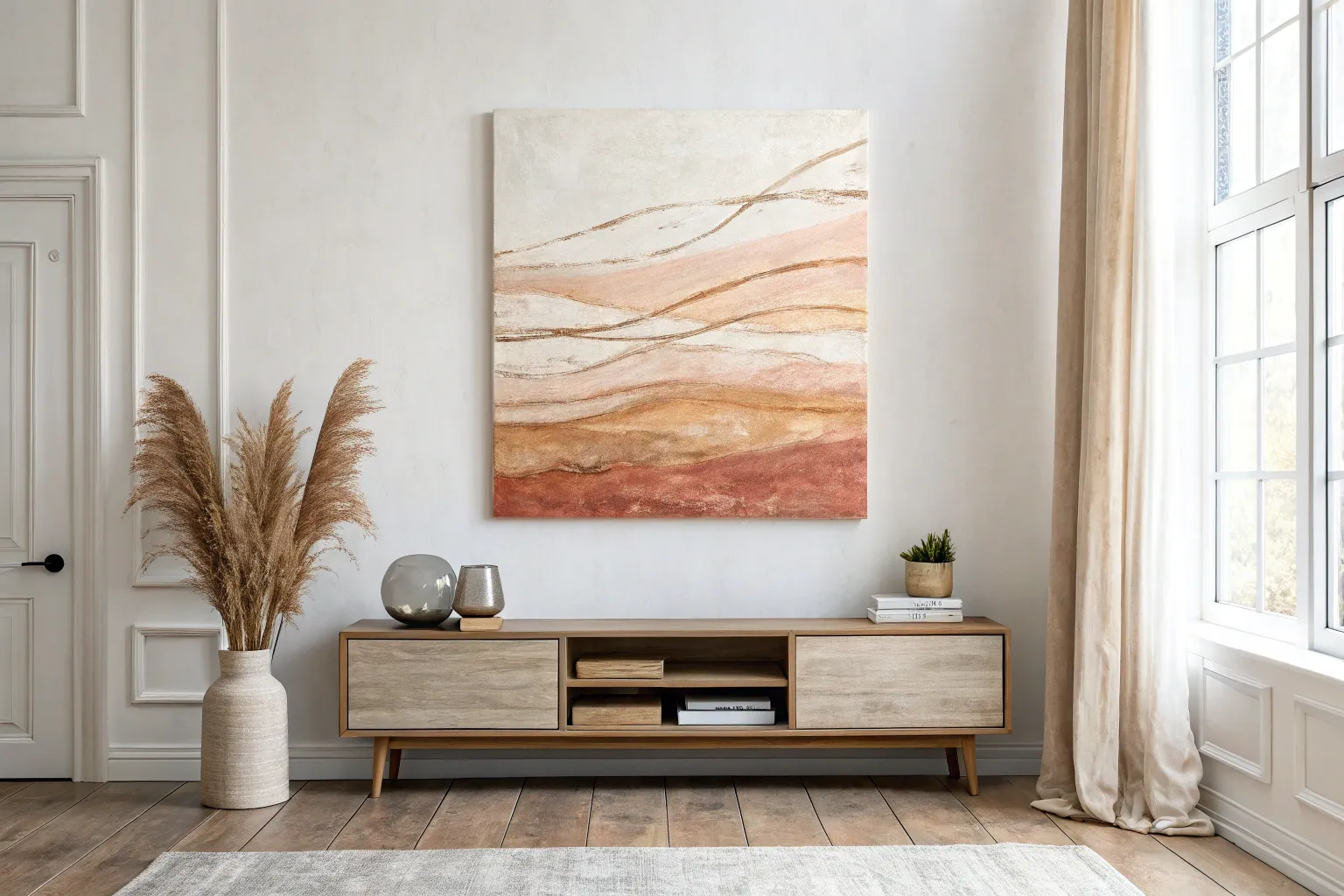
Oversized Statement Canvas Above the Sofa
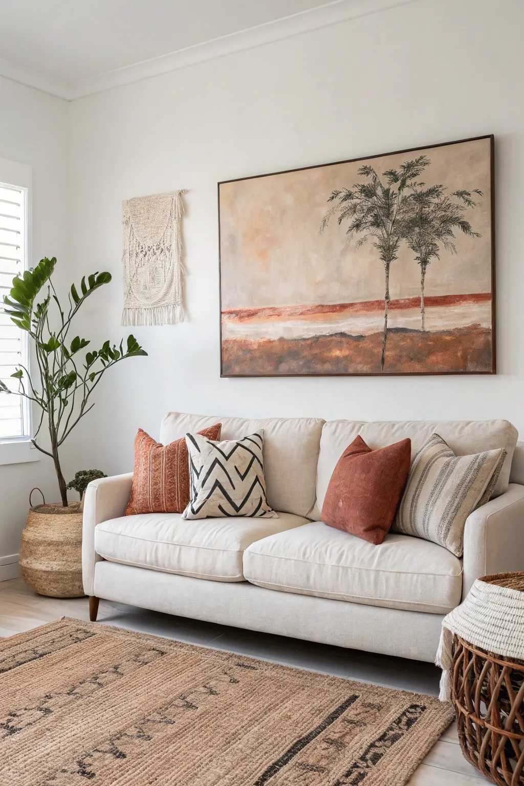
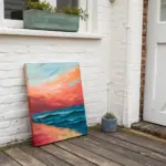
Bring the warmth and expansive beauty of an arid landscape into your living room with this oversized statement piece. This project uses soft washes and textured layering to create a serene, neutral-toned desert scene featuring two prominent palm trees.
How-To Guide
Materials
- Oversized canvas (approx. 48” x 36” or larger)
- Acrylic paints: Titanium White, Burnt Sienna, Raw Umber, Yellow Ochre, Burnt Umber, Paynes Gray, Sage Green
- Gesso (white)
- Wide flat brush (2-3 inches) for background washes
- Medium filbert brush
- Fine liner brush or rigger brush
- Sea sponge or crumpled paper towel
- Mixing palette or paper plates
- Water container and spray bottle
- Dark wood floating frame (optional, for finishing)
Step 1: Setting the Atmosphere
-
Prime and prep:
Ensure your large canvas is clean. Apply a coat of white gesso if the canvas isn’t pre-primed, or if you want a smoother surface. Let it dry completely. -
Establish the horizon:
Lightly sketch a horizontal line about one-third of the way up from the bottom using a diluted Raw Umber mix. It doesn’t need to be perfectly straight; a slight organic waver adds realism. -
Mix the sky gradient:
Create a large pool of creamy off-white by mixing Titanium White with a tiny dot of Yellow Ochre and Burnt Sienna. You want a very warm, pale beige. -
Wash the sky:
Using your wide flat brush and a spritz of water to keep the paint fluid, cover the entire sky area. Use broad, sweeping horizontal strokes. While wet, blend in subtle patches of pure White and faint touches of Ochre to create atmospheric depth. -
Create the clouds:
Mix a soft, hazy grey-brown using White and a touch of Burnt Umber. While the sky is still slightly damp, scumble this color in irregular cloud-like patches near the top left and center. Use a dry brush or rag to soften the edges so they fade into the background.
Pro Tip: Hazy Horizons
To get that soft, distant look on the horizon line, use a dry brush to gently scrub the wet paint where the sky meets the land. This removes hard edges and mimics heat haze.
Step 2: Building the Terrain
-
Base the foreground:
Mix a mid-tone earthy brown using Burnt Sienna and Raw Umber. Apply this to the bottom third of the canvas below your horizon line. Don’t aim for solid coverage; let the brush strokes show texture. -
Add the red earth band:
Create a vibrant rust color by mixing Burnt Sienna with a little red (or just use the Sienna heavily). Paint a distinct horizontal band right across the horizon line. This simulates the clay-rich soil typical of desert landscapes. -
Blend the transition:
While the rust band is wet, use a clean, slightly damp large brush to drag the color downwards into the brown foreground and upwards slightly into the sky, blurring the hard line. This creates a heat-haze effect. -
Texturize the ground:
Dip a sea sponge or crumpled paper towel into a mix of dark Burnt Umber and Paynes Gray. Lightly dab this over the bottom foreground area to create the look of rough scrub and shadows.
Step 3: Painting the Palms
-
Position the trunks:
Mix a dark charcoal color using Burnt Umber and Paynes Gray. With a medium filbert brush, paint two tall, slender vertical lines. Place them off-center to the right for better composition. Make the lines slightly wavy and broken rather than ruler-straight. -
Define the bark texture:
Switch to a smaller brush. Add horizontal dashes across the trunks using a lighter grey-brown mix. This mimics the ringed texture of palm bark. -
Start the fronds:
Using Sage Green mixed with a little Raw Umber (to desaturate it), paint the main spines of the palm fronds arching out from the top of the trunks. Vary the lengths and directions. -
Flesh out the leaves:
With a fine liner or rigger brush, paint individual leaflets dangling from the main spines. Use quick, flicking motions. I find it helpful to start near the spine and flick outward and downward. -
Add depth to foliage:
Mix a darker green-black shade. Go back into the center of the palm crowns and add dense, shadowed fronds underneath the lighter ones to give the tree volume. -
Highlight the trees:
Add a few touches of the light sky color on the top edges of the highest fronds and the sun-facing side of the trunks to suggest sunlight hitting them.
Troubleshooting: Flat Foliage
If your palm fronds look too flat or cartoonish, you likely need more color variation. Add very dark green-blacks in the center and pale, yellow-greens on the tips.
Step 4: Final Details
-
Ground the trees:
At the base of the trunks, paint a small pool of dark shadow using the Burnt Umber/Paynes Gray mix. Feather this shadow out horizontally into the landscape. -
Assessment:
Step back about 5-10 feet from the canvas. Check if the horizon feels level and if the trees feel grounded. Add more white washes to the sky if it feels too dark. -
Seal the work:
Once fully dry (usually 24 hours for thick acrylics), apply a matte or satin varnish to protect the surface and unify the sheen.
Hang this expansive piece in a central spot and enjoy the quiet drama it brings to your space
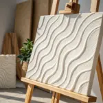


Neutral Abstracts for a Calm Wall
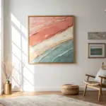
Achieve the look of high-end gallery art with this minimalist, textured landscape that uses layers of neutral tones to evoke a calming horizon. This project focuses on horizontal movements and subtle color blending to create a piece that feels both grounded and ethereal.
Step-by-Step Tutorial
Materials
- Large stretched canvas (e.g., 36” x 48” or larger)
- Acrylic heavy body paints (Titanium White, Unbleached Titanium, Raw Umber, Paynes Grey, Mars Black)
- Texture paste or modeling paste
- Large palette knife or putty knife (4-inch width)
- Wide flat bristle brush (3-inch or larger)
- Spray bottle with water
- Paper towels or rags
- Drop cloth
Step 1: Texturing the Canvas
-
Prepare the workspace:
Lay down a drop cloth in a well-ventilated area. This canvas is large, so I prefer leaning it against a wall or placing it flat on a large table to get better leverage. -
Apply the texture base:
Scoop out a generous amount of texture paste onto the canvas. Focus the heaviest texture on the upper two-thirds of the canvas where the ‘sky’ will be. -
Spread horizontally:
Using your large palette knife or putty knife, spread the paste using long, horizontal sweeping motions. Don’t try to make it smooth; ridges and gaps will catch the paint later. -
Create distinct zones:
In the lower third, apply the texture slightly thinner but keep the horizontal direction. This variation helps distinguish the ‘ground’ from the ‘sky’ before adding color. -
Let it cure:
Allow the texture paste to dry completely. This can take several hours or overnight depending on thickness. Touching it while damp will ruin the effect.
Too Muddy?
If your colors are turning grey and muddy, stop blending immediately. Let the current layer dry completely (15 mins), then add fresh color on top. Overworking wet paint ruins the crisp layering.
Step 2: Painting the Sky (Upper 2/3)
-
Mix the base sky color:
On your palette, mix a large amount of Titanium White with a tiny touch of Paynes Grey to create a very cool, off-white tone. -
Apply the first sky layer:
Use the wide brush to apply this mixture over the textured upper section. Use long, horizontal strokes, but don’t worry about full coverage yet. -
Add warmth:
While the white is wet, mix Unbleached Titanium (a beige tone) into the white on your brush. Streak this randomly across the upper section to create warmth in the clouds. -
Scumble the texture:
Clean your brush until it’s ‘dry’ (damp but no paint). Drag the dry brush lightly over the textured ridges to soften the transition between the white and beige areas. -
Highlight the ridges:
Take a bit of pure Titanium White on the palette knife. Gently scrape it over the highest points of the dried texture paste to make the ‘clouds’ pop forward.
Step 3: Painting the Earth (Lower 1/3)
-
Establish the horizon line:
Mix Raw Umber with a little Mars Black. Paint a confident, dark horizontal line roughly one-third of the way up from the bottom. It doesn’t need to be ruler-straight. -
Blend the horizon down:
Using a slightly wet brush, pull the dark paint from the horizon line downward, fading it out as you go so it isn’t a solid block of color. -
Layer the earth tones:
Mix Raw Umber and Unbleached Titanium. Apply this mid-tone brown in horizontal bands below the horizon line, leaving some gaps. -
Create the foreground:
Near the very bottom edge, introduce more white into your brown mixture. Paint this lightest earth tone at the base to create depth and perspective. -
Add separation lines:
Dip the edge of your palette knife into dark grey or black paint. Press it gently into the wet earth section to create thin, dark horizontal scratches simulating layers of sediment.
Pro Tip: The Scrape Method
For that weathered look, take a piece of rigid cardboard and scrape wet paint OFF the canvas in spots. This reveals the texture underneath and adds instant history to the piece.
Step 4: Refining and Blending
-
Mist and blend:
Lightly mist the entire canvas with water. Use a clean, dry rag to gently wipe horizontally across areas that look too harsh, blurring the lines. -
Reconnect sections:
If the sky and ground look too separate, dry-brush a little of the ground color faintly into the lower sky, and a little sky white onto the horizon line. -
Final highlights:
Step back and assess. Add touches of pure thick white with the palette knife to any area that needs more brightness or texture. -
Final drying:
Let the painting sit vertically to dry. Acrylics dry darker, so don’t panic if it looks slightly different while wet.
Now you have a stunning, gallery-worthy focal point that brings instant tranquility to your room


Botanical Canvas Prints With a Fresh Palette
Bring the calming influence of nature indoors with these crisp, clean botanical illustrations. By combining simple painting techniques with high-quality paper, you can create a gallery-worthy display that adds a breath of fresh air to any room.
Detailed Instructions
Materials
- High-quality watercolor paper (white or off-white, at least 300gsm)
- Set of watercolor paints (specifically Sap Green, Hookers Green, Olive Green, and Payne’s Grey)
- Round watercolor brushes (sizes 2, 6, and 8)
- Pencil (HB or lighter)
- Kneaded eraser
- Two wooden frames (one large, one medium)
- Ruler
- Water cups and paper towels
- Reference images of leaves (palm, fern, ficus)
Step 1: Planning the Layout
-
Measure and Cut:
Begin by measuring the inside dimensions of your chosen frames. Cut your watercolor paper to these exact sizes. For the larger print, you will need a substantial sheet to accommodate four distinct specimens. -
Grid the Large Sheet:
On the larger paper, use your ruler to lightly mark out four equal quadrants. These don’t need to be drawn in dark lines, just faint tick marks at the edges to help you center each individual leaf illustration. -
Sketch the Palm:
In the top-left quadrant, lightly sketch a simplified palm leaf. Draw a central stem that curves slightly, then add long, slender leaflets radiating outward. Keep the pencil pressure extremely light so it doesn’t show through the paint. -
Sketch the Complex Leaf:
In the top-right quadrant, sketch a stem with varying sizes of oval-shaped leaves attached. This mimics a plant like a rose or ash tree leaf structure. -
Sketch the Ficus:
For the bottom-left, draw a strong central stem with large, broad leaves arranged explicitly in opposite pairs. Give the leaves pointed tips and visible central veins. -
Sketch the Fern:
In the bottom-right, sketch a triangular fern shape. This is the most detailed sketch; indicate the main stem and the graduating sizes of the fronds, but don’t worry about drawing every tiny leaflet yet. -
Sketch the Solo Print:
On your smaller sheet of paper, sketch a single, symmetrical fern frond centered perfectly on the page. This should mirror the style of the fern in the larger print but can be slightly more detailed due to the focus.
Natural Texture Trick
Add depth by lifting wet pigment. While a leaf is still damp, dab it gently with a dry paper towel to remove color, creating a natural highlight.
Step 2: Painting the Foliage
-
Mix Your Greens:
Prepare three puddles of green paint. Mix Sap Green with a touch of Payne’s Grey for a deep shadow color. Mix Olive Green with water for a mid-tone. Use pure watered-down Sap Green for the lightest, freshest leaves. -
Paint the Palm Stems:
Starting with the top-left palm, use the size 2 brush and the dark mix to paint the very thin central spine. I like to keep my hand loose here to prevent shaky lines. -
Fill in Palm Leaves:
Switch to a size 6 brush. Using the mid-tone green, press the belly of the brush down and lift as you pull outward to create the tapered shape of the palm leaflets. Leave tiny gaps of white paper where the leaf meets the stem for a crisp look. -
Detail the Top-Right Specimen:
For the top-right plant, paint the leaves using the olive mix. While the paint is still wet, drop a tiny amount of the darker green into one side of each leaf to create localized shadowing and dimension. -
Paint the Broad Leaves:
Move to the bottom-left broad-leaf plant. Use the size 8 brush here. Paint one half of a leaf, leave a hairline gap for the center vein, and then paint the other half. This negative space creates the vein without needing white paint. -
Add Veining Detail:
Once the broad leaves are semi-dry, use the size 2 brush with the darkest green mixture to paint fine diagonal veins over the leaves for added texture. -
Execute the Ferns:
For both the bottom-right section and the separate solo print, use the size 2 brush. Use a stippling or short-dash motion to build up the fern texture. Start from the bottom of the stem and work comfortably upward. -
Clean Up:
Allow all paint to dry completely—referably overnight to prevent smudging. once fully dry, gently use the kneaded eraser to lift any visible pencil lines that weren’t covered by paint.
Step 3: Final Assembly
-
Mount and Frame:
Clean the glass of your frames thoroughly to remove dust or fingerprints. Place your artwork face down on the glass, layer the backing board on top, and secure the clips. -
Hang and Arrange:
Hang the large print first to anchor the space, then place the smaller print beside it, aligning the bottom edges or centering it vertically relative to the larger frame for a balanced gallery wall look.
Vintage Aesthetic
Soak the finished paper in a weak tea bath for 30 seconds after the paint is waterproof-dry (or before painting) to give the background an aged, antique look.
Enjoy the timeless elegance of your new botanical gallery.
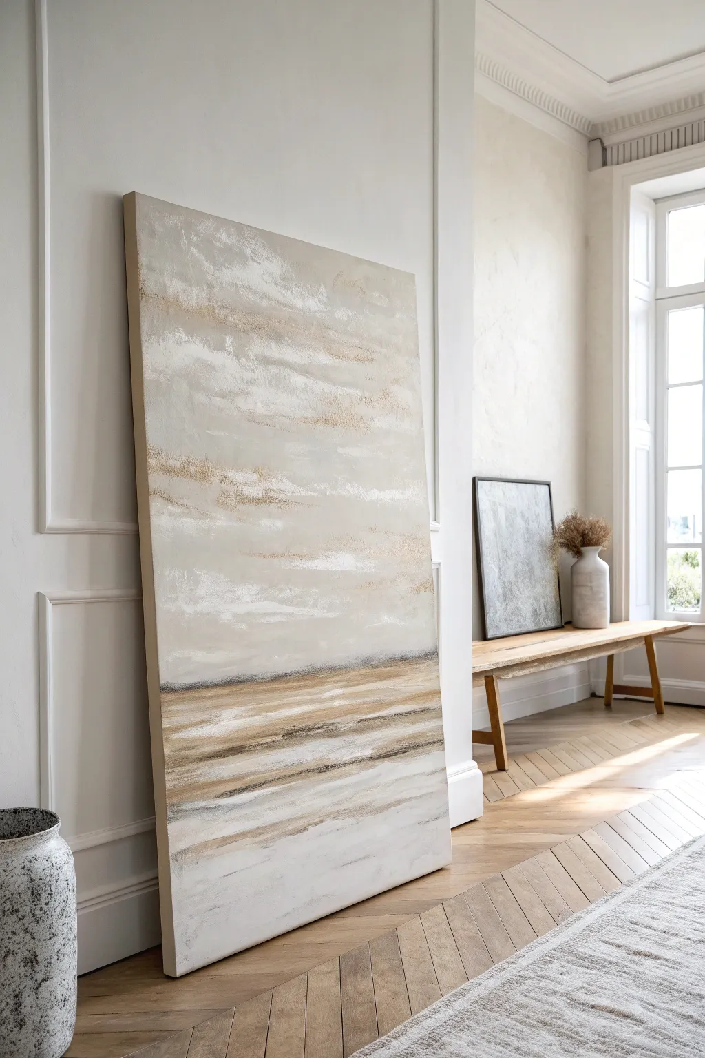
Landscape Canvas That Opens Up the Room
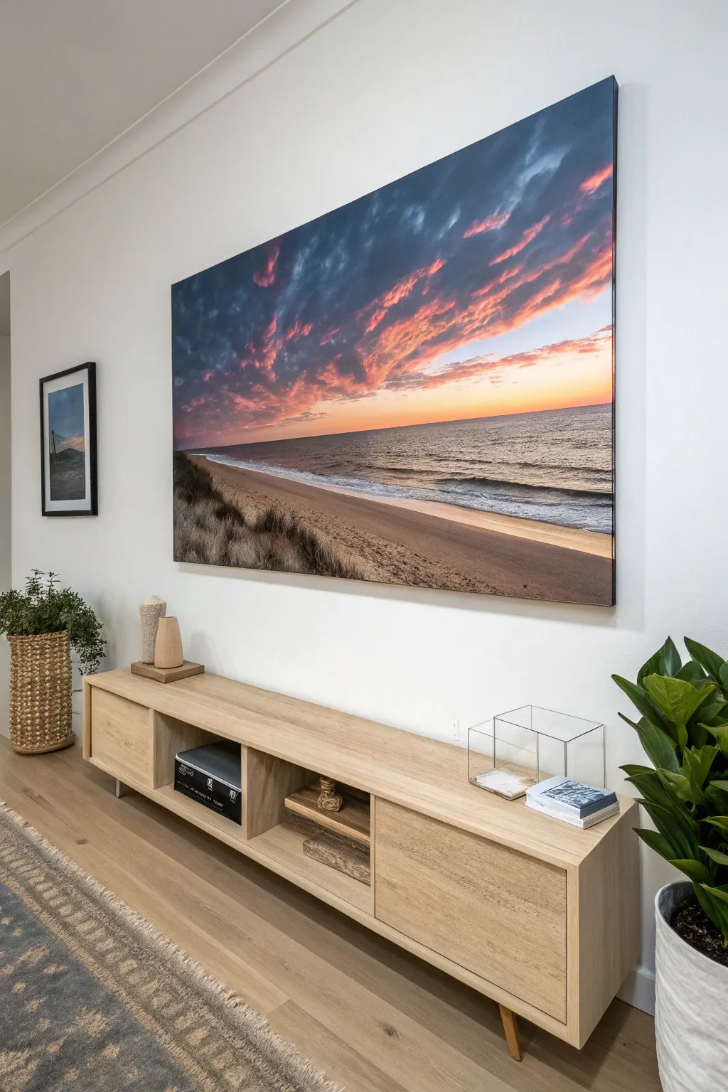
Transform a blank wall into a breathtaking window by creating a massive, gallery-quality canvas print. This project focuses on preparing a high-resolution landscape photo for large-format printing and mounting it to achieve that sleek, frameless look usually found in high-end interiors.
Step-by-Step
Materials
- High-resolution digital photograph (minimum 300 DPI at scale)
- Adobe Photoshop or similar photo editing software
- Large format canvas printing service
- Heary-duty wooden stretcher bars (custom sized to print)
- Canvas stretching pliers
- Heavy-duty stable gun
- Stainless steel staples (3/8 inch)
- Gesso (clear or white, optional for texture)
- UV-resistant varnish (matte or satin)
- Large foam brush or roller
- Measuring tape
- Rubber mallet
- French cleat hanging hardware
Step 1: Image Preparation
-
Select the right photo:
Choose a landscape image with a strong horizon line, like a beach at sunset. For a canvas this large (likely 60″ or wider), the source file needs to be extremely high quality—think RAW files or 20+ megapixel images to prevent pixelation. -
Measure your wall:
Determine the exact dimensions for your space. This project looks great when it spans almost the full width of the console table below it, so measure your furniture first as a guide. -
Crop and resize:
Open your image in editing software. Set your canvas size to your measured dimensions plus a 2-inch bleed on all sides for the wrapping process. This ensures the image continues around the edges of the frame. -
Adjust contrast and saturation:
Canvas prints tend to absorb ink and look slightly duller than a backlit screen. I like to bump up the saturation and contrast by about 10-15% to compensate for this natural dulling effect. -
Sharpen for print:
Apply a ‘High Pass’ filter or ‘Unsharp Mask’ specifically designed for print output. The image should look slightly ‘crunchy’ or over-sharpened on your screen; this detail is necessary to look crisp on the textured canvas.
Step 2: Printing & Frame Assembly
-
Order the print:
Upload your file to a professional large-format print lab. Specify ‘rolled canvas’ (unstretched) if you plan to build the frame yourself to save on shipping costs. -
Assemble the stretcher bars:
While waiting for the print, connect your heavy-duty stretcher bars. Use a rubber mallet to gently tap the slotted corners together until they are perfectly flush and square. -
Add cross-bracing:
For any artwork over 36 inches wide, install central cross-braces to prevent the wood from bowing inward under the tension of the canvas.
Loose Canvas?
If the canvas sags slightly after hanging, spray a fine mist of warm water on the BACK of the canvas. As it dries, the cotton fibers will shrink and tighten the drum.
Step 3: Stretching the Canvas
-
Position the art:
Lay the canvas face down on a strictly clean, flat surface. Place the wooden frame face down on top of it, ensuring the image is perfectly centered with equal excess fabric on all sides. -
Anchor the center points:
Starting on the longest side, pull the canvas overlap up and staple it once in the dead center of the bar. Repeat this on the opposite side, pulling tightly with your pliers before stapling. -
Secure the short sides:
Move to the shorter sides and repeat the center-staple process. You should now have a diamond shape of tension across the canvas. -
Work outward:
Return to the long sides. Place staples every 2 inches, working from the center outward toward the corners. Alternatives sides frequently—staple the top, then the bottom, then the left, then the right—to keep tension even. -
Check the tension:
Periodically flip the frame over to check the front. The canvas should be taut like a drum skin, with no ripples or sagging areas. -
Fold the corners:
At the corners, tuck the excess fabric neatly inside to create a hospital corner fold. Staple this fold securely on the back or side of the frame, depending on your preference for how the edge looks.
Add Visible Texture
Before sealing, dry-brush clear acrylic gel medium over the highlights (like the breaking waves) to create real 3D brushstrokes mimicking an oil painting.
Step 4: Sealing & Hanging
-
Apply varnish:
Once stretched, protect the ink. Pour a small amount of UV-resistant varnish into a tray and roll it horizontally across the canvas in thin, even coats to prevent cracking and sun fading. -
Level the wall:
For a piece this wide, standard wire hanging can cause tilting. Secure a French cleat system to the wall, using a long level to ensure it is perfectly horizontal. -
Mount the artwork:
Attach the receiving end of the French cleat to the top back bar of your canvas frame. Lift the art onto the wall cleat for a flush, secure fit that won’t budge.
Now you have a stunning, professional-grade landscape piece that anchors your entire room
BRUSH GUIDE
The Right Brush for Every Stroke
From clean lines to bold texture — master brush choice, stroke control, and essential techniques.
Explore the Full Guide
Black-and-White Canvas for Instant Contrast
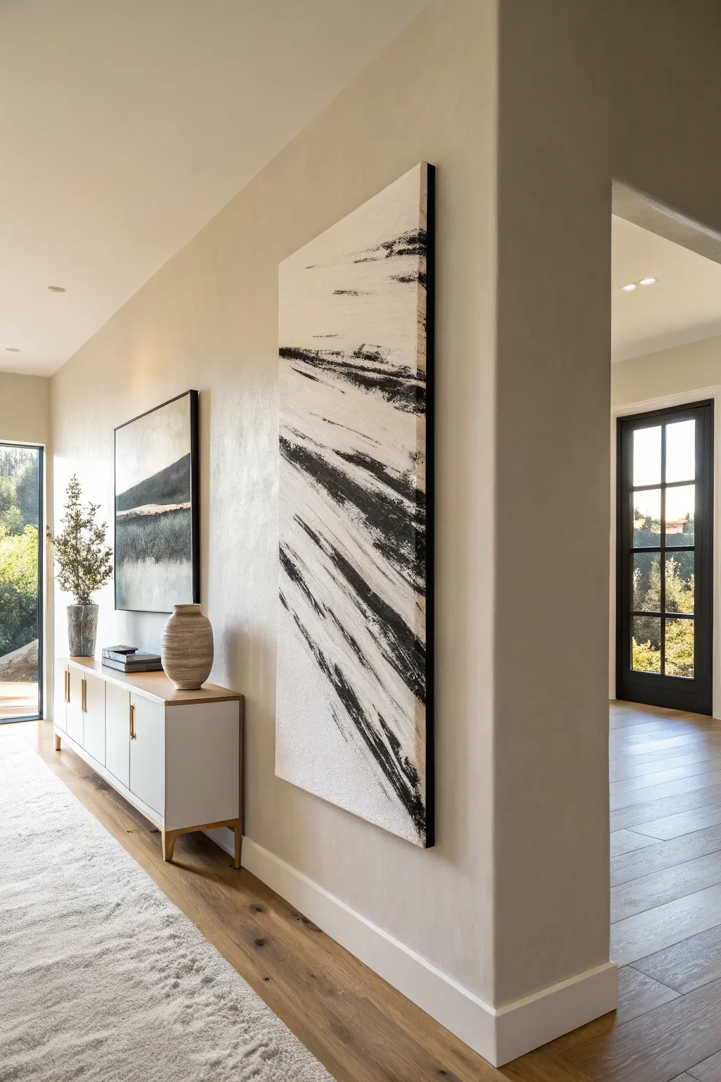
Make a bold, sophisticated statement in your hallway or living room with this oversized abstract canvas. Relying on the sheer power of high-contrast black and white, this piece uses sweeping, energetic brushstrokes to simulate motion and texture on a grand scale.
How-To Guide
Materials
- Large, gallery-wrapped canvas (approx. 36″ x 72″ or custom size)
- Heavy body black acrylic paint
- Heavy body titanium white acrylic paint
- Matte medium or texture paste (optional)
- Wide painters brush (3-4 inch width)
- Flat, stiff-bristled utility brush
- Drop cloth
- Painter’s tape
- Mixing buckets or large palette
- Water spray bottle
- Black wood floating frame (optional)
Step 1: Preparation and Base Layer
-
Set the stage:
Lay down a substantial drop cloth in a well-ventilated area. Because this canvas is so large, painting it flat on the floor or on a large work table is often easier than using an easel. -
Tape the edges:
If you plan to use a floating frame later, mask off the sides of your canvas with painter’s tape to keep them pristine. If you prefer a frameless look, you can skip this and paint the edges black or white later. -
Mix the white base:
Pour a generous amount of titanium white heavy body acrylic into a container. If you want added texture right from the start, mix in a little matte medium or modeling paste, though standard heavy body paint works well on its own. -
Apply the background:
Using your widest brush covered in white paint, cover the entire canvas. Don’t aim for perfection here; subtle ridges and brush marks in the white will add depth to the final product. -
Let it cure:
Allow this base layer to dry completely. This is crucial so your black strokes sit on top rather than mixing into a grey soup.
Too Much Paint?
If you apply too much black and lose the ‘scratchy’ texture, wait for it to dry, then dry-brush white paint back over the area to reclaim the texture.
Step 2: Creating the Dynamic Strokes
-
Prepare the black paint:
Squeeze black heavy body acrylic onto your palette. Do not add water initially; you want the paint to be thick enough to create that ‘dry brush’ effect where the canvas tooth shows through. -
Plan your motion:
Study the reference image. The energy flows diagonally from bottom-left to top-right. Stand in a position where you can pull the brush towards you or sweep it across your body naturally in that direction. -
Load the stiff brush:
Dip your flat, stiff-bristled utility brush into the black paint. Remove excess paint on a scrap piece of cardboard—you want the bristles coated but not dripping. -
Execute the first sweep:
Start near the bottom third of the canvas. With a confident, quick motion, sweep the brush diagonally upward. Apply more pressure at the start and lift off gradually as you end the stroke to create a trailing effect. -
Build the composition:
Repeat this motion, adding parallel strokes. Vary the length and starting points slightly to avoid it looking too uniform. The goal is a cluster of movement, not perfect stripes. -
Critique and adjust:
Step back and look at the balance. If a stroke looks too solid, you can lightly drag a mostly dry brush over the edges to feather it out. -
Add secondary marks:
I like to add a few smaller, disconnected black marks near the top or bottom edges to balance the composition, just like the faint marks seen at the very top of the original artwork. -
Create texture contrast:
If you want areas of deeper black, go back over the thickest parts of the strokes with a second coat, but leave the trailing edges raw and scratchy. -
Verify the negative space:
Ensure you have left plenty of white space, particularly in the top left and bottom right corners. This negative space is what gives the black strokes their impact.
Pro Tip: The Broom Trick
For massive canvases, a stiff household broom (clean/new) can replace a brush. Dip the tips in paint and sweep for huge, energetic lines.
Step 3: Finishing and Framing
-
Dry completely:
Let the black paint dry overnight. Heavy body acrylics can feel dry to the touch quickly but take longer to fully cure. -
Seal the work:
Apply a clear isolation coat or varnish (matte or satin finish works best) to protect the surface from dust and UV light. -
Remove tape:
Carefully peel off the painter’s tape from the sides if you used it. -
Frame it:
For the gallery look shown in the photo, install the canvas into a slim black floating frame. This separates the art from the wall and adds a finished, professional boundary.
Hang your new masterpiece vertically to draw the eye upward and celebrate the power of simple contrast.
Triptych Set for Long Walls
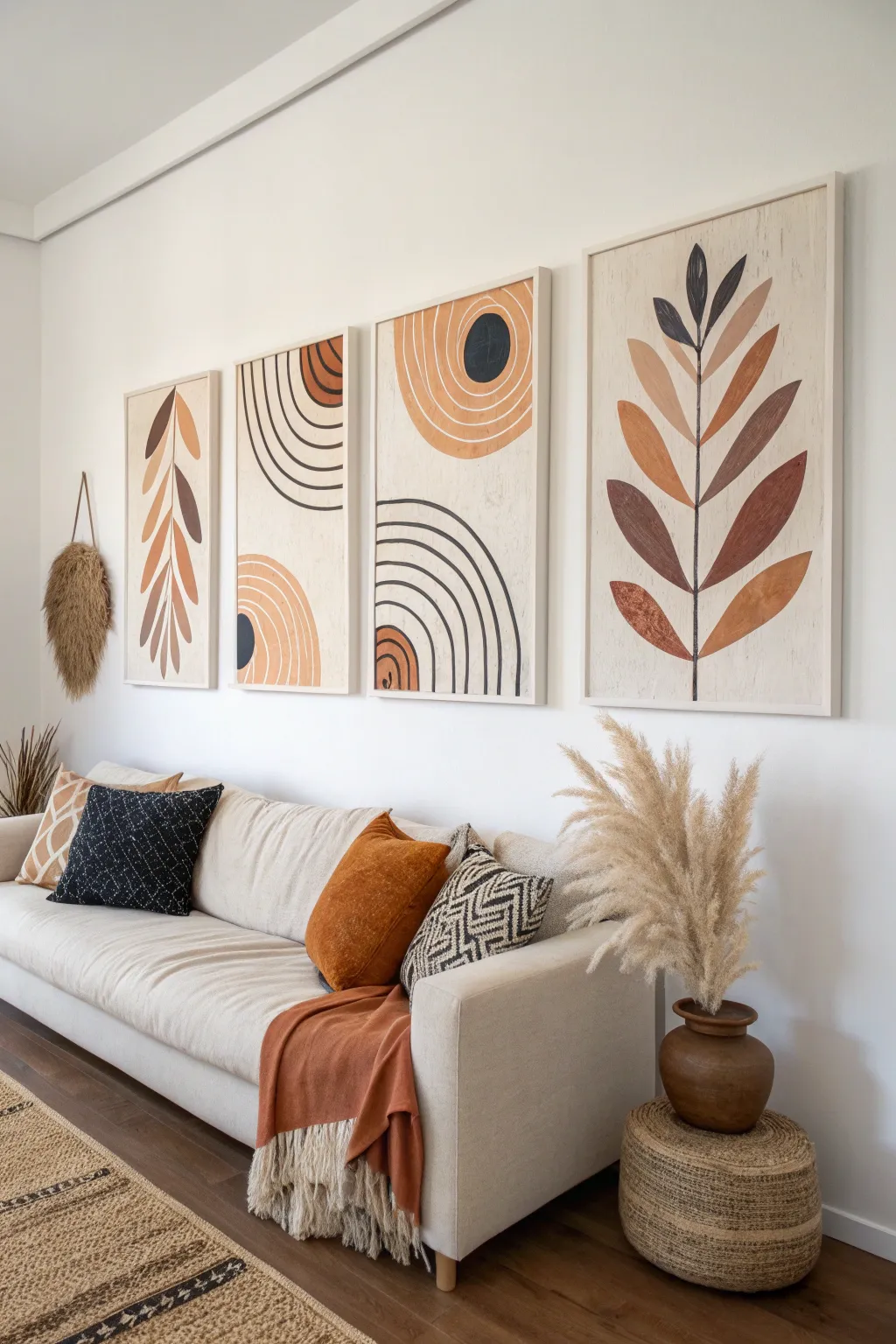
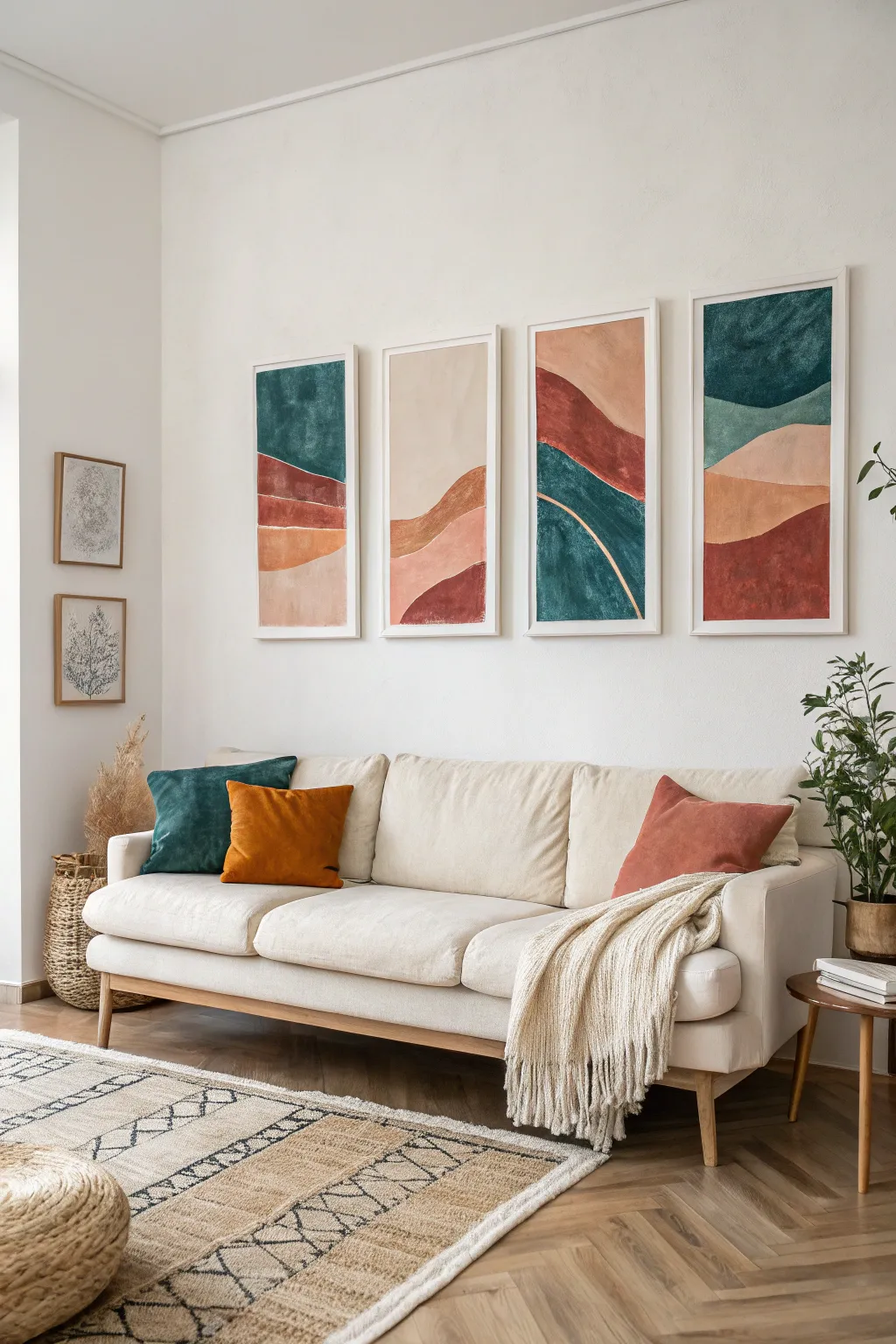
Bring warmth and modern organic style to your space with this stunning four-piece canvas set featuring abstract botanical leaves and geometric arches. The earthy color palette of terracotta, brown, and cream creates a serene focal point perfect for long living room walls.
Step-by-Step Guide
Materials
- 4 large rectangular canvases (18×24 or 24×36 inches suggested)
- Acrylic paints: warm white/cream, terracotta, burnt orange, raw umber, black
- Gesso (optional, for priming)
- Pencil and large eraser
- Painter’s tape or a large compass tool
- Flat shader brushes (medium and large)
- Round detail brush (size 4 or 6)
- Matte varnish
- Palette or mixing plate
- Ruler or straight edge
Step 1: Planning and Priming
-
Prep the surface:
Begin by ensuring your four canvases are clean and dust-free. If the canvas texture is too rough, apply a coat of gesso to smooth it out, which helps with crisp lines later. -
Base coat application:
Mix a large amount of your background color. Combine warm white with a tiny drop of raw umber to create an off-white, light beige tone. Paint the entire surface of all four canvases, including the sides, and let them dry completely. -
Drafting the layout:
Arrange the four canvases side-by-side on the floor in their intended order. This is crucial for visualizing the flow, especially for the geometric arches that span multiple panels. -
Sketching the designs:
Using a pencil, lightly sketch the designs. The two outer panels will feature tall, stylized leaves. The two inner panels will feature abstract arches and circles. Don’t press too hard; you just want faint guidelines.
Wobbly Lines?
If painting focused curves is difficult, use thin flexible masking tape (fineline tape) to mask off the arches before painting.
Step 2: Painting the Botanicals (Outer Panels)
-
Stem structure:
On the far left and far right panels, paint the central vertical stem line using your round brush and diluted raw umber or black paint. Use a ruler if a perfectly straight line is preferred, or freehand it for an organic look. -
Leaf blocking:
Paint the leaf shapes branching off the stems. Alternate deeply, mixing burnt orange, terracotta, and raw umber for each leaf to create variety. I find it helpful to paint all the leaves of one color first before switching to the next hue. -
Refining edges:
Once the main leaf colors are dry, use a smaller flat brush to sharpen the points and edges of the leaves against the cream background. Clean lines make the graphic style pop.
Step 3: Creating the Geometrics (Inner Panels)
-
Drafting the arches:
For the two middle panels, use a large compass or a string-and-pencil trick to draw perfect semi-circles. Ensure the concentric lines are evenly spaced. -
Painting solid shapes:
Fill in the solid semi-circles and circles first. Use the terracotta and burnt orange mixes for the larger shapes, ensuring opaque coverage by applying two thin coats rather than one thick one. -
Executing the line work:
Using a medium round brush and black paint, carefully trace over your pencil lines for the thin arches. Keep a steady hand and maintain consistent pressure to keep the line width uniform. -
Adding dark accents:
Add the solid black or dark charcoal circle accents within the geometric shapes. These provide high contrast and anchor the lighter earth tones.
Add Texture
Mix modeling paste into your acrylic paint for the darker leaves or geometric shapes to give the artwork a raised, tactile 3D effect.
Step 4: Finishing Touches
-
Quality check:
Step back and look at all four panels together. Touch up any background areas where the paint might have accidentally smudged or dripped. -
Erase guidelines:
Once the paint is absolutely bone dry, gently erase any visible pencil marks that weren’t covered by paint. -
Connect the design:
Double-check that the geometric arches on the middle panels align visually with elements on the adjacent panels if you planned a continuous flow. -
Seal the art:
Apply a layer of matte varnish over all canvases. This protects the acrylics from UV light and dust while unifying the sheen of the different paint colors. -
Framing (Optional):
For the exact look in the photo, mount the canvases into wooden floating frames. Use a light, natural wood tone to complement the earthy palette.
Hang your new gallery wall set with even spacing between the frames to complete the modern organic look

PENCIL GUIDE
Understanding Pencil Grades from H to B
From first sketch to finished drawing — learn pencil grades, line control, and shading techniques.
Explore the Full Guide
Diptych Pair With Matching Color Blocks
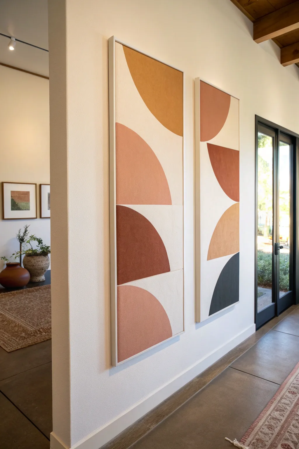
Bring modern warmth to your hallway with this striking pair of geometric canvases featuring bold semi-arches in a cohesive earth-tone palette. The large-scale shapes and minimalist composition create a gallery-worthy look that feels both grounded and contemporary.
Detailed Instructions
Materials
- Two large gallery-wrapped canvases (e.g., 24×48 inches)
- Two float frames sized to match your canvases
- Acrylic paints (Titanium White, Yellow Ochre, Burnt Sienna, Terra Cotta, Carbon Black)
- Matte medium or texture paste (optional)
- Wide flat paintbrush (2-inch)
- Medium flat paintbrush (1-inch)
- Painters tape (low tack)
- Large compass or string and pencil
- Ruler or straight edge
- Pencil
- Palette or paper plates
- Drop cloth
Step 1: Planning and Priming
-
Prepare the Base:
Begin by coating both canvases with a mix of Titanium White and a tiny drop of Yellow Ochre to create a warm, creamy off-white background. Apply two coats for opacity, allowing full drying time between layers. -
Mark the Grid:
Once the base is completely dry, lightly use a pencil and ruler to mark horizontal lines that divide each canvas into four equal rectangular sections. These guide lines will help center your shapes. -
Sketch the Curves:
Decide on the orientation of your semi-circles. In the inspiration piece, shapes alternate direction. Use a large compass—or a string tied to a pencil and anchored at the edge of the canvas—to draw large semi-circles or quarter-circles within the marked sections. -
Refine the Lines:
Double-check that your pencil curves are smooth. If you are creating a shapes that ‘bleeds’ off the edge, engage the pencil right off the side of the canvas to keep the arc natural. -
Tape for Precision:
Apply painters tape along the straight horizontal division lines you drew earlier. This ensures a crisp, hard edge where the color blocks meet the white background.
Clean Lines
If paint bleeds under your tape, use a stiff, damp brush to gently wipe the unwanted paint away immediately, or paint over the bleed with your background color.
Step 2: Mixing and Painting
-
Mix the Mustard Tone:
Create the top color by mixing Yellow Ochre with a touch of Titanium White and a very small amount of Burnt Sienna to dull the brightness. Aim for a warm, spicy mustard hue. -
Mix the Terracotta Pink:
For the lighter pink-rust tone, blend Burnt Sienna with a generous amount of Titanium White. Test the color on a scrap paper; it should look like unglazed clay. -
Mix Deep Rust:
Mix a deep reddish-brown using Burnt Sienna and a small dot of Black or Dark Umber to deepen it. This will provide the strongest contrast in the middle sections. -
Mix the Charcoal/Black:
For the darkest shape, use Carbon Black mixed with a little White to create a very dark charcoal rather than a stark, flat black. -
Add Texture (Optional):
I like to mix a little matte medium or texture paste into the paints at this stage. This gives the finished shape a tactile, heavy-bodied quality similar to the inspiration image.
Level Up
For a textile art look, cut the semi-circle shapes out of colored linen or felt fabric and glue them onto the canvas instead of painting them.
Step 3: Execution and Framing
-
Paint the Edges First:
Using the medium flat brush, carefully paint along the curved pencil lines of your first shape. Keep your hand steady to create a smooth arc. -
Fill the Shapes:
Switch to the wide flat brush to fill in the rest of the shape. Use long, confident strokes to minimize brush marks, or stipple slightly if you added texture paste. -
Layer for Opacity:
Most earth tones are semi-transparent. Apply a second coat to each shape once the first is dry to ensure richness and solid coverage. -
Remove Tape:
Peel away the painters tape while the second coat is still slightly tacky. Pull the tape away from the paint line at a 45-degree angle to prevent peeling. -
Touch Ups:
Inspect the curved edges. If the line is shaky, use a small angled brush with the background cream color to tidy up the negative space. -
Varnish and Seal:
Once fully cured (wait at least 24 hours), apply a matte varnish over the entire canvas to unify the sheen and protect the surface from dust. -
Mount in Frames:
Place your finished canvases into the float frames. Secure them from the back using the provided hardware, ensuring an even gap around the perimeter.
Hang these canvases side-by-side with a few inches of spacing to let the shapes converse with one another
Multi-Panel Canvas Set for Big Impact
Transform a blank wall with this sophisticated four-piece canvas set featuring abstract, organic landscapes in muted earth tones. The flowing shapes and harmonious palette of terracottas, teals, and sand hues create a serene, cohesive focal point perfect for a living room.
Step-by-Step
Materials
- 4 large rectangular stretched canvases (e.g., 20×40 inches)
- Acrylic paints: Teal/Dark Green, Terracotta/Rust, Mustard Yellow, Sand/Beige, Titanium White
- Large flat brushes (2-3 inches wide)
- Medium round brushes
- Pencil
- T-square or long ruler
- Painter’s tape (optional)
- Palette or paper plates
- Water cup and rags
- Matte varnish (optional)
Step 1: Planning and Sketching
-
Prepare the workspace:
Lay out all four canvases side-by-side on a large flat surface or the floor. Ensure they are spaced apart slightly, just as they will hang on the wall, to visualize the flow of the design across the gap. -
Prime the background:
Mix a large amount of a soft, off-white or cream color using Titanium White and a tiny drop of Sand/Beige. Apply this base coat to all four canvases to ensure a uniform background tone. -
Sketch the flow:
Using a pencil, lightly draw the flowing, wave-like lines that will separate your color blocks. Treat the four canvases as one large continuous surface, letting the lines travel from one canvas to the next. -
Refine the shapes:
Review your pencil lines. You want organic, uneven mounds that look like rolling hills. Ensure each canvas has 3-4 distinct ‘zones’ or layers vertically.
Clean Lines
For ultra-crisp edges between color blocks, apply painter’s tape over the dry base layer. Paint the new color, then peel tape while still wet.
Step 2: Painting the Layers
-
Mix the teal shade:
Create a deep, moody teal by mixing your Dark Green with a touch of Blue and darkening it slightly with a dot of Black or Burnt Umber. It should feel rich and opaque. -
Apply the first color blocks:
Paint specific sections with the teal mixture. In the reference, this appears at the top of the first and third panels, and the bottom of the fourth. Use a large flat brush for broad strokes. -
Mix the terracotta tone:
Create a warm rust color. If your paint isn’t earthy enough, mix red with a little orange and a touch of brown to desaturate it. -
Paint the red earth layers:
Fill in the corresponding sections with the terracotta paint. Focus on the bold swoops in the middle-right and bottom sections. I find painting two coats helps get that solid, matte look. -
Create the sand and mustard tones:
Mix a pale beige (sand) and a muted yellow-ochre (mustard). These lighter tones act as bridges between the darker colors. -
Fill remaining sections:
Paint the remaining ‘hill’ shapes with your lighter earth tones. Be careful to paint right up to the pencil lines for a crisp edge, but don’t worry if it’s slightly painterly. -
Add texture and variation:
While the paint is still slightly wet, use a dry brush to feather some edges or add subtle streaks within the larger color blocks to give it a canvas-like texture.
Textured Finish
Mix a modeling paste or sand medium into your acrylics before painting the ‘earth’ sections to add genuine tactile grit and depth.
Step 3: Refining and Sealing
-
Detailing lines:
If you want the thin separation lines seen in some abstract art (like the gold or white lines), use a small detail brush with white or metallic gold paint to trace the boundary between two colors. -
Touch up edges:
Inspect the sides of your canvases. For a professional gallery-wrap look, paint the design so it wraps around the edges, or paint all edges a solid neutral color like white or black. -
Final drying time:
Let the canvases sit for at least 24 hours to ensure the acrylic is fully cured, especially where the paint is thick. -
Apply varnish:
To protect your set from dust and UV light, apply a coat of clear matte varnish. This unifies slight differences in sheen between the paint colors. -
Install hardware:
Attach sawtooth hangers or wire to the back of each frame. Ensure they are placed at the exact same height on all four panels for perfect alignment. -
Hang and enjoy:
Mount them on the wall with consistent spacing—usually 2 to 3 inches between panels looks best for this size.
Step back and admire how the colors flow seamlessly from one panel to the next, creating a custom gallery wall right in your home


Gallery Wall Made Only of Canvases
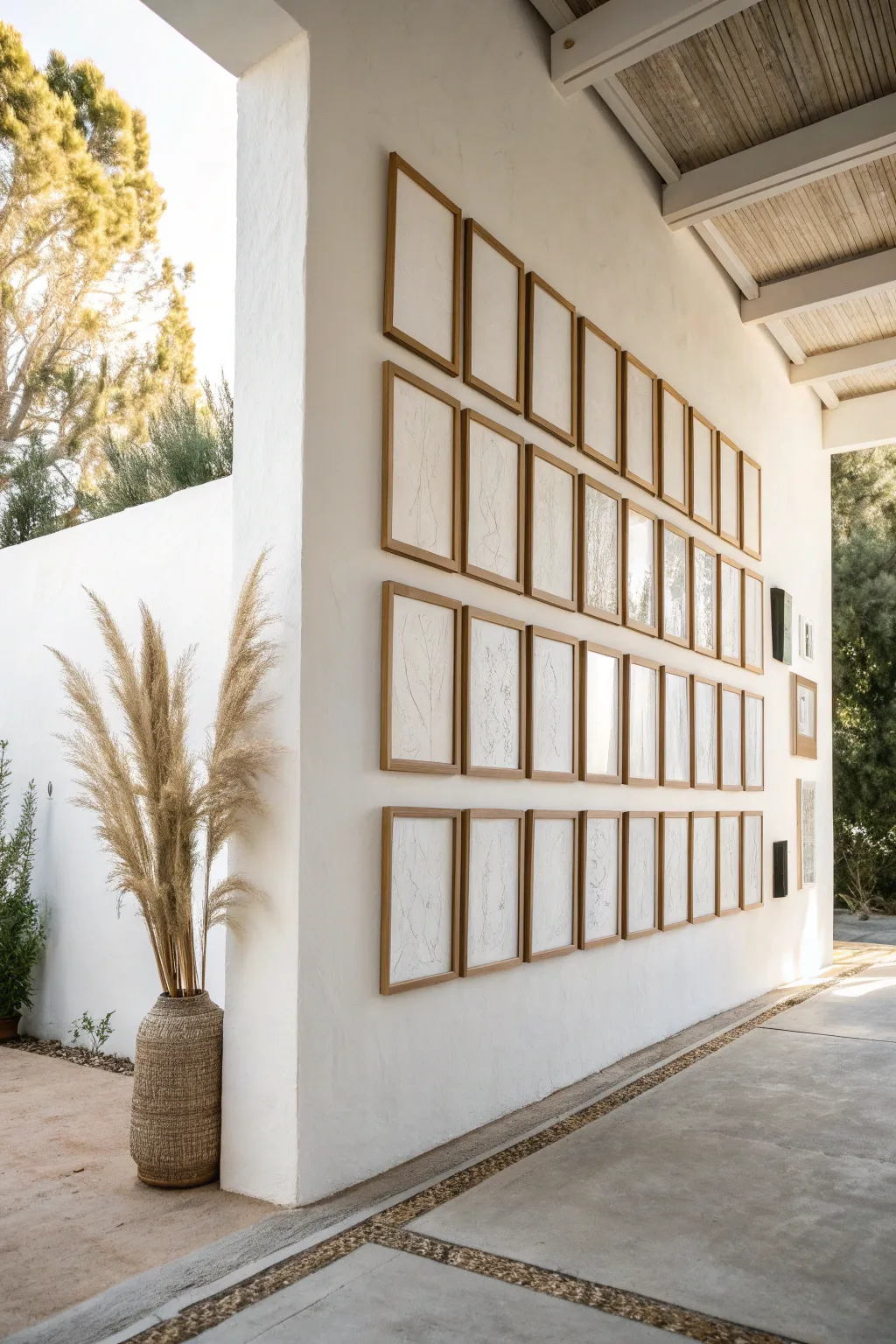
Create a calming, museum-worthy focal point with this large-scale gallery wall installation featuring subtle, continuous line drawings. This project relies on repetition and simplicity to transform simple white canvases and wooden frames into a cohesive architectural statement.
Step-by-Step Tutorial
Materials
- 36 Flat canvas panels (approx. 11×14 or size of choice)
- 36 Thin wooden gallery frames (natural oak or pine)
- Black fine-point pigment liner pens (0.3mm and 0.5mm)
- Graphite pencil (HB) and kneaded eraser
- Measuring tape and huge spirit level (or laser level)
- Tracing paper (optional, for planning)
- Command strips or small nails for hanging
Step 1: Planning and Sketching
-
Select your botanical theme:
Decide on a loose theme for your drawings. The image features abstract botanical forms—think dried grasses, simple leaf veins, or flowing stems. You aren’t aiming for photorealism, but rather gentle, organic gestures. -
Draft the layout digitally (optional):
If you struggle with improvisation, take a photo of your blank canvases laid out on the floor and sketch over them on an iPad or tablet to see how the lines might flow from one frame to the next. -
Lightly sketch on canvas:
Using your HB pencil, lightly draw your designs onto the flat canvas panels. Keep the pressure very light so you don’t dent the surface or leave dark graphite marks that are hard to erase later. -
Create continuity across panels:
For a cohesive look, allow some of your drawn lines to ‘continuing’ across imaginary boundaries. Place two canvases side-by-side and draw a single long stem that starts on the bottom one and finishes on the top one.
Ink Bleeding on Canvas?
If your pen bleeds into the woven texture of the canvas, paint a thin layer of clear acrylic matte medium over the canvas first. This seals the weave.
Step 2: Inking the Artwork
-
Test your pens:
Before committing to the final canvas, test your pigment liners on a spare scrap of canvas or heavy paper. Canvas texture can sometimes bleed ink or struggle with very fine tips; a 0.5mm usually glides better over the weave. -
Trace the main lines:
Begin inking over your pencil sketches. Use a confident, fluid hand. It helps to lock your wrist and move your whole arm to get smooth curves rather than shaky, jagged lines. -
Vary line weight:
I like to go back over certain curves (like the shadow side of a stem) with a second pass or a slightly thicker pen to add subtle depth to the otherwise flat drawing. -
Add delicate details:
Use your finest 0.3mm pen to add tiny details like the veins of a leaf or the feathery top of a grass stalk. Keep these sparse—white space is your friend here. -
Let the ink cure:
Allow the ink to dry completely for at least an hour. Canvas surfaces are less absorbent than paper, meaning ink sits on top longer and smudges easily if touched too soon. -
Erase pencil marks:
Gently dab—don’t scrub—with a kneaded eraser to lift away visible graphite lines. Scrubbing too hard can ruin the texture of the canvas or turn the graphite into a grey smudge.
Pro Tip: Batch Drawing
Draw all your stems first, then leaves, then details across all canvases. Working in ‘assembly line’ style ensures the style remains consistent from the first frame to the last.
Step 3: Framing and Installation
-
Frame the panels:
Pop each flat canvas panel into its wooden frame. Tapping the flexible points in the back of the frame securely ensures the artwork doesn’t rattle or shift. -
Calculate the grid:
Measure your total wall space. Calculate the gap between frames carefully; for this look, a tight spacing of 1.5 to 2 inches creates that organized, library-like aesthetic. -
Mark the wall:
Use a laser level or a very long spirit level to mark your horizontal and vertical guides. Start with the center horizontal line and work your way out. -
Hang the center row first:
Install the middle row of frames first to establish your horizon line. Once these are perfectly level, hanging the rows above and below becomes much easier visually. -
Fill the vertical columns:
Work column by column or row by row, constantly checking with your level. Precision is key here—even a half-inch misalignment can throw off the clean, gridded effect. -
Secure the corners:
Once everything is hung, place a small ball of museum putty or a command strip on the bottom corners of each frame. This keeps them permanently straight, even if a door slams nearby.
Step back and enjoy the peaceful rhythm your new gallery wall brings to the room
Tone-on-Tone Minimal Canvas Textures
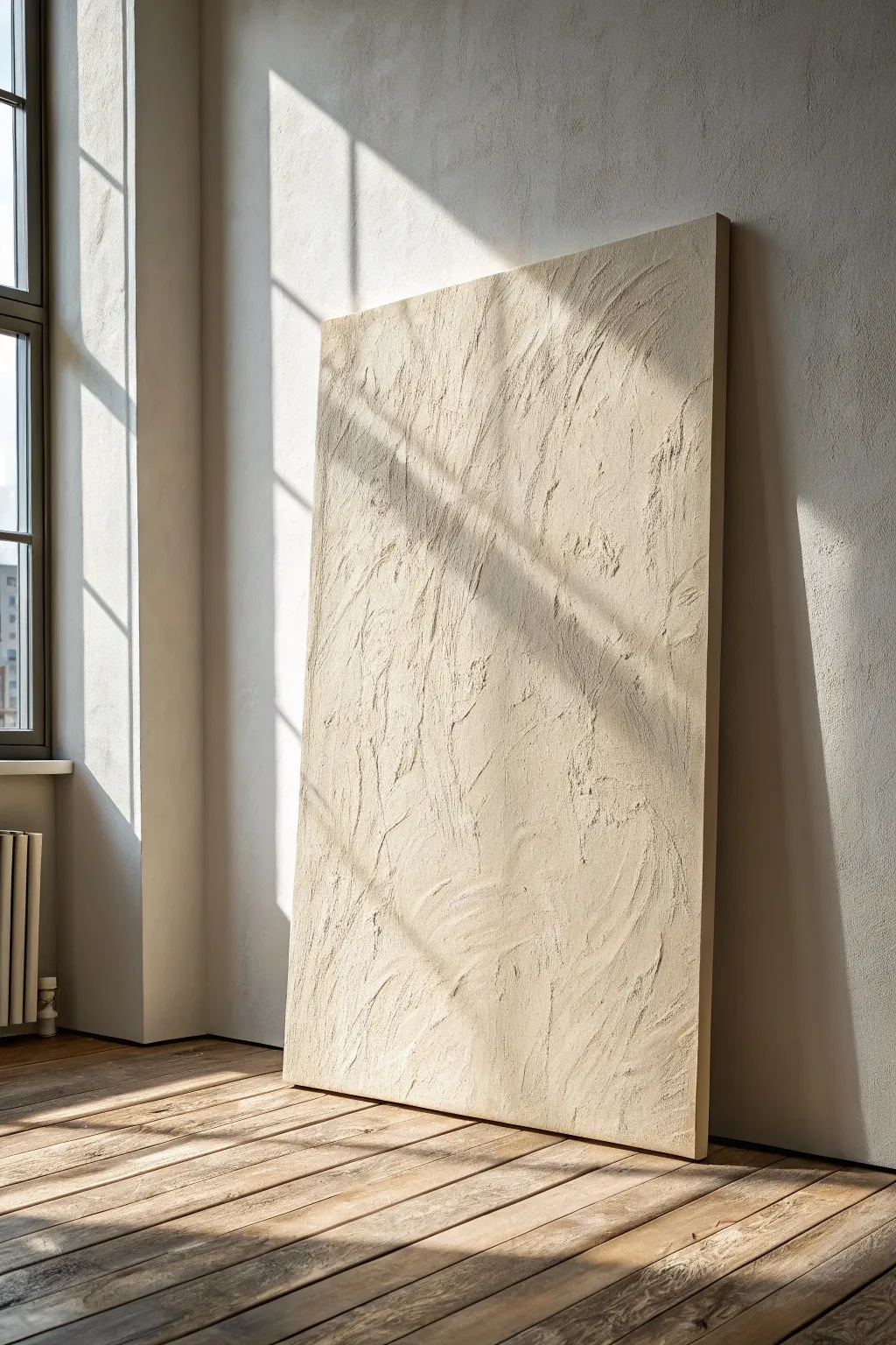
Embrace the beauty of raw texture with this sophisticated, tone-on-tone wall art that relies on shadow and light rather than pigment for its impact. By using joint compound or modeling paste, you’ll create a sculptural, monochromatic masterpiece that brings organic warmth to modern spaces.
Step-by-Step
Materials
- Large stretched canvas (gallery wrapped preferred)
- White gesso primer (if canvas is raw)
- Joint compound or thick modeling paste (roughly 1 quart for a large canvas)
- Matte acrylic paint (cream, beige, or off-white)
- Wide putty knife or drywall taping knife (6-inch)
- Smaller palette knife (for details)
- Wide flat paintbrush (3-4 inch)
- Drop cloth
- Sandpaper (fine grit, optional)
- Matte spray varnish
Step 1: Preparation & Base
-
Secure the workspace:
Lay down your drop cloth in a well-ventilated area. This project can get messy with the plaster, so protect your floors. -
Support the canvas:
If your canvas is very large, place a stack of books or a wood block underneath the center of the canvas fabric from the back. This prevents the canvas from sagging under the weight of the wet compound. -
Prime the surface:
If your canvas isn’t pre-primed, apply a coat of white gesso and let it dry completely. This ensures the joint compound adheres properly without soaking into the fibers. -
Mix the medium:
Open your joint compound or modeling paste. If you want the color integrated directly, mix your acrylic paint into the paste now until you achieve a uniform beige tone. I prefer mixing it in for depth, even if painting over later.
Cracking Up?
Thick plaster often cracks while drying. Minimize this by drying away from direct heat or sun. If deep cracks form, turn them into ‘kintsugi’ gold veins or simply fill with more paste.
Step 2: Creating the Texture
-
Apply the initial layer:
Scoop a generous amount of compound onto the canvas using the wide putty knife. Spread a thin, even layer across the entire surface to act as a ‘wet bed’ for the texture. -
Start the sweeping motions:
Working while the base is wet, add more compound to your knife. use long, vertical sweeping motions starting from the top and pulling down. Don’t aim for perfection; irregularities create the shadows. -
Vary angle and pressure:
Tilt your knife slightly to scrape areas back, revealing previous layers, and flatten the knife to deposit thick ridges. This push-and-pull creates the organic, stone-like aesthetic. -
Add directional flow:
Look at the inspiration image—notice the slight diagonal drift? Mimic this by angling your major strokes slightly from top-left to bottom-right to create movement. -
Detail with the palette knife:
Switch to the smaller palette knife to add specific areas of focused texture or to break up large flat spots. Use the edge of the knife to create thin, sharp ridges. -
Check the edges:
Don’t forget the sides of a gallery-wrapped canvas. Smooth the compound over the edges for a finished, professional look that doesn’t require framing. -
Review and refine:
Step back five feet. Look for areas that seem too smooth or repetitive. Go back in and disrupt those patterns with quick, confident scrapes.
Add Organic Grit
Before applying the paste, mix in a handful of clean sand or coffee grounds. This adds a grainy micro-texture that looks incredible when highlighted with dry-brushing.
Step 3: Drying & Finishing
-
Allow for deep drying:
This is crucial: Let the canvas dry flat for at least 24-48 hours. The thick areas of compound need significant time to cure to prevent cracking. -
Check for cracks:
Once dry, inspect the surface. If hairline cracks appear (common with thick applications), fill them with a tiny amount of fresh compound and let dry again. -
Light sanding (Optional):
If there are incredibly sharp peaks that look dangerous or fragile, lightly knock them down with fine-grit sandpaper. Wipe away the dust with a dry cloth. -
Apply the color coat:
Using the wide flat brush, paint the entire surface with your matte beige or cream acrylic. Use a stippling motion to get paint into the deep crevices of the texture. -
Dry brush highlights:
For extra dimension, mix a slightly lighter shade of your base color. Dip a dry brush into it, wipe most off, and lightly drag it over just the highest ridges of texture. -
Seal the work:
Finish with a matte spray varnish. This protects the porous compound from dust and moisture without adding an unwanted glossy sheen.
Hang your textured canvas near a window where the changing daylight will constantly reinvent the shadows across your artwork
Geometric Canvas Art With Clean Lines
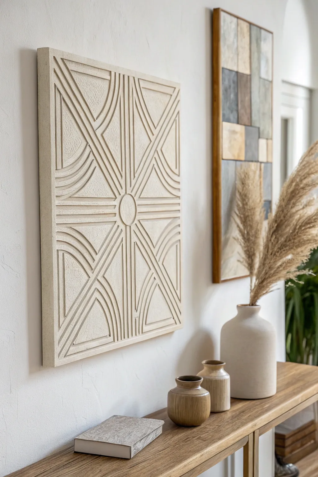
Bring sophisticated texture to your walls with this sculptural, monochromatic masterpiece that mimics the look of carved stone or plaster. This project combines simple geometric forms with a rich, gritty texture to create a stunning focal point that feels both modern and artisanal.
How-To Guide
Materials
- Large square wood panel or heavy-duty canvas (24×24 or larger)
- Thin wooden dowels or square balsa wood strips
- Flexible foam molding trim (half-round or quarter-round)
- Wood glue or heavy-duty construction adhesive
- Joint compound or premixed spackle
- Plaster of Paris (powder)
- Sand (fine grain) or texture medium
- Compass or string and pencil
- Ruler or T-square
- Utility knife or miter shears
- Wide putty knife
- Cheap chip brushes (2-inch)
- Matte cream or beige spray paint
- Matte acrylic paint (color match to spray paint)
- Small round wooden disc (for the center)
Step 1: Planning and Layout
-
Prepare the base:
If using a wood panel, ensure the surface is clean and lightly sanded. If using a canvas, reinforce the back with extra cardboard or plywood to prevent sagging under the weight of the plaster later. -
Draw the center:
Find the exact center of your square panel by measuring corner to corner. Mark this spot clearly with a pencil. -
Create the main X:
Draw straight lines from corner to corner, passing through your center mark, dividing the square into four equal triangles. -
Outline the quadrants:
Draw a vertical line and a horizontal line through the center point, creating a cross that divides the panel into four squares. This gives you the basic 8-point star structure needed for the design.
Step 2: Building the Structure
-
Attach the center:
Glue the small round wooden disc directly onto the center mark. This will serve as the anchor for all your radiating lines. -
Place the straight lines:
Measure and cut your square balsa strips or dowels to fit along the pencil lines you drew for the ‘X’ and the cross. Glue these down firmly working outward from the center disc. -
Plan the curves:
The semicircles create the scalloped effect. Use a compass (or string) anchored at the midpoint of each side edge of the panel to sketch the concentric curved paths connecting the diagonal spokes. -
Measure the flexible trim:
Take your flexible foam molding. Measure pieces that will fit into those curved pencil paths. You will need multiple concentric arcs for each quadrant. -
Glue the curves:
Apply adhesive to the back of the flexible trim. Gently bend them to follow your curved lines and press them firmly onto the board. Use painter’s tape to hold them in place while the glue sets if they try to spring back. -
Fill the gaps:
Double-check that all trim pieces adhere well. If there are small gaps where the curves meet the straight spokes, fill them with a dab of wood filler or caulk for a seamless look.
Cracking Up?
If your joint compound cracks significantly while drying, don’t panic. Mix a thinner batch of compound and brush it into the cracks, then repaint. A few hairline cracks actually add to the aged stone look.
Step 3: Creating the Texture
-
Mix the texture paste:
In the mixing bucket, combine joint compound with a handful of sand or texture medium. I find adding a little Plaster of Paris powder helps it harden faster and more durably. -
Apply the base coat:
Using a chip brush, apply a thick layer of your textured mixture over the entire piece. Don’t be shy—cover the wood, the canvas, and all the trim pieces. -
Stipple for effect:
While the compound is wet, use the bristles of the brush in a pouncing motion (stippling) to create a rough, stone-like surface. This hides the fact that the materials underneath are just wood and foam. -
Refine the lines:
Run a gloved finger or a smaller tool along the deep crevices between the trim pieces to ensure the design remains crisp and doesn’t get clogged with too much plaster. -
Let it cure completely:
Let this layer dry for at least 24 hours. It will turn opaque white and feel hard to the touch when ready. -
Sand high spots:
Lightly knock down any overly sharp peaks or rough blobs with fine-grit sandpaper, but leave the majority of the texture intact.
Pro Tip
Use self-adhesive weather stripping foam instead of wood molding for the curves. It’s cheaper, incredibly flexible, and the texture paste covers it perfectly.
Step 4: Painting and Finishing
-
Apply the base color:
Take your matte spray paint in cream or beige and coat the entire artwork. Spray from multiple angles to get inside all the nooks and crannies of the relief pattern. -
Add dimension:
Mix a slightly darker beige acrylic paint with water to create a wash. Brush this over the texture and immediately wipe the high points with a rag. This settles dark pigment into the holes, enhancing the stone effect. -
Final dry brush:
Once the wash is dry, use a dry brush with a very light, almost white paint to hit just the very tops of the curved ridges. This highlight makes the geometric pattern pop.
Hang your new textural art piece in a well-lit spot to let the shadows play across the intricate surface
Moody Color Wash Canvas for Drama
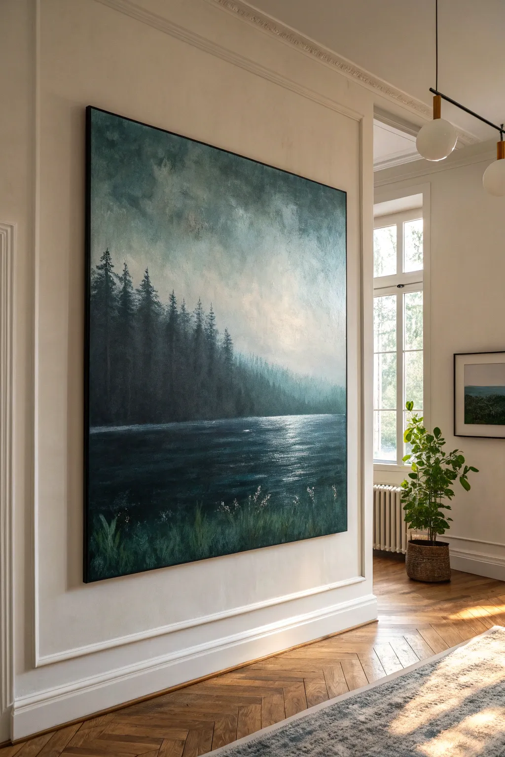
Bring the serene drama of twilight to your space with this oversized canvas project. By layering deep teals, forest greens, and soft grays, you’ll create an atmospheric landscape where the water meets a misty treeline.
Step-by-Step
Materials
- Large painter’s canvas (minimum 36×48 inches)
- Acrylic paints (Phthalo Green, Prussian Blue, Payne’s Grey, Titanium White, Mars Black, Burnt Umber)
- Wide flat wash brushes (2-3 inches)
- Assorted round brushes (sizes 4, 8, and 12)
- Fan brush
- Palette knife
- Acrylic matte medium or glazing liquid
- Water spray bottle
- Paper towels or rags
- Easel or large drop cloth for floor work
Step 1: Setting the Atmosphere
-
Prime the Surface:
Even if your canvas is pre-primed, apply a thin wash of Payne’s Grey mixed with a lot of water. This kills the stark white and establishes the cool, moody undertone visible throughout the piece. -
Establish the Horizon:
Using a ruler or painter’s tape, lightly mark your horizon line about one-third of the way up from the bottom. This separates your water from your forest and sky. -
Sky Gradient Base:
Mix Titanium White with a touch of Payne’s Grey and a tiny drop of Phthalo Green. Using a wide wash brush, paint the upper third of the canvas, keeping strokes loose and swirling. -
Deepening the Sky:
While the sky paint is still damp, blend in darker grey-blue tones near the top corners and edges. Use a dry brush to soften the transition into the lighter center area, creating a vignette effect. -
Adding Cloud Texture:
Dab a scrunched-up paper towel or a dry round brush dipped in diluted white paint onto the sky area to suggest soft, diffusing clouds. Keep the edges blurry for a misty look.
Fixing Muddy Colors
If your greens and greys turn brown or muddy, stop and let the layer dry completely. Acrylics blend wet-on-wet, but overworking them destroys clarity. Repaint fresh color over the dry mistake.
Step 2: The Forest Line
-
Blocking the Trees:
Mix a dark forest color using Phthalo Green, Mars Black, and a touch of Burnt Umber. Using a medium flat brush, block in the main treeline shape right above the horizon, varying the heights. -
Creating Distance:
For the trees further back (the right side of the painting), mix more white and grey into your green. This lighter, cooler color mimics atmospheric perspective, making the forest look like it’s fading into fog. -
Detailing Pine Tops:
Switch to a fan brush or a small round brush. Using the dark green mix, tap lightly along the top edge of your treeline to create the jagged, pointed silhouettes of pine trees. -
Vertical texture:
Drag a dry, stiff brush vertically downward through the dark tree mass. This suggests trunks and dense foliage without needing to paint every single branch.
Step 3: The Water and Foreground
-
Water Base Layer:
Paint the bottom third of the canvas with a mix of Prussian Blue and Mars Black. Ensure horizontal brushstrokes here to distinguish the water surface from the sky and trees. -
Reflecting the Light:
Where the sky is brightest, mix Titanium White with a little glazing liquid. Use a flat brush to lightly drag horizontal streaks across the dark water, mimicking moonlight hitting the ripples. -
Deepening Shadows:
Glaze a thin layer of pure black along the very bottom edge and the immediate shoreline to anchor the painting and increase contrast. -
Foreground Vegetation:
Load a size 8 round brush with varied greens (mix yellow into your dark green). Use quick, upward flicking motions at the very bottom left and right to create tall grasses. -
Adding Wildflowers:
I particularly enjoy this final detail: take a small detail brush with pure white paint and dot tiny clusters on the tips of some grass blades to represent small wildflowers catching the last light. -
Final Glaze:
Once fully dry, apply a very thin wash of Phthalo Green and glazing medium over the entire canvas (except the brightest white water highlight) to unify the colors.
Level Up: Gallery Frame
For a truly high-end look, build a simple float frame from thin oak lattice strips. Leave a 1/4 inch gap between the canvas edge and the wood to let the artwork ‘breathe’ inside the frame.
Step back and admire how your new oversized landscape transforms the room with its quiet, mysterious depth
Abstract Florals on Canvas for Soft Energy
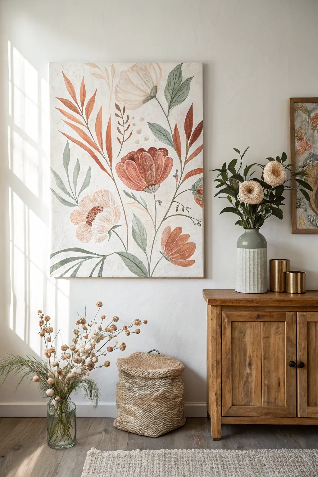
Bring the calming influence of nature indoors with this large-scale botanical painting featuring soft earth tones and organic shapes. Using acrylics on a textured canvas, you’ll create oversized, stylized florals that feel both modern and refreshingly vintage.
Step-by-Step Tutorial
Materials
- Large stretched canvas (at least 24×36 inches)
- Acrylic paints: Burnt Sienna, Terra Cotta, Sage Green, Olive Green, Cream, White, Raw Umber
- Gesso (optional, for extra texture)
- Large flat brushes (1-2 inch)
- Medium filbert brushes
- Fine liner brush for details
- Palette knife
- Pencil
- Water cup and paper towels
- Matte varnish
Step 1: Preparation & Background
-
Prime with texture:
Begin by applying a coat of white gesso to your canvas. If you want that slightly aged, fresco-like appearance seen in the photo, apply the gesso unevenly with a palette knife or a coarse brush to build up subtle ridges. -
Create the base tone:
Mix a large amount of white paint with a tiny drop of Cream and the smallest hint of Raw Umber. You want a warm, off-white background that isn’t stark bright white. -
Apply the background:
Cover the entire canvas with your off-white mixture. Use broad, sweeping strokes. Don’t worry about perfection; a little variation in the white adds to the organic feel. Let this dry completely before sketching.
Step 2: Composition & Sketching
-
Plan the flow:
Visualize a diagonal flow for your composition. In the reference, the stems generally reach upward and outward, creating a fan-like shape. -
Sketch the main stems:
Lightly draw three to four main curved lines starting from the bottom center area, reaching up towards the top corners. These will anchor your flowers. -
Outline the blooms:
Sketch large, cup-shaped flowers. Place a large focal bloom slightly right of center, a softer peony-style bloom on the left, and smaller buds near the edges. Keep the shapes loose and simple. -
Add foliage:
Draw long, lance-shaped leaves extending from the stems. Vary their sizes, making some reach high like feathers and others curve downwards near the base.
Uneven Coverage?
If your large petals look streaky, don’t worry. This painterly look adds charm! If you want them solid, wait for the first layer to dry completely before adding a second coat.
Step 3: Painting the Florals
-
Mix the rust tones:
Create a palette of warm, earthy reds. Mix Terra Cotta with a little White for a soft clay color, and have pure Burnt Sienna ready for darker areas. -
Block in the main flowers:
Using a filbert brush, paint the petals of the large right-side flower. Use the clay mixture for the general shape, leaving small gaps between petals to keep it airy. -
paint the softer bloom:
For the left-side flower, mix mostly White with a touch of Terra Cotta for a very pale peach tone. Paint rounded, scalloped strokes to suggest layers of soft petals. -
Add depth to petals:
While the paint is still slightly tacky, streak in small amounts of the darker Burnt Sienna at the base of the petals and lighter Cream at the tips to create volume. -
Paint the bottom bud:
For the lower right flower, use a slightly more saturated orange-rust tone. Paint this one facing upward, using broad strokes to define the cup shape.
Vintage Patina
Create a ‘tea stain’ wash by mixing a tiny drop of brown paint with lots of water. Lightly brush this over the dried background corners for an aged, antique paper look.
Step 4: Adding Greenery & Details
-
Mix foliage greens:
Prepare two green mixtures: a muted Sage Green (mix Green + extended White + tiny touch of Black) and a deeper Olive Green. -
Paint the leaves:
Fill in your leaf sketches. I find it works best to use the lighter Sage Green for the majority of the leaves to keep the artwork feeling light and airy. -
Accentuate with dark green:
Use the deeper Olive Green for a few select leaves, particularly those near the top right, to create visual contrast and balance the warmth of the flowers. -
Define the stems:
Using a smaller round brush or liner brush, trace over your stem lines with a mix of Olive Green and Raw Umber. Keep the lines thin and elegant. -
Create flower centers:
For the pale flower on the left, stipple (dot) a center using Burnt Sienna and a dark brown. For the red flowers, paint tight inner petals or simple dark shading at the base. -
Add delicate details:
Look for empty spaces and add tiny sprigs or dots. Mix a golden ochre color and paint small floating circles or ‘pollen’ dots near the top center for whimsy. -
Refine edges:
Step back and look at your work. If any edges look too sharp, use a clean, damp brush to gently soften them into the background for that watercolor-like effect. -
Seal the work:
Once the painting is fully dry (give it at least 24 hours), apply a coat of matte varnish to protect the surface without adding unwanted shine.
Hang your masterpiece in a bright room to let those warm earth tones truly glow.
Minimal Line Art on Canvas
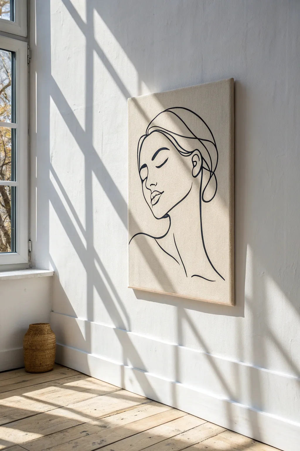
Embrace the elegance of simplicity with this stunning line-art canvas project. Using bold, flowing strokes on a textured neutral background, you will create a modern masterpiece that looks effortlessly chic in any sunlit room.
Step-by-Step
Materials
- Large stretched canvas (24×36 inches or larger)
- Unbleached cotton or linen fabric (enough to wrap canvas)
- Heavy-duty staple gun and staples
- Fabric scissors
- Carbon transfer paper
- Pencil and eraser
- Black acrylic paint (high flow or fluid heavy body)
- Round synthetic brush (size 4 or 6)
- Easel or flat work surface
- Clear spray varnish (matte finish)
Step 1: Preparing the Canvas
-
Cut the fabric:
Lay your unbleached cotton or linen fabric face down on a clean floor or large table. Place your canvas face down in the center of the fabric. Trim the fabric edges, leaving about 3 to 4 inches of excess material on all sides for wrapping. -
Secure the first side:
Pull the fabric taut over one long side of the wooden frame. Using your staple gun, secure the fabric to the back of the frame, placing a staple every 2 inches. Start from the center and work your way out toward the corners. -
Stretch and staple the opposite side:
Move to the opposite long side. Pull the fabric very tight—this is crucial to avoid wrinkles later. Staple from the center outwards, mirroring your work on the first side. -
Finish the short sides:
Repeat the stretching and stapling process on the two shorter sides. Ensure the tension is even across the entire surface so the fabric acts like a drum skin. -
Fold the corners:
Create neat hospital corners with the excess fabric. Fold the loose fabric diagonally, tuck the flap under, and pull it tight against the frame before stapling it down securely.
Smoother Curves Pro Tip
Mix a flow improver medium into your acrylic paint instead of water. This increases the paint’s fluidity without breaking the binder, allowing for long, unbroken brushstrokes.
Step 2: Drafting the Design
-
Sketch or print your reference:
Find a minimalist line art face design you love. If you aren’t confident drawing freehand, print the design to the desired scale using a ’tiled printing’ website to spread it across multiple pages, then tape them together. -
Position the transfer paper:
Place sheets of carbon transfer paper (dark side down) onto your fabric canvas where you want the face to appear. Tape them lightly in place so they don’t shift. -
Lay the template:
Position your printed design directly over the carbon paper. Secure it with tape. If drawing freehand, skip the carbon paper and sketch very lightly directly on the fabric with a pencil. -
Trace the design:
Using a pencil or stylus, trace over the lines of your design with firm pressure. This transfers the image onto the textured fabric. Lift a corner periodically to ensure the transfer is visible but not messy. -
Refine the sketch:
Remove the paper and carbon sheets. Inspect your transferred lines. If any areas are faint due to the fabric texture, lightly reinforce them with a pencil so you have a clear guide for painting.
Step 3: Painting the Lines
-
Prepare the paint:
Squeeze black acrylic paint onto a palette. Add a tiny drop of water if using heavy body paint; you want an ink-like consistency that flows smoothly off the brush without dripping. -
Load the brush:
Fully saturate a size 4 or 6 round synthetic brush. High-quality synthetic bristles provide the snap needed for controlling curves. -
Begin with the profile:
Start painting at the forehead and nose line. Maintain consistent pressure to keep the line width uniform. I find it helpful to lock my wrist and move my whole arm to get smoother curves. -
Paint the facial features:
Carefully paint the closed eye and lips. These areas often require tapering the line—lift the brush slightly as you end a stroke to create a delicate point. -
Connect the hair and neck:
Complete the sweeping curves of the hair and neck. If your brush runs dry, stop at a natural intersection or corner before reloading to hide the join. -
Review and touch up:
Step back to view the canvas from a distance. Check for uneven line weights or skipped spots where the fabric texture hindered the paint coverage. Fill these in carefully. -
Erase guidelines:
Once the paint is completely dry (give it at least an hour), gently erase any visible pencil marks. Be gentle to avoid abrading the fabric surface. -
Seal the artwork:
Take the canvas outdoors or to a well-ventilated area. Spray a light, even coat of matte varnish over the piece to protect the fabric from dust and UV fading.
Shaky Hands Troubleshooting
Use a mahl stick or steady your painting hand against a dry section of the canvas with your pinky finger. This acts as an anchor point, giving you much more control over fine details.
Hang your beautiful new artwork in a spot with natural light to highlight the texture of the linen.
Abstract “Marble” Swirl Canvas Effects
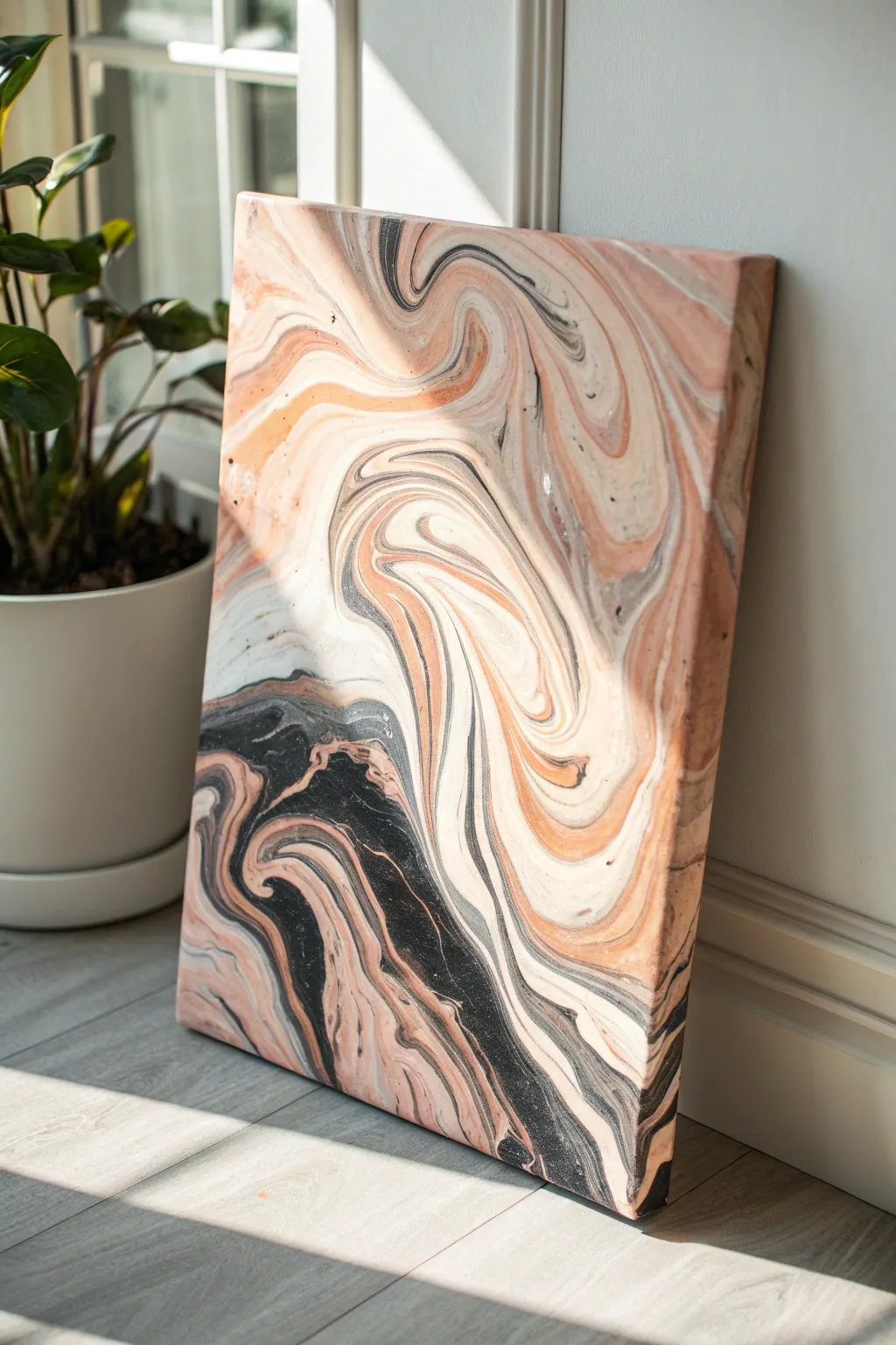
Capture the elegance of natural stone with this fluid art technique that creates mesmerizing ribbons of peach, black, and cream. The result is a sophisticated, high-gloss statement piece that looks completely different every time you create it.
Step-by-Step Tutorial
Materials
- Stretched canvas (rectangular)
- Acrylic paints (Titanium White, Mars Black, Peach/Salmon, Pearl White)
- Pouring medium (Liquitex or Floetrol)
- Silicone oil (optional, for cells)
- Plastic cups (one per color + one large cup)
- Wooden stir sticks
- Drop cloth or plastic sheet
- Gloves
- Crème Brûlée torch or heat gun (optional)
- High-gloss varnish
Step 1: Mixture Preparation
-
Set up your workspace:
Cover your entire work surface with a drop cloth or heavy plastic sheeting. Elevate your canvas by placing it on four upside-down cups to allow paint to drip off the edges freely. -
Mix the paint base:
In separate plastic cups, mix each acrylic paint color with your chosen pouring medium. A standard ratio is 1 part paint to 2 parts medium, but follow the specific instructions on your medium’s bottle. -
Check consistency:
Stir the paints thoroughly until they are smooth. You want a consistency similar to warm honey; if the paint is too thick, add a few drops of water at a time until it flows easily off the stick. -
Add silicone (optional):
For more organic ‘cells’ or bubbles within the marble pattern, add 1-2 drops of silicone oil to the peach and black mixtures. Stir very gently just once or twice—don’t overmix.
Clean Edges Trick
Apply painter’s tape to the entire underside of the canvas before pouring. Once the painting is dry, peel off the tape to remove dried drips for a professional back.
Step 2: The Dirty Pour Technique
-
Layer the wash cup:
Take a large empty cup. Pour a generous amount of white paint into the bottom to serve as your base. -
Add contrasting ribbons:
Slowly pour the black paint down the side of the cup, layering it on top of the white. Do not stir. -
Introduce the color:
Pour the peach/salmon color into the center of the cup. Follow this with a layer of the pearl white or grey to add dimension. -
Repeat layers:
Continue layering your colors—white, black, peach—until the cup is nearly full. Varying the amount of each pour will create different line weights in the final piece. -
Prepare the flip:
Place the canvas face-down on top of your full cup. Holding the cup tight against the canvas surface, quickly flip both over so the cup is upside down on the canvas. -
Wait and lift:
Let the cup sit for a moment to allow the paint to settle. Gently lift the cup straight up to release the puddle of paint onto the center of the canvas.
Step 3: Creating the Marble Effect
-
Tilt the canvas:
Gently pick up the canvas and begin tilting it slowly in a circular motion. Watch as the paint stretches and flows toward the edges. -
Guide the flow:
Direct the paint to cover each corner. I like to let the paint run off the edges slightly to ensure the sides are fully coated, which gives it a professional finished look. -
Create distinct ribbons:
Tilt the canvas back and forth to stretch out the pools of color. This stretching action is what transforms blobs of paint into the elegant, elongated marble veins seen in the photo. -
Manage the black:
Be careful when tilting the areas with heavy black paint; try to keep them somewhat contained so they don’t overpower the delicate peach tones. -
Pop air bubbles:
If you see small air bubbles disrupting the surface, quickly pass a heat gun or torch over the wet paint. This will pop the bubbles and may bring up small cells if you used silicone. -
Check the edges:
Use your finger to dab dripped paint onto any bare spots along the sides or corners of the canvas.
Add Metallic Flair
Mix a small amount of gold metallic powder into your clear pouring medium and drizzle it into your layered cup last for stunning, glittering veins.
Step 4: Drying and Sealing
-
Let it cure:
Allow the painting to dry undisturbed for at least 24 to 48 hours. Ensure the room is well-ventilated and dust-free. -
Clean surface:
If you used silicone oil, gently wipe the dried surface with a slightly damp cloth with a drop of dish soap to remove oily residue before varnishing. -
Apply varnish:
Once fully cured and clean, apply a coat of high-gloss varnish to protect the paint and give it that polished, wet-stone appearance.
Hang your unique abstract creation in a sunny spot to let the light catch those fluid textures
Palette Knife Canvas for Bold Texture
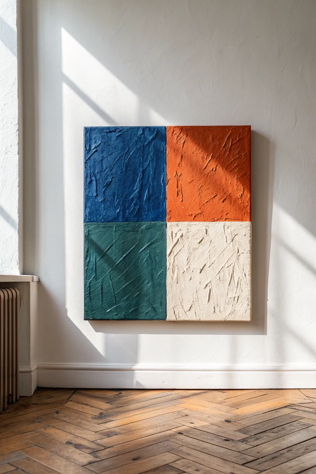
This striking four-color canvas relies on heavy texture and bold color blocking to create a modernist statement piece. Using modeling paste and a palette knife, you’ll sculpt deep peaks and valleys that catch the light beautifully.
How-To Guide
Materials
- Square canvas (24×24 or 30×30 inches recommended)
- Heavy body acrylic paints: Deep Navy Blue, Burnt Orange/Terracotta, Forest Green, Cream/Titanium White
- Modeling paste or texture gel (matte finish)
- Large palette knife (trowel shape)
- Painter’s tape or masking tape (1 inch wide)
- Ruler or measuring tape
- Pencil
- Disposable mixing surface or palette
- Drop cloth
Step 1: grid preparation
-
Measure the midpoint:
Lay your canvas flat on a protected surface. Using your ruler, find the specific center point of the top edge and mark it lightly with a pencil. -
Mark the vertical line:
Repeat this measurement on the bottom edge. Draw a very light vertical line connecting the top and bottom marks to split the canvas in half. -
Establish the horizontal line:
Measure the exact center of the left and right edges. Connect these points with a light pencil line to create a perfect cross, dividing your canvas into four equal quadrants. -
Mask the vertical axis:
Apply a strip of painter’s tape directly over your vertical pencil line. Ensure the tape is centered so the line runs perfectly beneath its middle. -
Mask the horizontal axis:
Apply a second strip of painter’s tape horizontally over your other pencil line. This creates a clean separation between your future color blocks.
Peak Preservation
Don’t overwork the paste once applied. The more you swipe, the flatter it gets. Make one confident stroke and leave it to keep those high ridges.
Step 2: creating the texture mix
-
Scoop the paste:
Place a generous dollop of modeling paste onto your mixing palette—about the size of a lemon for one quadrant. -
Add the first color:
Squeeze your Deep Navy Blue acrylic paint into the paste. The ratio should be roughly 70% paste to 30% paint to maintain the thick structural integrity. -
Mix thoroughly:
Use your palette knife to fold the color into the paste until the hue is uniform. If the color looks too pale, add a bit more paint, but be careful not to reinvent the consistency into a runny fluid.
Metallic Upgrade
For a luxe twist, lightly brush gold leaf adhesive over the highest dried peaks of the ridges and apply gold foil for shimmer.
Step 3: applying the impasto
-
Apply the blue quadrant:
Scoop the blue mixture onto your knife and apply it to the top-left quadrant. Spread it thickly, extending right up onto the masking tape boundaries. -
Sculpt the ridges:
Use the edge of your knife to press into the wet paste and lift up quickly, or drag the knife at random angles to create deep chaotic ridges. -
Mix the orange:
Clean your knife. Repeat the mixing process with the Burnt Orange paint and fresh modeling paste. -
Fill the top right:
Apply the orange mixture to the top-right quadrant. Create texture strokes that oppose the direction of the blue side for visual interest. -
Apply the green section:
Mix your Forest Green with paste. Apply this to the bottom-left quadrant, ensuring the texture is just as thick and raised as the top sections. -
Finish with cream:
Mix the Cream/Titanium White paint with paste. Fill the final bottom-right quadrant. I usually make this section slightly smoother but still retain distinct knife marks.
Step 4: finishing touches
-
Remove the tape while wet:
This is crucial: carefully peel away the painter’s tape while the paste is still wet. Pull the tape away from the canvas at a 45-degree angle to ensure sharp, crisp lines between colors. -
Touch up edges:
If the tape pulled up any major chunks, use a small, clean palette knife to gently push the paste back into a straight line. -
Dry partially:
Allow the canvas to sit undisturbed for about 24 hours. The surface will skin over, but the inside will still be soft. -
Paint the gallery edges:
Once the top is touch-dry, paint the sides of the canvas canvas to match the adjacent quadrant colors for a seamless, professional finish. -
Full cure:
Let the piece cure fully for 2-3 days before hanging, as thick modeling paste holds moisture longer than standard acrylics.
Hang your textured masterpiece where side-lighting will hit the canvas and emphasize the dramatic shadows you created
Painted Edge Canvases for a Finished Look
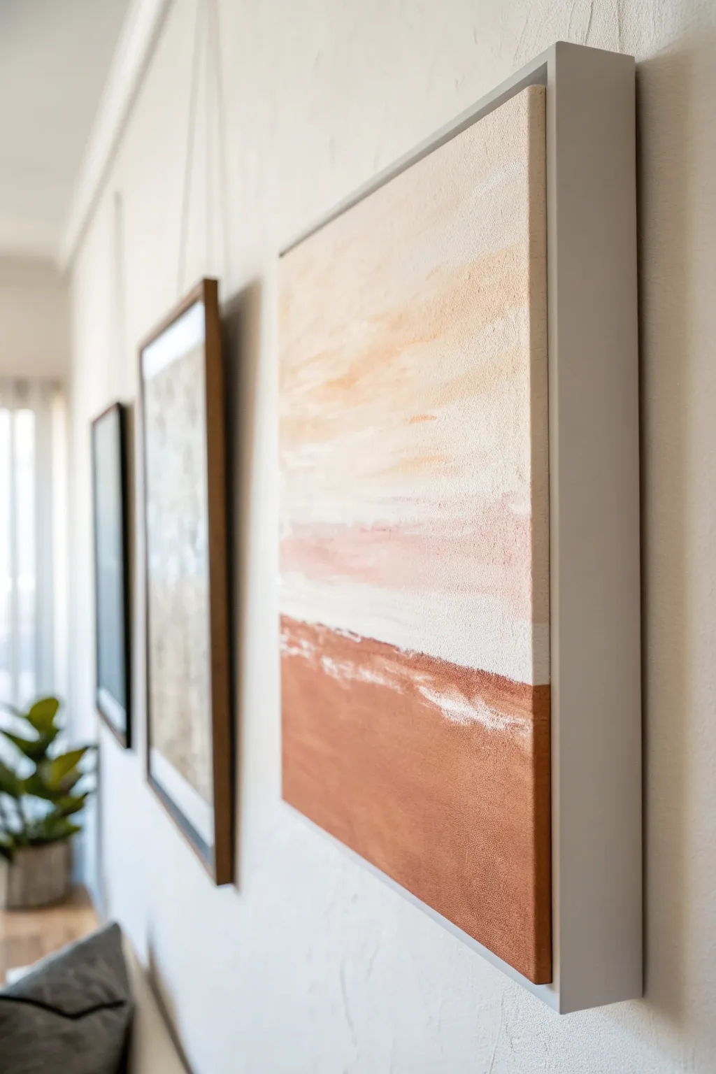
Create a high-end gallery look in your own home with this textured abstract landscape painting, finished with a crisp floater frame. The serene palette of terracotta, cream, and soft peach brings warmth while the floating design adds professional sophistication.
Step-by-Step
Materials
- Large square gallery-wrapped canvas (approx. 24×24 inches)
- White gesso
- Heavy body acrylic paints (Titanium White, Burnt Sienna, Yellow Ochre, Unbleached Titanium)
- Texture paste or modeling paste
- Large flat paintbrush (2-3 inches)
- Palette knife
- Floater frame kit (measured to fit your canvas depth)
- Wood glue or framing hardware
- Fine grit sandpaper
- Painter’s tape
Step 1: Preparing the Surface
-
Prime the canvas:
Begin by applying a generous coat of white gesso over the entire canvas surface. While many canvases come pre-primed, adding this extra layer ensures a smoother glide for your heavy body paints later. -
Add texture:
Mix a dollop of modeling paste with a little gesso. Using a palette knife, spread this mixture across the canvas in horizontal sweeping motions. Don’t aim for perfect flatness; the goal is to create subtle horizontal ridges that will catch the light. -
Let it cure:
Allow the texture layer to dry completely, typically overnight. It should be hard to the touch. -
Sand lightly:
Once dry, run a piece of fine-grit sandpaper gently over the surface to knock down any overly sharp peaks, ensuring a pleasant texture rather than a rough one.
Uneven Paint Coverage?
If the texture makes it hard to fill the valleys, add a little water to your paint for the first layer, then go over with thicker paint to hit the high points.
Step 2: Painting the Abstract Composition
-
Mix the base terracotta:
On your palette, mix Burnt Sienna with a touch of Unbleached Titanium to create a warm, earthy terracotta hue. This will be the darkest tone at the bottom. -
Apply the bottom block:
Use your large flat brush to paint the bottom third of the canvas with the terracotta mix. Paint in horizontal strokes, allowing the texture of the canvas to show through slightly. -
Create the horizon:
Without cleaning your brush thoroughly, dip into Titanium White. Where the terracotta section ends, blend the white upwards to create a transitional, slightly messy horizon line. I like to let the brush run dry here for a scratchy, organic look. -
Mix the sky tones:
Clean your brush. Mix a large amount of Titanium White with a tiny dot of Yellow Ochre and a hint of the terracotta mix to create a very pale, warm cream color. -
Paint the upper section:
Start from the very top of the canvas and paint downwards with the cream mixture. As you approach the middle, blending towards the terracotta, the colors should meet but remain somewhat distinct. -
Enhance the transition:
Use a palette knife with pure Titanium White to scrape horizontally across the meeting point of the two colors. This creates that distinct ‘broken’ white line effect seen in the inspiration image. -
Add warmth to the sky:
While the paint is still tacky, glaze a very watered-down mix of peach (red + yellow + white) into the upper sky area for subtle variation.
Step 3: Finishing the Edges
-
Dry completely:
Ensure the front of the painting is 100% dry before flipping or handling the edges. -
Paint the canvas sides:
Extend the painting design around the sides of the canvas. The terracotta should wrap around the bottom sides, and the sky color around the top. This ensures that if viewed from an extreme angle within the frame, no raw canvas is visible. -
Clean up the back:
If any paint dripped onto the back of the canvas whilst working, clean it up or tape it off for a tidy finish.
Gallery Gold
Paint the very outer edge of the canvas (the part hidden by the frame shadow) gold or black to make the floating effect pop with hidden contrast.
Step 4: Framing
-
Prepare the frame:
If your floater frame is unfinished wood, paint or stain it now. A clean white or soft grey lacquer complements the minimalist art perfectly. Let the frame dry fully. -
Position the art:
Lay the frame face down on a clean, soft surface. Place the canvas face down inside the frame. Use spacers (often playing cards work well) to ensure the gap between the canvas and frame is even on all sides. -
Secure the canvas:
Using the offset clips or screws provided with your kit, secure the canvas to the frame from the back. Be careful not to screw through the front of the canvas. -
Final inspection:
Flip the work over and check the ‘float’ gap. It should be a uniform shadow line surrounding the artwork. -
Install hardware:
Attach D-rings and picture wire to the back of the frame, positioning the wire about one-third of the way down from the top.
Hang your new masterpiece in a well-lit spot to let the texture catch the light.
Mini Canvas Grid for Small Spaces
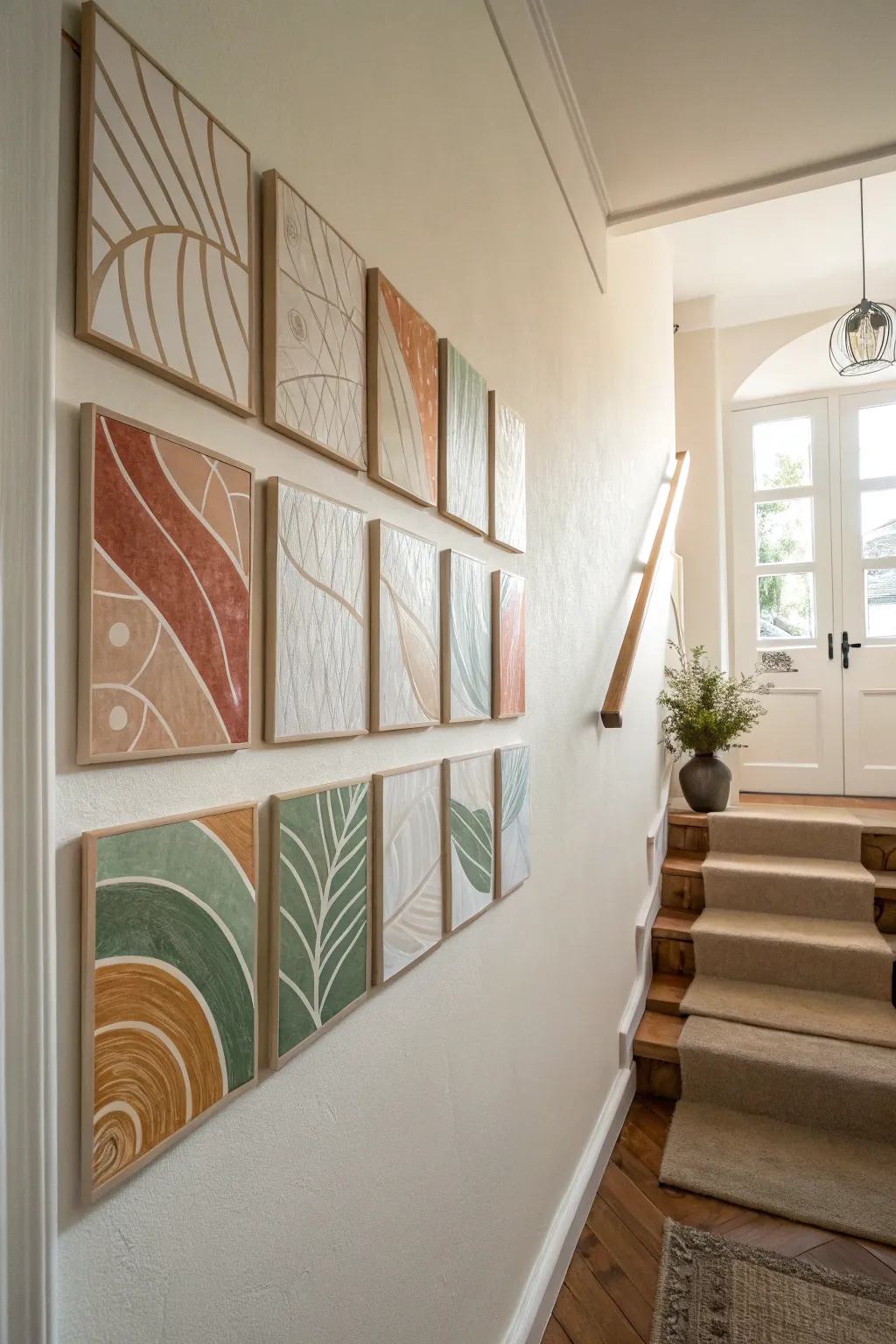
Transform a blank hallway wall with this gallery-worthy installation of mini canvases featuring organic abstract shapes and soothing earth tones. By using modeling paste and acrylics, you’ll create a cohesive, tactile series that feels custom-made for your space.
Detailed Instructions
Materials
- 12-14 mini stretched canvases (approx. 8×10 or 10×12 inches)
- Acrylic modeling paste or heavy body texture gel
- Palette knives (variety of sizes)
- Acrylic paints (terracotta, sage green, mustard yellow, beige, white, cream)
- Flat synthetic brushes (1-inch and 2-inch)
- Pencil
- Ruler or painter’s tape
- Fine-grit sandpaper
- Slim wooden float frames (optional, light oak finish)
- Level and wall mounting strips
Step 1: Preparation & Planning
-
Map out your grid:
Before touching a canvas, lay them all out on the floor in your desired grid pattern (e.g., 3 rows). Use this time to sketch a vague plan for your flow; you want the lines and shapes to feel like they travel from one canvas to the next. -
Prime the surface:
If your canvases aren’t pre-primed, apply a coat of white gesso. Even if they are, I like to add a thin layer of modeling paste mixed with white paint across the entire surface to give a subtle base texture. -
Sketch the organic lines:
Lightly draw your designs with a pencil. Focus on large, sweeping curves, leaf-like structures, and abstract hills. Allow some lines to ‘exit’ one canvas and ‘enter’ the neighbor relative to your floor layout.
Step 2: Texturing
-
Apply the raised texture:
Scoop out modeling paste with a palette knife. Apply it thickly over specific sections of your design, particularly the ‘background’ or negative space areas, to create depth. -
Create directional scratches:
While the paste is wet, use the edge of your palette knife or a stiff brush to scratch lines into the texture. Vary the direction—vertical hatching for one section, curved sweeps for another. -
Smooth the focal shapes:
Leave your main shapes (the leaves, the bold curves) relatively flat or smooth compared to the textured background. This contrast helps the design pop later. -
Let it cure fully:
This is crucial. Modeling paste can take 24 hours to dry completely if applied thickly. Don’t rush this step or the paint will crack. -
Sand rough peaks:
Once fully dry, run fine-grit sandpaper lightly over the highest peaks of the texture to knock down anything too sharp or jagged.
Dry Brushing Tip
When painting textured areas, keep your brush very dry with minimal paint. Lightly skimming the surface highlights the peaks while leaving the valleys dark.
Step 3: Painting
-
Mix your palette:
Prepare your earth tones. You want a desaturated look, so mix a touch of beige or grey into your greens and yellows to soften them. -
Paint the base blocks:
Start applying color to your defined shapes. Use your flat brushes to block in the terracotta curves, sage leaves, and mustard arches. Don’t worry about perfect edges yet. -
Layering for depth:
Once the first coat is dry, apply a second coat. For the textured areas, you might want to ‘dry brush’ a lighter shade over the top to catch the ridges of the modeling paste. -
refined the lines:
Use a smaller brush to tidy up the boundaries between colors. Add the thin white or cream defining lines that separate the color blocks, mimicking the look of stained glass or batik. -
Add detail dots:
On a few select canvases, add subtle details like small dots or circles in a contrasting cream color to break up solid blocks of color.
Cracked Paste?
If your modeling paste cracks while drying, simply fill the cracks with a little more paste, smooth it out, and let it dry again before painting.
Step 4: Framing & Installation
-
Frame the minis:
Place each canvas into a light wood float frame. This unifies the collection and gives it a polished, high-end look. -
Mark the wall:
Measure your wall space. Mark the center point, then measure outwards to ensure equal spacing between frames (usually 2-3 inches). -
Install the grid:
Using a level, hang the first row. I find it easiest to start with the center painting and work outward. Repeat for the rows above and below.
Step back and admire how the individual pieces work together to create a stunning, cohesive wall feature
Layered Canvas Ledge Display You Can Swap
Transform a blank wall into a dynamic focal point with this custom oak picture ledge designed for effortless style updates. Its sleek profile and clever front lip keep your layered collection of framed prints and dried botanicals secure while maintaining a clean, minimalist aesthetic.
Step-by-Step
Materials
- 1×3 inch oak board (for the back mounting plate)
- 1×4 inch oak board (for the bottom shelf)
- 1×2 inch oak board (for the front lip)
- Wood glue
- 1.5-inch finishing nails or brad nails
- Medium and fine grit sandpaper (120 and 220)
- Clear matte polyurethane or wood oil
- Heavy-duty drywall anchors and screws
- Drill with countersink bit
- Stud finder
- Level
- Dried pampas grass or bunny tails
- Small ceramic vase
- Assorted picture frames (wood and black finishes)
- Art prints (seascapes and nature themes)
Step 1: Building the Ledge
-
Measure and cut:
Determine your desired ledge length based on your wall space. Cut the 1×3, 1×4, and 1×2 oak boards to this exact length using a miter saw for clean, square ends. -
Sand the components:
Before assembly, give all cut boards a thorough sanding with 120-grit paper to remove rough mill marks. Follow up with 220-grit for a furniture-smooth finish. -
Assemble the base:
Apply a bead of wood glue along the edge of the 1×4 (bottom shelf). Position it against the face of the 1×3 (back plate) so they form an ‘L’ shape. -
Secure the joinery:
Clamp the pieces together or hold firmly, then drive finishing nails through the back of the 1×3 into the edge of the 1×4. Space nails about every 6-8 inches. -
Add the front lip:
Apply glue to the front edge of the 1×4 shelf. Press the 1×2 board against this edge flush with the bottom, creating a raised lip to hold frames in place. -
Nail the lip:
Secure the front lip by nailing through the face of the 1×2 into the 1×4 shelf. For a cleaner look, I prefer to sink the nail heads slightly below the surface. -
Fill and finish:
Fill any visible nail holes with wood filler that matches your oak tone. Once dry, lightly sand the filler flush with the wood surface. -
Apply protection:
Wipe away all dust with a tack cloth. Apply two thin coats of matte polyurethane or wood oil, sanding lightly between coats to seal the wood without altering its natural color.
Seamless Joinery
For a truly invisible look, clamp the front lip while glue dries instead of nailing. The wood glue bond is often stronger than the wood itself if clamped properly.
Step 2: Installation
-
Pre-drill mounting holes:
Drill three to four holes through the back plate (the 1×3 piece). Use a countersink bit so the screw heads will sit flush and be hidden behind your artwork later. -
Find wall studs:
Use a stud finder to locate studs in your desired hanging area. Mark their positions lightly on the wall with a pencil. -
Level and mark:
Hold the ledge against the wall at your desired height. Place a level on top to ensure it’s perfectly straight, then mark your drill locations through the pre-drilled holes. -
Secure to wall:
If you aren’t hitting studs, install heavy-duty drywall anchors at your marks. Drive 2.5-inch screws through the back plate holes into the anchors or studs until tight.
Seasonal Swap
Change the vibe instantly by swapping prints for the season. Try botanical pressed leaves in autumn or black-and-white family portraits for winter.
Step 3: Styling the Display
-
Anchor with a large piece:
Place your largest framed artwork on the left side. Lean it casually against the wall; a seascape or landscape print works beautifully to set a calm tone. -
Layer simply:
Add a medium-sized frame, perhaps in a contrasting black finish, slightly overlapping the edge of the first frame. -
Mix orientation:
Incorporate a smaller, landscape-oriented frame or a square piece. Overlapping the frames creates depth and prevents the arrangement from looking too regimented. -
Introduce texture:
Place a small ceramic vase with a narrow neck on the right side. Fill it with dried pampas grass or wheat stems to add organic height and softness. -
Balance the composition:
Step back and adjust the spacing. Ensure the visual weight feels balanced between the large frame on the left and the sculptural vase on the right.
Enjoy the flexibility of rearranging your curated art collection whenever inspiration strikes.
Mixed-Media Canvas With Collage Details
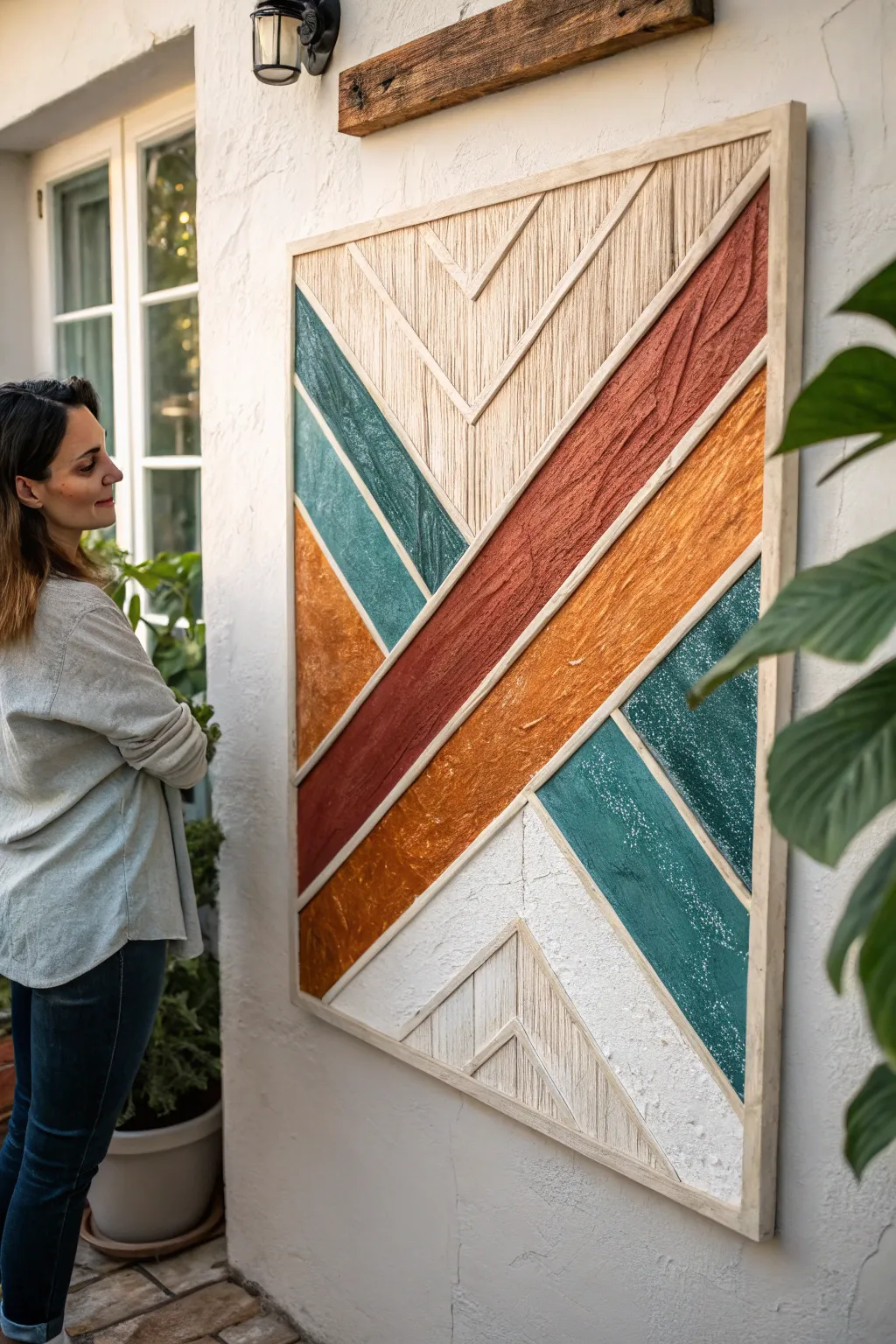
This stunning mixed-media piece combines the warmth of wood trim with distinct textured zones to create a large-scale geometric statement. The design features a bold chevron pattern balancing exposed string-art textures against rich, stucco-like painted sections in teal, burnt orange, and terracotta.
Detailed Instructions
Materials
- Large wooden canvas panel or plywood sheet (approx. 36″ x 48″)
- Square dowels or thin wood slat trim (1/4″ to 1/2″ thick)
- Wood glue
- Miter saw or hand saw with miter box
- Joint compound or texture paste
- Cotton twine or thick embroidery floss (cream/natural color)
- Acrylic paints (Teal, Burnt Orange, Terracotta/Rust, White)
- Palette knives and textured sponges
- Fine-grit sandpaper
- Strong craft glue or hot glue gun
- Pencil and straightedge ruler
Step 1: Planning and Framework
-
Prepare the base:
Start with a clean, sanded wooden panel or heavy-duty canvas. If using plain plywood, prime it with white acrylic gesso first to ensure your colors pop later. -
Draft the design:
Using your straightedge and pencil, lightly sketch the large chevron pattern directly onto the base. Find the vertical center line to ensure your ‘V’ shapes are symmetrical. -
Cut the primary dividers:
Measure and cut your wood slat trim to fit the pencil lines you just drew. These slats will act as borders between the different colors and textures. -
Secure the dividers:
Apply wood glue to the back of each slat and press them firmly onto your pencil lines. Wipe away any squeezing glue immediately with a damp cloth and let this dry completely before moving on.
Fixing Cracks
Thick texture paste often cracks while drying. Don’t panic; just mix a thinner batch of colored paste and fill the cracks, or embrace the aged look.
Step 2: Creating the Linear Texture
-
Identify the string zones:
Select the top central ‘V’ section and the bottom central pyramid shape for the string art texture. These areas mimic vertical wood grain or fabric. -
Apply glue base:
Work in small 2-inch sections. Apply a generous layer of craft glue or wood glue within the selected zone. -
Lay the twine:
Cut lengths of cotton twine to fit the space exactly vertically. Press them side-by-side into the wet glue, ensuring no gaps show between the strings. -
Trim edges:
Once the string sections are fully dry, use a sharp craft knife to carefully trim any fuzzy ends that overlap onto the wood dividers.
Add Metallic Flair
Once dry, rub a tiny amount of gold guilding wax along the ridges of the textured paint or on the wood trim to catch the light.
Step 3: Adding the Rough Texture
-
Mix the texture medium:
Scoop joint compound onto a palette. Separate it into three piles for your teal, orange, and terracotta colors. -
Tint the compound:
Mix your acrylic paints into the compound piles. I like to keep the mixing slightly imperfect so there are subtle variations in color depth. -
Apply the first color:
Using a palette knife, spread the terracotta-tinted paste into the large diagonal section. Don’t smooth it out; use the knife to create ridges and peaks for a rough, stucco look. -
Fill remaining sections:
Repeat the process with the teal and bright orange mixtures in their respective zones. Keep the texture heavy and organic to contrast with the straight wood lines. -
Create the white stucco zone:
For the bottom white sections, apply plain joint compound using a dabbing motion with a sponge to create a porous, stone-like surface.
Step 4: Finishing Details
-
Clean the trim:
If any texture paste got onto your wood slats, gently scrape it off with a clean knife edge or sand it away lightly once dry. -
Distress the color (optional):
Once the textured paint is bone dry, you can lightly dry-brush white paint over the highest peaks of the teal and orange sections to enhance the depth. -
Frame the piece:
Cut four pieces of wood trim to fit the outer perimeter of your canvas. Miter the corners at 45 degrees for a professional look. -
Attach the frame:
Glue and clamp the outer frame pieces to the edge of your panel. This unifies the entire artwork and hides the raw edges of your plywood or canvas.
Hang your new textural masterpiece in a well-lit spot where shadows can play across the different surfaces
Monochrome Series Canvases With One Pop Color
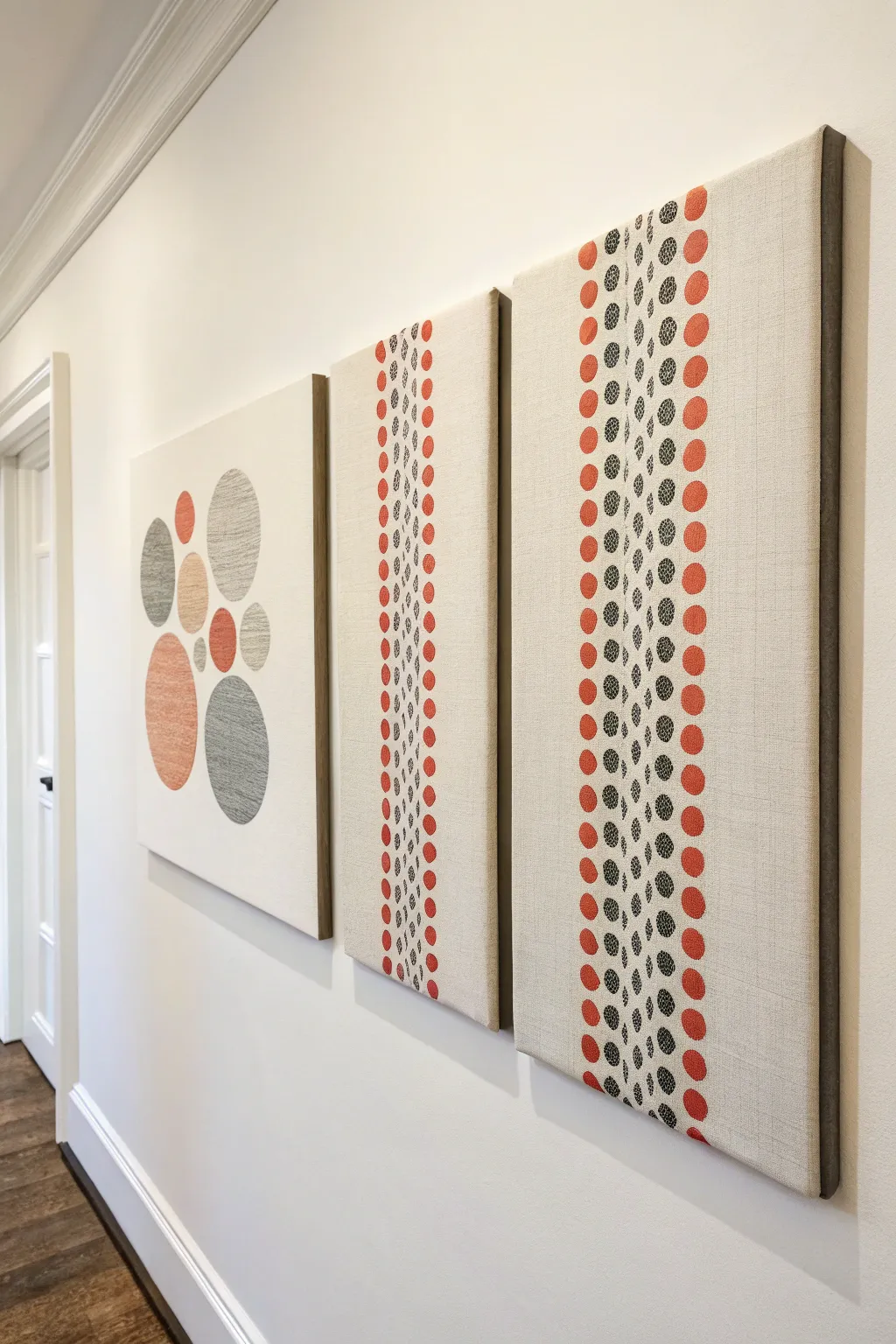
This elegant three-piece canvas series transforms a hallway with its textured, minimalist aesthetic. By combining muted oranges and greys with simple geometric forms, you’ll create a cohesive gallery wall that feels high-end yet is surprisingly achievable.
Step-by-Step
Materials
- 3 large stretched canvases (approx. 24×36 inches or custom size to fit wall)
- High-quality acrylic paints (muted terracotta orange, charcoal grey, warm beige)
- White or cream gesso (optional base coat)
- Assorted circular foam pouncers (varying sizes from small to large)
- Fine detail paintbrush
- Pencil
- Long ruler or T-square
- Painter’s tape
- Dark wood lattice strips (for framing)
- Wood glue or pin nailer
- Matte varnish
Step 1: Preparation & Layout
-
Prime the surface:
If your canvases are raw or bright white, consider applying a base coat of cream-tinted gesso or a very light beige acrylic. This warms up the background and mimics the look of linen seen in the inspiration photo. -
Draft the left panel:
For the first canvas, lightly sketch the layout of the large scattered circles. Aim for an asymmetrical cluster—some overlapping slightly, others floating freely—using a compass or tracing household objects like bowls. -
Mark the linear panels:
On the remaining two canvases, use your long ruler to draw very faint vertical guide lines. These will ensure your columns of dots stay perfectly straight. Measure carefully so the spacing between columns is uniform.
Step 2: Painting the Feature Panel
-
Apply the large circles:
Use your largest foam pouncers or a flat brush to fill in the sketched circles on the first canvas. Alternate between the terracotta orange, charcoal grey, and beige. -
Add texture:
While the paint is wet, lightly dab the surface with a dry brush or sponge to create a ‘woven’ look. This prevents the large blocks of color from looking too flat. -
Refine edges:
Once the main shapes are dry, go back with a small brush to sharpen the circumference of each circle if any paint bled or looked uneven.
Stamp Master Tip
Don’t reload your foam pouncer for every single dot. Stamping 2-3 times before reloading creates a natural gradient of opacity that looks like vintage fabric print.
Step 3: Creating the Dot Patterns
-
Start the outer columns:
On the two linear canvases, begin with the terracotta color. Dip a medium-sized round foam pouncer into the paint, blot excess on a paper towel, and stamp down the outer vertical guide lines. -
Layer the inner columns:
Switch to your charcoal grey paint and smaller pouncers. Stamp the inner columns of dots, ensuring they nestle between the orange columns without touching. -
Vary the density:
For a more organic look, I like to accidentally-on-purpose press lighter on some dots and harder on others. This creates a faded, printed textile effect. -
Detail the center:
For the very center columns of the linear panels, use your smallest brush or a Q-tip to create the tiniest dots, mimicking a delicate stitched seam running down the artwork. -
Erase guides:
Once the paint is completely cured (give it at least 24 hours), gently erase any visible pencil guide lines.
Level Up: Textile Texture
Instead of pouncers, cut circles out of old denim or potato skins and use them as stamps. The rough surface will transfer paint with a unique, organic texture.
Step 4: Framing & Finishing
-
Cut the frame strips:
Measure the height of your canvases. Cut your dark wood lattice strips to match this length exactly. You will need two strips per canvas (for the left and right sides only) to replicate the floating side-frame look. -
Stain the wood:
Stain the wood strips a dark walnut or espresso color to contrast with the light canvas. Let them dry fully. -
Attach the trim:
Apply a bead of wood glue to the side edge of the canvas and press the wood strip firmly against it. Use clamps or pin nails to secure it until the glue sets. -
Seal the work:
Finish all three pieces with a coat of matte varnish. This unifies the sheen of the paint and protects your new gallery wall from dust.
This trio works beautifully when hung close together to emphasize the rhythm of the patterns
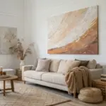
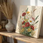
Have a question or want to share your own experience? I'd love to hear from you in the comments below!