When you’re painting with a bunch of people, the best projects are the ones that look amazing without anyone needing “perfect” brush control. Here are my favorite easy group painting ideas that keep things social, low-stress, and super doable for beginners.
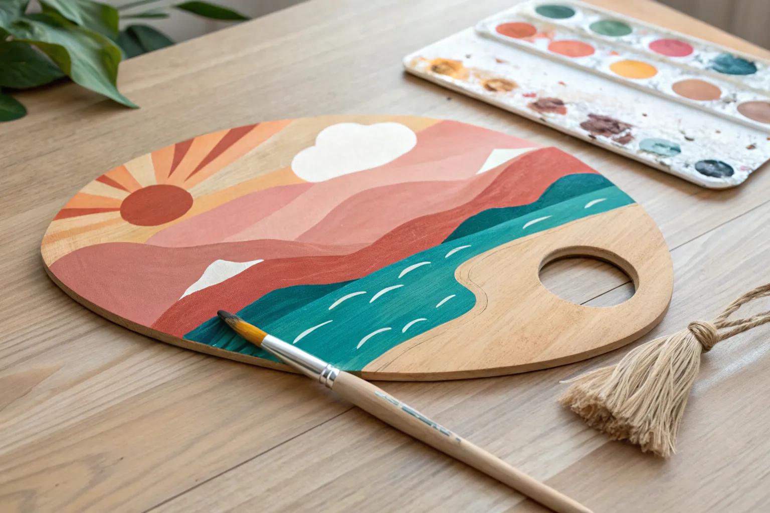
Sunset Gradient With Silhouette
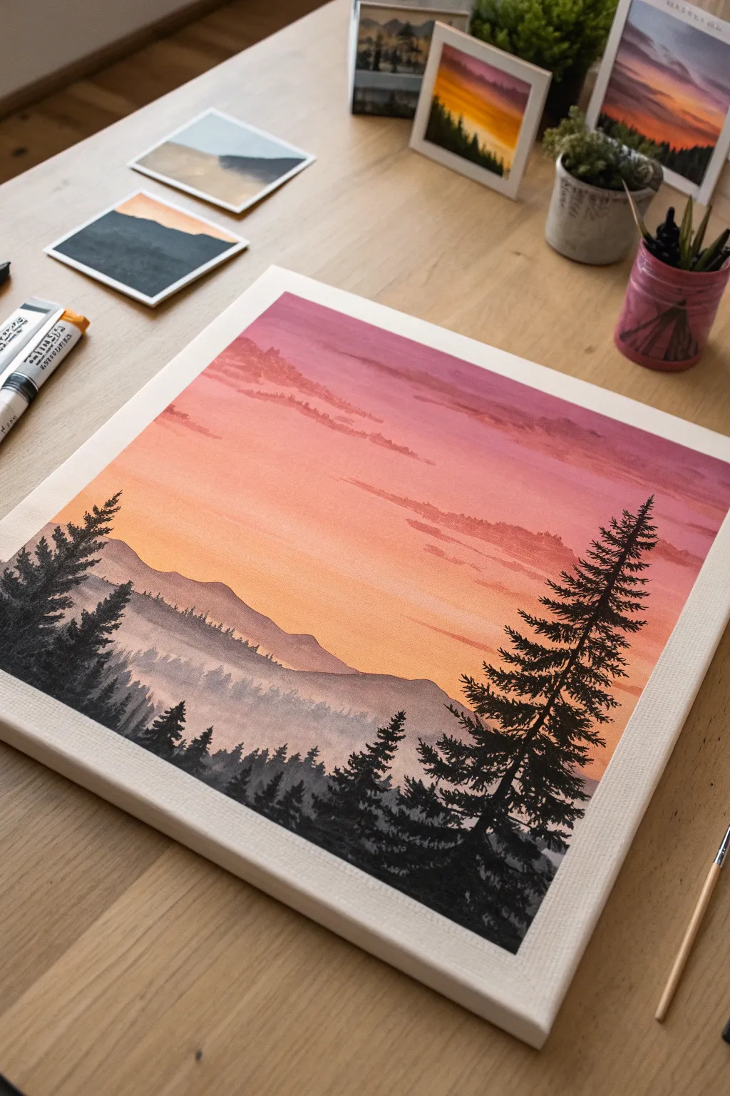
Capture the magic of twilight with this striking landscape that blends a warm, gradient sunset with crisp forest silhouettes. The dramatic contrast between the glowing pink-orange sky and the rich black pines makes this an impressive yet beginner-friendly project for any painting party.
Step-by-Step Guide
Materials
- Square stretched canvas (approx. 12×12 inches)
- Acrylic paints: Titanium White, Cadmium Yellow, Orange, Alizarin Crimson (or Magenta), Purple, Mars Black
- Large flat brush (1 inch) for blending
- Medium filbert brush for clouds and mountains
- Small round detail brush (size 0 or 1) for trees
- Cup of water and paper towels
- Palette or paper plate
Step 1: Painting the Gradient Sky
-
Prepare your sky colors:
Squeeze out generous amounts of white, yellow, orange, red/magenta, and purple onto your palette. You will need to work somewhat quickly while the paint is wet to get a good blend. -
Start at the top:
Using your large flat brush, apply a band of purple paint across the very top edge of the canvas. Mix a little red into the purple as you move slightly down to warm it up. -
Transition to pink:
Without cleaning your brush fully, pick up some red and white. Blend this below the purple area, using long, horizontal strokes to create a soft pink transition. -
Create the orange band:
Clean your brush. Pick up orange and a touch of yellow. Paint the middle section of the canvas, blending upward into the pink layer. The goal is a seamless fade. -
Finish with yellow light:
Mix a large amount of white with a little yellow and orange. Paint the bottom third of the sky area (where the mountains will sit), blending it up into the orange. This creates the glowing horizon effect. -
Add wispy clouds:
While the sky is drying, use a medium filbert brush with a mix of watered-down purple and red. Gently dab irregular, horizontal cloud shapes into the upper pink and purple sections. Keep edges soft.
Smooth Blends
Work efficiently on the sky. If the paint starts dragging or feels sticky, mist the canvas lightly with water or dip your brush tip in water to get that seamless, airbrushed gradient look.
Step 2: Creating the Mountain Layers
-
Mix a hazy mountain color:
Create a light purplish-grey by mixing white, a tiny dot of black, and a touch of purple. You want this to look distant and faded, not dark. -
Paint the distant ridge:
About one-third up from the bottom, paint a rolling mountain ridge line. Fill in the area below this line with your hazy mix. Let the paint become slightly translucent towards the bottom to suggest mist. -
Add the middle ground:
Mix a slightly darker shade of grey-purple (less white, same base colors). Paint a second, lower ridge line that overlaps the first one slightly. This creates depth. -
Texturing the middle ground:
While the middle ground paint is wet, use the tip of your brush to tap tiny, vertical texture along the top edge of this ridge. This mimics the look of distant distinct trees without needing to paint them individually. -
Dry completely:
Before moving to the stark black foreground, ensure your background layers are totally dry to prevent smudging mud.
Shaky Hands?
If you struggle with painting straight thin likes for the tree trunks, use a rigger brush (liner brush) or even a black permanent marker specifically for the main trunk lines before adding painted leaves.
Step 3: The Silhouette Foreground
-
Load black paint:
Switch to pure fluid black paint. If your acrylic is too thick, add a drop of water so it flows smoothly off the brush. -
Establish the treeline:
Paint a solid black uneven ground layer at the very bottom of the canvas. Make it slightly higher on the left and right corners to frame the composition. -
Start the main tree:
Using your small round brush, paint a thin vertical line on the right side of the canvas. This is the trunk of your focal pine tree. It should reach up into the pink section of the sky. -
Paint pine branches:
Starting at the top of the trunk, paint small downward-sloping branches. Keep the top branches very short and make them progressively wider as you move down the tree. -
Add texture to the tree:
Don’t make the branches perfect lines. Use a tapping or stippling motion with your brush tip to create the jagged, needle-like texture of a spruce or pine. -
Balance the left side:
Paint a cluster of slightly shorter trees on the left side using the same technique. I like to vary heights here to keep the composition natural. -
Fill the bottom gap:
Flick tiny vertical lines upward from your black ground layer to fill the space between the main trees. These represent smaller shrubs and young trees in the foreground distance.
Step back and admire how the dark silhouettes make those sunset colors pop right off the canvas

Birds on a Branch Pair Painting
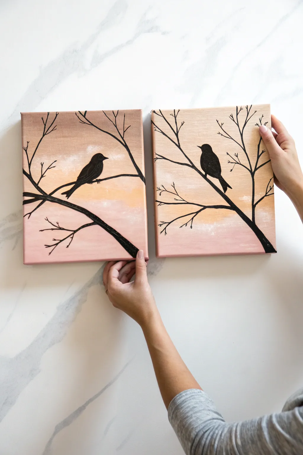
Create a stunning pair of coordinated canvases that capture the serene beauty of birds at twilight. This beginner-friendly project uses gradient blending techniques to create a soft, glowing sky, contrasting sharply with crisp black silhouettes for a modern, elegant look.
Step-by-Step
Materials
- Two square stretched canvases (e.g., 8×8 or 10×10 inches)
- Acrylic paints: Titanium White, Light Pink (or Rose), Peach (or Light Orange), Tan (or Beige), and Mars Black
- Large flat paintbrush (approx. 1 inch)
- Small round detail brush (size 0 or 1)
- Medium round brush (size 4 or 6)
- Palette or paper plate
- Cup of water and paper towels
- Pencil
Step 1: Painting the Gradient Sky
-
Prepare your palette:
Squeeze out generous amounts of white, tan, peach, and pink paint onto your palette. You’ll want to work somewhat quickly while the paint is wet to get a good blend, so have everything ready. -
Apply the top color:
Start at the very top of both canvases using your large flat brush. Load it with the tan (beige) paint and brush horizontal strokes across the top quarter of each canvas. Paint the edges too for a finished look. -
Blend in the middle tones:
Without fully cleaning your brush, pick up some peach paint. Apply this directly below the tan section, overlapping the wet edges slightly. Use long, horizontal strokes to blend the two colors where they meet, creating a soft transition. -
Add the lower sky:
Wipe your brush on a paper towel, then load it with the light pink paint. Apply this to the bottom third of the canvases, blending it upwards into the peach section. The goal is a seamless ombre effect from tan to peach to pink. -
Soften with white:
While the background is still slightly tacky, I like to take a tiny bit of white paint on a mostly dry brush and lightly sweep it horizontally across the transition areas. This creates a subtle, cloudy haze and softens any harsh lines. -
Let it dry completely:
Allow the background to dry fully before moving on. The surface must be dry to the touch so your pencil sketches don’t dig into the paint. This usually takes about 20-30 minutes.
Uneven Background Blends?
If your sky colors aren’t blending well, your paint might be drying too fast. Mist the canvas remarkably lightly with water or mix a slowing medium into your acrylics.
Step 2: Sketching the Composition
-
Plan the branches:
Place the two canvases side-by-side. Using a pencil, lightly sketch the main thick branch starting from the bottom right corner of the right canvas, extending diagonally up to the middle left of the left canvas. This connects the two pieces visually. -
Add smaller twigs:
Sketch smaller offshoot branches and twigs reaching upward and outward. Keep lines jagged and organic rather than perfectly straight. Nature is rarely perfectly symmetrical. -
Outline the birds:
Draw the outline of a bird sitting on the branch on each canvas. Keep the shapes simple—an oval for the body, a small circle for the head, a triangle for the beak, and a long rectangle for the tail works well as a base.
Metallic Accents
Make the sunset shimmer by mixing a drop of gold medium into your peach paint, or adding metallic gold leaf to the edges of the branches for a luxury finish.
Step 3: Painting the Silhouettes
-
Paint the main branch:
Switch to your medium round brush and load it with black paint. Carefully fill in the main, thickest part of the branch, covering your pencil lines. Add a little water to the paint if it feels too thick to drag smoothly. -
Fill in the birds:
Use the same medium brush to fill in the bodies of the birds. Work slowly around the edges to keep the silhouette crisp and sharp against the soft background. -
Define the details:
Switch to your small detail brush. Use this to refine the bird’s beak, tail feathers, and tiny feet gripping the branch. Sharp points on the beak and tail make the silhouette readable. -
Paint fine twigs:
Using the very tip of the detail brush and slightly watered-down black paint (ink consistency), paint the thin, wispy twigs at the ends of the branches. A shaky hand actually helps here to make them look more like real wood. -
Check for continuity:
Place the canvases side-by-side again. Ensure the main branch looks like it flows naturally from one canvas to the other, touching up the connection point if necessary. -
Add final touches:
Look for any spots where the background shows through the black paint. Apply a second coat of black to the birds or thick branches if needed to make them completely opaque.
Hang your new masterpiece with a small gap between the canvases to emphasize the beautiful continuity you created

Tree of Life Dot Leaves
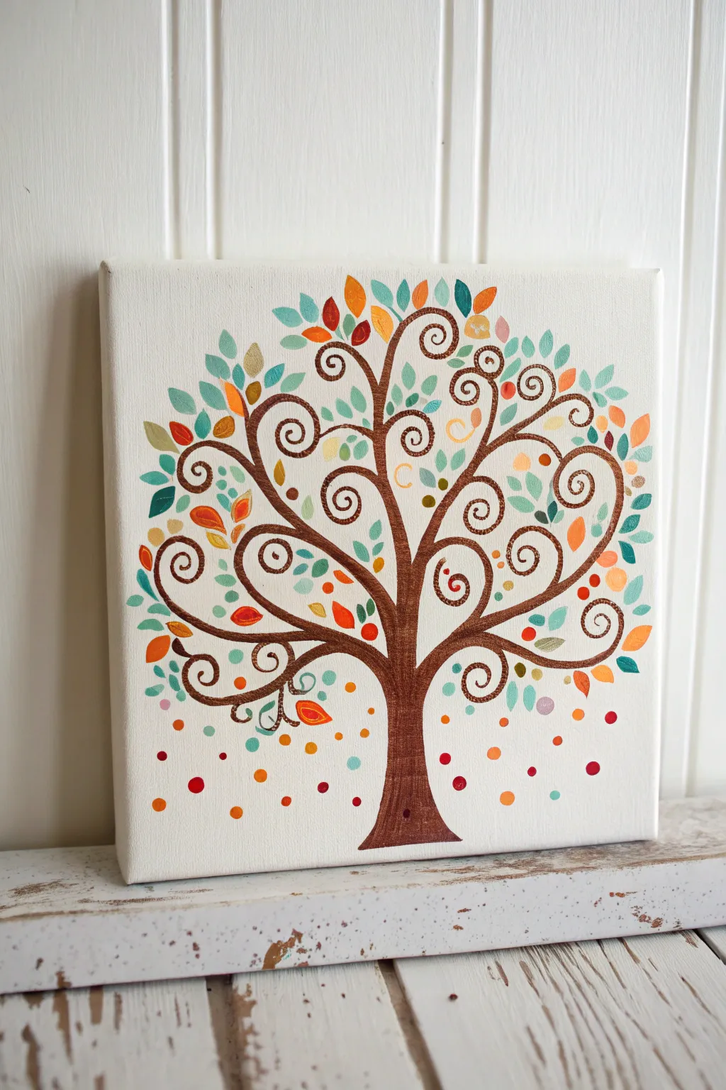
This charming canvas project combines elegant, swirling branches with a playful explosion of colorful leaves and dots. It’s a perfect beginner-friendly piece that uses simple shapes to create a sophisticated, folk-art inspired design.
Step-by-Step Guide
Materials
- Square stretched canvas (10×10 or 12×12 inches)
- Acrylic paints (Dark brown, deep teal, mint green, orange, coral, yellow ochre, burgundy)
- Small round brush (size 2 or 3)
- Fine liner brush (size 0 or 00)
- Pencil and eraser
- Palette or paper plate
- Cup of water and paper towels
Step 1: Planning the Structure
-
Find the center:
Start by lightly marking the center vertical line of your canvas with a pencil to help keep your tree balanced. -
Sketch the trunk:
Draw the main trunk starting wide at the bottom center and narrowing as it reaches the middle of the canvas. It should look like a soft hourglass shape that flares out at the top. -
Map the main swirls:
Sketch the primary branches extending from the top of the trunk. Instead of straight lines, draw large, sweeping ‘C’ and ‘S’ curves that curl inward at the ends like fern fronds. -
Fill the canopy:
Add secondary, smaller swirl branches filling in the gaps. Aim for a balanced, circular overall shape for the tree’s crown, leaving plenty of negative space for the leaves.
Shaky swirls?
If your hand shakes while painting the spirals, rest your pinky finger on a dry part of the canvas for stability. Thinning the paint slightly with water creates smoother lines.
Step 2: Painting the Tree
-
Base coat the trunk:
Using your brown acrylic paint and the small round brush, fill in the main trunk area. Apply the paint smoothly, following the vertical grain of the tree. -
Trace the branches:
Switch to your liner brush or the tip of your round brush. Carefully paint over your pencil lines for the swirling branches. I find it helpful to rotate the canvas as I paint these curves to keep my hand comfortable. -
Thicken the connections:
Go back over the points where branches meet the trunk or other branches. Thicken these joints slightly to make the structure look organic and sturdy rather than stick-like. -
Add the spiral tips:
At the very end of each branch, paint a tight, decorative spiral. Ensure your paint is slightly thinned with water here so the liner brush glides smoothly without breaking the line.
Double-Dip Delight
For multi-dimensional leaves, dip one side of your brush in teal and the tip in white. One stroke will create a beautiful, naturally blended two-tone leaf.
Step 3: Adding Leaves and Dots
-
Paint single-stroke leaves:
Dip your round brush into the deep teal paint. Press the belly of the brush down near a branch and lift up quickly to create a teardrop or almond leaf shape. -
Vary the leaf angles:
Continue adding teal leaves, placing them randomly throughout the canopy. Be sure to point them in different directions to create movement. -
Introduce warm tones:
Clean your brush and repeat the leaf process with orange and coral paints. Place these warm-colored leaves in empty spaces, balancing them against the cool teal tones. -
Highlight with lighter greens:
Add a layer of mint or light blue-green leaves. These lighter values will help bring the tree forward and add depth to the foliage. -
Fill gaps with tiny leaves:
Use your smallest brush to tuck tiny yellow ochre and burgundy leaves into the smaller nooks of the swirls.
Step 4: The Final Details
-
Create the falling dots:
Using the handle end of a paintbrush, dip it into your various paint colors and stamp dots around the base of the tree and falling through the air. -
Vary dot sizes:
Make some dots large (by pressing harder or using a larger handle) and others tiny. Use orange, red, and teal for these floating confetti-like accents. -
Refine the trunk:
If the trunk looks too flat, mix a tiny bit of white into your brown paint and add subtle vertical streaks for bark texture. -
Check for balance:
Step back and look at your composition. If a certain area looks too empty, add a small floating dot or a tiny extra leaf to balance the color distribution.
Allow your beautiful tree of life to dry completely before displaying it on your wall

Easy Mountain Range Layers
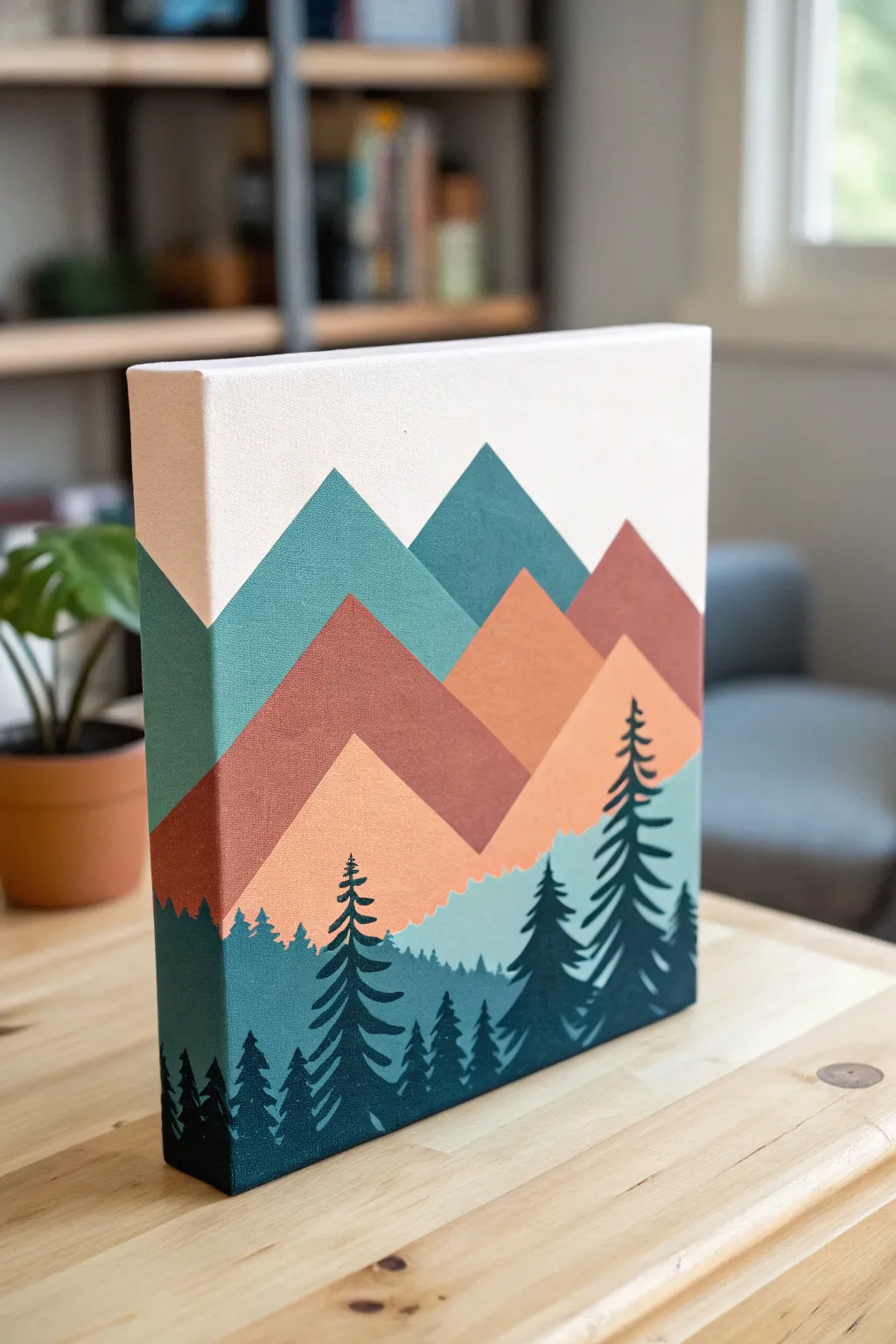
This minimalist landscape uses clean lines and a modern color palette to create a striking piece of depth-filled art. The layered triangular peaks and high-contrast silhouette trees make it perfect for beginners looking for a professional finish.
Step-by-Step
Materials
- Stretched canvas (square or rectangular)
- Acrylic paints: Teal/dark cyan, rust red, peach/light orange, cream/off-white, dark forest green
- Painter’s tape (1-inch width works best)
- Flat shader brushes (medium and large)
- Small round detail brush or liner brush
- Palette or paper plate
- Pencil
- Ruler
Step 1: Planning the Peaks
-
Prime the Surface:
Start by painting the entire canvas with your cream or off-white color. Use a large flat brush to get smooth, even coverage, and don’t forget to paint the sides of the canvas for that polished, gallery-wrapped look. -
Map the Mountains:
Once the base is completely dry, use a pencil and ruler to lightly sketch three distinct mountain ranges. Draw large peaks in the back, medium peaks in the middle, and smaller ones closer to the bottom. -
Tape the Background Layer:
Apply painter’s tape along the pencil lines of your furthest back mountain range (the biggest peaks). Press the edges of the tape down firmly with your fingernail to prevent paint bleed.
Bleeding Lines?
If paint seeps under your tape, wait for it to dry completely. Then, use a small brush and your background color to carefully touch up the line for a razor-sharp edge.
Step 2: Painting the mountain Layers
-
Apply the Teal Layer:
Fill in the taped-off background mountains with your teal or dark cyan paint. Brush away from the tape edge initially to further seal it, then fill the center. Extend the paint down past where the next mountain layer will start. -
Let it Dry:
Allow this layer to dry to the touch before carefully peeling back the tape. If the paint is slightly tacky, pull slowly at a 45-degree angle. -
Tape the Middle Layer:
Position tape for your second layer of mountains (the rust-colored ones). Ensure the previous layer is fully hardened so the tape doesn’t lift the paint. -
Paint the Rust Peaks:
Paint this middle section with the rust red color. I like to do two thin coats here rather than one thick one to keep the texture smooth. Remember to wrap the design around the sides of the canvas. -
Final Mountain Layer:
Repeat the taping process for the lowest mountain range. Paint these peaks with the peach or light orange shade, again painting over the edge of the canvas. -
Add the Fog Line:
For the soft, wavy transition at the very bottom of the mountains, freehand a gentle, uneven line using a mix of light blue and cream. This acts as a background for your forest floor.
Step 3: Painting the Forest
-
Block in the Forest Base:
Using deep forest green mixed with a touch of blue, paint the bottom section of the canvas. Keep the top edge slightly jagged to suggest distant treetops. -
Start the Tree Trunks:
Switch to your small round brush. Paint vertical lines of varying heights rising from the dark base color. These will be the trunks of your foreground pine trees. -
Add Branches at the Top:
Starting at the top tip of a trunk, use the very point of your brush to dab small, short horizontal strokes. These should be very narrow at the peak. -
Widen the Boughs:
As you work your way down the trunk, make your strokes wider and slightly curved downward. Think of a zig-zag motion that gets broader near the base. -
Layer the Trees:
Paint the largest trees in the very front using the darkest green. Once dry, you can add slightly smaller trees behind them in a slightly lighter shade if you want extra depth. -
Refine the Edges:
Check the sides of your canvas one last time. Connect the mountain lines and tree shapes so the image wraps seamlessly around the corners.
Add Texture
Before removing the tape on the mountain layers, sponge on a slightly lighter shade of the same color near the peaks to create a sun-hit, textured gradient effect.
Hang your new modern landscape on the wall and enjoy the serene view you constructed.
BRUSH GUIDE
The Right Brush for Every Stroke
From clean lines to bold texture — master brush choice, stroke control, and essential techniques.
Explore the Full Guide
Beach Horizon With Simple Waves
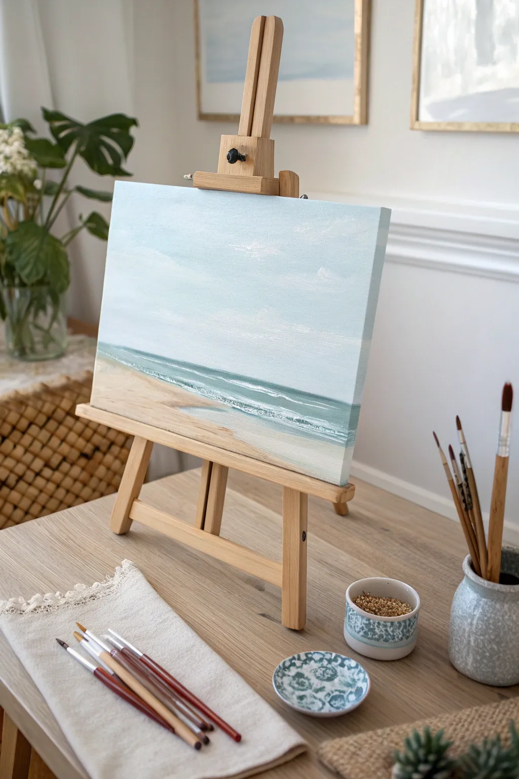
Capture the calm of a quiet morning at the shore with this minimalist seascape. Using soft blending techniques and a muted palette, you’ll create a peaceful horizon where the sky meets gentle ocean waves.
Detailed Instructions
Materials
- Canvas or canvas board (square or rectangular)
- Acrylic paints: Titanium White, Light Blue, Phthalo Blue, Burnt Sienna, Yellow Ochre, Raw Umber
- Flat brush (1/2 inch)
- Small round brush (size 2 or 4)
- Fan brush (optional, but helpful for texture)
- Palette or paper plate
- Cup of water
- Paper towels
Step 1: Painting the Vast Sky
-
Define the Horizon:
Visualize your canvas divided into roughly four horizontal sections. Draw a very faint pencil line across the canvas at the bottom quarter mark. Everything above this line will be sky; everything below will be water and sand. -
Mix the Sky Blue:
On your palette, mix a large amount of Titanium White with just a tiny touch of Light Blue. Ideally, you want a very pale, airy blue that looks almost white. -
Apply the Base Sky Color:
Using your flat brush, paint horizontal strokes starting from the top of the canvas down to about the halfway point. Keep the paint somewhat fluid but opaque. -
Deepen the Lower Sky:
Add a microscopic dot of Phthalo Blue to your existing sky mix to darken it slightly. Paint the area from the middle down to your horizon line, blending upward into the paler blue while both are still wet. -
Add Cloud Hints:
Wipe your brush clean. Pick up pure Titanium White on the corner of the brush. Gently scumble varied, soft horizontal streaks across the upper sky to suggest distant, wispy clouds. Don’t overthink their shapes; simple streaks work best.
Step 2: Creating the Ocean
-
Mix the Ocean Teal:
Create a teal shade by mixing Phthalo Blue, a touch of Green (or yellow mixed with blue), and a bit of Titanium White. You want a color distinctly darker than the sky. -
Paint the Horizon Strip:
With the flat brush turned on its chisel edge, carefully paint a straight line right across your pencil horizon mark. Fill in a band of water below this line, about an inch or two wide. -
Lighten the Shallows:
Add more white to your teal mix to create a lighter turquoise. Paint a band below the darker ocean water, blending the two edges slightly where they meet. -
Add Wave Movement:
Using a clean brush with a bit of white paint, drag horizontal streaks through the water area to mimic distant ripples.
Horizon Trouble?
If you struggle to paint a straight horizon line freehand, place a strip of painter’s tape across the dry canvas before starting the water. Peel it off for a crisp edge once the sky is 100% dry.
Step 3: The Sandy Shore
-
Mix Sand Color:
Combine Titanium White with a small amount of Yellow Ochre and a tiny dot of Burnt Sienna. I usually test this on a scrap paper first to ensure it’s not too orange. -
Fill the Beach Foreground:
Fill the remaining bottom portion of the canvas with your sand mix. Use diagonal strokes slanting from left to right to create the feeling of a sloping beach. -
Initial Wet Sand:
Mix a tiny bit of your ocean color into your sand color to create a darker, ‘wet sand’ tone. Paint a thin strip right where the water meets the beach. -
Blend the Transition:
While the wet sand color is manageable, use a damp, clean brush to soften the hard line between the dry sand and the wet sand area.
Textured Shore
Mix a pinch of real sand or baking soda into your tan paint for the bottom foreground. This adds gritty, realistic texture to the beach closest to the viewer.
Step 4: Details & Foam
-
Create the Breaking Waves:
Using your small round brush and pure Titanium White, paint a thin, irregular line right at the water’s edge to represent the foam of a breaking wave. -
Add Sea Foam Texture:
To make the foam look realistic, use a tapping motion along the white line you just painted. Let the white paint drift slightly up into the teal water and down onto the wet sand. -
Add Secondary Waves:
Paint a second, thinner line of white parallel to the shore, slightly further out in the turquoise water. This creates depth by suggesting incoming waves. -
Final Highlights:
Add a few sharp, bright white dashes on the crests of the water ripples for sparkle. Check your horizon line one last time to ensure it is perfectly straight.
Step back and admire the tranquil atmosphere you have created on your canvas
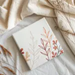
Field of Wildflowers With Dabs
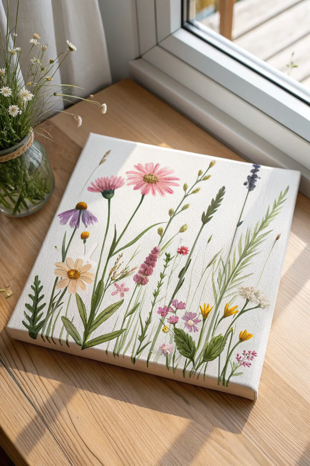
Capture the delicate beauty of a summer meadow with this airy, botanical-style painting. Using simple brushstrokes and a clean white background, you will create a charming collection of stems and blooms that looks effortlessly elegant.
Step-by-Step
Materials
- Square stretched canvas (approx. 10×10 or 12×12 inches)
- Acrylic paints: sap green, olive green, yellow ochre, cadmium yellow, magenta, violet, white, burnt sienna
- Round brushes: sizes 2, 4, and a fine liner brush (0 or 00)
- Palette or paper plate
- Cup of water and paper towels
- Pencil (optional)
Step 1: Setting the Composition
-
Prepare the canvas:
Ensure your canvas is clean. If the weave is very rough, you might want to apply a coat of gesso to smooth it out, but the raw texture works fine for this rustic look. -
Plan the heights:
Visualize three invisible vertical zones. You want your tallest flowers (like the purple lavender-style stalks) to reach near the top, medium flowers in the middle, and shorter filler greenery at the bottom. Variation is key here. -
Light sketching (optional):
If you are nervous about placement, lightly sketch vertical lines with a pencil to mark where your main stems will go. Keep these lines faint so they don’t show through the paint later.
Step 2: Painting the Greenery
-
Mix your greens:
On your palette, create three shades of green: a dark olive (green + tiny bit of red/brown), a bright grassy green (green + yellow), and a muted sage (green + white). This variety adds depth. -
Anchor the stems:
Using your liner brush and the dark olive shade, paint incredible thin, vertical lines starting from the very bottom edge of the canvas. Let them sway slightly; nature rarely grows in straight lines. -
Add grassy blades:
Switch to the size 2 round brush. Load it with the grassy green mix. Press the brush down at the bottom and flick it upward to create tapered, sword-like grass blades that intersperse with your stems. -
Create fern-like leaves:
For the fern-style leaf on the left, make a central stem, then use short, quick diagonal strokes outward on both sides using the dark olive paint. -
Paint broad leaves:
Near the bottom center, use a size 4 brush to press and pull creates broader, tear-drop shaped leaves attached to the base of the stems. I find varying the pressure here creates the most realistic leaf shapes.
Fixing Shaky Lines
If your stems look wobbly or too thick, wait for them to dry. Then, paint over the edges with white paint to ‘erase’ and thin them down again.
Step 3: Adding the Blooms
-
Pink cosmos petals:
Mix magenta with white to get a soft pink. For the large flower near the top center, use a round brush to paint elongated oval petals radiating from a center point. Leave the center empty for now. -
Purple coneflower:
On the left side, paint downward-drooping purple petals. They should look like a skirt hanging from a waist. Use a mix of violet and white. -
Golden daisies:
Mix yellow ochre with a touch of white. Paint a few small, simple daisy shapes (5-6 petals) on the lower left and right. Keep these loose and imperfect. -
Tall lavender spikes:
Using a dark violet, tap the tip of your small round brush in a vertical line near the top right. As you move down the stem, make the dots slightly larger to mimic lavender buds. -
Pink steeple flowers:
Create the tall, cone-shaped pink flower in the middle by dabbing small spots of dark pink at the bottom of the flower head, getting lighter and smaller as you reach the tip.
Pro Tip: Flow Aid
Add a drop of water or flow medium to your green paint for stems. Inky paint creates much smoother, longer lines than thick paint.
Step 4: Details & Finishing Touches
-
Fill the centers:
Once the petals are dry, use yellow ochre or burnt sienna to dot the centers of your daisies and coneflowers. Texturize the centers by stippling (tapping) the brush tip repeatedly. -
Add seeding grass:
Use your thinnest liner brush and a pale beige or watered-down brown. Paint faint, feathery V-shapes at the top of the tall grass blades on the right to look like seed heads. -
Highlighting:
Mix a very pale green (almost white). Carefully add tiny highlights to the sun-facing side of the thickest stems and leaves to give them dimension. -
Tiny filler flowers:
Dip the handle end of a brush into pink or yellow paint and dot tiny clusters of flowers in the empty spaces between the main focal stems. -
Wrap the edges:
Don’t forget the bottom edge of the canvas. Extend your green stems and grass blades underneath to the bottom lip of the canvas for a professional, finished look. -
Final assessment:
Step back and look for empty spots. If a space feels too vacant, add a simple floating stem or a small bud to balance the composition.
Hang your botanical masterpiece near a window to bring a permanent touch of spring into your home

PENCIL GUIDE
Understanding Pencil Grades from H to B
From first sketch to finished drawing — learn pencil grades, line control, and shading techniques.
Explore the Full Guide
Butterfly Symmetry Templates
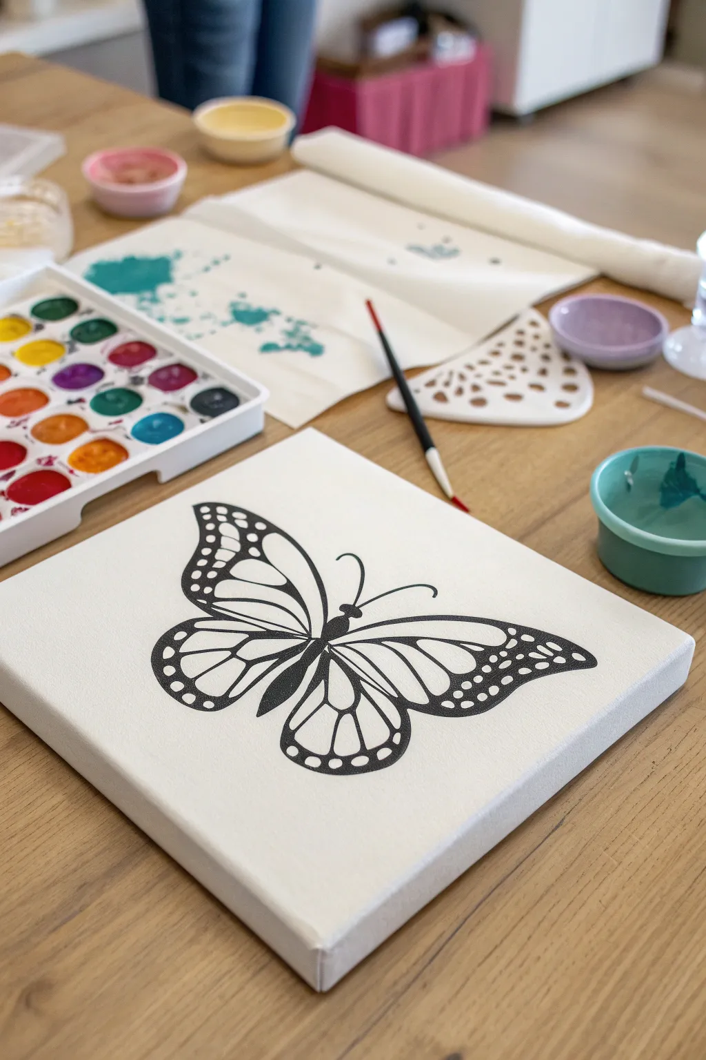
This elegant project combines the stark beauty of a black-and-white butterfly silhouette with the soft, fluid world of watercolors. It’s a perfect exercise in symmetry and precision line work, resulting in a striking piece of wall art that looks deceptively professional.
How-To Guide
Materials
- Small square stretched canvas (approx. 8×8 or 10×10 inches)
- Black acrylic paint or black paint marker
- Watercolor paint set (pan or tube)
- Fine liner brush (size 0 or 00) for details
- Medium round brush (size 4 or 6) for painting
- Butterfly template or reference image
- Graphite transfer paper
- Pencil
- Painter’s tape (optional)
- Cup of water
- Paper towels
Step 1: Preparing the Canvas
-
Surface Prep:
Begin by wiping down your canvas with a clean, dry cloth to remove any dust. If your canvas feels very rough, you might want to apply a layer of gesso, but standard pre-primed canvases usually work fine for this acrylic-watercolor hybrid method. -
Aligning the Template:
Place your butterfly template centered on the canvas. You can hold it up to a light source to ensure the symmetry feels balanced within the square frame. -
Securing the Layers:
Slide a sheet of graphite transfer paper (dark side down) between the template and the canvas. Use small pieces of painter’s tape on the corners to keep everything from shifting while you work.
Step 2: Creating the Outline
-
Tracing the Design:
Using a pencil or a ballpoint pen, firmly trace over every line of your butterfly template. Apply enough pressure to transfer the graphite, but be gentle enough to avoid denting the canvas fabric. -
Revealing the Sketch:
Lift one corner of the papers to check that the lines have transferred clearly. If they are faint, lay it back down matches up perfectly and re-trace with a bit more pressure. Once satisfied, remove the template and transfer paper. -
Initial Outline:
Load a fine liner brush with black acrylic paint. I find that slightly thinning the acrylic with a drop of water helps the paint flow more smoothly for long lines. Carefully paint over your transferred pencil lines. -
Thickening the Borders:
Identify the thicker areas of the butterfly wings—usually the upper edges and the body. Go back over these sections to add weight and boldness to the silhouette. -
Refining the Details:
Use the very tip of your brush to fill in the delicate antennae and the smaller vein lines inside the wings. Keep your hand steady and rest your pinky on a dry part of the canvas for stability. -
Filling the Spots:
For the decorative white spots on the wing edges, you represent these by painting the black area *around* them. Carefully outline the small circles first, then fill in the surrounding black space. -
Drying Time:
Allow the black outline to dry completely. Acrylics dry relatively fast, but give it at least 20-30 minutes to ensure you don’t smudge the stark black lines during the next phase.
Keep it Crisp
Use a black acrylic paint marker instead of a brush for the outlines. This offers much easier control for steady lines and sharp corners.
Step 3: Adding the Watercolor Effect
-
Pre-wetting the Wings:
Dip your clean medium round brush into water and lightly dampen one section of the wing (inside the black lines). Don’t soak it; just make the canvas receptive to the paint. -
Dropping in Color:
Load your brush with a vibrant watercolor pigment—teals and purples work beautifully here. Touch the wet brush to the dampened canvas section and watch the color bloom. -
Blending Gradients:
While the first color is still wet, introduce a second analogous color (like blue next to purple) into the same wing section. Let them bleed into each other naturally for a soft, dreamy look. -
Controlled Edges:
Be careful when painting near your black acrylic lines. While the black paint acts as a barrier, too much water can cause the watercolor to bleed underneath or over the top. -
Layering Intensity:
If the colors dry too pale (common on canvas), wait for the first layer to dry and then add a second glaze of watercolor to deepen the saturation. -
Splatter Technique:
For an artistic touch, load a brush with watery paint and tap it against another brush handle over the canvas to create light splatters. Cover the main butterfly body with a paper towel if you want to keep the splashes only on the background. -
Cleaning Up:
If any watercolor strayed onto the black lines, you can easily touch up the black acrylic once everything is bone dry to make the silhouette crisp again.
Paint Beading Up?
If watercolor beads on the primed canvas, mix a tiny drop of ox gall or dish soap into your paint water. This breaks surface tension for better flow.
Now step back and admire how the bold black lines make those soft colors truly pop
Simple Animal Silhouette Series
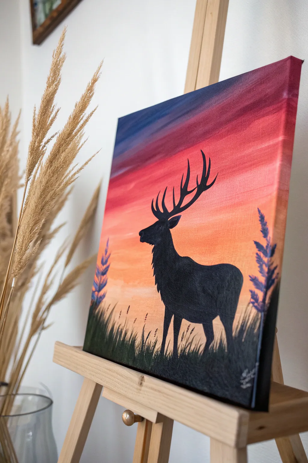
This striking canvas creates a moody yet serene atmosphere by combining a vibrant, blended sunset gradient with a stark animal silhouette. It’s a perfect project for beginners because the high-contrast design forgives small details, letting the colors do the heavy lifting.
Step-by-Step Guide
Materials
- Square canvas (approx. 12×12 or 16×16 inches)
- Acrylic paints: Navy Blue, Deep Purple, Crimson Red, Bright Orange, Yellow, Titanium White, Mars Black
- Large flat paintbrush (approx. 1 inch width)
- Medium flat brush
- Small round detail brush (size 0 or 1)
- Cup of water
- Paper palette or mixing plate
- Paper towels
- Pencil (optional)
- Deer stencil (optional, if not freehanding)
Step 1: Creating the Sunset Gradient
-
Prepare the Horizon:
Decide where your ground line will be—aim for the bottom quarter of the canvas. This area will eventually be black, but for now, focus on the sky above it. Start by mixing a bright yellow with a tiny touch of white to make it opaque. -
Paint the Lower Sky:
Using your large flat brush, paint horizontal strokes of your yellow mix just above where the grass will be. Paint upwards about two inches, keeping the strokes long and smooth from left to right. -
Introduce Orange:
Without cleaning your brush thoroughly (just wipe off excess paint), dip into your bright orange. Apply this directly above the yellow section, slightly overlapping the wet yellow paint to encourage blending. -
Blend the Transition:
Use clean, horizontal strokes to move back and forth between the yellow and orange distinct bands. The colors should mix on the canvas to create a soft, peachy transition. -
Add the Red Tones:
Mix your crimson red with a little orange. Apply this band above the orange layer. As you move higher, add more pure crimson. -
Deepen the Sky:
Move into the purples now. Mix deep purple with a touch of red and apply it above the crimson band. This creates a dramatic dusk effect. -
Paint the Upper Sky:
Finish the very top of the canvas with a mix of deep purple and navy blue. This should be the darkest part of the sky. -
Final Gradient Sweep:
With a clean, slightly damp large brush, gently sweep across the entire canvas horizontally from top to bottom (or bottom to top) one last time to soften any harsh lines between colors. Let the canvas dry completely.
Step 2: Painting the Silhouette
-
Draft the Deer:
Once the background is dry to the touch, use a pencil to lightly sketch the outline of the deer. Focus on the pose—head held high, large rack of antlers, and strong chest. If drawing isn’t your strong suit, you can trace a printed cutout. -
Fill the Body:
Load a medium flat brush with Mars Black paint. Carefully fill in the main body of the deer. Use smooth strokes to ensure the finish is solid and opaque; you shouldn’t see the sunset colors through the black. -
Detail the Edges:
Switch to your small round brush. Go around the perimeter of the deer to sharpen the edges. Pay special attention to the nose and the fur texture on the neck, using tiny, flicking strokes to mimic hair. -
Paint the Antlers:
Using the same small brush, paint the antlers. I find it easiest to paint the main beams first, then branch off into the tines. Keep the tips slightly pointed for a realistic look. -
Create the Ground:
Switch back to the medium brush and paint the solid black ground along the bottom edge of the canvas, covering the bottom of the deer’s legs. -
Add Grass Texture:
While the ground paint is still wet, use the small round brush or the edge of a flat brush to flick upward strokes from the ground. Vary the height and angle of these blades of grass. -
Blend the Hooves:
Ensure the deer’s legs disappear naturally into this tall grass. Add a few taller blades of grass in front of the legs to ground the animal in the scene. -
Paint Side Foliage:
On the left and right edges, paint taller, stalk-like plants using black. Use a dabbing motion with the small brush to create the textured appearance of seed heads or lavender-like shapes. -
Final Touches:
Check your black areas for any transparency. If the sunset shows through, apply a second coat of black once the first is dry. Sign your name in white or a light color in the corner.
Keep it Wet
For a smooth gradient, work quickly so the acrylic paint doesn’t dry between layers. If it gets sticky, mist the canvas lightly with water.
Metallic Magic
Mix a tiny drop of gold metallic paint into your orange or yellow layer for a sunset that truly glows when the light hits it.
Step back and enjoy the dramatic contrast of your wilderness scene


Rainy Day Umbrella Scene
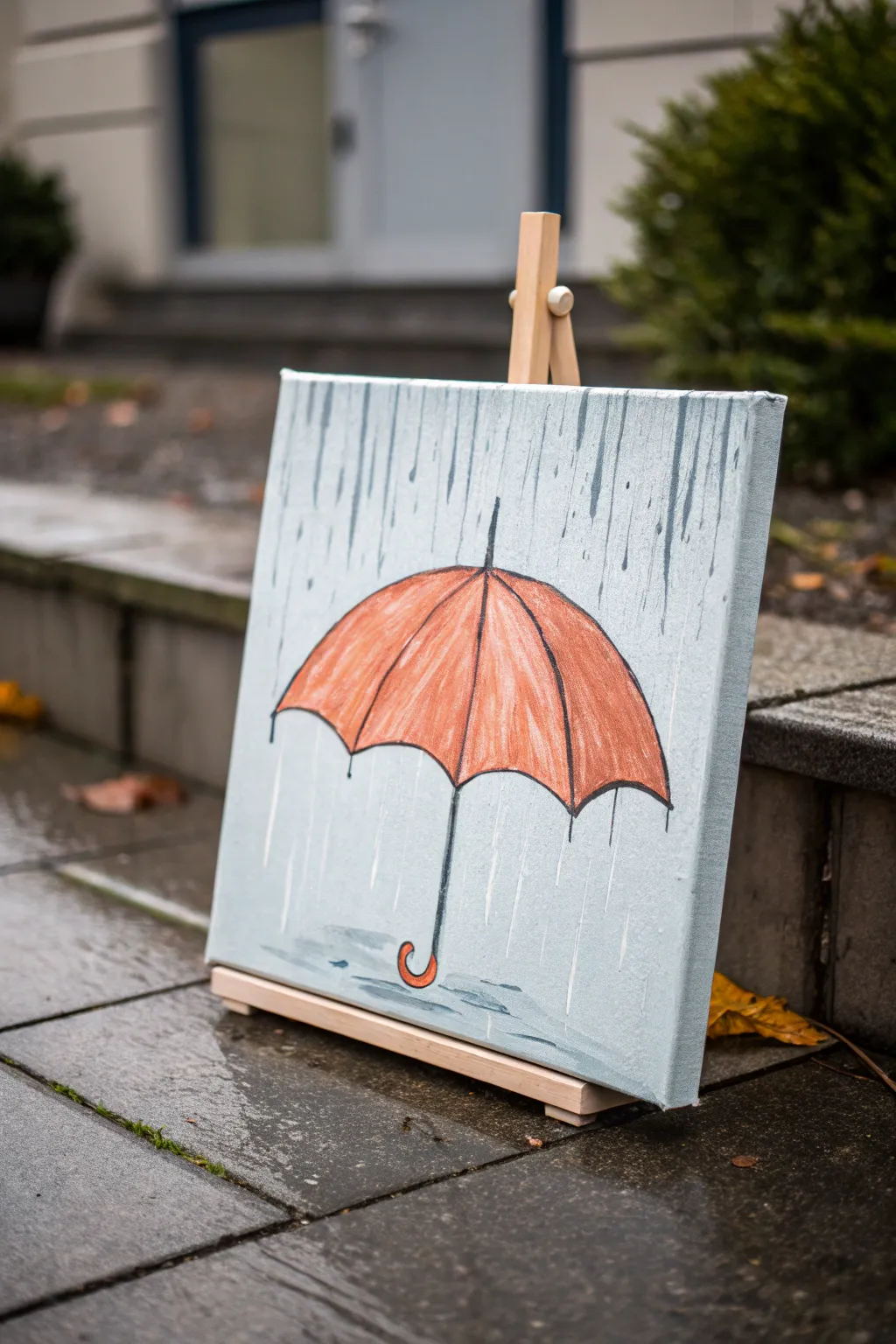
Brighten up a gloomy afternoon by painting this charming rainy scene featuring a vibrant orange umbrella shielding against a soft downpour. Using simple acrylic techniques, you’ll learn to create convincing rain streaks and a cozy illustrative style that looks great on any wall.
Detailed Instructions
Materials
- Square stretched canvas (approx. 12×12 inches)
- Acrylic paints: Titanium White, Payne’s Grey, Burnt Sienna, Cadmium Orange, Mars Black
- Flat shader brush (1 inch)
- Round synthetic brush (size 4 or 6)
- Fine liner brush (size 0 or 1)
- Cup of water
- Paper towels
- Pencil for sketching
- Ruler (optional)
Step 1: Setting the Mood
-
Mix the background color:
Start by creating a cool, overcast sky tone. On your palette, mix a large amount of Titanium White with a tiny dot of Payne’s Grey and a minuscule touch of Mars Black. You want a very pale, silvery-blue grey. -
Apply the base coat:
Using your large flat shader brush, cover the entire canvas with this pale grey mixture. Use long, vertical strokes from top to bottom. -
Add rain texture:
While the base coat is still slightly wet, pick up a tiny bit more undiluted Payne’s Grey on the dirty brush. Lightly drag it vertically down the canvas in random spots to create subtle, darker streaks that suggest falling rain. -
Dry completely:
Let this background layer dry fully before moving on. This usually takes about 15-20 minutes, or you can speed it up with a hair dryer.
Wobbly Lines?
If your hand shakes while outlining, try resting your pinky finger on a dry part of the canvas for stability. Fast, confident strokes are often straighter than slow ones.
Step 2: Sketching the Umbrella
-
Outline the canopy shape:
Using a pencil, lightly draw a large semi-circle in the center of your canvas. The bottom edge should be curved like a frown, not straight across, to give it dimension. -
Draw the ribs:
Mark the center point at the top of the curve. Draw curved lines radiating from this top center point down to the bottom edge. Imagine the ribs of an umbrella—the lines should curve outward on the sides. -
Add the scalloped edge:
Connect the bottom points of your rib lines with small, upward-curving arches. This creates the classic scalloped look of umbrella fabric. -
Sketch the handle and ferrule:
Draw a straight line coming down from the center for the shaft, curving into a ‘J’ hook at the bottom. Add a tiny spike (the ferrule) at the very top center of the canopy.
Step 3: Painting the Umbrella
-
Base coat the canopy:
Mix Cadmium Orange with a touch of Burnt Sienna to tone down the brightness slightly. Using your round brush, fill in the entire canopy shape. Don’t worry about the ribs yet. -
Add highlights:
Mix a little White into your orange mixture. Paint the center section of each panel (between the rib lines) with this lighter orange to make the fabric look rounded and puffed out. -
Shade the folds:
Mix little more Burnt Sienna into your original orange to make a shadow tone. Paint thin lines along where the ribs would be to create depth where the fabric folds inward. -
Paint the handle:
Switch to your fine liner brush. Paint the shaft and handle utilizing the same orange mix, perhaps darkening the bottom curve slightly for weight. -
Outline for definition:
Dilute a bit of Mars Black with water so it flows like ink. Using the fine liner brush, carefully outline the entire umbrella, the individual ribs, and the handle. Keep the lines slightly loose for an illustrative feel.
Pro Tip: Depth
Add a very faint, watery shadow on the ground in a dark grey oval shape right underneath the umbrella handle to ground the object in space.
Step 4: Creating the Rain
-
Mix the rain color:
Create a wash by mixing Payne’s Grey with plenty of water. It should be semi-transparent. -
Paint vertical streaks:
Starting from the top edge, paint long, vertical lines of varying lengths using the liner brush. Press harder at the start of the stroke and lift off as you go down to create tapered ‘drops’. -
Vary the intensity:
Make some rain streaks darker and thicker, and others very faint. Ensure some rain appears ‘behind’ the umbrella by stopping the lines before they hit the orange canopy. -
Add bouncing splashes:
Paint small, flattened puddles or splashes near the bottom of the canvas under the handle. Use short, horizontal dashes of grey and white to suggest water hitting the ground. -
White highlights:
Dip your fine brush into pure White. Add a few stark white vertical streaks among the grey rain to suggest light catching the water droplets. -
Final touches:
Add a tiny white highlight on the curve of the orange handle and the top of the umbrella to make them look wet and shiny.
Now you have a cozy piece of art that celebrates the beauty of a rainy day
Color Block Abstracts With Shared Palette
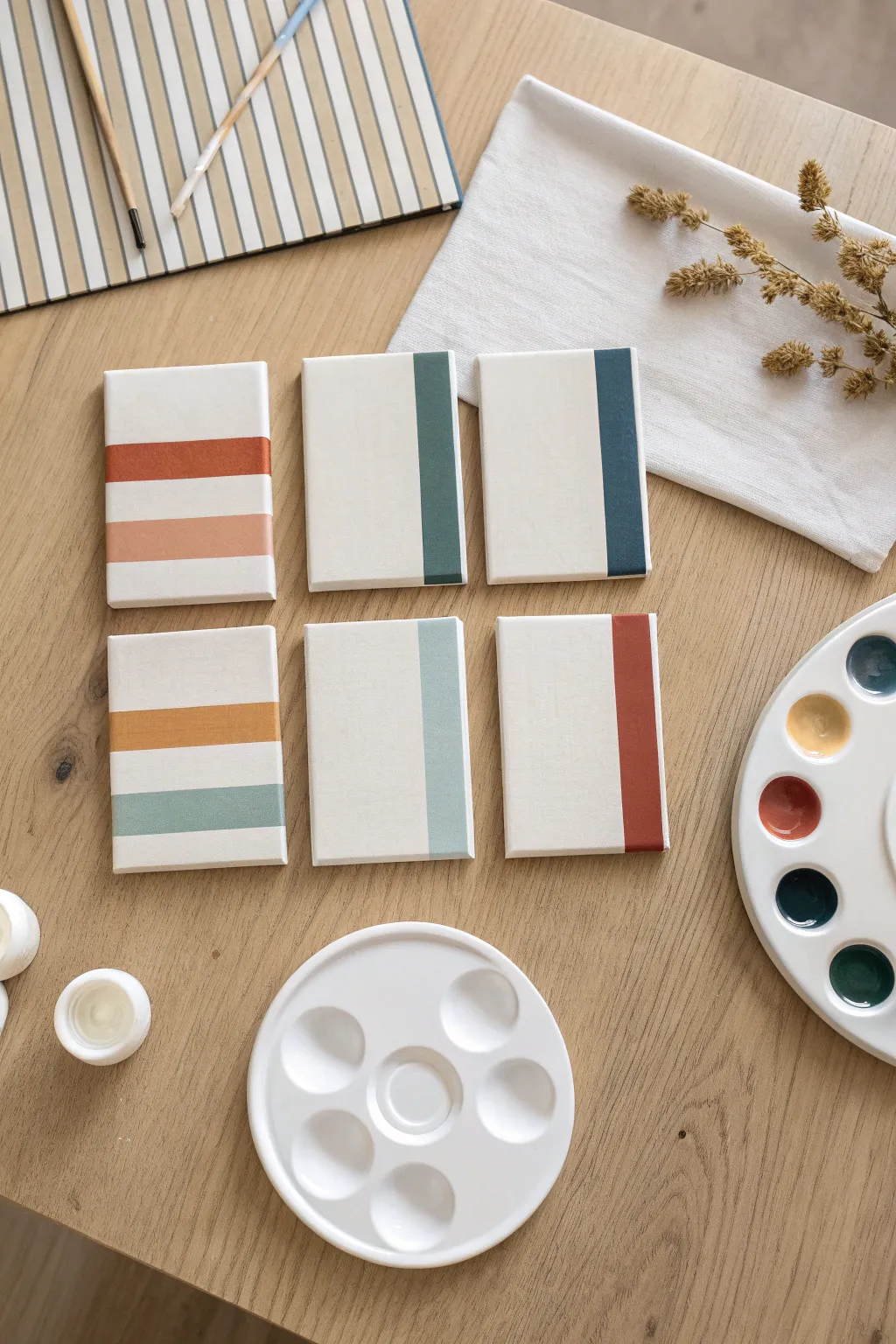
Create a sophisticated gallery wall effect with this series of mini canvases featuring clean lines and a harmonious, muted color palette. This project relies on a shared paint selection to tie distinct geometric designs together into a cohesive collection.
Step-by-Step
Materials
- 6 small stretched canvases (approx. 4×6 or 5×7 inches)
- Acrylic paints (Titanium White, Burnt Sienna, Yellow Ochre, Deep Teal/Phthalo Green, Navy Blue, and Burnt Umber)
- Flat shader brush (size 6 or 8 for broad strokes)
- Painter’s tape or masking tape (approx. 1 inch width)
- Paint palette or mixing tray
- Cup of water and paper towels
- Ruler (optional, for precise spacing)
Step 1: Planning and Taping
-
Prepare your workspace:
Lay out all six canvases on a flat surface. Arrange them in a grid (two rows of three) so you can visualize the final composition as you work. -
Tape horizontal designs:
For the two canvases on the left side, apply strips of painter’s tape horizontally. Place the tape strips to mask off the white space, leaving exposed canvas where the colored stripes will go. -
Vary the stripe width:
On the top-left canvas, create two stripes of equal width. On the bottom-left canvas, try varying the spacing slightly to add visual interest. -
Tape vertical designs:
For the remaining four canvases (center and right columns), apply a single strip of tape vertically. Position the tape about an inch or so from the right edge of each canvas. -
Seal the edges:
Run your fingernail or a specialized burnishing tool firmly along the edges of every piece of tape. This is crucial to prevent paint from bleeding underneath and ensures those crisp, sharp lines we want.
Bleeding Lines?
If paint bled under the tape, wait for it to dry completely. Then, use a small brush and white paint to carefully touch up the edge and straighten the line.
Step 2: Mixing the Palette
-
Create a base palette:
Squeeze out your main colors onto the palette: Burnt Sienna, Yellow Ochre, Deep Teal, Navy Blue, and White. The key here is to mix custom shades rather than using colors straight from the tube. -
Mix a muted terracotta:
Combine Burnt Sienna with a touch of White to create a soft, warm rust color. This will be the boldest warm tone in the set. -
Create a soft peach:
Take a small amount of your terracotta mix and add significantly more White. This should result in a pale, dusty peach tone that complements the darker rust. -
Blend an ochre tone:
Mix Yellow Ochre with a tiny dot of Burnt Sienna to warm it up, creating a golden mustard shade. -
Formulate the cool tones:
Mix Deep Teal with White and a touch of gray (or tiny bit of black/orange) to create a muted sage green. Separately, mix the Navy Blue with a hint of Deep Teal for a rich, dark petrol blue. -
Mix a deep rust red:
For the final accent color, use Burnt Sienna with just a drop of Red or Burnt Umber to make a deep, reddish-brown clay color.
Pro Tip: Consistent Texture
Stroke the brush in the same direction as the tape line (horizontally for horizontal stripes, vertically for vertical stripes) to keep the texture uniform.
Step 3: Painting the Blocks
-
Paint horizontal stripes (Top Left):
On the top-left canvas, paint the top exposed stripe with your rust/terracotta mix. Use the flat brush to apply smooth, even strokes. -
Finish horizontal stripes (Top Left):
Clean your brush thoroughly, then paint the bottom stripe on that same canvas with the pale peach mix. -
Paint horizontal stripes (Bottom Left):
On the bottom-left canvas, paint the top stripe with the golden mustard color. Paint the bottom stripe with the muted sage green mix. -
Paint vertical blocks (Center):
Move to the center column. Creating a lovely contrast, paint the exposed vertical strip on the top canvas with your deep sage/teal mix. For the bottom center canvas, facilitate coherence by using a very light blue-grey or pale sage. -
Paint vertical blocks (Right):
On the top-right canvas, use the dark petrol blue for the vertical stripe. For the final canvas on the bottom right, paint the strip with the deep clay red color. -
Check coverage:
Look closely at your paint application. If the canvas texture is showing through too much, let the first coat dry for about 10 minutes and apply a second coat for opacity.
Step 4: Finishing Up
-
Let the paint set:
Allow the paint to dry until it is dry to the touch, usually about 20-30 minutes. Don’t rush this step or you risk shifting the paint. -
Remove the tape:
Carefully peel back the tape at a 45-degree angle. Pull slowly away from the paint edge to reveal your crisp, clean lines. -
Paint the background (optional):
The example keeps the background raw or white canvas for a clean look. If your canvas looks messy, you can carefully paint the negative space with Titanium White using a smaller brush to clean up any smudges.
Now you have a stunning, cohesive set of modern art pieces ready to hang together
Tape-Resist Geometric Canvases
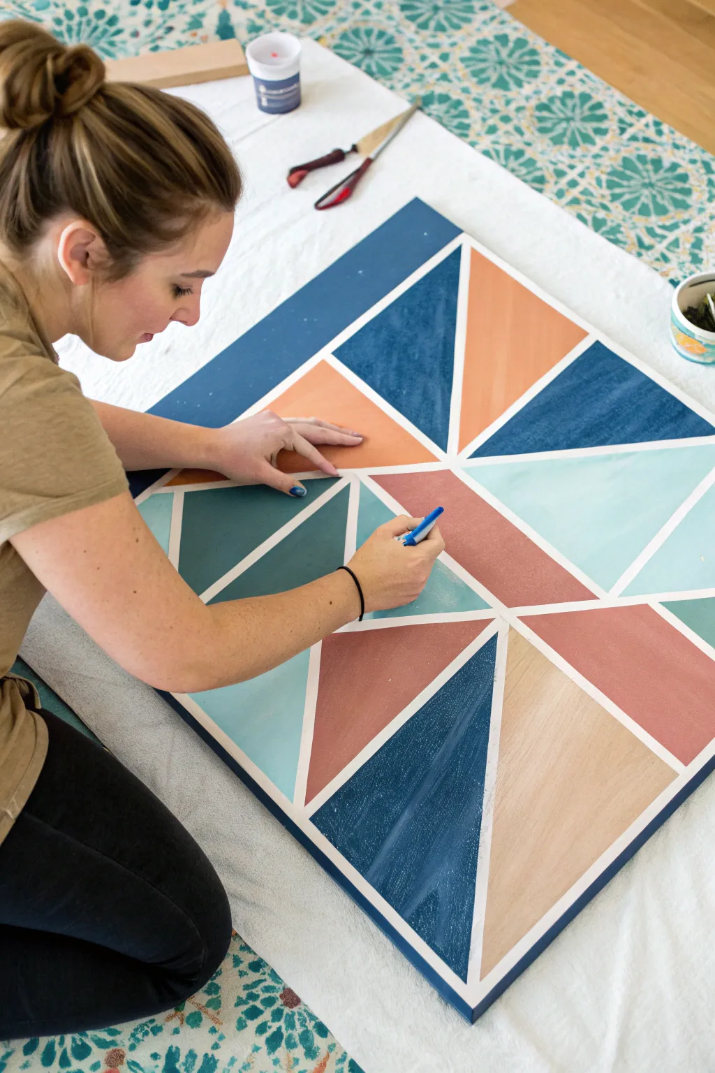
Bring bold patterns into your space with this stunning geometric wall art that looks much harder to make than it actually is. By using simple masking tape techniques and a refined palette of muted blues and warm earth tones, you can achieve crisp lines and professional-looking results.
How-To Guide
Materials
- Large square wooden panel or canvas (24×24 inches or larger)
- White primer or white acrylic paint (for the base)
- Painter’s tape or automotive masking tape (various widths)
- Acrylic or chalk paints (Navy, Teal, Mint, Salmon, Peach)
- Medium-sized flat paintbrush
- Small angled paintbrush (for touch-ups)
- Ruler or straight edge
- Pencil
- Credit card or burnishing tool
- Craft knife (optional)
Step 1: Planning and Taping
-
Prep the surface:
Begin by painting your entire panel with a solid coat of white primer or paint. This serves two purposes: it seals the wood and acts as the color for your dividing lines later. Let this base coat dry completely—overnight is best to ensure the tape doesn’t peel it up. -
Visualizing the grid:
Lightly mark the center point of your board with a pencil. You can draw a faint quadrant grid (a large plus sign) to help you keep your design symmetrical, but keep the marks light so they are easy to erase or paint over. -
Apply the main diagonal lines:
Start taping your design by laying down long strips of painter’s tape diagonal from corner to corner, creating a large ‘X’ across the board. Press down lightly at first so you can reposition if needed. -
Create the inner geometry:
Using the initial ‘X’ as your guide, add additional tape lines to create triangles and trapezoids. Work from the center outward to maintain balance in the design. -
Vary the shapes:
Don’t be afraid to subdivide larger triangles into smaller ones. In this design, we created visual interest by having some large solid blocks and some smaller, intricate sections. -
Seal the tape edges:
Once you are happy with the layout, run a credit card or burnishing tool firmly over every strip of tape. This is the secret to crisp lines. -
The anti-bleed trick:
Paint a thin layer of your base white color over the tape edges. This seals the tape; if any paint bleeds underneath, it will just be white on white, keeping your final colors perfect.
Bleeding Lines?
If you peel the tape and find fuzzy edges, wait for the paint to dry completely. Then, place a ruler over the line and run a sharp craft knife gently along the edge to scrape away the excess paint.
Step 2: Painting the Colors
-
Select your palette:
Choose 4-5 complementary colors. For this look, I like to mix a deep navy, a soft teal, a minty aqua, and two warm tones like salmon and peach. -
Plan color placement:
Before dipping your brush, mark a tiny dot of the intended color in each section with a pencil or a dab of paint. This ensures you don’t accidentally paint two adjacent shapes the same color. -
Start with the darkest tone:
Begin filling in the sections marked for your navy blue. Use a flat brush and stroke away from the tape edge toward the center of the shape to minimize paint build-up against the tape. -
Apply the mid-tones:
Move on to your teal and salmon sections. Apply the paint generously but evenly, aiming for full opacity in one coat if possible, though some lighter colors may need a second pass. -
Fill in light accents:
Finish with your lightest colors, like the mint and peach. Ensure every shape is filled completely, watching out for brush strokes. -
Dry time:
Allow the paint to become touch-dry, which usually takes about 20-30 minutes depending on your paint thickness. You don’t want it bone dry, or the paint might crack when you pull the tape.
Step 3: The Reveal
-
Peel carefully:
Slowly peel back the tape at a sharp 45-degree angle. Pulling slowly helps prevent the paint from lifting along with the tape. -
Check intersections:
Pay special attention where multiple strips of tape overlapped. Remove these gentle layers one by one to reveal the sharp white grid underneath. -
Touch up:
If a little paint managed to sneak under the tape, don’t worry. Use a tiny angled brush and a bit of white paint to clean up any fuzzy edges once the colors are fully dry. -
Seal:
Protect your artwork with a layer of clear matte or satin polycrylic if you plan to hang it in a high-traffic area or outdoors.
Add Wood Texture
For a rustic look, skip the white base coat. Let the natural wood grain show through as your dividing lines, or stain the wood panel first before applying your tape and geometric colors.
Hang your new masterpiece and enjoy the pop of color it brings to the room
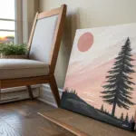
Easy Night Sky With Swirly Strokes
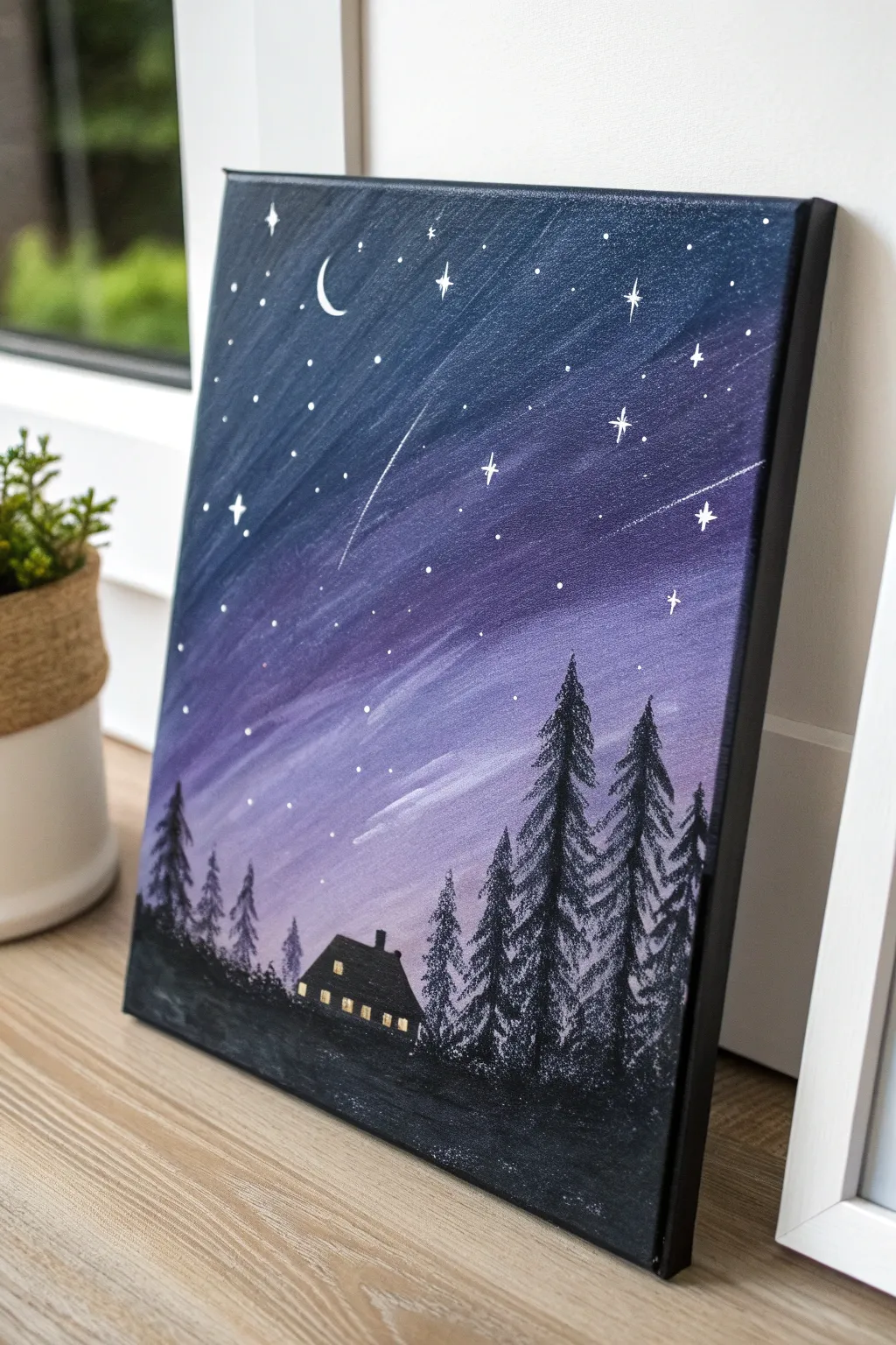
This dreamy landscape captures the magic of a starry night with a stunning gradient from deep indigo to soft lavender. The vertical, sweeping brushstrokes create a sense of falling wonder, perfect for outlining a cozy silhouetted cabin nestled among the trees.
Step-by-Step Guide
Materials
- Stretched canvas (e.g., 11×14 or 16×20 inches)
- Acrylic paints: Black, Titanium White, Dioxazine Purple, Phthalo Blue (or Navy)
- Wide flat brush (1-2 inch)
- Medium flat brush
- Small round detail brush (size 0 or 1)
- White paint pen (optional, for stars)
- Cup of water and paper towels
- Easel or flat working surface
Step 1: Creating the Swirly Background
-
Prepare your palette:
Squeeze out generous amounts of your black, blue, purple, and white paints. You will need to work somewhat quickly to blend them on the canvas while wet. -
Paint the top dark corner:
Using your wide flat brush, load up black and deep blue paint. Start at the top-left corner of the canvas, applying the paint in long, diagonal strokes moving downward towards the right. Cover about the top third of the canvas with this darkest shade. -
Blend in the purple mid-tones:
Without washing your brush (wipe it slightly if it’s too heavy with black), load it with purple. Continue those diagonal strokes right below the blue section. Allow the brush to overlap the dark blue area so the colors blend naturally on the canvas. -
Transition to light lavender:
Wipe your brush clean on a paper towel. Pick up white paint and mix it slightly with a touch of purple on your palette to make a light lavender. Apply this to the middle-lower section, blending upward into the purple layer with the same diagonal motion. -
Finish the horizon glow:
Add more white to your brush (creating a very pale lilac) and paint the bottom third of the sky area. This should be the lightest part of the painting, mimicking the glow above the horizon. Ensure your strokes remain diagonal and “swirly” throughout. -
Add streak highlights:
While the paint is still tacky, take a clean, slightly damp brush with a tiny bit of white paint. Gently drag a few distinct diagonal streaks through the sky to create the illusion of movement or distant aurora.
Step 2: Painting the Foreground
-
Establish the ground line:
Switch to your medium flat brush and load it with solid black paint. Paint a solid, uneven strip across the bottom 1-2 inches of the canvas to create the forest floor. -
Outline the cabin:
Using the small round brush and black paint, draw the basic shape of the cabin. Start with a rectangle for the base and add a triangle or trapezoid for the roof. Fill the shape in completely with black. -
Add the chimney:
Paint a small, rectangular chimney sticking up from the roofline. -
Start the pine trees:
Using black paint, draw a vertical line for the trunk of your first tree. I like to start with the tallest trees on the right side to balance the composition. -
Foliage technique:
Use a tapping or dabbing motion with the tip of your brush (or a small fan brush if you have one) to create the pine needles. Start narrow at the top of the trunk and tap wider as you move down, leaving small gaps so the sky shows through. -
Fill the forest:
Repeat the tree process across the horizon. Vary the heights—make the trees on the left side shorter and the ones on the right taller and more prominent to create depth. -
Let the black dry completely:
Pause here and let the black silhouette layer dry fully. This is crucial before adding the lights to avoid muddy colors.
Muddy Sky Fix
If your sky colors turn grey or brown, wipe your brush thoroughly between colors. Don’t over-blend! Leave visible brushstrokes for texture.
Step 3: Adding the magic
-
Paint the crescent moon:
With your smallest detail brush and pure white paint, carefully paint a thin C-shape in the upper left dark section. -
Add the house lights:
Mix a tiny bit of yellow with white (or use plain white/cream). Paint small squares or rectangles onto the black house silhouette to represent lit windows. They should be bright enough to stand out against the black. -
Dot the stars:
Using the tip of your smallest brush or a white paint pen, dot random stars all over the sky. Concentrate slightly more stars in the darker upper section. -
Create twinkling stars:
Select 3-5 of your largest dots. Paint a cross shape (+) through them, then an ‘X’ shape (x) over that to create an eight-pointed glimmering star effect. -
Add shooting stars:
For the finishing touch, create 1-2 shooting stars. Paint a small star head, then quickly flick your brush downward and diagonally to create a fading tail trail.
Level Up: Glitter
Once the painting is totally dry, mix loose silver glitter into a clear glossy topcoat and brush it over just the dark blue section for real sparkle.
Step back and admire the peaceful winter twilight scene you have captured on canvas
Seasonal Mini Canvases Set
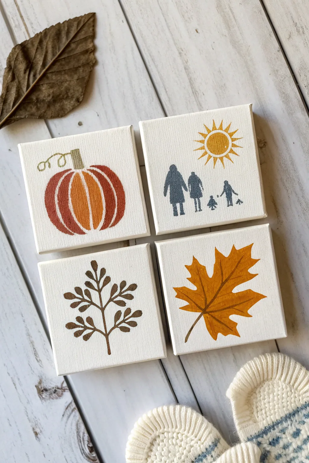
These charming mini canvases capture the essence of fall with simple, rustic iconography. Using warm earth tones and a silhouette style, these four distinctive designs come together to create a cohesive seasonal gallery wall perfect for small spaces.
Step-by-Step Tutorial
Materials
- 4 mini stretched canvases (4×4 inches)
- Acrylic paints (burnt orange, mustard yellow, dark brown, grey-blue, dark green)
- Small flat shader brush
- Fine liner brush (size 0 or 00)
- Pencil and eraser
- Palette or paper plate
- Cup of water and paper towels
Step 1: Preparation & Sketching
-
Prime the surface:
If your canvases aren’t pre-primed, apply a coat of gesso. Since the background is keeping the raw canvas look, ensure they are clean and free of dust. -
Sketch the pumpkin:
On the first canvas, lightly sketch a rounded pumpkin shape. Draw vertical curved lines to segment the pumpkin, and add a rectangular stem with a curly vine coming off the left side. -
Outline the family scene:
For the second canvas, lightly draw the silhouettes of a family group walking. Include two taller figures and two smaller figures, creating simple shapes without facial details. -
Draw the sun:
Above the family figures, sketch a simple circle with triangular rays radiating outward. -
Map the botanical branch:
On the third canvas, draw a central vertical stem. Add pairs of small, oval-shaped leaves branching off symmetrically as you move up the stem. -
Design the maple leaf:
For the final canvas, sketch a single, large maple leaf. Focus on the five main points and the jagged edges, filling most of the canvas space.
Clean Lines Hack
For the negative space stripes on the pumpkin, you can place thin strips of washi tape on the canvas before painting the orange segments.
Step 2: Painting the Pumpkin & Branch
-
Block in pumpkin color:
Use your flat brush to paint the pumpkin segments with burnt orange paint. Leave very thin unpainted gaps between the segments to create natural separation. -
Add pumpkin highlights:
Mix a little mustard yellow into your orange and paint the central segment slightly lighter to give the pumpkin dimension. -
Paint the stem and vine:
Using the detail brush and muted olive green, fill in the stem. Carefully trace the curly vine line you sketched earlier. -
Paint the botanical branch:
Switch to dark brown paint. Using the fine liner brush, carefully trace the stem and fill in each small leaf on the third canvas.
Step 3: Painting the Silhouette & Leaf
-
Paint the family figures:
Using the grey-blue paint and your detail brush, fill in the family silhouettes. Keep the edges crisp and the paint opaque. -
Fill the sun:
Paint the sun circle and rays with mustard yellow. I like to start from the center and pull strokes outward for sharp points. -
Outline the maple leaf:
On the fourth canvas, outline your maple leaf sketch with mustard yellow mixed with a touch of orange. -
Fill the leaf shape:
Fill in the entire leaf with the golden-yellow mixture. Ensure the paint is thick enough to cover the canvas texture. -
Add leaf veins:
Once the leaf base is semi-dry, use a slightly darker brown-orange mix and your fine liner brush to paint the central vein and side veins.
Shaky Hands?
If you struggle with the tiny stems or vine details, try using acrylic paint markers instead of brushes for better control.
Step 4: Final Touches
-
Clean up edges:
Check all four canvases. If lines look wobble, use a tiny bit of white paint (or gesso) to tidy up the canvas background around the designs. -
Erase pencil marks:
Once the paint is completely bone-dry, gently erase any visible pencil sketch lines. -
Let them cure:
Allow all canvases to dry flat for at least an hour before hanging or displaying them.
Now arrange your beautiful quartet on a shelf or wall to bring warmth to your room
Paint Swap Round Robin
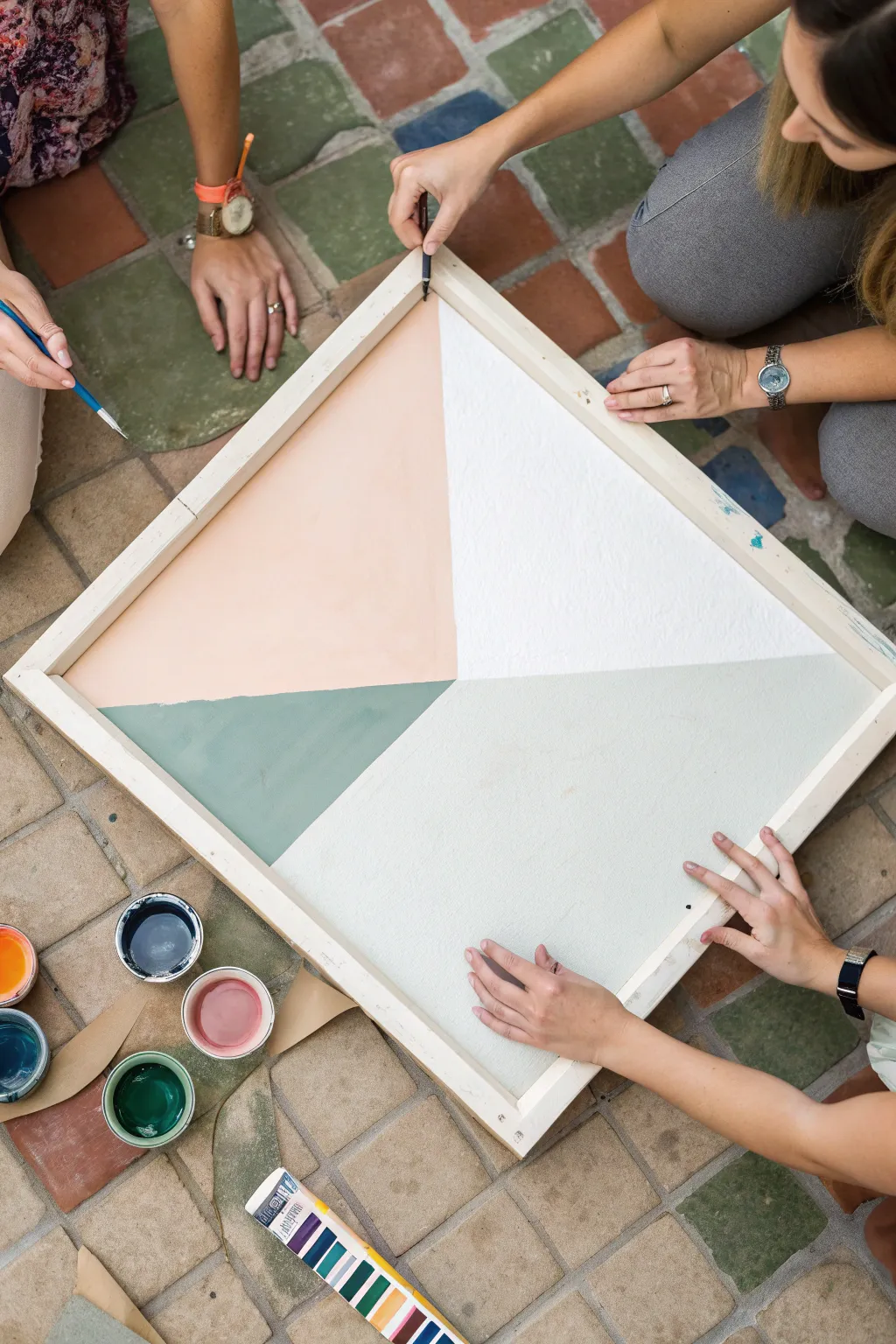
Bring your friends together for this collaborative color-block project that results in a striking, modern geometric art piece. Using a large canvas divided into simple sections, everyone contributes to a shared masterpiece featuring soft, desert-inspired tones.
Step-by-Step Guide
Materials
- Large square canvas (24×24 or 36×36 inches)
- Acrylic paints (peach, white, sage green, light grey)
- Pencil and long ruler (or straight edge)
- Painter’s tape or masking tape
- Medium flat paintbrushes
- Small detail brushes
- Paint cups or small bowls
- Water for rinsing
- Paper towels
Step 1: Preparation & Layout
-
Prepare the workspace:
Lay down a drop cloth or kraft paper to protect your floor or table, as this is a group activity best done with plenty of space to move around. -
Find the center:
Using your ruler, measure the exact center point of your square canvas and mark it lightly with a pencil. -
Draw the grid:
Draw two diagonal lines extending from the center point to each of the four corners, creating four large triangles that meet in the middle. -
Tape the sections:
Apply painter’s tape along your pencil lines to define the boundaries. Decide which two triangles you want to paint first, and tape *outside* those lines so the paint goes exactly where you want it. -
Seal the tape edges:
Run your fingernail or a credit card firmly along the tape edges to prevent paint from bleeding underneath.
Clean Lines
Paint over the tape edge with the *base* color (or white) first. This seals the gap, so if any paint seeps under, it matches the background.
Step 2: Mixing & Painting
-
Select your palette:
Pour your chosen acrylic colors into individual small cups or bowls. For this look, aim for a harmony of warm peach, crisp white, deep sage, and a very pale grey or mint. -
Assign sections:
If working in a group, assign one person to each open triangle section to work simultaneously. -
Start with edges:
Use a medium flat brush to carefully paint along the taped edges first, ensuring a sharp line once the tape is removed. -
Fill the center:
Continue filling in the rest of the triangle with smooth, even strokes. I find it helps to brush in one consistent direction to minimize texture. -
Check for coverage:
If the canvas texture shows through too much, let the first coat dry for about 15 minutes and apply a second coat for opacity. -
Remove tape carefully:
While the paint is still slightly tacky but not wet, slowly peel back the painter’s tape at a 45-degree angle to reveal crisp lines. -
Dry completely:
Allow these first sections to dry fully before proceeding. Using a hairdryer on a low, cool setting can speed this up if you’re impatient.
Texture Play
Mix a texture medium or sand into one color block’s paint. The contrast between smooth and gritty sections adds tactile interest.
Step 3: Finishing Touches
-
Tape the remaining sections:
Once the first colors are dry to the touch, apply new tape over the painted edges to protect them while you work on the remaining triangles. -
Paint remaining triangles:
Repeat the painting process for the final two colors—white and the pale grey/mint tone—ensuring full coverage. -
Define the frame (optional):
For a polished look, you can leave the wooden frame raw as shown, or paint the outer rim of the canvas in a neutral color. -
Detail work:
Use a small detail brush to touch up any specific areas where the lines might not be perfectly sharp or where colors meet in the center. -
Final dry:
Let the entire piece cure for at least 24 hours before hanging or moving it.
Hang your collective creation in a central spot where everyone can admire the teamwork
One Landscape, Many Color Schemes
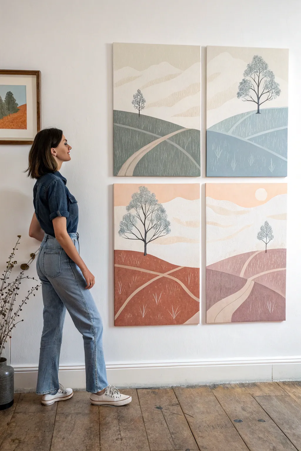
This striking wall art project transforms a single landscape design into a cohesive gallery display by exploring different color palettes across four separate canvases. The unified style creates a modern, calming atmosphere perfect for filling a large wall space with personalized art.
Step-by-Step
Materials
- 4 stretched canvases (16×20 inches or similar, vertical orientation)
- Acrylic paints (Titanium White, Earth tones, Blues, Greens, Warm Pinks/Terracotta)
- Wide flat brush (1-2 inch) for backgrounds
- Medium round brush (size 6 or 8) for hills and paths
- Fine liner brush (size 0 or 1) for trees and grass details
- Pencil for sketching
- Palette or paper plates for mixing
- Ruler or straight edge (optional)
- Clean water and paper towels
Step 1: Planning and Sketching
-
Prepare your workspace:
Lay out all four canvases side-by-side on a flat surface or upright on easels. This helps ensure the horizon lines and hill placements relate to each other visually, even though they don’t need to connect perfectly like a puzzle. -
Sketch the horizon:
Lightly draw a horizon line about one-third down from the top on each canvas. Vary the exact height slightly across the four panels to create a dynamic rhythm. -
Outline the rolling hills:
Below the horizon, sketch two or three layers of overlapping hills. Use swooping, curved lines that intersect. Keep the designs similar but not identical across all four canvases. -
Draw the paths:
Add a winding path to each composition. Start wide at the bottom edge of the canvas and narrow it significantly as it winds up toward the horizon line, disappearing behind a hill. -
Place the trees:
Decide on a focal point for each panel. Sketch a simple skeletal tree structure—a vertical trunk with branching limbs. Place some trees high on a hill in the distance and others larger and closer to the foreground.
Clean Lines Pro Tip
For crisp divisions between the hills and the sky, or along the edges of the winding path, use artist’s masking tape. Peel it off while the paint is still slightly damp.
Step 2: Creating the Color Block Layer
-
Choose your palettes:
Assign a distinct color family to each canvas. For this look, aim for: 1) Sage greens/creams, 2) Slate blues/cool grays, 3) Warm terra cotta/rust, and 4) Dusty pinks/mauves. -
Mix the sky colors:
Start with the sky on the first canvas. Mix plenty of white with a tiny drop of your chosen hue for a pale, atmospheric look. Paint the entire sky area using your wide flat brush. -
Paint distant mountains:
While the sky dries, mix a slightly darker, more opaque version of the sky color. Paint faint mountain shapes right along the horizon line for depth. -
Block in the hills:
Using your medium brush, paint the hill sections. Alternating shades creates contrast; make the furthest hills lighter and the foreground hills darker or more saturated within that canvas’s specific color family. -
Fill the paths:
Paint the winding path a light, neutral beige or cream that complements the specific panel’s color scheme. Apply two coats if necessary to ensure it looks solid. -
Repeat for all panels:
Move to the next canvas and repeat the blocking process with its designated color family (blue, rust, or pink). Work one canvas at a time so your paint mixes stay fresh.
Step 3: Adding Details and Texture
-
Paint the tree trunks:
Switch to your fine liner brush. Mix a dark charcoal or soft black paint. Carefully trace over your tree sketches, thickening the trunk at the base and tapering the branches into fine wisps. -
Stipple the leaves:
For the foliage, use a dry, scruffy brush or a stippling technique. Use a color slightly darker or lighter than the sky to create a textured, lacy canopy shape around the branches. -
Add grass texture:
Using the fine liner brush and a very light wash of white or cream paint, flick small, vertical lines onto the hills. Group them in loose clusters rather than covering the whole area to suggest wild grass. -
Refine the paths:
Add a thin highlight line along one side of the winding path to give it dimension. I find that smoothing the edges of the path with a clean, damp brush helps it sit naturally in the landscape. -
Final touches:
Check for any patchy areas in your solid colors and apply a second coat if needed. If you want a sun (like in the bottom right panel), paint a soft white circle in the sky area. -
Seal the artwork:
Once fully dry (give it at least 24 hours), apply a matte varnish to protect the paint and unify the sheen across all four panels.
Level Up: Texture
Mix a little modeling paste or baking soda into your acrylic paint for the foreground hills. This adds a gritty, physical texture that mimics earth.
Hang your new quartet of landscapes together to enjoy a serene view that changes color with every glance.
Segmented Puzzle Mural
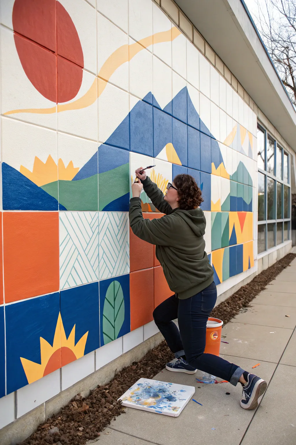
Transform a plain tiled exterior wall into a vibrant, segmented landscape using the natural grid of the tiles as your guide. This geometric mountain scene combines bold blocks of color with patterned accents, making it a perfect collaborative puzzle for a group to solve together.
How-To Guide
Materials
- Exterior acrylic latex house paint (Quart or Gallon sizes)
- Small plastic cups or containers for mixing colors
- Assorted synthetic paintbrushes (1-inch flat brushes, angled sash brushes, and small round brushes)
- Pencil and large eraser
- Blue painter’s tape
- Drop cloth or plastic sheeting
- Ladder or step stool (if needed)
- Reference grid printout of the design
- Cleaning rags
Step 1: Planning and Prep
-
Assess the Surface:
Before painting, ensure your tiled wall is clean and dry. If the wall is dirty or has mildew, scrub it down with a mild detergent and water, then let it dry completely for at least 24 hours. -
Design the Grid:
Create your design on paper first using a square grid layout that matches the number of tiles on your wall. This ‘pixel art’ approach simplifies the transfer process later. -
Protect the Area:
Lay down a drop cloth at the base of the wall to catch drips. If there is mulch or soil at the base, pull it back slightly so you can paint the bottom edge of the lowest tiles cleanly. -
Sketch the Outline:
Using a pencil, lightly transfer your design onto the wall. Since you have a grid, you can mimic the design tile by tile. Focus on marking where the horizon lines, mountain peaks, and sun rays intersect the tile edges.
Step 2: Painting the Base Blocks
-
Start with the Sky:
Begin at the top to prevent drips from ruining finished lower sections. Paint the large white or cream background areas first. -
Block in the Sun:
Mix a warm, muted red and paint the large circle in the upper left corner. Use an angled sash brush to get a crisp curve against the background color. -
Add Golden Accents:
Using a mustard yellow, paint the wavy ‘cloud’ line extending from the sun and the jagged sunburst shapes lower down. I find painting the outline of these shapes first makes filling them in much faster. -
Paint the Mountains:
Apply your blues. Use a lighter, dusty blue for the distant peaks and a deeper, saturated royal blue for the foreground mountains to create depth. -
Fill the Foreground:
Move to the bottom sections, filling in the large orange squares and the deep blue blocks. Apply two coats if the concrete texture shows through too much.
Clean Lines
For ultra-crisp straight lines inside a single tile (like the pattern blocks), use blue painter’s tape. Press the edge down firmly to stop bleed-under.
Step 3: Adding Patterns and Details
-
Create Green Hills:
Paint the rolling green hills that sit in front of the mountains. Ensure a sharp line where the green meets the blue mountain base. -
Detail the Geometric Patterns:
For the patterned tiles, paint the base color first (like the creamy white square). Once dry, carefully hand-paint the teal diagonal hatch lines using a smaller flat brush. -
Add Botanical Elements:
In the lower blue squares, paint simple oversized leaf shapes. Use a lighter green for the leaf body and a dark green or blue for the center vein. -
Refine the Edges:
The grout lines between tiles act as a natural frame. You can choose to paint over the grout for a continuous look, or leave the grout unpainted to emphasize the grid aesthetic. If keeping them unpainted, wipe away any accidental smudges immediately with a damp rag. -
Touch Up:
Step back about ten feet to view the whole mural. Look for any patchy areas or uneven lines and apply small touch-ups where needed. -
Clean Up:
Remove the drop cloth, wash out your brushes thoroughly with water, and reseal your paint cans for future touch-ups.
Collaborative Coding
Number the tiles on your paper design (A1, A2, B1, etc.) and assign specific tiles to different group members to speed up the work.
Step back and admire how individual tiles have come together to form a cohesive and striking outdoor gallery
Community Mandala With Repeating Shapes
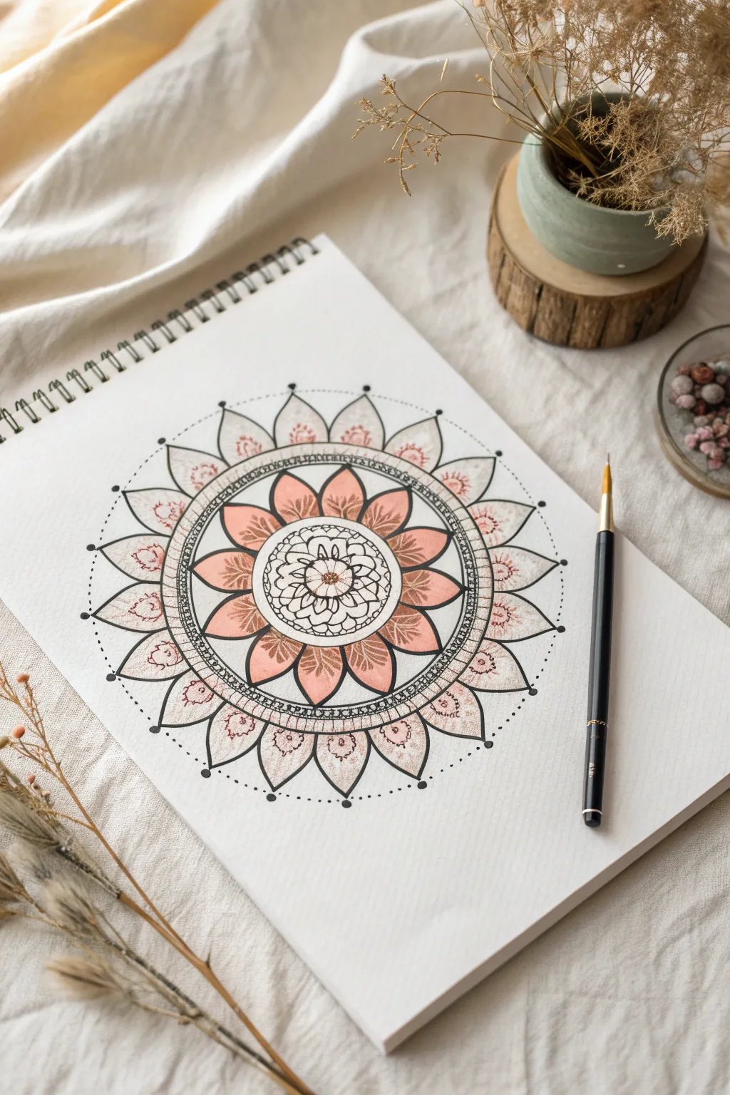
Create a soothing, symmetrical centerpiece with this elegant floral mandala design. Combining crisp black ink lines with soft, dusty-pink watercolor washes, this project offers a perfect balance between structured repetition and organic flow.
Detailed Instructions
Materials
- Spiral-bound sketchbook or mixed media paper
- Pencil (HB or H)
- Eraser
- Compass
- Ruler
- Fineliners (Black, 0.1mm, 0.3mm, and 0.5mm)
- Watercolor paints (dusty rose/terracotta)
- Small round paintbrush (size 2 or 4)
- Water cup and paper towel
Step 1: Building the Framework
-
Find the center:
Begin by finding the exact center of your paper. Make a tiny dot with your pencil to anchor the entire design. -
Draw the concentric circles:
Using your compass, draw a series of light pencil circles radiating from the center point. You will need a small inner circle (approx. 1 inch diameter), a medium circle for the main petals (approx. 3 inches), a decorative band circle (3.5 inches), and a large outer circle for the final petal layer (approx. 5.5 inches). -
Create guidelines:
Using a ruler, lightly draw straight lines through the center, dividing the circle like a pizza. Start with vertical and horizontal lines, then divide those sections in half until you have 16 equal wedges. These will ensure your repeating shapes stay evenly spaced.
Step 2: Drawing the Inner Flower
-
Start the center bloom:
Switch to your 0.3mm fineliner. In the very center, draw a small circle, then surround it with 8 small, rounded petals. Inside those petals, add tiny details like dots or lines for texture. -
Add the first petal layer:
Draw a second row of larger, pointed petals around the small center flower. These should nest between the smaller petals. -
Create the main floral ring:
Move to the medium circle guide. Draw 12-16 large, leaf-shaped petals. The tips of these petals should touch the pencil guideline you drew earlier. Keep your hand relaxed to get smooth curves. -
Structure the decorative band:
Around the main floral ring, ink two concentric circles close together to create a band. Inside this band, draw a repetitive pattern—small semicircles or hatch marks work beautifully here.
Wobbly Circles?
Don’t stress if your freehand circles aren’t perfect. Thickening the line weight on the ‘wobbly’ side can visually correct the shape and hide unevenness.
Step 3: Adding the Outer Layers
-
Draw the large outer petals:
Using the largest pencil circle as a guide, draw wide, pointed arches for the final layer of petals. These should be the largest shapes in your mandala, framing the inner work. -
Detail the outer petals:
Inside each large outer petal, sketch a smaller, floating petal shape. I like to add a tiny scribbled flower or organic shape inside this floating area to make it look intricate. -
Add connecting dots:
INK tiny black dots on the very tips of the outer petals. Then, connect these tips with a delicate dotted line that forms a large circle around the entire perimeter. -
Erase guidelines:
Let the ink dry completely for at least 5-10 minutes. Once dry, gently erase all your pencil circles and wedge lines to reveal the clean black and white design.
Level Up: Metallic Pop
Swap the pink watercolor for gold ink or metallic paint on every other petal. The subtle shimmer adds a luxurious, professional finish to the piece.
Step 4: Painting and Finishing
-
Prepare the wash:
Mix a dusty rose or terracotta watercolor. Dilute it with plenty of water so it remains translucent—you want to see the ink lines through the paint. -
Paint the main ring:
Carefully fill in the main floral ring (the middle layer) with your pink wash. Try to keep the color even, or let it pool slightly at the base of the petals for a subtle gradient. -
Add subtle accents:
Using a very diluted version of the same pink, add small touches of color to the tiny flowers inside the large outer petals. Leave the rest of the outer petals white for contrast. -
Enhance texturing:
Once the paint is bone dry, take your 0.1mm fineliner and add fine stippling (dots) or hatching on top of the painted areas to deepen the shading near the center. -
Final heavy lines:
Use your thickest pen (0.5mm) to re-trace the major structural circles, particularly the bands separating the flower layers. This adds visual weight and makes the design pop.
Enjoy the calm focus that comes with watching your radial pattern bloom on the page
Stencil-Free Hand Lettered Word Art
Bring warmth to any room with this textured, stencil-free canvas that celebrates the charming imperfections of hand lettering. Featuring soft earth tone acrylics and playful patterns within bold block letters, this project is a relaxing way to practice your typography skills while creating custom wall art.
Step-by-Step
Materials
- Large stretched canvas (24×36 or similar)
- Acrylic paints (rust, sage green, mustard yellow, muted teal, slate blue, off-white)
- Assorted flat brushes (1/2 inch to 1 inch)
- Small round detail brush (size 0 or 1)
- Pencil and white eraser
- Ruler or T-square
- Painter’s tape or artist tape
- A palette or paper plate
- Bucket of water and paper towels
Step 1: Planning and Layout
-
Grid setup:
Begin by lightly measuring out horizontal guidelines on your canvas using a ruler and pencil. You will need distinct zones: a large area at the top for big block letters, a middle band for your central phrase, and a bottom section for the largest letters or shapes. -
Sketching the letters:
Lightly sketch your block letters. Don’t worry about making them perfectly uniform; the charm of this piece lies in the hand-drawn aesthetic. Draw a large ‘HAND’ at the top, followed by ‘HAND-LETTERED’ in smaller, simpler text across the middle, and your final word or shapes at the bottom. -
Refining the shapes:
Go back over your pencil lines to thicken the block letters, ensuring they look substantial enough to hold patterns inside. Keep your pencil pressure very light so graphite doesn’t smudge into your paint later.
Step 2: Color Blocking
-
Preparing the palette:
Mix your acrylics to achieve that muted, boho palette. I find that adding a tiny drop of brown or grey to standard bright colors helps achieve those sophisticated earthy tones seen in the example. -
Painting the first letters:
Using a flat brush, fill in the solid base colors for letters like the mustard ‘H’ and the rust ‘N’ at the top. For letters that will have patterns, simply paint the solid background color first and let it dry completely. -
Painting the distinct shapes:
Move to the square and arch shapes in your composition. Paint the square teal block and the arched shapes with steady, even strokes. Apply a second coat if the canvas texture is showing through too much. -
The middle text:
Switch to a smaller flat brush or round brush for the ‘HAND-LETTERED’ line. Paint these letters in a dark slate grey or soft black. Since these are thinner, take your time to keep the line width relatively consistent. -
Drying time:
Allow the entire canvas to dry for at least 30 minutes. If the paint is cool to the touch, it needs more time.
Keep it Steady
Rest your pinky finger on a dry part of the canvas to stabilize your hand while painting detailed lines or lettering.
Step 3: Adding Details and Patterns
-
Creating stripes:
Using your detail brush and a contrasting color, paint diagonal stripes inside the ‘A’ or the teal square. You don’t need tape for this; freehand lines add character. -
Adding organic shapes:
On the rust-colored ‘A’ or ‘N’, paint swirling, vine-like patterns or loose scribbles in white or a lighter shade of the base color. -
Dot work:
Dip the handle end of a paintbrush into white or light beige paint to stamp perfect dots. Use this technique on the square or the bottom ‘L’ to create organized rows of stippling. -
Linear accents:
Add thin vertical lines or hatch marks to other letters using your finest brush. Vary the pressure to create thick and thin variations within the strokes. -
Layering shapes:
For the arch shapes, paint smaller internal arches in alternating colors (like the muted clay inside the sage green arch) to create a rainbow effect. -
Final touches:
Step back and look for any letters that feel too plain. Add a small cross, a circle, or simple texture to balance the composition. -
Clean up:
Once the paint is fully cured, gently erase any visible pencil guidelines that haven’t been covered by paint.
Fixing Wobbly Lines
If a letter edge looks messy, wait for it to dry, then use the background color (usually white) to ‘cut in’ and tidy the edge.
Hang your new masterpiece and enjoy the personalized, artisanal vibe it brings to your space
Texture Tools Party Painting
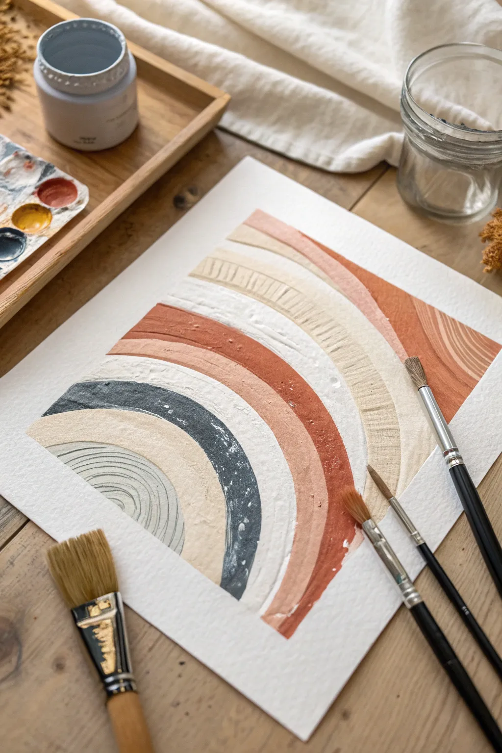
Create a stunning, modern art piece characterized by earthy tones and satisfyingly tactile surfaces. This project uses texture paste and warm, muted colors to build a sophisticated rainbow arch that feels organic and handcrafted.
Step-by-Step Tutorial
Materials
- Heavyweight watercolor paper or mixed media paper
- Acrylic paints (terracotta, cream, slate blue, beige, white)
- Texture paste or modeling paste
- Palette knife or old credit card
- Flat shader brushes (various widths)
- Round detail brush
- Pencil
- Ruler
- Palette for mixing
- Water jar and paper towels
Step 1: Preparation & Sketching
-
Secure the paper:
Start by taping down your paper to a flat surface or drawing board. This prevents buckling from the moisture in the paint and texture paste. -
Mark the center:
Use a ruler to find the approximate horizontal center of your paper near the bottom edge. This will be the anchor point for your arches. -
Sketch the arches:
Lightly sketch semi-circles radiating from your center point. You don’t need a compass; freehand drawing adds to the organic, boho feel. Create about 5-6 distinct bands of varying widths.
Step 2: Creating Texture
-
Mix the texture medium:
On your palette, mix your acrylic paints with the texture paste. Aim for a 50/50 ratio to ensure the color holds but the body remains thick. -
Prepare the terracotta tone:
Create a warm terracotta by mixing burnt sienna with a touch of white and red. Add the texture paste and mix thoroughly until smooth but thick. -
Apply the outer band:
Using a medium flat brush, apply the terracotta mixture to one of the larger outer bands. Don’t smooth it out perfectly; leave visible brushstrokes and ridges for dimension. -
Mix the slate blue:
Combine blue, a tiny drop of black, and plenty of white to get a muted slate blue shade. Mix with texture paste. -
Paint the accent arch:
Apply the textured blue paint to one of the middle bands. Use the edge of the brush to create a crisp line against the neighboring empty space. -
Create the cream tones:
For the lighter bands, mix white with a tiny dot of yellow oxide or beige. I like to keep this mixture very thick to contrast with the darker bands. -
Fill remaining bands:
Fill in the rest of the arches with your creamy beige and off-white mixtures. Vary the direction of your brushstrokes slightly to distinguish between similar colors.
Build That Body
No texture paste? Make a DIY version by mixing baking soda into your acrylic paint until it reaches a frosting consistency.
Step 3: Details & Distress
-
Scraping technique:
While the paint is still tacky (semi-wet), take the back end of a paintbrush or a palette knife and gently scrape horizontal lines into the widest beige band. -
Adding ridges:
For the innermost arch, use a smaller brush to create concentric, curved ridges that mimic the shape of the rainbow itself. -
Dry styling:
If you want a roughed-up look, wait for the paint to dry slightly and drag a nearly dry stiffness brush over the texture to create ‘skips’ in the surface. -
Clean the edges:
Use a small, damp round brush to neaten up any wobbly edges between the color bands, ensuring crisp separation. -
Add speckles (optional):
Dilute a tiny bit of white paint with water. Flick the bristles of an old toothbrush over the semi-dry arches for a stone-like effect. -
Final drying:
Let the piece dry completely flat. Because of the texture paste, this might take several hours or overnight.
Metallic Luxe
Once the painting is fully dry, dry-brush a tiny amount of gold leaf paint over the raised ridges for an elegant shimmer.
Frame your textured masterpiece in a light wood or floating frame to complement the natural aesthetic


Have a question or want to share your own experience? I'd love to hear from you in the comments below!