
When I’m craving a little extra joy, I love turning it into something I can see on paper. These happiness drawing ideas are meant to feel light, doable, and instantly mood-boosting—like a mini art pep talk.
Smiling Sun With Radiating Joy Lines
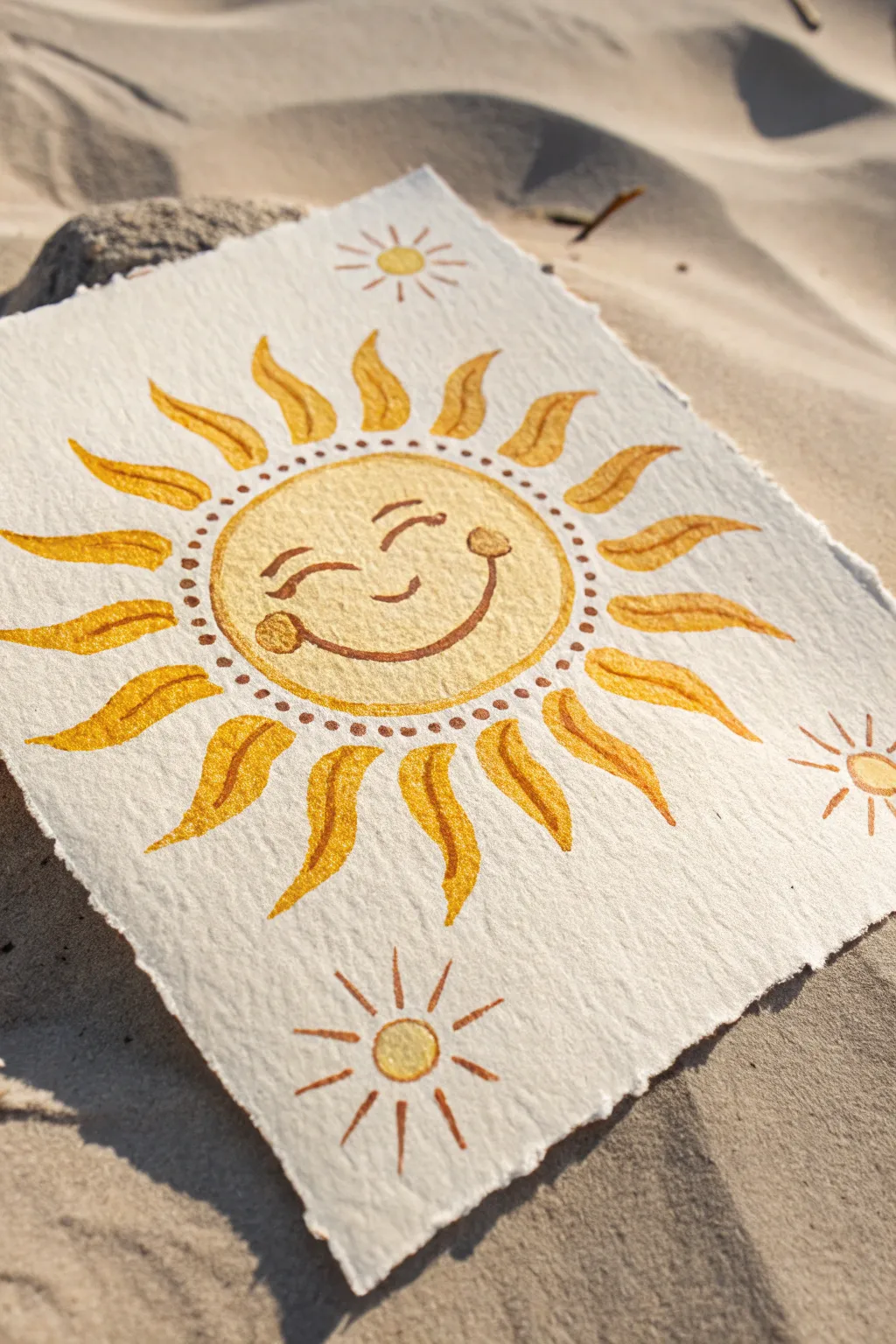
Capture the warmth of a sunny day with this cheerful watercolor illustration featuring a smiling sun surrounded by joyful, dancing rays. Painted on textured, deckle-edge paper, this project radiates a rustic, handmade charm that is perfect for gifting or framing.
Step-by-Step
Materials
- Heavyweight cold-press watercolor paper (300gsm or higher)
- Watercolor paints (Yellow Ochre, Cadmium Yellow, Burnt Sienna)
- Round watercolor brushes (size 2 and size 6)
- Pencil (HB or H for light sketching)
- Kneaded eraser
- Ruler
- Jar of clean water
- Paper towels
Step 1: Preparation and Sketching
-
Prepare the paper to size:
Begin by tearing your watercolor paper to size rather than cutting it. Use a ruler as a guide and gently tear against the edge to create that beautiful, fibrous deckle edge seen in the reference. -
Map out the central circle:
Lightly find the center of your paper. Using a compass or tracing a small bowl, draw a faint circle about 3-4 inches in diameter. -
Sketch the rays:
Draw wavy, flame-like shapes radiating outward from the circle. Aim for about 16-18 rays, keeping them slightly irregular to maintain a hand-drawn feel. -
Add the joyful face:
Sketch the facial features in the center. Draw two closed, crescent-moon eyes and a wide, U-shaped mouth. Add small circles at the corners of the mouth for cheeks. -
Place the mini suns:
In the open corners of the paper (top and bottom), lightly sketch smaller, simpler sun shapes with straight line rays.
Granulation Magic
Use a rough or cold-press paper. The texture allows pigment to settle in the valleys of the paper, creating that gorgeous, speckled vintage look seen in the sun’s face.
Step 2: Painting the Sun Face
-
Mix the base yellow:
Create a watery wash of Yellow Ochre on your palette. You want a warm, sandy yellow tone, not a neon yellow. -
Fill the center circle:
Using your size 6 brush, fill in the main circle with the wash. Use the wet-on-dry technique to keep the edges crisp. -
Add texture while wet:
While the circle is still damp, dab a tiny bit of slightly concentrated pigment near the edges to create a subtle glow effect. -
Let the base dry:
Allow the central circle to dry completely. If the paper feels cool to the touch, it’s still wet. -
Paint the facial details:
Switch to your size 2 brush and load it with Burnt Sienna. Carefully paint over your pencil lines for the eyes, smile, and cheeks. The darker brown contrasts beautifully with the pale yellow.
Step 3: Creating the Radiating Rays
-
Base coat for rays:
Mix a slightly more vibrant yellow, perhaps adding a touch of Cadmium Yellow to your ochre mix. Paint each wavy ray, ensuring the paint doesn’t touch the central circle yet. -
Add dimension to the rays:
I like to drop a tiny amount of Burnt Sienna into the tips or curves of the wet rays to give them a flickering, fire-like appearance. -
Paint the decorative border dot:
Once the center and rays are dry, use the tip of your size 2 brush and the brown mix to paint a ring of small dots between the face and the rays. -
Refine the ray edges:
If needed, use the fine brush to sharpen the tips of the wavy rays so they look distinct and sharp.
Metallic Shine
Once the paint is dry, add highlights to the sun rays using metallic gold watercolor paint or a gold gel pen for extra shimmer when the light hits it.
Step 4: Finishing Touches
-
Paint the corner suns:
Fill in the small circles on the top and bottom mini-suns with the lighter yellow wash. -
Detail the corner suns:
Use the brown Burnt Sienna mix to paint simple straight lines radiating from these smaller suns. -
Erase guidelines:
Wait until the painting is bone-dry (give it at least 20 minutes), then gently dab with a kneaded eraser to lift any visible pencil marks. -
Final assessment:
Step back and look at the composition. If the face needs more definition, go over the smile lines one more time with a slightly thicker brown mix.
Place your finished piece in the sun to admire how the natural light interacts with those warm yellow tones

Rainbow Over a Happy Little Cloud
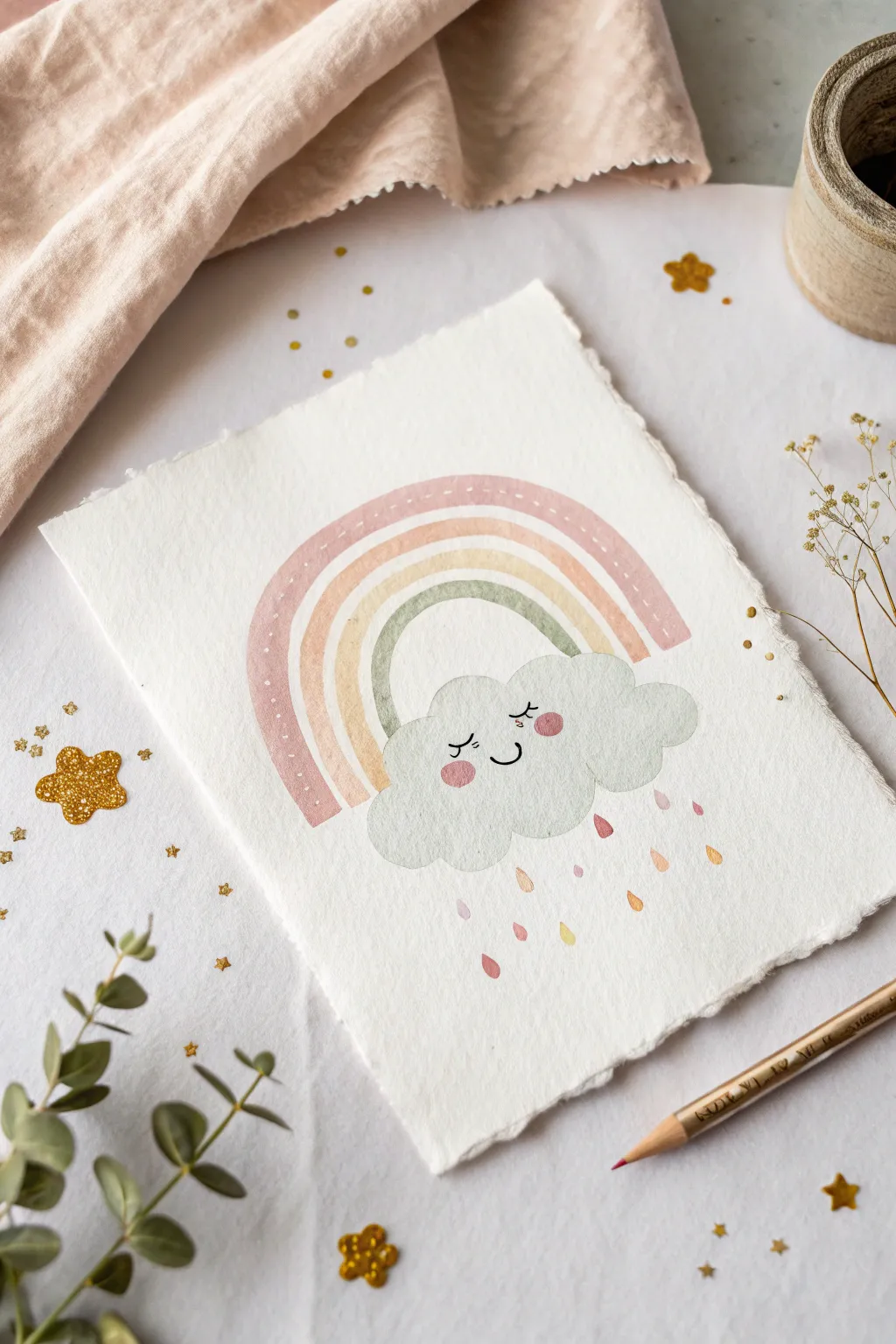
This whimsical watercolor project features a gentle, sleeping cloud nestled under a soft pastel rainbow. The muted, earthy tones and delicate raindrops create a soothing piece of art perfect for a nursery or a relaxing creative afternoon.
How-To Guide
Materials
- Cold press watercolor paper (deckle edge preferred)
- Watercolor paints (dusty rose, peach, sage green, cool grey)
- Round watercolor brush (size 4 or 6)
- Small detail brush (size 0 or 1)
- Fine liner pen (black, waterproof)
- White gel pen (optional)
- Pencil and eraser
- Jar of clean water
- Paper towel
Step 1: Sketching the Composition
-
Outline the cloud:
Start by lightly sketching a fluffy cloud shape near the bottom center of your paper. Keep the bottom edge relatively flat and the top bumps rounded and soft. -
Add the rainbow arches:
Above the cloud, sketch four concentric arches for the rainbow. Leave a small gap between the cloud and the innermost arch to keep the design airy. -
Mark the raindrops:
Lightly draw small teardrop shapes falling from below the cloud. Vary their heights to create a natural, drifting rain effect.
Color Harmony Tip
To keep the “vintage” nursery look, mix a tiny dot of brown or grey into your bright colors. This desaturates them, turning bright pink to dusty rose and bright orange to soft peach.
Step 2: Painting the Rainbow
-
Paint the outer arch:
Mix a watery, dusty rose color. Using your round brush, fill in the outermost arch of the rainbow. Keep the paint fluid but controlled. -
Add the second band:
While the first band dries slightly, mix a soft peach tone. Paint the second arch, being careful not to let the wet paint touch the rose band completely if you want distinct lines. -
Fill the third band:
Create a pale, sandy yellow or warm beige color. Carefully paint the third arch, maintaining a steady hand to keep the curve smooth. -
Complete the inner arch:
For the smallest arch, mix a muted sage green. Fill this space, anchoring the rainbow design. -
Add texture:
Once the outer rose arch is completely dry, use a very diluted white gouache or a white gel pen to add tiny dashes along the center of the band for a stitched look.
Bleeding Colors?
If your rainbow bands are bleeding into each other, you’re painting too fast! Let each arch dry to the touch before painting its neighbor, or leave a hairline gap of white paper between them.
Step 3: Bringing the Cloud to Life
-
Paint the cloud base:
Mix a very pale, cool grey. Fill in the entire cloud shape with a light wash. The color should be translucent, almost like a shadow. -
Add rosy cheeks:
While the grey wash is still slightly damp (but not soaking), drop two small circles of watered-down pink paint onto the cheek areas. This wet-on-wet technique creates soft, fuzzy edges. -
Define the face:
Wait for the cloud to be 100% dry. Using your fine liner pen, draw two curved lines for sleeping eyes with tiny eyelashes, and a simple ‘u’ shape for a smile.
Step 4: Finishing Touches
-
Paint the raindrops:
Using the leftover colors from your rainbow (rose, peach, beige), paint the teardrop shapes below the cloud. Alternate colors randomly for a playful look. -
Clean up sketch lines:
Once you are absolutely certain all paint is bone dry, gently erase any visible pencil marks, especially around the rainbow arches. -
Create the deckle edge:
If you started with a standard sheet, you can carefully tear the edges of the paper against a ruler to mimic the textured, handmade look seen in the photo.
Display your charming artwork in a simple wooden frame or gift it to a friend who needs a little cheer


Heart Balloon Lifting a Tiny Character
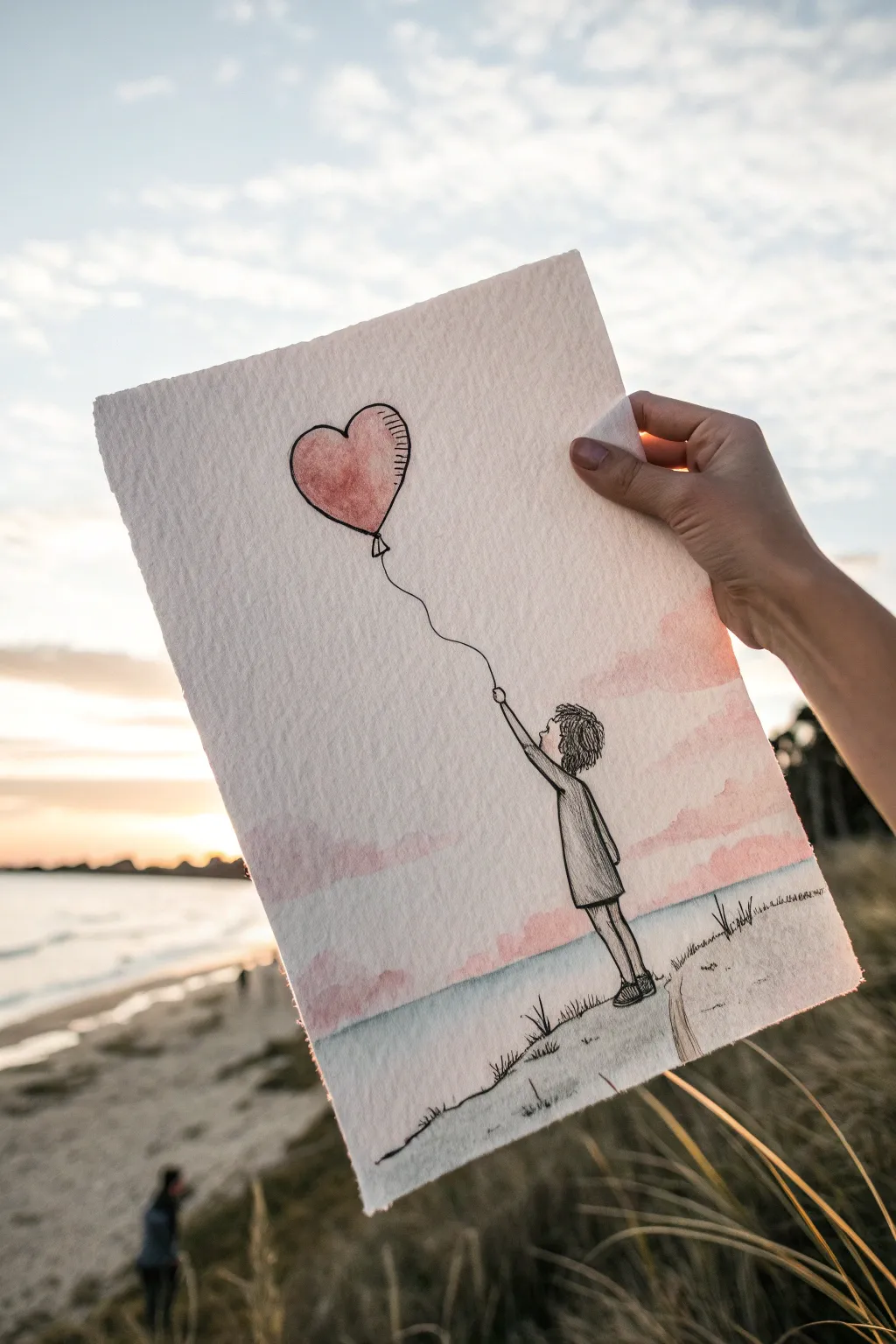
Capture a moment of quiet joy with this mixed-media illustration featuring a whimsical character lifted by a heart-shaped balloon. This project combines simple ink line work with soft watercolor washes to create a dreamy, uplifting scene.
Step-by-Step
Materials
- Cold-press watercolor paper (300gsm/140lb)
- Fine liner pen (black, waterproof, size 0.1 or 0.3)
- Watercolor paints (Alizarin Crimson, Cobalt Blue, Rose Madder)
- Round watercolor brush (size 4 or 6)
- Pencil (HB or 2H)
- Eraser
- Jar of clean water
- Paper towels
Step 1: Sketching the Composition
-
Plan placement:
Visualize your composition on the textured paper. The heart balloon should be in the upper left quadrant, tilted slightly to the right, while the figure stands in the lower right area. -
Draw the balloon outline:
Lightly sketch a heart shape using your pencil. Make it slightly plump and rounded rather than sharp and geometric. Add a small triangle at the bottom where the string attaches. -
Sketch the figure:
Draw the small character below and to the right. Start with a simple circle for the head, looking upward. -
Add the body:
Sketch a simple A-line tunic or coat shape for the body. The pose should be leaning back slightly, with one arm extended high up towards the balloon. -
Connect the string:
Draw a wavy, organic line connecting the base of the balloon to the figure’s hand. Let the line have a bit of slack and movement rather than being perfectly straight. -
Ground the scene:
Sketch a gentle slope for the ground beneath the figure’s feet. Add a few vertical scribbles to indicate grass.
Bleeding Lines?
Make absolutely sure your pen is waterproof before painting. If not, paint the colorful washes first, let them dry completely, and then draw your ink lines on top.
Step 2: Inking the Details
-
Outline the balloon:
Using your waterproof fine liner, go over the pencil lines of the heart. Add small hatching marks on the right side of the heart to suggest volume and shadow. -
Ink the character:
Trace the figure’s head and hair. Use short, scraggly strokes for the hair to give it a messy, windblown texture. -
Define the clothing:
Ink the coat, adding a few vertical lines within the shape to suggest fabric folds. Draw the legs and simple shoes. -
Detail the ground:
Ink the ground line, using broken strokes for a natural look. Add tufts of grass sticking up along the slope. -
Erase pencil marks:
Wait until the ink is completely dry to prevent smudging, then gently erase all visible pencil guidelines.
Step 3: Adding Watercolor Softness
-
Wet the balloon area:
Dip your brush in clean water and lightly dampen the inside of the heart shape, being careful to stay within the lines. -
Paint the heart:
Load your brush with Alizarin Crimson. Touch it to the left side of the wet heart and let the color bleed naturally towards the right. You want the color uneven for a textured look. -
Prepare the sky wash:
Mix a very watery, pale wash of Rose Madder or a soft pink. I prefer testing the opacity on a scrap piece first to ensure it’s translucent enough. -
Apply the pink sky:
Paint gentle horizontal strokes across the middle of the page, behind the balloon string and figure. Leave white space at the top. -
Add the horizon:
While the pink is still slightly damp, mix a watery Cobalt Blue. -
Paint the sea line:
Apply the blue wash directly below the pink area to create a horizon line, suggesting the ocean or distance. Let the colors touch slightly to create a soft violet transition. -
Ground shadow:
Add a very faint wash of grey or diluted blue to the ground area beneath the grass to give it some weight.
Pro Tip: Texture Magic
For the specific texture seen on the heart balloon, try lifting a little bit of the wet red paint with a twisted corner of a dry paper towel to create a highlight.
Step 4: Final Touches
-
Strengthen the string:
Once the background paint is dry, re-trace the string line if the paint has obscured it, ensuring a continuous connection. -
Review and refine:
Check your shadows. If the balloon needs more depth, add a second layer of red only on the shadowed side once the first layer is bone dry.
Now you have a charming piece of art that serves as a gentle reminder to hold onto hope and happiness


Self-Hug With a Big Heart at the Chest
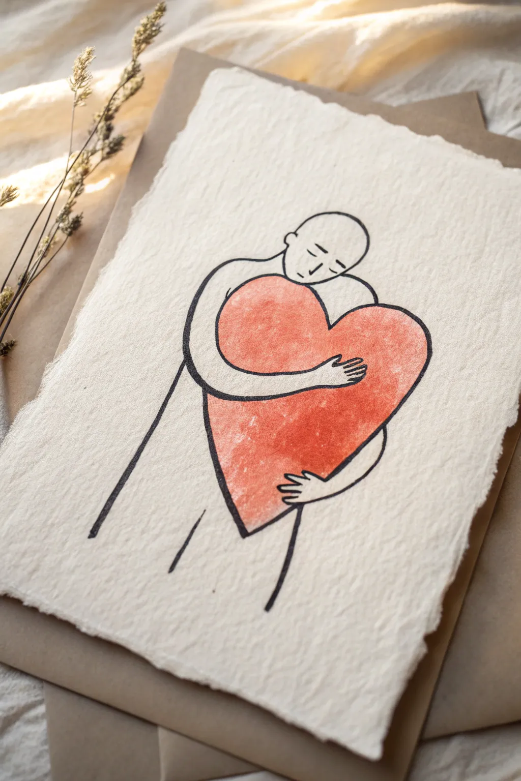
This tender minimalist illustration captures the warmth of self-acceptance using simple line work and a bold splash of color. The textured, handmade paper adds an organic, heartfelt quality that makes this piece feel incredibly personal and grounding.
How-To Guide
Materials
- Heavyweight handmade cotton rag paper (deckle edge)
- Black archival ink fineliner pen (0.5mm or 0.8mm)
- Red watercolor paint or gouache
- Soft round watercolor brush (size 6 or 8)
- Pencil (HB or 2H)
- Kneadable eraser
- Paper towel
- Cup of water
Step 1: Preparation and Sketching
-
Prepare the surface:
Place your sheet of handmade paper on a flat, clean surface. Because this paper can be quite textured and sometimes uneven, taping it down isn’t always necessary, but ensure your workspace is stable. -
Map out the heart:
Using your pencil very lightly, draw a large, tilted heart shape in the center of the paper. The heart should act as the anchor for the entire drawing. -
Sketch the head:
Draw an oval shape for the head resting just above the dip of the heart. The head should interact with the top curve, suggesting a nuzzling motion. -
Outline the arms:
Sketch the left arm reaching around the front of the heart. The shoulder connects to the head, and the arm curves naturally so the hand lands near the center. -
Draft the hands:
Add the fingers of the upper hand, making them look relaxed. Then, sketch the lower hand supporting the bottom curve of the heart from underneath. -
Complete the body blocking:
Draw simple, straight lines extending downward from the arm and heart to suggest the torso and sides of the body. Keep these lines minimal—abstract is better here. -
Add facial details:
Lightly pencil in the facial features: two small curved lines for closed eyes, a simple nose line, and a small mouth. The expression should be peaceful. -
Refine the composition:
Step back and look at your sketch. Erase and adjust lines now to ensure the hug looks tight and comforting before you commit to ink.
Textured Paper Tip
If your pen snags on the rough paper fibers, switch to a felt-tip drawing pen or a brush pen. They glide over bumps much smoother than metal-nibbed fineliners.
Step 2: Inking the Lines
-
Trace the outline:
Take your black archival fineliner and begin tracing over your pencil lines. Start with the head and work your way down to avoid smudging. -
Line weight variation:
Keep your pressure consistent, but don’t worry if the texture of the paper causes slight skips or bumps; these imperfections add character to the style. -
Ink the facial features:
Use a delicate touch for the eyes and mouth. These lines should be slightly thinner or lighter than the body outline to keep the face soft. -
Define the hands:
Carefully ink the fingers. Ensure the hand on top of the heart clearly overlaps the heart shape, while the heart shape overlaps the body behind it. -
Erase pencil marks:
Wait at least 5-10 minutes for the ink to dry completely. Use your kneadable eraser to gently lift away the graphite guidelines without damaging the paper surface.
Step 3: Adding Color and Texture
-
Mix your red:
Load your brush with red watercolor. I prefer a slightly diluted mix rather than thick opaque paint, as this allows the paper’s texture to show through the color. -
Paint the heart interior:
Carefully fill in the heart shape with the red paint. Work around the fingers of the top hand so they remain the color of the paper. -
Create texture:
While the paint is wet, dab it slightly with a dry paper towel in random spots if you want a mottled, vintage look, or let it pool naturally in the paper’s grooves. -
Refine edges:
Use the tip of your brush to ensure the paint meets the black ink lines cleanly, but stay just inside the lines to avoid bleeding if your pen isn’t fully waterproof. -
Final dry:
Let the artwork sit undisturbed until the paint is bone dry. Handmade cotton paper holds water longer than standard paper, so be patient.
Level It Up
Once dry, use a white gel pen to add tiny highlight lines or stippling inside the red heart to give it extra dimension and a soft, fabric-like texture.
Display this heartfelt piece in a simple frame or gift it to remind someone of the power of self-compassion

PENCIL GUIDE
Understanding Pencil Grades from H to B
From first sketch to finished drawing — learn pencil grades, line control, and shading techniques.
Explore the Full Guide
Friends Jumping Together in a Joyful Line
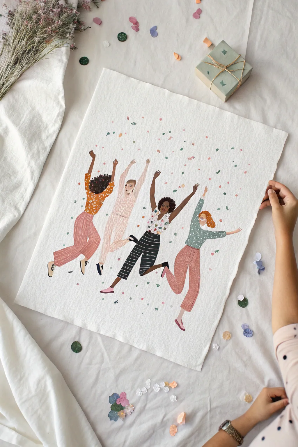
Capture the infectious energy of friendship with this vibrant illustration of four women jumping mid-air amidst a shower of confetti. Using gouache or acrylics on textured paper, you’ll create a lively scene filled with patterned outfits and dynamic poses.
Step-by-Step Tutorial
Materials
- Heavyweight watercolor paper or mixed media paper (rough grain preferred)
- Gouache or acrylic paints (matte finish)
- Pencil (HB) and eraser
- Fine liner or small round brushes (sizes 0, 1, and 4)
- Mixing palette
- Water cups and paper towels
- Optional: colored pencils for details
Step 1: Sketching the Dynamic Poses
-
Establish the curve:
Begin by lightly drawing a shallow, U-shaped curve across the paper. This will serve as the baseline for the jumping motion, ensuring the figures look like they are leaping together in an arc. -
Block in the torsos:
Sketch four rough oval shapes along your invisible curve. Tilt the bodies slightly—some leaning back, some forward—to emphasize movement. Vary the heights slightly so their heads aren’t in a perfect straight line. -
Add limbs in motion:
Draft the arms first; have most reaching upward in celebration. For the legs, create distinct bends at the knees. Some legs should kick back, while others kick forward or to the side to distinguish each character’s unique jump. -
Refine the forms:
Flesh out the stick figures into realistic shapes. Add volume to the pants and sleeves, keeping the clothing loose to suggest movement. Don’t worry about facial features yet; focus on the silhouette. -
Lighten the sketch:
Once happy with the composition, use a kneaded eraser to lift most of the graphite, leaving only faint guidelines so the pencil won’t show through your paint.
Pattern Precision
Wait for the base layer of paint to be bone-dry. If it’s even slightly cool to the touch, your pattern lines will bleed. Use a distinct consistency like heavy cream for sharp details.
Step 2: Painting the Figures
-
Mix skin tones:
Prepare a variety of skin tones on your palette. Paint the faces, hands, and any exposed ankles. Keep the shapes flat and simple, letting the paper texture add character. -
Paint the hair:
Block in the hair shapes. Go for variety: a dark curly afro, a straight blonde bob, reddish waves. Leave the hair shapes slightly loose at the edges to imply movement. -
Base coats for clothing:
Select a distinct color palette for the outfits. I like to paint the solid base colors first—mustard yellow, pale pink, white, and sage green—letting them dry completely before adding patterns. -
Add clothing patterns: Figure 1:
For the figure on the far left, take a fine brush with white or light orange paint and dab small floral clusters onto her mustard top. Paint vertical stripes on her pink pants using a slightly darker shade of pink. -
Add clothing patterns: Figure 2:
For the second figure in the pale pink jumpsuit, use a slightly darker red-pink to add subtle texture lines or a faint grid pattern to give the fabric dimension without overwhelming the pale color. -
Add clothing patterns: Figure 3:
For the third figure, paint bold black horizontal stripes on her pants. For her white top, add colorful little specks or floral motifs to make it pop against the black pants. -
Add clothing patterns: Figure 4:
For the figure on the right, use a white paint pen or fine brush to add playful polka dots to her green top. Wash a simple terracotta color over her pants.
Step 3: Details & Confetti
-
Refine faces:
Using your smallest brush or a fine colored pencil, add minimal facial features. Simple eyes and joyful smiles are enough; too much detail can distract from the overall movement. -
Shoes and socks:
Paint the shoes. Give them personality—some might be sneakers with laces, others simple flats or slip-ons. Add socks peeking out where appropriate. -
Create the confetti mix:
Mix three or four pastel colors used in the clothing (pink, mint, yellow) on your palette. You want a consistent ‘party’ theme across the illustration. -
Apply the confetti:
Dip a small brush into your pastel mixes and dab small, irregular spots all around the figures. Concentrate the dots above their heads and near their hands to simulate a toss. -
Final drying:
Let the entire piece dry completely flat to prevent the paper from buckling further. If the paper curls, weigh it down under heavy books once the paint is fully cured.
Wonky Proportions?
If a limb looks too long or short, don’t erase the paint. Instead, paint over the area with opaque gouache to ‘reshape’ the clothing or limb, then redraw the edge.
Hang this cheerful artwork in a spot where you need a daily reminder of friendship and celebration
Smiling Earth for Universal Happiness
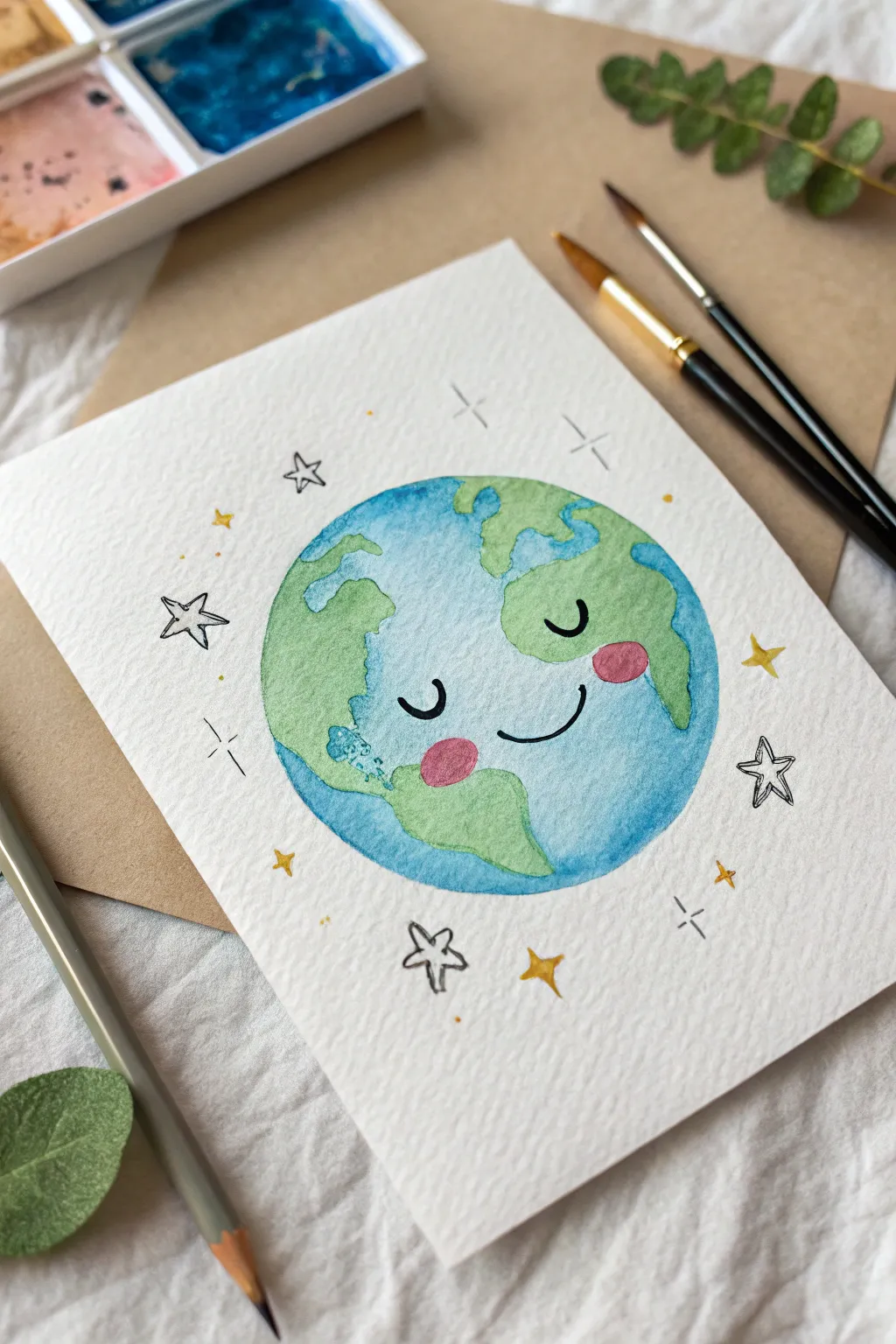
Spread a little universal joy with this adorable watercolor illustration of a smiling planet Earth. The combination of loose, watery textures and simple ink details creates a cheerful character perfect for greeting cards or wall art.
Step-by-Step Tutorial
Materials
- Cold press watercolor paper (textured)
- Watercolor paints (Cerulean or Cobalt Blue, Sap Green, Rose/Pink, Yellow)
- Round watercolor brushes (sizes 4 and 2)
- Fine liner pen (black, waterproof)
- Graphite pencil (HB or 2H)
- Circle template or compass
- Clean water and paper towel
Step 1: Sketching the Base
-
Trace the globe:
Begin by lightly tracing a perfect circle in the center of your watercolor paper using a compass or by tracing a round object like a jar lid. -
Draft the continents:
Sketch very loose, wobbly outlines for the continents inside your circle. Focus on big shapes like North and South America or Europe and Africa, but keep them simplified and cartoonish rather than geographically perfect. -
Add the face:
In the center of the ‘Atlantic Ocean’ area, lightly sketch two curved semicircles for closed sleeping eyes, a small u-shape for a smile, and two oval spots for cheeks. -
Scatter the stars:
Surround the planet with a mix of small sketched stars and simple four-point star shapes to frame the composition.
Step 2: Painting the Planet
-
First wash: The oceans:
Load your larger round brush with clean water and wet the ‘water’ areas of your globe sketch, being careful not to soak the land masses yet. -
Drop in blue:
While the paper is damp, touch your brush loaded with blue pigment to the wet areas. Let the color bloom naturally, keeping it lighter near the center face area for a highlighted effect. -
Let it dry:
Wait for the blue sections to dry completely. If you paint the land too soon, the green will bleed into the blue. -
Painting the land:
Mix a fresh Sap Green. Using the smaller brush, carefully fill in the continent shapes. I like to vary the intensity of the green slightly to add texture to the land. -
Rosy cheeks:
With a diluted Rose or Pink paint, gently fill in the two oval cheek spots. Ensure the blue underneath is totally dry first so the pink stays bright.
Wet-on-Wet Magic
For a glowy look, lift a little wet blue paint from the center of the face with a dry brush while it’s still damp to create a soft highlight.
Step 3: Details & Stars
-
Painting sparkles:
Take a bright yellow and fill in about half of the small background stars you sketched earlier, leaving the others blank for now. -
Adding outlines:
Once the entire painting is bone-dry, use your waterproof black fine liner to trace over the pencil lines of the facial features. -
Inking the stars:
Use the pen to doodle over the unpainted pencil stars, giving them a loose, hand-drawn look. -
Final decorative touches:
Add small cross-hatches or simple ‘plus sign’ sparkles in the empty white space around the globe to fill out the background. -
Erase guidelines:
Gently erase any visible pencil marks that weren’t covered by paint or ink, leaving a crisp, clean illustration.
Cosmic Sparkle
Mix a tiny amount of metallic gold watercolor or use a gold gel pen for the yellow stars to make your galaxy truly shimmer in the light.
Now you have a cheerful little world ready to brighten someone’s day
BRUSH GUIDE
The Right Brush for Every Stroke
From clean lines to bold texture — master brush choice, stroke control, and essential techniques.
Explore the Full Guide
Flower Bloom Headspace Sketch
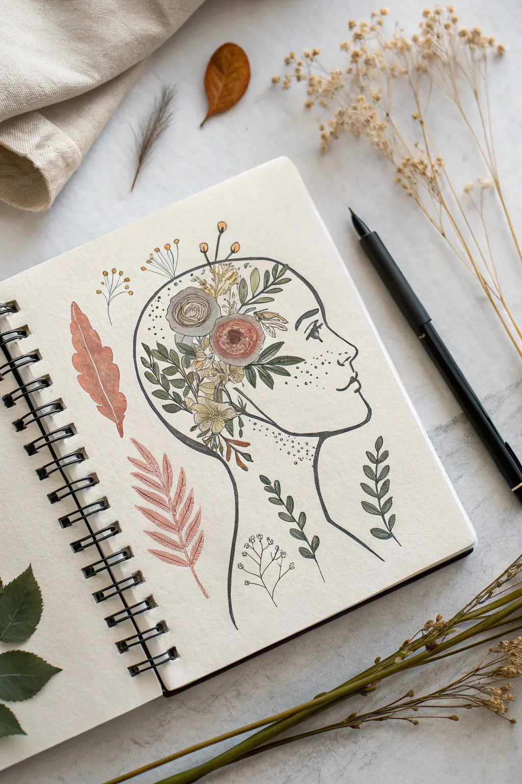
Capture the feeling of a blooming imagination with this serene profile sketch, where thoughts literally blossom into a garden. This project combines simple line art with detailed botanical illustrations for a relaxing and meaningful creative session.
Step-by-Step
Materials
- Spiral-bound sketchbook (mixed media or heavy drawing paper)
- Fine liner pen (black, 0.3mm or 0.5mm)
- Pencil (HB) and eraser
- Colored pencils or alcohol markers (muted earth tones: sage green, terracotta, mustard)
- White gel pen (optional for highlights)
Step 1: Laying the Foundation
-
Profile outline:
Begin with a light pencil sketch of a human profile facing right. Keep the lines simple: a forehead flowing into a nose, lips, chin, and a smooth curve for the neck. Don’t close the top of the head completely yet; leave the cranial area open for the flowers. -
Defining the headspace:
Sketch a large, curved line representing the back of the skull, but instead of making it a solid line, treat it as a boundary where your flowers will live. -
Inking the face:
Using your fine liner, carefully trace the facial features (nose, lips, chin, neck) and the front hairline. Draw a simple, stylized eye with a few lashes looking forward.
Step 2: Cultivating the Garden
-
Central blooms:
Start the floral arrangement inside the head area. Draw two main circular blooms near the center—think roses or ranunculus—using tightly spiraled lines for petals. -
Leafy filler:
Surround the main blooms with clusters of small, pointed leaves. Let some leaves overlap the flowers slightly to create depth. -
Trailing vines:
Extend vines and leaves towards the back of the skull shape. Allow the leaves to form the actual contour of the head, breaking the boundary line for an organic feel. -
Upward growth:
Add vertical sprigs and buds reaching up towards the top of the head. Include long, thin stems with tiny spheroid buds for variety. -
Neck details:
Draw tiny stippling dots along the neck and jawline to add texture and shading without heavy lines.
Ink Smearing?
Wait at least 5 minutes before erasing pencil lines over ink. If using alcohol markers, ensure your liner is waterproof/archival to prevent bleeding.
Step 3: Floating Elements
-
Feather addition:
To the left of the head, draw a large, stylized feather. Use a central spine and curved, broken lines to suggest the barbs. -
Fern frond:
Below the feather, sketch a fern-like leaf. Draw a central stem with symmetrical, angled leaflets branching off. -
Loose sprigs:
Add a few disconnected botanical sprigs around the neck and behind the head to balance the composition. Keep these simple and airy.
Make it Metallic
Use gold leaf or a metallic gold paint pen for the pollen dots and flower centers. It catches the light beautifully and elevates the sketch.
Step 4: Adding Color & Detail
-
Coloring the roses:
Use a muted terracotta or dusty pink for the main flowers. Apply color lightly, building up saturation in the center of the spirals. -
Greenery tones:
Color the leaves with sage green and olive tones. I find mixing two shades of green adds a nice richness to the botanical cluster. -
Feather hues:
Fill the floating feather with a warm copper or brown tone, leaving small streaks of white paper showing for texture. -
Golden accents:
Use a mustard yellow for the tiny buds and pollen centers. Add a faint blush to the cheek area of the profile if desired. -
Freckles:
Take your fine liner and gently tap a cluster of dots across the nose and cheek area to create freckles. -
Final inking:
Go over any remaining pencil lines in the floral area with your pen. Add detail veins to the leaves and define the petals. -
Cleanup:
Once the ink is fully dry, gently erase all underlying pencil marks to leave a crisp, clean illustration.
Enjoy the peaceful process of watching your drawing bloom on the page
Simple Smiley Face Pattern Background
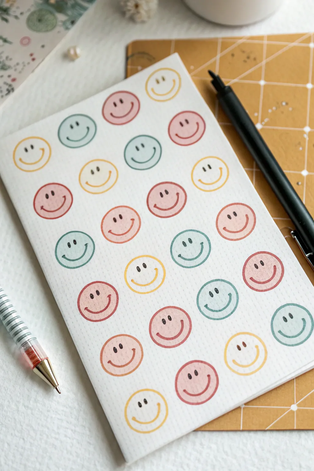
Create a charming and minimalist pattern that transforms plain paper into custom stationery. This project uses a soft, earthy color palette and simple line work to achieve a cozy, aesthetic look for your notes and lists.
Step-by-Step Guide
Materials
- Blank white notebook or heavy cardstock cut to size
- Fine-tip black gel pen or pigment liner (0.3mm or 0.5mm)
- Set of muted markers or highlighters (colors: mustard yellow, sage green/teal, dusty rose/terracotta)
- Pencil (optional for sketching)
- Eraser
- Ruler (optional for spacing)
Step 1: Planning and Base Shapes
-
Test your color palette:
Before touching your final paper, take a scrap piece and swatch your markers. You want three distinct colors that harmonize well together—in this case, a warm yellow, a muted teal or sage, and a soft reddish-brown or dusty pink. -
Visualize the grid:
Imagine a loose grid over your paper. The smileys in this design are arranged in staggered rows, meaning the faces in the second row sit in the spaces between the faces in the first row. -
Draw the first circle:
Start at the top left corner with your first color (e.g., yellow). Draw a simple, open circle. It doesn’t need to be geometrically perfect; a slightly organic, hand-drawn look adds character. -
Complete the first row:
Continue drawing circles across the top row, alternating your colors (Yellow, Teal, Pink, etc.). Leave about a half-inch of white space between each circle. -
Start the second row:
Begin the next row slightly indented so the first circle sits nestled below the gap between the first two circles of the row above. This creates a honeycomb or brick-lay effect. -
Continue the pattern:
Fill the entire page with these alternating colored circles. I find it meditative to work one row at a time to keep the spacing consistent, rather than jumping around the page. -
Let the ink settle:
Wait a minute or two for the marker ink to fully dry. This prevents the black pen from bleeding into the color in the next steps.
Uneven Circles?
Don’t stress if your circles look wobbly! This is a ‘doodle’ style pattern where imperfections make it look authentic and cozy. Uniformity is actually less desirable here.
Step 2: Adding Expressions
-
Draw the eyes:
Using your fine-tip black pen, add two small, vertical oval shapes for eyes inside the first circle. Place them slightly higher than the center line of the circle. -
Fill the eyes:
Color in the small ovals completely with black ink. Keeping them small and close together gives the face a cute, minimal aesthetic. -
Add the smile:
Draw a simple ‘U’ shape for the mouth. Position it centered below the eyes. Keep the curve relatively shallow for a classic smiley look. -
Add cheek dimples (optional):
For a little extra charm, add tiny little tick marks at the ends of the smile curve on a few faces. -
Repeat for all shapes:
Work your way down the page, adding the same simple face to every colored circle. Try to keep the proportions similar, but slight variations in expression are part of the charm. -
Check for gaps:
Look at the edges of your paper. If there’s a large empty space where a circle would naturally fall off the page, you can draw a partial circle and add just part of the face to make the pattern look continuous. -
Adding texture (optional):
If you used textured paper, the markers will naturally show some grain. If your paper is very smooth, you can lightly stipple the paper texture with an eraser to soften the marker lines. -
Final dry time:
Give the black ink a moment to set completely before closing the notebook or stacking the paper to avoid smudging your hard work.
Level Up: Emotions
Mix up the expressions! Instead of identical smiles, try adding a few winking faces, sunglasses, or surprised ‘O’ mouths scattered randomly throughout the grid.
Now you have a cheerful, custom-patterned space ready for your daily thoughts and reminders


Happiness Typography With Doodle Accents
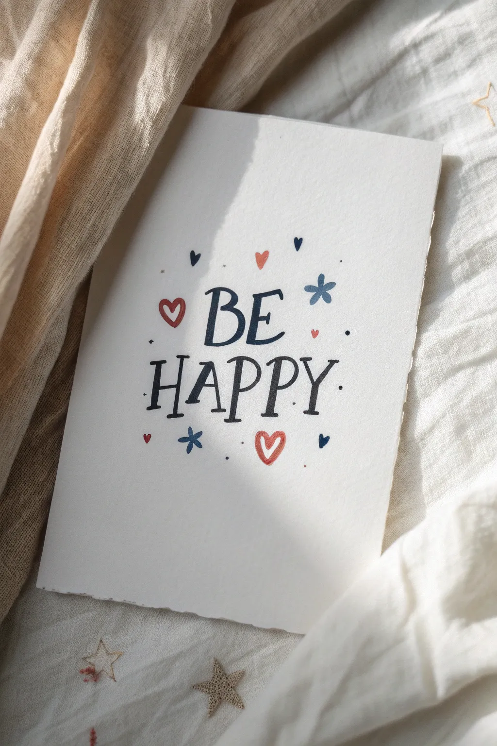
Spread a little joy with this simple yet charming lettering project that combines playful typography with delicate doodle accents. The resulting piece features a lovely textured look, perfect for a greeting card or a small framed art print.
Step-by-Step
Materials
- Cold press watercolor paper (A5 size or trimmed cardstock)
- Pencil (HB or 2H)
- Kneaded eraser
- Dark blue fine liner or brush pen (0.5mm or 0.8mm)
- Red fine liner or marker
- Light blue marker or colored pencil (optional for accents)
- Ruler
Step 1: Planning and Sketching
-
Prepare the paper:
Start with a piece of cold press watercolor paper. The texture adds a wonderful organic feel to the final piece. If you want deckled edges like the example, you can gently tear the paper against a ruler instead of cutting it with scissors. -
Mark the center:
Find the rough center of your page. Since there are two words, we want ‘BE’ to sit slightly above the center line and ‘HAPPY’ to sit below it. -
Draft the ‘BE’:
Lightly sketch the word ‘BE’ in uppercase letters. Aim for a slightly tall, playful serif style. The vertical strokes should be distinct, and the serifs can be a bit exaggerated. -
Draft the ‘HAPPY’:
Sketch ‘HAPPY’ directly below ‘BE’. Make these letters slightly larger and wider than the first line to create a balanced composition. Ensure the spacing between letters is relatively even. -
Sketch the accents:
Lightly draw small heart shapes and asterisk-style flowers around the words. Place a larger open heart to the left of ‘BE’ and a smaller solid one to the right. Add a large open heart below the ‘P’ and ‘Y’ for balance.
Ink Bleeding Issues?
If your ink feathers on the textured paper, you might be pressing too hard. Use a lighter touch or switch to a pigment liner designed specifically for watercolor paper.
Step 2: Inking the Typography
-
Trace the main strokes:
Using your dark blue fine liner, carefully trace over the pencil lines of the text. Start with the vertical downstrokes. To mimic the look in the photo, go over the downstrokes a second time to thicken them slightly, creating a faux-calligraphy effect. -
Refine the serifs:
Add small, horizontal lines at the top and bottom of your strokes to create the serifs. Keep them casual and not too geometrically perfect; this adds to the hand-drawn charm. -
Ink the ‘BE’:
Finish inking the ‘BE’. Notice how the ‘B’ has a slightly smaller top loop compared to the bottom loop. This quirky unevenness is desirable here. -
Ink the ‘HAPPY’:
trace the ‘HAPPY’. Pay attention to the ‘A’—the crossbar is quite low. For the ‘Y’, let the tail curve gently. I like to rotate the paper slightly as I work to keep my hand comfortable. -
Let the ink set:
Allow the ink to dry completely for a minute or two to prevent smudging before we erase any guidelines.
Step 3: Adding Color and Details
-
Draw the red outlines:
Switch to your red marker. Carefully trace the open heart shapes you sketched previously. The lines should be fairly thin and delicate. -
Fill the solid hearts:
Find the small solid hearts in your sketch—like the tiny one above ‘BE’ and the inverted one near the bottom left corner. Fill these in solidly with red or blue ink. -
Create the blue accents:
Using the blue pen, draw the asterisk-shaped flowers. You can make these by drawing simple intersecting lines. Vary their sizes slightly for visual interest. -
Add tiny fillers:
Look for empty spaces around the letters. Add tiny dots in blue and very small solid hearts in red to fill these gaps. Don’t overdo it; just a sprinkle is enough. -
Erase pencil lines:
Once you are absolutely certain all ink is dry, gently rub the kneaded eraser over the entire design to lift away the graphite sketches. -
Final touches:
Inspect your lettering. If any downstrokes look too thin compared to the others, carefully widen them now to unify the weight of the text.
Pro Tip: Faux Calligraphy
To get the thick-thin look without a fancy brush pen, simply double up the line on every downstroke (whenever your pen moves downwards) and color in the gap.
Now you have a cheerful piece of art ready to brighten someone’s day
Gratitude List Turned Into Little Icons
Transform a simple gratitude list into a visual delight by sketching small, meaningful icons instead of just writing words. This minimalist spread uses clean lines and structured boxes to celebrate the little cozy moments of the season.
Detailed Instructions
Materials
- Spiral-bound sketchbook or journal (blank or dot grid)
- Fine liner pen (black, 0.3mm or 0.5mm)
- Ruler
- Pencil
- Eraser
Step 1: Setting the Structure
-
Draft the grid:
Start on the left-hand page of your open notebook. Using your pencil and ruler, draw a large rectangle that fills most of the page. -
Divide the space:
Split this large rectangle into two columns and three rows to create six equal-sized boxes. Keep your pencil lines light so they are easy to erase later. -
Ink the grid:
Once you are happy with the spacing, trace over your pencil grid with the black fine liner. Use the ruler again to ensure crisp, straight lines.
Step 2: Drawing the Icons
-
Sketch the coffee cup:
In the top-left box, draw a simple teacup on a saucer. Use an oval for the rim, a ‘U’ shape for the cup, and a curved line for the handle. -
Capture the sun:
In the top-right box, draw a small circle. Add short, straight lines radiating outward to represent sunshine. -
Draw the branch:
For the middle-left box, draw a curved central stem. Add small, leaf-shaped loops alternately up the sides of the stem. -
Create a snowflake-sun:
In the middle-right box, draw another circle. Inside, draw a simple asterisk. On the outside, add small loops or ‘rays’ to give it a decorative winter feel. -
Sketch the leaf:
In the bottom-left box, draw a maple leaf shape. Start with the main veins, then outline the jagged edges connecting the points. -
Draw the mitten:
In the final bottom-right box, outline a mitten shape. Add a ribbed cuff at the bottom by drawing small vertical lines inside a rectangular band.
Keep it Consistent
Try to keep the line weight for your icons similar to the line weight of your grid. This creates a cohesive, professional look.
Step 3: The Feature Page
-
Letter the title:
On the right-hand page, write the word ‘Thankful’ in a bouncy, cursive script near the top center. I find that thickening the downstrokes slightly makes the lettering pop. -
Add an underline:
Draw a swift, looping underline beneath the title to frame it. -
Sketch the chair outline:
Below the title, pencil in the shape of a cozy armchair. Start with a tall, rounded rectangle for the back and a flatter rectangle for the seat. -
Add texture:
Fill the backrest with a cross-hatch or grid pattern to mimic wicker or woven fabric. -
Detail the drawing:
Draw the legs of the chair. You can add a tiny square shape on the seat to represent a book or a small pillow. -
Add floating leaves:
Draw tiny circles or leaf shapes falling around the chair leg to suggest an outdoor setting or fallen leaves. -
Final inking:
Go over all your pencil sketches on both pages with the fine liner. Let the ink dry completely for a minute to avoid smudges. -
Clean up:
Gently erase all remaining pencil marks to leave a clean, black-and-white finish.
Wobbly Lines?
If your grid lines aren’t perfectly straight, don’t worry. Go over them a second time loosely to create a deliberate ‘sketched’ frame style.
Enjoy the peaceful process of filling your day with gratitude through art
Laughing Mouth Close-Up Study
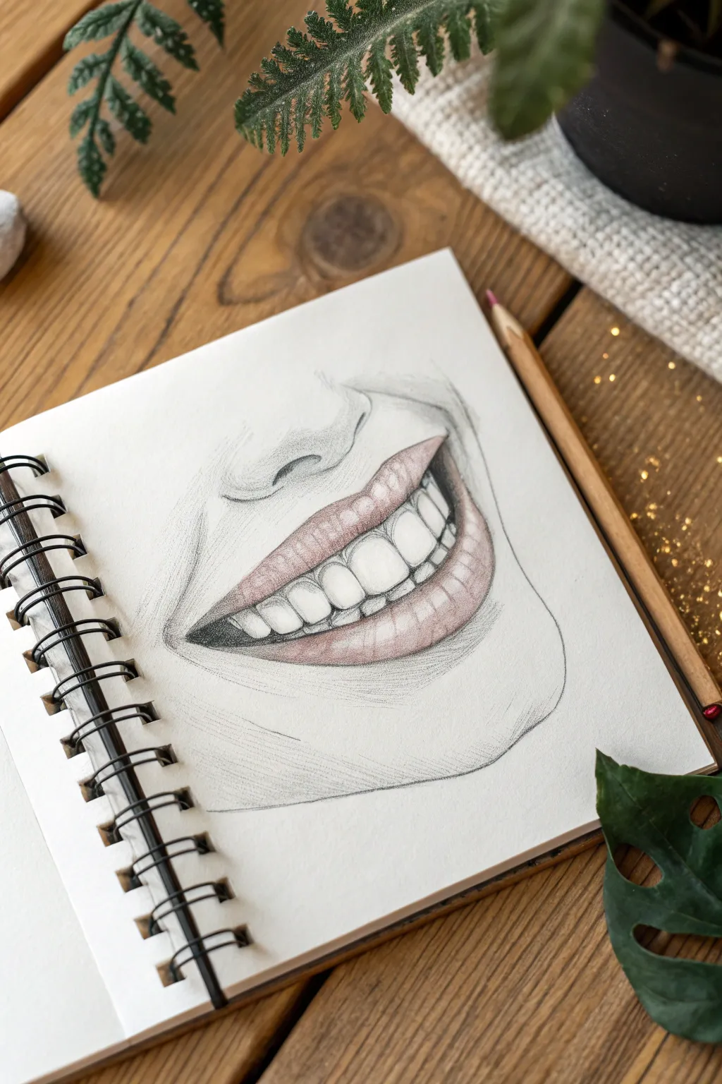
Capture the essence of joy with this focused pencil study of a laughing mouth. This project combines graphite shading techniques with a soft touch of color to create a realistic yet stylized illustration of happiness.
How-To Guide
Materials
- Spiral-bound sketchbook (smooth or vellum surface)
- Graphite pencils (HB, 2B, 4B)
- Red or pink colored pencil (soft core preferred)
- Kneaded eraser
- Precision eraser or eraser stick
- Blending stump or cotton swab
- Pencil sharpener
Step 1: Initial Sketch & Outline
-
Map the proportions:
Begin with a very light HB pencil to establish the placement of the mouth. Draw a gentle curve for the centerline where the upper and lower lips will part, tilting it slightly to suggest a dynamic laugh. -
Outline the lips:
Sketch the outer boundary of the upper lip, noting the ‘M’ shape of the cupid’s bow. Draw the fuller curve of the lower lip beneath it, ensuring the corners taper naturally into the cheeks. -
Define the teeth:
Lightly indicate the gum line inside the upper lip. Sketch the individual teeth, starting from the two front incisors and working outward. Keep the lines between teeth very faint; you don’t want them to look like gaps, just separations. -
Add facial lines:
Sketch the prominent smile lines (nasolabial folds) that curve from the nose area down around the mouth corners. Add the base of the nose and the curve of the chin to give the mouth context.
Step 2: Shading with Graphite
-
Establish darks:
Switch to a 2B or 4B pencil to darken the negative space inside the mouth, specifically the corners and the area behind the teeth. This contrast is crucial for making the white teeth pop. -
Shade the gums:
Use an HB pencil to gently shade the visible gum line above the teeth. Use short, vertical strokes that follow the curvature of the roots. -
Dimension on the teeth:
Teeth aren’t perfectly white. Lightly shade the sides of the teeth where they curve back into the mouth using an HB pencil. Leave the center of each tooth bright white to show reflection. -
Contour the skin:
Shade the skin surrounding the mouth. Focus on the shadow beneath the lower lip and the depression of the smile lines. I find cross-hatching works well here to follow the anatomy of the face. -
Detail the philtrum:
Add soft shading to the philtrum (the groove above the upper lip) and underneath the nose tip to anchor the upper part of the drawing.
Don’t Outline Teeth
Avoid drawing hard heavy lines between teeth. Instead, shade the gum above and the slight shadow *between* them to define the shapes without making them look like a fence.
Step 3: Adding Color & Texture
-
Base layer for lips:
Take your red or pink colored pencil and apply a very light, even layer over the upper and lower lips. Avoid pressing hard; you want the texture of the paper to show through slightly. -
Enhance lip volume:
Apply a second, heavier layer of color to the bottom of the upper lip and the outer edges of the lower lip. This creates a rounded 3D effect. -
Add vertical lip texture:
Sharpen your colored pencil to a fine point. Draw curved vertical lines on the lips to mimic natural cracks and texture. These lines should wrap around the form of the lip like contour lines. -
Integrate with graphite:
Use a 2B pencil to lightly shade over the colored pencil in the darkest areas of the lips (like the corners). This desaturates the pink slightly, making it look more natural and less like lipstick.
Adding Sparkle
For a magical touch, use a white gel pen for the brightest highlights on the teeth and the ‘wet’ spot on the lower lip. This sharp contrast creates an instant glossy look.
Step 4: Final Polish
-
Highlight removal:
Use a precision eraser or the sharp edge of a kneaded eraser to lift out pigment on the lower lip. Create a few crisp, white highlights to make the lips look moist. -
Refine the edges:
Clean up the outline of the teeth one last time. If the graphite has smudged onto the teeth, erase it carefully to restore brightness. -
Deepen contrast:
Go back with your 4B pencil and re-darken the deepest shadows inside the mouth corners to ensure maximum depth. -
Soften skin shading:
Use a blending stump to gently smooth out the graphite shading on the chin and cheeks, fading it out into the white paper for a vignette effect.
Now you have a captured a moment of pure joy in your sketchbook
Inner Child Joy With Balloons and Chalky Lines
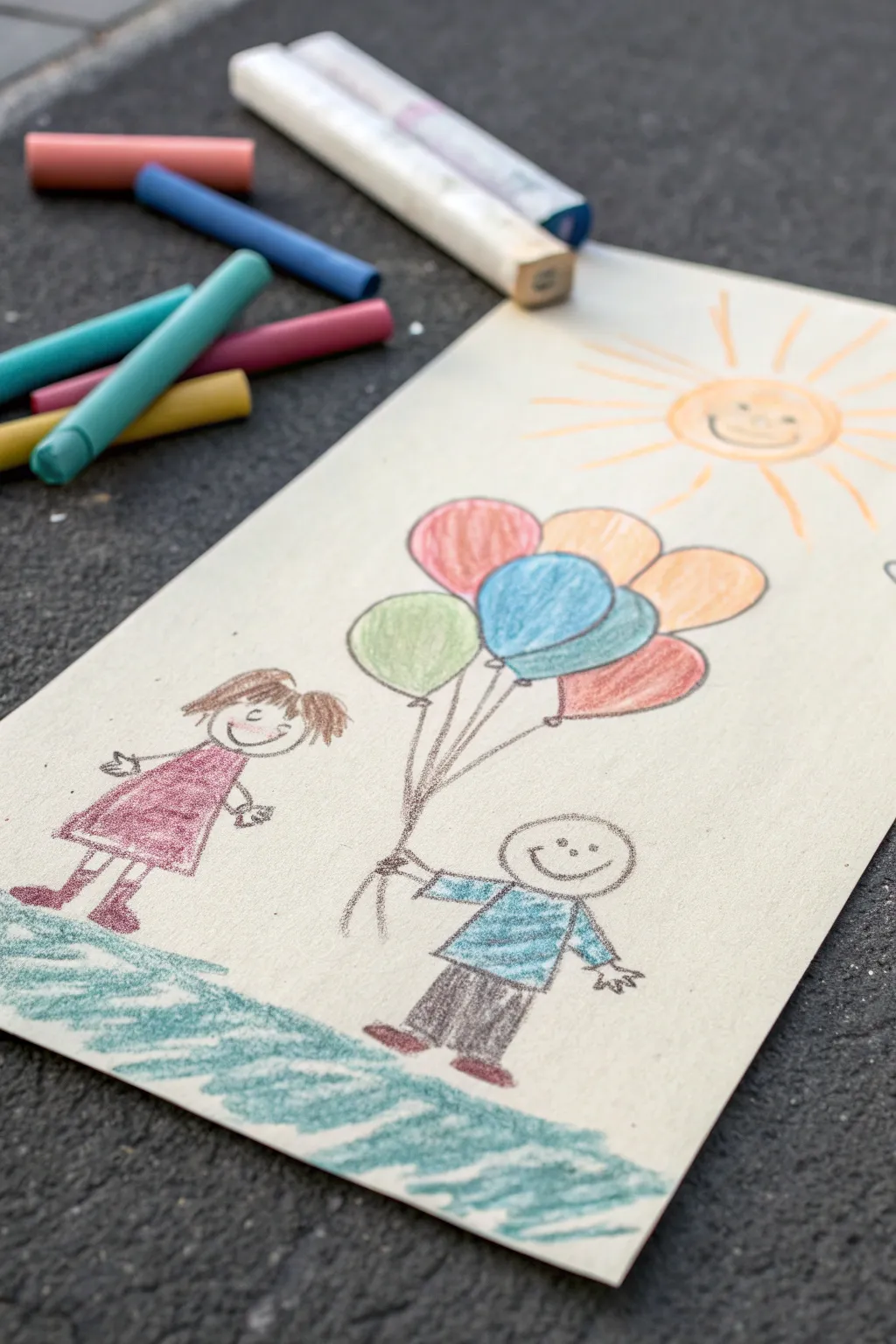
Capture the simple, uninhibited joy of childhood with this cheerful scene drawn on a unique wooden canvas. Using oil pastels allows for vibrant colors and soft, blendable textures that bring the happy figures and bright sun to life.
Detailed Instructions
Materials
- Light-colored wooden board or stiff heavy cardstock (approx. 5×10 inches)
- Set of oil pastels (including peach, pink, blue, green, yellow, brown, orange)
- Graphite pencil for sketching
- Black fine-liner or dark grey pastel for outlines
- Paper towel or blending stump (tortillon)
Step 1: Setting the Scene
-
Prepare the surface:
Begin with a clean piece of light-colored wood or heavy cardstock. If using wood, ensure it is sanded smooth enough to draw on but rough enough to grip the pastel pigment. -
Sketch the horizon:
Lightly use a pencil to mark a ground line near the bottom third of the board. It doesn’t need to be straight; a gentle curve adds movement. -
Outline the figures:
Sketch two stick-figure outlines: a girl on the left and a boy on the right. Give the boy an arm extended upward as if holding something floating. -
Add the balloons:
Above the boy’s hand, draw a cluster of five or six overlapping ovals to represent the balloons. -
Place the sun:
In the upper right corner, sketch a circle for the sun face and simple lines radiating outward for the rays.
Step 2: Bringing in Color
-
Color the balloons first:
Select your brightest pastels—pink, light blue, teal, orange, red, and lime green. Fill in each balloon oval solidly. Using firm pressure here helps the colors pop against the beige background. -
Draw the sun:
Use a yellow pastel to fill the sun’s circle. Outline it with orange and draw the radiating rays, alternating between yellow and orange strokes for warmth. -
Give the sun a face:
With a fine-point tool or the edge of a darker pastel, draw a simple smiley face on the sun. -
Dress the girl figure:
Color in the girl’s dress with a reddish-pink pastel. A simple A-line shape works best for this naïve art style. -
Add details to the girl:
Draw brown hair with loose scribbles and simple boots for her feet. -
Dress the boy figure:
Color the boy’s shirt with blue (I like adding a little teal pattern for interest) and his trousers in dark grey or black. -
Fill the faces:
Use a peach or light tan pastel to color in the circular faces and the boy’s hands. -
Create the grass:
Using the side of a green pastel stick, rub color along the bottom ground line. Layer a bit of teal or blue-green over it to create a sketched, grassy texture.
Keep it Clean
Place a scrap piece of paper under your drawing hand while coloring. This prevents your palm from smudging the oil pastels across the bare wood background.
Step 3: Defining Lines & Finishing
-
Outline the figures:
Take a sharpened black pastel or a dark grey one and trace over your initial pencil lines. Define the smiles, eyes, and limbs clearly. -
Connect the balloons:
Draw single, straight lines from the bottom of each balloon converging into the boy’s hand. -
Final touches:
Add small black outlines to the balloons to separate them and give the drawing a finished, illustrative look. -
Clean up:
Gently blow away any pastel crumbs. If you see smudges on the bare wood areas, lift them carefully with a kneaded eraser.
Trouble with Details?
Oil pastels can feel clumsy for small details like eyes. Try using a standard colored pencil in a matching shade for the fine facial features instead.
Now you have a charming piece of art that captures the pure happiness of a sunny afternoon
Happiness as a Warm Glow Aura Portrait
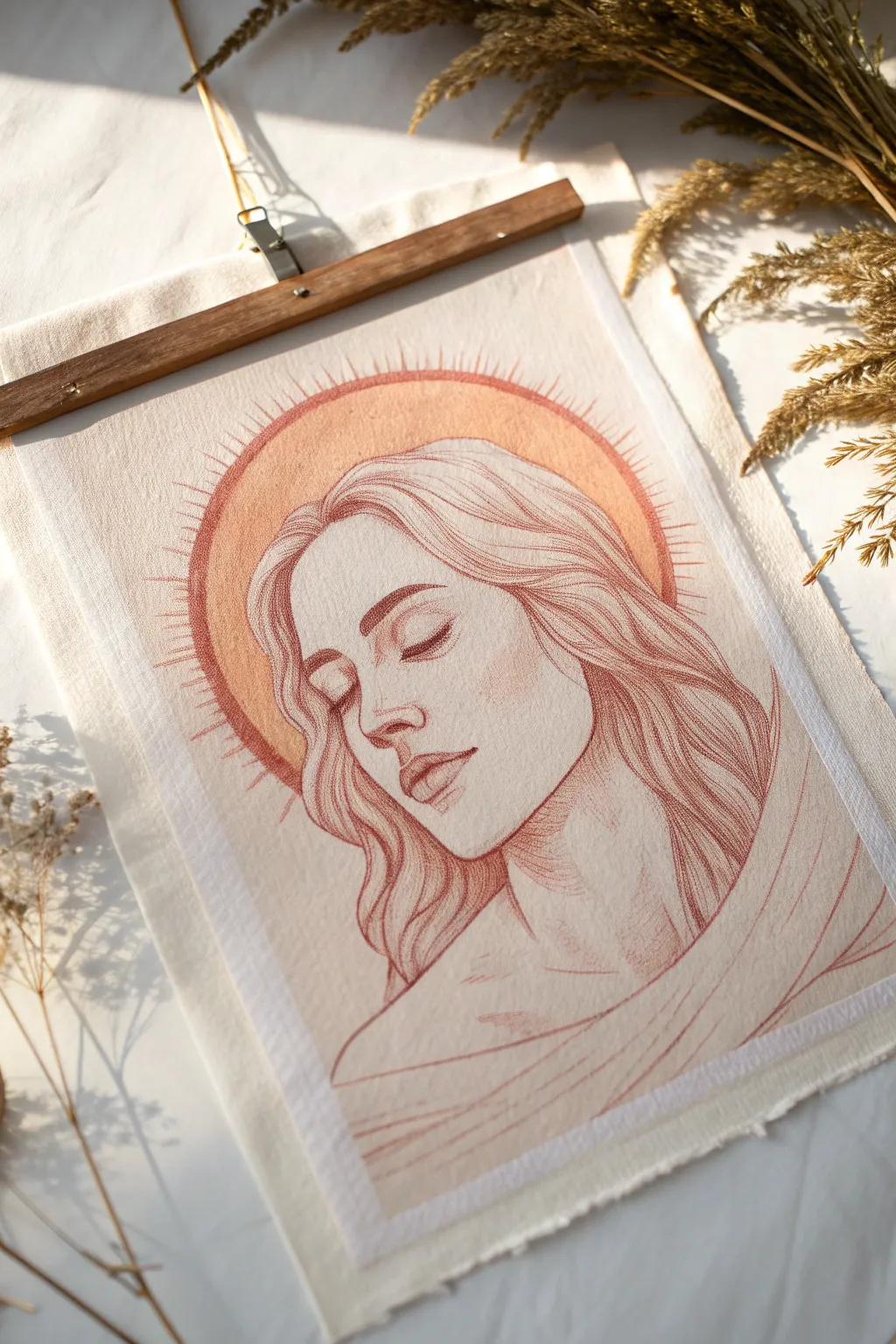
Capture the subtle glow of inner peace with this delicate portrait illustrating happiness as a warm, radiating aura. Using earthy pencils and soft washes on textured canvas paper creates a timeless, serene piece of art.
Step-by-Step
Materials
- Heavyweight textured paper or loose canvas sheet (approx. 9×12 inches)
- Terra cotta or sanguine colored pencil (oil-based or pastel)
- Sepia or dark brown colored pencil
- Watercolor paints (Peach, Orange, Yellow Ochre)
- Round watercolor brush (size 6-8)
- Pencil for initial sketching (H or HB)
- Kneaded eraser
- Circular object or compass for the halo
- Wooden magnetic poster hanger
Step 1: Preparation and Sketching
-
Prepare the surface:
Cut your canvas sheet or textured paper to size. If using raw canvas, you might want to apply a very thin layer of clear gesso to give it tooth without losing the texture, although drawing directly on raw fabric works for this rustic look. -
Outline the halo:
Lightly center your composition. Use a compass or trace a circular object (like a bowl) to draw the circle that will become the glowing aura. Place it high enough so the head fits naturally underneath. -
Sketch the portrait:
Begin sketching the face profile lightly with an H pencil. Focus on a peaceful expression—eyes closed, head slightly titled down. Keep the lines very faint; these are just guides for your colored pencil work. -
Check proportions:
Step back and verify the placement. The head should overlap the bottom portion of the circle slightly, creating depth as if the light is behind her. -
Lighten the guides:
Roll your kneaded eraser gently over the entire sketch. You want the graphite to be barely visible so it doesn’t muddy the warm tones you’ll add next.
Uneven Watercolors?
If your halo wash dries with hard edges or ‘blooms,’ invite it! This texture adds to the vintage charm. If it’s too distracting, lightly hatch over the area with colored pencil to unification.
Step 2: Applying the Warm Glow
-
Mix the wash:
Dilute your peach and orange watercolors with plenty of water. You want a very transparent, tea-like consistency, not opaque paint. -
Paint the aura:
Carefully fill in the circle behind the head with your watercolor wash. I like to keep the edges slightly soft rather than perfectly hard. Let the color vary slightly—maybe darker at the top edge and lighter near the head. -
Let it dry completely:
This is crucial. The paper must be bone dry before you start drawing over it, otherwise, the pencil points will dig into the damp fibers and tear the surface.
Step 3: Detailed Drawing
-
Define the features:
Switch to your terra cotta or sanguine pencil. Start with the eyes and nose, using gentle pressure. The texture of the canvas will naturally break up the line, giving it that vintage, sketched aesthetic. -
Draw the hair:
Use long, flowing strokes for the hair. Don’t try to draw every strand; instead, outline large shapes and locks, adding texture within them. Keep the hair strokes loose and rhythmic. -
Shade the face:
Apply very light hatching to shadow areas: under the brow, the side of the nose, and under the chin. Keep the hand pressure light to maintain the drawing’s airy feeling. -
Enhance the halo edge:
Take the terra cotta pencil and outline the painted circle. Add small, radiating tick marks or rays extending outward from the circle’s edge to emphasize the ‘glowing’ effect. -
Deepen contrast:
Use the darker sepia pencil sparingly. Add it only to the darkest points—the lash line, the corner of the mouth, and the deepest shadows in the hair—to anchor the drawing. -
Add drapery:
Sketch the suggestion of fabric or clothing at the bottom. Keep these lines very simple and sweeping, guiding the viewer’s eye back up toward the face.
Level Up: Gold Leaf
For extra radiance, apply a very thin line of gold size and gold leaf along the outer rim of the halo or on the radiating rays to make the artwork shimmer in the light.
Step 4: Finishing Touches
-
Add cheek color:
Lightly shade a circular area on the cheek with the terra cotta pencil to suggest a blush, blending it gently with your finger or a paper stump. -
Review and refine:
Look for any lines that feel too harsh. You can tap them with a clean kneaded eraser to lift pigment and soften the look. -
Mount the artwork:
Once you are satisfied, clamp the top of the canvas sheet into the magnetic wooden hanger.
Hang your serene creation in a sunny spot to remind yourself of the quiet glow of happiness
Surreal Happiness Pool With Fish-Shaped Bubbles
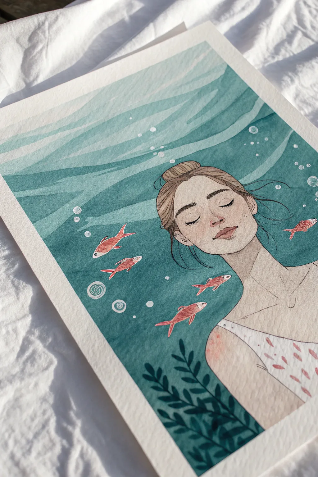
Capture a moment of pure tranquility with this mixed-media illustration featuring a figure floating peacefully beneath the waves. Using a combination of watercolor washes and fine liner details, you’ll create a soothing, surreal scene full of depth and delicate textures.
Step-by-Step Tutorial
Materials
- Cold press watercolor paper (300 gsm)
- Watercolor paint set (focus on teal, turquoise, Prussian blue)
- Small round paintbrushes (sizes 2 and 4)
- Red and pink colored pencils or fine liners
- White gel pen or white gouache
- Waterproof black fine liner pen (0.1 or 0.3mm)
- H pencil and eraser
- Masking tape (optional)
Step 1: Sketching the Scene
-
Outline the figure:
Begin with a very light pencil sketch of the woman’s head and shoulders. Position her slightly off-center to the right. Draw her face tilted upwards, with closed eyes to convey calmness. -
Add floating hair:
Sketch the hair flowing loosely around her head. Since she is underwater, the strands should drift upwards and outwards rather than falling flat. -
Place the fish and flora:
Lightly draw four to five small fish swimming around the figure. Add some seaweed shapes at the bottom left-hand corner to frame the composition. -
Plan the water layers:
Sketch gentle, wavy horizontal lines across the background to demarcate the different bands of water depth. These don’t need to be perfect; organic waves look more natural.
Layering Hack
To get crisp lines between the water waves without them bleeding, ensure the previous strip of paint is 100% dry before starting the one directly below it.
Step 2: Painting the Water Gradient
-
Mix your teals:
Prepare three concentrations of a turquoise or teal watercolor mix: a very watery pale wash, a medium tone, and a more saturated, darker deep sea green. -
Paint the top layer:
Start at the very top of the paper with your palest wash. Paint the first wavy band, carefully painting around the figure’s hair if it reaches that high. -
Work downwards:
Move to the next band of water, using a slightly darker or more saturated version of your teal mix. Let each band dry just slightly before painting the next to create hard edges. -
Deepen the depths:
As you reach the bottom of the page, use your most saturated teal pigment. This gradient effect mimics the way light fades as you go deeper underwater. -
Paint the seaweed:
Using a dark Prussian blue or deep green, paint the seaweed leaves in the bottom corner. Let them overlap the water background for depth. -
Skin tone base:
Mix a very dilute, warm beige or peach tone and fill in the face, neck, and shoulders. Keep this layer light and translucent.
Make It 3D
Once the painting is dry, use a sharp colored pencil to add drop shadows under the fish and chin. It instantly separates the figure from the background.
Step 3: Adding Details and Texture
-
Detail the face:
Once the skin tone is bone dry, use a waterproof black fine liner to ink the eyebrows, closed eyelids, nose, and lips. Keep lines delicate. -
Define the hair:
Create texture in the hair using a mix of brown watercolor and fine pencil strokes. Focus on following the flow of the floating strands. -
Color the fish:
Use red colored pencils or small dabs of red watercolor to fill in the fish. I find that using pencils here allows for nice, textured hatching that contrasts with the smooth water. -
Pattern the swimsuit:
Paint or draw the swimsuit straps. Add a simple pattern, such as small red dashes or fish shapes, to echo the surrounding sealife. -
Add bubbles:
Using a white gel pen or a fine brush with white gouache, draw small circles of varying sizes drifting up from the fish and the figure. -
Enhance the magic:
Add tiny white dots or sparkles in the darker water areas to represent catching light or suspended particles, giving the water a magical quality. -
Final outlines:
Go over the main contours of the figure and fish with your fine liner to make them pop against the blue background.
Step back and admire the calm atmosphere you’ve created with just paper and paint
Happiness Map Made of Symbols and Paths
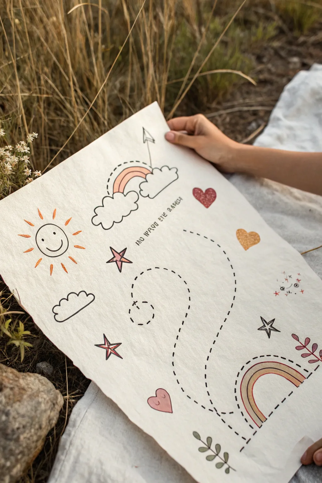
Create a charming visual journey across textured paper using simple doodles and glittering accents. This ‘happiness map’ combines classic symbols like rainbows and sunshine with a winding dotted path to represent a joyful adventure.
How-To Guide
Materials
- Thick, textured watercolor paper or handmade paper (cream or off-white)
- Fine-tip black permanent marker (e.g., Micron 05 or 08)
- Metallic or glitter gel pens (gold, copper, pink)
- Colored pencils or brush markers (warm earth tones: terra cotta, mustard, sage)
- Pencil and eraser for sketching
- Ruler (optional)
Step 1: Planning and Sketching
-
Paper selection:
Choose a sheet of heavy, textured paper. The rougher the grain, the more rustic and authentic the final map will look. A sheet around A3 or 11×14 inches works well. -
Map out the path:
Lightly sketch a large, winding curve with a pencil. Start from the bottom right and sweep up towards the center, creating a loopy shape that ends near the center or top, similar to a question mark or a backwards ‘S’. -
Place key landmarks:
Sketch the main icons lightly in pencil. Place a large rainbow arc at the bottom right (the start) and a cloud-and-rainbow cluster near the top center (the destination). -
Add floating symbols:
Fill the empty spaces around the path with simple shapes: a smiling sun on the left, scattered stars, floating hearts, and a small cloud. Keep the composition balanced but not perfectly symmetrical.
Step 2: Inking the Outlines
-
Draw the main dotted line:
Using your fine-tip black marker, trace over your pencil path with short, dashed lines. Try to keep the dashes evenly spaced, but don’t worry if they wobble slightly; it adds character. -
Ink the rainbows and clouds:
Outline the cloud shapes with fluffy, scalloped lines. For the rainbows, draw smooth, concentric arches. Leave the inner bands open for coloring later. -
Define the sun icon:
Draw the circular face of the sun and add short, radiating lines for rays. Ink the simple smiley face in the center. -
Trace remaining elements:
Go over the stars, hearts, and the small leaf sprig at the bottom. Erase all pencil marks gently once the ink is completely dry to avoid smudging.
Ink Bleeding?
Textured paper is thirsty! If your marker bleeds, switch to a finer nib or work faster. Test your pens on a scrap piece of the same paper first.
Step 3: Adding Color and Texture
-
Color the rainbow bands:
Use colored pencils or markers in warm, muted tones like terra cotta and mustard to fill the bands of the rainbows. Leave some bands white or trace inside them with a colored line for variety. -
Apply glitter accents:
I like to use glitter gel pens here for a magical touch. Fill in the heart shapes with pink or red glitter ink to make them pop against the matte paper. -
Highlight the stars:
Color in the stars. You can fill them solidly with gold ink or just outline the inner shapes with a metallic pen for a subtle shimmer. -
Detail the sun rays:
Add color to the sun’s rays using orange or yellow. Alternating between short and long strokes creates a nice rhythm. -
Add facial features:
If you have a cloud or a star with a face, carefully add small cheeks with a pale pink pencil.
Add Dimension
Make your map tactile by sewing along the dotted path with embroidery thread. Use a needle to pre-poke holes, then stitch with a running stitch.
Step 4: Final Touches
-
Draw directional arrows:
Add a small, sketched arrow pointing towards the destination cloud to emphasize movement along the map. -
Add text (optional):
If desired, write a small phrase near the center path, like ‘Find the magic’ or a personal date, using a small, neat print font. -
Enhance with foliage:
Draw small sprigs of leaves or berries near the bottom corner or empty spaces to ground the design. -
Review and refine:
Look over the entire piece. If any black lines look too thin, thicken them slightly to create stronger contrast against the textured paper.
Display your finished map on a mood board or frame it to remember your charted journey to happiness
Have a question or want to share your own experience? I'd love to hear from you in the comments below!