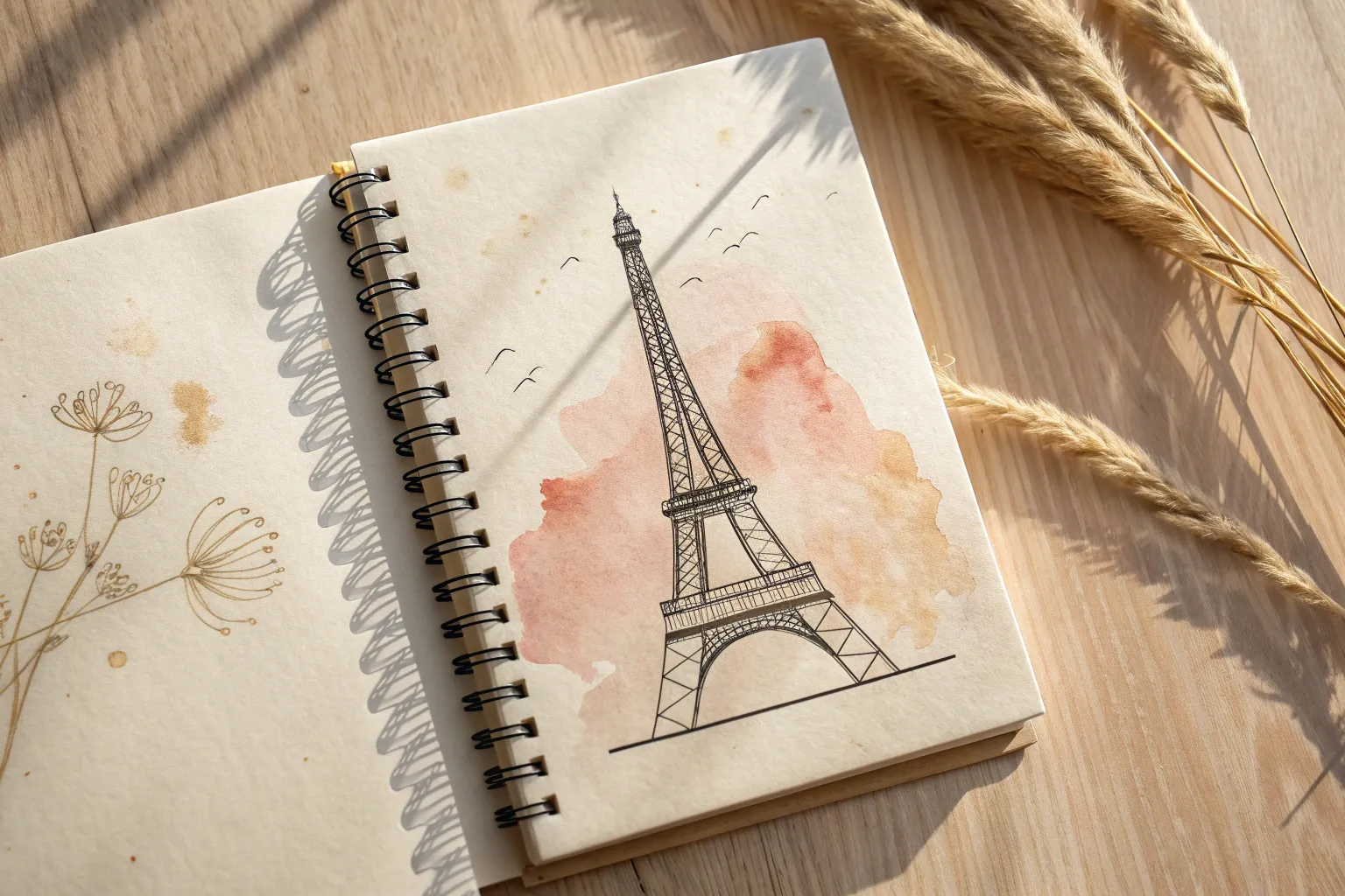
When I’m craving fresh drawing inspiration, I always circle back to Paris—it’s basically a buffet of elegant lines, charming street details, and instant mood. Here are my favorite Paris drawing ideas, starting with the classic Eiffel Tower and then wandering into more playful, unexpected takes.
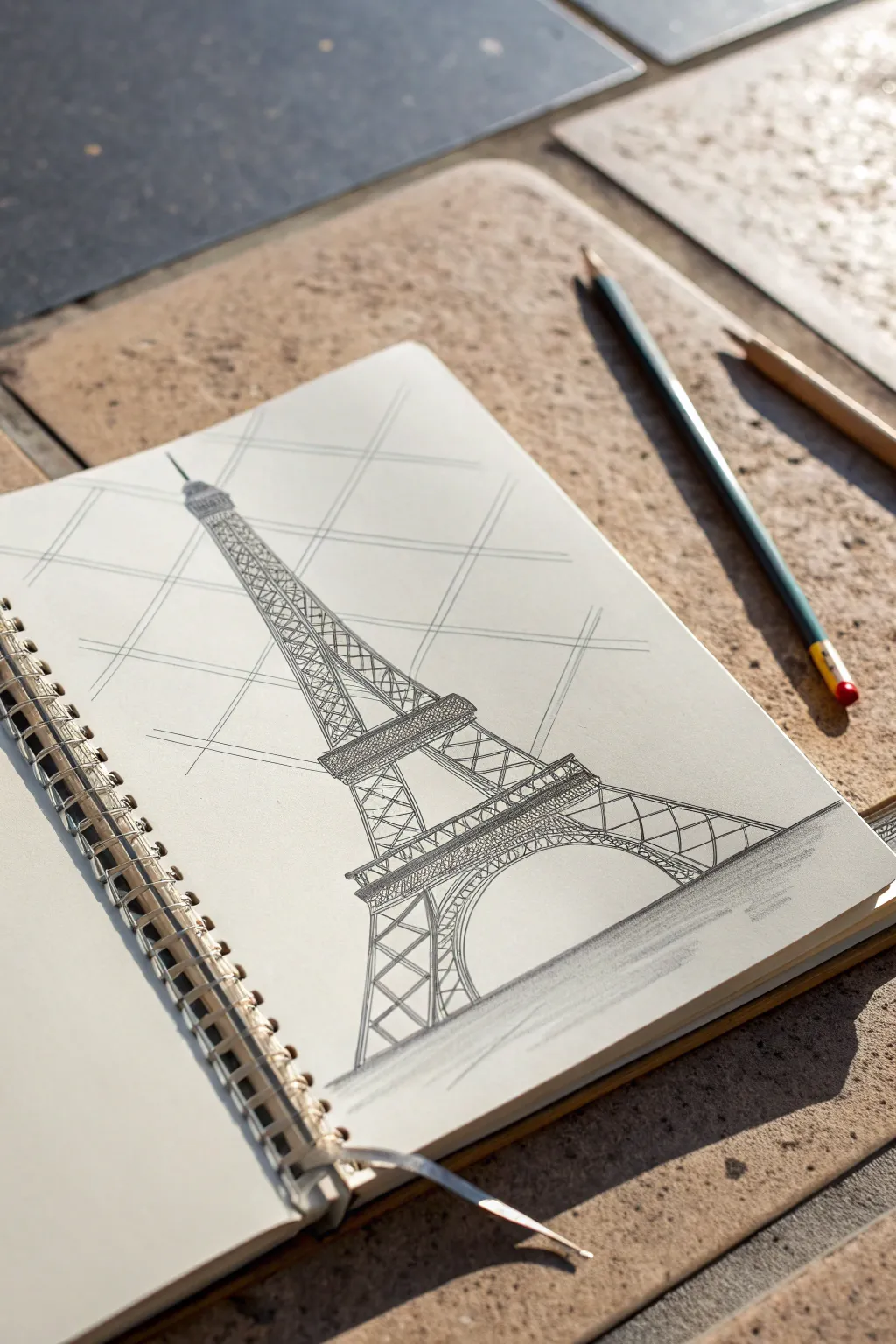
Simple Eiffel Tower Outline
Capture the iconic elegance of Paris with this clean, architectural line drawing in your sketchbook. This project focuses on capturing the tower’s graceful silhouette and intricate lattice work using simple geometric shapes and confident pen strokes.
Step-by-Step
Materials
- Sketchbook with smooth, off-white paper
- HB or 2B graphite pencil
- Kneaded eraser
- Fine liner pen (0.1mm or 0.3mm, black)
- Ruler (optional, but helpful for the central axis)
Step 1: Setting the Structure
-
Establish the centerline:
Start by lightly drawing a vertical centerline down the middle of your page. This guide is crucial for keeping the tower symmetrical as it tapers upward. -
Mark the tiers:
Divide your centerline into three main sections to represent the tower’s tiers. Make a small mark near the bottom for the base, another about a third of the way up for the first platform, and a third mark roughly two-thirds up for the second platform. -
Draft the base width:
At the bottom mark, sketch a wide horizontal line to define the full width of the legs. This should be the widest part of your drawing. -
Sketch the silhouette:
Lightly pencil in the curved sides of the tower. Start from the wide base and curve inward gently, steepening the angle as you reach the very top spire, creating a tall, slender ‘A’ shape.
Wobbly Lines?
Don’t stress about ruler-straight lines. A slight wobble adds character and suggests the intricate, organic feel of the ironwork rather than a rigid blueprint.
Step 2: Defining the Tiers
-
Draw the main platforms:
At your marked platform heights, draw small horizontal rectangles. The lower platform should be wider and more substantial, while the upper platform is narrower. -
Form the arch:
Connect the inner legs at the base with a large, sweeping semi-circle arch. Ensure the arch is centered on your vertical guide line. -
Outline the legs:
Refine the outer edges of the legs with your pencil, ensuring they taper smoothly up to the first platform. Add inner lines to show the thickness of the legs. -
Structure the spire:
Draw the top section rising from the second platform. It should be very narrow, almost needle-like, ending in a tiny antenna tip.
Add Context
Sketch a few loose, undefined clouds behind the top spire or a simple horizontal line at the base to suggest the ground of the Champ de Mars.
Step 3: Inking the Lattice Details
-
Ink the main outlines:
Switch to your fine liner pen. I find it safest to trace the main outer silhouette and the horizontal platform lines first to lock in the shape. -
Create the heavy lattice:
On the bottom section (base to first platform), draw X-shapes inside the legs. These should be fairly large and open. -
Add the arch details:
Under the main arch, draw a second, parallel curve slightly below the first. Fill the space between these curves with small, vertical tick marks to represent the decorative ironwork. -
Detail the middle section:
Move to the section between the first and second platforms. Draw a central vertical line, then add smaller X-shapes in the columns on either side. -
Refine the platforms:
Add tiny vertical dashes across the horizontal platform rectangles to mimic the railing and structural beams. -
Texture the spire:
For the long top section, simply draw hatched X-patterns all the way up. The lines here can be looser and closer together to suggest distance and density. -
Thicken shadow areas:
Go back over the underside of the arch and the bottoms of the platforms with a slightly heavier line weight to ground the structure. -
Clean up:
Wait at least five minutes for the ink to dry completely to avoid smudging. Then, gently erase all your initial graphite guidelines.
Now you have a timeless piece of Paris preserved right in your sketchbook


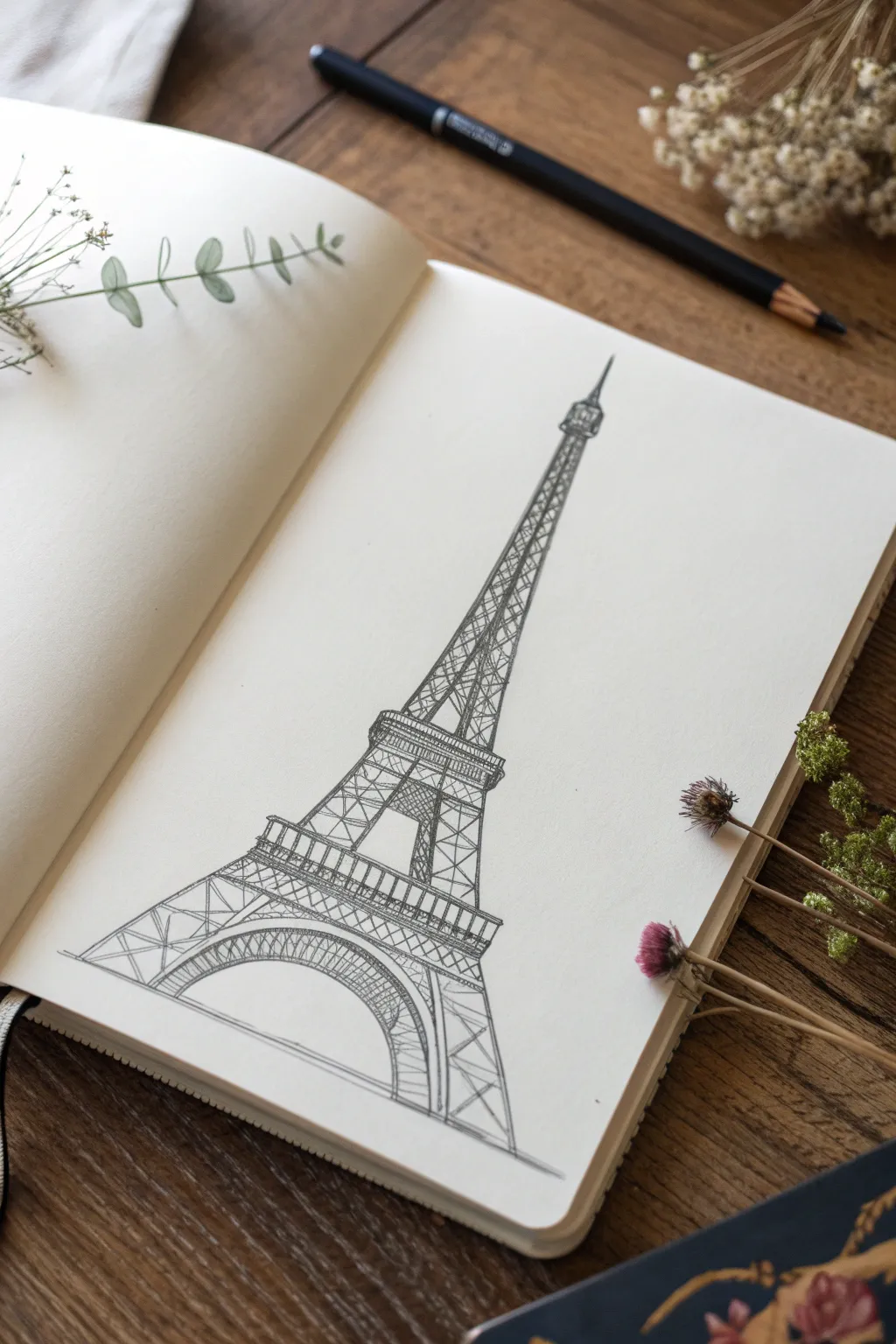
Eiffel Tower With Simplified Ironwork
Capture the iconic silhouette of Paris with this stylized pencil sketch of the Eiffel Tower, focusing on structural elegance rather than perfect realism. This approach breaks down the complex ironwork into manageable geometric shapes, resulting in a charming architectural illustration.
How-To Guide
Materials
- Spiral-bound sketchbook (medium weight paper)
- Graphite pencil (HB or B for initial lines)
- Darker graphite pencil (2B or 4B for shading)
- Ruler or straight edge
- Eraser (vinyl or kneaded)
Step 1: Laying the Geometric Foundation
-
Establish the central axis:
Begin by drawing a faint, straight vertical line down the center of your page. This will act as the spine of the tower to ensure symmetry. -
Mark the horizontal tiers:
Lightly mark three horizontal lines across your central axis to establish where the three observation decks will sit. The bottom base is the widest, the middle deck is narrower, and the top is the smallest. -
Sketch the outer curve:
Draw the sweeping, upward-curving lines for the tower’s legs. Start wide at the bottom and curve them inward until they nearly meet at the top tip, creating a tall, stretched ‘A’ shape.
Step 2: Drawing the Base and Decks
-
Form the base arch:
At the very bottom, draw semi-circular arches connecting the legs. The main central arch should be large and prominent, grounding the structure. -
Define the platforms:
Flesh out the horizontal markers you made earlier. Draw identifying rectangles for the first and second viewing platforms. These should have a slight thickness to them, representing the walkways. -
Add the top spire:
Detail the very peak of the tower with a small vertical rectangle and a tiny antenna line extending upward.
Wobbly Lines?
Don’t stress straight lines! The Eiffel Tower is thousands of iron parts. A slightly shaky hand actually mimics the texture of the rivets and beams better than ruler-perfect lines.
Step 3: Adding the Ironwork Details
-
Create the structural X-lattice:
Inside the legs of the bottom section, draw large ‘X’ shapes. This mimics the heavy iron girders that support the base. -
Cross-hatch the mid-section:
Moving up to the section between the first and second platform, draw smaller, tighter crisscross patterns. I find keeping these lines slightly looser adds more character than using a ruler for every single one. -
Detail the upper spire:
For the long neck of the tower leading to the top, simplify the details. Use small horizontal dashes or tiny ‘X’s to suggest the intricate metalwork without overcrowding the drawing. -
Darken the platforms:
Go back to the horizontal platforms and fill them in with tiny vertical lines or tight scribbles to make them appear solid and darker than the open-air lattice sections.
Add a Splash of Color
Use a single watercolor wash or a colored pencil in a muted blue or warm sepia over the drawing. This adds a vintage postcard vibe without overpowering your linework.
Step 4: Finishing Touches and Atmosphere
-
Add directional guidelines:
To give the drawing an architectural blueprint feel, you can lightly sketch a few large, diagonal grid lines in the background behind the tower. -
Deepen the contrast:
Switch to your softer, darker pencil (like a 2B). Retrace the outer silhouette of the tower to make it pop off the page. -
Ground the structure:
Add some horizontal shading at the very bottom, beneath the legs. Use broad, side-of-the-pencil strokes to create a suggestion of the ground or shadow. -
Refine the arches:
Add a second, inner line to the large base arch and fill the space between with small vertical ticks to show the decorative lattice trim. -
Clean up:
Gently erase your initial central axis line if it’s still visible through the center, leaving just the finished structure.
Now you have a timeless piece of Parisian architecture captured in your sketchbook


Eiffel Tower Framed by Cherry Blossoms
This elegant project combines precise architectural sketching with the soft romance of spring. By pairing a detailed ink drawing of the Eiffel Tower with a subtle tree line and framing it with dimensional cherry blossoms, you’ll create a piece that feels both classic and fresh.
Step-by-Step
Materials
- High-quality hot press watercolor paper or smooth bristol board (A4 or similar)
- Fine liner pens (sizes 0.05, 0.1, 0.3, and 0.5)
- H or HB graphite pencil for outlining
- Kneaded eraser
- Ruler
- Watercolor pencils or light wash watercolors (olive green, sap green, brown)
- Small round paintbrush (size 2 or 4)
- Artificial cherry blossom branches (silk flowers)
- Small wire cutters (if using artificial flowers)
Step 1: Structural Layout
-
Establish the centerline:
Begin by using your ruler and H pencil to draw a faint vertical line directly down the center of your paper. This axis is crucial for keeping the tower symmetrical. -
Mark the tiers:
Mark three horizontal lines across the centerline to indicate the three main platforms of the Eiffel Tower. The base is the widest, the middle platform is roughly halfway up the main body, and the top observation deck is small and near the peak. -
Draw the main curves:
Sketch the sweeping outer curves of the tower’s legs, connecting your horizontal markers. The shape should taper gracefully from the wide base up to the spire. -
Add the arch:
At the very bottom, draw the semi-circular arch that connects the feet of the tower. This arch sits below the first platform level.
Steadiness Hack
Drawing straight lines freehand is hard! Exhale slowly as you draw each long line of the tower’s legs. This steadies your hand and reduces shaky lines better than holding your breath.
Step 2: Inking the Architecture
-
Outline the silhouette:
Switch to a 0.5 fineliner to ink the main outer edges and the horizontal platforms. Keep your hand steady, but don’t worry if the line has a slight natural waver; it adds character. -
Cross-bracing lines:
Using a 0.3 pen, start drawing the characteristic ‘X’ patterns of the ironwork. I find it helpful to draw vertical guide lines first inside the legs, then fill in the diagonals. -
Detailing the top section:
Use a 0.1 pen for the upper spire and antenna section. The ironwork here is very dense, so focus on vertical lines and tiny horizontal hatches rather than distinct crosses. -
Refining the base:
Return to the base legs and the arch with a 0.1 pen. Draw tiny squares and triangles to mimic the intricate lattice work. Density creates shadow here, so place lines closer together near the corners. -
Adding depth:
With the 0.05 pen, add very fine shading lines (hatching) under the platforms and on the right side of the structure to suggest a light source coming from the left. -
Erase pencil guides:
Wait at least 10 minutes to ensure the ink is totally dry, then gently lift off your graphite grid with a kneaded eraser.
Step 3: The Parisian Landscape
-
Sketch the tree line:
At the base of the tower legs, lightly sketch a row of small, rounded tree shapes. These should be much smaller than the tower to emphasize its scale. -
Apply soft color:
Use watercolor pencils or a very diluted watercolor wash to color the trees. Use varying shades of olive and sap green. Keep the edges fuzzy and indistinct to create atmospheric perspective. -
Add trunk details:
Once the green wash is dry, use your 0.1 or 0.05 pen to draw tiny, stick-like trunks and branches beneath the green foliage. Make them jagged and irregular. -
Ground shadow:
Add a few light horizontal strokes of grey or diluted black ink at the very bottom to ground the trees and the tower, suggesting a pathway or street.
Make it Sparkle
Add tiny dots of gold ink or metallic gel pen to the centers of the sketched trees or the tower lights. This mimics the twinkling ‘Iron Lady’ at night.
Step 4: Final Styling
-
Prepare the blossoms:
Take your artificial cherry blossom stems and trim them if necessary. You want two main branches: one curving in from the top left and another reaching up from the bottom right. -
Positioning the frame:
Lay the branches over the drawing to find a composition that frames the tower without obscuring the main architectural details. The contrast between the 3D flowers and the 2D drawing is the key effect. -
Securing (Optional):
If you are framing this in a shadow box, you can lightly glue the stems to the mat board. If this is for a flat lay photo, simply arrange them loosely for the perfect shot.
Now you have a stunning tribute to Paris that captures both its grand design and blossoming beauty


Eiffel Tower in Autumn Colors
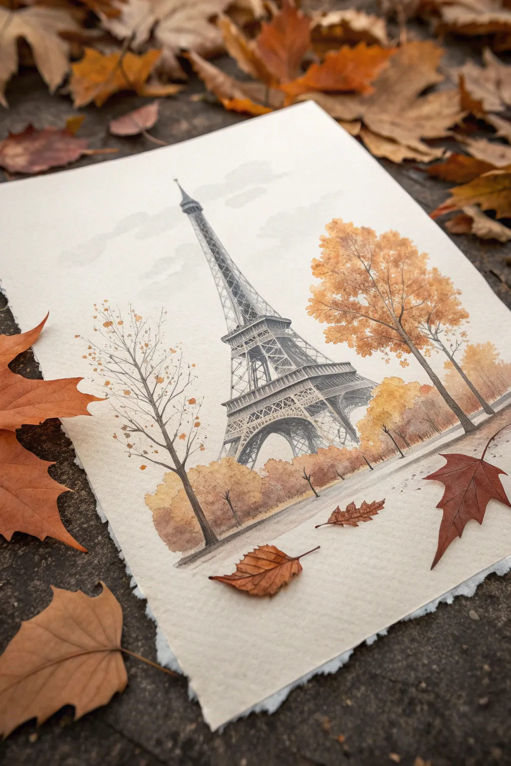
Capture the romance of Paris wrapped in fall foliage with this mixed-media piece that combines precise architectural lines with loose, organic washes. Soft ambers and muted grays create a cozy, nostalgic atmosphere perfect for a seasonal art display.
Detailed Instructions
Materials
- Cold press watercolor paper (300 gsm) with deckled edges
- HB or 2B graphite pencil for sketching
- Fine liner pen (0.1mm and 0.3mm, waterproof, gray or black)
- Watercolor paints (Payne’s Gray, Burnt Sienna, Yellow Ochre, Sepia)
- Round watercolor brushes (size 4 and 8)
- Clean water and paper towels
- Painter’s tape (optional, if stretching paper)
Step 1: Drafting the Structure
-
Establish the horizon:
Begin by lightly drawing a low horizon line about one-fifth of the way up from the bottom of your paper. This provides space for the foreground path and trees. -
Sketch the tower’s centerline:
Draw a faint vertical line exactly where you want the Eiffel Tower to stand. This guideline is crucial for keeping the symmetrical structure straight as it tapers upward. -
Outline the main arches:
Lightly sketch the legs of the tower, curving them inward as they rise. Mark the horizontal platforms: the first level is the widest, followed by the second, and finally the narrow top section. -
Add architectural details:
Using your pencil, fill in the ‘X’ cross-bracing patterns on the tower legs. Keep these lines light and delicate; you don’t need to draw every single beam, just enough to suggest the intricate ironwork.
Bleeding Lines?
If your ink smudges when painting, your pen isn’t waterproof or hasn’t dried enough. Test your pen on a scrap paper first with water. If it bleeds, do all watercolor steps first and ink last.
Step 2: Inking the Iron Lady
-
Trace with fine liner:
Switch to your waterproof fine liner. Use the 0.3mm pen for the main structural outlines of the tower, focusing on the dark silhouette of the legs and platforms. -
Detail the latticework:
With the 0.1mm pen, add the delicate cross-hatching inside the structure. I like to break the lines slightly here and there to give it an aged, sketchy look rather than a rigid blueprint feel. -
Erase guidelines:
Once the ink is completely dry—wait at least 15 minutes to prevent smudging—gently erase your graphite pencil lines to leave a clean ink drawing.
Step 3: Painting the Foliage
-
Mix your autumn palette:
Prepare puddles of Yellow Ochre, Burnt Sienna, and a touch of Sepia mixed with plenty of water. You want these colors to be transparent and fluid. -
Paint the large right-side tree:
Using the size 8 brush, wet the area where the large tree canopy will be. Drop in Yellow Ochre, then immediately touch in spots of Burnt Sienna while wet, letting the colors bleed together naturally. -
Create the left-side sapling:
For the bare tree on the left, use the fine liner to draw spindly branches first. Then, dab just a few tiny, diluted spots of orange along the branches to suggest sparse, falling leaves. -
Wash the background bushes:
Paint a soft, horizontal band of mixed autumn colors behind the base of the tower to represent distant trees. Keep the edges soft and watery so they recede into the distance. -
Add texture with splatter:
Load your brush with darker orange-brown paint and tap the handle against your finger over the tree areas. This creates tiny speckles that mimic falling leaves and texture.
Add Realism
Sprinkle a pinch of table salt onto the wet tree canopy paint. Let it dry completely effectively brushing it off. This creates a stunning mottled texture that looks exactly like individual leaves.
Step 4: Atmosphere and Final Touches
-
Shadow the tower:
Mix a very watery Payne’s Gray. Glaze over the darker sides of the tower (usually the interior arches) to give the structure three-dimensional volume without overpowering the ink lines. -
Paint the sky:
Using extremely diluted gray-blue paint, add a few horizontal strokes across the sky area. Leave plenty of white paper showing to suggest clouds drifting by. -
Ground the scene:
Paint a light wash of brown-gray along the bottom to create the pathway. While it’s damp, drop in slightly darker pigment directly under the trees and tower legs for shadows. -
Define the foreground trunks:
Use your size 4 brush and a Sepia mixture to paint the main trunk of the large right-side tree and the smaller trees in the background, anchoring them into the ground wash. -
Scatter fallen leaves:
Once the ground wash is dry, use the tip of your brush to paint tiny diamond shapes in Burnt Sienna on the path, suggesting leaves that have settled on the ground.
Enjoy the elegant simplicity of your Parisian autumn scene once the paper is fully dry and crisp

PENCIL GUIDE
Understanding Pencil Grades from H to B
From first sketch to finished drawing — learn pencil grades, line control, and shading techniques.
Explore the Full Guide
Seine River View of the Tower
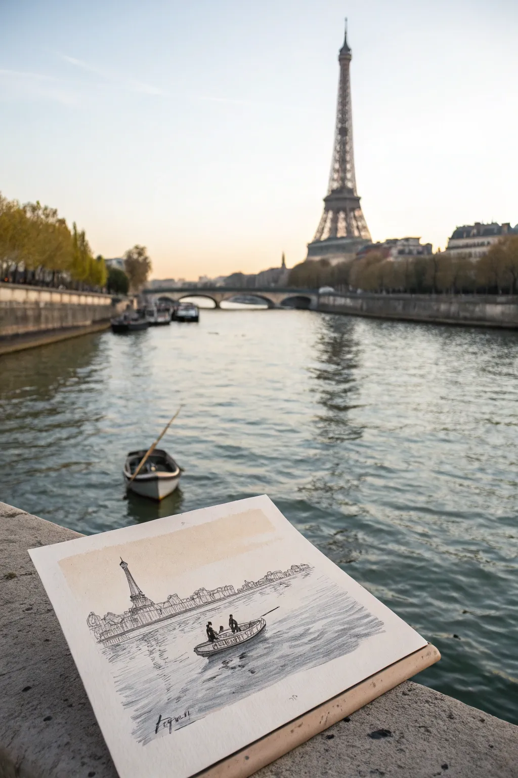
Capture the romantic essence of Paris with this mixed-media sketch that combines delicate ink linework with subtle tonal shading. This project focuses on simplifying complex architecture and mastering water reflections for a serene, atmospheric result.
Step-by-Step Tutorial
Materials
- Heavyweight textured sketch paper or mixed-media paper
- Fine liner pens (sizes 0.1, 0.3, and 0.5)
- Graphite pencil (HB or 2B) for sketching
- Soft charcoal pencil or graphite stick for shading
- Blending stump (tortillon) or cotton swab
- Optional: Diluted watercolor wash (raw sienna or pale yellow)
- Ruler (optional for horizon lines)
Step 1: Setting the Scene
-
Establish the horizon:
Begin by lightly drawing a horizontal line across your paper, roughly one-third of the way up from the bottom. This separates the river in the foreground from the cityscape in the background. -
Position the tower:
Determine where the Eiffel Tower will sit. Make a light vertical mark on the left side of your composition to act as the central axis for the tower structure. -
Block in major shapes:
Using your HB pencil, loosely sketch the triangular silhouette of the Eiffel Tower. Don’t worry about details yet; just get the proportions relative to the rest of the skyline correct. -
Add the riverbank line:
Sketch the uneven line of the riverbank and the buildings along the horizon. Notice how the buildings are low and blocky compared to the soaring tower. -
Place the boat:
In the lower middle third of the water, lightly outline the simple oval shape of the small boat, ensuring it sits flat on the perspective plane of the water.
Loose Lines
Don’t connect every line perfectly. Leaving small gaps in your architectural outlines lets the eye fill in the details and keeps the sketch looking fresh and not stiff.
Step 2: Inking the Architecture
-
Outline the tower:
Switch to your 0.3 fine liner. Carefully go over your pencil lines for the Eiffel Tower, using slightly broken lines to suggest distance and atmosphere rather than a solid, heavy outline. -
Detail the ironwork:
Use the 0.1 fine liner to suggest the iconic cross-hatching of the tower’s iron lattice. You don’t need to draw every beam; scribble-like textures work perfectly here. -
Ink the skyline:
Draw the buildings along the riverbank. Keep these shapes loose and slightly erratic to suggest rooftops and chimneys without getting bogged down in architectural precision. -
Create the bridge railing:
Draw a distinct horizontal line below the buildings to represent the stone embankment or bridge railing separating the city from the river. -
Define the boat:
Use the 0.5 pen for the boat to bring it forward visually. Outline the hull and add the two small figures inside as simple silhouettes.
Vintage Vibe
Try sketching on toned tan or gray paper instead of white. Use a white gel pen for highlights on the water ripples to make the drawing pop against the colored background.
Step 3: Shading and Atmosphere
-
Add tone to the water:
Using the side of a soft graphite pencil or charcoal, shade the water area horizontally. Keep the strokes loose to mimic the movement of the current. -
Create reflections:
Darken the area directly beneath the boat and the distant riverbank. Vertical, wiggly strokes here help create the illusion of objects reflecting in the moving water. -
Blend for softness:
Take your blending stump or a tissue and gently smudge the graphite shading on the water. I like to leave some areas of the paper white to represent light catching the ripples. -
Enhance the boat’s shadow:
Use the graphite to add a deep shadow underneath the boat hull, grounding it in the water so it doesn’t look like it’s floating in mid-air. -
Add the sky wash (optional):
If you want to recreate the warm tone seen in the original, apply a very broad, faint wash of pale yellow or raw sienna watercolor across the sky area. Let it fade out as it reaches the horizon. -
Final ink accents:
Once the shading is done, go back with your 0.5 pen and add a few sharp, horizontal lines in the foreground water to define individual waves and add crispness. -
Sign your work:
Place your signature in the bottom corner using a loose, gestural hand to match the sketching style.
Now you have a charming piece of Parisian scenery to frame or keep in your sketchbook
Paris Bridge With Tower in Distance
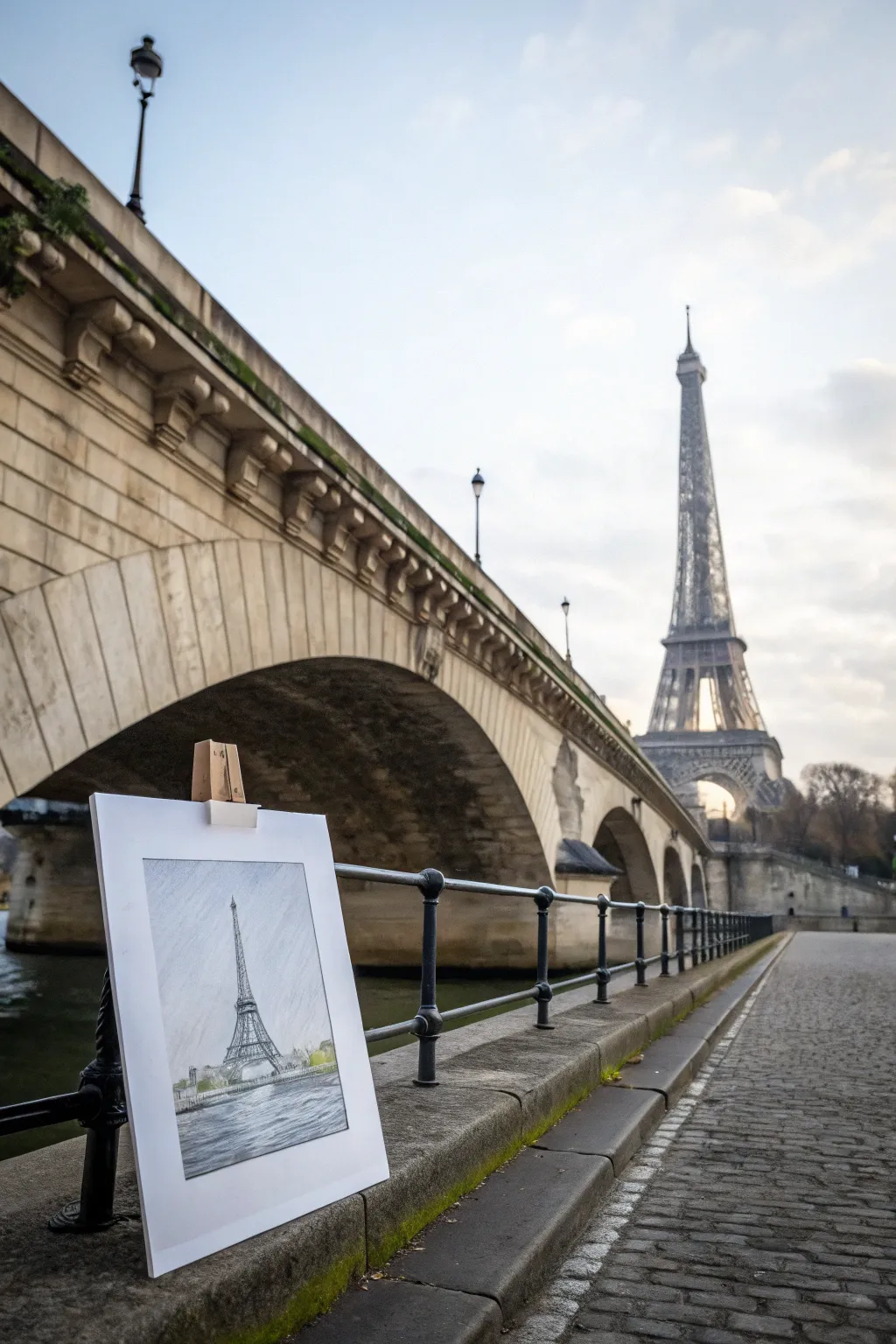
Capture the iconic romance of the Eiffel Tower with this elegant graphite drawing that stands out against a misty white background. This project focuses on mastering architectural lines and soft shading to create a timeless souvenir of Paris.
How-To Guide
Materials
- High-quality drawing paper (smooth or vellum finish)
- Set of graphite pencils (2H, HB, 2B, 4B)
- Kneaded eraser
- Vinyl eraser
- Ruler or straight edge
- Blending stump (tortillon)
- Pencil sharpener
Step 1: Drafting the Structure
-
Establish the horizon:
Begin by lightly drawing a low horizon line about one-quarter of the way up from the bottom of your paper using a 2H pencil. This will separate the water from the skyline. -
Center line guide:
Draw a vertical centerline straight up the middle of the paper. This is crucial for symmetry, as the Eiffel Tower is a perfectly balanced structure. -
Mark the tiers:
Mark three horizontal dashes along your centerline to indicate where the three main platforms of the tower will sit. The base is widest, the second deck is midway, and the top is small. -
Sketch the silhouette:
Connect your marks with sweeping, curved lines starting wide at the base and tapering inward as they rise to the top point. Keep your touch light so adjustments are easy. -
Add the arch:
At the very bottom, draw the large semi-circle arch that connects the two legs of the tower. Ensure the peak of the arch aligns with your centerline.
Step 2: Adding Architectural Detail
-
Lattice work outlines:
Switch to an HB pencil. Begin drawing the ‘X’ patterns of the iron lattice work. Don’t try to draw every single beam; instead, suggest the texture with crisscrossing lines. -
Define the platforms:
Thicken the horizontal lines for the viewing decks. I like to add tiny vertical strokes here to simulate the railings and observation areas. -
Strengthen the legs:
Darken the outer edges of the tower’s legs. The structure should feel heavy and grounded at the bottom, so use a slightly firmer pressure here. -
The spire:
Refine the very top antenna. It needs to be sharp and straight, so you might want to use your ruler again for this tiny detail.
Wobbly Lines?
If your tower looks leaning, check your vertical centerline. Use a ruler to correct the main structural legs before adding the tiny lattice details.
Step 3: Shading and Atmosphere
-
Establish light source:
Decide which side the light is coming from (usually the left or right). Lightly shade the opposite side of the tower using a 2B pencil to give it volume. -
Deepen the shadows:
Use a 4B pencil to darken the interior areas underneath the arch and the underside of the platforms. This high contrast makes the metal look solid. -
Suggestion of trees:
At the horizon line, sketch low, scruffy shapes to represent the tree line or distant buildings. Keep these loose and less detailed than the tower to push them into the background. -
Water reflection:
Below the horizon line, add horizontal zigzag strokes to create the rippling water of the Seine. These strokes should be wider closer to the bottom of the page. -
Blending the sky:
Take your blending stump and very gently smudge the graphite around the tower to create a subtle, overcast sky effect. Don’t overdo it; keep the paper mostly white for contrast. -
Final touches:
Use the kneaded eraser to lift off any graphite smudges from the sky area, keeping the background crisp. Add one final pass of dark 4B accents on the tower’s closest iron beams.
Add a Pop of Color
Use a pale green watercolor wash or colored pencil on the trees and water for a mixed-media look that contrasts beautifully with the grey graphite.
Now you have a stunning architectural sketch ready to display on a desk easel or in a frame
BRUSH GUIDE
The Right Brush for Every Stroke
From clean lines to bold texture — master brush choice, stroke control, and essential techniques.
Explore the Full Guide
Paris Street View Toward the Tower
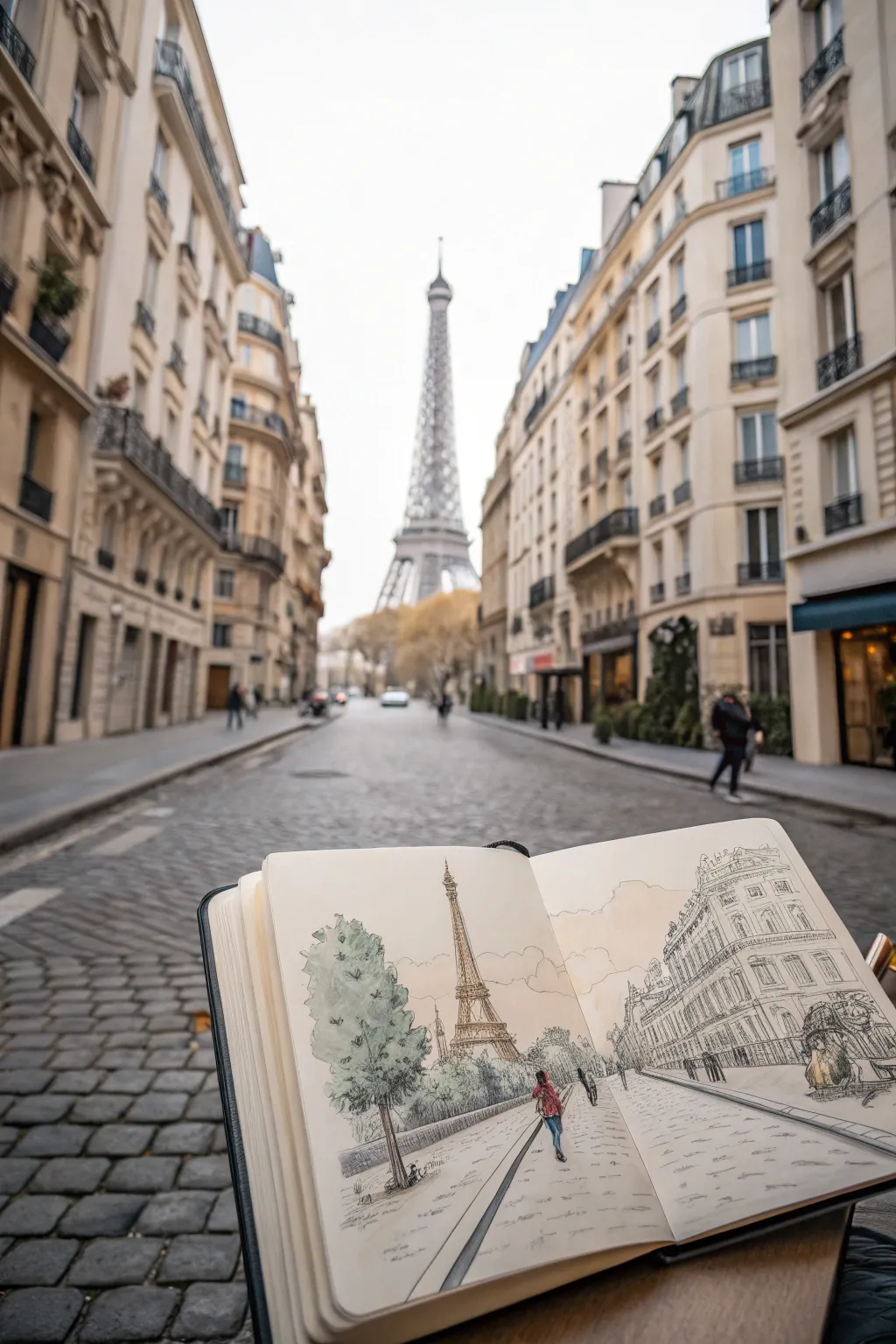
Capture the romantic atmosphere of Paris with this mixed-media urban sketch that combines precise ink lines with loose, expressive watercolor washes. The finished piece features a classic Parisian street leading toward the Eiffel Tower, rendered in a charming, illustrative style.
Step-by-Step
Materials
- A5 or A4 sketchbook (heavyweight paper suitable for light washes)
- Pencil (HB or 2B) for initial layout
- Kneadable eraser
- Fine liner pens (0.1mm, 0.3mm, and 0.5mm, waterproof ink)
- Watercolor set (basic pan set)
- Round watercolor brushes (size 4 and 8)
- Water container and paper towel
Step 1: Pencil Structure and Perspective
-
Establish the horizon line:
Begin by lightly drawing a horizontal line across the lower third of your page. This will help ground your perspective and determine the height of the buildings relative to the viewer. -
Locate the vanishing point:
Place a vanishing point near the center of your horizon line. Since this is a one-point perspective street view, all the diagonal lines of the buildings and sidewalks will converge toward this single spot. -
Block in the Eiffel Tower:
Sketch a light vertical centerline rising from the vanishing point. Draw the basic triangular shape of the Eiffel Tower centered on this line, keeping it tall and slender to show distance. -
Outline the street layout:
Draw diagonal lines radiating from the vanishing point to the bottom corners to define the curbs of the street. This creates the wide, inviting pathway leading into the scene. -
Draft the building masses:
On the right side, sketch the large vertical block of the Haussmann-style building. On the left, mark the position of the trees and the low wall or curb.
Loose Lines Matter
Don’t connect every line perfectly. Leaving small gaps in your building outlines and windows lets the drawing ‘breathe’ and prevents it from looking like a technical architectural blueprint.
Step 2: Inking the Scene
-
Ink the Eiffel Tower:
Using your 0.1mm pen, carefully go over the tower structure. Use broken, delicate lines to suggest the intricate ironwork without trying to draw every single beam. Keep the lines lighter here to push the tower into the distance. -
Define the building façade:
Switch to a 0.3mm pen for the building on the right. Draw the vertical windows and the horizontal balconies. Don’t use a ruler; a slightly wavering hand-drawn line adds character to the architecture. -
Add architectural details:
Use the 0.1mm pen again to add scribbly textures for roof tiles and balcony railings. Suggest ornate details under the eaves with quick, looping marks. -
Draw the foreground trees:
On the left side, use a 0.5mm pen to outline the leafy canopies. Use a loose, scalloped line for the foliage to make it feel organic and fluffy, contrasting with the rigid buildings. -
Sketch the figures:
Place a figure walking away from the viewer in the middle foreground. Keep the shape simple—a small oval for the head and a basic triangular shape for the coat. This adds scale and life to the empty street. -
Detail the cobblestones:
Using the 0.1mm pen, draw a few horizontal, dashed lines across the street surface. Don’t draw every stone; just suggest the texture in patches, especially near the foreground. -
Erase pencil marks:
Once the ink is completely dry—I usually wait at least five minutes to be safe—gently erase all your underlying pencil guidelines.
Step 3: Watercolor Washes
-
Paint the tree foliage:
Mix a muted sap green with a touch of gray. Apply a loose wash over the tree area on the left, letting some white paper show through for highlights. -
Wash the sky:
Dilute a very faint yellow ochre or warm beige. Paint a large, watery wash across the sky area and the background buildings to create a warm, hazy atmosphere. -
Color the street:
Mix a light gray wash with plenty of water. Drag this across the street area using horizontal strokes, leaving streaks of white paper to suggest the sheen of wet or light-reflecting cobblestones. -
Add warmth to the architecture:
Apply a pale wash of raw sienna or creamy beige to the building on the right. While it’s wet, touch a slightly darker brown into the shadowy areas under the balconies. -
Highlight the figure:
Use a pop of red or blue for the figure’s coat. This small splash of saturated color will draw the viewer’s eye immediately to the center of the composition. -
Final touches:
Once the main washes are dry, use a slightly darker gray mix to add cast shadows under the figure and the trees to ground them firmly on the pavement.
Add a Coffee Stain
For an authentic ‘travel journal’ vibe, purposefully place a coffee cup ring on a corner of the page or spatter a tiny bit of brown ink near the bottom edges.
Close your sketchbook and enjoy the satisfaction of having captured a little piece of Paris forever
Vintage Paris Street Lamp Sketch
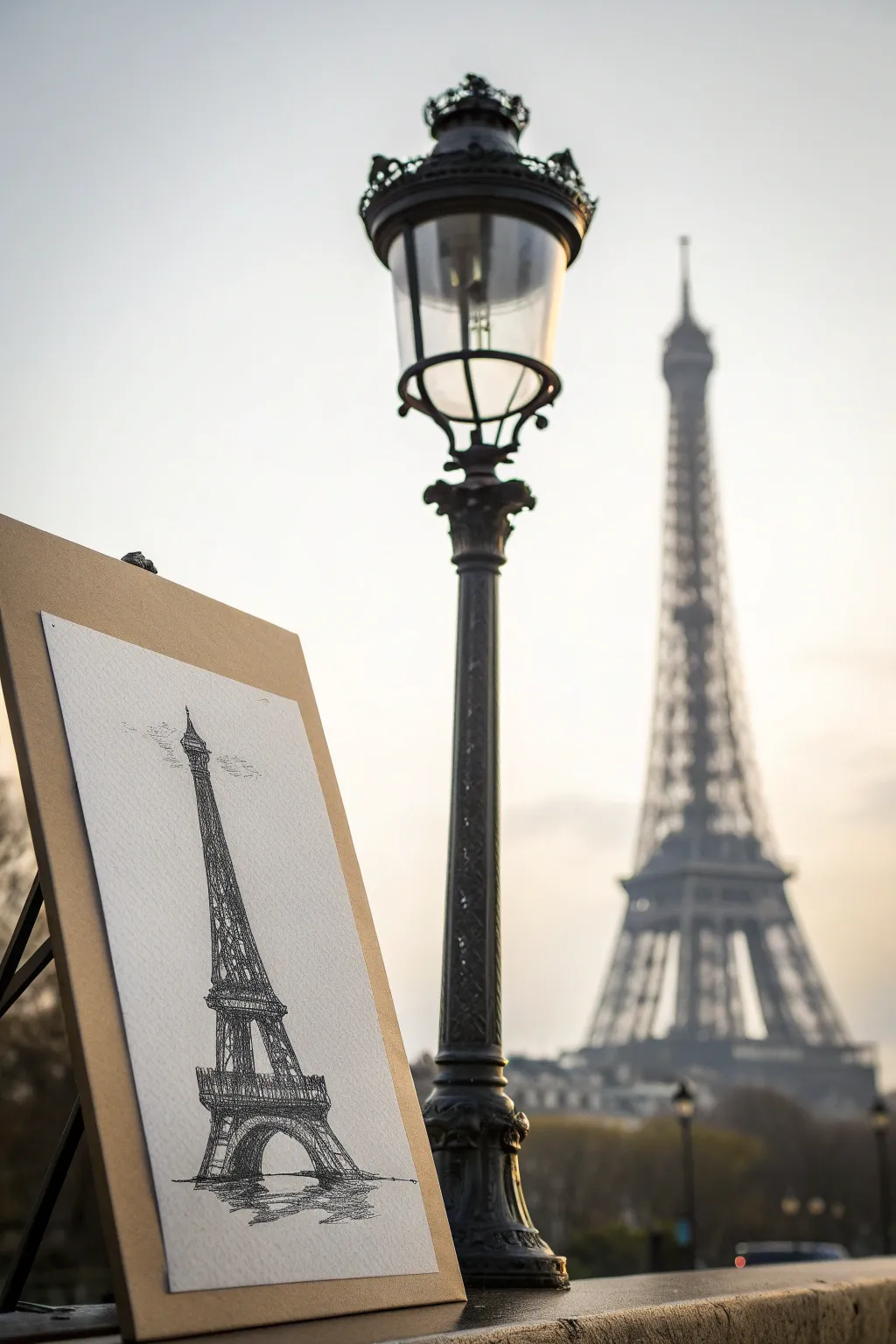
Capture the romantic essence of Paris with this architectural-style sketch of the Eiffel Tower, rendered in classic black ink tones. This project focuses on mastering perspective and texture to create a timeless piece that looks beautiful displayed against any backdrop.
How-To Guide
Materials
- Heavyweight textured drawing paper (cold press watercolor or mixed media)
- Hard graphite pencil (2H or H) for guidelines
- Soft graphite pencil (2B or 4B) for shading
- Fine liner pens (0.1mm, 0.3mm, 0.5mm) in black
- Kneaded eraser
- Ruler
- Drawing board or easel (optional)
Step 1: Planning the Structure
-
Establish the centerline:
Begin by lightly drawing a vertical centerline down the middle of your paper using a ruler and your 2H pencil. This axis is crucial for keeping the tower symmetrical. -
Mark horizontal tiers:
Divide the vertical line into three main sections to represent the three platforms of the tower. Place a horizontal mark for the base, the first deck, the second deck, and the very top tip. -
Sketch the base curve:
At the bottom, draw a wide, gentle arch for the legs. The base should be the widest part of your drawing, anchoring the structure firmly. -
Outline the silhouette:
Connect your horizontal marks with sweeping, upward-curving lines that taper inward as they reach the top. It should look like a very tall, narrow letter ‘A’.
Loose is Better
Don’t try to draw every single beam exactly. The brain fills in the gaps. Using ‘broken lines’ (lifting the pen occasionally) makes the sketch feel more lively.
Step 2: Adding Architectural Details
-
Define the platforms:
Thicken the horizontal lines at your deck marks to create the observation platforms. The first deck is the widest rectangle; the second is slightly narrower. -
Draw the lattice X-pattern:
Lightly sketch the crisscross lattice work inside the main structural lines. Don’t worry about drawing every single beam perfectly; just suggest the texture. -
Refine the legs:
Add thickness to the sweeping legs, ensuring they look sturdy enough to hold the weight of the tower. Include the smaller arches underneath the first platform. -
Add the antenna:
Draw a small vertical needle at the very peak of the tower to represent the antenna spire. -
Clean up guidelines:
Take your kneaded eraser and gently roll it over the pencil sketch to lift up the darkest graphite, leaving just a faint ghost image to guide your ink work.
Step 3: Inking and Texturing
-
Outline the main structure:
Using a 0.5mm pen, trace the main vertical curves and the horizontal decks. Keep your hand relatively loose to maintain that sketchy, artistic feel. -
Fill in the ironwork:
Switch to a 0.3mm pen for the lattice details. Instead of perfectly straight lines, use short, scratchy strokes to mimic the look of wrought iron. -
Darken the shadows:
Identify the light source (usually coming from the top left or right). Use the 0.5mm pen to darken the side opposite the light, adding weight and three-dimensionality. -
Detail the observation decks:
Use the 0.1mm pen to add tiny vertical lines along the platform railings. These small details add a sense of massive scale to the drawing. -
Add depth with hatching:
Create shadows under the arches and platforms using cross-hatching diagonal lines. I like to layer these slowly to build up a rich dark tone.
Mixed Media Pop
Once the ink is dry, add a light wash of blue watercolor behind the tower or dabs of yellow acrylic on the decks to mimic sparkling lights at twilight.
Step 4: Final Atmosphere
-
Sketch the ground reflection:
At the very base, add some scribbled, horizontal zigzag lines to suggest the ground or a wet reflection, anchoring the tower to the earth. -
Enhance contrast:
Go back with your tonal pencil (2B or 4B) and lightly shade over the inked shadowed areas to add a mixed-media softness. -
Add subtle clouds:
Using a very light touch with the 0.1mm pen or pencil, scribble a few loose, floating lines around the spire to suggest clouds passing by. -
Final erase:
Once the ink is completely dry, do a final pass with the eraser to remove any remaining visible guidelines.
Step back and admire your Parisian masterpiece, ready to be framed or gifted to a travel lover


Ink-and-Wash Paris Sketchbook Spread
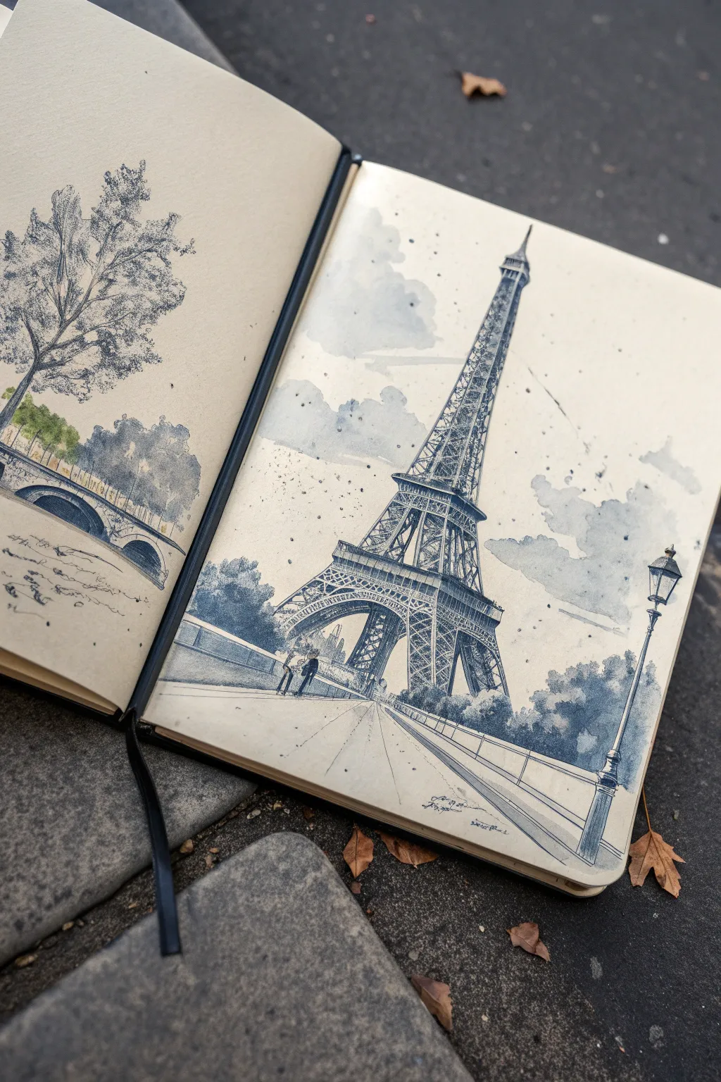
Capture the romantic atmosphere of Paris with this monochromatic ink-and-wash sketchbook spread. Using varying tones of blue-grey watercolor and sharp ink lines, you’ll create a dynamic composition that balances architectural precision with loose, cloudy skies.
Detailed Instructions
Materials
- Heavyweight mixed-media or watercolor sketchbook
- Waterproof fineliner pens (0.1mm, 0.3mm, 0.5mm) in black or dark grey
- Watercolor paints (Payne’s Grey, Indigo, and a touch of Burnt Sienna)
- Round watercolor brushes (size 4 and 8)
- Pencil (HB or 2B) and kneaded eraser
- Ruler (optional)
- White gel pen or gouache for highlights
- Water jar and paper towels
Step 1: Planning the Composition
-
Establish the horizon line:
Begin by lightly sketching a low horizon line across the right page, about one-fifth from the bottom edge. This low angle emphasizes the height of the tower. -
Block in the Eiffel Tower structure:
Using your pencil, draw a vertical centerline for the tower. Mark the three main platforms. Sketch the sweeping curve of the legs, ensuring they are wider at the base and taper elegantly toward the top spire. -
Sketch foreground elements:
Place a street lamp on the far right side of the page to create depth. Sketch the railing running diagonally from the bottom right corner toward the tower’s base to lead the viewer’s eye. -
Outline the left page scenery:
On the left page, sketch a large, leafy tree extending from the top left. Below it, draw the curve of a bridge arch and a hint of the riverbank to complement the main drawing.
Muddy Washes?
If your grey washes look dirty or opaque, you likely used too much pigment or dirty water. Always use two water jars—one for rinsing dirty brushes and one for picking up clean water.
Step 2: Inking the Architecture
-
Ink the tower’s main lines:
Switch to a 0.3mm waterproof pen. Carefully trace the outer edges of the Eiffel Tower. Don’t use a ruler here; a slightly wavering hand-drawn line adds character and life to the sketch. -
Add the intricate lattice work:
Use a finer 0.1mm pen for the interior cross-bracing (the ‘X’ patterns). Suggest the complexity rather than drawing every single beam. Concentrate the detail near the platforms and let it get looser near the top. -
Detail the foreground lamp:
Ink the street lamp with the 0.5mm pen to make it stand out as a foreground object. Darken the metal casing and the pole to give it visual weight. -
Draw the paving and figures:
Use quick, loose strokes to indicate the pavement lines leading toward the tower. Add tiny silhouettes of people near the base to provide a sense of massive scale. -
Erase pencil marks:
Once the ink is completely dry—give it a few minutes—gently erase all your graphite guidelines with a kneaded eraser.
Step 3: Applying the Wash
-
Mix your base grey:
Create a watery mix of Payne’s Grey or Indigo. You want a very pale, transparent blue-grey tone for the sky. Wet the sky area with clean water first, then drop in the paint to create soft, billowy clouds. -
Paint the tower’s shadows:
Using a slightly stronger mix of the same grey, paint the shadowed side of the tower. I like to keep the sun coming from the left, so I darken the right side of the structure to create form. -
Darken the lower levels and trees:
Mix a saturated, dark blue-grey. Apply this to the trees at the base of the tower and the foliage on the left page. Use a stippling motion with your brush to mimic leaf texture. -
Add warmth to the ground:
Introduce a tiny bit of Burnt Sienna into your grey mix for the pavement. This subtle warmth separates the ground from the metallic steel of the tower. -
Texturize the left page:
For the large tree on the left, use a dry-brush technique with dark ink or paint to create the rough bark and scattered leaves, keeping the wash loose and uneven.
Level Up: Vintage Vibe
Instead of pure white paper, try staining your pages with a light tea wash before you start drawing. This gives the sketch an antique, travel-journal aesthetic perfect for Paris.
Step 4: Final Details and Splatter
-
Deepen the foreground contrast:
Go back to the street lamp and the closest railing section. Apply a second layer of indigo to make these the darkest elements on the page. -
Add atmospheric splatter:
Load a small brush with watery dark grey paint. Tap the handle against your finger to flick tiny droplets across the sky area. This adds texture and an ‘urban sketch’ energy. -
Highlight with white:
Use a white gel pen to add highlights to the top of the street lamp and the brightest edges of the tower’s metalwork. -
Final assessment:
Check the balance of the spread. If the bridge on the left looks too light, add a quick wash of grey under the arch to deepen the shadow.
Close your sketchbook knowing you’ve captured a timeless piece of Parisian architecture in your own style


Have a question or want to share your own experience? I'd love to hear from you in the comments below!