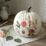
If you’re craving simple flower painting ideas that actually feel doable, you’re in the right mindset to make something pretty fast. I’m sharing my favorite beginner-friendly blooms that lean on basic brushstrokes, easy shapes, and repeatable little tricks.
One-Stroke Daisies
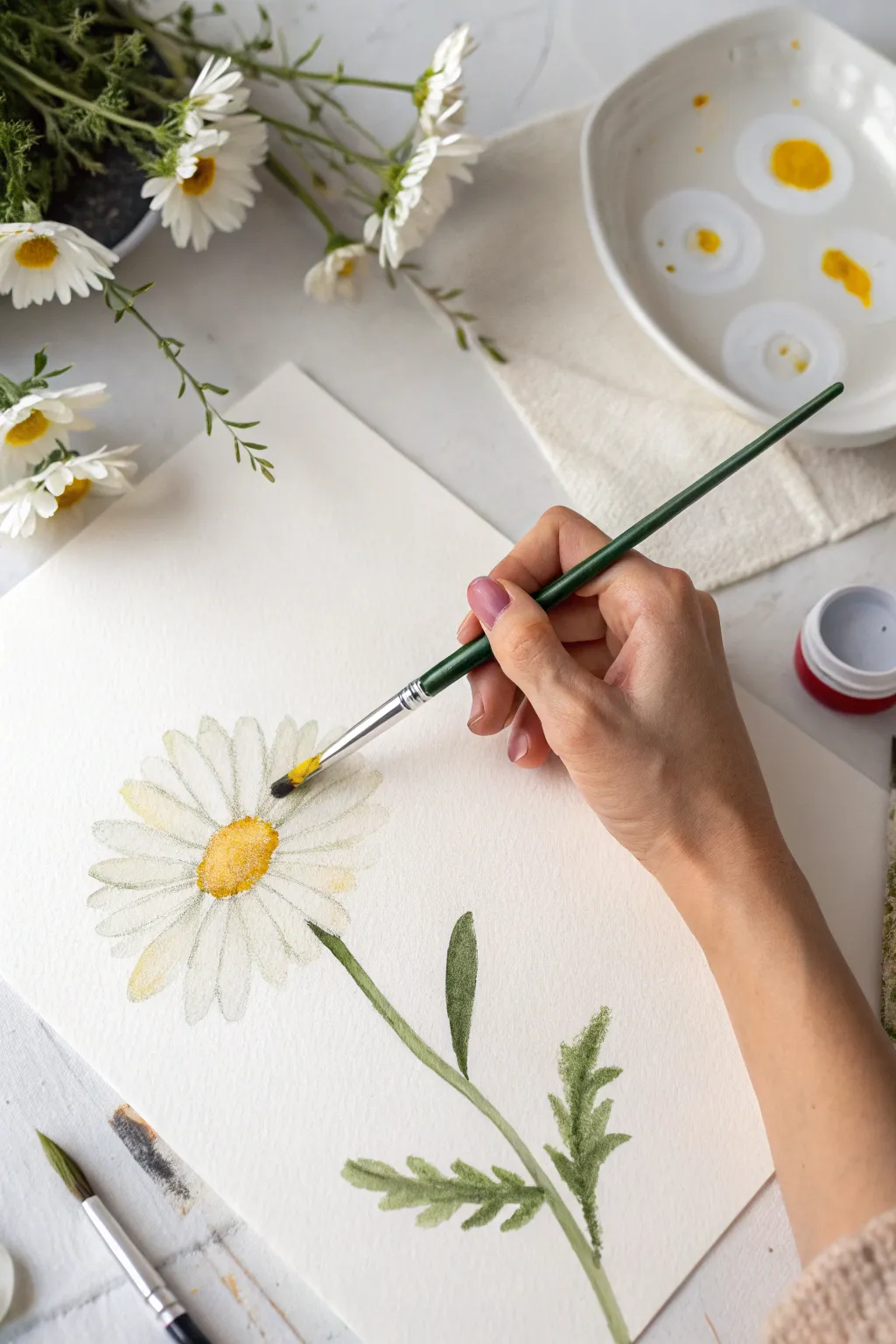
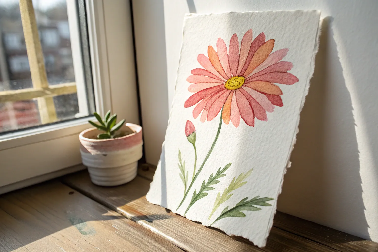
Capture the delicate charm of a summer daisy with this soft and airy watercolor study. By carefully layering transparent washes and defining the petal shapes, you’ll create a lifelike bloom that feels fresh from the garden.
How-To Guide
Materials
- Cold press watercolor paper (140lb/300gsm)
- Round synthetic watercolor brush (Size 4 or 6)
- Small detail brush (Size 0 or 1)
- Watercolor paints: Lemon Yellow, Yellow Ochre, Sap Green, Burnt Umber
- Ceramic palette or mixing plate
- Clean water jar
- Paper towels
- Pencil (HB or H) for light sketching
Step 1: Sketching the Structure
-
Establish the center:
Begin by lightly sketching a small oval near the center-left of your paper. This will be the flower’s disk. Keep your pencil pressure extremely light so the graphite doesn’t show through the transparent paint later. -
Map the petals:
Draw faint guidelines radiating outward from the oval to determine the length of your petals. Sketch the individual petal shapes, ensuring they are narrow at the base and slightly wider at the tips with rounded ends. -
Add the stem:
Draw a slender, slightly curved line extending downward from the flower head. Add a few jagged, fern-like leaves branching off near the bottom to give the composition balance.
Step 2: Painting the Flower Head
-
First petal wash:
Mix a very watery, pale wash of Yellow Ochre or dirty water to create an off-white shadow tone. Gently fill in every other petal, letting the white of the paper shine through as the highlight. -
Petal layering:
Once the first set is damp but not soaking, fill in the remaining petals. If some edges touch and bleed slightly, that’s okay—it adds to the loose, organic watercolor look. -
Create the golden center:
Load your round brush with Lemon Yellow. Dab the color into the center oval. While it’s still wet, drop in a touch of Yellow Ochre on the bottom edge to create volume and roundness. -
Texturing the center:
Allow the yellow center to dry until it loses its shine. Then, using the tip of your brush and a mix of Yellow Ochre and a tiny dot of Burnt Umber, stipple small dots along the lower shadow edge for a textured, pollen-like effect. -
Deepening shadows:
I find it helpful to mix a very dilute grey-blue or cool violet now. Glaze this shadow color lightly at the base of the petals where they meet the center to lift the cone shape upward visually.
Muddy Petals?
If your white petals look dirty, your shadow wash was too dark or your water jar was dirty. Use clean water and test the grey wash on scrap paper; it should be barely visible.
Step 3: Stem and Foliage
-
Mixing greenery:
Prepare a mix of Sap Green with a touch of Yellow Ochre for a warm, natural green. You want the consistency of milk—not too thick, not too watery. -
Painting the stem:
Using a steady hand and medium pressure, paint the main stem in one fluid stroke, starting from the flower base and pulling downwards. -
Adding leaves:
For the jagged leaves, press the belly of the brush down to create the wider leaf sections and lift to a point for the tips. Mimic the serrated edges sketched earlier. -
Leaf details:
While the green paint is still wet, drop a slightly darker green mix (Sap Green plus a tiny bit of Burnt Umber) into the base of the leaves where they attach to the stem.
Add a Background
Wet the area around the daisy with clean water and drop in a very pale blue wash. This negative painting technique makes the white petals pop brilliantly against the soft sky color.
Step 4: Final Details
-
Refining petal edges:
Switch to your smallest detail brush. With a very faint grey mix, outline just a few tips of the petals to clarify their separation without outlining the entire flower. -
Highlight check:
Step back and look at the painting. If the center feels too flat, add a tiny dot of pure, unmixed yellow to the top left area for a pop of brightness. -
Clean up:
Once the paper is bone dry, gently erase any visible pencil marks that haven’t been covered by paint, particularly around the petal tips.
Frame your delicate daisy or scan it to create beautiful custom stationery cards


Simple Tulip Trio
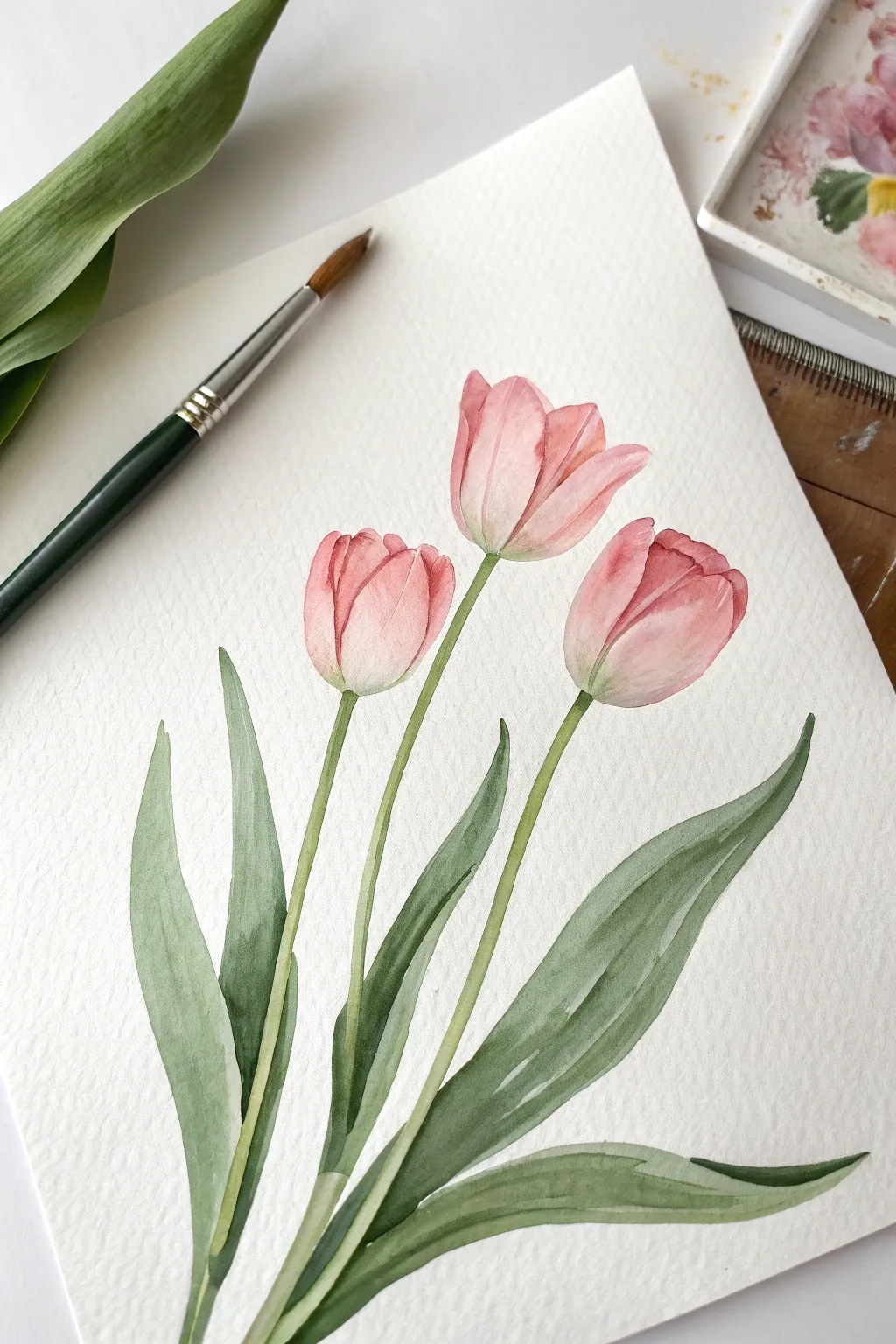
Capture the delicate elegance of spring with this watercolor study of three budding tulips. Using soft washes and gentle layering, you will create petals that glow with translucency and stems that curve with natural grace.
Step-by-Step Guide
Materials
- Cold press watercolor paper (300 gsm)
- Round watercolor brushes (sizes 4 and 8)
- Watercolor paints: Rose Madder or Quinacridone Rose
- Sap Green and Olive Green paint
- Clean water jar
- Paper towel
- Pencil (HB) and kneaded eraser
Step 1: Sketching and Preparation
-
Composition Layout:
Begin by lightly sketching the position of the three flower heads. Place the highest one slightly off-center to the right, with the other two flanking it at different heights to create a natural, asymmetrical balance. -
Refining the Shapes:
Refine the tulip bowls into soft egg shapes, slightly tapered at the top. Draw the overlapping petals lightly—usually one central petal hugged by two side petals. -
Adding Stems and Leaves:
Draw long, slender stems flowing downwards from each flower head. Unlike stiff lines, give them a subtle curve. Add large, lance-shaped leaves at the base that sweep upward, wrapping around the stems. -
Clean Up:
Go over your sketch with a kneaded eraser. Roll it gently over the paper to lift excess graphite until the lines are barely visible, ensuring they won’t show through the transparent watercolor.
Muddy colors?
If your pinks and greens are mixing into brown where the stem meets the flower, let the flower head dry 100% before painting the stem. A dry edge prevents unwanted bleeding.
Step 2: Painting the Blooms
-
First Wash – Left Tulip:
Mix a very watery, pale wash of your pink hue. Apply this to the entire head of the left tulip. While it’s still wet, drop a slightly more saturated pink into the base of the flower and let it bleed upward naturally. -
First Wash – Center and Right:
Repeat this process for the center and right tulips. Keep the edges crisp but the interiors soft. Leave tiny slivers of white paper at the top edges if you can, to represent highlights. -
Wait for Drying:
Allow these base layers to dry completely. If the paper feels cool to the touch, it’s still wet. Patience here prevents the colors from becoming muddy. -
Defining Petals:
Using a smaller brush and a deeper mix of pink, paint the shadows where the petals overlap. On the right tulip, shade the area where the side petal tucks behind the front one to create dimension. -
Deepening color:
Glaze a second layer of translucent pink over the bottom half of each bloom. This intensifies the color near the stem while keeping the tops delicate and airy.
Preserve the light
Watercolor relies on the white paper for light. Leave the tops of the tulip petals unpainted or use a very pale wash to keep them looking sun-kissed and translucent.
Step 3: Stems and Foliage
-
Base Green Layer:
Mix a light Sap Green. Starting at the very base of the flower head, pull your brush down to create the stem. I find that resting my hand on a clean paper towel helps keep the line steady. -
Connecting Bloom to Stem:
While the top of the stem is wet, touch a tiny bit of the pink mix into the green right where it meets the flower. This creates a realistic, soft transition. -
Painting Leaves:
Load your larger brush with a mix of Sap and Olive Green. Paint the broad leaves using a single stroke technique: press down to widen the stroke for the leaf body, then lift as you reach the tip. -
Creating Leaf folds:
For the folded leaves, paint the darker underside with a more concentrated green mix, appearing almost grey-green. Leave a thin white negative space or dry line between the front and back of the leaf to define the fold. -
Adding Texture:
Once the first layer of green is dry, add subtle vertical striations on the leaves with a watery mix to mimic the natural veins of tulip foliage. -
Final Touches:
Evaluate your painting. If the tulips need more contrast, add a final, very concentrated touch of pink to the deepest crevices between petals. Let the entire piece dry completely.
Now you have a graceful floral trio ready to be framed or turned into a lovely greeting card
Easy Spiral Roses
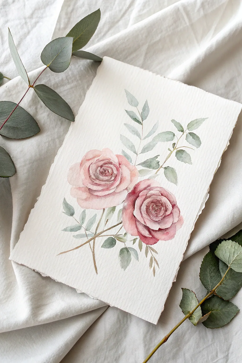
Capture the romantic charm of a vintage garden with this delicate watercolor study of two blooming roses. You’ll learn how to build soft, transparent layers to create depth in the petals and balance the composition with muted, natural greenery.
Step-by-Step Tutorial
Materials
- Cold press watercolor paper (deckle edge preferred)
- Watercolor paints (Alizarin Crimson, Burnt Sienna, Payne’s Gray, Sap Green, Yellow Ochre)
- Round watercolor brushes (sizes 2, 6, and 8)
- Pencil (HB or 2H)
- Kneaded eraser
- Clean water jar
- Paper towels
Step 1: Sketching the Composition
-
Map out the roses:
Begin by lightly sketching two rough circles to position your winding rose blooms. Place the upper rose slightly to the left and the lower rose to the right, ensuring they overlap slightly for a natural cluster. -
Define the centers:
Inside each circle, lightly draw a tight spiral to mark the center of the bloom. This will be your guide for the darkest, most concentrated petals later on. -
Sketch the outer petals:
Around your spiral, sketch loose, scalloped shapes that grow larger as they move outward. Keep your lines incredibly faint so they wno’t show through the translucent paint. -
Add stems and foliage:
Draw thin, intersecting stems extending downward. Then, sketch the skeleton of your greenery: a tall sprig of eucalyptus rising behind the roses and jagged rose leaves tucking underneath the blooms.
Muddy Color Fix
If your pinks look brown or dirty, you likely overworked the wet paper. Let the layer dry completely, then add a fresh glaze of pure, clean pink to restore vibrancy.
Step 2: Painting the Blooms
-
Mix your base blush:
Create a watery mix of Alizarin Crimson and a tiny touch of Burnt Sienna to get a vintage dusty pink. Load your size 6 brush with this dilute mixture. -
First wash on the top rose:
Paint the outer petals of the upper rose first. Use the watery mix to fill in the large petal shapes, leaving thin slivers of white paper between them to define their edges. -
Deepen the lower rose:
For the bottom rose, add slightly more Alizarin Crimson to your mix for a richer, deeper hue. Paint the petals using the same technique, keeping the wet paint moving to avoid hard edges where you don’t want them. -
Darkening the centers:
While the outer petals are damp (not soaking wet), mix a thicker, creamier version of your rose color. Using a size 2 brush, drop this pigment into the tight spiral center, allowing it to bleed slightly outward for a soft gradient. -
Building petal contrast:
Once the first layer is dry, glaze a second layer of translucent pink over the shadowy areas where petals overlap. This negative painting technique helps the top petals pop forward.
Try Sepia Ink
Once the watercolor is fully dry, use a dip pen with sepia ink to loosely outline just the centers of the roses for a highly illustrative, botanical print style.
Step 3: Painting the Greenery
-
Mix a muted green:
Combine Sap Green with a touch of Payne’s Gray and Yellow Ochre. You want a desaturated, realistic green rather than a bright, artificial one. -
Paint the eucalyptus:
Using the tip of your size 6 brush, paint the tall sprig behind the roses. Use a dilute, watery version of your green mix to make these leaves look further away and softer. -
Add the rose leaves:
Mix a darker, more concentrated green for the serrated leaves underneath the blooms. Paint these with sharper edges to contrast with the soft eucalyptus. -
Stem work:
Switch to your size 2 brush and paint thin, decisive lines for the main stems. I like to add a hint of brown to the green mix here for a woodier look. -
Connect the elements:
Ensure the stems connect naturally to the flower heads. If there are awkward gaps, add a tiny leaf or sepals to bridge the space visually.
Step 4: Final Details
-
Deepen the shadows:
Mix your darkest red (Alizarin + a dot of Payne’s Gray). With your smallest brush, add tiny, selective accents to the very deepest folds in the center of the roses. -
Add leaf veins:
If your leaves look too flat, use a slightly darker green mix to paint a delicate central vein on a few of the foreground leaves. -
Soften edges:
Inspect your work. If any background leaves look too harsh, scrub them gently with a damp, clean brush to blur the edges and push them into the distance.
Now step back and admire how a few simple spirals can transform into such elegant blooms

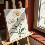
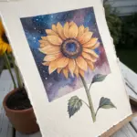
Sunflowers From the Center Out
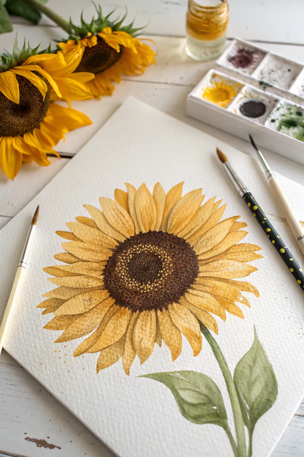
Capture the golden warmth of late summer with this vibrant watercolor sunflower study. You’ll layer rich ochres and deep browns to build a realistic textured center surrounded by luminous petals.
Step-by-Step
Materials
- Cold press watercolor paper (300 gsm)
- Watercolor paints (Yellow Ochre, Cadmium Yellow, Burnt Umber, Sepia, Sap Green)
- Round brushes (size 4, size 8, and a fine liner size 0)
- Pencil (HB or H)
- Eraser
- Two jars of water
- Paper towels
Step 1: Drawing the Base Structure
-
Outline the center:
Begin by lightly sketching a large oval in the middle of your paper. This will be the seed head. It doesn’t need to be a perfect circle; a slightly flattened oval gives it a more natural perspective. -
Sketch petal guides:
Draw faint lines radiating outward from the center oval to guide where your petals will go. This helps ensure they fan out evenly and don’t clump together on one side. -
Define the petal shapes:
Using your guide lines, sketch the actual petal shapes. Make them varied—some wide, some narrow, some overlapping. The tips should be slightly pointed but soft. -
Add stem and leaves:
Draw a thick stem curving down from the base of the flower head. Add two broad, leaf shapes attached to the stem near the bottom. -
Clear lines:
Gently erase your guidelies, leaving only the faintest impression of your final shapes so the graphite doesn’t muddy the watercolor later.
Don’t Overwork The Petals
Sunflowers look best with loose, fresh washes. If you mess up a petal, resist the urge to scrub at it. Just lift excess paint with a tissue and let it be.
Step 2: Developing the Center
-
First wash:
Mix a watery wash of Yellow Ochre and fill the entire center oval. Keep this layer wet and light to act as a glowing base under the seeds. -
Darkening the edges:
While the center is still damp, drop concentrated Burnt Umber around the outer ring of the oval. Let the brown bleed slightly inward for a soft gradient. -
Building seed texture:
Once the wash is dry, use your small brush to stipple tiny dots of Sepia or dark brown in the very center and the outer rim. Leave a ring of the lighter underpainting visible in the middle area to create depth. -
Refining the core:
Add smaller, denser dots of nearly black brown (Sepia mixed with a touch of blue) to the very center divot. This creates that concave look typical of sunflowers.
Step 3: Painting the Petals
-
Base petal wash:
Mix a clean Cadmium Yellow. Paint every other petal first, filling them with an even wash. Painting non-adjacent petals prevents wet edges from bleeding into each other. -
Deepening color:
While the petals are wet, drop a tiny amount of Yellow Ochre at the base where the petal meets the center. This adds dimension and shadow. -
Completing the ring:
Once the first set of petals is dry, paint the remaining petals. You can make these slightly darker or lighter to distinguish them from their neighbors. -
Adding fine veins:
Use a fine liner brush with a thin mix of orange-brown to paint delicate veins on the petals. Keep lines broken and faint so they don’t look like stripes.
A Touch of Sparkle
For a magical finish, use a tiny bit of white gouache or a gel pen to dot highlights onto the darkest part of the seed center once fully dry.
Step 4: Stem and Leaves
-
Green wash:
Mix Sap Green with a touch of brown for a natural, earthy olive tone. Coat the stem and both leaf shapes with a medium wash. -
Adding shadows:
While the green is still damp, charge the shadowed side of the stem and the undersides of leaves with a darker green mix. -
Leaf details:
Let the greenery dry completely. Use your liner brush and a dark green mix to paint thin, branching veins on the leaves for realistic texture. -
Final touches:
Evaluate your contrast. If the center needs more punch, stipple one final layer of dark brown dots to make the yellow petals really pop.
Step back and admire your sunny creation, knowing you’ve preserved a piece of summer on paper
BRUSH GUIDE
The Right Brush for Every Stroke
From clean lines to bold texture — master brush choice, stroke control, and essential techniques.
Explore the Full Guide
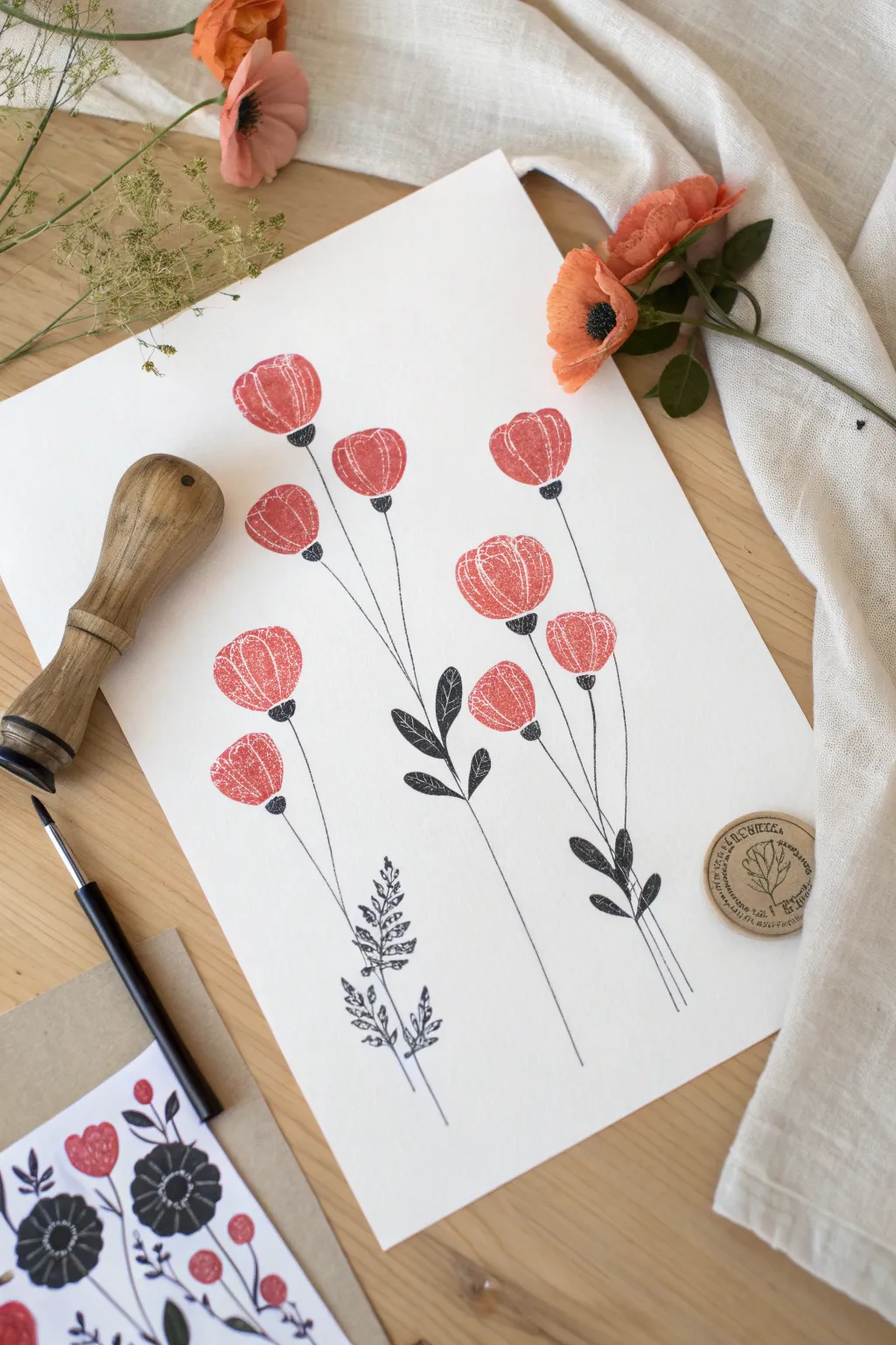
Bold Poppies With Four Petals
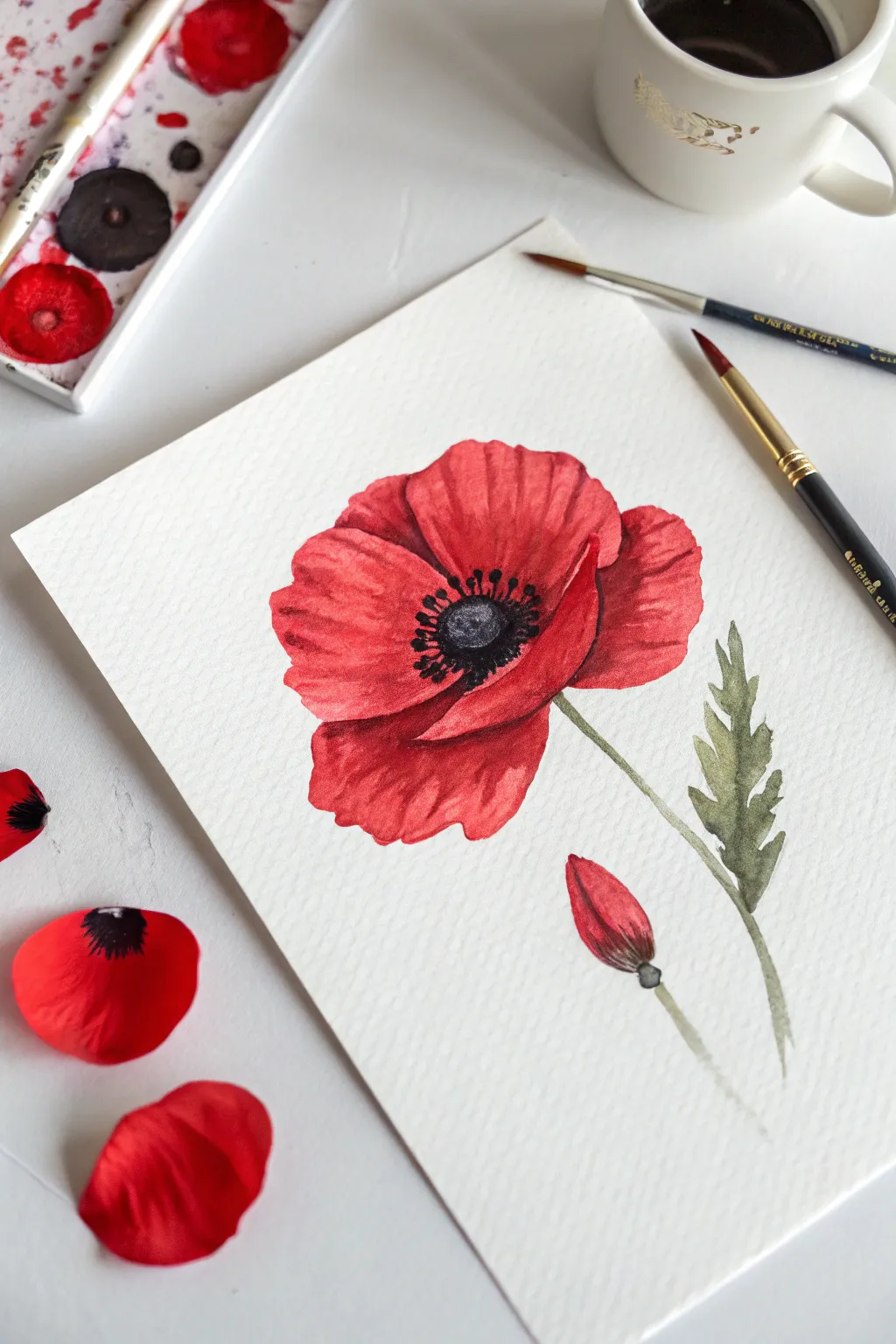
Capture the bold beauty of a red poppy with this striking watercolor study that focuses on rich layering and contrast. You’ll create translucent, papery petals that seem to flutter off the page, paired with a delicate unopened bud.
Step-by-Step
Materials
- Cold press watercolor paper (300 gsm)
- Watercolor paints (Cadmium Red, Alizarin Crimson, Sap Green, Payne’s Grey, Black)
- Round watercolor brushes (Size 4 and Size 8)
- Pencil (HB or lighter)
- Kneaded eraser
- Clean water jar
- Paper towels
- Palette
Step 1: Sketching the Composition
-
Outline the main flower:
Begin by lightly sketching a large, oval shape to define the overall size of the poppy head. Inside this, sketch four distinct, overlapping petals that surround a central point. -
Add crinkles and edges:
Refine the petal edges to be slightly wavy and irregular, mimicking the papery texture of a real poppy. Draw a small circle in the very center for the seed head. -
Sketch the stem and bud:
Draw a thin, slightly curved line extending downward from the flower for the stem. To the right, add a second shorter stem topped with an oval shape for the unopened bud. -
Draw the leaf:
Add a jagged, textured leaf growing from the main stem on the right side. Keep the pencil lines faint so they won’t show through the transparent paint later. -
Clean up lines:
Use your kneaded eraser to lift any excess graphite, leaving only a ghost of the image to guide your painting.
Wet-on-Wet Magic
To get soft transitions in the petals, pre-wet the paper with clean water before dropping in the red paint. The color will bloom naturally.
Step 2: Painting the Blooms
-
First wash of red:
Load your Size 8 brush with a watery mix of Cadmium Red. Paint the four petals, leaving tiny slivers of white paper between them to separate the shapes and prevent them from bleeding into a single blob. -
Deepen the shadows:
While the first layer is still damp (but not swimming), drop in a concentrated mix of Alizarin Crimson near the center of the flower and along the creases of the petals. This creates depth and curvature. -
Painting the bud:
Paint the top portion of the bud with your red mix. As you move down the bud, blend in a touch of green where the sepals meet the petals. -
Let it dry completely:
Wait for the red layer to be bone dry. If you paint the center too soon, the black will bleed into your beautiful red petals. -
Second layer of texture:
Using a drier brush and the darker Alizarin Crimson, paint fine lines radiating from the center outward to simulate the crinkled texture of the petals.
Step 3: Stems and Details
-
Paint the stems:
Mix a watery Sap Green with a tiny touch of red to dull it down. With the tip of your brush, paint the main stem and the bud stem with a single, confident stroke for each. -
Filling the leaf:
Paint the jagged leaf with your green mix. While wet, drop in a slightly darker green (add a touch of Payne’s Grey) near the stem to create a shadow. -
The poppy center:
Mix a thick, dark color using Payne’s Grey or Black. Paint the central seed pod circle, leaving a tiny highlight of white paper if you can. -
Adding stamens:
Using your smallest brush (Size 4) or a rigger brush, flick tiny, fine lines outward from the black center. Add small dots at the ends of these lines to represent pollen. -
Final bud details:
Add a small touch of the dark green mix to the base of the bud where it connects to the stem. -
Review and refine:
Step back and look at your contrast. If the petals look too flat, add a translucent glaze of crimson over the shadowed areas to punch up the vibrancy.
Try a Splatter
For a looser, artistic look, load a brush with watery red or green paint and tap it over the dry painting to create subtle splatters.
Once the center is fully dry, your bold poppy is ready to frame or give as a cheerful gift
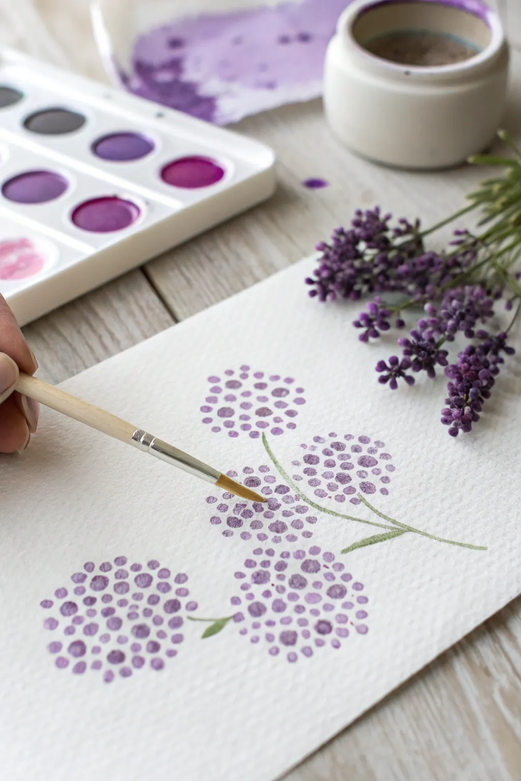
Hydrangeas as Tiny Petal Clusters
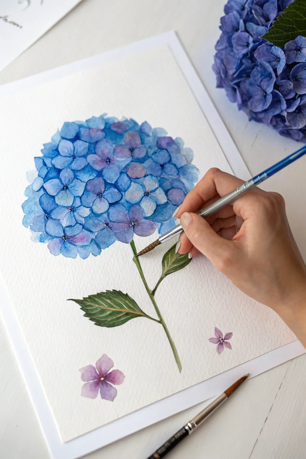
Capture the delicate beauty of a blue hydrangea bloom by building up layers of translucent petals. This watercolor project focuses on creating depth through negative space and soft wet-on-dry techniques to achieve that lush, spherical look.
Detailed Instructions
Materials
- Cold press watercolor paper (300 gsm recommended for texture)
- Watercolor paints: Cobalt Blue, Ultramarine Blue, Violet or Purple, Sap Green, and Burnt Umber
- Round watercolor brushes: Size 6 for petals and Size 2 or 1 for details
- Pencil (HB or lighter) for sketching
- Kneaded eraser
- Cup of water
- Palette or white plate for mixing
- Paper towels
Step 1: Sketching the Structure
-
Outline the orb:
Start by lightly sketching a large, rough circle or oval in the center of your page to define the overall shape of the hydrangea head. Keep this line extremely faint so it disappears later. -
Map the petals:
Inside your circle, sketch small, four-petaled flowers clustered together. You don’t need to draw every single petal, but create a dense grouping in the center and looser, partial shapes near the edges to suggest curvature. -
Add the stem and leaves:
Draw a thin stem extending downwards from the flower head. Add two large, serrated leaves branching off the stem—one pointing left and one pointing right. Sketch two fallen, single four-petaled florets near the bottom of the page for composition. -
Lighten the lines:
Gently roll a kneaded eraser over your sketch to lift up the graphite, leaving only the faintest guide lines visible for you to follow.
Wet Edge Control
To prevent flowers from merging into one big blob, ensure adjacent petals are dry before painting the next one, or leave a hairline whitespace gap between them.
Step 2: Painting the Blooms
-
Mix your blues:
Prepare a puddle of watery Cobalt Blue on your palette. For variation, mix a separate smaller puddle of Ultramarine for shadows and one with a touch of Violet for purple accents. -
Paint the first layer of petals:
Using your size 6 brush, paint individual florets with the light Cobalt Blue mix. Leave tiny white spaces between the petals of each floret to define their centers. -
Vary the tones:
While the paint is still wet on some petals, touch in a tiny drop of the purple mix or the darker blue to let the color bloom naturally. -
Build the sphere:
Continue painting florets across the entire circular shape. Ensure the petals on the outer edges are lighter and more watery to make the flower look round. Let this layer dry completely. -
Deepen the shadows:
Mix a more concentrated Ultramarine Blue. Paint negative space areas—the triangular gaps between the first layer of flowers—to create the illusion of depth inside the cluster. -
Refine the centers:
Switch to your size 2 brush. With a dark blue-violet mix, add tiny dots or distinct centers to the most prominent florets to give them focus. -
Create soft edges:
If any edges feel too hard, use a clean, damp brush to gently soften lines on petal tips, making the flower look fluffy and organic. -
Paint the fallen petals:
Paint the two loose florets at the bottom using a mix leaning more towards violet. Keep them translucent and delicate.
Add Dew Drops
Lift a tiny dot of color with a dry brush and add a hard shadow underneath with dark blue to create realistic water droplets on the petals.
Step 3: Leaves and Stem
-
Mix leaf green:
Combine Sap Green with a tiny touch of Burnt Umber or red to create a natural, earthy olive green. -
Paint the stem:
Use the tip of your brush to pull a thin line of green down from the flower head. I like to break the line slightly where the leaves attach to keep it looking natural. -
Base coat for leaves:
Fill in the leaf shapes with a medium wash of your green mix, ensuring the serrated edges are clearly defined. -
Add leaf texture:
While the leaves are still slightly damp, drop in darker green pigment near the central vein and the base of the leaves for volume. -
Defining veins:
Once the leaves are fully dry, mix a concentrated dark green. Use your finest brush to paint thin, crisp lines for the veins on the leaves, leaving the lighter green showing through as highlights. -
Final touches:
Review the painting for balance. If the hydrangea head needs more definition, add a few final dark dabs of blue in the deepest crevices.
Step back and admire the vibrant, clustered volume of your finished hydrangea study

PENCIL GUIDE
Understanding Pencil Grades from H to B
From first sketch to finished drawing — learn pencil grades, line control, and shading techniques.
Explore the Full Guide
Quick Wildflower Field Layers
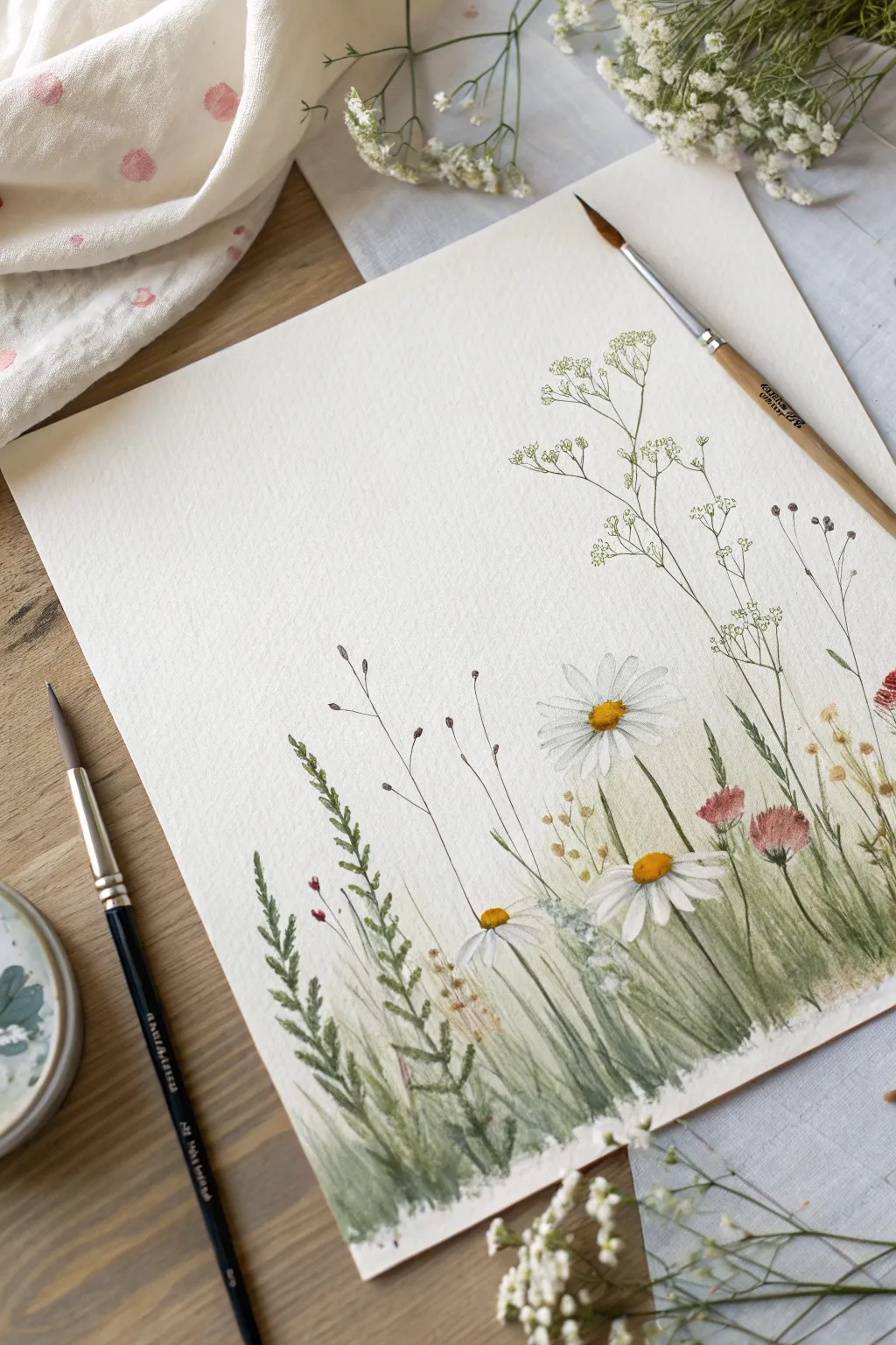
Capture the airy, gentle nature of a summer field with this loose watercolor technique. By layering delicate washes of green and adding crisp flower details, you create depth without needing to paint every single blade of grass.
Detailed Instructions
Materials
- Cold press watercolor paper (300 gsm)
- Round watercolor brushes (size 2, 6, and a finer detail brush like a size 0)
- Watercolor paints (Sap Green, Olive Green, Yellow Ochre, Burnt Sienna, Cadmium Yellow, Alizarin Crimson, Paynes Gray)
- Clean water jar
- Paper towel
- Pencil (HB) for very light sketching
Step 1: Setting the Composition
-
Lightly sketch positions:
Begin with an extremely faint pencil sketch. Mark the general height of your tallest grass blades and the placement of the three main daisy heads—one low on the left, one larger on the right, and one slightly tucked behind. -
Plan your white space:
Identify the areas that need to remain pure white, specifically the daisy petals and the upper ‘sky’ area. Watercolor relies on the paper’s white for highlights, so we will paint around these shapes.
Keep it Loose
Don’t try to paint every individual blade of grass. Let the initial pale wash do the heavy lifting for the background density, focusing your detail work only on the foreground stems.
Step 2: Base Greenery Layer
-
Mix a pale wash:
Dilute Sap Green with plenty of water to create a very pale, tea-like consistency. This will form the soft, out-of-focus background grass. -
Apply the initial wash:
Using your size 6 brush, sweep loose, vertical strokes from the bottom upward. Let the strokes fade out as you reach the middle of the paper. Keep this layer uneven to suggest wild growth. -
Add warmth while wet:
While the green is still damp, drop in small touches of Yellow Ochre near the bottom edge. This suggests dried earth and adds immediate warmth to the composition. -
Soften edges:
Use a clean, damp brush to feather out the top edges of your green wash so there isn’t a harsh line where the grass meets the empty white background. -
First drying phase:
Allow this initial layer to dry completely. If the paper still feels cool to the touch, it is too wet to proceed.
Add Some Splatter
For a more organic, wild look, load your brush with watery green or gold paint and tap it against your finger to splatter tiny droplets over the bottom section of the grass.
Step 3: Defining the Flowers
-
Paint daisy centers:
Mix Cadmium Yellow with a tiny touch of Burnt Sienna to get a warm, golden yellow. Paint the round centers of your daisies. Leave a tiny sliver of white on the top left of each center for a highlight. -
Shadow the centers:
While the yellow is drying, mix a thicker Burnt Sienna. Dab small dots strictly on the bottom right curve of the yellow centers to give them a 3D, domed appearance. -
Petal shadows:
The petals stay white, but to give them separation, mix a very watery, pale gray (Paynes Gray + water). Paint very thin lines between a few petals or shadow the petal underneath where they overlap. -
Add pink accents:
Using Alizarin Crimson mixed with a little water, paint the small, fuzzy clover-like flower heads. Use a stippling motion (dotting) rather than smooth strokes to create texture.
Step 4: Building Grass Textures
-
Mix mid-tone greens:
Create a mixture of Olive Green and a bit of Sap Green. It should be darker and less watery than your first wash. -
Paint distinctive blades:
Switch to your size 2 brush. Paint individual blades of grass, starting from the bottom and flicking your wrist upward to get a tapered, sharp point. Vary the heights and angles. -
Create fern-like textures:
On the bottom left, paint a stem with small, fern-like leaves branching off. Use short, quick dabs of the brush to mimic the leafy texture shown in the reference. -
Darken the base:
Mix a darker green by adding a touch of Paynes Gray or blue to your green mix. Paint short grass strokes right at the very bottom edge to ground the artwork and create depth. -
Stem connections:
Carefully draw very thin green stems connecting to your daisies and pink flowers. Ensure these lines are delicate; a thick stem will make the flower look heavy.
Step 5: Final Airy Details
-
Baby’s breath structure:
Using your finest detail brush (size 0) and a mix of watery Olive Green, draw the tall, branching skeleton of the filler flowers (like baby’s breath) on the right side. Keep lines trembling and thin. -
Dotting the filler flowers:
Once the thin stems are dry, take a clean brush or even a toothpick with opaque white gouache (or very pale, creamy yellow watercolor) and dot the unmistakable tiny blooms at the ends of those fine branches. -
Adding seed heads:
Use Burnt Sienna or a reddish-brown to paint the tall, thin seed pods sticking up in the background. Keep these very distinct and separate from the rest of the foliage. -
Final assessment:
Step back. I often find I need to add one or two very dark, sharp blades of grass in the foreground to increase the contrast. Add these sparingly only if needed.
Once the final dark accents are dry, gently erase any visible pencil marks to reveal your fresh meadow scene
Finger-Painted Five-Petal Blossoms
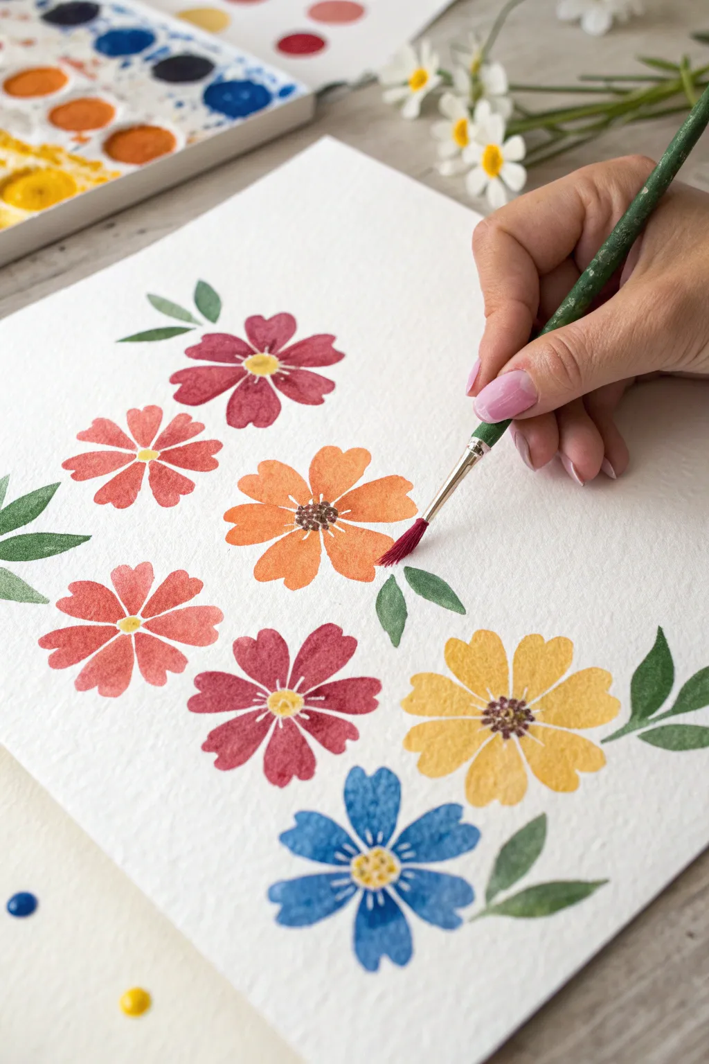
Capture the loose, charming beauty of a summer garden with these cheerful watercolor flowers. Each bloom features distinct, brush-shaped petals that come together to create a lively composition full of color and movement.
Step-by-Step
Materials
- Cold-press watercolor paper (300gsm recommended)
- Watercolor paints (Red, Pink, Orange, Yellow, Blue)
- Round watercolor brush (size 6 or 8)
- Small detail brush (size 0 or 1)
- Cup of clean water
- Paper towel for blotting
- Palette for mixing
Step 1: Planning and First Blooms
-
Prepare your palette:
Begin by activating your watercolor pans with a drop of water each. You’ll want a saturated mix for the petals, so swirl your brush until you have a juicy, vibrant consistency for your red and pink shades. -
Start with the red flower:
Choose a spot near the upper left to start. Load a size 6 or 8 round brush with reddish-pink paint. -
Paint the first petal:
Press the belly of the brush down onto the paper and pull it slightly inward to create a teardrop shape. The rounded end should be the outer petal edge. -
Complete the first flower:
Repeat this press-and-pull motion four more times in a circle, leaving a small negative space in the very center for the flower’s eye. Let the petals touch slightly or leave tiny white gaps between them for character. -
Add a pink companion:
Slightly below and to the left of your first flower, paint a second bloom using a softer coral-pink shade. Use the same five-petal technique, varying the angle slightly so it doesn’t look like a carbon copy.
Brush Technique Tip
Don’t overwork the petals. One confident ‘press and lift’ motion creates the freshest look. If the shape isn’t perfect, leave it—that’s part of the watercolor charm.
Step 2: Adding Variety and Warmth
-
Create the orange centerpiece:
Mix a bright, sunny orange. Place this flower centrally, acting as an anchor for your composition. I like to make the petals on this one just a tiny bit wider by pressing the brush harder. -
Paint the lower blooms:
Moving down the paper, add a deep red flower on the left and a bright yellow flower on the right. Keeping the spacing somewhat irregular helps the arrangement feel organic rather than rigid. -
Anchor with blue:
At the very bottom center, paint your final flower in a rich cornflower blue. Ensure your brush is clean before picking up this color to keep the blue distinctive and crisp. -
Let the petals dry:
This is a crucial pause. Wait until all petal layers are completely dry to the touch before adding centers or leaves, otherwise the colors will bleed uncontrollably.
Level Up: Texture
Sprinkle a tiny pinch of salt onto the wet paint of one or two flowers. As it dries, the salt pushes the pigment away, creating beautiful starburst textures.
Step 3: Details and Greenery
-
Mix your leaf green:
Create a natural green using a mix of sap green and a touch of your red or orange to tone down the brightness. You want an earthy, olive tone. -
Paint simple leaves:
Tuck small, single brush-stroke leaves between the flowers. Use the point of your brush to start the leaf stem, then press down to widen the leaf body. -
Vary leaf placement:
Add leaves in groups of two or three near the outer edges of the composition to frame the flowers. -
Add yellow centers:
Using a smaller brush or the tip of your round brush, drop a small dab of opaque yellow paint into the center of the pink, red, blue, and dark red flowers. -
Create textured centers:
For the orange and yellow flowers, use brown or dark orange paint. Instead of a solid dot, use the very tip of a small brush to stipple tiny dots in a tight circle. -
Stamen details:
Once the centers are semi-dry, use a very fine darker color (like dark brown or indigo) to add tiny dots or short lines radiating from the very center of the yellow and orange blooms for extra definition. -
Final white accents:
If you have white gouache or a gel pen, add tiny white stamens to the darker flowers (like the blue and red ones) to make them pop against the deep petal colors.
Now you have a refreshing page of blooms that looks bright enough to pick


Cotton Swab Lilac and Lavender Dots
Capture the delicate beauty of purple blooms using a simple yet effective stippling technique. Ideally suited for beginners, this project relies on layering dots of various sizes and shades to create fluffy, spherical flower heads that pop off the textured paper.
How-To Guide
Materials
- Cold press watercolor paper (textured)
- Watercolor paints (various shades of purple, violet, magenta, and olive green)
- Round watercolor brush (size 2 or 4)
- Small round brush (size 0 or 1 for fine stems)
- Mixing palette
- Water jar
- Paper towels
Step 1: Preparation and Palette
-
Prepare your paper:
Cut your cold press watercolor paper to your desired size. The texture of cold press paper is crucial here, as it helps break up the paint and adds organic character to the dots. -
Mix your purples:
On your palette, create three distinct puddles of purple. One should be a deep, dark violet; the second a medium lavender; and the third a watery, pale lilac. Having these ready beforehand allows for smoother workflow. -
Create a magenta accent:
Mix a small amount of magenta or reddish-purple. This will be used sparingly to add warmth and dimension to the flower heads. -
Mix the green:
Prepare a muted olive green. If your green is too bright, tone it down with a tiny touch of red or brown to make it look more natural.
Pro Tip: Water Control
Don’t use too much water! For crisp dots, your brush should be damp but not dripping. If it’s too wet, the dots will merge into a single blob.
Step 2: Painting the Flower Heads
-
Visualize placement:
Imagine where your three or four main flower heads will sit on the page. They should be arranged at different heights to create a natural, unbalanced composition. -
Start with medium dots:
Dip your round brush into the medium lavender mix. gently press the tip onto the paper to create small, round dots in a loose circular cluster about the size of a coin. -
Keep spacing open:
Don’t cluster the dots too tightly yet. Leave plenty of white space between them. The charm of this style comes from the airy feel of the bloom. -
Add pale tones:
I like to rinse the brush slightly and pick up the very pale lilac. Add more dots interspersed among the first set, slightly overlapping a few to let colors bleed together softly. -
Introduce depth:
While the first layers are still damp but not soaking wet, load the tip of your brush with the darkest violet. Place tiny dots near the bottom center of each flower cluster to suggest shadow and volume. -
Refine the shape:
Use the magenta mix to add just a few accent dots on the sunlit side (usually the top left or right) of the flower sphere. -
Vary dot sizes:
Ensure some dots are tiny points while others are fuller circles. You can achieve this by varying the pressure you put on the brush tip. -
Repeat for all blooms:
Move to the next flower position and repeat the process. Try to make each flower head slightly different in size or density so they don’t look like identical stamps.
Step 3: Stems and Details
-
Draft the stems:
Switch to your smaller brush or use the very fine tip of your current brush. Load it with the olive green paint. -
Connect the blooms:
Starting from the bottom center of a flower head, draw a thin, curving line downwards. Let the line break slightly or vary in thickness for a more organic look. -
Join the stems:
If you are painting a bouquet, have the stems converge towards a central point at the bottom. Some stems can cross over each other. -
Add tiny leaves:
Painting small, simple leaves is easy: just press the belly of the brush down on the stem and lift up quickly to create a teardrop shape. -
Final assessment:
Step back and look at the painting. If a flower looks too sparse, add a few more dark dots to fill the gaps. If it looks too heavy, you can lift a little color with a damp paper towel. -
Let it dry:
Allow the painting to dry completely flat. The dots may lighten slightly as the water evaporates.
Troubleshooting: Blobs
If two dots accidentally merge and look messy, wait for them to dry completely, then paint a smaller, darker dot on top to hide the connection.
Once dry, frame your lovely purple blooms or turn them into a handmade greeting card for a friend
Fork-Stamped Petal Flowers
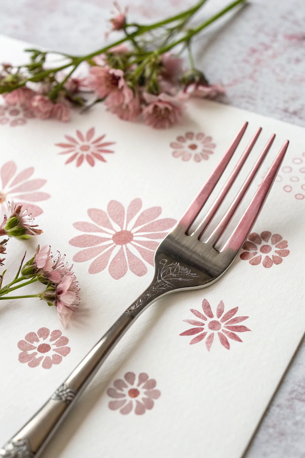
Transform a simple kitchen utensil into a tool for delicate art with these lovely stamped flowers. The technique uses the tines of a fork to create uniform, ribbed petals, resulting in a soft and charming floral pattern perfect for cards or stationery.
Step-by-Step
Materials
- Heavyweight white textured paper or cardstock
- Pink acrylic or craft paint (muted dusty rose shade)
- Metal dinner fork (clean and dry)
- Small round paintbrush (size 2 or 4)
- Paper plate or palette
- Paper towels
- Scrap paper for testing
Step 1: Preparation & Practice
-
Prepare your palette:
Squeeze a dollop of your dusty rose pink paint onto a paper plate or palette. Using the back of a spoon or a palette knife, spread a small portion of it out into a thin, even layer. -
Load the fork:
Take your metal dinner fork and press the back of the tines directly into the thin layer of paint. You want the raised backs of the tines coated, but avoid getting a globs of paint stuck in the gaps between them. -
Check the coverage:
Lift the fork and inspect the tines. If there is too much paint clumping between the prongs, gently tap the excess off onto a paper towel. The goal is to see the four distinct lines clearly. -
Practice the motion:
On a piece of scrap paper, practice the stamping motion. Rock the fork gently from the tips of the tines to the middle of the curve to create a long, linear imprint. This creates one ‘petal’ of your flower.
Rock and Roll
When stamping, use a gentle ‘rocking’ motion from the tips of the tines backward. This ensures the full length of the petal transfers without smudging the lines.
Step 2: Stamping the Flowers
-
Start the first flower:
Choose a spot on your final paper for the first bloom. Press the painted fork tines down to create your first petal, aiming the bottom of the handle away from where the flower’s center will be. -
Create a cross shape:
Rotate your paper or your hand 180 degrees and stamp a second petal directly opposite the first one. Then, stamp two more petals at the 90-degree marks to form a cross shape. -
Fill in the diagonals:
Stamp four more petals in the diagonal spaces between your cross shape. You should now have an eight-petal flower with a small empty space in the exact center. -
Vary the sizes:
For variety, try creating smaller flowers. You can do this by using a smaller dessert fork or by only pressing down the very tips of the tines rather than the full curve. -
Create scattered placement:
Continue stamping flowers across the paper. Place them randomly, allowing some to go off the edge of the page to create a natural, wallpaper-like pattern. -
Reload paint frequently:
Dip your fork back into the paint every 1-2 impressions to ensure the color remains solid and the tine texture is visible. -
Let the petals dry:
Allow the stamped paint to dry completely. Since the layer is thin, this should only take about 5 to 10 minutes. Do not start the centers until the petals are dry to avoid smudging.
Two-Tone Petals
Dip one side of your fork in a darker pink and the other in a lighter shade. When you stamp, you’ll get a beautiful ombre gradient across each individual petal.
Step 3: Adding Details
-
Paint the centers:
Dip your small round paintbrush into the same pink paint. Dab a small, solid circle directly in the middle of each dried flower where the petal bottoms meet. -
Refine the circle:
If the brush stroke looks too messy, you can create a perfect circle by dipping the handle end of your paintbrush into the paint and dotting it onto the paper. -
Optional: Add white accents:
For extra dimension, once the pink centers are tacky-dry, you can add a tiny dot of white or a lighter pink right in the middle for a highlight. -
Clean up stray marks:
Check the paper for any accidental smudges. If the paint is still wet, you might be able to lift it with a damp cotton swab; otherwise, let it be part of the handmade charm. -
Final drying time:
Set the finished artwork aside in a safe, flat place for at least 20 minutes to ensure the thicker paint in the centers cures fully.
You can now use your beautiful floral paper for gift wrapping or frame it as a delicate piece of wall art
Balloon-Stamped Poppy Blooms
Capture the delicate beauty of poppy fields using a surprising tool—a simple balloon. This project combines the unpredictable texture of stamping with precise ink illustration to create a modern, minimalist floral art piece.
How-To Guide
Materials
- Heavyweight watercolor paper or mixed media paper (A4 size)
- Small round water balloon (partially inflated)
- Red acrylic paint (warm, vibrant red)
- Black fine-liner pen (0.3mm or 0.5mm)
- Black brush pen or small round watercolor brush with black ink
- Paper palette or flat dish for paint
- Pencil and eraser (optional for sketching placement)
- Scrap paper for testing stamps
Step 1: Preparing the Blooms
-
Prepare your stamp:
Inflate a small water balloon just enough so it fits comfortably in your palm, roughly the size of a lemon. Knot it securely. The amount of air determines the size of your flower heads, so keep it small for these delicate blooms. -
Set up your palette:
Squeeze a dollop of red acrylic paint onto your flat palette. Spread it out slightly with a brush or palette knife so you have a thin, even layer of paint rather than a thick blob. -
Test the impression:
Dip the rounded bottom of your balloon into the paint. Press it gently onto a piece of scrap paper. Rock it ever so slightly to get good coverage, then lift straight up. You’re looking for an imperfect, textured oval shape. -
Plan your composition:
Visualize where you want your flowers on the final paper. Aim for a staggered arrangement with flowers at different heights—some tall and proud, others lower down. -
Stamp the first flower:
Re-dip your balloon and press it onto your good paper. Start near the top to create the highest bloom. The natural texture of the balloon will create tiny white veins where the paint doesn’t touch, which adds lovely organic detail. -
Fill the field:
Continue stamping flowers across the page. Create groupings of two or three, and leave plenty of white space between stems. Vary the pressure slightly; lighter pressure makes smaller, more textured blooms. -
Add variety:
For a few blooms, tilt the balloon slightly as you stamp to create more of a side-view or cup shape rather than a perfect circle. Let the red paint dry completely before moving to the next phase.
Paint too blobby?
If your stamped flowers are just solid circles without texture, your paint is too thick. Thin it on the palette or blot the balloon on a paper towel first.
Step 2: Drawing Stems and Details
-
Add the flower bases:
Once the paint is dry, take your black fine-liner. Draw a small, flattened oval or semi-circle right at the base of each red bloom. This is the sepal that holds the petals. -
Outline the petals:
With a very light touch, use the fine-liner to sketch delicate contour lines just inside the painted red shapes. You don’t need to outline the whole shape perfectly; broken, gestural lines look more artistic. -
Add petal details:
Draw three or four vertical, curved lines inside each flower head to suggest individual petals folding over. These should follow the curve of the stamped shape. -
Draw the main stems:
From the black base of each flower, draw a long, thin line straight down to the bottom of the page. You can use a ruler if you are nervous, but a slightly wavering hand-drawn line feels more organic. -
Intersecting lines:
It’s okay if stems cross over each other. This adds depth to the bouquet. Keep your pen pressure consistent for clean, modern lines.
Step 3: Adding Foliage
-
Sketch solid leaves:
Switch to your black brush pen or a small round brush with black ink. Choose one or two stems to feature bold leaves. Paint crisp, almond-shaped leaves branching out from the stem. -
Fill in the leaves:
Fill these almond shapes in completely with black ink. The contrast between the solid black leaves and the textured red flowers creates a striking visual balance. -
Create a fern sprig:
At the bottom of the composition, draw a separate shorter stem. Instead of a flower, create a fern-like leaf. Draw a central spine and use short, quick flicks of the fine-liner to create tiny leaflets on both sides. -
Detail the fern:
Add a second layer of tiny marks or dots on the fern leaves to give them a lacy, delicate texture different from the bold solid leaves. -
Final assessment:
Step back and look at your composition. If a stem feels too floating, extend it to the bottom edge. If a flower head looks too flat, add one more tiny curved line to define its volume.
Try gold accents
Add sophistication by drawing the inner petal lines with a gold metallic gel pen instead of black ink. It catches the light beautifully.
Frame your botanical print for a stunning piece of modern wall art that you made yourself
Vegetable-Stamped Rose Rosettes
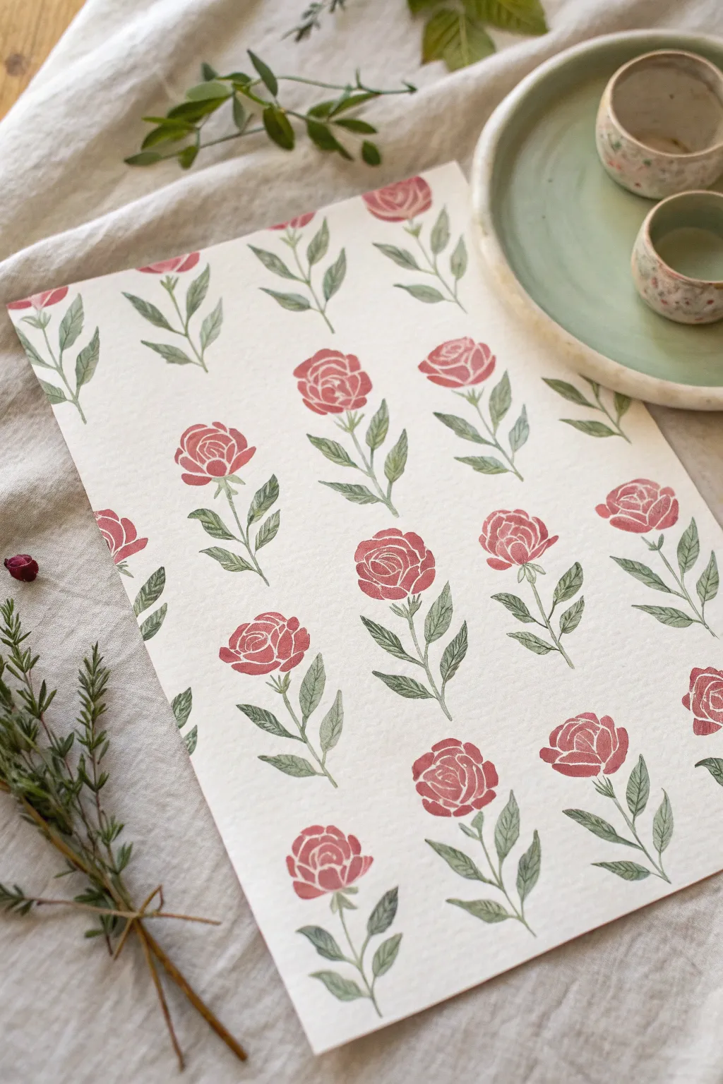
Transform humble vegetable scraps into elegant artwork with this clever stamping technique. By using the natural shape of a celery or bok choy base, you can create a repeating rose pattern that feels organic, vintage, and effortlessly sophisticated.
Step-by-Step Tutorial
Materials
- A bunch of celery or bok choy (base attached)
- Sharp kitchen knife
- Heavyweight textured paper (watercolor or mixed media paper)
- Acrylic paint or block printing ink (Rose/Red)
- Acrylic paint (Sage Green)
- Small round paintbrush (size 2 or 4)
- Palette or flat plate for paint
- Paper towels
- Scrap paper for testing
Step 1: Prepare Your Stamp
-
Select your vegetable:
Choose a bunch of celery or bok choy that has a tight, well-formed base. The tighter the stalks are packed together at the bottom, the more detailed your inner rose petals will be. -
Make the cut:
Using a sharp knife, cut across the base of the vegetable bunch, approximately 2 to 3 inches from the bottom. The cut needs to be extremely flat and even to ensure the stamp makes full contact with the paper. -
Dry the surface:
Moisture is the enemy of a crisp print. Press the cut surface of your vegetable stamp onto a paper towel firmly. Repeat this several times until the surface feels dry to the touch.
Stamp Sharpness
If your prints look blurry or blobby, your paint is too thick or the veggie is too wet. Blot the stamp on paper towel again and apply a thinner layer of paint.
Step 2: Stamping the Roses
-
Prepare the paint:
Squeeze a generous amount of rose or red acrylic paint onto your palette. Spread it out slightly into a thin, even layer rather than a gloopy mound. -
Load the stamp:
Dip your vegetable stamp into the paint. Lift it and check the coverage; you want the edges of the ‘petals’ coated, but not so much paint that the gaps get filled in. -
Test print:
Press the stamp firmly onto a piece of scrap paper. Rock it extremely gently—just a millimeter—to ensure all stalks touch the paper, then lift straight up. Adjust your paint load based on this test. -
Plan your layout:
Visualize a grid on your final paper. You want the roses to be spaced evenly in staggered rows. -
Stamp the first row:
Stamp your first row of roses. I like to re-dip the stamp into the paint after every single impression to keep the color intensity consistent. -
Complete the pattern:
Continue stamping rows until the sheet is filled. Offset each new row so the roses sit in the gaps of the row above, creating a classic half-drop pattern. Let the rose heads dry completely before moving on.
Vintage Vibes
Before painting, stain your paper with weak tea or coffee and let it dry. This gives the background an aged, antique parchment look that suits the roses perfectly.
Step 3: Painting the Greenery
-
Mix your green:
On your palette, prepare a sage green color. If your green is too bright, mix in a tiny drop of red or brown to mute it into a more natural, vintage leaf tone. -
Start the stems:
Using a small round brush, paint a thin, slightly curved stem extending downward from the base of each rose. Vary the curve direction slightly for a natural look. -
Add leaves:
Paint small, almond-shaped leaves branching off the stems. Aim for two or three leaves per stem. -
Refine the shape:
Give the leaves a gentle point at the tip. You can press the belly of the brush down to widen the leaf and lift up as you reach the tip to create a taper. -
Detail the calyx:
Paint small green sepals (the little green leafy bits) right at the base of the rose head where it meets the stem. This connects the stamped flower to the painted stem seamlessly. -
Fill empty spaces:
If there are large gaps in your pattern, paint standalone sprigs of leaves or detached stems to balance the composition. -
Final check:
Look over the artwork for any light spots. You can carefully touch up the stamped roses with a brush if a specific petal didn’t print clearly.
Once dry, this lovely botanical pattern makes excellent wrapping paper or framed wall art for a cottage-style room
Abstract Oversized Single Bloom
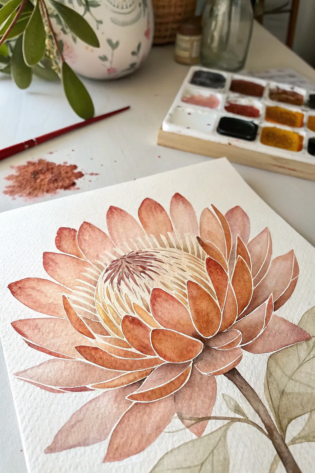
Capture the elegance of a King Protea using a loose watercolor technique that emphasizes structure through absence. This project relies on leaving thin white channels between petals to create definition without harsh outlines, resulting in a soft, airy botanical illustration.
How-To Guide
Materials
- Cold press watercolor paper (300 gsm)
- Watercolor paints (Terracotta, Burnt Sienna, Alizarin Crimson, Sap Green, Burnt Umber)
- Round brushes (flats sizes 4, 8, and a fine liner)
- Pencil (HB or H)
- Kneaded eraser
- Clean water jars
- Paper towel
Step 1: Sketching the Structure
-
Map the center:
Begin by lightly sketching a large oval in the center of your page. This will be the bulky cone of the Protea. Keep your pencil marks extremely faint, as watercolor is transparent and won’t hide heavy graphite. -
Draft the petals:
Draw the upward-curving petals surrounding the center. Start with the smaller, inner petals hugging the cone, then add layers of larger, wider petals fanning out towards the bottom and sides. -
Crucial negative space:
This is the most important sketching step: double-check that none of your pencil shapes touch. There must be a deliberate gap between every single petal and the center cone. These gaps will remain unpainted paper. -
Stem and leaves:
Sketch a thick, sturdy stem extending from the bottom right, attaching to the flower base. Add a few broad, oval-shaped leaves branching off the stem.
Step 2: Painting the Flower
-
Mix your palette:
Create a warm, earthy mix using Terracotta or Burnt Sienna. Prepare a second, slightly pinker puddle by adding a touch of Alizarin Crimson, and a third darker mix with a bit of Burnt Umber for shadows. -
First petal wash:
Start with a top petal. Load your size 8 brush with watered-down Terracotta mix. Fill the petal shape, being extremely careful not to paint over your pencil lines—stop just short to preserve that white gap. -
Adding gradients:
While the first petal is still wet, drop a tiny amount of the darker reddish-brown mix at the base of the petal. Let it bleed naturally upward to create depth. -
Paint non-adjacent petals:
To prevent wet paint from bridging your white gaps, move to a petal on the opposite side of the flower. Continue painting petals that don’t touch each other, allowing them to dry before painting their neighbors. -
Completing the petals:
Once the first set is dry, fill in the remaining petals using the same technique. Vary the color intensity slightly—make the outer, lower petals a bit deeper in tone than the airy top ones. -
The center cone base:
Wash a very pale, diluted yellow-ochre or cream color over the central oval dome. Let this layer dry completely before adding texture.
Use masking fluid
Struggling to keep those gaps white? Apply thin lines of masking fluid between petals before painting. Rub it off at the very end for crisp, perfect lines.
Step 3: Details & Greenery
-
Defining the cone:
Using your finest brush and a concentrated mix of Alizarin Crimson and Burnt Umber, paint thin, curved lines radiating from the center of the cone’s top. These stamens should follow the curve of the dome. -
Painting the stem:
Mix Sap Green with a little Burnt Umber to get a muted, brownish-green. Paint the stem in a single smooth stroke, connecting it to the flower base. -
Leaf texture:
Paint the leaves with a watery wash of your green mix. While wet, drop in slightly darker green near the veins. Keep the edges soft and organic. -
Enhancing contrast:
Look at your petals again. If they look too flat, add a translucent glaze of Terracotta to the bottom half of the outer petals to deepen the bowl shape. -
Refining the white lines:
Once the painting is 100% bone dry, very gently use a kneaded eraser to lift any visible pencil marks remaining in the white gaps. This makes the negative space ‘pop’.
Add slight shimmer
Once dry, lightly brush a metallic copper watercolor or iridescent medium over just the tips of the central stamens for a subtle, luxurious glow.
Step back and admire how the simple white lines give your oversized bloom a beautiful sense of volume and light

Have a question or want to share your own experience? I'd love to hear from you in the comments below!