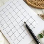
Grid painting is one of my favorite ways to turn “I don’t know what to paint” into a clear, satisfying plan. Once you break a page into squares, you can go classic and precise—or get delightfully weird with color, pattern, and texture.
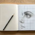
Eye Study In a Grid
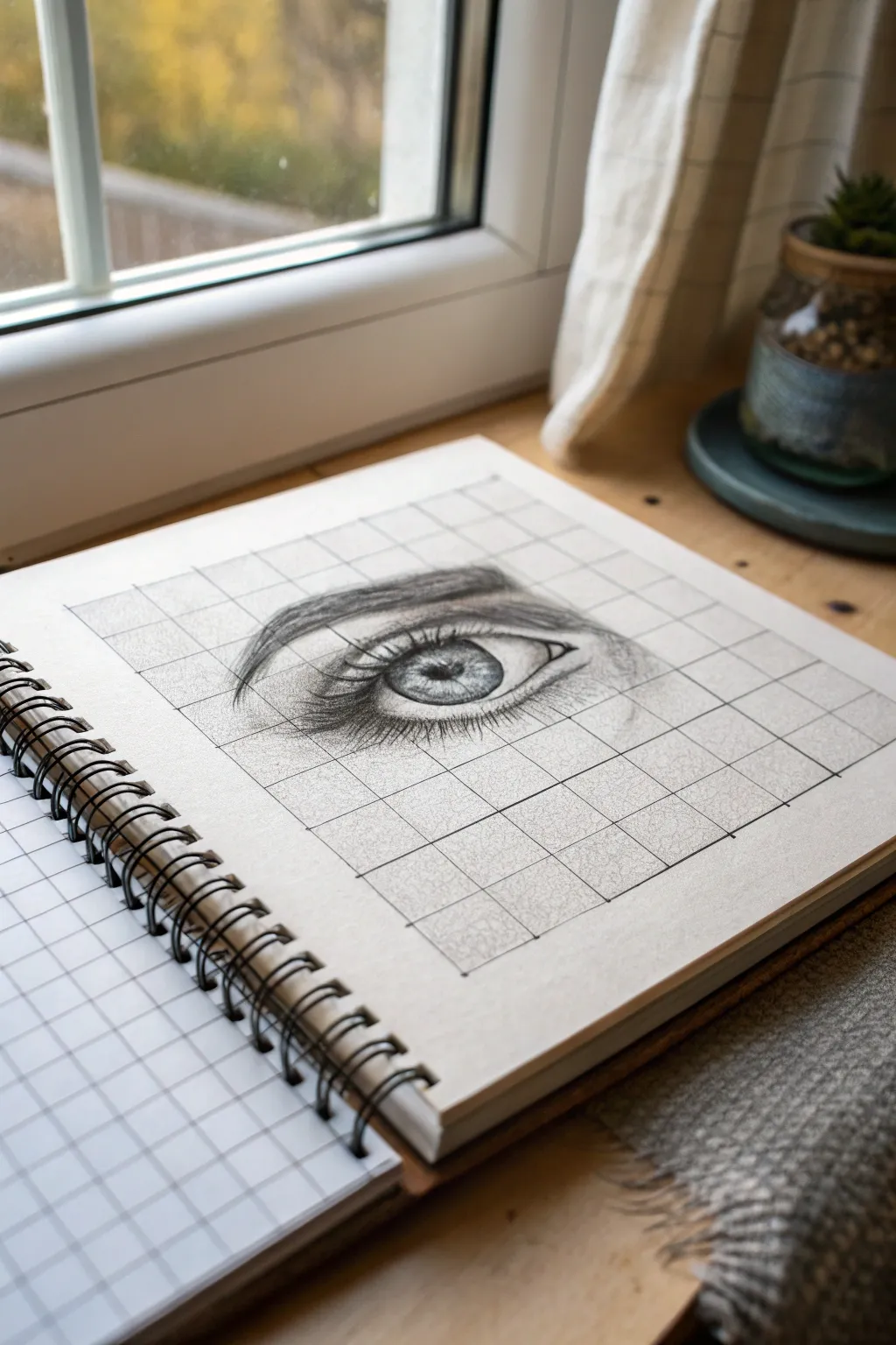
Master the art of proportion and realistic shading with this focused eye study using the classic grid method. This project breaks down a complex subject into manageable squares, resulting in a striking, detailed sketch that looks far more advanced than the simple technique used to create it.
How-To Guide
Materials
- Spiral-bound sketchbook with grid paper (or plain paper ruled with a grid)
- Set of graphite pencils (HB, 2B, 4B, 6B)
- Mechanical pencil (0.5mm)
- Kneaded eraser
- Precision eraser (stick eraser)
- Blending stump or tortillon
- Ruler
- Reference photo of an eye
Step 1: Preparation & Grid Setup
-
Select your paper:
Choose a sketchbook page. If your book already has a pre-printed grid like the one in the photo, you are ready to start. If using blank paper, lightly draw a 6×6 square grid using a ruler and an HB pencil, making each square roughly 2cm x 2cm. -
Prepare the reference:
Take your reference photo of an eye and overlay a matching grid on it digitally or physically. Ensure the grid on the reference has the same number of rows and columns as the one on your paper. -
Mark the boundaries:
Identify main anchor points on your grid. Mark where the inner corner, outer corner, and highest point of the eyelid intersect with the grid lines to establish accurate placement.
Step 2: The Basic Outline
-
Sketch the upper lid:
Using a light hand and an HB pencil, draw the curve of the upper eyelid. Instead of trying to draw the whole curve at once, focus on one grid square at a time, copying exactly where the line enters and exits that specific box. -
Map the lower lid:
Sketch the lower waterline and lash line. Pay attention to the subtle gap between the eyeball and the lashes; this waterline is crucial for realism. -
Place the iris and pupil:
Draw the circle of the iris carefully. Observe which grid squares cut through the circle. Draw the smaller pupil in the center, ensuring it aligns correctly with your reference. -
Indicate the brow:
Lightly outline the general shape of the eyebrow above the eye, noting how the arch corresponds to the grid lines below it.
Clear Highligts
For the brightest white reflection in the eye, avoid drawing there entirely. Paper white is always brighter than erased graphite.
Step 3: Shading & Details
-
Darken the pupil:
Switch to a 4B or 6B pencil to fill in the pupil. Make this the darkest part of your drawing, but leave a small, crisp white shape for the catchlight reflection. -
texture the iris:
Using a sharp 2B pencil, draw establishing lines radiating outward from the pupil like spokes on a wheel. Add varied pressure to create the intricate texture of the iris muscle fibers. -
Shade the eyeball:
The white of the eye isn’t purely white. Use a blending stump or a very light HB shading to add a shadow under the upper eyelid and in the corners of the eye to give it spherical form. -
Define the crease:
Deepen the fold of the upper eyelid with a 4B pencil. The line should be thickest and darkest in the crease, fading slightly as it moves outward. -
Add skin texture:
Lightly shade the skin around the eye. Use a blending stump to smooth out graphite, then use a kneaded eraser to lift out tiny highlights, mimicking skin texture.
Colored Pencil Pop
Make the drawing stand out by doing the iris in colored pencil (like bright green or hazel) while keeping the rest of the sketch in grayscale.
Step 4: Lashes & Final Touches
-
Draw upper lashes:
With a sharp 4B pencil, draw the upper eyelashes. Start at the root on the eyelid rim and flick quickly upward and curved. Ensure the lashes vary in length and sometimes clump together. -
Draw lower lashes:
Add the lower lashes, which should be shorter, thinner, and more sparse than the upper ones. Remember to draw them coming from the outer edge of the waterline, not directly from the eyeball. -
Build the eyebrow:
Fill in the eyebrow outline with individual hair strokes. I prefer following the natural growth direction—upward at the start of the brow and angling downward toward the tail. -
Clean up highlights:
Use your precision eraser or a sharp edge of an eraser to meticulously clean up the catchlight in the eye and add tiny highlights on the waterline. -
Refine the grid lines:
If you drew your own grid, you can now erase the outside lines carefully. If using pre-printed grid paper, simply ensure your shading hasn’t smudged unnecessarily into the surrounding empty squares.
Step back and admire how the grid helped you capture an incredible level of realistic detail

Warm-To-Cool Gradient Grid Background
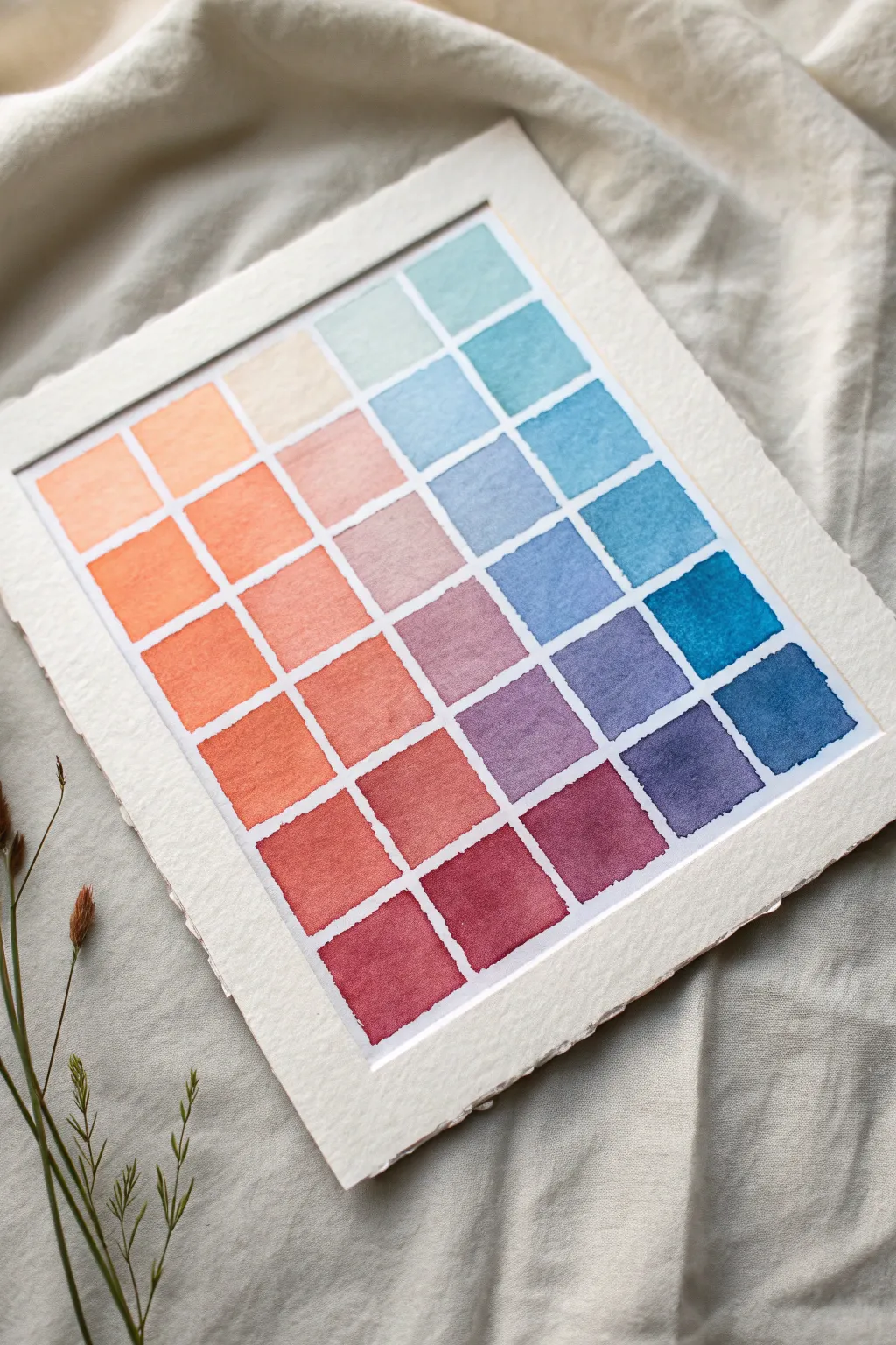
This soothing watercolor project transforms a simple geometric grid into a luminous study of color relationships, blending warm terracotta tones into cool oceanic blues. The finished piece features soft, naturally textured edges that give it an organic, handcrafted feel perfect for minimalist decor.
Step-by-Step Tutorial
Materials
- High-quality watercolor paper (cold press, 300gsm/140lb)
- Watercolor paints (warm red/orange, cool blue/teal)
- Flat shader brush (size 6 or 8)
- Painters tape or masking tape (1/4 inch width)
- Ruler
- Pencil
- Mixing palette
- Container of clean water
- Box cutter or X-Acto knife (optional)
- Metal ruler or straight edge
Step 1: Preparing the Grid
-
Prepare the paper:
Begin with a sheet of heavy watercolor paper. If you want the deckled edge look shown in the example, you can either buy paper with these edges or create them yourself by folding the paper deeply and tearing it carefully along a straight edge. -
Measure the grid:
Decide on your grid dimensions. The example is a 6×7 grid. Lightly measure equal increments along the top and side of your paper, leaving a generous white border around the entire perimeter. -
Tape the grid lines:
Using thin masking tape (1/4 inch is ideal), tape off your grid lines. Run the tape strips all the way past the edges of the painted area to ensure they stay secure. -
Seal the edges:
Run your fingernail or a bone folder firmly over every strip of tape. This is crucial for achieving crisp, clean squares and preventing paint from bleeding underneath.
Step 2: Mixing the Gradient
-
Set up your palette:
You will need two main color pools: a warm end (orange/terracotta) and a cool end (teal/blue). Squeeze these paints onto opposite sides of your palette. -
Create the base warm tone:
Mix a vibrant orange-red. Dilute it slightly with water so it flows easily but retains strong pigment. -
Create the base cool tone:
Mix a deep, rich teal or ocean blue. Test the color on a scrap piece of paper to ensure it balances well with your warm tone.
Clean Lines Hack
To prevent bleeding, apply a thin layer of clear watercolor medium or white gouache over the tape edges before painting your colors.
Step 3: Painting the Squares
-
Paint the first warm column:
Start at the bottom left corner. This area represents your warmest, most saturated reds. Fill the squares in this zone with your warm mix. -
Begin the transition:
As you move upwards and towards the right, add tiny amounts of water to your warm mix to lighten the value, creating a softer peach tone in the upper left quadrant. -
Introduce the cool tones:
For the middle diagonal sections, begin mixing tiny drops of your blue into the orange mix (or create a neutralized purple/grey transition color) for the squares where the two distinct zones meet. -
Paint the cool column:
Move to the top right corner. This area should be your lightest, airiest blues. Use more water here for a translucent effect. -
Deepen the blues:
As you work down the right side, add more pigment to your brush, making the blues darker and more intense towards the bottom right corner. -
Create varied textures:
Don’t aim for perfect uniformity in every square. I find that letting the water pool slightly in some corners or having slight variations in pigment density adds lovely character to the final piece. -
Fill remaining gaps:
Assess the overall flow. If a transition looks too abrupt, you can place a wash over a specific square, but act quickly before the previous layer dries completely.
Add Metallic Flair
Once the paint is dry, use a fine-tip gold paint pen to trace thin lines inside the white gaps for a glamorous, geometric accent.
Step 4: Finishing Touches
-
Allow to dry fully:
Let the painting sit undisturbed until the paper is completely cool to the touch. If you peel the tape while the paper is damp, it may rip. -
Remove the tape:
Peel the tape away slowly at a 45-degree angle, pulling away from the painted areas. Reveal the satisfying crisp white lines between your colorful squares. -
Flatten the artwork:
If the watercolor has buckled the paper slightly, place the dry artwork under a heavy book overnight to flatten it out before displaying.
Display your beautiful gradient grid in a floating frame to show off those lovely deckled edges.

Flower-a-Day Mini Grid Tiles
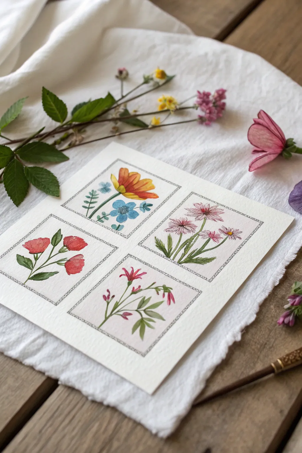
Capture the delicate beauty of a garden with this four-panel watercolor study. By breaking the composition into smaller, framed vignettes, you can practice different floral shapes and color palettes without the pressure of a full-scale painting.
Detailed Instructions
Materials
- Cold press watercolor paper (square format)
- Fine liner pen (01 or 03 micron, waterproof black)
- Watercolor paints (tube or pan set)
- Small round brushes (size 2 and 4)
- Pencil and eraser
- Ruler
- Clean water
Step 1: Planning and Layout
-
Paper Preparation:
Begin with a square piece of heavy watercolor paper. If you want that rustic look shown in the photo, gently tear the edges against a ruler to create a soft, deckled effect rather than cutting with scissors. -
The Grid Structure:
Using a ruler and a light pencil touch, measure out a 2×2 grid. Leave a generous margin around the outer edge (about 1 inch) and a smaller gap (about 0.5 inch) between the inner squares to let the designs breathe. -
Inking the Frames:
Once satisfied with the spacing, go over your pencil squares with a waterproof fine liner pen. I like to double up the lines slightly or add tiny hash marks in the corners to give it a vintage, hand-drawn illustration vibe. -
Sketching the Flora:
Lightly sketch a different flower arrangement in each box. Plan for variety: a singular large bloom in one, a cluster in another, and distinct leaf shapes for each to keep the grid dynamic.
Ink Smearing?
Even waterproof pens can smudge if the paper is damp. Wait at least 15 minutes after drawing lines before painting, or paint first and ink last.
Step 2: Painting: Left Column
-
Red Poppies (Bottom Left):
Start with the bottom left square. Mix a vibrant poppy red and paint the rounded petals. Keep the wash slightly uneven to suggest the fragility of the petals. -
Poppy Stems:
While the red dries, mix a sap green. Paint slender, curving stems and add broad, serrated leaves at the base. Let the green touch the wet red slightly if you enjoy soft bleeds, or wait for it to dry for crisp edges. -
Orange Blooms (Top Left):
Moving to the top left, paint the main flower using a warm yellow-orange. Use distinct brush strokes radiating from the center to mimic petals. -
Blue Accents:
Add small blue woodland flowers next to the orange bloom. The cool blue contrasting with the warm orange creates a lovely visual pop. Connect them with delicate, thin green stems.
Step 3: Painting: Right Column
-
Pink Daisies (Top Right):
For the top right panel, use a diluted cooler pink. Paint long, thin petals radiating from a center point to create daisy-like shapes. -
Daisy Centers:
Once the pink petals are damp but not soaking, drop a tiny dot of yellow or brown into the center of each flower. -
Linear Leaves:
Paint the leaves for the daisies using long, vertical strokes. These foliage shapes should be grass-like, contrasting with the broader leaves in the other panels. -
Wildflowers (Bottom Right):
In the final square, paint delicate, trumpet-shaped flowers using a magenta or berry hue. Arrange them loosely on a branching stem. -
Final Greenery:
Add small, fern-like leaves to this final stem. Use the very tip of your smallest brush to keep these details crisp and airy.
Go Vintage
Apply a very light wash of tea or diluted yellow ochre over the entire paper before painting to give the background an aged, antique parchment look.
Step 4: Finishing Touches
-
Detail Work:
Wait for all paint layers to be bone dry. Use your fine liner pen again to add minimal details—perhaps outlining a few petals or adding veins to the larger leaves. Don’t outline everything; broken lines look more natural. -
Cleanup:
Erase any remaining pencil marks carefully, ensuring you don’t smudge the ink or paint.
Now you have a charming botanical collection ready to be framed or gifted to a nature lover

Monochrome Grid With One Accent Color
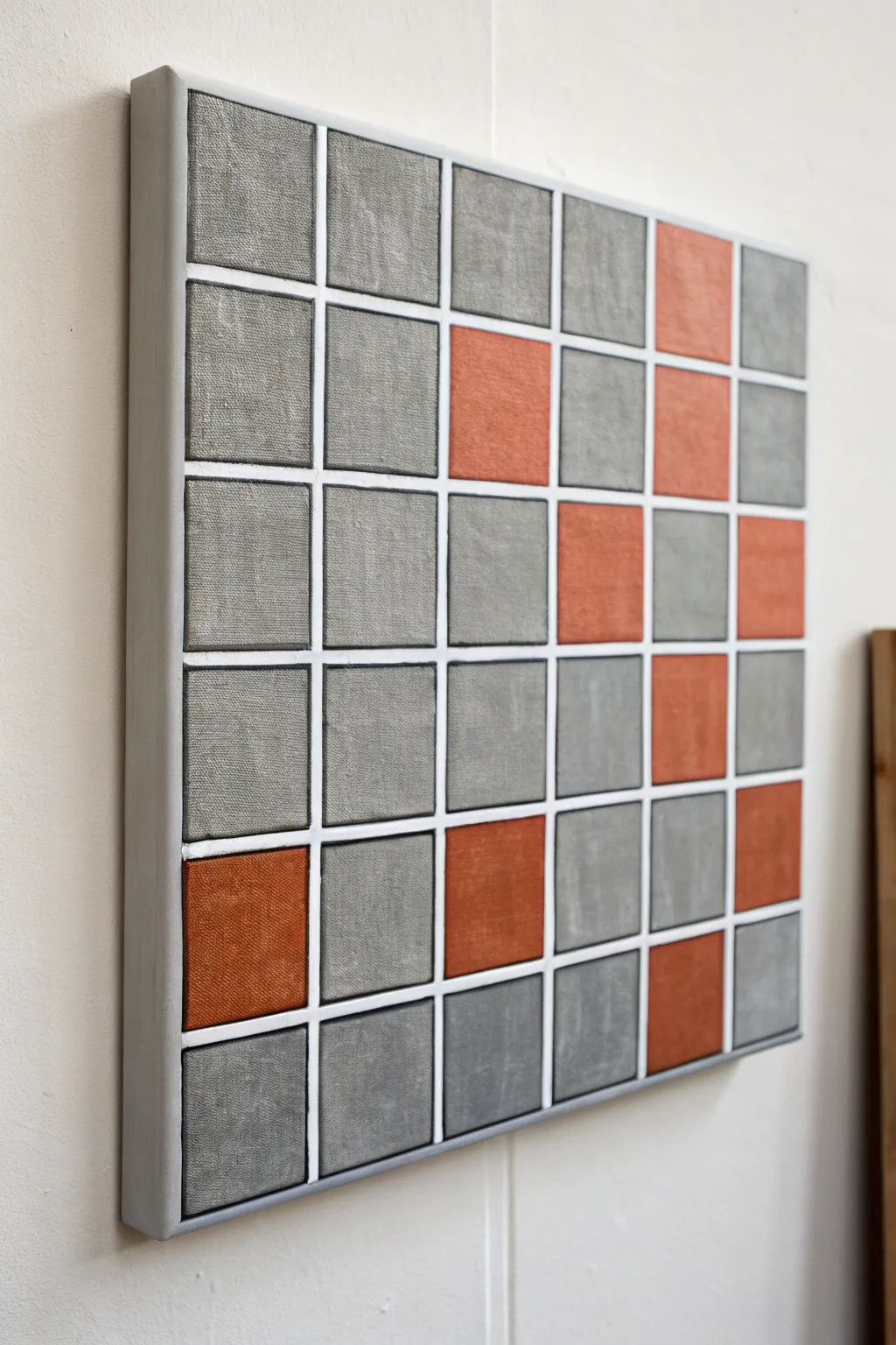
This modern, structural piece combines the raw texture of concrete greys with the warmth of burnt orange. By creating raised grid lines, you achieve a tiled effect that looks more like a mosaic installation than a flat painting.
Step-by-Step
Materials
- Square stretched canvas (deep edge profile recommended)
- Acrylic paints: Titanium White, Mars Black, Burnt Sienna, Yellow Oxide
- Texture paste or heavy body gel medium
- Painter’s tape (1/4 inch width)
- Ruler or T-square
- Pencil
- Flat synthetic brushes (various sizes)
- Palette knife
- Grey acrylic gesso (optional, can mix grey paint instead)
Step 1: Preparing the Grid Structure
-
Base coat application:
Start by painting the entire canvas, including the deep edges, with a solid coat of medium-grey paint. This ensures that even if you miss a spot later, no raw white canvas will show through. -
Measure and mark:
Once the base is fully dry, calculate your grid spacing. For a standard 6×6 layout like the photo, divide your canvas width by 6. Mark these intervals lightly with a pencil along the top and sides. -
Tape the grid:
Apply your 1/4 inch painter’s tape along your pencil marks to mask off the grid lines. Run tape horizontally and vertically, pressing down firmly to seal the edges. The tape represents the white lines in the final piece. -
Seal the edges:
To prevent paint bleeding under the tape, brush a very thin layer of your base grey color over the tape edges. This seals the tape and ensures crisp lines later.
Bleeding Lines?
If paint seeped under the tape, wait for it to dry fully. Then, paint over the bleed with your white line color using a fine liner brush to ‘cut back’ into the square and straighten the edge.
Step 2: Building Texture and Color
-
Mix the colors:
Prepare two main mixtures. First, a ‘concrete’ grey using white and a touch of black. Make slight variations of this grey (some lighter, some darker) for a natural stone look. Second, mix a ‘terracotta’ shade using Burnt Sienna with a dot of Yellow Oxide. -
Add texture medium:
Mix a generous amount of texture paste or heavy body gel into both your grey and orange paint piles. You want a consistency similar to frosting to create that tactile, raised surface. -
Map your accents:
Decide which squares will be your orange accents. Mark them lightly with a dot of paint so you don’t accidentally fill them with grey later. -
Apply grey blocks:
Using a palette knife or a stiff brush, fill the majority of the squares with your textured grey mix. Don’t smooth it out perfectly; leave ridges and tool marks to mimic slate or concrete. -
Vary the tones:
As you work, dip your tool into slightly different shades of grey for different squares. This tonal variation prevents the grid from looking flat and manufactured. -
Apply orange blocks:
Fill the designated accent squares with the textured terracotta mixture. Ensure the thickness of the paint matches the height of the grey squares for a uniform surface level.
Metallic Twist
Create an industrial chic version by replacing the terracotta accent color with a metallic copper or gold paint mixed with the texture paste for a shimmering contrast.
Step 3: Reveal and Refine
-
Remove the tape:
Here is the critical part: peel off the tape while the textured paint is tacky but not fully dry. Pull the tape slowly at a 45-degree angle to reveal the recessed grid lines. -
Clean the lines:
If any textured paint bridged over the tape lines, simply use a clean, damp brush or a toothpick to gently push it back into its square before it hardens. -
Paint the grid lines:
Once the textured blocks are completely cured (this may take overnight), use a small liner brush to paint the recessed grid lines (where the tape was) with pure Titanium White. -
Refine the edges:
Check the outer edges of the canvas. Paint them a solid, uniform grey to frame the artwork cleanly, matching the deep edge visible in the reference. -
Final inspection:
Look for any unintentional white spots on the textured squares and touch them up. I recommend stepping back often to ensure the color balance feels right.
Hang your new textured geometric piece in a spot with good side lighting to really show off the depth of the squares
BRUSH GUIDE
The Right Brush for Every Stroke
From clean lines to bold texture — master brush choice, stroke control, and essential techniques.
Explore the Full Guide
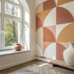
Complementary Color Swap Grid
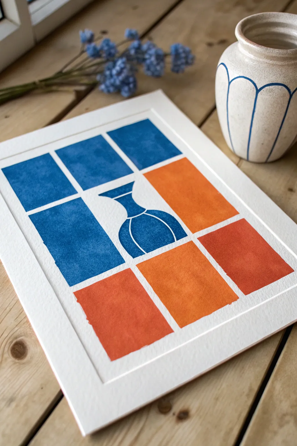
This striking project plays with positive and negative space using a bold complementary color scheme of deep azure and warm terracotta. By breaking the composition into a structured grid, you create a modern, graphic interpretation of a classic still life vase.
Step-by-Step Guide
Materials
- High-quality printmaking paper or heavy watercolor paper (A3 or A4 size)
- Linoleum block or easy-carve rubber block
- Lino cutting tools (V-gouge and U-gouge)
- Block printing ink (Phthalo Blue and Orange/Terra Cotta)
- Brayer (rubber roller)
- Pencil and ruler
- Tracing paper
- Craft knife
- Glass or acrylic sheet for rolling ink
- Baren or clean wooden spoon for burnishing
Step 1: Planning the Grid
-
Measure your paper:
Start by measuring the printable area of your paper. You want a generous white border around the edge, so lightly mark a centered rectangle where your grid will live. -
Draft the grid layout:
Divide your central rectangle into a 3×3 grid. Using your ruler and pencil, mark out nine equal rectangles, leaving small, consistent gaps (about 3-5mm) between them to create that window-pane effect. -
Sketch the central subject:
Lightly draw a simple, symmetrical vase shape in the very center of your grid. The vase should mostly occupy the central rectangle but can slightly overlap into adjacent spaces if you want a larger form.
Step 2: Creating the Blocks
-
Transfer to block material:
You will need to create separate blocks for the different color zones. Trace your grid dimensions onto your carving material. You can essentially cut your carving block into the individual rectangular shapes first. -
Define the blue zones:
Identify which rectangles will be blue (the top row and the middle-left rectangle in this design). For the central tile with the vase, you will be carving away the background so the vase remains as the printable surface. -
Carve the vase detail:
On the central block, carefully carve away the negative space around your vase sketch. I like to use a small V-gouge here to add curved white lines across the vase body to suggest roundness and highlights. -
Define the orange zones:
Identify the orange rectangles (the bottom row and the middle-right rectangle). These blocks generally remain solid, providing flat fields of color. -
Add texture:
Don’t aim for perfectly smooth surfaces on your rectangular blocks. Leave the natural texture of the lino or add tiny random nicks to give that authentic, hand-pressed look.
Registration Hack
Create a simple cardboard ‘jig’ or L-shaped bracket taped to your table. Place your paper into the corner every time you print to ensure perfect alignment.
Step 3: Printing the Design
-
Prepare the blue ink:
Squeeze a small amount of blue block printing ink onto your glass slab. Roll it out with the brayer until you hear a consistent ‘velcro’ sizzling sound. -
Ink the blue blocks:
Roll a thin, even layer of ink onto your blue-designated blocks, including the central vase block. -
Position and press:
Carefully place the blue blocks onto your paper, following your faint pencil guidelines. Place a clean sheet of paper on top and burnish firmly with a baren or spoon in circular motions. -
Reveal the blue layer:
Gently peel back the paper to reveal the blue sections. Let this dry for about 15-20 minutes so you don’t smudge it while working on the next color. -
Prepare the orange ink:
Clean your brayer thoroughly and repeat the inking process with your orange or terracotta ink. -
Print the orange blocks:
Ink up the remaining rectangular blocks. carefully align them into the empty spaces of your grid, maintaining those even white gaps. -
Final burnish:
Press the orange blocks firmly. Pay special attention to the edges to ensure a crisp rectangular shape. -
Erase guidelines:
Once the ink is fully dry (this can take 24 hours for oil-based inks), gently erase any visible pencil marks from your initial grid layout.
Patchy Ink Coverage?
If your print looks too salty or speckled, you likely need a bit more ink on the brayer. Listen for the ‘hiss’—if it sounds too loud/wet, you have too much.
Frame your print with a wide mount to let the grid breathe and become a focal point on your wall
Tape-Resist Grid for Crisp Edges
Create a soothing and organized color study using simple masking techniques to achieve perfectly crisp edges. This grid project explores a muted earthy palette, allowing you to focus on color mixing and transparency without worrying about staying inside the lines.
How-To Guide
Materials
- Cold press watercolor paper (block or taped sheet)
- Wide washi tape or painter’s tape (approx. 1/4 inch or similar)
- Watercolor paints (terracotta, ochre, sage green, olive)
- Medium round brush (size 6 or 8)
- Palette for mixing
- Clean water jar
- Paper towels
- Ruler
Step 1: Setting the Grid
-
Prepare your surface:
Start with a clean sheet of cold press watercolor paper. If you aren’t using a watercolor block, tape your paper down to a hard board to prevent buckling when the paint is applied later. -
Measure the border:
Decide on the size of your grid. Use a ruler to lightly mark the outer boundary of your painting area or simply frame it with a border of tape to define the overall rectangle. -
Apply vertical tape lines:
Begin creating the grid structure. Lay down long vertical strips of your washi tape, spacing them evenly apart. You can use the width of the tape itself as a spacer for a uniform look, or measure equal distances. -
Apply horizontal tape lines:
Cross over your vertical lines with horizontal strips. Press down firmly on all the tape, especially at the intersections and edges, to ensure a tight seal that prevents paint from seeping underneath. -
Smooth the edges:
Run your fingernail or a bone folder along every edge of the tape grid. This extra pressure is the secret to getting those incredibly sharp, clean lines visible in the finished abstract piece.
Seal the Deal
To guarantee zero bleeding, paint a layer of clear water or matte medium over the tape edges and let it dry before applying color. This seals any gaps.
Step 2: Mixing and Painting
-
Mix earth tones:
On your palette, prepare puddles of your chosen colors. Aim for an organic feel by mixing burnt sienna with a touch of blue for grey-browns, or yellow ochre with a dot of red for warmth. -
Test transparency:
Before hitting the grid, test your secondary colors on a scrap piece of paper. This project looks best when the paint is somewhat transparent, letting the paper texture show through. -
Paint the first column:
Start by filling the squares in the first vertical column. I like to alternate colors randomly here—perhaps a soft beige at the bottom leading up to a terracotta. -
Work diagonally:
Continue filling in squares, moving across the grid. Try to place contrasting colors next to each other, like putting a deep sage green beside a pale cream, to create visual interest. -
Vary the saturation:
Don’t make every square the same intensity. Add more water to your brush for some squares to create lighter, airier blocks, and use more pigment for others to anchor the composition. -
Embrace imperfection:
It is perfectly fine to paint carelessly over the tape itself. In fact, ensuring you paint all the way across the tape ensures the final white lines will be consistent. -
Add texture:
While some squares are still damp, you can drop in a tiny bit of clear water or a darker pigment to create a ‘bloom’ effect, adding subtle texture to individual blocks. -
Let it dry completely:
This is the most crucial patience test. Allow the paint to dry fully. If the paper feels cool to the touch, it is still damp. Wait until it is room temperature.
Level Up: Gradient Shift
Instead of random colors, mix a single saturated color and gradually add water for each square, creating an ombré fade from top to bottom.
Step 3: The Reveal
-
Peel slowly:
Once bone dry, begin removing the tape. Start with the strips that were laid down last (the top layer). Peel the tape back at a steep 45-degree angle, pulling away from the painted area. -
Remove vertical lines:
After the horizontal strips are gone, carefully peel up the long vertical strips. Proceed slowly to avoid tearing the paper surface. -
Check the edges:
Inspect your grid. If you see any tiny points where paint bled under, you can often gently scratch it away with a craft knife or touch it up with white gouache, though slight organic edges add character. -
Flatten if needed:
If the moisture caused the paper to curl slightly despite being taped down, place the finished artwork under a heavy book overnight to flatten it out perfectly.
Hang your finished grid on a mood board or use it as a custom color chart for future reference

PENCIL GUIDE
Understanding Pencil Grades from H to B
From first sketch to finished drawing — learn pencil grades, line control, and shading techniques.
Explore the Full Guide
One Motif Repeated With Tiny Variations
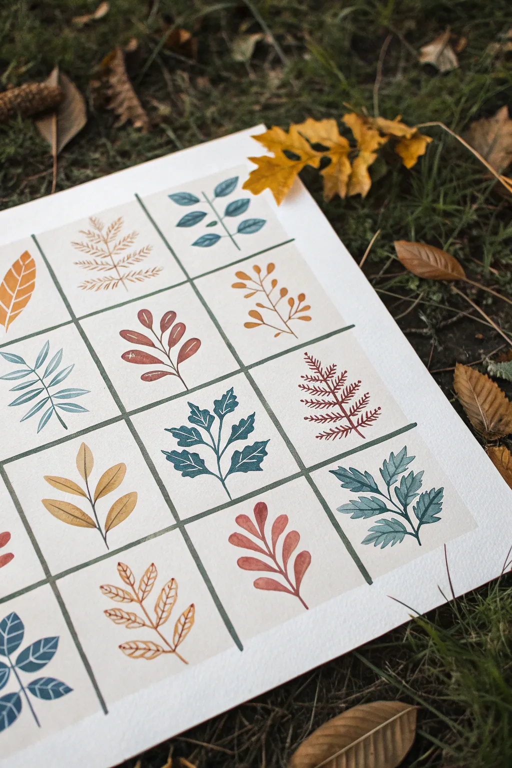
Embrace the meditative quality of autumn with this structured watercolor project featuring a diverse collection of stylized leaves. Each grid square showcases a unique botanical shape in a warm, earthy color palette, combining repetition with delightful variety.
Step-by-Step
Materials
- Heavyweight watercolor paper (300gsm, cold press)
- Pencil (HB or H)
- Ruler
- Geometry compass (optional, for measuring)
- Washi tape or masking tape (low tack)
- Watercolor paints (burnt sienna, yellow ochre, indigo, sap green, burnt umber)
- Small round paintbrush (size 2 or 4)
- Fine liner brush (size 0 or 00 for stems)
- Palette for mixing
- Paper towels
- Water jar
Step 1: Setting the Grid
-
Prepare the paper:
Begin by securing your watercolor paper to a flat surface with masking tape. This prevents the paper from buckling when wet and creates a clean border around your final piece. -
Measure the grid:
Using a ruler and a light pencil touch, mark out a grid of equal-sized squares. For the look in the photo, aim for about 2.5 to 3-inch squares. Leave a small gap (approx. 1/8 inch) between each square to serve as a border later. -
Define the borders:
Instead of drawing full pencil lines for the grid, just mark the corners or very faintly sketch the lines. We will be painting the grid lines themselves, so precision here helps keep everything straight. -
Paint the grid structure:
Mix a deep, muted teal color using indigo and a touch of green. Using a steady hand and a small round brush, paint the dividing lines of your grid. I find it easiest to paint all the vertical lines first, let them dry, and then paint the horizontal ones to avoid smudging.
Brush Control Pro-Tip
For sharp leaf tips, press the belly of the round brush down for the wide part of the leaf, then slowly lift as you pull outward to create a fine point.
Step 2: Planning the Motifs
-
Sketch the leaves:
Lightly sketch a different leaf design in the center of each square. Vary the shapes: try a simple oval leaf, a complex fern-like structure, a jagged oak leaf, and a rounded branch. -
Balance the composition:
Step back and look at your sketches. Ensure you have a good mix of dense, heavy shapes and light, airy branches distributed evenly across the page so no single area feels too ‘heavy’.
Step 3: Painting the Botanicals
-
Mix your palette:
Prepare puddles of your autumnal colors. You’ll want a mustard yellow (yellow ochre), a deep teal (indigo + green), a rusty red (burnt sienna), and a soft coral or salmon pink. Keep the consistency milky to ensure opacity. -
Start with the teal leaves:
Select 3-4 scattered squares for your teal motifs. Paint the central stems first using the tip of your brush, then carefully fill in the leaf blades. The teal works beautifully for the fern-like or jagged-edge leaves. -
Add the yellow motifs:
Switch to your mustard yellow paint. Fill in another 3-4 scattered squares with this color. Simple, rounded leaves or grain-like stalks look particularly good in this golden hue. -
Paint the rust and red accents:
Using your burnt sienna or rust color, fill in the remaining squares. These darker, warmer tones anchor the composition. Try painting the more substantial, wider leaves in this shade for visual weight. -
Add fine details:
Once the base shapes are dry, you can use a slightly darker version of each color to add a central vein line to the leaves if desired, though the flat style in the image is also very striking without them.
Level Up: Texture
Once the paint is dry, use colored pencils to add subtle texture or vein details on top of the watercolor for a mixed-media illustrator look.
Step 4: Finishing Touches
-
Correct edges:
Check the edges of your grid squares. If any paint went slightly over the line, you can carefully touch up the grid lines with your deep teal mixture and a fine liner brush. -
Erase pencil marks:
Wait until the painting is completely bone dry—if it feels cool to the touch, it’s still damp. Once sure, gently erase any visible pencil sketch lines from the background. -
Flatten the artwork:
If the paper has warped slightly from the water, place the dry painting under a heavy book overnight to flatten it out seamlessly.
This disciplined yet creative exercise results in a lovely piece of wall art that celebrates the diversity of nature’s design
Distorted Features Grid Portrait
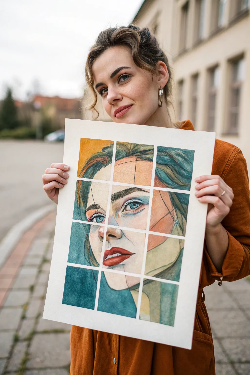
This striking portrait technique combines realistic drawing with a deconstructed, geometric twist. By breaking a face into independent grid squares, you create an intriguing, slightly shifting perspective that turns a standard portrait into a modern art piece.
Step-by-Step Guide
Materials
- High-quality watercolor paper (cold press, at least 140lb)
- Pencil (HB or 2B)
- Ruler
- Masking tape or painter’s tape (1/4 inch width)
- Watercolor or gouache paints
- Round brushes (sizes 4 and 8)
- Reference photo of a face
- Eraser
Step 1: Planning and Gridding
-
Tape the border:
Start by taping down the edges of your large sheet of watercolor paper to a board. This keeps the paper flat and creates a crisp white margin around the entire artwork. -
Measure the grid:
Decide on the size of your grid squares. For the look in the photo, aim for a 3×4 layout. Lightly measure and mark the intervals for your vertical and horizontal lines with a ruler. -
Apply the grid tape:
Using thin masking tape (about 1/4 inch wide), tape off the grid lines you just marked. Press the tape down firmly to prevent paint from bleeding underneath later.
Bleeding Lines?
If paint bled under the tape, wait for it to dry completely. Then, use a white gouache or a white gel pen to tidy up the grid lines and cover the mistake.
Step 2: Sketching the Distorted Face
-
Establish facial proportions:
Lightly sketch the basic oval of the face and the guidelines for the eyes, nose, and mouth. Don’t worry about grid lines yet; just get the general placement right. -
Draw square by square:
Here is the trick to the distorted effect: instead of drawing one continuous line across the tape, treat each square as its own tiny composition. When a line (like a jawline) crosses under the tape, slightly shift its entry point in the next square up or down by a few millimeters. -
Intensify the lines:
Once your sketch is laid out, go back with your pencil and darken the key features—eyes, lips, and hair strands. Leave some construction lines visible for that raw, artistic aesthetic. -
Refine the disconnect:
Evaluate the ‘jumps’ between squares. If the lines align too perfectly, erase and redraw parts of a feature within a specific square to exaggerate the misalignment and enhance the fragmented look.
Shift Perspective
For a ‘Level Up,’ draw the face from slightly different angles in randomly selected squares (e.g., a profile nose in a front-facing portrait).
Step 3: Painting
-
Mix skin tones:
Prepare a basic palette of skin tones using ochre, burnt sienna, and a touch of red. Keep the mix watery for transparent layers. -
First wash:
Apply a light wash of color to the face areas. I like to work one square at a time to maintain control, letting the puddles settle naturally within the taped boundaries. -
Add stylized color blocks:
Notice the abstract shapes in the example? Introduce arbitrary blocks of color—like peach or terracotta—over parts of the face or background to break up the realism. -
Define the eyes:
Use a smaller brush to paint the irises with a vibrant blue or green. Keep the whites of the eyes clean, perhaps adding just a tiny touch of grey for shadow. -
Paint the lips:
Load your brush with a bolder red or terracotta. Paint the lips carefully, respecting the grid lines. If the mouth spans two squares, slightly change the shade of red in one square to emphasize the separation. -
Layering the hair:
For the hair, use loose, sweeping strokes in dark teal, deep green, or ochre. Don’t fill every space solidly; let the paper texture show through. -
Deepen shadows:
Once the first layers are dry, mix a slightly darker version of your skin tone. Add shading under the nose, chin, and along the cheekbones to give the face dimension. -
Background wash:
Fill the remaining negative space in the grid squares with moody, deep tones like indigo or heavy teal. This high contrast makes the warm face tones pop.
Step 4: The Reveal
-
Final drying time:
Ensure the painting is completely bone-dry. If the paper is cool to the touch, it is still wet. Patience is crucial here to keep lines sharp. -
Remove tape:
Gently peel the masking tape off at a 45-degree angle, pulling away from the painted areas. Reveal the crisp white grid lines that separate your fragmented masterpiece.
Step back and admire how the simple white grid transforms a standard portrait into a complex visual puzzle you can display with pride


Optical Mixing Grid With Micro-Marks
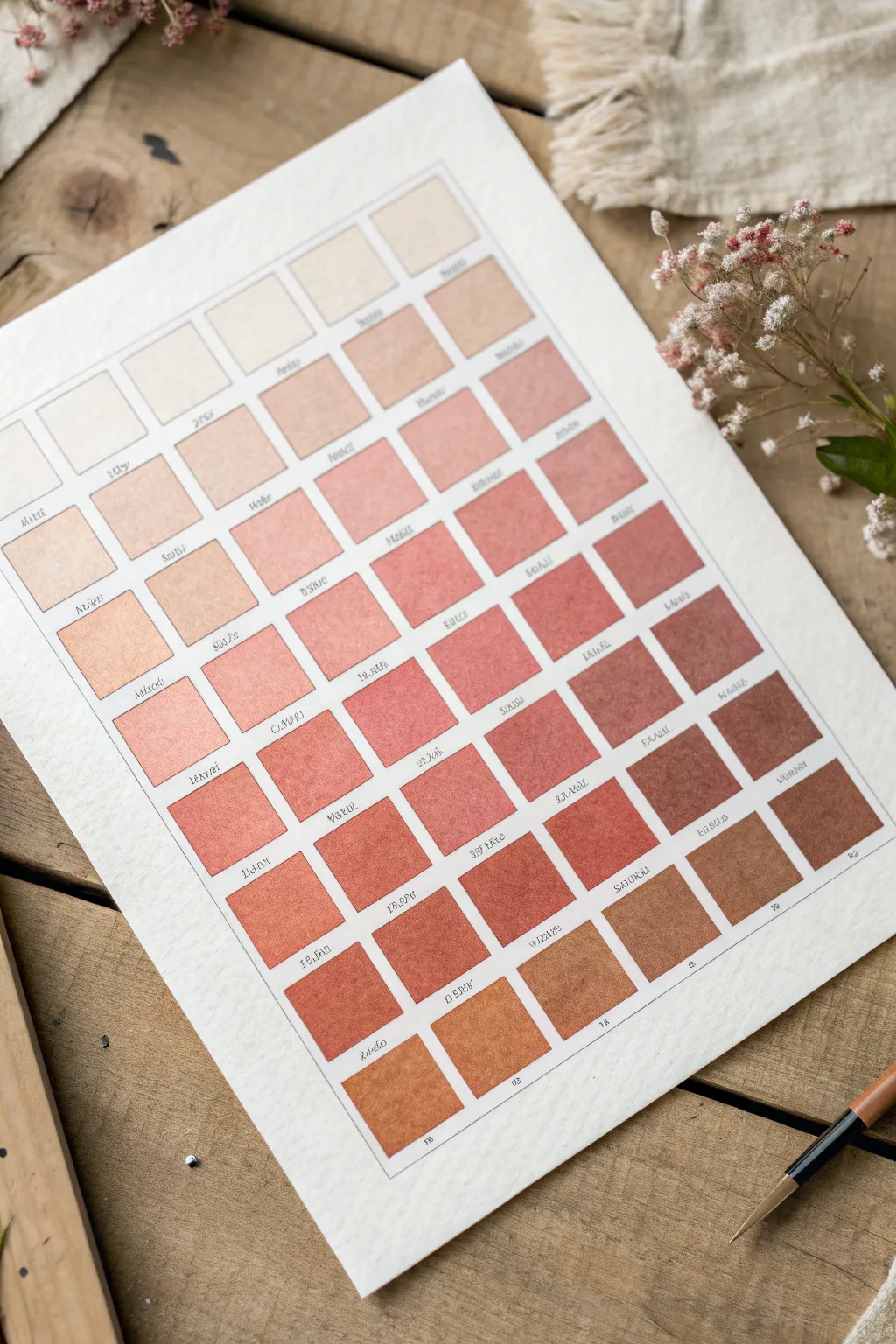
Master the subtle shifts of color mixing with this structured gradient grid. This project creates a satisfying visual reference chart, moving seamlessly from whisper-light creams to deep, earthy terracottas.
Detailed Instructions
Materials
- High-quality watercolor paper (cold press, 140lb/300gsm)
- Watercolor paints (burnt sienna, yellow ochre, cadmium red, ivory black)
- Pencil (HB or H)
- Ruler or T-square
- Fine liner pen or calligraphy nib with sepia ink
- Round watercolor brush (size 4 or 6)
- Palette for mixing
- Two jars of water
- Paper towels
Step 1: Planning the Grid
-
Measure margins:
Begin by deciding on the overall size of your chart. Leave a generous 1-inch to 1.5-inch border around the edge of your paper to frame the work cleanly. -
Calculate cell size:
Count the number of rows and columns shown here (roughly 6 columns by 10 rows). Measure your available space inside the margins and divide by the number of squares to determine the exact size for each swatch. -
Draw the grid:
Using a ruler and a light pencil touch, draw the grid. Ensure you leave a small gap (about 1/8th inch) between each square to separate the colors, and leave extra space beneath each square for the labels.
Uneven Drying?
If you get ‘cauliflower’ blooms in your squares, you are adding water back into drying paint. Once you lay a wash, leave it alone until fully dry before retouching.
Step 2: Mixing the Gradient
-
Prepare base colors:
Squeeze out fresh dabs of your base earth tones. You will primarily need a warm brown like Burnt Sienna, a touch of red, and a very small amount of black or dark brown to deepen the later shades. -
Start with the lightest value:
For the top-left square, mix a huge amount of water with just a speck of yellow ochre or buff titanium. It should be barely visible, like a tinted wash. -
Paint the first row:
Moving left to right, paint the first row. For each subsequent square, add a microscopic amount of pigment. The goal is to keep this entire top row extremely pale and airy. -
Deepen the mix for row two:
As you move to the second row, introduce the tiniest drop of warm pink or light terracotta into your puddles. Aim for a ‘blush’ tone rather than a solid color. -
Consistency is key:
I find it helpful to mix enough water into the paint so it flows easily. Fill each square carefully, using the tip of your brush to push the pigment into the corners without going over the pencil lines. -
Building saturation:
By the middle rows, your colors should resemble skin tones or peach shades. Increase the pigment-to-water ratio. The colors should look distinct but still transparent. -
Transitioning to earth tones:
As you reach the lower third of the grid, start adding more burnt sienna. The jump in intensity should be noticeable now. -
Adding depth:
For the final two rows, mix in your darkest red-browns. If you need more depth for the very last square, a tiny touch of Paynes Grey or Burnt Umber will ground the gradient. -
Let it dry completely:
Do not touch the paper while the squares are wet. Let the sheet sit for at least an hour to ensure no smudging occurs during the next step.
Go Monochromatic
Try this same grid exercise using only a single color like Indigo or Payne’s Grey, relying entirely on water dilution to create the value scale.
Step 3: Labeling and details
-
Simulate text or label:
Beneath each dried square, carefully write a label. You can invent names for the shades, write the mixing ratio (e.g., ‘1:10 BS’), or mimic the aesthetic script shown in the inspiration photo. -
Use the right pen:
A fine liner with archival ink is best, or a dip pen with sepia ink for a vintage look. Keep your handwriting small and centered under the swatch. -
Erase guidelines:
Once the ink is totally dry, gently run a kneaded eraser over the grid lines to lift the graphite, leaving only the crisp edges of the paint.
Display your finished study on a clipboard or frame it as a testament to color theory discipline
Irregular Hand-Drawn Grid for Loose Energy
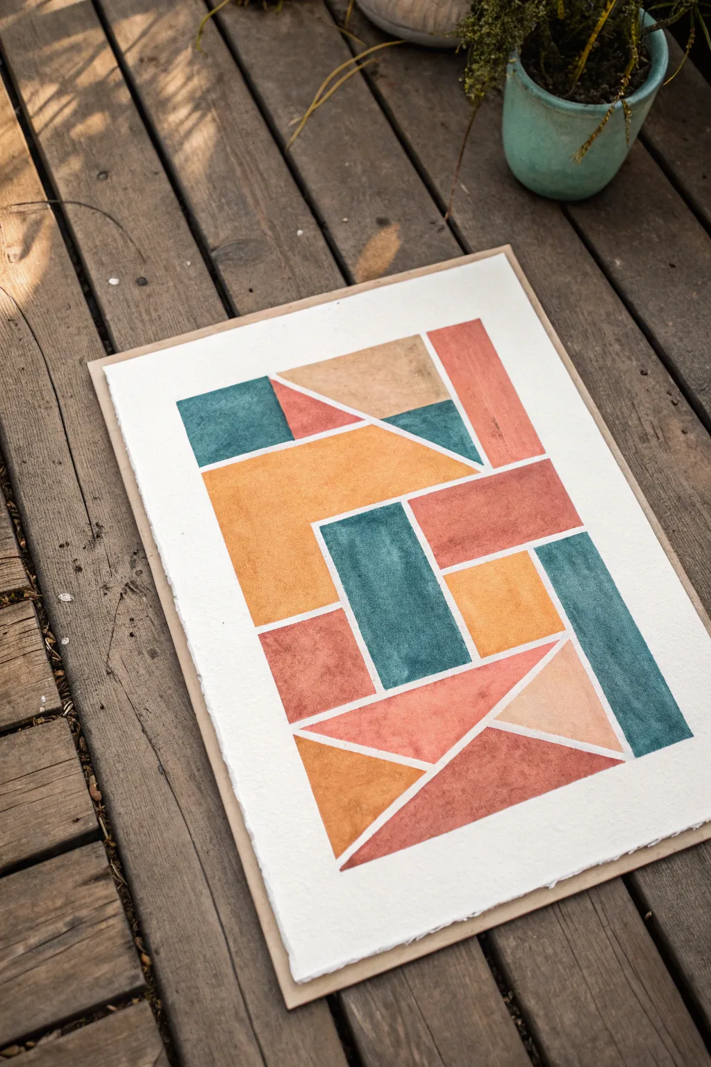
Embrace the imperfect beauty of hand-drawn lines with this warm, abstract composition of interlocking shapes. The textured paper and matte paint finish create an earthy, grounded feel that turns simple geometry into sophisticated decor.
Step-by-Step
Materials
- Heavyweight watercolor paper (300gsm or handmade rag paper)
- Gouache paints (burnt sienna, ochre/mustard, teal/petrol blue, beige)
- Flat shader brush (size 6 or 8)
- Ruler
- Pencil (HB)
- Eraser
- Painter’s tape or masking tape
- Mixing palette
- Water jar
Step 1: Planning the Layout
-
Prepare your surface:
Begin by securing your paper to a flat surface. Since this project features a clean white border, use masking tape to block off a rectangle in the center of your paper, leaving about a 2-inch margin all around. Press the tape edges down firmly to prevent bleed-through. -
Draft the outer boundary:
Using your ruler and pencil, lightly draw a large rectangle inside your taped area. This rectangle will serve as the container for all your geometric shapes. Keep lines faint so they can be erased later if needed. -
Divide the space vertically:
Sketch a few vertical lines to break up the large rectangle. Don’t measure these perfectly; place them slightly off-center to create varied column widths, which adds to that loose, organic energy we are aiming for. -
Add horizontal and diagonal breaks:
Now, intersect those columns with horizontal lines and diagonal slashes. Look at the reference image: notice how triangles nestle against rectangles. Draw these shapes so they fit together like a puzzle, leaving a consistent, thin gap (about 3-4mm) between every single shape. This negative space is crucial.
Clean Lines Pro-Tip
For sharper internal lines, you can use thin artist tape (1/8 inch) to mask off the ‘gaps’ between shapes before painting. Peel it off while paint is damp.
Step 2: Mixing the Palette
-
Create the teal tone:
Mix a deep teal using blue, a touch of green, and a tiny bit of black or burnt umber to desaturate it. You want a color that feels vintage, not electric. -
Mix the warm earth tones:
Prepare three warm distinct shades: a deep terracotta (burnt sienna), a mustard yellow (ochre mixed with a dot of yellow), and a soft beige or sand color. Gouache dries lighter, so mix them slightly darker than your desired finish. -
Check consistency:
Add water to your gouache until it reaches a creamy, double-cream consistency. It should flow off the brush smoothly but still be opaque enough to cover the paper in one or two coats.
Step 3: Painting the Shapes
-
Start with the teal shapes:
Select 3-4 distinct areas on your grid for the teal color, ensuring they are spread out and not touching. Fill them in using your flat brush, carefully cutting in towards the pencil edges but leaving that small white gap visible. -
Apply the mustard tone:
Next, paint the mustard yellow sections. Focus on the larger, central shapes for this color to anchor the composition. Keep your brush strokes relatively flat and even. -
Fill in the terracotta:
Paint the terracotta sections. I usually like to place these adjacent to the teal areas for high contrast. If the paint drags, dip just the tip of your brush in water. -
Add the beige accents:
Finish the color blocking with the beige tone in the remaining shapes. These lighter areas act as ‘breathing room’ for the eye. -
Refine the edges:
Once the first layer is touch-dry, go back with a slightly smaller brush to tidy up any wobbly edges. The goal isn’t machine perfection, but the white channels between shapes should look intentional. -
Assess opacity:
Gouache can sometimes look streaky. If needed, apply a second thin coat of color to any shapes that look uneven, ensuring fully matte, opaque coverage.
Level Up: Texture
Mix a tiny amount of fine sand or modeling paste into your gouache for the terracotta sections. This adds physical grit that makes the piece look like a fresco.
Step 4: Finishing Touches
-
Let it dry completely:
Allow the painting to dry fully. This might take 15-20 minutes depending on how thick your paint application was. -
Erase guidelines:
Very gently erase any visible pencil marks in the white channels. Be careful not to rub over the painted areas, as gouache can smudge. -
Reveal the border:
Slowly peel away the masking tape at a 45-degree angle. This crisp white border contrasts beautifully with the organic, slightly textured edges of the internal shapes.
Mount this piece on a wooden backing or in a floating frame to highlight the beautiful texture of the paper
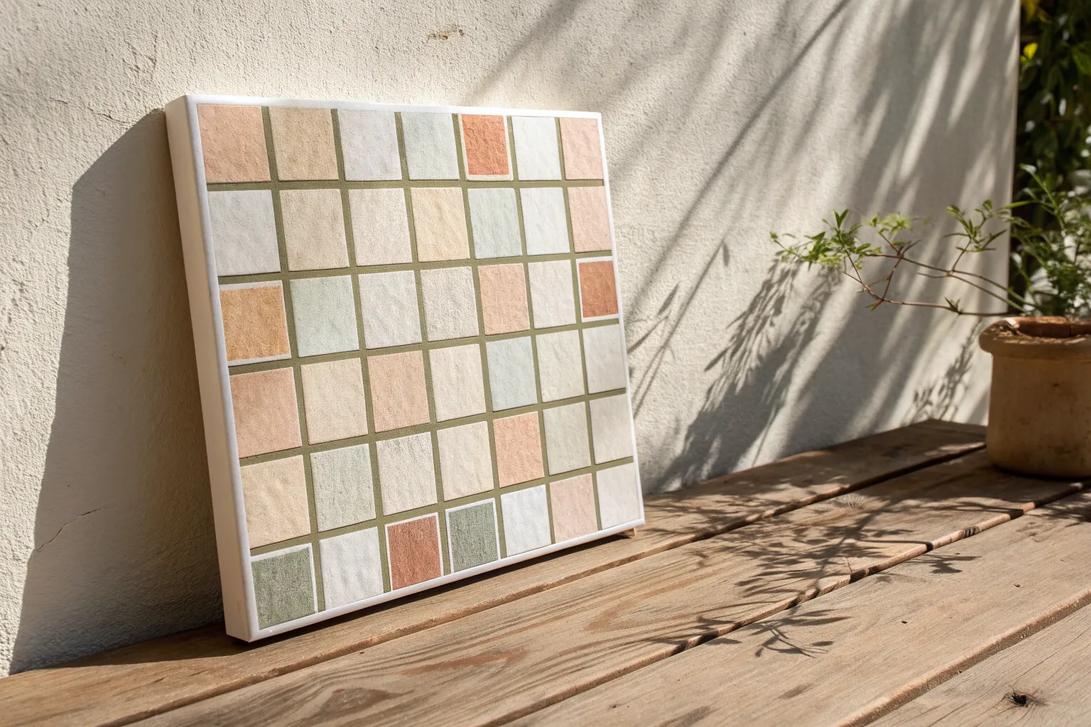
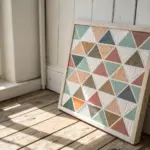
Physical Grid Collage With Painted Squares
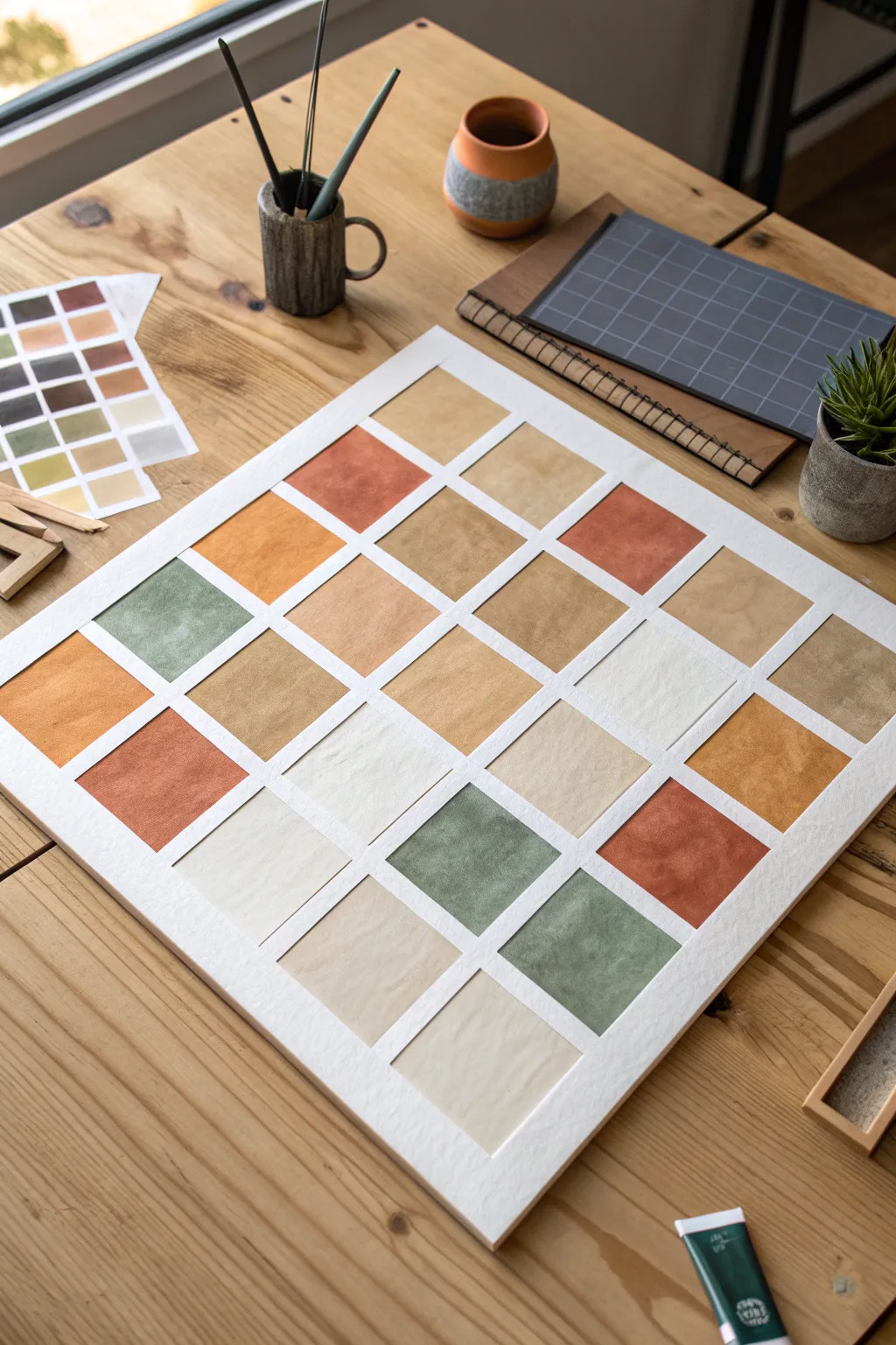
This soothing project explores color theory through a beautiful arrangement of warm, earthy square swatches separated by crisp white lines. It combines the structured look of a grid with the organic texture of watercolor or gouache for a modern, minimalist piece.
How-To Guide
Materials
- Large sheet of thick watercolor paper (hot press preferred for smooth texture)
- White artist tape or thin drafting tape (approx. 1/4 inch width)
- Gouache or opaque watercolor paints (olive green, burnt sienna, yellow ochre, warm beige, white)
- Flat shader brush (size 10 or 12)
- Mixing palette with deep wells
- Ruler and T-square
- Pencil
- Craft knife or scissors
- Optional: separate sheets of paper if painting swatches individually
Step 1: Planning and Preparation
-
Measure your base:
Begin with a large square sheet of watercolor paper. A 12×12 inch or 16×16 inch size works beautifully for this scale. Ensure your paper is heavyweight enough to handle paint without buckling. -
Calculate the grid:
Decide on your layout. The example shows a 5×5 grid. Measure the total width of your paper, subtract the width of your desired borders (outer and inner), and divide the remaining space by 5 to determine the size of each painted square. -
Mark the lines:
Using a pencil and T-square, lightly mark out where your grid lines will go. Accuracy here is key to that clean, professional finish. -
Mask the grid:
Apply your artist tape over the pencil lines to create the white separating barriers. Run long strips horizontally first, then vertically (or vice versa), pressing down firmly to prevent paint bleed. -
Create the outer border:
Don’t forget to tape off a wide outer border to frame the entire composition. This negative space is crucial for letting the colors breathe.
Step 2: Mixing the Initial Palette
-
Prepare the base colors:
Squeeze out your primary earth tones: Burnt Sienna, Olive Green, and Yellow Ochre. You will also need a generous amount of Titanium White for tinting. -
Mix a terracotta shade:
Combine Burnt Sienna with a touch of Yellow Ochre to create a warm, brick-red terracotta. Add tiny amounts of white to create 2-3 variations of this hue. -
Create muted greens:
Mix your Olive Green with a little Burnt Sienna to desaturate it, making it earthier. Create a light version by mixing in white, and a darker version by adding a touch of blue or more green. -
Formulate the neutrals:
Prepare several shades of beige and cream. I start with a lot of white and add just a speck of the Yellow Ochre and Sienna mix to warm it up without checking it too dark.
Tape Removal Trick
To prevent tearing the paper, heat the masking tape with a hair dryer on low for a few seconds before peeling. It softens the adhesive instantly.
Step 3: Painting the Swatches
-
Randomize the placement:
Before painting, plan a loose arrangement to balance the colors. Try not to place two identical squares right next to each other. -
Apply the darks first:
Limit your palette initially to the darker terracotta and olive shades. Fill in scattered squares across the board using your flat shader brush for even coverage. -
Layer with gouache:
If you are using gouache, aim for an opaque, velvety finish. You may need two thin coats rather than one thick one to avoid cracking. -
Fill in mid-tones:
Move on to your mustard yellows and medium beiges. Paint these into the adjacent squares, allowing the wet edges to touch only the tape, not the other wet paint. -
Complete with lights:
Finish by painting the remaining squares with your lightest creams and off-whites. These pale squares act as visual ‘rests’ in the composition. -
Add texture (optional):
While the paint is damp, you can lightly stipple with a dry brush or blot with a paper towel on a few squares to create that subtle, organic texture seen in the reference.
Collage Style Variation
Instead of masking, paint a large sheet with various colors, cut them into perfect squares, and physically glue them onto a board for added depth.
Step 4: Finishing Touches
-
Let it cure:
Allow the entire piece to dry completely. If the paper feels cool to the touch, it’s still wet deep down. -
Peel the tape:
This is the best part. Slowly peel back the tape at a 45-degree angle, pulling away from the painted area to ensure crisp, sharp lines. -
Touch up:
If any paint bled under the tape, use a tiny amount of opaque white gouache or a white gel pen to tidy up the grid lines.
Hang your finished grid in a brightly lit spot to let those earthy textures warm up the room

Have a question or want to share your own experience? I'd love to hear from you in the comments below!