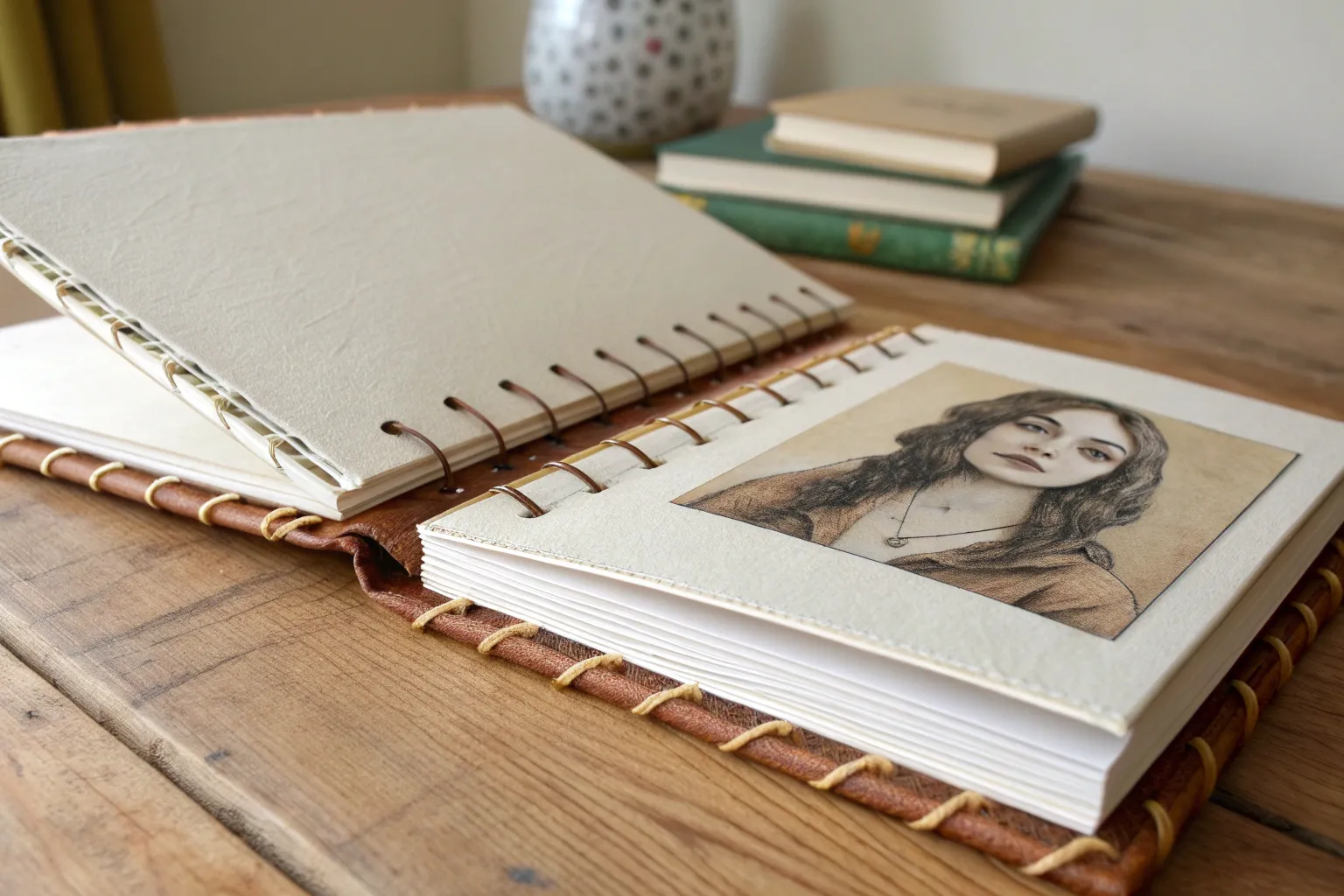
Whenever I feel stuck, I pick one subject and redraw it in a bunch of different looks—it’s the fastest way to generate fresh art styles ideas. Try it with a simple object or character, and you’ll start spotting what you naturally repeat (and what you want to explore next).
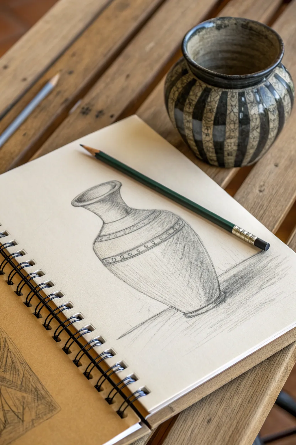
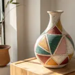
Realism Study Style
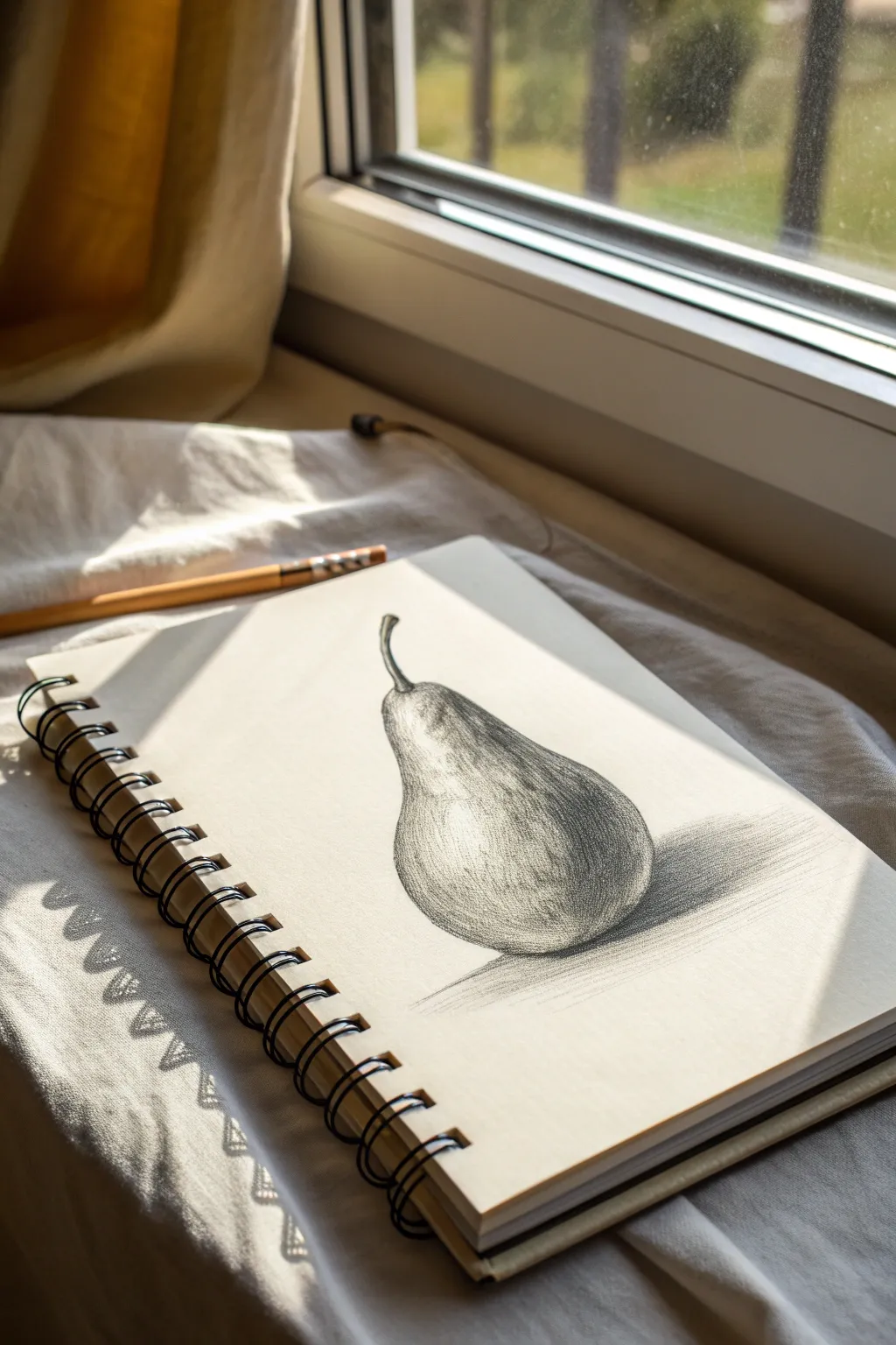
Capture the delicate curves and dramatic shadows of a single pear in this classic graphite realism study. This project focuses on observing form and using tonal values to bring a simple fruit to life on sketchbook paper.
Detailed Instructions
Materials
- Spiral-bound sketchbook (medium tooth paper)
- Graphite pencils (HB, 2B, 4B, 6B)
- Kneaded eraser
- Pencil sharpener or craft knife
- Blending stump or tissue
- Reference pear (or photo)
Step 1: Shaping the Form
-
Analyze the shapes:
Begin by observing your pear reference. Visualize it as two overlapping circles: a larger, wider one for the base and a smaller one for the top section near the stem. -
Sketch the outline:
Using your HB pencil, lightly sketch these basic circle shapes on the page. Use very faint pressure so these marks can be erased later or blended into the shading. -
Refine the contour:
Connect the circles with smooth, sloping lines to create the distinctive pear silhouette. Pay attention to the slight dip or asymmetry that makes organic objects look real rather than perfect. -
Add the stem:
draw the stem emerging from the top. Notice how it thickens slightly at the base where it joins the fruit and curves naturally. Keep the tip slightly uneven.
Fixing Flatness
If the pear looks flat, your mid-tones are likely too uniform. Darken the core shadow (the curve away from the light) and keep the reflected light on the bottom rim subtle yet distinct.
Step 2: Establishing Value
-
Map the shadows:
Identify where the light is hitting your pear. Lightly outline the highlight area (the brightest spot) so you remember to keep it white. Mark the line distinguishing the light side from the shadow side. -
Base shading:
Switch to a 2B pencil. Apply a light, even layer of graphite over the entire shadow side of the pear. Leave the light side largely untouched for now. -
Deepen the core shadow:
Apply a second layer of shading along the ‘core shadow’—the darkest band on the fruit where the light creates the turn of the form. Use small, circular strokes to build texture. -
Cast shadow placement:
Sketch the shape of the cast shadow on the surface beneath the pear. This shadow grounds the object and prevents it from looking like it’s floating.
Try Colored Ground
Instead of white paper, try this study on tan or grey toned paper. Use a white charcoal pencil for the highlights to make the volume pop dramatically.
Step 3: Texturing and Refining
-
Mid-tone development:
Using the side of your 2B pencil, gently shade the transition labeled ‘mid-tones’ between the bright highlight and the core shadow. This creates the rounded 3D effect. -
Darkest darks:
Take your 4B or 6B pencil to deepen the darkest areas. Focus on the very bottom of the pear and the cast shadow immediately underneath it. -
Texture techniques:
Pears have a speckled skin. I like to use a sharp HB pencil to add tiny, random dots or short stippling marks, particularly in the transition zones between light and dark. -
Stem detailing:
Add dark lines along the shadowed side of the stem with the 4B pencil. Leave a tiny sliver of white on the opposite side to make the stem look cylindrical. -
Reflected light:
Lift a small amount of graphite from the very bottom edge of the pear (inside the shadow area) using your kneaded eraser. This created ‘reflected light’ bouncing up from the table.
Step 4: Final Polish
-
Enhance the highlight:
Use your eraser to clean up the main highlight spot, ensuring it is the brightest white on the page. Soften the edges of this highlight slightly so it looks natural, not like a sticker. -
Cast shadow gradation:
Make the cast shadow darkest right underneath the fruit, fading it out into a softer grey as it moves away from the object. -
Clean up:
Take the kneaded eraser and dab away any smudges or fingerprints on the surrounding white paper to keep the presentation crisp and professional.
Now that you’ve mastered the humble pear, you can apply these same shading principles to more complex still life compositions
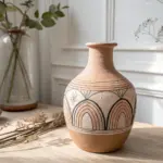
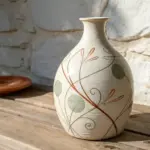
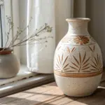
Loose Sketch Style
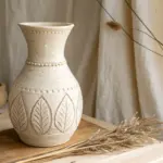
Embrace the imperfect, fluid nature of loose sketching with this simple study of a ceramic vase. Using energetic pencil strokes and focusing on form rather than photorealism, you will create a charming still life that feels spontaneous and lively.
Step-by-Step Tutorial
Materials
- Spiral-bound sketchbook (medium textured paper)
- Graphite pencil (HB or 2B recommended)
- Eraser (kneaded or vinyl)
- Reference vase (optional, but helpful for lighting)
Step 1: Constructing the Form
-
Establish the centerline:
Begin by lightly drawing a vertical line down the center of your page. This axis helps ensure your vase remains symmetrical, though perfect symmetry isn’t required for this loose style. -
Mark the proportions:
Make small horizontal dashes along your centerline to map out the height. Mark the top rim, the narrowest part of the neck, and the widest point of the belly to guide your shape. -
Sketch the rim ellipse:
At the top mark, draw a flattened oval to represent the opening of the vase. Keep your wrist loose and go over the line a few times to find the right curvature. -
Outline the neck:
Draw two curving lines coming down from the rim, pinching inward to form the neck. Allow them to flair out slightly as they join the main body. -
Create the body shape:
From the base of the neck, sweep your pencil outward to create the bulbous shoulders of the vase, tapering back in toward the bottom base. -
Anchor the base:
Draw a slightly curved line at the bottom to connect the sides, mirroring the curvature of the top rim ellipse to give the object volume.
Uneven Ellipses?
If your rim looks pointy like a football, round out the corners more. Practice drawing floating loops in the air before committing pencil to paper.
Step 2: Adding Details & Shading
-
Define the decorative bands:
Draw two horizontal bands across the upper ‘shoulder’ of the vase. These lines should curve downward slightly to follow the rounded form of the pot. -
Add circle motifs:
Inside the band you just created, sketch a row of small, repetitive circles. Don’t worry if they are uneven; the loose style thrives on these little irregularities. -
Start the hatching:
Using the side of your pencil lead, begin adding diagonal shading marks across the main body of the vase. Keep your strokes quick and uniform in direction. -
Deepen the shadows:
Identify your light source (usually coming from the top left or right). Add a second layer of hatching on the side opposite the light to create depth and roundness. -
Shade the neck:
Apply vertical shading strokes to the neck area, making it darker near the edges to emphasize its cylindrical shape. -
Detail the rim:
Darken the inner back edge of the rim to show that the vase is hollow. This simple contrast immediately gives the drawing dimension. -
Add cast shadow:
Sketch a patch of horizontal shading on the surface just to the right of the vase’s base. This grounds the object so it doesn’t look like it’s floating.
Loosen Up
Hold the pencil higher up the shaft, away from the tip. This forces you to draw with your arm rather than just your fingers, creating fluid lines.
Step 3: Refining the Sketch
-
Enhance the outlines:
Go back over your initial contour lines with a bit more pressure. I find that varying line weight—pressing harder on the shadowed side—makes the sketch pop. -
Soften edges:
If any lines feel too harsh or mechanical, gently rub them with your finger or a tissue to soften the graphite, blending the texture slightly. -
Clean up stray marks:
Use your eraser to lift out highlights on the widest part of the vase and clean up the centerline you drew in the beginning. -
Final assessment:
Take a step back and look at the overall balance. Add a few erratic, sketchy lines around the base or sides to reinforce the artistic, ‘unfinished’ aesthetic.
Enjoy the relaxed process of filling your sketchbook with these quick, expressive studies
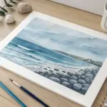
Watercolor Wash Style
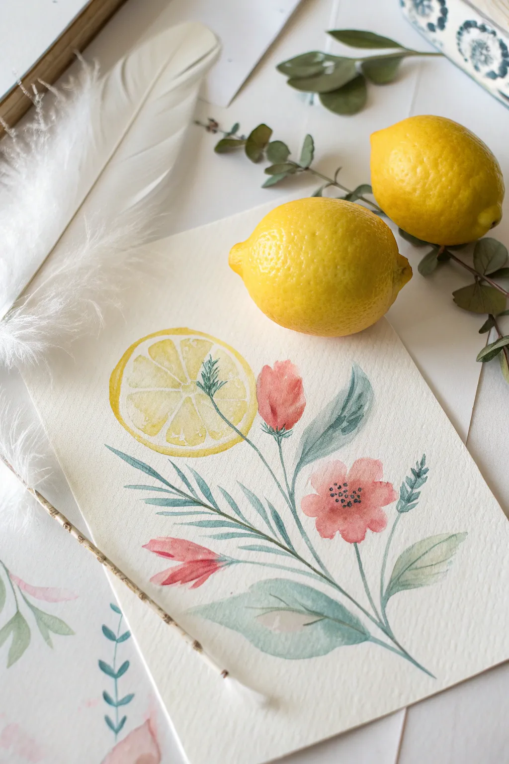
Capture the freshness of summer with this delicate watercolor composition featuring a bright lemon slice nestled among soft pink blooms and sage-green foliage. Using the wet-on-dry technique allows for crisp edges while maintaining that signature translucent watercolor charm.
Step-by-Step Tutorial
Materials
- Cold press watercolor paper (300 gsm)
- Round watercolor brushes (size 2, 6, and 8)
- Watercolor paints: Lemon Yellow, Cadmium Yellow, Alizarin Crimson, Sap Green, Payne’s Grey
- Pencil (HB or H) and kneaded eraser
- Clean water jar
- Paper towel or rag
- Palette for mixing
Step 1: Sketching the Layout
-
Draft the central axis:
Begin by lightly sketching a central curved line that will serve as the main stem. This should start from the bottom right and curve gently towards the center left of your paper. -
Outline the lemon slice:
Draw the outline of the lemon slice near the top left of your stem. Make sure it’s a perfect circle first, then sketch the inner fruit segments, leaving thin gaps for the white pith. -
Position the flowers:
Sketch a small, tulip-shaped bud to the right of the lemon, and a larger, fully open five-petaled flower lower down on the right side of the stem. -
Add the foliage:
Draw long, slender leaves extending from the main stem. add a large, broad leaf at the very base and finer, fern-like sprigs near the flowers to vary the texture. -
Refine and lighten:
Use your kneaded eraser to roll over the entire sketch. You want the graphite guidelines to be barely visible so they don’t show through the transparent paint later.
Bleeding Colors?
If your colors are running into each other unexpectedly, you’re painting adjacent sections too quickly. Let each shape dry completely before painting its neighbor to keep edges crisp.
Step 2: Painting the Elements
-
Wash the lemon segments:
Mix a watery Lemon Yellow. Carefully paint each triangular fruit segment of the lemon slice, leaving the thin channels between them unpainted (white paper) to represent the pith. -
Add rind detail:
While the segments are wet, drop a tiny hint of concentrated Cadmium Yellow near the outer edge of the slice for a gradient effect. Paint a thin yellow ring around the entire slice for the rind. -
Paint the pink bud:
Mix a soft pink using Alizarin Crimson and plenty of water. Paint the tulip-shaped bud, keeping the top edge slightly lighter. Drop a slightly darker red into the base while it’s still damp. -
Paint the open flower:
Using the same pink mix, paint the five petals of the lower flower. Leave a tiny white gap in the very center. I find it helpful to paint non-adjacent petals first to prevent them from bleeding into each other. -
Establish the main greenery:
Mix Sap Green with a touch of Payne’s Gray for a muted, sage tone. Using your size 6 brush, paint the large bottom leaf with a confident, sweeping stroke. -
Adding texture to leaves:
While the large leaf is still wet, lift out a small section of paint with a clean, damp brush to create a highlight. Drop a darker green mix into the shadow areas near the stem. -
Paint the slender leaves:
Switch to a size 2 brush. Paint the thin, needle-like leaves extending to the left using a mix of Sap Green and blue for a cooler tone.
Make it Pop
Add a very loose, watery splatter of yellow and pink paint around the composition once finished. This adds energy and breaks the stiffness of the white background.
Step 3: Refining Details
-
Add the stems:
With a fine brush and dark green, connect all your floating elements to the main stem line you sketched earlier. Keep these lines very thin and fluid. -
Detail the lemon center:
Once the yellow lemon slice is completely dry, mix a very faint grey. Paint delicate lines over the white pith areas to give them structure without darkening them too much. -
Enhance the flower center:
Wait for the pink flower to dry fully. Using a concentrated dark grey or black, stipple tiny dots in the center of the open flower to create the stamens. -
Paint the lower bud:
If you sketched a third floral element, like the small drooping bud near the bottom left, paint this now in a deeper shade of red-pink to balance the composition. -
Final leaf accents:
Add the small, darker green sprigs that peek out behind the flowers. These should be sharper and darker than the other leaves to create depth. -
Check balance:
Step back and look at your composition. If any area looks too pale, you can gently glaze a second layer of color over it, but ensure the first layer is bone dry.
Allow your painting to dry flat completely before framing or erasing any remaining pencil marks


Minimalist Line Art Style
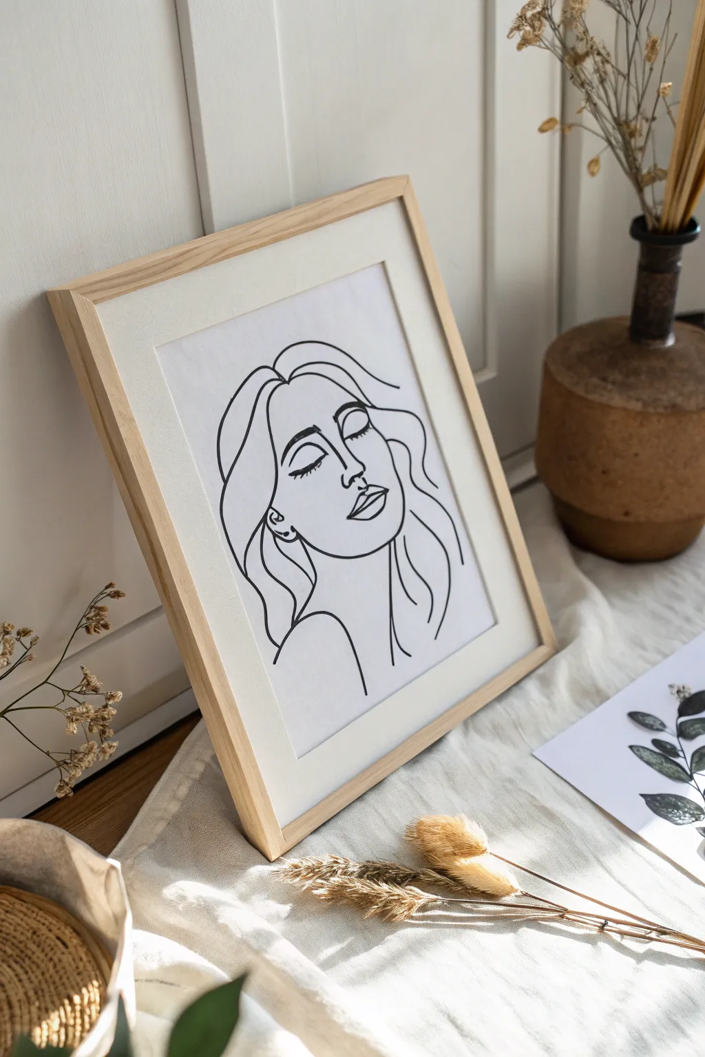
Capture the essence of calm with this elegant minimalist line drawing, featuring a serene face with closed eyes and flowing hair. This project embraces the ‘less is more’ philosophy, using simple, bold black strokes on crisp white paper to create sophisticated modern art.
How-To Guide
Materials
- High-quality white drawing paper (heavyweight cardstock or watercolor paper)
- Pencil (HB or 2H for light sketching)
- Eraser (kneaded eraser works best)
- Black fine-liner pen (0.5mm or 0.8mm)
- Black brush pen or calligraphy marker (for varied line width)
- Ruler (optional for framing alignment)
- Light wood frame with matting
Step 1: Conceptual Sketching
-
Establish the Head Shape:
Begin by lightly sketching an oval shape for the face with your pencil. Since this is stylized, the jawline can be somewhat angular to emphasize the chin. -
Map Facial Features:
Draw faint guidelines to position the eyes and nose. Place the nose line slightly lower than center, and mark where the eyebrows will arch. -
Sketch the Nose Profile:
Instead of a full nose, sketch a single, flowing L-shaped line that starts near the brow bone and curves down to form the tip of the nose and one nostril. -
Draw Closed Eyes:
Create two downward curves for the eyelids. Add short, delicate lashes along the bottom of these curves to signify the eyes are gently closed. -
Form the Lips:
Sketch the mouth slightly open or relaxed. Use two simple curves for the top lip and a fuller curve for the bottom lip, keeping them detached from the face outline for a floaty feel. -
Outline the Hair:
Draw loose, wavy lines framing the face. Let the hair strands flow down the sides, creating open shapes rather than detailed strands. -
Add the Neck and Shoulder:
Extend a smooth line down from the jaw to form the neck, curving outward into a bare shoulder line.
Uneven Lines?
If your hand shakes and a line goes wobbly, don’t scrap it. Thicken the line slightly at that curve to hide the wobble and add artistic weight.
Step 2: Inking the Lines
-
Test Your Pens:
Before inking the main piece, test your black markers on a scrap piece of the same paper to ensure the ink doesn’t bleed or feather. -
Start with Central Features:
Begin inking the face features first. Use a steady hand to trace over your pencil lines for the eyes and nose. I find it helpful to pull the pen towards me rather than pushing it away for smoother curves. -
Define the Face Shape:
Ink the jawline next. Try to do this in one or two continuous strokes to maintain that fluid, minimalist aesthetic. -
Emphasize the Hair:
Use your thicker brush pen or marker for the hair outlines. Varying the pressure here creates a nice dynamic line width that mimics volume. -
Connect the Shoulder:
Draw the neck and shoulder line with a confident, sweeping motion. Keep this line simple and unadorned. -
Check Line Weight Consistency:
Look over your drawing. If some lines look too thin compared to others, carefully re-trace them to thicken the line weight, ensuring a balanced look.
Step 3: Final Touches & Framing
-
Let the Ink Dry:
Allow the ink to dry completely. This is crucial—smudging wet ink at this stage is heartbreaking. -
Erase Sketches:
Gently erase all underlying pencil marks. A kneaded eraser is gentle on the paper texture and won’t fade your black ink. -
Inspect for Imperfections:
Check for any gaps in your lines that weren’t intentional. Fill them in with a delicate touch if necessary. -
Prepare the Mat:
Place your drawing behind the mat board to check centered alignment before securing it. -
Frame Your Art:
Clean the glass of your light wood frame. Insert the matted artwork and secure the back.
One-Line Challenge
Try recreating this drawing without lifting your pen off the paper once. The connected lines create a unique, abstract flow that looks very high-end.
Now you have a piece of chic, personal art ready to bring a calming atmosphere to any corner of your home
BRUSH GUIDE
The Right Brush for Every Stroke
From clean lines to bold texture — master brush choice, stroke control, and essential techniques.
Explore the Full Guide
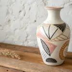
Comic Shading Style
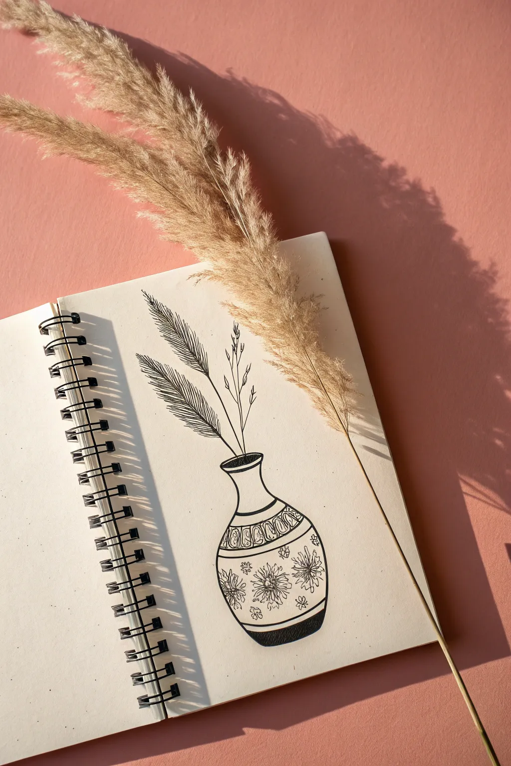
Master the art of high-contrast comic shading with this simple yet elegant line drawing of a patterned vase holding dried grass. By combining bold outlines with delicate hatching, you’ll create a striking graphic illustration that pops off the page.
Step-by-Step Guide
Materials
- Spiral-bound sketchbook or heavy drawing paper
- Fine liner pens (sizes 0.1, 0.3, and 0.5)
- Black brush pen or broad marker
- Pencil (HB or 2B)
- Eraser
Step 1: Sketching the Foundation
-
Outline the vase shape:
Start with a light pencil sketch of the vase. Draw a curved, bulbous bottom that tapers into a narrower neck, flaring out slightly at the rim to create a classic bottle shape. -
Define the decorative bands:
Lightly sketch two horizontal bands across the upper part of the vase’s body. These will serve as guides for the geometric patterns later. -
Sketch the stems:
Draw three main lines extending straight up from the vase opening. Make them radiate slightly outward, mimicking the natural lean of dried grass. -
Block in the foliage:
Around the two left-leaning stems, sketch long, feathery shapes that feel heavy and droop slightly downward. For the rightmost stem, add small, sparse twig-like offshoots.
Hatching Trick
Don’t connect every hatch line to the outline perfectly. Leaving tiny gaps at the edges of the leaves creates a sense of light hitting the object.
Step 2: Inking the Structure
-
Trace the main contours:
Using a 0.5 fine liner, go over your pencil lines for the vase’s outer silhouette. Keep your hand steady to create clean, confident curves. -
Ink the vase details:
Switch to a 0.3 pen to ink the horizontal bands and the rim of the vase. Don’t worry if lines aren’t perfectly straight; a little wobble adds organic character. -
Draw the main stems:
Ink the central lines of the plant stems with the 0.3 pen. Ensure they connect cleanly to the inside of the vase rim.
Step 3: Creating Texture & Shading
-
Detail the fern leaves:
For the heavy leaves on the left, use a 0.1 pen to draw rapid, closely spaced diagonal lines (hatching) extending from the central vein to the edge of the leaf shape. -
Refine the hatching direction:
Ensure your hatch marks follow the curve of the leaf. I find it helpful to flick the pen outward to give the tips a sharp, feathery appearance. -
Ink the dried twigs:
On the rightmost stem, use the 0.1 pen to draw tiny, delicate loops or buds at the tips of the small branches. -
Pattern the vase neck:
Inside the horizontal band on the vase neck, draw a repeating pattern of simple loops or arches using the 0.3 pen. -
Add floral motifs:
In the main body of the vase, draw three large flower outlines. Use a jagged, nervous line style to mimic embroidery or etched details. -
Fill the flowers:
Add center details to the flowers with tight scribble lines and small dots to create density and texture. -
Decorate the background space:
Fill the empty space around the flowers with tiny, scattered asterisk shapes or small four-petaled flowers.
Add Realism
Place a real dried pampas stem or wheat stalk on your page and trace its shadow lightly for a hyper-realistic silhouette to fill with ink.
Step 4: Final Touches
-
Add heavy shadows:
Using a brush pen or broad marker, fill in the very bottom curve of the vase with solid black. This anchors the object and gives it weight. -
Thicken select lines:
Go back over the outer edge of the vase on the shadow side (usually the right) to thicken the line weight, enhancing the 3D effect. -
Erase pencil guides:
Wait until the ink is completely dry to prevent smudging, then gently erase all remaining pencil marks. -
Add stippling (optional):
If you want more depth, add tiny dots (stippling) just above the solid black base to create a gradient transition from dark to light.
Now you have a stylish piece of botanical line art ready to be framed or gifted
Cute Chibi Proportion Style
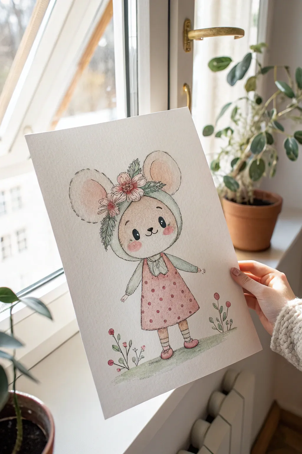
Capture the sweetness of spring with this adorable illustration featuring a wide-eyed mouse in a floral bonnet. Using gentle watercolor washes and delicate ink outlines, you’ll bring this charming, soft-hued character to life on textured paper.
Detailed Instructions
Materials
- Cold press watercolor paper (A4 or A5 size)
- Pencil (HB or H for light sketching)
- Kneaded eraser
- Fine liner pens (sepia or dark brown, 0.1 and 0.3mm)
- Watercolor paints (Pink, Peach, Sage Green, Brown, Yellow Ochre)
- Round watercolor brushes (sizes 2 and 6)
- Clean water and paper towels
Step 1: Sketching the Character
-
Outline the head shape:
Begin by lightly sketching a large, rounded oval for the mouse’s head. Since this is a chibi style, the head should be significantly larger than the body to emphasizecuteness. -
Add the ears and bonnet:
Draw two large, circular ears emerging from the top of the head. Then, sketch the outline of the bonnet wrapping around the face, creating a soft hood shape. -
Draw the facial features:
Place two wide, oval eyes low on the face, leaving plenty of forehead space. Add a tiny triangular nose and a small ‘w’ mouth just beneath it. Don’t forget the rosy cheek circles. -
Create the floral crown:
Sketch a cluster of three simple flowers on the forehead area of the bonnet. Add leafy sprigs extending out to the sides to frame the face naturally. -
Sketch the body and dress:
Draw a small A-line dress shape below the head. Keep the limbs simple—stick-like arms with tiny hands and spindly legs ending in rounded shoes. -
Add background elements:
Lightly pencil in a few simple stemmed flowers at the mouse’s feet to ground the character.
Soft Ink Technique
For an even softer look, try inking *after* painting. The watercolor lines will blur slightly under the pen, creating a vintage storybook aesthetic.
Step 2: Inking the Lines
-
Trace with fine liner:
Using a sepia or dark brown fine liner (0.1mm), carefully trace over your pencil lines. The brown ink gives a softer look than harsh black for this delicate subject. -
Vary lines for texture:
Use broken, dashed lines for the bonnet’s edge and the mouse’s ears to suggest a fuzzy or stitched texture. Keep the facial features smooth and solid. -
Clean up the sketch:
Wait for the ink to maintain its permanence, then gently erase all visible pencil marks with your kneaded eraser.
Add Some Sparkle
Use a white gel pen to add tiny highlights on the nose, fresh dots on the dress, or little gleams on the flower petals for extra dimension.
Step 3: Watercolor Washes
-
Paint the skin tones:
Dilute a peach or warm beige color with plenty of water. Apply a very light wash to the mouse’s face, leaving the white of the paper for the eyes. -
Color the ears:
Mix a soft pink and apply it to the inner circles of the ears. While still damp, dab a slightly darker pink at the base of the ear to create a subtle gradient. -
Paint the dress:
Fill the dress shape with a dusty rose or muted pink color. Let this layer dry completely before moving to patterns. -
Detail the bonnet and sleeves:
Use a pale sage green for the bonnet’s outer fabric and the sleeves of the dress. Keep the wash light to maintain that airy, illustrative feel. -
Add floral accents:
Paint the flowers on the head and the ground with diluted reds and pinks. Use a pointed brush to dab green onto the leaves. -
Create the rosy cheeks:
I like to take a fairly wet brush with pink pigment and dab it onto the cheek circles, letting the color bloom slightly for a soft, blushing effect.
Step 4: Final Details
-
Add polka dots:
Once the dress is bone-dry, use a smaller brush with a concentrated red-brown mix to dot a pattern across the fabric. -
Paint the shoes and socks:
Color the shoes a matching pink and add tiny horizontal stripes to the socks for extra charm. -
Ground the figure:
Sweep a very diluted green wash horizontally under the feet to create a grassy patch, ensuring the character isn’t floating in space. -
Highlight the eyes:
Fill the eyes with solid black or dark brown ink, leaving two tiny white circles in each for those bright, sparkling highlights.
Now you have a sweet little character ready to brighten up any room

Have a question or want to share your own experience? I'd love to hear from you in the comments below!