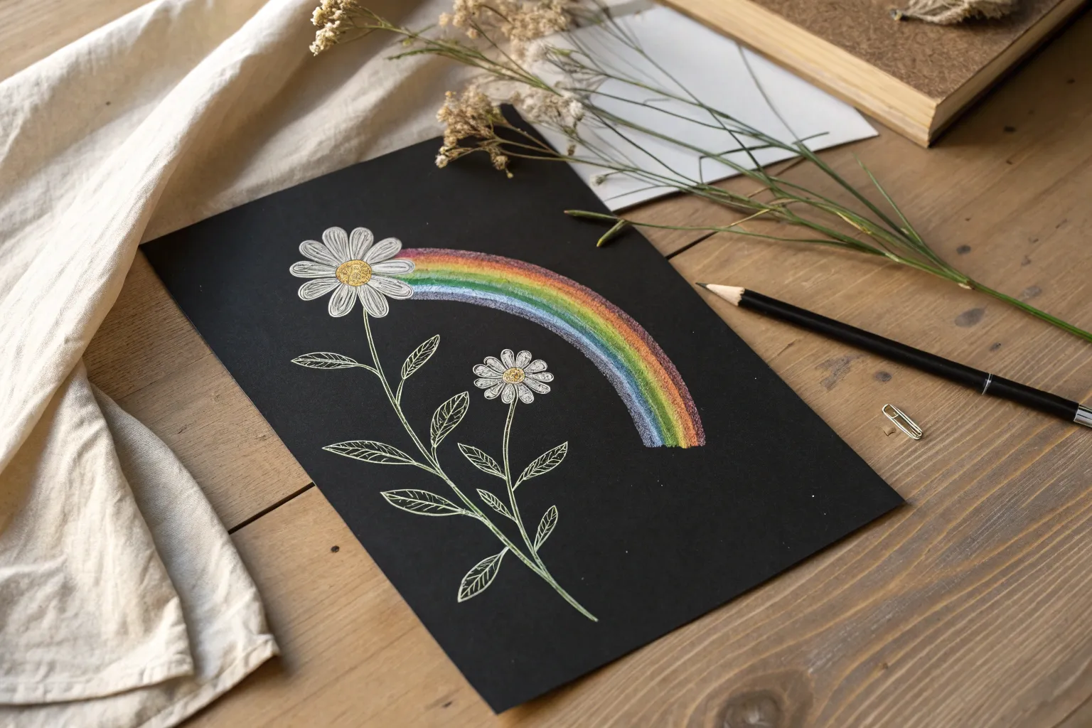
I love scratch art because you get that instant, colorful payoff with just a few simple lines—no fancy drawing skills required. Here are my favorite easy scratch art ideas that look impressive fast and still leave plenty of room for your own style.
Simple Hearts, Stars, and Doodles
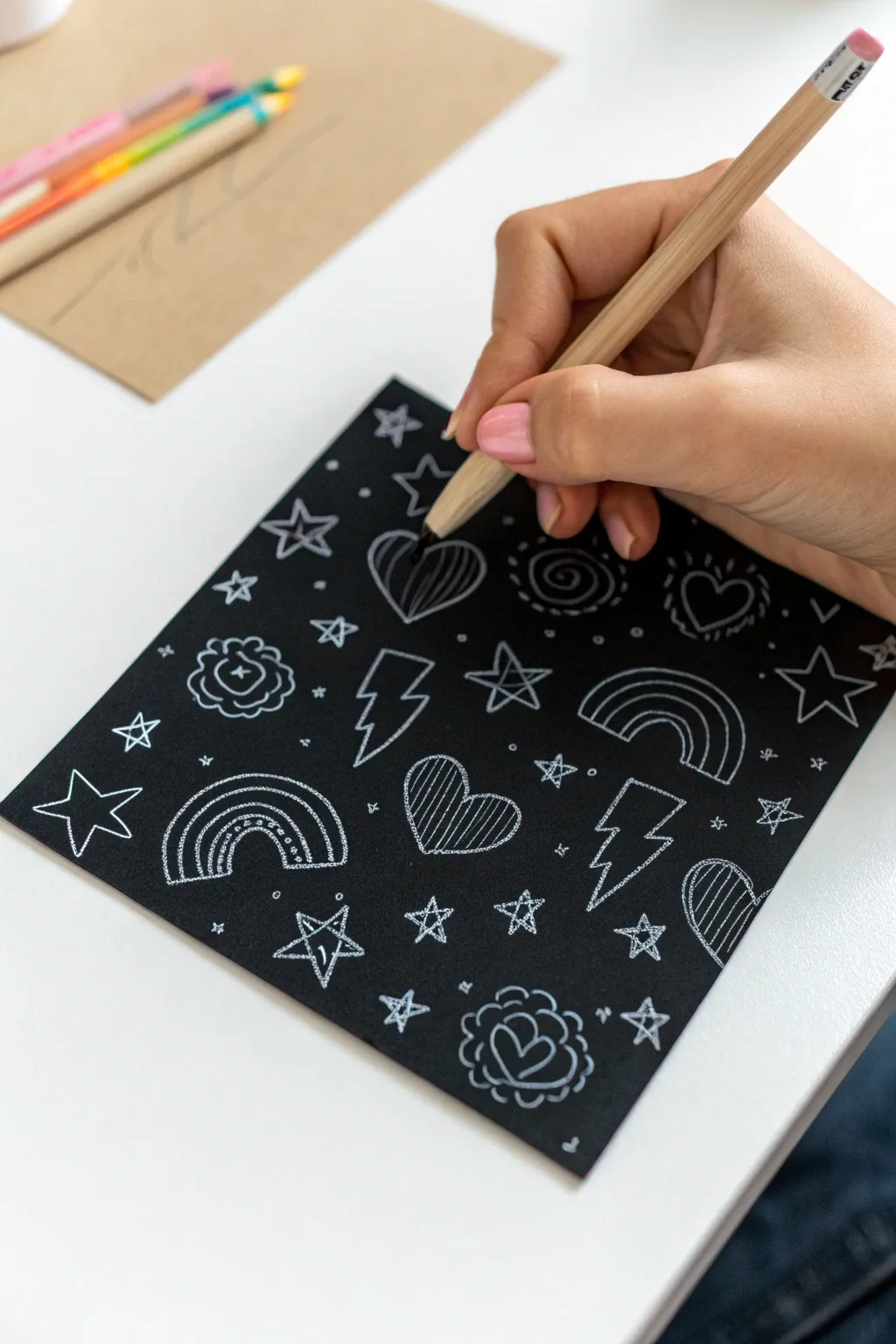
Discover the satisfying crunch of scratching away darkness to reveal bright lines with this fun doodle project. This design features a playful mix of rainbows, hearts, stars, and lightning bolts that pop against a stark black background.
Detailed Instructions
Materials
- Black scratch art paper (white or silver holographic base)
- Wooden scratch art stylus (or a wooden skewer)
- Soft brush (for sweeping away debris)
- Pencil (optional, for light drafting)
Step 1: Planning and Layout
-
Prepare your workspace:
Lay your square of scratch art paper on a flat, clean surface. Keep your wooden stylus handy. -
Visualizing the grid:
Imagine a loose, invisible grid over the paper. The goal is to fill the space evenly without crowding the shapes, so plan to scatter your main motifs generally across the surface. -
Testing the pressure:
If you are new to this paper, make a tiny mark in the very corner to see how much pressure is needed to scratch through the black coating cleanly.
Keep it Clean
Keep a piece of scrap paper under your hand while working. Oils from your skin can smudge the black matte coating and make it harder to scratch cleanly later.
Step 2: Drawing the Main Icons
-
Start with the first heart:
Near the center or top third, draw a simple heart outline. To give it texture, fill the inside with vertical hatched lines. -
Add a rainbow:
Move to the bottom left section and scratch two arched lines to form a rainbow shape. -
Detail the rainbow:
Inside the rainbow arches, add a row of dots or small dashes to create one of the bands, giving it that classic doodle look. -
Create a lightning bolt:
In the open space between other shapes, draw a jagged lightning bolt outline. Keep the lines crisp and sharp. -
Sketch a flower motif:
Draw a small heart, then surround it with a scalloped, cloud-like border to create a stylized flower or rosette. -
Repeat the patterns:
Continue adding these core shapes—hearts, rainbows, bolts, and flowers—randomly across the page. Vary their rotation slightly so they don’t look too uniform.
Step 3: Adding Stars and Fillers
-
Draw open stars:
Scattered around the larger motifs, draw varying sizes of five-pointed stars. I find drawing them in a continuous line without lifting the stylus works best. -
Create filled stars:
For variety, draw smaller stars that are fully scratched out (filled in) or simple crisscross stars. -
Insert swirl elements:
Find a gap and draw a tight spiral or swirl. Surround the swirl with tiny triangular ‘rays’ to make it look like a sun or a decorated candy. -
Add heart variations:
Draw a few more hearts, but change the interior pattern. Try a smaller heart inside the larger one, or just a simple outline. -
Incorporate tiny filler stars:
In the small awkward gaps between big shapes, add tiny asterisks or simple dots to balance the negative space.
Rainbow Reveal
Instead of white-base paper, try using rainbow-base scratch paper. Your simple line doodles will instantly become colorful gradients without any extra effort.
Step 4: Refining and Cleaning
-
Check line thickness:
Go back over your main outlines. If any lines look too thin or faint, trace over them again with slightly more pressure to make the white pop. -
Clean up edges:
Look for any jagged scratch marks where the coating didn’t come off cleanly and smooth them out with the stylus tip. -
Final sweep:
Gently use a soft brush or a tissue to wipe away all the black scratch dust from the surface to reveal your bright high-contrast artwork.
You have now created a charming piece of hand-drawn art that mimics the look of a chalkboard illustration
Butterfly Wings With Symmetry
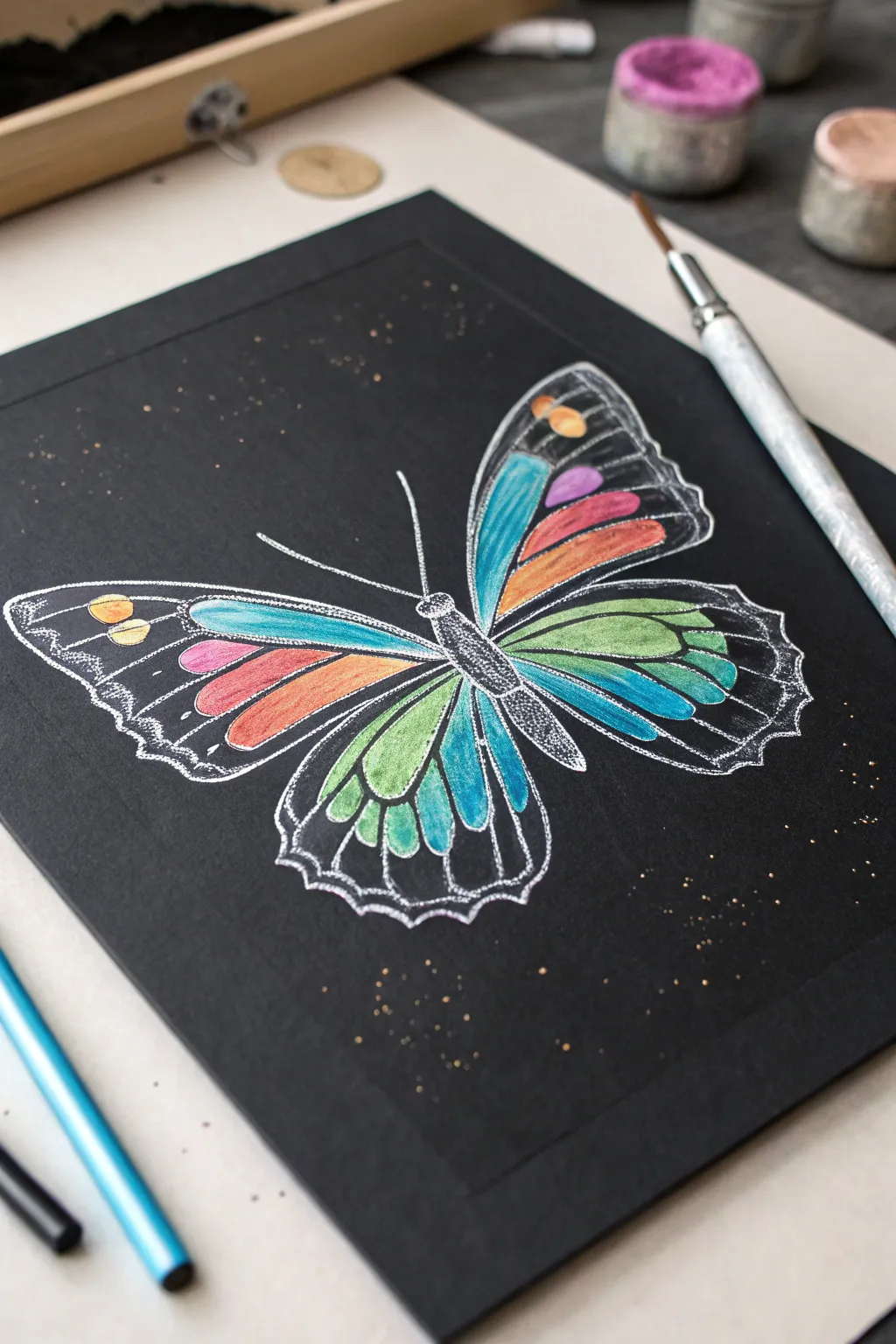
Capture the magical contrast of bright colors against a deep black background with this striking butterfly project. By combining vibrant coloring with precise white outlining, you’ll create an artwork that pops off the page.
Step-by-Step Guide
Materials
- High-quality black drawing paper or cardstock
- White gel pen (fine and medium tip)
- Brightly colored pencils (prismacolor or similar soft wax core recommended)
- Pencil for sketching
- Eraser
- Ruler (optional for symmetry)
Step 1: Planning the Structure
-
Center Your Subject:
Begin by lightly sketching a vertical line down the center of your black paper to serve as the butterfly’s body axis. -
Map the Wing Span:
Lightly sketch the general triangular shapes of the upper and lower wings on the left side first using a regular pencil. Keep the lines very faint so they don’t show through later. -
Create Symmetry:
Replicate the same wing shapes on the right side. I find it helpful to measure the distance from the center line to the wing tips to ensure both sides match perfectly. -
Define the Segments:
Sketch the internal teardrop and elongated oval shapes within the wings where the colors will go. Leave distinct gaps between these shapes—these gaps will become the black veins of the butterfly.
Step 2: Adding Vibrant Color
-
Start with the Top Left:
Select a bright teal or aqua colored pencil. Fill in the large, elongated segment closest to the body on the upper left wing. Press firmly to ensure the pigment stands out against the black. -
Layer Warm Tones:
Moving outward on the top wing, color the next segments with warm hues: a strip of deep pink, followed by sunburst orange. -
Detail the Wing Tips:
Near the outer edge of the upper wing, fill the small circular spots with bright yellow and gold. Colored pencils with a soft wax core work best here to get that opaque coverage. -
Mirror the Colors:
Repeat this exact color pattern on the right upper wing to maintain bilateral symmetry. -
Color Lower Wings:
For the bottom wings, transition into cooler tones. Use lime green for the central segments, blending into teals and touches of blue as you move toward the wing edges. -
Intensify the Pigment:
Go back over your colored sections a second time. The black paper absorbs some light, so a second layer is crucial for that neon, glowing effect.
Uneven White Ink?
If your gel pen skips on top of the waxy pencil, try outlining the shapes first, letting it dry completely, and color inside the lines carefully afterwards.
Step 3: The ‘Scratch’ Effect Outlining
-
Outline the Wings:
Take your white gel pen and carefully trace the outer perimeter of the entire butterfly. Use a confident, fluid motion to keep the line smooth. -
Define the Veins:
Outline each individual colored segment with the white pen. This creates a separation between the color and the black paper, mimicking the look of etched scratch art. -
Detail the Body:
Draw the butterfly’s central body using stippling (small dots) with the white pen rather than solid lines. This gives it a fuzzy, textured appearance. -
Add Antennae:
Draw two long, thin curves extending from the head for the antennae. Keep these lines very delicate. -
Decorative Scalloping:
Add a second, wavy line along the bottom edges of the lower wings. Connect this to the main outline with small perpendicular hash marks for intricate detail. -
Magic Dust:
Finish the piece by tapping tiny dots of gold or copper gel pen randomly around the butterfly to create a magical, sparkling background effect.
Make It Pop
Use a white colored pencil to lay down a base layer underneath your bright colors. This acts like a primer and makes neons look significantly brighter on black paper.
Step back and admire how the colors seem to glow against the dark background.


Night Sky Moon and Stars
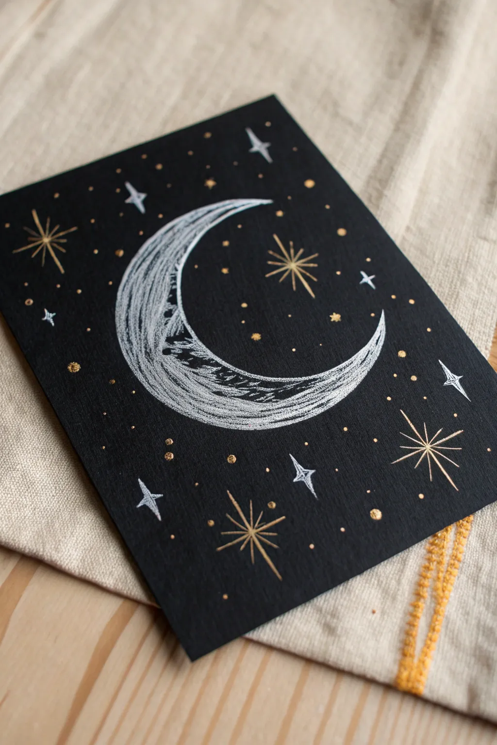
Bring the magic of a clear midnight sky onto paper with this striking high-contrast design. Using silver and gold ink on black cardstock creates an elegant, mystical effect that mimics the luminous quality of the moon and stars.
Step-by-Step
Materials
- Heavyweight black cardstock or mixed media paper
- Silver gel pen or metallic paint marker (fine tip)
- Gold gel pen or metallic paint marker (fine tip)
- Pencil (optional for sketching)
- Eraser
- Ruler (optional)
Step 1: Planning the Composition
-
Prepare your surface:
Cut your black cardstock to your desired size. A standard 5×7 inch rectangle works beautifully for this design, perfect for framing or using as a greeting card. -
Sketch the moon outline:
Lightly sketch a large crescent shape in the center of the paper using a pencil. If you want a perfect curve, you can trace the rim of a small bowl or cup for the outer edge, then freehand the inner curve to create a crescent. -
Initial pencil placement:
Visualize where your largest stars will go. Mark a few light dots around the moon where you plan to place the major starbursts, ensuring they don’t crowd the central moon figure.
Step 2: Drawing the Moon
-
Define the moon’s edge:
Take your silver gel pen or marker and trace over your pencil outline for the crescent moon. Make this initial line relatively thin. -
Fill with texture:
Instead of coloring the moon in solid, use a sketching motion to fill the crescent. Use curved, sweeping strokes that follow the shape of the moon. I find that leaving small gaps of black showing through creates a lovely crater-like texture. -
Add highlights:
Go back over the center arch of the crescent with more silver ink, layering it to make it brighter and more opaque. This gives the moon dimension, making it look rounded rather than flat. -
Create shadow details:
On the inner curve of the crescent, add a few jagged, horizontal lines or scribbles to suggest the textural surface of the lunar landscape.
Ink Flow Tip
Keep a scrap piece of black paper nearby to scribble on if your gel pen stops flowing. Metallic ink can clog, so frequent testing ensures smooth lines.
Step 3: Adding the Stars
-
Draw major gold stars:
Using the gold pen, draw the largest starbursts first. Start with a simple cross (+), then add a diagonal cross (x) through the center. Extend the vertical and horizontal lines slightly longer than the diagonal ones. -
Detail the gold stars:
For the larger gold stars, draw a second line right next to your primary rays to thicken them slightly, giving them more presence against the dark background. -
Add silver diamond stars:
Switch back to your silver pen. Draw four-pointed ‘diamond’ stars scattered around the moon. Draw these by making a stretched cross shape but curved inward, almost like a concave diamond. -
Fill the diamonds:
Color in these silver diamond shapes completely so they stand out as solid points of light. -
Create medium starbursts:
Add a few smaller, simpler starbursts in gold—just simple intersecting lines without the extra thickness.
Cosmic Dust
Use an old toothbrush to flick tiny specks of watered-down white acrylic paint over the background for a realistic ‘milky way’ galaxy effect.
Step 4: Finishing Touches
-
Scatter the small stars:
Fill in the empty negative space with tiny dots. Use the gold pen to create small, solid circles. -
Vary the dot sizes:
Make some gold dots pin-prick size and others slightly larger for variety. This mimics the depth of a real night sky. -
Add final silver accents:
Place a few tiny silver dots interspersed among the gold ones to balance the color palette and add extra sparkle. -
Check balance:
Hold your artwork at arm’s length. If any area looks too empty, add a small gold dot or a tiny silver cross to fill the void. -
Clean up:
Once you are absolutely certain the ink is 100% dry (metallic ink can smear easily), gently erase any visible pencil lines from your initial sketch.
Now you have a shimmering piece of celestial art ready to display or gift

Planets and Rings in Space
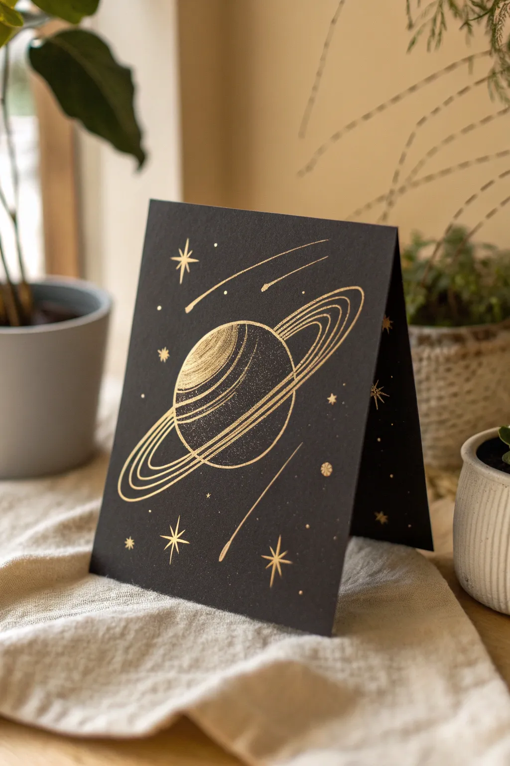
Create a stunning celestial greeting card using the magic of scratch art paper. By scratching away the matte black surface, you’ll reveal a brilliant gold layer beneath to create a shimmering ringed planet surrounded by stardust.
Step-by-Step Guide
Materials
- Gold foil scratch art paper (pre-scratch notes/sheets)
- Wooden styluses or scratch tools (fine and medium tips)
- Graphite transfer paper (optional)
- Pencil and eraser
- Ruler
- Soft brush (for sweeping away debris)
- Bone folder (for folding the card)
Step 1: Planning and Preparation
-
Select your surface:
Begin with a sheet of gold-reveal scratch art paper. Since this is a folded card, ensure your paper is large enough to be folded in half, or plan to create a single panel graphic to glue onto a separate black cardstock base later. -
Fold the card:
If your scratch paper is double-sided black or suitable for folding, create a crisp fold down the center using a ruler and a bone folder. This establishes the front face where your artwork will live. -
Sketch the layout:
Lightly sketch your design onto the black surface using a very soft pencil. Don’t press hard, or you’ll scratch the surface prematurely. Draw a large circle for the planet in the center, tilted slightly. -
Outline the rings:
Draw an elliptical shape around the planet to represent the rings. The rings should wrap around the planet, disappearing behind it at the top right and crossing in front at the bottom left.
Step 2: Scratching the Planet
-
Define the planet’s edge:
Using a fine-point scratch tool, carefully trace the visible outer edge of your planet circle. Keep your hand steady to create a clean, sharp line. -
Create surface texture:
Inside the planet circle, use short, horizontal strokes to creating shading. Concentrate these strokes on the left side to simulate a lit sphere. -
Add the glowing highlight:
Scratch away a larger patch of black on the upper left curve of the planet. This solid gold area acts as the primary reflection, giving the planet a 3D spherical look. -
Detail the shadow side:
As you move toward the bottom right of the planet sphere, create a stippled texture by gently tapping the tool instead of dragging it. This mimics a starry, shadowed surface.
Oops, scratched too much?
If you accidentally scratch an area you wanted black, use a fine ultra-black permanent marker or a tiny dab of black acrylic paint to cover the mistake. Let it dry completely before retouching.
Step 3: Crafting the Rings
-
Establish the main ring lines:
With a steady hand, scratch three distinct, parallel curving lines for the rings. Start with the outermost ring and work your way inward. -
Thicken the bands:
Go back over specific sections of the rings to vary the line weight. I like to make the middle ring slightly thicker to add visual weight to the composition. -
Connect the hidden lines:
Ensure the rings visually ‘pass’ in front of the planet by scratching those lines cleanly over the planet’s texture, interrupting the planet’s outline where necessary.
Make it Shine
Add varying ‘shimmer’ to the rings by using sandpaper. Rub a small piece of fine-grit sandpaper gently along the ring path for a soft, diffused gold glow distinct from sharp lines.
Step 4: Adding Celestial Details
-
Draw shooting stars:
Add a few long, sweeping lines that taper off to represent comets or shooting stars. Place two near the top right, pointing down towards the planet. -
Add a lower comet tail:
Create a long, singular streak near the bottom right, mirroring the curve of the rings for balance. -
Create major stars:
Scratch several large, four-pointed or eight-pointed stars around the planet. Use a ruler if needed to get the points perfectly straight. -
Sprinkle distinct dots:
Use the very tip of your tool to press focused dots into the black coating. Scatter these around the main elements to form constellations. -
Create fine stardust:
For a magical finish, very lightly scuff tiny clusters of micro-dots in the negative space. This adds depth without distracting from the main floating planet. -
Clean up:
Take your soft brush and gently sweep away all the black scratch debris to reveal your glistening gold galaxy in full detail.
This celestial card makes a beautiful gift for space lovers and looks fantastic displayed near a window where the light can catch the gold details
BRUSH GUIDE
The Right Brush for Every Stroke
From clean lines to bold texture — master brush choice, stroke control, and essential techniques.
Explore the Full Guide
Firework Bursts Over a Horizon
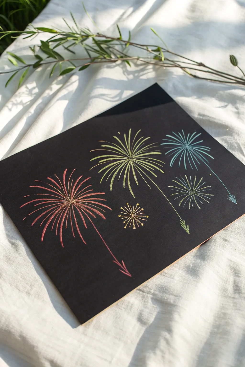
Here is a wonderfully simple yet striking way to capture the magic of fireworks using a classic scratch art technique. The contrast of the shimmering metallic bursts against the matte black background creates an instant celebration on the page.
How-To Guide
Materials
- Scratch art paper (black coating over metallic or rainbow base)
- Wooden stylus or scratching tool
- Pencil (optional for sketching)
- Ruler (optional)
- Paper towel or soft brush for dust
Step 1: Planning and Placement
-
Visualize the composition:
Before you make your first scratch, look at your blank sheet. Imagine three main fireworks arranged in a diagonal line from bottom-left to top-right to create movement. -
Mark the centers:
Using the very tip of your stylus, make three tiny, nearly invisible dots to mark where the center of each main burst will be. Place one low on the left, one in the middle, and one higher on the right. -
Add secondary centers:
Mark spots for two smaller fireworks: one tucked below the middle burst and another nestled between the middle and right bursts.
Step 2: Creating the Large Bursts
-
Start the red burst:
Begin with the large bottom-left firework. Place your tool on the center dot and scratch a short line outward to start your first ray. -
Extend the rays:
Continuing from the center point, scratch long, slightly curved lines radiating outward in a full circle. Vary the lengths slightly so it looks natural, not perfect. -
Add density:
Go back and scratch shorter lines in between the long rays near the center. This makes the core of the explosion look brighter and denser. -
Create the rocket trail:
From the center of the burst, scratch a single, slightly wavy line extending straight down. Add a small arrow shape at the bottom to suggest the rocket’s path. -
Move to the central burst:
Now focus on the middle firework. Use firm pressure to reveal the gold or green layer underneath, scratching rays that radiate outward just like the first one. -
Vary the line weight:
Try pressing a bit harder at the start of the stroke (near the center) and lifting off gently at the end to create tapered points on your rays. -
Draw the second trail:
Add a long tail for this central firework, extending downwards and slightly to the right, finishing with another arrow tip.
Oops! Scratched too much?
If you accidentally scrape off too much black coating, use a fine-tip black permanent marker or a bit of black acrylic paint to carefully cover the mistake.
Step 3: Adding Detail and Depth
-
Scratch the blue burst:
Move to the top right section for the blue-toned firework. Keep this one slightly smaller than the previous two to create a sense of distance. -
Refine the rays:
Make these lines thinner if possible, using the sharpest point of your tool. Add its corresponding downward trail and arrow. -
Create the small sparkler:
Locate the dot for the tiny firework below the central burst. Instead of long lines, scratch very short spokes radiating from the center. -
Add whimsical tips:
For this small sparkler, scratch tiny circles or dots at the end of each short spoke to make it look like a dandelion puff or a glittering star. -
Draw the starburst:
Find the space between the middle and right fireworks. Scratch a medium-sized burst here with very thin, delicate lines. -
Intersect lines gently:
Be careful not to scratch off too much black coating where lines cross, or you might end up with a big blob of color instead of defined rays.
Sharper Lines Tip
Keep a piece of fine sandpaper nearby. You can periodically rub the tip of your wooden stylus on it to sharpen the point for crisp, thin lines.
Step 4: Finishing Touches
-
Clean the surface:
Take a moment to carefully brush away the black scratch dust with a soft brush or tissue. Avoid rubbing it with your hand, as oils can smudge the matte surface. -
Review contrast:
Look at the centers of your fireworks. If they aren’t bright enough, add a few more tiny scratches to reveal more color. -
Check the trails:
Ensure all the downward trails feel connected to their bursts. You can thicken the lines slightly at the connection point if needed. -
Final polish:
Give the artwork one last gentle sweep to remove any remaining debris. I usually tilt the paper under a light to make sure I haven’t missed any stray specks.
Now you have a vibrant display of fireworks that will sparkle on your wall
Tropical Leaf Line Art
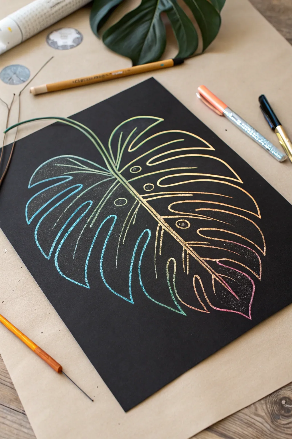
Reveal a stunning spectrum of hidden colors with this elegant tropical leaf design. Using simple line work on scratch paper, you’ll create a vibrant Monstera leaf that shifts from cool blues to warm pinks against a dramatic black background.
How-To Guide
Materials
- Rainbow scratch art paper (black coating over multicolored base)
- Wooden scratching stylus or bamboo stick
- Pencil (optional, for sketching)
- Reference image of a Monstera leaf
- Soft brush or cloth (to sweep away scratch dust)
- Masking tape or washi tape
Step 1: Planning and Preparation
-
Secure your workspace:
Tape the corners of your scratch art paper to a flat surface using masking tape. This prevents the paper from shifting while you work and keeps your lines steady. -
Study the shape:
Look at a Monstera leaf reference. Notice the characteristic heart shape at the base and the deep splits (fenestrations) that cut into the sides of the leaf. -
Lightly sketch the spine:
Using the very tip of your stylus with incredibly light pressure—or a regular pencil—mark a curved central vein running diagonally across the page. Don’t scratch the black off yet; just make a faint indentation to guide you.
Step 2: Outlining the Leaf
-
Establish the stem:
Starting from the top left corner, use your wooden stylus to scratch a double line that curves down to become the central spine of the leaf. Press firmly enough to reveal the color underneath. -
Draw the central vein:
Continue that center line all the way to the bottom right tip of the leaf. I like to make this line slightly thicker than the others to ground the composition. -
Create the top leaf segments:
Start drawing the right side of the leaf first. Scratch curved lines extending outward from the spine, looping back to create the separated finger-like sections typical of a Monstera. -
Complete the outline shape:
Move to the left side of the spine and repeat the process, creating matching leaf segments that curve outward and downward. Ensure the overall shape tapers to a point at the bottom. -
Add the holes:
Monstera leaves often have oval holes near the center vein. Scratch a few small circles or ovals inside the larger leaf segments, closer to the central spine. -
Clean up debris:
Pause to brush away the black shavings with a soft brush or tissue. Blowing them away works too, but be careful not to get moisture on the paper.
Fixing Mistakes
Accidentally scratched the wrong spot? You can fix small errors by coloring over the scratch with a black permanent marker or a black fineliner to hide the color.
Step 3: Dealing Details
-
Add the main veins:
Inside each leaf segment, draw a central vein line that connects from the main spine out toward the edge of the leaf. -
Double up the lines:
Go back over your main outline and the central spine to thicken them. Adding a second parallel line very close to the first creates a bold, illustrative look. -
Create texture:
For a stippled or textured effect, you can gently tap the stylus tip along certain curves, creating tiny dots that suggest shading. -
Refine the holes:
Add a second inner ring to the oval holes you drew earlier. This simple detail makes them pop and look more defined against the colorful background. -
Connect the veins:
Ensure all your vein lines connect cleanly to the central spine. If any gaps exist, carefully extend the lines until they touch. -
Check for consistency:
Look closely at your line weights. If the outline feels too thin compared to the veins, widen it slightly by scratching adjacent to the original line.
Negative Space
Instead of outlines, try scratching away the entire inside of the leaf sections to create solid blocks of rainbow color, leaving thin black veins for contrast.
Step 4: Final Touches
-
Smooth the curves:
Examine the tips of the leaf segments. If any look too sharp or jagged, round them off slightly with your tool for a more organic feel. -
Final cleaning:
Give the entire piece a thorough sweep with your soft brush to remove every last bit of black residue, ensuring the colors shine bright.
Frame your glittering botanical art against a simple mat to really let those gradient colors pop

PENCIL GUIDE
Understanding Pencil Grades from H to B
From first sketch to finished drawing — learn pencil grades, line control, and shading techniques.
Explore the Full Guide
Rainbow Stripes and Chevron Patterns
This vibrant scratch art project uses precise geometry to reveal a stunning gradient of rainbow colors beneath a matte black surface. By combining simple straight lines into repeating chevron patterns, you can create an illusion of depth and movement that looks incredibly professional.
Detailed Instructions
Materials
- High-quality rainbow scratch paper (A4 or square)
- Ruler (preferably clear plastic)
- Wooden stylus or scratch tool
- Fine-point scratch tool (optional, for sharper lines)
- Masking tape or painter’s tape
- Soft brush (for sweeping away debris)
- Pencil (optional)
Step 1: Planning and Layout
-
Secure the Paper:
Begin by taping down the corners of your scratch paper to a flat work surface. This prevents the paper from shifting while you’re using the ruler, which is crucial for straight lines. -
Define the Border:
Using your ruler as a straight edge, carefully scratch a single, continuous line around the entire perimeter of the paper, about half an inch from the edge. This frames your artwork beautifully. -
Mark Vertical Guidelines:
Lightly mark intervals along the top and bottom borders where your vertical columns will go. For the look in the photo, you’ll want at least four or five wide columns. -
Create the Columns:
Align your ruler with the top and bottom marks and scratch vertical lines to separate the paper into distinct rectangular sections. These will house your varying chevron patterns.
Clean Lines Secret
Wipe your ruler edge with a paper towel after every few lines. Accumulated black residue on the ruler can smear across your work surface and dull the final look.
Step 2: Creating the Chevron Pattern
-
Start the Zigzag:
Focus on the first column. Place your ruler at a 45-degree angle starting from the bottom left corner of that column. Scratch a diagonal line upward to the center of the column. -
Complete the ‘V’:
From that center point, angle your ruler downward to the right edge of the column and scratch. You’ve now created the first ‘V’ shape, which is the foundation of the chevron. -
Repeat Upward:
Move your ruler up about a quarter of an inch. Repeat the diagonal scratch process to create a second ‘V’ parallel to the first one. -
Fill the Column:
Continue this process all the way up the column. Try to keep the spacing between lines as consistent as possible, as this regularity creates the mesmerizing optical effect. -
Vary the Direction:
For the next column, I like to invert the pattern. Instead of pointing up, make your chevrons point down. Start from the top and work your way down, or simply reverse your angles. -
Alternating columns:
Proceed to the third column, reverting to the upward-pointing chevrons. Alternating the direction of the zigzags between columns adds dynamic contrast to the piece.
Oops! A Mistake?
If you scratch a line in the wrong place, turn it into a thicker band or add a new geometric element. You can’t erase, so incorporate the error into the pattern.
Step 3: Adding Depth and Detail
-
Thicken Key Lines:
Go back to your initial chevron lines. Using the side of your stylus or pressing slightly harder, thicken every third or fourth line to create visual weight. -
Create Internal Stripes:
Inside the wider gaps between your main chevron lines, fairly gently scratch two or three thinner parallel lines. This reveals more of the rainbow gradient. -
Clean Intersection Points:
Check the points where your diagonal lines meet the vertical column dividers. Carefully scratch closer to the edge to ensure the lines look like they connect seamlessly. -
Refine the Edges:
Go over the vertical division lines one more time to make them bold and distinct, separating the colorful patterned columns clearly.
Step 4: Finishing Touches
-
Clear Debris:
Use a soft brush to gently sweep away all the black scrapings. Avoid wiping with your hand, as natural oils can smudge the matte black surface. -
Final Inspection:
Look for any inconsistent line weights. If a line looks too thin compared to its neighbors, carefully re-scratch it to widen the stroke. -
Remove Tape:
Slowly peel away the masking tape from the corners. Peel it back away from the artwork to ensure you don’t accidental lift the black coating.
Enjoy the satisfying reveal of those brilliant gradient colors as your geometric pattern comes to life
Underwater Jellyfish Glow
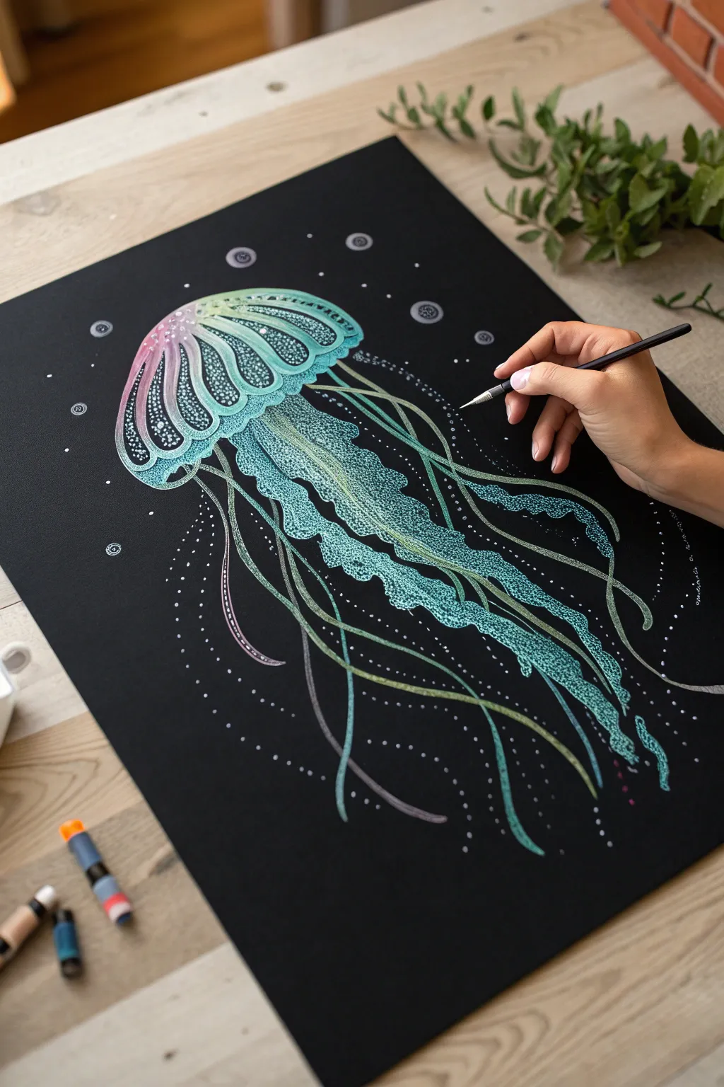
Dive deep into creativity with this mesmerizing jellyfish design that pops brilliantly against a black background. Using simple scratching techniques and soft coloring, you’ll create an ethereal, glowing effect that looks incredibly professional.
Step-by-Step
Materials
- Black scratch art paper (A4 or larger)
- Fine-point scratch tool or etching needle
- Wooden stylistic tool (for broader strokes)
- Soft pastels or chalk markers (teal, mint green, pink, purple)
- White gel pen (optional, for highlights)
- Pencil (for sketching)
- Soft brush (to sweep away scratch residue)
Step 1: Planning and Outline
-
Light Sketching:
Begin by very lightly sketching the jellyfish’s bell shape in the upper center of your black paper using a regular pencil. The graphite will show up faintly as a silver sheen on the black coating. -
Defining the Bell:
Outline the mushroom-shaped cap, adding the scalloped edges at the bottom. Keep the lines fluid and rounded. -
Tentacle Flow:
Sketch the main directions of the long, trailing tentacles. Draw wavy, ribbon-like lines extending downward, varying their lengths to create natural movement.
Step 2: Creating the Glow
-
Initial Scratching – The Cap:
Using your fine-point tool, start scratching vertical, curved lines inside the bell of the jellyfish. Follow the curve of the dome. -
Creating Sections:
Divide the bell into vertical segments using double lines. Inside these segments, use a stippling technique (tiny dots) to create texture. -
Adding Color Underlay:
Before scratching the main details fully, I like to rub soft pastels gently over the areas I plan to scratch. Apply mint green to the center and a soft pink/purple gradient to the left side of the bell. -
Blending the Hues:
Use your finger or a cotton bud to smudge the pastel into the black paper surface. This creates that foggy, bioluminescent haziness.
Don’t smudge the glow
Place a scrap piece of clean paper under your hand while you work to prevent oils from your skin transferring to the black matte surface.
Step 3: Detailing the Anatomy
-
Scratching Through Color:
Now, use your sharp tool to scratch distinct patterns over the pastel areas. The tool will remove the black coating and reveal the white layer beneath, which will now appear tinted by your pastel. -
The Frilly Arms:
Draw the thick, central oral arms (the frilly parts in the center). Use a jagged, squiggly line motion to mimic their ruffled texture. -
Texturing the Ruffles:
Fill these ruffled arms with dense stippling. scratch more dots in the center of the ruffles and fewer near the edges to create volume and 3D form. -
Long Tentacles:
Trace over your initial tentacle sketches with long, continuous strokes. Make some lines thicker by double-scratching them. -
Adding Movement:
Draw faint, hair-like filaments drifting off the main tentacles to make them look delicate and free-floating.
Add neon vibrancy
Instead of pastels, try using neon gel pens on the exposed white scratch areas for an intense, electric cyberpunk look.
Step 4: Atmosphere and Finish
-
Bubble Effects:
scattered around the jellyfish, scratch small circles. Leave the centers black or scratch a tiny highlight dot to make them look like bubbles. -
Particle Dust:
Use the tip of your tool to tap tiny dots randomly throughout the background. This ‘marine snow’ adds depth to the water. -
Highlighting:
Go back to the brightest parts of the jellyfish bell and scratch firmly to reveal pure white (or the brightest underlying color), ensuring high contrast. -
Final Clean Up:
Use a soft drafting brush to gently sweep away all the black scratch debris without smudging your pastel work.
Step back and admire your luminous underwater creature as it floats in the deep darkness.


Negative-Space Silhouette Portrait
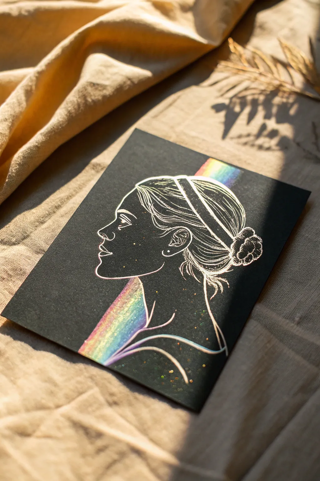
This elegant project transforms a classic profile portrait into a striking interplay of light and dark using simple scratch art techniques. Delicate linework defines the figure’s features against a dark matte background, while bold rainbow stripes add a surprising pop of vibrant color.
Detailed Instructions
Materials
- Black scratch art paper (rainbow or holographic underlayer)
- Wooden stylus or scratching tool (fine point)
- Pencil (soft lead like 2B or 4B)
- Reference photo of a side profile (optional)
- Tracing paper (optional)
- Ruler
- Soft brush (for sweeping away debris)
- Washi tape or low-tack tape
Step 1: Preparation & Sketching
-
Choose your subject:
Begin by selecting a profile image to use as your reference. You can draw this freehand if you’re comfortable, but tracing a printed photo is a foolproof way to get accurate proportions. -
Transfer or sketch the outline:
If transferring, place tracing paper over your reference image and trace the main contour lines: the nose, lips, chin, neck, and the general shape of the hair. -
Apply the sketch to scratch paper:
Lay your tracing paper on top of the black scratch sheet. Secure it lightly with tape. Trace over your lines again with a slightly firm pressure to create a faint indentation on the black surface below. Avoid pressing so hard that you scratch the coating prematurely. -
Refine the indentation:
Lift the tracing paper and look for your indented guide lines. If they are hard to see, you can very lightly sketch over them with a soft pencil, just enough so you can see where to work.
Step 2: Scratching the Contour
-
Start the main profile line:
Using a fine-point scratching tool, begin scratching the primary outline of the face. Start at the forehead and work your way down the nose, lips, and chin. Use a confident, continuous motion for smooth lines. -
Define the neck and shoulders:
Extend the line down the neck and sweep across to suggest the shoulder and collarbone area. Keep these lines elegant and fluid. -
Detail the eye:
Carefully scratch the eye shape. Since this is a profile, focus on the triangular shape of the eye and the lash line. Add a small glint in the pupil for life. -
Add the ear:
Outline the ear simply. You don’t need every fold of cartilage; a few curved lines will suggest the inner structure effectively without looking cluttered.
Oops, scratched too much?
If you accidentally scratch an area you wanted to keep black, use a fine-tip black permanent marker to color it back in. It hides mistakes remarkably well on the matte surface.
Step 3: Creating the Rainbow Accent
-
Mark the strip area:
Visualize a diagonal band that runs behind the neck and shoulder. Use a ruler to lightly mark two parallel lines where this rainbow block will exist. -
Scratch the solid fill:
Within those parallel lines, completely scratch away the black coating. Use back-and-forth strokes to clear large areas. This will reveal the brilliant rainbow gradient underneath. -
Overlap considerations:
Be mindful where the rainbow strip meets the neck outline. I prefer to stop the solid scratching right at the contour line of the neck so the figure appears to be in front of the colorful beam. -
Clean up the edges:
Go back over the edges of your rainbow strip with a ruler and your tool to ensure they are crisp and straight.
Pro Tip: Line Variation
Vary your line weight for a more artistic look. Press harder for the main silhouette outline to make it bold, and use a feather-light touch for internal hair details.
Step 4: Hair & Finishing Details
-
Outline the hairstyle:
Sketch the outer shape of the hair bun and the main volume of the hair. Keep the strokes light initially. -
Add hair texture:
Now, fill in the hair shape with flowing, curved lines. These should follow the direction the hair is pulled—sweeping back from the face toward the bun. Leave some black space between lines to create depth. -
Detail the bun:
For the bun (or scrunchie), use shorter, curved strokes or small scallops to suggest the texture of gathered fabric or twisted hair. -
Create the headband:
Scratch two parallel curved lines across the head to create a headband. You can leave the space between these lines black, or add a simple pattern inside. -
The stippling effect:
To create a magical, starry atmosphere, add random dots around the face and on the dark parts of the neck. Simply press the tip of your tool into the paper without dragging it. -
Final clean:
Take your soft brush and gently sweep away all the black scratch dust. Inspect your lines and neaten any that look shaky.
Display your radiant portrait in a simple frame to let the rainbow colors truly shine

Have a question or want to share your own experience? I'd love to hear from you in the comments below!