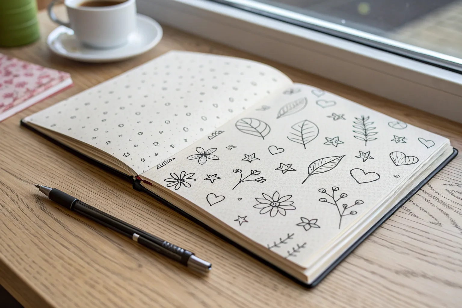
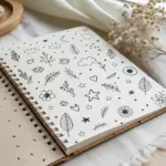
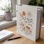
When I need a quick creative reset, I reach for easy doodle art because it’s playful, low-pressure, and instantly satisfying. Here are my favorite easy doodle art ideas you can start right now with simple lines and a little curiosity.
Stars and Sparkles
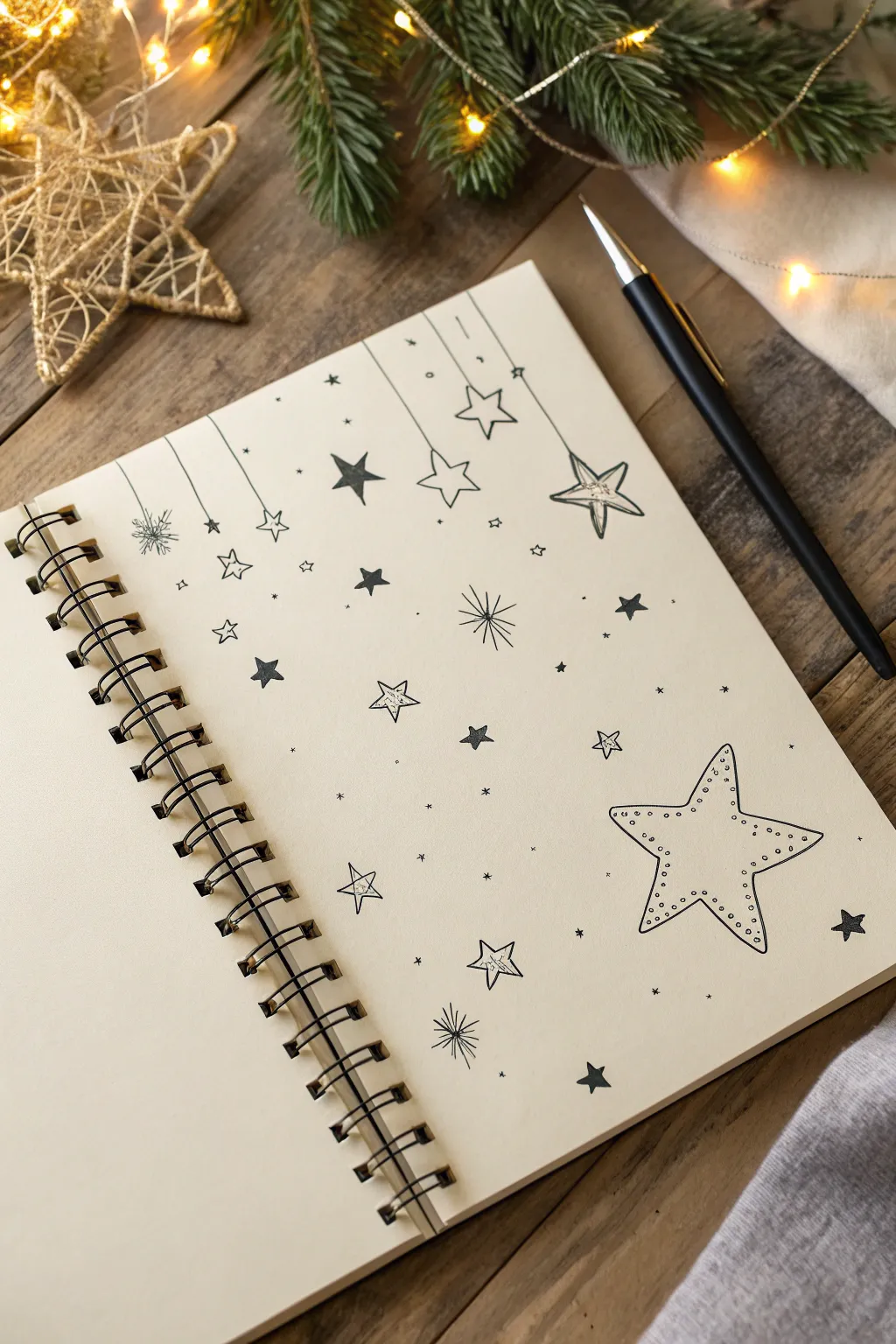
Transform a blank journal page into a constellation of charming doodles with this simple ink drawing project. By combining hanging ornaments, scattered sparkles, and a large statement star, you’ll create a festive and dreamy layout perfect for winter journaling.
Step-by-Step
Materials
- Spiral-bound sketchbook or journal (cream or off-white paper looks best)
- Fine-liner pen (black, 0.3mm or 0.5mm)
- Pencil (HB or lighter)
- Eraser (kneaded eraser preferred)
- Ruler (optional, but helpful for straight lines)
Step 1: Setting the Stage
-
Plan the Layout:
Start by visualizing your page. You want a cascading effect from the top left and a large focal point in the bottom right. -
Lightly Sketch the Hanging Lines:
Using your pencil and a ruler (or freehand for a softer look), draw five to six vertical lines of varying lengths descending from the top edge of the paper. -
Draft the Major Shapes:
Sketch a large five-pointed star in the bottom right corner. It should be the biggest element on the page, roughly 2-3 inches wide. -
Mark Smaller Star Placements:
Lightly mark spots for medium-sized stars at the ends of your hanging lines and scatter a few distinct star shapes in the empty middle space.
Keep it Loose
Don’t worry about perfect symmetry. Wobbly lines and uneven points add to the hand-drawn, cozy charm of this doodle style.
Step 2: Inking the Hanging Ornaments
-
Draw the Vertical Strings:
Switch to your fine-liner pen. Carefully trace over your pencil lines for the strings, stopping just before you reach the star shape to leave room for the knot. -
Ink the Hanging Stars:
Draw the stars at the end of the strings. Make them varied: some can be simple outlines, while the one on the far right looks great as a ‘double’ star with a smaller star inside the larger outline. -
Add Decorative Details:
For the leftmost string, draw a small snowflake or burst shape instead of a classic star for variety. -
Connect the Strings:
Draw a tiny loop or knot where the string meets the star to make it look like physically hanging decor.
Ink Smearing?
If your hand drags ink across the page, place a scrap piece of paper under your drawing hand to act as a shield while you work.
Step 3: Creating the Solid Stars
-
Outline the Solid Shapes:
locate the spots you marked for filled-in stars. Draw the five-pointed outline first to get the shape right. -
Fill with Ink:
Color these stars in completely with your black pen. I find that coloring in small circular motions helps prevent streak marks. -
Vary the Sizes:
Ensure you have at least three or four solid black stars of different sizes scattered across the left and center page to balance the visual weight.
Step 4: Detailing the Large Star
-
Ink the Main Outline:
Go over the pencil sketch of your large bottom-right star with a steady hand. Give the lines a slight curve to make the star feel puffy and friendly rather than sharp. -
Add the Inner Row:
Draw a smaller star shape inside the main outline, maintaining an even gap between the two lines. -
Stipple the Details:
In the gap between your two outlines, add tiny dots (stippling) all the way around. Keep them somewhat loose rather than perfectly spaced.
Step 5: Finishing Touches
-
Draw Outline Stars:
Fill a few gaps with simple, hollow five-pointed stars. Add a subtle center line to one or two of them to give a 3D effect. -
Create Sparkle Bursts:
Add radial ‘burst’ stars. Draw a central point and flick varying lengths of lines outward from the center. -
Sprinkle Tiny Elements:
Fill the remaining negative space with tiny dots, microscopic crosses, and little ‘x’ shapes to simulate distant stardust. -
Erase Guidelines:
Wait at least 5-10 minutes for the ink to dry completely, then gently erase all remaining pencil marks.
Now you have a festive, sparkling page ready for notes or to stand alone as beautiful art


Hearts With Simple Variations

This charming project features a vertical row of hand-drawn hearts, each showcasing a unique pattern or texture. Using just a few simple supplies, you’ll create a minimalist piece of art perfect for bullet journals, greeting cards, or framed decor.
Step-by-Step Tutorial
Materials
- White cardstock or heavy drawing paper (A5 size works well)
- Black fine-liner pen (0.5mm or 0.8mm)
- Pencil (HB or H)
- Eraser
- Ruler
Step 1: Preparation & Layout
-
Prepare your paper:
Start with a clean sheet of white cardstock. If you are using a larger sheet, cut it down to your desired size; the example looks great on roughly A5 or 5×7 inch paper. -
Draw a guideline:
Using your ruler and pencil, draw a very faint vertical line roughly an inch from the left edge of the paper. This will help keep your stack of hearts perfectly aligned. -
Sketch the heart shapes:
Lightly sketch seven small heart shapes along your guideline. Keep them evenly spaced, leaving about a half-inch between each one. Aim for hearts that are roughly uniform in size, perhaps 1 inch wide each. -
Refine the sketches:
Go back over your pencil sketches to ensure the curves are pleasing. You want a classic heart shape that isn’t too wide or too narrow.
Ink Smudges?
If you smudge wet ink, turn it into a ‘shadow’ by adding light grey marker swipes behind all hearts to disguise the mistake.
Step 2: Inking the Outlines
-
Outline the top heart:
Take your black fine-liner pen and carefully trace over your pencil sketch for the very top heart. Keep your hand steady to get a clean, continuous line. -
Outline the second heart:
Move down to the second heart and trace the outline just as you did before. -
Complete the outlines:
Continue down the line, inking the outline for every heart in the stack. Don’t worry about the patterns yet; just focus on getting the exterior shapes defined. -
Erase pencil marks:
Once the ink is completely dry (give it a full minute just to be safe), gently erase your vertical guideline and any visible pencil sketching underneath the ink.
Step 3: Adding Patterns
-
Leave the top heart blank:
For a clean start to the sequence, leave the top heart completely empty. It sets a simple tone for the rest of the drawing. -
Dotted pattern:
On the second heart, draw small, solid black circles scattered inside the shape. Space them out generously so the white paper shows through clearly. -
Horizontal stripes:
For the third heart, draw simple horizontal lines across the width. You can freehand these for a more organic look, or use a ruler if you prefer crisp geometry. -
Leopard print spots:
On the fourth heart, draw small, irregular clusters of dots and tiny circles. This mimics a simplified animal print or confetti texture. -
Diagonal stripes:
Move to the fifth heart and draw parallel diagonal lines. I sometimes like to vary the thickness slightly, but consistent spacing works best here. -
Vertical stripes:
For the sixth heart, draw bold vertical lines. To add contrast, color every other stripe in solid black, making them look like thick bars. -
Solid with white dots:
For the final bottom heart, you will do the reverse of the second heart. Draw small circles first, then color in the rest of the heart black, leaving the circles white.
Pro Tip: Consistent Spacing
Use a piece of scrap paper marked with your desired gap size as a spacer guide while sketching to ensure perfect intervals.
You now have a delightful column of patterned hearts ready to brighten up your journal or desk space


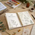
Simple Flower Sprigs
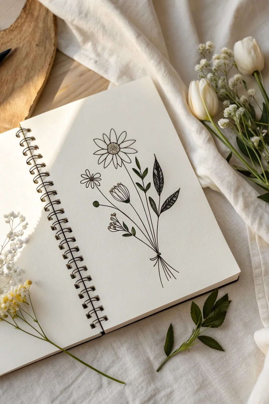
Capture the delicate beauty of a mixed floral arrangement with this clean, minimalistic line drawing. Using varying line weights and simple shapes, you’ll create a sketchbook keepsake that feels both modern and timeless.
Step-by-Step
Materials
- Sketchbook or drawing paper (medium weight)
- Pencil (HB or 2H)
- Eraser
- Fine liner pen (0.3mm or 0.5mm)
- Thicker marker or brush pen (optional, for filling leaves)
Step 1: Planning the Layout
-
Establish the Stems:
Start with a light pencil sketch to map out the ‘skeleton’ of your bouquet. Draw five slightly curved lines that meet at a single point near the bottom, fanning out as they go up. These will be your main stems. -
Position the Blossoms:
At the top of the central tallest stem, sketch a rough circle for the main daisy. To its left, draw a smaller circle for the secondary flower. Add an oval shape on another stem for the tulip-like bud. -
Bind the Bouquet:
Where the stems converge at the bottom, sketch a small loop or bow shape to represent a string or ribbon holding the sprig together.
Ink Movement
Pull the pen toward you rather than pushing it away when drawing long stems. This usually results in smoothly flowing lines rather than shaky ones.
Step 2: Drawing the Main Flower
-
Inking the Center:
Switch to your fine liner pen. For the large central daisy, draw a textured center by making a small circle filled with tiny dots or a cross-hatch pattern to simulate pollen. -
Adding Petals:
Draw long, slender petals radiating outward from the center. Keep them simple—just rounded elongated loops. It’s okay if they overlap slightly or vary in width. -
Refining the Stem:
Trace over your pencil line for this flower’s stem, bringing it all the way down to the binding point.
Step 3: Adding Secondary Blooms
-
The Small Daisy:
Move to the smaller flower on the left. Draw a simple open circle for the center, leaving it unshaded. Add five or six distinct, rounded petals around it. -
The Bud:
For the bud flower, draw a U-shape for the base. Close the top with zigzag or serrated lines implies tightly packed petals. Draw vertical lines inside the bud for texture. -
Stem Work:
Ink the stems for these two flowers, ensuring they flow naturally toward the central gathering point.
Add a Splash
Use watercolor to add a loose, ‘out of the lines’ wash of green and yellow over the drawing for a vibrant mixed-media look.
Step 4: Leaves and Details
-
Solid Leaves:
On the rightmost stem, draw two large, pointed leaves. Instead of just outlining them, use your pen to color them in completely solid black. This adds a lovely contrast to the delicate line work. -
Veined Leaves:
I like to add variety here, so on the stem next to the solid leaves, draw similar leaf shapes but leave them outlined. Draw a central line down the middle and small diagonal veins branching off. -
Simple Leaflets:
On the central stems, add smaller, simple almond-shaped leaves that are just outlines. These fill the gaps without overwhelming the drawing. -
Berry Sprig:
On one of the lower left stems, draw tiny circles at the ends of short branches to create a cluster of berries or buds. Add small dots inside them for depth. -
The Tie:
Ink the small bow or knot at the bottom. Extend the stem lines slightly below the knot, fanning them out just a bit to show the cut ends of the flowers.
Step 5: Finishing Touches
-
Clean Up:
Wait at least five minutes to ensure the ink is completely dry. This prevents dreaded smudges. -
Erase:
Gently erase all your underlying pencil sketches until only the crisp ink lines remain. -
Contrast Check:
Look at the solid black leaves. Go over them one more time if necessary to ensure the black is deep and opaque, hiding any pen strokes.
Enjoy the clean simplicity of your botanical sketch as you turn the page for your next creation


Cute Cloud Faces
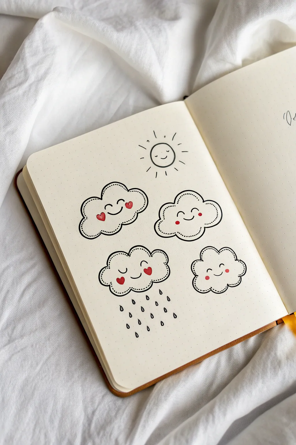
Brighten up your bullet journal or sketchbook with this charming set of cloud characters and a sunny friend. These simple line drawings use sweet expressions and subtle red accents to turn ordinary weather symbols into adorable art.
Step-by-Step Guide
Materials
- Dotted or blank notebook/journal
- Fine liner pen (black, approx. 0.3mm or 0.5mm)
- Red colored pencil or felt tip marker
- Pencil (optional, for sketching)
- Eraser
Step 1: Drawing the Happy Sun
-
Outline the sun:
Start near the top center of your page by drawing a simple, clean circle. It doesn’t need to be perfect; a little wobble adds character to a doodle. -
Add the rays:
Draw short, straight lines radiating outward from the circle. Space them relatively evenly, but vary their lengths slightly for a playful look. -
Create the face:
Inside the circle, draw two wide-set dots for eyes. Add a small, gentle ‘u’ shape between them for a smile.
Consistent Curves
When drawing cloud bumps, try to make the bottom bumps flatter and the top bumps rounder. This helps the clouds look distinct and weighted correctly on the page.
Step 2: Designing the Heart-Cheek Cloud
-
Draw the cloud shape:
Below the sun to the left, draw a kidney-bean-shaped cloud outline using bumpy, curved lines. Aim for about 5-6 bumps to close the loop. -
Add the inner detail:
Inside the main outline, re-draw the cloud shape using a dashed or dotted line. Leave a small gap between this inner line and the outer edge. -
Draw the expression:
Place two small, curved arches for closed, smiling eyes. Add a central smile. -
Apply color:
Using your red marker or pencil, draw two small hearts on the cheeks, slightly overlapping the ends of the smile.
Ink Smearing?
If your red marker smears the black ink, color the cheeks first, let them dry completely, and then draw the black facial features over or around them.
Step 3: Creating the Blushing Cloud
-
Outline the second cloud:
To the right of the first cloud, draw another fluffy cloud shape. Try to make this one slightly rounder than the first. -
Add dotted borders:
Just like before, carefully add a second, dotted cloud outline inside the solid ink border to give it that stitched-patch look. -
Draw the face:
Draw two arched eyes and a simple smile. This time, switch to simple red circles for the blush marks instead of hearts.
Step 4: Illustrating the Raining Cloud
-
Sketch the rain cloud:
Below the first cloud, draw a third cloud shape. Make the bottom bumps slightly flatter to suggest heaviness. -
Add the inner stitching:
Repeat the dashed line technique inside the perimeter of the cloud. -
Create the sleepy face:
Draw two U-shapes for sleeping eyes and a small smile. Adding red heart cheeks gives it a cozy feel despite the rain. -
Draw raindrops:
Below the cloud, draw small teardrop shapes in staggered rows. I like to keep the tops open or very thin to keep them looking light.
Step 5: Formatting the Final Cloud
-
Draw the last cloud:
Fill the space on the bottom right with a smaller, compact cloud shape. -
Finish the details:
Add the inner dotted line, two simple dot eyes, a smile, and small red circle cheeks. -
Review and clean:
Check your drawings for any gaps. If you sketched with pencil first, wait for the ink to be fully dry before gently erasing the guidelines.
Now you have a page full of friendly weather to keep your journal looking bright

PENCIL GUIDE
Understanding Pencil Grades from H to B
From first sketch to finished drawing — learn pencil grades, line control, and shading techniques.
Explore the Full Guide
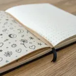
Moon, Planets, and Tiny Orbits
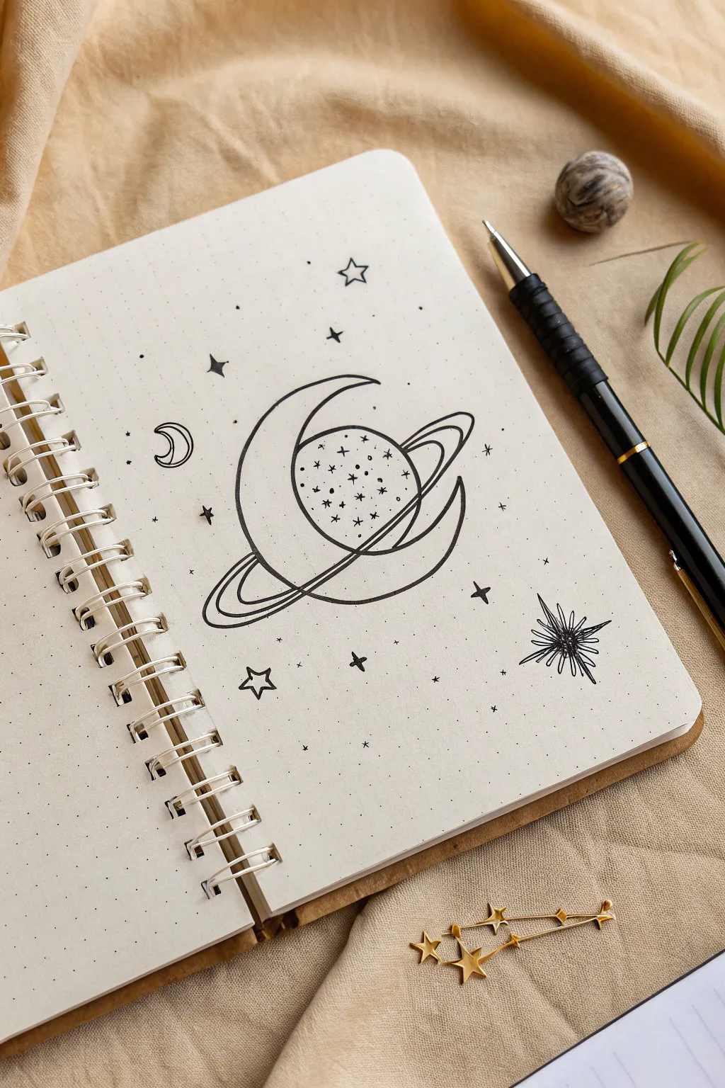
Capture the magic of the cosmos with this simple yet striking line art doodle. Combining a stylized planet with a gentle crescent moon, this design is perfect for filling a blank page in your bullet journal with celestial wonder.
Step-by-Step Tutorial
Materials
- Dotted notebook or bullet journal
- Fine liner pen (0.3mm or 0.5mm, black)
- Pencil (for sketching)
- Eraser
Step 1: Sketching the Core Shapes
-
Start with the moon:
Begin by lightly sketching a large ‘C’ shape in the center of your page to form the outer curve of the crescent moon. Don’t close the shape yet. -
Define the inner curve:
Draw the inner curve of the moon, making it taper to sharp points at both the top and bottom tips. Leave the center of the crescent somewhat wide to accommodate the planet. -
Add the planet:
Sketch a circle that appears to sit ‘behind’ the moon. The left side of the circle should be hidden by the inner curve of the crescent you just drew. -
Draw the ring foundation:
Draw a long, thin ellipse that cuts across the planet diagonally. Imagine the ring going behind the planet at the top right and coming around the front at the bottom left. -
Thicken the rings:
Add a second, larger ellipse parallel to the first one to give the planetary ring some width. Sketch lines where the ring passes behind the moon’s lower tip to create a sense of depth.
Ink Confidence
Commit to your lines. If you wobble, don’t try to fix it by going over it again; just thicken that part of the curve slightly to mask it naturally.
Step 2: Inking the Outlines
-
Outline the moon:
Take your fine liner pen and carefully go over your pencil lines for the crescent moon. Make these lines deliberate and smooth. -
Ink the planet:
Trace the visible parts of the planet’s circle. Remember not to draw the line where the ring cuts across the front of the planet. -
Detail the rings:
Ink the planetary rings. Pay close attention to the overlap—ensure the ring looks like it’s circling the planet but weaving through the moon shape. -
Add planet texture:
Inside the planet circle, draw small dots, tiny circles, and little asterisks. This gives the planet a textured, cratered appearance. -
Erase pencil marks:
Once the ink is fully dry, gently erase all your initial pencil sketches to reveal the clean black lines.
Gold Accents
After the black ink dries, use a metallic gold gel pen to fill inside the five-pointed stars or to trace a parallel line inside the moon for a deluxe finish.
Step 3: Adding Celestial Details
-
Draw a mini moon:
To the left of your main drawing, add a small, simple crescent moon outline. -
Create a starburst:
In the bottom right corner, draw a starburst shape. Start with a small center and radiate jagged, uneven spikes outwards for an energetic look. -
Add five-pointed stars:
Scatter a few traditional five-pointed stars around the page. Draw them outlined (hollow) rather than filled in. -
Draw four-pointed stars:
Fill some of the empty spaces with simple four-pointed stars. I like to draw these like elongated diamonds that curve slightly inward. -
Micro-details:
Draw tiny solid black dots and single plus signs scattered randomly to look like distant stardust. -
Final touches:
Look for any large empty gaps and fill them with a single dot or a tiny star to balance the composition.
Now you have a serene piece of galaxy art ready to inspire your next journaling session
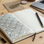
Leafy Vines and Quick Borders
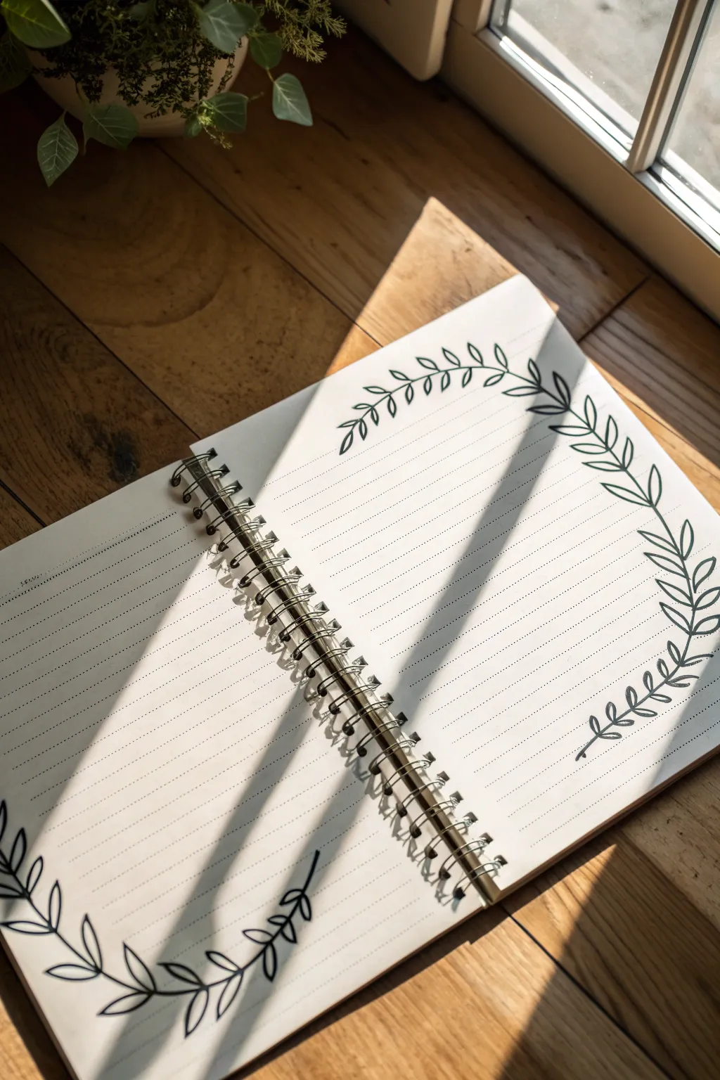
Transform a plain notebook page into an inviting journal spread with this surprisingly simple vine doodle. By framing your writing space with elegant, curved branches, you create a structured yet organic look that’s perfect for bullet journaling or reflective writing.
Detailed Instructions
Materials
- Spiral-bound notebook (lined or dot grid)
- Black fineliner (0.5mm or 0.8mm for main lines)
- Pencil (HB or lighter)
- Soft eraser
- Ruler (optional)
Step 1: Planning the Layout
-
Assess your space:
Open your notebook to a fresh two-page spread. Visualize where you want your writing to go versus where the decoration will sit. In this design, we are creating a split wreath: the top half of the circle is on the right page, and the bottom half is on the left page. -
Sketch the main curves:
Using a pencil and a very light hand, draw a large arc on the top right corner of the right-hand page. It should curve inward towards the spine. -
Mirror the arc:
Move to the bottom left corner of the left-hand page. Draw a similar arc that curves upward toward the spine. The goal is to make it look like one continuous circle is being interrupted by the spiral binding. -
Check the balance:
Look at the spread as a whole. Ensure your pencil lines leave enough white space in the center for your actual journal entries later.
Smooth Curves
Draw the main stem curve by moving your arm, not just your wrist. This locks your hand in position and results in a much smoother, less shaky line for the vine.
Step 2: Inking the Vines
-
Draw the stems:
Take your black fineliner. Carefully trace over your pencil arcs to create the main stems. Use a confident, steady stroke rather than short, sketchy lines for a smoother look. -
Start the leaves (Right Page):
Beginning at the top tip of the right-page arc, draw a small single leaf pointing outward. This anchors the end of the vine. -
Add alternating leaves:
Work your way down the stem. Draw small, pointed oval leaves, alternating them on the left and right sides of the stem. Imagine the shape of a grain of rice or a simple laurel leaf. -
Vary drawing angles:
As the curve changes direction, rotate the angle of your leaves slightly so they always flow naturally with the vine’s direction. -
Finish the top vine:
Continue adding leaves until you reach the end of the stem near the page edge. I like to make the leaves slightly larger toward the middle of the vine and smaller at the tips. -
Start the bottom vine (Left Page):
Move to the left page. Start at the bottom tip of your inked stem and draw the end leaf. -
Work upwards:
Repeat the alternating leaf pattern, moving up towards the spine. Keep the spacing consistent with what you did on the right page. -
Refine the shapes:
For these specific leaves, try to keep the leaf tips pointy and the base where it meets the stem slightly rounded. You can draw a tiny line down the center of a few leaves for texture, but leaving them open is cleaner.
Step 3: Finishing Touches
-
Let the ink set:
Wait a few minutes to ensure the fineliner ink is completely dry. This prevents smudging during the next step, especially on smoother paper. -
Erase guidelines:
Gently erase any visible pencil marks from your initial sketch. Hold the paper taut with one hand so the eraser doesn’t crinkle the page. -
Add detail (Optional):
If you feel the design needs more weight, you can thicken the main stem line slightly by going over it once more, or add tiny dots around the leaves for a magical effect.
Add Seasonal Flair
Customize this basic vine for seasons: add tiny berries between leaves for winter, small flower buds for spring, or broaden the leaves into maple shapes for autumn.
Now you have a beautifully framed space ready for your thoughts and plans
BRUSH GUIDE
The Right Brush for Every Stroke
From clean lines to bold texture — master brush choice, stroke control, and essential techniques.
Explore the Full Guide
Tiny Mushroom Patch
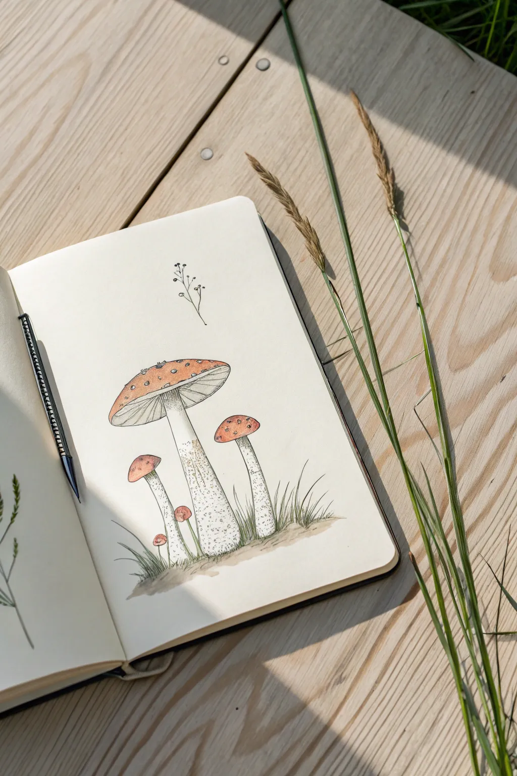
Capture the charm of the forest floor with this delicate mushroom study, combining precise fine-liner details with soft washes of color. This botanical-style sketch features a family of Amanita muscaria mushrooms in various stages of growth, nestled in tufts of grass.
How-To Guide
Materials
- Cream-colored sketchbook or mixed media paper
- Pencil (HB or H)
- Kneaded eraser
- Fine-liner pens (black, sizes 0.1 and 0.3)
- Watercolor paints or watercolor markers (Red-orange, Earthy brown, Muted green)
- Small round paintbrush (size 2 or 4)
- Cup of water and paper towel
Step 1: Pencil Structure
-
Main cap placement:
Begin by lightly sketching a wide, shallow oval near the center of your page for the largest mushroom cap. This will be the focal point, so position it carefully, leaving room below for the stems. -
Stem structure:
Draw the stem for the large mushroom. Start from the center of the oval and draw two lines tapering slightly outward as they go down. Add a small ‘skirt’ or ring just below the cap. -
Adding companions:
Sketch two smaller mushrooms to the right and left. The one on the right should be medium-sized with a taller, rounder cap. The one on the left can be smaller and tucked slightly behind. -
Tiny sprouts:
Draw two very tiny baby mushrooms near the base of the stems on the left side to create a sense of growth and scale. -
Grounding drawing:
Lightly sketch uneven ground lines and tufts of grass at the base of the stems so the mushrooms aren’t floating in space.
Pro Tip: Masking Fluid
Can’t paint around the tiny white dots? Apply dots of masking fluid on the caps before painting. Rub it off after the paint dries for crisp white spots.
Step 2: Inking the Outlines
-
Cap contours:
Using your 0.1 fine-liner, trace over the pencil lines of the mushroom caps. Use a slightly broken or wavering line to give them an organic texture rather than a perfect geometric shape. -
The gills:
Underneath the large cap, draw fine, straight lines radiating from the stem to the edge of the cap to represent the gills. Keep these lines very delicate. -
Texturing the stem:
Outline the stems. Instead of solid lines, use stippling (tiny dots) specifically on the lower halves of the stems to suggest a rough, fibrous texture. -
Grassy details:
Ink the grass blades using quick, upward flicking motions to keep the tips sharp. Ensure some blades overlap the base of the stems for depth. -
Floating flora:
Add a very simple, minimalist sprig of a plant floating above the large mushroom cap using a thin line and tiny dots for buds. -
Clean up:
Once the ink is completely dry, gently erase all pencil marks with your kneaded eraser to prepare for color.
Troubleshooting: Bleeding Ink
If your black lines smudge when you apply watercolor, your pen isn’t waterproof. Wait 24 hours for it to cure, or do the painting first and ink last.
Step 3: Adding Color Washes
-
Cap base color:
Mix a diluted red-orange watercolor. Paint the top of the mushroom caps, but carefully leave small, uneven white circles unpainted to create the signature spots of the Amanita mushroom. -
Gradient deepening:
While the first layer is still slightly damp, drop a more concentrated red-brown pigment near the center-top of the caps to give them volume and roundness. -
Stem shading:
Use a very watery grey or pale brown wash to add shadows to one side of the stems and under the skirt, keeping the rest of the stem white. -
Ground shadows:
I prefer to use a muddy brown-green mix here to paint the dirt mound at the base. Let this wash bleed slightly into the bottom of the stems to ground them. -
Grass accents:
Add a touch of muted green to the grass blades. You don’t need to fill them in perfectly; a loose wash that goes outside the lines adds to the sketchy aesthetic.
Step 4: Final Details
-
Reinforcing texture:
Once the paint is bone dry, go back in with the 0.3 fine-liner to darken the darkest shadows under the caps and at the base of the grass. -
Dot definition:
Add a tiny rim of ink around a few of the white spots on the caps to make them pop against the red background.
This charming little patch is now ready to decorate your journal spread or greeting card
Cozy Mug and Steam Swirls
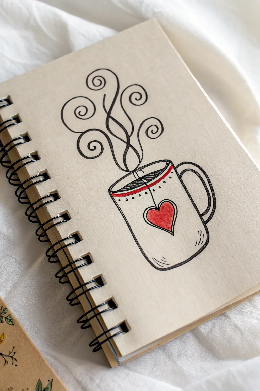
Capture the warmth of a hot drink with this charming doodle featuring playful steam curls and a sweet heart motif. Drawn on kraft paper, the simple red accents pop beautifully against the tan background, creating a cozy and inviting illustration.
Step-by-Step Guide
Materials
- Spiral-bound notebook with tan or kraft paper pages
- Fine-point black drawing pen (size 03 or 05)
- Red marker or felt-tip pen
- Pencil and eraser (optional for sketching)
Step 1: Drawing the Mug Base
-
Outline the mug shape:
Start by drawing a simple U-shape for the body of the mug. Make it slightly wider at the top than the bottom, giving it a classic coffee cup silhouette. Don’t close the top just yet. -
Create the rim:
Draw a flattened oval across the top opening of your U-shape to form the rim. Connect the edges smoothly so drawn oval sits directly on top of the mug body. -
Draw the rim thickness:
Inside the oval you just drew, add a second curved line parallel to the front edge to show the thickness of the mug’s rim. This small detail adds a nice bit of dimension. -
Add the handle:
On the right side of the mug, sketch a C-shape for the handle. Draw a smaller C-shape inside it to give the handle thickness, connecting them at the top and bottom where they meet the mug body. -
Detail the handle:
Add a thin line running down the center of the handle to suggest a rounded surface or a seam, giving it a bit of texture.
Wobbly Lines?
Don’t stress if your circles aren’t perfect! The charm of this doodle comes from the hand-drawn, cozy aesthetic. Retrace confident lines over shaky ones to add intentional style.
Step 2: Adding the Steam Swirls
-
Start the central steam lines:
Begin drawing the steam by starting near the center of the liquid surface inside the mug. Draw two wavy lines that rise up and intertwine slightly, like vines growing upward. -
Create the first curls:
Extend these lines upward and verify they curve outward. At the end of each line, draw a tight spiral loop. Think of these like fiddlehead ferns uncurling. -
Add side swirls:
Draw additional wavy lines branching off from the main steam flow or rising independently from the mug. End each one with a similar decorative spiral. -
Balance the composition:
Continue adding swirls until you have about five or six distinct curls. Try to vary their heights and directions—I usually aim for a taller central one with shorter ones flanking it to create a nice, organic plume shape.
Step 3: Decorative Details
-
Draw the heart:
In the center of the mug’s body, draw a simple heart shape. Keep the lines clean and deliberate. -
Add the tea bag string:
Draw a straight line extending from the top center of the heart up to the rim of the mug. Continue the line just over the rim to show the string dipping into the liquid. -
Create the coffee level:
Inside the rim oval, draw a curved line to indicate the surface of the liquid. Position it slightly below the rim edge. -
Add decorative dots:
Just below the mug’s outer rim, add a row of small dots. Beneath that, sketch a thin scalloped line or a series of tiny drops for extra ornamentation. -
Sketch motion lines:
Add small, curved hatch marks near the bottom right corner of the mug to suggest roundness and shadow.
Make it Pop
Use a white gel pen to add a tiny highlight on the curve of the heart and the rim of the mug. It adds instant shine and dimension to kraft paper art.
Step 4: Inking and Coloring
-
Fill the heart:
Use your red marker to color in the heart completely. The bold red looks fantastic against the tan paper. -
Add red accents:
Use the same red marker to draw a thin stripe just under the rim of the mug, directly over your decorative dot line. You can also color the liquid surface red or leave it black—the example uses red for a nice pop. -
Double-check lines:
Go over any faint pencil lines with your black pen if you started with a sketch. Add a second pass of ink to the main outline of the mug to make it slightly bolder than the decorative details. -
Final touches:
Add a few tiny hatch marks inside the liquid or on the steam lines if you want more texture, but keeping it simple works best here.
Now you have a cozy piece of art perfect for a bullet journal layout or a handmade greeting card


Sweet Treat Icons
Satisfy your creative cravings with this delightful set of four dessert doodles featuring a donut, cupcake, macaron stack, and cake slice. These simple yet charming illustrations use clean black lines paired with soft, understated pops of pink for a minimalist bullet journal aesthetic.
How-To Guide
Materials
- Dotted bullet journal or sketchbook page
- Fine-point black drawing pen (size 03 or 05)
- Light pink colored pencil or marker
- Brown colored pencil or tan marker
- Pencil for sketching
- Eraser
Step 1: Planning and Preliminaries
-
Visualize the layout:
Imagine a 2×2 grid on your page to keep the icons evenly spaced. The donut will go top-left, cupcake top-right, macarons bottom-left, and cake slice bottom-right. -
Lightly sketch positions:
Using your pencil, sketch very faint circles or triangles to mark where each treat will sit. This ensures you don’t run out of room before you start inking.
Step 2: Drawing the Donut
-
Outline the shape:
Draw a slightly imperfect outer circle for the donut body. Inside, draw a smaller, central circle for the hole. -
Add the frosting:
Draw a wavy, scalloped line that meanders around the top surface of the donut, connecting back to itself. This separates the frosted part from the plain cake base. -
Sprinkle details:
Switch to your fine black pen to ink the main lines. Then, add tiny dots and small elongated ovals on the frosting area to represent sprinkles.
Wobbly Lines?
Don’t stress about perfect circles! Food items often look tastier when drawn with slightly organic, uneven lines rather than rigid geometry.
Step 3: Creating the Cupcake
-
Draw the wrapper:
Start with a trapezoid shape that is wider at the top and narrower at the bottom. Draw vertical lines inside it to mimic the corrugated paper wrapper. -
Add frosting layers:
Sketch three rounded, cloud-like tiers stacking upward. Make each tier slightly smaller than the one below it. -
Top with a cherry:
Place a small circle at the very peak of the frosting. Add a tiny curved stem sticking out from the top. Color the cherry circle light pink.
Flavor Variations
Change the flavor by swapping the pink accent color. Use mint green for pistachio, light yellow for lemon, or lavender for ube treats.
Step 4: Stacking the Macarons
-
Form the top cookie:
Draw a wide oval for the top of the macaron stack. Beneath it, add a ruffled, slightly jagged line to represent the distinct ‘foot’ of the cookie. -
Add the filling and base:
Draw two parallel curved lines for the filling, then repeat the ruffled foot and smooth bottom oval for the lower cookie. Repeat this process if you want a taller stack. -
Soft coloring:
Unlike the other icons, this one relies heavily on color. Outline the entire shape in a soft pink pencil instead of black ink for a delicate look, adding darker pink dots on top for texture.
Step 5: Slicing the Cake
-
Create the wedge:
Draw a triangle pointing downward for the top surface. From the two bottom corners of the triangle, draw vertical lines down, then connect them with a line parallel to the triangle’s base. -
Decorative piping:
Along the back edge of the top triangle, draw a row of small connected loops to look like piped whipped cream. -
Layer details:
Draw a horizontal band across the side of the cake slice to show the filling layer. Inside the top triangle, draw a simple strawberry shape.
Step 6: Finishing Touches
-
Ink the outlines:
Go over your pencil sketches for the donut, cupcake, and cake slice with your black fine-point pen. Keep the lines confident and smooth. -
Add splashes of color:
Use your pink pencil to fill in the strawberry on the cake and the cherry on the cupcake. I like to shade the cake filling layer with a textured brown to look like chocolate or sponge. -
Erase guidelines:
Once the ink is completely dry—give it a full minute—gently erase all underlying pencil marks to leave a clean, crisp finish.
Now you have a charming collection of sweets to decorate your weekly spread or recipe journal
Easy Animal Faces
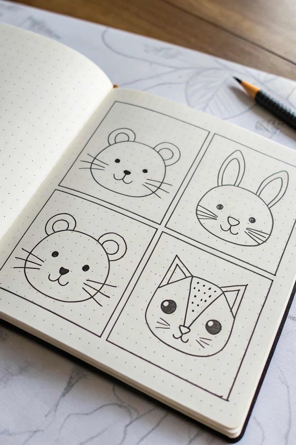
Learn to draw four adorable animal faces—a mouse, bear, rabbit, and fox—using simple geometric shapes and clean lines. This grid-style layout makes for a perfect practice page in your bullet journal or sketchbook.
Step-by-Step Guide
Materials
- Dotted or grid notebook (A5 size recommended)
- Black fineliner pen (0.3mm or 0.5mm)
- Pencil (for sketching)
- Eraser
- Ruler
Step 1: Setting the Stage
-
Create the grid:
Using your ruler and pencil, lightly draw a large rectangle on your page. Divide this rectangle into four equal smaller boxes (2×2 grid). Leave a small margin between the inner lines so each box is distinct. -
Ink the frames:
Once you are happy with the layout, trace over your pencil grid lines with the black fineliner. creating four crisp frames for your portraits.
Dot Grid Guide
Use the dots in your notebook to keep symmetry. Count 3-4 dots from the center line for eye placement to ensure perfectly spaced faces.
Step 2: Drawing the Mouse (Top Left)
-
Head shape:
Draw a wide, slightly flattened circle in the center of the first box. The bottom should be a bit wider than the top to give it chubby cheeks. -
Ears:
Add two semi-circles on top of the head. Draw a smaller semi-circle inside each one to detail the inner ear. -
Face features:
Place two small dots for eyes wide apart. Draw a triangular nose in the center, and extend two curved lines outward for the mouth. -
Whiskers:
Add three long, straight whiskers extending from each cheek.
Step 3: Drawing the Rabbit (Top Right)
-
Head and ears:
Draw a similar circle shape for the head. Add two tall, long ovals on top for ears, with smaller matching ovals inside them. -
Face details:
Draw two small circles for eyes, adding a tiny white highlight dot inside if you can, or just fill them black. Draw a rounded triangle nose and a ‘W’ shape for the mouth. -
Whiskers:
Draw three short lines on each cheek for whiskers, angling them slightly downward.
Add Some Color
Use watercolor pencils or mild highlighters to add rosy cheeks or fill in the inner ears for a soft pop of color without overwhelming the line art.
Step 4: Drawing the Bear (Bottom Left)
-
Head outline:
Sketch a circle, but this time make it slightly more round and full than the previous ones. -
Round ears:
Draw two perfect semi-circles on the upper corners of the head. Add smaller semi-circles inside them. -
Eyes and nose:
Place the eyes lower on the face. Draw a dark, inverted triangle nose with a small vertical line connecting to a curved mouth smile. -
Final touches:
Add three straight whiskers on each side to match the style of the other animals.
Step 5: Drawing the Fox (Bottom Right)
-
Angled head:
Unlike the others, start with a wide curve for the bottom of the face, but flatten the top of the head slightly. -
Pointy ears:
Draw two large triangles on top. Add an inner triangle to each ear to show depth. -
The mask:
From the inner base of each ear, draw a curved line sweeping down towards the nose area, creating that classic fox ‘mask’ shape. -
Expressive eyes:
Draw larger circles for the eyes here. Fill them in black, leaving a small white circle at the top left of each eye for a cute catchlight. -
Nose and texture:
Draw a small triangle nose right where the mask lines meet. Add a few stipple dots on the forehead area between the eyes for texture.
Step 6: Finishing Up
-
Inking everything:
Trace over all your pencil animal sketches with the fineliner. I find that quick, confident strokes make the lines look smoother than slow ones. -
Erase guidelines:
Wait at least 5 minutes for the ink to dry completely, then gently erase all remaining pencil marks to reveal your clean artwork.
Now you have a charming set of animal portraits that brighten up your journal page
Mini House Row
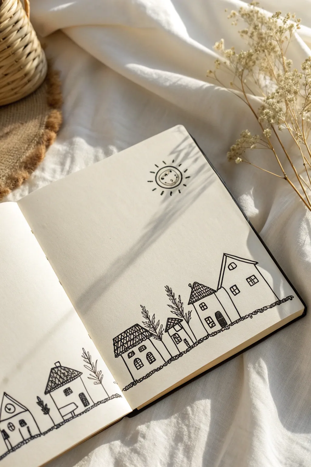
Capture the charm of a sleepy little town with this delightful line art doodle featuring a row of crooked houses and a beaming sun. The beauty of this project lies in its simplicity and the freedom to embrace imperfect, wobbly lines.
Step-by-Step Tutorial
Materials
- Sketchbook or drawing paper (blank pages)
- Fine liner pen (0.3mm or 0.5mm, black ink)
- Pencil (optional, for initial layout)
- Eraser
Step 1: Setting the Scene
-
Draw the Ground Line:
Start by drawing a long, bumpy horizontal line across the bottom section of your page. Don’t worry about making it straight; use small, loop-like scribbles to mimic grass or cobblestones. -
Position the Sun:
Near the top center-right of the page, draw a small circle for the sun’s face. Keep it simple and playful. -
Add Solar Details:
Inside the circle, draw two tiny dots for eyes and a curved line for a smile. Add short, dashed lines radiating outward to represent the sun’s rays.
Embrace the Wobble
Don’t use a ruler! The charm of this doodle comes from the shaky, hand-drawn lines. Imperfections make the village look cozy and lived-in.
Step 2: Building the Village
-
Outline the First House:
Starting on the right side, draw the silhouette of the tallest house. Use a tall rectangle for the base and a steep triangle for the roof. -
Add a Neighbor:
Directly next to it, draw a slightly shorter, wider house structure. Connect the walls so they look like they are touching or sharing a wall. -
Continue the Row:
Move leftward, adding two smaller houses. Vary the heights and widths to create visual interest, making some squat and others lean slightly. -
Draw the Left Page Houses:
If you are working across a double-page spread like the image, continue your row onto the left page with two more simple house outlines.
Step 3: Architectural Details
-
Roof Textures:
For the smaller houses, add a cross-hatch pattern to the triangular roofs to mimic tiles. Draw diagonal lines in one direction, then cross them with lines in the other direction. -
Alternative Roofing:
On the taller house, try a double-outline for the roof edge instead of hatching, giving it a sleek, modern look. -
Windows and Doors:
Draw small squares and rectangles for windows. Add dividers inside them using a ‘+’ sign for distinct panes. -
Arched Features:
Incorporate a few arched windows or doorways to break up the boxy shapes. Fill in one or two doors completely with black ink for contrast. -
Chimneys:
Add tiny rectangular chimneys to one or two roofs. You can add a little curl of smoke if you like, though the original keeps it clean.
Make it Pop
Use a light grey marker or a watercolor wash to add subtle shadows to one side of the houses for instant 3D depth without full coloring.
Step 4: Nature and Finishing Touches
-
Planting Trees:
In the gaps between houses, draw simple, tall plant stems. Use a single vertical line for the trunk. -
Adding Foliage:
Draw small loops or leaf shapes extending from the vertical stems. Keep them loose and sketchy rather than biologically acturate. -
Texturing the Ground:
Go back over your bottom ground line and thicken it with more scribbles or small loops to ground the buildings firmly. -
Review and Correct:
Look over the entire piece. If you used pencil first, wait for the ink to dry completely before erasing guide lines. -
Final Contrast:
If any lines look too faint, go over them once more to ensure the black ink stands out crisp against the paper.
Now you have a charming little street scene that fills your sketchbook with character
Everyday Object Mini Icons
Fill your notebook pages with a charming collection of miniature everyday icons, perfect for bullet journaling or simply practicing your sketching skills. This project uses clean lines and basic shapes to turn cameras, lightbulbs, and envelopes into delightful, bite-sized art.
Detailed Instructions
Materials
- A5 dotted notebook (bullet journal style)
- Black fine liner pen (0.3mm or 0.5mm)
- Pencil (HB or H)
- Soft white eraser
- Reference image (optional)
Step 1: Planning and Layout
-
Open your spread:
Lay your dotted notebook flat so you have a full two-page spread to work with. The dots will act as your invisible grid to keep the tiny drawings proportionate. -
Visualize the spacing:
Before drawing, imagine a loose, scattered arrangement. We aren’t making a strict grid; instead, aim for a playful ‘confetti’ look where icons float with plenty of white space between them. -
Initial pencil sketch:
Lightly sketch the basic geometric shapes for your icons using a pencil. Keep your pressure extremely light so these lines are easy to erase later.
Wobbly Lines?
Don’t stress over perfect straightness. Wobbly lines add hand-drawn charm. If a line goes astray, thicken it slightly to make it look intentional.
Step 2: Doodling the Right Page
-
Draw the lightbulb:
Start near the top right. Draw a large upside-down tear-drop shape. Add a zig-zag line inside for the filament and a rectangular base with horizontal stripes for the screw threads. -
Add a radiant sun:
In the center region, draw a small circle. Surround it with alternating long and short lines radiating outward. Add a playful ‘v’ inside the circle for a simple detail. -
Sketch floating clouds:
Create a cloud shape using three connected semi-circles or ‘bumps’—a large one in the middle and smaller ones on the sides. Flat bottom lines give them a cartoonish feel. -
Ink the lines:
Go over your pencil sketches on this page with your black fine liner. Use confident, single strokes rather than feathery ones for a crisp look.
Pro Tip: Dot Alignment
Use the notebook’s grid dots as anchor points. For example, make every camera exactly 4 dots wide and 3 dots high to keep all icons consistent.
Step 3: Filling the Left Page
-
Create the paper airplane:
Near the top, draw a sharp triangle pointing upward. Add a line down the center and two angled lines at the base to create the folded wings. -
Draw the vintage camera:
Sketch a rectangle with rounded corners. Draw a circle in the center for the lens, adding a smaller circle inside that. Top it off with a small square for the viewfinder and a button. -
Add nature elements:
Scatter a few leaves found in the bottom half. Draw a simple tear-drop shape or an oval, then bisect it with a line for the stem and add tiny diagonals for veins. -
Include mail icons:
Draw simple rectangular envelopes. To show the flap, draw a triangle pointing down from the top edge, creating that classic ‘back of the envelope’ look. -
Draw the gift box:
Create a 3D cube or rectangle. Draw a cross shape over it to represent ribbons, and top it with two small loops for a bow. -
Add sparkly fillers:
Fill the empty gaps between your main icons with tiny four-pointed stars (just a cross with curved sides) or small diamond shapes. This fills the void without looking cluttered. -
Inking the left side:
Carefully trace over your pencil work with the fine liner. Small details like the camera lens might require a steady hand, so take your time.
Step 4: Finishing Touches
-
Erase pencil marks:
Once the ink is completely dry (give it at least 5 minutes to prevent smudging), gently use your soft eraser to remove all underlying pencil sketches. -
Add word details:
If you sketched any text like ‘Travel’ or ‘Gemini’, trace over them now. I like to thicken the downstrokes slightly to mimic faux calligraphy. -
Review and refine:
Look at the overall spread. If a particular doodle looks too light, go over the outer outline one more time to make it pop, or add a few stippling dots for texture.
Now you have a whimsical spread of icons ready to decorate your daily planner or inspire your next big idea
Zentangle-Inspired Shape Fills
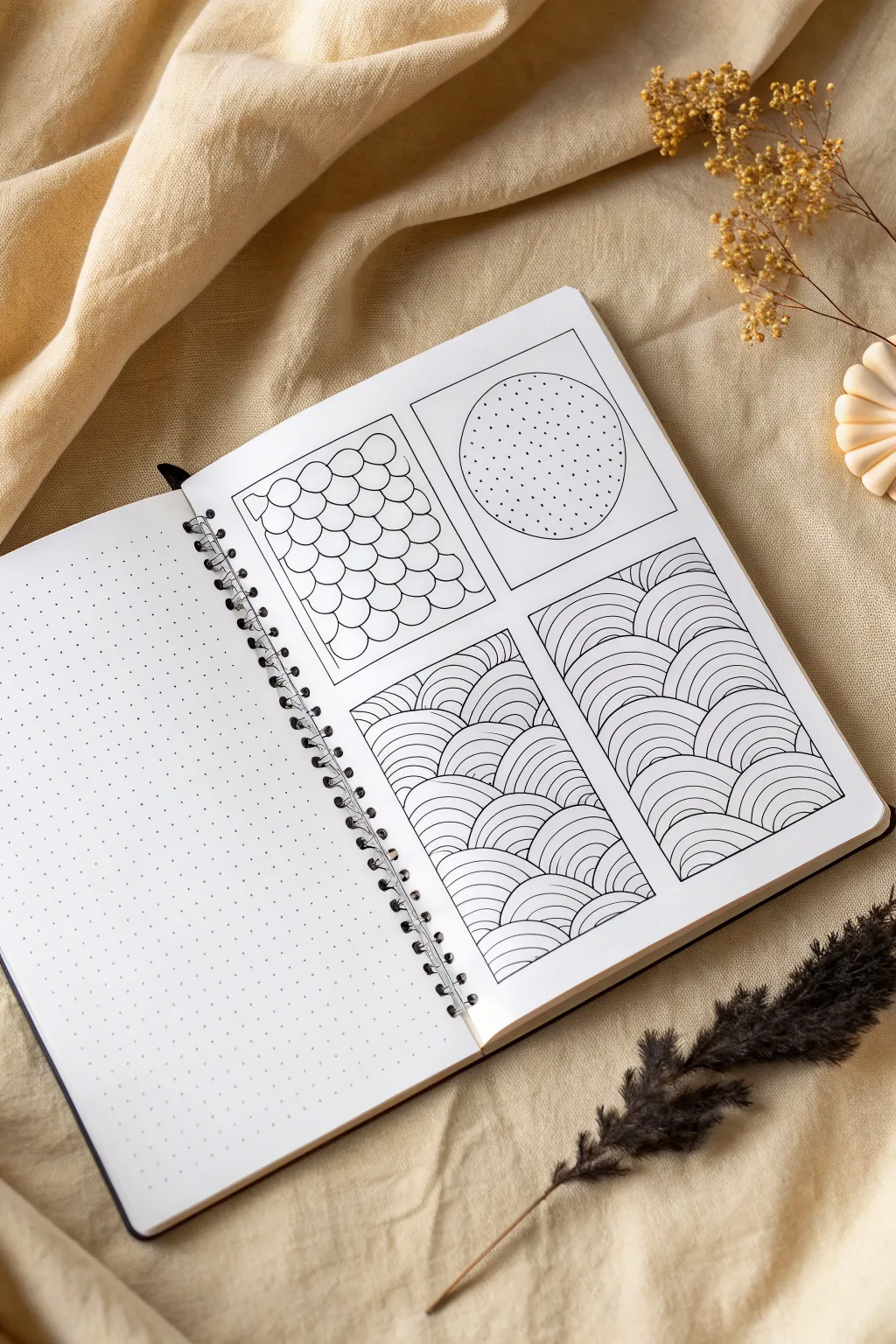
Transform a simple bullet journal page into a study of texture and line with these four distinct shape-filling exercises. This project breaks down complex-looking patterns into manageable, repetitive strokes that create a calming visual rhythm.
Step-by-Step Guide
Materials
- Dotted bullet journal or high-quality sketch paper
- Ruler or straight edge
- Fine liner pen (0.3mm or 0.5mm)
- Pencil (for sketching outlines)
- Eraser
- Compass or circular object (optional)
Step 1: Setting the Framework
-
Outline the panels:
Begin by drawing four large rectangular boxes on your page using a pencil and ruler. Arrange two on the top row and two on the bottom row, leaving a small gap between them for a clean layout. -
Define the top right circle:
In the top right box, lightly sketch a large circle in the center. You can freehand this or use a compass; personally, I often just trace a roll of washi tape for a quick perfect circle. -
Ink the borders:
Go over your pencil panel lines with your fine liner pen to create varied, crisp frames. Let the ink dry completely before erasing any stray pencil marks.
Steady Hand Trick
Exhale slowly as you draw long curved lines. This steadies your hand and prevents shaky strokes better than holding your breath.
Step 2: Top Left: Scallop Scales
-
Start the first row:
In the top left panel, begin at the very bottom left corner. Draw a row of connected semicircles (hills) all the way across the bottom edge. -
Layer the second row:
Start the next row of scales so that the peak of each new semicircle sits directly above the valley of the two scales below it, like laying bricks. -
Continue upward:
Repeat this pattern until you fill the entire box. Try to keep the size of your curves consistent for a uniform look. -
Close the gaps:
When you reach the sides and top edges, draw partial curves to make the pattern look as if it continues off the page.
Step 3: Top Right: Stippled Sphere
-
Begin stippling:
Move to the top right panel with the circle outline. Start placing small dots inside the circle using your pen. -
Create a gradient:
To make the circle look spherical, cluster the dots more densely near the bottom edge to create a shadow effect. -
Fade upward:
As you move toward the top of the circle, space the dots further apart. Leave the very top area sparse or empty to represent a highlight. -
Ink the outline:
Carefully trace the pencil circle with your pen to define the shape clearly against the white background.
Add Depth
Use a light grey marker or a pencil to add subtle shading where the lines overlap or curve. This gives the 2D patterns a 3D pop.
Step 4: Bottom Row: Wavy Arches
-
Draft the layout:
For the bottom panels, we will use a variation of the ‘Sez’ pattern. First, imagine a grid of squares filling these boxes (you can lightly pencil this grid if helpful). -
Draw base arches:
In the bottom left panel, start in the bottom-left hypothetical grid square. Draw a series of concentric arches radiating from the bottom-left corner of that small square. -
Alternate direction:
In the ‘grid square’ directly above or beside it, rotate the pattern so the arches radiate from a different corner. This creates a weaving, basket-like effect. -
Fill the panel:
Continue filling the panel by alternating the corner origin of your concentric arches. Keep the lines parallel and evenly spaced. -
Repeat for the final panel:
Recreate this same wave pattern in the final bottom-right panel. I find rotating the page as I draw helps me keep the curves smooth and natural. -
Final touches:
Check all four panels for any incomplete lines or areas that need a little more ink weight, then erase any remaining pencil guidelines.
Enjoy seeing how simple repetitive lines build up to create these satisfyingly complex textures
Doodle Banners and Labels
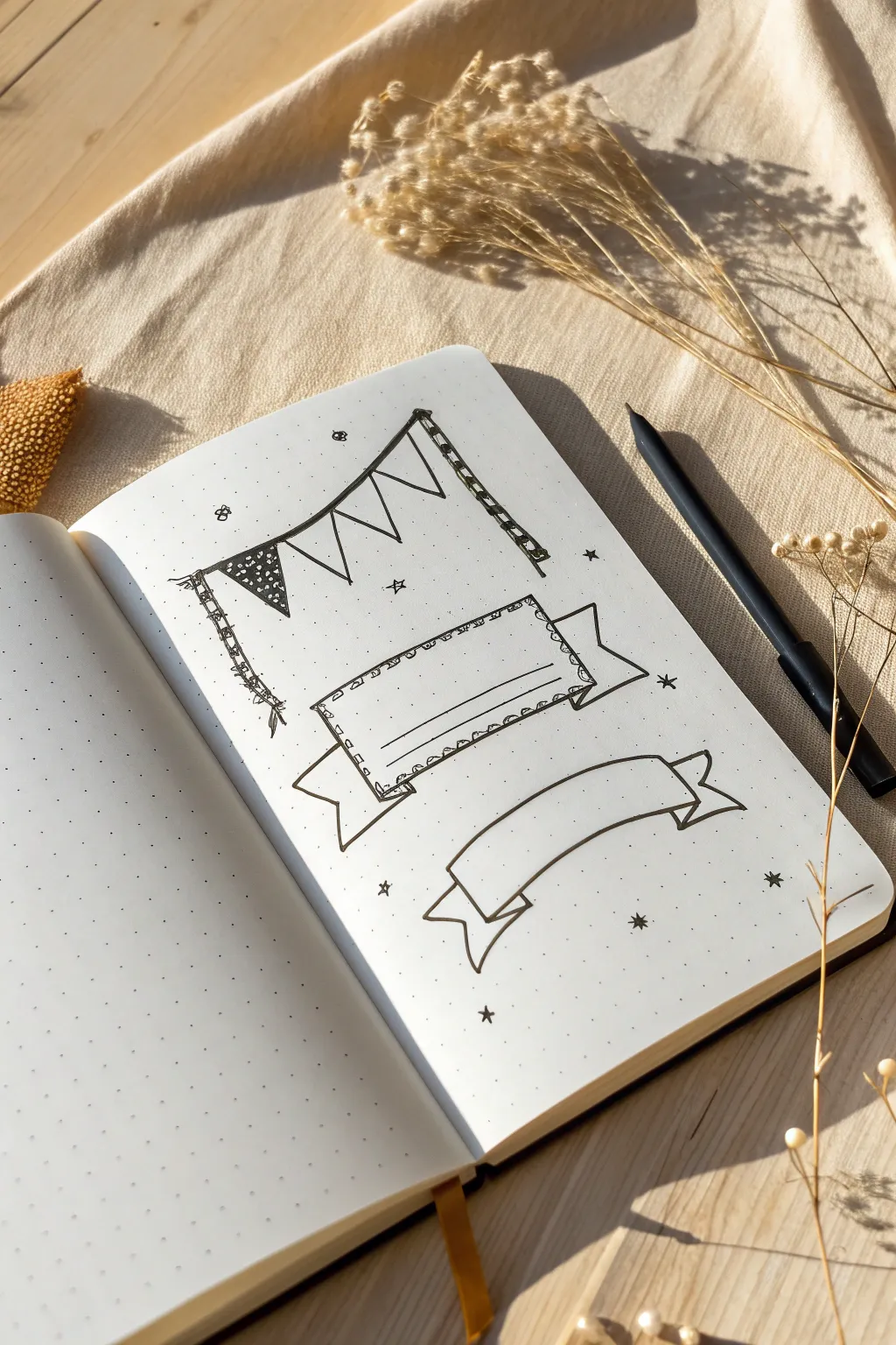
This tutorial guides you through creating three distinct banner styles—a festive pennant string, a decorative ribbon label, and a classic curved scroll—perfect for adding structure and flair to your journal spreads. These doodles vary in complexity, offering a wonderful way to practice your line work while organizing your page headers.
Step-by-Step Tutorial
Materials
- A5 dotted notebook or bullet journal
- Fine liner pen (black, size 0.3 or 0.5)
- Pencil (optional, for sketching)
- Eraser
Step 1: The Pennant String
-
Anchor points:
Begin near the top of your page by drawing two tall, vertical poles. For added character, wrap a few horizontal lines around them to give the appearance of striped poles or fabric wrapping. -
String it up:
Connect the tops of your two poles with a single, slightly dipping line to represent the string holding your flags. -
Triangle flags:
Draw a series of inverted triangles hanging from the string. Try to keep them somewhat uniform in size, sketching four distinct flags across the line. -
Pattern play:
Fill the first flag on the left with a dense stippling pattern (tiny dots) and color the background black, leaving the dots white. For the remaining flags, leave them plain or add simple stripes for variety. -
Finishing touches:
Add small decorative details: draw tiny knots at the top corners of the flags where they attach to the string, and maybe a few loose ‘threads’ hanging from the bottom of the poles.
Step 2: The Decorative Ribbon Label
-
Central rectangle:
In the middle of the page, draw a wide rectangle. Instead of straight lines, use a small, repetitive loop pattern for the border to create a ruffled or stitched edge effect. -
Side folds:
From the vertical sides of your rectangle, draw two short diagonal lines going downwards and inwards to start the ribbon’s fold. -
Ribbon tails:
Draw the ribbon tails extending outward from those folds. Finish the ends with a V-cut shape for that classic ribbon look. -
Connect the back:
Connect the top corner of the ribbon tail to the side of the main rectangle with a straight vertical line to show the ‘back’ of the ribbon peeking through. -
Text lines:
Inside the main ruffled rectangle, carefully draw two straight horizontal lines near the bottom to designate space for writing.
Dot Grid Guide
Use the dots on your paper to ensure symmetry! Count the dots between your banner poles or scroll ends to make sure everything is centered perfectly.
Step 3: The Curved Scroll Banner
-
Top and bottom curves:
Draw two long, parallel arched lines. These form the main body of your scroll. -
Closing the shape:
Connect these two lines at the ends with short vertical lines that curve slightly inward. -
Drawing the folds:
From the bottom corners of your main shape, draw a short line curving downward and inward. This creates the illusion of the paper folding back. -
Adding the tails:
Extend a line outward from the end of that fold to create the scroll tails. Make the ends dove-tailed (V-shaped) just like the previous ribbon. -
Connecting lines:
Draw a final line connecting the top corner of the tail back to the bottom edge of the main scroll body to complete the 3D illusion.
Shadow Depth
Add grey highlighter or light pencil shading to the ‘back’ folds of the ribbons. This simple step instantly makes the banners pop off the page.
Step 4: Atmospheric Details
-
Sparkles and stars:
Scatter small five-pointed stars randomly around the banners to fill empty space. I think filling them in solid black adds a nice contrast. -
Tiny dots:
Finally, stipple extremely small dots around the stars and banners to create a magical, confetti-like atmosphere across the page.
Now you have a set of charming headers ready to label your next weekly spread
Tiny Checklists and Tracker Doodles
This clean and minimal tracker layout combines practical checklist boxes with a charming star-rating system, perfect for tracking habits or daily goals. The design utilizes a simple dot grid structure to keep everything neat without needing advanced drawing skills.
How-To Guide
Materials
- A5 Dot grid notebook or loose dot grid paper
- Fine liner pen (0.3mm or 0.5mm, black)
- Ruler or straight edge
- Orange colored pencil or marker
- Pencil and eraser (optional for sketching)
Step 1: Planning the Header
-
Establish the baseline:
Start by counting about 5-6 rows down from the top edge of your paper. Using your ruler, draw a horizontal line that spans most of the page width, leaving a small margin on both the left and right sides. -
Add vertical dividers:
Along this horizontal line, make small markings to divide the space. You’ll need a larger section on the left for the title and smaller sections on the right for dates or categories. -
Label the sections:
Above the line in the first section, write ‘Plan’ or your chosen header in a serif or typewriter-style font. In the middle section, write ‘Dated’ or ‘Day’, and in the far right section, add ‘Time’ or a similar tracker label.
Wobbly Lines?
If your stars look uneven, draw a tiny pentagon first as a guide, then add triangles to each flat side. It makes the five points much easier to space out evenly.
Step 2: Drawing the Checkboxes and Stars
-
Set the vertical guide:
Find a vertical line of dots about 1 inch from the left edge of your paper. This will serve as the anchor for your checklist. Draw a long vertical line starting below your header and extending down about 15-20 rows. -
Draw the first checkbox:
To the left of your vertical line, draw a small square. Use four dots as your corners (2×2 grid squares) to keep the size consistent. The right side of the box should nearly touch your vertical dividing line. -
Add the first star:
Directly to the right of that same vertical line, aligned with the checkbox, draw a small five-pointed star. Keep it simple; an outline works best here. -
Continue the pattern:
Skip one row of dots below your first set to create breathing room. Draw your second checkbox and star combination. -
Fill the column:
Repeat this process all the way down the page until you have a column of about 10-12 checklist items. Using the dots as guides ensures they stay perfectly aligned without measuring every time.
Step 3: Refining and Coloring
-
Close the shapes:
Go back over your checkboxes to ensure all corners are closed and lines are crisp. Small gaps can make the layout look unfinished. -
Add color accents:
Take your orange colored pencil or marker. Carefully fill in just the stars. I find that a soft colored pencil gives a nice vintage texture compared to a saturated marker. -
Erase guidelines:
If you used a pencil to sketch out spacing beforehand, wait for the ink to become completely dry and gently erase any graphite marks. -
Final touches:
Review your headers. If you want them to stand out more, you can thicken the downstrokes of the letters slightly to mimic a calligraphy effect.
Level Up: Color Coding
Instead of only orange stars, use a different color for each row to categorize tasks (e.g., blue for work, green for health) for an instant visual overview.
Now you have a structured canvas ready to help organize your days with clarity and style
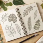
One-Line Doodle Challenges
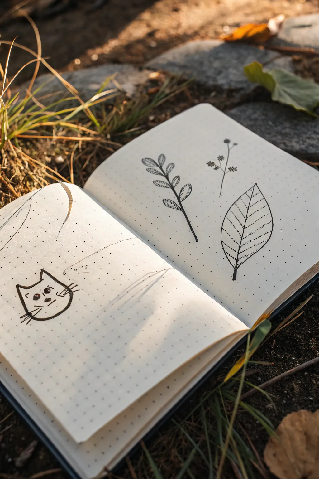
Capture the charm of the outdoors with these simple, sketchy ink drawings on dot grid paper. This project features a playful cat alongside botanical elements like a fern frond and a textured leaf, perfect for beginners wanting to practice line work.
Step-by-Step Tutorial
Materials
- Dot grid notebook (A5 size works well)
- Fine liner pen (0.3mm or 0.5mm, black)
- Pencil (optional, for sketching)
- Eraser
Step 1: Drawing the Grumpy Cat
-
Outline the head shape:
Begin on the lower left page. Draw a rounded U-shape for the bottom of the cat’s face, using the dots as a guide to keep it symmetrical. -
Add the ears:
From the top open ends of your U-shape, draw two triangles pointing upward. Connect the space between the ears with a slightly curved horizontal line for the top of the head. -
Sketch the eyes:
Place two small circles in the center of the face. Fill them in with black ink, leaving a tiny white dot in each for a highlight. -
Draw the nose and mouth:
Between and slightly below the eyes, draw a small inverted triangle for the nose. Extend a straight vertical line down from the nose and cross it with a short horizontal line for a flat, unimpressed mouth. -
Add whiskers:
Draw three quick, straight lines radiating outward from each cheek area to finish the cat’s expression.
Wobbly Lines?
Don’t stress about perfect straight lines. Embrace the shake! Wobbly lines actually make organic subjects like plants and fur look more natural and hand-drawn.
Step 2: Creating the Botanical Elements
-
Start the fern stem:
On the opposite page, draw a long, slightly curved line positioned diagonally. This will serve as the central stem for your fern branch. -
Draw the leaves:
Starting from the bottom of the stem, draw small oval shapes attached to either side. As you move up the stem, make the leaves slightly smaller. -
Detail the fern leaves:
Inside each oval leaf, draw tiny hatched lines or a central vein to give them texture and depth. -
Draw the wildflowers:
To the right of the fern, sketch a very thin, vertical stem that branches near the top into three smaller sprigs. -
Add flower heads:
At the end of each sprig, draw a tiny cluster of dots or small dashes to represent delicate flower petals or seeds. -
Outline the large leaf:
below the wildflowers, draw a large teardrop shape pointing upward. Use the dot grid to help balance the curve on the left and right sides. -
Add the central vein:
Draw a straight line directly down the center of the leaf, extending slightly past the bottom to create a stem. -
Add diagonal veins:
Sketch parallel diagonal lines branching from the center vein out to the leaf edges. Space them evenly using the grid dots as markers. -
Create texture:
Finally, add rows of tiny, dashed lines between the diagonal veins to mimic the intricate texture of a dried leaf.
Add Subtle Color
Use a light green or brown highlighter to trace over just the stems or one side of the leaves. This adds dimension without overpowering the simple ink aesthetic.
Close your notebook knowing you’ve captured a little bit of nature’s simplicity on the page
Doodle Sticker Sheet Page
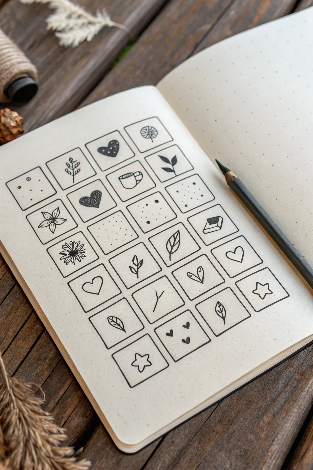
This project creates a satisfyingly organized sticker-sheet aesthetic directly in your bullet journal using a simple grid layout. The clean black lines against the dotted paper serve as perfect frames for tiny, minimalist doodles ranging from botanical elements to geometric patterns.
Detailed Instructions
Materials
- Dotted grid notebook or journal
- Fine-liner pen (black, 0.3mm or 0.5mm)
- Pencil (HB or H)
- Ruler
- Eraser
Step 1: Setting the Framework
-
Calculate the spacing:
Count the dots across your page to determine the best size for your squares. A common standard is 4×4 dot squares, leaving a 1-dot gap between them. -
Draft the grid:
Using your pencil and ruler, lightly mark out rows and columns of squares. Based on the image, aim for a grid of roughly 4 columns by 6 rows. -
Ink the squares:
Once you are happy with the layout, trace over your pencil lines with a fine-liner pen. Keep your hand steady and use the ruler if you want razor-sharp edges, or freehand it for a more organic feel. -
Erase guidelines:
Wait at least five minutes for the ink to cure completely, then gently erase all remaining pencil marks to reveal clean, empty frames.
Smudge Alert
If you are left-handed, work from the right side of the page to the left to avoid smearing the fresh ink as your hand moves across the grid.
Step 2: Doodling: Top to Middle
-
Start with texture:
In the top-left square, add simple stippling. Draw random small dots and circle outlines to create a ‘cookie’ or porous texture. -
Botanical twig:
Moving right, draw a vertical line with small, rounded leaves branching off in pairs to create a simple fern or vine. -
Patterned heart:
In the next box, draw a tilted heart shape. Fill it in with black ink but leave small white circles empty to create a polka-dot effect. -
Dandelion puff:
Finish the first row with a simple dandelion. Draw a stem, a small circle, and stick-like lines radiating outward. -
Classic flower:
Start the second row with a stylized flower. Draw five pointed petals radiating from a center point, adding a vein line down the middle of each petal. -
Dark heart:
Draw another heart, but fill this one with a stippling technique (lots of tiny dots) to make it look darker and textured compared to the outline. -
Coffee mug:
Sketch a simple mug shape with a handle on the right. Add a curved line near the top for the rim to give it a 3D perspective. -
Simple leaf sprig:
Draw a stem with two larger, pointed leaves attached, angling them upwards for a dynamic look.
Step 3: Doodling: Lower Section
-
Dense daisy:
In the third row, draw a flower with many narrow petals packed closely together around a dark center. -
Geometric sprinkles:
Fill the next few squares with varying densities of dots. Use a mix of heavy pressed dots and light taps to create depth, like scattered salt or stars. -
Open book:
Draw a small rectangle, add a line down the middle, and angled lines at the bottom to represent pages, creating a tiny open book icon. -
Single leaves:
Throughout the lower rows, draw single leaves. Vary them by making some curved, some pointed, and adding central veins to a few. -
Empty hearts:
Keep it simple by drawing open heart outlines in random squares. Try tilting them at different angles for variety. -
Simple Stars:
Draw a classic five-point star outline. Don’t worry about perfect symmetry; a hand-drawn look fits the aesthetic. -
Branch variations:
Fill remaining botanical boxes with variations of twigs—try a ‘Y’ shape branch or a single curved stem with opposite leaves. -
Tiny hearts cluster:
In one of the bottom squares, draw three very tiny solid hearts floating together.
Level Up
Add a drop shadow to two sides of every square using a light grey marker. This makes the grid look like a real sheet of raised stickers.
Now you have a charming collection of miniature art that turns a simple page into visual inspiration
Surreal Mix-and-Match Doodles
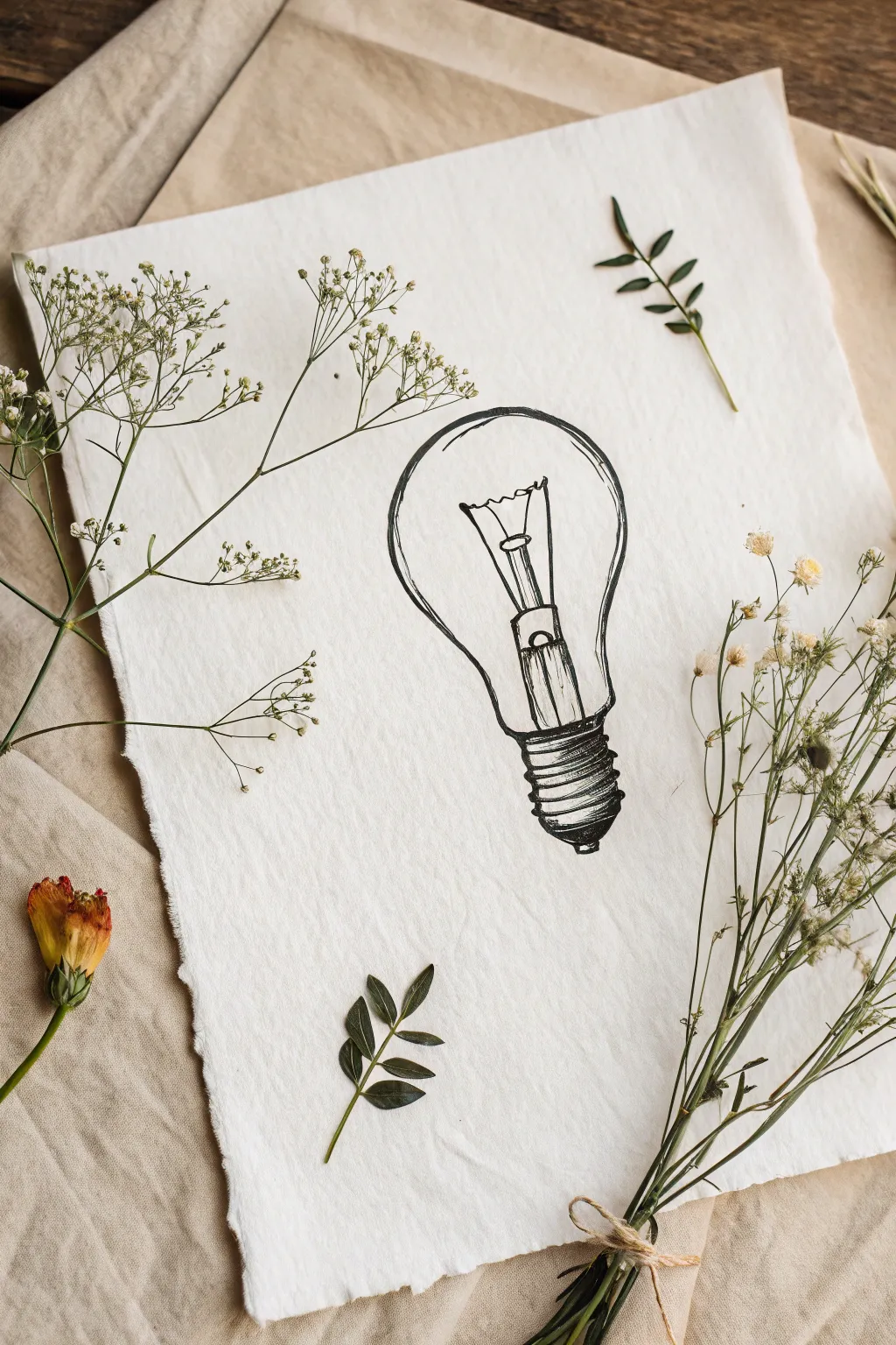
Create a charmingly sketchy lightbulb illustration that blends industrial design with organic textures. This project combines simple ink drawing techniques with natural elements for a beautiful mixed-media flat lay.
Step-by-Step
Materials
- Textured handmade paper (white or cream)
- Black fine liner pens (sizes 0.1, 0.3, and 0.5)
- Pencil (HB or 2B)
- Kneadable eraser
- Dried baby’s breath flowers
- Dried greenery stems
- Small dried yellow/orange flower
- Twine or jute string
Step 1: Preparation & Outline
-
Paper Selection:
Choose a sheet of heavy, textured paper with deckled edges. If your paper has straight edges, you can dampen the edges with a wet brush and carefully tear them to create a soft, rustic look. -
Rough Pencil Sketch:
Using your pencil very lightly, draw a simple oval shape for the top glass part of the bulb. Keep your grip loose to encourage a naturally imperfect line. -
Adding the Base:
Sketch a narrower cylinder shape extending from the bottom of the oval for the bulb’s neck, followed by a series of stacked, flattened ovals to represent the threaded metal base. -
Refining the Shape:
Connect your shapes to form the classic pear-like silhouette of an incandescent bulb. Don’t worry about perfect symmetry; the charm lies in the hand-drawn feel.
Pro Tip: Line Variation
Vary your pen pressure while drawing the glass outline. A line that is thick in some spots and thin or broken in others suggests light hitting the glass.
Step 2: Inking the Drawing
-
Main Outline:
Switch to a 0.5 fine liner. Trace over your pencil outline, occasionally breaking the line or doubling it slightly to give it a sketchy, doodle-like quality. -
Drawing the Filament:
Inside the bulb, switch to a finer 0.3 pen. Draw the internal glass stem structure rising from the base. Add the zigzag filament wire connecting the two support wires at the top. -
Inking the Base Details:
Use the 0.5 pen to outline the threaded metal base. Draw horizontal curved lines to show the ridges of the screw threads. -
Adding Depth:
With your 0.1 pen, add fine hatching lines to the sides of the metal base to create shadow and dimension. -
Creating Contrast:
Deepen the shadows on the metal tip at the very bottom of the bulb and the sides of the internal stem using the 0.5 pen for bolder strokes. -
Glass Reflections:
Add a few broken, curved lines along the inner edge of the glass bulb to suggest reflection and volume. I find keeping these minimal works best. -
Final Ink Touches:
Review your drawing and darken any areas that need more weight, particularly where the glass meets the metal base. -
Erase:
Once the ink is completely dry—wait at least 15 minutes to be safe—gently dab and roll your kneadable eraser over the drawing to lift all pencil marks.
Step 3: Styling the Composition
-
Gathering Florals:
Select a few stems of dried baby’s breath and fine greenery. The delicate white flowers complement the simple line art perfectly. -
Creating a Bouquet:
Bundle the stems together. Tie the bottom of the bunch with a small piece of jute twine or natural string, looping it into a simple bow. -
Left Side Arrangement:
Place a single stem of dried baby’s breath or a wispy branch on the left side of the paper, allowing it to curve naturally around the drawing. -
Bottom Accent:
Arrange a small sprig of green leaves near the bottom center of the paper to balance the composition. -
Corner Accent:
If you have a dried colorful flower, place it near the bottom left corner off the paper for a pop of warmth. -
Top Accent:
Place a single small leaf or sprig at the top right corner to frame the artwork without overcrowding it. -
Final Placement:
Position your main bouquet bundle on the right side, slightly overlapping the paper edge to create depth and connection between the art and the physical objects.
Level Up: Watercolor Wash
Add a very pale wash of yellow watercolor inside the bulb outline before inking for a subtle ‘lit up’ glow effect.
Step back and enjoy the peaceful blend of art and nature you’ve just composed

Have a question or want to share your own experience? I'd love to hear from you in the comments below!