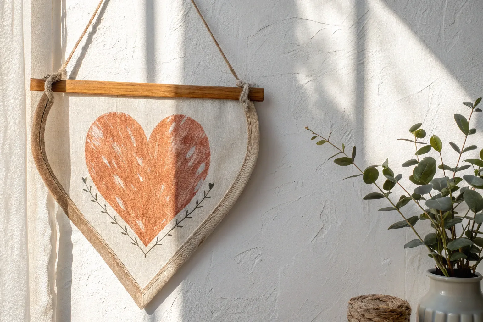
When I’m craving a little extra sweetness in my sketchbook, I reach for love art themes because they’re instantly meaningful and honestly just fun to make. Here are my favorite love art ideas—from classic heart motifs to unexpected, artsy twists you can turn into gifts, décor, or a creative date-night project.
Watercolor Hearts With Soft Washes
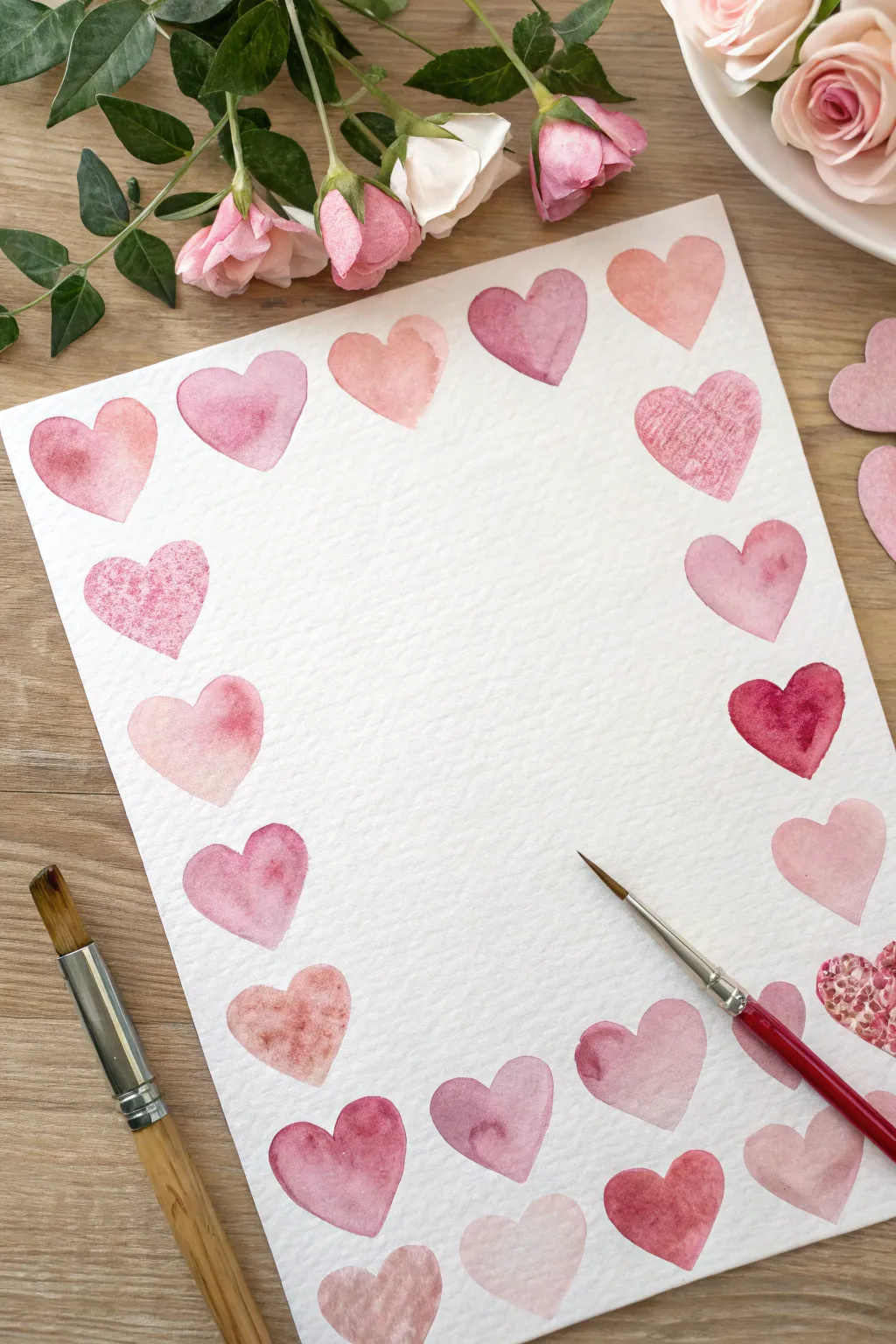
Create a delicate frame for your love letters or favorite quotes with this charming watercolor project. Using soft washes in shades of pink, rose, and blush, you’ll paint a loosely arranged border of hearts that feels organic and romantic.
Step-by-Step
Materials
- Cold press watercolor paper (A4 or letter size)
- Watercolor paint set (focusing on red, alizarin crimson, and pink)
- Round watercolor brushes (size 4 and 6)
- pencil
- Clean water jar
- Paper towel
- Palette for mixing
Step 1: Preparation and Sketching
-
Paper selection:
Begin with a sheet of high-quality cold press watercolor paper. The texture of this paper is crucial for achieving that lovely, granulated look inside the hearts. -
Plan the layout:
Lightly visualize where your border will sit. You want the hearts to frame the central white space without crowding it too much. -
Light sketch:
Using a very light hand and a hard pencil (like an H or HB), sketch the outlines of hearts around the perimeter of the paper. Keep them roughly the same size but vary the angles slightly to keep it looking natural. -
Erase guidelines:
Once your layout is set, take a kneaded eraser and gently lift most of the graphite. You want the faintest possible guide that won’t show through the translucent paint.
Water Control is Key
To get the soft ‘bloom’ effect in the center of the hearts, ensure your puddle of paint is juicy but not dripping. Too much water causes puddles; too little creates streaks.
Step 2: Mixing Your Palette
-
Base pinks:
On your mixing palette, prepare three distinct puddles of diluted paint. Start with a classic rose or permanent rose color. -
Warm it up:
Create a second mix by adding a tiny touch of orange or yellow to your red to make a warm, coral-leaning salmon shade. -
Deepen the tone:
For the third puddle, mix alizarin crimson with a drop of purple or cool blue to create a deeper, berry-toned pink. -
Water ratio:
Ensure all your mixes are quite watery. The beauty of this piece relies on the transparency of the wash, not thick opaque color.
Metallic Accents
Once fully dry, load a small brush with metallic gold watercolor. Paint thin outlines on just one side of each heart for a sophisticated, shimmering shadow effect.
Step 3: Painting the Hearts
-
Wet-on-dry technique:
Load your size 6 round brush with the lightest pink wash. Start painting the first heart, applying the color to dry paper. -
Adding gradients:
While the first heart is still wet, dip the very tip of your brush into a slightly darker pigment and touch it to the bottom curve of the heart. The color will naturally bleed upward. -
Varying colors:
Move to the next heart, but switch to your coral/salmon mixture this time. Alternating colors creates a pleasing rhythm around the page. -
Leaving gaps:
I like to skip around the border rather than painting adjacent hearts immediately. This prevents two wet hearts from accidentally touching and bleeding into each other. -
Lifting color:
If a heart looks too dark, rinse your brush, dry it slightly on a paper towel, and touch the damp brush to the center of the heart to lift some pigment away, creating a highlight. -
Texture variation:
For a ‘mottled’ look on a few hearts, drop a tiny splash of clean water into the drying paint. As it dries, it will push the pigment to the edges creating a beautiful bloom. -
Details with the small brush:
Switch to your size 4 brush for the sharper points at the bottom of the hearts or to refine the curves at the top defined specifically. -
Filling the gaps:
Once your first set of hearts is dry, go back and paint the remaining hearts in the spaces you left earlier. This ensures crisp edges between shapes.
Step 4: Finishing Touches
-
Evaluate the balance:
Step back and look at the overall color distribution. If one area looks too pale, you can gently glaze a second light layer of color over a dry heart to deepen it. -
Corner accents:
Pay special attention to the corners. You might want to angle the corner hearts 45 degrees inward to guide the viewer’s eye toward the center of the page. -
Final drying:
Let the paper sit flat until completely dry. Avoid using a heat gun if possible, as natural air drying preserves those lovely watermarks and textures best.
Now you have a beautifully hand-painted border ready for calligraphy or a heartfelt note to someone special


Bold LOVE Lettering With Texture
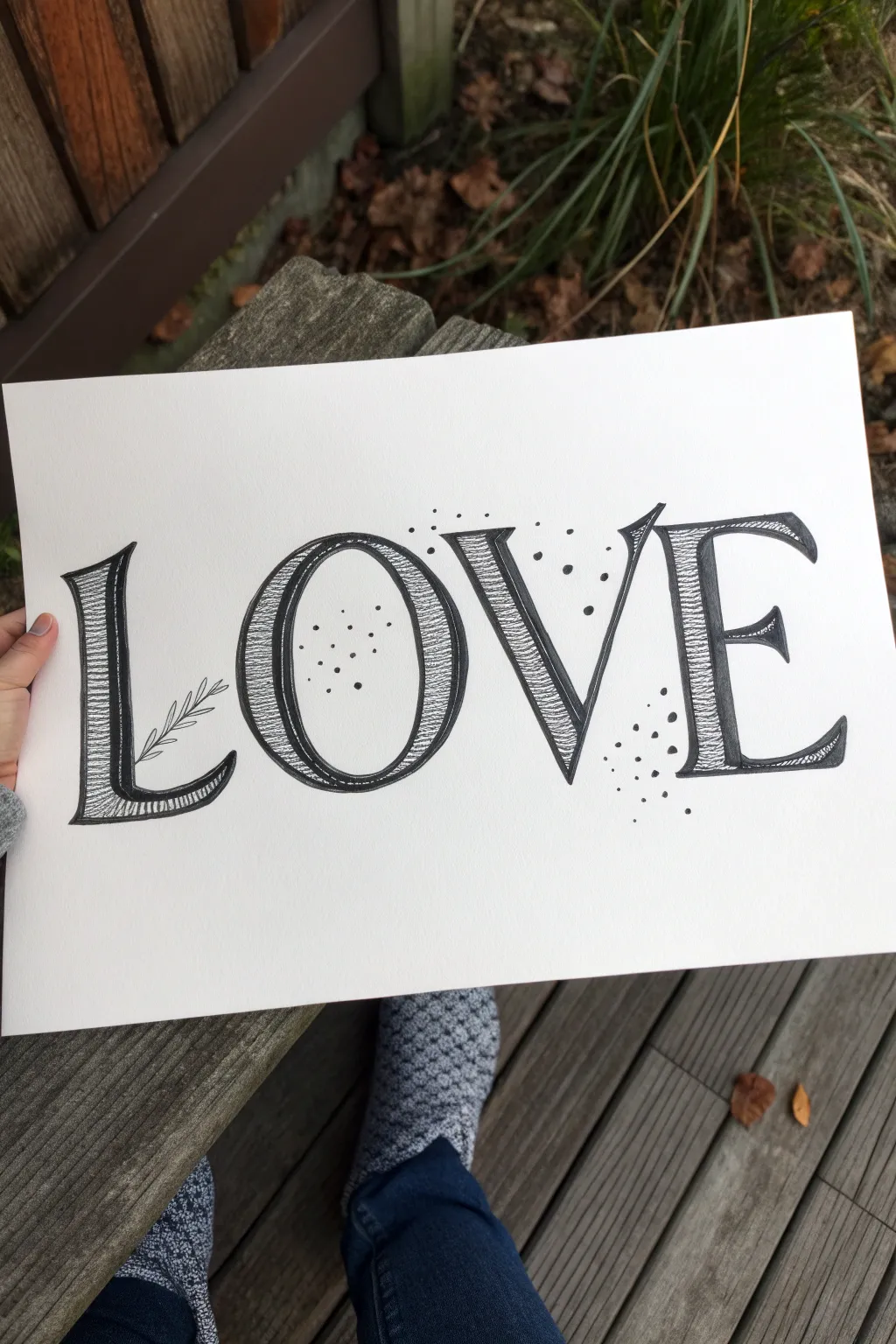
This elegant art piece combines strong serif lettering with delicate textural details to create a classic, almost engraved look. By using simple hatching lines and strategic stippling, you can turn a basic word into a sophisticated statement piece perfect for framing.
Step-by-Step Guide
Materials
- High-quality white cardstock or Bristol board (smooth surface preferred)
- Pencil (HB or H)
- Good quality eraser
- Ruler
- Fine liner pen (01 or 03 size) – black
- Medium felt tip marker or brush pen – black
Step 1: Drafting the Layout
-
Set your guidelines:
Start by lightly drawing two horizontal parallel lines across your paper with a ruler. These will define the top cap-height and the baseline for your letters, ensuring they are all the same size. -
Sketch the skeleton:
Using your pencil, lightly sketch the basic skeleton of the word ‘LOVE’. Focus on spacing first—make sure the ‘O’ is nice and round and the ‘L’ and ‘E’ have room to breathe. -
Add weight to the strokes:
Thicken the strokes to create a serif style. Remember the rule of thumb for calligraphy: downstrokes should be thick, and upstrokes should remain thin. Sketch these thick blocks lightly around your skeleton lines. -
Refine the serifs:
Add the serif details (the little feet) to the ends of the strokes. For this specific style, give the serifs a slight curve or bracket where they join the main stem, rather than a harsh blocky corner. -
Review and erase:
Step back and look at your pencil sketch. Adjust any spacing issues now. Lightly erase your sketch so it’s barely visible, just enough to guide your ink.
Steady Hands
Rest the heel of your hand on a separate scrap piece of paper while drawing. This prevents hand oils from smudging your paper and keeps your hatching lines steady.
Step 2: Inking the Outlines
-
Outline the thick strokes:
Take your fine liner pen and carefully trace the outline of the *thick* parts of the letters. Do not fill them in! You want an empty shape that you will fill with texture later. -
Draw the thin strokes:
Draw the thin connecting lines and serifs. For parts like the crossbar of the ‘E’ or the thin side of the ‘O’, a single clean line often works best, perhaps double-traced very closely to add just a hint of weight. -
Add floral embellishment:
On the ‘L’, draw a simple, curved line sprouting from the thin vertical stroke. Add small, leaf-like loops along this stem to create a delicate botanical accent. -
Let the ink settle:
Wait a moment for the ink to dry completely, then gently erase all remaining pencil guidelines to reveal a clean black and white outline.
Add a Pop of Color
After the black ink is fully waterproof-dry, use a watercolor brush to add a very pale wash of pastel pink or blue just inside the letter shapes for a soft tint.
Step 3: Adding Texture and Detail
-
Start the hatching:
This is the defining step. Inside the thick, outlined shapes of your letters, begin drawing very fine horizontal lines. I like to start at the top and work my way down to keep a consistent rhythm. -
Vary the line quality:
Don’t make the lines perfectly straight or uniform. Let them have a slight ‘wobble’ or gentle curve. This imperfection mimics the look of vintage copperplate engraving. -
Apply shading strokes:
To create dimension, go back over specific areas—like the bottom of the ‘L’ or the curve of the ‘O’—with shorter, darker lines or cross-hatching. This simulates a shadow and makes the letters look rounded. -
Fill the ‘O’ and ‘V’:
Continue this hatching process for all the thick strokes. Be patient; the density of these lines creates the grey value. Keep the thin strokes solid black or empty to maintain contrast. -
Add external stippling:
Using your fine liner, add small dots floating around the letters. Concentrate them in the negative spaces, like inside the ‘O’, between the ‘V’ and ‘E’, and near the flourish on the ‘L’. -
Vary dot density:
Group some dots closer together and let others drift further apart. This creates a sense of movement and whimsy, preventing the background from looking too static. -
Final touches:
Inspect your hatched lines. If any areas look too light or ‘flat,’ add a few more thin strokes to deepen the texture. Ensure your floral sprig is connected smoothly to the letter ‘L’.
Once your stippling is complete, you have a timeless piece of hand-lettered art ready to display


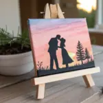
Sweet Couple Portrait in Gentle Color
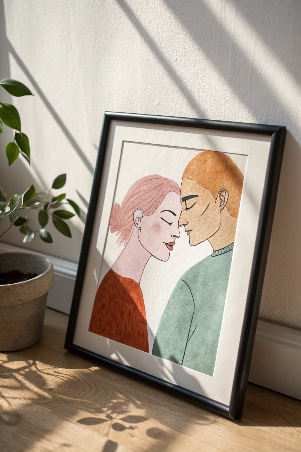
This tender artwork captures an intimate moment between two figures using gentle watercolor washes and distinct ink outlines. The soft color palette of rust, teal, and pink creates a calming, romantic vibe perfect for framing as a heartfelt gift.
Step-by-Step Guide
Materials
- Cold press watercolor paper (A3 or A4)
- Pencil (HB) and soft eraser
- Watercolor paint set (focus on burnt sienna, emerald green, pink, skin tones)
- Fine liner pen (Black, waterproof, 0.3mm and 0.5mm)
- Round watercolor brushes (sizes 4 and 6)
- Masking tape
- Jar of clean water
- Palette for mixing
Step 1: Sketching the Composition
-
Prepare your paper:
Tape your watercolor paper down to a hard board or table surface using masking tape. This prevents the paper from buckling when wet and creates that crisp white border later. -
Establish the profiles:
Lightly sketch two vertical lines slightly apart to mark where the noses will almost touch. This central gap is the focal point, so accurate spacing here is key. -
Draft the facial features:
Draw the profile of the woman on the left, focusing on a soft jawline, closed eyes with lashes, and a bun hairstyle. Mirror this on the right with the man’s profile, including a stronger jawline and short hair. -
Refine the lines:
Connect the necks to simple shoulder shapes. Keep the clothing lines minimal—just a curve for the woman’s neckline and a ribbed collar suggestion for the man. -
Finalize the pencil work:
Go over your sketch to ensure the expressions look peaceful. Erase any heavy or unnecessary guide lines until only a faint ghost image remains.
Step 2: Applying Watercolor Washes
-
Mix skin tones:
Prepare a pale, watery skin tone using ochre and a touch of red. Paint the face and neck areas, keeping the wash very flat and even. It’s okay if it looks pale now; watercolors dry lighter. -
Paint the hair:
For the woman’s hair, mix a soft pink with plenty of water. Paint the hair shape, leaving the texture for later. For the man, use an orange-brown mix, perhaps burnt sienna, and fill in his hair shape. -
Add the blush:
While the woman’s face is still slightly damp (but not soaking), drop a tiny amount of diluted pink onto her cheek area. This wet-on-wet technique creates that soft, natural blush effect. -
Color the clothing:
Mix a deep rust orange for the woman’s top and a muted teal or sage green for the man’s sweater. Apply these colors carefully, ensuring you get a solid, even fill. -
Let it dry completely:
Step away and let the artwork dry fully. If you try to ink over damp paper, the ink will bleed and ruin the crisp look we want.
Bleeding Lines?
If your black ink bleeds into the color, your paint wasn’t fully dry. Use a hairdryer on a low, cool setting to ensure bone-dry paper before starting any pen work.
Step 3: Inking and Details
-
Outline the faces:
Using your 0.3mm waterproof pen, carefully trace the pencil lines of the profiles. Use confident, continuous strokes for the nose and forehead lines. -
Detail the eyes:
Add the closed eyelids. Drawing the eyelashes requires a flicking motion with the pen to keep them delicate and tapered. -
Define hair texture:
Use the pen to draw strands within the painted hair shapes. For the woman’s bun, use sweeping curves; for the man, use shorter, straighter strokes to suggest texture. -
Outline clothing:
Trace the outer edges of the shirts. For the man’s teal sweater, add small vertical lines at the neck to simulate the ribbing of the fabric. -
Add final textures:
I like to add subtle texture lines inside the colored clothing areas—little dashes or faint scribbles—to give the fabric some visual weight, distinct from the smooth skin. -
Erase pencil marks:
Once the ink is 100% dry, gently run your soft eraser over the whole piece to remove any visible graphite sketch lines.
Add Metallic Accents
Once finished, use a gold paint pen or metallic watercolor to add tiny details, like an earring on the woman or highlights in the hair, for a premium look.
Peel off the tape slowly to reveal your clean border and frame it to celebrate love

Love Birds on a Branch
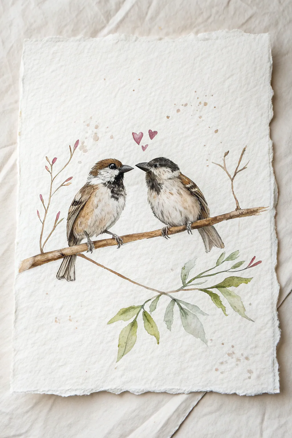
Capture the tender moment between two sparrows perched on a delicate branch in this detailed watercolor project. Using fine brushwork and natural earth tones on textured paper, you’ll create a charming piece that celebrates quiet avian romance.
Detailed Instructions
Materials
- Cold press watercolor paper (deckle edge optional, but nice)
- Watercolor paints (Burnt Umber, Burnt Sienna, Payne’s Grey, Yellow Ochre, Sap Green, Alizarin Crimson)
- Round brushes (sizes 6, 2, and 00 for details)
- HB Drawing pencil
- Kneaded eraser
- Mixing palette
- Jar of clean water
- Paper towels
Step 1: Sketching the Composition
-
Map out the shapes:
Begin by lightly drawing two oval shapes side-by-side in the center of your paper. These will form the bodies of the sparrows. Position them so their heads are angled slightly toward each other. -
Refine the bird forms:
Add smaller circles for heads on top of the body ovals. Sketch the outline of the wings folded against their sides and draw the tail feathers extending downward. The bird on the left should have a slightly longer, fanned tail. -
Add the perch:
Draw a diagonal branch running beneath their feet, slightly thicker at the right end. Add a smaller twig branching off downwards to the right, where the leaves will go. -
Details and cleanup:
Carefully sketch the beaks (the left one slightly open, the right one closed) and the eye placements. Add the tiny feet gripping the branch. Use your kneaded eraser to lighten the graphite lines until they are barely visible.
Muddy colors?
If your browns look dull or muddy, let the paper dry completely between layers. Wet-on-wet is great for soft blending, but crisp feathers need a dry surface.
Step 2: Painting the Sparrows
-
Base wash for bodies:
Mix a very watery wash of Yellow Ochre and a touch of Burnt Sienna. Apply this loosely to the chests and bellies of both birds, leaving some areas white for highlights. -
Wing foundation:
While the bellies dry, mix Burnt Umber with a little water. Paint the base shape of the wings and tail feathers. Don’t worry about individual feathers yet; just block in the brown areas. -
Adding the distinctive markings:
Using a size 2 brush and a darker mix of Burnt Umber and Payne’s Grey, paint the ‘cap’ on the left bird’s head and the black bib under its beak. For the right bird, paint the dark cap and the stripe through the eye area. -
Feather texture:
Switch to your smallest brush (size 00). With a dark brown mix, use tiny, flicking strokes to create the look of layered feathers on the wings. Follow the curve of the wing as you paint these fine lines. -
Softening the chests:
I like to take a clean, slightly damp brush and gently soften the edges of the darker bibs where they meet the lighter chest feathers, creating a fluffy texture rather than a hard line. -
Facial details:
Paint the beaks using a concentrated dark grey or black. Leave a tiny speck of white paper for the highlight on the eyes to make them look alive and glossy. -
Feet and claws:
Paint the legs and claws using a mix of grey and brown. Keep the paint fairly crisp here so the claws look like they are firmly gripping the wood.
Step 3: Painting Elements & Finishing The Scene
-
Branch texture:
Paint the branch with a mix of Burnt Umber and Yellow Ochre. While the paint is wet, drop in darker brown along the bottom edge to create roundness and shadow. -
Adding foliage:
Mix a soft, muted green using Sap Green and a touch of brown. Paint the leaves hanging from the lower twig. Vary the intensity of the green so some leaves look translucent. -
Buds and twigs:
On the left side, paint thin, wiry twigs rising up with tiny pinkish-red buds using a diluted Alizarin Crimson. Keep these lines very delicate. -
Splatter effect:
Cover the birds with a scrap piece of paper to protect them. Load a brush with watery brown paint and tap it against another brush handle to create subtle speckles across the background for an organic feel. -
The floating hearts:
Using the Alizarin Crimson (watered down slightly), paint three tiny hearts floating between the birds’ heads. Vary their sizes slightly, with the smallest one lowest. -
Final Contrast Check:
Step back and assess your values. If the eyes or wing patterns need more punch, add a final layer of your darkest Payne’s Grey mix to the deepest shadows.
Texture Pro Tip
For the fluffy belly texture, dab the damp paint with a dry paper towel while it’s still wet. This lifts pigment and creates a soft, downy look instantly.
Once dry, you’ll have a heartwarming avian portrait ready to be framed or gifted to a loved one.
BRUSH GUIDE
The Right Brush for Every Stroke
From clean lines to bold texture — master brush choice, stroke control, and essential techniques.
Explore the Full Guide
Tree of Hearts Landscape
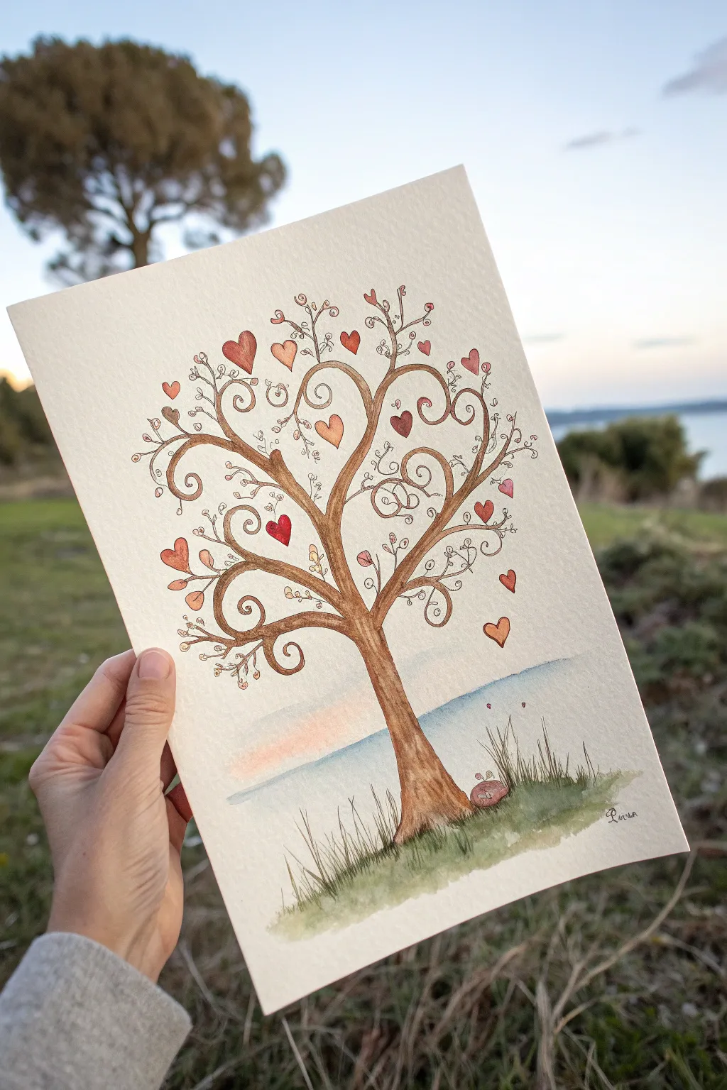
Capture the feeling of romance in nature with this charming watercolor illustration features swirling branches and delicate heart-shaped leaves. Using a combination of ink outlines and soft watercolor washes, you’ll build a piece that feels both organic and magical, perfect as a heartfelt gift or wall art.
How-To Guide
Materials
- Cold press watercolor paper (300 gsm)
- Watercolor paint set (Browns, Reds, Oranges, Greens, Blues)
- Fine liner pen (Waterproof, archival ink – Sepia or Brown)
- Round watercolor brushes (Size 2 and Size 6)
- Pencil (HB or H)
- Kneaded eraser
- Paper towel
- Jar of clean water
Step 1: Sketching the Foundations
-
Establish the horizon:
Begin by lightly sketching a horizon line about one-third of the way up from the bottom of your paper. Keep this line very faint as it will eventually be painted over. -
Outline the trunk:
Sketch the main trunk of the tree centered on the page. Start wider at the base, letting the roots flare out slightly into the grass area, and taper the trunk as it moves upward toward the center of the page. -
Draw swirled branches:
Instead of straight realistic branches, draw main limbs that curl at the ends like fern fronds. Create a balanced canopy by extending these swirls outward left and right, ensuring the tips curl inward. -
Add delicate details:
Fill the gaps between the main branches with thinner, smaller lines that also end in tiny spirals. These fine details give the tree its whimsical, fairytale character. -
Place the hearts:
Scatter heart shapes of varying sizes throughout the branches. Draw some hanging from the branch tips like fruit, and gently float a few detached hearts in the empty space to the right, as if carrying on a breeze.
Step 2: Inking the Design
-
Trace with ink:
Using your waterproof sepia or brown fine liner, carefully trace over your pencil lines. The brown ink softens the look compared to harsh black, maintaining the warm, earthy vibe of the piece. -
Refine the branches:
As you ink the trunk, distinct lines can act as bark texture. Break up your lines slightly on the trunk rather than drawing one continuous contour to suggest rough wood. -
Ink the grass:
At the base of the tree, use quick, upward flicking motions with your pen to create blades of grass rather than a solid line. -
Erase guidelines:
Wait until the ink is completely dry—I usually give it at least five full minutes to be safe—then gently remove all visible pencil marks with your kneaded eraser.
Ink Smearing?
If your pen smears when painting, it isn’t fully waterproof. Test your pen on a scrap paper first with water. If it runs, do the painting first and add ink last once dry.
Step 3: Applying Watercolor
-
Paint the trunk:
Mix a warm brown watercolor. Using a size 6 brush, fill in the trunk. Let the paint be slightly uneven, pooling darker at the edges and lighter in the center to create a sense of roundness. -
Color the hearts:
Switch to your smaller size 2 brush. Paint the hearts using a variety of warm tones: deep reds, soft pinks, and muted oranges. Vary the saturation so some look transparent and others bold. -
Add the grassy base:
Wet the bottom area of the paper slightly with clean water. Drop in various shades of sap green and olive, letting the colors bleed softly into the wet paper to create a grassy texture. -
Create grass details:
While the green wash is damp but not soaking, use the tip of your brush to flick distinct darker green strands upward, mimicking the ink lines you drew earlier. -
Paint a soft horizon:
For the water background, dilute a soft blue heavily with water. Paint a horizontal band behind the tree trunk, fading it out as it goes upward to suggest distance. -
Add a sunset glow:
Just above the blue water line, brush a very faint, watery wash of pale peach or pink. Blend the edge where the pink sky meets the blue water so there are no hard lines. -
Final touches:
Once the grass is dry, paint a small, rounded rock near the base of the tree in a reddish-brown tone to anchor the composition.
Vary Your Hearts
Don’t make every heart a perfect solid red. Leave tiny white highlights in some, or use a ‘wet-on-wet’ technique to blend orange into pink within a single heart.
Sign your name in the corner with your fine liner and enjoy the love radiating from your creation
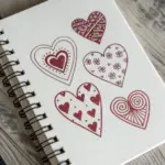
Doodle Page of Tiny Heart Patterns
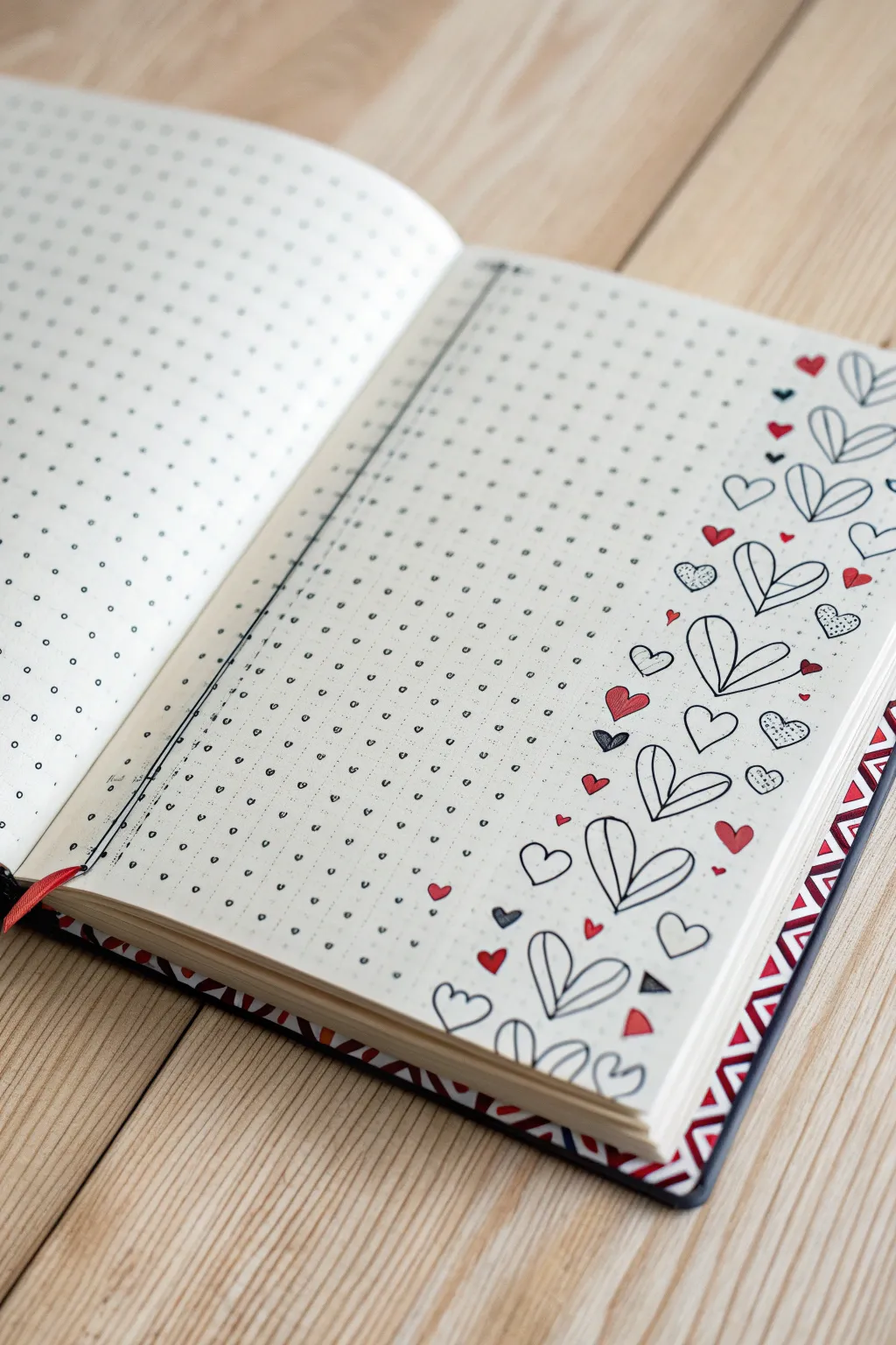
Transform a plain journal page into a love-filled canvas with this charming margin design. Featuring a vertical cascade of varied heart doodles, this pattern adds a sweet, hand-drawn touch to your organizers or sketchbooks.
Step-by-Step Guide
Materials
- Dotted grid notebook or journal
- Fine liner pen (black, 0.3mm or 0.5mm)
- Red felt-tip pen or marker
- Pencil and eraser (optional for sketching)
- Ruler (optional)
Step 1: Setting the Layout
-
Define the drawing area:
Open your dotted grid notebook to a fresh spread. Locate the right-hand page where we will focus our design. -
Mark the margin boundary:
We will be working primarily in the rightmost column, about 1.5 to 2 inches wide. You don’t need to draw a line, but mentally visualize this vertical strip as your canvas. -
Draw the main vertical divider:
On the left side of the right page, draw a long, straight vertical line to separate a ‘tracker’ or ‘list’ section if you wish to mimic the photo exactly. This line runs parallel to the spine. -
Add detail to the divider:
If you drew the divider line, double it up slightly or re-trace it to give it a sketchy, bold look, adding small tick marks along it to interact with the grid dots.
Ink Smudges?
If you smear wet ink, turn the smudge into a shadow or a solid black geometric shape. A small solid triangle can hide many accident with style.
Step 2: Drawing the Primary Hearts
-
Start with the large outline hearts:
Begin drawing the largest heart motifs. These are stylized hearts that look like two teardrop shapes or leaves meeting at the bottom point. Place the first one near the bottom right corner. -
Continue the large pattern:
Work your way up the right margin, drawing these large ‘split’ hearts intermittently. Space them out irregularly—some tilted left, some tilted right—to create a flowing, organic feel. -
Vary certain sizes:
Draw a few slightly smaller versions of this same split-heart design higher up the page, ensuring they climb all the way to the top corner.
Step 3: Adding Variety and Fillers
-
Sketch standard hearts:
Now, switch to a classic simple heart shape. Draw these in the medium-sized gaps between your large split hearts using your black fine liner. -
Add textured hearts:
Create visual interest by drawing small hearts and filling them with tiny dots or stippling. I like to scatter these sparsely to keep the texture balanced. -
Incorporate tiny hearts:
Fill the smallest gaps with very tiny black outline hearts. These act as confetti, tying the larger elements together. -
Add geometric accents:
Draw tiny triangles or diamond shapes in a few open spots, colouring them in solid black for high contrast.
Pro Tip: Organic Flow
Don’t align the hearts perfectly. Rotating each heart slightly creates a ‘tumbled’ effect that looks much more whimsical and professional than a rigid line.
Step 4: Bringing in Color
-
Select your accent color:
Take your red felt-tip pen. The goal is to sprinkle color throughout the design without overwhelming the black ink. -
Fill small solid hearts:
Identify small empty spaces in the flow and draw tiny solid red hearts. Place them near the larger black-and-white hearts to make the monochrome pop. -
Balance the color distribution:
Step back and look at the column. Ensure red elements are scattered evenly from top to bottom so the eye travels smoothly down the page.
Step 5: Final Touches
-
Enhance the bottom border:
At the very bottom of the page, allow a few hearts to spill horizontally towards the center, creating a footer effect. -
Draw the grid dots (if not using dot paper):
If you are using plain paper, simulate the journal look by using a ruler and fine pen to add rows of small dots across the rest of the page. -
Clean up sketch lines:
Once the ink is completely dry, gently erase any pencil guidelines you might have made for spacing. -
Highlight the spine:
If copying the photo faithfully, you can add a strip of decorative washi tape or a coloured marker strip along the very edge of the book cover for a finished look.
Now you have a lovely, custom-decorated page ready for your daily planning or notes

PENCIL GUIDE
Understanding Pencil Grades from H to B
From first sketch to finished drawing — learn pencil grades, line control, and shading techniques.
Explore the Full Guide
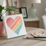
Candy Heart Color Study (Painted)
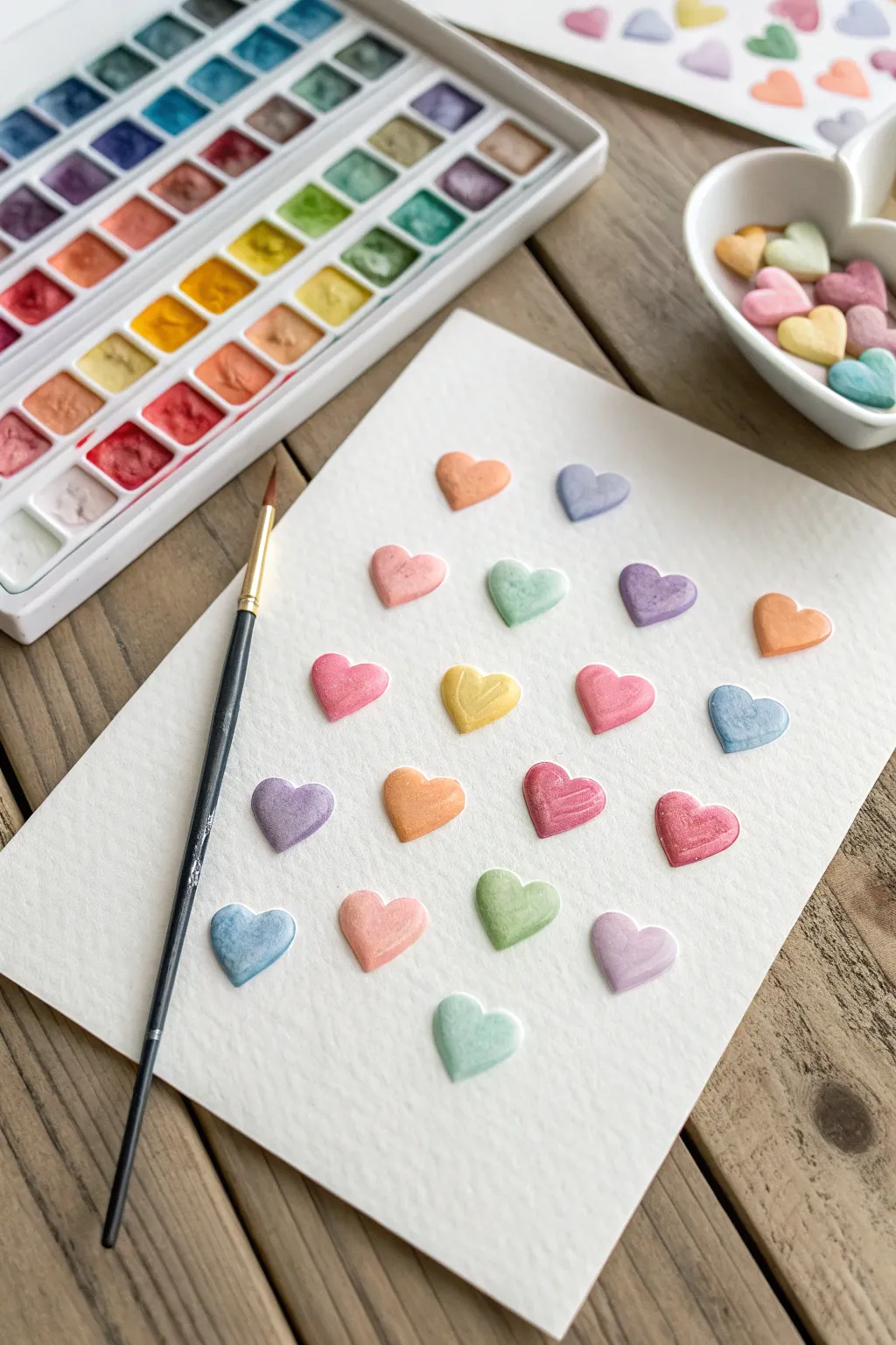
Capture the sweetness of Valentine’s Day treats with this delightful watercolor study of conversation hearts. By playing with soft pastel shades and subtle highlighting, you can create a dimensional, candy-like effect that looks good enough to eat.
Step-by-Step
Materials
- Cold press watercolor paper (140lb/300gsm)
- Watercolor pan set (pastels, metallics, or pearlescents recommended)
- Round watercolor brush (size 4 or 6)
- Pencil (HB or lighter)
- Kneaded eraser
- Jar of clean water
- Paper towel
Step 1: Preparation & Sketching
-
Prepare your workspace:
Set up your watercolor paper on a flat surface. Tape it down if you prefer a clean border, though a loose sheet works fine for this casual study. -
Plan the layout:
Visualize a grid of hearts. In the reference, they are arranged loosely in about 4-5 rows, slightly staggered to feel organic rather than rigid. -
Sketch the hearts:
Using your pencil very lightly, draw small heart shapes. Aim for that classic ‘candy’ shape: slightly wide, rounded at the top, and not too pointy at the bottom. -
Soften the lines:
Once you are happy with the placement, roll a kneaded eraser over the sketch. You want the graphite to be barely visible so it doesn’t show through the translucent paint.
Fixing Water Blooms
If you see cauliflower-like blooms, you added water to drying paint. Let it dry completely, then gently glaze over it with a damp brush to smooth texture.
Step 2: Painting the Hearts
-
Select your palette:
Choose a variety of pastel colors: peach, lavender, mint green, soft pink, pale yellow, and baby blue. If your paints are too vibrant, mix in a little white or water them down significantly. -
Load the brush:
Wet your brush and pick up a generous amount of your first color, for example, a peachy orange. The consistency should be fluid but pigment-rich. -
Outline the first heart:
With the tip of the brush, carefully trace the outline of your first pencil heart. -
Fill in the shape:
Quickly fill the center of the outline with color before the edges dry. This prevents hard lines from forming inside the shape. -
Lift for highlights:
While the paint is still wet, rinse your brush, dry it on a paper towel, and gently touch the upper left curve of the heart to lift a tiny bit of pigment. This creates a subtle highlight. -
Move around the paper:
Switch colors and move to a non-adjacent heart to prevent wet edges from touching and bleeding into each other. -
Repeat the process:
Continue painting hearts, scattering the colors randomly so no two same-colored hearts are right next to each other. -
Painting the yellow hearts:
For the yellow hearts, ensure your brush feels very clean before picking up the paint to keep the yellow bright and not muddy. -
Adding shadow depth:
I like to drop a tiny amount of slightly more concentrated pigment into the bottom right curve of the wet heart. This enhances the 3D ‘puffy’ look.
Add Messages
Once fully dry, use a very fine red pen or tiny brush to write classic phrases like ‘LUV U’ or ‘BE MINE’ on the center of each heart.
Step 3: Finishing Touches
-
Check for gaps:
Look over your composition. If there are awkward empty spaces, paint an additional heart to balance the visual weight. -
Refine the edges:
If any edges look ragged, use a damp brush with a tiny amount of pigment to smooth them out, but be careful not to overwork the paper. -
Let it dry completely:
Allow the artwork to sit undisturbed until the sheen of water is completely gone and the paper feels dry to the touch. -
Erase stray marks:
Once fully dry, use your eraser to gently remove any remaining visible pencil marks from around the painted shapes.
Display your sweet color study in a frame or use it as a handmade card for someone special
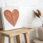
Split-Canvas Partner Heart Painting
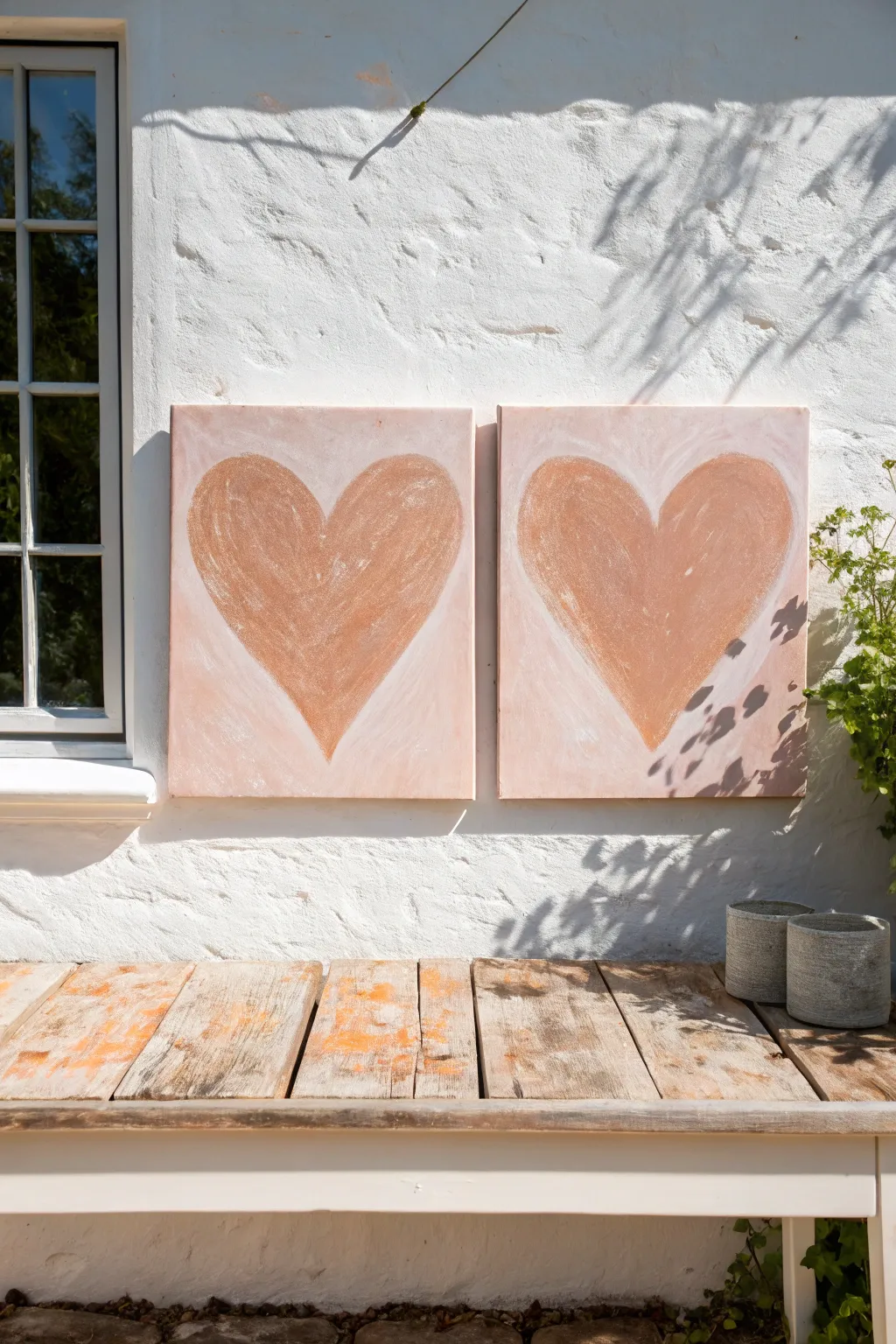
Create a unified statement piece using two separate canvases that come together to form two warm, rustic hearts. This project relies on texture and subtle color blending to achieve a weathered, fresco-like appearance that looks beautiful indoors or out.
How-To Guide
Materials
- Two square stretched canvases (equal size, e.g., 20×20 inches)
- Acrylic heavy body paint (Terracotta/Burnt Sienna, Titanic White, Unbleached Titanium)
- Texture paste or modeling paste
- Large flat paintbrush (2-3 inch)
- Medium round brush
- Palette knife or plastic scraper
- Paper plate or palette
- Pencil
- Cardstock or paper for templates (optional)
Step 1: Base Preparation
-
Prepare the texture mix:
Begin by mixing a generous amount of texture paste with white acrylic paint and a touch of Unbleached Titanium. You want a consistency similar to thick frosting that holds its shape but spreads smoothly. -
Apply the background layer:
Using your large flat brush or a palette knife, slather this off-white mixture across both canvases. Don’t try to make it perfectly smooth; let the brushstrokes and knife marks show to create an organic, plaster-like foundation. -
Add subtle background tint:
While the texture is still wet, dip the very corner of your brush into a tiny amount of Terracotta paint. Sweep this lightly into the wet white background in random areas to create a soft, dusty pink blush effect. -
Dry completely:
Allow the canvases to dry fully. Since the texture paste is thick, this may take several hours or overnight. The surface should be hard to the touch before proceeding.
Step 2: Drafting the Shapes
-
Make a heart template:
To ensure your hearts look like a matching pair, I like to cut a heart shape out of cardstock or paper that fits comfortably within the canvas dimensions. -
Position the templates:
Place your canvases side-by-side on a flat surface. Center your template on the left canvas and lightly trace the outline with a pencil. -
Mirror the design:
Repeat the process on the right canvas. Step back to ensure both hearts are aligned horizontally and are roughly the same size and shape before you start painting.
Uneven Texture?
If texture paste cracks while drying, mix a thinner batch of paint and paste to fill fissures, then lightly sand for a distressed look.
Step 3: Painting the Hearts
-
Mix the heart color:
On your palette, mix your primary Terracotta or Burnt Sienna color with a little bit of the texture paste. This ensures the heart shape has the same gritty, rustic feel as the background. -
Fill the outlines:
Using a medium brush, fill in the heart shapes with your terracotta mixture. Apply the paint in sweeping, curved motions that follow the rounded shape of the heart lobes. -
Create a weathered look:
Once the base color is down, take a mostly dry brush with a tiny bit of white paint. Lightly scuff this over the center and upper curves of the hearts to create a ‘chalky’ highlight effect. -
Soften the edges:
The edges of the hearts shouldn’t be razor-sharp. Use a clean, slightly damp brush to gently feather the edges where the terracotta meets the background, blending them slightly for a cohesive look. -
Check consistency:
Compare both canvases. If one heart looks darker, add a wash of diluted Unbleached Titanium over it to tone it down until they match.
Go Metallic
Mix a drop of copper or gold leaf paint into the terracotta color for a subtle shimmer that catches sunlight outdoors.
Step 4: Finishing Touches
-
Add final texture:
If the surface looks too flat, use a palette knife to scrape a very small amount of thick white paint across the canvas, skipping over the high points of the canvas weave. -
Paint the sides:
Don’t forget the edges of your canvas. Paint the sides in the same off-white background color so the artwork looks finished from every angle. -
Seal for protection:
If you plan to display these outdoors or in a sunroom, apply a coat of UV-resistant matte varnish once the paint is completely cured to prevent fading.
Hang your twin canvases side by side to enjoy a warm, rustic focal point that celebrates love and symmetry


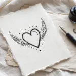
One-Line Drawing of an Embrace
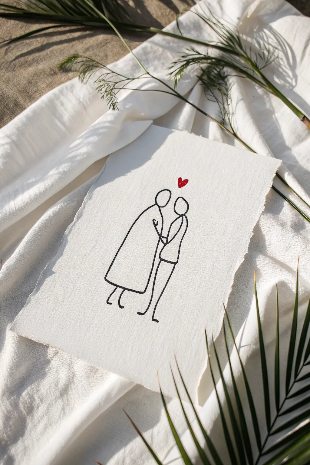
Capture the essence of intimacy with this elegant, minimalist artwork on textured paper. Using a single continuous styling for the figures and a pop of red for the heart, this piece proves that sometimes less truly is more when expressing love.
Step-by-Step
Materials
- Heavyweight textured cotton paper (handmade style with deckle edges)
- Black archival ink fine-line pen (sized 0.5mm or 0.8mm)
- Red gel pen, watercolor paint, or fine marker
- Pencil (HB or H)
- Kneaded eraser
- Ruler (optional for centering)
- Scrap paper for sketching
Step 1: Preparation and Sketching
-
Select your paper:
Choose a high-quality, textured paper. The rough surface adds character to the simple lines. If your paper doesn’t have deckle edges, you can gently tear the edges against a ruler to create that rustic, torn look. -
Draft the concept:
Before touching your good paper, practice the continuous line flow on scrap paper. The goal is to draw the figures with as few breaks as possible, keeping the lines fluid and connected. -
Lightly center the composition:
Using your pencil very lightly, mark the center of your textured paper. This helps ensure the couple isn’t floating too high or too low. -
Sketch figure one (the taller figure):
Start sketching the left figure lightly in pencil. Begin with an oval for the head, then flow down into a wider coat or robe shape. This figure leans slightly forward. -
Sketch figure two:
Sketch the second figure on the right. Their head should tilt up slightly towards the first figure. Draw a simpler, straighter body shape, suggesting they are standing close. -
Refine the connection points:
Adjust the pencil sketch so the arms seem linked. The lines don’t need to be anatomically perfect; just suggest the gesture of holding hands or an embrace near the center. -
Add the feet:
Draw simple, stick-like legs and feet at the bottom. The left figure’s feet should point slightly outward, while the right figure’s legs angle back slightly for balance. -
Place the heart:
Lightly mark the position for the heart directly centered above the space between their heads. Keep it small to maintain the minimalist aesthetic.
Jittery Lines?
If your hand shakes, don’t worry. Embrace the ‘wobbly’ aesthetic or try drawing from your shoulder rather than your wrist for smoother, longer strokes.
Step 2: Inking and Finishing
-
Test your pen:
On a scrap piece of the same paper type, test your black fine-line pen. Textured paper can snag nibs, so ensure the ink flows smoothly without bleeding. -
Ink the heads:
Begin the final inking with the heads. Draw the ovals confidently. If the line breaks slightly due to the paper texture, leave it; it adds to the organic look. -
Ink the bodies:
Move downwards to ink the robes and bodies. Try to maintain a steady speed. I find that moving too slowly can make the lines look shaky, while a slightly faster stroke looks more confident. -
Detail the embrace:
Carefully ink the center section where the arms meet. Be precise here to ensure the shapes remain distinct but connected. -
Ink the legs:
Finish the black linework by tracing the legs and feet. Keep these lines swift and light. -
Let the ink set:
Wait at least 15 to 20 minutes for the black ink to dry completely. Textured paper absorbs ink slowly, and smudging it now would ruin the clean background. -
Erase pencil marks:
Gently dab—don’t scrub—with a kneaded eraser to lift the graphite guidelines. The dabbing motion protects the paper’s rough texture. -
Add the red heart:
Using your red pen or a small brush with red watercolor, fill in the heart shape above the heads. Make this solid and saturated for a striking contrast. -
Final texture check:
Inspect the drawing. If the texture of the paper caused any major gaps in the black lines that disrupt the form, specific touch-ups can be made, but imperfections generally enhance the style.
Try Gold Leaf
Instead of red ink, apply a tiny dab of gold sizing and gold leaf for the heart. It catches the light beautifully and makes the print feel luxurious.
Now you have a charming piece of sentimental art ready to display or gift to a loved one
Map-Style Heart Memory Collage
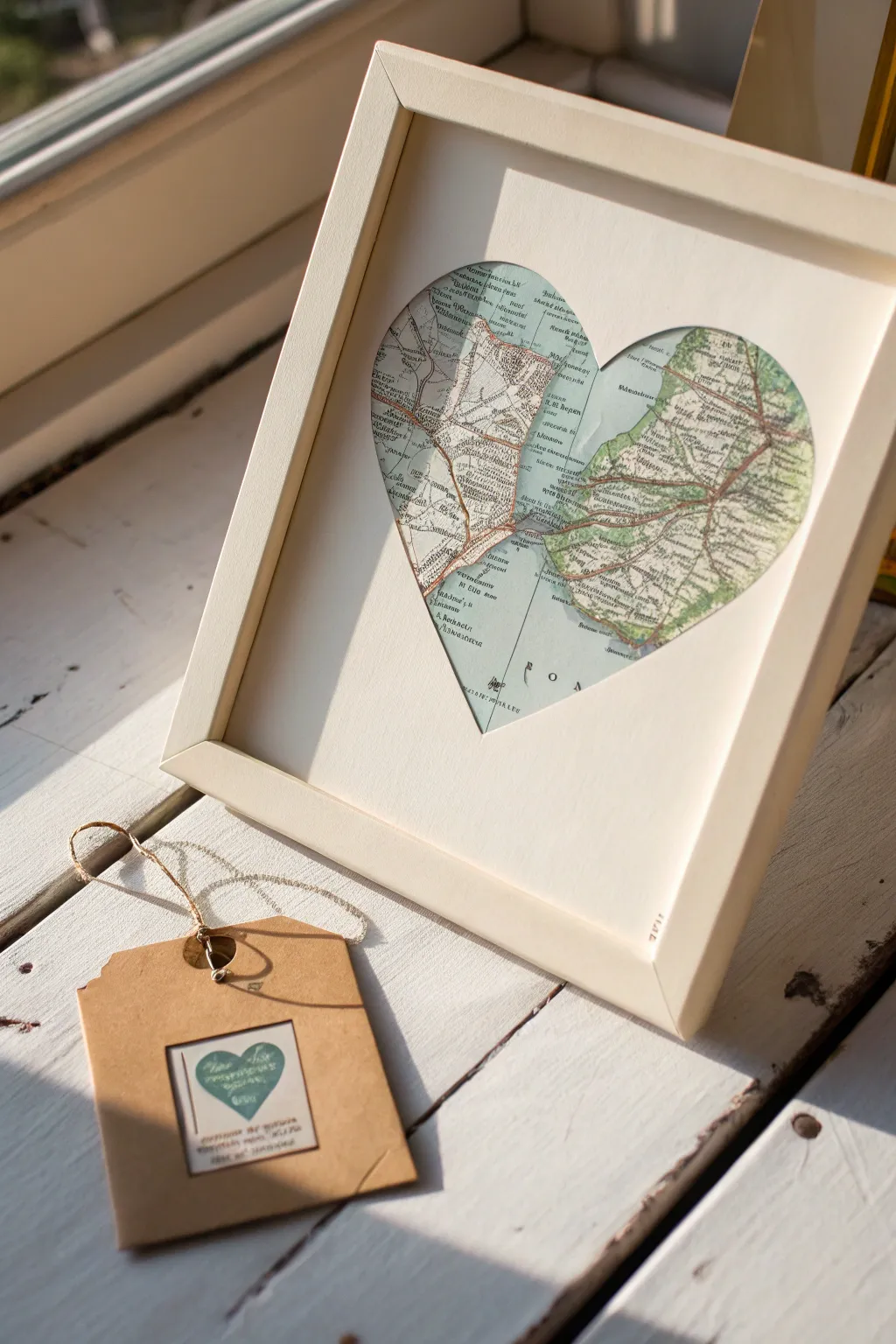
Celebrate a significant connection between two places with this elegant, sentimental display. By combining two distinct vintage maps behind a singular heart cutout, you create a visual story of long-distance love or the journey that brought you together.
How-To Guide
Materials
- White shadow box frame or deep-set picture frame (approx 8×10)
- Thick white cardstock or mounting board (to fit frame)
- Two vintage maps (originals or high-quality prints)
- Pencil
- Ruler
- Craft knife or scalpel (e.g., X-Acto)
- Cutting mat
- Acid-free double-sided tape or archival glue stick
- Paper scissors
- Computer and printer (for template)
- Plain paper (for template)
Step 1: Planning and Preparation
-
Source your locations:
Identify the two specific locations you want to feature. Look for maps that have similar color palettes—usually soft greens, blues, and creams—to ensure they look cohesive when placed side-by-side. -
Prepare the frame:
Disassemble your frame, removing the back and the glass. Clean the glass thoroughly on both sides to avoid trapping dust later. -
Create the heart template:
Print a symmetrical heart shape onto plain paper. The heart should be large enough to fill the center of your frame but leave a generous white border (about 1.5 to 2 inches) on all sides. -
Cut the template:
Cut out the paper heart carefully with scissors. Fold it gently in half vertically to find the exact center line which will separate your two maps.
Ragged Edges?
If your cardstock tears while cutting the heart, your blade is dull. Snap off the end or swap for a fresh blade immediately for crisp lines
Step 2: Creating the Mount
-
Measure the mounting board:
Cut your thick white cardstock or mounting board to the exact dimensions of your frame’s glass. -
Trace the aperture:
Place your heart template in the absolute center of the white board. Use a ruler to verify the margins are equal. Lightly trace around the heart with a pencil. -
Cut the aperture:
Place the board on a cutting mat. Using a sharp craft knife and a steady hand, cut along the pencil line to remove the heart shape. I find it helpul to rotate the mat, not the knife, as I cut curves. -
Refine the edges:
If there are any rough spots on your cutout, gently smooth them with a fine-grit sanding block or the side of your craft knife blade.
Add Dimension
Use foam tape instead of flat tape to mount the white mat over the maps. This creates a shadow box effect, adding depth to the heart window
Step 3: Assembling the Map Collage
-
Position the first map:
Take your first map and slide it behind the left side of the heart aperture. Adjust it until the specific town or street you want to highlight is visible. -
Mark the cut line:
Lightly mark where the center vertical line of the heart falls on this map. -
Trim the first map:
Remove the map and use a ruler and craft knife to cut a straight vertical edge on the right side, just past where your center mark was, leaving a tiny bit of overlap room. -
Position the second map:
Repeat the process with the second map for the right side of the heart, ensuring the color tones balance well with the first map. -
Trim the second map:
Cut a straight vertical edge on the left side of this second map. -
Join the maps:
On a separate scrap piece of thin card, tape the two map pieces side-by-side so they touch perfectly without a gap. This creates your backing layer. -
Make the final sandwich:
Flip the white mounting board (the one with the heart hole) face down. Position your joined map layer face down over the opening. Check the front to ensure alignment. -
Secure the backing:
Use acid-free tape to secure the map layer firmly to the back of the mounting board. Ensure it is taut so the paper doesn’t buckle.
Step 4: Final Assembly
-
Reframe:
Place the glass back into the frame, followed by your mounted artwork. Replace the frame backing and secure the clips. -
Create a matching tag (optional):
If gifting, create a small gift tag using a scrap of kraft paper. Adhere a tiny square cutout of leftover map to the front, perhaps drawing a tiny heart over a special spot with a gel pen.
Hang this sentimental piece in a spot where the light catches the colors of the maps to remind you of your favorite places
Layered Paper Hearts With Depth
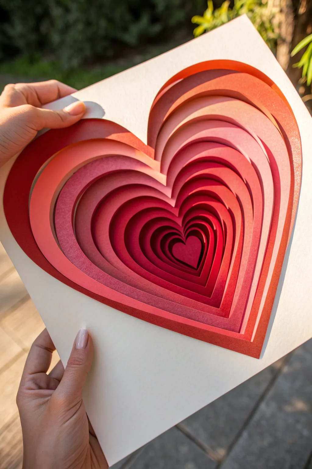
Create a mesmerizing optical illusion of depth with this layered paper art project. By stacking graduating shades of red and pink cardstock with foam spacers, you’ll build a vibrant heart tunnel that seems to pull the viewer right into its center.
Step-by-Step Tutorial
Materials
- Heavy cardstock (10-12 sheets in a gradient of reds, deeper wines, and soft pinks)
- White backing board or heavy watercolor paper
- Precision craft knife (X-Acto)
- Self-healing cutting mat
- Digital cutting machine (Cricut/Silhouette) OR pencil and tracing paper
- Double-sided foam tape or foam squares (creates the depth)
- Ruler
- Glue stick or double-sided tape runner
- Shadow box frame (optional)
Step 1: Planning and Cutting
-
Design your template:
Start by drawing a large heart shape that fits your frame size (e.g., 8×8 inches). Inside this heart, draw 9-11 progressively smaller concentric hearts. The spacing doesn’t need to be mathematically perfect; slight variations add organic charm. -
Assign your color palette:
Lay out your cardstock sheets to determine the color order. For the effect shown in the picture, use a mix of deep ruby, bright cherry red, and soft salmon pinks. I find that alternating dark and light shades creates the most dramatic contrast. -
prepare the layers:
You will need one sheet of paper for each ‘ring’ of the heart. The topmost layer will have the largest heart cutout, while the bottom-most layer will be a solid small heart (or the very backing). -
Digital cutting method:
If using a cutting machine, import your heart vectors. Set each concentric heart to cut from a different sheet of paper. Ensure the outer dimensions of every sheet remain the exact same square size so they stack perfectly. -
Manual cutting method:
If cutting by hand, trace your square outline and the specific heart size for that layer onto the back of your cardstock. -
Execute the cuts:
Carefully cut out the heart centers using a sharp craft knife. Keep the blade fresh to avoid tearing the paper fibers, especially on the tighter inner curves. -
Save the centers:
Don’t throw away the heart cutouts! You can use these smaller hearts for card-making or a reverse-colored project later. -
Check the stack:
Before gluing anything, stack your paper layers dry. Look through the ‘tunnel’ to ensure the graduation looks smooth and the colors interplay nicely. Adjust the order if a certain red blends too much with its neighbor.
Step 2: Assembly and Depth
-
Prepare the base:
Take your solid white backing board or the very smallest central heart piece. This will be the anchor for your stack. -
Apply foam spacers:
Cut your foam tape into thin strips. Apply these strips to the back of your second-smallest layer (the one that goes immediately over the center). Place foam near the edge of the heart cutout to prevent the paper from sagging. -
Align and adhere:
Carefully align the corners of this layer with your base layer and press down gently. The foam creates a shadow gap that is essential for the 3D look. -
Build the tunnel outward:
Continue this process, working from the center outward (smallest hole to largest hole). Apply foam tape to the back of the next layer, align the outer square edges, and stick it down. -
Reinforce corners:
As the heart cutouts get larger, the paper borders get thinner. Ensure you put tiny pieces of foam tape in the corners and along the thin side strips so the artwork remains rigid. -
Add the top layer:
For the final, topmost layer with the largest opening, ensure your foam tape is very neat and hidden from view. Press firmly around the perimeter to seal the stack. -
Examine side profile:
Check the sides of your paper stack. If the white foam tape is too visible, you can use a matching marker to gently color the edges of the foam to blend with the red paper. -
Framing:
Place the finished stack inside a shadow box frame. The glass keeps dust out of the intricate layers and enhances the professional finish.
Clean Cuts Only
Change your X-Acto blade every 2-3 sheets. A dull blade drags and ruins crisp corners. If edges look fuzzy, sand lightly with an emery board.
Add Lighting
For a magical nightlight effect, sandwich a string of battery-operated micro LED fairy lights between the bottom two layers before sealing the stack.
Now step back and admire how simple sheets of paper have transformed into a sculptural piece full of life and depth
Painted Love Rocks With Simple Icons
Transform smooth river stones into charming tokens of affection with this delicate painted rock project. The main design features a soft pink heart pierced by an arrow, accompanied by rustic botanical flourishes, perfect for a heartfelt gift or garden decoration.
Detailed Instructions
Materials
- Smooth river rocks (one large white, several smaller terracotta/grey)
- White acrylic paint (titanium white)
- Soft pink acrylic paint
- Taupe or grey-brown acrylic paint
- Fine detail paintbrush (size 0 or 00)
- Small flat paintbrush (size 2 or 4)
- Pencil for sketching
- Matte spray varnish (optional)
Step 1: Base Preparation
-
Select your canvas:
Choose a large, smooth stone for your main design. A naturally white or light-colored stone works best so the colors pop without needing a base coat. If your stone is dark, you may want to prime the painting area with a layer of white paint first. -
Clean surface:
Wash the stone thoroughly with soap and water to remove any dirt or oils. Let it dry completely before starting, as moisture will prevent the paint from adhering properly.
Steady Hand Trick
Rest your painting hand’s wrist or pinky finger on the table surface while you work. This anchor point significantly reduces shakiness for fine lines.
Step 2: Painting the Heart
-
Sketch the outline:
Lightly sketch a central heart shape and the arrow placement using a pencil. Keep the lines faint so they are easily covered by the paint. -
Fill the heart:
Using your small flat brush, fill in the heart shape with soft pink acrylic paint. Aim for an even, opaque layer. -
Let it dry:
Allow the pink paint to dry completely. This is crucial before adding the outline to prevent smudging. -
Add the inner outline:
Switch to your fine detail brush and white paint. Carefully paint a thin contour line just inside the edge of the pink heart. I like to rest my pinky on the table for stability to get steady lines.
Fixing Wobbly Lines
If a line goes astray, don’t wipe it! Let it dry completely, then gently scrape the error off with a toothpick or paint over it with the background color.
Step 3: Adding Rustic Details
-
Paint the piercing arrow:
Mix a taupe or grey-brown shade on your palette. Using the fine detail brush, paint the shaft of the arrow entering the top right of the heart and exiting the bottom left. -
Detail the fletching:
Add the arrow’s feathers (fletching) at the top end using short, angled strokes to mimic texture. -
Draw the arrowhead:
Paint a simple triangular arrowhead at the bottom end of the shaft. -
Create the decorative branch:
To the right of the heart, paint a long, curved line representing a stem or branch using the same taupe color. -
Add leaves:
Along the curved stem, paint small, V-shaped marks to create stylized leaves or pine needles, giving it a botanical look. -
Add extra arrows:
Paint two smaller, standalone arrows floating near the heart for balance—one pointing right and one pointing down-left.
Step 4: Companion Stones
-
Prep smaller decorative stones:
Take your smaller terracotta or grey stones. These make great accent pieces to accompany the main artwork. -
Paint simple hearts:
On these smaller rocks, simply paint a heart outline in white. Use the fine brush to create a continuous, flowing line. -
Final touches:
Check all your stones for any patchy areas. If the white outlines look translucent, carefully go over them with a second coat once the first is dry. -
Seal the artwork:
Once all paint is fully cured (usually 24 hours), spray a light coat of matte varnish over the rocks to protect them from chipping and handling.
Arrange your beautiful new collection in a sunny spot to spread a little love
Geometric Mosaic Heart Gradient
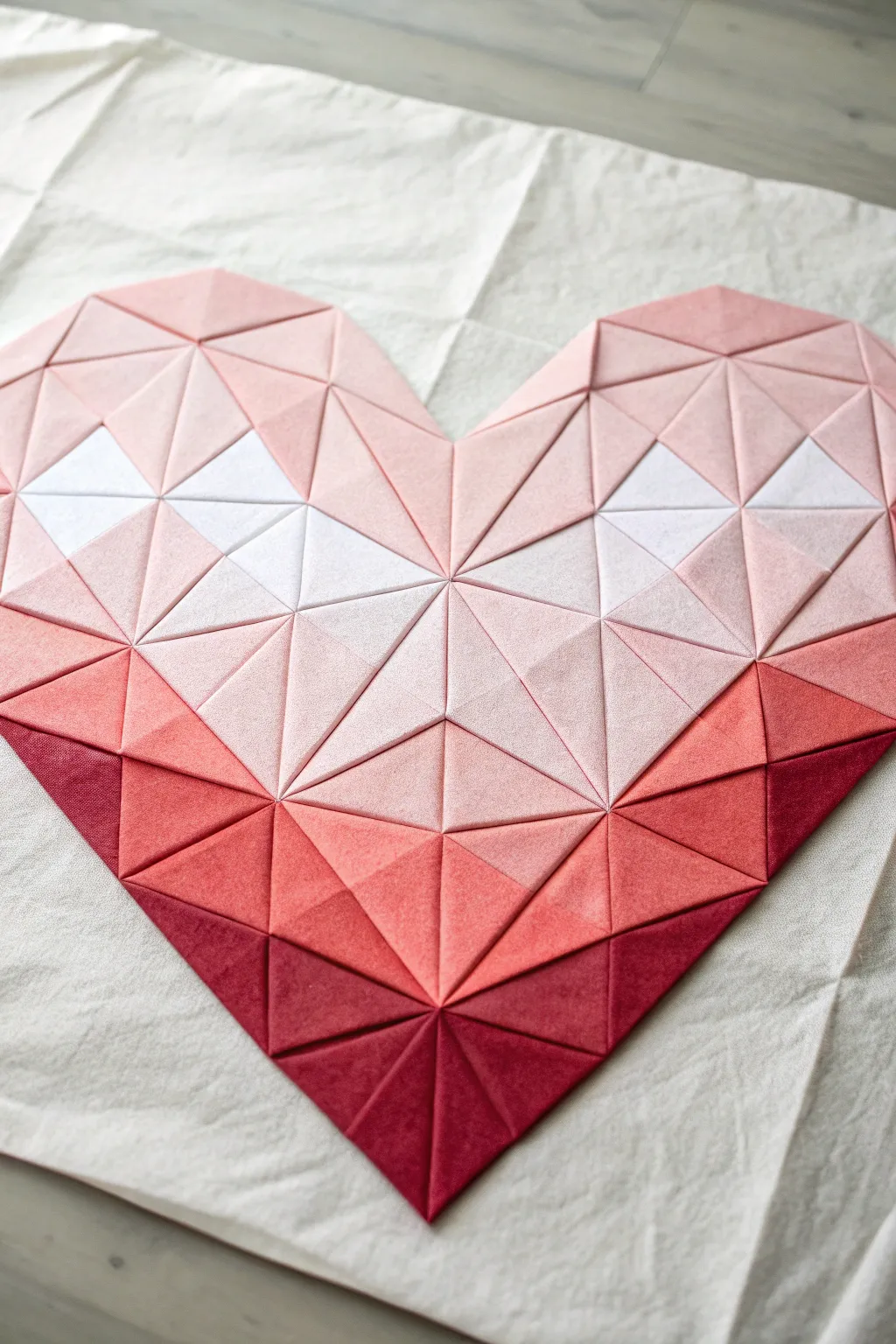
This stunning geometric heart uses a clever arrangement of folded triangles to create a 3D faceted effect that catches the light beautifully. With its gentle gradient from deep crimson to soft blush and white, this tactile artwork adds warmth and modern texture to any wall.
Step-by-Step Guide
Materials
- Stiff crafting felt or cardstock (in dark red, medium red, pink, pale pink, and white)
- Sharp fabric scissors or rotary cutter
- Self-healing cutting mat
- Metal ruler
- Pencil or chalk fabric marker
- White canvas or heavy fabric backing (approx. 24×24 inches)
- Hot glue gun and glue sticks
- Cardboard or poster board for backing support
Step 1: Preparation & Cutting
-
Choose your palette:
Select 5 distinct shades for your gradient: deep burgundy, bright red, coral/salmon, soft pink, and white. Lay them out to ensure the transition looks smooth to your eye. -
Create a template:
Draw an equilateral triangle on cardstock with sides measuring approximately 2.5 inches. Cut this out to use as your master template for every piece. -
Trace the shapes:
Using your template, trace roughly 20-30 triangles of each color onto your felt or paper material. You will need more of the mid-tone pinks and fewer of the extreme darks and whites, but extras are always helpful. -
Cut the triangles:
carefully cut out all the triangles. Precision is key here; use a rotary cutter and metal ruler if possible to get perfectly straight edges, which helps the final mosaic fit together tightly. -
Score the centers:
To create the 3D faceted look, lightly score a line from each corner of the triangle to the center point on the back of each piece. If using felt, you can simply crease it firmly with your fingers.
Uneven Gaps?
If gaps appear between triangles, cut tiny slivers of matching felt to fill the spaces. Tuck them deep into the cracks with tweezers so they disappear.
Step 2: Forming the Facets
-
Fold the pyramids:
Pinch the center of a triangle so the three corners pull slightly inward, creating a low pyramid shape. The center point should rise up. -
Secure the shape:
While pinching the shape, apply a tiny dot of hot glue inside the fold near the center point (on the back/hollow side) to hold that slightly raised, faceted structure. Repeat for all triangles. -
Prepare the backing:
Cut your canvas or heavy fabric to size. I like to mount mine onto a piece of cardboard or poster board first to keep it rigid while I work. -
Mark vertical center:
Draw a faint vertical line down the center of your backing board. This will help you keep the heart symmetrical as you build it.
Level Up: Mixed Media
Swap the white felt for metallic gold or silver cardstock triangles in the highlight areas. This adds an incredible shimmer and contrast to the soft felt.
Step 3: Assembly & Layout
-
Start at the bottom tip:
Begin with your darkest red triangles. Arrange a cluster of them at the bottom center of your backing to form the point of the heart. -
Build the first V-shape:
glue the dark red triangles down, arranging them so their sides touch perfectly. The pattern works best if you create larger diamond shapes made of two or more triangles. -
Transition to medium red:
As you move upward and outward, introduce the bright red triangles. Blend them in a jagged line rather than a straight stripe to make the gradient look organic. -
Add the coral layer:
Continue building rows upwards, switching to the coral/salmon color. Ensure the points of the triangles lock into the gaps of the row below. -
Construct the white highlights:
Place your white triangles in two specific clusters on the upper left and right sides. These act as ‘highlights’ on the heart shape, giving it dimension. -
Fill with soft pink:
Surround the white highlights with your lightest pink triangles, connecting them to the coral section below and filling out the upper curves of the heart. -
Form the top arches:
Create the two rounded tops of the heart using the light pink felt. You may need to tilt pieces slightly to get the currve right, but stick to the geometric grid as much as possible. -
Check for symmetry:
Step back and look at your heart. If one side looks wider, add an extra column of triangles to balance it out. -
Final glue down:
Once you are happy with the dry arrangement, lift each piece individually and hot glue it permanently in place, pressing firmly on the corners but being gentle with the raised center. -
Clean up:
Pull away any wispy strings of hot glue that might be clinging to the felt surface.
Hang your geometric heart in a spot with good natural light to really show off the dimensional shadows of the facets

Have a question or want to share your own experience? I'd love to hear from you in the comments below!