If you love clean, minimalist art but still want that satisfying “I painted this” feeling, line art painting is the sweet spot. I’m sharing my go-to line art painting ideas that mix crisp linework with soft washes, bold color blocks, and lots of delicious negative space.
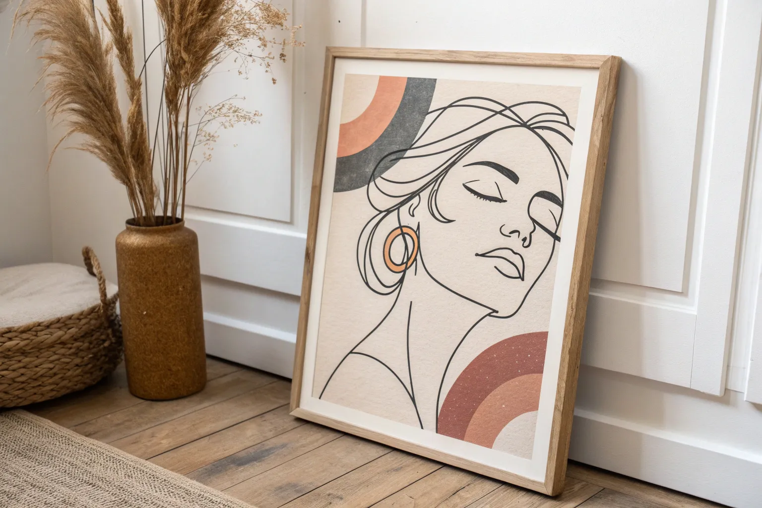
One-Line Face With a Color Block Halo
This elegant project captures the quiet beauty of a minimal line drawing, focusing on fluid curves and peaceful expression. Perfect for beginners and advanced artists alike, the black ink contours create a striking contrast against textured white paper.
Detailed Instructions
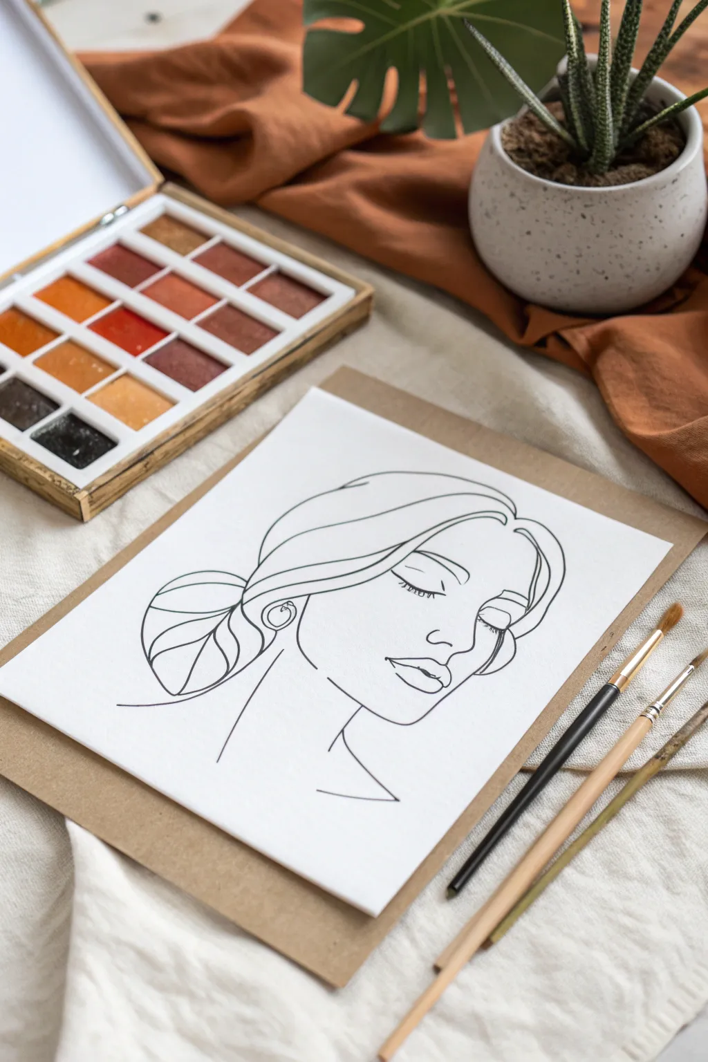
Materials
- Heavyweight watercolor paper or mixed media paper (cold press)
- Pencil (HB or H)
- Kneadable eraser
- Fine liner pen or felt-tip marker (0.5mm or 0.8mm, waterproof)
- Small round paintbrush (size 2 or 4)
- Watercolor palette (earth tones)
- Cup of water and paper towels
- Backing board (cardboard or sturdy cardstock)
Step 1: Sketching the Framework
-
Prepare your workspace:
Begin by taping your heavyweight paper to a flat surface or a backing board to prevent slipping. Ensure you have good lighting to see your pencil lines clearly. -
Map the face shape:
Using your pencil very lightly, sketch an oval shape to represent the head. Start with a loose gesture drawing rather than focusing on details immediately. -
Position the features:
Draw faint horizontal guidelines to mark where the eyes, nose, and mouth will sit. Since the subject is looking down, these lines will be slightly lower on the face than in a straight-on portrait. -
Refine the profile:
Sketch the forehead curve leading into the nose bridge. Keep your pencil strokes light so they are easy to erase later. -
Detail the closed eye:
Draw a gentle, downward-curving crescent shape for the closed eye. Add a few tiny lashes pointing downward for a serene look. -
Add the lips and chin:
Define the lips with two soft overlapping curves. Ensure the lower lip is slightly fuller, then connect the jawline down to the chin and neck. -
Outline the hair:
Sketch the hair sweeping back from the forehead. Draw big, swooping shapes to indicate volume rather than drawing individual strands. -
Create the bun:
At the nape of the neck, draw a round shape for the low bun. Add a few internal curved lines to suggest the hair is wrapped or twisted.
Shaky Lines?
If your hand shakes, try drawing from your shoulder rather than your wrist. Moving your whole arm creates smoother, more fluid curves than restricted finger movements.
Step 2: Inking the Lines
-
Test your pen:
Before touching the final paper, test your fine liner or marker on a scrap piece to ensure the ink is flowing smoothly and isn’t dried out. -
Start from the top:
Begin inking at the top of the head (the hair) to avoid smudging your work with your hand as you move down the page. -
Commit to the strokes:
When tracing your pencil lines, use confident, continuous strokes. It’s better to have a slightly wobbly confident line than a sketchy, hairy-looking line. -
Vary the line weight:
I like to press just a little harder on the shadowed areas, like under the chin and the bottom of the bun, to add subtle depth. -
Define the earring:
Carefully ink the small circular earring and the ear lobe. This small detail adds a nice touch of realism to the abstract style. -
Finish the neck and shoulders:
Draw the sleek lines of the neck and the hint of a shoulder or collarbone, letting the lines trail off into open space at the bottom. -
Let the ink dry completely:
Wait at least 15 to 20 minutes to ensure the ink is fully set. If you erase too soon, you risk smearing the black ink across the white paper and ruining the crisp look.
Pro Tip: Line Weight
Use two different pen sizes. A thicker pen (0.8mm) for the main face outline and a thinner pen (0.3mm) for delicate details like eyelashes creates instant professional depth.
Step 3: Finishing Touches
-
Erase pencil guidelines:
Gently rub your kneadable eraser over the entire drawing to lift away the graphite sketches, leaving only the clean black ink. -
Prepare for painting (optional):
If you plan to add the ‘color block halo’ mentioned in the section title, now is the time to mix a warm earth tone on your palette. -
Mount and display:
Once you are happy with the clean line art, you can mount the paper onto the brown backing board for a rustic, studio-style presentation.
You now have a sophisticated piece of minimalist art ready to frame or gift

Minimal Botanical Stem Over a Soft Wash
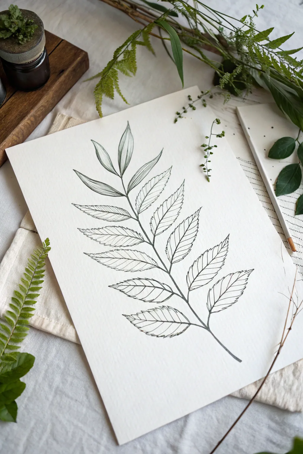
This elegant line art project focuses on the delicate structures of a leafy stem, capturing the beauty of botanical illustration with clean, precise strokes. The monochromatic palette emphasizes form and texture, making it a perfect exercise in observation and steady handwork.
How-To Guide
Materials
- Hot press watercolor paper or smooth Bristol board
- HB graphite pencil
- Kneaded eraser
- Fine liner pens (sizes 0.05mm, 0.1mm, and 0.3mm)
- Ruler (optional, for guiding the central stem)
Step 1: Drafting the Structure
-
Map the central line:
Begin by lightly drawing a curved central line using your HB pencil. This will serve as the main stem of your branch. Position it diagonally across the page to create dynamic movement, extending from the bottom right towards the top left. -
Mark leaf positions:
Along this central stem, make small tick marks where each pair of leaves will connect. Aim for about 6-7 pairs, spacing them slightly closer together as you reach the tip of the branch. -
Sketch the leaf shapes:
Lightly sketch outlines for the leaves. They should be lance-shaped—wider at the base and tapering to a point. Use a flowing gesture to make them look uniform but natural, with opposite pairing along the stem. -
Refine the edges:
Go back over your leaf outlines and add serrated edges. These little saw-tooth details should point towards the tip of each leaf. Keep these pencil marks faint so they are easy to erase later. -
Add central veins:
Draw a faint line down the center of each leaf to indicate the midrib. This line should follow the gentle curve of the leaf itself.
Step 2: Inking the Outlines
-
ink the main stem:
Switch to a 0.3mm fine liner pen. Trace your central stem line with confidence. I like to thicken the line slightly at the bottom and let it taper as it reaches the top for a more organic feel. -
Outline the leaves:
Using a 0.1mm fine liner, carefully trace the serrated edges of your leaves. Don’t worry if your hand shakes slightly; natural imperfections often make botanical drawings look more realistic. -
Draw the midribs:
Still using the 0.1mm pen, draw the central vein of each leaf. Connect this line securely to the main stem. -
Wait and erase:
Allow the ink to dry completely for at least 5-10 minutes. Once dry, gently gently rub your kneaded eraser over the entire drawing to lift away the graphite guidelines.
Uneven Ink Flow?
If your fine liner skips, wipe the nib gently on a paper towel. Ink flow issues usually mean you’re pressing too hard or drawing too fast.
Step 3: Adding Texture and Detail
-
Start veining:
Switch to your finest pen, the 0.05mm liner. Begin observing the top leaves. Draw delicate veins branching out from the midrib towards the serrated edges. -
Vary vein spacing:
Keep the veins widely spaced and roughly parallel to each other. They should curve slightly upward, following the flow of the leaf shape. -
Apply shading strokes:
To add dimension, use very short hatching marks near the midrib of the lower leaves. This suggests a slight depression where the leaf folds inward. -
Deepen the shadows:
Add a few extra lines near the base of the leaves where they attach to the stem. This small detail helps ground the leaves and gives the drawing depth. -
Add surface texture:
For the larger, lower leaves, draw very faint, broken lines between the main veins. This mimics the subtle texture of the leaf surface without overcrowding the drawing. -
Assess line weight:
Step back and look at your drawing. If the outer edges feel too uniform, use the 0.3mm pen to selectively darken the underside of a few leaves to simulate shadow.
Add a Color Wash
Wait 24 hours for ink to fully cure, then brush a diluted sage green watercolor wash loosely over the leaves for a soft, vintage look.
Frame your botanical study in a simple wood frame to highlight the crisp beauty of your line work

Abstract Profile With Layered Shapes
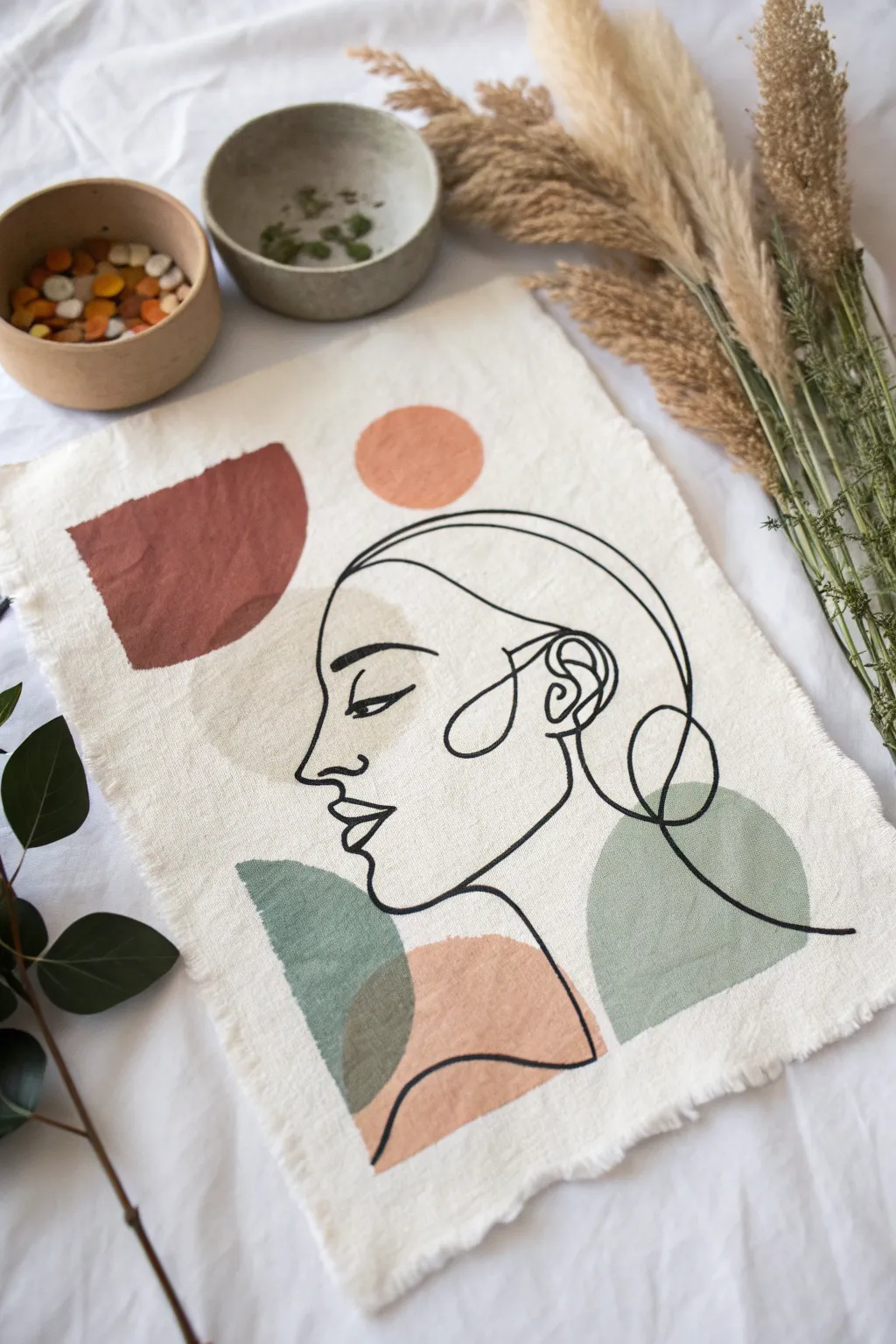
Embrace the beauty of modern minimalism with this mixed-media fabric wall hanging. Combining fluid line art with soft, earthy blocks of color, this project captures a sophisticated bohemian aesthetic perfect for warm, neutral interiors.
Detailed Instructions
Materials
- Unbleached cotton canvas or linen fabric
- Fabric medium
- Acrylic paints (terracotta, sage green, beige, dusty pink)
- Black fabric paint or fine tip fabric marker
- Flat shader brush (medium size)
- Fine liner brush or script liner brush
- Pencil for sketching
- Palette for mixing
- Painter’s tape or pins
- Scissors
Step 1: Preparing the Canvas
-
Select your fabric:
Cut a rectangular piece of unbleached cotton or linen. Aim for a size around 12×16 inches, but you can adjust depending on your wall space. -
Create frayed edges:
Instead of hemming the sides, gently pull the loose threads along all four edges of your fabric rectangle. Continue pulling threads until you have a nice, uniform fringe about half an inch deep. -
Secure the workspace:
Tape down the corners of your fabric to a flat, protected surface. This prevents the fabric from shifting while you sketch and paint.
Fixing Wobbly Lines
If your black line goes astray, thicken it slightly to smooth out the bump. Intentional variation looks artistic, so don’t stress over perfection.
Step 2: Planning the Shapes
-
Visualize the layout:
Lightly plan where your abstract color shapes will sit. You want a large semi-circle near the top left, a circle near the top center, and organic curves at the bottom. -
Sketch the color blocks:
Using a pencil very lightly, draw the outlines of these background shapes. Don’t worry about perfect geometric precision; organic, slightly wobbly edges add character. -
Mix your paints:
Mix your acrylic paints with fabric medium according to the bottle instructions. This ensures the paint moves flexibly with the fabric and doesn’t crack. -
Balance the palette:
Aim for a muted, earthy palette. If your greens or oranges are too bright, tone them down with a tiny drop of brown or a touch of white.
Add Texture
Mix a pinch of baking soda into your acrylic paint before applying the color blocks. This creates a gritty, matte texture that looks high-end.
Step 3: Painting the Abstract Background
-
Paint the terracotta shape:
Using a flat shader brush, fill in the top-left semi-circle shape with your terracotta mixture. Keep the edges relatively crisp but soft. -
Add the sun element:
Mix a lighter peachy-orange or dusty pink tone for the circular shape above the head area. Paint this carefully, ensuring it balances with the darker terracotta. -
Apply the sage greens:
Switch to your sage green mixture. Paint the curved shapes at the bottom right and lower left. These will eventually anchor the figure’s shoulders and neck. -
Layer the beige tones:
Add a soft beige or taupe shape that overlaps slightly with the face area. I like to let this dry briefly before seeing if it needs a second coat for opacity. -
Allow to dry completely:
Let the color blocks dry fully. This is crucial because painting the black lines over wet paint will cause smearing. Give it at least an hour.
Step 4: Creating the Line Art
-
Sketch the profile:
Lightly sketch the continuous line face over your dried color blocks. start with the forehead, sweeping down to the nose, lips, and chin. -
Refine the details:
Add the eye, the curve of the ear, and the sweeping lines that suggest hair. The line should flow through and over the color shapes, connecting them visually. -
Outline with paint:
Load a fine liner brush with black fabric paint (or use a fabric marker). Begin tracing your pencil lines with a steady hand. -
Vary line weight:
Try to keep the line thickness relatively consistent, but allow natural variations where the brush lifts or presses. This mimics the look of ink on paper. -
Final touches:
Connect the hair lines down to the shoulders, ensuring the black lines extend towards the edges of the color blocks for a grounded composition. -
Erase pencil marks:
Once the black ink is completely dry (wait a few hours to be safe), gently erase any visible pencil sketch lines.
Hang your new textile art with clips or frame it floating style to show off those beautiful frayed edges


Continuous Line Couple Embrace
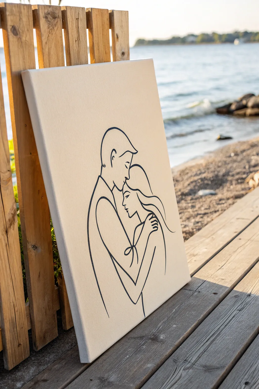
Capture the tender connection of an embrace with this elegant continuous line art painting. Using just a few flowing strokes on a neutral canvas, you’ll create a piece that feels both modern and intimate, perfect for a bedroom or living space.
How-To Guide
Materials
- Stretched canvas (16×20 inches or similar)
- Acrylic paint (Cream/Clam Shell for base)
- Acrylic paint (Dark Navy or Carbon Black for lines)
- Flat paintbrush (2-inch width)
- Round detail brushes (sizes 1 and 2)
- Carbon transfer paper
- Pencil and eraser
- Printed line art template
- Painter’s tape
- Easel or flat work surface
- Palette or paper plate
Step 1: Preparing the Foundation
-
Prime the canvas:
Even if your canvas is pre-primed, adding a custom background color elevates the look. Squeeze a generous amount of cream or clam-shell colored acrylic paint onto your palette. -
Apply the base coat:
Using the wide flat brush, apply the paint in smooth, horizontal strokes across the entire canvas. Ensure you cover the edges for a finished, gallery-ready appearance. -
Let it cure:
Allow this base layer to dry completely. This usually takes about one to two hours, but I prefer to let it sit overnight to ensure the surface is hard enough to withstand pencil pressure. -
Prepare your design:
While the paint dries, scale your line art design to fit the canvas dimensions. You can sketch it freehand on scrap paper first or print a digital reference to use as a template.
Smooth Operator
If your hand feels shaky, rest your pinky finger on a dry part of the canvas for stability. This acts as an anchor while you paint long curves.
Step 2: Transferring the Design
-
Position the template:
Place your printed design or sketch on top of the dry canvas. Center the couple’s embrace so that the negative space around them feels balanced. -
Secure the layers:
Tape the top edge of your paper to the canvas. Slide a sheet of carbon transfer paper (dark side down) underneath the drawing. -
Trace the lines:
Using a sharp pencil or a ballpoint pen, trace over your design with firm, even pressure. Focus on the fluidity of the curves, especially around the faces and hair. -
Check the transfer:
Lift the bottom corner of the paper gently to check if the lines are transferring clearly. If they are too faint, go over them again with more pressure. -
Clean up the sketch:
Remove the paper and carbon sheet. Use a clean eraser to lightly banish any smudges or stray carbon marks, being careful not to rub off the base paint.
Wobbly Lines?
Don’t panic if a line isn’t perfect. Let the dark paint dry completely, then use a small brush and your base color to ‘erase’ and reshape the edge.
Step 3: Painting the Lines
-
Mix your line color:
Prepare your dark navy or black acrylic paint. Add a tiny drop of water or flow improver to the paint; ink-like consistency helps the brush glide smoothly for long unbreaking lines. -
Load the detail brush:
Dip your size 2 round brush into the thinned paint. Twirl the tip against the palette surface to create a sharp point, ensuring you don’t have a glob of paint at the ferrule. -
Start with confident strokes:
Begin painting the main outlines of the male figure’s back and head. Use your whole arm to guide the movement rather than just your wrist to keep the curves smooth. -
Detail the faces:
Switch to the smaller size 1 brush for delicate areas like the nose, lips, and closed eyes. These features require precision and a steady hand. -
Connect the embrace:
Paint the female figure’s hair and the arms wrapping around. Pay close attention to where lines intersect or overlap, maintaining a consistent line width throughout. -
Refine the edges:
Once the main lines are down, inspect your work. Gently thicken any areas that look shaky or too thin to create a bold, intentional graphic look. -
Dry and seal:
Allow the line work to dry for at least 24 hours. If desired, apply a clear matte varnish spray to protect the surface and unify the sheen of the different paints.
Step back and admire the simple emotion captured in your sophisticated new artwork

PENCIL GUIDE
Understanding Pencil Grades from H to B
From first sketch to finished drawing — learn pencil grades, line control, and shading techniques.
Explore the Full Guide
Simple Figure Outline on a Neutral Ground
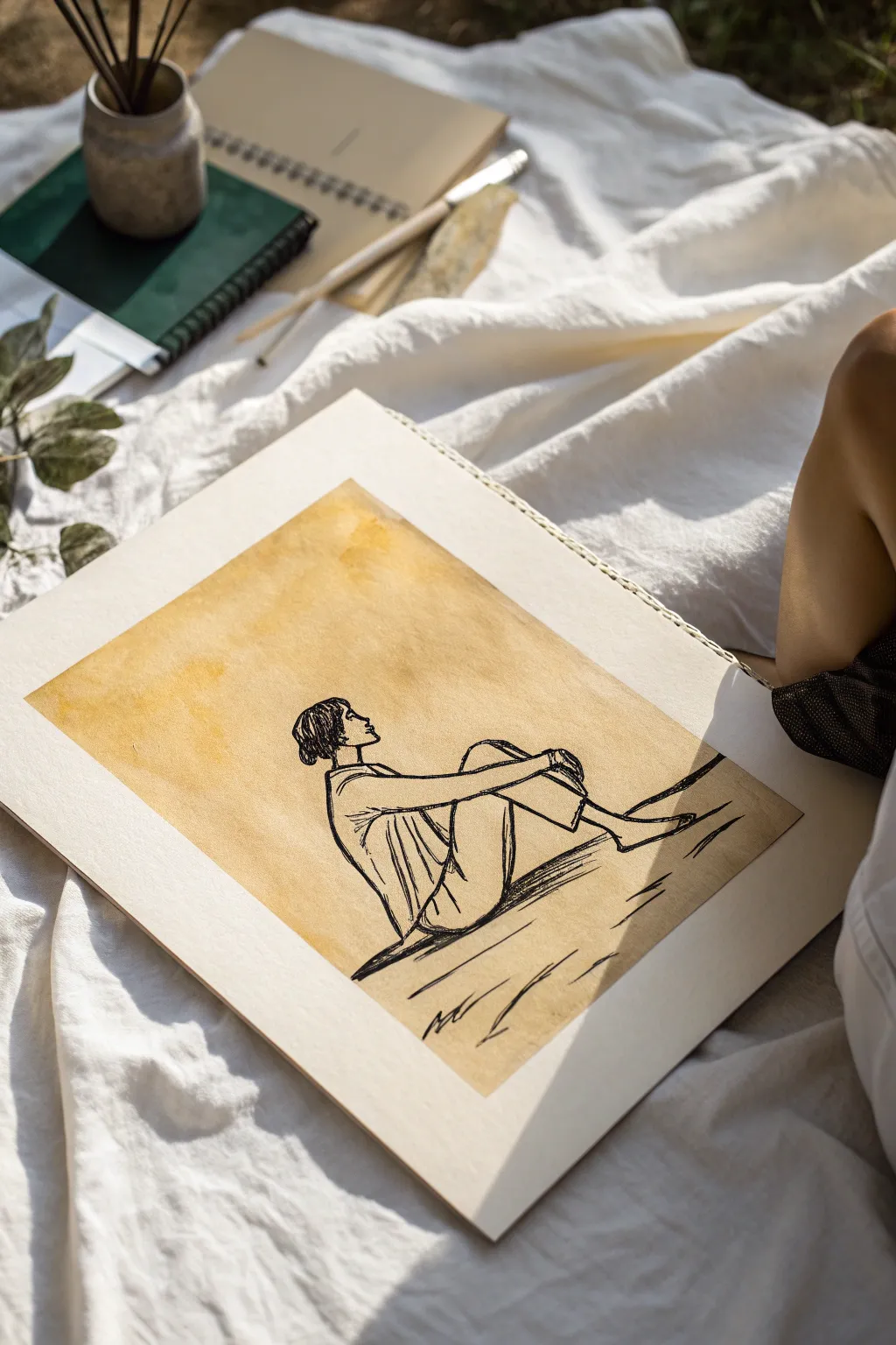
This evocative project combines the raw simplicity of a quick gestural sketch with the warmth of an organic background wash. The result is a contemplative piece where the stark black lines float beautifully against a textured, earth-toned rectangle.
Step-by-Step Tutorial
Materials
- Heavyweight mixed-media paper or watercolor sketchbook
- Brewed black tea or coffee (cooled)
- Wide flat brush (1 inch)
- Black pigment liner (0.5mm and 0.8mm) or calligraphy brush pen
- Pencil (HB or 2H)
- Kneaded eraser
- Masking tape (low tack)
Step 1: Preparing the Ground
-
Tape boundaries:
Begin by taping off a clean rectangle in the center of your sketchbook page. Press the edges of the masking tape down firmly to prevent liquid from seeping underneath. -
Prepare the wash:
Simulate the aged paper look by brewing a very strong cup of black tea or instant coffee. Let it steep until it’s a deep amber color, then allow it to cool completely. -
Apply the base layer:
Dip your wide flat brush into the tea or coffee. Apply a generous wash across the entire taped area. Don’t worry about making it perfectly even; pooling creates lovely texture. -
Add depth:
While the first layer is still damp, dab a little more concentrated liquid into random areas, particularly near the corners, to create a mottled, vintage effect. -
Thorough drying:
Allow the paper to dry completely. It must be bone dry before you start drawing, or the ink will bleed. You can use a hairdryer on a low setting if you’re impatient. -
Remove tape:
Once dry, carefully peel away the masking tape at a 45-degree angle to reveal crisp, clean edges framing your neutral ground.
Step 2: Sketching the Figure
-
Position the figure:
Using your HB pencil, lightly mark where the head and feet will go. The figure works best when centered horizontally but grounded low in the rectangle. -
Outline the head:
Sketch a simple profile view of the head. Keep the features minimal—just the suggestion of a nose and chin looking upward. -
Draw the torso:
Extend a line down for the back and another for the chest. The posture should be relaxed, leaning slightly back on the hands. -
Leg placement:
Sketch the legs bent at the knees. One leg should be slightly higher, creating a triangular composition with the torso. -
Arm positioning:
Draw the arms extending backward to support the weight. Don’t stress about anatomical perfection; focus on the general flow of the limbs. -
Refine the lines:
Go over your sketch lightly, adding folds to the clothing (like the shirt and pants) to give the figure volume without shading.
Create Natural Texture
Sprinkle a few grains of coarse salt onto the wet coffee wash. As it dries, the salt pushes the pigment away, creating beautiful little starburst textures.
Step 3: Inking the Artwork
-
Outline the main form:
Switch to your 0.8mm pigment liner or brush pen. Start tracing your pencil lines with confident, fluid strokes. Avoid sketching ‘hairy’ lines; try to make continuous marks. -
Detail the hair:
Fill in the hair using short, dense strokes. Leave a small white gap near the top or side to suggest a highlight or shine. -
Clothing folds:
Use the finer 0.5mm pen for interior details like the wrinkles in the shirt and the cuff of the pants. These lines can be slightly broken or thinner. -
Grounding shadows:
Add heavy, dark horizontal hatches underneath the figure’s legs and hands. This purely gestural shadow anchors the person so they aren’t floating. -
Erase pencil marks:
Wait at least 10 minutes to ensure the ink is totally set. I prefer to wait closer to 20 just to be safe. Then, gently erase all underlying pencil sketch lines.
Bleeding Line Fix
If your ink feathers or bleeds, your paper was likely still damp. Stop immediately, let it dry fully, then go over the fuzzy lines with a slightly thicker pen.
Step back and admire how the simple lines capture a quiet moment of relaxation
Boho Mountains and Sun in Flat Paint
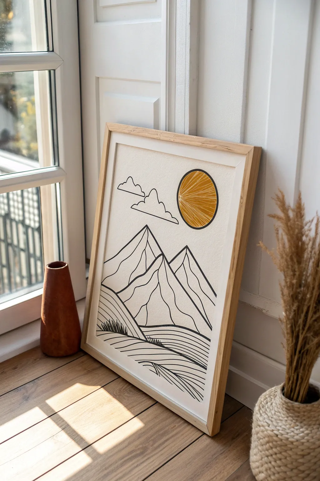
Capture the serenity of a sun-drenched landscape with this minimalist line art painting. Combining crisp black ink work with a textured, golden sun feature, this piece brings a warm, modern bohemian aesthetic to any space.
How-To Guide
Materials
- Heavyweight watercolor paper or mixed media paper (A3 or similar size)
- Fine liner pens (black, sizes 05 and 08)
- Black acrylic paint or India ink
- Fine round paintbrush (size 2)
- Golden yellow or ochre acrylic paint
- Compass or round object for tracing (approx. 3-4 inches diameter)
- White gel pen or fine white paint marker
- Pencil (HB)
- Eraser
- Ruler
- Light wood frame (optional, for display)
Step 1: Planning the Composition
-
Prepare your surface:
Lay your paper on a flat, clean surface. If your paper tends to curl, tape the corners down with low-tack masking tape to keep it steady while you work. -
Position the sun:
Decide where your sun will sit in the sky. Using a compass or a round household object like a jar lid, lightly sketch a circle in the upper right quadrant of the paper with a pencil. -
Sketch the mountain peaks:
Below the sun, sketch the outlines of three main mountain peaks. Make the central peak slightly taller and the side peaks overlapping naturally. Use light, loose strokes so you can adjust the shapes easily. -
Add the foreground:
Draw rolling hills in the foreground leading up to the mountains. Create sweeping curved lines that mimic the flow of a valley or fields. -
Draft the clouds:
In the upper left, sketch two simple, fluffy cloud shapes. Keep the lines somewhat jagged and stylized rather than purely round to match the geometric vibe of the mountains.
Step 2: Painting the Sun
-
Mix the sun color:
Squeeze out a small amount of golden yellow acrylic paint. I like to mix in a tiny drop of brown or orange to deepen the tone and make it feel more earthy. -
Fill the circle:
Using your round brush, carefully paint inside your penciled circle. Apply the paint somewhat thickly to create a bit of texture, ensuring the edges are crisp and round. -
Dry completely:
Let the sun dry fully before moving on. This is crucial because wet paint will smudge when you try to draw near it later. Give it about 20-30 minutes. -
Add sun rays:
Once the yellow paint is bone dry, take your white gel pen or paint marker. Draw lines radiating from a point on the left edge of the sun outward to the right, creating a sunburst pattern inside the yellow circle.
Clean Circles Tip
Struggling to paint a perfect circle? Use masking fluid to block out the sun shape first, paint the rest freely, then peel it off and fill the circle last.
Step 3: Inking the Landscape
-
Outline the mountains:
Switch to your thicker black fine liner (size 08) or use the brush with black ink. Trace over your pencil lines for the main mountain peaks. Intentionally vary your line pressure slightly to give it an organic, hand-drawn feel. -
Detail the ridges:
Draw internal lines down the center of the peaks to represent ridges and shadows. These lines help give the flat mountains a sense of dimension. -
Ink the clouds:
Trace your cloud sketches with the thinner pen (size 05). Keep the bottom line of the clouds flat and the tops bumpy. -
Create the fields:
trace the sweeping curves of the foreground hills. Use long, continuous strokes to keep the flow smooth. If your hand shakes, doing this quickly often yields a smoother line than moving slowly. -
Add texture to the fields:
Fill the hill sections with parallel curved lines. Don’t worry about perfect spacing; the slight irregularity adds to the boho charm. -
Draw grassy accents:
In the lowest foreground section, use quick, short upward flicks of the pen to create small patches of grass. This anchors the bottom of the composition.
Ink Smearing?
If your black ink smudges when erasing pencil lines, check your pen type. Some gel pens take much longer to dry. Switch to pigment liners for instant drying.
Step 4: Finishing Touches
-
Erase pencil marks:
Wait until you are absolutely certain the black ink is 100% dry to avoid smearing. Gently erase all visible pencil sketch lines from the paper. -
Clean up the sun edge:
If the black line of the mountain overlaps the sun slightly, re-blacken that section to ensure the mountain clearly sits ‘in front’ of the sun. -
Final inspection:
Step back and look at the line weights. If the main mountain outlines feel too thin compared to the sun, thicken them up with a second pass of the marker. -
Frame and display:
Place your finished artwork into a light wood frame to complement the warm tones of the sun painting.
Hang this radiant piece near a window to let the natural light emphasize your beautifully drawn textures
BRUSH GUIDE
The Right Brush for Every Stroke
From clean lines to bold texture — master brush choice, stroke control, and essential techniques.
Explore the Full Guide
Coffee Cup Line Art With a Warm Background Block
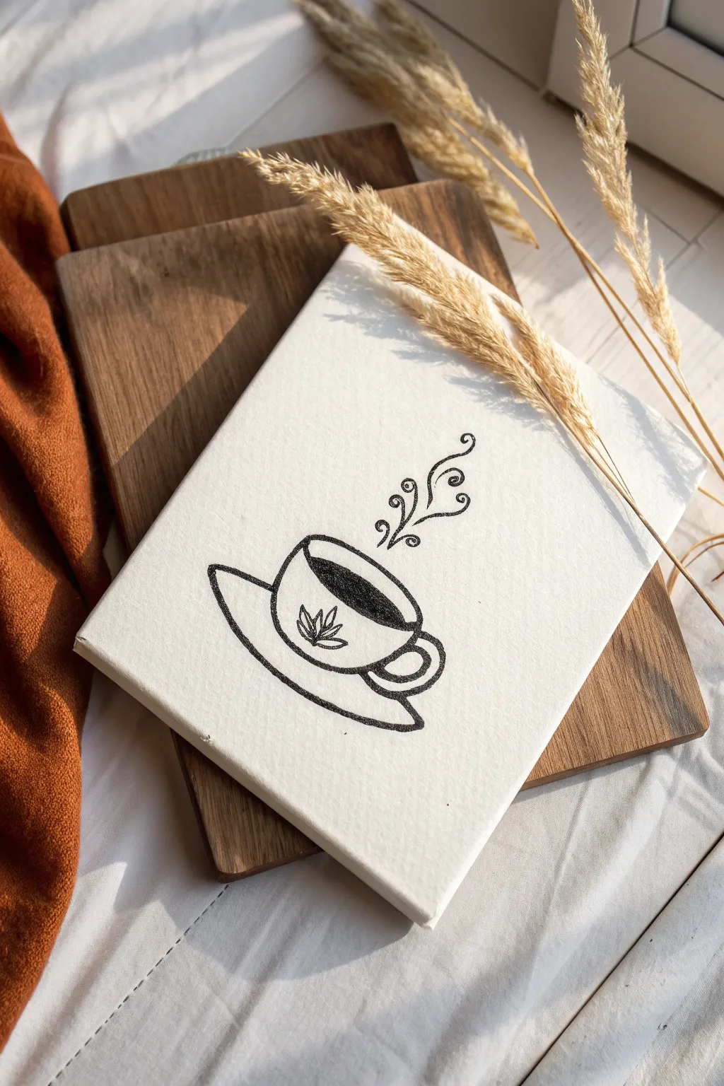
Capture the cozy essence of a hot cup of coffee with this minimalist line art project on canvas. Using bold black ink or paint against a textured white background creates a striking high-contrast piece that fits perfectly in any kitchen or coffee nook.
How-To Guide
Materials
- Small stretched canvas (approx. 5×7 or 6×8 inches)
- Black acrylic paint or a broad black oil-based paint marker
- Fine liner brush (size 0 or 00) if using paint
- Pencil (HB or lighter)
- Eraser
- Ruler (optional)
- Reference image of a simple coffee cup
Step 1: Sketching the Outline
-
Set the scene:
Place your blank canvas on a flat, well-lit surface. Wipe it gently with a dry cloth to ensure no dust interferes with your drawing surface. -
Draw the rim:
Start by lightly sketching a wide, flattened oval near the center of the canvas. This oval represents the opening of the coffee cup. -
Form the bowl:
From the sides of your oval, draw a curved ‘U’ shape downwards to create the body of the cup. Keep the bottom slightly flattened for stability. -
Add the saucer:
Sketch a larger, flatter oval shape underneath the cup body. The back line of this oval should disappear behind the cup, while the front curve extends forward to create the saucer’s rim. -
Attach the handle:
On the right side of the cup body, draw a ‘C’ shape or a slightly squared ear shape for the handle. Add an inner line to give the handle thickness. -
Detail the center:
Inside the center of the cup’s body, lightly sketch a small decorative element. A simple five-pointed leaf or star adds a nice organic touch similar to the inspiration image.
Fixing Wobbly Lines
If a line gets shaky, don’t try to wipe it while wet. Let it dry, paint over it with a bit of white acrylic, and re-draw the line once corrected.
Step 2: Inking the Design
-
Prepare your medium:
If you are using acrylic paint, thin it slightly with a drop of water to help it flow smoothly off the brush. If using a paint marker, pump the tip on a scrap piece of paper until the ink flows fully. -
Trace the liquid line:
Inside the top oval (the rim), draw a second curved line parallel to the back edge. This defines the surface level of the coffee. -
Fill the coffee:
Carefully color in the crescent shape formed inside the rim with solid black. This represents the dark coffee liquid. Take your time near the edges to keep the lines crisp. -
Outline the cup body:
Go over your pencil sketches for the main body of the cup. Use a confident, fluid motion. It’s okay if the line thickness varies slightly; it adds to the hand-drawn charm. -
Define the saucer:
Trace the saucer shape. You can make the front bottom edge slightly thicker to suggest shadow and weight. -
Ink the handle:
Outline the handle carefully. I find it helpful to rotate the canvas slightly here to get the best angle for my hand. -
Add the decoration:
Switch to your finest brush or the very tip of your marker to trace the small leaf design in the center of the cup.
Textured Canvas Tip
Canvas has a weave that can make markers skip. Press the nib down firmly and move slowly to let the ink saturate the textured grooves.
Step 3: Finishing Touches
-
Create the steam:
Above the cup, draw three whimsical, swirling lines rising upward. Add small curls or spirals at the ends and midway points to mimic rising steam. -
Thicken select lines:
Review your artwork. Go back and slightly thicken the lines on the underside of the saucer and the bottom of the handle to enhance the sense of dimension. -
Let it dry:
Allow the paint or ink to dry completely. Acrylics usually need about 20 minutes, while oil-based markers might need longer to avoid smudging. -
Clean up:
Once fully dry, gently erase any visible pencil marks. Be sure the ink is 100% set, or you risk smearing your crisp black lines.
Display this charming little canvas on a wooden easel or lean it on a shelf to bring a warm cafe vibe to your space
Matching Three-Piece Line Art Set
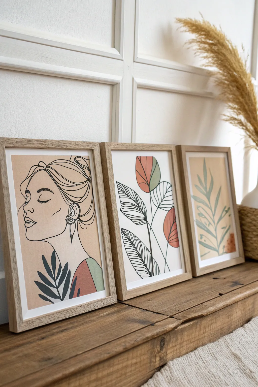
Create a unified gallery wall aesthetic with this matching three-piece set that blends continuous line drawing with abstract botanical shapes. Using a cohesive earth-tone palette of sage, terracotta, and beige, you’ll learn to balance negative space with striking silhouettes.
Detailed Instructions
Materials
- 3 sheets of heavy mixed media or watercolor paper (A4 or 8×10 size)
- Pencil (HB or H for light sketching)
- Fine liner pens (Black, sizes 0.5mm and 0.8mm)
- Acrylic paints (Terracotta/Rust, Sage Green, Beige/Cream)
- Flat synthetic brushes (small and medium)
- 3 light wood frames
- Ruler
- Eraser
- Palette for mixing
Step 1: Planning the Composition
-
Define the borders:
Begin by lightly measuring a 1-inch border around your paper if you want a clean white edge like the photos, or plan to work edge-to-edge. Use a ruler to mark the boundaries very faintly. -
Sketch the portrait contours:
On the first sheet, lightly sketch the woman’s profile. Focus on the sweeping line of the jaw, the curve of the closed eyelid, and the loose bun. Keep the lines fluid and unhesitating. -
Draft the botanical shapes:
For the second sheet, sketch three large, abstract leaf shapes. Make them bulbous and organic rather than realistic. On the third sheet, draw a simple central stem with radiating fern-like leaves. -
Add abstract color blocks:
Lightly mark where your color blocks will go. On the portrait, mark a semi-circle at the shoulder. On the middle piece, these blocks will fill parts of the abstract leaves.
Step 2: Adding the Color Layers
-
Mix your palette:
Prepare your acrylics. You want a creamy consistency—not too watery, but smooth enough to paint flat shapes without heavy brushstrokes. I like to mix a tiny bit of white into my terracotta to soften it. -
Paint the background wash:
For the first and third prints, paint a large, loose rectangular background shape in a very pale beige or diluted cream color. Leave the edges slightly organic or tape them off for a crisp look. -
Fill the accent shapes:
Using the terracotta paint, fill in the top abstract flower shapes on the middle sheet and the shoulder area of the portrait. Let this dry completely before moving to the next color. -
Apply the sage green:
Switch to your sage green mix. Paint the accent leaf on the middle sheet and the small shoulder detail on the portrait. For the third sheet, paint the entire fern shape in this muted green tone. -
Ensure opacity:
If the colors look streaky after the first coat, apply a second thin layer once the first is dry. You want solid, matte blocks of color.
Wobbly Lines?
If your hand shakes during long lines, try ‘ghosting’ the movement in the air first. Also, pull the pen toward your body rather than pushing it away.
Step 3: Inking the Line Work
-
Warm up your hand:
Before touching the final paper, practice drawing long, smooth lines on scrap paper to get your wrist comfortable. -
Outline the portrait:
Using the 0.8mm pen, trace your pencil sketch for the woman’s face. Vary the line weight slightly—press harder on the hair curves and lighter on facial features like the nose and lips. -
Detail the hair and ear:
Switch to the 0.5mm pen for finer details like the strands of hair in the bun and the intricate lines inside the ear. Add the small floral earring detail now. -
Ink the botanical overlay:
On the middle sheet, draw the black botanical outlines OVER your dried colored shapes. Draw the stems and leaf veins with confident strokes. Don’t worry if the line doesn’t perfectly match the color blob edge—that misalignment is part of the style. -
Create texture lines:
Add the detailed hatching inside the leaves on the middle piece. Use the 0.5mm pen to draw parallel, curved lines that mimic leaf veins but in a stylized, graphic way. -
Incorporate the foreground foliage:
On the portrait piece, draw the dark sage/black leaves at the bottom left. These should sit ‘in front’ of the figure, adding depth to the composition.
Level Up: Texture
Mix a pinch of baking soda into your beige acrylic paint for the background shapes. It creates a subtle, gritty plastered texture that looks high-end.
Step 4: Finishing Touches
-
Erase guidelines:
Wait at least 30 minutes for the ink to be absolutely bone-dry. Then, gently erase any visible pencil marks with a clean vinyl eraser. -
Framing:
Place your artworks into the light wood frames. Clean the glass inside and out to ensure clarity before sealing the back.
Now you have a gallery-worthy triptych that brings a calm, modern vibe to any room


Hand Outline With Painted Stripe Negative Space
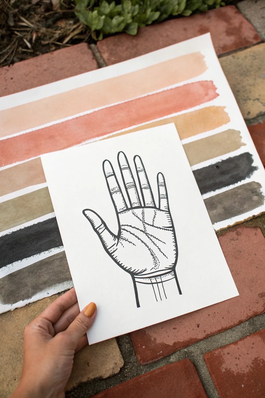
Blend clean minimalism with a touch of the esoteric in this two-layer art project. By combining earthy watercolor stripes with a crisp ink illustration on a separate floating panel, you create a striking composition that mimics negative space without the masking fluid.
Step-by-Step
Materials
- Large sheet of cold-press watercolor paper (9×12 or larger)
- Smaller sheet of bright white Bristol or mixed media paper (5×7 or similar)
- Watercolor paints (Peach, Terra Cotta, Yellow Ochre, Lamp Black)
- Large flat wash brush (1 inch)
- Fine liner pigment pens (05 and 01 sizes, black)
- Pencil and eraser
- Paper towels
- Double-sided tape or foam mounting tape
- Masking tape (for securing paper)
- Jar of water
Step 1: Painting the Background Stripes
-
Prepare your workspace:
Tape down your large sheet of watercolor paper to a board or table surface using masking tape on all four sides. This prevents warping when the paper gets wet. -
Mix your palette:
Prepare four distinct puddles of watercolor paint. You’ll need a pale peach, a warm terra cotta or rust, a dusty yellow ochre, and a deep, watery black or charcoal grey. -
Load the brush:
Dip your flat wash brush into the clean water, then into the peach pigment. Ensure the brush is fully saturated but not dripping uncontrollably. -
Paint the first stripe:
Starting at the top of the paper, drag the brush horizontally from left to right in one confident stroke. The natural jagged ends are part of the charm, so don’t worry about perfect edges. -
Add warmth:
Rinse your brush thoroughly. Load it with the terra cotta color and paint a second stripe directly beneath the first, leaving a thin sliver of white paper between them. -
Introduce earth tones:
Repeat the process with the yellow ochre paint for the third stripe. I like to let the consistency vary slightly so some parts are semi-transparent and others are opaque. -
Anchor with dark tones:
Finish the background with two stripes of the dark grey or black wash at the bottom. Allow the paint to pool slightly in areas for texture. -
Dry completely:
Set the background sheet aside to dry fully. The paper must be bone dry before you mount the top illustration later.
Uneven Stripes?
Don’t overwork the brush strokes if they look messy. The beauty of this style is the ‘wabi-sabi’ imperfection. Resist the urge to go back and fix edges once the paint is down.
Step 2: Drawing the Hand Illustration
-
Sketch the outline:
Take your smaller sheet of bright white paper. Use a pencil to lightly sketch the outline of an open right hand, including the wrist. -
Refine the shape:
Adjust the proportions of the fingers so they are slightly stylized and elegant. Erase unnecessary sketch lines until you have a clean guide. -
Ink the main contour:
Using the thicker 05 pigment pen, trace over your pencil outline. Use confident strokes to create a bold, solid perimeter. -
Add palm lines:
Switch to your finer 01 pen. Draw the major palm lines (heart, head, and life lines) using broken, dashed, or stippled strokes rather than solid lines for a vintage engraving look. -
Detail the fingers:
Add horizontal curved hatching marks across the finger joints and knuckles. This gives the drawing dimension and reinforces the ‘scientific illustration’ style. -
Shade the edges:
Add small, short hatching marks along the inner edge of the thumb and palm outline to suggest rounding and shadow. -
Clean up:
Once the ink is completely dry (give it a few minutes to avoid smearing), gently erase all visible pencil marks.
Step 3: Assembly
-
Position the art:
Place the hand drawing over the dried stripe background. Center it so the stripes extend visibly on both the left and right sides. -
Mount the layers:
Apply double-sided tape or foam mounting squares to the back of the hand drawing. Press it firmly onto the background sheet to complete the layered effect.
Use Foam Tape
Instead of flat glue, use adhesive foam mounting squares to attach the top paper layer. This adds a slight 3D shadow and elevates the professional look.
Now you have a stunning, modern piece of wall art that balances organic textures with graphic precision
Pet Portrait One-Line With a Soft Pastel Ground
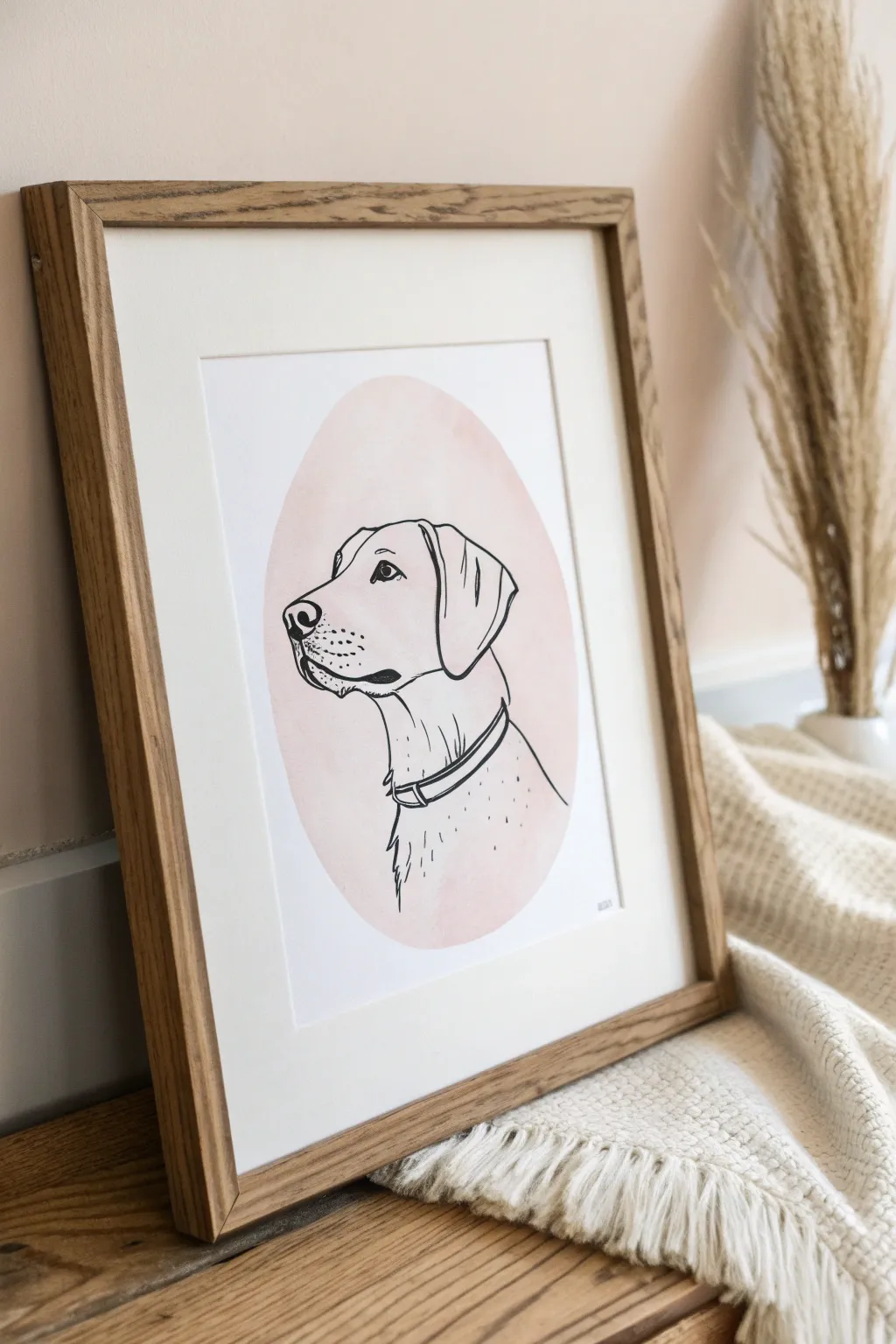
Create a minimalistic tribute to your furry friend by combining stark black line work with a soft, organic splash of watercolor. The juxtaposition of the precise ink lines against the loose, blurred edges of a pastel oval creates a modern and sophisticated aesthetic perfect for any gallery wall.
Step-by-Step Tutorial
Materials
- Heavyweight watercolor paper (300gsm, cold press recommended)
- Watercolor paints (Alizarin Crimson or a soft pink/peach hue)
- Large round watercolor brush (size 10 or 12)
- Black pigment liner pens (0.5mm and 0.8mm for varying line weight)
- Pencil (HB) and eraser
- Reference photo of your pet in profile
- Light tablet or bright window for tracing (optional but helpful)
- Paper towel and water cup
- Oak or wood-finish frame with mat board
Step 1: Painting the Background
-
Prepare your palette:
Mix a very dilute wash of your pink watercolor. Aim for a ‘tea-like’ consistency; you want a sheer, barely-there pastel tone rather than a vibrant saturation. Test the color on a scrap piece of paper first to ensure it dries to that dusty rose hue seen in the example. -
Map the shape:
Lightly sketch a large oval in the center of your paper using a pencil. It doesn’t need to be geometrically perfect; a slightly organic egg shape feels more artistic. This will serve as the boundary for your watercolor wash. -
Apply the wash:
Load your large round brush with the watered-down pink paint. Start in the center of your oval and work outward toward the edges, keeping the brush quite wet so the color flows smoothly without streakiness. -
Soften the edges:
As you reach the pencil guidelines, allow the brush to create a natural, slightly uneven edge. I like to let the brush run a little dry near the perimeter so the texture of the cold press paper shows through, giving it that cloudy, soft look. -
Dry completely:
Let this layer dry 100% before moving on. The paper must be bone dry, or your ink lines will bleed into the fibers later.
Step 2: Drafting the Portrait
-
Align your reference:
If you aren’t confident drawing freehand, print your pet’s profile photo to the desired size. Place the dried watercolor paper over the photo on a light box or against a sunny window so the image shines through the pink oval. -
Sketch the outline:
Using a very light hand with your HB pencil, trace the main contours of the dog. Focus on the distinct shape of the muzzle, the flop of the ear, and the neckline. Don’t worry about fur texture yet; just get the ‘map’ of the face down. -
Refine the expression:
Pay special attention to the eye placement. In profile, the eye is a triangular shape set slightly back from the muzzle. A correctly placed eye captures the pet’s likeness more than any other feature.
Uneven Paint?
If your watercolor dries with hard ‘tide lines’ or puddles, you likely used too much water. Next time, blot your brush slightly on a paper towel before touching the paper for a smoother wash.
Step 3: Clicking & Detailing
-
Ink the main contours:
Switch to your 0.8mm pigment liner. Start with the most confident lines: the top of the head, the back of the neck, and the clean curve of the collar. Use smooth, continuous strokes where possible to maintain that ‘line art’ style. -
Define the face:
Carefully ink the nose and mouth. The nose should be solid black but leave a tiny sliver of white space to represent a highlight, which adds dimension. Ink the eye, leaving a small white reflection dot to bring the portrait to life. -
Add the collar:
Draw the simple band of the collar. In the example, notice how the collar sits loosely; mimic this by leaving a small gap between the neck line and the collar line to suggest gravity and fur thickness. -
Switch to finer detail:
Change to your thinner 0.5mm pen. Use this for the delicate details like the whisker spots on the muzzle (stippling) and the folds inside the ear. -
Suggest fur texture:
Instead of drawing every hair, use the 0.5mm pen to add a few short, broken vertical lines on the neck and chest area. This implies the direction of the fur without cluttering the clean aesthetic. -
Final clean up:
Wait at least 15 minutes to ensure the ink is totally set. Then, gently erase any visible pencil marks, being careful not to rub too hard over the watercolor area. -
Frame your work:
Place your finished piece behind a clean white mat board and secure it in a light oak frame to echo the natural, warm tones of the artwork.
Level Up: Metallic Touch
Add a tiny pop of luxury by painting the metal tag or buckle on the collar using gold metallic watercolor paint. It catches the light beautifully against the matte black ink.
Now you have a timeless, elegant keepsake that captures the spirit of your pet.
Arched Doorway Geometry With Shadow Blocks
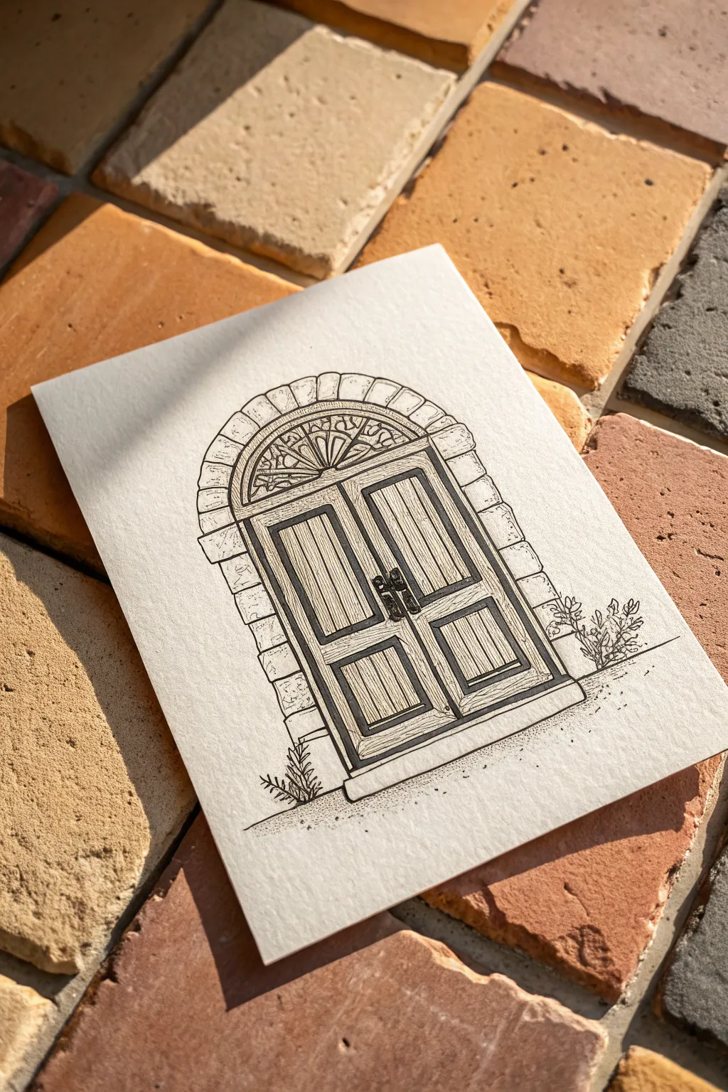
Capture the charm of classic architecture with this precise ink drawing of a double-door entryway. This project focuses on building distinct textures—from wood grain to rough stone—using simple line variation on high-quality textured paper.
Step-by-Step Guide
Materials
- Cold press watercolor paper or heavyweight mixed media paper
- Fine liner pens (sizes 005, 01, 03, and 05)
- Ruler or straight edge
- Compass or circle template
- HB Pencil
- Kneaded eraser
Step 1: Planning the Structure
-
Establish the footprint:
Begin by lightly penciling a horizontal line near the bottom of your paper for the threshold. Draw a large rectangle sitting on top of this line to define the main door shape. -
Create the arch:
Using a compass or a circular object, sketch a semi-circle perfectly centered on top of your rectangle. This forms the fanlight and the top of the door frame. -
Draft the stonework:
Around the main arch and sides, lightly sketch a border of irregular rectangles. These will become the stone bricks. Keep them slightly uneven to suggest age and character. -
Define the panels:
Inside the main rectangle, draw a vertical line split down the middle to separate the two doors. Sketch four inner rectangles (two upper, two lower) to outline the recessed wood panels.
Ink Smearing?
If your ruler smears the ink, tape a penny to the underside of the ruler. This raises the edge off the paper, preventing ink drag.
Step 2: Inking the Framework
-
Outline the main shapes:
Switch to your 05 pen. Carefully trace over your pencil lines for the main door frame and the central dividing line, using the ruler to keep them crisp. -
Detail the fanlight:
With an 03 pen, draw the radiating lines inside the semi-circle arch. Start with a small semi-circle at the base acting as the hub, and draw lines extending outward like sun rays. -
Add decorative curves:
Connect your fanlight rays with small, scalloped curves near the outer edge to mimic wrought iron or leaded glass detailing. -
Ink the stone border:
Use the 03 pen for the exterior stones. Instead of perfectly straight lines, use a slightly shaky or broken hand to give the stones a chipped, weathered texture.
Add Vintage Charm
Once dry, use a dilute wash of warm brown watercolor or even tea over just the wooden door parts to make them look like aged timber.
Step 3: Creating Texture & Dimension
-
Thicken shadow areas:
Imagine the light source coming from the top left. Use the 05 pen to thicken the lines on the bottom and right inner edges of the door panels to create instant depth. -
Draw the wood grain:
Switch to your finest 005 pen. Fill the door panels with vertical lines. Vary the spacing—some close together, some further apart—to replicate natural wood grain. -
Add stone texture:
On the exterior arch stones, use the 005 pen to add tiny dots, chips, and small scratches. Keep this sparse so the paper white still shines through. -
Install the hardware:
Draw two small, dark handles or knobs near the center join of the doors. Color them in solid black with the 05 pen, leaving a tiny speck of white for a highlight. -
Ground the drawing:
Use the 01 pen to create stippling (tiny dots) along the ground line. Concentrate the dots directly under the door for a shadow, fading out as you move away. -
Plant life:
Sketch small, organic scribbles and leaf shapes peeking out from the bottom corners of the door frame. This contrast softens the rigid architectural lines. -
Final clean up:
Wait at least 15 minutes to ensure the ink is totally bonded to the paper fibers. Gently erase all remaining pencil guidelines with the kneaded eraser.
Now you have a charming architectural study ready to be framed or gifted
Line Art Over a Painted Terrazzo Field
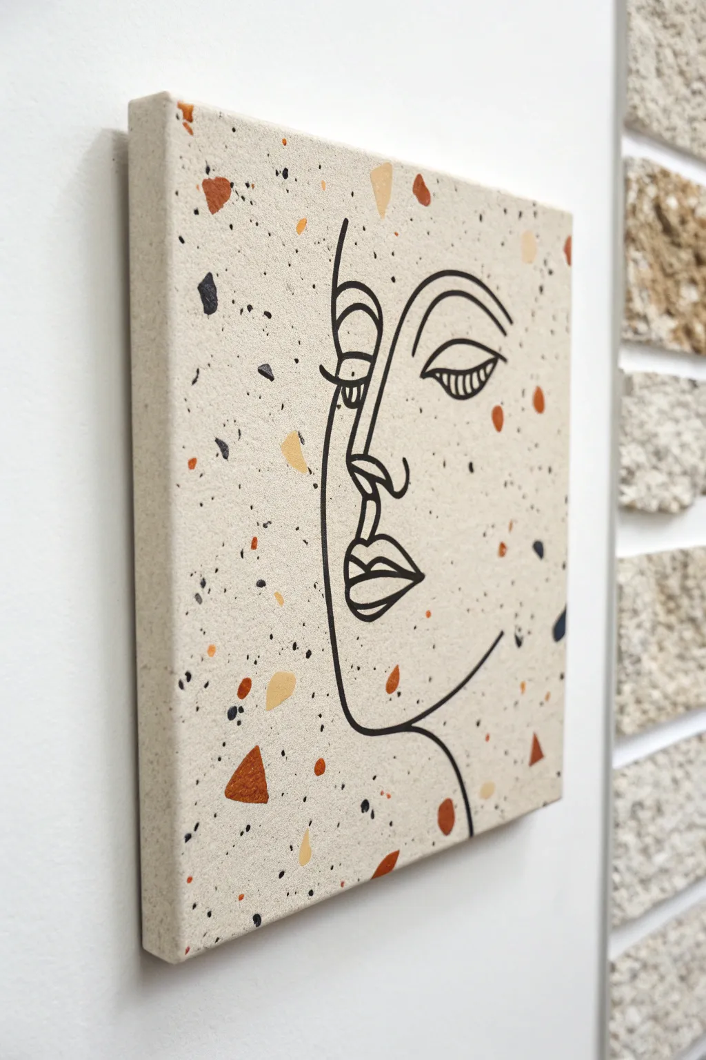
This trendy project combines the organic, scattered beauty of a terrazzo pattern with elegant, minimalist line art. The result is a sophisticated piece that looks like high-end decor but is surprisingly simple to achieve with basic acrylics.
Step-by-Step Tutorial
Materials
- Square gallery-wrapped canvas (10×10 or 12×12 inches)
- Acrylic paints (sand/beige, burnt orange, mustard yellow, dark brown, black)
- Wide flat paintbrush (for base coat)
- Small round paintbrush or angled shader brush (for terrazzo shapes)
- Black acrylic paint marker (medium tip) or fine liner brush
- Pencil and eraser
- Old toothbrush (optional, for splatters)
- Palette or paper plate
- Water cup and paper towels
Step 1: Setting the Background
-
Prime the Surface:
Start by painting your entire canvas with the sand or light beige acrylic paint. This is your foundation color. -
Cover the Edges:
Don’t forget to paint the sides of the canvas as well. This gives the finished piece a professional, gallery-ready look that doesn’t require a frame. -
Apply a Second Coat:
Once the first layer is dry to the touch, apply a second coat to ensure full opacity, hiding the canvas texture slightly. Let this dry completely before moving on.
Natural Chaos
Avoid perfectly spacing your terrazzo chips. Clumping a few shapes together and leaving some larger empty spaces creates a more realistic stone look.
Step 2: Creating the Terrazzo Effect
-
Mix Your Palette:
Prepare small dollops of your terrazzo colors: burnt orange, mustard yellow, dark brown, and black. Keep them separate on your palette. -
Paint Large Shards:
Using a small flat brush, paint random geometric shapes—triangles, trapezoids, and rough squares—scattered across the canvas. Use your burnt orange and mustard yellow for these larger ‘chips.’ -
Add Medium Accents:
Switch colors and paint smaller, irregular blobs. I find that varying the orientation of these shapes makes the pattern feel more natural and stone-like. -
Incorporate Black Flakes:
Use the black paint sparingly to add smaller, high-contrast chips. These anchor the design and will tie in nicely with the line art later. -
Create Fine Speckles:
For that authentic grainy texture, load an old toothbrush with slightly watered-down black or brown paint. Run your thumb over the bristles to flick tiny specks onto the canvas. -
Dry Thoroughly:
This phase is crucial; let the terrazzo layer dry for at least an hour. If the paint is wet, your line art pen might snag or bleed.
Textured Touch
Mix a pinch of baking soda into your base beige paint. This adds actual grit and texture, making the background feel like real stone or plaster.
Step 3: Drawing the Line Art
-
Sketch the Contour:
Lightly sketch the face profile with a pencil. Start with the forehead curve, moving down to the nose bridge and the lips. -
Refine the Features:
Add the eye detail, focusing on the heavy upper lid and lashes typical of this abstract style. Keep the lines fluid and continuous where possible. -
Check Composition:
Step back and ensure the face is centered or placed aesthetically amidst your terrazzo pattern. Erase and adjust gently if needed. -
Trace with Paint Marker:
Take your black acrylic paint marker and essentially trace over your pencil lines. Use confident, smooth strokes rather than short, scratchy ones. -
Thicken Key Lines:
Go back over the main profile line (forehead to chin) and the eyebrow to slightly thicken them. This line variation adds graphical interest. -
Detail the Eye:
Use a lighter touch for the delicate eyelashes and the pupil detail to keep them crisp. -
Clean Up:
Once the marker ink is fully dry, gently erase any visible pencil sketch lines that weren’t covered by the ink. -
Seal (Optional):
If you want extra protection, apply a clear matte varnish over the entire piece to unify the sheen of the paint and the marker.
Hang your new modern art piece in a well-lit spot to enjoy the subtle interplay of pattern and line
Loose Watercolor Bloom With Ink Contour
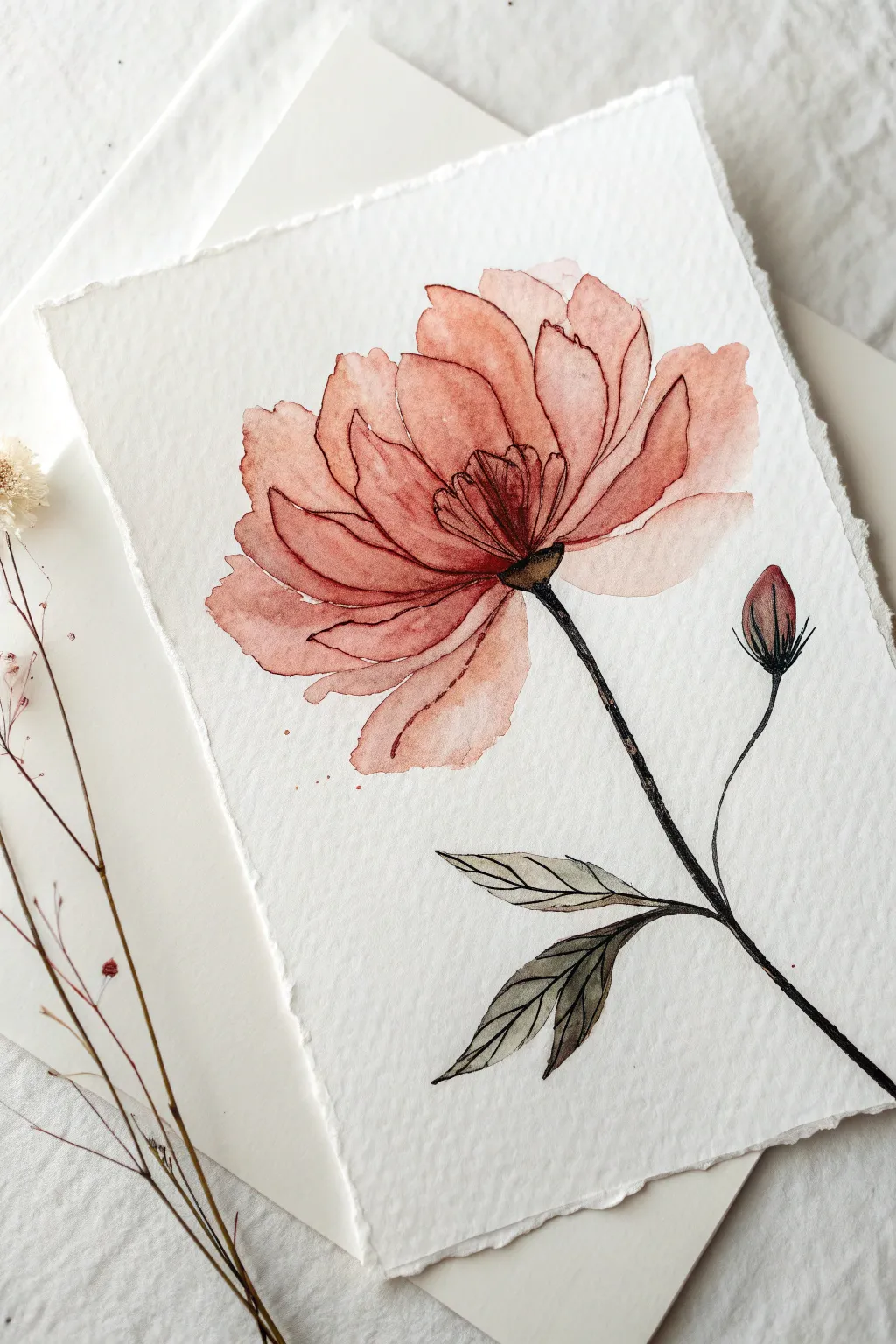
This elegant project combines the fluidity of watercolor with the graphic precision of ink line art. You’ll create a soft, dusty pink bloom where intentional imperfections and loose washes meet crisp, defining contours.
Step-by-Step Guide
Materials
- Cold-pressed watercolor paper (300 gsm or higher, with deckled edges if possible)
- Watercolor paints (Terracotta, Burnt Sienna, Alizarin Crimson, Sap Green, Payne’s Grey)
- Round watercolor brushes (Size 6 or 8 for petals, Size 2 for details)
- Fine liner pen (Waterproof black ink, 0.1mm or 0.3mm nib)
- Pencil (HB or 2H)
- Kneadable eraser
- Jars of water
- Paper towels
Step 1: Preparation & Sketching
-
Paper selection:
Choose a high-quality textured paper. If you want to match the reference exactly, carefully tear the edges of your paper against a ruler to create a faux-deckled edge look. -
Light blocking:
Using your pencil very lightly, map out the general oval shape of the main flower head near the upper center of the page. -
Adding the stem line:
Draw a gently curved line extending downwards from the flower head towards the bottom right corner. -
Sketching the bud:
Add a smaller shoot branching off to the right side of the main stem, topping it with a small teardrop shape for the unbloomed bud. -
Initial petal shapes:
Lightly sketch the large, overlapping petals. Don’t worry about tiny details yet; just focus on the way the petals fan out from the center.
Step 2: Watercolor Washes
-
Mixing the color:
Create a watery mix of Terracotta nicely balanced with a touch of Alizarin Crimson to get that dusty, warm pink hue. Test it on a scrap paper first. -
First petal wash:
Load your larger round brush with clean water and wet just one petal area. Drop your color mix into the wet area and let it bloom naturally. -
Working in sections:
Continue painting individual petals. I prefer to paint non-adjacent petals first and let them dry slightly before painting their neighbors to prevent everything from bleeding into one big blob. -
Creating depth:
While a petal is still damp, drop a slightly more concentrated mix of the paint (more pigment, less water) near the base of the petal towards the flower center. -
Painting the bud:
Apply the same dusty pink mix to the bud, keeping the top slightly lighter than the base. -
Leaf tones:
Mix Sap Green with a tiny bit of Payne’s Grey or Burnt Sienna to de-saturate it. Paint the leaves loosely, allowing the brush to trail off at the sharp tips. -
Full dry:
This is crucial: allow the painting to dry completely. If the paper is even slightly cold to the touch, it’s still damp. Using ink too soon will bleed and ruin the crisp lines.
Loose Lines Look Best
Don’t connect every single ink line perfectly. Leave small gaps in the outline, especially at the lighter tips of petals, to let the drawing ‘breathe’ and feel more organic.
Step 3: Inking the Contours
-
Center details:
Start with the fine liner at the center of the flower. Draw the small stamens and the dark central point where the stem meets the bloom. -
Petal outlines:
Trace the edges of your watercolor petals. Keep your hand loose; the line doesn’t need to match the paint edge perfectly. In fact, slight misalignments add artistic character. -
Defining folds:
Add extra ink lines inside the petal shapes to suggest folds, veins, or crinkles in the flower texture. -
Stem strength:
Ink the stem. You can go over this line twice or thicken it slightly to give it visual weight compared to the delicate petals. -
Leaf veins:
Outline the leaves and add a simple central vein line to each one. -
Final splatters:
Load a brush with watery pink paint and tap it against your finger to create very subtle, tiny splatters near the petals for a loose finish.
Ink Bleeding?
If your fine liner starts feathering or bleeding, the paper is still damp deep down. Stop immediately and use a hair dryer on a low, cool setting for 2-3 minutes before resuming.
Once dry, gently erase any visible pencil marks to reveal your delicate botanical illustration
Op Art Ripples on an Ombre Paint Base
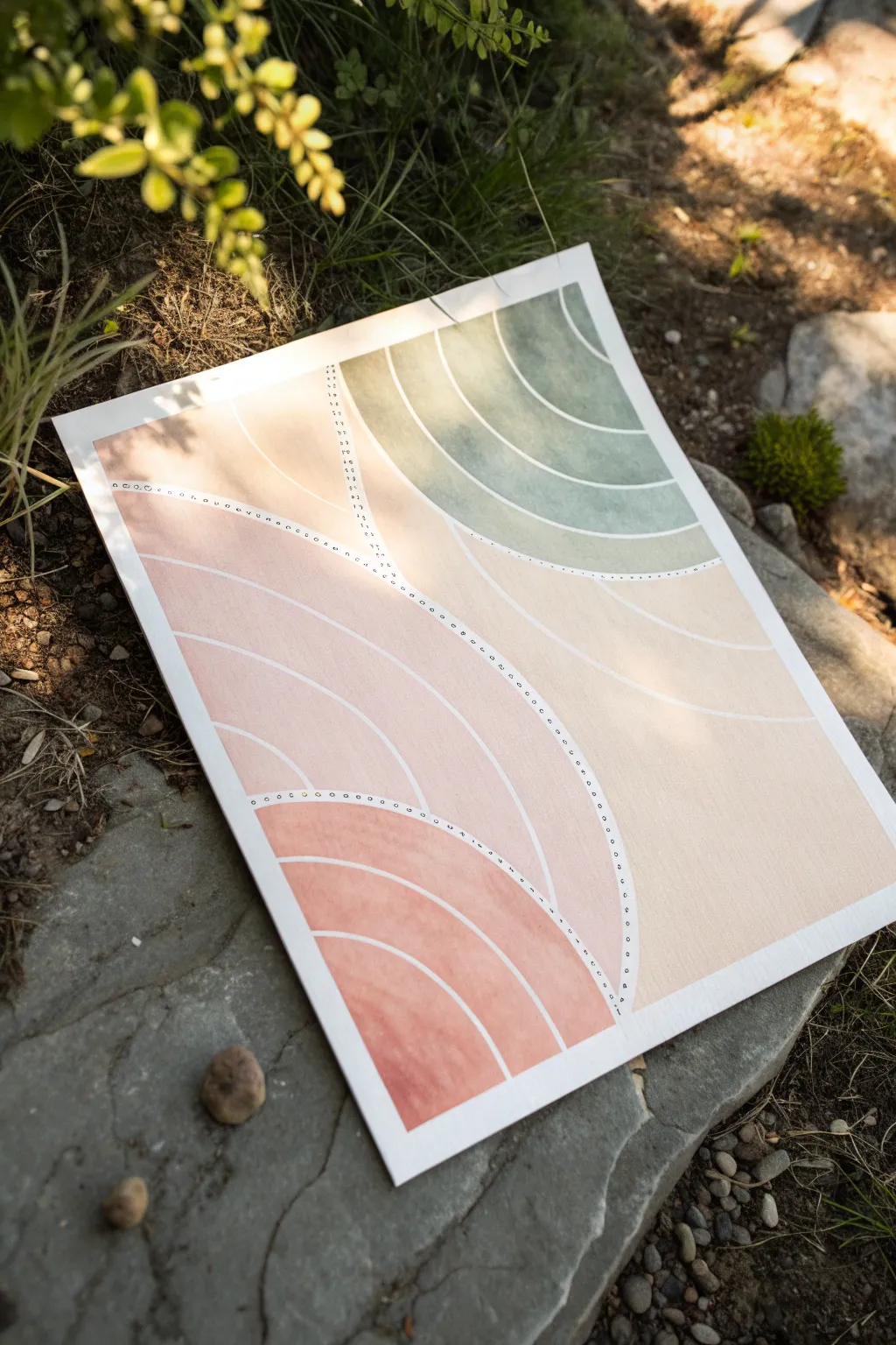
Embrace the soothing rhythms of nature with this abstract line art project that combines soft watercolor gradients with precise geometric forms. The visual effect mimics stylized ripples on water or topographical maps, creating a modern and calming piece for your wall.
Step-by-Step Tutorial
Materials
- Cold press watercolor paper (block or taped down)
- Watercolor paints (Peach, Terracotta, Sage Green)
- Masking fluid or white acrylic ink
- Fine liner brushes (size 0 and 2)
- Pencil and eraser
- Compass or round objects for tracing
- Painter’s tape
- Fine tip black or white pen (optional for dots)
Step 1: Planning and Sketching
-
Prepare the canvas:
Begin by securing your watercolor paper to a flat surface using painter’s tape on all four sides. This prevents buckling when the paper gets wet and creates a crisp white border. -
Map the main curves:
Visualize the composition as three distinct zones. Lightly sketch two main dividing lines that curve across the paper, creating a top-right section, a middle band, and a bottom-left section. -
Draft the ripples:
Using a compass or by carefully tracing curved objects, draw a series of concentric arcs within each of your three zones. These lines don’t need to meet perfectly; they establish the flow of the ripples. -
Refine the gaps:
Ensure there is a consistent, narrow gap between your sketched arcs. This negative space will eventually become the white lines that define the structure.
Uneven Gaps?
If you struggle to leave consistent white gaps while painting, apply thin lines of masking fluid over your sketches before painting. Rub it off after the paint dries to reveal perfect white lines.
Step 2: Painting the Ombre
-
Mix your base colors:
Prepare your palette. You’ll need a sage green for the top section and a gradient of peach-to-terracotta for the bottom two sections. Keep plenty of water nearby to dilute the pigment. -
Paint the green zone:
Start with the top-right section using the sage green. Paint the arc segments, keeping the color fairly solid but allowing natural watercolor texture to show through. Leave the sketched gap lines unpainted (white paper). -
Start the peach gradient:
For the large middle section, begin with a very diluted, pale peach wash. Fill in the arched segments carefully, minding the white gaps. -
Deepen the tones:
As you move to the bottom-left section, mix more terracotta or red pigment into your peach color. I like to test the darkness on a scrap paper first to ensure a smooth transition. -
Paint the darkest ripples:
Fill the bottom-left segments with this darker terracotta mix. This creates an ombre effect where the painting visual gravity feels heavier at the bottom. -
Let it dry completely:
This is crucial. Walk away for at least 30 minutes or use a hair dryer on a low setting. The paper must be bone dry before adding details.
Add Metallic Flair
Swap the white or black dots for gold leaf or metallic paint pen. The shimmer against the matte watercolor creates a sophisticated, high-end look.
Step 3: Defining the Lines
-
Enhance the white lines:
If your painting hand wasn’t perfectly steady and some paint bled into the gaps, use white acrylic ink or opaque white gouache to carefully paint over the gaps, sharpening the edges of your arcs. -
Add the dotted boundary:
Look at the main dividing lines you sketched in the beginning that separate the three color zones. With a very fine brush and white paint (or a white gel pen), add a row of tiny, evenly spaced dots along these borders. -
Second dotted detail:
Add a second row of black or dark grey dots right next to the white ones for contrast, or stick to simple black circles as shown in the example. This stippling effect adds a lovely illustrative touch. -
Clean up:
Once the detailed ink work is dry, gently erase any visible pencil marks from the unpainted areas. -
Reveal the border:
Slowly peel away the painter’s tape at a 45-degree angle to reveal the clean, sharp edges of your artwork.
Frame your piece simply to let the gentle motion of the lines speak for itself


Have a question or want to share your own experience? I'd love to hear from you in the comments below!