If you’ve ever painted something you love and then hung it up only to realize it doesn’t quite “click” in your space, you’re not alone. Here are my favorite modern canvas painting ideas for the living room that create that pulled-together, designer-style harmony—especially above the sofa.
Oversized Neutral Abstract Above the Sofa
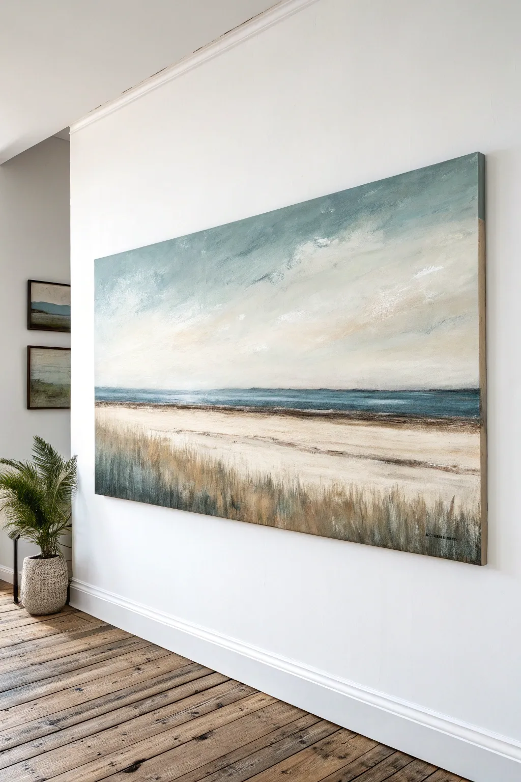
Bring a sense of calm serenity to your space with this oversized abstract canvas that melds stylized botanical forms with a soothing coastal landscape. Using soft neutrals like sand, taupe, and slate blue, this piece captures the essence of a hazy beach day with a gentle, painterly touch.
Step-by-Step
Materials
- Large gallery-wrapped canvas (approx. 48″ x 36″ or larger)
- Acrylic paints: Titanium White, Unbleached Titanium (buff), Raw Sienna, Burnt Umber, Payne’s Grey, and a soft Sage Green
- Gesso (white)
- Wide flat brush (2-3 inch) for background layers
- Medium filbert brush for clouds and hills
- Round brush (size 6 or 8) for botanical details
- Spray bottle with water
- Palette knife (optional for texture)
- Floating wooden frame (light oak finish)
Step 1: Setting the Background
-
Prime the canvas:
Even if your canvas is pre-primed, apply a fresh coat of white gesso to ensure a smooth, manageable surface. Let it dry completely. -
Create the horizon line:
Visualize the canvas in horizontal thirds. The bottom third will be your foreground/sand, the middle is the sea/land strip, and the top is the sky. Lightly sketch a very faint horizontal line about one-third of the way up from the bottom. -
Paint the sky base:
Mix a large amount of Titanium White with a tiny touch of Burnt Umber and Sage Green to create a warm, off-white ‘dirty cloud’ color. Use your wide flat brush to cover the top two-thirds of the canvas with long, horizontal strokes. -
Add sky variation:
While the sky paint is still slightly damp, mix a bit of Unbleached Titanium and Raw Sienna. Drag this warmer color horizontally across the upper middle section to suggest atmospheric clouds or a sunset glow. Keep the blending soft. -
Paint the foreground:
For the bottom third, mix Titanium White with a little Payne’s Grey and just a drop of water to make a thin wash. Paint this area loosely, allowing some of the bright white canvas to show through for a textured, sandy look.
Step 2: Developing the Landscape Layers
-
Layer the horizon bands:
Just above your horizon line, paint a strip of Unbleached Titanium mixed with Raw Sienna. This golden band represents a distant sandy shore or dunes. Don’t make the line perfectly straight; let it undulate slightly. -
Add the distant water:
Below the golden band, add a strip of very pale grey-blue (White + tiny dot of Payne’s Grey). This separates the foreground from the distant dunes. -
Paint the prominent dark hill:
Mix Payne’s Grey with a little Burnt Umber to create a dark charcoal color. On the right side of the horizon line, paint a low, sloping hill shape. Keep the edges slightly soft so it looks far away, not like a cutout. -
Soften the transitions:
Use a clean, dry brush to gently sweep over the boundaries where the color bands meet. This horizontal dry-brushing technique unifies the landscape. -
Add secondary low hills:
Using a lighter grey mix, paint a faint, lower landmass shape to the left of the dark hill. This creates depth and prevents the horizon from looking too heavy on one side.
Uneven Horizon?
If your horizon lines look too wiggly or unintentional, apply a strip of painter’s tape across the canvas. Paint your horizon band, let it dry slightly, and peel the tape for a crisp edge.
Step 3: The Botanical Overlay
-
Sketch the fronds:
Once the background is completely dry, use a piece of white chalk or a very light pencil to sketch a large, fountain-like plant structure on the left side. The stems should rise from the bottom edge and curve gracefully outward near the top. -
Paint the stems:
Load a round brush with a mix of Burnt Umber and plenty of Titanium White (a soft taupe). Paint the vertical stems with a confident, upward motion. I find it helps to hold the brush loosely at the end of the handle for more organic lines. -
Create the leaves:
Using the same taupe color, add elongated, leaf-like shapes at the ends of the stems. Make them loose and painterly rather than botanically perfect. Think of them as impressions of leaves. -
Add highlights:
Mix a creamy white color (Titanium White + Unbleached Titanium). Add highlights to the left side of the stems and the tips of the leaves to give them dimension. -
Add accent details:
Dip a small brush into Raw Sienna (gold/tan). Add small accent dashes inside the leaf shapes—similar to the seeds or texture seen in the reference image. These warmth pops tie the plant to the golden horizon band. -
Ghosting technique:
Mix a very watery wash of white paint. Lightly glaze over the bottom section of the plant stems so they seem to fade into the mist or foreground. This transparency is key to the ethereal look.
Add Texture
Mix a tablespoon of baking soda or modeling paste into your white paint for the foreground sand area. This adds gritty, realistic texture that catches the light beautifully.
Step 4: Finishing Touches
-
Review and refine:
Step back about ten feet. If the botanical shape feels too heavy, dry-brush some of the background sky color over parts of the leaves to push them back into the atmospheric haze. -
Frame the piece:
Once minimal drying time has passed (acrylics dry fast), install the canvas into a light oak floating frame. This specific frame style creates a shadow gap that elevates the professional look of the artwork.
Hang your new masterpiece and enjoy the tranquil, sophisticated atmosphere it creates in your living room

Calm Black-and-White Minimalism
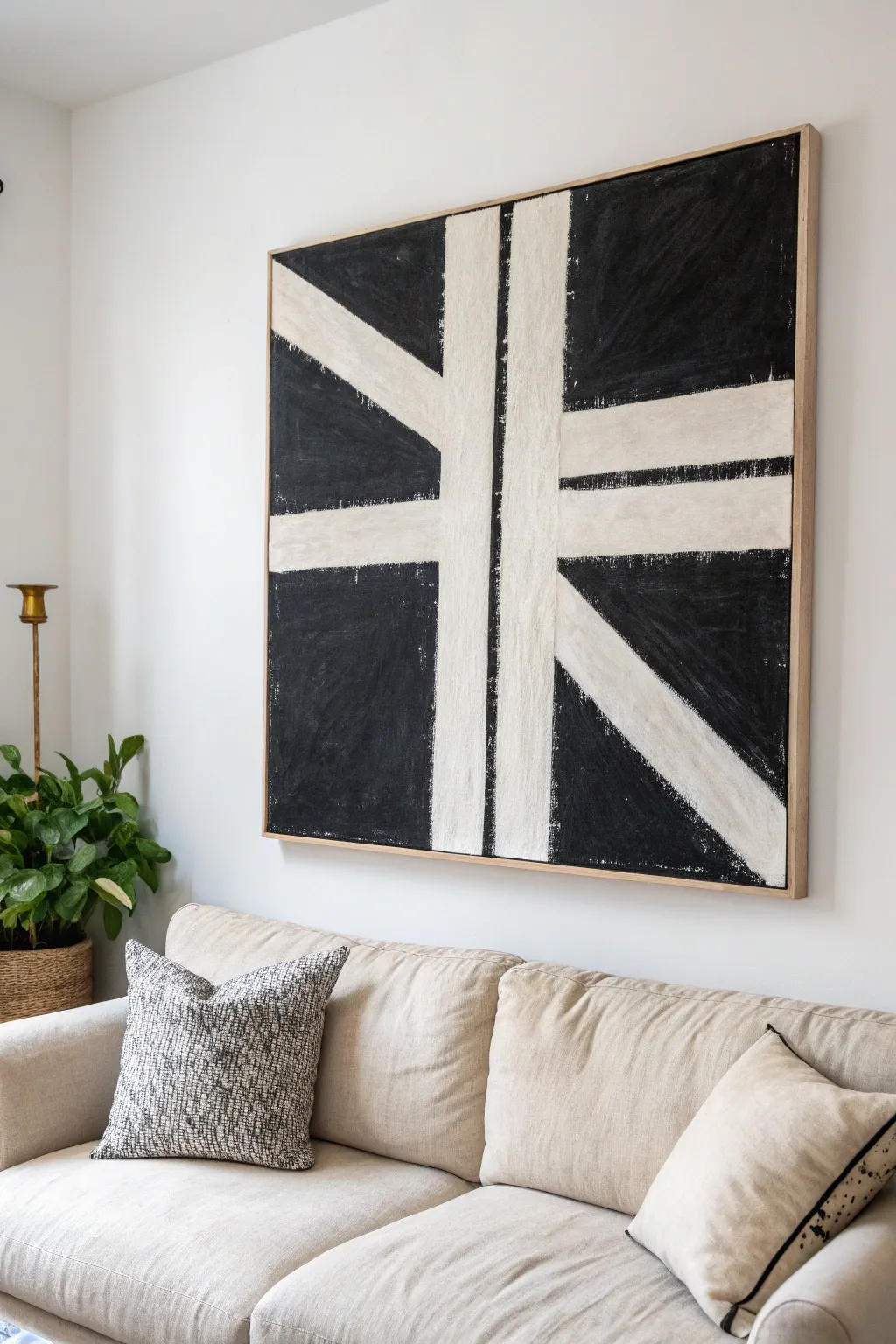
Embrace the elegance of high contrast with this striking black-and-white minimalist piece that anchors any room. Its rough, texture-rich brushwork softens the rigid geometric lines, giving the artwork an organic, hand-touched warmth.
Step-by-Step Tutorial
Materials
- Large square canvas (approx. 36×36 inches or larger)
- Heavy body acrylic paint (Mars Black)
- Heavy body acrylic paint (Titanium White or Unbleached Titanium)
- Matte gel medium (for texture)
- 2-inch painter’s tape or masking tape
- Wide flat synthetic brush (2-3 inches)
- Medium flat bristle brush (1 inch)
- Graphite pencil
- Straight edge or yardstick
- Drop cloth
- Light wood floating frame (optional)
Step 1: Planning and Taping
-
Prime the Surface:
Even if your canvas is pre-primed, apply an initial coat of Titanium White or Unbleached Titanium mixed with a little water to ensure a solid, bright base. Let this dry completely for at least an hour. -
Mark vertical guides:
Using your yardstick and pencil, lightly mark the center of the canvas vertically. Measure about 1.5 inches to the left and 1.5 inches to the right of this centerline to establish the width of your central vertical stripe. -
Draft the diagonal and horizontal lines:
Draw the remaining geometric pattern. You want a horizontal stripe intersecting the vertical one slightly above the visual center. Then, add the diagonal ‘spokes’ radiating outward, keeping the spacing somewhat symmetrical but not mathematically perfect. -
Mask the positive space:
Apply your painter’s tape precisely over the pencil lines you just drew. The area *under* the tape will remain white, forming your geometric structure. Press the edges of the tape down firmly with your thumbnail or a credit card to prevent bleed-under. -
Seal the tape edges:
Take a small amount of your white base paint and brush a very thin layer over the edges of the tape. This trick seals the tape edge so that if any paint bleeds under, it matches the background, keeping your future black lines crisp.
Bleeding Lines?
If black paint bled under the tape, don’t panic. Wait for it to dry completely, then use a small angled brush and your white base paint to touch up the line and restore the sharp edge.
Step 2: Applying Texture and Color
-
Mix the black pigment:
Squeeze a generous amount of Mars Black heavy body acrylic onto your palette. Mix in about 20% matte gel medium. This extends the drying time slightly and adds a wonderful body to the paint that holds brushstrokes well. -
Paint the first black section:
Start applying the black mixture to the exposed canvas areas using the wide flat brush. Don’t aim for perfect opacity; let the brush drag slightly to create a raw, textured look. -
Vary brush direction:
While filling in the large black fields, mostly use vertical strokes, but occasionally scumble or cross-hatch near the edges to enhance the ‘sketchy’ aesthetic seen in the reference. -
Address the edges:
Bring the black paint all the way to the outer edges of the canvas, painting the sides as well for a finished gallery wrap look if you aren’t framing it immediately. -
Add depth:
While the first layer is tacky but not wet, go back in with a slightly dryer brush and add a second pass of black in random areas. This buildup creates the subtle tonal variations that stop the black from looking flat. -
Wait for the paint to set:
Allow the black paint to dry until it is firm to the touch. This usually takes about 20 to 30 minutes depending on humidity and paint thickness.
Step 3: The Reveal and Refinement
-
Remove the tape:
Slowly peel back the painter’s tape at a 45-degree angle. Do this carefully to ensure you don’t rip up the base layer of paint. -
Assess the contrast:
Step back and look at your white lines. They should be stark against the black. If the white feels too ‘new,’ you can dry-brush a tiny amount of off-white paint over them to soften the starkness. -
Create the rough edges:
The charm of this piece is the imperfect line work. I prefer to take the medium bristle brush with a tiny amount of black paint (wipe most of it off on a rag) and gently feather the edges of the black sections into the white stripes. -
Add scratches or texture:
If you want the distressed look shown in the image, lightly drag the dry bristles over parts of the solid black areas to reveal tiny speckles of the canvas texture below, or dab white spots sparingly. -
Final cure:
Let the entire painting cure for 24 hours before handling or framing. -
Frame the artwork:
Install the canvas into a light wood floating frame. This natural border provides a crucial warm contrast to the stark black and white palette.
Pro Tip: Texture
For that grainy, organic look, don’t use water to thin your black paint. Use it straight from the tube or mixed with a texture paste. The thicker the paint, the richer the surface quality.
Hang your new statement piece above your sofa and enjoy the sophisticated calm it brings to the space


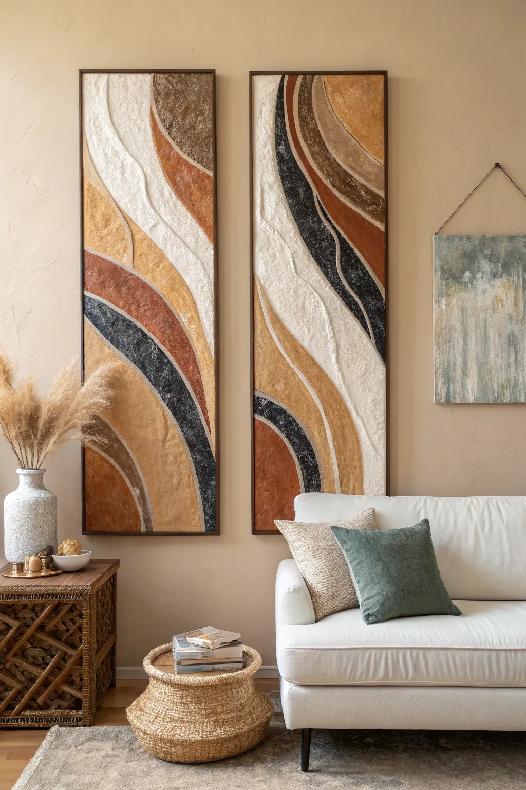
Modern Triptych With One Color Story
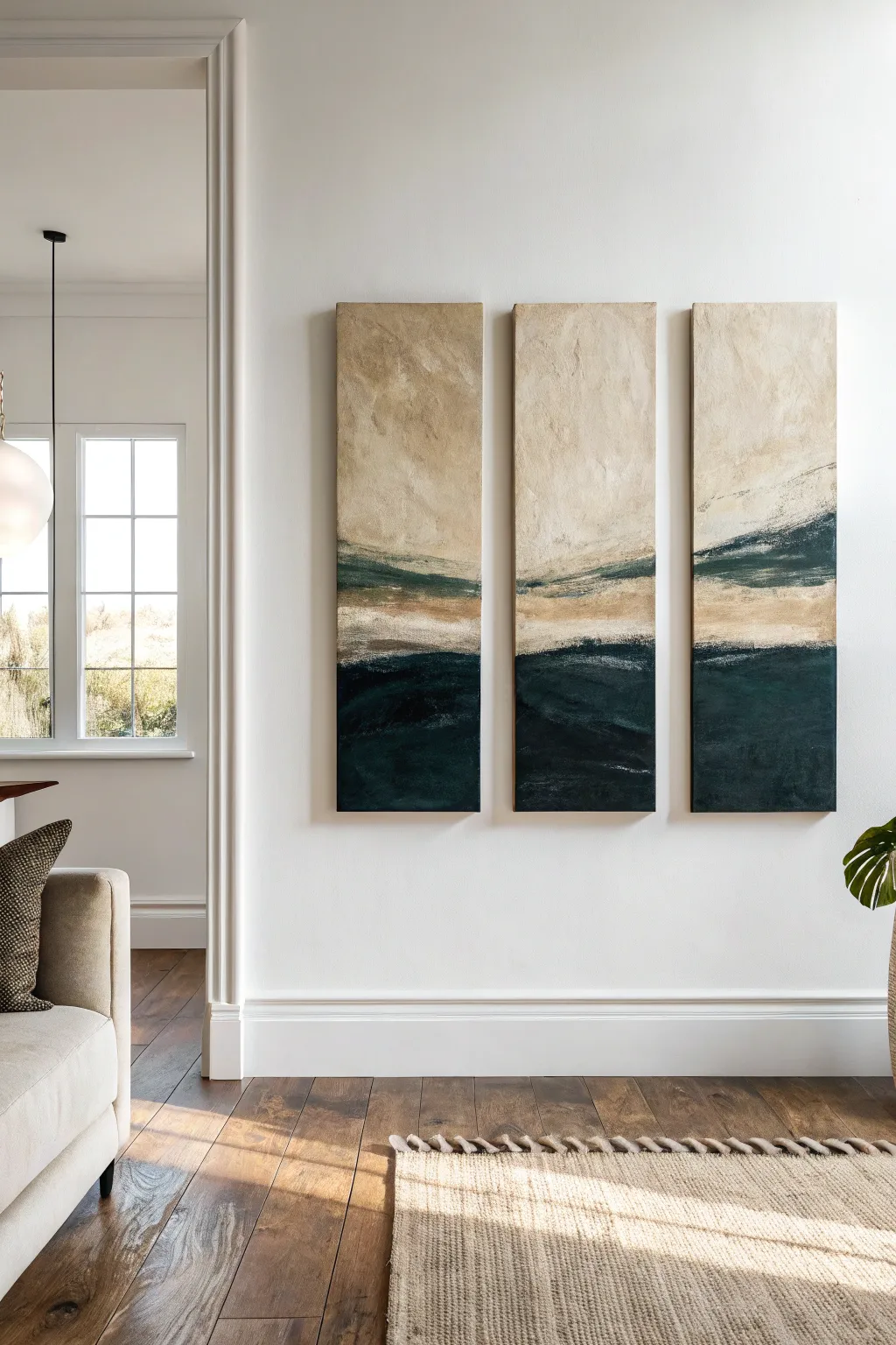
This stunning three-panel set brings the calming essence of a modern seascape into your living room through textured layers and deep, moody tones. By creating a continuous horizon line across separate canvases, you’ll achieve an expansive, gallery-quality look that feels both grounded and ethereal.
Step-by-Step
Materials
- 3 tall rectangular stretched canvases (gallery wrapped, approx. 12×36 inches each)
- Heavy body acrylic paints (Titanium White, Unbleached Titanium/Beige, Raw Umber, Hooker’s Green, Prussian Blue, Mars Black)
- Modeling paste or texture gel
- Large flat paintbrush (2-3 inch)
- Medium filbert brush
- Palette knife or plastic scraper
- Painter’s tape
- Large mixing palette or disposable plates
- Spray bottle with water
- Easel or large flat workspace
Step 1: Preparation & Texture
-
Prepare the workspace:
Lay your three canvases side-by-side on a flat surface or easel. Ensure they are touching or spaced very closely together (about 1/4 inch apart) to visualize the continuous image. -
Map out the horizon:
Using a pencil or a piece of chalk, lightly sketch a horizontal line across all three canvases where you want the dark sea to meet the lighter sky. In this design, place it slightly below the vertical center mark. -
Apply texture foundation:
Scoop out a generous amount of modeling paste with your palette knife. Apply it unevenly across the top two-thirds of the canvases (the ‘sky’ area), using sweeping, multidirectional strokes to create physical ridges and valleys. -
Refine the texture:
While the paste is wet, scrape back some areas to be flatter and build others up thicker. This variation is crucial for catching the light washes later. Let this dry completely, preferably overnight.
Step 2: The Atmospheric Sky
-
Mix the base sky color:
Combine a large amount of Titanium White with a touch of Unbleached Titanium and a tiny dot of Raw Umber to create a warm, creamy off-white. -
Apply the first sky layer:
Using the large flat brush, paint over the dried texture paste. Don’t worry about perfect coverage; let the brush skip over the textured ridges. -
Add warmth and variation:
While the base is still slightly tacky, mix a slightly darker beige tone. Dry-brush this color sporadically into the upper sections to create depth and an aged, parchment-like feel. -
Create the soft transition:
Near the horizon line, blend in a bit of watered-down Raw Umber. Use a damp brush to soften the edges so the transition looks hazy rather than stark.
Uneven Horizon Lines?
If your horizon line doesn’t match up across canvases, simply push the three panels tightly together and re-paint that specific section across the gap to realign them.
Step 3: The Dark Horizon
-
Mix the deep ocean hue:
On your palette, mix Hooker’s Green and Prussian Blue in equal parts, then add Mars Black until you achieve a very deep, rich petrol blue-green. -
Paint the bottom section:
Apply this dark mixture to the bottom third of the canvases using the large flat brush. Ensure your brushstrokes move horizontally to mimic water. -
Add subtle movement:
Mix a slightly lighter version of your teal (add a tiny bit of white/beige). While the dark paint is wet, streak this lighter shade horizontally through the dark mass to suggest subtle waves or currents.
Texture Too Sharp?
If your dried modeling paste feels too jagged or sharp to the touch, lightly sand it with fine-grit sandpaper before painting to soften the peaks.
Step 4: The Horizon Bond
-
Mix the shoreline colors:
Create a palette of ‘transitional’ earthy tones: a sandy beige, a muddy green (Raw Umber + Hooker’s Green), and a soft white. -
Bridge the gap:
Using the palette knife, scrape the sandy beige paint right along the line where the dark ocean meets the light sky. I like to apply this thickly so it sits on top of the other layers. -
Blend upwards:
Take a clean, dry filbert brush and lightly drag some of the dark ocean color upward into the sandy strip, and some of the sandy color downward, creating a rugged, blurry coast. -
Add the specific horizon details:
Referencing the inspiration image, paint a thin, jagged line of the dark muddy green just above the sandy area on the right two panels, letting it fade out on the left panel. -
Final dry brushing:
Dip a dry brush into pure Titanium White and lightly skim it horizontally over the darkest part of the water to create highlights on the ‘waves’ and texture. -
Review continuity:
Step back and look at the triptych as a whole. Ensure the color bands flow naturally from one canvas to the next. If a line feels disjointed, use excess paint to bridge the visual gap. -
Paint the edges:
Once the face is dry, paint the sides of each canvas. For a professional gallery look, continue the image around the sides, or simply paint them a solid neutral color like dark grey or cream.
Now recreate this serene landscape on your own wall and enjoy the modern, gallery-like atmosphere it creates


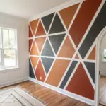
Geometric Shapes That Echo Your Rug
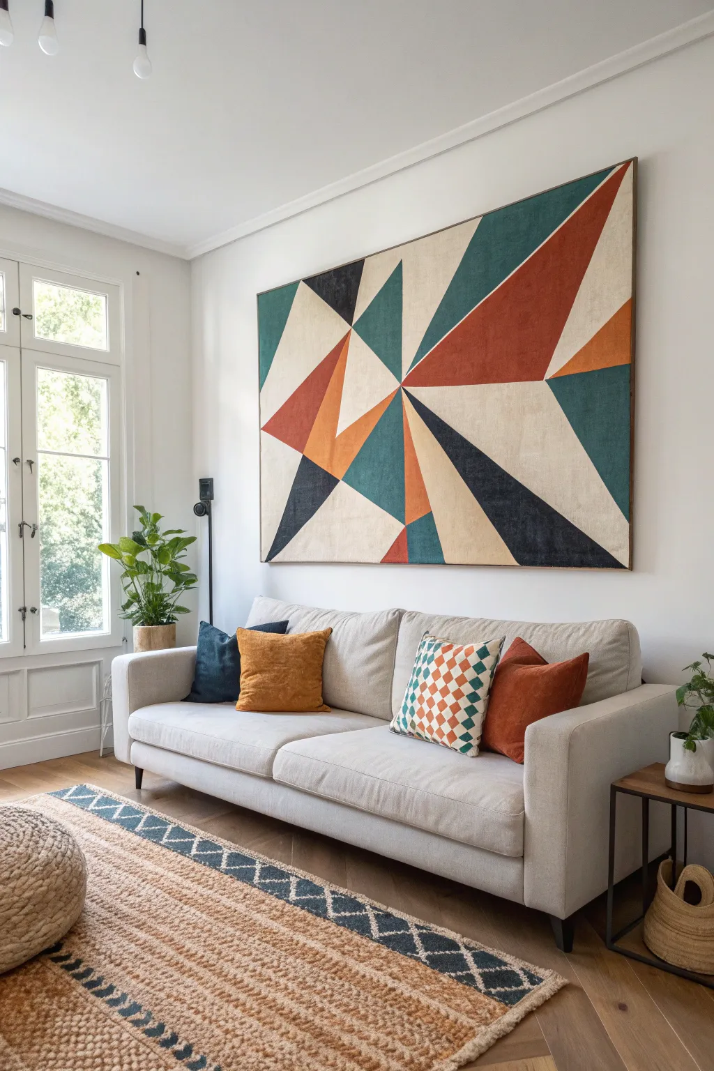
This striking large-scale artwork serves as a bold focal point, blending mid-century modern aesthetics with geometric precision. The interplay of rust, teal, and cream triangles creates dynamic movement while perfectly echoing the warm tones of a jute rug.
Step-by-Step Guide
Materials
- Large stretched canvas (approx. 48″ x 60″ or custom size)
- Acrylic paints (Cream/Beige, Rust/Burnt Orange, Teal/Dark Turquoise, Navy Blue/Black)
- High-quality painter’s tape (frog tape or similar)
- Long ruler or yardstick
- Pencil
- Flat paintbrushes (2-inch and 1-inch sizes)
- Gesso (optional, for priming)
- Matte finish varnish
- Thin wooden lattice strips (for framing)
- Wood stain and wood glue
- Drop cloth
Step 1: Preparation and Planning
-
Prime the surface:
If your canvas isn’t pre-primed, or if you want a smoother texture, apply a coat of white gesso across the entire surface. Let this dry completely before moving forward. -
Sketch the focal point:
Decide where you want the central convergence point of your triangles to be. In the inspiration piece, this is slightly off-center to the right. Mark this spot lightly with a pencil. -
Draft the major lines:
Using your yardstick, draw long straight lines radiating outward from your focal point to the edges of the canvas. These will form the main ‘spokes’ of your design. -
Subdivide the shapes:
create additional intersecting lines across the spokes to form distinct triangles and quadrilaterals. Don’t worry about perfect symmetry here; the rugged, asymmetrical layout creates more visual interest. -
Plan your color map:
Mark each section lightly with a letter representing the color (e.g., ‘R’ for Rust, ‘T’ for Teal) to ensure you have a balanced distribution of hues before you start painting.
Step 2: Painting the Geometry
-
Tape the first batch:
This is the most crucial step for clean lines. Apply painter’s tape along the pencil lines for your first group of shapes. Ensure the tape is outside the shape you intend to paint so you don’t reduce its size. -
Seal the tape edges:
I like to run a fingernail or a credit card firmly along the edge of the tape to seal it. For perfect lines, paint a thin layer of your background color (or clear matte medium) over the tape edge first to prevent bleed-through. -
Paint the cream base:
Start with the lightest color. Fill in the large cream/beige sections using a wide flat brush. Apply two coats if necessary for full opacity, letting the first coat dry to the touch in between. -
Apply the bold colors:
Move on to the rust orange and teal sections not touching the wet cream paint. Use long, smooth strokes in the direction of the triangle’s longest side to minimize texture buildup. -
Remove tape while damp:
Carefully peel back the tape while the paint is still slightly tacky, not fully dry. Pull the tape away from the painted area at a sharp 45-degree angle. -
Dry and re-tape:
Allow the first batch of shapes to dry completely—usually at least an hour. Then, apply fresh tape over the dried painted edges to define the borders for the remaining empty shapes. -
Finish the remaining shapes:
Fill in the remaining triangles with your navy/black and secondary rust tones. Be very careful to ensure full coverage right up to the tape line where new colors meet old colors. -
Touch up edges:
Once all tape is removed and the canvas is fully dry, inspect the lines. Use a small, angled detail brush to fix any tiny bleeds or unpainted gaps.
Clean Line Secret
Paint clear matte medium over tape edges before applying color. It seals gaps so the only thing that bleeds under is clear, ensuring razor-sharp lines.
Step 3: Finishing and Framing
-
Seal the artwork:
Apply a coat of matte varnish over the entire painting. This unifies the sheen of the different paint colors and protects the canvas from dust and UV light. -
Prepare the frame strips:
Measure the outer dimensions of your canvas. Cut your wooden lattice strips to match these lengths, cutting the corners at 45-degree angles for unauthorized corners, or simple butt joints for a rustic look. -
Stain the wood:
Apply a wood stain that complements the rust tones in your painting—a warm walnut or teak finish works beautifully here. Wipe off excess stain and let dry. -
Attach the frame:
Use wood glue and small finish nails (or a brad nailer) to attach the stained lattice strips directly to the outer edge of the canvas stretcher bars. This creates a sleek ‘floating frame’ appearance.
Add Texture
Mix a small amount of sand or modeling paste into the cream paint. This adds gritty tactile depth that mimics vintage mid-century canvas art.
Hang your massive masterpiece and enjoy how the sharp geometry brings order and warmth to your living space
BRUSH GUIDE
The Right Brush for Every Stroke
From clean lines to bold texture — master brush choice, stroke control, and essential techniques.
Explore the Full Guide
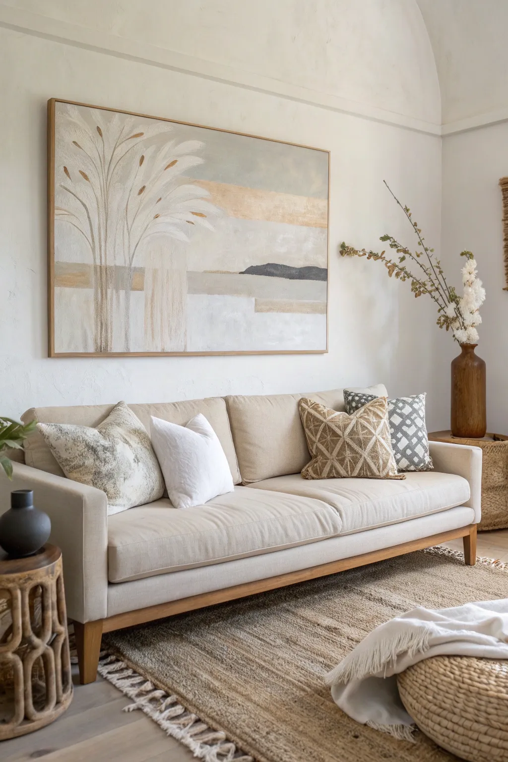
Soft Botanical Silhouettes in Modern Tones
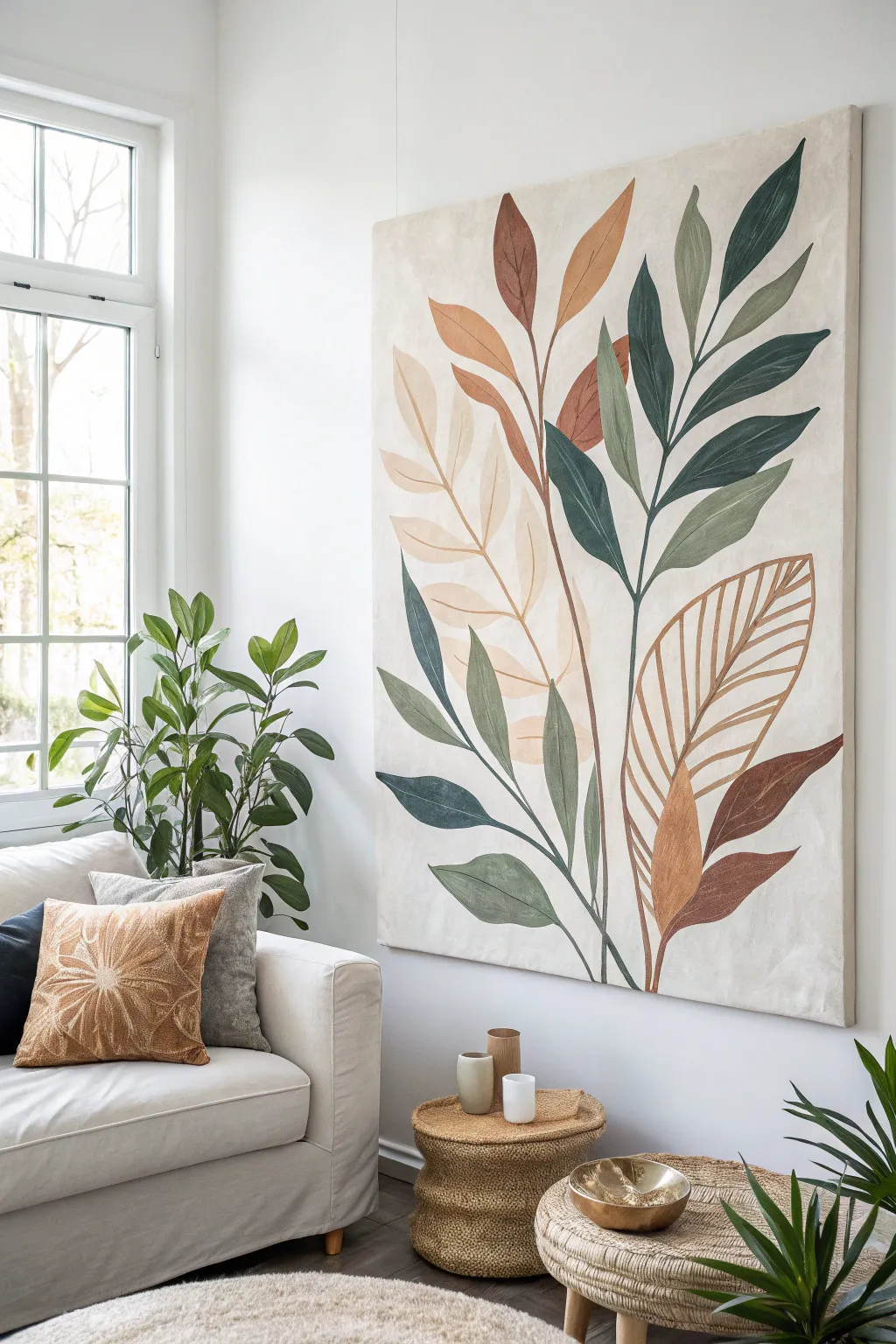
Transform your living space with this serene, large-scale botanical artwork featuring sweeping leaf silhouettes in a palette of sage, terracotta, olive, and cream. The soft blending and organic shapes make this piece feel both modern and timeless, perfect for adding a natural touch to neutral interiors.
Detailed Instructions
Materials
- Large canvas (approx. 36×48 inches or larger)
- Acrylic paints: Titanium White, Unbleached Titanium, Burnt Sienna, Raw Umber, Olive Green, Sap Green, Payne’s Grey
- Gesso (white or clear)
- Large flat brushes (2-3 inch) for background
- Medium filbert brushes (size 8-12) for leaves
- Fine liner brush (size 1-2) for stems and veins
- Palette knife
- Pencil or willow charcoal stick
- Mixing palette or disposable plates
- Water cups and paper towels
Step 1: Preparing the Foundation
-
Prime the Surface:
Even if your canvas is pre-primed, add a fresh coat of white gesso mixed with a tiny drop of Unbleached Titanium. This creates a slightly warm, off-white base rather than a stark clinical white. -
Create Texture:
While the gesso is still wet, use a palette knife or a dry brush to create subtle vertical and cross-hatch strokes. This mimics a textured linen look which adds depth to the final piece. -
Mix the Background Tone:
Combine a large amount of Titanium White with a small touch of Raw Umber and Unbleached Titanium. You want a creamy, sophisticated beige that feels like natural linen. -
Apply Background Layer:
Paint the entire canvas with your mixed cream tone. Don’t worry about perfect opacity; a little bit of streakiness adds to the natural textile vibe. Let this dry completely before moving on.
Master the Flow
Use a filbert brush rather than a flat brush for the leaves. The rounded tip naturally creates that tapered, organic leaf shape with a single confident stroke.
Step 2: Sketching the Composition
-
Map the Main Stems:
Using a pencil or willow charcoal, lightly draw three or four main stem lines originating from the bottom center. Curve them gracefully outward toward the top corners to create visible flow. -
Outline Leaf Shapes:
Sketch large, lance-shaped leaves extending from the stems. Vary the sizes—keep larger leaves near the visual center and slender ones toward the tips. Keep the pencil pressure extremely light. -
Plan Your Color Blocks:
Mentally assign colors to different branches to balance the composition. I like to mark a tiny ‘G’ for green, ‘R’ for rust, or ‘C’ for cream inside the outlines so I don’t get lost later.
Metallic Touch
Mix a tiny amount of gold fluid acrylic into your beige paint for the skeleton leaf outlines. It adds a subtle shimmer that catches the light beautifully.
Step 3: Painting the Botanical Elements
-
Mix the Sage Green:
Create a muted green by mixing Olive Green with Titanium White and a dash of Payne’s Grey to desaturate it. This will be your primary cool tone. -
Paint the Deep Green Leaves:
Using a filbert brush, fill in the darkest leaves. Start from the stem and pull the brush outward toward the leaf tip for a smooth, tapered edge. -
Mix the Terracotta Shade:
Combine Burnt Sienna with a little Unbleached Titanium and a touch of red (if needed) for that warm, earthy rust color. It should contrast beautifully with the cool greens. -
Apply Warm Accents:
Paint the designated ‘rust’ leaves. If the paint feels too dry, dip your brush in a little water to help the acrylic flow smoothly into the curves of your sketch. -
Create the Cream/Beige Leaves:
Mix a tone slightly darker than your background color (more Raw Umber). Paint the lightest leaves, which act as a subtle ‘ghost’ layer in the composition. -
Add Variation:
While the paint is wet on the larger leaves, blend in a slightly lighter or darker version of the same color near the edges. This prevents the shapes from looking like flat stickers.
Step 4: Refining Details
-
Connect the Stems:
Using a fine liner brush and a dark brown mix (Burnt Sienna + Raw Umber), trace over your initial stem lines. Ensure the stems connect logically to the base of each leaf. -
Paint the Veins:
For the feature leaf (the large skeleton leaf on the right), use your liner brush to carefully paint the central spine and the delicate ribs extending outward. Keep lines thin and steady. -
Clean Up Edges:
Step back and look for any wobble in your leaf outlines. Use your background cream color to cut back into the shapes and crisp up any edges that became too messy. -
Final Assessment:
Check the balance of the piece. If a leaf feels too heavy, you can dry-brush a little background color over it to soften its impact. -
Seal the Work:
Once fully cured (wait at least 24 hours), apply a matte isolation coat or varnish to protect the paint and unify the sheen across the canvas.
Hang your oversized masterpiece in a well-lit spot to let those earthy tones bring warmth and calm to your room
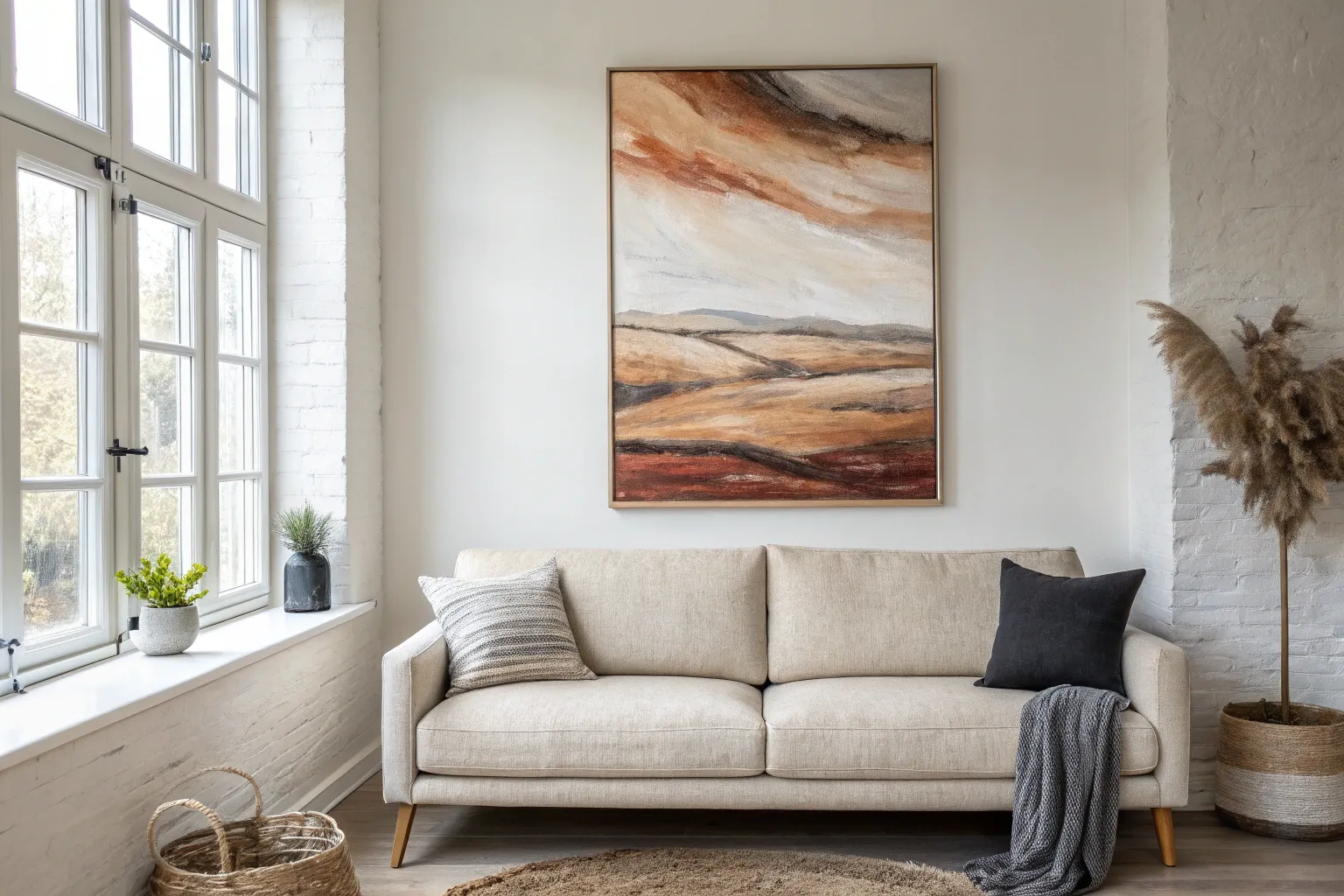
Abstract Landscape With a Low Horizon
Capture the serene essence of a shoreline with this expansive abstract landscape feature. By focusing on a low horizon line and sweeping, blended brushstrokes, you’ll create a sense of depth and airy spaciousness perfect for anchoring a modern living room.
Step-by-Step
Materials
- Large rectangular canvas (e.g., 36” x 60” or larger)
- Acrylic paints: Titanium White, Unbleached Titanium (cream), Phthalo Blue (Green Shade), Payne’s Grey, Burnt Umber, Raw Sienna, Yellow Ochre, Sap Green
- Large flat brush (3-4 inch) for sky
- Medium flat brush (1-2 inch) for horizon and dunes
- Fan brush or stiff bristle brush for grasses
- Palette knife
- Water spray bottle
- Mixing palette
- Drop cloth
Step 1: Setting the Sky and Atmosphere
-
Establish the horizon line:
Measure about one-quarter of the way up from the bottom of your canvas. Lightly sketch a straight horizontal line across the entire width using a pencil or a diluted wash of Burnt Umber. This low horizon is key to the artwork’s grand scale. -
Mix the sky base colors:
Prepare a large volume of paint for the sky. Mix Titanium White with a touch of Phthalo Blue and a tiny dot of Payne’s Grey to create a soft, muted teal-blue. Keep a separate pile of pure white and a third pile of Unbleached Titanium ready. -
Apply the upper sky:
Using your largest flat brush, apply the muted teal-blue mixture to the top third of the canvas. Use long, sweeping horizontal strokes that go off the edges of the canvas to create movement. -
Transition to light:
As you work downward toward the horizon line, start blending the Unbleached Titanium and Titanium White into your wet blue paint. I find that misting the canvas lightly with water helps these colors meld softly without harsh lines. -
Add cloud definition:
While the sky layer is still tacky, load your brush with pure Titanium White. Scumble in loose, organic cloud shapes diagonally across the upper right and center, blending the edges so they look wispy rather than solid.
Fixing “Muddy” Blends
If your sky colors turn gray or muddy while blending, stop and let the canvas dry completely. Paint a fresh layer of your lightest color over the muddy area, then re-introduce the blue carefully.
Step 2: The Sea and Sandy Shores
-
Paint the ocean band:
Mix Phthalo Blue with Payne’s Grey to create a deep, moody ocean color. Paint a narrow strip just below your horizon line. Ensure the top edge is crisp and straight, while the bottom edge can be slightly rougher. -
Create the shoreline transition:
Mix a lighter version of the ocean color by adding white. Apply this right below the dark ocean strip to suggest shallow water or breaking waves, blending it slightly downward into where the sand will begin. -
Lay the sand foundation:
Mix Unbleached Titanium with a small amount of Raw Sienna. FIll the area from the water line down to the bottom quarter of the canvas. Use horizontal strokes, but allow brush texture to remain visible. -
Highlight the dunes:
Take your palette knife and scrape pure Titanium White horizontally across the sand area. This ‘skimming’ technique catches the tooth of the canvas and hints at sunlit ridges in the sand. -
Deepen the shadows:
Mix Burnt Umber with a touch of the ocean blue. Use a smaller flat brush to add thin, horizontal streaks within the sand area, suggesting slight dips or wet sand near the water.
Step 3: Foreground Texture
-
Mix grass tones:
Prepare three distinct mixtures for the dune grasses: a dark shadow tone (Sap Green + Burnt Umber), a mid-tone (Raw Sienna + Olive), and a highlight tone (Yellow Ochre + White). -
Establish the grass base:
Using the dark shadow mixture and a stiff brush, paint the bottom 4-5 inches of the canvas. Use upward, vertical flicking motions to start suggesting vertical growth. -
Layering the reeds:
Switch to your fan brush or a dry, stiff flat brush. load it with the mid-tone brown/green mix. Starting from the bottom edge, flick upward briskly to create tall, thin grass blades that reach up into the sand section. -
Varying height and density:
Make the grasses dense at the bottom corners and slightly sparser toward the center. Vary the height of your strokes so the top edge of the grass line feels organic and uneven. -
Adding sunlit tips:
Load a detailed round brush or the edge of your fan brush with the highlight tone. Add sparse, deliberate highlights to the tips of the tallest grasses and reeds to imitate light catching the vegetation. -
Final blending and softening:
If the grasses look too sharp, lightly glaze over the very bottom edge with a watered-down wash of Raw Sienna to unify the foreground.
Add Metallic Warmth
For a luxe modern twist, mix a small amount of gold metallic paint into your Yellow Ochre highlights on the dune grasses. This will catch the light beautifully in a living room setting.
Step back and admire the tranquil atmosphere your new coastal masterpiece brings to your living space

PENCIL GUIDE
Understanding Pencil Grades from H to B
From first sketch to finished drawing — learn pencil grades, line control, and shading techniques.
Explore the Full Guide
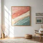
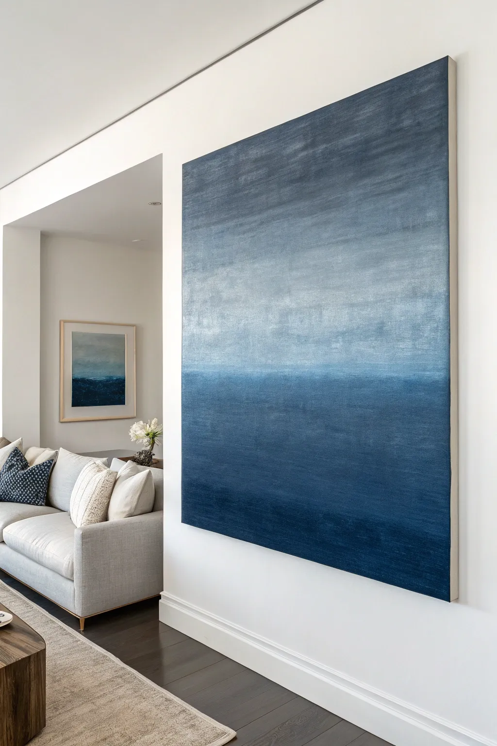
Moody Color-Field Gradient
Capture the serene depth of the horizon with this moody, large-scale color field painting. By blending gradual shifts of indigo, denim, and slate blue, you’ll create a sophisticated statement piece that feels both modern and timeless.
Detailed Instructions
Materials
- Large gallery-wrapped canvas (minimum 36″ x 48″)
- Gesso (white)
- Acrylic paints: Indigo, Phthalo Blue, Payne’s Grey, Titanium White, Metallic Silver (optional)
- Soft body acrylic medium or glazing liquid
- Large flat paintbrush (4 to 6 inches wide)
- Medium blending brush (2 inch)
- Spray bottle with water
- Drop cloth
- Mixings cups or palette
- Painter’s tape (optional for edges)
Step 1: Preparation & Base Coat
-
Prime the Surface:
Even if your canvas is pre-primed, apply a fresh coat of white gesso to ensure a smooth, toothy surface that grabs the paint evenly. Use your large brush and long horizontal strokes. -
Let it Cure:
Allow the gesso to dry completely, preferably overnight, to prevent any lifting during the heavy blending process later. -
Prepare Your Palette:
Squeeze out generous amounts of your main colors: Indigo, Phthalo Blue, Payne’s Grey, and Titanium White into separate containers. You will need a lot of white to create the upper gradient. -
Pre-mix the Mid-Tones:
Create three transition shades in separate cups: a dark mid-blue (Indigo + White), a medium slate (Payne’s Grey + White), and a very pale grey-blue (mostly White + touch of Payne’s Grey).
Step 2: Applying the Gradient
-
Start at the Bottom:
Dip your large brush into the pure Indigo and Phthalo Blue mixture. Paint the bottom 20% of the canvas with firm, horizontal strokes to establish the deepest anchoring color. -
Introduce the First Mid-Tone:
While the bottom strip is still wet, pick up your dark mid-blue mix. Apply this directly above the dark bottom section. -
Wet-on-Wet Blending:
Where the two colors meet, use long, continuous horizontal strokes to marry them together. If the paint feels draggy, I occasionally mist the canvas lightly with the spray bottle to keep it workable. -
Working Upwards:
Clean your large brush or switch to a fresh one. Apply the medium slate color to the middle section of the canvas, roughly covering the next 20-30% of the height. -
Create the Horizon Line:
Blend the slate section down into the dark mid-blue. Don’t over-blend this specific area; leaving a slightly distinct visual ‘seam’ creates that suggestion of a horizon line seen in the reference image. -
The Upper Atmosphere:
Apply your palest grey-blue mixture to the upper section. As you near the top edge, mix in even more Titanium White directly on the canvas for maximum brightness. -
Softening the Transition:
Use a clean, dry blending brush to gently sweep back and forth over the area where the pale top meets the middle slate tone. The goal is a foggy, ethereal transition here.
Uneven Blending?
If you see harsh stripes instead of a smooth fade, your paint dried too fast. Mist the area with water and use a soft, dry brush to feather out the hard edges while damp.
Step 3: Texture & Finishing
-
Add Subtle Highlights:
Once the main layer is touch-dry, mix a tiny amount of Metallic Silver into your white paint. Dry-brush this very lightly across the top third of the canvas to catch the light. -
Reinforce the Depths:
If the bottom dark section dried lighter than expected, apply a wash of glazing liquid mixed with a drop of Indigo to restore richness. -
Cross-Hatching Texture:
To mimic the linen-like texture visible in the photo, take a mostly dry brush and gently drag it vertically in short strokes over nearly-dry areas, then smooth it out horizontally again. -
Paint the Sides:
Don’t forget the deep edges of the gallery-wrapped canvas. Continue the gradient around the sides for a professional, frameless look. -
Final Seal:
Once the painting has cured for at least 48 hours, apply a satin or matte varnish to protect the surface and unify the sheen of the different paint mixtures.
Add Dimension
Mix a tiny amount of fine sand or texture gel into the bottom indigo layer before painting. It adds physical weight to the ‘ocean’ part of the abstract landscape.
Hang your new masterpiece in a well-lit room to let the subtle gradients shift beautifully throughout the day
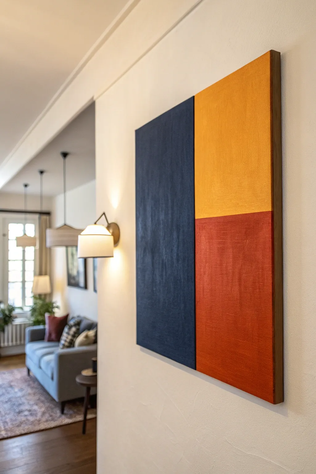
Bold Color Blocks for Accent-Pillow Matching
This striking, minimalist piece brings focus to your living space with its bold geometric composition and rich textural depth. By balancing a deep navy column against stacked blocks of mustard and rust, you can easily tie together accent colors from your existing decor.
Step-by-Step Tutorial
Materials
- Large rectangular stretched canvas (approx. 24×36 inches or larger)
- Acrylic paints: Navy Blue, Mustard Yellow/Ochre, Burnt Orange/Rust
- Gesso (optional, for priming)
- Painter’s tape (1-inch width or wider)
- Large flat paintbrush (2-3 inches)
- Medium flat paintbrush (1 inch)
- Ruler or T-square
- Pencil
- Drop cloth or newspapers
- Water cup and paper towels
- Floater frame (optional, for finishing)
Step 1: Preparation & Layout
-
Prepare your workspace:
Lay down your drop cloth or newspapers in a well-ventilated area to protect your floors. Set up your canvas either on an easel or flat on a table, ensuring it is stable and won’t shift while you work. -
Prime the canvas:
Even if your canvas is pre-primed, adding a coat of gesso can provide a smoother texture. Apply a thin, even layer across the entire surface and let it dry completely before moving on. -
Measure the vertical division:
Decide on the proportions for your color blocks. For the look in the image, measure approximately one-third to one-half of the width from the left edge. Make small tick marks with your pencil at the top and bottom. -
Create the vertical line:
Use your ruler or T-square to lightly draw a vertical line connecting your top and bottom marks. This line will separate the large blue section from the two right-hand sections. -
Measure the horizontal division:
On the right side of your vertical line, measure mostly halfway down the canvas. You can adjust this slightly higher or lower depending on which color you want to be dominant. Mark this spot with your pencil. -
Draw the horizontal line:
Using your T-square against the right edge of the canvas, draw a horizontal line from your mark inward until it intersects with your vertical line. You now have your three distinct zones mapped out.
Clean Line Secret
To prevent bleeding, paint a thin layer of the *base* color (or clear matte medium) over the tape edge first. This seals the gap so your accent color stays crisp.
Step 2: Taping & Painting
-
Tape the vertical boundary:
Apply a strip of painter’s tape along the vertical pencil line. Place the tape on the right side of the line (covering the future yellow/orange area) so you can paint the blue section first without bleeding over. -
Seal the tape edge:
Press down firmly on the edge of the tape with your fingernail or a credit card to ensure a tight seal. I like to apply a tiny amount of white paint or matte medium along the tape edge first; this blocks any seep-through and keeps your lines razor-sharp. -
Paint the navy section:
Using your large flat brush, apply the navy blue paint to the left section. Use vertical strokes to create a subtle, elongated texture that mimics the height of the piece. -
Add a second navy coat:
Allow the first coat to dry to the touch. Apply a second coat to ensure deep, opaque coverage, continuing with vertical brushstrokes for consistency. -
Remove the first tape:
While the second coat of navy paint is still slightly damp, carefully peel off the painter’s tape at a 45-degree angle. Let the navy paint cure completely before taping over it. -
Tape for the yellow section:
Once the blue is fully dry, apply new tape over the edge of the blue paint to protect it. Also, apply a strip of tape along the horizontal line, placing it on the bottom (orange) side to leave the top right quadrant open. -
Paint the mustard block:
Load your medium flat brush with the mustard yellow paint. Fill in the top right rectangle, using horizontal or cross-hatch strokes to differentiate the texture slightly from the blue section. -
Apply second yellow coat:
Let the first yellow layer dry, then apply a second coat for vibrancy. Peel off the horizontal tape immediately while the paint is wet, but endure the vertical tape stays protecting the blue. -
Tape for the rust section:
Wait for the yellow section to be bone dry. Carefully tape over the bottom edge of the yellow section. Ensure the tape protecting the blue section is still secure. -
Paint the rust block:
Using a clean medium brush, paint the bottom right rectangle with your burnt orange or rust color. Pay attention to the corners and edges for full coverage. -
Final coat and reveal:
Apply your final coat of rust paint. Once finished, slowly peel away all remaining tape strips to reveal your crisp, clean geometric borders. -
Paint the sides:
Don’t forget the edges of the canvas. Extend each color wrap-around style onto the sides of the canvas corresponding to its block, or paint all sides a neutral black or white for a framed look. -
Varnish (Optional):
Once the entire painting has cured for at least 24 hours, you can apply a matte or satin varnish to protect the surface from UV light and dust.
Textural Depth
Mix a small amount of modeling paste or even baking soda into your acrylics before painting. This adds a gritty, modern texture that catches the light wonderfully.
Hang your new masterpiece in a spot with good lighting to really show off those rich, saturated hues


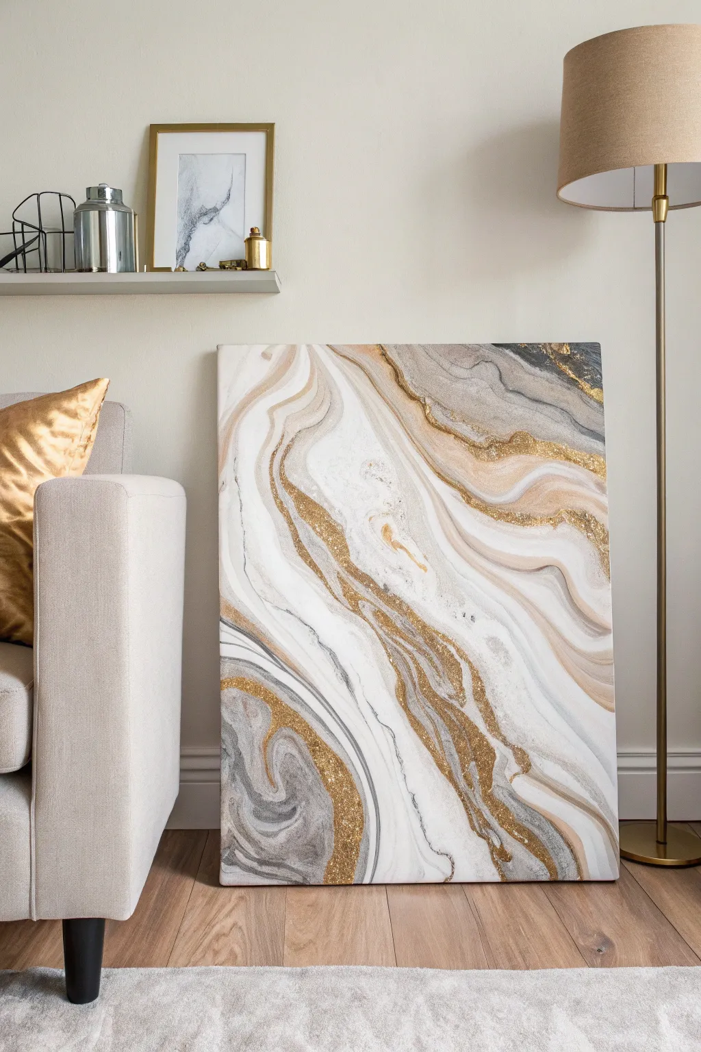
Marble-Swirl Abstract With Metallic Pops
Achieve the sophisticated look of natural stone with this fluid art technique that blends soft creams, greys, and striking gold accents. This large-scale canvas brings a touch of modern luxury to any space, mimicking the organic flow of marble veins with an added metallic sparkle.
Step-by-Step Guide
Materials
- Large stretched canvas (24×36 or similar)
- White gesso
- Acrylic paints (Titanium White, Unbleached Titanium/Cream, Payne’s Grey, Mars Black)
- Metallic Gold acrylic paint (high pigment)
- Gold glitter or gold leaf flakes
- Pouring medium (Liquitex or Floetrol)
- Silicone oil (optional for cells)
- Plastic cups and stir sticks
- Hairdryer or heat gun
- Palette knife and straw
- High-gloss varnish
Step 1: Preparation and Mixing
-
Prime the Surface:
Begin by applying a coat of white gesso to your canvas if it isn’t pre-primed. This ensures the paint flows smoothly and adheres properly. Let it dry completely. -
Mix the Pouring Base:
In separate cups, mix your acrylic paints with the pouring medium. A standard ratio is 1 part paint to 2 parts medium, but check your specific medium’s instructions. You want a consistency similar to warm honey. -
Prepare the Colors:
Mix a large cup of Titanium White, as this will be your negative space. Create smaller cups of Cream, Grey, and Black. For the gold, use a high-pigment metallic paint mixed with medium. -
Add Glitter Component:
In a separate small cup, mix some of the pouring medium with loose gold glitter. This will be poured directly onto the canvas later for that textured sparkle seen in the reference.
Muddy Colors?
If colors are blending into grey mush, your paint is too thin or you’re over-working it. Stop blowing/tilting sooner and let layers sit on top of each other.
Step 2: Creating the Flow
-
Flood the Canvas:
Pour the white mixture generously over the entire canvas. Use a palette knife or wide brush to spread it to the edges. This wet base helps the colored veins glide effortlessly. -
Layer the Veins:
Gently pour the cream and grey paints in diagonal, wavy lines across the canvas. Don’t worry about precision; organic movement is key here. -
Introduce Contrast:
Add thinner, more sparing lines of the black and dark grey paint near the cream lines. This creates depth and shadows within the ‘marble’ structure. -
Pour the Gold Guide:
Drizzle the metallic gold paint alongside the darker veins. I like to let these gold lines weave in and out of the grey areas to mimic natural mineral deposits. -
Apply Glitter Paste:
Take your glitter-medium mixture and pour thin ribbons of it directly over or next to the metallic gold paint lines. This creates those concentrated areas of sparkle.
Step 3: Manipulation and Drying
-
Blow Out the Edges:
Using a hairdryer on the ‘cool’ and ‘low’ setting, gently push the colored veins outward into the white base. Aim the air at the edge of the paint line to feather it out creating a soft, smoky look. -
Refine with Air:
For tighter control, use a drinking straw to blow on specific areas. This is perfect for creating the intricate, swirling details where the colors meet. -
Tilt for Movement:
Pick up the canvas and very gently tilt it side to side. Allow gravity to stretch the veins and elongate the shapes, making the composition feel more natural. -
Sharpen the Details:
Once the general shape is set, dip a fine brush or palette knife edge into the gold paint and manually enhance any veins that got lost during the blowing and tilting process. -
Add Texture:
While the paint is still wet, sprinkle a tiny pinch of dry glitter onto the wettest gold areas for extra dimension. -
Dry Time:
Allow the painting to dry on a perfectly level surface for at least 48 to 72 hours. Fluid art takes a long time to cure because of the thick layers. -
Seal the Deal:
Once fully cured, apply two coats of high-gloss varnish. This protects the paint and creates that polished, stone-like sheen.
Luxe Upgrade
Instead of glitter, wait for the painting to dry completely, then apply gold leaf adhesive and real gold leaf sheets to the metallic veins for an expensive, high-end finish.
Hang your new masterpiece and enjoy the elegant, high-end gallery feel it brings to your room
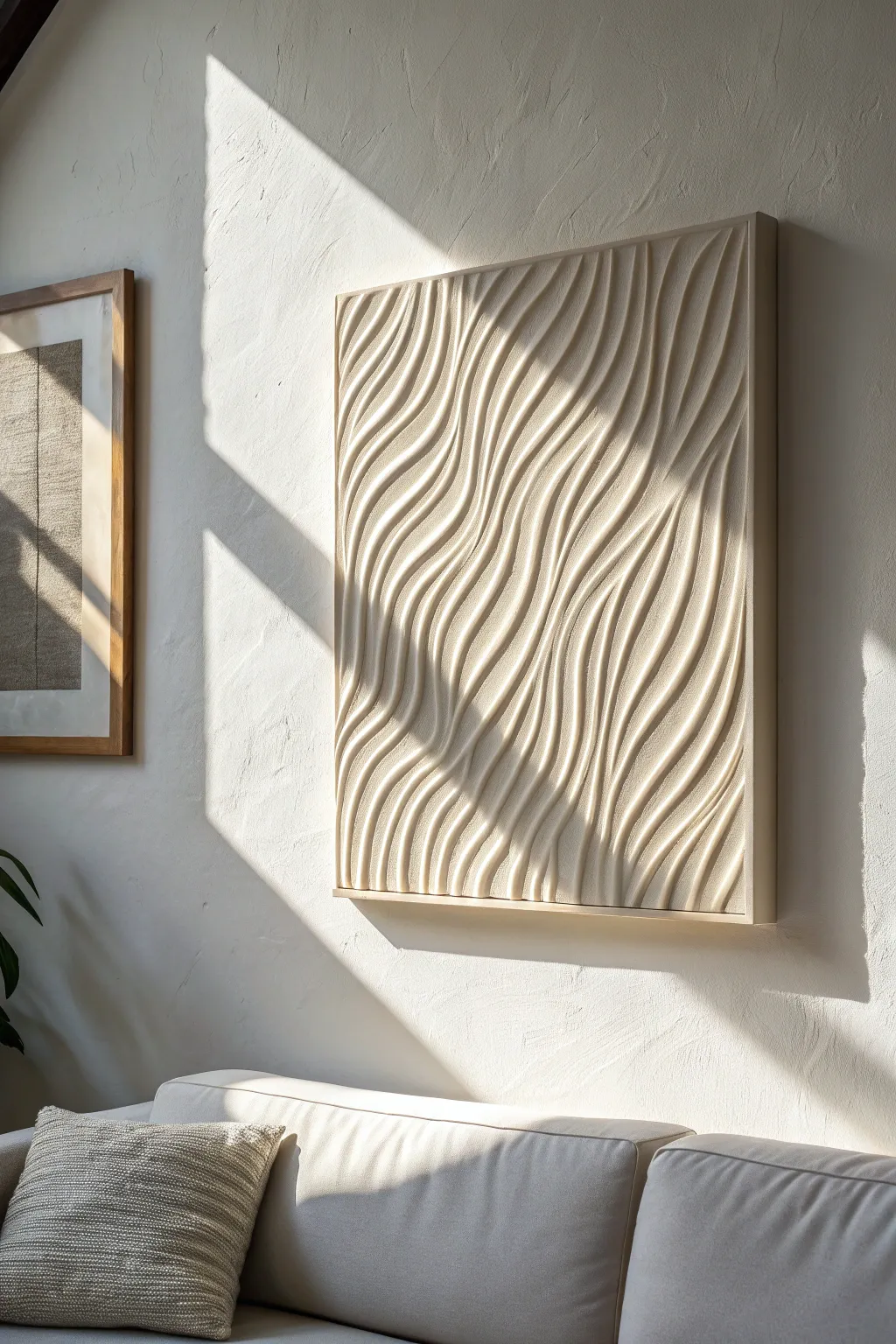
One-Color Texture Painting for Quiet Luxury
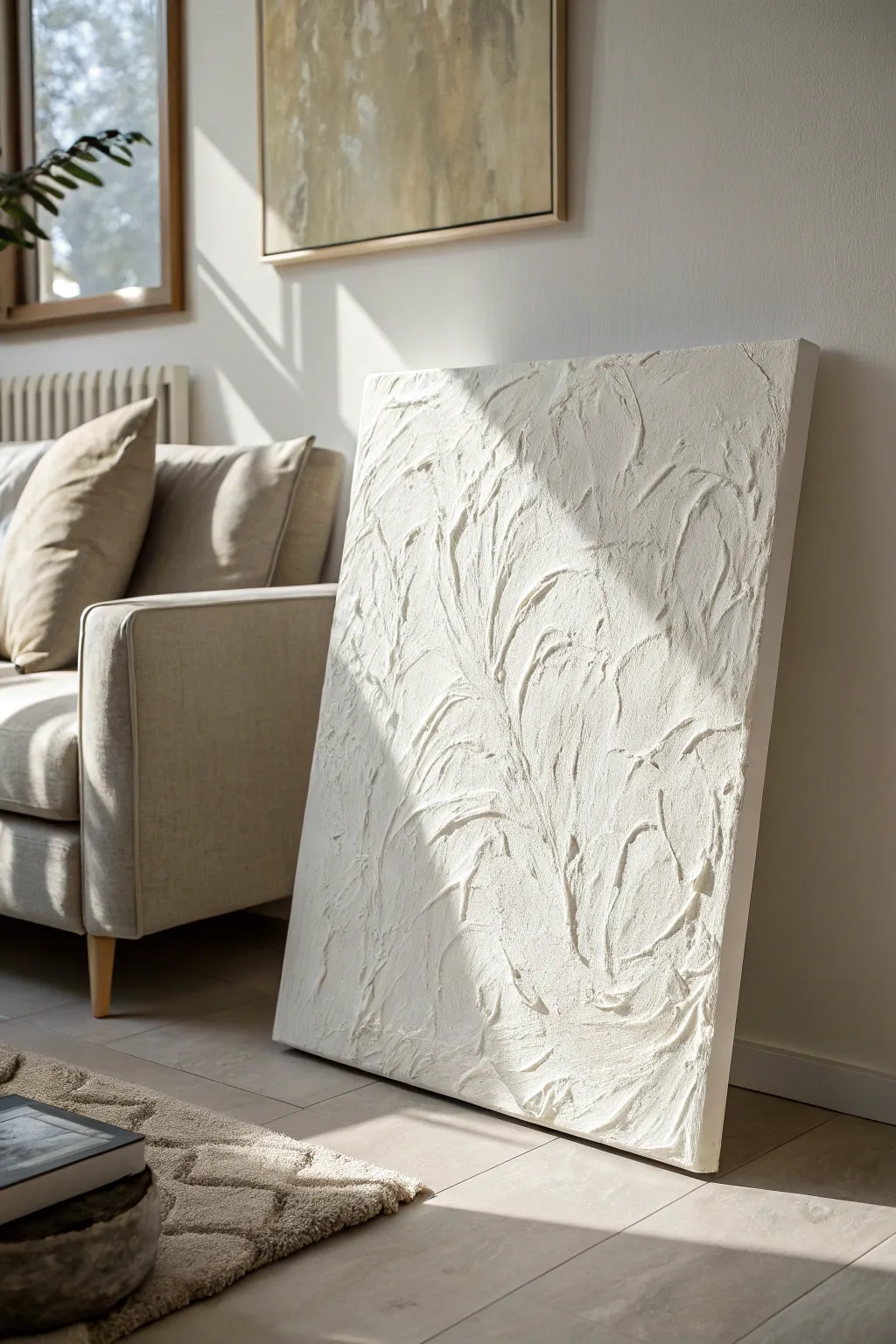
Embrace the ‘quiet luxury’ aesthetic with this stunningly simple textured canvas that relies on shadow and light rather than pigment for its beauty. Using basic hardware store materials, you can sculpt organic, sweeping patterns that bring sophisticated depth to any modern living space.
Step-by-Step
Materials
- Large stretched canvas (24″x36″ or larger)
- White modeling paste or lightweight joint compound
- Large palette knife or trowel
- Medium palette knife
- Gesso (optional)
- High-quality white acrylic paint (matte finish)
- Wide flat paintbrush (2-3 inch)
- Drop cloth or plastic sheet
- Sandpaper (fine grit, optional)
- Matte spray varnish
Step 1: Preparation & Base
-
Set up your workspace:
Lay down your drop cloth in a well-ventilated area. This project can get messy with the paste, so ensure your floor is protected. Place the canvas on a flat, stable surface like a table or the floor—do not try to do this while the canvas is vertical on an easel. -
Prime the canvas:
Even if your canvas is pre-primed, adding a coat of gesso helps create a toothy surface for the heavy paste to grip. Apply a thin, even layer and let it dry completely before moving on. -
Prepare your texturing medium:
Open your modeling paste or joint compound. Give it a quick stir to ensure the consistency is smooth and free of air pockets. If it feels too stiff, you can mix in a tiny amount of white acrylic paint to loosen it up, but avoid adding water.
Step 2: Sculpting the Texture
-
Apply the initial layer:
Using your large palette knife or trowel, scoop a generous amount of paste onto the center of the canvas. Spread it outward to cover the entire surface about 1/8 to 1/4 inch thick. It doesn’t need to be perfectly smooth; just ensure full coverage. -
Create the primary movement:
This is where the artistry happens. Using the edge of your large trowel, make long, sweeping curved motions. Start from the bottom corner and pull the tool upwards and diagonally, mimicking the growth of large leaves or abstract waves. -
Add secondary details:
Switch to your medium palette knife. Working alongside your larger swoops, add smaller, sharper ridges. Press the knife flat into the wet paste and lift it quickly to create peaks, or drag it sideways to create distinct valleys. -
Refine the edges:
Pay attention to where one swoop meets another. I like to gently feather these intersections so the movement feels continuous rather than disjointed. Ensure the texture extends fully to the edges of the canvas for a professional, wrap-around look. -
Check the light interaction:
Before the paste begins to set, stand up and walk around the canvas. Look at it from different angles to see how shadows catch on the ridges. If an area looks too flat, add a bit more paste and redefine the texture. -
Allow specifically long drying time:
Thick texture mediums take a long time to cure. Leave the canvas flat in a dry, warm room for at least 24 to 48 hours. Do not touch it until you are certain the thickest peaks are solid all the way through.
Cracks Appearing?
Thick joint compound can crack while drying. If this happens, mix a little paste with water to make a slurry and paint it into the cracks with a small brush, then repaint white.
Step 3: Finishing Touches
-
Inspect and clean up:
Once fully dry, run your hand gently over the surface to find any dangerously sharp spikes of dried paste. You can knock these down slightly with fine-grit sandpaper, but be careful not to flatten your beautiful texture. -
Apply the white base coat:
The dried paste often has a different sheen or shade of white than the canvas. Squeeze out your white matte acrylic paint. Using a wide, dry brush, paint the entire surface. -
Work into the crevices:
Ensure you jam the bristles into the deep valleys and ridges of the texture. You don’t want any raw joint compound showing through, as it may yellow over time. -
Add a second coat:
For that ultra-opaque, plaster-like finish seen in the photo, a second coat of white paint is crucial. Apply it thinly to avoid pooling in the textures. -
Seal the artwork:
Textured art collects dust easily. Take your matte spray varnish and apply two light coats over the piece. This seals the porous surface and makes it much easier to dust or wipe clean in the future.
Add Metallic Depth
For a luxe twist, lightly dry-brush the very tops of the highest ridges with a metallic gold or champagne paint. It catches the light just like the shadows do.
Once dry, lean or hang your masterpiece to instantly add architectural interest to your room
Modern Line-Art Portrait With a Soft Wash
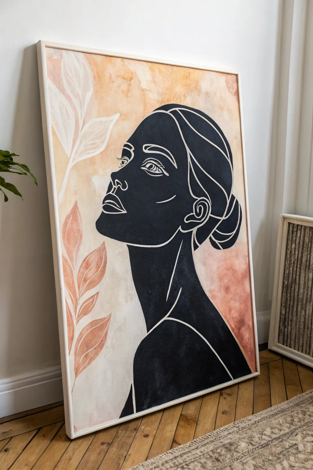
Blend the boldness of graphic illustration with the softness of watercolor washes in this striking modern canvas piece. The contrast between the solid black silhouette and the warm, earthy background textures creates an eye-catching focal point for any contemporary living room.
Detailed Instructions
Materials
- Large stretched canvas (e.g., 24×36 inches)
- Acrylic paints (Mars Black, Titanium White, Burnt Sienna, Yellow Ochre, Raw Umber)
- Wide flat wash brush (2-3 inches)
- Medium round brush
- Fine liner brush (size 0 or 00)
- Pencil for sketching
- Eraser
- Palette or mixing plate
- Water container and paper towels
- White paint marker (optional, for crisp lines)
Step 1: Creating the Textured Background
-
Prepare your palette:
Begin by squeezing out generous amounts of Titanium White, Burnt Sienna, Yellow Ochre, and a tiny touch of Raw Umber. You want a warm, earthy palette reminiscent of dried clay and sandstone. -
Mix the base wash:
Mix a large amount of white with a drop of Yellow Ochre and water to create a milky, semi-transparent glaze. Apply this loosely over the entire canvas using your wide flat brush to break the stark white surface. -
Add warmth patches:
While the base is still slightly damp, mix Burnt Sienna with plenty of water. Dab this randomly in corner areas and sections where you want warmth, letting the pigment bloom and spread naturally. -
Create texture with scumbling:
Take a dryer brush with very little paint (a mix of white and ochre) and scumble—scrub gently in circular motions—over the transition areas between the white and darker patches to soften the edges. -
Paint the background leaves:
Mix a soft terracotta shade using Burnt Sienna and White. Using a medium round brush, paint simple, flowing leaf shapes on the left side. Paint a second set of ghost leaves using almost pure white at the top left for contrast. -
Let it cure:
Allow the background to dry completely. This is crucial because you need a hard, dry surface to sketch the portrait without lifting the underpainting.
Steady Hands Tip
Rest your painting hand on a clean mahl stick or a dry ruler bridged across the canvas. This keeps your palm off the wet black paint while you draw the delicate white lines.
Step 2: Sketching the Silhouette
-
Outline the profile:
Lightly sketch the profile of the face using a pencil. Focus on the big shapes: the curve of the forehead, the nose, the lips, and the sweeping line of the neck and shoulder. -
Define the hair shape:
Sketch the outline of the hair bun and the main mass of the hair. Don’t worry about individual strands yet; just get the overall solid shape of the silhouette correct. -
Mark feature placement:
Very faintly mark where the white lines will go later—the eye, the definition of the ear, the jawline, and the hair strands. This acts as a roadmap for your final detailing.
Metallic Accent
For a luxe modern twist, replace the white line work with gold leaf or a metallic gold paint marker. It catches the light beautifully against the matte black.
Step 3: Painting the Silhouette
-
Fill the silhouette:
Load a medium flat or round brush with Mars Black acrylic paint. Carefully fill in the entire shape of the head, neck, and shoulders. I prefer to do the edges first with a smaller brush to ensure sharpness, then fill the center. -
Apply a second coat:
Acrylic black can sometimes look streaky. Once the first layer is dry to the touch, apply a second coat to ensure a deep, opaque matte black finish. -
Dry thoroughly:
Wait for the black paint to fully dry. If it’s even slightly wet, the white lines you add next will turn gray and muddy.
Step 4: Adding the Line Work
-
Prepare the white paint:
You need fluid, opaque white paint for the lines. Mix Titanium White with a tiny drop of water to get an ink-like consistency, or shake your white paint marker vigorously if using one. -
Detail the eye:
Using your fine liner brush or marker, draw the eye. Keep the lines confident and smooth. Don’t overwork it; a few simple strokes for the eyelids, iris, and brow create the strongest effect. -
Define the facial features:
Add the contour lines for the nose, verify the lip separation, and add the curve of the jawline. These white lines should sit directly on top of the black silhouette. -
Draw the ear and neck:
Add the intricate swirl of the ear and the long, elegant lines defining the neck muscles and collarbone area. -
Flowing hair lines:
Finally, add the sweeping curves in the hair area to suggest strands and movement. Keep these lines long and fluid to mimic the texture of pulled-back hair. -
Final touch-ups:
Step back and look at the composition. If any white lines look weak, go over them carefully for brightness. Ensure the edges of the black silhouette are crisp against the textured background.
Hang your new masterpiece in a well-lit spot to let those earthy textures warm up the room
Organic Blobs in a Curated Neutral Palette
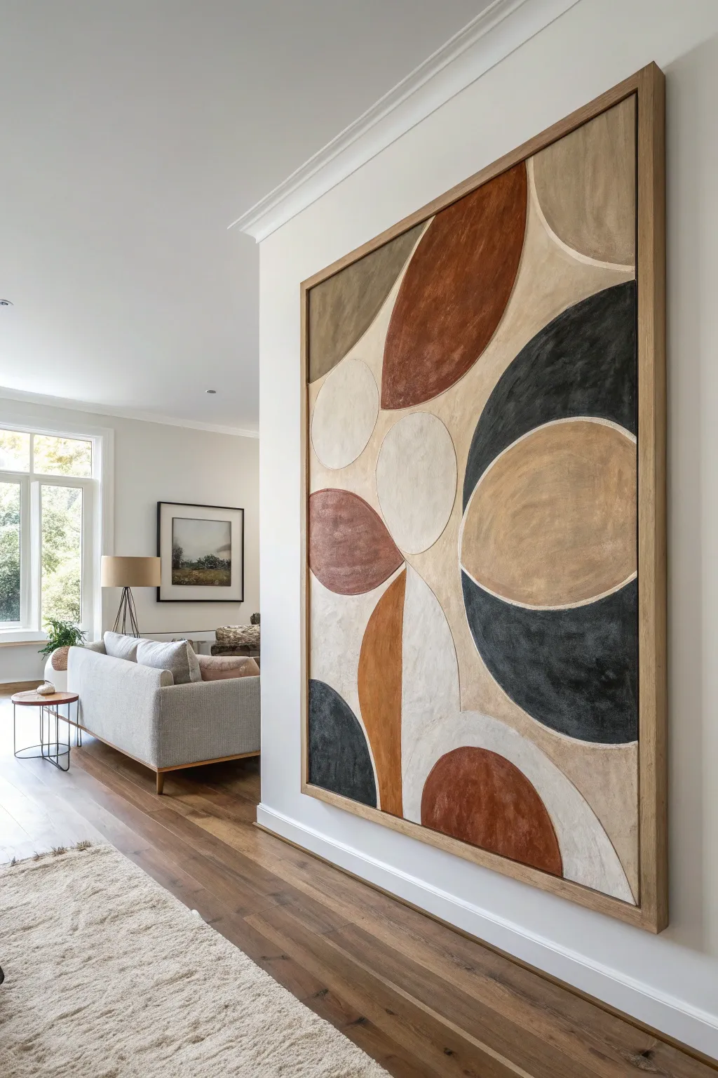
Bring the calming influence of nature into your home with this large-scale abstract painting, featuring smooth, interlocking organic forms in warm terracotta, deep charcoal, and soft neutrals. This tutorial guides you through creating balanced compositions and achieving that matte, designer finish.
Step-by-Step Tutorial
Materials
- Large gallery-wrapped canvas (at least 36×48 inches)
- Acrylic paints: Burnt sienna, raw umber, mars black, titanium white, unbleached titanium (beige)
- Matte medium or textural modeling paste
- Large flat brushes (2-3 inches)
- Medium round brushes (for edges)
- Charcoal stick or soft pencil
- Palette knife
- Painters tape (optional for framing)
- Paper plates or palette
- Water cup and rags
Step 1: Planning and Sketching
-
Prime the Surface:
Even if your canvas is pre-primed, apply a base coat of ‘Unbleached Titanium’ or a mix of white and a tiny dot of raw umber. This creates that warm, sandy background color that will serve as the separating lines between your shapes later. -
Map the Composition:
Using a piece of charcoal or a soft pencil very lightly, draw large, sweeping curves and ovals. Don’t worry about perfect circles; these are organic ‘blob’ shapes. Let them touch and almost overlap, but leave a consistent gap of about 1/4 inch between every shape to let that base color show through. -
Balance the Layout:
Step back and look at your sketch. You want a mix of large shapes (anchors) and smaller connecting shapes. Ensure the composition flows off the edge of the canvas in a few places to make the artwork feel expansive.
Uneven Edges?
If your hand is shaky, don’t stress about perfect curves. Organic shapes look better with slight wobbles. If it’s too messy, let dry and use base color to ‘erase’ and reshape the line.
Step 2: Mixing the Palette
-
Create the Terracotta:
Mix burnt sienna with a touch of white to soften it. Be careful not to make it too pink; a tiny dab of raw umber can keep it earthy. -
Mix the Charcoal:
Don’t use straight black. Mix Mars Black with a little white to create a soft, slate charcoal color. The goal is a stoneware look, not a stark graphic black. -
Prepare the Neutrals:
Create 2-3 variations of beige and taupe. Mix raw umber with varying amounts of white for a ‘latte’ color, and perhaps a darker ‘mushroom’ grey-brown. -
Add Texture:
Here I prefer to mix a dollop of matte medium or light modeling paste into each color pile. This ensures the paint has body and dries with a non-reflective, velvety finish.
Step 3: Painting the Forms
-
Start with Darkest Tones:
Select two or three non-adjacent shapes for your charcoal color. Use a medium round brush to carefully paint the perimeter of the shape first, keeping your edges clean but soft. Fill the center with a larger flat brush. -
Apply the Terracotta:
Choose another set of shapes for the reddish-brown tone. Try to place these somewhat opposite each other to balance the visual ‘heat’ of the painting. -
Fill with Neutrals:
Paint the remaining shapes with your beige and taupe mixes. Similar colors shouldn’t touch directly; try to alternate light and dark shapes to keep the eye moving. -
Refine the Edges:
Go back in with a smaller brush and tidy up the boundaries. The unpainted (or base-coated) gap between shapes acts as a ‘mortar’ line. Keep this line thickness relatively consistent, but natural variations add character.
Level Up: Texture
Mix clean sand or sawdust into your paint before applying. This physical grit catches the light and makes the painting look like an expensive textural tapestry piece.
Step 4: Finishing Touches
-
Second Coat:
Acrylics often dry darker or slightly transparent. Apply a second coat to any shapes that look streaky, focusing on solid, opaque coverage. -
Add Depth (Optional):
If a shape looks too flat, take a slightly lighter version of that color and dry-brush a little texture into the center of the blob. This mimics the look of worn stone or fabric. -
Clean the ‘Grout’ Lines:
If you accidentally painted over your separation lines, mix a fresh batch of your base color and carefully re-paint those channels to crisp them up. -
Frame It:
For the professional look in the photo, construct or buy a floating frame in natural oak. This wood tone perfectly complements the earthy palette.
Hang your new masterpiece in a well-lit spot and enjoy the sophisticated atmosphere it adds to your room
Sharp Negative Space With a Clean Border
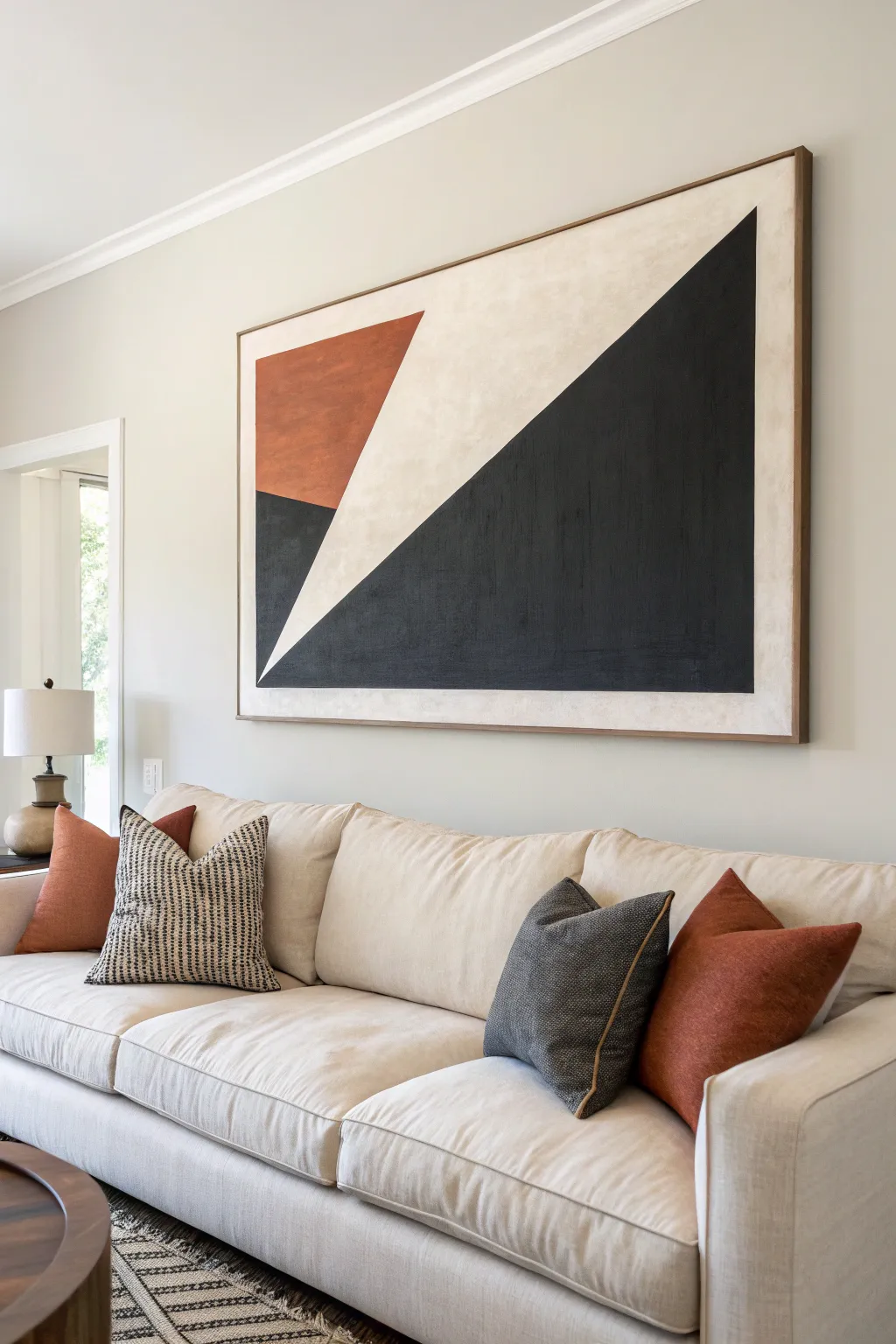
This striking, large-scale abstract piece serves as a sophisticated focal point by balancing heavy black angles with warm rust tones and creamy negative space. Its sharp lines and textured finish create a modern, minimalist aesthetic that feels both curated and organic.
Detailed Instructions
Materials
- Large-scale gallery wrapped canvas (approx. 48×60 inches)
- Acrylic paints: Carbon Black, Burnt Sienna, Titanium White, Unbleached Titanium (Beige)
- Matte medium or texture paste
- Painter’s tape (high quality, low-tack)
- Large flat paintbrush (2-3 inch)
- Medium round brush
- Ruler or straight edge
- Pencil
- Floater frame wood strips (pine or oak)
- Wood stain (walnut or similar)
- Wood glue and brad nailer (for frame)
Step 1: Preparation & Base Layer
-
Prime the Surface:
Even if your canvas is pre-gessoed, applying a fresh coat of gesso mixed with a tiny drop of Unbleached Titanium ensures a warm, consistent starting ground. -
Add Texture:
Mix your base coat of creamy white (Titanium White plus Unbleached Titanium) with a bit of matte medium or texture paste. Apply this across the entire canvas using cross-hatch strokes to build a subtle, non-uniform surface grain. -
Establish the Border:
Once the base is completely dry, measure about 1.5 to 2 inches from the edge on all four sides. Apply painter’s tape along these lines to create a clean, uniform border that will remain creamy white.
Bleeding Lines?
If paint bled under the tape, wait for it to fully dry. Then, use a straight edge and an X-Acto knife to very lightly score the bleed, and scrape it away before touching up with base color.
Step 2: Mapping the Geometry
-
Draft the Triangles:
Using a pencil and a long straight edge, lightly sketch the diagonal line that divides the canvas. Start from the bottom left quadrant and extend sharply upward to the top right corner. -
Define the Rust Section:
Sketch the secondary triangle in the upper left area. This shape should feel like it’s intersecting or nesting within the larger white space, creating tension between the forms. -
Tape the Main Diagonal:
Apply a strip of painter’s tape along the long diagonal line you sketched. Press the edges down firmly with your fingernail or a credit card to prevent paint bleed. -
Seal the Tape Edge:
I like to brush a very thin layer of the base cream color over the edge of the tape. This seals the seal—if any paint seeps under, it will be the base color, keeping your final line crisp.
Elevate the Texture
Mix sand or fine pumice into the black paint before applying. This adds grit and depth, making the large dark shape absorb light differently than the smooth rustic orange areas.
Step 3: Applying Color
-
Paint the Black Section:
Mix Carbon Black with a touch of matte medium. Fill in the large triangle on the right side of the tape. Use multiple thin layers rather than one thick glob to maintain the canvas texture. -
Texture the Black:
While the black is semi-wet, use a dry brush to scuff the surface slightly, giving it that worn, matte look seen in the original artwork. -
Paint the Rust Section:
Mix Burnt Sienna with a small amount of Unbleached Titanium to soften the rust tone. Carefully paint the upper left triangular section. -
Refine the Rust Edges:
If you didn’t tape this smaller section, use a steady hand and a flat brush to cut in the straight edges against the cream background. -
Remove Tape:
Peel off the tape while the paint is still slightly tacky, pulling away from the painted area at a 45-degree angle. This prevents the dried paint film from ripping. -
Fill the Lower Corner:
You’ll notice a small black triangle needs to be added to the bottom left to balance the composition. Use your ruler to mark it and paint it in carefully to align with the main diagonal.
Step 4: Finishing Touches
-
Touch Up Borders:
Remove the border tape. If any paint bled into the clean border area, use a small brush and your cream base mix to correct it once the dark paint is fully dry. -
Stain the Frame Wood:
Cut your thin wood strips to match the canvas dimensions. Apply a walnut or medium-oak hue stain with a rag, wiping off excess for a natural finish. -
Install the Frame:
Once the stain is dry, attach the wood strips directly to the sides of the canvas stretcher bars using wood glue and brad nails. Leave a tiny gap (1/8 inch) between the canvas face and the wood for a ‘floating’ look. -
Final Seal:
Apply a clear, matte varnish over the entire painting to unify the sheen and protect the deep black areas from scuffing.
Hang your new masterpiece in a well-lit living area to let the stark contrast and clean lines transform the space
Asymmetrical Diptych for a Modern Twist
Bring deep warmth and modern movement to your living room with this textured abstract diptych. By using modeling paste and a palette of rich ochres, rusts, and charcoal blacks, you can create a high-end gallery look that feels both organic and structured.
How-To Guide
Materials
- Two long, vertical canvases (e.g., 20×60 inches)
- Acrylic modeling paste or heavy texture gel
- Palette knives (assorted sizes)
- Acrylic paints (Titanium White, Burnt Sienna, Yellow Ochre, Raw Umber, Mars Black)
- Wide flat paintbrush (2-3 inch)
- Small round brush for details
- Pencil
- Painter’s tape or stencil tape
- Floating frames (optional, dark wood tone)
Step 1: Preparation & Composition
-
Surface Prep:
Lay out both canvases side-by-side on your workspace or floor, ensuring they are oriented vertically. This helps you visualize the flow of the design across both panels as one continuous (though asymmetrical) composition. -
Sketch the Waves:
Using a pencil, lightly draw organic, flowing curved lines that span vertically across the canvas. Think of these as geological strata or sound waves. Let some lines start on the left canvas and visually ‘continue’ onto the right canvas, but vary the height to keep it asymmetrical. -
Define Zones:
Decide which sections will receive heavy texture and which will remain smoother. Mark small ‘x’s in the areas meant for the thickest texture to guide your application later.
Cracked Paste?
If your texture paste cracks while drying, mix a little paint with more paste and fill the cracks. Thick layers often shrink; apply in two thinner stages to prevent this.
Step 2: Applying Texture
-
Mix the Paste:
Scoop a generous amount of modeling paste onto a palette. If you want colored texture from the start, mix a small amount of white or cream paint into the paste now, but keeping it white works well for later glazing. -
Create the Ridges:
Using a palette knife, apply the paste to your designated ‘x’ zones. Use the edge of the knife to create distinct, raised ridges that follow the curves of your pencil lines. Don’t smooth it out—the roughness is key to the look. -
Vary the Application:
For the smoother sections, apply a very thin, scraped layer of paste or leave the canvas raw if it’s already primed well. This contrast between high and low relief adds depth. -
Drying Time:
Let the texture paste dry completely. This is crucial. Depending on humidity and thickness, this could take 12 to 24 hours. The paste must be hard to the touch.
Metallic Accent
Mix gold leaf flakes or bronze metallic paint into the separation lines between color blocks for a subtle shimmer that catches the light.
Step 3: Painting the Layers
-
Base Color: Cream:
Once dry, paint the section intended to be white/cream (usually the largest, central wavy area) with a mix of Titanium White and a tiny drop of Yellow Ochre. Use a wide brush to urge paint into the crevices of the texture. -
Adding Rust Tones:
Mix Burnt Sienna with a little Raw Umber to create a deep rust color. Paint the specific curved bands you planned for this hue. I like to dilute the paint slightly so it acts like a stain on the textured parts, showing the highs and lows. -
The Ochre Layer:
Apply the Yellow Ochre to the adjacent bands. Blend the edges slightly where it meets the rust tone if you want a softer transition, or keep hard edges for a graphic look. -
Painting the Charcoal:
For the dark, striking ribbons, use Mars Black mixed with a touch of white to create a soft charcoal gray. Apply this carefully to the thinnest curved sections. -
Adding Dimension:
Dip a dry brush into a lighter version of your base colors (e.g., light peach or pale grey). Gently drag it over the top of the raised texture ridges. This ‘dry brushing’ technique highlights the 3D effect instantly.
Step 4: Refining Details
-
Separation Lines:
Using a fine round brush and a darker shade of brown or grey, carefully paint thin lines between the major color blocks. This mimics the look of lead in stained glass or grout, defining the shapes clearly. -
Clean Up Edges:
Paint the side edges of the canvas to match the adjacent color or paint them a solid dark brown to frame the work if you aren’t using a wooden frame. -
Varnish:
Apply a matte or satin varnish over the entire piece once the paint is fully cured. This unifies the sheen levels between the glossy paste and matte acrylics. -
Optional Framing:
Place the canvases into simple, dark walnut floating frames to mimic the wood trim shown in the image and add a professional finish.
Hang your new asymmetrical masterpieces with a few inches of space between them to let the wall color breathe through the design
Minimal Architecture Silhouette in Muted Colors
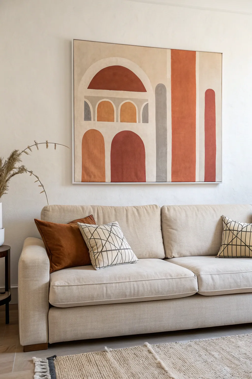
Bring the warmth of Mediterranean architecture into your home with this striking, large-scale abstract painting. Using muted terracotta, rust, and grey tones, you’ll create simplified geometric forms that mimic ancient archways and columns for a sophisticated, modern minimalist look.
Step-by-Step Tutorial
Materials
- Large stretched canvas (at least 30×40 inches)
- Acrylic paints (Burnt Sienna, Yellow Ochre, Raw Umber, Titanium White, Mars Black, Neutral Grey)
- Wide flat paintbrushes (2-inch and 1-inch)
- Small angled brush for edges
- Pencil
- Ruler or yardstick
- Large circular objects (plates, bowls) or a compass for tracing curves
- Palette or paper plates for mixing
- Cup of water
- Paper towels
Step 1: Preparation & Sketching
-
Prime the background:
Begin by missing Titanium White with a tiny drop of Yellow Ochre and Raw Umber to create a warm, creamy off-white base color. Paint the entire canvas with your wide brush to cover the bright white gesso, giving it an aged plaster look. Let this base layer dry completely. -
Map out the grid:
Using a pencil and ruler, lightly mark vertical lines to define the main sections. Looking at the reference, notice the large column on the right and the central arched section. Don’t press too hard; you just want faint guidelines. -
Draft the main arches:
Sketch the large semi-circle arch at the top left. To get a perfect curve, you can trace a large round platter or use a string-and-pencil compass technique. Ensure the arch spans the width of your planned architectural block. -
Add the smaller arches:
Below the main arch, sketch the horizontal band containing the three smaller window-like arches. Use a smaller bowl or cup to trace the curved tops of these three shapes, ensuring they are evenly spaced. -
Draw the lower archways:
Sketch the two tall, standing arches at the bottom left. These should look like doorways. Their tops should align roughly with the bottom of the column shapes next to them. -
Outline the columns:
Draw the long vertical column shapes on the right side. Include the thinner grey column and the wider, bold terracotta column. Use your ruler to keep the lines perfectly straight.
Clean Curves Secret
For perfectly crisp arch tops, use masking tape for the straight sides, but freehand the curves with a filbert brush (oval-shaped tip). The rounded bristles make turning corners much smoother.
Step 2: Color Filling
-
Mix your rust tone:
Create the signature deep rust color by mixing Burnt Sienna with a touch of Mars Black to deepen it. This will be the darkest red tone used for the central bottom arch and the wide top arch. -
Paint the deep rust shapes:
Using a flat brush, fill in the large top semi-circle and the central bottom doorway arch with your deep rust mix. Use the angled brush to carefully cut in the curved edges so they remain sharp. -
Mix the terracotta orange:
Lighten your previous rust mix by adding more Burnt Sienna and a little Yellow Ochre. This vibrant terracotta shade is for the tall column on the right side. -
Fill the tall column:
Paint the long vertical rectangle on the right. I find it helpful to turn the canvas sideways to paint long straight lines more comfortably with a steady hand. -
Create the ochre shade:
Mix Yellow Ochre with a dot of Burnt Sienna to create a warm, sandy gold color. Use this for the far-left bottom arch and the middle small window arch. -
Paint the ochre sections:
Apply the ochre paint smoothly. You may need two coats for this lighter color to ensure it looks opaque and solid against the cream background. -
Mix the grey tones:
Combine Neutral Grey with a tiny bit of your background cream color to warm it up slightly. You want a soft, stonelike grey, not a cold industrial grey. -
Fill the grey elements:
Paint the tall, thin column located between the main building block and the orange column. Also, paint the outer two distinct ‘window’ arches in the middle band with this grey. -
Add the accent column:
For the final curved column on the far right edge, mix a medium reddish-brown by combining your rust and terracotta mixes. Paint this final shape carefully.
Patchy Color?
If your terracotta or ochre looks streaky, don’t keep brushing wet paint. Let the first layer dry completely, then apply a second thin coat perpendicular to the first stroke direction.
Step 3: Finishing Touches
-
Clean up edges:
Once the shapes are dry, inspect your lines. If any paint bled or looks shaky, take your original cream background color and verify carefully ‘erase’ or straighten the edges with a small detail brush. -
Soften the texture (optional):
To mimic the worn fresco look of the original, you can dry-brush a tiny amount of the cream background color lightly over the colored shapes. This adds a subtle, weathered texture. -
Seal the artwork:
Allow the painting to dry for at least 24 hours. Once fully cured, apply a matte or satin varnish to protect the surface and unify the sheen of the different paint colors.
Hang your new architectural masterpiece in a well-lit spot to enjoy the warm Mediterranean vibes it adds to the room
3D Plaster Ridges Painted Tone on Tone
Bring sophisticated texture to your blank walls with this minimalist 3D ridge art featuring flowing organic lines. By manipulating simple joint compound on a canvas, you can create a high-end, gallery-worthy piece that plays beautifully with natural light.
Step-by-Step Guide
Materials
- Large square gallery-wrapped canvas (24×24″ or larger)
- Lightweight joint compound or modeling paste (large tub)
- Notched trowel or homemade cardboard comb
- Palette knife or taping knife
- Gesso (optional, for priming)
- Fine-grit sandpaper (220 grit)
- Matte acrylic paint (creamy off-white or warm beige)
- Wide flat paintbrush (2-3 inches)
- Floating frame (optional, for finishing)
- Drop cloth
Step 1: Base Preparation
-
Assess the canvas:
Start with a sturdy gallery-wrapped canvas. Because the plaster is heavy, verify the canvas is taut. If it feels loose, tap the wooden keys in the back corners to tighten the surface drum-tight. -
Prime the surface:
Apply a coat of gesso if your canvas is raw; if it’s pre-primed, you can skip this, though a quick layer of gesso adds extra ‘tooth’ for the heavy compound to grip onto. -
Prepare the compound:
Open your lightweight joint compound. Give it a good stir to ensure it is smooth and free of air pockets. It should be the consistency of thick frosting.
Step 2: Applying the Texture
-
Apply the first layer:
Using a wide taping knife or palette knife, spread a generous layer of joint compound across the entire canvas face. -
Build up thickness:
Add more compound until you have a uniform thickness of about 1/4 inch to 1/2 inch. You need this depth so your ridges will be prominent. -
Smooth the surface:
Lightly smooth the top of the compound layer. It doesn’t need to be perfect, but ensure the depth is relatively consistent from edge to edge. -
Create your tool:
If you don’t have a notched trowel with the specific curve you want, cut a piece of sturdy cardboard or an old credit card with rounded ‘fingers’ to act as your custom comb. -
Practice the motion:
Before touching the canvas, practice your arm movement in the air. You want a Fluid, continuous S-curve motion from top to bottom. -
Sculpt the first ridge:
Starting at the top left corner, press your tool into the wet compound and drag it downwards in a slow, waving motion to the bottom edge. Maintain steady pressure. -
Continue the pattern:
Repeat the motion immediately next to your first line. Slight overlaps are okay and add to the organic feel. Try to keep the rhythm of the waves somewhat parallel, but allow them to drift naturally. -
Refine the edges:
Use your palette knife to clean up any excess compound hanging off the sides of the canvas edges for a clean profile.
Smoother Waves
Periodically wipe your combing tool with a damp rag between passes. Built-up compound on the tool drags through the fresh texture and creates unwanted roughness.
Step 3: Finishing Touches
-
Allow to dry:
Let the piece dry completely flat. This is crucial—drying upright might cause the deep ridges to slump. Depending on humidity and thickness, this can take 24 to 48 hours. -
Check for cracks:
Once fully dry, inspect for hairline cracks. If found, mix a tiny bit of water with compound and smooth it into the cracks with your finger, then let dry again. -
Light sanding:
Gently run fine-grit sandpaper over the highest peaks of the ridges to knock down any sharp, jagged burrs. Wipe away the dust with a dry cloth. -
Apply the base color:
Pour your matte acrylic paint. Using a wide, soft brush, paint the entire surface. Use a dabbing motion ensuring you get paint deep into the valleys of the texture. -
Final coat:
Once the first coat is dry, apply a second coat for full opacity. I find that brushing in the direction of the waves helps emphasize the flow. -
Frame it:
For the polished look in the photo, mount your canvas into a light wood floating frame once the paint is fully cured.
Level Up: Ombré Effect
Mix two shades of cream paint. Paint the deep valleys (troughs) with the slightly darker shade and the high peaks with the lighter shade to exaggerate the 3D depth.
Hang your new sculptural masterpiece where the daylight hits it from the side to reveal all those beautiful shadows
Modular Mini Canvases You Can Rearrange
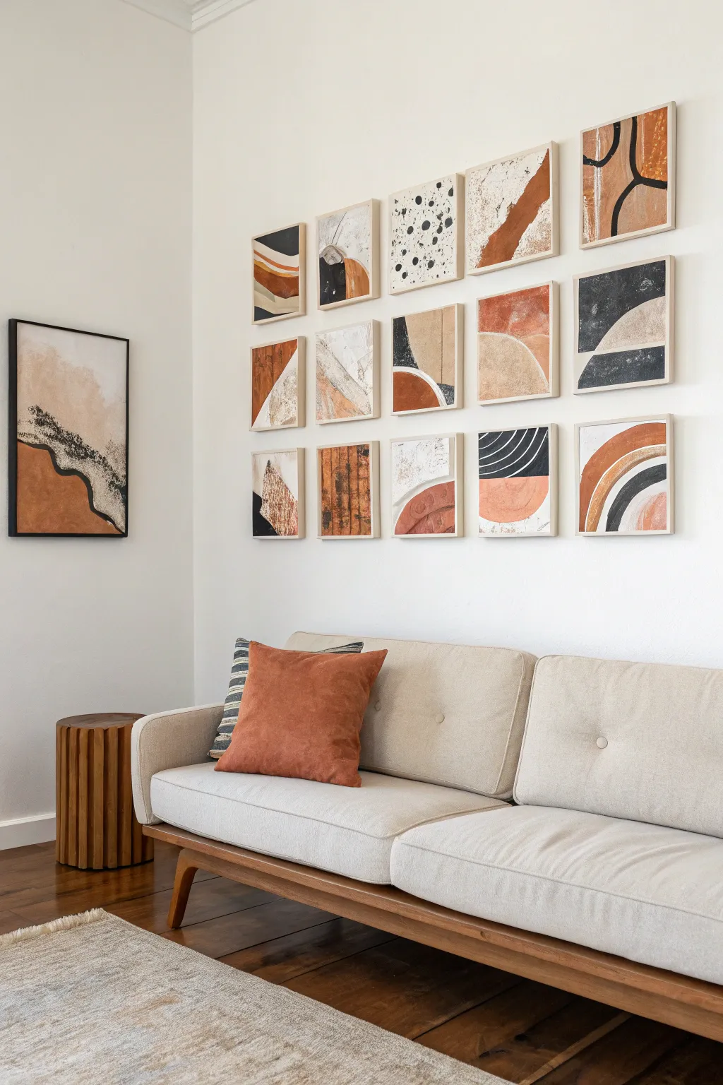
Transform a blank wall into a dynamic focal point with this grid of mini canvases featuring abstract, organic shapes. The earthy, neutral palette of terracotta, beige, black, and white creates a cohesive look, while the individual squares allow for endless rearrangement possibilities.
Step-by-Step Tutorial
Materials
- 15 wood-framed mini canvases (approx. 6×6 or 8×8 inches)
- Acrylic paints (terracotta/burnt orange, mars black, titanium white, warm beige/sand)
- Modeling paste or thick texture medium
- Gesso (optional foundation)
- Palette knives (assorted sizes)
- Flat shader brushes (medium)
- Round detail brush (small)
- Painters tape or masking tape
- Pencil
- Palette or paper plates for mixing
- Command strips or small nails for hanging
Step 1: Planning and Prep
-
Map out your grid:
Before touching paint to canvas, sketch a rough 3×5 grid on a piece of paper. This doesn’t have to be a masterpiece, but designate which squares will get heavy black accents, which rely on negative space, and where the terracotta curves will flow to ensure a balanced composition. -
Prime the surfaces:
If your canvases aren’t pre-primed, apply a coat of gesso. Since we are using wood-framed canvases, taping off the wooden edges with painters tape is a crucial step to keep that clean, raw wood aesthetic protected from stray brushstrokes. -
Create texture foundation:
Select 5-7 random canvases from your set and apply modeling paste with a palette knife. Create subtle ridges, swipes, or peaks in specific areas where you plan to paint lighter colors later; this adds a tactile, high-end dimension to the finished gallery.
Mix It Up
To add depth, mix baking soda into your acrylic paint. It creates a gritty, stone-like texture that mimics unglazed pottery perfect for the terracotta sections.
Step 2: Painting the Abstract Shapes
-
Mix your palette:
Prepare your colors. You’ll want a pure black, a stark white, a deep terracotta (mix orange with a touch of brown), and a sandy beige. I like to mix a tiny bit of white into the beige to keep it airy and light. -
Block in background zones:
Start with the beige and white areas. On some canvases, paint large, sweeping curves or corner triangles. On others, like the speckled ones, paint the entire background off-white. Let these base layers dry completely. -
Add terracotta elements:
Using a flat brush, paint the burnt orange shapes. Focus on organic forms—create arches, half-circles, and thick stripes. Don’t worry about perfect edges; a slightly wobbly hand adds to the organic, boho charm. -
Apply the black contrast:
Now for the boldest color. Paint strong geometric shapes like triangles or corners on a few canvases. Use black to create high contrast against the lighter beige areas. -
Create the splatter effect:
For the speckled canvas (top row, middle), load a round brush with watery black paint. Hold it over the canvas and tap the handle against another brush to flicker small droplets onto the white background.
Uneven Lines?
If your hand-painted arches look too shaky, lightly sketch the curve with a pencil first. You can also use the rim of a bowl or plate as a guide to trace perfect curves.
Step 3: Detailing and Refining
-
Paint fine lines:
Using your smallest round brush or a paint pen, add the delicate line work. This includes the squiggly lines on the top right canvas and the sweeping thin curves over the terracotta rainbows. -
Layer textures:
Return to the canvases where you applied modeling paste. Dry-brush a lighter color over the raised areas to highlight the texture and make the details pop. -
Add graphic stripes:
For the graphic striped look (like the bottom fourth canvas), use masking tape to block off curved or straight lines, then paint the open spaces. Peel the tape while the paint is still slightly tacky for the crispest edge. -
Evaluate balance:
Lay all 15 canvases out on the floor in their 3×5 grid. Step back and look for balance. Does one area look too dark? Add a beige circle. Too plain? Add a black line. This is the moment to make final adjustments. -
Final touches:
Check the edges. If any paint bled under your tape onto the wood frame, gently scrape it away with an X-Acto knife or wipe it with a damp cloth immediately.
Step 4: Installation
-
Remove tape:
Gently peel away the painter’s tape from the wooden frames. The contrast between the painted art and the natural wood is what makes this set look so professional. -
Seal the work:
Apply a matte varnish spray over the painted surfaces. This equalizes the sheen between the glossy acrylics and the matte texture paste, giving everything a uniform finish. -
Measure and hang:
Install the canvases on your wall. Keep the spacing consistent—about 1.5 to 2 inches between frames usually looks best. Using a laser level here saves a lot of headache.
Enjoy the flexibility of your new gallery wall, rearranging the tiles whenever you need a fresh perspective


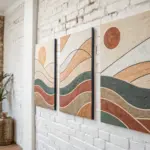

Have a question or want to share your own experience? I'd love to hear from you in the comments below!