If you’re craving projects that push you past “pretty” and into truly next-level technique, you’re in the right headspace. These advanced painting ideas are all about deliberate challenges—light, texture, perspective, and color decisions that make your skills noticeably sharper.
Chiaroscuro Portrait with a Single Light
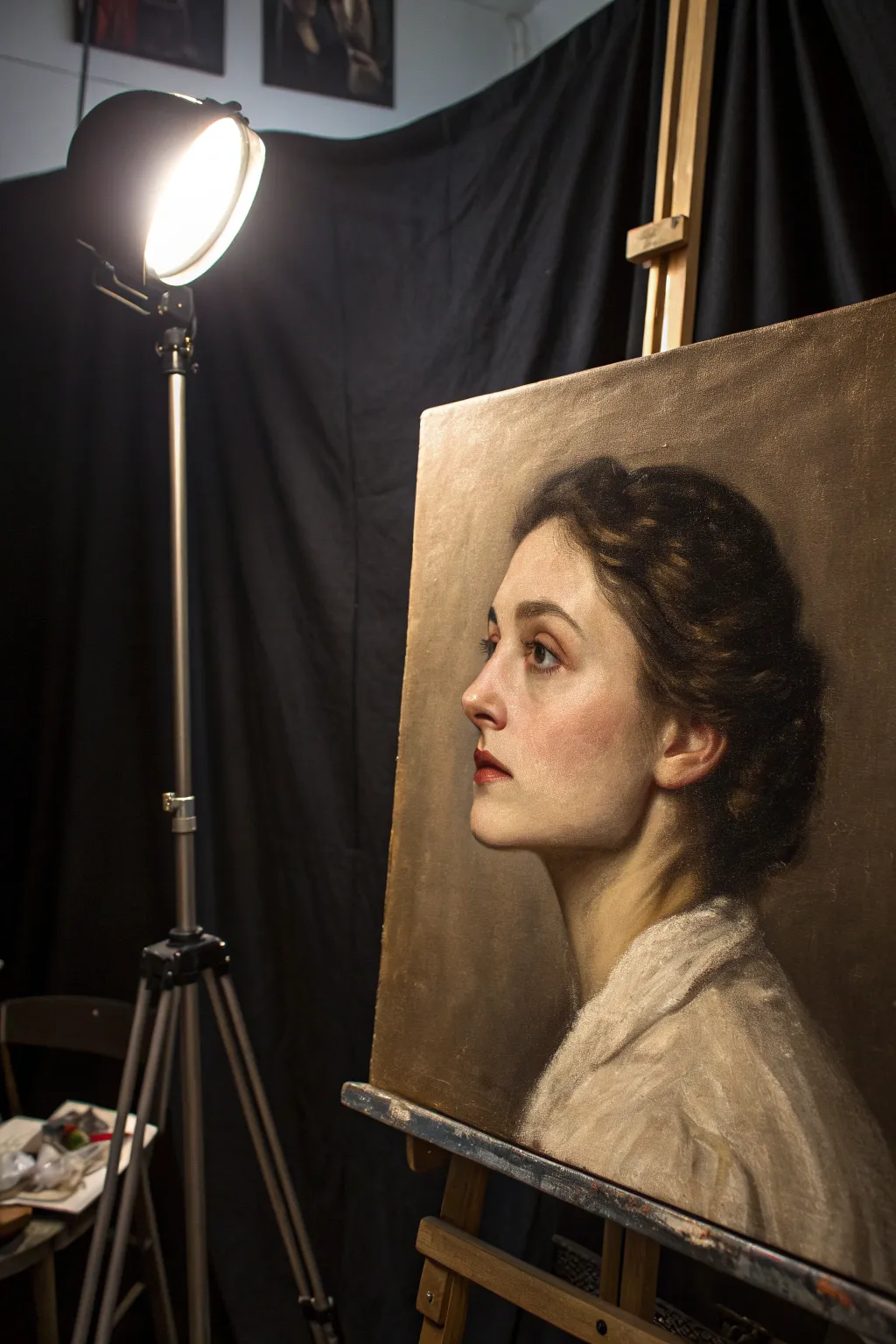
Capture the drama of a single light source with this classical oil painting study. You will focus on soft edges, luminous skin tones, and the deep, rich shadows characteristic of the Old Masters, bringing a striking realism to a delicate profile.
Step-by-Step Tutorial
Materials
- Oil paints (Titanium White, Yellow Ochre, Burnt Sienna, Alizarin Crimson, Burnt Umber, Ivory Black, Ultramarine Blue)
- Stretched canvas or linen panel (approx. 16×20 inches)
- Hog bristle brushes (filberts and flats, sizes 4-8)
- Soft synthetic brushes (rounds and filberts, sizes 0-4 for blending)
- Odorless mineral spirits (OMS)
- Liquin or linseed oil medium
- Palette and palette knife
- Mahl stick (optional for hand stability)
Step 1: The Underpainting
-
Tone the canvas:
Begin by applying a wash of Burnt Umber mixed with plenty of OMS to the entire canvas to kill the white. Wipe it back with a rag to create a warm, mid-tone brown background. -
Sketch the profile:
Use a small round brush with thinned Burnt Umber to sketch the outline of the head. Focus heavily on accuracy here—mark the brow, the tip of the nose, the chin, and the ear placement carefully. -
Establish the shadow shapes:
Squint at your subject to merge all darks into one mass. Paint these shadow areas (the back of the hair, under the jaw, the background behind the face) using a mix of Burnt Umber and Ivory Black. Keep this layer thin. -
Wipe out the lights:
Take a clean rag wrapped around your finger or a brush handle and wipe away the paint where the strongest light hits the forehead, nose, and cheek. This reductive method helps establish your value structure early.
Muddy Skin Tones?
If flesh tones look dirty, you likely over-blended into the darks. Let the paint dry, scrape the area down with a palette knife, and re-apply clean mid-tones without touching the shadows.
Step 2: First Color Layer
-
Mix your flesh strings:
Prepare a range of skin tones on your palette. Mix a base shadow (Burnt Sienna + Ultramarine), a mid-tone (Yellow Ochre + Alizarin + White), and a highlight (White + touch of Yellow Ochre). -
Apply the darks:
Start painting the hair and darkest background areas. Use opaque darks now, not just washes. A mix of Alizarin Crimson and Ivory Black creates a deep, warm dark for the hair mass. -
Block in facial planes:
Lay down the mid-tones on the cheek and jawline using a flat bristle brush. Don’t worry about blending yet; just place the color where it belongs like a mosaic tile. -
Define the features:
Using a smaller filbert, paint the darker values of the eye socket, the nostril, and the line of the lips. The eye in profile is triangular, not almond-shaped—keep this shape accurate. -
Bridge the values:
Apply the transition tones where the light meets the shadow on the focal point of the face. This is the ‘terminator’ line. Use a slightly cooler gray-pink mix to turn the form away from the light.
Step 3: Refining and Blending
-
Soften edges:
With a clean, dry, soft synthetic brush, gently sweep over the boundaries between color patches to blend them. I like to brush across the form to knit the colors together. -
Enhance the highlights:
Load a brush with your lightest mixture (White + trace of Ochre). Apply thick, impasto strokes to the forehead, bridge of the nose, and top of the cheekbone where the light is strongest. -
Detail the ear:
The ear catches light from behind and glows red (subsurface scattering). Glaze a little Alizarin Crimson and Burnt Umber over the ear area to give it that warm transparency. -
Paint the garment:
Rough in the white collar/garment. Keep the strokes loose and painterly to contrast with the smooth skin. Use muted grays and whites, keeping the brightest white only where the light hits directly. -
Deepen the background:
Repaint the background with a solid, opaque dark mixture (Black + Umber). Bring this dark paint right up to the profile edge to make the face pop forward.
Glazing for Glow
Once fully dry, apply a thinned glaze of Transparent Red Oxide over the cheeks. This creates a vibrant, blood-beneath-skin effect that direct mixing cannot achieve.
Step 4: Final Glazes and Highlights
-
Refine the hair texture:
Don’t paint every strand. Use a medium round brush to pull a few lighter, warm brown strokes through the shadow mass to suggest waves catching the light. -
Sharpen crucial edges:
Use a small brush to crisp up key edges: the tip of the nose, the edge of the upper lip, and the eyelid. Keep edges softer around the jaw and hair to maintain focus on the features. -
Add reflected light:
Bounce a tiny amount of warm light into the shadow under the jawline. It should be darker than the light side but lighter than the core shadow. -
Final highlights:
Place the smallest, brightest highlights: a dot on the lower lip, the tear duct, and the very tip of the nose. These ‘specular highlights’ bring the wetness of the skin to life.
Step back and admire how the interplay of deep shadow and bright light creates a sculpture-like volume on your canvas

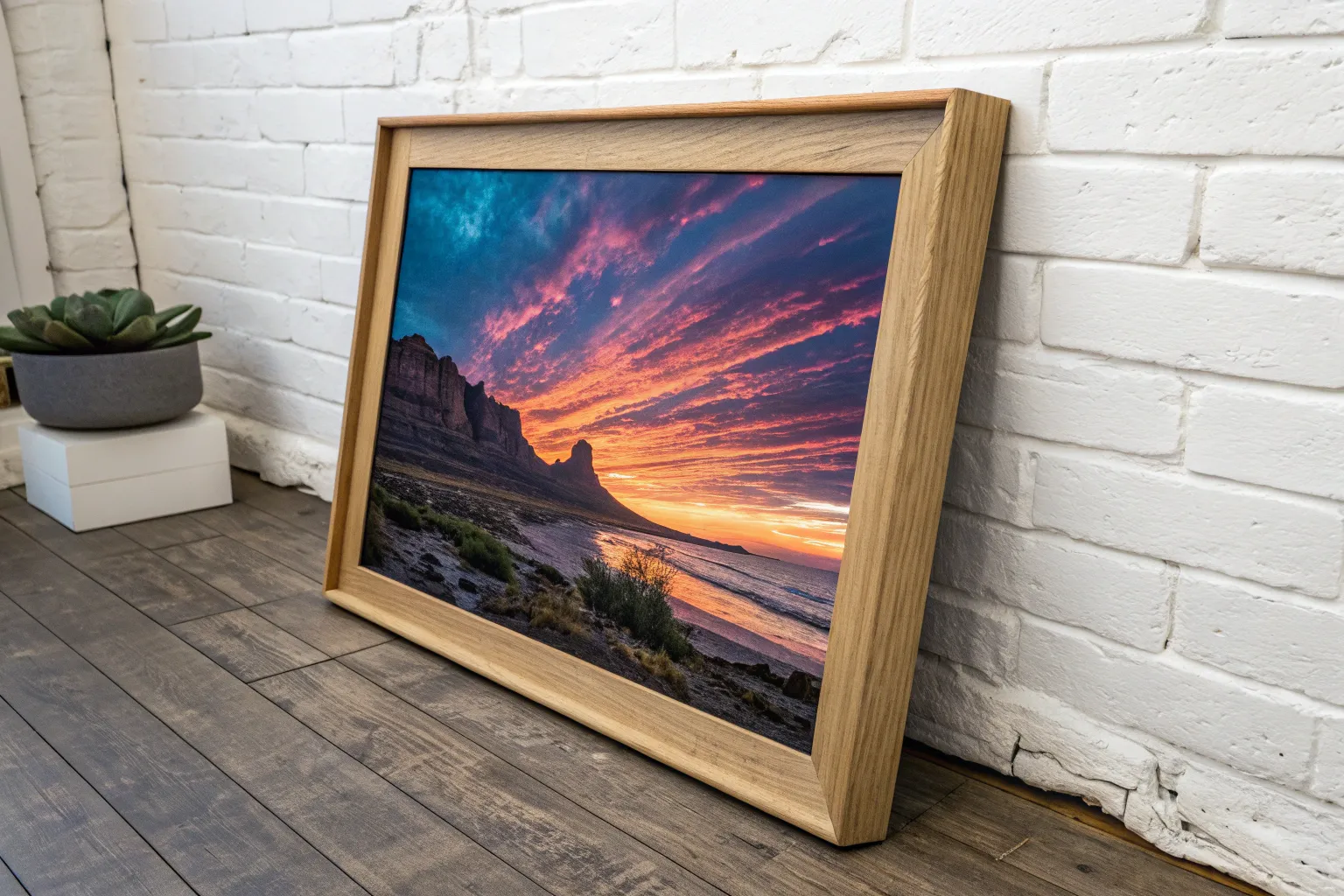
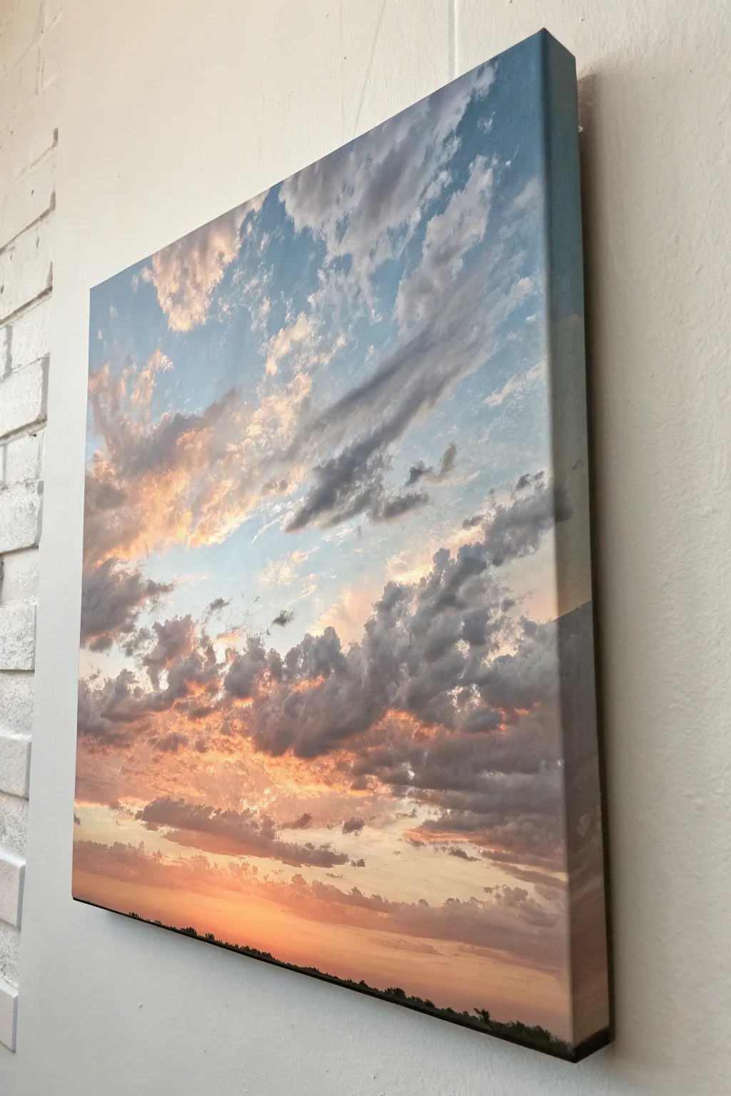
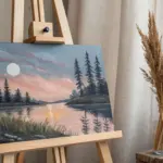
Dramatic Lake Reflections at Sunset
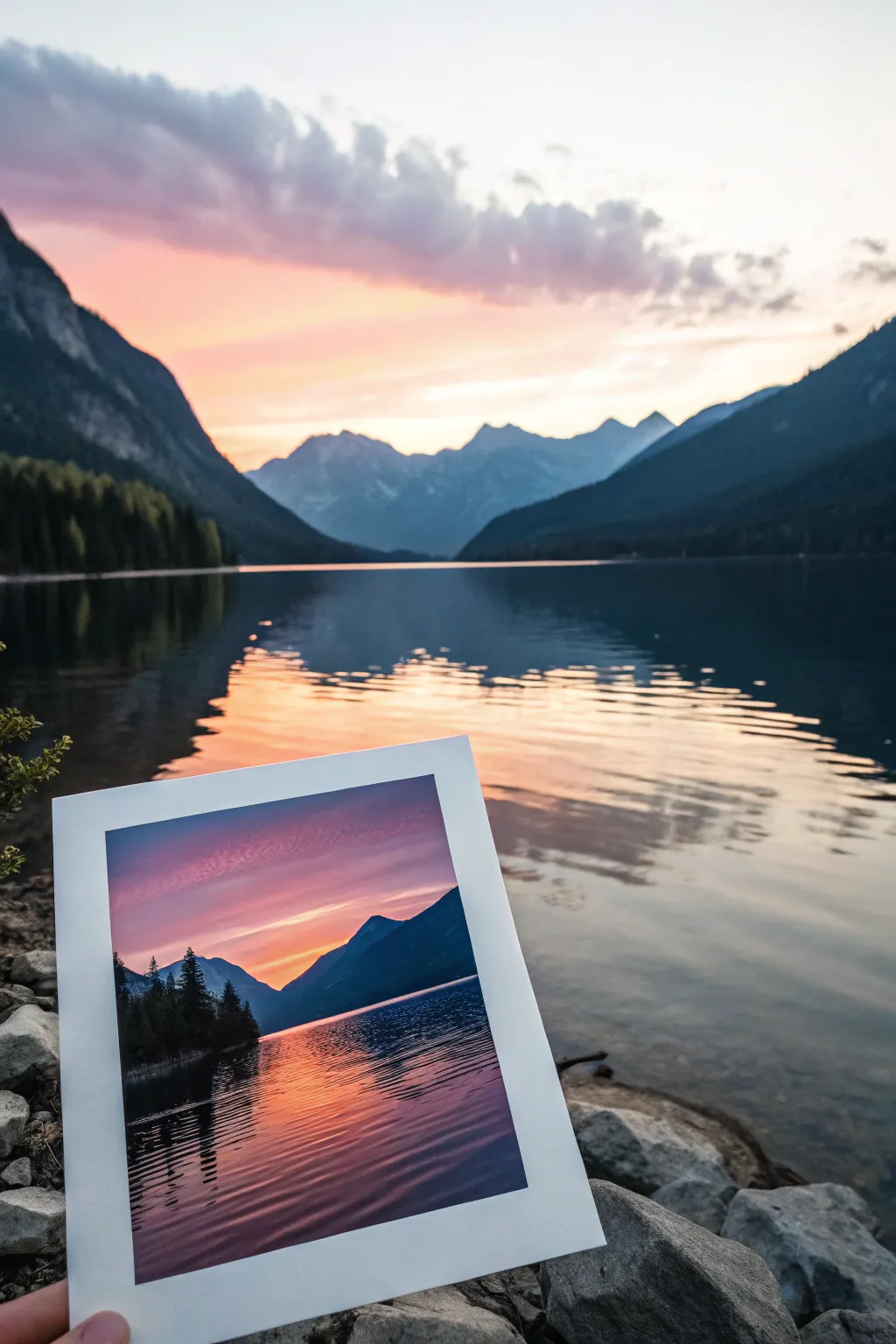
Capture the serene beauty of a mountain lake at twilight with this dramatic oil painting project. You’ll layer rich oranges, purples, and deep blues to create a glowing sky and mirror-like water reflections that radiate warmth.
Step-by-Step Tutorial
Materials
- Primed canvas or canvas board (8×10 or 9×12 inches)
- Oil paints: Titanium White, Cadmium Yellow, Cadmium Orange, Alizarin Crimson, Ultramarine Blue, Phthalo Blue, Burnt Umber
- Gamsol or odorless mineral spirits
- Medium (Linseed oil or Liquin)
- Flat brushes (sizes 8, 4), Filbert brush (size 6), Detail round brush (size 1 or 0)
- Palette knife for mixing
- Paper towels or rags
Step 1: Blocking the Composition
-
Tone the canvas:
Start by applying a very thin wash of Burnt Umber mixed with plenty of mineral spirits over the entire canvas. Wipe it back with a rag to leave a warm, neutral mid-tone. -
Establish the horizon:
Using a small round brush and thinned blue paint, draw a low horizon line about one-third of the way up from the bottom. This emphasizes the expansive sky. -
Sketch mountain shapes:
Roughly outline the large mountain masses on either side. Keep the shapes organic and overlapping, ensuring the distant center mountains are lower to create depth.
Muddy colors?
If your sky gradient turns brown or grey, stop blending immediately. Let the paint dry completely, then apply a fresh layer of distinct color over the top.
Step 2: Painting the Sky Gradient
-
Mix sky colors:
Prepare three piles of paint: a deep purple-blue for the top (Ultramarine + Alizarin), a vibrant pinkish-orange for the middle, and a bright yellow-white for the horizon. -
Apply the darkest sky:
Using a large flat brush, paint the top of the canvas with your dark purple-blue mix. Use long horizontal strokes. -
Blend downwards:
Without cleaning the brush perfectly, pick up your pink-orange mix and apply it below the blue. Blend the transition gently while the paint is wet to create a soft gradient. -
Add the glow:
Near the mountain peaks, paint the bright yellow-white mixt. Blend this upwards into the orange. I find using a clean, dry brush helps soften these transitions without muddying the colors. -
Create cloud streaks:
With a smaller filbert brush, gently streak thin bands of lavender and soft pink across the upper blue area to suggest high altitude clouds catching the last light.
Softer blends
Use a large, dry makeup brush or a soft mop brush to gently sweep over your sky transitions. It feathers the brushstrokes and creates an airbrushed look.
Step 3: Mountains and Silhouettes
-
Mix mountain colors:
For the distant distant center mountains, mix a hazy blue-grey (Ultramarine + White + trace of Orange to desaturate). For the closer mountains on the sides, mix a dark, rich blue-black (Phthalo Blue + Burnt Umber). -
Paint distant peaks:
Fill in the center mountains with the hazy blue-grey. Keep the edges slightly soft to push them into the distance. -
Paint foreground mountains:
Block in the large side mountains with your dark blue-black mix. These should be solid and opaque. -
Add tree details:
Using the tip of a small flat brush or a rigger brush, dab vertical texture along the top ridges of the closer mountains to mimic the jagged silhouette of pine trees.
Step 4: Reflections and Water
-
Mirror the sky:
The water is a mirror. Paint the water area with the same colors as the sky but in reverse order: yellow near the horizon, transitioning to orange and then deep purple at the bottom. -
Darken the edges:
Reflections are generally darker than the source. Glaze a small amount of medium mixed with blue over the water area to slightly deepen the tone. -
Reflect the mountains:
Pull the dark mountain color downwards into the water using vertical strokes. Keep these shapes slightly distorted compared to the real mountains. -
Cut the ripple lines:
This is the crucial step. Take a clean, dry flat brush. Drag it horizontally across the wet dark reflections to ‘cut’ lines through them, mimicking the water’s surface tension. -
Add highlights:
Load a liner brush with slightly thinned pink-orange paint. Create thin, wiggly horizontal lines in the water area, concentrating them near the center where the sun’s glow hits the ripples. -
Final touches:
Add a few very crisp, bright highlights of nearly pure white mixed with a touch of yellow in the immediate center foreground water to bring the shine forward.
Step back and admire how the warm glow of your painted sunset brings a peaceful atmosphere to the room

Atmospheric Forest with Layered Depth
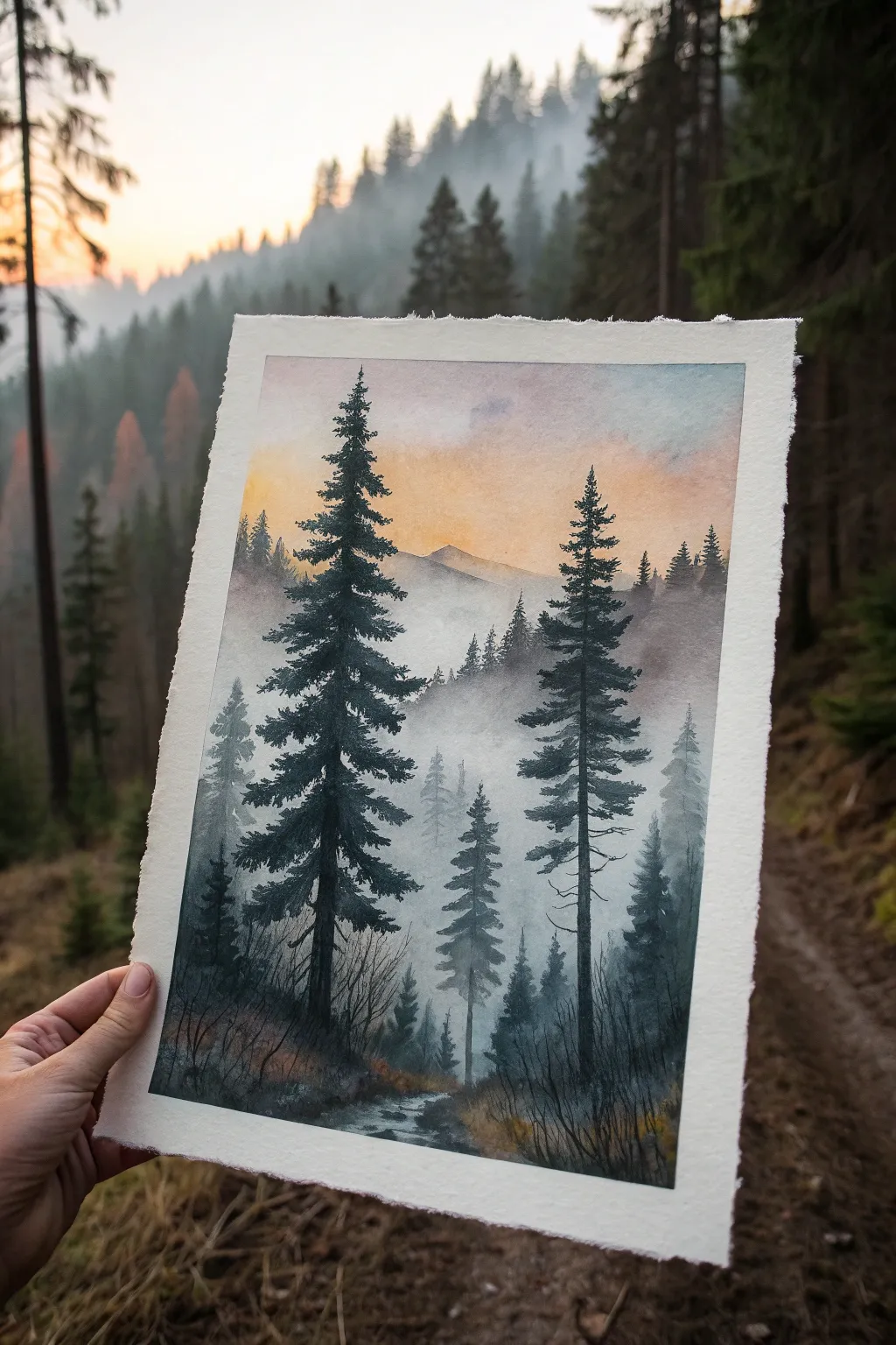
Capture the serene mood of a foggy mountain forest with this atmospheric watercolor piece. You’ll layer washes to create depth, moving from a soft, glowing sunset sky to crisp, detailed pines in the foreground.
How-To Guide
Materials
- Cold press watercolor paper (300 gsm or heavier), taped down
- Watercolor paints: Payne’s Grey, Indigo, Burnt Sienna, Yellow Ochre, Alizarin Crimson, Sepia
- Large flat wash brush
- Round brushes (sizes 4, 8, and a rigger or size 0 for details)
- Two jars of water (clean and dirty)
- Paper towels
- Masking tape
- Hairdryer (optional, to speed up drying)
Step 1: Sky and Background Atmosphere
-
Prepare the paper:
Begin by taping your paper securely to a board. Use a clean flat brush to wet the entire surface evenly with clean water. You want a consistent sheen, not puddles. -
Paint the sunset gradient:
While the paper is wet-on-wet, drop in a light wash of Yellow Ochre near the center horizon line. Blend this upwards into a mix of Alizarin Crimson and a touch of Burnt Sienna to create a soft orange glow. -
Add the upper sky:
Near the very top of the paper, introduce a diluted wash of Payne’s Grey mixed with a tiny bit of Indigo. Let this blend naturally downward into the warmer sunset colors, creating a soft transition from cool to warm. -
Hint at distant peaks:
While the sky is still damp (but losing its shine), mix a very pale, watery grey-purple using Payne’s Grey and Alizarin Crimson. Paint a faint mountain silhouette horizontally across the middle. The damp paper will soften the edges, pushing the mountain into the distance. -
Dry completely:
Allow this entire first layer to dry completely. The paper must be bone dry before you start the trees to prevent blooming.
Step 2: Mid-Ground and Depth
-
Create the first tree line:
Mix a watery, pale blue-grey using Indigo and plenty of water. Paint a row of small, indistinct tree shapes just below the mountain line. Keep them loose and vertical. -
Building the fog:
Immediately soften the bottom edges of these distant trees with a clean, damp brush. Drag the pigment downwards into the white of the paper to simulate thick fog rising from the valley floor. -
Add a darker layer:
Once the pale trees are dry, mix a slightly stronger value of Payne’s Grey. Paint a few more trees slightly lower down and larger than the previous ones. I find overlapping these shapes helps convince the eye of the density of the forest. -
Soften again:
Repeat the softening technique—blend the bottoms of these new trees into nothingness. This ‘lost and found’ edge quality is crucial for the atmospheric effect.
Keep It Misty
To maintain the foggy look, never paint the bottom of the distant trees with a hard line. Always fade them out with clean water into the white of the paper.
Step 3: Foreground Elements
-
Establish the stream path:
Near the bottom, sketch a winding path for the stream using a pale wash of the sky colors (grey-blue reflecting the clouds). Leave some white paper for the brightest water reflections. -
Paint the ground layer:
Mix Sepia with Payne’s Grey for a dark, earthy tone. Stipple this color around the bottom corners and edges of the stream bank to suggest rough terrain and undergrowth. -
Draft the main trees:
Load a size 8 round brush with a thick, creamy mix of Indigo and Payne’s Grey—almost black. Paint the straight vertical trunk lines for the two large dominant pine trees. One should be slightly higher and to the left, the other lower and to the right. -
Add pine texture:
Using the tip of the brush, start at the top of the trunk and dab outwards to create branches. As you move down the tree, make the branches wider and slightly drooping. Leave gaps between branches to let the background show through. -
Refine the foreground foliage:
Switch to a smaller brush to add smaller saplings and bushes around the base of the large trees. Use upward flicking motions to suggest grass and dry twigs. -
Deepen shadows:
Glaze a dark transparent wash over the bottom corners if they look too light. This vignette effect draws the focus toward the light in the center. -
Final details:
Use your smallest rigger brush to add tiny dead branches or twigs sticking out from the main trunks and along the stream bank. These fine lines add realistic complexity.
Muddy Colors?
If your sunset turns green where it meets the blue sky, let the yellow layer dry completely before adding any blue paint. Mixing wet yellow and blue directly creates green.
Peeling off the tape reveals a crisp border that makes your atmospheric forest scene look instantly professional


Underpainting for Strong Value Structure
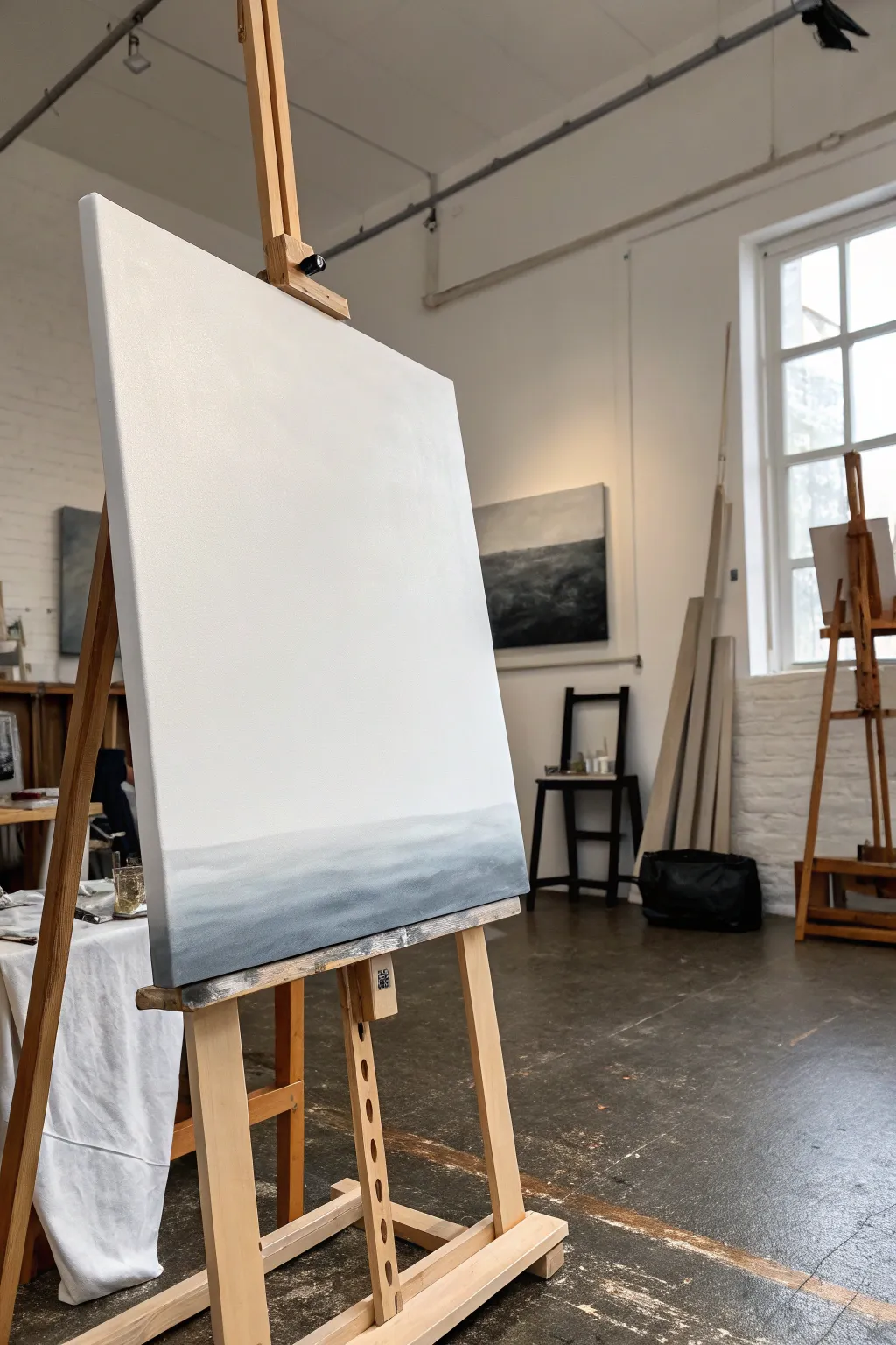
Establish a powerful atmospheric foundation for your next masterpiece with this subtle gradient underpainting study. This project focuses on the delicate transition from pure white to deep slate gray, creating a sense of distance and calm before you add any further detail.
Step-by-Step Guide
Materials
- Large stretched canvas (approx 24×30 inches or similar)
- Acrylic or oil paint: Titanium White
- Acrylic or oil paint: Payne’s Gray or Neutral Tint
- Acrylic or oil paint: Ultramarine Blue (optional for cooling the gray)
- Large flat brush (2-3 inch width)
- Medium filbert brush
- Palette knife
- Water jar or solvent container
- Lint-free rags or paper towels
- Spray mister (if using acrylics)
Step 1: Setting the Horizon Line
-
Assess the canvas:
Begin with a clean, pre-primed white canvas. Secure it firmly on your easel at a comfortable standing height so you can make broad arm movements. -
Mix the darkest value:
On your palette, mix a substantial amount of your darkest tone. Combine Payne’s Gray with a touch of Ultramarine Blue to give it a cool, atmospheric depth. It needs to be dark but not pitch black. -
Mark the division:
Visualize where your horizon line will sit. In this composition, it is quite low—roughly the bottom fifth of the canvas. Use your medium filbert brush to lightly sketch a horizontal line across at this level. -
Fill the base layer:
Using the large flat brush, paint the area below your horizon line with your dark gray mixture. Don’t worry about perfect evenness yet; just get the pigment onto the canvas surface.
Pro Tip: The Misty Look
To get that ultra-smooth fog effect, use a large, dry makeup brush or specialized mop brush to lightly whisk over the wet transition line. It blurs brushstrokes instantly.
Step 2: Creating the Gradient
-
Prepare the transition tone:
Mix a lighter version of your gray by adding Titanium White to your original pile. You want a mid-tone slate color that will bridge the gap between the dark bottom and the white top. -
Apply the mid-tone band:
Paint a horizontal band of this mid-tone gray directly above your dark base layer, slightly overlapping the wet edge of the dark paint. -
Blend the lower transition:
While the paint is still wet, use clean, horizontal strokes to blend the dark base into the mid-tone band. If using acrylics, a quick mist of water will keep the paint workable longer. -
Softening the horizon edge:
The key to this atmospheric look is avoiding a hard line. Gently feather the top edge of your mid-tone gray upward into the white canvas space, letting the brush run dry as you move up.
Troubleshooting: Muddy Skys
If gray paint accidentally travels too high into your white sky, don’t just paint over it immediately. Change your water, clean your brush thoroughly, scrape off the mistake, then re-apply thick white.
Step 3: Maximizing Negative Space
-
Reinforce the white:
Even though the canvas is already white, painting the upper section with fresh Titanium White adds texture and luminosity. Load your large clean brush with white paint. -
Paint the sky area:
Cover the large upper portion of the canvas with white, working from the top down. Use crisscross strokes to add subtle texture that catches the light. -
Merging sky and land:
When your white paint reaches the gray gradient area, carefully blend them. I like to wipe my brush frequently during this step to prevent dragging too much gray up into the pristine sky. -
Refine the fade:
Stand back and look at the gradient. It should look like a soft fog lifting off the water or ground. If the transition is too abrupt, use a dry, soft brush to lightly sweep back and forth across the meeting point. -
Check the bottom edge:
Ensure the very bottom edge of the canvas is your darkest value to anchor the composition. If it got muddied during blending, re-apply pure dark gray along the bottom strip.
Step 4: Final Adjustments
-
Evaluate value structure:
Squint your eyes at the canvas. The bottom should read clearly as a heavy, grounding mass, while the top feels light and airy. -
Clean up edges:
Paint the sides of your canvas to match the front—dark gray at the bottom, transitioning to white. This gives the artwork a professional, finished object quality. -
Allow to cure:
Let the underpainting dry completely. If using oils, this may take a few days; acrylics will be ready in an hour or two.
You now have a serene, value-focused foundation ready for further layers or to stand alone as a minimalist statement piece
BRUSH GUIDE
The Right Brush for Every Stroke
From clean lines to bold texture — master brush choice, stroke control, and essential techniques.
Explore the Full Guide
Glazing for Luminous Color Depth
Capture the muted, serene beauty of an autumn field with this advanced tutorial focusing on atmospheric depth and soft light. Using multiple thin glazes, you will build a landscape that glows with an inner warmth and features delicate, textural grasses.
Step-by-Step
Materials
- Canvas board or stretched canvas (approx. 9×12 inches)
- Acrylic paints (Titanium White, Raw Umber, Yellow Ochre, Burnt Sienna, Payne’s Grey, Olive Green)
- Glazing medium (gloss or matte)
- Flat synthetic brushes (1 inch, 1/2 inch)
- Round detail brushes (size 0, size 2)
- Fan brush (optional)
- Palette knife
- Water container and lint-free rags
- Wooden frame (light oak finish recommended)
Step 1: Setting the Atmosphere
-
Prime with warmth:
Begin by covering your entire canvas with a wash of Yellow Ochre mixed with a touch of Titanium White. Apply this layer thinly to let the canvas texture show through slightly, creating a warm underglow that will shine through later layers. -
Establish the horizon:
Once dry, mix a soft, neutral grey using Titanium White and a tiny dot of Payne’s Grey. Use your 1-inch flat brush to paint the upper two-thirds of the canvas for the sky, blending it downwards into the ochre base. -
Cloud formation:
While the sky layer is still tacky, scumble in subtle diagonal cloud streaks using pure Titanium White mixed with glazing medium. Keep these strokes loose and airy, avoiding hard edges to maintain that misty atmosphere. -
First glaze layer:
Mix a very translucent glaze of Raw Umber and medium. Apply this over the dried sky area, wiping away areas with a rag where you want the brightest light to mimic sun breaking through clouds.
Too much texture?
If your sky looks too brush-heavy, use a large, soft makeup brush to gently verify and smooth out the wet paint. This creates a more convincing atmospheric haze.
Step 2: Building the Landscape
-
Block in the tree line:
Mix Olive Green with Raw Umber and a touch of Payne’s Grey for a deep, muted dark. Using the corner of a flat brush, tap in the distant tree shapes along the horizon line, keeping the tops irregular. -
Soften the edges:
Immediately take a clean, dry brush and very gently blur the edges of your trees into the sky. This ‘sfumato’ effect pushes them into the distance. -
Mid-ground transition:
Paint the area directly below the tree line with a mix of Burnt Sienna and Olive Green. This serves as the shadowy base for the field. -
Foreground base:
For the bottom third of the canvas, drag darker strokes of Raw Umber and Payne’s Grey vertically. This creates a deep shadow layer that will make the bright foreground grasses pop later.
Step 3: Texturing the Grasses
-
Palette knife texture:
Mix Yellow Ochre with a little white to create a thick, heavy body paint. Use the edge of a palette knife to scrape upward lines in the foreground, suggesting the thickest stalks of grass. -
Layering mid-tones:
Switch to a round size 2 brush. Dilute Burnt Sienna with glazing medium and paint quick, sweeping upward strokes to create the bulk of the dried grass field. -
Adding the highlights:
Mix Titanium White with just a hint of Yellow Ochre. Using your finest liner brush or a fan brush turned on its side, flick very fine lines upward over the darker layers. -
Painting the focal stalk:
On the left side, paint a distinct, fuzzy seed head using a stippling motion with the tip of a small brush. I find adding a tiny touch of Burnt Sienna on the shadow side gives it volume. -
Final glazing pass:
Once completely dry, apply a final, ultra-thin glaze of transparent Yellow Ochre over the entire bottom half of the painting to unify the grass colors and enhance the ‘golden hour’ feel.
Add dimensionality
For the foreground grasses, try varying the opacity of your paint. Use heavy body paint for the closest stalks and watered-down washes for those further back.
Step 4: Finishing Touches
-
Frame selection:
Select a light-colored wooden frame with a deep profile. The natural wood tone complements the ochre and sienna tones in the painting without overpowering them. -
Mounting the artwork:
Ensure the painting is fully cured before inserting it into the frame. Secure it from the back using glazier points or offset clips.
Step back and admire how the layers of glaze interact to create a painting that feels full of light and quiet movement
Alla Prima with Confident Brushwork
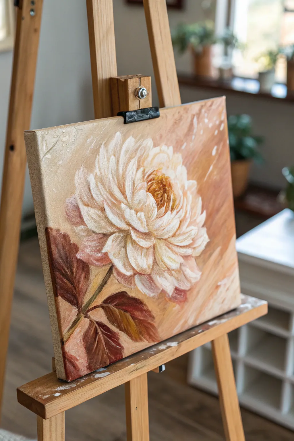
Capture the delicate complexity of a dahlia bloom using warm, earthy tones and confident, visible brushwork in this alla prima painting study. The interplay of soft white petals against a dynamic, caramel-colored background creates a glowing, vintage atmosphere perfect for honing your floral skills.
Step-by-Step Tutorial
Materials
- Canvas panel or stretched canvas (approx. 12×12 inches)
- Oil paints (Titanium White, Yellow Ochre, Burnt Sienna, Burnt Umber, Alizarin Crimson)
- Flat bristle brushes (sizes 4, 8, and 12)
- Round synthetic brush (size 2 for details)
- Palette knife
- Odorless mineral spirits or turpentine
- Linseed oil or painting medium
- Paper towels or rag
Step 1: Setting the Atmospheric Ground
-
Tone the canvas:
Begin by covering the entire white canvas with a thin wash of Yellow Ochre and a touch of Burnt Sienna diluted with plenty of mineral spirits. Scrub this in loosely to kill the stark white; it doesn’t need to be perfectly even. -
Establish the background gradient:
While the wash is still wet or tacky, mix a creamy body color using Burnt Sienna, White, and a tiny bit of Yellow Ochre. Apply this to the background area, stroking diagonally from the top right to bottom left. -
Add background variation:
Introduce pure Burnt Sienna and touches of Alizarin Crimson into the wet background paint near the edges and corners to create depth. Leave the center somewhat lighter where the flower will sit.
Muddy Colors?
If your white petals turn brown/gray, your brush isn’t clean enough. Wipe your brush thoroughly between every single petal stroke to keep the whites crisp.
Step 2: Blocking in the form
-
Sketch the flower placement:
Using a small round brush dipped in thinned Burnt Umber, lightly sketch the large oval shape of the dahlia head slightly off-center. Mark the center point of the bloom. -
Draft the stem and leaves:
Quickly gesture in the main stem line extending downwards and outline two or three large, jagged leaf shapes near the bottom left. -
Paint the dark leaves:
Mix a deep, rich dark using Burnt Umber and Alizarin Crimson. Fill in the leaf shapes with broad, confident strokes using a flat brush. Don’t worry about veins yet; focus on the silhouette. -
Add warmth to the leaves:
While the dark leaf paint is wet, blend in some Burnt Sienna on the tips or edges of the leaves to suggest light hitting them.
Step 3: Sculpting the Petals
-
Mix your petal whites:
Prepare three piles of white: a ‘shadow white’ (White + tiny bit of Burnt Umber + Oxide Red), a ‘mid-tone white’ (pure Titanium White + touch of Yellow Ochre), and a ‘highlight white’ (pure, thick Titanium White). -
Create the flower center:
Load a small flat brush with Yellow Ochre and Burnt Sienna. Stipple in the tight center of the dahlia, creating a textured, pollen-heavy look. -
Paint the background petals:
Using your ‘shadow white’ mix, paint the outer ring of petals that recede away from the viewer. Keep edges slightly soft so they blend into the background. -
Layer the mid-tones:
Working towards the center, apply the ‘mid-tone white’ for the main body of petals. Use curved strokes that follow the cup-shape of the dahlia structure. -
Define individual petals:
Switch to a clean flat brush. Pick up heavy scooped loads of paint. Lay down each petal with a single committed stroke if possible, twisting the brush slightly at the end to create the tapered tip. -
Build the highlights:
Apply the pure ‘highlight white’ to the tips of the petals facing the light source (coming from the top right). I like to lay this paint on thick—impasto style—so it catches physical light. -
Refine the center interaction:
Use a small brush to drag some of the yellow/orange center color slightly outward onto the base of the inner white petals, creating a soft glow from within.
Pro Tip: Impasto Pop
Use a palette knife instead of a brush for the final bright white highlights on the front-most petals. The physical ridge of paint adds incredible dimension.
Step 4: Finishing Touches
-
Add stem definition:
Paint the stem with a mix of Yellow Ochre and sap green (or mixing blue/yellow) if available, or stick to the earth palette with Ochre and Umber. Add a dark shadow line on the left side of the stem. -
Deepen contrast:
Look for gaps between petals. Use a tiny brush with dark Burnt Umber to deepen these negative spaces, which makes the white pops forward. -
Add looseness:
Take a larger dry brush and very lightly feather the edges of the furthest petals into the background to create movement. -
Create splatter effects:
Thicken some white paint with a little solvent until it’s fluid. Flick the bristles of an old brush to send tiny white droplets across the upper left background for texture.
Step back and admire how the warm underpainting makes your white dahlia glow with lively energy

PENCIL GUIDE
Understanding Pencil Grades from H to B
From first sketch to finished drawing — learn pencil grades, line control, and shading techniques.
Explore the Full Guide
Palette Knife Impasto Landscape
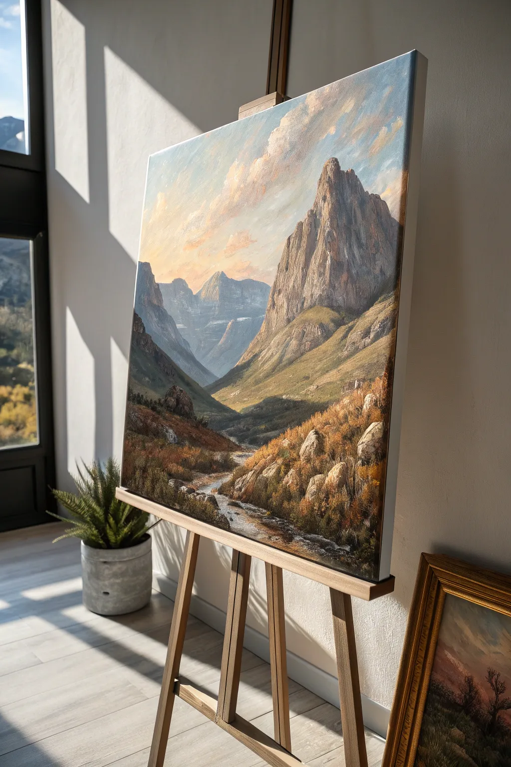
Capture the rugged beauty of a mountain valley with this textured landscape project that combines brushwork with the heavy body of palette knife application. You’ll build depth from distant hazy peaks to a detailed, rocky foreground, using thick paint to mimic the solidity of stone and the movement of water.
Detailed Instructions
Materials
- Stretched canvas (approx. 24×30 inches)
- Heavy body acrylic paints or oil paints
- Titanium White, Payne’s Gray, Burnt Sienna, Yellow Ochre, Ultramarine Blue, Alizarin Crimson, Sap Green
- Palette knives (large trowel shape and small diamond shape)
- Flat synthetic brushes (sizes 8 and 12)
- Small round detail brush (size 2)
- Texture paste or molding paste (optional for extra grit)
- Easel
- Palette and rags
Step 1: Atmospheric Foundation
-
Prime the sky:
Begin by blocking in the sky area using a large flat brush. Mix Titanium White with a tiny touch of Ultramarine Blue for the upper corners, transitioning to a warm, pale peach near the horizon using White, Yellow Ochre, and a speck of Alizarin Crimson. -
Cloud formation:
While the sky paint is still wet, use a clean brush to scumble in soft diagonal cloud shapes. Use pure White mixed with a hint of warm orange to catch the imagined light source from the left. -
Distant mountains:
Mix a hazy lavender-grey using Ultramarine Blue, Alizarin Crimson, White, and Payne’s Gray. Paint the silhouette of the furthest back mountain peaks in the center valley. Keep edges soft to push them into the distance. -
Mid-ground shadows:
Establish the shadowed left-side mountain slope. Use a darker mix of Payne’s Gray and Sap Green. Apply this flatly with a brush to act as an underpainting for later texture.
Step 2: Sculpting the Peaks
-
Base coat for main peak:
Address the large, dominant mountain on the right. Paint a base layer of warm grey (Burnt Sienna + Ultramarine + White). Don’t worry about detail yet; just cover the canvas white. -
Knife loading:
Switch to your palette knife. Mix a thick pile of highlight color—White, Yellow Ochre, and a touch of Burnt Sienna. Load the paint onto the flat bottom of the knife. -
Dragging the highlights:
Gently drag the loaded palette knife down the right-facing facets of the main peak. Let the paint ‘break’ over the canvas weave to create the look of rugged rock texture. -
Carving shadows:
Clean the knife and mix a shadow tone with Ultramarine and Burnt Sienna. Apply this to the vertical crevices and left-facing sides of the rock face, using the edge of the knife for sharp, linear cracks. -
Base grassy slopes:
For the lower slopes of the mountain, switch back to a brush. Mix Sap Green, Yellow Ochre, and White. Paint the rolling terrain that connects the craggy peak to the valley floor.
Knife Consistency
For the rock effect, do not thin your paint with water or medium. The paint needs to be as stiff as toothpaste to break properly over the canvas grain.
Step 3: Valley Floor & Foreground
-
Deepening the valley:
Darken your green mix with Payne’s Gray. Paint the ‘V’ shape where the valley creates a trough. This deep contrast is crucial for leading the viewer’s eye. -
River mapping:
Use a small brush to sketch the winding path of the stream through the center. It should be very narrow in the distance and widen significantly as it reaches the bottom canvas edge. -
The rushing water:
Use a small palette knife with pure Titanium White to lay in the water. Keep your strokes horizontal and jagged to simulate rushing water breaking over rocks. -
Foreground underpainting:
Block in the bottom foreground area with a dark, earthy mix of Burnt Sienna and Sap Green. This needs to be dark to make the foreground details pop.
Sunlight Glazing
Once fully dry, glaze a transparent mix of Indian Yellow over the sunlit side of the mountain to create a glowing, late-afternoon warmth.
Step 4: Textural Details
-
Foreground boulders:
Using the tip of your diamond-shaped knife, sculpt heavy, thick rocks in the immediate foreground. Use a mix of grey, white, and ochre. Apply the paint thickly so it physically stands off the canvas. -
Grasses and scrub:
Load a fan brush or an old, splayed bristle brush with Yellow Ochre and Burnt Sienna. Use an upward flicking motion to create dried autumn grasses along the riverbank. -
Highlighting vegetation:
Add touches of pure Yellow Ochre and White to the tips of the grasses on the right side of the painting where the sunlight hits most strongly. -
Water transparency:
Glaze a very thin, watery layer of blue-grey over parts of the stream edges to make the water look like it has depth and isn’t just surface foam. -
Final light checks:
Stand back. Add final touches of brightest white impasto on the sharpest peaks of the mountains and the whitest foam of the river.
Step back and admire how the thick texture brings your mountain landscape to life with tangible depth
Scumbled Clouds Over a Clean Gradient Sky
Capture the fleeting beauty of a twilight sky with this layering technique that combines a seamless acrylic gradient with textured, scumbled cloud formations. The result is a dramatic interplay between soft, fading light and rugged, shadowy clouds.
Step-by-Step
Materials
- Stretched canvas (square or rectangular)
- Acrylic paints: Titanium White, Cerulean Blue, Ultramarine Blue, Cadmium Orange, Alizarin Crimson, Burnt Umber, Carbon Black
- Large flat wash brush (2-3 inch)
- Medium filbert brush
- Small round detail brush
- Old, stiff bristle brush (for scumbling)
- Palette and water container
- Slow-drying medium or retarder
- Paper towels
Step 1: The Foundation Gradient
-
Prime the Surface:
Ensure your canvas is clean and primed with gesso. If you want a smoother finish, lightly sand the gesso once dry to reduce the canvas grain texture. -
Mix Your Gradient Colors:
On your palette, prepare three main piles: a mix of Cerulean Blue and Titanium White for the top, a pale peach made from Titanium White and a tiny dot of Cadmium Orange for the middle, and a slightly richer warm pink using White, Orange, and a touch of Alizarin Crimson for the horizon. -
Apply the Moving Medium:
Before painting, brush a thin layer of slow-drying medium or retarder over the entire canvas. This is crucial for achieving that seamless, airbrushed look behind the clouds. -
Lay the Top Blue:
Using your large flat brush, apply horizontal strokes of the light blue mix across the top third of the canvas. -
Add the Horizon Warmth:
Without cleaning the brush completely, pick up the pale peach color and paint the middle section, blending upward into the wet blue to create a soft transition zone. -
Anchor the Glow:
Apply the warm pink mix to the bottom third. Use long, sweeping horizontal strokes to blend this into the peach section above, ensuring no harsh lines remain.
Dry Brush Mastery
Wipe 80% of the paint off your brush onto a paper towel before scumbling. You want a whisper of pigment, not a glob, to get that fluffy effect.
Step 2: Building the Cloud Structure
-
Mix Shadow Tones:
While the background dries completely, mix a dark cloud shadow color using Ultramarine Blue, Alizarin Crimson, and a touch of Burnt Umber. It should be a deep, bruised purple-grey. -
Map the Clouds:
Using a filbert brush, loosely sketch the main shapes of the clouds. Focus on a large, diagonal band sweeping from the upper right toward the center, and a dense cluster in the lower middle. -
Scumble the Edges:
Switch to an old, dry bristle brush. Dip just the tip into your shadow mix and scrub the paint onto the canvas in a circular motion to create soft, feathery edges, leaving gaps for the sky to peek through. -
Establish Mid-Tones:
Create a lighter grey-purple by adding White to your shadow mix. Apply this to the top edges of the lower cloud bank where the light would naturally hit, blending it gently into the darker bases. -
Build Volume:
Apply more scumbled layers of the dark shadow mix to the ‘bellies’ of the clouds. I find that keeping the brush relatively dry helps build that fluffy, cumulative texture without turning it into mud.
Muddy Clouds?
If your cloud colors are blending into the background sky, the background wasn’t dry enough. Let the gradient layer cure for at least an hour before cloud work.
Step 3: Highlights and Details
-
Add Warm Highlights:
Mix a sunny highlight color using Titanium White and a small amount of Cadmium Orange. Apply this purely to the bottom edges of the clouds where they reflect the sunset. -
Create Depth:
Reinforce the darkest parts of the clouds with a mix of Ultramarine Blue and Burnt Umber to deepen the contrast against the glowing highlights. -
Refine the Whisps:
Use a smaller brush to drag faint streaks of grey-blue cloud matter diagonally across the upper sky, mimicking wind-blown vapor. -
Paint the Silhouette:
Mix Carbon Black with a little Burnt Umber. Using a small round brush, paint a very thin, jagged tree line along the absolute bottom edge of the canvas. -
Detail the Trees:
Dab the tip of the brush along the horizon line to suggest tiny treetops and foliage shapes, keeping them completely solid and dark against the bright sky. -
Wrap the Edges:
Finally, paint the sides of your canvas with the corresponding colors—blue at the top, pink at the bottom, and black at the base—to give the piece a finished, gallery-ready appearance.
Step back and admire how the depth of the dark clouds contrasts against your glowing sunset sky


Sgraffito for Hair, Grass, and Sparkle
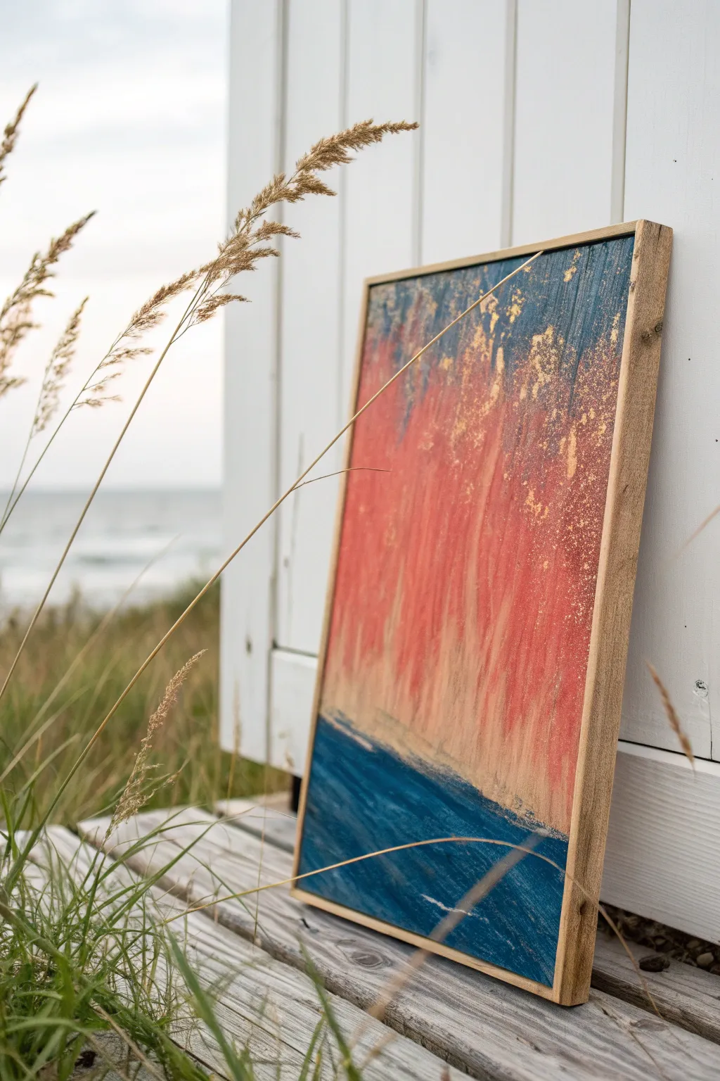
This evocative abstract painting captures the burning hues of a sunset over deep water, utilizing scratching techniques to create movement and texture. The interplay of cool blues, warm corals, and metallic gold leaf brings a sophisticated shimmer to this coastal-inspired piece.
Step-by-Step Guide
Materials
- Wooden painting panel or heavy canvas board (approx. 16×20 inches)
- Floating wood frame (natural finish)
- Heavy body acrylic paints: Phthalo Blue, Prussian Blue, Titanium White, Coral, Red Oxide, Yellow Ochre
- Gold leaf sheets and gilding size (adhesive)
- Palette knife
- Stiff bristle brushes (various sizes)
- Sgraffito tools: toothpick, pottery tool, or even an old fork
- Soft synthetic brush (for gilding)
- Spray bottle with water
Step 1: Setting the Horizon
-
Prepare the substrate:
Begin with a clean wooden panel. If the wood is very absorbent, apply a thin coat of gesso and let it dry completely to ensure your paint glides smoothly. -
Define the horizon line:
Measure about one-third of the way up from the bottom of your panel. Use painter’s tape to mask off this line if you want a sharp edge, or keep it loose for a more organic feel. -
Mix the ocean depths:
On your palette, mix Phthalo Blue with a touch of Prussian Blue and a tiny bit of black or burnt umber to create a deep, moody ocean color. We want this to be dark and rich. -
Apply the base ocean layer:
Using a stiff brush, paint the bottom third of the canvas with your dark blue mix. Apply the paint thickly; texture is your friend here. -
Add wave motion:
While the blue paint is still wet, drag a clean, dry brush horizontally across the surface to create subtle streaks that mimic the movement of gentle waves.
Paint drying too fast?
If acrylics dry before you can scratch, mist the surface lightly with water or mix a slow-drying medium into your paint beforehand.
Step 2: The Burning Sky
-
Mix the sunset gradient:
Prepare three separate piles of paint: pure Coral, a mix of Red Oxide and Coral, and a lighter mix of White with Yellow Ochre. -
Apply the sky base:
Start painting the upper two-thirds of the panel. Begin with the darker Red Oxide mix near the top corners and transition into the bright Coral in the center. -
Blend downwards:
As you move closer to the blue horizon line, blend in the Yellow Ochre mix. Use vertical strokes to suggest falling light or rain. -
Create the vertical rain effect:
Load a flat brush with a slightly watered-down white or pale peach. Drag the brush vertically from the top of the painting down toward the horizon, letting the colors streak and blend naturally. -
Adding atmospheric splatter:
Dilute a bit of the dark blue paint with water. Flick the bristles of an old toothbrush or stiff brush to create tiny droplets near the top, simulating distant texture or stars.
Step 3: Sgraffito and Gilding Details
-
Scratch into the paint:
While the sky section is tacky but not fully dry, take your sgraffito tool. I like to use the back of a paintbrush for this. Scratch vertical lines and erratic shapes to reveal the lower layers or wood grain underneath. -
Apply gilding size:
Identify areas where you want gold accents—focus on the transition between the blue water and the red sky. Dab small amounts of gilding size randomly in these areas. -
Wait for tackiness:
Allow the size to dry until it feels sticky to the touch, usually about 15-20 minutes depending on your brand. -
Lay the gold leaf:
Gently press sheets or flakes of gold leaf onto the sticky areas. Don’t worry about being perfect; a distressed look suits this style best. -
Burnish the gold:
Use a soft, dry brush to rub the gold leaf into the surface. Brush away the excess flakes to reveal glittering, organic patterns. -
Final texture check:
Assess the painting. If the horizon line feels too stiff, use a palette knife to scrape a little blue paint upwards into the red, or red downwards into the blue, blurring the boundary. -
Seal and frame:
Once fully dry (wait at least 24 hours), apply a satin varnish to protect the surface. Finally, set the panel into a natural wood floating frame to complete the rustic, seaside aesthetic.
Level Up: Salt texture
Sprinkle coarse sea salt onto the wet blue paint at the bottom. Once dry, brush it off to create pitted, organic textures.
Hang your new masterpiece in a bright room where the sunlight can catch the gold accents
Limited Palette Color Harmony Challenge
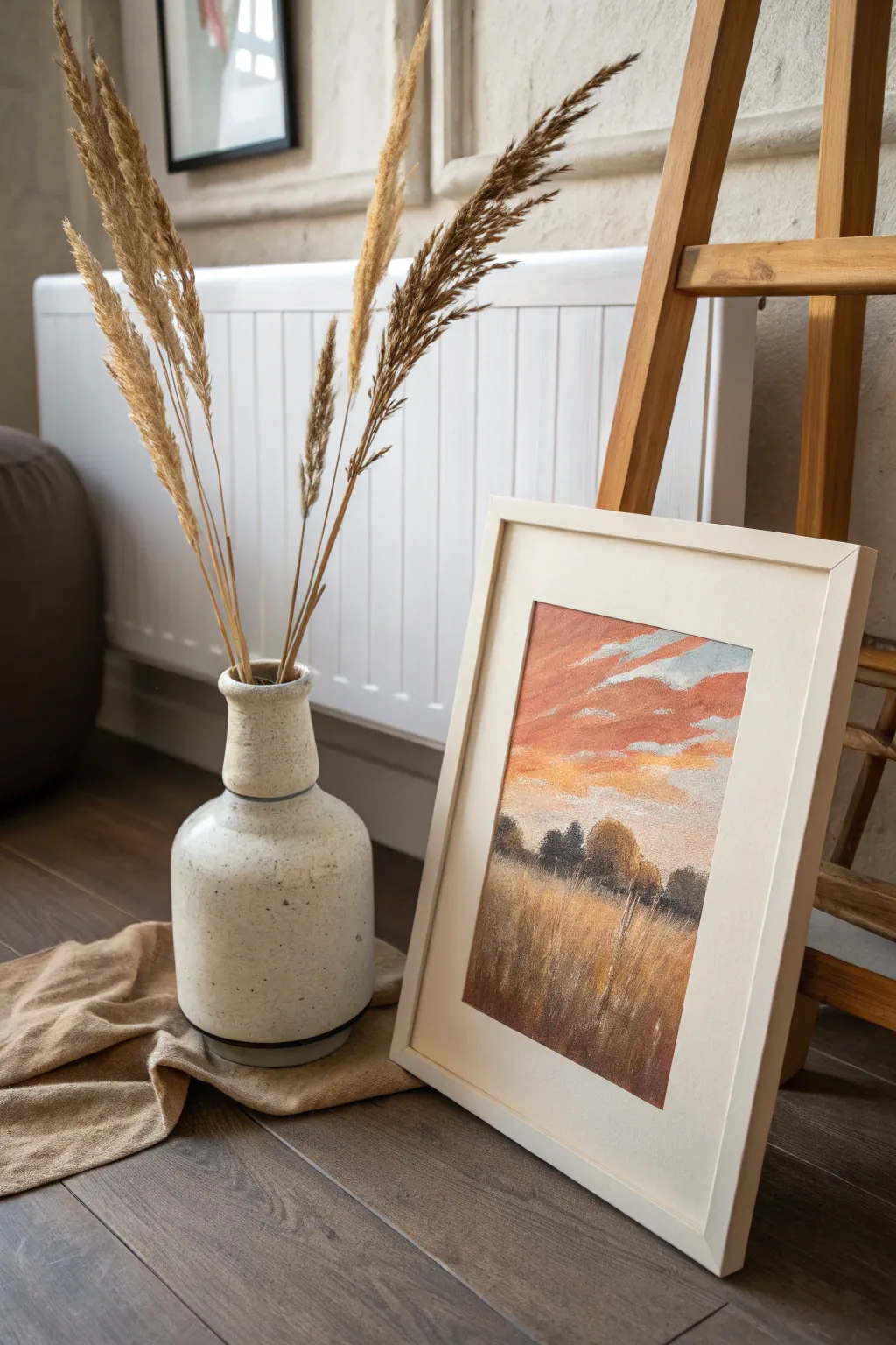
Capture the fleeting beauty of a sunset over a wild meadow using a limited, harmonious color palette. This project focuses on blending warm oranges with cool slate blues and earthy browns to create a serene, atmospheric landscape that feels both grounded and ethereal.
Step-by-Step Tutorial
Materials
- Textured pastel paper (cream or light beige tone)
- Soft pastels (burnt orange, salmon pink, slate blue, light grey, warm white, dark umber, ochre, raw sienna)
- Pastel pencils for fine details (dark brown, cream)
- Blending stump or tortillon
- Fixative spray (workable)
- Masking tape
- Drawing board
- Cream-colored mat board and wooden frame (optional)
Step 1: Setting the Scene
-
Prepare your surface:
Tape your textured paper securely to a drawing board, leaving a clean border around the edges. This helps keep the paper flat and creates a crisp edge later. -
Initial sketch:
Lightly sketch the horizon line about one-third of the way up from the bottom using a neutral pastel pencil. Outline the basic shapes of the tree line and the cloud formations above. -
Base sky gradient:
Begin applying the sky colors. Start with a rich burnt orange near the horizon line, fading upwards into a salmon pink. At the very top right, introduce a touch of slate blue.
Step 2: Developing the Sky
-
Cloud structure:
Using the side of a salmon pink pastel, block in the jagged, horizontal cloud shapes. Keep the strokes loose and disconnected to allow the background gradient to peek through. -
Adding highlights:
Layer a warm white or very pale cream on the bottom edges of the clouds where the sun would catch them. This adds immediate volume and dimension to the flat shapes. -
Cool shadows:
Introduce light grey or a pale slate blue into the upper parts of the clouds and the sky gaps. This contrast between the warm orange and cool grey creates the ‘harmony’ essential to this limited palette challenge. -
Soft blending:
Use your finger or a blending stump to gently soften the transitions in the sky. Be careful not to over-blend; you want to retain some of the paper’s tooth for texture.
Don’t Over-blend
Resist the urge to smooth everything out. Leaving rough pastel strokes visible adds energy and mimics the organic texture of wild grass and clouds better than a perfectly smooth gradient.
Step 3: The Middle Ground
-
Blocking the trees:
Using a dark umber pastel, block in the silhouette of the tree line along the horizon. Focus on varied heights and rounded organic shapes for the foliage. -
Adding depth to trees:
Scumble a bit of slate blue and dark grey over the umber trees to recede them into the distance. They shouldn’t be pitch black, as atmospheric perspective mutes the colors. -
Tree highlights:
Touch the tops of the trees with a small amount of ochre or burnt orange to suggest the last light of the sun hitting the canopy.
Try a Colored Ground
Instead of beige paper, try this scene on a deep terracotta or dark grey paper. The underlying color will pop through the pastel strokes, instantly unifying the palette.
Step 4: The Foreground Field
-
Base layer for grass:
Apply a dense layer of dark umber at the very bottom of the paper, gradually transitioning to raw sienna as you move upward toward the tree line. -
Creating texture:
Using the broad side of an ochre pastel, make vertical, sweeping strokes upwards from the bottom. This simulates the density of the tall grass. -
Adding light:
Layer lighter yellow-ochre strokes over the darker base. Vary the pressure to create areas of light and shadow within the field. -
Detailing stalks:
With a sharp pastel pencil in cream or light yellow, draw individual thin stalks of grass reaching up into the dark tree line. I always try to vary the angle of these lines so the field doesn’t look too uniform. -
Final highlights:
Add a few sharp, bright highlights on the tips of the prominent grass blades in the immediate foreground to pull them forward visually.
Step 5: Finishing Touches
-
Review and refine:
Step back to assess the color balance. Ensure the warm sky reflects slightly in the warmth of the field grass to tie the whole piece together. -
Fix and frame:
Apply a light coat of workable fixative. Once dry, carefully remove the tape and mount the artwork in a cream mat and simple frame to complement the warm tones.
Place your finished piece near a window to let natural light enhance the subtle textures you’ve created
Complex Interior Scene with Multiple Vanishing Points
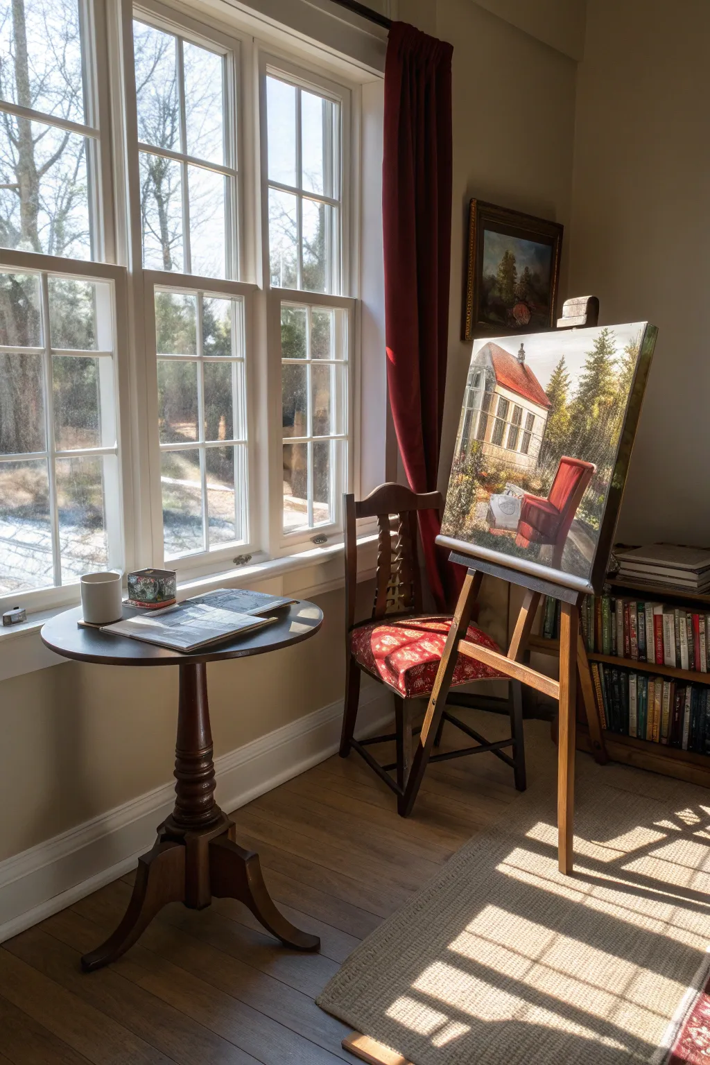
This advanced acrylic project challenges you to capture the architectural precision of a white house exterior juxtaposed with the organic textures of a garden, anchored by a strikingly vibrant red armchair. You will explore complex perspective, dappled light effects, and the interplay between man-made and natural forms.
Step-by-Step Guide
Materials
- Stretched canvas (approx. 16×20 inches or larger)
- Acrylic paints (Titanium White, Burnt Umber, Yellow Ochre, Cadmium Red, Alizarin Crimson, Sap Green, Ultramarine Blue, Lamp Black)
- Assorted brushes: Flat shaders (1 inch and 1/2 inch), Round brushes (#4, #8), Liner brush (#1)
- Pencil and eraser for sketching
- Ruler or T-square for perspective lines
- Palette knife for texture
- Water container and paper towels
- Slow-drying medium or retarder (optional)
Step 1: Establishing the Structure
-
Establish the horizon line:
Begin by lightly sketching a horizontal line roughly one-third up from the bottom of your canvas; this anchor point will determine the viewer’s eye level. -
Sketch the house perspective:
Using your ruler, draw the basic geometric shape of the house on the left side. Pay close attention to the vanishing points for the roofline and windows, as they slant downwards to the right, creating a sharp two-point perspective. -
Place the focal point:
Sketch the outline of the armchair in the foreground. Position it slightly off-center to the right, ensuring its scale feels appropriate relative to the house behind it. -
Block in foliage masses:
Lightly outline the large pine trees in the background and the bushes surrounding the house foundation, focusing on their overall shapes rather than individual leaves.
Clean Lines
For the crisp, straight lines of the window frames and house siding, use painter’s tape or the edge of a ruler as a guide for your brush to keep edges sharp.
Step 2: Underpainting and Blocking
-
Apply the sky base:
Mix Titanium White with a touch of Ultramarine Blue and paint the sky area, keeping it pale and hazy near the horizon to suggest distance. -
Block in the house exterior:
Use a mix of Titanium White and a tiny bit of Yellow Ochre or Burnt Umber to create a warm, creamy off-white for the house walls. Don’t worry about the windows or trim just yet. -
Establish the roof color:
Mix Cadmium Red with Burnt Umber to create a muted terracotta shade. Paint the roof, ensuring the slope matches your perspective lines perfectly. -
Lay down the dark greens:
For the trees and bushes, mix Sap Green with a small amount of Lamp Black or Burnt Umber. Block in the darkest shadow areas first to establish depth immediately.
Sun-Dappled Effect
To make the light look more realistic on the house wall, dry brush the shadow color lightly over the lit areas to create soft, uneven edges where shadows fall.
Step 3: Refining Details and Light
-
Define the windows:
Using a smaller flat brush, paint the interior darkness of the windows using a mix of Ultramarine Blue and Burnt Umber. Keep edges sharp and consistent with your perspective lines. -
Add architectural trim:
With a liner brush and pure Titanium White, carefully paint the window frames and vertical trim on the house. This highlights the structure against the creamy walls. -
Paint the red chair:
This is your focal point. Apply a bold layer of Cadmium Red to the chair. While it’s wet, I like to blend in Alizarin Crimson for the shadowed seat and backrest areas to give it weight. -
Highlight the chair:
Once dry, add highlights to the top of the chair arms and back using a mix of Cadmium Red and Titanium White to suggest sunlight hitting the upholstery. -
Texture the foliage:
Switch to an old, splayed brush or fan brush. Stipple lighter greens and yellows over your dark base foliage to create the look of sun-dappled leaves.
Step 4: Refining Shadows and Atmosphere
-
Create cast shadows:
Mix a transparent glaze of Burnt Umber and Blue. Paint diagonal shadows across the grass and rising up the side of the house to mimic the filtering of light through trees. -
Detail the grass:
Use a liner brush with varied greens to flick upwards in the foreground, creating individual blades of grass around the legs of the chair. -
Enhance the roof texture:
Dry brush a lighter, chalky red over the roof area to simulate weathering and tiles catching the light. -
Add final sparkle:
Add tiny dots of white or pale yellow in the garden areas to suggest small flowers catching the sun, and refine the sharpest highlights on the window glass.
Take a moment to step back and admire how the play of light brings your architectural garden scene to life
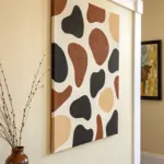
Controlled Paint Pour as a Planned Composition
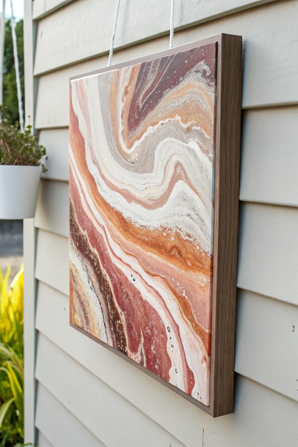
Recreate the swirling, organic beauty of sandstone canyons with this earthy fluid art project. By carefully layering terracotta, beige, and umber tones, you’ll produce a mesmerising composition that captures the delicate flow of nature.
Step-by-Step
Materials
- Square canvas (12×12 or similar)
- Floating frame (wood finish)
- Acrylic paints (Titanium White, Burnt Sienna, Raw Umber, Yellow Ochre, metallic Copper)
- Acrylic pouring medium (such as Liquitex or Floetrol)
- Silicone oil (optional for cells)
- Plastic cups for mixing
- Wooden stir sticks
- Hairdryer (with cool setting) or straw
- Palette knife
- Drop cloth or plastic sheet
- Cardboard box or tray (to catch drips)
Step 1: Preparation & Mixing
-
Workspace Setup:
Cover your entire work surface with a drop cloth. Place your canvas inside a shallow cardboard box or on raised cups to ensure runoff doesn’t pool underneath the frame edges. -
Mix the Pouring Medium:
In separate cups, mix your acrylic paints with the pouring medium. Aim for a ratio of approximately 1:1, but adjust until the consistency resembles warm honey. It should flow off the stick in a continuous stream without breaking immediately. -
Create Earth Tones:
For this canyon look, you need specific shades. Leave one cup as pure Titanium White. Mix a Burnt Sienna with a touch of white for a soft terracotta. Create a dark contrast using Raw Umber, and a sandy highlight using Yellow Ochre mixed generously with white. -
Add Metallic Accents:
Prepare a small amount of metallic copper paint. This adds the subtle shimmer seen in mineral deposits. If you want small ‘cells’ or bubbles, add two drops of silicone oil to only the metallic and dark brown cups, stirring very lightly.
Consistency is Key
If your paint is too thick, it won’t marble; too thin, and the colors will muddy together. Test the flow on a piece of paper first.
Step 2: The Pouring Process
-
Base Layer Application:
Start by pouring a puddle of your white mixture in the centre of the canvas and spread it thinly to the edges with a palette knife. This ‘wet canvas’ helps the coloured paints glide smoothly. -
Layering the Cup:
Take a clean, large cup. Pour your colours in slowly, one on top of the other. Start with white, then terracotta, then dark umber, then sand, and repeat. Do not stir this cup; let the layers rest on each other. -
The Controlled Pour:
Slowly pour the contents of the layered cup onto the canvas in a diagonal, wavy motion, starting from the top left and moving toward the bottom right. This creates the primary ‘river’ of sediment-like bands. -
Enhancing the Composition:
Pour thin ribbons of plain white alongside the coloured band. This negative space is crucial for the controlled look, preventing the piece from becoming too dark or chaotic.
Fixing Muddy Colors
If colors start turning gray or brown while pouring, stop immediately. Scrape that section off and add fresh white paint before re-pouring contrasting colors.
Step 3: Manipulation & Finishing
-
Tilt to Stretch:
Gently lift the canvas and tilt it slowly. Guide the paint to stretch the bands out, elongating the swirls. I like to let the paint roll just over the edges to ensure full coverage. -
Air Manipulation:
Use a hairdryer on the ‘cool’ and ‘low’ setting to blow the white negative space slightly over the coloured bands. This creates that ghost-like, uneven edge seen in natural rock formations. -
Refining Details:
For precise control in tight corners or specific curves, use a drinking straw to blow the paint manually. This allows you to create the intricate, feather-like veins. -
Checking Edges:
The sides of the canvas should be covered as the paint drips over. Use a gloved finger to touch up any bald spots on the corners with runoff paint from the tray. -
Drying Phase:
Leave the painting to dry in a dust-free area for at least 24-48 hours. The paint must be completely cured before framing to avoid sticking. -
Framing:
Once fully dry, place the canvas into a floating wood frame. Secure it from the back using the hardware provided with the frame, leaving that characteristic gap between the canvas and the wood rim.
Hang your finished abstract piece where natural light can catch the subtle metallic copper shimmers
Have a question or want to share your own experience? I'd love to hear from you in the comments below!