
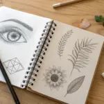
When I’m making a one-pager, I’m really just trying to fit a whole idea into one satisfying, organized page without it feeling cramped. Here are my favorite one pager drawing ideas that mix simple layouts with drawings so your page looks intentional, readable, and totally you.
Beginning–Middle–End Story Strip
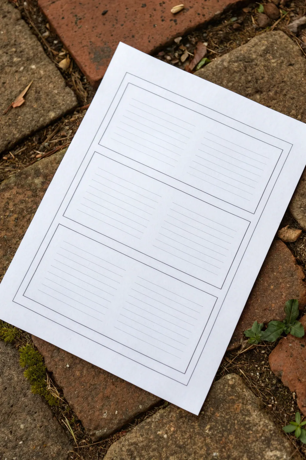
This simple yet effective printable template organizes narrative thinking into three clear sections, perfect for drafting stories or comics. Its clean, ruled lines within labeled boxes offer a structured space for writers and artists to map out a plot’s progression.
Step-by-Step Guide
Materials
- A4 or Letter-sized white paper
- Ruler
- Black fine-liner pen (0.5mm or similar)
- Pencil for drafting
- Erin or eraser
- Computer with word processing software (optional, for digital creation)
- Printer (optional, for digital creation)
Step 1: Planning the Layout
-
Draft the outer margin:
Start by lightly drawing a rectangle about 1 inch (2.5 cm) from the edge of your paper on all sides using a pencil and ruler. This will act as the defining frame for your story strip. -
Divide the space:
Measure the height of the space inside your margin. Divide this number by three to determine the height of each story panel. Mark these three vertical sections lightly with your pencil. -
Create panel gaps:
Draw horizontal lines to separate your three main sections. I like to leave a small gap of about 1/4 inch (5-6mm) between each box so they feel distinct rather than crowded together.
Smudge Patrol
If your ruler smears the fresh ink, tape a few pennies to the underside of the ruler. This raises the edge slightly off the paper, preventing ink drag.
Step 2: Drawing the Structure
-
Define the boxes:
Using your ruler and black fine-liner, ink the outlines of the three main rectangular boxes. Do not ink the original outer margin guide unless you want a double border look; the image shows a single bounding box containing the three smaller boxes. -
Adding the outer border:
Draw a large rectangle that encases all three of your smaller boxes. Ensure there provides an even margin of white space between this outer line and the three inner boxes. -
Erase pencil guides:
Wait a moment for the ink to dry completely to avoid smudging, then gently erase all your initial pencil markings to reveal the clean black structure.
Creative Twist
Leave the top third of each box unlined. This creates a dedicated ‘illustration zone’ above the text area for sketching the scene described below.
Step 3: Adding the Ruled Lines
-
Mark line spacing:
Inside the top box, use a ruler to mark small ticks every 1/4 inch (6mm) or 1/2 inch (12mm) down the sides, depending on how large you want the writing space to be. -
Consider a center divide:
Looking closely at the example, the lines seem to have a very subtle break or lighter area in the middle, suggesting two columns, but for a standard story strip, you can draw them straight across. Let’s draw them straight across for simplicity. -
Draw the first set of lines:
Use a thinner pen tip if available (like a 0.3mm) to draw the horizontal writing lines inside the first box. Stop just short of the box borders to keep it looking neat. -
Repeat for middle and end:
Repeat the measuring and line-drawing process for the middle and bottom boxes. Ensure the number of lines is consistent across all three panels for a uniform look. -
Final clean up:
Check for any stray pencil marks one last time and erase them. Your template is now ready for photocopying or immediate use.
Step 4: Digital Option (Alternative)
-
Open software:
If you prefer a digital crispness, open a word processor or design tool. Create a new document with narrow margins. -
Insert table:
Insert a 1-column, 3-row table. Adjust the row height so they fill the page evenly. -
Adjust borders:
Set the table borders to a simple black line. Add a second specific border around the entire page or group of tables to mimic the outer frame. -
Add ruling lines:
Inside each cell, you can either use the underscore key repeatedly or insert a background image of ruled lines. Printing this out gives you the exact result shown in the photo.
Now you have a structured canvas ready to capture your story from start to finish


Timeline Ribbon Across the Page

This elegant bullet journal layout features a flowing, vintage-style ribbon banner and clean checkboxes to keep your tasks organized. The minimalist black ink design is accented with a touch of tan marker and delicate floral line art for a polished, functional finish.
Step-by-Step Tutorial
Materials
- Dotted notebook or bullet journal
- Fine liner pen (01 or 03 size, black)
- Thicker drawing pen (05 or 08 size, black)
- Tan or light brown felt-tip marker
- Pencil and eraser
- Ruler
Step 1: Sketching the Banner
-
Outline the center curve:
Start by lightly penciling the main body of the ribbon near the top of the page. Draw two parallel wavy lines that curve slightly upward in the middle. -
Add the folded sides:
On the left side, draw a diagonal line angling down and inward from the bottom corner of your main wave. Do the same on the right side. Connect the top corner to this new section with a small curved line to create the ‘fold’ illusion. -
Finish the ribbon tails:
Extend the ribbon out from behind the fold on both sides. Draw ‘V’ shapes at the ends of the tails for a classic notched look. -
Ink the outline:
Trace over your pencil lines with your standard fine liner pen. Keep your hand steady for clean curves, but don’t worry if it looks slightly organic—that adds to the charm.
Uneven Ribbon?
If your ribbon looks lopsided, count the dots on your grid paper before drawing. Mark the center point first, then work outward an equal number of dots to the left and right.
Step 2: Adding Text and Color
-
Lettering:
Using a thicker black pen or going over lines twice, write ‘TO-DO’ in capital serif letters inside the center of the ribbon. I find that thickening the downstrokes slightly gives it a nice faux-calligraphy effect. -
Erase pencil marks:
Once the ink is completely dry, gently erase the underlying pencil structure to keep the page clean. -
Color the ribbon:
Take your tan marker and color inside the ribbon banner. Use long, horizontal strokes to minimize streakiness and keep the texture smooth. -
Add shading details:
With the fine liner, add tiny vertical hatch marks where the ribbon folds—specifically where the center overlay meets the back tails. This adds dimension.
Level Up: Monthly Theme
Match the ribbon color to your monthly theme. If doing a winter spread, use pale blue; for autumn, try burnt orange. You can also shade the ribbon with a second layer of marker for depth.
Step 3: Creating the Checklist
-
Position the separator:
Draw a small row of six or seven tiny circles or semicircles underneath the banner using the grid dots as a guide. -
Align the boxes:
Using the dot grid to keep spacing even, draw six small squares down the left side of the page. Leave 2-3 dot spaces between each vertical box. -
Check them off:
Since this is a decorative sample page, draw a large checkmark in every box. Let the tail of the checkmark extend well outside the box for a casual, accomplished look. -
Add drop shadows:
To make the checkboxes pop, draw a thin line on the bottom and right side of each square. This creates a simple drop-shadow effect.
Step 4: Floral Details
-
Draw the main stem:
In the bottom right corner, draw a long, slightly curved line extending diagonally upward toward the center of the page. -
Add leaves and buds:
Along this stem, draw simple oval leaves with a center vein. At the top of the stem, add smaller branching lines topped with tiny circles to represent berries or buds. -
Draw the flower:
Near the base of the stem, sketch a small flower with five or six rounded petals and a textured center. -
Include extras:
Add a few loose elements around the stem, like a small pocket-watch circle or extra floating leaves, to fill the corner space nicely.
Now you have a beautifully organized page ready to help you tackle your tasks


Cause-and-Effect Flowchart Boxes
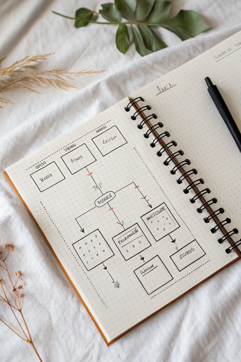
Design a clean and structured cause-and-effect flowchart for your bullet journal. This layout uses simple geometric boxes and directional arrows to help visualize processes or decisions in a visually satisfying way.
Detailed Instructions
Materials
- Dotted notebook or bullet journal
- Black fineliner pen (0.3mm or 0.5mm)
- Ruler or straight edge
- Pencil (HB or lighter)
- Eraser
Step 1: Drafting the Layout
-
Set the foundation:
Begin by lightly sketching the main structure with a pencil. Locate the visual center of your page to anchor the primary elements. -
Outline the top tier:
Draw three rectangular boxes in a horizontal row near the top of the page. The center box should be slightly lower than the flanking ones to create a staggered look. -
Define the central node:
Sketch a single, central rounded rectangle below the first row. This acts as the ‘hub’ connecting the upper causes to density lower effects. -
Map the lower section:
Create the bottom tier consisting of three larger boxes. Place the outer two boxes slightly higher than the central one, mirroring the staggered layout of the top but inverted. -
Add final details:
Draw two additional smaller rectangles at the very bottom, connected to the central column, to represent final outcomes. -
Establish boundaries:
Lightly mark a large rectangular border around the entire flowchart area using dashed lines to contain the diagram visually.
Grid Precision
Count the dots in your notebook before drawing. Assigning e.g. 4 dots height per box ensures perfect symmetry without measuring.
Step 2: Inking the Graphic
-
Trace the main boxes:
Using your black fineliner and a ruler, carefully ink over your pencil lines for all the rectangular boxes. Keep your lines crisp and verify corners meet neatly. -
Draw the path lines:
Inking the connection lines is crucial. Draw vertical lines dropping from the top boxes, converging toward the central hub. Use a slight angle for the outer boxes to guide the eye inward. -
Connect the lower tier:
Draw distinct lines branching out from the central hub to the three lower boxes. Use 90-degree angles where lines turn; this makes the chart look professional and organized. -
Add directional arrows:
Draw small arrowheads at the end of your connector lines where they meet the boxes. Keep the arrowheads small and filled in solid black for high contrast. -
Ink the dashed border:
Go over your perimeter border with the fineliner, making small, consistent dashes. I find counting ‘one, two, lift’ helps keep the rhythm steady.
Smudge Alert
If you are left-handed or using a juicy pen, place a scrap piece of paper under your hand while inking to prevent smearing your fresh lines.
Step 3: Adding Text & Details
-
Letter the headers:
Write simple headers above the top boxes. Use a stylized, slightly condensed print font to match the aesthetic. -
Fill box content:
Inside the boxes, add your specific text labels. If you are just practicing layout, you can use squiggly lines or pseudo-text as placeholders. -
Detail the grid:
For the bottom-left and bottom-right boxes, draw faint internal grids or checkmarks to suggest data or lists. -
Clean up:
Wait at least 5 minutes for the ink to fully cure, then gently erase all remaining pencil sketches to leave a sharp, clean design.
Now you have a structured visual tool ready to simplify complex ideas


Theme Border With Keyword Frame
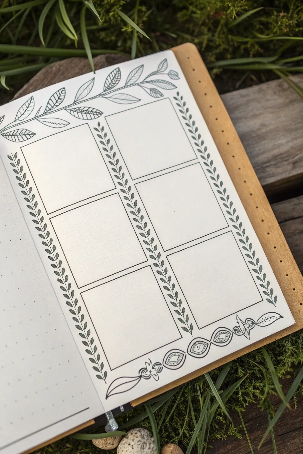
This elegant bullet journal spread features a six-panel grid framed by delicate botanical illustrations, perfect for weekly planning or tracking habits. The clean lines and detailed leaf motifs create a structured yet organic look that feels both professional and artistic.
Step-by-Step Tutorial
Materials
- Dot grid notebook or loose dot grid paper
- Pencil (HB or H)
- Eraser (kneaded is best)
- Ruler (clear grid ruler recommended)
- Fine liner pen (0.3mm or 0.5mm, black)
- Thinner fine liner pen (0.1mm, black) for details
Step 1: Drafting the Structure
-
Define the margins:
Begin by deciding on the outer margins of your page. Using your pencil and ruler, lightly mark a specific number of dot grid squares from the edge (usually 2-3 dots) to ensure your layout is centered. -
Sketch the main grid:
Lightly draw two tall columns. Divide these columns horizontally to create six equal rectangular boxes in total—three on the left and three on the right. Leave a small gap (about 1-2 grid squares) between the two columns and between each stacked box. -
Outline the top border area:
Above your top two boxes, lightly sketch a gentle, waving line that spans the width of the page. This will serve as the spine for your top vine illustration. -
Sketch the bottom border area:
similarly, below your bottom two boxes, sketch a guide for the bottom decorative element. This won’t be a vine, but rather a space for the geometric floral design shown.
Grid Counting Tip
Count your total dots horizontally first. Subtract the gutter width, then divide by 2 to get the exact width for perfectly equal columns.
Step 2: Inking the Grid & Vines
-
Ink the boxes:
Switch to your 0.3mm or 0.5mm pen. Carefully trace over your penciled grid boxes. Use a ruler for crisp, straight lines, ensuring the corners meet neatly without overshooting. -
Draw the vertical vines:
In the vertical gaps between the boxes and on the outer edges, draw a straight vertical line from top to bottom. Then, add small, simple leaves along both sides of this line, angling them upwards. Keep the leaves uniform in size for a cohesive look. -
Create the top branch spine:
Go over your top wavy pencil line with ink. Make it a double line that tapers at the end to give the branch some thickness and weight. -
Add detail to top leaves:
Draw large, prominent leaves extending from the top branch. Alternating the leaf styles adds interest; I like to leave some plain and fill others with simple diagonal hatching or lines.
Nature’s Imperfection
Don’t stress about making every leaf identical. Varied sizes and slight angle changes make the botanical theme feel more natural and organic.
Step 3: Adding Decorative Details
-
Bottom border elements:
At the bottom, draw a horizontal series of oval shapes. Inside each oval, draw a smaller oval or diamond shape, and fill the center with hatching or a simple eye-like pupil design. -
Add floral accents:
Intersperse the bottom ovals with small, stylized floral shapes or petals to connect them into a continuous border design. -
Refine the vertical vines:
Go back to your vertical leaf borders. Using your 0.1mm pen, you can add a tiny central vein to each small leaf if you want extra detail, though keeping them as simple outlines works well too. -
Connect the corners:
Ensure the vertical vine borders meet the top and bottom decorative bands seamlessly. You might need to add a tiny extra leaf or curve to bridge any awkward gaps. -
Erase guidelines:
Wait for the ink to dry completely—give it at least five minutes to avoid smudges. Then, gently erase all pencil marks with a kneaded eraser, rolling it over the page rather than scrubbing. -
Final touches:
Review your lines. If any box edges look too thin, thicken them slightly with your pen to make the grid pop against the detailed background.
Your page is now ready to organize your week with a touch of nature’s calmness

PENCIL GUIDE
Understanding Pencil Grades from H to B
From first sketch to finished drawing — learn pencil grades, line control, and shading techniques.
Explore the Full Guide
Color-Coded Topic Blocks
This clean, structured template breaks down a large topic into manageable, bite-sized pieces perfect for visual learners. By creating a custom grid of blank windows, you set the stage for a tidy mix of doodles, organized notes, and color-coded information.
Step-by-Step
Materials
- Heavyweight white paper or cardstock (8.5×11 or A4)
- Ruler or T-square
- Pencil (HB or lighter)
- Fine-liner pen (black, 0.3mm or 0.5mm)
- Eraser
Step 1: Planning the Grid
-
Paper positioning:
Place your paper on a flat, hard surface. While seeing it on the grass is nice for a photo, you’ll need a solid table for precise line work. -
Define margins:
Using your ruler, measure a 1-inch margin from the top of the page for a main title area. Mark this lightly with your pencil. -
Measure outer boundaries:
Measure a 0.5-inch margin on the left, right, and bottom sides to create a tidy border for your content area. -
Calculate box sizes:
Measure the remaining width inside your margins. Divide this number by three to determine the width of each column. I prefer to leave about a quarter-inch gap between columns for breathing room. -
Determine row height:
Measure the remaining vertical space under your title bar. Divide this by four to create four even rows of boxes, remembering to account for gaps between the rows as well.
Step 2: Drafting and Inking
-
Sketch the grid:
With a light hand, use your pencil and ruler to draw the horizontal guidelines for your four rows. -
Add vertical lines:
Draw the vertical lines to create the columns. You should now see a grid of roughly 12 rectangular boxes taking shape. -
Refine the boxes:
Go back over your grid and verify that the gaps between the boxes are consistent. Adjust any crooked lines now while they are still in graphite. -
Ink the outlines:
Take your fine-liner pen and carefully trace over the final pencil lines of the boxes. Don’t rush this part; keep the ruler steady to ensure sharp corners. -
Add label lines:
Just underneath the bottom line of each box, draw a very short, faint line or a tiny bracket. This will serve as a designated spot for writing sub-headers later. -
Ink the title bar:
Ink the long horizontal rectangle at the very top of the page for the main project title. -
Clean up:
Wait at least five minutes for the ink to dry completely to avoid smudging. Then, gently erase all the underlying pencil marks.
Clean Corners Pro-Tip
Lift your pen immediately when you hit the corner of a box. dragging it too slowly can cause ink written pools or rounded edges.
Step 3: Adding Text Placeholders
-
Label the sections:
Using a smaller pen nib or writing very neatly, add the specific topic labels to the small lines you created under each box (e.g., ‘Key Terms’, ‘Quote’, ‘timeline’). -
Optional texture:
If you want the printed look shown in the image, keep the font simple and sans-serif type. You can even use a stencil for perfect uniformity.
Level Up: Color Coding
Assign a specific color to each column (e.g., blue for facts, red for opinions) and outline the boxes in those colors instead of black.
Now your blank canvas is ready to be filled with brilliant ideas and organized notes
Quote Spotlight With Visual Metaphor
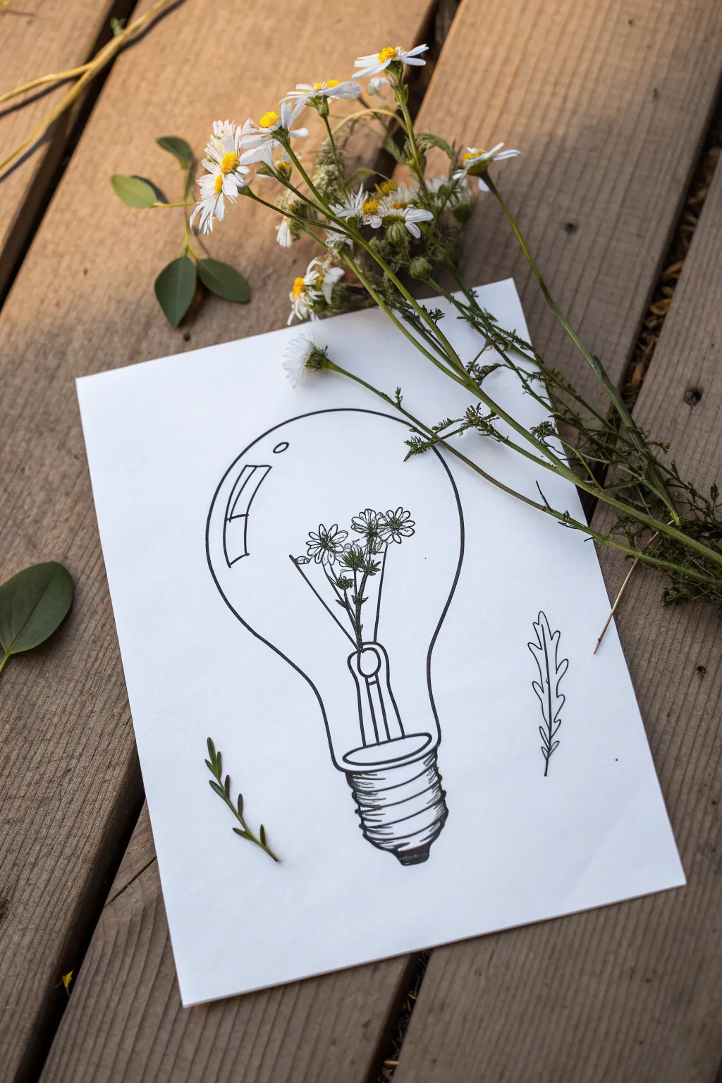
Capture the spark of nature with this minimalist ink drawing, featuring dainty wildflowers serving as the filament of a classic lightbulb. The clean lines and botanical elements create a beautiful visual metaphor for growth and bright ideas.
Step-by-Step
Materials
- White cardstock or heavy drawing paper (A5 or A4 size)
- Pencil (HB or 2B)
- Eraser
- Fine liner pen (black, 0.3mm and 0.5mm)
- Ruler (optional)
- Real wildflowers or foliage for styling (optional)
Step 1: Drafting the Structure
-
Draw the Bulb Outline:
Begin by lightly sketching a large circle in the center of your page. Elongate the bottom of the circle into a gentle ‘U’ shape that narrows towards the base to form the classic glass bulb silhouette. -
Add the Base:
At the very bottom of the bulb shape, sketch a small rectangle with rounded corners for the metal screw base. Don’t worry about the threading details yet; just get the main blocky shape down. -
Sketch the Stem:
Inside the bulb, draw a vertical structure rising from the base. Instead of a wire filament, draft a few thin stems branching out slightly near the top center of the bulb. -
Place the Flowers:
At the ends of your sketched stems, draw small circles to mark where the flower heads will go. Keep them clustered in the upper middle area of the bulb space.
Steady Hands
Draw the long curve of the lightbulb from your shoulder, not your wrist. This creates a much smoother, more confident arc than short, sketchy strokes.
Step 2: Inking the Details
-
Outline the Bulb:
Switch to your 0.5mm fine liner. Trace over your pencil outline of the glass bulb with a steady, confident hand. Remember, glass is smooth, so try to keep your line continuous. -
Draw the Reflection:
On the upper left curve of the bulb, draw two small shapes—a rectangle and a smaller sliver underneath it—to mimic light reflecting off the glass surface. This essential detail adds instant dimension. -
Detail the Base Screw:
Using the 0.5mm pen, ink the base. Draw 4-5 slightly curved horizontal lines across the rectangular area to create the screw threads. Shade the very bottom tip dark black to anchor the drawing. -
Ink the Floral Filament:
Switch to a finer 0.3mm pen for the delicate interior. Carefully outline your flower petals—simple daisy shapes work best here. Add texture to the centers with tiny dots. -
Connect the Stems:
Draw the stems extending down from the flowers. Instead of having them float, draw a small ‘U’ shape bracket near the base of the bulb where the stems enter the metal housing, mimicking the internal glass mount of a real bulb. -
Add Leaves:
Draw tiny leaves attached to the stems inside the bulb. Keep them small so they don’t clutter the design.
Add Color
Use watercolor pencils to lightly tint just the flowers inside the bulb, leaving the rest black and white. This makes the ‘idea’ pop even more.
Step 3: Finishing Touches
-
Add External Elements:
To balance the composition, draw a simple leaf sprig floating in the empty white space on the bottom left and bottom right outside the bulb. -
Erase Guidelines:
Wait at least 5-10 minutes for the ink to dry completely. Gently erase all your underlying pencil sketches until the paper is clean. -
Check Line Weight:
Look over your drawing. If the outer bulb line looks too thin compared to the base, go over it once more to thicken it up, making the glass enclosure distinct from the delicate flowers inside. -
Style and Photograph:
Place your finished drawing on a wooden surface. Arrange real wildflowers or greenery diagonally across the paper, letting them overlap the drawing slightly for that perfect aesthetic photo.
Now you have a charming piece of botanical art ready to frame or gift to a friend who lights up your life
BRUSH GUIDE
The Right Brush for Every Stroke
From clean lines to bold texture — master brush choice, stroke control, and essential techniques.
Explore the Full Guide
Setting Sketch With Labeled Callouts
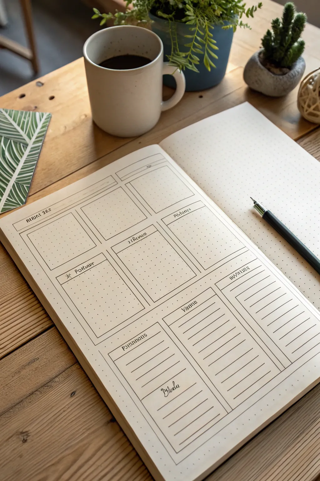
This clean, functional spread is perfect for organizing your week with clarity and style. Using a simple box layout on dotted grid paper, you can create dedicated spaces for tasks, notes, and daily tracking.
How-To Guide
Materials
- A5 dotted grid notebook (cream or ivory paper recommended)
- Fine liner pen (0.3mm or 0.5mm, black)
- Ruler or straight edge
- Pencil (HB or H)
- Eraser
- Fountain pen or calligraphy marker (for headers)
Step 1: Planning and Structure
-
Grid Calculation:
Start by counting the dots on your page width and height. You need to divide the page into three main sections vertically. I find it helpful to mark tiny dots with a pencil at the top and side margins to guide the main structure before drawing lines. -
Top Header Row:
Measure a narrow horizontal band at the very top of the page. This will serve as the main title bar for the date or month. Use your ruler to pencil in this thin rectangle spanning nearly the full width. -
Drafting the Upper Grid:
Below the header, lightly pencil in a 2×2 grid of rectangles. These should be roughly equal in size. Leave a small gap (about 1-2 dot spaces) between the boxes and around the edges for a clean ‘gutter’ look. -
Drafting the Lower Section:
For the bottom third of the page, pencil in three vertical rectangular columns. The first column (left) should match the width of the box above it. The middle and right columns can be slightly wider or adjusted to fit the remaining space evenly. -
Adding Text Boxes:
Inside the top-left box of the bottom section, draw a smaller internal rectangle at the top. This creates a dedicated header space within the module itself.
Step 2: Inking the Lines
-
Main Outlines:
Switch to your fine liner pen (0.3mm is ideal). Carefully trace over your penciled box outlines. Use a ruler for crisp, professional edges, but don’t worry if the corners slightly overshoot or don’t perfectly meet—it adds character. -
Header Separators:
For the boxes in the middle 2×2 section, measure about 1cm down from the top line of each box and draw a horizontal line across. This creates the header bar for each day or category. -
Lined Sections:
Move to the bottom three vertical columns. Inside these boxes, draw horizontal lines spaced about 0.5cm to 1cm apart. These will serve as writing guides for lists or notes. Leave the very top portion blank for a header. -
Internal Dividers:
Review your layout. If any boxes need sub-dividing (like the small checklist area in the bottom left), add those lines now with the fine liner.
Crisp Corners
Lift your pen briskly at the end of each line rather than stopping on the paper. This prevents ink pooling and keeps your grid corners sharp.
Step 3: Lettering and Finishing
-
Pencil Lettering:
Sketch your headers into the designated spaces using a pencil. Use a stylized, slightly gothic or serif font to match the reference image. Common headers might include ‘Monday’, ‘Tuesday’, ‘Notes’, or specific project names. -
Inking the Text:
Go over your penciled letters with a slightly thicker pen or a calligraphy marker. Focus on varying line weight—make downstrokes slightly thicker if possible. -
Adding Icons:
Draw small icons or symbols next to your headers if desired, like the small sun or asterisk symbol seen in the reference image. -
Erase Guidelines:
Wait at least 5-10 minutes for the ink to dry completely. This is crucial to prevent smudging. once safe, gently erase all underlying pencil marks. -
Final Touches:
Fill in any small decorative elements or deepen the shading on your letters to make the headers pop against the cream paper.
Smudged Ink?
If you accidentally smudge wet ink, turn it into a ‘shadow’ or intentionally thicken the line to cover it. You can also use white gel pen for small cover-ups.
Now you have a structured canvas ready to organize your upcoming week
Compare-and-Contrast Venn One-Pager
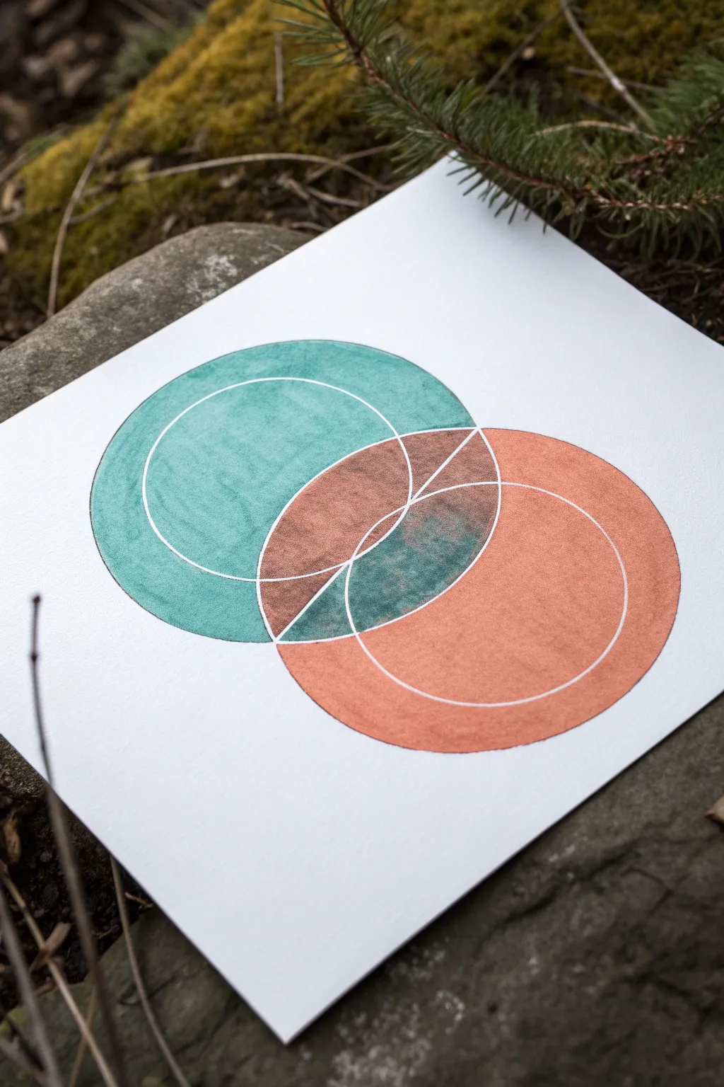
This elegant one-pager elevates the simple Venn diagram into a piece of geometric art through the use of rich metallic or textured markers and precise negative space. The interaction between the teal and copper tones in the overlapping section creates a stunning visual metaphor for comparison.
Detailed Instructions
Materials
- High-quality white cardstock or mixed media paper
- Compass with a pencil holder
- HB Pencil
- White gel pen (0.8mm or 1.0mm) or fine-tip masking fluid pen
- Teal alcohol marker or paint pen (textured finish preferred)
- Copper/Rust alcohol marker or paint pen
- Ruler
- Eraser
Step 1: Drafting the Geometry
-
Set the centers:
Begin by marking two center points on your paper. They should be horizontally aligned but spaced close enough that your future circles will overlap significantly—aim for an overlap of about one-third of the diameter. -
Draw the outer boundaries:
Set your compass to a radius of about 2-3 inches. Place the needle on the left center point and draw your first circle lightly in pencil. Repeat for the right center point to create the classic Venn shape. -
Add inner circles:
Without moving your center points, tighten the compass radius by approximately half an inch. Draw a smaller, concentric circle inside each of your main circles. These lines will eventually become the white negative space. -
Mark the center division:
Using a ruler, draw a vertical line straight through the exact center of the football-shaped overlap. This line should extend from the top intersection point to the bottom intersection point of the two outer circles.
Precision Pro Tip
Put a small piece of masking tape under your compass needle point. It prevents the needle from widening the hole in the paper, keeping your concentric circles perfectly centered.
Step 2: Inking the Negative Space
-
Trace the white lines:
Before adding color, we need to create the boundaries. Take your white gel pen (or masking fluid pen if you plan to paint loosely) and carefully trace over the inner concentric circles. -
Trace the vertical bisector:
Trace the vertical line inside the overlap area with the white pen. It’s crucial that this ink is fully opaque, so you might need a second pass once the first is dry. -
Let it cure:
Allow the white ink to dry completely. If you apply the colored markers too soon, they might smear the white lines or pick up the pigment, ruining the crisp effect.
Smudge Control
If your markers bleed across the white gel pen lines, switch to using a fine brush with white acrylic paint or gouache for the final white touch-ups. It sits on top better.
Step 3: Applying Color and Texture
-
Fill the left circle:
Start with your teal marker. Color the entire left circle, excluding the overlapping ‘football’ shape in the middle. Use circular strokes to mimic the round form. -
Layering for texture:
I prefer to go back over the teal area immediately while the ink is wet to create a subtle, mottled texture rather than a flat block of color. -
Fill the right circle:
Switch to your copper or rust-colored marker. Fill the entire right circle, again stopping exactly at the edge of the overlap section. -
Color the upper overlap:
The overlap is split by your vertical white line. Color the top-left section of the overlap with the copper marker, and the top-right section with the teal marker. This inversion creates immediate visual interest. -
Color the lower overlap:
For the bottom half of the overlap, do the reverse. Color the bottom-left section with teal, but go heavier to darken it slightly. Color the bottom-right section with the copper tone. -
Create the transparency effect:
To make the center interactions look like true overlapping blends, lightly layer the opposite color over these sections. For example, add a swift, light glaze of teal over the copper section to murky it up slightly.
Step 4: Refining
-
Retouch white lines:
Once all the colored ink is bone dry, take your white gel pen again. Retrace the inner circles and the vertical center line to ensure they pop brightly against the dark colors. -
Clean up edges:
If your outer circles feel a bit fuzzy, carefully trace the very outer perimeter with the matching colored marker to sharpen the edge. -
Erase pencil marks:
Gently erase any visible graphite lines that weren’t covered by the ink, being careful not to rub off your white gel pen lines.
Now you have a striking geometric diagram ready to display your compare-and-contrast data


Problem–Solution Blueprint Layout
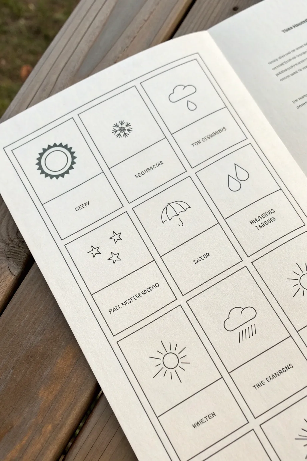
This minimalist one-page layout serves as a creative problem-solving blueprint, pairing simple weather icons with designated spaces for notes or solutions. It features clean, crisp line art in a structured grid, perfect for brainstorming or daily tracking.
Step-by-Step Guide
Materials
- A5 or A4 sketchbook (smooth, off-white paper preferred)
- Ruler (clear plastic recommended)
- Pencil (HB or 2H for guidelines)
- Fine liner pen (0.3mm or 0.5mm, black)
- Ultra-fine liner pen (0.1mm, black)
- Eraser (kneaded or plastic)
Step 1: Setting the Structure
-
Measure the margins:
Start by measuring equal margins around the edge of your page, roughly 1 inch or 2.5cm from the outside. -
Draw the main frame:
Using your pencil and ruler, lightly sketch a large rectangle that defines the outer boundary of your grid. -
Divide the columns:
Measure the width of your rectangle and divide it by three. Lightly mark these points and draw two vertical lines to create three equal columns. -
Create the rows:
Measure the height and divide it to fit four rows. Draw horizontal lines across the columns to create a grid of twelve rectangular boxes. -
Define the text areas:
Inside each of the twelve boxes, draw a horizontal line about one-third of the way up from the bottom. This separates the illustration space (top) from the text space (bottom).
Clean Corners Pro Tip
When inking the grid, stop your line just a hair before it touches the perpendicular line. This prevents ink from pooling and creating dark dots at intersections.
Step 2: Inking the Framework
-
Outline the boxes:
Switch to your 0.5mm fine liner. Carefully trace over your pencil grid lines. I like to lift the pen slightly at the corners to avoid ink blobs. -
Ink the dividers:
Go over the internal horizontal lines that separate the icon space from the text space within each box. -
Erase grid guidelines:
Wait at least 5 minutes for the ink to fully dry, then gently erase all the pencil construction lines to leave a clean black grid.
Level Up: Color Coding
Use a translucent highlighter or watercolor wash over just the icon sections to color-code your problem categories (e.g., blue for rain/sadness, yellow for sun/ideas).
Step 3: Adding the Iconography
-
Sketch the symbols:
With a pencil, lightly sketch a different weather or celestial symbol in the center of each top section. Think simple: a sun, a cloud, an umbrella, a snowflake, or stars. -
Refine the sun icon:
For the sun (top left), draw a double circle. Add small triangles around the outer circle for rays. -
Detail the cloud and snowflake:
Draw the cloud with a flat bottom and fluffy top. For the snowflake, start with an ‘X’ crossed by a vertical line, then add small ‘V’ shapes to the arm ends. -
Add rain and umbrella:
Draw simple teardrops for rain. For the umbrella, draw a semicircle with scalloped edges and a ‘J’ hook handle. -
Ink the illustrations:
Use your 0.3mm pen to outline your weather symbols. keep the lines consistent and don’t worry about perfection; small wobbles add character. -
Erase illustration sketches:
Once the ink is dry, erase the pencil sketches from the icon areas.
Step 4: Adding Text Elements
-
Draft the labels:
In the bottom section of each box, use a pencil to letter your labels. You can write nonsense placeholder text (lorem ipsum style) or actual weather conditions like ‘Rainy’, ‘Sunny’, or ‘Stormy’. -
Ink the typography:
Go over your lettering with the 0.1mm ultra-fine pen. Using a thinner pen here creates a nice visual hierarchy between the bold grid and the delicate text. -
Final clean up:
Do one last pass with the eraser to remove any remaining graphite shadows.
You now have a structured, beautifully minimal layout ready to organize your thoughts or track your days
Open-Mind Silhouette Fill-In

This thoughtful journaling spread combines a minimalist silhouette with intricate botanical details and celestial elements. It creates a serene visual metaphor for an open mind connecting with nature and the universe.
Step-by-Step Tutorial
Materials
- Spiral-bound notebook or sketchbook (mixed media paper ideal)
- Fine liner pen (black, water-resistant, sized 0.3 or 0.5)
- Thinner fine liner pen (size 0.05 or 0.1 for details)
- Pencil and eraser
- Gold or yellow gel pen/marker
- Green marker or brush pen (muted olive tone)
- White gel pen (optional for stars)
Step 1: Planning the Silhouette
-
Center layout:
Visualize your page layout. The head profile will be central but slightly left-aligned to allow breathing room for the celestial elements above and mountains below. -
Light pencil sketch:
Using a soft pencil, gently sketch the outline of a human profile facing right. Focus on a simple, smooth line for the forehead, nose, lips, chin, and neck. -
The curve:
Instead of drawing the full back of the head, stop the line just behind the ear area and create a gentle, sweeping curve that forms the bottom of the ‘container’ shape inside the head. -
Refine the shape:
Review your pencil lines. The silhouette should look like an open vessel. Erase and adjust until the proportions feel balanced.
Ink Smearing?
Wait at least 5-10 minutes before erasing pencil lines, especially over the heavy black moon or marker areas. Test dryness with a clean tissue first.
Step 2: Filling the Mind Garden
-
Main floral elements:
Inside the head silhouette, lightly pencil in a few key botanical shapes. Place a larger circular flower near the ‘ear’ position and a few sprigs reaching upwards. -
Inking the outline:
Take your 0.3 or 0.5 black fine liner and trace over your final pencil silhouette line. Keep your hand steady for a smooth, single stroke. -
Inking the flowers:
Switch to your thinner fine liner (0.1 or 0.05). Ink the botanical drawings inside. Draw tiny leaves, stems, and petals. Vary the density so some areas look fuller than others. -
Adding color accents:
Use an orange or muted red fine liner or pencil to color the main spiral flower. Add touches of yellow/gold to star-shaped flowers within the bouquet.
Make It Yours
Replace the generic flowers inside the silhouette with your birth month flower or specific herbs that represent clarity and calmness for you.
Step 3: Celestial Atmosphere
-
Drawing the moon:
To the upper left of the forehead, draw a crescent moon shape. Fill it in with black ink, but leave tiny circles or star shapes white inside the black area for texture. -
Sun sketch:
Above the head, slightly to the right, draw a simple sun. Create a central circle and surround it with radiating lines. -
Sun color:
Color the center of the sun with your gold or yellow marker. If you have a different shade of yellow, you can alternate colors on the rays. -
Scattered stars:
Sprinkle small four-pointed stars and tiny dots around the head and moon using your thinnest pen. Keep them sparse to maintain a clean look.
Step 4: The Mountain Foundation
-
Outline peaks:
At the very bottom of the page, draw a jagged line representing three or four mountain peaks. Use a gold or brown pen for this outline to distinguish it from the black ink. -
Detailing the peaks:
Add stippling (tiny dots) inside the mountain peaks near the top to suggest texture or snow. -
Forest line:
Below the mountain outline, draw a row of simple evergreen tree shapes tightly packed together. -
Coloring the forest:
Fill in the tree shapes with a muted olive green marker. Let the tops of the trees create a jagged horizon line against the bottom of the mountains. -
Final touches:
Once all ink creates a permanent bond with the paper, gently erase any remaining pencil guidelines for a crisp finish.
Enjoy the peaceful feeling that comes from taking a moment to draw something truly reflective


Have a question or want to share your own experience? I'd love to hear from you in the comments below!