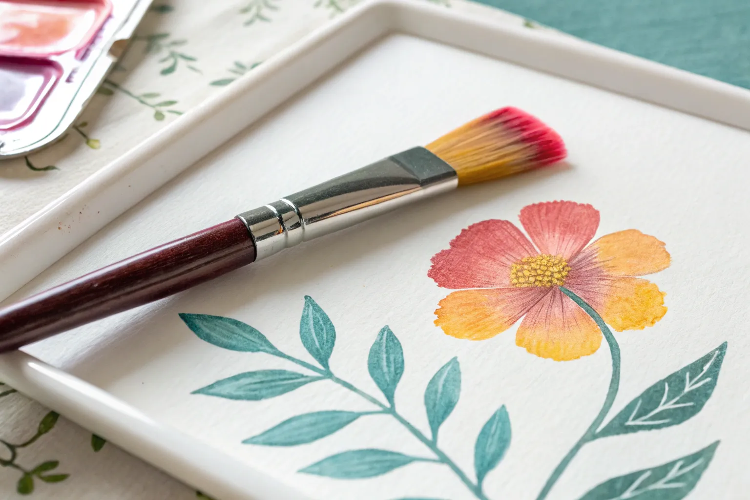
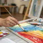
If you’ve ever wanted flowers that look dimensional without a million layers, one-stroke painting is your new best friend. I’m sharing my favorite one-stroke painting ideas that let you load two colors at once and make petals, leaves, and whole little bouquets in a single satisfying motion.
Classic Two-Color Daisy Petals
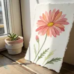
Capture the delicate beauty of a daisy with this soft, two-toned watercolor study. By layering translucent washes of dusty rose and leaving crisp white paper for highlights, you’ll create a realistic bloom that feels both vintage and fresh.
Step-by-Step Tutorial
Materials
- Cold press watercolor paper (300 gsm)
- Round watercolor brush (size 4 or 6)
- Small detail brush (size 0 or 1)
- Watercolor paints: Burnt Sienna, Alizarin Crimson, Yellow Ochre, and Sepia
- Clean water jar
- Paper towel
- Pencil for sketching
- White gouache or white gel pen (optional)
Step 1: Sketching and First Wash
-
Outline the flower:
Begin by lightly sketching the center circle of the daisy. Draw long, teardrop-shaped petals radiating outward. Ensure the petals overlap slightly to create depth, with some appearing behind others. -
Mix your base color:
Create a watery mix of ‘dusty rose’ by combining a touch of Alizarin Crimson with Burnt Sienna and plenty of water. The color should be very pale and transparent for the first layer. -
Paint the first petals:
Choose a few non-adjacent petals to start with. Apply the pale wash from the base of the petal (near the center) extending outward, but stop about halfway up the petal. -
Fade to white:
Clean your brush, dab it on a paper towel so it’s damp but not dripping, and gently pull the pigment from the middle of the petal out toward the tip. This creates a soft gradient that fades into the white of the paper. -
Repeat around the bloom:
Continue this process for all the petals. I like to work on every other petal first to let them dry slightly, preventing wet edges from bleeding into each other.
Step 2: Building Depth and Shadows
-
Deepen the color:
Mix a slightly more concentrated version of your dusty rose color, adding a tiny bit of Sepia to darken it. -
Add inner shadows:
Paint this darker tone at the very base of each petal where it meets the flower center. Use a small, damp brush to soften the edge of this shadow upwards, blending it into the previous wash. -
Define overlapping petals:
Where petals tuck behind one another, add a thin line of the darker mix along the shadowed edge to separate them visually. -
Paint the center base:
While the petals dry completely, mix Yellow Ochre with a touch of Burnt Sienna. Fill in the center circle with a solid wash of this golden-brown hue. -
Darken the center edge:
While the center is still damp, drop deeper brown (Sepia) around the outer rim of the circle to create a domed, 3D effect.
Clean Water Hack
Use two jars of water: one for rinsing dirty paint off your brush, and a separate one exclusively for wetting the paper for gradients. This keeps your white tips pure.
Step 3: Texture and Details
-
Create the stippled texture:
Once the center is fully dry, mix a thick, creamy consistency of Yellow Ochre. Using your smallest brush, dot tiny points closely together around the outer ring of the center. -
Add darker dots:
Rinse your brush and switch to a concentrated Sepia. Add tiny stippled dots in between the lighter ones, concentrating them near the bottom edge for shading. -
Highlight the center:
This is a key step: leave tiny specks of the unpainted paper showing through your dots, or use a tiny bit of white gouache to add bright stippled highlights in the very middle of the flower center. -
Refinal petal veins:
Using a very dilute, watery mix of your dusty rose and your finest brush, paint extremely subtle, thin lines running lengthwise down the center of a few petals to suggest veins. -
Final assessment:
Step back and look for any hard edges that need softening with a damp brush. Ensure the fade from pink to white on the petal tips is smooth.
Vintage Vibe
Once dry, apply a very faint wash of tea or diluted yellow ochre over the entire paper (avoiding the bright white petal tips) to give the whole piece an aged, antique look.
Now you have a timeless botanical piece perfect for framing or a handmade card


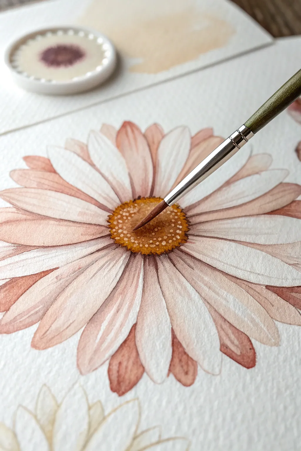
Cosmos Flowers With Fan Strokes
Capture the delicate flutter of cosmos petals on handmade paper with this soft watercolor study. The vintage-style deckle edges frame the translucent, ribbed texture of the bloom perfectly.
Step-by-Step Tutorial
Materials
- Cold press watercolor paper (deckle edge preferred)
- Watercolor paints: Rose Madder, Quinacridone Rose, Sap Green, Cadmium Yellow, Burnt Umber
- Round watercolor brush (size 6 or 8)
- Small round detail brush (size 2 or 0)
- Pencil (HB) and kneaded eraser
- Water cups and paper towel
Step 1: Planning the Layout
-
Paper Preparation:
Select a sheet of heavy, textured watercolor paper. If you don’t have deckle-edge paper, you can gently tear the edges of a standard sheet against a ruler to create that ragged, vintage look. -
Light Sketching:
Using an HB pencil, very lightly sketch the center circle of the flower slightly above the midpoint of the paper. Draw eight faint guidelines radiating outward to mark the general direction of the petals. -
Petal Outlines:
Sketch the rough, somewhat squared-off shapes of the eight petals. Cosmos petals often have characteristic jagged or notched tips, so keep your pencil lines loose and natural.
Fixing Water Blooms
If you get a ‘cauliflower’ bloom edge in the petals, soften it immediately with a damp, clean brush gently rubbed along the hard edge to blend it back.
Step 2: Painting the Petals
-
Mixing the Pink:
Create a watery wash of Rose Madder with a touch of Quinacridone Rose. You want a very transparent, pale pink for the initial layer. -
First Glaze:
With your size 6 brush, fill in each petal shape with clear water first, then drop in your pale pink mixture. Let the color flow naturally to the edges, keeping the center slightly lighter. -
Creating Texture:
While the first layer is still slightly damp but losing its sheen, use a ‘thirsty’ brush (clean and slightly dried) to lift out faint lines radiating from the center to mimic the petal’s ribs. -
Defining the Veins:
While the paper is still drying, mix a slightly stronger concentration of the pink paint. Using the tip of your brush, paint gentle, curving lines following the ribbed texture you just lifted out to enhance the petal striations. -
Shadows and Depth:
Once fully dry, glaze a darker pink mixture near the center where the petals meet the yellow eye. This adds depth and prevents the flower from looking flat.
Step 3: The Center & Stem
-
The Yellow Eye:
Load your brush with Cadmium Yellow and dab in the center circle. The texture here should be stippled, not smooth. -
Adding Pollen Details:
Mix Burnt Umber with a tiny bit of yellow. Using your smallest detail brush, dot this darker color into the bottom half of the yellow center to create a shadowed, textured seed head. -
Painting the Stem:
Mix Sap Green with a touch of brown for a natural olive tone. With steady pressure, paint a single, slender line curving from the flower head down to the bottom left edge. -
Adding Leaves:
Cosmos leaves are feathery and fern-like. Use the very tip of your detail brush to paint thin, wispy sprigs branching off low on the stem. -
Final Contrast:
I find that adding a tiny, dark shadow right where the stem meets the flower head helps anchor the bloom realistically. -
Cleanup:
Erase any remaining pencil marks gently once the painting is bone dry.
Level Up: Sun-Bleached Look
For added realism, leave thin slivers of white paper negatively painted between the petals to show separation and catch the light.
Let your beautiful botanical artwork dry completely before framing or gifting it to a friend


Two-Tone Leaf Stroke Sampler
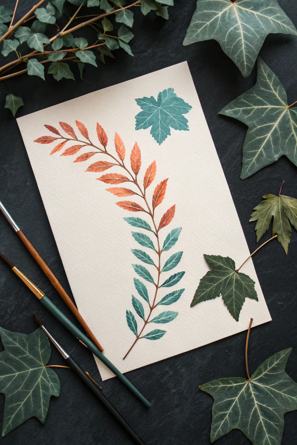
Master the art of color transition with this elegant botanical study featuring a fern that shifts seamlessly from warm rust to cool teal. This project focuses on the “double loading” technique and controlling pressure to create delicate, organic leaf shapes.
Step-by-Step
Materials
- Cold press watercolor paper (A4 or similar size)
- Round watercolor brush (size 6 or 8)
- Detail liner brush (size 0 or 1)
- Watercolor paints: Burnt Sienna (rust), Teal or Phthalo Green
- Clean water jar
- Palette or mixing plate
- Paper towels
Step 1: Preparation and Color Mixing
-
Prepare your palette:
Begin by creating a puddle of Burnt Sienna on one side of your palette and a puddle of Teal on the other. Ensure the consistency is milky—not too watery, but fluid enough to flow easily. -
Create a transition mix:
In the center of your palette, mix a small amount of the rust and teal together to create a muted, brownish-green middle tone. This will help bridge the gap between your two main colors later. -
Sketch the spine:
Using a very light pencil touch or a dilute mix of paint with your liner brush, draw a gentle S-curve down the center of your paper to act as a guide for the stem.
Brush Control Pro Tip
Hold the brush perpendicular to the paper. This allows the bristles to splay evenly in all directions when you press down, creating perfectly symmetrical leaf shapes.
Step 2: Painting the Upper Leaves
-
Load the brush for warmth:
Load your round brush fully with the Burnt Sienna. Tap lightly on a paper towel to remove excess drips; you want the belly of the brush full but the tip sharp. -
Start at the tip:
Begin at the very top of your guide line. Place the tip of the brush down to start the first leaflet from the central stem. -
Press and lift:
As you pull the stroke outward, press down gradually to widen the leaf, then lift slowly as you curve outward to create a sharp point. This is the classic tear-drop leaf stroke. -
Paint the opposite side:
Repeat the stroke on the opposite side of the stem, ensuring the leaves are slightly offset rather than perfectly symmetrical for a natural look. -
Continue down the stem:
Paint the next 3-4 pairs of leaves using pure Burnt Sienna. With each pair, slightly increase the size of the leaves.
Step 3: Creating the Gradient
-
Introduce the teal:
Without fully washing your brush, dip just the very tip into your Teal paint. This is a subtle version of double-loading. -
Paint the transition leaves:
Paint the next set of leaves. You will see the teal mix with the rust on the paper, creating a muddy, earthy transition tone naturally. -
Intensify the cool tones:
Rinse your brush slightly, then load it primarily with the Teal paint. Dip the tip briefly into the Burnt Sienna to keep the transition smooth. -
Commit to blue-green:
As you move past the halfway point of the stem, switch to using almost pure Teal. Notice how the leaves should be at their largest width around the middle of the stem. -
Taper the bottom leaves:
For the final few pairs of leaves at the bottom, start making them slightly smaller again, using pure Teal paint.
Muddy Color Solution
If your middle transition leaves look too brown or gray, wash your brush completely between color changes. Don’t mix on the paper; mix a fresh transition color on the palette instead.
Step 4: Refining Details
-
Connect the stem:
Switch to your fine liner brush. Load it with a mix of the rust and teal to get a dark brownish-green. -
Draw the central vein:
Carefully trace over your initial guide line, connecting the base of all the leaves. Keep the line thin and organic. -
Add leaf veining:
While the leaves are semi-dry (damp sheen is gone but paper is cold), use the liner brush with a slightly darker, concentrated version of the leaf color to paint very faint center veins inside the larger leaves. -
Paint the isolated leaf:
To practice the stroke without the stem, load your round brush with teal and paint the standalone ‘maple’ style leaf in the upper corner. Create five radiating strokes that meet at a central point. -
Add the veins:
Once dry, use white gouache or a white gel pen to add the delicate vein details on the isolated teal leaf for contrast.
Now you have a serene botanical piece that beautifully demonstrates color theory and brush control
Cherry Blossom Branch With Quick One-Strokes
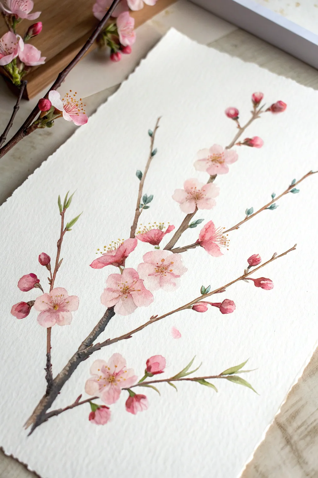
Capture the fleeting beauty of spring with this soft and elegant watercolor study of a cherry blossom branch. Using gentle one-stroke techniques, you will build up layers of translucent petals and woody textures to create a natural, botanical feel.
Step-by-Step Guide
Materials
- Cold press watercolor paper (300gsm, rough or medium grain)
- Round watercolor brushes (sizes 2, 4, and 6)
- Rigger or liner brush for fine details
- Watercolor paints: Rose Madder, Alizarin Crimson, Sepia, Burnt Umber, Sap Green, and a warm Yellow
- Palette for mixing
- Two jars of water
- Paper towels
Step 1: Planning the Composition
-
Light Sketching:
Begin with a very faint pencil sketch to map out the main branch structure. Draw a diagonal line starting from the bottom left corner, gently curving upwards toward the top right. Add two or three smaller off-shoot branches extending outwards. -
Placement of Blooms:
Lightly mark small circles where your main flower clusters will sit. Don’t worry about drawing individual petals yet; just establish where the visual weight of the flowers will be to keep the composition balanced.
Control the Water
Test your petal stroke on scrap paper first. If the paint forms a puddle, blot your brush. The brush should be damp and loaded with pigment, but not dripping wet.
Step 2: Painting the Branches
-
Base Wood Tone:
Mix Sepia with a touch of Burnt Umber to create a dark, woody brown. Using a size 4 round brush, paint the main branch, starting thicker at the base and tapering as you move up. Allow the brush to skip slightly on the rough paper to create natural texture. -
Adding Dimension:
While the branch is still slightly damp, drop in pure Sepia on the shadowed side (the bottom edge) of the wood. This wet-on-wet technique adds immediate volume and roundness to the branch. -
Thinner Twigs:
Switch to a smaller brush or a liner brush to pull out the delicate, spindly twigs that will hold the buds. Keep your hand loose and let the lines be slightly jagged rather than perfectly straight.
Step 3: Creating the Blossoms
-
Mixing Pink Shades:
Prepare a very watery wash of Rose Madder for the lightest petals, and a slightly more saturated mix of Alizarin Crimson for the darker accents. You want transparency here. -
One-Stroke Petals:
Using a size 6 brush loaded with the light pink wash, press the belly of the brush down and lift sharply to create a teardrop petal shape. Paint five of these converging at a center point to form a flower. -
Softening Edges:
If a petal looks too stiff, quickly touch the edge with a clean, damp brush to soften it into the paper. This creates that dreamy, soft-focus look characteristic of cherry blossoms. -
Layering Blooms:
Continue painting flowers along the branches. Some should be fully open facing the viewer, while others can be painted as side profiles using just three petals in a fan shape. -
Painting Buds:
For the unopened buds, use the more saturated Alizarin Crimson mix. Paint small, tight tear-drop shapes at the tips of the thin twigs. These add a nice pop of contrast against the paler open flowers.
Hard Edges Appearing?
If your petals have harsh outlines as they dry, your brush was likely too wet or the room is too hot. Soften edges immediately with a clean, slightly damp brush.
Step 4: Details & Refinements
-
Flower Centers:
Once the pink petals are fully dry, mix a warm Yellow with a tiny dot of brown. Use the very tip of your smallest brush to dot the centers of the open flowers. -
Stamens:
With a fine liner brush and a reddish-brown mix, paint extremely delicate lines radiating from the yellow centers. Top these fine lines with tiny dots of yellow or red for the pollen. -
Sepals and Greenery:
Mix a muted Sap Green. Paint the small, cup-like sepals at the base of the flower buds. Add tiny, young leaves emerging from the branch tips using a simple press-and-lift stroke. -
Textural Accents:
I like to take a nearly dry brush with dark brown paint and drag it mostly horizontally across the main branch to enhance the bark texture. -
Falling Petal:
Finally, paint a single, lonely petal floating away from the branch in the empty space. This adds movement and emphasizes the delicate nature of the subject.
Allow your painting to dry completely before erasing any visible pencil marks to reveal your serene spring artwork
BRUSH GUIDE
The Right Brush for Every Stroke
From clean lines to bold texture — master brush choice, stroke control, and essential techniques.
Explore the Full Guide
Wildflower Bouquet in Layered One-Strokes
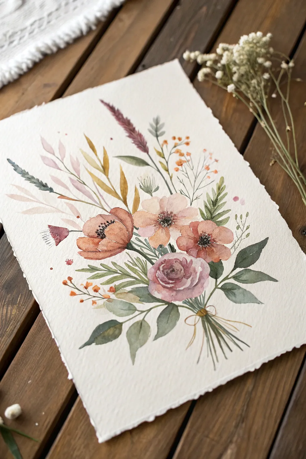
Capture the delicate charm of a summer meadow with this tiered wildflower bouquet, painted using loose one-stroke techniques. The composition combines soft washes, crisp details, and rustic earth tones to create a vintage-inspired piece perfect for framing.
Step-by-Step Tutorial
Materials
- Cold-pressed watercolor paper (300gsm, deckle edge preferred for vintage look)
- Watercolor paints (Burnt Sienna, Sap Green, Olive Green, Dusty Pink, Indigo, Yellow Ochre, Burnt Umber)
- Round brushes (sizes 2, 4, and 6)
- Clean water jar
- Paper towels
- Pencil (optional for sketching placement)
Step 1: Setting the Floral Foundation
-
Map the composition:
Visualize the bouquet’s structure, aiming for an upward-fanning ‘V’ shape. Keep the bottom collection point tight where the stems will gather. -
Paint the central rose:
Start with the prominent dusty mauve rose at the lower center. Using a size 6 brush loaded with diluted Dusty Pink mixed with a touch of Indigo, paint a tight C-curve center. Loosely layer C-shaped petals around it, leaving small white gaps for highlights. Let the outer petals be wetter and paler. -
Add the terracotta poppies:
Mix Burnt Sienna with a drop of red. Paint the large poppy to the left of the rose and the smaller one to the right. Use broad, sweeping strokes to form cup-shaped petals. While still damp, drop deeper pigment near the flower centers to create natural depth. -
Create the soft center bloom:
Between the main flowers, paint a lighter, peach-toned flower (Yellow Ochre + tiny bit of Pink). Use very watery paint to keep specific petals translucent and airy compared to the bolder poppies.
Muddy Colors?
If colors bleed into brown messes, ensure each layer is fully dry before touching it with a new color, or leave tiny white gaps between wet elements.
Step 2: Adding Foliage and Tall Grasses
-
Establish the base leaves:
Switch to a size 4 brush and Olive Green. Paint several broad, teardrop-shaped leaves extending downwards and outwards from the rose, anchoring the bouquet. -
Paint golden wheat stalks:
Mix Yellow Ochre and Burnt Umber. Using the tip of your brush, draw long, slender stems reaching up from the center. Add elongated oat-like leaves using a ‘press and lift’ motion to taper the ends nicely. -
Insert grassy accents:
With diluted Sap Green, add long, thin blades of grass shooting upwards. Vary the height and curve to make the arrangement feel organic and wild. -
Add the purple plume:
For the feathery plume at the top center, mix a muted purple. Use a dry-brush technique (remove excess water on a towel) to dab small, texture-rich marks upward in a spear shape. -
Create the fern sprig:
On the right side, paint a fern-like stem. Draw a central vein, then add small, repetitive leaves on either side using short, rhythmic dabs of darker green.
Age Your Paper
Before painting, lightly brush the paper edges with strong tea or coffee. This enhances the vintage botanical illustration aesthetic of the bouquet.
Step 3: Details and Final Flourishes
-
Define the flower centers:
Once the main blooms are completely dry, use a size 2 brush with concentrated Indigo or Black. Stipple tiny dots in the centers of the poppies and the peach flower to create stamens. -
Paint delicate filler flowers:
Mix a bright orange-brown. Paint tiny clusters of berries or buds on thin, branching stems reaching towards the top right and bottom left. Keep these marks quick and spontaneous. -
Add the dark bloom detail:
On the far left, paint a small, downward-facing bell flower in dark crimson or maroon. Add fine lines for texture. -
Gather the stems:
At the bottom focal point, paint numerous thin, green and brown lines converging. They should look like varied cut stems bundled together. -
Tie the bow:
Using a fine liner or size 0 brush and Yellow Ochre, paint a simple, loose bow around the gathered stems. Let the ribbon tails trail down casually. -
Splatter for texture:
I like to finish these rustic pieces with a tiny bit of splatter. Load a brush with watery pink or brown, tap it against your finger over the paper to create subtle speckles around the foliage.
Allow your beautiful botanical study to dry completely before removing it from your workspace to display
Hibiscus Gradients With a Single Sweep
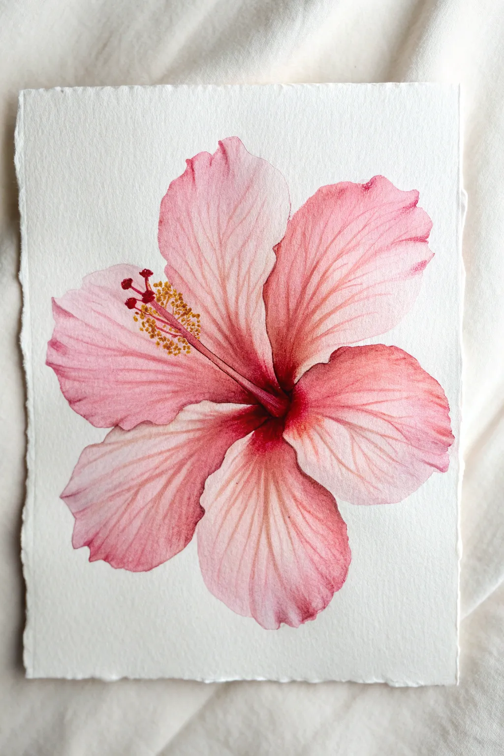
Capture the delicate beauty of the tropics with this soft, pink hibiscus painting that emphasizes smooth color transitions. Using a wet-on-wet technique combined with controlled brushstrokes, you’ll create petals that seem to glow from the center outward.
Detailed Instructions
Materials
- Cold press watercolor paper (300 gsm)
- Round watercolor brushes (size 6 and size 2 for details)
- Watercolor paints (Alizarin Crimson, Rose Madder, Sap Green, Cadmium Yellow)
- Clean water jar
- Paper towels
- Pencil (HB or 2H)
- Kneaded eraser
Step 1: Sketching and Preparation
-
Outline the flower:
Begin by lightly sketching the five large, overlapping petals of the hibiscus. Make sure they radiate from a central point, slightly off-center on your paper. Keep your pencil lines extremely faint so they disappear under the paint later. -
Define the pistil:
Sketch the central pistil—the long stem protruding from the center—curving gently upward to the left. Add the small stamen details at the tip. -
Prepare your palette:
Mix a watery wash of Rose Madder for the base petal color. Separately, mix a more concentrated Alizarin Crimson for the deep center shadows and a small amount of Cadmium Yellow for the pollen.
Step 2: Painting the Petals
-
Wet the first petal:
Choose one petal to start with. Using your size 6 brush and clean water, dampen the entire shape of that petal. It should be glistening but not forming a puddle. -
Apply the base wash:
Load your brush with the watery Rose Madder mix. touching the tip to the outer edge of the wet petal, let the color bleed inward. Keep the edges crisp but the inside soft. -
Deepen the center:
While the petal is still wet, drop the concentrated Alizarin Crimson into the base of the petal near the flower’s center. Tilt the paper slightly to help the dark red flow outward into the pink, creating a natural gradient. -
Lift highlights:
If the color gets too heavy near the petal edges, rinse your brush, dry it on a paper towel, and gently lift away some pigment to create soft highlights. -
Repeat for all petals:
Work through the remaining four petals one by one. I prefer to paint non-adjacent petals first to prevent wet paint from bleeding across the lines, allowing them to dry slightly before painting the ones in between. -
Soften edges:
Once all petals have their base gradient, check the boundaries where they overlap. Use a slightly damp brush to soften any harsh lines where shadows meet light areas.
Wet-on-Wet Control
If your paint spreads too fast, your paper is too wet. Let the sheen dull to satin before dropping in your darker center colors.
Step 3: Adding Details and Texture
-
Switch to the fine brush:
Once the base layers are completely dry to the touch, switch to your size 2 detail brush. Mix a semi-transparent version of the Alizarin Crimson. -
Paint the veins:
With a very light hand, paint fine, branching veins radiating from the center of each petal outward. The lines should be broken and delicate, not solid strokes. -
Emphasize the folds:
Add slightly darker shading along the ruffled edges of the petals to give them a three-dimensional, wavy appearance. -
Paint the central pistil:
Using a creamy mix of Alizarin Crimson, paint the long pistil stem. Make the base darker where it connects to the flower and lighter toward the tip. -
Add the pollen:
Dip the tip of your small brush into thick Cadmium Yellow. Dot small, textured clusters along the top part of the pistil to represent the pollen. -
Detail the stigma pads:
At the very tip of the pistil, add the five tiny red pads using a concentrated red mix, ensuring they stand out against the yellow pollen. -
Final assessment:
Step back and look at the whole composition. If any veins look too harsh, glaze over them with a very watery pink wash to integrate them better into the petal surface.
Framing Flair
Tear the edges of your watercolor paper against a ruler (deckled edge) instead of cutting it for an artisanal, vintage botanical look.
Allow your beautiful floral study to dry completely before framing or gifting it to a friend

PENCIL GUIDE
Understanding Pencil Grades from H to B
From first sketch to finished drawing — learn pencil grades, line control, and shading techniques.
Explore the Full Guide
Curly Vines and Scrolls in One Stroke
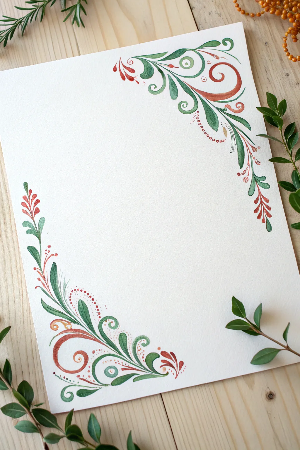
Transform a plain sheet of paper into elegant stationery or art with these graceful, one-stroke botanical scrolls. Using simple pressure variations with your brush, you will create flowing vines, delicate leaves, and whimsical dotted accents in a harmonious palette of forest greens and warm terracottas.
Step-by-Step Guide
Materials
- Cold press watercolor paper (A4 size or similar)
- Round watercolor brushes (sizes 2 and 6)
- Watercolor or gouache paints (Sap Green, Hooker’s Green, Burnt Sienna, Alizarin Crimson)
- Two jars of water
- Paper towel
- Pencil (HB) and eraser for light sketching
Step 1: Planning the Composition
-
Define the structure:
Visualize the layout first; the design focuses on two opposing corners—the top right and the bottom left. While they echo each other, they aren’t identical mirror images, giving the piece an organic feel. -
Sketch the spine:
With an extremely light touch, use your pencil to draw the main ‘S’ curve spines for both corners. Keep these lines faint as guides for the flow, rather than rigid outlines to fill in.
Fixing Shaky Lines
If your long scrolls look shaky, you’re likely moving too slowly. Speed up your stroke slightly and lock your wrist, moving your whole arm to create smoother, more confident curves.
Step 2: Painting the Bottom Left Corner
-
The primary scroll:
Load your size 6 round brush with a mix of Burnt Sienna and a touch of Alizarin Crimson. Start near the bottom edge, press down to widen the stroke, and lift as you curl upward into a spiral, ending on a fine point. -
Green flourishes:
Switch to your green mixture. Nestle a large, sweeping ‘S’ curve leaf right next to your red scroll. Start at the base with heavy pressure, pull upward, and curve the tip outward like a fern frond. -
Adding teardrop leaves:
Along the outer edge of your main green curve, add a series of tear-drop shapes. Press the belly of the brush down to create the rounded bottom of the leaf, then drag and lift quickly to create a sharp tail. -
Inner details:
Using the tip of your size 2 brush and the red-brown mix, paint delicate veins inside the larger green leaves while they are still slightly damp for a soft, blended look, or wait until dry for crisp lines. -
The upward extension:
Extend a thin green vine straight up the left side of the paper from your base cluster. Add alternating small leaves—press, drag, lift—growing smaller as you reach the top of this stem.
Step 3: Painting the Top Right Corner
-
Create the anchor scroll:
Mirroring the bottom corner, paint a large, loose green spiral starting from the top edge and curling downward into the page center. Focus on that transition from thick to thin. -
Intertwining colors:
Paint a secondary scroll in your rusty red tone that hugs the curve of the green one. I find it helps to rotate the paper so your hand is always pulling the brush toward you comfortably. -
Cascading foliage:
Allow a long, trailing vine to drop down the right side of the paper. Use a mix of darker and lighter greens here to create depth, painting groupings of three leaves at the tips. -
Berry clusters:
At the very end of the downward drooping vine, switch to red and paint small, clustered teardrop shapes to resemble hanging flower buds or berries.
Metallic Magic
Once the matte paint is dry, use a gold pen or metallic watercolor to outline just one side of the main scrolls. It catches the light beautifuly and adds a vintage illuminated manuscript vibe.
Step 4: Refining and Embellishing
-
Dotted accents:
With the very tip of your smallest brush and saturated red paint, add rows of tiny dots (stippling) following the curves of your main scrolls. This adds a decorative, jewelry-like quality. -
Fine tendrils:
Dilute your green paint slightly to make it flow better. Paint whisper-thin, curly tendrils shooting off the main vines to fill empty white space without adding visual weight. -
Spiral centers:
Identify the center of your largest scroll shapes. Add a small, contrasting dot or a tiny spiraling line in the center to make the ‘eye’ of the scroll pop. -
Balance check:
Step back and look at both corners. If one side feels too heavy, add a few small floating red dots or tiny green leaves to the lighter side to balance the visual weight. -
Erase guidelines:
Ensure the paint is completely bone-dry before taking your eraser to any visible pencil marks to avoid smudging your hard work.
Now you have a beautifully framed space perfect for a handwritten poem, a calligraphy quote, or a heartfelt letter
Mini Floral Greeting Cards With One-Stroke Blooms
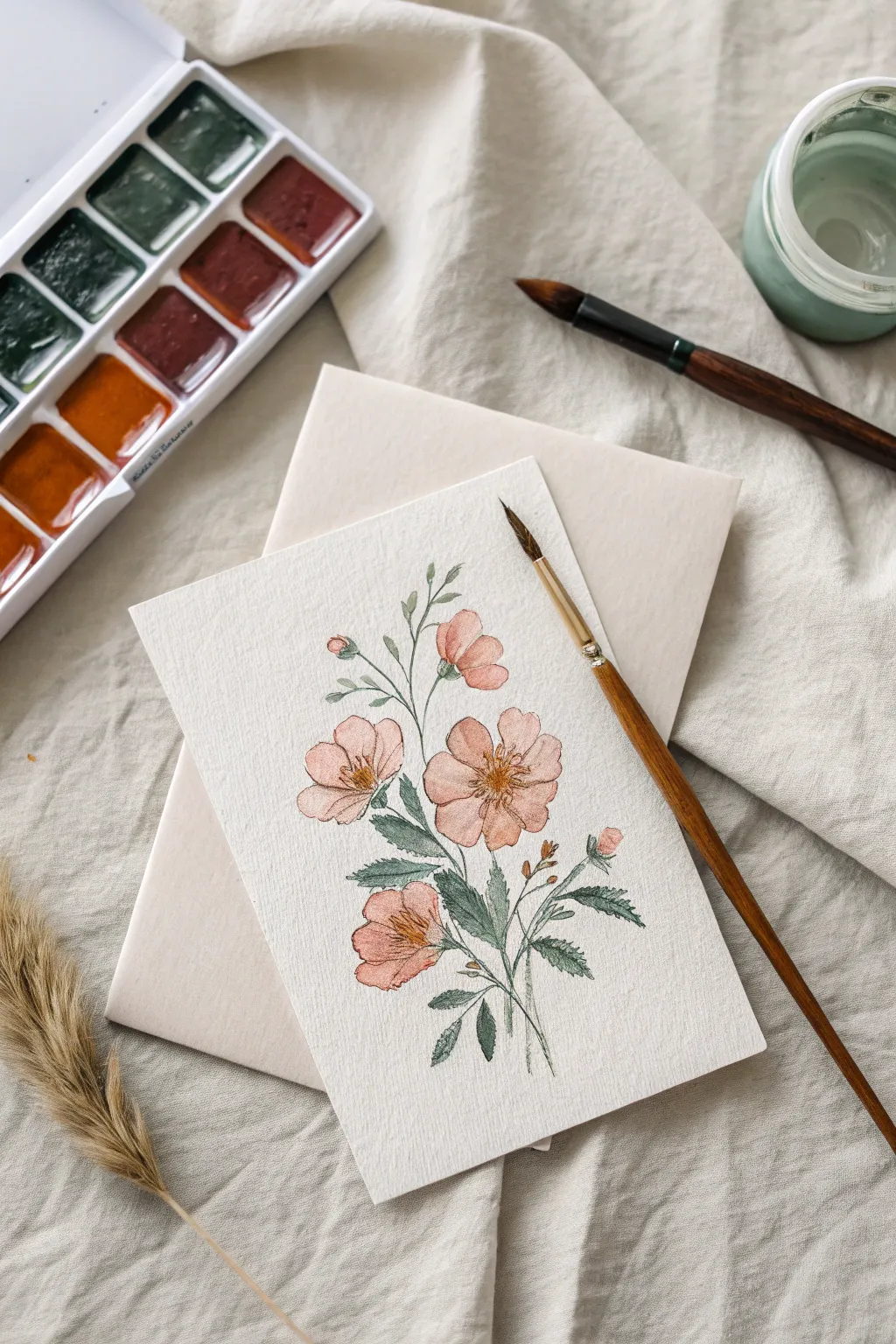
Capture the fleeting beauty of wildflowers with this elegant greeting card project. Using soft, muted one-stroke techniques, you’ll create a vintage-inspired floral spray that feels both effortless and refined.
How-To Guide
Materials
- Cold press watercolor paper (cut to card size, approx. 4×6 inches)
- Small round watercolor brush (size 2 or 4)
- Fine liner brush (size 0 or 00)
- Watercolor paints: Peach, Burnt Sienna, Sap Green, Olive Green, Payne’s Grey
- Clean water jar
- Paper towel
- Pencil (optional for light sketching)
Step 1: Planning and First Blooms
-
Prepare your palette:
Mix a soft, watery peach tone for the petals. To achieve that vintage look, muddy the color slightly with a tiny dot of brown or burnt sienna. -
Establish the composition:
Visualize a gentle S-curve rising from the bottom center of the paper. This imaginary line will guide your main stem and flower placement. -
Paint the main bloom:
Load your round brush with the peach mix. Choosing a focal point near the center, press the belly of the brush down to create the widest part of a petal, then lift as you pull inward. Repeat this five times in a circular arrangement to form the main open flower. -
Add secondary flowers:
Using the same press-and-lift motion, paint a slightly smaller flower above the first one, perhaps facing slightly upward. Paint a third flower below the main one to balance the composition. -
Create buds:
Near the top of your composition, add one or two small, tight buds. These are simple oval shapes made with a single, short stroke of your loaded brush.
Pro Tip: Vintage Effects
For an antique botany book feel, let your initial petal wash dry, then glaze a very faint tea-stain color over just the bottom edges of the petals.
Step 2: Stems and Foliage
-
Mix your greens:
Create an earthy green by mixing Sap Green with a touch of Payne’s Grey. You want a natural, muted tone rather than a bright, artificial green. -
Draw the main stems:
Switch to your fine liner brush. With a very steady hand, pull thin, delicate lines connecting your floating flowers. I like to keep these lines slightly broken or varied in thickness to look more organic. -
Add stem details:
Connect the buds to the main stem with thin, curving lines. Ensure the connections look natural, thickening slightly where the stem meets the flower base. -
Paint the leaves:
Switch back to the round brush. Load it with your green mix. Press the tip down near the stem, flatten the brush to widen the leaf body, and lift sharply to create a pointed tip. Paint leaves in pairs or alternating along the stem. -
Detail the leaf edges:
While the leaves are still slightly damp, use the very tip of your brush (or the liner) to pull out tiny, jagged spikes along the edges for a realistic rose-leaf texture. -
Add sepals:
Paint tiny green sepals at the base of your buds and the backs of any side-facing flowers using quick, flicking strokes.
Step 3: Details and Finishing Touches
-
dry completely:
Allow the petal layer to dry fully before adding the centers. If the paper is cool to the touch, it’s still wet. -
Mix the center color:
Prepare a concentrated mix of Burnt Sienna or a reddish-brown. The paint should be less watery now for sharper details. -
Paint flower centers:
Using the fine liner brush, add a cluster of tiny dots in the center of the open flowers. Keep them grouped tightly in the middle but allow a few to stray outward. -
Add stamens:
Draw extremely fine lines radiating from the center dots outward onto the petals. Top some of these lines with tiny specks of darker brown to represent pollen. -
Darken the leaves:
If your leaves look too flat, glaze a second layer of darker green (more Payne’s Grey added) over just one side of a few leaves to add depth and shadow. -
Final assessment:
Step back and look for empty spaces. If needed, add a stray leaf or a tiny twig to balance the negative space.
Troubleshooting: Blooms Bleeding
If your flower centers bleed into the petals, the first layer wasn’t dry enough. Wait longer, or use a hair dryer on low heat to speed up the process.
Now you have a charming, hand-painted card ready to brighten someone’s mailbox.


Negative-Space Florals Made With One-Stroke Leaves
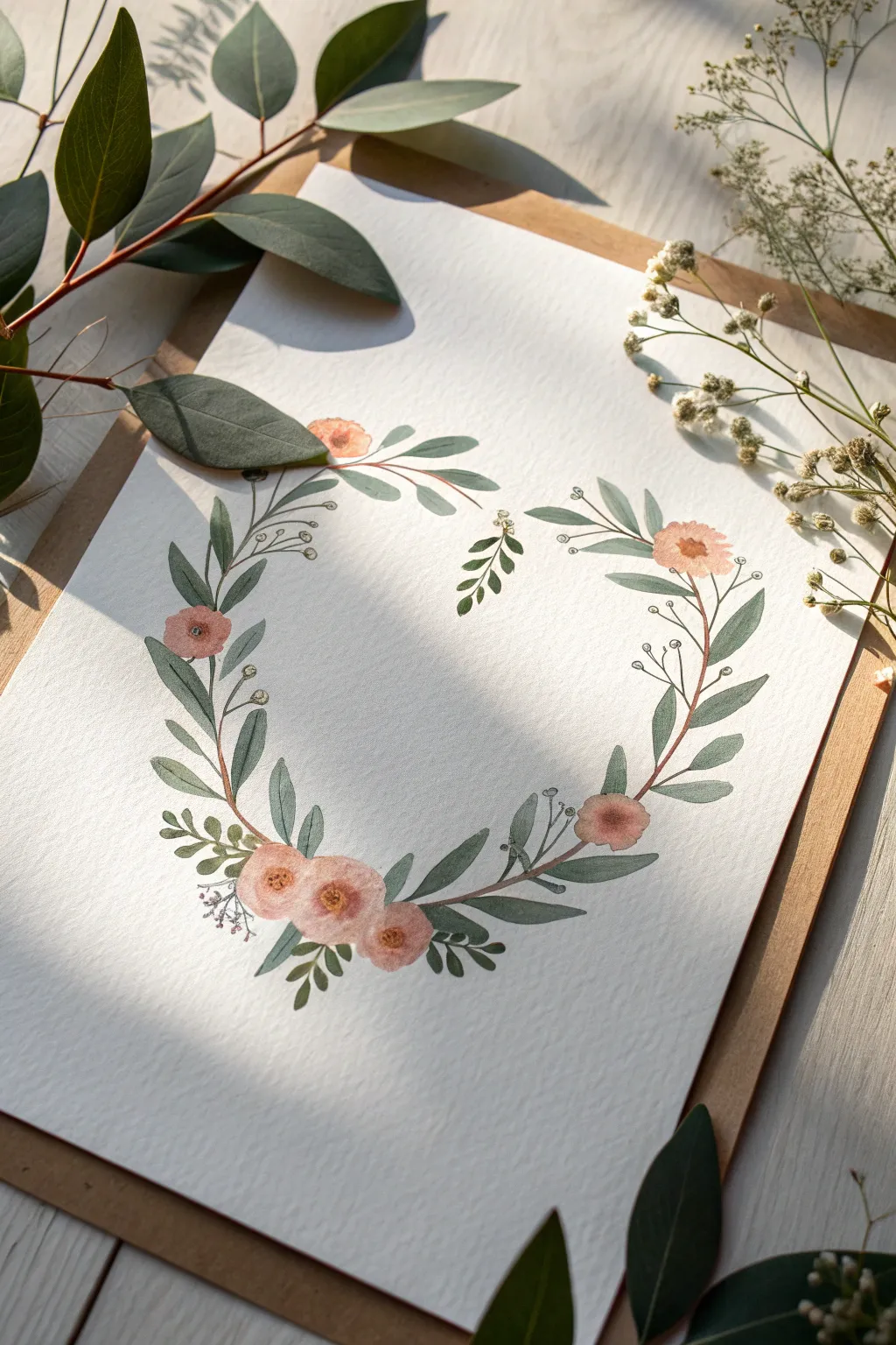
Capture the delicate beauty of wildflowers with this elegant heart-shaped wreath, perfect for wedding stationery or framed wall art. By combining loose, one-stroke leaves with soft, diffuse blooms, you will create a harmonious composition that feels organic and airy.
Step-by-Step
Materials
- Cold press watercolor paper (300 gsm)
- Round watercolor brushes (size 4 and 6)
- Watercolor paints: Sap Green, Olive Green, Burnt Sienna, Payne’s Grey, Peach/Coral, Yellow Ochre
- Pencil (HB or H)
- Kneaded eraser
- Two jars of water
- Paper towel
Step 1: Planning the Composition
-
Sketch the guide:
Begin by lightly sketching a large heart shape on your paper using an HB pencil. Keep your lines incredibly faint, just enough to see, as you want the flowers to define the shape, not the graphite line. -
Mark focal points:
Identify where your main clusters of flowers will sit. In this design, mark a spot for the large trio of blooms at the bottom left curve and a single bloom on the upper right curve to balance the weight.
Step 2: Painting the Foliage Base
-
Mix your greens:
Prepare two puddles of green: a warm ‘spring’ green (Sap Green with a touch of Yellow Ochre) and a cooler, shadowed green (Olive Green mixed with a tiny bit of Payne’s Grey). -
Paint the primary vines:
Using a size 4 brush and a watery mix of Burnt Sienna and green, paint thin, curving stems that follow the pencil heart line. Leave gaps where the flowers will go; don’t close the shape completely. -
Master the one-stroke leaf:
Load your size 6 brush with the cooler green mix. Start at the stem with the tip, press down firmly to widen the belly of the brush, and lift back up to a point as you pull away. This creates the classic one-stroke leaf shape. -
Build leaf clusters:
Add these leaves along your painted stems. Vary the direction—some pointing outward, some inward. Create pairs of leaves but keep them slightly asymmetrical for a natural look. -
Layer lighter leaves:
While the first leaves are drying, switch to your warmer ‘spring’ green mix. Paint smaller, narrower leaves interspersed among the darker ones to create depth and variety. -
Add tiny fillers:
Using the very tip of your size 4 brush, paint tiny, sprig-like stems with miniature leaves (almost just dots) extending outward from the main wreath to soften the edges.
Muddy Leaves?
If your layered leaves are turning into a brown blob, ensure the first layer is 100% dry before painting over it. Impatience creates mud.
Step 3: Adding the Blooms
-
Paint the first wash:
For the peach-colored flowers, mix a very watery Coral or Peach paint. Paint loose, round shapes where you planned your focal points. Keep the edges ragged and uneven to mimic petals. -
Create the heavy cluster:
At the bottom left, paint three bloom shapes closely together. Allow the wet paint of one to slightly touch the other if you like colors bleeding, or wait for them to dry for distinct separation. I usually let them touch slightly for softness. -
Add floating blooms:
Paint the single flowers on the mid-left and upper-right curves. Keep these slightly smaller than the main cluster to maintain visual hierarchy. -
Define the centers:
Once the petals are dry, mix a concentrated Yellow Ochre or Burnt Sienna. Dot the centers of the flowers, tapping the brush to create texture rather than a solid circle. -
Add shadow accents:
With a slightly darker version of your peach mix, add a few C-shaped strokes inside the petals to suggest cupping and layers, but keep this minimal to maintain the loose style.
Add Some Sparkle
Once dry, use a metallic gold watercolor or a gel pen to add tiny dots to the flower centers or fine veins on a few leaves for an elegant finish.
Step 4: Final Details
-
Connect the elements:
Use your thin liner brush or the tip of the size 4 to paint tiny stems connecting the floating flowers back to the main vine. -
Add berry accents:
Using a grey-blue or muted green, paint tiny round buds or berries on long, thin stalks that shoot out from the main arrangement. -
Erase and assess:
Once the painting is completely bone-dry, gently erase any visible pencil lines from your initial heart sketch.
Step back and admire how the negative space in the center perfectly enhances your delicate floral border
Floral Mandala Burst Using One-Stroke Petals
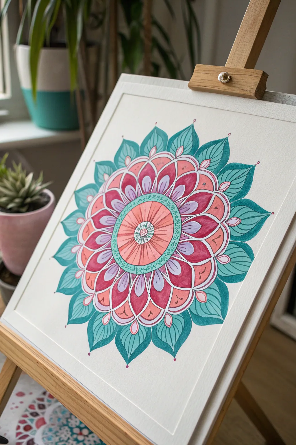
This vibrant mandala radiates energy with its layered petals in harmonious shades of teal, deep rose, and soft coral. The design combines the precision of geometric structuring with the organic flow of floral shapes, making it a perfect exercise for practicing control and color layering.
Detailed Instructions
Materials
- Heavyweight watercolor or mixed media paper (at least 300gsm)
- Pencil and compass
- Protractor
- Fine liner pens (black, 0.3mm and 0.5mm)
- Watercolor paints or fluid acrylics
- Paintbrushes: Round sizes 2, 4, and 6
- White gel pen for highlights
- Eraser
- Palette for mixing colors
Step 1: Planning and Sketching
-
Establish the Center:
Begin by finding the exact center of your paper. Make a small mark. Use your compass to draw a small central circle about 1 inch in diameter. -
Draw Concentric Guides:
Keeping the same center point, draw four larger concentric circles moving outward. Space them roughly 1-1.5 inches apart. These will guide the height of each petal layer. -
Divide the Circle:
Use a protractor to mark every 22.5 degrees around the circle, giving you 16 sections. Draw light straight lines from the center through these marks to the outer edge. These radial lines ensure your petals stay symmetrical. -
Sketch the Inner Petals:
In the second circle ring, sketch the first layer of petals. These should be rounded at the bottom and slightly pointed at the top, fitting snugly between your radial guide lines. -
Add Outer Layers:
Continue sketching petal shapes for the next two rings. Make the petals in the outermost ring larger and more leaf-like, slightly curving the tips to give the mandala dynamic movement.
Pro Tip: Symmetry Hack
Work on opposite petals instead of going in a circle. Paint the top petal, then the bottom one, then left, then right. It balances the drying time.
Step 2: Painting the Core
-
Paint the Central Hub:
Mix a diluted coral or salmon color. Fill in the very center circle with a flat wash. While it’s wet, you can drop a tiny bit of darker pink near the edges for depth. -
Detail the Center:
Once dry, use your fine liner to draw small spokes or a sunburst pattern radiating from the very center point within that coral circle. -
The Decorative Ring:
Paint the thin ring immediately surrounding the center with a mint green or pale teal. Let it dry completely before adding tiny loop or dot details with your fine liner.
Step 3: Layering the Petals
-
Base Layer of Pink:
For the first ring of petals, mix a rich rose pink. Paint the lower half of each petal, fading it out with clear water as you move toward the tip to create a gradient effect. -
Purple Accents:
Inside these pink petals, paint a smaller, teardrop shape using a soft lavender or lilac shade. Leave a small white gap between the purple and pink sections to keep them distinct. -
The Middle Ring:
Move to the next layer of petals. Paint these a solid, warm coral color. I like to keep the paint slightly pooled at the base of the petal to naturally darken the color there as it dries. -
Outer Teal Leaves:
For the largest, outermost ring, mix a deep teal or turquoise. Paint these petals fully, ensuring crisp edges. You can lift a little color from the center of each leaf with a damp brush to create a highlighted vein. -
Secondary Teal Layer:
Notice the peekaboo petals between the main teal ones? Paint these smaller points in a slightly lighter shade of teal or aqua to create visual separation.
Level Up: Metallic Pop
Trace the separation lines between the coral and pink sections with gold ink or metallic watercolor for a luxurious, shimmering outline.
Step 4: Inking and Highlighting
-
Outline the Design:
Once the paint is bone dry, use your 0.5mm black pen to outline all the major petal shapes. Keep your hand steady and confident for smooth curves. -
Add Inner Details:
Switch to the 0.3mm pen. Draw the internal veins on the outer teal leaves and the small loops inside the pink petals. -
Erase Basics:
Gently erase all your pencil guide circles and radial lines. Be careful not to scrub the painted areas too hard. -
White Highlights:
Using a white gel pen, add tiny dots to the tips of the teal leaves and small accent lines inside the pink and coral petals to give them a glossy, finished look. -
Final Dots:
Place a single tiny dot of dark pink paint or ink at the very tip of each outer leaf for a final decorative flourish.
Step back and admire the rhythmic balance of colors in your finished mandala piece


Have a question or want to share your own experience? I'd love to hear from you in the comments below!