
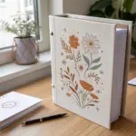
Whenever I’m drawing appreciation art, I try to keep one thing in mind: it should feel like a warm little hug on paper. These appreciation drawing ideas are meant to be simple to start, easy to personalize, and genuinely fun to make for the people who show up for you.
Apple With A Gratitude Note
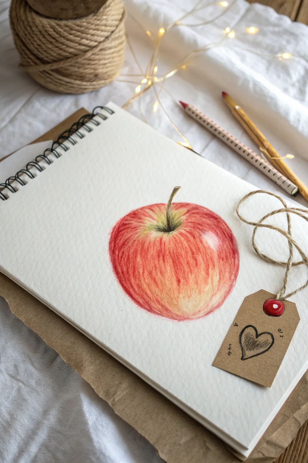
This stunningly simple project combines realistic fruit illustration with a rustic touch to express thanks. Using colored pencils to build layers of red and gold creates a vibrant apple that pops off the page, perfectly paired with a handmade kraft tag.
Step-by-Step Guide
Materials
- Spiral-bound mixed media or sketch paper (heavyweight)
- Set of colored pencils (specifically: varied reds, yellows, greens, brown, and black)
- Graphite pencil (HB or 2B) for outlining
- Small piece of brown kraft paper or cardstock
- Fine-liner pen (black)
- Single hole punch
- Jute twine or rustic string
- Small red button or brad (optional)
- Eraser
Step 1: Drawing the Apple Outline
-
Prepare your workspace:
Begin with a clean page in your spiral sketchbook. Ensure you have good lighting to see your color layering clearly. -
Sketch the basic shape:
Using your graphite pencil very lightly, draw a rounded apple shape. Don’t make it a perfect circle; apples are organic, so allow for a slight dip at the top for the stem and a tapering at the bottom. -
Add the stem and cavity:
Draw the stem curving slightly to the right. Create a small V-shaped indentation where the stem meets the fruit to define the apple’s cavity. -
Lighten the lines:
Before adding color, gently erase your graphite lines until they are barely visible. This prevents the grey graphite from dirtying your bright pencil colors later.
Directional Strokes
When coloring the apple, always curve your pencil strokes to match the round shape of the fruit. This makes it look 3D rather than flat.
Step 2: Layering Colors
-
Lay the yellow base:
Start with a light yellow colored pencil. Shade the entire apple shape, leaving just a small, soft white highlight near the upper right shoulder of the fruit for reflection. -
Establish the shadows:
Select a light orange or golden pencil. Lightly shade the bottom curves and the area around the stem cavity to begin building three-dimensional form. -
Begin the red streaks:
Take a bright red pencil. Instead of coloring flatly, use flicking motions that follow the contour of the apple. Start from the top cavity flicking down, and from the bottom flicking up. -
Deepen the mid-tones:
Switch to a slightly darker or cooler red (like a crimson). Add more density to your strokes on the left side and bottom of the apple, leaving the center mixture of yellow and orange showing through. -
Detail the stem cavity:
Use a mossy green pencil mixed with a bit of yellow to color the deep part of the cavity around the stem base. -
Color the stem:
Fill in the stem using a mix of brown and dark green. Keep the top edge of the stem slightly lighter to show light hitting it. -
Refine the texture:
Go back with your sharpest red pencil. Add fine, crisp lines over the shaded areas to mimic the natural vertical striping found on apple skin. -
Burnish the highlights:
I like to take a white or very pale cream pencil and blend over the highlight area to soften the transition between the shine and the red skin. -
Add final contrast:
Use a very small amount of black or dark brown pencil at the absolute base of the stem and the darkest shadow underneath the apple to anchor it.
Step 3: Creating the Gratitude Tag
-
Cut the tag shape:
Cut a small rectangle from your brown kraft paper, about 1.5 inches by 2.5 inches. Snip off the top two corners at an angle to create the classic luggage tag shape. -
Punch the hole:
Use your hole punch to create a hole centered near the top edge of the tag. -
Draw the heart:
With your black pencil or fine-liner, loosely sketch a heart in the center of the tag. Go over the lines a few times to give it a sketchy, hand-drawn feel, and lightly shade the inside. -
Add decorative text:
Add tiny, scribbled decorative marks or small letters around the heart to simulate a handwritten note. -
Adding the faux button:
Draw a small red circle over the hole punch area to look like a fastener, or glue a tiny real button there if you prefer. -
Attach the twine:
Thread a piece of jute twine through the tag (or around the faux button visual) and curl the raw ends of the string artistically onto the sketchbook page.
Add a Shadow
To make the tag look real, lightly shade underneath it on the white paper with a cool grey pencil to create a drop shadow effect.
Now you have a beautiful, handmade expression of appreciation ready to share


Pencil Bouquet Thank-You
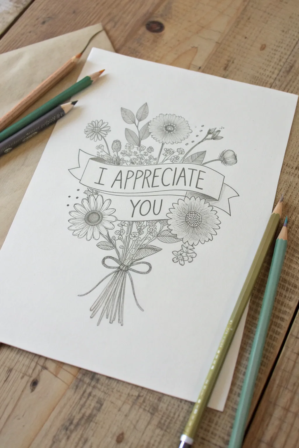
Express your gratitude with this delicate pencil illustration featuring a cheerful bouquet wrapped in a personalized banner. The clean lines and detailed floral elements create a sophisticated yet heartfelt card design that serves as a perfect keepsake.
How-To Guide
Materials
- High-quality white drawing paper or cardstock (A4 or slightly smaller)
- Graphite pencils (HB for sketching, 2B or fine-liner pen for defining)
- Eraser (kneadable preferred)
- Ruler (optional for banner guidelines)
- Fine-point black pen (optional for inking)
Step 1: Structuring the Design
-
Map the central axis:
Begin by lightly sketching a vertical line down the center of your paper. This will act as the ‘spine’ of your bouquet, ensuring the stems and flowers are balanced on either side. -
Outline the banner:
About one-third of the way down from the top, sketch a wavy, horizontal ribbon shape. Draw the front face of the banner first, creating a gentle ‘S’ curve, then add the folded ends tucked behind. -
Position the main flowers:
Roughly mark circles where your three main focal flowers will sit. Place one large daisy-like flower below the banner on the right, another similar one on the left (slightly lower), and a third one peeking out from the top center above the banner. -
Sketch the stems:
Draw loose lines converging from the bottom of the flower heads and filler areas toward a central point below the banner. Gather them tightly where the bow will be, then flair them out slightly at the very bottom.
Step 2: Detailing the Florals
-
Draw the main petals:
Refine the circle guides into daisy flowers. Draw long, slightly overlapping petals radiating from textured centers. Don’t worry about perfect symmetry; natural irregularities make them look real. -
Texture the centers:
Fill the centers of your daisies with small, tight stippling or tiny circles to mimic the pollen texture. -
Add filler flowers:
In the empty spaces, especially above the banner, sketch clusters of tiny baby’s breath or small buds. Use quick, small circular motions for a fluffy texture. -
Create foliage:
Draw leaves of varying shapes. Add broad, pointed leaves near the main flowers and slender, grassy sprigs extending outward. I like to add veins to the larger leaves for extra detail. -
Draw the lower stems and bow:
Define the gathered stems below the flowers. Draw a simple string bow with two loops and trailing ends wrapped around the bundle, pulling the lines taut to show tension.
Stem Realism Trick
Don’t draw straight parallel lines for stems. Add slight wobbles and bumps where leaves attach to make the bouquet look organic and hand-picked.
Step 3: Lettering and Finishing
-
Pencil in the text:
Lightly sketch guide lines inside the banner to keep your letters even. Block out ‘I APPRECIATE’ on the top curve and ‘YOU’ on the section below or centered, depending on your banner’s width. -
Refine the typography:
Go over your lettering with firmer pressure. Use a tall, narrow serif or sans-serif font to match the elegant illustration style. -
Darken the contour lines:
Once you are happy with the composition, retrace your main lines with a darker lead (like a 2B) or a fine-tip pen. Vary your line weight—thicker on the undersides of petals and leaves creates depth. -
Add shading:
Use light hatching strokes to add shadow where petals overlap, under the banner where it casts a shadow on the stems, and inside the folds of the ribbon. -
Clean up:
Wait for any ink to dry completely if you used pen. Then, gently erase all initial construction lines, the central axis, and any stray sketch marks.
Smudge Prevention
Place a scrap piece of paper under your drawing hand. This acts as a shield, preventing your palm from smearing the graphite across your finished white paper.
Now you have a beautifully hand-drawn token of gratitude ready to be gifted

Simple Flower Bouquet Card Front
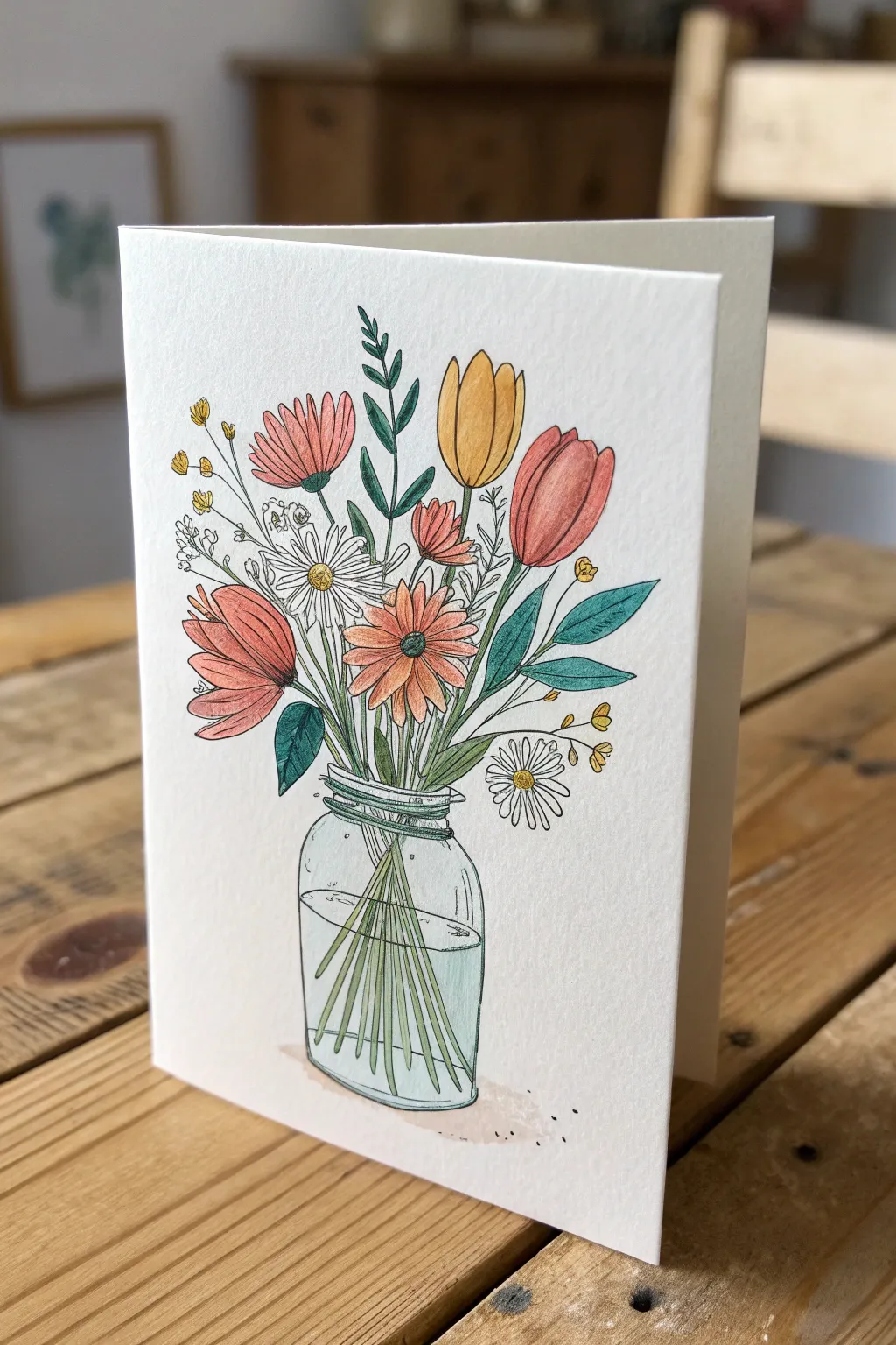
This charming greeting card captures the rustic beauty of a hand-picked wildflower bouquet resting in a simple glass jar. With delicate ink linework and soft, pastel coloring, it creates a personal and heartwarming gesture of appreciation perfectly sized for a standard card.
Detailed Instructions
Materials
- Heavyweight watercolor paper or cardstock (folded to A5 or 5×7 size)
- Fine liner waterproof pen (0.1mm and 0.3mm, black)
- Watercolor paints or watercolor pencils
- Small round paintbrush (size 2 or 4)
- Pencil (HB or H)
- Eraser
- Jar of water and paper towels
Step 1: Drafting the Composition
-
Sketch the jar:
Begin lightly in pencil near the bottom center of your card front. Draw a slightly rounded rectangle for the jar body, narrowing slightly at the top for the neck. -
Add the rim and water line:
Sketch a thick rim at the opening of the jar using two narrow ovals. About halfway down the jar, draw an ellipse to indicate the water level. -
Map out stem direction:
From the jar opening, draw faint guidelines fanning out upwards. These will be the spines for your main flowers. Inside the jar, sketch straight lines crisscrossing down into the ‘water’ area to represent stems. -
Shape the main blooms:
Sketch oval shapes for the tulip heads and round circles for the daisies and cosmos. Place the largest blooms (the tulips and salmon-colored flowers) first to anchor the arrangement. -
Fill with foliage:
In the gaps between flowers, sketch varied leaf shapes—some long and tapered like tulip leaves, others smaller and fern-like.
Ink Confidence
Don’t try to make perfectly straight lines for the stems or jar. A slightly shaky or broken line adds character and emphasizes the hand-drawn, illustrative style.
Step 2: Inking the Outlines
-
Outline the flowers:
Switch to your 0.1mm waterproof pen. Carefully trace your flower petals, adding small creases or center details to the daisies. Keep your hand relaxed for a loose, organic look. -
Define the jar:
Trace the jar outline. At the neck, add swirling horizontal lines to mimic the screw-top threads of a mason jar. Don’t trace the entire water ellipse; just use broken lines to suggest the water’s surface. -
Ink the stems and leaves:
Draw the stems, making sure they connect logically from the flower head down into the jar. Notice how water refracts light—I usually slightly offset the stem lines where they enter the water to make it look realistic. -
Add detail filler:
Use the pen to add tiny filler flowers, like baby’s breath or billy buttons, using small circles or clusters of dots. -
Erase pencil guides:
Once the ink is completely dry (give it a few minutes to avoid smudging), gently erase all underlying pencil sketch marks.
Texture Additive
Once the paint is dry, use a white gel pen to add tiny dots on the flower centers or small highlights on the rounded side of the glass jar for extra shine.
Step 3: Adding Color
-
Paint the tulips:
Using a mustard yellow and a muted salmon pink, fill in the tulip heads. Leave tiny slivers of white space near the top or sides of the petals to act as highlights. -
Color the central blooms:
Paint the cosmos-style flowers with a soft coral or peach tone. For the centers, use a darker brown or orange dot to create depth. -
Touch up the daisies:
Leave the daisy petals white (or use a very watery grey shadow). Paint their centers with a bright yellow yolk. -
Greenery variation:
Mix two shades of green: a sage/blue-green for the larger leaves and a fresh grassy green for stems. This variety keeps the bouquet from looking flat. -
Tint the water:
Dilute a tiny amount of blue-green paint with plenty of water. Wash it heavily over the ‘water’ section of the jar, ensuring the stems underneath remain visible. Add a faint shadow under the jar.
Now you have a delicate, handcrafted piece of art ready to share your appreciation with someone special


Best Ever Trophy Illustration

Celebrate someone special with this charming, hand-illustrated trophy card that shines with personality. Using a mix of metallic watercolors and crisp black ink, you’ll create a keepsake that feels both classic and festive.
How-To Guide
Materials
- Heavyweight cold-press watercolor paper (A5 size)
- Pencil (HB or similar) for sketching
- Eraser
- Gold metallic watercolor paint
- Small round paintbrush (size 2 or 4)
- Black waterproof fine liner pen (0.5mm)
- Black felt-tip marker or brush pen (for filling)
- Scrap paper for testing colors
Step 1: Sketching the Foundations
-
Center the base:
Begin by lightly sketching the base of the trophy near the bottom third of your paper. Draw a trapezoid shape (narrower at the top, wider at the bottom) and add a smaller, thinner rectangle on top of it. Inside the main trapezoid, sketch a rectangular plaque area where text could go later. -
Form the stem:
From the center of the base’s top rectangle, draw a short vertical stem that bulges slightly in the middle, resembling a decorative knob. -
Draft the cup shape:
Draw a large U-shape sitting on top of the stem. Close off the top with a flattened oval to create the rim of the cup. Make sure the proportions feel balanced—the cup should be the dominant feature. -
Add the handles:
Sketch two looping handles on either side of the cup. Start from near the top rim, curve outward and down, and attach them back to the lower body of the cup. Try to keep them symmetrical. -
Laurels and stars:
Lightly pencil in curved lines flanking the stem for the laurel branches. Scatter small five-pointed stars randomly around the trophy, varying their sizes and rotation for a playful look.
Uneven Gold Paint?
If your gold looks streaky, let the first layer dry completely, then add a second thin wash. Don’t overwork wet paint, or you’ll lift the previous layer.
Step 2: Inking the Outlines
-
Trace the main lines:
Using your waterproof fine liner, carefully trace over your pencil sketch. Start with the cup and handles. Don’t worry about perfect machine-made straight lines; a slightly wavering hand adds hand-drawn character. -
Detail the rim and base:
Ink the rim of the cup, drawing a second inner line to show thickness. Outline the base, including the inner rectangle for the plaque. -
Draw the laurels:
For the laurel branches, draw small leaf shapes along your penciled guide curves. Make the leaves point generally upward and outward. -
Erase pencil marks:
Once the ink is completely dry (give it a few minutes to be safe), gently erase all visible pencil guidelines to leave a clean black outline.
Sparkle finish
Once the artwork is totally dry, lightly flick a damp brush with gold paint over the whole paper to add tiny, subtle speckles for extra celebration.
Step 3: Painting with Gold
-
Prepare your gold paint:
Activate your metallic gold watercolor with a drop of water. You want a creamy consistency that is opaque enough to shimmer but fluid enough to spread. -
Fill the cup body:
Paint the main body of the cup. I find it helps to leave a few tiny slivers of white paper showing near the edges or outlines to simulate a highlight, giving the object dimension. -
Paint the details:
Fill in the stem, the rim, and the plaque area on the base with the same gold paint. Let the paint pool slightly in some areas to create natural variations in tone as it dries. -
Star power:
Carefully paint in the scattered stars. Since these are small, use the very tip of your brush to stay within the lines, or keep them loose for a more artistic style. -
Drying time:
Let the gold paint dry completely. Metallic paints can smudge easily if wet, so be patient before moving to the next step.
Step 4: Adding Contrast & Depth
-
Fill the base:
Use your felt-tip marker or brush pen to color the base of the trophy solid black. Be careful to paint *around* the gold plaque rectangle in the center. -
Darken the leaves:
Color in the laurel leaves with black ink. This high contrast against the white paper makes the gold trophy pop significantly. -
Add shading lines:
Return to your fine liner. Add hatching or stippling (dots) to the gold areas to suggest shadow. Focus on the left side of the cup and under the rim to create a 3D effect. -
Highlight the plaque:
If you have a white gel pen, add two small stars within the gold plaque on the base. If not, you can leave these as negative space during the gold painting phase.
Now you have a gleaming award ready to gift to your favorite champion
BRUSH GUIDE
The Right Brush for Every Stroke
From clean lines to bold texture — master brush choice, stroke control, and essential techniques.
Explore the Full Guide
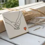
Heart Hands Appreciation Drawing
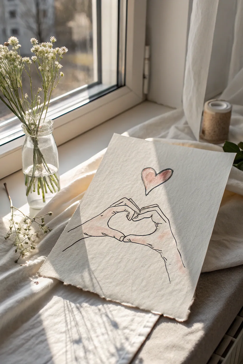
Capture a simple gesture of love creating this delicate line drawing on textured paper. The combination of fine ink lines and soft watercolor washes creates a gentle, heartwarming piece perfect for gifting.
Step-by-Step Tutorial
Materials
- Heavyweight textured paper (watercolor or handmade cotton paper)
- Fine liner pen (black, waterproof, 0.3mm or 0.5mm)
- Pencil (HB or 2B)
- Kneadable eraser
- Watercolor paints (Pink and Peach/Skin tones)
- Small round paintbrush (soft bristles, size 4 or 6)
- Cup of water
- Paper towel
Step 1: Preparation & Sketching
-
Paper selection:
Choose a piece of paper with visible tooth or texture. If you want to replicate the rustic look from the photo, gently tear the edges of your paper instead of cutting them with scissors for a soft, deckled effect. -
Basic hand shapes:
Start by lightly sketching the thumbs using your pencil. Draw them touching at the bottom knuckle and curving outward, then inward at the tips to form the bottom point of the heart shape. -
Index fingers:
Sketch the index fingers curving down from the top to meet the thumbs. The tips of the index fingers should curl inward, pressing against each other to create the upper arches of the heart. -
Remaining fingers:
Draw the remaining three fingers on each hand curled downward into the palms. Keep these lines relaxed; they don’t need to be anatomically perfect, just suggestive of the folded hand shape. -
Wrists and arms:
Extend lines outward from the base of the hands to suggest wrists and forearms. These lines should fade off toward the edges of the paper rather than being closed shapes. -
Floating heart:
Position a small, simple heart shape floating centered above the fingertips. Keep it loose and slightly imperfect for a hand-drawn charm. -
Review and refine:
Step back and look at your pencil sketch. Ensure the negative space between the thumbs and fingers clearly forms a heart silhouette. Lighten any heavy pencil lines with your kneadable eraser so they won’t show through the paint.
Smudge Alert
If your ink smears when adding watercolor, your pen isn’t waterproof. Test your pen on a scrap piece of paper first by drawing a line and painting over it immediately.
Step 2: Inking the Lines
-
Trace with pen:
Using your waterproof fine liner, carefully trace over your pencil lines. I prefer to use broken, slightly sketchy lines on the wrinkles of the knuckles to keep the drawing feeling organic. -
Adding detail:
Add small, subtle crease lines where the thumbs bend and on the knuckles. Don’t overdo it—just a few tiny strokes add character without making the hands look aged. -
Erase pencil marks:
Wait at least 5-10 minutes to ensure the ink is totally dry. Gently erase all remaining graphite lines to leave a clean black-and-white base.
Step 3: Watercolor Washes
-
Mix skin tones:
Dilute a peach or light skin-tone watercolor paint with plenty of water. You want a very transparent wash, not opaque color. -
Apply the first wash:
Loosely paint the skin tone over the hands. It’s okay if the paint goes slightly outside the lines or misses spots; this imperfect ‘spill’ gives the artwork its artistic, sketchy vibe. -
Add warmth:
While the first layer is still damp, drop a tiny bit of diluted pink paint onto the knuckles and fingertips. This ‘wet-on-wet’ technique creates a soft, natural blush effect. -
Paint the heart:
Mix a soft red or rose color. Paint the floating heart above the hands. Try leaving a tiny sliver of white paper unpainted on one side to act as a highlight. -
Final drying:
Let the paper lie flat until completely dry. If the paper buckles slightly from the water, you can press it under a heavy book overnight once it is bone dry.
Level It Up
Write a short name, date, or word like ‘gratitude’ in a small, elegant script purely along the curve of the wrist line for a hidden personalized message.
Frame your delicate drawing or prop it up near a window to let the light catch the texture of the paper
Big Heart, Little Minds Concept

This charming, handmade card features a large, textured orange heart floating above a row of stick-figure friends holding a banner. It captures a minimalist aesthetic with rough-edged paper and simple linework, making it perfect for expressing group appreciation.
How-To Guide
Materials
- Heavyweight textured watercolor paper (approx. 300gsm)
- Orange watercolor paint or gouache
- Soft round watercolor brush (size 6 or 8)
- Fine-point black fineliner pen (0.3mm or 0.5mm)
- Pencil and eraser
- Ruler
- Light pink watercolor or marker (for the banner)
- Brown kraft envelope (A6 or A7 size)
- Water cup and palette
Step 1: Preparing the Base
-
Tear the paper:
Instead of cutting your watercolor paper with scissors, manipulate it to create deckled edges. Crease the paper firmly where you want the edge, wet the crease slightly with a clean brush, and carefully tear the paper strip away. -
Size it up:
Aim for a standard postcard size, roughly 5×7 inches, ensuring it fits comfortably inside your chosen kraft envelope. -
Sketch the layout:
Using a pencil very lightly, mark the center of the card. Sketch the outline of a large, tilted heart in the upper two-thirds of the space. -
Outline the figures:
Below the heart, lightly sketch six small circles for heads in a horizontal row. They should curve slightly upward in the middle like a smile.
Uneven Ink Flow?
On rough watercolor paper, pens can skip. If this happens, slow down your drawing speed significantly and go over lines twice to saturate the crevices.
Step 2: Painting the Elements
-
Mix the heart color:
Load your brush with a warm, desaturated orange watercolor. You want a semi-transparent wash that allows the paper’s texture to show through, rather than thick opaque paint. -
Paint the heart:
Fill in your sketched heart shape. Don’t worry about making the edges perfectly smooth; the slight roughness adds to the organic look. Let the color pool naturally in some areas for texture. -
Dry completely:
This is crucial—wait until the heart serves is bone dry before moving on, or your hand might smudge the paint. -
Draft the banner:
Lightly sketch a rectangular banner stretching across the chests of your stick figures. The banner needs tails on either end that fold backward. -
Color the banner:
Using a very pale, watered-down pink (or a light marker), fill in the main rectangle of the banner. Leave the folded tails white or paint them a slightly darker shade for depth.
Step 3: Inking the Details
-
Draw the heads:
Take your black fineliner and ink the six small circles for the heads. Make them solid black circles rather than outlines. -
Add the bodies:
Draw simple triangular shapes for the upper bodies connecting the heads to the top of the banner. Fill these triangles in with black ink. -
Link the arms:
Draw thin lines connecting the shoulders of the figures, making it look like they are linking arms or holding hands behind the banner. -
Define the banner:
Trace the outline of your banner in ink. Add small vertical hatch marks at the ends of the main rectangle to simulate shadow where the paper folds back. -
Add the tiny heart:
In the direct center of the pink banner, draw a very small outline of a heart. -
Finish the ribbon tails:
Draw the ribbon tails extending outward. Use a ‘V’ shape at the very ends for a classic ribbon cut. -
Erase guidelines:
Once you are certain the ink is completely dry, gently erase any visible pencil marks from your initial sketch.
Make It Personal
Instead of a generic group, customize the number of stick figures to match your specific team or family size to make the card truly unique.
Now you have a heartfelt, handcrafted card ready to share your appreciation with the group

PENCIL GUIDE
Understanding Pencil Grades from H to B
From first sketch to finished drawing — learn pencil grades, line control, and shading techniques.
Explore the Full Guide
Printable-Style Coloring Appreciation Page
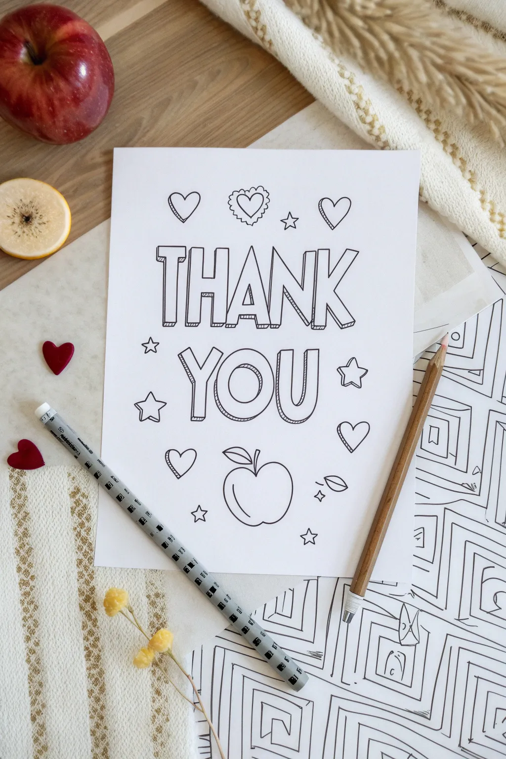
This delightful coloring page project combines bold typography with charming doodles to create a heartfelt gesture of gratitude. With its clean lines and playful motifs like apples and hearts, it captures the classic look of a professional printable that you can draw yourself.
Step-by-Step Guide
Materials
- White cardstock or heavy drawing paper (8.5 x 11 inches)
- Pencil (HB or 2H for sketching)
- Fine-point black fineliner pen (0.5mm)
- Medium-point black marker or pen (0.8mm – 1.0mm)
- Ruler
- Eraser (kneaded eraser preferred)
- Optional: Light box or sunny window for tracing
Step 1: Layout and Lettering Structure
-
Establish the margins:
Begin by lightly marking a uniform margin around your paper, about 1 inch from the edges, to keep your design centered. -
Map out the text lines:
Use your ruler to draw two parallel guidelines across the upper-middle section for the word ‘THANK’. Leave a gap, then draw two more parallel lines below for ‘YOU’. -
Sketch the letter skeletons:
Lightly sketch the basic stick-figure skeletons of the letters. Center ‘THANK’ on the top line and ‘YOU’ on the bottom line to ensure spacing looks balanced before fleshing them out. -
Create the block letter forms:
Draw boxes around your skeleton lines to turn them into block letters. Keep the width of the bars relatively consistent for a cohesive look. -
Add the 3D dimension:
To achieve the pop-out effect, draw short diagonal lines extending from the bottom-left corners of each letter block. Connect these diagonal lines to create a ‘shadow’ block shape. -
Refine the 3D details:
Add small internal lines within the 3D shadow areas to give them texture, mimicking a hatched shading effect often found in coloring books.
Drawing Crisp Lines
For that professional ‘printed’ look, pull the pen toward you rather than pushing it away. Complete long lines in one single, confident stroke rather than short, feathery sketches.
Step 2: Adding Motifs and Doodles
-
Sketch the central apple:
Beneath the word ‘YOU’, sketch a large, rounded apple shape. Add a small curved stem and a single leaf attached to the top right of the stem. -
Add the top row of hearts:
Above ‘THANK’, lightly draw three evenly spaced hearts. Make the center heart slightly different—perhaps give it a scalloped or lace-like border for variety. -
Scatter the decorative stars:
Fill the empty spaces around the words with five-pointed stars. I like to vary their sizes slightly, placing some near the corners of the words and others floating in the background. -
Incorporate extra hearts:
Place a few more hearts in the lower section, flanking the apple and filling gaps near the bottom corners to balance the composition. -
Draw floating leaves:
Sketch a couple of small, detached leaves near the apple or bottom corners to reinforce the autumn or back-to-school theme.
Step 3: Inking and Finalizing
-
Outline the main text:
Switch to your medium-point black marker. Carefully trace over the outer boundaries of your ‘THANK YOU’ letters, using confident, steady strokes. -
Ink the 3D details:
Use the finer point pen (0.5mm) for the 3D shadow lines and the hatching texture inside the letters. The thinner line weight helps distinguish the shadow from the main letter shape. -
Trace the doodle elements:
Outline the hearts, stars, and apple with the medium marker. Keep your lines smooth and continuous, closing all shapes neatly. -
Add detail flourishes:
Use the fine-point pen to add details like the veins in the leaves, the scalloped edge on the center heart, or small reflection lines on the apple. -
Erase pencil guides:
Wait until the ink is completely dry—give it a few minutes to be safe. Then, gently erase all pencil sketches and guidelines, checking carefully for stray marks inside the letters. -
Final inspection:
Look over the design one last time. If any lines look too thin or shaky, go over them once more with the marker to thicken and smooth them out.
Smudged Ink?
If you smear ink while erasing, cover the mistake with a small white out pen or a glued-on paper patch. You can then redraw the line over the dried correction fluid.
You have now created a custom, professional-looking coloring page ready for gifting or relaxing embellishment
Fold-Out Surprise Message Drawing
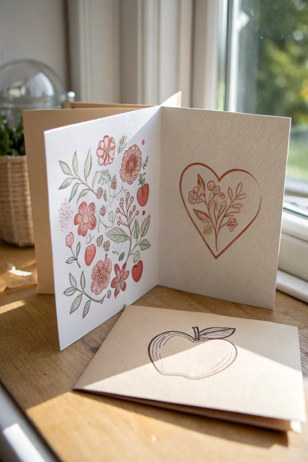
Create a delightful surprise with this double-sided illustration project that unfolds to reveal hidden messages or designs. The combination of delicate line drawings and simple shapes gives this card a timeless, handcrafted aesthetic that is perfect for expressing appreciation.
How-To Guide
Materials
- Heavyweight speckled kraft cardstock (A4 or letter size)
- Fine liner pens (Black or dark grey, 0.3mm and 0.5mm)
- Colored gel pens or fine markers (Rust red, muted pink, olive green)
- Pencil and eraser
- Bone folder
- Ruler
- Scissors or craft knife
Step 1: Planning and Folding
-
Prepare the card base:
Start with a rectangular sheet of heavyweight kraft paper. A standard A4 sheet cut lengthwise works well to create a long strip, roughly 5-6 inches tall by 11-12 inches wide. -
Measure the panels:
Divide the width of your paper into three equal sections using a pencil and ruler. Lightly mark the vertical lines where the folds will be. -
Create the Z-fold:
Score along your pencil marks using a bone folder and ruler to ensure crisp lines. Fold the first section inward (valley fold) and the second section outward (mountain fold) to create the jagged ‘Z’ shape that allows the card to stand on its own.
Step 2: Illustrating the Floral Panel
-
Sketch the layout:
On the left-most panel (which will be the front when folded), lightly sketch a vertical composition of botanicals. Aim for a mix of larger blooms, small filler flowers, and leaves to create a dense, garden-like feel. -
Draw the main blooms:
Using a rust-red fine liner, ink the primary flowers. Draw simple five-petal shapes for the larger blooms and small circles for berries. Vary the line weight slightly for a hand-drawn look. -
Add leafy elements:
Switch to an olive green pen to draw stems and leaves. I find that leaving small gaps where leaves meet stems keeps the drawing feeling airy and light. -
Incorporate line details:
Use a grey or black 0.3mm fine liner to add intricate details like the veins in the leaves, the centers of the flowers, and delicate shading lines on the petals. -
Fill the gaps:
Identify empty spaces in your composition and fill them with tiny red dots, small sprigs, or simple line texturing to balance the visual weight of the panel.
Ink Choosing Tip
Test your pens on a scrap of kraft paper first. Some inks absorb too much into porous paper and look dull; gel pens often sit on top and stay vibrant.
Step 3: Creating the Focal Heart
-
Outline the heart:
On the adjacent panel (the center or right panel, depending on your layout preference), lightly pencil a large, simple heart shape in the optical center. -
Ink the frame:
Go over your pencil line with the rust-red marker. Keep the line somewhat loose; it doesn’t need to be geometrically perfect. A slight break in the line adds character. -
Draw the inner bouquet:
Inside the heart, draw a simple sprig of leaves and berries rising primarily from the bottom point of the heart. -
Add botanical details:
Use the same visual language as the first panel—small circles for berries and lance-shaped leaves—keeping the drawing contained strictly within the heart border.
Level Up: Hidden Messages
Draw the heart shape on a loose piece of cardstock first, cut it out to make a stencil, and use it to sponge light ink inside the heart for a soft background glow.
Step 4: The Matching Envelope or Insert
-
Sketch a singular motif:
On a separate piece of rectangular cardstock or a matching envelope, lightly sketch a large apple or fruit shape. -
Add contour lines:
Using the dark grey or black fine liner, outline the fruit. Instead of a solid single line, use multiple loose strokes to create a sketch-like quality. -
Detail the interior:
Draw parallel curved lines following the contour of the fruit’s shape to suggest roundness and volume without full shading. -
Final touches:
Erase all remaining pencil marks gently from all parts of the project. If any ink looks faint, go back over it to deepen the contrast against the kraft paper.
Now you have a charming, multi-layered card ready to brighten someone’s day


Mini Comic Of A Helpful Moment
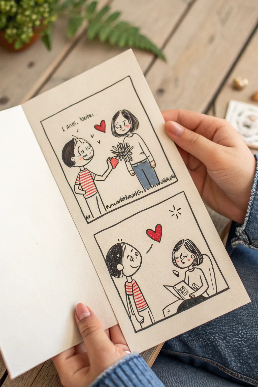
Capture a sweet moment of connection with this two-panel comic illustration featuring a charming, sketchy style. Using simple ink lines and touches of colored pencil, you will create a heartfelt narrative about giving and receiving appreciation.
Step-by-Step Guide
Materials
- Blank off-white cardstock or mixed media paper (folded)
- Fine-point black fineliner pen (0.3mm or 0.5mm)
- Graphite pencil (HB) and eraser
- Colored pencils (Red, Blue, Grey)
- Ruler
Step 1: Planning the Layout
-
Prepare the workspace:
Start with your folded cardstock open or closed, depending on your comfort. I prefer working on the right-hand interior page. Lightly pencil in two equal-sized squares, one stacked above the other, leaving a comfortable margin around the edges. -
Define the frames:
Use your ruler and the black fineliner to ink over your pencil boxes. Don’t worry if the lines aren’t perfectly machine-straight; a little wobble adds to the hand-drawn charm. -
Sketch the figures involved:
Inside the top box, lightly sketch two stick figures facing each other. The figure on the left (boy) should be offering something, and the figure on the right (girl) should be standing receptively. -
Refine the scene:
Flesh out the stick figures. Give them round heads and simple hairstyles—spiky for the boy, a bob cut for the girl. Draw the boy holding a flower and a small heart shape.
Smudged Ink?
If you smear wet ink, don’t panic. Turn the smudge into a shadow or draw a small pattern, like floating leaves or stars, over it to hide the mistake naturally.
Step 2: Inking the First Panel
-
Outline the characters:
Go over your pencil sketches with the black fineliner. Keep the eyes as simple dots or small curves, and give them gentle smiles. Add small cheek marks for blush. -
Detail the clothing:
Draw horizontal stripes on the boy’s shirt and simple pants. For the girl, draw a plain long-sleeved top and jeans. -
Add the speech element:
Above the boy, write a short phrase. The example uses ‘I love, thanks,’ but you can customize this. Add a floating heart between their heads. -
Ground the scene:
Add small, jagged grass strokes at their feet to show they are standing outside. This grounds the characters so they aren’t floating in space.
Level Up: Texture
Try using a textured paper like cold-press watercolor paper. The rough surface gives the colored pencil shading a lovely, grainy vintage aesthetic.
Step 3: Drawing the Second Panel
-
Set the second scene:
In the bottom box, sketch the same two characters. This time, show the boy standing happily on the left and the girl seated on the right, perhaps reading or holding a book. -
Focus on expressions:
Ink the faces, making sure they are looking at each other. The boy should look attentive, and the girl should look peaceful as she looks up from her book. -
Ink the details:
Outline their hair and clothing again. Consistency is key, so keep the hairstyles identical to the top panel. Draw the chair back behind the girl using simple curved lines. -
Add symbolic elements:
Draw a larger heart floating between them to symbolize the connection established in the first panel plus a little ‘shine’ mark in the corner.
Step 4: Adding Color and Finish
-
Erase guidelines:
Wait for the ink to dry completely to avoid smudging, then gently erase all remaining pencil marks from both panels. -
Color the hearts:
Use a sharp red colored pencil to fill in the floating hearts. Press firmly to make them the focal point of the drawing. -
Stripe the shirt:
Use the same red pencil to color the stripes on the boy’s shirt in both panels. Alternating white and red adds a nice graphical pop. -
Color the denim:
Use a blue colored pencil to shade the girl’s pants. You can create a texture effect by using light, directional strokes that mimic denim grain. -
Add final touches:
Use a grey pencil or very light black shading to darken the boy’s hair, leaving a few white streaks for highlights. Add pink cheeks to both characters for warmth.
Now you have a charming, hand-drawn story ready to share with someone special


Have a question or want to share your own experience? I'd love to hear from you in the comments below!