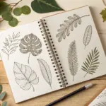
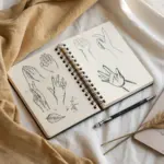
If you ever want a drawing practice that instantly makes you see more, contour drawing is it. These contour drawing ideas are the kind I reach for when I want quick wins, looser lines, and more confident observation.
Blind Contour Portrait Practice
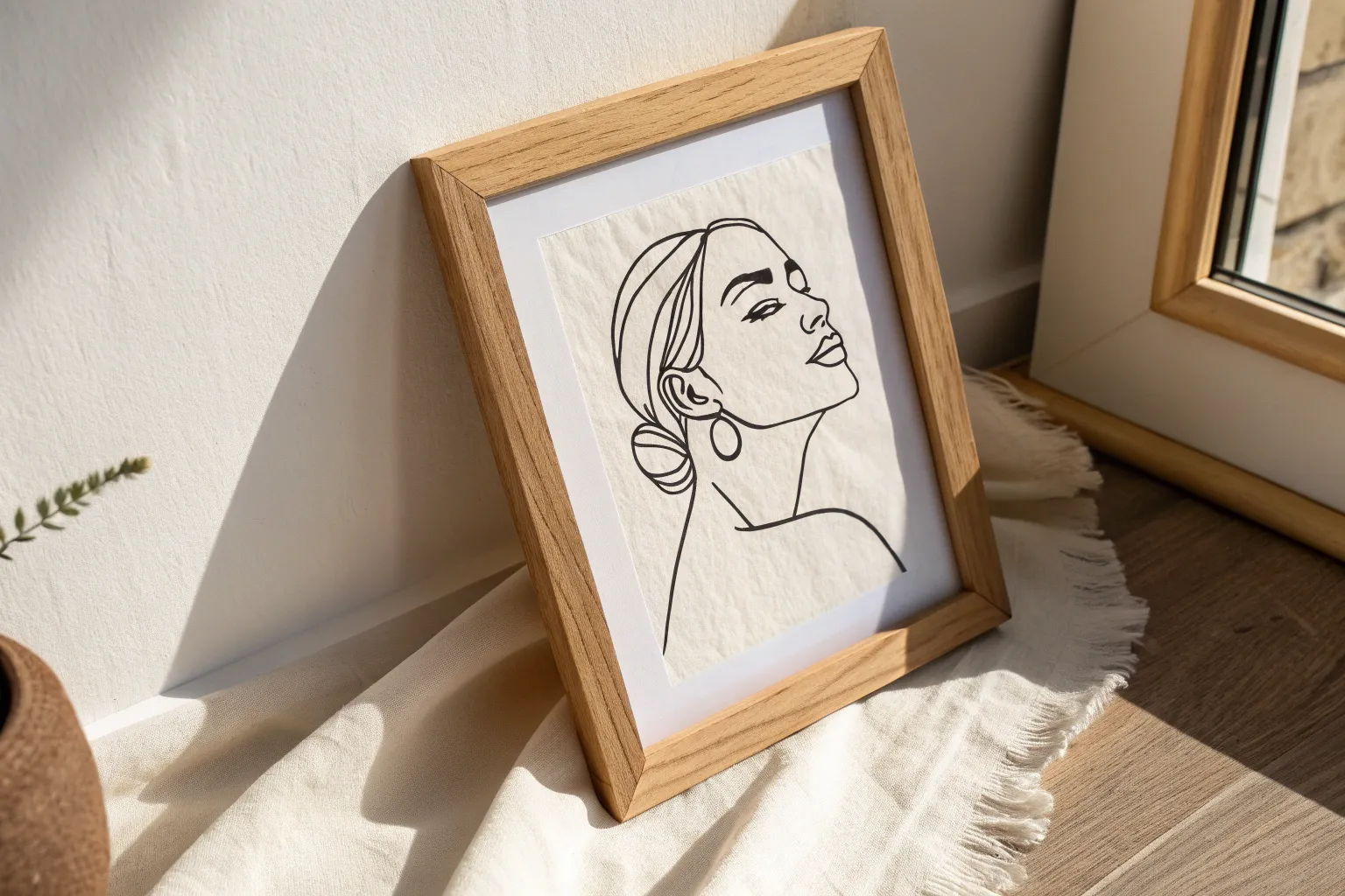
Capture the timeless elegance of classical sculpture with a modern, fluid twist using this contour drawing technique. This project emphasizes observation over perfection, resulting in a striking, illustrative portrait with character-filled lines.
Step-by-Step Guide
Materials
- Wire-bound sketchbook (heavyweight paper preferred)
- Fine liner pen (0.3mm or 0.5mm, black ink)
- Pencil (HB or 2B) for initial layout
- Eraser
- Reference image of a classical bust (e.g., Greek or Roman statue)
Step 1: Preparation and Initial Layout
-
Select your subject:
Choose a reference photo of a classical statue or bust. Look for strong profiles or three-quarter views, as these offer interesting angles for contour lines to follow. -
Lightly sketch the envelope:
Using your pencil, very faintly mark the top of the head, the bottom of the chest, and the extreme left and right widths. This ‘envelope’ ensures your drawing fits comfortably on the page. -
Mark key features:
Still using the pencil, place faint dots or extremely light lines to indicate where the eyes, nose tip, and chin will fall. These are just guideposts to keep your pen drawing proportional.
Step 2: Drawing the Face Contour
-
Start at the eyes:
Switch to your fine liner pen. I find starting with the eyes anchors the whole piece. Begin drawing the upper lid of the right eye with a continuous, confident line. -
Connect the features:
Without lifting your pen if possible, move from the corner of the eye down the bridge of the nose. Let the line wander naturally to capture the nostril shape. -
Define the lips:
Flow your line from the nose to the philtrum and onto the upper lip. Classical statues often have distinct, bowed lips; trace these carefully but don’t worry about wobbles. -
Outline the jawline:
Bring the line down around the chin and sweep it up towards the ear to form the strong jawline typical of classical sculpture. Keep looking at your reference more than your paper. -
Add facial details:
Go back in to add the pupils and eyelid creases. Use slightly broken or lighter pressure lines for subtle details like under-eye bags to keep them from looking too heavy.
Wobbly Lines?
Don’t fix them! In contour drawing, ‘mistakes’ add character. If a line goes astray, just keep going or draw a new line right next to it.
Step 3: Hair and Accessories
-
Structure the hair:
Move your pen to the hairline. Classical busts often feature curls or headbands. Use loopy, rapid squiggles to suggest tight curls rather than drawing every single hair strand. -
Draw the headwear:
If your subject has a headband or laurel wreath, outline its shape now. Let the lines overlap the hair slightly to integrate the accessory into the form. -
Create volume with loops:
For the bun or gathered hair at the back, use dense, overlapping loops. This texture contrast against the smooth face lines creates visual interest.
Don’t Lift the Pen
Try to keep the pen on the paper for as long as possible. This ‘continuous line’ technique creates a unique, fluid look that connects all elements beautifully.
Step 4: Drapery and Finishing Touches
-
Start the neck:
Draw the neck muscles (sternocleidomastoid) extending down from behind the ear to the collarbone. These lines should be long and sweeping. -
Outline the toga:
Begin the clothing at the shoulder. Use long, flowing curves to represent the folds of the fabric (drapery). The lines should mimic the weight of cloth draping over the body. -
Add fabric folds:
Draw nested ‘V’ or ‘U’ shapes within the main drape outline to show where the fabric gathers. Keep these lines significantly looser than facial features. -
Suggest form through lines:
Add a few scratchy, hatched lines under the chin and in the deepest folds of the cloth to suggest shadow without fully shading the piece. -
Erase pencil guides:
Wait at least 5-10 minutes for the ink to dry completely. Gently erase your initial pencil marks to leave a clean, crisp ink drawing.
Now you have a timeless sketch that celebrates the beauty of line and form.
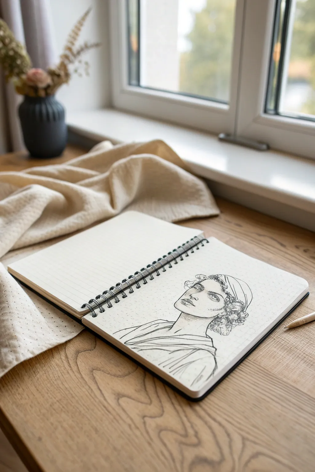
Continuous Line Face Profile
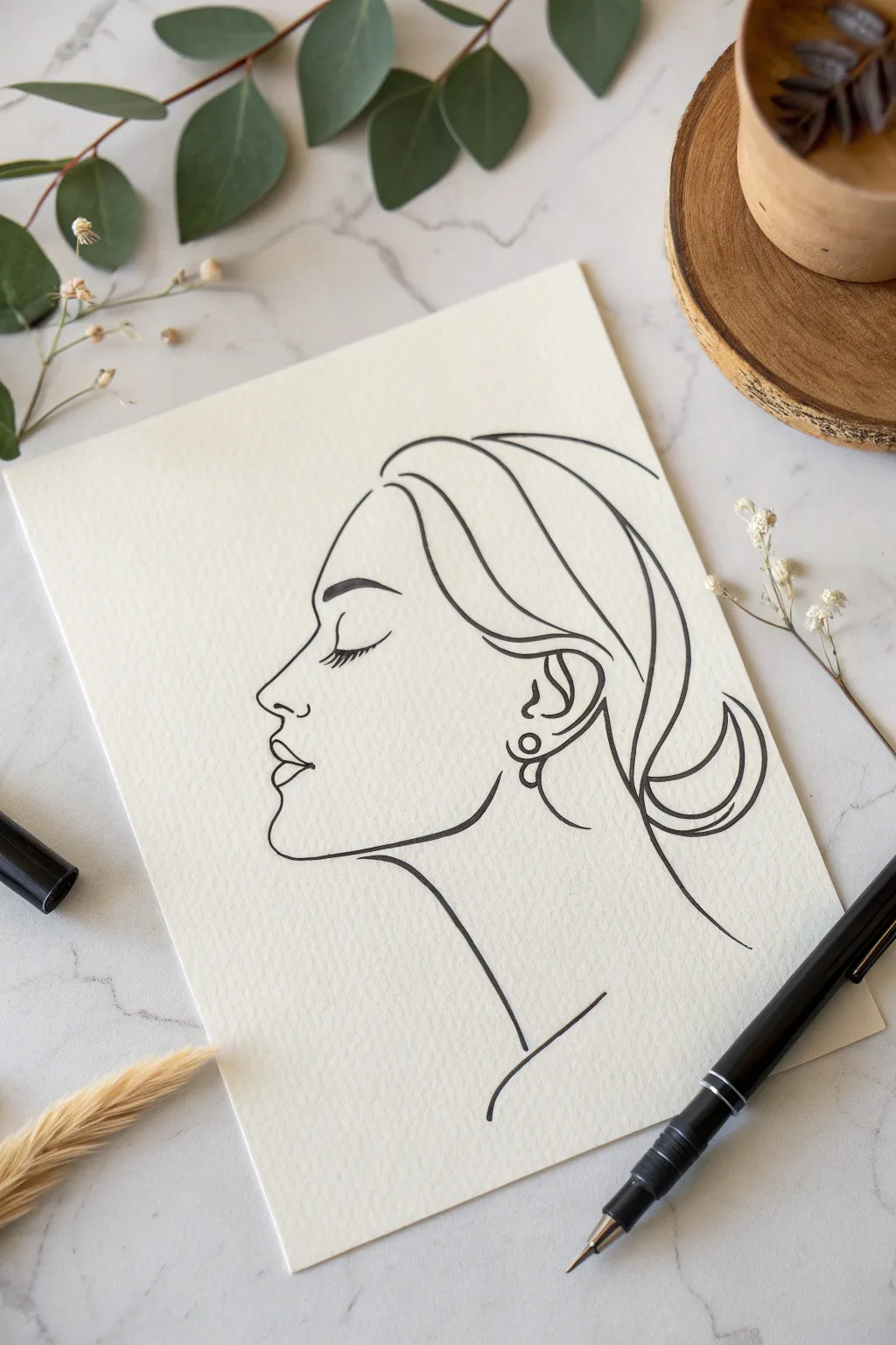
Capture the graceful essence of a profile using the fluid, minimalistic technique of continuous line art. This project creates a striking black-and-white illustration that looks deceptively simple but requires intentional flow and balance.
Step-by-Step
Materials
- High-quality watercolor paper or mixed media paper (light texture)
- Black fineliner pens (0.5mm and 0.8mm)
- Pencil (HB or 2H)
- Kneaded eraser
- Tracing paper (optional, for practice)
Step 1: Planning the Sketch
-
Start with the forehead:
Begin with a very light pencil sketch to map out your proportions. Draw a gentle curve starting at the upper left for the forehead, sloping slightly backward. -
Map the nose bridge:
From the forehead line, create a slight indentation for the top of the nose bridge, then extend a straight line outward for the nose. -
Define the nose tip and nostril:
Round off the tip of the nose softly. Add a small C-curve underneath to indicate the nostril, keeping it subtle. -
Draft the lips and chin:
Sketch the upper lip protruding slightly, a dip for the mouth opening, and a fuller lower lip. Curve inward under the lip and then push out for a rounded chin. -
Outline the jaw and neck:
Draw a strong jawline that angles upward toward where the ear will be. Add a long, elegant curve downward for the neck. -
Position the closed eye:
Place a curved line for the eyelid halfway down the nose bridge. Add long, downward-sweeping lashes. -
Sketch the ear:
Draw the ear shape level with the eye and nose. Keep the details inside the ear simple, focusing on the outer rim and the lobe. -
Draft the hairline and bun:
Sweep large curves backward from the forehead and temple to suggest pulled-back hair. Create a circular or looped shape at the nape of the neck for a messy bun.
Shaky Lines Solution
If your hand shakes, don’t stop! Speed up your stroke slightly. Faster movements often result in smoother curves than slow, hesitant ones.
Step 2: Creating the Continuous Line
-
Prepare your pen:
Switch to your 0.5mm or 0.8mm black fineliner. Take a deep breath; the goal is smooth, confident strokes rather than perfection. -
Ink the profile:
Start at the top of the forehead. Trace your pencil line down the nose, around the lips, and under the chin in one steady motion. Lift your pen only if absolutely necessary. -
Add weight to the jaw:
As you ink the jawline, press slightly harder or go over the line a second time to thicken it, giving the face structure and weight. -
Detail the eye:
Ink the closed eyelid with a delicate touch. Swiftly flick the pen downward to create the eyelashes so they taper naturally at the ends. -
Define the eyebrow:
Draw the eyebrow with a slightly thicker line than the rest of the face, arching it gently above the eye. -
Ink the ear and earring:
Trace the ear shape. Add a small circle or loop on the earlobe for a simple earring, connecting it directly to the jawline if you want to maintain the continuous look. -
Flow into the hair:
Using broad, sweeping arm movements, ink the hair strands. Start from the forehead and pull lines back toward the ear, keeping them loose. -
Create the low bun:
Draw the bun at the back using looping, overlapping curves. Let the lines cross each other to mimic the texture of gathered hair. -
Extended neck lines:
Extend a final long line from the nape of the neck downward, and another from under the chin, leaving the bottom open-ended.
Add a Splash of Color
Once the ink is fully dry, paint a single abstract shape of watercolor (like a soft peach or pink circle) behind the profile for a modern pop.
Step 3: Refining
-
Thicken key areas:
I like to go back and selectively thicken areas where shadows would naturally fall—under the chin, the back of the neck, and the bottom of the bun—to add dimension. -
Erase pencil marks:
Wait at least 10 minutes for the ink to dry completely. Gently rub your kneaded eraser over the entire drawing to lift the initial sketch lines without smudging the ink.
Step back and admire the sophisticated simplicity of your line work


Shoe Contours With Texture Details
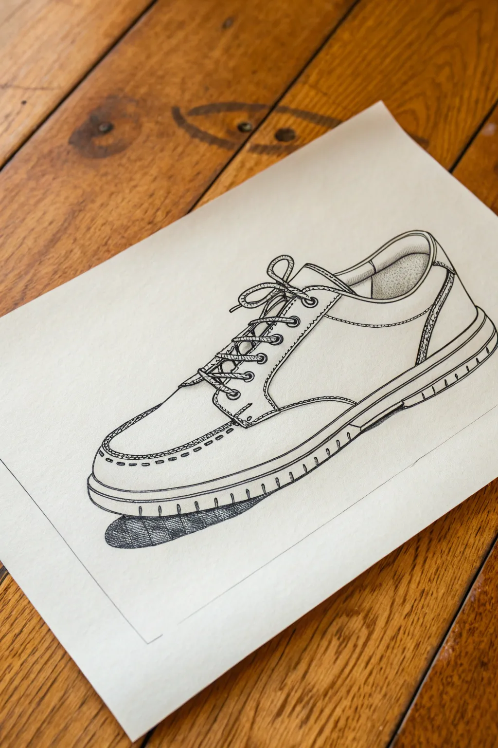
Capture the casual elegance of a classic shoe with this precise contour drawing study. By focusing on clean lines and carefully placed stippling, you’ll transform a simple everyday object into a striking piece of graphic art.
Step-by-Step
Materials
- Smooth bristol or heavyweight drawing paper
- HB graphite pencil for sketching
- Fine liner pens (0.1mm, 0.3mm, and 0.5mm)
- Kneaded eraser
- Ruler (optional for the framing box)
- Reference shoe (or the photo provided)
Step 1: Laying the Groundwork
-
Block in the general shape:
Start with your HB pencil and a very light hand. Draw a long oval that tilts slightly upward for the sole, and build a wedge shape on top for the main body of the shoe. Don’t worry about details yet; just get the proportions of the heel and toe box correct. -
Refine the silhouette:
Carve out the specific curves of the shoe. Note the dip near the ankle collar and the slight upward curve of the toe. Sketch in the thick rubber sole at the bottom, keeping parallel lines consistent. -
Map out the seams:
Lightly draw the internal lines where the leather panels meet. There’s a prominent U-shape on the top (the vamp) and a curved line near the heel. These seams are crucial as they define the shoe’s structure. -
Pencil in the laces:
Sketch the laces loosely. Start with the loops of the bow, making them floppy and organic rather than stiff. Draw the crisscrossing pattern down the center, making sure the laces look like they are tucking under the eyelet tabs.
Step 2: Inking the Contours
-
Outline the main body:
Switch to a 0.5mm fine liner. Go over your pencil lines for the outer silhouette of the shoe. Use smooth, confident strokes rather than short, scratchy ones to maintain a clean contour look. -
Ink the structural seams:
Use a slightly thinner pen, like a 0.3mm, for the internal stitching lines. For the U-shaped seam on the toe, draw a solid line first, then add tiny, evenly spaced dashes alongside it to mimic heavy stitching. -
Detail the laces:
Carefully outline the laces with your 0.3mm pen. I find it helpful to draw the knot first so I know which strands overlap. Add tiny striations or curves inside the laces to suggest the woven texture of the fabric. -
Draw the sole treads:
On the side of the rubber sole, draw small vertical tick marks. These shouldn’t be too uniform; vary their spacing slightly to make the rubber texture look realistic and worn.
Wobbly Lines?
If your long contour lines are shaky, try moving your arm from the shoulder rather than just your wrist. This creates smoother, more confident strokes.
Step 3: Adding Texture and Depth
-
Stipple the suede collar:
Look at the inside of the shoe near the heel. Use your finest 0.1mm pen to add stippling (tiny dots). Cluster them densely in the shadows and spread them out towards the light to create a soft, suede-like texture. -
Add stitching details:
Go back to the heel cap and the eyelet tabs. Draw tiny parallel dashes along the seams to represent the thread. Consistency is key here—try to keep the length of the dashes the same. -
Texturize the laces:
Add very subtle cross-hatching or diagonal lines on the shadowed parts of the lace loops. This separates them visually from the smooth leather of the shoe tongue. -
Define the eyelets:
Draw small circles for the metal eyelets. Leave a tiny white spot in the center of each metal ring to simulate a highlight, making them look shiny.
Pro Tip: Line Weight
Use a thicker pen for the bottom-most lines of the shoe (the sole). This adds visual weight and suggests gravity acting on the object.
Step 4: Final Touches
-
Create the cast shadow:
Beneath the shoe, draw a tight, dark shadow shape. Use dense cross-hatching with the 0.5mm pen only directly under the sole where it touches the ground. This anchors the floating object. -
Erase pencil guides:
Once the ink is completely dry (give it at least 5-10 minutes to be safe), freely erase all your underlying graphite sketches with the kneaded eraser. -
Add a frame line:
Using a ruler and your thinnest pen, draw a simple rectangular border around the drawing. This gives the sketch a finished, architectural presentation.
Now you have a clean, stylized illustration that celebrates the design of everyday footwear


Leaf Contours and Veins Study
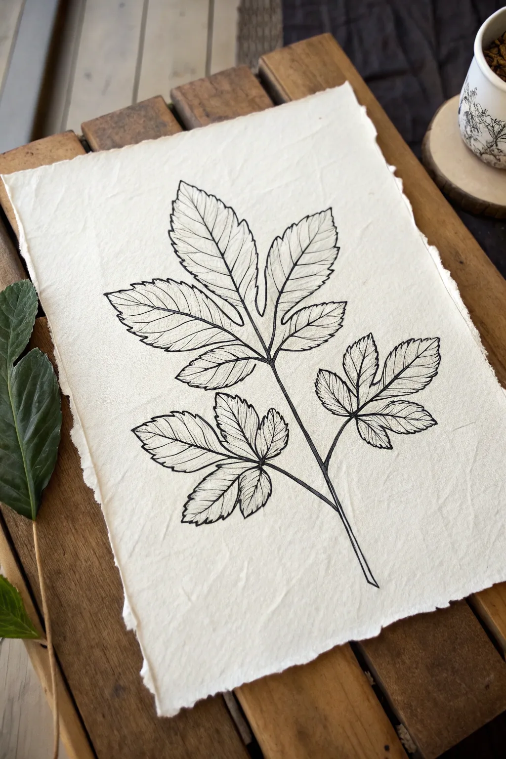
Capture the delicate beauty of foliage with this high-contrast ink study, focusing on the intricate network of veins and serrated edges. By using handmade cotton rag paper, the clean black lines gain a timeless, rustic warmth perfect for minimal framing.
Detailed Instructions
Materials
- Handmade cotton rag paper (deckle edge, roughly A4 or 5×7)
- Fine liner pen (01 or 03 nib size, archival black ink)
- Pencil (HB or H)
- Kneaded eraser
- Real leaf branch for reference (optional, or use the image provided)
- Smooth work surface (backing board)
Step 1: Drafting the Structure
-
Analyze the form:
Begin by observing the overall shape of your leaf branch. Notice the central stem and how the three main leaflets branch off; the largest leaf sits at the top center, with two smaller compound leaves angling out from the lower sides. -
Sketch the central axis:
Using your HB pencil, lightly draw a single, slightly curved vertical line to represent the main stem. This will serve as the anchor for the entire composition. -
Mark leaf positions:
From the central stem, sketch faint guidelines for the petioles (leaf stems) extending outwards. Keep your pressure extremely light so these lines are easy to erase later. -
Outline the leaf shapes:
Draw the basic perimeter of each leaf cluster. Don’t worry about the jagged edges yet; just block in the almond-like shapes to ensure the proportions feel balanced on the page.
Ink Bleeding Control
Handmade paper is thirsty! Test your pen on a scrap piece first. If the ink feathers (spreads like a spiderweb), switch to a pigment liner or work faster with lighter pressure.
Step 2: Inking the Contours
-
Start the main stem:
Switch to your fine liner pen. Trace the main stem line, starting from the cut bottom and working upward. Add a tiny amount of thickness where the smaller branches diverge to show weight. -
Define the serrated edges:
Begin inking the top center leaf. Instead of a smooth line, create the ‘toothed’ margin. Use short, crisp strokes that zigzag slightly—out, then sharply back in—mimicking the natural serration seen in the reference. -
Connect the lobes:
Notice how the top leaf is deeply lobed, almost splitting into three sections. Ink these deep indentations carefully, ensuring they curve inward towards the central vein without touching it. -
Ink the side leaves:
Move to the right-hand leaf cluster. Repeat the serrated outline technique. I find it helpful to turn the paper slightly as I work to keep my hand position comfortable and consistent. -
Complete the outlines:
Finish the outline for the left-hand leaf cluster. Ensure the stems connecting these leaves to the main axis look organic and attached, not just floating nearby.
Variation is Key
Don’t make your leaf symmetry perfect. Nature is irregular. Making one leaf slightly twisted or one serrated edge uneven adds significantly to the realism.
Step 3: Detailing the Veins
-
Draw the midribs:
Draw the central vein (midrib) down the center of each individual leaflet. The line should be confident but can taper off slightly as it reaches the tip of the leaf. -
Add primary veins:
From each midrib, draw diagonal lines extending toward the leaf edges. These should curve gently upward, following the structural flow of the leaf. -
Refine vein placement:
Try to match the veins to the serrated points on the edge. Often, a vein will terminate right at the tip of a serrated ‘tooth’ or just between them. -
Vary line weight:
For a more realistic look, press slightly lighter with your pen as you draw the smaller veins near the tips of the leaves compared to the thicker base stems. -
Check for gaps:
Review your drawing for any disconnected lines. A contour drawing relies on continuity, so close any accidental gaps in your main outlines.
Step 4: Finishing Touches
-
Let the ink cure:
Wait at least 15 minutes for the ink to dry completely. Cotton rag paper is absorbent, but ink can pool in the texture, taking longer to dry than on standard paper. -
Erase pencil marks:
Gently dab and rub with your kneaded eraser to lift the graphite guidelines. Avoid harsh scrubbing, which can damage the delicate surface fibers of handmade paper. -
Flatten the paper:
If the ink caused slight buckling, place your finished art under a heavy book overnight to flatten it back out.
Place your study in a floating glass frame to show off those beautiful deckled edges

PENCIL GUIDE
Understanding Pencil Grades from H to B
From first sketch to finished drawing — learn pencil grades, line control, and shading techniques.
Explore the Full Guide
Flower Petal Overlap Contours
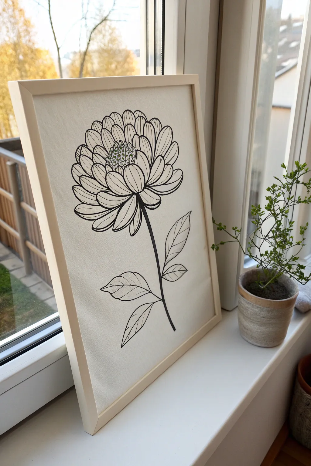
Capture the delicate complexity of overlapping petals with this bold yet minimalist contour drawing. Using a single line weight and stippling techniques, you’ll create a striking botanical piece that looks elegant in a simple wood frame.
Step-by-Step
Materials
- canvas board or stretched canvas (11×14 or A3 size)
- Black permanent marker or paint pen (medium tip)
- Fine tip green pen or green paint marker
- Pencil (HB or H)
- Eraser
- Reference photo of a zinnia or dahlia
- Wooden frame (to fit canvas size)
Step 1: Drafting the Structure
-
Establish the center:
Begin by lightly sketching a small circle in the upper middle area of your canvas. This doesn’t need to be perfect; it just marks where the pollen center will sit. -
Sketch the inner petals:
Around your center circle, lightly pencil in the first row of petals. Keep them small and oval-shaped, pointing upwards and slightly inwards. -
Build outward layers:
Draw the next row of petals, placing them behind and between the first row. Create variations in height to make the flower feel organic and full. -
Expand the bloom:
Continue adding concentric rings of petals. As you move outward, make the petals larger, wider, and more open. Let some droop slightly at the bottom to suggest weight. -
Add the stem:
Draw a slightly curved line descending from the bottom center of the flower head. I find a gentle `S` curve looks more natural than a straight stick. -
Place the leaves:
Sketch two or three leaves attached to the lower part of the stem. Draw a central vein line for each leaf to guide the shape.
Smudge Control
Work from the center outward and rotate your canvas as you draw. If you’re left-handed, start from the right side to keep your hand off fresh ink.
Step 2: Inking the Contours
-
Start the final lines:
Switch to your medium-tip black marker. Begin tracing your pencil lines starting from the innermost petals and working your way out. This prevents your hand from smudging wet ink. -
Define the overlaps:
When outlining petals that are ‘behind’ others, stop your line elegantly where it meets the petal in front. This ‘clean stop’ is crucial for the contour overlapping effect. -
detail the petals:
Add a simple center line to main petals. Ensure the lines curve with the shape of the petal to reinforce the 3D volume. -
Ink the stem and leaves:
Trace the stem with a confident, continuous stroke if possible. Outline the leaves and add the veins. -
Refine leaf details:
For the leaves, add smaller diagonal veins branching off the center line. Keep these lines slightly thinner or lighter if your pen allows control.
Add Dimension
For a bolder look, thicken the outer contour lines of the entire flower head, keeping the inner petal details thinner. This makes the bloom pop forward.
Step 3: Finishing Touches
-
Create the texture:
Using the same black marker, add tiny dots inside the very center circle. Cluster them tightly near the bottom edge of the center for a shadow effect. -
Add a splash of color:
Take your green fine-tip pen or marker. Add tiny green stippled dots interspersed among the black dots in the center. This subtle hint of color brings life to the monochrome piece. -
Erase pencil marks:
Wait at least 15 minutes to ensure the ink is completely dry. Gently erase all visible pencil sketches to leave a clean, crisp black line. -
Inspect line weights:
Check your drawing for any faint areas. If a line looks too thin, retrace it carefully to match the uniform bold look of the rest of the flower. -
Frame your work:
Place your finished canvas into a simple light wood frame to complement the organic nature of the drawing.
Hang your new botanical artwork near a window to let the natural light highlight your clean lines
Utensil Pile Contour Tangles
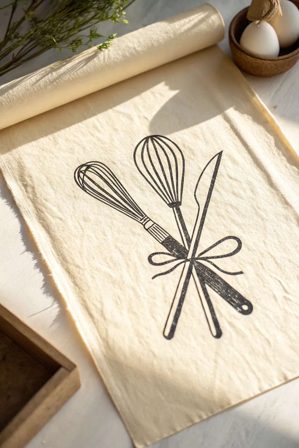
Transform a plain tea towel into a charming piece of kitchen decor with this rustic contour design. Featuring a trio of utensils tied with a simple bow, this project combines bold line work with the texture of fabric for a cozy, farmhouse aesthetic.
How-To Guide
Materials
- Light beige cotton or linen tea towel (pre-washed)
- Black fabric ink or screen printing ink
- Fine-tip paintbrush or fabric marker (for initial sketching)
- Linoleum block and carving tools (optional for stamp method)
- Speedball barren or large spoon (for stamp method)
- Pencil
- Tracing paper
- Iron (for heat setting)
- Piece of cardboard (to place inside the towel)
Step 1: Preparation & Design
-
Prepare the fabric:
Begin by washing and drying your tea towel to remove any sizing chemicals that might prevent ink adhesion. Iron it flat to ensure a smooth working surface. -
Protect your workspace:
Slide a piece of cardboard or thick paper inside the folded towel or underneath the single layer where you plan to apply the design. This prevents ink from bleeding through to the back or the table. -
Draft the contour:
On a sheet of paper, sketch your design: a central balloon whisk, a second whisk angled to the left, and a knife angled to the right. Make sure the handles cross near the bottom third of the composition. -
Add the bow:
Draw a ribbon tied around the crossing point of the handles. Keep the loops loose and flowing to contrast with the rigid lines of the utensils. -
Transfer the sketch:
Trace over your drawing with a dark pencil or transfer paper. Place the drawing face down on the fabric and rub the back firmly to leave a faint guide on the material.
Stamp It Instead
Carve the design into a soft linoleum block for a true print texture. The natural imperfections of printing create that lovely speckled look automatically.
Step 2: Inking the Design
-
Outline the central whisk:
Using your fabric ink and a fine brush (or a fabric marker), carefully trace the wire loops of the central whisk. Keep the lines relatively thick and consistent. -
Detail the second whisk:
Move to the whisk on the left. Draw the wire loops, ensuring they look like they are behind or beside the first one. Add the handle detail, including the darker connecting point where wires meet the handle. -
Define the knife shape:
Outline the knife on the right side. Focus on the curve of the blade and the simple handle shape. I find it helpful to rotate the fabric slightly to get the best angle for long, smooth strokes. -
Draw the handle texture:
Fill in the handles. For a stamped look like the photo, don’t fill them perfectly solid black; leave tiny specks of the beige fabric showing through to create texture. -
Connect with the bow:
Ink the bow last, drawing the ribbon strands passing over the utensil handles to physically ‘tie’ the composition together visually.
Bleeding Lines?
If ink spreads into the fabric fibers, switch to a thicker fabric paint or use a stiffer brush with less water. Don’t overload your brush.
Step 3: Refining & Finishing
-
Enhance line weight:
Go back over your main contour lines. A slightly varying line width—thicker in some spots, thinner in others—adds hand-drawn character and mimics the look of a block print. -
Check for gaps:
Look closely at where lines intersect, specifically the whisk wires. Ensure the connections are clean and distinct so the shapes read clearly. -
Add texture marks:
If your lines look too perfect, use a mostly dry brush to add a little roughness to the edges of the knife blade or handles for that vintage feel. -
Let it cure:
Allow the ink to dry completely. Follow the manufacturer’s instructions for your specific ink, which usually requires 24 hours of air drying. -
Heat set the design:
Once fully dry, iron the reverse side of the fabric on a high setting (no steam) for several minutes. This seals the ink into the fibers so it won’t wash out. -
Final wash (optional):
You can give the towel a gentle wash after heat setting to soften the fabric again, though this isn’t strictly necessary before gifting or display.
Now you have a custom, artisan-style linen ready to hang in your kitchen or wrap up as a thoughtful gift
BRUSH GUIDE
The Right Brush for Every Stroke
From clean lines to bold texture — master brush choice, stroke control, and essential techniques.
Explore the Full Guide
Chair Contours With Fabric Folds
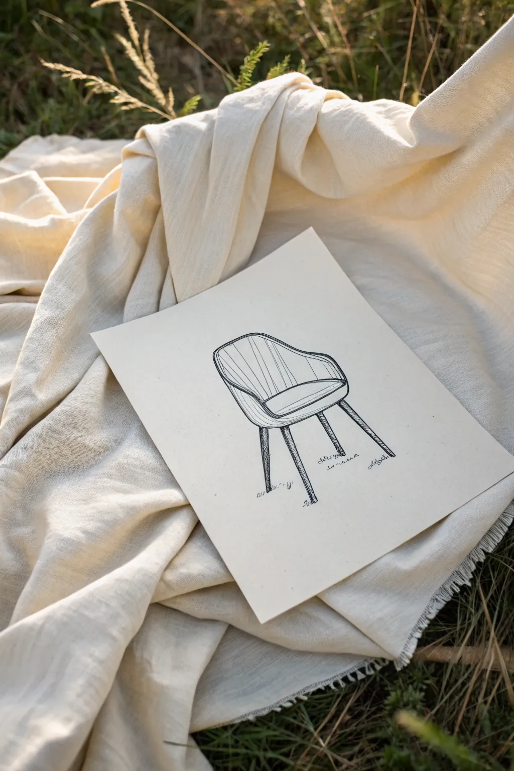
This elegant contour drawing captures the sleek lines of a mid-century modern chair, emphasizing its curved back and tapered legs. Using fine black ink on textured paper creates a striking contrast that makes the furniture design pop with minimal fuss.
Detailed Instructions
Materials
- High-quality off-white or cream drawing paper (heavyweight)
- Pencil (HB or 2H)
- Kneaded eraser
- Fine liner pen (0.3mm or 0.5mm, black)
- Ruler (optional)
- Reference photo of an armchair
Step 1: Drafting the Structure
-
Establish the seat base:
Begin by lightly sketching a flattened oval or rounded rectangle in the center of your page. This will serve as the seat cushion area. Keep your pencil lines very faint so they can be easily erased later. -
Add the backrest curve:
Draw a large, sweeping U-shape that starts from the left side of the seat, goes up and around, and connects to the right side. This defines the wrap-around back of the armchair. -
Define the armrests:
Refine the top edge of that U-shape. Dip the line slightly as it comes down to meet the front of the seat to indicate where the armrests slope downwards. -
Draw the seat thickness:
Add a parallel line just below the front curve of your initial seat oval to give the cushion some visible thickness. -
Position the legs:
Mark four points beneath the seat for the leg attachments. For accurate perspective, the front two legs should start lower on the page than the rear two legs. -
Sketch the legs:
Draw the legs as long, tapered cylinders. They should be wider at the top where they meet the seat and narrow significantly as they reach the ground. Angle the back legs slightly outward for stability.
Wobbly Lines?
Don’t stress over shakes. In contour drawing, slight imperfections add character. If a line goes astray, thicken it slightly to make it look intentional.
Step 2: Inking the contours
-
Select your pen:
Switch to your fine liner pen. A 0.5mm tip works well for the main outlines, providing a solid, confident line. -
Outline the shell:
Trace over your pencil lines for the chair’s outer shell. Try to use continuous, smooth strokes rather than short, sketchy ones to maintain the sleek modern look. -
Ink the cushion interior:
Carefully outline the inner seat cushion. I personally find that breaking the line slightly near the corners can add a nice, organic touch, suggesting fabric softness. -
Detail the legs:
Ink the tapered legs. You can add small, darkened caps at the very bottom to represent feet or glides. -
Erase pencil guides:
Wait at least five minutes for the ink to dry completely to avoid smudging. Then, gently rub the kneaded eraser over the entire drawing to lift the graphite.
Step 3: Adding Texture and Depth
-
Vertical texture lines:
Draw vertical lines running down the inside of the backrest. These should curve slightly with the form of the chair, following the perspective you established. -
Vary the line weight:
Keep these texture lines thinner or lighter than the main outline. If you have a 0.1mm or 0.3mm pen, switch to it now for these details. -
Cross-hatching shadows:
Add subtle shading where the armrests meet the seat. Use small, diagonal hatch marks to create a sense of depth in the corners. -
Leg shading:
Darken one side of each leg (usually the right side if the light is coming from the left) with vertical hatching to give them a cylindrical volume. -
Grounding shadows:
Draw tiny scribbles or hatched shadows directly underneath the feet of the chair. This grounds the object so it doesn’t look like it’s floating in space. -
Simulated text:
To mimic an architectural sketch or designer’s concept, add some illegible, squiggly ‘text’ notes near the legs. Keep these loose and gesture-like.
Pro Tip: Perspective Check
Look at the negative space between the legs. Ensuring the shapes of the empty space look correct is often easier than trying to draw the legs perfectly.
Now you have a stylish furniture study that looks like it came straight from a designer’s sketchbook
Pet Contour Drawing With Fur Rhythms
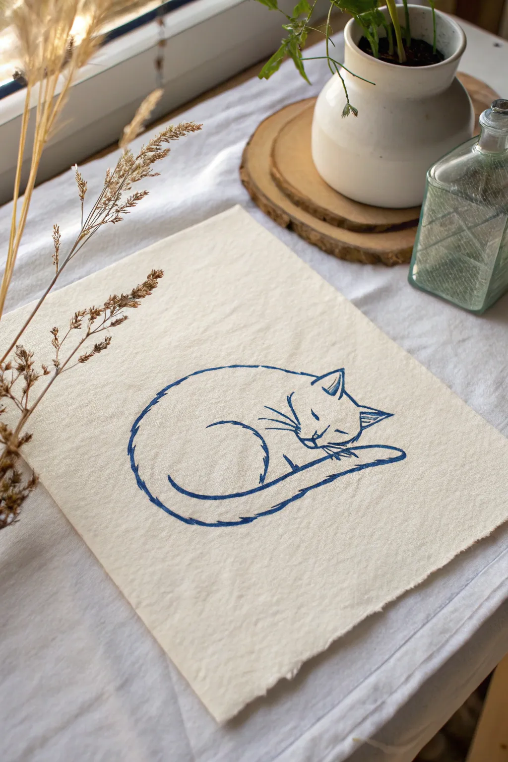
Capture the peaceful essence of a napping feline with this minimalist blue line study. Using soft, slightly textured paper and a single calming color, you’ll learn to suggest form and fur through varied line weights and rhythmic strokes.
How-To Guide
Materials
- Cream-colored cotton rag paper or textured mixed media paper (approx. 8×10 inches)
- Blue fineliner pens (0.3mm and 0.5mm size)
- Hard graphite pencil (2H or H) for sketching
- Kneaded eraser
- Ruler (optional, to center the composition)
- Reference photo of a curled-up cat (or your own sleeping pet)
Step 1: Initial Sketching
-
Center the composition:
Begin by finding the visual center of your textured paper. Lightly mark this spot with your pencil to ensure the curled-up cat doesn’t drift too far to one side. -
Blocking in the main shape:
Using your hard pencil, lightly sketch a large oval or kidney bean shape. This represents the overall mass of the sleeping cat’s body. -
Defining the head:
At one end of your oval, sketch a smaller, slightly triangular shape for the head. It should be tucked in close to the body mass. -
Adding the tail:
Draw a sweeping curve that wraps around the bottom of the oval, tapering towards the end. The tail acts as a visual frame for the bottom of the cat. -
Refining the features:
Lightly indicate the position of the ears, the closed eyes, and the nose. Don’t press hard; these guide lines will be erased later. -
Checking proportions:
Take a moment to step back. Does the head feel too big or small compared to the body circle? Adjust your pencil sketch now before committing to ink.
Uneven Ink Flow?
Textured paper can sometimes cause pens to skip. If this happens, slow down your drawing speed or go over the line a second time for a deliberate ‘sketchy’ style.
Step 2: Inking the Contours
-
Starting the ink work:
Switch to your 0.5mm blue pen. Begin with the main curve of the back. Instead of one continuous rigid line, use short, overlapping strokes to mimic the texture of fur. -
Creating the back curve:
Draw the large arc of the cat’s spine. Let your pen lift slightly at the end of each short stroke to create a jagged, furry edge rather than a smooth wire. -
Defining the thigh:
Draw the curved line representing the rear thigh/leg tucked into the body. This line should be fairly distinctive to show the separation of limbs. -
Inking the tail:
Outline the tail with a slightly bolder line weight. Focus on the long, sweeping curve that cradles the body. -
Detailing the ears:
Switch to the finer 0.3mm pen for the head. Carefully ink the triangles of the ears, adding a small inner line to show depth. -
Drawing the face:
With a very light touch, draw the closed eyes as simple slanted dashes. Add the nose and mouth with minimal strokes to maintain that peaceful expression. -
Whiskers and fine details:
Use quick, confident flicks of your wrist to add the whiskers. I generally prefer to make these lines thinner than the body outline to keep the face delicate. -
Adding rhythm lines:
Go back to the body with the 0.5mm pen. Add a few disconnected, floating strokes inside the main body shape. These ‘rhythm lines’ suggest the direction the fur lies without drawing every hair.
Step 3: Finishing Touches
-
Evaluating line weight:
Look at your drawing as a whole. Thicken the lines on the underside of the cat (where shadow would fall) to grind the figure. -
Erasing the sketch:
Wait at least 10 minutes for the blue ink to dry completely. Gently roll your kneaded eraser over the paper to lift the graphite without damaging the paper’s texture. -
Deckling the edges (optional):
If your paper has straight edges but you want the manual look shown in the example, carefully tear the edges against a ruler to create a soft, deckled border.
Level Up: Contrast
Try using a navy blue brush pen for the darkest shadows under the tail and chin. The variation between the thin liner and thick brush strokes adds dynamic depth.
Display your charming cat line drawing in a simple wooden frame or on a clipboard for a relaxed studio vibe


Simple Architecture Contour Sketch
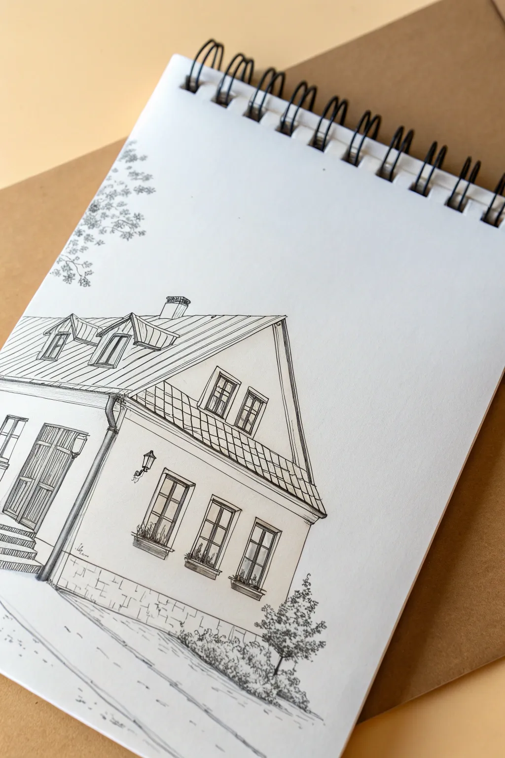
Capture the charm of a quaint European-style house with this precise yet relaxing contour drawing. Using fine liners, you will build up structure with confident lines and add depth through simple hatching techniques.
Step-by-Step
Materials
- Spiral-bound sketchbook (smooth or mixed media paper)
- HB pencil for sketching
- Fine liner pens (sizes 0.1, 0.3, and 0.5)
- Ruler (optional but helpful)
- Kneaded eraser
Step 1: Planning the Structure
-
Establish the horizon:
Start with your HB pencil. Lightly sketch a slanted line near the bottom third of the page to represent the ground slope. This anchors your house so it doesn’t feel like it’s floating. -
Map the main corner:
Draw a vertical line to mark the corner of the house nearest to you. This will act as the spine of your perspective drawing. -
Outline the façade:
Sketch the left wall receding slightly into the distance and the larger right-facing wall. Keep your pencil pressure extremely light so these lines can be erased later. -
Add the roofline:
Draw a large triangle atop the right wall for the gable end. Connect the peak of this triangle back towards the left to form the main roof ridge. -
Place windows and doors:
Block in the shapes for the three windows on the right wall and the large arched door on the left wall. Don’t worry about details yet; just focus on getting the rectangles in the correct perspective.
Step 2: Inking the Outlines
-
Switch to ink:
Take your 0.3 fine liner. Begin tracing your pencil lines, starting with the roof. Draw the main triangular shape and the straight horizontal ridge line. -
Detail the dormer windows:
On the left slope of the roof, ink the two small dormer windows. They are essentially mini-houses popping out of the roof, so give them their own tiny peaked roofs. -
Ink the walls and gutter:
Draw the vertical corner line and the gutter pipe that runs down it. Use a steady hand to ink the horizontal lines of the foundation. -
Refine the windows:
Using a 0.1 pen for finer control, outline the three lower windows. Draw the outer frame first, then the inner cross-bars (mullions). -
Add the door:
Ink the large double door on the left. Include the small rectangular panels within the door frame to suggest wood carving.
Wobbly Lines?
If your straight lines are shaky, try drawing from your shoulder rather than your wrist. Alternatively, embrace the wobble—it gives the drawing a charming, hand-sketched character.
Step 3: Adding Texture and Depth
-
Roof texture:
On the triangular gable roof face, draw diagonal lines to represent metal standing seams or tiles. Keep the spacing consistent but not mechanically perfect. -
Window shadows:
Use your 0.1 pen to add diagonal hatching inside the windows. Leave some small areas white to suggest the reflection of glass. -
Flower boxes:
Beneath the windows, sketch rough, squiggly organic shapes to represent flower boxes. I usually let my pen dance a bit here to contrast the straight architectural lines. -
Foundation details:
Draw irregular brick-like shapes along the bottom of the wall. You don’t need to draw every single brick; just enough to suggest the texture of stone. -
Hatching for dimension:
Add vertical hatching lines under the roof eaves and on the right side of the door frame. This creates shadows that make the house pop off the page.
Add Watercolor
Make sure your ink is waterproof, then add a light wash of watercolor. A touch of terracotta for the roof and pale ochre for the walls creates a lovely warmth.
Step 4: Final Touches
-
Ground the building:
Sketch a few loose lines on the ground to suggest a path or road. Keep these lines broken and light to imply direction without drawing a solid outline. -
Add foliage:
In the bottom right corner, use a stippling or scribbling motion to create a small bush or tree. Do the same in the upper left corner to suggest overhanging branches. -
Erase pencil guides:
Once the ink is completely dry (give it a few minutes to avoid smearing), gently use your kneaded eraser to remove all underlying pencil sketches. -
Final assessment:
Review your drawing. If an area looks too flat, add a few more hatching lines with your 0.1 pen to deepen the shadow.
Enjoy the satisfaction of seeing your architectural sketch come to life on the page
Contour Drawing of Your Desk Setup
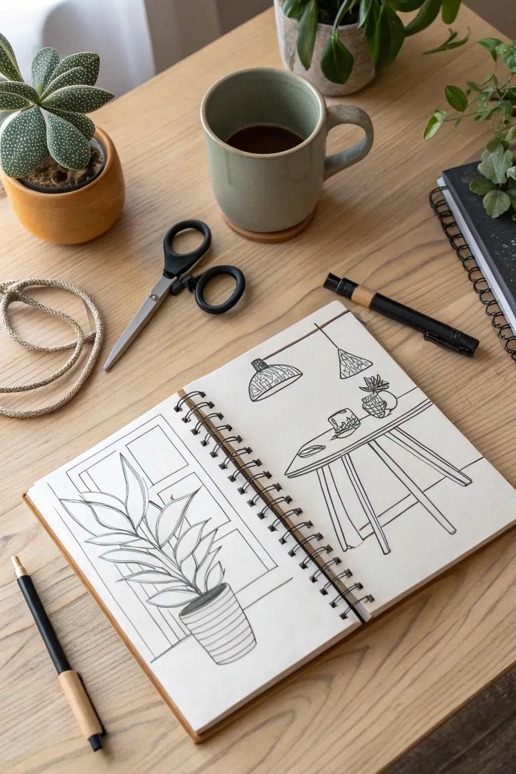
Capture the essence of your workspace with this clean, linear contour drawing that spans across two sketchbook pages. This project focuses on simplifying complex interior forms into crisp, deliberate lines without the distraction of shading or color.
Step-by-Step Guide
Materials
- Spiral-bound sketchbook (A5 or similar size)
- Fine liner pen (black, approx. 0.3mm or 0.5mm)
- Pencil (HB for sketching)
- Eraser
- Ruler (optional, but helpful for the table)
- Reference photo of a desk or dining area
Step 1: Planning the Composition
-
Establish the horizon:
Open your sketchbook to a fresh double-page spread. Visualize where the floor meets the wall. Lightly sketch a horizontal line across the right page, about one-third of the way up from the bottom, to anchor your table. -
Block in the main shapes:
Using your pencil very lightly, draw a large rectangle on the left page for the window frame. On the right page, sketch a slanted oval for the table surface and simple stick lines to indicate where the legs will go. -
Position the plant:
On the left page, sketch a simple cylinder shape near the bottom right of the page to represent the plant pot. Add sweeping, curved lines extending upward to map out the direction of the leaves. -
Add lighting fixtures:
On the top half of the right page, sketch the rough outlines of two hanging lamps. Place the left one slightly lower than the right one to create visual interest and depth. -
Refine the table details:
Thicken your initial table sketch. Turn the single “stick” legs into proper cylinder shapes or rectangular prisms, depending on your style. Add a rim to the table edge to give it three-dimensionality.
Wobbly Lines?
Don’t stress if straight lines aren’t perfect. In contour drawing, slight wobbles add organic charm. If you mess up a line, don’t scratch it out; just draw the correct line next to it.
Step 2: Inking the Plant Study
-
Outline the pot:
Switch to your fine liner pen. Start by tracing the plant pot on the left page. Draw the rim as a thin oval, then draw horizontal, slightly curved stripes around the body of the pot to emphasize its roundness. -
Draw the central stems:
Draw the central veins of the leaves first. Start from the pot and use confident strokes that curve outward. These don’t need to be perfectly straight; natural wobble adds character. -
Define the leaves:
Draw the outer edges of the leaves around the central veins. Notice how the leaves in the reference taper to a point. Allow some leaves to overlap others for a realistic look. -
Add leaf details:
Add angled veins inside each leaf, flowing from the center line toward the edges. Keep these lines lighter if you can, or simply space them out comfortably. -
Frame the window:
Behind the plant, ink the window frame using straight, deliberate lines. Break the lines where the plant leaves overlap the frame so the plant clearly sits in the foreground.
Pro Tip: Line Continuity
Try to lift your pen as little as possible. Longer, continuous strokes create a smoother flow than short, sketching dashes. Focus your eyes on the subject, not just the paper.
Step 3: Inking the Interior Scene
-
Ink the pendant lights:
Move to the right page. Ink the cords hanging from the top edge. Draw the curved shades of the lamps. Ideally, trace the pattern on the shades—simple vertical hatching or woven textures work well here. -
Define the tabletop:
Carefully ink the oval shape of the table. If you have objects on the table like a bowl or a small plant, draw those first so the back edge of the table doesn’t cut through them. -
Draw table legs and structure:
Ink the legs of the table. Notice in the example how the legs splay outward. Draw the cross-bracing if your table design has it, ensuring the lines connect logically. -
Add tabletop decor:
Draw the small items on the table—perhaps a mug, a small succulent, or a bowl. Keep these shapes simple, focusing on their silhouette rather than internal details. -
Creating the horizon line:
Finally, draw the stiff horizontal line behind the table to represent the wall edge or floor molding. Stop your pen when you hit the table legs and resume on the other side.
Step 4: Final Touches
-
Erase pencil marks:
Wait at least five minutes to ensure the ink is completely dry. I always check by lightly touching a heavy ink area. Once dry, gently erase all underlying pencil sketches. -
Assess line weight:
Look over your drawing. If you want certain objects to pop (like the main plant), go over the outer contour one more time to slightly thicken that specific line.
Now you have a stylish, minimalist record of your space that looks great as a standalone spread


Have a question or want to share your own experience? I'd love to hear from you in the comments below!