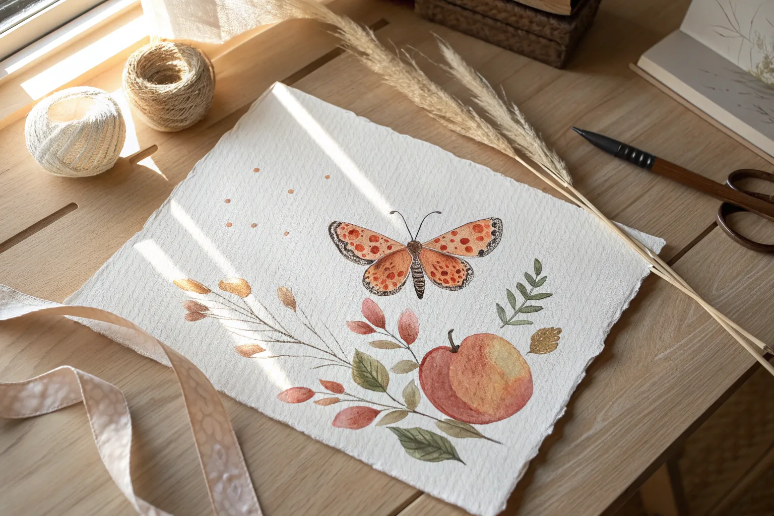
If you’re craving cute easy painting ideas on paper, you’re in the right headspace—quick wins, simple shapes, and charming little details that make your page feel instantly happy. I’m sharing my go-to beginner-friendly ideas that look adorable without needing perfect drawing skills or fancy setups.
Simple Daisies and Dots
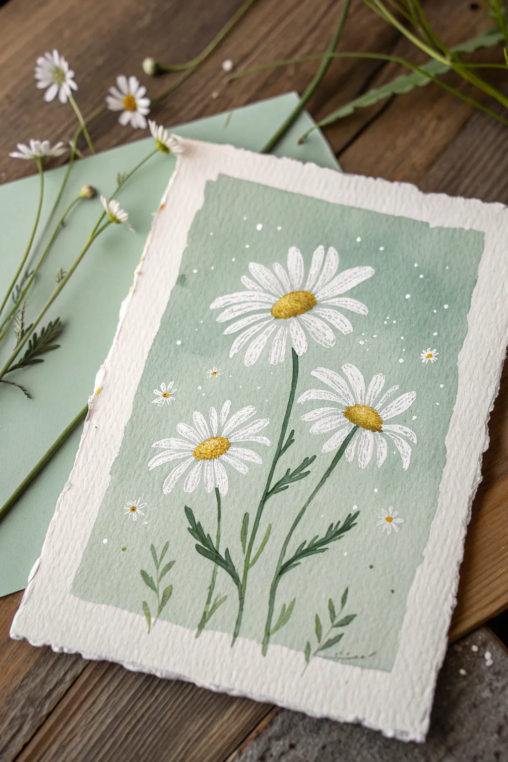
Capture the charm of a sunlit meadow with this lovely gouache painting featuring three prominent daisies against a soothing sage background. The textured paper and delicate white splatters give this piece a delightful, airy feel that’s perfect for a greeting card or framed art.
Detailed Instructions
Materials
- Heavyweight watercolor paper (300gsm cold press recommended)
- Masking tape or painter’s tape
- Gouache paints (Sage Green, Titanium White, Lemon Yellow, Yellow Ochre, Deep Green)
- Flat synthetic brush (size 6 or 8)
- Round synthetic brushes (sizes 2 and 0)
- Palette for mixing
- Water cups and paper towels
- White gel pen (optional)
- Old toothbrush (optional for splatter)
Step 1: Setting the Scene
-
Prepare your paper:
Start with a piece of watercolor paper cut to your desired size, perhaps A5 or 5×7 inches. If you want the torn-edge look shown in the reference, carefully tear the edges of the paper against a ruler instead of cutting with scissors. -
Tape the border:
Using masking tape, tape off a rectangular area in the center of your paper. This will create the crisp, painted background box while leaving a clean white border of raw paper around the outside. -
Mix the background color:
Mix a generous amount of sage green. I like to combine a pale green with a touch of white and a tiny dot of yellow ochre to warm it up. The consistency should be creamy like melted ice cream. -
Paint the background:
With your flat brush, fill in the taped rectangle completely with your sage green mix. Gouache dries fast, so work quickly to get an even, opaque layer. -
Create the rough edges:
To mimic the artistic, imperfect edges shown in the example, don’t rely solely on the tape. Once the main block is filled, take a slightly drier brush and feather the paint out slightly past where your tape line would be if you were freehanding, or simply peel the tape off while wet and use a dry brush to scuff the edges for that vintage, deckled look. Let this layer dry completely.
Clean Edges Top Tip
For that imperfect, vintage edge look, paint slightly outside your intended rectangle with a ‘dry brush’ technique before the main block is fully dry.
Step 2: Flowering Forms
-
Sketch placement:
Lightly sketch the position of the three main flower heads with a pencil. Place the largest one near the top center-right, one to the bottom left, and one to the bottom right for a balanced composition. -
Paint the first petal layer:
Load your size 2 round brush with Titanium White. Starting from the center of your sketched circles, pull the brush outwards to create long, thin petals. Don’t worry about perfect coverage yet; a little transparency adds depth. -
Refine the petals:
Go over the petals again with thicker white paint to increase opacity. Vary the length and curve of the petals so they look natural and not too uniform. -
Paint the flower centers:
Mix Lemon Yellow with a touch of Yellow Ochre. Using the rounded tip of your brush, dab this into the center of each flower to create a textured, domed center. -
Add texture to centers:
Once the yellow base is dry, mix a darker golden brown (Yellow Ochre + tiny bit of brown/orange). Stipple small dots on the lower side of the yellow centers to give them 3D volume and shadow.
Level Up: Metallic Pop
Mix a tiny bit of gold watercolor or metallic gouache into the yellow flower centers. It will catch the light beautifully when viewed from an angle.
Step 3: Stems and details
-
Paint the stems:
Switch to your size 0 or thin detail brush. Mix a Deep Green color. Paint slender, slightly curving lines extending downwards from each flower head to the bottom of the painted rectangle. -
Add leafy details:
Along the main stems and at the bottom, paint small, fern-like leaves. Use a flicking motion to keep the leaf tips pointed and delicate. Vary the green shade slightly by adding more water or a touch of yellow for interest. -
Connect flowers to stems:
Where the stem meets the petals, add tiny green sepals (the little cup under the flower head) to anchor the blooms visually. -
Add highlight details:
Using a very fine brush or a white gel pen, add tiny white highlights to the top of the yellow centers to make them look glistening. -
Paint tiny filler flowers:
Around the main three daisies, paint tiny asterisks or 5-dot flowers in white to fill the empty green space. Add microscopic yellow dots to their centers. -
Splatter effect:
Dilute a little white gouache with water. Load an old toothbrush or stiff brush and gently flick bristles to spray fine white dots across the background for a magical, pollen-filled atmosphere.
Now step back and admire your serene field of flowers.


Smiling Sun and Puffy Clouds
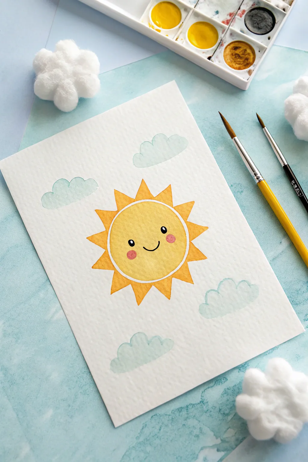
Brighten up your sketchbook with this cheerful, cartoon-style sun painting surrounded by soft, puffy clouds. The simple shapes and friendly face make this a perfect project for beginners looking to practice clean edges and flat washes.
Step-by-Step Tutorial
Materials
- Cold press watercolor paper (A5 or similar size)
- Watercolor paints (Yellow, Orange, Light Blue, Black, Pink)
- Round watercolor brush (size 6 or 8)
- Fine liner brush or black waterproof pen
- Pencil and eraser
- Compass or circular object for tracing
- Jar of water and paper towels
Step 1: Sketching the Layout
-
Draw the central circle:
Begin by lightly tracing a perfect circle in the center of your paper. Use a compass or trace around a small cup to get a clean shape. This will be the main face of your sun. -
Add the rays:
Sketch triangular rays around the entire circumference of the circle. Try to keep them relatively uniform in size, but don’t worry about mathematical perfection; a little variation adds charm. -
Outline the clouds:
Draw four fluffy cloud shapes in the background—two above the sun and two below. Keep the lines very faint so they won’t show through the light blue paint later. -
Map the face:
Lightly mark the position of two oval eyes and a curved smile in the center of the sun circle. Position them slightly lower than the midline for a cuter look.
Step 2: Painting the Sun
-
Fill the sun’s face:
Load your round brush with a bright, primary yellow. Carefully paint inside the central circle, maintaining a wet edge to avoid streakiness. -
Leave a white border:
Crucially, as you paint the yellow circle, leave a tiny sliver of unpainted white paper between the yellow fill and the start of the rays. This white ring acts as a highlight and separates the shapes cleanly. -
Let the center dry completely:
Wait for the yellow circle to serve as a dry base. If you paint the rays while the center is wet, the colors might bleed together and ruin your crisp white border. -
Paint the rays:
Mix a warm orange or golden yellow. Carefully fill in each triangular ray. I like to rotate the paper as I work around the circle so my hand doesn’t smudge the wet paint.
Clean Edges
For the crispest edges on your rays, don’t overload your brush. A brush that is damp—not dripping—gives you far more control over the sharp points.
Step 3: Clouds and Details
-
Mix a soft blue:
Dilute a small amount of blue paint with plenty of water to create a very pale, transparent wash. -
Paint the cloud shapes:
Gently fill in your cloud sketches with the pale blue wash. Because watercolor dries lighter, you might need a second layer if the first is too faint, but keep it airy. -
Add the rosy cheeks:
Once the yellow sun face is bone dry, mix a soft pink. dab two small circles on either side of the smile for the cheeks. Use a fairly dry brush to keep control. -
Paint the eyes:
Using a very fine brush and black paint (or a waterproof pen), fill in the oval eyes. Leave a tiny white dot in the upper corner of each eye for a sparkle reflection. -
Draw the smile:
With the same fine tool, carefully draw the simple ‘U’ shape for the smile. Ensure your hand is steady and the yellow paint underneath is completely dry. -
Erase pencil lines:
After the entire painting has dried for at least an hour, gently erase any visible pencil marks around the clouds or sun rays for a professional finish.
Bleeding Colors?
If your orange rays are bleeding into the yellow face, you didn’t wait long enough! Use a hair dryer on the low setting to speed up drying between adjacent colors.
Now you have a happy piece of art ready to hang on your wall or give as a greeting card
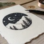
Pastel Sky With Crescent Moon
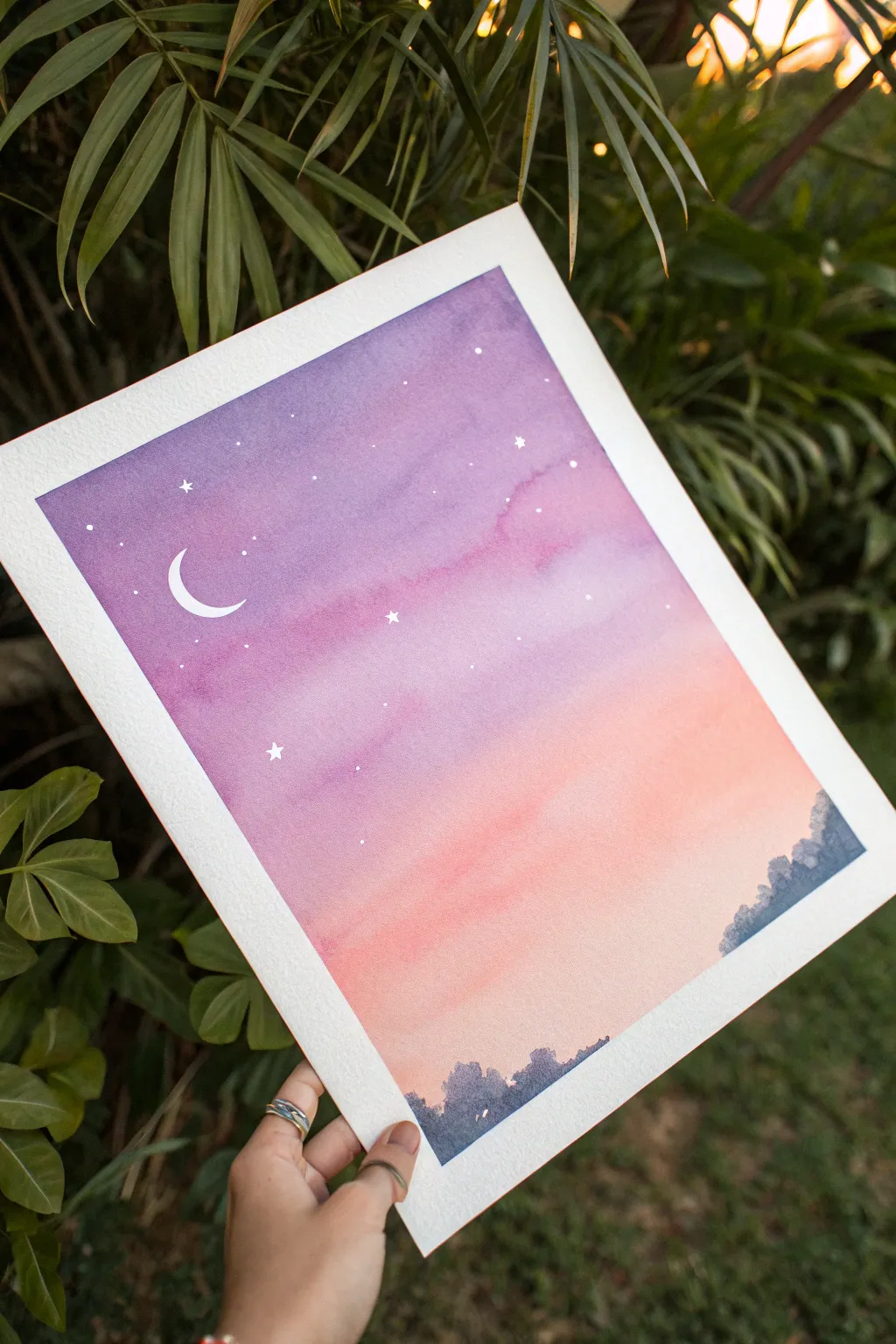
Capture the magic of twilight with this ethereal watercolor painting featuring a soft gradient from lavender to peach. The delicate crescent moon and twinkling stars make this simple landscape feel like a peaceful dream on paper.
Step-by-Step Guide
Materials
- Cold press watercolor paper (300 gsm recommended)
- Masking tape (painter’s tape)
- Watercolor paints: Purple/Violet, Magenta/Pink, Warm Orange, Indigo or Payne’s Grey
- Large flat wash brush
- Medium round brush (size 6 or 8)
- Small detail brush (size 0 or 1)
- White gouache or white gel pen
- Cup of clean water
- Paper towels
- Mixing palette
Step 1: Preparing the Canvas
-
Secure the paper:
Tape down all four edges of your watercolor paper to a hard board or table. Press the tape firmly to ensure clean, crisp borders once you peel it off later. -
Wet the surface:
Using your large flat wash brush and clean water, apply an even coat of water across the entire paper surface. The paper should be glistening but not forming puddles.
Step 2: Painting the Gradient Sky
-
Apply the purple:
Load your large brush with a diluted violet or purple tone. Start painting at the very top of the paper, using horizontal strokes to lay down the darkest part of the sky. -
Blend in pink:
While the purple is still wet, clean your brush slightly and pick up a magenta or soft pink color. Apply this directly below the purple, letting the two colors bleed and merge naturally where they touch. -
Transition to orange:
Rinse your brush and load it with a pale, warm orange. Paint a band below the pink section, continuing your horizontal strokes to encourage a smooth gradient. -
Fade to the horizon:
As you reach the bottom third of the paper, use mostly clean water on your brush to pull the orange pigment downward, letting it fade into the white of the paper near the horizon line. -
Adjust the blend:
If I notice any harsh lines, I like to gently run a slightly damp brush horizontally across the transition areas to soften them. Be careful not to overwork the paper. -
First drying phase:
Let this background layer dry completely. The paper must be bone-dry before you add the next details to prevent the trees from bleeding into the sky.
Pro Tip: Better Gradients
Tilt your paper board slightly so gravity helps pull the wet paint downward. This naturally assists the blending of the purple into the pink for a seamless transition.
Step 3: Adding the Silhouette
-
Mix the tree color:
Create a dark, moody blue-grey by mixing indigo with a touch of purple or black. You want this color to be fairly saturated, not too watery. -
Paint the tree line:
Using your medium round brush, dab irregular shapes along the bottom edge of the paper to simulate distant treetops. -
Vary the heights:
Make some trees taller and some shorter to create a natural, organic look. Keep the edges soft and slightly uneven to mimic foliage. -
Extend the base:
Fill in the solid area below the tree tops all the way down to the bottom tape line to ground the composition.
Level Up: Pine Shadows
Instead of a generic tree line, use a tiny fan brush or a dry detail brush to flick upward strokes, creating the specific texture of distant pine trees along the ridge.
Step 4: Celestial Details
-
Paint the moon:
Using white gouache and your smallest detail brush, carefully paint a thin, sharp crescent moon shape in the upper left purple section of the sky. -
Add major stars:
Paint a few larger distinct stars using small cross shapes or five-pointed stars scattered sparingly across the upper sky. -
Sprinkle distinct dots:
Use the tip of your small brush or a white gel pen to place precise white dots around the moon and in the purple and pink zones. -
Review the balance:
Step back and check the star distribution; add a few tiny dots in the lighter sections if needed, but keep the majority in the darker upper sky for contrast.
Step 5: Finishing Touches
-
Final dry:
Allow the tree line and white details to dry completely to avoid smudging. -
The reveal:
Slowly peel off the masking tape at a 45-degree angle, pulling away from the center of the painting to reveal your crisp white borders.
Frame your new twilight landscape or gift it to a friend who loves gazing at the night sky

Easy Heart Cluster

This charming project features a lovely collection of loose, hand-painted hearts clustered together to form a larger heart shape. Using a soft palette of dusty pinks, deep reds, and shimmering mauve, you’ll learn how to layer colors and vary sizes for a beautiful, organic composition.
How-To Guide
Materials
- Cold flower or rough textured watercolor paper (approx. 5×7 inches)
- Watercolor paints (shades of pink, red, maroon, and metallic rose gold)
- Round watercolor brushes (size 4 and 6)
- Clean water jar
- Paper towel or cloth
- Pencil and eraser (optional)
Step 1: Planning and Preparation
-
Prepare your palette:
Start by activating your watercolor pans with a drop of water each. You’ll need a variety of tones: a light blush pink, a medium dusty rose, a deep maroon, and a bright red. I also like to include a metallic copper or rose gold paint for special accents. -
Mix your base shades:
On your mixing palette, create three distinct puddles of color. Mix a very watery, pale pink for your lightest hearts, a saturated medium red, and a darker, moodier burgundy. Having these ready prevents stopping mid-painting. -
Rough sketch (optional):
If you’re nervous about the overall shape, lightly trace a large heart outline on your paper using a pencil. Keep the lines incredibly faint so they can be erased later, or simply use them as a loose guide without painting directly over them.
Step 2: Painting the Base Layer
-
Start large:
Load your size 6 brush with a medium dusty rose shade. Paint a medium-sized heart near the upper-middle section of your imagined heart cluster. Use two simple strokes: one curved stroke for the left lobe and one for the right, meeting at the bottom point. -
Establish the corners:
Using a slightly deeper red, paint a heart near where the bottom point of the large cluster will be. This helps anchor your design so you know your boundaries. -
Fill the center:
Switch to your palest pink tone. Paint two or three larger, tilted hearts in the center of the cluster. Let the water pool slightly at the bottom of the hearts for that characteristic watercolor texture. -
Vary the saturation:
Dip your brush into the deep maroon paint. Add a few bold, dark hearts towards the outer edges of the cluster. The contrast between the pale centers and dark edges adds depth. -
Add metallic touches:
If you have metallic watercolor, paint a few shimmering hearts scattered throughout the design. These catch the light beautifully and add a special touch to the composition.
Master the “Bloom”
Drop a tiny splash of clean water into the center of a still-wet heart. As it dries, the pigment pushes to the edges, creating a dark outline and a textured “bloom” effect.
Step 3: Adding Details and Fillers
-
Switch to a smaller brush:
Change to your size 4 round brush for better control over the tiny details. -
Paint tiny filler hearts:
Identify the white gaps between your larger painted hearts. Use the tip of the brush to dab in tiny, delicate hearts using various shades of red and pink to fill these voids. -
Rotate different angles:
Don’t paint all the hearts uniform and straight. Tilt some slightly left and others right. This “tossled” look makes the cluster feel organic and playful rather than rigid. -
Create color bleeds:
While some hearts are still damp, touch a wet brush loaded with a different color to the edge of a heart. Watch the pigment bleed into the damp area, creating a beautiful two-tone gradient. -
Balance the shape:
Step back and look at your painting. If the overall heart shape looks lopsided, add a medium-sized heart to the edge that needs filling out. -
Refine the edges:
Ensure the outermost hearts create a recognizable heart silhouette. You might need to add a few tiny hearts at the very top ‘V’ dip and the bottom point to sharpen the overall form.
Fixing a Blob
Did two wet hearts accidentally touch and bleed together? Use a clean, damp brush to “thirsty lift” the paint between them, creating a small white channel to separate them again.
Step 4: Finishing Touches
-
Check for puddles:
If any hearts have too much water pooling in them, gently touch a corner of a paper towel to the wet spot to lift the excess liquid, leaving a softer color behind. -
Let it dry completely:
Allow the painting to dry undisturbed for at least 15 minutes. The colors will lighten slightly as they dry. -
Erase guidelines:
Once the paper is bone dry, gently erase any visible pencil marks from your initial sketch, being careful not to smudge the paint.
Frame this sweet composition or turn it into a handmade card for someone special
BRUSH GUIDE
The Right Brush for Every Stroke
From clean lines to bold texture — master brush choice, stroke control, and essential techniques.
Explore the Full Guide
Chubby Cat Face
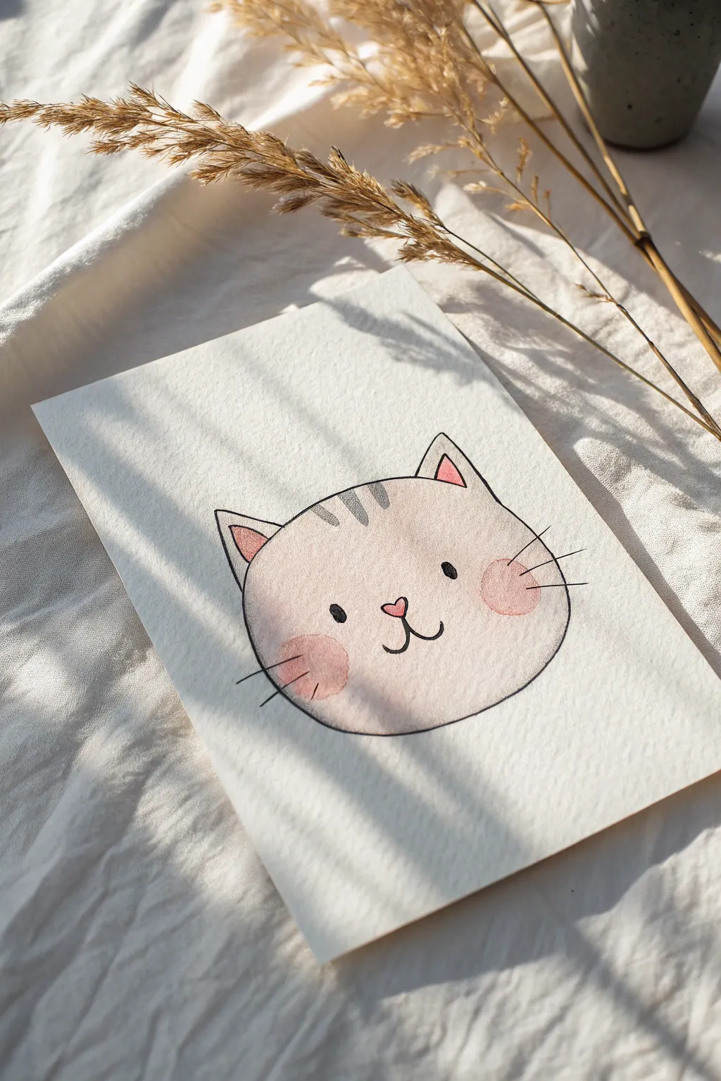
This adorable project captures the sweet simplicity of a chubby cat face using soft watercolors and clean ink lines. The textured paper adds a lovely organic feel, making the soft pink hues pop against the creamy background.
Step-by-Step
Materials
- Cold press watercolor paper (textured)
- Pencil (HB or lighter) and eraser
- Watercolors (soft pink, deeper rose pink, warm gray)
- Fine liner pen (black, waterproof, size 03 or 05)
- Round watercolor brush (size 6 or 8)
- Clean water and paper towel
Step 1: Sketching the Shape
-
Outline the head:
Start by lightly sketching a wide, flattened oval shape for the cat’s head. Imagine a slightly squashed bun to get that chubby look. -
Add the ears:
Draw two triangles on top of the oval. Place them fairly wide apart and curve the outer lines slightly to keep the feeling soft rather than sharp. -
Erase guidelines:
If your oval sketch has multiple messy lines, gently erase the excess until you have one clean, faint guide for your painting.
Clean Lines Tip
To keep your ink lines steady, try locking your wrist and moving your whole arm. Creating the outline in a few long strokes is often smoother than many short, sketchy ones.
Step 2: Watercolor Wash
-
Mix the base color:
Dilute a small amount of pink watercolor with plenty of water. You want a very pale, almost translucent wash for the main fur color. -
Paint the face:
Using your round brush, fill in the entire cat head shape. Keep the edges relatively neat but don’t worry about perfection; the texture of the paper will do some of the work for you. -
Add inner ears:
While the face wash is still wet or just starting to dry, mix a slightly more saturated pink and paint small triangles inside the ear shapes. -
Rosy cheeks:
Load your brush with a deeper rose pink. While the base layer is still slightly damp, dab two round circles on the cheeks to create soft, diffused blush spots. -
Top stripes:
Using a very watery warm gray mixture, paint three small, short stripes at the top of the forehead, between the ears. -
Let it dry completely:
Wait for the paint to be bone dry. If the paper feels cold to the touch, it’s still wet. Painting ink over damp paper will cause bleeding.
Step 3: Inking the Details
-
Outline the head:
Take your waterproof fine liner and trace the outer perimeter of the painted shape. Use a confident, consistent speed to keep the line smooth. -
Define the ears:
Ink the outer triangles of the ears, connecting them seamlessly to the head outline. You can outline the pink inner ear shapes too if you want extra definition. -
Draw the eyes:
Place two small, solid black ovals wide apart on the face. Positioning them lower on the face creates a cuter, younger look. -
Nose and mouth:
Draw a tiny heart shape for the nose right between the eyes. From the bottom point of the heart, draw two curved lines outward to make the classic ‘w’ mouth shape. -
Color the nose:
If you left the nose unpainted earlier, you can gently dab a tiny bit of pink paint inside the ink outline now, or leave it white. -
Add whiskers:
Limit the whiskers to two short, straight lines on each cheek, extending outward from the blush spots. Keeping them short maintains the chubby aesthetic.
Make it a Set
Create a whole series of facial expressions using this same template—try a winking cat, a sleeping cat, or one sticking its tongue out to create a cute gallery wall.
Now you have a sweet little character ready to brighten up a greeting card or sketchbook page
Frog Peeking From a Pond
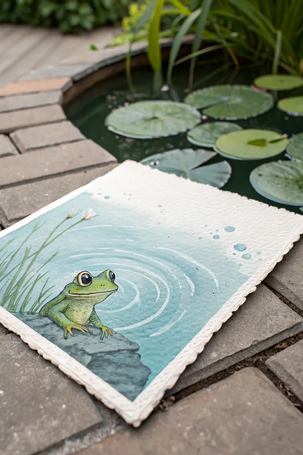
Capture the serenity of a garden pond with this charming watercolor illustration featuring a friendly green frog. Using soft washes and crisp details, you’ll create a layered scene that feels both peaceful and playful.
Detailed Instructions
Materials
- Heavyweight watercolor paper (preferably with deckled edges)
- Watercolor paints (phthalo blue, sap green, yellow ochre, burnt umber, black, white gouache)
- Round brushes (flats/washes for background, size 2 or 4 for details)
- Pencil and kneaded eraser
- Masking fluid (optional)
- Palette
- Two jars of water
- Paper towels
Step 1: Sketching and Preparation
-
Outline the Composition:
Begin by lightly sketching the main elements with a pencil. Place the large rock in the bottom left corner and position your frog sitting atop it. Keep the frog’s shapes simple—an oval body and rounded head. -
Add Details:
Refine the frog’s sketch by adding the large, expressive eyes, the mouth line, and the front legs gripping the rock. Sketch in a few tall, thin reeds rising from behind the rock on the left side. -
Map the Ripples:
Lightly draw concentric curved lines rippling outward from the frog into the water area. These don’t need to be perfect circles; gentle arcs work best to suggest movement.
Deckle Edge Effect
To get the rough paper edge shown in the photo, fold your watercolor paper and tear it against a ruler instead of cutting with scissors.
Step 2: Painting the Water
-
Mix the Water Color:
Create a watery mix of phthalo blue with a touch of green to get that teal pond color. You want this to be quite diluted for a soft, transparent look. -
Apply the Wash:
Paint the water area, carefully working around the frog, rock, and reeds. I find it helpful to fade the color out to white as you move toward the top right corner, creating an airy, misty effect. -
Add Depth:
While the paper is still slightly damp, drop a slightly more saturated version of the teal into the lower right area and around the rock base to suggest deeper water. -
Let it Dry:
Allow this background layer to dry completely before moving on. If you engage the next step too soon, the crisp lines will bleed.
Step 3: Bringing the Frog to Life
-
Base Coat the Frog:
Mix a bright sap green with a little yellow ochre. Paint the entire body of the frog, leaving the belly area slightly lighter if possible. -
Shadowing the Frog:
Once the base green is dry, mix a darker green (add a tiny bit of blue or brown to your mix). Apply shadows under the chin, along the side of the body, and under the legs to give the frog volume. -
The Eyes:
Paint the large pupils solid black. Leave a tiny speck of white paper for the highlight, or add it later with white gouache. Paint the iris a golden yellow. -
Paint the Rock:
Use a mix of black and white gouache or watered-down black watercolor to create a grey. Paint the rock surface, dabbing your brush to create a rough, stony texture. -
Rock Shadows:
Add darker grey or black to the bottom of the rock and crevices to ground it in the scene.
Muddy Colors?
If your green frog looks dull against the blue water, ensure the water layer is 100% dry before painting the frog to prevent colors from bleeding together.
Step 4: Final Details and Atmosphere
-
Painting the Reeds:
Using a thin liner brush and a mix of sap green, paint the long, slender grass blades on the left. Top a few of them with small white dabs for flowers. -
Creating Ripples:
Using white gouache (or very opaque white watercolor), carefully paint thin, curved lines over the dried blue water wash, following your initial pencil guides. -
Water Highlights:
Add smaller, broken white lines between the main ripples to simulate sparkling light on the water surface. -
Bubble Accents:
Paint a few small circles floating up towards the right side using a semi-transparent teal, then highlight the top edge of each bubble with a dot of white. -
Final Outline:
If you want a sharper illustrative look like the example, can use a very fine brush or a waterproof fineliner pen to add subtle outlines to the frog and rock.
Now you have a serene little pond friend ready to brighten up your sketchbook or wall

PENCIL GUIDE
Understanding Pencil Grades from H to B
From first sketch to finished drawing — learn pencil grades, line control, and shading techniques.
Explore the Full Guide
Cute Cactus Trio
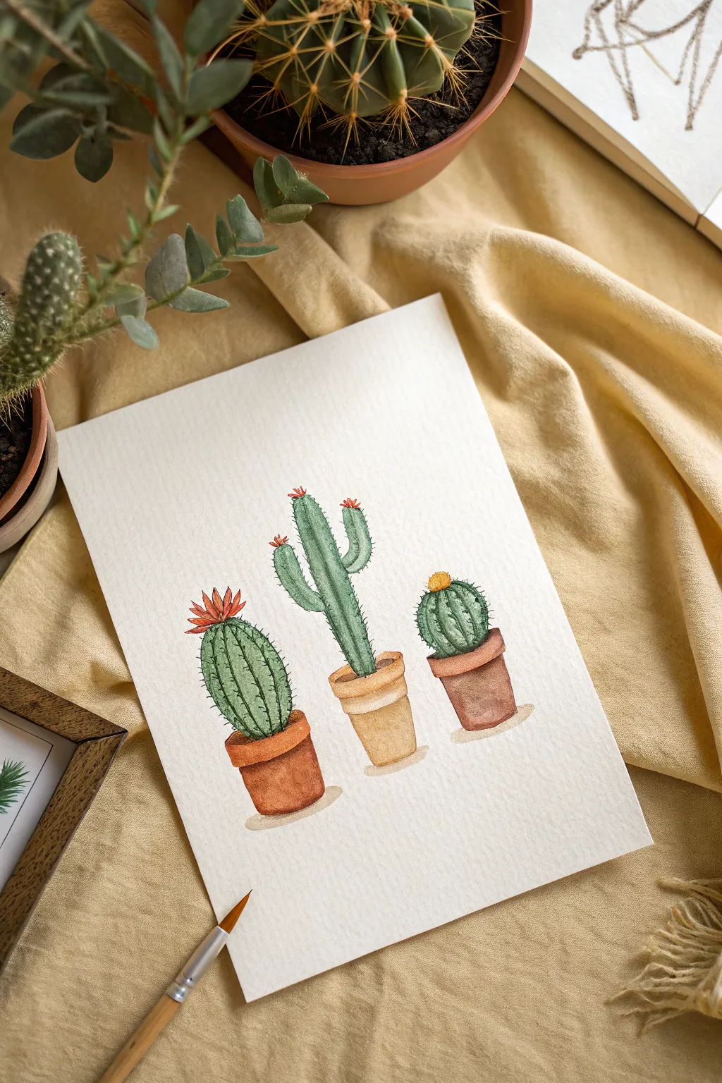
Bring a touch of the desert indoors with this delightful watercolor painting featuring three distinct cacti in simple terracotta pots. The soft textures and warm earth tones create a cozy, handmade feel that’s perfect for beginners looking to practice wet-on-dry techniques and simple shading.
Step-by-Step
Materials
- Cold-press watercolor paper (at least 300gsm)
- Watercolor paints (Sap Green, Burnt Sienna, Yellow Ochre, Cadmium Red/Orange, Payne’s Grey)
- Round brushes (sizes 2, 4, and 6)
- Pencil (HB or 2H)
- Kneaded eraser
- Two jars of water
- Paper towel
Step 1: Sketching the Layout
-
Outline the pots:
Start by lightly sketching three flower pots in a horizontal row. Draw the left and right pots slightly lower than the middle one to create a dynamic composition. Keep the shapes simple—a wider rim at the top and a slightly tapered body. -
Draw the cacti shapes:
For the left pot, sketch an oval-shaped cactus. In the middle, draw a tall, column-like cactus with two small arms reaching upward. On the right, sketch a round, globe-shaped cactus sitting snugly in its pot. -
Add floral details:
Lightly sketch a small, spiky flower on top of the left cactus and tiny buds on the tips of the middle cactus arms. Add a small round bloom atop the right cactus. -
Clean up the sketch:
Use your kneaded eraser to gently lift the graphite until the lines are faint but visible. This prevents the pencil marks from muddying your watercolours later.
Water Control Tip
Work wet-on-dry for the ribs and spines. If the base green is still wet, your sharp details will blur into fuzzy blobs.
Step 2: Painting the Cacti
-
Base layer for the greens:
Mix a watery wash of Sap Green. Using your size 6 brush, fill in the body of all three cacti. Keep the wash light and even, leaving the paper white where the flowers will go. -
Adding dimension to the left cactus:
While the first layer is dry, mix a slightly darker green. Paint vertical stripes following the curve of the oval cactus on the left to suggest ribs. Leave thin gaps of the lighter base color showing between the stripes for highlights. -
Texturing the tall cactus:
For the middle cactus, use the size 4 brush and a medium green mix to add vertical ridge lines. I like to make these lines slightly shaky or broken to mimic natural texture. -
Shading the round cactus:
On the right spherical cactus, paint curved vertical lines that contour the round shape, meeting at the top center under the flower. -
Defining the needles:
Switch to your smallest brush (size 2). Mix a dark green with a tiny bit of Payne’s Grey. Paint tiny, short ticks or dots along the darker ridges of all three cacti to represent spines.
Step 3: Painting the Pots and Flowers
-
Base coat for the pots:
Mix a light wash of Burnt Sienna for the left and right pots. For the center pot, mix Yellow Ochre with a touch of Burnt Sienna for a lighter, sandy clay look. Fill in the pot shapes. -
Shadowing the rims:
Once the base coat is dry, mix a concentrated Burnt Sienna. Paint a shadow directly under the rim of each pot to create depth. -
Rounding the forms:
Add a second layer of your pot color to the left and right sides of each pot, blending inward with a clean, damp brush. This creates a cylindrical illusion, making the pots look round rather than flat. -
Painting the blooms:
Use a vibrant Red/Orange for the flower on the left cactus, painting petal shapes radiating outward. Use the same color for the tiny buds on the middle cactus. Use a warm Yellow for the round flower on the right. -
Grounding shadows:
Mix a very watery grey or diluted brown. Paint a small, soft oval underneath each pot, slightly offset to the right, to ground the objects so they don’t look like they are floating.
Spicing It Up
Try using a white gel pen at the very end to add high-contrast highlights on the shiny side of the cactus skins or pot rims.
Step 4: Final Details
-
Deepening contrast:
Look at your painting from a distance. If the spines have faded, go back with your darkest green mixture and re-emphasize a few of them on the shadow sides. -
Adding texture to the soil:
Dab a tiny bit of dark brown just inside the rim of the pots, right at the base of the cacti, to suggest soil.
Once dry, frame your desert trio to add a warm, botanical vibe to any corner of your home
Whale Tail Over a Gradient Sea
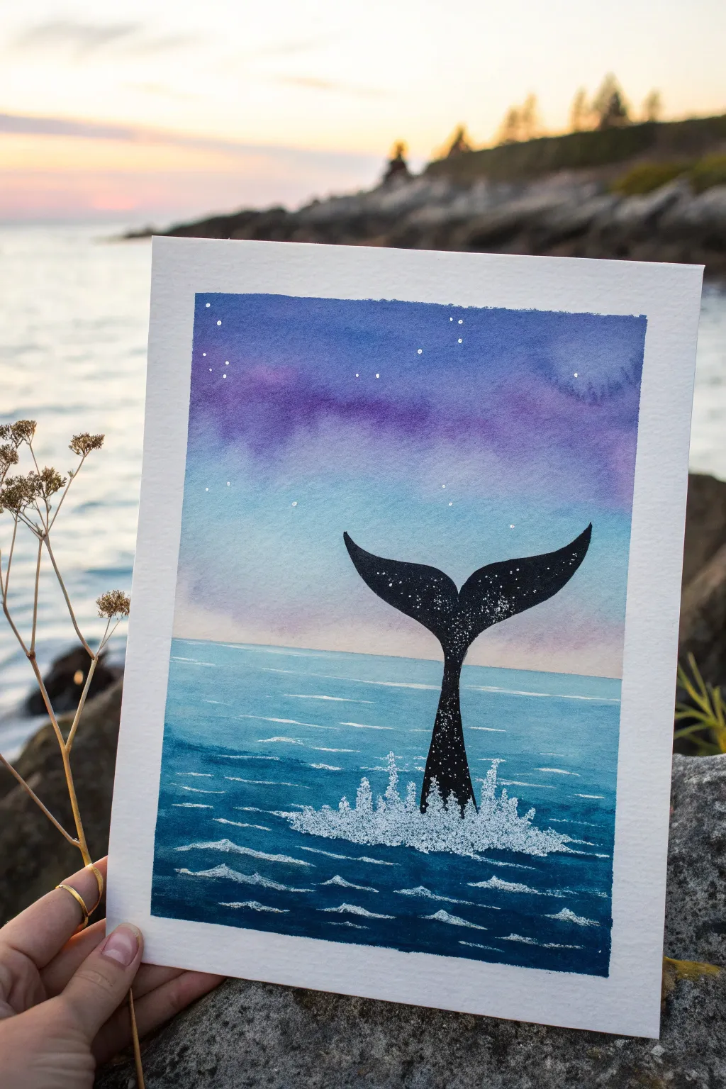
Capture the magic of the ocean at twilight with this serene watercolor project. You’ll master a beautiful purple-to-blue gradient sky and create a striking silhouette of a whale’s tail splashing in the waves.
Step-by-Step Tutorial
Materials
- Watercolor paper (cold press, 140lb/300gsm recommended)
- Watercolor paints (Indanthrone Blue, Dioxazine Purple, Phthalo Blue, Turquoise)
- Black gouache or waterproof black ink
- White gel pen or white gouache
- Masking tape or painter’s tape
- Round watercolor brushes (size 6 and size 2)
- Small flat brush
- Jar of clean water
- Paper towels
- Pencil and eraser
Step 1: Preparation & Sky
-
Tape the borders:
Begin by taping down all four edges of your watercolor paper to a board or table. This creates that crisp, clean white border you see in the final piece and prevents the paper from buckling when wet. -
Sketch the horizon:
Lightly draw a straight horizontal line about one-third of the way up from the bottom to separate the sea from the sky. -
Wet the sky area:
Using your larger round brush or flat brush, apply clean water to the entire sky section above your horizon line until the paper has a gentle sheen. -
Apply the purple:
Load your brush with Dioxazine Purple. Start painting at the very top of the sky, sweeping back and forth. Let the color flow naturally into the wet paper. -
Create the gradient:
Rinse your brush slightly and pick up Phthalo Blue. Blend this right below the purple, allowing the colors to bleed together mid-sky. -
Fade to horizon:
As you move closer to the horizon line, dilute the blue paint significantly with water so it fades into a very pale, almost white blue right at the water’s edge. -
Drying time:
Wait for the sky section to dry completely before moving on. I like to use a hairdryer on a low cool setting to speed this up if I’m impatient.
Step 2: Painting the Ocean
-
Base ocean layer:
Mix a watery wash of Turquoise and Phthalo Blue. Paint the entire ocean section below the horizon line with this light, even color. -
Deepen the water:
While the base layer is still damp, drop in concentrated Indanthrone Blue or darker turquoise near the bottom of the page to create depth. -
Add gentle waves:
Once the base layer is dry, use your size 6 brush with a darker blue mix to paint loose, horizontal wavy lines across the water, leaving gaps of the lighter color showing through. -
Refine the surface:
Add thinner, more precise wave lines closer to the horizon using the tip of your brush to mimic distance.
Uneven Gradients?
If your sky looks streaky, re-wet the entire area and tilt the paper to help the pigment flow downward more naturally.
Step 3: The Whale Silhouette
-
Sketch the tail:
With a pencil, lightly outline the shape of the whale’s tail (flukes) rising from the center of the water. Make sure the stem is centered and the tips curve gracefully outward. -
Fill with black:
Using black gouache or ink and your size 2 brush, carefully fill in the whale tail silhouette. Gouache gives a wonderful matte opacity that watercolor sometimes lacks for silhouettes. -
Add texture:
While the black paint is still wet, you can tap in a tiny bit of water or very dark blue in the center to give it a slight, uneven texture, though solid black works beautifully too.
Make It Sparkle
Mix a tiny amount of iridescent medium or metallic watercolor into the splash area for a magical shimmer.
Step 4: Magical Details
-
Splash zone:
Using a white gel pen or thick white gouache, draw the splash around the base of the tail where it meets the water. Use tiny dots and upward scribbles to mimic foamy spray. -
Highlight the waves:
Add thin white lines to the tops of your dark blue waves in the foreground to create sea foam and movement. -
Stars in the tail:
Dot the inside of the black whale tail with white gel pen to create a ‘galaxy’ effect inside the silhouette. -
Sky stars:
Finally, add a few scattered white dots in the purple section of the sky for distant stars. -
Reveal the border:
Once absolutely everything is bone dry, slowly peel away the masking tape at a 45-degree angle to reveal your clean edges.
This celestial ocean scene makes a perfect greeting card or framed miniature for a beach-themed room


Mini Mountain Postcard Scene
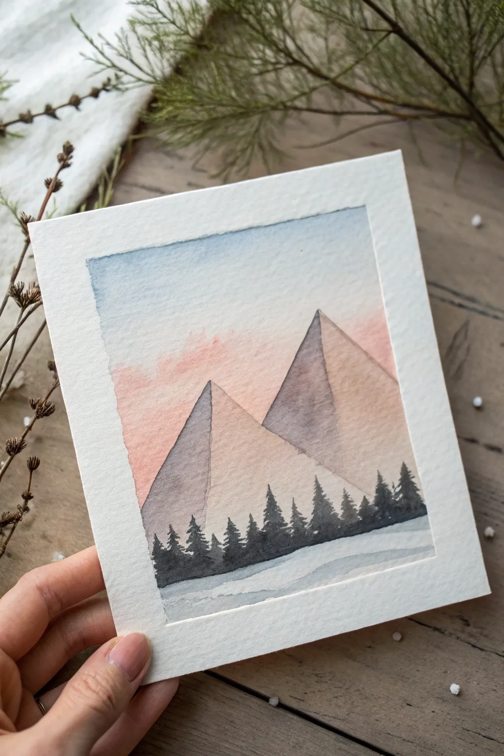
Capture the serene beauty of a winter landscape with this charming postcard-sized watercolor painting. Featuring a soft gradient sky, geometric mountain peaks, and a crisp tree line, this project is perfect for sending a handmade greeting.
Step-by-Step
Materials
- Cold press watercolor paper (postcard size or 5×7 inches)
- Painter’s tape or masking tape
- Watercolor paints (Indigo, Payne’s Grey, Burnt Sienna, Rose Madder or Alizarin Crimson, Cerulean Blue)
- Round watercolor brushes (size 6 for washes, size 2 for details)
- Jar of clean water
- Paper towels
- Pencil and eraser
- Rigid backing board
Step 1: Preparation and Sketching
-
Tape the borders:
Secure your watercolor paper to a rigid backing board using painter’s tape. Create a border about half an inch wide on all four sides to mask off the edges. Press the tape down firmly to ensure crisp, clean lines later. -
Sketch the mountains:
Using a light pencil, draw two large triangles for the mountains. Position the larger mountain slightly to the right and behind, and the smaller one to the left and forward. Keep the lines faint so they don’t show through the paint. -
Mark the horizon:
Lightly sketch a horizontal line near the bottom third of the paper to designate where the tree line and snowy foreground will eventually sit.
Fixing Bleeds
If paint bleeds under the tape, wait for it to dry fully. Then, take a small amount of opaque white gouache or acrylic paint and carefully touch up the border to restore the clean edge.
Step 2: Painting the Sky
-
Prepare the sky wash:
Mix a watery solution of Cerulean Blue for the upper sky. For the lower sky, prepare a very diluted mix of Rose Madder or Alizarin Crimson to create a soft sunset glow. -
Apply the blue:
Using your size 6 brush, wet the sky area with clean water first. Drop in the blue pigment at the very top, letting it flow naturally downward but stopping before you reach the mountains. -
Blend in the pink:
While the paper is still damp, introduce the pink wash just above the mountain peaks facing the light. Gently blend it upward into the blue to create a soft, violet transition. -
Let it dry:
Allow the sky layer to dry completely before moving on. If you paint the mountains while the sky is wet, the colors will bleed into each other.
Starry Night
Make it a night scene! Use indigo for the sky and wait for it to dry. Dip a toothbrush in white gouache and flick bristles to splatter tiny stars across the sky before painting the mountains.
Step 3: Creating the Mountains
-
Mix mountain colors:
Create two mixtures: a warm, light beige using watered-down Burnt Sienna for the sunlit sides, and a cooler, darker grey using Payne’s Grey (perhaps with a touch of purple) for the shadowed sides. -
Paint the light side:
Start with the right side of the mountain peaks. Apply the warm beige wash, covering the right face of both triangles. Keep the wash even and translucent. -
Paint the shadow side:
Once the light side is touch-dry, paint the left faces of the mountains with the cooler grey mix. This contrast gives the geometric triangles a 3D pyramid form. -
Soften the edges:
If I want a dreamier look, I sometimes soften the very bottom edge of the mountains with a clean, damp brush so they fade slightly into the white beneath them.
Step 4: Foreground Details
-
Mix the tree color:
Prepare a concentrated, dark mix of Indigo or Payne’s Grey. You want this to be opaque and bold to stand out against the pale background. -
Start the tree line:
Switch to your size 2 brush. Starting at the base of the mountains, paint vertical lines of varying heights to establish the trunks of the pine trees. -
Add pine branches:
Using the very tip of the brush, use small dabbing or zigzag motions to create the foliage of the trees. Start narrow at the top and widen the branches as you move down the trunk. -
Fill the forest floor:
Connect the bases of the trees by filling in the area immediately beneath them with the same dark pigment, creating a solid silhouette band across the paper. -
Paint the snowy ground:
Dilute your grey mountain mix with a lot of water. Paint a few horizontal, sweeping strokes below the tree line to suggest shadows on the snow or ice. -
Final reveal:
Once the painting is 100% dry—check the darkest tree areas especially—carefully peel away the masking tape at a 45-degree angle to reveal your crisp white border.
Sign your masterpiece in the corner and get ready to mail this beautiful slice of wilderness to a friend
Cherry Blossom Confetti Branch
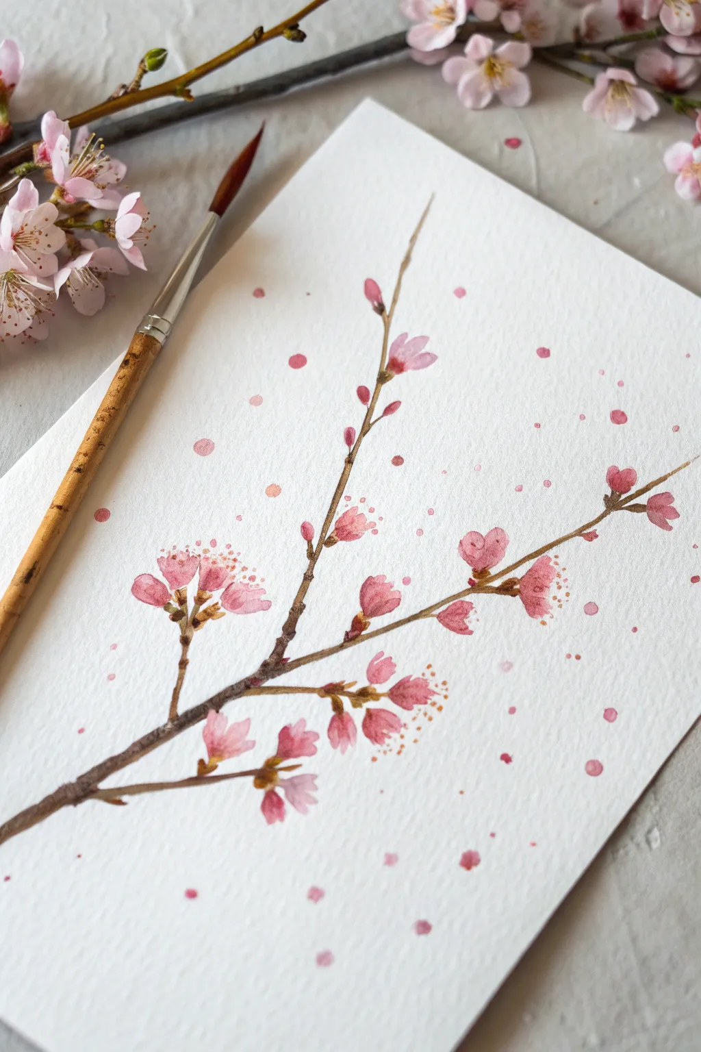
Capture the delicate beauty of spring with this whimsical cherry blossom watercolor study. This project combines precise botanical details with playful paint splatters for a loose, festive finish that feels like petals dancing in the breeze.
Step-by-Step Tutorial
Materials
- Cold press watercolor paper (A5 or 5×7 inches)
- Round watercolor brush (size 2 or 4)
- Small liner brush or rigger brush (size 00)
- Watercolor paints: Burnt Umber, Alizarin Crimson, Sap Green, Yellow Ochre
- Jar of clean water
- Paper towel
- Mixing palette
Step 1: Painting the Structure
-
Mix your brown:
Start by creating a natural wooden tone. Mix a generous amount of Burnt Umber with a tiny touch of Alizarin Crimson to warm it up. The consistency should be like tea—fluid but not too watery. -
Establish the main branch:
Using the tip of your round brush or a liner brush, paint the main branch starting from the bottom left corner. Extend it diagonally upward toward the center, lifting your pressure near the end to make the line taper naturally. -
Add secondary twigs:
Paint two or three smaller offshoot branches growing from the main stem. Keep these lines thin and slightly jagged to mimic the irregular growth of real wood. -
Create bud nodes:
Along the branches, dab tiny, darker brown dots where you want your flower clusters to sit. These will serve as the anchors for your blooms.
Splatter Control
If you are worried about getting paint on specific flowers, cover them gently with a scrap of paper towel before you start flicking the paint for the confetti effect.
Step 2: Blooming the Flowers
-
Mix a gentle pink:
Clean your brush thoroughly. On your palette, dilute Alizarin Crimson with plenty of water to create a soft, transparent petal pink. I like to keep a second, slightly more concentrated puddle nearby for variation. -
Paint the closed buds:
Using the concentrated pink, paint small, teardrop shapes at the very tips of the thinnest twigs. These represent the tightly closed buds that haven’t opened yet. -
Form the open blossoms:
For open flowers, use the watery pink. Paint three to five small, rounded strokes clustered together near the branch nodes. Leave a tiny bit of white space between the petals to keep them airy. -
Add depth to petals:
While the petals are still damp, touch the base of a few flowers with the darker, concentrated pink mix. Let the color bleed naturally into the wet petal for a soft gradient look. -
Connect flowers to stems:
Once the flowers are dry, use your smallest brush and a mix of Sap Green and Burnt Umber to paint tiny calyxes (the little green cups) at the base of each flower, connecting them firmly to the branch.
Level Up: Metallic Pop
Once your painting is totally dry, add tiny dots of metallic gold watercolor or gold gel pen to the center of the flowers for a shimmering, elegant finish.
Step 3: Details & Confetti
-
Add pollen details:
Mix a small amount of Yellow Ochre with very little water so it’s opaque. Using the very tip of your liner brush, dot tiny stamens in the center of the open flowers. -
Enhance with reddish accents:
For extra realism, add very fine red-brown lines radiating from the flower centers alongside the yellow dots. -
Prepare the confetti paint:
Load a medium-sized round brush with a juicy, watery mixture of your pink paint. It needs to be wet enough to drip easily. -
Splatter large drops:
Hold the brush over the paper and tap the handle firmly with another brush or your finger. Let larger drops fall randomly around the branches to mimic falling petals. -
Create fine mist:
For tinier specks, load the brush again and flick the bristles with your finger closer to the paper. Focus this fine mist near the flower clusters. -
Allow to dry completely:
Let the paper sit flat until every splatter is fully dry to prevent smearing.
Now you have a lively spring branch that looks like it’s celebrating the season
Salt-Sparkle Galaxy on Paper
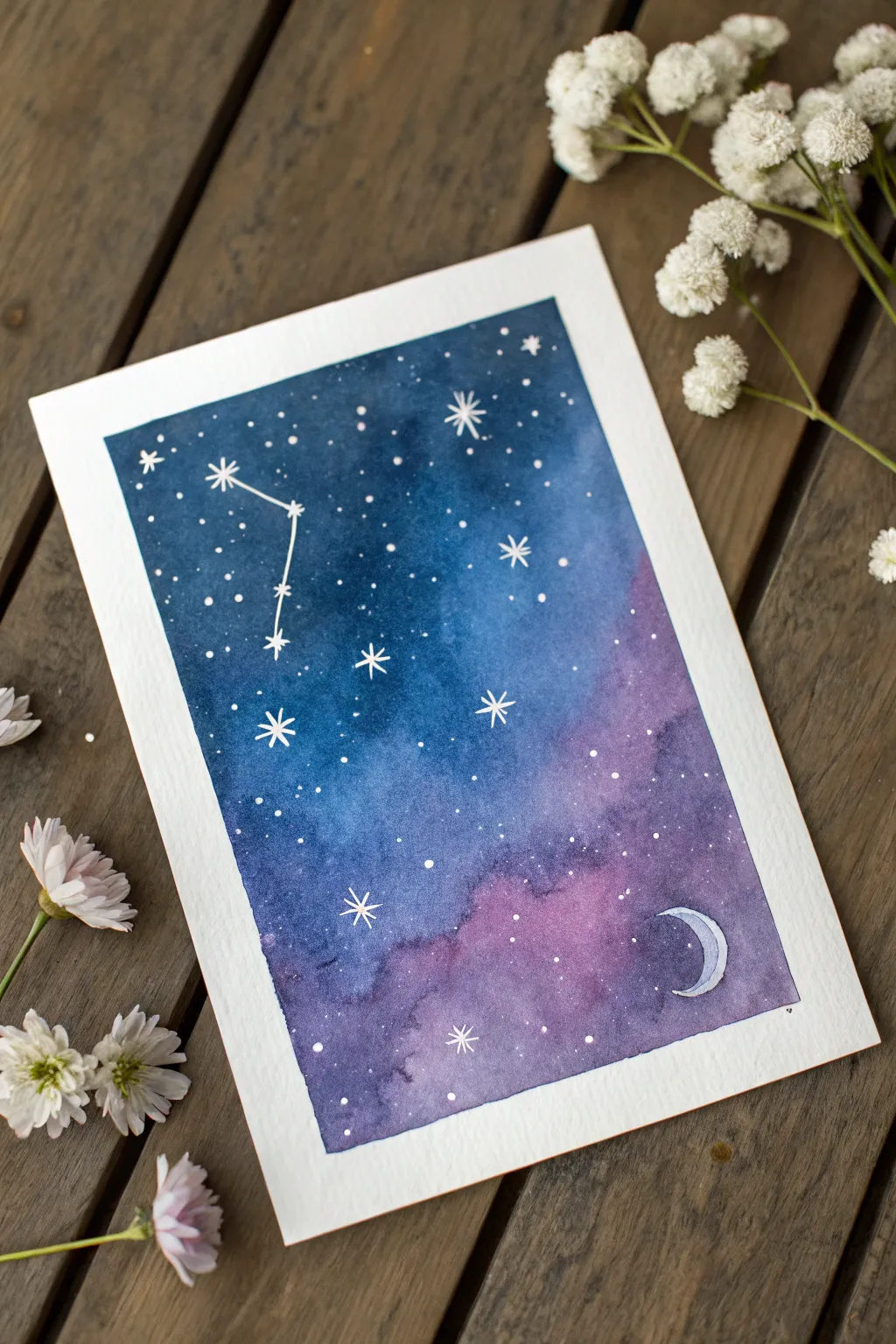
Capture the magic of a starry night with this simple watercolor technique that uses table salt to create organic, nebula-like textures. This project blends deep indigo and soft violet hues for a dreamy backdrop, framed perfectly by white constellations and a crescent moon.
How-To Guide
Materials
- Cold press watercolor paper (A5 size or similar)
- Watercolor paints (Indigo, Prussian Blue, Violet/Purple)
- Flat wash brush (medium size)
- Round detail brush (size 2 or 4)
- Masking tape or painter’s tape
- Table salt
- White gel pen or white gouache
- Pencil and eraser
- Two jars of water (one clean, one for rinsing)
Step 1: Preparation & Sketching
-
Tape the edges:
Secure your watercolor paper to a drawing board or table using masking tape along all four edges. Press down firmly to create a crisp, clean border and prevent buckling. -
Review the layout:
Visualize where you want your galaxy to flow. In the reference, the darker teals and blues dominate the upper left, fading into purples towards the bottom right. -
Lightly sketch placements:
Very faintly sketch the position of the crescent moon in the bottom right corner so you know to paint carefully around it or lift color later.
Step 2: Painting the Galaxy
-
Wet-on-wet base:
Using your flat wash brush, saturate the paper with clean water. You want the surface to be glistening but not forming puddles. -
Apply the Indigo:
Load your brush with deep Indigo or Prussian Blue. Start dropping color into the upper left corner, letting it spread naturally into the wet paper. -
Introduce Violet:
Rinse your brush and pick up a vibrant Violet or Purple shade. Apply this to the bottom right section, blending it gently where it meets the blue in the middle to create a soft transition. -
Deepen the contrast:
While the paper is still wet, add more concentrated pigment to the corners and edges to create depth. I like to dab darker blue spots randomly to mimic cloud-like nebulas. -
Add the salt texture:
While the paint is still wet and shiny—this timing is crucial—sprinkle a pinch of table salt over the purple and transition areas. The salt will absorb the pigment, creating beautiful star-burst textures. -
Let it dry completely:
Allow the painting to dry fully on its own. Avoid using a hair dryer if possible, as it might blow the salt crystals away before they do their magic. -
Remove the salt:
Once the paper is bone dry to the touch, gently rub off the dried salt crystals with your fingers or a clean, dry brush to reveal the textured patterns underneath.
Timing is Everything
Add salt when the paper is shiny-wet, not soaking (puddles) or damp (matte). If it’s too wet, the salt dissolves; too dry, and nothing happens.
Step 3: Adding Celestial Details
-
Paint the Moon:
Using a very dilute blue or purple, lightly fill in the crescent moon shape you sketched earlier. You can outline it in white gel pen for a sharper look. -
Draw the constellation:
With a white gel pen or fine brush with white gouache, draw the main stars of your chosen constellation (the example looks like Cancer). Connect them with thin lines. -
Add major stars:
Draw larger, eight-pointed stars scattered around the sky. Draw a simple cross, then an ‘X’ over it to create the sparkle shape. -
Sprinkle distant stars:
For the tiny background stars, you can either dot them by hand with the gel pen or load a toothbrush with white gouache and flick it over the paper for a natural spray. -
Final touches:
Add a few medium-sized solid dots to balance out the composition between the large sparkles and the tiny flicked stars. -
Reveal the border:
Slowly peel away the masking tape at a 45-degree angle, pulling away from the painting to ensure a perfect, clean white edge.
Unwanted Blooms?
If cauliflower-like blooms appear where you didn’t want them, don’t worry! In a galaxy painting, these actually look like realistic gas clouds.
Now you have a stunning piece of cosmic art ready to frame or turn into a greeting card


Have a question or want to share your own experience? I'd love to hear from you in the comments below!