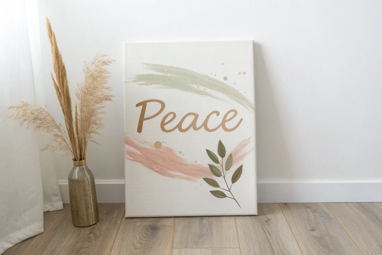
When I’m craving a calmer mind, I love making art that’s literally built around peace—simple symbols, soothing colors, and gentle textures. Here are my favorite peace painting ideas to try when you want something meaningful, relaxing, and totally yours.
Classic Peace Sign Silhouette
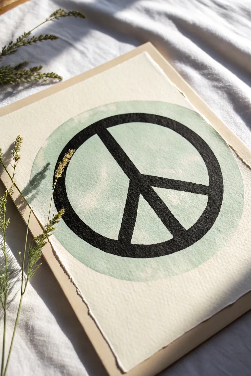
This serene project combines soft watercolor textures with bold, graphic lines to create a modern peace symbol. The result is a calming piece of art featuring a misty sage green circle backdrop and a striking black silhouette, perfect for minimalist decor.
How-To Guide
Materials
- Cold press watercolor paper (deckle edge preferred)
- Beige or oatmeal-colored backing board/cardstock
- Sage green watercolor paint
- Black India ink or acrylic ink
- Large round watercolor brush (size 10-12)
- Medium liner brush or flat brush for the symbol
- Compass or round object for tracing
- Pencil
- Ruler
- Glue stick or acid-free adhesive tape
Step 1: Preparing the Base
-
Select your paper:
Choose a high-quality watercolor paper with some texture. If your paper doesn’t have a natural deckle edge, you can create a faux one by carefully tearing the edges against a ruler rather than cutting them. -
Outline the circle:
Lightly trace a large circle in the center of your watercolor paper using a compass or a large bowl. Keep your pencil pressure extremely light so the graphite doesn’t smudge into the wet paint later. -
Mix the sage wash:
Dilute your sage green watercolor paint with plenty of water. You want a transparency that allows the paper’s texture to show through, creating that misty, organic look rather than a solid opaque block of color.
Deckle Edge Trick
To get softer torn edges, paint a line of water where you want to tear the paper. Let it soak for a minute, then gently pull the paper apart along the wet line.
Step 2: Painting the Green Backdrop
-
Lay the wash:
Using your large round brush, fill in the circle with the sage green wash. Work reasonably quickly to keep a wet edge, which prevents harsh drying lines from forming within the shape. -
Create texture:
While the paint is still wet, you can dab a clean, slightly damp tissue onto a few spots to lift a little pigment. This creates subtle cloud-like variations in the green field. -
Dry completely:
Let this green layer dry fully. The paper must be bone dry before you add the black ink, or the sharp lines will bleed into the green.
Step 3: Adding the Symbol
-
Draft the symbol:
Once dry, use a ruler to lightly pencil in the vertical line through the center of the circle. Then, mark the two diagonal legs of the peace sign. -
Define the thickness:
Draw the outer edges of these lines to define how thick the black bars will be. Ensure the width is consistent across all parts of the symbol for a balanced look. -
Outline the ink:
Switch to your black ink and liner brush. Carefully paint the outer edges of the symbol first. I find it helps to rotate the paper as I work to keep my hand at a comfortable angle. -
Fill the silhouette:
Fill in the rest of the black shape. India ink is excellent here because it dries to a deep, matte, velvety black that contrasts beautifully with the watercolor texture. -
Refine the edges:
Check closely for any uneven spots along the edges of your black lines and smooth them out with your smallest brush.
Bleeding Lines?
If your black ink feathers into the paper, the green layer might still be damp. Wait longer or use a hairdryer on low heat to ensure absolute dryness first.
Step 4: Assembly and Finishing
-
Erase guidelines:
Wait until the black ink is completely cured—give it at least an hour. Then, gently erase any visible pencil marks remaining inside the sage circle. -
Prepare the mount:
Cut a piece of beige backing board slightly larger than your watercolor paper to act as a mat. -
Mount the artwork:
Apply adhesive to the back center of your painted paper. Press it firmly onto the center of the beige board, leaving an even border all around to frame the piece. -
Flatten (optional):
If the watercolor paper buckled slightly from the water, place the finished piece under a heavy book overnight to flatten it out perfectly.
Display your new artwork in a spot that gets gentle natural light to highlight the paper’s unique texture


Olive Branch Wreath of Peace
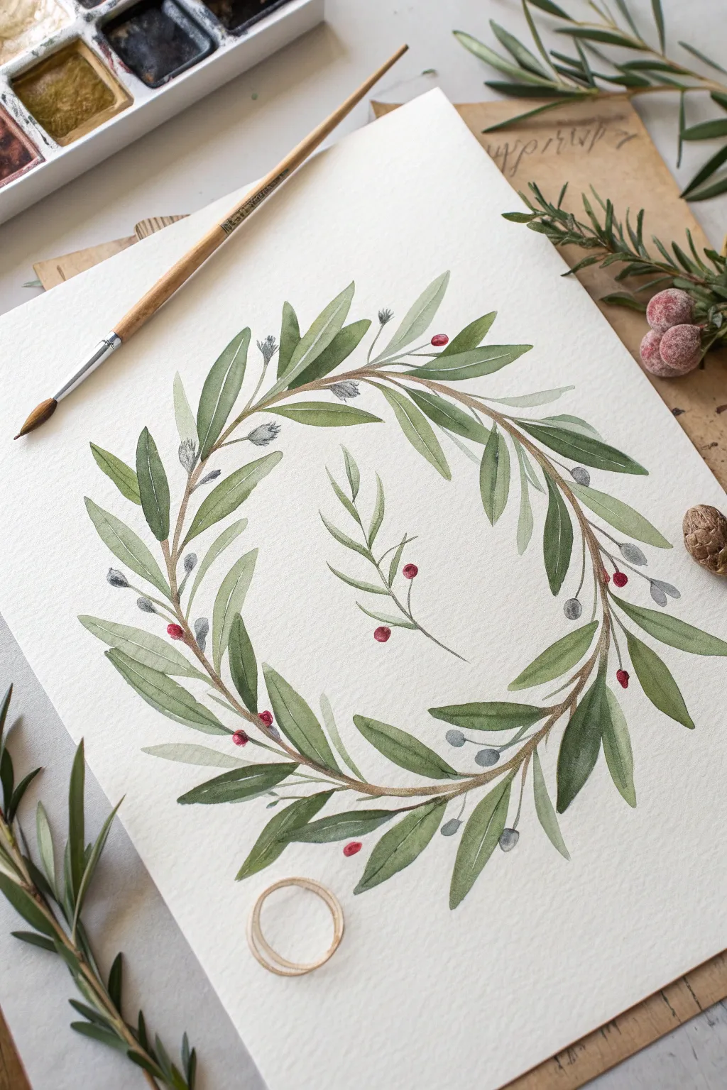
This delicate watercolor wreath combines soft sage greens and deep olives to create a symbol of peace and serenity. The loose, botanical style captures the organic flow of olive branches, making it a perfect project for calming creative practice.
Step-by-Step Guide
Materials
- Cold press watercolor paper (300 gsm)
- Watercolor paints (Sap Green, Olive Green, Burnt Umber, Payne’s Grey, Alizarin Crimson)
- Round brushes (flats/rounds mixed): Size 4 and Size 0 or 00 for details
- Pencil (HB or lighter) and kneaded eraser
- Palette for mixing
- Jar of clean water
- Paper towels
Step 1: Sketching the Foundation
-
Create the circle guide:
Start by lightly drawing a circle on your paper to serve as the main guide for your wreath. You can trace a bowl or plate if you want a perfect circle, or freehand it for a more organic look. -
Map out the stems:
Sketch the main woody stems flowing around the circle. Instead of one continuous line, draw overlapping, intertwining branches to mimic natural wood growth. Leave a few gaps where leaves will cover the stems. -
Draft leaf placement:
Lightly mark the direction of the leaves. Olive leaves are narrow and elongated, often growing in pairs or opposing clusters. Sketch them pointing generally in the direction of the wreath’s flow (clockwise or counter-clockwise).
Step 2: Painting the Greenery
-
Mix your base greens:
Prepare two main green puddles on your palette: a lighter, warmer ‘young leaf’ green (Sap Green mixed with a touch of yellow) and a deeper, cooler ‘mature leaf’ green (Olive Green mixed with a tiny bit of Payne’s Grey). -
Paint the first layer of leaves:
Using your size 4 brush, paint the larger leaves. Start with light pressure at the stem, press down to widen the belly of the brush for the leaf body, and lift up to create a sharp point. Use the lighter green mix for these. -
Add variety with darker tones:
While the first leaves are drying, paint a second set of leaves using your darker, cooler green mix. Try to place some of these behind the lighter leaves to create depth and dimension. -
Create the silvery undersides:
Olive leaves often have silvery-grey undersides. Mix a very dilute wash of Payne’s Grey with a hint of green. Paint a few slender, tucked-away leaves with this color to mimic that characteristic shimmer. -
Paint the stems:
Mix Burnt Umber with a touch of your dark green. Using the tip of your brush (or switching to a size 0), carefully trace over your pencil stem lines. Let the line break naturally where leaves overlap; it doesn’t need to be a solid, heavy outline. -
Connect the leaves:
Draw tiny, thin stems connecting each floating leaf back to the main branch. These connections should be delicate and barely there.
Muddy Greens?
If your greens look dull, stop mixing too many colors. Stick to 2 pigments max per mix. Allow layers to dry fully before glazing to keep colors crisp.
Step 3: Details & The Centerpiece
-
Paint the small sprig:
In the center of the wreath, sketch and paint a small, isolated three-branch sprig. Use the same technique: light pressure, heavy pressure, lift. This acts as a lovely focal point or signature. -
Add the berries:
Load your small brush with Alizarin Crimson (or a deep red). Dot small, round berries sporadically throughout the wreath. Don’t overdo it—just a few clusters of 1-3 berries add a perfect pop of contrast. -
Add grey buds:
Using your watery grey mix from earlier, add small, oval-shaped buds near the tips of some branches. These represent the immature olives or flower buds. -
Deepen the shadows:
Once the initial green layers are fully dry, mix a glazing color—a very watery, dark green. Paint a thin line down the center of a few select leaves to suggest a central vein, or darken the area where a leaf attaches to the stem. -
Refine the woody texture:
Go back to your main brown stems. Add tiny, darker brown scratching marks or knots to give the wood texture and age. I find this really helps the branch look established rather than flimsy. -
Erase guide lines:
Wait until the paper is bone dry—completely cool to the touch. Gently use your kneaded eraser to lift any visible pencil marks from the initial circle guide.
Pro Tip: Color Variation
Drop a tiny dot of blue or brown into wet green leaves while they are still damp. The paint will bleed slightly, creating natural, organic color shifts.
Frame this piece in a simple wood frame to emphasize the natural aesthetic of your peaceful creation

Hand Gesture for Peace
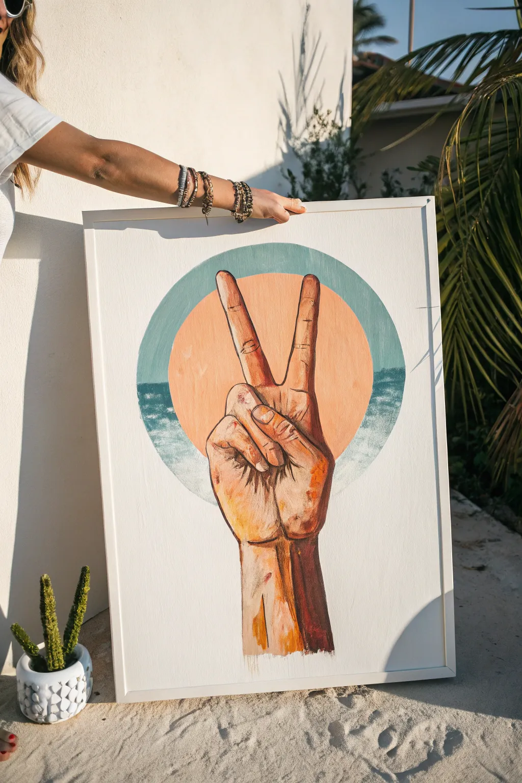
Capture the laid-back vibes of summer with this acrylic painting featuring a classic peace sign gesture set against a stylized sun and sea backdrop. The contrast between the warm, textured skin tones and the cool, geometric background creates a striking piece of wall art perfect for a beach house or sunroom.
Step-by-Step Tutorial
Materials
- Large stretched canvas (approx. 18×24 inches)
- Acrylic paint set (White, Burnt Sienna, Yellow Ochre, Cadmium Red, Teal/Turquoise, deep Blue)
- Gesso (optional as primer)
- Compass or large circular object (like a dinner plate) for tracing
- Pencil and eraser
- Flat shader brushes (various sizes)
- Round detail brushes (sizes 2 and 4)
- Painter’s tape or long ruler
- Palette knife or mixing palette
- Water cup and paper towels
Step 1: Planning and Sketching
-
Prime the Surface:
Begin by applying a coat of white gesso to your canvas if it isn’t pre-primed. This creates a smooth, workable surface for your sketch. Let it dry completely before moving forward. -
Draft the Circle:
Calculate the center of your canvas. Using a large compass or by tracing around a large circular dinner plate or bowl, draw a perfect circle centered in the upper two-thirds of the canvas. This will become your sun and sky frame. -
Divide the Horizon:
Draw a horizontal line intersecting the lower third of your circle. This line divides the ‘ocean’ section from the ‘sky’ section inside the circle, establishing your horizon line. -
Sketch the Hand:
Lightly sketch the peace sign hand gesture. Start with the forearm rising from the bottom center, leading into the palm. Draw the index and middle fingers extended in a V-shape, overlapping the circle’s center. Ensure the ring and pinky fingers are curled down comfortably.
Reference Your Own Hand
Take a photo of your own hand doing the peace sign in roughly the same lighting you want to paint. It makes understanding the shadows and knuckle creases so much easier than guessing.
Step 2: Creating the Background
-
Paint the Sky Ring:
Mix a muted teal or soft turquoise with plenty of white. Paint the outer ring area of the circle that sits above the horizon line, but leave a smaller inner circle empty for the sun. The goal is a thick, opaque ring of cool blue. -
Fill the Sun:
Mix a warm, peachy tone using White, a touch of Yellow Ochre, and a tiny dab of Cadmium Red. Fill the inner circular space with this color. I like to blend the edges slightly where it meets the teal ring if the paint is still wet for a softer look, or keep it crisp for a graphic style. -
Paint the Ocean:
For the bottom section of the circle (below the horizon), use a darker teal or ocean blue mixed with a little grey. Paint this area solidly up to the horizon line. -
Add Sea Foam Texture:
Load a dry, stiff brush with a small amount of titanium white. Dab and stipple it along the left and right edges where the ocean meets the outer circle boundary, simulating crashing waves or sea foam texture.
Step 3: Painting the Hand
-
Block in Base Skin Tones:
Mix a base skin color using White and Burnt Sienna with a hint of Yellow Ochre. Apply this flat color to the entire hand and arm silhouette, covering your pencil marks. Let this base layer dry fully. -
Define Shadows:
Create a darker shadow tone by adding more Burnt Sienna and a touch of Blue (to desaturate) to your base mix. Paint the shadowed side of the fingers (usually the right side), the creases in the palm, and the long shadow running down the right side of the arm. -
Add Warm Highlights:
Mix a lighter highlighter color using mostly White with a pinch of plain Yellow Ochre or even faint Orange. Apply this to the tops of the knuckles, the fingernails, and the center of the forearm where the light would naturally hit. -
Detail the Knuckles:
Using a small round brush, add specific details to the bent fingers. Use your dark shadow mix to define the folds of skin where the ring and pinky fingers curl into the palm. -
Enhance the V-Shape:
Pay special attention to the two extended fingers. Paint vertical highlights down the center of each finger to give them cylindrical volume, and darken the space between them to emphasize the separation. -
Layering Texture:
For a painterly look, don’t over-blend your strokes. Add dashes of unmixed Burnt Sienna or raw Yellow Ochre in the mid-tones to simulate skin texture and warmth. -
Final Contrast:
Mix a very dark brown (Burnt Sienna plus Dark Blue). Use a fine liner brush to add the deepest creases in the palm and outline key areas if you want more definition.
Fixing Wobbly Circles
If your circle’s edge looks shaky after painting, utilize the white background paint. Use a flat brush loaded with white to ‘cut back’ into the shape, refining the curve from the outside in.
Step 4: Finishing Touches
-
Protect the Edges:
Check the surrounding white canvas. If you accidentally got paint outside the circle or hand, paint over it with fresh Titanium White to ensure a crisp, clean negative space. -
Varnish:
Once the painting is completely dry (wait at least 24 hours), apply a coat of satin or matte varnish to protect the acrylics and unify the sheen of the different colors.
Hang your finished piece in a bright spot to enjoy those sunny, peaceful vibes all year round


Rainbow Peace Color Wash
This vibrant watercolor project combines a soothing, effortless wet-on-wet technique with a stark, graphic symbol of peace. The colors blend seamlessly from warm to cool tones, creating a dreamy backdrop for the crisp white focal point.
Step-by-Step Guide
Materials
- Cold press watercolor paper (140lb/300gsm suggested)
- Watercolor paints (tube or pan set)
- Medium round brush (size 8 or 10)
- Water cups (one for rinsing, one for clean water)
- Masking tape or painter’s tape
- Paper towels
- White cardstock or heavy paper
- Scissors or a craft knife (X-Acto)
- Compass or round object to trace
- Ruler
- Glue stick or liquid craft glue
Step 1: Preparation & Outline
-
Secure the paper:
Tape down all four edges of your watercolor paper onto a flat, sturdy surface or drawing board. This prevents warping and creates a clean white border. -
Pre-wet the paper:
Using a large clean brush, apply a light, even layer of clean water across the entire painting area. The paper should glisten but not have puddles.
Keep it Clean
Keep a separate paper towel handy just for wiping your brush between colors. This ensures your yellow stays bright and doesn’t turn muddy from residual blue or red paint.
Step 2: Creating the Rainbow Wash
-
Start with red:
Load your brush with a vibrant red paint. Apply it horizontally across the top section of the paper, letting the pigment flow freely into the wet surface. -
Transition to orange:
Clean your brush slightly and pick up orange paint. Apply this directly below the red, slightly overlapping the wet edge so the colors bleed together naturally. -
Add the yellow band:
Continue downward with a bright yellow. I find that pure lemon yellow works best here to keep the center of the painting feeling luminous. -
Blend in green:
Introduce a sap green or emerald green below the yellow. Allow it to mix slightly with the yellow above to create a lime-green transition zone. -
Cool down with blue:
Apply a band of cerulean or cobalt blue. Let the water encourage the blue to soften into the green band above it for a sea-glass effect. -
Finish with violet:
Use a deep purple or violet for the bottom-most stripe. Ensure this layer is saturated enough to anchor the composition visually. -
Encourage bleeding:
If distinct lines remain, gently tilt your board to encourage gravity to pull the colors into one another, or run a damp clean brush lightly between color bands. -
Complete drying:
Allow the painting to dry completely. The paper must be bone-dry before you proceed to the next step to avoid warping or moisture damage.
Step 3: The Peace Symbol
-
Draw the outer circle:
On a separate sheet of white cardstock, use a compass or trace a round object (like a jar lid or bowl) to draw a perfect circle. A 3-4 inch diameter works well for a standard sheet. -
Draw the inner circle:
Inside the first circle, draw a slightly smaller circle, leaving about a 1/4 inch border to form the outer ring of the peace sign. -
Mark the center line:
Use a ruler to draw a vertical line straight down the center from top to bottom. -
Create the legs:
From the center point of the vertical line, draw two diagonal lines extending downward to the outer ring at approximately 45-degree angles. -
Thicken the lines:
Add thickness to your sketch lines (about 1/4 inch wide) to match the width of the outer ring. -
Cut out the negative space:
Carefully cut out the three inner negative shapes first using a craft knife for precision. Then, cut around the outer perimeter with scissors.
Add Some Sparkle
Mix a tiny pinch of salt into the wet paint while the wash is still drying. The salt crystals absorb water and pigment, creating beautiful starry textures in the background.
Step 4: Final Assembly
-
Position the symbol:
Place your white cutout over the dry painting to find the best placement. Centering it over the transition between yellow, green, and blue usually looks balanced. -
Glue securely:
Apply a thin, even layer of glue to the back of the peace sign. Press it firmly onto the watercolor paper, smoothing it down gently to ensure edges don’t lift. -
Remove tape:
Slowly peel away the masking tape from your painting at a 45-degree angle to reveal the crisp white borders.
Hang your finished piece in a spot that needs a little extra brightness and calm
BRUSH GUIDE
The Right Brush for Every Stroke
From clean lines to bold texture — master brush choice, stroke control, and essential techniques.
Explore the Full Guide
Choose Peace Lettering Art
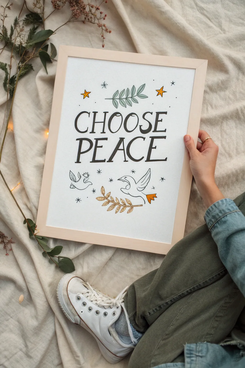
Bring a sense of calm to your space with this whimsical hand-lettered art piece featuring playful typography and delicate line drawings. The design combines bold lettering with charming motifs like doves and olive branches for a look that feels both grounded and hopeful.
Step-by-Step
Materials
- Heavyweight drawing paper or watercolor paper (A3 or A4 size)
- Light wood frame (to fit paper size)
- Pencil (HB or 2B)
- Kneaded eraser
- Black fineliner pens (sizes 0.5 and 0.8)
- Black brush pen or chisel tip marker
- Watercolor paints or colored markers (Yellow/Gold, Sage Green, Orange)
- Small round paintbrush (size 2 or 4)
- Ruler
Step 1: Drafting the Layout
-
Establish the center:
Start by finding the vertical center of your paper. Lightly draw a vertical line down the middle with your ruler and pencil to help align your text later. -
Mark text guidelines:
Measure out the space for your two main words. Draw two horizontal baselines in the upper-middle section of the page, leaving roughly 2 inches of space between them for the lettering height. -
Sketch the letters:
Using your pencil, lightly sketch the words ‘CHOOSE’ and ‘PEACE’ in a quirky, serif capital font. Make the letters slightly uneven and bouncy rather than perfectly rigid to capture that hand-drawn charm. -
Add nature elements:
Above the word ‘CHOOSE’, sketch a horizontal leafy branch. Below the text, draft two simple dove shapes—one sitting on the left and one flying on the right. -
Place the stars:
Scatter small five-pointed stars and tiny dots around the text and birds. Keep them random for a magical, starry-night feel. -
Draw the olive branch:
Between the two doves at the bottom, sketch a larger, more detailed olive branch with several leaves extending horizontally.
Ink Confidence
Don’t stress about shaky lines! Slight wobbles actually add to the authentic, hand-lettered aesthetic of this style.
Step 2: Inking the Design
-
Outline the text:
Trace your pencil lettering with a 0.8mm black fineliner. Go over the downstrokes a second time to thicken them, mimicking a calligraphy style without needing a special nib. -
Refine the illustrations:
Switch to a finer 0.5mm pen for the illustrations. Ink the top branch, the doves, and the bottom olive branch using smooth, continuous lines. -
Detail the doves:
Add small eyes and beak details to the doves. I like to keep the wings simple with just a few curved lines to suggest feathers. -
Ink the celestial elements:
Carefully outline the stars and add tiny asterisks and dots as ‘sparkles’ throughout the negative space. -
Underline emphasis:
Using the thicker pen or brush marker, draw a casual, slightly wavy underline beneath the word ‘PEACE’ to ground the text. -
Erase guidelines:
Wait at least 10 minutes for the ink to fully set so it doesn’t smudge. Gently use your kneaded eraser to lift away all pencil marks.
Step 3: Adding Color
-
Paint the top leaves:
Mix a muted sage green watercolor. Carefully fill in the leaves of the top branch, staying within the lines but allowing for a little transparency. -
Highlight the stars:
Use a warm yellow or gold paint to fill in the larger stars. You don’t need to paint every single dot; just the main stars will make it pop. -
Color the olive branch:
For the bottom olive branch, use a slightly warmer, brownish-gold or ochre tone to distinguish it from the top greenery. -
Accent the bird:
Add a tiny splash of orange to the tail feathers of the flying dove on the right for a playful focal point. -
Frame your work:
Once the paint is bone dry, place your artwork into a simple light wood frame to complement the organic, peaceful vibe of the piece.
Gold Leaf Accents
For a premium finish, replace yellow paint with real or imitation gold leaf on the stars and main olive branch.
Hang this lovely reminder in a place where you start your day to cultivate a calm mindset.
Earth Held in Peaceful Hands
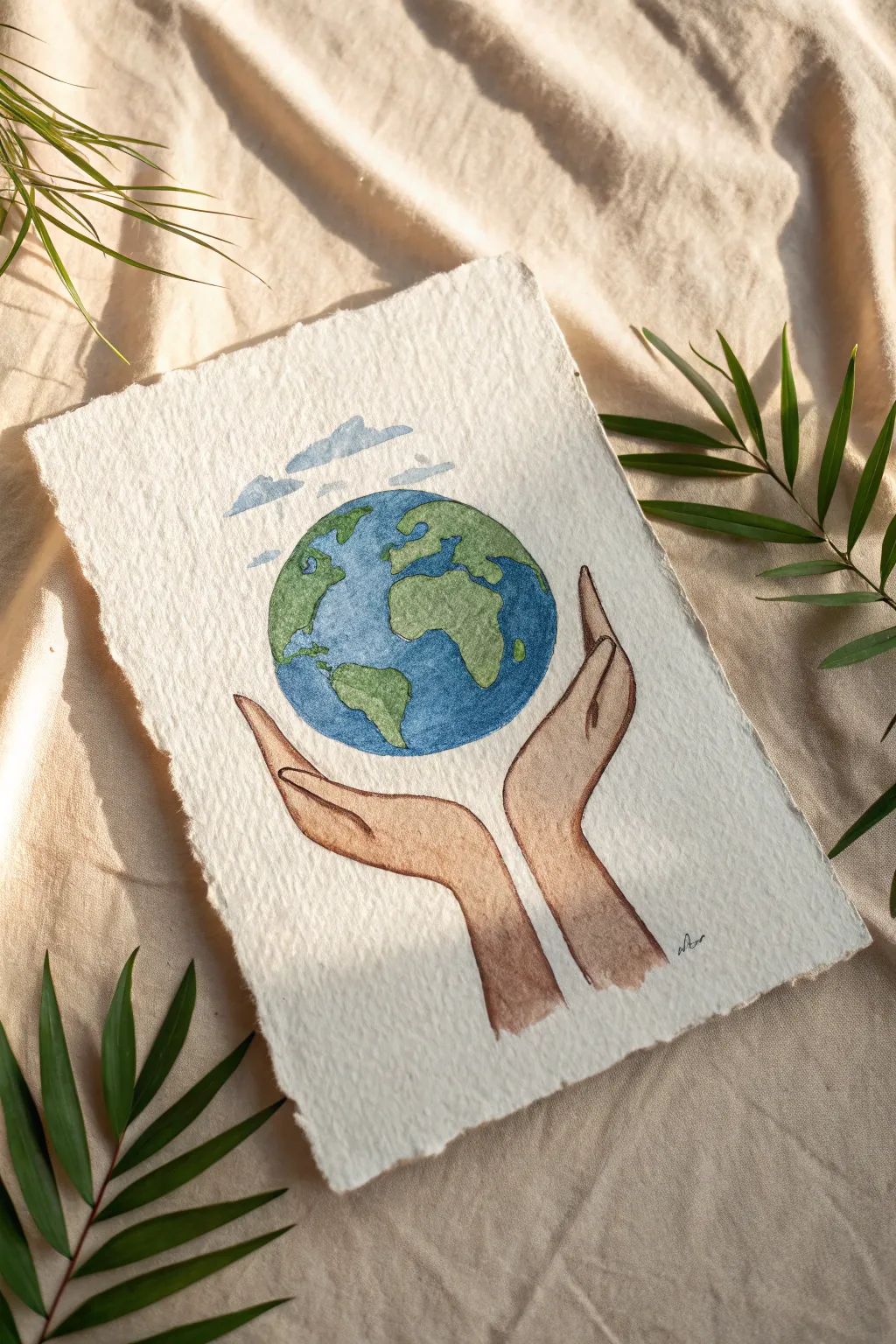
Capture the spirit of protection and unity with this delicate watercolor illustration featuring hands gently cupping the planet. The soft, textured paper and earthy tones create a warm, organic feel perfect for symbolizing peace.
Step-by-Step Guide
Materials
- Heavyweight watercolor paper (300gsm cold press recommended)
- Pencil (HB or H)
- Kneaded eraser
- Watercolor paints (Cerulean or Ultramarine Blue, Sap Green, Burnt Sienna, Yellow Ochre)
- Fine liner brush (size 0 or 1)
- Round watercolor brush (size 4 or 6)
- Cup of water and paper towels
- Deckle edge ruler or ruler and water (optional for paper tearing)
Step 1: Preparing the Canvas
-
Create the deckled edge:
To mimic the rustic look in the photo, tear your watercolor paper manually. I like to run a wet brush along a ruler’s edge on the paper, wait a moment for it to soften, and then gently tear the strip away to create that soft, fibrous edge. -
Sketch the circle:
Lightly draw a perfect circle in the center of your page for the Earth. Use a compass or trace a circular object like a cup rim if you aren’t confident freehanding it. -
Outline the continents:
Sketch the continents loosely inside your circle. Focus on the identifiable shape of Africa and South America as shown, but keep the lines faint so they don’t show through the paint later. -
Add the hands:
Draw the hands below cupping the circle. Start with the wrist shapes widening upward, then add the fingers curving gently around the globe. Notice how the thumbs rest slightly lower on the ‘equator’ line. -
Sketch the clouds:
Above the globe, add a few simple, elongated cloud shapes. Keep them somewhat flat on the bottom and fluffy on top.
Step 2: Painting the Earth
-
Wet-on-dry technique:
For crisp edges, use the wet-on-dry technique. Load your small round brush with a vibrant blue mix (like Ultramarine) and carefully fill in the ocean areas, working around your continent sketches. -
Adding gradients:
While the blue is still slightly damp, you can drop in a tiny bit of darker blue near the edges to create a subtle spherical shadow effect. -
Painting the land:
Mix a natural green tone using Sap Green and a touch of Yellow Ochre. Fill in the continent shapes carefully. Let the blue dry completely first so the colors don’t bleed into each other. -
Creating depth on land:
Add a slightly darker green (mix your green with a tiny bit of brown) to the bottom curves of the continents to suggest curvature and shadow.
Muddy Colors?
If your green and blue on the Earth are blending into a brown mess, you aren’t waiting long enough between colors. The blue ocean must be 100% dry before the green brush touches the paper.
Step 3: Painting the Hands
-
Mix skin tones:
Mix a diluted wash of Burnt Sienna with plenty of water for a warm, tan skin tone. Test the color on a scrap piece of paper first to ensure it isn’t too dark. -
base wash:
Apply an even wash of this color to the hands. work quickly from the wrists up to the fingertips to avoid drying lines. -
Shadowing the fingers:
Once the base layer is dry, mix a slightly more concentrated version of your skin tone. Paint thin lines between the fingers to define them. -
Adding dimension:
Apply this darker tone along the outer edges of the wrists and under the thumbs where the hands would naturally be in shadow.
Textured Paper Tip
The reference uses cold-press paper with a ‘tooth’. When painting heavily textured paper, don’t press too hard; let the brush skim the surface so some white speckles remain for a vintage look.
Step 4: Final Details
-
Tinting clouds:
Mix a very watery, pale blue-grey. Paint the cloud shapes, keeping the wash very light and transparent to maintain an airy feel. -
Refining outlines:
Once everything is bone dry, take your finest brush (size 0) with a dark brown or black paint (kept fairly dry) to trace the outlines of the hands and the globe. This mimics the delicate ink-like line work seen in the reference. -
Defining the fingers:
Use this fine dark line to separate the fingers and outline the fingernails gently. -
Final touches:
Add your signature or tiny initials in the corner with the fine brush to complete your artwork.
Step back and admire the serene message of your handcrafted world peace painting

PENCIL GUIDE
Understanding Pencil Grades from H to B
From first sketch to finished drawing — learn pencil grades, line control, and shading techniques.
Explore the Full Guide
Negative Space Peace Cutout
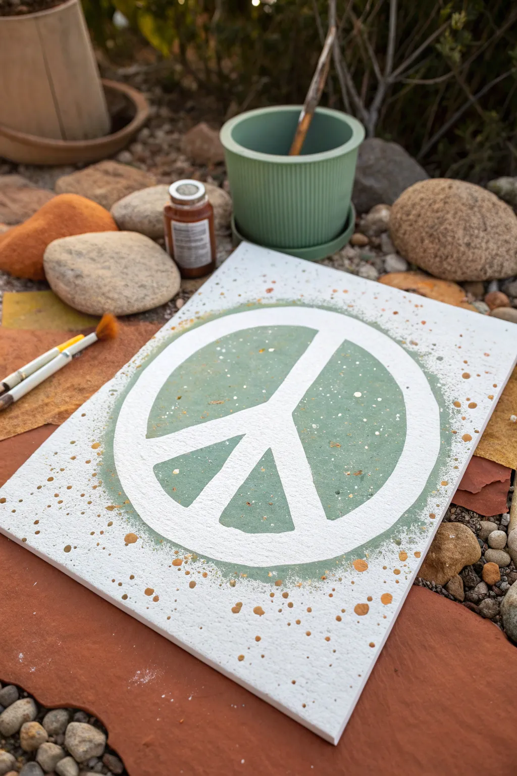
Bring a sense of calm to your space with this earthy, textured peace sign painting. By utilizing masking tape to create negative space, you can achieve crisp, clean lines against a beautiful sage green backdrop with playful metallic splatters.
Step-by-Step Tutorial
Materials
- Rectangular canvas (e.g., 9×12 or 11×14 inches)
- Painter’s tape or masking tape (1-inch width)
- Sage green acrylic paint
- White acrylic paint
- Bronze or gold metallic acrylic paint
- Medium flat paintbrush
- Small round paintbrush (for splattering)
- Paper plate or palette
- Compass or round object (bowl/lid) for tracing
- Pencil
- Craft knife or scissors
- Water cup and paper towels
Step 1: Creating the Mask
-
Prepare the canvas:
Start with a clean, dry white canvas. If your canvas isn’t pre-primed bright white, give it a quick base coat of white acrylic paint and let it dry completely. -
Establish the center:
Find the approximate center of your canvas. You can do this by lightly marking diagonals or just eyeing it if you prefer a more organic look. -
Tape the vertical line:
Place a vertical strip of painter’s tape down the center of the canvas. This will form the main vertical bar of the peace sign. -
Form the legs:
Place two strips of tape angling diagonally downwards from the center point of your vertical strip. These should form an upside-down ‘V’ shape overlapping the vertical line. -
Trace the circle:
Place a large bowl or use a compass to draw a circle that encompasses the taped design. The circle should be large enough that the tape extends past the line. -
Cut the outer circle:
Carefully trim the excess tape extending beyond your pencil circle using a craft knife or scissors, so the tape ends perfectly at the circle’s edge. -
Mask the circle border:
This part requires patience: use curved pieces of tape or cut straight tape into smaller segments to mask off the thick circular border of the peace sign. Ensure this ring connects with the ends of your inner lines. -
Seal the edges:
Press down firmly on all tape edges with your thumbnail or a credit card. This prevents paint from bleeding underneath and ensures those crisp lines we want.
Step 2: Painting the Background
-
Mix your green:
Pour some sage green paint onto your palette. If the shade is too dark, mix in a touch of white to soften it. -
Apply the base color:
Using a flat brush, paint over the entire canvas, including over the tape. Paint the circular area inside the peace sign completely green. -
Feather the edges:
As you move away from the central circle towards the edges of the canvas, lighten your brush pressure. You can leave the very corners white or create a faded, distressed edge for texture. -
Add texture:
While the green is still wet, dab the brush slightly to create a stippled texture rather than perfectly smooth strokes. This adds to the organic, earthy feel. -
Let it dry:
Allow the green paint to dry completely. It must be dry to the touch before moving to the splatter phase.
Bleed-Proof Lines
Before painting the green, paint a thin layer of white over the tape first. This seals the tape edges with the canvas color, stopping green leaks.
Step 3: Splattering & Revealing
-
Prepare white splatter:
Water down a small amount of white acrylic paint until it has the consistency of heavy cream. -
Flick white paint:
Dip a small round brush into the watery white paint. Hold the brush over the canvas and tap the handle against a pencil or your finger to spray fine droplets mainly around the outer edges of the circle. -
Prepare bronze splatter:
Repeat the thinning process with your bronze or gold metallic paint. This adds a warm, rusty contrast to the cool green. -
Flick bronze paint:
Splatter the metallic paint more sparsely than the white. Focus these larger droplets near the bottom corners and partially over the green circle area. -
Peel the tape:
This is the best part. Carefully peel up the painter’s tape while the splatters are semi-dry or fully dry. Pull the tape slowly at a 45-degree angle to reveal the crisp white canvas underneath. -
Touch ups:
If any green paint bled under the tape, use a tiny brush and white paint to clean up the edges. I find this sharpens the look instantly. -
Seal the work:
Once fully cured (wait 24 hours), apply a matte varnish spray to protect your artwork from dust and UV light.
Textured Glow
Mix fine sand or painting texture gel into the sage green paint for a gritty, stone-like finish that contrasts beautifully with the smooth white space.
Hang your new peaceful creation in a sunny spot to let those bronze specks catch the light
Have a question or want to share your own experience? I'd love to hear from you in the comments below!