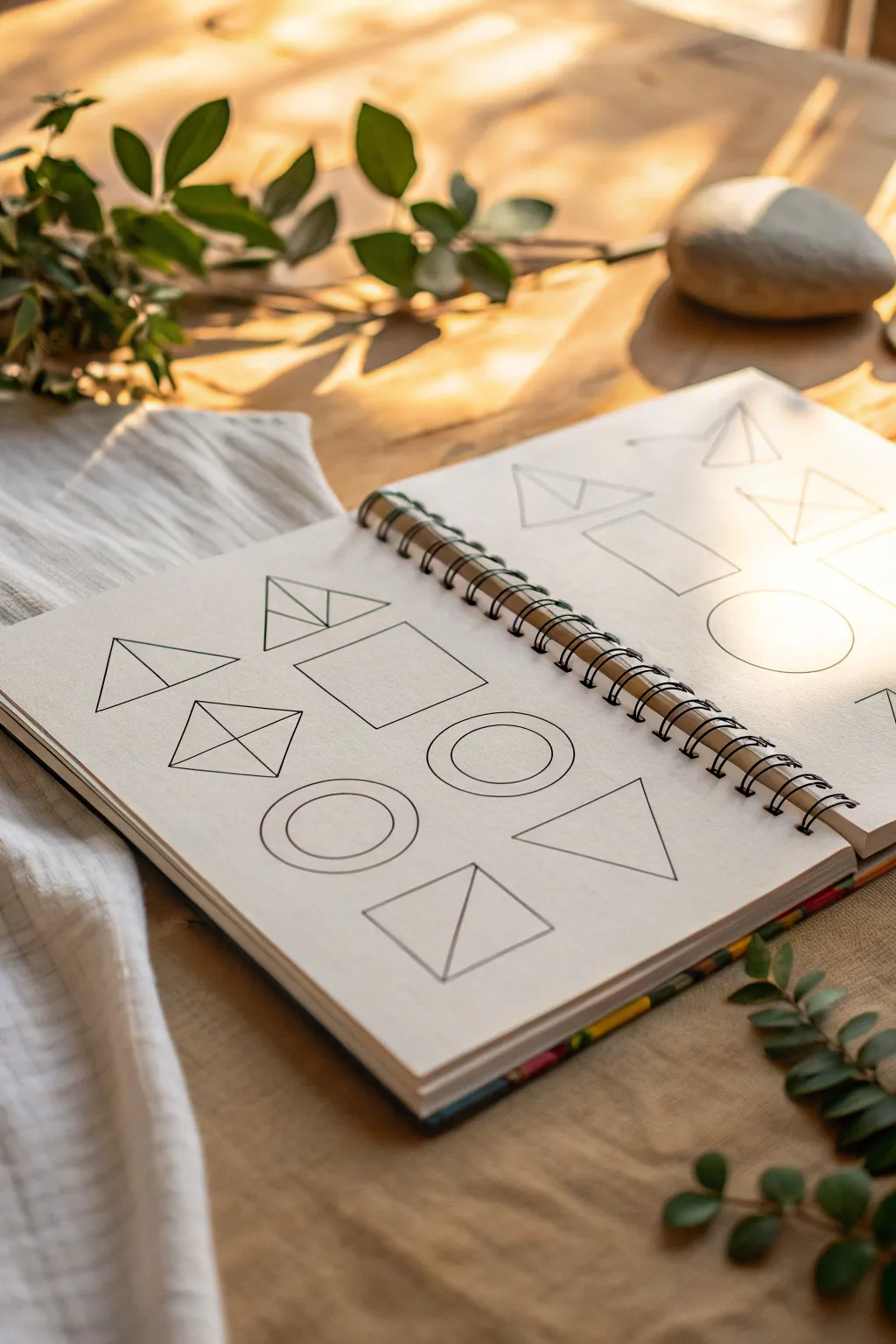
When I’m craving creativity without the pressure of drawing something “real,” pencil abstract sketches are my go-to. Here are a bunch of pencil abstract drawing ideas you can start right in your sketchbook, from classic patterns to delightfully weird experiments.
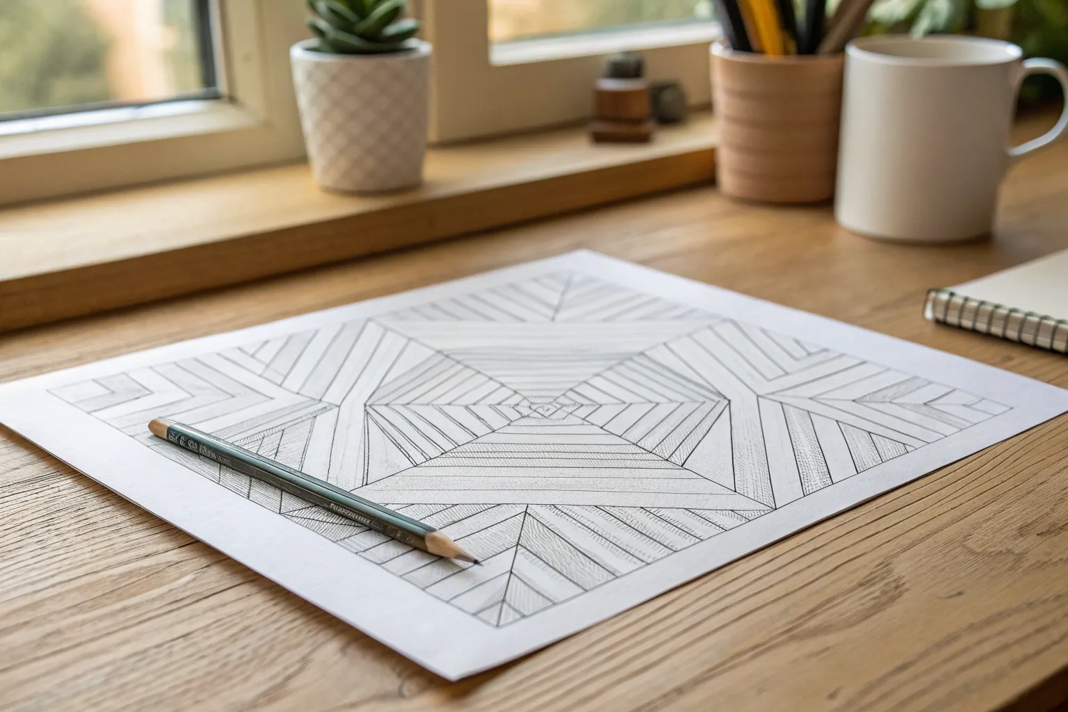
Geometric Shape Patchwork
Discover the calming power of pure geometry with this beautifully simple sketchbook exercise. By focusing on clean lines and negative space, you’ll create a meditative patchwork of shapes that celebrates the elegance of structured design.
How-To Guide
Materials
- Spiral-bound sketchbook (medium weight paper)
- Fine-point black pen or drawing marker (0.5mm)
- HB or 2H graphite pencil (for sketching)
- Transparent ruler
- Kneaded eraser
- Compass or circle stencil
Step 1: Preparation and Layout
-
Find your light:
Before you begin drawing, choose a workspace with plenty of natural light. This project is all about precision, so good visibility is key to keeping lines crisp. -
Establish a margin:
Open your sketchbook to a fresh spread. Using your pencil and ruler, lightly mark a consistent invisible border around the edge of the page to keep your composition from looking crowded. -
Plan the grid:
Visualize a loose, invisible grid on the page. We aren’t drawing grid lines, but rather deciding where the center points of our shapes will sit to ensure they are evenly spaced. -
Sketch basic anchors:
With an extremely light hand, pencil in the approximate sizes of your primary shapes—squares, triangles, rectangles—spacing them out so they have room to breathe.
Keep it Clean
Wipe the edge of your ruler with a tissue after every few ink lines. Ink accumulates on the plastic and can easily smear across your paper when you slide the ruler.
Step 2: Drawing the Shapes
-
Start with the square:
Begin near the center or bottom left. Draw a perfect square using your ruler. This fundamental shape sets the scale for the rest of your patchwork. -
Add a divided triangle:
Next to or above the square, draw a wide triangle. Bisect it with a vertical line from the peak to the base to create two smaller right-angled triangles within the form. -
Create the diamond prism:
Draw a rhombus (diamond shape). Connect opposite corners with an ‘X’ inside it. This creates a faceted, prism-like effect that adds 3D depth to the 2D page. -
Draft the concentric circle:
Use your compass or stencil to draw a medium-sized circle. Then, carefully draw a slightly smaller circle directly inside it to create a thick ring or ‘donut’ shape. -
Construct the split rectangle:
Draw a horizontal rectangle. Draw a diagonal line from the bottom left corner to the top right corner, splitting the shape into two long triangles. -
The triangle-in-square:
Outline another square. Inside, draw a diagonal line from one bottom corner to the opposite top corner, essentially cutting the square in half visually.
Step 3: Refining and Inking
-
Ink the straight lines:
Switch to your fine-point black pen. Place your ruler along your pencil marks and commit to the lines. Move confidently; slow lines often wobble more than quick ones. -
Ink the curves:
Carefully trace your circle shapes. If you don’t have a steady hand, you can run the pen along the inside edge of your stencil, but be careful of smudging. -
Re-evaluate balance:
Look at the composition. If a corner feels too empty, sketch and ink a simple shape, like a lone triangle pointing horizontally, to fill the void. -
Let the ink settle:
Wait fully five to ten minutes for the ink to dry ideally. Smudging a clean geometric drawing at the finish line is heartbreaking. -
Erase guidelines:
Gently roll your kneaded eraser over the entire page to lift the graphite under-drawing. I prefer a rolling motion rather than rubbing to protect the paper texture. -
Final check:
Inspect your lines for any tiny gaps where corners meet. Use the very tip of your pen to close these gaps for a professional, seamless look.
Hatching Depth
Pick one facet of each shape (like one side of a divided triangle) and fill it with very fine diagonal hatching lines to add shading and visual weight.
Now you have a crisp, modern study of forms that looks professional enough to frame


Meditative Doodle Pattern Blocks
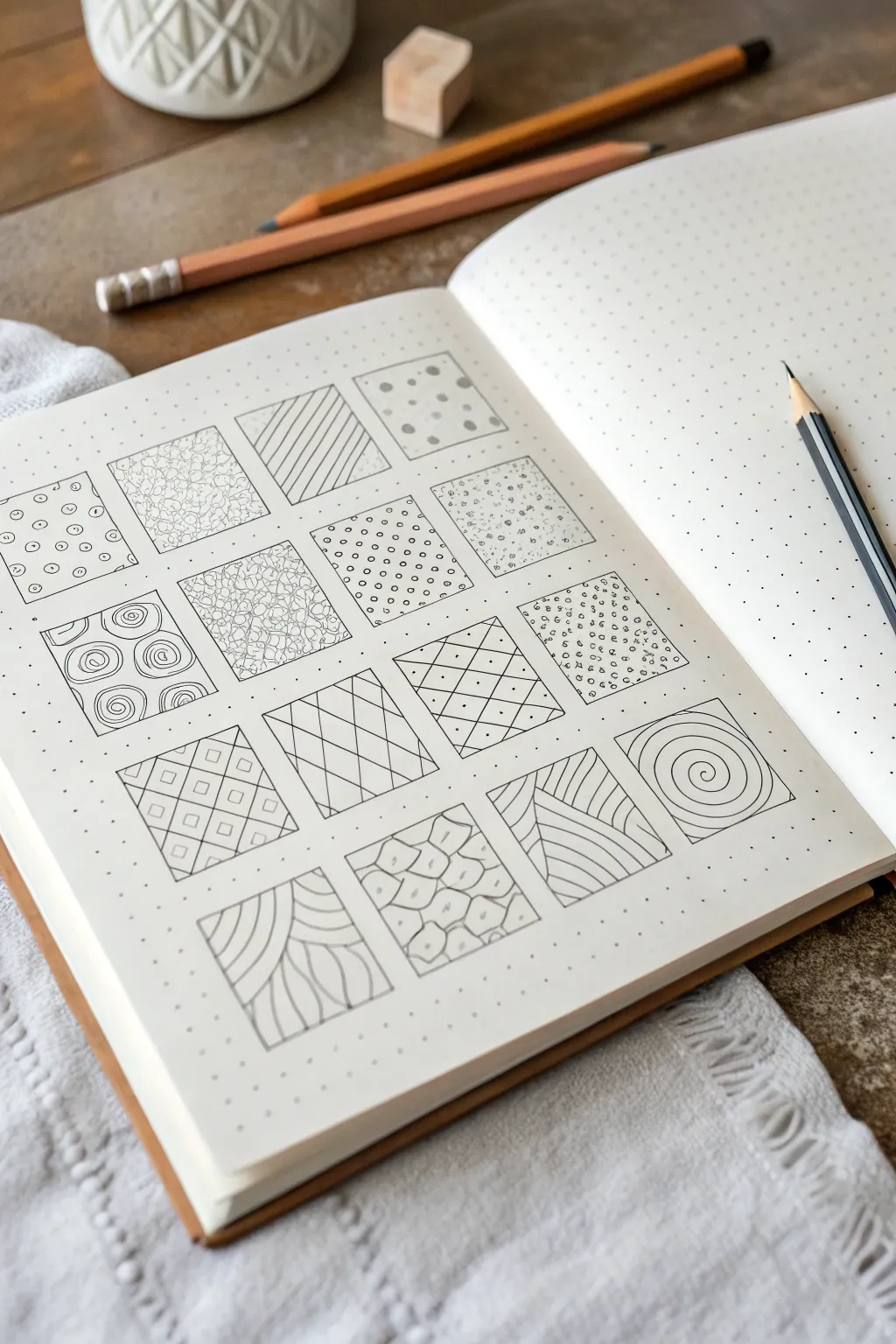
Transform a blank page into a mesmerizing gallery of textures with these meditative pattern blocks. This project is perfect for testing out new doodle ideas or simply relaxing with repetitive, calming strokes in a grid layout.
Step-by-Step
Materials
- Dotted grid notebook or sketchbook
- Fine-tip drawing pen (0.3mm or 0.5mm)
- Pencil (HB or 2B)
- Ruler or straight edge
- Eraser
Step 1: Setting the Grid
-
Define the layout:
Start by deciding on the size of your squares. For a standard dot grid journal, a 6×6 dot square (about 1 inch or 2.5cm) works perfectly. Leave a 2-dot gap between each square to let the patterns breathe. -
Draw the frames:
Using your pencil and ruler, lightly sketch out a 4×4 grid of squares. Press softly so these lines can be erased later or inked over without leaving grooves in the paper. -
Ink the borders:
Go over your pencil squares with your fine-tip pen to create crisp boundaries. You can do this freehand for a more organic look, or use a ruler for precision.
Keep it Loose
Don’t stress about perfect lines. This is a meditative exercise meant to be relaxing. Slight imperfections make the texture look more handmade and authentic.
Step 2: Row 1: Simple Beginnings
-
Circle scatter:
In the first square, draw tiny, scattered circles. Keep them open and roughly the same size, distributing them randomly like bubbles. -
Stippling texture:
Fill the second square entirely with tiny ink dots. Cluster them denser in some areas and sparser in others to create a subtle cloud-like texture. -
Diagonal striping:
Draw parallel diagonal lines across the third square. Try to keep the spacing consistent, but don’t worry if lines wobble slightly—it adds character. -
Polka dots:
Create larger, solid filled circles for the fourth square. I like to arrange these in a loose grid, but random placement works too.
Add Dimension
Once your ink is dry, use a soft graphite pencil to lightly shade the edges or corners of specific squares. This makes the patterns look like 3D tiles.
Step 3: Row 2: Introducing Curves
-
Spiral blocks:
Draw square-ish spirals that start from the center and expand outward. Fit four distinct spirals into this block for a tiled look. -
Organic netting:
Draw a web of interconnected, irregular shapes. Think of this like cells under a microscope or the cracking pattern in dried mud. -
Tiny bubbles:
Similar to the first square, but make these circles much smaller and denser. Fill the entire space so it looks like foam. -
Speckled field:
Combine tiny dots and very small open circles. The mix of solid and open shapes creates a nice variation in visual weight.
Step 4: Row 3: Geometric Structures
-
Concentric swirls:
Draw four large swirls or ‘cinnamon roll’ shapes. Allow them to touch the edges of the square frame. -
Criss-cross grid:
Draw a diagonal grid pattern. Inside every resulting diamond shape, create a smaller diamond or dot to add complexity. -
Woven lattice:
Create a weaving effect by drawing sets of perpendicular lines. Draw horizontal lines in one section and vertical lines in the adjacent section. -
Chequered diamonds:
Draw a diamond grid. This time, create a double line for the grid structure itself, leaving the inside spaces empty.
Step 5: Row 4: Flow and Form
-
Grid tiles:
Draw a standard checkerboard grid. Inside random squares, draw a smaller concentric square to break up the pattern. -
Wavy lines:
Fill a block with vertical wavy lines. Keep them close together so the waves seem to vibrate against each other. -
Stone wall:
Draw irregular, rounded shapes that fit together like a cobblestone path or a giraffe’s spots. Keep a thin channel of white space between them. -
Single spiral:
Finish with one large, hypnotic spiral starting from the absolute center and winding all the way to the four corners of the frame.
Step back and enjoy the satisfying collection of textures you have created on a single page

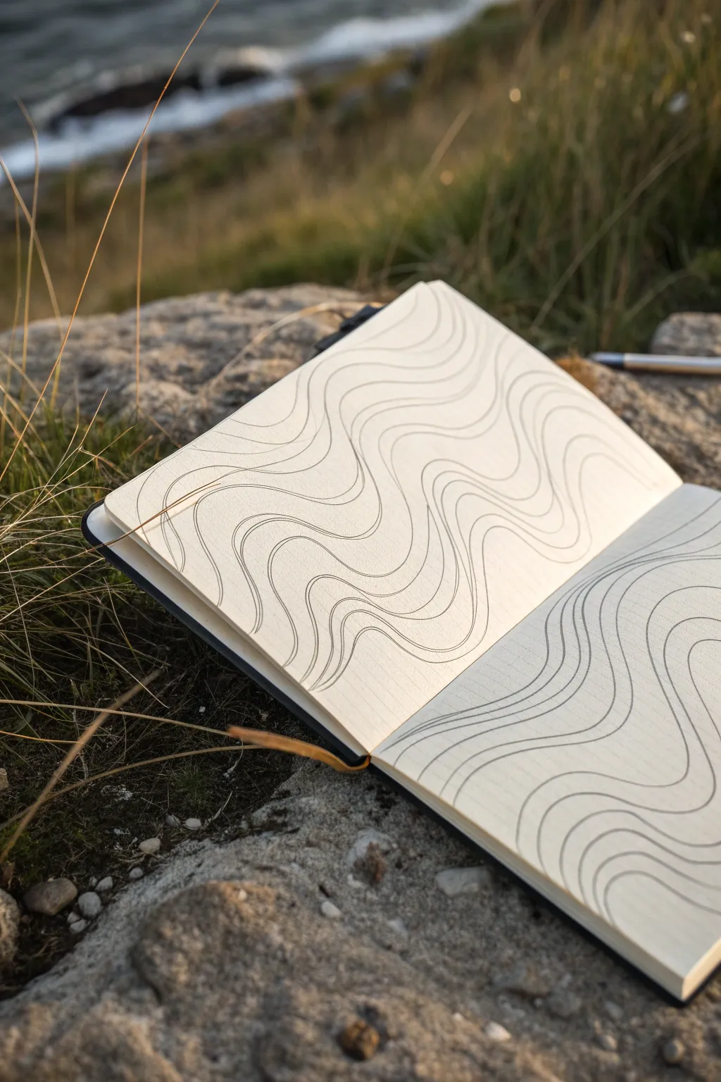
Topographic Contour Lines
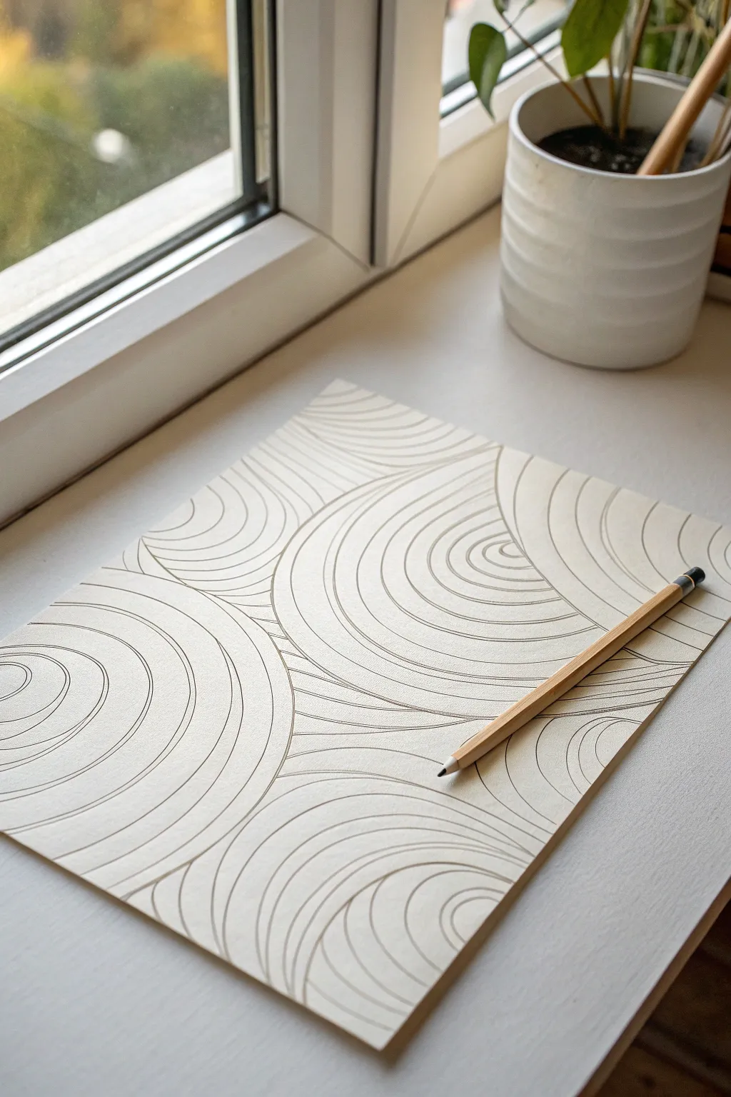
Capture the organic flow of nature with this meditative drawing that mimics topographic maps or ripples in water. Using simple curved lines that radiate from various points, you can build a mesmerizing, abstract landscape that feels both structured and fluid.
How-To Guide
Materials
- High-quality, heavy-weight drawing paper (off-white or cream)
- H or HB graphite pencil (for light lines)
- 2B or 4B graphite pencil (for final definition)
- Pencil sharpener
- Kneadable eraser
- Blender stump (optional)
Step 1: Planning the Flow
-
Prepare your workspace:
Place your paper on a smooth, hard surface. Ensure you have good lighting, preferably natural light from a window like in the inspiration image, to see your faint guide lines clearly. -
Mark focal points:
Visualize where you want your ‘ripples’ to originate. Lightly mark 3 to 5 distinct points or small circles scattered across your page using your H or HB pencil. These will be the centers of your contour groups. -
Establish the first curves:
Draw the initial, smallest semi-circles or ovals around your focal points. Keep these lines very light for now, as they set the direction for the entire piece. -
Create boundaries:
Lightly sketch invisible boundary lines where you imagine the ripples from different centers will crash into each other. You don’t need to draw actual lines here, but mentally map out where the interaction zones will be.
Wobbly Lines?
Don’t panic if a curve isn’t perfect. Instead of erasing, just adjust the next parallel line to gradually correct the shape. The ‘mistake’ becomes a natural variation.
Step 2: Drafting the Contours
-
Expand the first circle:
Starting at one focal point, draw a second curved line parallel to your first one. Aim for even spacing, roughly 2-3mm apart, but don’t stress about perfection; organic variations look better. -
Continue radiating outward:
Keep adding concentric lines around that first center. As the circles get larger, let the lines flatten out slightly on the sides to create more of an oval or hill-like shape. -
Start the second group:
Move to a neighboring focal point and begin drawing its concentric rings. Continue expanding until the outer rings of this group get close to the first group. -
Forming the ridge:
Here is the crucial part: where two sets of expanding rings meet, do not let them cross. Instead, curve the lines away from each other so they run parallel along a ‘ridge’ or fault line. -
Fill the gaps:
Continue this process for all your focal points. You will likely find odd triangular or diamond-shaped gaps between the converging circles. Fill these with nested triangular shapes that round off at the corners to maintain the fluid aesthetic. -
Check the composition:
Step back and look at the overall flow. If there are large empty spaces near the edges, extend your lines off the page to make the pattern feel infinite.
Step 3: Defining and Refining
-
Switch to a darker lead:
Now, pick up your 2B or 4B pencil. You want a clear, consistent line weight, so give it a fresh sharpen. -
Trace over the design:
Carefully re-draw your lines with confident, darker strokes. Try to keep your hand steady and move from your elbow rather than your wrist for smoother curves. -
Vary line pressure:
I like to press slightly harder on the curves that are closest to the ‘ridges’ where groups meet. This adds a subtle sense of depth and overlapping height. -
Clean up intersections:
Ensure that where lines run parallel, they don’t accidentally touch. Use your kneadable eraser to lift away any smudges or stray graphite dust. -
Optional shading:
If you want more dimensionality, you can very lightly shade the valleys between the ridges, but the style shown here relies mostly on clean line work. -
Final polish:
Do one last pass with the eraser to remove any original construction marks that are still visible underneath your dark lines.
Smoother Flow
Turn your paper constantly as you draw. Pulling the pencil toward your body in a natural arc is much easier than trying to push the pencil away or sideways.
Enjoy the calming effect of this structured yet flowing abstract piece


Warped Checkerboard Illusion
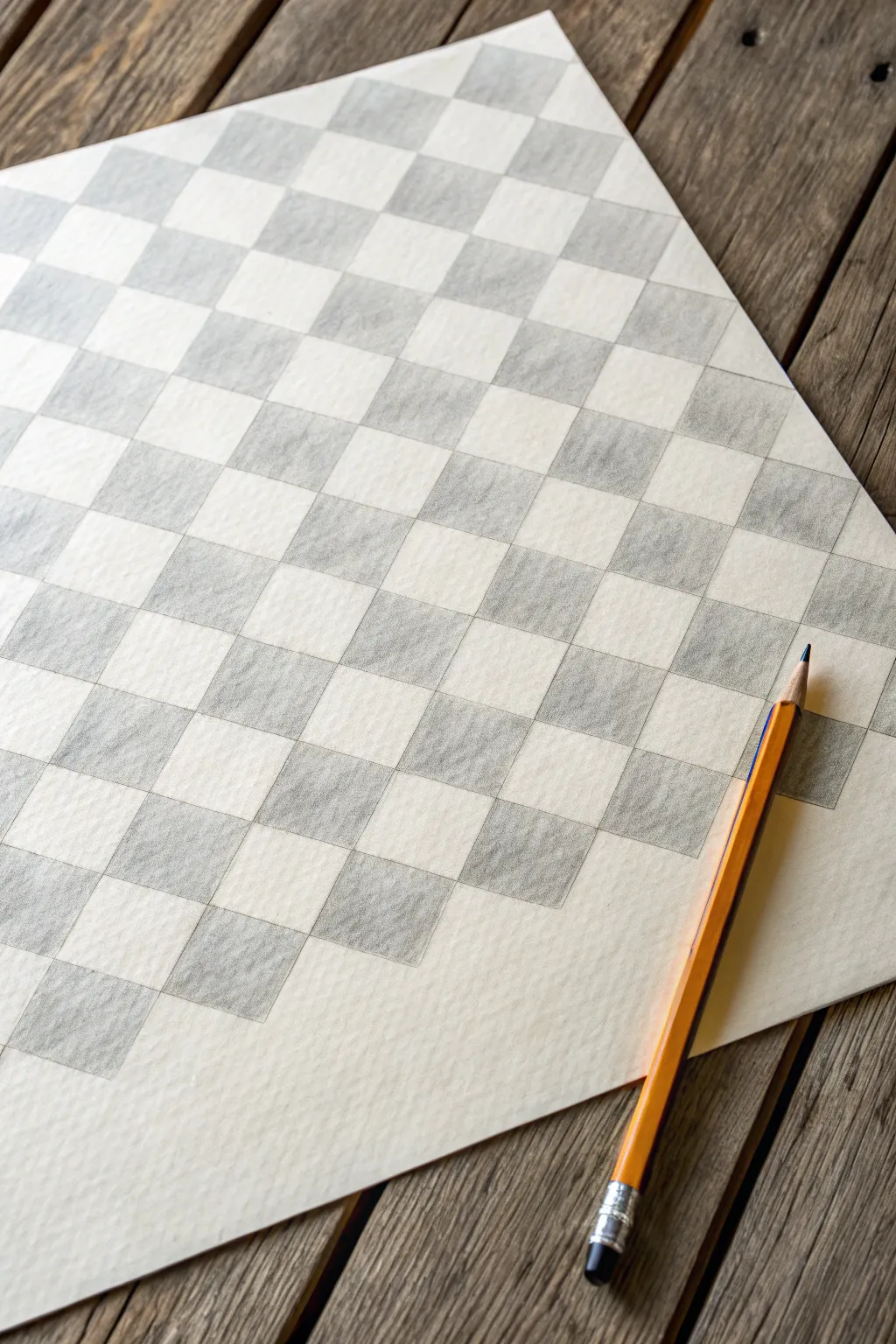
Master the art of optical illusions with this deceptively simple checkerboard study. By carefully measuring a grid and applying consistent pencil shading, you will create a warped, dimensional surface that seems to ripple right off the page.
Step-by-Step Tutorial
Materials
- High-quality sketch paper or bristol board (textured surface encouraged)
- HB or 2B graphite pencil
- Ruler (preferably 12-inch or longer)
- Eraser (kneaded eraser works best)
- Sharpener
Step 1: Setting the Foundation
-
Paper orientation:
Begin by placing your paper on a flat, hard surface. You can orient it vertically or horizontally, but angle it slightly if you want to match the reference photo’s casual aesthetic. -
Establishing the grid boundary:
Decide on the outer shape of your checkerboard. It doesn’t need to fill the whole page. Lightly mark four corners or a large rectangle where your pattern will live. -
Measuring the vertical intervals:
Using your router, make small tick marks along the top and bottom edges of your boundary area. Space them evenly—about 1 inch or 2 centimeters apart works well for a standard sheet of paper. -
Drawing vertical lines:
Connect these tick marks with very light, straight vertical lines. Keep your pencil pressure minimal here; these are just guides that will eventually be filled or erased. -
Measuring horizontal intervals:
Repeat the process on the left and right sides. Measure equal intervals down the sides to ensure your grid is composed of perfect squares initially. -
Completing the grid:
Connect the side marks with horizontal lines. You should now have a clean, evenly spaced grid of empty squares.
Step 2: Creating the Pattern
-
Planning the check:
Before shading, lightly mark which squares will be dark. Start at the top left corner. Mark the first square with a tiny ‘x’. Skip the next, mark the third, and so on. -
Alternating rows:
Move to the second row. Ensure you are alternating the pattern—if the square above is marked, the one below it should be empty. This sets up the classic checkerboard look. -
Setting the outline:
Go over the specific perimeter lines of the ‘dark’ squares with slightly more pressure to define their edges clearly. This prevents you from accidentally shading outside the lines later. -
Erasing unnecessary guides:
If you have extended your grid lines far past the drawing area, gently erase the excess now so your workspace is clean.
Smudge Prevention
Place a scrap piece of paper under your drawing hand. This acts as a shield, preventing your palm from dragging graphite across the white squares.
Step 3: Shading and Definition
-
First shading pass:
Begin shading the marked squares. Hold your pencil at a low angle to use the side of the lead, creating a soft, broad stroke rather than scratchy lines. -
Consistent direction:
Try to shade in a consistent diagonal direction for every dark square. This uniformity is key to making the final piece look cohesive and professional. -
Building value:
Don’t press too hard at first. Layer your graphite. I prefer to do a light grey wash over all dark squares first, then go back to deepen them. -
Refining edges:
Sharpen your pencil to a fine point. Go back and crisp up the corners where the dark squares meet the white squares. Sharp corners create a stronger optical pop. -
Creating texture:
Allow the texture of the paper to show through the graphite slightly. This ‘tooth’ adds character to the drawing and prevents it from looking like a digital print. -
Final darkening:
Identify areas where the graphite looks patchy. Add a final layer of pressure to even out the tone, aiming for a medium-dark grey rather than a pitch black. -
Cleaning highlights:
Use your eraser to clean up any smudges inside the white squares. The contrast between the shaded graphite and the pure white paper is what makes the illusion work.
Uneven Tones?
If your shading looks scratchy, try using circular motions instead of back-and-forth strokes. Circles blend better and hide start/stop marks.
Step back and admire the geometric precision of your new optical art piece

PENCIL GUIDE
Understanding Pencil Grades from H to B
From first sketch to finished drawing — learn pencil grades, line control, and shading techniques.
Explore the Full Guide
3D Ribbon Twist
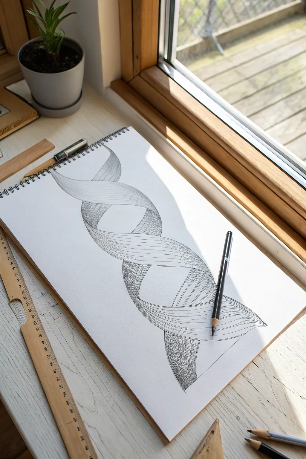
Master the art of illusion with this captivating 3D ribbon twist that seems to float right off the page. Using simple pencil strokes and careful shading, you’ll transform a flat DNA-like structure into a voluminous, sculptural form.
Step-by-Step Guide
Materials
- White sketchbook paper (A4 or similar)
- Graphite drawing pencil (HB or B for sketching)
- Softer graphite pencil (2B or 4B for shading)
- Fine-liner pen (optional, for final definition)
- Eraser
- Ruler (optional, for initial guidelines)
Step 1: Sketching the Skeleton
-
Establish the curve:
Begin by lightly drawing a wavy, sinusoidal line down the center of your page. This central spine will dictate the flow of the entire structure, so keep the curves smooth and fairly large. -
Define the width:
Draw parallel wavy lines on either side of your central spine to establish the width of the helix. Imagine you are drawing a thick, flat noodle that is twisting. -
Mark overlap points:
Identify where the ‘front’ ribbon crosses over the ‘back’ ribbon. Lightly sketch horizontal or slightly diagonal connecting lines at these crossing points to start separating the front plane from the back plane. -
Create the second strand:
To get the double-helix look shown in the image, sketch a second wavy ribbon that mirrors the first one. It should weave in and out of the first ribbon’s gaps.
Ribbon looking flat?
Ensure your contour lines are curved, not straight. Straight lines flatten the shape, while curved lines mimic the cylinder-like volume of the twist.
Step 2: Refining the Form
-
Outline the ribbons:
Darken the main edges of your ribbons. Crucially, at the intersection points, make sure the ribbon that is ‘on top’ has a continuous line, cutting off the lines of the ribbon passing ‘underneath.’ -
Add contour lines:
Lightly draw sweeping curves along the length of the ribbon surfaces. These flow lines should follow the bend of the ribbon; if the ribbon twists left, curve your lines left. -
Clean up:
Erase your initial central spine and any construction lines that are now hidden behind the overlapping segments. You want a clean outline before starting the shading process.
Step 3: Shading and Texture
-
Start directional hatching:
On the inner surfaces (the parts of the ribbon curving away from you), begin adding fine, closely spaced lines. These should run lengthwise along the ribbon, reinforcing the flow. -
Deepen the shadows:
Locate the areas where one ribbon passes underneath another. Use your softer pencil (2B/4B) to add darker shading here. I find it helpful to press harder right at the overlap and fade out as I move away. -
Cross-hatching technique:
For the darker, underside sections of the twist, apply cross-hatching. Draw a second set of fine lines perpendicular to your first set to build up a denser, darker tone. -
Highlighting the crests:
Leave the ‘high points’ of the ribbon (the parts facing the light source) largely white or with very few lines. This contrast between the dense hatching and white paper creates the 3D volume. -
Refining edges:
Go back over the outer boundaries of the shape with a sharp pencil point. A crisp, dark outline helps separate the object from the background. -
Blend transitions:
Use a light touch to add mid-tone hatching between your darkest shadows and brightest highlights. You want a smooth gradient that suggests a round, turning surface rather than a sharp fold. -
Final contrast check:
Step back and assess the drawing. If the ribbon looks flat, darken the deepest shadows significantly. High contrast is the key to a convincing 3D effect.
Make it Metallic
To make the ribbon look like chrome, increase the contrast sharply. Use pure black shadows and leave pure white highlights with almost no mid-tones.
Now you have a dynamic, twisting form that proves complex shapes are just simple lines with smart shading
Gradient Orbs and Cylinders
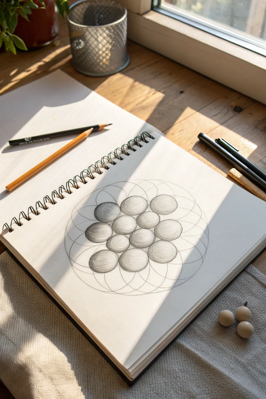
Blend the precision of geometric drafting with the softness of graphite shading in this mesmerizing study. By constructing a classic ‘Flower of Life’ grid and selectively shading the intersections, you’ll create the illusion of three-dimensional orbs floating on the page.
How-To Guide
Materials
- Sketchbook or drawing paper (medium tooth)
- Drawing compass
- Graphite pencils (HB for outlines, 2B and 4B for shading)
- Eraser (kneaded eraser is best)
- Ruler
- Blending stump or torture (optional)
Step 1: Constructing the Grid
-
Set your center:
Find the approximate center of your page. Mark a small dot. Set your compass to a radius of about 1 inch (or 2.5 cm). Place the compass point on the dot and draw your first complete circle. -
Start the pattern:
Without changing the radius, place the compass point anywhere on the circumference of your first circle. Draw a second circle. -
Find intersection points:
Place your compass point at one of the two intersections where the new circle meets the first one. Draw a third circle. -
Complete the flower:
Continue this process, moving your compass point to the newest intersection each time, until you have six circles surrounding the central one. This creates the classic six-petaled flower shape in the middle. -
Expand outward:
To create the larger grid seen in the reference, continue adding circles at the outer intersections of your current cluster. You want to build roughly two to three layers of circles extending outward to provide enough framework for the spheres. -
Lighten the guides:
The grid you just drew is purely structural. Take your kneaded eraser and gently dab or roll it over the entire drawing to lift the graphite until the lines are faint and barely visible.
Step 2: Defining the Spheres
-
Isolate the shapes:
Look closely at the intersecting circles. You will see smaller, darker circles formed where the grid lines overlap. Use your HB pencil to firmly outline thirteen distinct circles in a cluster arrangement—one in the center, six around it, and six more in the gaps of the outer ring. -
Check the formation:
Ensure your outlined circles touch each other perfectly at their edges but do not overlap into each other’s space. They should look like a tight cluster of marbles.
Uneven Circles?
If your compass slips, place a piece of tape or a sturdy piece of cardstock under the center point. This prevents the needle from widening the hole in the paper.
Step 3: Shading and Form
-
Establish a light source:
Decide where your light is coming from. In the reference image, the light hits from the top right. This means the highlight will be on the top right of each sphere, and the shadow will be on the bottom left. -
Base shading layer:
Using a 2B pencil, lightly shade the bottom-left crescent of the central sphere. Use curved strokes that follow the roundness of the circle to imply volume. -
Deepen the core shadow:
Switch to a 4B pencil to darken the deepest part of the shadow, which should be slightly inward from the very edge of the sphere. This creates a ‘reflected light’ effect on the rim, making it look more 3D. -
Gradient blending:
I like to use a lighter touch as I move toward the light source. Fade your pencil strokes out to pure white paper as you reach the top right area of the sphere. -
Repeat for the inner ring:
Move to the six spheres surrounding the center. Apply the exact same shading pattern to each one: dark bottom-left, bright top-right. Uniformity is key here to sell the illusion that they are all lit by the same source. -
Handle the contact points:
Pay special attention to the tiny V-shaped gaps where three spheres meet. Ensure the shading is distinct so the spheres don’t visually merge into a blob. -
Shade the outer ring:
Proceed to shade the final outer ring of spheres. Keep your pencil sharp; crisp edges are essential for this geometric look. -
Refine the background grid:
Go back to the faint grid lines we drew earlier (the ones that aren’t part of the spheres). Lightly re-trace them with an HB pencil just enough to make them visible as a delicate background pattern behind your 3D orbs. -
Final contrast check:
Step back and squint at your drawing. If any spheres look flat, gently add more 4B graphite to the darkest curve of their shadow to increase the contrast range.
Make It Pop
Add a cast shadow underneath the entire cluster of spheres to make them look like they are floating slightly above the paper surface.
Enjoy the satisfying optical illusion you have created with just simple lines and shadows
BRUSH GUIDE
The Right Brush for Every Stroke
From clean lines to bold texture — master brush choice, stroke control, and essential techniques.
Explore the Full Guide
Spiral Vortex Study
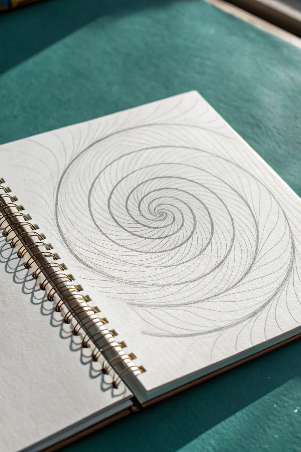
This mesmerizing yet minimalist drawing exercise creates a sense of infinite depth using nothing more than repetitive curved lines. The result is a clean, graphic spiral that pulls the eye toward a central vanishing point, perfect for practicing line control and spacing.
How-To Guide
Materials
- Drawing paper or sketchbook (smooth bristol or mixed media paper works best)
- Graphite pencil (HB or H for light lines, 2B for darker definition)
- Fine-liner pen (optional, for final inking)
- Eraser (kneaded eraser preferred)
- Compass (optional, if you want a perfect circle guide lines)
Step 1: Setting the Foundation
-
Find the center:
Begin by locating the approximate center of your page. Mark it with a tiny, faint dot. This will be the focal point where all your spirals converge. -
Draw the first curve:
Starting near the outer edge of your paper, draw a long, smooth arc that curves inward toward the center dot. Do not connect it perfectly; instead, let it ‘land’ somewhere near the middle. -
Mirror the motion:
Rotate your sketchbook slightly. Draw a second arc starting from a similar distance from the center, curving in the same direction to meet the previous line near the middle. -
Establish the primary arms:
Continue this process, drawing 6 to 8 main ‘arms’ or primary curves that originate from the outside and spiral toward the center. Space them relatively evenly around the perimeter. -
Check the flow:
Step back and look at your initial structure. It should look like a pinwheel or a galaxy. Adjust any curves that feel too straight or too jagged.
Step 2: Building the Spiral Density
-
Start the subdivisions:
Now, go to the space between two of your primary arms. Draw a new curve that starts slightly further in than the outer edge and follows the parallel path of the existing lines. -
Tighten the coil:
As this new line approaches the center, let it curve tighter, tucking in closer to the central vortex point. -
Repeat the fill:
Move to the next section and add a similar subdividing line. I find it helpful to rotate the book constantly so my hand stays in the same comfortable drawing position for every curve. -
Create the rhythm:
Continue adding lines between your main structural lines. The goal is to fill the white space with a rhythmic texture of curves. -
Watch your spacing:
Try to keep the gap between lines consistent as they move outward, but allow them to get very dense and close together as they swirl into the center point.
Uneven Spacing?
If your spirals look lopsided, lightly draw a few concentric circles with a compass first. Use these rings as ‘checkpoints’ to ensure your curves are hitting the same distance from the center.
Step 3: Refining the Depth
-
Intensify the center:
Go back to the very center of the vortex. Add very short, tiny curved marks to fill any remaining gaps, creating a dark, dense focal point. -
Review line weight:
Assess your drawing. Some lines might be faint. Go over the main structural curves with slightly more pressure to make them stand out against the filler lines. -
Extend to edges:
If your lines don’t reach the edge of the paper or a natural boundary, extend the outer tails of the curves so they fade off or meet the page edge elegantly. -
Clean up intersections:
Where lines converge in the deep center, things can get messy. Use a sharp pencil tip to define the distinct layers so it doesn’t just look like a dark smudge. -
Final erase:
Take a kneaded eraser and gently list any stray graphite dust or accidental smudges from your hand resting on the paper.
Wrist Mechanics
Don’t draw these curves with your fingers. Lock your wrist and move your entire arm from the elbow or shoulder. This creates much smoother, more confident arcs.
Now you have a hypnotic geometric study that draws the viewer deep into the page
Abstract Landscape in a Circle
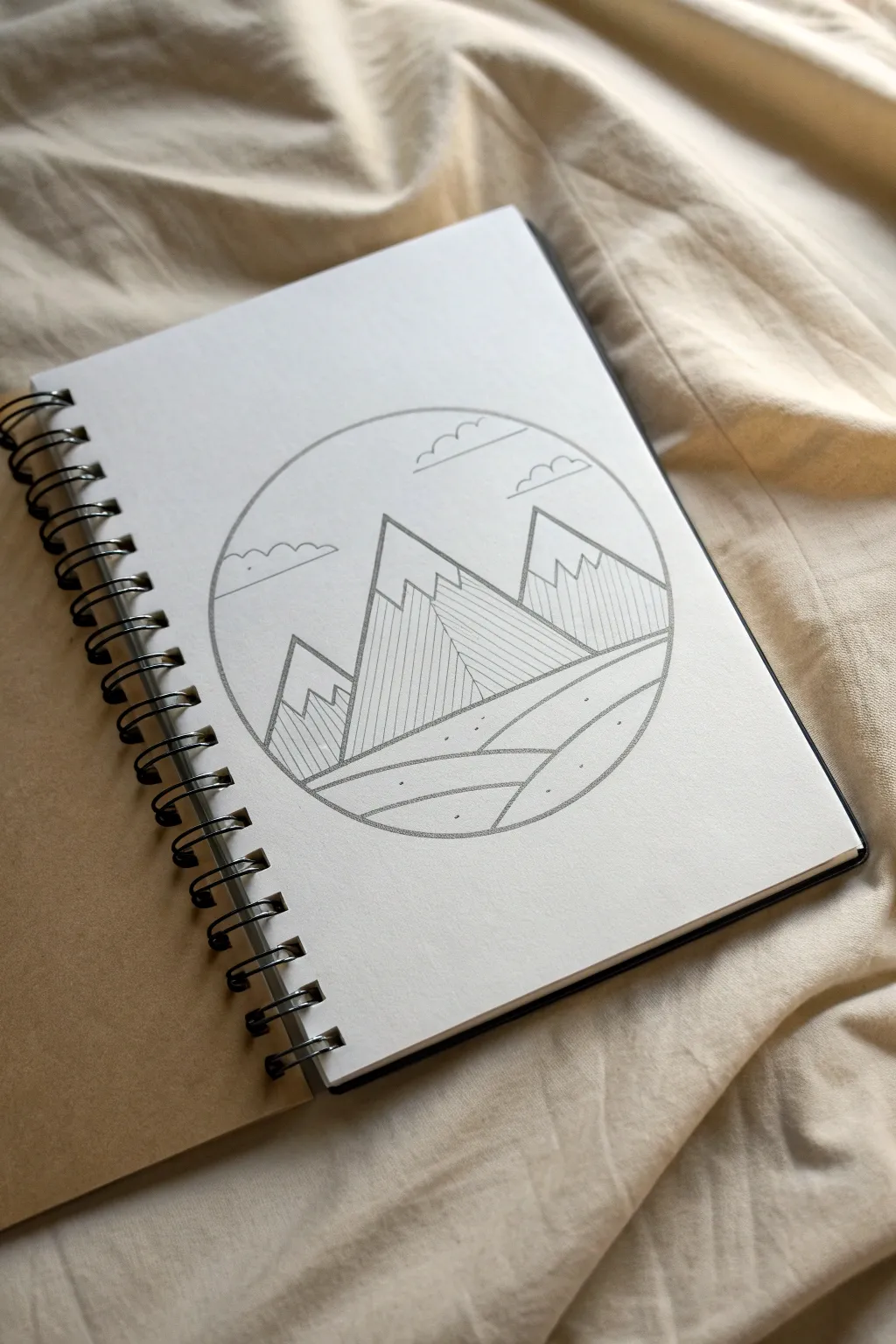
This minimalist project combines clean geometry with nature-inspired motifs to create a striking abstract landscape. Using simple lines and distinctive hatching techniques inside a perfectly round frame, you’ll capture the essence of a serene mountain range.
Step-by-Step Guide
Materials
- Sketchbook or drawing paper (heavyweight preferred)
- Compass (or a circular object to trace like a bowl)
- Graphite pencil (HB or 2B)
- Fine-liner pen (0.3mm or 0.5mm, black)
- Ruler or straight edge
- Eraser
Step 1: Setting the Scene
-
Create the boundary:
Begin by drawing a perfect circle in the center of your page using a compass. If you don’t have a compass, carefully trace around a circular object like a bowl or a roll of tape. This circle will frame your entire composition. -
Establish the horizon:
Lightly sketch a horizontal line crossing through the lower third of the circle. This doesn’t need to be perfectly straight; a slight curve creates a more natural ground line.
Smudge Alert
If your ruler smears the fresh ink, stick a few layers of masking tape on the underside of the ruler. This lifts the edge slightly off the paper to prevent smudging.
Step 2: Constructing the Mountains
-
Draft the central peak:
Draw the largest triangle shape first, positioning its peak slightly left of the center. Use your ruler to ensure the sides are perfectly straight, extending downward to meet your horizon line. -
Add the supporting peaks:
To the right, draw a slightly smaller mountain peak. Then, add a third, smaller peak on the far left side, slightly overlapping behind the central one to create depth. -
Define the snow caps:
Near the top of each triangle, draw jagged, zigzag lines to represent the snow line. Connect the points of the zigzags down to the mountain slopes to create a dimensional, crystalline look. -
Divide for shading:
Use your ruler to draw a vertical line straight down from the tip of each mountain peak to the base. This splits each mountain into a ‘sun’ side and a ‘shadow’ side, which is crucial for the geometric style.
Add a Pop of Color
Try painting a watercolor wash over the sky or ground once the ink is dry. A soft sunset gradient of pink and orange looks amazing against the harsh geometric lines.
Step 3: Inking and Detailing
-
Outline the main shapes:
Switch to your fine-liner pen. Carefully trace over the main circle, the mountain outlines, and the snow caps. Do not ink the bottom of the mountains yet where they meet the ground. -
Create vertical texture:
On the right half of each mountain (the shadow side), use your ruler and pen to draw thin, vertical lines. Space them evenly and keep them strictly parallel. This vertical hatching gives the drawing its modern, architectural feel. -
Vary the hatching:
For the left side of the central peak, draw diagonal lines slanting downward. This subtle contrast in line direction helps distinguish the different faces of the rock. -
Add landscape layers:
Below the mountains, draw two or three curving lines that sweep across the bottom of the circle. These represent rolling hills or fields leading up to the peaks. -
Detail the ground:
Inside these ground layers, add tiny, scattered dots. These stippling marks suggest texture like grass or rocks without needing to draw every blade. -
Draw stylistic clouds:
In the sky area, draw three simple cloud shapes using connected semi-circles. Keep the bottom of each cloud flat and straight for a stylized look. -
Erase guidelines:
Once the ink is completely dry—I usually wait at least five minutes to be safe—gently erase all the underlying pencil sketches to reveal the crisp black lines.
Now you have a serene, geometric landscape that perfectly balances structure and nature


Mandala Meets Geometry
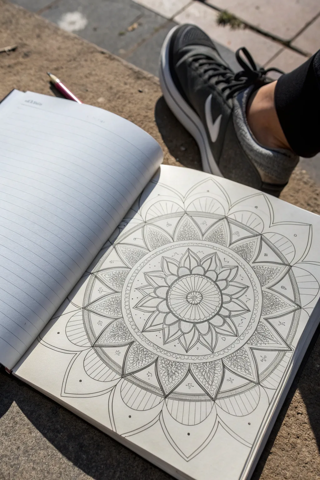
This intricate mandala combines fluid floral shapes with strict geometric precision, creating a mesmerizing piece of art that looks far more complex than it actually is. By building outwards from a central point, you can achieve this balanced and meditative design directly in your sketchbook.
Step-by-Step
Materials
- Sketchbook with quality drawing paper
- Compass
- Protractor (optional but helpful)
- Ruler
- HB Graphite pencil
- Eraser
- Black fine liner pen (01, 03, and 05 sizes recommended)
Step 1: Setting the Structure
-
Find Center:
Begin by marking the absolute center of your sketchbook page lightly with a pencil. This single dot will be the anchor for the entire drawing. -
Draw Concentric Circles:
Using your compass, draw a series of light concentric circles expanding from your center point. Start small for the inner medallion, then add 5-7 increasingly larger circles spaced about 2-3 cm apart to guide your petal layers. -
Divide the Pie:
Use a ruler to draw a vertical and horizontal line through the center, dividing the circle into four quadrants. Then, intersect these again to create eight equal pie slices. Repeat until you have 16 or 32 sections depending on how detailed you want your petals to be.
Step 2: Drawing the Floral Core
-
Central Medallion:
In the innermost circle, draw a small flower or geometric star. For this design, create a small wheel with spokes radiating from the center dot to the first circle boundary. -
First Petal Layer:
Using the radial grid lines as guides, sketch the first row of pointed petals. The tip of each petal should touch a grid line, ensuring perfect symmetry around the core. -
Overlapping Layers:
Draw a secondary layer of larger petals behind the first. Let the tips of these petals fall exactly between the tips of the previous layer, creating a densely packed floral look. -
Adding Details:
Inside these core petals, sketch smaller interior lines or “veins” to add depth. This mimics the look of a real bloom.
Uneven Petals?
Don’t panic if symmetry slips. Instead of erasing, thicken the outlines of the smaller petals to match the visual weight of the larger ones. The eye forgives minor variances.
Step 3: Expanding the Pattern
-
Geometric Band:
Create a distinct separator ring around your floral core. Draw two circles close together and fill the space between them with tiny circles or beads. -
Complex Petal Frames:
In the next available wide band, draw large, broad frames for your main petals. These should span two or three of your grid sections each, creating a wide base. -
Intricate Fill:
Fill these large frames with a dense pattern. A stippling effect or small, tight loops works beautifully here to contrast with the open space of the other petals. -
Outer Points:
Add a layer of sharp, triangular points extending from the textured petals. Keep these simple and linear to balance the visual weight.
Rotational Ease
Turn your sketchbook constantly! It is much easier to draw the same curve repeatedly if you rotate the paper so your hand stays in its most natural, comfortable position.
Step 4: The Outer Rim and Inking
-
Large Outer Petals:
For the final exterior layer, draw broad, sweeping arcs that connect the outer points. These should be the largest shapes in your mandala. -
Striped Texture:
Fill these large outer petals with parallel vertical lines (hatching). Keep the spacing consistent to create a clean, architectural look. -
Tiny Accents:
Look for empty negative spaces between petal tips. Add tiny floating circles, dots, or small flourishes in these gaps to make the design feel magical and active. -
Initial Inking:
Switch to your 05 fine liner. Trace the major structural lines of the petals and circles. Use a confident, steady hand, as hesitancy creates shaky lines. -
Detail Inking:
Switch to a finer 01 or 03 pen for the intricate details, such as the hatching lines, stippling, and interior petal veins. This line weight variation adds tremendous depth. -
Erase and Refine:
Wait at least 15 minutes for the ink to fully cure. I always check purely by touch before erasing. Once dry, gently erase all pencil grid lines and circles. -
Final Touches:
Assess the finished ink drawing. If certain areas look too light, go back in and thicken the outline on just one side of the petals to suggest a shadow.
Now you have a stunning geometric centerpiece that invites color or stands beautifully on its own in black and white
Biomorphic One-Shape Flow
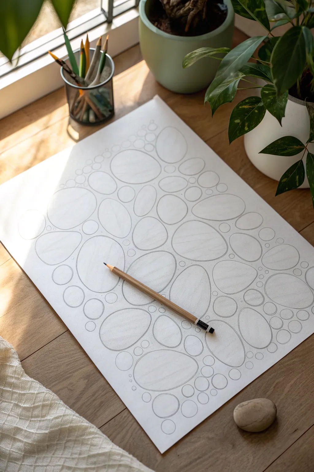
Capture the meditative quality of nature with this simple yet striking abstract composition. Using biomorphic shapes inspired by river stones, this project focuses on balance, line quality, and the satisfying way organic forms nestle together.
How-To Guide
Materials
- High-quality bright white drawing paper or sketchbook (smooth texture preferred)
- Graphite pencil (HB or 2B for initial lines)
- Pencil sharpener
- Eraser (kneaded or vinyl)
Step 1: Planning the Composition
-
Establish the focal point:
Begin near the center of your page, but slightly offset. Draw a medium-sized, slightly irregular oval. Avoid perfect geometry; think of the shape of a smooth potato or a river rock. -
Add primary shapes:
Draw 3-5 distinct, large ovals scattered around the central area. Ensure they are different sizes and orientations. These will serve as the anchors for your composition. -
Check spacing:
Leave gaps between these initial shapes. You aren’t connecting them yet, but rather creating a loose cloud of ‘stones’ across the page.
Stone Reference
Keep a real smooth stone nearby while drawing. Touching it and observing its curves can help your hand naturally mimic those organic, non-geometric shapes on paper.
Step 2: Creating the Biomorphic Mesh
-
Fill the gaps:
Start drawing smaller ovals and circles in the spaces between your large anchors. Imagine these shapes are soft and slightly pliable, mostly conforming to the space available. -
Maintain consistent spacing:
Try to keep a consistent ‘channel’ of white space between every shape. This negative space is just as important as the pencil lines themselves. -
Vary the sizes:
Don’t just use one size for the filler shapes. Use medium ovals for larger gaps and tiny, near-perfect circles for tight corners where three or more large stones meet. -
Work outward:
Expand your drawing toward the edges of the paper. As you move outward, I tend to let the shapes become slightly looser or smaller to create a fading effect, or you can fill the page entirely. -
Assess the flow:
Step back and look at the overall pattern. Does it feel balanced? If there is an awkward empty spot, drop in a tiny ‘pebble’ circle to bridge the gap.
Shading Depth
To transition from 2D to 3D, add very light graphite shading to the bottom right of each ‘stone’ and a tiny drop shadow beneath them to dampen the flatness.
Step 3: Refining Line Quality
-
Assess your pencil sharpness:
Before the final pass, sharpen your pencil. A crisp, relatively fine point is crucial for the clean, minimalist aesthetic of this piece. -
Darken the outlines:
Go back over your initial sketch lines. Press slightly firmer to create a definitive, confident dark grey outline for each shape. -
Correct irregularities:
As you re-trace, smooth out any accidental jagged edges or hesitant sketch marks. The goal is a smooth, continuous loop for every stone. -
Clean up:
Use your eraser to gently remove any stray marks or smudge spots on the white paper between the stones. The contrast between line and paper needs to be high. -
Add subtle variation (Optional):
If a line looks too mechanical, you can thicken it slightly on one curve of the oval to suggest weight or shadow, though keeping the line uniform works well for this graphical style.
Enjoy the calm rhythm of fitting these shapes together on your finished page
Face Hidden in Line Waves
Transform simple wavy lines into a mesmerizing optical illusion that hints at a hidden visage across a double-page spread. This meditative drawing exercise uses varying line density and curvature to create volume and depth without traditional shading.
Detailed Instructions
Materials
- A5 or A4 sketchbook (smooth paper works best)
- Fine-liner pen (0.3mm or 0.5mm, black)
- Pencil (HB for light sketching)
- Eraser
- Ruler (optional, for guidelines)
Step 1: Preparation & Mapping
-
Flatten the spread:
Begin by opening your sketchbook to a fresh double-page spread. Press the spine down firmly so the pages lay as flat as possible, ensuring your lines can flow uninterrupted across the gap. -
Visualize the peaks:
Lightly sketch a few very faint circles or ovals with your pencil where you want the ‘features’ of the hidden face to be—think cheeks, nose bridge, or forehead. These areas will act as the high points for your topographical lines. -
Mark vertical guides:
Still using your pencil, draw 4-5 loose, vertical wavy guidelines spaced evenly across both pages. These will help you maintain the general flow and direction of your waves so the drawing doesn’t become chaotic. -
Test the pen:
On a scrap piece of paper, test your fine-liner to ensure the ink flows smoothly. Consistent ink flow is crucial for maintaining the hypnotic effect of the parallel lines.
Step 2: Drawing the Base Waves
-
Start the first line:
Starting at the very top left corner of the left page, draw your first continuous wavy line extending all the way to the right edge of the right page. -
Navigate the page seam:
When your pen hits the spine, lift it slightly or slow down to cross the bump carefully. I usually try to make the line dip slightly into the crease to emphasize depth. -
Establish the rhythm:
Draw a second line parallel to the first, about 3-5mm apart. Focus on keeping this distance relatively consistent for now, as this sets the peaceful base rhythm of the piece. -
Create the first distortion:
As you approach one of your pencil-marked ‘feature’ zones, gently curve your line upward more sharply than the previous one. This slight divergence begins to build the volume. -
Widen the gap:
In the valleys between features (like the space under a cheekbone), allow the lines to drift slightly further apart. Wider spacing visually recedes, while tighter spacing pulls forward.
Uneven Lines?
If a gap gets too wide by accident, don’t force it back immediately. Gradually correct the spacing over the next 3-4 lines to make the adjustment look intentional and organic.
Step 3: Building Volume & Detail
-
Compress the peaks:
When drawing lines over your pencil-marked ‘high points,’ draw them closer together. The compression of lines optical creates a darker, denser value that suggests faint shadowing or contouring. -
Flow around the forms:
Imagine your pen is physically traveling over a 3D landscape. Let the line climb up the ‘nose’ and slide down into the ‘eye socket.’ The lines should wrap around the forms rather than just sit on top. -
Adjust line weight:
If you want certain features to pop more, you can go over specific segments of a curve a second time to thicken the line weight slightly on the shadowed side of a curve. -
Continue the pattern:
Work your way down the page, line by line. It’s meditative work, so take your time. If your hand gets shaky, pause and shake it out; wobbly lines ruin the smooth illusion. -
Check the alignment:
Every few inches, pause and look at the spread from a distance. Ensure the waves on the left page are still visually connecting with the waves on the right page. -
Fill the bottom edge:
As you reach the bottom, the curves should naturally flatten out slightly, returning to a calmer, more horizontal wave pattern similar to how you started at the top.
Level Up: Color Gradient
Swap the black pen for colored fine-liners. Use cool blues for receding ‘valleys’ and warm oranges for protruding ‘peaks’ to enhance the 3D topographical effect.
Step 4: Finishing Touches
-
Let the ink dry:
Give the drawing several minutes to dry completely. Smudging intricate line work at the very end is heartbreaking, so patience is key here. -
Erase guidelines:
Gently erase your initial pencil circles and vertical guides. Use a soft, kneaded eraser to avoid damaging the paper texture or lightening the ink. -
Refine connections:
Inspect the spine / gutter of the book again. If any lines don’t quite meet in the middle, use your fine-liner to carefully bridge the gap. -
Optional shading:
For extra depth, you can add extremely subtle stippling (tiny dots) in the tightest curves where the lines bunch together, deepening the ‘shadows’ of the hidden face.
Step back and tilt your sketchbook to see the hidden features emerge from the simple sea of waves


Have a question or want to share your own experience? I'd love to hear from you in the comments below!