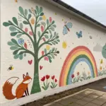
Whenever I’m stuck, I draw a rainbow—because it’s basically a ready-made playground for color, texture, and mood. Here are my favorite creative rainbow drawing ideas that start classic and slowly get delightfully weird.
Classic Rainbow Arch With Fluffy Clouds
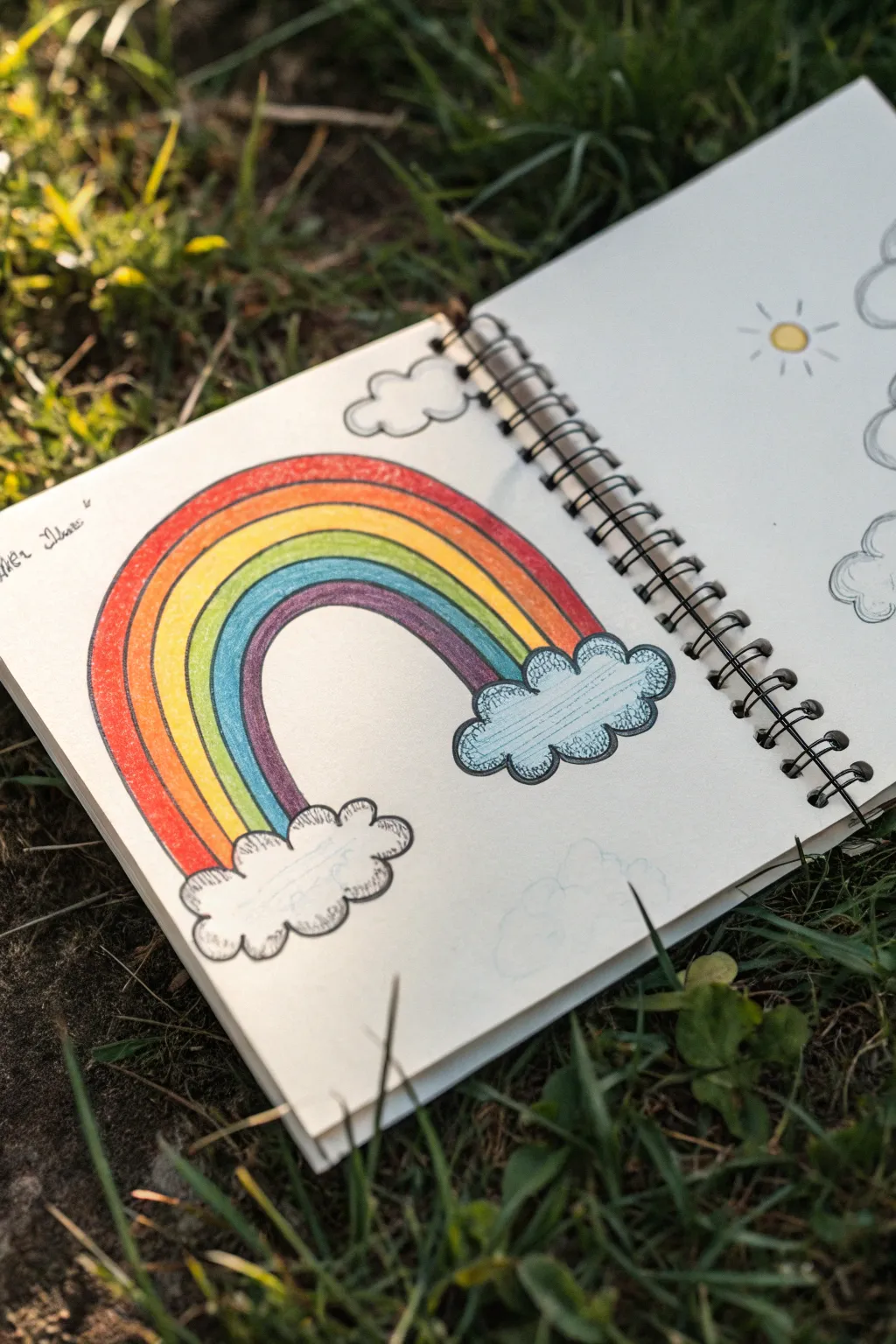
Capture the simple joy of a bright day with this charmingly traditional rainbow sketch. Using colored pencils and fine liners, you’ll create a vibrant arch grounded by fluffy, illustrative clouds that pop right off the page.
How-To Guide
Materials
- Spiral-bound sketchbook or drawing paper
- HB Drawing pencil
- Eraser
- Fine black liner pen (0.3mm or 0.5mm)
- Colored pencils (Red, Orange, Yellow, Green, Light Blue, Purple/Violet)
Step 1: Planning the Composition
-
Establish the cloud bases:
Start by lightly sketching two horizontal ovals near the bottom of your page with your pencil. These will serve as markers for where your rainbow starts and ends, ensuring the arch is centered. -
Sketch the primary arch:
Draw a large, high curve connecting the two cloud markers. This top line defines the outer height of your rainbow. Keep your wrist loose to get a smooth curve. -
Create the inner boundary:
Draw a smaller, parallel arch inside the first one. This creates the full width of the rainbow band. -
Divide the bands:
Lightly sketch five curved lines inside the main band, spacing them as evenly as possible. You need to create six total stripes for your colors. -
Shape the clouds:
Over your initial cloud markers, sketch the fluffy outlines. Use a series of bumpy, connected small curves (‘C’ shapes) to create that classic cartoon cloud look.
Uneven Arches?
If sketching a perfect arch is hard, pin a string to the center point below the clouds. Tie your pencil to the other end and swing it like a compass.
Step 2: Adding Color
-
Begin with red:
Take your red colored pencil and fill in the outermost band. Use consistent pressure to get a solid, vibrant tone without leaving too much white paper showing. -
Fill the orange band:
Move inward to the next stripe with your orange pencil. Be careful near the edges to keep the distinctive separation between colors. -
Add yellow sunshine:
Color the third band yellow. If you want the colors to feel seamless, you can ever-so-slightly overlap the boundary with the orange, but crisp lines work best for this style. -
Bring in the green:
Fill the fourth band with a grassy green shade. -
Apply the blue:
Color the fifth band with a bright or light blue. This contrasts nicely with the upcoming purple. -
Finish with purple:
Fill the final, innermost band with violet or purple to complete the spectrum. -
Shade the clouds:
Take the light blue pencil again and lightly shade just the inside of the cloud outlines. Leave the center of the clouds white to make them look puffy.
Step 3: Inking and Definition
-
Outline the clouds:
Using your fine black liner, trace over the bumpy cloud sketches. Don’t worry if the lines aren’t perfectly smooth; a little jitter adds character. -
Define the rainbow edges:
Inking the rainbow bands is optional, but for this specific look, trace the long arched lines with the black pen to make the colors stand out. -
Add texture marks:
Inside the blue shading of the clouds, add tiny horizontal hatch marks with the pen. This serves as a shadow detail that mimics the reference style. -
Erase guidelines:
Wait a moment for the ink to fully dry to avoid smudges. Then, gently erase any visible pencil marks from your initial sketch. -
Extra atmosphere:
If you have space, clarify the smaller cloud detail on the opposing page or add faint outlines of other clouds in the background.
Make It Sparkle
Make the drawing magical by adding tiny stars or glitter glue over the cloud edges. You can also use a white gel pen to add highlights to the colored bands.
Enjoy the brightness this colorful sketch brings to your sketchbook

Soft Gradient Rainbow Arc
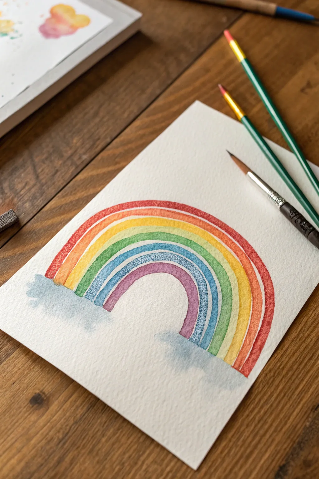
Capture the ethereal beauty of a classic rainbow with this soft and textured watercolor project. Using wet-on-dry techniques on high-quality cold press paper allows the colors to pop while maintaining distinct, beautiful edges for each arc.
Step-by-Step Guide
Materials
- Cold press watercolor paper (300 gsm recommended)
- Watercolor paints (Red, Orange, Yellow, Green, Blue, Indigo/Violet)
- Round watercolor brushes (sizes 6 and 8)
- Pencil (HB or lighter)
- Kneaded eraser
- Jar of clean water
- Paper towels or cloth
Step 1: Preparation & Sketching
-
Prepare your workspace:
Clear a flat surface and tape down your watercolor paper if you prefer crisp edges, though this project works well on a loose sheet too. Ensure your water is clean and your paints are activated with a drop of water. -
Mark the base points:
Lightly mark two points on your paper with a pencil to determine how wide your rainbow will be. This helps ensure your arc doesn’t run off the page as you paint. -
Sketch the guide arch:
Using a very light hand, sketch the outermost arch of the rainbow connecting your two base points. Don’t worry about drawing every single band yet; just get the top curve right. -
Define the inner bands:
Estimate the width of your rainbow bands. You can lightly sketch the inner boundary curve to keep your painting consistent, but avoid drawing lines for every single color to prevent graphite from showing through the translucent paint.
Fixing Bleeds
If two wet colors accidentally touch and bleed, dab the spot immediately with a clean, dry paper towel to lift the pigment. Let it dry fully before repainting the edge.
Step 2: Painting the Arcs
-
Load the red paint:
Saturate your size 8 brush with a vibrant red. Ensure the paint has a milky consistency—not too watery, but fluid enough to glide over the textured paper. -
Paint the first arch:
Start from the left base and paint a smooth, consistent red stripe following your top pencil guide. Use the belly of the brush to maintain a uniform width. -
Wait for drying:
This is crucial: let the red stripe dry completely. If you paint the next color too soon, they will bleed together. I usually wait about 5-10 minutes or use a hairdryer on a low setting. -
Apply the orange stripe:
Once the red is dry, mix a bright orange. Paint this stripe directly underneath the red one, leaving a microscopic hairline gap of white paper between them to keep the colors distinct. -
Add the yellow band:
Continue with a sunny yellow. As the arc gets smaller, you might switch to a size 6 brush if you feel you need more control on the inner curve. -
Paint the green layer:
Mix a fresh grass green and paint the next concentric arch. Try to keep your hand steady and move the brush with your arm, not just your wrist, for a smoother curve. -
Introduce the blue:
Lay down a stripe of cooler blue tones. Allow the natural texture of the cold press paper to show through slightly for that lovely granulated look seen in the reference. -
Finish with violet:
Complete the rainbow with a final inner arch of violet or purple. Let this layer dry completely before moving on to the final touches.
Sparkle Effect
Mix a tiny amount of iridescent medium into your paint water or splatter clean water droplets onto the drying paint for a magical, textured finish.
Step 3: Adding the Clouds
-
Prepare a dilute wash:
Take some of your blue paint and dilute it heavily with water until it is very pale and transparent. -
Wet the cloud area:
Using clean water, lightly wet the paper area at the base of the rainbow legs where you want the clouds to sit. -
Drop in color:
Touch your dilute blue wash onto the wet paper. Let the pigment bloom naturally to create soft, fluffy cloud shapes that overlap the bottom ends of your colored stripes. -
Soften the edges:
If the cloud edges look too harsh, rinse your brush, dry it slightly, and gently run it along the perimeter to feather the paint out. -
Final drying time:
Allow the entire piece to dry undisturbed. Once fully dry, gently erase any visible pencil marks with your kneaded eraser.
Hang your cheerful creation in a sunny spot to enjoy the brightening effect of your hand-painted spectrum

Doodle-Filled Rainbow Bands
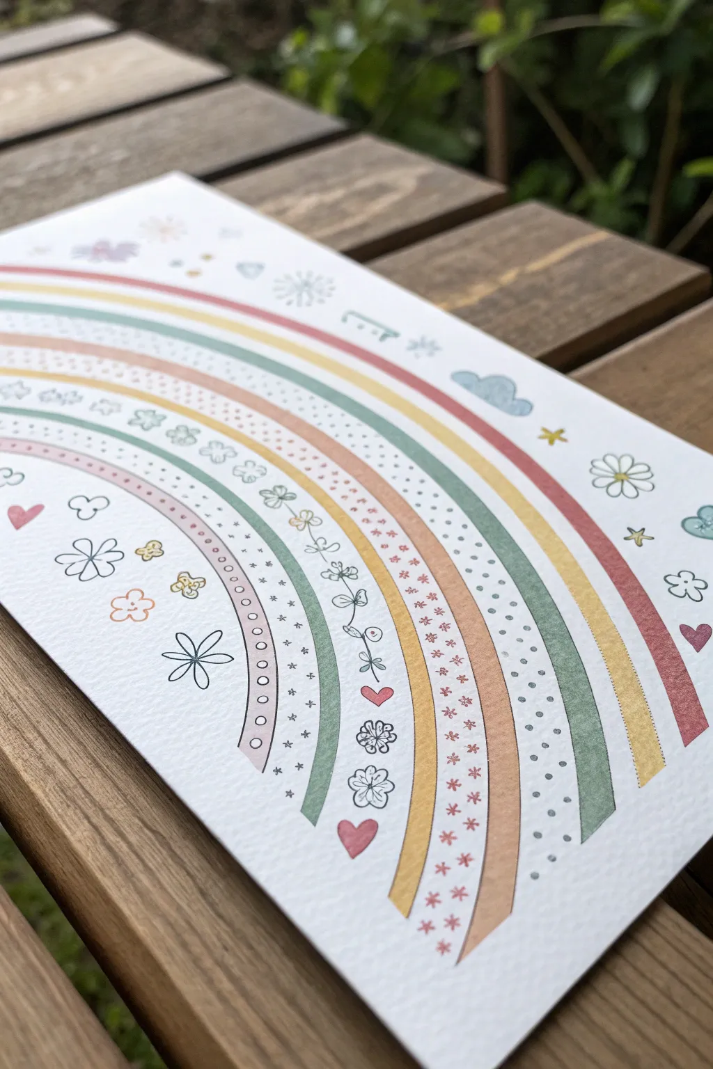
Transform a simple rainbow arch into a whimsical piece of art by alternating solid bands of color with playful, hand-drawn patterns. This project combines steady marker work with delicate fineliner doodles on textured paper for a charming, rustic finish.
Step-by-Step Guide
Materials
- Heavyweight textured paper (watercolor or mixed media)
- Pencil (HB or lighter)
- Eraser
- Protractor or compass (optional)
- Pastel markers or watercolor brush pens (maroon, mustard yellow, sage green)
- Fine-point black drawing pen (0.3mm or 0.5mm)
- Ruler
Step 1: Planning the Arch
-
Establish the center:
Find the bottom center of your paper to serve as the anchor point for your rainbow. If you want perfect symmetry, make a tiny pencil mark here. -
Sketch the guide arcs:
Using a compass or by carefully freehanding, sketch light pencil lines for the rainbow’s arches. You will need pairs of lines to create defined ‘lanes’ or bands. -
Vary the widths:
For a dynamic look, don’t make every band the same width. Sketch two narrow bands, followed by a wide band, then another narrow one, and so on, moving outward. -
Review the spacing:
Step back and look at your pencil sketch. Ensure there is distinct negative space (white space) between the bands so the drawings won’t bleed into each other.
Wobbly Arches?
If freehanding the curves is difficult, trace circular household items like plates or bowls lightly in pencil first to establish your guide arcs.
Step 2: Drawing the Solid Bands
-
Select your palette:
Choose a muted, earthy color palette. I like to keep it limited to three or four tones—like sage green, mustard yellow, and a dusty rose—to keep the design cohesive. -
Color the first narrow band:
Start with the innermost narrow band using a dusty rose marker. Use a slow, sweeping motion to get a smooth curve without shaky edges. -
Add a green band:
Skip the wide ‘doodle’ lane and color the next narrow band in sage green. If your markers have a brush tip, use the side of the nib to fill the space efficiently. -
Fill the mustard band:
Move outward to the next designated solid sript. Fill this one with your mustard yellow marker, maintaining that steady arc. -
Complete the outer bands:
Continue painting the solid colored stripes according to your sketch pattern. For the outermost red band, you might want to make it slightly thicker to frame the artwork.
Make it Shine
Use a gold or silver gel pen for the star doodles or to add tiny highlighted dots inside the colored bands for a magical, shimmering effect.
Step 3: Adding the Doodles
-
Start the innermost doodles:
In the wide band closest to the center, use your black fine-point pen to draw specific patterns. A simple recurring motif like tiny circles or bubbles works well here. -
Create a floral vine:
In the next wide empty band, draw a continuous vine. Sketch a thin wavy line through the center of the band, then add small leaves and loops along the stem. -
Draw the geometric band:
For the next white band, create a pattern of tiny stars or asterisks mixed with small dots. Keep the spacing random for a confetti-like effect. -
Add floating hearts:
In one of the larger outer bands or spaced between solid colors, draw small outline hearts. You can fill a few in with color or leave them simple black and white. -
Incorporate playful shapes:
Use the remaining empty bands for patterns like scalloped edges, tiny flowers, or repeating dashes. Varying line weight slightly can add interest here.
Step 4: Background & Final Touches
-
Scatter surrounding elements:
Fill the large white spaces outside and inside the rainbow arch with standalone doodles. Draw simple five-petal daisies, small clouds, and singular stars. -
Add touches of color:
Selectively color some of the scattered doodles. For example, color a heart red or shade a cloud light blue, but leave the daisies black and white for contrast. -
Erase pencil marks:
Wait until the ink is completely dry—usually about 5-10 minutes just to be safe. Gently erase any visible pencil guidelines from your initial sketch. -
Assess and refine:
Check for any gaps in your coloring or lines that need re-inking. Crisp up the edges of your solid marker bands if the texture of the paper made them uneven.
Now you have a charming, rustic rainbow illustration perfect for framing or gifting

Zentangle Pattern Rainbow
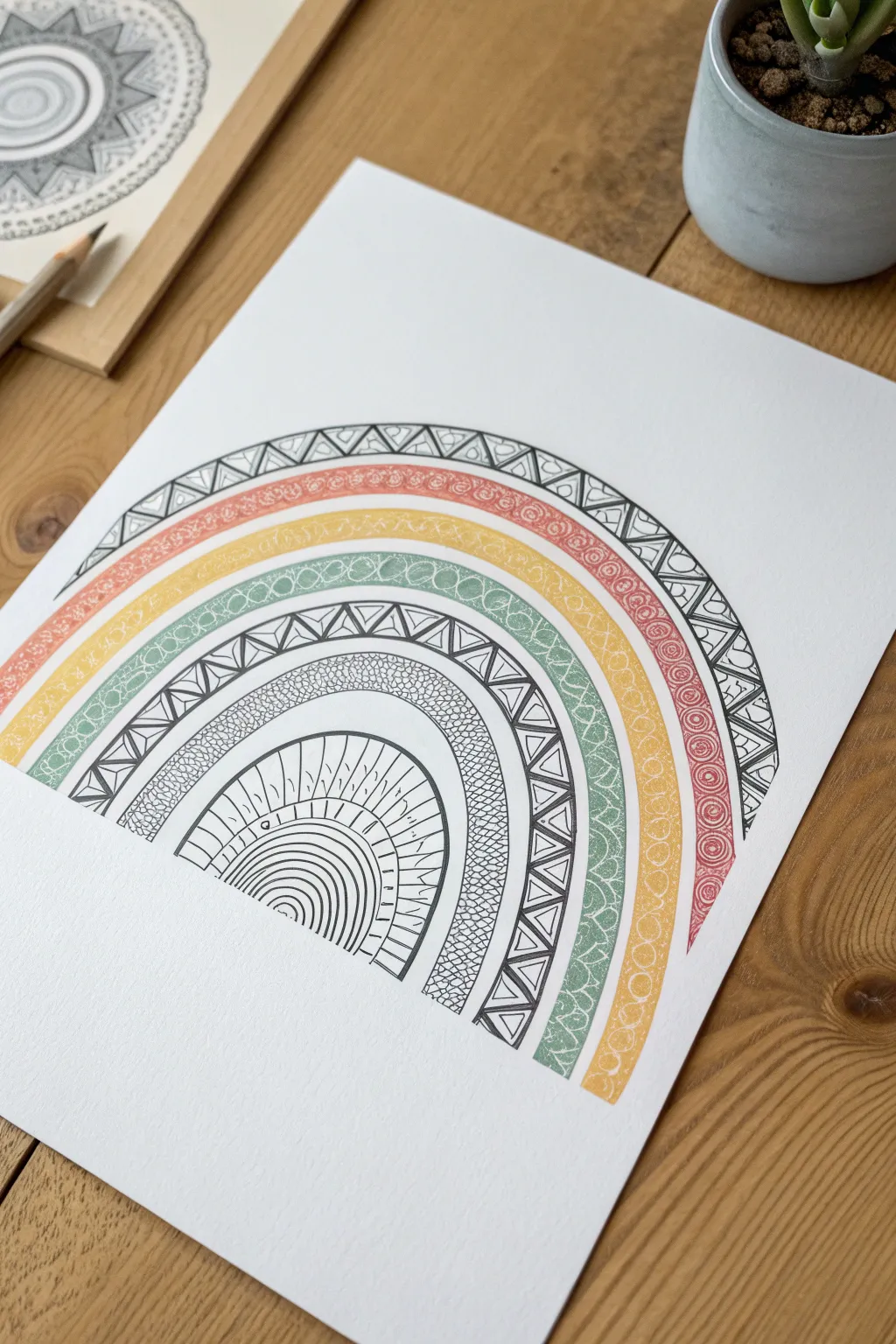
This project combines the relaxing repetition of Zentangle patterns with the classic joy of a rainbow arc. By alternating bold black ink designs with softer, textured bands of color, you achieve a sophisticated look that is playful yet polished.
How-To Guide
Materials
- Heavyweight drawing paper or mixed media paper (A4 size)
- Black fine liner pens (sizes 0.3mm and 0.5mm)
- Pencil (HB or 2B)
- Compass or round objects (bowls, plates) for tracing
- Eraser
- Colored pencils or fine markers (red, yellow, green)
- Ruler
Step 1: Drafting the Arcs
-
Establish the base line:
Begin by deciding where your rainbow will sit on the page. Use a ruler to lightly draw a faint horizontal line about 1/3 of the way up from the bottom of your paper to ensure your arches start and end evenly. -
Draw the outermost arc:
Using a compass set to a wide radius, or a large circular object like a dinner plate, lightly sketch the largest, outermost semi-circle. This determines the overall size of your rainbow. -
Create the inner bands:
Continuing with your compass or smaller round objects, draw six additional concentric semi-circles inside the first one. Space them out somewhat evenly, but don’t worry about perfection; slight variations add character. -
Define the sections:
You should now have a series of bands. Designate which will be patterned in black ink and which will be colored. In the example, the outermost band is black and white, followed by three colored bands, another black and white band, a textured band, and finally the center core.
Uneven Arcs?
Use a makeshift compass! Tie a string to your pencil and pin the other end to the center point. Adjust string length for each new band.
Step 2: Inking the Black Patterns
-
Outline the outer band:
Switch to your 0.5mm black fine liner. Go over the pencil lines for the very top band (the largest arc). Keep your hand steady to create smooth, confident curves. -
Add the triangle structure:
Inside this top band, draw a zig-zag line that touches the top and bottom of the band, creating a series of alternating triangles. -
Fill the triangles:
Inside each triangle pointing up, draw smaller nested triangles. For the triangles pointing down, add simple vertical hatching lines or small circles. This contrast makes the pattern pop. -
Ink the middle patterned band:
Move down past the space reserved for color. Outline the next designated black-and-white band with your pen. I find it helpful to rotate the paper as I draw the curves to keep the angle comfortable for my wrist. -
Create the middle zig-zag:
Repeat the triangle/zig-zag motif in this middle band. To add variety, you can vary the internal details—perhaps outlining the inner triangles heavily or using stippling instead of lines. -
Detail the inner texture band:
Move to the next band inward. Instead of triangles, fill this narrow band with a ‘pebble’ texture by drawing tightly packed, organic circular shapes that fit together like a stone wall. -
Design the center core:
For the smallest, innermost semi-circle, draw a series of radiating straight lines from the center point, looking like sun rays. Then, draw small arches connecting these rays near the bottom to create a scalloped effect.
Texture Twist
Try using watercolor paints for the colored bands instead of pencils. The translucent wash contrasts beautifully with harsh black ink.
Step 3: Adding Color and Texture
-
Start the red band:
Take a red or coral colored pencil. In the band directly beneath the top black pattern, fill the space with small, tight swirls or spirals. Press firmly enough to see the texture, but keep the color somewhat soft. -
Fill the yellow band:
Move to the next band inward. Use a mustard or golden yellow pencil to create a similar texture. Instead of spirals, try small overlapping circles or a ‘scribble’ texture that looks dense but airy. -
Complete the green band:
For the third colored band, use a muted olive or sage green. Fill this section with a repeating scale pattern (small ‘U’ shapes) or cross-hatching to differentiate it from the swirled texture above. -
Reinforce pattern lines:
Once the color is down, use your 0.3mm fine liner to gently go over any pencil guidelines that separate the colored bands, giving them a crisp final boundary.
Step 4: Final Touches
-
Erase pencil marks:
Wait a few minutes to ensure all ink is completely dry. Then, gently erase the original horizontal base line and any visible pencil sketching from the drafting phase. -
Check contrast:
Look at the black patterned areas. If they look too light compared to the color, thicken the main black outlines slightly to regain visual weight and balance. -
One last review:
Scan the drawing for any gaps in the patterns or areas where the color needs to be a bit more vibrant, touching up as needed.
Now you have a stunning, patterned piece that turns a simple rainbow shape into a work of complex art
BRUSH GUIDE
The Right Brush for Every Stroke
From clean lines to bold texture — master brush choice, stroke control, and essential techniques.
Explore the Full Guide
Rainbow Mandala Circle
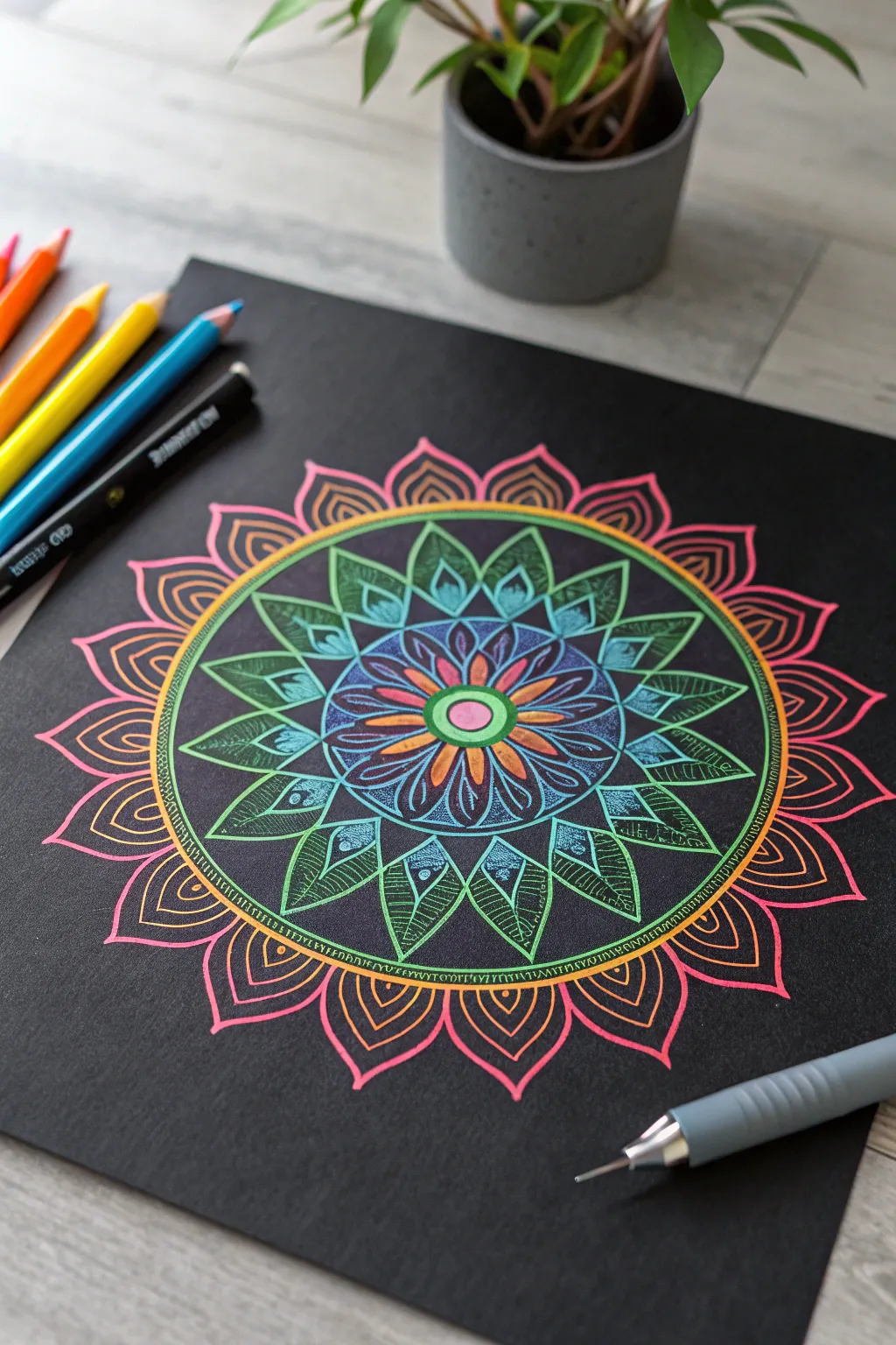
This striking mandala project uses the high contrast of neon gel pens or pencils against black paper to create a glowing, stained-glass effect. By building concentric circles of floral patterns, you create a mesmerizing radial design that looks complicated but is surprisingly simple to construct.
Step-by-Step
Materials
- Black cardstock or heavy black mixed-media paper
- Compass
- Ruler
- White or metallic pencil (for faint sketching)
- Neon or opaque pastel gel pens (pinks, blues, greens, oranges)
- Fine-liner pens in metallic gold or bronze
Step 1: Setting the Structure
-
Find drawing center:
Begin by finding the exact center of your black paper. Use your ruler to measure the width and height, marking a tiny dot where they intersect with your white pencil. -
Draw guide circles:
Using your compass and a white pencil with very light pressure, draw a series of concentric circles. Start with a small inner circle (about 1 inch diameter), then add three increasingly larger circles spaced roughly an inch apart to guide your petal layers.
Step 2: The Inner Core
-
Central seed:
Switch to a bright pink gel pen. Draw a solid circle in the very center, creating a bold focal point. Surround this with a thick ring of bright green. -
First petal layer:
Using an orange or coral pen, draw small, simple teardrop petals radiating from the center green ring. They should be compact and touch at the base. -
Detailing the core:
Add a second set of slightly larger, pointed petals in blue behind the first orange set. Use a fine-tip pen to add internal lines or veins to these blue petals for texture.
Ink Flow Tip
On black paper, gel pens can sometimes skip. Keep a scrap piece of paper nearby to scribble on to get the ink flowing smoothly again before touching your artwork.
Step 3: Expanding the Design
-
The leaf ring:
Move to the next guide circle. Draw a ring of broad, leaf-shaped petals using a teal or light blue pen. These should be wider than your inner petals. -
Leaf texture:
Inside each teal leaf, draw a smaller leaf shape using a green gel pen. Fill the space between the teal outline and the green inner shape with tiny cross-hatching or stippling to make the color pop. -
Outer leaf layer:
Create a layer of sharp, triangular green leaves that extend to your third guide circle. Outline them boldly in bright green. -
Intricate filling:
Fill these green triangles with a grid or mesh pattern using a thinner green or metallic pen. At the base of each triangle, draw a small tear-drop shape in blue.
Glow Up
Use a white colored pencil to lightly shade the center of the petals before drawing over them with neon gel pens. The white base makes the neon colors appear to glow.
Step 4: The Outer Rim
-
The binding ring:
Use a metallic gold or orange pen to draw a solid double-line circle enclosing everything you’ve drawn so far. This acts as a border between the inner patterns and the final outer details. -
Detailing the ring:
I like to fill this narrow channel between the double lines with tiny tick marks or small dots to give it a jewelry-like finish. -
Base of outer petals:
Along the outside of your gold ring, draw a series of small, connecting scollops or U-shapes in a deep orange or red. This serves as the foundation for the final large petals. -
Large petal forms:
Extend large, sweeping petal shapes from the scalloped base. Make these pink or magenta, curving them gracefully to a sharp point. -
Internal echoes:
Inside each large pink petal, draw a smaller, identical shape in orange. This ‘echoing’ technque adds depth without needing to color the whole shape in.
Step 5: Final Touches
-
Erase guides:
Once you are absolutely certain the ink is dry—give it extra time on non-porous paper—gently erase any visible white pencil guidelines. -
Highlight accents:
Use a white gel pen to add tiny dots or ‘specular highlights’ to the tips of the green leaves and the center of the mandala to make it sparkle.
Step back and enjoy how the vibrant colors seem to float above the dark background
Rainbow Spiral Swirl
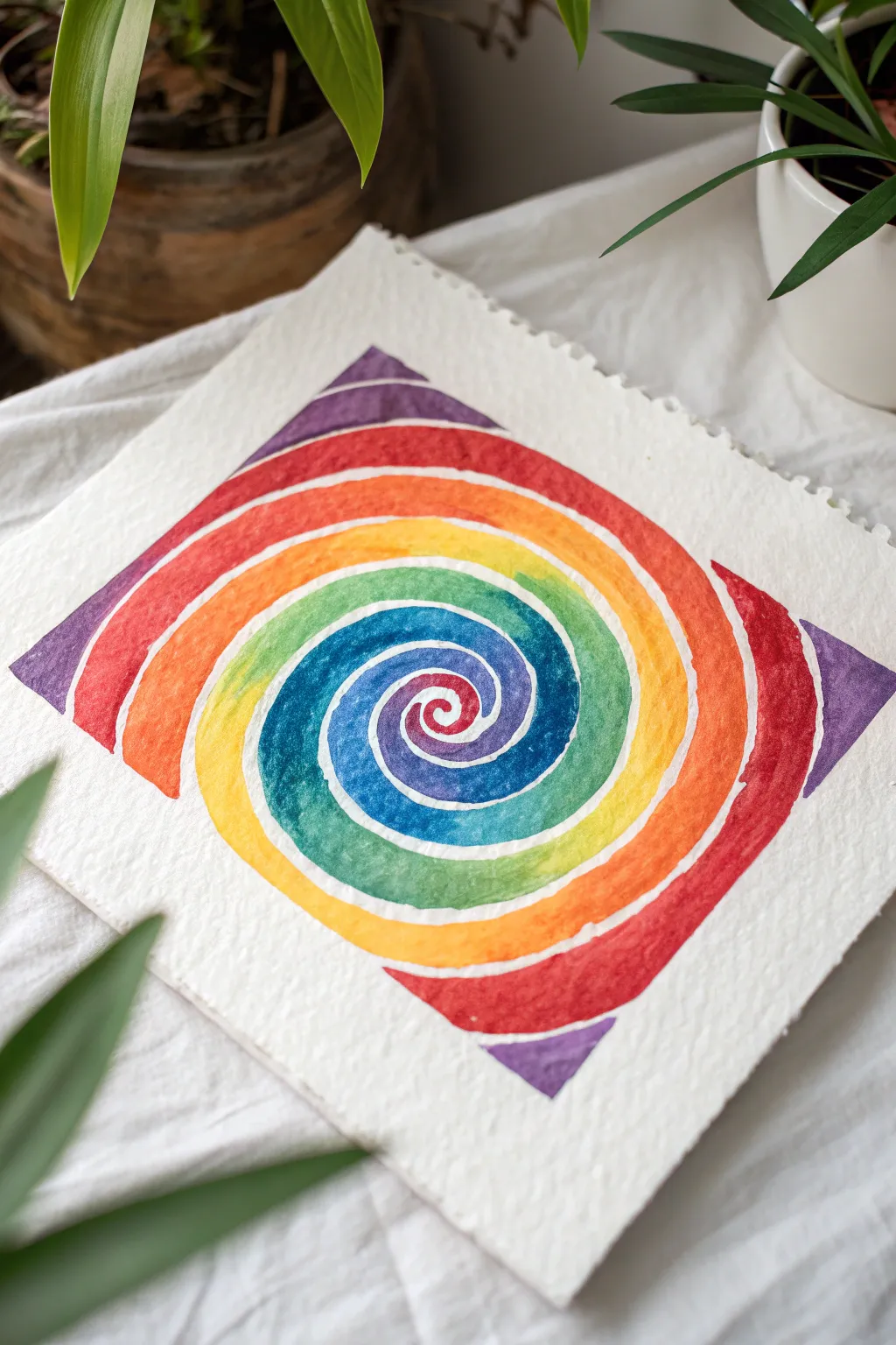
This radiant watercolor project turns a simple spiral into a vibrant spectrum that catches the eye. By using negative space to separate the bands of color, you create a clean, modern look that lets each hue shine individually.
Step-by-Step Tutorial
Materials
- Cold press watercolor paper (square format recommended)
- Pencil (HB or lighter)
- Compass or circular drawing template (optional)
- Small round watercolor brush (size 2 or 4)
- Watercolor paints (rainbow palette: red, orange, yellow, green, blue, indigo, violet)
- Cup of water
- Paper towel
- Masking tape (for borders, optional)
Step 1: Planning the Spiral
-
Mark the center:
Find the center of your watercolor paper. If you are using a square sheet, you can lightly mark diagonals to find the exact middle point. -
Draft the inner coil:
Using a very light pencil touch, sketch a small, tight spiral starting from the center point. It should look like a snail shell. -
Expand outward:
Continue drawing the spiral line outward, gradually increasing the width between the lines as you move away from the center. Imagine the spiral getting ‘looser’ as it grows. -
Define the perimeter:
Extend your spiral until it nearly touches the edges of your paper. For this specific design, the spiral curves naturally form a diamond or square shape at the outer limits. -
Create the channels:
Sketch a second line parallel to your first spiral line, leaving a small gap (about 2-3mm) between them. This gap will remain unpainted to serve as the white separator.
Step 2: Painting the Spectrum
-
Prepare your palette:
Pre-mix your watercolor puddles so you have red, orange, yellow, green, blue, indigo, and violet ready to go. You want the consistency of milk—fluid but pigmented. -
Begin at the heart:
Dip your small round brush into the red paint. Carefully fill in the very center ‘button’ of the spiral. -
Start the transition:
Continue painting the red along the spiral path for a short distance. While the paint is still wet, rinse your brush. -
Blend to orange:
Pick up orange paint and apply it right next to the red, allowing them to touch and bleed slightly together on the paper for a seamless gradient. -
Continue the rainbow:
Work your way through the spectrum: yellow after orange, then green, blue, indigo, and violet. Keep your brush strokes confined strictly within the pencil lines. -
Respect the gaps:
Pay distinct attention to the thin channels we sketched earlier. Do not paint over them; the white of the paper creates the defined swirl effect. -
Repeat the cycle:
Once you reach violet, loop back to red. I find it helpful to look at the previous loop to ensure the colors aren’t perfectly aligned, creating a dynamic, shifting pattern. -
Widen the strokes:
As the spiral gets larger toward the outside, you will need to use broader strokes or multiple passes to fill the wider bands of color. -
Finish the corners:
When you reach the outer edges, paint the segments that form the corners of the ‘square’ shape. These might be isolated triangles of color depending on where your spiral ends.
Steady Hand Trick
Rest your painting hand on a clean scrap of paper or a paper towel while you work. This prevents oils from your hand touching the paper and stops you from accidentally smudging wet paint.
Step 3: Refining
-
Let it dry:
Allow the painting to dry completely. The paper should feel room temperature to the touch, not cool. -
Erase guidelines:
Gently erase the visible pencil lines in the white negative spaces. Be very careful not to smear any pigment.
Metallic Magic
Once the rainbow colors are dry, trace the white negative space channels with gold or silver metallic ink using a gel pen for a glittering, luxurious finish.
Display your colorful spiral creation somewhere bright to catch the light

PENCIL GUIDE
Understanding Pencil Grades from H to B
From first sketch to finished drawing — learn pencil grades, line control, and shading techniques.
Explore the Full Guide
Geometric Triangle Rainbow
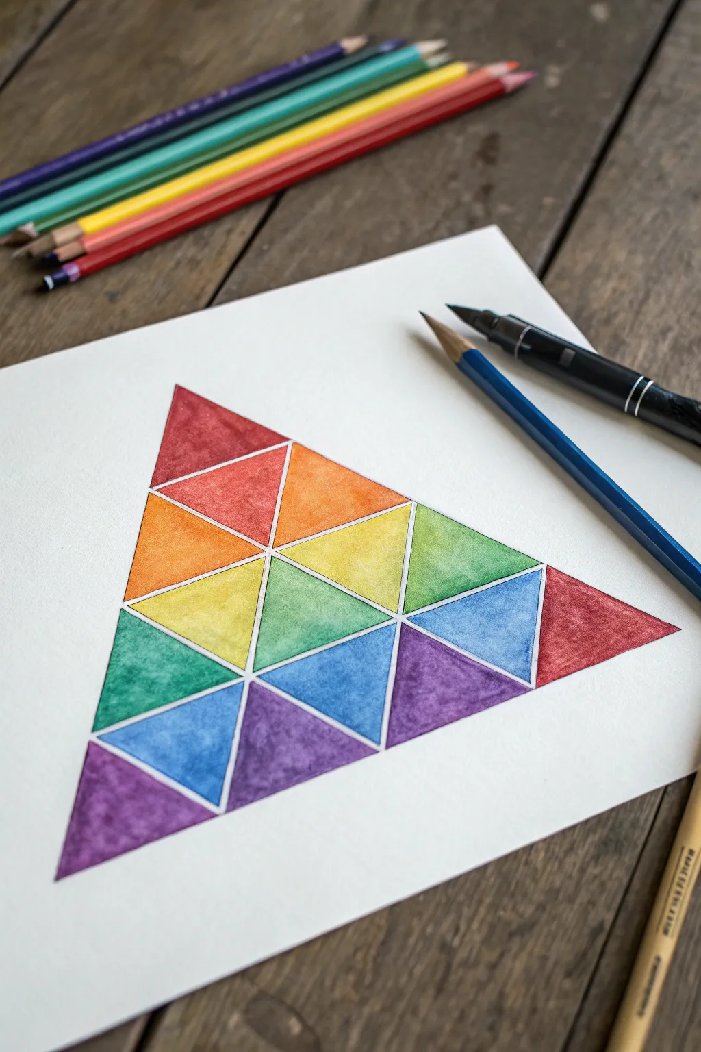
This striking geometric design breaks the traditional rainbow arc into a modern, triangular puzzle. By combining sharp, clean lines with textured color fills, you create a piece that feels both mathematical and organic.
Detailed Instructions
Materials
- Thick watercolor paper or mixed media paper (heavyweight)
- Ruler
- HB Pencil
- Fine liner pen (waterproof, black or dark grey)
- Watercolor paints or watercolor pencils
- Small round paintbrush (size 2 or 4)
- Jar of water
- Paper towel
Step 1: Constructing the Grid
-
Establish the base:
Start by lightly drawing a large equilateral triangle on your paper. If you want precision, draw a horizontal line for the base first (e.g., 12cm), mark the midpoint, and use a protractor or geometry trick to find the peak. -
Divide the sides:
Along each of the three sides of your large triangle, make tick marks to divide the length into four equal segments. This is crucial for creating the internal grid. -
Connect the grid lines:
Using your ruler, connect these tick marks with straight lines parallel to the main sides. You will see a grid of smaller triangles emerging—some pointing up, some pointing down. -
Refine the shapes:
Check your grid. You should have a pyramid shape composed of 4 rows of small triangles. Count them to be sure: top row has 1, second has 3, third has 5, and bottom has 7. -
Create the white gaps:
To achieve the look in the reference, we need ‘breathing room’ between shapes. Draw a slightly smaller triangle inside each grid triangle, leaving a uniform 1-2mm gap between them.
Clean Lines Trick
Use thin masking tape or washi tape along the edges of your triangles before painting. It ensures perfectly straight edges and protects the white gaps.
Step 2: Color Application
-
Plan your palette:
This design relies on color relationships. Notice the corners: Top is red, bottom-left is purple, bottom-right is red/pink. The colors blend toward the center. -
The top layer:
Paint the single top-most triangle with a deep crimson red. Keep your edges crisp within the inner triangle lines you drew. -
Second row gradient:
Move to the second row. The left triangle should be a reddish-orange, the center an orange, and the right a lighter orange. We are transitioning from the top red towards yellow. -
Third row variations:
On the third row, start the left triangle with a yellow-orange. The middle two triangles shift into pure yellow and a lime green. The far right triangle starts introducing a grassy green. -
Bottom row spectrum:
Now for the wide base. From left to right, paint the triangles: deep purple, blue-violet, primary blue, teal/green, lighter green, blue again, and finally back to red on the far right tip for balance. -
Layering texture:
I prefer to let the first wash dry completely. Once dry, go back in with slightly more saturated paint on one side of each triangle (like a shadow) to give it that subtle 3D dimension. -
Managing wet edges:
Be careful not to paint two adjacent triangles while both are wet, or the colors might jump the gap. Work on non-touching shapes (like a checkerboard pattern) to let them dry safely.
Go Monochromatic
Try this same pattern using only shades of a single color (like navy to baby blue), or use metallic gold and silver paints for an art deco style version.
Step 3: Finishing Touches
-
Erase guidelines:
Once the paint is bone dry—touch it with the back of your hand to check for coldness—gently erase the pencil grid lines visible in the white gaps. -
Outline optionality:
If you want a sharper look, re-trace the colored triangles with a very thin waterproof fineliner. Alternatively, leave them without outlines for a softer, painterly effect. -
Final inspection:
Check for any uneven edges. If you used colored pencils, you can now sharpen up corners; if watercolor, a tiny dab of white gouache can fix any slips outside the lines.
Step back and enjoy the vibrant, orderly beauty of your new geometric artwork
Rainbow Checkerboard Blocks
This satisfying watercolor grid project explores color mixing and gentle gradients in a precise yet relaxed way. By arranging square blocks in a deliberate spectrum, you create a harmonious checkerboard that feels both modern and handmade.
Step-by-Step Tutorial
Materials
- Cold press watercolor paper (140 lb / 300 gsm)
- Watercolor paint set
- Flat shader brush (size 6 or 8)
- Ruler
- Pencil (HB or H)
- Clean water jar
- Paper towels
- Washi tape or masking tape
- Palette for mixing
Step 1: Preparation & Grid Layout
-
Prepare the Paper:
Begin by taping down your watercolor paper to a hard board or table surface using masking tape. This prevents buckling when the paper gets wet and creates a crisp white border around the edge. -
Measure the Outer Boundary:
Decide on the overall size of your colorful square. Using a ruler and a light pencil touch, mark a large, perfect square in the center of your paper, leaving ample white space around it as a mat. -
Mark the Grid Lines:
Along the top and side edges of your large square, make small tick marks at even intervals. For this design, aim for an 8×8 or 9×9 grid, making each individual block about 1 inch square. -
Connect the Grid:
Lightly draw lines connecting your tick marks horizontally and vertically to form the checkerboard grid. Keep your pencil pressure very light so the graphite doesn’t show through transparent paint later.
Clean Lines Hack
Work in a checkerboard pattern (painting every other square) and let them dry before filling the gaps. This prevents wet paint from bleeding across the lines.
Step 2: Painting the Color Spectrum
-
Plan Your Palette:
Visualize the gradient before painting. The goal is to transition diagonally or linearly. I like to start with warm tones (reds, crimsons) in the bottom left or top left, moving toward cool blues and teals in the opposite corner. -
Mix the First Red:
On your palette, mix a saturated, slightly earthy red. This will serve as your anchor color on one side of the grid. -
Paint the First Block:
Using a flat shader brush, carefully fill in the first corner square. A flat brush is perfect here because its straight edge makes painting clean, boxy corners much easier. -
Create a Gradient Transition:
For the adjacent square, take your base red and add a tiny touch of orange or yellow. Paint the next block, ensuring the color looks distinct but related to the first one. -
Work in Sections:
Continue painting adjacent squares, slowly shifting the hue. If you started with red, move gradually into deep oranges, then golden yellows. -
Manage Wet Edges:
To keep the grid crisp, try painting in a checkerboard pattern initially (skipping every other square) so wet edges don’t bleed into each other. Return to fill the gaps once the neighboring squares are dry. -
Introduce Earth Tones:
Don’t be afraid of muddier colors. Notice how some squares in the reference aren’t pure primary colors but are ochres, terracottas, and olive greens. These act as bridges between bright zones. -
Transition to Cool Colors:
As you move across the paper, clean your brush thoroughly and begin mixing your cool transition shades—lime greens leading into teals and seafoams. -
Layering the Blues:
For the blue section, vary the intensity. Use more water for pale, sky-blue squares and more pigment for deep, ocean-blue blocks. -
Finishing with Purples:
Conclude the spectrum by blending your blues with a touch of red or magenta to create violets and deep purples in the final corner or row.
Step 3: Final Details
-
Check for Unevenness:
Look over the grid for any squares that dried too light or patchy. You can add a second wash of the same color over a dry square to deepen the saturation if needed. -
Dry Completely:
Allow the entire painting to dry fully. Watercolor always dries slightly lighter than it looks when wet, so be patient. -
Reveal the Border:
Once bone dry, carefully peel away the masking tape at a 45-degree angle. This reveals the clean, professional white edge that frames your colorful grid perfectly.
Add Metallic Flair
Once the matte colors are dry, glaze a few random squares with a sheer metallic gold or pearlescent watercolor wash for a surprising shimmer catch.
Step back and admire how the individual squares come together to form a cohesive, glowing wave of color


Rainbow Over a Simple Horizon
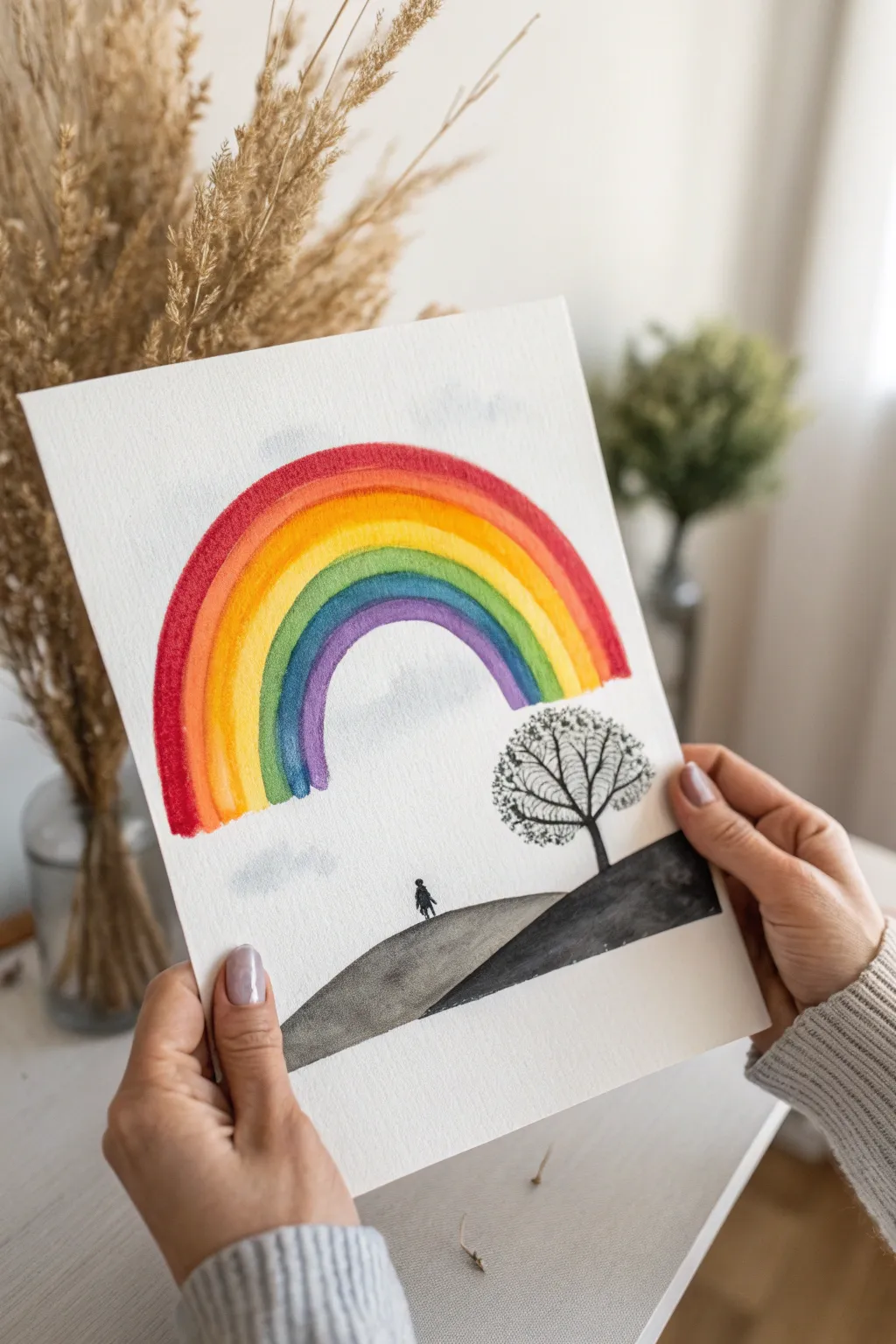
This striking watercolor piece creates a beautiful contrast by placing a violently colorful rainbow against a stark, black-and-grey landscape. It captures a moment of hope and brightness emerging from simplicity, perfect for practicing smooth color transitions.
Step-by-Step
Materials
- Cold press watercolor paper (A4 or similar size)
- Watercolor paints (Red, Orange, Yellow, Green, Blue, Indigo/Violet, Black)
- Round watercolor brushes (Size 8 or 10 for the rainbow, Size 2 or 4 for details)
- Pencil (HB or lighter)
- Eraser
- Two jars of water (one for warm colors, one for cool)
- Paper towels
- Painter’s tape or masking tape
Step 1: Preparation and Sketching
-
Secure the paper:
Tape down all four edges of your watercolor paper to a sturdy board or your work surface. This prevents the paper from buckling when we add the wet washes later. -
Sketch the horizon:
Using a very light hand, draw a sloping horizon line about a third of the way up from the bottom. Let the hill on the left slope gently down, and the darker hill on the right slope more steeply to meet it. -
Outline the rainbow:
Lightly sketch the arch of the rainbow. Drawing two concentric semicircles serves as your guide to keep the bands even, but keep the lines faint so they don’t show through the yellow or orange paint later. -
Place the elements:
Mark a tiny spot for the person on the left slope and a general circle shape for the tree crown on the right slope. No details yet, just placement markers.
Clean Edges
For a perfect rainbow shape with sharp edges, you can use a compass to faint pencil lines, but erase them until they are barely visible before painting.
Step 2: Painting the Rainbow
-
Prepare your palette:
Pre-mix your six rainbow colors on your palette. You want them to be vibrant and fluid, not dry or pasty. -
Start with Red:
Using your larger round brush, paint the outermost arch in a bold red. Keep the edge clean and smooth. -
Blend into Orange:
While the inner edge of the red is still slightly damp, paint the orange band right next to it. Let them touch just enough to create a soft transition without bleeding too heavily. -
Add Yellow:
Continue inward with your yellow stripe. Rinse your brush thoroughly before picking up yellow to ensure it stays bright and isn’t muddied by the orange. -
Paint the Cool Colors:
Work your way through Green, Blue, and finally Violet for the innermost arch. As the radius gets smaller, be careful not to crowd the bands. -
Add floating clouds:
While you wait for the rainbow to dry, dilute a tiny drop of blue-grey paint with lots of water. Paint very faint, loose cloud shapes above and below the rainbow arch for atmosphere.
Step 3: The Monochromatic Landscape
-
Paint the first hill:
Mix a watery grey wash. Fill in the left hill slope. The color should be translucent and uneven to give the impression of ground texture. -
Paint the second hill:
Mix a much darker, thicker grey-black. Paint the right-hand hill slope that sits in the foreground. I find that making this section darker adds necessary depth to the composition. -
Dry completely:
This step is crucial. Do not proceed until the hills are bone dry. If you paint the tree on wet paper, it will just bloom into a messy blob.
Go Metallic
Once the watercolor is dry, trace the thin branches of the tree or the silhouette with a silver or gold gel pen for a magical, shimmering finish.
Step 4: Graphite Details
-
Draft the tree trunk:
Using fine black paint or a waterproof ink pen, draw the trunk of the tree on the right hill. Keep the trunk fairly thin and elegant. -
Create the branches:
Switch to your smallest detailing brush or pen. extend upward into many delicate, branching limbs. Create a rounded canopy shape purely through the branch structure. -
Stipple the leaves:
Using the tip of a dry brush with black paint, gently stipple (dot) around the branches to suggest sparse foliage. Keep it airy so the white paper shows through. -
Paint the figure:
On the crest of the lighter hill, paint a tiny silhouette of a person. Keep the shape simple—just a small head and body/legs. -
Final touches:
Add a few tiny specks or dots on the hills to suggest stones or texture. Once fully dry, peel off your tape carefully.
Now you have a piece that beautifully balances vibrant color with quiet, contemplative space
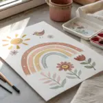
Sun-and-Moon Rainbow Sky
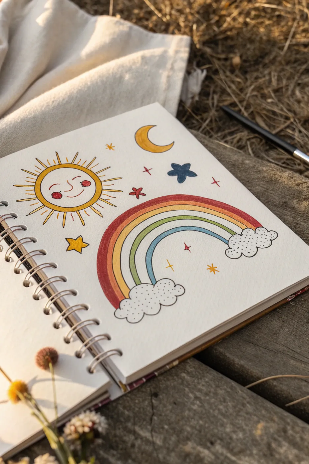
Brighten up your sketchbook with this charming celestial scene featuring a cheerful sun, a classic rainbow, and scattered dreamy elements. The playful line work and soft colors create a cozy, nostalgic vibe perfect for a relaxing afternoon outside.
How-To Guide
Materials
- Spiral-bound sketchbook (heavyweight paper recommended)
- Fine liner pen (black, 0.3mm or 0.5mm)
- Colored markers or brush pens (yellow, orange, red, green, blue)
- Pencil and eraser
- Ruler (optional)
Step 1: Planning and Sketching
-
Rough layout:
Start by lightly sketching the main elements with a pencil to get the composition right. Place a large circle for the sun in the top left corner and map out an arch for the rainbow in the bottom right. -
Map the celestial bodies:
Sketch a crescent moon shape near the top center. Then, scatter faint placeholders for stars and sparkles in the empty spaces around the sun and rainbow. -
Define the rainbow:
Refine your rainbow sketch by drawing four parallel arches. At the base of each side of the rainbow, sketch flurry cloud shapes using bumpy, scalloped lines.
Make It Look Organic
Don’t use a compass for the sun or moon. Hand-drawing these circles makes the final piece feel friendlier and more whimsical.
Step 2: Inking the Outlines
-
Outline the sun:
Using your black fine liner, go over the sun’s circle. Add two small curved eyes, a simple smile, and two round cheeks. Don’t worry about being perfectly geometric; a little wobble adds character. -
Add sun rays:
Draw the rays around the sun. Alternate between simple straight lines and long, thin playful triangles to mimic the style in the original artwork. -
Ink the rainbow arches:
Carefully trace over your pencil lines for the rainbow arches. Try to keep your hand steady, but remember that hand-drawn imperfections are part of the charm. -
Cloud details:
Ink the fluffy clouds at the base of the rainbow. Add small dots or stippling inside the clouds to give them texture and volume. -
Finalize scattered elements:
Ink the crescent moon and the various star shapes. Include a mix of five-point stars, simple crosses, and diamond sparkles. -
Clean up:
Once the ink is completely dry—I usually give it a full minute just to be safe—erase all the underlying pencil marks to reveal a clean design.
Step 3: Adding Color
-
Color the sun:
Fill the sun’s face with a bright yellow marker. Use a red or pink marker for the round cheeks to give it a rosy glow. -
Sun rays:
Color inside the triangular rays with yellow, leaving the simple straight line rays as black ink only. -
Rainbow stripes – Red:
Start filling the rainbow from the top arch downwards. Color the top band with a deep red or rustic orange marker. -
Rainbow stripes – Yellow:
Fill the second band with a warm yellow or gold tone. -
Rainbow stripes – Green:
Color the third band with a soft, grassy green marker. -
Rainbow stripes – Blue:
Finish the lowest band of the rainbow with a calming sky blue. -
Coloring the moon and stars:
Fill the crescent moon with the same yellow used for the sun. Color the scattered stars in various shades—yellow for the five-point star, dark blue for the solid star, and red for smaller accent sparkles. -
Final touches:
Review your drawing for any missed spots. Add tiny red dots or extra stippling in the clouds if you want more texture.
Smudged Ink?
If your fine liner smudges when erasing, switch to a waterproof pigment liner or wait significantly longer before erasing pencil marks.
Now you have a cheerful page that captures the warmth of a sunny day
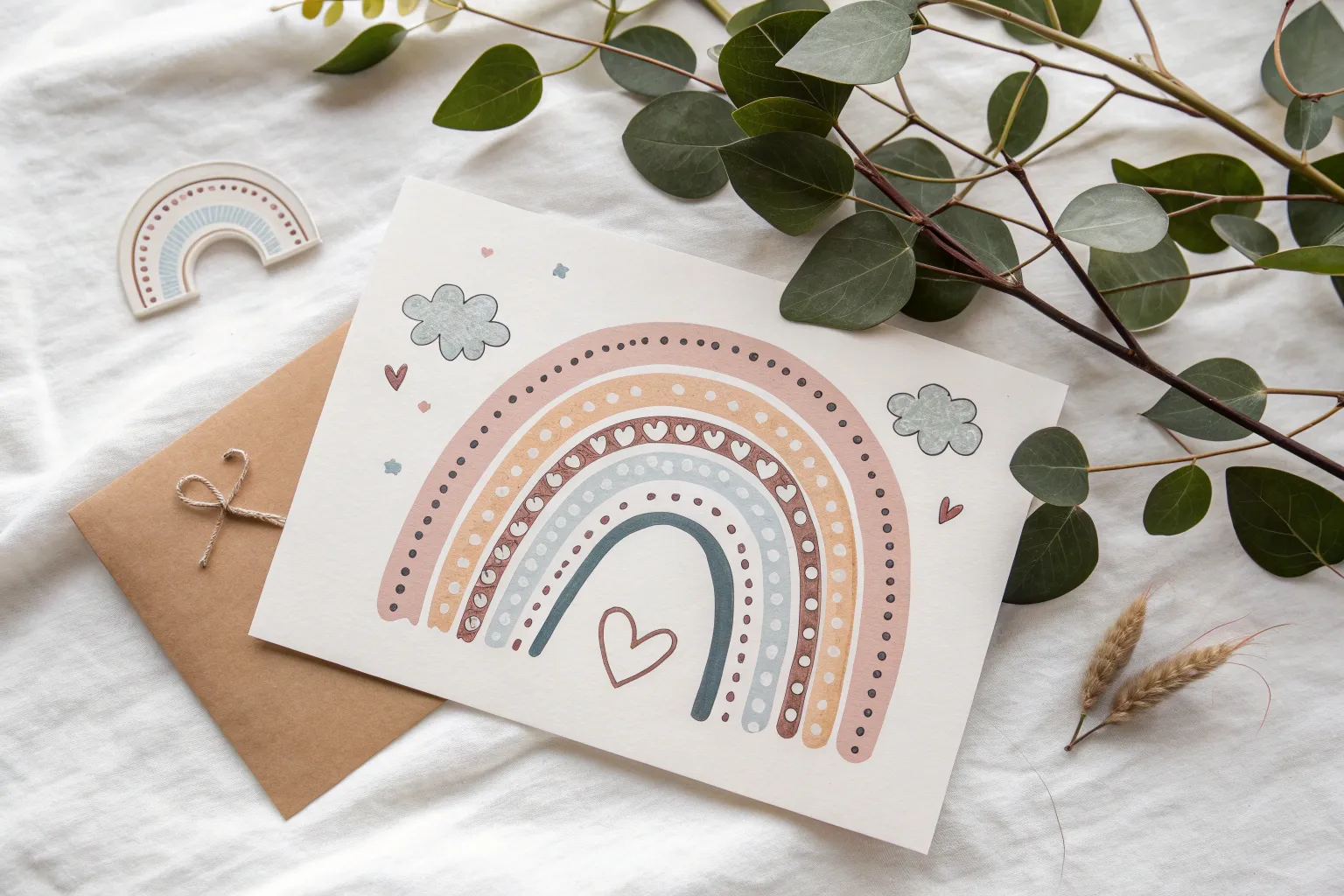
Rainbow With Heart Raindrops

Bring a little love to a rainy day with this charming illustration featuring cheerful anthropomorphic clouds. The combination of crisp ink outlines and soft, washed-out colors creates a delightful greeting card vibe that looks wonderful on textured paper.
Step-by-Step
Materials
- Heavyweight textured paper (watercolor or mixed media paper)
- Black waterproof fineliner pen (0.5mm or 0.8mm)
- Colored markers or watercolor paints (pastel pink, yellow, blue, teal)
- Pencil for sketching
- Eraser
Step 1: Sketching the Composition
-
Outline the left cloud:
Start by lightly sketching a fluffy cloud shape on the lower left side of your paper using a pencil. Keep the bottom flatter and the top puffy with three distinct bumps. -
Draw the right cloud:
Sketch a second cloud on the upper right side. Position it slightly higher than the first to give the rainbow an angled, dynamic arch. -
Connect with an arch:
Draw a large, sweeping arch connecting the top of the left cloud to the left side of the right cloud. It doesn’t need to be mathematically perfect; a hand-drawn look adds character. -
Add rainbow bands:
Create the inner bands of the rainbow by drawing concentric arches inside your main shape. Aim for about four or five bands. -
Add falling rain:
Below each cloud, sketch simple teardrop shapes falling downwards. As the drops get lower, swap a few of the teardrops for heart shapes, particularly near the bottom.
Wobbly Arches?
If your rainbow arches look uneven, don’t worry. Just trace over the line a second time to thicken it intentionally, hiding any wobbles.
Step 2: Inking and Detailing
-
Ink the main outlines:
Go over your pencil lines with a waterproof black fineliner. Use a confident, steady hand for the rainbow arches. -
Create the cloud texture:
Instead of a solid line, ink the clouds with a dashed or dotted line. This gives them a stitched, fabric-like appearance. -
Add cute faces:
Draw small, wide-set eyes using solid black dots on both clouds. Add a tiny curved smile and little cheek marks. -
Ink the raindrops:
Outline the teardrops and the hearts beneath the clouds. -
Clean up the sketch:
Wait a moment for the ink to fully set, then gently erase all your pencil guides to leave a clean black-and-white drawing.
Level Up: Glitter
Use a glitter gel pen or metallic watercolor pan to fill in the hearts. It adds a lovely shimmer that catches the light.
Step 3: Adding Color
-
Color the rainbow bands:
Using markers or watercolors, fill in the rainbow stripes. I prefer using muted, pastel tones like peach, sage green, and pale yellow rather than bright primaries for a softer look. -
Add decorative dashed lines:
Inside the colored bands, add decorative details. You can draw a dashed red line through the outer pink band to mimic stitching. -
Rosy the cheeks:
Add a tiny dab of pink to the cheeks of both cloud faces to bring them to life. -
Fill the lower hearts:
Color in the large heart shapes at the bottom of the rain shower with a solid, dusty pink or red. -
Leave highlights:
When coloring the hearts, try leaving a tiny speck of white uncolored to act as a highlight or shine.
Now you have a sweet, distinctive piece of art ready to be gifted or framed
Rainbow Lettering Hidden in Stripes
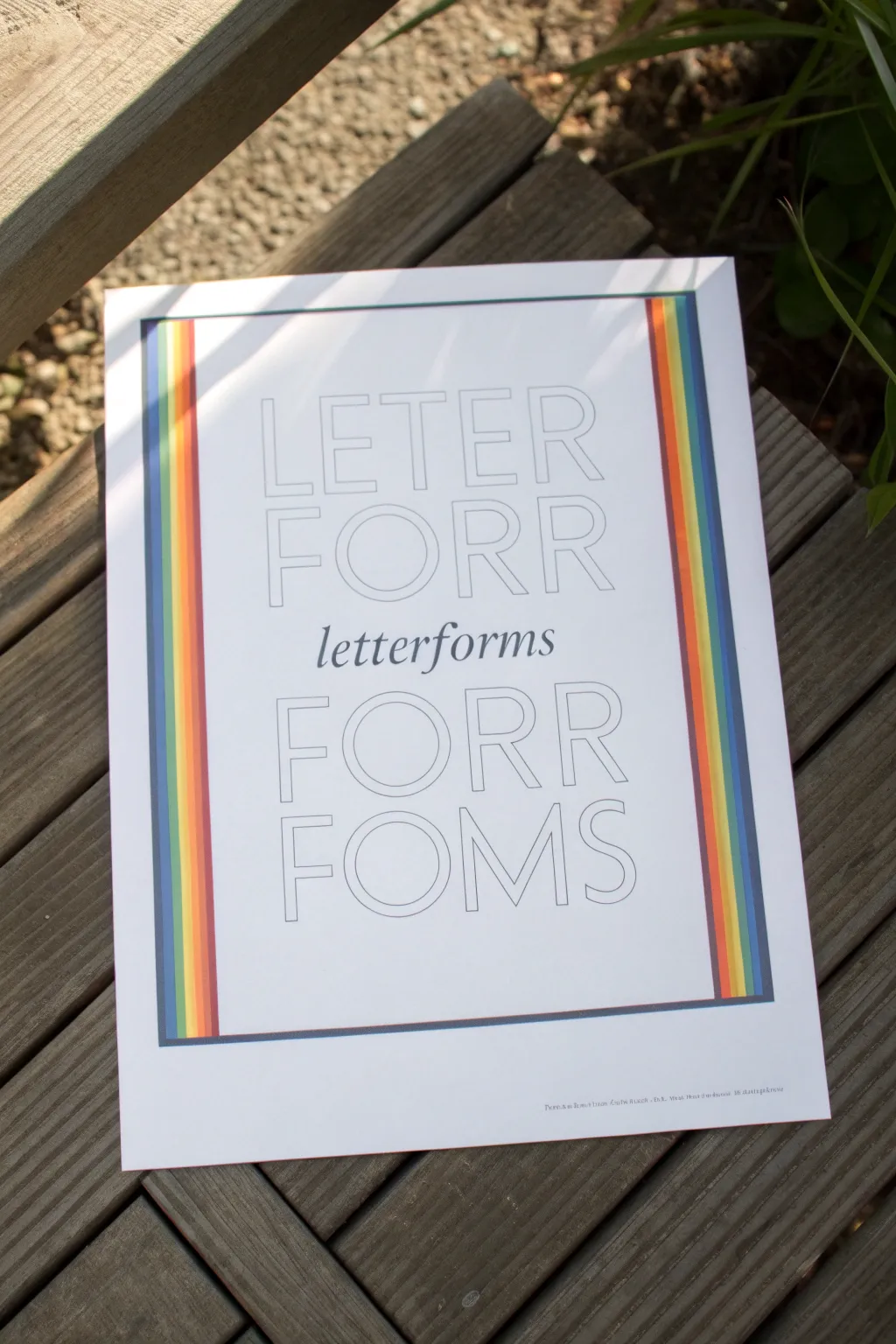
This project combines minimalist typography with vibrant retro design elements to create a striking piece of wall art. By flanking clean, outlined lettering with bold rainbow stripes, you achieve a balanced look that feels both vintage and modern.
Step-by-Step Guide
Materials
- High-quality white cardstock or art paper (A4 or letter size)
- Ruler
- Pencil
- Eraser
- Fine-liner pen (black, 0.3mm or 0.5mm)
- Colored markers or felt-tip pens (Navy Blue, Royal Blue, Green, Yellow, Orange, Red)
- Computer and printer (optional forテンプレート)
Step 1: Design & Layout
-
Plan your composition:
Start by sketching out the placement of your text and stripes on a scrap piece of paper. The design relies on central alignment, so find the exact vertical center of your page. -
Measuring the margins:
Measure about 1.5 to 2 inches from the left and right edges of your paper. Make light pencil marks at the top and bottom of the page to guide where your rainbow columns will go. -
Drafting the text guidelines:
Between your two margin marks, lightly draw horizontal baselines for your text. You will need four lines for the large outline text and one central line for the smaller italicized script.
Clean Lines
To prevent marker bleed when coloring the stripes, place a ruler over the line you are coloring against to act as a physical barrier for the marker tip.
Step 2: Creating the Typography
-
Penciling the letters:
Using a ruler to keep vertical strokes straight, sketch the words ‘LETER FORR’ in the top section and ‘FORR FOMS’ in the bottom section. Use a serif style for the letters, keeping them tall and uppercase. -
Adding the central script:
In the middle gap, hand-letter the word ‘letterforms’ using a classic serif italic style. This should be much smaller and solid black, contrasting with the large open letters above and below. -
Inking the outlines:
Carefully trace your large pencil letters with a fine-liner pen. I like to use a ruler for the straight edges to get that crisp, printed look, but freehand works if you have a steady hand. -
Solidifying the script:
Go over the central ‘letterforms’ text with your pen. You might need to thicken the downstrokes slightly to mimic a calligraphy pen if your fine-liner is too thin. -
Clean up:
Once the ink is completely dry, gently erase all pencil guidelines from the text area. Be careful not to smudge the ink.
Step 3: Drawing the Rainbow Stripes
-
Marking the stripe widths:
Return to your side margins. Mark out six equal narrow columns (about 3-4mm wide each) on both the left and right sides of your text block. These will become your rainbow stripes. -
Drawing the stripe borders:
Using your ruler and the fine-liner, draw long vertical lines to define these columns. They should span almost the full height of your design, framing the text. -
Connecting top and bottom:
Draw horizontal lines connecting the top of the left rainbow column to the top of the right one, and similarly at the bottom. This creates a large rectangular frame. -
Coloring: The dark blues:
Start on the outermost stripe on both sides. Fill this stripe with a dark navy blue marker. Moving inward one stripe, switch to a lighter royal blue. -
Coloring: The greens and lights:
For the third stripe in, use a vibrant green. The fourth stripe should be a bright yellow. Ensure you color carefully within the lines to maintain that sharp graphic feel. -
Coloring: The warms:
Fill the fifth stripe with orange. Finally, color the innermost stripe—the one closest to your text—with a bold red. -
Finishing touches:
Check for any uneven coloring or pencil marks you missed. If you want a thicker frame, you can go over the outermost black border line one more time.
Digital Hybrid
Design the text on a computer using a font like ‘Bodoni’ or ‘Didot’ in outline mode, print it out lightly, and then hand-color the rainbow stripes for a mixed-media finish.
Hang this colorful typographical study in a simple frame to brighten up your workspace
Broken-Tile Rainbow Mosaic
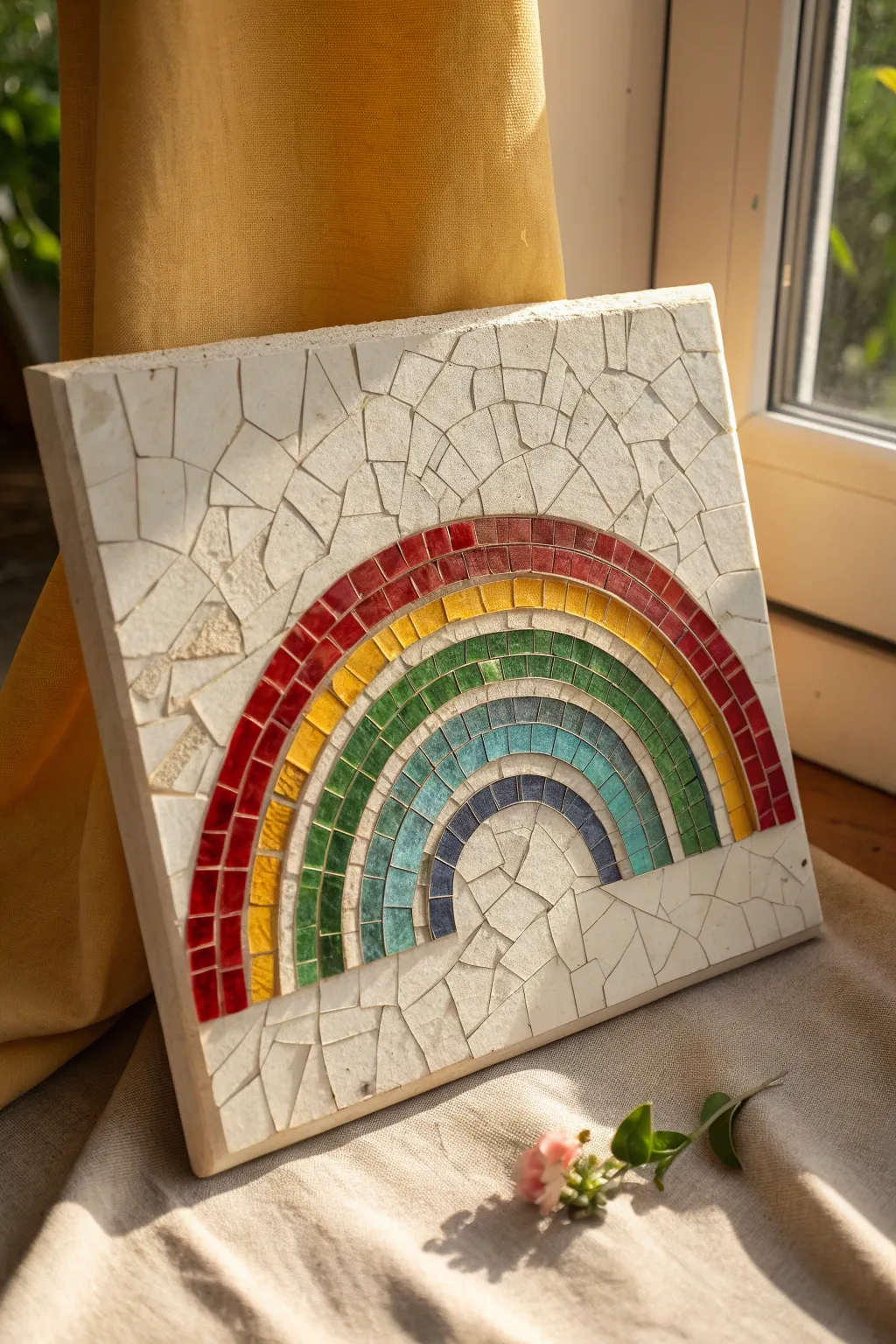
This rustic mosaic project transforms simple broken tiles into a striking rainbow arch. The finished piece features a beautiful textured surface where glossy colorful tiles pop against a matte, off-white background of irregular shards.
Step-by-Step
Materials
- Square wooden or MDF base board (approx. 10×10 inches)
- White or cream ceramic floor tile (to be broken)
- Mosaic tiles or glass tesserae in rainbow colors: deep red, orange-yellow, green, turquoise, navy blue
- Tile adhesive or strong craft glue (like Weldbond)
- Tile nippers (wheeled nippers work best)
- Hammer and an old towel (for breaking the background tile)
- Protective eyewear
- Tweezers (optional, for placement)
- Off-white unsanded grout
- Rubber spatula or grout float
- Sponge and water bucket
- Soft cloth for polishing
Step 1: Preparation & Design
-
Prepare the Base:
Start by cleaning your wooden or MDF base board to ensure it is free from dust. If the wood is very absorbent, you might want to seal it first with a mix of PVA glue and water. -
Draft the Arches:
Using a pencil and a compass (or tracing round bowls of varying sizes), draw five concentric semi-circles on your board. Leave about 1-1.5cm of space between each line to define the width of your color bands. -
Shatter the Background:
Take your large white ceramic tile and wrap it in an old towel. While wearing safety glasses, give it a firm strike with a hammer to create irregular shards. You want pieces that range from 1 to 3 inches in size.
Curve Mastery
To get smoother curves on the rainbow bands, nip the tiles into key-stone shapes (wider at top, narrower at bottom) rather than leaving them square.
Step 2: Laying the Rainbow
-
Start the Red Band:
Begin with the outermost arch using the deep red tiles. Apply adhesive to the back of each small square tile and place them along the outer curve. Nipping them slightly into trapezoids helps them follow the curve more smoothly. -
Yellow and Orange Layer:
Move inward to the second band. Select yellow or golden-orange tiles. Try to stagger the grout lines so they don’t line up perfectly with the red row above, which adds visual interest. -
Green Arch:
Coutinue with the middle band using green tesserae. If you have subtle shade variations in your green tiles, mix them up here to create depth rather than a flat block of color. -
Cool Tones:
Fill the fourth band with turquoise or teal tiles. I find that using wheeled nippers here allows for very precise trimming if your tiles are too wide for the drawn curve. -
Final Purple Arch:
Complete the smallest, innermost arch with navy or deep purple tiles. Ensure the bottom edges of all arches align horizontally across the board.
Step 3: The Background Fill
-
Arrange the White Shards:
Now, begin fitting the broken white ceramic pieces into the background space (the sky). Treat this like a puzzle, looking for shapes that nestle well together. -
Mind the Spacing:
Leave a consistent gap—about 2-3mm—between the white shards and between the shards and the rainbow. This gap is crucial for holding the grout later. -
Filling the Center:
Don’t forget the semi-circle inside the rainbow arch. Fill this area with smaller white shards to complete the composition. -
Adhere and Dry:
Once you are happy with the arrangement, glue every piece down firmly. Let the entire project cure for at least 24 hours so the adhesive is rock solid before grouting.
Grout Haze Helper
If stubborn grout haze remains on the colored tiles after drying, a mixture of half water and half white vinegar on a rag will cut right through it.
Step 4: Grouting & Finishing
-
Mix the Grout:
Mix your off-white unsanded grout with water until it reaches the consistency of peanut butter. Let it sit (slake) for about 5 minutes, then stir again. -
Apply Grout:
Spread the grout over the entire surface using a rubber float or spatula. Push the mixture firmly into all the crevices between the tiles and the shards. -
Clear Excess:
Scrape off the bulk of the excess grout with the edge of your float. Be careful not to dig grout out of the joints. -
First Sponge:
Wait about 15-20 minutes for the grout to set slightly. Using a damp (not soaking) sponge, gently wipe the surface in circular motions to clean the tile faces. -
Final Buff:
Once a dry haze forms on the tiles (usually after an hour), take a soft, dry cloth and buff the surface vigorously to make the rainbow colors shine.
Display your stone rainbow on a shelf where it can catch the morning light and brighten the room
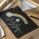
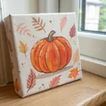
Mini Rainbow Series on Tiny Surfaces
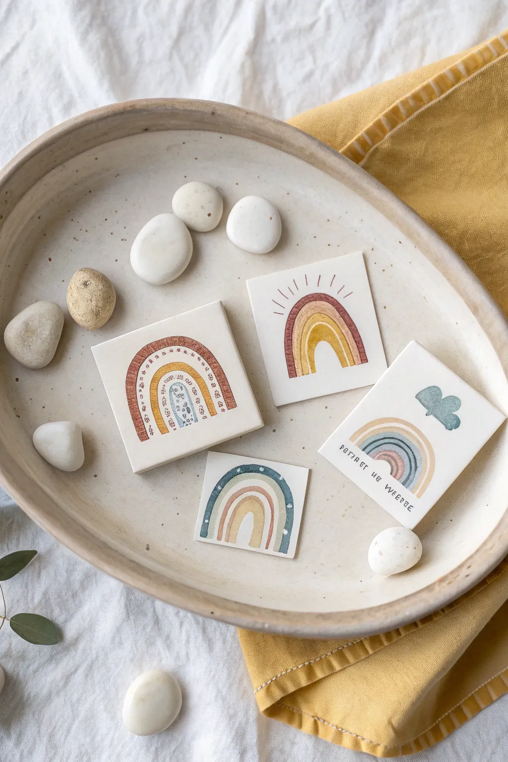
Create a charming collection of tiny rainbow artworks on small square surfaces, perfect for display as a set. These mini-masterpieces feature earthy, muted tones and simple illustrative styles that create a cohesive bohemian aesthetic.
Step-by-Step
Materials
- 4 small square ceramic tiles (approx. 3×3 inch) or heavy watercolor paper cut to size
- Watercolors or gouache paints (colors: terracotta, mustard yellow, sage green, slate blue, blush pink)
- Fine detail brushes (sizes 0 and 00)
- Pencil for light sketching
- Kneadable eraser
- Palette for mixing
- Water cup and paper towel
- Matte spray varnish (optional, for sealing)
Step 1: Preparation & Sketching
-
Prepare your surface:
Clean your ceramic tiles with a damp cloth to remove any dust or oils, or cut your watercolor paper into four equal squares. If using tiles, priming with a very thin layer of gesso or watercolor ground can help the paint adhere better, though unglazed bisque tiles work wonderfully as is. -
Plan the designs:
Visualize four distinct rainbow variations. You’ll want one classic arch, one with radiating sun lines, one with a cloud element, and one with a decorative patterned arch. -
Lightly sketch:
Use a pencil to very faintly outline your four designs on the squares. Keep the pressure minimal so you don’t etch into the paper or leave dark graphite marks that are hard to cover with watercolor.
Brush Control Pro Tip
For steady lines on curved arches, try moving the tile itself rather than just your hand. Rotating the paper as you paint helps maintain a consistent curve.
Step 2: Painting the Decorative Arch
-
Paint the outer band:
On your first tile, mix a warm terracotta color. Paint the outermost thick arch, leaving rough, organic edges rather than perfect lines for a hand-drawn feel. -
Add inner details:
Inside the terracotta arch, paint a thinner mustard yellow arch. Once dry, use your finest brush to add tiny geometric patterns or dots inside the arches using a darker brown or grey ink-like consistency paint. -
Complete the center:
Finish this tile by adding a small, central arch in slate blue with white dot detailing if your brush control allows, or leave it solid.
Uneven Paint Fix
If your watercolor beads up on the tile surface, add a tiny drop of ox gall or dish soap to your paint water. This breaks the tension and helps it lay flat.
Step 3: Painting the Sun-Ray Rainbow
-
Base arches:
For the second tile, paint three nested arches. Start with a deep mauve or rusty red on the outside, followed by an unpainted white gap, then a mustard yellow arch. -
Add radiating lines:
Using a very dilute rusty red, paint thin, straight lines radiating outward from the top of the outer arch to mimic sun rays. Keep them loose and slightly uneven in length.
Step 4: Painting the Cloud & Text Design
-
Create the cloud:
On the third tile, paint a small, puffy cloud shape in the upper right quadrant using a soft blue-grey mix. Keep the edges soft. -
Paint the rainbow:
Paint a standard rainbow arch emanating from the bottom left, but make it look like it’s dipping behind or interacting with the cloud space. Use soft pastel tones like sage, blush, and slate blue. -
Add lettering:
Below the rainbow, carefuly letter a small phrase or name using a dark grey paint and your smallest brush. I find it helpful to practice the spacing on scrap paper first.
Step 5: Painting the Starry Arch
-
Outer band:
For the final square, paint the largest arch in a deep, moody teal or slate blue. -
Add stars:
While the teal paint is still wet, you can lift out tiny spots for ‘stars’ with a dry brush, or wait for it to fully dry and use opaque white gouache to dot small stars on top. -
Inner layers:
Fill the rest of the rainbow with warm, contrasting tones like peach and soft yellow to balance the cool outer ring.
Step 6: Finishing Touches
-
Cleanup edges:
Check the edges of your squares. If any paint smudged onto the sides of the tiles or paper, wipe it away gently or touch it up with white paint. -
Erase pencil marks:
Once you are absolutely certain the paint is bone dry, gently dab your kneadable eraser over any visible pencil lines to lift them without disturbing the pigment. -
Seal (Optional):
If you used ceramic tiles, give them a light coat of matte spray varnish to protect the artwork from scratching or moisture.
Set your finished tiles in a shallow dish with smooth stones for a peaceful, artistic display

Have a question or want to share your own experience? I'd love to hear from you in the comments below!