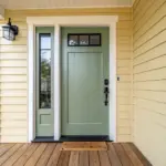
Painting with only three colors is one of my favorite ways to make art feel instantly doable and surprisingly bold. With a tight palette, you get high contrast, cleaner decisions, and that satisfying “I meant to do this” look—even if you’re keeping it super simple.
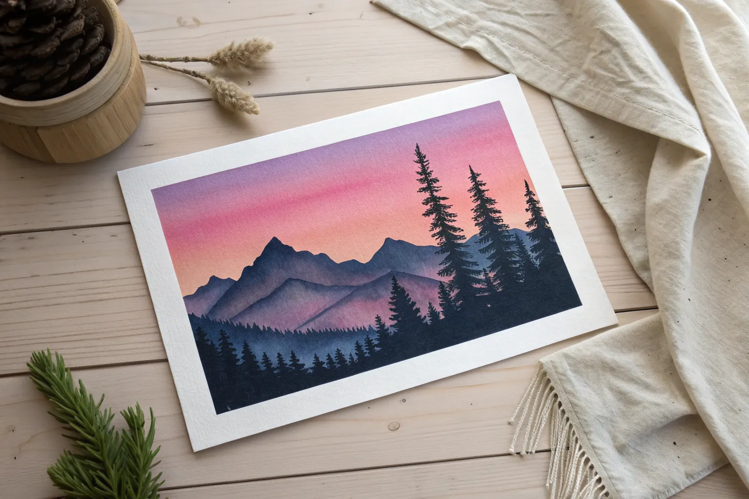
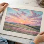
Classic Silhouette Sunset
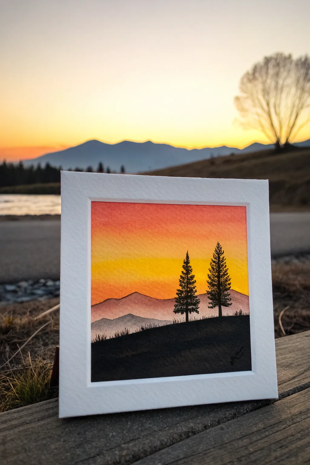
Capture the magic of a mountain sunset with this striking three-color gradient painting. Using just a few harmonious shades and high-contrast silhouettes, you’ll create a scene that feels both vast and intimate.
Step-by-Step Guide
Materials
- Watercolor paper (cold press, roughly 4×4 inches)
- White mat board frame (square opening)
- Painter’s tape or masking tape
- Watercolors or gouache paints (red, yellow, black, optional purple)
- Flat wash brush (1/2 inch)
- Small round detail brush (size 0 or 1)
- Jar of clean water
- Paper towels
Step 1: Setting the Sky
-
Define the boundaries:
Begin by taping down the edges of your small square watercolor paper to a board. If you plan to mount this inside a mat frame later, ensure your painting area is slightly larger than the frame opening so no white edges peek through. -
Moisten the sky area:
With a clean flat brush, apply a very thin, even layer of clean water to the top two-thirds of your paper. This wet-on-wet technique allows the colors to blend seamlessly. -
Apply the yellow glow:
Load your brush with a vibrant yellow. Start painting horizontally just below the midpoint of the paper, sweeping back and forth to create a bright horizon line. -
Introduce the red:
Clean your brush quickly, then pick up a bold orange-red. Start at the very top edge of the paper and paint downwards in horizontal strokes. -
Blend the gradient:
As you bring the red down toward the yellow, clean your brush slightly so it’s damp but not saturated. Gently feather the area where the two colors meet. Let them bleed into each other naturally to create soft orange transition tones. -
Let the sky dry:
Allow the sky gradient to dry completely. The paper must be bone-dry before adding the mountain layers to prevent unwanted bleeding.
Step 2: Layering the Mountains
-
Mix the mid-ground color:
Create a muted purple-grey by mixing a tiny dot of black into your red, or mixing red and blue if you have it. You want a color that is darker than the sky but much lighter than the final foreground. -
Paint the distant range:
Using a round brush, paint a jagged, rolling line across the paper, overlapping the bottom of your yellow sky. Fill in the area below this line with a watery wash of this color. -
Add a second ridge:
While the previous layer is still slightly damp, add a slightly darker, lower ridge in front of the first one. This creates atmospheric perspective, making the landscape feel deep. -
Dry check:
Pause here and let everything dry fully again. If the paper feels cool to the touch, it’s still wet.
Bleeding Lines?
If your black silhouette bleeds into the sky, the background wasn’t dry enough. Wait longer between layers, or use a hairdryer on low heat to ensure the paper is bone-dry before adding the foreground.
Step 3: The Silhouette Foreground
-
Establish the hill:
Load your round brush with pure black paint. Paint a sloping hill starting from the bottom corners, rising slightly as it moves across. Ensure the coverage is solid and opaque. -
Detail the grass:
Along the top edge of this black hill, use the very tip of your smallest brush to flick tiny, short vertical lines upward. These mimic the texture of wild grass silhouetted against the light. -
Start the pine trunks:
Decide where your two main trees will stand. Paint a thin, straight vertical line for each trunk, making one slightly taller than the other for visual interest. -
Build the branches:
Starting from the top of the trunk, use a stippling or tapping motion to create branches. Keep the top branches very narrow and widen the tree as you move down, creating a classic conical pine shape. -
Thicken the base:
Make the bottom branches of the trees dense and dark where they merge with the hill. I find that leaving tiny gaps of sky showing through the upper branches makes the trees look more realistic. -
Final touches:
Add a few stray grass blades or tiny shrub shapes near the base of the trees to ground them. -
Frame and finish:
Once the black paint is completely dry, carefully peel off the tape. Mount the painting behind your white square mat frame to give it that crisp, professional gallery look.
Custom Colors
Try swapping the yellow/red sky for a cool blue/purple gradient to create a ‘Blue Hour’ twilight scene instead of a sunset while keeping the black silhouettes exactly the same.
Now you have a captured moment of evening calm that fits perfectly in the palm of your hand

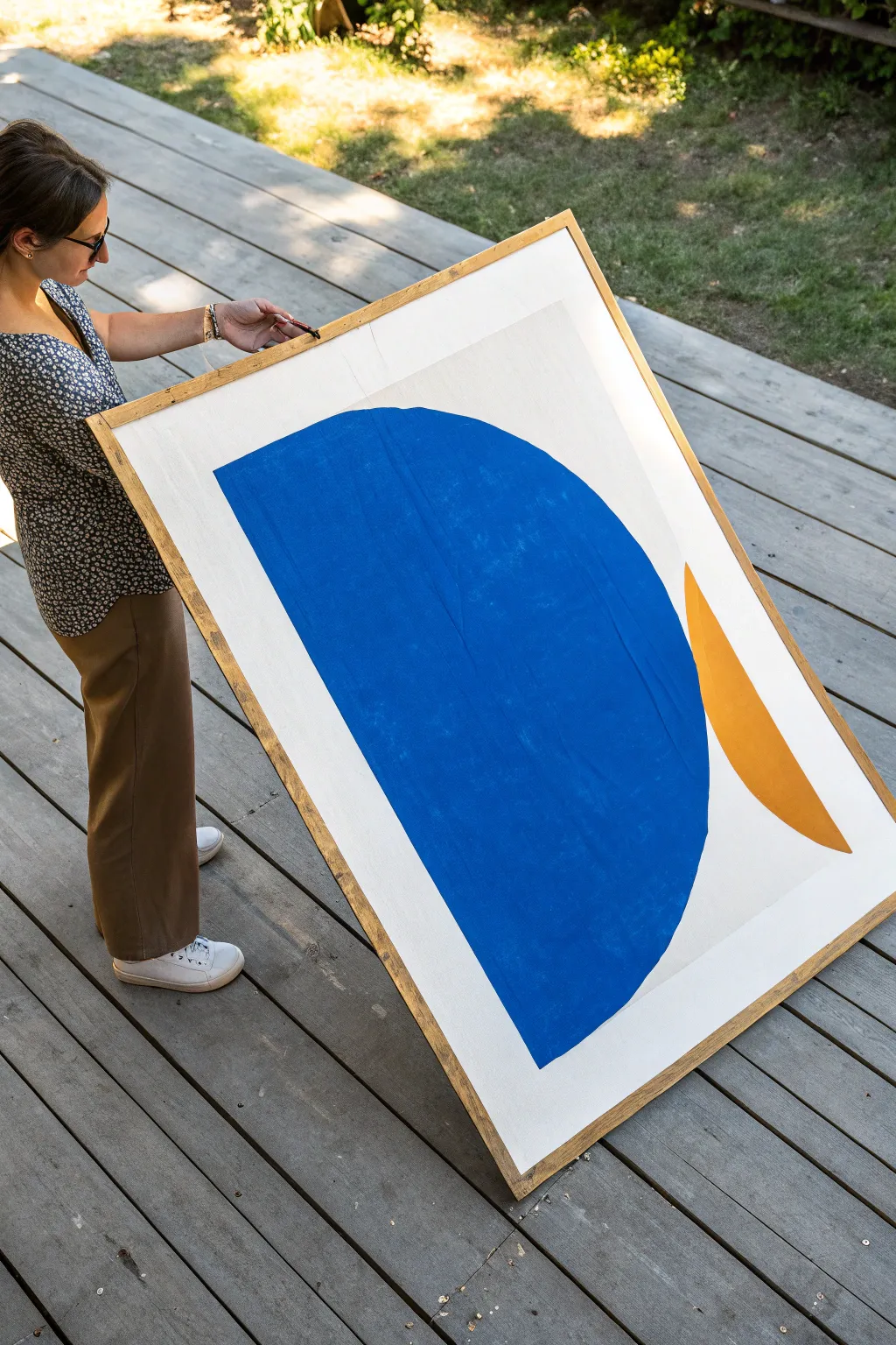
Three-Color Mountain Layers
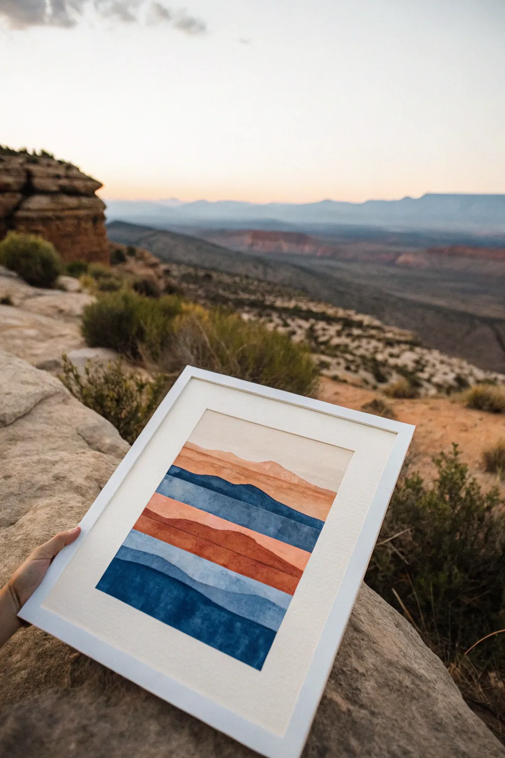
Capture the serenity of distant mountain ranges with this minimalist watercolor project. Using just three core colors—deep indigo, rusty terracotta, and warm beige—you will build distinct, hard-edged layers that mimic atmospheric perspective.
Step-by-Step Tutorial
Materials
- Cold press watercolor paper (140 lb/300 gsm)
- Watercolor paints: Indigo (or Payne’s Gray), Burnt Sienna (or Terra Cotta), and Yellow Ochre (or Naples Yellow to mix for beige)
- A flat wash brush (3/4 inch)
- A round brush (size 6)
- Painter’s tape or masking tape
- Two jars of water
- Pencil and eraser
- Paper towels
- Hairdryer (optional, for speed)
Step 1: Planning and Preparation
-
Secure the paper:
Tape your watercolor paper down to a hard board or your table on all four sides. This creates a crisp white border and prevents the paper from buckling when wet. -
Mix your palette:
Prepare three generous puddles of paint. Mix a deep, saturated Indigo for the blues. Create a warm, earthy orange using Burnt Sienna (you can add a touch of red if needed). Finally, mix a very watery, pale wash of Yellow Ochre or heavily diluted Sienna for the sky and lightest peaks. -
Sketch the layers:
Lightly sketch wavy, horizontal lines across your paper to map out the mountain ranges. Start from the top third for the sky and work your way down. These don’t need to be perfect; natural wobbles look better.
Step 2: Painting the Sky and Peaks
-
Establish the sky:
Using your flat brush, paint the very top section with your palest beige or cream mix. Use plenty of water to keep the wash smooth and even. -
Wait for dryness:
Let this first layer dry completely. If the paper is cool to the touch, it’s still damp. Painting adjacent layers too soon will cause the colors to bleed together. -
Paint the first distant range:
Just below the sky, paint the next sliver of mountain using a slightly more saturated version of your beige-orange mix. Follow your pencil line carefully with the round brush to create a crisp edge.
Bleeding Edges?
If layers bleed into each other, the previous layer wasn’t dry enough. Use a hairdryer on low heat between every single stripe to ensure crisp, hard edges.
Step 3: Building the Middle Layers
-
Introduce the blue:
For the third layer down, switch to your indigo mix. Keep it somewhat translucent. Fill the shape from the top edge down to the next pencil line. -
Create the focal orange band:
Once the blue layer is dry, paint the next section with your strongest terracotta/orange color. This warm band serves as a striking contrast to the cool blues. -
Add a texture detail:
While the terracotta layer is still wet, I like to drop in a tiny bit of clean water or darker pigment near the bottom edge of the shape to create subtle blooming textures. -
Add a deeper rust layer:
Below the main orange band, paint a thinner strip using a darker mix of the burnt sienna (perhaps mixed with a tiny dot of blue to dull it slightly).
Gold Leaf Accent
Once dry, trace the top edge of just one mountain layer with liquid gold leaf or a metallic gold paint pen for a touch of modern elegance.
Step 4: The Foreground Depths
-
Return to blue:
Paint the next wide band with a medium-strength indigo. This layer helps transition the eye back to cool tones. -
The darkest layer:
For the very bottom section, use your most saturated, least watery indigo pigment. This visual weight anchors the composition at the bottom. -
Review and refine:
Check your edges. If any white paper separates the layers unintentionally, carefully fill those gaps with a small brush. -
Final drying:
Allow the entire painting to dry for at least an hour. The paper must be bone dry before removing tape. -
Reveal the border:
Peel the tape away slowly at a 45-degree angle, pulling away from the artwork to prevent tearing the paper.
Frame your new landscape in a clean white frame to highlight those distinct color bands and enjoy the view.

Ocean Horizon With Two-Tone Sky
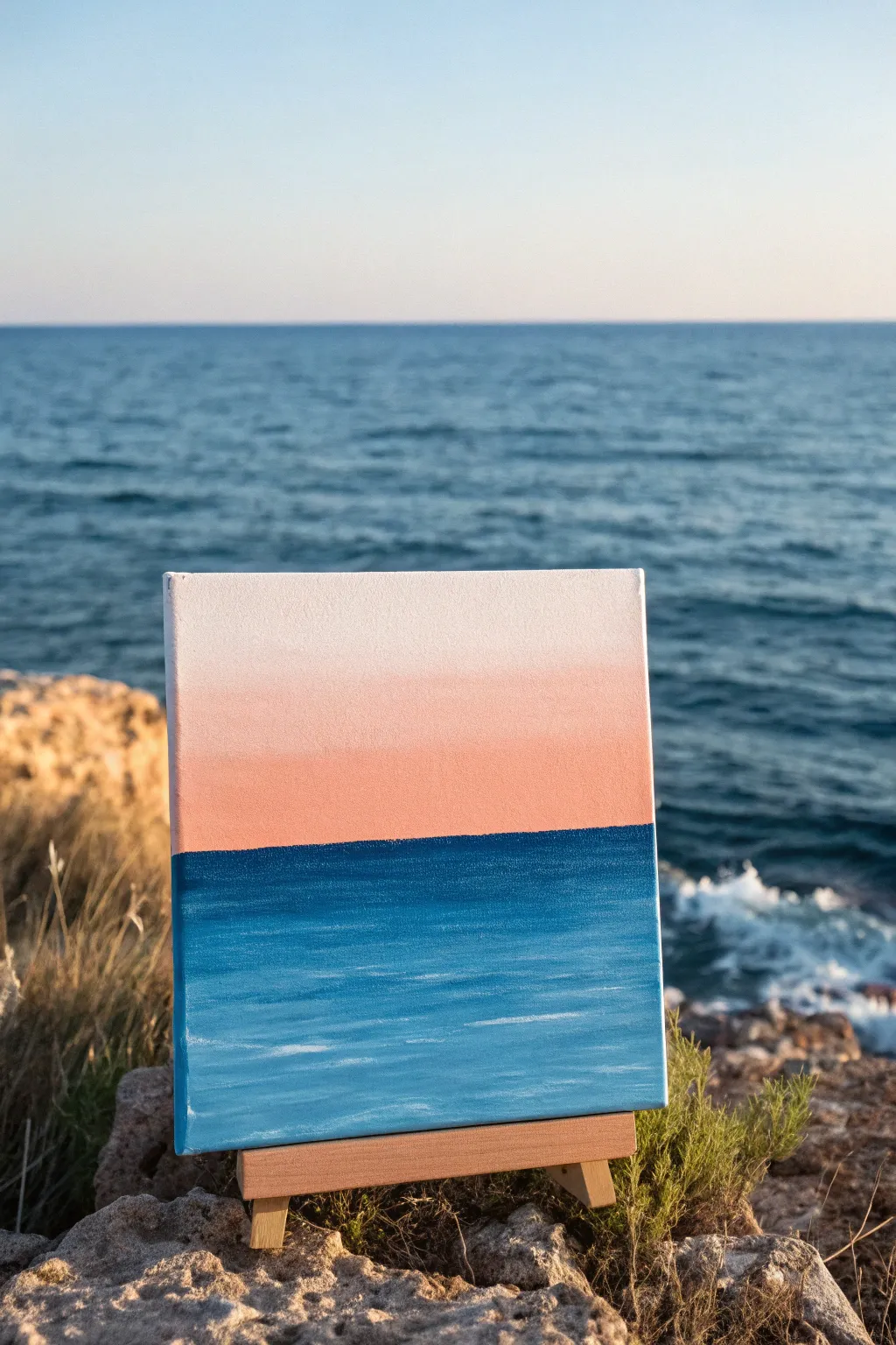
Capture the calm beauty of a coastal sunset with this minimalist seascape painting. This project focuses on mastering soft gradients and simple horizon lines to create a peaceful, atmospheric piece perfect for beginners.
Detailed Instructions
Materials
- Small square canvas or canvas board
- Acrylic paints (Titanium White, Phthalo Blue or Deep Blue, Coral or soft Peach)
- Flat shader brush (large)
- Flat shader brush (medium)
- Small round detail brush
- Palette or paper plate
- Cup of water
- Paper towels
- Painter’s tape or masking tape (optional)
Step 1: Setting the Horizon
-
Define the horizon line:
Decide where you want your horizon line to sit. For this composition, place it just slightly below the vertical center of the canvas. You can lightly sketch this with a pencil or apply a strip of painter’s tape to ensure a crisp, straight edge while you work on the sky. -
Prepare the sky palette:
Squeeze out your Titanium White and Coral (or Peach) paint onto your palette. Create a third transition color by mixing a large amount of White with just a tiny dot of Coral.
Chalky Blends?
If your acrylics are drying too fast to blend smoothly, mix a tiny drop of retarder or glazing medium into your paint. This keeps them wet longer for smoother gradients.
Step 2: Painting the Gradient Sky
-
Start at the top:
Using your large flat brush, load it with pure Titanium White. Paint the top third of the canvas using long, horizontal strokes. -
Introduce the transition color:
Without cleaning your brush, pick up some of your pale white-coral mix. Apply this to the middle section of the sky, blending it upward into the pure white while the paint is still wet to create a soft fade. -
Deepen the horizon color:
Load your brush with the darker Coral tone. Apply this directly above your horizon line (or tape edge). -
Blend the sky gradient:
Work this coral color upwards into the paler middle section. I like to use a clean, dry brush to gently sweep back and forth across the meeting point of the colors to eliminate harsh lines, creating that seamless sunset glow. -
Let the sky dry:
Allow the top half of the painting to dry completely. If you used tape for the horizon, peel it off carefully once the paint isn’t tacky.
Step 3: Creating the Ocean Depth
-
Mix the ocean blues:
Prepare your sea colors. You will need your Deep Blue straight from the tube, and a lighter version created by mixing the Blue with a little White. -
Establish the horizon line:
Using the medium flat brush and the darkest Deep Blue, carefully paint a straight line right up against the dried coral sky. This dark edge gives the ocean depth and dimension. -
Fill the deep water:
Continue painting the upper portion of the water area with this dark blue, extending it down about an inch or two. -
Transition to lighter water:
Switch to your lighter blue mix. Apply this to the bottom half of the canvas. -
Blend the water sections:
Use horizontal strokes to blend the dark blue top section into the lighter blue bottom section. The blend doesn’t need to be as perfect as the sky; a little texture here mimics the movement of water.
Clean Horizon Tip
If you struggle painting a straight horizon line freehand, turn the canvas sideways! It is often physically easier to pull a straight vertical stroke than a horizontal one.
Step 4: Adding Highlights and Texture
-
Create faint waves:
Dip your small round brush or the corner of a flat brush into Titanium White. Remove most of the paint on a paper towel so the brush is almost dry. -
Dry brush the foreground:
Very lightly drag the brush horizontally across the lighter blue bottom section to suggest gentle ripples catching the light. -
Add distant movement:
Add a few extremely thin, subtle horizontal white streaks in the darker blue area, but keep them minimal to maintain focus on the gradient. -
Paint the edges:
Don’t forget to wrap the painting around the sides of the canvas. Continue the sky and sea colors onto the edges for a polished, frameless look. -
Final assessment:
Step back and look at the blend. If any white wave highlights look too harsh, you can glaze over them with a very watered-down blue to push them back into the water.
Enjoy the peaceful atmosphere your new seascape brings to the room
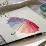
Bold Flower With Flat Petals
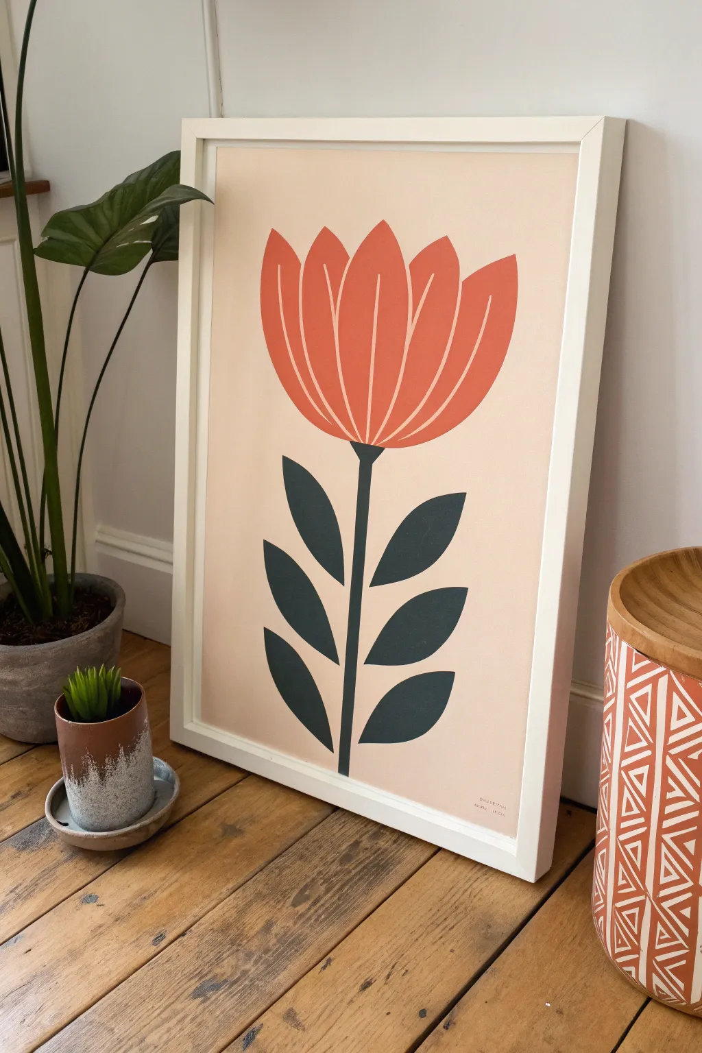
Embrace the bold simplicity of mid-century design with this stylized flower painting featuring clean lines and a striking three-color palette. The graphic, flat petal shapes and contrasting dark leaves create a piece that feels both vintage and refreshingly modern.
Step-by-Step
Materials
- A3 or similar size heavy watercolor paper or mixed media board
- Acrylic paints: Pale Peach/Beige, Muted Coral/Terracotta, Deep Teal/Dark Slate Green
- Flat synthetic brushes (medium 3/4 inch and small 1/4 inch)
- Pencil (HB)
- Eraser
- Ruler
- Palette or mixing plate
- Painter’s tape or masking tape
- Cup of water and paper towels
Step 1: Preparing the Foundation
-
Surface setup:
Begin by taping down the edges of your paper to a work surface or board. This creates a clean white border (resembling a mat board) and prevents the paper from buckling when you apply the base coat. -
Mixing the background:
Mix a generous amount of your background color. You want a very pale, warm peach or beige tone. Test it on a scrap piece of paper; it should be light enough to let the flower pop but saturated enough not to look just like white paper. -
Applying the base:
Using your largest flat brush, paint the entire paper surface within the taped area. Use smooth, horizontal strokes to ensure even coverage. Let this layer dry completely, then apply a second coat if needed for opacity. -
Sketching the centerline:
Once the background is bone dry, lightly use a ruler and pencil to mark a vertical centerline. This guides the symmetry of the stem and flower head, though the leaves don’t need to be perfectly mirrored. -
Drawing the flower shape:
Sketch the flower head at the top third of the centerline. Think of it as a wide U-shape base topped with petal points. Sketch five main petal sections: a central one, two flanking it, and two outer ones.
Crisp Edge Secret
For ultra-sharp lines between petals, use a very fine liner brush just for the edges, then fill the center with a larger brush. Paint flows better if slightly thinned with water.
Step 2: Painting the Flower Head
-
Refining the petals:
Before painting, refine your sketch to ensure there are tiny gaps between the petals. These negative spaces (showing the background color) define the petals without needing outlines. -
Mixing the coral tone:
Create your flower color using a muted coral or terracotta paint. It should be bold but earthy, not neon. Add a touch of white if it feels too transparent. -
Painting the center petal:
Using a smaller flat brush, carefully fill in the central petal first. Keep the edges crisp and the paint application flat and opaque. -
Filling the sides:
Move outward to paint the remaining four petal shapes. I find it helpful to rotate the paper to get the best angle for those curved edges, ensuring the thin negative space lines remain consistent. -
Checking opacity:
Let the flower head dry. If you can see the background color or brush strokes through the orange paint, apply a second coat for that truly graphic, print-like finish.
Shaky Hands?
If you struggle to paint straight lines for the stem or leaf gaps, use low-tack painter’s tape (or washi tape) to mask off the shapes before painting for perfect geometric edges.
Step 3: Adding the Stem and Foliage
-
Drafting the greenery:
Lightly sketch the stem starting from the base of the flower down to the bottom. Add three leaves on each side. The leaves should be stylized almond shapes—pointed at both ends—angled slightly upward. -
Mixing the dark teal:
Mix your deep teal or slate green. This needs to be the darkest value on your canvas to anchor the composition. A mix of phthalo green, a touch of blue, and a little black or burnt umber works well. -
Painting the stem:
With a steady hand and your smallest brush (or a liner brush if you have one), paint the central stem. Start from the flower base, creating a small triangular connection point, and pull the line down. -
Filling the leaves:
Switch back to your small flat brush to fill in the leaves. Start at the stem connection and stroke outward to the leaf tip to get a sharp point. -
Refining edges:
Go back over any leaf edges that look wobbly. The beauty of this style lies in the crisp contrast between the shapes and the background. -
Final clean up:
Once all paint is completely dry, gently erase any visible pencil marks, being careful not to rub off any paint. -
The reveal:
Slowly peel away the painter’s tape at a 45-degree angle. This reveals your crisp white border, instantly making the piece look professional and framed.
Place your finished floral study in a simple white frame to highlight those clean, modern lines
BRUSH GUIDE
The Right Brush for Every Stroke
From clean lines to bold texture — master brush choice, stroke control, and essential techniques.
Explore the Full Guide
Leafy Botanical in a Simple Triad
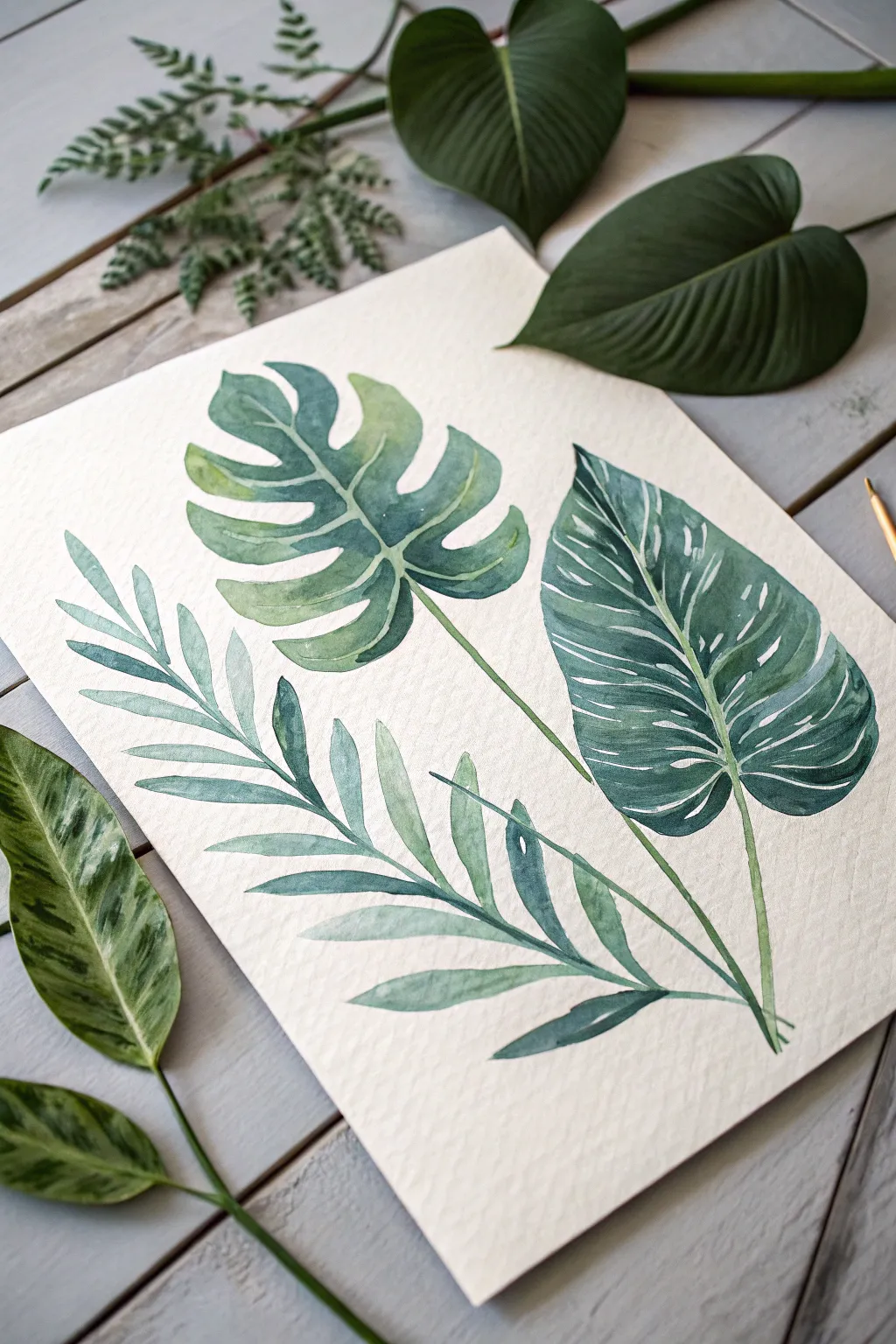
Capture the lush calm of the jungle with this elegantly simple watercolor composition featuring three distinct tropical leaves. Using just three harmonious green hues, you will learn to build depth and texture on cold press paper for a modern botanical print.
Detailed Instructions
Materials
- Cold press watercolor paper (A4 or slightly larger)
- Watercolor paints (Emerald Green, Sap Green, and a deep Blue-Green or Payne’s Grey)
- Round watercolor brushes (Size 4 and Size 8)
- Fine liner brush (Size 0 or 1)
- Pencil (HB or H for light sketching)
- Kneaded eraser
- Two jars of water
- Paper towels
- Palette
Step 1: Sketching the Layout
-
Visualize placement:
Before putting pencil to paper, imagine the composition divided into thirds. The palm frond will sweep up from the bottom left, the Monstera leaf will float in the upper center, and the large philodendron will anchor the right side. -
Outline the palm frond:
Start at the bottom center and draw a long, curving central spine extending toward the left edge. Sketch long, weeping leaflets extending outward from this spine, ensuring they taper to gentle points. -
Draft the monstera:
In the upper middle area, sketch a heart-shaped outline. Add deep, curved indentations (fenestrations) cut into the sides of the leaf, leaving a central area solid. Keep your pencil lines extremely faint so they don’t show through the paint. -
Sketch the philodendron:
On the right side, draw a large, broad leaf shape with a point at the bottom and a rounded top. Add a vertical center line that follows the curve of the leaf. -
Lighten the lines:
Gently roll your kneaded eraser over the entire sketch. You want the graphite to be barely visible, just enough to guide your brush without trapping dirty lines under the watercolor.
Step 2: Painting the Palm Frond
-
Mix your base green:
On your palette, mix a watery wash of Sap Green with a tiny touch of Emerald. You want a middle-value green that feels fresh and light. -
Paint the leaflets:
Using your size 4 brush, paint the individual leaflets of the palm. Use a single stroke for each: press down near the stem to widen the trace, then lift progressively as you pull outward to create a sharp tip. -
Add variance:
While the paint is still wet on some leaflets, drop in a slightly more concentrated blue-green near the spine. This creates a natural shadow gradient without hard edges.
Blooms & Cauliflowers?
If weird textures or ‘blooms’ appear as paint dries, your brush was too wet when adding a second layer. Let it dry completely, then glaze over the uneven area to smooth it out.
Step 3: The Monstera Leaf
-
Create a gradient wash:
For the Monstera, load your size 8 brush with Emerald Green water. Start painting from the top of the leaf sections. -
Wet-on-wet transition:
As you move toward the center of the leaf, dip your tip into the darker Blue-Green mix. Allow these colors to bleed together on the paper, keeping the center darker and the edges lighter. -
Refine the edges:
Carefully trace the curves of the cut-outs. I like to keep my brush quite wet here so the paint pools slightly at the edges, creating that characteristic watercolor dried edge. -
Paint the stem:
Draw a thin, confident line for the stem connecting to the bottom of the leaf, crossing behind the palm frond area if necessary to create depth.
Mastering Veins
For the white veins, try using masking fluid with a fine nib before painting. Rub it off after the paint dries for crisp, bright white lines without the stress of painting around them.
Step 4: The Philodendron Detail
-
Base layer:
This leaf is the darkest. Mix a strong concentration of Blue-Green with a little Sap Green. Paint the entire right half of the leaf first, stopping meticulously at the center vein line. -
Leave highlights:
While painting the leaf body, carefully leave tiny slivers of white paper unpainted to represent the veins. This negative painting technique creates the white lines without using white paint. -
Paint the left side:
Repeat the process for the left half of the leaf. Ensure the center vein remains unpainted white paper to separate the two halves clearly. -
Deepen the shadows:
While the wash is still damp, drop highly pigmented Payne’s Grey or dark green into the areas closest to the center vein and the bottom tip to curve the form visually.
Step 5: Finishing Touches
-
Define the stems:
Using your fine liner brush and the dark green mix, sharpen the stems of all three leaves where they converge at the bottom. Make sure they clearly overlap to show which leaf is in front. -
Assess and texture:
Once fully dry, look for areas that feel too flat. You can glaze a very watery layer of Blue-Green over the shadowed parts of the palm frond to push it backward in space. -
Enhance contrast:
If the white veins on the Philodendron got lost, use a tiny amount of opaque white goache or a white gel pen to reclaim them, though negative space is preferred.
Now step back and admire how three simple colors combined to create a vibrant, cohesive botanical scene.
Simple Portrait With Three Value Steps
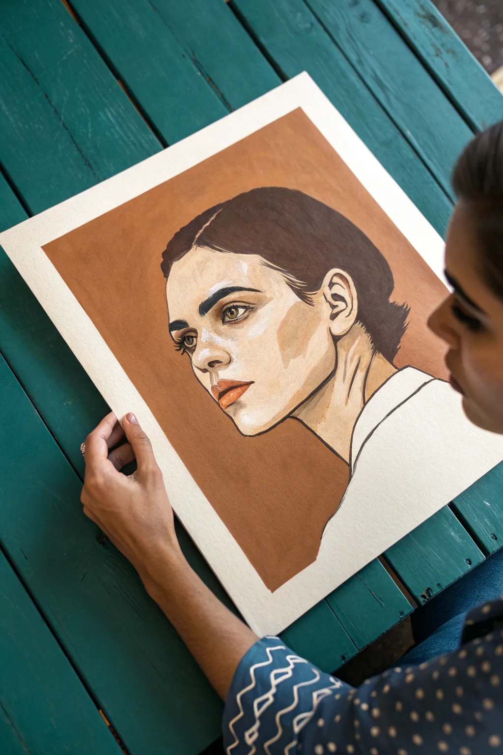
This striking portrait relies on the power of limitation, using just three distinct values to create depth and form. By balancing the raw white of the paper with a warm terracotta mid-tone and a deep brown-black for details, you’ll achieve a bold, graphic look that feels both modern and timeless.
Detailed Instructions
Materials
- Heavyweight watercolor or mixed media paper (hot press for smoothness)
- Gouache paint (burnt sienna, burnt umber, black, white)
- Pencil (HB or H)
- Kneaded eraser
- Round synthetic brushes (sizes 2, 4, and 0 for details)
- Mixing palette
- Masking tape (optional)
Step 1: Planning and Sketching
-
Prepare the background:
Before sketching, decide on the borders of your painted area. You can lightly mark a rectangle with a pencil or use masking tape to create crisp edges for that framed look seen in the example. -
Outline the silhouette:
Using a hard pencil like an H or HB, lightly sketch the contour of the face. Focus on the sharp angles of the jawline and the slope of the neck. -
Map facial features:
Place the eyes, nose, and lips. Keep your lines faint so they won’t show through the lighter paint areas later. The subject is gazing off to the side, so ensure the iris placement reflects this direction. -
Mark shadow shapes:
Outline the areas that will be filled with the mid-tone color. This includes the background, the shadow under the cheekbone, the neck shadows, and the darker side of the nose. -
Clean up the sketch:
Take a kneaded eraser and gently dab (don’t rub) your sketch to lift excess graphite until the lines are barely visible guides.
Step 2: Applying the Mid-Tone
-
Mix your terracotta:
Create your main background color. Mix burnt sienna with a touch of white to make it opaque and creamy. If it’s too orange, add a tiny dot of burnt umber to neutralize it. -
Fill the background:
Using a size 4 brush, carefully paint the negative space around the head. Keep the paint consistency like heavy cream—thick enough to be opaque, but fluid enough to not leave streaks. -
Paint facial shadows:
Apply this same terracotta mix to the shadow shapes on the face: the hollow of the cheek, the side of the nose to bridge connection, and the deep shadows of the neck muscles. -
Refine the edges:
while the paint is wet, ensure the edges where the background meets the face are crisp. This sharp contrast is crucial for the graphic style. -
Let it dry completely:
Gouache dries uniquely matte. Wait until the sheen completely disappears and the paper feels cool but dry to the touch before proceeding.
Patchy Gouache?
If your large color blocks look streaky, your paint was likely too watery. Let the first layer dry completely, then apply a second coat with a creamier consistency to smooth it out.
Step 3: Adding the Dark Values
-
Mix the dark tone:
Combine burnt umber with black. You want a color that is almost black but retains a hint of warmth to harmonize with the terracotta. -
Block in the hair:
Use a size 4 brush to fill in the hair shape. Follow the direction of hair growth with your brushstrokes for subtle texture, leaving a few tiny gaps for highlights if desired. -
Define the brows:
Switch to a size 2 brush. Paint the eyebrows with deliberate strokes. They should be strong and dark to frame the eyes. -
Detail the eyes:
Carefully paint the pupil, iris, and upper lash line. Use your finest brush (size 0) for the delicate lower lashes and the crease of the eyelid. -
Line work:
With the 0 brush and a slightly watered-down dark mix, outline the jaw, the ear structure, and the neck tendons. Let the line weight vary—thicker in shadow areas, thinner in light.
Level Up: Texture Play
Instead of flat color for the background, try a dry-brush technique. Load your brush with terracotta paint, wipe most of it off, and drag it across the paper for a distressed, vintage texture.
Step 4: Highlights and Finishing Touches
-
Add the lip color:
Mix a small amount of burnt sienna with a little red or more white for a slightly rosier, lighter version of your background color. Paint the lips, keeping the edges clean. -
Brighten the eyes:
Use pure white gouache to add the whites of the eyes. Be incredibly careful not to paint over your dark lash lines. -
Final highlights:
Add a tiny dot of pure white to the pupil for a ‘catchlight.’ You can also add a small swipe of white on the bridge of the nose or forehead if you want to push the contrast further. -
Erase borders:
If you used pencil marks for your border instead of tape, gently erase them now. If you used tape, peel it away slowly at a 45-degree angle.
Enjoy the satisfying crispness of your finished three-value portrait, ready to be framed or gifted.

PENCIL GUIDE
Understanding Pencil Grades from H to B
From first sketch to finished drawing — learn pencil grades, line control, and shading techniques.
Explore the Full Guide
Night Sky With One-Star Color
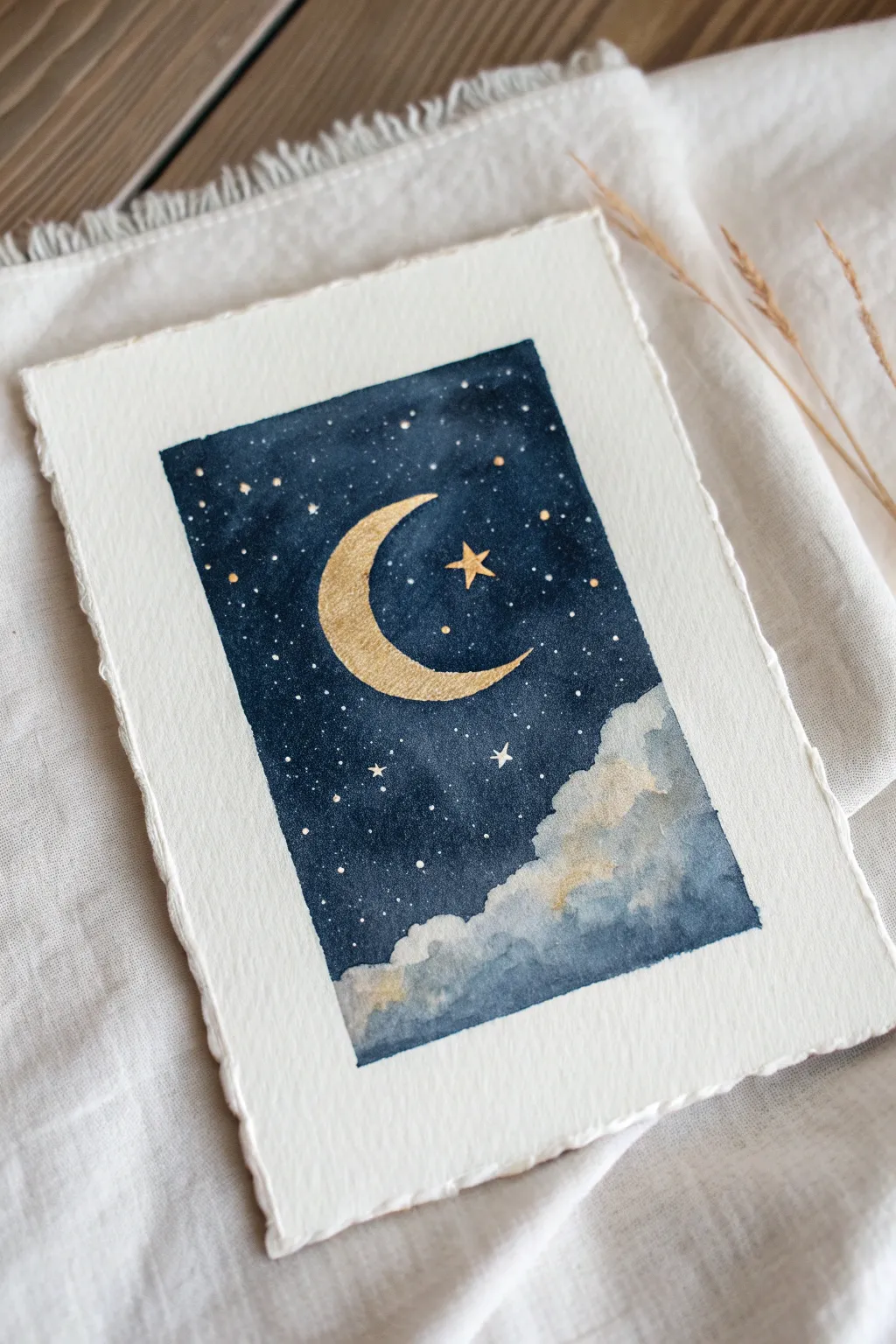
This celestial watercolor piece combines deep, moody indigo hues with the striking brilliance of metallic gold. It captures a serene night sky complete with a textured crescent moon and soft, billowing clouds at the horizon.
How-To Guide
Materials
- Cold press watercolor paper (deckled edge optional)
- Indigo watercolor paint
- Metallic gold watercolor paint or gouache
- Painters tape or masking tape
- Flat shader brush (size 6 or 8)
- Round detail brush (size 0 or 1)
- Clean water jar
- Piece of paper towel
- Pencil for sketching
- White gel pen or white gouache
Step 1: Preparation & Sketching
-
Tape the border:
Begin by taping off a rectangular area in the center of your watercolor paper using painters tape. Press the edges down firmly to ensure crisp, straight lines later. -
Sketch the moon:
Lightly sketch a crescent moon shape in the upper-left center of your rectangle. Keep your pencil lines faint so they won’t show through the gold paint. -
Mark the star:
Place a small dot or light cross where the main decorative star will go, just to the right of the moon’s curve. -
Outline the clouds:
Roughly sketch a bumpy, mountain-like line across the bottom third of the rectangle to define where the dark sky ends and the clouds begin.
Uneven Gold?
If your gold paint looks patchy or translucent after drying, don’t worry. Simply wait for the first coat to dry fully and apply a second layer for that solid, foil-like shine.
Step 2: Painting the Sky
-
Mix the indigo:
Prepare a generous puddle of indigo paint. You want a high pigment-to-water ratio for that deep, velvety night sky look. -
First sky wash:
Using your flat shader brush, paint the sky area around the moon and above the cloud line. Don’t worry about perfect coverage yet; just map out the blue. -
Define the edges:
Switch to a smaller round brush to carefully paint around the crescent moon shape. Clean, sharp edges here are crucial for the final look. -
Deepen the color:
While the first layer is still slightly damp, drop in more concentrated indigo, especially near the top corners, to create a subtle gradient effect. -
Soften the cloud line:
At the bottom edge where the sky meets your cloud sketch, rinse your brush and use clean water to soften the blue paint, pulling it slightly downwards to create a misty transition. -
Let it dry completely:
Allow the blue layer to dry fully. If the paper feels cool to the touch, it is still wet.
Step 3: Adding the Gold
-
Activate the gold:
Add a few drops of water to your metallic gold paint and let it sit for a minute to get creamy and opaque. -
Fill the moon:
Using your detail brush, carefully fill in the crescent moon shape with the gold paint. Apply it thickly for a nice texture. -
Paint the main star:
Paint a five-pointed star to the right of the moon using the tip of your detail brush. -
Add gold speckles:
Dip your brush in the gold mixture and gently tap it against another brush handle over the paper to sprinkle tiny gold stars across the blue sky. -
Detail the stars:
Manually add a few larger gold dots with your brush tip to create varied star sizes.
Add Texture
Make the moon look like a cratered surface by salting the wet gold paint, or by dabbing it with a crumpled tissue while still damp for an organic, uneven finish.
Step 4: Clouds & Finishing Touches
-
Paint cloud shadows:
Dilute a tiny amount of indigo with plenty of water to make a very pale grey-blue. Paint fluffy shapes in the cloud area at the bottom. -
Add cloud highlights:
While the cloud area is wet, drop in tiny touches of gold or leave white space to suggest moonlight hitting the tops of the clouds. -
White star accents:
Once the sky is bone dry, use a white gel pen or white gouache to add the tiniest pin-prick stars in the darkest parts of the sky for depth. -
Draw star crosses:
Add one or two tiny ‘cross’ shaped stars in white near the bottom of the sky for variety. -
Reveal the border:
Carefully peel away the painters tape at a 45-degree angle to reveal your crisp, clean edges.
Frame this little astronomical gem or gift it to a stargazer in your life
Three-Panel Triptych Palette Split
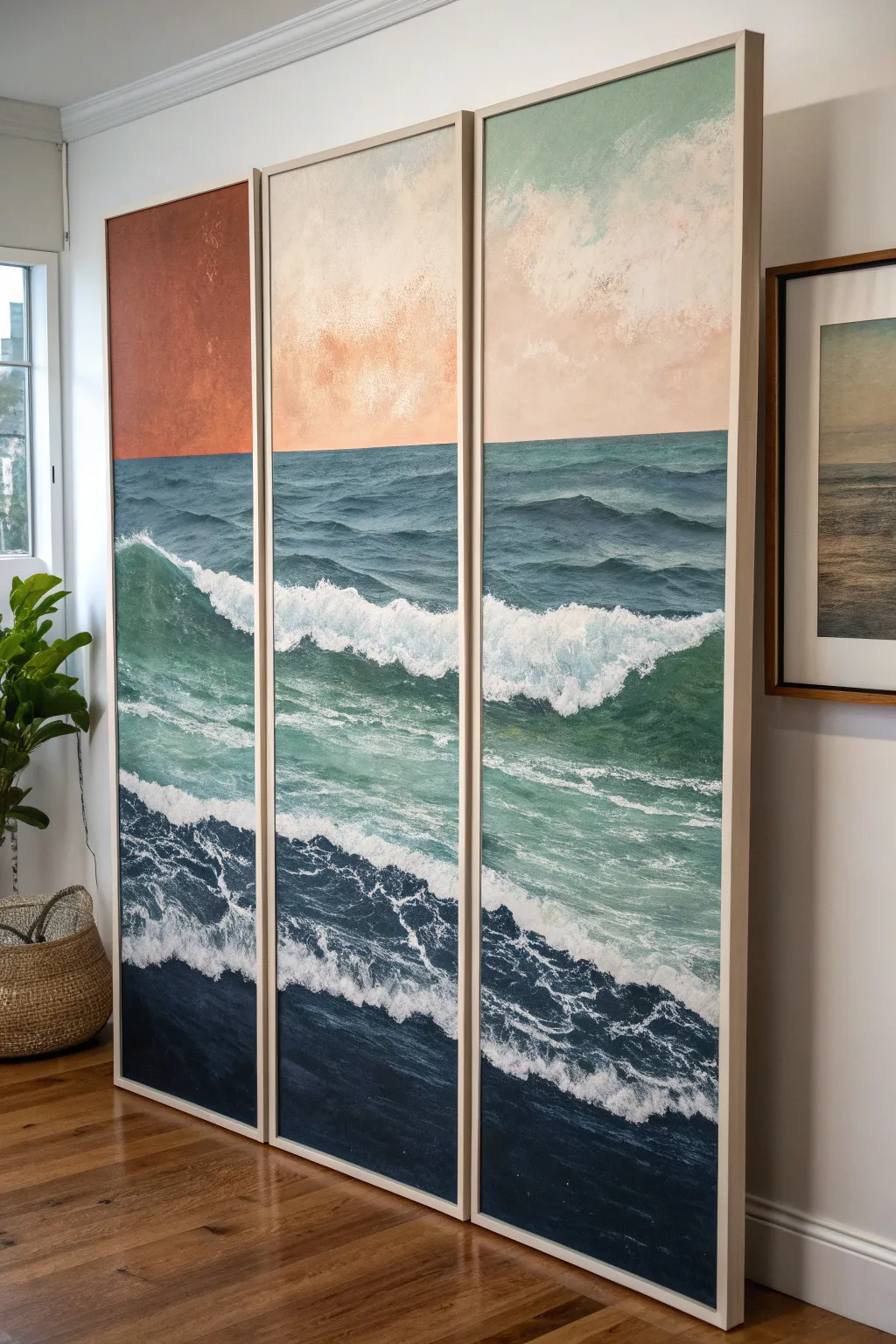
This striking three-panel artwork transforms a traditional seascape by splitting the horizon into distinct color zones. The bold transition from burnt orange to ethereal peach and soft blue creates a modern, surreal twist on a classic ocean view.
Detailed Instructions
Materials
- 3 large stretched canvases (tall, rectangular format, e.g., 24×60 inches)
- Acrylic paints: Phthalo Blue, Ultramarine Blue, Titanium White, Burnt Sienna, Cadmium Orange, Teal, Sap Green
- Large flat brushes (2-3 inch) for background washes
- Medium filbert brushes for wave bodies
- Fan brush or stippling brush for sea foam
- Palette knifes (optional)
- Painter’s tape or masking tape
- Easels or wall for mounting while painting
- Water spray bottle
- Mixing palette
Step 1: Setting the Horizon
-
Prep the layout:
Arrange all three canvases side-by-side on your easel or floor. Ensure there is a small gap (about 1-2 inches) between them, exactly as they will hang, so you can visualize the continuous image. -
Define the horizon line:
Using a long straightedge or a level, lightly sketch the horizon line across all three panels. Place it high, roughly at the top 1/3 mark, to emphasize the expanse of the ocean water. -
Mask the ocean:
Apply a strip of painter’s tape exactly along your pencil line, covering the ‘ocean’ side. This protects the water area while we paint the three distinct sky sections.
Uneven Horizon?
If your tape bled or the line looks shaky, don’t panic. Use a straight edge and a small flat brush with the dark ocean color to “cut in” a new, sharp line over the dry sky paint.
Step 2: The Split-Palette Sky
-
Panel 1: The bold earth tone:
For the left panel sky, mix Burnt Sienna with a touch of Cadmium Orange. Paint the entire sky section in a flat, matte wash. I like to add a tiny bit of texture here, daubing the paint slightly rather than smoothing it perfectly, to give it an organic feel. -
Panel 2: The transition zone:
On the middle panel, create a softer, dreamlike sky. Mix Titanium White with a very small amount of Orange and a dot of Pink or Burnt Sienna. Create a cloudy, mottled texture using a scrunched rag or a dry brush, letting the white dominate near the top. -
Panel 3: The cool atmosphere:
For the right panel, mix a pale blue-green using Teal, White, and a hint of Sap Green. Apply this loosely, keeping it airy and light to contrast sharply with the dark orange of the first panel. -
Remove the mask:
Once the sky sections are touch-dry, carefully peel away the painter’s tape to reveal a crisp, clean horizon line across the triptych.
Add Metallic Life
Mix a small amount of gold or copper paint into the white foam highlights on the left (orange sky) panel. It catches the light and ties the water to the warm sky tones.
Step 3: Painting the Ocean Base
-
Mix the deep water tones:
Create a dark, moody mixture using Phthalo Blue, a touch of Black (or burnt umber), and Ultramarine. This will be the darkest part of the water in the foreground. -
Establish the gradient:
Paint the water horizontally across all three panels simultaneously. Start dark at the bottom and gradually mix in more Teal and Green as you move upward toward the horizon line. -
Blend panel-to-panel:
Crucial step: Step back frequently to ensure the colors match where one canvas ends and the next begins. The gradient needs to flow seamlessly across the gaps.
Step 4: Waves and Highlights
-
Sketch the wave motion:
Using thin white paint or chalk, lightly map out the main crashing wave. It should start lower on the left panel (the trough) and rise to a crest on the middle or right panel. -
Build the wave body:
Using a medium filbert brush, paint the translucent part of the wave. Mix Teal and Sap Green with a glazing medium or water to keep it semi-transparent. Apply this under the crest where light would shine through the water. -
Create the rolling foam:
Load a fan brush or rough bristle brush with thick Titanium White. Tap and drag the brush horizontally along the tops of the small background waves to suggest movement and distance. -
Crash the main wave:
For the main white water, use heavy body white paint. Use a stabbing or stippling motion to create the explosion of foam. Let the paint pile up slightly physically for texture. -
Add sea spray:
Dilute a bit of white paint with water. Load an old toothbrush or stiff brush and flick tiny droplets onto the crest of the wave to mimic airborne spray. -
Refine the foreground:
In the dark bottom section, add swirling patterns of lighter blue-grey foam (white mixed with the base blue) to show the turbulent water left behind after a wave crashes. -
Final continuity check:
Stand back one last time. Ensure the white foam lines connect logically from one canvas to the neighbor. Adjust edges so the ‘cut’ of the canvas doesn’t interrupt the wave’s visual flow.
Hang your canvases with uniform spacing to let the eye bridge the gap and complete the coastal scene


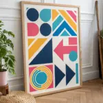
Geometric Color-Block Abstract
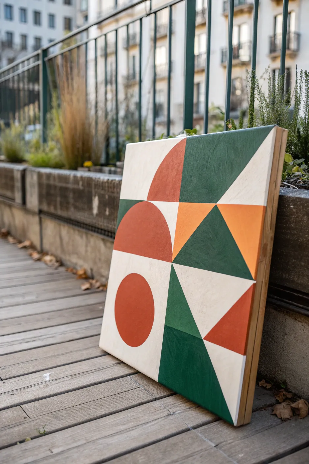
This striking artwork relies on the precise interplay of simple shapes—a circle, semicircles, and sharp triangles—rendered in a sophisticated palette of terra cotta, forest green, and creamy beige. The clean lines and bold color blocking create a modern, balanced composition that feels both architectural and organic.
How-To Guide
Materials
- Square wooden painting panel (canvas works too, but wood offers cleaner lines)
- Acrylic paints: Terra Cotta (reddish-orange), Forest Green, Cream/Off-White
- Pencil and eraser
- Ruler or T-square
- Compass or round objects for tracing
- Painter’s tape (high quality)
- Flat synthetic brushes (various sizes)
- Gesso (if panel is unprimed)
Step 1: Preparation and Grid Layout
-
Surface Prep:
Begin by ensuring your wooden panel is smooth. If it’s raw wood, apply two coats of gesso, sanding lightly between layers to create a flawless foundation for your geometric shapes. -
Base Coast:
Paint the entire surface with your Cream/Off-White acrylic shade. I like to do two thin coats rather than one thick one to avoid brush strokes; let this dry completely before drawing. -
Establish the Center:
Using your ruler, lightly mark the vertical and horizontal center lines of the panel. This central cross will act as the anchor for all your subsequent shapes. -
Pencil the Quadrants:
Sketch out the four main quadrants defined by your center lines. You don’t need heavy lines here—just faint guides to help you place the shapes accurately.
Bleeding Lines?
If paint bleeds under tape, wait for it to dry fully. Then, use a small detail brush and the background color to carefully paint over the bleed, straightening the line.
Step 2: Drafting the Design
-
Draw the Bottom-Left Circle:
In the bottom-left quadrant, use a compass to draw a perfect circle. Position it centrally within that quadrant’s space so it floats nicely with negative space around it. -
Create the Semicircles:
Move to the top-left quadrant. Draw a large semicircle that fills the right half of that quadrant, with its flat side running vertically along the canvas center line. Repeat this shape logic for the large red shape in the middle-left area. -
Draft the Triangles:
Using your ruler, draw the triangular elements. Start with the large green triangle spanning the top-right corner. Then, draft the central green triangles that point inwards, and finally the smaller red triangle in the bottom right corner. -
Review Proportion:
Step back and look at your pencil sketch. The shapes should feel balanced diagonally. Adjust lines now before any tape goes down.
Step 3: Painting the Colors
-
Taping the Straight Edges:
Apply painter’s tape along the straight edges of your first color group (let’s start with the Forest Green sections). Press the tape edges down firmly with your thumbnail or a credit card to prevent bleed. -
Seal the Tape:
A great trick is to brush a tiny amount of your base background color (Cream) over the tape edge first. This seals any gaps so your green lines will be razor-sharp. -
Apply Forest Green:
Fill in the designated green triangles and shapes. Use a flat brush to get smooth coverage. It may take 2-3 coats for full opacity. -
Remove Tape:
Peel the tape off gently while the paint is still slightly tacky—don’t wait for it to be bone dry, or it might chip. -
Freehand or Mask Curves:
For the circular terra cotta shapes, you have two choices. You can carefully freehand the curved edges with a small flat brush, or use flexible curve tape if you have it. I generally prefer taking my time with a steady hand. -
Painting Terra Cotta:
Fill in the circle, semicircles, and the small triangle with your Terra Cotta paint. Be patient near the edges where the red shapes meet the green ones. -
Clean Up Edges:
Once all colors are blocked in, use your smallest brush to touch up any areas where colors touch or where lines aren’t perfectly crisp. -
Painting the Sides:
Don’t forget the depth of the panel. Painting the sides either white or continuing the geometric pattern wraps the artwork up nicely.
Add Texture
Mix a small amount of baking soda or modeling paste into your acrylics before painting. This creates a subtle, tactile matte texture reminiscent of plaster.
Let the piece cure for a day before hanging it to admire your precise handiwork
Negative Space Shape Painting
Embrace the power of simplicity with this striking abstract piece that balances a massive, deep blue form against a delicate sliver of mustard yellow. The use of negative white space creates a modern, minimalist look perfect for anchoring a large wall.
Step-by-Step
Materials
- Large canvas (approx. 36 x 48 inches) or heavy watercolor paper
- Acrylic paint (Deep Ultramarine Blue)
- Acrylic paint (Mustard Yellow/Ochre)
- Wide flat brush (2-3 inches)
- Medium round brush
- Pencil
- String and pushpin (optional, for drafting curves)
- Gesso (if canvas is unprimed)
- Painter’s tape or masking tape
- Wooden frame (optional)
Step 1: Preparation and Planning
-
Prepare your surface:
Ensure your canvas is clean and taut. If you are using raw canvas or wood, apply a coat of white gesso to prime the surface and let it dry completely to ensure the colors pop. -
Visualize the composition:
This artwork relies on the tension between two shapes. The large blue shape occupies almost the entire bottom-left quadrant, arching upwards. The yellow shape is a distinct, smaller sliver on the right side. -
Draft the major curve:
Lightly sketch the outline of the large blue shape. You can freehand this for an organic feel, or use a pushpin tied to a string as a makeshift compass to get a perfect arc. -
Refine the blue shape:
The blue shape should start from the bottom edge and curve towards the top right, but stop about two-thirds of the way up the canvas, leaving plenty of white space above. -
Sketch the accent shape:
On the right side of the canvas, sketch the smaller yellow shape. It should look like a sliver of a crescent moon, curving slightly inward towards the blue shape but never touching it. -
Check the balance:
Step back and look at your pencil marks. The gap between the two shapes—the negative space—is just as important as the shapes themselves. Adjust the lines if the gap feels too wide or too narrow.
Step 2: Painting the Forms
-
Mix the blue:
Squeeze out a generous amount of Deep Ultramarine Blue. If the paint feels too thick, mix in a tiny drop of water or glazing medium to help it flow smoothly across the large surface area. -
Outline the blue edge:
Use the medium round brush to carefully paint along the pencil line of the blue curve. This establishes a crisp, clean edge which is crucial for this geometric style. -
Fill the blue field:
Switch to your wide flat brush. Fill in the rest of the blue shape using long, confident strokes. Painting in the direction of the curve can add a subtle texture that looks lovely when dry. -
Apply a second coat:
Acrylics can sometimes look streaky on large areas. Once the first layer is touch-dry, apply a second coat of blue to achieve that solid, velvety saturation shown in the referenced image. -
Mix the yellow:
Prepare your Mustard Yellow paint. You want a warm, earthy yellow rather than a bright lemon neon to maintain the sophisticated look. -
Paint the yellow sliver:
Using a clean round brush, carefully fill in the yellow shape. Take your time here, as this shape is smaller and requires precision to keep the edges sharp. -
Evaluate opacity:
Yellow pigments are often naturally translucent. You will likely need two or even three thin coats to get a solid, opaque color that stands up to the heavy blue.
Uneven Edges?
If your curved edges look shaky, use ‘fluid’ acrylics or thin your paint slightly with water. This allows the brush to glide longer without lifting, creating smoother lines.
Step 3: Finishing Touches
-
Clean up edges:
Inspect the white background. If any paint smudged, use a tiny bit of white paint to cover the error once the color is dry. -
Remove tape:
If you taped off the edges of your canvas for a clean border, peel the tape away slowly at a 45-degree angle to reveal crisp lines. -
Seal the work:
I prefer to apply a matte or satin varnish over the entire piece once it’s fully cured. This unifies the sheen of the paint and protects the large field of white. -
Frame it:
Finish the project by placing the canvas into a simple light wood floating frame. The natural wood tone complements the mustard yellow beautifully.
Textured Twist
Mix a Texture medium or modeling paste into the blue paint before applying. This adds physical depth and makes the large shape feel more sculptural and tactile.
Hang this piece in a room that needs a focal point and enjoy the calm energy of your new abstract art
Masking Tape Border and Stripes
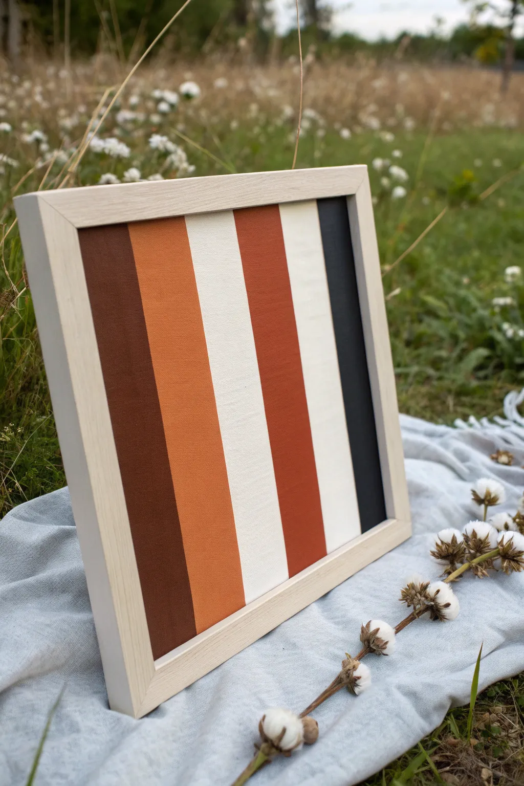
Embrace the warmth of nature with this minimalist striped canvas painting, featuring rich bands of terracotta, cocoa, and cream. The clean lines and earthy palette create a sophisticated piece that adds a modern touch to any room.
Step-by-Step Tutorial
Materials
- Square wood frame (approx. 12×12 inches)
- Cotton canvas or canvas board (sized to fit frame)
- Acrylic paints: Burnt umber, terracotta/burnt orange, rust, cream/warm white, charcoal grey/black
- Painter’s tape or masking tape (1 inch and 2 inch widths)
- Flat synthetic paintbrush (1 inch)
- Ruler
- Pencil
- Gesso (if canvas is unprimed)
- Matte varnish (optional)
Step 1: Preparation and Planning
-
Prepare the canvas:
If your canvas panel isn’t pre-primed, apply a smooth coat of gesso and let it dry completely. A smooth base usually helps achieve crisper lines later on. -
Check the fit:
Ensure your canvas board fits snugly into your chosen wooden frame before you start painting so adjustments can be made if necessary. -
Color selection:
Pre-mix all your acrylic colors on your palette: a deep chocolate brown, a vibrant rust orange, a creamy off-white, a deeper burnt terracotta, and a nearly-black charcoal.
Clean Lines Secret
Before painting your color, paint a thin layer of your base cream color over the tape edge. This seals the tape so any bleed-through is invisible.
Step 2: Creating the Cream Stripes
-
Base coat application:
Because cream is the lightest color, it’s easier to paint the areas where the cream stripes will go first. I sometimes just paint the entire middle section cream rather than trying to stay perfectly in the lines. -
Dry thoroughly:
Let this cream base layer dry completely. If you move on too quickly, the tape will peel up your paint.
Step 3: Masking the Design
-
Mark stripe locations:
Using a ruler and pencil, lightly mark where your vertical stripes will fall. From left to right, you will have: dark brown, rust orange, a cream stripe, a terracotta stripe, another cream stripe, and finally a charcoal stripe. -
Apply first round of tape:
Apply strips of painter’s tape vertically to mask off the areas you want to keep cream. Press the edges of the tape down firmly with your thumbnail or a credit card to prevent bleed-under. -
Mask adjacent colors:
Since the stripes touch each other directly, you will need to mask off one side of a stripe, paint it, let it dry, and then re-tape for the neighbor. Start by masking the boundaries for the dark brown and charcoal stripes on the far edges.
Peeling Paint?
If paint lifts when removing tape, you likely pulled too fast or the paint was too thick. Next time, score the edge gently with a craft knife first.
Step 4: Painting the Dark Tones
-
Paint the left edge:
Load your flat brush with the dark burnt umber paint. Fill in the far-left vertical stripe, ensuring smooth, even strokes from top to bottom. -
Paint the right edge:
Clean your brush thoroughly, then dip into the charcoal grey. Paint the far-right vertical stripe carefully. -
Remove tape carefully:
While the paint is still slightly tacky but set, gently peel back the tape at a 45-degree angle to reveal sharp edges. Let these sections dry fully.
Step 5: Painting the Warm Tones
-
Re-mask for remaining stripes:
Once the brown and charcoal stripes are bone dry, apply fresh tape over their edges to protect them. Also, ensure your cream stripes are covered. -
Paint the rust stripe:
Paint the second stripe from the left with your vibrant rust orange color. Use long vertical strokes to minimize brush marks. -
Paint the terracotta stripe:
Paint the stripe located between the two cream sections with the deeper terracotta/burnt orange color. -
Dry and reveal:
Allow these final warm colors to dry before slowly removing all remaining masking tape.
Step 6: Finishing Touches
-
Touch-ups:
Inspect your lines. If any paint bled led under the tape, use a small detail brush and the appropriate background color to carefully tidy up the edges. -
Sealing the art:
Apply a coat of matte varnish over the entire piece to protect the paint and give it a unified finish. -
Framing:
Place the dried canvas board into the light wood frame and secure the backings.
Hang your new geometric masterpiece in a spot with plenty of natural light to let those earth tones really glow
Loose Brush-Mark Energy Study
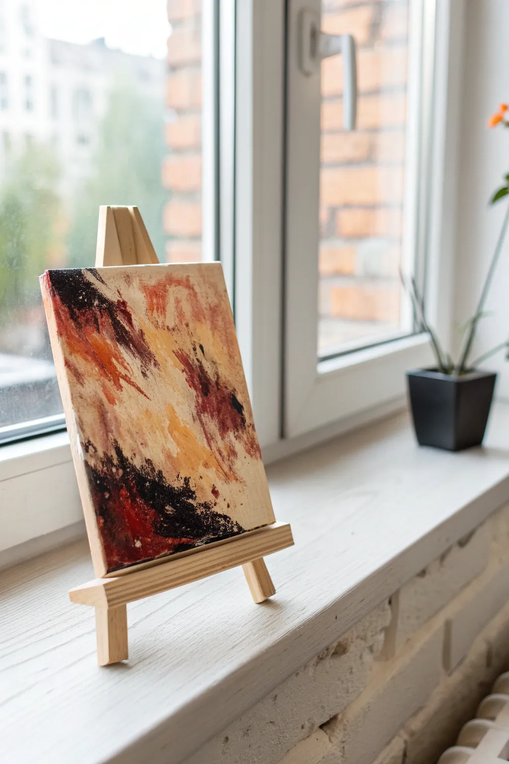
This project is a fantastic study in loose, gestural abstraction using a strictly limited palette of just three colors. By focusing on the raw energy of brushstrokes rather than realistic representation, you’ll create a striking mini-artwork that feels dynamic and spontaneous.
Step-by-Step
Materials
- Small canvas board or canvas panel (approx. 5×7 or 6×8 inches)
- Mini wooden display easel
- Acrylic paints: Carbon Black, Burnt Sienna (or a deep rust red), and Titanium White
- Unbleached Titanium or Cream acrylic paint (optional, for warmer mixing)
- Flat bristle brushes (sizes 6 and 10) for texture
- Small palette knife (optional, for scraping)
- Palette for mixing
- Paper towels
- Water cup
Step 1: Setting the Ground
-
Prepare the background:
Begin by covering the entire canvas surface with a mixture of Titanium White and a tiny dot of Burnt Sienna to create a warm, creamy off-white base. If you have Unbleached Titanium, you can use that straight from the tube. -
Create a scumbled texture:
Don’t aim for a perfectly smooth coat. Use a dry brush technique to apply the base color, letting visible brushstrokes remain. This underlayer will add depth to the final piece. -
Allow to dry:
Let this base layer dry completely before moving forward. Acrylics dry quickly, so five to ten minutes should be sufficient.
Muddy Colors?
If your rust and black are turning into a dull gray, stop! Let the layers dry strictly between applications. Wet-on-wet mixing is great, but visible layering keeps colors distinct.
Step 2: Drafting the Composition
-
Mix your mid-tone:
Create a warm, diluted rusty orange by mixing Burnt Sienna with a little water and a touch of the cream base color. You want a semi-transparent consistency. -
Establish the diagonal flow:
Using a size 10 flat brush, make a few sweeping, diagonal marks from the top left corner toward the bottom right. This establishes the primary movement of the composition. -
Add central warmth:
Apply patches of pure Burnt Sienna in the center left area. Use jagged, vertical strokes to break up the diagonal flow slightly. -
Soften edges:
While the paint is still wet, use a clean, slightly damp brush to blur some of the edges of your rust-colored strokes so they fade into the cream background.
Texture Boost
Mix a dab of modeling paste or heavy gel medium into your lighter paint colors. This allows you to build actual 3D ridges that catch the light, mimicking an oil painting look.
Step 3: Adding Contrast
-
Introduce the darks:
Load a smaller flat brush (size 6) with pure Carbon Black. Be careful, as black can easily overpower the other colors. -
Anchor the corners:
Apply the black paint heavily in the top left corner and the bottom center. These dark ‘anchors’ will frame the energetic center of the painting. -
Create dry-brush noise:
Wipe most of the black paint off your brush onto a paper towel. Drag the nearly dry brush rapidly over the dried rust areas to create distinct, scratchy textures. -
Mix a dark maroon:
On your palette, mix a little Black into the Burnt Sienna to create a deep maroon/brown shade. -
Connect the zones:
Use this maroon mixture to bridge the gap between the pure black areas and the bright rust areas, creating a transition zone.
Step 4: Refining and Texturing
-
Reintroduce light:
Clean your brush thoroughly. Pick up some thick Titanium White or your cream mix. Apply this thickly in the center of the painting, overlapping some dry darker areas to create depth. -
Scraping technique:
If you have a palette knife, or even the edge of an old credit card, use it to scrape across wet black paint in the bottom section. This reveals the canvas texture underneath. -
Add energetic splatters:
Dilute a tiny bit of black paint with water until it is distinctively fluid. loading a brush and tapping the handle against another brush to create tiny speckles near the center right. -
Evaluate the balance:
Step back and look at your composition. It should feel ‘heavy’ on the diagonal. If it looks too tidy, add a few more rapid, erratic marks with the rust color. -
Final drying and display:
Let the painting dry completely, which may take an hour due to the thick paint in some areas. Once dry, mount it on the mini easel.
Place your finished mini-masterpiece on a windowsill or desk where natural light can highlight the textures you’ve built up
Unexpected Palette Mood Swap
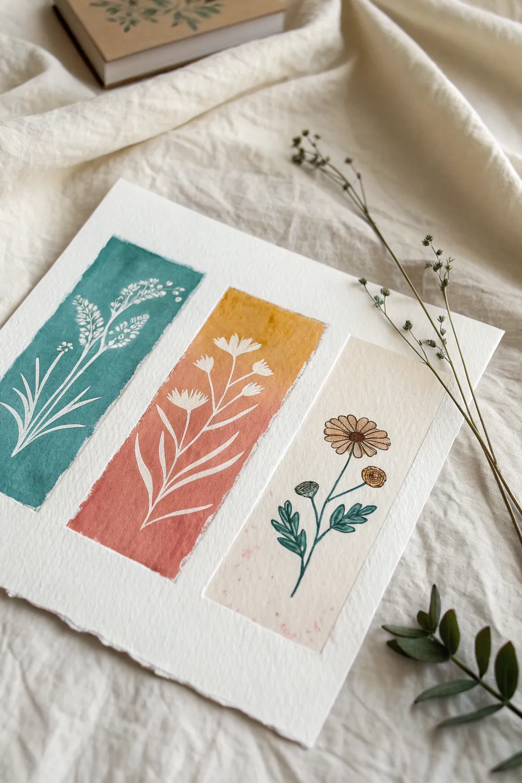
This charming watercolor project combines bold block colors with delicate line work, showcasing three distinct botanical styles side-by-side. The juxtaposition of negative space silhouettes against a solid wash and a traditional detailed illustration creates a lovely, unexpected balance on the page.
Detailed Instructions
Materials
- Cold press watercolor paper (300 gsm)
- Watercolor paints (Teal, Yellow Ochre, Terracotta, Burnt Sienna)
- Fine liner pens (Black and Brown, 0.1mm and 0.3mm)
- White gouache or white gel pen
- Masking tape or washi tape
- Small flat brush (1/4 inch)
- Small round brush (size 2)
- Pencil and eraser
- Ruler
Step 1: Planning the Composition
-
Masking boundaries:
Begin by taping down your paper to a flat surface to prevent buckling. Measure and lightly mark three equal vertical rectangles in the center of your page, leaving about an inch of breathing room between each one. -
Defining the edges:
Use your masking tape to block off the outside edges of these three rectangles. This ensures you get crisp, clean lines for the colored backgrounds in the first two panels.
Bleeding Lines?
If your gouache pulls up the watercolor underneath, the base layer isn’t dry enough. Wait longer or use a white gel pen, which sits on top of the paint without reactivating it.
Step 2: Panel 1: The Teal Silhouette
-
Applying the wash:
Mix a rich, opaque teal color. Using your flat brush, fill the first rectangular area completely. Aim for a slightly uneven, textured look rather than a perfectly flat wash—it adds character. -
Drying time:
Let this teal layer dry completely. If you proceed while it’s damp, your white lines will bleed. -
Painting the silhouette:
Using a very fine round brush and white gouache (or a white gel pen for easier control), carefully paint the silhouette of a wild grass sprig. Start with the main stem and branch outwards, adding small clusters for the seeds.
Step 3: Panel 2: The Warm Gradient
-
Mixing the gradient:
Prepare a palette with yellow ochre and a reddish terracotta. I like to keep these quite watery to help them blend. -
Creating the ombre:
Start at the top of the second rectangle with the yellow ochre. As you move down past the halfway point, introduce the terracotta paint, blending the two while wet to create a seamless transition from gold to rust. -
Adding negative space florals:
Once the gradient is bone dry, replicate the technique from the first panel. Use white gouache to paint a delicate wildflower with thin, pointed leaves and small blossom heads.
Pro Tip: Torn Edges
For a more organic, rustic look like the example, skip the masking tape on the short top/bottom edges. Free-hand the paint ending to create a rough ‘deckled’ edge effect.
Step 4: Panel 3: The Detailed Illustration
-
Setting the background:
For the third panel, apply a very pale, diluted wash of beige or cream. You want this to look almost like aged paper, barely darker than the white page itself. -
Sketching the flower:
Lightly pencil in a daisy-like flower with a secondary bud. This panel relies on line art, not negative space. -
Inking the outlines:
Trace your pencil lines with fine liner pens. Use black for the stems and leaves, and switch to a warm brown for the flower petals and centers to keep the look soft. -
Adding color accents:
Using your watercolor brush, gently fill in the leaves with a muted green and the flower centers with yellow ochre. Leave the petals largely unpainted or lightly tinted to maintain a light, airy feel.
Step 5: Finishing Touches
-
Removing tape:
Slowly peel away the masking tape at a 45-degree angle. This reveals the sharp boundaries of your rectangular panels. -
Clean-up:
Erase any remaining pencil marks around the third panel or the borders. -
Splatter texture:
Dip your brush in diluted terracotta paint and tap it gently over the third panel to add tiny speckles for a vintage texture.
Step back and admire how these three different techniques create a harmonious botanical trio

Have a question or want to share your own experience? I'd love to hear from you in the comments below!