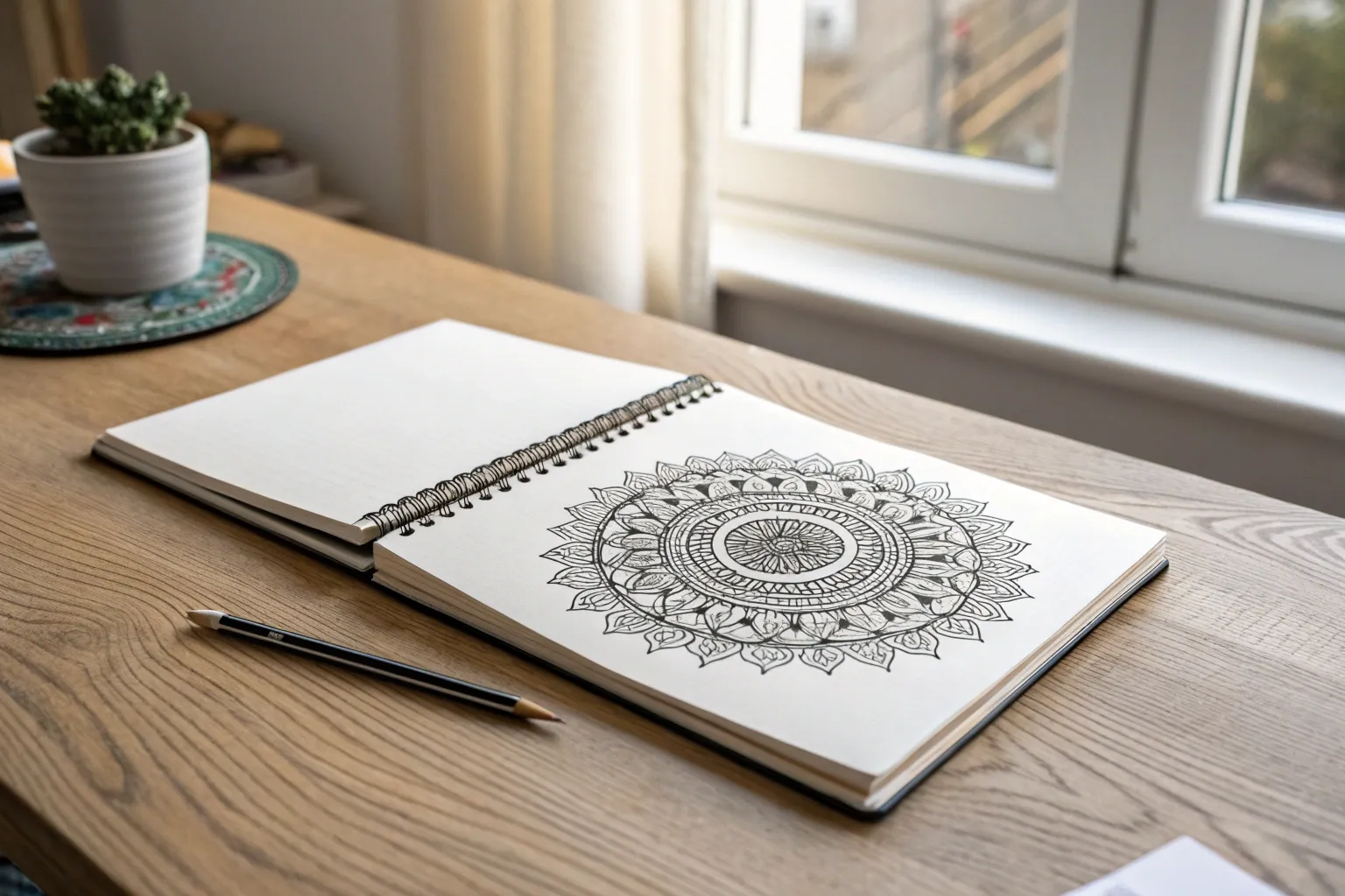
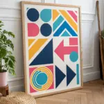
When I’m stuck on what to draw, I always come back to designs—those satisfying little patterns that turn simple lines into something that looks way more complex than it is. Here are my favorite designs drawing ideas you can start today, whether you’ve got five minutes or a whole cozy afternoon.
Classic Circle Mandala Rings
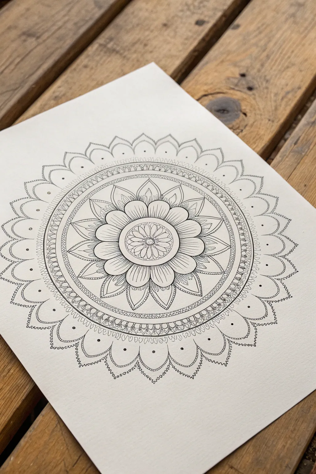
This classic circle mandala centers on a blooming lotus motif, radiating outward with layers of delicate petals and intricate geometric borders. The clean black lines against crisp white paper create a soothing, balanced design perfect for practicing precision and symmetry.
Step-by-Step Tutorial
Materials
- High-quality white drawing paper or cardstock (smooth bristol is ideal)
- Pencil (HB or 2H for light drafting)
- Compass
- Protractor
- Ruler
- Fine liner pens (e.g., Micron 01, 03, and 05 sizes)
- Eraser (kneaded eraser preferred)
Step 1: Drafting the Structure
-
Establish the center:
Begin by marking a precise center point on your paper. This single reference point is crucial for the entire symmetry of the mandala. -
Draw the grid lines:
Using a ruler and protractor, draw faint lines intersecting through the center point to divide your circle into equal pie slices. I like to start with 8 sections, then divide again to get 16, which helps perfectly align the flower petals later. -
Mark concentric circles:
With your compass, draw a series of light concentric circles starting from the center. You’ll need a small inner circle for the core, a slightly larger one for the small petals, a medium ring for the large petals, a wide band for the geometric border, and a final large circle for the outer scallops.
Pro Tip: Spin It
Rotate your paper constantly as you draw. It is much easier for your hand to repeat a stroke at the same natural angle than to contort your wrist to draw upside down.
Step 2: Drawing the Floral Core
-
Create the central seed:
Switch to your 03 fine liner. In the very center, draw a small circle and fill it with tiny, clustered loops or seeds to create texture. -
Add first petal layer:
Draw the innermost ring of small, rounded petals. There should be about 12-16 narrow petals radiating from the center seed, touching the first guide circle. -
Draw the main lotus petals:
On the next layer out, draw larger, broader petals. These should have a slightly pointed tip. Use your grid lines to ensure the peak of each petal lands exactly on a line for symmetry. -
Detail the petals:
Inside these large petals, add fine vertical lines at the base and near the tips to suggest texture and shading. This is where a thinner 01 pen really shines for delicate work. -
Add pointed sepals:
Between each large flower petal, draw a sharp, triangular ‘sepal’ leaf peeking out from behind. These should be shorter than the main petals and add a spiky contrast to the soft curves.
Level Up: Gold Accents
Once the black ink is dry, take a gold gel pen or metallic marker and fill in the small central seeds or the dots on the outer ring for a touch of luxurious shimmer.
Step 3: The Geometric Border
-
Outline the band:
Moving outward, ink two solid circles to create a distinct band or channel approximately 1cm wide around the floral center. -
Fill with scale pattern:
Inside this channel, draw a repeating ‘scale’ or small semi-circle pattern. Keep these tight and uniform. If you have gaps, fill them with tiny black triangles to add contrast. -
Add the rope texture:
Just outside this scale band, draw a very narrow ring filled with diagonal hatch marks, creating a twisted rope or cable effect.
Step 4: The Outer Scallop Ring
-
Draft the scallops:
On your outermost guide circle, sketch large semi-circles (scallops) all the way around. Ensure they are evenly spaced; adjusting their width slightly is better than having one odd-sized scallop at the end. -
Ink the primary scallops:
Go over your pencil scallops with the 05 pen for a bold outer edge. This heavier line weight frames the artwork nicely. -
Create the lace edge:
Inside each large scallop, draw a slightly smaller one. Connect this inner line to the outer line with tiny perpendicular dashes, giving it a stitched or lace-like appearance. -
Add decorative curves:
Beneath the main scallop points, draw small, ornate loops (like draped chains) connecting the bottom corners of the scallops to the geometric border ring. -
Final dotted details:
Place a single, bold dot in the center of each large outer scallop. Then, add a tiny dot at the very peak of the ‘draped chain’ loops for a jewelry-inspired finish. -
Clean up:
Wait at least 15-20 minutes to ensure the ink is totally bone dry. Then, gently erase all your pencil grid lines and circle guides to reveal the high-contrast black and white design.
Take a moment to admire how the repetitive motions have built up into a complex and meditative final piece


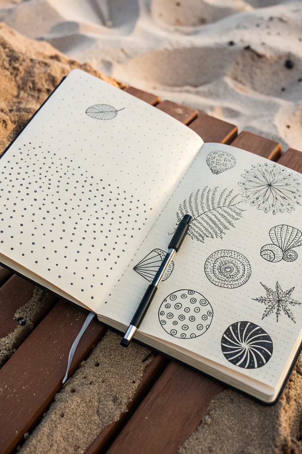
Pattern Grid Sampler Page
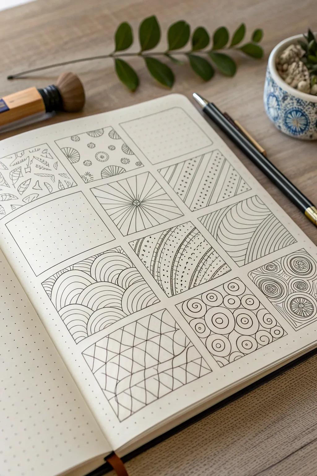
This soothing drawing exercise transforms a blank page into a structured gallery of textures and shapes. By confining intricate doodles into neat squares, you create a satisfying sampler that serves as both a relaxation technique and a reference for future designs.
How-To Guide
Materials
- A5 Dot Grid Notebook (or blank paper with a ruler)
- Fine liner pen (0.3mm or 0.5mm, black)
- Pencil (HB or 2B)
- Ruler or straight edge
- Eraser
Step 1: Setting up the Grid
-
Calculate spacing:
Count the dots across your page to determine the best size for your squares. A 3-column layout works well for A5 journals, leaving a 1-2 dot margin between each box. -
Draft the boxes:
Using your pencil and ruler, lightly draw a grid of squares. Aim for a 3×4 or 4×4 layout depending on page height. Keep the lines faint so they can be erased or traced over later. -
Ink the frames:
Take your fine liner and carefully trace over your pencil grid lines to create permanent borders for your pattern swatches. Let the ink dry completely before erasing any visible pencil marks to avoid smudging.
Steady Hand Trick
When inking long straight lines without a ruler, lock your wrist and move your entire arm from the shoulder. This reduces shakiness compared to moving just your fingers.
Step 2: Row 1: Organic & Geometric Mix
-
Botanical box:
In the top-left square, sketch small, scattered leaves. Vary their direction and size, adding tiny veins to the larger ones for detail. Leave plenty of negative space. -
Floral medallions:
For the second square, draw small circular motifs. Alternate between simple circles with dots inside and ‘fan’ shapes that look like half-flowers. Scatter them randomly. -
Grid texture:
Leave the third square partially empty or fill it with a very simple, repetitive texture like tiny dots or faint cross-hatching to act as a ‘breathing room’ panel in the composition.
Step 3: Row 2: Lines & Illusions
-
Simple stippling:
Skip the first box of the second row (or fill it with uniform stippling dots) to create visual balance. -
Sunburst:
In the middle square, place a small circle in the absolute center. Use your ruler to draw straight lines radiating from that circle to the edges of the box. -
Diagonal stripes:
In the rightmost square, draw diagonal lines from bottom-left to top-right. In every other gap between the lines, draw a row of small dots to create a striped hanging bead effect.
Add Dimension
Use a light grey marker or a pencil to add drop shadows to the inside edges of your squares. This makes the patterns look like tiles set into the page.
Step 4: Row 3: Curves & Flow
-
Rainbow arches:
Start at the bottom of the left square. Draw a series of stacked semi-circles (rainbows). When you hit a ‘rainbow,’ start a new stack behind it, creating a clouded scale effect. -
Curved channels:
In the center square, draw gentle, flowing vertical curves. Fill creating alternating sections: one filled with horizontal dashes, the next with stippling dots, and another with tiny circles. -
Warped tunnel:
For the right square, draw a series of curved lines that get closer together as they move toward the top right corner, creating a 3D illusion of a bending tube.
Step 5: Row 4: Complexity
-
Wavy net:
In the middle square of the bottom row, draw wavy horizontal lines. Then, draw vertical wavy lines that intersect them, creating a distorted checkerboard or netting look. -
Target circles:
In the right square, draw circles of various sizes. Inside each circle, draw a smaller concentric circle or a dot (bullseye). Fill the awkward gaps between large circles with tiny dots. -
Spiral roses:
If you have a final empty square (like the bottom right), draw tight spirals that look like abstract roses, filling the entire space with swirling lines. -
Final clean up:
Wait at least five minutes to ensure all ink is dry. Gently run your eraser over the whole page to remove any remaining graphite guidelines from the initial grid setup.
Now you have a beautiful reference page of patterns ready for your next doodle session


Doodle Border and Frame Designs
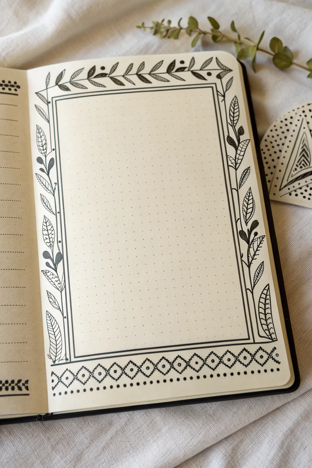
This elegant layout combines structure and nature, featuring a clean rectangular frame surrounded by delicate leaf vines and a geometric footer. Perfect for highlighting a quote, a weekly summary, or a special memory, this monochrome design turns a simple dot grid page into a work of art.
Detailed Instructions
Materials
- Dot grid notebook or loose dot grid paper
- Fine liner pen (size 0.3 or 0.5) for main lines
- Extra fine liner pen (size 0.1) for details
- Ruler
- Pencil (optional but recommended for sketching)
- Eraser
Step 1: Setting the Structure
-
Define the margins:
Begin by deciding how much white space you want around your frame. I usually count about 4-5 dots in from each edge of the page to ensure the drawing feels centered and not cramped. -
Draw the inner rectangle:
Using your ruler and the thicker fine liner (0.5), draw a large rectangle. Use the dot grid to keep your lines perfectly straight and corners square. -
Create the double border:
Draw a second rectangle closely around the first one, leaving just a narrow gap—about 2-3 millimeters wide. This double-line effect gives the frame more weight and visual interest.
Step 2: Drawing the Botanical Elements
-
Sketch the vine paths:
Lightly pencil in a wavy, organic line running along the left and right vertical outer edges of your frame, and a horizontal vine along the top edge. These will be the spines for your leaves. -
Ink the main stems:
Trace over your pencil guide lines with your pen. Don’t worry if they aren’t perfectly smooth; a little natural variation makes the vines look more realistic. -
Add the top leaves:
Along the top horizontal vine, draw small, simple laurel-shaped leaves. Alternate the direction of the leaves, pointing slightly forward along the vine’s path. Add small solid black berries occasionally for contrast. -
Create the side foliage:
For the vertical vines on the left and right, draw larger leaves. Mix up the styles: some can be simple outlines, others can have a central vein, and a few can be filled in solid black. -
Detail the leaves:
Switch to your finer 0.1 pen to add intricate details. Draw tiny hatch marks or veins inside the open leaves. This texture difference between the bold stems and delicate veins adds lovely depth. -
Balance the composition:
Step back and look at your vines. If a spot looks too empty, add a small bud or an extra curved tendril to fill the gap.
Pro Tip: Leaf Variety
Don’t make every leaf identical. Varying the size, angle, and internal patterns (stripes vs. veins) creates a much more organic and hand-drawn feel.
Step 3: Designing the Geometric Footer
-
Draw the bottom boundary:
Below your main frame, draw a horizontal line spanning the width of the page to serve as the base for your geometric pattern. -
Create the diamond chain:
Draw a continuous zig-zag line above your base line to form a row of connected diamonds. Use the grid dots to ensure each diamond is the same width and height. -
Add inner details:
Inside every other diamond, draw a smaller diamond shape. In the alternating diamonds, place a small dot in the center. -
Finish with a dotted line:
Just below the geometric border, add a row of evenly spaced dots. To make it pop, alternate between a larger dot and a smaller dot.
Troubleshooting: Smudged Ink
If you accidentally smudge wet ink, turn it into a leaf or berry! A solid black leaf or an extra vine curl can easily hide small mistakes.
Step 4: Final Touches
-
Erase pencil marks:
Wait at least five minutes for the ink to dry completely. Then, gently erase any visible pencil sketches, being careful not to crumple the paper. -
Review and refine:
Check for any lines that need thickening or gaps in your black fill areas. A quick touch-up now ensures the final result looks crisp and professional.
Now you have a stunning, structured page ready to be filled with your thoughts or plans

Repeating Dots and Bubble Clusters
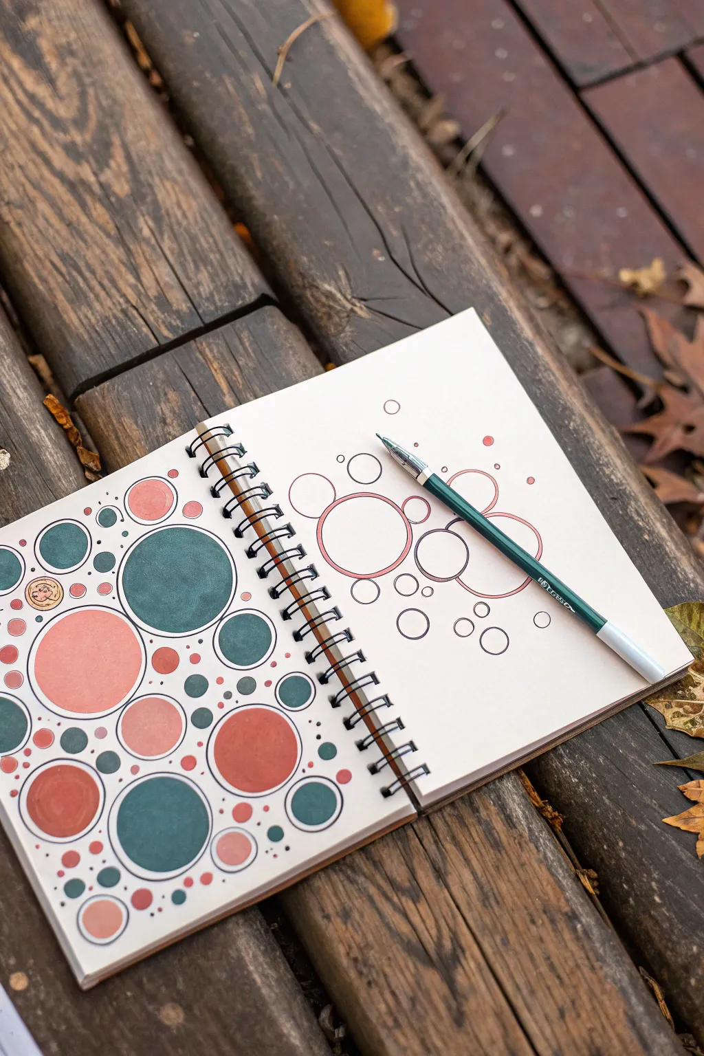
This relaxing doodle project transforms simple circles into a cohesive, bubbly composition using a sophisticated, muted color palette. It’s a perfect exercise for practicing spacing and balance while creating a satisfyingly filled page.
Step-by-Step Tutorial
Materials
- Spiral-bound sketchbook (medium weight paper suitable for markers)
- Fine liner pen (black or dark grey, approx. 0.5mm)
- Circle stencils (optional, but helpful for perfect shapes)
- Markers or brush pens in muted teal, peach, terracotta, and dark green
- Pencil and eraser
Step 1: Planning the Layout
-
Start with large anchors:
Begin on a fresh page by drawing three to five large circles scattered randomly across the paper. These will serve as the main focal points of your composition. If you want perfectly round shapes, use a circle stencil or a compass, but freehand circles add a lovely organic feel. -
Add medium connectors:
Draw medium-sized circles near the large ones, sometimes letting them touch the edges of the big circles or hover just slightly apart. Imagine these are bubbles clumping together naturally. -
Disperse smaller bubbles:
Fill the gaps between the larger clusters with small circles. Unlike the big ones, these can float independently in the white space to create a sense of movement and airiness. -
Micro-dots for texture:
In the remaining negative spaces, sprinkle tiny, pin-prick sized dots. Do this sparingly at first; you can always add more later to balance the density. -
Review the balance:
Step back and look at the spread. Aim for an uneven distribution—some areas should be dense with clusters, while others remain more open.
Uneven Circles?
Don’t stress if your freehand circles are wobbly. Go over the outline a second time loosely to create a sketchy, artistic ‘doodle’ style where imperfections look intentional.
Step 2: Inking the Outlines
-
Trace carefully:
Using your fine liner pen, carefully go over your pencil sketches. Keep your hand steady and try to close the loop on each circle cleanly. -
Vary line weight (optional):
For added depth, you might thicken the line on one side of the circles (usually the bottom right) to suggest a subtle shadow, though a uniform line works beautifully for a flat graphic look. -
Erase pencil marks:
Wait a moment for the ink to dry completely to avoid smudging, then gently erase all visible pencil guidelines.
Add Dimension
Use a white gel pen to add a small curved highlight stroke on the upper left of each colored circle. This instantly turns flat dots into shiny, three-dimensional bubbles.
Step 3: Adding Color
-
Select your palette:
Choose three main colors. The example uses a deep muted teal, a soft peach, and a warm terracotta. Limit your palette to keep the design cohesive. -
Fill the largest anchors:
Start coloring the largest circles first. Alternate between your teal and peach shades, ensuring that two large circles of the same color aren’t right next to each other. -
Color medium circles:
Move to the medium circles. Introduce your third color (terracotta) here. Keep the saturation flat and even; I find circular strokes help minimize streakiness with markers. -
Leave breathing room:
Leave a significant number of the medium and small circles uncolored (white). This negative space is crucial—it prevents the drawing from looking too heavy or cluttered. -
Small accents:
Take your darkest color (or the teal) and fill in just a few of the smallest floating bubbles to drag the eye across the page. -
Create outer rings:
For a few selected white circles, take a colored marker and carefully outline the *inside* edge again, creating a colored rim effect without filling the center.
Step 4: Finishing Touches
-
Add floating dots:
Using the fine tip of your markers, add tiny colored dots among the black ink micro-dots you drew earlier. This integrates the color into the background. -
Check density:
If a corner feels too empty, add a few more freehand circles now. It’s safe to draw them directly in ink at this stage since you have the rhythm down.
Now you have a serene, abstract pattern that turns a simple shape into art
BRUSH GUIDE
The Right Brush for Every Stroke
From clean lines to bold texture — master brush choice, stroke control, and essential techniques.
Explore the Full Guide
Triangle Mosaic Pattern Fill
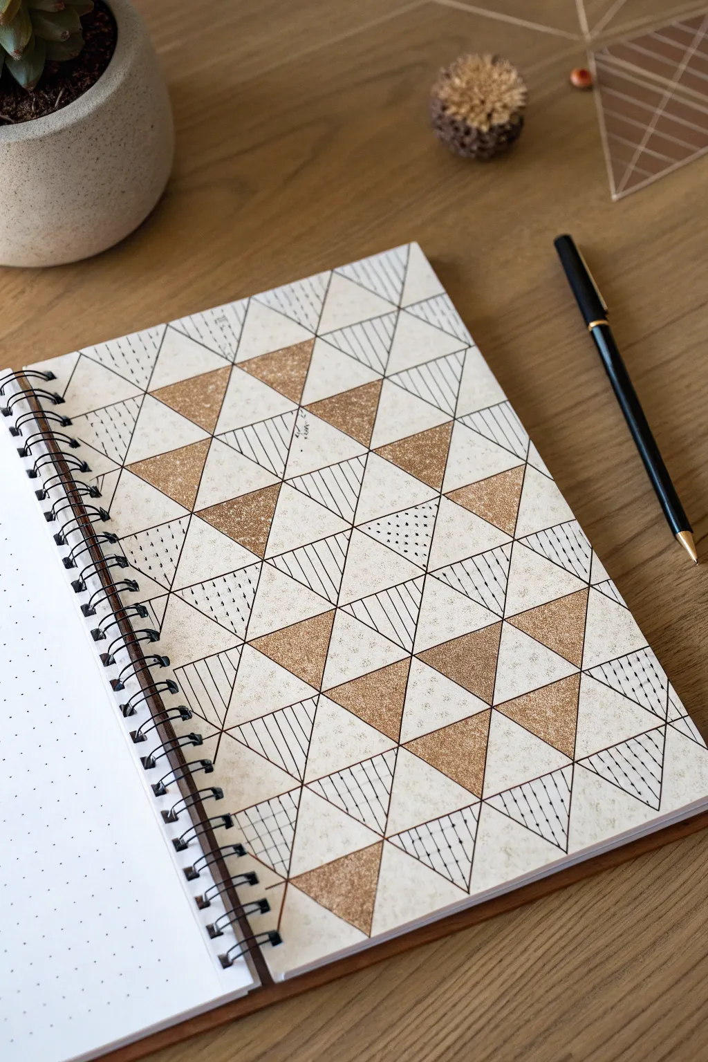
This elegant geometric design combines the simplicity of triangular grids with the sophisticated contrast of metallic gold and fine ink detailing. The result is a modern mosaic effect that turns a simple notebook page into a piece of structured art, alternating between solid, patterned, and negative spaces.
How-To Guide
Materials
- Dotted or grid notebook (A5 size recommended)
- Ruler or straight edge
- Pencil (HB or lighter)
- Eraser
- Fine liner pen (0.3mm or 0.5mm, black)
- Metallic gold paint marker or gold gel pen
- Scrap paper for testing ink flow
Step 1: Planning the Grid
-
Set your baseline:
Start by deciding on the size of your triangles. If using a dot grid notebook, a base width of 4-6 dots works well for clarity. Mark your baseline points lightly with a pencil along the bottom of the page. -
Mark geometric peaks:
For equilateral-style triangles, mark the peak of your first triangle halfway between your base points, but several rows of dots higher. -
Draw the main slanted lines:
Using your ruler, draw long, continuous diagonal lines connecting your base marks to the top of the page. Repeat this in parallel lines across the entire page, maintaining equal spacing. -
Complete the grid:
Draw the opposing set of diagonal lines to intersect the first set. This will create a full page of diamond shapes. Draw horizontal lines through the intersections to divide the diamonds into triangles. -
Refine the border:
Decide if you want the pattern to bleed off the edge or stop within a frame. Lightly box in your drawing area if you prefer a contained look.
Step 2: Inking the Structure
-
Trace the outlines:
Take your black fine liner and carefully trace over your pencil grid. Keep even pressure on the ruler to avoid smudging. -
Let it set:
Allow the ink to dry completely for a minute or two before proceeding to erase the underlying pencil marks. This keeps the lines crisp. -
Erase pencil guides:
Gently erase all graphite lines, leaving only the clean black triangular grid.
Clean Edges Tip
When inking along a ruler, slightly angle the pen tip away from the ruler’s edge. This prevents ink from bleeding under the ruler and causing smudges.
Step 3: The Gold Fill
-
Plan the random pattern:
The beauty of this design is the random distribution. Mark a small ‘G’ lightly in pencil inside the triangles you plan to fill with gold to ensure a balanced spread. -
Apply the gold:
Using the gold paint marker or gel pen, fill in the selected triangles. Using a paint marker tends to give a more solid, opaque finish that catches the light better. -
Edges first:
Outline the inside of the triangle with the gold first, then flood the center. This prevents coloring outside the black lines. -
Dry time:
Let the gold layer dry completely. Metallic inks can smudge easily if your hand drags across them while working on adjacent sections.
Make It Pop
Add depth by drawing a heavier shadow line on just the bottom and right side of each gold triangle to create a faux 3D lifting effect.
Step 4: Adding Textures
-
Vertical hatching:
Select a new set of scattered triangles for line work. Draw vertical, parallel lines inside some of these triangles using your ruler and fine liner. -
Horizontal hatching:
In a different set of triangles, draw horizontal parallel lines. Varying the line direction adds visual movement to the piece. -
Stipple texture:
Choose a few remaining triangles for stippling. Create rows of tiny dots, or random clusters of dots, to add a lighter texture than the solid lines. -
Dashed lines:
For a ‘stitched’ look, fill a few triangles with dashed vertical lines. I find this breaks up the rigidity of the solid lines nicely. -
Leave negative space:
Ensure you leave about one-third to half of the triangles completely blank. This white space allows the gold and ink details to breathe. -
Final inspection:
Check for any gaps in your gold fill or uneven ink lines. Touch up small areas carefully to finish the piece.
Now you have a striking geometric art page that looks complex but was built one triangle at a time
Hexagon Quilt Design Blocks
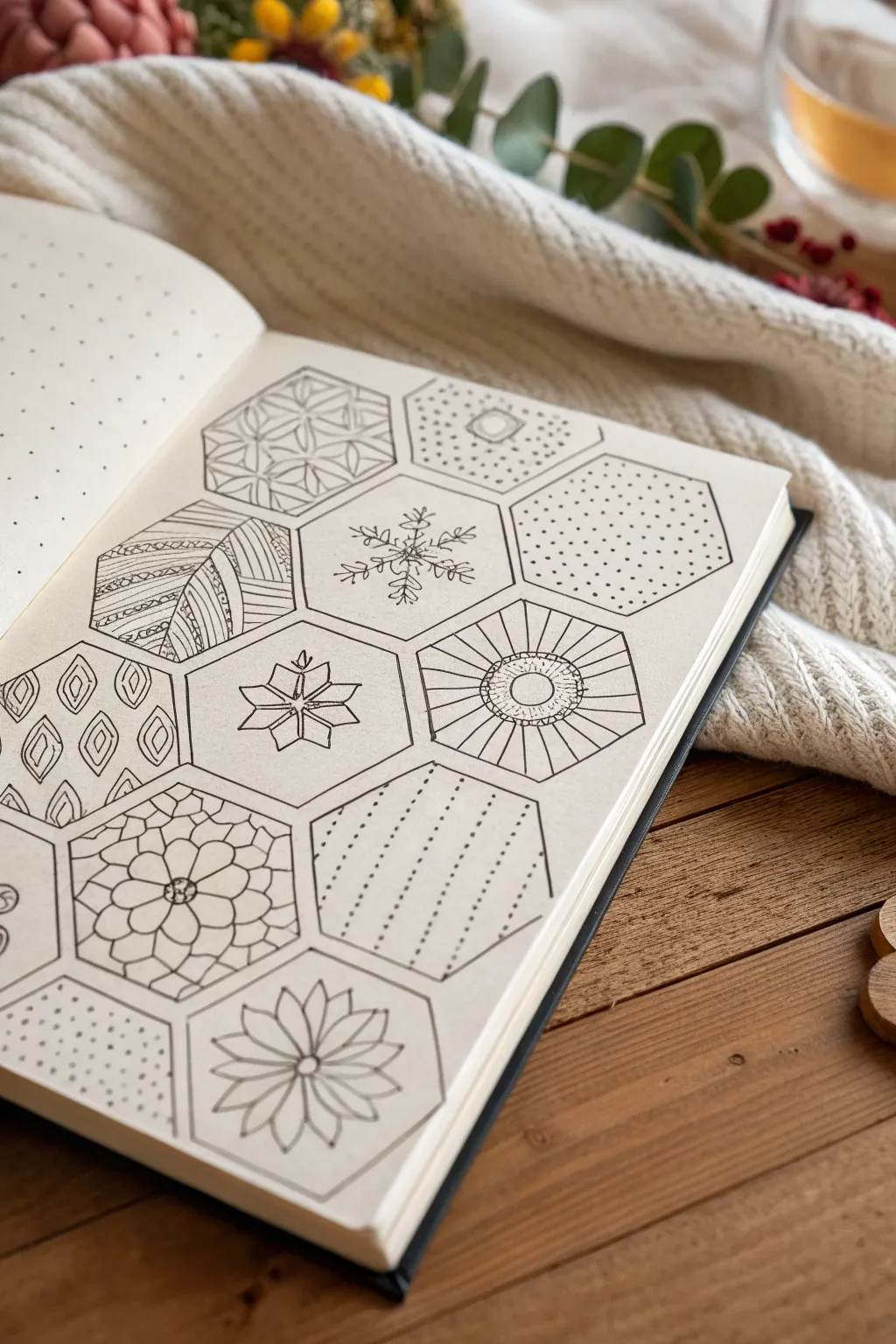
Fill your sketchbook with geometric charm by creating a honeycomb of patterned hexagons. This relaxing drawing exercise mimics the look of a patchwork quilt, allowing you to experiment with diverse textures and motifs in bite-sized spaces.
Step-by-Step Tutorial
Materials
- Dotted grid sketchbook (A5 or similar)
- Fine liner pen (black, 0.3mm or 0.5mm)
- Ruler or straight edge
- Pencil (HB for sketching)
- Eraser
Step 1: Setting the Grid
-
Map the layout:
Begin by counting the dots on your grid paper to establish spacing. A good size for these hexagons is usually 4-5 grid units per side. Use your pencil to lightly mark the six corner points of your first central hexagon. -
Draft the first hexagon:
Connect your pencil dots using a ruler to form the first clean hexagon shape. This will act as your anchor for the rest of the pattern. -
Expand the hive:
Draw adjacent hexagons that share sides with your central shape. Ensure the parallel lines remain consistent with the dot grid to keep everything symmetrical. Aim for a cluster of about 10-12 hexagons on the page. -
Ink the outlines:
Once you are happy with the pencil layout, trace over the hexagon perimeters with your fine liner pen. Use the ruler for crisp, defined edges. -
Clean up:
Wait a moment for the ink to set completely, then gently erase all the underlying pencil marks to reveal a clean honeycomb structure.
Uneven Hexagons?
If your shapes look wonky, count grid dots! Standardize the size (e.g., 4 dots per side) so every angle matches perfectly.
Step 2: Patterning the Blocks
-
Geometric Flower:
In one hexagon, draw a small circle in the center. Sketch 8-12 petals radiating outward until they touch the hexagon’s edge, creating a stained-glass floral look. -
Dotted Texture:
For a simple filler, take a hexagon and fill it entirely with small, evenly spaced dots (stippling). Keep the spacing consistent for a clean, fabric-like appearance. -
Snowflake Motif:
Find the center of a blank hexagon. Draw a vertical line and two diagonal crossing lines. Add small ‘V’ shapes to the ends of these lines to create a delicate snowflake crystal. -
Striped Patchwork:
Divide a hexagon into three or four uneven sections using straight lines. Fill each section with a different pattern—diagonal hatching, small circles, or zig-zags—to mimic crazy quilting. -
Radiant Burst:
Draw a larger circle in the center of a hexagon. Use your ruler to draw lines radiating from the circle’s edge to the hexagon’s corners and midpoints, creating a sunburst effect. -
Diamond Lattice:
Create an overlapping diamond pattern by drawing diagonal grid lines in both directions across a hexagon. Add a small dot inside each resulting diamond for extra detail. -
Leafy Vibe:
Draw simple leaf shapes horizontally or vertically across a hexagon. I prefer to keep these simple with just a center vein and an outline. -
The Cube Illusion:
Connect the center point of a hexagon to every other corner. This creates three diamonds meeting in the middle, giving the illusion of a 3D cube. Fill each diamond with a different hatching direction. -
Dotted Stripes:
Draw parallel lines across a hexagon, but instead of solid lines, use rows of dots. Vary the density of the dots to create visual interest. -
Flower Power:
Draw a large, multi-petaled flower that touches exactly six points of the hexagon interior. Add a second layer of smaller petals inside for depth. -
Simple Dashes:
Fill a remaining hexagon with vertical dashed lines. This mimics running stitches often found in hand-quilting.
Step 3: Final Touches
-
Check balance:
Look at the overall page. If some hexagons look too ‘heavy’ with dark ink, balance them by adding slightly darker details to a hexagon on the opposite side. -
Erase again:
Do a final pass with your eraser to remove any stray pencil marks from your sketching phase inside the patterns.
Vary Line Weight
Use a thicker pen (0.8mm) for the hexagon borders and a thinner pen (0.3mm) for internal patterns to make the designs pop.
Close your sketchbook knowing you’ve created a unique sampler of textures and designs

PENCIL GUIDE
Understanding Pencil Grades from H to B
From first sketch to finished drawing — learn pencil grades, line control, and shading techniques.
Explore the Full Guide
Simple Leaf Repeat Patterns
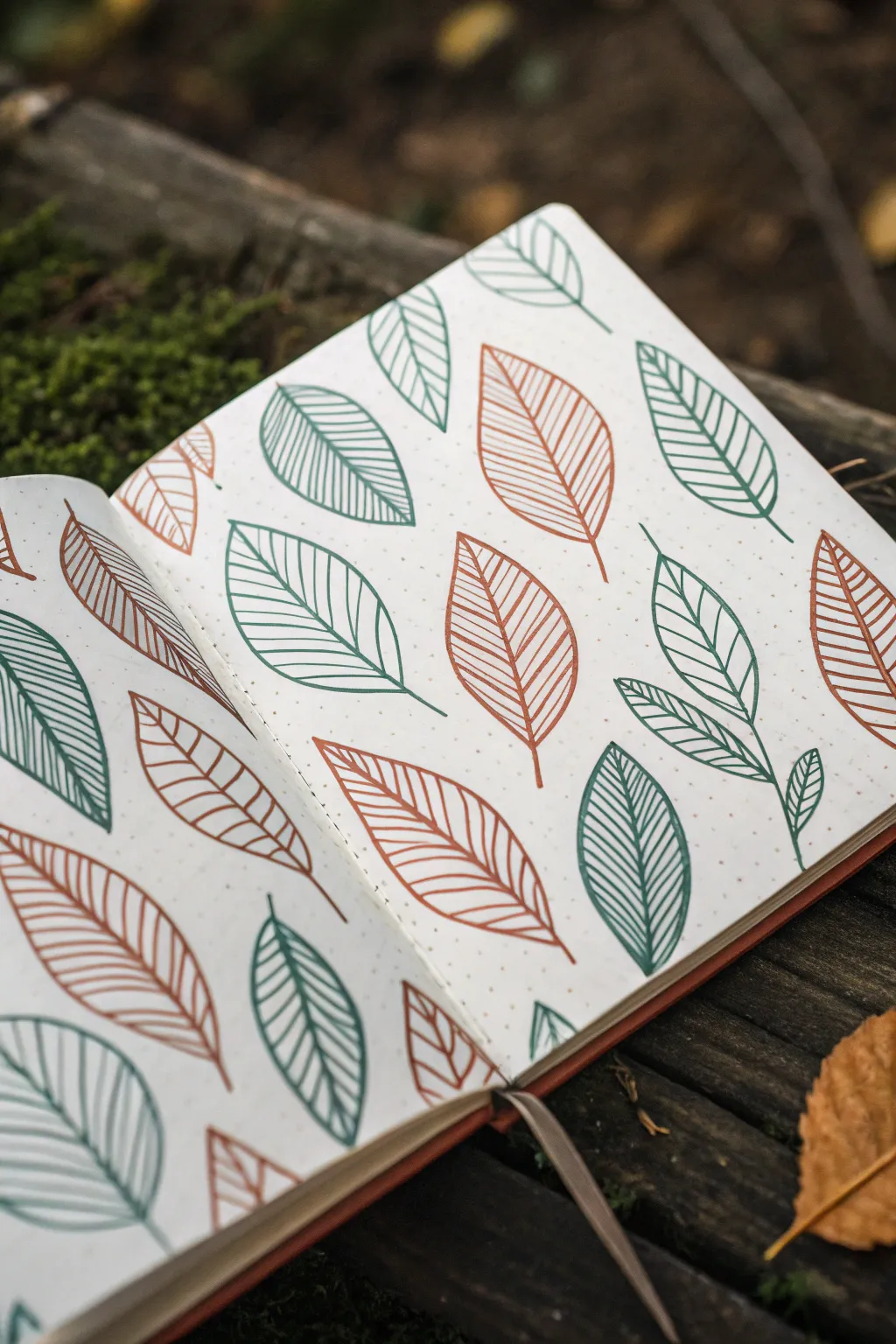
Capture the essence of autumn with this minimalist leaf pattern, perfect for filling the pages of your bullet journal or sketchbook. Using just two earthy tones creates a warm, rhythmic design that feels organic and cozy.
How-To Guide
Materials
- A5 Dot grid notebook or sketchbook
- Fine liner pen (Teal/Dark Green, approx. 0.4mm – 0.5mm)
- Fine liner pen (Rust/Burnt Orange, approx. 0.4mm – 0.5mm)
- Ruler (optional, but helpful for spacing)
- Pencil and eraser (for rough sketching)
Step 1: Setting the Composition
-
Analyze the spacing:
Before putting pen to paper, look at your dot grid. The beauty of this pattern lies in its random but balanced scatter. You want the leaves to point in various directions without crowding each other. -
Pencil placement:
Lightly mark small ‘X’s or dots with a pencil where you plan to place the center of each leaf. Aim for roughly 3-4 centimeters between each mark to keep the layout airy. -
Vary the angles:
Ensure your placement marks suggest different rotations. Some leaves should point up, others down, and some diagonally to create a dynamic ‘falling leaves’ effect.
Uneven Lines?
If your vein lines look too shaky, try drawing them faster. A quick, confident stroke is often straighter than a slow, hesitant one. Embrace the imperfections as style.
Step 2: Drawing the Base Shapes
-
Start with Teal:
Pick up your teal or dark green fine liner. Select about half of your marked spots to be this color. Start by drawing a central spine line for the first leaf, slightly curved for a natural look. -
Form the outline:
Draw the outer shape of the leaf. I find it easiest to start from the base of the spine, curve out wide, and taper back in to meet the tip of the spine perfectly. -
Repeat the green shapes:
Continue drawing these empty green leaf outlines across the spread. Remember to vary their sizes slightly—some can be short and stout, others long and slender. -
Switch to Rust:
Now, take your rust or burnt orange pen. Fill in the remaining pencil marks with the same leaf outline technique: central spine first, then the curved borders. -
Check the balance:
Step back and look at your spread. If there are large empty gaps, add a few smaller leaves in either color to fill the negative space without overcrowding.
Step 3: Adding the Veins
-
Understanding the vein style:
The veins in this design are simple, straight(ish) lines that run from the central spine to the outer edge. They don’t need to be perfectly parallel. -
Detailing the Teal leaves:
Return to your teal pen. Starting near the bottom of a leaf, draw diagonal lines outward from the spine to the edge. Space them about 2-3mm apart. -
Keep a steady hand:
Try to make the lines touch both the spine and the outer edge cleanly. If you overshoot slightly, don’t worry—it adds to the hand-drawn charm. -
Detailing the Rust leaves:
Switch back to the orange pen and repeat the process. Match the angle of the veins to the curve of the leaf; if the leaf curves left, angle your veins slightly to follow the flow. -
Add variance:
On a few leaves, you can change the density of the veins. Making them closer together creates a darker value, while spacing them out keeps the leaf looking lighter.
Add Watercolor
Instead of drawing veins, use a wet brush to lightly pull the ink from the outline into the center, creating a soft, tinted wash inside each leaf.
Step 4: Finishing Touches
-
Draw the stems:
Go back to every leaf and add a short, distinct stem line extending from the base. Make this a single, confident stroke. -
Create clusters:
For added visual interest, find one or two spots where you can draw a smaller leaf ‘behind’ or attached to a larger one, as if they are overlapping slightly. -
Erase guidelines:
Once the ink is completely dry (give it at least 5 minutes to prevent smudging), gently erase any visible pencil marks from your initial planning.
Now you have a full spread of autumnal foliage ready to frame your notes or daily thoughts
Feather Outline With Pattern Barbs
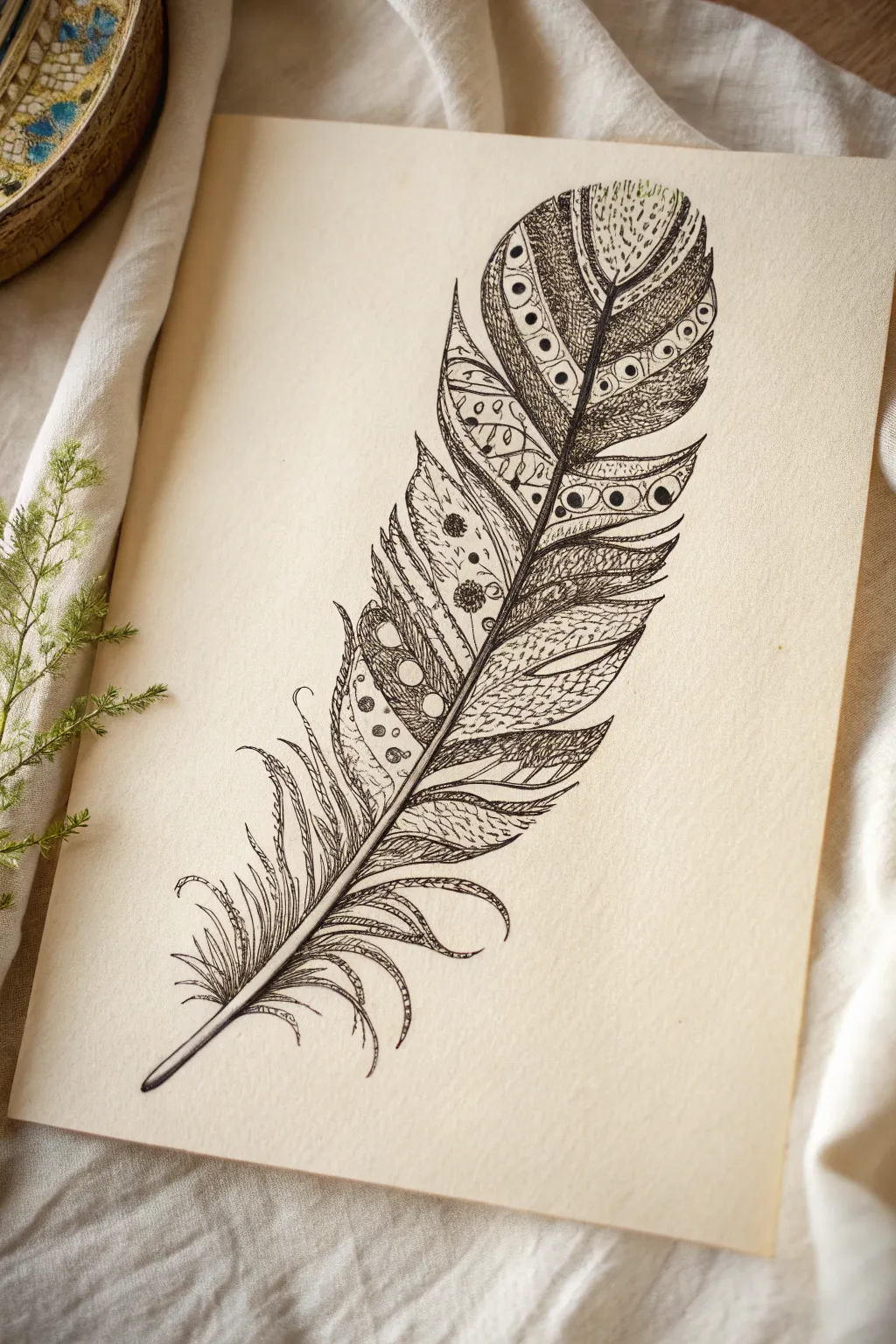
This intricate ink drawing combines the organic flow of a natural feather with the geometric precision of Zentangle-inspired patterns. The result is a striking black-and-white illustration perfect for framing or scanning for digital prints.
Detailed Instructions
Materials
- Fine-tooth drawing paper or Bristol board (cream or white)
- HB pencil
- Kneaded eraser
- Fine liner pens (sizes 0.05, 0.1, 0.3, and 0.5mm)
- Ruler (optional for reference)
Step 1: Sketching the Framework
-
Draw the rachis:
Begin by lightly sketching a central shaft (rachis) with your HB pencil. Create a gentle curve, starting slightly thicker at the bottom (the quill) and tapering to a fine point at the top. It shouldn’t be perfectly straight; a slight ‘S’ curve adds natural movement. -
Map the feather shape:
Lightly outline the overall silhouette of the feather around the shaft. Don’t make it a perfect oval. Instead, create distinct sections or ‘clumps’ of barbs. Some sections near the bottom should be loose and separated, while the top remains more cohesive. -
Define the sections:
Within your outline, draw faint dividing lines to separate the feather into distinct bands or zones. These zones will later hold different patterns. Think of them like stained glass segments.
Step 2: Inking the Outlines
-
Ink the shaft:
Using a 0.3mm or 0.5mm pen, trace your pencil line for the central shaft. Make the line confident and smooth. Leave the very bottom tip open slightly if you want a faded look, or close it off for a clean quill. -
Outline the major barbs:
Switch to a 0.1mm pen to trace the outer edges of the feather sections. Instead of a smooth continuous line, use slightly jagged or wavy strokes to mimic the texture of hair-like barbs. Allow some lines to split at the ends. -
Create the segments:
Draw the internal dividing lines you sketched earlier. These lines act as barriers between your different pattern styles. Keep them lighter than the main outline.
Ink Confidence
Don’t worry about wobbles! If a line isn’t perfectly straight, simply go over it again to thicken it slightly. This adds character.
Step 3: Filling with Patterns
-
Plan your patterns:
Look at the different segments. You want high contrast between adjacent sections. If one section is dark and dense, make the neighbor light and airy. -
Add circular motifs:
In the upper sections, use your 0.1mm pen to draw rows of small circles or ‘eyes.’ Surround these with heavy stippling (lots of tiny dots) to make the white circles pop against a dark background. -
Draw cross-hatching:
Select a long, narrow segment on the right side. Fill it with fine, diagonal cross-hatching. This mimics the natural texture of a feather while adding shading depth. -
Incorporate flowery doodles:
For the wider middle sections, add organic shapes like small flowers or paisley-like swirls. Leave plenty of negative space around them so they don’t look muddy. -
Create striped zones:
Fills a lower segment with simple, parallel curved lines. I like to vary the pressure here, making the lines thicker where they meet the central shaft and thinner as they move outward. -
Detail the loose bottom barbs:
The bottom of the feather is usually fluffy and disorganized (the ‘downy’ part). Draw individual, long, wavy strokes here. Don’t fill these with patterns; keeping them as simple lines creates a nice contrast with the heavy patterns above.
Gold Leaf Accent
For a luxe upgrade, paint the central shaft or fill specific geometric shapes (like the circles) with gold watercolor or metallic leaf.
Step 4: Refining and Polishing
-
Thicken key lines:
Take your 0.5mm pen and go back over the major dividing lines between sections. Thickening these boundaries helps separate the visual noise and makes the design readable. -
Add shading:
Using the 0.05mm pen, add tiny hatching lines right next to the central shaft on both sides. This gives the illusion that the feather curves inward toward the quill. -
Fill the darkest areas:
Look for spots that need more contrast. Color in the small gaps between circles or in the deep corners of your patterns to anchor the drawing. -
Erase pencil marks:
Wait at least 10 minutes to ensure the ink is bone-dry. Then, gently use the kneaded eraser to lift all visible pencil guidelines. Be careful not to crinkle the paper. -
Final touches:
Review the outer edges. Add a few stray, flyaway hairs or tiny dots around the perimeter to soften the silhouette and make it feel more organic.
Your beautifully patterned feather is now ready to be framed as a standalone piece or added to a larger nature journal collection


Abstract Shape Islands With Textures
This relaxing sketchbook exercise combines rhythmic stippling with an exploration of nature-inspired textures. It’s a wonderful way to practice pen control while creating a balanced composition of organic forms and geometric patterns.
Step-by-Step Guide
Materials
- Dotted or blank journal/sketchbook
- Fine liner pen (black, 0.3mm or 0.5mm)
- Pencil (HB or 2B)
- Eraser
- Ruler (optional)
Step 1: Setting the Stage: The Fade Pattern
-
Define the boundary:
Begin on the left-hand page. Use your pencil to lightly sketch a diagonal line from the top left corner to the bottom right, roughly marking where your texture will fade out. -
Anchor the corner:
With your fine liner, start in the very bottom-left corner of the page. Draw small, distinct circles or solid dots. Keep them tightly packed here to create a sense of density. -
Expand the field:
Work your way diagonally upwards and outwards from that corner. As you move away from the dense area, increase the space between your dots. Instead of solid dots, switch to small, open circles for a lighter visual weight. -
Create the gradient:
Continue spreading the pattern until you reach the middle of the page. Here, spacing should be quite wide—maybe an inch or two between marks. This creates a gradient effect from heavy to light. -
Add a focal point:
Near the top-right of your dotted field, draw a simple, small leaf shape. Fill it with curved cross-hatching to give it a bit of volume, making it float above your texture field.
Ink Bleeding?
If your pen bleeds through the paper, place a loose sheet of scrap paper underneath the page you are working on to protect the next fresh page.
Step 2: Building the Texture Library
-
Outline organic shapes:
On the right-hand page, use a pencil to lightly draw 8-10 distinct shapes. Think of ‘islands’—some circular, some fern-like, some shell-shaped. Scatter them evenly across the page. -
Detail the fern leaf:
Start with the large, fern-like shape in the upper left. Draw a central spine with your pen. Then, add tiny, intricate fronds branching off, keeping the lines wiggly and natural. -
Draw the sea urchin:
For the circular shape near the top right, visualize a sea urchin. Draw a central point and radiate squiggly lines outward to the edge of the circle. -
Create the shell texture:
Find a rounded shape mid-page. Divide it into segments like a seashell. Fill each segment with closely spaced parallel lines that curve with the shape’s contour. -
Construct the geo-crystal:
Locate a shape on the left side. Draw a geometric, crystal-like form with straight lines. Fill the facets with parallel lines running in alternating directions to suggest light reflection. -
Stipple the sphere:
For a circular shape near the center, outline it in ink. Fill the interior with concentric circles made entirely of tiny stipple dots, getting denser toward the center. -
Pattern the spores:
Choose a circle near the bottom. Draw various small circles inside it. Fill each small circle with a dot or a tiny spiral, leaving the background white. -
Invert the swirl:
For the shape in the bottom right corner, draw a pinwheel pattern. Color every other section solid black to create high contrast against the white page. -
Add the botanical star:
In an empty space, draw a starburst or flower shape. Instead of standard petals, make them jagged and textured like dried foliage.
Step 3: Refinement
-
Deepen contrasts:
This is where I like to pause and scan the whole page. Look for areas that feel too light. Go back into your ‘sea urchin’ or ‘fern’ and thicken some lines to add depth. -
Erase guidelines:
Once the ink is completely dry (wait at least 5 minutes to avoid smudging), gently erase all your pencil outlines.
Go chromatic
Try using a different color fine liner (like sepia or dark blue) for every third texture island to add subtle variation without breaking the harmony.
Now you have a unique catalogue of textures ready to be applied to larger pieces of art
Checkerboard of Mixed Linework
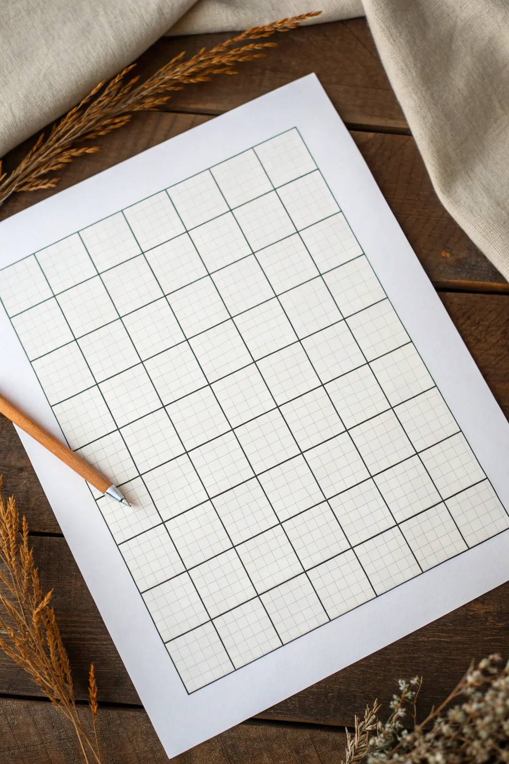
Before diving into intricate patterns, every mixed linework project needs a perfect skeleton to hold it all together. This tutorial walks you through drafting a precise major and minor grid structure that serves as the ideal playground for your creative doodles.
Step-by-Step
Materials
- High-quality white drawing paper (A4 or letter size)
- Ruler (preferably clear plastic)
- Fine liner pen (0.5mm, black)
- Fine liner pen (0.1mm or 0.05mm, light grey or thinner black)
- Pencil (HB or H)
- Eraser
- Protractor or set square (to ensure 90-degree angles)
Step 1: Planning the Layout
-
Calculate margins:
Begin by measuring your paper size. Determine a comfortable margin around the edge, usually about 1 inch (2.5 cm) on all sides, to frame your work nicely. -
Mark the corners:
Using your pencil and ruler, lightly mark four dots representing the corners of your main grid area based on the margins you just calculated. -
Define the major grid size:
Decide on the size of your large ‘container’ blocks. For this project, 1.5-inch or 4-cm squares work beautifully. Calculate how many fit within your marked corners to determine the final grid dimensions.
Clean Lines Pro Tip
Tape a penny to the underside of your ruler. This raises the edge slightly off the paper, preventing the ink from bleeding under the ruler and smearing.
Step 2: Drafting the Major Grid
-
Draw the perimeter:
Connect your corner marks with a pencil to create the outer boundary rectangle. Use a set square or protractor to ensure your corners are perfectly 90 degrees. -
Mark the intervals:
Along the top and left edges of your rectangle, make small tick marks at your chosen interval (e.g., every 4 cm) to define the columns and rows. -
Repeat markings:
Repeat these tick marks on the bottom and right edges. Having marks on both sides ensures your ruler stays straight when you draw the connecting lines. -
Pencil in the major lines:
Lightly connect opposing tick marks with your pencil to form the main grid of large squares. Keep your pressure light so these lines can be easily adjusted or erased later.
Level Up: Dot Grid
Instead of full lines for the minor sub-grid, used small dots at the intersections. This creates a cleaner, less intrusive guide for your pattern work.
Step 3: Adding the Minor Sub-Grid
-
Determine sub-grid density:
Within each large square, you’ll want a finer mesh. dividing each large square into a 4×4 or 5×5 pattern is standard. If your large square is 4 cm, mark every 0.8 cm or 1 cm. -
Mark sub-intervals:
Along the top edge of your very first row, mark these smaller intervals. I find it helpful to only mark the top and left edges initially to avoid cluttering the paper. -
Draft the vertical sub-lines:
Carefully draw vertical lines down the entire page at these small intervals. Use the major grid lines as guides to keep your ruler parallel. -
Draft the horizontal sub-lines:
Do the same horizontally, drawing lines across the full width to complete the graph-paper look. You should now have a page covered in tiny pencil squares.
Step 4: Inking the Structure
-
Ink the minor grid:
Start with your thinnest pen (0.05mm or a light grey liner). Trace over your pencil lines for the small sub-grid. Hand-drawn lines add character, but using a ruler here creates that crisp, technical look shown in the photo. -
Ink the major grid:
Switch to your thicker pen (0.5mm). Trace over the lines that form the larger squares. This line weight hierarchy is crucial; it visually separates your ‘working zones’ from the background grid. -
Let it dry:
Give the ink a solid 5 to 10 minutes to dry completely. Smudging fresh ink with an eraser is heartbreaking after all that precision work. -
Clean up:
Gently erase all underlying pencil marks. Hold the paper taut with one hand while erasing to prevent the paper from crinkling. -
Paper check:
Brush away all eraser dust and inspect your lines. If any segments look faint, touch them up carefully with the appropriate pen size.
You now have a pristine, professional-grade canvas ready for your creative pattern designs
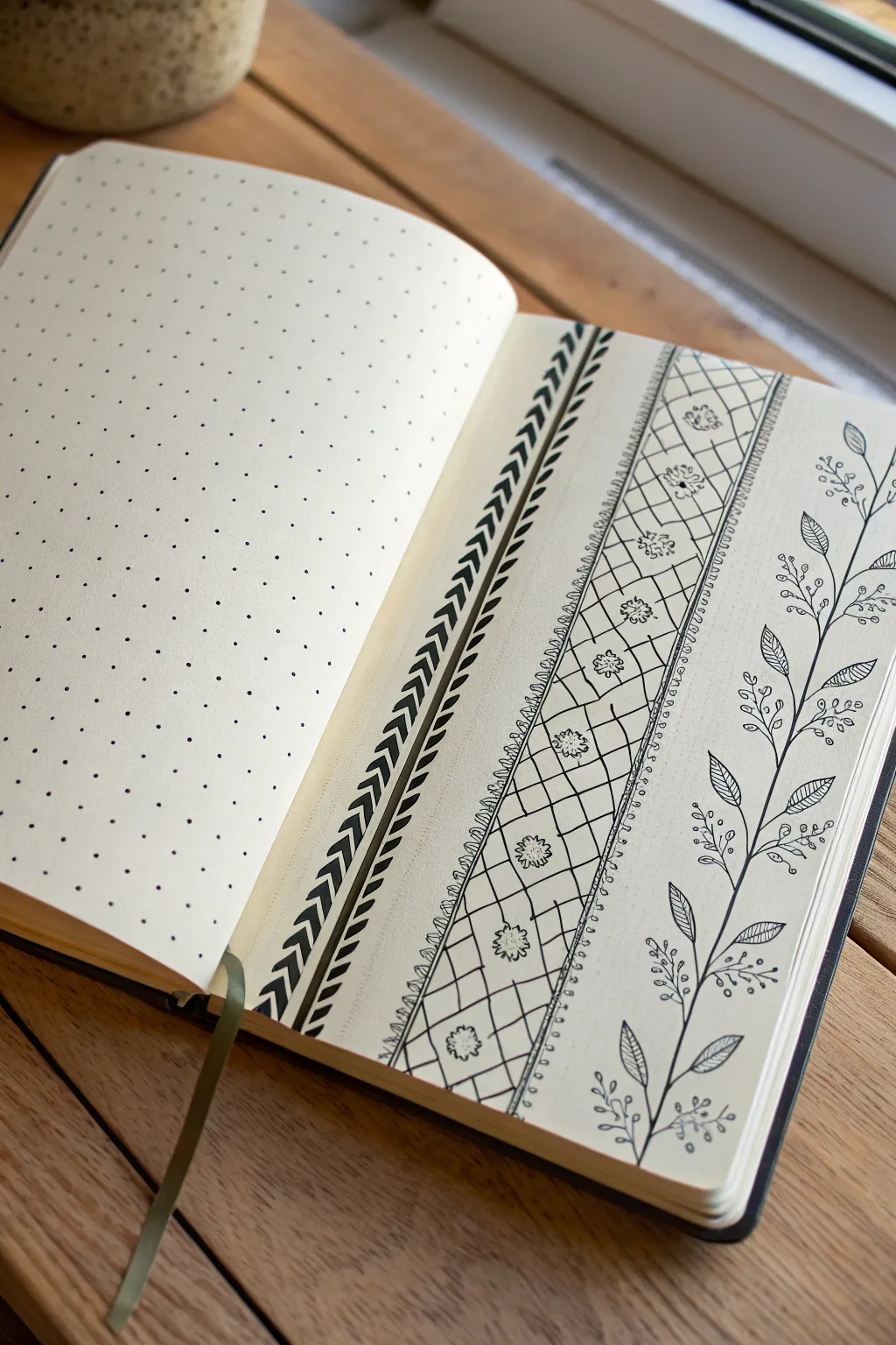
Bookmark-Style Vertical Design Panels
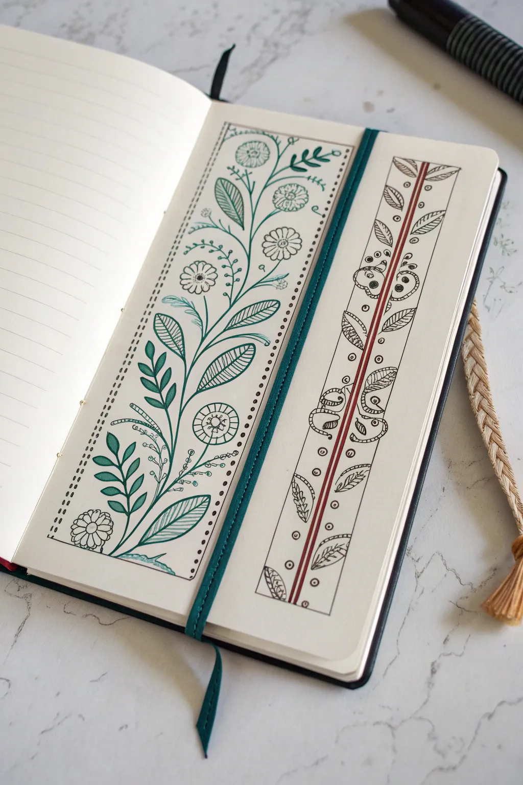
Transform a plain journal page into a garden of creativity with these elegant vertical bookmark-style panels. Using simple fineliners and a touch of teal, you’ll create structured yet organic floral designs that perfectly frame your writing space.
How-To Guide
Materials
- Dotted or lined journal (A5 size recommended)
- Ruler (clear acrylic is helpful)
- Pencil (HB or 2B)
- Eraser (kneaded or soft vinyl)
- Black fineliner pen (0.3mm or 0.5mm)
- Teal or dark green felt-tip pen/marker
- Red-brown or burgundy fineliner pen (optional for right panel)
Step 1: Setting the Structure
-
Define the boundaries:
Start by deciding on the placement of your vertical panels. For the left design (the teal floral), draw a long rectangle roughly 2.5 inches wide and 7 inches tall using your pencil and ruler. -
Create the border guides:
Inside this first rectangle, lightly sketch a second, smaller rectangle about a quarter-inch inward from the edge to create a frame area. -
Outline the second panel:
For the right-hand design (the patterned strip), draw a narrower rectangle next to the first one, approximately 1.5 inches wide. Divide this narrow rectangle vertically down the center with a double line to act as the central stem.
Step 2: The Teal Botanical Panel
-
Draw the main stem:
Switch to your teal or dark green pen. Start from the bottom left corner of the inner rectangle and draw a long, curving S-shaped line that reaches toward the top right corner. This is your main vine. -
Add major leaves:
Sketch large, pointed oval leaves branching off the main vine. Alternate their placement—one left, one right. Fill these leaves with simple hatching (diagonal lines) to add texture without solid coloring. -
Incorporate sprigs:
Between the large leaves, add smaller sprays of foliage. Draw three to five small teardrop shapes fanning out from a single point on the stem to create a fuller look. -
Sketch the flowers:
Using a black fineliner, draw simple circular flower heads interspersed among the teal leaves. A circle with radiating petals or a wheel-spoke design works beautifully here. -
Complete the frame:
Go back to the outer border of this panel. Instead of a solid line, use your black pen to create a dashed or dotted line along the pencil guide. This softens the edge and adds a stitched effect.
Ink Confidence
Worried about shaky lines? Pull the pen toward your body rather than pushing it away for smoother, straighter strokes.
Step 3: The Geometric Leaf Strip
-
Ink the central spine:
Moving to the narrower right panel, trace the central vertical double-line using a reddish-brown or burgundy pen to make it stand out as the ‘spine’ of the design. -
Add symmetric leaves:
With your black fineliner, draw small, simple leaves branching out from the central red spine. Unlike the organic left panel, keep these relatively symmetrical and spaced evenly. -
Fill with texture:
Add detail to these leaves by drawing a center vein and tiny diagonal veins in each one. Keep the lines light and crisp. -
Draw decorative spirals:
In the negative space between the leaves, draw small curled fern shapes or spirals. These fill the gaps and add a whimsical touch. -
Add filler circles:
Sprinkle tiny open circles or dots in any remaining open white space within the panel to balance the composition. -
Frame it up:
Use your black fineliner to draw a solid, straight line over your pencil guides to encase this narrow panel, giving it a crisp, finished look. -
Final touches:
Once the ink is completely dry—I usually wait at least five minutes to be safe—gently erase all underlying pencil marks to reveal your clean design.
Golden Touch
Add tiny accents of metallic gold gel pen to the centers of the flowers or the veins of the leaves for a luxurious finish.
You now have a beautifully decorated spread that invites you to fill the pages with your thoughts
Ribbon Bands Filled With Patterns
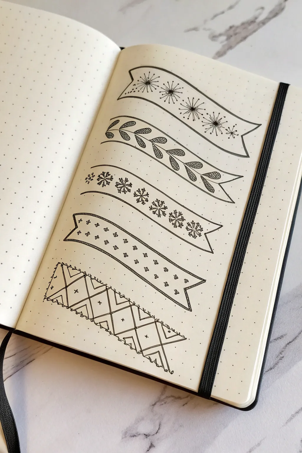
Add flair to your headers with these five distinct ribbon banner designs, ranging from elegant botanical motifs to structured geometric lattices. These hand-drawn elements are perfect for separating sections or highlighting titles in your bullet journal spreads.
Step-by-Step Tutorial
Materials
- Dotted grid notebook or journal paper
- Fine liner pen (0.3mm or 0.5mm)
- Thinner fine liner pen (0.1mm) for details
- Pencil
- Eraser
- Ruler (optional)
Step 1: Planning the Layout
-
Pencil Sketching:
Begin by lightly sketching five curving ribbon shapes with your pencil. Use the dot grid to help keep their widths consistent and their curves balanced. -
Define the Ends:
For the first two and the fourth ribbons, draw V-shaped notches at the ends to create a classic banner look. This simple detail instantly identifies them as ribbons. -
Add Ribbon Tails:
For the third and fifth designs, sketch folded ‘tails’ that appear to go behind the main banner strip. This adds a nice 3D effect to the page.
Keep it flowing
Rotate your notebook as you draw curves. It’s much easier to pull the pen toward your body in a natural arc than to push it away or draw sideways.
Step 2: Inking the First Design: Starbursts
-
Outline the Banner:
Go over your first pencil banner with the 0.3mm fine liner. Keep your lines smooth and confident. -
Draw Centers:
Place small dots evenly spaced along the center of the ribbon. These will be the anchors for your starbursts. -
Create Rays:
Using the thinner 0.1mm pen, flick lines outward from each center dot. Vary the lengths slightly so they look natural and explosive. -
Add Detail:
Draw tiny circles at the tips of some of the longer rays to finish the dandelion-like effect.
Step 3: Inking the Second Design: Leaves
-
Create the Stem:
Ink the outline of the second banner. Draw a central wavy line running through the middle to act as the vine or stem. -
Add Leaves:
Draw pairs of almond-shaped leaves branching off the central stem. Angle them slightly to follow the curve of the ribbon. -
Texture the Leaves:
Fill the inside of each leaf with a tight cross-hatching or netting pattern using your thinnest pen. This creates a lovely contrast against the white background.
Uneven spacing?
If your pattern spacing looks off in pencil, don’t erase everything. Just adjust the neighboring elements slightly. Often, the busy pattern hides minor imperfections.
Step 4: Inking the Third Design: Snowflake Flowers
-
Outline with Tails:
Ink the third banner, paying close attention to the folded tails at the ends. The banner body is just two parallel curved lines here. -
Draw Stems:
Sketch a simple single line stem running along the bottom curve. -
Add Snowflake Shapes:
Along the top of the stem, draw stylized snowflake or asterisk shapes. Vary their complexity—some can be simple six-pointed stars, others can have branched tips.
Step 5: Inking the Fourth Design: Delicate Specks
-
Double Border:
Ink the main shape of the fourth banner. Then, carefully draw a second line just inside the top and bottom borders to create a thin rim. -
Fill the Space:
Scatter tiny shapes throughout the ribbon. You can use mini hearts, small clovers, or simple three-dot clusters. Keep them random but evenly distributed.
Step 6: Inking the Fifth Design: Geometric Lattice
-
Structural Lines:
Ink the outline of the final, widest banner. I find it helpful to draw the vertical division lines first to break the ribbon into segments. -
Create the X Pattern:
Draw an ‘X’ inside each rectangular segment. Try to make the lines meet perfectly in the corners. -
Inner Details:
Draw a smaller diamond shape inside each ‘X’ intersection, or simply add a floating cross in the negative spaces for extra detail. -
Exterior Decoration:
Finish by adding small scalloped loops along the top and bottom edges of the banner for a lace-like trim. -
Clean Up:
Once the ink is completely dry—give it a minute or two to prevent smudging—erase all your underlying pencil sketches.
Now you have a versatile set of page dividers ready to enhance your next journal entry
Negative Space Letter Design
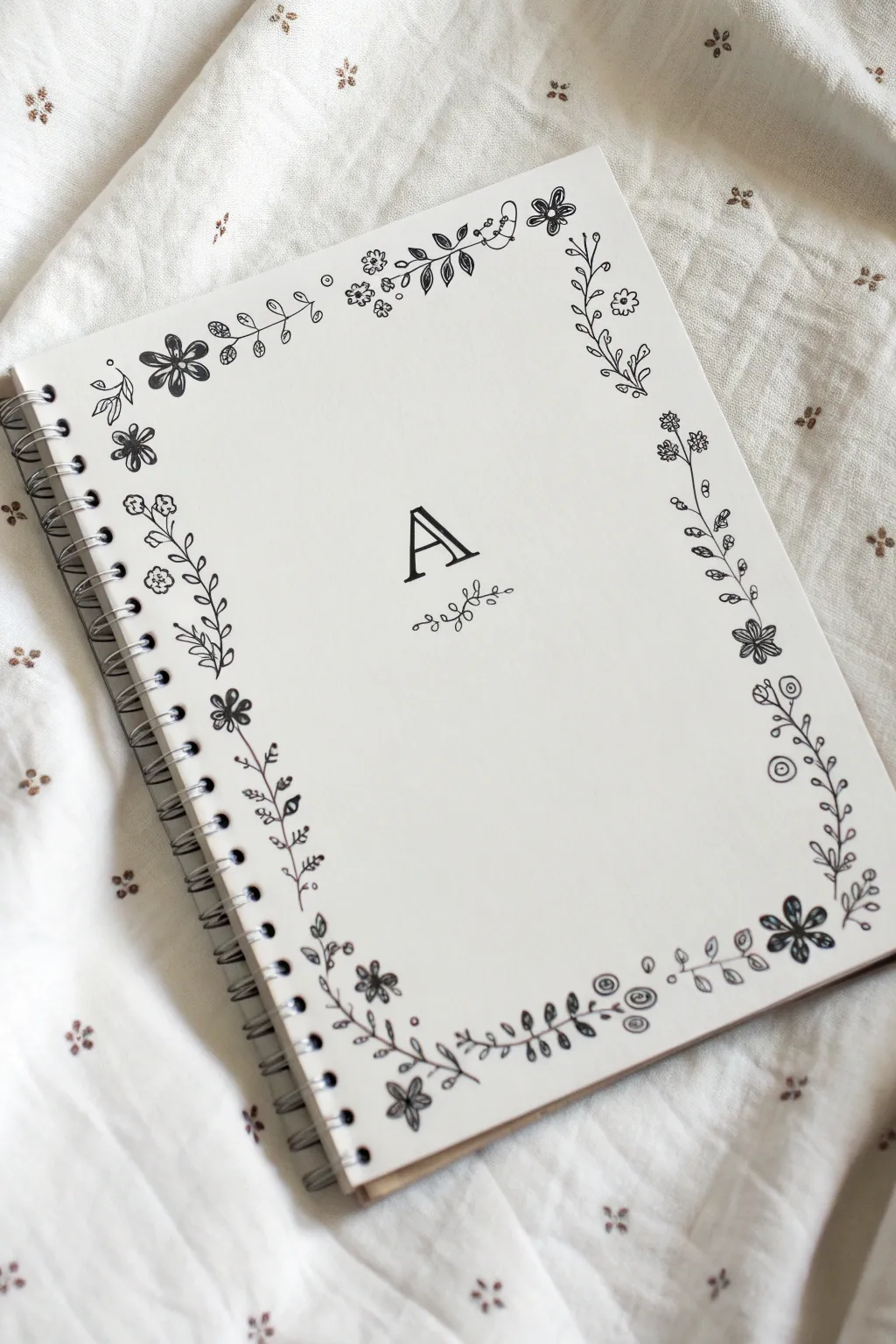
Transform a plain spiral notebook into a personalized keepsake with this delicate floral border design. Featuring a classic serif monogram surrounded by wandering vines and blooms, this project combines simple line drawing with elegant typography for a clean, sophisticated look.
Step-by-Step
Materials
- White spiral-bound sketchbook or notebook (hardcover preferred)
- Pencil (HB or H for light lines)
- Fine-liner pen (0.3mm or 0.5mm, black)
- Thicker marker or brush pen (black) for the letter
- Ruler
- Eraser (kneaded prefered)
- Scrap paper for sketching
Step 1: Planning the Layout
-
Find the center:
Begin by using your ruler to lightly mark the exact center point of the notebook cover with your pencil. This ensures your monogram sits perfectly in the middle. -
Draft the monogram:
In the center, lightly sketch your chosen letter. For the style shown, aim for a classic serif font about 1.5 to 2 inches tall. Focus on making the vertical strokes thick and the horizontal strokes thin. -
Refine the letter shape:
Go over your sketch to sharpen the serifs (the little feet at the ends of the lines). If drawing the ‘A’ as pictured, leave a small gap in the crossbar for a stylistic touch, or keep it solid. -
Sketch the border guide:
Lightly draw a rectangular guideline about 1 inch inward from the edges of the notebook. This won’t be inked, but it will help keep your floral vines from wandering too far inward or falling off the page.
Steady Hand Trick
Rest your wrist on a scrap piece of paper while drawing. This prevents hand oils from getting on the cover and keeps your hand from smudging wet ink as you move across the page.
Step 2: Drawing the Floral Border
-
Start the corners:
Sketch the main corner elements first. Draw small clusters of simple five-petal flowers or larger singular blooms in two opposite corners to anchor the design. -
Draw the vines:
Connect your corner elements by sketching a wavy, organic vine line that travels along your pencil guide. Don’t make it a straight line; let it meander naturally. -
Add leaves:
Along the vine, draw small pairs of leaves. Vary their size and angle to make them look more natural, similar to how leaves grow on a real stem. -
Incorporate varied blooms:
In the gaps between leaf sections, sketch different types of small flowers. Try simple daisies, tulip shapes, or berries. I like to group three small circles together to suggest buds. -
Vary the density:
Ensure some areas are denser with foliage while others are sparse. The variety makes the border feel hand-drawn and organic rather than stamped.
Add Some Dimension
Use a grey marker or a very diluted black watercolor wash to add tiny drop shadows to one side of the leaves and the monogram letter. This makes the design pop off the page.
Step 3: Inking and Details
-
Ink the central letter:
Using your thicker marker or brush pen, carefully trace your monogram. Fill in the thick downstrokes completely to give the letter weight and prominence. -
Add the underline flourish:
Beneath the letter, use your fine-liner to draw a tiny, symmetrical vine flourish. It acts as a pedestal for the monogram. -
Start inking the border:
Switch to your fine-liner pen. Begin tracing your pencil sketches, starting with the main flowers. Keep your hand relaxed to avoid shaky lines. -
Trace the vines:
Connect the flowers with the vine lines. It’s okay if you deviate slightly from your pencil sketch; often the spontaneous ink lines look better. -
Add texture to flowers:
For the larger flower centers, add small dots or scribbles. For leaves, you can draw a single line down the center for the vein. -
Fill in tiny details:
Look for empty spaces that feel unbalanced. Add tiny floating dots or singular leaves to fill these gaps without overcrowding the design.
Step 4: Finishing Touches
-
Let the ink set:
This is crucial—wait at least 10-15 minutes for the ink to dry completely. Smearing your hard work at the end is heartbreaking. -
Erase guidelines:
Gently erase the pencil border guide and the initial sketch under the monogram. Hold the paper taut so it doesn’t crinkle. -
Final check:
Review your drawing for any lines that need thickening or unconnected vines, and touch them up with your fine pen.
Now you have a beautifully customized notebook ready for journaling or sketching
Split-Page Mirror Symmetry Patterns
This elegant bullet journal divider combines bold geometric lines with delicate floral work to create a striking vertical layout. The three distinct columns offer a perfect balance of structure and organic flow, turning a simple dot grid page into a work of art.
Step-by-Step Tutorial
Materials
- Dot grid notebook
- Fine liner pen (0.1mm or 0.3mm)
- Thicker black marker or brush pen (for the chevron pattern)
- Ruler
- Pencil
- Eraser
Step 1: Planning the Layout
-
Draft the columns:
Begin on the right-hand page of your dot grid notebook. Using a pencil and ruler, lightly mark out three vertical sections. The first section on the far left should be about 3 grid squares wide for the bold pattern. The middle section should be roughly 4-5 squares wide for the lattice work. The remaining space on the right is for the floral vine. -
Mark vertical guides:
Draw faint vertical pencil lines to define the boundaries of your center lattice column. These will help keep your pattern straight and even.
Step 2: The Bold Chevron Border
-
Draw the main vertical line:
Switch to your medium-thickness pen. Draw a straight vertical line separating your first narrow column from the central lattice column. Use a ruler to ensure it is perfectly crisp. -
Create the heavy line:
To the left of your straight line, leave a tiny gap and draw a second, slightly thicker vertical line. This acts as the anchor for your chevron pattern. -
Draft the chevrons:
In the leftmost space, draft a column of ‘V’ shapes or chevrons pointing upwards. Each chevron should be identical in height—using the dot grid as a guide makes this much easier. -
Fill the chevrons:
Using your thicker marker or brush pen, carefully fill in every other chevron stripe to create a bold, black-and-white diagonal effect. The contrast here is key, so make sure the black ink is solid.
Uneven Lines?
If your lattice grid lines look shaky, embrace it! Go over them a second time loosely to create a deliberate ‘sketched’ aesthetic rather than a rigid architectural one.
Step 3: The Central Lattice Panel
-
Create the border detail:
On the pencil lines defining your central column, draw a decorative border. Instead of a straight line, draw a series of tiny, tight loops or small scallops running all the way down both sides. -
Draw the grid:
Inside this scalloped border, draw diagonal lines to create a diamond lattice pattern. I find a ruler helps here, but freehand lines give it a charming, organic look. Space them about two grid squares apart. -
Add floral centers:
In the center of alternating diamond shapes, draw a small flower. A simple circle with 5-6 tiny petals works perfectly. Vary their placement so they don’t look too rigid. -
Add accent dots:
In the empty diamond spaces where you didn’t draw a flower, place a single small dot in the center to balance the design.
Add Some Color
Use mild highlighters to color in just the tiny flowers in the lattice or the berries on the vine. A soft pink or pale yellow adds pop without overwhelming the line art.
Step 4: The Delicate Floral Vine
-
Draw the main stem:
In the large empty space on the right, draw a long, wavy vertical line. Let it meander gently from the bottom of the page to the top; this is the spine of your plant. -
Add leaf branches:
Starting from the bottom, add small offshoot stems alternating left and right. On these stems, draw simple, detailed leaves. Draw a center vein in each leaf and add tiny diagonal hatching lines for texture. -
Intersperse berry sprigs:
Between the leafy branches, add different offshoots with small clusters of berries or buds. Draw these as thin stems branching into three tiny circles. -
Fill the space:
Continue alternating between the textured leaves and the berry sprigs until you reach the top of the page. The variety keeps the eye moving upward.
Step 5: Finishing Touches
-
Erase pencil marks:
Allow your ink to dry completely. This is crucial to avoid smudges! Once dry, gently erase all your pencil guidelines. -
Refine details:
Check your bold chevron column. If the black fill looks patchy, go over it once more for a deep, solid black.
You now have a sophisticated spread ready for journaling or habit tracking
Spiral Growth From Simple to Detailed
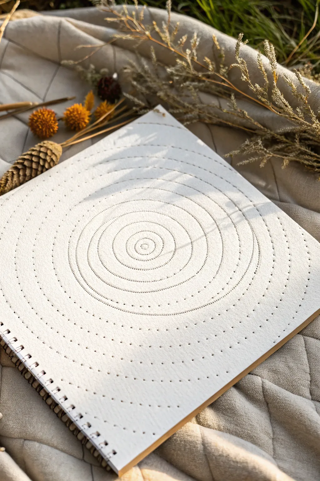
This meditative project transforms a simple sheet of heavy paper into a textural masterpiece using nothing but a needle and patience. The result is a series of precisely spaced, concentric circles composed of delicate perforations that catch the light beautifully.
Step-by-Step
Materials
- High-quality sketchbook or heavy cardstock (approx. 300gsm)
- Drafting compass
- Fine-point mechanical pencil
- Pricking tool, embroidery needle, or awl
- Cork board or thick piece of cardboard (as a protective mat)
- Ruler (optional)
- Eraser
Step 1: Preparation & Mapping
-
Prepare your workspace:
Place your sketchbook or cardstock on a flat, stable surface. If you are working on a single sheet, place a cork board or thick cardboard underneath to protect your table and allow the needle to penetrate fully. -
Find the center:
Using your ruler, lightly mark the exact center of your page. This central point is crucial for keeping your spirals symmetrical. -
Set the compass:
Insert the mechanical pencil into your compass. Start small; set the radius to about 0.5 cm for the innermost circle. -
Draw the guidelines:
Place the compass point on your center mark and draw a very faint circle. You want this line to be barely visible—just enough to guide your needle later. -
Expand the rings:
Increase the compass radius by approximately 0.5 cm to 1 cm increments. Continue drawing concentric circles moving outward toward the edge of the paper. -
Vary the spacing:
To mimic the organic feel of the reference image, try varying the distance between rings slightly. Group two or three rings closer together, then leave a wider gap before the next set. -
Finish map:
Continue until you have filled the page, leaving a pleasing margin at the edges.
Needle Tip
Wrap a bit of masking tape around the top of your needle or use a thimble. Pushing through heavy paper hundreds of times can make fingers sore.
Step 2: The Piercing Process
-
Select your tool:
Choose a needle or awl. A thicker needle will create larger, more visible holes, while a fine needle creates subtle texture. For this project, a medium embroidery needle works best. -
Start at the center:
Begin with the smallest innermost circle. Hold your needle perpendicular to the paper. -
Pierce the first ring:
Press the needle through the paper along your pencil line. Space the holes very close together for the inner rings to create a dense, stitch-like line. -
Maintain consistency:
As you work, try to keep the spacing between holes consistent. I find a steady rhythm helps create a cleaner line than rushing. -
Adjust spacing for outer rings:
As you move to the larger outer circles, you can increase the space between the individual holes. This creates the ‘dotted line’ effect seen in the outer edges of the example. -
Work outward:
Systematically complete each ring before moving to the next. Rotate the paper as needed to keep your hand in a comfortable position. -
Check the texture:
Occasionally run your finger lightly over the back of the page (if accessible) to feel the raised texture, ensuring you are pushing through with consistent pressure. -
Erase guidelines:
Once all holes are pierced, gently erase any visible pencil lines. Be careful not to snag the rough edges of the perforations. -
Clean up:
Use a soft brush to sweep away eraser crumbs rather than your hand, which might smudge the paper.
Holes Not Clean?
If the back of the paper looks messy or torn, your backing surface is too soft. Switch to a firmer piece of cardboard or a self-healing cutting mat.
Now you have a tactile, minimalist piece of art ready to catch the afternoon sun


Have a question or want to share your own experience? I'd love to hear from you in the comments below!