Rectangular canvases are such a fun challenge because the shape basically begs you to design with intention. Whether you’ve got a long panoramic strip or a tall skinny panel, these rectangle canvas painting ideas will help you fill the space in a way that feels effortless and satisfying.
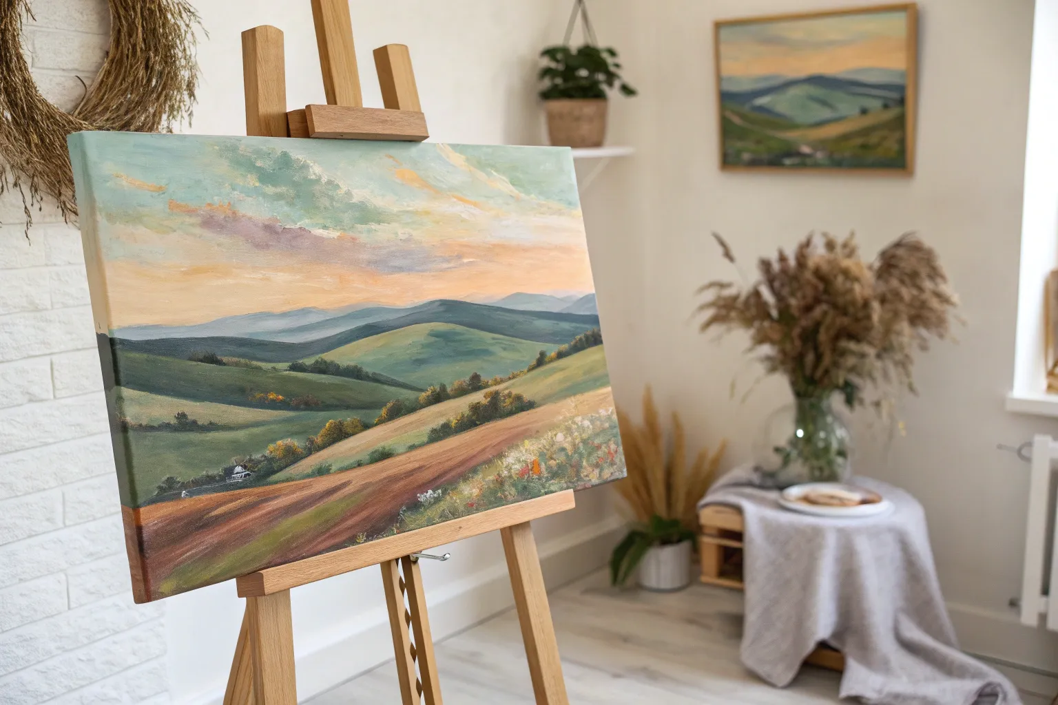
Mountain Range Layers
Capture the serene beauty of distant peaks fading into the horizon with this atmospheric landscape painting. By using a technique of gradual desaturation and lightening, you will create a stunning sense of depth that draws the viewer deep into the misty valleys.
Step-by-Step Tutorial
Materials
- Large rectangle canvas (24×36 or similar)
- Acrylic paints (Titanium White, Mars Black, Phthalo Blue, Dioxazine Purple, Burnt Umber, Sap Green)
- Retarder medium or slow-drying medium
- Large flat brush (2-inch)
- Medium filbert brush (size 8 or 10)
- Small round brush for details
- Palette knife
- Palette for mixing gradients
- Water cups and paper towels
Step 1: Sky and Background
-
Prepare the gradient:
Begin by observing the sky tones. Mix a generous amount of Titanium White with a tiny touch of Burnt Umber and a speck of Orange to create a warm, peach-hued cream color. On the other side of your palette, mix a soft, pale grey-blue. -
Paint the sky:
Using your large flat brush, paint the upper third of the canvas. Start with the blue-grey at the very top edge and blend downwards into the warm creamy peach tone. Use horizontal strokes to ensure a smooth transition, simulating a soft sunset glow. -
Add cloud wisps:
While the sky is still slightly tacky, use a dry filbert brush with pure Titanium White to scumble in faint, horizontal cloud lines near the top. Keep these extremely subtle; they should look like whispers of vapor. -
First mountain layer:
Mix a very pale blue-grey (about 90% white, 10% blue/black mixture). Paint the silhouette of the furthest mountain range right where the sky fades out. The edges should be soft, almost blurring into the sky.
Step 2: Atmospheric Middle Ground
-
Darken the mix slightly:
For the next ridge down, take your previous mountain color and add a small amount of Dioxazine Purple and more Phthalo Blue. It should still be quite pale and misty. -
Paint fading ridges:
Paint the next layer of mountains below the first. To achieve the ‘misty valley’ look, add a little glazing medium or water to the bottom edge of this shape and fade it out into transparency before it hits the next ridge line. -
Build the procession:
Continue this process, moving downward. With each new mountain ridge, add slightly more pigment (darker blues, purples, and greys) and less white. This progression is key to the illusion of distance. -
Shape the peaks:
Vary the shape of your mountains. Make some peaks sharp and others rolling. I like to let the paint dry completely between these layers so I don’t accidentally muddy the distinct ridge lines. -
Introduce warmth:
As you reach the middle of the canvas, start mixing a tiny bit of Burnt Umber into your blue/purple greys. This shifts the mountains from cool atmospheric tones to earthy, rocky shadows.
Mist looks solid?
If your mist looks like solid paint lines, your paint is too thick. Use a glazing liquid or water to thin the pigment significantly until it’s translucent before applying it to valley floors.
Step 3: Detailed Foreground
-
Establish the darks:
For the closest massive slopes, mix a deep, rich color using Phthalo Blue, Mars Black, and Burnt Umber. It should look nearly black but have a colorful undertone. -
Block in foreground slopes:
Paint the large, darker mountain shapes in the lower third. Don’t worry about individual trees yet; focus on the heavy visual weight of these landmasses compared to the airy background. -
Add texture to slopes:
Using a dry brush technique with a slightly lighter version of your dark mix, tap gently along the ridges of these foreground mountains to suggest tree canopies and uneven terrain. -
Create the valley mist:
Mix a thin glaze of your original sky peach color. Carefully glaze it into the ‘V’ shapes where mountain slopes meet in the lower middle section. This simulates light catching the mist trapped in the deep valleys.
Add a Focal Point
To customize, paint a tiny silhouette of a hiker or a lone pine tree on the nearest rock ledge. This gives the viewer a sense of immense scale against the mountains.
Step 4: Final Details
-
Foreground foliage:
Mix Sap Green with a little Black and Umber for a deep forest green. Switch to your small round brush or a fan brush used vertically. Stipple in the texture of bushes and shrubs at the very bottom edge of the canvas. -
Highlighting rocks:
Mix a medium grey-brown. Use a palette knife or a small flat brush to suggest rocky outcrops in the immediate foreground, specifically on the right side as seen in the inspiration image. -
Green highlights:
Take a lighter olive green (Sap Green + Yellow + White) and tap it onto the tops of the foreground bushes to simulate sunlight hitting the nearest vegetation. -
Final assessment:
Step back 10 feet from your canvas. Check if the gradient from light (top) to dark (bottom) feels continuous. If a layer stands out too much, apply a thin wash of water and a tiny drop of white or grey to knock it back.
Enjoy the calm atmosphere you’ve brought into your space with these majestic peaks.


Golden Field With a Big Sky
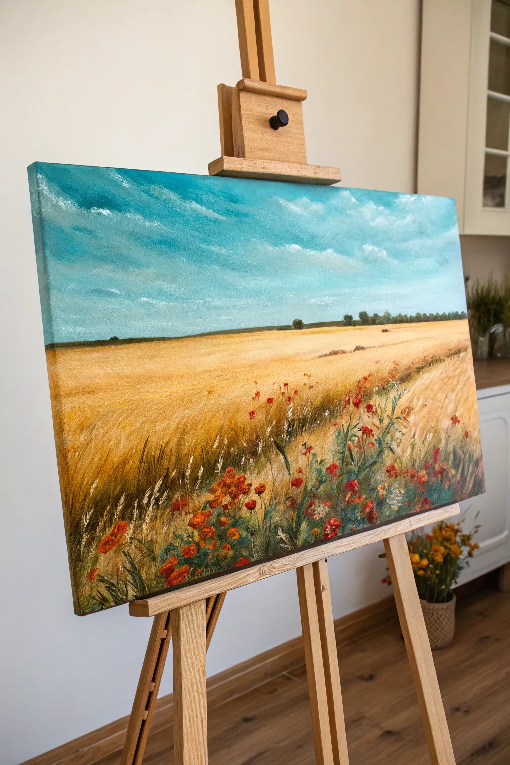
Capture the serene beauty of late summer with this landscape painting featuring an expansive golden wheat field beneath a vibrant turquoise sky. The composition draws the eye from detailed wildflowers in the foreground to a distant, hazy horizon.
Step-by-Step Tutorial
Materials
- Rectangular stretched canvas (approx. 16×20 or 18×24 inches)
- Acrylic paints: Titanium White, Cerulean Blue, Turquoise, Yellow Ochre, Burnt Sienna, Raw Umber, Cadmium Red, Hooker’s Green, Sap Green
- Large flat brush or wash brush (2 inch)
- Medium flat brush (3/4 inch)
- Small filbert brush
- Fine liner brush or rigger brush
- Palette knife
- Palette for mixing
- Water cup and paper towels
Step 1: Painting the Vast Sky
-
Establish the horizon line:
Mix a very light wash of Raw Umber and water. About one-third of the way down from the top of the canvas, paint a faint, straight horizontal line to separate the sky from the land. -
Block in the sky base:
Mix a large amount of Turquoise with Titanium White to create a bright, airy teal color. Using your large wash brush, paint horizontal strokes starting from the top edge and working down toward the horizon. -
Note the gradient:
As you move closer to the horizon line, gradually mix in more White to your turquoise blend. The sky should be palest right where it meets the distant earth. -
Add cloud texture:
While the blue paint is still slightly tacky, load a smaller brush with pure Titanium White. Scumble in loose, diagonal drifts of clouds, blending the bottom edges into the blue to make them look wispy and wind-blown.
Palette Knife Tip
For the wheat texture in the foreground, try scraping wet paint with the edge of a palette knife. It creates sharp, organic lines that look exactly like stiff stalks.
Step 2: Laying the Golden Foundation
-
Underpaint the field:
Clean your large brush and mix Yellow Ochre with a touch of Burnt Sienna. Paint the entire field area below the horizon line with this warm base color. -
Create depth with values:
While the base is wet, blend a lighter mix (Yellow Ochre + White) near the horizon line to push it into the distance. Add streaks of darker Raw Umber near the bottom foreground corners. -
Paint the distant trees:
Using a small flat brush and a dark mix of Sap Green and Raw Umber, dab in a tiny, irregular line of trees and bushes right along the horizon. Keep these shapes small and slightly blurry to indicate distance.
Step 3: Texturing the Wheat
-
Build the mid-ground texture:
Switch to a medium flat brush. Mix Yellow Ochre with White. Use short, dry-brush strokes angled diagonally to mimic the sway of wheat in the wind, focusing on the middle section of the field. -
Add directional flow:
Paint sweeping curves starting from the right foreground moving toward the left center. This suggests a path or the natural bend of the crop. -
Detail individual stalks:
Using a liner brush and a mix of Titanium White and creamy yellow, paint thin, sharp lines in the immediate foreground (bottom 4 inches) to represent individual wheat stalks catching the light. -
Add shadow accents:
With the same liner brush, use thinned Burnt Sienna to paint shadowed stalks between the highlighted ones, giving the foreground volume.
Level Up: Impasto
Mix a heavy gel medium into your red and white paints for the foreground flowers. This thickens the paint, letting the poppies physically stand out from the canvas for a 3D effect.
Step 4: Foreground Wildflowers
-
Place the greenery:
Mix Hooker’s Green with a little burnt umber. Using a filbert brush, paint vertical, grassy strokes in the bottom right corner and scattered along the bottom edge to create stems for the wildflowers. -
Paint poppy shapes:
Load a small brush with Cadmium Red. Paint loose, irregular blotches for the poppy flowers among the green stems. Vary the sizes, making the ones at the very bottom larger. -
Add flower highlights:
Mix a tiny bit of orange or yellow into your red paint. Dab this lighter color onto the top edges of the poppy petals to show sunlight hitting them. -
Insert small white flowers:
Using the tip of a small brush or a palette knife edge, dot in clusters of tiny white or cream-colored wildflowers amidst the red poppies and wheat. -
Final crisp details:
Take your finest liner brush with pure white paint and add a few final, sharp highlights to the tops of the closest wheat stalks and grass blades to bring them sharply into focus.
Step back and admire the warmth of your summer field.
Forest Silhouette at Dusk
Capture the serene beauty of twilight in the woods with this captivating acrylic landscape painting. You will learn to blend a vibrant, gradient sky and create contrasting, realistic pine silhouettes that pop against the colorful backdrop.
How-To Guide
Materials
- Rectangular canvas (16×20 or similar size)
- Acrylic paints (Titanium White, Mars Black, Cadmium Yellow, Cadmium Orange, Magenta, Dioxazine Purple, Phthalo Blue)
- Large flat wash brush (2 inch)
- Medium flat brush (1/2 inch)
- Small round detail brush (size 0 or 1)
- Fan brush (optional, for tree textures)
- Palette and water cup
- Paper towels
- Pencil (optional)
Step 1: Sky Gradient Base
-
Prime the top section:
Begin by dampening your large flat wash brush slightly. Load it with Dioxazine Purple mixed with a tiny touch of Phthalo Blue. Apply this dark mixture to the very top edge of the canvas, using long, horizontal strokes. -
Transition to magenta:
Without cleaning your brush thoroughly (wipe off excess paint), pick up some Magenta. Blend this just below the purple, allowing the colors to mix directly on the canvas to create a smooth transition. -
Introduce warmth:
Clean your brush. Pick up Cadmium Orange and begin painting the middle section of the sky. Blend upwards into the magenta while the paint is still wet to avoid hard lines. -
Brighten the horizon:
Mix Cadmium Yellow with a significant amount of Titanium White to create a glowing pale yellow. Apply this near the bottom third of the canvas, blending it seamlessly into the orange above. -
Add cloud streaks:
While the sky is still slightly tacky, use a smaller dry brush with a mix of purple and magenta. Lightly sweep in thin, diagonal cloud streaks across the sky, mostly in the upper right quadrant, to add movement.
Wet-on-Wet Sky
Work quickly on the sky! Acrylic dries fast, so keep a spray bottle of water handy to mist the canvas. This keeps the paint workable for smoother gradients.
Step 2: Background Forest Line
-
Mix the distant color:
Create a dark grey-green shade by mixing Mars Black with a little Green (or Blue and Yellow) and a touch of the sky purple. This shouldn’t be solid black yet, as atmospheric perspective makes distant trees look lighter. -
Block in the tree line:
Using a medium flat brush, tap in a jagged horizon line about one-quarter up from the bottom. Vary the height of your taps to simulate tree tops. -
Fill the ground:
Fill in everything below this tree line with a dark mix of black and brown. This will serve as the shadowed ground and distant forest floor. -
Create distinct tops:
Switch to a small round brush. Using the same dark grey-green mix, paint tiny vertical lines sticking out of the tree mass to suggest individual pine tips in the distance.
Step 3: Foreground Pines
-
Position the main trees:
Using pure Mars Black and a thin round brush, paint four vertical lines on the left side of the canvas. These will be the trunks of your main foreground trees. Make them slightly uneven and taper them as they go up. -
Start the pine branches:
Starting at the top of the first trunk, use a stippling or tapping motion with the tip of your brush to create narrow, short branches. I find it helpful to wiggle the brush slightly as I pull outward. -
Widen the growth:
As you move down the trunk, make your horizontal strokes wider and denser. Leave small gaps between branches so the beautiful sunset sky peeks through. -
Ground the trees:
Continue adding branches all the way down until they merge with the dark foreground shadow. Repeat this process for all four main trees, varying their heights slightly for a natural look. -
Add right-side details:
On the far right side, paint a denser cluster of trees using the same tapping technique. These should look more like a solid mass of forest edge compared to the individual trees on the left. -
Refine the ground:
Mix a dark brown-black. Use horizontal scumbling strokes at the base of the trees to suggest uneven terrain and grass texture in the deep shadow. -
Final highlights:
Mix a tiny amount of the sky orange with white. Lightly graze the very edges of the ground terrain where the setting sun might hit, just to give the ground some dimension.
Make It Starry
Once the sky is totally dry, flick an old toothbrush loaded with watered-down white paint over the darker purple top section to add a field of early evening stars.
Step back and admire how your simple silhouettes transform the canvas into a peaceful evening view.

Pier or Dock With Reflections
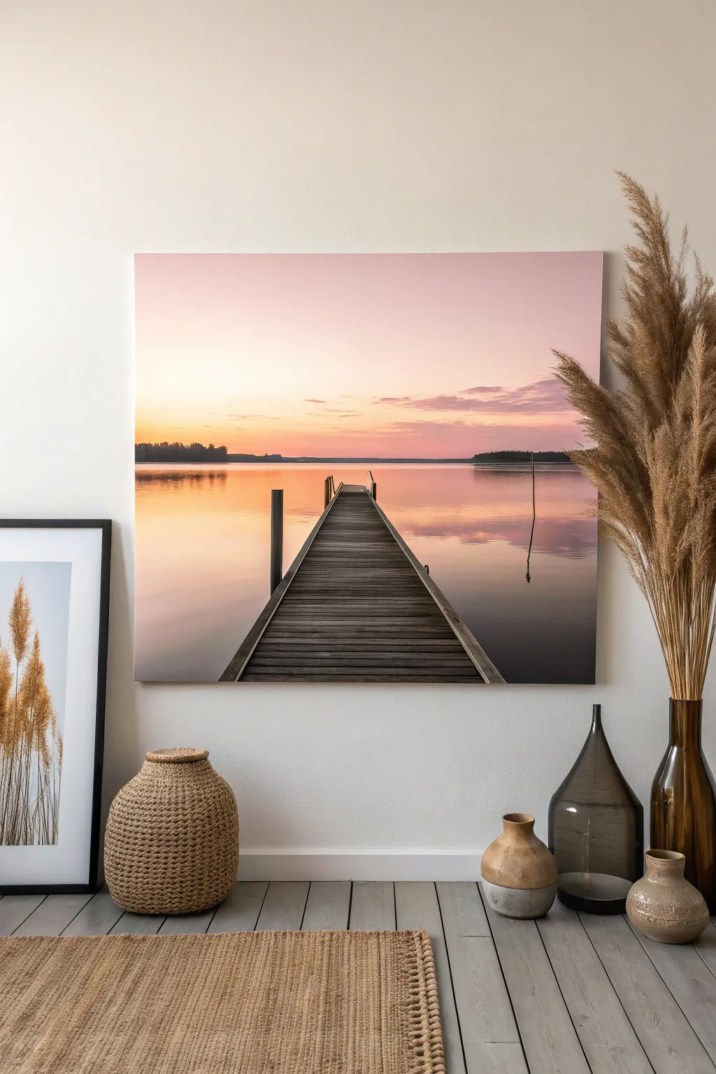
Capture the stillness of a calm lake at dawn with this rectangular canvas project. Soft gradients of blush pink and warm orange meet the rustic texture of a wooden dock, creating a peaceful focal point for any room.
Detailed Instructions
Materials
- Rectangular stretched canvas (approx. 24×36 inches)
- Acrylic paints: Titanium White, Cadmium Yellow, Napthol Red (or bright pink), Burnt Umber, Mars Black, Ultramarine Blue
- Large flat brush (2-3 inch) for blending background
- Medium flat brush (1 inch)
- Small round detail brush
- Ruler or straight edge
- Painters tape (optional)
- Palette knife
- Water container and paper towels
- Slow-drying medium or retarder (essential for smooth blending)
Step 1: Setting the Scene
-
Create the horizon line:
Measure about one-third of the way up from the bottom of your canvas. Use a ruler and a very light pencil touch to draw a straight horizontal line across the entire width. This separates the sky from the water. -
Mix the sky gradient colors:
Prepare three piles of paint for the sky: a pale buttery yellow (White + tiny dot of Yellow), a soft salmon pink (White + Red + Yellow), and a dusky lavender (White + tiny bit of Blue + Red). Add a drop of slow-drying medium to each pile to keep them workable. -
Paint the upper sky:
Using your large flat brush, start at the very top with the dusky lavender mix. Paint broad horizontal strokes, covering the top quarter of the canvas. -
Blend the transition:
While the lavender is still wet, pick up the salmon pink mix. Apply it just below the lavender, brushing back and forth where they meet to create a seamless, soft fade. This misty transition is key to the mood. -
Add the horizon glow:
Finish the sky by painting the pale yellow mix abruptly above the horizon line, blending it upward into the pink. The brightest part of the painting should be right here.
Uneven Horizon?
If your horizon line dips or bows, re-apply a strip of painter’s tape across the dry sky area. Repaint the water’s edge against the tape for a razor-sharp, perfectly level line.
Step 2: Reflective Waters
-
Mirror the sky colors:
For the water, you will reverse the order. Start just below the horizon line with a slightly darker version of your yellow-orange mix (reflections are usually a shade darker than the source). -
paint the lower water:
Continue working downward, blending into the salmon tones and finally the darker lavender-grey at the very bottom corners. Use horizontal strokes exclusively to distinguish the water surface from the sky. -
Add distant land:
Mix a dark, desaturated purple-grey using Blue, Red, and a touch of Burnt Umber. Using a smaller flat brush, tap in a thin, uneven strip of trees sitting right on top of the horizon line. Keep the trees small to emphasize the distance. -
Soften the reflections:
Using a clean, dry brush, very lightly sweep horizontally across the water area to blur any harsh brushstrokes. I find this really helps mimic the glassy look of a still lake. -
Add darker water ripples:
With a watered-down mix of the dark purple-grey, paint very thin, horizontal streaks in the water, focusing on the foreground and sides. This adds depth and movement to the surface.
Step 3: Constructing the Pier
-
Draft the perspective:
Locate the center point of your painting’s bottom edge. From this point, draw two diagonal lines converging toward a vanishing point on the horizon (slightly off-center to the right for interest). -
Base coat the wood:
Fill in the triangle shape of the pier with a dark mix of Burnt Umber and Black. It doesn’t need to be perfect; this is just the shadow layer underneath the planks. -
Paint the planks:
Mix a lighter grey-brown using White and Umber. Using a flat brush, paint horizontal stripes across the pier, leaving thin gaps where the dark base coat shows through. -
Detail the wood grain:
Switch to your small round brush. With watered-down black paint, add fine lines for wood grain, cracks, and knots on the planks. Vary the pressure to keep it organic. -
Add the posts:
Paint vertical posts along the edges of the pier using Mars Black. Make the posts in the foreground thicker and taller, and the ones further away strictly smaller to reinforce the perspective. -
Paint post reflections:
Directly below each post, paint a dark vertical squiggle into the water. Break the line up slightly with horizontal dashes to show the water’s surface disturbing the reflection. -
Highlight the edges:
Mix a very light grey (almost white). Carefully paint the top edge of the posts and the very edges of the planks on the sun-facing side to show where the morning light hits the wood.
Texture Twist
Mix a little modeling paste into your paint for the wooden pier planks. Applying this with a palette knife will give the wood actual 3D ridges and realistic roughness.
Step back and enjoy the peaceful atmosphere you have brought into your home with this gentle landscape
BRUSH GUIDE
The Right Brush for Every Stroke
From clean lines to bold texture — master brush choice, stroke control, and essential techniques.
Explore the Full Guide
Vertical Night Sky With Tall Pines
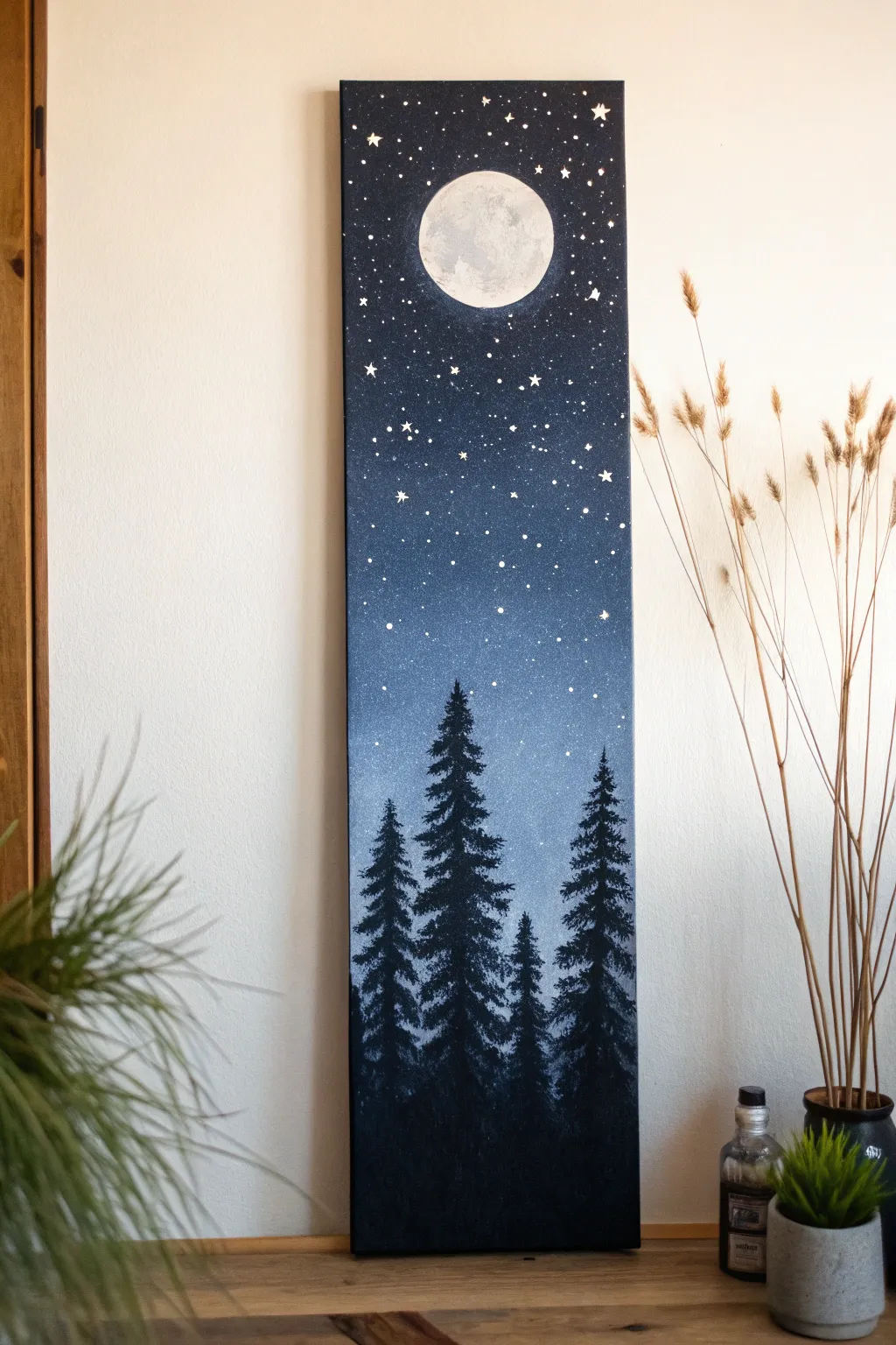
Capture the serene beauty of a crisp night with this vertical canvas painting, featuring a luminous full moon watching over a silhouetted forest. The gradient sky creates a stunning backdrop for the sharp, dark pines, making this a perfect piece for narrow wall spaces.
Step-by-Step
Materials
- Vertical stretched canvas (e.g., 10×30 inch or similar ratio)
- Acrylic paints: Black, Titanium White, Phthalo Blue (or Prussian Blue)
- Flat wash brush (1-inch or larger)
- Medium round brush
- Small liner brush or rigger brush
- Fan brush (optional, for trees)
- Old toothbrush (for stars)
- Cup or circular object (for tracing the moon)
- Palette or paper plate
- Water cup and paper towels
Step 1: Setting the Sky Gradient
-
Prepare your palette:
Squeeze out generous amounts of black, dark blue, and white acrylic paint onto your palette. -
Start at the top:
Using your large flat wash brush, mix black with a little blue to create a midnight navy color. Apply this to the top third of the canvas, brushing horizontally from edge to edge. -
Transition to blue:
Gradually mix more blue into your black as you move down the canvas. By the time you reach the middle, the color should be a rich, deep blue without much black. -
Lighten the horizon:
As you move into the lower third (where the tops of the trees will eventually be), start mixing white into your blue. Create a hazy, lighter blue band just above the bottom quarter of the painting. -
Blend the layers:
While the paint is still wet, use clean, long horizontal strokes to blend the transition zones between the black, navy, and light blue so there are no hard stripes. Allow the background to dry completely.
Pro Tip: Glowing Moon
Before painting the white circle, dry brush a faint halo of very sheer white or pale blue around the area. This subtle glow makes the finished moon look like it’s illuminating the atmosphere.
Step 2: Creating the Moon
-
Position the moon:
Place your circular object near the top center of the canvas, leaving some space above it for the sky. Trace lightly around it with a pencil or chalk. -
Block in the shape:
Using a round brush and Titanium White, fill in the circle. Don’t worry if it’s a stark white right now; we will add texture. -
Add craters and texture:
Mix a tiny localized drop of black or grey into your white. Use a mostly dry brush to dabbing softly onto the wet white moon to create grey shadowy areas, mimicing craters. I find tap-tapping the brush creates the best natural crater texture. -
Refine the edges:
If your edges got messy, carefully clean them up with fresh white paint to ensure the moon looks crisp against the dark sky.
Level Up: Metallic Magic
Mix a tiny amount of silver glitter paint or iridescent medium into the white used for the stars. It catches the light in the room and makes the night sky actually twinkle.
Step 3: Adding the Stars
-
Prepare the splatter mix:
Mix white paint with a few drops of water until it reaches an ink-like consistency. -
Protect the forest floor:
Cover the bottom quarter of your canvas (where the trees will go) with a piece of paper to prevent stars from appearing in the dark forest shadows. -
Splatter the stars:
Dip an old toothbrush into the thinned white paint. Point the bristles toward the canvas and run your thumb across them to flick tiny specks of ‘starlight’ across the upper sky. -
Hand-paint larger stars:
Use your smallest liner brush to manually paint a few larger, distinct stars. Create simple cross shapes or 5-point stars scattered randomly among the specks.
Step 4: Painting the Forest
-
Plan the tree line:
At the very bottom of the canvas, paint a solid uneven black strip about 2-3 inches high. This anchors your forest. -
Paint the tree trunks:
Using a small round brush and pure black paint, draw vertical lines extending upward from the bottom strip. Vary their heights, making the center trees slightly taller than the side ones. -
Form the tree tops:
Starting at the very tip of a trunk line, use the corner of a flat brush or a fan brush to tap in tiny branches. Keep the top very narrow and pointy. -
Build the branches downward:
Work your way down the trunk, using a tapping motion that gets wider as you descend. Leave small gaps between branches so the background sky peeks through; this adds realism. -
Create depth:
Ensure the trees overlap slightly. Establish a foreground by making the lowest, widest branches of the front trees cover the trunks of the trees behind them. -
Fill the bottom density:
As you reach the bottom of the canvas, tap the brush more densely to create a solid, dark mass of shadows where the light doesn’t reach.
Hang your vertical masterpiece in a hallway or narrow nook to add immediate calm to your space.
Waterfall Down a Tall Canvas
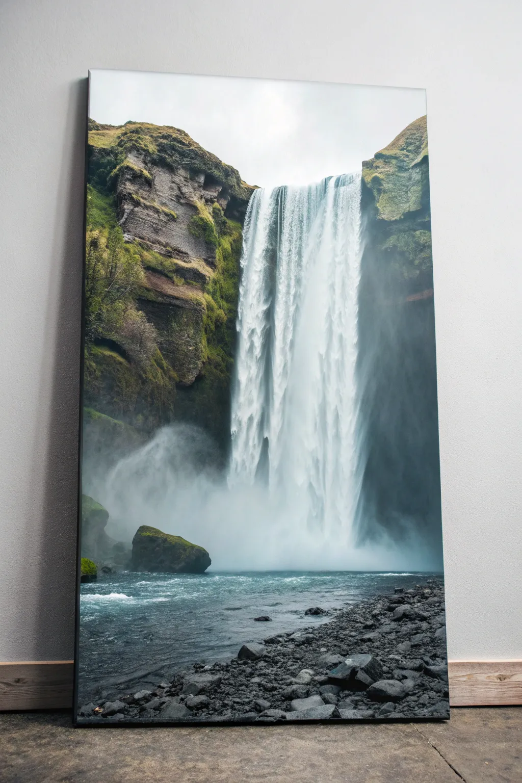
Capture the raw power and serene beauty of nature with this imposing vertical canvas project. By utilizing a tall layout, you emphasize the dramatic drop of the waterfall, contrasting soft, misty whites with rugged, mossy greens and dark volcanic rocks.
Step-by-Step Guide
Materials
- Large vertical canvas (e.g., 24×48 inches)
- Acrylic paints (Titanium White, Mars Black, Sap Green, Hooker’s Green, Burnt Umber, Ultramarine Blue, Phthalo Blue)
- Large flat brush (2-inch)
- Medium filbert brush
- Small round brush for details
- Fan brush (optional)
- Palette knife
- Water container and paper towels
- Easel suitable for tall canvases
Step 1: Setting the Scene
-
Establish the sky:
Begin at the very top of your canvas. Mix Titanium White with a tiny touch of Mars Black or Grey to create an overcast, cloudy sky. I like to keep this quite bright to contrast with the dark cliffs later. -
Block in the cliffs:
Using a large brush, paint the rough shapes of the cliffs on both the left and right sides. Mix Burnt Umber with some Mars Black to get a deep, dark base color. The cliffs should frame the center void where the water will go. -
Create the riverbed base:
For the bottom quarter of the canvas, paint a dark blue-grey using a mix of Phthalo Blue, Mars Black, and White. This will serve as the water flowing away from the falls. -
Add vegetation base layers:
While the cliff paint is still tacky, stipple in patches of Sap Green and Hooker’s Green along the top ridges and sloping sides. Don’t cover all the rock; let the dark brown show through as shadows.
Muddy Water?
If your white waterfall strokes are turning grey or green, let the background layers dry completely first. Clean your brush thoroughly before applying the final brilliant white highlights.
Step 2: The Waterfall
-
Rough in the water column:
Mix a pale blue-grey shade. Using a clean large flat brush, pull vertical strokes straight down from the top cliff edge to the bottom river area. This acts as the shadow layer for the water. -
Layering the rushing water:
Switch to pure Titanium White. Load your brush heavily and drag it downwards with confidence. Start slightly below the very top edge to show the water rolling over. Leave some gaps so the grey underlayer peeks through, creating depth. -
Creating the mist:
At the bottom of the falls where the water hits the pool, use a dry brush or a scruffy round brush. Dab Titanium White in a circular motion to create a cloud of rising mist. Soften the edges with a clean, dry brush to make it look ethereal. -
Refining the water texture:
Use a smaller round brush with watered-down white paint to add thin, sharp vertical lines near the top of the falls. These represent individual streams of water separating as they fall.
Step 3: Rocky Details and Foreground
-
Sculpting the cliffs:
Return to the cliffs with a palette knife or small flat brush. Mix a lighter grey-brown and scrape it horizontally across the rock faces to simulate geological strata and rocky texture. -
Highligting the moss:
Mix Sap Green with a little Yellow or heavy White. Dab this brighter green onto the sun-facing parts of the mossy slopes to give the vegetation volume. -
Painting the heavy boulder:
On the left side, near the mist, paint a large, prominent boulder using dark grey. Add a sliver of green moss on top to tie it into the landscape. -
The river current:
In the bottom blue-grey water area, use horizontal strokes of white and light blue to create ripples and whitewater current moving away from the crashing falls. -
Foreground rocks base:
Along the very bottom edge and right corner, dab in oval shapes using pure Mars Black and dark grey. These will be the wet stones on the riverbank.
Glossy Finish
Once fully dry, apply a high-gloss varnish only to the water and wet rocks. Leave the mossy areas matte or satin. This contrast in sheen makes the water look genuinely wet.
Step 4: Final Touches
-
Highlighting the river rocks:
Mix a medium grey. Add a small highlight to the top of each foreground rock to make them look wet and three-dimensional. Keep the light source consistent, coming from the sky above. -
Connecting mist and rock:
Lightly glaze some transparent white paint over the dark cliffs on the right side, just where they meet the waterfall. This makes the rocks look like they are behind a veil of spray. -
Deepening shadows:
Assess the painting from a distance. If the cliffs look flat, add pure black into the deepest crevasses and overhangs to increase the contrast against the bright white water.
Step back and admire the majestic flow you’ve brought to your space with this vertical masterpiece

PENCIL GUIDE
Understanding Pencil Grades from H to B
From first sketch to finished drawing — learn pencil grades, line control, and shading techniques.
Explore the Full Guide
Abstract Gradient With a Crisp Horizon
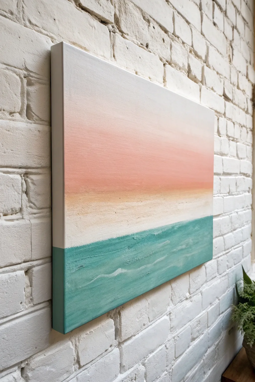
Capture the peaceful stillness of a coastal horizon with this minimalist abstract landscape. By blending soft gradients with textured layers, you’ll create a soothing piece where sand meets sea in perfect harmony.
Step-by-Step Guide
Materials
- Rectangular stretched canvas (e.g., 18×24 or 24×36 inches)
- Acrylic paints: Titanium White, Peach/Salmon Pink, Sandy Beige, Teal or Turquoise
- Large flat brush (2-3 inches wide)
- Medium flat brush
- Palette knife (medium size)
- Texture paste or modeling paste
- Painter’s tape (optional)
- Water cup and paper towels
- Palette or mixing plate
Step 1: Setting the Scene
-
Prep your canvas:
Before you begin painting, ensure your canvas is clean and dust-free. If it’s not pre-primed, apply a coat of gesso and let it dry completely to create a smooth surface. -
Define the horizon:
Visualize where you want your horizon line to be. For this composition, the horizon (where the water meets the sky/sand) sits lower than the center, roughly one-third of the way up from the bottom. -
Plan the color zones:
Mentaly divide the canvas into three zones: the large top sky area, a thin middle transition strip for the sand, and the bottom third for the water.
Step 2: Painting the Sky Gradient
-
Start with white:
Load your large flat brush with plenty of Titanium White. Paint the top third of the canvas using long, horizontal strokes to ensure a clean base for the gradient. -
Introduce the peach tone:
While the white is still wet, pick up a small amount of Peach or Salmon Pink on one corner of your brush. Begin blending this color into the white section, starting about a third of the way down the canvas. -
Deepen the color:
As you move lower toward the middle section of the canvas, gradually add more pink to your brush. Use long, sweeping left-to-right strokes to create a seamless Ombré effect. -
Refine the blend:
Go back and forth over the transition area between the white and pink. A clean, slightly damp brush helps smooth out any brushstrokes for that soft, airy look. -
Paint the edges:
Don’t forget to wrap your colors around the sides of the canvas canvas. Continue the gradient onto the deep side edges so the artwork looks finished from every angle.
Smooth Transitions
If your gradient paint dries too fast, keep a spray bottle of water handy. A very light misting keeps acrylics workable longer for smoother blending.
Step 3: Creating Texture and Separation
-
Mix the sandy texture:
Mix a small amount of texture paste with your Sandy Beige paint on your palette. You want a consistency distinct enough to hold shape but loose enough to spread. -
Apply the sand layer:
Using a palette knife or a stiff brush, apply the sandy mixture in a horizontal band right below the pink sky. Keep the upper edge soft where it meets the sky, but allow the texture to be rougher as you go down. -
Let it dry partially:
Allow the sky and sand sections to dry until they are tacky or dry to the touch. This prevents the strong teal of the ocean from bleeding heavily into the delicate sky colors.
Metallic Shimmer
Mix a drop of metallic gold paint into the beige sand strip or drag a tiny bit of pearl medium over the white wave crests for a sun-kissed glint.
Step 4: The Ocean Layer
-
Prepare the teal:
Load your palette knife or a clean medium brush with the Turquoise or Teal paint. You can mix in a tiny bit of texture paste here as well if you want the water to have physical waves. -
Establish the water line:
Apply the teal paint directly below the beige sand strip. Create a crisp, straight line where the water meets the sand to establish a sharp horizon. -
Fill the bottom section:
Fill the remainder of the canvas bottom with the teal color. Use horizontal strokes to mimic the motion of water. -
Add wave details:
While the teal paint is wet, wipe your brush or knife clean and pick up a tiny bit of white. Gently streak thin, broken lines horizontally across the teal section to suggest distant waves catching the light. -
Texturize the water:
I like to use the flat side of the palette knife to drag lightly over the drying teal paint. This creates a slightly rugged, organic texture that contrasts beautifully with the smooth sky gradient. -
Wrap the bottom edges:
Paint the bottom and lower side edges of the canvas with the teal color, ensuring the horizon line on the side matches the front. -
Final dry:
Step back and check your work. Once satisfied with the blend and texture, let the entire painting dry flat for at least 24 hours to ensure the texture paste cures properly. -
Varnish (optional):
For longevity, apply a satin or matte varnish once the painting is fully cured to protect the colors from UV light and dust.
Hang your finished canvas in a well-lit spot to see the texture catch the light
Geometric Tape Blocks in a Rectangle
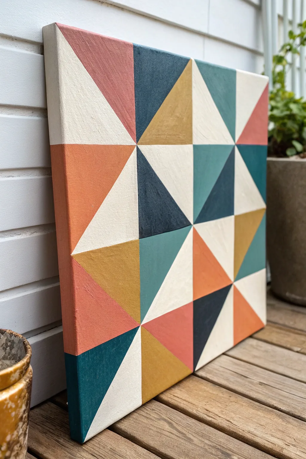
This striking geometric canvas brings the cozy charm of traditional barn quilts into a modern home setting with a fresh, earthy color palette. By using painter’s tape and careful planning, achieve razor-sharp lines and a professional finish that looks deceptively complex.
Step-by-Step Tutorial
Materials
- Square canvas (12×12 or 16×16 inches recommeded)
- Acrylic paints (Cream, Rust Orange, Mustard Yellow, Deep Navy, Teal, Salmon Pink)
- Painter’s tape (0.5 inch or thinner works best)
- Flat shader brushes (assorted sizes)
- Ruler or straight edge
- Pencil
- Palette or paper plate
- Cup of water and paper towels
- Matte medium or white paint (for sealing tape edges)
Step 1: Preparation & Grid
-
Base Coat Application:
Begin by painting your entire canvas with the cream/off-white acrylic paint. This acts as a primer and ensures your lightest color is solid. Don’t forget to paint the sides of the canvas for a finished look. -
Dry Time:
Allow the base coat to dry completely. If the canvas texture still shows through too much, apply a second coat and let it cure fully. -
Measuring the Grid:
Using your ruler and pencil, lightly mark a 4×4 grid on the canvas. For a 12-inch canvas, you would make marks every 3 inches along each side. -
Drawing the Grid:
Connect your marks to draw the full grid lightly with a pencil. You should end up with 16 equal squares. -
Adding Diagnols:
Referencing the finished image, draw diagonal lines through specific squares to create the triangle patterns. Notice that the diagonals often alternate direction to create the ‘pinwheel’ or ‘star’ effects.
Step 2: Taping & sealing
-
Initial Taping:
Apply painter’s tape along the outlines of your first set of triangles. You cannot paint adjacent shapes at the same time, so choose triangles that do not touch each other. -
Firming the Edges:
Run your fingernail or a credit card firmly over the edges of the tape to ensure a tight seal against the canvas texture. -
Sealing the Tape:
Here I prefer to brush a very thin layer of the cream base color (or matte medium) over the edge of the tape where you will be painting. This bleeds under the tape and blocks the colored paint from seeping through, guaranteeing crisp lines. -
Color Selection:
Prepare your palette with your chosen colors: Rust, Mustard, Navy, Teal, and Salmon. Keep the original image handy to mimic the specific color placement.
Clean Lines Secret
Using matte medium to seal your tape edges is clearer than using white paint and creates an invisible barrier against bleeds.
Step 3: Painting the Texture
-
First Round of Color:
Paint the exposed triangles with their designated colors. Use a flat brush and paint away from the tape edge to further prevent bleeding. -
Second Coat:
Most colors, especially the yellow and navy, will need a second coat for opacity. Let the first layer dry to the touch before applying the next. -
Tape Removal:
While the final coat of paint is still slightly damp (not wet, but not fully cured), carefully peel back the tape at a 45-degree angle. This prevents the paint from chipping. -
Drying Phase:
Allow these painted sections to dry completely before moving on. The paint must be hard to the touch so fresh tape doesn’t pull it up.
Texture Twist
Mix a small amount of modeling paste into your acrylics for a raised, tactile surface that mimics thick fabric weaving.
Step 4: Completing the Pattern
-
Taping Round Two:
Apply tape to mask off the next set of triangles, covering the dry paint lines you just created where necessary to get a straight edge. -
Repeat Sealing:
Don’t skip the sealing step! Apply your base color or matte medium along the new tape lines just as before. -
Painting Remaining Shapes:
Fill in the remaining triangles with the appropriate colors. Pay attention to balance—distribute the rust and teal tones so the eye moves around the canvas. -
Painting the Sides:
Extend the design onto the sides of the canvas. If a triangle ends at the edge, continue that color down the side for a gallery-wrapped effect. -
Final Reveal:
Gently peel off the final strips of tape. If you find any tiny bleeds, use a small detail brush and the appropriate paint color to touch them up. -
Varnish (Optional):
Once the entire painting has cured for 24 hours, you can apply a matte or satin varnish to protect the surface and unify the sheen.
Hang your geometric masterpiece on a prominent wall to enjoy the bold, structured beauty you created


One-Line City Skyline Silhouette
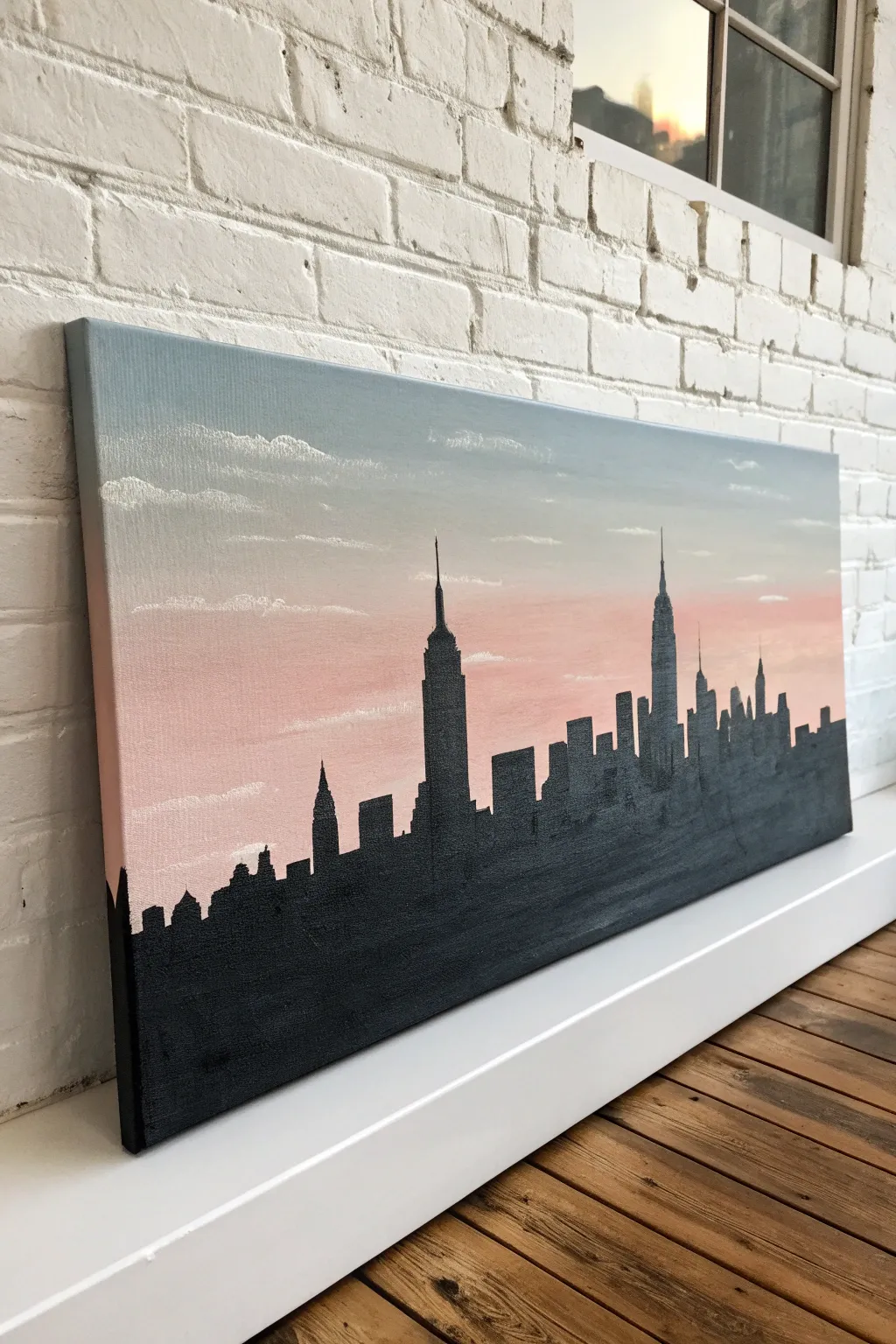
Capture the romantic glow of a city evening with this elegant layered painting project. By blending a soft gradient sky behind a crisp black skyline, you’ll create a striking piece of wall art that looks surprisingly professional.
How-To Guide
Materials
- Rectangular stretched canvas (e.g., 12×24 inches)
- Acrylic paints: Titanium White, Payne’s Grey (or slate blue), Light Pink/Peach, and Mars Black
- Wide flat brush for background blending
- Medium flat brush
- Fine detail liner brush
- Pencil and eraser
- Ruler
- Cup of water and paper towels
- Palette or paper plate
Step 1: Creating the Sunset Gradient
-
Prepare the palette:
Squeeze out generous amounts of white, grey-blue, and pink paint onto your palette. It’s better to have too much than to run out while trying to blend a smooth gradient. -
Start at the top:
Using your wide flat brush, load up the grey-blue paint mixed with a tiny touch of white. Apply this horizontal stroke across the top third of the canvas, ensuring you paint the top edge of the canvas too for a finished look. -
Begin the transition:
While the blue paint is still wet, mix a lighter version of the blue with more white. Apply this below the first section, using long, horizontal strokes to blend the two areas together seamlessly. -
Introduce the pink:
Clean your brush thoroughly. Mix your light pink with a good amount of white. Apply this to the middle-lower section of the canvas, working upwards slightly into the pale blue area to create a soft, purplish transition zone. -
Finish the horizon:
Paint the bottom third of the canvas with a stronger pink tone. Don’t worry about the very bottom edge being perfect, as the black skyline will cover it later. Let the entire background dry completely for at least 30 minutes.
Step 2: Painting the Clouds
-
Mix a cloud color:
Mix a small amount of white with a tiny dot of pink to create an off-white color. You don’t want stark white, as it can look too cartoonish against the soft sky. -
Dry brush technique:
Load a small amount of paint onto a dry medium brush, then wipe most of it off on a paper towel. The brush should have very little pigment left on it. -
Add wispy clouds:
Gently scrub the dry brush horizontally across the upper sky. Focus on the transition area between the blue and pink. Keep the pressure light to create a fluffy, ethereal texture rather than solid lines. -
Layer the clouds:
Add a few more defined, smaller clouds near the top left, staggering them so they don’t look like a pattern. Let dry completely.
Uneven Coverage?
If your black paint looks streaky or gray after drying, don’t panic. Black often requires two coats. Wait for the first layer to fully cure, then apply a second coat for a matte, solid finish.
Step 3: Drafting and Painting the Skyline
-
Establish the horizon line:
Use a ruler and pencil to lightly draw a straight horizontal line across the bottom third of the canvas. This ensures your buildings sit on flat ground. -
Sketch the landmarks:
Lightly sketch the outlines of the skyline. Focus on recognizable shapes first—like the Empire State Building’s tiered spire in the center and the Chrysler Building or One World Trade Center. -
Fill in the gaps:
Draw varied rectangles between the landmarks to represent general skyscrapers. Vary their heights and widths to create visual interest and a realistic city rhythm. -
Outline in black:
Using the fine liner brush and black paint slightly thinned with water, carefully trace the outline of your building tops. A steady hand is key here; resting your pinky on the dry canvas helps stabilize your stroke. -
Fill the silhouette:
Switch to a medium flat brush to fill in the large black areas of the buildings. Since black acrylic can sometimes be slightly transparent, I like to let the first coat dry and apply a second for solid, opaque coverage. -
Paint the edges:
Don’t forget to wrap the black paint around the bottom and side edges of the canvas. This ‘gallery wrap’ style makes the painting look complete even without a frame. -
Refine the details:
Go back in with your smallest brush to sharpen the tips of the spires and antennas. These tiny details are what make the silhouette recognizable. -
Final check:
Step back and look for any spots where the pink background shows through the black. Touch up these areas to ensure a solid, crisp silhouette.
Add City Lights
Once the black is dry, use a toothpick dipped in yellow or white paint to dot tiny windows on the buildings. Cluster them randomly to mimic the look of a city waking up at dusk.
Hang your urban masterpiece where it can catch the evening light and impress your guests
Power Lines Across a Sunset
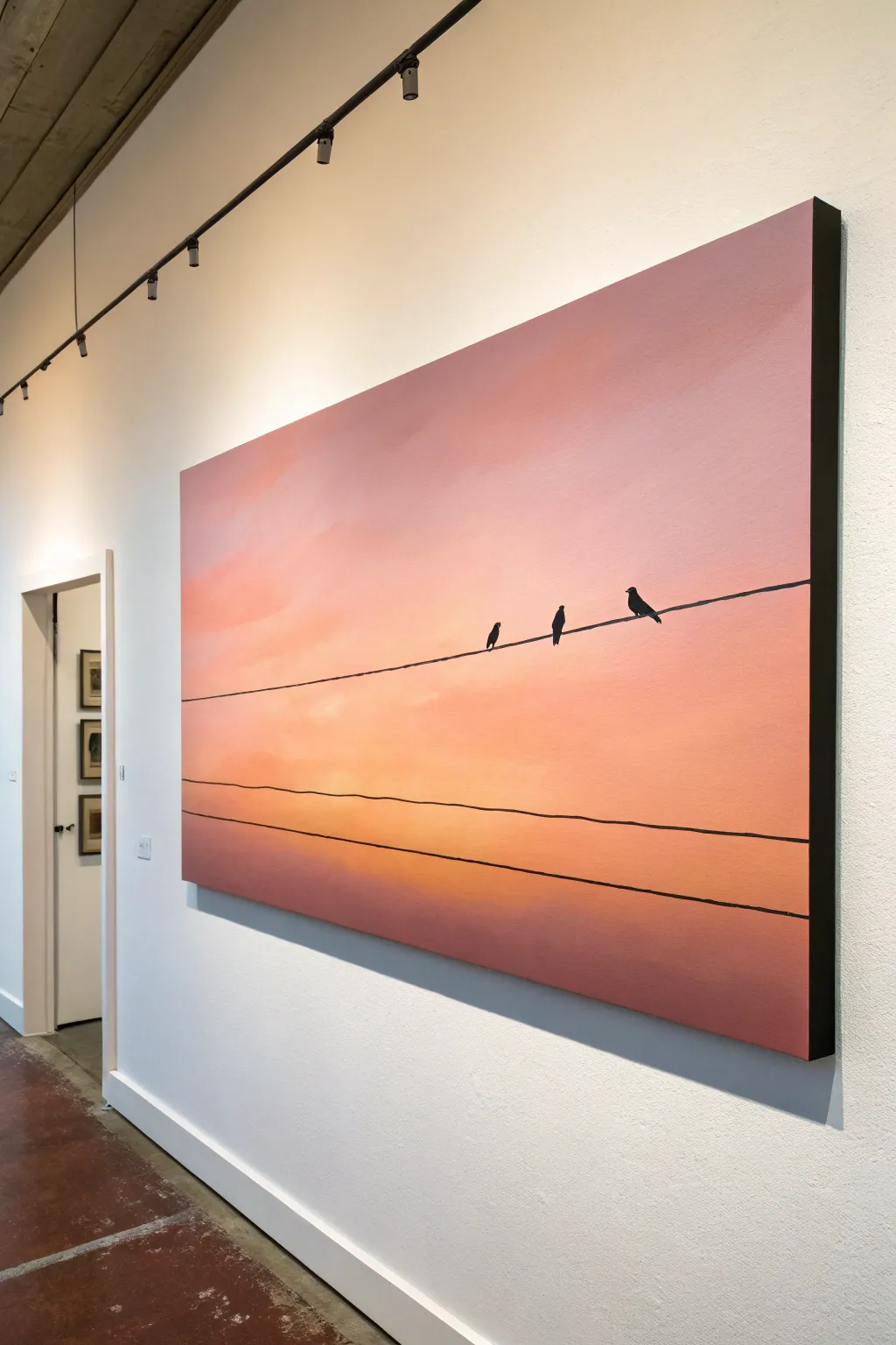
Capture the peaceful simplicity of dusk with this expansive gradient painting. By blending soft pinks and oranges behind stark black silhouettes, you can create a striking piece of modern art that feels both melancholic and warm.
Step-by-Step
Materials
- Large rectangular canvas (e.g., 24×36 or larger)
- Acrylic paints (Titanium White, Rose Pink, Cadmium Orange, Burnt Umber, Mars Black)
- Large flat paintbrush (2-3 inch)
- Medium filbert brush
- Small round detail brush (size 0 or 1)
- Ruler or straight edge (long enough for the canvas width)
- Pencil
- Palette for mixing
- Water cup and paper towels
- Slow-drying medium or retarder (optional)
Step 1: Creating the Gradient Sky
-
Prepare the dreamy palette:
Start by premixing your transition colors on the palette. You will need a pale, creamy pink for the top, a vibrant peach, a mid-tone orange, and a deeper, dusty purple-brown for the very bottom horizon line. -
Apply the top layer:
Using your large flat brush, paint the top third of the canvas with the pale pink mixture. Use long, horizontal strokes that span the entire width of the canvas to avoid choppy textures. -
Introduce the mid-tones:
While the pink is still tacky, introduce the peach color below it. Brush back and forth where the two colors meet to create a soft blur. I like to add a touch of slow-drying medium here to make the blending smoother. -
Deepen the horizon:
Continue working downward with the orange tones, gradually darkening the mix as you reach the bottom. The lowest section should be a hazy purple-brown, created by mixing a little Burnt Umber into your pinks and oranges. -
Smooth the transitions:
With a clean, slightly damp large brush, gently sweep across the transition lines one last time. The goal is an ethereal, cloud-like gradient where you can’t tell exactly where one color ends and another begins. -
Add subtle clouds:
Using a filbert brush with a very small amount of slightly lighter peach paint, scrub in a few wispy, diagonal cloud streaks on the left side. Keep these very faint and soft-edged. -
Paint the edges:
Don’t forget to paint the sides of your canvas with the corresponding gradient colors, or paint them a solid black for a framed look without the frame. Let the entire background dry completely before moving on.
Smooth Gradients
Work quickly when blending the sky background. Acrylics dry fast, so keep a spray bottle of water handy to lightly mist the canvas if the paint starts dragging.
Step 2: Drawing the Wires
-
Mark the wire anchor points:
Decide where your power lines will sit. Place small pencil marks on the left and right edges of the canvas. The top wire should angle slightly upward, while the bottom wires can run parallel but lower. -
Draft the lines:
Use a long straight edge and a pencil to very lightly connect your marks. Don’t press hard, as you don’t want to groove the canvas paint. -
Paint the main wire:
Mix a fluid consistency of Mars Black paint—add a drop of water if it helps the paint flow. Using your round brush or a liner brush, carefully trace over your top pencil line. -
Add distinct thickness:
Go over the top wire a second time to ensure it is opaque and solid black. This line needs to be substantial enough to visually support the weight of the birds. -
Paint the lower wires:
Paint the two lower lines across the bottom third of the canvas. These should be slightly thinner than the top wire to suggest depth or simply a different type of cable.
Urban Texture
Instead of birds, try painting the silhouette of a transformer box on the pole or adding dangling shoes to the wire for a gritty, urban street art vibe.
Step 3: Adding the Silhouettes
-
Block in bird shapes:
Identify the placement for your three birds on the top wire. Start by painting simple oval shapes for their bodies using the small round brush and black paint. -
Refine the heads:
Add smaller circles on top of the ovals for heads. Notice the postures: usually one looks straight ahead, while another might be looking up or to the side. -
Detail beaks and tails:
Use the very tip of your smallest brush to pull out tiny triangles for beaks and longer, rectangular shapes for the tail feathers hanging below the wire. -
Check the posture:
Ensure the feet connection points are small, making the birds look like they are gripping the wire rather than hovering above it. A tiny dab of paint connecting the body to the line is all it takes. -
Final touches:
Step back and check for any transparent patches in your black silhouettes. Apply a second coat of black to the birds and wires if necessary to achieve a stark, graphic contrast.
Hang your new masterpiece in a well-lit hallway to let those warm sunset colors really glow
Split-Season Landscape in One Rectangle
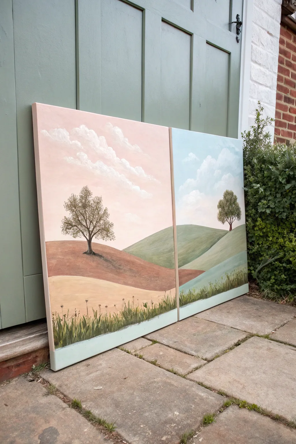
Transform two canvases into a seamless yet contrasting panoramic view, blending the warmth of autumn with the crisp coolness of spring. This diptych project guides you through painting a rolling landscape that flows across a split background, perfect for adding a sophisticated, large-scale feel to your walls.
Step-by-Step Tutorial
Materials
- Two large rectangular gallery-wrapped canvases (e.g., 24″ x 36″)
- Acrylic paints: Titanium White, Burnt Sienna, Yellow Ochre, Sap Green, Phthalo Blue, Alizarin Crimson, Raw Umber
- Large flat brush (2-inch width)
- Medium filbert brush
- Small round detail brush
- Fan brush (optional, for grass)
- Masking tape
- Palette and mixing knife
- Water cup and paper towels
Step 1: Planning and Sky gradients
-
Align your canvases:
Place your two canvases side-by-side on a flat surface or easel, ensuring they touch perfectly. Use a pencil to lightly sketch the horizon line and the rolling hill contours so they flow continuously from the left canvas to the right across the gap. -
Mix the warm sky:
For the left canvas, mix a large amount of Titanium White with a tiny touch of Alizarin Crimson and Yellow Ochre to create a soft, dusty pink. Paint the sky area, fading it into white as you move diagonally downward. -
Mix the cool sky:
For the right canvas, mix Titanium White with a small drop of Phthalo Blue. Apply this to the sky area, blending softly. Try to match the opacity of the pink side so the textures feel consistent even though the colors differ. -
Paint the clouds:
Using a filbert brush and pure Titanium White, scumble in diagonal cloud formations. Let the clouds drift from the pink sky across the invisible border into the blue sky, unifying the two halves.
Step 2: Painting the Landscape
-
Base coat the warm hills:
On the left canvas, mix Burnt Sienna with a little White and Raw Umber for the middle hill. Paint the rolling shape solid. For the foreground hill, use Yellow Ochre mixed with White for a sandy, dried-grass look. -
Base coat the cool hills:
On the right canvas, mix Sap Green with White and a touch of Burnt Sienna to dull it down. Paint the background hill. Bring this green shape slightly onto the left canvas to create the transition where the seasons meet. -
Refine the hill transition:
Where the brown hill from the left meets the green hill on the right (usually near the bottom center), blend the wet paints slightly or layer a glaze of brownish-green to make the ground shift colors naturally. -
Add depth and shadows:
Use a slightly darker version of your hill colors (add Raw Umber or less White) to paint the ‘shadow side’ of the hills, particularly underneath where the trees will sit.
Keeping the Horizon Straight
If your contour lines don’t match up when you hang the finished canvases, place a strip of masking tape across both canvases while they are side-by-side during the sketching phase.
Step 3: Trees and Details
-
Draft the tree structures:
Mix Raw Umber with a touch of blue for a dark, almost black brown. Using a small round brush, paint the skeletal trunk and branches of the main tree on the left and the smaller tree on the right. -
Stipple the foliage:
Using an old, splayed brush or a sea sponge, tap in the leaves. For the left tree, use olive tones mixed with ochre. For the right tree, use a brighter Sap Green. Keep the foliage airy so the sky peeks through. -
Paint the tree shadows:
Mix a transparent glaze of Burnt Umber and paint a soft shadow stretching from the base of the tree trunks down the slope of the hills. This grounds your trees instantly. -
Add foreground grass:
Along the very bottom edge of both canvases, mix a dark green-brown. Use a fan brush or small liner brush to flick upward strokes, creating a border of tall wild grasses. -
Highlight the grass:
Mix a lighter yellow-green and add a second layer of grass strokes over the dark ones to create dimension and catch the light. -
Add the bottom border:
Paint a clean, solid strip of pale mint or light grey along the absolute bottom edge of the canvas (below the grass line) to frame the painting like a polaroid or window sill.
Cloud Continuity
When painting clouds near the center gap, push the canvases together and paint across the crack. Then separate them to paint the specific canvas edges to ensure the image wraps fully.
Step back and admire how a simple color shift changes the entire mood of your panoramic landscape
Vertical Botanical Climb
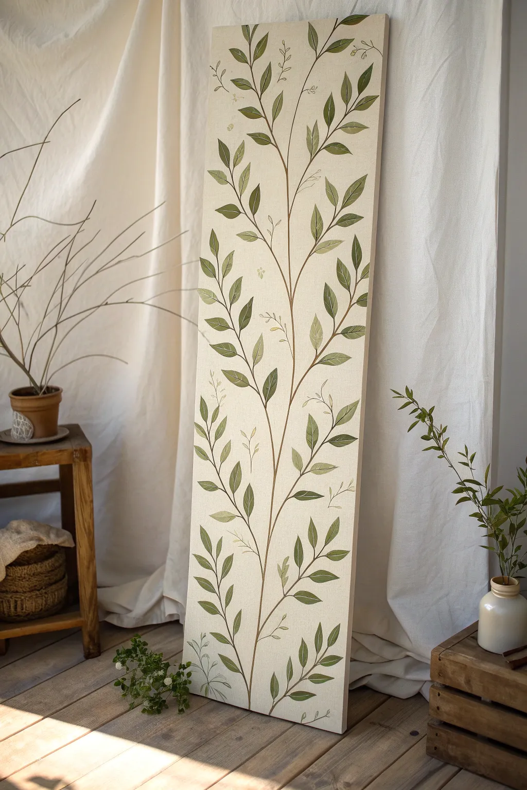
This elegant vertical project transforms a simple canvas into a towering botanical study, featuring a delicate climbing vine that draws the eye upward. The soft cream background and layered, organic foliage create a serene, nature-inspired focal point perfect for narrow wall spaces.
Step-by-Step Tutorial
Materials
- Long, narrow stretched canvas (e.g., 12 x 36 inches or similar ratio)
- Acrylic paints: Titanium White, Unbleached Titanium (or Cream), Raw Umber, Burnt Sienna, Sap Green, Olive Green, Yellow Ochre
- Gesso (if canvas isn’t pre-primed)
- Medium flat brush (1 inch)
- Small round brush (size 2 or 4)
- Fine liner brush (size 0 or 00)
- Graphite pencil (HB or 2B)
- Palette for mixing
- Water cup and paper towels
- Matte varnish (optional)
Step 1: Setting the Stage
-
Prepare the canvas:
Begin by wiping down your canvas to ensure it is free of dust. If your canvas feels rough, apply a thin coat of gesso and sand it lightly once dry for a smoother painting surface. -
Mix the background color:
Create a warm, neutral base by mixing Titanium White with a generous amount of Unbleached Titanium or a touch of Yellow Ochre. You want a soft, creamy off-white that mimics the look of raw linen or parchment. -
Apply the base coat:
Using your medium flat brush, paint the entire canvas with your background mix. Utilize long, vertical strokes to encourage a slight texture that runs up the length of the canvas. Let this dry completely before proceeding.
Fixing Shaky Lines
If your vine stems look shaky, don’t worry. Wait for the brown to dry, then use the background cream color to ‘erase’ or thin the wobbles from the outside in.
Step 2: Sketching the Structure
-
Plan the main stem:
Lightly visualize a central S-curve that meanders from the bottom center to the very top. It doesn’t need to be perfectly straight; a gentle, organic sway looks more natural. -
Draft the primary vine:
With your graphite pencil, sketch the main central stem line. Keep your touch very light so the graphite doesn’t smear into the paint later. -
Add branch placement:
Mark small off-shoots alternating up the stem where your leaf clusters will go. I find spacing them somewhat irregularly helps avoid a stiff, ladder-like appearance. -
Sketch the leaves:
Draw the basic almond or lanceolate shapes of the leaves attached to the branches. Vary the sizes—larger leaves near the bottom and slightly smaller ones as you reach the top.
Step 3: Painting the Vine
-
Mix stem colors:
Combine Raw Umber with a touch of Burnt Sienna to get a warm, woody brown. Thin the paint slightly with water to ensure it flows smoothly off the brush. -
Paint the main stem:
Using your small round brush or liner brush, trace over your pencil line for the main stem. Vary the pressure—press harder at the base for thickness and lift up for a whisper-thin line at the top. -
Add the branches:
Paint the smaller branches connecting to the leaves. Ensure these connections feel fluid and tapered, like natural growth.
Golden Hour Glow
Mix a tiny amount of metallic gold paint into your highlight green. It adds a subtle shimmer that catches the light, making the leaves look sun-kissed.
Step 4: Developing the Foliage
-
Create a green palette:
Prepare three shades of green on your palette: a dark mix (Sap Green + tiny bit of Raw Umber), a mid-tone (Sap Green + Olive Green), and a light highlight (Olive Green + White). -
Block in the leaves:
Start with the mid-tone green. Fill in the leaf shapes using the round brush, painting from the stem outward to the leaf tip to mimic the direction of growth. -
Add depth and shadow:
While the base green is still slightly tacky or just dry, paint the lower half or the stem-side of the leaves with your darker green mix to create volume. -
Apply highlights:
Dip into your lightest green mix. Add soft streaks along the upper edges or tips of the leaves where light would naturally hit. -
Detail the veins:
Switch to your fine liner brush and the dark green or thinned brown mix. Carefully paint a central vein down the middle of the larger leaves for added realism.
Step 5: Finishing Touches
-
Create the ‘sketch’ effect:
To achieve the artistic, illustrative look seen in the photo, take a sharpened pencil or a very dilute grey paint and draw faint outlines of ‘ghost’ leaves or tendrils in the background. These should look like preliminary sketches that were left intentional. -
Add delicate tendrils:
Use the liner brush with watered-down brown paint to add tiny, curly tendrils wrapping around parts of the main stem. These should be very fine and sparse. -
Refine edges:
Review your leaves. If any edges look too messy, use a little of the background cream color to cut back in and clean up the silhouette. -
Seal the work:
Once the painting is fully cured (usually 24 hours), apply a coat of matte varnish to protect the surface without adding distracting glare.
Hang this tall beauty in a hallway or narrow corner to bring a breath of fresh air into your home
Abstract Color River Across a Wide Canvas
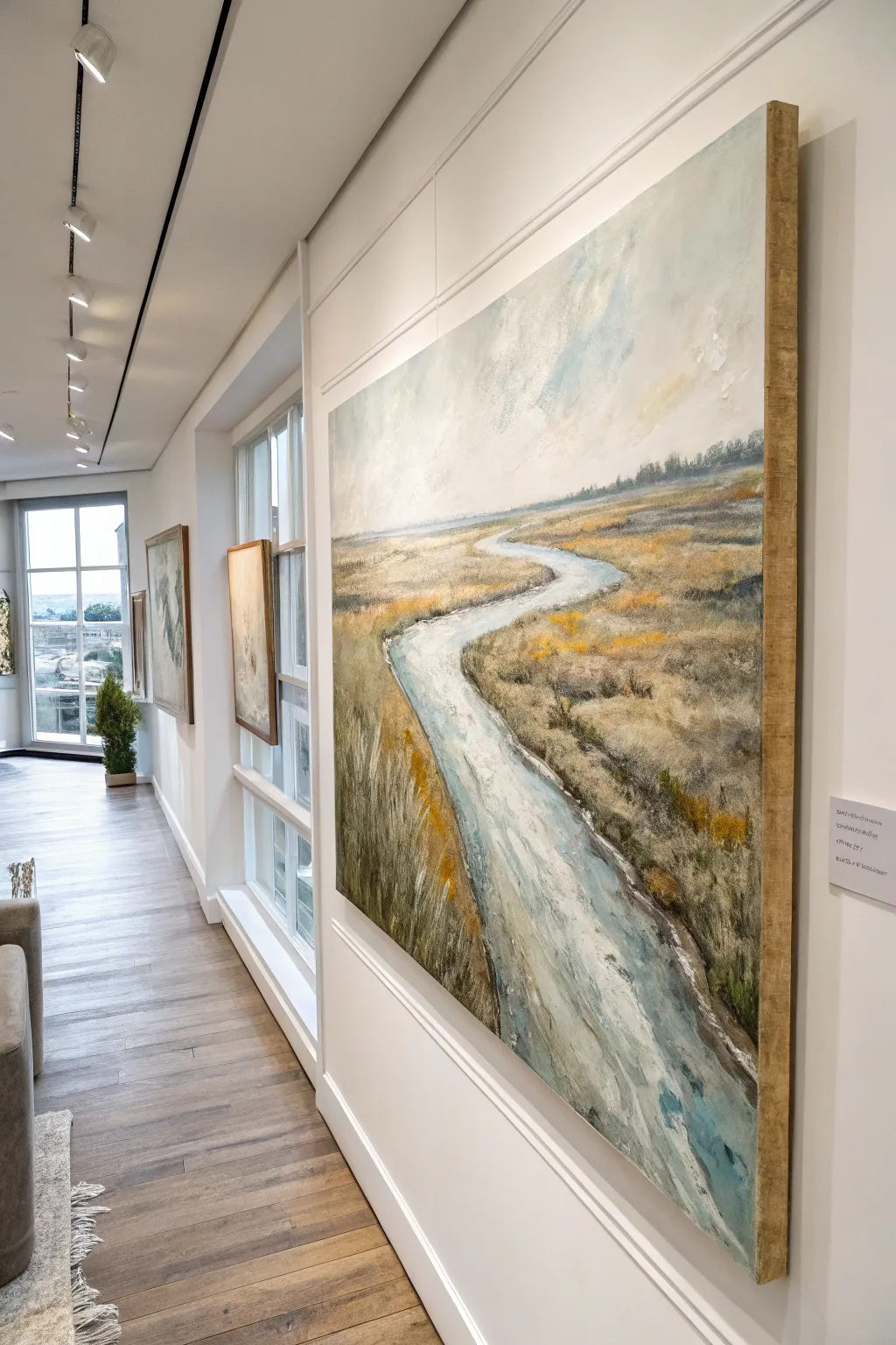
Capture the peaceful essence of a meandering river cutting through golden marshlands with this textured acrylic landscape. This vertical composition uses layers of soft blues and earthy ochres to draw the viewer’s eye deep into the distant horizon.
Step-by-Step
Materials
- Large rectangular canvas (approx. 24×36 or 30×40 inches)
- Acrylic paints: Titanium White, Ultramarine Blue, Cerulean Blue, Yellow Ochre, Burnt Sienna, Raw Umber, Sap Green
- Gesso (optional, for priming)
- Large flat brushes (2-inch and 1-inch)
- Medium round brushes
- Palette knife
- Modeling paste or heavy body gel medium
- Water container and paper towels
- Easel
Step 1: Preparation and Sketching
-
Prime the Surface:
Even if your canvas is pre-primed, applying a fresh coat of gesso creates a smoother starting point. Let it dry completely before moving forward. -
Map the Horizon:
Using a diluted wash of Raw Umber and a medium brush, paint a horizon line somewhere in the upper third of the canvas. Keep it slightly soft rather than a rigid ruler line. -
Sketch the River Path:
Draw the winding shape of the river. Start narrow at the horizon line and widen it significantly as it curves down toward the bottom right corner, creating a strong sense of perspective.
Muddy Colors?
If your greens and oranges are turning brown, let the bottom layer dry completely before adding the next. Wet-on-wet mixing creates mud; layering requires patience.
Step 2: Sky and Background
-
Mix Sky Colors:
Create a pale, muted blue by mixing Titanium White with a tiny touch of Ultramarine Blue and a speck of Raw Umber to desaturate it. You want a cloudy, atmospheric look. -
Paint the Sky:
Using your large flat brush, apply the sky color with loose, crisscross strokes. Blend in pure Titanium White near the horizon to suggest distance and light. -
Add Subtle Clouds:
While the sky is still slightly wet, dab in hints of warmer white mixed with a touch of Yellow Ochre. This adds depth and warmth to the upper atmosphere. -
Create the Distant Treeline:
Mix a dark, cool grey-green using Sap Green, Ultramarine Blue, and Burnt Sienna. With a smaller brush, stipple a faint, low line of trees right along the horizon, keeping the edges blurry to push them into the distance.
Step 3: Foundational Landscapes
-
Block in the Terrain:
Mix a base color for the land using Yellow Ochre and a touch of Burnt Sienna. Apply this loosely to the land areas on either side of the river, leaving the riverbed blank for now. -
Establish the River Base:
Fill the river shape with a light, cool blue wash. Mix Titanium White with Cerulean Blue. The paint can be somewhat thin here, as we will add texture later. -
Add Depth to the Banks:
Along the edges of the river, darken your earth tones with Raw Umber to create the shadow of the riverbank dropping down to the water.
Golden Hour Glow
Glaze the entire finished painting (once dry) with a very thin wash of transparent Gold or Zinc White to handle light differently and unify the tone.
Step 4: Building Texture and Detail
-
Introduce Texture Medium:
Mix your modeling paste with some heavy body Yellow Ochre and Titanium White. I like to use a palette knife here to scrape and drag this mixture across the foreground grass areas to create physical relief. -
Layering Grasses:
Using a dry bristle brush, flick upward strokes of Raw Umber and Sap Green in the foreground to suggest tall marsh grasses. Let the brush skipping over the canvas weave the texture naturally. -
Highlighting the Fields:
On top of the darker grasses, layer lighter strokes of Yellow Ochre and Unbleached Titanium. Concentrate these lighter values on the ‘top’ surfaces of the land where the sun would hit. -
Adding River Movement:
Return to the river with thicker white and pale blue paint. Use long, horizontal strokes with a palette knife or flat brush to mimic the sheen of water and the current’s flow.
Step 5: Refinement and Atmosphere
-
Deepen the River Edges:
Glaze a thin, watery mix of Burnt Sienna and Ultramarine Blue along the very edge of the water to show reflection and depth. -
Create Atmospheric Haze:
Mix a very watery glaze of white. Lightly brush this over the most distant part of the river and land (near the horizon) to make them look further away compared to the textured foreground. -
Final Highlights:
Use pure Titanium White on the palette knife to add sparkling highlights to the widest part of the river in the foreground and the tips of the nearest grasses. -
Paint the Gallery Edge:
Paint the sides of your canvas a neutral grey or continue the painting around the edges for a finished, professional look without a frame.
Step back and admire the depth you have created in your tranquil landscape


Have a question or want to share your own experience? I'd love to hear from you in the comments below!