When I pull out metallic watercolor, it instantly turns a simple wash into something that shifts and shines as you move it under the light. Here are my favorite metallic watercolor painting ideas—starting with the classics people crave and ending with a few studio-style experiments that are pure shimmer therapy.
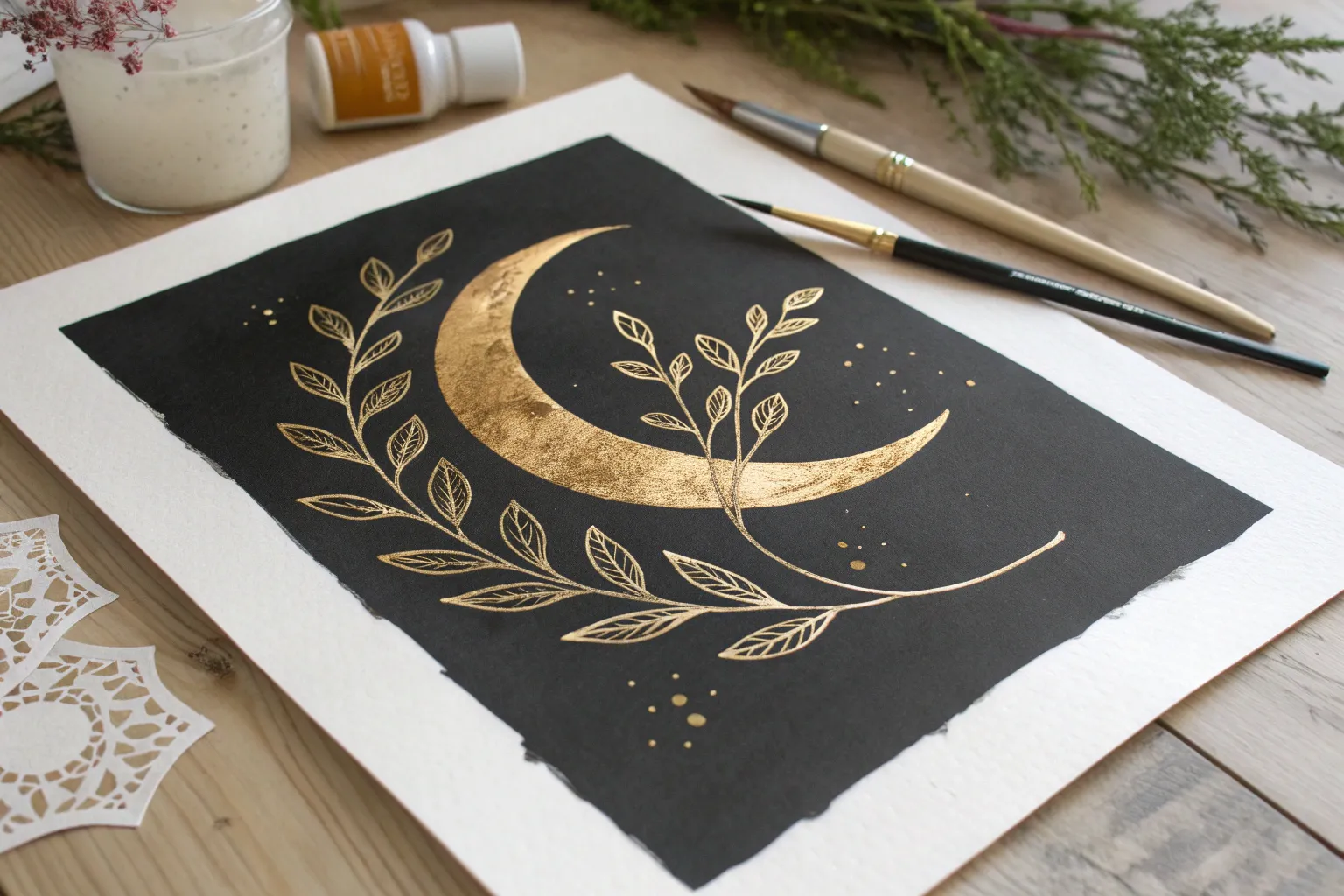
Gold Moon With Silver Cloud Edges
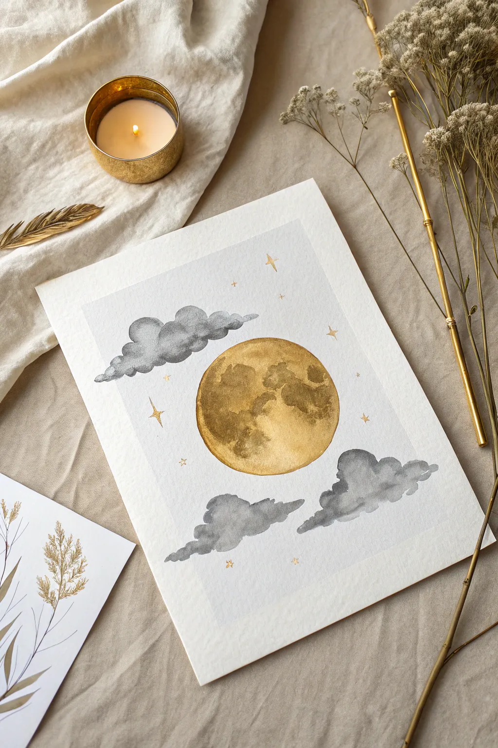
Capture the magic of a night sky with this stunning watercolor project featuring a luminous metallic gold moon nestled among moody grey clouds. The contrast between the shimmering celestial body and the soft, matte storm clouds creates a piece that feels both serene and powerful.
Detailed Instructions
Materials
- Cold press watercolor paper (300 gsm)
- Metallic gold watercolor paint (high pigment)
- Payne’s Grey or Sepia watercolor paint
- Pencil and eraser
- Compass or circular object for tracing
- Round watercolor brush (size 6 or 8)
- Small detail brush (size 0 or 1)
- Clean water and paper towels
- Masking fluid (optional but helpful)
Step 1: Preparation and Sketching
-
Paper Setup:
Begin by taping down your watercolor paper to a hard board using creating tape. This prevents the paper from buckling when wet and leaves a clean, crisp border around your artwork once removed. -
Draw the Moon:
Use a compass or trace around a circular object (like a jar lid or roll of tape) to draw a perfect circle in the center of your page. Keep your pencil lines very light so they don’t show through the metallic paint later. -
Sketch the Clouds:
Lightly sketch the outlines of the clouds. Place one grouping overlapping the top left of the moon slightly, and two separate cloud formations floating below the moon. Keep the shapes organic and fluffy, avoiding rigid straight lines. -
Protect the Moon (Optional):
If you are worried about accidentally painting grey into your moon area, you can apply a thin layer of masking fluid over the circle. Allow it to regular-dry completely before proceeding. Otherwise, just paint carefully around the edge.
Boost the Shine
For an extra reflective moon, apply a second layer of gold only to the crater areas once the first layer is dry. This layering builds physical texture.
Step 2: Painting the Gold Moon
-
Base Gold Layer:
Activate your metallic gold watercolor with a few drops of water and let it sit for a minute to get creamy. Load your round brush and fill in the entire circle with a solid, even wash of gold. Don’t worry about texture yet; just get good coverage. -
Creating Craters:
While the base layer is still slightly damp (but not soaking wet), drop in more concentrated gold pigment in irregular blotches. Focus these darker areas on the right side and bottom left to mimic lunar craters and maria. -
Lifting Highlights:
Rinse your brush and pat it almost dry on a paper towel. Gently lift some pigment away from the center-left area of the moon to create a brighter highlight, giving the sphere dimension. Let the moon dry completely.
Step 3: Painting the Clouds
-
Middle Wash:
Mix a watery wash of Payne’s Grey (or a mix of black and blue). Use your round brush to paint the bodies of the clouds. Use a ‘wet-on-dry’ technique here to keep the edges relatively crisp against the white paper background. -
Softening Edges:
Immediately after laying down the grey, rinse your brush and use just damp bristles to soften the internal edges of the clouds, creating a gradient from dark to light within each puff. Keep the bottom edges flatter and the top edges fluffier. -
Adding Contrast:
While the clouds are still damp, drop clearer, darker pigment into the bottom sections of the cloud formations. This adds weight and volume to the clouds, making them look 3D. -
Detailing Edges:
For the cloud sections that overlap or touch the moon, be extremely precise. I like to use a smaller brush here to ensure the grey paint comes right up to the gold edge without bleeding into it.
Bleeding Edges?
If gold bleeds into the grey or vice versa, your paint was too wet. Let the first shape dry completely (use a hair dryer!) before painting an adjacent shape.
Step 4: Final Details
-
Adding Stars:
Switch to your smallest detail brush (size 0 or 1). Load it with thick, creamy gold paint. Paint tiny four-pointed stars scattered around the sky. Vary their sizes—some tiny dots, some larger cross-shapes. -
Micro-Stars:
Add extremely small dots of gold in clusters near the larger stars to create the look of distant galaxies or stardust. -
Remove Tape:
Once the painting is 100% bone dry, carefully peel away your masking tape at a 45-degree angle away from the painting to reveal your crisp white border.
Now you have a shimmering piece of celestial art ready to frame or gift


Metallic Constellation Map
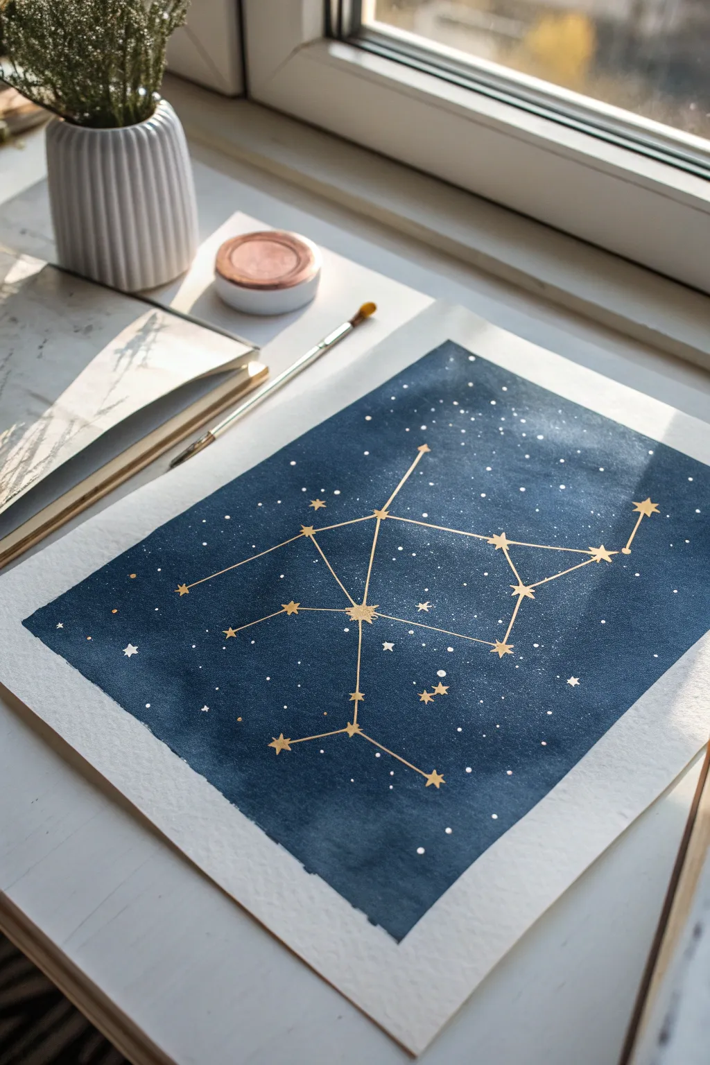
Capture the magic of the night sky by combining deep, moody indigo watercolors with the striking brilliance of metallic gold. This constellation map uses simple masking and layering techniques to create a piece that feels both cosmic and elegant.
Step-by-Step
Materials
- Cold press watercolor paper (block or taped down)
- Indigo or Payne’s Gray watercolor paint
- Metallic gold watercolor paint or gold gouache
- Large flat wash brush (1 inch or similar)
- Fine detail brush (size 0 or 00)
- White gouache or white ink
- Stiff bristle brush or old toothbrush
- Pencil and ruler
- Gold metallic marker (optional, for sharper lines)
- Washi tape or masking tape
- Paper towels
- Cup of water
Step 1: Preparing the Night Sky
-
Paper preparation:
Begin by securing your watercolor paper to a board using washi tape or masking tape. This creates that crisp, clean white border seen in the final piece and prevents the paper from buckling under a heavy wash. -
Mixing the void:
Mix a generous puddle of Indigo or Payne’s Gray paint. You want a high pigment-to-water ratio to achieve that deep, velvety midnight blue color, but ensure it’s fluid enough to spread easily. -
Laying the wash:
Using your large flat wash brush, apply the dark blue paint across the entire taped area. Work quickly from top to bottom to maintain a ‘wet edge’ and avoid uneven drying lines. -
Deepening the tone:
While the first layer is still damp (not soaking wet), you can drop in concentrated pigment in random areas to create subtle cloud-like variations in the deep space darkness. -
Drying time:
Allow this base layer to dry completely. The paper must be bone-dry and cool to the touch before moving to the next step, or your stars will bleed into the blue.
Starry Depth
For a 3D effect, mix a tiny bit of blue into your white splatter mix for fainter, ‘distant’ stars, then layer pure white speckles on top after the first layer dries.
Step 2: Creating the Galaxy
-
Prepping the stars:
Dilute a small amount of white gouache or white ink with water until it reaches a milky consistency. -
The splatter technique:
Dip a stiff bristle brush or an old toothbrush into the white mixture. Run your thumb across the bristles to flick tiny speckles onto the dark background. -
Adding texture:
Vary the distance between your brush and the paper to create different star sizes. Keep the density somewhat uniform, but random enough to look natural. -
Drying the stars:
Let these white speckles dry fully. I usually give this about 10-15 minutes just to be safe before touching the surface again.
Uneven Wash?
If your blue background dries with ‘cauliflower’ blooms/backruns, don’t restart. Embrace them as nebulas or cosmic dust clouds; the stars will camouflage most imperfections.
Step 3: Drafting the Constellation
-
Pencil mapping:
Lightly sketch the position of your main ‘bright’ stars using a pencil. You can choose a real constellation like Orion or Cassiopeia, or invent your own geometric design. -
Connecting the dots:
Use a ruler to lightly draw the connecting lines between your star points. Keep the pressure very light so the pencil graphite doesn’t show through the gold later. -
Painting primary stars:
Using your fine detail brush and the metallic gold paint, create five-pointed stars over your main pencil marks. Make these larger than the background speckles. -
Adding secondary stars:
Paint smaller gold dots or tiny crosses at the intersections or ends of lines that don’t have a major star.
Step 4: Gilding the Lines
-
Mixing the gold:
Activate your metallic gold watercolor with a few drops of water. Stir it until it has a creamy, opaque consistency similar to melted butter. -
Loading the brush:
Load your fine liner brush with the gold paint. Twist the tip on your palette to ensure it comes to a sharp point. -
Drawing the connections:
Carefully trace over your pencil lines with the gold paint. If you struggle with brush control, a gold metallic marker is a fantastic alternative for these straight lines. -
Enhancing the shine:
Once the gold lines are dry, do a second pass if the first layer looks too sheer against the dark blue background. -
Adding scattered gold:
For extra depth, paint a few tiny, lone gold stars randomly in the empty spaces of the blue wash, away from the main constellation. -
The reveal:
Wait until everything is absolutely dry—metallic paint can stay tacky longer than regular watercolor. Then, slowly peel off the masking tape at a 45-degree angle to reveal the crisp border.
Now you have a shimmering piece of the galaxy to hang on your wall or gift to a stargazer


Ocean Waves With Metallic Highlights
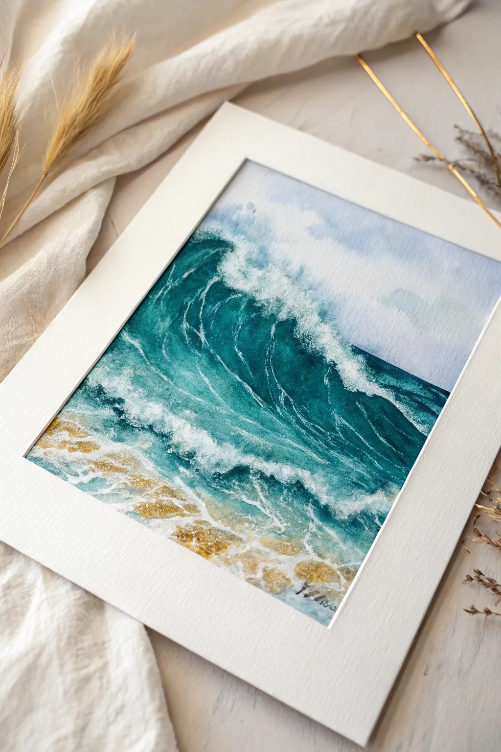
Capture the raw energy of a crashing wave while adding a touch of elegance with shimmering metallic accents. This project combines deep, moody ocean hues with bright white gouache foam and golden sand to create a dynamic seascape that sparkles in the light.
Step-by-Step Guide
Materials
- Cold press watercolor paper (300 gsm)
- Watercolor paints (Indigo, Turquoise, Phthalo Blue, Burnt Sienna)
- Metallic watercolor pan (Gold or Bronze)
- White gouache or bleed-proof white ink
- Round brushes (Size 4, 8, and a rigger/liner brush)
- Masking fluid (optional, but recommended for foam)
- Old toothbrush (for splattering)
- Paper towels
- Two jars of water
- White mat board for framing
Step 1: Planning and Sky
-
Sketch the wave:
Begin by lightly sketching the outline of your main wave crest and the shoreline foam patterns with a hard pencil (H or HB). Avoid pressing too hard, as graphite can muddy the yellow gold later. -
Mask the brightest whites:
If you want to preserve the pure white of the paper for the brightest foam, carefully apply masking fluid to the very top edge of the crashing wave and the thickest foam clusters on the sand. Let this dry completely. -
Paint the sky:
Wet the sky area above the wave with clean water. For a moody, subtle sky, drop in a very dilute mix of Indigo and a touch of Turquoise. Keep it pale and undefined so it doesn’t distract from the main wave. -
Soften the horizon:
While the sky is still damp, lift out some pigment with a thirsty brush to suggest distant clouds or mist on the horizon line.
Creating Flow
When painting the wave’s curve, move your whole arm, not just your wrist. This creates fluid, confident strokes that mimic the natural flow of water better than stiff, short lines.
Step 2: Building the Ocean
-
Base layer for the water:
Mix a vibrant teal using Phthalo Blue and Turquoise. Apply this wash to the main body of the wave, keeping it lighter near the top where light hits, and darker in the trough. -
Deepen the shadows:
While the base layer is still slightly damp, drop in concentrated Indigo right under the curl of the wave. This creates the depth and volume needed to make the water look heavy. -
Paint the background sea:
For the water behind the wave, use a flatter, horizontal stroke with a medium blue mix. Ensure a crisp horizon line where it meets your pale sky. -
Transition to shore:
As you move towards the bottom of the paper, let the blue wash fade out. Paint the sandy area with a light wash of Burnt Sienna, blending it slightly where it meets the shallow water.
Step 3: Adding the Drama
-
Enhance wave movement:
Once the main wave is dry, use a smaller round brush to paint directional lines inside the curve of the wave. These striations show the water being pulled upward into the crest. -
Add white gouache foam:
Using white gouache (or bleed-proof white) and a rigger brush, paint the chaotic foam patterns. Focus on the crashing lip and the trailing foam on the water’s surface. -
Create the spray:
Load an old toothbrush with slightly watered-down white gouache. Flick the bristles with your thumb to spray fine mist over the top of the wave, simulating the sea spray. -
Detail the seafoam:
Paint distinctive ‘lace’ patterns on the surface of the wave face using fine, trembling lines of white. This detail is crucial for realistic texture.
Level Up: Texture
Sprinkle a tiny pinch of coarse salt onto the wet sandy area before adding the metallic gold. Once dry, brush it off for a pitted, realistic sand texture that catches the light.
Step 4: The Metallic Finish
-
Prepare the gold:
Activate your metallic gold pan with a few drops of water. You want a creamy consistency, thick enough to be opaque but fluid enough to flow. -
Isolate the sand:
Apply the gold paint specifically to the wet sand area at the bottom. Intersperse it with the Burnt Sienna tones to make the sand look like it’s glistening in the sun. -
Adding hidden sparkles:
I like to add tiny touches of gold into the white foam near the shore. This reflects the idea of sunlight catching the churned-up sand and water. -
Refine the foreground:
Use the white gouache again to paint final foam lines *over* parts of the gold sand. This layering creates a receding depth, placing the water visually on top of the sparkling beach. -
Final touches:
Wait for everything to dry completely. If you used masking fluid, rub it off gently now. Touch up those revealed white areas with a little extra gouache if needed for softness. -
Frame it:
Place a clean white mat over the painting. The stark white border will make the deep blues and metallic gold pop incredibly well.
Step back and admire how the gold catches the light, bringing the warmth of the sun to your stormy seas.
Koi Fish With Shimmering Scales
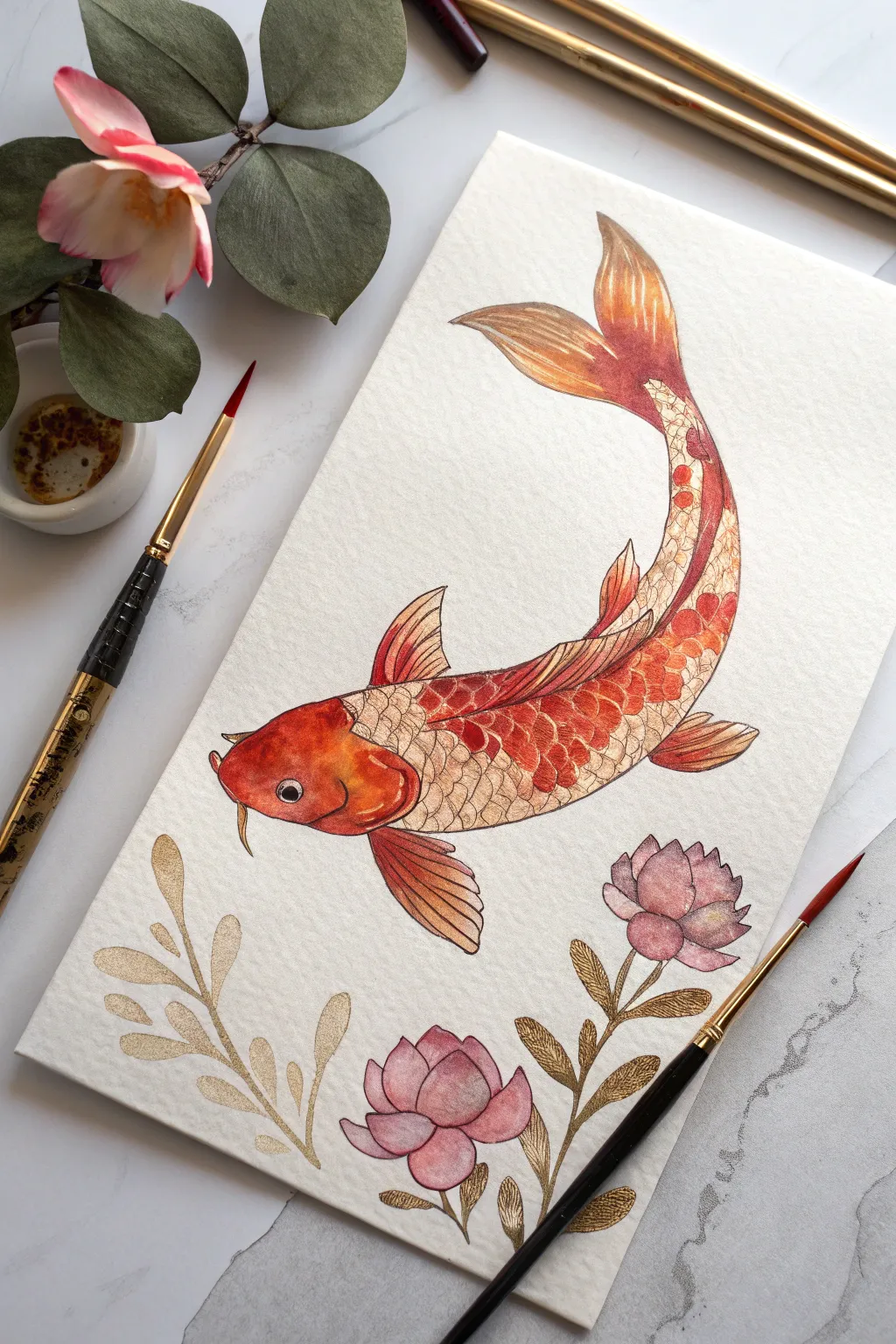
Capture the fluid elegance of a koi fish using a blend of vibrant watercolors and light-catching metallic accents. This project combines traditional layering techniques with shimmering gold details to create a piece that glows from every angle.
Step-by-Step Tutorial
Materials
- Cold press watercolor paper (300 gsm)
- Pencil (HB or H) and kneaded eraser
- Watercolor paints (Vermilion, Scarlet, Orange, Pink, Burnt Sienna)
- Metallic gold watercolor paint or gold ink
- Round brushes (sizes 2, 4, and 6)
- Fine liner brush (size 0 or 00) for detailing
- Black waterproof fine liner pen (0.1mm or 0.3mm)
- Clean water and paper towels
Step 1: Sketching and Outlining
-
Outline the curve:
Begin with a light pencil sketch of the fish’s body, focusing on the dynamic ‘S’ curve to imply movement. Draw the head slightly wider, tapering down continuously to the tail fin. -
Add anatomical details:
Sketch the dorsal fin on the back, the pectoral fins near the head, and the flowing tail fin at the top. Add the barbels (whiskers) near the mouth and position the eye on the side of the head. -
Draft the scales:
Lightly draw a grid or diamond pattern along the body to guide your scale placement. Don’t worry about perfection; organic variation looks more natural. -
Position the flora:
Sketch two lotus-style flower buds and several stems of leafy branches at the bottom of the paper to frame the composition. -
Ink the lines:
Using a waterproof black fine liner, carefully trace over your pencil lines. Use distinct, confident strokes for the outer shape and delicate touches for the scales. Erase pencil marks once the ink is dry.
Gold Paint Consistency
If your gold paint looks transparent or dull, add less water. It should feel like melted butter on your brush. Apply a second coat if the first dries too sheer.
Step 2: Painting the Base Layers
-
Wash the head:
Mix a vibrant orange-red using Vermilion and a touch of Orange. Apply a wet-on-dry wash to the head, darkening the color near the nose and cheeks for dimension. -
Base coat the body:
For the body scales, prepare a diluted wash of Burnt Sienna mixed with a little orange. Paint a very light, almost transparent wash over the scaled area, avoiding the fins for now. -
Define the patches:
Koi are famous for their patterns. While the base is damp (not soaking), drop in concentrated Scarlet or Red paint onto random clusters of scales to create the classic ‘Kohaku’ red markings. -
Paint the fins:
Use a mix of Orange and Burnt Sienna for the fins. Paint from the body outward, lifting your brush at the end of the stroke to keep the edges soft and feathered. -
tint the flowers:
Dilute a soft pink watercolor and paint the flower buds. Concentrate the pigment at the base of the petals and use clean water to blend it out towards the tips for a gradient effect.
Pro Tip: Shadow Depth
Mix a tiny bit of purple into your orange shadow color. Apply this sparingly under the fins and belly to make the fish pop off the page instantly.
Step 3: Adding Metallic Shimmer
-
Prep the gold:
Activate your metallic gold watercolor with a few drops of water. Let it sit for a minute to become creamy and opaque. -
Gild the individual scales:
Using your smallest round brush, paint gold onto the individual scales that are *not* colored red. You can paint the whole scale or just outline the bottom edge for a highlighted look. -
Highlight the red patches:
I like to add thin gold lines over the red patches or along the spine of the fish to suggest light hitting wet scales. -
Detail the fins:
With a rigger or fine liner brush, paint thin gold streaks along the ribs of the fins and tail. This mimics the fin rays catching the light. -
Paint the gold foliage:
Fill in the leafy stems entirely with the metallic gold paint. Ensure the paint is thick enough to cover the paper texture smoothly. -
Finish the eye:
Paint the pupil black, leaving a tiny white dot for the reflection. Paint a small ring of gold around the pupil for a lively spark.
Let the piece dry completely before tilting it under a lamp to admire how the gold scales shimmer against the matte watercolor
BRUSH GUIDE
The Right Brush for Every Stroke
From clean lines to bold texture — master brush choice, stroke control, and essential techniques.
Explore the Full Guide
Dragonfly Wings in Iridescent Metallics
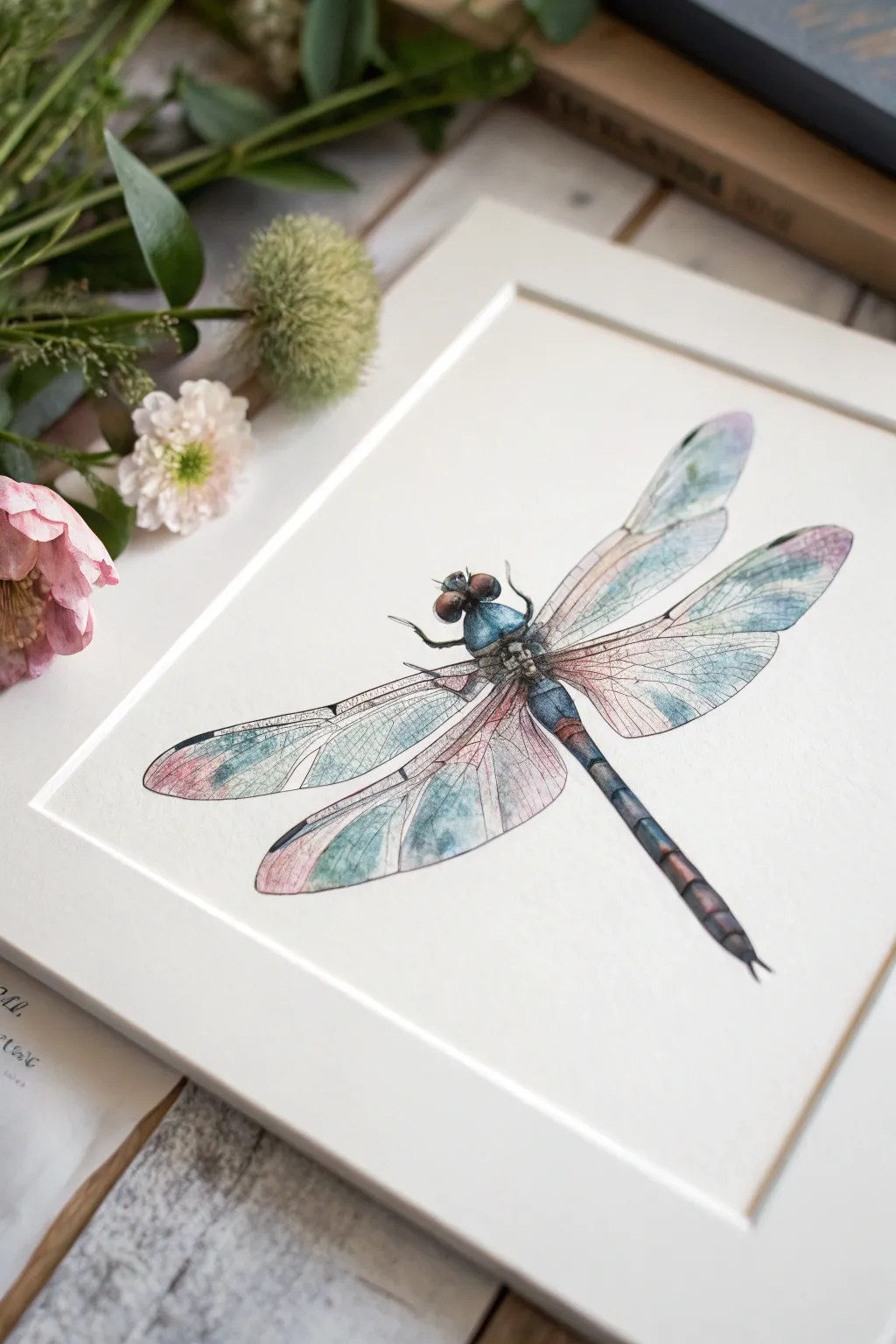
Capture the ethereal beauty of a dragonfly using translucent watercolors layered with shifting metallic hues. This project focuses on building delicate wing veins and achieving that signature shimmering, glass-like effect found in nature.
Step-by-Step
Materials
- Hot pressed watercolor paper (smooth texture is key for detail)
- Pencil (HB or H)
- Micron pen or waterproof fine liner (black, 005 and 01 sizes)
- Watercolor paints (Payne’s Gray, Indigo, Turquoise, Rose Madder)
- Metallic watercolor pan set (specifically pearl, iridescent blue, and champagne gold)
- Round brushes (size 0, 2, and 4)
- Masking fluid (optional)
- White gel pen
Step 1: Sketching the Framework
-
Basic Geometry:
Start by lightly sketching a central axis for the body. Draw an elongated oval for the abdomen, a thicker segment for the thorax, and a rounded shape for the head. Add the large eyes on either side of the head. -
Wing Placement:
Map out the four wings. The top pair should attach near the front of the thorax, angling slightly backward. The bottom pair attaches just below, angling more sharply back. Ensure they are long and tapered. -
Vein Grid:
Very lightly sketch the major veins running through the wings. Don’t stress about every tiny cell yet, just get the main structural lines in place.
Step 2: Inking the Details
-
Outlining the Body:
Using your 01 fine liner, carefully trace the body contours. Use broken lines on the thorax to suggest texture rather than a solid cartoon outline. -
Defining the Wings:
Switch to the ultra-fine 005 pen. Trace the outer edges of the wings. Draw the main veins with a steady hand, then fill in the delicate lattice-work of smaller veins, creating the ‘stained glass’ look. -
Cleanup:
Once the ink is completely dry, gently erase all pencil marks to leave a clean, crisp illustration.
Keep it Clean
Metallic pigments can be cloudy. Use two water jars: one for rinsing metallic brushes and one for regular colors. This keeps your non-metallic hues transparent and vibrant.
Step 3: Painting the Body
-
Base Tone:
Mix a watery wash of Turquoise and Indigo. Apply this to the thorax and upper abdomen, leaving small white gaps for highlights. -
Deepening Shadows:
While the first layer is damp, drop in concentrated Payne’s Gray along the edges of the body segments to create volume and roundness. -
Eye Detail:
Paint the eyes with a mix of Burnt Sienna or reddish-brown, darkening the edges with Indigo. Leave a tiny white spot on each eye for the reflection.
Framing for Impact
Float mount your finished piece in a shadow box frame. The slight distance from the backing board creates depth and allows light to catch the metallic wings beautifully.
Step 4: The Iridescent Wings
-
Wet-on-Wet Base:
Working on one wing at a time, wet the paper inside the wing shape with clean water. The paper should glisten but not puddle. -
Soft Color Drops:
Touch the wet paper with diluted Turquoise near the body, and Rose Madder near the wing tips. Let the colors bleed softly into each other without overmixing. -
Metallic Infusion:
I like to introduce the shine while the paper is still damp. Load your brush with iridescent blue and tap it into the center of the turquoise areas. -
Gold & Pearl:
Add touches of champagne gold or pearl watercolor to the pink areas and the clear sections of the wings. This creates the shifting sheen when viewed from different angles. -
Repeat Step:
Repeat this wet-on-wet process for the remaining three wings, varying the placement of blue and pink slightly to keep it organic.
Step 5: Final Definition
-
Restoring Contrast:
Once the wings are fully dry, the metallic paint might have obscured some ink lines. Go back with your 005 pen and re-darken key veins to make them pop against the shimmer. -
Tail Segments:
Paint the long tail segments with Indigo, fading to a lighter blue-grey near the tip. Use a dry brush technique to create the segmented look. -
Bright Highlights:
Use a white gel pen to add sharp, crisp highlights on the top of the thorax, the eyes, and the thickest veins of the wings.
Hang your artwork near a window or light source to truly enjoy the shifting colors of the wings
Rose Gold Florals on Dark Backgrounds
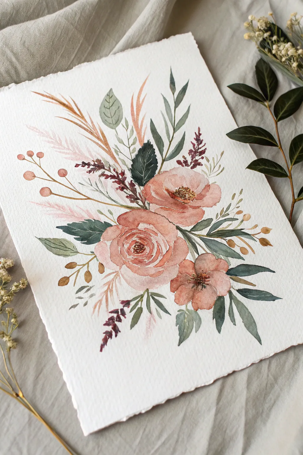
Capture the romantic interplay of dusty rose blooms and deep green foliage with this delicate watercolor tutorial. The soft, muted palette combined with the textured deckled paper creates a vintage-inspired piece perfect for framing.
Detailed Instructions
Materials
- Cold press watercolor paper (deckle edge preferred, 300gsm)
- Watercolor paints: Dusty Rose, Burnt Sienna, Payne’s Gray, Sap Green, Olive Green, Metallic Rose Gold
- Pointed round watercolor brushes (Size 2, 6, and 8)
- Pencil (HB or lighter) and kneaded eraser
- Clean water jar and paper towels
- Mixing palette
Step 1: Planning and Sketching
-
Paper Preparation:
Begin by selecting a high-quality sheet of cold press paper. If your paper doesn’t have a deckled edge, you can create one by carefully tearing the edges against a ruler for that rough, handmade look. -
Light Composition:
Using an HB pencil, very lightly sketch the placement of your three main flowers. Place the largest rose slightly off-center near the bottom, with a medium bloom above it and a smaller wild rose to the right. Keep lines faint as we don’t want them showing through the translucent petals. -
Foliage Guide:
Sketch the main directional lines for your greenery. Indicate where the tall grasses will sweep upwards and where the heavier leaves will anchor the bouquet at the bottom.
Wet-on-Wet Secrets
To get soft, romantic petals, pre-wet the petal shape with clean water first, then touch your pigment to the edge and let it bloom inward naturally.
Step 2: Painting the Blooms
-
Mixing the Rose Tone:
Create a watery mix of Dusty Rose with a tiny touch of Burnt Sienna to warm it up. We want a soft, pillowy color, not a bright pink. -
Center Rose Base:
Start with the large central rose. Using your size 6 brush, paint the tight, C-shaped strokes of the center first. Rinse your brush slightly and pull that pigment outward to create larger, lighter petals. Leave white gaps between strokes to define individual petals. -
Adding Depth:
While the paint is still damp but not soaking (the damp stage), drop a slightly more concentrated mix of the rose color into the center and the shadowy bases of the petals to create dimension. -
Upper and Side Blooms:
Paint the upper poppy-like flower and the side wild rose using the same technique. For the upper flower, keep the center open and unpainted for now. Let the floral layer dry completely.
Step 3: Adding Foliage and Details
-
Dark Contrast Leaves:
Mix Payne’s Gray with Sap Green for a deep, moody emerald. Use your size 6 or 8 brush to paint the large, pointed leaves tucked behind the roses. The contrast here is what makes the pink pop. -
Sage Green Elements:
Dilute your green mix significantly or switch to a pale Olive Green. Paint the rounded eucalyptus-style leaves near the top left, keeping the wash very transparent. -
Feathery Grasses:
Switch to your size 2 brush. Mix a very pale, watery pink wash. Use quick, upward flicking motions to create the feathery pampas grass elements on the left side of the bouquet. -
Golden Reeds:
Using a yellow ochre or light brown, paint the thin, tall reeds extending upward. Vary the pressure on your brush to make lines that taper elegantly. -
Berry Sprigs:
Paint the thin brown stems extending to the left. Add small, round berries using a mix of your rose color and a touch of orange. I find adding a tiny white highlight (by lifting paint or leaving paper white) makes them look spherical.
Elevate It
Mix metallic gold directly into your dark green leaf paint. It creates a shimmering, dark foliage that looks stunning when the light hits the artwork.
Step 4: Final Accents
-
Detailed Centers:
Once the flowers are bone dry, use a concentrated dark brown or maroon mix and a size 2 brush to dot in the stamens. For the open flowers, cluster these tiny dots tightly in the center. -
Textural Sprigs:
Add the dark purple-red textured sprigs that look like lavender or heather. Use a stippling motion (tapping the brush tip) to create that bumpy texture. -
Metallic Highlights:
This is where the magic happens. Take your Metallic Rose Gold paint and add subtle glazing over the edges of the rose petals and on the berries. Don’t cover the whole flower—just catch the light. -
Final Assessment:
Step back and look at the balance. If the bouquet feels too bottom-heavy, add a few more wispy green leaves extending upward using the tip of your brush.
Allow your painting to dry flat completely before framing to preserve the beautiful texture of the watercolor paper

PENCIL GUIDE
Understanding Pencil Grades from H to B
From first sketch to finished drawing — learn pencil grades, line control, and shading techniques.
Explore the Full Guide
Botanical Studies With Gilded Veins
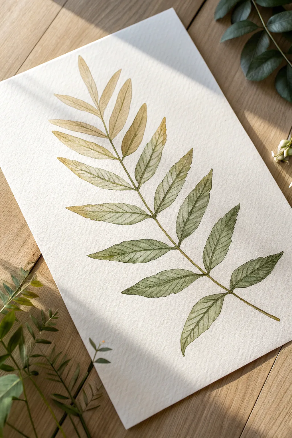
Capture the delicate beauty of a fern frond transitioning from autumn gold to summer green with this botanical watercolor study. By layering subtle metallic gold over traditional pigments, you’ll create shimmering veins that catch the light beautifully against the textured paper.
How-To Guide
Materials
- Cold press watercolor paper (300 gsm)
- Round watercolor brushes (size 4 and size 0/1 for details)
- Watercolor paints: Sap Green, Olive Green, Yellow Ochre, Burnt Sienna
- Metallic watercolor pan or gold gouache
- Pencil (HB or H)
- Kneaded eraser
- Two jars of water
- Paper towels
Step 1: Sketching the Frond
-
Establish the spine:
Begin by lightly drawing a central curved line from the bottom right corner towards the top left. This line will serve as the main stem (rachis) of your fern. -
Mark leaf pairs:
Along this central spine, create small tick marks to indicate where the pairs of leaflets (pinnae) will attach. Space them wider apart at the bottom and progressively closer together near the tip. -
Draft the leaflets:
Sketch the lance-shaped outlines of the leaflets. Start with the larger, broader leaves at the bottom and make them shorter and narrower as you ascend the stem. -
Refine the edges:
Go back over your simple leaf shapes and add slight serrations or waves to the edges to mimic the natural texture of a fern frond. -
Lighten the lines:
Take your kneaded eraser and gently roll it over the entire sketch. You want the graphite to be faint enough to guide you but invisible under the translucent watercolor layers.
Muddy Gradient?
If your transition from yellow to green looks muddy, rinse your brush completely between colors. Over-mixing wet paint on the paper causes dullness; let the water move the pigment naturally.
Step 2: Painting the Gradient
-
Prepare the palette:
Mix a puddles of Yellow Ochre with a touch of Burnt Sienna for the top leaves. For the transition, mix Olive Green. For the bottom leaves, prepare a deeper Sap Green. -
Paint the top leaflets:
Start at the top of the frond. Load your size 4 brush with the golden-yellow mix and paint the first few pairs of small leaves using a wet-on-dry technique. -
Begin the transition:
As you move down to the next set of leaves, dip your dirty yellow brush into the Olive Green mix. Paint the middle section, letting the colors blend naturally on the paper for a soft ombré effect. -
Deepen the greens:
For the largest bottom leaves, switch to your pure Sap Green mix. I like to drop in tiny hints of blue or dark brown while the paint is wet to add visual interest to these shadowed areas. -
Connect the stem:
Using a fine liner or the tip of your round brush, paint the central stem connecting all the leaves. Start with green at the bottom and transition to yellow-brown at the tip to match the leaves. -
Allow to dry:
Let the base layer dry completely. The paper must be bone dry before adding the veins, otherwise the fine lines will bleed.
Vein Precision
For the sharpest gilded veins, hold your brush vertically, perpendicular to the paper. This ensures you’re using only the very tip of the bristles rather than the belly.
Step 3: Gilding the Details
-
Activate the metallic paint:
Add a few drops of water to your metallic gold pan or gold gouache. You want a consistency similar to heavy cream—opaque but flowy. -
Mix the vein color:
To ensure the veins look natural and not just like glitter, mix a small amount of dark green watercolor into your gold puddle. This creates an ‘antique gold’ mossy shade. -
Draw the central leaf veins:
Switch to your size 0 or 1 brush. Paint a singular, thin line down the center of each individual leaflet. -
Add lateral veins:
From that central vein, paint delicate diagonal lines branching outward to the leaf edges. Keep your hand very light to ensure these lines stay razor-thin. -
Enhance the tips:
Use a slightly more concentrated metallic mix to touch the very tips of the upper, golden leaves. This simulates sunlight hitting the driest parts of the fern. -
Final assessment:
Step back and look at the composition. If the bottom leaves feel too flat, glaze a very thin, watery layer of Sap Green over the lower half of the gilded veins to integrate them.
Place your finished piece near a window to watch the metallic veins shift and sparkle throughout the day
Negative Painting With Metallic Outlines
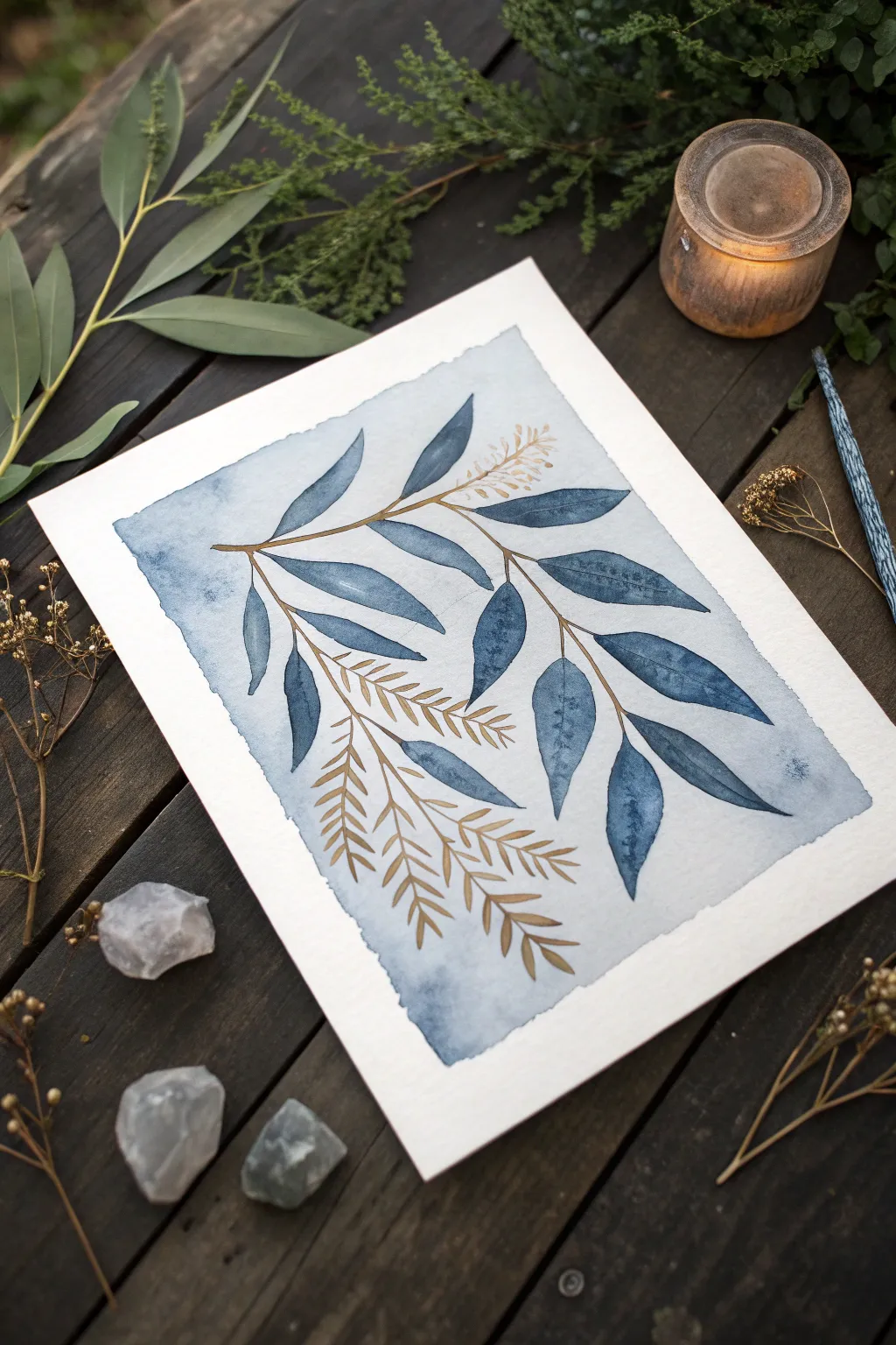
Capture the ethereal beauty of botanicals with this stunning watercolor project that combines moody indigo tones with delicate metallic accents. The contrast between the deep matte blue leaves and the shimmering gold stems creates a sophisticated, modern piece perfect for framing.
Step-by-Step
Materials
- Cold-press watercolor paper (300gsm/140lb)
- Indigo watercolor paint (tube or pan)
- Metallic gold watercolor paint or gold ink
- Flat wash brush (approx. 1 inch)
- Round watercolor brushes (sizes 4 and 6)
- Fine liner brush (size 0 or 1)
- Masking tape or Washi tape
- Pencil (HB or H)
- Kneaded eraser
- Two jars of water
- Paper towels
Step 1: Preparation and Sketching
-
Prepare your paper:
Begin by securing your watercolor paper to a flat board or your work surface using masking tape. Create a border of about 1-2 inches on all sides to establish clean, crisp edges for your final piece. -
Sketch the layout:
Lightly sketch the main composition using an HB pencil. Draw a flowing, diagonal central stem branching out into smaller sprigs. Add the outlines of the larger eucalyptus-style leaves, ensuring they curve naturally. -
Refine the sketch:
For the fern-like or feathery branches shown at the bottom, sketch just the central spine as a guide. Keep your pencil pressure very light so the graphite won’t show through the transparent watercolor layers later. -
Lighten lines:
Take your kneaded eraser and gently roll it over the entire sketch. You want to lift enough graphite so the lines are barely visible—just faint guides for your brush to follow.
Fixing Bleeds
If blue paint bleeds into your gold, wait for it to dry fully. Then, re-apply a thick, creamy layer of gold over the mistake. Most metallics are opaque enough to cover dark colors.
Step 2: Painting the Background Wash
-
Mix the background color:
Dilute a small amount of Indigo paint with plenty of water to create a very pale, watery blue wash. Test it on a scrap piece of paper first; it should be significantly lighter than the leaves will be. -
Apply the wash:
Using your flat wash brush, paint over the designated rectangular area within your tape borders. You don’t need to paint around the leaves perfectly; a loose, organic wash sets a nice atmospheric mood. -
Create texture:
While the background is still wet, you can drop in tiny amounts of clean water or slightly more concentrated pigment in the corners to create subtle blooms and variations. -
Let it dry completely:
This is crucial. The background paper must be bone-dry before you proceed to the next step to prevent the darker pigments from bleeding into the wash.
Level Up: Salt Texture
While your indigo leaves are still wet, sprinkle a pinch of table salt on them. Once dry, brush the salt off to reveal a stunning, crystallized texture that mimics frost.
Step 3: Painting the Leaves
-
Mix the leaf color:
Prepare a rich, concentrated mixture of Indigo paint. You want a creamy consistency that is dark and opaque enough to stand out against the pale background. -
Paint the first leaf:
Using a size 6 round brush, carefully fill in one of the leaf shapes. Start at the tip and work your way back toward the stem, leaving a tiny hairline gap where the center vein will go. -
Define the edges:
Use the tip of the brush to ensure the leaf edges are crisp. Natural variation is good, but you want a defined silhouette against that lighter background wash. -
Negative space veins:
As you paint each leaf, I like to be mindful to leave a very thin sliver of unpainted paper running down the center. This negative space acts as a guide for your metallic paint later. -
Vary tonal values:
For a few leaves, dilute your indigo mix slightly to create depth. Painting some leaves darker and others slightly more transparent adds realistic dimension to the branch. -
Complete the foliage:
Continue painting all the broad leaves on the upper section of the branch. Ensure every leaf is fully dry before moving your hand across the paper to avoid smudging.
Step 4: Adding Metallic Details
-
Prepare the metallic paint:
Activate your metallic gold watercolor pan with a few drops of water and let it sit for a minute to soften, or shake your gold ink well. You need a smooth, ink-like flow. -
Paint the main stems:
Switch to your fine liner brush. Load it with gold and carefully trace the main central branch and the smaller offshoot stems that connect the blue leaves. -
Fill the veins:
Gently run a line of gold paint through the center of each blue leaf, filling in those negative spaces you left earlier or painting directly over the dried indigo if you skipped that step. -
Paint the feathery sprigs:
For the feathery botanical elements at the bottom and top, use the tip of your liner brush. Paint a central gold stem, then use quick, short strokes to flick gold leaves outward on both sides. -
Final touches:
inspect the piece for balance. Add tiny gold dots or extra metallic sprigs in empty spaces if the composition feels like it needs more sparkle. -
The reveal:
Wait until the metallic paint is completely dry to the touch. Then, slowly peel away the masking tape at a 45-degree angle away from the painting to reveal the crisp white border.
Frame your botanical masterpiece in a natural wood frame to complement the organic feel of the leaves


Masked Shapes With Metallic Reveals
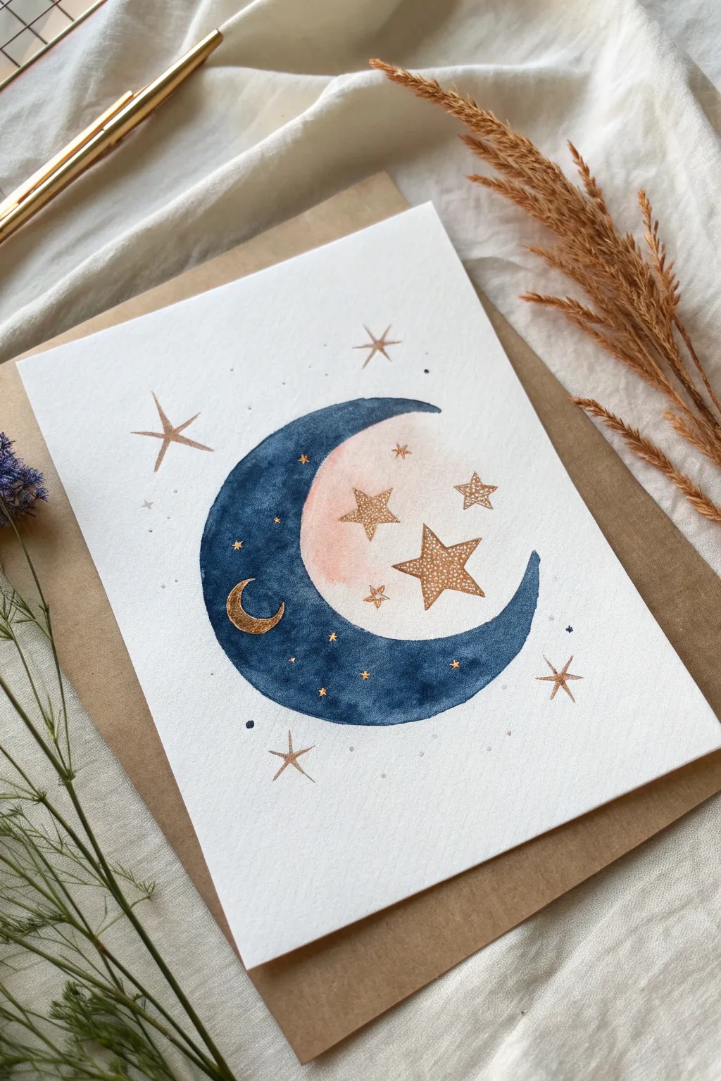
Capture the magic of the night sky with this simple yet stunning watercolor illustration featuring a deep indigo moon adorned with sparkling metallic accents. This project teaches you to combine masking fluid for clean edges with shimmering gold details for a professional finish.
Detailed Instructions
Materials
- Cold press watercolor paper (A5 size)
- Masking tape or painter’s tape
- Pencil and eraser
- Drawing release fluid (Masking fluid) with a fine applicator or throwaway brush
- Watercolor paints (Indigo, Payne’s Gray, and a touch of Shell Pink)
- Metallic gold watercolor paint (pan or liquid ink)
- Round watercolor brushes (size 6 for washes, size 0 or 2 for details)
- Paper towel
- Clean water
Step 1: Sketching and Masking
-
Prepare the Surface:
Begin by taping down your watercolor paper to a hard board using masking tape. This prevents the paper from buckling when wet and creates a clean border if you choose to paint to the edge. -
Outline the Moon:
Lightly sketch a large crescent moon shape in the center of your paper. Keep your pencil lines very faint so they don’t show through the watercolor later. -
Add Celestial Details:
Inside the empty space ‘cradled’ by the crescent, lightly sketch three stars of varying sizes. Draw another small crescent moon shape directly on the main crescent body, along with a few tiny circles for scattered stars. -
Apply Masking Fluid:
Using a fine applicator or an old brush dipped in soap, apply masking fluid carefully over the stars inside the crescent curve. You want these areas to remain stark white for now so you can paint over them later without worry. -
Mask the Metallic Reveal:
Also apply masking fluid to the small crescent shape sitting on top of the main moon. Let the fluid dry completely until it is firm to the touch.
Torn Paper?
If removing masking fluid tears your paper, lift it more gently at a shallow angle. Alternatively, your paper might be too soft; ensure you are using 100% cotton cold-press watercolor paper.
Step 2: Painting the Atmosphere
-
Create a Soft Glow:
Mix a very watery, pale wash of shell pink or diluted orange. Gently paint the area inside the curve of the crescent (where the masked stars are), fading it out into the white paper to create a subtle atmospheric glow. -
Dry the Glow:
Allow this pink layer to dry completely before moving on to the dark moon, otherwise the colors will bleed together. -
Mix the Night Sky:
Prepare a rich, saturated mix of Indigo and Payne’s Gray. You want a deep, moody blue that is dark enough to contrast with the gold later. -
Paint the Crescent:
Carefully paint the main crescent shape using your dark blue mix. Paint right over the masked tiny moon shape within the crescent. The mask will protect it. -
Add Texture:
While the blue paint is still wet, you can drop in touches of clean water or slightly darker pigment to create a blooming, galaxy-like texture within the moon’s surface. -
Patience is Key:
Wait for the blue paint to bone dry. If the paper feels cool to the touch, it is still wet deep down.
Cosmic Depth
Before the dark blue moon dries, sprinkle a pinch of salt onto the wet paint. Brush it off once dry to create amazing starburst textures that look like craters.
Step 3: The Metallic Reveal
-
Remove the Masking:
Once you are certain the paint is dry, gently rub off the masking fluid with your clean finger or a rubber cement pickup tool to reveal the clean white paper shapes underneath. -
Paint the Stars:
Load your small detail brush with metallic gold paint. Fill in the now-revealed star shapes floating in the pink glow. -
Fill the Inner Moon:
Paint the small revealed crescent shape inside the blue moon with the same metallic gold. The contrast against the deep indigo will be striking. -
Embellish the Sky:
Paint freehand gold stars around the outside of the moon. Use thin lines to create four-pointed stars and tiny dots for distant planets. -
Add Golden Details:
Using the very tip of your brush, add tiny metallic specks and smaller four-pointed stars directly onto the dark blue moon surface for extra depth. -
Final Touches:
Inspect your work for any uneven edges. You can sharpen the points of your stars with a little extra gold paint if needed.
Place your finished piece in a simple wood frame or mount it on cardstock for a beautiful handmade greeting card
Abstract Metallic Gradients and Geometric Blocks
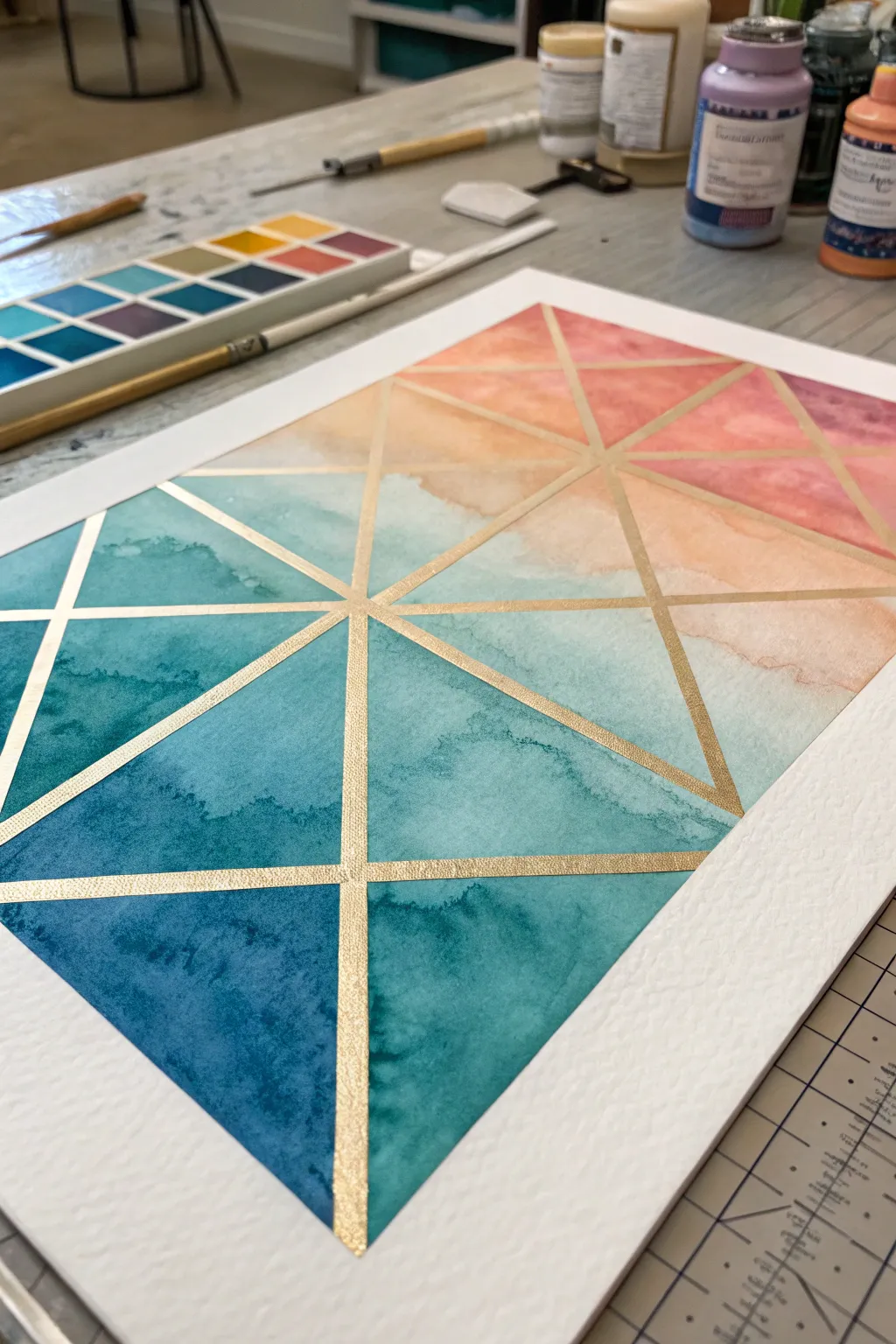
This stunning piece combines the organic flow of watercolor washes with the crisp precision of metallic geometry. By using resist tape to create clean lines, you’ll build a vibrant gradient that shifts from deep ocean blues to warm sunset pinks, all framed by shimmering gold.
Step-by-Step Guide
Materials
- High-quality watercolor paper (cold press, 140lb/300gsm)
- Watercolor paints (teal, indigo, turquoise, peach, coral pink)
- Gold metallic watercolor paint or gold gouache
- Washi tape or artist’s masking tape (1/4 inch width)
- Flat shader brush (size 1/2 inch) for washes
- Small round brush (size 2) for gold details
- Ruler
- Pencil
- Palette for mixing
- Two jars of water
- Heat tool or hairdryer (optional)
Step 1: Structural Preparation
-
Paper Setup:
Begin by taping down all four edges of your watercolor paper to a hard board or table. This prevents buckling and creates that satisfying crisp white border when finished. -
Grid Layout:
Using a ruler and a light pencil touch, mark out a simple grid of squares or rectangles as your base. You don’t need to draw every line heavily, just faint guide points. -
Diagonal Designs:
Draw diagonal lines through your grid boxes to create a network of triangles. Vary the direction of the diagonals to create visual interest rather than a uniform pattern. -
Tape Application:
Apply your thin masking tape directly over your pencil lines. Ensure you press the edges of the tape down firmly with your fingernail or a bone folder to prevent paint from sneaking underneath.
Clean Lines Pro Tip
Before painting color, paint a layer of clear water or white gouache over the tape edges. This seals the tape so any bleeding is invisible!
Step 2: Creating the Gradient
-
Color Mixing: Cool Tones:
On your palette, prepare a generous puddle of deep indigo and teal. This will be the darkest part of your gradient at the bottom of the piece. -
Color Mixing: Warm Tones:
Separately, mix a watery peach and coral pink solution. Keep these mixes fluid, as you want the colors to blend softly within the individual shapes. -
Painting the Base:
Start painting the bottom triangles with your deep teal mix. Don’t worry about painting over the tape—that’s what it’s there for. -
Transition Zone:
As you move up the paper to the middle row of triangles, start mixing water into your teal paint to lighten it, and slowly introduce drops of the peach tone to create a muddy but pleasant transition grey-blue. -
Wet-on-Wet Texture:
While the paint is still wet in a triangle, drop in a tiny bit of clear water or a different pigment concentration. This creates those beautiful ‘blooms’ and textures seen in characteristic watercolor work. -
Upper Gradient:
Paint the top section with your coral and peach mixes. I like to keep the very top triangles quite pale and watery to enhance the feeling of light entering the composition. -
Complete Drying:
Let the entire painting dry completely. This is crucial—if the paper is damp, removing the tape will tear the surface. Use a hairdryer if you’re impatient like me.
Step 3: The Metallic Reveal
-
Tape Removal:
Gently peel away the masking tape at a 45-degree angle. You should be left with white geometric channels between your colored triangles. -
Gold Preparation:
Activate your metallic gold watercolor or gouache with a few drops of water until it reaches a creamy, opaque consistency similar to melted ice cream. -
Filling the Lines:
Using your small round brush, carefully paint the gold into the white negative spaces left by the tape. Steady your hand by resting your pinky finger on a dry part of the paper. -
Intersection Detail:
Pay special attention to where the lines cross. Apply a second coat of gold at these intersections if needed to ensure the coverage is solid and reflective. -
Final Borders:
If you want a framed look, run a line of gold paint along the outer perimeter of the painted area where the main border tape was.
Bleeding Troubles?
If paint bleeds under the tape, don’t panic. Gently scrub the spot with a clean, damp stiffer brush to lift the color, then cover the error with the gold line.
Once the gold lines catch the light, you’ll have a sophisticated piece of art ready for framing.


Have a question or want to share your own experience? I'd love to hear from you in the comments below!