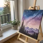
Whenever you want that cute aesthetic vibe without stressing over realism, soft colors and simple shapes are your best friends. I pulled together cute painting ideas that look dreamy on mini canvases and feel totally doable, even if you’re just getting started.
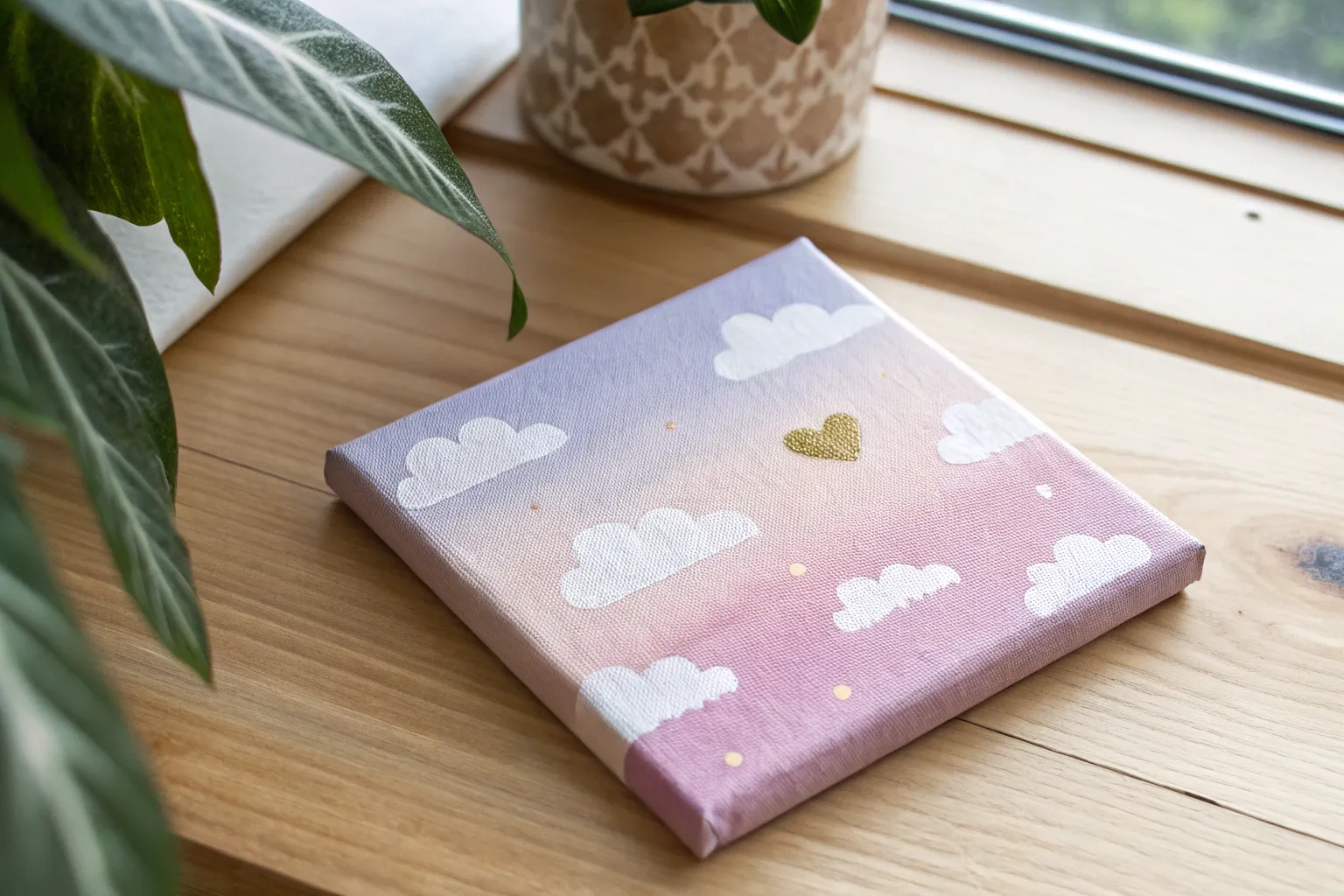
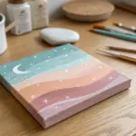
Cotton-Candy Cloud Sky
Capture the magic of twilight with this soft, pastel gradient sky painting. With its fluffy clouds and gentle transition from lavender to sweet pink, this little canvas adds a serene, dreamy aesthetic to any corner of your room.
Detailed Instructions
Materials
- Small square canvas (e.g., 6×6 or 8×8 inches)
- Acrylic paints: Titanium White, Magenta or Primary Red, Violet or Purple
- Large flat brush (for blending background)
- Medium round brush (for cloud shapes)
- Small detail brush (for cloud highlights)
- Palette or paper plate
- Cup of water and paper towels
- Optional: Slow-drying medium or retarder
Step 1: Creating the Gradient Base
-
Prepare your palette:
Squeeze out generous amounts of white, violet, and magenta onto your palette. You will need more white than any other color to achieve those pastel tones. -
Mix the top color:
Mix a soft lavender by combining a small amount of violet with a large amount of white. You want a dusty, muted purple rather than a deep grape color. -
Apply the top section:
Using your large flat brush, paint the top third of the canvas with your lavender mix. Use smooth, horizontal strokes that go all the way across. -
Mix the middle pink:
Without fully cleaning your brush, mix some magenta and plenty of white to create a medium bubblegum pink. -
Paint the middle band:
Apply the pink mixture below the purple section. While the paint is still wet, gently brush upward into the purple area to start blending the two colors together. -
Mix the bottom peach-pink:
Add even more white to your pink mixture, perhaps with a tiny touch of yellow if you have it (or just rely on the white to warm it up), creating a very pale pink. -
Paint the bottom section:
Fill the remaining bottom third of the canvas with this palest pink shade. -
Final blend:
Clean your flat brush and slightly dampen it. Run it back and forth horizontally across the transition lines where the colors meet to create a seamless, soft gradient. I like to work quickly here before the acrylics set. -
Let it dry:
Allow the background to dry completely. It should be matte and dry to the touch before you start the clouds.
Fixing Muddy Blends
If your sky gradient looks streaky or muddy, let it fully dry. Then, apply a second thin layer of paint, blending with a very soft, clean brush while wet.
Step 2: Painting the Fluffy Clouds
-
Mix shadow color:
Create a very pale lilac-grey for the cloud shadows. Mix a tiny dot of violet into a large amount of white. It should be just slightly darker than the white of the clouds. -
Map out cloud shapes:
Using the medium round brush and your shadow color, lightly dab in the rough shapes of the clouds. Place a large formation in the middle-left and a smaller cluster at the bottom right. -
Use a dabbing motion:
Don’t sweep the brush; instead, use a pouncing or blotting motion to create uneven, fluffy edges that mimic real cloud textures. -
Add pure white highlights:
Clean your brush thoroughly. Dip into pure Titanium White and begin painting the top, fluffy edges of your clouds, overlapping the shadow layer slightly. -
Refine the shapes:
Focus the brightest white on the upper curves of the clouds where the ‘sun’ would hit them. Leave the bottom edges of the clouds softer and slightly darker to suggest weight. -
Create wispy trails:
Using a small detail brush or the very tip of your round brush, drag small amounts of white paint horizontally from the sides of the clouds to create wispy tails. -
Soften the bottom edges:
With a clean, slightly damp brush, gently blur the bottom edges of the clouds so they fade into the pink sky rather than having a hard outline. -
Layer for density:
Wait for the first layer of white to dry, then add a second coat of bright white just on the very tops of the fluffiest parts to make them pop. -
Paint the edges:
Don’t forget to paint the sides of your canvas! Extend the sky gradient and cloud wisps around the edges for a professional, finished look.
Add Some sparkle
Once fully dry, subtle touches of iridescent glitter paint on the cloud tops can mimic sunlight catching the moisture for a magical effect.
Step back and admire your serene skyscape, ready to bring a calming vibe to your space.

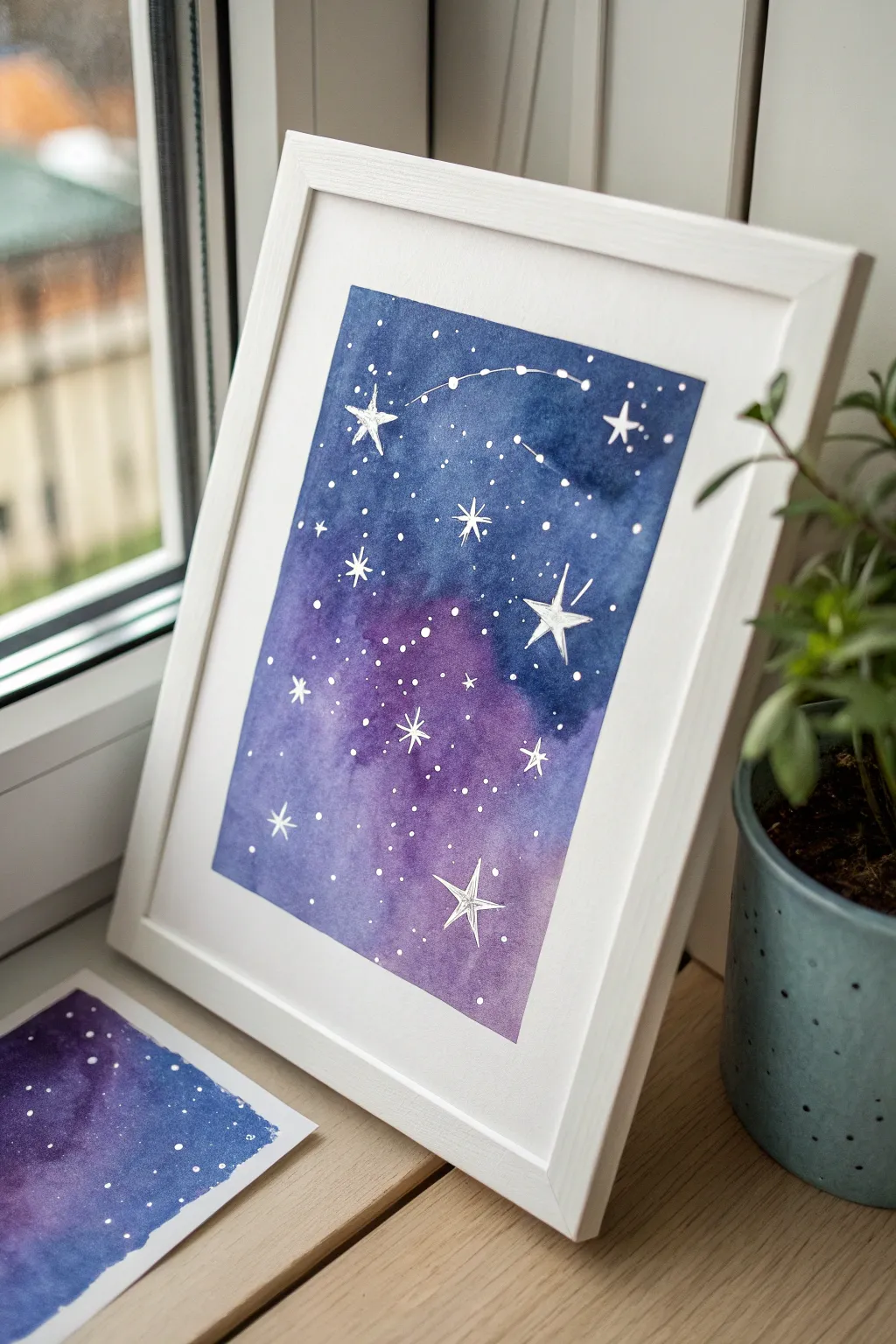
Blushing Moon and Sparkles
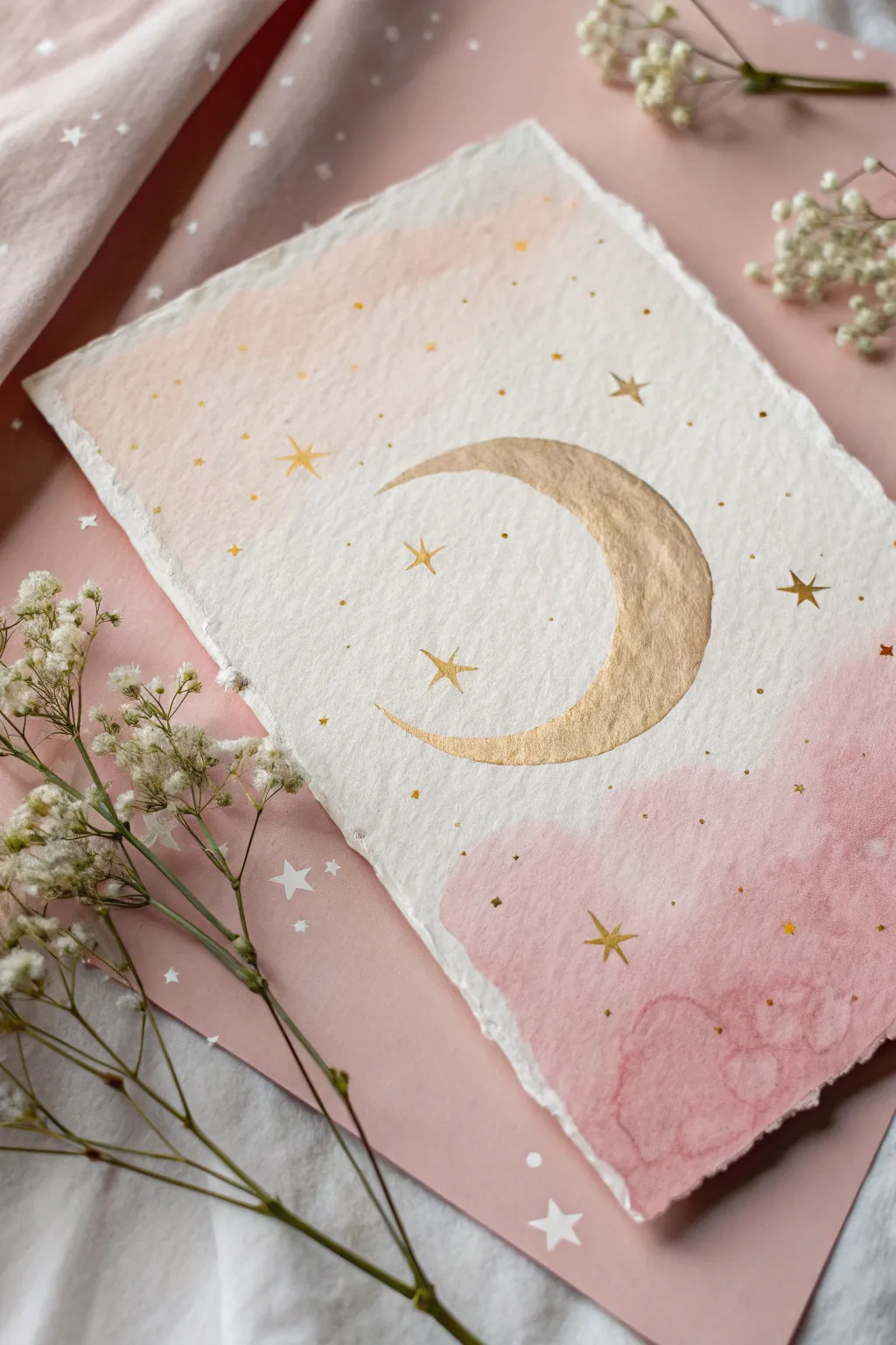
Capture the magic of a twilight sky with this dreamy watercolor and gold leaf project. Featuring soft pink washes and shimmering metallic accents on textured paper, this piece makes for beautiful wall decor or a heartfelt greeting card.
How-To Guide
Materials
- Heavyweight watercolor paper with deckle edges (300 gsm or higher)
- Pink watercolor paint (blush or dusty rose shade)
- Metallic gold watercolor paint or gold gouache
- Soft round watercolor brush (size 6 or 8)
- Fine detail brush (size 0 or 1)
- Clean water and jar
- Pencil and eraser
- Paper towel
Step 1: Creating the Soft Background
-
Prepare your paper:
Start with a piece of high-quality watercolor paper that has torn or deckled edges for that rustic, handmade feel; tape it down gently if you’re worried about buckling, though heavy paper should hold up well. -
Sketch the moon placement:
Lightly sketch a large crescent or ‘C’ shape in the center of the paper using a pencil. Keep the lines very faint so they don’t show through the gold later. -
Mix your watery wash:
Dilute your pink watercolor heavily with water to create a very pale, transparent ‘tea’ consistency. You want a soft blush, not a hot pink. -
Apply the bottom wash:
Using the larger round brush, paint an abstract, cloud-like shape at the bottom right corner of the paper. Keep the edges wet and irregular for a natural look. -
Soften the edges:
While the pink paint represents wet clouds, dip your brush in clean water and gently touch the inner edges of the pink area, allowing the color to bleed and fade softly into the white paper. -
Add the top wash:
Repeat the process in the top left corner with an even paler wash of pink, creating a diagonal balance across the page. -
Deepen the color:
While the bottom section is still slightly damp, drop in a slightly more saturated pink pigment into the wettest areas to create texture and depth, simulating fluffy clouds. -
Dry completely:
Let the paper dry fully before moving on; if the paper is cool to the touch, it’s still wet, so give it time or use a hairdryer on a low setting.
Uneven Gold Coverage?
If your gold looks streaky, let the first layer dry completely, then apply a second thin coat. Two thin coats are always smoother than one thick, goopy one.
Step 2: Adding the Celestial Gold
-
Activate the gold:
Add a few drops of water to your metallic gold paint or gouache and mix it until it reaches a creamy, opaque consistency similar to melted butter. -
Fill the crescent:
Carefully paint inside your sketched moon shape using the gold paint. I find it easier to outline the shape first with the tip of the brush, then fill in the center. -
Smooth the texture:
Ensure the gold application is relatively flat and even, avoiding big puddles, so it dries with a smooth metallic finish. -
Paint large stars:
Switch to your fine detail brush and paint a few five-pointed or four-pointed stars scattered around the moon. Aim for variety in size. -
Add tiny stars:
Using just the very tip of the detail brush, dot tiny specks of gold around the main stars and near the moon to create the look of distant stardust. -
Create scattered dots:
Continue adding very small gold dots over the pink washed areas and the white space to tie the composition together. -
Review and refine:
Step back and look at the balance of stars; add a few more if the sky feels empty, but try to keep the area immediately around the moon somewhat breathable. -
Erase guidelines:
Once the gold is absolutely bone dry, very gently erase any visible pencil marks from your initial sketch.
Level Up: Texture
Sprinkle a pinch of coarse sea salt onto the wet pink watercolor wash. Let it dry, then brush it off to create beautiful, starry ice-crystal textures in the clouds.
Now you have a shimmering piece of celestial art ready to frame or gift to a stargazer.
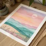


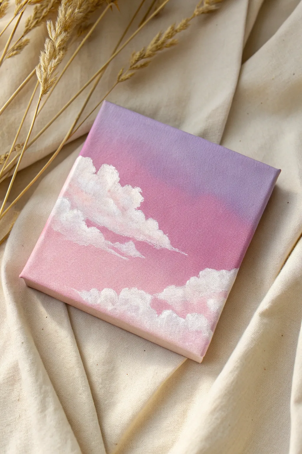
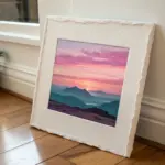
Sunset With Simple Silhouettes
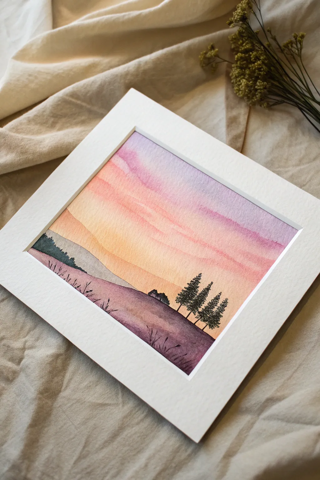
Capture the serene beauty of twilight with this simple yet stunning watercolor landscape. Featuring a dreamy gradient sky that melts into rolling hills, this project uses easy silhouette techniques to create depth and drama.
Detailed Instructions
Materials
- Cold press watercolor paper (300 gsm)
- Watercolor paints (Purple, Magenta, Orange, Black/Payne’s Grey)
- Flat wash brush (large)
- Round brush (size 2 or 4)
- Fine liner brush (size 00 or 0)
- Masking tape
- Clean water jar
- Paper towels
- Pencil (optional)
- White mat board or frame (for finishing)
Step 1: Setting the Sky
-
Prepare the Paper:
Tape down all four edges of your watercolor paper to a hard board using masking tape. This creates that crisp white border seen in the final piece and prevents the paper from buckling when wet. -
Pre-wet the Sky Area:
Using your large flat wash brush and clean water, gently wet the upper two-thirds of the paper where the sky will be. You want the paper glistening but not forming puddles. -
Apply the Lavender:
Load your brush with a diluted purple or lavender mix. Starting at the very top edge, sweep the color across horizontally, letting it naturally diffuse downwards into the wet paper. -
Blend in Pink:
Before the purple dries, rinse your brush and pick up a soft magenta or rose color. Apply this right below the purple, slightly overlapping so the colors bleed together seamlessly. -
Add the Golden Glow:
Rinse again and switch to a warm orange or peach tone. Paint this below the pink section, bringing it down to where you want your horizon line to begin. -
Softening the Transition:
If the bands of color look too distinct, use a clean, slightly damp brush to gently stroke horizontally across the meeting points to encourage a softer gradient. -
Let it Dry:
Allow the sky layer to dry completely. This is crucial—if the paper is damp, the hills will bleed into the sky.
Step 2: Painting the Rolling Hills
-
Outline the Hills:
Once the sky is bone dry, use a pencil to very lightly sketch the rolling curve of the foreground hill and the smaller hill in the background. -
Paint the Background Hill:
Mix a very diluted grey-purple shade. Paint the distant hill on the left side. It should be transparent enough to look far away, creating atmospheric perspective. -
Paint the Foreground Hill:
Mix a stronger, more saturated purple with a touch of brown or black for the main foreground hill. Paint the entire bottom section, ensuring a sharp edge along the top curve. -
Add Texture:
While the foreground hill is still slightly damp, you can drop in tiny hints of darker pigment near the bottom to suggest shadow and weight. -
Second Drying Phase:
Wait for the hill layers to dry completely before moving on to the detailed silhouettes.
Keep it clean
To get the crispest horizon line on your hills, wait until the sky is totally dry. If the paper feels cool to the touch, it’s still wet inside!
Step 3: Adding Silhouettes
-
Mix the Darkest Tone:
Create a thick mixture of black or Payne’s Grey. A creamy consistency is best here so the paint doesn’t run. -
Paint Distant Shrubs:
On the left side of the foreground hill, use a small round brush to dab in bumpy, irregular shapes representing distant bushes or tree tops along the varying slopes. -
Draw the Tree Trunks:
Switch to your fine liner brush. On the right side of the hill, paint three or four very thin vertical lines for the tree trunks. -
Stipple the Pine Foliage:
Using the tip of a small round brush, stipple distinct dots and dashes along the trunks. Start narrow at the top and get wider towards the bottom to form the classic pine tree shape. -
Add Mid-Ground Detail:
Just behind the main hill crest in the center, paint a tiny silhouette of a house or distant trees to break up the horizon line. -
Detail the Grass:
With the finest brush or a black pen, flick tiny, quick upward strokes along the bottom edge and random spots on the hill to look like wild grass blades.
Make it yours
Try swapping the color palette for a blue monochrome ‘midnight’ scene, or add tiny white gouache stars to the purple section of the sky.
Step 4: Finishing Touches
-
Review and Refine:
Step back and check the balance. If the trees need to be denser, add another layer of stippling once the first layer is dry. -
The Reveal:
Once the painting is 100% dry, slowly peel away the masking tape at a 45-degree angle to reveal those satisfying crisp edges.
Frame your new masterpiece with a wide mat to really make those sunset colors pop.
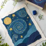
Tiny Galaxy Star Splatter
Capture the magic of a deep purple and blue cosmos with this dreamy, beginner-friendly watercolor project. Using simple wet-on-wet techniques and bright white stars, you will create a celestial piece perfect for gazing at.
Step-by-Step
Materials
- Cold press watercolor paper (A4 or similar size)
- Watercolor paints (Indigo, Prussian Blue, Violet/Purple)
- White gouache or white gel pen
- Posca paint marker (white, fine tip)
- Round watercolor brush (size 6 or 8)
- Masking tape or painter’s tape
- Clean water jar
- Paper towels
- White picture frame
Step 1: Setting the Background
-
Prepare your surface:
Tape down all four edges of your watercolor paper to a hard board or table. This creates that crisp white border seen in the final piece and prevents the paper from buckling when it gets wet. -
Wet the paper:
Dip your clean brush into water and coat the entire area inside the tape. You want an even sheen, not puddles. This ‘wet-on-wet’ technique is crucial for that soft, blended galaxy look. -
Drop in the purple:
Load your brush with a rich violet or purple paint. Starting from the bottom center, dab the paint onto the wet paper. Let it bloom and spread naturally upwards and outwards. -
Add the blue tones:
Clean your brush slightly and pick up a deep Prussian Blue. Apply this around the edges of the purple, filling in the top corners and sides. -
Deepen with indigo:
While the paper is still damp, take your darkest color, Indigo, and drop it into the very top corners and edges to create depth. Allow the colors to bleed into each other where they meet. -
Let it dry completely:
This is the hardest part—patience. The background must be bone dry before you add stars. If the paper is cool to the touch, it’s still damp. I use a hairdryer on a low setting if I’m in a rush.
Cosmic Bloom
If your watercolors aren’t blending well, your paper might be too dry. Re-mist it lightly with a spray bottle before adding more pigment.
Step 2: Creating the Cosmos
-
Splatter the stars:
Dilute a small amount of white gouache with water until it’s the consistency of milk. Tap your brush handle against another brush over the painting to create tiny, random speckles. -
Enhance splatter variations:
Vary your tapping height; closer to the paper makes concentrated clusters, while higher up creates a spread-out mist. -
Draw the star shapes:
Using a white Posca marker or gel pen, select a few spots to draw distinct five-pointed stars. Keep the lines somewhat sketchy and loose rather than geometrically perfect matching the whimsical style. -
Add major stars:
Draw 4-5 larger stars scattered across the darker blue sections. Make the vertical line slightly longer for a twinkling effect. -
Connect a constellation:
Near the top, use dot-to-dot lines to connect a few stars, hinting at a constellation shape without needing to be astronomically correct. -
Add tiny details:
Use your fine-tip pen to add very small distinctive dots and tiny crosses in the empty purple spaces to balance the composition. -
The final reveal:
Once the white ink is fully dry, slowly peel away the masking tape at a 45-degree angle to reveal those satisfying crisp edges. -
Frame your universe:
Place your finished artwork into a simple white frame to complement the clean borders and make the deep colors pop.
Silver Highlight
After the white stars dry, trace over the largest ones with a metallic silver gel pen. It adds a subtle shimmer that catches the light beautifully.
Hang your new galaxy near a window to let the natural light highlight those deep watercolor blends
BRUSH GUIDE
The Right Brush for Every Stroke
From clean lines to bold texture — master brush choice, stroke control, and essential techniques.
Explore the Full Guide
Smiley Frog in a Lily Pond
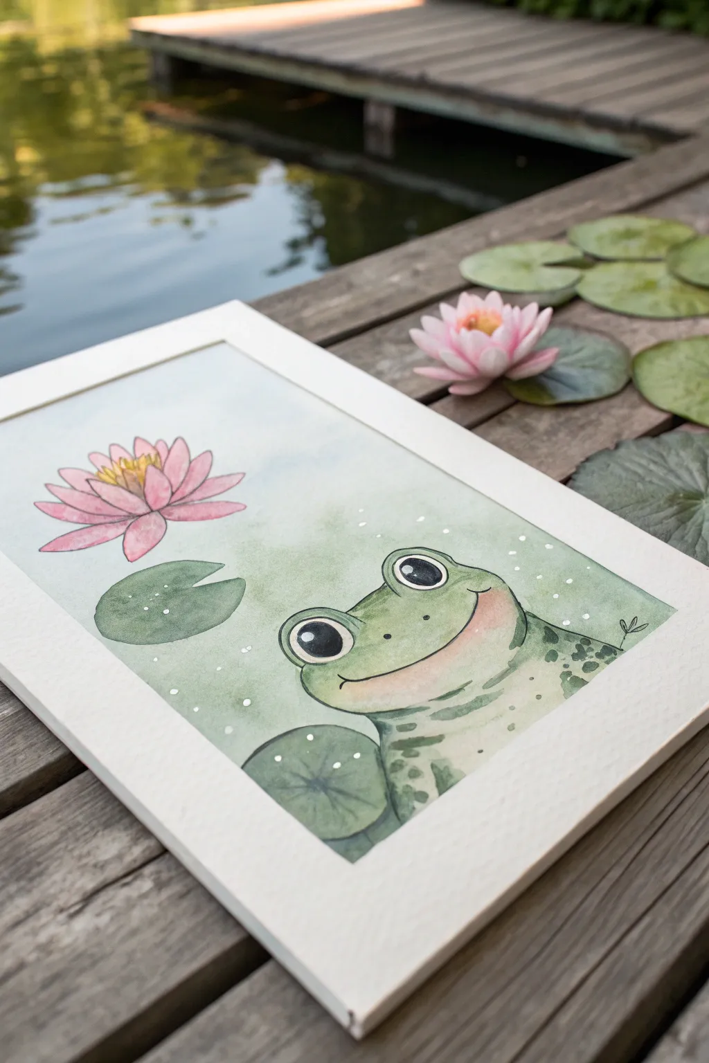
Capture the charm of a lazy summer afternoon with this adorable watercolor illustration. Featuring a smiling frog and a vibrant pink water lily, this project uses soft washes and ink outlines to create a friendly, approachable aesthetic.
How-To Guide
Materials
- Cold press watercolor paper (approx. 300gsm)
- Watercolor paint set (greens, pinks, yellow, black)
- Pencil (HB or H)
- Kneaded eraser
- Fine liner pen (waterproof, black, size 0.3 or 0.5)
- White gel pen or gouache for highlights
- Round brushes (size 4 and 8)
- Clean water
Step 1: Sketching the Layout
-
Light Outline:
Begin by sketching the main oval shape for the frog’s head and body in the lower right corner, ensuring it takes up a good portion of the space. -
Face Details:
Add two large semi-circles on top of the head for the eyes. Draw a wide, gentle curve for the smile and small nostril dots. -
Placement of Elements:
Sketch a large lily pad leaf floating near the frog’s shoulder and another smaller one on the left side. -
The Flower:
In the upper left quadrant, lightly sketch the water lily. Start with the center petals and work outward in layers to create a blooming shape. -
Clean Up:
Use your kneaded eraser to gently lift the graphite until the lines are barely visible, so they won’t show through the transparent paint later.
Pro Tip: Wet-on-Wet
For the softest background, dampen the paper first before adding color. This prevents hard edges and creates that dreamy, out-of-focus water effect.
Step 2: Applying the Base Washes
-
Frog Base:
Mix a pale, sap green color. Using plenty of water, fill in the entire frog shape, leaving the eye circles pure white. -
Pink Gradient:
While the frog dries, mix a diluted rose or magenta. Paint the lily petals, keeping the tips darker and fading to almost white near the center. -
Lily Pads:
Paint the two lily pads with a slightly cooler, bluish-green shade to differentiate them from the frog’s skin tone. -
Background Wash:
Wet the paper around your subjects with clean water. Drop in a very faint wash of mint green or sky blue to suggest water, letting it fade out irregularly toward the edges.
Troubleshooting: Bloom
If you get ‘cauliflower’ blooms in your paint, you likely added water to a drying wash. Wait until it’s 100% dry before adding a second layer to fix it.
Step 3: Adding Depth and Details
-
Shadows on the Frog:
Once the base layer is completely dry, mix a slightly darker green. Identify the areas under the chin and the side of the body to add soft shadows. -
Frog Markings:
Using a smaller brush, dab irregular spots of darker olive green onto the frog’s back and shoulder area to create texture. -
Flower Center:
Paint the center stamina of the lily with a bright, warm yellow. Allow the yellow to bleed slightly into the base of the pink petals for a natural glow. -
Eye Contrast:
Fill the pupils with black paint or ink, leaving a large white circle in each for that ‘shiny’ cartoon look.
Step 4: Inking and Finishing Touches
-
Inking the Outline:
When the paper is bone dry, take your waterproof fineliner and trace your original pencil lines. Use a technique where the line breaks occasionally to keep it looking organic. -
Adding Texture:
Ink small details like the veins on the lily pads and the center details of the flower stamens. -
White Highlights:
Using a white gel pen or a dot of white gouache, add tiny sparkles to the water background and small dots on the frog’s skin for a wet look. -
Blush:
I usually mix a very watery red and gently glaze a small circle of blush on the frog’s cheek for extra cuteness.
Now you have a cheerful little pond dweller ready to brighten up any room
Peachy Mini Still Life
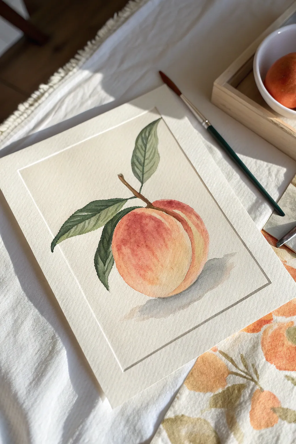
Capture the soft, fuzzy texture of a summer peach with this delicate watercolor study. This project focuses on warm color blending and simple layering to create a piece that feels ripe and ready to pick.
Step-by-Step Tutorial
Materials
- Cold press watercolor paper (300 gsm)
- Watercolor paints: Alizarin Crimson, Cadmium Yellow, Burnt Sienna, Sap Green, Paine’s Gray
- Round brushes (sizes 4 and 8)
- Pencil (HB or 2H)
- Kneaded eraser
- Clean water jar
- Paper towel
- Masking tape (optional, for edges)
Step 1: Sketching & First Wash
-
Outline the form:
Start by lightly sketching a simple circle for the peach body. Add a curved crease line running down the side to create that classic peach cleft. -
Add the stem and leaves:
Draw three almond-shaped leaves clustering near the top. Connect them with a thin, slightly jagged branch stem. -
Determine the border:
Lightly rule a rectangular border around your sketch if you want that framed look shown in the reference, or tape off the edges now. -
Base layer for the peach:
Mix a very dilute wash of Cadmium Yellow. Paint the entire body of the peach, leaving a small, dry white highlight near the top left for shine. -
Wet-on-wet blushing:
While the yellow is still damp, drop in watery Alizarin Crimson on the left side and bottom. Let the colors bleed naturally into the yellow center.
Fuzzy Texture Tip
To get that specific peach fuzz look, try lifting a tiny bit of color with a folded dry paper towel while the paint is still damp. It creates a soft, textured mottling.
Step 2: Building Depth & Details
-
Define the crease:
Once the first layer is semi-dry, use a mix of Crimson and a touch of Burnt Sienna to paint a thin line along the fruit’s cleft, softening the outer edge with a clean, damp brush. -
Base layer for leaves:
Mix a light wash of Sap Green. Fill in all three leaves, keeping the edges crisp for a nice silhouette. -
Paint the stem:
Use Burnt Sienna with a fine-point brush to carefully paint the woody stem, connecting it firmly to the top of the peach. -
Deepen the peach shadow:
Glaze a stronger red-orange mix over the shadow side (bottom left) of the fruit. Stippling this layer gently can mimic the fuzzy skin texture. -
Add leaf veins:
Mix a darker green by adding a touch of Paine’s Gray to your Sap Green. Paint the central vein and side veins on the leaves once the base green is completely dry. -
Shadowing the leaves:
Glaze a transparent layer of the darker green on one half of each leaf to suggest they are folding or turning in the light.
Muddy Colors?
If your peach looks brown instead of glowing, let the yellow layer dry completely before adding red. Mixing them wet-on-wet sometimes over-blends into mud.
Step 3: Finishing Touches
-
Cast shadow placement:
Mix a very watery grey using Paine’s Gray and a tiny bit of the peach color. Paint an oval shape beneath the peach. -
Soften the shadow:
While the cast shadow is wet, soften the edges so it doesn’t look like a sticker. It should fade out into the paper white. -
Review contrast:
Check if the stem needs a darker brown accent where it meets the leaves. Small details here ground the image. -
Erase pencil lines:
Wait until the painting is bone dry—warm to the touch—then gently erase any visible graphite marks, especially around the border.
Frame this sweet little artwork in a simple wooden frame to complement those warm summer tones

PENCIL GUIDE
Understanding Pencil Grades from H to B
From first sketch to finished drawing — learn pencil grades, line control, and shading techniques.
Explore the Full Guide
Flowery Hills With Dabbed Daisies
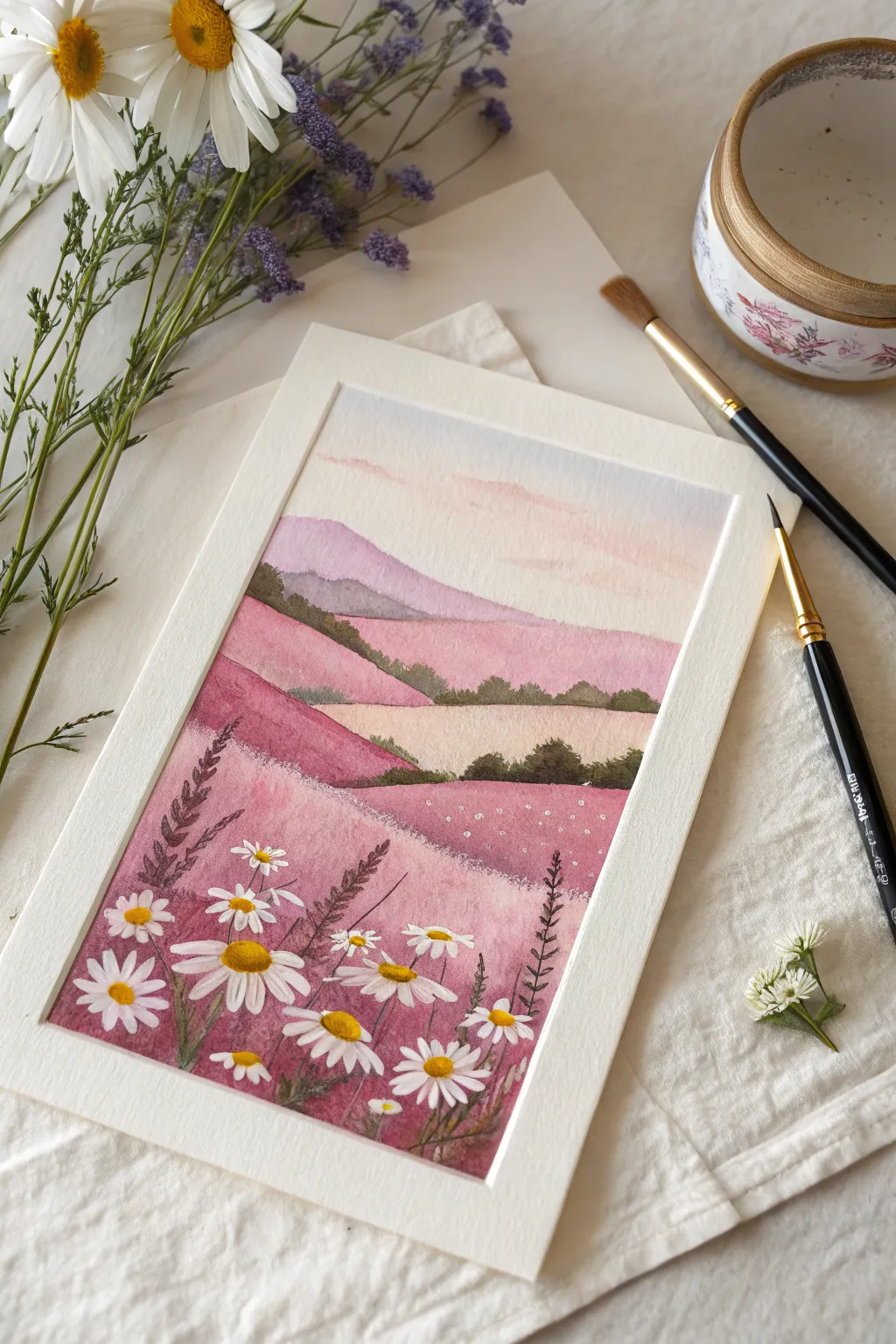
Capture the magic of a serene afternoon with this dreamy watercolor landscape, featuring rolling hills in soft pinks and purples dotted with cheerful daisies. This project uses wet-on-wet techniques to create gentle gradients and crisp, detailed floral work for a stunning contrast.
How-To Guide
Materials
- Cold press watercolor paper (300 gsm)
- Watercolor paints (shades of pink, violet, purple, ochre, sap green, indigo)
- White gouache or white acrylic ink
- Pencil and eraser
- Masking tape
- Round watercolor brushes (sizes 6 or 8 for washes, size 2 or 0 for details)
- Palette for mixing
- Jars of clean water
Step 1: Setting the Scene
-
Prep the paper:
Begin by taping down the edges of your watercolor paper to a board. This creates the crisp white border seen in the final piece and prevents the paper from buckling when wet. -
Draft the hills:
Lightly sketch the outlines of the rolling hills using a pencil. Draw curvy, overlapping lines that start high in the background and swoop down towards the foreground, creating layers of depth. -
Sky wash:
Wet the sky area with clean water first. Mix a very dilute wash of pale pink and light blue-violet. Apply the paint to the wet paper, letting the colors bleed softly together to create a hazy, sunset-like atmosphere.
Opacity Secret
If your white gouache feels too transparent over the dark pink paint, mix in a tiny drop of white acrylic ink adjustments for extra covering power.
Step 2: Painting the Hills
-
First background layer:
Once the sky is dry, mix a soft lavender-purple. Paint the furthest hill using a flat wash, keeping the color light to suggest atmospheric perspective. -
Mid-ground warmth:
Move to the next hill forward. Mix a dusty rose pink and apply it across the hill shape. While the paint is still damp, dab in slightly darker pinks at the bottom edge to create roundness and volume. -
Creating contrast:
For the distinct middle band, mix a creamy ochre or pale beige. Paint this section solidly, ensuring the edges where it meets the pink hills are crisp. I find waiting for adjacent sections to dry completely is crucial here to prevent bleeding. -
Foreground vibrancy:
The closest and largest hill section should be the most vibrant. Use a saturated berry pink or magenta wash. Create texture by dropping in clean water droplets or darker purple paint while it’s still wet to mimic the texture of a flower field. -
Shadows and bushes:
Mix a dark, earthy green using sap green and a touch of indigo. Using the tip of a smaller brush, dab irregular, small shapes along the ridges of the hills to represent distant treelines and bushes.
Golden Hour Glow
After everything is dry, glaze a very watery, transparent layer of yellow over just the top edges of the hills to mimic sunlight hitting the peaks.
Step 3: The Daisy Details
-
Stem structure:
Using your smallest detail brush and a dark purple-grey mix, paint thin, wavering stems in the foreground. Vary their heights so they look natural and wild. -
Adding foliage:
Add small, fern-like leaves to some of the stems using short, flicking brushstrokes. Keep these dark to contrast against the pink hill behind them. -
Painting petals:
Switch to thick white gouache or opaque white ink. Paint the daisies by creating small, teardrop-shaped strokes radiating from a center point. varies the angle of the petals to make some flowers look like they are facing up or sideways. -
Layering whites:
For the brightest white, you may need a second coat of gouache once the first layer dries. Ensure the pink background doesn’t show through. -
Golden centers:
Mix a bright yellow-orange. Carefully dot the centers of your white daisies. Add a tiny speck of brown on one side of the yellow center to give it a 3D shadow effect. -
Distant blooms:
For flowers further back on the hill, simply use the tip of your brush to dot tiny specks of white gouache, suggesting a field full of blooms without needing detail. -
Final reveal:
Allow the painting to dry completely—gouache can smear if touched while damp. Gently peel away the masking tape at a 45-degree angle to reveal your clean edges.
Frame this charming landscape or gift it to a friend who loves the countryside
Heart Planets in Pastel Space
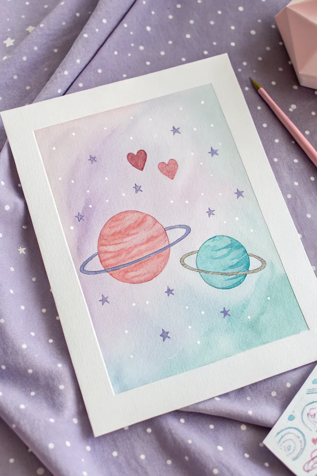
Create a dreamy cosmic scene with soft watercolor washes and sweet celestial details. This gentle composition features two ringed planets floating in a pastel gradient sky, perfect for adding a touch of whimsy to your art journal or wall.
Detailed Instructions
Materials
- Cold press watercolor paper (A5 or A4 size)
- Masking tape (washi tape works too)
- Watercolor paints (Pink, Blue, Violet, Magenta)
- Round watercolor brushes (Size 4 and Size 0 or 1)
- White gel pen or white gouache
- Pencil and eraser
- Clean water and paper towels
Step 1: Setting the Stage
-
Secure the paper:
Tape down all four edges of your watercolor paper to a board or table. This creates that crisp white border shown in the photo and prevents the paper from buckling when wet. -
Sketch the layout:
Lightly sketch two circles for the planets. Place the larger one on the left and a slightly smaller one on the right. Add elliptical rings around each, angling them slightly differently for visual interest. -
Add details:
Draw two small hearts floating above the space between the planets. Mark tiny stars around the background, but keep the pencil lines very faint so they don’t show through the paint later.
Clean Edges
If paint bleeds under your tape, use a slightly damp, stiff brush (like an angled shader) to gently scrub the unwanted pigment away while it’s still fresh.
Step 2: The Cosmic Background
-
Wet on wet technique:
Using your larger brush, wet the entire background area with clean water, carefully painting around your pencil sketches of the planets and hearts. The paper should be glisten, but not form puddles. -
Apply the first wash:
Load your brush with a watered-down violet or lavender. Dab it gently into the upper left area of the wet paper, letting the color bloom and spread naturally. -
Blend the gradient:
Pick up a soft teal or aqua blue. Apply this to the bottom right corner, blending it upwards towards the violet. I like to let the center area remain very pale where the colors meet to create a soft, glowing transition. -
Let it dry completely:
Wait for the background to be bone dry. If the paper feels cold to the touch, it’s still damp. This is crucial so your planet colors don’t bleed into the sky.
Step 3: Painting the Planets
-
Base layer for the left planet:
Mix a warm, dusty pink or salmon color. Fill in the left sphere, leaving the ring area blank for now. Vary the intensity slightly to suggest roundness. -
Texture the left planet:
While the pink is still damp, drop in slightly darker magenta stripes horizontally across the planet surface to create a banded atmosphere effect. -
Base layer for the right planet:
Use a turquoise or sea-green color for the right planet. Paint distinct bands of color, leaving tiny slivers of white paper or lighter washes between them to mimic cloud belts. -
Painting the hearts:
Fill in the two hearts with a reddish-pink tone similar to the left planet but slightly more saturated to make them pop against the pale background.
Glitter Galaxy
Mix a tiny amount of iridescent medium into your star paint or use a metallic silver pen for the stars to make the artwork shimmer when it catches the light.
Step 4: Details & Definition
-
Defining the rings:
Once the planets are dry, paint the rings. For the pink planet, use a muted violet-blue for the ring. For the teal planet, create a translucent beige or light grey ring. -
Adding outlines:
Switch to your smallest detail brush (size 0 or 1). Mix a darker shade of purple or blue-grey and very delicately outline the rings and parts of the planets to sharpen the shapes. -
Painting the stars:
Using the same dark purple-grey color, paint small five-pointed stars over your pencil marks. Keep them loose and whimsical rather than geometrically perfect. -
White highlights:
Take your white gel pen or a fine brush with white gouache. Add tiny dots scattered across the background for distant stars. -
Final sparkle:
Add a few white dots directly onto the planets to give them a shiny, spherical look, and perhaps a highlight on the hearts. -
The reveal:
Once absolutely everything is dry, slowly peel away the masking tape at a 45-degree angle to reveal your clean white border.
Enjoy your peaceful little corner of the galaxy.


Ribbon Bow Icon Painting
Capture the delicate elegance of a classic ribbon bow with this soft watercolor project. The interplay of light and shadow on the pink fabric creates a charming, semi-realistic effect perfect for beginners and seasoned painters alike.
Step-by-Step
Materials
- Cold-press watercolor paper (300gsm)
- Watercolor paints (Alizarin Crimson, Opera Pink, Burnt Umber)
- Round watercolor brushes (size 4 and 8)
- Fine liner brush (size 0 or 00)
- Two water jars
- Pencil (HB) and kneaded eraser
- Paper towels
Step 1: Sketching the Shape
-
Central Knot:
Begin by lightly drawing a small, rounded square or rectangle in the upper center of your page. This will be the knot of the bow. Keep your pencil pressure very light so the graphite doesn’t show through the transparent paint later. -
Upper Loops:
Draw two large, teardrop-shaped loops extending outward from the top of the central knot. Make them slightly asymmetrical to give the bow a natural, tied look. The left loop can be a bit flatter, while the right one might be fuller. -
Lower Ribbons:
Sketch two long, flowing tails draping down from behind the knot. Curve them slightly outward and then inward. Finish the ends with a ‘V’ notch or a slanted cut. -
Fabric Folds:
Add faint guidelines inside the loops and tails where the fabric would naturally crease. Look for areas where the ribbon bunches near the knot.
Uneven Washes?
If you get ‘cauliflower’ blooms, you added water to drying paint. Let the layer dry completely, then glaze over the uneven area with a uniform, transparent wash.
Step 2: First Wash
-
Mixing the Base Color:
Create a watery mix of Opera Pink with a touch of Alizarin Crimson. You want a soft, translucent tea-consistency wash. -
Painting the Knot:
Using your size 4 brush, fill in the central knot. Leave a tiny sliver of white paper unpainted on the top left edge to represent a highlight. -
Left Loop Wash:
Paint the entire left loop with your base mix. While it’s still wet, drop a slightly more saturated pink into the inner part of the loop where it meets the knot to create depth. -
Right Loop Wash:
Repeat the process for the right loop. I like to leave small, random gaps of dry paper near the folds to imply light hitting stiffness in the fabric. -
Painting the Tails:
Wash the color down the tails. As you reach the bottom tips, add a little more water to your brush to make the color fade slightly, keeping the look airy.
Step 3: Building Depth and Texture
-
Shadow Mix:
Mix a thicker, creamier consistency of Alizarin Crimson with a tiny dot of Burnt Umber to create a deep, dusty rose shadow color. -
Defining the Creases:
Once the first layer is completely dry, use the size 4 brush to paint stripes of shadow along the fold lines you sketched earlier. This distinguishes the front of the ribbon from the back. -
Softening Edges:
Immediately after painting a shadow line, rinse your brush, damp off the excess water, and run the clean, damp bristles along one edge of the shadow line. This softens the transition so it doesn’t look like a hard stripe. -
Inner Loop Shadows:
Paint the ‘inside’ visible parts of the back of the loops with a darker value. This pushes those areas backward visually. -
Cast Shadows:
Add darker pigment beneath the knot and where the loops overlap the tails. This subtle contrast makes the bow pop off the page.
Pro Tip: Wet-on-Wet
Pre-wet the paper inside just one loop with clean water before adding pigment. The color will flow naturally into the shape, creating soft, dreamy gradients effortlessly.
Step 4: Final Details
-
Detailing the Edges:
Switch to your fine liner brush (size 0). Mix a concentrated, deep red color. -
Stitching Effect:
Very delicately outline the edges of the ribbon. Don’t make a solid line; break it up occasionally to simulate a stitched hem or light reflection. -
Enhancing Contrast:
Look for the darkest nooks—right under the knot and inside deep folds—and touch them up with your darkest pigment mix. -
Final Highlights:
If you lost any highlights during painting, use a tiny amount of white gouache or a white gel pen to reclaim the sparkle on the knot and the highest points of the loops.
Let your artwork dry fully before framing to enjoy the crisp edges and soft washes of your beautiful bow
Dreamy String Lights Border
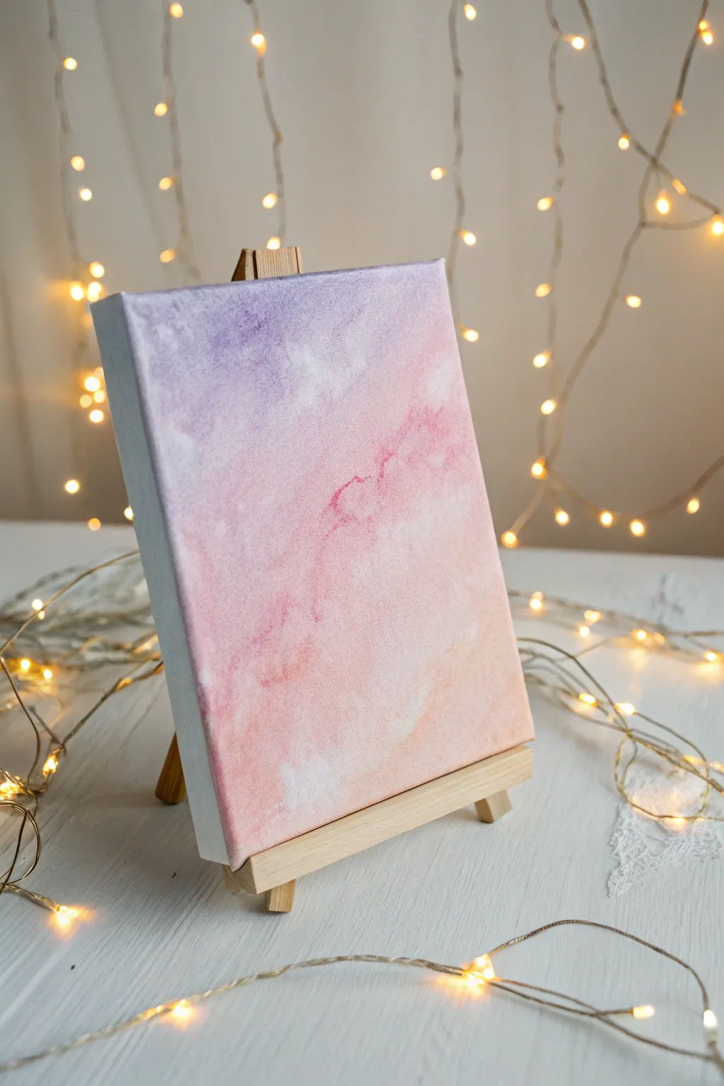
Capture the soft, ethereal beauty of a sunset sky on a mini canvas with this beginner-friendly tutorial. Using simple blending techniques, you will create a dreamy gradient of lavender, pink, and peach that adds a touch of whimsy to any desk or shelf.
Step-by-Step Guide
Materials
- Small stretched canvas (approx. 5×7 inches)
- Mini wooden easel
- Acrylic paints (lavender, soft pink, peach, titanium white)
- Wide flat synthetic brush
- Medium round brush
- Small piece of sea sponge or a crumpled paper towel
- Palette or paper plate
- Cup of water
- Paper towels
Step 1: Setting the Foundation
-
Prepare the workspace:
Lay down some protective paper or newspaper on your work surface. Set up your mini canvas on the easel or lay it flat on the table, whichever feels more stable for you. -
Prime the canvas:
Even if your canvas is pre-primed, apply a thin, even coat of titanium white acrylic paint across the entire surface. This helps the colors blend more smoothly later on. -
Mix the base lavender:
On your palette, mix a small amount of lavender paint with a touch of white to soften it. You want a pastel purple that isn’t too dark or jarring. -
Mix the base pink:
Next to your lavender, prepare a soft pink shade. If your pink is too hot or neon, tone it down with a tiny bit of white or peach. -
Create the transition color:
Mix a little bit of the lavender and pink together in the middle of your palette creating a mauve bridge color. This will ensure your gradient doesn’t look striped.
Paint drying too fast?
If acrylics dry before you can blend, mist canvas lightly with water or mix a drop of ‘slow drying medium’ into your paints to keep them workable longer.
Step 2: Painting the Gradient
-
Apply the top color:
Using your wide flat brush, paint horizontal strokes of the lavender mix across the top third of the canvas. Don’t worry about making the bottom edge perfect. -
Add the middle pink:
Without cleaning your brush fully (wipe it just slightly on a towel), pick up the pink paint. Apply this to the middle section of the canvas, slightly overlapping the lavender area. -
Blend the transition:
While the paint is still wet, gently brush back and forth over the line where the purple and pink meet. Use long, light horizontal strokes to blur them together seamlessly. -
Apply the bottom peach:
Clean your brush thoroughly. Pick up the peach paint (mixed with plenty of white for a very pale look) and paint the bottom third of the canvas. -
Final gradient blend:
Blend the peach upwards into the pink section just like before. You should now have a smooth transition from purple to pink to pale peach-white.
Add some magic
Once fully dry, splatter tiny flecks of diluted white paint using an old toothbrush to create a subtle starry effect over the twilight sky.
Step 3: Creating the Cloudy Texture
-
Prepare the texture tool:
Take a small piece of damp sea sponge or a tightly crumpled paper towel. Dip it lightly into white paint, then dab most of it off onto your palette so it’s almost dry. -
Dab the clouds:
Gently gently dab the sponge randomly across the canvas. Focus on the transition areas where colors meet to create a drifting cloud effect. -
Add subtle highlights:
I like to add a tiny bit of extra white to the bottom right corner, dabbing softly to suggest a light source or a thicker cloud bank. -
Enhance the darker tones:
Mix a slightly darker version of your pink (less white). Use the corner of your sponge to dab a few darker shadowy spots in the pink section for depth. -
Soften harsh edges:
If any sponge marks look too distinct, use a clean, dry soft brush to lightly sweep over them while wet. This feathers the edges creating that misty aesthetic. -
Paint the sides:
Don’t forget the edges of the canvas. Wrap the colors around the sides—lavender on the top sides, pink in the middle, and peach at the bottom—for a polished, gallery-wrap look. -
Let it dry completely:
Allow the painting to dry undisturbed for at least 30 minutes. Acrylics darken slightly as they dry, settling into their final finish. -
Display:
Once dry, place your masterpiece back on the mini easel. Arrange some fairy lights around the base to compliement the glowing effect of your new artwork.
Enjoy the peaceful atmosphere this little painting brings to your space
Cute Turtle With Bubbles
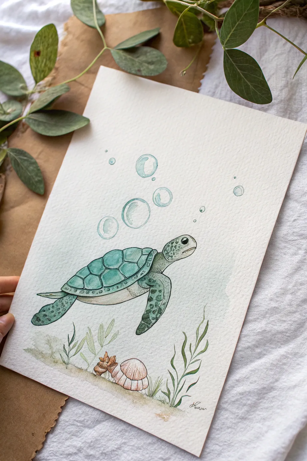
Capture the gentle movement of the ocean with this charming watercolor illustration of a sea turtle gliding through bubbles. The combination of delicate ink lines and soft, translucent washes creates a serene and aesthetic piece perfect for a nursery or art journal.
Step-by-Step
Materials
- Cold press watercolor paper (A5 or A4 size)
- Waterproof fine liner pens (0.1mm and 0.3mm, black)
- Watercolor paint set (focus on shades of teal, green, turquoise, and sepia)
- Round watercolor brushes (size 2 and 4)
- Pencil (HB) and eraser
- White gel pen or white gouache
- Paper towel and water jar
Step 1: Sketching the Composition
-
Draft the main shape:
Start by lightly sketching an oval shape for the turtle’s shell in the center of your paper. Make it slightly tilted to suggest movement. -
Add head and flippers:
Draw the head extending from the front of the shell, giving it a rounded snout and a large eye socket. Sketch the large front flipper curving backward and the smaller rear flipper mirroring the motion. -
Detail the shell:
Divide the shell into its characteristic scutes (scales). Draw a central row of hexagonal shapes, surrounded by smaller, more rectangular scutes along the edges. -
Sketch the environment:
Draw three large circular bubbles rising from the turtle’s back and several smaller ones near the head. At the bottom, lightly sketch a sandy floor with a few blades of sea grass and two simple shells.
Ink Smudging?
If your ink bleeds when you paint, check your pen type. It must say ‘waterproof’ or ‘archival ink.’ If unsure, let the drawing sit overnight before painting to ensure it’s fully set.
Step 2: Inking the Outline
-
Outline the turtle:
Using your 0.3mm waterproof pen, carefully trace over your pencil lines for the turtle’s main body. Keep your hand relaxed to create fluid, organic lines. -
Fill in the details:
Switch to the finer 0.1mm pen. Draw small, irregular circles and spots on the flippers and head to create the scaly texture. Be careful not to make them too uniform; random placement looks more natural. -
Ink the background:
Trace the bubbles, seaweed, and shells with the 0.1mm pen. Sometimes I like to leave small gaps in the bubble lines to make them look lighter and more reflective. -
Erase guidelines:
Once the ink is completely dry—wait at least 5 minutes to avoid smudging—gently erase all the pencil marks.
Step 3: Watercolor Washes
-
Paint the shell base:
Mix a watery turquoise color. Using a size 4 brush, paint a light wash over the entire shell. While it’s still damp, drop slightly darker teal pigment into the bottom edge of each scute to create volume. -
Color the skin:
For the skin and flippers, use a pale sap green. Paint the entire limb, then tap a darker green onto the ‘scales’ or spots you drew earlier, allowing the colors to bleed softly. -
Add definition:
Once the first layer is dry, mix a deeper blue-green. Carefully paint along the shadow areas under the shell rim and the lower edge of the flippers to add dimension. -
Paint the seabed:
Dilute a sepia or light brown heavily with water. Wash it across the bottom of the page for the sand. Add clearer brown touches to the shells, and paint the seaweed with a mix of olive green.
Wet-on-Wet Magic
To get that soft, blurred look on the turtle’s skin spots, pre-wet the flipper area with clean water first, then just touch the brush tip loaded with paint to the paper surface.
Step 4: Final Touches
-
Tint the bubbles:
Mix a very dilute pale blue. Paint a crescent shape inside each bubble, leaving the center white to represent transparency. -
Add subtle background:
To make the turtle pop, add a very faint, watery wash of blue-gray around the turtle’s body, fading out into the white paper. This suggests the ocean water without needing to paint the whole page. -
Highlighting:
After everything is bone dry, use a white gel pen or a tiny dot of white gouache to add a highlight to the black eye and the top of the largest bubbles.
Now you have a peaceful underwater friend ready to frame or gift
Whale Tail at Pink Horizon
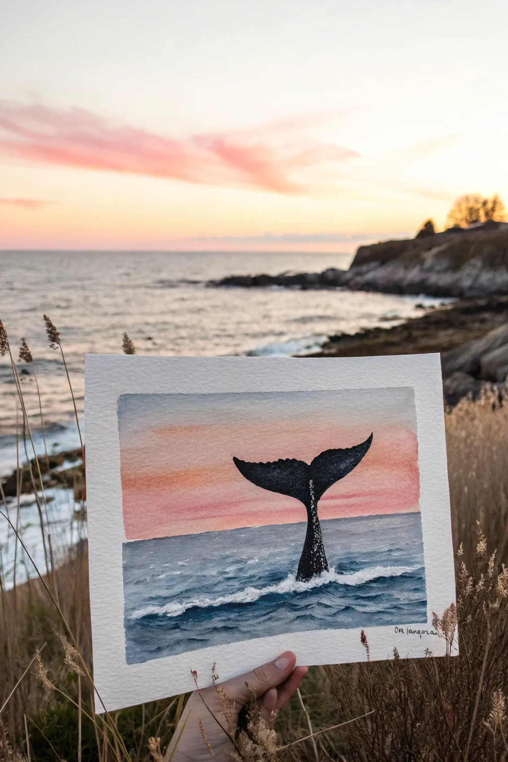
Capture the magic of a gentle ocean sunset with this watercolor painting featuring a striking whale tail silhouette. The soft blend of pinks and oranges in the sky contrasts beautifully with the deep blues of the sea, making it a perfect project for capturing coastal vibes.
Step-by-Step Tutorial
Materials
- Cold-press watercolor paper (approx. 5×7 or 8×10)
- Masking tape (painter’s tape)
- Watercolor paints (Indigo, Prussian Blue, Payne’s Gray, Rose Madder, Cadmium Orange, White Gouache)
- Round brushes (size 2, size 6, and size 10)
- Pencil and eraser
- Two jars of water
- Paper towels
- Palette for mixing
Step 1: Preparation & Sketching
-
Tape the borders:
Secure your watercolor paper to a board or table using masking tape on all four sides. This creates that crisp white frame you see in the photo and prevents the paper from buckling when wet. -
Sketch the horizon:
Lightly draw a straight horizontal line about one-third of the way up from the bottom of the paper to separate the sky from the ocean. -
Outline the tail:
In the center of the water section, lightly sketch the shape of the whale’s tail flukes rising from the waves. Keep the stem (peduncle) relatively narrow and create a gentle curve for the flukes.
Step 2: Painting the Sky
-
Wet the sky area:
Using your largest clean brush, apply a thin layer of clean water to the sky area only, stopping right at the horizon line. This wet-on-wet technique allows for soft blending. -
Apply the warm tones:
Load a size 6 brush with a watery mix of Cadmium Orange and Rose Madder. Paint horizontal strokes across the sky, starting stronger near the horizon and fading upward. -
Soften the gradient:
Add a touch more water to your brush to feather the color upwards, letting the pink fade into the white of the paper at the very top. Let the sky dry completely before moving on.
Bleeding Lines?
If the horizon line blurs, your sky wasn’t dry enough before you started the sea. Use a hair dryer on the ‘cool’ setting between layers to ensure crisp separation.
Step 3: Painting the Ocean
-
Base layer for the sea:
Mix a medium-strength wash of Prussian Blue with a touch of Payne’s Gray. Paint the ocean section, carefully painting around your pencil sketch of the whale tail. -
Darken the horizon:
While the blue is still slightly damp, add a concentrated line of Indigo right against the horizon line to create depth and distance. -
Add wave texture:
Once the base layer is dry, use a smaller brush with a darker blue mix to paint short, choppy horizontal strokes. These suggest the movement of waves. Leave some lighter blue areas visible.
Create Splatters
Load a toothbrush with white gouache and flick it gently over the base of the tail. This creates a realistic spray effect for the crashing water.
Step 4: The Whale Tail
-
Fill in the silhouette:
Mix a very dark, thick color using Indigo and Payne’s Gray (almost black). Carefully fill in the whale tail shape using your size 2 brush. I like to keep the paint quite saturated here so it stands out boldly. -
Add texture to the skin:
While the black paint is still wet, you can lift tiny spots of pigment with a dry brush, or wait until it’s dry and scumble a tiny bit of white gouache to suggest barnacles or light reflecting on wet skin. -
Refine the edges:
Make sure the edges of the flukes are sharp and defined. Use the very tip of your smallest brush to fix any ragged lines.
Step 5: Sea Foam & Details
-
Create the splash:
Squeeze out a bit of fresh White Gouache. Using an old or stiff brush, dab thick white paint at the base of the tail where it meets the water to create frothy, churning foam. -
Add whitecaps:
Use a fine liner brush and the white gouache to paint thin, jagged lines along the tops of the blue waves you painted earlier. This creates the look of breaking waves. -
Blend the waterline:
Softly blend the bottom of the white foam into the blue water so it doesn’t look like a sticker pasted on top; it should feel like part of the turbulent water. -
Final reveal:
Ensure the painting is 100% bone dry. Then, slowly peel away the masking tape at a 45-degree angle to reveal your clean, professional borders. -
Sign your work:
Add your signature or initials in the bottom corner with a fine pen or thin brush.
Frame your mini seascape or gift it to an ocean lover to bring a bit of the coast into their home
Surreal Streetlamp With Heart Glow
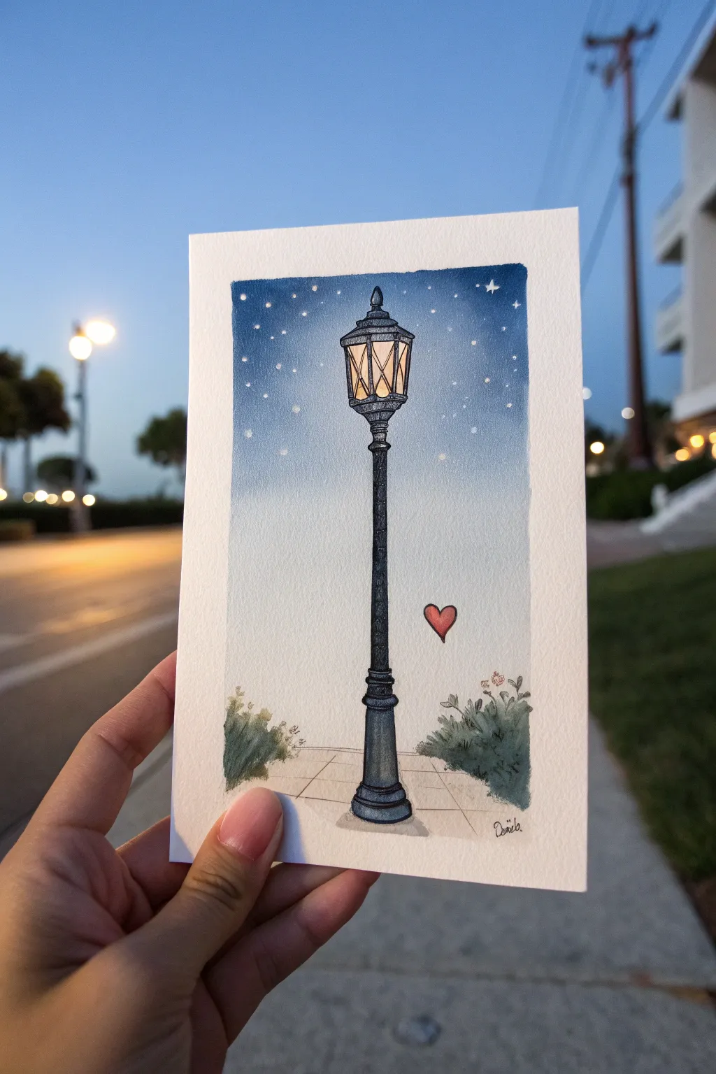
Capture the magic of an evening stroll with this enchanting watercolor and ink illustration. Featuring a finely detailed vintage lamp post against a gradient night sky, this piece adds a touch of surreal romance with a floating red heart.
Detailed Instructions
Materials
- Cold press watercolor paper (postcard size approx. 4×6 or 5×7 inches)
- Watercolor paints (Indigo, Prussian Blue, Burnt Sienna, Yellow Ochre, Lamp Black, Sap Green, Alizarin Crimson)
- Black fineliner pens (sizes 005 and 01 for details)
- White gouache or white gel pen
- Pencil (HB) and eraser
- Round watercolor brushes (size 4 for sky, size 0 or 2 for details)
- Ruler
- Masking tape
Step 1: Sketching the Structure
-
Tape margins:
Begin by taping down all four sides of your watercolor paper to a board. Use a ruler to ensure your painting area is a clean rectangle, leaving a crisp white border when removed. -
Outline the lamp:
Lightly sketch the lamp post using an HB pencil. Start with a long, slender vertical column in the center. At the top, draw the lantern head, which consists of a trapezoidal glass housing and a decorative pointed cap. -
Add the base and details:
Sketch the wider base of the lamp post where it meets the ground. Add horizontal ground lines behind the post to suggest a sidewalk perspective. Sketch two small bushes on either side of the base. -
The floating heart:
To the right of the lamp post, about halfway down, lightly sketch a small, simple heart shape. Keep it floating freely in the negative space; this is the surreal touch.
Step 2: Painting the Atmospheric Sky
-
Wet-on-wet preparation:
Wet the entire sky area with clean water using your size 4 brush. Be careful to paint around the lantern light area, but you can paint over the black post sketch since it will be darker later. -
Gradient wash:
Load your brush with Indigo or Prussian Blue. Start applying color at the very top of the sky, making it quite saturated. As you move down, dilute the paint with more water to create a fade. -
Softening the horizon:
By the time you reach the bottom third of the sky (near the bushes), the color should be extremely pale, almost fading to white to simulate atmospheric horizon glow. Let this layer dry completely.
Uneven Fade?
If your sky gradient dries with harsh lines, re-wet the entire sky area gently with clear water and tilt the paper to encourage the pigment to flow and smooth out.
Step 3: Illuminating the Lamp
-
Glowing light:
Paint the glass panes of the lantern with a wash of Yellow Ochre. While still slightly damp, drop a tiny touch of Burnt Sienna near the edges to create a feeling of warmth and depth. -
Base layer for metal:
Mix a watery grey using Indigo and a touch of Black. Paint the entire metal structure of the lamp post—the pole, the cap on top, and the base. -
Constructing the ground:
Paint the sidewalk area with a very pale, warm grey wash (diluted Brown or Lamp Black). Keep it lighter than the lamp post so the post stands out. -
Painting the greenery:
Mix Sap Green with a little Indigo for a dark, shadowy green. Paint the bushes on either side using a dabbing motion with your smaller brush to create leafy textures.
Make it Shine
Mix a tiny amount of iridescent or metallic watercolor medium into the yellow lantern paint for a literal warm glow that catches the light.
Step 4: Inking and Details
-
Defining the lamp:
Once all paint is perfectly dry, use your 01 fineliner to outline the lamp post. Add texture by drawing tiny dots (stippling) on the metal pole to make it look like cast iron. -
Lantern framework:
Carefully ink the cross-hatching or diamond pattern on the glass panes. Use the 005 pen here for finer lines so the yellow light isn’t obscured. -
Heart and bushes:
Paint the floating heart with Alizarin Crimson. Once dry, outline it with your pen. Add loose, scribbly ink details to the bushes to define leaves and small branches. -
Sidewalk lines:
Use a ruler and the fineliner to draw the perspective lines of the sidewalk tiles. -
Starry night:
Using white gouache or a gel pen, add stars to the blue part of the sky. I prefer to make varying sizes—some tiny dots and a few larger four-pointed stars near the top. -
Final highlights:
Add a tiny white highlight on the red heart and a few white dots on the lamp post metal to show reflection.
Now peel off the tape slowly to reveal those perfectly crisp edges and frame your whimsical night scene


Have a question or want to share your own experience? I'd love to hear from you in the comments below!