I love how medical painting lets you blend science and creativity in a way that feels both meaningful and visually striking. If you’re craving fresh medical painting ideas, here are some fun directions you can take—whether you’re into clean illustration vibes or expressive, painterly texture.
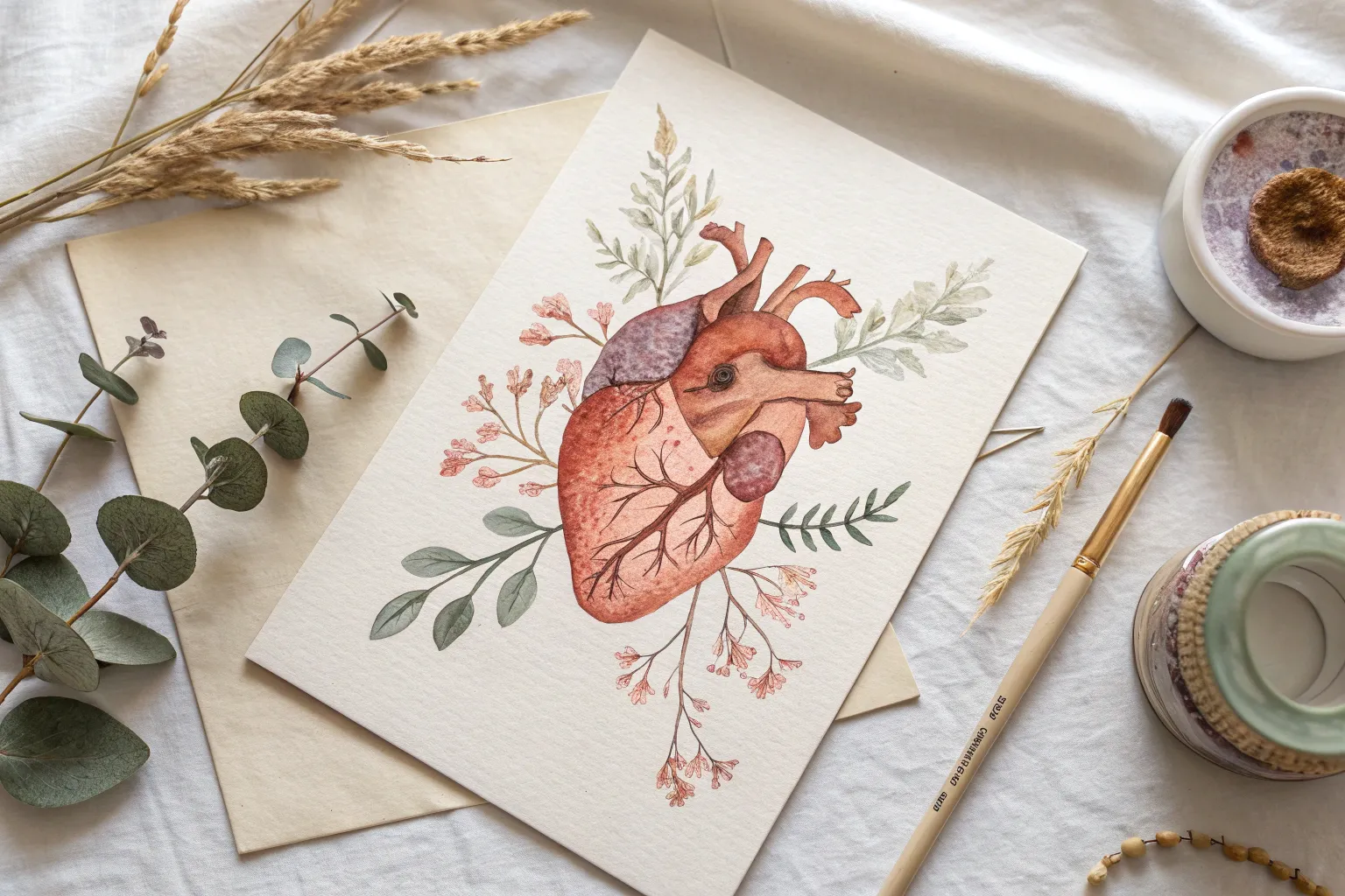
Watercolor Anatomical Heart Study
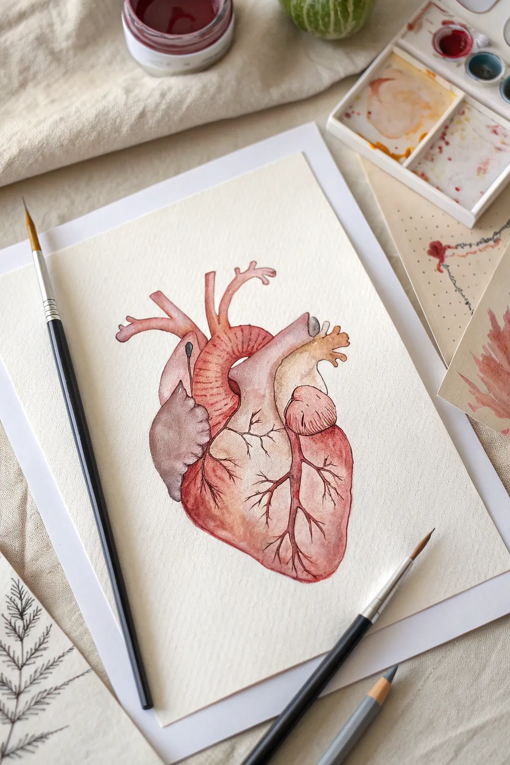
Capture the intricate beauty of the human heart with this delicate watercolor study. By layering soft washes of dusty rose and crimson, you’ll build a dimensional, beautifully textured illustration perfect for medical enthusiasts or art lovers alike.
Step-by-Step Guide
Materials
- Cold press watercolor paper (300 gsm)
- Watercolor paints (Alizarin Crimson, Burnt Sienna, Yellow Ochre, Paynes Grey)
- Round watercolor brushes (Size 4 for washes, Size 0 or 1 for details)
- Graphite pencil (HB or 2H)
- Kneaded eraser
- Jar of clean water
- Paper towels
- Palette for mixing
Step 1: Sketching the Foundation
-
Outline the main shape:
Begin with a light pencil sketch on your watercolor paper. Focus on the large, central mass of the ventricles first, creating a rounded, slightly asymmetrical bottom shape typical of a heart. -
Add the vessels:
Sketch the superior workings of the heart. Draw the arch of the aorta curling over the top, the pulmonary artery extending to the left, and the vena cava. Keep your lines faint so they won’t show through the transparent paint later. -
Refine the details:
Mark the separation between the left and right ventricles lightly. Add the small, ear-like shape of the left atrial appendage. Gently dab the sketch with a kneaded eraser to lift excess graphite, leaving only a ghost outline.
Muddy colors?
If your reds and browns are turning grey or muddy, let the layers dry completely between glazes. Use two jars of water—one for dirty rinsing and one for clean paint mixing—to keep hues pure.
Step 2: Applying Base Layers
-
First wash – Left Ventricle:
Mix a very watery, pale wash of Alizarin Crimson with a touch of Burnt Sienna. Apply this wet-on-dry to the main body of the heart, keeping the edges crisp but the center watery. -
Right Atrium shading:
While the first layer is drying, mix a pale Yellow Ochre with a tiny drop of brown. Paint the upper right section (the right atrium), letting it stay distinct from the reddish bottom section. -
Painting the vessels:
Use a soft pink mix (heavily diluted red) for the aorta and pulmonary arteries. I like to drop in a slightly concentrated red at the base of these tubes while they are still wet to suggest shadow and depth. -
Shadowing the appendage:
For the small, darker flap on the left (the right atrial appendage), mix a moody purple-grey using Alizarin Crimson and a touch of Paynes Grey. Paint this shape, letting the color pool slightly for texture.
Vintage Vibe
For an old textbook look, wash the background with weak tea or coffee before painting. Once dry, splatter tiny specks of burnt sienna to mimic foxing (aged paper spots).
Step 3: Building Depth and Texture
-
Deepening the reds:
Once the base layer is completely bone dry, mix a stronger concentration of your red-brown hue. Glaze this over the bottom right and left curves of the heart to create roundness. -
Creating the aorta texture:
Using a smaller brush (size 2), paint thin, curved horizontal lines across the arch of the aorta. Use a slightly darker red than the base to mimic the ribbed texture of the vessel. -
Mid-tone shading:
Add shadows where the vessels overlap the heart. Use a mix of Burnt Sienna and a touch of purple to paint the crevices between the pulmonary artery and the aorta. -
Enhancing the ochre tones:
Glaze a second, slightly richer layer of Yellow Ochre over the right atrium area. While wet, drop a tiny bit of brown wet-on-wet into the crevices to define the lumpy texture.
Step 4: Detailed Veins and Finishing
-
Mixing the vein color:
Create a concentrated mix of Alizarin Crimson and Burnt Sienna with very little water. You want a deep, blood-red color that will stand out against the pale washes. -
Painting main coronary arteries:
Switch to your smallest detail brush (size 0). Paint the main jagged line running diagonally down the center of the heart, branching out like lightning or tree roots. -
Adding fine capillaries:
From the main red line, pull out very fine, wispy lines extending into the muscle tissue. Use a light touch; lift the brush tip as you end the stroke to taper the line to nothing. -
Right side veins:
Paint the branching veins on the right ventricle. These should be slightly thicker at the top and branch downwards into finer capillaries. -
Final contrast check:
Assess your painting. If the shadows underneath the top vessels feel too light, add one final glaze of cool grey-purple to push them back into the distance.
Allow your painting to dry fully before erasing any remaining stray pencil marks for a crisp finish


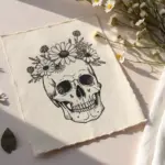
Skull With Floral Anatomy Notes
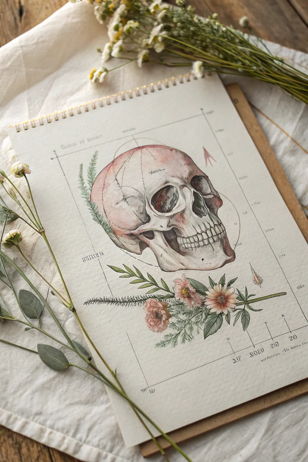
Marrying the stark beauty of skeletal anatomy with soft florals, this project creates a stunning faux-scientific illustration. You will achieve the look of an aged medical chart using watercolor washes and precise ink detailing.
How-To Guide
Materials
- Hot press watercolor paper (smooth texture)
- Pencil (HB or 2H)
- Kneaded eraser
- Waterproof fineliner pens (0.1, 0.3, and 0.5 sizes, Sepia or Black)
- Watercolor paints (Alizarin Crimson, Burnt Umber, Yellow Ochre, Sap Green, Paine’s Grey)
- Round watercolor brushes (sizes 2 and 6)
- Ruler
- Clean water and paper towels
Step 1: Drafting the Layout
-
Establish the frame:
Use your ruler and a very light pencil touch to draw a large rectangle centered on your paper. This serves as the boundary for your ‘medical plate.’ Leave about an inch of margin around the edges. -
Sketch the skull profile:
Lightly sketch the skull in a profile view, occupying the upper two-thirds of the rectangle. Focus on the large cranial curve, the deep hollow of the eye socket, and the line of the jaw. Don’t worry about teeth details yet. -
Position the florals:
Sketch a horizontal cluster of flowers at the base of the skull sketch. Draw a main daisy-like bloom and a smaller rosebud, along with extending leaves and fern sprigs that reach up the left side. -
Mark anatomical guides:
Using your ruler, add faint vertical and horizontal lines extending from the frame towards the skull. These mimic measurement lines found in old scientific diagrams.
Use Tea for Age
For an authentic vintage look, lightly brush a weak wash of brewed black tea over the entire paper before starting the sketch. Let it dry flat.
Step 2: Inking the Structure
-
Outline the cranium:
Switch to a 0.3 fineliner. Carefully trace your skull outline. Use broken or lighter lines for the smoother top of the skull to suggest light hitting it. -
Detail the features:
Use a 0.5 pen for the darker areas like the eye socket and nasal cavity. Add stippling (tiny dots) inside these hollows to create depth and shadow. -
Draw the teeth:
With the 0.1 pen, draw the teeth. Keep the lines between them thin and delicate so they don’t look like a cartoon skeleton. Irregularity adds realism. -
Ink the botanicals:
Outline the leaves and petals using the 0.1 pen. For the fern-like sprig on the left, use quick, short strokes to mimic the feathery texture. -
Add pseudo-text:
Scatter small, illegible scribble-writing near the guide lines to simulate handwritten doctor’s notes. You can write real Latin words or just abstract loops.
Step 3: Watercolor Application
-
Base skull wash:
Mix a very watery wash of Paine’s Grey and a touch of Burnt Umber. Apply this loosely over the skull, leaving the highlighted cheekbone and top of the head white. -
Adding the fleshy tones:
While the first layer is slightly damp, drop in diluted Alizarin Crimson near the back of the skull and the jaw hinge. This gives it that raw, anatomical look. -
Deepening shadows:
Once dry, mix a stronger grey-brown. Paint into the eye socket, nose, and under the cheekbone. Soften the edges with a clean, damp brush. -
Painting the blooms:
Paint the flowers with soft washes of pink and ochre. Keep the color application loose, allowing the ink drawing underneath to do most of the work. -
Greenery details:
Use Sap Green for the leaves. I like to vary the intensity, making the leaves closest to the flowers darker and the fern fronds very pale and translucent.
Ink Smearing?
Ensure your fineliners are marked ‘waterproof’ or ‘archival.’ If the ink bleeds when painting, let the drawing cure for at least an hour before wetting.
Step 4: Finishing Touches
-
Enhance textural cracks:
Using your finest 0.1 pen again, add tiny cracks (sutures) to the skull, particularly around the temple and back of the head. -
Reinforce guide lines:
Go over your pencil ruler lines with the 0.1 pen. Make them crisp but thin. Add small tick marks or numbers along the lines for that ‘chart’ effect. -
Final erase:
Wait until the paper is completely bone-dry. Gently erase any visible pencil sketch lines, being careful not to lift the ink or smudge the paint.
Step back and admire your beautifully scientific creation, ready to be framed as a curious conversation piece


Brain in Colored Pencil Layers
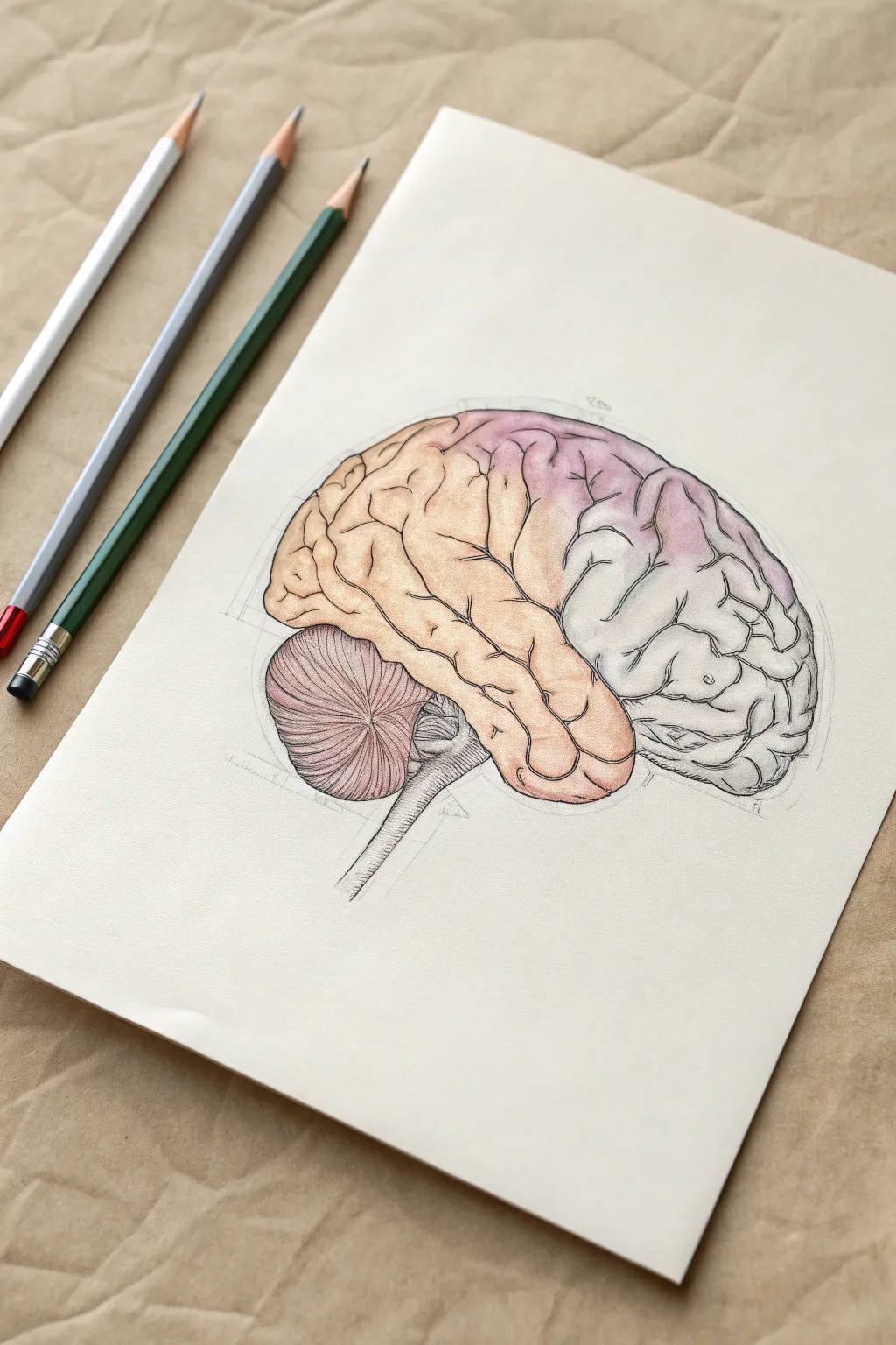
This tutorial guides you through creating a scientifically inspired yet artistically soft rendering of the human brain using colored pencils. By layering warm peach tones against cool greys and subtle purples, you will achieve a delicate, vintage textbook aesthetic perfect for medical illustration enthusiasts.
How-To Guide
Materials
- Smooth heavyweight drawing paper or bristol board (white or off-white)
- HB graphite pencil for sketching
- Soft eraser (kneaded usually works best)
- Colored pencils (peach/terracotta, light purple/lilac, cool grey, warm grey, dark charcoal)
- Fine-point black or dark grey liner pen (optional)
- Pencil sharpener
Step 1: Structural Foundation
-
Establish the Outer Shape:
Begin by sketching a light oval shape on your paper. This doesn’t need to be perfect; it simply marks the boundaries where the cerebrum will sit. Slightly flatten the bottom edge where the brain stem will eventually emerge. -
Divide the Hemispheres:
Lightly sketch the major anatomical divisions. Draw a curved line separating the frontal lobe area (which will be peach) from the parietal and occipital areas. Add an oval shape tucked underneath the back for the cerebellum. -
Sketch the Gyri and Sulci:
Using your graphite pencil, start mapping the ‘wrinkles’ of the brain. Instead of random squiggles, draw them as interlocking C and S shapes. Keep these lines very faint, as they serve only as a guide for your coloring layers. -
Refine the Brain Stem:
Draw the brain stem descending from the center. Add the striated texture of the cerebellum (the small structure at the base) using tight, parallel curved lines to differentiate its texture from the main cerebrum.
Keep it Sharp
For the intricate brain folds, a dull pencil is your enemy. Keep a sharpener handy and refresh your point every few minutes to ensure the crevices look crisp rather than muddy.
Step 2: Layering Color
-
Base Layer – Frontal Lobe:
Take your peach or light terracotta pencil. applying very light pressure, fill in the front section of the brain. Use small circular motions to avoid directional streaks, keeping the color soft and uniform. -
Base Layer – Parietal Region:
Switch to a light purple or lilac shade for the upper back section. Gently blend this color where it meets the peach zone, creating a seamless transition rather than a hard line. -
Base Layer – Occipital and Temporal:
For the lower back section and the temporal lobe, use a very light cool grey. This keeps the drawing grounded and adds a clinical, neutral tone to balance the warmer colors above. -
Deepening the Crevices:
Sharpen your pencils to a fine point. Go back over the sulci (the grooves) with slightly darker versions of your base colors. For the peach section, use a darker orange; for the purple section, a deeper violet. -
Shading the Cerebellum:
Color the cerebellum with a mix of warm grey and a touch of dusty pink. Emphasize the horizontal striations by pressing harder between the ridges to create depth. -
Shadowing the Base:
Add a shadow along the bottom edge of the cerebrum where it overhangs the cerebellum and brain stem. I find that a cool grey works best here to create a sense of three-dimensional volume.
Clinical Labels
Use a fine-tip micron pen to add delicate leader lines pointing to specific lobes. Label them (e.g., ‘Frontal Lobe’) in small, neat cursive or serif text for a textbook look.
Step 3: Defining Details
-
Outline Reinforcement:
Using a dark charcoal pencil or a very fine, dark grey liner, carefully trace the major outlines of the lobes. Keep the line weight varied—thicker in shadow areas, thinner in light areas—to prevent it from looking like a cartoon. -
Enhancing Texture:
Return to the main gyri (the bumpy surface). Add tiny ticking lines or small fissures branching off the main grooves. This adds realistic complexity to the surface texture. -
Developing the Brain Stem:
Detail the brain stem with vertical shading lines, following the cylindrical form. Use grey to shade the left side more heavily, implying a light source coming from the right. -
Final Contrast Pass:
Look for the deepest intersections where three or more wrinkles meet. Darken these specific points significantly with a dark grey or black pencil to punch up the contrast. -
Adding Construction Lines (Optional):
To give the piece a ‘study’ or ‘architectural’ feel, lightly draft some straight geometric lines around the outer perimeter using a ruler and a hard pencil (2H). This mimics the look of a vintage medical diagram.
Now you have a beautifully layered anatomical illustration ready for display or study


X-Ray Style Monochrome Painting
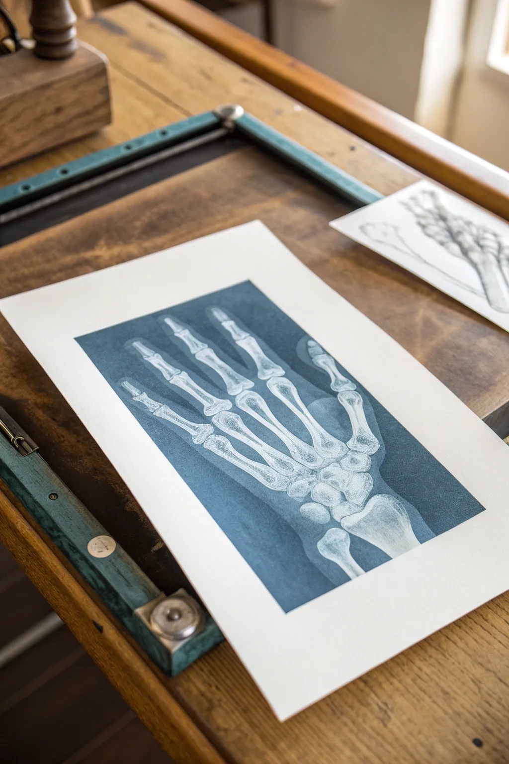
Capture the haunting beauty of medical imaging with this watercolor project that mimics the look of a vintage X-ray or cyanotype print. By layering rich indigo and Prussian blues against stark white paper, you’ll create a striking skeletal hand study that feels both scientific and artistic.
Step-by-Step Guide
Materials
- High-quality watercolor paper (140lb/300gsm, cold press is best)
- Watercolor paints: Prussian Blue, Indigo, and Payne’s Gray
- White gouache or white ink (for highlights)
- Round watercolor brushes (sizes 2, 4, and 8)
- Pencil (H or HB for light lines)
- Kneaded eraser
- Reference image of hand anatomy or X-ray
- Masking tape
- Palette for mixing
- Two jars of water
Step 1: Preparation and Sketching
-
Secure the Paper:
Begin by taping down all four edges of your watercolor paper to a sturdy board or table. This prevents buckling when we apply the wet washes later. -
Study Anatomy:
Before drawing, look closely at your reference image. Notice how the carpal bones (wrist) cluster together and how the phalanges (fingers) taper. -
Basic Outlines:
Using your H pencil, lightly sketch the contour of the hand bones. Focus on the negative space between the fingers rather than just the bones themselves. -
Refine the Shapes:
Detail the joints where the bones connect. Keep your lines very faint; we want the paint to define the forms, not graphite lines. -
Clean Up:
Use the kneaded eraser to lift up any heavy graphite. The sketch should be barely visible, just enough to guide your brush.
Pro Tip: Masking Fluid
For crisp bright whites, apply masking fluid over the bones before painting the blue background. Peel it off at the end to reveal perfect white paper.
Step 2: Painting the Background
-
Mix Your Base Color:
Create a large pool of your main ‘X-ray’ color. I like to mix Prussian Blue with a touch of Indigo for that deep, clinical blue tone. -
First Wash:
Using your largest brush (size 8), carefully paint the negative space *around* the bones. This is the background that will make the white bones pop. -
Working Wet-in-Wet:
While the background is still damp, drop in slightly darker pigment (Payne’s Gray) near the edges of the bones to create depth and contrast. -
Let it Dry:
Allow this layer to dry completely. The paper should feel room temperature to the touch, not cool.
Troubleshooting: Blooms
If ‘cauliflower’ blooms appear in your blue wash, you added water while the paint was semi-dry. Fix it by blending gently with a damp brush or embracing the texture.
Step 3: Defining the Bones
-
Soft Shadows:
Switch to a size 4 brush. Mix a very watery, pale version of your blue. Paint light shadows on the sides of the bones to give them cylindrical form. -
Joint Details:
Add slightly darker shading where bones meet at the joints or overlap. This separates individual bones from each other. -
Texture Work:
Bones aren’t perfectly smooth. Use a dry brush technique with faint blue to add subtle texture or ‘noise’ inside the white bone areas. -
Deepening the Background:
Go back into the negative spaces with a second layer of intense Prussian Blue. Darken the areas directly next to the bright white parts of the bone for maximum impact.
Step 4: Highlights and Final Touches
-
Ghostly Overlay:
X-rays often show a faint ‘ghost’ of the flesh surrounding the bones. Paint a very sheer, watery outline of the skin around the skeletal fingers. -
Adding White:
If you lost any bright whites, use opaque white gouache or ink. paint crisp highlights on the edges of the joints. -
Stippling details:
Use your smallest brush (size 2) to add tiny dots or stippling on the bone ends, mimicking the porous nature of bone tissue. -
Final Assessment:
Step back and check your contrast. Typical X-rays have high contrast, so don’t be afraid to darken the blue background one last time if needed. -
Remove Tape:
Once the painting is 100% dry, peel away the masking tape slowly at a 45-degree angle to reveal a crisp white border.
Frame this moody blue study in a simple black frame to enhance its sleek, monochromatic appeal
BRUSH GUIDE
The Right Brush for Every Stroke
From clean lines to bold texture — master brush choice, stroke control, and essential techniques.
Explore the Full Guide
DNA Helix in Bold Color Gradients
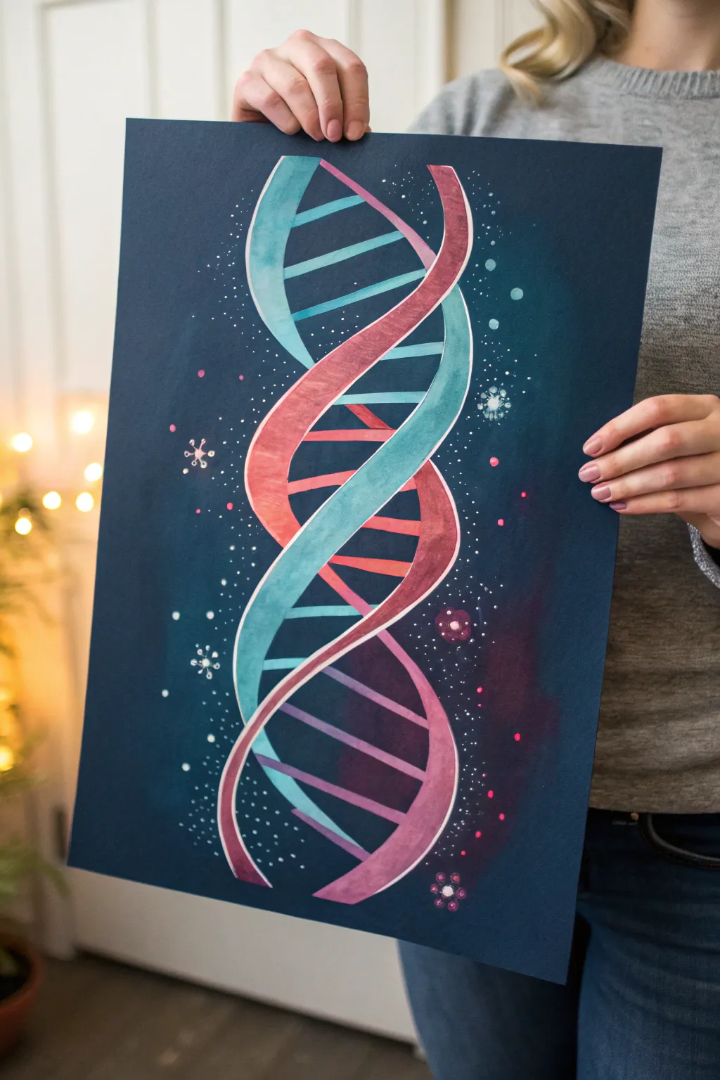
Merge science and art with this vibrant DNA strand painting that pops beautifully against a deep navy background. The gradient colors and celestial speckles give it a dreamy, galaxy-inspired feel perfect for any medical office or study. This project uses gouache or opaque watercolors to ensure the colors stand out boldly on dark paper.
Step-by-Step Tutorial
Materials
- Dark navy blue cardstock or heavy mixed-media paper (A3 or 11×17 size)
- Gouache paint (Teal, Magenta, White, Purple, Dark Blue)
- Pencil and eraser
- Ruler
- Synthetic round brushes (sizes 2 and 4)
- Fine liner brush (size 0 or 00)
- White gel pen or white acrylic ink
- Palette for mixing
- Water cups and paper towels
Step 1: Sketching the Double Helix
-
Establish the central axis:
Start by lightly drawing a vertical line down the center of your dark paper using a ruler. This will act as your guide to keep the DNA strands symmetrical. -
Mark the crossover points:
Along this central line, make small tic marks at equal intervals (about 2-3 inches apart). These marks indicate where the two strands of the helix will cross over each other. -
Sketch the first strand:
Draw a sinusoidal wave pattern that passes through your tic marks. Imagine a winding ribbon that curves out to the left and then back to the center. Keep the width of the ribbon consistent, roughly half an inch wide. -
Sketch the opposing strand:
Draw the second ribbon mirroring the first one. It should curve out to the right when the first one curves to the left, creating that classic figure-8 look of the double helix. -
Draw the base pairs:
Connect the two backbones with horizontal rungs. Space them evenly. Because the helix twists, some rungs will be long and full, while others near the crossover points will be shorter or partially hidden. -
Refine the sketch:
Clean up your pencil lines. Since we are painting on dark paper, try to keep the graphite light so it doesn’t show through lighter paint layers later.
Clean Edges Pro-Tip
If your hand is shaky, outlining the helix with a white gel pen *after* the paint dries crisps up the edges instantly.
Step 2: Painting the Strands
-
Mix your teal gradient:
Prepare a teal color on your palette. Mix a separate puddle of the same teal with a bit of white to create a lighter tint. I usually keep a pure white nearby for highlights. -
Paint the first backbone:
Using the size 4 brush, fill in one of the helix ribbons with your teal mix. While the paint is still wet, blend in the lighter teal or white towards the curved ‘high points’ to create a 3D cylindrical effect. -
Mix the magenta gradient:
Clean your brush and prepare a magenta or berry-pink shade. Like before, mix a lighter version by adding white. -
fill the second backbone:
Paint the second ribbon with the magenta mix. Apply the lighter pink to the center of the curves to mimic light hitting the strand. -
Add white highlights:
Once the base layers are dry, use your fine liner brush or a white gel pen to add a thin, crisp white line along the outer edge of each ribbon. This separates the helix from the dark background.
Level Up: Metallic Touch
Use metallic gold or silver paint for the highlights on the helix curves. It catches the light and adds a premium feel.
Step 3: Adding the Rungs and Details
-
Paint the rung gradients:
For the horizontal rungs, use a small flat or round brush. Paint them as gradients that transition from teal on one side to pink on the other, representing the pairing of the two strands. -
Define the edges:
Ensure the connection points where the rungs meet the backbones are clean. You may need a second coat of paint here if the dark paper is showing through. -
Create the nebula effect:
Mix a very watery purple or dark blue glaze. Gently brush this around the helix on the dark background to create subtle clouds of color, blending the edges out so they fade into the navy paper. -
Splatter the stars:
Dip a stiff brush or toothbrush into white acrylic ink or watered-down gouache. Use your thumb to flick fine misty splatters across the paper, concentrating them around the helix. -
Draw larger celestial bodies:
Using the white gel pen or fine brush with white paint, draw tiny dots, circles, and a few larger sparkle shapes or ‘virus’ shapes floating in the background space. -
Add floating orbs:
Paint a few small, translucent circles in soft teal or pink in the background to add depth, making it look like bokeh or distant cells.
Now step back and admire how the colors glow against the dark background, creating a stunning piece of scientific art
Mixed-Media Medical Diagram Collage
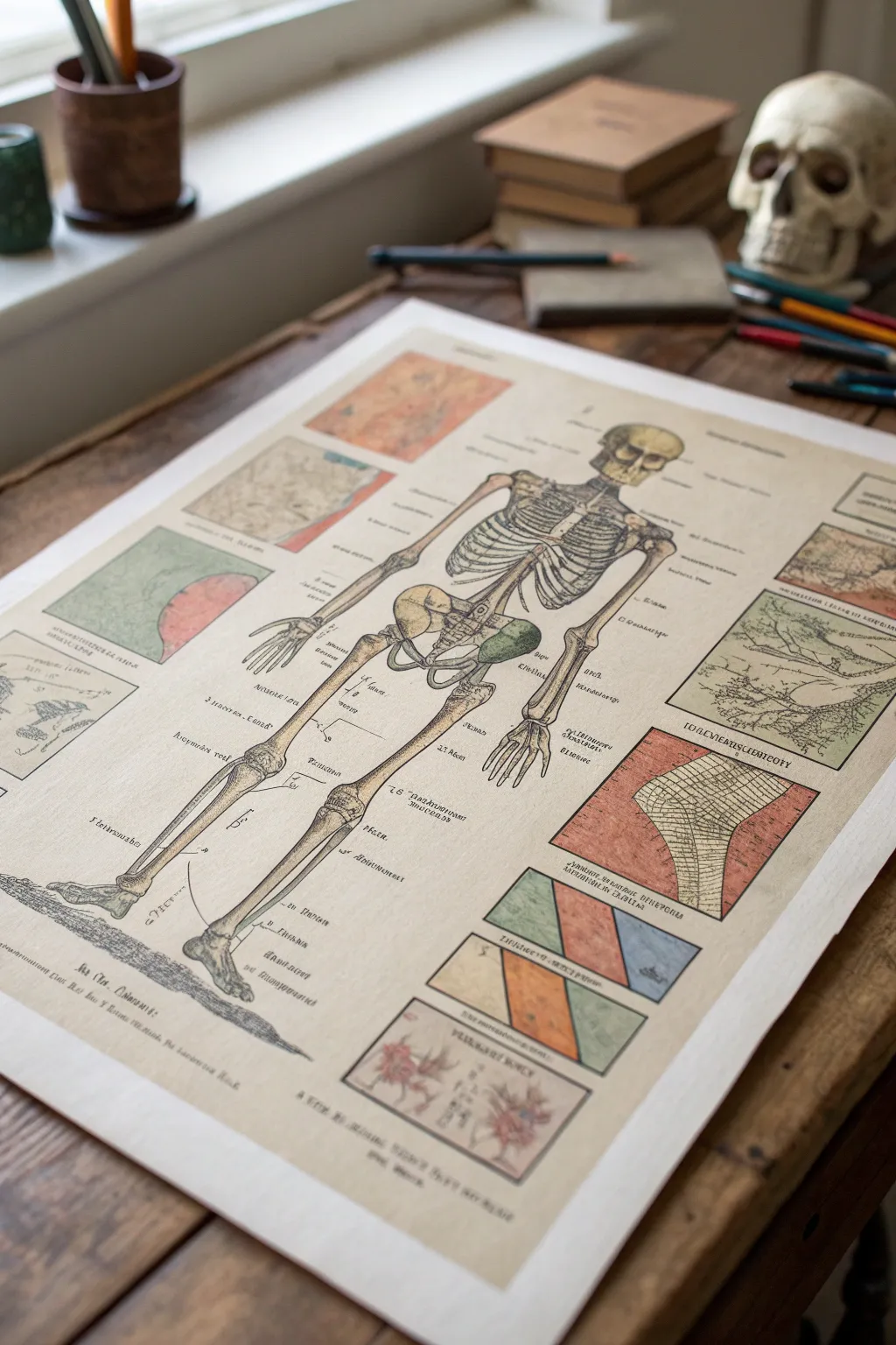
Transport yourself to a 19th-century medical study with this intricate mixed-media anatomical chart. Combining fine liner work with aged paper techniques and watercolor washes, you’ll create a piece that feels like a forgotten treasure from an old surgeon’s library.
Detailed Instructions
Materials
- Heavyweight watercolor paper (hot press for smoothness)
- Strong black tea or diluted coffee
- Waterproof archival ink pens (0.1, 0.3, and 0.5mm)
- Watercolor set (muted earth tones: ochre, burnt sienna, olive green, slate blue)
- Small round brushes (sizes 2 and 4)
- Pencil and eraser
- Ruler
- Reference image of a human skeleton
- Masking tape
Step 1: Preparing the Antique Surface
-
Stretch and tape:
Begin by taping your watercolor paper down to a flat board with masking tape. This prevents buckling during the staining process and creates a clean border later. -
Brew the stain:
Brew a very strong cup of black tea or instant coffee. Let it cool slightly but use it while warm for better absorption. -
Apply the wash:
Using a large brush or sponge, apply the tea or coffee wash across the entire paper. I like to let small pools form in some areas to create natural-looking discolorations found in old paper. -
Dry thoroughly:
Allow the paper to dry completely. If the color is too light, apply a second coat. For a crisp finish, you can press the dried paper under heavy books overnight.
Step 2: Drafting the Medical Diagram
-
Structural layout:
Using a ruler and a light pencil touch, lightly map out the composition. Draw a central vertical axis for the skeleton and rectangular borders for the surrounding inset diagrams. -
Skeleton sketch:
Lightly sketch the skeleton’s basic forms. Focus on gesture and proportion first—the ribcage as an oval, huge joints as circles—before refining the bone shapes. -
Inset details:
Sketch abstract shapes or cellular patterns inside the surrounding boxes. These don’t need to be biologically perfect; they act as supporting visual texture. -
Refining linework:
Go over your pencil sketch with a confident hand, defining individual ribs, vertebrae, and finger bones. Keep the pencil lines faint so they are easy to erase later.
Pro Tip: Instant Age
Splatter fine droplets of concentrated coffee or diluted brown ink onto the finished dry piece using a toothbrush to simulate foxing (age spots).
Step 3: Inking the Anatomy
-
Main outlines:
Switch to your 0.3mm waterproof pen. Carefully trace the outer edges of the bones. Use broken lines occasionally to suggest age or wear in the illustration. -
Hatching and shading:
Use the 0.1mm pen for shading. Create volume in the ribcage and long bones using fine cross-hatching or stippling. This technique mimics the look of copperplate engravings. -
Text and labels:
Add handwritten labels pointing to various bones. Use a cursive or serif style to mimic old typography. Don’t worry if the text is illegible placeholder script; the aesthetic is what matters. -
Border details:
Ink the rectangular frames for the inset diagrams. Vary line weight using the 0.5mm pen to make these frames stand out against the delicate internal drawings. -
Erase pencil:
Wait at least 15 minutes for the ink to fully set, then gently erase all visible pencil marks.
Level Up: Gold Leaf
Apply tiny accents of imitation gold leaf to specific joints or diagram frames. This adds a bizarre, precious quality reminiscent of illuminated manuscripts.
Step 4: Watercolor Washes
-
Bone tinting:
Mix a very watery wash of yellow ochre and a touch of gray. Lightly paint the skeleton, leaving highlights white. The goal isn’t solid color, but a vague stain of age. -
Inset colors:
Paint the inset diagrams with muted, ‘medical’ colors—faded reds, olives, and slate blues. Keep the paint transparent so the ink lines show through clearly. -
Shadow accents:
Add deeper shadows inside the pelvic cavity and eye sockets using a mix of burnt sienna and blue. Applying this wet-on-dry gives you hard edges that look illustrative. -
Grounding shadow:
Paint a slight cast shadow beneath the skeleton’s feet using a diluted gray washes to ground the figure.
Hang your finished medical plate in a simple wooden frame to complete the studious, dark academia aesthetic

PENCIL GUIDE
Understanding Pencil Grades from H to B
From first sketch to finished drawing — learn pencil grades, line control, and shading techniques.
Explore the Full Guide
Surreal Organ-as-Landscape Concept
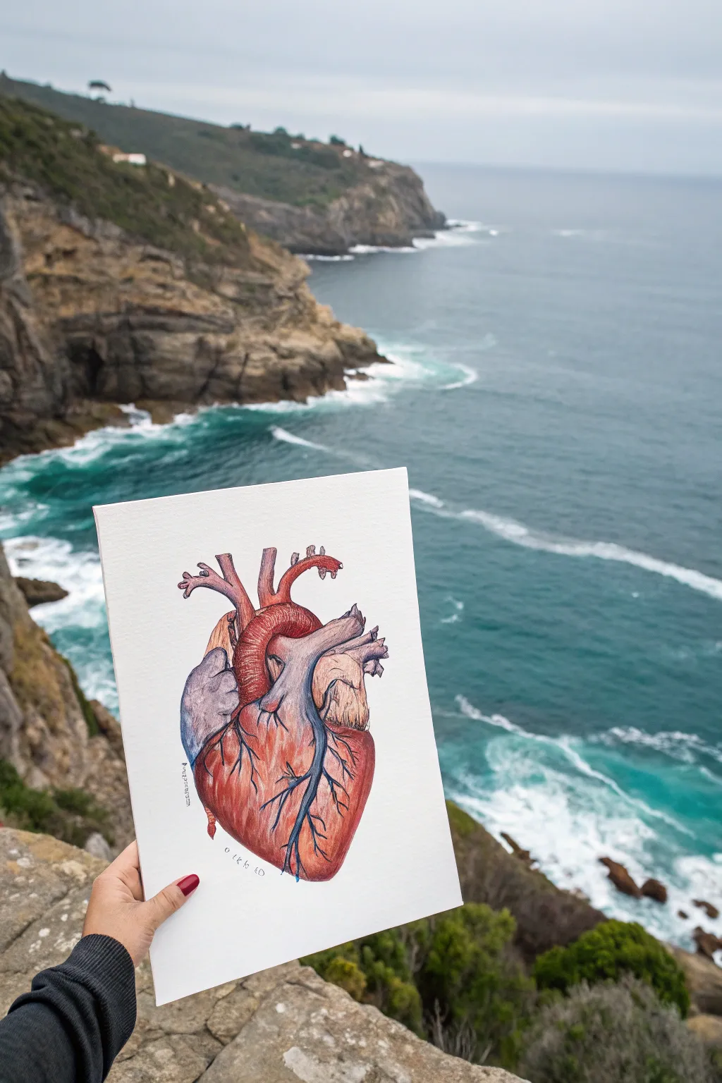
Capture the intricate beauty of human biology with this detailed anatomical heart illustration. Using a blend of fine liners and colored pencils, you’ll create a realistic yet artistic study that balances scientific accuracy with soft, textured shading.
Step-by-Step
Materials
- Heavyweight drawing paper or mixed media paper (smooth texture)
- HB graphite pencil
- Kneaded eraser
- Fine liner pens (sizes 0.1mm, 0.3mm, 0.5mm, black)
- Artist quality colored pencils (reds, maroons, purples, blues, parchment/cream)
- Colorless blender pencil (optional)
- Pencil sharpener
Step 1: Planning and Sketching
-
Analyze the shapes:
Begin by breaking down the complex form of the heart into simple geometric shapes. The main body is roughly an oval or an inverted pear shape, slightly tilted to the left. -
Map the major vessels:
Lightly sketch the aorta arching over the top, the pulmonary artery branching to the left, and the superior vena cava entering from the top right. Don’t press hard; keep these lines faint guidelines. -
Refine the outline:
Using your HB pencil, carefully trace the specific contours of the heart muscles. Pay attention to the ‘auricles’ (the ear-like flaps) and the major coronary arteries that zigzag down the front surface. -
Clean up the sketch:
Once you are happy with the proportions, roll your kneaded eraser gently over the drawing to lift up excess graphite. You want the lines to be barely visible, just enough to guide your ink.
Reference Is Key
For medical accuracy, don’t guess the anatomy! Keep a diagram of the heart open nearby. It helps you understand exactly where the aorta loops and how the ventricles sit.
Step 2: Inking the Anatomy
-
Outline main arteries:
Start with a 0.3mm fine liner for the major outlines. Use broken or slightly wavering lines for the muscular tissues to suggest texture, rather than perfectly smooth surgical cuts. -
Detail the veins:
Switch to a 0.1mm pen for the intricate branching veins on the surface of the heart. These should look like lightning bolts or tree roots, tapering off as they get smaller. -
Add textural hatching:
Use minimal stippling or very short hatch marks near the crevices where the vessels meet the main muscle to suggest depth before you even add color. -
Let the ink cure:
Wait at least 15 minutes to ensure the ink is totally dry before erasing any remaining pencil marks to avoid smudging.
Troubleshooting Shadows
If your drawing looks flat, your darks aren’t dark enough. Don’t be afraid to use a dark brown or even black pencil very lightly in the deepest crevices to force the contrast.
Step 3: Layering Color
-
Base layer for the muscle:
Start with a soft, pale pink or flesh tone. Cover the main body of the heart lightly. I prefer to use small circular motions here to get an even coverage without directional streaks. -
Establish the blue veins:
Take a muted blue or slate grey pencil. Color the superior vena cava and the pulmonary artery, as well as the spider-webbing veins on the surface. Keep the pressure light; we will darken this later. -
Deepen the reds:
Select a carmine or deep red. Begin shading the shadowed areas of the heart muscle, particularly the bottom curve and underneath the aorta. Leave the center of the muscle lighter to create a rounded, 3D effect. -
Shade the aorta:
Use a mix of bright red and a touch of brown for the aorta arch. Add circular hatch marks to suggest the fibrous texture of this large vessel. -
Create the purple shadows:
To make the heart look realistic, blend a deep purple or violet into the darkest red areas. This cools down the shadows and adds biological realism. -
Define the fatty tissue:
There is often yellowish ‘fat’ near the top arteries. Use a cream or pale ochre pencil to color these sections, blending it slightly into the red muscle for a natural transition. -
Intensify the surface veins:
Go back over your blue veins with a darker indigo or navy pencil. press a bit harder this time to make them pop against the red muscle. -
Blend and burnish:
Finally, use a colorless blender or a white pencil to smooth out the grain of the paper in the highlight areas. This gives the drawing that finished, polished look.
Take your finished artwork outside for a photo op against a dramatic background to juxtapose the internal body with the external world

Have a question or want to share your own experience? I'd love to hear from you in the comments below!