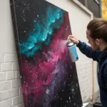
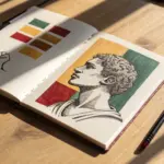
When you’re drawing a poster, the goal is simple: grab attention fast and make your message crystal clear. I love leaning on strong shapes, easy symbols, and a little bold typography to turn a drawing into something people actually stop to read.
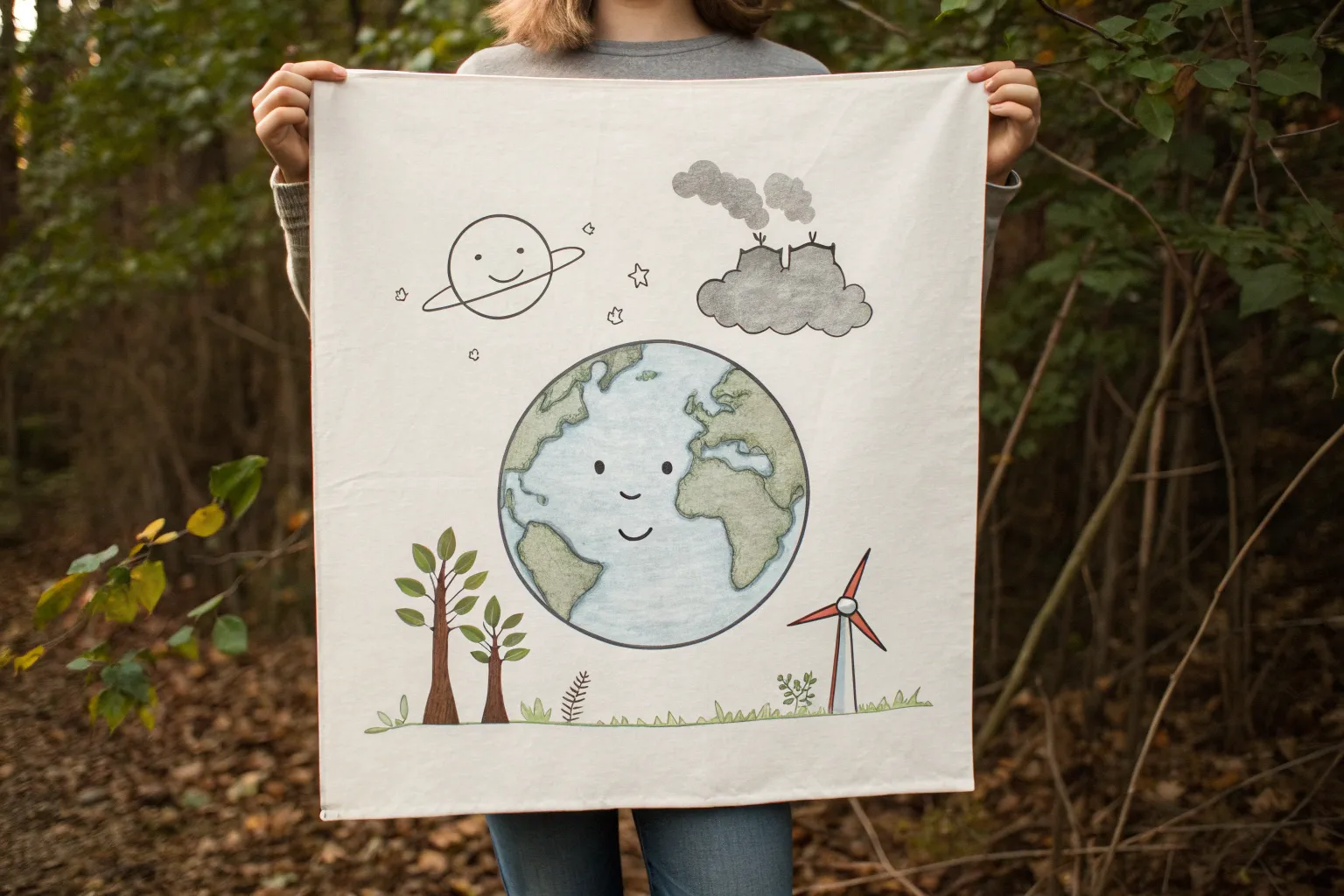
Save the Earth Poster Drawing
Embrace simplicity and environmental awareness with this clean, minimalist Earth poster. Featuring crisp line work and gentle pastel accents, this project combines a classic globe illustration with botanical elements to create a peaceful message.
Step-by-Step Tutorial
Materials
- Large white drawing paper or poster board (at least A3 size)
- Pencil and eraser
- Compass or large circular object for tracing
- Fine tip black marker or archival ink pen
- Medium tip black marker
- Sage green marker or colored pencil
- Dusty pink marker or colored pencil
- Red fine tip pen
Step 1: Setting the Foundation
-
Position your circle:
Begin by finding the center of your paper. Use a compass or trace around a large dinner plate to create a perfect circle for the globe. Make sure to leave ample white space around the edges for the decorative elements. -
Draft the continents:
Lightly sketch the outlines of the continents with your pencil. Focus on the familiar shapes of North and South America on the left, and Africa and Europe on the right. Keeping the shapes slightly simplified works best for this style. -
Add flanking leaves:
Sketch a long, curving stem rising up the left side of the globe. Mirror this on the right side, but allow the right stem to sit slightly higher for a more dynamic, organic look. -
Draw the leaf shapes:
Add individual oval-shaped leaves along these stems. Draw them in pairs, angling upwards as if reaching towards the sun. I like to keep the shapes consistent but not identical.
Step 2: Inking the Design
-
Outline the globe:
Switch to your medium-tip black marker. Carefully trace over your main circle. A steady hand is key here, but don’t worry if the line varies slightly in thickness—it adds character. -
Ink the continents:
Using a slightly finer tip pen, trace the jagged coastlines of your continents. Add small islands and details, ensuring the lines connect cleanly. -
Create the bottom wreath:
Below the globe, draw two curved branches meeting in the center. Unlike the large side leaves, draw these with small, narrow leaves closely packed together, resembling an olive branch or laurel wreath. -
Detail the olive branch:
Use your fine-tip pen to add a central vein line to each of these tiny leaves on the bottom wreath. -
Add the berry accent:
Where the two olive branches meet at the bottom center, draw a small, horizontal oval shape to represent a tie or berry cluster.
Smooth Circles
If you don’t have a compass, use a string tied to a pencil and a pin. Pin the string to the center and rotate the pencil for a perfect custom-sized circle.
Step 3: Adding Color and Details
-
Color the side leaves:
Take your sage green marker. Fill in the large leaves on the left and right sides. If using markers, try to use long, continuous strokes to minimize streakiness. -
Fill the berries:
Use a red fine-tip pen or marker to color in the small cluster at the base of the olive wreath. -
Draw floating hearts:
Above the globe, lightly pencil in three floating hearts. Arrange them in a gentle arc, following the curve of the earth. -
Ink the hearts:
Trace over your heart sketches with a dusty pink marker or pen. Keep the lines thin and delicate. -
Add spacing dots:
Scatter small black dots randomly around the composition using your fine-tip pen. Place a few near the hearts and several around the wreath to fill empty space without cluttering. -
Clean up:
Wait about ten minutes to ensure all ink is completely dry. Then, gently erase any visible pencil marks, being careful not to smudge the colored areas.
Wobbly Lines?
Don’t stress over perfect continent shapes. Intentional wobbles on coastlines actually make them look more realistic and geographical.
Hang your finished poster in a bright spot to remind everyone to care for our shared home

Say No to Plastic Ocean Scene
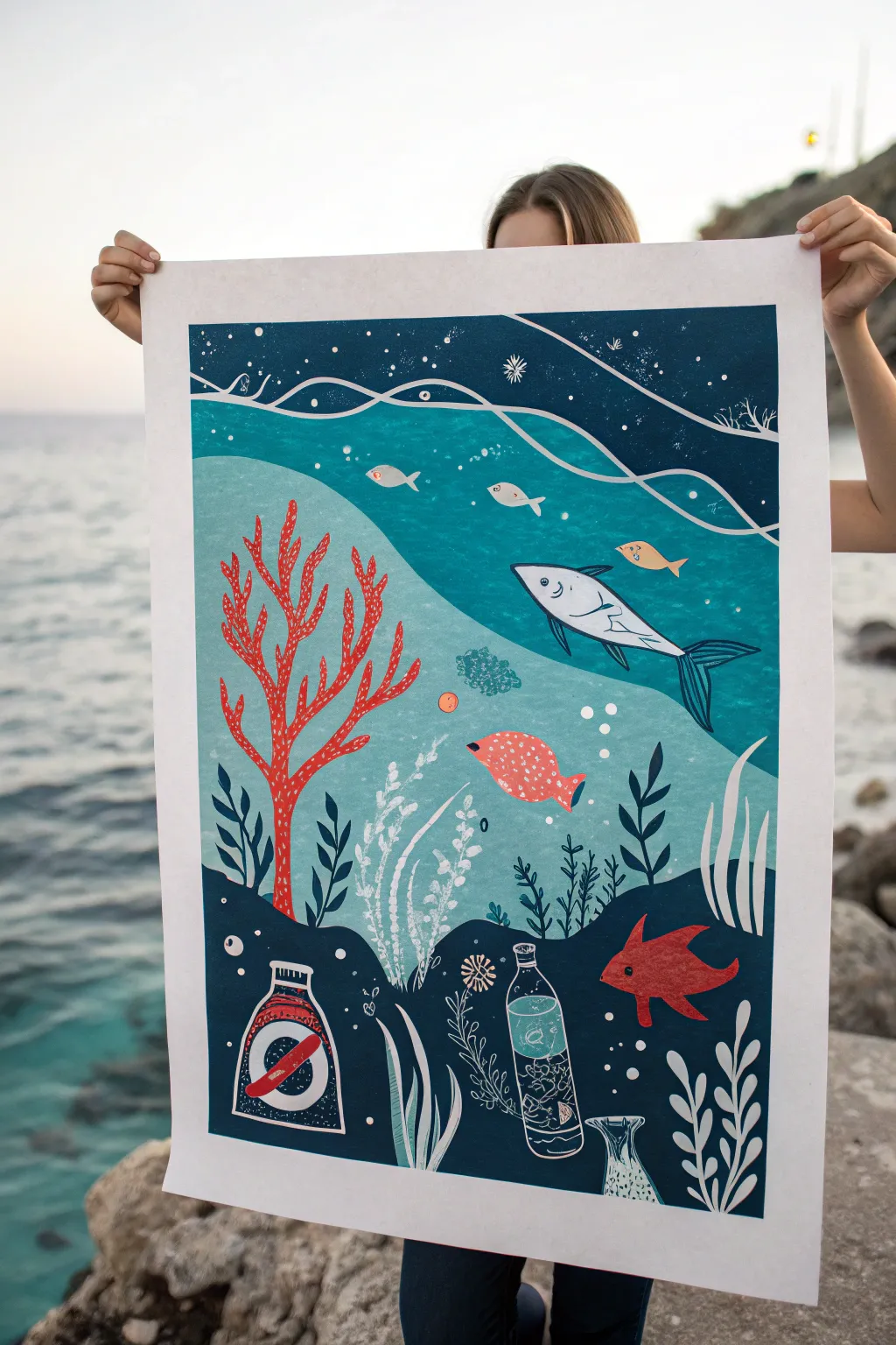
Create a striking ocean conservation statement with this poster that mimics the textured look of a linocut print. The design features layers of deep blues and teals, contrasting coral, and a poignant message about plastic pollution hidden within the seabed.
Detailed Instructions
Materials
- Large heavyweight mixed media paper or Bristol board (A2 or A3 size)
- Gouache or matte acrylic paints (Navy blue, teal, turquoise, coral red, orange, white)
- Pencil and eraser
- Flat shader brushes (medium and large)
- Fine round detail brush (size 0 or 1)
- White gel pen or fine white paint marker
- Masking tape (low tack)
- Mixing palette
- Ruler
Step 1: Planning the Composition
-
Border Prep:
Begin by taping down your large paper to a flat work surface. Create a clean border by applying masking tape about 1-2 inches inward from the edges on all four sides. -
Sketching the Layers:
Lightly sketch horizontal, wavy distinct zones. At the bottom, draw a jagged seabed. Above that, a middle water layer, and finally a top surface layer with wave lines. -
Drafting Elements:
Sketch the main focal points: a large red branching coral on the left, a large fish swimming right in the center, smaller fish throughout, and the crucial litter elements (bottles and jars) buried in the dark seabed at the bottom.
Step 2: Layering the Backgrounds
-
Deep Ocean Floor:
Mix a very dark navy blue. Paint the bottom-most section (the seabed) solidly, carefully painting around your sketched litter items and the base of the plants. Don’t worry if the edges are slightly uneven; this adds to the organic feel. -
Mid-Water Teal:
Mix a vibrant teal or turquoise shade. Paint the middle section of the water. For a textured ‘print’ look, use a fairly dry brush and dab slightly rather than using long, smooth strokes. -
Deep Blue Top:
Use a dark blue (slightly lighter than the seabed) for the top strip of water. Paint this section solid, creating a strong contrast with the teal below. -
Texture Splatter:
To mimic the speckled look of ink on paper, dilute a tiny bit of white paint. Tap your brush against a finger to flick very fine droplets over the blue sections. Go sparingly.
Faux-Print Texture
To get that gritty linocut texture, lightly sponge the paper with a dry kitchen sponge dipped in paint before doing your solid layers.
Step 3: Painting the Sea Life
-
Coral Foundation:
Using a bright coral red, paint the large branching coral structure on the left side. It overlaps both the dark seabed and the teal water, tying the layers together. -
Main Fish:
Paint the large central fish using a very light gray or off-white. Ensure its shape is sleek and pointed. -
Schooling Fish:
Fill in the smaller fish shapes with varied colors like soft orange, light gray, and muted red. Keep these shapes simple, almost like silhouettes. -
Seabed Plants:
Using a dark teal or green-black, add the leafy seaweed silhouettes rising from the ocean floor. I find painting these with quick, upward flicking motions creates the best tapered leaves.
Make it Metallic
Use metallic silver or gold paint for the plastic trash elements. It highlights the unnatural presence of the litter against the matte ocean.
Step 4: Adding the Message Details
-
The Plastic Elements:
Paint the bottles and jars in the seabed using white lines or very pale washes to make them look transparent. Inside one bottle, paint a ‘no’ sign (circle with a slash) in red and white. -
White Line Work:
Use your white gel pen or fine brush to add internal details. Draw the skeleton lines inside the red coral, the gills and fins on the fish, and the bubbles rising up. -
Wave Patterns:
With the white pen or paint, draw long, flowing, wavy lines separating the top dark blue layer from the teal water. Add swirling lines in the top dark section to suggest current. -
Finishing Touches:
Add final textures: small white dots for bubbles, little vertical dashes in the white plants, and definition on the plastic bottle caps. -
The Reveal:
Wait until the paint is completely bone dry. Carefully peel away the masking tape at a 45-degree angle to reveal your crisp white border.
Hang your artwork proudly to spark conversations about keeping our oceans clean and plastic-free
Clean Energy Poster With Simple Silhouettes
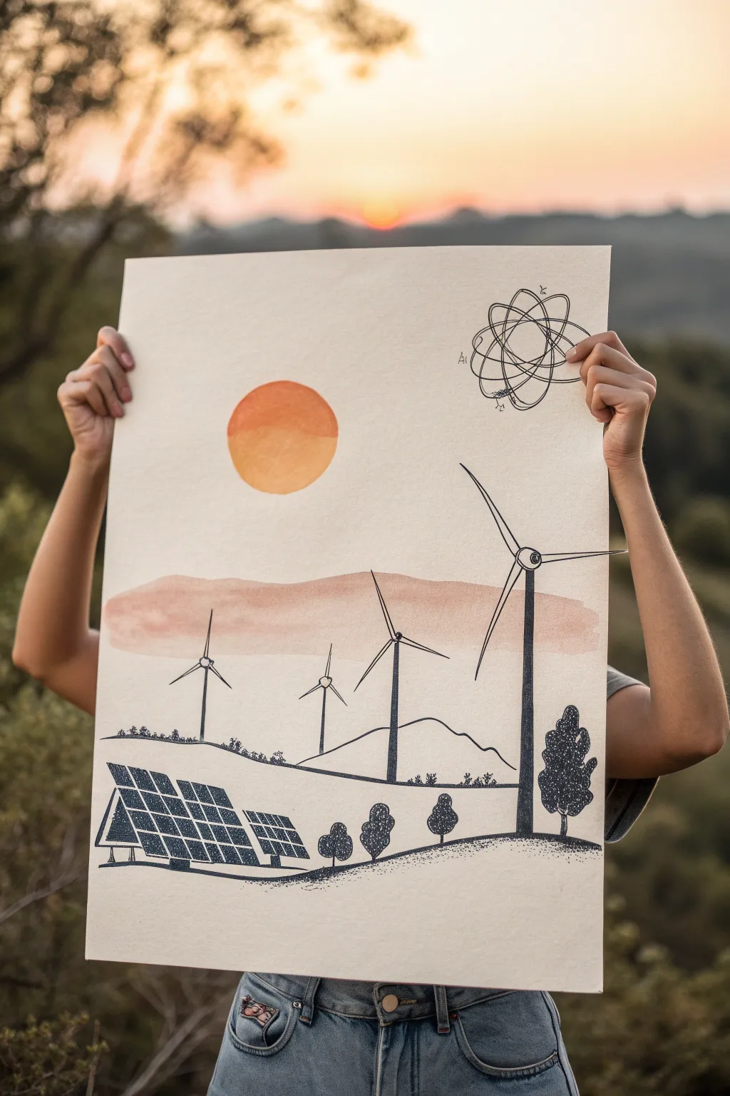
Capture the promise of a sustainable future with this elegant mixed media poster. By combining soft watercolor washes with crisp ink stippling, you’ll create a serene landscape featuring wind turbines, solar panels, and a symbolic atomic nod.
Step-by-Step Guide
Materials
- Large sheet of thick mixed-media or watercolor paper (A2 or 18×24 inches)
- Watercolor paints (warm orange, muted coral/terracotta)
- Large round watercolor brush (size 10 or 12)
- Black fine-liner pens (0.3mm and 0.5mm)
- Black chisel-tip marker or brush pen
- Pencil (HB) and eraser
- Ruler
- Compass or a circular object to trace (for the sun)
- Masking tape (optional, to secure paper)
Step 1: Setting the Scene with Watercolors
-
Prepare your canvas:
Lay your paper on a flat surface. If your paper tends to buckle, tape the edges down with masking tape. Lightly sketch a horizon line about one-third of the way up from the bottom. -
Paint the sun:
Using a compass or a round object, lightly trace a circle in the upper left quadrant. Mix a warm orange watercolor paint. Fill the top half of the circle with a slightly darker, more saturated orange, and the bottom half with a lighter, yellower tone while the paint is still wet to create a subtle gradient. -
Add the atmospheric band:
Mix a watery wash of muted coral or terracotta paint. Paint a loose, organic horizontal band across the middle of the paper, letting it overlap slightly with where your horizon line is sketched. Keep the edges soft and uneven for a cloud-like effect. -
Let it dry completely:
Before moving on to the ink work, ensure the watercolor sections are bone dry to prevent the ink from bleeding.
Bleeding Lines?
If ink bleeds into the paper, the watercolor wasn’t dry enough. Use a hairdryer on a low, cool setting to speed up drying before you start any pen work.
Step 2: Drafting the Landscape
-
Sketch the wind turbines:
With an HB pencil, lightly sketch the vertical poles of the wind turbines. Place the largest one prominently on the right side, cutting through the watercolor band. Add two smaller ones further back on the left side to create depth. -
Outline the blades:
Draw the blades for each turbine. Remember that perspective matters; the blades on the large right turbine should be long and bold, while the distant ones are shorter. -
Position the solar panels:
In the bottom left corner, use your ruler to sketch a bank of solar panels. Draw a large rectangular grid tilted upward, with a smaller auxiliary panel next to it. Focus on getting the angled parallel lines correct to show perspective. -
Sketch the terrain:
Draw a rolling hill line that connects the base of the turbines. Add a second, lower horizon line in the foreground for the solar panels to sit on. -
Place the trees:
Sketch simple outlines for trees along the hill lines. Use a variety of shapes—some rounded, some taller like simplistic pines—to break up the mechanical lines of the energy equipment.
Pro Tip: Consistent Dots
When stippling the trees, keep your pen vertical. Angled strokes create tiny dashes instead of round dots, which changes the texture significantly.
Step 3: Inking and Detailing
-
Outline the turbines:
Switch to your 0.5mm fine-liner. Carefully trace your pencil lines for the wind turbine blades. For the turbine poles, use the thicker chisel-tip marker or brush pen to fill them in solid black, giving them visual weight. -
Detail the solar panels:
Use the ruler and the 0.3mm fine-liner to draw the grid lines on the solar panels. Outline the frames with a slightly thicker line to make them pop. -
Ink the landscape curves:
Go over your hill lines with a confident, smooth stroke using the 0.5mm pen. -
Stipple the trees:
For the trees, use a stippling technique (lots of small dots). Group the dots densely on the shadowed side (usually the right or bottom) and more sparsely on the top to suggest volume. This adds a lovely texture that contrasts with the smooth solar panels. -
Add distant vegetation:
Along the distant horizon line (the one under the watercolor cloud), draw tiny Scribbles or bumps to represent distant bushes or tree lines. -
Draw the atomic symbol:
In the upper right corner, sketch the atom symbol. Draw three interlocking ellipses centered around a small nucleus point. Ink these lines carefully, keeping them thin and delicate. -
Add notation details:
To give it a scientific diagram feel, add tiny letters or labels near the atom symbol using your finest pen. -
Ground the foreground:
Under the solar panels and foreground trees, add some stippling or hatching to the ground to visually anchor the objects so they don’t look like they are floating. -
Final erase:
Wait at least 15 minutes for the ink to cure completely, then gently erase all remaining pencil marks to leave a clean, crisp finish.
Hang your artwork in a well-lit spot to inspire eco-friendly conversations every day

Road Safety Crosswalk Message Poster
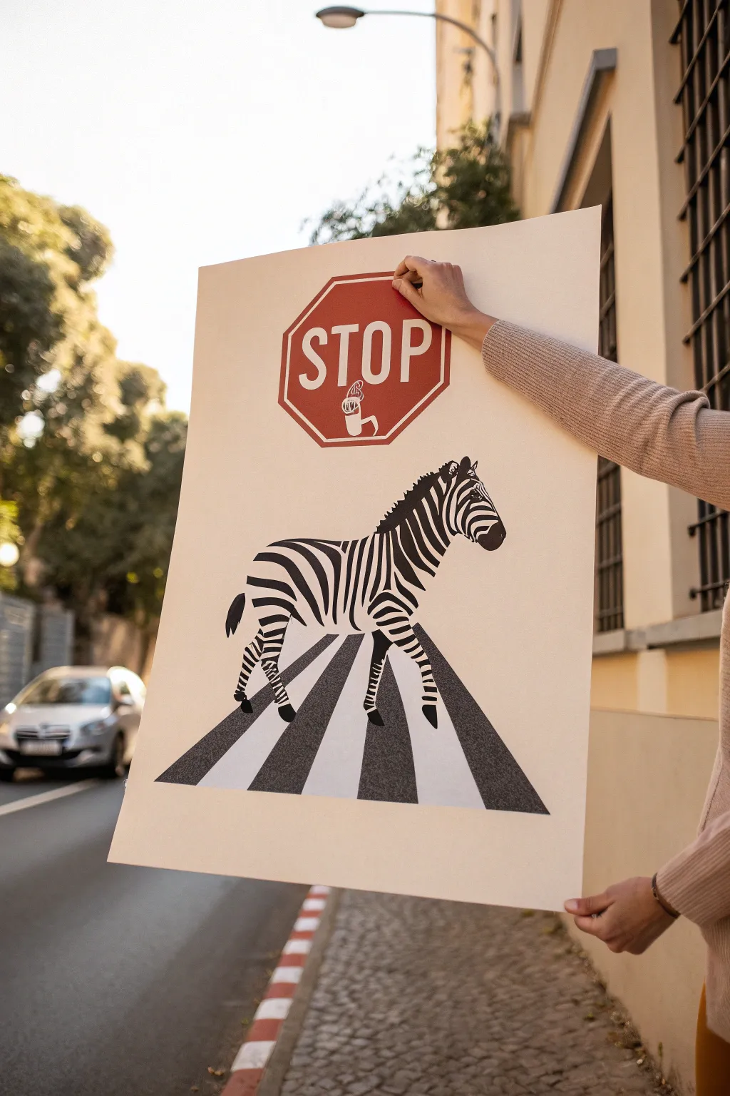
Create a striking and clever visual pun that drives home the message of pedestrian safety with style. This poster project combines crisp graphic design elements with hand-painted details for a professional yet handmade look that demands attention.
Detailed Instructions
Materials
- Large white poster board (A2 or 18×24 inches)
- Red acrylic paint (bright stop-sign red)
- Black acrylic paint or India ink
- Pencil and eraser
- Ruler
- Painter’s tape or masking tape
- Fine detail paintbrush (size 0 or 1)
- Medium flat paintbrush (size 6 or 8)
- Black permanent marker (fine tip)
- Reference image of a zebra
Step 1: Layout and The Stop Sign
-
Establish the centerline:
Begin by finding the vertical center of your poster board. Lightly draw a faint line down the middle with your pencil and ruler to help align all your elements symmetrically. -
Draft the octagon:
Near the top third of the poster, sketch a regular octagon. Use your ruler to ensure all eight sides are equal length. This will be the border of your stop sign. -
Create the inner border:
Draw a second, slightly smaller octagon inside the first one, leaving about a half-inch gap. This gap creates the classic double-line border seen on street signs. -
Draft the text:
In the center of the octagon, lightly sketch the word ‘STOP’ in tall, block capital letters. Leave a small gap below the ‘O’ and ‘P’ for the hand icon. -
Sketch the phone icon:
Below the letters, draw a small, stylized hand holding a smartphone. Keep the lines simple—just the outline of a gripping hand and the rectangular phone shape are needed. -
Paint the red background:
Carefully fill in the background of the octagon with red acrylic paint. Paint around your sketched letters and the hand icon, leaving them white. You may need two coats for a solid, opaque red.
Clean Edges Only
If red paint bleeds into your white letters, don’t panic. Wait for it to dry completely, then use a white gel pen or a small brush with white acrylic to correct the mistake.
Step 2: The Zebra Illustration
-
Outline the zebra form:
In the middle section of the poster, lightly sketch the outline of a walking zebra. Focus on the main shapes first: the oval body, the strong neck, and the head position. -
Position the legs:
Sketch the legs in a walking motion. Ensure the hooves land on an invisible horizontal line where your crosswalk will be. -
Draw the stripes:
Referring to your zebra photo, pencil in the distinctive stripe pattern. Remember that stripes wrap around the body curvature, which gives the drawing volume. -
Fill the black stripes:
Using your fine detail brush and black paint (or ink), carefully fill in the zebra’s stripes. I find it helpful to start from the spine and work downward to avoid smudging the wet paint. -
Add facial details:
Switch to your finest brush or a black marker to define the eye, nostril, and ear details. Clean, sharp lines here make the animal look alert.
Pro Tip: Perspective
To make the road look like it’s receding, make the white spacing between the black stripes slightly narrower at the top (near the hooves) and wider at the bottom edge.
Step 3: The Crosswalk & Finishing Touches
-
Map the perspective:
Below the zebra, use your ruler to draw a trapezoid shape that widens at the bottom. This creates the illusion of a road stretching toward the viewer. -
Mark the stripes:
Divide this trapezoid into alternating stripes. Angle the vertical lines slightly toward a vanishing point near the top of the poster to enhance the 3D perspective effect. -
Tape the edges:
Apply painter’s tape along the pencil lines of the road stripes. This is crucial for getting those razor-sharp, professional edges. -
Paint the asphalt:
Paint the dark stripes of the crosswalk using black paint. Since this represents asphalt, a slightly textured or matte finish looks great here. -
Remove tape:
Once the paint is tacky but not fully dry, carefully peel away the tape at a 45-degree angle to reveal crisp lines. -
Clean up:
Erase any remaining visible pencil guidelines once the entire poster is completely dry. Check for any white spots that need a touch-up of red or black paint.
Now you have a bold, thought-provoking piece of art ready to display.

PENCIL GUIDE
Understanding Pencil Grades from H to B
From first sketch to finished drawing — learn pencil grades, line control, and shading techniques.
Explore the Full Guide
Equality Poster With Interlocking Hands

This minimalist yet powerful artwork features interlocking hands in a spectrum of skin tones, arranged in a seamless circle to symbolize unity and connection. The clean lines and warm, earthy palette make it a perfect piece for framing or as a thoughtful gift.
Detailed Instructions
Materials
- High-quality white drawing paper or cardstock (A4 or similar size)
- Pencil (HB or H)
- Eraser
- Fine liner pen (black, 0.3mm or 0.5mm)
- Alcohol markers or colored pencils in various skin tones
- Compass (optional, for guiding the circle shape)
- Ruler
Step 1: Planning the Composition
-
Create a guide circle:
Start by lightly drawing a large circle in the center of your paper using a pencil. If you don’t have a compass, trace around a dinner plate or bowl. This won’t be part of the final drawing but will ensure your hands stay arranged symmetrically. -
Divide the circle:
Lightly mark seven evenly spaced tick marks around the circumference of your guide circle. It doesn’t have to be mathematically perfect, but aiming for equal spacing helps the final flow.
Reference Photos
Hands are tricky to draw! Take a photo of your own hand grasping your other wrist to use as a visual reference for how the fingers curl and overlap.
Step 2: Sketching the Hands
-
Sketch the first hand:
At the top tick mark, sketch the first hand. Draw the wrist extending from the outside inward. The fingers should grasp the wrist of the next position. Keep the shapes simple at first—just blocky forms to get the size right. -
Continue the chain:
Moving clockwise, draw the next wrist and hand. The wrist of this second arm should be positioned under the fingers of the first hand you drew. Repeat this process around the circle, ensuring each hand is grasping the wrist of the neighbor to its left. -
Refine the finger details:
Go back over your rough block shapes and refine the fingers. Give them natural curves, defining the knuckles slightly and adding fingernails if you want extra detail, though the example keeps it stylized and simple. -
Add cuffs or sleeves:
Notice how some arms in the example have lines indicating shirt cuffs or sleeves. Add a few simple transverse lines on random wrists to suggest clothing, which adds visual variety to the composition. -
Check the flow:
Step back and look at your pencil sketch. The negative space in the center should be roughly hexagonal or heptagonal. Make any adjustments now to ensure the hands look like they are firmly holding on.
Add Texture
Instead of flat colors, use different patterns inside the arm shapes—like stripes, polka dots, or hatch marks—to represent different people’s clothing styles.
Step 3: Inking the Outline
-
Trace with fine liner:
Using your black fine liner pen, carefully trace over your refined pencil lines. Use confident, continuous strokes for the long lines of the arms to keep the drawing looking crisp. -
Vary line weight:
I prefer to use a slightly thicker line for the main outlines of the arms and a lighter touch for internal details like fingernails or palm creases. -
Erase pencil marks:
Wait at least 15 minutes for the ink to fully dry to prevent smudging. Once dry, gently erase all your pencil guides, including the original circle and tick marks.
Step 4: Adding Color
-
Select your palette:
Choose 5-7 distinct skin tone shades, ranging from very pale to deep brown. Lay them out in the order you plan to use them to ensure a nice gradient or balanced distribution. -
Color the first hand:
Start with a light shade on the top hand. If using alcohol markers, work quickly to avoid streak marks. Fill the shape completely, staying neatly within the ink lines. -
Rotate colors:
Move clockwise to the next hand and choose a contrasting skin tone. For example, place a dark brown hand next to a beige one to create visual interest and emphasize diversity. -
Leave some white:
In the example, one hand is left uncolored (white) to represent the lightest skin tone or a glove. Include this if you like the high-contrast look it provides. -
Fill the remaining hands:
Continue until all hands are colored. If you are using colored pencils, you can layer colors to create custom shades if your set is limited. -
Final touches:
Inspect your coloring. If you went outside the lines slightly, you can sometimes fix it by thickening the black outline just a tiny bit in that specific spot.
Frame your inclusive masterpiece and display it as a daily reminder of togetherness
Negative Space Poster With Hidden Symbol
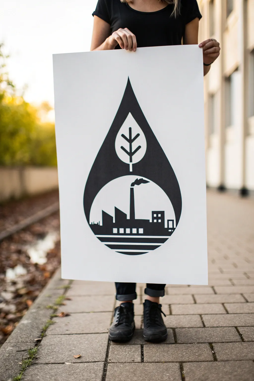
This striking high-contrast poster uses bold negative space to tell a story about the intersection of industry and environment. By combining precise stenciling with sharp geometric shapes, you’ll create a professional-looking graphic that makes a powerful statement without needing a single word.
Step-by-Step
Materials
- Large white poster board (A2 or similar)
- Black acrylic paint or matte poster paint
- Wide flat brush (1-2 inches)
- Small angled brush or detailing brush
- Pencil
- Large compass or string and tack (for the circle)
- Ruler or T-square
- Painter’s tape or masking tape
- Eraser
- Compass protractor (optional)
Step 1: Drafting the Geometry
-
Establish the centerline:
Begin by lightly drawing a vertical line straight down the center of your poster board with a ruler. This axis is crucial for keeping your droplet symmetrical. -
Draw the main circle:
Decide on the width of your design. Using a compass (or a string tied to a pencil and anchored with a tack), draw a large circle near the bottom half of the centerline. This will become the industrial skyline section. -
Shape the droplet top:
Mark a point high up on the centerline for the tip of the drop. From this tip, draw two smooth, curved lines that flare out and seamlessly connect to the sides of your circle. It keeps the shape organic yet structured. -
Outline the leaf insert:
In the upper portion of the droplet (above the circle but below the tip), sketch a simple almond-shaped leaf centered on your vertical axis. -
Add leaf veins:
Draw a straight vertical line through the leaf for the stem, extending slightly out the bottom. Add three angled branches on each side. Keep these thick enough that they will be visible as white space later.
Crisp Lines Pro-Tip
If you’re nervous about freehand painting outlines, cut the leaf and factory shapes out of masking tape or adhesive vinyl first. Apply them to the paper, paint the whole droplet black, then peel them off.
Step 2: Designing the Skyline
-
Set the horizon:
Draw a horizontal line across the lower third of your circle. This separates the factory silhouette from the ‘ground’ or water lines below. -
Sketch the smokestack:
Draw a tall, narrow rectangle slightly offset from the center. Add a small crooked cloud shape drifting from the top to represent smoke. -
Create the factory rooflines:
To the left of the smokestack, draw angled saw-tooth roof shapes. I like to vary the heights slightly to make the building look more complex. -
Detail the buildings:
On the right side, draw a blocky rectangular building. Add small squares for windows inside it, and perhaps a smaller structure next to it. Remember, you are drawing the shapes that will remain *white*. -
Add windows and accents:
Sketch small squares or rectangles along the bottom of the factory base. These need to be clearly defined so you don’t accidentally paint over them. -
Draw the ground stripes:
Below the factory horizon line, use your ruler to draw 3-4 parallel horizontal bands within the circle boundary. These stripes create a stylized foundation for the image.
Step 3: Painting the Contrast
-
Outline the preserves:
The trickiest part is remembering what stays white. I suggest putting a tiny piece of masking tape or a faint ‘X’ on every area that should remain unpainted (the leaf, the buildings, the windows, the stripes). -
Paint the droplet edges:
Using your smaller angled brush and black acrylic paint, carefully cut in the outer edges of the main droplet shape. Keep your hand steady to get a crisp, sharp curve. -
Define the negative space:
Switch to your detail brush to paint *around* the leaf shape, the stem, and the factory skyline. You are painting the ‘sky’ inside the droplet black, leaving the objects white. -
Fill the large areas:
Once your delicate edges are defined, use the wide flat brush to fill in the rest of the black droplet. Apply the paint in smooth, even strokes to avoid streaks. -
Paint the bottom stripes:
Carefully paint the alternating bands at the bottom of the circle. Using masking tape here helps ensure the lines stay perfectly straight and parallel. -
Final touches:
Check for any uneven edges or spots where the white paper shows through the black paint. Touch up these areas with a small brush for a solid, opaque look. -
Erase guidelines:
Allow the paint to dry completely—give it at least an hour. Once dry, gently erase any visible pencil marks remaining in the white sections.
Level Up: Color Pop
Instead of leaving the negative space white, paint the leaf a vibrant green and the factory smoke a subtle grey before applying the black overlay. This creates a multi-layered message.
Hang your poster proudly and watch how the bold simplicity draws people in to decipher the dual meaning

Have a question or want to share your own experience? I'd love to hear from you in the comments below!