When you’re looking for autism drawing ideas, you’re usually trying to make something that feels both meaningful and visually clear. I pulled together my favorite concepts that celebrate neurodiversity, support, and real connection—without needing complicated supplies or advanced skills.
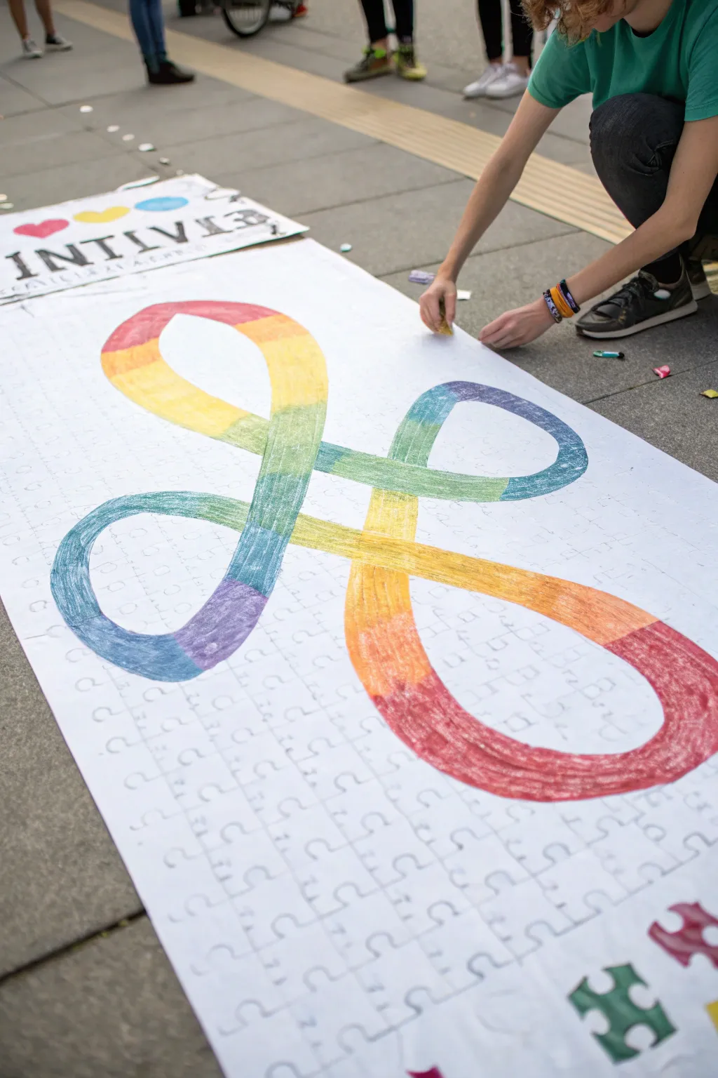
Puzzle-Piece Ribbon Drawing
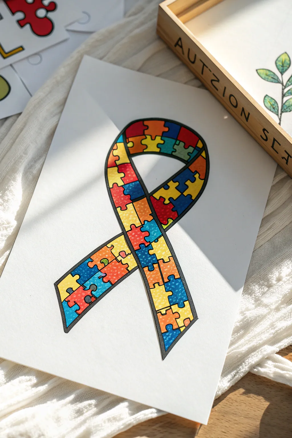
This classic awareness symbol gets a bold update with vibrant, interlocking puzzle pieces filling the traditional looped ribbon shape. The finished drawing features crisp black outlines contrasted against rich, primary colors, creating a meaningful tribute perfect for display or gifting.
How-To Guide
Materials
- Heavyweight white cardstock or drawing paper
- Fine-point black permanent marker or drawing pen (0.5mm or 0.8mm)
- Thicker black marker (for the outer border)
- Pencil (HB or H)
- Eraser
- Alcohol-based art markers or colored pencils (Red, Blue, Yellow, Orange, Green)
Step 1: Sketching the Framework
-
Draw the main ribbon loop:
Start lightly with your pencil. Draw a large, simple loop shape that crosses over itself. Imagine a teardrop shape that extends downwards into two legs. The crossing point should be somewhat centered, allowing the top loop to look open and round. -
Define the ribbon width:
Create the inner edge of the ribbon by drawing a second line parallel to your first one. Keep the width consistent—about 1.5 to 2 inches wide works well for fitting in puzzle pieces later. The ends of the ribbon usually cut off at an angle. -
Map the grid lines:
Lightly sketch curved lines across the width of the ribbon. Space them somewhat evenly, but let them curve with the flow of the ribbon. These lines will become the edges where your puzzle pieces eventually connect. -
Create vertical divisions:
Now, sketch lines running lengthwise down the center of the ribbon sections, breaking your horizontal segments into smaller, roughly square or rectangular blocks. They don’t need to be perfect squares; organic shapes work better for a puzzle look.
Clean Lines Secret
Use a ruler for the straight grid lines before adding the puzzle knobs. It keeps your pieces uniform in size even though the grid disappears later.
Step 2: Drawing the Puzzle Details
-
Sketch the interlocking knobs:
Transform your grid into puzzle pieces. On each straight line segment you drew, add a ‘knob’ (a semicircular bump) or a ‘socket’ (a semicircular dip). Vary the direction of these knobs—some should point up, some down, left, or right—to make it look like a real jigsaw puzzle. -
Refine the shapes:
Go over your puzzle outlines, erasing the original straight grid lines where the knobs are now placed. Make sure every piece looks like it locks strictly into its neighbor. -
Ink the puzzle lines:
Using your fine-point black pen, carefully trace over the internal puzzle piece lines. Keep your hand steady for smooth curves around the knobs. I prefer to rotate the paper as I draw circles to keep my wrist comfortable. -
Ink the outer border:
Switch to your slightly thicker black marker to trace the very outside edge of the entire ribbon. This heavier line weight helps contain the busy pattern inside and makes the shape pop off the white page. -
Erase pencil marks:
Wait a minute or two for the ink to fully dry to avoid smudging. Then, gently erase all remaining pencil sketches underneath your ink work.
Step 3: Adding Vibrant Color
-
Select your palette:
Gather your red, blue, yellow, orange, and green markers. The goal is a random distribution, so check that no two adjacent puzzle pieces will share the exact same color. -
Color the first few pieces:
Start with one color, perhaps blue, and color random pieces scattered throughout the ribbon. Maybe do 4-5 separated pieces. Work carefully up to the black lines without bleeding over. -
Rotate through colors:
Switch to red and fill in neighboring gaps. By working one color at a time across the whole ribbon, you ensure a balanced distribution without accidentally clustering too much of one shade. -
Fill the remaining gaps:
Continue with yellow, green, and orange until every puzzle piece is filled. The result should look like a vibrant mosaic. -
Layer for saturation:
If using alcohol markers, go back over any patchy areas with a second layer of the same color to get that smooth, solid, printed look. -
Add texture (optional):
For a subtle detail, use a white gel pen or a lighter shade of the same color to add tiny dots or stippling to just a few pieces. This mimics the paper texture seen in some artwork and adds depth.
Level Up: 3D Effect
Use a light gray marker to add a drop shadow along one side of the ribbon on the background paper. This lifts the drawing off the page instantly.
Once the colors are dry, your vibrant puzzle ribbon is ready to frame as a thoughtful piece of advocacy art.


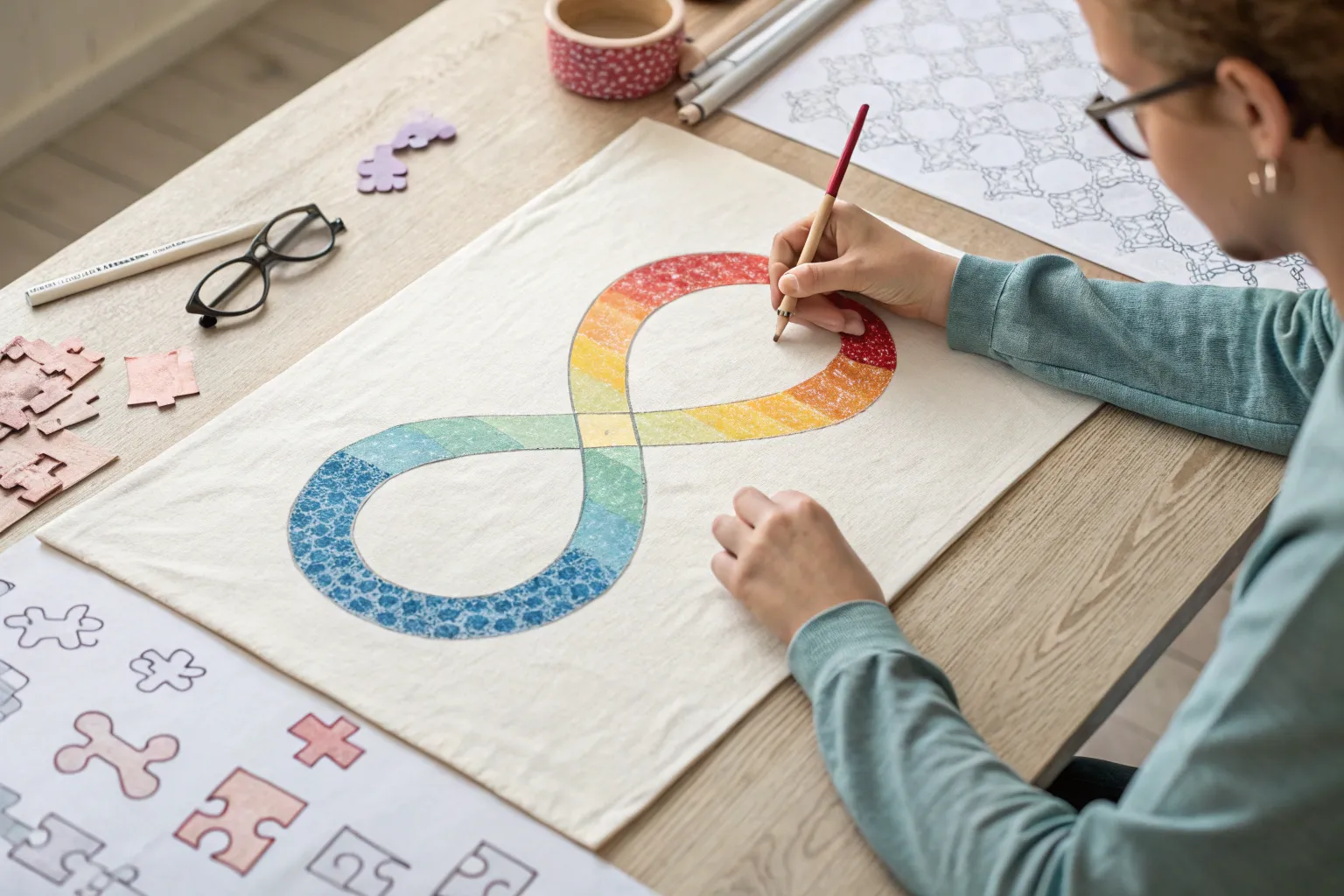
Rainbow Infinity Symbol Sketch
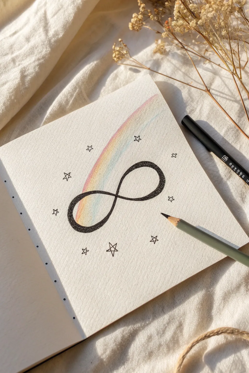
This gentle sketch combines the symbolism of the neurodiversity infinity loop with the calming, repetitive technique of stippling. The result is a delicate artwork featuring a textured black loop intersected by a soft wash of rainbow colors, surrounded by minimalist stars.
Step-by-Step
Materials
- Sketchbook or heavy drawing paper
- Pencil (HB or lighter)
- Eraser
- Fine liner pen (black, 0.3mm or 0.5mm)
- Colored pencils (pastel rainbow shades: pink, yellow, blue, green)
- Ruler (optional)
Step 1: Sketching the Guidelines
-
Center the symbol:
Begin by finding the center of your sketchbook page. Lightly mark the center point with your pencil to anchor the drawing. -
Draft the infinity shape:
Sketch a large figure-eight or infinity symbol sideways. Keep your pencil pressure very light so these lines can be erased later. Focus on making both loops roughly the same size and shape. -
Thicken the outline:
Draw an inner line parallel to your first loop to give the symbol thickness. The band should look like a ribbon twisting over itself. -
Refine the crossover:
Decide which part of the loop goes ‘over’ the other at the center intersection. Erase the lines of the bottom strand where it crosses under the top strand to create a convincing 3D effect.
Uneven Loops?
Draw an elongated rectangle first, then divide it in half vertically. Draw one loop inside each square half to keep the sizes symmetrical.
Step 2: Adding Color
-
Begin the rainbow arc:
Select your pastel colored pencils. Starting inside the left loop of the infinity symbol, lightly shade a curved band that follows the flow of the loop. -
Layer the colors:
Apply the colors in a soft gradient: pink, yellow, green, and blue. I like to overlap the edges of each color slightly to create a seamless blend rather than distinct stripes. -
Extend the color:
Allow the color to spill slightly outside the pencil lines of the infinity symbol, creating a dreamy, glowing effect that extends upward toward the top right of the page. -
Soften the texture:
If the pencil texture looks too rough, use your finger or a blending stump to gently smudge the pigments into the paper for a hazy look.
Pro Tip: Texture
Vary your pen pressure while stippling. Harder presses make larger dots, while light taps create fine mist, adding incredible depth to the shading.
Step 3: The Stippling Technique
-
Start the dots:
Take your black fine liner. Instead of tracing the pencil lines with a solid stroke, begin placing small dots along the pencil outline. -
Fill the ribbon:
Continue filling the entire interior of the infinity ribbon with dots. The stippling should be dense but not completely solid black—you want the white of the paper to peek through occasionally. -
Create gradients with density:
To give the loop volume, make the dots denser near the edges of the ribbon and slightly more sparse toward the center of the band. This mimics a rounded surface. -
Define the edges:
Ensure the edges of the ribbon are sharp by placing dots very close together right on the pencil guideline. This defines the shape clearly against the white paper. -
Let ink dry:
Wait a few minutes to ensure the ink acts permanent. Stippling can put down a lot of ink that needs a moment to set so it doesn’t smear. -
Erase guidelines:
Once the ink is fully dry, gently erase the original pencil sketch lines, leaving only the dotted form behind.
Step 4: Finishing Touches
-
Draw primary stars:
Using the same fine liner, draw small five-pointed stars scattered around the infinity symbol. Outline them simply without filling them in. -
Balance the composition:
Place about 8-10 stars in a rough oval shape framing the central symbol, keeping some distance between each one. -
Add variance:
Vary the orientation of the stars slightly so they look twinkling and natural, rather than stamped in a uniform direction.
Take a moment to admire the satisfying texture you have created with just simple dots and soft color

Head Profile With Spectrum Patterns
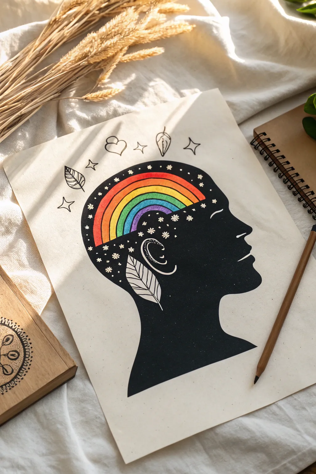
This striking illustration combines a bold, black silhouette profile with a vibrant burst of color to represent the beauty of neurodiversity. It’s a wonderful project for exploring contrast, using simple shapes and bright spectrum colors to create meaningful symbolism.
Step-by-Step Tutorial
Materials
- Thick mixed-media or watercolor paper (cream or white)
- Pencil (HB or lighter)
- Eraser
- Fine liner pen (black, 0.3mm or 0.5mm)
- Black brush pen or black acrylic marker (for filling large areas)
- Colored pencils, markers, or watercolor paints (rainbow colors)
- White gel pen (optional, for corrections or stars)
Step 1: Drafting the Silhouette
-
Profile Outline:
Begin by lightly sketching the profile of a human head in the center of your paper. Start with the forehead, curving down for the nose, lips, and chin, then extend the neck downwards. -
Defining the Cranium:
Draw the back of the head, connecting the top of the forehead to the nape of the neck. Ensure the head shape is round and full to allow ample space for the internal design. -
Mapping the Rainbow:
Inside the top portion of the head (where the brain would be), sketch a large arch shape. Divide this arch into six or seven concentric bands to create your rainbow spectrum. -
Adding Details:
Sketch a stylized ear shape in the middle of the head. Below the ear, draw a large leaf shape pointing downwards, seemingly growing from the neck area. -
Doodle Elements:
Around the top of the head, lightly sketch floating elements like hearts, stars, and leaves. You can also add tiny stars inside the ‘brain’ area surrounding the rainbow.
Clean Lines Hack
When filling large black areas around tiny shapes like stars, outline the tiny shape first with a very fine 0.1mm pen. This creates a safety barrier before you use the thick marker.
Step 2: Applying Color
-
The Red Band:
Start coloring the outermost band of your rainbow arch with a vibrant red. Press firmly if using pencils to get solid saturation. -
Walking the Spectrum:
Continue filling the bands inward with orange, yellow, green, blue, and finally purple or indigo. Keep the edges between colors crisp. -
Ear Detail:
If you want the ear to stand out, you can leave it white or outline it later. In this design, the ear is part of the negative space, so ensure your sketch lines are visible for the next phase. -
Leaf Accents:
Decide if you want the large leaf on the neck to be colored or left as a line drawing. For this specific look, leave the leaf interior uncolored (paper white).
Step 3: Inking and Filling
-
Outlining the Rainbow:
Using your fine liner pen, carefully trace the outer edge of the rainbow arch. This separates the color form from the black background we are about to create. -
Protecting the Details:
Trace the outline of the ear, the neck leaf, and the tiny stars inside the head. These areas will remain the color of the paper, creating ‘negative space’. -
Tracing the Profile:
Go over your main head silhouette sketch with the fine liner to establish the final boundary of the artwork. -
Filling the Black Space:
Switch to a black brush pen or acrylic marker. Carefully fill in the entire head profile, working around the rainbow, the ear, the leaf, and the tiny internal stars. -
Refining Edges:
I prefer to do the areas closest to the rainbow and tiny stars with the fine tip pen first, then fill the larger neck and cheek areas with the thicker marker. -
Let it Dry:
Allow the black ink to dry completely to avoid any smudging, especially if your hand rests on the paper.
Make It Personal
Replace the generic doodles with symbols that represent the person’s ‘special interests’—like tiny puzzle pieces, musical notes, dinosaurs, or planets floating above the head.
Step 4: Finishing Touches
-
External Doodles:
Ink the floating doodles (leaves, hearts, stars) outside the head using your fine liner. Keep the lines clean and simple. -
Adding Texture:
Add small lines inside the floating leaves for veins, and perhaps tiny dots or ‘sparkles’ around the external elements to give them movement. -
Cleanup:
Once you are absolutely certain all ink is dry, gently erase any visible pencil sketch lines. -
Final Pop:
If any of the tiny white stars inside the black area got covered by accident, use a white gel pen to bring them back.
Display this piece freely to celebrate the colorful diversity of the human mind

World Autism Awareness Poster Layout
Celebrate neurodiversity with this large-scale collaborative art project featuring a vibrant, rainbow-colored infinity symbol. This floor-sized poster combines bold coloring with subtle background details like puzzle piece outlines for a layered, meaningful design.
How-To Guide
Materials
- Large roll of white bond paper or butcher paper (minimum 24 inches wide)
- Pencil and large eraser
- Thick black permanent marker
- Oil pastels or chalk pastels (rainbow spectrum)
- Fixative spray (if using chalk)
- Ruler or yardstick
- Puzzle piece stencil (optional but helpful)
- Painter’s tape or masking tape
Step 1: Preparation and Sketching
-
Prepare the canvas:
Roll out a long strip of white paper, roughly 4 to 6 feet long, finding a clean, flat surface like a floor or large table to work on. Tape down the corners securely with painter’s tape to prevent slipping. -
Map out proportions:
Visualize the large infinity loop. It needs to dominate the center. Use a pencil to lightly mark the center point of the paper, then mark the outer edges where the loops will extend. -
Sketch the infinity loop:
Draw the infinity symbol (a sideways figure-8) lightly in pencil. Focus on making the lines flow smoothly. Draw the outer line first, then draw a parallel inner line to give the ribbon thickness. -
Refine the crossover:
Pay distinct attention to the center where the lines cross. Decide which part of the ribbon overlaps the other to create a 3D illusion, erasing the underlying lines where the top ribbon crosses over. -
Create the background texture:
Using a pencil or a stencil, lightly draw interlocking puzzle piece shapes covering the entire white background space outside the infinity symbol. These should be subtle, not bold. -
Add detail lettering:
Inside some of the puzzle outline spaces, faintly sketch small letters or initials if you want to personalize the background pattern, creating a code-like effect.
Step 2: Coloring and Texturing
-
Plan the color gradient:
Select your pastels. Arrange them in rainbow order: Red, Orange, Yellow, Green, Blue, Indigo, Violet. Plan where the colors will shift on the loop so the transition is seamless. -
Begin coloring the loop:
Start with red at one curve of the infinity symbol. Apply the pastel firmly to get rich, opaque coverage. Follow the curve of the ribbon with your strokes. -
Blend the transition:
As you move from red to orange, overlap the colors slightly. Use your finger or a paper towel to rub the boundary, blending them into a smooth gradient. -
Continue the spectrum:
Work your way through yellow and green as you approach the crossover point. I find it helps to stand back occasionally to ensure the colors are balanced on both sides of the loop. -
Complete the cool tones:
Finish the loop with blues and purples. Ensure the color flows logically—if one end is red, the adjacent section should eventually blend back into purple or red depending on your chosen cycle. -
Create texture:
Don’t just color flatly; sketch with directional lines that follow the ‘path’ of the ribbon. This enhances the sense of movement and dimensionality. -
Outline interior details:
Once the color is down, take your pencil or a fine gray marker and re-trace the puzzle pieces in the background just enough so they are visible but distinct from the bright main subject. -
Add floating shapes:
In the bottom corners, use stencils or freehand drawing to add a few standalone, fully colored puzzle pieces in contrasting solid colors like dark green or maroon.
Smudge Control
Pastels smear easily. Place a clean sheet of scrap paper under your hand while you color to protect the white background and keep your completed sections crisp.
Step 3: Finishing Touches
-
Clean up edges:
Check the outer edges of your infinity symbol. If the pastel has smudged outside the lines, use a large eraser or a clean cloth to tidy up the white space. -
Set the artwork:
If you used chalk pastels, take the poster outside and lightly mist it with a fixative spray to prevent the vibrant colors from smearing or transferring. -
Final display Prep:
Carefully remove the tape from the corners. Since the paper is long, you may need to weigh down the corners again when displaying it to keep it flat.
Collaborative Twist
Turn this into a group event! Have different people color each section of the puzzle background with a personal message or doodle before finishing the main loop.
Now you have a stunning, symbolic mural ready to spark conversation and brighten any room.

PENCIL GUIDE
Understanding Pencil Grades from H to B
From first sketch to finished drawing — learn pencil grades, line control, and shading techniques.
Explore the Full Guide
Emotion Color Map for Autism Expression
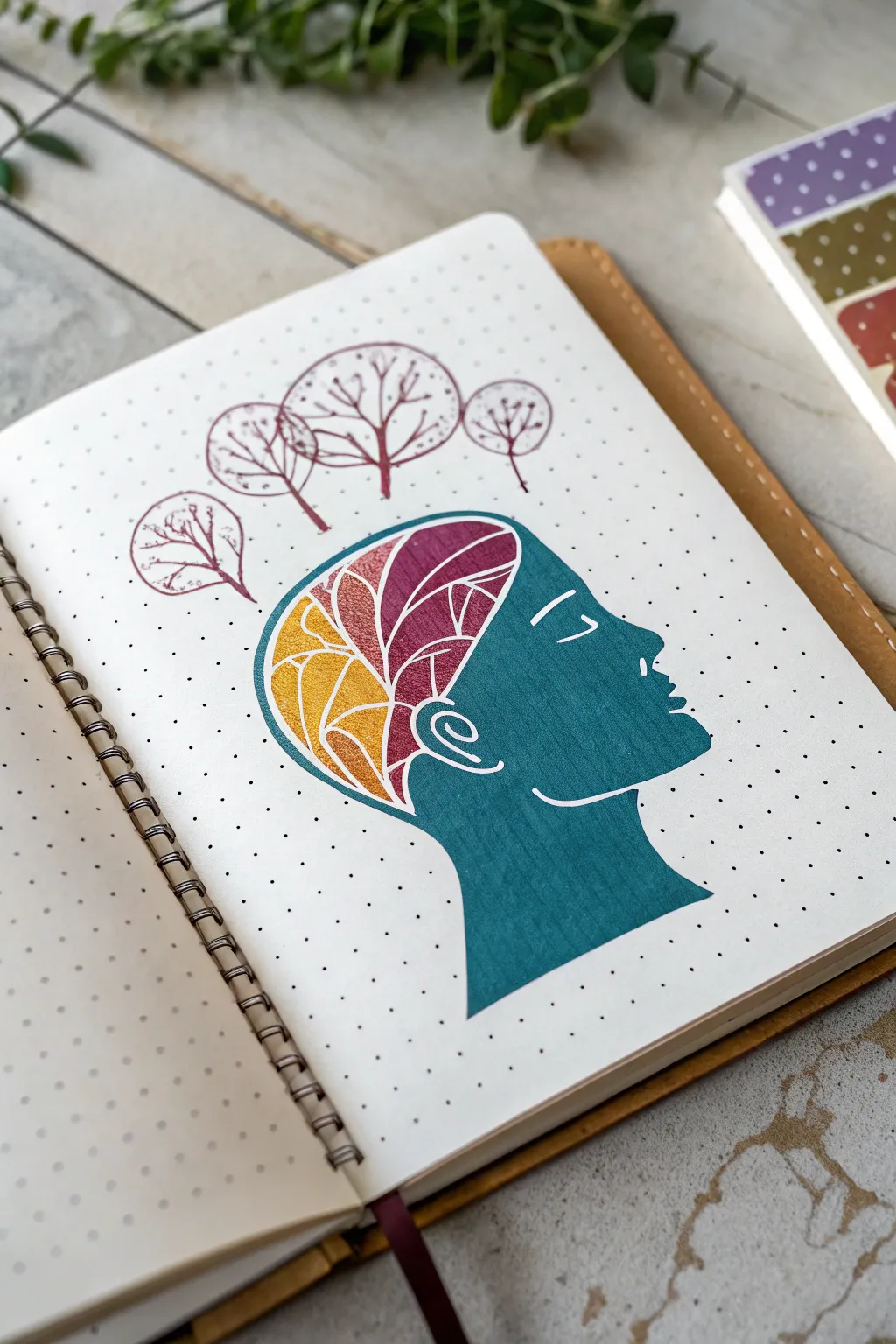
This introspective journal art project explores emotions through color mapping, featuring a striking teal profile with a mosaic-style brain visualization. The design balances structure and creativity by confining vibrant, free-flowing patterns within a clean, defined silhouette.
Step-by-Step
Materials
- Dotted or grid journal notebook (A5 size recommended)
- Pencil (HB or 2B) and eraser
- Teal brush pen or marker (medium tip)
- Fine liner pens (0.3mm and 0.5mm) in maroon or dark red
- Colored markers or pencils (mustard yellow, burnt orange, deep maroon)
- White gel pen (optional for corrections)
- Ruler (optional)
Step 1: Planning and Sketching
-
Map the proportions:
Begin by counting the dots on your page to center your design. Lightly mark the top and bottom boundaries for the head to ensure it fits comfortably on the page. -
Sketch the profile outline:
Using a pencil, lightly sketch the silhouette of a human head in profile facing right. Focus on the curve of the forehead, the nose, lips, and chin, extending down into a simple neck and shoulder implication. -
Define the brain cavity:
Inside the head shape, sketch a large, rounded shape representing the brain area. Keep this line light, as it will act as a boundary between the solid color and the internal pattern. -
Sketch the thought trees:
Above the head, lightly draw four circles of varying sizes floating upward. These will become the stylized trees representing thoughts or ideas.
Clean Lines Pro-Tip
To keep the white negative space like the eye crisp, draw it lightly with a white gel pen first. Then, color the teal right up to that barrier.
Step 2: Inking the Silhouette
-
Outline the face:
Take your teal marker and carefully trace the outer edge of the face profile. Keep your hand steady to create a smooth, continuous line. -
Fill the solid areas:
Using the same teal marker, color in the face, neck, and shoulder area. Be careful to stop exactly at the line you drew for the brain section; this area must remain uncolored for now. -
Add facial details:
While the teal ink is wet or using a fine liner if you prefer, define the ear with a simple swirl. Leave a small negative space (white paper) for the eye (a simple closed lid line) and the jawline separation to add dimension. -
Refine edges:
Go back over the edges of your teal coloring. If the marker left streaks, applying a second layer can smooth out the texture for a uniform, matte look.
Level Up: Emotion Keys
Add a color key at the bottom of the page assigning specific emotions to the yellow, orange, and maroon sections to turn this into a mood tracker.
Step 3: Creating the Mosaic Mind
-
Section the brain:
Switch to your maroon fine liner. Inside the uncolored brain area, draw curving lines that divide the space into several large, organic sections, almost like stained glass. -
Create the segments:
Within those larger sections, draw smaller, branching lines. Think of leaf veins or neural pathways branching out. Keep the lines clean and deliberate. -
Apply the first color:
Select a mustard yellow marker. Fill in the front-most sections of the brain pattern (the frontal lobe area). Color carefully within the maroon lines. -
Add the middle tones:
Use a burnt orange or rust-colored marker to fill the middle sections. I find that blending slightly into the yellow sections creates a nice transition, though distinct blocks of color look great too. -
Deepen the back:
Fill the remaining rear sections of the brain pattern with a deep maroon marker. This creates a gradient effect from light (front) to dark (back). -
Detail the pattern:
Once the color is dry, re-trace the separating lines with your maroon fine liner if they got obscured by the markers, making the mosaic pop.
Step 4: Finishing Touches
-
Draw the tree trunks:
Using the maroon fine liner, draw thin lines extending upward from the head/brain area toward the four circles you sketched earlier. -
Ink the tree canopies:
Trace the circular outlines of the trees with the maroon pen. Don’t make them perfect circles; a slightly organic, wobbly line adds character. -
Fill the branches:
Inside each tree circle, draw branching fractal patterns similar to the veins you drew inside the brain. Vary the density of lines for visual interest. -
Erase guidelines:
Wait until all ink is completely dry—give it a few extra minutes to be safe. Then, gently erase any visible pencil marks from your initial sketch.
This serene profile serves as a beautiful reminder of the vibrant complexity within our minds
Autism Self-Portrait With Comfort Icons
This gentle and expressive project combines a semi-realistic self-portrait with a halo of small, meaningful doodles representing personal comfort items. The finished piece uses soft colored pencils and fine liners to create a warm, inviting page that celebrates neurodivergent joy.
Step-by-Step Guide
Materials
- Spiral-bound sketchbook (heavyweight paper preferred)
- Pencil (HB or 2B) for sketching
- Fine liner pen (0.1mm or 0.3mm, black)
- Colored pencils (skin tones, sweater blue, rainbow colors, browns)
- Eraser
- Yellow pencil for drafting accents
Step 1: Drafting the Face and Features
-
Outline the head shape:
Begin lightly with your pencil, drawing a gentle oval shape for the face. Keep the jawline soft and rounded. Add a hint of the neck extending downwards. -
Place existing features:
Sketch a horizontal guideline halfway down the face for the eyes. Draw round frames for the glasses first, letting them sit comfortably on the bridge of the nose. -
Detail the eyes and nose:
Inside the glasses frames, draw the eyes looking slightly upward or to the side for a thoughtful expression. Add a small, simple curve for the nose and a gentle smile. -
Sketch the hair:
Draw the hair in short, textured clumps. Start from the crown and work outwards, creating a slightly messy, short cropped style that frames the forehead and ears.
Fixing Smudges
If you smudge pencil lead on the face, use a kneadable eraser to ‘lift’ the graphite straight up rather than rubbing it, which can spread the stain.
Step 2: Drawing the Outfit and Surroundings
-
Add the turtleneck:
Draw the thick, rolled collar of the sweater around the neck. Use curved vertical lines to indicate the ribbing texture of the fabric. -
Expand the shoulders:
Sketch the shoulders sloping downwards, ensuring the sweater looks oversized and cozy. Add faint texture marks to suggest a knit material. -
Plan the comfort icons:
Around the head, lightly pencil in your icons. Place a rainbow arc at the top right and a larger one at the bottom right. Scatter raindrops, hearts, and small leaves in the negative space. -
Detail the smaller elements:
Add a small drawing of a favorite drink or item near the bottom center, and place a tiny flower or doodle near the shoulder. Keep the composition balanced but playful.
Step 3: Inking and Coloring
-
Ink the main lines:
Using your fine liner, trace over your pencil sketch. Use quick, short strokes for the hair to maintain texture, and smooth, continuous lines for the glasses and face shape. -
Erase guidelines:
Wait for the ink to dry completely to avoid smudging, then gently erase all visible pencil marks. -
Color the skin:
Lightly shade the face with a skin-tone pencil. Add a little extra pressure on the cheeks and nose for a soft blush effect. -
Fill in the hair:
Layer strokes of light brown or blonde pencil in the direction of hair growth. Leave some areas lighter to suggest shine. -
Texture the sweater:
Use a soft blue or grey pencil to color the sweater. I like to use small circular motions here to mimic the fuzzy texture of wool. -
Color the doodles:
Use pastel shades for the surrounding icons. Fill the rainbows with muted red, yellow, and blue, and color the hearts and leaves softly.
Make It Yours
Swap the generic icons for hyper-specific special interests. Draw your exact headphones, a stim toy, or your favorite safe food instead.
Step 4: Final Touches
-
Deepen the sweater shadows:
Go back with a slightly darker blue pencil and shade inside the folds of the turtleneck ribbing to create depth. -
Add highlights:
If you have a white gel pen, add tiny dots to the eyes or the rim of the glasses. If not, simply ensure your pencil shading leaves the paper white in the brightest spots. -
Review contrast:
Check if the glasses stand out enough; if not, darken lines slightly with your fine liner.
Now you have a personalized page that visually represents your comfort and joy
BRUSH GUIDE
The Right Brush for Every Stroke
From clean lines to bold texture — master brush choice, stroke control, and essential techniques.
Explore the Full Guide
Comic Strip: Understanding Autism Moments
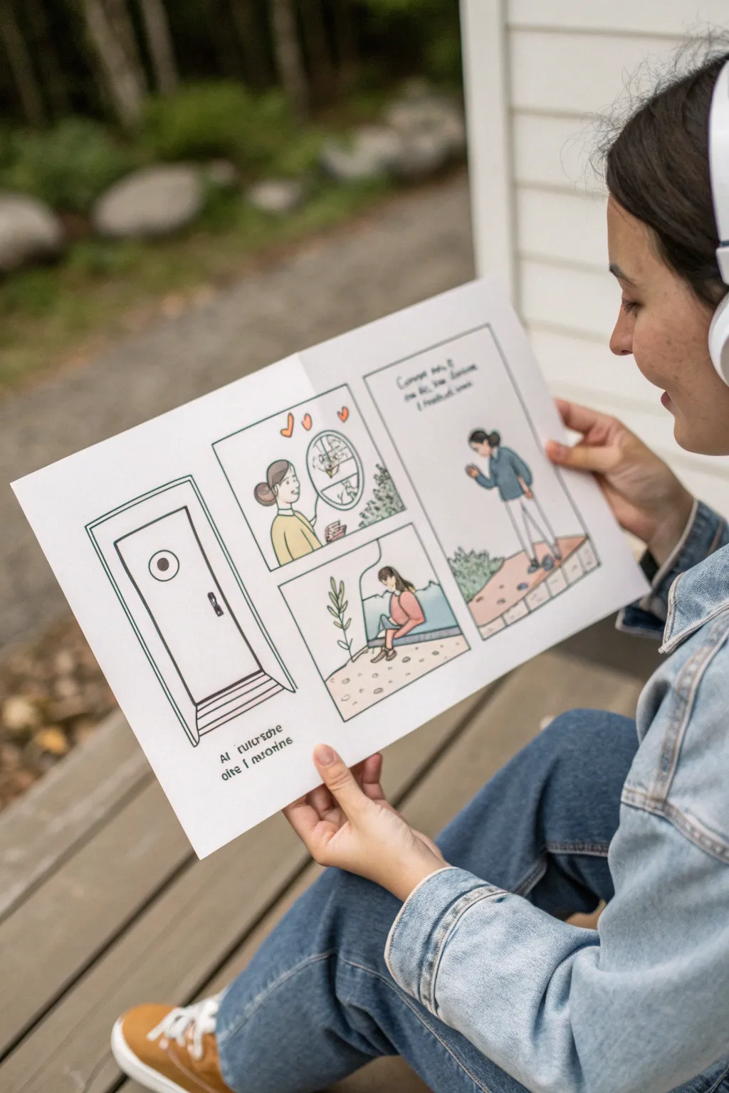
This project transforms a simple sheet of paper into a narrative space, perfect for illustrating personal experiences or explaining complex feelings through sequential art. The clean line-art style combined with soft, muted colors creates an approachable and visually calming aesthetic.
Step-by-Step
Materials
- A3 or 11×17 inch heavy drawing paper
- Fine liner pens (0.3mm and 0.5mm, black)
- Pencil (HB or 2B)
- Eraser
- Ruler
- Colored pencils or alcohol markers (muted tones: teal, sage green, mustard yellow, coral)
- Bone folder (optional, for crisp creases)
Step 1: Conceptualizing and Layout
-
Plan the fold:
Before drawing anything, decide how you want your paper to function. For this large spread, take your A3 or 11×17 paper and fold it vertically down the center to create a spine. Smooth the crease firmly. -
Sketch the panel grid:
Open the paper flat. Use your ruler and pencil to lightly map out your comic panels. Create one large, tall vertical panel on the far left side of the page. -
Divide the remaining space:
To the right of that first vertical panel, draw a grid for the rest of the story. I find splitting this area into quadrants works well—two panels stacked on top of two others—but leave the far right edge as a taller vertical panel if you want symmetry. -
Draft the borders:
Go over your pencil grid lines to create double borders or thicker frames. This separates the scenes clearly and gives it that professional comic book look. -
Sketch the narrative:
Now, lightly sketch your scenes inside the boxes using your pencil. Keep the figures simple and expressive. Focus on moments of observation or quiet interaction, like looking out a window or walking alone.
Step 2: Inking the Lines
-
Inking the frames:
Switch to your thicker fine liner (0.5mm). Carefully trace the box borders you created. Using a ruler here is crucial for keeping the artwork looking tidy and structured. -
Outline the main subjects:
Use the same 0.5mm pen to outline the main characters and key objects (like the door or window frame). Maintain a consistent pressure for a smooth, confident line. -
Add background details:
Switch to the finer 0.3mm pen for background elements like plants, floor textures, or distant landscapes. Lighter lines help push these elements into the background so they don’t compete with the main action. -
Erase pencil marks:
Wait at least 5-10 minutes for the ink to fully set. Then, gently erase all underlying pencil sketches. Be careful not to crinkle the paper. -
Lettering:
Add your text or dialogue. Hand-lettering adds charm, but keep it legible. You might want to draw very faint guidelines first to keep your sentences straight.
Palette Consistency Tip
Test your color combination on a scrap piece of paper first. A limited palette of 3 colors plus black often looks more sophisticated than using a rainbow.
Step 3: Coloring and Finishing
-
Select a limited palette:
Choose 3-4 colors to use throughout the entire piece. Limiting your palette to muted tones like sage green, pale blue, and mustard yellow creates a harmonious, calming effect. -
Apply base colors:
Start applying color to the clothing and key objects. If using colored pencils, use small circular motions for even coverage. If using markers, work quickly to avoid streakiness. -
Add subtle shading:
Identify a light source direction and add gentle shadows. For example, if the light is coming from a window, darken the side of the figure facing away from it. -
Highlighting:
Leave small areas white for highlights, particularly on shiny surfaces like glass windows or door handles, to give the drawing dimension. -
Clean up borders:
Check your panel borders one last time. If color has bled over, you can sometimes fix it with a white gel pen or by thickening the black border line slightly.
Ink Smearing?
If your hand smudges the ink while drawing, place a clean scrap sheet of paper under your drawing hand to protect the artwork underneath.
Once folded, you have a beautiful, tangible story ready to be shared or kept as a personal reflection.
Autism Mandala With Repeating Infinity Loops
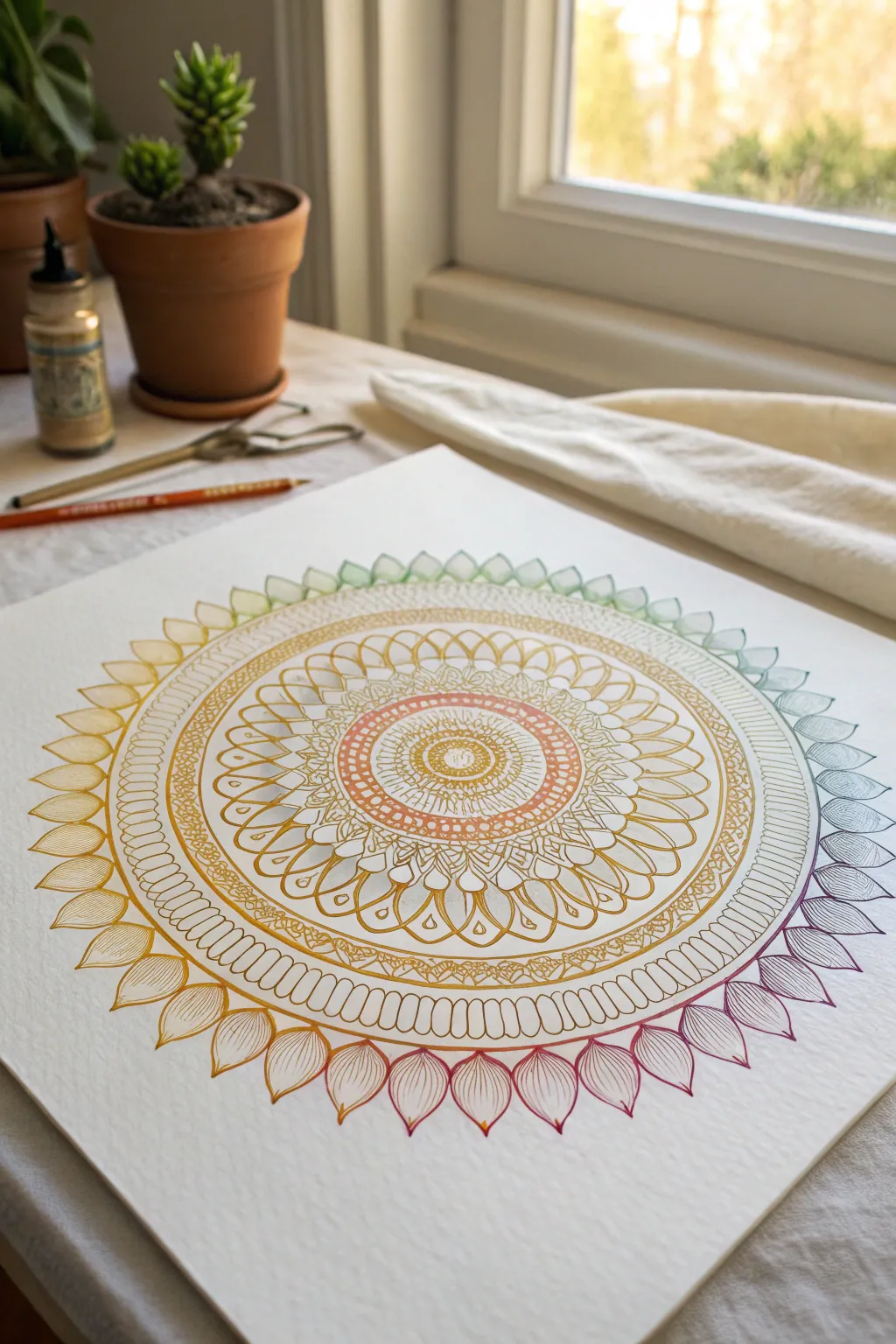
This soothing project features concentric layers of delicate patterns radiating from a central core, rendered in a calming, seamless color gradient. The repetitive motion of drawing symmetrical petals and fine lines makes this a mindful and grounding artistic exercise.
Step-by-Step Guide
Materials
- High-quality watercolor paper or heavy drawing paper (smooth/hot press creates cleaner lines)
- Fine-liner pens in a spectrum of colors (0.3mm to 0.5mm tip size works best)
- Compass for drawing perfect circles
- Protractor
- HB pencil for guidelines
- Soft eraser
- Straight edge or ruler
Step 1: Setting the Structure
-
Find the center:
Begin by finding the exact center of your paper. Make a tiny, unobtrusive mark here with your pencil. -
Draw the concentric guides:
Using your compass, draw a series of light pencil circles radiating from that center point. You’ll want about 6-8 rings of varying distances to act as the skeletons for your pattern layers. -
Segment the circle:
Use your protractor to mark degrees around the outer circle. Drawing very light lines through the center to divide the circle into 16 or 32 equal ‘pie slices’ helps ensure your repeating patterns stay perfectly symmetrical.
Uneven Spacing?
Don’t panic if your petals don’t meet perfectly at the end of a ring. Just slightly adjust the width of the last 2-3 petals to hide the gap visually.
Step 2: The Core & Inner Rings
-
Start the center seed:
Switch to an orange or warm-toned fine liner. Draw a small central circle and fill it with tiny, tight loops or dots to anchor the mandala. -
First petal layer:
On the first small guide circle, draw a row of simple, rounded U-shapes. Keep them consistent in size. -
Intricate cross-hatching:
Move to the next band using a slightly lighter yellow-orange pen. Create a dense band of cross-hatching or a mesh pattern that fills the space between two guide circles. -
Looping patterns:
In the next ring, draw a repeating series of figure-eight loops or interconnected teardrops. The ‘infinity’ motion here is particularly rhythmic and satisfying to draw.
Step 3: Expanding the Gradient
-
Transitioning colors:
As you move outward, select your next pen color—perhaps a bright yellow. Draw larger, sweeping petal shapes that extend to the next pencil guideline. -
Adding internal detail:
Inside each of these larger petals, draw a smaller, matching shape. I find that leaving a bit of white space between the lines makes the design breathe. -
The ornate middle band:
Create a distinct divider band using a double line. Fill this narrow channel with small circles, triangles, or vertical hash marks to create visual separation. -
Detailed leaf shapes:
For the middle section, draw a ring of leaf-like shapes with a central vein. Keep your hand relaxed to ensure the curves are smooth.
Add Metallic Flair
Use a gold or silver gel pen to trace over specific inner rings or to add accent dots inside the petals for a subtle, shimmering effect.
Step 4: The Outer Rim
-
Preparing the gradient:
Select your pens for the outer rim. You want a full rainbow transition: yellow to green, to blue, to purple, to red. -
Drawing the large petals:
Draw the outline of large, pointed lotus petals around the very outer edge. Do not close them all yet; instead, draw just the outlines using the specific color for that section of the wheel (e.g., use green pen for the top petals, purple for the right side). -
Filling with fine lines:
Return to each large outer petal and fill it with very fine, curved vertical lines. These lines should follow the contour of the petal, creating a sense of volume and texture. -
Checking the flow:
Ensure the colors blend logically as you circle the mandala—yellow petals should naturally sit next to orange ones, and blue next to green.
Step 5: Final Touches
-
Erase guidelines:
Once the ink is completely dry—wait at least 15 minutes to be safe—gently erase all your pencil circles and dividing lines. -
Clean up:
Brush away the eraser dust carefully so you don’t smudge the fine line work.
Now you have a stunning, symmetrical piece of art that represents both focus and creativity


Stimming Lines as Spectrum Abstraction
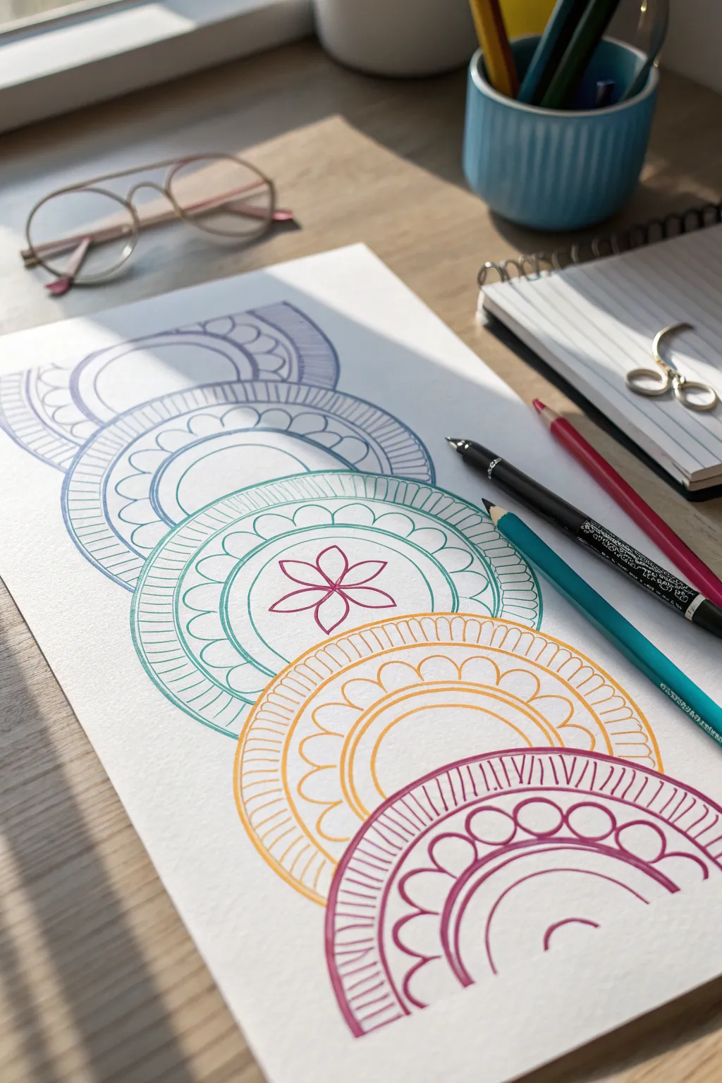
This calming project features a vertical cascade of intricate, semi-circular mandalas that explore repetitive patterns and soothing symmetry. By stacking colors from cool blues to warm pinks, you create a sense of grounded flow that is perfect for mindful drawing or visual stimming.
Step-by-Step Tutorial
Materials
- High-quality white drawing paper or cardstock (A4 size)
- Fine-point drawing pens or markers (Purple, Blue, Teal, Orange/Yellow, Magenta)
- A drawing compass or round objects for tracing (approximately 3-4 inch diameter)
- Pencil (HB or H)
- Eraser
- Ruler
Step 1: Setting the Structure
-
Mark clearly:
Begin by lightly drawing a vertical centerline down the middle of your paper using your ruler and pencil. This will keep your stack of semi-circles perfectly aligned. -
Draw the base arcs:
Starting near the top, use your compass to draw the primary semi-circle. Place the compass point on the centerline and create an arc that fills the width comfortably, leaving room for borders. -
Create the cascade:
Repeat this process four more times moving down the page. Each new semi-circle should overlap the one above it slightly, creating a layered, scale-like effect. Aim for five distinct sections. -
Define the layers:
Inside each main arc, lightly sketch 2-3 smaller, concentric semi-circles. These guidelines will separate your different pattern zones later. -
Erase overlaps:
Where the shapes overlap, erase the bottom line of the upper semi-circle so it looks like the shapes are stacked on top of each other, obscuring the bottom edge of the one above.
Pattern Rhythm
To keep the drawing relaxing, stick to just two pattern types (like lines and scallops) and alternate them. This reduces decision fatigue.
Step 2: Inking the Patterns
-
Start with purple:
For the top semi-circle, take your purple fine-liner. Ink the outermost concentric ring with simple, repetitive scallops or ‘U’ shapes. -
Add radial lines:
In the next ring inward on the purple section, draw straight lines radiating from the center, spacing them closely together like the spokes of a wheel. -
Transition to blue:
Moving to the second tier, switch to your blue pen. Trace the main arc lines first to define the shape. -
Create variation:
Fill the blue section’s outer ring with vertical hatching lines, and use larger, open scallops for the inner ring to differentiate it from the purple tier. -
Teal focal point:
For the middle (third) tier, use a teal or green pen. This is the central piece, so we’ll add a special detail. In the innermost semi-circle, simply draw a six-petaled flower shape instead of a geometric pattern. -
Complete the teal rings:
Fill the surrounding teal rings with a mix of the scalloped edges and radial lines you used previously to tie the design together. -
Warm up with orange:
Switch to your orange or yellow pen for the fourth tier. I find that alternating the pattern density here helps balance the piece—try wider spacing for your scallops on this layer. -
Finish with magenta:
For the final bottom tier, use the magenta pen. Since this base is fully visible, you can add an extra layer of detail. Create a bold ‘sunray’ pattern on the outermost ring with thick, deliberate strokes. -
Add final scallops:
Fill the inner rings of the magenta section with large, bubbly semi-circles to give the bottom weight and softness.
Metallic Touch
Trace over just the innermost flower or the very outer rim of each semi-circle with a gold or silver gel pen for a hidden shimmer.
Step 3: Refining and Polishing
-
Erase visible guides:
Once the ink is completely dry, gently erase all your pencil guidelines, including the vertical centerline. -
Strengthen lines:
Look over your work. If any of the main arc lines look too thin compared to the patterns, go over them a second time to bold them up. -
Check for gaps:
Review the points where the semi-circles touch or overlap. Ensure the lines connect cleanly so the ‘stack’ feels continuous.
Now you have a structured yet flowing piece of art that celebrates the soothing nature of repetition and color progression


Have a question or want to share your own experience? I'd love to hear from you in the comments below!