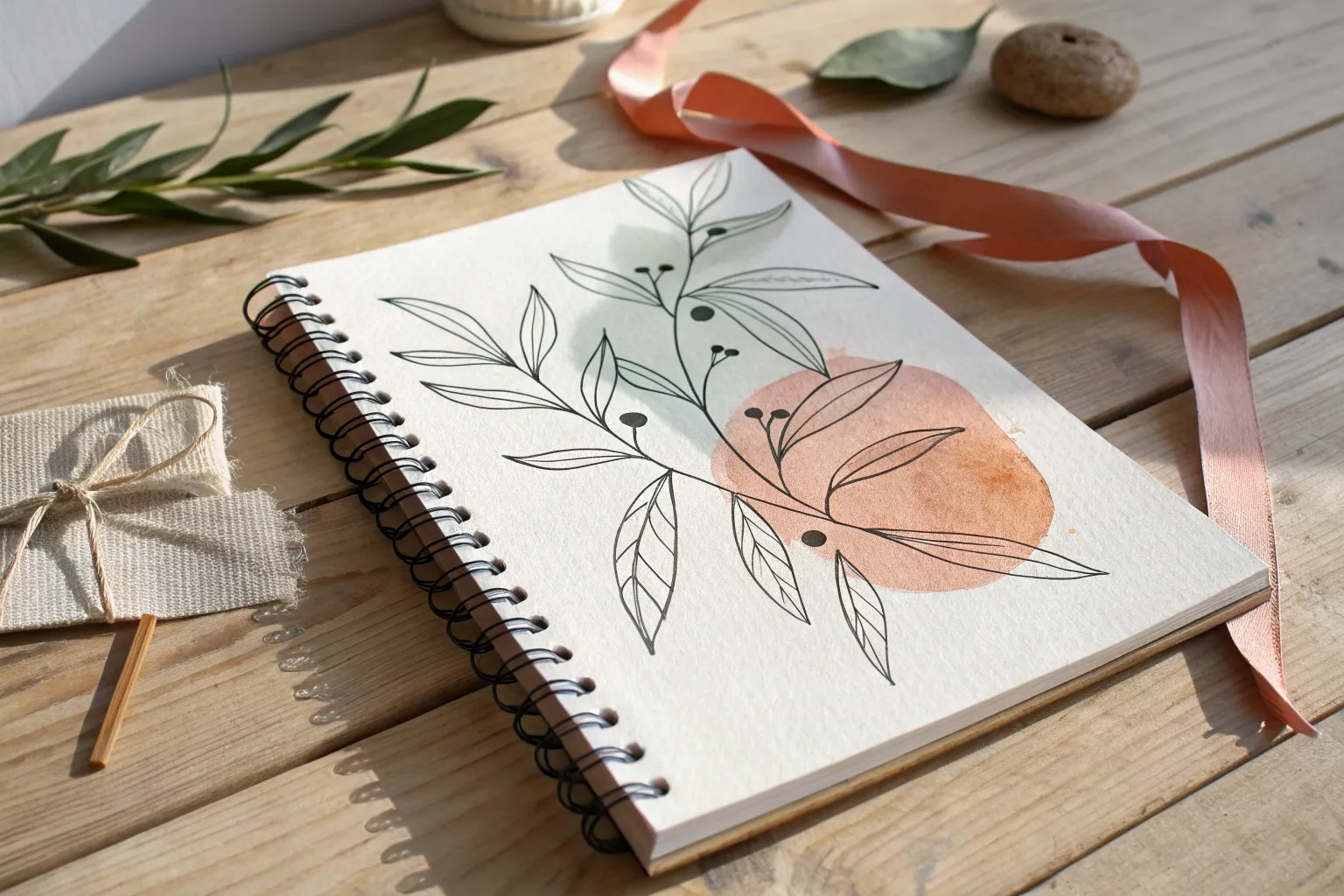
When I want my drawings to feel more alive, I lean hard into organic shapes—the curvy, imperfect forms you spot in leaves, shells, and growing things. Here are sixteen organic drawing ideas I keep coming back to when I’m craving flowing lines, natural texture, and that soft, biological kind of rhythm.
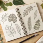
Leaf Contour Line Studies
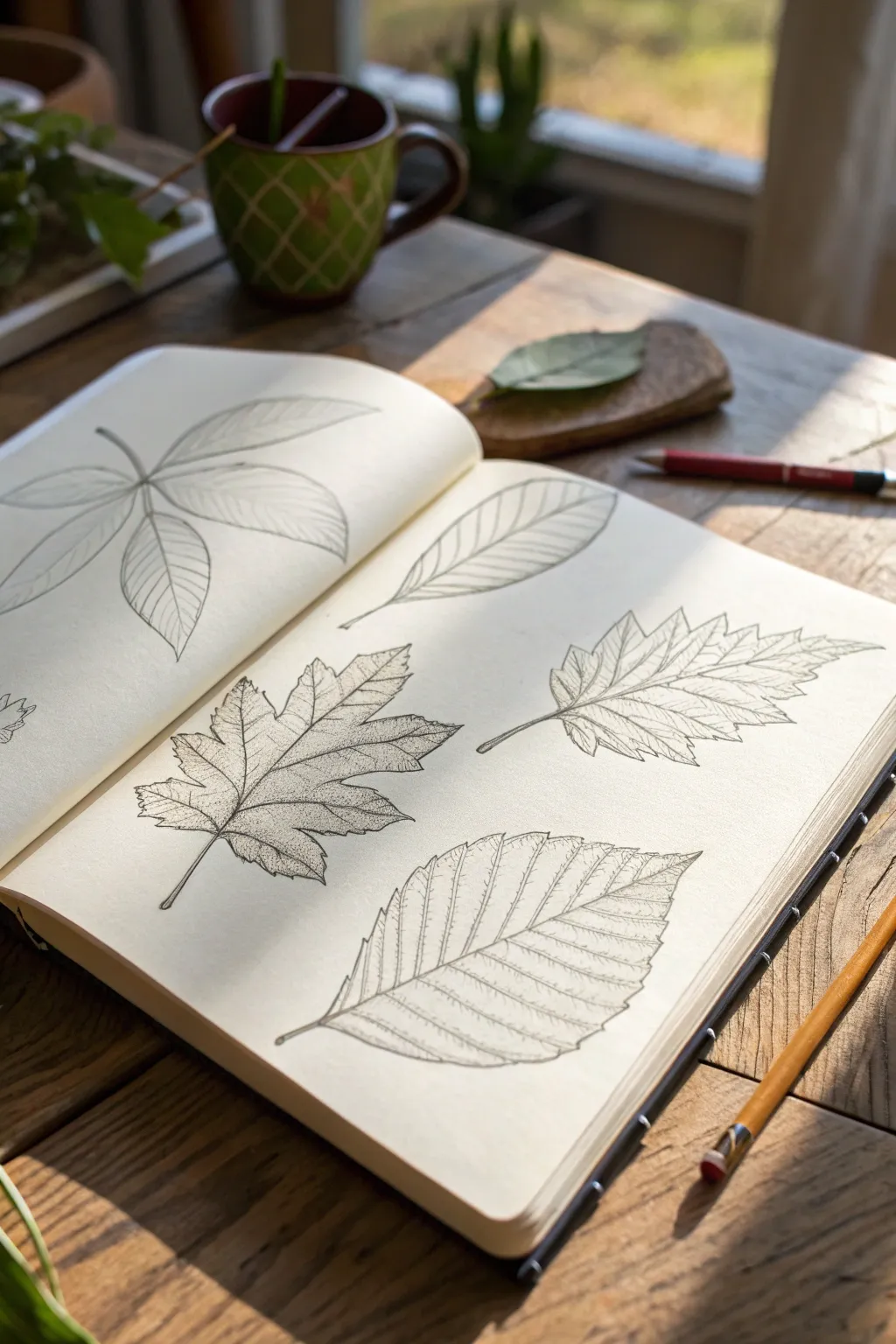
Capture the delicate intricacies of nature with these precise leaf studies, focusing on line weight and vein patterns. This project results in a calm, naturalist-style sketchbook spread that celebrates the unique geometry of various foliage.
Step-by-Step
Materials
- Sketchbook with smooth, heavy paper (approx. 140gsm)
- Graphite pencil (HB or 2H for initial lines)
- Fine liner pens (sizes 0.1mm, 0.3mm, and 0.5mm)
- Kneaded eraser
- Real or reference leaves (Maple, Beech, and elliptical shapes)
Step 1: Planning and Layout
-
Analyze your subject:
Begin by observing your leaves closely. Note the central vein (midrib) and the overall geometric shape. Is it lobed like a maple or serrated like a beech? Visualizing the basic envelope shape first helps maintain proper proportions. -
Rough placement:
Using your HB pencil, lightly sketch the central veins for three leaves on the right page to establish composition. Aim for a diagonal flow, placing one leaf high, one centrally, and one lower. -
Blocking in shapes:
Very faintly outline the perimeter of each leaf around the central veins. Don’t worry about jagged edges yet; just capture the smooth ‘ghost’ shape of the leaf’s outer boundary.
Wobbly Lines?
Should your hand shake, don’t restart. Thicken the line slightly in that area to disguise the wobble, turning it into a natural undulation of the leaf’s edge.
Step 2: Defining the Contours
-
Maple leaf structure:
For the central lobed leaf (resembling a maple), use your pencil to mark the main veins radiating from the stem point. Draw the jagged lobes, ensuring the tips follow the direction of the veins. -
Elliptical leaf shape:
For the top leaf, sketch a clean, elongated oval shape. Add secondary veins branching off the midrib at regular intervals, curving slightly toward the tip. -
Serrated leaf details:
For the bottom leaf (resembling beech or birch), draw a wide oval. Along the edges, lightly sketch the zig-zag pattern of the serrations, making sure they point toward the leaf’s apex. -
Refining the sketch:
Go over your pencil sketches one last time to correct any asymmetry. When I’m happy with the layout, I gently roll a kneaded eraser over the page to lift distinct graphite lines, leaving just a faint guide.
Natural Patina
Use a diluted watercolor wash in sepia or sap green over the dry ink. Let the pigment pool slightly in the serrated edges for an authentic dried-specimen look.
Step 3: Inking the Venation
-
Outline the stems:
Switch to a 0.5mm fine liner. Carefully trace the stems and the primary midribs of each leaf. Use a confident, single stroke rather than sketching/feathering to keep the look clean. -
Tracing the perimeter:
Continue with the 0.5mm pen to outline the outer edges. For the serrated and lobed leaves, pay close attention to the sharp points, ensuring the lines meet crisply without overlapping. -
Secondary veins:
Switch to a thinner 0.3mm pen. Draw the secondary veins branching from the midrib. These should taper off slightly as they reach the leaf edge, rather than touching the outline heavily. -
Tertiary details:
Using the ultra-fine 0.1mm pen, add delicate tertiary veins—the tiny web-like lines between the secondary veins. Use broken, light touches here to suggest texture without overcrowding the drawing.
Step 4: Adding Depth and Texture
-
Hatching for dimension:
Return to the 0.1mm pen. Add very fine, minimal hatching near the midrib and stem connections. This subtle shading gives the leaf a slight curve, preventing it from looking completely flat. -
Stippling detail:
On the central lobed leaf, add tiny dots (stippling) along the major veins. This creates a darker value and textural interest that mimics the roughness of a dried leaf surface. -
Correcting line weight:
Review your ink work. If any outer edges feel too thin compared to the internal details, thicken them slightly with the 0.5mm pen to separate the leaf clearly from the paper background. -
Final clean-up:
Wait at least 10 minutes to ensure the ink is totally bone-dry. Erase all remaining pencil marks completely with a high-quality eraser to reveal the crisp black-and-white contrast.
Close your sketchbook knowing you’ve preserved a fleeting bit of nature’s geometry on the page


Simple Flower Petal Layers
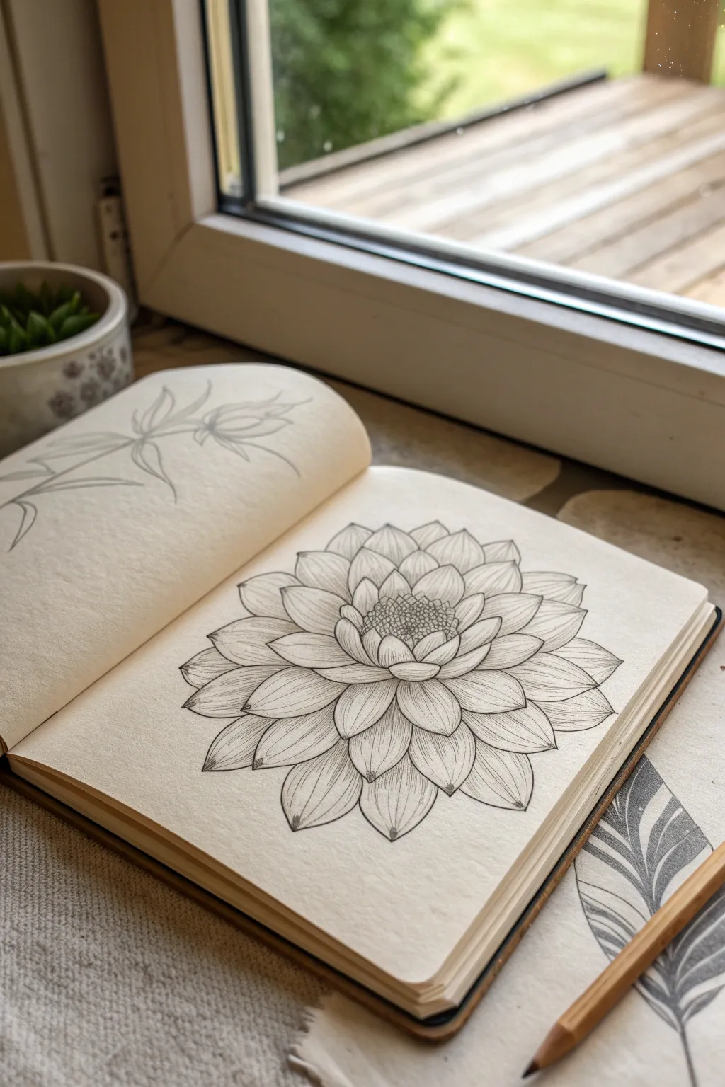
This elegant ink study captures the symmetry and organic beauty of a dahlia using simple, repetitive layering techniques. By breaking down the complex bloom into manageable concentric rings, you will build a sophisticated botanical illustration full of depth and texture.
Step-by-Step Tutorial
Materials
- Fine-tooth sketchbook or drawing paper
- HB graphite pencil
- Eraser (kneaded or soft vinyl)
- Fine liner pen (01 or 03 micron size, black)
- Ruler (optional, for guidelines)
Step 1: Pencil Framework
-
Establish the center:
Begin by lightly sketching a small, oval-shaped circle in the center of your page with your HB pencil. This will serve as the pistil or seed head of your flower. -
Create concentric guides:
Lightly draw two or three larger circles radiating outward from that center point. These don’t need to be perfect circles; they are just faint guidelines to help you keep your petal layers even as you expand. -
Sketch the inner seed texture:
Inside your central oval, create a rough texture of tiny, tightly packed circles or dots to simulate the seeds.
Step 2: Building the Petal Layers
-
Draft the first ring:
Around the seed center, sketch the first row of small petals. They should look like rounded, slightly pointed U-shapes that wrap snugly around the core. -
Expand the second layer:
Now, sketch the second layer of petals behind the first. Draw these petals slightly larger, positioning the tip of the new petal in the gap between two petals from the previous row (a brick-laying pattern). -
Check symmetry:
Continue adding rows, following your pencil guidelines. I like to rotate my sketchbook frequently to ensure the flower isn’t leaning too much to one side. -
Elongate outer petals:
As you move to the outer rings, make the petals longer and more pointed. The tips should face outward, giving the bloom an open, expansive feel. -
Finalize pencil structure:
Review your sketch. Ensure the petal tips generally align with a circular shape, though having a few extend further adds a lovely organic touch.
Uneven Petals?
If your layers start looking lopsided, lightly sketch a ‘pizza slice’ grid over the flower. This helps you distribute petals evenly across each quadrant.
Step 3: Inking and Detail
-
Ink the seed center:
Switch to your fine liner pen. Carefully ink the tiny circular textures in the center. Use stippling (small dots) between the seed shapes to create depth and shadow. -
Outline the inner petals:
Trace your inner petal shapes with clean, confident lines. Be careful not to smudge the wet ink with your hand. -
Continue outlining:
Work your way outward, outlining each subsequent layer of petals. Remember that outer petals will be partially hidden by the inner ones, so stop your lines where they meet a petal in front. -
Add center veins:
Draw a central vein line down the middle of each petal. Start from the base of the petal and flick the pen outward, lifting pressure so the line tapers off before hitting the tip. -
Create subtle shading lines:
To give the petals volume, add fine, curved hatching lines radiating from the base of each petal next to the central vein. These lines should follow the contour of the shape. -
Refine the edges:
Add tiny, slight dips or irregularities to the tips of the petals as you ink them; nature is rarely perfectly smooth, and this adds realism. -
Connect the layers:
Examine the gaps. If there are small empty spaces between lower petals, add tiny triangles of ink or lines to suggest shadowy petals deeper in the background. -
Erase guidelines:
Wait at least 15 minutes to ensure the ink is completely dry. Gently erase all visible pencil lines, leaving only your crisp ink drawing. -
Final touches:
Look for areas that need more contrast. You might darken the very center or the crevices where petals overlap to make the flower pop off the page.
Line Weight Magic
Use a thicker pen (05) for the outer contour of the petals and a thinner pen (005 or 01) for the delicate interior veins to create instant 3D volume.
Now you have a timeless botanical illustration ready to be framed or expanded into a full garden page

Fern Frond Repetition
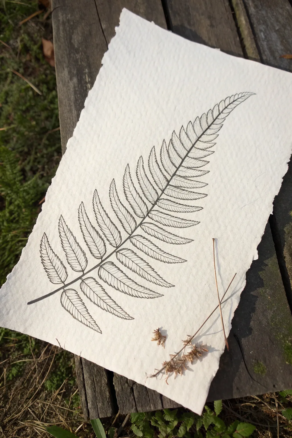
Capture the delicate symmetry of nature with this detailed botanical study of a single fern frond. Using fine liners on rough handmade paper creates a beautiful contrast between the precise, repetitive lines and the organic texture of the surface.
How-To Guide
Materials
- Heavyweight handmade cotton rag paper (deckle edge)
- Fine liner pens (sizes 005, 01, and 03, black archival ink)
- HB Graphite pencil
- Kneaded eraser
- Ruler (optional, for the central axis)
Step 1: Planning the Structure
-
Paper selection:
Choose a sheet of handmade cotton rag paper. The rough texture is crucial for the final look, so avoid smooth copy paper. Position it vertically. -
Draw the rachis:
Lightly sketch a long, curving line with your pencil to act as the main stem (rachis). It should start near the bottom left and curve gently toward the top right corner. -
Mark leaf placement:
Along this main stem, make small pencil ticks in pairs to indicate where each leaflet (pinna) will attach. Space them wider at the bottom and gradually closer together as you move up. -
Sketch the outline:
Very lightly sketch the overall triangular shape of the frond. The bottom leaflets should be the longest, tapering to a point at the top tip.
Paper Texture Tip
On rough rag paper, ink can bleed or skip. Move your pen slightly slower than usual to let the ink saturate the fibers fully for crisp lines.
Step 2: Inking the Stem
-
Define the stem:
Switch to your 03 fine liner. Carefully trace over your pencil line for the main stem, tapering it so it’s thicker at the base and extremely thin at the tip. -
Add the leaflet midribs:
Using a slightly thinner 01 pen, draw the central vein (midrib) for each individual leaflet extending out from the main stem. -
Curve the veins:
Ensure these midrib lines curve slightly upward; nature rarely deals in perfectly straight lines.
Variation Idea
Try using a sepia or dark green micron pen instead of black for a softer, vintage botanical illustration look.
Step 3: Detailed Leaf Work
-
Outline the leaflets:
With the 01 pen, draw the scalloped edges of the leaflets. Each leaflet should look like a long, slender oval with serrated edges. -
Start the venation:
Switch to your finest pen (005). Inside the first bottom-left leaflet, begin drawing the tiny veins branching off its midrib. -
Repetitive rhythm:
Continue this pattern up the left side of the frond. This is the meditative part of the process—keep your spacing consistent. -
Mirror the right side:
Now move to the right side of the stem. Draw the veins on these leaflets, checking to ensure they mirror the angle of the left side. -
Adjust the scale:
As you move toward the top of the frond, your leaflets are getting smaller. Reduce the number of veins you draw to avoid over-crowding the ink. -
Review the tip:
The very top leaflets are tiny. Use just a few suggestive lines here rather than full detail to keep it delicate.
Step 4: Refining and Finishing
-
Deepen the shadows:
Take the 01 pen again and add a second pass of ink right where each leaflet touches the main stem. This small shadow adds depth. -
Check connectivity:
Ensure all your leaflets actually connect visually to the main stem; floating leaves break the illusion of realism. -
Let the ink cure:
Allow the drawing to sit for at least 15 minutes. Archival ink dries fast, but on thick cotton rag, it can soak in deep and smudge if you rush. -
Erase guidelines:
Gently roll a kneaded eraser over the drawing to lift the original pencil sketches. I prefer a rolling motion rather than rubbing to protect the paper fibers. -
Final assessment:
Look for any gaps in the outline or broken lines and carefully touch them up with the 005 pen.
Now you have a timeless botanical piece that highlights the beauty of natural geometry
Mushroom Clusters and Gills
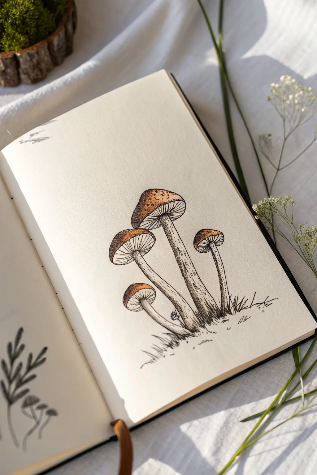
This elegant botanical illustration captures the delicate textures of a mushroom cluster using fine ink lines and subtle washes of color. By combining traditional cross-hatching and stippling techniques, you’ll create a drawing that feels both scientifically detailed and whimsically organic.
Step-by-Step Guide
Materials
- Fine liner pens (sizes 0.05, 0.1, and 0.3)
- Pencil (HB or H for sketching)
- Kneaded eraser
- Sketchbook with smooth, heavy paper (mixed media or hot press watercolor paper)
- Brown watercolor paint or watercolor pencils
- Small round brush (size 2 or 4)
Step 1: Structural Sketching
-
Establish the Stems:
Begin lightly with your pencil. Draw four curving, elongated stems rising from a single grassy point. Vary their heights and angles, with the tallest one in the center and shorter ones flanking it to create a natural, clustered composition. -
Cap Placement:
Top each stem with a mushroom cap. Sketch these as domed semi-circles. The central mushroom should have the largest cap, angled slightly so you can see underneath it. Vary the tilt of the other caps to show different perspectives of the gills. -
Define the Gills:
Lightly sketch the underside of the caps. For the angled mushrooms, draw an elliptical shape connecting the rim of the cap to the stem. This area will house the gills. Add a small ‘skirt’ or ring on the stems just below the caps where appropriate. -
Grounding Details:
Sketch a few jagged, uneven lines at the base of the stems to suggest grass and earth, anchoring the cluster so it doesn’t look like it’s floating.
Step 2: Inking the Outlines
-
Main Outlines:
Switch to your 0.1 fine liner. Carefully trace your pencil lines for the stems and the outer rims of the caps. Keep your hand relaxed to allow for slight organic wobbles in the line work, which looks more natural than perfect geometric curves. -
Drawing the Gills:
Using the 0.05 pen (the finest tip), draw the gills radiating from the stem to the cap’s edge. These should be fine, straight lines packed closely together. I find it helpful to rotate the sketchbook as I work around the circle to keep my hand angle consistent. -
Stem Texture:
Add linear texture to the stems using the 0.1 pen. unexpected breaks in the lines add character. focus mainly on the shadowed side of the stems (the right side in this example) to begin building volume. -
The Base:
Use quick, upward flicking motions with your 0.3 pen to ink the grass blades at the bottom. This heavier line weight grounds the drawing.
Ink Bleeding?
If your ink bleeds when adding watercolor, ensure your pens are labeled ‘waterproof’ or ‘archival.’ If not, simply do the painting step first, let it dry fully, then add the ink details on top.
Step 3: Shading and Stippling
-
Stippling the Caps:
This is where patience is key. On the top of the mushroom caps, use your 0.1 pen to create texture with stippling (tiny dots). Concentrate the dots heavily on the shadowed side (left) and near the bottom rim, dispersing them as you move toward the light source. -
Deepening Shadows:
Go back over the darkest areas of the stems and the underside of the caps with the 0.05 pen. Add tiny hatching lines or more dense stippling where the stems overlap or meet the grass. -
Clean Up:
Once the ink is completely dry, gently erase the visible pencil guidelines with your kneaded eraser. Be thorough but gentle to avoid fading the ink.
Natural Gills
Don’t draw every single gill line touching the center stem. Stop some lines halfway up. This ‘Y’ shape branching creates a much more realistic, crowded texture underneath the cap.
Step 4: Adding Color
-
Base Tone:
Mix a diluted wash of burnt sienna or warm brown watercolor. Lightly paint the top of the mushroom caps, leaving the very top right area unpainted or very pale for a highlight. -
Layering Intensity:
While the first layer is still slightly damp, drop a more concentrated brown pigment into the shadowed left side of the caps. Let the paint bleed naturally into the lighter wash. -
Stem Accents:
Use a very watery, pale brown wash to add just a hint of color to the shadowed side of the stems effectively tinting the paper without overpowering the ink work. -
Final Contrast:
If you want more definition after the paint dries, you can add a few final dark dots with your pen over the painted areas to re-establish the texture lost under the watercolor.
Flip the page and start a new cluster, perhaps experimenting with different cap shapes or colors
BRUSH GUIDE
The Right Brush for Every Stroke
From clean lines to bold texture — master brush choice, stroke control, and essential techniques.
Explore the Full Guide
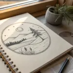
Mountain Forms With Hatching
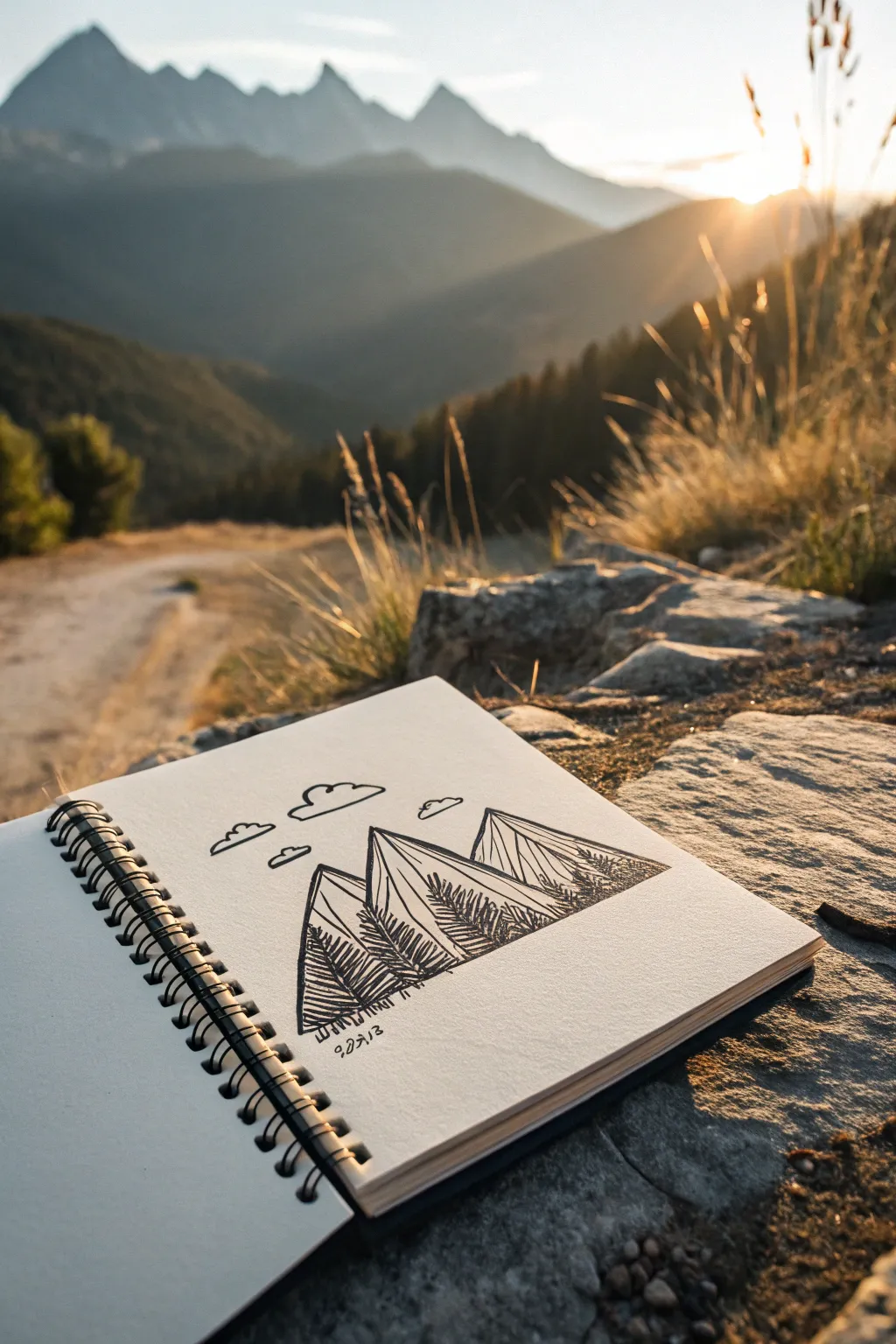
Capture the essence of the high peaks with this clean, stylized line drawing. Using confident triangular forms and precise hatching techniques, you will create a beautifully balanced mountain composition that feels both organic and architectural.
Step-by-Step Tutorial
Materials
- Sketchbook with smooth heavyweight paper
- Pencil (HB or H)
- Eraser (kneaded preferred)
- Fine liner pen (01 or 03 size)
- Thicker graphic pen (05 or 08 size)
- Ruler (optional, but helpful for crisp lines)
Step 1: Laying the Foundation
-
Establish the horizon line:
Begin by lightly sketching a horizontal baseline with your pencil about one-third of the way up from the bottom of your page. This doesn’t need to be perfectly straight, as it represents the rough ground. -
Draft the central peak:
Draw a large triangle in the center. Make the peak slightly off-center to the left or right to keep it dynamic. The sides don’t need to be perfectly symmetrical; a steeper slope on one side adds realism. -
Add the flanking mountains:
Sketch a smaller triangular shape overlapping behind the main peak on the left side. Then, add a third, broader mountain shape on the right side, tucked behind the central one. -
Define the ridgelines:
Inside each triangle, draw a slightly jagged line running from the peak down towards the base. This divides each mountain into a ‘sun side’ and a ‘shadow side,’ giving the forms dimension. -
Sketch the cloud forms:
Above the peaks, lightly outline three simple, rounded cloud shapes. Keep the bottoms flat and the tops bubbling with curves.
Clean Lines
Rest your hand on a scrap piece of paper while drawing to prevent oils from your skin smudging the paper or affecting how the ink absorbs.
Step 2: Inking the Outlines
-
Trace the main contours:
Switch to your thicker pen (05 or 08). Carefully trace over your pencil outlines for the mountains. Use a confident, steady hand. I find it helpful to pull the pen towards me rather than pushing it away. -
Ink the clouds:
Use the same thicker pen to ink the clouds. Leave small gaps in the line work occasionally to make them feel airy and light. -
Erase pencil guides:
Wait at least five minutes for the ink to dry completely to avoid smudging. Gently erase all visible pencil marks with your kneaded eraser.
Creative Twist
Try using a gold or silver gel pen for the ‘sunny’ side highlights, or add a watercolor wash in blue or purple over the mountains once the ink is totally dry.
Step 3: Adding Texture and Depth
-
Start the vertical hatching:
Switch to your fine liner (01 or 03). On the left face of the central mountain, start drawing vertical lines. These lines should follow the slope of the mountain but remain strictly vertical. -
Vary line density:
As you move down the shape, place the vertical lines closer together near the bottom and wider apart near the top. This creates a gradient effect that suggests shadow and weight at the base. -
Texture the side peaks:
Repeat the vertical hatching process on the shadowy faces of the left and right mountains. Ensure the lines are parallel to each other for a cohesive, geometric look. -
Create cross-hatching shadows:
To deepen the darkest areas, add diagonal lines crossing over your vertical lines at the very bottom corners of the mountains. This adds weight and anchors the drawing. -
Add jagged forest details:
along the lower slopes of the mountains, use short, rapid zigzag motions with your fine pen to suggest pine trees. These don’t need to be individual trees, just a texture that implies a forest. -
Detail the lit sides:
On the ‘sunny’ sides of the mountains (the faces without heavy hatching), add just a few sparse, broken lines to suggest craggy rock textures without darkening the area too much. -
Ground the composition:
Add a few horizontal scribbles and small rock shapes at the very base of the mountains to settle them into the foreground so they don’t look like they are floating. -
Sign and date:
Finally, add the date or a small signature near the bottom edge in a quirky, handwritten font to personalize your sketch.
Now you have a striking mountain scene that captures the spirit of the outdoors right in your notebook
Seed Pods and Curled Tendrils
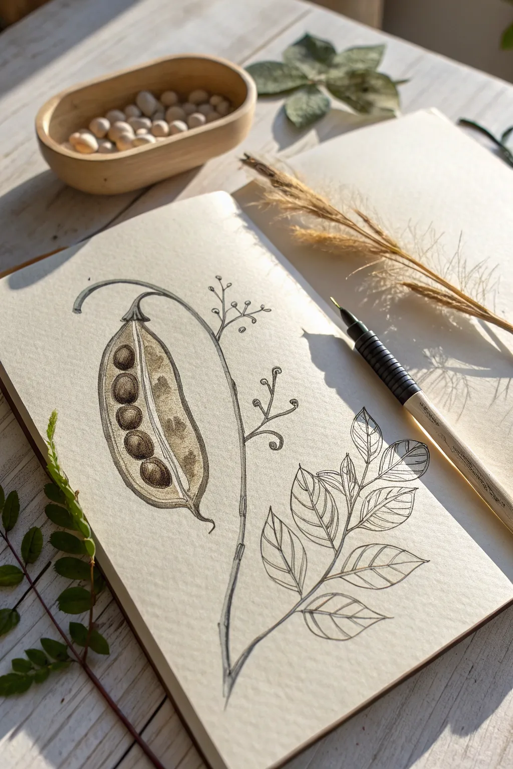
This botanical illustration captures the delicate structure of a split seed pod and leafy branch, combining fine line work with subtle shading. The result is an elegant, organic study that feels both scientific and artistic, perfect for filling a specialized nature journal.
Detailed Instructions
Materials
- Sketchbook with smooth, heavy paper (min 160 gsm)
- HB or 2B graphite pencil for sketching
- Fine liner pens (sizes 0.1mm, 0.3mm, 0.5mm)
- Sepia or brown calligraphy pen (optional for warm tones)
- Soft kneaded eraser
- Blending stump or tortilla
Step 1: Planning the Composition
-
Establish the curve:
Begin with a gentle HB pencil sketch. Draw a long, graceful ‘S’ curve that starts from the top left and sweeps down towards the bottom center. This will be your main stem connecting the pod and the leaves. -
Outline the pod shape:
Near the top of your curve, sketch a large, elongated tear-drop shape hanging downwards. This forms the outer shell of the seed pod. Ensure the tip curves slightly outward at the bottom. -
Mark the leaves:
Branching off the lower part of your main stem, lightly sketch the outlines of seven or eight leaves. Arrange them in pairs with a single terminal leaf at the end of the branch.
Natural Imperfection
Don’t make your lines too straight. A slight wobble in your hand helps mimic the organic, uneven growth patterns found in nature.
Step 2: Detailing the Seed Pod
-
Split the pod:
Refine your pod sketch to show it split open. Draw two curved lines running down the center of the tear-drop shape, creating an opening that is wider in the middle and tapered at the ends. -
Add the seeds:
Inside the opening you just created, sketch a row of five round seeds. They should look nestled into the back wall of the pod. I usually make the bottom seeds slightly larger than the top ones for visual weight. -
Ink the pod outline:
Switch to a 0.3mm fine liner. Carefully trace the outer contour of the pod and the stem holding it. Use a slightly broken or varying line weight to give it an organic feel, rather than a perfect geometric outline. -
Texture the seeds:
Using a 0.1mm pen, outline the seeds. Use stippling (tiny dots) or very fine hatching on one side of each seed to create a sense of roundness and shadow. -
Shade the interior:
Darken the space between the seeds and the pod wall. Use dense cross-hatching or a dark brown wash if you have it, making the seeds pop forward against the dark recess.
Step 3: Drawing the Foliage
-
Ink the stem:
Continue your ink line down the main stem. Add small ‘nodes’ or bumps where the leaf stems branch off to make the plant look realistic. -
Outline the leaves:
Go over your pencil sketches for the leaves with the 0.3mm pen. Keep the edges relatively smooth but include a few natural irregularities so they don’t look artificial. -
Add the veins:
Switch to your finest 0.05mm or 0.1mm pen. Draw a central vein down each leaf, then add delicate side veins branching out. Keep these lines very light and swift. -
Create depth:
Add a second layer of ink to the underside of the leaves or where they overlap. This creates a small cast shadow that separates the layers visually.
Add a Vintage Wash
Dilute a drop of sepia watercolor or coffee and paint a very faint wash over just the seed pod area to give the page an aged, botanical specimen look.
Step 4: Finishing Touches
-
Add whimsical tendrils:
Between the pod and the leaves, draw fine, curling tendrils branching from the main stem. Use the fine pen to draw small circles or hooks at the ends, representing emerging buds. -
Apply graphite shading:
Take your graphite pencil and gently shade the rounded side of the pod shell to give it volume. Smudge this shading gently with a blending stump for a smooth, soft texture. -
Enhance texturing:
Add subtle speckling or dots to the outside of the pod shell to suggest a rougher texture compared to the smooth leaves. -
Clean up:
Wait at least 10 minutes for all ink to be completely dry. Gently erase all remaining pencil guidelines with your kneaded eraser to reveal the crisp illustration.
Now you have a timeless botanical study captured in your sketchbook, ready to be admired

PENCIL GUIDE
Understanding Pencil Grades from H to B
From first sketch to finished drawing — learn pencil grades, line control, and shading techniques.
Explore the Full Guide
Organic-Geometric Hybrid Doodles
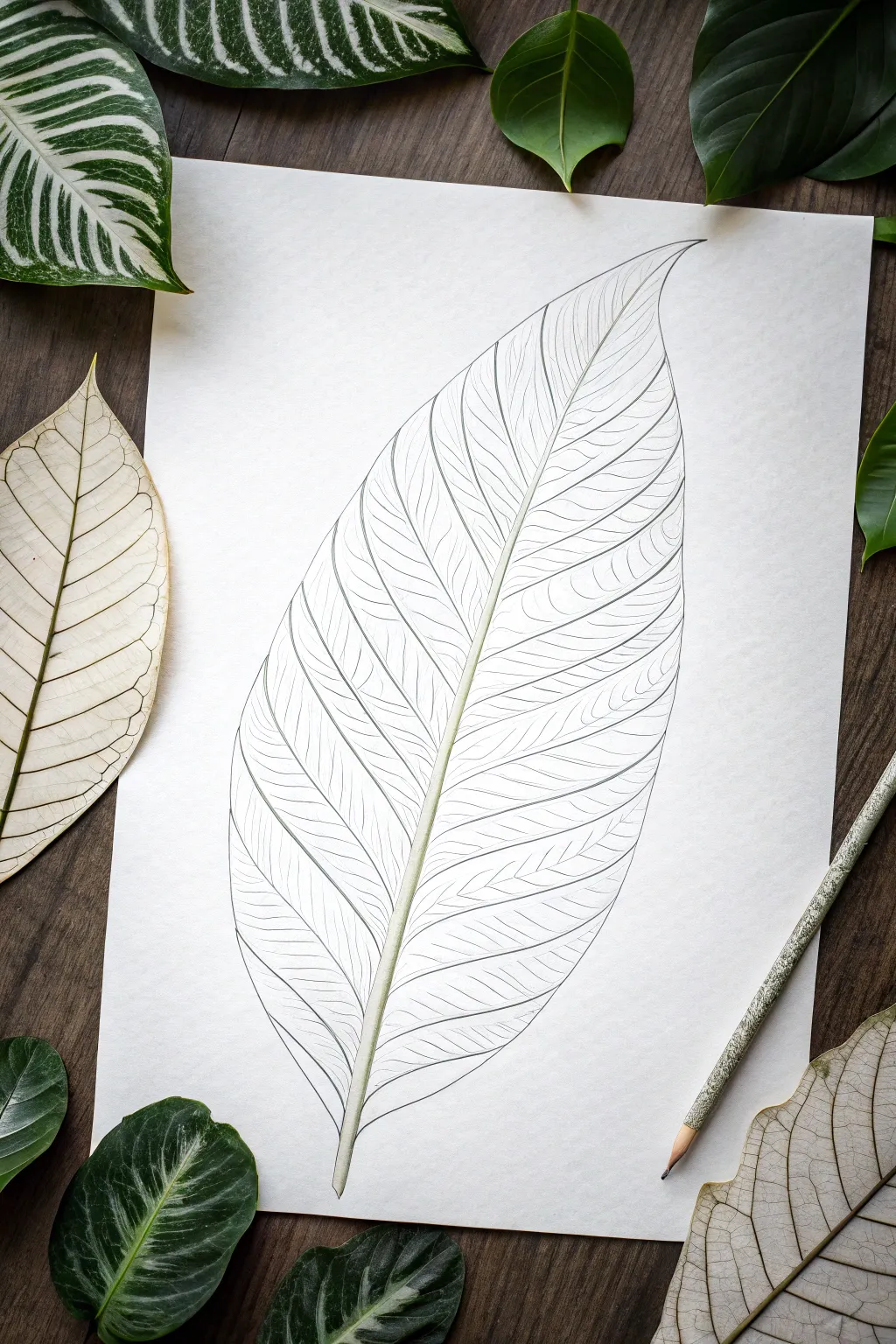
Capture the fragile beauty of a skeleton leaf with this detailed line drawing study. You will focus on creating organic rhythm through repetitive, sweeping lines that mimic the natural flow of veins, resulting in a piece that feels both botanical and architectural.
Step-by-Step
Materials
- High-quality smooth drawing paper (hot press watercolor or bristol board)
- HB graphite pencil for initial sketching
- 0.3mm or 0.5mm mechanical pencil (or a very sharp 2H pencil)
- Fine liner pen (optional, faint grey or sepia for final lines)
- Kneadable eraser
- Reference photo of a leaf
Step 1: The Foundation
-
Establish the curve:
Begin by lightly sketching a single, long swooping line that curves gently from the bottom left to the top right of your page. This will be the central spine (midrib) of your leaf. -
Define the perimeter:
Lightly sketch the outer shape of the leaf around your central spine. Aim for an asymmetrical, teardrop shape with a pointed tip at the top and a tapered base. -
Thicken the spine:
Go back to your central line and add a second line parallel to it, tapering them together at the very tip. This creates the physical thickness of the stem. -
Map primary veins:
Starting from the base, sketch the main lateral veins branching off the spine. They should angle upward, curving slightly toward the leaf tip rather than going straight out to the sides.
Uneven Lines?
If your long curves are shaky, try drawing from your shoulder rather than your wrist. Lock your wrist and move your whole arm to get smoother, sweeping strokes.
Step 2: Detailed Vein Work
-
Section by section:
I find it best to work from the bottom up, focusing on one section between two lateral veins at a time to avoid feeling overwhelmed. -
Draw secondary veins:
Inside each section, draw thinner lines that branch off the lateral veins. These should flow in the same general direction as their parent vein. -
Create the mesh:
Now, begin filling the spaces with the tertiary veins—the tiny network usually seen in skeleton leaves. Use very light pressure. -
Mind the edges:
As your veins reach the outer perimeter line you drew earlier, let them curve and merge into that edge line rather than stopping abruptly. -
Vary line weight:
Ensure the central spine remains the thickest element. Press slightly harder on the base of the lateral veins and lift your pressure as they move toward the leaf edge.
Observation Trick
Look at the negative space between the veins rather than the veins themselves. Drawing the shapes of the ‘holes’ often results in a more accurate network.
Step 3: Refining and Shaping
-
Clean up contours:
Go over the outer perimeter of the leaf with a confident, smooth line. It shouldn’t be perfectly straight; allow it to have tiny wobbles to look organic. -
Enhance the spine:
Add very subtle shading to one side of the central spine to give it a cylindrical, 3D appearance. Keep this shading extremely minimal. -
Connect the network:
Look for any ‘floating’ veins that don’t connect to anything. Extend them until they touch another line to create a closed network. -
Erase guidelines:
Take your kneadable eraser and gently dab away any heavy graphite or initial construction lines, leaving only your crisp, detailed vein map. -
Soft shading (Optional):
If you want more depth, lightly hatch small areas where the veins meet the spine, suggesting the natural depression in the leaf surface. -
Final assessment:
Step back and check the overall flow. If an area looks too empty, add a few more hair-thin lines to balance the density of the pattern.
Enjoy the meditative process of building this complex organic network line by line


Have a question or want to share your own experience? I'd love to hear from you in the comments below!