If you’re craving edgy drawing ideas that feel raw, moody, and a little rebellious, I’ve got you. Let’s lean into grunge, dark surrealism, and bold symbols that say what you can’t always put into words.
Classic Skull Study
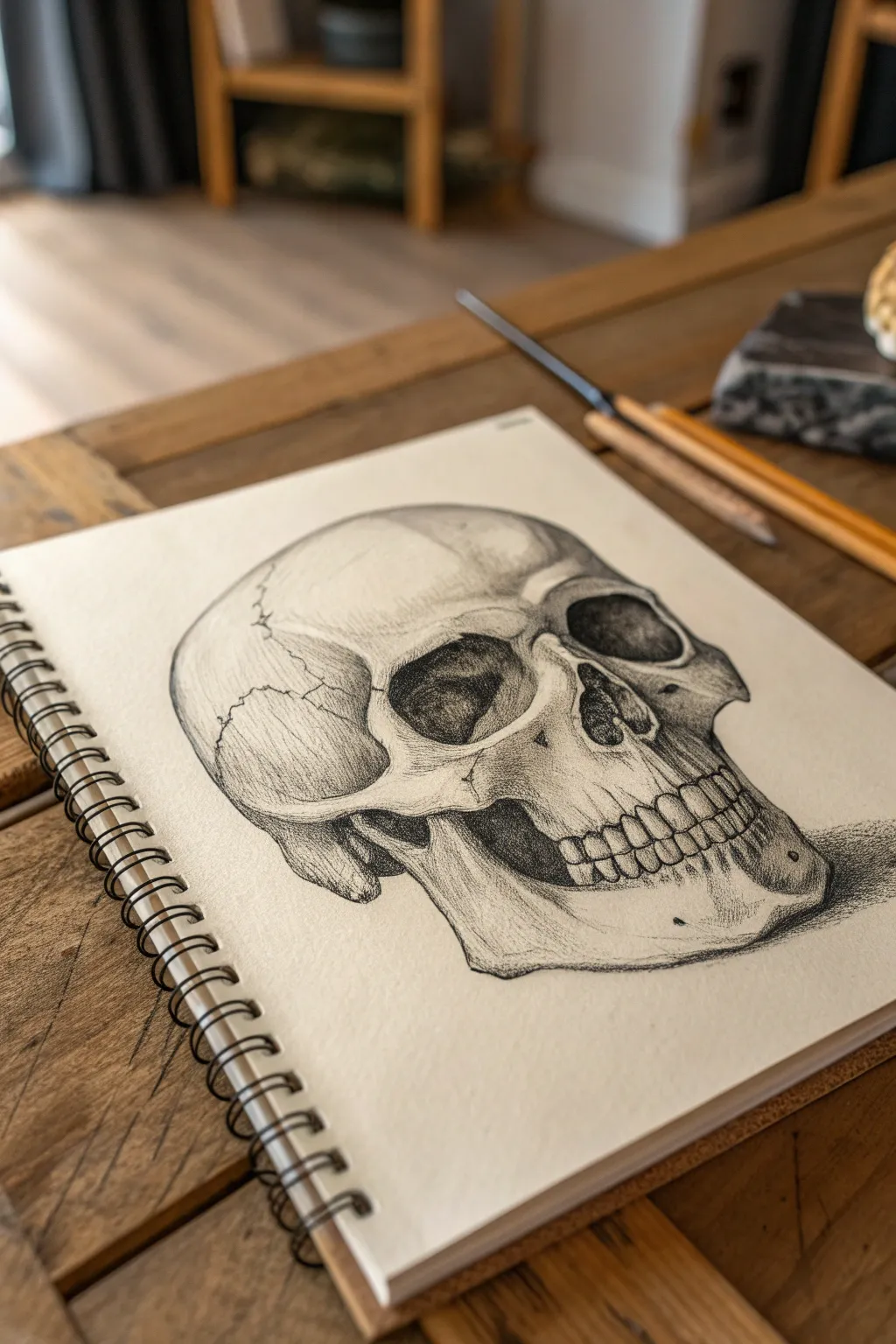
Mastering the structure and shadows of a human skull is a rite of passage for artists, offering a perfect blend of anatomical precision and dramatic shading. This study captures a classic three-quarter view, using graphite to render deep eye sockets and delicate bone sutures against a clean sketchbook page.
Step-by-Step Tutorial
Materials
- Spiral-bound sketchbook (medium tooth paper)
- Graphite pencils (HB, 2B, 4B, 6B)
- Kneaded eraser
- Precision mechanical pencil (0.5mm, optional)
- Blending stump or tortillon
- Pencil sharpener
Step 1: Structural Framework
-
Establish the cranial mass:
Begin with an HB pencil using very light, loose pressure. Draw a large, slightly elongated circle to represent the cranium (the top part of the skull). This will serve as the anchor for the rest of the drawing. -
Map the facial plane:
Extend a jawline downwards from the side of your circle, curving it inwards to create the chin area. Draw a vertical centerline down the front of the ‘face’ area, curving it slightly to match the three-quarter perspective shown in the reference. -
Locate features:
Lightly sketch horizontal guidelines across the face to mark the position of the eye sockets, the bottom of the nose cavity, and the mouth divide. Keep these lines faint so they can be erased later. -
Outline the eye sockets:
Draw two large, somewhat irregular shapes for the orbits (eye sockets). The socket closer to the viewer should appear wider, while the farther one is slightly foreshortened due to the angle. -
Draft the nasal cavity:
Sketch the upside-down heart shape of the nasal cavity just below the eye line. Pay attention to the small central spine of bone at the bottom of the cavity.
Uneven Proportions?
If the skull looks warped, check your centerline. The features (eyes, nose, mouth) should align perpendicular to that curve. Use a ruler to check alignment before shading.
Step 2: Defining Bone Structure
-
Sculpt the cheekbones:
Refine the zygomatic arch (cheekbone). Start from the outer edge of the eye socket and sweep a line back towards the ear area, and another down towards the upper jaw. -
Detail the jaw and teeth:
Outline the maxilla (upper jaw) and mandible (lower jaw). Sketch the teeth simply as a continuous band first, then divide them into individual shapes. Remember that teeth curve *around* the skull, they aren’t flat. -
Add cranial sutures:
Using a sharper point, drawn the jagged, wandering lines (sutures) on the side of the cranium. These squiggly cracks add immense realism and texture to the bone surface. -
Refine the outline:
Go over your initial sketch with a 2B pencil to firm up the final contours. Clarify the shape of the mastoid process—the bony lump just behind where the jaw meets the skull.
Memento Mori
Add symbolic elements like a wilted rose, an hourglass, or a melting candle next to the skull to turn your anatomical study into a classic ‘Vanitas’ still life composition.
Step 3: Shading and Depth
-
Darkest values first:
Switch to a 4B or 6B pencil. Fill in the deepest shadows first: specifically the back of the eye sockets, the inside of the nasal cavity, and the gap between the jaw and cheekbone. -
Layering mid-tones:
With a 2B pencil, shade the side of the skull that is turning away from the light. Use hatching or circular motions to build up tone gradually on the temple and under the cheekbone. -
Sculpting the teeth:
Shade the upper portion of the teeth near the gums to make them recede. I find it helpful to leave the center of the teeth mostly white to simulate the shiny enamel surface. -
Suture depth:
Go back to your cranial sutures. Darken the line itself, but add a tiny bit of shading on just one side of the crack to give it indentational depth. -
Smooth the transitions:
Use a blending stump to gently soften the graphite in the shadows, particularly in the orbital cavities, to create a smooth, hollow look. Avoid over-blending; you want to keep some texture. -
Cast shadow:
Add a strong cast shadow underneath the jaw and to the right side of the skull using your darkest pencil (6B). This grounds the object and prevents it from looking like it’s floating. -
Final highlights:
Use your kneaded eraser to lift out graphite on the brow ridge, the top of the cheekbone, and the front of the chin. This high contrast makes the bone look polished and solid.
Step back and admire the dramatic contrast of your finished anatomical study


Dagger Through a Rose
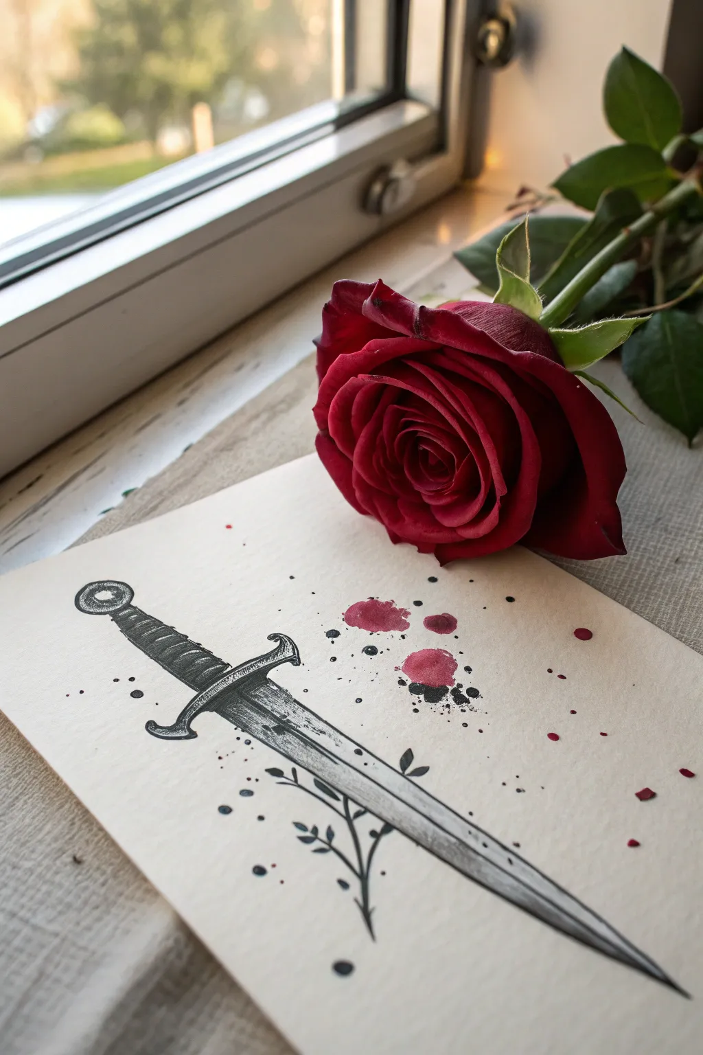
This project combines precise fineliner work with expressive ink washes to create a romantic yet sharp aesthetic. You’ll layer intricate hatching for the blade’s metallic finish and add splashes of deep red for a dramatic, storytelling effect.
Step-by-Step
Materials
- Thick, smooth Bristol board or hot-press watercolor paper
- Pencil (HB or 2B)
- Kneaded eraser
- Fineliner pens (sizes 0.1, 0.3, and 0.5)
- Red watercolor paint or red ink
- Black ink wash (or watered-down black watercolor)
- Small round paintbrush (size 2 or 4)
- Ruler
Step 1: Sketching the Weapon
-
Lay the Foundation:
Begin by lightly sketching a central vertical line using your ruler to ensure symmetry. This will be the spine of your dagger. -
Outline the Blade:
Sketch the blade shape, tapering it gradually to a sharp point at the bottom. Keep the lines faint so they can be easily erased later. -
Draft the Hilt and Guard:
Draw the cross-guard horizontally, adding a slight downward curve at the ends for a classic look. Sketch the handle grip with subtle bumps to indicate a wrapped texture, topping it with a circular pommel. -
Add Decorative Details:
Lightly pencil in the decorative wrapping on the hilt and the center ridge running down the blade. -
incorporate Organic Elements:
Sketch a delicate, thorny vine wrapping loosely around the lower part of the blade. Keep the leaves small and simple to contrast with the rigid metal.
Step 2: Inking and Texture
-
Primary Outlines:
Using a 0.3 fineliner, go over your pencil lines. Use steady, deliberate strokes for the metal edges to make them look sharp. -
Detailing the Hilt:
Switch to a 0.1 fineliner for the hilt wrapping. Add small, curved hatching lines to suggest the roundness of the leather or cord grip. -
Building Metallic Sheen:
On the blade, use fine stippling (dots) and cross-hatching to create shadows. Leave the center ridge and edges white to simulate a high-polish reflection. -
Darkening the Depths:
Use a 0.5 fineliner to fill in the darkest shadow areas, particularly under the cross-guard where it meets the blade, to add depth. -
Inking the Vines:
Trace the vine and leaves with the 0.1 pen. Fill the leaves in solid black or heavy hatching to make them silhouette against the lighter blade. -
Erase Sketches:
Once the ink is completely dry—I usually wait at least 5 minutes to be safe—gently erase all underlying pencil marks with the kneaded eraser.
Control the Chaos
Use a spare sheet of paper to mask off areas of the drawing you want to keep pristine before flicking paint to create splatters.
Step 3: Adding the Splatter Effects
-
Prepare Black Splatters:
Dilute a small amount of black ink or watercolor. Dip your brush, hold it over the drawing, and tap the handle to create random, small droplets around the hilt and blade. -
Add Red Washes:
Mix a deep, blood-red watercolor. Paint three distinct, irregular circular shapes near the hilt to mimic drops or petals. -
Red Splatter Technique:
Load your brush with the red mixture. Use a flicking motion or the tapping method to disperse tiny red specks across the paper, concentrating them near the larger red spots. -
Layering Darkness:
While the red spots are still slightly damp, touch a tiny bit of black ink into their centers. Let it bleed naturally to create a dark, coagulated look. -
Final Touches:
Add a few intentional larger dots of black ink near the bottom tip of the blade to ground the composition.
Ink Smearing?
If your fineliner smears when erasing, switch to pigment-based liners (like Microns) which are waterproof and dry much faster.
Now you have a striking, edgy piece of art perfect for framing or scanning

Crying Eye Close-Up
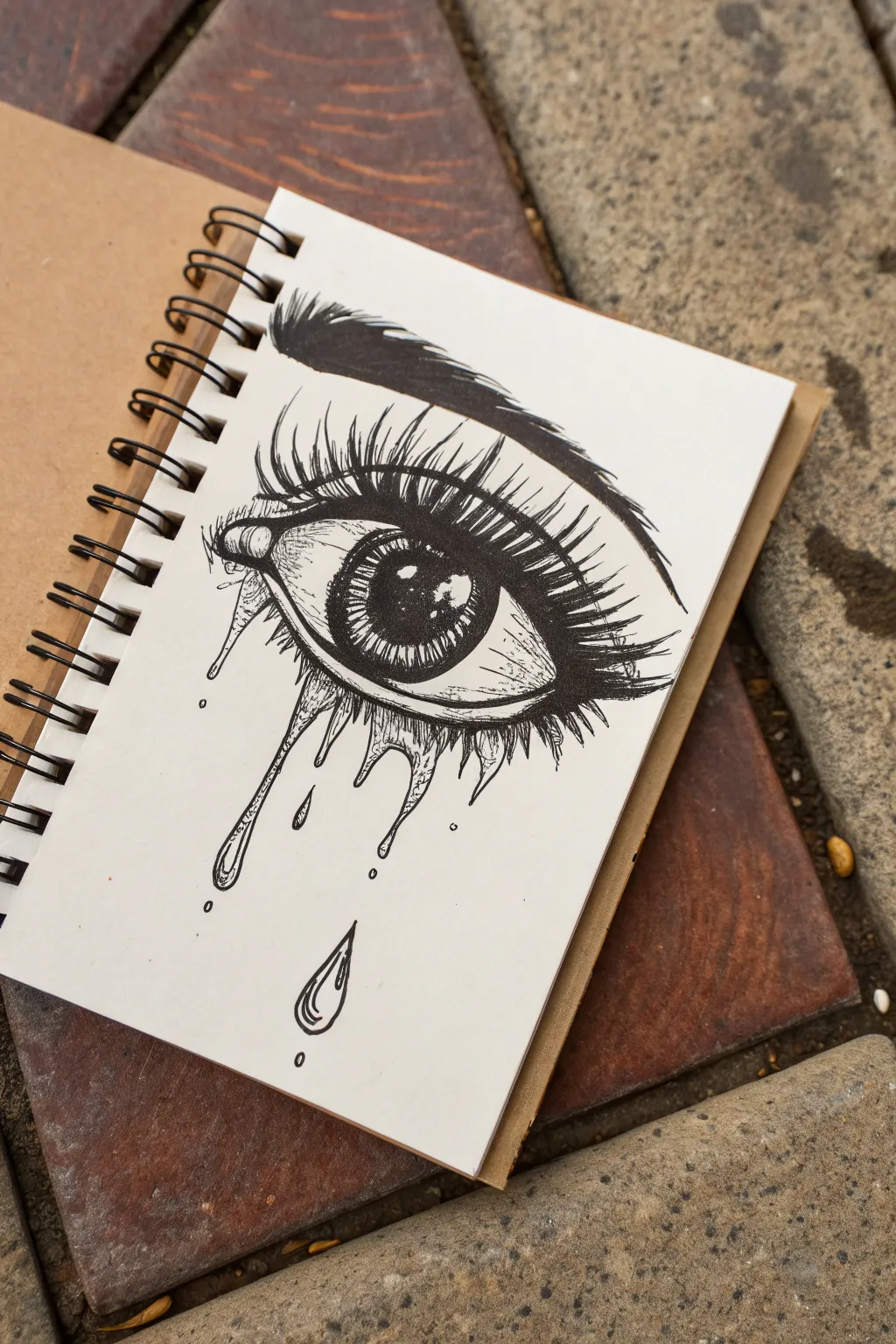
Capture raw emotion with this striking black ink illustration of a weeping eye. The high-contrast style uses bold lines and dramatic shading to create a moody, edgy aesthetic perfect for your sketchbook.
Detailed Instructions
Materials
- Spiral-bound sketchbook (heavyweight paper recommended)
- HB or 2B pencil for sketching
- Fine liner pen (0.1mm or 0.3mm)
- Thick black marker or brush pen
- Kneaded eraser
Step 1: Laying the Foundation
-
Map the Eye Shape:
Start with your pencil, drawing a light almond shape for the eye. Make the inner corner dip downwards slightly to create the tear duct area. -
Position the Iris:
Draw a large circle within the almond shape. Since the eye is looking straight ahead or slightly up, the top of the circle should be slightly cut off by the upper lid line. -
Add the Pupil and Highlight:
In the center of the iris, draw a smaller circle for the pupil. Immediately mark out a rectangular or oval highlight overlapping the pupil and iris on the upper left side—this ‘glint’ is crucial for bringing the eye to life. -
Sketch the Lid Creases:
Draw a curved line above the eye to represent the eyelid crease. Add a faint line below the lower lashes to suggest the puffiness of the lower lid. -
Draft the Eyebrow:
Sketch the eyebrow shape well above the eye. Aim for a distinct arch that tapers off towards the temple. -
Outline the Tears:
Lightly sketch wavy, drip-like shapes emerging from the lower lash line. Draw a few detached teardrops falling below to add movement.
Step 2: Inking the Details
-
Define the Pupil:
Switch to your thick black marker or brush pen. Fill in the pupil completely solid black, being extremely careful to preserve the white space of the highlight you mapped out earlier. -
Detail the Iris:
Using a fine liner (0.1mm), draw radiating lines from the pupil outward toward the edge of the iris. Pack these lines denser near the pupil and the outer rim to create depth. -
Lash Line Weight:
Thicken the upper lash line significantly with your marker. This mimics the look of heavy eyeliner or mascara and provides a strong anchor for the lashes. -
Draw Upper Lashes:
With the fine liner, flick quick, curved strokes upward from the lash line. Use a ‘J’ motion to make them look natural. Group them slightly so they stick together in clumps. -
Add Lower Lashes:
Draw shorter, sparser lashes on the bottom line. I find it effective to draw these directly over the top of the ‘tear’ outlines to show transparency. -
Fill the Eyebrow:
Use the brush pen or marker to fill in the eyebrow. Instead of a solid block, use directional strokes that follow the hair growth to keep some texture at the edges.
Clean Lines Tip
When flicking the eyelashes, rotate your sketchbook so your hand moves in a natural, comfortable arc. This prevents shaky lines.
Step 3: Shading and Texture
-
Ink the Tears:
Trace your pencil lines for the dripping tears with the fine liner. Add tiny inner contour lines within the drips to make them look liquid and reflective. -
Create Depth in the White:
Use extremely light stippling (dots) or very fine hatching in the corners of the eyeball (the sclera) to make it look spherical rather than flat. -
Shadowing the Skin:
Add small hatching lines under the eyebrow and around the tear duct. This adds dimension to the skin surrounding the eye. -
Floating Particles:
Draw a few tiny circles and stray marks around the falling tears. These ‘dust motes’ or droplets add to the raw, imperfect atmosphere of the piece. -
Final Cleanup:
Wait at least 15 minutes for the ink to fully cure. Gently erase all underlying pencil sketches with your kneaded eraser to leave a crisp black-and-white finish.
Add a Color Pop
Use a single colored watercolor wash (like red or blue) just inside the iris or for the tears to create a dramatic focal point.
Now you have a deeply expressive piece of eye art ready to stare back from your sketchbook page

Grunge Doodle Dump Page
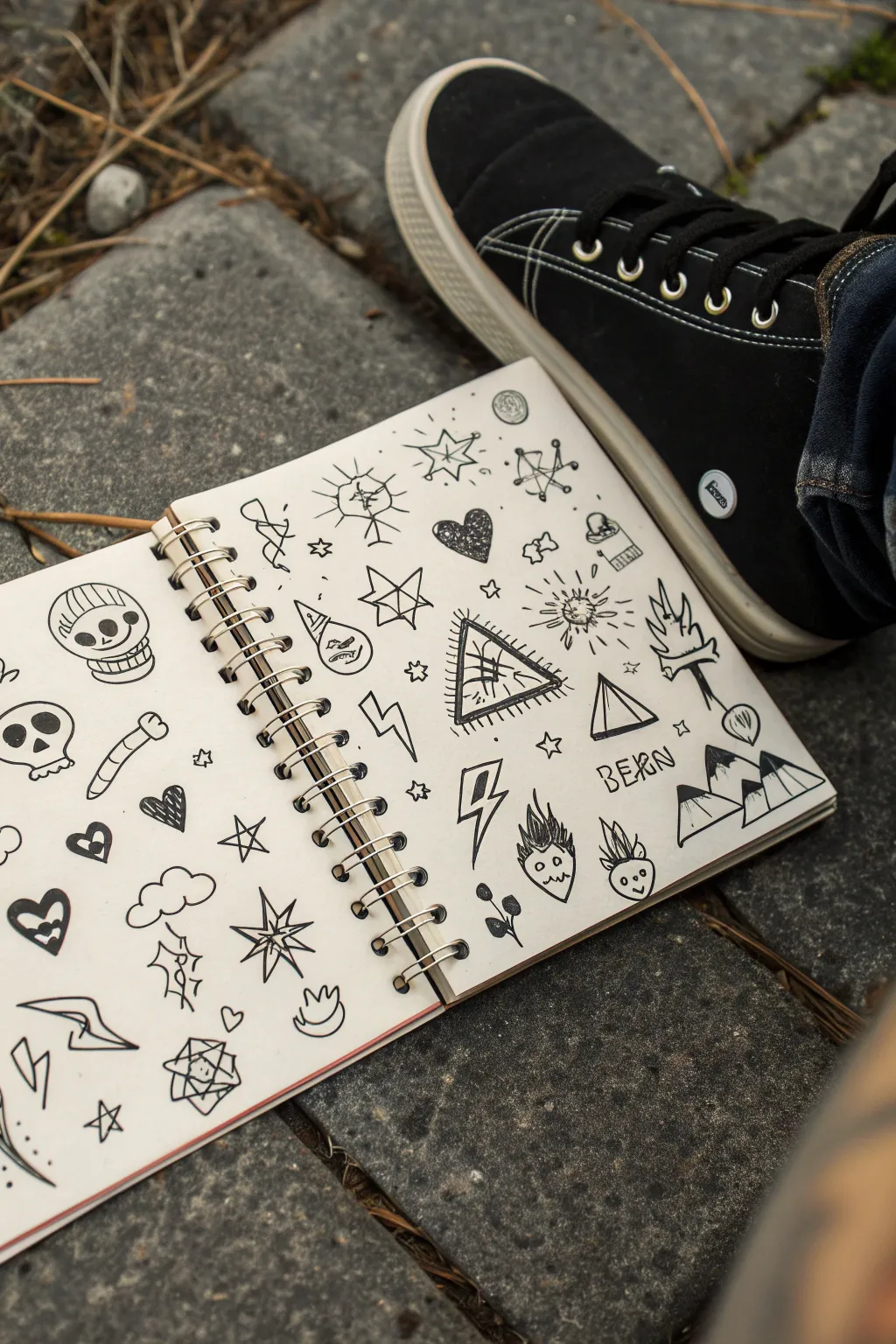
Embrace the chaos of a grunge-inspired doodle dump, where imperfect lines and edgy motifs come together to fill a page with personality. This project is all about letting go of precision and creating a raw, sketchbook aesthetic that looks effortlessly cool.
Step-by-Step
Materials
- Spiral-bound sketchbook (heavyweight paper preferred)
- Black fine liner pen (0.5mm or 0.8mm)
- Black chisel tip marker or brush pen
- Pencil (HB or 2B for sketching)
- Eraser
Step 1: Planning and Layout
-
Assess the space:
Open your sketchbook to a fresh two-page spread. Visualize the page not as a single composition, but as a collection of random stickers or patches. The goal is to scatter elements without them touching, leaving white space to let each doodle breathe. -
Rough sketching:
Using your pencil lightly, sketch out the general placement of your larger elements first. I like to start with the biggest icons—like the skull in the top left or the mountains on the right—to anchor the page. -
Distribute the weight:
Sketch in medium-sized motifs like the pyramid eye, the lightning bolts, and the word ‘BERN’ to balance the visual weight across both pages.
Keep it Loose
Don’t correct mistakes! If a line goes wonky, just go over it again or turn it into a new shape. The messy, overworked lines are central to the grunge style.
Step 2: Drawing the Elements
-
Inking the skull:
Start with the character on the top left. Draw a rounded U-shape for the jaw and a dome for the beanie. Add large circular eyes and a stitched mouth line to give it a rugged, customized look. -
Geometric lines:
Moving to the center right, draw the pyramid with the eye inside. Use your fine liner to create the triangle, then add shaky, radiating lines around the outside to simulate a glowing or vibrating effect. -
Mountain peaks:
On the bottom right page, draw three jagged triangles for the mountains. Use the chisel tip marker or fill in heavily with your pen to create solid black caps on the twin peaks on the right. -
Adding text:
Letter the word ‘BERN’ (or a word of your choice) in a loose, hand-written sans-serif style. Keep the letters slightly uneven to maintain the grunge vibe. -
Space fillers:
Scattered around the main drawings, ink smaller symbols like the lightning bolts and simpler stars. For the lightning, use sharp, jagged zig-zags. -
The scribble heart:
Near the center spine, draw a heart shape. Instead of outlining it perfecty, fill the interior with rapid, dense scribbles until it looks dark and textured.
Sticker Bomb Effect
Draw thick white borders around each doodle using a white gel pen on top of a grey paper background, or color the background black for a digital sticker look.
Step 3: Details, Fillers, and Cleanup
-
Bursting suns:
Add a few sun-like shapes with stick-figure rays. Don’t use a ruler; the hand-drawn wobble adds character. -
Tiny stars:
Find the empty gaps between your larger drawings. Fill these voids with tiny five-point stars, little plus signs, or small circles. -
Character faces:
Draw the small flame-hair characters at the bottom right. Give simple happy or neutral expressions using dots for eyes. -
Geometric accents:
Add the 3D cube or gem shape on the bottom left page. Draw overlapping squares and connect the corners to create depth. -
Heaviness check:
Look over the spread. If an area feels too light, use your thicker marker to bolden the outlines of nearby doodles, like the cloud or the bone. -
Erase guidelines:
Once the ink is completely dry (give it a few minutes to avoid smudging), gently erase all your pencil sketches. -
Final texture:
For a final gritty touch, add some stray dot work or small purposeful scratches and hatching lines inside the shapes, like on the beanie or the mountain slopes.
Now you have a sketchbook spread that perfectly captures that edgy, spontaneous energy

PENCIL GUIDE
Understanding Pencil Grades from H to B
From first sketch to finished drawing — learn pencil grades, line control, and shading techniques.
Explore the Full Guide
Occult Sun and Moon Emblems
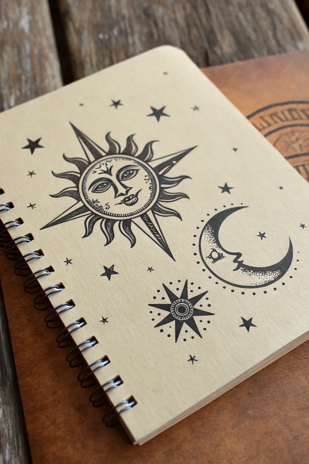
Transform a plain notebook into a mystical grimoire with these bold, stylized celestial emblems. Using high-contrast black ink on tan paper creates a vintage, occult aesthetic perfect for sketching your most enigmatic ideas.
Step-by-Step Guide
Materials
- Spiral-bound notebook with kraft (tan) paper cover
- Pencil (HB or 2H)
- Eraser (kneaded preferred)
- Fine liner pens (sizes 01, 03, and 05 – black)
- Ruler or straight edge
- Compass or circular object (for tracing)
- White gel pen (optional for highlights)
Step 1: Drafting the Layout
-
Map the placements:
Begin by lightly sketching the placement of your three main elements using an HB pencil. Place the large sun in the upper-left quadrant, the crescent moon on the right side, and the compass star near the bottom center. -
Construct the sun’s core:
Use a compass or trace a small lid to draw a perfect circle for the sun’s face. Draw a second, slightly larger ring around it to create the border where the rays will attach. -
Draft the moon:
Sketch a ‘C’ shape for the crescent moon. To get the proportions right, you can lightly draw a full circle first and then carve out the inner curve. Mark a small area on the inner curve for the profile nose and mouth. -
Outline the starbursts:
For the compass star at the bottom and the sun’s major rays, use a ruler to draw light guidelines extending outward. This ensures your points are straight and symmetrical before you commit to ink.
Step 2: Inking the Sun
-
Draw the facial features:
Switch to an 01 fine liner. Carefully ink the sun’s heavy-lidded eyes, the defined nose, and the small, pursed lips. Add the decorative brow lines and cheek details. -
Ink the wavy rays:
Using an 03 pen, outline the wavy, flame-like rays. Keep the lines fluid and organic. These should alternate with the rigid, straight spikes. -
Ink the straight spikes:
Use your ruler and the 03 pen to ink the long, sharp triangular rays. Extend them significantly further than the wavy rays for dramatic effect. -
Add texture and shading:
With the 01 pen, create density by stippling (using small dots) inside the wavy rays and adding hatching lines to one side of the straight spikes. This gives the drawing dimensionality. -
Fill the dark areas:
Use the 05 pen to fill in the dark sections of the eyes and the shadow side of the facial features to make them pop against the tan paper.
Steady Hand Trick
Rest your wrist on a clean sheet of scrap paper while drawing. This prevents hand oils from staining the kraft paper and stops you from smudging fresh ink.
Step 3: Inking the Moon and Stars
-
Define the moon profile:
Ink the outer curve of the crescent with the 03 pen. Carefully draw the profile face on the inner curve, giving it a prominent nose and lips similar to the sun. -
Stipple the moon:
I particularly enjoy this part; create a gradient on the moon by concentrating tiny dots near the outer edge and fading them out as you move toward the face. This creates a rounded, 3D form. -
Create the lower star:
Draw the bottom compass star. Start with the central circle, then draw eight points—four long cardinal points and four shorter intermediate points. Fill the center with concentric rings. -
Dotted halo effect:
Around both the moon and the lower star, add a ring of evenly spaced dots floating just outside the main outlines. This adds a mystic, radiating energy to the emblems. -
Scatter small stars:
Fill the empty negative space with various small stars. Mix solid black five-point stars, open outline stars, and simple cross-stars to keep the background interesting.
Gold Foil Accents
Use a gold paint pen or applying gold leaf to the sun’s rays and the crescent moon’s edge. The metallic shine looks incredible against the matte tan kraft paper.
Step 4: Finishing Touches
-
Erase pencil marks:
Wait at least 10–15 minutes to ensure the ink is completely dry. Gently erase all initial pencil guidelines with a kneaded eraser to avoid damaging the paper surface. -
Deepen contrasts:
Go back over your thickest lines with the 05 pen if they look patchy. The contrast between the bold black ink and the kraft paper is key to this look. -
Optional highlights:
If you have a white gel pen, add tiny dots of reflection in the eyes of the sun and moon to bring them to life.
Now your notebook is ready to hold your sketches, spells, or daily musings
Cigarette and Smoke Shapes
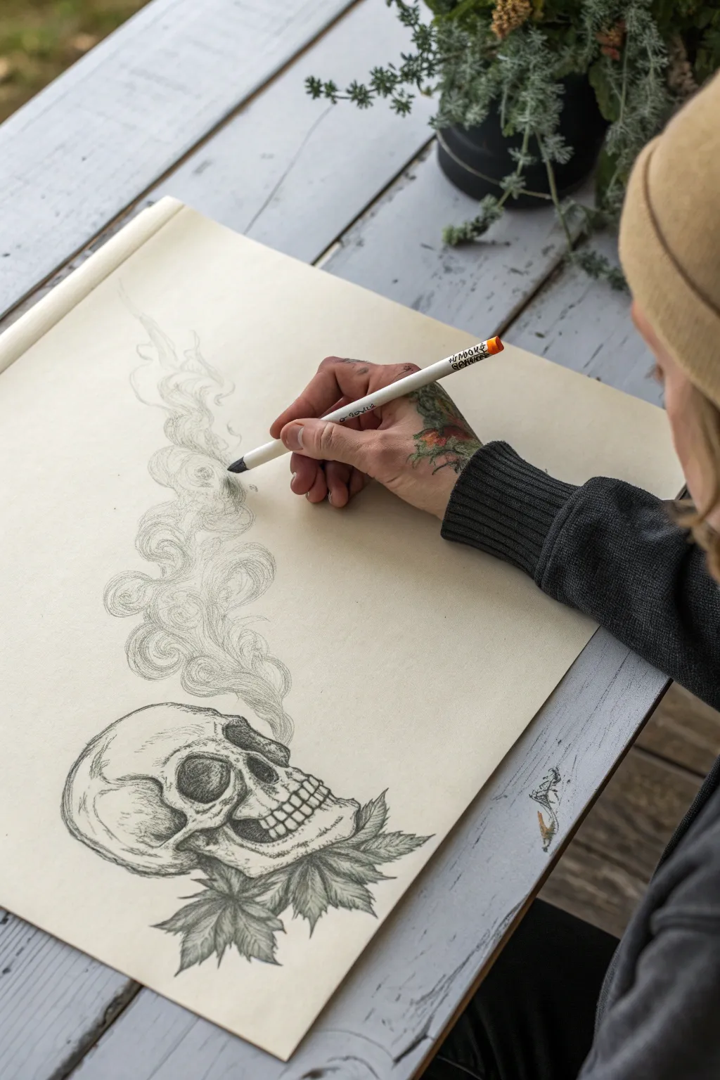
This striking charcoal or graphite sketch combines the macabre elegance of a human skull with the organic flow of rising smoke and foliage. It’s a perfect exercise for practicing texture, shading, and the ethereal quality of vapor against bone.
How-To Guide
Materials
- Smooth bristol or mixed media paper (cream or off-white tone recommended)
- Charcoal pencils (Soft, Medium, and Hard)
- Mechanical pencil (0.5mm HB) for initial sketching
- Kneaded eraser
- Blending stump or tortillon
- White gel pen or chalk pencil (optional for highlights)
- Fixative spray
Step 1: Laying the Foundation
-
Establish the skull shape:
Start with your mechanical pencil, using very light pressure. Draw a rough circle for the cranium and a boxy shape extending downwards and forwards for the jaw. This forms the basic profile view. -
Map the facial features:
Lightly sketch the eye socket (orbit) as a darkened, D-shaped hollow. Add the nasal cavity (piriform aperture) shaped like an inverted heart, and outline the zig-zag pattern of the teeth. -
Position the foliage:
At the base of the skull, sketch the rough outlines of three to four jagged leaves. Let them fan out beneath the jawbone to ground the composition. -
Draft the smoke trail:
Draw loose, S-shaped curves rising from the top and back of the skull. Keep these lines incredibly faint, just to mark the direction of the flow.
Smoke Technique Tip
Don’t press hard when drawing smoke. Use the pencil’s weight and circular motions. Smudge immediately with a stump or finger to keep edges soft and dreamy.
Step 2: Defining Bone and Leaf
-
Outline the skull:
Switch to a medium charcoal pencil. Go over your initial lines with more confidence, adding the cracks and sutures typical of a skull, particularly around the temple and cranium. -
Deepen the shadows:
Use a soft charcoal pencil to fill in the eye socket and nasal cavity. Press firmly to get a rich black, creating depth that makes these areas recede. -
Detail the teeth:
Carefully define individual teeth. Remember they aren’t perfect rectangles; round the edges and add tiny roots where they meet the bone. -
Shade the bone structure:
Using a hard charcoal pencil or light pressure with the medium, add shading to the cheekbone (zygomatic arch) and the curve of the cranium. I like to use hatch marks here to simulate texture. -
Flesh out the leaves:
Define the serrated edges of the leaves below. Add a central vein to each leaf and use hatching to show the texture radiating from the center.
Step 3: The Ethereal Smoke
-
Build the smoke structure:
Using the side of your charcoal pencil, start creating the ‘billows’ of smoke. Instead of hard outlines, think of cloud shapes overlapping each other. -
Soft shading:
Fill the interior of the smoke shapes with light, circular scumbling motions. The smoke should be darker near the source and get lighter as it rises. -
Creating volume:
Use a blending stump to smudge the charcoal within the smoke shapes. This mimics the soft, diffused nature of vapor. -
Adding swirls:
Take your sharpest pencil and draw delicate, curvilinear lines weaving through the blended areas. These distinct lines define the movement and edges of the smoke wisps. -
Fade out the top:
As the smoke reaches the top of the page, let the lines become broken and faint. It should feel like it’s dissipating into the air rather than hitting a wall.
Too Much Smudging?
If your drawing gets muddy, shape your kneaded eraser into a fine point. dab (don’t rub) the paper to lift graphite and restore crisp white highlights.
Step 4: Final Touches
-
Refine contrast:
Look at the whole piece. If the skull looks too flat, darken the area right behind the jaw and under the cheekbone to make the form pop. -
Clean up highlights:
Use your kneaded eraser to lift pigment off the highest points of the skull (the forehead and brow ridge) and the tops of the smoke billows. -
Seal the work:
Because charcoal smudges easily, lightly mist the drawing with a fixative spray in a well-ventilated area once you are completely finished.
This edgy piece manages to be both gritty and graceful, making it a standout addition to your sketchbook
BRUSH GUIDE
The Right Brush for Every Stroke
From clean lines to bold texture — master brush choice, stroke control, and essential techniques.
Explore the Full Guide
Spiderweb Corner Sketch
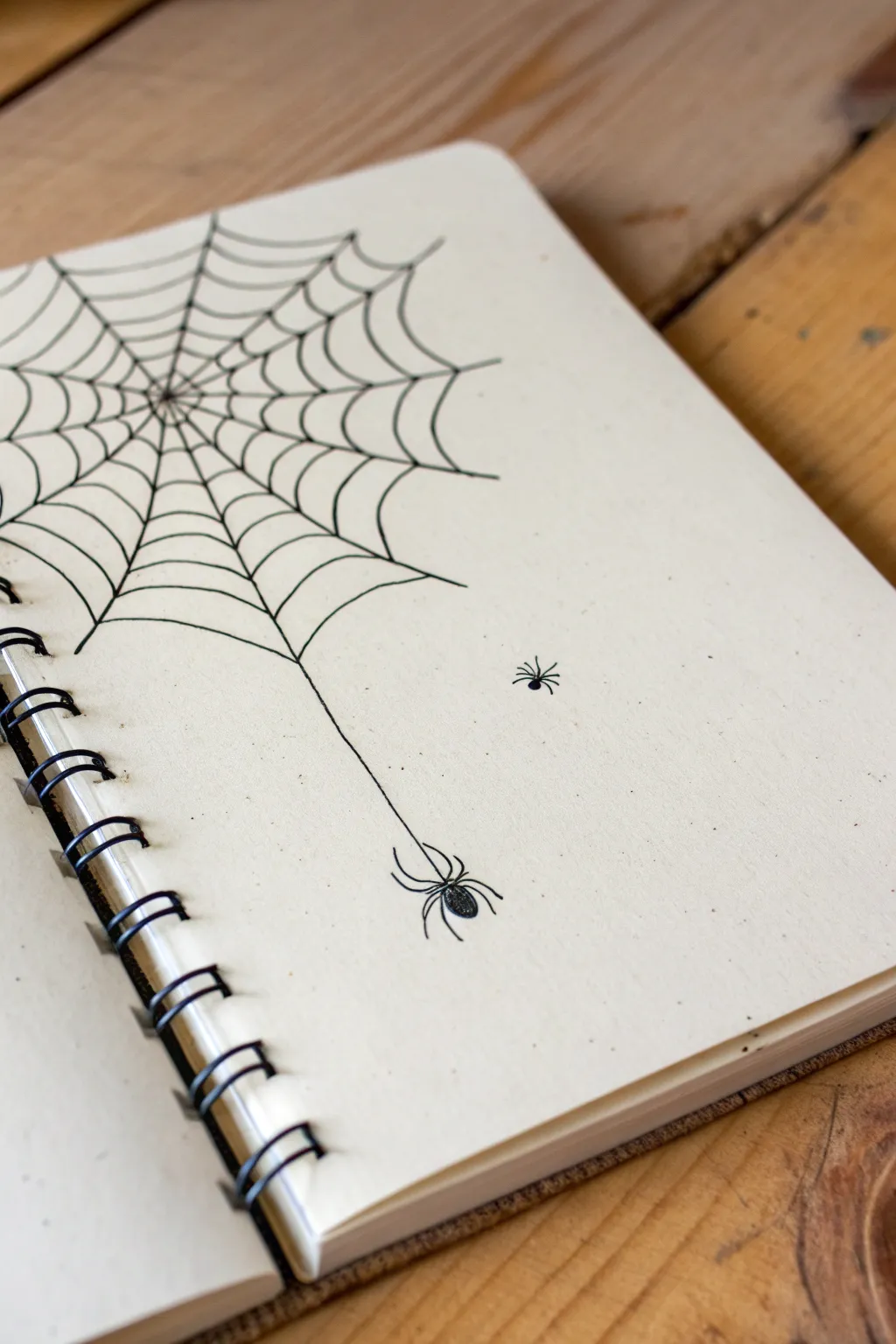
This minimalist ink drawing transforms the empty corner of a sketchbook page into a spooky yet charming scene. It features a classic radial spiderweb anchoring the composition, with delicate lines trailing down to suspend a solitary spider, accompanied by a tiny friend nearby.
Detailed Instructions
Materials
- Spiral-bound sketchbook (cream or white paper)
- Fine-liner pen (0.3mm or 0.5mm, black)
- Ultra-fine pen (0.05mm or 0.1mm, black for details)
- Pencil (HB or H)
- Eraser
Step 1: Drafting the Web Structure
-
Mark the center point:
Start by identifying a focal point in the upper-left area of your page. This doesn’t need to be the extreme corner; place a tiny dot about two inches down and two inches in from the spiral binding to serve as the hub of your web. -
Draw the radial lines:
Using your pencil, lightly sketch straight lines radiating outward from your center dot. Aim for about 10-12 lines total. Some should go off the top edge, some off the left edge (towards the spiral), and the longest ones should extend downward and to the right. -
Create the spiral curves:
Starting near the center, sketch small concave curves connecting the radial lines. Think of them as tiny U-shapes or scallops that bridge the gap between each spoke. -
Expand the web network:
Continue adding rows of these scalloped lines, moving further out from the center. As you get further away, make the scallops slightly wider and the distance between rows larger to mimic natural tension. -
Extend the main anchor:
Choose one of the radial lines pointing downward—specifically one near the middle-right of the web—and extend it significantly further down the page. This will become the silk thread holding the main spider.
Loose Loops
Don’t try to make the web symmetrical. Varying the spacing between the ‘scallops’ makes the web look old and abandoned rather than freshly spun.
Step 2: Inking the Design
-
Trace the radial spokes:
Switch to your 0.3mm or 0.5mm pen. Carefully trace over your pencil lines for the main spokes of the web. I like to let the pen linger just a fraction of a second at the start of each line to create a solid anchor point. -
Ink the webbing:
Go over the scalloped horizontal lines. Try to keep your hand relaxed; a slightly shaky line actually adds realism to a spiderweb, making it look organic rather than technically perfect. -
Draw the hanging thread:
Trace the long, single line dropping down from the web. Keep this line remarkably straight to show the weight of the spider pulling it taut. -
Erase the pencil marks:
Wait at least five minutes for the ink to dry completely to avoid smudging. Then, gently erase all the underlying pencil sketches.
Pop of Red
Add a tiny red hourglass shape to the back of the hanging spider to turn it into a Black Widow, or add small dots of dew on the web with a white gel pen.
Step 3: Adding the Spiders
-
Draw the main spider’s body:
At the very end of your long drooping line, draw a small oval for the spider’s abdomen. Fill it in solidly with black ink, leaving a tiny sliver of white if you want a highlight. -
Add the head:
Attach a much smaller semi-circle to the bottom of the oval to form the spider’s head/thorax section. -
Create the legs:
Using your ultra-fine pen, draw eight legs coming from the center section. Since this spider is hanging, curve the legs upward and inward, looking like bent hooks grappling the air. -
Position the tiny spider:
Choose a spot in the empty space to the right of the main thread. Draw a very small dot or tiny oval here for the second spider. -
Detail the small spider:
Give this tiny spider extremely short, delicate legs radiating outward. Since it isn’t hanging on a thread, its stance should look like it’s crawling on the paper surface. -
Final touches:
Check your line weights. If the main anchor lines of the web look too thin compared to the spider, go over them once more to thicken them slightly.
Now you have a delicately spooky corner piece that brings a bit of wildlife to your notebook pages
Split-Face Skull Reveal
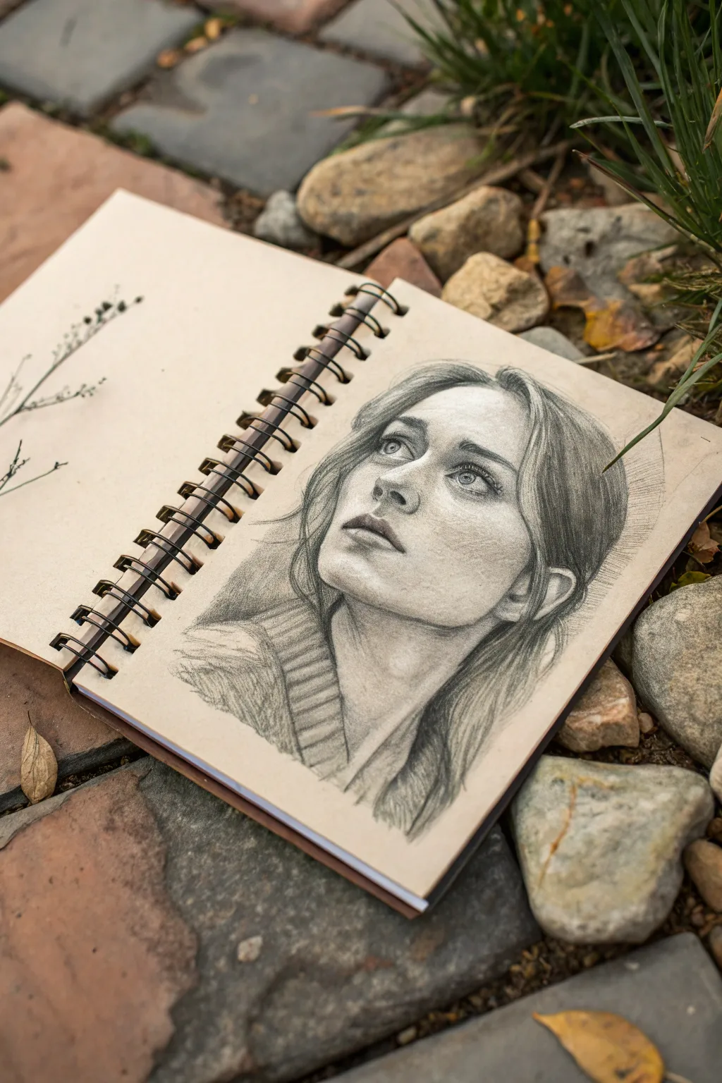
Capture a moment of quiet contemplation with this realistic graphite portrait. Using a toned sketchbook adds immediate warmth and depth, allowing your highlights to pop and your shadows to feel rich and atmospheric.
Step-by-Step Guide
Materials
- Toned tan or grey sketchbook paper
- Set of graphite pencils (HB, 2B, 4B, 6B)
- White charcoal pencil or white pastel pencil
- Kneaded eraser
- Blending stump (tortillon)
- Mechanical pencil (optional for details)
- Workable fixative spray
Step 1: Laying the Foundation
-
Rough placement:
Begin with an HB pencil, using very light, loose strokes to map out the general shape of the head. Since the subject is looking up, envision the head as a tilted oval. -
The guideline cross:
Draw a curved vertical line down the center of the face to mark the angle of the nose and chin. Add a horizontal curved line for the eye level, placing it slightly higher than halfway to account for the upward tilt. -
Feature mapping:
Mark the position of the eyes on your horizontal line. Indicate the bottom of the nose and the center line of the mouth. Remember, because of the perspective, the distance between the nose and mouth will appear slightly foreshortened.
Toned Paper Magic
Let the tan paper act as your mid-tone skin value. Only draw the shadows (graphite) and the brightest highlights (white), leaving the bare paper for the rest.
Step 2: Defining the Features
-
Eyes and Gaze:
Switch to a 2B pencil to refine the eye shapes. The irises should be positioned upward, leaving white space below the iris to emphasize the upward gaze. Keep the outlines soft. -
Nose structure:
Define the nostrils and the tip of the nose. Focus less on outlining the bridge and more on suggesting it through subtle shading later. The nostrils will be visible teardrop shapes from this angle. -
Lips and jaw:
Sketch the lips, noting that the upper lip usually casts a shadow on the lower one. Draw the jawline, ensuring it connects smoothly to the ear, which sits lower on the head due to the tilt.
Step 3: Shading and Depth
-
Initial toning:
Using the side of a 2B pencil, lightly shade the recessed areas: under the brow bone, the side of the nose, under the chin, and the hollows of the neck. -
Deepening shadows:
Switch to a 4B pencil for darker values. Focus on the pupils, the lash line, and the corners of the mouth. I like to build these darks gradually rather than pressing hard all at once. -
Soft blending:
Use a blending stump to gently smudge your graphite, smoothing out the transition between light and shadow on the skin. Keep the texture of the paper visible; don’t over-smooth. -
Sweater texture:
Sketch the collar of the sweater with loose, directional strokes. Use the 4B pencil to create the ribbed texture of the knit fabric, keeping the lines slightly uneven for realism.
Smudged Drawing?
Place a clean sheet of scrap paper under your drawing hand. This acts as a bridge, preventing oils from your skin and friction from smearing your graphite work.
Step 4: Hair and Highlights
-
Hair volume:
Map out the main masses of hair with long, sweeping strokes. Don’t draw every strand; focus on how the hair clumps together and flows around the face. -
Darker strands:
Use a 6B pencil to add deep contrast in the hair, particularly where it tucks behind the ear and near the neck. Leave areas of the toned paper showing through for the mid-tones. -
Adding highlights:
Take your white charcoal pencil and add pop to the lightest areas: the whites of the eyes, the tip of the nose, the center of the lower lip, and the top of the cheekbones. -
Hair highlights:
Add a few stray hairs catching the light with the white pencil. Use quick, confident flicks of the wrist to make them look natural and flyaway. -
Final adjustments:
Step back and check your contrast. If the drawing feels flat, darken the deepest shadows (nostrils, pupils, neck shadow) with the 6B to make the highlights sing.
Finish by lightly spraying your sketch with fixative to preserve those delicate pencil strokes for years to come


Stitched Mouth Sketch
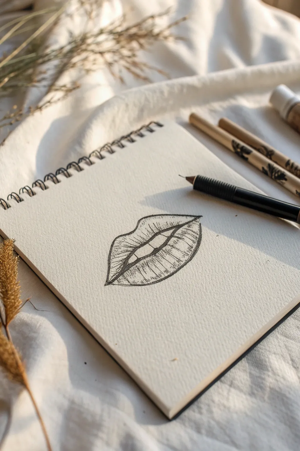
This striking charcoal or graphite sketch captures the edgy aesthetic of lips marked by vertical lines, creating a cracked or stitched effect. The high contrast between the precise outline and the textured shading brings a moody, realistic depth to your sketchbook page.
Step-by-Step
Materials
- Spiral-bound sketchbook with textured paper
- Mechanical pencil (0.5mm or 0.7mm HB lead)
- Fine-point black pen (0.1mm or 0.3mm)
- Blending stump or cotton swab
- Kneaded eraser
Step 1: Outlining the Form
-
Establish the center line:
Begin by lightly sketching the horizontal line where the upper and lower lips meet. Give it a gentle ‘M’ shape in the center (the Cupid’s bow dip) and let it curve slightly downward at the corners. -
Define the Cupid’s bow:
Sketch the top edge of the upper lip. Create two distinct peaks for the Cupid’s bow, ensuring they dip down to meet the corners of your center line. -
Draw the bottom curve:
Map out the lower lip with a full, rounded curve that connects to the same corners. Keep the line weight light at this stage so you can adjust the symmetry. -
Create the inner opening:
Instead of a single line for the mouth opening, draw a slightly open shape. It should look like two flattened hills on the bottom and a gentle dip on top, showing just a hint of space between the lips.
Step 2: Adding Texture and Detail
-
Thicken the outline:
Go over your initial perimeter lines with slightly more pressure to darken the main shape of the lips, defining the silhouette clearly. -
Start vertical texturing:
Begin drawing vertical lines on the upper lip. These should curve with the contour of the lip—curving left on the left side and right on the right side. -
Vary line length:
Don’t make every vertical line the same length. I find it looks more organic if some lines start from the outer edge and stop, while others extend fully across the lip surface. -
Apply lower lip texture:
Repeat the vertical line process on the lower lip. These lines should curve downward slightly to emphasize the fullness and roundness of the bottom lip. -
Intensify the stitching effect:
Go back over specific vertical lines to make them darker and thicker than the others. These serve as the deep cracks or ‘stitches’ that give the drawing its edgy character.
Uneven Texture?
If the lips look too flat, your lines might be too straight. Curve your hatch marks like parentheses ( ) to follow the rounded form of the lip surface.
Step 3: Shading and Refining
-
Shade the corners:
Add shading to the outer corners of the mouth by clustering your vertical lines closer together. This creates depth and makes the lips look three-dimensional. -
Darken the opening:
Fill in the small gap between the upper and lower lip completely with your darkest value (or black pen) to create strong contrast. -
Add cross-hatching:
Lightly cross-hatch (draw diagonal lines) over the shadowed areas, focusing on the bottom of the upper lip and the very bottom edge of the lower lip. -
Refine the edges:
Using your fine-point pen or sharp pencil, restate the jagged nature of the vertical lines. Let them break the smooth outline of the lips occasionally for a rougher texture. -
Create highlights:
Leave the center areas of the lower lip relatively free of heavy lines. You can use a kneaded eraser to lift up graphite here, creating a highlight that suggests moisture or volume. -
Final contrast check:
Step back and look at your drawing. Darken the main division line one last time to ensure it anchors the entire composition.
Level Up: Ink Wash
Dilute a drop of black ink with water and brush it lightly over the shadowed corners. This creates a ghostly, fluid look beneath the harsh lines.
With these finishing touches, your drawing now has a wonderfully gritty and expressive look perfect for an edgy art collection
Neon Alley Silhouette Scene
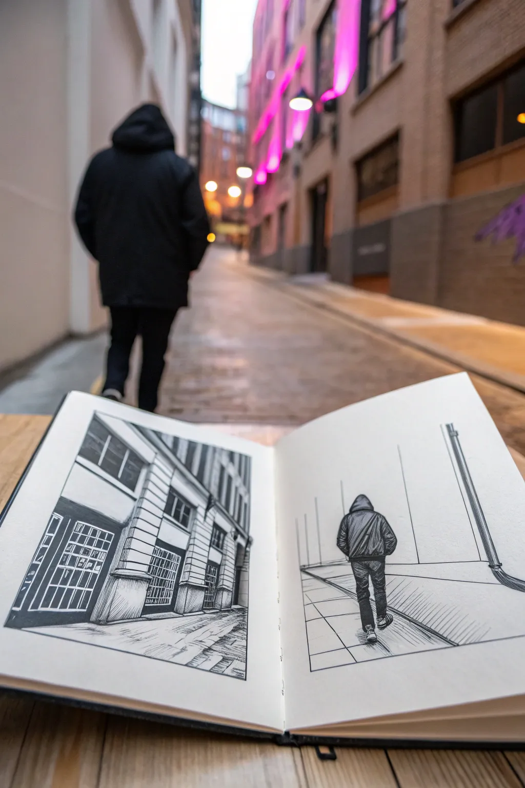
Capture the moody atmosphere of a city alleyway with this stark, black-and-white double-page spread. By juxtaposing architectural details on one side with a lonely figure on the other, you’ll create a narrative that feels both intimate and expansive.
Step-by-Step
Materials
- A5 or A4 sketchbook (smooth or mixed media paper)
- HB pencil for sketching
- Fine liner pens (sizes 0.1, 0.3, and 0.5)
- Black brush pen or broad marker
- Ruler
- Eraser
Step 1: Setting the Scene: Architecture (Left Page)
-
Create the structural grid:
Begin on the left page by lightly sketching the corner of a building using your HB pencil. Position the corner slightly off-center to the left. Allow the perspective lines to fan out dramatically towards the top and right, creating a sense of height. -
Block in windows and details:
Draw the main rectangular shapes for the windows and storefronts. Keep your pencil lines loose but use your ruler to ensure the vertical lines remain parallel to the page edge, which anchors the drawing. -
Ink the main outlines:
Switch to a 0.5 fine liner to ink the major structural lines of the building—the corner edge, the roofline, and the ground line. Use confident, single strokes rather than feathery lines. -
Detail the brickwork:
With a 0.1 fine liner, add texture to the building’s facade. Draw horizontal lines to suggest stone cladding or brickwork, but don’t fill every inch; leave some white space to suggest light hitting the surface. -
Fill the dark window panes:
Use your 0.3 pen to draw the grid patterns inside the windows. Then, take a brush pen or broad marker to fill in the dark glass areas, leaving small white highlights to represent reflections. -
Ground the structure:
Sketch the pavement details at the bottom using rapid, horizontal hatching strokes with the 0.1 pen to simulate the texture of stone or concrete.
Clean Lines Tip
When drawing long architectural lines, lock your wrist and move your whole arm from the elbow. This keeps lines straighter and more confident than moving just your fingers.
Step 2: The Walking Figure (Right Page)
-
Outline the environment:
On the right page, draw a very simplified perspective grid. You only need a horizon line about a third of the way up the page, and two converging diagonal lines to represent the alley walls. -
Position the figure:
Lightly sketch the silhouette of a person walking away from the viewer in the center of the path. Focus on the shape of the hooded jacket and slim trousers. -
Inking the figure’s contour:
Use the 0.5 fine liner to trace the outer edge of the figure. Make the lines slightly jagged or wrinkled around the elbows and knees to suggest heavy fabric like a winter coat or jeans. -
Add fabric folds:
With the 0.1 pen, add vertical hatched lines down the back of the jacket and across the legs. These lines indicate shading and the texture of the clothing. -
Suggest movement:
Draw the shoes with one heel slightly lifted to imply a walking motion. Keep the shoe details minimal; distinct shapes are more important than laces here. -
Draw the alley floor:
Use a ruler and the 0.1 pen to draw clean, diagonal grid lines on the ground. These should emanate from the central vanishing point, guiding the eye toward where the figure is walking. -
Include vertical elements:
Add a vertical pipe or pole on the far right edge using the 0.3 pen. Add shading to one side of it to give it cylindrical volume. -
Connect the pages:
Ensure the ground lines on the right page roughly align with the perspective established on the left page interaction, even if they aren’t perfectly continuous. -
Final cleanup:
Once the ink is completely dry—I usually wait at least five minutes to be safe—erase all visible pencil guidelines to leave a crisp, high-contrast finish.
Add Atmosphere
Use a grey alcohol marker to add subtle shadows under the figure’s feet and in the deep corners of the building windows. This adds immediate depth without clutter.
Close your sketchbook on this moody urban scene and feel proud of the story you’ve captured in ink
Glitchy Double-Exposure Head
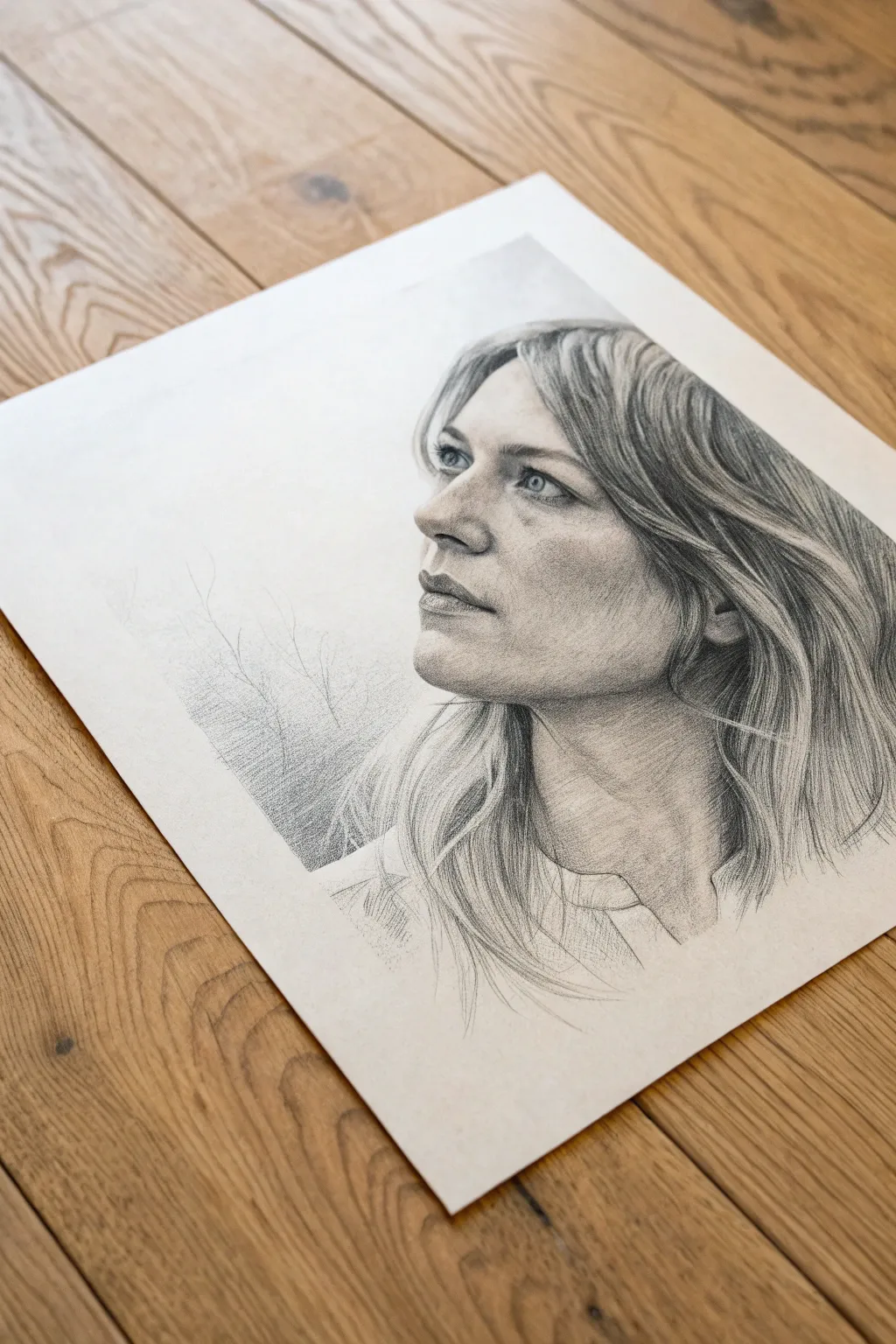
Capture the subtle emotion of a gaze with this detailed graphite portrait study. You’ll work on building soft skin textures and flowing hair while mastering the delicate balance of light and shadow on facial features.
Step-by-Step Guide
Materials
- High-quality drawing paper (smooth or vellum finish)
- Graphite pencils (HB, 2B, 4B, 6B)
- Mechanical pencil (0.5mm, HB)
- Kneaded eraser
- Precision eraser (stick or mono zero)
- Blending stumps or tortillons
- Soft tissue or chamois cloth
- Workable fixative
Step 1: Planning and Structure
-
Establish the Head Angle:
Start with a light HB pencil to sketch the basic oval of the head carefully. Since the subject is looking up and away, angle the axis line slightly diagonal to guide placement. -
Map Facial Features:
Lightly mark horizontal guidelines for the eyes, nose base, and mouth. The three-quarter view means the far eye will be partially obscured by the bridge of the nose. -
Outline the Hair Shape:
Block in the general volume of the hair without drawing individual strands yet. Visualise the hair as large shapes draping around the skull. -
Define the Features:
Refine the outlines of the eyes, nose, and lips. Pay close attention to the shape of the nostril and the curve of the upper eyelid to capture the upward gaze correctly.
Step 2: Shading the Face
-
Initial Tone Laydown:
Using the side of a 2B pencil, lightly shade the shadow areas of the face—specifically under the jawbone, the eye socket, and the side of the nose. -
Blend for Base Skin Tone:
Wrap a tissue around your finger or use a blending stump to smooth these graphite marks into a soft, consistent grey tone. This removes the graininess of the paper. -
Detailing the Eyes:
Switch to a sharp 4B pencil to darken the pupils and the upper lash line. Leave a tiny speck of white paper for the highlight in the iris to make the eyes look alive. -
Modeling the Nose:
Build up the shading on the side of the nose bridge. Avoid hard lines; let the shadow define the edge of the nose rather than a drawn contour. -
Sculpting the Lips:
Shade the upper lip darker than the bottom lip. Use vertical, curved strokes to mimic the texture of the lips, and darken the corners of the mouth for depth. -
Refining Jaw and Neck:
Deepen the shadow under the chin with a 4B or 6B pencil to push the neck back. Sketch the tendons of the neck lightly to suggest tension and posture.
Smudge Alert
Place a scrap piece of paper under your drawing hand. This prevents skin oils from transferring and stops your hand from smearing your hard work.
Step 3: Rendering Hair and Background
-
Establishing Hair Flow:
With an HB pencil, draw long, flowing strokes following the direction of hair growth. Start from the roots (near the part) and sweep outwards. -
Adding Depth to Hair:
Identify the darkest areas where hair clumps together or sits behind the ear. Use a 6B pencil here to create deep contrast against the highlights. -
Lifting Highlights:
I like to take a kneaded eraser formed into a wedge and lift out graphite along the curves of the hair. This creates the shine where the light hits the strands. -
Creating Fine Strands:
Use a mechanical pencil to draw rogue, flyaway hairs around the perimeter. These messy details make the portrait look realistic rather than plastic. -
Adding Atmospheric Background:
Lightly sketch faint, branch-like structures or abstract shapes in the negative space to the left. keep this very subtle so it doesn’t distract from the face.
Boost the Drama
For a ‘glitchy’ look mentioned in the prompt, try carefully slicing the paper horizontally and slightly shifting sections, or draw duplicate offset outlines.
Step back and admire how a few simple pencil grades can bring a gaze to life
Too Many Eyes Creature
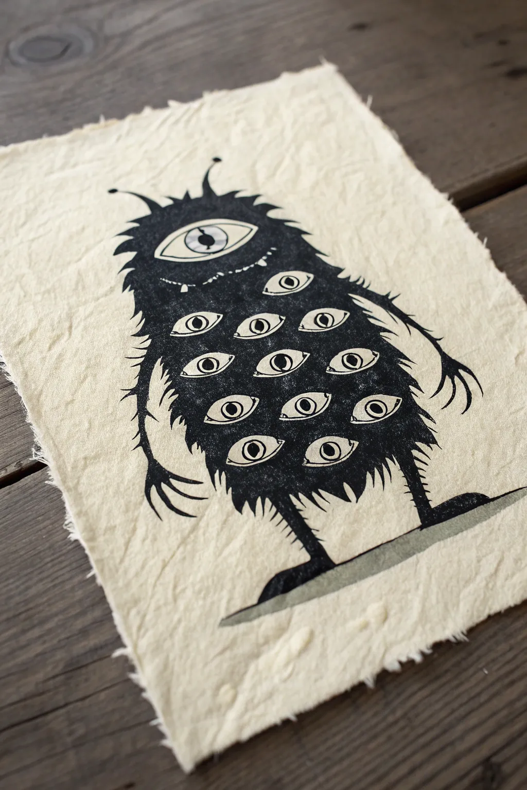
This striking project combines the stark contrast of block printing with a delightfully eerie subject matter. By carving a multi-eyed creature into soft linoleum, you’ll create a textured, reproducible print that looks fantastic on rustic, handmade paper.
Step-by-Step
Materials
- Soft-cut linoleum block (4×6 or 5×7 inches)
- Linoleum carving tools (V-gouge and U-gouge)
- Handmade paper with deckled edges (natural/cream color)
- Black water-soluble block printing ink
- Brayer (rubber roller)
- Inking plate or piece of glass/plexiglass
- Pencil and tracing paper
- Permanent marker or Sharpie
- Baren or a wooden spoon
Step 1: Planning and Transferring
-
Sketch the outline:
Begin by sketching your monster’s body shape on a piece of scrap paper. Aim for a simple, rounded blob or gumdrop shape to serve as the main torso. -
Add the details:
Draw a large, central cyclops eye near the top. Below that, fill the body with rows of smaller, almond-shaped eyes. -
Refine the limbs:
Sketch thin, spindly arms with long fingers hanging at the sides and stick-like legs with flat feet. -
Transfer to block:
Trace your final design onto tracing paper. Flip the tracing paper over (graphite side down) onto your linoleum block and rub the back to transfer the image. Remember, the final print will be a mirror image of your carving. -
Invert the image:
I like to go over the lines on the linoleum with a permanent marker to make them distinct. Color in the areas you want to remain black (the bold sections) so you don’t accidentally carve them away.
Patchy Ink Coverage?
If your print looks ‘salty’ or too speckled, you likely didn’t use enough ink or pressure. Apply a slightly thicker layer of ink, or verify your paper isn’t too heavily textured for the detail.
Step 2: Carving the Matrix
-
Carve the negative space:
Using a wide U-gouge, clear away the large area of linoleum surrounding the monster’s body. Leave a bit of texture if you want a rougher look, but clear enough so the background won’t print solid black. -
Define the fur:
Switch to a fine V-gouge. Carve jagged, outward strokes all around the perimeter of the body to create a spiky, furry texture. -
Carve the eyes:
Carefully carve out the whites of the eyes. Leave the pupil (the center dot) and the outline of the eyelids raised and uncarved. -
Add facial details:
Use your finest tool to carve a small, jagged mouth just below the main eye, perhaps adding a tiny tooth or two. -
Outline the limbs:
Carve closely around the thin arms and legs. Be extremely gentle here, as thin line work can crumble if forced. -
Clean up:
Brush away all linoleum crumbs with a soft brush or old toothbrush to ensure they don’t get stuck in the ink later.
Sharpen Your Fur
For sharper fur spikes, always carve AWAY from the body center toward the empty background. This prevents the tool from slipping into the body and ruining the solid black mass.
Step 3: Inking and Printing
-
Prepare the ink:
Squeeze a small line of black block printing ink onto your inking plate. correspond. -
Charge the brayer:
Roll your brayer back and forth and up and down over the ink until you hear a ‘velcro-like’ hissing sound. The texture on the roller should look like orange peel. -
Ink the block:
Roll the brayer over your carved block. Apply thin, even layers. You want the raised surfaces to be shiny black, but avoid flooding the fine carved lines of the fur. -
Position the paper:
Place your handmade paper carefully on top of the inked block. Once it touches the ink, do not shift or slide it. -
Burnish the print:
Using a baren or the back of a wooden spoon, rub the back of the paper firmly in circular motions. Press specifically over the eye details and the darker body sections to ensure good ink transfer. -
The reveal:
Gently lift one corner of the paper and peel it back slowly to reveal your creature. -
Add a shadow grounding:
Once the main ink is dry, dilute a tiny drop of black ink (or watercolor) with water to make a grey wash. Paint a simple, long horizontal shadow under the creature’s feet to ground it.
Now you have a marvellously moody monster print ready to frame or gift
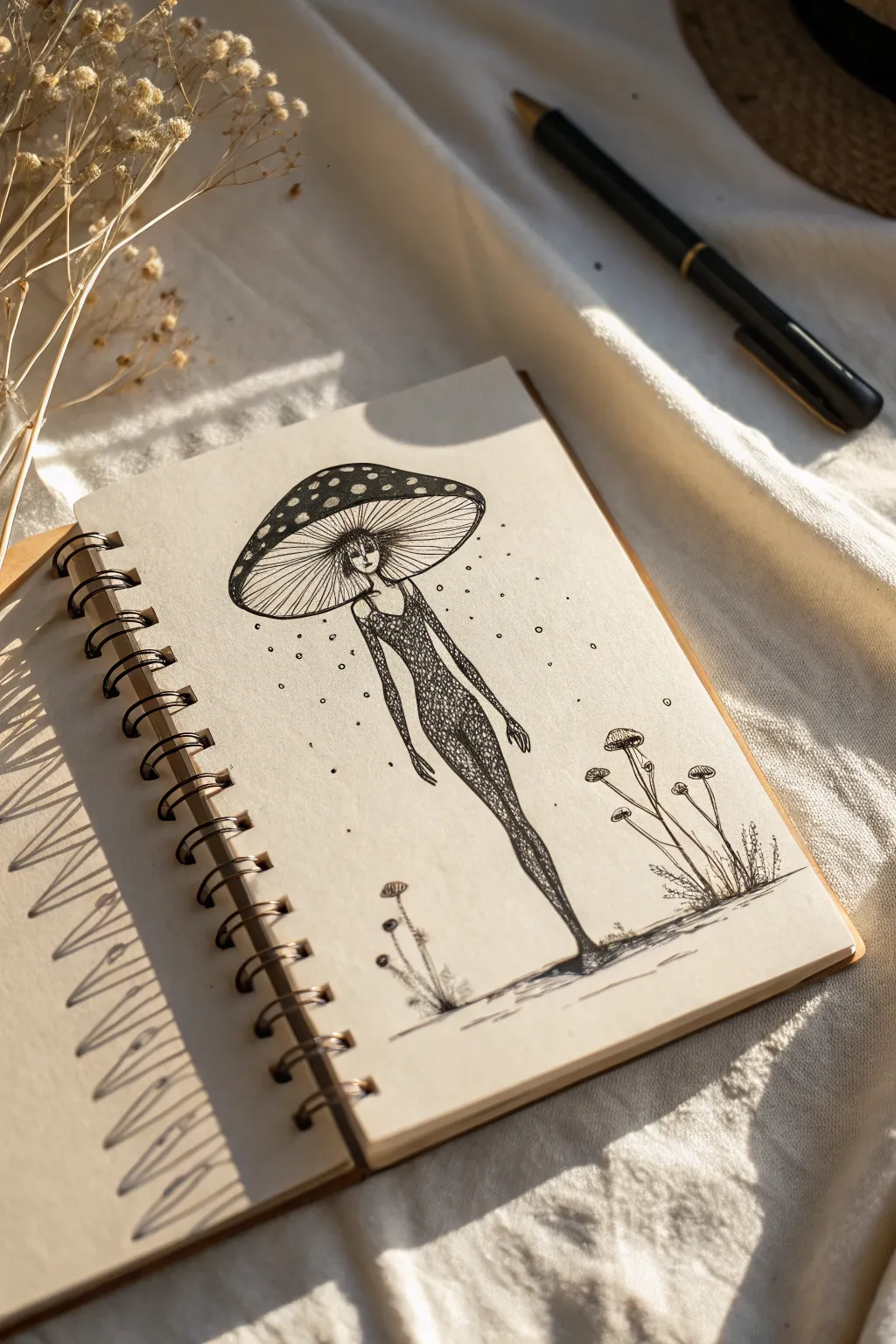
Mushroom-Head Figure

This whimsical yet slightly unsettling drawing features a lithe, elongated figure with a large mushroom cap for a head, rendered in precise black ink. The textured, dotted style gives it an organic, woodland feel perfect for filling a sketchbook page with something magical.
How-To Guide
Materials
- Fine-liner pen (0.1mm or 0.3mm)
- Thicker drawing pen (0.5mm)
- Sketchbook with cream or off-white paper
- Pencil (HB or H)
- Eraser
Step 1: Penciling the Skeleton
-
Mark the center line:
Begin by lightly sketching a faint vertical line down the center of your page with your pencil. This will help you keep the figure’s elongated posture straight and balanced. -
Sketch the mushroom cap:
Near the top of your vertical line, draw a large, flattened oval shape. Curve the top edge more significantly than the bottom to create the domed look of a mushroom cap. Add a smaller, flatter oval directly underneath it to mark where the gills will go. -
Outline the body:
Draw the figure’s body extending downward. Aim for exaggerated proportions: a very slender neck, a long torso, and extremely long legs that taper down to tiny feet. Keep the pose stiff and straight. -
Add face and arms:
Sketch the arms hanging loosely by the figure’s sides, reaching almost to the knees. Under the rim of the cap, pencil in a very small, simple face—just eyes and a nose—peeking out from the shadow of the mushroom.
Ink Smudging?
If your hand drags ink across the page, place a scrap piece of paper under your drawing hand as a guard. Working from left to right (if you’re right-handed) also helps keep the page clean.
Step 2: Inking the Details
-
Outline the cap:
Switch to your 0.5mm pen. Carefully trace the outer silhouette of the mushroom cap. Add small, varying circles on the top surface to create the classic ‘fly agaric’ spots. -
Fill the darks:
Using the same pen, color in the space between the spots on the cap solid black. Leave the spots themselves the color of the paper for contrast. -
Draw the gills:
With a finer 0.1mm pen, draw a series of thin, closely spaced lines radiating from the figure’s head out to the rim of the mushroom. These lines represent the delicate gills underneath. -
Ink the face:
Use the fine pen to carefully define the small face. Add vertical hatching lines over the face to cast it in shadow, making sure the eyes remain visible but mysterious. -
Texture the body:
Instead of a solid outline, build the form of the body using tiny, dense stippling or scribbled texture. I find that using a repetitive ‘loop’ or small chaotic scribble pattern mimics the texture of moss or bark. -
Define the limbs:
Continue this textured scribbling down the arms and legs. Let the ink get denser and darker towards the edges of the limbs to create a sense of roundness and volume.
Step 3: Atmosphere and Ground
-
Ground the figure:
At the very bottom, draw a few horizontal, scratchy lines to represent the earth. Allow the figure’s feet to merge slightly with these lines so it looks connected to the ground. -
Add smaller mushrooms:
To the right and left of the main figure, sketch tiny companion mushrooms. Use simple, thin stems and small caps, drawing them with quick, loose strokes to keep them in the background. -
Create spores:
Using your finest pen, tap tiny dots randomly around the figure’s head and torso. Concentrate them near the mushroom cap and let them disperse as they move outward, simulating falling spores. -
Refine the contrast:
Look over your drawing. If the body looks too light, go back in with your texture pattern and darken the core shadows (the center of the torso and legs). -
Erase pencil marks:
Wait at least five to ten minutes to ensure the ink is completely dry. Gently erase all your underlying pencil guidelines to reveal the crisp, high-contrast ink work.
Uneven Texture
Don’t worry about making the body texture perfect. The beauty of the scribbled style is its randomness. Varying the density creates natural-looking shadows without needing perfect cross-hatching.
Now you have a mysterious woodland character ready to inhabit your sketchbook pages


Have a question or want to share your own experience? I'd love to hear from you in the comments below!