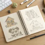
When you’re drawing cancer awareness art, it helps to pair a strong symbol with a message people can understand in two seconds. These cancer drawing ideas are the kinds I’d sketch in my studio for posters, school projects, and support pieces—starting with the classics and ending with some more artsy twists.
Classic Awareness Ribbon Poster
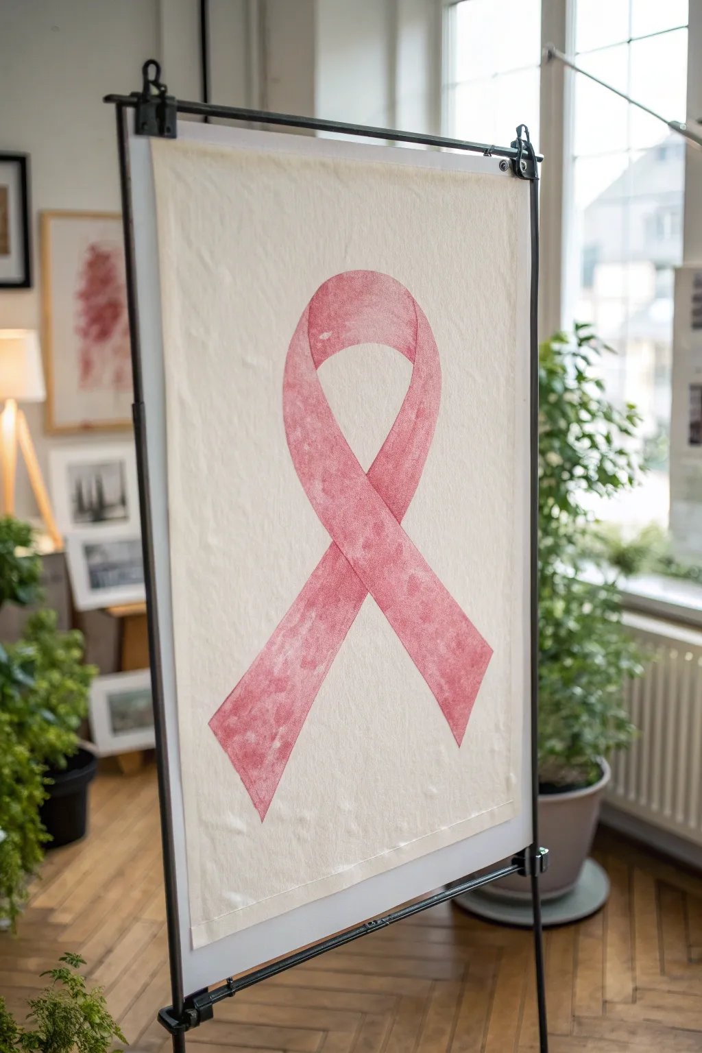
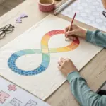
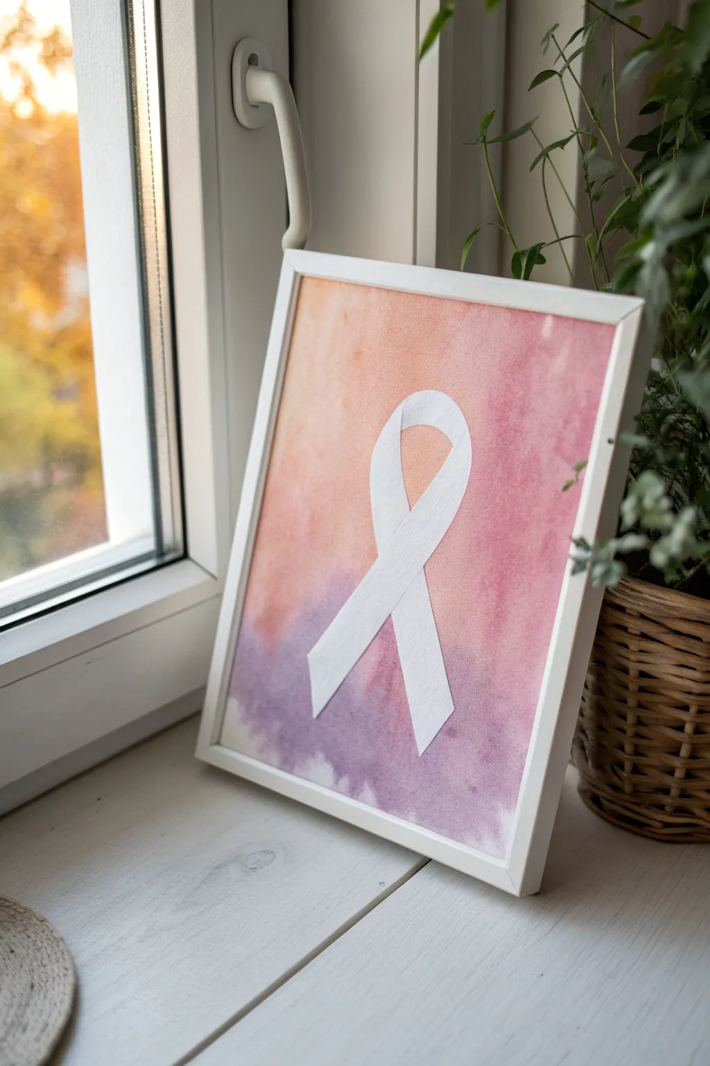
This elegant project creates a large-scale, minimalist awareness ribbon on fabric or textured paper. The soft, mottled pink finish gives it a hand-painted, vintage feel that stands out beautifully as a focal point for any awareness event or personal tribute.
Step-by-Step Tutorial
Materials
- Large sheet of unbleached canvas or heavy watercolor paper (approx. 24×36 inches)
- Red and white acrylic paint
- Textile medium (if using canvas)
- Sea sponge or textured sponge
- Wide flat synthetic brush (2-3 inches)
- Pencil
- Large ruler or yardstick
- Painter’s tape or masking tape (optional)
- Black poster hanging frame or magnetic poster rails
- Scrap paper for sketching
Step 1: Preparation & Sketching
-
Prepare your workspace:
Clear a large flat surface like a dining table or clean floor area. Lay down a protective drop cloth or newspaper, as you will be working with a large piece of material. -
Mix your paint:
In a shallow dish, mix a generous amount of white acrylic paint with a small drop of red to create a soft baby pink. If you are painting on canvas, mix in textile medium according to the bottle’s instructions to keep the paint flexible. -
Create a darker shade:
Separate a small portion of your pink mixture and add a tiny bit more red to it. You want a subtle variation in tone to create that textured, depth-filled look seen in the final piece. -
Sketch the outline:
Lightly sketch the ribbon shape onto your canvas using a pencil. Start with the loop at the top, roughly centered, and then draw the two crossing legs extending downward. Keep your lines very faint so they won’t show through the paint later. -
Refine the curves:
Step back and look at your sketch. The crossover point—where the ribbon overlaps itself—is crucial. Make sure the leg coming from the left goes *over* the leg from the right (or vice versa) clearly. Erase and adjust until the flow looks natural.
Step 2: Painting the Texture
-
Base layer application:
Dip your sea sponge into the lighter pink mixture. Dab off excess paint onto a paper towel; you want a ‘dry sponge’ effect, not a sloppy one. -
Sponge the edges:
Start sponging gently along the pencil outlines first. This helps define the shape without creating a hard, solid line, maintaining the soft aesthetic. -
Fill the center:
Continue sponging the interior of the ribbon shape. Don’t aim for solid opacity; let some of the canvas texture show through. -
Add depth:
While the first layer is still tacky, dip your sponge lightly into the darker pink mixture. Randomly dab this over the ribbon, focusing slightly more on the shadowed area where the ribbon crosses over itself. -
Blend the tones:
Using a clean part of the sponge, gently dab over the areas where dark and light meet to soften the transition. The goal is a mottled, stone-like texture rather than distinct spots. -
Refine the overlap:
I like to use a small brush for this part: carefully paint a thin, slightly darker line right at the intersection where the front piece of ribbon overlaps the back piece. This visual separation is key for the 3D effect.
Don’t Over-Mix
When mixing your two pink tones on the palette, don’t blend them completely. Slight streaks of red or white on your sponge add beautiful organic variation.
Step 3: Finishing Touches
-
Assess the shape:
Stand back again. If any edges look too ragged, use your flat brush with a very small amount of the lighter pink to gently tidy up the perimeter, keeping the edge soft but distinct. -
Let it cure:
Allow the artwork to dry completely flat. If you used thick acrylics, this might take a few hours. Ensure no wet paint remains before moving it. -
Clean up edges:
If there are visible pencil marks outside your painted area, gently erase them now. be careful not to smudge graphite into the canvas weave. -
Prepare the hanger:
Open your poster rails or hanging frame. Place the top edge of your canvas into the clamp or magnetic strip, ensuring it is perfectly centered and level. -
Hang and display:
Secure the bottom rail if your kit includes one, which helps weight the canvas down so it hangs straight. Place on your stand or wall hook to display.
Make It Sparkle
For a subtle, hopeful shimmer, mix a tiny amount of iridescent medium or fine silver glitter into your top coat of paint before sponging it on.
Your beautiful, textured ribbon poster is now ready to inspire hope and serve as a powerful symbol of support

Ribbon Wrapped Around a Heart
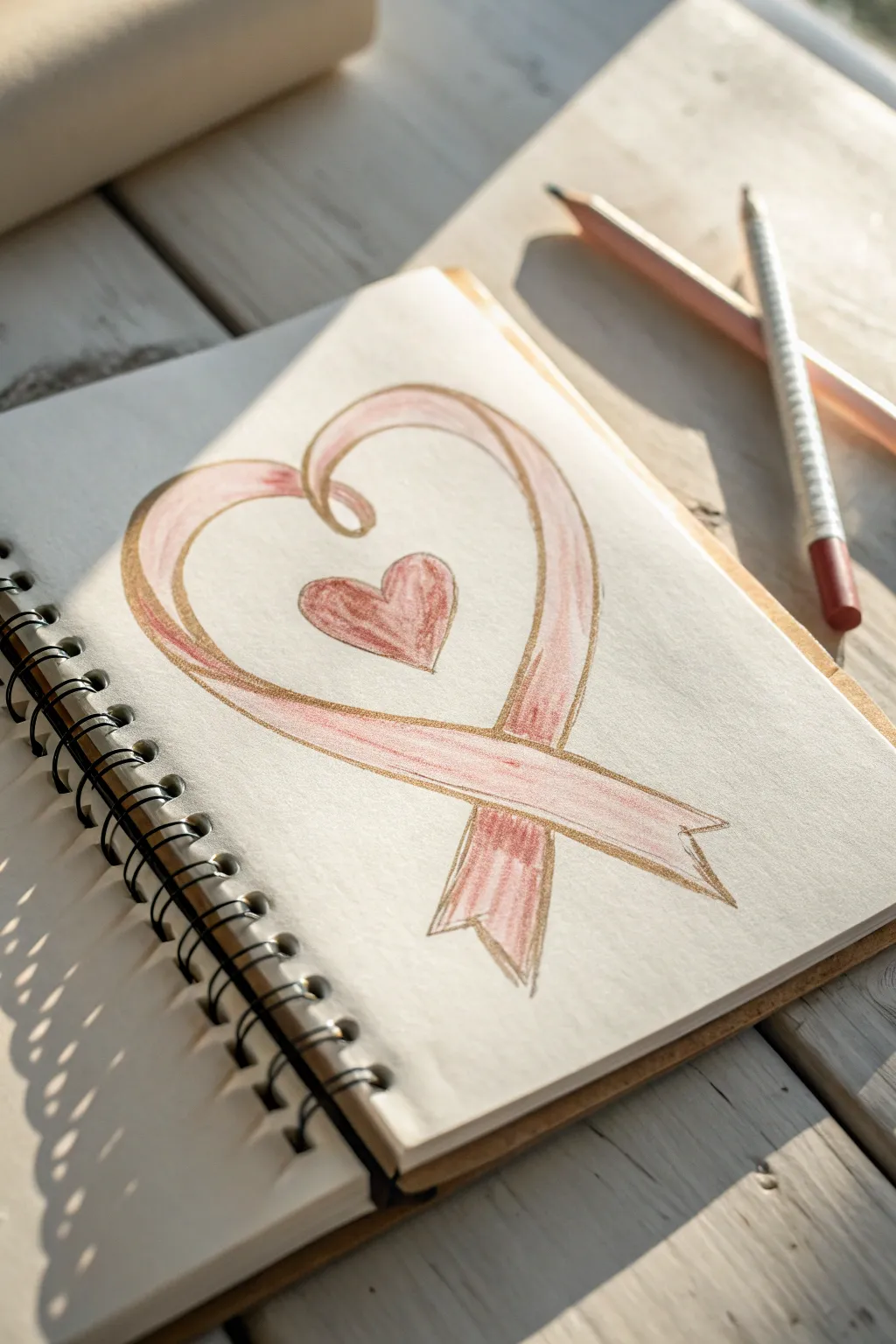
This thoughtful sketch combines the classic awareness ribbon with the symbol of love, creating a unified shape that represents support and compassion. Using soft colored pencils and a light touch, you’ll capture the delicate, folded texture of the ribbon as it forms a protective heart.
Detailed Instructions
Materials
- Spiral-bound sketchbook with off-white or cream paper
- HB graphite pencil for sketching
- Soft pink colored pencil (warm, dusty rose tone)
- Darker pink or red colored pencil for shading
- Gold or bronze colored pencil for outlining
- Quality eraser
- Pencil sharpener
Step 1: Planning the Structure
-
Lay the Foundation:
Start with your HB pencil using extremely light pressure. Draw a large, slightly asymmetrical heart shape in the center of your page to serve as a guide for the ribbon’s path. -
Sketch the Center Heart:
Inside the larger heart guide, float a smaller, classic heart shape. Position it slightly above the center point so it feels nestled within the larger form. -
Define the Ribbon Loop:
Begin transforming the large outer heart into a ribbon. Start at the top left curve; instead of closing the heart, spiral the line inward to create a loop that mimics the top fold of a ribbon. -
Cross the Tails:
Draw the bottom intersecting lines of the ribbon. Bring the left side of the ribbon down and across to the right, and the right side down and across to the left, creating the classic awareness ribbon ‘cross’ at the bottom point. -
Add Thickness:
Go back over your single lines and add a parallel line to create the width of the ribbon. I like to keep the ribbon fairly thick to allow room for shading later. -
Detail the Ends:
Finish the two tail ends of the ribbon with notched ‘V’ cuts to make them look like fabric.
Fixing Symmetry
If one side of the heart feels lopsided, thicken the ribbon line on the narrower side instead of erasing. This balances the visual weight without ruining the paper.
Step 2: Adding Color and Depth
-
Outline in Warmth:
Take your gold or bronze colored pencil. Carefully trace over your final pencil lines, skipping the initial guide marks. -
Preserve the Highlights:
Before coloring, incite visualize where the light hits the ribbon—mainly on the top curves. Keep these areas blank or very lightly colored. -
Base Pink Layer:
Using the soft pink pencil, color the ribbon with long, directional strokes that follow the flow of the fabric. -
Color the Inner Heart:
Fill in the small central heart with the same soft pink, pressing slightly harder to make it a focal point. -
Deepen the Folds:
Switch to your darker pink or red pencil. Add shading where the ribbon twists at the top loop and where the tails cross over each other at the bottom. -
Enhance the Edges:
Run the darker pink pencil along the inner edges of the gold outline to create a sense of dimension and roundness. -
Texture the Tails:
On the bottom tails of the ribbon, add vertical strokes with the darker pink to suggest the grain of the fabric. -
Center Heart Detail:
Add a touch of the darker red to the bottom point and left side of the small center heart to curb flatness.
Make it Shine
Use a white gel pen to add tiny dots or lines on the highest points of the ribbon curves. This mimics glossy satin fabric and makes the drawing pop.
Step 3: Final Touches
-
Clean Up:
Use your eraser to gently remove any graphite guide lines that are still visible outside the gold outline. -
Reinforce the Gold:
Go over the gold outline one last time, pressing firmer now to create a distinct, shimmering barrier for the soft color within. -
Soft Blending:
If the pencil strokes look too harsh, you can gently smudge the pinks together with a clean finger or a paper stump for a smoother look.
Your drawing is now a beautiful symbol of hope ready to be shared

Hands Holding the Ribbon
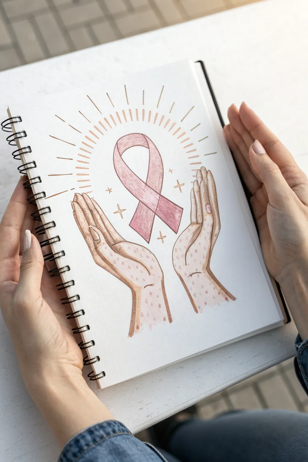
This tender illustration captures the essence of care and solidarity featuring stylized hands cradling a pink awareness ribbon. The soft stippling texture and warm color palette give it a handcrafted, personal feel perfect for a thoughtful card or journal entry.
How-To Guide
Materials
- Spiral-bound sketchbook or mixed media paper
- HB or 2B graphite pencil
- Kneaded eraser
- Fine liner pens (brown or sepia, 0.3mm and 0.5mm)
- Colored pencils (muted pink, warm beige/tan, rose)
- White gel pen (optional)
Step 1: Sketching the Foundations
-
Establish the center:
Begin by lightly sketching a vertical centerline on your page. This will act as your anchor. In the center, draw the basic loop shape of the ribbon, ensuring the top loop is open and airy while the legs cross over each other neatly at the bottom. -
Position the hands:
Lightly block out the shapes of the hands on either side of the ribbon. Unlike realistic hands, these are stylized and elongated. Imagine two gentle curves bracketing the ribbon, roughly forming a distinctive ‘V’ shape with the wrists at the bottom. -
Refine the finger shapes:
Detail the fingers, keeping them long and elegant. Notice how the thumbs extend outward slightly, while the four fingers on each hand are pressed gently together, curving upward towards the ribbon’s loop. -
Add the radiance:
Sketch light guidelines for the sunburst effect emanating from behind the ribbon. Draw lines radiating outward, alternating between longer and shorter strokes to create a halo effect.
Keep it Organic
Don’t aim for perfect symmetry. The charm of this piece lies in the hand-drawn, slightly imperfect lines. Let the pen jitter slightly for a raw look.
Step 2: Inking and Outlining
-
Outline the ribbon:
Switch to your brown or sepia fine liner. Carefully trace the ribbon outline. Instead of a single rigid line, try using slight breaks or varying pressure to give it a sketched, organic look. -
Define the hands:
Ink the outline of the hands. Pay attention to the knuckles and fingernails, drawing small ovals for the nails. Use disjointed, sketchy lines for the inner palm creases to maintain the artistic style. -
Create the halo rays:
Go over your pencil bursts with the pen. Draw these as thin, elongated teardrop shapes or simple dashes rather than strict straight lines. Keep them loose and freehand. -
Erase guidelines:
Wait a moment for the ink to set completely, then gently use your kneaded eraser to lift away all the graphite pencil marks, leaving just the clean ink drawing.
Step 3: Adding Color and Texture
-
Base layer for the ribbon:
Take a muted pink colored pencil and fill in the ribbon. Use soft, directional strokes that follow the curve of the fabric. I like to keep the pressure light here to allow the paper grain to show through slightly. -
Shading the ribbon:
Use a slightly darker rose pencil to add depth. Shade the areas where the ribbon twists and where the legs cross over each other to create a sense of dimension. -
Coloring the hands:
Lightly shade the hands with a beige or warm tan pencil. Focus the color on the edges of the fingers and the wrists, leaving the center of the palms lighter to suggest volume. -
Stippling technique:
This is the crucial texture step. Using a reddish-brown or darker flesh-tone pencil, create tiny dots (stippling) across the hands. Concentrate the dots heavily near the outlines and shadows, dispersing them as you move toward the center. -
Detailing the nails and sparkles:
Color the small fingernails with the pink pencil. Then, draw small four-pointed stars around the ribbon using a gold or yellow-ochre pencil to add a magical touch. -
Enhancing the halo:
Trace over the halo rays with a light orange or peach pencil to give them a warm glow without overpowering the central drawing.
Make it Shine
Use metallic gold watercolor or a gel pen for the stars and the halo rays. It will catch the light beautifully when the page is turned.
Now you have a touching piece of art that speaks volumes through simple gestures

Hope and Strength Word Halo
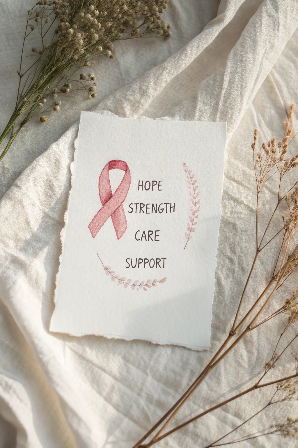
This tender watercolor project combines delicate lettering with a classic symbol of support to create a heartfelt keepsake. The soft pink tones and organic deckle-edged paper give the piece a warm, handmade feel perfect for sharing love and encouragement.
How-To Guide
Materials
- Cold press watercolor paper (deckle edge preferred)
- Watercolor paints (Alizarin Crimson, Burnt Sienna, or a pre-mixed dusty rose)
- Round watercolor brush (size 2 or 4)
- Fine liner brush or 00 round brush
- HB pencil
- Kneaded eraser
- Water cups
- Paper towel
- Ruler
Step 1: Preparation & Sketching
-
Prepare the paper surface:
If your watercolor paper doesn’t have a deckle edge, you can create a faux one by carefully tearing the edges against a ruler or tearing strip. This adds to the rustic, gentle aesthetic. -
Map out the center line:
Lightly draw a vertical guideline down the center of your paper with an HB pencil to help align your text and ribbon. -
Sketch the ribbon shape:
To the left of your center line, sketch the pink awareness ribbon. Start with the loop at the top, cross the lines in the middle, and let the two tails hang down naturally. Keep the pencil lines barely visible. -
Draft the text placement:
Using your ruler to keep things straight, lightly letter the words ‘HOPE,’ ‘STRENGTH,’ ‘CARE,’ and ‘SUPPORT’ in a vertical stack to the right of the ribbon. Leave equal breathing room between each word. -
Outline the leafy laurels:
Draw two faint curves for the stems: one starting below ‘SUPPORT’ and curving up the left side, and another starting below the ribbon and curving up the right side.
Clean Lines Pro-Tip
For the lettering, hold your breath slightly on the downstrokes to keep your hand steady, or rest your pinky finger on a dry part of the paper for stability.
Step 2: Painting the Ribbon
-
Mix your ribbon color:
Create a soft dusty pink by mixing a small amount of Alizarin Crimson with plenty of water. I like to add a tiny touch of Burnt Sienna to tone down the brightness and make it look more vintage. -
Paint the first layer:
Using your size 4 round brush, fill in the ribbon shape with a light, even wash of your pink mixture. This base layer should be quite pale. -
Add dimension while wet:
While the paint is still damp, drop slightly more saturated pigment into the areas where the ribbon folds over itself or where shadows would naturally fall (like under the crossover). -
Define the edges:
Once the first layer is dry, take a slightly darker mix of the same pink and carefully outline the edges of the ribbon to give it a crisp, illustrative look. -
Add texture lines:
Use a very dry brush with concentrated pink paint to add faint, vertical streaks on the ribbon tails, mimicking the texture of fabric.
Level Up: Metallic Tint
Mix a tiny amount of rose gold or copper watercolor paint into your ribbon color for a subtle shimmer that catches the light when the card is tilted.
Step 3: Lettering & Foliage
-
Select your text color:
Mix a dark, warm grey or sepia tone. Avoid harsh black; a softer charcoal color harmonizes better with the gentle theme. -
Paint the letters:
Switch to your fine liner or 00 brush. Carefully paint over your pencil letters using the tip of the brush. Keep your pressure consistent to maintain even line widths. -
Paint the stems:
Load your brush with a very watered-down version of your pink (or a soft brown-pink mix). Paint the thin, curved stems you sketched earlier. -
Add the leaves:
Using short, gentle dabs with the tip of your round brush, add small leaves along the stems. Vary their size slightly—smaller near the tips, larger near the base—for a natural look. -
Refine the foliage details:
If you want more definition, add a tiny vein line down the center of a few larger leaves using a slightly darker shade of paint. -
Erase guidelines:
Allow the entire painting to dry completely—give it at least 20 minutes. Then, gently roll a kneaded eraser over the paper to lift any remaining pencil marks without damaging the paint.
Now you have a touching piece of art ready to frame or gift to someone who needs a reminder of their resilience

PENCIL GUIDE
Understanding Pencil Grades from H to B
From first sketch to finished drawing — learn pencil grades, line control, and shading techniques.
Explore the Full Guide
Checklist Icons Around a Ribbon
Create a meaningful and symbolic sketchbook spread centered around a large pink awareness ribbon surrounded by medical-themed icons. This project combines simple line art with soft colored pencil shading to create a clean, organized composition perfect for health journaling or awareness campaigns.
Step-by-Step Tutorial
Materials
- Sketchbook or drawing paper (medium weight)
- HB Graphite pencil
- Eraser
- Fine liner pen (black, approx. 0.3mm or 0.5mm)
- Colored pencils (specifically shades of pink, yellow, and red)
- Ruler (optional, but helpful for symmetry)
Step 1: Drafting the Central Ribbon
-
Establish the center:
Begin by finding the visual center of your page. Using your graphite pencil, sketch a light vertical line to act as a guide for the ribbon’s loop, ensuring your main subject is perfectly balanced. -
Draw the main loop:
Sketch a large, classic awareness ribbon shape. Start with the top loop, curving down and crossing over to form the ‘legs’ of the ribbon. The left leg should cross over the right leg (or vice versa, just keep it consistent). -
Refine the ribbon width:
Draw an inner line parallel to your first line to give the ribbon dimension and width. Connect the bottom ends with a flat or slightly angled cut. -
Add contour lines:
To make the ribbon look like folded fabric, sketch a thin line curving across the intersection point where the two legs verify, separating the front piece from the back piece.
Ribbon Symmetry Trick
Draw an ‘8’ shape lightly with pencil first. The top loop becomes the head of the ribbon, and the bottom loop guides where the legs should flare out.
Step 2: Sketching the Surrounding Icons
-
Place the medical bottle:
Directly below the ribbon, sketch a small bottle with a dropper lid. Start with a rectangle for the body, round the shoulders, and add the dropper cap detail on top. -
Add the Star of Life:
To the left of the ribbon, draw a six-pointed medical cross (Star of Life). You can start with a simple ‘X’ intersected by a vertical bar to get the spacing right, then thicken the arms. -
Draw the syringe:
In the upper left corner, sketch a simple syringe shape. Draw a thin tube with a plunger at the top and a needle at the bottom, angled slightly toward the center. -
Add a candy doodle:
In the lower-left area, draw a wrapped candy shape. This adds a nice variety to the shapes and fills the negative space effectively. -
Include smaller ribbons:
Scatter two smaller versions of your main ribbon on the right side—one near the top right, and one near the bottom right. These can be looser and less detailed than the centerpiece. -
Draw the second syringe:
Add a slightly different style of syringe or dropper in the lower-left area near the candy, keeping the lines simple and clean.
Uneven Inking?
If your hand shakes while outlining, don’t try to fix it with a second line. Instead, thicken that specific segment slightly to mask the wobble intentionally.
Step 3: Inking and Coloring
-
Ink the outlines:
Take your black fine liner pen and carefully trace over your graphite sketches. Use steady, deliberate strokes. I tend to rotate the sketchbook as I draw curves to keep my hand in a comfortable position. -
Erase pencil marks:
Wait at least a minute for the ink to dry completely, then gently erase all the underlying graphite guidelines to leave a crisp black outline. -
Color the ribbon base:
Using a soft pink colored pencil, lightly fill in the entire large ribbon. Keep your strokes directional—flowing with the shape of the ribbon—to mimic fabric texture. -
Add ribbon shading:
Press slightly harder with the same pink pencil (or use a slightly darker shade) to add shadows where the ribbon overlaps itself and near the edges. This creates a 3D effect. -
Color the medical cross:
Fill in the Star of Life symbol on the left with a deep red or maroon colored pencil to make it stand out against the pinks. -
Add accent colors:
Use yellow or orange for the liquid inside the syringes and the candy wrapper. Keep the bottle mostly white or pale blue to suggest glass, coloring only the label area if desired. -
Color smaller ribbons:
Fill in the two smaller ribbons on the right with the same pink shading technique used for the central one. -
Final dots:
To tie the whole composition together, add a few small floating circles or ‘bubbles’ in pale pink or peach around the empty spaces of the page.
Now you have a beautifully composed and symbolic page dedicated to health awareness
Community Silhouettes Forming a Ribbon
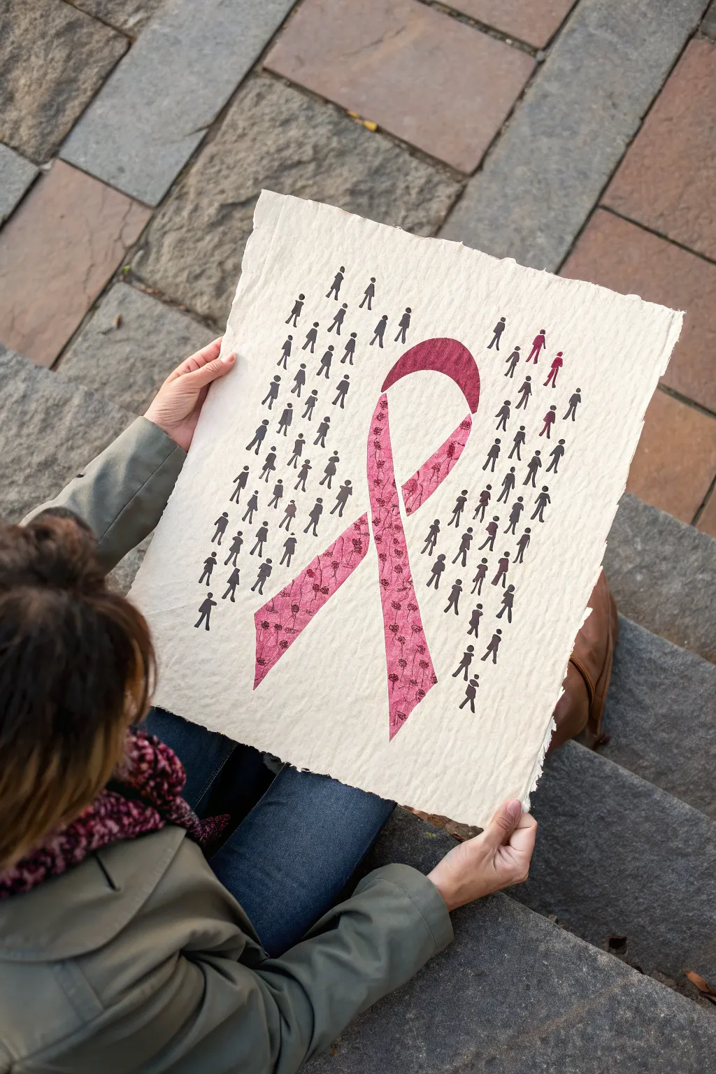
This poignant art piece combines simple silhouette stamping with a striking patterned ribbon, symbolizing the human connection behind cancer awareness. Using textured handmade paper creates a raw, authentic feel that elevates the design beyond a simple drawing.
Detailed Instructions
Materials
- Heavyweight handmade textured paper (white or cream)
- Pink patterned fabric or scrapbook paper
- Small person-shaped silhouette stamp (or stencil)
- Black ink pad (archival quality works best)
- Pencil
- Eraser
- Scissors or precision craft knife
- Mod Podge or craft glue stick
- Ruler
Step 1: Preparing the Foundation
-
Select your paper:
Choose a thick, handmade paper with visible texture and deckled edges. The roughness adds character that standard printer paper simply can’t match. -
Draft the outline:
Lightly sketch a large awareness ribbon in the center of your paper using a pencil. Keep the lines faint so they are easy to erase later. -
Define the negative space:
Imagine a rectangular border around your ribbon sketch. The silhouettes will fill this rectangle, stopping abruptly at the edge of the ribbon to create the shape through negative space.
Step 2: Creating the Ribbon
-
Trace the shape:
Using your initial sketch as a guide, trace the exact ribbon shape onto your pink patterned fabric or scrapbook paper. -
Cut carefully:
Cut out the ribbon shape using sharp scissors or a craft knife for the inner loop. I find a craft knife is much easier for getting clean curves. -
Dry fit the piece:
Place the cut-out ribbon onto your textured paper to ensure it fits your sketched guide perfectly, but don’t glue it down just yet.
Stamp Clarity Tip
Place a thin foam sheet or mousepad under your paper while stamping. This ‘give’ helps the stamp press into the paper’s texture for a solid, crisp black impression.
Step 3: Stamping the Community
-
Test your stamp:
On a scrap piece of paper, test your person-shaped stamp to check ink coverage. Handmade paper is uneven, so you’ll need firm, rocking pressure. -
Start stamping vertically:
Begin stamping the silhouettes in vertical columns on the left side of the ribbon. Leave a small, uniform gap between each figure to keep the rows tidy. -
Mind the edges:
When you approach the sketched outline of the ribbon, stop stamping. The goal is to have the crowd of people surround the ribbon, not overlap where it will be placed. -
Continue to the right:
Repeat the stamping process on the right side of the paper, maintaining the same vertical alignment and spacing. -
Fill the loop:
Don’t forget the small triangular area inside the top loop of the ribbon. Stamp a few figures here to maintain the illusion of a solid background crowd. -
Let the ink set:
Allow the stamped ink to dry completely. Because the paper is textured, ink can settle into the grooves and take a little longer to become smudge-proof. -
Erase guidelines:
Once the ink is bone dry, gently erase any visible pencil marks from your initial sketch.
Uneven Ink Fix
If a silhouette stamps too lightly due to the paper texture, simply use a fine-point black waterproof marker to fill in the gaps and darken the figure manually.
Step 4: Final Assembly
-
Apply adhesive:
Apply a thin layer of Mod Podge or run a glue stick along the back of your pink ribbon cutout. -
Mount the ribbon:
Carefully press the ribbon into the negative space you left between the stamped figures. Smooth it down from the center outward to prevent air bubbles. -
Seal edges:
If using fabric, you might want to dab a tiny bit of clear glue on the very edges to prevent fraying over time. -
Add detail (optional):
For extra depth, you can use a fine-tip black pen to sharpen the edges of any stamped figures that didn’t transfer perfectly onto the rough paper.
Display your artwork in a shadow box frame to protect the textured paper while highlighting the meaningful message
BRUSH GUIDE
The Right Brush for Every Stroke
From clean lines to bold texture — master brush choice, stroke control, and essential techniques.
Explore the Full Guide
Cancer Awareness Day Poster Layout
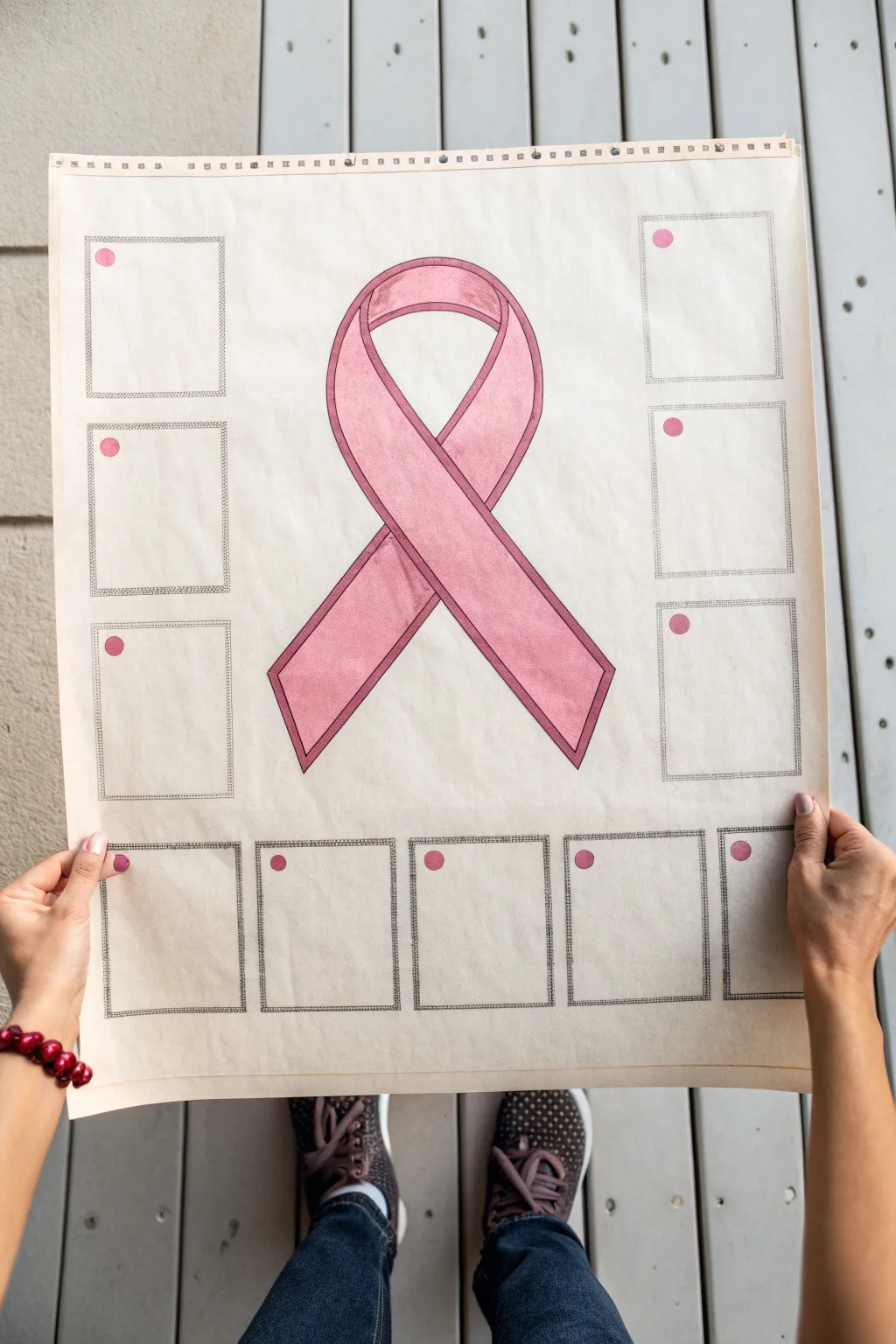
This thoughtful layout combines the iconic pink ribbon with dedicated spaces for personal messages or photos, making it perfect for a community event or remembrance wall. The design features a central, hand-drawn ribbon surrounded by bordered frames, creating a structured yet heartfelt display piece.
How-To Guide
Materials
- Large sheet of heavyweight drawing paper or poster board (approx. 18×24 inches)
- Pencil (HB or 2H for sketching)
- Black fine-liner pens (0.3mm and 0.5mm)
- Pink alcohol markers (light and medium shades)
- Pink dot stickers or a pink paint marker
- Ruler (preferably 18-inch or longer)
- Eraser
- Compass or circular object (optional for ribbon curves)
Step 1: Drafting the Layout
-
Establish the center:
Begin by finding the exact center of your poster board. Use your ruler to lightly mark a vertical centerline; this will ensure your ribbon sits perfectly in the middle of the composition. -
Sketch the ribbon shape:
Lightly sketch the large awareness ribbon in the center. Start with the loop at the top, ensuring both sides arch symmetrically, and cross the ‘tails’ near the bottom third of the shape. I find it helpful to draw a single line for the gesture first, then build the thickness around it. -
Create the ribbon dimension:
Add a second inner line parallel to your first outline to give the ribbon a border or ‘hem’ look. This small detail adds significant dimension to the final drawing. -
Grid the side boxes:
Plan the placement of the rectangular frames. You’ll want three vertical boxes on the left and three on the right. Use your ruler to ensure they are evenly spaced from the edge and aligned horizontally with each other. -
Grid the bottom boxes:
Measure and sketch a row of five rectangular boxes along the bottom edge. These should be slightly smaller or similar in size to the side boxes, filling the width of the paper comfortably.
Uneven marker lines?
If your large pink areas have visible streaks, color in small circular motions rather than long straight lines. This helps blend the alcohol ink more seamlessly.
Step 2: Inking and Coloring
-
Outline the ribbon:
Once you are happy with your pencil sketch, switch to a 0.5mm black fine-liner. carefully trace the outer and inner lines of the central ribbon, using confident, smooth strokes to avoid shaky lines. -
Outline the frames:
Ink the rectangular boxes surrounding the ribbon. For a textured look like the example, you might double-line these boxes or use a slightly sketchier, hand-drawn line quality rather than a rigid ruler line. -
Erase pencil marks:
Allow the ink to dry completely for at least five minutes to prevent smearing. Gently erase all visible pencil guidelines from the paper. -
Base coat the ribbon:
Using your lighter shade of pink alcohol marker, fill in the entire central ribbon. Use broad, consistent strokes moving in the direction of the ribbon’s flow to minimize streakiness. -
Add shading:
Take a slightly darker pink marker or layer your original color to add depth. Focus on the areas where the ribbon crosses over itself and the edges of the curves to create a rounded, 3D effect. -
Darken the ribbon border:
If the inner border needs more definition, go over the narrow ‘hem’ area with a slightly more saturated pink to distinguish it from the center of the fabric.
Make it meaningful
Instead of leaving the boxes blank, pre-fill a few with inspiring quotes about strength and hope or leave faint lines for visitors to write names easily.
Step 3: Adding Details
-
Create texture on frames:
To mimic the stitched or textured look of the frames in the photo, use your fine-liner to add tiny hatch marks or a stippled pattern between the double lines of each box border. -
Placement dots:
In the top-left corner of each empty frame, place a single pink dot. You can use small round stickers for uniformity, or simply draw and fill a small circle with your pink marker. -
Top edge detail:
For a finishing touch, draw a perforated strip or ruler-style markings along the very top edge of the paper, creating a ‘notebook’ aesthetic. -
Final review:
Step back and check the overall balance. If the ribbon looks too flat, you can add very subtle white pencil highlights to the highest points of the curve.
Now your poster is ready to be filled with names and memories at your awareness event
Butterfly Made From a Ribbon
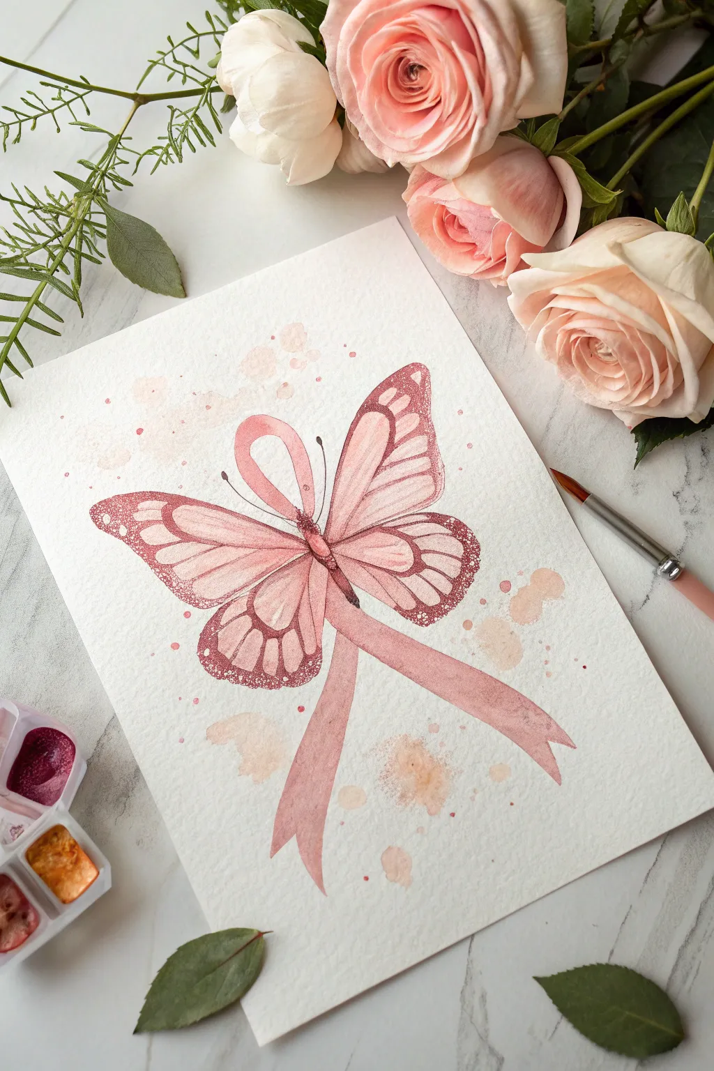
This delicate watercolor illustration blends the gentle symbolism of a butterfly with the pink awareness ribbon, creating a powerful emblem of hope. Combining precise stippling details with soft washes, this piece feels both artistic and deeply meaningful.
Step-by-Step Tutorial
Materials
- Cold press watercolor paper (300 gsm)
- Watercolor paints (shades of rose, magenta, crimson, and peach)
- Fine liner brush (size 0 or 00)
- Round watercolor brush (size 4 or 6)
- Pencil (HB or H) for light sketching
- Eraser
- Clean water
Step 1: Sketching the Framework
-
Draw the central loop:
Begin by lightly sketching the classic awareness ribbon shape in the center of your paper. Make the loop at the top slightly elongated to serve as the butterfly’s head and thorax area. -
Extend the tails:
Draw the two tails of the ribbon flowing downwards. Give them a gentle curve, mimicking the natural movement of fabric, and terminate them with V-shaped cuts. -
Map out the wings:
From the ‘knot’ or intersection of the ribbon, sketch large upper wings and smaller lower wings on both sides. The wings should appear to be attached to or emerging from the ribbon structure itself. -
Define wing veins:
Inside the wings, lightly draw the vein structures. These will look like elongated teardrops or stained glass sections that radiate from the center body.
Fixing Bleeds
If your wing color bleeds into the veins, wait for it to dry completely. Then use white gouache or a white gel pen to re-draw the crisp separation lines.
Step 2: Painting the Base Layers
-
Mix your pinks:
Prepare a palette with a soft rose pink and a deeper magenta. I usually ensure I have plenty of watery mix ready for the initial wash. -
Wash the wings:
Using the round brush, paint a very light, watery wash of rose pink inside the wing segments. Leave the vein lines white (unpainted) for now. -
Paint the ribbon:
Fill in the ribbon shape with a slightly more saturated pink tone. While the paint is wet, drop a tiny bit of darker magenta into the areas where the ribbon overlaps to create shadow depth. -
Background softness:
While the main subject dries, mix a very dilute peach or beige. Add random, loose splotches around the butterfly to create that dreamy, textured background effect shown in the example.
Level Up
Add a touch of metallic gold watercolor to the stippled dots on the wing edges. It adds a subtle shimmer that catches the light beautifully.
Step 3: Adding Detail and Texture
-
Define the veins:
Once the base layer is completely dry, switch to your fine liner brush. engaging a darker brownish-red or deep crimson mix, carefully outline the wing segments. -
Darken the edges:
Paint the outer borders of the wings with the deep crimson mix. Make this border thicker at the wing tips and thinner near the body. -
Stippling technique:
This is the most crucial step for texture. Using the tip of your fine brush and the dark crimson paint, create tiny dots (stippling) along the outer edges of the wings, fading inwards. -
Concentrate the dots:
Add dense stippling around the central intersection of the ribbon. This creates the illusion of the butterfly’s fuzzy body without drawing a harsh black line. -
Enhance the ribbon:
Add a second layer of translucent pink to one side of the ribbon tails to give them a 3D folded appearance.
Step 4: Final Flourishes
-
Antennae:
Draw two delicate, curved lines extending from the top of the ribbon loop to form the antennae. Add small teardrop shapes at the ends. -
Splatter effect:
Load your brush with watery pink paint and gently tap the handle against your finger to flick tiny speckles across the paper. Keep them subtle and concentrated near the artwork. -
Refine highlights:
If you lost any white highlights during painting, you can use a touch of white gouache or a white gel pen to reclaim the brightest spots on the wing tips. -
Final check:
Step back and assess the contrast. If the wing veins look too faint, go over them one last time with your finest brush to make the structure pop.
Allow the painting to dry thoroughly before framing this beautiful symbol of support and resilience


Floral Ribbon Bouquet
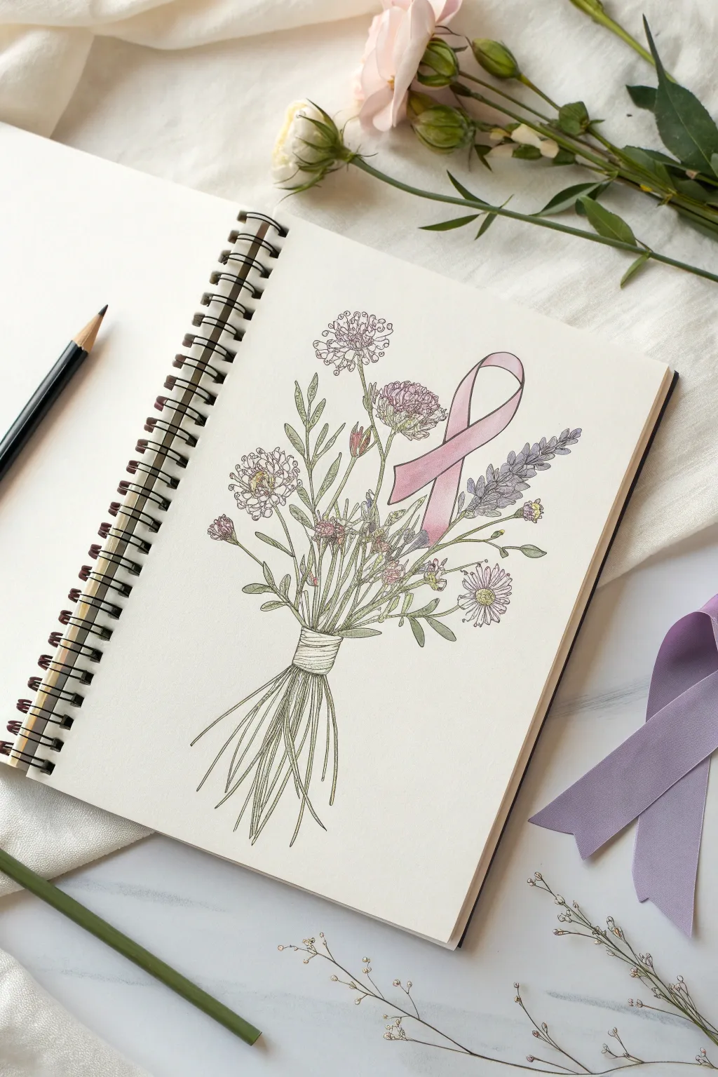
Blend the softness of wildflowers with a powerful symbol of hope in this illustrative sketch. This project combines fine ink linework with gentle washes of color to create a thoughtful and meaningful tribute.
Step-by-Step Guide
Materials
- Sketchbook or watercolor paper (cold press, medium texture)
- HB Drawing pencil
- Kneaded eraser
- Fine liner pens (0.1mm and 0.3mm, waterproof ink)
- Colored pencils or watercolor paints (muted greens, dusky pinks, lavender)
- Small round paintbrush (if using watercolor)
- Ruler (optional)
Step 1: Planning and Sketching
-
Construct the ribbon shape:
Begin by lightly sketching the awareness ribbon in the upper right-center of your page. Draw a standard loop shape, ensuring the top is rounded and the two tails hang down at slight angles while crossing over each other. -
Establish the stems:
From the bottom center of the page, draw a bundle of lines curving upward and outward. Aim for them to intersect behind the ribbon, creating a fan shape that will support your flower heads. These act as the skeleton for your bouquet. -
Map out flower placements:
Lightly draw circles and ovals at the ends of your stems to indicate where the different blooms will go. Place larger clover-like shapes near the top and smaller daisy forms lower down to create balance. -
Define the binding:
Where the stems gather at the narrowest point, sketch a horizontal band to represent the string or twine binding. Add a few loose stem ends flaring out beneath this tie for realism.
Uneven ink lines?
Don’t panic! If a line goes wobbly, add a tiny leaf or bud over the mistake. Nature is imperfect, and organic shapes hide shaky hands perfectly.
Step 2: Inking the Outline
-
Outline the ribbon:
Using your 0.3mm fine liner, carefully trace your ribbon sketch. Give the ribbon a continuous, smooth edge, but avoid drawing lines where the flowers or stems will overlap in front of it. -
Detail the main blooms:
Switch to a 0.1mm pen to draw the flower heads. For the clover-like flowers, use small, jagged loops to create texture. For the lavender sprigs on the right, draw tiny teardrop shapes stacked vertically. -
Draw the stems and leaves:
Trace your stem lines, making them slightly uneven to look organic. Add small, lance-shaped leaves branching off the main stems. I find drawing leaves in pairs helps fill empty spaces quickly. -
Ink the binding:
Draw tight, horizontal loops for the string binding the bouquet. Use slightly curved lines to show the volume of the wrapped twine. -
Erase pencil marks:
Once the ink is completely dry, gently run your kneaded eraser over the entire drawing to remove the initial graphite guidelines.
Step 3: Adding Color
-
Color the ribbon:
Using a soft pink colored pencil or a very diluted pink watercolor wash, fill in the ribbon. Apply more pressure or pigment near the folds and overlaps to create a sense of depth and shadow. -
Tint the greenery:
Color the stems and leaves with a sage or olive green. Keep the color application light and somewhat sketchy; complete saturation isn’t necessary for this delicate illustrative style. -
Add floral hues:
Use lavender for the tall sprigs on the right and a mix of dusty pink and pale purple for the rounder blooms. Leave some white space within the petals to suggest highlights. -
Shade the binding:
Use a light beige or warm grey to color the string binding. Add a tiny touch of darker grey between the strands to separate them visually. -
Final shading touches:
Take a slightly darker green and add thin shadow lines to the undersides of the leaves and where stems cross one another. This adds dimension without overpowering the drawing.
Make it Personal
Write a small name, date, or word of encouragement like ‘Hope’ or ‘Grace’ along one of the tails of the ribbon in a delicate script font.
Now you have a gentle, handcrafted reminder of resilience and beauty captured in your sketchbook
Shield of Care Around a Ribbon
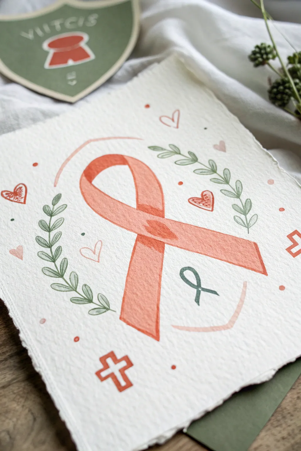
This tender watercolor piece centers on a large awareness ribbon framed by olive branches and delicate hearts, symbolizing protection and support. The design uses soft, muted tones on deckled-edge paper to create an artwork that feels both organic and deeply personal.
Step-by-Step Tutorial
Materials
- Heavyweight cold-press watercolor paper (300 gsm) with deckled edges
- Watercolor paints: Peach/Salmon Pink, Olive Green, Burnt Sienna
- Synthetic watercolor brushes: Round size 6 and Round size 2
- HB pencil for sketching
- Kneaded eraser
- Jar of water
- Paper towel
Step 1: Sketching the Layout
-
Outline the central ribbon:
Start by lightly sketching the large awareness ribbon in the center of your paper. Draw the loop first, then let the crisscrossing tails flow downwards to the right. -
Add dimension lines:
To give the ribbon a 3D effect, sketch a thin inner line running parallel to the outer edges. This will serve as a guide for your darker shading later. -
Sketch the laurel wreath:
Draft two curved lines on either side of the ribbon to act as stems. Along these stems, sketch small, paired oval leaf shapes. -
Place the decorative elements:
scatter details around the composition: a small cross at the bottom left, a tiny ribbon inside the main loop, several hearts of varying sizes, and floating dots. -
Draft the shield borders:
Lightly pencil two curved, bracket-like lines—one arching over the top of the ribbon and a wider, flatter one cupping the bottom—to suggest a shield shape.
Wet-on-Dry Precision
For the crisp edges on the ribbon and leaves, ensure your paper is completely dry before painting outlines. Wet paper will cause the lines to bleed and lose definition.
Step 2: Painting the Ribbon
-
Base wash for the ribbon:
Mix a watery wash of Peach or Salmon Pink. Using your size 6 brush, fill in the entire shape of the large ribbon. Keep this layer very pale. -
Deepen the shadows:
While the base is still slightly damp, mix a more saturated version of the same pink. carefully paint the areas where the ribbon overlaps itself, specifically the knot in the center. -
Defined edges:
Once the first layer is dry, take your size 2 brush with the saturated pink mix. Outline the ribbon edges firmly to create a crisp border. -
Adding texture:
With the small brush, paint a slightly darker stripe inside the ribbon, following the dimension lines you sketched earlier. This creates a ‘seam’ look.
Step 3: Painting the Botanicals
-
Leaf stems:
Switch to your Olive Green mix. Using the tip of the size 2 brush, trace the thin curved stems of the laurel branches. -
Filling the leaves:
Paint each leaf with a single stroke. Press the belly of the brush down and lift up to create the tapered leaf shape. Keep the green paint somewhat translucent. -
Detailing the leaves:
I like to wait for the leaves to dry completely, then use a slightly darker green mix to draw a very fine central vein down the middle of each leaf.
Make it Metallic
Use gold watercolor paint or a gold ink pen for the shield bracket lines and the leaf veins. It adds a subtle shimmer that elevates the meaning of the tribute.
Step 4: Adding Accents
-
Painting the hearts:
Use the pink mix to fill in some of the larger hearts. For others, just outline them with the fine brush for variety. -
Shield outlines:
Paint the top and bottom ‘shield’ bracket lines using a very pale wash of the pink, keeping the lines thin and understated. -
The small cross:
Paint the cross at the bottom left using a Burnt Sienna or a darker orange-pink mix to make it stand out against the lighter background dots. -
Miniature ribbon:
Paint the tiny ribbon accent inside the main loop using a dark green or teal color to contrast with the warm pinks. -
Scattered dots:
Finish the piece by dotting the brush tip randomly around the design using both pink and green paint to fill any empty negative space.
Let the piece dry fully before erasing any visible pencil marks to avoid smudging your delicate work
Crab Symbol vs. Ribbon: Fight and Hope
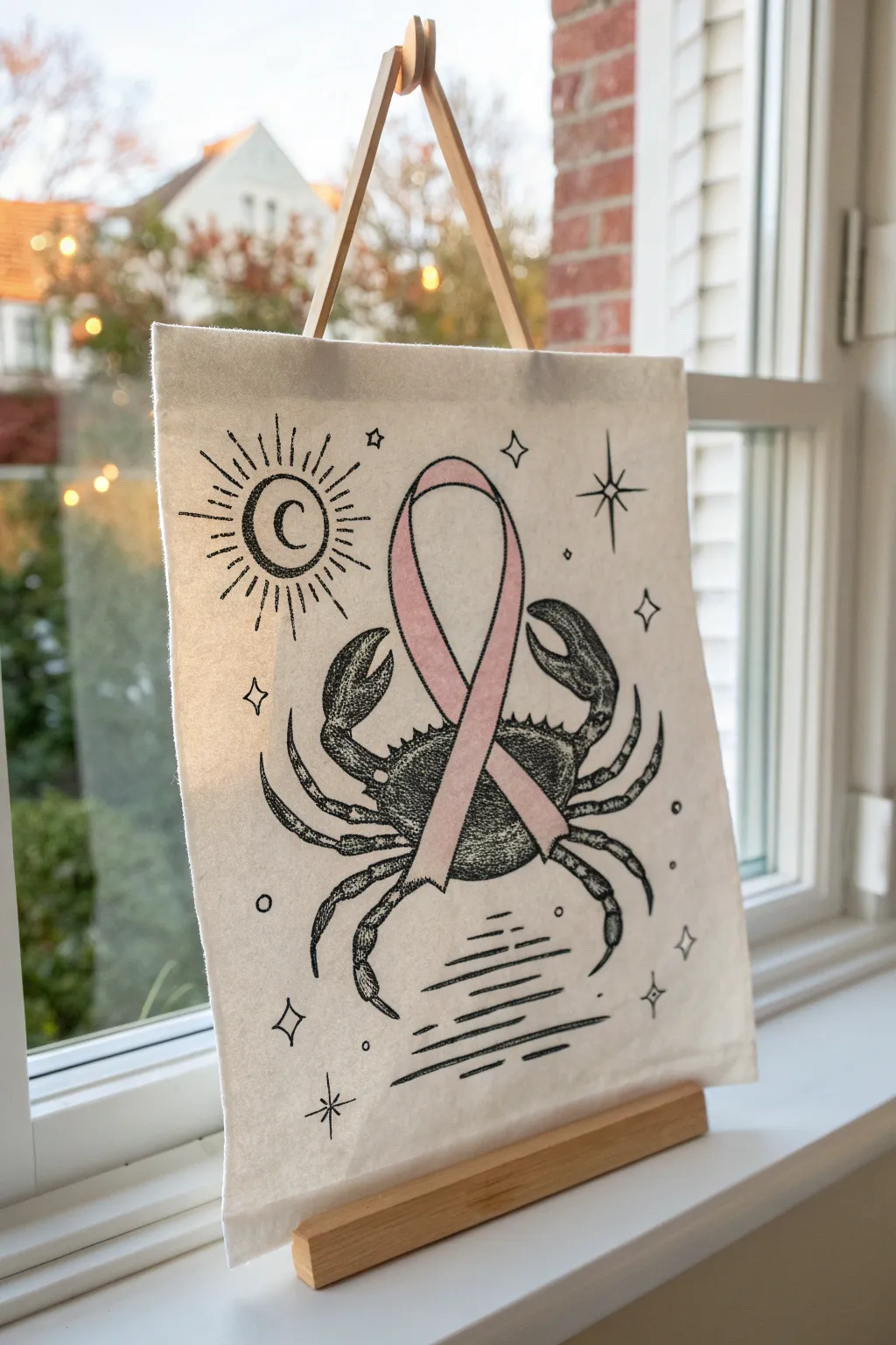
This thoughtful project combines astrological symbolism with a powerful emblem of hope, featuring a detailed ink illustration of a crab and a soft pink awareness ribbon. Displayed on a simple wooden stand, this canvas banner serves as a delicate but strong reminder of resilience.
Step-by-Step Guide
Materials
- Small rectangular canvas banner (approx. 5×7 or 6×8 inches)
- Small wooden dowel (typically comes with the banner) or craft wood strip
- Wooden display stand or small easel
- Fine-point black permanent marker or micron pen (05 or 08 size)
- Pencil and eraser
- Pink colored pencil or fabric marker (soft pastel pink)
- Ruler
- Reference image or crab stencil (optional)
Step 1: Planning and Sketching
-
Prepare your canvas:
Lay your small canvas banner flat on a hard surface. If the fabric is wrinkled, give it a quick press with an iron on a low setting so your drawing surface is perfectly smooth. -
Outline the central ribbon:
Start by lightly sketching the awareness ribbon in the center of the canvas using a pencil. Draw the classic loop shape, making sure it’s tall enough to be the focal point but leaves room for the crab behind it. -
Sketch the crab shape:
Lightly draw the oval body of the crab horizontally behind the ribbon. Position it so the ribbon appears to be draped over the crab’s shell. -
Add the claws and legs:
Sketch two large claws reaching upward on either side of the ribbon. I find it easiest to draw the general pincer shapes first, then refine the joints. -
Complete the lower legs:
Draw the smaller walking legs extending from the bottom of the crab’s body. They should curve naturally downward and outward. -
Add celestial details:
In the upper left corner, sketch a sun motif with a crescent moon inside it. Add radiating rays around the circle. -
Fill in the background:
Scatter small four-pointed stars and diamond shapes around the empty spaces. Add horizontal lines at the bottom to represent water ripples.
Ink Bleeding Info
If using a fabric marker, test on a scrap canvas first. Some fabrics wick ink quickly, ruining fine lines. Micron pens usually stay crisp.
Step 2: Inking and Coloring
-
Ink the ribbon first:
Using your fine-point black pen, trace the outline of the ribbon. Doing this first ensures you don’t accidentally draw crab lines through the ribbon, keeping it in the foreground. -
Outline the crab:
Carefully trace the pencil lines of the crab. Use a slightly broken or textured line for the shell to make it look organic rather than cartoonishly smooth. -
Add texture to the crab:
This is the most time-consuming part: stippling. Use the tip of your pen to create tiny dots (stippling) on the crab’s claws and shell to create shading and texture. Denser dots create darker shadows. -
Ink the celestial elements:
Go over your sun, moon, and star sketches with clean, sharp black lines. Fill in the crescent moon with solid black ink for contrast. -
Draw the water:
Trace the horizontal water lines at the bottom, varying the line thickness slightly to suggest movement. -
Erase pencil marks:
Wait at least 10 minutes to ensure the ink is completely dry. Then, gently erase all your initial pencil guidelines. -
Color the ribbon:
Take your pink colored pencil or fabric marker and gently fill in the ribbon. A colored pencil works beautifully here for a soft, vintage texture that isn’t too overpowering.
Personalize It
Embroider the pink ribbon with thread instead of coloring it for a lovely varied texture, or add a date hidden in the water lines.
Step 3: Assembly and Display
-
Insert the top support:
Slide the thin wooden dowel or craft strip through the sewn channel at the top of the canvas banner. -
Attach the hanging cord:
Tie a piece of leather cord or twine to both ends of the wooden dowel to create a triangle shape for hanging. -
Prepare the stand:
Set up your small wooden easel or display stand on your windowsill or table. -
Final placement:
Hang the banner on the stand (or lean it against the frame if using a flat panel) and adjust it so it hangs straight.
Now you have a handmade piece of art that speaks to strength and celestial support to brighten your window
Negative Space Ribbon in a Gradient Wash
This elegant project uses masking techniques to create a crisp, white awareness ribbon set against a dreamy watercolor background. The blend of warm citrus tones fading into soft purples creates a hopeful and soothing piece of art perfect for gifting.
Step-by-Step
Materials
- High-quality watercolor paper (cold press, 140lb/300gsm)
- Masking fluid or white artist tape
- Watercolor paints (Peach/Light Orange, Pink/Rose, Purple/Violet)
- Large flat wash brush
- Medium round brush
- Clean water jar and paper towels
- Pencil and eraser
- White or light wood frame (8×10 or similar)
Step 1: Preparation and Masking
-
Paper sketch:
Begin by lightly sketching the outline of a ribbon in the center of your watercolor paper using a pencil. Keep the lines faint so they don’t show through later. -
Refine the shape:
Ensure the loop at the top is proportionate and the ‘legs’ of the ribbon cross naturally. The classic awareness ribbon shape is key here. -
Apply masking fluid:
Carefully paint liquid masking fluid inside your pencil outline to fill the entire ribbon shape. Use an old brush or a silicone applicator for this, as masking fluid can ruin good bristles. -
Alternative masking method:
If you don’t have masking fluid, you can carefully cut the ribbon shape out of masking tape or specialized frisket film and adhere it firmly to the paper. -
Let it dry:
Allow the masking medium to dry completely. It must be dry to the touch before you add any water, or you risk tearing the paper later.
Step 2: Creating the Gradient Wash
-
Pre-wet the paper:
Using your large flat brush, apply a clean coat of water over the entire paper surface, painting right over the masked area. This ‘wet-on-wet’ technique helps colors blend seamlessly. -
Start with peach:
Load your brush with a watery mix of peach or light orange paint. Apply this to the top third of the paper, using broad horizontal strokes. -
Introduce pink:
While the peach section is still wet, clean your brush slightly and pick up a soft pink or rose color. Paint the middle section, letting it overlap slightly with the orange above. -
Blend the transition:
Gently tilting the paper can encourage the peach and pink to flow together naturally. I like to let gravity do some of the work here for a smoother gradient. -
Add the purple base:
Load a violet or purple shade and apply it to the bottom third of the paper. Allow it to bleed upward into the pink section. -
Enhance texture:
If you want a mottled, organic look similar to the example, you can dab a clean, crumpled paper towel lightly on wet areas or drop in tiny splashes of clear water. -
Wait for drying:
Set the painting aside to dry completely. The paper must be bone-dry before the next step to ensure the edges remain crisp.
Torn paper?
If removing the mask tears the paper, you likely pulled too fast or the paper was still damp. Ensure it is 100% dry and pull the mask slowly at a 45-degree angle.
Step 3: The Reveal
-
Remove the mask:
Once the paint is fully dry, gently rub the masking fluid with your finger or a rubber cement pickup tool. Start from the center and peel outward. -
Clean up edges:
If any paint seeped under the mask, use a barely damp stiff brush to gently scrub and lift the unwanted color. Alternatively, use a white gel pen to touch up the edges. -
Erase guidelines:
Gently erase any remaining pencil marks that might be visible around the white ribbon shape. -
Frame the work:
Place your finished artwork into a simple white or light wood frame to complement the clean aesthetic of the negative space ribbon.
Add sparkle
For a magical touch, lightly spatter gold metallic watercolor paint over the colored background before removing the mask. It adds a subtle shimmer to the wash.
You have created a beautiful, meaningful tribute that glows with color and hope
Typography Inside the Ribbon
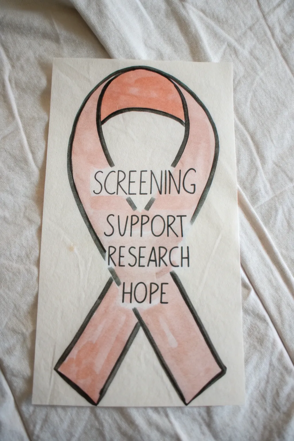
This thoughtful illustration combines the iconic pink ribbon symbol with powerful words of advocacy and hope. Using blending techniques and crisp lettering, you’ll create a meaningful piece of art that speaks volumes through simple design.
Step-by-Step Guide
Materials
- Thick drawing paper or mixed media paper
- Pencil (HB or 2B)
- Eraser
- Light pink alcohol marker or watercolor paint
- Peach or coral alcohol marker or watercolor paint (for shading)
- Black fine liner pen (0.5mm)
- Thicker black marker or brush pen (for outlines)
- Ruler (optional)
Step 1: Sketching the Structure
-
Draft the loop:
Begin by lightly sketching the top loop of the ribbon in the center of your paper. Aim for a rounded, slightly bulbous top that tapers as it comes down. -
Draw the crossing point:
Bring the two sides of the loop down until they cross over each other. The left side should cross over the right side to match the reference, creating a central ‘X’ shape. -
Extend the legs:
Continue sketching the ribbon ends downwards, angling them away from each other so they flare out at the bottom. -
Add dimension:
Sketch the inner line of the ribbon parallel to your outer line to give the ribbon its width. Keep the width consistent throughout the entire loop. -
Create the back loop:
Draw a curved line connecting the inner edges of the top loop. This represents the back of the ribbon showing through the hole.
Clean Lettering Trick
Draw faint horizontal lines with a ruler first to keep your text straight. Erase them only after the final ink is completely dry to avoid smudges.
Step 2: Adding the Typography
-
Plan the text placement:
Before writing, lightly sketch horizontal guidelines across the middle section of the ribbon where the two sides converge. -
Draft the first word:
Pencil in the word ‘SCREENING’ near the top of the converging section. Use tall, narrow capital letters to fit the space well. -
Stack the middle words:
Directly below, sketch ‘SUPPORT’ and then ‘RESEARCH’. Ensure they are centered horizontally within the ribbon’s shape. -
Add the final word:
Place the word ‘HOPE’ at the bottom of the stack, just where the legs begin to separate fully. -
Refine the lettering:
Go over your letters to ensure they are legible and evenly spaced. I usually make the vertical strokes slightly thicker for a printed look.
Uneven Ribbon Width?
If one side looks thicker, thicken the outline on the narrower side rather than re-sketching. The bold black border hides minor symmetry errors easily.
Step 3: Coloring and Inking
-
Base color application:
Using a light pink alcohol marker or watercolor wash, color the entire ribbon shape. Avoid the area directly over your penciled letters if you want to keep the background behind the text lighter, or just color right over it if your ink is opaque. -
Adding gradients:
While the base layer is still impactful, take your darker peach or coral shade and add color to the top of the loop and the bottom ends of the legs. This creates a subtle ombre effect. -
Creating highlights:
Leave small slivers of the paper white or lift color with a damp brush (if using watercolor) on the curves of the ribbon to suggest a shiny, satin texture. -
Ink the typography:
Trace over your penciled words with a fine liner pen. Use a steady hand to create thin, crisp lines for the letters. -
Outline the ribbon:
Use a thicker black marker or outlining pen to trace the outer and inner edges of the ribbon. A slightly bolder line here helps separate the subject from the background. -
Define the overlap:
Don’t forget to outline the curve inside the top loop to show the back of the ribbon. -
Erase guidelines:
Once the ink is completely dry—give it a few extra minutes just to be safe—gently erase any visible pencil marks. -
Final touches:
Inspect your coloring. If the text area needs more definition, you can add a very faint wash of pink around the letters to integrate them while keeping them readable.
Now you have a supportive piece of art ready to display or gift.
Cells Turning Into Flowers
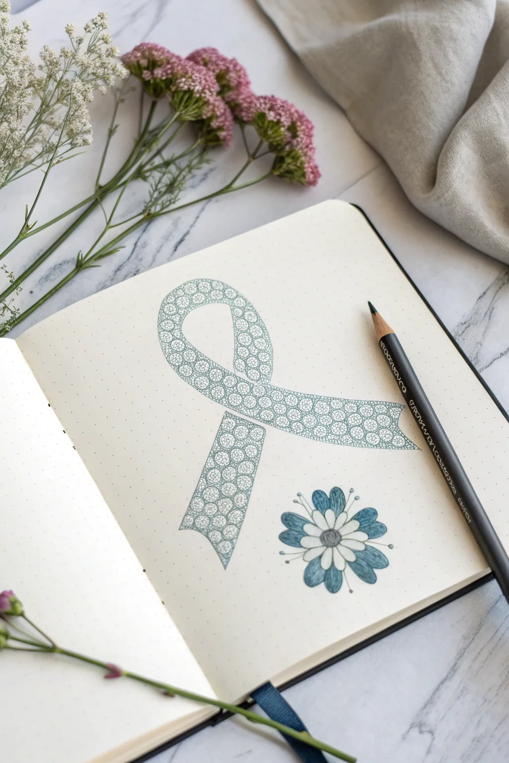
This thoughtful journal art combines a classic awareness ribbon with a cellular motif that gently transforms into a blooming flower. The detailed pattern work creates a meditative drawing experience, perfect for a bullet journal or sketchbook spread dedicated to healing and resilience.
How-To Guide
Materials
- Dotted bullet journal or heavyweight sketch paper
- HB or 2B pencil
- Fine liner pen (black or dark grey, 0.1mm or 0.3mm)
- Teal or seafoam green colored pencil
- Soft hi-polymer eraser
- Ruler (optional)
Step 1: Drafting the Outline
-
Sketch the Curves:
Begin by lightly sketching the awareness ribbon shape in pencil. Start with the loop at the top, ensuring it is rounded and open, then bring the lines down to cross over each other. -
Define the Legs:
Extend the two ‘legs’ of the ribbon downwards. To match the reference, give the ends a concave, fishtail cut rather than a straight line or a point. -
Check Symmetry:
Step back and look at your ribbon. Adjust the width so it looks consistent throughout the entire loop and the tails. Using a dotted grid notebook makes alignment much easier here. -
Draft the Flower:
To the bottom right of the ribbon, lightly sketch a simple daisy-like flower. Draw a small central circle and arrange about 8-10 petals radiating outward from it.
Ink Smearing?
If your fine liner smears when you erase or color, switch to a waterproof pigment liner. Alternatively, let the ink cure for at least 15 minutes before erasing.
Step 2: Creating the Cellular Pattern
-
Start the Circles:
Inside the ribbon outline, begin drawing small, tightly packed circles. I find it easiest to start at the top of the loop and work my way down one side. -
Vary Sizes:
Keep the circles mostly uniform, but allow slight variations in size to mimic organic cells. They should touch each other but not overlap. -
Fill the Gaps:
As you draw the main circles, you’ll notice small triangular gaps between them. Fill these tiny spaces with very small dots or tiny circles to make the pattern feel dense and complete. -
Ink the Outline:
Once the ribbon is fully packed with the cell pattern, use your fine liner pen to trace over the main outer edges of the ribbon. -
Ink the Cells:
Carefully go over your pencil circles with the fine liner. Use a very light touch here so the ink doesn’t bleed or look too heavy. -
Bloom the Flower:
Ink the flower outline. Add small stamens—tiny lines with dots at the end—protruding from between the petals to give it a delicate, wild look. -
Erase Basics:
Wait until the ink is completely dry to avoid smudging, then gently erase all your initial pencil guidelines.
Add Dimension
Use a white gel pen to add tiny highlight dots to the center of a few ‘cells’ or on the flower petals. This makes the drawing look glossy and more alive.
Step 3: Adding Color & Depth
-
Base Color:
Take your teal colored pencil and lightly shade the entire ribbon. Apply the color gently so you can still clearly see the inked cell pattern underneath. -
Petal Shading:
Color the flower petals. Instead of filling them solidly, start from the center and flick the color outward, leaving the tips of the petals white or very pale. -
Deepen the Center:
Add a second layer of teal to the very center of the flower to create depth. -
Highlighting Cells:
Return to the ribbon and add a tiny bit more pressure with the teal pencil in the gaps between the circles. This makes the ‘cells’ pop and look like they are glowing.
Now you have a beautiful, symbolic representation of transformation and hope on your page
Bandage and Ribbon Healing Motif
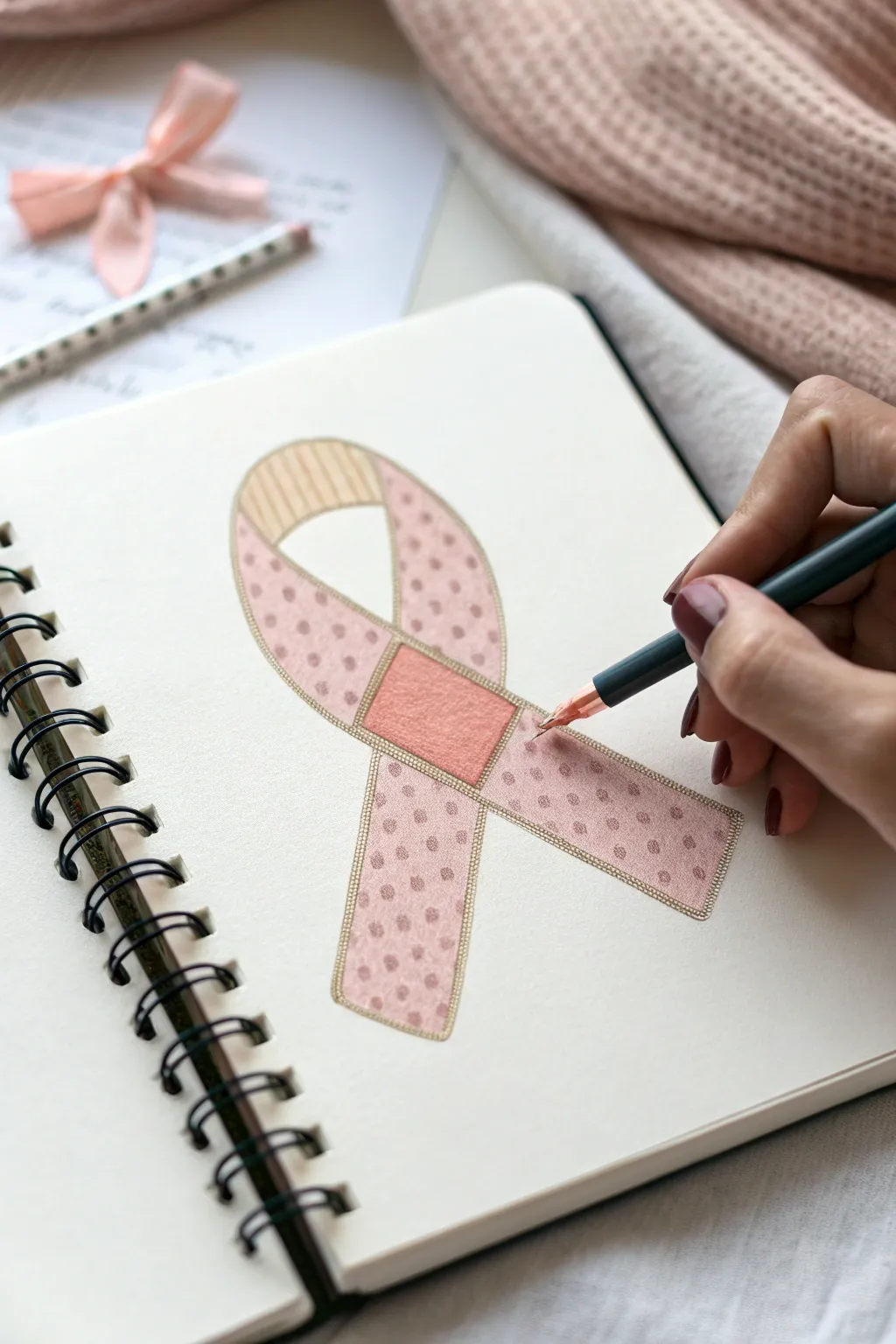
This thoughtful drawing combines the classic awareness ribbon shape with patchwork elements to symbolize the healing process. Using soft pinks and simple patterns, it’s a gentle artistic exercise perfect for journaling or creating supportive cards.
Step-by-Step Tutorial
Materials
- Spiral-bound sketchbook with smooth, heavyweight paper
- HB graphite pencil for sketching
- Fine-tip pen or marker (dark teal or charcoal)
- Flesh-toned or light beige colored pencil
- Soft pink colored pencil
- Rose or darker pink colored pencil/marker
- Ruler (optional)
- Eraser
Step 1: The Foundation Sketch
-
Outline the loop:
Start by lightly sketching the classic ribbon shape with your graphite pencil. Draw the top loop first, then extend the two legs downwards, letting them cross over each other naturally. -
Create the double border:
To give the ribbon dimension, draw a second line parallel to your first outline on the inside. Keep the spacing consistent, about 1-2mm wide, to create a border effect. -
Add the bandage center:
Where the two legs of the ribbon cross, draw a distinct square or rectangle. This acts as the ‘knot’ or a bandage patch, symbolizing recovery. -
Define the top section:
Draw a curved line across the top of the loop to separate the upper arch from the rest of the ribbon. This section will have a different pattern later. -
Clean up sketch lines:
Gently erase any intersecting lines inside the bandage square or other areas so you have a clean, segmented outline.
Fixing Smudges
If pencil smudges on the white paper, use a kneading eraser. Press and lift the graphite rather than rubbing, which can smear pigment further.
Step 2: Coloring and Patterns
-
Color the bandage:
Fill in the central square ‘bandage’ using a solid, warm pink or salmon color. Apply the color evenly to make it stand out as the focal point. -
Pattern the ribbon legs:
Using the same pink, carefully draw small, evenly spaced polka dots on the main sections of the ribbon legs and the lower part of the loop. Keep the dots inside the inner border. -
Stripe the top loop:
Switch to a lighter beige or flesh-toned pencil for the very top arch of the loop. Draw vertical stripes following the curve of the ribbon. -
Shade the background:
Lightly shade behind the dots with a very pale pink or cream color if you want to avoid stark white paper showing through, though leaving it white works well for contrast too. -
Fill the borders:
Your double-line border needs definition. I like to lightly shade this narrow track with a beige or light gold pencil to frame the pink sections.
Step 3: Inking and Details
-
Ink the main outline:
Take your fine-tip pen (a dark teal or charcoal grey looks softer than black) and trace over the outer and inner pencil lines of the ribbon. -
Refine the bandage:
Outline the central bandage square clearly. You can add tiny stitch marks at the corners if you want to emphasize the fabric patch look. -
Detail the stripes:
Go over the vertical stripe lines in the top loop with your pen, keeping your hand steady to follow the curve. -
Enhance the dots:
If your colored pencil dots look too soft, you can outline them very delicately or just ensure the surrounding color doesn’t bleed into them. -
Final erase:
Once the ink is completely dry, use a soft eraser to remove any visible graphite guidelines.
Add Texture
Use a white gel pen to add tiny highlights on the bandage square or over the polka dots to make the ribbon look like glossy fabric.
This simple yet meaningful drawing serves as a beautiful reminder of resilience and hope
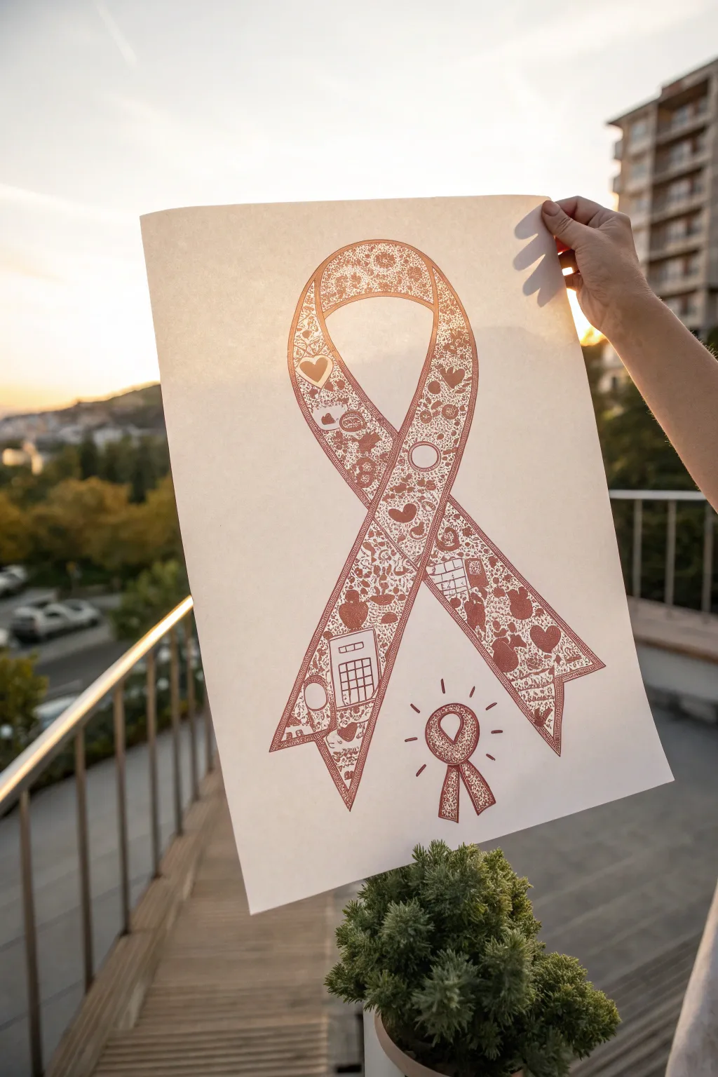
Collage-Style Ribbon of Mini Scenes

This thoughtful art project transforms the iconic awareness ribbon into a tapestry of personal stories and symbols. By filling the shape with detailed miniature doodles, you create a complex and meaningful visual narrative.
How-To Guide
Materials
- Large sheet of high-quality drawing paper (A3 or similar)
- Pencil (HB or 2H for light drafting)
- Large eraser
- Fine-liner pens (0.1mm, 0.3mm, and 0.5mm) in sepia, rust, or terracotta ink
- Ruler
- Compass or large circular object (for tracing curves)
Step 1: Drafting the Foundation
-
Establish center lines:
Begin by lightly marking a vertical center line on your paper to ensure symmetry. The ribbon will need to loop around this axis, so having a guide helps keep the proportions balanced. -
Sketch the top loop:
Using a pencil, draw the large upper loop of the ribbon. If you struggle with freehand curves, use a large bowl or a compass to guide the rounded top, keeping the lines faint. -
Draw the crossing legs:
Extend the lines downwards so they cross over each other naturally. The ‘legs’ of the ribbon should flare out slightly towards the bottom, ending in inverted V-notches. -
Create the inner border:
Draw a secondary line inside your first outline to give the ribbon thick borders. This creates the ‘frame’ that will contain all your doodles, leaving the thin edges empty for definition. -
Add the mini ribbon:
In the bottom right corner, sketch a smaller, simpler version of the ribbon. Add radiating lines around it to suggest a shining effect or emphasis.
Step 2: Inking the Outline
-
Trace major lines:
Switch to your thickest fine-liner (0.5mm). Carefully trace the outer and inner edges of the main ribbon shape. Keep your hand steady to ensure smooth, continuous curves. -
Define the small icon:
Ink the smaller ribbon at the bottom and its radiating lines. This element serves as a visual anchor or signature for the piece. -
Erase pencil guides:
Once the ink is completely dry—give it a few minutes to avoid smudging—gently erase all the underlying pencil marks so you have a clean slate for the details.
Use a Bridge
Place a scrap piece of paper under your drawing hand. This acts as a bridge, preventing oils from your skin from staining the paper and stopping fresh ink from smudging.
Step 3: Filling with Detail
-
Plan your symbols:
Before drawing directly in ink, softly pencil in larger key symbols you want to feature, such as hearts, calculators, medical icons, or nature elements representing the journey. -
Start from the top:
Using a finer pen (0.3mm), verify your larger symbols. Then, begin at the top loop and work your way down to avoid smearing ink with your hand as you draw. -
Create density with textures:
Fill the spaces between your main icons with tiny patterns. Stippling (dots), small circles, cross-hatching, and floral swirls work well to create a rich, textured look. -
Vary line weight:
I find that switching between the 0.1mm and 0.3mm pens adds depth. Use the thinnest pen for delicate shading inside the icons and the slightly thicker one for outlines of the shapes. -
Incorporating negative space:
Leave tiny pockets of white space around the denser doodle clusters. This prevents the drawing from becoming a solid block of dark ink and keeps the images legible. -
Focus on the crossover:
Pay attention to where the ribbon crosses itself. Ensure the doodle pattern stops cleanly at the overlapping lines to maintain the 3D illusion of the ribbon folding. -
Fill the legs:
Continue the pattern down into the legs of the ribbon. You might choose to put heavier, more grounded symbols primarily at the bottom, like houses or larger geometric shapes. -
Detail the mini ribbon:
Fille the small bottom-right ribbon with a similar, though simpler, pattern to match the large one. It acts as a microcosm of the main artwork. -
Final review:
Step back and look for any uneven gaps. Fill any unintentionally empty spots with tiny dots or dashed lines to balance the overall visual ‘weight’ of the texture.
Hidden Messages
Integrate words or names into the doodle pattern. By hiding text within the texture (like inside a flower stem or a geometric shape), you add a layer of personal discovery.
The result is a stunningly intricate tribute that rewards close viewing with hidden details and care.
Have a question or want to share your own experience? I'd love to hear from you in the comments below!