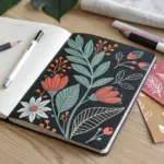
I love how cross hatching can take a simple outline and suddenly make it feel solid, moody, and real. Here are my favorite cross hatching drawing ideas—starting with the classic practice subjects and moving into more playful, unusual ones once your hand is warmed up.
Shade a Sphere With a Cast Shadow
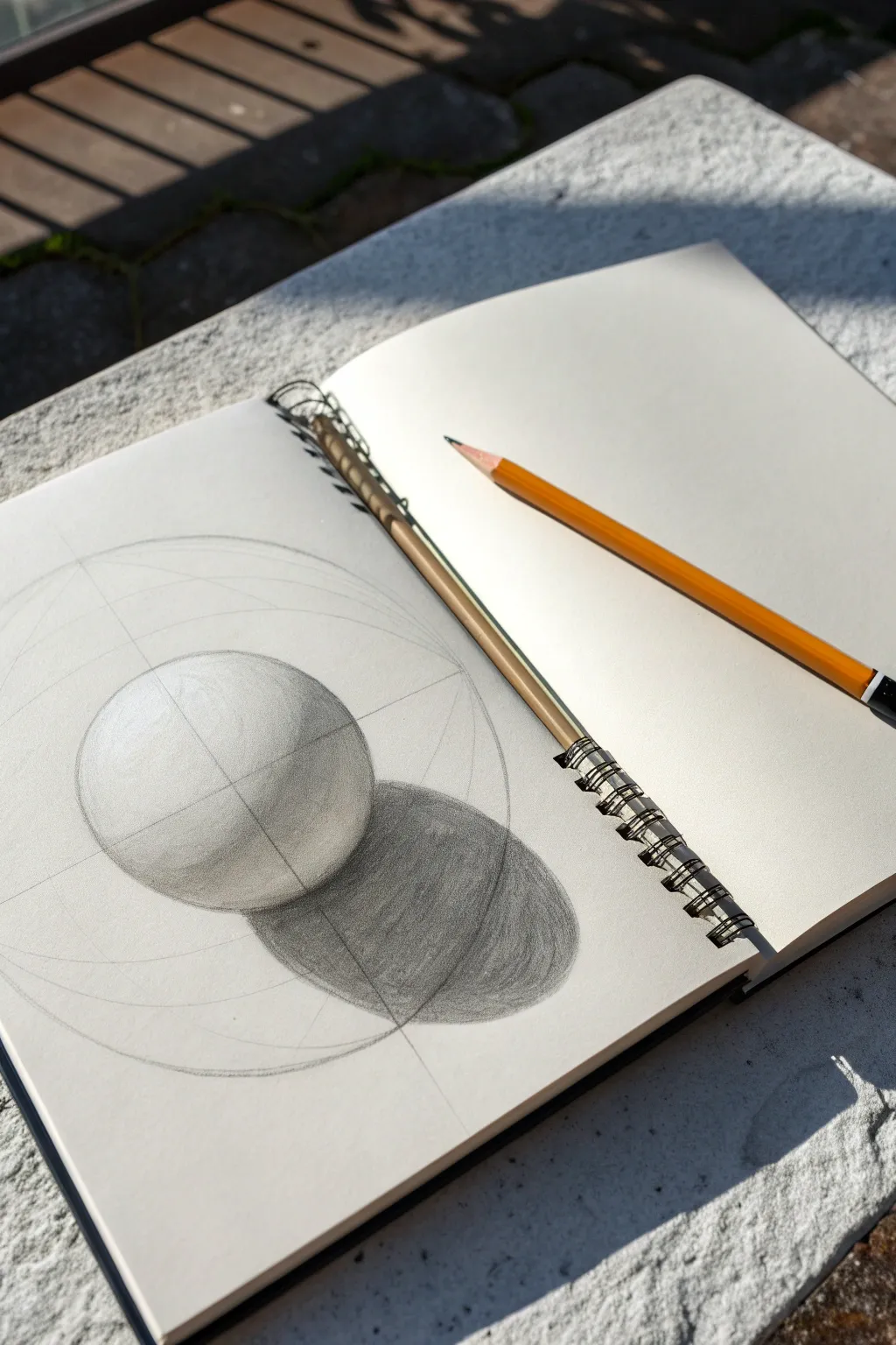
Learn the fundamentals of form and lighting by sketching a classic sphere study. This project breaks down the geometry of light and shadow, resulting in a realistic 3D object on your page.
Step-by-Step Tutorial
Materials
- Sketchbook or drawing paper (medium tooth)
- HB or 2B graphite pencil
- 4B or 6B graphite pencil for darks
- Eraser (kneaded preferred)
- Ruler (optional)
- Circle template or compass (optional)
Step 1: Construction & Geometry
-
Draw the main axis:
Begin by lightly sketching a vertical line and a horizontal line that cross in the center of your page. These will act as the anchor for your entire composition. -
Establish the outer boundary:
Draw a large, faint circle centered on your crosshairs. This large circle won’t be the sphere itself, but rather a guide to help you place the shadows and light angles correctly within a contained space. -
Draw the sphere outline:
Inside your large guide circle, draw a smaller, perfect circle. This is your actual sphere. Keep your pencil pressure very light so you can erase these lines later if needed. -
Define the light source:
Decide on your light direction—in this example, it’s coming from the top left. Draw a faint diagonal line through the center of the sphere to mark the angle of the light. -
Mark the shadow ellipse:
Sketch an elongated oval (ellipse) extending from the base of the sphere toward the bottom right. This shape represents the cast shadow on the ground surface.
Keep it Clean
Place a piece of scrap paper under your drawing hand. This prevents oils from your skin transferring to the paper and stops your hand from smudging completed graphite work.
Step 2: Mapping Values
-
Locate the highlight:
On the upper left side of the sphere, lightly circle a small area. This will remain the white of the paper, representing the brightest point where light hits directly. -
Define the terminator line:
Sketch a curved line across the sphere’s surface, perpendicular to your light source. This line separates the light side from the shadow side and is often called the ‘terminator’. -
Begin the core shadow:
Using the side of your pencil lead, gently fill in the area just behind the terminator line. This band of shadow—the core shadow—is usually the darkest part of the object itself. -
Shade the cast shadow base:
Move to the ellipse on the table surface. Fill this entire shape with a medium-dark tone. The cast shadow is generally darker than the form shadow on the sphere.
Step 3: Refining & Texturing
-
Build intermediate tones:
Switch to gentle cross-hatching or smooth shading motions. Bridge the gap between your bright highlight and the core shadow with soft, mid-tone greys. -
Darken the occlusion shadow:
Press harder with your pencil right underneath the sphere where it touches the ground. This area, known as the occlusion shadow, receives the least light and should be nearly black. -
Add reflected light:
Important: Do not shade the bottom edge of the sphere completely black. Leave a sliver of lighter value near the bottom rim to show light bouncing off the table back onto the object. -
Gradient the cast shadow:
Make the cast shadow darkest near the object and let it fade slightly as it moves away. This mimics how shadows diffuse over distance. -
Smooth the transitions:
Go back over your mid-tones. I like to use small circular pencil strokes here to blend the graphite without smudging it, creating a seamless curve from light to dark. -
Reinforce construction lines:
Unlike a realistic render where you erase guides, in this study, you can darken the initial geometric lines (the vertical/horizontal axis and large outer circle) to give the drawing a technical, architectural look.
Shift the Light
Once mastered, try drawing three spheres on one page, but move the light source for each one (e.g., top-left, direct top, and back-lit) to practice how shadows change.
Now you have a solid geometric study that captures volume and depth on a flat surface
Draw a Pear With Contour Cross Hatching
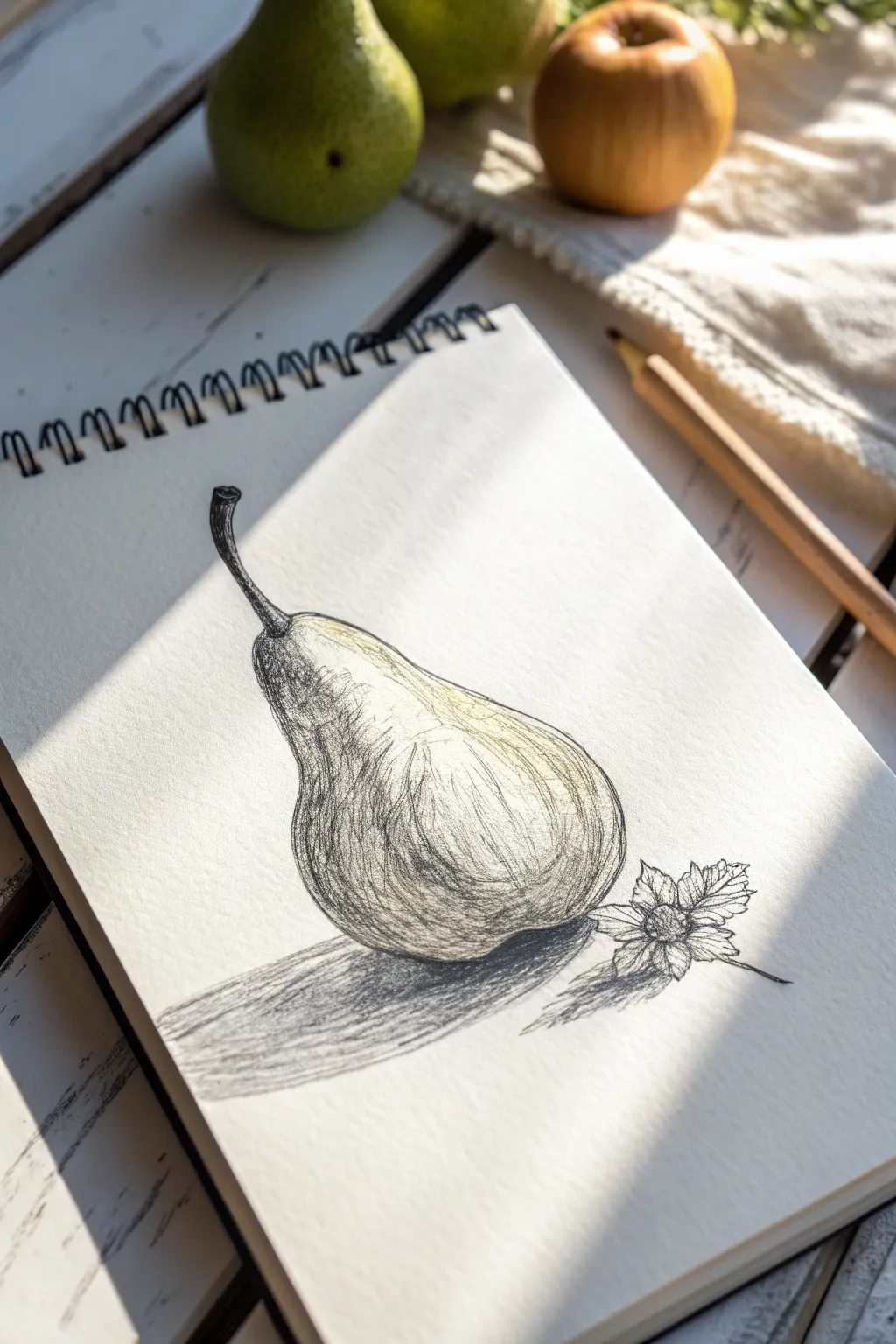
Master the art of volume and form with this elegant pear study that relies on directional lines rather than smooth shading. This tutorial guides you through capturing organic texture and light using contour cross-hatching techniques.
Detailed Instructions
Materials
- Spiral-bound sketchbook (heavyweight paper preferred)
- Graphite pencils (HB for sketching, 2B and 4B for shading)
- Fine liner pen (optional, for final definition)
- Kneaded eraser
- Pencil sharpener
- Blending stump (optional)
Step 1: Form & Outline
-
Observe the subject:
Begin by observing your pear. Notice how the bottom is bulbous and heavy, while the neck tapers gracefully toward the stem. Visualize the center line of the fruit to keep it symmetrical. -
Lightly sketch the basic shape:
Using an HB pencil with very light pressure, draw a circle for the base and a smaller oval for the top section. Connect them with curved lines to create the pear’s signature silhouette. -
Add the stem:
Draw the stem curving slightly to the left. Thicken the base of the stem where it meets the fruit, adding a small divot or depression around the insertion point. -
Refine the contour:
Go over your light sketch to define the final outline. Keep the line slightly organic and wavering—pears aren’t perfect geometric shapes. -
Place the flower accent:
To the right of the pear’s base, lightly sketch a small, multi-petaled flower. This adds a nice contrast in scale. Start with a center circle and radiate jagged, leaf-like petals outward.
Step 2: Contour Hatching
-
Map the light source:
Identify where the light is hitting the pear. In our reference, the light comes from the top right, leaving the bottom left in shadow. Mark a faint highlight area on the upper right curve to keep it white. -
Start the first layer of hatching:
Using your 2B pencil, begin drawing curved lines that follow the form of the pear. Start from the shadow side (left). These lines should wrap around the object like rubber bands, reinforcing its roundness. -
Build density in the shadows:
Deepen the shadows on the left side and the bottom by adding a second layer of hatching lines. I like to cross these at a slight angle to the first set, creating a mesh-like texture. -
Detail the neck:
On the neck of the pear, use more vertical, slightly curved lines to show how the form stretches upwards. Keep the strokes lighter here to indicate the transition to the highlighted area. -
Define the stem texture:
Switch to a sharper point or a 4B pencil for the stem. fill it in darker, leaving a tiny sliver of white on the right edge for a highlight. Use short, crisp strokes to mimic the woody texture. -
Refine the mid-tones:
Extend your hatching lines towards the center of the pear, pressing lighter as you approach the highlight. Let the paper’s white show through between strokes to create a mid-tone grey. -
Darken the core shadow:
Identify the darkest part of the pear—usually just before the reflected light at the very edge. Use close, dense cross-hatching here with a 4B pencil to add weight and volume.
Wrap Around
Imagine the contour lines are actual strings wrapped around the pear. If the lines are straight, the pear will look flat. Curve them significantly to pop the 3D volume.
Step 3: Grounding and Details
-
Cast the shadow:
Draw the cast shadow stretching beneath the pear to the left. Use tight, horizontal hatching lines here. The shadow should be darkest right underneath the fruit and fade as it moves outward. -
Detail the flower:
Return to the small flower. Use quick, short strokes to define the petals, adding shade to their centers. Draw the stem extending out to the right. -
Connect shadow and object:
Darken the bottom edge of the pear where it touches the surface. This ‘occlusion shadow’ anchors the object so it doesn’t look like it’s floating. -
Add subtle texture:
Pears often have speckled skin. You can suggest this by adding a few tiny dots or stippling marks near the transition between light and shadow. -
Final assessment:
Step back and check your contrast. If the drawing looks flat, darken your deepest shadows on the left curve. If lines feel too harsh, you can very gently soften them with a kneaded eraser, but try to preserve the hatched look.
Ink Finish
Once comfortable with the pencil sketch, go over your lines with a waterproof fine liner, then wash over it with watercolor for a multimedia illustration.
Enjoy your beautifully volume-rich fruit study, a classic exercise that always sharpens observation skills

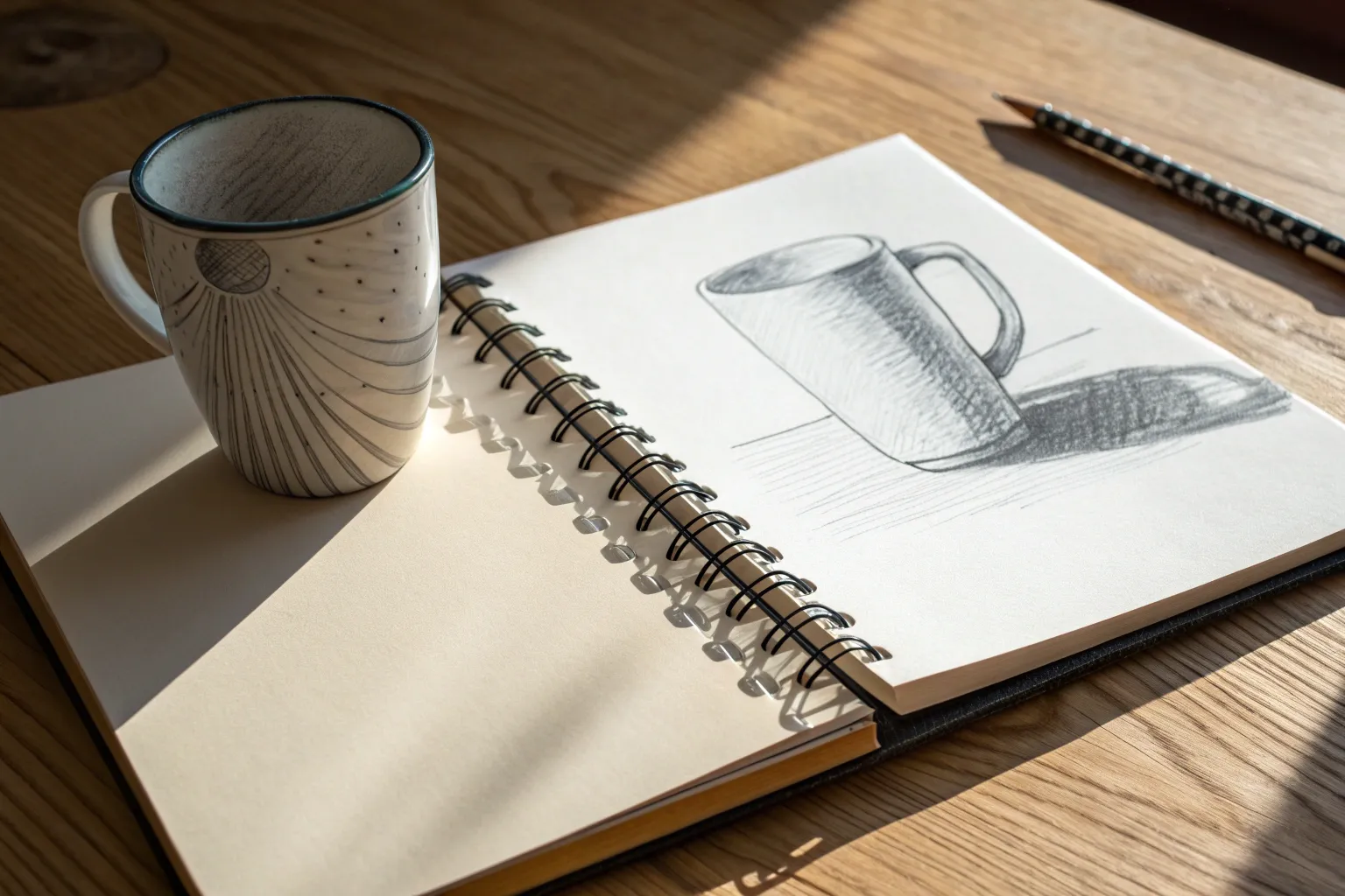
Cross Hatch a Mug and Its Rim Ellipse
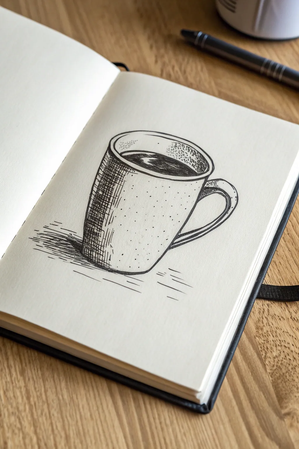
Capture the cozy essence of a coffee break with this detailed ink study of a simple mug. By combining clean contour lines with strategic cross-hatching and stippling, you’ll transform a basic cylinder shape into a dimensional, textured object that pops off the page.
Step-by-Step
Materials
- Sketchbook or drawing paper (smooth bristol or mixed media)
- HB Graphite pencil (for under-sketch)
- Kneaded eraser
- Fine liner pen (0.3mm or 0.5mm) – Black
- Fine liner pen (0.1mm) – Black
Step 1: Pencil Structure
-
Establish the Ellipse:
Begin by sketching a flattened oval (ellipse) near the top of your page. This will represent the open rim of the mug. Keep your pencil pressure very light so these lines can be erased later. -
Draw the Body:
Drop two vertical lines down from the widest points of your ellipse. Curve the lines slightly inward as they go down to give the mug a gentle taper, rather than making it a perfect rectangle. -
Base Curve:
Connect the bottom of your vertical lines with a curve that mimics the front curve of your top ellipse. This parallel curve is crucial for making the mug look round and not flat. -
Add the Handle:
On the right side, sketch a ‘C’ shape for the handle. Draw the outer curve first, then add the inner curve, making sure to show how the handle attaches to the body with slightly widened connection points. -
Refine the Rim:
Go back to your top oval and draw a second, slightly smaller oval inside it. This creates the thickness of the mug’s ceramic rim.
Wobbly Ellipses?
Drawing perfect ovals is tough. Instead of drawing it in one slow go, try ‘ghosting’ the motion with your hand in the air first, then lower the pen while moving quickly.
Step 2: Inking Outlines
-
Trace the Rim:
Using your 0.5mm pen, carefully ink the outer and inner ellipses of the rim. Try to keep your hand steady for a continuous line, but don’t worry if it’s slightly shaky—it adds character. -
Ink the Body and Handle:
Ink the vertical sides, the bottom curve, and the handle shape. Notice how the handle lines overlap the body slightly at the attachment points. Stop your lines cleanly where shapes intersect. -
Fill the Coffee:
Inside the inner rim ellipse, draw a wavy, irregular shape for the liquid line. Leave a small, kidney-bean-shaped white space near the left side to represent a reflection on the liquid surface. -
Erase Graphite:
Once the ink is completely dry (give it a full minute), gently erase all your initial pencil guides with the kneaded eraser to leave a clean black-and-white base.
Step 3: Shading and Texture
-
Darken the Liquid:
Use your thicker pen to fill in the coffee area black, being very careful to preserve that white reflection shape you mapped out earlier. This contrast is what makes the liquid look wet. -
Start the Hatching:
Switch to your finer 0.1mm pen. On the left side of the mug body, start drawing closely spaced vertical lines. These should span from just under the rim to the bottom edge, following the curve of the mug. -
Cross-Hatch the Shadow:
To deepen the shadow on the far left, draw horizontal lines crossing over your vertical ones. Keep this cross-hatching dense on the leftmost edge and let it fade out as you move toward the center of the mug. -
Inner Rim Texture:
Add some very light hatching or stippling (dots) inside the back rim of the mug to show shadow depth inside the cup, just above the liquid line. -
Stippling the Surface:
To give the mug a speckled, ceramic texture, tap your pen to create random dots across the body. Concentrate more dots on the left side near the hatching and fade them out completely as you reach the right side. -
Handle Shading:
Add a few small hatch lines to the bottom curve of the handle and the inside edge to give it volume. -
Cast Shadow Base:
To ground the object, draw horizontal lines starting from the bottom left base of the mug, extending outward to the left. -
Deepen the Shadow:
Layer more horizontal lines closer to the mug’s base to make the cast shadow darkest right where the object touches the table. I find varying the length of these lines makes the surface look more natural. -
Final Touches:
Review your drawing. If the main shadow on the mug doesn’t look dark enough, add a third layer of diagonal hatching on the very edge to increase the contrast.
Steam It Up
To imply heat, draw three wavy, broken lines rising from the liquid. Keep them very light and delicate, breaking the lines frequently so they look like vapor.
Now you have a permanently fresh cup of coffee to admire in your sketchbook without worrying about spills

Render a Glass Bottle With Sharp Darks
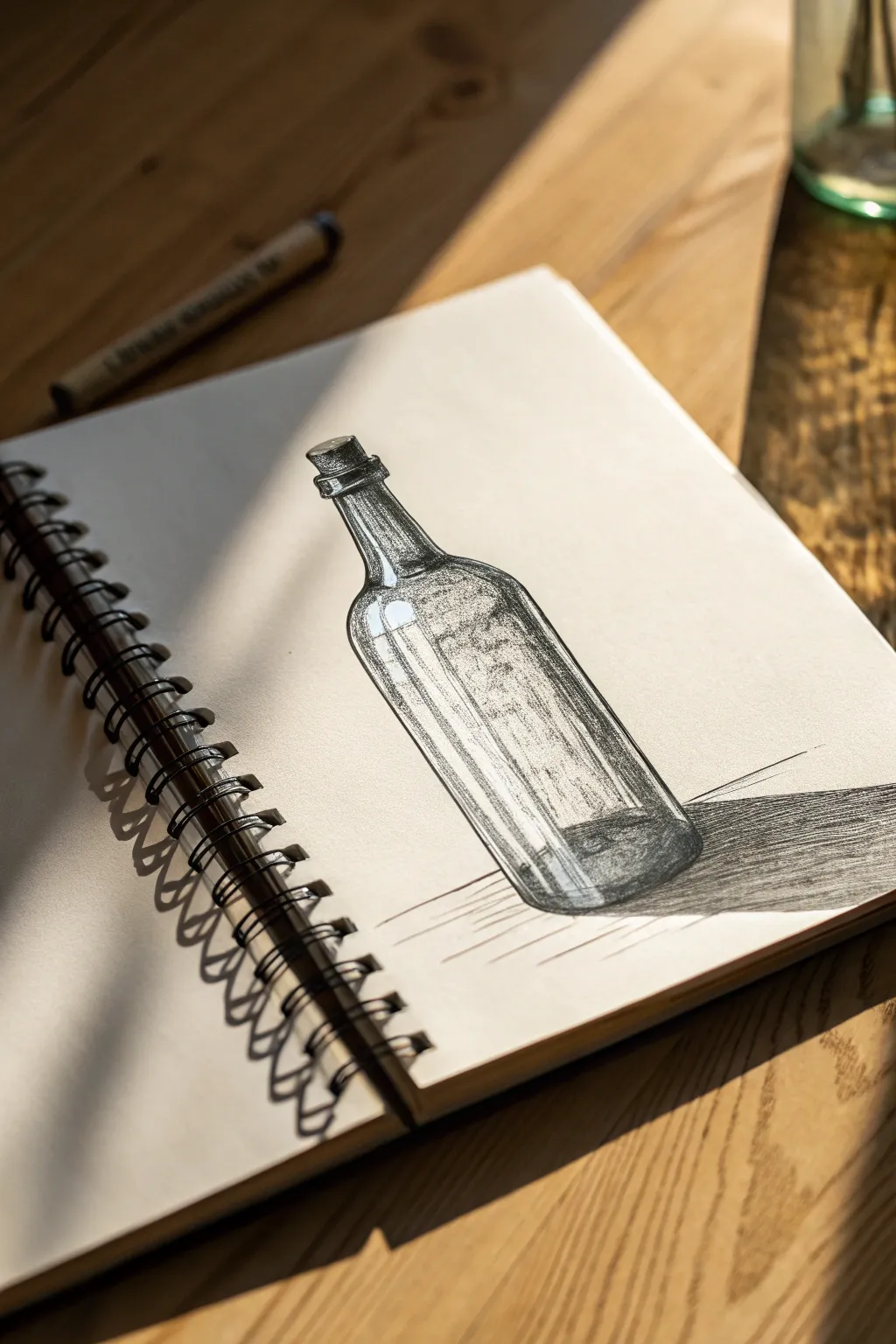
This tutorial guides you through sketching a classic glass bottle, focusing on how shadow and light interplay to create the illusion of glass. By using sharp darks and deliberate cross-hatching, you’ll learn to render convincing reflections and volume on the page.
Detailed Instructions
Materials
- Sketchbook or drawing paper (heavyweight)
- HB or 2B pencil (for initial sketch)
- Fine liner pens (0.1mm, 0.3mm, 0.5mm)
- Eraser
- Ruler (optional)
Step 1: The Scaffold
-
Establish the centerline:
Start by lightly drawing a vertical line down the center of your page to guide the symmetry of the bottle. -
Draft the basic shapes:
Draw an oval at the top for the opening, a thin cylinder for the neck, and then curve gently outward to form the wider body of the bottle. -
Define the base:
Sketch a slightly curved line at the bottom to match the perspective of the top oval, giving the bottle a rounded, 3D feel rather than a flat look. -
Add the cork:
Draw a small trapezoid shape sitting in the opening, ensuring the rim of the bottle wraps slightly around it to show depth. -
Mark the highlights:
Before adding any permanent ink, lightly outline the areas where the light hits the glass—specifically long vertical strips on the left side and the curve of the shoulder. These areas must stay white.
Step 2: Inking the Form
-
Outline the silhouette:
Using a 0.3mm pen, go over your pencil lines for the outer shape of the bottle. Keep the line slightly broken or thinner on the highlighted side to suggest light. -
Detail the rim and cork:
Ink the top rim with care, using a thicker line on the shadowed side. Use small, textural dots or tiny dashes on the cork to differentiate its porous texture from the smooth glass. -
Establish the core shadows:
Switch to a 0.1mm pen to start the shading. Draw long, vertical hatch lines down the right side of the bottle (the shadowed side), following the curve of the glass. -
Deepen with cross-hatching:
Layer a second set of diagonal hatch lines over the vertical ones on the darkest side of the bottle to build up density. -
Render the liquid line (optional):
If you want the bottle to look empty but thick, draw an inner outline near the base. If partly full, draw an oval ellipse inside the body.
Clean Highlights
Don’t outline your highlights with ink. Let the white paper define the shape. If you accidentally draw over a highlight, a white gel pen can rescue the shine later.
Step 3: Building Contrast
-
Darken the edges:
Glass is often thickest and darkest at the very edges. Use your 0.5mm pen to solidify the outer contour line on the right side and the bottom curve. -
Create mid-tones:
Add lighter, more spaced-out hatching towards the center of the bottle, fading out as you approach the highlighted white areas. -
Refine reflections:
On the left highlighted side, add just a few very thin, broken vertical lines to suggest the glass surface without darkening it too much. -
Ground the object:
Draw a long, horizontal shadow stretching to the right. Use dense, tight cross-hatching here with the 0.5mm pen to anchor the bottle to the surface. -
Final touches:
Check for balance. If the shadow side looks too light, add one final layer of hatching. Erase all original pencil marks once the ink is totally dry to leave a crisp finish.
Wobbly Lines?
Long, continuous lines on smooth glass can be tricky. Try locking your wrist and moving your whole arm from the elbow to get straighter, more confident strokes.
With these techniques, you can turn a simple outline into a convincing, shine-filled glass object.

PENCIL GUIDE
Understanding Pencil Grades from H to B
From first sketch to finished drawing — learn pencil grades, line control, and shading techniques.
Explore the Full Guide
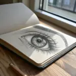
Do an Eye Study With Soft Gradients
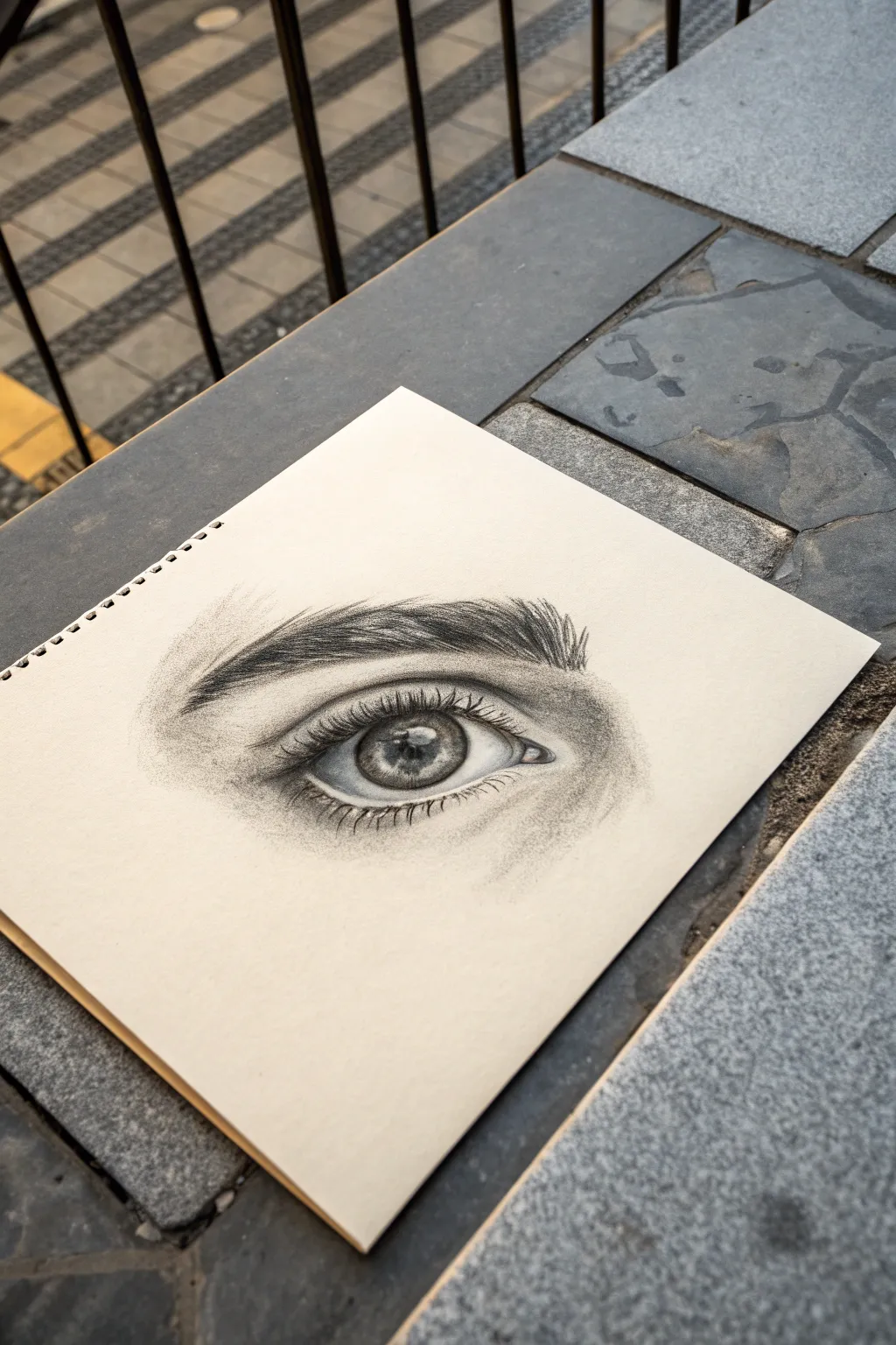
Capture the soul of your subject with this detailed graphite eye study, focusing on realistic textures and soft, blended gradients. This project balances precise line work with gentle shading to create a lifelike rendering of the iris, lashes, and surrounding skin.
How-To Guide
Materials
- Smooth bristol or drawing paper
- Graphite pencils (HB, 2B, 4B, 6B)
- Mechanical pencil (0.5mm, 2B lead)
- Blending stump (tortillon)
- Kneaded eraser
- Precision eraser (for highlights)
- Tissue or soft cloth
Step 1: Structure & Iris
-
Outline the basic shape:
Use your HB pencil to lightly sketch the almond shape of the eye. Mark the tear duct on the inner corner and the crease of the upper eyelid above the eye. -
Define the iris and pupil:
Draw a perfect circle for the iris, letting the top portion be slightly covered by the upper lid. Inside this, draw the smaller pupil circle and mark a small, irregular shape for the highlight (reflection) that will remain white. -
Darken the pupil:
Switch to a 4B or 6B pencil to fill in the pupil. Make this the darkest part of your drawing, pressing firmly but being careful not to crush the paper tooth. -
Detail the iris spokes:
Using a sharp mechanical pencil or 2B, draw lines radiating outward from the pupil like bicycle spokes. Vary the length and pressure, leaving some areas lighter for a natural texture. -
Shade the iris rim:
Darken the outer ring of the iris (the limbal ring) with a 4B pencil. Gently shade inward to blend it with the radiating lines, creating a sense of depth. -
Add iris highlights:
Use your kneaded eraser to tap or lift small sections within the iris to create varied light values. This contrast makes the eye look wet and glossy.
Fixing “Flat” Eyes
If the eye looks flat, the sclera (white part) is likely too bright. Even white objects have shadows. Shade the corners and under the lid to curve the form.
Step 2: Skin shading & Brow
-
Shade the eyeball (sclera):
The white of the eye isn’t purely white. Use a 2B pencil to lightly shade the corners and the area directly under the upper eyelid, creating a subtle shadow cast by the lid. -
Create the skin gradient:
Using an HB pencil held at a low angle, lay down a base tone for the skin above and below the eye. Focus on the crease, which should be darker. -
Blend the skin tone:
Take a blending stump or tissue and gently buff the graphite into the paper. I find circular motions work best here to create that seamless, pore-less skin texture shown in the reference. -
Deepen the crease shadows:
Layer 2B and 4B graphite into the eyelid crease and the hollow near the nose bridge. Blend again to soften the transition from shadow to highlight. -
Map the eyebrow:
Sketch the faint outline of the eyebrow shape. Don’t draw individual hairs yet; just define the area where the hair grows. -
Draw eyebrow hairs:
Using a sharp mechanical pencil, draw quick, short strokes for the eyebrow hairs. Follow the direction of growth—upward at the start, angling sideways and down toward the tail. Layer strokes for density.
Add Skin Texture
For hyper-realism, lightly tap a sharpened HB pencil over the shaded skin areas to create pores, then gently dab—don’t rub—with a tissue to set them.
Step 3: Lashes & Final Details
-
Draw upper lashes:
With a 4B pencil or mechanical pencil, create the upper eyelashes. Start at the root on the eyelid line, press down, and flick upward in a curved motion. Make them clump together slightly rather than spacing them perfectly evenly. -
Add reflected lashes:
Lightly sketch the reflection of the upper lashes into the highlight of the eye itself if your reference shows it. This adds extreme realism. -
Draw lower lashes:
Draw the lower lashes using lighter, shorter strokes. Remember, these grow from the outer edge of the lower waterline, not from inside the eye. -
Define the waterline:
The waterline is the rim of skin between the eye and the lashes. Ensure this area stays light to show its thickness, but shade the edges slightly to round it out. -
Refine highlights:
Use a precision eraser or the sharp edge of a kneaded eraser to clean up the main highlight on the iris and add tiny specs of light on the oily tear duct area. -
Final contrast check:
Step back and assess your values. Darken the pupil and lash roots one last time if they look faded compared to the rest of the drawing.
Enjoy the process of seeing your drawing come to life as you add those final sparkling highlights
Try a Simple Portrait With Cross Hatching
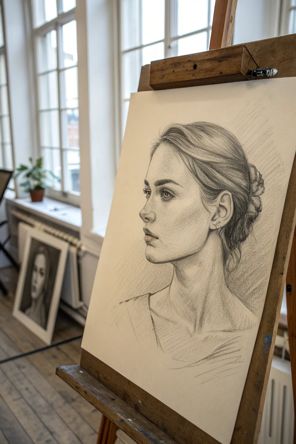
Capture the delicate strength of a female profile using classic graphite techniques on toned paper. This project balances soft shading with structured cross-hatching to create a lifelike and expressive portrait.
Step-by-Step Tutorial
Materials
- Smooth bristol or drawing paper (can be off-white or cream)
- Graphite pencils (HB, 2B, 4B, 6B)
- Kneaded eraser
- Precision eraser or eraser stick
- Blending stump (tortillon)
- Pencil sharpener
Step 1: Constructing the Framework
-
Establish the envelope:
Begin with an HB pencil using very light, loose strokes. Map out the overall height of the head and the width from the nose tip to the back of the bun to ensure the composition fits the page. -
Map the features:
Draw the ‘Loomis’ construction lines or a simple oval for the cranium and a jawline shape. Mark horizontal guidelines for the eyes, base of the nose, and the mouth. -
Refine the profile:
Sketch the specific angle of the forehead, the dip of the bridge of the nose, and the protrusion of the chin. Pay close attention to the negative space in front of the face to get the silhouette right. -
Place the ear:
Locate the ear carefully; in profile, it sits further back than beginners often think. Sketch the general C-shape between the eye line and nose line.
Pro Tip: Sharpness Matters
Keep your pencil needle-sharp for hair strands and eyelashes, but use a duller point for soft skin shading. This contrast in texture makes the drawing pop.
Step 2: Detailed Rendering
-
Define the eye:
Switch to a 2B pencil. Draw the upper eyelid with a crisp, dark line, and sketch the iris looking forward. Remember that in a side view, the iris is an oval, not a circle. -
Shade the orbital bone:
Apply soft hatching around the eye socket (orbital bone) to push the eye back into the skull. Leave the eyeball white for now to maintain brightness. -
Sculpt the nose:
Add shading under the tip of the nose and around the nostril wing. Avoid drawing hard outlines for the nose bridge; define it using the contrast of shading on the cheek instead. -
Shape the lips:
Darken the parting line of the lips. Shade the upper lip darker than the lower lip, as it naturally angles away from the light. Use a blending stump to soften these transitions. -
Detail the ear:
Work into the folds of the ear with a 4B pencil for the deepest crevices. The ear is complex, so focus on the main pools of shadow rather than outlining every ridge. -
Carve the jawline:
Strengthen the jawline by adding a shadow underneath it, separating the head from the neck. Keep the line on the face itself slightly softer to imply roundness.
Level Up: Charcoal Accent
Use a stick of compressed charcoal for the absolute darkest masses in the hair bun. The matte black of charcoal is much darker than graphite can achieve.
Step 3: Hair and Texture
-
Block in hair flow:
Using the side of a 2B pencil, map the large masses of hair. Focus on the direction the strands grow—sweeping back from the forehead and up from the nape. -
Add directional strokes:
With a sharpened 4B pencil, draw long, sweeping lines following the hair’s path. Lift your pencil at the end of strokes to taper them naturally. -
Create the bun:
Draw the braided or twisted texture of the bun at the back. Use short, curved hatching marks to suggest overlapping sections of hair without drawing every single strand. -
Darken the deepest values:
Take a 6B pencil to the darkest areas: the pupil, the corner of the mouth, the deepest folds of the ear, and the shadowed pockets within the hair mass.
Step 4: Atmosphere and Finish
-
Apply background hatching:
Add diagonal cross-hatching to the background behind the head. This classic technique adds texture and pushes the white of the profile forward. -
Refine the neck shadows:
Shade the neck using vertical hatching lines that follow the anatomy of the sternocleidomastoid muscle. Keep this shading loose to contrast with the detailed face. -
Suggest clothing:
Sketch the neckline of the shirt very loosely. I like to keep the clothing lines sketchy and unfinished to keep the viewer’s focus on the face. -
Lift highlights:
Take your kneaded eraser and gently dab or stroke to lift pigment on the high points: the bridge of the nose, the brow bone, the lower lip, and a few sleek highlights on the hair. -
Final assessment:
Step back from your easel or table. Check if the values are balanced. If the face looks too flat, deepen the shading under the cheekbone and jaw.
Now you have a stunning, classical portrait that captures both character and light
BRUSH GUIDE
The Right Brush for Every Stroke
From clean lines to bold texture — master brush choice, stroke control, and essential techniques.
Explore the Full Guide
Cross Hatch Lips Without Over-Detailing
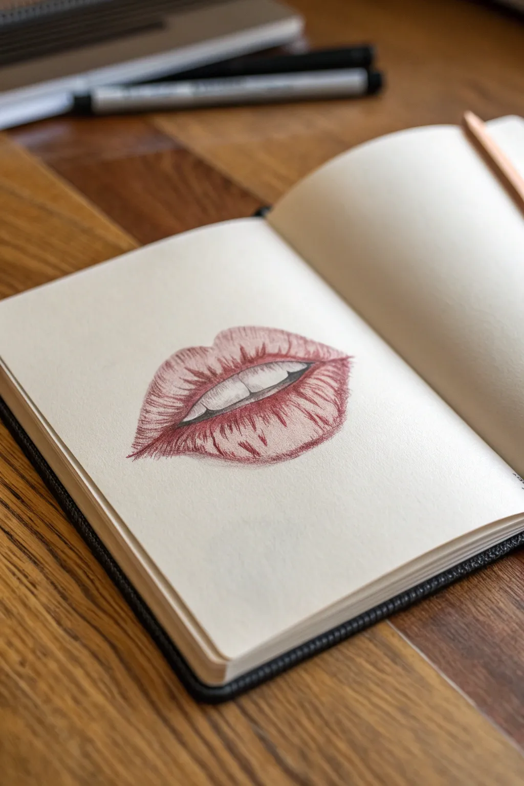
This tutorial guides you through creating a striking, semi-realistic drawing of lips using a single red fine-liner or colored pencil. By focusing on cross-hatching techniques rather than heavy outlines, you’ll achieve a textured, dimensional look that pops off the page.
Detailed Instructions
Materials
- Smooth sketchbook paper (cream or off-white recommended)
- Red or maroon fine-liner pen (0.3mm or 0.5mm)
- Graphite pencil (H or HB for light sketching)
- Kneaded eraser
Step 1: Planning and Outline
-
Mark the center:
Begin by lightly sketching a horizontal line in the center of your page to represent the mouth opening. Add a small vertical mark in the middle to establish symmetry. -
Define the cupid’s bow:
Above the center line, sketch a soft ‘M’ shape for the top outline of the upper lip. Keep the peaks rounded rather than sharp for a natural look. -
Sketch the bottom curve:
Draw a deep, wide ‘U’ shape below the centerline for the bottom lip. Make this section fuller and slightly thicker than the top lip. -
Indicate the teeth:
Lightly draw the bottom edge of the upper teeth inside the mouth opening. Don’t draw vertical lines between every tooth yet; just focus on the overall curve where the teeth rest. -
Softening lines:
Take your kneaded eraser and gently roll it over your graphite sketch. You want the lines to be barely visible—just faint guides for your ink work.
Pro Tip: Line Weight
Vary your pressure. Start strokes firmly and lift the pen briskly at the end to create tapered, hair-like lines that mimic lip texture.
Step 2: Contour Hatching
-
Start the center line:
Switch to your red pen. Carefully trace the opening of the mouth, darkening the corners where the lips meet. Add a little weight to the line underneath the upper teeth to create depth. -
Vertical contours (Bottom Lip):
Begin closest to the center line on the bottom lip. Draw curved, vertical strokes that follow the roundness of the lip. These strokes should start from the mouth opening and flick downward, disappearing before they hit the very bottom edge. -
Curved strokes (Bottom Lip Highlights):
Now work from the bottom edge of the lip upward. Leave a negative space gap in the middle of the bottom lip untouched—this uncolored area acts as your primary highlight. -
Upper lip texture:
On the top lip, reverse the direction. Draw short, curved hatching lines starting from the top edge (cupid’s bow) curving downward. Add similar lines starting from the bottom of the top lip curving upward. -
Define the lip wrinkles:
Lips have natural vertical cracks. Accentuate these by drawing a few stronger, slightly wavy vertical lines across both lips. Don’t make them straight; let them follow the contour curvature.
Level Up: Gloss Effect
Use a white gel pen to add tiny, sharp dots or lines over the empty highlight areas for a ‘wet’ or glossy lip gloss appearance.
Step 3: Deepening Shadows
-
Darken the corners:
Return to the corners of the mouth. Apply a second layer of cross-hatching (diagonal lines) in these tight spaces to create a deep shadow, making the lips look recessed. -
Under-lip shadow:
Add density to the very bottom curve of the lower lip. By layering more strokes here, you create the illusion that the lip is casting a small shadow on itself. -
Refining the teeth:
Use extremely light touches to suggest the separation between teeth. Don’t outline them fully. Instead, just darken the negative space (the tiny triangles) between the gum line and the teeth tops. -
Connecting the strokes:
Go back over your vertical hatching lines. Length some of them so they encroach slightly on the highlight area, softening the transition from dark to light paper. -
Final contrast check:
Look at the drawing from a distance. If the mouth opening isn’t the darkest part, go over that central line one more time to ensure strong contrast.
Step back and admire the simple elegance of your cross-hatched illustration
Build Hair Texture With Layered Cross Hatching

Learn to sketch a sturdy, textured padlock using layered ink techniques. This project focuses on building depth and metallic weathering through careful cross-hatching and directional shading.
Step-by-Step Guide
Materials
- Sketchbook with cream paper
- HB or 2B pencil for initial layout
- Fine liner pen (0.1mm) for details
- Fine liner pen (0.3mm or 0.5mm) for main lines
- Eraser
Step 1: Basic Structure
-
Outline the body:
Start by lightly sketching a square shape for the lock’s main body. Make the top edge slightly wider than the bottom to give it a heavy, solid feel. -
Add dimension:
Draw angled lines extending back from the right side and bottom edge to create a 3D block form. Perspective is key here, so keep your angles consistent. -
Draw the shackle:
Sketch a U-shaped arch on top of the body. Draw a second, smaller U-shape inside the first to create the thickness of the metal bar. -
Define the keyhole:
In the center of the body’s front face, sketch a classic keyhole shape—a circle on top merged with a trapezoid below.
Directional Shading Tip
Always curve your hatching strokes on cylindrical parts like the shackle. Following the form’s contour creates immediate 3D volume.
Step 2: Inking the Forms
-
Trace main outlines:
Switch to your 0.3mm or 0.5mm pen. Go over the pencil lines of the lock body and shackle. Use confident strokes, but don’t worry if they are slightly rough; it adds character. -
Detail the mechanism:
Draw the rim around the keyhole. Add small rivets or screws along the vertical edges of the lock face for extra industrial detail. -
Erase guidelines:
Once the ink is completely dry, gently erase all visible pencil marks to clean up your workspace.
Level Up: Rusty Details
Use stippling (tiny dots) in the corners or near the rivets to simulate rust texture and make the lock look properly ancient.
Step 3: Adding Texture & Shading
-
Shade the shackle:
Using the 0.1mm pen, draw curved hatching lines along the left side of the shackle to suggest roundness. Leave the top right area clear for a highlight. -
Texture the face:
On the front face of the lock, use vertical strokes to simulate a brushed metal or wood grain texture. Vary the length and density of these lines. -
Darken the side:
Cross-hatch the side panel of the lock heavily. Layer diagonal lines over vertical ones to make this side significantly darker than the front. -
Deepen the keyhole:
Fill in the keyhole with solid black or very dense cross-hatching to create a sense of deep, hollow space. -
Add edge wear:
Thicken the lines at the corners and edges of the lock body. This subtle detail suggests wear and tear over time. -
Cast a shadow:
Draw horizontal hatching lines extending from the bottom right of the lock onto the ‘surface’ it sits on. Taper these lines off as they move away from the object. -
Final contrast check:
Review your drawing. I usually find adding a few extra dark strokes near the bottom of the lock face helps ground the object and enhances the 3D effect.
Now you have a solid, weighty sketched padlock to secure your sketchbook pages


Draw a Hand Using Cross-Contour Hatching
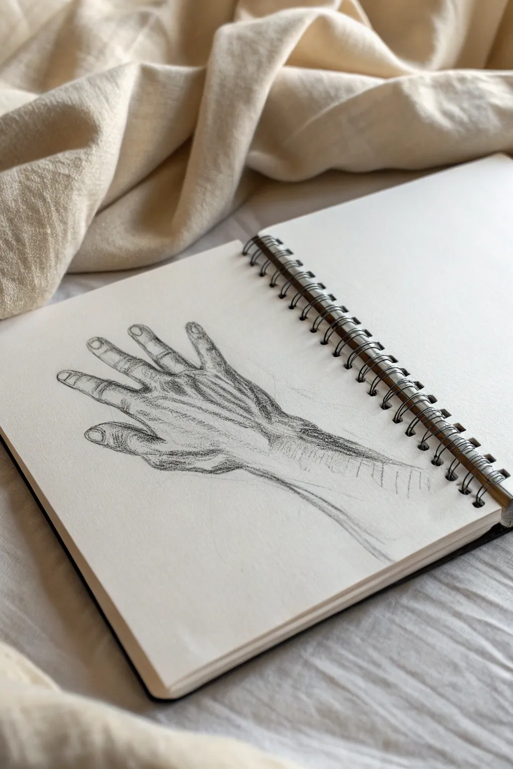
Master the art of volume and form by drawing a human hand using cross-contour hatching techniques. This sketch emphasizes the structural hills and valleys of the knuckles and tendons through directional line work rather than simple shading.
Step-by-Step
Materials
- Sketchbook with medium-weight paper
- HB graphite pencil (for initial layout)
- 2B or 4B graphite pencil (for hatching)
- Kneaded eraser
- Pencil sharpener
Step 1: Laying the Foundation
-
Gesture the palm:
Start lightly with your HB pencil. draw a skewed, slightly rounded rectangular shape to represent the main block of the palm. Keep this significantly faint as it’s just a guide. -
Map the knuckles:
Along the top edge of your palm block, mark four small arches or circles where the fingers will attach. These pivot points are crucial for natural spacing. -
Extend finger lines:
Draw single, gestural lines extending from those knuckle points to establish the length and direction of each finger. Observe how they fan out slightly. -
Flesh out the fingers:
Build cylinders around your wireframe lines to give the fingers thickness. Pay attention to the joints—they should bulge slightly wider than the segments between them. -
Add the thumb:
Sketch the thumb extending from the side of the palm block, roughly at a 45-degree angle. Ensure the base of the thumb connects lower on the wrist than the fingers. -
Refine the outline:
Once the proportions look correct, gently firm up the outline, adding the fingernail shapes and the slight webbing between fingers. Erase your internal construction lines carefully.
Follow the Form
Imagine an ant crawling across the hand. Your pencil lines should follow the path the ant walks—up over the knuckles and down into the valleys between tendons.
Step 2: Cross-Contour Hatching
-
Switch pencils:
Pick up your softer 2B or 4B pencil. A slightly duller tip can actually be helpful here to create softer, broader strokes. -
Define the wrist tendons:
Start at the wrist. Draw series of parallel lines that curve slightly around the form of the arm. These lines shouldn’t be flat; curve them like you are wrapping string around a cylinder. -
Hatch the hand back:
Move onto the back of the hand. Draw hatching lines that follow the tendons extending from the wrist to the knuckles. These lines should flow lengthwise. -
Sculpt the knuckles:
This is the most define part of the sketch. Use short, curved hatched lines that wrap horizontally over the knuckle bumps. This sudden change in line direction creates the volume. -
Shade the finger sides:
On the sides of the fingers (away from the light source), apply tighter, diagonal hatching to denote shadow. Keep the tops of the fingers mostly clear to represent highlights. -
Detail the fingernails:
Outline the nails firmly. Add just one or two tiny vertical strokes inside the nail bed to show the curvature without overworking it. -
Deepen the shadows:
Go back to the areas between the fingers and the deep recesses of the palm web. Press harder here to darken your lines, creating contrast against the lighter skin. -
Add horizontal contouring:
Across the back of the hand, overlay a few sparse, horizontal curved lines running perpendicular to your first tendon lines. This cross-hatching adds a skin-like texture. -
Finalize the wrist fade:
Allow the lines at the bottom of the wrist to trail off and fade out, leaving the drawing with an artistic, incomplete edge rather than a hard cutoff.
Ink it Up
Once comfortable with pencil, try this exact exercise again using a fine liner pen. The permanency of ink forces you to commit to every contour line.
Step back and admire how simple lines have transformed into a volumetric, realistic hand study
Render a Feather With Directional Cross Hatching
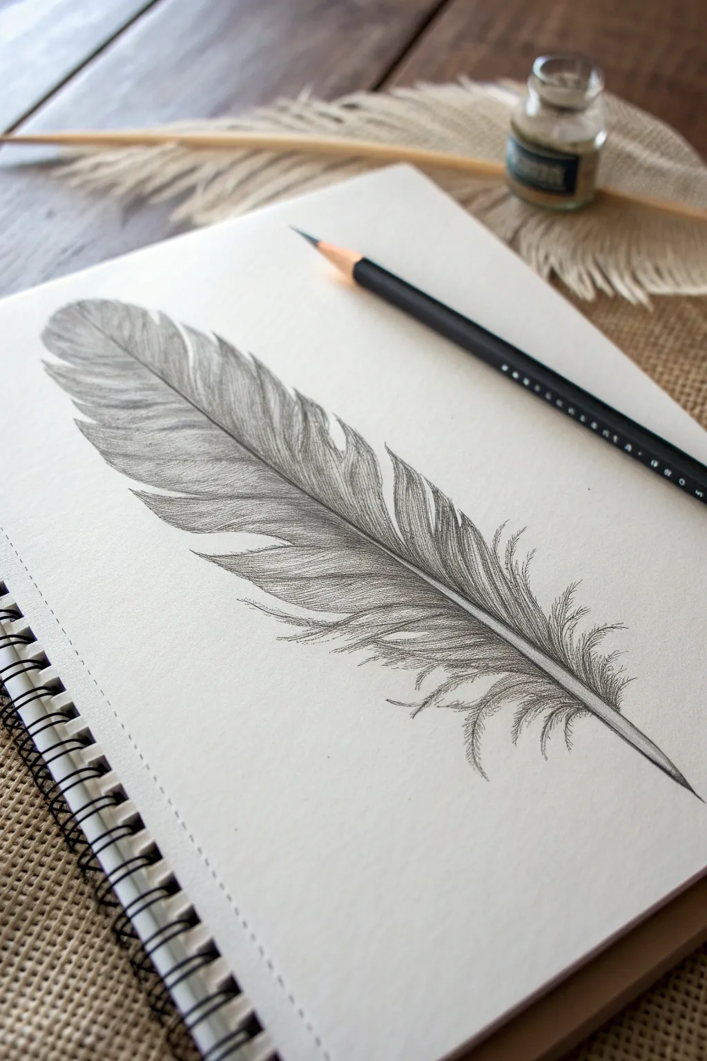
Capture the delicate softness and intricate texture of a bird feather using precise, directional pencil strokes. This project focuses on building up volume and detail through careful line work, resulting in a realistic, three-dimensional study.
Step-by-Step
Materials
- Smooth white sketchbook paper (smooth bristol or drawing paper works best)
- Graphite pencils (HB, 2B, and 4B)
- Pencil sharpener (essential for fine lines)
- Kneaded eraser
- Ruler (optional, for the central shaft)
Step 1: Drafting the Basic Shape
-
Draw the central shaft:
Begin by drawing a long, gently curved line for the rachis (the central shaft) using your HB pencil with very light pressure. Thicken it slightly at the base (quill) and let it taper off to a fine point at the tip. -
Outline the vane:
Lightly sketch the outer silhouette of the feather’s vane. Don’t make this a perfect oval; instead, create a slightly irregular shape that tapers at the top and widens near the middle before narrowing again at the base. -
Add separation points:
Feathers naturally have splits where the barbs separate. Mark a few ‘V’ shaped notches along the edges of your outline to indicate these breaks, giving the feather character and realism. -
Refine the contour:
Go over your outline again, breaking up the continuous line into tiny, distinct separate strokes that follow the outward direction of the barbs. This prevents the feather from looking like a solid cutout.
Step 2: Establishing Directional Texture
-
Start the barb lines:
Using a sharp HB pencil, begin drawing fine, parallel lines originating from the central shaft and moving outward towards the edge. The angle is critical here—these lines should sweep upwards slightly, not straight out. -
Map the flow:
Continue these directional strokes along the entire length of the feather. Notice how the angle changes slightly as you move down; the barbs near the top are steeper, while those near the base are flatter and more relaxed. -
Create the downy base:
At the very bottom of the feather (the afterfeather), change your stroke style. Instead of straight parallel lines, use loose, curly, and chaotic scribbles to replicate the fluffy, downy texture near the quill.
Uneven Shading?
If your hatching looks scratchy or uneven, your pencil might be too dull. Keep a sharp point and rotate the pencil in your hand every few strokes to maintain a consistent line width.
Step 3: Shading and Depth
-
Switch to a darker pencil:
Swap to your 2B pencil to begin adding depth. Focus your shading right next to the central shaft, darkening the area where the barbs attach to the rachis. -
Layering the hatch marks:
Add a second layer of hatch marks over your initial HB lines. I find it helpful to vary the length of these strokes—some short, some long—to avoid creating distinct ‘bands’ of shading. -
Define the splits:
Where you marked those ‘V’ notches earlier, use the 2B pencil to darken the edges of the split. This casts a tiny shadow and shows that one section of barbs is overlapping another. -
Darken the outer edge:
Add a subtle gradient to the outer tips of the feather. Lightly flick your pencil from the outer edge inward to create a soft, shadowed border. -
Shadow the shaft:
The central shaft isn’t flat; give it volume by shading just one side of it with a fine line, leaving the center or opposite side white to act as a highlight.
Try Toned Paper
Draw this on tan or grey paper using a white charcoal pencil for the highlights. This instantly adds a level of realism by making the feather look like it’s resting on a surface.
Step 4: Refining Details
-
Deepen the contrast:
Use your 4B pencil sparingly to add the darkest values. Place these dark accents deep in the splits and right at the junction where the barbs meet the shaft to make the feather pop. -
Enhance the fluff:
Revisit the downy bottom section. Add a few stray, flyaway curved lines that break away from the main shape to emphasize the softness. -
Clean up highlights:
Take your kneaded eraser and mold it into a fine point. Gently lift off graphite in the middle of the vane sections to create a ‘sheen’ or highlight running parallel to the shaft. -
Final sharp details:
Sharpen your pencil to a needle point one last time. Reinforce the very tips individual barbs along the outer edge so they look crisp against the white paper.
Take a moment to admire the soft texture you’ve created before signing your work
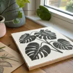
Make a Silhouette Pop With a Cross Hatched Background
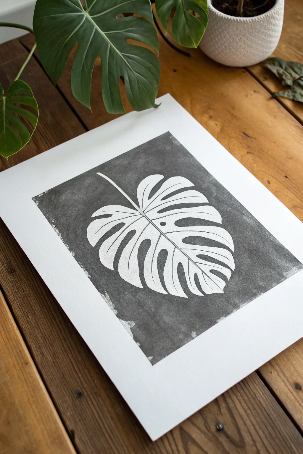
Reverse the traditional drawing process by surrounding a pristine white subject with a deep, textured background. In this project, you will preserve the clean paper as your leaf and build up a rich, dark negative space using dense cross-hatching or charcoal techniques.
Step-by-Step Guide
Materials
- High-quality white mixed media paper or bristol board
- Graphite pencil (HB or 2H)
- Kneaded eraser
- Fine liner pens (black, various sizes 0.1 – 0.5)
- Graphite stick, charcoal stick, or black ink wash (for the base darkness)
- Ruler
- Masking tape or painter’s tape
Step 1: Drafting the Leaf
-
Prepare your borders:
Begin by measuring a rectangular border on your paper to frame the artwork. Use a ruler to ensure straight lines and lightly mark the corners with your pencil, creating a clear boundary for where your background will end. -
Set the central vein:
Draw a curved line extending diagonally from the upper left quadrant down towards the right center. This will serve as the midrib (central vein) of your Monstera leaf, giving it gesture and flow. -
Outline the leaf shape:
Sketch the broad, heart-shaped perimeter of the leaf. Don’t worry about the holes or splits yet; just focus on getting the large scale and proportion right so it fills the frame nicely. -
Add fenestrations:
Now, sketch the characteristic splits (fenestrations) of the Monstera. Draw deep indentations coming from the outer edge inward toward the midrib, leaving strips of leaf in between. -
Refine the details:
Add a few oval holes near the midrib where the leaf hasn’t split open. Clean up your contour lines so you have a very definite boundary between ‘leaf’ and ‘background’. -
Detail the veins:
Lightly draw the secondary veins branching out from the center line into each leaf segment. These lines will remain white, but they help guide where you might add subtle shading later.
Step 2: Creating the Negative Space
-
Outline with ink:
Use a fine liner pen to carefully trace the outline of your leaf. This line needs to be crisp because it acts as a barrier; everything outside this line will become dark, and everything inside stays white. -
Erase pencil marks:
Once the ink is completely dry, gently erase your initial pencil sketches. This leaves you with a clean, invisible guide for the next step so graphite doesn’t smudge into your white leaf. -
Establish the base tone:
To achieve the heavy darkness shown in the reference without spending hours hatching, apply a base layer to the background. You can use a charcoal stick, a graphite block, or a light wash of black ink, carefully painting up to the leaf’s edge. -
Define the edges:
If using charcoal or graphite blocks, use a blending stump or tortillon near the leaf edges to get a precise, sharp transition. The contrast is key here—the sharper the edge, the more the leaf pops. -
Start cross-hatching:
Once your base layer is set (and dry, if using ink), take your fine liner pens and begin cross-hatching over the dark background. I find working in small patches helps maintain consistency. -
Layering texture:
Build up layers of diagonal lines in opposing directions. The goal isn’t just darkness, but visual texture. Let the pen lines be visible to give that hand-drawn, etched quality. -
Varying line density:
Make the hatching slightly denser immediately around the leaf outline. This creates a subtle ‘halo’ effect that pushes the white subject forward visually. -
Adding distressed edges:
Observe the outer edges of the background rectangle in the reference. Instead of a ruler-straight finish, let your hatching and base tone fade out roughly or have a ‘ragged’ edge for an organic, print-like look. -
Interior details:
Return to the white leaf. Use your finest pen (0.05 or 0.1) to draw very delicate, thin lines for the veins avoiding the heavy look of the background. -
Final assessment:
Step back and look at the contrast. If the background looks patchy, add another layer of hatching to unify the tone while keeping that lovely scribbled texture.
Smudge Alert
Charcoal and soft pencil love to travel to the white paper. Keep a scrap sheet of paper under your hand as a guard while you work on the background to protect the pristine white leaf.
Textured Depth
Instead of uniform black, try ‘scumbling’ (tiny controlled scribbles) near the corners of the background. It adds a vintage, lithograph-style texture that looks amazing up close.
Now step back and admire how that stark contrast turns a simple botanical outline into a dramatic piece of art


Have a question or want to share your own experience? I'd love to hear from you in the comments below!