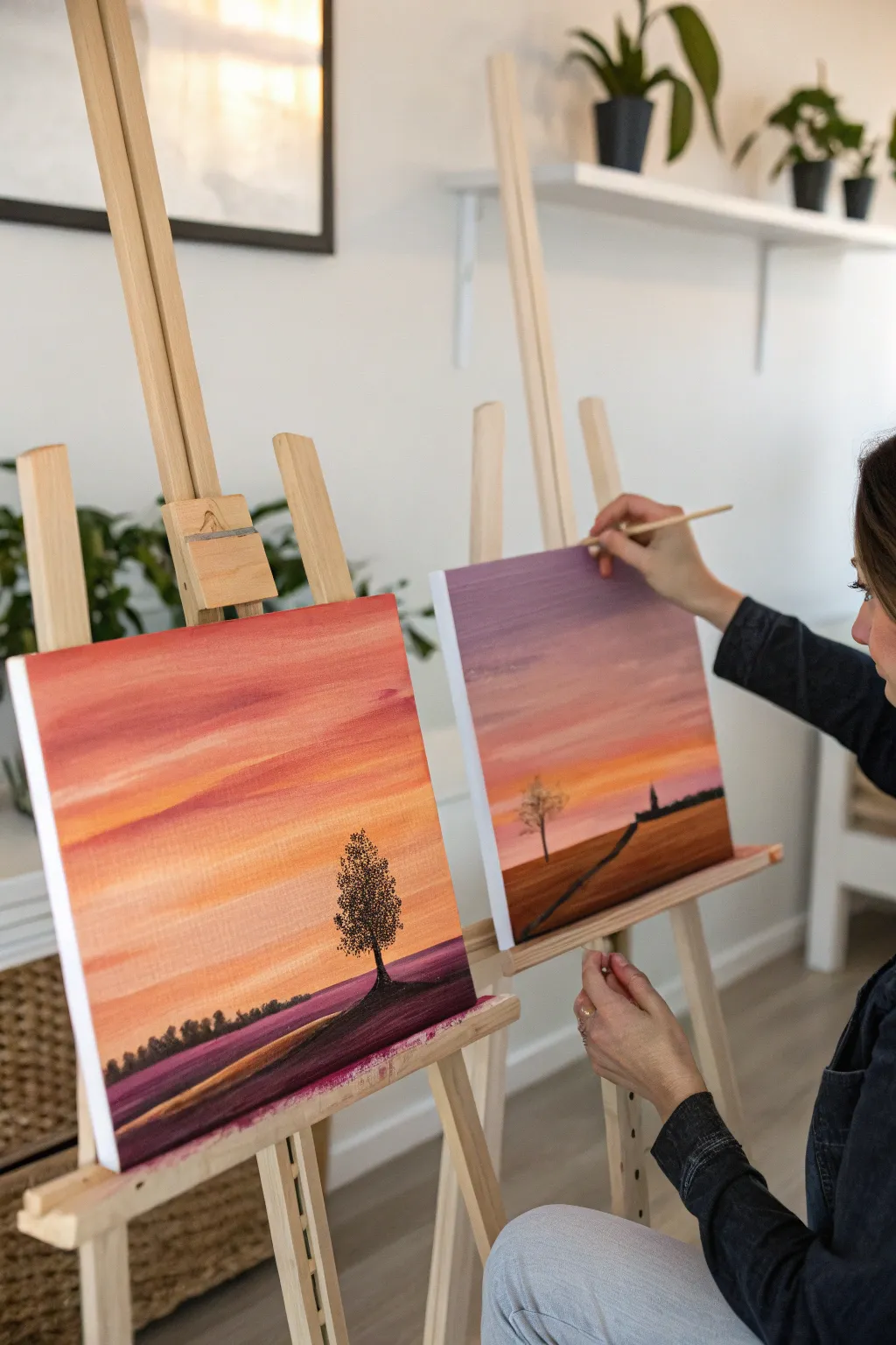
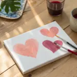
If you’re craving a date that feels cozy, creative, and genuinely connective, painting together is my go-to. You don’t need “real artist” skills—just a little curiosity, a couple brushes, and a willingness to laugh at the messy parts.
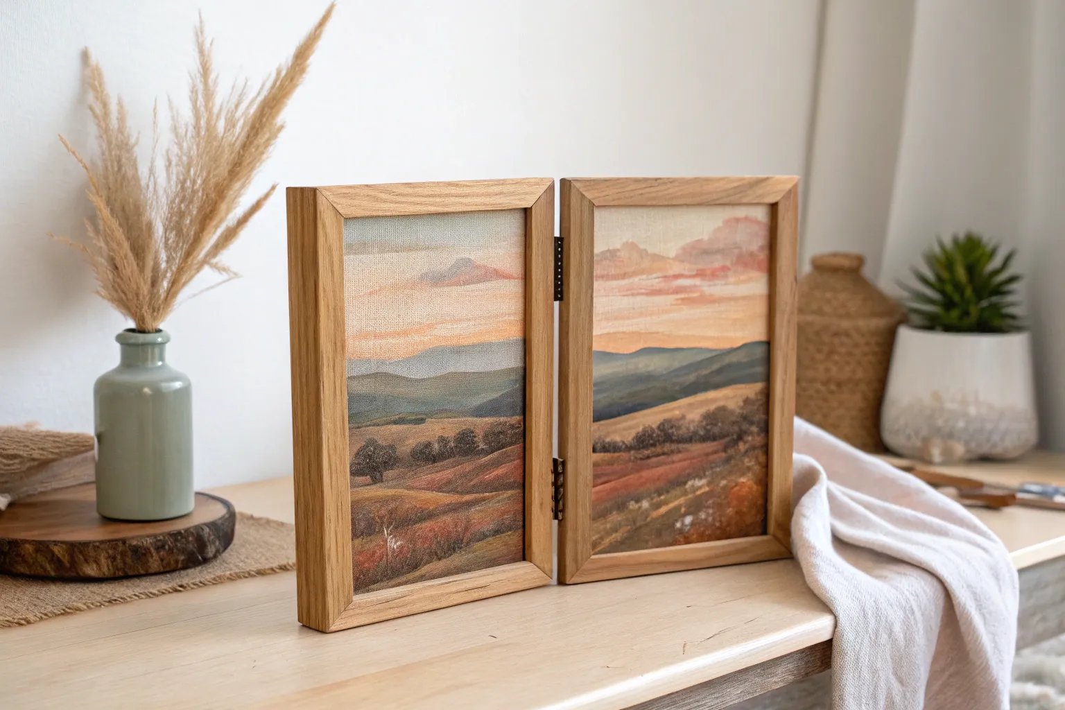
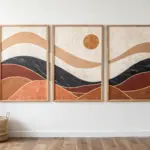
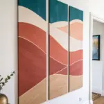
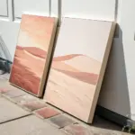
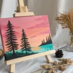
Side-by-Side Sunset Landscapes
Create a stunning panoramic view that spans across two canvases, perfect for a painting date night. This warm, gradient-filled landscape features a glowing sunset and silhouetted flora that seamlessly connects when the canvases are placed side-by-side.
Step-by-Step Tutorial
Materials
- Two 16×20 stretched canvases
- Acrylic paints (Titanium White, Cadmium Yellow, Orange, Alizarin Crimson, Raw Umber, Black)
- Large flat brush (2-inch) for backgrounds
- Medium flat brush (1-inch) for blending
- Small round detail brush (size 1 or 2)
- Palette or paper plates
- Cup of water and paper towels
- Two easels (optional but helpful)
Step 1: Setting the Sky
-
Align the horizon:
Place both canvases side-by-side touching each other. Lightly sketch a horizon line across both canvases using a pencil, creating a very slight hill or slope that continues from the left canvas onto the right canvas. Aim for the lower third of the canvas. -
Mix your sunset colors:
Prepare large amounts of your sky colors. You’ll need a vibrant orange, a soft peach (orange mixed with white), a deep crimson, and a pale violet for the upper sky. -
Paint the upper sky base:
Starting at the very top of both canvases, apply the violet shade using your large flat brush. Use long, horizontal strokes that span the width of the canvas. -
Gradual transition:
Without cleaning your brush fully, pick up the crimson red while the violet is still wet. Paint below the violet section, allowing the colors to mix on the canvas to create a seamless gradient. -
Add the glowing warmth:
Switch to a clean brush. Below the crimson band, paint a thick stripe of orange. Blend it upward slightly into the crimson band so there are no hard lines. -
The golden horizon:
Mix cadmium yellow with a touch of white. Paint this lightest color directly above your pencil horizon line, blending it upward into the orange section to create the glowing effect of the setting sun. -
Cloud wisps:
While the background is barely tacky, use a smaller dry brush with a small amount of crimson or purple paint. Lightly drag uneven, horizontal streaks across the sky to mimic thin cloud layers.
Paint drying too fast?
If your acrylics are drying before you can blend them smoothly, mist the canvas lightly with a spray bottle of water or mix a slowing medium into your paints.
Step 2: Ground and Shadows
-
Base ground layer:
Mix a dark muddy purple using alizarin crimson and independent black or raw umber. Fill in the entire area below your horizon line on both canvases. -
Define the path:
On the left canvas, sketch a winding path emerging from the bottom left corner, leading toward the center connection point. Continue this path onto the right canvas, creating a visual link. -
Paint the path:
Fill the path area with a lighter tone—brown mixed with a little orange and white—so it stands out against the dark purple ground. -
Highlight the ground:
I like to dry brush a little bit of the lighter ground color horizontally across the dark purple fields to suggest uneven terrain or crops catching the last bit of light.
Step 3: Silhouettes and Details
-
Tree trunk placement:
On the left canvas, identify a spot on the hill for your focal tree. Using black paint and the small round brush, paint a thin vertical line for the trunk, thickening it slightly at the base. -
Stippling leaves:
For the foliage, use an old, scruffy brush or dab the tip of your round brush repeatedly. Use pure black paint to create a rounded, textured canopy shape on top of the trunk. -
Adding the village:
On the right canvas near the horizon line, paint tiny geometric shapes in black—squares and triangles—to suggest a distant church or house silhouette. -
Distant trees:
Along the horizon line on the far left, paint extremely small, jagged bumps to represent a faraway forest line. -
Final connection check:
Place the canvases side-by-side one last time. Ensure the path lines up perfectly and the horizon colors match at the seam. Touch up any discrepancies with leftover paint.
Softer Clouds
To make your clouds look wispier and less like stripes, use a dry, clean brush to gently feather out the edges of your paint strokes while they are still wet.
Sign the corners nearest to each other to commemorate your shared masterpiece

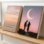
Diptych: One Scene, Two Canvases
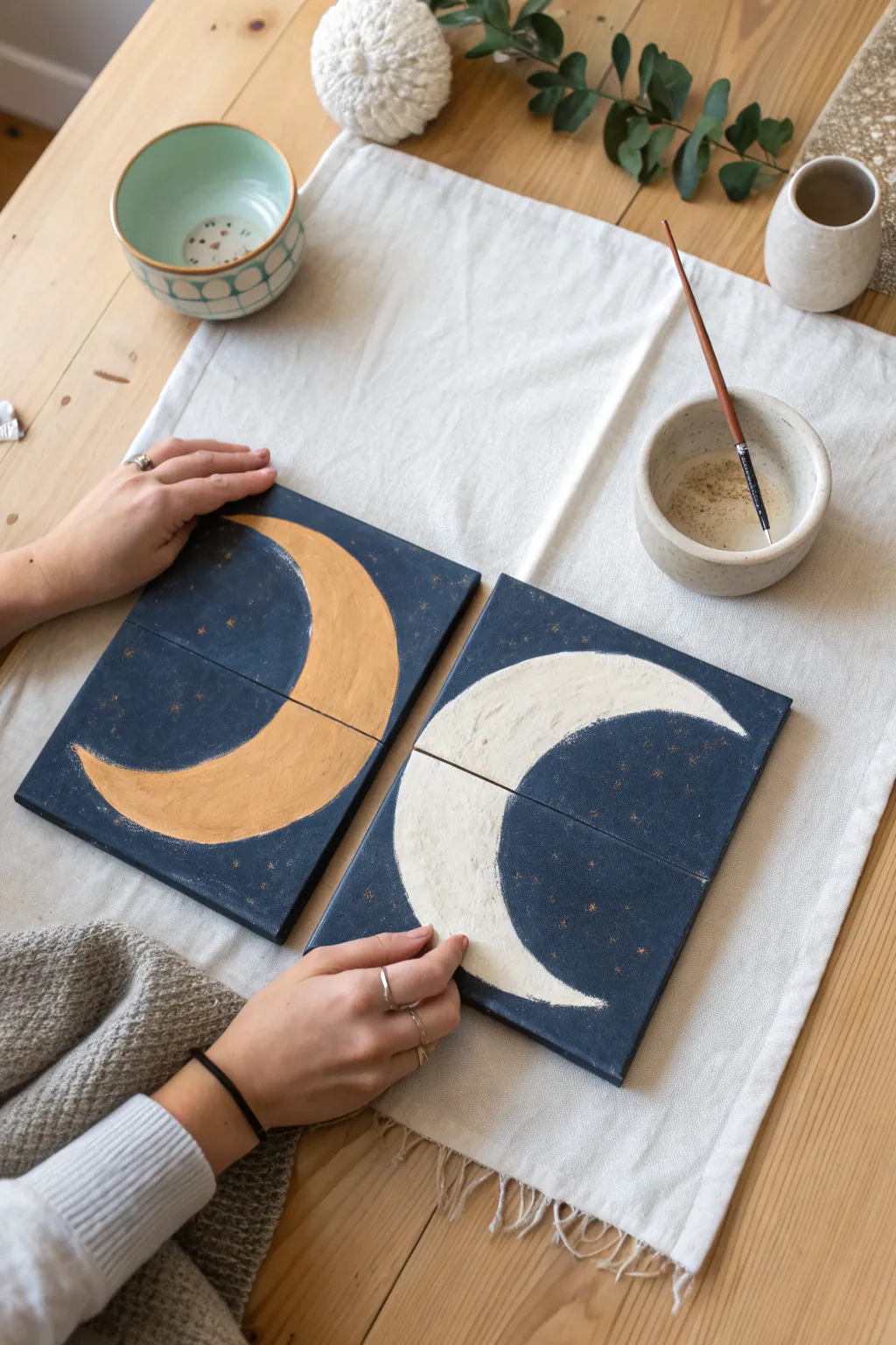
Create a unified art piece across two canvases with this celestial diptych project, perfect for a painting date. The finished artwork features opposing crescents—one warm gold, one cool white—set against a deep, starry night sky that spans both panels.
Step-by-Step Guide
Materials
- Two small square canvases (approx. 8×8 inches)
- Acrylic paints: Navy blue, black, gold/ochre, titanium white
- Medium flat paintbrush
- Fine detail paintbrush
- Pencil
- Circular object for tracing (like a small bowl) or compass
- Water cup and palette
- Washi tape or masking tape (optional)
Step 1: Planning and Aligning
-
Unite the canvases:
Place your two square canvases side-by-side on a flat surface so their edges touch perfectly. This is crucial because your design will flow from one canvas to the other. -
Establish the horizon:
Lightly draw a horizontal line across the middle of both canvases with a pencil. This ensures your crescent shapes will be vertically centered and aligned with each other. -
Trace the outer moons:
Using a bowl or compass, sketch a large circle on each canvas. Position them so the curves mirror each other—the left canvas should have a ‘C’ curve facing right, and the right canvas a ‘C’ curve facing left. -
Define the crescent shape:
Shift your circular object slightly inward toward the center of the diptych and trace a second, inner curve. This creates the crescent shape. Erase the extra lines so you only have your moon outlines left.
Step 2: Painting the Night Sky
-
Mix the background color:
On your palette, mix a generous amount of navy blue with a small touch of black. You want a deep, midnight blue rather than a bright primary blue. -
Paint around the shapes:
Using a flat brush, carefully paint the negative space around your moon penciled outlines. Work slowly near the lines to keep the crescent shapes crisp. -
Cover the edges:
Don’t forget to paint the sides of your canvases. Painting the edges gives the piece a finished, professional look when hung on the wall without a frame. -
Apply a second coat:
Acrylics can be translucent. Once the first layer is dry to the touch (usually 15-20 minutes), apply a second coat of your midnight blue mixture for full, opaque coverage.
Fixing Wobbly Lines
If your crescent edges look uneven, wait for the paint to dry fully. Then, use a gold or silver paint marker to outline the moon shapes for a crisp, clean border.
Step 3: Illuminating the Moons
-
Base coat the crescents:
Paint the inside of both crescent shapes with a thin layer of titanium white. This primes the canvas so the final colors will pop against the dark fabric. -
Paint the golden moon:
On the left canvas (or whichever you choose), paint the crescent with a gold or ochre yellow paint. You might need two layers to get a rich, metallic finish. -
Texture the gold:
While the gold paint is still wet, I like to dab it gently with a dry brush or sponge to create a subtle crater-like texture. -
Paint the silver moon:
On the other canvas, paint the crescent with pure titanium white or a metallic silver if you have it. Keep the strokes following the curve of the moon. -
Add texture to white:
Similar to the gold moon, add a tiny drop of grey to your white and stipple it onto the crescent to suggest surface texture and depth.
Pro Tip: Splatter Stars
For a natural galaxy look, dip an old toothbrush in thinned white paint and flick the bristles with your thumb to spray tiny star mists across the background.
Step 4: Starry Details
-
Prepare the stars:
Load your fine detail brush with gold paint. Make sure the paint is slightly thinned with water so it flows easily off the tip. -
Dot the constellations:
Gently touch the tip of the brush to the dark blue background to create small stars. Vary the pressure to create different sized dots. -
Add cross stars:
For a few larger stars, paint a tiny cross or ‘plus’ sign shape. This mimics the twinkling effect of distant stars. -
Create a unified flow:
Ensure some stars are placed near the inner edges where the canvases meet. This helps visually bridge the gap between the two pieces. -
Final drying:
Let both canvases sit undisturbed for a few hours until completely dry before separating or hanging them.
Now you have a stunning pair of celestial paintings that represent two halves of a beautiful whole, ready to adorn your wall
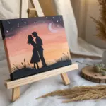

Romantic Silhouette Under a Night Sky
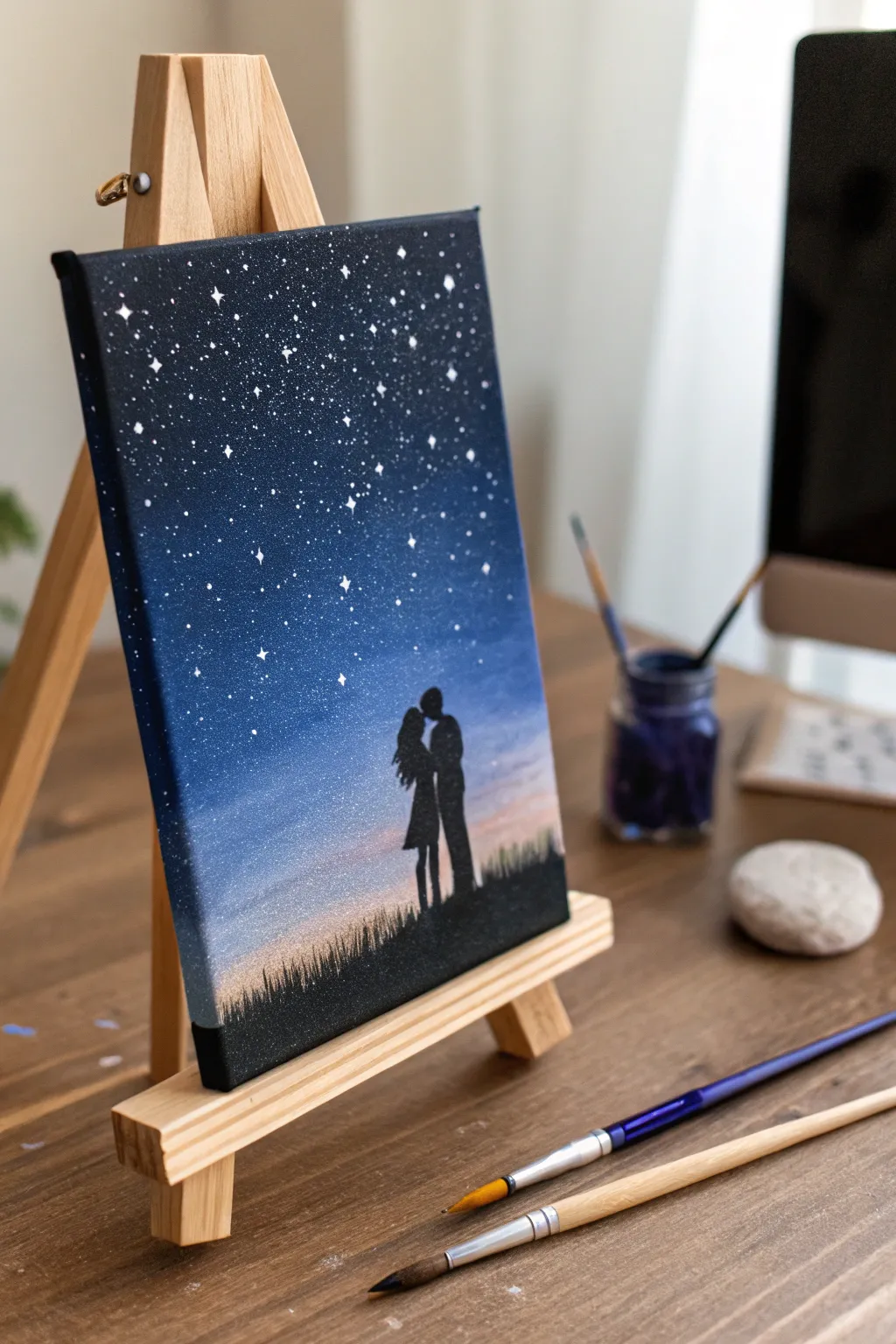
Capture a moment of romance under the stars with this beautiful silhouette painting. The project features a stunning blended night sky gradient that transitions into a soft sunset glow, framing a couple in love.
Detailed Instructions
Materials
- Small stretched canvas (8×10 or similar)
- Acrylic paints (Dark Blue/Navy, Phthalo Blue, White, Peach/Light Orange, Black)
- Flat shader brushes (large and medium)
- Fine liner brush (size 0 or 00)
- Old toothbrush (stiff bristles)
- Tabletop easel (optional but helpful)
- Palette or paper plate
- Cup of water and paper towels
- Pencil
Step 1: Creating the Twilight Gradient
-
Prime the background:
Before diving into colors, check if your canvas surface is smooth; if needed, apply a thin coat of white paint or gesso to help the subsequent colors blend easier. -
Start with the darkest blue:
Load your largest flat brush with Dark Blue or Navy. Paint the top third of the canvas using long, horizontal strokes, ensuring full coverage at the very top edge. -
Blend in the mid-tone:
Without cleaning your brush fully, dip into Phthalo Blue. Paint the middle section of the canvas, slightly overlapping the dark blue above. Go back and forth over the seam to create a smooth, seamless transition. -
Lighten the lower sky:
Mix a little white into your blue to create a light sky blue. Apply this below the mid-tone section, blending upwards into the Phthalo Blue while the paint is still wet. -
Add the sunset glow:
Clean your brush thoroughly. Pick up your Peach or Light Orange color mixed with a tiny bit of White. Paint the bottom strip of the canvas (where the ground will eventually be). -
Final blend:
While the paint is wet, gently blend the peach layer upward into the light blue sky. You want a soft, hazy transition where the colors meet, creating a twilight effect. -
Let it dry completely:
Wait for this background layer to become completely dry to the touch. I usually let this sit for about 15-20 minutes so I don’t smudge the sky later.
Step 2: Painting the Stars
-
Prepare the spatter paint:
Mix white acrylic paint with a few drops of water on your palette. You want a consistency similar to heavy cream or melted ice cream—thin enough to fly off a brush, but thick enough to be opaque. -
Spatter the distant stars:
Dip an old toothbrush into the thinned white paint. Point the bristles toward the top dark section of the canvas and run your thumb across the bristles to flick tiny specks of ‘stars’ onto the sky. -
Paint prominent stars:
Switch to your fine liner brush and pure white paint. Dot a few specific, larger stars throughout the dark blue area. Add tiny cross shapes to a few of them to make them twinkle. -
Wait for stars to set:
Allow the white dots to dry completely before moving on to the black silhouette layer.
Star Spatter Pro-Tip
Test your toothbrush spatter technique on a piece of scrap paper first. If the drops are too big, your paint is too thick; if they are translucent, add more pigment.
Step 3: Adding the Silhouettes
-
Outline the ground:
Using a pencil, very lightly sketch a gentle hill or flat line across the bottom of the peach section. This will be your ground level. -
Sketch the couple:
Lightly draw the outline of the couple standing close together. Focus on the distinct shapes: the heads slightly tilted, the curves of the backs, and the legs. Keep it simple since it will be filled in solid black. -
Paint the solid black ground:
Load a medium flat brush with black paint. Fill in the ground area below your pencil line completely solid black. -
Add grass texture:
Using the tip of the fine liner brush or the edge of a small flat brush, flick short, upward strokes from the black ground into the peach sky to create the look of tall grass blades. -
Fill the figures:
Switch to your smallest liner brush. Carefully fill in the couple’s silhouette with black paint. Take your time around the faces to keep the profiles sharp. -
Clean up edges:
If any edges of the silhouette look rough, smooth them out with one final pass of black paint to ensure a crisp contrast against the bright sunset.
Make It Personal
Customize the silhouette! Add a small dog sitting next to the couple, change the hair lengths to match your partner, or paint two tall trees framing the scene.
Now you have a timeless romantic keepsake to display on your desk or shelf
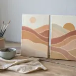
Paint Your First Date Memory
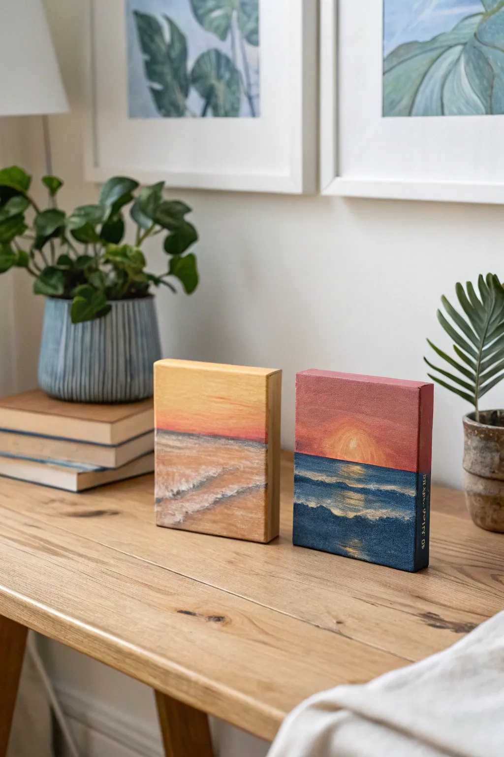
Capture the romantic atmosphere of your first date with these matching mini canvas paintings, depicting soft beach light and a dramatic sunset on the water. These thick-profile canvases stand on their own, making them perfect little reminders of a special memory.
Step-by-Step
Materials
- Two small, thick-profile gallery wrapped canvases (e.g., 5″x7″ or 4″x4″)
- Acrylic paints (Titanium White, Cadmium Yellow, Orange, Alizarin Crimson, Phthalo Blue, Burnt Umber)
- Set of synthetic brushes (flat shader for backgrounds, small round for details)
- Palette or paper plate
- Cup of water and paper towels
- Pencil for sketching
- Optional: Gold paint pen for side lettering
Step 1: Setting the Scene
-
Establish the horizon line:
Begin by lightly sketching a horizontal line across the middle of both canvases with a pencil. For the ‘Sunrise’ painting (left), place it slightly below the center. For the ‘Sunset’ painting (right), place it closer to the true center. -
Map out key elements:
On the left canvas, sketch gentle diagonal lines for the receding shoreline. On the right canvas, draw a small semi-circle resting on the horizon line to represent the setting sun. -
Paint the canvas edges:
Before tackling the main image, paint the sides of your thick canvases. Use a solid color that matches the main theme—warm ochre for the left and deep blue or red for the right—to give them a polished, finished look.
Smooth Blending
To get a seamless ombre effect in the sky, keep your brush slightly damp and work quickly while the acrylics are still wet on the canvas.
Step 2: Painting the Golden Hour (Left Canvas)
-
Lay down the sky gradient:
Mix Titanium White with a touch of Cadmium Yellow. Start at the top of the canvas and paint downward, gradually adding small amounts of orange as you near the horizon line to create a soft, warm glow. -
Add horizon touches:
While the paint is still wet, blend in a very thin, faint line of pink or light red right at the horizon to suggest distance. -
Block in the sand:
Mix White, a tiny bit of Yellow, and a dot of Burnt Umber to make a sandy beige. Fill in the beach area, using horizontal strokes near the water and slightly diagonal strokes near the bottom. -
Create the ocean wash:
Mix a pale, grey-blue using White, a touch of Phthalo Blue, and a speck of Orange (to dull the blue). Paint the water section, ensuring the horizon line is straight. -
Add frothy waves:
Using a small round brush and pure Titanium White, dab textured lines where the water meets the sand. I like to dry-brush this part slightly to mimic the foam of crashing waves.
Step 3: Painting the Sunset (Right Canvas)
-
Create a dramatic sky:
Mix Alizarin Crimson with a little White to make a deep rose color. Paint the top half of the canvas, blending into a brighter orange near the horizon line. -
Paint the sun:
Using pure Yellow or a mix of Yellow and White, fill in the semi-circle sun. Soften the edges slightly so it seems to glow rather than looking like a hard sticker. -
Block in the deep ocean:
Mix Phthalo Blue with a tiny touch of Burnt Umber to create a deep, dark sea color. Paint the entire bottom half, carefully cutting around your sun reflection area. -
Add the sun’s reflection:
Directly below the sun, paint horizontal dashes of yellow and orange on the water. Make the strokes wider near the horizon and narrower as they come closer to the bottom edge. -
Paint the waves:
Mix a lighter blue (Blue + White). Use the edge of a flat brush to create horizontal lines across the dark water, suggesting rolling waves catching the ambient light. -
Detail the water movement:
Use a small brush with very diluted white paint to add thin highlights on the crests of the waves, focusing mostly on the center column where the light hits.
Fixing Wobbly Horizons
If your horizon line isn’t straight, let the paint dry completely. Apply a strip of painter’s tape across the line and repaint the edge for sharpness.
Step 4: Finishing Touches
-
Refine the textures:
Look at both paintings together. Add a little more white texture to the beach waves on the left, and deepen the blue shadows on the right for contrast. -
Add a personal date:
Once fully dry, use a fine liner brush or a gold paint pen to write the date or coordinates of your memory on the side profile of the canvas.
Display these side-by-side on a shelf to keep your favorite shared memory in view
BRUSH GUIDE
The Right Brush for Every Stroke
From clean lines to bold texture — master brush choice, stroke control, and essential techniques.
Explore the Full Guide
Abstract Love Colors: Pick a Shared Palette
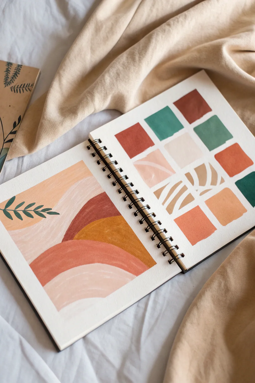
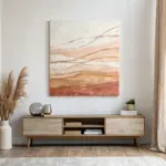
Embrace the soothing vibes of boho minimalism with this dual-page sketchbook spread. On one side, you’ll build a harmonious color palette through simple geometric swatches, while the facing page translates those hues into a flowing, organic abstract landscape.
Step-by-Step Tutorial
Materials
- Heavyweight mixed-media sketchbook or watercolor paper (spiral bound preferred)
- Gouache or acrylic paints (Terracotta, Ochre, Sage Green, Peach, White, Deep Red)
- Flat shader brush (size 6 or 8)
- Small round detail brush (size 2 or 3)
- Palette for mixing
- Water cup and paper towels
- Washi tape or masking tape (optional for clean edges)
- Pencil for light sketching
Step 1: Planning the Palette Page
-
Prepare your colors:
Begin by squeezing out your base colors onto the palette. You want an earthy, warm theme. Mix a deep terracotta (red + brown), a soft sage green (green + white + tiny touch of black/brown), a glowing ochre yellow, and a pale peach (orange + lots of white). -
Establish the grid:
On the right-hand page, visualize a 4×4 or 3×4 grid. You don’t need to measure perfectly; the charm of this style comes from slightly imperfect, hand-painted squares. -
Paint the solids:
Using your flat brush, paint square swatches of your solid colors. Distribute your darkest terracotta and sage green colors so they aren’t all clustered together. Keep the edges slightly rough or rounded for an organic feel. -
Creating tonal variations:
Mix a little white into your terracotta to create a mid-tone clay color, and do the same with your green. Add these lighter versions as new squares in your grid to show the range of your palette. -
Adding texture boxes:
Leave 2-3 squares blank or painted in a very light cream base. Once dry, use a detail brush and a darker color (like the terracotta or ochre) to paint simple organic patterns—zebra-like stripes or curved leaf shapes—inside these squares.
Swatch Hack
Don’t wash your brush completely between similar colors. A little leftover paint creates beautiful, natural gradients within your swatch squares.
Step 2: Drafting the Landscape
-
Lightly sketch the curves:
On the left-hand page, use a pencil to very faintly draw the outline of your abstract hillscape. Think in terms of overlapping mounds—large gentle curves that sweep across the page. -
Block in the sky area:
Start at the top left with your palest peach or cream color. Fill in the ‘sky’ area, bringing the paint down to meet the curve of your first hill, keeping the brushstrokes smooth and horizontal. -
Paint the first hill:
For the large hill shape on the left, use a soft beige or diluted terracotta. I like to keep my brush slightly dry here to create a bit of texture that contrasts with the solid blocks on the other page. -
Layering the dark accents:
Paint the mid-ground hill on the right side using your darkest terracotta or rust red. This high-contrast shape anchors the composition and draws the eye to the center. -
Adding the foreground:
Fill the bottom curves with your ochre and a medium coral/terracotta mix. Ensure each section is dry before painting the adjacent one to keep your lines crisp and prevent muddy bleeding. -
Refining the edges:
Go back with your small round brush and tidy up the boundaries between the color blocks. The lines should be smooth but retain a hand-painted quality.
Step 3: Botanical Details
-
Mixing the foliage green:
Take your sage green and mix in a tiny bit of the rust color or a dark blue to deepen it slightly. This ensures the leaves stand out against the pale background. -
Painting the stem:
On the left side of the landscape page, paint a thin, curved line extending from the left edge inward over the pale background area. -
Adding the leaves:
Using the tip of your round brush, press and lift to create small, almond-shaped leaves along the stem. Alternate sides of the stem for a natural look. -
Final drying time:
Let the entire spread dry completely before closing your sketchbook. The gouache or acrylic creates a lovely matte finish that looks professional yet personal.
Chalky Finish?
If your gouache looks too chalky or cracks when dry, you likely didn’t add enough water. Mix it to a heavy cream consistency before applying.
Now you have a serene color reference and a beautiful piece of art to remind you of your shared creative time
Two-Canvas Heartbeat Line Connection
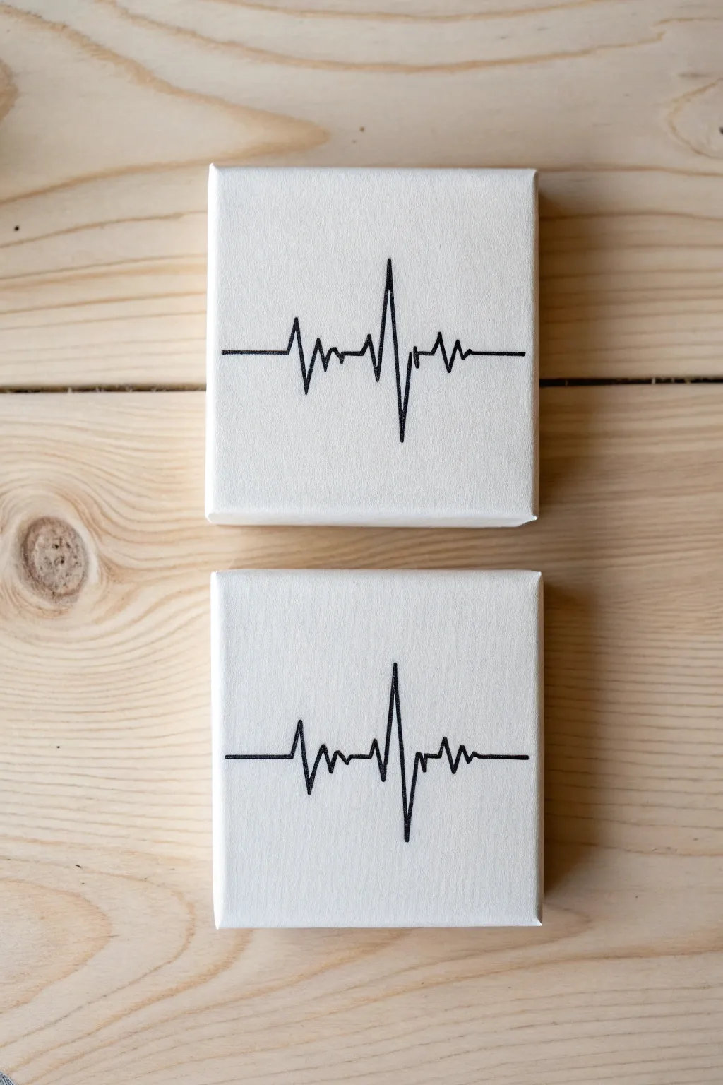
Capture the rhythm of your connection with these minimalist heartbeat line paintings, perfect for a couple’s painting night. The clean black lines on stark white canvas create a modern, medical-chic aesthetic that symbolizes two hearts beating as one.
Step-by-Step
Materials
- Two small square stretched canvases (4×4 or 6×6 inches)
- Black acrylic paint or a black acrylic paint marker
- Fine liner paintbrush (size 0 or 00) if using liquid paint
- Pencil (HB or lighter)
- Ruler or straight edge
- White eraser
- Small cup of water and paper towel (for paint)
- Optional: Gesso (for priming)
Step 1: Preparation and Planning
-
Prime the surface:
If your canvases aren’t pre-primed, apply a thin coat of white gesso to ensure a smooth texture. Let this dry completely before moving forward. -
Establish the horizon line:
Use your ruler to find the exact center horizontal line on both canvases. Lightly mark the start and end points on the left and right edges with your pencil. -
Draw the guide:
Connect your edge marks with the ruler to create a very faint horizontal line across the middle of each canvas. This baseline ensures your heartbeats start and end at the same level. -
Sketch the baseline segments:
Draw straight horizontal segments at the beginning (left) and end (right) of each canvas, leaving the middle open for the spike. Aim for about 1 inch of flat line on each side.
Use a Bridge
Rest your hand on a book or a clean block of wood while painting. This elevates your wrist off the wet canvas and stabilizes your hand for straighter lines.
Step 2: Drafting the Pulse
-
Start the first spike:
On the first canvas, lightly sketch the heartbeat pattern. Start from the left flat line, angle up sharply, then down below the centerline to create the small initial dip. -
Create the main peak:
Draw the dramatic central spike. Extend a line steeply upward towards the top third of the canvas. -
Complete the drop:
Bring the line back down sharply, crossing the center line and extending deep into the bottom third of the canvas for the main ‘trough’. -
Finish the rhythm:
Bring the line back up to meet the right-side flat baseline, adding a small secondary bump if desired to mimic a real ECG readout. -
Replicate or mirror:
Repeat the sketching process on the second canvas. You can either trace the first one to make them identical or freehand a similar shape so they look like consecutive beats. -
Evaluate the flow:
Place the canvases side-by-side or stacked vertically. Check that the entry and exit lines act as a visual continuation of each other.
Wobbly Lines?
If a line gets shaky, don’t panic. Wait for the black to dry, paint over the error with white acrylic, let that dry, and try the black line again.
Step 3: Inking the Connection
-
Prepare your black medium:
Shake your paint marker well to get the ink flowing, or dilute your black acrylic paint slightly with a drop of water for smoother lining. -
Trace the flat lines:
Start by carefully going over the straight horizontal lines on the left and right edges. Use a ruler if you want machine-like precision, or freehand it for an organic feel. -
Paint the spikes:
Commit to the central heartbeat shape. I find it helpful to pull the brush or marker towards me rather than pushing it away to keep the line steady. -
Sharpen the corners:
Go back to the peaks and valleys of your wave. Ensure the tips are sharp and pointy, not rounded, to maintain that digital readout look. -
Thicken slightly:
If your line looks too wispy, retrace it gently to add just a tiny bit of weight, keeping the width consistent throughout. -
Allow to dry:
Let the black paint dry completely. This usually takes about 20 minutes for acrylics. -
Clean up:
Once the paint is fully cured and hard to the touch, gently erase any visible pencil marks with your white eraser.
Now hang these side-by-side to symbolize your lasting connection

PENCIL GUIDE
Understanding Pencil Grades from H to B
From first sketch to finished drawing — learn pencil grades, line control, and shading techniques.
Explore the Full Guide
Paint Your Pet as a Couple Keepsake
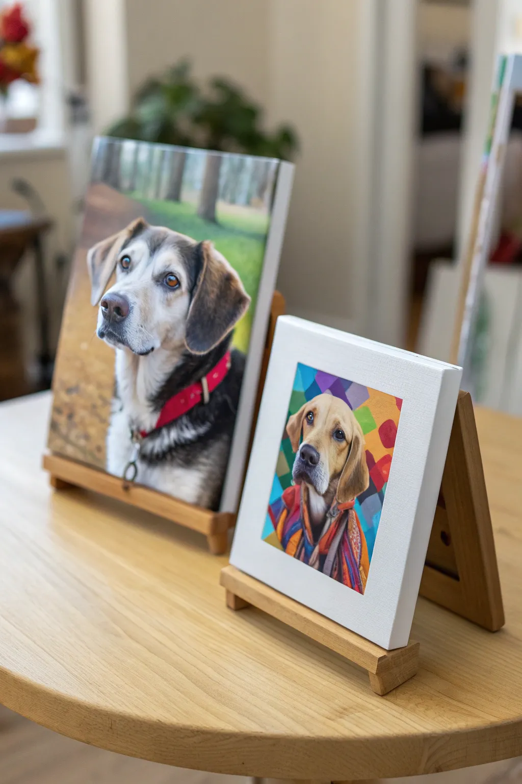
Immortalize your furry friend with this charming couples’ project resulting in two distinct styles of pet portraiture. One partner creates a classic, realistic canvas while the other tackles a vibrant, pop-art interpretation, making for a perfect complementary display.
Detailed Instructions
Materials
- Two 8×10 or 9×12 inch stretched canvases
- High-quality acrylic paints (heavy body preferred)
- Assorted synthetic brushes (detail round, flat, and filbert)
- Reference photo of your pet
- Carbon transfer paper or graphite paper
- Pencil and eraser
- Easel (tabletop style)
- Palette or paper plate
- Painter’s tape
- Computer/tablet for photo editing (optional)
Step 1: Preparation & Transfer
-
Choose your photo:
Select a high-resolution photo of your pet where the eyes are clear and in focus. The best portraits usually come from photos taken at the dog’s eye level rather than from above. -
Edit for two styles:
For the pop-art version, use a photo editor to increase saturation or apply a ‘posterize’ filter to help see the distinct color shapes. Leave the reference photo natural for the realistic version. -
Print and size:
Print your reference images to match the exact size of your canvases. If you don’t have a large printer, you can print on standard paper and tile it, taping the pieces together. -
Prepare the realistic transfer:
Place carbon paper charcoal-side down on the first canvas. Tape the natural reference photo securely on top to prevent shifting while you work. -
Trace the realistic outlines:
Using a pencil, trace the main contours of the dog: eyes, nose, ears, and direction of the fur clumps. Focus on the boundary between light and dark areas. -
Create the pop-art sketch:
For the second canvas, trace only the major shapes. Ignore individual hairs; instead, outline the blocks of shadow and light, and draw a geometric background pattern behind the pet.
Step 2: Painting the Pop-Art Canvas
-
Block in background colors:
Mix vibrant, contrasting colors—like teal, violet, and mustard—and fill in the geometric shapes behind the dog. Keep the edges crisp for a graphic look. -
Paint the shadows first:
On the dog’s face, identify the darkest shadow areas. Instead of black, use deep purples or dark blues to maintain that artistic flair. -
Add mid-tones:
Fill the rest of the fur with exaggerated colors. If your dog is golden, try using bright oranges and yellows; if black, use deep blues and purples. -
Refine the edges:
Go back with a small liner brush to sharpen the lines where different colors meet. This style relies on clean separation rather than blending.
Muddled Fur Colors?
If your fur looks muddy, wait for the layer to dry completely before adding more. Wet-on-wet blending often creates gray mush. Crisp layers build better texture.
Step 3: Painting the Realistic Canvas
-
Underpainting:
Wash the background with a blurred, muted green to simulate an outdoor depth of field. Keep this layer thin and watery. -
Establish the darks:
Mix a dark brownish-black and paint the eyes, nose, and deepest fur shadows. I find that getting the eyes right early on brings the painting to life immediately. -
Layer the fur colors:
Using a filbert brush, lay down usage blocking for the main fur colors (whites, browns, tans). Do not worry about texture yet; just get the color in the right place. -
Create fur texture:
Switch to a small round brush. Paint individual strokes in the direction the hair grows, layering lighter colors over darker ones to build volume. -
Highlights and details:
Add the final sparkle to the eyes with pure white. Use your smallest brush to add whiskers and the finest bright hairs on the snout.
Pop-Art Punch
For the colorful version, try using complementary colors for shadows (e.g., violet shadows on yellow fur) to make the image vibrate with energy.
Step 4: Finishing Touches
-
Paint the sides:
To give the canvases a polished, gallery-wrapped look, paint the edges of the canvas either solid black or wrap the image color around the side. -
Varnish:
Once completely dry (wait at least 24 hours), apply a coat of gloss or satin varnish to protect the paint and unify the sheen across the surface.
Now you have a matched set of artworks that celebrates your pet’s personality from two different artistic perspectives
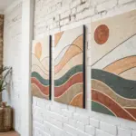
Mirror Painting: One Leads, One Echoes
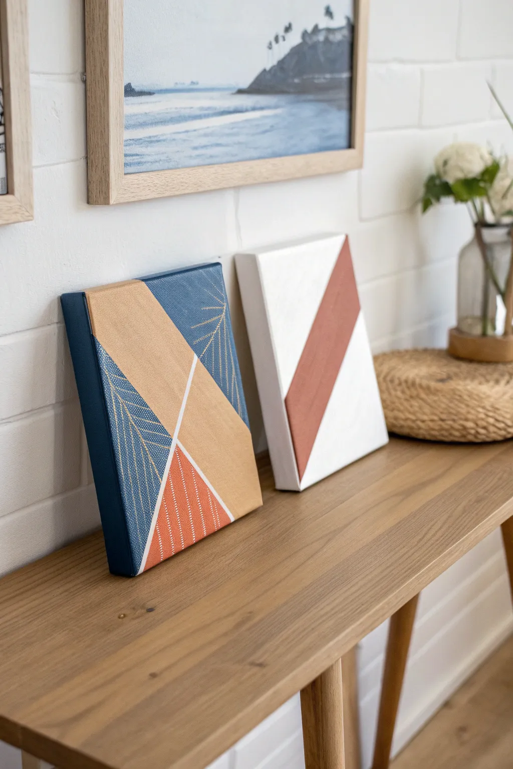
Create a sophisticated pair of decorative canvases that play with negative space, bold angles, and metallic accents. This project combines deep navy, warm terracotta, and gold leaf tones in a modern color block design that looks professionally curated.
Detailed Instructions
Materials
- Two small stretched canvases (approx. 8×10 or 6×8 inches)
- Painter’s tape or masking tape (various widths)
- Acrylic paints: Navy blue, terracotta/rust orange, metallic gold, and titanium white
- Flat paintbrushes (medium and small)
- Fine liner brush
- Gold or white paint marker (optional for fine lines)
Step 1: Planning and Taping
-
Clean Your Surface:
Start with clean canvases. If they have any dust or debris, wipe them gently with a dry cloth to ensure the tape adheres properly. -
Map the Diagonal:
Decide on your main diagonal composition. For the left canvas, you’ll want a three-part division; for the right, a simple striking stripe. -
Tape Section 1:
For the simpler canvas on the right, place two parallel strips of painter’s tape diagonally across the surface to create a wide channel in the middle. -
Tape Section 2:
For the more complex canvas on the left, use tape to section off a large triangular corner. Press the edges of the tape down firmly with your fingernail to prevent bleed-through. -
Create the Negative Space:
On the left canvas, apply thin strips of tape (or art masking tape) where you want thin white lines to remain unpainted later.
Seal Your Tape
Before applying colored paint, paint a thin layer of white (or your base color) over the tape edges. This seals the gap so lines stay razor sharp.
Step 2: Painting the Base Layers
-
Paint the Terracotta Stripe:
Mix a warm terracotta hue. Paint the diagonal channel on the right canvas, ensuring smooth, even coverage. Don’t worry about painting over the tape edges. -
Paint the Navy Sections:
On the left canvas, paint the top left corner and bottom right corner areas with a rich navy blue acrylic. You may need two coats for full opacity. -
Paint the Gold Block:
Fill the central diagonal section of the left canvas with metallic gold paint. Use long, unidirectional strokes to maximize the metallic sheen. -
Add Secondary Terracotta Accent:
Paint the smaller triangular section at the bottom of the left canvas with your terracotta color to tie the two pieces together visually. -
Let Dry Completely:
Allow all paint to dry fully before touching the tape. This is crucial for crisp lines.
Step 3: Adding Details and Finishing
-
Peel and Reveal:
Gently peel off the painter’s tape at a 45-degree angle. This reveals your crisp geometric zones and the white canvas underneath where the thin tape was. -
Add Fine Line Details:
Using a fine liner brush or a paint pen, draw delicate leaf or palm frond patterns over the navy sections. Gold ink looks stunning against the dark blue. -
Texture the Terracotta:
If you want the texture seen in the image, use a white paint pen to add small dots or dashed lines over the terracotta triangle on the left canvas. -
Touch Up Edges:
Inspect your lines. If any paint bled under the tape, use a small brush and white paint (or the background color) to tidy up the edges. -
Paint the Sides:
Don’t forget the sides of the canvas! Extend your colors around the edges for a gallery-quality wrap-around finish. -
Final Varnish:
Once everything is cured, apply a coat of matte or satin varnish to protect the paint and even out the sheen.
Texture It Up
Mix baking soda into your terracotta paint for the simple stripe canvas to create a rough, plaster-like texture that contrasts with the smooth metallic gold.
Display these side-by-side on a mantel or shelf to enjoy the interplay of color and geometry


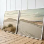
Paint a Fantasy Vacation Together
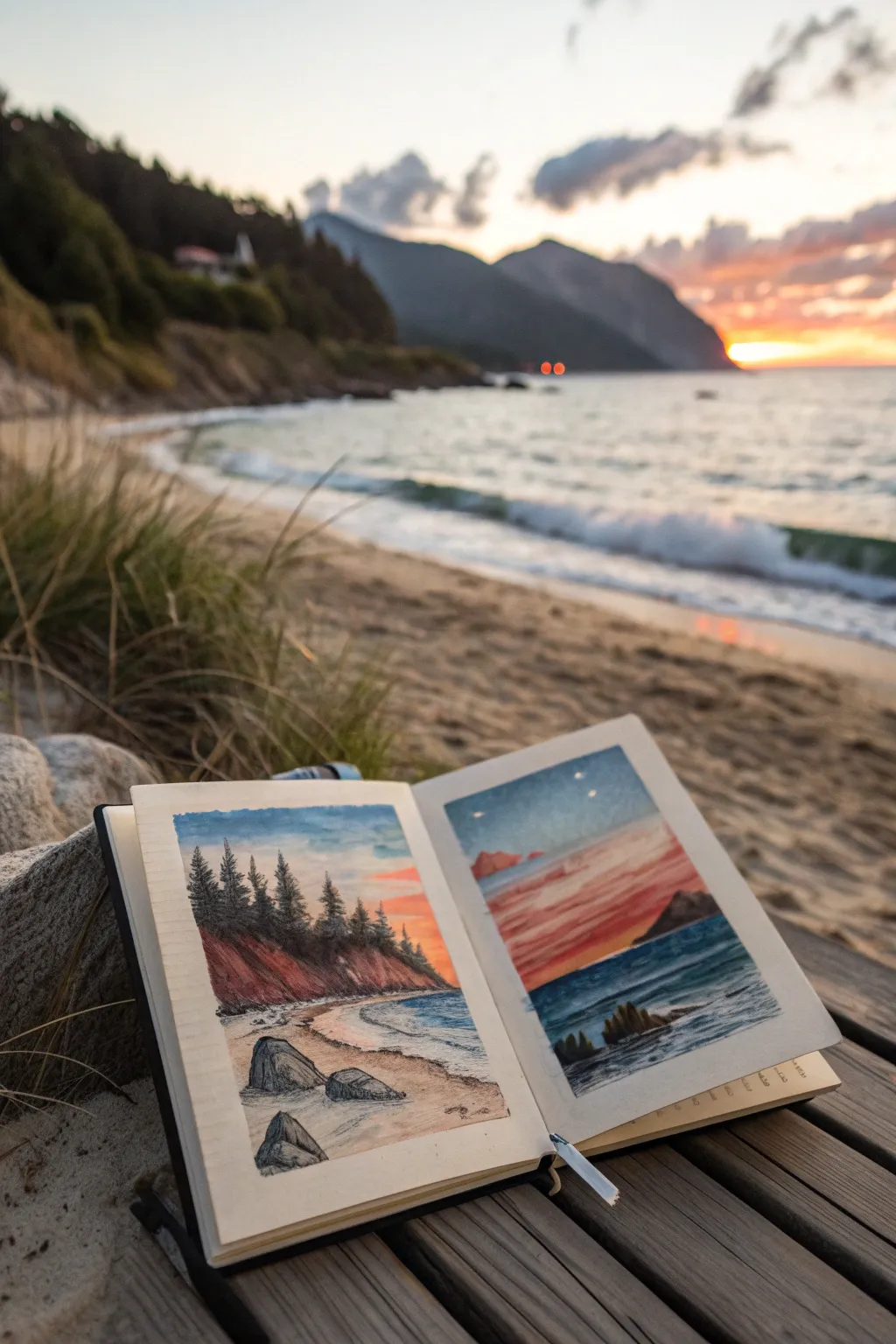
Capture the magic of a coastal sunset across two pages of your sketchbook with this split-scene composition. By dividing the view—a rocky shore on the left and a vibrant horizon on the right—you create a panoramic storytelling effect that feels both intimate and expansive.
Step-by-Step Tutorial
Materials
- Mixed media sketchbook (A5 or similar size, heavyweight paper)
- Watercolor paints (pan or tube)
- Small round brushes (sizes 2, 4, and 6)
- Fine liner pens (black, 0.1mm and 0.3mm)
- Pencil (HB) and eraser
- Painter’s tape or masking tape
- Jar of water and paper towels
Step 1: Preparation and Sketching
-
Tape the borders:
Begin by applying painter’s tape to create clean, rectangular borders on both the left and right pages. Leave a consistent margin of about one inch from the edge of the paper to frame your artwork neatly. -
Draft the horizon lines:
Lightly sketch a straight horizon line across both pages using your HB pencil. Ensure the line is at roughly the same height on both sides to maintain continuity, about one-third of the way up from the bottom border. -
Outline the left landscape:
On the left page, sketch a curving shoreline that sweeps from the bottom left corner up towards the middle right. Add rough triangular shapes for the pine trees along the ridge and jagged outlines for large rocks in the foreground. -
Outline the right landscape:
On the right page, keep it simpler. Sketch a distant mountain silhouette on the right side and faint lines to indicate cloud layers in the sky.
Tape Tearing Paper?
If your tape is ripping the paper upon removal, heat it briefly with a hair dryer first. The heat softens the adhesive, allowing it to lift away gently without damage.
Step 2: Painting the Sky and Water
-
Wash the sky (Left Page):
Start with a wet-on-wet technique for the sky on the left page. Apply clean water, then drop in soft blues near the top, fading into a pale peach or warm yellow near the treeline to suggest the glow of sunset. -
create the dramatic sunset (Right Page):
For the right page, use bolder colors. Paint horizontal streaks of warm red, coral, and purple across the sky area, leaving some white paper showing for bright clouds. Let the colors bleed slightly for a soft, atmospheric look. -
Paint the ocean base:
Mix a deep cerulean or ultramarine blue. Paint the water area on both pages. On the right page, darken the water near the horizon effectively to contrast with the bright sky. On the left, keep the water lighter near the shore. -
Add water texture:
While the blue paint is still damp but not soaking, lift out small horizontal lines with a dry thirsty brush to create the look of sea foam or reflections.
Step 3: Developing the Landscape
-
Paint the cliffs and sand:
On the left page, paint the sandy beach with a wash of yellow ochre and burnt sienna. Use a darker reddish-brown for the steep bank beneath the trees. -
Define the rocks:
Fill in the foreground rocks on the left page with a mix of grey and payne’s grey. Variation in value here will give them 3D form—keep the tops lighter and the bases dark. -
Layer the distant mountains:
On the right page, paint the distant headland using a muted purple or dark grey. Keep this shape flat and silhouetted against the bright sky. -
Create the pine trees:
Using a size 2 brush and a concentrated mix of dark green and black, paint the pine trees on the left page. Use short, dabbing vertical strokes to mimic needles. I find it helps to start from the top of the tree and work downwards, widening the shape.
Pro Tip: Depth Perception
To create depth, make the trees and rocks on the left page highly detailed and contrasted, while keeping the distant mountains on the right page softer and paler.
Step 4: Pen Work and Final Details
-
Dry completely:
Ensure the paper is bone dry before touching it with a pen. If the paper is cool to the touch, wait a little longer. -
Inking the trees:
Use your 0.1mm fine liner to add definition to the pine trees. Don’t outline them fully; instead, add textural scribbles to shadow the dark side of the branches. -
Detailing the rocks:
Add cracks and crevices to the large foreground rocks using the 0.3mm pen. Use stippling or hatching to create rough texture on the stone surfaces. -
Enhance the waves:
On the right page, use the fine liner to draw very thin, broken horizontal lines in the dark water. This simulates the movement of waves catching the last light. -
Reveal the border:
Carefully peel away the masking tape. Pull the tape away from the painting at a 45-degree angle to prevent tearing the paper.
Enjoy the satisfaction of closing your book on a captured sunset memory
Have a question or want to share your own experience? I'd love to hear from you in the comments below!