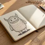
When you’re trying to draw a mascot character, clarity and attitude matter more than tiny details. These mascot drawing ideas are the same kinds of prompts I use in my studio to kickstart bold, readable characters you can actually polish into a logo-style design.
Bird of Prey Mascot
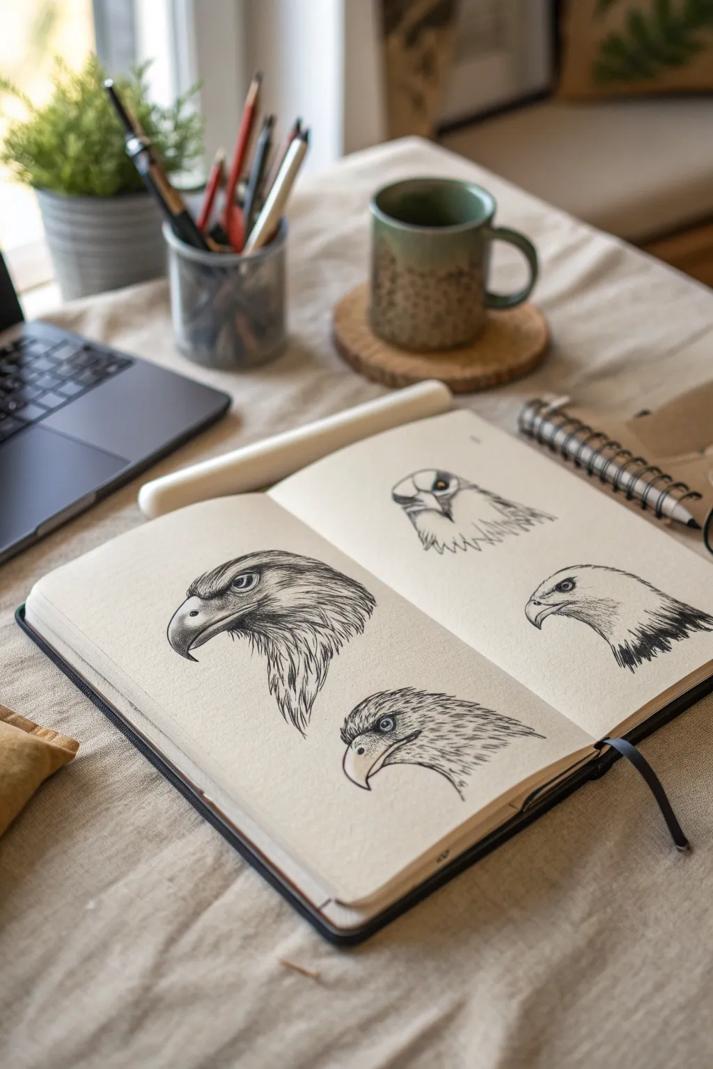
Master the fierce gaze of a bird of prey with these four distinct eagle head studies. This project focuses on capturing different angles and feather textures using precise ink work, perfect for developing mascot concepts.
Step-by-Step Tutorial
Materials
- High-quality sketchbook (smooth or vellum finish)
- H or HB pencil for initial sketching
- Kneaded eraser
- Fine liner pens (sizes 0.1, 0.3, and 0.5)
- Optional: White gel pen for highlights
Step 1: Conceptualizing the Angles
-
Lightly block in shapes:
Since we are drawing four separate heads, start by ghosting in four general locations on your spread. Use your pencil to lightly draw a circle for each cranium and a hooked shape for the beaks. Vary the sizes and ensure you have two heads on the left page and two on the right. -
Define the profiles:
For the main left drawing, position the beak facing left in a classic profile. For the top right drawing, orient the face forward-looking. The bottom right should be a profile facing left, and the bottom center a slightly angled profile. Keep these lines very faint. -
Establish the brow ridge:
Eagles have a distinct, angry-looking brow. Draw a sharp, angled line above the eye socket area for each sketch. This overhang is crucial for that intense mascot look.
Master the “Gape”
Make the corner of the mouth extends slightly past the eye. This anatomical detail is key to making the eagle look realistic rather than cartoony.
Step 2: Refining the Main Profile (Left Page)
-
Draft the eye and beak:
Sketch a sharp, almond-shaped eye deep under the brow ridge. Add the pupil. Refine the beak’s curve, ensuring the upper mandible hooks sharply over the lower one. -
Outline the head plumage:
Draw the contour of the head feathers, sweeping back from the brow and down the neck. Use jagged, saw-tooth lines at the bottom of the neck to suggest layers of feathers. -
Ink the structural lines:
Using a 0.5 pen, go over the main outline of the beak and the eye. Make the line along the mouth opening (the gape) slightly thicker. -
Texture the feathers:
Switch to a 0.1 or 0.3 pen. Draw long, flowing lines following the curve of the head from the crown down to the neck. Keep these lines fairly separated near the top and denser near the neck shadow. -
Detail the beak:
Add small stippling dots near the base of the beak (the cere) and the nostril slit area to give it a porous texture.
Step 3: Drawing the Variations (Right Page)
-
Sketch the forward-facing eagle:
For the top right sketch, draw two eyes staring straight ahead. Frame them with a heart-shaped facial disc of feathers. The beak should look like a narrow triangle pointing down. -
Apply minimal shading:
Keep the forward-facing sketch cleaner. I prefer using broken lines here to suggest fluffiness rather than hard edges. Use the 0.1 pen for the feather tips. -
Create the heavy shadow profile:
For the middle-right sketch, focus on high contrast. Outline the head smoothly, but fill the neck feathers with heavy, dark strokes using the 0.5 pen. -
Hatch the shadow areas:
Use cross-hatching under the chin and at the back of the neck to create a sense of depth and volume on this specific head.
Uneven Ink Flow?
If your fine liners skip over pencil graphite, try erasing the pencil lines slightly until they are faint ghosts before inking, or switch to a new pen tip.
Step 4: The Final Study and Cleanup
-
Draft the bottom center head:
This head sits low on the spread. Draw it with a slightly softer, rounder eye to make it look distinct from the main profile. -
Feather direction flow:
Ink short, flicking strokes starting from the bridge of the nose, sweeping backward. These strokes should be shorter and more uniform than the main profile. -
Darken the pupils:
Go back to all four drawings. Fill in the pupils with solid black, leaving a tiny speck of white paper for the ‘catchlight’ or reflection. This brings them to life. -
Erase pencil guides:
Wait at least 15 minutes for the ink to fully cure. Gently erase all underlying pencil marks with the kneaded eraser so the drawing doesn’t smear. -
Final shading pass:
Assess the balance of the page. Add deeper black ink to the furthest neck feathers on the main profile to anchor the drawing visually.
Now you have a dynamic reference sheet of eagle concepts ready for your next mascot design

Fast Bunny Mascot
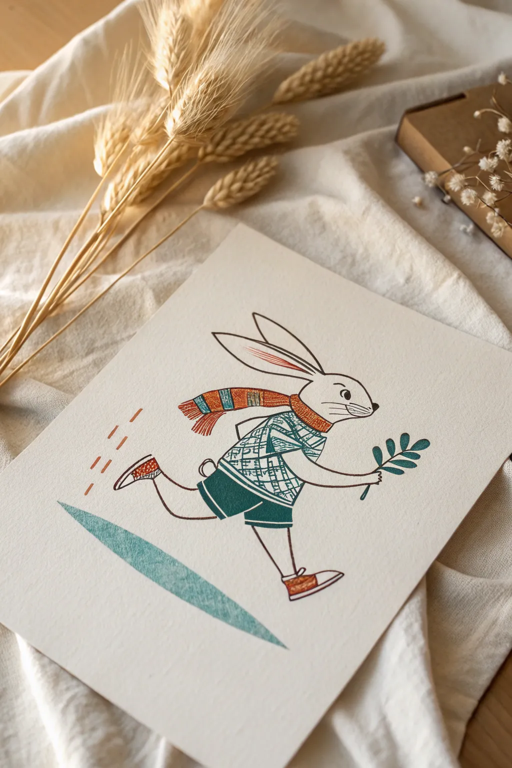
Capture the spirited energy of this festive hare with a clean, stylized illustration that combines linework with textured color blocking. This project mimics the look of a screen print or block print using accessible markers and pens on quality paper.
Step-by-Step Guide
Materials
- Heavyweight textured paper (cream or off-white, roughly 140lb/300gsm)
- Fine liner pen (black or very dark brown, size 0.3 or 0.5)
- Deep teal or forest green marker
- Burnt orange or rust-colored marker
- Pencil (HB or 2H)
- Soft block eraser
- Ruler (optional)
Step 1: Sketching the Skeleton
-
Draft the head:
Begin lightly with your pencil in the upper right quadrant. Draw a rounded oval for the head, tilting slightly upward to suggest forward momentum. -
Add the ears:
Extend two long, sleek ears from the top of the head. Angle them back sharply to emphasize the speed of the bunny running. -
Establish the body gesture:
Sketch a C-curve spine connecting to the head. This bunny is leaning forward, so keep the posture dynamic rather than upright. -
Draw the limbs:
Sketch the legs in mid-stride. The back leg should be kicking out behind, while the front leg stretches forward. Add the arms, with the visible front arm holding a branch.
Step 2: Refining the Lines
-
Detail the face:
Define the eye, nose, and whiskers. The expression is determined, so give the eye a focused look. -
Outline the clothing:
Draw the sweater and shorts directly over your body sketch. Add the scarf streaming out behind the neck, mirroring the angle of the ears. -
Ink the main outlines:
Using your fine liner, carefully go over your pencil lines. Keep the line weight consistent for that graphic illustration style. -
Add the leaf prop:
Ink the simple branch held in the bunny’s hand. Use teardrop shapes for the leaves. -
Erase guidelines:
Once the ink is completely dry—I usually give it a full five minutes to be safe—gently erase all underlying pencil marks.
Uneven marker coverage?
If your large color areas look streaky, coloring in small circular motions rather than straight lines blends the ink better on textured paper.
Step 3: Applying Color & Texture
-
Color the shorts:
Take your deep teal marker and fill in the shorts. Aim for a solid, flat fill without streaks if possible. -
Pattern the sweater:
Using the same teal marker (or a finer tip if available), draw a cross-hatch or plaid pattern on the sweater. Leave plenty of white space to create contrast. -
Fill the scarf details:
Use the burnt orange marker to color alternating stripes on the scarf. Don’t worry if the texture looks slightly grainy; it adds to the handmade charm. -
Add shoe accents:
Color the shoes with the orange marker, leaving the soles and toe caps white for detail. -
Color the greenery:
Carefully fill in the leaves on the branch with the teal marker.
Textured paper is key
For this specific look, standard printer paper is too smooth. Use cold-press watercolor paper or cardstock with ‘tooth’ to get that grainy, vintage print effect.
Step 4: Finishing Touches
-
Add motion lines:
Draw three small, dashed lines in orange behind the bunny’s foot to represent dust or movement. -
Create the ground shadow:
Using a light touch or a slightly dried-out teal marker, create the elongated triangular shadow beneath the bunny. The texture here should be rougher than the solid clothing. -
Review contrast:
Check the illustration for any gaps in the coloring or lines that need thickening to separate forms, like where the scarf overlaps the sweater. -
Final textural details:
Add tiny hatching lines inside the bunny’s inner ear using the orange marker for a pop of color.
This charming, speedy character makes a perfect addition to a personalized greeting card or a framed nursery decoration
Bear Power Mascot
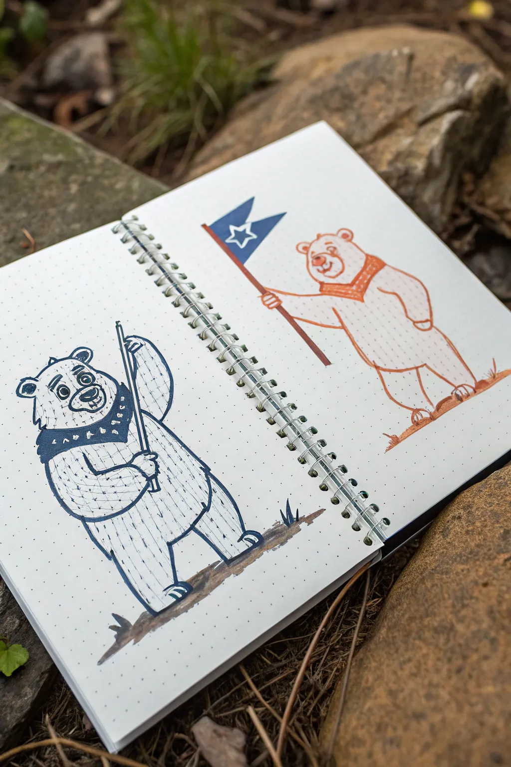
Capture the spirit of the outdoors with this charming duo of bear mascots sketched in an open sketchbook. Using simple line work and limited colors, you’ll create two distinct bear characters—one holding a fishing rod and the other waving a starry flag—perfect for a camping or hiking journal.
How-To Guide
Materials
- Dot grid notebook or sketchbook
- Navy blue felt-tip pen or fine liner (0.5mm)
- Orange felt-tip pen or fine liner (0.5mm)
- Light grey alcohol marker (for shadows)
- Pencil (HB or 2B)
- Eraser
- Ruler (optional)
Step 1: Planning Sketches
-
Lay out the shapes:
Begin with a pencil to lightly sketch two kidney-bean shapes for the bodies. Place one bear on the left page and one on the right, ensuring they are roughly the same height. -
Position the limbs:
Add simple ovals for the arms and legs. For the left bear, position the left arm posed on its hip and the right arm raised to hold a pole. For the right bear, extend the left arm forward to hold a flag staff. -
Define the heads:
Sketch circles for the heads. Add smaller circles for the muzzles and semicircles for the ears. Give the left bear a slightly more squared jawline for character variety.
Step 2: The Blue Bear (Left Page)
-
Outline the head:
Switch to your navy blue pen. Trace over your pencil lines for the head, adding tufts of fur on the cheeks and a small tuft on top. -
Draw the face:
Ink the eyes with large pupils, a wide nose, and a smiling mouth showing a couple of teeth. Don’t forget the inner ear details. -
Create the bandana:
Draw a bandana tied around the neck. Fill it in with solid blue ink but leave small triangles and dots white to create a patterned texture. -
Body texture:
Outline the body and limbs. Instead of solid lines for the fur, use short, broken hatching lines all over the sweater area to simulate a knit texture or rough fur coat. -
Add the fishing rod:
Draw the long, thin fishing rod held in the right paw. Make sure the rod passes behind the arm and extends upwards. -
Ground the figure:
Using a grey marker or diluted ink, swipe a simple shadow shape under the feet to give the bear solid footing.
Grid Guide
Use the dot grid of your notebook to help align the height of the eyes and shoulders, ensuring both bears look like they belong to the same ‘species’ and scale.
Step 3: The Orange Bear (Right Page)
-
Outline the orange form:
Switch to the orange pen. Outline the right bear’s head and body, keeping the lines smooth but slightly organic. -
Add facial features:
Draw a friendly face with closed, curved eyes for a happy expression, a round nose, and a simple smile. -
Detail the collar:
Draw a thick collar or scarf around the neck. Detail it with diagonal cross-hatching to distinguish it from the rest of the body. -
Texture the fur:
I find that adding vertical dashed lines down the body helps create volume without cluttering the drawing. Add these faint dashed lines across the torso. -
Draw the flag:
Draw a staff in the bear’s extended hand. At the top, draw a triangular flag using the navy blue pen. -
Star detail:
Inside the blue flag, carefully leave a star shape white (negative space) or use a white gel pen later to add it. -
Shadows and ground:
Use the orange pen to create a scribbly, rough texture for the ground under the feet. Add a few vertical grass blades for context.
Team Colors
Customize the flags and bandanas with your school or favorite sports team colors to turn these generic bears into spirited, specific mascots.
Step 4: Refining the Duo
-
Erase guidelines:
Once the ink is completely dry—give it a good few minutes so you don’t smudge—gently erase all the underlying pencil sketches. -
Final touches:
Check for any gaps in your line work. Add tiny tick marks on elbows or knees to suggest movement and joints.
Now you have a pair of adventurous mascots ready to lead the way in your sketchbook

Bulldog Grit Mascot
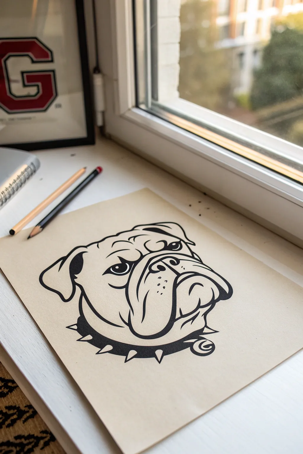
Capture the tenacious spirit of a classic mascot with this bold, graphic illustration on toned paper. By using high-contrast black ink against a tan background, you’ll create a striking, sticker-style artwork perfect for team spirit or logo practice.
Detailed Instructions
Materials
- Tan or light brown toned sketch paper (smooth surface)
- HB or 2H graphite pencil for sketching
- Fine liner pen (0.5mm)
- Black brush pen or broad marker
- Kneaded eraser
- White gel pen (optional for highlights)
Step 1: Structural Sketching
-
Establish the Head Shape:
Start by lightly drawing a large, slightly squashed circle for the main mass of the bulldog’s head. Add a smaller, overlapping oval near the bottom center for the muzzle area. -
Define the Jawline:
Below the main circle, sketch a wide, U-shaped jaw that connects to the sides of the head. This gives the bulldog its characteristic heavy jowls. -
Place the Features:
Draw faint guidelines intersecting the face. Place two small ovals for eyes wide apart on the horizontal line, and mark the nose position in the center of the muzzle oval. -
Sketch the Ears:
Add the triangular shapes of the folded ears at the top corners of the head. Keep them relatively small and flopped forward to maintain that classic bulldog silhouette. -
Draft the Collar:
Curve a thick band around the bottom of the neck area. Sketch simple triangles along this band to indicate where the spikes will go.
Ink Smearing?
If your hand smudges the ink, place a scrap piece of paper under your drawing hand as a shield while you work across the page.
Step 2: Refining the Lines
-
Detail the Frown:
Using your pencil, refine the mouth into a deep, upside-down ‘U’ shape. Add the creases of the jowls extending downward from the corners of the nose. -
sculpt the Nose:
Draw the nose shape more clearly, including the nostrils. Add distinct wrinkles across the bridge of the nose between the eyes to emphasize the scowl. -
Shape the Eyes:
Outline the eyes with a sharp, angular aesthetic. Draw the eyelids heavy and low to create a glaring, determined expression. -
Add Texture Details:
Lightly mark spots for whiskers on the muzzle and add a few extra wrinkle lines on the forehead. I find it helpful to keep these lines faint so they don’t overpower the ink later.
Make it Pop
Use a white gel pen or white charcoal pencil to add highlights to the top of the nose, the spikes, and the eyes for a glossy 3D effect.
Step 3: Inking the Outline
-
Start with Variable Widths:
Switch to your black brush pen or broad marker. Trace the outer silhouette of the head with a thick, confident line to separate the subject from the background. -
Ink the Facial Features:
Carefully ink the eyes, leaving a tiny spot of paper white for the reflection. Fill in the pupils completely black. -
Define the Wrinkles:
Use a slightly thinner line weight for the internal wrinkles on the forehead and around the nose. Taper the ends of these lines to make them look like natural skin folds. -
Create Depth in the Jowls:
Use bold, heavy lines for the bottom of the jowls and the mouth. Briefly thicken the line where shadows would naturally fall, like under the lip flaps. -
Ink the Ears:
Outline the ears, ensuring you fill in the shadow area inside the ear fold with solid black for depth.
Step 4: Finishing Touches
-
Bold the Collar:
Fill in the main strap of the collar with solid black ink. Carefully outline the spikes, leaving them the color of the paper to make them pop against the dark leather. -
Erase Guidelines:
Once the ink is completely dry—give it a few minutes to be safe—gently use your kneaded eraser to lift all the underlying pencil sketches. -
Add Muzzle Dots:
Using your fine liner, add small stippling dots on the muzzle capability to suggest whisker follicles. -
Final Contrast Check:
Look over the drawing one last time. If any outer contour lines look weak, go over them again to thicken the stroke and ensure that bold, graphic sticker look.
Now you have a fierce mascot illustration ready to represent your team spirit

PENCIL GUIDE
Understanding Pencil Grades from H to B
From first sketch to finished drawing — learn pencil grades, line control, and shading techniques.
Explore the Full Guide
Bull or Ram Mascot
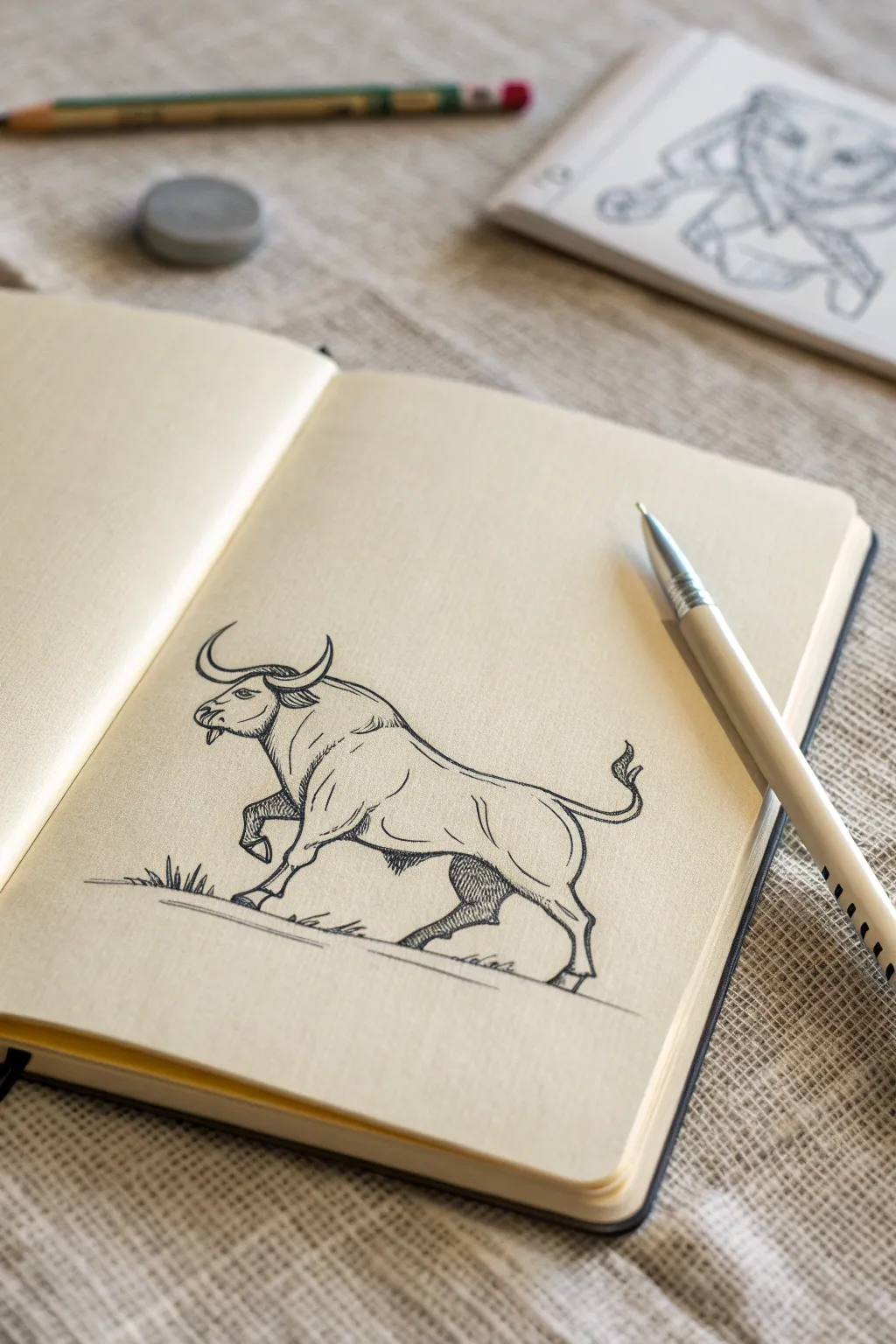
Capture strength and momentum with this stylized ink drawing of a charging bull. This project uses clean line work and cross-hatching to create a classic mascot feel that looks great in any sketchbook.
Step-by-Step Tutorial
Materials
- Cream or off-white sketchbook paper (smooth texture)
- HB graphite pencil
- Kneaded eraser
- Fine liner pen (0.3mm or 0.5mm, black)
- White gel pen (optional for corrections)
Step 1: Structural Sketch
-
Establish the curve:
Begin with your HB pencil using very light pressure. Draw a sweeping, slightly S-shaped curve that starts high at the shoulder and dips down towards the rear. This ‘line of action’ will guide the bull’s charging posture. -
Block in the masses:
Sketch a large oval for the chest and shoulder area, which should be the dominant mass. Add a smaller circle for the hindquarters, positioned slightly lower than the shoulder. -
Map the head:
Draw a smaller, thick wedge shape for the head, attaching it to the shoulder mass with a short, thick neck. The head should be angled slightly downward to suggest aggression. -
Position the legs:
Sketch stick-figure lines for the legs first to get the posing right. The front left leg should be raised high at the knee, while the back legs should be planted firmly to show propulsion.
Hatching Pro-Tip
Don’t rush your hatching lines. Keep them evenly spaced and parallel. If lines cross messily, it creates ‘dirty’ looking shadows rather than clean shading.
Step 2: Defining the Form
-
Flesh out the limbs:
Add volume to the legs. Make the upper legs (thighs and forearms) thick and muscular, tapering down into the hooves. Notice the ‘knobby’ look of the joints in the reference; emphasize these bony landmarks. -
Add the horns and tail:
Draw the horns curving upward and slightly forward, resembling a crescent moon shape. Sketch a wavy line for the tail that flicks upward at the end, adding a tuft shape. -
Refine the facial features:
Mark the position of the eye, sitting high on the cheek. Add the nostril near the snout and a small detailed line for the mouth/jaw. -
Connect the contours:
Use your pencil to create a definitive outline, connecting your shapes into one cohesive animal. Pay attention to the dip in the back and the powerful hump of muscle over the shoulders.
Step 3: Inking the Outline
-
Start the clean lines:
Switch to your fine liner pen. Begin tracing your graphite lines, but don’t just trace—use confident, deliberate strokes. I find it helpful to pull the pen towards me for steadier lines. -
Vary the line weight:
Make the outline of the bull’s back and underside slightly thicker to give the drawing weight. Keep internal details, like muscle creases, thinner. -
Detail the head:
Ink the eye, leaving a tiny white dot for a highlight if possible. Carefully outline the horns, adding small ridge lines at the base for texture. -
Ink the hooves and tail:
Outline the cloven hooves with sharp angles. Ink the tail, using jagged strokes for the tuft of hair at the end.
Smudge Control
If you are smudging pencil while drawing, place a scrap piece of paper under your drawing hand. This acts as a shield between your skin oils and the paper.
Step 4: Shading and Texture
-
Hatching the shadows:
Identify your shadow areas: under the neck, the belly, the back thigh, and under the shoulder hump. Use parallel diagonal lines (hatching) to fill these areas. -
Deepening contrast:
For darker areas like the far back leg and the deep shadow under the neck, apply cross-hatching (lines going in the opposite direction) to make the tone denser. -
Texturing the coat:
Add short, small dashes along the shoulder hump and the contour of the back to suggest fur texture without drawing every hair. -
Grounding the figure:
Sketch a few jagged tufts of grass near the hooves and draw a simple horizontal slipstream line underneath to show the ground and speed. -
Final cleanup:
Once the ink is completely dry—give it a few minutes to be safe—gently erase all the underlying pencil sketch lines with your kneaded eraser.
You now have a dynamic mascot drawing that captures the raw power of the bull
Wise Owl Scholar Mascot
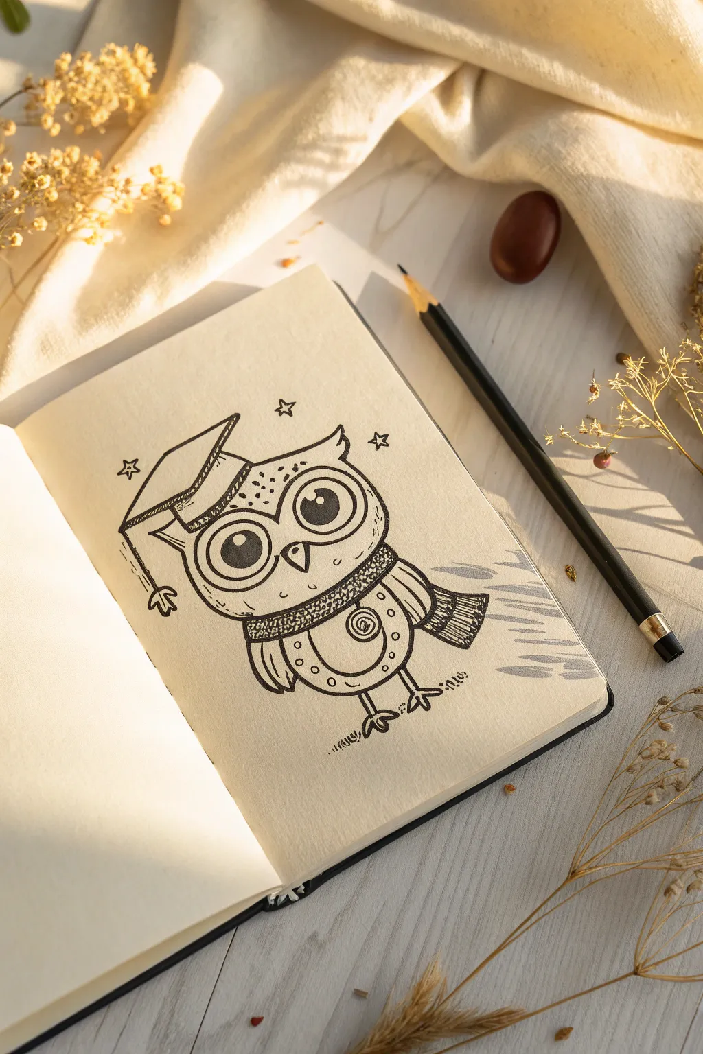
Celebrate academic achievement or just wisdom in general with this delightful ink drawing of a scholarly owl. This project focuses on clean linework and whimsical details, creating a charming mascot character perfect for a journal or notebook.
Step-by-Step
Materials
- Creme-toned sketchbook or mixed media paper
- HB Graphite pencil (for under-sketching)
- Kneaded eraser
- Fine liner pen (black, 0.3mm)
- Fine liner pen (black, 0.5mm or 0.8mm for thicker outlines)
- Pencil sharpener
Step 1: Basic Structure & Pencil Sketch
-
Outline the head and body:
Start with a light pencil sketch. Draw a wide, flattened oval for the head. Directly beneath it, sketch a slightly smaller, U-shaped curve to form the bottom of the body. Keep your pencil pressure very light so these lines can be erased later. -
Add the graduation cap:
Position the graduation cap (mortarboard) tilted on the left side of the owl’s head. Draw a flat diamond shape for the top, and add a small triangle hanging down on the left side to represent the cap sitting on the head. -
Sketch the large eyes:
Inside the head oval, draw two very large circles that touch in the middle. These will be the glasses/eyes. Inside those, draw smaller circles for the pupils, leaving a white highlight spot in the upper right of each pupil. -
Define the beak and scarf:
Draw a small, downward-pointing triangle between the eyes for the beak. Below the head, sketch a curved band wrapping around the neck area to create a cozy scarf. Add a tail to the scarf flowing out to the right side. -
Add wings and feet:
Sketch small, rounded wings on either side of the body. At the bottom, draw two stick legs ending in three-toed talons.
Step 2: Refining with Ink
-
Ink the eyes:
Switch to your 0.5mm pen. Carefully trace the large outer circles of the eyes. Fill in the pupils solid black, being extremely careful to preserve the white highlight circles—this gives the character life. -
Outline the head and cap:
Trace the outer shape of the head, adding small tufts of feathers at the top corners (the ‘ears’). Ink the graduation cap using straight, confident lines. Don’t forget the tassel hanging down the left side, ending in a little frayed puff. -
Texture the scarf:
Ink the outline of the scarf. To give it a knitted texture, add rows of tiny, dense stippling (dots) or small hatched lines. I like to focus the darker texture around the folds to show depth. -
Detail the body feathers:
Draw a curved line across the chest to separate the stomach area. On the stomach, draw a spiral shape on the right side and few small circles for pattern. Use the 0.3mm pen for these finer details. -
Inking the wings:
Outline the wings, adding simple vertical lines inside them to suggest flight feathers. -
Finalize the feet:
Go over the legs and talons with your pen. Add little hatch marks on the ground beneath the feet to ground the character so it doesn’t look like it’s floating.
Wobbly Lines?
If your circles aren’t perfect, embrace it! This style is hand-drawn and whimsical. Varying line weight by going over ‘wobbly’ spots makes them look intentional.
Step 3: Finishing Touches
-
Erase pencil lines:
Wait until the ink is completely dry—smudging is the enemy here! Once dry, gently run your kneaded eraser over the entire drawing to remove the initial graphite sketch. -
Add personality details:
Using your finest pen, add small freckles or dots on the forehead. Draw three simple sparkles (diamond stars) floating around the head to emphasize the ‘magic’ of learning. -
Shadowing:
Add subtle hatching lines (diagonal strokes) on the right side of the body and under the scarf tail. This simple step adds instant dimension to a flat drawing.
Add School Spirit
Color the scarf and the tassel on the cap with colored pencils or markers that match your own school colors or house team for personalized flair.
Now you have a wise little companion to watch over your studies and notes.
BRUSH GUIDE
The Right Brush for Every Stroke
From clean lines to bold texture — master brush choice, stroke control, and essential techniques.
Explore the Full Guide
Cool Cat Mascot Persona
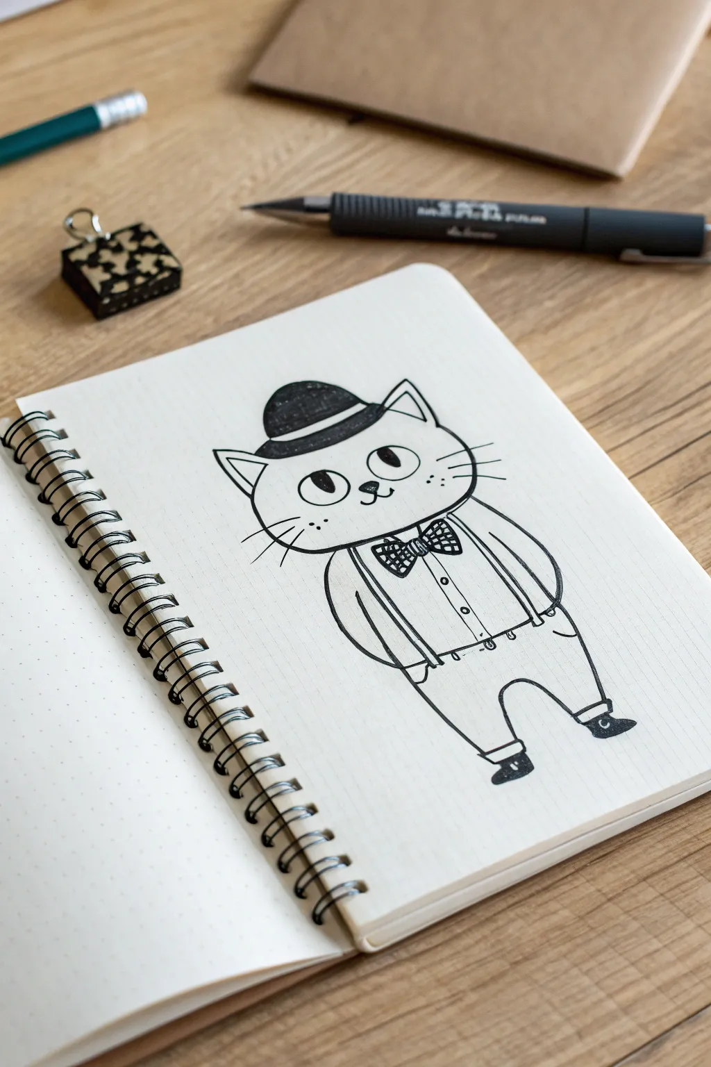
Create a charming vintage-style mascot character featuring a stylized cat dressed to the nines in suspenders and a bowler hat. This simple line art project relies on clean ink strokes and minimal shading to achieve a classic, cartoonish personality perfect for logos or fun illustrations.
Step-by-Step Tutorial
Materials
- Dotted or grid notebook (A5 size recommended)
- Pencil (HB or 2B)
- Eraser
- Fine liner pen (0.3mm or 0.5mm, black)
- Thicker marker or brush pen (black)
Step 1: Drafting the Basic Shapes
-
Outline the head:
Start near the top center of your page. Lightly sketch a wide, slightly flattened oval for the cat’s head, keeping the bottom curve softer than the top. -
Add the hat:
Draw the brim of the bowler hat directly on top of the head oval, curving slightly upward at the sides. Add a dome shape above the brim for the crown of the hat. -
Body structure:
Below the head, sketch a rounded, bean-like shape for the torso. It should be slightly narrower than the head to emphasize the cartoon proportions. -
Legs and feet:
Extend two short, sturdy legs from the bottom of the torso. Keep the stance wide for a confident look, and add small oval shapes for the feet.
Use Dotted Paper
Using a dotted notebook helps you keep the symmetry of the eyes and suspenders aligned without needing to draw rigid grid lines first.
Step 2: Adding Character Details
-
Face features:
Place two large, wide-set circles for eyes in the middle of the face. Below them, draw a tiny triangle nose and a simple ‘w’ shape for the mouth. -
Ears and whiskers:
Sketch triangular ears poking out from under the hat brim. Add three straight whisker lines on each cheek. -
Clothing basics:
Define the trousers by drawing a horizontal waistline on the torso. Add cuffs at the bottom of the legs just above the shoes. -
Accessories:
Draw a prominent bowtie right under the chin. Then, sketch two vertical straps running from the shoulders down to the waistline for the suspenders. -
Arm positioning:
Draw the arms resting at the sides. Curve them slightly inward so the hands disappear into imaginary pockets, simplifying the drawing process.
Step 3: Inking and Refining
-
Trace the main outlines:
Using your fine liner pen, carefully trace over your pencil lines. Start with the head and hat to establish the focal point. -
Fill the hat:
Use your thicker marker or brush pen to color the dome of the bowler hat completely black, leaving a small white highlight if desired for dimension. -
Detail the bowtie:
Ink the bowtie outline, then fill it with a checkered pattern or small diagonal stripes using the fine liner to give it texture. -
Darken the eyes:
Fill in the pupils with black ink, leaving large white circles for reflections to make the character look friendly and alert. -
Line weight variation:
Go back over the outer contour of the cat’s body with slightly thicker strokes to separate the character from the background. -
Clothing details:
Add small circles for buttons on the shirt front. Draw tiny loops where the suspenders meet the trousers. -
Texturing the shoes:
Color in the shoes with black ink, leaving a thin white strip at the sole to distinguish the heel. -
Clean up:
Once the ink is completely dry—I usually wait at least five minutes to be safe—gently erase all underlying pencil sketch marks.
Add a Prop
Give your mascot more personality by having him hold a cane, a customized sign, or even a coffee cup in one of his paws.
You now have a dapper mascot ready to greet the world from your notebook page
Bandana Dog Mascot
Capture the infectious joy of man’s best friend with this minimal yet expressive ink illustration. Using fine liners on toned paper allows for crisp details, while a splash of color on the bandana creates a charming focal point.
Step-by-Step Guide
Materials
- Spiral-bound sketchbook with tan or toned paper
- Fine liner pens (sizes 0.1, 0.3, and 0.5)
- Graphite pencil (HB or 2H)
- Kneaded eraser
- Muted orange or terracotta alcohol marker or colored pencil
- White gel pen
Step 1: Sketching the Foundation
-
Outline the head shape:
Begin with a gentle pencil sketch. Draw a rounded square shape for the snout area and a broader curve for the top of the head. Keep your pressure extremely light so lines can be erased later. -
Position the features:
Mark a horizontal line across the snout for the nose placement and eye level. Add two triangular shapes that flop downwards for the ears. -
Draft the smile:
Sketch the open mouth with a long U-shape for the tongue hanging out slightly to the side. This is crucial for that happy expression. -
Add the bandana:
Draw a curved line below the chin and a V-shape pointing down towards the chest to define the bandana. Keep the knot hidden or just suggest it at the back.
Pro Tip: Eye Sparkle
Never fully black out the eyes. Always leave a tiny speck of white paper untouched for the ‘catchlight.’ It instantly brings the character to life.
Step 2: Inking the Outline
-
Define the eyes:
Switch to your 0.3 fine liner. Carefully outline the eyes, leaving small white circles for highlights. Fill in the pupils with solid black. -
Ink the nose:
Use the 0.5 pen for the nose to give it weight. Focus on the nostrils, making them the darkest part, and use broken lines on top to suggest texture. -
Trace the mouth and tongue:
Outline the mouth with the 0.3 pen. For the tongue, use a smooth, continuous line. Darken the empty space inside the mouth behind the tongue to create depth. -
Draw the fur texture:
Instead of a solid outline for the head, use short, quick strokes with the 0.1 pen to mimic fur, especially around the cheeks and ears. -
Outline the bandana:
Use a steady, continuous line for the bandana to contrast with the scratchy fur texture. Add a few small wrinkles near the neck area.
Troubleshooting: Smudged Ink
If your hand smudges the ink, place a scrap piece of paper under your drawing hand as a guard sheet. This protects the work surface while you focus on details.
Step 3: Adding Details and Color
-
Erase pencil marks:
Once the ink is completely dry, gently roll your kneaded eraser over the entire drawing to lift the graphite guidelines. -
Add hatching for shadows:
Using the 0.05 or 0.1 pen, add diagonal hatching lines under the chin, inside the ears, and along the side of the snout to suggest form. -
Detail the chest fur:
Draw loose, sparse vertical lines extending down from the bandana to suggest the dog’s body without needing a full outline. -
Whisker spots:
Add tiny stipple dots on the muzzle area where whiskers would originate. -
Color the bandana:
Fill in the bandana shape with your terracotta marker or colored pencil. If using marker, work quickly to avoid streak marks. -
Create the polka dots:
Wait for the marker ink to dry fully. Then, use the white gel pen to dot small, evenly spaced circles across the colored bandana. -
Final touches:
Review your contrast. I often go back and darken the corners of the mouth or the depths of the ears to make the face pop.
Now you have a loyal illustrated companion ready to brighten your sketchbook page


Dinosaur Athlete Mascot
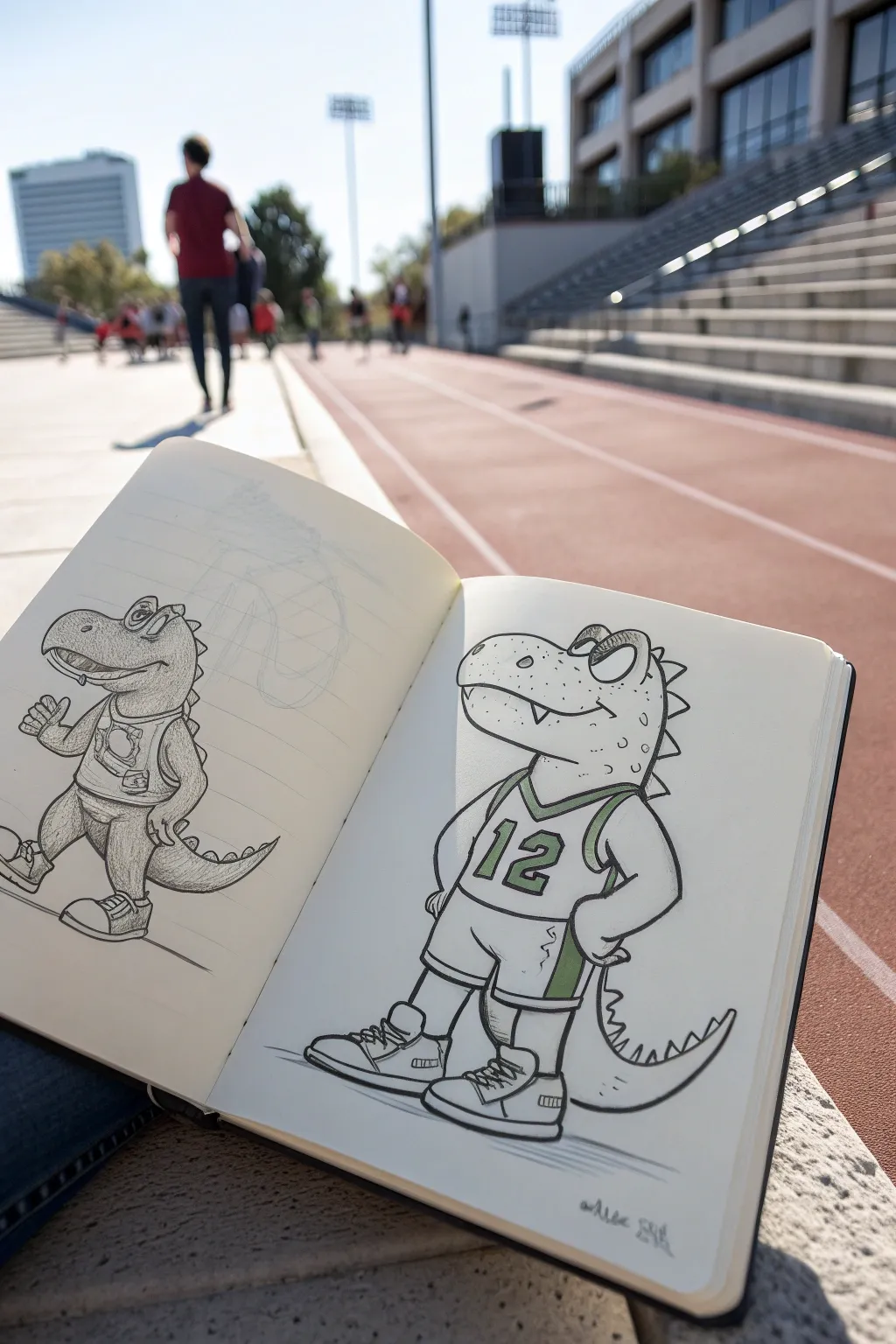
Bring some prehistoric power to the court with this energetic dinosaur mascot. This tutorial guides you through sketching a friendly T-Rex character sporting a basketball jersey, perfect for adding a sporty vibe to your sketchbook.
Detailed Instructions
Materials
- Sketchbook (heavyweight paper preferred)
- HB Graphite Pencil
- Fine liner pen (0.5mm and 0.8mm)
- Light green marker or colored pencil
- Dark green marker or colored pencil
- Eraser
Step 1: Drafting the Character
-
Head Shape Base:
Start by drawing a large, rounded rectangle for the snout, connecting it to a slightly smaller circle for the back of the head. Keep your pencil lines extremely light during this phase. -
Body Framework:
Below the head, sketch a bean-like shape for the torso. It should be slightly puffed out at the chest to suggest an athletic build. -
Positioning Limbs:
Draw simple stick-figure lines to determine the pose. Place the arms akimbo with hands resting on imaginary hips, and sketch robust, thick legs ending in large, blocky shapes for the sneakers. -
Refining the Face:
Add a classic dinosaur jawline. Draw a curved line for the mouth that kicks up at the end for a smirk. Sketch large, expressive brow ridges and oval eyes looking confidently forward. -
Jersey Outline:
Draw the outline of a basketball tank top over the torso. Include the V-neck collar and the armholes, making sure the straps look like they sit naturally on the dino’s shoulders. -
Shorts and Shoes:
Add baggy athletic shorts ending just above the knees. Flesh out the sneakers into high-top designs with laces and thick soles. -
The Tail:
Don’t forget the tail! Sketch a thick, curved shape emerging from behind the shorts, tapering to a point.
Clean Lines
When inking long curves like the tail or back, try to draw from your shoulder rather than your wrist. This creates smoother, less shaky lines.
Step 2: Adding Details and Inking
-
Textural Details:
Add small triangles along the back of the head and tail for spikes. Draw a few small circles on the snout for texture. -
Jersey Numbers:
Block out a large number ’12’ (or your favorite number) in the center of the jersey using a bold, varsity-style font. -
Initial Inking – Outlines:
Switch to your 0.8mm fine liner. Trace over the main exterior lines of the character—the head, body, arms, and legs. Use confident, smooth strokes. -
Secondary Inking:
Use the finer 0.5mm pen for interior details like the teeth, the jersey trim, the laces on the shoes, and the texture spots on the skin. -
Line Weight Variation:
Go back over the bottom curves of the chin, tail, and shoes with the thicker pen to add weight and shadow to the drawing. -
Erase Sketches:
Once the ink is completely dry (give it a few minutes to avoid smudging), gently erase all the underlying graphite pencil lines.
Design Your Team
Customize the jersey! Change the number to a recognizable player’s, or swap the green accents for your local school or favorite team’s colors.
Step 3: Color Accents
-
Number Coloring:
Using your markers, color in the body of the numbers on the jersey. Leaving a thin white gap between the outline and the color can make it pop. -
Uniform Trim:
Apply color to the collar trim, the armhole trim, and the side stripes on the shorts. This unifies the team uniform look. -
Grounding Shadow:
Use a grey marker or light pencil shading to add a horizontal scribble under the feet. This grounds the character so they aren’t floating in space. -
Signature:
Sign your artwork at the bottom with a small, stylized signature.
Now you have a dynamic dino mascot ready to lead the team to victory
Shark or Wolf Mascot Snarl
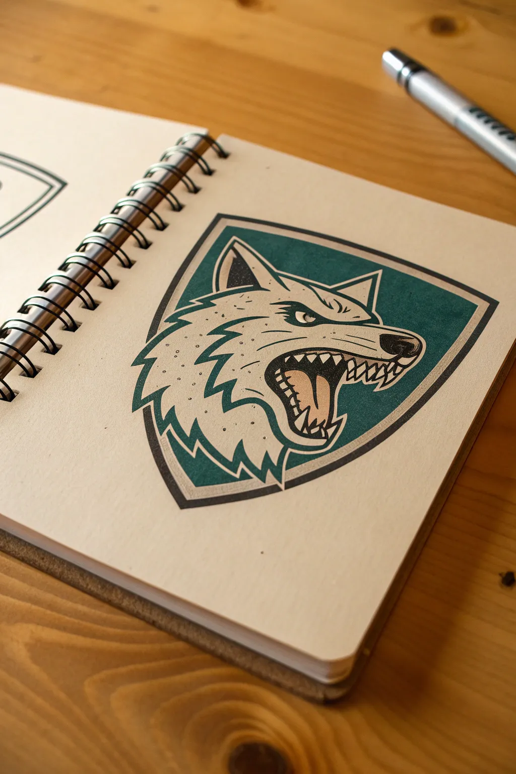
This tutorial guides you through creating a bold, geometric wolf mascot emblem with a striking teal background. The finished piece features clean linework and an expressive snarl, perfect for practicing logo-style illustration in your sketchbook.
Step-by-Step Tutorial
Materials
- Sketchbook with smooth, heavy paper
- HB pencil for initial sketching
- Fine liner pens (0.3mm and 0.8mm)
- Deep teal or forest green alcohol marker
- Light grey alcohol marker (cool tone)
- White gel pen or Posca marker
- Ruler
- Eraser
Step 1: Conceptualizing the Shape
-
Draft the Shield:
Begin by lightly sketching a shield outline in the center of your page. The shape should curve slightly outward at the top sides and come to a soft point at the bottom. -
Define the Inner Border:
Draw a second, smaller shield shape inside the first one to create a thick border. This space will eventually remain white to frame the artwork. -
Establish the Wolf’s Structure:
Inside the shield, lightly map out the wolf’s head using basic geometric shapes. Use a triangle for the ear, a wedge for the snout, and a circle for the jaw area.
Uneven Marker Ink?
If your background color looks patchy, work faster while the ink is still wet to blend strokes. Alternatively, use circular motions rather than straight lines.
Step 2: Designing the Mascot
-
Refine the Snout:
Shape the wolf’s snout so it points towards the right. Add a curved nose tip and sketch the snarl lines along the muzzle bridge. -
Draw the Mouth and Teeth:
Open the jaw wide. Sketch jagged, triangular teeth on both the upper and lower jaws, ensuring the canines are prominent. Add a curved line for the tongue inside the mouth. -
Add the Eye:
Place the eye deep under a slanted brow to create that angry, focused expression. The eye shape should be angular, almost like a triangle pointing toward the nose. -
Create the Fur Texture:
Outline the back of the head and neck using jagged, sawtooth lines. These spikes mimic fur tufts and should sweep backward, reinforcing the feeling of movement. -
Connect to the Shield:
Ensure the fur spikes on the left and the ear at the top touch or slightly overlap the inner shield border you drew earlier. This integrates the subject with the frame.
Step 3: Inking and Coloring
-
Initial Outline:
Using the 0.3mm fine liner, carefully trace over your pencil sketch. Keep your hand steady to maintain crisp, clean lines. -
Thicken the Major Lines:
Switch to the 0.8mm pen to thickening the outer border of the shield and the main silhouette of the wolf. Varying line weight makes the drawing pop. -
Fill the Mouth:
Use the black pen to fill in the darker recesses of the mouth, leaving the teeth and tongue white for now. -
Erase Pencil Marks:
Wait for the ink to dry completely to avoid smudging, then gently erase all underlying pencil guidelines. -
Apply the Background Color:
Take your deep teal marker and carefully fill in the negative space inside the shield, behind the wolf’s head. Be precise around the jagged fur edges. -
Layer the Color:
If your marker is streaky, apply a second coat of teal in the same direction to achieve a solid, graphic look. -
Shade the Wolf:
Use the light grey marker to add subtle shading. I like to focus on the lower jaw, inside the ear, and under the fur tufts to give the flat illustration a bit of volume. -
Color the Tongue:
Use a muted pink or leave the tongue grey/white depending on your preference, but add a small shadow at the back of the throat. -
Add Stippling Details:
With a fine pen, add tiny dots (stippling) on the wolf’s snout and cheek. This adds texture without needing complex shading. -
Final Highlights:
Use a white gel pen to add a small reflection in the eye and distinct highlights on the nose tip to make it look wet.
Make it a Brand
Turn this into a team logo by adding bold block lettering with the team name curved underneath the shield border.
Now you have a dynamic mascot design ready to represent your imaginary team
Robot Sidekick Mascot
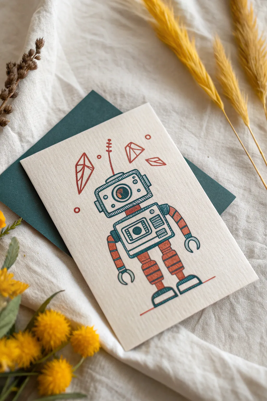
Bring a charming mechanical friend to life with this retro-inspired robot drawing. Using a limited color palette of teal and burnt orange on textured cream cardstock creates a classic, nostalgic feel perfect for a mascot character.
How-To Guide
Materials
- High-quality cream or off-white textured cardstock (folded)
- Dark teal fine-liner pen (0.3mm and 0.5mm)
- Burnt orange or rust-colored fine-liner pen
- Pencil (HB for sketching)
- Soft eraser
- Ruler
- Dark teal envelope (optional, for styling)
Step 1: Sketching the Framework
-
Define the head and body:
Start by lightly sketching a horizontal rectangle for the head near the upper-middle of your card. Leave a small gap, then draw a slightly larger, square-ish rectangle below it for the chest piece. -
Add limb guides:
Draw simple lines extending from the chest for arms and legs. I like to pose the arms slightly curved outward to give the robot a friendly, welcoming posture. -
Basic details:
Sketch a large circle in the center of the head for the eye and a smaller rectangle inside the chest area for a control panel.
Pro Tip: Faux-Risograph
To mimic the print style in the photo, don’t color solidly. Use closely spaced hatching lines for all filled areas to let the paper texture show through.
Step 2: Inking the Outline
-
Outline the main shapes:
Using your 0.5mm teal pen, trace over your main rectangular box shapes. Use a ruler if you want perfect precision, but a unsteady hand actually adds to the vintage, hand-drawn charm. -
Create the joints:
Where the arms and legs meet the body, draw segmented, tube-like shapes. Think of them like vacuum cleaner hoses—series of small, stacked curvy rectangles. -
Draw the hands and feet:
For the hands, draw simple ‘C’ shaped clamps. For the feet, draw semi-circles flat on the ground. Outline these in the teal ink. -
Add the antenna:
Draw a thin stick centered on top of the head with smaller cross-hatch marks going up it. This will be inked in orange later, so keep it in pencil for now or switch pens immediately.
Step 3: Adding Color & Texture
-
Fill the limbs:
Switch to your burnt orange pen. Fill in the segmented arm and leg joints with horizontal hatching lines to create a solid, yet textured block of color. -
Detail the head:
Back with the teal pen, draw the eye detail. Create a pupil and shade the iris with tight diagonal lines. Add small circles (bolts) in the corners of the face plate. -
Chest panel details:
Inside the chest square, draw distinct components: a speaker vent made of vertical lines, and a few buttons. Use the orange pen to create a stripe or accent bar across the top of the chest. -
Floating crystals:
Around the robot’s head, sketch three geometric crystal shapes. These are essentially jagged diamonds. Outline them in orange. -
Crystal shading:
Use the orange pen to add hatching lines on just one or two facets of each crystal. This simple technique gives them dimension without full coloring. -
Atmospheric elements:
Draw a few small, open circles floating near the crystals in orange. Add a wobbly orange line representing the antenna signal. -
Grounding the figure:
Draw a simple, straight orange line beneath the robot’s feet so it isn’t floating in space.
Troubleshooting: Smudged Ink
If you smudge ink while erasing, turn it into ‘rust’ or ‘oil.’ Use the orange pen to stipple over the smudge, making the robot look weathered and used.
Step 4: Finishing Touches
-
Erase pencil lines:
Wait at least five minutes to ensure all ink is completely distinct. Gently erase your initial pencil sketch, being careful not to smudge the ink. -
Enhance texture:
Look at the teal areas. If they look too flat, add very subtle hatching in the corners to suggest metallic shading.
Now your little mechanical mascot is ready to deliver a message from the future
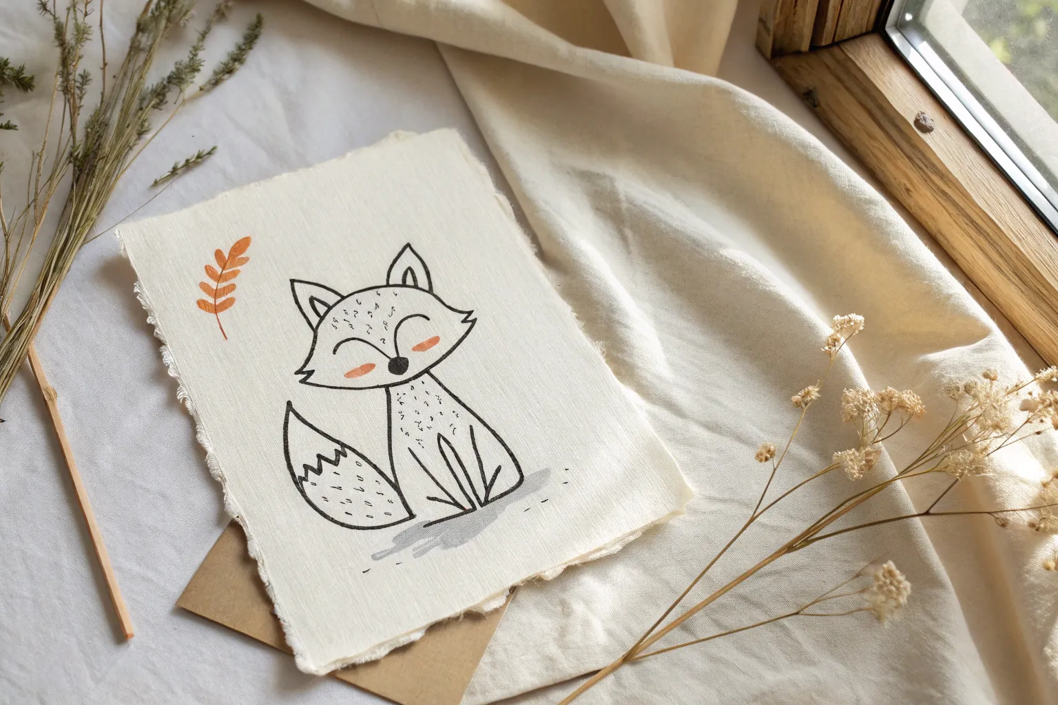
Simple One-Prop Mascot
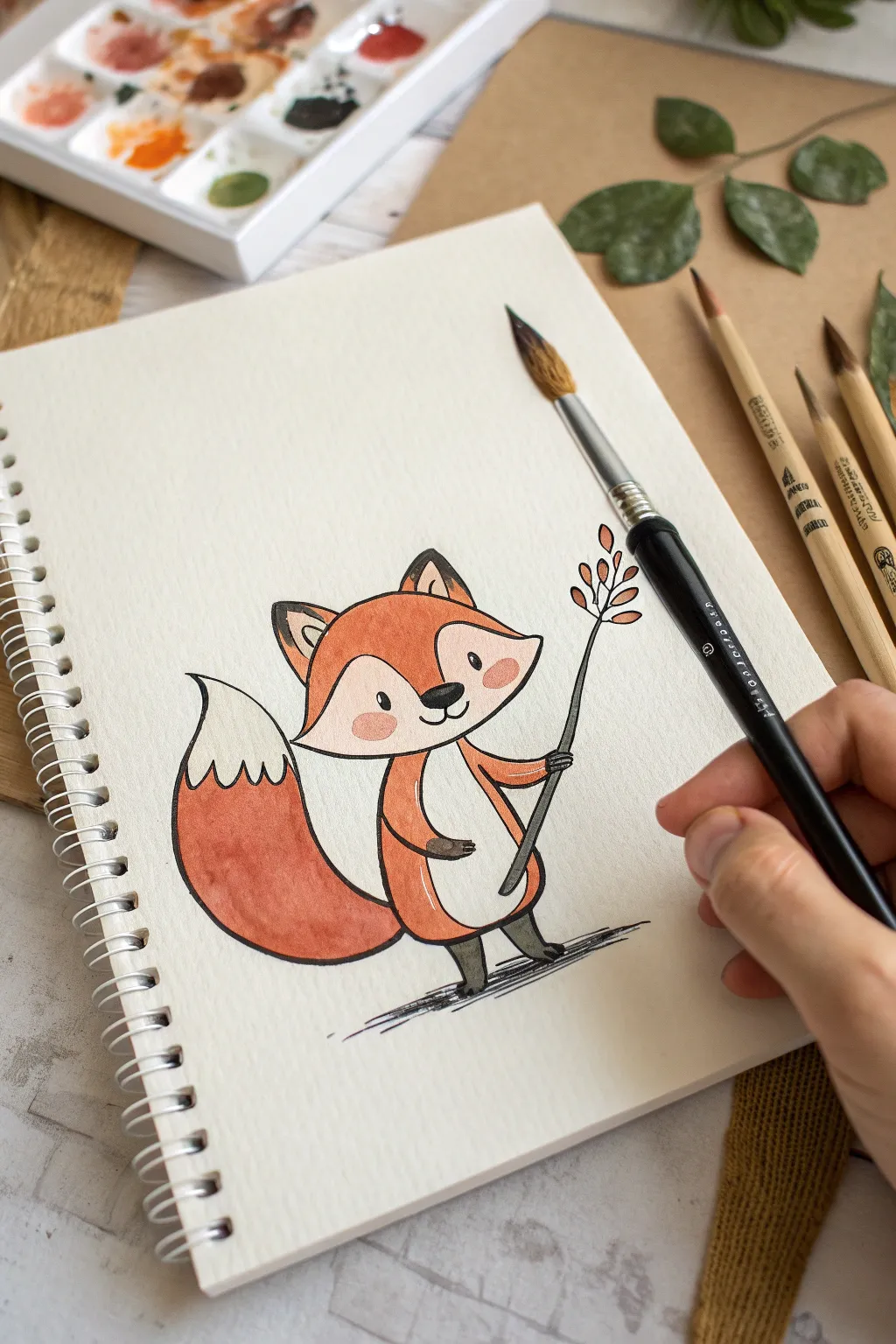
This darling fox illustration combines the clean lines of simple cartooning with the warm, textured wash of watercolors. It is a perfect beginner project for establishing a cute mascot character using a single identifying prop.
Detailed Instructions
Materials
- Heavyweight mixed media or watercolor paper sketchpad
- HB pencil and eraser
- Fine liner pen (waterproof, black, size 0.3 or 0.5)
- Watercolor paints (burnt orange, black/dark grey, blush pink)
- Round watercolor brush (size 4 or 6)
- Clean water and paper towels
Step 1: Drafting the Character
-
Head shape:
Start by lightly sketching a wide, slightly flattened oval for the head. Add two large triangular ears on top, spacing them widely apart. -
Face details:
Draw the facial mask area by creating a curved ‘m’ shape that starts from the sides of the head and meets in the middle of the face. -
Body outline:
Sketch a small, pear-shaped body directly beneath the head. Unlike realistic foxes, keep the body smaller than the head for that cute mascot proportion. -
The tail:
Draw a large, bushy tail sweeping up to the left side. It should be almost as large as the body itself. Add a zigzag line near the tip to separate the white end from the main color. -
Limbs and prop:
Sketch simple tube-like arms. Position the right arm extending outward to hold a thin vertical line (the twig). Add small feet at the bottom.
Ink Smearing?
If your black pen smudges when you paint, it isn’t waterproof. Instead, do the watercolor painting first, let it dry completely, and add the ink lines last.
Step 2: Inking the Lines
-
Refining the outline:
Using your waterproof fine liner, trace over your pencil sketch. I prefer to use quick, confident strokes here to keep the drawing looking energetic rather than stiff. -
Adding features:
Ink two small oval eyes, a rounded triangular nose, and a tiny smile. Don’t forget the inner ear triangles and the cute leaf shapes on the twig prop. -
Erase guidelines:
Once the ink is completely dry—give it a full minute—gently erase all underlying pencil marks to keep your paper clean for painting.
Seasonal Switch
Change the prop to match the season! Swap the autumn twig for a flower in spring, an ice cream cone in summer, or a candy cane in winter.
Step 3: Watercolor Application
-
Main fur color:
Mix a vibrant burnt orange watercolor. Carefully fill in the top of the head (avoiding the mask area), the main body, and the large section of the tail. -
Gradient effect:
While the orange paint is still damp on the tail, you can drop in a slightly more saturated reddish-orange near the bottom for a subtle shadow effect. -
Dark accents:
Using a diluted black or dark grey, paint the tips of the ears (leaving the inner ear white), the paws, and the legs. Use this same dark shade for the twig stem. -
Cheeky details:
Dilute a red or pink paint significantly with water to create a soft blush tone. Dab two small circles on the cheeks just below the eyes. -
Leaf colors:
Paint the small leaves on the twig using a variation of your orange or a soft autumnal brown to tie the prop into the color scheme. -
Grounding shadow:
Mix a very watery grey wash. Use swift horizontal strokes underneath the fox’s feet to create a scribbled shadow, grounding the character so it doesn’t look like it’s floating.
Allow your little fox to dry completely before closing your sketchbook to keep colors crisp
Plant or Nature Mascot
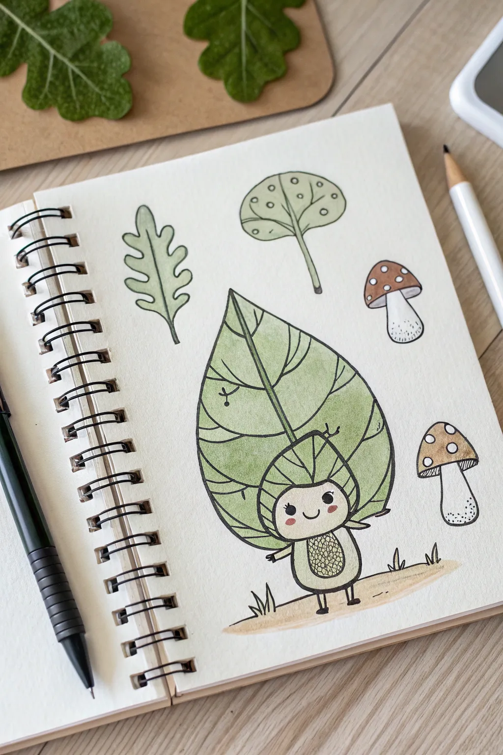
Bring the forest to life in your sketchbook with this adorable leaf mascot character surrounded by its botanical neighbors. This project uses simple line work and soft watercolor washes to create a charming, whimsical illustration perfect for nature lovers.
Step-by-Step
Materials
- Spiral-bound mixed media or watercolor sketchbook
- Fine liner pen (0.3mm or 0.5mm, waterproof black ink)
- Watercolor paints (Sage Green, Olive Green, Burnt Sienna, Yellow Ochre)
- Round watercolor brush (size 4 or 6)
- Pencil (HB)
- Eraser
- Jar of water and paper towel
Step 1: Sketching the Layout
-
Outline the mascot’s body:
Start near the bottom center of the page. Draw a small, rounded oval shape for the mascot’s tummy. Below it, add two tiny stick legs with small rectangular feet. -
Draw the head shape:
Directly on top of the oval body, sketch a wider, rounded shape for the head. Inside this, lightly mark a smaller, curved line to define the face area separate from the leafy hood. -
Add the giant leaf backing:
This is the defining feature. Draw a huge, pointed leaf shape that encompasses the entire character. It should start narrow at the bottom (behind the body), widen significantly around the head, and taper to a sharp point at the very top. -
Position the surrounding elements:
To the left of the mascot, sketch a vertical, wavy oak leaf. Above the mascot, draw a stylized tree shape with a rounded canopy. To the right, sketch two mushrooms—one larger one higher up, and a smaller one closer to the mascot.
Ink Smearing?
If your black pen smears when painting, switch to a Micron PN or allow the ink to cure for at least 15 minutes before wetting. Not all ‘permanent’ pens are instantly waterproof.
Step 2: Inking the Lines
-
Ink the mascot’s face:
Switch to your waterproof fine liner. Draw two small filled circles for eyes and a simple ‘u’ shape for a smile. Add two small oval blushes on the cheeks. -
Define the mascot’s textures:
Ink the body oval, adding a cross-hatch or scale-like pattern inside the tummy area to suggest texture. Draw the arms extending outward. -
Detail the main leaf:
Ink the large leaf outline. Draw a central vein running from the top tip down to the distinct ‘hood’ around the face. Add curving horizontal veins branching out from the center line to the edges. -
Ink the botanical props:
Go over your pencil lines for the oak leaf, tree, and mushrooms. For the top mushroom, add small circles on the cap. For the bottom mushroom, add tiny stippling dots near the base of the stem for shading. -
Add ground details:
Draw a simple horizontal line beneath the mascot to ground it. Add tiny tufts of grass (small ‘M’ shapes) along this line. -
Erase pencil marks:
Wait a moment to ensure the ink is totally dry, then gently erase all underlying graphite sketches.
Step 3: Adding Watercolor
-
Paint the giant leaf:
Dilute some Olive Green or Sage paint heavily with water. Wash over the entire large leaf shape. I find keeping the color light helps the black lines stand out. -
Color the side leaf and tree:
Use a slightly more muted or grey-green mix for the floating oak leaf and the round tree canopy above. Leave the tree trunk unpainted or very pale. -
Paint the mushroom caps:
Mix a Burnt Sienna or warm brown. Carefully fill in the caps of the mushrooms. For the spotted mushroom, carefully paint around the white circles you drew earlier. -
Warm up the mascot:
Use a vary pale wash of green for the mascot’s tummy texture. For the cheeks, dab a tiny amount of diluted pink or red while the area is dry. -
Ground the scene:
Take a diluted Yellow Ochre or light sand color and paint a loose, horizontal stripe along the ground line you drew, fading it out at the edges.
Vein Variation
Make the mascot’s leaf look more organic by varying the pressure on your brush while painting over the veins, creating subtle light and dark pools of green.
Once the paint is dry, you have a sweet forest companion ready for your next adventure
Crest Badge Mascot Layout
This classic crest design combines regal heraldry with clean, modern lines, perfect for a personal logo or notebook embellishment. The artwork features a noble eagle head atop a patterned shield, framed by laurel branches and a scrolling banner.
Step-by-Step Guide
Materials
- Cream or off-white sketchbook paper
- Dark forest green colored pencil (wax or oil-based)
- HB graphite pencil (for sketching)
- Kneaded eraser
- Ruler
- Fine-liner pen (optional, for final outlining)
Step 1: Planning the Structure
-
Establish the centerline:
Begin by lightly drawing a vertical line down the center of your page to ensure symmetry. This will be the anchor for your shield and eagle. -
Outline the shield shape:
Sketch a classic heater shield shape (flat top, curved sides meeting at a point) centered on your line. Keep it relatively wide at the top to accommodate the interior details. -
Position the eagle:
Above the flat top of the shield, sketch an oval for the eagle’s head facing left. Add a curved line extending down to represent the neck feathers draping over the shield’s top edge. -
Block in the wreath:
Lightly sketch two curved guidelines sweeping up from the bottom of the shield on either side. These will become your laurel branches later.
Uneven Symmetry?
If one side of your shield looks lopsided, trace the ‘good’ side on tracing paper, flip it over, and transfer it to the other side for perfect symmetry.
Step 2: Drawing the Eagle & Shield
-
Detail the eagle’s face:
Using your green pencil, carefully define the hooked beak and the stern brow of the eagle. The eye should be small and intense, placed just under the brow line. -
Feather texture:
Draw jagged, flowing lines for the neck feathers. Use short, sharp strokes that overlap slightly to create a sense of layering and volume as they rest on the shield. -
Create the chevron:
Inside the main shield, use your ruler to draw a wide, inverted ‘V’ shape (chevron). This divides the shield into upper and lower sections. -
Add the upper pattern:
In the space above the chevron, draw a grid of small, intersecting semi-circles to create a scale or chainmail effect. Keep these small and uniform for a textured look. -
Draw the inner crest:
Below the chevron, draw a smaller shield shape. Inside this mini-shield, sketch a simple heraldic symbol, like the stylized flower or sprout shown in the reference. -
Thicken the borders:
Go over the main outline of the shield and the chevron with heavier pressure on your green pencil to create a bold, defining border.
Step 3: Laurels & Banner
-
Draw the leaves:
following your curved guidelines, draw pairs of leaves extending outward. Start small at the top and get slightly larger towards the bottom. The leaves should look like stylized ovals with pointed tips. -
Detail the leaf veins:
Add a single central line down the middle of each leaf. I find that leaving a tiny gap between the leaf outline and the vine adds a nice illustrative touch. -
Sketch the banner ribbon:
Below the laurel branches, draw a flowing ribbon banner. It should wave slightly, with the ends folding back behind the main strip. -
Lettering guidelines:
Lightly pencil in top and bottom guidelines inside the banner to keep your text straight. -
Add the text:
Inscribe your motto or name in a serif font. The reference uses ‘FORTIS VULNERA’ (or similar faux-Latin text), but you can customize this. Keep the letters evenly spaced.
Sharp Lines Only
Keep your colored pencil extremely sharp, especially for the scale pattern and text. Rotate the pencil in your hand every few strokes to maintain the point.
Step 4: Final Touches
-
Deepen the shadows:
Return to the eagle and add darker shading under the brow and beneath the neck feathers to make the head pop. -
Refine the lines:
Sharpen your green pencil to a fine point. Go over the delicate scale pattern and the text one last time to ensure everything is crisp and legible. -
Clean up:
Once you are happy with the green pencil intensity, gently erase any remaining visible graphite construction lines with your kneaded eraser.
You now have a distinguished, hand-drawn crest ready to guard your notes
Retro Cartoon Mascot Style
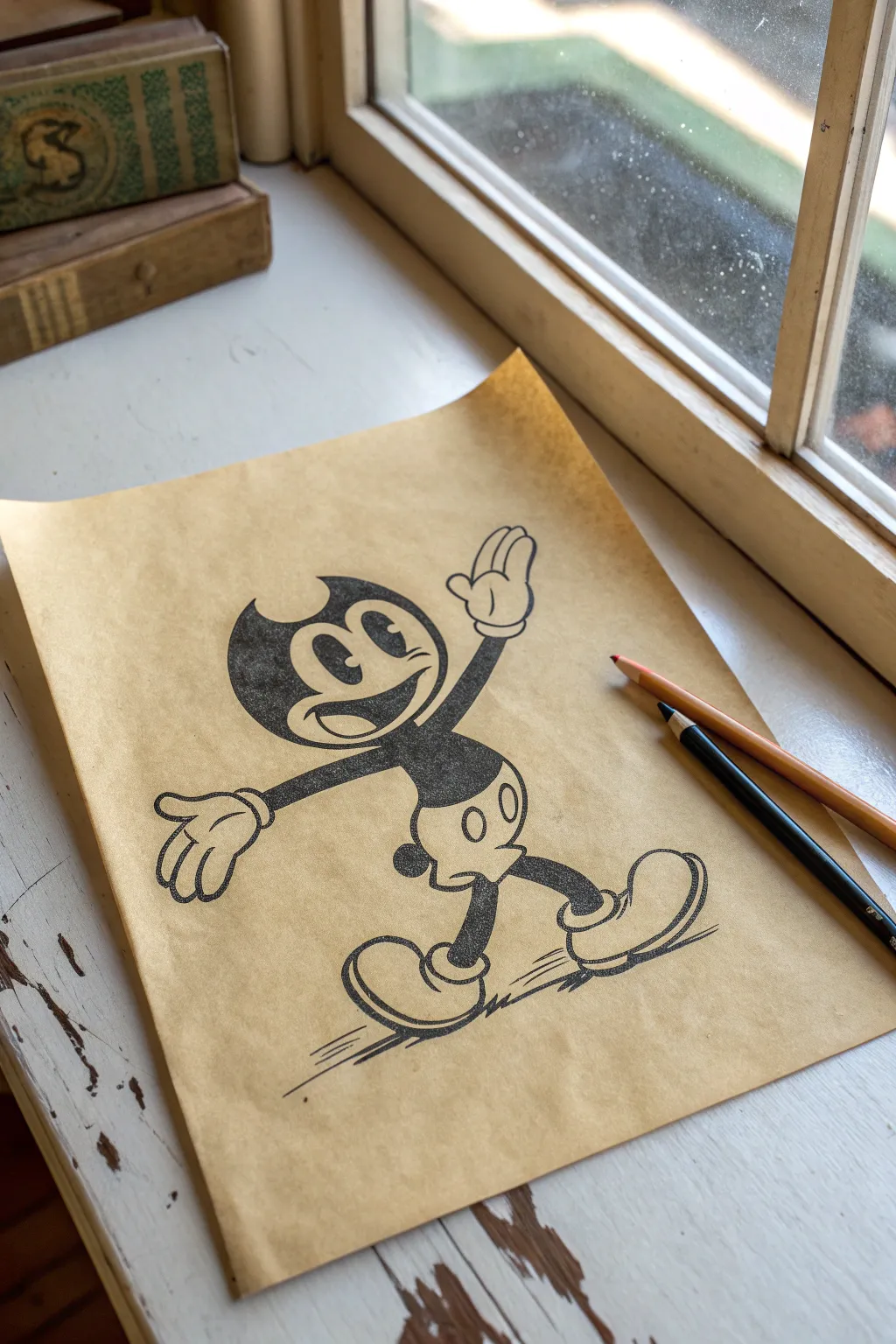
Capture the charm of the 1930s animation era with this tutorial on creating a classic ‘rubber hose’ style mascot. Using simple shapes and bold inking on toned paper, you’ll recreate the nostalgic feel of old-school cartoons right at your desk.
How-To Guide
Materials
- Tan/Kraft tone sketching paper (A4 size)
- HB graphite pencil
- Soft gum eraser
- Fine liner pen (0.3mm or 0.5mm, black)
- Thicker marker or brush pen (black)
- White gel pen or gouache (optional highlights)
- Art knife or scissors (for final trim if needed)
Step 1: Conceptual Sketching
-
Lay the foundation:
Begin lightly with your HB pencil. Draw a large circle for the head in the upper-left center of your paper, leaving plenty of room for the limbs. -
Add the body shape:
Sketch a smaller, bean-shaped oval slightly below and to the right of the head circle. This will form the torso and shorts area. -
Draft the ‘pie-cut’ eyes:
Inside the head circle, draw two tall ovals for eyes. In the classic style, one eye is often slightly larger. Add a small ‘pie slice’ cut out of the black pupil area for that authentic vintage shine. -
Create the face mask:
Outline the characteristic heart-shaped ‘mask’ around the eyes, which defines the face against the black head. Don’t forget the two small horn-like points at the top of the head. -
Sketch the rubber limbs:
Draw the arms and legs using long, gently curving tubes. Remember, there are no elbows or knees in rubber hose style—just smooth curves. -
Detail the hands:
Sketch large, gloved hands. Focus on the classic four-fingered look (three fingers plus a thumb). The gloves should have three darts on the back and a thick cuff at the wrist. -
Draw the boots:
Add oversized, rounded boots at the ends of the legs. They should look heavy and doughy, with a distinct rim at the top where the leg enters. -
Refine the expression:
Draw a wide, toothy grin that stretches across the face area. Add a small oval nose right between the eyes.
Ink Confidence
Don’t connect every single line. Leaving tiny gaps where lines intersect (like where the arm meets the body) prevents ink bleeding and keeps the drawing airy.
Step 2: Inking and Finishing
-
Outline the perimeter:
Switch to your fine liner pen. confidently trace your outer pencil lines. Keep your hand steady to create smooth, consistent line weights. -
Fill the blacks:
Use your thicker marker to fill in the dark areas: the main head shape (avoiding the face mask), the upper torso, and the limbs. I like to do this slowly to ensure a solid, deep black without streaks. -
Detail the shorts:
Leave the shorts white (showing the paper tone). Draw two vertical ovals for the buttons. -
Ink the shoes and gloves:
Outline the boots and gloves carefully. Add a ‘shine’ line or small detail marks on the shoes to give them volume. -
Add movement lines:
Beneath the feet, add quick, horizontal motion lines to suggest the character is walking or sliding. This adds kinetic energy to the pose. -
Texture the fill:
If you want a grittier look, allow some of the paper texture to show through your black fill, or stipple slightly near the edges for a worn effect. -
Erase pencil marks:
Once the ink is completely dry, gently rub the entire drawing with a soft gum eraser to remove the initial sketch lines. -
Optional highlights:
If you have a white gel pen, add tiny accents to the buttons or the top of the boots for extra contrast against the tan paper.
Aged Effect
Crumple the paper gently before starting, then flatten it out. Draw over the wrinkles to give the artwork an authentic ‘recovered from an attic’ vibe.
Your spirited, vintage-style character is now ready to step right off the page

Have a question or want to share your own experience? I'd love to hear from you in the comments below!