If you love art that feels calm, cozy, and quietly elevated, neutral paintings are such a satisfying direction to explore. I’m sharing my favorite neutral painting ideas that bring in texture, shape, and mood without shouting over your space.
Soft Abstract Color Blocks
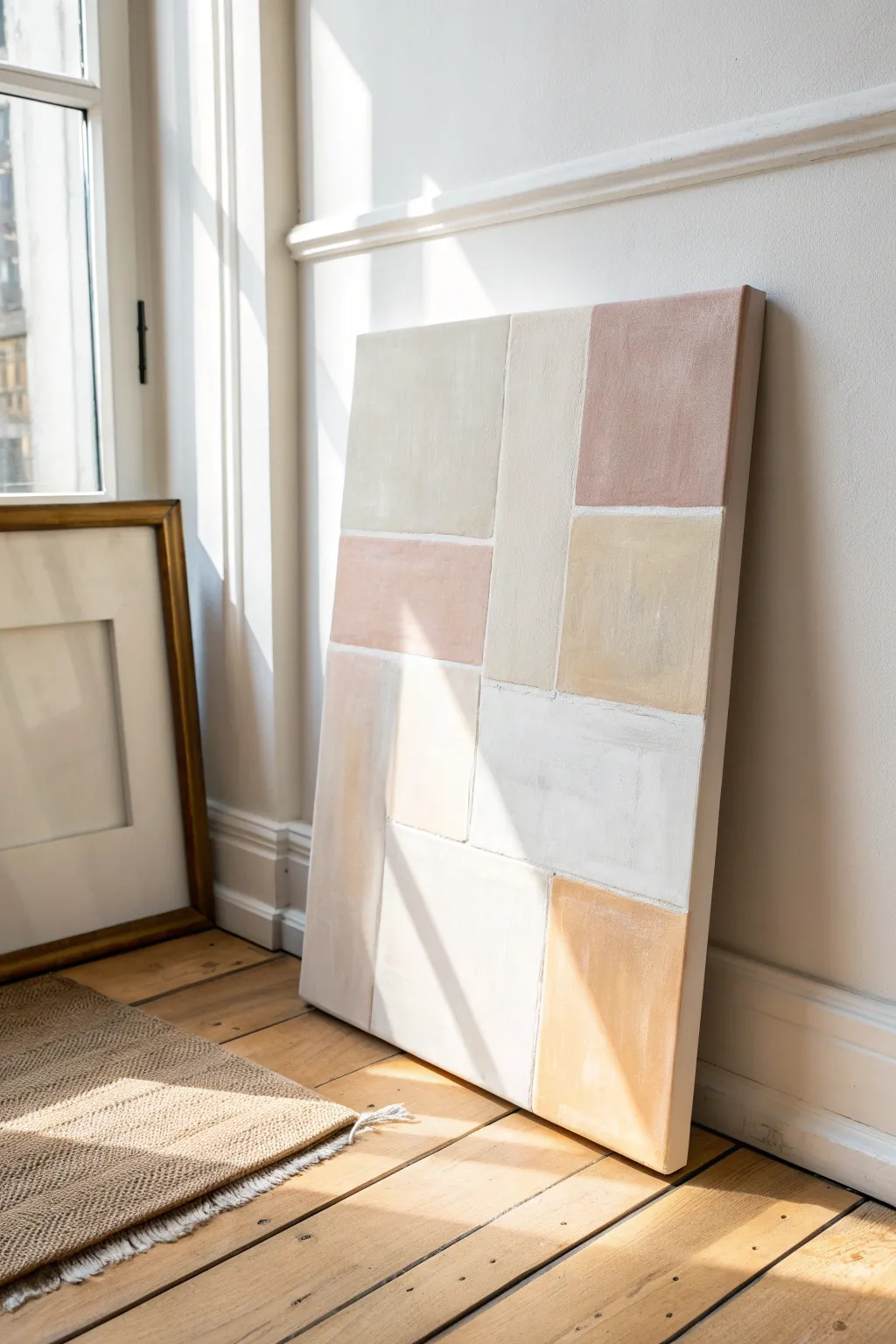
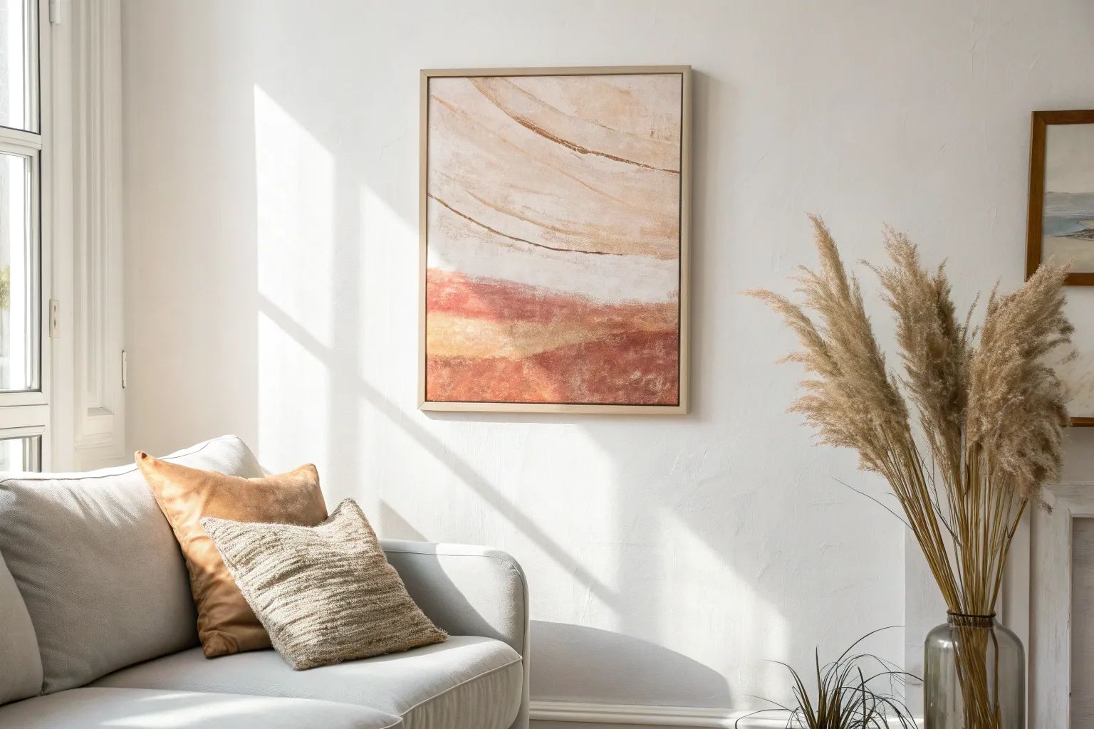
Bring a sense of calm sophistication to your space with this soft, color-blocked abstract painting. The muted palette of creams, terracottas, and beiges creates a warm minimalism that feels perfectly balanced.
How-To Guide
Materials
- Large stretched canvas (square or rectangular)
- Acrylic paints (Titanium White, Unbleached Titanium, Raw Sienna, Burnt Sienna)
- Texture paste or modeling paste
- Wide flat synthetic brushes (2-inch width)
- Palette knife
- Painter’s tape (optional)
- Pencil
- Ruler or straight edge
- Mixing palette or paper plates
Step 1: Planning and Preparation
-
Prime the surface:
Begin by applying a base coat of white acrylic paint or gesso to your canvas. This ensures a bright, clean foundation for your subtle neutral tones. -
Sketch the grid:
Once the base is dry, use a pencil and straight edge to lightly map out your design. Don’t aim for a perfect grid; vary the sizes of your rectangles and squares to create visual interest like the asymmetric layout in the example. -
Mix your base texture:
On your palette, mix white acrylic paint with a generous amount of modeling paste. This creates a thick, plaster-like consistency that adds depth without needing heavy color.
Fixing Wobbly Lines
Lines aren’t straight? Don’t stress. Once dry, lay a strip of painter’s tape along the edge and repaint the border with white for a crisp finish.
Step 2: Color Mixing
-
Create the cream tones:
Mix a large batch of ‘warm cream’ using Titanium White and a tiny dot of Unbleached Titanium. Keep this mix handy as it acts as a mixer for other shades. -
Mix the terracotta pink:
Combine white with a small amount of Burnt Sienna to achieve that soft, earthy pink tone. Add more white to keep it pastel and airy. -
Prepare the warm ochre:
Create the yellowish-beige tone by mixing white with Raw Sienna. Keep this quite pale to maintain the neutral vibe. -
Make the cool beige:
For the greyer beige sections, mix white with a tiny drop of Raw Umber or mix a little of your ochre and pink blends together to neutralize them.
Textural Depth
Mix sand or fine grit into your acrylic paint before applying. This adds an organic, earthy grain that catches the light beautifully.
Step 3: Painting the Composition
-
Apply the first block:
Starting with your texture-mixed cream paint, fill in the large vertical rectangle in the center. Use a flat brush to lay it down, keeping the brushstrokes vertical for a clean look. -
Add the terracotta:
Move to the top right corner and fill in that block with your terracotta pink mix. I find using a slightly dry brush here helps create a subtle, uneven texture. -
Fill the adjacent neutrals:
Paint the top left block with your palest beige-grey mix. Ensure the edges touch the other colors but don’t blend into them; we want distinct shapes. -
Continue downwards:
Paint the middle-left block with a slightly darker version of your pink-terracotta mix to create a subtle variation from the top corner block. -
Paint the ochre accents:
Fill the block below the terracotta (middle right) and the bottom right corner with your warm ochre mix. These yellow tones bring sunshine to the piece. -
Balance with white:
Fill the remaining large sections (bottom center and middle) with pure white or off-white mixed with texture paste. This brightness keeps the painting feeling fresh.
Step 4: Detailing and Refining
-
Thicken the texture:
Once the first layer is touch-dry, use your palette knife to drag extra paint over the centers of the blocks. This builds up that lovely, tactile surface quality. -
Refine the edges:
Check the lines between your color blocks. If they are too messy, use a small brush with white paint to ‘cut in’ and tidy up the separation lines. -
Add separation lines (optional):
If you want the tiled look, use your palette knife to gently scrape a thin line of white paint between the blocks, enhancing the grid structure. -
Soften the surface:
If any colors look too bold, mix a translucent wash of white (water and paint) and lightly brush it over the dried block to mute the tone. -
Paint the sides:
Don’t forget the edges of the canvas. You can paint them white for a framed look, or extend the color blocks around the sides for a gallery wrap effect. -
Final dry:
Allow the entire painting to cure for at least 24 hours, especially if you used heavy texture paste.
Hang this serene piece in a sunlit corner to see the textures come to life.

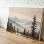
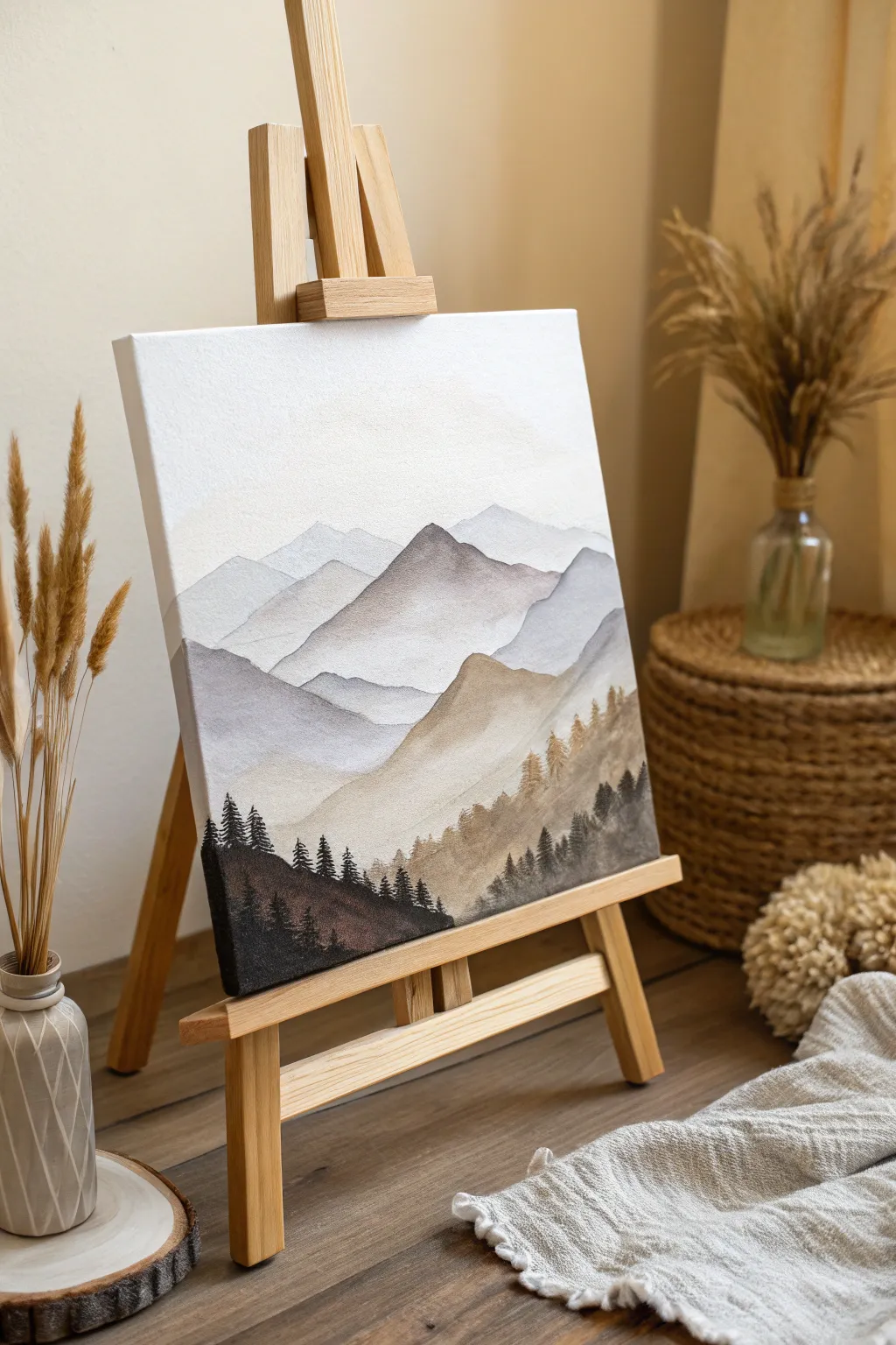
Minimalist Neutral Landscape
Capture the serene beauty of a limitless horizon with this minimalist neutral landscape painting. Using soft blending techniques and a muted palette of earthy browns and atmospheric grays, you’ll create a piece that feels both expansive and grounding for any living space.
Step-by-Step Tutorial
Materials
- Large canvas (24×36 inches or larger)
- Acrylic paints (Titanium White, Burnt Umber, Yellow Ochre, Paynes Grey, Raw Sienna)
- Large flat brushes (2-inch and 1-inch)
- Medium round brush
- Palette knife
- Water spray bottle
- Blending medium or slow-drying medium
- Floating frame (natural wood finish)
- Paper towels or rag
- Palette or mixing plate
Step 1: Setting the Sky
-
Prepare the canvas:
Start by setting your canvas in a vertical upright position if possible, or flat on a table. Apply a thin, even coat of Titanium White mixed with a tiny drop of water across the entire upper two-thirds of the canvas to prime the sky area. -
Mix the sky colors:
On your palette, create a soft grey-blue by mixing plenty of Titanium White with a small touch of Paynes Grey. Create a second pile of warm white by adding a dot of Yellow Ochre to white. -
Apply the upper sky:
Using your largest flat brush, sweep the grey-blue mix across the very top of the canvas. Use long, horizontal strokes that travel from edge to edge. -
Create atmospheric clouds:
While the top layer is still wet, dip your brush into the warm white mixture. Ideally, maintain a wet edge as you work your way down. Blend this lighter color into the grey-blue, allowing streaks of the darker color to remain visible to suggest cloud forms. -
Soften the transition:
Use a clean, slightly damp brush to blur the lines between the grey and warm white areas. I find a gentle mist from a spray bottle helps keep the acrylics workable for longer soft blending. -
Add the horizon glow:
Near the center of the canvas where the horizon will be, paint a band of pure Titanium White. Blend this upwards into the sky using upward sweeping strokes to create a hazy, light-filled atmosphere.
Paint drying too fast?
Acrylics dry quickly! If your sky blending feels sticky or rough, mix a retarder or gloss medium into your paints. This extends working time significantly.
Step 2: Grounding the Earth
-
establish the horizon line:
About one-third up from the bottom, use a medium flat brush to paint a straight, distinct line using a mix of Raw Sienna and a touch of white. This divides the ethereal sky from the solid ground. -
Paint the distant ground:
Just below the horizon, apply a pale, washed-out brown (Burnt Umber + White). Keep this section smooth and relatively flat to simulate distance. -
Darken the foreground:
As you move towards the bottom edge of the canvas, gradually introduce darker tones. Mix Burnt Umber with a little Paynes Grey for a deep, rich earth tone. -
Introduce texture:
Switch to your palette knife for the bottom third. Scoop up some unthinned Raw Sienna and Burnt Umber. Scrape these colors horizontally across the foreground. -
Layering warmth:
Using the side of the palette knife, drag some Yellow Ochre lightly over the darker brown areas. Don’t overwork this; let the texture of the canvas catch the paint to look like dry grass or soil. -
Blend the middle ground:
With a dry brush, gently feather the transition area between the textured foreground and the smooth, pale horizon strip. The goal is to make the ground viewing angle feel expansive.
Pro Tip: The Palette Knife
For the foreground, don’t mix your colors fully on the palette. Let the brown, ochre, and white mix partially directly on the canvas as you scrape for organic variation.
Step 3: Refining and Framing
-
Enhance sky details:
Step back and look at your sky. If it looks too flat, take a small amount of Paynes Grey glaze (mostly water) and add faint, wispy shadows in the upper corners. -
Highlight the horizon:
Add a very thin, crisp line of pure white right at the horizon meeting point to make the light appear to reflect off a distant body of water or mist. -
Deepen contrast:
Add a final layer of the darkest brown-grey mix to the very bottom corners. This vignette effect draws the viewer’s eye toward the center light. -
Dry and seal:
Allow the painting to dry completely for at least 24 hours. Because of the thick palette knife texture, the bottom may take longer. Apply a matte varnish to protect the surface without adding unwanted shine. -
Frame the piece:
Place the canvas into a natural wood floating frame. Secure it from the back, leaving that characteristic small gap between the canvas edge and the frame to complete the gallery look.
Hang your finished landscape above a sofa or bed to bring a sense of organic calm to the room
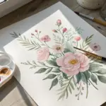
Neutral Botanical Silhouettes
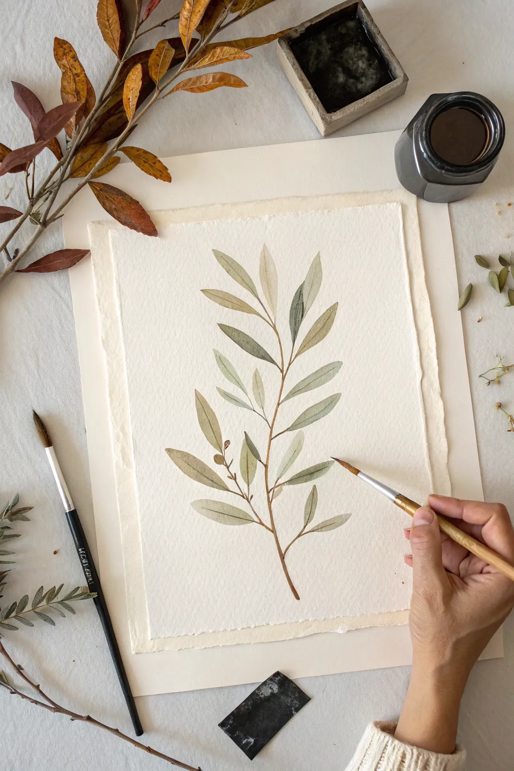
Capture the quiet elegance of nature with this delicate watercolor study of an olive branch. Using a muted palette of sage greens and earthy browns on textured paper, you will create a piece that feels both organic and timeless.
Step-by-Step
Materials
- Cold press watercolor paper (deckle edge preferred)
- Watercolor paints (Sap Green, Burnt Umber, Yellow Ochre, Indigo)
- Round watercolor brushes (Size 4 and Size 0 or 1 for details)
- Jar of clean water
- Paper towels
- Pencil (HB or H)
- Kneaded eraser
- Palette or ceramic dish for mixing
Step 1: Preparation & Sketching
-
Prepare your paper:
If you are using a large sheet, tear it down to size using a ruler to create a soft, deckled edge aimed at matching the rustic look of the example. Tape the paper down to a board if it’s lighter than 300gsm to prevent buckling. -
Map the stem:
Lightly sketch the central stem line with your pencil. Start from the bottom center and create a gentle, slightly curved S-shape rising toward the top. This main line provides the anchor for all your leaves. -
Place the leaves:
Mark the positions of the leaves branching off the main stem. Draw simple, elongated oval shapes in pairs or alternating patterns. Keep your pencil pressure very light so the graphite won’t show through the translucent paint later. -
Refine the shapes:
Go back over your leaf sketches to refine their tips and connection points to the stem. Olive leaves are narrow and pointed; ensure they don’t look too round. Dab away excess graphite with a kneaded eraser until the lines are barely visible.
Control the Flow
Work top to bottom if you’re right-handed (or vice versa) to avoid smudging wet paint. Keep a distinct “puddle” of water on your palette to easily re-wet your brush.
Step 2: Painting the Foliage
-
Mix your base green:
In your palette, mix Sap Green with a touch of Burnt Umber and a tiny bit of Yellow Ochre. You want a desaturated, warm ‘olive’ green rather than a bright, grassy hue. Add plenty of water to create a tea-like consistency. -
Paint the first leaf layer:
Using your size 4 brush, load it with the watery mix. Paint the upper half of a leaf first, pulling the brush from the stem out to the tip. Let the brush belly do the work to create the width, then lift for a fine point. -
Complete the leaf shape:
While the paint is still wet, paint the bottom half of the leaf, leaving a hairline gap of white space down the center to represent the vein. This negative space adds instant dimension without needing extra paint. -
Vary the tones:
As you move to other leaves, slightly alter your mix. Add a drop more water for paler leaves, or a speck of Indigo for shadowed ones. This natural variation prevents the branch from looking flat. -
Create soft gradients:
I like to drop a slightly darker concentration of green into the base of a wet leaf and let it bleed outward. This creates a natural shadow where the leaf attaches to the stem. -
Paint the upper leaves:
For the topmost leaves, use a very pale, watery wash. These represent the youngest growth catching the light. Keep your brush strokes loose and fluid here. -
Let it dry completely:
Before moving on to the stem, ensure all leaves are bone dry. If the paper is cool to the touch, it’s still damp. Patience here prevents muddy colors.
Rustic Texture Trick
Once the painting is totally dry, sprinkle a few grains of coarse salt on a scrap paper, wet a brush heavily, pick up the salt, and dab it onto drying leaves for texture.
Step 3: Stem & Details
-
Mix the stem color:
Create a rich twig color using Burnt Umber with a touch of the green mix you used earlier. It should be slightly thicker than the leaf wash—more like milk than tea. -
Paint a fine stem:
Switch to your smaller detail brush (size 0 or 1). Starting from the top, drag the brush carefully down the center line, connecting the leaves. Press slightly harder as you reach the bottom to thicken the woody stem. -
Add gentle thorns or knobs:
Real branches aren’t perfectly smooth. Add tiny bumps or slight jagged edges where leaves attach to give the wood texture and character. -
Connect the leaves:
Paint the tiny petioles (mini stems) that connect each leaf to the main branch. Ensure these connections look organic and seamless. -
Optional: Add olives or buds:
If you wish to add the small buds seen in the reference, use a diluted Burnt Umber. Paint small, round organic shapes near the leaf intersections. Keep them subtle. -
Deepen the shadows:
Once the stem is dry, mix a darker version of your green (more Indigo). Add very thin, dry-brush strokes to the shadowed side of some leaves to define their curve.
Step back and admire the soft, soothing atmosphere your botanical study brings to the room

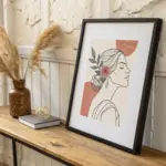
One-Line Face in Neutrals
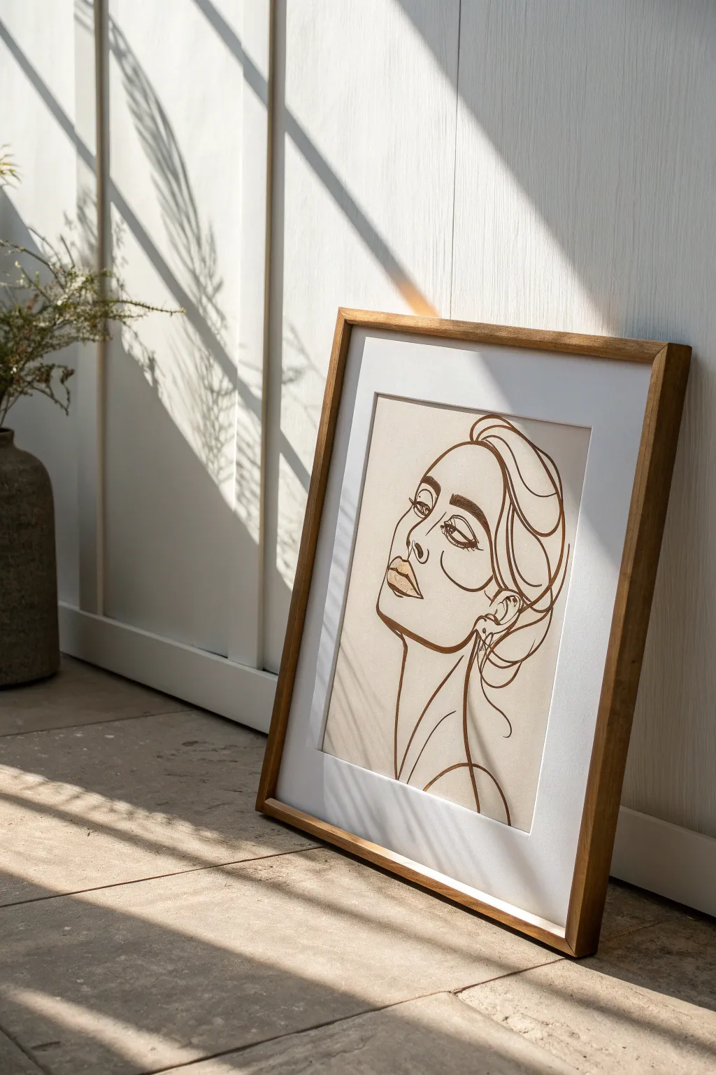
Embrace the minimalism of modern decor with this elegant one-line style portrait set against a soothing beige backdrop. This project captures the essence of a face through fluid, confident strokes, creating a sophisticated piece that fits seamlessly into any neutral-themed room.
Detailed Instructions
Materials
- Heavyweight mixed media or watercolor paper (A3 or 11×14 inches)
- Acrylic paint (Titanium White, Unbleached Titanium, Burnt Umber)
- Wide flat brush or foam brush
- Fine liner brush (size 0 or 1) or paint marker
- Pencil (HB or 2H)
- Kneaded eraser
- Mixing palette
- Gold metallic paint or marker (optional)
- Wood frame with white matting
Step 1: Planning and Background
-
Prepare the canvas hue:
Begin by creating the perfect neutral base tone. Mix a large amount of Titanium White with a small dollop of Unbleached Titanium and a tiny speck of Burnt Umber. Aim for a warm, sandy beige that matches the reference image. -
Apply the base coat:
Using your wide flat brush, paint the entire sheet of heavyweight paper with your mixed beige tone. Use long, horizontal strokes to ensure a smooth, even finish. -
Let it cure:
Allow the background layer to dry completely. This is crucial; if the paper is damp, your pencil sketch might tear the surface or the ink will bleed. I often let this sit for at least an hour. -
Sketch the silhouette:
Lightly sketch the outline of the face using an HB pencil. Start with the profile: draw the forehead, the slope of the nose, and the lips. Keep your pressure extremely light so lines can be erased easily. -
Refine the features:
Add the details of the eye, eyebrow, and fluid hair shapes. Don’t worry about perfect realism; you are aiming for a stylized, continuous-line aesthetic where shapes flow into one another. -
Check the composition:
Step back and look at your pencil sketch. Ensure the face is centered but has ‘breathing room’ around the edges for the mat board later.
Mastering the Flow
For steadier lines, don’t move just your wrist. Lock your wrist and move your entire arm from the shoulder. This creates smoother, less shaky long curves.
Step 2: Inking the Lines
-
Prepare the line color:
Mix a dark, rich brown using Burnt Umber with a touch of black if necessary. Alternatively, you can use a high-quality dark brown paint marker for more control. -
Practice your flow:
Before touching the final piece, practice making long, smooth curves on a scrap piece of paper. This builds muscle memory for that confident ‘one-line’ look. -
Paint the jaw and neck:
Load your fine liner brush with the dark brown paint. Start at the bottom of the neck, moving upward to define the jawline and chin with a steady hand. -
Define the lips:
Carefully trace the lips. Use varying pressure: press slightly harder for the shadow beneath the lower lip and lighter for the upper lip outline. -
Create the nose and brow:
Continue the line up the bridge of the nose, connecting it seamlessly into the eyebrow arch. This connection is key to the continuous style. -
Detail the eye:
Paint the eye shape, focusing on the heavy upper lash line. Keep the iris simple and graphic rather than hyper-realistic. -
Flow into the hair:
Use loose, sweeping gestures to create the hair. These lines should feel freer and less structured than the facial features, framing the face elegantly. -
Clean up sketch lines:
Once the paint is bone dry, gently use a kneaded eraser to lift any visible pencil marks that weren’t covered by paint.
Textured Upgrade
Mix a little baking soda into your background beige paint. This creates a grainy, plaster-like texture that makes the piece look like an expensive fresco.
Step 3: Finishing and Framing
-
Add subtle highlights:
Mix a slightly lighter version of your background beige color. Carefully paint small highlight shapes on the eyelid and the fullness of the lips to add dimension without breaking the minimalist vibe. -
Optional metallic touch:
If you want extra glamour, add a tiny dot of gold paint to the inner corner of the eye or the earring shape. -
Prepare the frame:
Clean the glass of your wooden frame thoroughly on both sides to remove dust and fingerprints. -
Mount artwork:
Center your dry painting behind the white mat board. Use artist tape to secure the back of the paper to the mat so it doesn’t slip over time. -
Final assembly:
Place the matted art into the frame, secure the backing, and your neutral masterpiece is ready for display.
Place your framed artwork in a sunlit corner to let the shadows play across your new sophisticated creation
BRUSH GUIDE
The Right Brush for Every Stroke
From clean lines to bold texture — master brush choice, stroke control, and essential techniques.
Explore the Full Guide
Warm Greige Gradient Wash
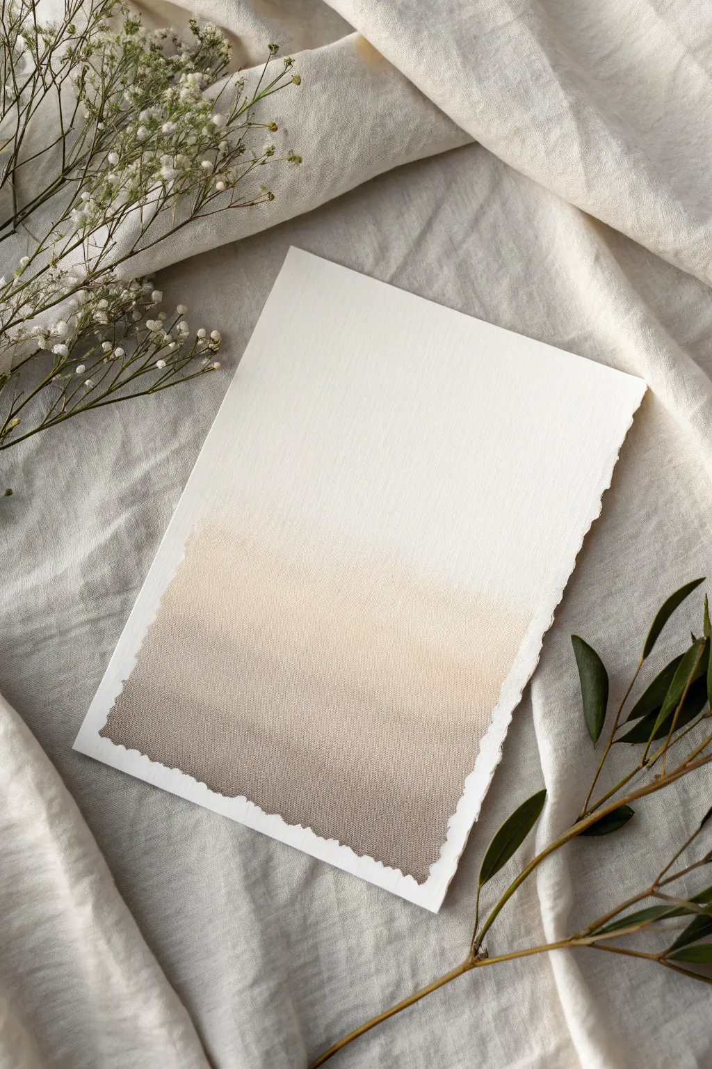
Capture the essence of calm with this minimalist gradient piece that blends warm beige tones into deep taupe. The soft transition and textured deckled edge create a sophisticated, modern organic look perfect for neutral decor.
How-To Guide
Materials
- Heavyweight watercolor paper (300gsm cold press or cotton rag)
- Watercolor paints (Raw Umber, Burnt Sienna, and Buff Titanium)
- Wide flat wash brush (1-2 inch)
- Medium round brush (size 8)
- Two jars of water
- Paper towels
- Masking tape (optional)
- Clean mixing palette
Step 1: Preparing the Paper
-
Create the deckled edge:
If your paper doesn’t already have a deckled edge, tear it manually to create that organic look. Fold the paper back and forth along a straight edge ruler to weaken fibers, then carefully tear strip by strip against the ruler’s edge. -
Surface setup:
Lay your paper flat on a clean, waterproof surface. You can tape down the very edges if you’re worried about buckling, but leaving it loose allows the wash to pool naturally near the tear lines.
Unwanted Hard Lines?
If a hard line forms while blending, re-wet it immediately with a clean damp brush and gently scrub in small circles to soften the edge back into a gradient.
Step 2: Mixing the Hues
-
Mix the base greige:
On your palette, combine a generous amount of warm greige. I like to start with Buff Titanium and add a tiny touch of Raw Umber to execute that perfect sandy neutral. -
Create the shadow tone:
In a separate well, mix a deeper, rock-colored taupe. Use Raw Umber as your base and add a hint of Burnt Sienna to warm it up, ensuring it’s significantly darker than your base greige. -
Prepare a clean water wash:
Load your large flat brush with clean water. You want the brush fully saturated but not dripping excessively.
Step 3: Applying the Gradient
-
Wet the lower canvas:
Paint clean water onto the bottom two-thirds of the paper. Feather the top edge of this water area upward so there isn’t a hard line where the wet meets the dry. -
Apply the lightest tone:
Load your brush with the light greige mix. Start painting horizontally across the paper, beginning just below the halfway point. Use long, smooth strokes. -
Feather upward:
While the paint is wet, gently pull the color upward into the white space using a clean, damp brush. The goal is for the color to disappear seamlessly into the white paper. -
Deepen the hue:
Pick up your darker taupe mixture. Apply this to the bottom third of the paper, working horizontally. -
Blend the transition:
Clean your brush slightly and run it along the border where the light greige meets the dark taupe. The wet paper will do most of the work, helping the colors bleed together softly. -
Bottom edge saturation:
Add the most concentrated pigment along the very bottom jagged edge. Allow the paint to settle into the torn fibers for extra texture.
Add Metallic Touches
Once fully dry, lightly graze the very bottom deckled edge with metallic gold watercolor or ink for a subtle, luxurious shimmer.
Step 4: Adding Texture and Drying
-
Create blooming texture:
While the bottom section is still damp but not soaking, dip a clean brush into water and tap tiny droplets onto the darker area. This creates subtle ‘blooms’ that mimic stone texture. -
Dry brush detail:
Once the shine has left the paper but it’s cold to the touch, take a nearly dry brush with dark pigment and gently drag it vertically in the darker section to simulate fabric weave. -
Dry flat:
Let the piece dry completely flat. If the edges curb up, don’t fuss with them yet; the natural warping adds character to the final piece. -
Flatten (optional):
If the buckling is too extreme after drying, place the artwork under a heavy book overnight to press it out gently.
Frame your beautiful gradient piece in a simple floating frame to show off those lovely torn edges
Textured Neutral Impasto Swirls
Transform a simple square canvas into a sculptural masterpiece using nothing more than modeling paste and a palette knife. This minimalist project relies on light and shadow to bring the elegant, sweeping leaf-like textures to life.
Detailed Instructions
Materials
- Small square prominent profile canvas (approx. 8×8 or 10×10 inches)
- Heavy body acrylic paint (Titanium White or Unbleached Titanium)
- Modeling paste (high density is best for peaks)
- Palette knife (medium trowel shape with a rounded tip)
- Gesso (optional, for priming)
- Disposable mixing surface or palette
- Pencil (optional)
Step 1: Preparation and Mixing
-
Prime the surface:
If your canvas isn’t pre-primed, apply a coat of white gesso to seal the fabric and ensure your heavy texture adheres properly. Let this dry completely before moving forward. -
Mix your medium:
On your palette, combine a substantial amount of modeling paste with a small dollop of your chosen heavy body acrylic paint. -
Tinting technique:
If you want that warm, creamy off-white look shown in the photo, add just a tiny drop of yellow ochre or unbleached titanium to the white mixture. Mix thoroughly until the color is consistent. -
Plan the flow:
You can lightly sketch a central curved line with a pencil to guide your main movement, or simply trust your intuition to create the organic vine-like shape as you go.
Step 2: Applying the Texture
-
Apply the base layer:
Scoop up a generous amount of the paste mixture with your palette knife and spread a thin, even layer across the entire canvas surface. -
Create a wet foundation:
This base layer shouldn’t be too thick, but it needs to be wet so your sculptural strokes will bond seamlessly with the background rather than sitting on top of dry canvas. -
Start the central vein:
Identify where you want your central ‘stem’ or motion line to begin—usually starting from the bottom center and curving upward. -
Forming the first curve:
Load the back of your palette knife with a thick ridge of paste. Press the knife down gently at the bottom and sweep upward in a soft ‘S’ curve, lifting the blade off gradually. -
Sculpting the leaves:
Starting from that central imaginary line, you will create outward sweeping strokes to mimic leaves or petals. -
Execute the stroke:
Place the knife near the center line, apply pressure to flatten the paste, and pull outward and slightly upward, twisting your wrist so the knife edge creates a raised ridge. -
Lift and taper:
As you reach the end of the ‘leaf’ shape, lift the knife sharply to create a delicate, tapered point or ridge. -
Repeat on the opposite side:
Move to the other side of your central vine and repeat the motion, mirroring the curve but keeping it organic and asymmetrical. -
Layering the flow:
Work your way up the canvas, alternating sides. I find it helpful to overlap the strokes slightly to create depth and continuity. -
Refining the ridges:
Inspect the raised edges of your swipes. If a ridge isn’t sharp enough, carefully run the clean edge of your knife along the side of the stroke to heighten the contrast.
Clean Knife, Sharp Lines
Keep a paper towel handy and wipe your palette knife clean between every 2-3 strokes. A buildup of dried paste on the blade will drag and ruin the smooth finish of your swirls.
Step 3: Finishing Touches
-
Fill the gaps:
If there are large empty spaces near the edges, add smaller, curved strokes that echo the main pattern, making sure the design flows off the canvas naturally. -
Clean up sides:
Use the flat edge of your knife to scrape away any excess paste hanging off the sides of the canvas for a clean, professional profile. -
Final inspection:
Look at the piece from the side to check the height of your peaks; gentle adjustments can be made while the paste is still wet. -
Drying time:
Lay the canvas flat in a safe, dust-free area. Because the impasto is thick, let it cure for at least 24 to 48 hours to ensure the center is fully hardened.
Gilded Edges
Once fully dry, lightly brush a metallic gold or bronze wax over just the very highest ridges of the texture. This catches the light and adds a subtle touch of luxury.
Place your finished piece near a window where the natural light will shift across the ridges throughout the day

PENCIL GUIDE
Understanding Pencil Grades from H to B
From first sketch to finished drawing — learn pencil grades, line control, and shading techniques.
Explore the Full Guide
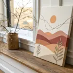
Neutral Geometric Arches
Embrace the soothing calm of neutral tones with this minimalist stacked arch painting, featuring a harmonious palette of rust, ochre, and sage. The textured watercolor paper adds a lovely organic feel, making this piece perfect for modern boho decor.
How-To Guide
Materials
- Cold press watercolor paper (300 gsm or higher for texture)
- Watercolor paints (burnt sienna, yellow ochre, raw umber, olive green, sepia)
- Round watercolor brushes (size 6 and size 2 for details)
- Cup of water
- Paper towel
- Pencil (HB or lighter)
- Compass or round objects to trace
- Eraser (kneaded preferred)
- Palette or ceramic dish for mixing
Step 1: Preparation & Sketching
-
Prep your paper:
Begin by taping down your watercolor paper to a hard surface if you are not using a block; this prevents buckling as the paper gets wet. -
Plan the composition:
Visualize three distinct arch sets stacked vertically. The top arch will be partially cut off by the paper edge, the middle one fully visible, and the bottom one the largest and boldest. -
Sketch the guidelines:
Using a compass or by lightly tracing circular objects, draw the concentric semicircles. For the bottom arch, you’ll need four distinct bands; for the middle, four bands; and for the top, three visible bands. -
Keep lines faint:
Press very lightly with your pencil. Watercolor is transparent, and dark graphite lines are difficult to erase once painted over.
Clean Lines Pro-Tip
To keep bands distinct, always leave a hairline gap of dry paper between wet colors. If they touch wet-on-wet, they will bleed together and lose definition.
Step 2: Painting the Top Arch
-
Mix a soft rust tone:
Combine burnt sienna with a touch of water to create a terracotta orange. Paint the outermost band of the top arch with a size 6 brush, keeping the edges crisp. -
Add the middle band:
Mix a pale beige by diluting raw umber heavily. Paint the second band, leaving a tiny sliver of white paper between it and the rust band to prevent bleeding. -
Paint the center:
Fill the innermost semi-circle with a diluted ochre or camel tone. Let this section dry completely before moving down.
Level Up: Gold Leaf
Add a touch of luxury by applying gold leaf size to one specific band in each arch. Once tacky, apply gold leaf for a shimmering, modern accent.
Step 3: Painting the Middle Arch
-
Create a deep brown:
Mix sepia with a bit of burnt umber for the large outer curve of the middle arch. Apply this confidently, letting the brush bristles grab the paper texture. -
The ochre layer:
For the second band, use a pure yellow ochre. Remember to maintain that thin negative space (the white line) between color bands. -
Soft beige transition:
The third band should be a whisper-light beige. Dilute your brown mixture significantly with water until it’s barely there. -
Sage green center:
Mix olive green with a tiny touch of grey or brown to desaturate it. Fill the small semi-circle at the core of this middle arch.
Step 4: Painting the Bottom Arch
-
Mix a warm terracotta:
Create a reddish-brown color, slightly darker than the top arch. Paint the large outer sweep of the bottom rainbow. -
Dark ochre band:
Add a bit of brown to your yellow ochre mix to deepen it, then paint the second inward band. -
Light caramel band:
Use a diluted burnt sienna for the third band, keeping your brush wet enough to create a smooth wash without streaks. -
The final center:
Finish with a solid semi-circle of deep rust or reddish-brown at the very center of the bottom arch.
Step 5: Finishing Touches
-
Check for gaps:
Once the paint is tacky but not fully dry, use the smaller size 2 brush to touch up any ragged edges, being careful not to overwork the wet paper. -
Erase guidelines:
Wait until the painting is 100% bone dry—I usually give it at least an hour. Gently dab with a kneaded eraser to lift any visible pencil marks. -
Flatten the artwork:
If the paper has curled slightly, place the dry painting under a heavy book overnight to press it flat.
Hang your new geometric masterpiece in a simple wooden frame to complement those warm earth tones
Loose Neutral Desert Dunes
Capture the serene warmth of a desert landscape with this large-scale textured art piece. Using a mix of modeling paste and earthy acrylics, you will create raised, sculptural lines that mimic the rolling curves of sun-drenched sand dunes.
Detailed Instructions
Materials
- Large canvas (e.g., 30×40 inches or larger)
- Pencil
- String or piping bag
- Heavy body acrylic paints (Titanium White, Unbleached Titanium, Raw Sienna, Burnt Sienna, Yellow Ochre)
- Texture medium (coarse sand gel or modeling paste)
- Palette knives (assorted sizes)
- Wide flat synthetic brushes
- Squeeze bottle or piping bag with a round tip
- Matte varnish (optional)
Step 1: Planning the Flow
-
Prime your surface:
Ensure your large canvas is clean and taut. If it’s a raw canvas, apply a coat of gesso to seal it. For pre-primed canvases, a quick wipe with a microfiber cloth removes any dust that might interfere with adhesion. -
Draft the dunes:
Using a light pencil, sketch your composition directly onto the canvas. Start from the bottom left and draw swooping, curved lines that extend upward and outward toward the right side. -
Create distinct zones:
Vary the width of the bands between your lines. Some should be thick pathways of color, while others can be narrower ribbons. Include a large, circular or semi-circular shape in the top right corner to represent a stylized sun.
Step 2: Creating the Relief Lines
-
Prepare the paste:
Mix a small amount of white acrylic paint into your modeling paste to ensure it stays opaque when dry. Fill your squeeze bottle or piping bag with this mixture. -
Pipe the boundaries:
Carefully trace over your pencil lines with the piping bag. Apply steady pressure to create a consistent, raised bead of paste. This creates the ‘walls’ that will separate your color sections. -
Smooth the ridges:
For a cleaner look, you can gently dampen your finger and smooth the very top of the piped lines, or leave them rugged for more organic texture. I like to check these lines from the side to ensure the height is somewhat uniform. -
Let it cure:
This step requires patience. Allow the piped lines to dry completely, which may take anywhere from 12 to 24 hours depending on the thickness and humidity. They must be hard to the touch before painting.
Piping bag breaks?
If you don’t have a piping bag, mix heavy modeling paste with white paint, roll it into thin ‘snakes’ like modeling clay, and press them onto the canvas with a little water to adhere.
Step 3: Adding Texture and Color
-
Mix your base texture:
In several cups, mix your acrylic colors with the coarse sand gel or texture medium. Aim for a ratio of about 60% paint to 40% texture medium to keep the color vibrant but gritty. -
Create a palette gradient:
prepare five distinct shades: a deep rust/brown, a warm ochre, a sandy beige, a pale cream, and a near-white. This gradient is key to the dimensional look. -
Fill the bottom sections:
Start at the bottom with your darkest rust and brown tones. Using a palette knife or stiff brush, spread the textured paint within the piped boundaries. Push the paint right up against the raised white lines. -
Transition upward:
As you move to the middle ‘dunes,’ switch to the warm ochre and sandy beige mixtures. Apply the paint thickly, allowing the brushstrokes or knife marks to follow the curve of the piped lines. -
Paint the upper atmosphere:
Fill the extensive upper area with the palest cream and white mixtures. Keep the texture slightly smoother here to represent the vastness of the sky or distant sand. -
The golden sun:
For the corner sun shape, use the Raw Sienna or a gold-tinted ochre. Apply this with a stippling motion (dabbing straight down) to make it visually distinct from the sweeping dune textures.
Add subtle sparkle
Mix a tiny pinch of fine gold mica powder or glitter into your ‘sun’ section paint. It won’t look flashy, but it will catch the light beautifully when viewing the art from an angle.
Step 4: Refinement and Finish
-
Clean the lines:
If any colored paint accidentally smudged onto your raised white lines, use a fine detail brush and fresh white paint to touch them up. These crisp white separations are crucial for the graphic style. -
Highlight the texture:
Once the color blocks are dry, dry-brush a tiny amount of Unbleached Titanium over the highest points of the darker dune sections. This emphasizes the gritty sand texture. -
Seal the work:
Because of the heavy texture, dust can settle in the crevices over time. Apply a spray matte varnish to seal the surface without adding unwanted gloss.
Hang your relief painting in a well-lit spot where the changing daylight will dance across the textures you’ve built.


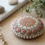
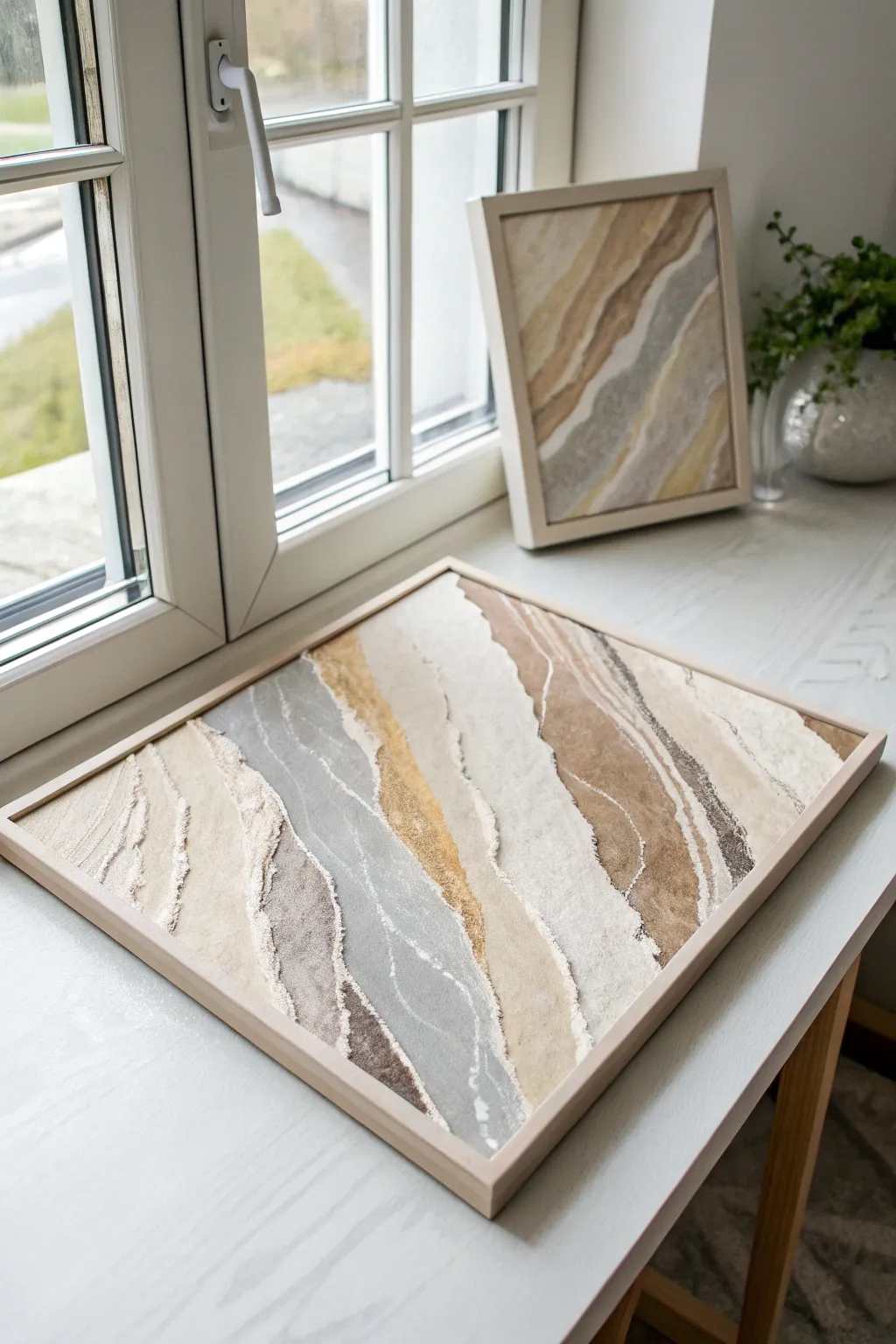
Abstract Pebble Shapes
This serene project captures the organic beauty of river stones through soft washes and neutral tones. It is an exercise in composition and color mixing, resulting in a calming piece of abstract art perfect for modern decor.
How-To Guide
Materials
- Cold press watercolor paper (approx. 300 gsm)
- Watercolor paints (burnt umber, yellow ochre, payne’s gray, raw sienna, sepia)
- Round watercolor brushes (size 6 and 10)
- Palette for mixing
- Two jars of water (one clean, one for rinsing)
- Paper towels
- Pencil (HB or H)
- Kneaded eraser
Step 1: Preparation & Sketching
-
Prepare your workspace:
Set up your paper on a flat surface. Taping the edges with masking tape is optional but helps keep the paper flat if you plan on using heavier water washes. -
Lightly map the composition:
Using a hard pencil like an H (which keeps lines faint), very lightly sketch the outlines of your pebbles. Aim for variety in size and rotation—some oval, some round, some slightly kidney-shaped. -
Check the spacing:
Ensure there is a comfortable, somewhat even amount of ‘breathing room’ between the stones. You want them close enough to feel like a collection, but not touching. -
Soften the sketch:
Roll your kneaded eraser gently over the entire paper to lift up most of the graphite, leaving only the faintest ghost lines to guide your brush.
Water Control Tip
For smooth, non-streaky pebbles, pre-wet the shape with clean water first, then drop the pigment in. This is the ‘wet-on-wet’ technique and creates soft, clouded interiors suitable for stones.
Step 2: Mixing the Palette
-
Create base mixes:
On your palette, prepare puddles of your neutral colors. Mix Burnt Umber with plenty of water for a soft beige, and dilute Payne’s Gray for a cool stone color. -
Mix secondary tones:
Create a ‘greige’ by mixing a touch of brown into your gray. Mix Yellow Ochre with a tiny bit of Sepia for a warm, sandy stone color. -
Test your colors:
On a scrap piece of watercolor paper, swatch your mixes. You want a harmonious family of muted earth tones, ranging from warm tan to cool slate.
Fixing “Cauliflowers”
If you get uneven drying edges (blooms), it usually means you added water to drying paint. Once a shape starts to dry (loses sheen), don’t touch it until it’s 100% bone dry.
Step 3: Painting the Stones
-
Start with the lightest stones:
Dip your size 10 brush into your lightest beige mix. Fill in several scattered pebble shapes, keeping the edges crisp. -
Vary the saturation:
While moving to the next set of stones, add a little more pigment to your brush to create slight variations in depth, avoiding a flat, uniform look. -
Introduce cool tones:
Switch to your diluted Payne’s Gray mix. Paint a few stones in this cool grey tone to create contrast against the warm browns. -
Create gradient effects:
I like to drop a tiny bit of darker pigment into the wet edge of a stone occasionally; this allows the color to bleed naturally and gives the pebble a rounded, 3D form. -
Add the darkest accents:
Using your Sepia or a concentrated Burnt Umber, paint the darkest stones. Place these strategically to balance the visual weight of the composition. -
Let the base layers dry:
Allow the painting to dry completely. The paper should be cool to the touch but no longer damp before you proceed to detailing.
Step 4: Adding Texture & Details
-
Identify stones for texture:
Select a few larger stones to add detail to. Leaving some plain creates a nice balance, so don’t feel the need to texture every single one. -
Paint striations:
Using the smaller size 6 brush and a slightly darker version of the stone’s base color, gently paint thin, curved lines across a few pebbles to mimic sedimentary layers. -
Create speckles:
For a granite look, load your brush with dark paint and tap it against your finger to splatter tiny dots onto a specific dry stone. You can mask off surrounding areas with paper to control the spray. -
Layering glazes:
If a stone looks too flat, paint a very watery, translucent layer of a darker color over just one side (imagine a light source coming from the top left) to enhance the roundness. -
Final assessment:
Step back and look at the overall balance. If there are large white gaps that feel awkward, you can paint a tiny, faint pebble to fill the space.
Once dry, you can frame this piece behind glass to highlight the delicate textures of your watercolor stones
Monochrome Mountains in Taupe
Create a serene atmosphere in your home with this monochromatic mountain landscape that relies on subtle shifts in value to create depth. Using a simple palette of taupe, cream, and charcoal, you will learn to layer sweeping peaks that fade gently into a misty white sky.
Detailed Instructions
Materials
- Stretched canvas (e.g., 11×14 or 16×20 inches)
- Acrylic paints: Titanium White, Burnt Umber, Raw Sienna, Mars Black
- Flat shader brushes (1 inch and ½ inch)
- Small round detail brush (size 1 or 2)
- Palette for mixing
- Cup of water and paper towels
- Pencil for sketching
Step 1: Planning and Sky
-
Sketch the terrain:
Begin by lightly sketching the outline of your mountain ranges directly onto the canvas with a pencil. Draw about 4-5 distinct wavy lines that overlap, starting high in the middle for the distant peaks and getting lower towards the foreground. -
Mix the sky tone:
Prepare a large amount of Titanium White with just a tiny pinprick of Burnt Umber. You want an off-white, warm cream color, not a stark bright white. -
Paint the background:
Use your 1-inch flat brush to paint the entire sky area above your highest mountain line. Bring this color down slightly over the pencil line so there are no gaps later. -
Create the first peak:
While you still have that sky mixture on your palette, add a tiny bit more Burnt Umber and a touch of Raw Sienna. This should be a very pale, sandy beige. Paint the distinctive, highest peak in the center back, keeping the edges crisp.
Fixing Flat Mountains
If your mountains look stuck together, your paint shades are too similar. Wait for them to dry, then repaint specific layers with slightly more white or black to re-establish contrast.
Step 2: Mid-Ground Layers
-
Deepen the mix:
For the next layer of mountains—the ones just in front of the furthest peak—add slightly more brown to your existing mix. The goal is to get just a shade darker than the previous layer. -
Apply the second layer:
Paint the second mountain range. Use the edge of your flat brush to carve out the tops of the mountains, then fill in the body of the shapes. -
Soften the bottom edge:
Before the paint dries completely on this layer, take a clean, slightly damp brush and gently feather out the bottom edge of the paint. This creates a misty transition into the layer below it. -
Cool down the color:
For the middle mountain range on the left, add the tiniest touch of Mars Black or grey to your beige mix. This coolness pushes the mountains visually further back while differentiating them from the warmer foreground. -
Paint the left range:
Fill in the sweeping range on the left side with this cooler taupe mixture. Ensure the top ridge line is clean and sharp against the lighter mountains behind it. -
Warm up the right side:
For the prominent slope on the right side, mix a fresh batch of darker beige using mostly Raw Sienna and Burnt Umber with less white. This warmer, golden-brown tone mimics sunlight hitting the slope. -
Define the slope:
Paint this golden-brown section, letting it curve downwards towards the center. This layer acts as a bridge between the distant faded mountains and the dark foreground.
Texture Play
For a more organic look, try blotting the wet paint with a crumpled paper towel on the foreground mountains. This lifts pigment and creates a rocky texture before you paint the trees.
Step 3: Foreground and Details
-
Mix the darkest value:
Create a deep, rich charcoal brown by mixing Burnt Umber with Mars Black. You want this to be the darkest value on your canvas. -
Block in the foreground base:
Paint the final, lowest mountain range at the very bottom of the canvas with this dark mix stripes. I find using choppy, uneven strokes here helps simulate rough terrain. -
Load the detail brush:
Switch to your small round brush. Thin your dark paint slightly with a drop of water so it flows smoothly for the fine details. -
Paint distant tree lines:
Along the ridge of the golden-brown slope on the right, paint tiny vertical lines to suggest a distant forest. Vary the heights slightly so it doesn’t look like a comb. -
Create detailed pines:
On the dark foreground mountain, start painting larger pine trees. Draw a vertical line for the trunk, then use quick, downward zig-zag strokes to create branches, getting wider at the bottom. -
Vary tree density:
Cluster some trees deeply together on the far left side, making them dense and dark. On the right side, space them out more to show the individual tree shapes against the lighter background. -
Final assessment:
Step back from the easel. If any mountain ridge looks too stark, you can lightly glaze it with a watered-down white wash to push it back into the fog.
Once dry, this peaceful landscape is ready to bring a touch of mountain calm to your living space
Neutral Watercolor Bloom Abstraction
Embrace the quiet beauty of nature with this minimalist watercolor stationery project. Featuring delicate, loose leaves in muted greens and subtle brown tones, this design transforms a simple sheet of textured paper into an elegant canvas for your thoughts.
How-To Guide
Materials
- Cold press watercolor paper (A4 or letter size)
- Watercolor paints: Sap Green, Burnt Umber, Yellow Ochre, Sepia
- Round watercolor brush (size 4 or 6)
- Small round detail brush (size 0 or 2)
- Pencil (HB or 2B)
- Jar of clean water
- Paper towel
- Palette for mixing
Step 1: Preparation & Color Mixing
-
Prepare your paper:
Start with a clean sheet of cold press watercolor paper. The texture is important here to achieve the organic, slightly rough look seen in the example. Tape down the corners if you are worried about buckling, although for this minimal amount of water, it might not be strictly necessary. -
Mix your greens:
Create a muted green shade by mixing Sap Green with a tiny touch of Burnt Umber or Sepia. You want a color that feels earthy, not vibrant or neon. Test the color on a scrap piece of paper; it should look like a dried herb leaf. -
Mix your browns:
Dilute Burnt Umber or Yellow Ochre heavily with water to create a very pale, tea-stain wash. You’ll also need a slightly more concentrated version of this for the ‘pods’ or buds.
Natural Bleeds
Drop clear water onto a semi-dry leaf to push pigment to the edges. This creates a hard, dark edge called a ‘bloom’ that looks very organic.
Step 2: Painting the Foliage
-
Plan the composition:
Look at the bottom edge of your paper. Imagine a loose, organic border growing upwards. Lightly sketch the position of a few stems if you need a guide, but keeping it freehand adds to the charm. -
Start the main stem:
Load your round brush (size 4 or 6) with your mixed green. Using the very tip, paint a thin, slightly curved line rising from the bottom edge to establish the first stem. -
Add leaves:
Press the belly of the brush down gently and lift up as you drag it away from the stem to create a leaf shape that tapers at the end. Repeat this on alternating sides of the stem. -
Vary the saturation:
While the paint is still wet on the paper, dip your brush in water and paint the next leaf. This creates a faded, translucent effect that adds depth, making some leaves look further back than others. -
Paint a second sprig:
Move slightly to the right or left and paint a smaller, separate sprig of leaves. I like to change the angle slightly so it doesn’t look too uniform or soldier-like.
Step 3: Adding Earthy Accents
-
Create the brown buds:
Switch to your diluted brown/ochre mix. Paint simple oval or teardrop shapes near the base of your green stems, appearing as dry seed pods or autumn leaves. -
Create a watercolor bloom effect:
While a brown pod is still wet, drop in a tiny speck of darker brown (Sepia) at the very bottom edge. Let it bleed naturally into the paler wash to create a gradient. -
Add ‘spilled coffee’ stains:
To mimic the organic, vintage feel of the original image, mix a very watery brown wash. Load your brush and gently tap it against your finger over the bottom edge of the paper to create subtle splatters. -
Paint faint stains:
Use a nearly clean, wet brush to drag some of that pale brown wash along the extreme bottom edge of the paper, creating an uneven, coffee-stained watermark effect. -
Dry completely:
Let the paper sit flat until completely dry. If the paper feels cold to the touch, it is still wet deep in the fibers.
Vintage Paper Hack
Before painting, lightly brush the entire paper with strong black tea and let dry. This gives an instant aged, parchment look.
Step 4: Finishing Touches
-
Refine with pencil:
Once fully dry, you can very lightly outline parts of the leaves or add a central vein line using a sharpened pencil. Keep the lines broken and sketchy, not continuous. -
Add subtle texture:
If you want more texture, take a slightly dry brush with darker green pigment and lightly scuff it over the dry leaves to suggest veins or rough surfaces.
Now you have a serene piece of stationery ready for your next letter or poem
Neutral Stripe Study
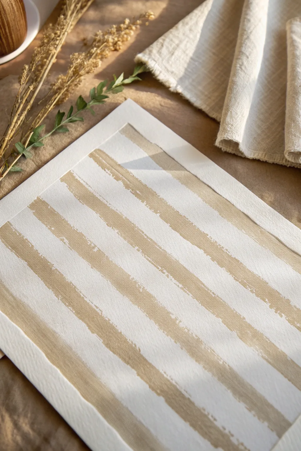
Capture the essence of calm with this minimalist stripe painting, where raw texture meets warm, sandy tones. The beauty lies in the imperfect, organic edges that give the piece a relaxed, lived-in feel perfect for neutral interiors.
Step-by-Step
Materials
- Heavyweight watercolor paper or mixed media paper (at least 140lb)
- Acrylic paint in warm beige or raw sienna
- Acrylic paint in white or unbleached titanium
- Wide flat brush (1-2 inch width)
- Painter’s tape or masking tape
- Palette or mixing plate
- Paper towels
- Ruler (optional)
Step 1: Preparation
-
Prepare your paper:
Secure your heavyweight paper to a flat surface using masking tape on all four sides. This creates a clean white border around your artwork and prevents the paper from buckling when wet. -
Mix your base tone:
Squeeze out a generous amount of warm beige or raw sienna acrylic paint onto your palette. If the color feels too dark, mix in a touch of white to achieve a soft, sandy hue. -
Create a wash (optional):
If you want a subtle undertone rather than stark white paper, water down a tiny bit of your beige paint and apply a very sheer wash over the entire paper. Let this dry completely before proceeding.
Paint Bleeding Under Tape?
If lines aren’t crisp enough, try sealing the tape edge with a layer of clear matte medium before applying color. This creates an invisible barrier against leaks.
Step 2: Creating the Resist
-
Tear the tape edges:
To achieve the ragged, organic edges seen in the reference, do not apply the tape straight from the roll. Instead, tear long strips of masking tape lengthwise down the middle. This torn edge is crucial for the texture. -
Place the first strip:
Apply a strip of torn tape diagonally or horizontally across your paper. Press down firmly to seal the edge, particularly along the torn side. -
Plan the spacing:
Continue placing strips of torn tape across the paper. The areas covered by tape will remain white (or your base wash color), while the exposed paper will become the beige stripes. Vary the width between tape strips to create visual interest. -
Seal the edges:
Run your fingernail or a bone folder along the torn edges of the tape to ensure they are fully adhered. This minimizes paint bleed-under but still allows the texture of the tear to shape the stripe.
Step 3: Painting the Texture
-
Load a dry brush:
Dip your wide flat brush into the sandy acrylic mix, but don’t overload it. Dab off excess paint onto a paper towel. You want a ‘dry brush’ effect rather than a solid pool of color. -
Apply the first layer:
Stroke the paint into the exposed gaps between the tape strips. Use confident, sweeping motions that run parallel to the tape. -
Focus on the edges:
Pay special attention to the areas where the paper meets the torn tape. Brush over the tape edge onto the paper to capture that specific ragged silhouette. -
Add lighter highlights:
While the beige is still tacky, mix a little more white into your brush without cleaning it. Lightly drag this lighter tint across the center of a few stripes to add dimension. -
Deepen the contrast:
Conversely, mix a tiny drop of brown or raw umber into your beige. Use the very tip of the brush to add darker, scratchy marks sporadically within the stripes for a weathered look. -
Let it set:
Allow the paint to dry until it is dry to the touch. Acrylics dry quickly, so this shouldn’t take more than 10-15 minutes.
Add Metallic Warmth
Mix a tiny amount of gold leaf or metallic bronze paint into your beige stripes for a subtle shimmer that catches the sunlight beautifully.
Step 4: The Reveal
-
Peel the tape slowly:
Once the paint is fully dry, gently peel back the masking tape strips. Pull the tape away at a 45-degree angle to prevent tearing the paper surface. -
Assess the edges:
Observe the beautiful, rough edges revealed by the torn tape. If any paint bled under in a way that looks messy rather than artistic, you can touch it up with white paint. -
Enhance the texture:
If some stripes look too flat, take a very dry brush with a tiny amount of leftover beige paint and lightly scumble (scrub) over parts of the white stripes to bridge the gap and add cohesion. -
Remove border tape:
Finally, peel away the tape securing the paper to your table to reveal the crisp, clean white frame around your textured composition. -
Flatten if needed:
If the paint has caused slight buckling, place the artwork under a heavy book overnight once it is 100% cure-dry.
Frame your new piece in natural wood to echo the organic textures you’ve created
Charcoal and White Wash Contrast
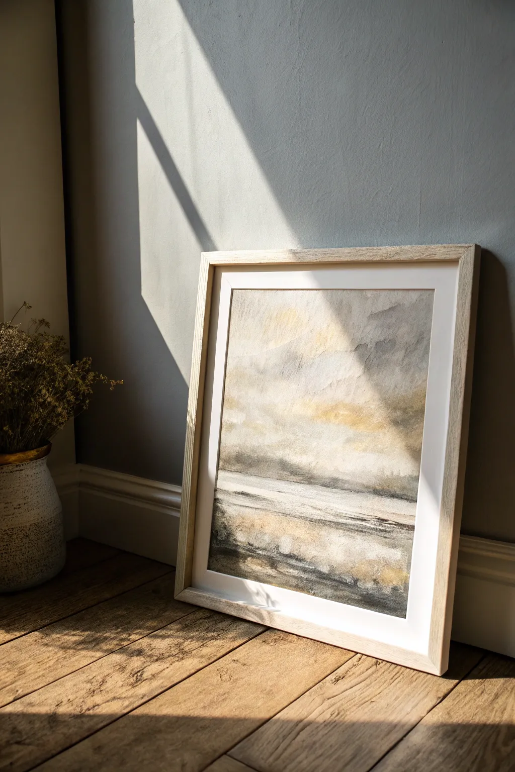
Capture the serene, hazy atmosphere of a coastal horizon with this mixed-media project. By layering charcoal textures with fluid white washes and touches of golden ochre, you will create a piece that feels both grounded and ethereal.
Step-by-Step
Materials
- Heavyweight watercolor paper or mixed-media board (at least 300gsm)
- Willow charcoal sticks
- Compressed charcoal stick (for darker details)
- White acrylic paint or white gesso
- Yellow ochre or raw sienna watercolor/acrylic paint
- Wide calm-hair wash brush
- Medium round brush
- Sponge or paper towels
- Workable fixative spray
- Clean water
Step 1: Setting the Background
-
Establish the horizon:
Begin by lightly marking your horizon line slightly below the center of the paper using a piece of willow charcoal. It doesn’t need to be perfectly straight; a slight organic waver creates a more natural landscape feel. -
Apply the first wash:
Mix a very watery grey using a tiny amount of black paint or simply by dipping a wet brush into charcoal dust. Wash this over the top two-thirds of the paper to create a cloudy, base sky layer. -
Introduce warmth:
While the paper is still damp, drop in diluted touches of yellow ochre or raw sienna into the upper sky area. Let the pigment bloom naturally to suggest breaking sunlight. -
Create the foreground base:
For the bottom third (the ground), use a slightly darker grey wash. Brush predominantly horizontally to mimic the lay of the land or water surface. -
Initial drying:
Allow these base layers to dry completely. If the paper feels cold to the touch, it is still wet; wait until it is room temperature.
Step 2: Layering Texture and Depth
-
Charcoal shading:
Take your willow charcoal stick and rub it on its side across the sky area. Use a light hand to catch the tooth of the paper texture without creating solid black blocks. -
Smudging the sky:
Use a dry paper towel or your fingers to smudge the charcoal upward, softening the marks into hazy clouds. Leave some areas lighter to let the ochre peek through. -
Defined horizon line:
Use the compressed charcoal to darken the horizon line significantly. Add some vague, vertical shapes along this line to suggest distant trees or landmasses. -
The white wash technique:
Dilute your white acrylic or gesso so it is milky but still opaque. Using a wide brush, drag this mixture horizontally across the middle section of the painting, partially obscuring the charcoal horizon. -
Scraping back:
While the white paint is wet, use the handle end of a brush or a credit card to gently scrape horizontal lines into the foreground. This reveals the darker underlayer and mimics ripples or textured earth.
Muddy colors?
If your white paint turns grey instantly, the charcoal underneath is loose. Spray a quick layer of fixative over the charcoal before painting the white wash to keep colors clean.
Step 3: Refining Details
-
Foreground contrast:
Reintroduce the compressed charcoal in the bottom corners and very bottom edge of the paper. This grounding darkness leads the eye inward. -
Golden accents:
Mix a slightly thicker consistency of yellow ochre. Dry-brush this sparingly onto the horizon line and parts of the foreground where ‘light’ would hit the ridges. -
Softening transitions:
I like to take a damp sponge and gently dab areas where the charcoal looks too harsh, specifically in the transitions between the sky and the white mid-ground. -
Final highlights:
Add pure, undiluted white paint with a small round brush to create sharp highlights on the water or land surface in the foreground. -
Review and balance:
Step back from the artwork. If the piece looks too grey, add another glaze of ochre; if it lacks depth, darken the bottom edge with more charcoal. -
Seal the work:
Once fully dry, spray the piece with a workable fixative. This is crucial as it prevents the charcoal dust from smearing against the glass when you frame it.
Add Metallic Flair
Swap the yellow ochre paint for a metallic gold watercolor or ink in the final steps. It adds a subtle shimmer that catches the sunlight beautifully.
Place your dried artwork in a light wood frame to complement the warm tones in the horizon
Minimal Neutral Diptych Pair
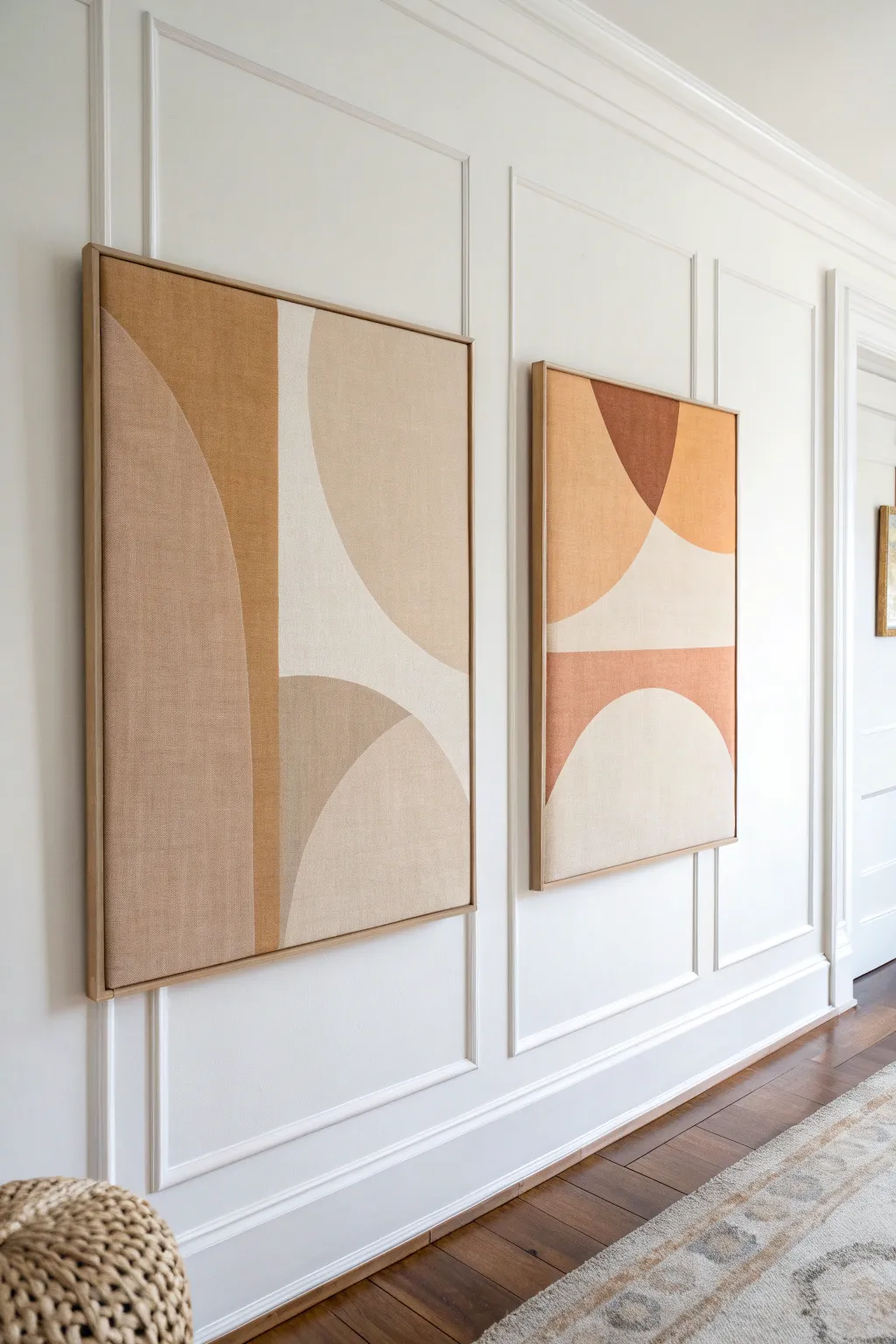
Bring warmth and modern sophistication to your walls with these large-scale abstract paintings featuring soft arches and soothing earth tones. This project focuses on balance and simplicity, using layered shapes to create a high-end gallery look on a budget.
Detailed Instructions
Materials
- Two large framed canvases (roughly 24×36 or 30×40 inches)
- Acrylic paints (Titanium White, Unbleached Titanium, Raw Sienna, Burnt Sienna, Yellow Ochre)
- Medium-sized flat paintbrush (1-inch width)
- Large flat paintbrush (2-inch width) for background areas
- Pencil
- String and pushpin (for drawing perfect curves)
- Painter’s tape (optional)
- Palette or paper plates for mixing
- Ruler or straight edge
- Matte varnish (optional)
Step 1: Planning and Sketching
-
Prepare your workspace:
Lay down a drop cloth or old sheet to protect your floor or table. Set up both canvases side-by-side so you can visualize how the shapes will flow from one panel to the next, even though they don’t need to line up perfectly. -
Create a simple guide:
Using a pencil, lightly mark horizontal lines to divide your canvases into roughly three vertical sections. These don’t need to be equal; in fact, varying the height adds visual interest. -
Sketch the large arches:
For the prominent curved shapes, I find it easiest to use the string method. Tie a string to a pencil and hold the other end (or use a pushpin) at a center point to swing an arc. Create large, sweeping semi-circles that intersect the vertical divisions. -
Refine the composition:
Draw the remaining geometric blocks. The design relies on the interplay of negative and positive space, so ensure you have a mix of large curved areas and solid rectangular blocks.
Clean Lines Hack
For ultra-crisp curves, apply flexible painter’s tape along your pencil line. Seal the edge with a thin layer of matte medium before applying color to prevent bleed-through.
Step 2: Mixing the Color Palette
-
Mix the lightest cream:
Combine a large amount of Titanium White with a small touch of Unbleached Titanium. This will serve as your lightest neutral tone for the airy negative spaces. -
Create the beige tone:
Mix White with a little Raw Sienna to get a sandy beige color. Test a swatch on a scrap piece of paper and let it dry, as acrylics often dry darker than they appear wet. -
Develop the warm ochre:
Use the Yellow Ochre straight from the tube or soften it slightly with a dot of White to create that rich, golden mustard tone seen in the left painting. -
Mix the terracotta accent:
Blend Burnt Sienna with a hint of Red or Orange if needed, and a touch of White to create an earthy, muted terracotta. This darker color acts as an anchor for the composition.
Level Up: Texture
Mix a little modeling paste or baking soda into your acrylic paint. This adds a subtle, grainy texture that mimics plaster or rough linen for an organic feel.
Step 3: Painting the Shapes
-
Block in the light areas:
Start by painting the lightest cream shapes first. Use the large flat brush for the centers and switch to the medium flat brush to get crisp edges along your pencil lines. -
Apply the second lightest tone:
Paint the beige sections next. Focus on smooth, even strokes. If the canvas texture is rough, you may need to scrub the paint in slightly to fill the weave. -
Add the ochre warmth:
Fill in the mustard-yellow sections. This color can sometimes be semi-transparent, so apply a thin first coat, let it dry completely, and then apply a second coat for full opacity. -
Paint the darkest accents:
Carefully paint the terracotta or dark brown sections. Because these are the boldest colors, steady hands are key here to keep the curves smooth. -
Refine the edges:
Once the main blocks are dry, use a smaller brush with the appropriate color to touch up any wobbly lines where two colors meet. You want a sharp, clean intersection. -
Check for consistency:
Step back and look at both canvases together. Ensure the color density looks balanced between the two pieces.
Step 4: Finishing Touches
-
Erase visible guides:
If any pencil marks are still visible through the lighter paint colors, gently erase them or dab a tiny bit more paint over them. -
Seal the artwork:
For longevity, apply a coat of matte varnish over the entire surface. This unifies the sheen of the different paint colors and protects the canvas from dust. -
Frame the pieces:
Place your finished canvases into floating frames. Natural light oak or maple frames complement these earth tones perfectly.
Now hang your masterpieces side by side and enjoy the calm, modern vibe they bring to your room
Collaged Neutrals With Painted Overlays
Emulate the gentle stratification of the earth with this layered collage, combining the tactile texture of torn paper with fluid painted accents. The resulting artwork offers a calming, geological aesthetic that fits perfectly into any neutral decor scheme.
How-To Guide
Materials
- Light wood floater frame or shadowbox frame
- Sturdy backing board or heavy watercolor paper (sized to frame)
- Assorted textured papers (handmade cotton, mulberry, kraft)
- Neutral acrylic paints (white, beige, warm grey, taupe)
- Metallic gold acrylic paint or ink
- Matte Mod Podge or heavy gel medium
- Flat synthetic brushes (1-inch width)
- Fine liner brush
- Palette knife (optional)
Step 1: Preparing the Base
-
Prepare your substrate:
Begin by cutting your backing board or heavy watercolor paper to fit precisely within your chosen frame. If using a canvas panel, ensure the surface is clean. -
Establish the background:
Paint the entire backing board with a solid coat of creamy off-white or very light warm grey acrylic paint to ensure no raw board shows through gaps later. -
Plan the composition:
I find it helpful to lightly pencil a few flowing, diagonal wave lines across the board to guide where your main strata layers will flow.
Tear like a pro
To get a fuzzier deckled edge, dampen the paper with a wet paintbrush along the line you want to tear. Wait 30 seconds, then pull gently apart.
Step 2: Creating the Torn Layers
-
Tear the paper strips:
Take your assorted papers—mix thick hand-cast paper with thinner mulberry or kraft types—and tear them into long, irregular strips about 1 to 2 inches wide. -
Focus on the edge:
Ensure each strip has a “deckled” or rough torn edge on at least one side. The beauty of this piece relies on that fibrous, fuzzy edge texture catching the light. -
Dry styling:
Lay the strips onto your dry board without glue first. Arrange them diagonally, overlapping significantly so that only the torn edges and a bit of the surface show. -
Check for balance:
Vary the colors as you arrange; alternate between the darker kraft tones, whites, and greys to create visual rhythm rather than pooling similar colors together.
Use sand for texture
Mix fine sand or baking soda into your beige paint for one of the painted layers. This adds a gritty, realistic stone effect.
Step 3: Adhering the Collage
-
Start gluing from the bottom:
Remove the strips, keeping them in order. Apply a generous layer of matte medium or Mod Podge to lightness of the board starting at the bottom corner. -
Layer upwards:
Press your first strip down. Apply medium to the top edge of that strip, then overlap the next strip on top, working your way diagonally up the artwork. -
Encourage texture:
Don’t flatten the tearing completely. If the paper ripples slightly or the torn fibers stick up, leave them; this adds essential dimension. -
Trim the excess:
Once the board is covered and the glue is mostly dry, flip the board over and use a craft knife to trim any paper hanging off the edges for a clean rectangle.
Step 4: Painted Overlays
-
Add painted strata:
Mix a watery wash of taupe or diluted grey acrylic. Paint along the ‘valleys’ where papers overlap to deepen the shadows and separate the layers. -
Highlight the torn edges:
Using a relatively dry brush with white paint, lightly skim over the roughest torn edges. This technique catches the raised fibers and makes the texture pop. -
Apply gold accents:
Dip a fine liner brush into metallic gold paint. Paint thin, organic lines that follow the curves of your paper tears, occasionally breaking the line for a natural look. -
Blend textures:
If a transition looks too harsh, use a palette knife to scrape a little thick beige paint over the seam, bridging the gap between two paper types.
Step 5: Finishing
-
Seal the surface:
Once all paint is fully dry, apply a final thin coat of matte spray varnish to protect the paper from dust without adding unwanted gloss. -
Mount in frame:
Place your artwork into the wood frame. If using a shadowbox, ensure the glass doesn’t crush the raised paper textures.
Hang your textured masterpiece near a window where natural light can play across the beautiful ridges you’ve created
Subtle Metallic Accents in Neutrals
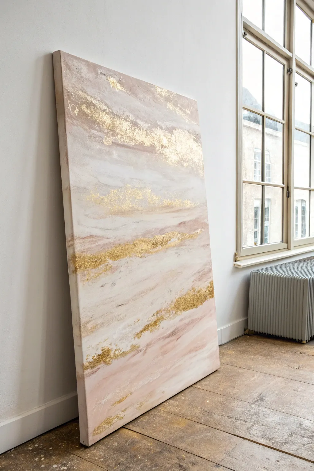
This large-scale abstract painting captures the ethereal beauty of a sunrise with soft layers of blush pink, cream, and taupe. The defining feature is the organic scattering of gold leaf, which adds a luxurious, light-catching shimmer to the serene neutral palette.
Step-by-Step
Materials
- Large stretched canvas (e.g., 36×48 inches)
- Acrylic paints (Titanium White, Unbleached Titanium, Blush Pink, Burnt Umber)
- Texture paste or modeling paste
- Large palette knife (trowel style)
- Wide flat synthetic brushes (2-3 inches)
- Gold leaf sheets (imitation or real)
- Gold leaf adhesive size
- Soft gilding brush (mop brush)
- Spray bottle with water
- Gloss or satin varnish
Step 1: Building the Foundation
-
Prepare the canvas:
Lay your large canvas on a drop cloth or easel. Even if pre-primed, I like to apply a quick coat of gesso to ensure a smooth, receptive surface. -
Mix base colors:
On a large palette or paper plate, mix your primary gradient shades. Create a soft cream using Titanium White with a touch of Unbleached Titanium. Mix a dusty rose by adding a tiny dot of Burnt Umber to your Blush Pink. -
Establish the horizon:
Using a wide brush, apply horizontal bands of color across the canvas. Keep the strokes loose. Place darker rose tones near the bottom and lighter creams towards the top to mimic an abstract landscape. -
Blend the transitions:
While the paint is still wet, spritz the canvas lightly with water. Use a clean, damp brush to feather the edges where the pinks and creams meet, creating a soft, misty look. -
Add first texture layer:
Mix a dollop of texture paste into your cream paint. Use a palette knife to scrape thin, horizontal layers across the upper third of the canvas, leaving some areas thicker than others.
Step 2: Layering and Depth
-
Create distinct bands:
Once the base is touch-dry, use the palette knife to apply unmixed white texture paste in sporadic horizontal streaks. These raised areas will eventually catch the gold leaf. -
Introduce darker accents:
Mix a slightly darker mauve by adding more Burnt Umber to the pink. Apply this sparingly in the lower sections with a dry brush to create visual weight and depth. -
Soften the texture:
Knock down any peaks of texture paste that are too sharp by lightly dragging a dry brush over them while they are semi-wet. -
Let it cure:
Allow the painting to dry deeply. The thick texture paste areas need to be completely solid before moving on to gilding, which usually takes at least 4-6 hours.
Natural Seam Lines
Don’t try to make the gold leaf perfectly smooth. Letting the natural cracks and seams show where the sheets overlap creates a vintage, weathered aesthetic.
Step 3: The Gilded Finish
-
Identify metallic zones:
Look at your composition and choose organic ‘veins’ where you want the gold to flow. Focus on the textured ridges you created earlier. -
Apply adhesive size:
Brush the gilding adhesive size onto these specific areas. Apply it somewhat messily and sporadically rather than in perfect lines to maintain the organic feel. -
Wait for tackiness:
Wait until the adhesive turns from milky to clear and feels sticky to the touch. This is called ‘coming to tack’ and is crucial for the leaf to stick properly. -
Lay the gold leaf:
Gently press sheets of gold leaf over the sticky areas. Don’t worry if the sheets tear or wrinkle; that texture adds to the charm. -
Burnish the gold:
Use a soft, dry mop brush to rub the back of the gold leaf sheets firmly, ensuring they adhere to the adhesive below. -
Remove excess leaf:
Brush vigorously with the dry mop brush to flake away the gold leaf that isn’t stuck to adhesive. Save these loose flakes for future projects. -
Refine the edges:
If a line of gold looks too solid, you can scrape gently with the edge of a palette knife to distress it and reveal the paint underneath. -
Seal the artwork:
Once fully cured (wait 24 hours to be safe), apply a coat of varnish over the entire piece to protect the paint and prevent the gold leaf from tarnishing.
Sticky Situation
If the gold leaf isn’t sticking, you likely applied it too soon while the glue was wet. Wait until the adhesive is completely clear and tacky like tape.
Hang your new masterpiece near a window where natural light can dance across the golden textures throughout the day
Coffee or Tea Stain Neutral Washes
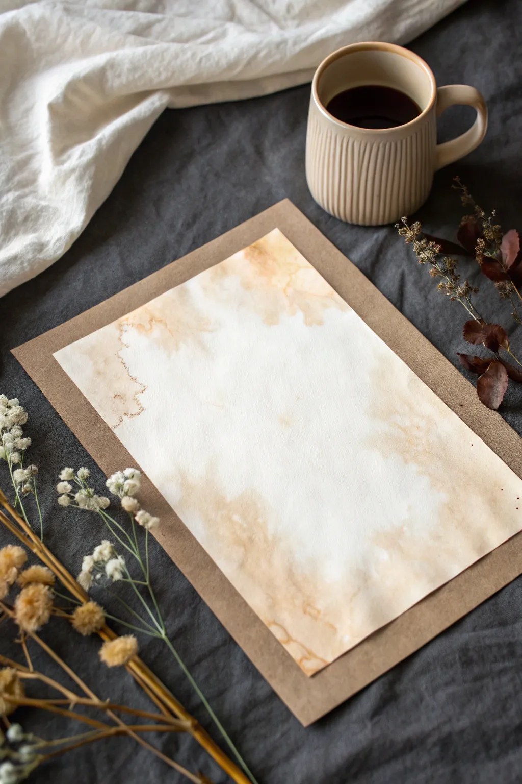
Embrace the natural imperfections of organic dyes with this simple yet elegant coffee staining project. By manipulating strong coffee washes on heavy paper, you can create a beautiful, antique-inspired frame effect that is perfect for calligraphy or mounting photos.
Step-by-Step Tutorial
Materials
- Heavyweight watercolor paper or mixed media paper (300gsm recommended)
- Strongly brewed coffee or dark tea (cooled)
- Medium round watercolor brush (size 8 or 10)
- Paper towels or clean rag
- Flat, water-resistant surface or craft mat
- Cup of clean water
- Heat tool or hair dryer (optional)
- Brown craft paper or cardstock (for backing)
Step 1: Preparation and Brewing
-
Brew the ‘paint’:
Brew a very strong cup of coffee or dark black tea. Use half the amount of water you normally would to ensure a deep, rich pigment. Let this liquid cool completely before using it. -
Secure the paper:
Place your watercolor paper on a flat, washable surface. If your paper tends to buckle, you can tape down the edges with painter’s tape, though leaving it loose creates more organic, free-flowing edges. -
Pre-wet the edges:
Dip your clean brush into plain water. Gently paint an irregular, watery border around the perimeter of the paper. This invisible water path will guide where the coffee flows.
Too Pale?
If the dried stain looks too light, dissolve a teaspoon of instant coffee into a few drops of hot water creates a syrup-like paint for much darker contrast.
Step 2: Applying the Wash
-
First coffee drop:
Load your brush heavily with the cooled coffee. Touch the brush to the wet areas you just painted on the paper’s edge, letting the pigment bleed naturally into the dampened fibers. -
Build the border:
Continue adding coffee along the edges, purposefully varying the width. Make some areas thick and pooled, while leaving other sections thin and delicate. -
Create inward blooms:
While the edges are still wet, drag small amounts of the coffee puddle toward the center of the page. Don’t cover the middle; leave a large, clean white space for the contrast. -
Splatter texture:
For a bit of organic texture, load your brush and gently tap the handle against your finger to flick tiny droplets onto the damp border areas. -
Blotting technique:
If a pool of liquid becomes too dark or heavy, lightly touch the corner of a paper towel to it. This lifts the pigment and creates a soft, cloud-like texture.
Step 3: Aging and Layering
-
Partial dry:
Allow the first layer to dry until it is damp but not soaking wet. I like to speed this up slightly with a hair dryer on a low setting to encourage interesting watermarks. -
Deepen the edges:
Go back in with your smallest brush and highly concentrated coffee (or wet instant coffee granules). Trace the very outer rim of the stain to create a dark, defined ‘crust’ line. -
Add ‘tide lines’:
Drop a tiny bit of clean water into the middle of a semi-dry coffee patch. As it pushes the pigment outward, it will form a dark ring known as a tide line or watermark. -
Final drying:
Let the paper dry completely. If you want the paper to buckle and wrinkle naturally for an aged look, let it air dry. For a flatter finish, press it under heavy books once it is bone dry.
Salt Textures
Sprinkle coarse sea salt onto the wet coffee pools. As it dries, the salt absorbs pigment, leaving behind beautiful, star-like speckles.
Step 4: Mounting the Piece
-
Prepare the backing:
Cut a sheet of brown craft paper or cardstock that is approximately one inch larger than your stained artwork on all sides. -
Center the artwork:
Place your dried, coffee-stained paper in the center of the brown backing sheet to serve as a contrasting frame. -
Adhere the art:
Use double-sided tape or a glue stick to secure the artwork to the backing. If the stained paper is wavy, apply adhesive only to the corners to preserve its dimensional texture.
This warm, neutral backdrop makes a stunning base for handwritten quotes or stands alone as a minimalist textural piece

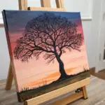
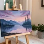
Have a question or want to share your own experience? I'd love to hear from you in the comments below!