
Whenever I’m painting for my mom’s birthday, I lean into the sweet stuff—simple shapes, cozy colors, and words that say what I sometimes forget to say out loud. Here are my favorite mom birthday painting ideas that feel personal, doable, and totally gift-ready.
Classic Floral Bouquet With Birthday Message
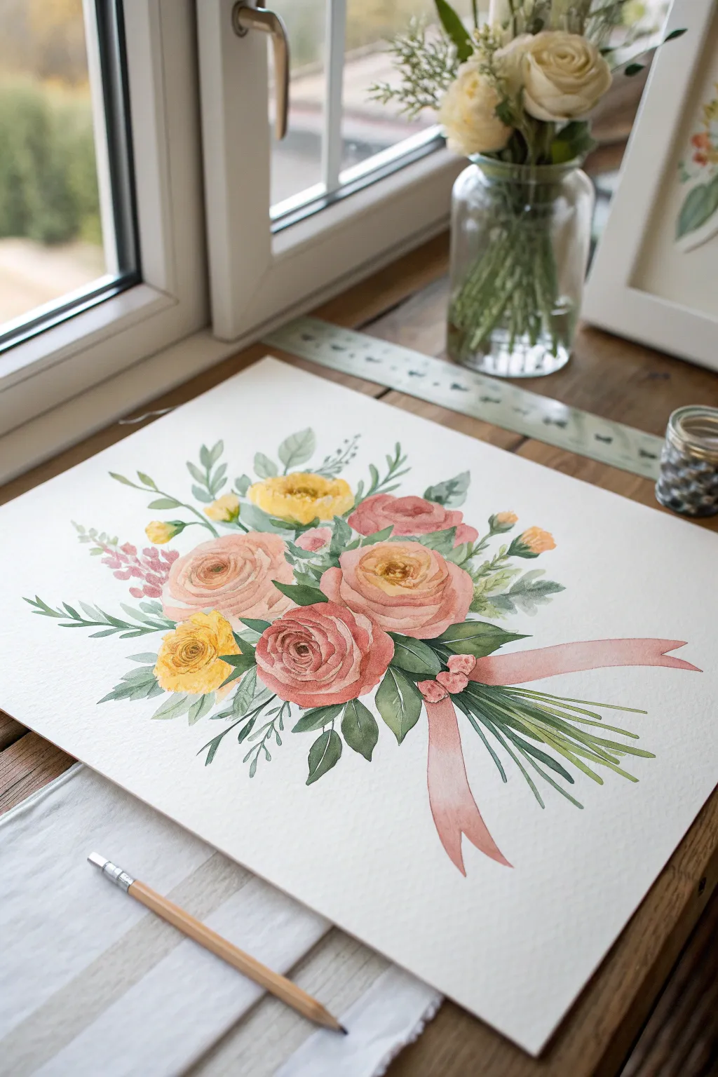
This elegant watercolor project features a lush bouquet of ranunculus and rose-like blooms tied with a soft pink ribbon, capturing a romantic, classic aesthetic. The wet-on-dry technique creates crisp edges while maintaining the soft translucency that makes floral watercolors so beloved.
How-To Guide
Materials
- Cold press watercolor paper (300 gsm / 140 lb)
- Watercolor paints (Alizarin Crimson, Yellow Ochre, Sap Green, Burnt Sienna, Payne’s Gray)
- Round brushes (size 4, 8, and 12)
- Fine liner brush (size 0 or 1)
- Pencil (HB or H) and kneaded eraser
- Two jars of water
- Paper towels
- Palette for mixing
Step 1: Sketching the Composition
-
Map out the main shapes:
Start by lightly sketching three large circles in the center for the main blooms—two stacked slightly vertically and one to the left. These will become your focal pink and peach flowers. -
Add secondary elements:
Sketch smaller circles for the yellow accent flowers tucked between the larger blooms. Use light, loose lines to indicate the stems radiating downward. -
Draw the ribbon:
Sketch the ribbon knot sitting just below the central flowers. Draw two distinct tails: one curling downward to the left and a longer, flowing tail extending to the right. -
Refine the sketch:
Gently erase your guidelines until they are barely visible so the graphite won’t dirty your light watercolor washes later.
Muddy colors?
If your flowers look brown or muddy, you may be working layers while they are still too wet. Let layers dry completely before glazing over them to keep colors fresh.
Step 2: Painting the Blooms
-
Base wash for the pink roses:
Mix a watery pale pink using Alizarin Crimson and a touch of Yellow Ochre. With your size 8 brush, paint the outer petals of the large central flowers, leaving white paper showing for highlights. -
Deepen the centers:
While the outer petals are still slightly damp, drop a more concentrated mix of the same pink into the center of the spirals to create depth naturally. -
Paint the peach ranunculus:
For the top-left large bloom, mix Yellow Ochre with a tiny dot of red. Paint concentric C-shapes, starting tight in the middle and getting looser as you move outward. -
Yellow accent flowers:
Using a clean brush, paint the smaller yellow blooms with pure Yellow Ochre. Add tiny dots of light brown in their centers for texture once they are dry. -
Layering petals:
Once the first layers are completely dry, use a slightly darker, thicker paint mix to define the edges of individual petals. This crisp layering gives the flowers their realistic volume.
Step 3: Adding Greenery and Details
-
Painting the main leaves:
Mix Sap Green with a touch of Payne’s Gray for a cool, muted green. Paint large, almond-shaped leaves framing the central bouquet, varying the pressure on your brush to get tapered points. -
Add flowing stems:
Switch to your size 4 brush. Paint the stems grouped tightly below the ribbon, letting them fan out slightly at the cut ends. Keep the green translucent. -
WISPY filler foliage:
Using the tip of your brush or a rigger brush, add lighter, wispy sprigs and smaller leaves extending outward like fireworks to break up the heaviness of the main blooms. -
Painting the ribbon:
Mix a soft, dusty pink. Paint the ribbon tails in sections, leaving a thin white gap where the ribbon twists or folds to suggest light hitting the fabric. -
Ribbon shadows:
Once the ribbon base is dry, add a darker pink mix to the areas right under the knot and on the underside of the curls to create dimension. -
Final Contrast:
I find that adding a very dark green (green mixed with red or brown) into the deeper crevices between leaves and flowers really makes the bouquet pop off the page.
Add a Sentiment
Use a fine liner pen to write ‘Happy Birthday Mom’ along the curve of the long right ribbon tail to integrate your message seamlessly into the art.
Allow the painting to dry flat completely before framing it or turning it into a beautiful handmade card

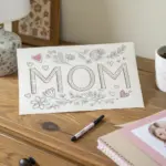

“Mom” Floral Lettering
Create a heartfelt keepsake for Mom with this delicate watercolor tutorial, featuring soft roses and gentle greenery framing the word ‘MOM’. The project uses textured cotton paper to give the artwork a timeless, high-quality finish perfect for gifting.
Step-by-Step Tutorial
Materials
- Heavyweight cold-press watercolor paper (deckle-edge preferred)
- Watercolor paints (Peach, Soft Pink, Sap Green, Olive Green, Burnt Umber)
- Round watercolor brushes (sizes 2, 4, and 6)
- Pencil (HB or H)
- Kneaded eraser
- Ruler
- Water cups and paper towel
- Gold or bronze metallic watercolor paint (optional for lettering)
Step 1: Planning and Sketching
-
Center layout:
Begin by finding the visual center of your paper. Use a ruler to lightly mark the center point, ensuring equal margins on all sides. -
Sketch the circle:
Lightly trace a circle around your center point to guide the wreath shape. You can use a bowl or a compass, but keep the pencil pressure extremely light so it doesn’t show through the paint later. -
Draft the lettering:
In the center of your circle, sketch the word ‘MOM’ using a classic serif font. Focus on clean lines and consistent spacing between the letters. If freehand lettering feels daunting, you can lightly trace a printed template. -
Place floral markers:
Mark the positions for the two main floral clusters: one at the top right (around 1 o’clock) and one at the bottom left (around 7 o’clock). Sketch three small circles in each spot to represent the rose blooms.
Step 2: Painting the Roses
-
Mix your base color:
Create a very watery wash of peach mixed with a tiny bit of soft pink. You want this color to be quite transparent. -
Paint the first bloom:
Using a size 4 brush, paint a loose C-shape for the center of your first rose. Rinse your brush slightly and pull the pigment outward in concentric, broken C-strokes to form the petals, leaving white space between them. -
Add depth:
While the paint is still damp, drop a slightly more concentrated mix of peach and pink into the very center of the rose. This wet-on-wet technique creates a natural bloom effect. -
Complete the clusters:
Repeat this process for the other two roses in the top cluster and the three roses in the bottom cluster. Vary the sizes slightly—make the center flower the largest and the flanking ones smaller.
Wet-on-Wet Magic
Don’t overwork the roses. Let the water move the pigment naturally. If edges reflect hard lines, soften them immediately with a clean, damp brush.
Step 3: Adding Greenery
-
Paint main stems:
Mix a sap green with a touch of olive. Using your size 2 brush, paint thin, curving stems that follow the circle guide, connecting your two floral clusters. -
Add large leaves:
Load your size 4 or 6 brush with the green mix. Press the belly of the brush down and lift up to create teardrop-shaped leaves along the main stems. Alternate their direction for a natural look. -
Create variation:
Mix a slightly darker, cooler green (add a touch of blue or more olive). Paint a few smaller leaves tucked behind the larger ones to add dimension and fullness to the wreath. -
Add accents:
Using the very tip of your smallest brush, paint tiny stems extending from the rose clusters. Add small dots or ‘buds’ at the ends of these delicate stems using a darker green or brown.
Make it Personal
Instead of ‘MOM’, try painting her first name or ‘NANA’. You can also change the rose color to match her favorite flower or birthstone hue.
Step 4: Lettering and Finishing
-
Prepare lettering paint:
Mix a rich brown (Burnt Umber) with a small amount of water. For a special touch, I like to mix in a bit of metallic gold or bronze paint here to make the text shimmer. -
Paint the letters:
Carefully paint over your ‘MOM’ pencil sketch using the size 2 brush. Keep your hand steady and maintain even pressure for the thick downstrokes and light pressure for thin upstrokes. -
Erase guidelines:
Wait until the painting is completely bone dry—this is crucial to avoid smearing. Gently use your kneaded eraser to lift any visible pencil marks from the circle guide or lettering.
Now framing this delicate piece will give Mom a daily reminder of your love and creativity


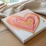
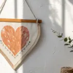
Heart Garland Birthday Card Painting
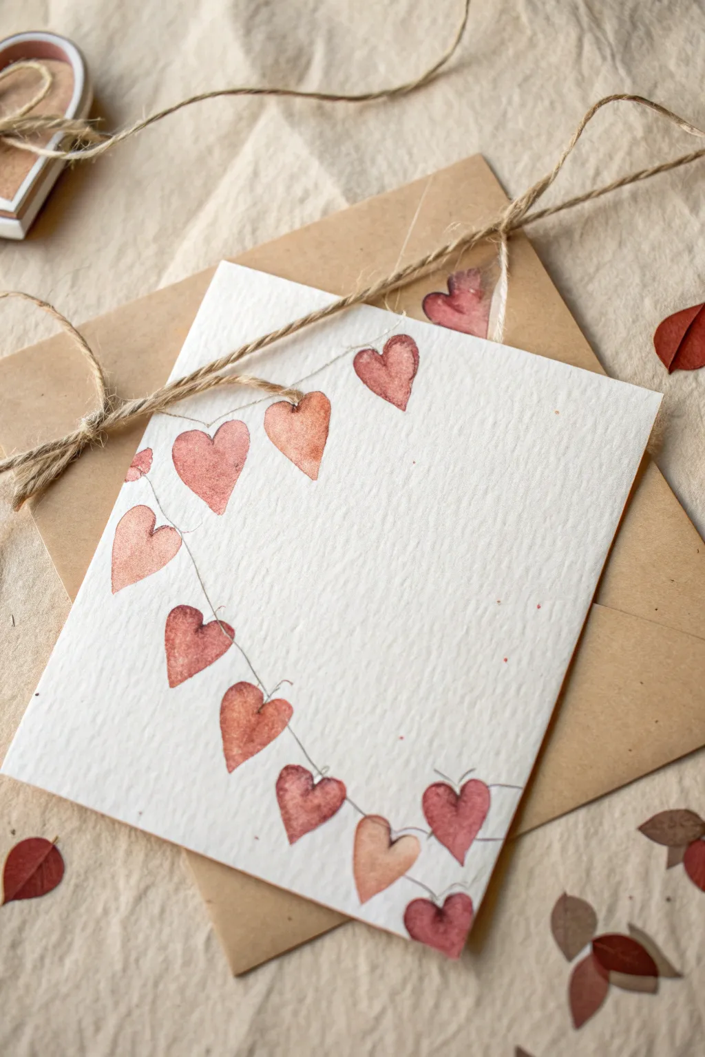
This charming, minimalist card features a delicate garland of watercolor hearts draped across textured paper, perfect for a heartfelt birthday wish. The uneven, hand-painted look gives it a sweet, rustic charm that pairs beautifully with kraft envelopes.
How-To Guide
Materials
- Heavyweight cold-press watercolor paper (300gsm)
- Watercolor paints (shades of muted red, burgundy, and dusty pink)
- Small round watercolor brush (size 2 or 4)
- Fine-tip black waterproof ink pen or micron pen (0.1 or 0.05 size)
- Kraft paper envelope
- Jute twine (for staging/wrapping)
- Pencil and eraser
- Water cups and paper towels
Step 1: Preparation & Sketching
-
Cut and fold:
Begin by cutting your watercolor paper to your desired card size. A standard 5×7 inch folded size works well. Fold heavily textured paper carefully to avoid cracking the spine. -
Visualizing the curve:
Lightly visualize where the garland string will hang. It should start from the top left, swoop down into the lower third of the card, and curve back up toward the middle right side. -
Rough pencil sketch:
Using a very light touch with a hard pencil (like a 2H), sketch a loose, sweeping curve for your string line. Don’t press hard, or you’ll dent the textured paper. -
Spacing the hearts:
Mark tiny dots along the curve where each heart will hang. Aim for roughly 8-10 hearts, leaving slightly irregular gaps to keep the whimsical, handmade feel.
Step 2: Painting the Hearts
-
Mixing your palette:
Prepare a mix of reds and pinks on your palette. You want a cohesive but varied range: a deep burgundy, a rusty red, and a soft blush pink. Don’t over-mix; let the pigments separate slightly. -
The wet-on-dry technique:
Dip your small round brush into the paint. The brush should be wet but not dripping. Paint the first heart shape directly onto the dry paper at your first mark. -
Varying the shapes:
As you move along the line, paint each heart slightly differently. Some can be plump and round, others longer and narrower. This variety adds character. -
Creating tonal variety:
Dip into a slightly different shade of red for the next heart. I like to dilute the paint with more water for some hearts to make them translucent, while keeping others opaque and dark. -
Adding the distinctive ‘bloom’:
While a heart is still wet, you can drop a tiny amount of clean water or a darker pigment into the center. This creates the beautiful watercolor texture seen in the reference image. -
Completing the chain:
Continue painting hearts along your visualized curve until you reach the end. Ensure the orientation of the hearts shifts slightly as if they are hanging naturally from a loose string. -
Patience is key:
Let the hearts dry completely. Watercolor paper holds moisture, so give it at least 20 minutes. If the paper is cool to the touch, it’s still wet.
Natural Imperfection
Don’t try to make the color solid. Let the paint pool at the bottom of the heart shape as it dries; this creates a darker edge often seen in professional watercolor work.
Step 3: Fine Details & Finishing
-
Drawing the string:
Once the paint is bone dry, take your fine-tip black pen. Carefully draw a very thin, shaky line connecting the tops of the hearts. Emulate a loose thread by not making the line perfectly straight. -
Connecting the hearts:
Where the string meets each heart, draw tiny little loops or knots. This grounds the shapes and makes them look like they are physically tied to the garland. -
Adding texture specs:
Look closely at the reference. You can gently flick a toothbrush with very diluted reddish-brown paint over the card to create tiny speckles, adding to the vintage aesthetic. -
Erasing guides:
gently erase any visible pencil marks from your initial sketch, being careful not to rub over the painted areas if they aren’t fully cured. -
Creating matching confetti:
On a scrap piece of watercolor paper, paint a few loose leaf or heart shapes in the same colors. Once dry, cut these out to use as matching confetti inside the envelope. -
Final assembly:
Pair your finished card with a kraft envelope. For the full effect shown in the picture, wrap the bundle with natural jute twine.
Add Subtle Shimmer
Mix a tiny amount of metallic gold watercolor into your red paint or use a gold gel pen to highlight the string knots for a festive birthday sparkle.
Slide your beautifully painted card into the envelope along with your handmade confetti for a lovely surprise
Mother And Child Sunset Silhouette
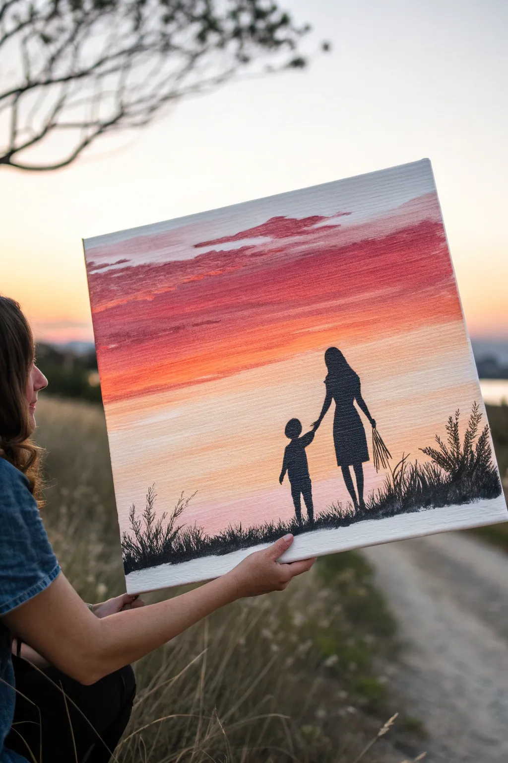
Capture the unbreakable bond between mother and child with this stunning acrylic painting featuring a vibrant, gradient sunset and striking silhouettes. Best of all, no advanced drawing skills are required to achieve that dramatic, professional-looking contrast.
Step-by-Step Guide
Materials
- Square stretched canvas (approx. 16×16 or 20×20 inches)
- Acrylic paints: Titanium White, Primary Yellow, Orange, Cadmium Red, Deep Purple/Crimson, Black
- Large flat wash brush (1-2 inch)
- Medium round brush
- Small fine liner or detail brush
- Pencil and eraser
- Palette or paper plate for mixing
- Cup of water and paper towels
Step 1: Painting the Sky
-
Prepare the canvas:
Start with a clean, dry canvas. If you want a smoother surface, you can apply a thin coat of gesso first and let it dry, but standard pre-primed canvases work perfectly fine. -
Mix the horizon color:
On your palette, mix a generous amount of white with a touch of yellow and a tiny bit of orange. You want a very pale, warm peach color for the lowest part of the sky. -
Apply the base horizon:
Using your large flat brush, paint horizontal strokes across the bottom third of the canvas. Keep your strokes long and smooth, going from edge to edge. -
Introduce the orange:
Without washing your brush, pick up some pure orange paint. Start blending this into your peach section, moving upwards. Overlap the colors while they are wet to create a seamless gradient. -
Deepen the red tones:
As you move toward the middle of the canvas, start mixing Cadmium Red into your orange. Paint horizontal bands, blending downward into the orange section to avoid harsh lines. -
Create the upper crimson sky:
For the top third of the canvas, mix your red with a little deep purple or crimson. Apply this dark mixture to the very top, blending it down into the red section. -
Add cloud textures:
While the top section is still slightly tacky, load a smaller amount of the crimson mix onto the tip of your brush. Dab gently to create irregular, horizontal cloud shapes drifting across the upper sky. -
Dry completely:
Let the background dry fully. Acrylics dry quickly, but give it at least 20-30 minutes so your silhouette layer doesn’t muddy the beautiful sunset.
Mastering the Gradient
Keep your brush slightly damp (not dripping) when blending the sky colors. This helps the acrylics flow together smoothly without creating drag marks.
Step 2: Sketching the Figures
-
Establish the ground line:
Using a pencil, lightly draw a sloping line near the bottom edge of the canvas to represent the grassy hill. It doesn’t need to be perfectly straight; a slight curve adds naturalism. -
Outline the mother:
Lightly sketch the silhouette of the mother on the right side. Focus on the shape of the dress and the head; don’t worry about facial features since this will be filled in black. -
Outline the child:
To the left of the mother, sketch the smaller child figure. Ensure their arm is reaching up to meet the mother’s hand. -
Connect the hands:
Refine the connection point between their hands. This is the emotional focal point of the piece, so take a moment to get the positioning right. -
Sketch the bouquet:
On the mother’s other side, draw simple lines extending downward from her hand to represent the bouquet of wheat or wildflowers.
Step 3: Creating the Silhouettes
-
Fill the ground:
Load your medium round brush with black acrylic paint. Fill in the ground area first to establish your base. -
Block in the figures:
Carefully fill in the outlines of the mother and child with solid black. I find it easiest to outline the edges with a smaller brush first, then fill the center. -
Define the edges:
Switch to your fine liner brush. Go along the edges of the silhouettes to make them crisp and sharp against the sunset background. -
Paint the grass details:
Using the fine liner brush, flick upward from the black ground to create individual blades of grass. Use quick, confident strokes and vary the heights for a natural look. -
Add taller foliage:
On the far right and left edges, paint taller, thicker weeds or wheat stalks. Use a stippling motion (dabbing small dots) at the tops of the stalks to mimic seed heads. -
Detail the bouquet:
Use your finest brush to paint the thin stems hanging from the mother’s hand. Add tiny flicks at the ends to suggest dried flowers or wheat. -
Final check:
Step back and look for any spots where the black looks thin or streaky. Apply a second coat of black if needed to make the silhouettes completely opaque.
Uneven Silhouette Edges?
If your black edges look shaky, wait for the paint to dry completely. Then, use a fine-tip black permanent marker to trace and smooth out the detailed outlines.
Now you have a heartwarming keepsake that freezes a beautiful moment in time
BRUSH GUIDE
The Right Brush for Every Stroke
From clean lines to bold texture — master brush choice, stroke control, and essential techniques.
Explore the Full Guide
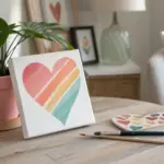
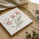
Handprint Flower Bouquet Keepsake
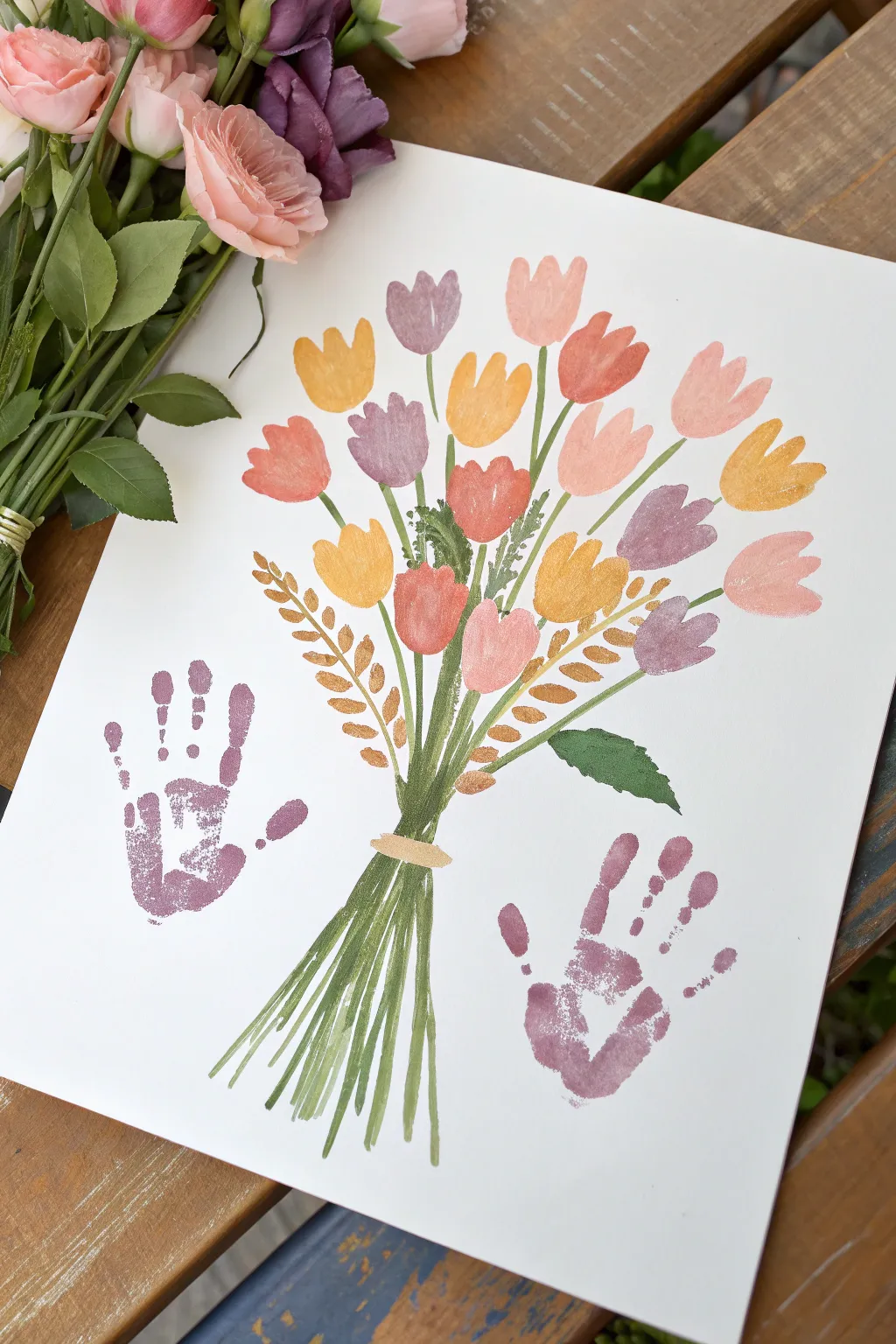
This heartwarming project combines the charm of a classic flower painting with the personal touch of little handprints, creating a timeless gift for Mom. Using soft acrylics or gouache, you’ll create a vibrant bunch of tulips that seem to be held by tiny hands, preserving a sweet moment in time.
Step-by-Step Guide
Materials
- Heavyweight white cardstock or watercolor paper (11×14 inches)
- Acrylic or Gouache paints (purple, peach, coral, yellow, gold, varying greens)
- Small flat brush (size 6 or 8)
- Fine liner brush (size 0 or 1) for details
- Paint palette or paper plate
- A child’s hands (for prints)
- Baby wipes or damp paper towels
- Pencil (optional, for light sketching)
Step 1: Painting the Blooms
-
Prepare your palette:
Squeeze out small amounts of your flower petal colors: soft purple, warm yellow, coral pink, and peach. To achieve the slightly translucent look in the reference, mix a tiny drop of water into your acrylics or gouache to thin them just slightly. -
Paint the first tulip shape:
Start near the top center of your paper. Using your small flat brush, paint a simple U-shape for the base of the tulip head. -
Complete the first flower:
Add two or three small peaks to the top of the U-shape to mimic closed tulip petals. Keep the strokes loose and painterly rather than perfectly outlined. -
Create a varied arrangement:
Continue painting tulip heads scattered across the upper half of the page. Mix up your colors as you go, ensuring no two flowers of the same color are right next to each other for a balanced look. -
Add dimension:
Once the base color of a flower is semi-dry, take a slightly lighter or darker shade of that same color and add a quick swipe on one side of the petal to suggest depth and roundness. -
Include filler foliage:
Switch to a metallic gold paint. Between the colorful blooms on the left and right sides, paint simple leaf shapes or sprigs that look like wheat stalks using small, dashed strokes.
Step 2: Stems and Arrangement
-
Mix your greens:
Prepare two shades of green on your palette: one fresh, grassy green and one deeper, olive tone. Mixing them slightly on the brush gives a more natural effect. -
Draw the main stems:
Starting from the bottom of each flower head, pull your brush down toward a central convergence point near the bottom third of the paper. Let your lines be imperfect and organic. -
Gather the bouquet:
Ensure all stems cross over each other at that central ‘cinched’ point where the bouquet would be held. The lines should become denser here. -
Paint the lower stems:
Continue the green lines below the convergence point, fanning them out slightly to represent the cut ends of the flowers. Vary the lengths so they don’t look too uniform. -
Add a binding:
Paint a small horizontal band or ‘tape’ across the cinched part of the stems using a light beige or gold color to make it look like the bouquet is tied together. -
Insert green leaves:
Paint a few broad green leaves tucked in among the stems. Add one prominent leaf sticking out to the right side for asymmetry. -
Layer in texture:
Using your fine liner brush and the darker green, add tiny, thin lines representing smaller filler greenery or fern fronds in the gaps between the main flower heads.
Stamp perfectly
Do a practice print on scrap paper first! This ensures the paint thickness is right and helps the child understand how pressing their hand down feels before touching the real art.
Step 3: The Handprint Touch
-
Prepare the hands:
Choose a muted purple or mauve paint color. Use a broad brush or sponge to coat the child’s palm and fingers evenly. It shouldn’t be dripping wet, but fully covered. -
Position the left print:
Guide the child’s hand to the empty space on the bottom left of the bouquet. Press the hand down firmly, fingers pointing up, as if they are reaching for or framing the flowers. -
Lift carefully:
Hold the paper down with one hand and lift the child’s hand straight up to avoid smearing the print. I always keep wipes nearby to clean their hand immediately before doing the second print. -
Position the right print:
Re-apply paint to the other hand (or wash and reuse the same hand if needed). Press this print onto the bottom right side, mirroring the first one to balance the composition. -
Final touches:
Once the handprints are dry, inspect your painting. If the bouquet feels floaty, you can extend a few stems slightly downward to visually anchor the piece between the hands.
Smudged print?
Turn mistakes into art. If a finger smudges, turn that smudge into a fallen flower petal by painting over it when dry, or add a ‘fallen leaf’ shape on top to disguise the blur.
Allow the entire piece to dry completely before framing this beautiful collaboration between floral art and tiny fingers
Fingerprint Heart Cluster With Note
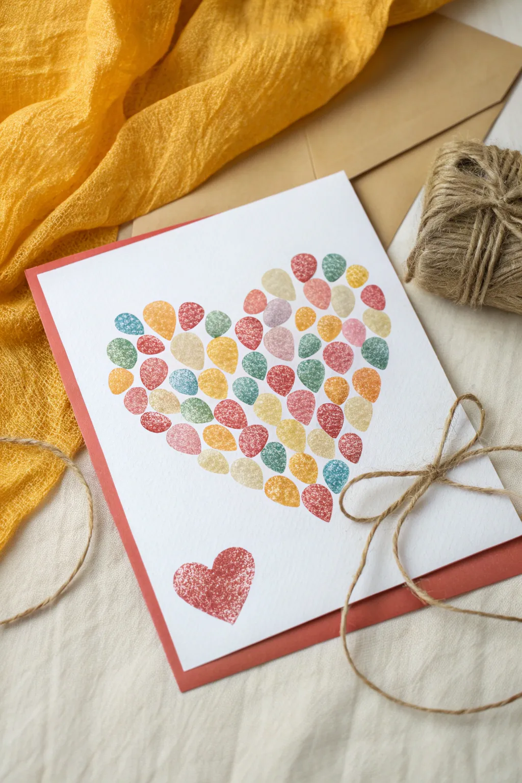
This heartfelt project uses simple fingerprints to form a vibrant, textured heart shape that feels personal and sweet. The colorful clustering of prints creates a beautiful mosaic effect, perfect for a personalized Mom’s birthday card.
Step-by-Step Tutorial
Materials
- White cardstock or heavy watercolor paper (5×7 inches)
- Red cardstock (for backing)
- Stamp pads in various colors (reds, pinks, oranges, greens, blues)
- Pencil
- Eraser
- Paper towels or wet wipes
- Scissors
Step 1: Preparation
-
Prepare the base:
Start with a clean sheet of white cardstock or heavy watercolor paper, cut or folded to your desired card size. -
Lightly sketch the boundary:
Using a pencil, very faintly draw a large heart shape on the paper. This will serve as your guide for placing the fingerprints so the final shape is balanced. -
Select your palette:
Choose 4-6 ink pad colors that coordinate well. The example uses a mix of warm tones like coral and mustard, balanced with cool sage and teal. -
Test your prints:
Before touching the final paper, practice pressing your thumb onto a scrap piece to gauge how much pressure gives you a clear, textured print without smudging.
Smudge Control
If a print smudges, turn it into a ladybug or flower with a fine-tip pen, or restart the cluster technique over it to hide the mistake.
Step 2: Creating the Mosaic Heart
-
Start at the top:
Begin pressing fingerprints near the top curve of your penciled heart outline. Use a warm color like red or dark pink to anchor the shape. -
Add color variety:
Switch to a different color, like a soft yellow or teal, and place the next print close to the first one, leaving just a sliver of white space between them. -
Fill the outline:
Continue working your way around the pencil outline first. Rotating colors frequently ensures no two identical colors are sitting right next to each other. -
Work inward:
Once the perimeter is defined, start filling in the center of the heart. I prefer to work in small clusters to keep the color distribution random and organic. -
Direction matters:
Try to angle your thumb slightly differently for some prints. The variation in direction adds energy and movement to the cluster. -
Clean in between:
Remember to wipe your thumb thoroughly with a wet wipe or paper towel between every color change so you don’t muddy the bright ink pads. -
Check for gaps:
Stand back and look at the heart. If there are large white gaps, fill them with an appropriately colored print. -
Let it dry:
Allow the ink to dry completely. Since stamp ink can be wet, give it at least 10-15 minutes to avoid smearing. -
Erase the guide:
Once fully dry, gently erase any visible pencil lines from your initial sketch. Be careful not to rub over the ink if it’s not set.
Step 3: Finishing Touches
-
Add a solo heart:
To balance the composition, press two thumbprints in a ‘V’ shape at the bottom left of the card to form a small, single red heart. -
Prepare the backing:
Cut a piece of red cardstock slightly larger than your main artwork to create a colorful border frame. -
Mount the artwork:
Using double-sided tape or glue, center your fingerprint art onto the red cardstock backing. -
Tie the twine:
Take a length of natural jute twine and wrap it around the bottom right corner of the card. -
Secure the bow:
Tie the twine in a simple bow, adjusting the loops so they sit flat against the paper without covering the artwork. -
Trim the ends:
Snip the ends of the twine to a pleasing length, letting them trail slightly off the edge for a rustic look.
Personalize It
Have each family member pick one color and contribute prints to the heart for a collaborative multi-generational gift.
This simple yet striking card is ready to be gifted and cherished for years to come

PENCIL GUIDE
Understanding Pencil Grades from H to B
From first sketch to finished drawing — learn pencil grades, line control, and shading techniques.
Explore the Full Guide
Simple Watercolor Wash With Hand-Lettering
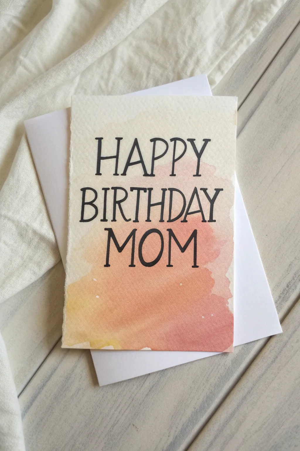
Embrace the effortless beauty of a loose watercolor wash with this warm, sunset-inspired card for Mom. The blend of peachy pinks and soft yellows provides a perfect, gentle backdrop for bold hand-lettering.
Step-by-Step Guide
Materials
- Cold press watercolor paper (minimum 140lb/300gsm)
- Watercolor paints (Peach, Rose, Warm Yellow)
- Medium round watercolor brush (size 6 or 8)
- Fine liner pen (black, archival/waterproof, size 05 or 08)
- Pencil and eraser
- Ruler
- Clean water jar
- Paper towel
- White envelope (A2 or A7 size depending on card)
- White gel pen (optional, for speckles)
Step 1: Preparation and Sketching
-
Size your paper:
Cut your watercolor paper to your desired card size. A standard flat card like this works well as a 5×7 inch piece, or you can cut a 10×7 inch piece and fold it in half for a traditional greeting card. -
Create rough edges:
If you want that lovely deckled edge look seen in the photo, simulate it by placing a ruler firmly against the edge you want to remove and tearing the paper upwards against the ruler’s metal edge. -
Draft the text:
Using a light pencil touch, sketch out the words ‘HAPPY BIRTHDAY MOM’. Center the alignment, keeping ‘HAPPY’ on the top line, ‘BIRTHDAY’ slightly larger in the middle, and ‘MOM’ anchoring the bottom. -
Refine the lettering:
Go back over your pencil sketch to finalize the letter shapes. Aim for a narrow serif font style where the vertical lines are slightly thicker than the horizontal ones.
Wet-on-Wet Pro Tip
For the softest blend, ensure your paper has a satin sheen of water before adding paint. If puddles form, dab them up with a corner of a paper towel.
Step 2: Creating the Watercolor Wash
-
Prepare the palette:
Dilute your rose, peach, and warm yellow paints on your palette. You want a very watery, transparent consistency rather than thick, opaque color. -
Wet the paper:
Take your clean round brush and apply a thin layer of clean water only to the area where you want the color to flow. Leave a generous white margin around the edges of the card. -
Apply the first color:
While the paper is still glistening wet, dab the rose or peach color into the center and lower-right section. Let the pigment bloom naturally into the wet paper. -
Introduce the yellow:
Rinse your brush slightly and pick up the yellow paint. Drop this into the bottom-left corner and allow it to bleed into the pink areas. -
Blend softly:
Focus on the transition zones. If the colors aren’t mixing well, use a damp, clean brush to gently nudge them together. Don’t overwork it; let the water do the work. -
Soften edges:
Check the outer boundaries of your wash. If hard lines are forming where you don’t want them, run a damp brush along the edge to soften it out into the white space. -
Add subtle splatters:
Load your brush with watery paint and tap the handle against your finger to create tiny accidental speckles. You can also use a white gel pen or white gouache later if you prefer white speckles. -
Dry completely:
This is crucial. Let the card sit until it is bone dry. If the paper feels cool to the touch, it is still wet. Using a heat tool or hairdryer can speed this up, but air drying is safest for flatness.
Level Up: Metallic Touch
Mix a tiny bit of gold metallic watercolor into your final specks or use a gold pen to outline the word ‘MOM’ for an elegant, shimmering finish.
Step 3: Inking and Finishing
-
Outline the letters:
Once dry, trace your pencil lines with the black archival pen. Use a steady hand to outline the shapes of the letters. -
Thicken the strokes:
Add weight to your letters by drawing a second line next to the vertical strokes and filling in the gap. This creates a faux-calligraphy look without needing special nibs. -
Erase pencil marks:
Wait at least 15 minutes for the ink to fully set. Then, gently erase any visible pencil guidelines, being careful not to smudge the ink or damage the paper surface. -
Flatten the card:
Watercolor paper often buckles. Place your finished card under a heavy stack of books overnight to flatten it out nicely before gifting.
Slip this heartfelt creation into a crisp white envelope and get ready to make her day special
Butterflies And Blossoms Birthday Scene
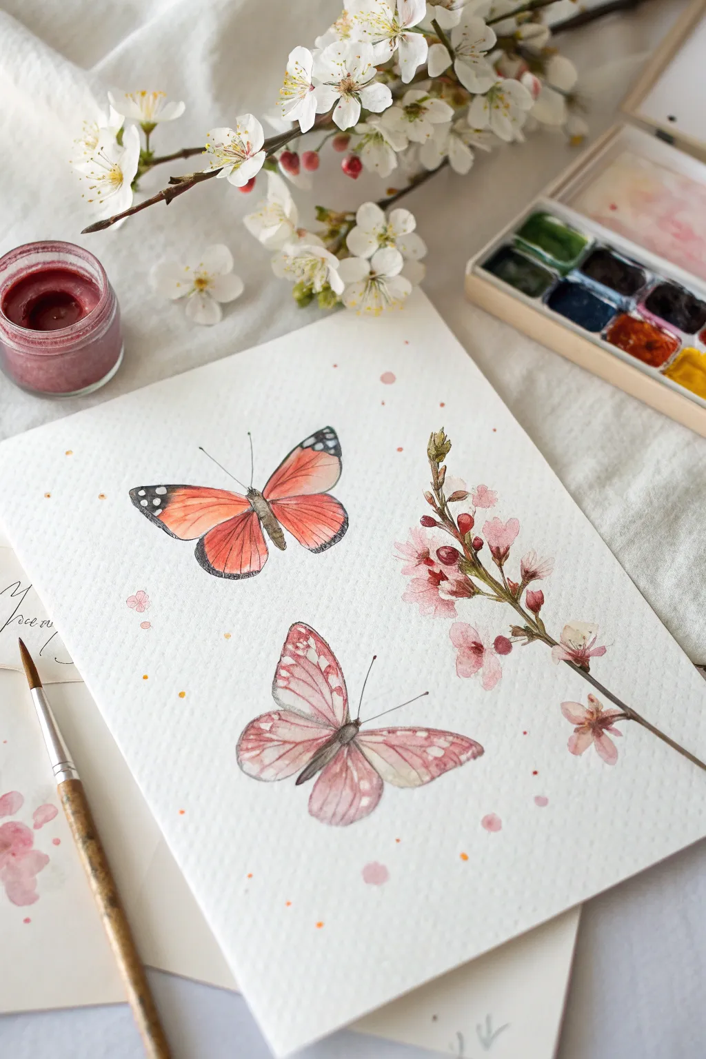
Capture the delicate beauty of spring with this soft watercolor study featuring two distinct butterflies and a flowering branch. The combination of warm coral tones and gentle pinks creates a serene, feminine composition perfect for a heartfelt birthday gift.
Step-by-Step Guide
Materials
- Cold press watercolor paper (300 gsm)
- Watercolor paints (Coral, Burnt Sienna, Payne’s Grey, Rose Madder, Sap Green, Yellow Ochre)
- Round watercolor brushes (Size 4 for washes, Size 0 or 00 for details)
- Pencil (HB or 2H for light sketching)
- Kneaded eraser
- Jar of clean water
- Paper towels
- Palette for mixing
Step 1: Sketching the Composition
-
Map out the layout:
Lightly sketch the position of your elements on the paper. Place the larger monarch-style butterfly near the top left, the smaller moth-like butterfly below it, and the flowering branch curving up the right side. -
Refine the butterfly shapes:
Draw the detailed outlines of the wings. For the top butterfly, focus on the structured veins; for the bottom one, keep the edges softer and more rounded. -
Detail the branch:
Sketch the woody stem and small budding flowers. Don’t worry about perfect symmetry—organic, slightly uneven spacing looks more natural. -
Clean up lines:
Gently roll a kneaded eraser over your sketch to lift excess graphite, leaving only faint guidelines that won’t show through the transparent paint.
Fixing “Blooms”
If a water blossom spreads too much creates a cauliflower edge, soften it immediately with a damp brush, or wait for it to dry and glaze over it.
Step 2: Painting the Monarch Butterfly
-
First wing wash:
Mix a watery wash of Coral and a touch of Yellow Ochre. Apply this directly to the inner sections of the top butterfly’s wings, leaving the white paper visible for any highlights. -
Deepening the hue:
While the first layer is still slightly damp, drop in a more concentrated Coral or bright Orange near the body to create a natural gradient. -
Adding the wing tips:
Once the orange sections are dry, use Payne’s Grey (or a mix of blue and brown) to paint the dark tips of the wings. Leave tiny circular negative spaces for the white spots. -
Veins and body:
With your smallest brush (size 0), drag thin lines of diluted Payne’s Grey from the body outward to define the wing structure. Paint the narrow body and delicate antennae using the very tip of the brush.
Vibrant Colors
To make the butterfly wings really pop, let the first layer dry completely before adding the second. This glazing technique boosts color intensity.
Step 3: Painting the Pink Moth
-
Soft base layer:
create a very pale, watery mix of Rose Madder. Wash this over the entire shape of the bottom butterfly, keeping it much lighter than the top one. -
Translucent layering:
Let the base dry completely. Mix a slightly stronger pink and paint the patterns on the wings, softening the edges with a clean, damp brush to maintain a translucent, moth-like texture. -
Darker details:
Add definition to the body and the edges of the wings using a mix of brown and pink. Keep the contrast lower here than on the monarch to separate the two styles.
Step 4: The Flowering Branch
-
Stem structure:
Paint the main branch using a mix of Burnt Sienna and a touch of green. As you move up the stem, let the lines break slightly to suggest texture. -
Blossom base:
For the flowers, use a watery pink wash. Dab the color onto the paper loosely, allowing the water to create the petal shapes naturally. -
Adding depth to buds:
While the petals are damp, drop a concentrated dark red or deep pink into the center of the blooms and the tight buds to create volume. -
Connecting stems:
Use a mix of Sap Green and brown to paint the tiny stems connecting the flowers to the main branch, adding small leaf buds where appropriate.
Step 5: Final Touches
-
Splatter effect:
Load a medium brush with watery pink or coral paint. Tap the handle against another brush over the paper to create random, playful speckles around the subjects. -
Refining highlights:
If you lost any white highlights during painting, you can use a tiny dot of white gouache or a white gel pen to reclaim the spots on the monarch’s wings.
Now you have a gentle, nature-inspired artwork ready to frame for a special celebration


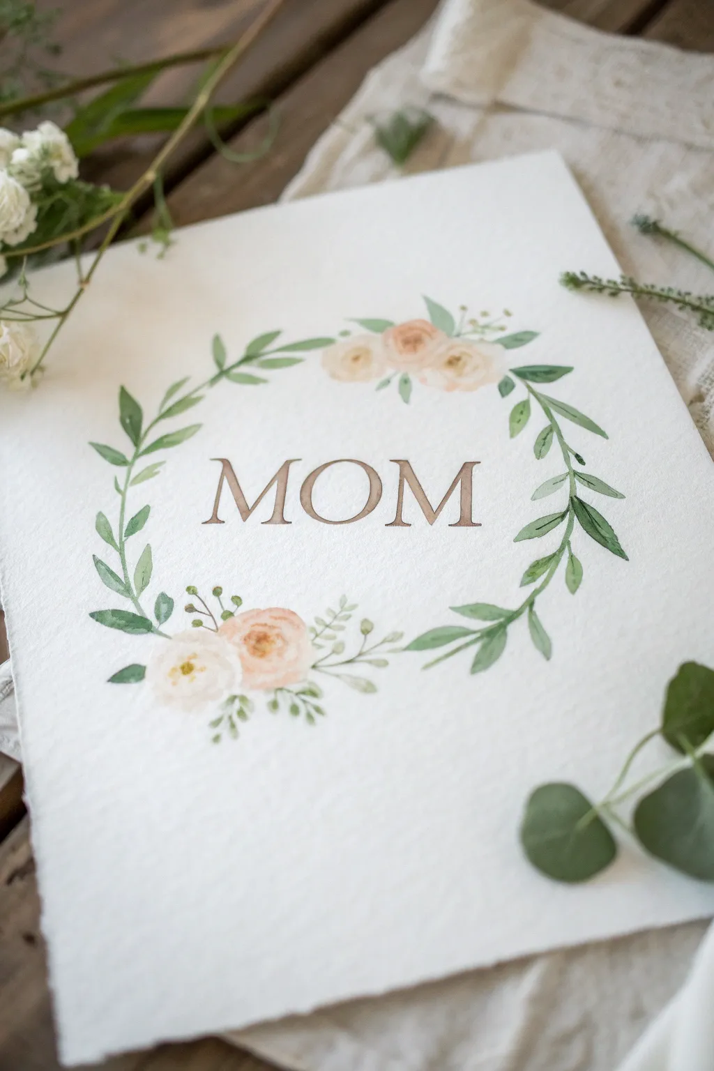
Family Birth Flowers Around “Mom”
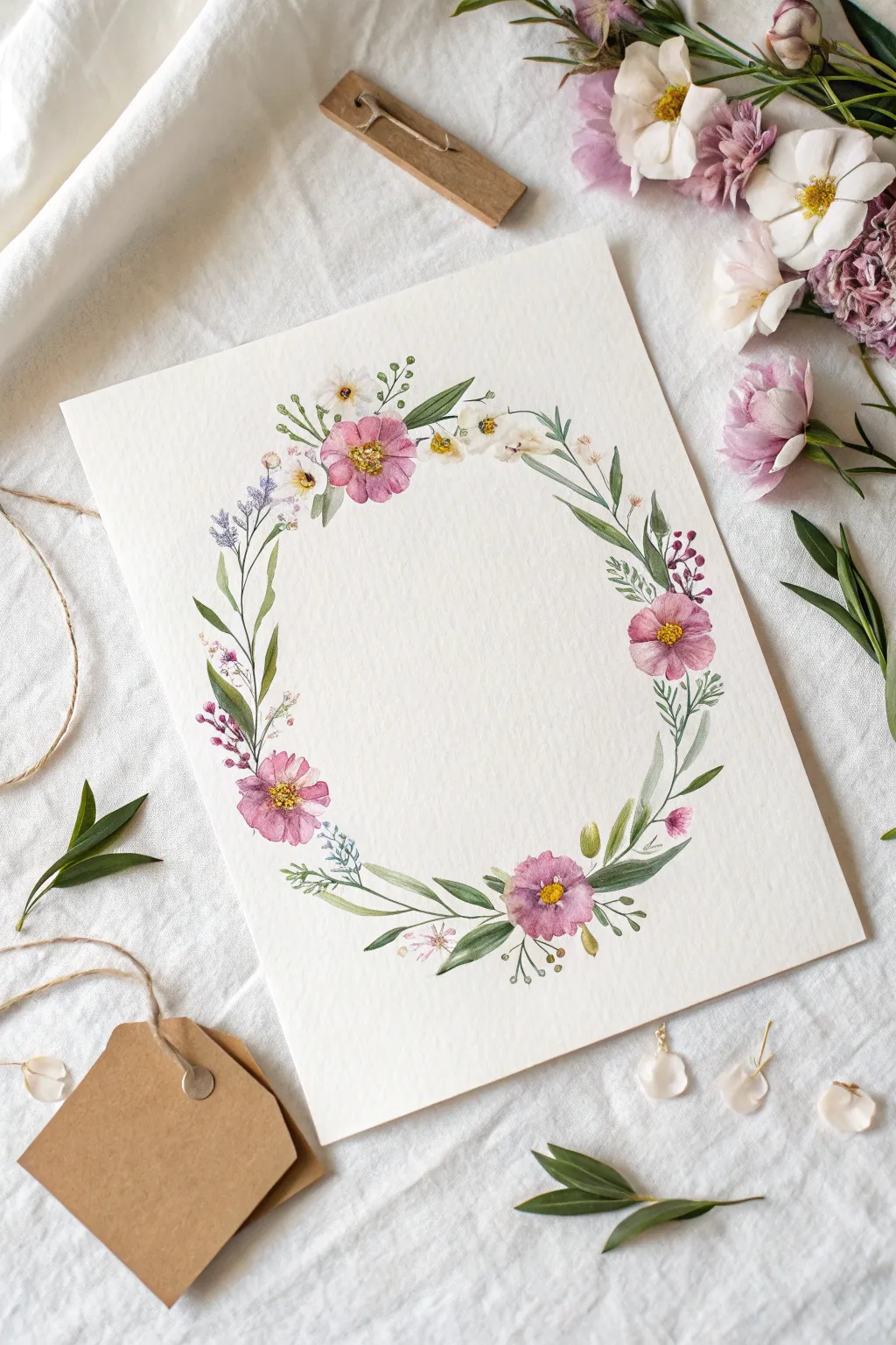
This delicate watercolor wreath features soft pink blooms and trailing greenery, creating a perfect frame for a handwritten message. Its gentle, circular composition symbolizes endless love, making it a thoughtful and personalized gift for Mom’s special day.
Detailed Instructions
Materials
- Cold press watercolor paper (300 gsm or heavier)
- Watercolor paints (Pink, Magenta, Sap Green, Olive Green, Yellow Ochre, Indigo)
- Round watercolor brushes (Size 2, 4, and 6)
- HB pencil
- Kneaded eraser
- Circular object or compass for tracing
- Clean water and paper towels
- Palette for mixing
Step 1: Planning and Sketching
-
Trace the boundary:
Begin by lightly tracing a circle in the center of your paper using a bowl or compass. This guide line should be extremely faint so it won’t show through the final paint. -
Map out focal flowers:
Sketch four or five larger circles evenly spaced around the wreath guide to mark where your main pink flowers will go. Don’t make them perfectly symmetrical; a little irregularity looks more organic. -
Add foliage guidelines:
Lightly draw curved lines extending from the flower placeholders, following the curve of the main circle. These will become your stems and leaves.
Natural Edges
Don’t try to make the wreath a perfect circle. Let a few stray leaves or stems break the boundary line to give the artwork a wild, hand-gathered garden feel.
Step 2: Painting the Main Blooms
-
Mix your pinks:
On your palette, creating a watery mix of pink with a touch of magenta. You want a translucent, soft color for the first layer, not a thick opaque paste. -
Paint the petals:
Using a size 6 brush, paint the petals of the main cosmos-style flowers. Start from the outer edge of the petal and pull the brush inward toward the center, lifting pressure as you go to leave a jagged, natural edge. -
Create variation:
While the paint is still wet, drop a tiny amount of more concentrated magenta into the center of the flower or the tips of a few petals. This wet-on-wet technique adds instant depth. -
Paint the centers:
Once the pink petals are barely dry, mix a vibrant yellow ochre. Dab small dots into the very center of each flower using the tip of a size 2 brush. -
Add detail to centers:
To make the centers pop, add a few tiny specks of dark brown or indigo around the edge of the yellow center for contrast.
Calligraphy Center
Once dry, use gold ink or a fine charcoal pen to write ‘Mom’ or a family name in the negative space. The floral frame makes simple text look professional.
Step 3: Adding Greenery and Filler
-
Paint main stems:
Mix a sap green with a little water. Using your size 4 brush, paint thin, curving stems connecting your flowers, following your pencil guide. -
Add long leaves:
Paint elongated, lance-shaped leaves extending from the main stems. Press down on the belly of the brush to widen the leaf, then lift up to create a sharp point. -
Vary the greens:
I like to mix a little blue or indigo into my green for a cooler, darker shade. Use this darker mix to paint smaller, fern-like fronds tucked behind the main flowers. -
Insert purple sprigs:
Mix a muted lavender color. Using the very tip of your smallest brush, dab small dots in a vertical line to resemble lavender or salvia. Connect them with a hairline-thin green stem. -
Add white flower accents:
For the tiny white flowers, simply paint small yellow centers and use a very watery grey or just clean water to imply the white petals around them, letting the paper do the work. -
Layering leaves:
Go back and add a second layer of leaves in empty spots. Ensure the first layer is dry so the new leaves overlap crisply rather than bleeding into blobs. -
Add buds:
Paint small, tight oval shapes in pink or green at the ends of thin stems to represent unopened buds, adding movement to the outer edges of the wreath.
Step 4: Finishing Touches
-
Erase guidelines:
Wait until the painting is bone dry—touch it with the back of your hand to check. Gently erase any visible pencil lines using the kneaded eraser. -
Add definition:
Use a fine liner brush or a very sharp colored pencil to add tiny veins to a few leaves or definition to the flower petals if they feel too washed out. -
Review contrast:
Step back and look at the composition. If it looks too pale, darken the shadows where stems cross or under the flower heads with a translucent glaze of dark green.
You now have a beautiful, heirloom-quality piece of art ready to frame.
Photo-Inspired Portrait For Mom’s Birthday
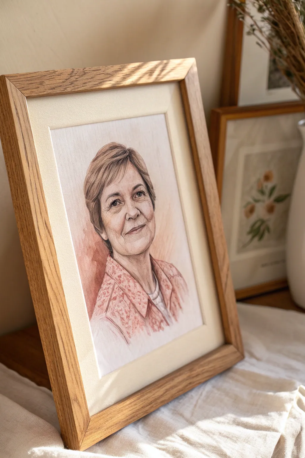
Capture the warmth and wisdom of your mother’s smile with this delicate, photo-inspired portrait. Using a combination of soft pastels and colored pencils creates a textured, realistic finish that feels both personal and professionally artistic.
Step-by-Step Tutorial
Materials
- High-quality reference photo of Mom
- Pastel paper (light cream or off-white, textured)
- Soft pastels (stick form, skin tones and muted pinks)
- Pastel pencils (fine details, sepia/brown tones)
- Kneaded eraser
- Blending stumps (tortillons) or cotton swabs
- Artist tape
- Drawing board or stiff backing
- Workable fixative spray
- Light oak floating frame with mat board
Step 1: Preparation and Sketching
-
Prepare your workspace:
Tape your textured pastel paper securely to a drawing board using artist tape. This prevents the paper from shifting or buckling while you work and creates a clean border. -
Grid or trace the reference:
Since accuracy is key for portraits, lightly sketch the main outlines using a hard H pencil or transfer the image using a light table. Focus on the placement of the eyes, nose, mouth, and jawline, keeping lines very faint. -
Map the shadows:
Identify the darkest areas of the face—usually under the chin, the eye sockets, and beside the nose. Lightly block these in with a neutral brown pastel pencil to establish the facial structure early on.
Muddy Colors?
If skin tones look dirty, stop blending. Spray a fixative layer, let it dry, then apply fresh, clean pigment on top. Over-blending mixes too many colors into gray.
Step 2: Layering Skin Tones
-
Apply the base layer:
Using the side of a soft pastel stick, gently scumble a pale cream or light peach tone across the illuminated parts of the face. Do not press hard; let the texture of the paper show through slightly. -
Introduce warmth:
Add subtle flushes of color to the cheeks and nose using a dusty rose or salmon pink pastel. Gently blend this into the base layer using your finger or a soft blending stump for a smooth transition. -
Deepen the shadows:
Go back over your shadow areas with a darker flesh tone or a cool brown. I find that layering a tiny bit of violet in the deepest shadows adds a convincing depth to aging skin without looking muddy. -
Blend carefully:
Use a clean blending stump to marry the light and dark areas. Be careful not to over-blend, as you want to retain some of that classic pastel texture.
Step 3: Detailed Features
-
Define the eyes:
Switch to sharpened pastel pencils for the eyes. Use a dark sepia for the pupil and lash line, leaving a tiny spot of pure white paper for the catchlight to bring the portrait to life. -
Refine the mouth:
Draw the lips using a mix of terracotta and soft pink pencils. Remember that the upper lip usually falls in shadow and should be slightly darker than the lower lip. -
Add laughter lines:
Gently mark the nasolabial folds and crow’s feet. Use a light touch with a mid-tone brown pencil; hard lines here can age the subject too much, so keep them soft. -
Create hair texture:
Instead of drawing every strand, block in the main shapes of the hair with broad strokes of a base color. Then, add darker strokes for shadows and lighter strokes for highlights to suggest volume.
Add a Personal Note
Before framing, sign the portrait and hide a tiny, handwritten ‘I love you’ or a significant date within the texture of the clothing or hair for her to find later.
Step 4: Clothing and Background
-
Sketch the blouse pattern:
Loosely suggest the pattern of her clothing. For a floral print like this, use scribbled circular motions with a colored pencil rather than stiff detailing, keeping the focus on the face. -
Add the background wash:
Apply a rusty-red or terracotta soft pastel loosely around the shoulders and neck area. Let this fade out into white space as it moves away from the figure for a dreamy, vignette effect. -
Blend the edges:
Soften the edges of the background wash into the paper. This negative space helps frame the face without needing a full background scene.
Step 5: Final Touches and Framing
-
Lift highlights:
Take your kneaded eraser and gently tap (don’t rub) the highest points of the cheekbones, bridge of the nose, and forehead to lift off pigment and create bright highlights. -
Seal the artwork:
Take the drawing outside or to a well-ventilated area and apply a light coat of workable fixative spray to prevent the pastel dust from smudging. -
Mount and frame:
Once dry, carefully peel off the tape. Mount the artwork behind a cream mat board and place it into a light oak frame to complement the warm tones of the portrait.
Present this framed masterpiece to your mom and watch her face light up seeing herself through your artistic eyes
Mother And Child Hands Forming A Heart

This sentimental watercolor painting captures the bond between parent and child through the simple, expressive gesture of hands forming a heart. The artwork combines careful line drawing with warm, gentle skin tone washes to create a touching keepsake perfect for a mother’s birthday.
Step-by-Step Guide
Materials
- Cold-press watercolor paper (140lb/300gsm)
- Watercolor paints (Yellow Ochre, Burnt Sienna, Alizarin Crimson, Burnt Umber)
- Pencil (HB or H for light sketching)
- Kneaded eraser
- Fine liner brush (size 0 or 1)
- Round watercolor brush (size 4 or 6)
- Two jars of water
- Paper towels
- Reference photo of your own hands (optional)
Step 1: Sketching the Composition
-
Plan the layout:
Visualize the paper divided into thirds. The adult hands forming the heart shape should occupy the top two-thirds of the sheet, while the child’s small hand will reach up from the bottom right quadrant. -
Lightly outline the adult hands:
Using your HB pencil, lightly sketch the left hand first. The thumb should point downward and curve inward. The index finger curves to meet the thumb of the other hand. Keep your lines very faint so they won’t show through the paint later. -
Complete the heart shape:
Sketch the opposing right hand. Ensure the index finger mirrored against the left one creates the ‘V’ dip of the heart, and the thumbs meet at the bottom point. The negative space between them forms the heart. -
Add the child’s hand:
In the lower right corner, sketch a smaller, open palm with fingers slightly spread, reaching upward toward the heart shape. The scale should be significantly smaller to emphasize the parent-child relationship. -
Refine the details:
Go back over your sketch to add subtle details like knuckles, fingernails, and the natural creases in the palm and fingers. Use the kneaded eraser to lift up any graphite that is too dark or smudged.
Step 2: Painting Skin Tones
-
Mix your base tone:
Create a watery, pale skin tone mix using Yellow Ochre and a tiny touch of Alizarin Crimson. Test the color on a scrap piece of paper first to ensure it’s not too saturated. -
Apply the first wash:
Using the round brush, paint a clean water glaze over one hand, then drop in your pale skin tone mix. Let the pigment spread naturally. I prefer to work on one hand at a time to keep the edges wet and workable. -
Add warmth to the shadows:
While the paper is still slightly damp, mix a slightly darker tone using Burnt Sienna. Dab this into the shadowed areas: between the fingers, along the bottom of the thumbs, and near the wrists. -
Define the knuckles:
Add a touch more red or pink to your mix to designate the rosier parts of the hands, specifically the knuckles, fingertips, and palms. Apply this gently to the child’s hand to make it look soft and youthful. -
Deepen the contrast:
Once the first layers are semi-dry, mix a small amount of Burnt Umber into your skin tone. Use the fine liner brush to carefully paint the deepest shadows where fingers overlap or touch to separate the forms. -
Highlight removal:
If an area looks too flat, use a clean, damp brush (a ‘thirsty brush’) to lift a little pigment off the tops of the hands and knuckles to create natural highlights.
Reference Hack
Take a photo of your own hands forming the heart first! It helps clarify exactly how the thumbs and index fingers should maintain contact.
Step 3: Defining Details
-
Wait for full drying:
Allow the painting to dry completely. The paper should feel cool to the touch if it is still damp; wait until it is room temperature. -
Outline the forms:
Using your fine liner brush with a concentrated mix of Burnt Umber and Burnt Sienna (very little water), carefully trace the outlines of the hands. Keep the line weight variable—thicker in shadow areas, thinner in light areas. -
Paint the fingernails:
Fill in the fingernail shapes with a very pale, watery pink wash. Leave a tiny sliver of white paper at the cuticle or tip for a realistic shine. -
Add skin creases:
With the finest point of your brush, add the distinctive lines across the palms and at the finger joints. These lines give the hands character and realism. -
Final assessment:
Step back and look at the painting as a whole. If the child’s hand feels disconnected, you can add a very faint shadow underneath it to groundbreaking it slightly, or leave it floating for an ethereal look.
Personalize It
Consider lightly penciling the child’s birth date or name inside the negative space of the heart for an extra sentimental touch.
Once specific framed, this tender watercolor becomes a timeless tribute to motherhood
Hidden Message Paint Reveal For Mom
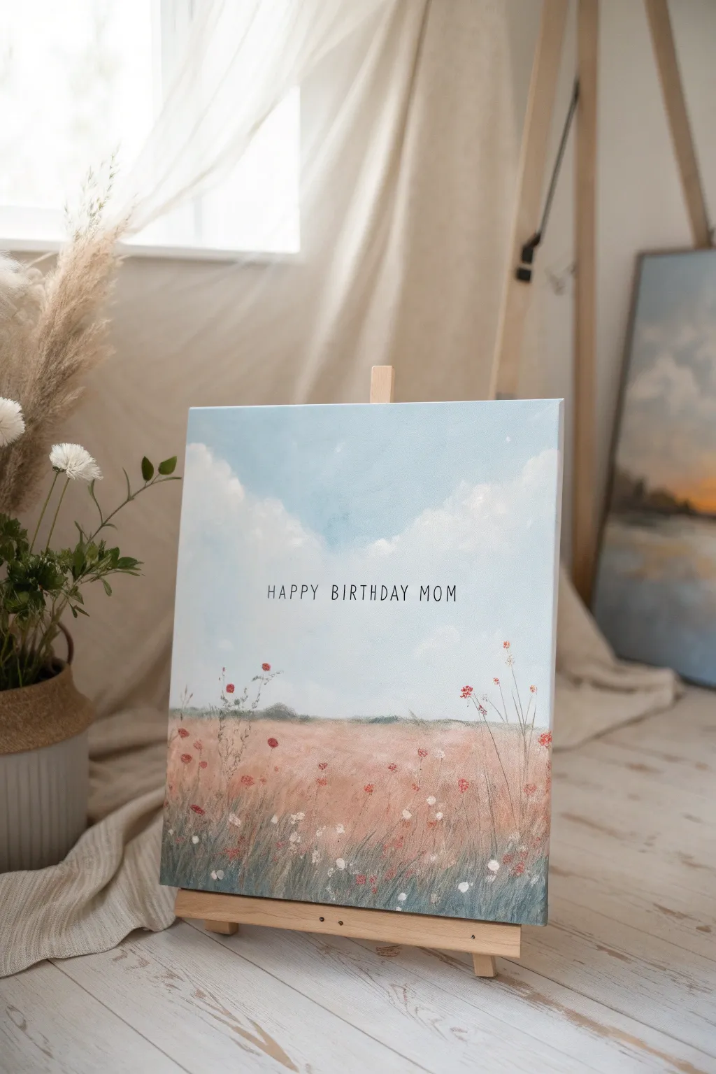
Create a heartfelt surprise for Mom with this serene landscape painting that doubles as a minimalist birthday card. By blending soft acrylics to form a dreamy field and sky, you provide the perfect backdrop for a simple, typed message that conveys your love instantly.
Step-by-Step
Materials
- Pre-stretched canvas (11×14 or similar vertical size)
- Acrylic paints (Titanium White, Sky Blue, Raw Sienna, Crimson Red, Olive Green, Burnt Umber)
- Set of paintbrushes (1-inch flat brush, medium filbert, fine liner brush)
- Fine-point black permanent marker or black paint pen
- Ruler
- Pencil
- Palette or paper plate
- Water cup and paper towels
- Small tabletop easel (for display)
Step 1: Painting the Sky
-
Preparing the canvas:
Start by laying down a very thin, watery base coat of Titanium White across the entire upper two-thirds of the canvas. This helps the blue blend smoothly later. -
Blocking in the blue:
Mix a light shade of Sky Blue with a touch of Titanium White. Using your 1-inch flat brush, apply this to the top edge of the canvas, painting in horizontal strokes. -
Creating a gradient:
As you move down the canvas, gradually add more white to your blue mixture. By the time you reach the middle, the sky should be a very pale, almost white blue to simulate atmospheric perspective. -
Forming clouds:
While the sky paint is still slightly tacky, load a medium filbert brush with pure Titanium White. Use a circular dabbing motion to create fluffy cloud shapes, focusing on the upper corners and leaving the center relatively clear for text. -
Softening the edges:
Wipe your brush clean and dry it slightly. Gently dry-brush over the edges of your clouds to blur them into the blue background, giving them a soft, wispy appearance.
Keep it Steady
To keep your handwriting straight and centered, type the phrase on a computer, print it out, and use transfer paper to trace the letters onto the dry canvas before inking.
Step 2: Painting the Field
-
Establishing the horizon:
Mix a muted green using Olive Green and a tiny bit of Burnt Umber. Paint a low, uneven horizon line about one-third of the way up from the bottom, slightly blurring it into the sky. -
Base layer for the grass:
For the field, create a warm, reddish-brown hue by mixing Raw Sienna with a touch of Crimson Red and White. Apply this roughly below the horizon line using vertical strokes. -
Adding atmospheric haze:
While the base layer is wet, blend some of your pale sky color into the horizon line to make the distant field look foggy and soft. -
Layering foreground color:
Switch to a darker mix of Crimson Red and Raw Sienna. Use the filbert brush to dab patches of color near the bottom edge, creating depth in the foreground. -
Adding grass texture:
Use a smaller round brush and mix various shades of muted pink, sage green, and cream. Flick the brush upward from the bottom to create individual blades of tall grass. -
Varying the strokes:
Ensure your grass strokes vary in length and direction. I find that crossing some strokes over others makes the field look more natural and wild.
Add Dimension
Mix a tiny amount of modeling paste into your white and crimson acrylics for the foreground flowers. This adds physical texture that Mom can actually feel.
Step 3: Floral Details & Text
-
Painting wildflowers:
Dip a fine liner brush into Crimson Red. Dot small blooms randomly throughout the tall grass, placing larger, more detailed flowers near the bottom and tiny specks near the horizon. -
Adding white accents:
Clean the liner brush and pick up Titanium White. Add small clusters of white flowers or highlights to the red blooms to make them pop against the warm field background. -
Stems and leaves:
Mix a dark green using Olive Green and a drop of black. Paint very thin, delicate stems connecting your floating flower heads to the grass below. -
Allowing to dry completely:
Let the entire painting dry for at least 1-2 hours. The surface must be completely dry and hard to the touch before writing the text to prevent the marker from snagging. -
Guiding lines:
Using a ruler, lightly mark a centered straight line with a pencil where you want the text to sit. Keep it subtle so it’s easy to erase later. -
Writing the message:
Use a fine-point black paint pen or permanent marker to carefully print ‘HAPPY BIRTHDAY MOM’ in a clean, sans-serif font along your guide line. -
Final cleanup:
Once the ink is fully dry, gently erase any visible pencil marks. Place the canvas on the small wooden easel for a charming presentation.
Now you have a beautiful, custom piece of art that serves as an enduring reminder of your love on her special day.


Have a question or want to share your own experience? I'd love to hear from you in the comments below!