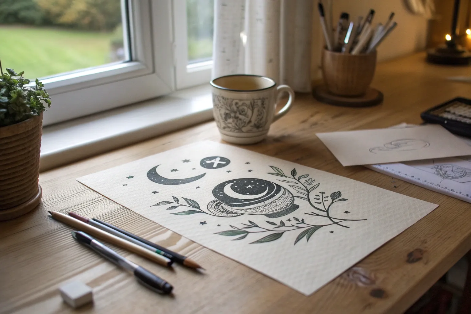
When you’re craving original drawing ideas, it helps to start with familiar subjects and then twist them into something surprising. Here are my go-to prompts for making drawings that feel fresh, personal, and a little bit unexpected—like your imagination just stretched and yawned awake.
Self-Portrait With a Symbolic Mask
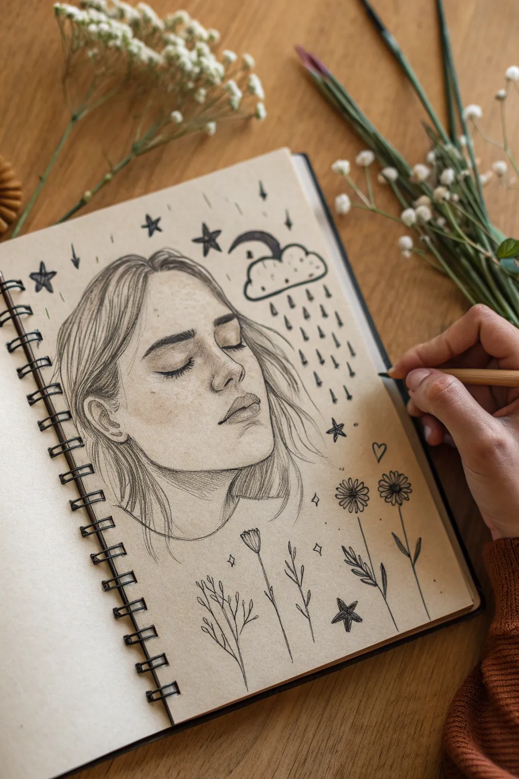
Capture a mood of quiet contemplation with this mixed-style portrait sketch. By combining a realistic facial study with whimsical, flat doodles on toned paper, you’ll create a striking contrast that feels both intimate and imaginative.
How-To Guide
Materials
- Toned tan sketchbook paper (spiral bound)
- Graphite pencils (H, HB, 2B)
- Dark charcoal pencil or black colored pencil
- Kneaded eraser
- Blending stump (tortillon)
- White gel pen (optional for highlights)
Step 1: Laying the Portrait Foundation
-
Map the head shape:
Start lightly with an H pencil to sketch an oval for the head. Tilt it slightly upwards to suggest a dreaming posture. Draw a central vertical line for the nose and a horizontal line where the eyes will rest. -
Sketch facial features:
Place the eyebrows first, giving them a relaxed arch. Sketch the closed eyelids below them, ensuring the curve follows the eyeball underneath. Mark the tip of the nose and the centerline of the lips. -
Refine the jawline:
Carve out the jawline and chin, keeping the lines soft. The neck should extend naturally from the ears and jaw, disappearing into a suggested neckline.
Step 2: Adding Realistic Shading
-
Define the shadows:
Switch to an HB pencil. Lightly shade the areas where shadows naturally fall: under the eyebrows, the side of the nose, under the nose tip, and the upper lip. -
Deepen the contrast:
Use a 2B pencil to darken the lash line and the nostrils. Add shading under the chin to push the neck back in space. -
Blend for smoothness:
Take your blending stump and gently smudge the graphite shading to create smooth skin transitions. The tan paper acts as your mid-tone, so leave the cheekbones and forehead largely unshaded to represent light. -
Draw the hair:
Using long, flowing strokes, sketch the hair. Start from the roots and flick outward. Keep the hair loose and sketch-like rather than drawing every single strand. Let strands fall naturally over the ear and side of the face. -
Accentuate with charcoal:
I like to come in with a black charcoal or dark colored pencil now to add the deepest blacks—specifically in the pupils’ lash line, the nostrils, and the darkest shadows of the hair. This anchors the drawing.
Uneven Shading?
If skin shading looks scratchy, use circular motions with your blending stump. You can also lightly rub the area with a tissue for a softer, airbrushed effect on the paper grain.
Step 3: Surrounding with Symbols
-
Draw the raining cloud:
focusing on the space above the forehead, draw a small, fluffy cloud shape. Underneath, add vertical dashed lines to represent rain falling toward the face, but not touching it. -
Add celestial elements:
Scatter 4-5 simple five-pointed stars around the hair and background. Fill some in solid black and leave others as outlines for variety. -
Plant the flowers:
At the bottom of the page, beneath the neck, draw simple botanical stems. Create a mix of daisy-like flowers and simple leaf sprigs. These should look like flat, inked doodles compared to the 3D face. -
Fill the empty space:
Add tiny diamond shapes or sparkles in the negative space between the larger doodles to balance the composition. -
Final heavy outlines:
Go over your doodles (cloud, stars, flowers) with your dark charcoal or black pencil. Press firmly to create a bold, graphic look that contrasts with the soft shading of the face. -
Clean up:
Use a kneaded eraser to lift any stray graphite smudges from the background, keeping the tan paper clean around the doodles.
Pro Tip: Pop of White
Use a white charcoal pencil or gel pen to add tiny highlights on the tip of the nose, the bow of the lips, and the top of the cheekbones to make the face three-dimensional.
Now you have a sketchbook page that perfectly balances realistic portraiture with illustrative charm


A Room Corner as a Mini World
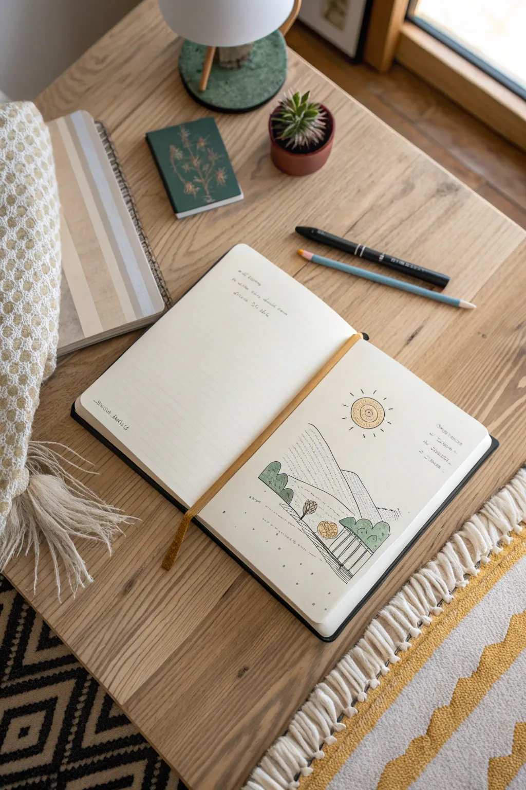
Capture the serene simplicity of nature with this charming sketchbook doodle that turns basic lines into a stylized mountain scene. The combination of crisp ink work and soft colored pencil accents creates a mini world that feels both modern and handmade.
Step-by-Step
Materials
- Blank sketchbook or mixed media paper
- Fine liner pen (black, 0.4mm or 0.5mm)
- Pencil (HB for sketching)
- Eraser
- Colored pencils (muted green, yellow, earthy brown)
- Ruler (optional)
Step 1: Setting the Scene
-
Plan the horizon:
Start with a light pencil sketch. Draw a sloping line across the lower third of your page to establish your foreground hill. Keep the line gentle and organic rather than perfectly straight. -
Add mountain peaks:
Behind your first hill, sketch two large, triangular mountain shapes. Make the one on the left slightly shorter and wider, while the one on the right peaks higher to create visual interest. -
Place the sun:
In the upper right quadrant of the sky, lightly draw a circle for your sun. Position it high enough so its rays won’t interfere with the mountain peaks. -
Sketch the trees:
Add simple geometric shapes for trees. Draw a small circle on a stick near the center foreground for a focal tree. Add rounded, bush-like shapes on the left and right hill slopes to frame the composition. -
Outline the path:
Sketch a winding path or a simple fence structure in the bottom right corner using vertical and horizontal lines. This adds a sense of human presence to your mini world.
Step 2: Inking the Lines
-
Trace the main contours:
Switch to your black fine liner pen. Carefully go over your pencil lines for the hills and mountains. Use a confident, steady hand to create smooth outlines. -
Define the trees:
Ink the outlines of your trees. For the rounded bushes, keep the lines clean. For the central tree, you might add a few tiny hatch marks inside the foliage to suggest texture. -
Create the sun motif:
Ink the sun’s circle. Inside, draw a spiral or concentric circles to give it a folksy feel. Add short, radiating dashes around the outside for sunlight rays. -
Add text details:
If you wish to replicate the journaling style, add tiny, illegible scribble-writing or real notes on the right side of the page and near the horizon line. This mimics the look of field notes.
Pen Pressure
Vary your pen pressure slightly. Press harder for the main outline of the mountains and lighter for the texture dots inside to create depth.
Step 3: Texture and Color
-
Erase pencil guides:
Once the ink is completely dry—give it a minute or two—gently erase all your underlying pencil sketches to clean up the page. -
Draw texture lines:
Using your fine liner, fill the mountain shapes with rows of small, dashed lines or dots. You can follow the slope of the mountain to emphasize its form. -
Add ground cover:
In the foreground hill, add scattered dots and tiny ‘v’ shapes to represent grass. This keeps the foreground looking lighter than the textured mountains. -
Color the trees:
Take a muted green colored pencil and gently fill in the tree shapes. Apply the color softly; you want a translucent, sketchy look rather than a solid block of opaque color. -
Brighten the sun:
Use a yellow colored pencil to fill in the center of your sun. I find that coloring in a circular motion helps blend the pigment smoothly. -
Shade the ground elements:
Use an earthy brown or a darker yellow to color the small path or fence structure in the corner. Keep the pressure light to maintain the drawing’s delicate aesthetic.
Creative Twist
Swap the daytime sun for a crescent moon and stars, and use cool blues and purples for the trees to create a night version of this mini world.
Close your sketchbook knowing you’ve preserved a quiet little landscape to revisit whenever you need a moment of calm


Portrait From the Back, With Story Details
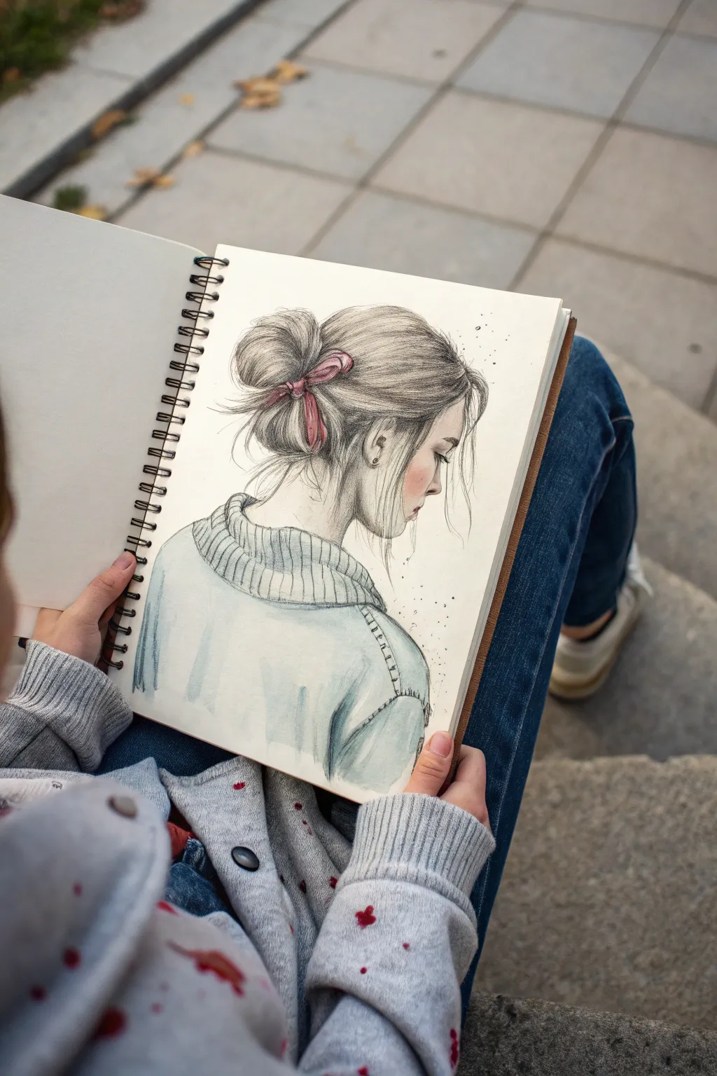
Capture a tender moment of quiet contemplation with this mixed-media sketch. Combining soft graphite shading with delicate watercolor washes creates a beautiful contrast that brings the cozy sweater and messy bun to life.
Step-by-Step Guide
Materials
- Spiral-bound sketchbook (mixed media paper recommended)
- Graphite pencils (HB, 2B, 4B)
- Mechanical pencil (0.5mm for details)
- Watercolor paints (Payne’s Grey, Alizarin Crimson, Light Blue)
- Small round watercolor brush (size 2 or 4)
- Kneaded eraser
- Blending stump or tissue
- Fine liner pen (optional, light grey)
Step 1: Laying the Foundation
-
Rough out the silhouette:
Start with a light HB pencil to establish the basic shapes. Draw an oval for the head, slightly tilted forward, and extend a curved line down for the neck meeting the curve of the shoulders. -
Map the features:
Since this is a profile view from slightly behind, focus on placing the ear first as an anchor point. Sketch the jawline curving up towards the ear and the gentle slope of the nose and forehead. -
Construct the hair mass:
Loosely sketch the shape of the messy bun high on the back of the head. Keep the lines flowing outward from the crown to gather at the back, indicating the volume without drawing individual strands yet. -
Position the ribbon:
Draw the knot of the ribbon right at the base of the bun. Add two loops and tails that flow downwards, ensuring they follow the curve of the hair. -
Outline the sweater:
Sketch the chunky collar of the sweater, wrapping it loosely around the neck. Add the shoulder seams and the bulk of the sweater body, letting it drop off the shoulder naturally.
Hair Flow Secret
When drawing hair, always lift your pencil at the end of each stroke. This tapers the line, making it look like a natural strand rather than a wire.
Step 2: Pencil Detailing
-
Define the profile:
Switch to a mechanical pencil for precision. Carefully refine the profile of the face—the eyelashes, the curve of the nose, and the lips. Keep the lines delicate. -
Texturizing the hair:
Use long, sweeping strokes with a 2B pencil to create hair strands. Start from the roots and sweep toward the bun. Add darker strokes underneath the hair mass to create depth. -
Creating the messy look:
Add stray wisps of hair framing the face and escaping from the bun. These flyaways should be very light and spontaneous lines to give that effortless feel. -
Detailing the ear:
Darken the inner folds of the ear with a 2B pencil but leave the outer rim lighter to suggest form. Add a tiny dot for an earring if desired. -
Knitting the sweater:
Draw vertical ribbed lines on the collar and cuffs. Use slightly wavy lines to mimic the texture of fabric rather than ruler-straight lines.
Make It Personal
Instead of a solid ribbon, draw a patterned scrunchie or add floral elements tucked into the hair bun for a romantic, botanical twist.
Step 3: Adding Depth and Color
-
Shading the skin:
Use a 2B or 4B pencil to add soft shading under the jawline and around the neck. Blend this gently with a stump or tissue for smooth skin texture. -
Deepening the hair:
Go in with a 4B pencil to darken the deepest shadows where the hair gathers at the ribbon and at the nape of the neck. This contrast makes the highlights pop. -
Watercolor wash for the ribbon:
Mix a watery Alizarin Crimson. Carefully paint the ribbon, letting the color pool slightly in the darkest folds of the knot for natural shading. -
Painting the sweater:
Dilute Payne’s Grey with a touch of Light Blue to get a cool, slate tone. Apply a loose wash over the sweater area, leaving some white paper showing for highlights. -
Adding shadow accents:
While the sweater wash is still damp, drop in slightly more concentrated blue-grey paint into the folds of the collar and under the arm to create volume. -
Rosy cheeks:
Dilute a tiny amount of red or pink watercolor significantly. Gently dab a blush tone onto the cheek area for a flushed, lively look. -
Final splatters:
Load your brush with watery grey paint. Tap the handle against your finger to create tiny, controlled splatters near the face and back of the head for artistic flair.
Step back and admire the gentle mood you’ve captured in your sketchbook portrait


Botanical Study With a Hidden Secret
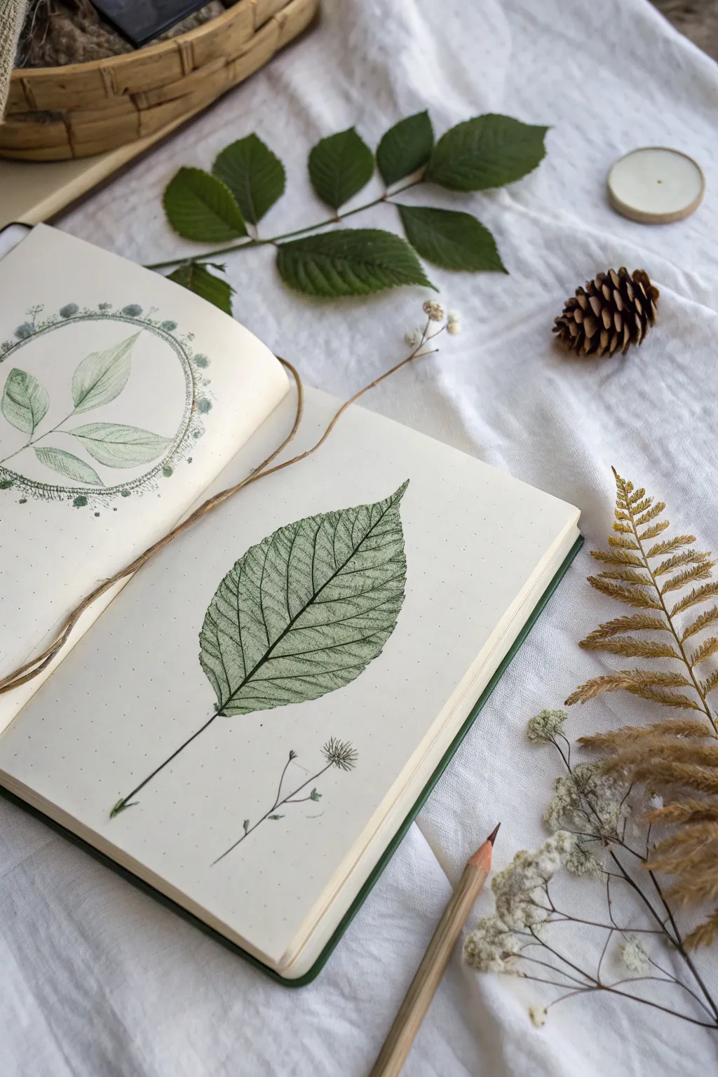
Capture the intricate veins and textures of nature with this dual-page spread that combines delicate pencil sketching with a fascinating leaf rubbing technique. The result is a scientific yet artistic botanical study that feels like a discovery from an old field journal.
How-To Guide
Materials
- Dotted or blank sketchbook (A5 size recommended)
- Fresh leaves with prominent veins (beech, elm, or blackberry)
- Graphite pencils (HB, 2B, and 4B)
- Green colored pencils (sage, olive, and forest tones)
- Fine liner pen (0.1 or 0.05 mm, black or sepia)
- Blending stump or cotton swab
- Tracing paper (optional)
- Masking tape
Step 1: Page 1: The Veined Leaf Rubbing
-
Leaf selection:
Choose a fresh, sturdy leaf with raised veins on the underside. A dry leaf will crumble, so fresh is best. Place the leaf vein-side up on a hard, flat surface. -
Positioning:
Carefully place the right-hand page of your sketchbook over the leaf. Secure the corners of the page with a tiny bit of masking tape so the paper doesn’t shift while you work. -
The rubbing technique:
Take a green colored pencil or a soft 4B graphite pencil. Hold it at a low angle, almost flat against the paper. Gently rub back and forth over the area where the leaf lies underneath. -
Building definition:
As the image emerges, press slightly harder on the stem and main veins to sharpen the details. I find that going over the edges a second time helps define the leaf shape clearly. -
Detailing the veins:
Remove the leaf from underneath. Using a sharpened colored pencil or fine liner, very lightly trace over the major vein lines that the rubbing revealed to make them pop. -
Stem extension:
Draw the stem extending downwards from the leaf base using a single, confident stroke. Thickening the line slightly at the very bottom adds realism. -
Adding the sprig:
Below the main leaf, sketch a small, delicate sprig using a fine liner or sharp H pencil. Keep the lines incredibly thin and airy. -
Micro-details:
Add tiny dot stippling around the flower head of the small sprig to suggest pollen or texture.
Freshness Matters
For the best rubbing results, use a leaf picked within the last hour. If it’s too dry, the veins won’t be raised enough to catch the graphite texture.
Step 2: Page 2: The Framed Study
-
Drafting the frame:
On the left page, lightly draw a circle using a compass or by tracing a round object (like a mug base). Keep this line very faint. -
Sketching the subject:
Inside the circle, sketch a simple branch with three leaves. Focus on the central vein of each leaf first, then draw the outer contours. -
Shading with graphite:
Use an HB pencil to lightly shade one half of each leaf, leaving the other half lighter to suggest a light source. Use a blending stump to smooth the graphite for a soft look. -
Adding color:
Layer a pale sage green pencil over your graphite shading. Keep the pressure light to maintain that vintage, washed-out aesthetic. -
Creating the border:
Go back to your circle guide. Instead of a solid line, create the border using tiny, repetitive botanical shapes—little dots, dashes, or tiny loops that resemble seeds or pollen. -
Emphasizing the connection:
Allow the tip of the top leaf to slightly break the boundary of the circle frame. This small overlap creates depth and makes the composition more dynamic. -
Final touches:
Erase any stray graphite marks outside the drawings. If using a dotted notebook, embrace the grid as part of the scientific aesthetic.
Level Up: Ghost Prints
Apply a tiny bit of watercolor to the back of the leaf before rubbing to create a subtle tinted background behind your pencil strokes.
Close your book carefully to press the pages and preserve your botanical finds for the future
BRUSH GUIDE
The Right Brush for Every Stroke
From clean lines to bold texture — master brush choice, stroke control, and essential techniques.
Explore the Full Guide
Animal Made of Everyday Objects
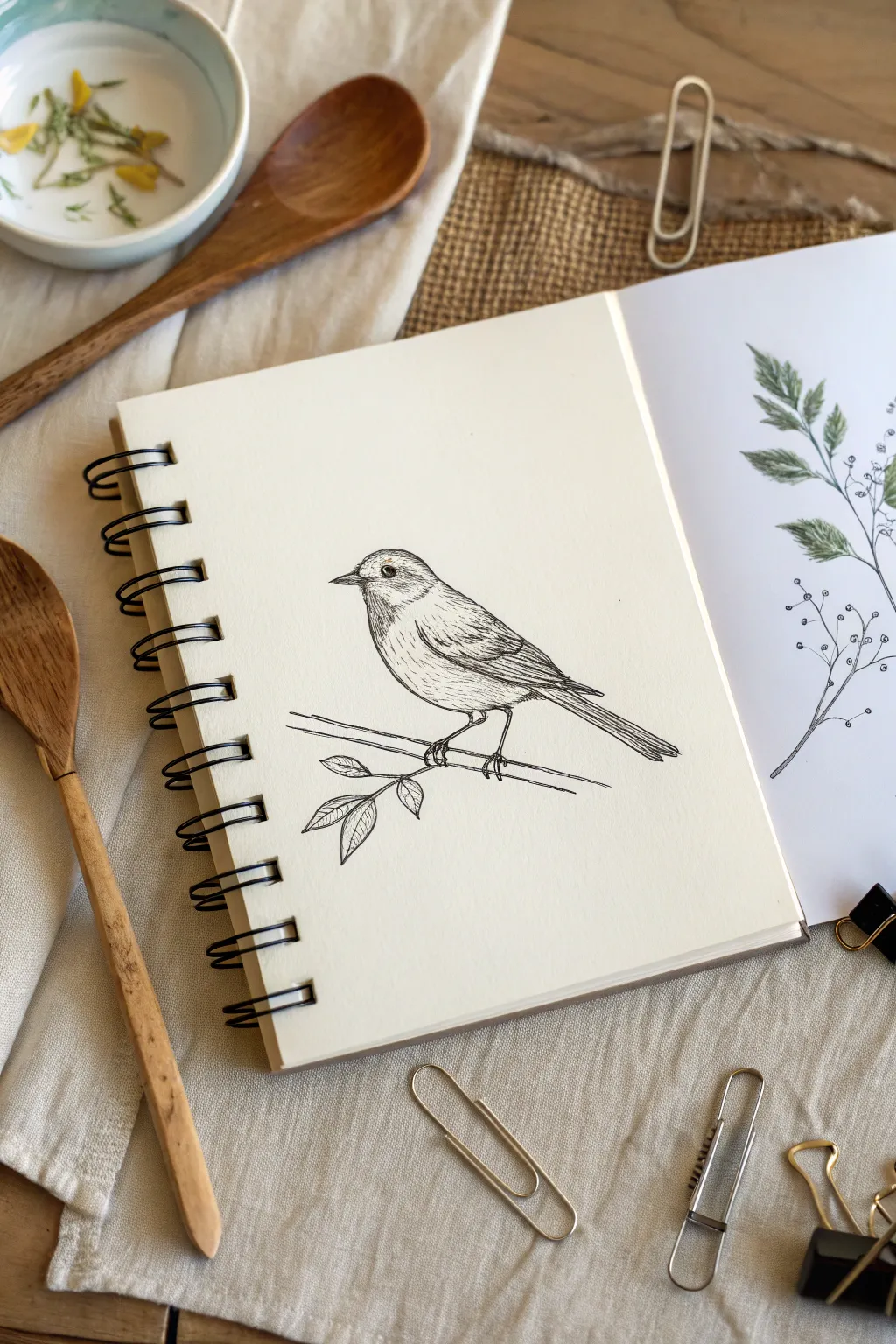
This charming project captures the delicate beauty of a songbird perched on a branch using fine ink lines. With its crisp details and subtle shading, this sketch turns a simple blank page into a serene study of nature.
Step-by-Step Tutorial
Materials
- Spiral-bound sketchbook with smooth, heavyweight paper
- Fine liner pens (sizes 0.05, 0.1, and 0.3)
- HB graphite pencil
- Soft kneaded eraser
Step 1: Drafting the Basic Shapes
-
Establish the Head and Body:
Start lightly with your HB pencil. Draw a small circle for the head and an intersecting oval for the body, tilting the oval slightly upwards to the right to suggest the bird’s posture. -
Position the Eye and Beak:
Place a small dot within the head circle as a placeholder for the eye. Extend a small, triangular shape from the left side of the head for the beak, keeping the lines sharp and pointed. -
Define the Wing and Tail:
Sketch a long, tapering shape extending from the back of the oval to form the folded wing. Add a longer, narrower rectangle sticking out beneath the wing for the tail feathers. -
Sketch the Perch:
Draw two parallel lines beneath the bird’s body to create the branch. Add a slight curve or angle to make it look organic, rather than perfectly straight. -
Place the Legs:
Connect the bird’s underbelly to the branch with two thin legs. Ensure the toes appear to wrap around the branch for a realistic grip.
Shaky Lines?
If your lines are wobbling, try drawing from your shoulder rather than your wrist. You can also ‘ghost’ the line in the air before touching the paper to build confidence.
Step 2: Inking the Outline
-
Refine the Head Profile:
Switch to your 0.1 fine liner. Carefully trace the top of the head and the beak, using broken lines near the neck to suggest soft feathers rather than a hard shell. -
Draw the Eye:
Use the 0.05 pen for the eye. Draw a small circle, leaving a tiny white highlight at the top, and fill the rest in black. Add a small ring around it for depth. -
Outline the Wings:
Outline the main wing shape with the 0.1 pen. Break the wing into layers of feathers—shorter curve shapes near the shoulder and longer straight lines toward the tip. -
Detail the Tail feathers:
Draw long, straight parallel lines for the tail. Use a ruler if your hand is shaky, but a freehand line adds more character. -
Ink the Branch and Leaves:
Go over your branch sketch with the 0.3 pen for a slightly bolder look. Add the small sprig of leaves dangling below the main branch, drawing the veins inside each leaf.
Step 3: Adding Texture and Shading
-
Texture the Head:
Using the 0.05 pen, add tiny, short dashes following the curve of the head. Keep the strokes denser near the beak and eye to create shadow. -
Shade the Underbelly:
Use light hatching lines on the bird’s belly. Curve these lines to follow the roundness of the body, leaving the center of the chest mostly white to show volume. -
Detail the Wing Feathers:
Add fine lines inside the wing feathers. I like to keep these strokes very thin to differentiate the texture of the flight feathers from the fluffy body down. -
Darken the Underside:
Add cross-hatching (overlapping lines) right beneath the wing and where the legs meet the body. This shadow anchors the wing and makes it look tucked against the body. -
Texture the Branch:
Add horizontal markings and small knots to the branch using the 0.1 pen. A few wandering lines can simulate bark texture effectively. -
Final Cleanup:
Once you are certain the ink is completely dry, gently erase all underlying pencil marks with your kneaded eraser to reveal the crisp ink drawing.
Add a Splash of Life
Use watercolor or colored pencils to tint just the leaves or the bird’s breast. A monochromatic blue or subtle yellow wash keeps the elegant feel while adding focus.
This simple yet detailed drawing is a perfect way to practice texture and line control
Food That Acts Like a Landscape
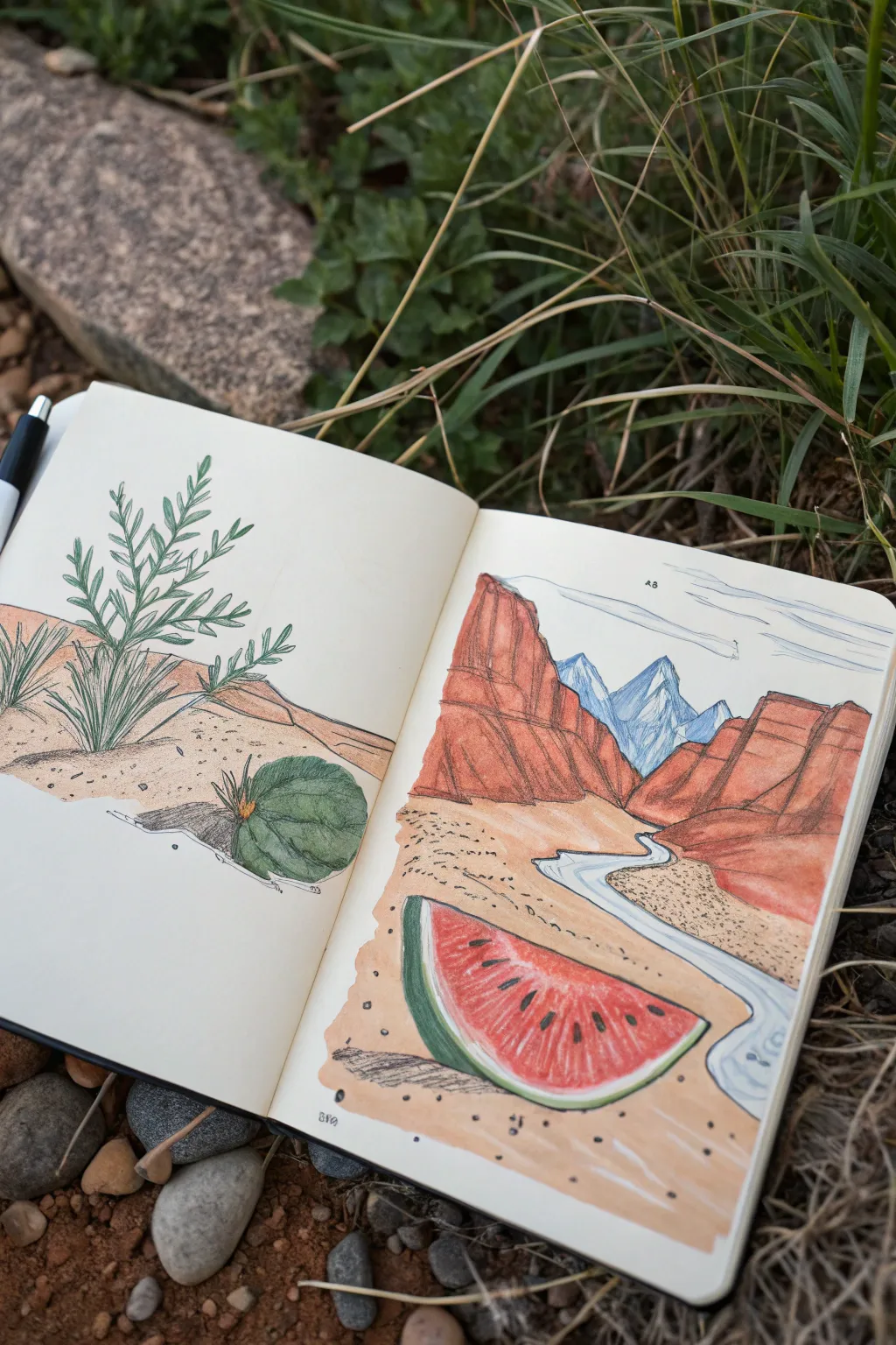
Blend the juicy vibrancy of summer fruit with rugged desert scenery in this imaginative sketchbook spread. This project combines coloured pencil and ink to transform a slice of watermelon and a round cactus into key elements of a sprawling canyon vista.
How-To Guide
Materials
- Sketchbook (heavyweight paper recommended)
- HB graphite pencil
- Eraser
- Fine liner pens (black, sizes 0.1 and 0.5)
- Colored pencils (terracotta, brick red, crimson, forest green, light green, sandy beige, sky blue, cobalt blue)
- White gel pen (optional for highlights)
Step 1: Planning the Composition
-
Draft the left page botanical:
Begin on the left page by lightly sketching a spiky, fern-like desert plant. Position it centrally but slightly to the left. At the base, sketch a small, round, segmented cactus shape that mimics the form of a whole watermelon. -
Outline the canyon structure:
On the right page, sketch towering rock formations on the left and right sides, leaving a valley in the center. These should loom large in the foreground and recede into the distance. -
Place the surreal element:
In the immediate foreground of the right page, draw a large, triangular slice of watermelon. Imagine it resting on the canyon floor like a fallen boulder. -
Sketch the river and mountains:
Draw a winding river flowing from the background forward, disappearing under the watermelon slice. Add jagged mountain peaks in the far distance between the canyon walls.
Step 2: Inking the Lines
-
Ink the foreground outlines:
Use a 0.5 fine liner to trace the main contours of the watermelon slice, the foreground sand, and the main canyon walls. A slightly thicker line weight here helps bring these elements forward. -
Detail the background:
Switch to a 0.1 fine liner for the distant mountains and the subtle texture of the river. Keep the lines delicate to enhance the sense of depth. -
Define the plant life:
On the left page, carefully ink the spiky leaves and the round cactus base. Add small, scattered dots around the base to suggest sand texture. -
Erase pencil marks:
Once the ink is completely dry, gently erase all graphite guidelines to prepare the surface for coloring.
Texture Trick
To make the canyon walls look like rough sandstone, rub the textured side of your pencil lead against the paper grain instead of the sharp tip.
Step 3: Coloring the Landscape
-
Base layer for the canyon:
Start with a terracotta or burnt orange colored pencil. Lightly shade the canyon walls on the right page, using vertical strokes to mimic strata and heavy rock. -
Deepen the shadows:
Layer a brick red or dark brown into the crevices and the bottom edges of the cliffs to create dimension. I find that pressing harder in the corners really pops the 3D effect. -
Color the desert floor:
Use a sandy beige pencil to fill the ground on both pages. Apply it lightly, leaving some white paper showing through for a sun-bleached look. Add small dots of brown for scattered rocks. -
Paint the distant peaks:
Goal for a cool contrast by coloring the distant mountains in shades of cobalt and sky blue. This atmospheric perspective pushes them into the background. -
Fill the river:
Color the winding river with a very pale blue, leaving white streaks in the center of the flow to suggest reflected light and movement.
Level Up: Juicier Fruit
Use a water-soluble red pencil or a tiny dab of watercolor for the watermelon flesh to create a translucent, juicy texture distinct from the dry rocks.
Step 4: bringing the Fruit to Life
-
Color the watermelon rind:
On the right page, use a dark forest green for the outer skin of the watermelon slice, blending into a pale light green rind before hitting the red flesh. -
Saturate the fruit flesh:
Fill the triangular face of the watermelon with a vibrant crimson. Apply more pressure near the bottom crust to make it look juicier and lighter pressure near the top point. -
Add the seeds:
Use a black pen or very sharp black pencil to draw teardrop-shaped seeds. Add a tiny speck of white gel pen to each seed for a glossy shine. -
Color the left-page cactus:
Return to the botanical drawing on the left. Color the round cactus base with deep greens to match the watermelon rind, hinting that the landscape on the right is inside this ‘fruit’. -
Final atmospheric touches:
Lightly sketch in some horizontal cloud lines in the sky with a blue pencil. Add cast shadows under the watermelon and the plant using a cool grey pencil to ground the objects.
You now have a surreal, double-page spread that perfectly blurs the line between botanical study and dreamscape

PENCIL GUIDE
Understanding Pencil Grades from H to B
From first sketch to finished drawing — learn pencil grades, line control, and shading techniques.
Explore the Full Guide
A Familiar Object Turned Into a Home
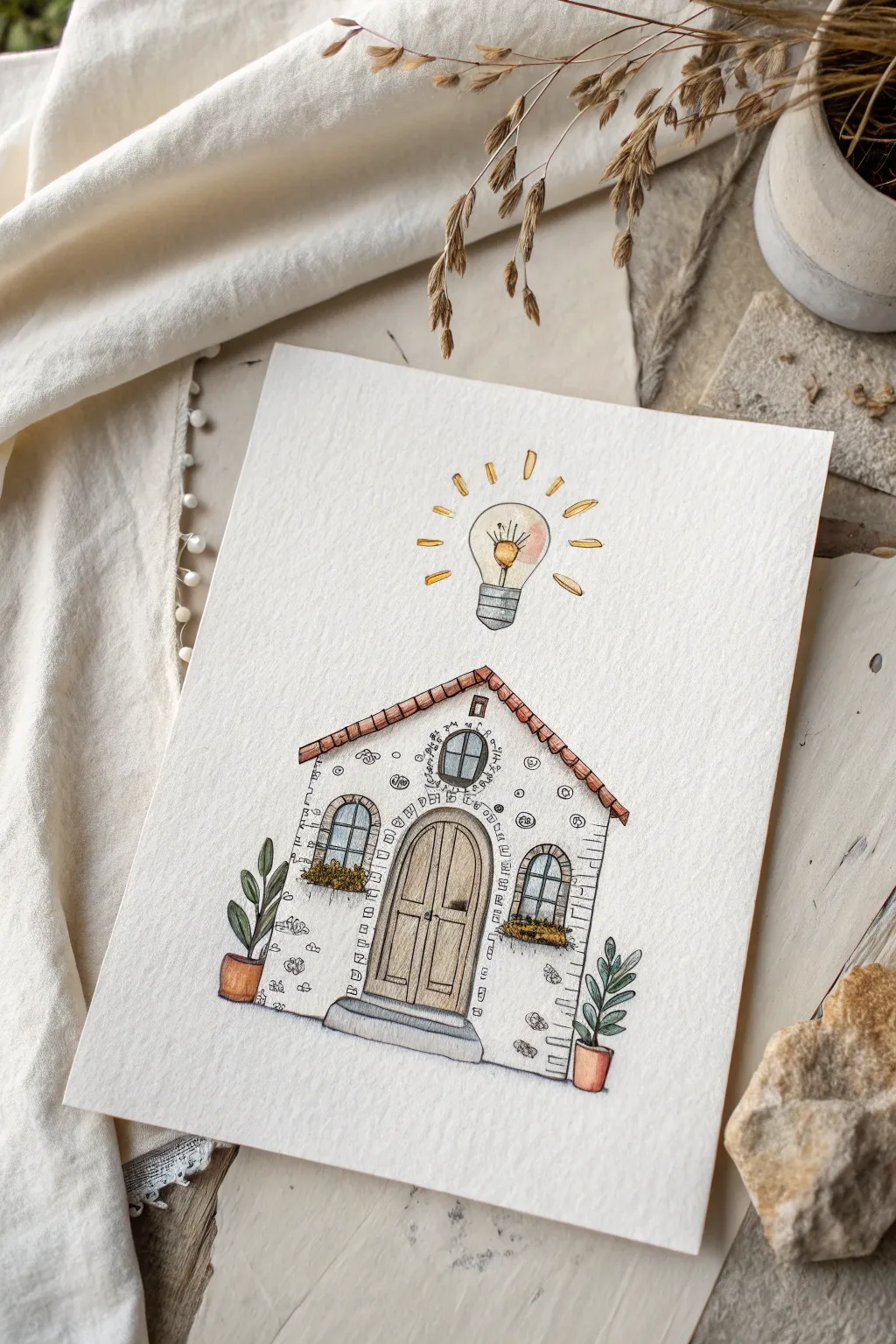
This whimsical illustration combines the cozy architecture of a cottage with a surreal touch: a glowing lightbulb acting as a sun. Using fine liner pens and watercolor washes, you’ll create a textured, inviting scene that feels like a home for bright ideas.
Step-by-Step Guide
Materials
- Heavyweight watercolor paper (cold press, roughly 300gsm)
- Fine liner pens (waterproof, sizes 01 and 03)
- Watercolor paints (pan or tube set)
- Round watercolor brushes (sizes 2 and 4)
- Graphite pencil (HB or 2B) and eraser
- Ruler (optional but helpful)
- Jar of clean water
- Paper towel
Step 1: Planning the Structure
-
Establish the base shape:
Begin with a light pencil sketch. Draw a simple pentagon shape for the house façade—a rectangle bottom with a triangle top for the roof. Center it on your paper, leaving plenty of room at the top. -
Add architectural features:
Sketch a large arched double door in the center of the house. Flank the door with two smaller arched windows. Add a small circular window near the peak of the roof. -
Sketch the lightbulb:
Floating directly above the roof peak, lightly draw a classic lightbulb shape. Add radiating lines around it to suggest light rays or sparks. -
Place the details:
Draw flower boxes beneath the two main windows. Sketch two potted plants on the ground at the far left an right corners of the house. Add a simple stone step beneath the front door.
Ink Control
If your hand shakes while drawing long lines like the walls, try ‘ghosting’ the movement first: hover your pen over the paper and practice the motion before touching down.
Step 2: Inking the Outlines
-
Outline the main structure:
Switch to your waterproof fine liner (size 03). Carefully trace the roofline, adding small rectangular scallops to suggest roof tiles. Ink the outer walls of the house. -
Detail the door and windows:
Ink the arched door frame. Draw vertical wood grain lines on the door panels and add a small handle. For the windows, draw the frames and the grid panes. -
Texture the masonry:
This is where the charm happens. Instead of drawing every brick, draw scattered clusters of small, organic shapes and squiggles across the white space of the walls to suggest rough stone texture. Concentrate these slightly more near the edges and corners. -
Ink the lightbulb and plants:
Trace the lightbulb and its filament. Draw the radiating lines using quick, confident strokes. Ink the leaves of the potted plants using simple oval shapes. -
Erase pencil lines:
Wait a moment to ensure the ink is completely dry, then gently erase all your underlying pencil sketches to clean up the drawing.
Step 3: Adding Watercolor Washes
-
Paint the roof:
Mix a warm terracotta or reddish-brown color. Using a size 4 brush, carefully fill in the roof tiles. Keep the color somewhat translucent to let the paper texture show through. -
Color the door and wood details:
Use a light brown or ochre wash for the wooden door. I like to let the paint pool slightly at the bottom of the door panels to create a natural shadow gradient. -
Greenery and pots:
Paint the leaves of the potted plants a deep sage green. Use a terracotta orange for the pots themselves. Dab small touches of yellow and green into the window boxes to suggest flowers. -
Illuminating the bulb:
Dilute a yellow-orange paint with plenty of water. Apply a very light wash inside the glass part of the lightbulb. Add a slightly more concentrated drop of yellow near the filament to make it ‘glow’. -
Stone and pavement details:
Mix a very watery grey. Paint the front step and the window glass panes. For the glass, keep the grey very pale, perhaps leaving a tiny white spot unpainted for a reflection. -
Enhancing the light rays:
Using a small brush (size 2), paint the radiating lines around the lightbulb with a solid yellow-gold color.
Magic Glow
Use a white gel pen to add tiny highlights on the lightbulb glass and the plant leaves after the paint is fully dry for extra sparkle.
Step 4: Final Touches
-
Deepen shadows:
Once the first layers are dry, mix a slightly darker version of your brown and grey. Add thin shadows under the roof overhang and beneath the window boxes to give the house dimension. -
Highlight the filament:
If needed, add a touch of intense orange or gold directly to the center of the lightbulb filament to act as the focal point. -
Review and refine:
Check for any areas that need a bit more definition. You can go back in with your fine liner to re-emphasize lines that might have been faded by the paint.
Now you have a charming little dwelling that proves home really is where the bright ideas live
A Dream Moment With Sharp Details
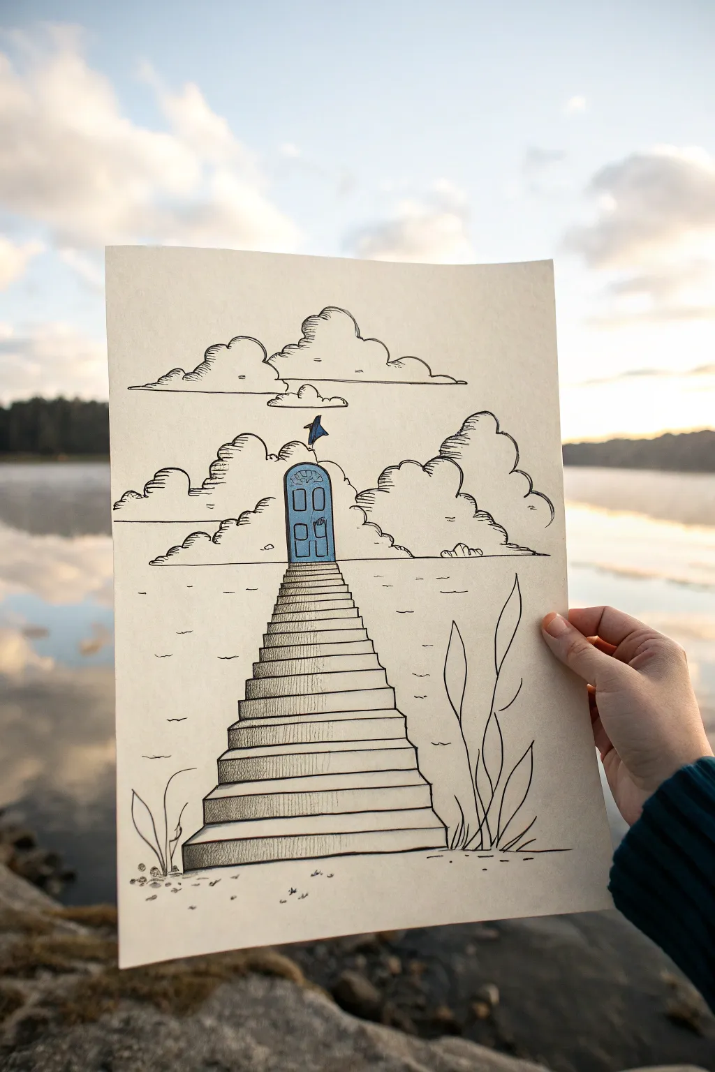
This whimsical pen and ink conceptual drawing features a mysterious staircase rising out of a sketched shoreline towards a solitary blue door floating in the sky. It combines crisp linework with subtle hatching to create a dreamlike atmosphere perfect for imaginative portfolios.
How-To Guide
Materials
- Heavyweight cream sketch paper or mixed media paper (smooth texture)
- Pencil (HB or 2B)
- Eraser (kneaded)
- Fine liner pens (0.1, 0.3, and 0.5 mm in black)
- Blue watercolor paint or alcohol marker
- Small round brush (if using paint)
- Ruler
Step 1: Sketching the Composition
-
Define the Horizon:
Start by lightly drawing a horizontal line across the middle of your paper to separate the sky from the water. This doesn’t need to be perfectly straight, as it represents a distant shoreline or water’s edge. -
Draft the Door:
In the center of the upper half, sketch a small, vertical rectangle with an arched top. This will be your floating door. Add a tiny flag or pennant fluttering from the very top of the arch. -
Outline the Stairs:
From the bottom of the door, draw two diagonal lines angling outward as they reach the bottom of the page. This creates the perspective of the stairs coming toward the viewer. -
Add Step Details:
Using a ruler if desired, draw horizontal lines between the diagonal guides to create individual steps. The spacing should get gradually tighter as the stairs ascend toward the door to enhance the perspective effect. -
Place the Clouds:
Lightly sketch large, puffy cloud shapes flanking the door and hovering above it. Keep the shapes organic and varied, letting them overlap the horizon line slightly.
Wobbly Lines?
If your straight lines for the stairs are shaky, lean into it. Retrace them deliberately to make the unevenness look like a stylistic choice for old stone.
Step 2: Inking the Structure
-
Ink the Door:
Switch to a 0.3 mm pen. Trace your door outline carefully. Add inner rectangles for the door panels—two tall visible panels work well—and a tiny circle for the doorknob. Don’t ink the flag just yet. -
Define the Steps:
Ink the horizontal tops of the stairs first. Then, draw the vertical risers. I like to add a slight wobble to these lines rather than using a ruler here, as it gives the stone a more weathered, organic feel. -
Shade the Risers:
Using your 0.1 mm pen, add vertical hatching lines to the front face (riser) of each step. Keep the tops of the steps clear white. This contrast creates dimension and form immediately. -
Darken the Sides:
Thicken the outline on the left side of the staircase with a 0.5 mm pen to suggest a shadow side, grounding the structure.
Pro Tip: Depth of Field
Make the ripples and details at the bottom of the page thicker and darker than the ones near the horizon line. This subtle weight change increases the illusion of depth.
Step 3: Atmospheric Details
-
Ink the Clouds:
Outline your clouds with the 0.3 mm pen using bumpy, scalloped lines. Don’t close every shape completely; broken lines can make clouds feel airier. -
Shade the Clouds:
Use the 0.1 mm pen to add horizontal hatching to the underside and shadowed curves of the clouds. Keep the strokes light and parallel. -
Create the Water:
Draw short, broken horizontal dashes across the background behind the stairs to represent water ripples. Vary the lengths, keeping them sparse near the horizon and slightly denser near the bottom. -
Add Foreground Elements:
In the bottom corners, sketch simple, tall grasses or reed shapes rising up. Ink them with confident, sweeping upward strokes that taper at the top.
Step 4: Finishing Touches
-
Color the Door:
Use blue watercolor or a marker to fill in the door. If using paint, keep it semi-transparent so your ink lines show through. Carefully color the tiny flag at the top as well. -
Enhance Contrast:
Once the color is dry, re-ink the door’s outline if it looks faded. Add a few tiny hatched shadows under the flag and door frame. -
Ground the Scene:
Add some small pebbles or dots at the very bottom near the reeds to suggest a sandy shore where the stairs originate. -
Cleanup:
Wait for the ink to be completely dry, then gently erase all remaining pencil guidelines to leave a crisp, clean illustration.
Now you have a serene, surreal landscape that invites the viewer to step into the unknown


Two Unrelated Objects Fused Into One
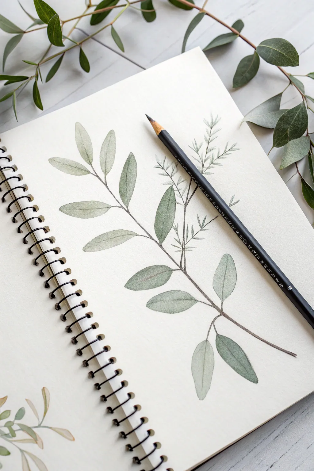
Capture the delicate beauty of nature with this airy botanical illustration of a eucalyptus branch. Using soft watercolor washes and fine pencil details, you’ll create a serene composition that floats elegantly across your sketchbook page.
Step-by-Step Tutorial
Materials
- Hot pressed watercolor paper or mixed media sketchbook
- HB graphite pencil for sketching
- Watercolor paints (Sap Green, Olive Green, Payne’s Grey, Burnt Umber)
- Round watercolor brushes (Size 2 and 4)
- Black colored pencil or fine liner (optional for details)
- Cup of water and paper towels
Step 1: Planning and Sketching
-
Analyze the Composition:
Visualize a diagonal line stretching from the bottom right to the middle left of your page. This will be the main spine of your branch, creating a dynamic flow across the paper. -
Draw the Central Stem:
Using your HB pencil with very light pressure, sketch a slightly curved line for the main stem. Keep it faint, as you want the watercolor to be the star. -
Mark Leaf Positions:
Along this stem, make small tick marks where the leaf pairings will emerge. Eucalyptus leaves often grow in opposite pairs or slightly offset from one another. -
Outline the Leaves:
Sketch the oval, lance-shaped leaves. They should be tapered at the ends. Vary their angles—some facing up, some drooping downwards—to create a natural, organic look. -
Refine the Stems:
Connect the leaves to the main branch with thin, delicate stems. Add a secondary, thinner branch shooting upwards from the middle to add complexity.
Water Control
If you get ‘cauliflower’ blooms where you don’t want them, your brush was too wet. Blot excess water on a towel before touching a drying wash.
Step 2: Watercolor Washes
-
Mix Your Base Green:
Create a muted green by mixing Sap Green with a touch of Payne’s Grey. You want a watery, tea-like consistency for the first layer. -
First Leaf Wash:
Using the size 4 brush, paint a clear water glaze over one leaf, then drop in your green mix. Let the pigment bloom naturally into the wet area. -
Varying the Tone:
While moving to other leaves, add tiny amounts of Burnt Umber or more water to your mix. This subtle variation makes the branch look alive rather than flat. -
Painting the Stem:
Switch to your size 2 brush. Mix a darker brownish-green using Olive Green and Burnt Umber. Carefully paint the thin stems, lifting pressure at the ends for a tapered look. -
Creating Depth:
For leaves that appear ‘behind’ others, use a slightly cooler, bluer mix (add more Payne’s Grey). This pushes them into the background visually.
Step 3: Layering and Detailing
-
Second Layer:
Once the first wash is bone dry, mix a slightly more saturated green. Glaze this over the lower half of some leaves to suggest shadow and curvature. -
Vein Details:
Using the very tip of your size 2 brush and a darker green mix, paint a thin central vein down the middle of the larger leaves. -
Adding Texture:
I like to use a fairly dry brush to add tiny stippling or faint lines near the base of the leaves where they connect to the stem. -
The Secondary Branch:
For the wispy upper branch, keep the leaves paler and less detailed. This ‘atmospheric perspective’ helps the main branch pop forward. -
Final Pencil Touches:
Take a sharpened colored pencil (dark grey or black) and very lightly define the edges of the leaves that need more contrast, but keep the line broken and organic.
Go Botanical
Add a small magnifying glass detail in the corner showing a zoomed-in view of the leaf veins or a tiny seed pod for a scientific illustration feel.
Enjoy the peaceful process of watching your garden grow on the page


Have a question or want to share your own experience? I'd love to hear from you in the comments below!