When you want to paint but your brain is totally blank, random painting ideas are the fastest way to get your brush moving again. These are my go-to prompts for making something fun, colorful, and low-pressure—no big plan required.
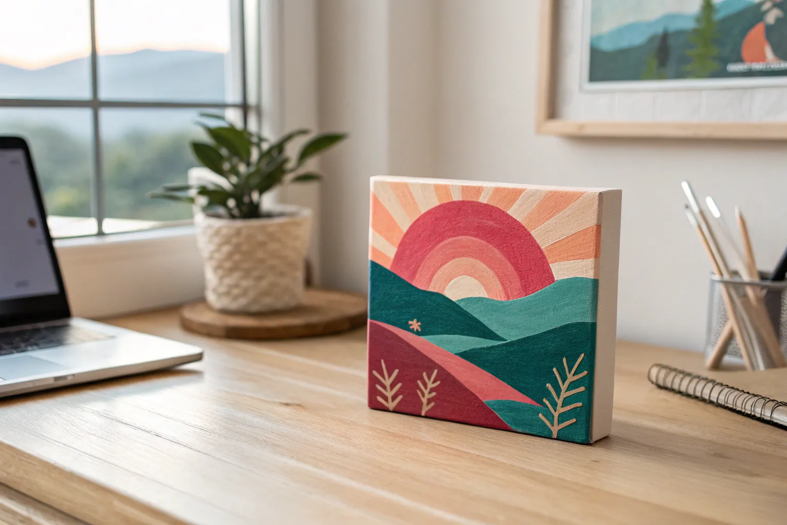
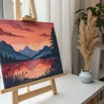
Sunset Gradient With a Simple Silhouette
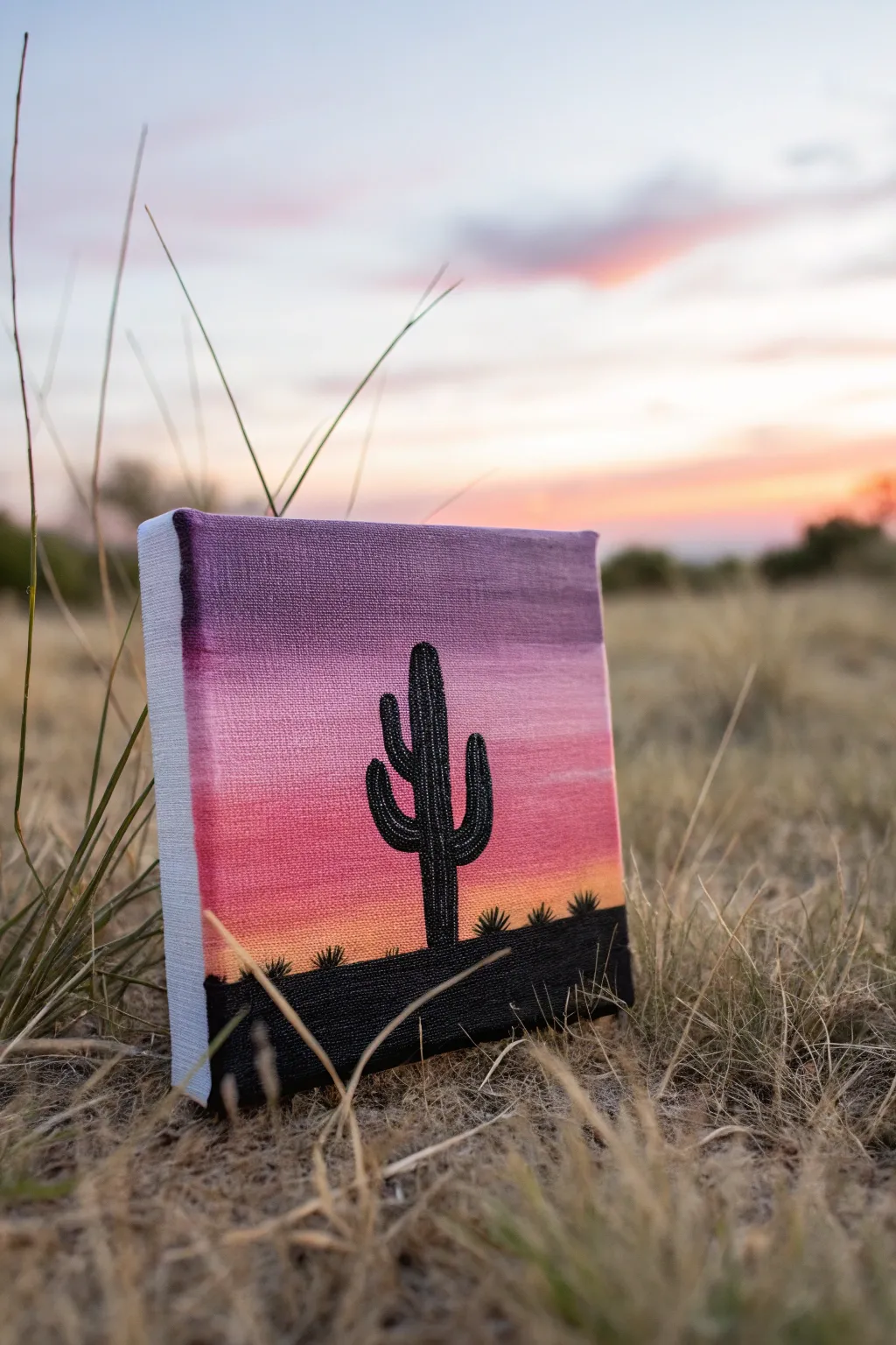
Capture the serene beauty of a desert evening with this beginner-friendly acrylic painting tutorial. By blending a vibrant sunset gradient and adding a stark black cactus silhouette, you’ll create a striking contrast that pops beautifully on a small canvas.
Step-by-Step
Materials
- Small square canvas (e.g., 6×6 or 8×8 inches)
- Acrylic paints: Violet, magenta, orange, yellow, and black
- Large flat paintbrush (1/2 inch or 3/4 inch)
- Small round detail brush (size 0 or 1)
- Cup of water
- Paper towels
- Palette or paper plate
Step 1: Creating the Sunset Gradient
-
Prepare your palette:
Squeeze out generous amounts of your violet, magenta, orange, and yellow acrylic paints onto your palette. Keep the black aside for later. -
Start at the top:
Using your large flat brush, load up with violet paint. Apply a solid horizontal band across the top quarter of the canvas. Don’t worry about being perfectly neat at the bottom edge. -
Add the magenta layer:
Without cleaning your brush thoroughly (just wipe off excess violet), pick up the magenta paint. Paint a band directly below the violet one. -
Blend the transition:
Where the violet and magenta meet, use long, smooth horizontal strokes to mix the wet paints directly on the canvas. This creates a soft, blurry transition between the colors. -
Introduce the orange tone:
Wipe your brush clean on a paper towel. Pick up the orange paint and apply a band below the magenta, leaving the bottom quarter of the canvas empty. -
Blend the middle section:
Using the same horizontal back-and-forth motion, blend the boundary between the magenta and the orange. If the paint feels too dry to blend, dip just the corner of your brush in water. -
Finish with yellow highlights:
Mix a little yellow with your orange to create a golden sunset hue. Apply this to the very bottom strip of the sky area. Blend it upwards into the orange for a glowing horizon effect. -
Wrap the edges:
While you have the colors on your brush, extend the painting around the sides of the canvas. Use the violet on the top edges, pink on the sides, and orange near the bottom for a professional, finished look. -
Allow to dry:
Let the gradient background dry completely. This usually takes about 15-20 minutes. If the background is still wet, the black paint in the next phase will mix and look muddy.
Fixing Muddy Blends
If your gradient colors turn brown while blending, stop! Let the layer dry completely, then paint fresh layers of color over the top. Clean your brush more frequently between color transitions.
Step 2: Painting the Silhouette
-
Establish the ground:
Switch to a smaller flat brush or clean your large one. Load it with black acrylic paint. Paint a solid, slightly uneven horizontal strip across the very bottom of the canvas to represent the ground. -
Outline the main trunk:
Switch to your small round detail brush. Load it with black paint that has been slightly thinned with a drop of water for smoother flow. Paint a vertical line starting from the ground up to the lower part of the purple sky. -
Thicken the cactus body:
Go over your vertical line to thicken it into a sturdy trunk shape. I like to keep the top rounded rather than pointy for a realistic saguaro look. -
Add the first arm:
Choose a spot about halfway up the trunk. Paint a curved line extending out to the left and bending upwards like an ‘L’ shape. Thicken this line to match the style of the trunk. -
Add the second arm:
Slightly higher or lower on the right side, paint a second arm curving upwards. Vary the height and thickness slightly so the cactus doesn’t look too symmetrical. -
Refine the shape:
Use your detail brush to smooth out any wobbly edges on the cactus. Ensure the black paint is opaque; if you can see the sunset through it, let it dry and add a second coat of black. -
Add distant vegetation:
Along the horizon line of the black ground, paint tiny, spiky semicircles or small bumps. These represent bushes or small agave plants in the distance. -
Final touches:
Check the edges of your canvas again. If the black ground needs to wrap around the bottom and lower sides, do that now to complete the 3D effect.
Make It Sparkle
Once the sky is totally dry, flick an old toothbrush dipped in watered-down white paint across the purple section to create a field of tiny stars appearing in the twilight.
Place your mini masterpiece on a small easel or shelf to bring a warm desert vibe to your room


Mini Abstract Color Blocks
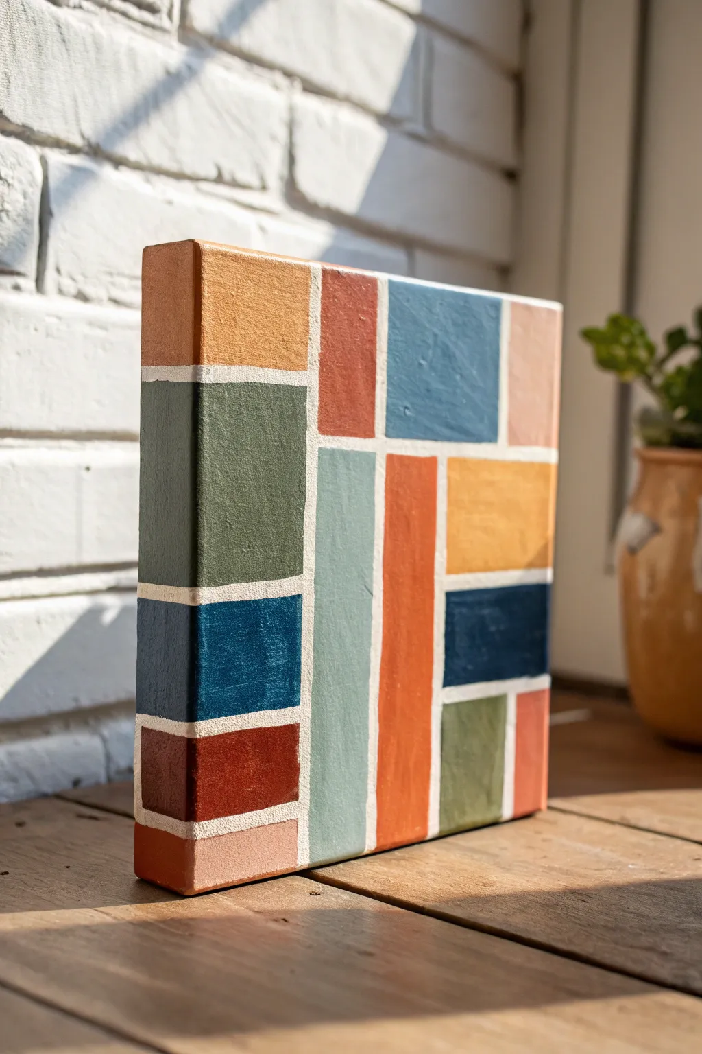
Transform a blank canvas into a stunning modern focal point using nothing but color and clean lines. This mini abstract painting features warm, earthy tones locked together in a satisfying puzzle-like composition that wraps beautifully around the edges.
How-To Guide
Materials
- Small square stretched canvas (e.g., 6×6 or 8×8 inches)
- Painter’s tape or washi tape (1/4 inch width works best)
- Acrylic paints (terracotta, sage green, mustard yellow, teal, navy, blush pink, burnt sienna)
- Flat synthetic paintbrushes (small and medium)
- White gesso or acrylic paint (for base)
- Palette or mixing plate
- Cup of water and paper towels
Step 1: Preparation & Masking
-
Prime the surface:
Start by giving your canvas a solid coat of white gesso or white acrylic paint. This ensures your final grid lines will be crisp and bright white rather than raw canvas color. Let this base layer dry completely. -
Map out the grid:
Using your narrow tape, begin creating your geometric design. Start by placing a long vertical strip slightly off-center to anchor the composition. Press the tape down firmly to prevent bleed-under later. -
Cross the lines:
Add horizontal strips of tape to intersect your vertical line. There’s no wrong way to do this, but try to create rectangles of varying sizes—some tall and skinny, others squat and square. -
Wrap the edges:
Don’t stop the tape at the front face of the canvas. Continue every strip of tape over the sides and around to the back. This wraps the design around the whole object, giving it a polished, sculptural look. -
Seal the tape:
For razor-sharp lines, I like to brush a very thin layer of white paint over the edges of the tape. This seals the tape gaps; if any paint bleeds under, it will just be white on white.
Bleeding edges?
If paint bled under the tape, wait for it to dry completely. Then, scrape away the excess gently with a craft knife or paint over the error with opaque white paint for a clean fix.
Step 2: Color Application
-
Plan your palette:
Squeeze out your acrylic colors onto your palette. Aim for a mix of warm tones (terracotta, mustard, burnt sienna) and cool tones (teal, sage green, navy) to create balance. -
Start with the largest blocks:
Identify the biggest rectangular spaces in your taped grid. Choose bold colors for these anchors—perhaps a deep sage green or a vibrant terracotta—and paint them in. Use a flat brush to get smooth, even coverage. -
Paint the edges simultaneously:
As you fill in a shape on the front, immediately paint the corresponding side of the canvas with the same color. This continuity is key to the 3D effect shown in the photo. -
Fill the medium shapes:
Move onto the medium-sized rectangles. Use contrasting colors next to the ones you’ve already painted. For instance, place a cool blue teal next to a warm orange strip. -
Tackle the small accents:
Save your punchiest colors, like the deep navy or bright blush pink, for the smaller squares and rectangles. These little pops of color add visual interest without overwhelming the piece. -
Check for opacity:
Acrylics can sometimes dry translucent. Once your first coat is touch-dry, check if you need a second coat to make the colors solid and opaque. Lighter colors like yellow often need that second pass.
Texture Play
Mix a little modeling paste into your acrylics before painting the blocks. This adds a raised, tactile texture to the colored shapes while keeping the white dividing lines recessed.
Step 3: The Reveal
-
Let it set:
Allow the painting to dry until it is tacky but not fully hardened. Peeling tape too early can smear wet paint, but waiting until it’s bone-dry can sometimes peel up the paint skin. -
Peel carefully:
Slowly peel back the tape at a 45-degree angle. Pull gently away from the painted areas. It is incredibly satisfying to watch the crisp white grid lines emerge from beneath the messy tape. -
Touch up:
Inspect your lines. If a little color bled through despite your best efforts, use a tiny liner brush and white paint to tidy up the grid lines. -
Varnish (Optional):
Once fully dry (give it 24 hours), you can apply a matte or satin varnish to protect the surface and unify the sheen of the different paint colors.
Now you have a striking geometric art piece that looks great on a shelf or hung as part of a gallery wall
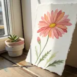
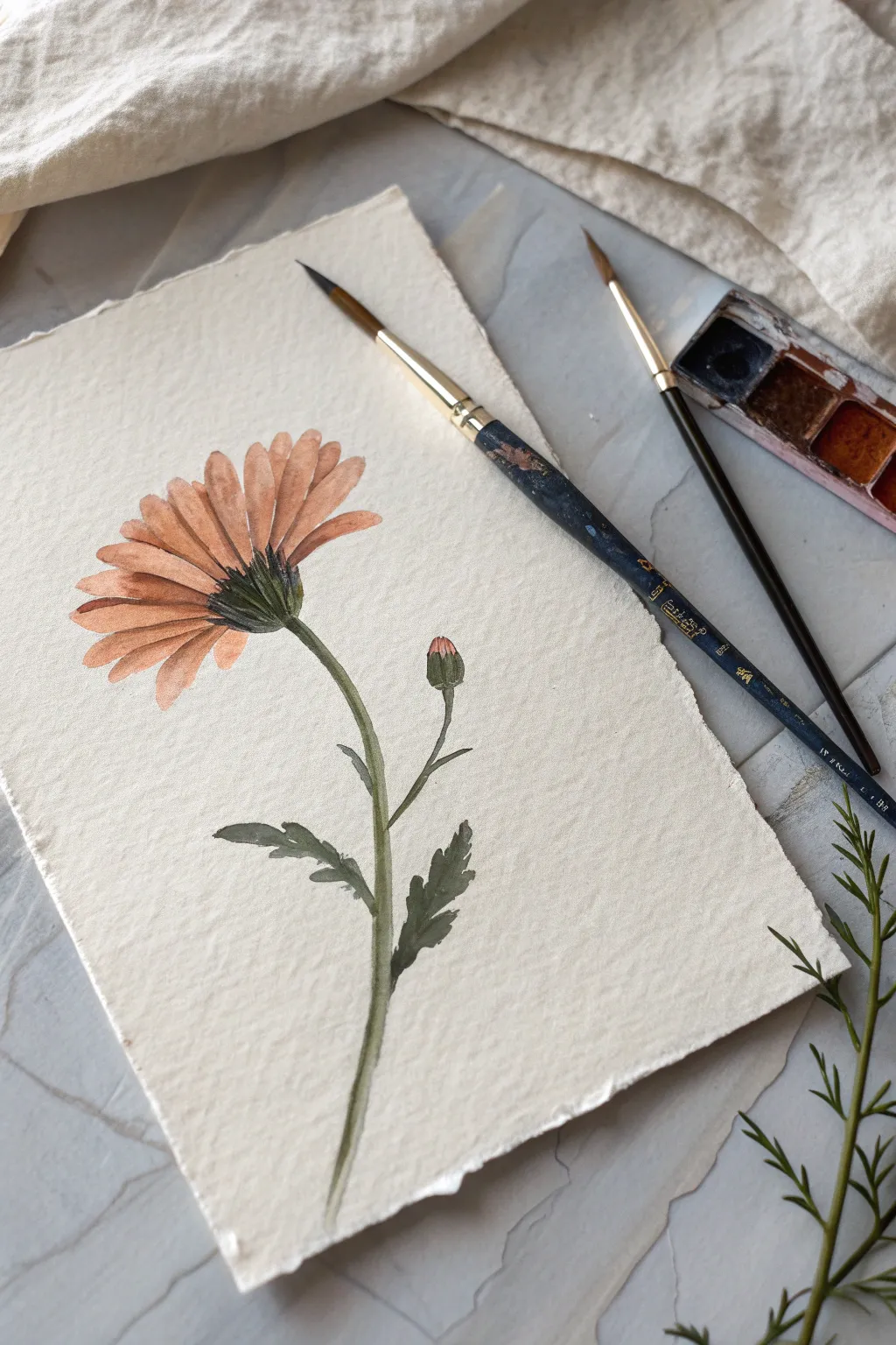
Paint a Tiny Botanical Study
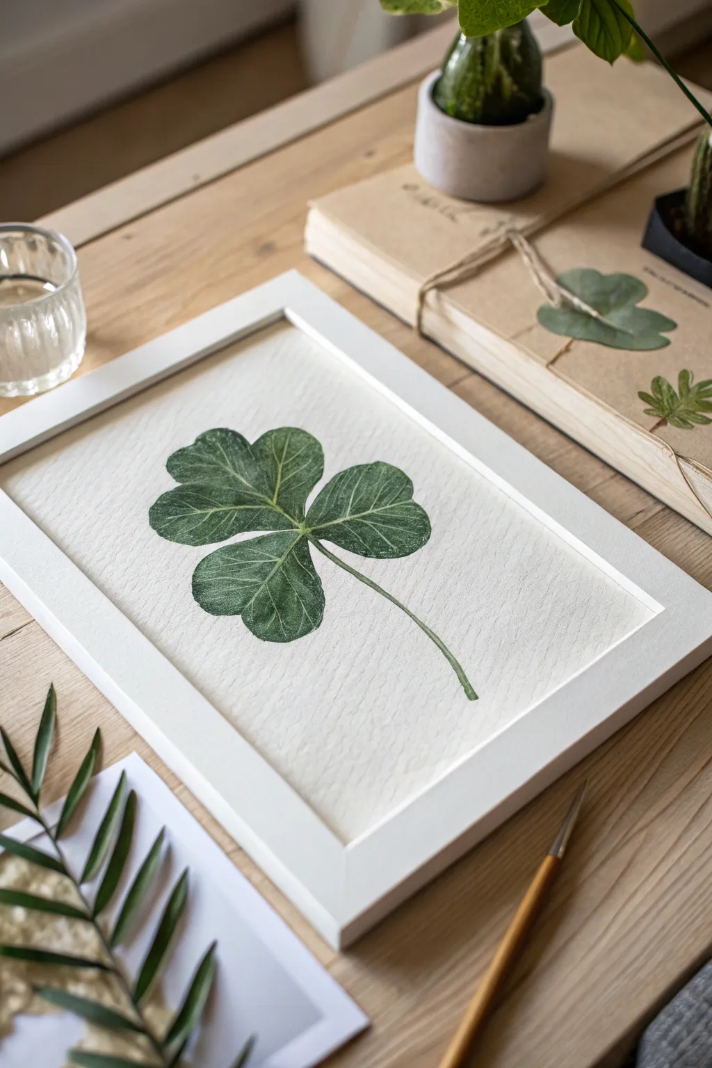
Capture the delicate details of nature with this minimalist botanical study of a four-leaf clover. Using layered watercolor techniques, you will create a realistic, textured leaf that sits beautifully within a clean white frame, bringing a touch of luck and greenery to any space.
Detailed Instructions
Materials
- Cold press watercolor paper (300 gsm)
- Watercolor paints (Sap Green, Hooker’s Green, Burnt Umber, Yellow Ochre)
- Small round brushes (Size 0, 2, and 4)
- HB pencil and kneaded eraser
- Mixing palette
- Jar of water
- Paper towels
- White wooden frame (approx. 8×10 inches)
Step 1: Planning and Sketching
-
Analyze the Composition:
Begin by observing the clover’s structure. Notice how the four leaflets meet at a central point, with the stem curving gently downwards to the right. The leaflets aren’t perfect circles; they have subtle heart-like indentations at the tips. -
Light Skeleton Sketch:
Using your HB pencil, draw a very faint ‘plus sign’ or cross shape to establish where the four leaves will sit. From the center intersection, lightly draw the curved line for the stem. -
Outline the Leaflets:
Sketch the outline of each leaflet around your guide marks. Keep your pencil pressure extremely light so graphite doesn’t muddy the paint later. Give the edges a slight undulation rather than a perfect curve to mimic organic matter. -
Refining the Shape:
Define the central veins. Draw a thin line down the middle of each leaflet, tapering off before it hits the outer edge. Use a kneaded eraser to lift up any heavy graphite, leaving only a ghost of an outline.
Dry Brush for Texture
For the realistic, scratchy texture on the leaf surface, wipe your brush almost completely dry on a paper towel before picking up concentrated pigment. This creates precise, textured lines.
Step 2: Base Layers and Texture
-
Mixing the Base Green:
Create a watery mix of Sap Green with a tiny touch of Yellow Ochre. This wash should be transparent and light, serving as the underlying glow of the leaf. -
The First Wash:
Apply this light green mix to the entire clover shape using your size 4 brush. Work fairly quickly to ensure an even coat, but don’t worry about minor streakiness—it adds to the natural look. Let this layer dry completely. -
Deepening the Shadows:
Mix Hooker’s Green with a dab of Burnt Umber to create a darker, forest green shade. Using the size 2 brush, paint the areas near the center where the leaflets overlap, feathering the color outward to create a gradient. -
Painting the Stem:
Use the size 2 brush and a mix of Sap Green and the darker shadow mix to paint the stem. Make one side of the stem slightly darker to suggest roundness and dimension. -
Creating Vein Texture:
This is where the realism happens. Switch to your smallest size 0 brush. Using a slightly darker green but with a very dry brush (remove excess water on a paper towel), gently sweep curved lines outward from the central vein of each leaflet.
Step 3: Refining Details
-
Building Vein Density:
Continue adding these fine, hair-like vein strokes. They should curve towards the leaf tips. I like to keep these strokes somewhat broken and uneven so they don’t look like diagrams. -
Highlighting:
If your painting feels too dark, you can lift a tiny bit of color from the high points of the leaf using a damp, clean brush. Alternatively, use a tiny amount of diluted white gouache mixed with yellow for subtle highlights on the vein ridges. -
Defining the Edges:
Go back around the outer perimeter of the clover with a very fine line of your darkest green mix. This crisps up the edges and separates the leaf from the white paper background. -
Central Contrast:
Add a final, concentrated dot of dark shadow right at the absolute center where the stem meets the leaves. This punches up the contrast and anchors the composition. -
The V-Shape Markings:
Many clovers have a faint, lighter chevron or ‘V’ pattern on the leaflets. If you wish to include this, glaze a very thin, watery layer of white or lifting fluid over the middle of each leaflet before your final dark vein details.
Try Pressed Elements
Instead of painting the stem, try gluing a real, pressed clover stem or a piece of dried grass to the paper for a mixed-media 3D effect that blurs the line between art and nature.
Step 4: Finishing and Framing
-
Dry and Flatten:
Allow the painting to dry thoroughly, preferably overnight. If the paper has buckled, you can carefully flatten it under a stack of heavy books. -
Cleaning the Paper:
Once bone dry, use your eraser to gently remove any remaining visible pencil marks around the edges, being careful not to rub the painted areas. -
Framing:
Clean the glass of your white wooden frame to ensure no dust is trapped. Center your artwork on the backing board or within the mat. -
Assembly:
Place the artwork into the frame and secure the back. The white frame compliments the botanical green perfectly, creating a fresh, modern piece ready for display.
Hang your finished botanical study in a bright corner to enjoy a permanent splash of spring green


Two Colors Only Challenge
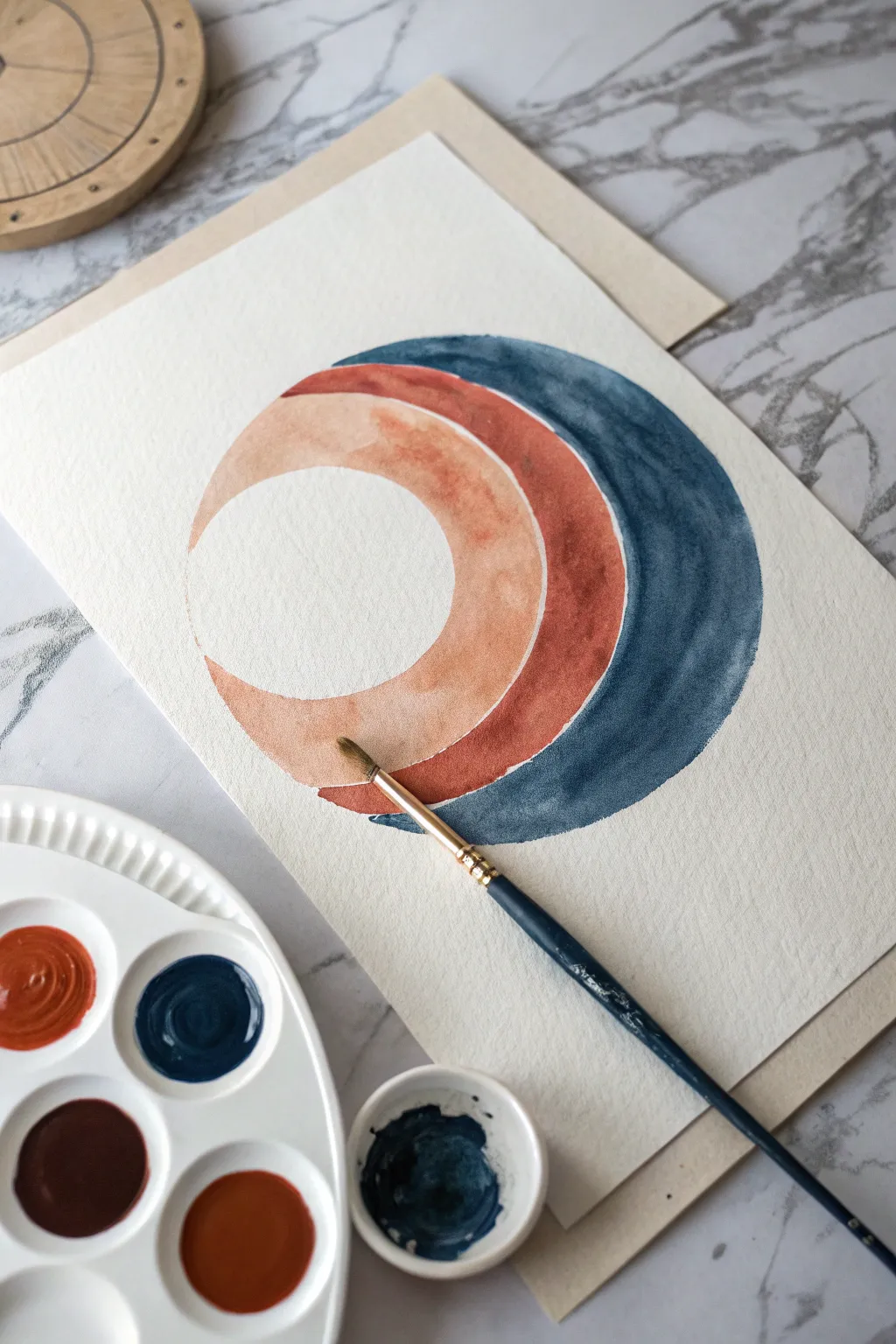
Embrace the beauty of restraint with this abstract watercolor study that relies on negative space and subtle layering. Using just two main pigments, you’ll create a harmonious stacking of crescent shapes that play with transparency and hard edges.
Step-by-Step
Materials
- Cold Press Watercolor Paper (approx 9×12 inches)
- Round Watercolor Brush (Size 6 or 8)
- Watercolor Paints: Prussian Blue (or Indigo) and Burnt Sienna (or Red Iron Oxide)
- Mixing Palette
- Two Jars of Water
- Paper Towels
- Pencil (HB or H)
- Compass or Circular Objects for tracing
Step 1: Preparation & Sketching
-
Prepare your palette:
Begin by squeezing out your two colors into your palette. You will need a deep, moody blue like Prussian Blue and a warm, earthy tone like Burnt Sienna. Activate them with a few drops of water so they are ready to mix. -
Plan the composition:
The artwork is composed of three nested, offset arcs. You’ll need to sketch this lightly first. Grab your compass or a circular object (like a masking tape roll). -
Sketch the inner boundary:
Draw your first circle in the center-left of the page. This will actually remain unpainted white paper—the negative space ‘moon’. -
Sketch the middle arc:
Slightly shift your compass or object to the right—about half an inch to an inch—and draw a second circle. This creates the first crescent shape. -
Sketch the outer arc:
Shift the compass to the right again, keeping the vertical alignment roughly the same, and draw a third circle. This defines the middle band. -
Define the final edge:
Shift one last time to the right to draw the final heavy outer curve. Ensure your pencil lines are very light; you don’t want them showing through the translucent paint.
Bleeding Edges?
If paint bleeds into the adjacent arc, wait for it to dry, then gently scrub the mistake with a clean, damp stiff brush and blot with a tissue to lift the pigment.
Step 2: Painting
-
Mix the lightest wash:
Start with the innermost crescent (the one closest to the white circle). Mix a very watery version of your Burnt Sienna. I find it helpful to test the opacity on a scrap piece of paper first—you want a pale, peachy terracotta tone. -
Paint the first arc:
Carefully fill in the first crescent shape. Use the tip of your round brush to follow the curve of your pencil line precisely. This creates that crisp (‘hard’) edge against the white paper. -
Let it dry completely:
This is crucial. If you paint the next layer while this one is wet, the colors will bleeding into each other. Wait until the paper is cool to the touch but dry. -
Mix the middle tone:
For the middle band, make a more saturated mix of the Burnt Sienna. It should be rich and rusty, distinctively darker than your first layer. -
Paint the second arc:
Fill in the middle crescent. Be very careful where this shape meets the first one; leave a microscopic hairline of white space between them if you can, or let them touch just barely to keep the forms distinct. -
Wait for drying:
Again, pause to let this rust-colored layer dry fully. Patience is key for clean geometric edges. -
Mix the dark outer tone:
Load your brush with the Prussian Blue. Keep this mix fairly pigment-heavy so it provides a strong contrast and acts as a visual anchor for the composition. -
Paint the final arc:
Paint the large, outermost crescent shape. Use confident, sweeping strokes to maintain a fluid look within the shape, while keeping the edges sharp and deliberate. -
Detailing the edges:
If your edges look a bit ragged, use the very tip of a slightly damp brush to gently refine the curve, smoothing out any bumps in the perimeter. -
Final dry:
Let the entire piece dry completely flat. If the paper buckles slightly, you can flatten it under heavy books overnight once the paint is bone dry. -
Erase pencil lines:
Once absolutely dry, take a kneaded eraser and very gently lift any visible pencil marks, being careful not to scrub the paint itself.
Add Some Sparkle
Once the painting is dry, use a metallic gold pen or fine brush with gold watercolor to trace the thin lines where the different colored arcs meet for a luxe finish.
Step back and admire the balance and simplicity of your abstract composition
BRUSH GUIDE
The Right Brush for Every Stroke
From clean lines to bold texture — master brush choice, stroke control, and essential techniques.
Explore the Full Guide
Random Shape Doodles Turned Into a Painting
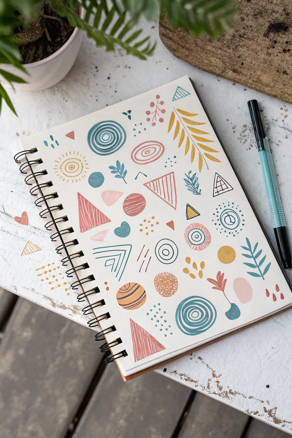
Transform a blank sketchbook page into a cohesive and modern pattern using simple geometric shapes and botanical motifs. This relaxing project relies on a limited earth-tone color palette and repetitive doodles to create a balanced, aesthetically pleasing composition.
How-To Guide
Materials
- Sketchbook or mixed media paper
- Paint markers (e.g., Posca) or colored gel pens in teal, mustard yellow, dusty pink, and terra cotta
- Fine-liner pen (black or dark blue) for details
- Pencil and eraser (optional for layout preview)
Step 1: Setting the Composition
-
Select your palette:
Choose 4-5 core colors that work well together. The reference image uses a harmonious mix of muted teal, mustard yellow, dusty pink, and rust orange to create a warm, organic feel. -
Start with large shapes:
Begin by scattering a few larger ‘anchor’ shapes across the page to establish balance. Draw a couple of large triangles and circles using your dusty pink and rust markers, leaving plenty of white space between them. -
Add spiral circles:
Using your teal marker, draw a few concentric circle designs. Start from the center and spiral outwards, or simply draw rings inside one another. Vary the line thickness slightly for a hand-drawn look.
Step 2: Building the Pattern
-
Create triangle clusters:
Draw several triangles of varying sizes. Fill some completely with solid dusty pink or rust color. For others, leave the inside empty for now, or fill them with vertical hatching lines. -
Incorporate botanicals:
Switch to your mustard yellow and teal markers. Draw simple leaf branches in the open spaces. Try a large, fern-like yellow leaf and smaller, sprig-like teal leaves. -
Draw simple sunbursts:
With the mustard yellow marker, draw a small spiral or circle and surround it with short radiating lines to create little sun or flower motifs. -
Add outlined shapes:
Draw outlines of circles and ovals using the teal and pink markers. Inside some of these, you can add smaller concentric circles or simple dots.
Uneven Coverage?
If your markers look streaky on the solid shapes, wait for the first layer to dry completely, then apply a second coat in a perpendicular direction.
Step 3: Adding Texture and Detail
-
Detail the triangles:
Go back to your outlined triangles. Use a fine-liner or a thinner marker tip to draw vertical stripes inside them if you haven’t already. This contrast between solid and striped shapes adds visual interest. -
Layer shapes:
Look for empty spots or simple shapes that need more flair. Draw a small teal semi-circle or irregular blob next to a pink triangle. Overlapping isn’t necessary, but close proximity creates a cohesive flow. -
Introduce geometric lines:
Use the teal marker to draw sets of nested chevrons (V-shapes) or parallel distinct lines floating in the negative space. -
Create dotted accents:
Using the tip of your markers, add clusters of small dots. Group teal dots near the bottom or mustard dots near the center to guide the eye. -
Add tiny fillers:
Look for any awkward large gaps. Fill them with tiny triangles, single dashes, or small hearts in a contrasting color like terra cotta.
Make it a Greeting Card
Scan your finished pattern and print it onto cardstock. It makes for beautiful, custom wrapping paper or a unique background for handmade stationery.
Step 4: Final Touches
-
Check the balance:
Step back and look at the spread. If one area looks too ‘heavy’ with one color, add a small motif of that same color on the opposite side to balance it out. -
Refine edges:
If any marker lines look rough, re-trace them carefully to smooth out the edges. Clean lines give this doodle style its polished, graphic appearance. -
Add black ink details:
Using your fine black pen, add tiny details like the grid inside a small triangle or very thin outlines around specific shapes for definition. -
Let it dry:
Ensure all ink is completely dry before closing your sketchbook to prevent smudging your crisp pattern.
You now have a vibrant page of modern doodles that serves as a perfect creative warm-up or a standalone piece of art
Tape-Off Geometric Stripes
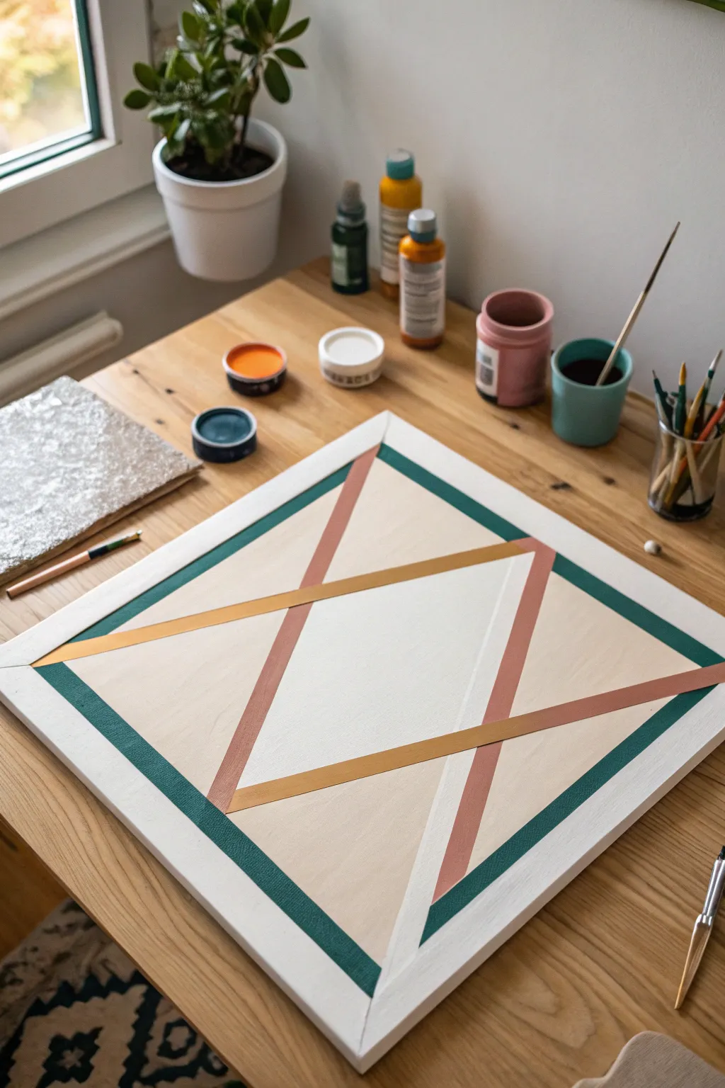
Achieve crisp lines and a modern aesthetic with this geometric tape-off painting project. By layering intersecting triangles and stripes in muted earth tones like teal, terracotta, and gold, you can create a sophisticated piece of wall art that looks surprisingly professional.
Detailed Instructions
Materials
- Square stretched canvas (approx. 12×12 or 16×16 inches)
- Painter’s tape or masking tape (various widths if desired, but standard 0.75 inch works)
- Acrylic paints: Dark teal/emerald green, dusty terracotta/pink, golden yellow, and creamy beige/off-white
- Flat paintbrushes (medium and small sizes)
- Palette or small cups for mixing paint
- Small jar of water
- Pair of scissors
- Pencil (optional)
- Hairdryer (optional, to speed up drying)
Step 1: Preparation and Background
-
Clean the canvas:
Ensure your canvas is free of dust or lint. Swipe it gently with a dry cloth. -
Paint the base coat:
Mix a creamy beige or off-white color. Apply this evenly over the entire canvas to serve as your background color. Don’t forget to paint the sides of the canvas for a finished look. -
Let it dry completely:
This is crucial. The base coat must be 100% dry before any tape touches it, otherwise, the tape will peel up the paint. I like to leave it for at least an hour or use a hairdryer on a cool setting.
Bleeding Lines?
If paint seeps under the tape, wait for it to fully dry. Then, use a small flat brush and your base color to carefully paint over the mistake, tidying the edge.
Step 2: Taping the Design
-
Create the outer border:
Apply strips of painter’s tape to form a square border inside the canvas. Place the tape approximately 1-1.5 inches from the edge. Press down firmly on the inner edges of the tape to prevent bleeding. -
Establish the main angles:
Imagine a large diamond shape. Run tape strips diagonally from the center-top area towards the bottom corners, and vice versa. -
Refine the geometric shapes:
Add additional intersecting tape lines to create the smaller triangles and crossing bars. Look at the reference image: you want to create negative spaces that will remain beige, while defining the areas that will become teal, pink, and gold. -
Seal the tape edges:
Run your fingernail or the back of a spoon over every edge of the tape. This friction ensures a tight seal against the canvas texture. -
The anti-bleed trick:
Take your base coat color (the beige) and paint a very thin layer *over* the tape edges. This seals any microscopic gaps; if paint bleeds, it will be the background color, which is invisible.
Clean Peel Trick
Pull the tape away from the painted area, not toward it. If the paint feels rubbery or stuck, lightly score the edge with a craft knife before peeling.
Step 3: Painting the Colors
-
Paint the teal border:
Load your brush with the dark teal or emerald green paint. Carefully fill in the outer border area created by your first set of tape lines. -
Apply the terracotta triangles:
Identify the long, vertical triangular sections in your design. Fill these with the dusty pink or terracotta paint. You may need two coats for full opacity. -
Add the golden accents:
Locate the horizontal or diagonal crossing bands that intersect the pink shapes. Paint these with your golden yellow hue. -
Touch up the white sections:
If you plan to have a specific white geometric section (like the bottom right triangle in the image), apply a fresh coat of pure white or very light grey there to make it pop against the beige background. -
Allow paint to set:
Let the colors dry until they are tacky to the touch but not fully hardened. Acrylics usually take about 15-20 minutes for this stage.
Step 4: The Reveal
-
Peel the tape:
Start peeling the tape off slowly at a 45-degree angle. Do this while the paint is still slightly damp to get the cleanest edge without chipping. -
Check for imperfections:
Once the tape is removed, inspect your lines. If there is any tiny bleed-through, you can fix it with a small detail brush and the background color once everything is dry. -
Final drying time:
Allow the finished piece to sit undisturbed for several hours to fully cure before displaying or framing.
Hang your new geometric masterpiece in a well-lit spot to show off those razor-sharp lines

PENCIL GUIDE
Understanding Pencil Grades from H to B
From first sketch to finished drawing — learn pencil grades, line control, and shading techniques.
Explore the Full Guide
Cloud Study Using a Sponge or Dab Brush
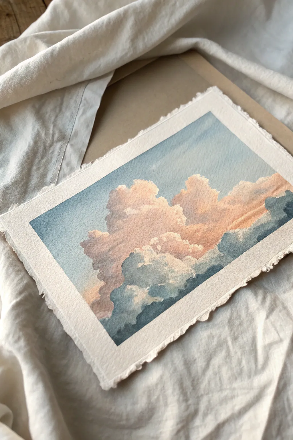
Capture the fleeting beauty of a sunset sky with this soft and dreamy cloud study. Using a unique sponge technique, you’ll build up layers of fluffy texture and warm, peachy light against a crisp blue backdrop on lovely deckled paper.
Step-by-Step Tutorial
Materials
- Heavyweight watercolor paper (300gsm or higher) with deckled edges
- Watercolor paints (Cerulean Blue, Indigo, Peach or Light Red, Yellow Ochre)
- Natural sea sponge or specialized dab brush
- Large flat wash brush
- Small round detail brush (size 2 or 4)
- Masking tape
- Paper towels
- Clean water jar
- Palette for mixing
Step 1: Setting the Stage
-
Prepare the Paper:
Since we want to preserve those beautiful deckled edges, tape your paper down to a board or table from the back, or very lightly tape only the corners so the edges remain exposed. -
Map the Clouds:
Using a very hard pencil (H or 2H), faintly sketch the outline of your main cloud formation. Keep the lines incredibly light so they disappear later. -
Pre-mix Your Palette:
Create three puddles on your palette: a watery pale blue for the sky, a warm peachy-pink for the cloud highlights, and a muted greyish-blue (mix Indigo with a touch of the Peach) for the cloud shadows.
Sponge Control
Rotate your sponge constantly as you work. Using the same spot on the sponge repeatedly creates a repeating pattern that looks artificial.
Step 2: Sky and Base Layers
-
Wet the Sky Area:
With your flat brush and clean water, dampen the area of the sky surrounding your clouds. Careful not to wet the inside of the cloud shapes yet. -
Apply the Blue Wash:
Load your flat brush with the pale blue mix. Use long, horizontal strokes to lay down the sky color, working carefully around the cloud outlines to keep the paper white where the clouds will be. -
Softening Edges:
While the blue is still slightly damp, take a clean, slightly wet brush and gently soften some of the hard edges where the blue meets the white paper, creating a hazy atmosphere.
Step 3: Building the Clouds
-
Prepare the Sponge:
Dip your natural sea sponge into water and squeeze it out thoroughly until it is just damp, not dripping. -
First Peach Layer:
Dip the sponge lightly into your peach mixture. Dab off excess paint on a paper towel—this is crucial for texture. -
Dabbing Highlights:
Gently press the sponge onto the upper, sun-lit portions of your cloud sketch. Use a rolling motion to create organic, fluffy shapes rather than a uniform stamp pattern. -
Adding Depth:
While the first layer is still tacky, mix a tiny bit more pigment into your peach color to darken it slightly. Sponge this near the middle sections of the clouds to start building volume. -
Transition Zone:
Clean your sponge or switch to a clean side. Pick up the greyish-blue shadow mix. -
Initial Shadows:
Sponge the grey-blue color into the lower sections of the clouds. Where the grey meets the peach, let the sponge textures blend naturally to create a violet transition tone.
Level Up: Golden Hour
Mix a tiny amount of gold metallic watercolor or ink into your peach highlight color for clouds that genuinely shimmer in the light.
Step 4: Refining and Deepening
-
Deepen the Shadows:
Mix a stronger version of your Indigo/grey mix. I like to use a small round brush here to paint the darkest undersides of the clouds, then immediately dab with a clean sponge to blur the brushstrokes. -
Define the Edges:
Use your small detail brush with opaque white gouache or very concentrated peach paint to dab tiny highlights on the very tops of the clouds, defining the ‘silver lining’ effect. -
Sky Contrast:
If your sky dried too pale, glaze a second layer of blue in the corners of the painting to make the white clouds pop more intensely. -
The Bottom Edge:
At the very bottom of the cloud formation, use a wet brush to drag the grey shadow pigment downwards, fading it out into nothingness to suggest distant rain or lower atmosphere. -
Final White Highlights:
For maximum fluffiness, use a fairly dry brush with white gouache to scumble (light circular scrubbing) over the lightest parts of the clouds, reinforcing the texture. -
Dry and Flatten:
Let the painting dry completely before removing it from your surface. If the paper buckled, place it under a heavy book overnight.
Step back and admire how the simple sponge texture transforms paint into billowing, light-filled forms
Random Color Wheel Slice Landscape
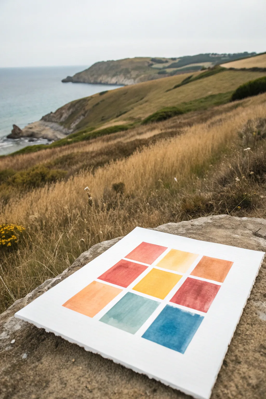
This meditative watercolor project involves distilling a sprawling landscape into its essential hues, arranged in a clean, minimalist grid. By extracting specific colors from your surroundings—like the ochre grass, clay cliffs, and slate-blue sea—you create an abstract map of the moment that feels both modern and deeply connected to nature.
Detailed Instructions
Materials
- Heavyweight watercolor paper (300gsm cold press recommended)
- Watercolor paints (pan or tube set)
- Flat shader brush (size 6 or 8)
- Pencil (HB or H)
- Ruler
- painter’s tape or masking tape (low tack)
- Two jars of water
- Paper towel or cloth
- Eraser (kneaded preferred)
Step 1: Preparation & Layout
-
Paper Setup:
Begin with a sheet of high-quality watercolor paper. The deckled edge seen in the example adds a lovely rustic touch, so feel free to tear your paper to size using a ruler as a guide rather than cutting it with scissors. -
Determine Grid Size:
Decide on the size of your squares. For a standard sheet, 1.5-inch or 2-inch squares usually work well. You need a 3×3 layout, meaning nine total squares. -
Draft the Grid:
Using your ruler and pencil, very lightly mark out the grid. Ensure there is even spacing between the squares—about 1/4 inch of white space creates a nice clean border. -
Refine the Lines:
Double-check your measurements. The beauty of this piece relies on the geometric precision contrasting with the organic paint flow, so keep your pencil lines straight but faint enough that they won’t show through lighter colors.
Uneven Edges?
If you struggle to paint straight edges freehand, use low-tack washi tape to mask off the grid. Ensure the paper is dry before peeling it off at a 45-degree angle.
Step 2: Color Selection & Mixing
-
Analyze the Landscape:
Look at your reference scene. Identify the dominant colors. In this coastal example, we see dried grass (yellow ochre/gold), cliffs (burnt sienna/terracotta), vegetation (muted greens), and the ocean (various blues and teals). -
Mixing the Earth Tones:
Prepare your palette. Mix a warm yellow ochre for the sun-bleached grass. For the darker cliff tones, mix burnt sienna with a touch of red or orange to warm it up. -
Mixing the Cool Tones:
Create a gradient of blues. You’ll want a deep, muted blue for the deep water, a lighter teal for the shallows, and perhaps a grayish-blue for the horizon line. -
Testing Swatches:
Before painting the final grid, test your mixed colors on a scrap piece of paper to ensure they harmonize well together.
Make it Personal
Instead of a landscape, pick a favorite photo, outfit, or flower bouquet and extract 9 colors from it. It’s a great way to document a memory abstractly.
Step 3: Painting the Squares
-
Brush Technique:
Load your flat brush with your first color, ensuring it’s wet but not dripping. The flat edge helps you cut sharp lines along the pencil marks without needing masking tape. -
First Application:
Start with the top left square. Apply the paint smoothly from top to bottom. If you want a slight gradient within the square, add a tiny bit more water as you move down. -
Work Diagonally:
To avoid smudging wet paint, I find it helpful to work diagonally or checkerboard-style rather than straight across, giving adjacent squares time to set. -
Color Placement Strategy:
Distribute your colors to create balance. Place warm reds and oranges opposite cool blues. In the example, the fiery reds sit near the center and top, while the heavy blues anchor the bottom right. -
Managing Water Control:
Watch for pooling. If a puddle forms in a corner, dry your brush on a paper towel and touch the tip to the puddle to lift the excess liquid. -
Painting the Sea Tones:
Fill the bottom row with your cool ocean colors—teals and slate blues. This mimics the landscape itself, grounding the composition with the ‘water’ at the bottom. -
Painting the Earth Tones:
Fill the remaining upper squares with your yellows, oranges, and reds. Let the colors vary slightly in saturation; some can be bold and opaque, others more transparent.
Step 4: Finishing Touches
-
Drying Time:
Let the piece dry completely flat. Do not touch the squares while they are damp, or you risk creating ‘blooms’ or back-runs in the pigment. -
Erase Guidelines:
Once the paper is bone dry, gently erase any visible pencil marks between the squares. Be careful not to rub the paint itself. -
Flattening:
If the paper has buckled slightly from the water, place the finished (and dry) painting under a heavy book overnight to flatten it out perfectly.
Now you have a serene color study that captures the essence of a beautiful view without needing to paint a single detailed tree


Combine Two Unrelated Things
Capture the graceful simplicity of a calendula flower with this botanical watercolor study. Using soft washes and careful layering, you’ll create a piece that feels both organic and elegantly detailed on textured cotton paper.
Detailed Instructions
Materials
- Textured watercolor paper (deckle edge preferred)
- Watercolor paints: Burnt Sienna, Yellow Ochre, Sap Green, Indigo, Sepia
- Round watercolor brushes (size 2 and 6)
- Pencil for sketching (HB)
- Kneaded eraser
- Jar of clean water
- Paper towel or cloth
Step 1: Sketch and Base Layers
-
Outline the Composition:
Begin with a very faint pencil sketch. Draw a gentle, curving line for the main stem. At the top, sketch an oval for the flower head’s angle, and mark the position of the bud on the right side. -
Define the Petals:
Lightly draw the individual petals radiating from the center. Notice how the petals on the left are viewed more fully, while those on the right are foreshortened. Sketch the jagged, leafy greens on the stem. -
Lighten the Sketch:
Roll your kneaded eraser gently over the entire drawing. You want the graphite lines to be barely visible so they won’t show through the transparent watercolor layers later. -
First Petal Wash:
Mix a watery blend of Yellow Ochre and a touch of Burnt Sienna. Using your size 6 brush, paint the petals with a very pale wash. Leave tiny slivers of white paper between some petals to define them. -
Base Greenery:
While the petals dry, mix a light Sap Green. Paint the main stem, the smaller stem for the bud, and the base of the flower head. Keep this layer translucent and even.
Muddy colors?
If your orange and green mix into a brown mess where they touch, let the first color dry completely before painting an adjacent area.
Step 2: Building Depth and Color
-
Deepen Petal Tones:
Once the first layer is bone dry, mix a slightly stronger orange using Burnt Sienna with a hint of red if you have it. Apply this to the base of the petals near the center, flicking the brush outward to create a gradient. -
Shadowing the Underside:
Observe which petals would be in shadow—typically those underneath or overlapping. Add a second glaze of your orange mix to these areas to create dimension. -
Painting the Bud:
Paint the enclosed petals of the small bud with your orange mix. Then, use a darker green mixture (Sap Green plus a touch of Indigo) to paint the sepals hugging the colored bud. -
Leaf Texture:
Swapping to the size 2 brush, mix Sap Green with a little Sepia to dull it. Paint the jagged leaves on the lower stem. Use the tip of the brush to create crisp, serrated edges. -
Stem Shadows:
Run a thin line of the darker green mix along one side of the stem. This simple step instantly makes the stem look round rather than flat.
Step 3: Final Details and Refinement
-
Darkening the Center:
Mix a dark, muddy green using Indigo and Sap Green. Carefully paint the base of the flower head where it meets the petals (the involucre). Use short, vertical strokes to suggest texture. -
Reviewing Petal Edges:
Check your petal tips. If they look too uniform, you can lift a tiny bit of color with a damp, clean brush to create highlights, or add a tiny line of Burnt Sienna to define an edge. -
Adding Veins:
With your smallest brush and a very watery orange mix, paint incredibly fine lines down the center of a few main petals to suggest veins. Don’t overdo this; less is more. -
Final Contrast:
Mix your darkest value yet—Sepia and Indigo. Add tiny dots or dashes right at the very center where the petals emerge from the green base to anchor the flower. -
Clean Up:
Allow the painting to dry completely. If any pencil marks are still visible and distracting in the white highlight areas, gently erase them now.
Pro Tip: Soft edges
To fix a hard paint line on a petal, quickly run a clean, damp brush along the edge while the paint is still wet to soften the transition.
Now stepping back, you can admire the gentle, organic feel of your finished botanical study
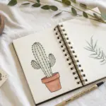
Paint a New Creature From Mixed Animals
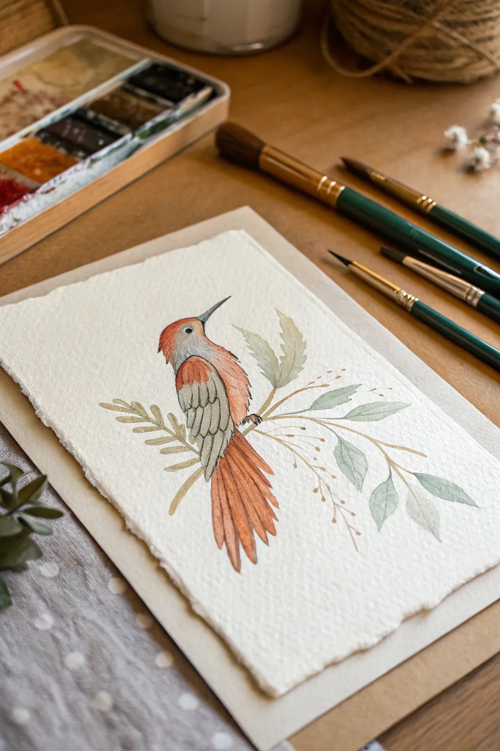
Blend the best features of different birds into one fantastical creature with this charming watercolor project. With its textured paper and delicate botanical elements, this painting captures the soft, organic feel of a classic nature study but touches on the wonderfully imaginative.
Step-by-Step Guide
Materials
- Cold-pressed watercolor paper (heavyweight, heavily textured)
- Watercolor paints (burnt sienna, yellow ochre, payne’s grey, sap green, cadmium red)
- Round watercolor brushes (size 2, 4, and a fine liner)
- Pencil (HB or H)
- Kneaded eraser
- Clean water jar
- Paper towels
- Deckle edge ruler (optional)
- Mixing palette
Step 1: Planning the Hybrid
-
Prepare the paper:
Start by tearing your watercolor paper to size. To achieve that beautiful, ragged deckle edge shown in the photo, fold the paper deeply and tear it slowly against a ruler, or use a specific deckle-edge ruler if you have one. -
Form the body:
Lightly sketch a basic oval for the bird’s body and a smaller circle for the head using an H pencil. Keep these lines very faint so they won’t show through the translucent paint later. -
Add mixed features:
Draw a long, sharp beak characteristic of a woodpecker or hummingbird. Extend the tail feathers straight down, making them longer than a standard songbird’s to create that unique hybrid look. -
Sketch the perch:
Draw intersecting botanical stems crossing behind the bird. Don’t worry about perfect symmetry; these should look like wild, wandering sprigs.
Muddy colors?
If your bird’s red and grey sections are bleeding into a brown mess, let each section dry completely before painting the neighbor. Use a hair dryer on low to speed it up.
Step 2: Layering Colors
-
Base wash for the head:
Mix a watery wash of cadmium red and burnt sienna. Apply this to the head area, letting the color fade out as you move down the neck. -
Wing base:
While the head is drying, mix a very pale grey using plenty of water and a touch of Payne’s Grey. Fill in the wing area, leaving the space between feathers white for definition. -
Tail feathers:
Load your size 4 brush with a saturated burnt sienna mix. Paint each tail feather individually, starting from the top and lifting the brush as you reach the tip to create a tapered point. -
Define the eye:
Once the head is dry, use your smallest liner brush and dark grey or black paint to create the eye. Leave a tiny speck of white paper unpainted for the highlight to bring the creature to life.
Level Up: Metallic Accent
After the painting is dry, use gold watercolor or metallic ink to outline the delicate seed pods and thin stems. It adds a magical, illuminated manuscript vibe.
Step 3: Refining Details
-
Deepen the reds:
Glaze a second layer of the red-orange mix over the chest and shoulder of the bird to build vibrancy. I like to drop in a tiny bit of darker pigment while it’s wet to create shadow under the wing. -
Feather texture:
Using the tip of a size 2 brush and a darker grey mix, outline the individual wing feathers. Use quick, short strokes to mimic the texture of plumage. -
Beak work:
Paint the beak with a blue-grey wash. A darker line along the bottom edge will give it fullness and dimension. -
Painting the greenery:
Mix sap green with a touch of grey to get a muted, earthy green. Paint the larger leaves using a single stroke—press down to widen the leaf and lift up for the point. -
Adding delicate stems:
With your liner brush and a diluted ochre or brown, paint the thin, wispy stems that crisscross the composition. Keep your hand loose to avoid stiff lines.
Step 4: Final Touches
-
Leaf variation:
Vary your greens by adding more water for some leaves and more pigment for others. This creates depth so the botanical elements don’t look flat. -
Seed pods:
Dab tiny dots of golden-brown paint on the ends of the thinnest stems to represent small seeds or buds. -
Connecting the feet:
Use dark grey to paint tiny claws gripping the main stem. Ensure the feet look like they are wrapping around the twig rather than just floating on top of it. -
Shadows and cleanup:
Add a very faint line of grey paint to the underside of the main branch for shadow. Once everything is completely bone-dry, gently erase any remaining visible pencil marks.
Enjoy the peaceful process of bringing this gentle, invented creature into existence on your page.
Negative Space Shapes With One Accent Color
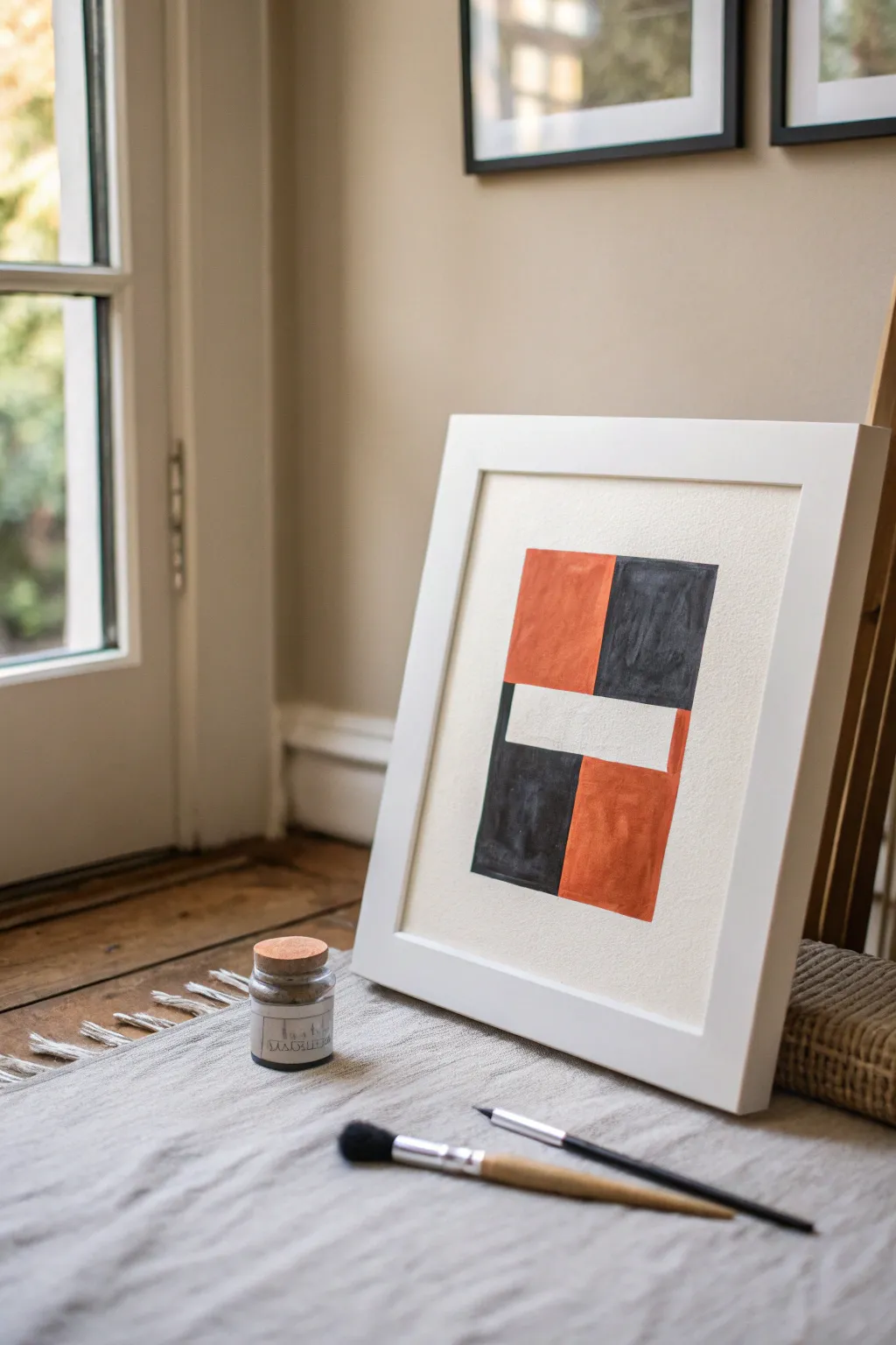
This striking yet simple abstract piece relies on the power of negative space and bold color blocking. By contrasting warm, earthy rust tones with deep charcoal against a raw canvas background, you create a modern composition that feels both structured and organic.
Step-by-Step Tutorial
Materials
- Heavyweight textured watercolor paper or canvas sheet
- Gouache or matte acrylic paints (Burnt Sienna/Rust, Carbon Black, Titanium White)
- Flat shader brush (size 10 or 12)
- Pencil (HB or lighter)
- Ruler or T-square
- Painter’s tape or masking tape
- Mixing palette
- Cup of water
- White or light wood frame for display
Step 1: Planning the Grid
-
Prepare your surface:
Start by cutting your textured paper to size. A standard 8×10 or A4 size works beautifully for this scale of composition. Tape down the edges to your work surface to prevent buckling. -
Define the outer boundary:
Using your ruler and a very light pencil touch, draw a centered rectangle on your paper. Leave a generous border of at least 2 inches on all sides to frame the artwork naturally. -
Mark the vertical division:
Measure the width of your drawn rectangle and make a small mark exactly in the center. Lightly draw a vertical line splitting the rectangle into a left and right column. -
Create the horizontal break:
Now, locate the visual center of the rectangle’s height. Measure about 3/4 of an inch above and below this center point. Draw two horizontal lines across both columns, creating a central band that will become our negative space. -
Erase guide lines:
Carefully erase the vertical center line *only* inside that new central horizontal band. This band should remain one continuous shape.
Step 2: Painting the Color Blocks
-
Mix the rust tone:
On your palette, squeeze out burnt sienna. If it feels too brown, add a tiny touch of red or orange. If it’s too bright, a speck of blue or green will tone it down to that earthy terracotta shade. -
Paint the top-left block:
Load your flat brush with the rust mixture. Fill in the top-left rectangle. Use vertical strokes first, then smooth them out. Don’t worry about perfect opacity; a little texture adds character. -
Paint the bottom-right block:
Using the same rust color, fill in the bottom-right rectangle. This diagonal placement creates visual balance. -
Clean your brush thoroughly:
Wash your brush well. You don’t want any orange tint muddying your deep charcoal color. -
Mix the charcoal shade:
Mix carbon black with a very small amount of white to create a soft, dusty charcoal. I prefer this over pure black because it feels less harsh against the warm paper. -
Paint the top-right block:
Fill the top-right rectangle with your charcoal mix. Keep your edges relatively neat, but embrace the slight wobble of a hand-painted line rather than using tape, which can look too manufactured. -
Paint the bottom-left block:
Complete the grid by painting the bottom-left rectangle in charcoal. Ensure the paint meets the central negative space cleanly.
A Textured Touch
For that grainy, vintage look, don’t help the paint flow too much with water. Use a ‘dry brush’ technique to let the paper’s tooth show through.
Step 3: Refining and Framing
-
Evaluate the negative space:
Look at the central unpainted band. If your paper isn’t bright enough, you can paint this strip with titanium white for a sharper contrast, or leave it bare for a softer look. -
Touch up edges:
Once the paint is dry to the touch, inspect the corners where colors meet the negative space. Use a small detail brush to sharpen any fuzzy edges if needed. -
Let it cure:
Allow the painting to dry completely. Gouache dries quickly, but acrylic might take an hour to fully settle into the texture. -
Erase remaining graphite:
Checking that the paint is totally bone-dry, gently erase any visible pencil marks around the perimeter of the painted shape. -
Peel the tape:
Remove the painter’s tape slowly, pulling it away from the paper at a 45-degree angle to ensure a crisp paper edge. -
Frame your work:
Place the artwork into a simple white frame with a mat. The mat helps isolate the composition and enhances that gallery-wall aesthetic.
Uneven Edges?
If your freehand lines are trembling too much, use a piece of cardstock as a mobile shield to paint against for straighter edges without taping.
Hang your new minimalist masterpiece in a well-lit spot to enjoy the subtle textures and bold geometry
Make a Four-Panel Random Series
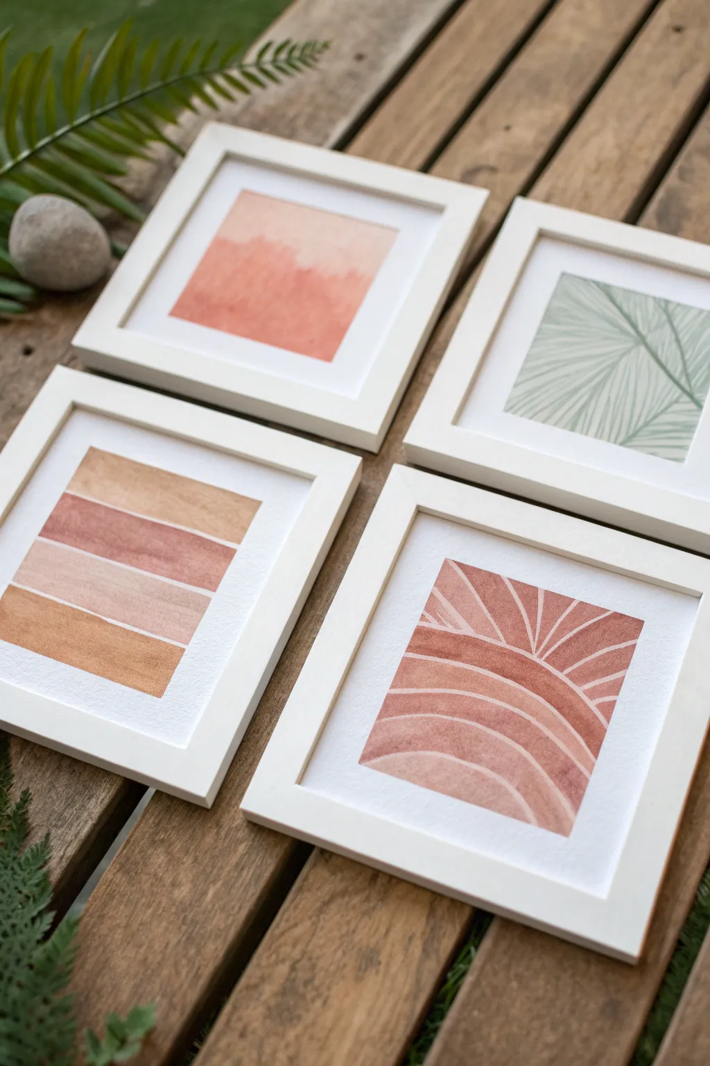
Create a harmonious gallery wall with this set of four mini watercolor paintings featuring warm earth tones and simple organic shapes. This project combines abstract washes, structured stripes, and botanical line work to produce a cohesive yet varied collection.
Detailed Instructions
Materials
- 4 small square watercolor paper sheets (approx. 5×5 or 6×6 inches)
- Watercolor paints (burnt sienna, ochre, muted pink, sage green, dark green)
- Flat shader brush (size 10 or 12)
- Round detail brush (size 2 or 4)
- Masking tape or delicate painter’s tape
- 4 white square frames with mats
- Pencil and eraser
- Jar of clean water
- Paper towels
Step 1: Preparation & Planning
-
Prepare the paper:
Cut your watercolor paper into four identical squares that will fit inside your frame mats. Tape down the edges of all four sheets to your work surface using masking tape to create a crisp white border and prevent buckling. -
Mix your palette:
Prepare your color palette before starting. You will need a gradient of warm tones: a deep rust (burnt sienna mixed with a touch of red), a sandy beige, a yellow ochre, and a soft sage green.
Step 2: Painting the Abstract Stripe
-
Sketch the zones:
On the first sheet, lightly use a ruler and pencil to mark four horizontal bands of roughly equal height. -
Paint the first stripe:
Starting with the second stripe from the top, fill it with a rich, watery rust or terracotta color using your flat brush. -
Add adjacent stripes:
Paint the top stripe in a diluted sandy beige and the bottom stripe in a yellow ochre. Leave a tiny hairline of white space between the wet stripes to prevent them from bleeding into each other. -
Finish the gradient:
Fill the remaining third stripe with a pale, dusty pink to complete the warm gradient stack.
Bleeding Lines?
If stripes bleed together, dry each color section with a hair dryer before painting the neighbor. This keeps lines crisp without white gaps.
Step 3: Painting the Sunset Arch
-
Outline the design:
On the second sheet, lightly sketch an arch shape that fills the bottom two-thirds of the paper, then divide the background and the arch into radiating segments. -
Fill the negative space:
Using a monochrome rust color, carefully paint every other segment inside the arch and the background rays. Leave the alternating stripes white. -
Refine edges:
Switch to your small round brush to neaten the edges of your colored segments, ensuring the white negative lines remain consistent in width.
Pro Tip: Color Harmony
Mix a tiny dot of the rust color into your green paint. This links the botanical print to the other three warm-toned pieces beautifully.
Step 4: Painting the Color Field Wash
-
Wet the paper:
For the third sheet, apply a layer of clean water over the central area of the paper. -
Drop in color:
Load your brush with watery peach and soft orange paint. Touch the wet paper and let the pigment bloom naturally. -
Create texture:
While the paint is still damp, dab in slightly more concentrated red-orange pigment near the bottom to suggest an abstract horizon line or landscape.
Step 5: Painting the Botanical Leaf
-
Lay the base color:
On the final sheet, paint a very pale wash of sage green over the entire square and let it dry completely. -
Paint the veins:
Mix a darker, more concentrated green. Using your finest detail brush, paint a diagonal line from corner to corner to serve as the leaf’s central stem. -
Add detail lines:
Paint fine, radiating lines branching out from the center stem to the edges of the paper to mimic palm frond veins.
Step 6: Finishing Touches
-
Remove tape:
Once all four paintings are 100% dry to the touch, slowly peel back the masking tape at a 45-degree angle. -
Erase guidelines:
Check for any visible pencil marks, particularly on the striped and arch designs, and gently erase them. -
Frame and hang:
Place each artwork into its corresponding white frame and arrange them in a 2×2 grid to display your new mini-series.
Step back and enjoy the simple elegance of your handcrafted gallery wall.
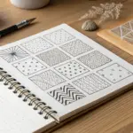
Paint Your Own “Art Prompt” Card Set
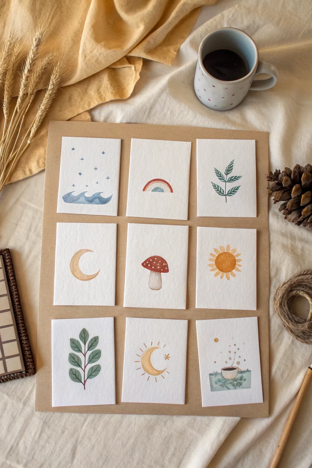
Create a charming set of nine miniature art cards featuring simple, minimalist nature themes like mushrooms, moons, and leaves. This project is perfect for using up scrap watercolor paper or creating a unique inspiration deck.
Step-by-Step Guide
Materials
- Cold-press watercolor paper (140lb/300gsm)
- Brown kraft paper or cardstock (approx. 12×16 inches)
- Watercolor paints (pan or tube set)
- Round watercolor brushes (sizes 2 and 4)
- White gel pen or gouache
- Ruler and pencil
- Scissors or paper trimmer
- Double-sided tape or glue stick
- Jar of water
- Paper towel
Step 1: Preparation
-
Cut the cards:
Begin by measuring and cutting your watercolor paper into nine equal rectangles. A size of 2.5 x 3.5 inches (standard ATC size) works well, or go slightly smaller for a daintier look. -
Prepare your palette:
Activate your watercolor paints by adding a drop of clean water to each pan. You will need an earthy palette: indigo blue, ochre yellow, sap green, burnt sienna, and a deep red.
Step 2: Painting the Elements
-
Paint the starry waves:
On the first card, load your brush with watered-down indigo. Paint a simple, wavy line near the bottom and fill it in. While wet, drop in a slightly darker blue at the base for depth. Once dry, use a fine brush or pen to draw tiny stars above. -
Create the rainbow:
For the second card, paint a small arch in dusty red. Leave a tiny gap of white paper, then paint a second arch inside it using a muted teal or blue. Keep the arches loose and organic rather than perfectly geometric. -
Leaf sprig design:
Paint a thin vertical stem. Using a ‘press and lift’ motion with your round brush, add simple leaves extending from the stem in a V-shape pattern. Vary the green shades slightly for interest. -
Simple crescent moon:
Mix a diluted ochre or pale brown. Sketch a C-shape with your brush and fill it in with a wash. Let the pigment pool naturally in some areas to create texture that mimics craters. -
The mushroom centerpiece:
Paint a stout stem shape in beige. Top it with a red cap, leaving it slightly rounded. Once the red is completely dry, use your white gel pen or opaque white gouache to dot simple spots onto the cap. -
Paint the sun:
Create a circle of warm yellow-orange in the center of a card. Paint small triangular rays radiating outward. Don’t worry about perfect symmetry; a hand-drawn look adds charm. -
Botanical branch:
Similar to the first leaf sprig, paint a central stem. This time, make the leaves larger and rounder, using a darker, more forest-green shade. Ensure each leaf connects delicately to the main stem. -
Celestial moon and stars:
Paint another crescent moon, perhaps thinner than the first, in a golden yellow. Add fine radiating lines around the outer curve and a small star shape near the opening. -
Cozy coffee cup:
Paint a small rectangle or saucer shape in muted green. Add a small brown oval for the coffee and a rim shape. Use tiny dots of brown paint rising from the cup to simulate steam or aroma.
Keep it Loose
Don’t overwork the paint. Let the water do the work by touching wet pigment to wet paper for soft blooms.
Step 3: Assembly
-
Arrange the grid:
Take your large sheet of brown kraft paper. Lay out your nine finished dry paintings in a 3×3 grid to ensure spacing is even before adhering anything. -
Adhere the artwork:
Apply double-sided tape or a thin layer of glue to the back of each watercolor card. Press them firmly onto the kraft paper backing, keeping your margins consistent. -
Final touches:
Inspect your grid. If any pencil marks are still visible from your initial sketches, gently erase them now that the paint is fully dry.
Make it a Deck
Instead of gluing them to a backing sheet, laminate the individual cards to use as a daily prompt deck or gift tags.
Display your finished grid on a wall or mood board to inspire your daily creativity

Have a question or want to share your own experience? I'd love to hear from you in the comments below!