
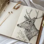
When you’re craving creative drawing ideas, it helps to start with simple prompts that instantly flip your brain into “what if?” mode. These are the kinds of sketches I suggest in my studio when you want something imaginative, doable, and totally your own.
Mash-Up Doodle Page

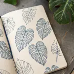
Transform a blank notebook page into a delightful landscape of imagination with this collection of simple, charming ink doodles. This project combines various unrelated elements—from desert cacti to celestial planets—into a cohesive and relaxing visual layout.
Step-by-Step Guide
Materials
- Blank or lined journal (A5 size ideally)
- Black fine-liner pen (0.3mm or 0.5mm)
- Pencil (for sketching)
- Eraser
- Reference photo (optional)
Step 1: Planning and Sky Elements
-
Layout the page:
Since we are working with pen directly, visualizing the space is key. Mentally divide the left page into a grid or lightly sketch placement circles with a pencil to ensure the big elements (balloon, mountains, cactus) fit well. -
Draw the smiling sun:
Start near the top center. Draw a circle for the sun’s face, adding two small dots for eyes and a tiny ‘v’ for a nose. Surround it with alternating short and long lines for rays. -
Add floating clouds:
To the left of the sun, draw a small cloud using three or four connected bumps. Add another simple cloud shape slightly lower down. -
Create the balloon string:
Draw a small balloon shape (like an upside-down teardrop) floating in the upper right quadrant. Extend a wavy, single line downward from it to suggest a string drifting in the wind.
Uneven Lines?
Don’t panic if lines are shaky. Simply go over them a second time to thicken the line weight. This style embraces ‘wobbly’ imperfections as part of the charm.
Step 2: The Central Focus: Hot Air Balloon
-
Outline the balloon shape:
In the center of the page, draw a large, inverted playful teardrop shape. This is the main envelope of the hot air balloon. -
Add vertical ribs:
Draw curved convex lines running from the top of the balloon down to the narrow neck. These lines should contour with the shape to give it volume. -
Decorate the panels:
Inside the vertical stripes you just made, add variety. I like to fill every other stripe with tiny dots or small dashes to create texture. -
Attach the basket:
At the narrow bottom of the balloon, draw a small rectangle for the basket. Connect the basket to the balloon with short vertical lines and add a tiny sandbag or two hanging off the side.
Add Color Accents
Use a single highlighter color (like pale yellow or mint green) to fill just one element, like the sun or the balloon stripes, for a stylish pop.
Step 3: Landscapes and Characters
-
Sketch the Fuji-style mountain:
On the left side, below the clouds, draw a trapezoid shape with a flat top. Add a jagged ‘snow cap’ line near the peak. -
Ground the mountain:
Surround the base of this mountain with fluffy, bubbly cloud shapes to make it look like it’s peeking through the atmosphere. -
Draw the jagged peaks:
At the very bottom left, draw two large, sharp triangles for a mountain range. Add zig-zag lines across them to define the snow line. -
Add mountain details:
In the negative space of the bottom mountains, draw tiny pine tree symbols (a vertical line with arrow-like branches) to show scale. -
Create the cactus:
On the bottom right, outline a saguaro cactus shape with two arms—one pointing up, one curving side-ways. Give it a ribbed texture by drawing vertical lines following the curve of the arms. -
Detail the cactus:
Add tiny horizontal dashes along the vertical ribs to represent spines. Draw a wavy line at the base to ground it in ‘sand’.
Step 4: Filling the Gaps
-
Insert the planet:
In the empty space on the middle-left, draw a circle with diagonal stripes to create a simple planet doodle. -
Draw the fish:
Below the planet, draw a stylized fish. Use an oval for the body, a triangle for the tail, and add big circular eyes and scales. -
Sprinkle confetti elements:
Look for empty white spaces. Fill them with tiny hearts, single stars, small letter ‘v’s to represent birds, or dashes for motion. -
Final ink check:
Identify lines that need thickening. Go over the outer edge of the cactus and the mountains once more to make them pop against the background details. -
Erase pencil marks:
Once the ink is completely dry (give it a full minute), gently erase any initial pencil sketches to leave a crisp, clean page.
Enjoy filling up your notebook with these relaxing little worlds

Double Exposure Silhouette Scene
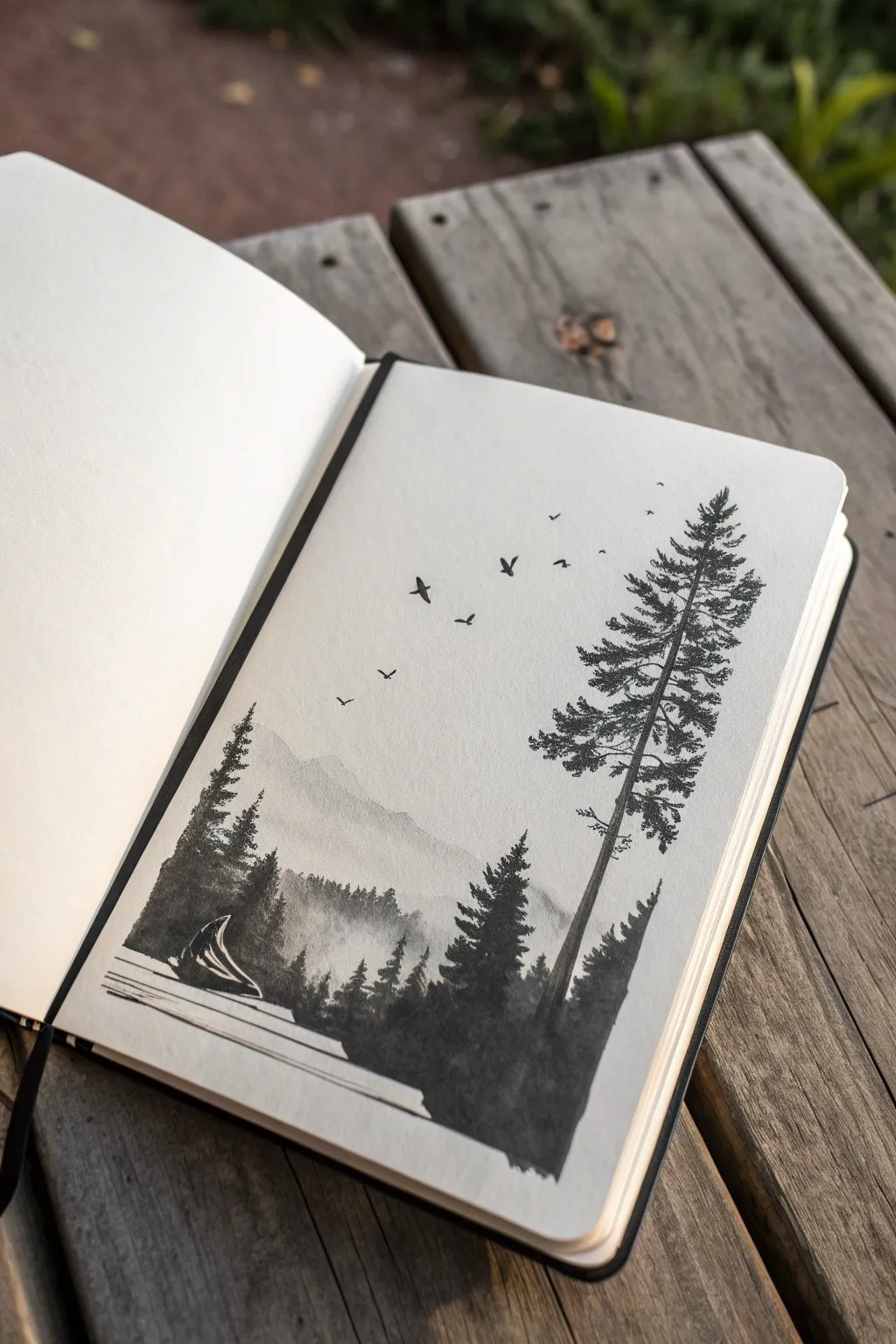
This striking sketchbook piece combines the stark beauty of silhouettes with atmospheric depth, creating a misty mountain landscape nestled within a forest frame. The high-contrast black ink against white paper evokes a serene, slightly mysterious wilderness vibe perfect for nature lovers.
Step-by-Step
Materials
- A5 Sketchbook (heavyweight mixed-media or watercolor paper)
- Black waterproof fine liner pens (sizes 0.1, 0.3, and 0.5)
- Black Indian ink or liquid watercolor
- Small round synthetic watercolor brush (size 2 or 4)
- Pencil (HB) and kneadable eraser
- Clean water jar and paper towel
- Ruler (optional)
Step 1: Planning and Sketching
-
Establish the horizon:
Begin by lightly sketching a horizontal line near the bottom third of the page. This will serve as your shoreline or ground level. -
Outline the main tree:
On the right side of the page, lightly draw a tall, slightly curved vertical line to represent the trunk of the dominant pine tree. Mark where the branches will start, leaving the very bottom of the trunk bare. -
Sketch the distant mountains:
Behind the tree line, sketch faint, jagged triangular shapes to suggest a mountain range in the distance. Keep these lines very subtle, as they will be painted with a lighter wash later. -
Position the foreground elements:
Roughly map out the cluster of smaller trees on the left side and the tent-like shape near the bottom left corner.
Step 2: Creating the Misty Background
-
Prepare a grey wash:
Dilute a drop of black ink with plenty of water on your palette to create a very pale, transparent grey. -
Paint the distant mountains:
Fill in the mountain shapes with this pale wash. The goal is to make them look far away and hazy, so keep the value very light. -
Add a mid-ground layer:
Mix a slightly darker grey wash. Paint a second layer of smaller hills or tree lines just in front of the mountains, overlapping them slightly while the first layer is still damp to create a soft, misty bleed. -
Let it dry completely:
Wait for the background washes to dry fully before moving on to the crisp black details. This prevents the ink from bleeding into the sky area.
Pro Tip: Wash Control
Test your grey washes on a scrap piece of paper before applying them. Ink dries lighter than it looks when wet, so you might need two coats for the mid-ground mountains.
Step 3: Inking the Foreground
-
Draw the main tree trunk:
Using your 0.5 fine liner, trace the main tree trunk on the right. Thicken the line towards the bottom and add small texture marks to simulate bark. -
Add the main branches:
Start adding branches extending from the trunk. Use a stippling or scribbling motion with the 0.3 pen to create the dense pine needle clusters. Keep the silhouette jagged and organic. -
Deepen the tree darkness:
I like to go back over the densest parts of the tree with the brush and pure black ink to get that solid, opaque silhouette effect. -
Create the left-side forest:
Draw the smaller pine trees on the left using the same stippling technique. Ensure these trees vary in height to look natural. -
Detail the campsite:
Carefully outline the tent shape on the lower left. Use thin lines to suggest the structure and perhaps a reflection if it’s near water.
Level Up: Cosmic Sky
Instead of a plain white sky, use a toothbrush to flick tiny droplets of white acrylic or gouache over the dried drawing to create a starry night effect.
Step 4: Final Touches
-
Ground the scene:
Use horizontal strokes with the brush and diluted ink to create the ground or water surface at the very bottom, anchoring the trees and tent. -
Add the flock of birds:
With your finest 0.1 pen, draw tiny ‘V’ or ‘M’ shapes scattered in the sky between the two tree groups. Vary their size to suggest depth—smaller birds look further away. -
Refine the sky:
If the sky feels too empty, you can add extremely faint stippling near the bird cluster, but keeping it empty emphasizes the vastness. -
Clean up sketch lines:
Once the ink is 100% dry, gently erase any remaining pencil marks from your initial sketch to leave a crisp, clean finish.
Close your sketchbook and enjoy the depth you’ve created with just simple ink and water


Book That Spills a New World

Transform a simple journal into a magical portal with this 3D collage art piece. By combining an open book with cascading origami stars, you’ll create a whimsical illusion of imagination escaping the pages.
Step-by-Step
Materials
- Hardcover sketchbook or journal (blank pages)
- Blue construction paper or origami paper (various shades)
- Metallic bronze or gold cardstock
- Star-shaped paper punches (small and micro sizes)
- Scissors or a craft knife
- Double-sided tape or strong glue dots
- Liquid school glue (clear drying)
- Tweezers
- Ruler
- Large white poster board or foam core (for the base)
Step 1: Setting the Stage
-
Prepare the base:
Start with a large, clean sheet of white poster board or foam core. This will be the canvas for your entire composition, so ensure it is free of smudges or creases. -
Position the book:
Open your hardcover book to a middle section where the pages lay relatively flat but still have some natural curve. Place it at the bottom center of your white board. -
Secure the pages:
Use a small amount of double-sided tape hidden underneath the bottom corners of the open pages to keep them from flipping while you work. I prefer using a tiny dab of removable putty so I can adjust the page curve later if needed.
Flat Stars?
If your 3D stars keep flattening out, apply a tiny bit of glue to the underside of the hollow center before sticking them down. This reinforces the ‘puff’ structure.
Step 2: Crafting the Stars
-
Cut paper squares:
Cut your blue and metallic papers into squares of various sizes. You will need larger squares (around 2-3 inches) for the main stars and smaller squares (1-1.5 inches) for the medium ones. -
Fold the pentagon base:
To make 5-pointed origami stars, you first need a pentagon shape. Fold a square in half, bring the bottom left corner to the center line, fold the top left corner down, and continue following standard pentagon-folding diagrams to create your starting shape. -
Cut the pentagon:
Once folded into a tight wedge, use scissors to cut across the paper at an angle. The sharper the angle, the pointier your star’s arms will be. Unfold to reveal a perfect pentagon. -
Crease the points:
Re-fold along the creases to create the 3D ‘puff’ effect. Pinch the five points of the star to sharpen the ridges, ensuring the center point pops upward. -
Shape the valleys:
Use your fingernail or a bone folder to press down the ‘valleys’ between the star points. This alternation of mountain and valley folds gives the star its signature faceted look. -
Repeat the process:
Create about 10-12 large blue stars in varying shades, and 5-6 metallic bronze stars. Variety in size and color depth is key to the visual flow.
Add Sparkle
Brush a very light layer of glitter glue or pearlescent watercolor over the blue stars to make them catch the light like a real night sky.
Step 3: Creating the Confetti
-
Punch tiny stars:
Use your star-shaped paper punches on the scrap pieces of blue and metallic paper. Create a generous pile of these tiny confetti stars. -
Make micro-dots:
If you have a standard hole punch or a micro-punch, create tiny circular dots from the metallic paper to add extra shimmer and texture to the ‘dust’ trail.
Step 4: Assembly
-
Plan the flow:
Before gluing, lightly arrange your 3D stars on the white board. Start with the metallic stars emerging directly from the book’s gutter, transitioning into the blue stars as the trail moves upward and right. -
Attach the main stars:
Using glue dots or a dab of hot glue, secure the 3D stars in place. Press only on the center or the valley folds so the points remain raised off the surface. -
Bridge the gap:
Ensure one or two metallic stars are glued partially onto the book pages and partially onto the background board. This visually connects the object to the artwork. -
Apply the trail:
Apply tiny dots of liquid glue in a sweeping ‘S’ curve or loose cloud shape around the main stars. This defines the path of the magic dust. -
Sprinkle the confetti:
Use tweezers to place the punched stars and dots onto the glue spots. Cluster them denser near the ‘source’ (the book) and let them spread out comfortably as they get higher. -
Review density:
Step back and look at the composition. Add more tiny blue stars near the top to suggest the magic is fading into the distance or becoming the sky. -
Final drying:
Allow the liquid glue to dry completely clear before moving the board. Check that the book pages haven’t shifted during the process.
Now you have a stunning piece of dimensional art that captures the feeling of a good story coming to life


Butterfly Wing Metamorphosis
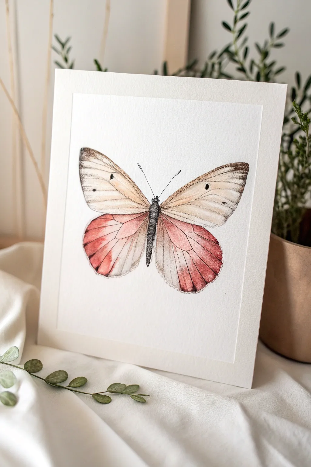
Capture the delicate beauty of metamorphosis with this watercolor and ink butterfly illustration. The project focusses on achieving a seamless, soft gradient on the lower wings contrasting with the structured, veined details of the upper wings.
Step-by-Step Guide
Materials
- High-quality watercolor paper (cold press, roughly 9×12 inches)
- HB or H pencil for sketching
- Fine liner pens (Black, 0.1mm and 0.05mm)
- Watercolor paints: Burnt Umber, Yellow Ochre, Alizarin Crimson, Rose Madder, Lamp Black
- Round watercolor brushes (Size 2 and Size 4)
- Clean water and paper towels
- Masking tape (optional, to secure paper)
Step 1: Basic Structure
-
Establish the axis:
Start by lightly drawing a vertical centerline on your paper. This axis will help keep the butterfly symmetrical. Mark the top and bottom points of the body to define the overall size. -
Sketch the wings:
Draw the basic shapes of the wings. The top wings should be somewhat triangular with rounded tips, extending upwards and outwards. The bottom wings are more rounded and teardrop-shaped. -
Define the body:
Sketch the slender thorax and abdomen along your centerline. Keep the head small with two thin antennae curving gently outward. -
Refine the outline:
Go over your sketch to add the specific scalloped edges of the wings. Notice how the bottom edge of the lower wings has a slight wave to it. Keep your pencil pressure very light so lines disappear later.
Uneven Gradients?
If your paint dries with hard edges instead of a smooth fade, re-wet the area with clean water and gently soften the line with a damp brush.
Step 2: Watercolor Application
-
Base wash for upper wings:
Mix a very watery wash of Yellow Ochre with a tiny touch of Burnt Umber to create a creamy, antique white tone. Apply this to the entire upper wing area using your Size 4 brush. -
Darkening the tips:
While the paper is still slightly damp (but not soaking), drop a slightly stronger mix of Burnt Umber onto the very tips of the upper wings. Let it bleed naturally inwards for a soft transition. -
Lower wing gradient – Part 1:
For the stunning lower wings, start near the body with a very pale wash of Alizarin Crimson heavily diluted with water. This area should remain light and airy. -
Lower wing gradient – Part 2:
As you move towards the outer edges of the lower wings, pick up more concentrated pigment—a mix of Rose Madder and a hint of Burnt Umber for that earthy red tone. Blend this wet-into-wet with the lighter wash. -
Intensify the edges:
Paint the very bottom edges of the lower wings with your strongest red-brown mix. I find adding a tiny drop of Lamp Black to the red here helps create distinct separation at the very rim. -
Paint the body:
Using a Size 2 brush, paint the body with a dense Lamp Black. Leave tiny slivers of white paper exposed to suggest highlights on the thorax segments. -
Let it dry completely:
Wait until the paper is bone dry. If it feels cool to the touch, it still has moisture. Patience here prevents the ink from bleeding later.
Add Metallic Flair
Mix a tiny amount of gold watercolor or mica powder into the pink gradient for wings that shimmer subtly when the light hits them.
Step 3: Inking and Details
-
Vein structure:
Switch to your 0.1mm fine liner. Starting from the body, draw the main veins radiating outward on the upper wings. Keep your hand loose; these lines shouldn’t be perfectly straight rigid rulers. -
Upper wing texture:
Use a stippling technique (tiny dots) or very short hatching lines near the tips of the upper wings to create that dusty, textured look characteristic of moths and butterflies. -
Defining the spots:
Ink the small black spots on the upper wings. Make the spots slightly irregular rather than perfect circles to look more organic. -
Lower wing veins:
Draw the veins on the pink lower wings with a very delicate touch. These lines should be thinner, so you might switch to a 0.05mm pen or use very light pressure. -
Wing edges:
Outline the outer edges of the wings with broken, sketchy lines rather than a solid contour. This preserves the fragile feel of the wing scales. -
Body texture:
Add tiny hatching lines along the sides of the painted body to give it roundness and a fuzzy texture. Draw the antennae with smooth, single strokes. -
Final highlights (optional):
If you lost your highlights on the body, use a white gel pen to add tiny dots back in for sheen.
Once dry, frame your delicate specimen to bring a touch of natural wonder into your space
BRUSH GUIDE
The Right Brush for Every Stroke
From clean lines to bold texture — master brush choice, stroke control, and essential techniques.
Explore the Full Guide
Geometric Frame Portrait
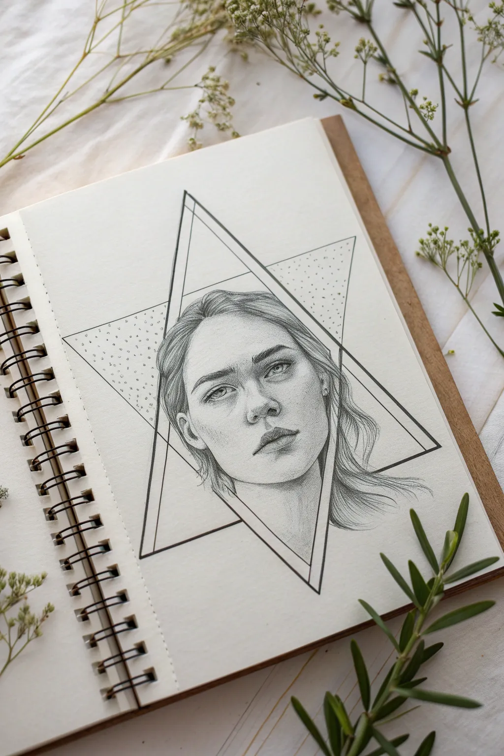
Blend the structured world of geometry with the organic flow of portraiture in this striking sketch. A realistic face is captured within interlocking triangles, creating a modern, mystical aesthetic that elevates a simple portrait study.
Step-by-Step Tutorial
Materials
- High-quality sketchbook paper (smooth or vellum finish)
- Graphite pencils (HB for sketching, 2B-4B for shading, 6B for depths)
- Fine-liner pen (black, 0.3mm or 0.5mm)
- Ruler
- Compass (optional but helpful for spacing)
- Kneaded eraser
- Blending stump or tortillon
Step 1: Planning the Geometry
-
Establish the center:
Begin by lightly marking the center of your page with an HB pencil. This will be the anchor point for your geometric shapes and the face itself. -
Draft the main triangle:
Using your ruler, draw an upward-pointing equilateral triangle. Ensure the lines are light so they can be easily erased or adjusted later. -
Create the secondary triangle:
Overlay a second, inverted triangle of the same size. Position it so the points intersect evenly to form a six-pointed star (hexagram) shape. This creates the ‘frame’ for your portrait. -
Decide on overlap:
At this stage, decide which triangle will sit in the foreground. In the reference, the inverted triangle is the dominant ‘frame’ that cuts across the portrait, while the upward triangle sits behind.
Step 2: Sketching the Portrait
-
Map facial proportions:
Within the central intersection of the triangles, lightly sketch the oval shape of the head. Mark horizontal guidelines for the eyes, nose, and mouth to ensure symmetry. -
Place features loosely:
Block in the eyes, nose, and lips using soft shapes. Keep the eyes aligned with the horizontal center line you created. Don’t worry about details yet; just get the placement right. -
Refine the outline:
Start defining the jawline and hair. Notice how the hair flows outside the geometric frame in some areas but is ‘cut off’ by the lines in others. This interaction is key to the artwork’s depth. -
Commit to the crop:
Erase the parts of the portrait sketch that fall outside your intended frame. For this piece, the neck and shoulders are cropped by the lower triangle lines, creating a floating effect.
Fixing Smudges
Graphite loves to smear. Place a clean sheet of paper under your drawing hand while you shade. If you do smudge the white background, a kneaded eraser lifts it cleanly without damaging the paper tooth.
Step 3: Shading and Rendering
-
Base shading layer:
Switch to a 2B pencil. Apply a light, even layer of graphite to the shadowed areas of the face: under the eyebrows, the side of the nose, and beneath the lip. -
Deepen the eyes:
Use a 4B pencil to add contrast to the pupils and the lash line. Leave tiny white spots for the catchlights to make the eyes look alive. -
Sculpt the nose and lips:
Build up layers on the nose bridge and nostrils. For the lips, shade deeply in the center line and lighter towards the edges to create volume. -
Texture the hair:
Draw the hair in segments, following the direction of growth. Use long, sweeping strokes with a sharp pencil. I often start at the root and flick outward to create natural tapering. -
Blend for smoothness:
Take your blending stump and gently soften the shading on the skin. Avoid blending the hair too much, as you want to keep that linear texture.
Add Gold Leaf
Make the geometric frame pop by applying gold leaf or metallic gold paint to the thick borders or the stippled background sections. The contrast against the gray graphite is stunning.
Step 4: Inking and Details
-
Ink the frame:
Using your fine-liner and ruler, carefully trace the geometric lines. Pay close attention to where the lines should stop if they are going ‘behind’ the head or hair strands. -
Double the lines:
To give the frame substance, draw a second, parallel line just inside the main geometric shape. This creates a border effect rather than a single thin wire. -
Add stippling texture:
In the background sections of the triangles (behind the head), create a gradient using stippling. Dot densely near the corners and space them out as you move inward. -
Final contrast check:
Use a 6B pencil to darken the deepest shadows one last time—under the chin and in the hair creases. Clean up any smudges with the kneaded eraser.
Step back and admire how the rigid lines perfectly frame the softness of your portrait
Ink Drawing with One Color Splash
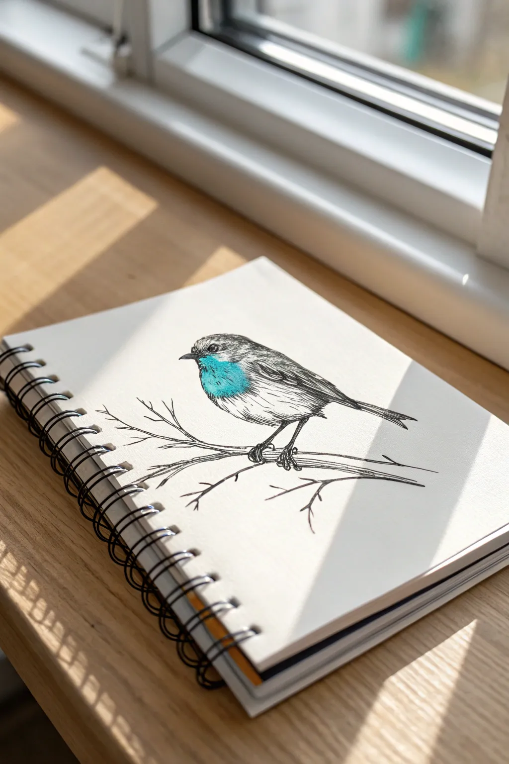
Capture the delicate charm of a songbird using classic ink techniques combined with a modern pop of color. This project balances loose, sketchy lines with precise hatching to create texture, finishing with a vibrant teal patch that brings the drawing to life.
Detailed Instructions
Materials
- Sketchbook with smooth, heavy drawing paper
- HB graphite pencil
- Kneaded eraser
- Black fineliner pens (sizes 0.1mm and 0.5mm)
- Teal or cyan alcohol-based marker (or soft colored pencil)
- Reference photo of a robin or flycatcher
Step 1: Penciling the Foundation
-
Basic Shapes:
Start with your HB pencil, using very light pressure. Draw a slanted oval for the bird’s body and a smaller circle overlapping the top left for the head. -
Connecting the Form:
Connect the head circle to the body oval with smooth, curved lines to form the neck. Refine the belly curve so it looks plump and round. -
Adding Beak and Tail:
Sketch a small, triangular beak pointing to the left. At the opposite end, draw a long, rectangular shape that tapers slightly for the tail feathers. -
Placing the Legs:
Draw two thin lines extending down from the belly for legs. Don’t worry about the toes yet; just establish where they will grip the branch. -
Sketching the Perch:
Draw a long, slightly curved main branch under the bird’s feet. Add a few smaller twigs branching off, some ending in ‘V’ shapes for a natural, wintery look. -
Refining the Eye:
Place the eye in the center of the head circle. It should be a small round shape with a tiny highlight reserve.
Loose Lines Rule
Don’t close every shape perfectly. Leaving small gaps in the outline, especially on the bird’s back and belly, lets the viewer’s eye ‘finish’ the drawing, making it feel more alive and less stiff.
Step 2: Inking the Details
-
Initial Outline:
Switch to the 0.5mm fineliner. Go over the upper outline of the head and wings with broken lines. I prefer to leave gaps in the line work here to suggest soft feathers rather than a hard shell. -
Defining the Eye and Beak:
Fill in the eye with solid black, carefully preserving that tiny white highlight. Outline the beak cleanly and add a small line through the middle for the mouth. -
Wing Feathers:
Use long, sweeping strokes to define the primary wing feathers. Ensure these lines flow backward toward the tail. -
Texturing the Head:
Switch to the finer 0.1mm pen. Add short, quick dashes on the top of the head to mimic short plumage. Keep the strokes directional, following the curve of the skull. -
Belly Fluff:
Use the 0.1mm pen to sketch the lower belly. Instead of a solid line, use loose scribbles or ‘scumbling’ motions to show fluffy down feathers. -
Legs and Feet:
Return to the 0.5mm pen to draw the legs. Add the toes wrapping around the branch, making the claws look sharp and grippy. Thicken the branch lines to give the wood weight.
Smudge Prevention
If your hand starts smearing the ink, place a clean scrap piece of paper under your drawing hand. This acts as a shield, protecting your paper oils and wet ink from being dragged across the page.
Step 3: Adding Depth and Splash
-
Hatching Shadows:
Identify your light source (coming from the top right). Use parallel diagonal hatching lines with the 0.1mm pen under the wing and on the lower belly to create volume. -
Contrast on Wings:
Darken the tips of the wing feathers and the tail with denser cross-hatching. This value contrast anchors the bird visually. -
Branch Texture:
Add linear wood grain texture to the branch. Keep lines uneven and organic, adding small knots or bumps for realism. -
Erase Guide Lines:
Wait at least five minutes for the ink to dry completely. Gently erase all visible pencil marks with the kneaded eraser to clean up the page. -
The Color Splash:
Take your teal marker or colored pencil. Color the chest area specifically, starting just under the beak and fading out before the belly. -
Blending the Edge:
Don’t create a hard edge with the color. Feather the blue strokes downward into the white belly area to mimic how colored plumage naturally transitions.
Enjoy the striking contrast between your simple ink sketch and that single burst of bright blue

PENCIL GUIDE
Understanding Pencil Grades from H to B
From first sketch to finished drawing — learn pencil grades, line control, and shading techniques.
Explore the Full Guide
Mandala Animal Silhouette
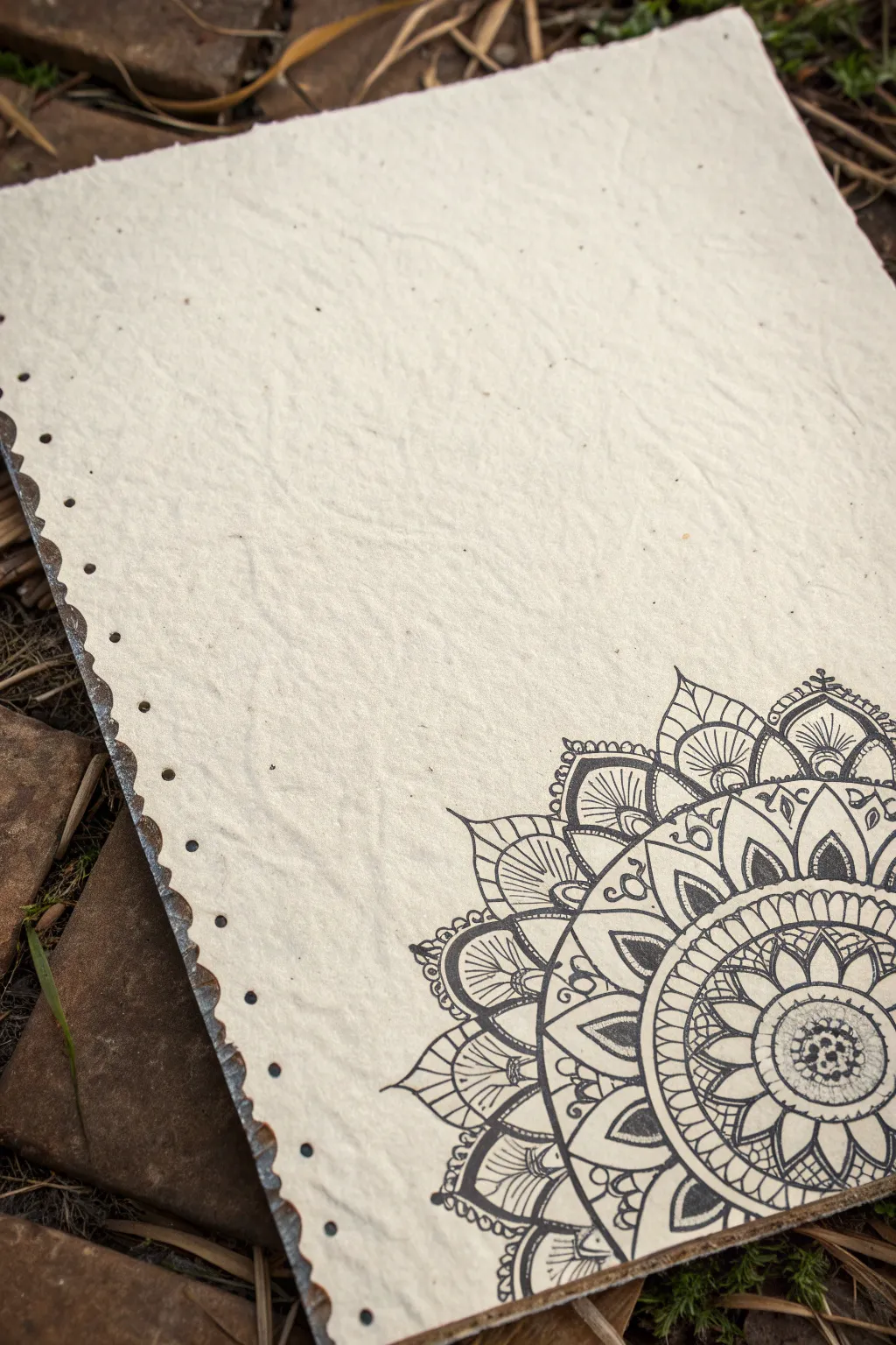
Create a stunning, earthy art piece featuring a detailed quarter-mandala design on textured handmade paper. This project combines intricate line work with rustic materials for a serene and organic aesthetic perfect for a custom journal cover or wall art.
Detailed Instructions
Materials
- Handmade cotton rag paper (heavy texture, cream/off-white)
- Fine liner pens (sizes 005, 01, 03, 05) – waterproof black ink
- Pencil (HB or 2H)
- Quality eraser
- Compass
- Ruler or straight edge
- Protractor (optional)
Step 1: Planning and Structure
-
Paper selection:
Begin with a sheet of high-quality handmade paper. The heavy texture and deckled or scalloped edges are crucial for the rustic look shown in the image. -
Corner orientation:
Orient your paper so the scalloped binding edge is on the left. We will be working in the bottom right corner. -
Establish the center:
Mark the absolute bottom-right corner of the paper with a tiny pencil dot. This will be the center point of your mandala. -
Draw guide arcs:
Using a compass, place the point on your corner mark. Lightly draw several concentric quarter-circles radiating outward. Space them irregularly—some close together for intricate bands, others wider for petals. -
Create radial guides:
Use a ruler to draw faint straight lines radiating from the corner point. Think of these as slices of a pie; they will help keep your diverse petal shapes symmetrical as they expand.
Ink Movement
Handmade paper is absorbent. Move your pen slightly faster than usual to prevent the ink from bleeding or feathering into the paper fibers.
Step 2: Inking the Core
-
Center rosette:
Switch to an 03 pen. Start at the very corner with a small floral shape or simple half-circle pattern. This anchors the design. -
First petal layer:
Draw the first ring of petals around the center. Use the first few pencil arcs to keep their height consistent. I find it helps to draw the outline of every petal first before filling in details. -
Adding texture:
Inside this first layer, use an 005 pen to add tiny stippling (dots) or delicate hatching lines to create depth without making the area too dark. -
Solid bands:
Create contrast by inking a narrow band completely black between petal layers. This distinct black arc makes the subsequent layers pop.
Step 3: Expanding the Design
-
Larger leaf shapes:
Moving outward, draw a layer of larger, varied leaf shapes. Give them a double outline—a thin inner line following the contour of the outer shape adds instant elegance. -
Detailed shading:
Use your finest pen to shade the base of these leaves. Use quick, upward flicking motions to create a gradient that fades toward the tip of the leaf. -
Geometric fillers:
In the spaces between the leaf tips, add small floating circles or teardrops. Tiny details like these make the mandala feel lush and full. -
The prominent outer band:
Draw a wide band consisting of semi-circles or scallops. Fill the negative space inside them with black ink to create heavy contrast, similar to the reference image.
Vintage Wash
Before drawing, lightly stain the paper with tea or diluted coffee and let it dry. This enhances the antique, earthy vibe of the mandala.
Step 4: Final Touches
-
Outer points:
Finish the outer edge with sharp, pointed petal shapes that extend into the negative space of the paper. Keep lines crisp. -
Line weight variation:
Go back over the major structural lines with an 05 pen to thicken them. This separates the main shapes from the delicate interior patterns. -
Texture check:
Look for gaps that feel too empty. Add tiny dots or thin parallel lines to balance the density of the ink across the whole quarter-circle. -
Erase guidelines:
Wait at least 15 minutes for the ink to fully cure. Gently erase your pencil arcs. Be careful with textured paper; rubbing too hard can pill the fibers.
Now you have a beautifully intricate design that celebrates the imperfect texture of handmade paper
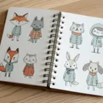
Tiny 5-Minute Miniatures Grid
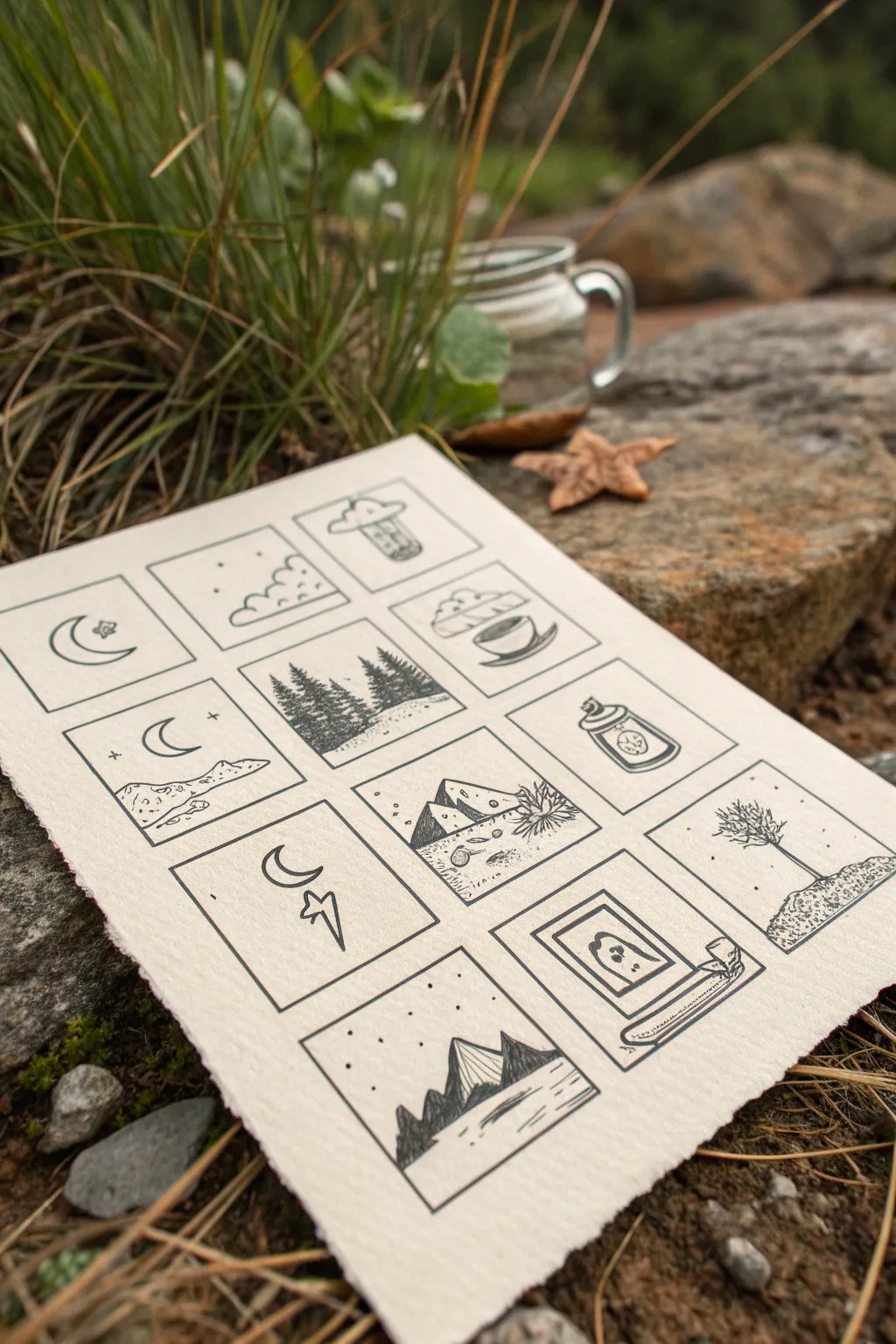
Capture tiny snippets of the natural world with this charming grid of minimalist illustrations. Using nothing more than fine liner pens and quality textured paper, you will learn to distill complex scenes into simple, striking line work.
Step-by-Step Guide
Materials
- Heavyweight cold-press watercolor paper or textured sketch paper (300gsm is ideal)
- Ruler
- Pencil (HB or H)
- Eraser
- Fine liner pen (01 or 03 micron size, black ink)
- Thicker marker or fine liner (05 or 08 size) for borders
Step 1: Setting the Stage
-
Paper Preparation:
Begin by selecting a thick, textured paper. The rough edge (deckled edge) shown in the example adds a lovely rustic touch, so feel free to tear your paper edges carefully against a ruler rather than cutting them clean. -
Grid Layout:
Use your pencil and ruler to map out a grid of squares. A 3×4 layout works beautifully. Leave generous margins around the outside and uniform spacing between each box—about 1/4 inch or 5mm usually looks balanced. -
Drafting Borders:
Lightly pencil in the square frames themselves. Keep your pressure extremely light so these lines can be erased completely later without damaging the paper’s texture. -
Selection of Themes:
Plan your twelve miniatures. The example uses nature motifs: crescent moons, UFOs, pine forests, mountains, and cozy elements like coffee cups. Sketching simple ideas now saves hesitation later.
Pro Tip: Pen Pressure
Vary your pen pressure. Press harder for the box frames and foreground elements, and use a feather-light touch for distant stars and clouds to create depth.
Step 2: Inking the Outlines
-
Drawing the Frames:
Switch to your slightly thicker pen (05 or 08). Carefully trace over your pencil grid lines to create the crisp black boxes that define the artwork. I like to purposefully make corners touch cleanly without overlapping too much. -
First Elements: Celestial:
Start with the simplest designs. In the top left, draw a crescent moon and a small star. Keep the lines steady and unhurried. -
Structured Scenes:
For the scene with the floating UFO, draw basic geometric shapes first—a semi-circle dome and a rectangular beam—before adding the textural details inside. -
Adding Landforms:
Moving to the landscapes, draw the horizon lines first using your finer (01) pen. For the mountains, use jagged, erratic lines to suggest rocky peaks rather than smooth triangles.
Troubleshooting: Inconsistent Ink
If your fine liner starts skipping on the textured paper, slow down your stroke speed. Moving too fast over rough tooth prevents the ink from settling.
Step 3: Detailing and Texture
-
Creating Trees:
For the pine forest square, use vertical scribbles. Start at the top of a tree and wiggle your pen downwards, getting wider at the base to create that classic conifer silhouette. -
Stippling Stars:
Return to your sky scenes. Add tiny dots (stippling) around the moons and mountains. Vary the density—more dots near the horizon can create a sense of depth or atmosphere. -
Shadow Work:
Use hatching (parallel lines) to add shading to the mountains. Choose one side of the mountain to be the ‘dark’ side and consistently apply lines there to give the scene volume. -
Whimsical Touches:
For the bottom right ‘ghost in a frame’ panel, keep the ghost shape incredibly simple—just an outline with two dots for eyes. The cuteness comes from the simplicity. -
Textural Ground:
In the tree panel (right side), create the ground by drawing tiny, tight squiggles and dots. This differentiates the earth texture from the airy sky above. -
Camping Vibes:
For the coffee cup panel, draw the saucer first as a flat oval, then the cup. Add a simple curvy line rising up to represent steam, keeping it airy.
Step 4: Final Polish
-
Erasure:
Wait until the ink is completely dry—give it a good 10 minutes to be safe. Gently erase all remaining pencil marks. Hold the paper taut so the eraser doesn’t crinkle the sheet. -
Blackening Fills:
Look back over your grid. If any areas need high contrast, like the deep shadows of the mountains in the bottom panel, carefully fill them in with solid black ink. -
Balancing the Composition:
Step back and view the whole sheet. If one square feels too ‘light,’ add a few more stippled dots or a small extra element like a ‘+ sign’ star to balance the visual weight.
Display your grid of miniatures on a shelf or desk where you can enjoy the serenity of these tiny worlds


Hidden Creatures in Negative Space
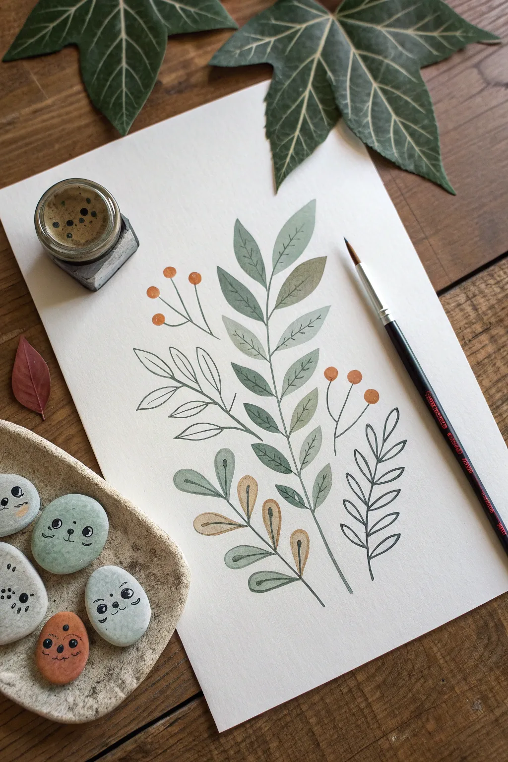
This charming project combines precise botanical illustration with playful watercolor washes to create a lovely sprig of leaves and berries. The organic, earthy color palette and delicate line work make this a relaxing study in nature, perfect for greeting cards or wall art.
Step-by-Step Guide
Materials
- Cold-pressed watercolor paper (A4 or A5)
- Watercolor paints (Sage Green, Olive Green, Burnt Sienna, Orange, Sepia)
- Fine liner pen (Black, waterproof, 0.1mm or 0.3mm)
- Round watercolor brush (Size 4 or 6)
- Pencil (HB)
- Eraser
- Jar of water
- Paper towels
Step 1: Sketching the Layout
-
Plan the central stem:
Start by lightly drawing a curved vertical line in the center of your paper. This will serve as the main spine for your largest leaf branch. -
Add side branches:
Sketch smaller stems branching off to the left and right at the bottom. Create a balanced composition by varying their lengths and angles. -
Outline the leaves:
Draw the basic almond shapes of the leaves along the main stem. Keep your pencil strokes extremely light so they won’t show through the watercolor later. -
Position the berries:
Add a few thin stems extending outward, topped with small circles for the berries. Place the berries in clusters of two or three to keep the layout dynamic.
Step 2: Painting the Elements
-
Mix your greens:
Prepare two shades of green on your palette: a muted sage green and a deeper olive tone. You want natural, earthy hues rather than bright artificial greens. -
Paint the main leaves:
Using the sage green mixture, carefully fill in the leaves on the central stem. Leave the very center vein unpainted if you want a highlight, or fill it solid for a flatter look. -
Add warmth:
For the lower, smaller branch on the left, mix a touch of Burnt Sienna with your green or use a diluted ochre to create those autumnal, brownish-yellow leaves. -
Paint the berries:
Clean your brush and pick up a vibrant orange. Carefully dab color into the berry circles. I like to drop a tiny bit of concentrated pigment on the shadow side while the paint is still wet for dimension. -
Let it dry completely:
Wait for the paint to be bone dry. If the paper feels cool to the touch, it is still damp. Painting wet-on-wet here will ruin the crisp lines we need for the next step.
Pro Tip: Color Harmony
Mix a tiny amount of your green into the orange berry paint, and a bit of orange into the green leaves. Sharing pigments ties the whole piece together.
Step 3: Detailed Line Work
-
Draw the stems:
Using your waterproof fine liner, trace over the pencil main stems. Keep your hand loose to avoid shaky lines. -
Outline the painted leaves:
Go over the edges of your painted sage leaves. You don’t have to follow the paint edge perfectly; a slight offset can look artistic and hand-drawn. -
Add leaf veins:
Draw a central line down each painted leaf and add small V-shaped veins branching out. Make these lines very thin and delicate. -
Create the ‘ghost’ branch:
For the empty branch on the left, draw the leaves and stems using only the ink pen. Do not paint these shapes. This creates a beautiful contrast between the solid painted forms and the airy line art. -
Detail the berries:
Outline the orange berries and their connecting stems. Keep the connections to the main branch thin and elegant. -
Finish the lower branch:
Outline the brownish-yellow leaves at the bottom, adding their central veins just like the main branch. -
Add the final foliage:
Draw a final, simple branch on the bottom right using only ink lines, mirroring the style of the ‘ghost’ branch on the left to balance the composition. -
Clean up:
Once you are certain the ink is dry, gently erase any remaining visible pencil sketch lines to leave a clean, professional finish.
Level Up: Pebble Pals
Create matching decor by painting smooth river stones with flat pastel colors and adding cute faces with your fine liner, just like the image.
Frame your botanical study or scan it to create custom stationery sets for friends
Impossible Object Sketch
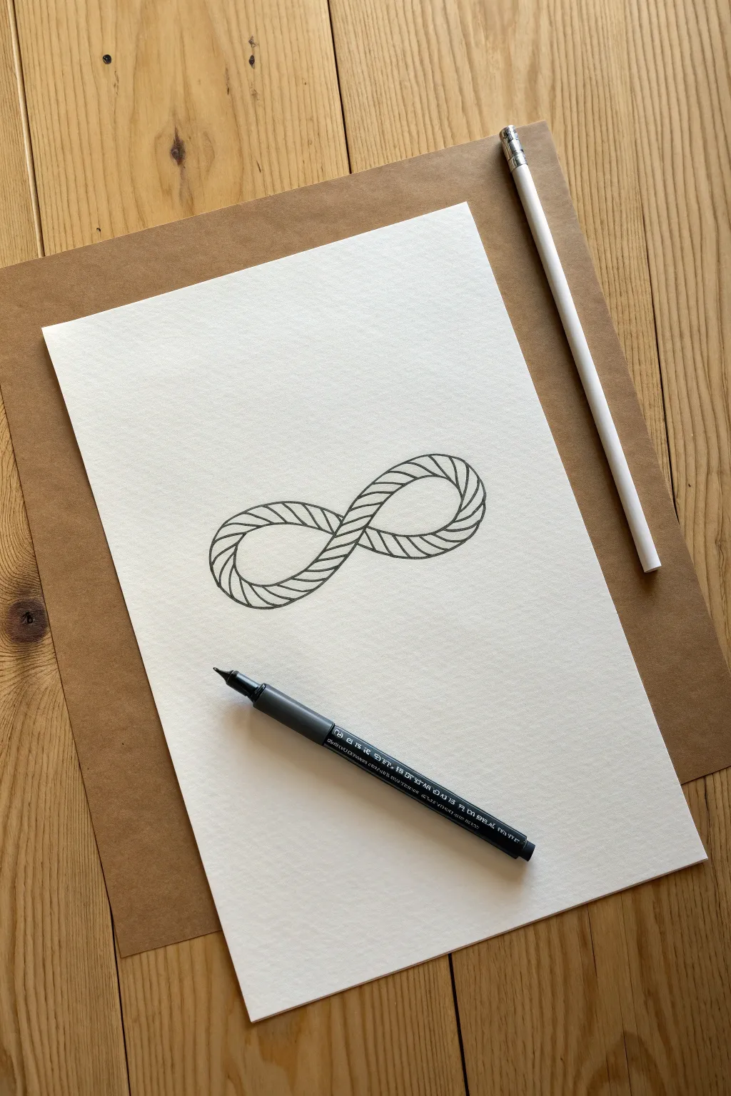
Learn to draw a mesmerizing optical illusion that transforms a simple infinity symbol into a complex, twisted rope structure. This impossible object sketch uses clever linework to create depth and texture, resulting in a clean yet intricate piece of art.
Detailed Instructions
Materials
- High-quality white drawing paper (heavyweight sketching paper recommended)
- HB or 2B pencil for sketching
- Fine liner pen (01 or 03 size, black ink)
- White eraser
- Ruler (optional, for spacing guidance)
Step 1: Laying the Foundation
-
Sketch the primary loop:
Start with your pencil. Lightly draw a standard infinity symbol (a sideways figure-8) in the center of your page. Keep the loops relatively wide and open to accommodate the rope texture later. -
Define the width:
Draw a second, parallel line inside your first infinity loop. This space between the lines will become the thickness of your rope. Ensure the width remains consistent throughout the entire shape. -
Establish the crossover:
At the center point where the loops cross, decide which section goes ‘over’ and which goes ‘under.’ Erase the lines of the bottom segment where the top segment crosses it to clarify the overlapping perspective.
Step 2: Creating the Rope Texture
-
Mark the twist intervals:
Along the outer edge of one loop, make small tick marks at regular intervals. These will guide the diagonal lines that create the rope’s twisted appearance. I find spacing them about 1cm apart works best for this scale. -
Draw the first curves:
Begin drawing curved diagonal lines connecting the outer edge to the inner edge. These lines should curve slightly, following the flow of the loop, rather than being perfectly straight. -
Continue the pattern:
Work your way around the entire shape with these curved diagonals. Consistency is key here; try to keep the angle and spacing as uniform as possible to maintain the illusion of a single continuous cord. -
Adjust direction at the turn:
As you navigate the tight curves of the loop ends, slightly fan out your lines. The outer part of the curve requires wider spacing than the inner part to look natural. -
Handle the intersection:
When you reach the center crossover, simply stop your diagonal lines when they hit the boundary of the ‘top’ rope segment. Restart them on the other side to reinforce that one rope is passing beneath the other.
Troubleshooting: Inconsistent Twist
If your rope looks uneven, draw small dots along the center of the path first. Use these dots as anchors to align your diagonal curves.
Step 3: Inking and Refining
-
Outline the main shape:
Switch to your fine liner pen. Carefully trace the main outer and inner boundaries of your infinity symbol first. Use confident, smooth strokes to avoid jagged edges. -
Ink the rope strands:
Go over your pencil diagonal lines with the pen. When dragging the pen, curve your stroke slightly outward at the very ends of each line to suggest the roundness of the rope strands coming around the form. -
Let the ink set:
Wait a few minutes for the ink to dry completely. This prevents smudging during the next step. -
Clean up the sketch:
Gently erase all underlying pencil marks. Ensure you remove the construction lines inside the loop so only the clean ink twisted texture remains. -
Add subtle weight:
Go back with your pen and slightly thicken the lines on the underside of the loops and where the rope tucks underneath at the intersection. This line weight variance adds instant dimension. -
Detail the edges:
For extra realism, create tiny, broken curves along the outer silhouette where the diagonal lines touch the edge. This breaks the perfectly smooth outline and mimics the texture of twisted fibers.
Level Up: Shadow Play
Use a light grey marker or hatching to add shadows where the rope overlaps itself. This makes the illusion pop off the page.
Step back and admire your impossible loop, a simple shape transformed into a complex puzzle.
Turn a Scribble into a Story
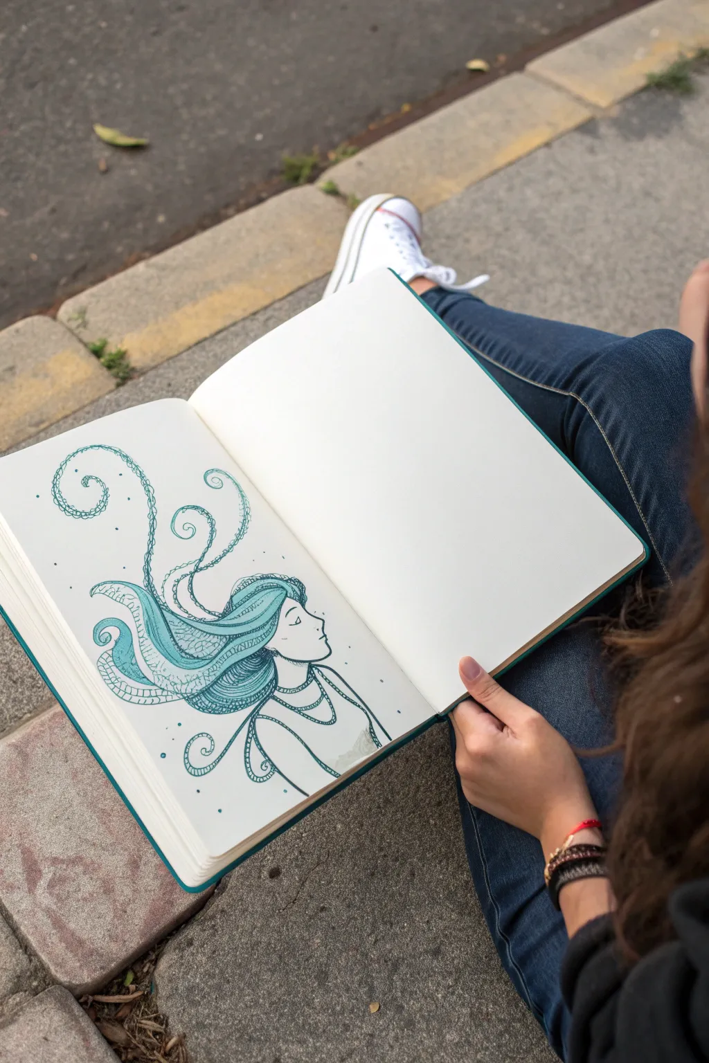
Transform a simple profile sketch into a whimsical, surreal work of art with this intricate ink drawing. Using shades of teal and blue, you’ll learn to blend messy curls into patterned, octopus-like tendrils for a captivating look.
Step-by-Step
Materials
- Sketchbook or drawing paper (heavyweight prevents bleed-through)
- Pencil (HB or 2B)
- Eraser
- Teal or turquoise fine-tip marker/fineliner (0.5mm)
- Dark teal or blue-green brush pen or marker
- Compass or small circular objects (optional for initial shapes)
Step 1: Sketching the Concept
-
Establish the Profile:
Start by lightly sketching the woman’s head in profile using your pencil. Draw a gentle curve for the forehead, dipping in for the eye socket, and coming out for a small nose and chin. Keep the lines faint so they can be erased later. -
Outline the Neck and Shoulders:
Extend the drawing downward to form her neck and shoulders. Indicate a simple scoop neckline for her top or dress, and add a few suggestion lines for folds in the fabric. -
Map Out the Hair Flow:
Instead of drawing realistic hair, sketch large, sweeping curves arching away from her head. These will serve as the guides for the tentacle-like shapes. Let them swirl upwards and outwards in a loose, floating motion. -
Form the Tendrils:
Refine those sweeping curves into distinct, tapering shapes. The ends should spiral tightly like fern fronds or octopus arms. Vary the thickness; make the roots near the head thicker and the tips delicate and thin.
Step 2: Inking the Outline
-
Trace the Face:
Switch to your teal fine-tip pen. carefully trace over your pencil lines for the face profile. Use a steady hand for the nose and lips. -
Add Facial Details:
Draw the eye closed with a simple downward curve and a few lashes. Add a small, defined eyebrow above it to give her a serene expression. -
Define the Hair Boundaries:
Outline the main shapes of the flowing hair. Don’t worry about the internal patterns yet, just get the solid exterior lines of each tendril defined. -
Outline the Clothing:
Ink the lines for her neck, collarbones, and the shirt neckline. You can keep these lines slightly looser to suggest fabric movement. -
Erase Pencil Guidelines:
Wait a moment for the ink to dry completely, then gently erase all visible pencil marks to clean up your canvas.
Uneven ink flow?
If your pen skips over textured paper, slow down your stroke speed. A slower hand allows the ink more time to soak into the paper grain for a solid line.
Step 3: Adding Textures and Patterns
-
Create Scaly Texture:
Choose one of the larger hair sections near the roots. Using the fine-tip pen, draw rows of small ‘U’ shapes or scales stacked on top of each other to fill the space. -
Stipple the Details:
For the upper sections of the hair shapes, use a stippling technique. Dot your pen repeatedly to create density. Cluster dots closer together near the outlines for shading and spread them out towards the center. -
Line Work Shading:
In the thinner, spiraled ends of the tendrils, use closely spaced parallel lines that follow the curve of the shape. This hatching technique adds volume and movement. -
Incorporate Circular Patterns:
On the ‘underside’ of some tentacles—similar to suction cups—draw small circles in a row. I find this really helps sell the aquatic, surreal vibe of the piece. -
Fill Larger Areas:
Select a few strands to fill in with solid color or very dense patterns using your darker marker. This contrast prevents the drawing from looking too busy and anchors the composition. -
Decorate the Neckline:
Add a pattern to the neckline of her shirt to mimic the hair’s complexity. A simple chain of small circles or a double line works perfectly here.
Level Up: Metallic Pop
Once the teal ink is dry, retrace just the outer edge of the hair swirls with a silver or gold gel pen. It catches the light beautifully when you turn the page.
Step 4: Final Touches
-
Add Floating Elements:
Draw tiny stray dots and small circles floating around the hair spirals. This ‘magic dust’ or bubble effect helps integrate the drawing with the white space of the page. -
Enhance Contrast:
Review your drawing. If any areas look too flat, go back in with the fine-tip pen and thicken the outline on the shadowed side of the tendrils to add weight. -
Final Cleanup:
Check one last time for any stray pencil marks or smudges and clean them up.
Now you have a serene, surreal portrait that perfectly blends human features with abstract flow


Have a question or want to share your own experience? I'd love to hear from you in the comments below!