When I’m craving a relaxing creative win, I lean on drawing and coloring ideas that feel simple to start but still look eye-catching when they’re done. Here are some of my favorite go-to prompts and mini techniques that make it easy to sketch first, then have a ton of fun adding bold color and pattern.
Simple Botanical Doodles
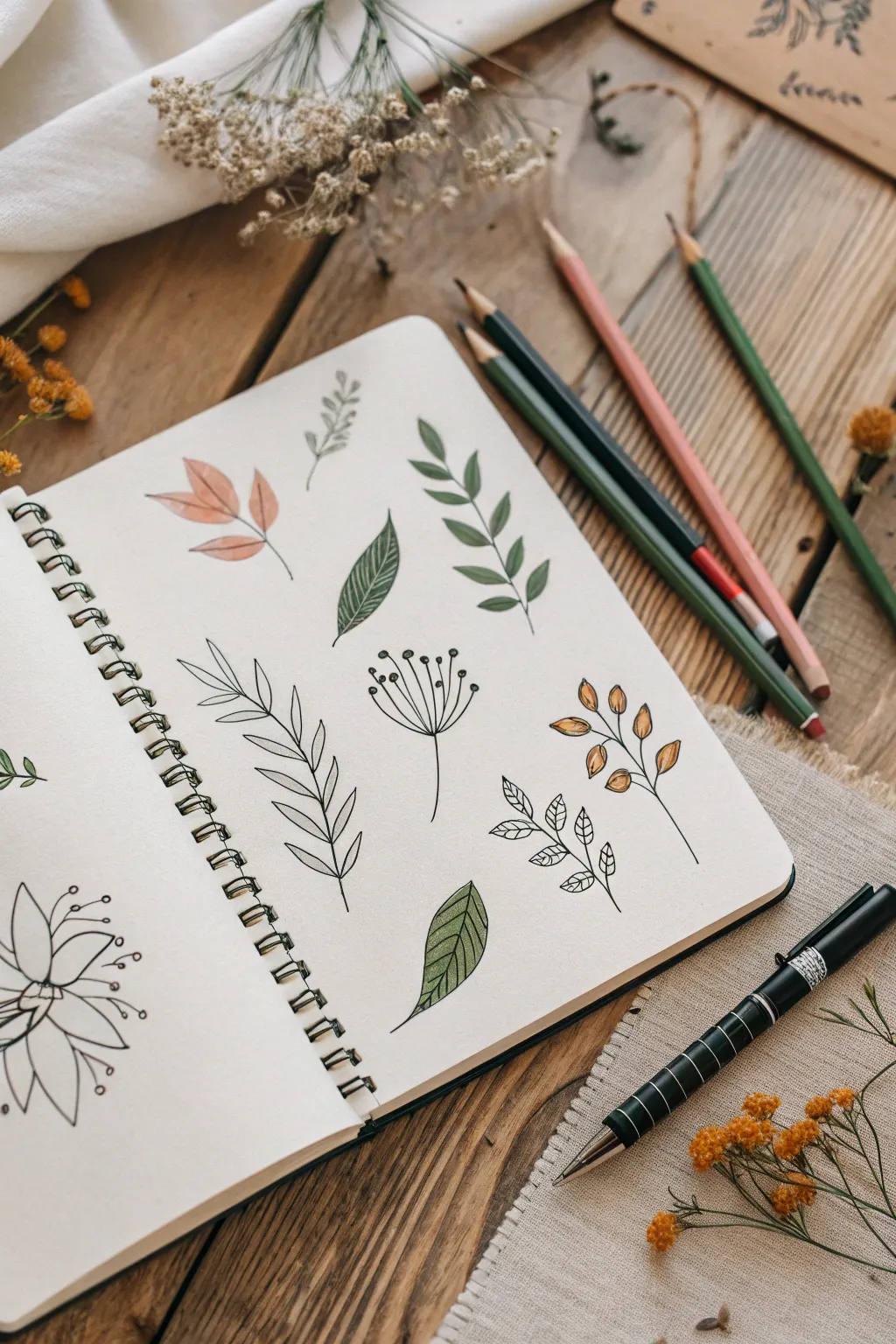
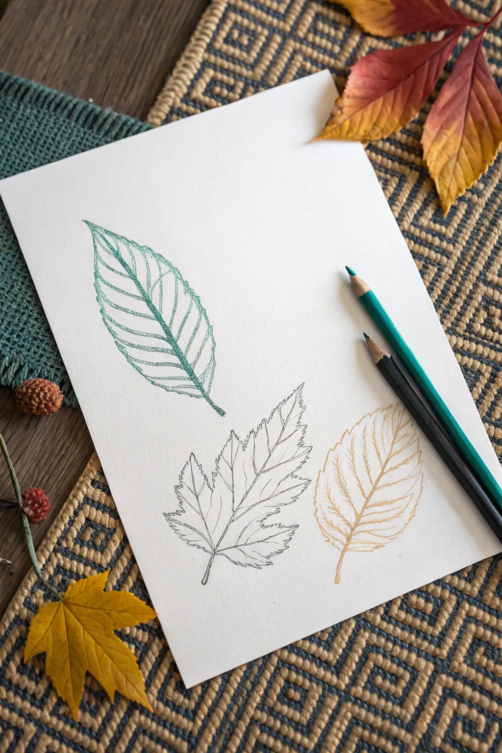
Capture the delicate beauty of nature with this spread of simple botanical doodles. Using fine liners and colored pencils, you’ll create a variety of leaf shapes and sprigs that feel organic and charmingly hand-drawn.
Detailed Instructions
Materials
- Spiral-bound sketchbook (smooth or mixed media paper)
- Black fine liner pen (0.3mm or 0.5mm)
- Colored pencils (Sage Green, Forest Green, Burnt Orange, Mustard Yellow)
- Pencil and eraser (optional for sketching)
- Real dried flowers or reference photos (optional)
Step 1: Planning and Outlining
-
Visualize the layout:
Before drawing, imagine a grid on your page to space out your elements evenly. You want roughly six to eight distinct botanical items spread across the right-hand page with plenty of breathing room between them. -
Start with the central sprig:
Directly in the center, draw a simple vertical stem. Add pairs of teardrop-shaped leaves branching off symmetrically as you move up the stem, making the top leaf a single point. -
Draw the ribbed leaf:
To the left of your central sprig, sketch a single, larger lance-shaped leaf. Draw a center vein, then add many close, parallel diagonal lines on either side to create a ribbed texture. -
Create the delicate fern:
On the bottom left, draw a long, curved stem. Add very thin, elongated oval leaves pairing up the stem. I like to keep these lines loose and not perfectly connected to the stem for a sketchier look. -
Add the seed pod doodle:
In the middle area, draw a thin vertical line. At the top, fan out 5-7 straight lines like flower stamens and top each with a small, filled-in black circle to mimic seeds or pollen. -
Sketch the berry branch:
On the right side, draw a branching twig structure. Instead of leaves, draw small ovals at the ends of the twigs to represent berries or buds. -
Draw the small patterned leaves:
Below the berries, draw a small sprig with three or four leaves. Inside each leaf, draw tiny diagonal hatching lines to create texture without using solid color. -
Add the corner leaf:
At the bottom center, draw a single broad leaf with a pointed tip. Draw a central vein and standard side veins like a skeletal structure. -
Create the top accent:
In the top left corner, draw a cluster of three broad leaves fanning out from a single point. Keep the shapes simple and open.
Ink Confidence
Don’t worry if lines aren’t perfect. Broken or wobbly lines often add character to botanical sketches rather than ruining them.
Step 2: Coloring and Detailing
-
Color the central leaves:
Using a forest green pencil, shade the central sprig. Press harder at the base of each leaf and lighter towards the tip to create a gentle gradient. -
Shade the ribbed leaf:
Take the forest green again for the ribbed leaf. Color right over your ink lines, but keep the shading light so the texture still shows through clearly. -
Add autumnal tones:
For the top-left leaf cluster, use a burnt orange or peach pencil. Fill them in softly, leaving some white paper visible for highlights. -
Color the berries:
Use a mustard yellow or light brown pencil to fill in the berry ovals on the right-hand sprig. Vary the pressure so some look darker than others. -
Detail the bottom leaf:
With an olive or sage green pencil, color the bottom center leaf. Try shading just one half of the leaf slightly darker to suggest dimension. -
Shadow the fern:
Use a very light grey or pale blue pencil to add a mere hint of shadow along one side of the delicate fern stem, rather than coloring the leaves fully green. -
Final ink touches:
Check your black lines. If the colored pencil has dulled any of the ink, carefully re-trace key outlines to make them pop again.
Step 3: The Floral Outline
-
Start the flower doodle:
On the left page (or remaining space), draw a small circle for a flower center. Draw 5-6 pointed petals radiating outward. -
Add stamens:
Draw long, curved lines coming from the center, extending past the petals. Add small circles at the ends. -
Keep it monochrome:
Leave this flower uncolored to create a nice contrast with the colored botanical elements on the facing page.
Level Up: Washes
Instead of pencils, use watercolor for the fill. Paint loosely outside the lines for a modern, artistic vibe.
Enjoy your lovely page of nature-inspired art that captures the quiet beauty of the outdoors

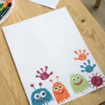
Cute Animal Faces
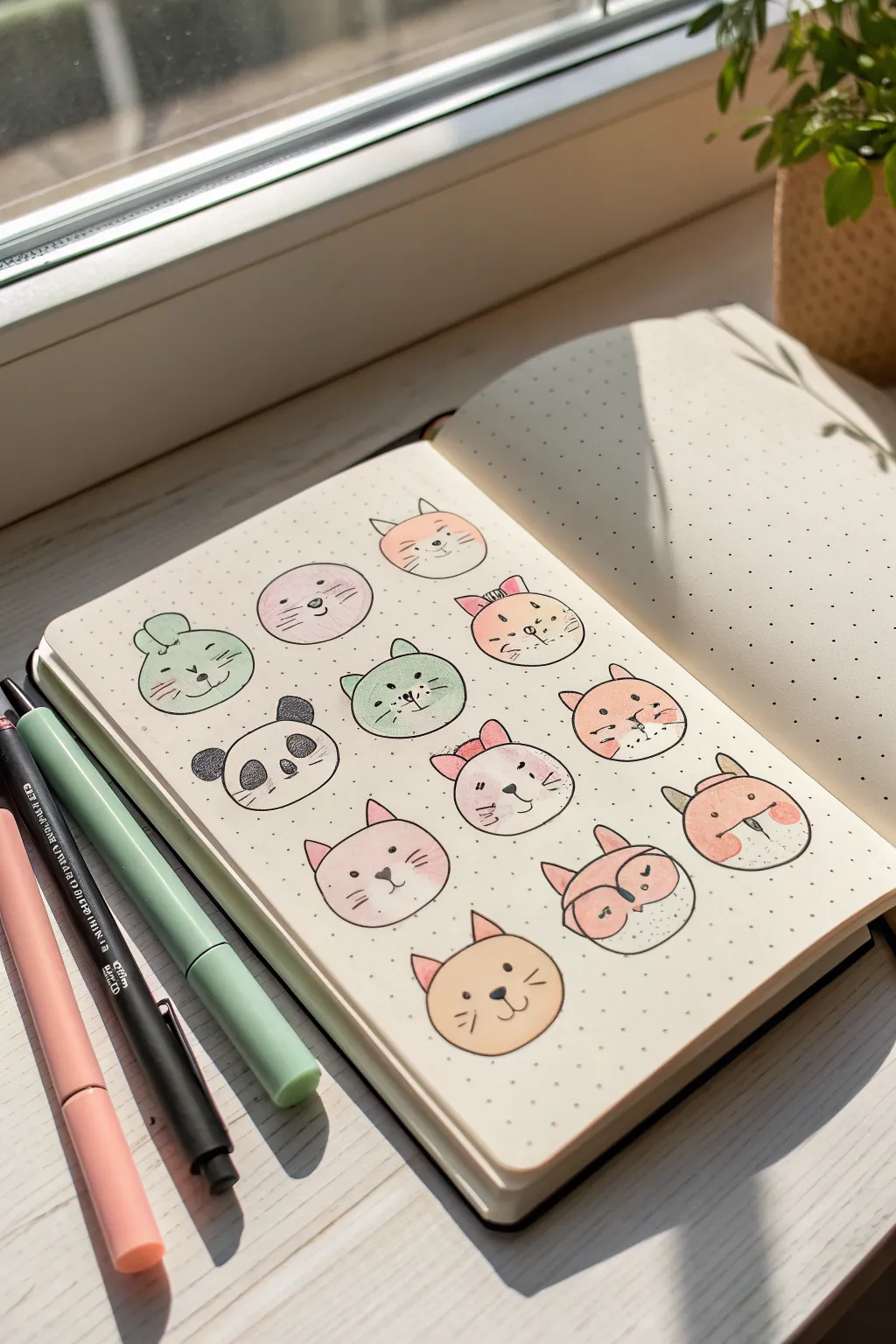
Fill your journal pages with these easy and adorable spherical animal characters. Using simple circles as a base, you can create a whole menagerie of kawaii critters with soft pastel tones and whimsical expressions.
Step-by-Step Tutorial
Materials
- Dotted or blank journal/sketchbook
- Circle stencil or compass (approx. 1-1.5 inch diameter)
- Pencil and eraser
- Fine liner pen (black, 0.3mm or 0.5mm)
- Pastel highlighters or brush pens (pink, teal, peach, warm yellow)
- White gel pen (optional for highlights)
Step 1: Planning the Layout
-
Establish the grid:
Start by lightly sketching a grid layout in pencil to ensure your animals are evenly spaced. A 3-column by 4-row layout works perfectly for a standard A5 journal page. -
Draw the base circles:
Using a circle stencil or a compass, draw twelve identical circles within your grid. Keep the pencil pressure very light so the graphite doesn’t smudge when you add ink later. -
Add basic ears:
Sketch simple geometric shapes on top of the circles to denote animal types. Use triangles for cats and foxes, rounded ovals for bears and pandas, and long loops for rabbits.
Stencil Hack
Don’t have a circle stencil? Trace the bottom of a glue stick, a lip balm container, or a small coin to get consistent, perfect circles every time.
Step 2: Drafting the Faces
-
Sketch the features:
Lightly pencil in the facial features for each animal. Keep the eyes wide-set and aligned with the nose for that signature kawaii look. -
Create variety:
Mix up the expressions. Try some with winking eyes, some with singing mouths, and others looking peaceful or happy. Adding small details like bows or whiskers adds character. -
The Panda and Fox details:
For the panda, pencil in the distinct eye patches. For the fox (bottom right), sketch the curved line that separates the orange fur from the white muzzle area.
Stickers Level Up
Draw these on adhesive label paper instead of directly in your journal. Cut them out to create your own custom sticker sheets for decorating letters or planners.
Step 3: Adding Color
-
Apply base colors:
Using your pastel highlighters or markers, fill in the shapes. I like to color the entire circle for the cats and pigs, but leave white spaces for the panda and fox. -
Layering blushing cheeks:
While the base color is settling, add rosy cheeks. You can do this by layering a slightly darker pink marker or doing a gentle circular scribble over the cheek area. -
Color the ears:
Don’t forget the inner ears. Use a soft pink for the inside of the rabbit, cat, and fox ears to give them depth. -
Allow to dry:
Let the marker ink dry completely for a minute or two. This prevents the black liner from bleeding or feathering when you trace the outlines.
Step 4: Inking and Final Touches
-
Trace the outlines:
Take your black fine liner and carefully trace over your pencil lines. For a cute style, you don’t always have to close every line; leaving small gaps can look charming. -
Define the features:
Ink the eyes, noses, and mouths. Use small dots for whiskers and simple curves for mouths. -
Add hair texture:
For the panda and some cats, use short, quick strokes or stippling (dots) to suggest fur texture rather than a solid line. -
Erase pencil guides:
Once the black ink is fully dry, gently erase all visible pencil marks to clean up the page. -
Optional highlights:
If you have a white gel pen, add a tiny dot to the eyes or cheeks to make the characters look glossy and alive.
Now you have a full page of cheerful companions to brighten your day

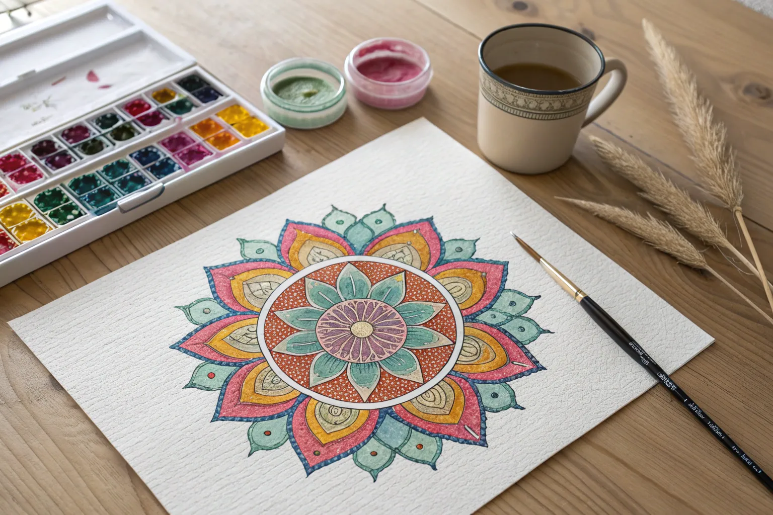
Easy Mandala Circles
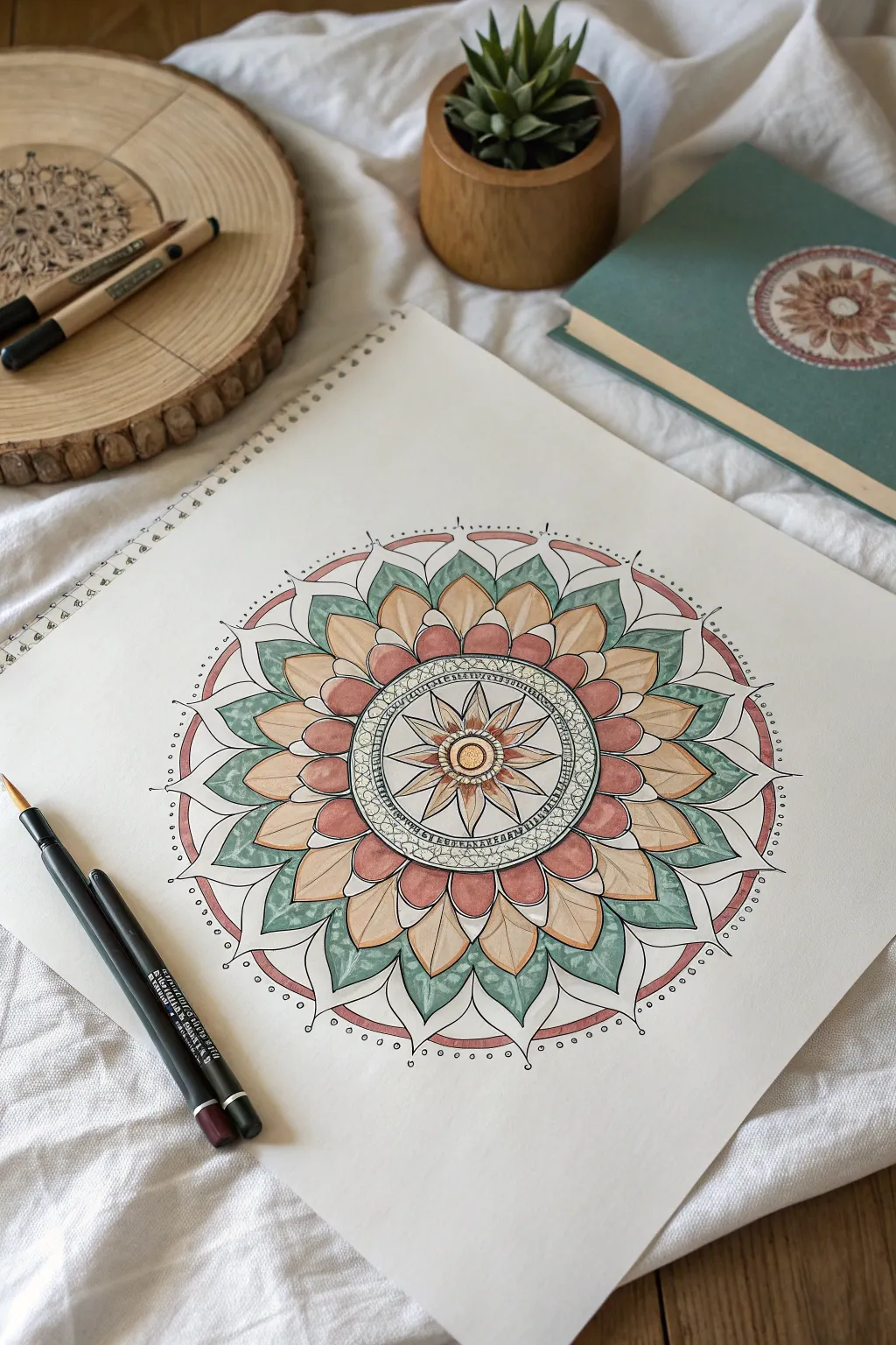
This serene mandala project combines earthy terracottas, pale yellows, and soothing jade greens in a structured floral radial design. The resulting artwork has a grounded, organic feel, perfect for meditative coloring sessions.
Detailed Instructions
Materials
- High-quality mixed media paper or smooth Bristol board (square format)
- Finetip ink pens (black, sizes 0.1mm and 0.5mm)
- Compass and ruler
- Pencil and eraser
- Watercolor pencils or alcohol markers (Jade Green, Terracotta/Salmon, Pale Ochre/Sand)
- White gel pen (optional for highlights)
Step 1: Setting the Radial Grid
-
Find the center:
Begin by marking the absolute center of your paper. Using a ruler, lightly draw a vertical and horizontal line intersecting at this point. -
Draw concentric circles:
Use your compass to draw four main circles. Start with a small inner circle (approx. 2cm diameter), a medium band (approx. 4cm diameter), a large floral boundary (approx. 10cm diameter), and the final outer rim. -
Create section guides:
Use a protractor to divide your circle into 12 or 16 equal pie wedges. Draw light pencil lines radiating from the center to the edge to serve as guidelines for your petal symmetry.
Step 2: Drawing the Inner Structure
-
Sketch the central star:
Inside the innermost circle, draw an eight-pointed star. Make the points sharp and distinct, radiating outward from a small central hub. -
Add the textured ring:
Around the star, create a distinct band. Fill this band with tiny, organic pebble shapes or circles packed closely together to create a stone-like texture. -
First layer of petals:
Draw the first ring of petals extending from the textured band. These should be relatively short and rounded, slightly overlapping at the base. -
Second layer of petals:
Create a larger ring of petals behind the first. Make these pointed at the tips, like traditional lotus petals, extending about halfway to your outer edge.
Keep it Symmetrical
Rotate your paper constantly as you draw. Drawing every petal at the ’12 o’clock’ position helps your hand maintain consistent pressure and shape for every section.
Step 3: Expanding the Pattern
-
Draw the large jade leaves:
For the dominant layer, draw large, sweeping leaf shapes that frame the inner petals. I like to let these curl slightly at the tips to soften the geometry. -
Add the outer rim:
Draw the final outer boundary line. Connect it to the main mandala structure using small, connecting arches or scallops to keep the floral theme consistent. -
Inking the lines:
Trace over your pencil lines with a 0.5mm black fineliner for the main petal shapes. Use a 0.1mm pen for delicate details like the inner star and texture ring. -
Erase guidelines:
Wait until the ink is completely dry—give it a few extra minutes just to be safe—then gently erase all pencil grid lines.
Watercolor Wash
Instead of markers, use watercolor pencils. Draw the color on dry, then activate it with a damp brush for a soft, painterly look that blends seamless gradients.
Step 4: Adding Color & Depth
-
Color the central star:
Use a pale ochre or gold tone for the very center points, blending outward into white for a glowing effect. -
Detail the textured band:
Lightly shade the pebble ring with a very pale grey or green, keeping it subtle so the line work remains the focus. -
Fill the inner petals:
Color the first row of petals with your pale ochre/sand hue. Apply more pressure at the base of the petal and fade out toward the tip. -
Apply the terracotta tones:
For the secondary petal layer and outer rim accents, use the terracotta or salmon color. This warm tone provides a nice contrast to the upcoming cool greens. -
Color the large leaves:
Fill the large, pointed leaves with jade green. To create depth, color the edges darker and leave the center vein lighter, or use a blending tool. -
Add final decorations:
Using a fine pen, add tiny dots around the outermost perimeter line for a delicate finish. -
Optional highlights:
If you have a white gel pen, add tiny dots or lines to the tips of the petals to simulate light hitting the surface.
Step back and enjoy the calming rhythm of your completed mandala design
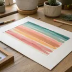
Colorful Rainbow Stripes and Swatches
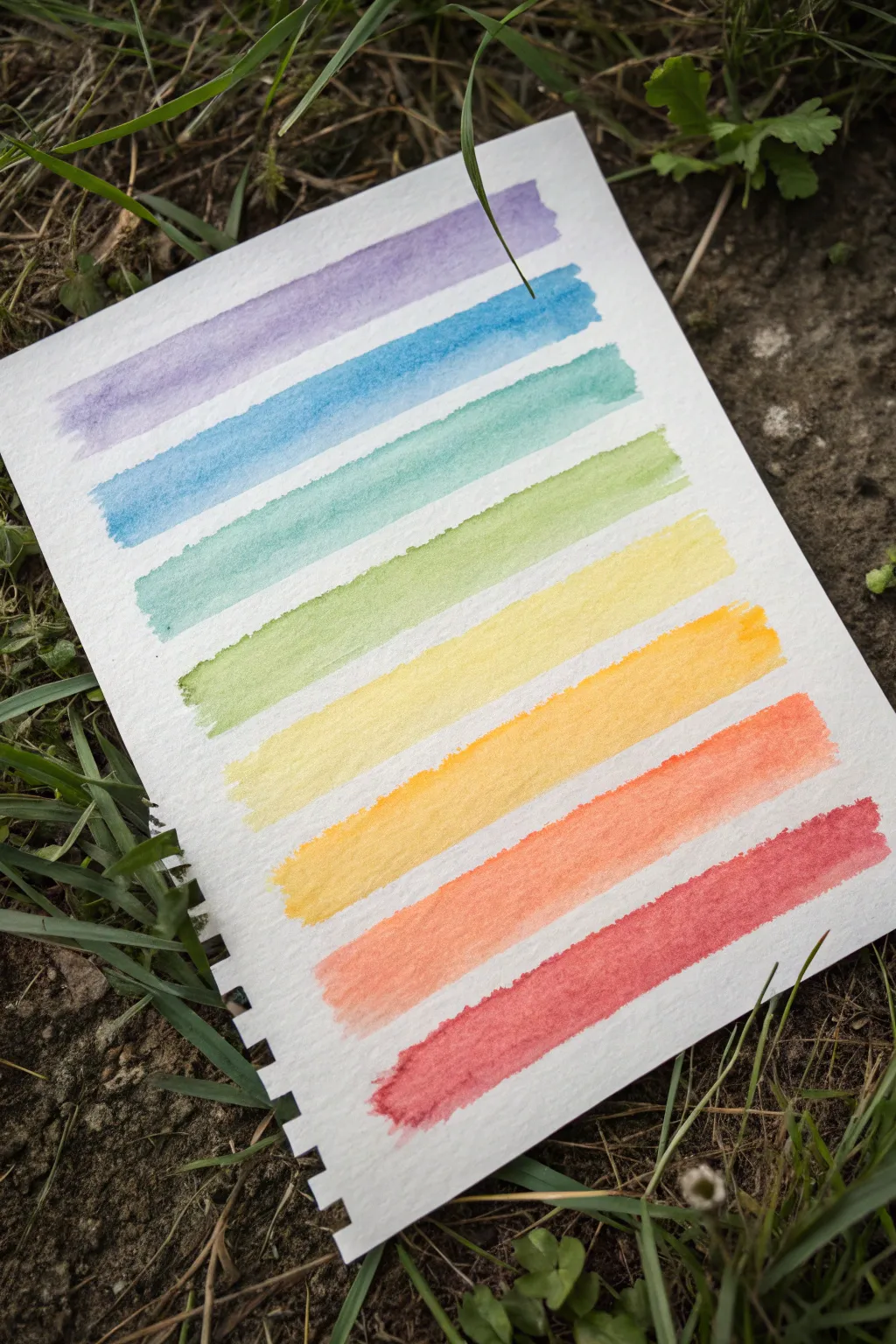
Create a soothing, minimalist study of color with this simple gradient exercise. These textured watercolor stripes are perfect for testing a new palette or just enjoying the calming process of laying down pigment, resulting in a beautiful rainbow progression.
Step-by-Step
Materials
- Cold press watercolor paper (spiral bound pad recommended)
- Watercolor paints (tube or pan set)
- Flat shader brush (size 1/2 inch or 3/4 inch)
- Two jars of water (one for rinsing, one for clean water)
- Paper towels or a clean rag
- Mixing palette
Step 1: Preparation and Palette Setup
-
Prepare your workspace:
Find a flat surface and set up your water jars and paper towels within easy reach. If you are working outside like the photo suggests, use a clipboard or hard surface underneath your paper pad for stability. -
Plan your palette:
Identify the eight colors you will need for this specific gradient: a soft purple (lavender), a medium blue, a teal-green, a lime green, a pale yellow, a golden yellow-orange, a bright orange, and a warm red. -
Pre-wet your paints:
If using a pan set, drop a little clean water onto each of the chosen colors to wake them up. If using tubes, squeeze small amounts onto your palette. -
Mix the first color:
Start with your purple. Mix it with enough water on your palette to create a fluid, transparent consistency. It shouldn’t be thick like toothpaste, but rather like vigorous tea.
Dry Brush Effect
To get those lovely textured ends on the stripes, don’t reload your brush mid-stroke. Let the paint run out naturally as you drag across, creating a scratchy ‘dry brush’ look.
Step 2: Painting the Cool Tones
-
Load the flat brush:
Fully saturate your flat shader brush with the purple mixture. Tap off any excess drips on the side of the palette. -
Paint the first stripe:
Starting near the top of the paper, place the flat edge of the brush horizontally. Drag the brush across the paper in a single, confident stroke from left to right. Allow the natural texture of the cold press paper to show through, creating slightly rough edges. -
Prepare the blue:
Rinse your brush thoroughly. Mix your medium blue shade. Aim for a similar water-to-pigment ratio as the purple to keep the opacity consistent. -
Paint the blue stripe:
Leave a small gap of white space (about 1/4 inch) below the purple stripe. Paint your blue stripe parallel to the first one, using the same single-stroke technique. -
Mix the teal-green:
Clean your brush. Mix a teal or sea-green shade. If you don’t have this exact color, mix a little of your blue with a touch of green. -
Apply the teal stripe:
Lay down the third stripe, maintaining that consistent white gap between the colors. Watch how the water settles into the paper’s tooth; don’t overwork the stroke. -
Transition to lime green:
Mix a fresh, yellow-leaning green. I find looking at a real leaf helps me gauge the natural quality of this shade. -
Paint the green stripe:
Apply the fourth stripe. This marks the transition from cool tones to warm tones in your gradient.
Step 3: Painting the Warm Tones
-
Mix the pale yellow:
Clean your brush very well—yellow is easily muddied by residual blue. Mix a light, sunny yellow. -
Apply the yellow stripe:
Paint the fifth stripe below the green. This should start the lighter, brighter half of the page. -
Create the golden orange:
Mix a yellow-orange or goldenrod hue. This color bridges the gap between pure yellow and true orange. -
Paint the golden stripe:
Lay down the sixth stripe. Try to keep your hand steady to maintain the same width as the previous lines. -
Mix the bright orange:
Prepare a vibrant, saturated orange paint. -
Apply the orange stripe:
Paint the seventh stripe. If the paint pools slightly at the end of the stroke, that’s okay; it adds characteristic watercolor charm. -
Finish with red:
Mix your final color, a warm, rosy red. Apply the last stripe at the bottom, completing the rainbow sequence. -
Let it dry:
Allow the paper to dry completely flat. If you pick it up too soon, wet paint might run and ruin the distinct separation between stripes.
Add Some Sparkle
Once the paint is fully dry, layer a metallic gold or silver ink over one edge of each stripe for a subtle, shimmering accent.
Now you have a refreshing colorful chart that captures the beauty of a simple rainbow gradient
BRUSH GUIDE
The Right Brush for Every Stroke
From clean lines to bold texture — master brush choice, stroke control, and essential techniques.
Explore the Full Guide
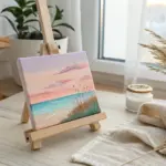
Sunset Landscape Silhouettes
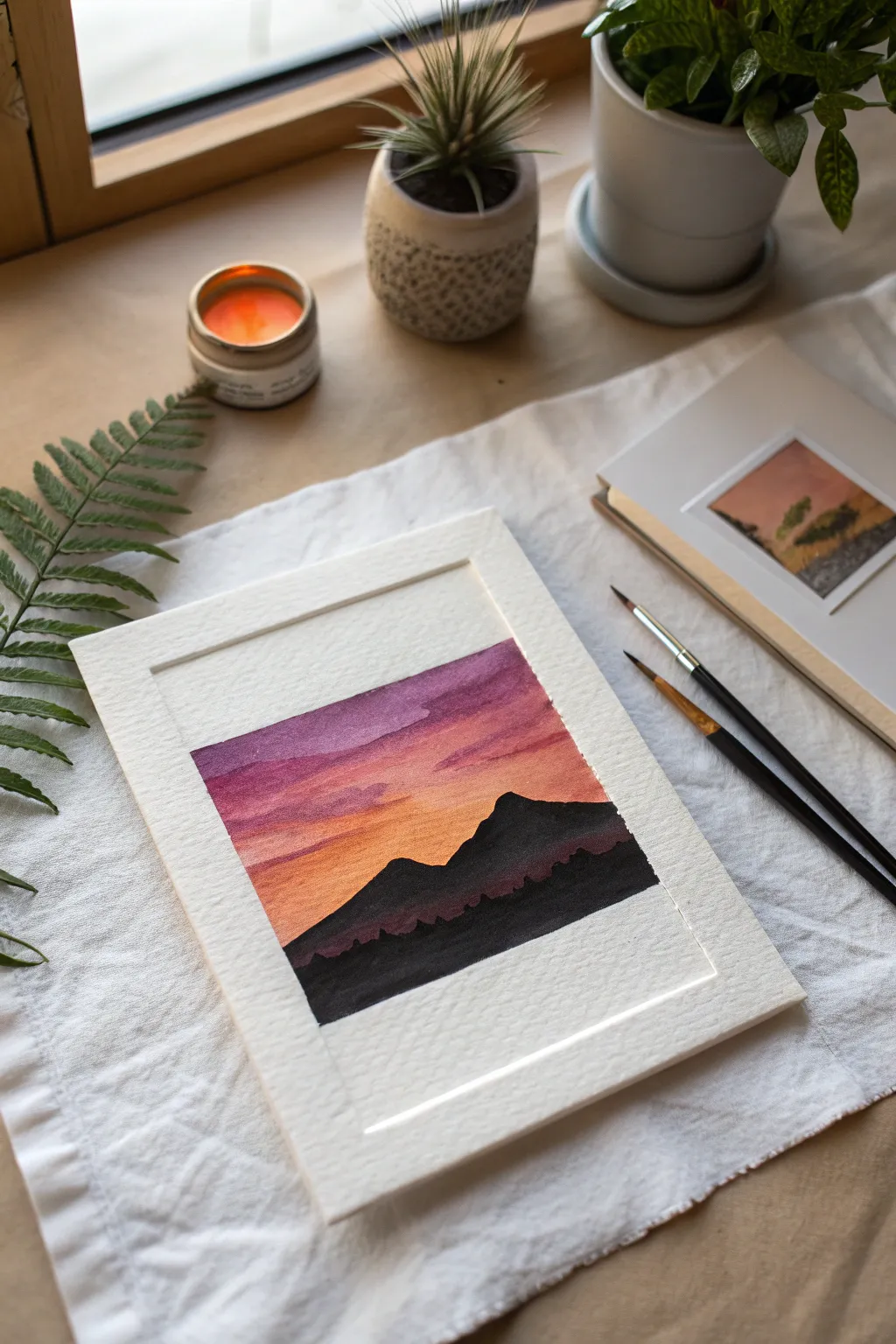
Capture the serene beauty of twilight with this compact watercolor landscape featuring a vibrant gradient sky and bold mountain silhouettes. The stark contrast between the glowing backdrop and the deep foreground creates a powerful visual impact in a small format.
Step-by-Step Guide
Materials
- Cold press watercolor paper (approx. 5×7 inches or cut to size)
- Masking tape or artist tape
- Watercolor paints (Purple/Violet, Alizarin Crimson, Cadmium Orange, Lamp Black)
- Round brushes (flats can work for the sky, fine point for details)
- Jar of clean water
- Paper towels
- Pencil (HB or lighter)
Step 1: Preparation and Base Layer
-
Define the borders:
Begin by taping down all four edges of your watercolor paper to a board or table clearly. Create a thick border by placing the tape about 1/2 to 1 inch inward from the paper’s edge; this clean white frame is crucial to the final look. -
Establish the horizon:
Lightly sketch a low horizon line with your pencil. You don’t need to draw the mountains yet, just establish where the sky ends and the land begins, keeping the land portion to the bottom third of the paper. -
The purple zone:
Mix a rich purple or violet with a moderate amount of water. Apply this to the very top section of the sky using broad horizontal strokes. While the paint is still wet, you can lift a tiny bit of pigment with a thirsty brush to suggest soft cloud shapes. -
Transition to pink:
While the purple edge is still damp, rinse your brush and load it with a pinkish-red tone like Alizarin Crimson. Paint below the purple, allowing the colors to touch and bleed slightly into one another for a seamless transition. -
The orange glow:
Clean your brush thoroughly and pick up a vibrant orange. Paint the bottom section of the sky right down to your pencil line. Blend this upwards into the pink layer carefully so you don’t muddy the colors. -
Refining the gradient:
If the transition lines look too harsh, use a clean, slightly damp brush to gently stroke horizontally across the meeting points of the colors. Aim for a soft, glowing sunset effect. -
Adding texture:
Before the sky dries fully, I sometimes dab in a slightly more saturated purple mix into the upper wet area to create faint, streaky cloud shadows that add depth to the atmosphere. -
The crucial pause:
Let the sky layer dry completely. The paper must be bone-dry before you add the mountains, or the black paint will bleed into your beautiful sunset. You can use a hairdryer on a low setting if you’re impatient.
Bleeding Lines?
If paint bleeds under your tape, ensure you press the edges down firmly with a bone folder or fingernail before starting. Using ‘artist’ tape instead of standard masking tape also helps prevent this.
Step 2: Silhouettes and Finish
-
Outline the peaks:
Using a fine round brush loaded with concentrated black paint (mix a tiny bit of blue or purple if you want a cooler black), carefully outline the top edge of the mountain range. Create one large peak on the right and a smaller one to the left. -
Fill the form:
Fill in the mountain shapes with solid black paint. Ensure the coverage is opaque; you may need a second coat if the first looks streaky or transparent. -
The foreground layer:
For the very bottom section below the main peaks, create a slightly darker or denser black layer to represent the closest foothills. Paint this all the way down to the bottom tape line. -
Tree line details:
While the mountain silhouettes are still workable, use the very tip of your smallest brush to stipple tiny, irregular bumps along the ridge lines and base. These suggest distant pine trees or jagged rock formations. -
Final drying:
Allow the black paint to dry thoroughly. This step takes longer than the sky because the paint application is much thicker. -
The reveal:
Once the paper is cool to the touch and totally dry, slowly peel away the masking tape. Pull the tape away from the center of the painting at a 45-degree angle to prevent tearing the paper surface. -
Clean up edges:
Inspect your white border. If any paint bled under the tape, you can sometimes gently lift it with a clean, damp brush or cover it carefully with a tiny bit of white gouache or opaque white gel pen.
Starry Night
Once the sky is dry (but before painting the mountains), flick a very small amount of white gouache or acrylic ink from a toothbrush onto the purple section to create faint, early evening stars.
Now you have a striking miniature landscape perfect for a greeting card or small frame
Pattern-Filled Hearts

These charming, hand-drawn hearts showcase the beauty of variety, mixing simple outlines with intricate internal textures like stripes, grids, dots, and scallops. The muted, earthy color palette of warm browns, dusty pinks, oranges, and sage greens gives the page a cozy, rustic feel perfect for a bullet journal or sketchbook spread.
How-To Guide
Materials
- Dotted grid notebook or sketchbook
- Fine-liner pens (black or dark brown for outlines)
- Colored pencils or colored gel pens (rust, sage green, dusty pink, brown)
- Pencil (HB for initial sketching)
- Eraser
Step 1: Planning the Layout
-
Visualize the spacing:
Look at your blank page and imagine a loose grid. You’ll want to scatter about 12-15 medium-to-large hearts across the page, leaving comfortable white space between them so they don’t feel crowded. -
Sketch the main hearts:
Using a light pencil, draw the outlines of your main hearts. Vary their orientations slightly—tilt some to the left and others to the right to create movement. Don’t worry about perfect symmetry; a slightly wonky shape adds charm. -
Add tiny fillers:
In the larger gaps between your main hearts, sketch a few tiny, solid-colored hearts. These mini-hearts act like confetti, balancing the composition and filling empty voids without overwhelming the design.
Step 2: Drawing and Patterning
-
Review your palette:
Select your colored pencils or pens. Stick to an earthy theme—think terracotta, sage, and sand—to replicate the natural aesthetic shown here. Limiting your palette creates a cohesive look. -
Create the grid heart:
Start with a heart in sage green. Outline the shape confidently, then draw diagonal lines one way, followed by perpendicular lines to create a checkered grid inside. It doesn’t need to be ruler-straight. -
Draw the striped heart:
Moving to a rust or orange color, draw another heart outline. Fill the interior with close, parallel diagonal lines to create a shading effect that looks almost solid from a distance but retains texture. -
Design the scallop pattern:
For the pinkish-brown heart, fill the interior with rows of tiny ‘U’ shapes or scallops. Stagger the rows so the bottom of one ‘U’ sits between the tops of the two below it, like fish scales. -
Add the polka dot heart:
Outline a heart in a warm brown. Fill the inside with small open circles or solid dots. Keep the spacing relatively consistent, but allow the hand-drawn nature to show through. -
Create the double-outline effect:
Draw a smaller solid heart (like the rust one near the top) and then draw a second, separate outline around it in a contrasting color like sage green. Add tiny decorative lines inside the border for extra detail. -
Sketch the swirly heart:
Use a darker brown to draw nested heart shapes inside an outline, or create a loose, messy scribble texture bounded by a clean heart border for a modern look. -
Create a vertical stripe variation:
Take a green or grey tone and fill a heart with varying widths of vertical stripes. I sometimes like to alternate between a thick colored stripe and a thin white space to add visual rhythm. -
Add the leafy doodle pattern:
Inside a larger heart outline, draw tiny, random triangular or leaf-like shapes. Let them float freely inside the boundary rather than organizing them in rows. -
Make the radiant heart:
Draw a heart where all the internal lines radiate from the bottom point upwards and outwards, like a fan. This works beautifully with a darker sage green pen.
Uneven Lines?
Don’t fret! Wobbly lines are part of the ‘doodle’ aesthetic. If a line goes astray, thicken it slightly or add a decorative doodle over the mistake to disguise it.
Step 3: Finishing Touches
-
Fill the mini hearts:
Go back to those tiny pencil hearts you sketched earlier. Color them in completely solid using your accent colors (pink, rust, grey) to anchor the lighter, patterned designs. -
Clean up the page:
Once all ink or pencil color is completely set, gently erase any visible graphite sketch lines from the first step to leave the artwork crisp and clean. -
Add final sparkle:
If any heart looks too empty, add a few extra dots or lines. The goal is a balanced spread where your eye travels easily from one pattern to the next.
Color Consistency
Test your color palette on a scrap piece of paper first. Ensure your 3-4 chosen colors look harmonious together before committing them to the final page.
Now you have a sketchbook page filled with cozy, personalized love notes to yourself that radiate creative warmth

PENCIL GUIDE
Understanding Pencil Grades from H to B
From first sketch to finished drawing — learn pencil grades, line control, and shading techniques.
Explore the Full Guide
Whimsical Mushroom Clusters
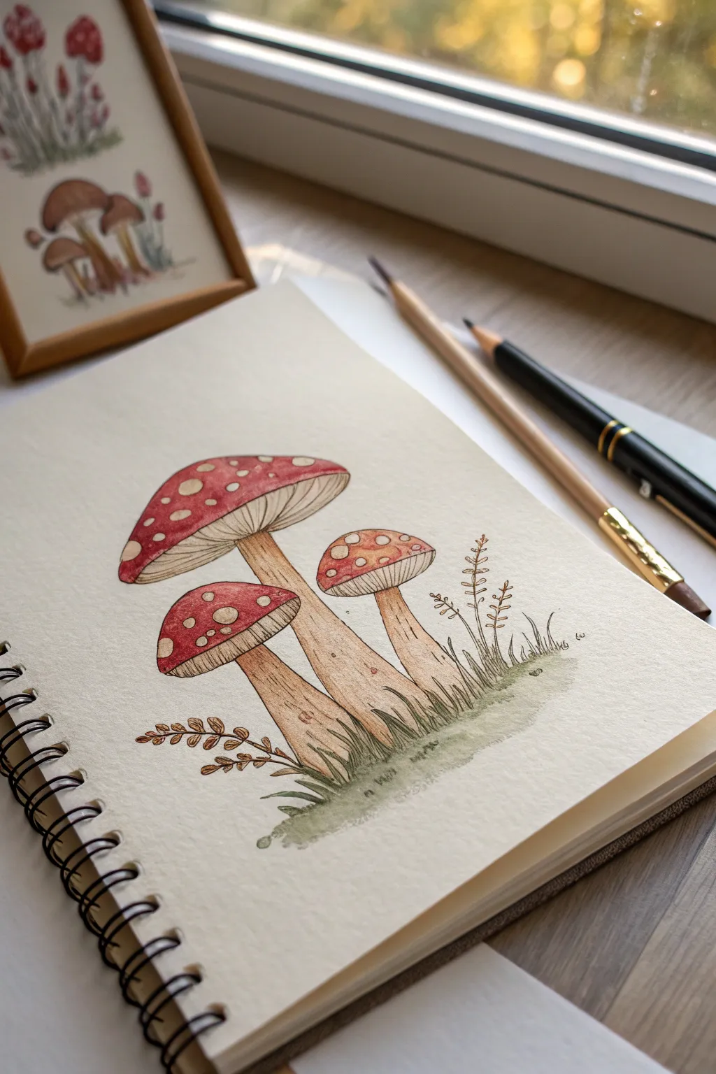
Capture the charm of the forest floor with this delicate illustration of a mushroom trio. Combining fine ink lines with soft washes of color creates a whimsical, botanical study perfect for your sketchbook.
Step-by-Step
Materials
- Heavyweight sketchbook (mixed media or watercolor paper)
- Fine liner pen (waterproof, black or dark sepia, 0.1mm – 0.3mm)
- Watercolor paints or watercolor pencils (Red, Ochre/Tan, Moss Green)
- Small round paintbrush (size 2 or 4)
- Pencil (HB) and eraser for sketching
- Cup of water and paper towel
Step 1: Planning the Composition
-
Establish the Stems:
Begin by lightly sketching the three stems with your pencil. Draw the central, tallest stem first, leaning slightly right. Add a shorter, thicker stem to its left and a small, delicate one to its right. -
Cap Placement:
Sketch broad, rounded triangular shapes for the caps. The central cap should be the largest, overlapping the top of the stem entirely. Ensure the cap on the left sits lower than the others. -
Sketch the Grounds:
Lightly indicate a grassy mound at the base of the stems to ground your mushrooms so they don’t look like they are floating in space.
Step 2: Inking the Outlines
-
Outline the Caps:
Using your fine liner, go over the pencil lines for the caps. Keep the lines somewhat organic rather than perfectly smooth circles. -
Add Gill Details:
Draw the gills underneath the caps. Start from the center (where the stem meets the cap) and draw fine lines radiating outward to the rim of the cap. I find it helps to curve these lines slightly to show volume. -
Define the Stems:
Ink the stems, making the lines slightly shaky or broken to suggest texture. Add a few small vertical marks on the stems to hint at fibrous woodiness. -
Draw the Spots:
Draw irregular circles and ovals on the top of the caps for the classic fly agaric spots. Vary their sizes. -
Inking the Foliage:
Add grass blades shooting up around the base. Draw delicate stick-like branches with tiny leaves on the left and right sides for balance. -
Erase Guidelines:
Once the ink is completely dry, gently erase all your initial pencil marks to leave a clean drawing.
Bleeding Lines?
If your black ink smudges when you add watercolor, your pen isn’t waterproof. Let it dry longer, or paint the colors first and add ink lines only after the paper is bone dry.
Step 3: Adding Color
-
Paint the Caps Red:
Dip your brush in water and pick up a muted red pigment. Carefully paint around the white spots on the caps. Let the color be slightly uneven to look natural. -
Shade the Stems:
Using a very watered-down tan or ochre, wash over the stems. Add a second, slightly darker layer on the shadowed sides (usually the left or right depending on your light source) to create roundness. -
Tint the Gills:
With an extremely pale wash of grey or brown, gently tint the gill area under the caps, keeping it lighter than the top. -
Grounding with Green:
Apply a mossy green wash to the grass at the base. Let the watercolor fade out softly at the edges to creating a vignette effect. -
Botanical Accents:
Use a touch of brown for the branch-like foliage on the sides, keeping the strokes light and airy.
Level Up: Highlights
Use a white gel pen or opaque white gouache to add tiny highlights on the shiny red parts of the caps or to tidy up the edges of the white spots for a crisper look.
Step 4: Finishing Touches
-
Deepen the Contrast:
Go back with a slightly more saturated red on the lower edges of the mushroom caps to make them look spherical. -
Refine Shadows:
Add tiny hatching lines with your pen in the darkest areas—under the caps and at the very bottom of the stems—to increase contrast. -
Review and Sign:
step back and check if the white spots need any cleaning up (white gel pen can help here if you painted over them) and sign your work.
Now you have a charming woodland scene preserved in your sketchbook to enjoy anytime
Underwater Sea Life Scene
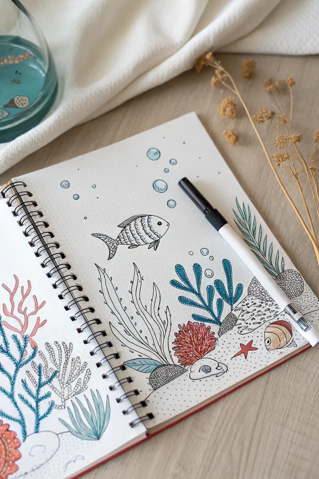
Dive into creativity with this charming sketchbook spread featuring playful fish, swaying seaweed, and vibrant coral reefs. Using a mix of crisp black fineliner details and soft pencil coloring, you’ll create a lively aquatic scene that feels both structured and organic.
Detailed Instructions
Materials
- Spiral-bound sketchbook (mixed media or heavy drawing paper)
- Black liquid ink rollerball pen or fineliner (0.5mm)
- Colored pencils (red, teal, olive green, sandy beige)
- Pencil for initial sketching
- Eraser
Step 1: Planning the Seascape Layout
-
Lightly sketch the composition:
Begin by lightly sketching the sandy ocean floor across the bottom third of the page. Don’t make it a straight line; give it gentle humps and bumps for a natural terrain feel. -
Block in major elements:
Sketch rough shapes for your main elements: a large coral branch on the left, grassy seaweed patches in the middle and right, and a few rocks scattered near the bottom. -
Place the swimming life:
Draw the outline of a central fish swimming left and a smaller bottom-feeding fish near the right corner. Add a few circles floating upward to represent bubbles.
Step 2: Inking the Outlines
-
Start with the main fish:
Using your black pen, ink the central fish. Give it a distinct eye, gills, and decorative stripes on its body. I like to add tiny scales or dots within the stripes for texture. -
Draw the tall seaweed:
Ink the tall, wavy seaweed strands rising from the center. Keep your lines fluid and organic, allowing them to overlap slightly to create depth. -
Outline the coral structure:
Move to the left side and ink the coral structure. Use branching, antler-like shapes. Don’t worry about perfect symmetry; natural coral is wonderfully irregular. -
Define the ocean floor:
Go over your bottom line work. Instead of a solid line, use stippling (lots of little dots) to create the texture of sand around the base of the plants and rocks. -
Add background bubbles:
Ink the floating bubbles. Draw a small crescent shape inside each circle or a smaller circle to mimic light reflecting on the bubble’s surface.
Ink Smearing?
If your rollerball pen smears when you color over it, let the ink dry for at least 15 minutes before using colored pencils, or switch to a waterproof archival pigment liner.
Step 3: Adding Texture and Detail
-
Texture the rocks:
Draw small cracks or circular patterns on the rocks at the bottom right. Fill one rock with a dense cross-hatching pattern to make it look porous. -
Detail the leafy plants:
On the far right, draw the fern-like seaweed leaf. Draw a central stem and add many thin, diagonal lines coming off it to create the feathery foliage. -
Adding patterned coral:
For the bulbous coral shapes near the bottom, fill them with tiny lines or hatch marks to distinguish them from the smoother plants. -
Erase pencil marks:
Once the ink is completely dry—give it a minute or two to prevent smudging—gently erase all your initial pencil sketches.
Make it Pop
Use a white gel pen to add tiny highlights on the darkest parts of the seaweed and the fish’s eye. This simple trick adds a wet, glossy look to your underwater elements.
Step 4: Coloring the Scene
-
Color the coral red:
Using a soft red or coral-colored pencil, gently fill in the branchy coral on the left side. Keep the pressure light to let the paper texture show through. -
Shade the blue plants:
Take a teal or blue pencil to color the central seaweed cluster. You can press harder near the base of the plant to create a gradient effect, shadowing where the leaves meet the sand. -
Highlight the feathery seaweed:
Use an olive or sea-green pencil for the fern-like plant on the right. Color the leaves but leave the tips slightly lighter for a sun-dappled look. -
Color the bottom fish:
Color the small fish on the ocean floor using beige and brown tones, adding a pop of red to its fins to tie it in with the coral. -
Add bubble accents:
Lightly shade just the bottom edge of the bubbles with a light blue pencil to give them three-dimensional volume. -
Final sandy touches:
Use the black pen to add more stippling dots across the bottom area to densify the sand texture, concentrating dots under rocks and plants for shadow.
Close your sketchbook knowing you’ve captured a peaceful slice of ocean life on paper


Cozy House and Window Views
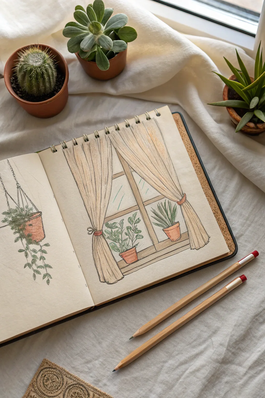
Capture the warmth of a sunny afternoon with this charming window scene sketch, featuring soft drapery and cheerful potted plants. This project combines simple line work with gentle colored pencil shading to create a relaxed, homey aesthetic.
How-To Guide
Materials
- Spiral-bound sketchbook (heavyweight paper preferred)
- Graphite pencil (HB or 2B)
- Fine liner or black ink pen (archival quality)
- Colored pencils (terracotta, sage green, forest green, warm beige, cream)
- Eraser
- Pencil sharpener
Step 1: Drafting the Window Frame
-
Sketch the outline:
Begin on the right-hand page by lightly sketching a large rectangle for the window frame. Don’t worry about using a ruler; freehand lines add character. -
Add the crossbars:
Divide the window with a vertical center line and movement for a horizontal bar about one-third of the way up from the bottom. -
Create depth:
Draw interior lines parallel to your basic frame to give the wood some thickness and dimension.
Uneven Curtains?
If your curtains look asymmetrical, measure the distance from the page edge to the gathering point on both sides before drawing the final curves to ensure balance.
Step 2: Drawing the Curtains
-
Outline the drape:
Start from the top corners of your page (or just above the window frame) and draw sweeping, curved lines that gather toward the lower third of the window. -
Add the tie-backs:
Sketch small oval shapes or bands where the curtains gather, indicating the ties holding the fabric back. -
Fan out the bottom:
From the tie-back, draw the bottom section of the curtains flaring out slightly and ending in a wavy, hemmed line. -
Detail the folds:
Draw long, vertical contour lines within the curtain shapes to represent the folds and pleats of the fabric hanging down.
Step 3: Adding Plant Life
-
Position the pots:
Sketch two terracotta pot shapes sitting on the window sill. Place one on the left and one on the right for balance. -
Sketch the left plant:
For the left pot, draw a leafy plant with rounded, oval leaves branching out in different directions, keeping it fairly loose. -
Sketch the right plant:
For the right pot, draw a spiky plant resembling a snake plant or aloe, with upright, pointed leaves. -
Optional hanging plant:
If you wish to replicate the full spread, use the left page to sketch a hanging planter with trailing vines cascading down.
Texture Twist
For the curtains, try cross-hatching with your colored pencils instead of smooth shading. This mimics the weave of linen fabric beautifully.
Step 4: Inking and Coloring
-
Ink the lines:
Go over your pencil sketch with a fine black pen. Use a steady hand but keep the lines somewhat sketchy rather than perfectly mechanical. -
Erase guidelines:
Once the ink is completely dry, gently erase all the underlying graphite sketch marks. -
Color the curtains:
Use a warm beige or cream colored pencil to fill in the curtains. Apply pressure vertically to mimic the fabric grain. -
Shade the fabric:
I like to go back in with a slightly darker beige or light brown to shade inside the folds and near the tie-backs, adding volume. -
Color the pots:
Fill in the plant pots with a terracotta or reddish-brown pencil, pressing harder on the sides to create a rounded 3D effect. -
Color the foliage:
Use a mix of sage and forest greens for the leaves. Varying the shades between the two plants creates nice visual interest. -
Add final touches:
Lightly sketch some diagonal blue or grey lines in the window panes to suggest glass reflection or the view outside.
Close your sketchbook knowing you’ve preserved a perfect little moment of calm afternoon light
Butterfly Wings as Color Practice
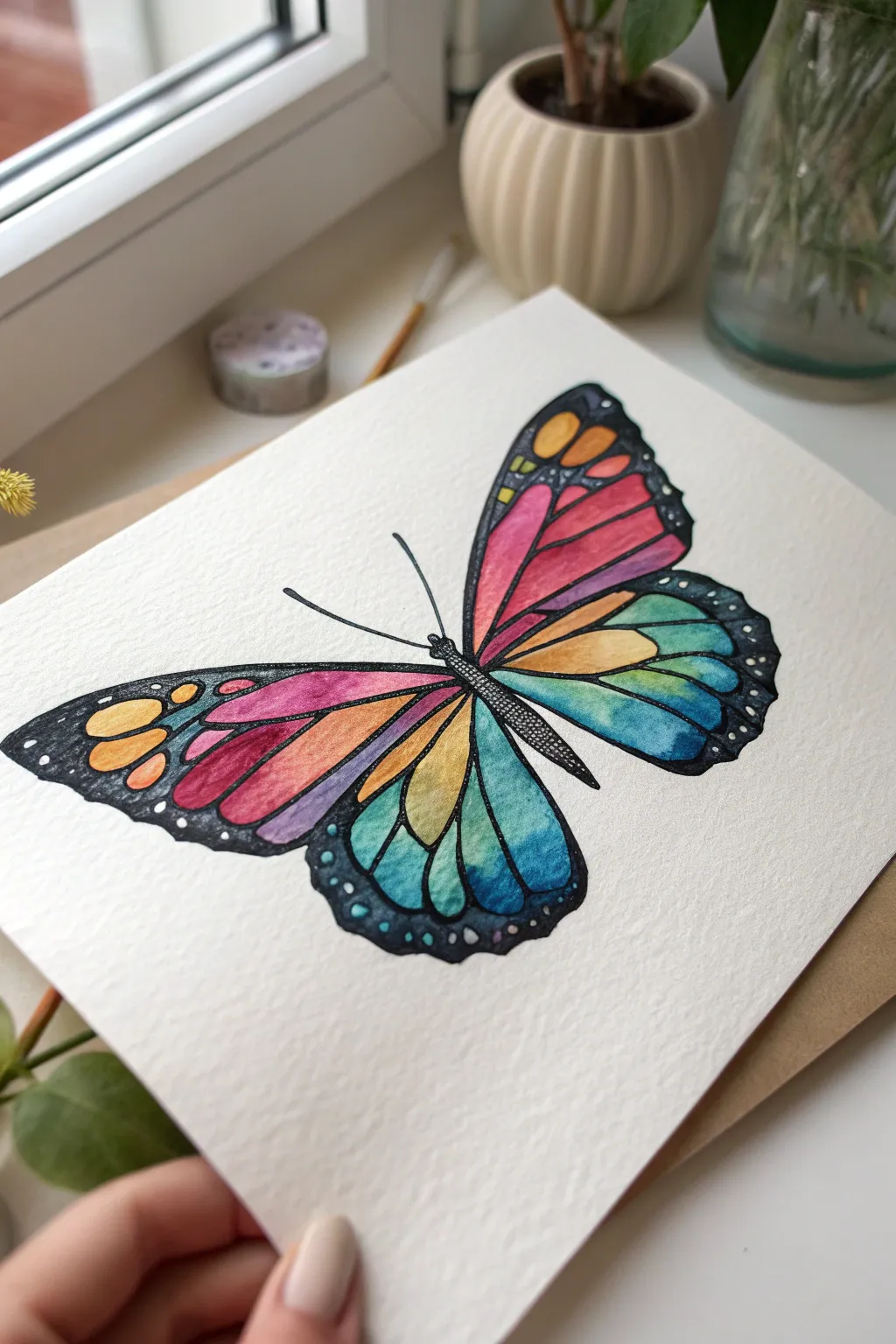
Learn how to use butterfly wings as a canvas for practicing seamless color transitions and gradient blending. This project combines bold ink linework with soft, flowing watercolors to create a vibrant, stained-glass effect that pops off the page.
Detailed Instructions
Materials
- Cold-press watercolor paper (300gsm textured)
- Watercolor paints (pan or tube set)
- Black waterproof fine liner pens (sizes 005, 01, and 05)
- White gel pen or white gouache
- Pencil (HB or H)
- Round watercolor brushes (size 2 and 6)
- Painters tape or washi tape (optional for securing paper)
- Paper towels and two water cups
Step 1: Sketching the Framework
-
Establish the centerline:
Begin by lightly drawing a diagonal line across your paper to guide the butterfly’s body angle. Draw a slender, segmented abdomen and thorax along this axis. -
Map the wing shapes:
Sketch the large upper forewing first, creating a rounded triangular shape. Below it, draw the hindwing, which should be slightly smaller and more rounded at the bottom edge. -
Mirror the design:
Repeat these shapes on the left side. Don’t worry about perfect symmetry; a natural, slightly angled perspective makes the butterfly look more dynamic. -
Draw the cell patterns:
Inside the wings, lightly sketch the veins to create the mosaic ‘cells.’ Start with long, teardrop shapes extending from the body, and add smaller, rounded cells near the outer edges.
Muddy colors?
If your gradients look brown, you likely mixed complementary colors (like orange and blue) too much. Let one section dry completely before painting a neighboring cell.
Step 2: Applying the Ink Outline
-
Inking the main veins:
Using a size 05 waterproof pen, trace over your pencil lines for the main wing veins. Keep your hand steady but allow for slight variations in line thickness to mimic organic structures. -
Thicken the borders:
Go back over the outer edges of the wings to create a thick, bold black border. This heavy contrast frame is essential for making the colors pop later. -
Detail the body:
Switch to a finer 01 pen to stipple (dot) the texture on the butterfly’s body and head. Draw two long, smooth curves for the antennae. -
Erase pencil guides:
Wait at least 10 minutes for the ink to fully cure, then gently erase all visible pencil marks.
Add some Shimmer
Mix a tiny amount of iridescent medium or metallic watercolor into your top layer. The wings will catch the light beautifully when tilted.
Step 3: Creating the Color Gradients
-
Prepare your palette:
Pre-mix a spectrum of colors: bright pink, orange, yellow, turquoise, and deep blue. Having these wet and ready is key for smooth blending. -
Start the pink-orange blend:
On the upper left wing, dampen the inner cells with clean water first. Drop in pink near the body, then blend it into orange as you move outward. Let the water mix the pigments on the paper. -
Paint the yellow-green transition:
Moving to the lower sections of the forewing, blend orange into a sunny yellow, then touch the very edge with a hint of green. -
Execute the cool tones:
For the hindwings (bottom wings), start with yellow near the body, blending rapidly into teal and then a deep indigo blue at the tips. Work one cell at a time to prevent drying lines. -
Mirror the colors:
Repeat the process on the right wing. I prefer to paint the corresponding cell on the opposite side immediately while my brush still holds that specific color mix. -
Adjust contrast:
While the paint is still damp, you can drop concentrated pigment into the corners of the cells to create depth and shadows.
Step 4: Final Details
-
Fill the black margins:
Once the color is bone dry, use your black marker or very concentrated black watercolor to color in the thick outer borders and the spaces between the colorful cells. -
Add white accents:
Using a white gel pen, add small dots along the black outer border of the wings. Vary the size of these dots for a more natural appearance. -
Highlight the body:
Add tiny stippled white dots to the center of the thorax and head to give the body dimension. -
Clean up edges:
Check your perimeter for any stray paint or uneven ink lines and tough them up for a crisp finish.
Step back and admire how the vibrant gradients transform simple shapes into a stunning piece of art
Lettering With Decorative Fills
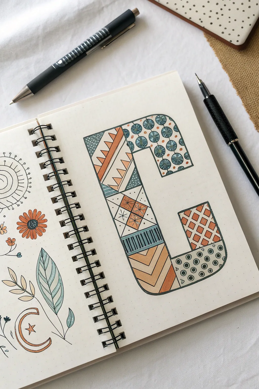
Transform a simple block letter into a work of art by filling it with intricate, doodle-style patterns. This project combines geometric precision with organic, boho-inspired designs for a relaxing and creative lettering exercise.
How-To Guide
Materials
- Dotted grid journal or sketch paper
- Pencil and eraser
- Ruler
- Fine liner pen (black, 0.3mm or 0.5mm)
- Colored markers or pencils (terra cotta, teal/slate blue)
Step 1: Drafting the Structure
-
Map out the letter shape:
Begin by sketching the large block letter ‘C’ lightly in pencil. If you are using a dotted journal, use the dots as guides to keep your lines perfectly straight and corners square. -
Segment the interior:
Using a ruler, divide the interior of the ‘C’ into irregular geometric sections. Create a mix of triangles, rectangles, and angled shapes to serve as containers for your different patterns. -
Ink the main outline:
Once you are happy with the letter’s proportions and the internal segments, trace over the main exterior outline and the internal dividing lines with your black fine liner.
Grid Guide
Use the dot grid to count spaces (e.g., make the letter 4 dots wide) before drawing. This ensures your proportions remain consistent without measuring.
Step 2: Filling with Patterns
-
Top curve circles:
In the top curved section, draw rows of small circles. Inside each circle, add a tiny ‘star’ or asterisk shape with lines radiating from the center. -
Triangle zig-zags:
Move to the angled section on the left vertical bar. Draw a zig-zag line across the middle, creating a row of triangles pointing right. -
Geometric diamonds:
In the central rectangular block, draw an ‘X’ to divide it into four triangles. Then, draw smaller diamond shapes inside the top and bottom triangles. -
Vertical stripes:
Find a small horizontal band, perhaps below the diamond section. Fill this area with tightly packed vertical lines. -
Chevrons:
In the lower curve of the ‘C’, create a chevron pattern by drawing nested ‘V’ shapes that echo the angle of the segment. -
Lattice grid:
Select a square or rectangular segment near the bottom right. Draw diagonal lines in both directions to create a lattice or diamond grid texture. -
Dotted texture:
In the final bottom tip of the letter, draw scattered circles. Place a solid dot in the center of some circles and leave others open for variety. -
Add tiny details:
Go back through your patterns and add micro-details, like stippling (tiny dots) in empty spaces or double-lining certain shapes to add depth.
Step 3: Adding Color
-
Select your palette:
Choose a limited color palette to keep the design cohesive. A classic teal mixed with a warm terra cotta orange creates a lovely earthy balance. -
Color the starbursts:
Use your teal marker to color the background of the top circle pattern, carefully working around the asterisk shapes so they remain white. -
Alternate the zig-zags:
Fill in the zig-zag triangles with terra cotta. I like to leave the adjacent negative space white to make the color pop. -
Define the diamonds:
Color the diamond shapes in the central block with terra cotta. Use the teal color to fill the side triangles in that same segment. -
Highlight the stripes:
Color every other vertical stripe with your teal marker, creating a classic pinstripe effect. -
Shade the chevrons:
Alternate creating bands of terra cotta and white within the chevron section. If you want more depth, use a lighter touch to fade the color out at the edges. -
Fill the lattice:
Color the diamond spaces inside your lattice grid with terra cotta, leaving the grid lines themselves white. -
Finish the dots:
Use the teal marker to color the background behind the circles at the bottom tip, leaving the circles themselves white. -
Erase guidelines:
Wait until the ink is completely dry to avoid smudging, then gently erase any remaining pencil lines from your initial sketch.
Add Dimension
After coloring, use a light grey marker to add a drop shadow along the right and bottom edges of the letter to make it lift off the page.
Now you have a beautifully patterned initial that looks complex but was built one simple shape at a time
Geometric Shapes With Bold Patterns
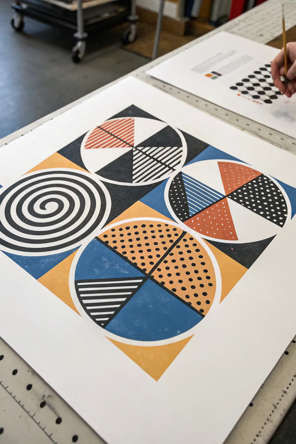
This striking project combines bold geometric forms with intricate patterns to create a visually dynamic composition inspired by mid-century modern design. By balancing solid blocks of color with stripes, dots, and swirls, you will achieve a professional graphic art look that pops off the page.
Step-by-Step Guide
Materials
- Heavyweight mixed-media paper or bristol board (square format)
- Ruler and compass
- Pencil and eraser
- Painter’s tape or masking tape (low tack)
- Gouache or acrylic markers (black, burnt orange, mustard yellow, denim blue)
- Fine liner pens (black and white, varying widths)
- Circle template (optional)
- Small flat brush (if using paint)
Step 1: Drafting the Layout
-
Establish the grid:
Begin by lightly drawing a large square in the center of your paper. Divide this main square into four equal quadrants using a vertical and a horizontal line through the center. -
Draw the circles:
Using your compass, draw a large circle centered perfectly within each of the four quadrants. Ensure the circles touch the edges of their respective quadrant boxes without overlapping. -
Divide the circles:
For the top-right, bottom-right, and bottom-left circles, draw an ‘X’ shape through their centers to divide them into triangular pie slices. Leave the top-left circle whole for now, as it will contain a spiral.
Crisp Compass Lines
Attach a fine-point pen directly to your compass using masking tape instead of the lead holder. This creates perfectly inked circles without needing to trace over pencil lines later.
Step 2: Planning Values and Colors
-
Map out the background:
Visualize the negative space around the circles. Lightly mark ‘blue’ for the spaces around the top-right and bottom-left circles, and ‘yellow’ for the spaces around the top-left and bottom-right. Alternatively, use the specific color blocking shown in the reference: distinct triangles of color in the corners. -
Plan the segments:
Lightly label each pie slice within the circles with its intended pattern: ‘solid black’, ‘dots’, ‘stripes’, or ‘solid color’. This planning step prevents confusion once you start applying permanent ink.
Step 3: Constructing the Spiral
-
Start the spiral:
In the top-left circle, place your pencil in the absolute center. Slowly draw a continuous spiral line moving outward until you reach the circle’s edge. Try to keep the spacing between the lines consistent. -
Thicken the spiral:
Go back over your spiral line, thickening the black bands so that the white negative space and black positive space are roughly equal in width.
Smudged Ink?
If you smudge wet ink, don’t wipe it immediately. Let it dry completely, then carefully paint over the mistake with opaque white gouache or correction fluid before redrawing the line.
Step 4: Applying Color
-
Tape the edges:
For crisp lines, apply low-tack tape along the straight edges of your quadrant boxes before painting larger areas. I like to press the tape edge firmly with a fingernail to prevent bleed-under. -
Fill solid colors:
Using gouache or acrylic markers, fill in the solid colored sections first. Apply the mustard yellow and denim blue to the background corners and selected pie slices. Let each color dry completely before painting an adjacent section. -
Add the burnt orange:
Fill in the specific orange segments, such as the top slice of the top-right circle and the right slice of the bottom-right circle. -
Paint the black solids:
Fill in all sections marked for solid black. This provides the heavy contrast needed to anchor the composition.
Step 5: Detailing with Patterns
-
Create the stripes:
In the designated striped sections (like the bottom slice of the top-center circle), use a ruler and a black fine liner to draw parallel lines. Vary the thickness; some sections might look best with thin hatching, others with bold bars. -
Add polka dots:
For dotted sections on a white background, use a black marker to dab evenly spaced dots. Try to create a staggered grid pattern rather than random placement. -
Layer white details:
Once your block colors are bone dry, use a white paint pen to add details over the colored areas. Add white stripes over the blue slice in the top-right circle, and white stippling dots over the orange slice below it. -
Enhance the black dots:
In the yellow section of the bottom circle, add black polka dots over the dry yellow paint for a bold, graphic texture.
Step 6: Finishing Touches
-
Clean up edges:
Remove any remaining tape carefully. Use a small brush with white gouache or a white gel pen to tidy up any ragged edges where colors might have bled slightly. -
Erase guidelines:
Gently erase any visible pencil lines from your initial grid, being careful not to rub over the painted areas. -
Final assessment:
Check the balance of the piece. If a black area feels too heavy, you can add a few more white geometric marks to lighten it visually.
Step back and admire how the interplay of simple shapes creates a complex and modern visual rhythm.
Color-by-Shape With a Limited Palette
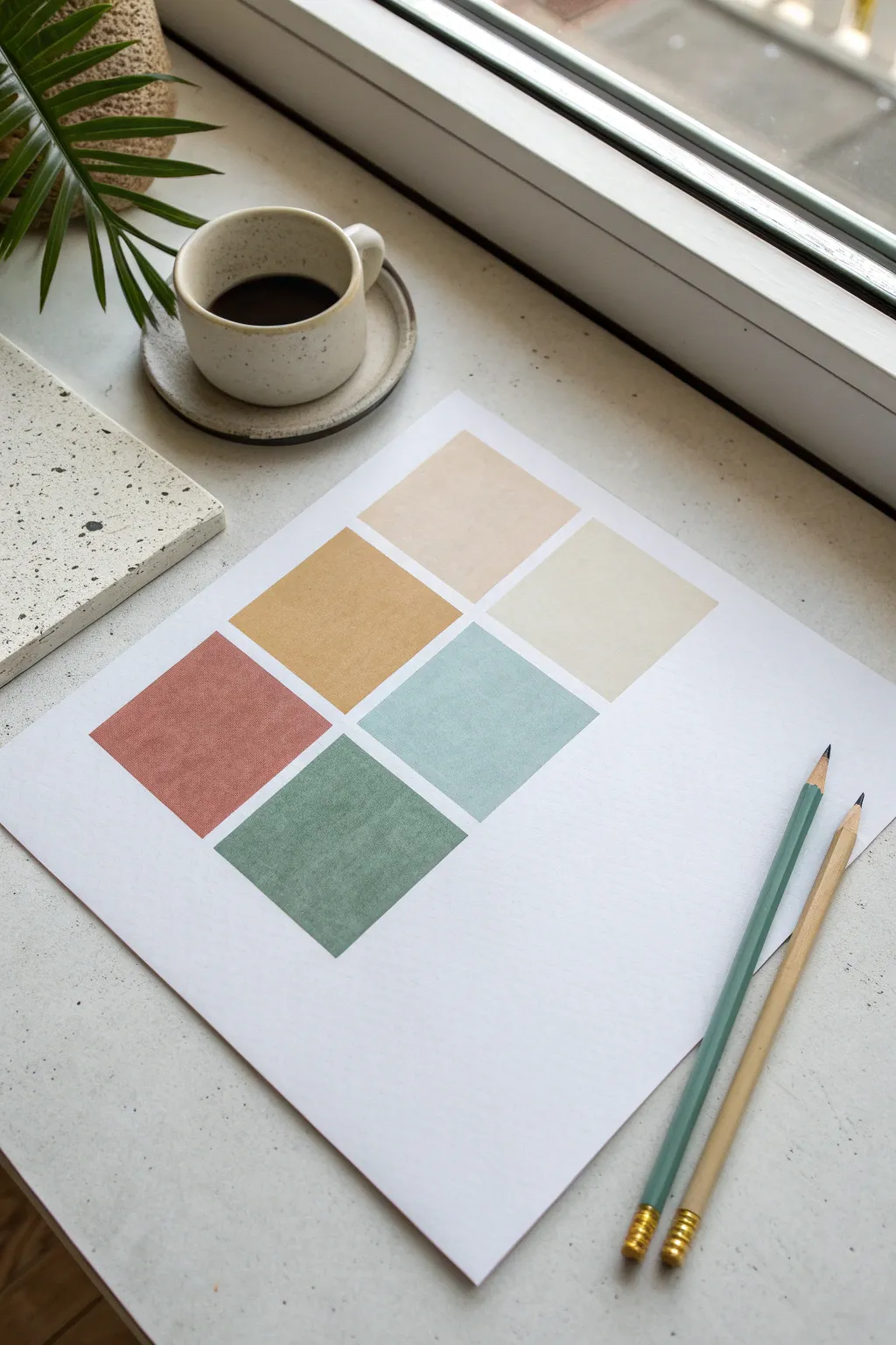
This project embraces the calming power of a limited, earthy color palette organized into a simple, balanced grid. It is an exercise in precision and color harmony, resulting in a piece that looks like high-end modern art but serves as a meditative practice.
Step-by-Step
Materials
- High-quality white cartridge or watercolor paper (A4 or Letter size)
- Ruler
- Pencil (HB or lighter)
- Eraser
- Colored pencils or matte gouache paint (in terracotta, mustard, sage, slate blue, beige, and cream)
- Masking tape or painter’s tape (optional, for crisp edges)
Step 1: Planning the Grid
-
Find the center:
Begin by laying your paper on a flat, clean surface. Using your ruler, very lightly mark the absolute center of the page. -
Determine square size:
Decide on the size of your colored blocks. For this composition, 2.5-inch or 6-centimeter squares work beautifully to leave ample negative space. -
Mark the spacing:
Plan for a small, consistent gap between the squares—about 0.25 inches or 5mm looks clean. Mark these gaps outward from your center point to ensure symmetry. -
Draft the grid:
Lightly draw the six squares in a 2×3 grid formation. Use a very light hand so the graphite lines are barely visible and easy to erase later if needed. -
Check alignment:
Step back and check your work. Ensure that the margins on the left and right are equal, and that the top margin is slightly smaller than the bottom margin for visual balance.
Sharpen Up
To keep corners perfectly crisp without tape, rotate your paper so your hand is always pulling the stroke away from the edge, never pushing toward it.
Step 2: Applying Color
-
Select your palette:
Choose six colors that harmonize well. The image uses a muted palette: rust red, mustard yellow, sage green, slate blue, pale beige, and cream. -
First block: Rust Red:
Start with the bottom-left square. Fill it in with the rusty terracotta shade. I prefer to outline the shape first to define the edge, then fill inward. -
Second block: Mustard:
Move to the middle-left square. Apply the mustard yellow color carefully, ensuring the tone is even and saturated. -
Third block: Beige:
Fill the top-left square with the pale beige tone. This should be a subtle, warm whisper of color compared to the others. -
Fourth block: Sage Green:
Shift to the bottom-right square. Apply the sage green, keeping your strokes consistent in direction to maintain a smooth texture. -
Fifth block: Slate Blue:
Color the middle-right square with the slate blue shade. Try to match the visual weight or darkness of the mustard square next to it. -
Sixth block: Cream:
Finish with the top-right square using the lightest cream or ivory shade. This block provides a gentle highlight to the composition.
Step 3: Refining and Finishing
-
Smooth the texture:
If using colored pencils, go back over any patchy areas with a circular motion to burnish the color and remove white paper specks. -
Clean the edges:
If you sketched your grid lines darker than intended, carefully erase any graphite visible outside the colored squares. -
Check for smudges:
Inspect the white negative space around the grid. Use a clean eraser to lift any stray pigment dust or fingerprints.
Uneven Coverage
If your pencil coloring looks scratchy, lay a tissue over the square and rub firmly with your finger. This blends the pigment into the paper tooth.
Display your new artwork near natural light to appreciate the subtle interplay of these earthy tones
Negative Space Line Art With One Pop Color
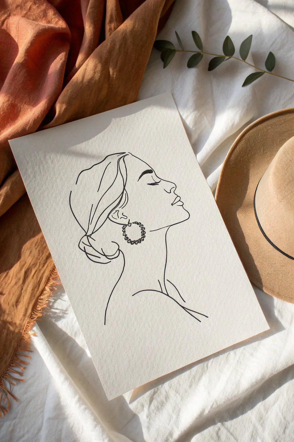
Capture the elegant simplicity of a single continuous-style line drawing with this minimalist profile project. The stark contrast of black ink against textured cream paper creates a sophisticated, modern art piece perfect for framing.
How-To Guide
Materials
- High-quality cream or off-white textured paper (approx. 180-250 gsm)
- HB pencil for sketching
- Kneaded eraser
- Fine liner pen (size 05 or 08), black ink
- Smooth work surface
- Reference photo of a side profile
Step 1: Planning and Sketching
-
Prepare your space:
Clear a flat surface and tape down the corners of your cream paper slightly if necessary to keep it from shifting. Ensure you have good lighting to see the paper’s texture. -
Visualize the flow:
Before touching pencil to paper, look at your reference image. Identify the major lines: the sweep of the hair, the dip of the nose, and the curve of the neck. Imagine drawing it without lifting your hand. -
Lightly block shapes:
Using your HB pencil with very light pressure, sketch an oval for the head and a gentle curve for the neck. This provides a boundary so your drawing remains centered. -
Outline the profile:
Refine the front of the face. Sketch a smooth forehead line flowing into the nose. Keep the pencil strokes incredibly faint so they are easy to lift later. -
Detail the features:
Mark the position of the closed eye with a simple curved line. Add the lips and the chin, focusing on the silhouette rather than shading. -
Sketch the hair and ear:
Draw the ear placement and sketch loose, flowing lines to suggest hair pulled back into a low bun. Do not draw every strand; suggest volume with a few key curves. -
Add the accessory:
Sketch a circle for the hoop earring hanging from the earlobe. This will be the focal point of texture within the simple lines.
Unsteady Hand?
If your lines are coming out shaky, try drawing from your shoulder rather than your wrist. Moving your whole arm creates smoother, more confident curves.
Step 2: Inking the Final Piece
-
Test your pen:
On a scrap piece of the same paper, test your fineliner ink flow. You want a consistent, solid black line that doesn’t bleed into the paper’s texture. -
Begin the forehead:
Start your final ink line at the hairline, moving down the forehead. Commit to the line with a steady hand, moving somewhat quickly to avoid shaky marks. -
Navigate the profile:
Continue the line down the nose, over the lips, and under the chin. I find it helpful to exhale slowly while drawing these long, crucial curves. -
Ink the neck and shoulder:
Draw the long, elegant curve of the neck down to the shoulder. Lift your pen at the collarbone area to create a ‘broken line’ effect, which adds artistic interest. -
Define the ear and earring:
Ink the ear shape carefully. For the earring, use a slightly jagged or looped line texture to create the look of a braided or beaded hoop, contrasting with the smooth skin lines. -
Flow the hair lines:
Use sweeping, confident strokes for the hair. Allow some lines to be disconnected or floating to maintain that airy, negative space aesthetic. -
Review line weight:
Look over the drawing. If certain areas, like the underside of the bun or the jawline, need more definition, go over them once more to slightly thicken the line.
Step 3: Refining and Finishing
-
Let the ink cure:
Wait at least 15 to 20 minutes for the ink to dry completely. This is crucial on textured paper where ink can settle into grooves and smudge easily. -
Erase pencil marks:
Gently dab and roll a kneaded eraser over the sketch lines. Avoid harsh rubbing, which can damage the paper surface or fade the black ink. -
Assess the balance:
Step back and look at the composition. If there feels like too much empty space on one side, you can extend a hair strand or shoulder line slightly to balance it. -
Final clean up:
Check for any stray graphite specks and remove them. Your minimalist masterpiece is now ready for display.
Add a Pop
To fit the ‘one pop color’ theme, stick gold leaf on the earring circle or use a bold watercolor wash just for the lips to create a stunning focal point.
Now you have a timeless piece of art that proves simple lines can carry profound expression
Texture Rubbing Backgrounds With Colored Details
Capture the intricate skeletal beauty of fallen autumn leaves with this refined take on the classic childhood rubbing technique. By using fine points instead of broad crayons, you’ll create delicate, diaphanous illustrations that look almost like scientific botanical sketches.
Step-by-Step Tutorial
Materials
- Fresh or dried leaves with prominent veins (maple, beech, oak)
- Lightweight drawing paper or high-quality printer paper
- Fine-liner pens (0.3mm or 0.5mm) in black, forest green, and mustard yellow
- Colored pencils (teal, black, ochre)
- Painter’s tape or washi tape
- Smooth hard surface (table or clipboard)
Step 1: Preparation and Setup
-
Select your specimens:
Gather a variety of leaves. Look specifically for leaves with raised, thick veins on the underside. Dried leaves work well for crisp lines, but slightly fresh ones are less brittle and easier to work with. -
Arrange the composition:
Place three distinct leaves on your hard surface, vein-side up. Arrange them so they will sit nicely on your paper—perhaps tilting one left, one right, and centering the bottom one. -
Touch-test the veins:
Run your finger over the leaves to ensure the veins are facing upward; this is crucial for the texture to transfer through the paper. -
Secure the paper:
Lay your sheet of paper gently over the arranged leaves. Use small pieces of painter’s tape at the corners to stick the paper to the table so it doesn’t shift while you work.
Blurred Lines?
If details look muddy, your paper is likely too thick. Switch to standard printer paper or thin sketching paper (under 80gsm) to let fine textures shine through.
Step 2: Creating the Green Leaf
-
Locate the stem:
Using your teal or forest green fine-liner or sharp colored pencil, gently feel for the stem of the top-left leaf through the paper. -
Trace the central vein:
Lightly trace the prominent central vein (midrib) from the stem to the tip. Don’t draw a straight line; let your tool bump along the texture underneath. -
Rub out the side veins:
Using a rapid back-and-forth shading motion, scribbling very lightly, move outward from the center vein. The raised veins underneath will catch the ink/lead, appearing darker than the flat areas. -
Define the edges:
Once the interior structure is visible, carefully outline the serrated edges of the leaf, following the gentle imprint you can see through the paper.
Step 3: Sketching the Central Leaf
-
Switch to black:
Pick up your black fine-liner or sharp pencil for the central, maple-like leaf. -
Establish the structure:
Draw the main stem and the primary veins branching out. Keep your grip loose so the lines remain organic and slightly shaky. -
Cross-hatching texture:
Instead of coloring solid blocks, use short, directional hatch marks to suggest the smaller veins. I find that lifting the pen frequently creates a airier, more delicate texture. -
Outline the perimeter:
Trace the jagged perimeter. If the leaf has deep lobes, make sure to follow the curves inward toward the center.
Pro Tip: The Side Grip
Hold your pencil almost horizontally (low angle) when rubbing the interior veins. This catches the raised texture without digging into the paper valleys.
Step 4: Rendering the Gold Leaf
-
Choose a warm tone:
Select an ochre or mustard yellow tool for the final leaf on the right. -
Create the skeleton:
Draw the central line and the chevron-like side veins first. Press slightly harder here to make the ‘skeleton’ the focal point. -
Feather the edges:
Use very light, feathery strokes to fill in the space between the veins, allowing the texture of the leaf underneath to guide your hand. -
Cleanup:
Carefully peel up the tape and lift the paper. Check for any gaps in your outlines and gently close them freehand if needed.
Frame your botanicals or use them as elegant seasonal greeting cards to share the autumn mood
One Outline, Three Palettes Remix Challenge
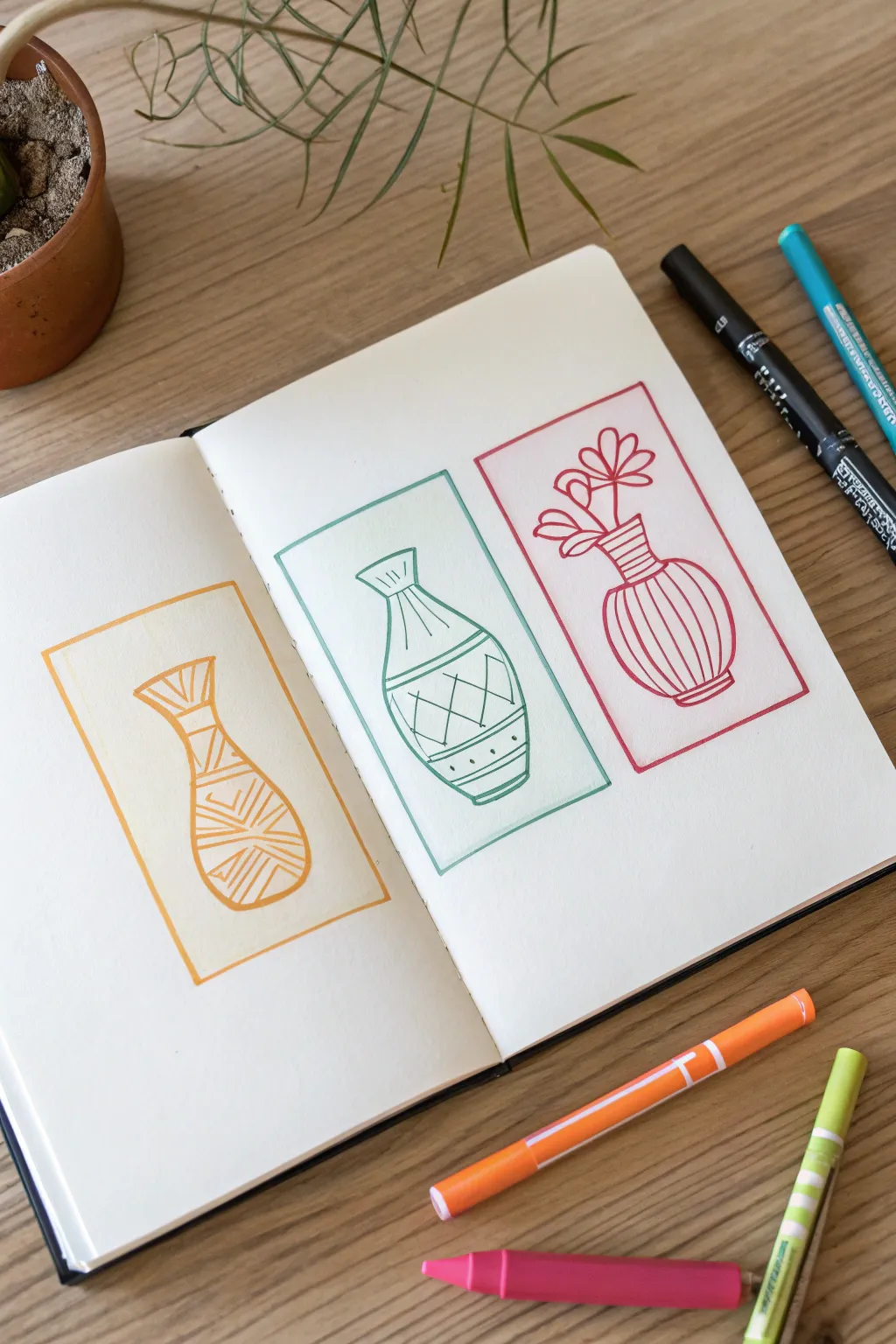
This simple yet striking project explores shape and linework by creating a series of three stylized vases within neatly framed rectangles. Using a consistent monoline style but varying designs and colors, you’ll create a harmonious triptych that pops off the page.
Step-by-Step
Materials
- Sketchbook with smooth, heavy paper
- Pencil (HB or 2H for light sketching)
- Eraser
- Ruler
- Fine liner or felt-tip markers (Orange, Teal, Magenta/Red)
- Black fine liner (optional for initial outlining, though colored lines are used here)
Step 1: Planning the Layout
-
Define the frames:
Start by lightly drawing three equal-sized rectangles with your pencil and ruler. Place one centered on the left page and two evenly spaced on the right page to create a balanced composition. -
Sketch the center vase outlines:
Inside each rectangle, lightly sketch a simple outline for a vase. Aim for variety in shape: make one tall and slender, one stout and curvy, and one rounded with a defined neck. -
Refine the shapes:
Check the symmetry of your vases. You don’t need them to be perfect, but the necks and bodies should look balanced. Lightly erase and adjust lines until you are happy with the forms.
Wobbly Lines?
Don’t stress over ruler-straight lines! If your hand shakes, lean into it. A slightly organic, wobbly line style often looks more intentional and artistic than a line that tries to be perfect and fails.
Step 2: Drawing the Orange Vase
-
Ink the frame:
Using an orange felt-tip marker, carefully trace over the pencil rectangle on the left page. I like to do this freehand for a more organic feel, but you can use a ruler for precision. -
Outline the vase:
Trace the main outline of the tall, slender vase using the same orange marker. -
Add horizontal bands:
Draw horizontal lines across the neck and the widest part of the vase body to create sections for patterns. -
Fill with zig-zags:
Within the sections you just created, draw tight zig-zag patterns. Vary the direction of the lines—some vertical, some diagonal—to create a woven texture effect.
Step 3: Drawing the Teal Vase
-
Ink the middle frame:
Switch to a teal or sea-green marker. Trace the first rectangle on the right page. -
Outline the second vessel:
Trace your pencil sketch for the middle vase. This shape should be slightly wider at the bottom, tapering gently up to a flared rim. -
Create the grid pattern:
Draw three crucial curved lines across the body: one near the neck, one at the belly, and one near the base. Inside the main section, draw crisscrossing diagonal lines to form diamond shapes. -
Add decorative details:
Inside the bottom band of the vase, place small dots evenly spaced. Add vertical stripes to the neck area.
Pattern Play
Before inking, test out different geometric patterns on a scrap piece of paper. Mixing dots, dashes, and simple shapes allows you to find combos that complement each other before committing to the final page.
Step 4: Drawing the Magenta Vase
-
Ink the final frame:
Pick up a magenta or reddish-pink marker for the third rectangle. -
Outline the round vase:
Trace the outline of the final vase, focusing on a round, bulbous body and a narrow neck. -
Stripe the body:
Fill the round body of the vase with curved vertical lines that follow the contour of the shape. This emphasizes the roundness of the object. -
Add simple florals:
Draw three distinct flower stems rising from the vase neck. Keep the petals simple and graphic—just loops or ovals—to match the clean style of the pottery. -
Erase pencil marks:
Once all ink is completely dry, use a quality eraser to gently remove all the underlying pencil sketches, leaving crisp colored lines behind.
Now you have a clean, modern aesthetic spread that celebrates simple forms and bright colors

Have a question or want to share your own experience? I'd love to hear from you in the comments below!