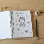
Some days in art class you want a prompt that’s super clear, skill-building, and still leaves room for your own style. Here are my favorite drawing ideas for art class—the kind that feel doable at any level but can still look seriously impressive on the wall.
Still Life With Everyday Objects

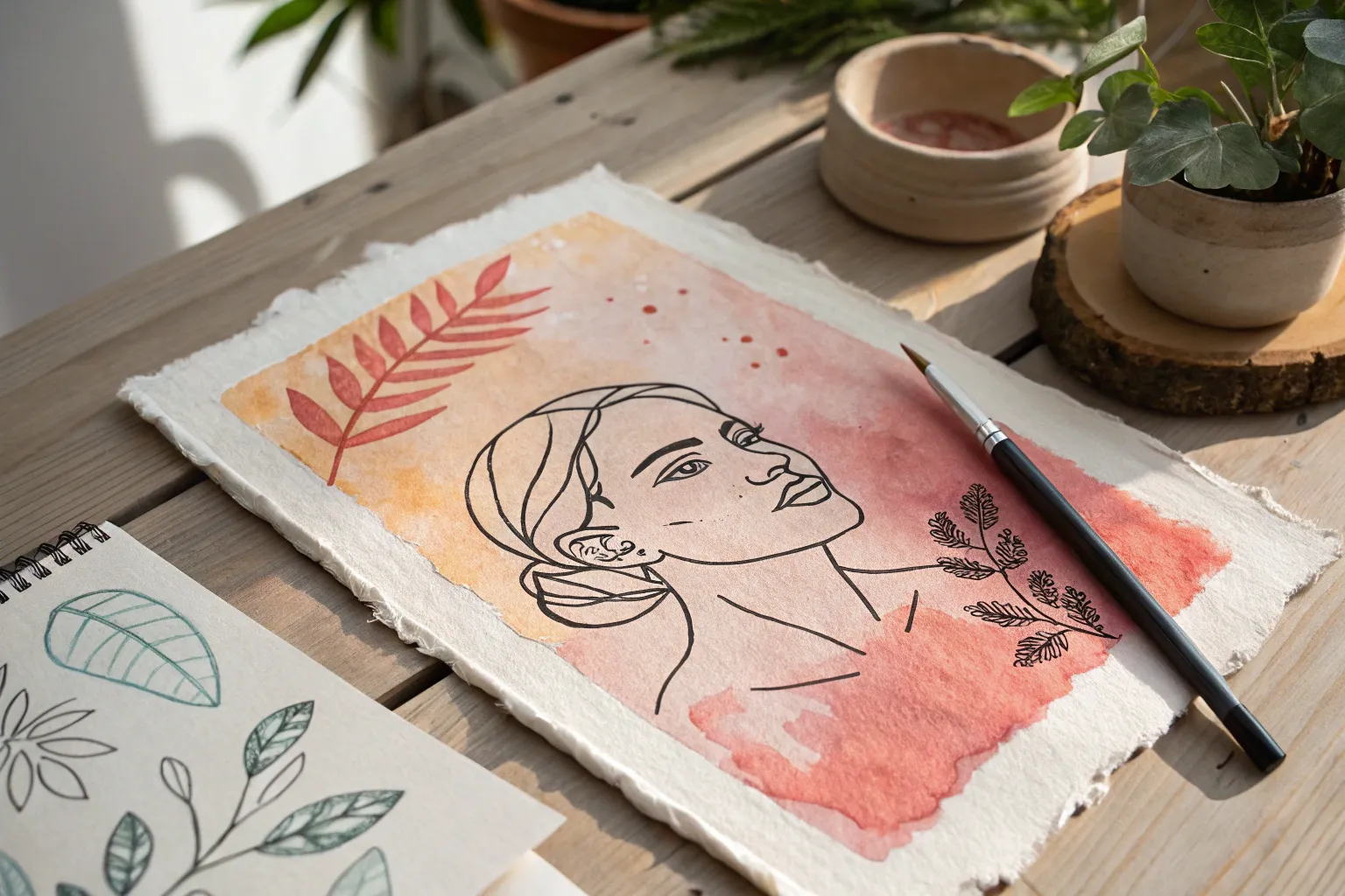
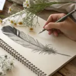
Capture the delicate textures of nature with this multi-subject sketchbook spread featuring a cross-sectioned citrus fruit and a sprouting root vegetable. This project focuses on fine line work, shading techniques, and observation to turn ordinary produce into elegant botanical illustrations.
Detailed Instructions
Materials
- Wire-bound sketchbook (smooth or mixed media paper)
- Fine liner pen (black, 0.3mm or 0.5mm)
- Graphite pencil (HB or 2B for sketching)
- Eraser
- Ruler (optional, if you want precise layouts)
- Real fruit/vegetable reference (optional but helpful)
Step 1: Planning the Layout
-
Visualize placement:
Begin by looking at your open sketchbook page. Imagine where the main focal points will go. We want the sprouting plant on the right page as the hero image, and smaller studies on the left. -
Light pencil blocking:
Using your HB pencil, lightly sketch a large oval shape on the right page for the root vegetable base. Add a vertical line extending upward for the stem. -
Left page composition:
On the left page, sketch a circle for the citrus cross-section near the top. Below it, lightly outline shapes for a sliced apple profile, a stem fragment with leaves, and a few loose leaves at the bottom.
Step 2: Drawing the Citrus Slice
-
Outer rind:
Starting with the citrus circle on the left, refine the outer edge with your pencil. Draw a second circle just inside the first to create the thickness of the rind. -
Segments and center:
Mark the center point and sketch radiating lines to divide the fruit into triangular segments. Round off the corners of these triangles so they look like juicy pulp sacs rather than geometric pizza slices. -
Inking the outline:
Switch to your fine liner pen. Trace over your pencil lines carefully. Use a slightly broken or wobbly line for the rind to suggest texture. -
Adding texture:
Fill the segments with tiny circles, scribbles, or stippling (dots) to mimic the juicy texture of the fruit pulp. Darken the spaces between the segments for contrast.
Smudged Ink?
If you smudge fresh ink while erasing, turn it into a shadow or texture. Use stippling (dots) over the smudge to integrate it into the drawing seamlessly.
Step 3: The Sprouting Root Vegetable
-
Refining the root shape:
Move to the right page. Refine the shape of the root vegetable (shaped somewhat like a turnip or beet). Give it a flattened top where the stem emerges. -
Developing the stem:
Draw the central stem growing upward, branching out into smaller offshoots. Keep lines organic and slightly curved. -
Sketching the leaves:
Add clusters of leaves to the branches. These leaves are serrated (toothed edges), so sketch the general leaf shape first, then add the jagged edges. -
Inking the plant:
Go over the stem and leaves with your pen. I find it helpful to draw the main veins of the leaves first, then attach the jagged edges to them. -
Shading the root:
Use horizontal hatching lines across the body of the root vegetable. Curve these lines slightly to follow the round form of the vegetable, making it look 3D. -
Grounding the object:
Add a few darker, denser lines at the bottom of the root where it sits on the imaginary surface to give it weight.
Add Watercolor
Once the ink is waterproof-dry, add a light wash of watercolor. A splash of pale green on leaves or orange on the citrus brings the page to life.
Step 4: Supporting Elements
-
Apple profile study:
Return to the left page. Define the apple shape, focusing on the indentation at the top where the stem sits and the dimple at the bottom. -
Leaf details:
For the loose leaves at the bottom of the page, draw the central vein first. Add shading on one side of the vein to suggest the leaf is curling or catching light. -
Geometric accent:
Near the bottom center, sketch a small square or diamond shape with internal cross-hatching. This adds a nice graphic design element to balance the organic shapes.
Step 5: Finishing Touches
-
Erase pencil marks:
Wait until the ink is completely dry—give it a full minute—then gently erase all the underlying pencil sketches. -
Review contrast:
Look at the whole spread. If any area looks too flat, add a bit more stippling or hatching to deepen the shadows. -
Add notes:
In the open white space on the right, write small notes in cursive about the plant type or the date, just like a scientific field study.
Close your sketchbook knowing you’ve preserved a fleeting natural moment in permanent ink


Self-Portrait With Proportion Guides
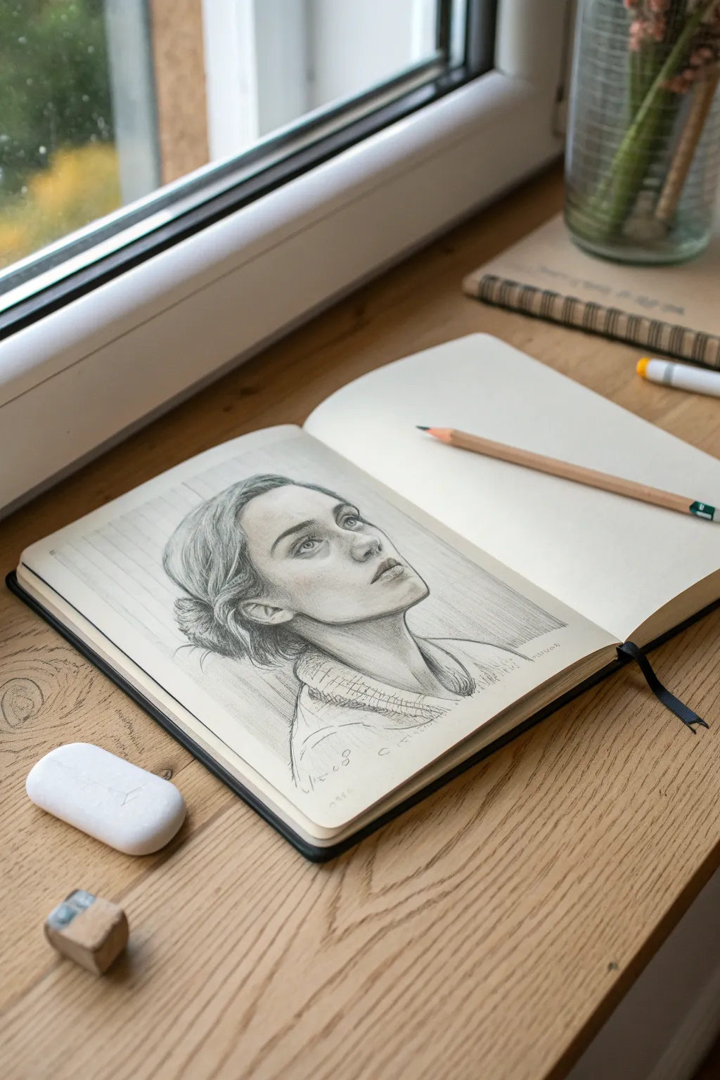
Capture a quiet, reflective moment with this delicate graphite portrait study. By focusing on upward-looking features and soft shading, you’ll create a drawing that feels both intimate and technically accomplished.
Step-by-Step Guide
Materials
- Sketchbook with smooth, off-white paper
- Graphite pencils (HB for layout, 2B and 4B for shading)
- White eraser
- Kneaded eraser
- Pencil sharpener
- Ruler (optional, for background lines)
Step 1: Laying the Foundation
-
Establish the Head Angle:
Begin with an HB pencil, using a very light touch. Draw an oval that tilts slightly upward and back. This initial shape defines the cranium and the direction of the gaze. -
Mark the Face Center:
Draw a curved vertical centerline that follows the form of the face, wrapping around the chin and forehead. This line helps you place the nose and mouth correctly on a turned head. -
Map Horizontal Guidelines:
Lightly sketch horizontal lines for the eyes, nose base, and mouth. Because the head is looking up, these lines should curve upward slightly, like bands around a sphere. -
Block in Features:
Using simple geometric shapes, place the eye sockets, the wedge of the nose, and the planes of the lips. Verify the spacing between the eyes—typically one eye-width apart. -
Draft the Neck and Shoulders:
Extend lines down for the neck, paying attention to the sternocleidomastoid muscle which becomes prominent when the head turns. Sketch the collar of the shirt loosely.
Step 2: Developing Form and Features
-
Refine the Eyes:
Switch to a sharp HB or B pencil. Draw the upper eyelids with a distinct curve, implying the upward gaze. Sketch in the iris and pupil, leaving a small highlight to bring the eyes to life. -
Shape the Nose:
Define the nostrils and the tip of the nose. Keep the bridge subtle; often, less is more when drawing female noses to maintain softness. -
Sculpt the Lips:
Outline the mouth, emphasizing the darker corners and the line where the lips meet. Shade the upper lip slightly darker than the lower lip to suggest volume. -
Initial Shading Pass:
Using the side of a 2B pencil, lay down a light wash of tone on the shadow side of the face (the left side in this reference). Shade under the jawline to separate the head from the neck. -
Define Hair Volume:
Sketch the hairline and the general mass of the hair. Use long, sweeping strokes that follow the direction of hair growth. Don’t draw individual strands yet; focus on the major clumps.
Soft Skin Technique
Avoid smudging graphite with your finger, which transfers oils. Instead, use a paper blending stump or build up layers of hatching slowly for a cleaner look.
Step 3: Refining and detailing
-
Deepen the Shadows:
With a 4B pencil, darken the deepest areas: the pupils, nostrils, corners of the mouth, and the area where the hair meets the neck. This contrast makes the drawing pop. -
Detail the Hair:
Add texture to the hair bun and the loose strands near the ear. Use quick, confident flicks of the pencil to suggest flyaways and softness. -
Add Clothing Texture:
Sketch the cross-hatching or weave pattern on the collar. Keep this looser than the face to ensure the viewer’s focus remains on the portrait. -
Create the Background:
Using a ruler or freehand, draw faint, vertical lines behind the head. This mimics wood paneling or a wall texture and helps ground the figure in space. -
Lift Highlights:
Take your kneaded eraser and gently dab areas on the forehead, nose bridge, and cheekbones to lift off graphite. This creates subtle highlights that emphasize the skin’s luminosity. -
Final Polish:
Review the drawing for balance. Re-darken the lashes or eyebrows if they’ve faded. I like to sharpen the jawline edge one last time for clarity.
Eyes look flat?
Make sure you shade the ‘whites’ of the eyes. They are spheres, so the corners should be slightly grey, leaving only the center or highlight pure white.
Now step back and admire how a simple gaze can tell a whole story on paper

Blind Contour Line Challenge

Master the art of observation with this clean line drawing exercise that focuses entirely on the structure and seams of a classic sneaker. By isolating the intricate stitching and sole patterns without shading, you create a sophisticated illustrative piece perfect for a sketchbook portfolio.
Detailed Instructions
Materials
- Spiral-bound sketchbook (heavyweight paper preferred for cleaner lines)
- HB or 2B graphite pencil (for initial light sketching)
- Fine-point black fineliner pen (0.3mm or 0.5mm)
- A real sneaker to use as a model (or a reference photo)
- Eraser
Step 1: Establishing the Shape
-
Set up your workspace:
Place your sneaker on the table in front of you at a 3/4 angle, similar to the reference. Good lighting is key here to see the seam details clearly. -
Mark the boundaries:
Using your pencil very lightly, mark the extreme top, bottom, toe, and heel points on your paper to constrain your drawing size. -
Block in the silhouette:
Sketch a loose, faint outline of the entire shoe shape. Focus on getting the curve of the sole and the height of the ankle collar correct before adding any details. -
Define the sole:
Draw the main line separating the upper shoe from the rubber sole. Notice how it thickens near the heel and tapers slightly toward the toe.
Step 2: Adding Structural Details
-
Map the main panels:
Lightly sketch the major panels of leather or fabric. Look for the ‘saddle’ area where the laces go, the toe cap, and the heel reinforcement. -
Draw the opening:
Refine the ankle opening. It should dip lower near the ankle bone and rise up at the heel tab and tongue. -
Placement of the stripes:
If your model has side stripes or branding, sketch their placement now. Ensure they follow the curve of the shoe rather than looking like flat stickers. -
Sketch the laces:
Rough in the tangled shape of the laces. Don’t draw every thread yet; just capture the overall volume of the knot and loops.
Keep it Holy
Don’t connect every single line perfectly. Leaving tiny gaps in the lines, especially on stitching or laces, lets the drawing ‘breathe’ and look more artistic.
Step 3: Inking and refining
-
Start the final lines:
Switch to your pencil or fine-point pen. I often prefer to start at the toe and work backward to avoid smudging. -
Detail the stitching:
This is the most critical step for realism. Draw dashed lines parallel to the panel edges to represent stitching. Keep your spacing consistent. -
Refine the laces:
Go over your lace sketch with confident lines. Add small overlaps where the laces cross each other to create depth. -
Texture the sole:
Add the vertical ridges often found on the side of sneaker soles. Use short, repetitive vertical strokes that follow the curve of the base. -
Add the tread line:
Draw the very bottom edge of the sole with a slightly heavier line weight to ground the object. -
Drawing the eyelets:
Add small circles or ovals where the laces enter the shoe. Drawing the metal ring adds a nice technical detail. -
Final contour check:
Darken the outermost outline of the entire shoe just slightly. This ‘holding line’ helps pop the drawing off the page. -
Clean up:
Once your darker lines are fully set, gently erase the underlying construction sketches to leave a crisp, clean contour drawing.
Color Pop
Instead of shading, use a single bright watercolor wash or marker color on just one element—like the stripes or the laces—to create a focal point.
Now you have a technically precise drawing that captures the design essence of the footwear

One-Point Perspective Room Scene
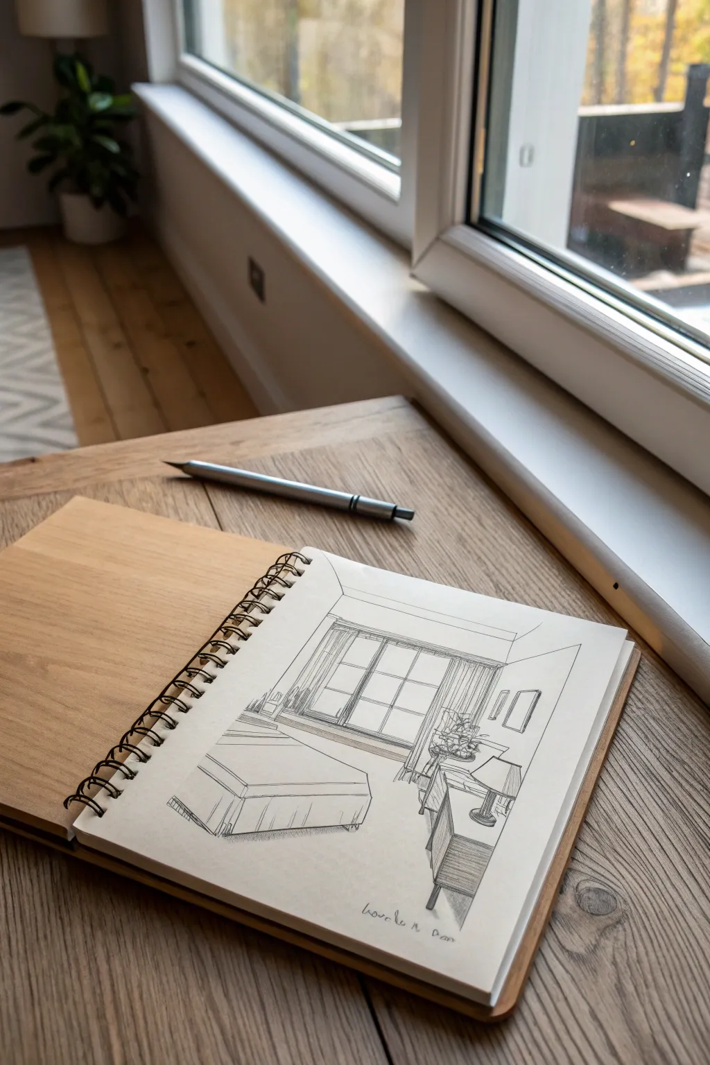
Capture the calm atmosphere of a sunlit bedroom using fundamental perspective techniques with this pen-and-ink study. You will learn to construct a believable 3D space starting from a single vanishing point, layering fine details to bring the furniture and textures to life.
Detailed Instructions
Materials
- Spiral-bound sketchbook (heavyweight sketching paper)
- HB Graphite pencil
- Eraser (kneaded or vinyl)
- Ruler or straight edge
- Fine liner pens (0.1, 0.3, and 0.5mm nibs, black ink)
Step 1: Establishing the Structure
-
Draw the back wall:
Begin by lightly sketching a square or rectangle in the center of your page using your HB pencil. This represents the far wall of the room and will frame your main window. -
Mark the vanishing point:
Place a small dot near the center of your back wall rectangle. This is your vanishing point; almost all diagonal lines for the furniture and walls will converge here. -
Create the room depth:
Using your ruler, lightly draw lines from the vanishing point through each of the four corners of your back wall rectangle, extending them outward towards the edges of the paper. These form the ceiling, floor, and side walls. -
Block in the bed:
Sketch the basic rectangular box shape for the bed on the left side. Remember that the side of the bed closest to the viewer will have horizontal top and bottom lines, while the sides receding into the distance must angle back toward your vanishing point. -
Outline the window frame:
Inside the back wall rectangle, draw a smaller rectangle for the window. Add a second line just inside it to give the frame thickness, and sketch the vertical and horizontal bars (muntins). -
Position the side furniture:
On the right side, block in the basic shapes for the nightstand and chest of drawers. Keep the vertical lines perfectly straight up and down, and ensure the depth lines angle towards your central dot.
Distorted Furniture?
If objects look warped, check your vertical lines. In 1-point perspective, all verticals must be perfectly parallel to the side of the paper, never tilted.
Step 2: Refining Details and Inking
-
Add soft furnishings:
Soften the rigid box of the bed by sketching the curve of the duvet and pillows. Add vertical fold lines hanging down the side to suggest a bed skirt or comforter edge. -
Detail the accessories:
Sketch a lamp on the nightstand using an oval for the shade and a simple base. Add rectangular shapes on the right wall to suggest framed artwork. -
Start the initial inking:
Switch to a 0.5mm fine liner. Carefully go over the main structural lines of the room—the walls, the window frame, and the main furniture outlines. Do not ink the vanishing point or the construction lines that helped you place objects. -
Ink the bed textures:
Use a lighter touch or a 0.3mm pen for the bed linens. Use slightly broken or wavy lines for the fabric folds to make them look soft compared to the hard edges of the walls. -
Define the windowpane:
Ink the window frame cleanly. Leave the glass areas clear, or perhaps add a remarkably faint horizon line if you want to suggest a view outside.
Pro Tip: Line Weight
Use thicker lines for objects closer to you (like the foot of the bed) and thinner lines for distant objects (like the window) to exaggerate the depth.
Step 3: Texturing and Finishing
-
Add hatching to the floor:
To suggest carpet or shadows, add light, diagonal hatching strokes on the floor area, particularly under the bed. -
Shade the furniture sides:
Use vertical hatching (closely spaced parallel lines) on the side of the nightstand facing away from the window to create a shadow side, giving the object volume. -
Detail curtains and plants:
Sketch vertical, wavy lines on either side of the window for curtains. If you have space on the cabinet, scribble loose, organic shapes to represent a potted plant. -
Erase pencil guides:
Once the ink is completely dry (I usually give it at least five minutes to be safe), gently erase all the underlying graphite construction lines to reveal the crisp black drawing. -
Final contrast check:
Look at your drawing as a whole. Use your 0.5mm or even a 0.8mm pen to darken the bottom-most lines of the furniture to ‘ground’ them so they don’t feel like they are floating.
Sign your name at the bottom in a loose script to claim your architectural study
BRUSH GUIDE
The Right Brush for Every Stroke
From clean lines to bold texture — master brush choice, stroke control, and essential techniques.
Explore the Full Guide
Gesture Drawing of Poses
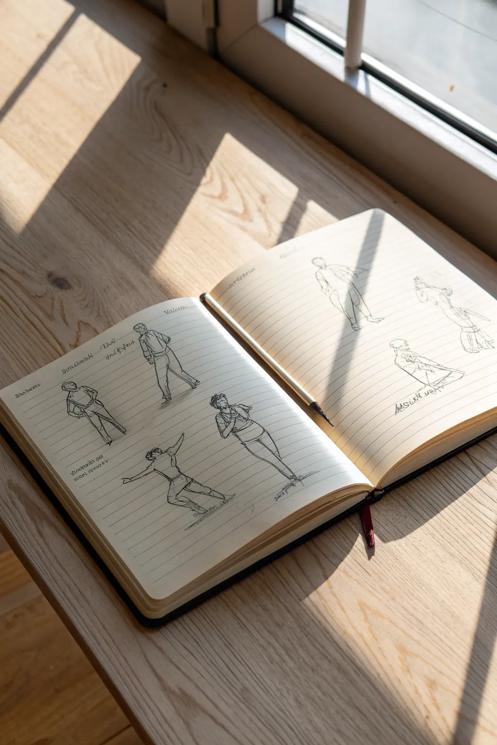
Capture the fluid energy of the human form with these quick, expressive gesture drawings made directly in a lined notebook. This exercise focuses on movement and posture rather than perfect anatomical detail, resulting in a lively page of studies that feels spontaneous and practiced.
Step-by-Step Tutorial
Materials
- Hardcover lined notebook (cream paper preferred)
- Fine liner pen (0.3mm or 0.5mm, black ink)
- Wooden pencil (HB or 2B)
- Reference photos of people in motion
Step 1: Setting the Foundation
-
Prepare your workspace:
Find a surface with good lighting to work on. If you want to replicate the photo’s aesthetic, utilize natural sunlight near a window to cast interesting shadows across your page as you work. -
Open the spread:
Open your notebook to a fresh two-page spread. Press the spine flat so both pages lie reasonably level, making it easier to draw across the surface. -
Select references:
Choose 5-6 references of people in distinct poses. Look for variety: standing, leaning, lunging, or dancing. The goal is to capture different lines of action. -
Visualize placement:
Mentally map out where each figure will go. Plan for about four figures on the left page and three or four on the right, staggering them so they aren’t perfectly aligned in rows.
Speed Drawing Tip
Set a timer for 60 seconds per pencil sketch. This forces you to ignore details and focus entirely on the energy and movement of the pose.
Step 2: Building the Figures
-
Start the first gesture:
On the left page, begin with a figure near the top left. Using your pencil lightly, find the ‘line of action’—the main curve of the spine. -
Block in masses:
Still using light pencil strokes, draw simple oval shapes for the ribcage, hips, and head. Keep these loose; they are just guides for the ink later. -
Connect the limbs:
Sketch lines for the arms and legs, paying attention to the angles of the joints. Don’t worry about drawing fingers or toes; focus on the direction the limbs are pointing. -
Repeat for the page:
Move to the next space on the page and repeat this pencil under-drawing process for all planned figures on the left side. -
Right page layout:
Do the same for the right page. Try placing a larger, standing figure near the gutter (the center fold) to anchor the composition. -
Review proportions:
Take a moment to step back. Check if heads look too large or legs too short. Since the pencil is light, make quick adjustments now before committing to ink.
Step 3: Inking the Forms
-
Begin inking:
Switch to your fine liner pen. Start with the figure you feel most confident about. Instead of tracing the pencil line perfectly, use the pen to define the contour of the clothing and muscles. -
Capturing clothing folds:
When drawing shirts or pants, use jerky, angular lines to suggest wrinkles and folds. This adds weight and realism to the figure. -
Defining the head:
Keep facial features minimal or non-existent. A simple outline of the hair and the jawline is often enough for gesture studies. -
Adding weight:
Where the figure touches the ground or where limbs overlap, press slightly harder or go over the line twice to create a darker accent. This grounds the drawing. -
Text and notes:
If you wish, add small, scribbled notes near the figures. These can be meaningless squiggles to mimic text or actual notes about the pose, written in a loose cursive style. -
Erase pencil lines:
Once the ink is completely dry (give it a minute or two), gently erase the underlying pencil sketches to leave a clean, crisp ink drawing. -
Final touches:
Place your pencil in the center fold of the book for that casual, ‘work in progress’ aesthetic.
Boost Contrast
Use a thicker pen (0.8mm) or a brush pen to fill in deepest shadows or hair. This high contrast makes the delicate line work pop off the page.
Now you have a dynamic spread of gesture studies that captures the essence of movement on the page
Negative Space Chair Drawing
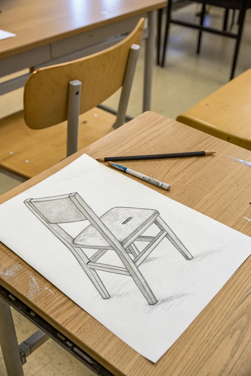
This classic art class exercise focuses on observational skills, capturing the precise angles and structure of a wooden school chair in pencil. The result is a crisp, detailed study that emphasizes perspective, wood grain texture, and subtle shading.
Step-by-Step
Materials
- White drawing paper (A3 or A4)
- Graphite drawing pencil (HB or 2B for outlines)
- Graphite drawing pencil (4B or 6B for shading)
- White eraser stick or pen-style eraser
- Pencil sharpener
- Ruler (optional, for checking angles)
Step 1: Drafting the Structure
-
Observe your angle:
Position yourself or your reference photo so you get a dynamic three-quarter view of the chair. Notice how the back legs appear shorter than the front due to perspective. -
Establish the seat block:
Lightly sketch the seat first as a flattened, trapezoidal box shape. This serves as the anchor for the rest of the chair’s anatomy. -
Draw the legs:
Extend lines downward from the corners of your seat block. Pay close attention to the angles; the back legs will likely slant inward slightly or follow the perspective lines. -
Add the backrest frame:
Sketch the two vertical posts rising from the back of the seat. Connect their tops with the horizontal curved board of the backrest. -
Refine the thickness:
Go back over your single lines and turn them into 3D forms by adding parallel lines to show the thickness of the wood segments. -
Connect the supports:
Draw the cross-braces (stretchers) connecting the legs near the bottom, ensuring they align correctly in perspective relative to the seat.
Step 2: Refining and Shading
-
Clean up the outline:
Use a pen-style eraser to remove construction lines and sharpen the edges of your finalized structure. -
Indicate wood grain:
With a sharp pencil, add subtle, flowing lines along the length of the wooden pieces, especially on the backrest and seat, to suggest grain. -
Add core shadows:
Ideally using a softer pencil like a 4B, shade the sides of the legs and seat that are facing away from your light source. This gives the chair weight. -
Detail the hardware:
If your chair has visible screws or bolts, draw them as small ovals or circles, adding a tiny shadow inside to make them look recessed. -
Create cast shadows:
Sketch a light, dispersed shadow on the ‘floor’ beneath the legs. Use horizontal hatching strokes to keep the ground flat. -
Enhance contrast:
Darken the deepest crevices where pieces of wood join together, such as under the seat or where the stretchers meet the legs. -
Final texture pass:
For the seat and backrest, use a side-shading technique to create a slightly smoother texture compared to the linear grain on the legs. -
Review negative space:
Check the empty shapes *between* the chair legs. If a shape looks wrong, the structure around it is likely off, so adjust as needed.
Sighting angles
Hold your pencil up at arm’s length against the real chair to gauge the angle of a leg, then transfer that exact slope to your paper.
Chair stacking
Once mastered, try drawing two chairs stacked on top of each other. The complex overlapping lines make for a fantastic advanced perspective challenge.
Now you have a solid structural drawing that turns a functional object into a piece of art

PENCIL GUIDE
Understanding Pencil Grades from H to B
From first sketch to finished drawing — learn pencil grades, line control, and shading techniques.
Explore the Full Guide
Shading Techniques Sampler Grid
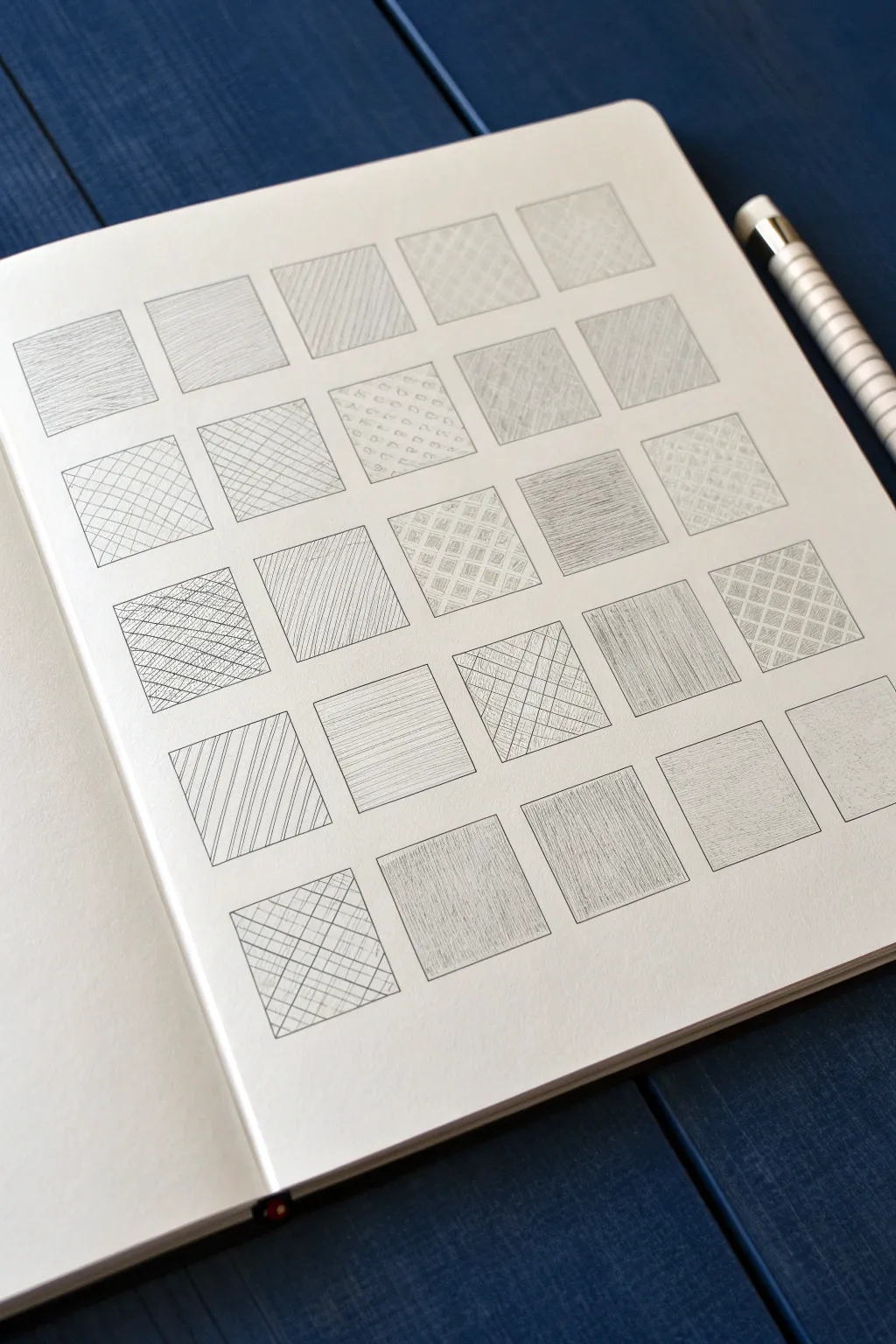
Master the fundamentals of value and texture with this clean, organized shading sampler. By filling a simple grid with varied hatching, cross-hatching, and stippling techniques, you’ll create a satisfying reference page that doubles as a minimalist piece of art.
Step-by-Step Guide
Materials
- Drawing paper or sketchbook (smooth bristol or mixed media paper works best)
- Graphite pencils (H, HB, 2B, 4B)
- Ruler
- Fine liner pen (optional, for grid outlines)
- Eraser
- Mechanical pencil (for precision details)
Step 1: Setting up the Grid
-
Clean surface:
Begin with a fresh, clean page in your sketchbook. Ensure your hands are clean to avoid smudging the bright white paper. -
Measure the layout:
Decide on the size of your squares. A grid of 1.5-inch (or 4cm) squares works well. Leave a consistent margin around the edges of the page to frame your work nicely. -
Draw horizontal guides:
Using a ruler and a light H pencil, mark and draw horizontal lines across the page, spacing them evenly to accommodate about 6 rows. -
Draw vertical guides:
Mark and draw vertical lines to create columns, resulting in a grid of approximately 25-30 squares. -
Define the boxes:
Go over the pencil grid lines with a slightly darker pencil or a very fine pigment liner to create crisp, permanent boundaries for your textures.
Step 2: Basic Hatching Techniques
-
Vertical hatching:
Start with the first square. Fill it with evenly spaced, vertical parallel lines. Try to keep the pressure consistent so the tone is uniform. -
Diagonal hatching:
In the next square, draw parallel diagonal lines. Vary the angle slightly from the previous box to create visual interest. -
Cross-hatching:
For a darker value, fill a square with diagonal lines in one direction, then layer lines in the opposite direction on top. -
Varied density:
Create a gradient effect in another square by drawing lines closer together on one side and gradually spacing them further apart as you move across.
Smudge Alert
Place a scrap piece of paper under your drawing hand as you work. This prevents oils from your skin transferring to the paper and keeps you from smearing your completed shading.
Step 3: Advanced Textures
-
Woven texture:
Simulate a weave pattern by grouping short strokes of 3-4 lines horizontally, then vertically, alternating like a checkerboard. -
Looped scribbles:
Fill a box with tight, controlled circular scribbles. Keep the pencil tip on the paper to create a organic, chaotic texture. -
Stippling or grain:
Instead of lines, use the side of your pencil lead to create a soft, grainy texture, or gently tap the point for a stippled dot effect. -
Wood grain:
Draw wavy, roughly parallel lines that occasionally converge to mimic the natural grain of wood. -
Herringbone pattern:
Create a zigzag pattern by drawing short diagonal lines that meet at a central spine, alternating direction with each column.
Go Digital
Scan your finished grid at high resolution. Isolate the squares in an image editor to create your own library of custom digital pattern brushes.
Step 4: Finishing Touches
-
Review consistency:
Look over your grid. If any squares feel too light compared to their neighbors, layer more graphite to balance the overall visual weight. -
Clean up edges:
Use a precision eraser or an eraser shield to remove any pencil marks that strayed outside the square boundaries. -
Erase guidelines:
If you used ink for the boxes, gently erase the initial pencil construction lines. If you used pencil, sharpen the box outlines one last time for clarity.
You now have a beautiful reference sheet that demonstrates the wide range of tones you can achieve with a single pencil
Botanical Study From a Single Leaf
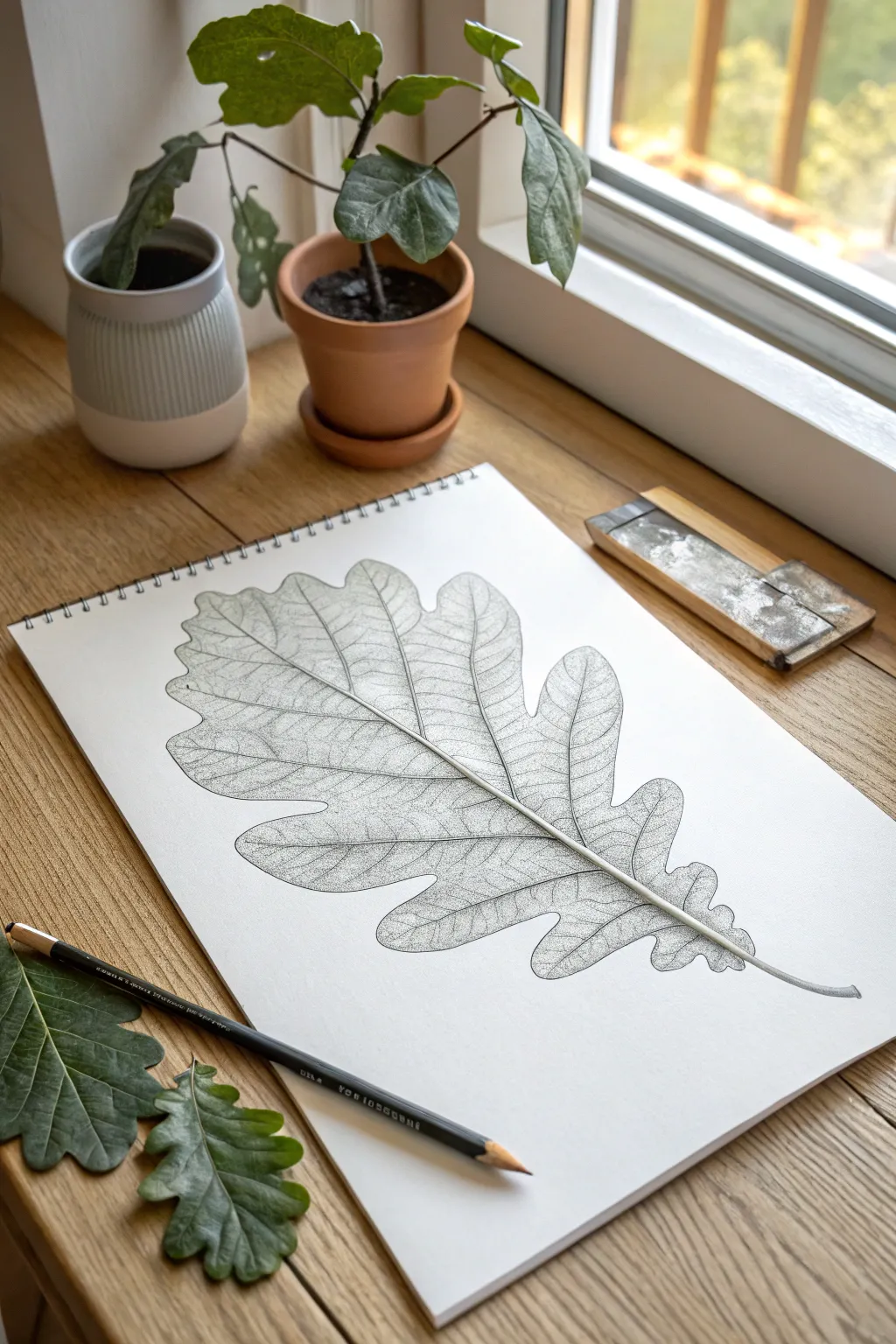
Capture the intricate beauty of nature with this detailed botanical study that transforms a simple oak leaf into a masterpiece of texture. Using fine stippling and careful line work, this project teaches patience and observation while creating a stunningly realistic graphite illustration.
How-To Guide
Materials
- Fresh oak leaf (or reference photo)
- Spiral-bound sketchbook (heavyweight paper recommended)
- Graphite pencils (HB for sketching, 2B and 4B for shading)
- Fine-point mechanical pencil (0.5mm)
- Kneaded eraser
- Pencil sharpener
Step 1: Structural Foundation
-
Analyze the subject:
Begin by observing your real oak leaf closely. Notice the central midrib, the alternating lobes, and how the veins branch out towards the tips. Place the leaf on a flat surface near your sketchbook for easy reference. -
Establish the axis:
Using an HB pencil with a very light hand, draw a long, curving line diagonally across your page. This will represent the central vein (midrib) and defines the flow and gesture of the leaf. -
Mark the width:
Lightly mark the top and bottom boundaries of the leaf on your central axis. Then, sketch rough indication marks for where the widest parts of the lobes will extend on either side. -
Sketch the silhouette:
Draw the outer contour of the leaf. Don’t worry about tiny serrations yet; focus on the main lobes. Oak leaves often have deep, rounded indentations, so keep your lines fluid and organic. -
Map primary veins:
From the central midrib, sketch the primary veins that lead into each major lobe. I find it helpful to look at the angles—some branch out at 45 degrees, while lower ones might be more horizontal.
Smudge Prevention
Place a scrap sheet of paper under your drawing hand. This prevents your palm from dragging graphite across the white paper while you work on detailed stippling.
Step 2: Refining and Detailing
-
Define the midrib:
Go back over the central stem. Instead of a single line, draw two parallel lines that taper to a point at the leaf tip, giving the stem physical thickness. -
Connect the veins:
Do the same for the primary veins you mapped earlier, giving them a slight thickness at the base where they connect to the midrib, tapering off as they reach the lobe edges. -
Refine the perimeter:
Sharpen your HB pencil or switch to a mechanical pencil. Outline the leaf’s edge seamlessly, adding the subtle wobbles and imperfections that make it look natural. -
Erase guidelines:
Take your kneaded eraser and gently list off the initial construction lines and any heavy graphite smudges, leaving only your clean outline and vein structure. -
Add secondary veins:
Lightly sketch the network of smaller veins (reticulate venation) that fill the spaces between the main ribs. These should be very faint, like a road map for your shading.
Step 3: Texture and Stippling
-
Begin stippling:
This is the meditative part. Using a sharp mechanical pencil or fine point, begin adding tiny dots along the edges of the veins. The closer the dots, the darker the shadow. -
create volume:
Concentrate your dots (stippling) heavily right next to the vein lines to make them pop forward. As you move into the flat ‘meat’ of the leaf, space the dots further apart to create a highlight. -
Texture the lobes:
Work one lobe at a time. Use a mix of stippling and extremely short, faint hatching strokes to mimic the leathery texture of dry oak leaves. -
Darken the edges:
Add shading around the outer perimeter of the leaf. This vignette effect draws the eye inward and makes the leaf appear slightly curved or convex. -
Sharpen the stem:
Using a 2B pencil, darken the shadowed side of the main stem to make it look cylindrical. Keep the top edge light to represent a highlight. -
Final assessment:
Step back and look at the overall contrast. If the leaf looks too flat, go back in with a 4B pencil and deepen the darkest areas right where the veins meet the stem. -
Clean up:
Use the kneaded eraser one last time to pick up any graphite dust from the white background, ensuring the leaf stands out crisply.
Go Autumn Mode
Instead of graphite, try this same technique using fine-liner archival ink pens in sepia, burnt orange, or dark red to create a permanent fall-themed illustration.
Now you have a permanent botanical specimen preserved in your sketchbook.


Animal Portrait Built From Basic Shapes
This unique drawing exercise breaks down the complex organic form of a resting fox into precise geometric scaffolds. By contrasting strict mathematical lines with the soft texture of fur, you’ll learn to see the underlying architecture of animal anatomy.
Step-by-Step Guide
Materials
- Spiral-bound sketchbook (smooth or mixed media paper, A4 size)
- Graphite pencils (H or 2H for guidelines, HB/2B for final lines)
- Mechanical pencil (0.5mm) with HB lead
- Compass for geometric circles
- Clear plastic ruler (12 inch)
- Black fine-liner pen (0.3mm or 0.5mm)
- Eraser (kneaded)
- Reference photo of a fox (viewed from above)
Step 1: Constructing the Framework
-
Establish the Head Circle:
Begin on the left page of your open sketchbook. Using your compass, draw a perfect circle about 4-5 inches in diameter in the center of the page. This circle represents the general volume of the fox’s head and ears viewed from above. -
Divide the Circle:
With your ruler and a light H pencil, draw vertical and horizontal diameter lines to divide the circle into four equal quadrants. -
Create Radial Guidelines:
Using the ruler, draw diagonal lines that pass through the center point, dividing each quadrant further. Aim for 12 or 16 equal ‘slices’ radiating from the center like wheel spokes. These lines will guide the placement of the ears and snout. -
Define the Central Hub:
Draw a much smaller concentric circle in the very center (about the size of a quarter). This focal point represents the nose tip and the convergence point of the fox’s facial planes. -
Connect the Perimeter:
Connect the tips of your radial spokes with straight lines along the outer circle to create a polygon (dodecagon or hexadecagon). This creates the faceted look seen in the reference drawing.
Symmetry Check
If your radial lines look uneven, don’t just eyeball it. Use a protractor to mark your angles (e.g., every 30 degrees) before drawing the spokes.
Step 2: Developing the Geometric Forms
-
Triangulate the Ears:
Select two upper ‘slices’ of your circle to represent the ears. Within these wedges, draw sharp, elongated isosceles triangles that originate from the central hub and extend past the circle’s perimeter. -
Map the Snout:
On the opposite page (the right side), we will practice the side profile geometry. Draw a long horizontal baseline. From the center of this line, project two diagonal lines upward to form a wide, inverted ‘V’ shape. -
Create the Diamond Grid:
Use your ruler to create a series of intersecting diagonal lines on the right page, forming a lattice of diamonds and triangles. This abstract grid helps you practice the angles needed for the fox’s angular cheekbones and jawline. -
Refine the Left Page Drawing:
Return to the main circular drawing. Darken the specific radial lines that correspond to the fox’s snout direction. I like to thicken these lines slightly to show they are the primary structural edges. -
Overlap Shapes:
Draw a secondary set of triangles overlapping the main circle to suggest the fox’s body lying behind the head. Keep these sticking to the geometric theme—straight lines only, no curves yet.
Step 3: Adding Texture and Definition
-
Switch to Mechanical Pencil:
Swap your drafting pencil for the mechanical pencil. The finer lead is perfect for the meticulous hatching we’re about to add. -
Hatch the Inner Circle:
In the small central hub of the circle, create a dense starburst pattern. Draw tiny, rapid lines radiating outward from the absolute center point to create a dark, textured focus. -
Detail the Ear Geometries:
Inside the ear triangles, create sub-triangles. Shade these smaller shapes using uniform parallel lines (hatching). Keep the spacing between lines consistent to maintain the technical drawing aesthetic. -
Add Directional Fur Hints:
Along the main radial lines, add very short, faint dashes. These shouldn’t look like realistic fur, but rather like measurement marks or ‘ticks’ that suggest the texture without breaking the geometric style. -
Finalize the Right Page:
On the right page grid, select one section to fill with a gradient. Draw tightly spaced parallel lines, starting with heavy pressure and lightening your hand as you move across the shape to create a metallic sheen effect. -
Ink the Key Lines:
Take your fine-liner pen and carefully trace over the most important structural lines: the main circle perimeter, the primary ear triangles, and the central nose hub. Leave the construction guidelines in pencil for contrast. -
Clean Up:
Once the ink is fully dry, gently erase any stray smudge marks, but leave the light pencil grid visible. It adds to the ‘architectural blueprint’ feel of the piece.
Pro Tip: Line Weight
Vary your line weight! Use the thickest pen for the outer silhouette and thin, lighter pencil lines for internal grid structures to create depth.
Step back and admire how simple math can capture the elegant spirit of a wild animal.
Layered Landscape With Depth Cues
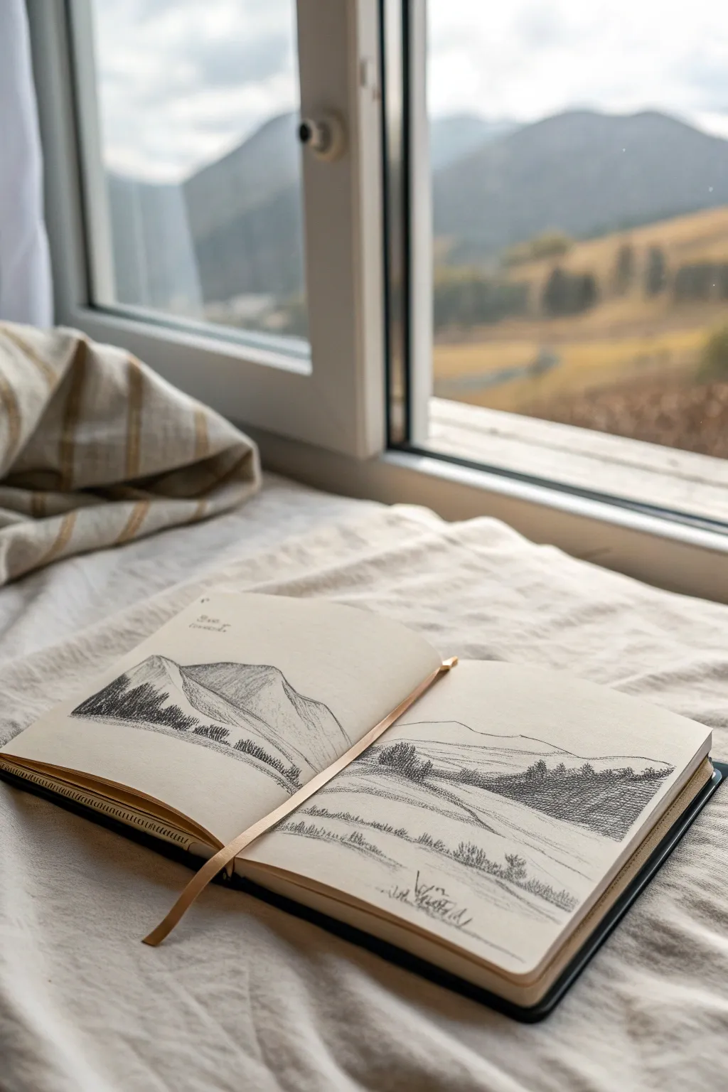
Capture the serenity of a sweeping mountain landscape across a double-page spread in your sketchbook. This graphite pencil study focuses on creating depth through atmospheric perspective, varied line weights, and textural hatching drawing focus to the mountain peaks and rolling hills.
How-To Guide
Materials
- Hardbound sketchbook (A5 or similar size)
- Graphite pencils (HB for sketching, 2B and 4B for shading)
- Kneaded eraser
- Pencil sharpener
- Blending stump (optional)
- Ruler (optional for horizon line)
Step 1: Setting the Scene
-
Establish the horizon:
Open your sketchbook to a fresh double-page spread. Lightly draw a faint horizon line about one-third of the way up from the bottom of the page, letting it run across both pages to connect the scene. -
Outline the main peak:
On the left page, sketch a large triangular form for the primary mountain. Keep the lines somewhat jagged and organic to represent rocky terrain, letting the slope extend slightly onto the right page. -
Add distant ranges:
On the right page, draw softer, lower rolling hills in the background behind your main mountain line. These should be smoother and less detailed to push them into the distance. -
Mark the foreground valley:
Sketch sweeping, curved lines in the lower third of the right page to suggest a valley floor or sloping meadow leading the eye into the scene. These lines should guide the viewer toward the center.
Uneven Shading?
If your hatching looks too messy, try rotating your sketchbook so your hand moves in a natural arc. Keep pencil pressure consistent for smoother tonal values.
Step 2: Developing the Peaks
-
Define the light source:
Decide that the light is coming from the right. This means the left sides of your mountain peaks will be in shadow. -
Hatch the mountain shadows:
Using an HB pencil, fill the shadowed side of the left mountain with diagonal hatching lines. Keep the strokes relatively close together but not solid black yet. -
Add rocky texture:
On the illuminated side of the mountain, use sparse, broken lines to suggest crags and ridges without darkening the area too much. I like to keep my pencil quite sharp here for crisp details. -
Deepen the contrast:
Switch to a 2B pencil and go over the darkest crevices of the mountain shadow. Leave the ridges within the shadow slightly lighter to show form.
Level Up: Wash Effect
Use water-soluble graphite pencils for the sky. After sketching, lightly brush clean water over the distant clouds to create a soft, painterly grey wash.
Step 3: Adding Vegetation
-
Plant the treeline:
Along the base of the left mountain, start clustering vertical, jagged marks to represent a dense pine forest. These shapes don’t need individual branches; just the silhouette is enough. -
Extend the forest:
Continue these pine textures across the ‘fold’ of the book onto the right page, placing them in the middle distance. Make the trees slightly smaller here to aid the illusion of depth. -
Create foreground interest:
On the bottom right page, draw a cluster of larger, more distinct pine trees. Use a 4B pencil here to make them the darkest element, which pulls them visually to the front. -
Sketch grassy textures:
In the immediate foreground of the right page, add quick, vertical flicks of the pencil to suggest tall grass and wild vegetation. Group them in small patches rather than covering the whole area.
Step 4: Refining and Unifying
-
Soften the distance:
Go back to the far background hills on the right page. Lightly shade them with the side of your HB pencil, or use a blending stump to smudge the graphite slightly for a hazy, atmospheric look. -
Check the flow:
Ensure the lines connect logically across the book’s center seam. You may need to darken the lines right at the fold so they don’t disappear into the binding. -
Clean up highlights:
Use your kneaded eraser to tap out any graphite smudges in the sky area or on the sunlit slopes of the mountains, ensuring the whites of the paper remain bright. -
Final dark accents:
Take your 4B pencil one last time and add tiny, punchy dark spots in the deepest shadows of the nearest trees to anchor the composition.
Now you have a serene panoramic landscape ready to inspire your next outdoor adventure
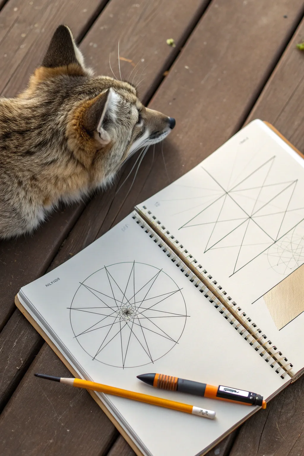
Op Art Ripple Dots Illusion
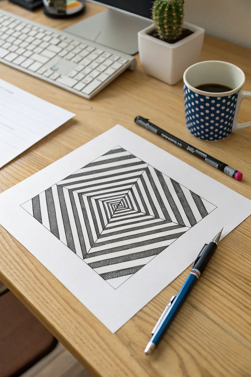
This mesmerizing optical illusion uses simple geometry and stippling to create a deep, twisting tunnel effect. By alternating stark white stripes with textured, dotted pathways, the drawing pulls the eye toward a vanishing center point.
Step-by-Step Tutorial
Materials
- Square drawing paper (or bright white cardstock)
- Pencil (HB or 2H)
- Ruler
- Fine-point black pen (0.5mm or similar)
- Ultra-fine black marker or felt-tip pen
- Eraser
Step 1: Drafting the Geometric Framework
-
Draw the main square:
Start by drawing a large, perfect square in the center of your paper using your pencil and ruler. A 6×6 or 8×8 inch square works well for this level of detail. -
Mark the spiral points:
On the top edge of your square, make a small mark about 1/2 inch (or 1-1.5 cm) from the top-left corner. -
Mark remaining sides:
Rotate your paper. Repeat this measurement on the next side, measuring from the new top-left corner. Do this for all four sides so you have one tick mark on each edge, shifted slightly from the corner. -
Connect the first layer:
Use your ruler to connect these four tick marks. This will create a slightly smaller, tilted square inside your original border. -
Continue the pattern:
Now, measure that same distance (1/2 inch) along the edges of your *newly drawn* tilted square, always measuring from the left corner of that specific line segment. Mark the points. -
Repeat inwards:
Connect the new marks to form a third, smaller square. Continue this process—measure, mark, connect—spiraling inward until you reach the very center and can no longer draw squares. It should look like a twisted pyramid view from above.
Wobbly Lines?
Don’t try to freehand the structural lines. Always keep your ruler firmly planted, even for the tiny central squares, or the illusion of depth will break.
Step 2: Inking and Adding Texture
-
Outline the spiral path:
Ideally, you want to leave the pencil lines visible for now as guides. Choose one ‘arm’ of the spiral to start with. In this design, we are alternating between white paths and textured paths. -
Define the striped sections:
Look at the four triangular quadrants created by the diagonal lines where the squares corners meet. We will treat each quadrant separately to maintain the illusion. -
Begin the stippling process:
Select the first band you want to darken (usually the outermost one). Instead of just coloring it black, use your fine-point pen to fill the shape with tiny dots (stippling). -
Build density:
Pack the dots closely together near the edges of the shape and slightly looser in the middle to give it volume, or keep them uniform for a flat graphical look. This creates that gritty, textured gray value seen in the reference. -
Alternate the bands:
Skip the next inner band (leave it white). Move to the third band and fill it with stippling. Continue this alternating pattern—stippled, white, stippled—all the way to the center of the drawing. -
Ink the lines:
Once your texture is established in the first quadrant, use your pen and ruler to go over the main structural lines to define the edges cleanly. -
Complete the remaining quadrants:
Rotate your paper and repeat the stippling process for the other three sections. Ensure the pattern aligns: if a band is white in one section, it should connect to a white band in the neighboring section to form a continuous spiral path.
Stippling Pro Tip
Hold your pen vertically, not at an angle. Straight up-and-down motion creates perfect round dots instead of tiny dashes, making the texture much cleaner.
Step 3: Refining the Illusion
-
Deepen the contrast:
Go back over your stippled areas. If any look too pale, add another layer of dots. I usually find that going darker increases the 3D effect significantly. -
Clean up edges:
Check the boundaries between the white and stippled stripes. Make sure your dots don’t drift into the white zones; a crisp edge is crucial for top-tier Op Art. -
Erase guidelines:
Wait until the ink is completely dry—give it a few minutes to be safe. Gently erase all remaining pencil marks to reveal the high-contrast design. -
Final check:
Step back from the artwork. If the center feels distinct and the spiral draws you in, your illusion is complete.
Now you have a piece of artwork that looks like it’s moving on its own
3D “Pop-Out” Drawing on Lined Paper

Create a mind-bending optical illusion with nothing more than a simple sheet of lined paper and a pencil. This project teaches you how to skew perspective to make a geometric cube appear as if it is floating right off the page.
Step-by-Step Guide
Materials
- Lined paper (standard notebook or A4)
- HB or 2B Graphite pencil
- Ruler or straight edge
- Eraser
Step 1: Setting the Foundation
-
Establish the horizon line:
Start by identifying a line near the middle of your paper. This will act as your anchor. You don’t need to draw over it yet, just keep this specific line in mind as the center of your cube. -
Draw the central vertical edge:
Using your ruler, draw a vertical line that spans about five or six of the printed horizontal lines. Place this straight line slightly off-center on the page to allow room for the sides. -
Create the top V-shape:
From the top point of your vertical line, draw two diagonal lines extending outwards and upwards. These should stop at the same height relative to the paper’s lines to ensure symmetry. -
Create the bottom V-shape:
Mirror the top step at the bottom of your vertical line. Draw two diagonal lines extending outwards and downwards. Make sure these are parallel to the top diagonal lines you just drew. -
Close the side walls:
Connect the endpoints of your diagonal lines with vertical lines on both the left and right sides. You should now have an open book shape or two diamond shapes side-by-side.
Step 2: Building the Top and Interior
-
Form the top diamond:
From the top corners of your side walls, draw two diagonal lines moving inward until they meet at a central point above the cube. This closes off the top face of your shape. -
Lightly sketch interior lines:
Now, switch to a lighter hand pressure. You need to draw the ‘invisible’ back lines of the cube. Draw a vertical line dropping down from that top rear corner you just made. -
Connect the floor:
From the bottom of that new interior vertical line, draw diagonal lines connecting to the bottom outer corners of the cube. This completes the wireframe structure. -
Add diagonal cross-bracing:
To enhance the geometric look shown in the example, use your ruler to draw diagonals across each square face of the cube. Connect opposite corners on the front, side, and top faces.
Wobbly Lines?
If your diagonals look curved, your ruler might be slipping. Tape the paper corners to the table so the sheet doesn’t rotate while you work.
Step 3: Refining the Illusion
-
Darken the outer edges:
Go back over the perimeter lines of your cube with firmer pressure. A stark, dark outline helps separate the object from the background paper. -
Vary line weight:
Keep the interior lines (the ones ‘inside’ the glass box) slightly thinner or lighter than the exterior contour. This creates depth and makes the front faces feel closer to the viewer. -
Check your intersection points:
Ensure all your diagonal cross-bracing lines meet perfectly at the center point of each face. If they miss the center, erase and adjust the angle slightly. -
Clean up smudges:
Use a precision eraser to remove any graphite drag marks or over-extended lines at the corners. The crispness of the lines is vital for the 3D effect. -
Create the shadow (optional):
Although not heavily featured in this specific sketch, you can add a very faint shadow beneath the bottom V-shape to exaggerate the floating effect. -
Final perspective check:
Hold your paper at an angle or take a photo of it from the side. The anamorphic nature of drawings on lined paper often looks best when viewed from a specific angle.
Pro Tip: Line Integration
For a cooler effect, don’t draw horizontal lines where the cube faces are. Let the paper’s actual blue lines serve as the horizontal structure.
Step back and admire how simple geometry can trick the eye into seeing volume on a flat surface
Pattern-Filled “What’s in Your Head” Silhouette
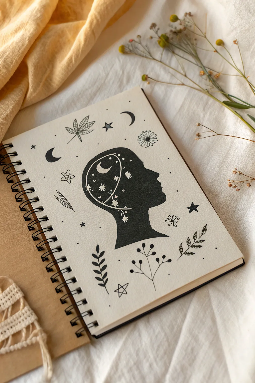
Explore inner thoughts and outer space with this striking black-and-white silhouette drawing. By combining a bold profile shape with delicate white ink details and surrounding doodle motifs, you’ll create a mystical artwork perfect for your sketchbook.
Step-by-Step Tutorial
Materials
- Spiral-bound sketchbook with smooth paper
- Pencil (HB or H)
- Eraser
- Black fine-liner pens (0.3mm and 0.5mm)
- Black marker or brush pen (for filling large areas)
- White gel pen or white paint pen (fine tip)
Step 1: Drafting the Layout
-
Outline the head:
Start by lightly sketching the profile of a human head in the center of your page with a pencil. Focus on capturing the curve of the forehead, nose, lips, and chin, leading down into a neck that flares slightly at the base. -
Refine the shape:
Adjust your pencil lines until you are happy with the silhouette. It doesn’t need to be anatomically perfect; a stylized look works great here. Ensure the back of the head is rounded and spacious enough to hold your galaxy doodles later. -
Place surrounding elements:
Lightly sketch the positions of the larger doodle elements around the head. I like to mark spots for the crescent moons, larger leaves, and the leafy branch at the bottom to balance the composition.
White Ink Woes?
If the white pen isn’t showing up clearly, wait for the black ink to dry longer. Tapping the pen tip gently on scrap paper can help get the ink flowing again.
Step 2: Creating the Silhouette
-
Trace the profile:
Using a 0.5mm black fine-liner, carefully trace over your pencil outline of the head profile. Keep your hand steady to create a smooth, continuous line. -
Fill in the shape:
Switch to a thicker black marker or brush pen to fill in the entire head silhouette. Work slowly near the edges to stay strictly within your lines. -
Ensure opacity:
If your marker looks streaky, let the first layer dry completely and apply a second coat. You want a deep, solid black background for the white details to pop against. -
Dry completely:
Allow the ink to dry fully before moving on. This is crucial—if the black ink is wet, your white gel pen will mix with it and turn gray.
Step 3: Adding White Details
-
Draw the main moon:
Take your white gel pen or paint pen. Inside the upper back part of the silhouette, draw a small, crisp crescent moon. -
Add a constellation line:
Draw a thin, curving line that swoops through the mind area, connecting different points like a constellation map. Add tiny dots along this line for emphasis. -
Scatter the stars:
Draw several eight-pointed stars and small asterisks inside the black silhouette. Vary their sizes to create depth. -
Incorporate floral hints:
Along the bottom curved line inside the head, sketch tiny floral or branch-like details in white, making it look as if thoughts are growing organically.
Color Pop
Add a splash of color by using gold or silver metallic pens for the stars, or watercolor washes around the doodle border for a dreamy galaxy effect.
Step 4: Surrounding Doodles
-
Ink the moons:
Using your 0.5mm black pen, ink the two solid black crescent moons in the background—one to the left and one above the head. -
Draw botanical elements:
Ink the leaf motifs. Create a mix of styles: single pointy leaves with veins, branches with small rounded leaves, and detailed fern-like fronds. -
Add structural leaves:
Draw the prominent vertical branch with paired leaves directly below the neck to anchor the drawing. -
Sketch the flowers:
Add stylized flowers, such as the simple five-petal flower on the left and the circular dandelion-style bloom on the upper right. -
Fill with stars:
Draw several open five-pointed stars around the head. I find five or six usually balance the space well without overcrowding it. -
Finishing touches:
Sprinkle small dots and tiny asterisks in the empty spaces between your main doodles to bind the whole composition together. -
Clean up:
Once all ink is 100% dry, gently erase any remaining pencil marks to leave your artwork crisp and clean.
Enjoy the peaceful process of turning simple shapes into a complex, thoughtful galaxy portrait
Mini Comic Strip Story Prompt
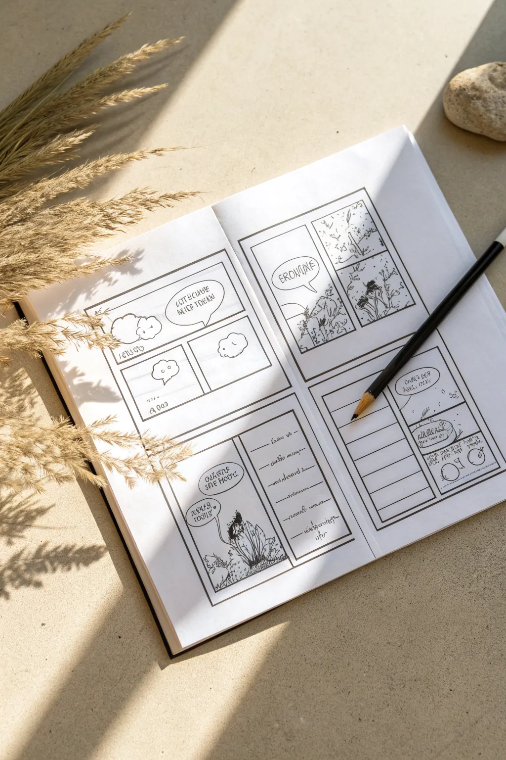
Challenge your storytelling skills by working within predetermined panels in this minimalist comic strip exercise. This clean, structured layout encourages focus on essential dialogue and simple illustrations, making it perfect for quick creative warm-ups.
Step-by-Step
Materials
- A5 or Standard Sketchbook (blank pages)
- Black Fine Liner Pen (0.3mm or 0.5mm)
- Ruler or Straight Edge
- Pencil (HB or 2B)
- Eraser
Step 1: Planning the Layout
-
Define the Page Spread:
Open your sketchbook to a clean double-page spread. Visualize dividing each page into two large quadrants, giving you four main story areas total across the spread. -
Draft the Outer Borders:
Use your ruler and pencil to lightly draw four large rectangles. Place one in the top half and one in the bottom half of each page. Leave a healthy margin of white space between them so they don’t look crowded. -
Divide into Panels:
Inside each large rectangle, sketch out smaller sub-panels. Vary the layouts: create a classic three-panel strip for one, a single large panel for another, or a vertical split. -
Add Dialogue Features:
Lightly sketch speech bubbles or caption boxes within the panels. Don’t worry about the text yet, just focus on where the conversation needs to physically fit in the composition. -
Create Writing Lines:
In the bottom right quadrant, instead of picture panels, creative varied horizontal lines. This section can serve as a journal entry or a text-based narration to accompany the visual story.
Step 2: Inking the Structure
-
Ink the Main Borders:
Switch to your black fine liner. Using the ruler, trace over your pencil lines to create the thick outer borders of each comic section. I like to go over these twice to make the frame stand out. -
Define Inner Panels:
Ink the dividing lines between individual panels. Keep these lines slightly thinner than the outer border if possible, or use a single firm stroke. -
Draw Speech Bubbles:
Freehand ink the speech bubbles. Give them organic shapes—clouds for thought bubbles or rounded ovals for speech. Let the tails point clearly to where a character would stand. -
Ink the Text Lines:
Carefully trace the horizontal writing lines in the bottom-right section. You can leave these freehand for a looser feel or use a ruler for precision. -
Erase Guidelines:
Once the ink is completely dry (give it a full minute), gently erase all the underlying pencil graphite to reveal a crisp, clean template.
Smudged Ink?
If you accidentally smudge wet ink, turn it into a shadow, texture, or background element. A smudge becomes a dark cloud or a bush easily.
Step 3: Filling the Story
-
Sketch the Subjects:
Lightly pencil in your characters or scenes. Keep the drawing style simple and doodle-like; the small scale works best with minimal detail. -
Add Text First:
Write your dialogue into the bubbles *before* inking the characters. This ensures you don’t run out of space for the words. -
Ink the Illustrations:
Go over your character sketches with the fine liner. Use short, sketchy hatch marks to add texture to clouds, grass, or clothing. -
Final Outline Boost:
If any main subject gets lost in the background, thicken their outline slightly to pop them forward visually.
Add Color Accents
Use a single colored pencil (like bright red or teal) to highlight one key element in each panel to unify the story visually.
Now you have a structured storyboard ready to capture your micro-narratives
Surreal Morph: Animal Into Object
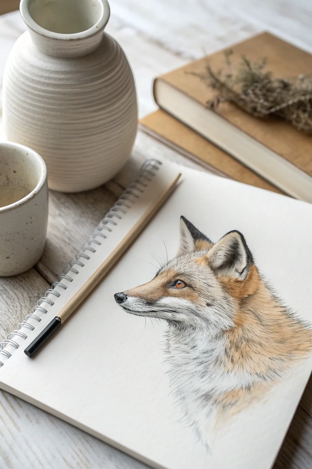
Capture the clever gaze of a red fox with this detailed colored pencil tutorial. You’ll layer soft oranges, creams, and dark grays to create realistic fur texture and a lifelike expression.
How-To Guide
Materials
- High-quality sketchbook (heavyweight paper)
- Set of colored pencils (orange, rust, cream, dark grey/black, ochre)
- Graphite pencil (HB or 2B)
- Fine-tip eraser
- Pencil sharpener
Step 1: Initial Sketching
-
Draft the General Shape:
Begin by lightly sketching the basic outline of the fox’s head using your graphite pencil. Use a circle for the cranial area and extend a wedge shape out for the muzzle. -
Refine the Contours:
Refine the shape of the ears, making them triangular but slightly rounded at the tips. Define the jawline and the slope of the nose bridge. -
Place Facial Features:
Mark the position of the eye, nose, and mouth line. The eye should be almond-shaped with a sharp focus. Keep these initial lines very faint so they don’t show through later.
Step 2: Layering the Fur
-
Base Layer of Cream:
Start applying color with a cream or white pencil. Lay down a base layer on the muzzle, under the eye, and the chest area where the fur is lightest. Use short strokes following the direction of hair growth. -
Adding Warm Tones:
Introduce a light ochre or yellowish-orange. Gently layer this over the transition areas between the white fur and what will be the darker red fur. Keep your pressure light. -
Building Red Fur:
Switch to your primary rust or orange pencil. Begin defining the main coat on the forehead, cheeks, and back of the neck. Instead of coloring in blocks, flick the pencil to mimic individual hairs. -
Deepening the Contrast:
Go back over the orange areas with a darker rust or brown pencil to add depth. Focus on the shadow areas, like behind the ear and under the jawline.
Keep it Sharp
For realistic fur, a dull pencil is your enemy. Sharpen your pencils every few minutes to ensure your strokes look like fine hairs rather than thick ribbons.
Step 3: Detailing and Defining
-
Drawing the Eye:
This is crucial for life. Use an amber or golden-brown pencil for the iris, leaving a tiny spot of white paper for the highlight. Outline the eye with a sharp black pencil. -
Darkening the Ears:
Fox ears typically have dark tips and rims. Use a dark grey or black pencil to color the outer edges and the interior depth of the ears. -
The Nose and Mouth:
Fill in the nose pad with black, leaving a small highlight on the top edge to show wetness. Draw the thin black line of the mouth, extending it slightly back. -
Whisker Spots:
On the muzzle, add tiny dots where the whiskers will originate. You can use a very sharp dark grey pencil for this. -
Adding Whiskers:
With a steady hand and very sharp pencil (or a white gel pen if you prefer), draw long, sweeping whiskers extending from the muzzle.
Color Looking Flat?
Don’t press harder; add more layers. Build up richness by layering contrasting colors (like blue or purple) lightly in the deepest shadows before adding black.
Step 4: Final Texturing
-
Refining Fur Texture:
I like to take a very sharp dark grey pencil and add fine, individual hairs into the white chest area to break up the solid color and add realism. -
Enhancing Shadows:
Check your reference. Deepen the shadows under the chin and around the eye socket to make the form pop off the page. -
Blending Edges:
Softly fade the fur at the bottom of the neck into the white of the paper. This vignette effect makes the portrait look elegant and finished.
Step back and admire the vibrant, lifelike gaze of your fox portrait.
Collaborative Exquisite-Corpse Creature Drawing
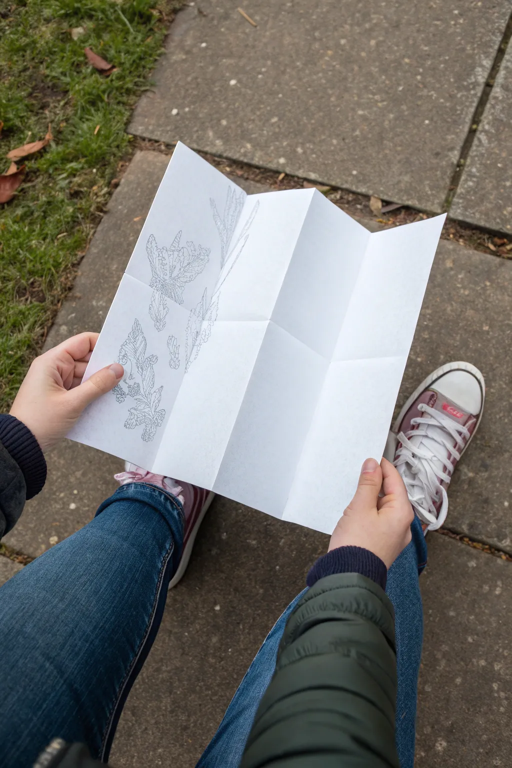
This collaborative drawing exercise transforms a simple sheet of paper into a surprising, multi-part creature using the surrealist Exquisite Corpse technique. The final result is a quirky, segmented line drawing where different artistic styles merge into one continuous, imaginative form.
Step-by-Step Tutorial
Materials
- White printer paper (A4 or Letter size)
- Fine-point black drawing pens (0.5mm or 0.3mm)
- Pencil (for initial light sketching)
- Eraser
- Flat, hard surface or clipboard
- Writing partner (optional but recommended)
Step 1: Preparing the Canvas
-
Select your paper:
Start with a clean, crisp sheet of standard white printer paper. While sketchbook paper works, thinner printer paper folds sharper and is easier to handle for this exercise. -
Create the first fold:
Hold the paper in portrait orientation. Fold the top edge down towards the center, creating a crisp crease. This section will hold the head of your creature. -
Continue folding:
Fold the paper accordion-style (zig-zag) until you have four equal horizontal sections. Press down firmly on all edges to ensure the paper lays relatively flat when opened. -
Check the mechanics:
Partially unfold the paper to ensure you can hide previous sections while revealing only a small strip of the drawing-to-come.
Lines not matching?
Make the connection lines (‘bleed lines’) slightly longer—about 0.5 inches past the fold. This gives the next artist a clearer trajectory to follow.
Step 2: Drawing the Head
-
Start at the top:
With the paper folded so only the top panel is visible, begin drawing the head of your creature. Use a pencil first if you are nervous, but I find going straight to ink encourages bolder choices. -
Add fantastical details:
Incorporate organic shapes like leaves, scales, or feathers. The style in the example relies on intricate line work and stippling for texture. -
Extend the connection lines:
Crucially, draw the neck or connecting lines slightly past the first fold onto the very top edge of the *second* hidden panel. This provides the starting point for the next section. -
Conceal the work:
Fold the top panel backward so your drawing is hidden, leaving only the tiny connecting lines visible on the top edge of the blank second panel.
Step 3: Building the Body
-
Pass or rotate:
If you are working alone, take a short break to reset your mind. If collaborative, pass the folded paper to a partner who hasn’t seen the first drawing. -
Connect the lines:
Looking only at the small marks crossing over from the previous fold, extend those lines downward to begin the torso or middle section. -
Develop the texture:
Fill this second panel with a completely different texture, perhaps turning a leafy neck into a scaled body or mechanical gears. Detailed hatching adds depth here. -
Bridge the gap:
Just like before, draw your connecting lines across the fold onto the third panel before hiding this section. -
Repeat for the legs:
On the third panel, create the lower body or legs. Think about shifting perspective or scale to make the final reveal more jarring and fun.
Pro Tip: Style Shift
Encourage each artist to use a radically different texture (stippling vs. hatching vs. solid black) to exaggerate the surrealist nature of the creature.
Step 4: The Final Reveal
-
Draw the feet:
On the final fourth panel, complete the drawing with feet, roots, or a tail. Ensure the drawing feels grounded at the bottom of the page. -
Ink the lines:
If you used pencil for the layout, trace over all your lines with the fine-point black pen. Vary your line weight—thicker for outlines, thinner for internal texture. -
Clean up:
Wait for the ink to dry completely to avoid smudging, then gently erase any visible pencil marks. -
Unfold the surprise:
Open the paper fully to reveal the complete, disjointed creature. The joy lies in seeing how the disparate parts connect. -
Refine connections:
If there are slight gaps where lines don’t meet perfectly at the folds, use your pen to bridge them now, unifying the artwork into one piece.
Enjoy the laughter as you unfold your paper to see what strange hybrid you have created
Have a question or want to share your own experience? I'd love to hear from you in the comments below!