
Whenever I’m stuck, I go back to a handful of digital painting ideas that reliably spark color, mood, and momentum. Here are my favorite prompts—starting with the classics you’ll actually want to practice, then sliding into the weirder, more magical stuff.
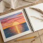
Sunset Lake Reflection Study
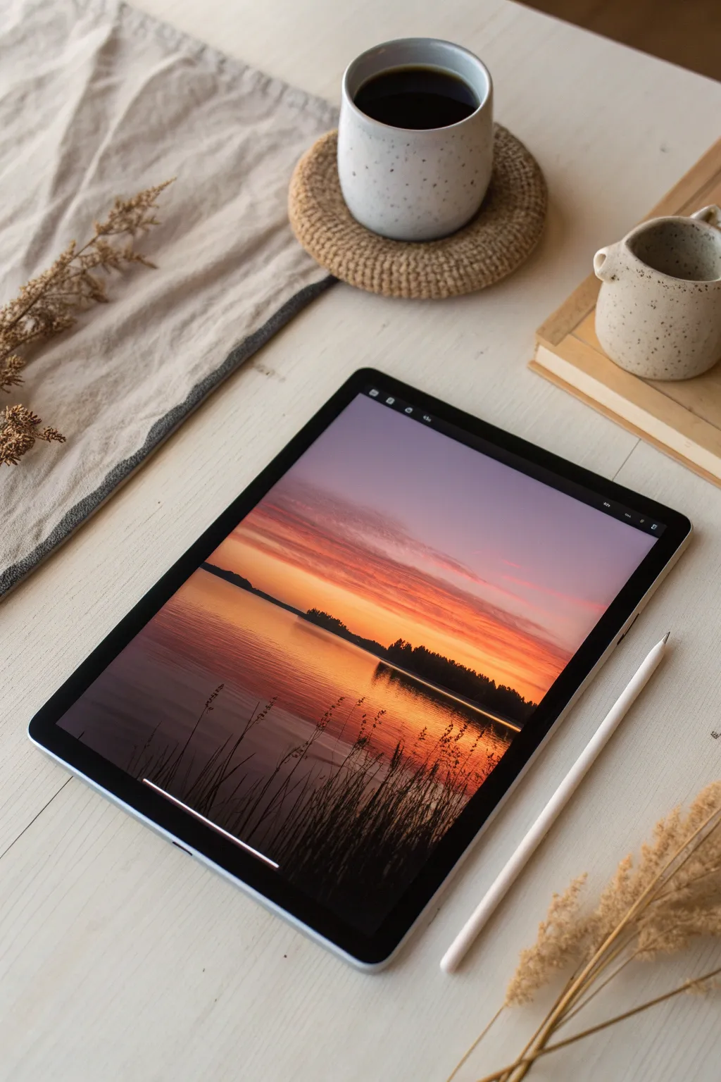
Master the art of capturing a serene sunset in this digital study, focusing on the seamless transition between warm skies and their mirror-like reflection on the water. You will learn to build dramatic silhouettes against a vibrant, glowing gradient.
Step-by-Step Tutorial
Materials
- Digital Tablet (iPad, Android, or Drawing Tablet)
- Stylus / Digital Pencil
- Drawing Software (Procreate, Adobe Fresco, or similar)
- Brushes: Soft Airbrush
- Brushes: Textured Ink or Dry Brush
- Brushes: Organic Grass/Foliage Stamp (optional)
Step 1: Setting the Sky and Water Gradient
-
Establish the canvas:
Create a new canvas, preferably with a 4:3 ratio to match the composition shown. Fill the background layer with a deep, desaturated purple to act as your darkest base tone. -
Paint the horizon line:
Select a Soft Airbrush and a warm, medium orange hue. Lightly stroke across the middle of the canvas to establish where the sky meets the water, keeping the edges soft. -
Build the sky gradient:
Moving upward from the horizon, brush in layers of salmon pink, transitioning into a soft lavender, and finally fading into the deep purple base at the very top. Use light pressure to blend the colors naturally. -
Mirror the water:
Reflect these same colors downward into the ‘water’ section. Remember that the water reflection should be slightly darker and more compressed than the sky. The orange near the horizon should be intense but quickly fade into darker brownish-purples as you move toward the bottom edge. -
Intensify the sunset glow:
Create a new layer and set the blend mode to ‘Add’ or ‘Overlay’. Using a vibrant yellow-orange, paint a concentrated glow just above the horizon line where the sun would be setting. -
Blur the background:
Apply a slight Gaussian Blur to your sky and water layers if your brushstrokes look too distinct. You want a creamy, seamless transition for the atmospheric backdrop.
Step 2: Creating the Mid-Ground Silhouettes
-
Draft the landmass shapes:
Create a new layer on top of your background. Choose a dark, nearly black purple color (avoid pure black for more realism). Use a hard round brush to block in the shapes of the distant islands and land strip across the horizon. -
Add tree line variations:
Switch to a textured brush or a foliage brush. Paint along the top edge of your landmass to suggest tiny treetops. Vary the height to make the forest look natural rather than uniform. -
Paint the land reflection:
On a layer beneath the landmass, paint the reflection of the trees into the water. Use vertical strokes that drag the dark color downward. -
Distort the reflection:
Select the Smudge tool with a wet acrylic or dragging brush. Gently smudge the land reflection horizontally to mimic the movement of water ripples breaking up the dark shape.
Pro Tip: Perfect Reflections
Duplicate your finished sky layer, flip it vertically, and lower the opacity to create an instant, color-perfect base for your water before smudging.
Step 3: Foreground Details and Water Texture
-
Add water ripples:
Create a new layer for surface details. Pick a color slightly lighter than your water base (a muted orange-pink). Sketch thin, horizontal lines across the water surface, concentrating them near the foreground. -
Refine the ripples:
Lower the opacity of the ripple layer to about 40-50%. I like to softly erase the ends of these lines so they taper off and don’t look like scratches. -
Establish foreground reeds:
Select a very dark brown or black color and a thin, pressure-sensitive inking brush or dry brush. In the bottom corners, sketch long, sweeping lines upward to create tall grasses. -
Vary the grass:
Ensure your reed strokes cross over each other and curve in different directions. Some should be thick at the base and taper to a needle point, while others can bear heavy seed heads at the top. -
Detail the seed heads:
Use a stippling motion or a small textured brush to add the fuzzy tops to the reeds. These silhouettes should be sharpest against the bright water reflection. -
Final lighting check:
Add a final ‘Color Dodge’ layer. Lightly airbrush a warm orange tint over the water specifically where the sun reflects brightest, ensuring the silhouette weeds stand out in high contrast.
Troubleshooting: Banding Issues
If your smooth gradients show ugly steps or ‘banding,’ add a generic Noise filter at 2-3% opacity to the layer. The grain hides the digital artifacts.
Enjoy the calming atmosphere of your new sunset landscape.

Twilight Gradient Sky Landscape
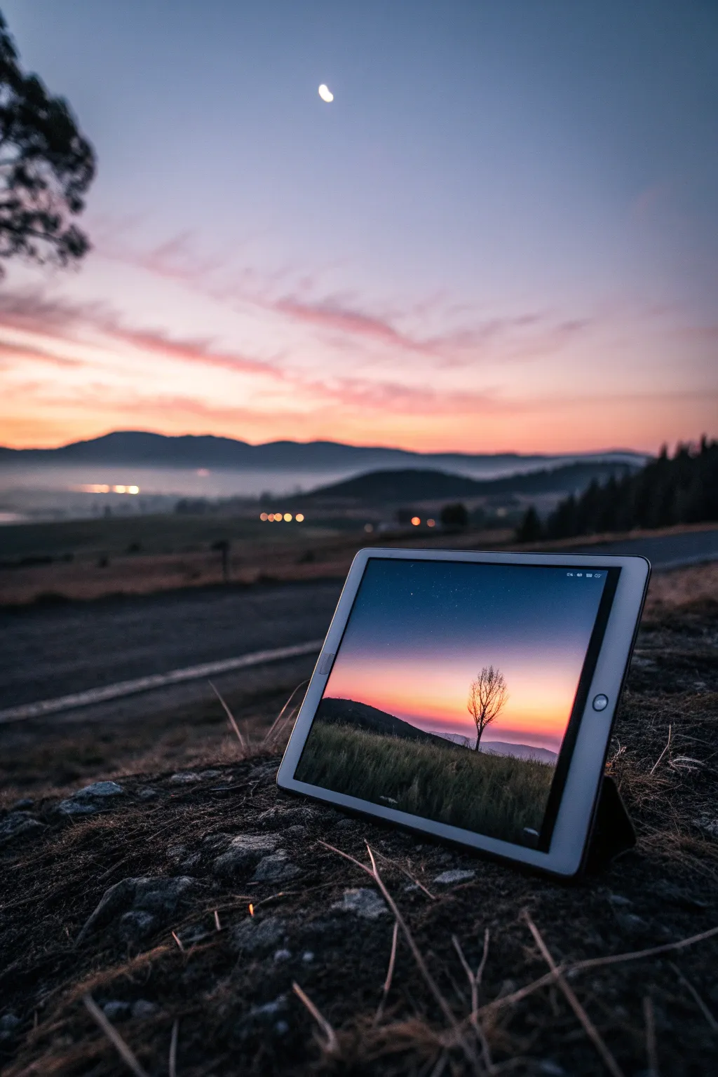
Master the art of blending vibrant sunset colors with deep, moody silhouettes in this digital painting tutorial. You will learn to create a serene landscape with a striking solitary tree against a soft gradient sky, perfect for capturing the transition from day to dusk.
Detailed Instructions
Materials
- Digital tablet (iPad, Wacom, etc.)
- Stylus (Apple Pencil or equivalent)
- Painting software (Procreate, Photoshop, or similar)
- Soft Airbrush tool
- Textured blending brush
- Monoline or technical pen brush
- Splatter brush or noise filter
Step 1: Setting the Sky Gradient
-
Establish the Canvas:
Open your digital painting software and create a new canvas. A landscape ratio like 4:3 or 16:9 works best for this calm scene. Fill the background layer with a deep, desaturated purple to serve as the darkening upper sky. -
Layering the Horizon:
Create a new layer above the background. Select a large Soft Airbrush and pick a warm orange hue. Paint a broad horizontal strip across the bottom third of the canvas. -
Adding the Mid-Tone:
Choose a vibrant pink or magenta color. On a new layer between the orange and the purple background (or directly on top with low opacity), gently airbrush the middle section to bridge the gap between the dark sky and the bright horizon. -
Blending the Transitions:
Use a Smudge tool or a soft blending brush to smooth the areas where the colors meet. You want an incredibly seamless gradient here, so lower the opacity of your brush if the strokes look too harsh. -
Intensifying the Glow:
Add a new layer and set the blend mode to ‘Add’ or ‘GLow’. Use a very pale yellow or peach color and lightly tap the airbrush right at the center of the horizon line to create the sun’s fading hotspot.
Banding Blues
Seeing distinct lines in your sky gradient? This is ‘banding.’ To fix it, apply a very slight Gaussian Blur to your sky layers, or add a subtle noise texture layer to break up the smooth pixels.
Step 2: Creating the Land and Tree
-
Blocking the Hills:
Create a new layer on top of everything for the foreground. Select a very dark color—not pure black, but a deep charcoal or midnight blue. Use a hard-edged brush to draw a rolling hill shape rising from the left side. -
Refining the Horizon Line:
Behind the main hill, add a lower, more distant hill shape using a slightly lighter shade of your dark color. This uses atmospheric perspective to create depth. -
Texturing the Grass:
Lock the transparency (Alpha Lock) of your main foreground layer. Choose a textured brush or a grass brush and a slightly lighter variation of your dark color. Gently paint vertical strokes along the top edge of the hill to simulate tall grass catching the last light. -
Sketching the Tree Trunk:
On a new layer, zoom in slightly to the right third of the composition. Using a Monoline or fine ink brush, draw a thin, slightly crooked vertical line for the tree trunk. I like to thicken the base slightly where it meets the ground. -
Branching Out:
Switch to a smaller brush size. Draw main branches splitting off the trunk in a ‘V’ shape, reaching upwards. Keep your lines organic and shaky; nature rarely makes perfect straight lines. -
Adding Fine Twigs:
Continue branching out into finer and finer lines. Ensure the tips of the branches are extremely delicate. Since this is a silhouette, you don’t need to worry about leaves or internal details, just the overall skeleton of the tree. -
Grounding the Tree:
Use a small smudge tool at the base of the trunk to pull the dark color down into the grass, integrating the tree so it doesn’t look like it’s floating.
Make it a Series
This basic structure works for any time of day. Try changing the palette to deep blues and silvers for moonlight, or bright yellows and cyans for a midday scene.
Step 3: Atmosphere and Details
-
Applying Noise:
Create a new overlay layer over the entire image. Fill it with 50% gray, then apply a ‘Noise’ filter (around 5-10%). Set the layer mode to ‘Soft Light’ to give the clean digital colors a slightly grainy, film-like texture. -
Adding Stars:
On a top layer, use a splatter brush with white paint. Focus on the upper dark purple area. Keep the stars very sparse and tiny; tap gently rather than dragging the brush. -
Vignetting:
To focus the eye, create a new layer set to ‘Multiply’. With a large, soft black airbrush, very lightly darken the corners of the canvas, especially the top two corners. -
Final Adjustments:
Check your overall contrast. If the silhouette looks too flat, you can lightly brush a tiny bit of orange rim light on the edge of the tree trunk facing the sunset to make it pop.
With these simple steps, you have created a mood-evoking landscape that fits perfectly in any digital portfolio

Moonlit Ocean and Cliff Silhouette
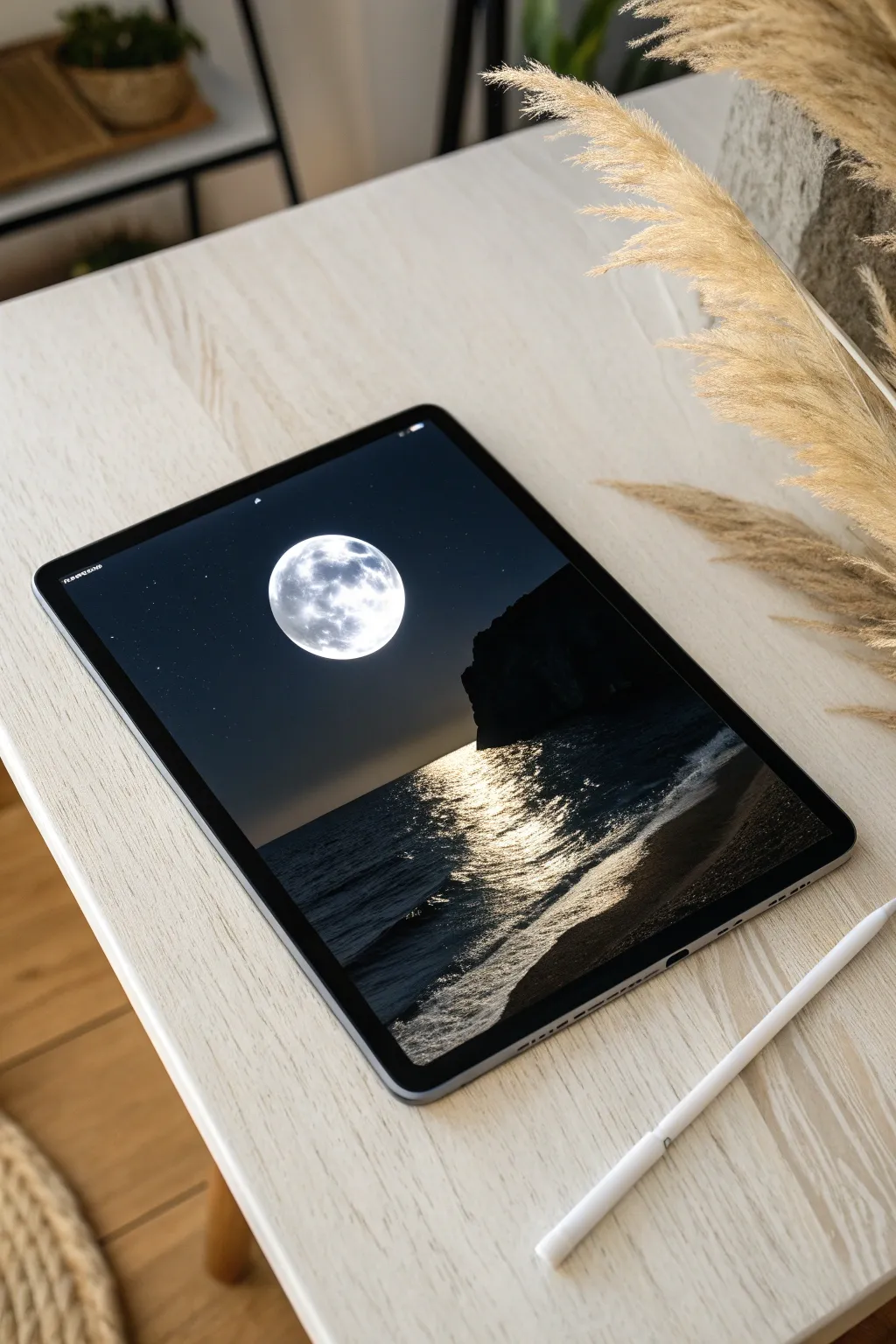
Capture the serene beauty of a full moon rising over a dark ocean with this high-contrast digital painting tutorial. You will learn to balance deep shadows with intense light sources to create a dramatic and atmospheric composition.
Step-by-Step Tutorial
Materials
- iPad with Apple Pencil (or any graphics tablet)
- Procreate (or similar drawing software like Adobe Fresco/Clip Studio Paint)
- Textured blending brushes (e.g., Gouache or Oil Paint brushes)
- Soft airbrush tool
- Luminance or Light Pen brush
Step 1: Setting the Atmosphere
-
Create the base gradient:
Begin with a new canvas and fill the entire background with a very dark, near-black navy blue. On a new layer, use a large soft airbrush with a slightly lighter, desaturated blue to create a faint horizon line about one-third of the way up the canvas. This establishes the separation between sky and sea. -
Establish the sky glow:
Select a soft, hazy brush and a medium-grey blue color. Gently dust the area in the center of the sky where the moon will sit. This creates the atmospheric scattering of light that will surround the moon later. -
Paint the full moon:
On a new layer, use a hard round brush with pure white to draw a perfect circle in the center of your glow. Lock the alpha of this layer or use a clipping mask to dab in soft grey craters and textures. Keep the edges of the moon crisp but blend the internal textures softly. -
Add the outer halo:
Create a layer underneath the moon layer. Using a large soft airbrush and white at a low opacity (around 10-15%), tap gently behind the moon to create a glowing halo effect that fades into the dark sky. -
Scatter the stars:
On a top layer set to ‘Add’ or ‘Screen’ mode, use a glimmer or splatter brush to dust tiny stars across the sky. Keep them sparse near the bright moon to mimic real-world light pollution, concentrating them more in the darker corners.
Fixing Flat Water
Does your ocean look like plastic? Use a noise filter or a grain brush at low opacity over the water surface to add instant organic texture and realism.
Step 2: Painting the Landscape
-
Block in the cliff silhouette:
Select a solid, unwavering black color. On a new layer, draw the shape of the large cliff formation on the right side of the canvas. Ensure the edges are somewhat rugged and rocky, not smooth. This shape should cut off the horizon line. -
Define the horizon:
Switch to a dark ocean blue—darker than your sky but lighter than the cliff. Use a flat brush to paint the water surface, ensuring a perfectly straight horizon line under the moon. -
Establish the water texture:
Using a textured brush (like a dry oil brush), paint horizontal strokes in the water area using slightly varied dark blues. This mimics the movement of swells in the open ocean without adding light yet.
Step 3: The Reflection and Shore
-
Paint the shoreline:
At the bottom right, paint a diagonal curve representing the wet sand. Use a dark, desaturated brown-grey. Blend it slightly where it meets the water to show the receding tide. -
Start the moon path:
Create a new layer set to ‘Add’ or ‘Color Dodge’. Choose a warm white or very pale yellow. Using a textured brush, start painting horizontal dashes directly under the moon, wider near the bottom and narrowing as they go toward the horizon. -
Intensify the reflection:
I like to duplicate the reflection layer to boost the brightness instantly. Focus on the center of the reflection path; use a brighter, harder brush to make the water look like liquid mercury where the light hits strongest. -
Add shoreline foam:
Where the water meets the sand, use a chalky or noisy brush to paint the crashing wave foam. Start with a dull grey-blue for the shadowed parts of the foam. -
Highlight the crashing waves:
Switch to pure white. Highlight the top ridges of the small waves and the foam closest to the light source. The water here is turbulent, so keep your strokes loose and energetic. -
Refine the wet sand:
The wet sand reflects the sky. Add a soft sheen to the sand area using a low-opacity whitish brush, mirroring the angle of the shoreline. -
Final contrast check:
Create a final adjustment layer for Curves or Brightness/Contrast. Slighty darken the shadows (the cliff and corners) and boost the highlights to make the moonlight pop even more.
Reference Layer Magic
Keep your moon layer separate! You can duplicate it, flip it vertically, and blur it heavily to create a perfect base for the water reflection color.
Step back and admire how the stark contrast makes the moonlight feel incredibly bright and real


Mountain Depth With Atmospheric Perspective
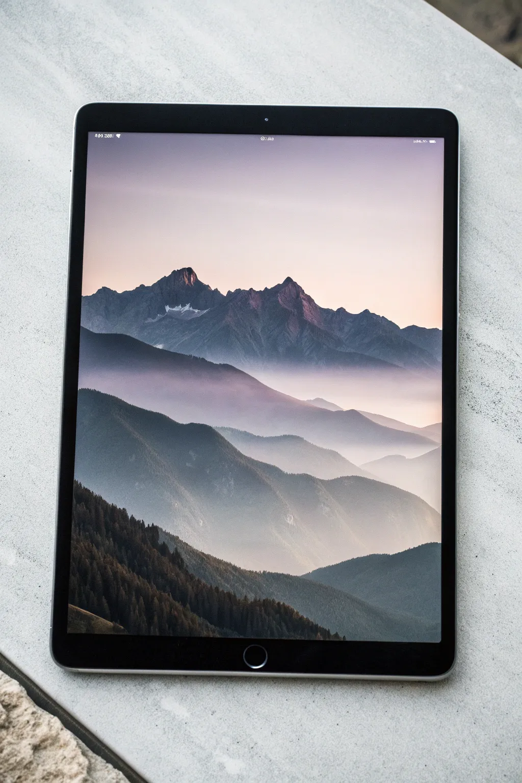
Capture the serene grandeur of fading mountain ridges using atmospheric perspective techniques on your digital canvas. This project focuses on building depth through successive layers of decreasing opacity and saturation, creating a stunning, foggy landscape.
How-To Guide
Materials
- Digital tablet (e.g., iPad) with stylus
- Digital painting software (Procreate, Photoshop, etc.)
- Textured blending brushes (clouds or soft pastel)
- Hard round brush for silhouettes
- Reference photo of layered mountains
Step 1: Setting the Sky
-
Create the canvas:
set up a new vertically oriented canvas, ideally at least 3000px on the longest side to capture subtle texture details. -
Base gradient:
On your first layer, paint a soft vertical gradient for the sky. Start with a pale, warm peach or champagne color at the horizon line (about 2/3 down the canvas) and fade upward into a muted lavender-grey. -
Soft blending:
Use a Gaussian Blur filter or a large soft airbrush to ensure the transition between the peach and lavender is seamless, mimicking the soft light of golden hour.
Pro Tip: Sampling Colors
Don’t pick distinct colors visually. Instead, duplicate your first mountain color and simply drag the brightness slider down 10-15% for each subsequent layer to get perfect value stepping.
Step 2: Background Ridges
-
Furthest peaks:
Create a new layer. Values work in reverse here: objects further away are lighter. Pick a pale, desaturated blue-purple color, only slightly darker than your sky. -
Rough blocking:
Sketch the silhouette of the most distant mountain range. Keep the shapes jagged but relatively simple, as atmosphere obscures fine details at this distance. -
Locking transparency:
Turn on ‘Alpha Lock’ (or preserve transparency) on this layer. Gently brush a soft, misty white color over the bottom half of these mountains to create the illusion of rising fog. -
Adding subtle highlights:
Still on the locked layer, dab a tiny bit of warm pink on the very tips of the peaks where the sun might catch them.
Troubleshooting: Flatness
If layers look stuck together, the bottoms of your mountains are too dark. Heavily airbrush ‘fog’ (light color) at the base of every mountain layer to visually separate them.
Step 3: Mid-Ground Layers
-
Second ridge:
Create a new layer above the previous one. Select a slightly darker, more saturated blue-grey tone. Paint a new mountain ridge that overlaps the first one. -
Varying the shape:
Ensure the peaks of this new ridge don’t line up perfectly with the one behind it; visual interest comes from offset positioning. -
Atmospheric mist:
Just like before, airbrush a soft, hazy lighter color at the base of this mountain layer. The goal is to separate this layer from the one coming next. -
Third ridge formation:
Add another layer. Choose a deeper, cool slate blue. Paint a sweeping ridge that starts to show more defined slopes. -
Shadow definition:
On this third ridge, define the form slightly more. Instead of just a silhouette, indicate which side of the mountain is in shadow (usually the side facing away from the light source).
Step 4: Foreground Details
-
Darkest prominence:
Create a new layer for the closest mountain mass. Use a very dark, near-black charcoal or forest green tone. -
Texture application:
Unlike the smooth distant mountains, use a textured brush here to mimic tree lines. A chalk or dry brush works well to create rough edges along the ridges. -
Tree detailing:
Zoom in on the foreground silhouette. Manually paint tiny vertical strokes along the ridges to suggest individual pine trees against the lighter background mist. -
Foreground lighting:
If I want to add dimension here, I lightly glaze a warm brown tone on the slopes facing the light source, keeping it very subtle.
Step 5: Final Atmosphere
-
Global haze:
Create a layer at the very top of your stack. Set the blending mode to ‘Screen’ or ‘Soft Light’. -
Final wash:
Lightly airbrush a warm, pale yellow or pink mist in the valleys between the mountains to unify the color palette. -
Noise texture:
Add a slight grain or noise filter (about 2-3%) over the entire image to stop the gradients from looking too digital and artificial.
Now you have a serene landscape that effectively demonstrates depth through value and color changes

PENCIL GUIDE
Understanding Pencil Grades from H to B
From first sketch to finished drawing — learn pencil grades, line control, and shading techniques.
Explore the Full Guide
Color-Blocked Stylized Portrait
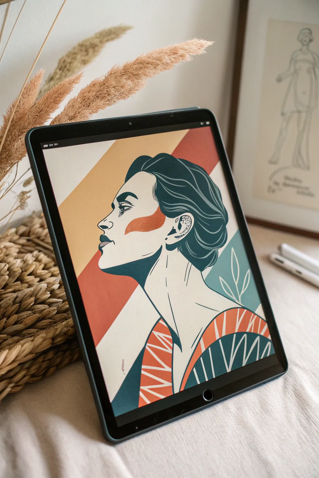
Capture striking elegance with this digital illustration project that combines bold, flat shapes with clean line work. The distinct teal and orange palette creates a retro-modern vibe perfect for stylized portraiture.
Step-by-Step Tutorial
Materials
- Digital drawing tablet (iPad shown) or graphics tablet
- Digital art software (Procreate, Photoshop, or fresco)
- Stylus pencil
- Reference photo of a side profile
- Textured brush set (inking and gouache styles recommended)
Step 1: Drafting the Foundation
-
Set the canvas:
Create a new canvas, aiming for at least 3000×4000 pixels at 300 DPI to keep your lines crisp. Fill the background layer with a warm, creamy off-white color. -
Sketch the profile:
Using a simple pencil brush on a new layer, sketch the side profile of your subject. Focus on the major landmarks: the brow line, the nose bridge, and the jawline. -
Refine the anatomy:
Lower the opacity of your rough sketch and create a new layer above it. Draw a cleaner version of the outline, paying special attention to the hair volume and the neck’s connection to the shoulders. -
Block out the clothing:
Sketch a kimono-style or V-neck garment. Instead of realistic folds, think in geometric shapes—triangles and broad curves work best for this stylized look.
Jagged Lines?
If your inking looks shaky, increase the ‘Streamline’ or ‘Stabilization’ setting in your brush properties. This smooths out jitters for cleaner curves.
Step 2: Inking and Color Blocking
-
Select your palette:
Create a swatch palette with three main colors: a deep teal blue, a muted burnt orange, and a dark charcoal for the lines. Keeping the palette limited is key to the style. -
Inking the linework:
Choose a smooth inking brush with pressure sensitivity. On a new top layer, ink the final lines of the face, hair, and neck. Vary your line weight—thicker on the hair outline, thinner for facial details like the eye and lips. -
Create the hair shape:
Create a layer beneath your linework. Select the deep teal color and fill in the entire hair mass. Use the eraser tool to carve out highlights or loose strands effectively. -
Detail the hair strands:
Switch back to your outline color. Add sweeping, curved lines inside the teal hair shape to suggest flow and volume, but don’t overdo it; keep it graphic. -
Add the cheek accent:
This style features a distinct abstract shape on the cheek. Using the burnt orange and a slightly textured brush (like a dry ink or noise brush), paint a soft, organic shape just under the eye extending to the ear. -
Define the shadows:
On a new layer set to Multiply blending mode, paint the deep teal shadow under the jawline and neck. Keep the edges sharp rather than soft-blended to maintain the vector aesthetic.
Add Color Depth
Duplicate your blocked color layers, slightly shift the hue or saturation, and use a Halftone layer mask to add a retro comic-book texture to the shadows.
Step 3: Background and Details
-
Background stripes:
Create a layer at the very bottom of your stack, just above the background fill. Draw two broad diagonal stripes—one orange, one teal—cutting across behind the head to add dynamic movement. -
Clothing patterns:
Fill the clothing areas with your orange and teal base colors. Use a clipping mask over these shapes to draw the white geometric patterns—zig-zags and radiating lines. -
Botanical elements:
In the lower right empty space, draw simple white leaf outlines against a teal background shape. These should be minimal, consisting of a single stem and oval leaves. -
Ear details:
Zoom in on the ear. Instead of realistic shading, use small dots, dashes, and tiny geometric shapes to suggest the cartilage structure. -
Facial features:
Refine the eye with heavy lashes and a strong brow. Add the lips with the dark charcoal color, perhaps adding a small spot of teal on the lower lip for a stylistic pop. -
Texture overlay:
I like to add a subtle paper texture over everything at the end. Place a paper texture image on the topmost layer and set the blending mode to Overlay or Soft Light at 15% opacity.
Step back and admire how a few bold colors and clean lines can create such a sophisticated piece of art
Rim-Light Portrait in Three Values
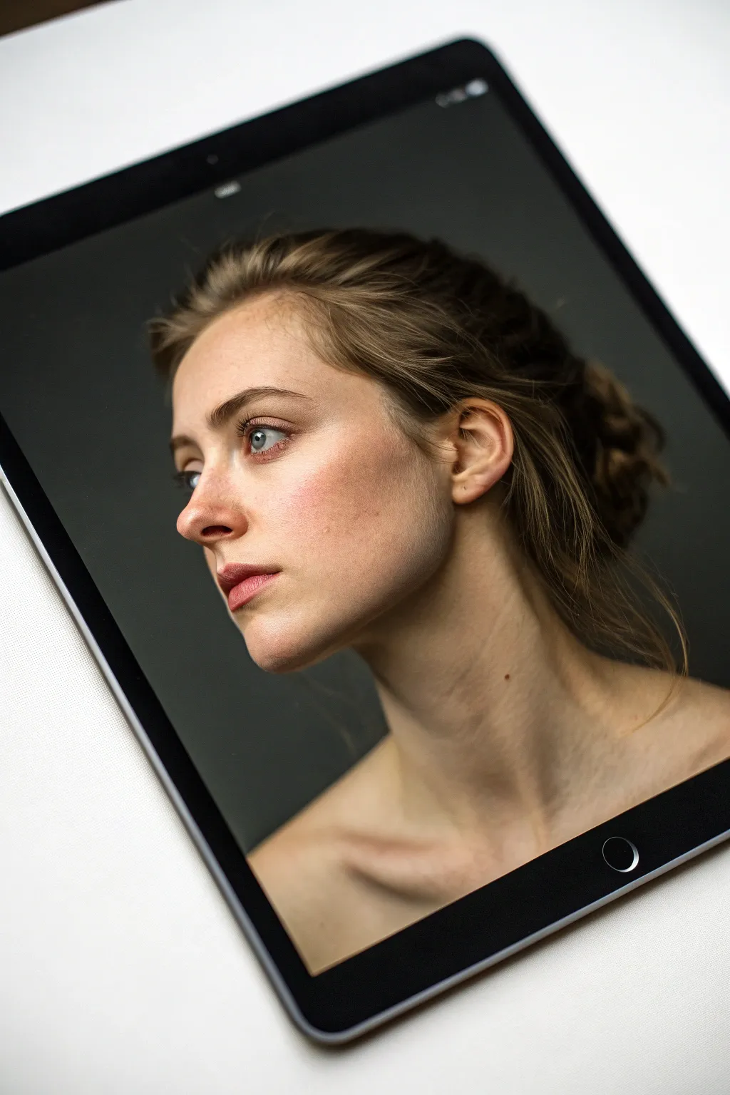
This project focuses on translating a hyper-realistic portrait into a manageable three-value study before refining it into a finished digital painting. You’ll learn how to capture the striking drama of rim lighting against a dark background, emphasizing form over complex color palettes.
How-To Guide
Materials
- Digital Tablet (iPad, Wacom, etc.)
- Stylus (Apple Pencil or equivalent)
- Painting Software (Procreate, Photoshop, Clip Studio Paint)
- Textured Brush Set (Charcoal or Oil mimic)
- Soft Airbrush
- Smudge Tool
Step 1: Setting the Stage
-
Prepare the canvas:
Create a new canvas with dimensions around 3000×4000 pixels at 300 DPI to ensure you have enough resolution for fine skin texture details later on. -
Establish the background:
Fill your background layer with a deep, desaturated charcoal grey (around #333333 on the hex scale). A pure black background can be too harsh and flattens the depth, so this dark grey allows the shadows to breathe. -
Sketch the construction lines:
Using a thin, light-colored pencil brush, sketch the basic head shape. Pay close attention to the tilt of the head and the swoop of the neck/shoulder line, as these create the portrait’s movement. -
Map the features:
Lightly block in the eyes, nose, and lips. The subject is looking away, so ensure the iris placement follows that sightline accurately.
Squint to Win
Make your canvas small or squint your eyes often. If the portrait reads clearly as a thumbnail, the values are working correctly.
Step 2: Blocking Values
-
Create a shadow layer:
On a new layer set to ‘Multiply’, block in the major shadow shapes of the face using a mid-tone grey. Focus on the eye sockets, the shadow under the nose, and the hollow of the cheek. -
Define the mid-tones:
Pick a warm, desaturated beige tone for the skin base. Paint this over the lit areas of the face, leaving the deep background visible where the hair and neck fall into shadow. -
Establish the core shadow:
The transition from the lit cheek to the dark ear area is crucial. Use a textured brush to paint the ‘terminator’ line—the soft edge where light turns into shadow across the jawline. -
Add the rim light foundation:
Select a very pale, cool grey. roughly sketch where the strongest light hits: the bridge of the nose, the forehead, and the shoulder. This acts as our map for the high contrast later. -
Refine facial planes:
Using a hard round brush, carve out the specific planes of the nose and lips. Sharp edges are vital here to stop the painting from looking ‘muddy’ or soft.
Skin Looks waxy?
You’ve likely over-blended. Stop using the soft airbrush and switch to a textured hard brush to re-introduce definitive edges and facial planes.
Step 3: Rendering and Texture
-
Introduce skin variation:
Create a new layer with ‘Soft Light’ blending mode. Airbrush a soft coral pink onto the cheeks, nose tip, and lips to mimic subsurface scattering—the way light glows through skin. -
Detail the eyes:
Paint the irises with a muted blue-grey. Add a sharp, pure white specular highlight near the pupil to make the eyes look wet and alive. Don’t forget the slight redness in the waterline. -
Paint the hair mass:
Treat the hair as a single dark shape first. I usually squint my eyes here to see the big shapes rather than individual strands. Use a large textured brush to block in the bun and loose strands. -
Add flyaway hairs:
Switch to a very small, tapering pencil brush. On a new layer, draw individual stray hairs catching the light around the ear and nape of the neck. These chaotic lines add realism. -
Enhance the rim light:
This is the ‘money maker’ step. Take a nearly white color and paint the harsh light hitting the edge of the profile, the ear rim, and the shoulder blade. -
Refine the shoulder anatomy:
The clavicle and neck muscles need subtle definition. Use a soft smudge tool to pull the shadows gently, creating the impression of bone beneath skin without drawing hard lines. -
Add skin texture:
On a layer set to ‘Overlay’ with low opacity, lightly dab a noise or pore-texture brush over the illuminated cheek and forehead area to break up the plastic smoothness.
Step 4: Final Polish
-
Deepen the darkest darks:
Go back to your shadow areas (nostrils, pupil, deep hair folds) and darken them with a rich, dark brown-black to increase contrast. -
Color correct:
Add a ‘Color Balance’ adjustment layer. Shift the highlights slightly towards cyan and the shadows slightly towards red/orange to separate the planes visually. -
Final sharpening:
Merge visible layers to a new layer and apply a very light ‘Unsharp Mask’ filter. This brings out the crispness of the eyelashes and hair details.
With these steps completed, you’ll have a dramatic, mood-filled digital portrait that truly pops off the screen
BRUSH GUIDE
The Right Brush for Every Stroke
From clean lines to bold texture — master brush choice, stroke control, and essential techniques.
Explore the Full Guide
Portrait Progression From Sketch to Render

Learn to create a striking four-panel character study that balances illustrative line work with bold, flat colouring. This digital project focuses on capturing diverse facial structures and expressions while maintaining a cohesive, graphic novel aesthetic across a grid layout.
Detailed Instructions
Materials
- Digital tablet (iPad Pro or similar)
- Stylus (Apple Pencil or similar)
- Digital art software (Procreate, Photoshop, or Clip Studio Paint)
- Texture brushes (pencil sketch, gritty ink, gouache shaders)
- Reference photos of four diverse subjects
Step 1: Setting the Stage
-
Canvas Setup:
Begin by creating a large vertically oriented canvas, ideally around 3000×4000 pixels at 300 DPI to ensure crisp details. -
Grid Construction:
Use the drawing guide or ruler tools to divide your canvas into four equal quadrants. Create a new layer and draw a thin white border to separate these panels clearly. -
Background Blocking:
Select a muted, contrasting color palette. Fill diagonal quadrants with the same background hue—for example, a warm terracotta orange for top-right and bottom-left, and a soft beige or teal for the others—to create visual balance.
Unified Palette Trick
To make four different portraits feel like one set, pick one specific shadow color (like a deep maroon) and use it for the deepest shadows on ALL four characters.
Step 2: Drafting the Subjects
-
Rough Gesture sketching:
On a new layer, use a loose pencil brush to sketch the basic head shapes for each quadrant. Vary the angles: try a 3/4 view for one, a profile for another, and a slight upward tilt for the third. -
Defining Features:
Refine the sketches by placing eyes, noses, and mouths. Focus on distinct facial structures—perhaps a strong jawline for one character and softer features for another—keeping lines energetic but light. -
Clean Line Art:
Switch to a dry ink or technical pen brush. Create a new layer above your sketch and draw the final line art. Use varied line weights: thicker lines for the jaw and neck, thinner lines for facial details like eyelids. -
Adding Hatching:
This style relies on texture. Add cross-hatching or parallel lines to indicate shadow areas, particularly under the chin, beneath the nose, and in the hair, rather than relying solely on color for shading.
Step 3: Color Application
-
Flatting Base Colors:
Create a layer beneath your line art. Block in the skin tones for each character using a hard round brush, ensuring you have a diverse range of complexions. -
There Goes the Hair:
Block in hair shapes with a solid dark color. Don’t worry about individual strands yet; focus on the overall silhouette and volume of the hair mass. -
Clothing Palette:
Paint the clothing using colors that complement your background grid. If the background is orange, a teal or muted green shirt creates a nice vibration; if the background is light, go for a darker garment. -
Locking Alpha:
Alpha-lock your base color layers. This is a crucial step that allows you to paint shading inside the shapes without preserving the clean edges you just established.
Dynamic Typography
Add imaginary character names or stats next to each head using a pixelated or typewriter font to give the piece a ‘character selection screen’ gaming vibe.
Step 4: Rendering and Texture
-
Skin Shading:
Using a slightly textured brush (like a gouache or pastel brush), paint shadows onto the skin. Choose a color slightly darker and more saturated than the base tone. I tend to push these shadows slightly warmer to keep the characters looking lively. -
Highlight Accents:
Select a lighter version of the skin tone and paint subtle highlights on the nose bridge, forehead, and cheekbones to bring forward the forms. -
Hair Detailing:
Return to the hair layer. Use a smaller brush to add texture to the hair mass—tight curls for one character, straight sheen for another—using a lighter value of the hair color. -
Clothing Texture:
Add simple folds to the clothes using the same hatching technique or a wide, soft brush stroke. Keep clothing rendering simpler than the face to direct focus to the eyes. -
Final Polish:
Create a ‘Noise’ or ‘Paper Texture’ layer on top of everything and set the blend mode to Overlay at 10–15% opacity. This unifies the four portraits and gives the piece a traditional print feel.
Now you have a stunning character sheet that showcases your versatility in capturing different personalities
Aurora Sky Over Silent Water
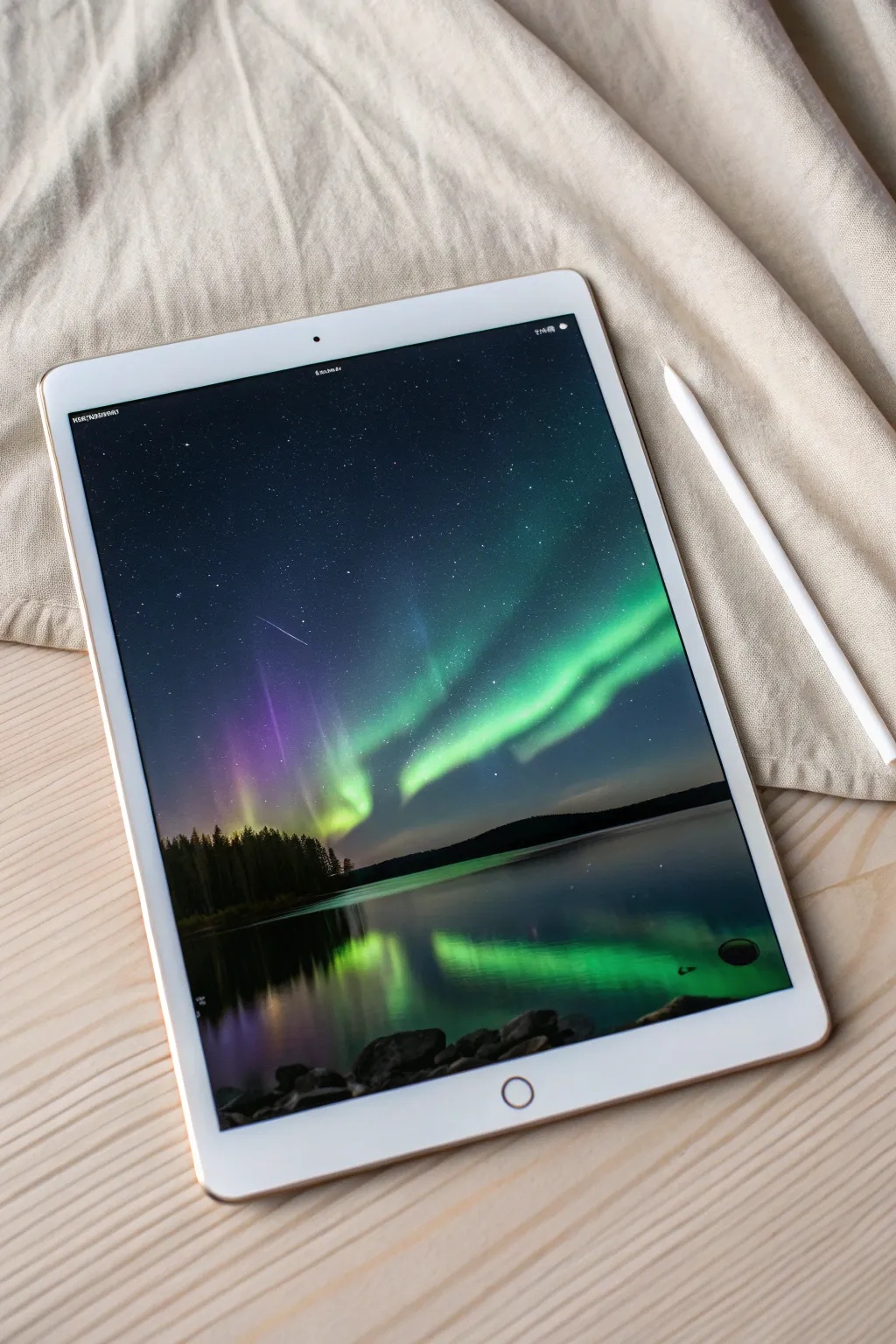
Capture the ethereal glow of the aurora borealis dancing over a still lake in this digital painting project. You will learn to use blending modes and soft brushes to create a luminous, reflective night scene directly on your tablet.
Step-by-Step Guide
Materials
- Digital painting software (Procreate, Photoshop, etc.)
- Tablet and stylus
- Textured blending brush
- Soft airbrush
- Stippling or speckled brush for stars
- Hard round brush
Step 1: Setting the Night Sky
-
Canvas Setup:
Open a new canvas, preferably at a high resolution like 300 DPI, to ensure your details remain crisp. Fill the entire background layer with a deep, dark midnight blue—almost black, but with a hint of color to keep it vibrant. -
Initial Horizon Line:
Create a new layer. Using a hard round brush with black or very dark green paint, draw a low horizon line about one-third of the way up from the bottom. This will separate your sky from the water. -
The Starfield:
On a new layer beneath the horizon but above the background, select a pure white color. Use a stippling or speckled brush to dust the upper sky with stars. Keep the density random—cluster some together for a Milky Way effect and leave other areas sparse. -
Shooting Star Detail:
Switch to a very fine, hard brush. Draw a thin, white scratch mark diagonally across the upper left quadrant. Taper the ends by adjusting the pen pressure so it fades out, mimicking a shooting star.
Step 2: Painting the Aurora
-
Base Glow:
Create a new layer and set the blend mode to ‘Add’ or ‘Screen’. With a large, soft airbrush and a teal-green color, paint broad, sweeping curves across the middle of the sky. Keep opacity low, around 40%, to build the glow slowly. -
Adding Structure:
Select a slightly more textured brush. Choose a brighter, saturated spearmint green. Paint distinct ribbons within your soft glow, varying the pressure to create thick and thin sections that mimic folded curtains of light. -
Vertical Pillars:
Use the smudge tool or a soft blending brush. Pull pixels from your green ribbons upward into the dark sky. This creates the vertical pillars characteristic of auroras. Make these strokes swift and fading. -
Purple Hues:
On the same layer or a new one above it, introduce a vivid violet or magenta. Paint these colors near the top edges of the green ribbons or fading into the dark sky on the left side, blending gently where the colors meet. -
Intensifying the Core:
Create a layer set to ‘Color Dodge’. Use a nearly white vibrant green to hit the brightest centers of the aurora bands. This makes the lights look like they are truly glowing against the dark backdrop.
Unwanted Banding?
If your sky gradients look like stripes (banding), add a tiny amount of ‘Noise’ to the background layer. This texture breaks up the smooth gradient and makes the transition seamless.
Step 3: Reflections and Landscape
-
Tree Silhouette:
Return to your horizon layer. Using a textured brush that mimics foliage, paint the silhouette of a dense pine forest along the horizon line. Vary the heights of the treetops for a natural look. -
Water Base:
Below the horizon layer, create the water surface. Sample the dark blue from your sky and paint the bottom third of the canvas. Make it slightly darker than the sky to suggest depth. -
Mirroring the Aurora:
Duplicate your aurora layers and flip them vertically. Move them down into the water area. Apply a ‘Gaussian Blur’ filter (about 10-15%) to these reflections to soften them suggesting movement on the water surface. -
Water Ripples:
Select the smudge tool with a flat, horizontal brush shape. Gently drag horizontally across the reflected aurora colors. This breaks up the perfect mirror image and creates the illusion of subtle ripples. -
Reflected Trees:
Duplicate your tree silhouette layer, flip it vertically, and lower the opacity to around 70%. Position it directly under the tree line to cast the forest’s shadow onto the water.
Go Cinematic
Add a ‘Bloom’ effect in your final adjustments to make the brightest parts of the aurora bleed light into the surrounding darkness, enhancing the magical feel.
Step 4: Foreground Details
-
Rocky Shoreline:
On a top layer, paint a cluster of rocks in the immediate foreground at the bottom edge. Use dark grays and blacks. The shapes should be rounded but irregular. -
Ambient Lighting:
Lock the transparency (Alpha Lock) of your rock layer. With a soft airbrush, lightly dust the top edges of the rocks with the teal-green color of the aurora to show reflected light hitting the stones. -
Final Adjustments:
Add a new layer set to ‘Overlay’ on top of everything. Paint large, soft distinct areas of blue and purple to unify the color, creating a cold, atmospheric mood across the entire piece.
Step back and admire your tranquil, glowing nightscape.


Underwater Light Caustics Scene
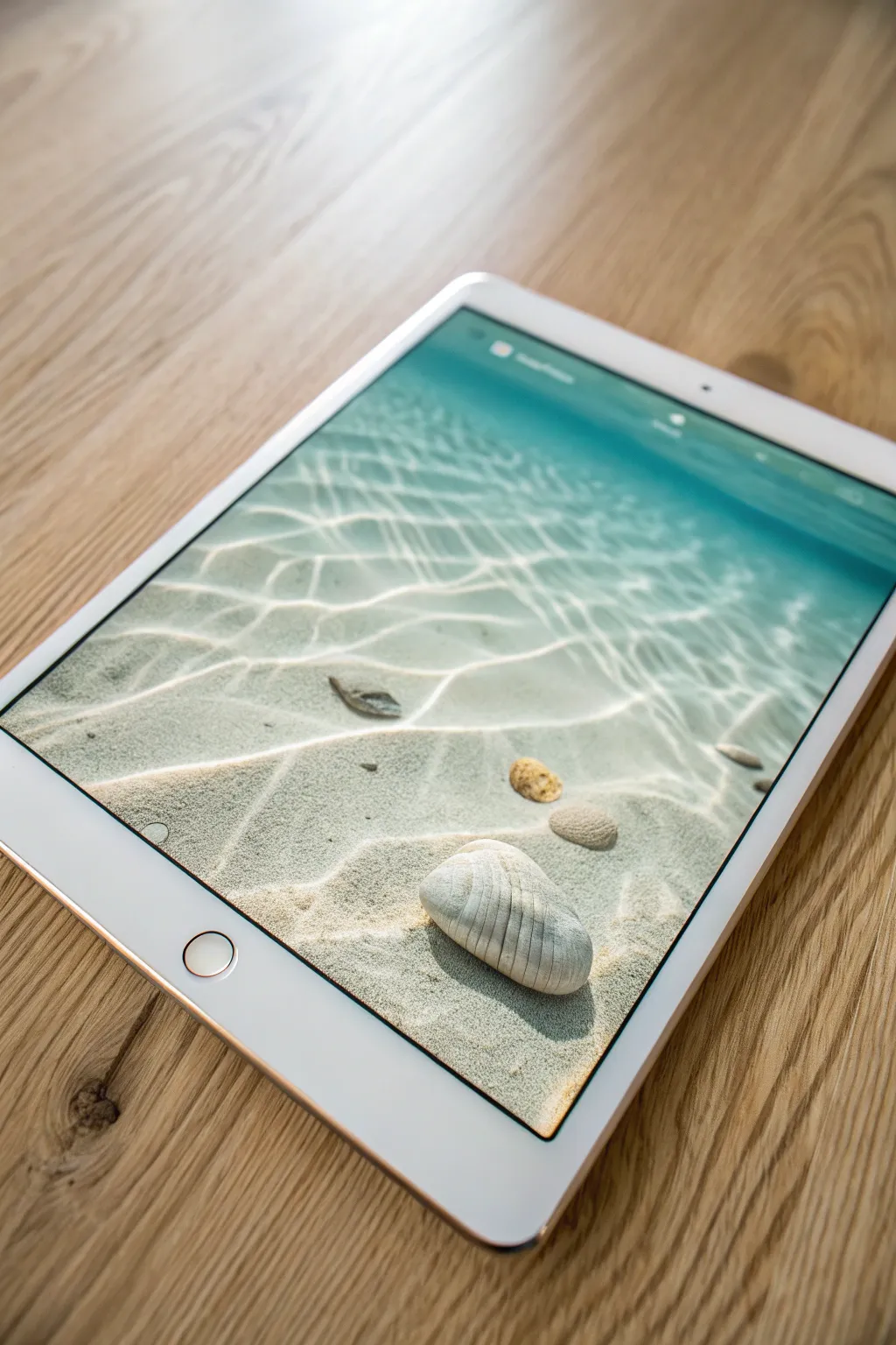
Master the mesmerizing interplay of light and water in this serene digital painting project. You will recreate the look of crystal-clear shallow swells over sand, focusing specifically on realistic light caustics and submerged textures.
How-To Guide
Materials
- Digital painting software (Procreate, Photoshop, Clip Studio Paint, etc.)
- Pressure-sensitive graphics tablet
- Soft Round pressure opacity brush
- Hard Round brush
- Texture brushes (Sand or Noise grain)
- Blending/Smudge tool
- Layer blending modes (Overlay, Add/Linear Dodge, Multiply)
Step 1: Setting the Sandy Foundation
-
Base Gradient:
Create a new canvas and fill a ‘Sand’ layer with a warm beige tone. Use a large soft airbrush to paint a gentle gradient of turquoise blue coming from the top right corner, fading into the beige to suggest water depth. -
Adding Texture:
On a new layer clipped to the Sand layer, use a noise or grain brush to stipulate the texture of wet sand. Set this layer to Multiply mode with low opacity (around 20-30%) to keep it subtle. -
Sandy Undulations:
Paint broad, soft shadows across the sand using a darker, cool grey-brown on a Multiply layer. These should look like gentle dunes or ripples in the sand bed itself, not the water yet.
Step 2: Painting the Resting Objects
-
Blocking Shapes:
Sketch the outline of the main foreground shell and the smaller pebbles. Fill these shapes with flat base colors—creamy white for the main shell and brownish-grey for the stones. -
Defining Volume:
Using a standard round brush, paint the shadows on the objects. Remember the light source is coming from the top right, so shadows will fall to the bottom left. -
Shell Details:
For the large shell, use a smaller brush to paint the vertical ridges. Alternate between a light tan shadow color and a bright off-white highlight to create the 3D texture. -
Cast Shadows:
Create a new layer underneath the objects set to Multiply. Paint dark, sharp shadows directly under the shell and stones, softening the edges as they move further away.
Pro Tip: The Liquify Tool
Don’t hand-paint every curve! Draw a straight-ish grid first, then use the Liquify tool to push and pull it into organic, wavy shapes.
Step 3: Creating the Caustics (The Light Network)
-
Web Pattern:
Create a new layer named ‘Caustics Base’. Using a light, almost white cyan color and a hard round brush, sketch a distorted web pattern over the sand. Think of chicken wire that has been stretched and pulled. -
Refining the Shapes:
Thicken the intersections where lines meet. The lines should not be uniform; make some segments thicker and brighter, and others thin and faint to mimic how light refracts through waves. -
Soft Glow:
Duplicate your Caustics Base layer. Apply a Gaussian Blur (about 5-10px) to the copy and set it to ‘Overlay’ or ‘Soft Light’ mode to give the distinct hard lines a bloom effect. -
Chromatic Aberration (Optional):
I sometimes duplicate the sharp caustic layer again, slightly offset the red and blue color channels, and lower the opacity to add a prismatic, realistic water edge feel. -
Warping for Depth:
Use the Transform/Warp tool to flatten the pattern slightly near the top of the canvas, simulating perspective as the water recedes into the distance.
Troubleshooting: Flat LOOK?
If the water looks too shallow or flat, darken the blue gradient at the very top of the canvas and blur the caustics more in that area to fake depth of field.
Step 4: Surface Tension and Final Lighting
-
Surface Ripples:
On a top layer, paint very faint, horizontal white streaks across the upper third of the canvas. These represent the actual surface of the water catching the light. -
Caustic Distortion:
Where the light pattern (caustics) hits the shell and stones, use the Warp tool or liquify filter to bend the lines over the objects, confirming their 3D form. -
Highlight Punch:
Create a ‘Linear Dodge (Add)’ layer. Use a soft brush to paint varying bright glow spots over the strongest intersections of your caustic web pattern. -
Shadow Contrast:
To make the light pop, you need darkness. Paint thin, dark teal lines right next to the brightest caustic lines on the sand to represent the refraction shadows. -
Water Color Gradients:
Add a new layer on top set to ‘Color’ mode. Brush a vibrant turquoise gradient over the top half of the image to unify the water colors. -
Noise Finish:
Add a final layer of uniform variety noise over the entire image at 2-3% opacity to mimic the grain seen in the reference photo.
Now you have a refreshing underwater scene that glows with realistic light refraction
Bioluminescent Forest Path
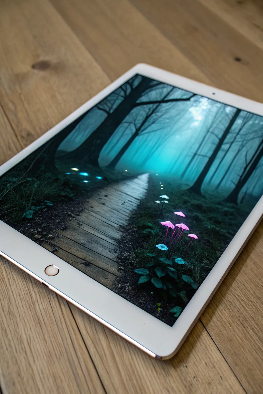
Transport yourself to an ethereal woodland by painting this moody, fog-drenched scene filled with bioluminescent fungi. With its mysterious boardwalk leading into the mist, this digital painting exercise perfectly balances atmospheric perspective with vibrant, glowing focal points.
Step-by-Step
Materials
- Digital painting software (Procreate, Photoshop, etc.)
- Pressure-sensitive graphics tablet or stylus
- Textured brush set (charcoal, gouache, or soft pastel)
- Soft airbrush for fog effects
- Detail brush for flora
Step 1: Setting the Atmosphere
-
Prepare the Canvas:
Start with a cool, muted background color. A desaturated teal or slate blue works perfectly as your mid-tone base, establishing that evening forest mood immediately. -
Rough Composition:
On a new layer, sketch the main elements loosely. Place the boardwalk leading from the bottom left toward the center, narrowing significantly to show distance. Sketch the large tree trunks on the left and right borders to frame the scene naturally. -
Paint the Background Trees:
Using a low-opacity textured brush, block in the distant trees. Keep them soft and undefined, using a lighter, foggier cyan tone than your background. They should feel like silhouettes fading into the mist. -
Establish the Fog:
Select a soft airbrush with a bright cyan or turquoise color. Gently glaze the center of the image where the path disappears. This creates a light source and depth, making the foreground elements pop in contrast.
Glow Looks Dull?
If your mushrooms look flat, ensure your background is dark enough. Glow effects rely on contrast. Try painting a dark halo behind the fusing heavy shadows.
Step 2: Constructing the Foreground
-
Block in Dark silhouettes:
Switch to a nearly black, dark green hue. Paint the heavy, thick tree trunks on the immediate left and right. Use a rougher brush here to suggest bark texture without drawing every crack. -
Painting the Ground:
Lay down the forest floor using dark, earthy textures. Dab your brush to simulate moss, soil, and fallen leaves around the base of the trees and the edges of where the wooden path will be. -
Building the Boardwalk:
Paint the wooden planks using a desaturated brown-grey. Don’t make straight lines; let the edges be uneven and organic. I prefer to paint the individual planks with slight gaps between them to show the dark earth underneath. -
Adding Planking Details:
Add subtle highlights to the edges of the planks nearest to the viewer using a pale grey. Add darker lines for wood grain, keeping the detail highest in the infinite foreground.
Step 3: Creating the Glow
-
Planting the Mushrooms:
On a new layer, paint the stems of the mushrooms in the bottom right corner. Use a thin, opaque brush. Top them with cap shapes in a base color of magenta or violet. -
Igniting the Bioluminescence:
Create a new layer and set the blending mode to ‘Add’, ‘Color Dodge’, or ‘Overlay’. Using a soft airbrush and a vibrant hot pink, gently brush over the mushroom caps to make them bloom with light. -
Blue Accents:
Repeat the previous step for the smaller blue fungi on the left side of the path and near the pink cluster. Use a neon cyan color to make them stand out against the dark moss. -
Ambient Light Pools:
Using a very low opacity soft brush, paint faint pools of blue light on the forest floor around the glowing mushrooms. This grounds the light sources so they don’t look like stickers floating on top. -
Fireflies and Particles:
Speckle the air above the path with tiny dots of white and pale yellow. Vary the opacity to make some look close and others far away in the fog.
Add Magical Creatures
Don’t stop at mushrooms. Add a silhouette of a deer or rabbit on the path. Give it glowing eyes or antlers to integrate it into the magical setting.
Step 4: Final Polish
-
Vignette Effect:
Darken the four corners of your canvas with a large soft brush on a ‘Multiply’ layer. This draws the viewer’s eye strictly to the glowing center path. -
Texture Overlay:
Finally, add a subtle noise or paper texture over the entire image on a ‘Overlay’ layer at 10-15% opacity to give the digital painting a more traditional, tactile feel.
Step back and admire how your command of light has turned a simple path into a gateway to a fantasy world
Pixel-to-Painterly Style Mashup Landscape
This project bridges the gap between retro pixel art and soft, atmospheric landscapes. You will create a stunning mountain sunrise on your tablet that features crisp, geometric edges softened by rich, blended color gradients.
Detailed Instructions
Materials
- Digital Tablet (iPad, Android, or Graphics Tablet)
- Stylus or Apple Pencil
- Digital Painting Software (Procreate, Adobe Fresco, or similar)
- Textured Brush Set (Gouache or Dry Oil)
- Pixel/Square Brush
- Smudge Tool settings
Step 1: Setting the Scene
-
Canvas Setup:
Approve a new canvas with screen dimensions (approximately 1920x1080px or larger) to match your device’s aspect ratio. A resolution of 300 DPI ensures crispness if you decide to print later. -
Background Gradient:
Fill the background layer with a soft, pale cream or light beige color. This acts as the light of the sky. -
Sky Wash:
Using a large, soft airbrush, gently paint a wide horizontal band of pale lavender across the upper middle section, blending it upwards into the cream background to create an atmospheric haze.
Jagged Lines?
If your pixel edges look too harsh against the soft sky, use the smudge tool at 20% strength to slightly blur just the corners of the ‘pixels’ for a softer transition.
Step 2: Blocking the Landscape
-
Distant Peaks:
Create a new layer. Select a mid-tone mauve or dusty purple color. Using a hard-edged brush or a lasso tool, block in the furthest mountain range with jagged, distinct peaks. -
Mid-Ground Hills:
Add another layer above the previous one. Switch to a rusty orange tone. Sketch in rolling hills that overlap the purple mountains, keeping the ridge lines fairly clean and sharp. -
Foreground Terrain:
On a top layer, choose a deep, rich terra-cotta or brownish-red. Paint the largest, closest hill in the foreground, letting it dominate the bottom third of the canvas. -
Adding the Sun:
Create a layer behind the distant mountains. Use a pure white or very pale yellow circle brush to stamp a crisp sun just peeking over the horizon line.
Go Animatic
Duplicate your sun layer and move it slightly up. Export both versions as frames in a GIF animation to make the sun appear to incurably rise.
Step 3: The Pixel-Painterly Mashup
-
Adding Texture:
This is the core of the style. Select a ‘Dry Gouache’ or ‘Chalk’ brush. Lock the Alpha Channel (or create a clipping mask) on your foreground terra-cotta layer. -
Foreground Detailing:
With a slightly lighter shade of red-orange, paint vertical, grassy strokes on the foreground hill. I find that varying the pressure here helps create a natural, windswept look. -
Pixelated Edges:
Switch to a specialized square or ‘pixel’ brush. Go along the very top edge of the foreground hill and erase tiny notches or add tiny square blocks. -
Digital Noise:
Apply the same pixel-edge technique to the mid-ground orange hills, but use slightly larger block shapes to suggest trees or distinct rocks in a retro style. -
Shadows and Depth:
On the mid-ground layer, select a darker, cooler orange. Using a textured brush, paint broad shadows on the right side of the slopes to simulate the sun coming from the left.
Step 4: Atmosphere and Final Polish
-
Distance Fog:
Create a new layer between the distant purple mountains and the mid-ground. Lightly airbrush a band of the sky color (cream) at the base of the mountains to push them further back. -
Sun Glare:
Add a new layer on the very top simply for lighting effects. Set the blending mode to ‘Overlay’ or ‘Soft Light’. -
Warm Wash:
Paint a large, soft circle of warm yellow over the sun area and spreading onto the nearby hilltops to create a glowing bloom effect. -
Scattered Trees:
Using a small, dark brush, dot a few tiny silhouetted pine trees on the ridge of the mid-ground hills. Keep them simple and geometric to match the pixel vibe. -
Grain Overlay:
Finally, add a top layer filled with 50% gray, add ‘Noise’ filter, and set layer mode to ‘Overlay’ at 10% opacity. This unifies the pixel and painterly elements.
Now you have a serene digital landscape that perfectly balances retro charm with modern artistic flair
Double-Exposure Portrait With Landscape Fill
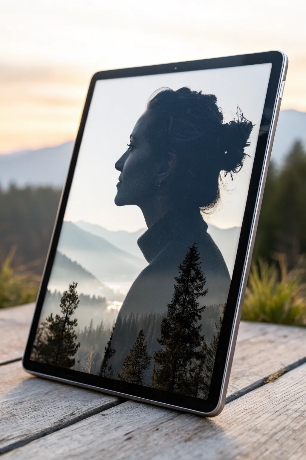
This striking digital composition merges a pensive silhouette with a serene mountain landscape, creating a seamless blend of human and nature. Using layer blending modes and careful masking, you’ll capture the moody, ethereal atmosphere of a foggy morning within a portrait profile.
How-To Guide
Materials
- Digital painting software (Procreate, Photoshop, or similar)
- Graphics tablet or iPad with stylus
- High-contrast profile photo reference
- Misty landscape photo or custom painted landscape assets
- Textured blending brushes
- Soft round eraser tool
Step 1: Preparing the Base Silhouette
-
Import your subject:
Begin by importing your profile portrait reference onto a new canvas. A side profile with a clear jawline and messy bun works best for this specific look. -
Trace or extract the shape:
Create a new layer and carefully trace the outline of the subject using a solid ink brush. Fill the shape with a dark, solid gray color (around 80% black) rather than pure black to allow for better blending later. -
Refine the hair edges:
Use a specialized hair brush or a small smudge tool to pull out fine strands around the bun and nape of the neck. These flyaway details are crucial for making the silhouette feel organic and less like a cutout. -
Isolate the background:
Turn off your reference photo layer so you are left with just the dark silhouette on a transparent background. Add a new layer beneath it and fill it with a very light, soft off-white or pale gray color.
Step 2: Integrating the Landscape
-
Position the mountain scene:
Import your misty mountain landscape image. Place this layer directly above your silhouette layer. Lower the opacity temporarily to position the horizon line—aim to align the distant mountains with the subject’s neck and chin area. -
Clip the landscape:
Right-click the landscape layer (or tap the layer menu) and select ‘Clipping Mask’ or ‘Create Clipping Mask’. This effectively forces the landscape to appear only inside the boundaries of your silhouette shape. -
Set the blending mode:
Change the blend mode of the landscape layer to ‘Screen’ or ‘Lighten’. This is the magic step: it keeps the bright misty areas visible while letting the dark silhouette define the shadows. -
Adjust levels:
Open your curves or levels adjustment tool on the landscape layer. Boost the whites to make the fog brighter and darken the shadows slightly to increase the contrast against the silhouette base.
Hair Detail Tip
Don’t over-clean the hair silhouette. The messy, stray hairs catch the light of the background layer best, creating a realistic, backlit effect that sells the illusion.
Step 3: Refining the Blend
-
Paint the bottom trees:
Create a new layer on top of everything. Using a textured pine tree stamp brush or a stippling brush, paint dark silhouette trees rising from the bottom edge of the artwork. -
Color match the trees:
Ensure these painted trees are a very dark charcoal color to match the darkest parts of your profile silhouette. Vary the height and size of the trees to create depth, placing larger ones in the foreground. -
Mask the face details:
Select the landscape layer again and add a layer mask. With a large, soft round brush set to low opacity (20%), gently paint black on the mask over the face’s features—specifically the eye, nose, and lips—to bring back the definition of the profile. -
Restore the hair texture:
Using a smaller masking brush, gently hide parts of the mountain texture that overlap the messy bun area. I find this helps keep the focus on the landscape in the lower body while preserving the detail of the hair at the top. -
Add atmospheric fog:
Create a new layer set to ‘Overlay’ mode. Use a soft airbrush with a pale blue-white color to paint gentle fog banks where the silhouette’s neck meets the mountains, softening the transition.
Try This Twist
Swap the mountain forest for a city skyline or a crashing ocean wave. The key is ensuring the ‘fill’ image has strong contrast and light areas to blend properly.
Step 4: Final Atmosphere
-
Enhance global contrast:
Add a final adjustment layer on top of your stack. Increase the contrast slightly to make the pine trees crisp against the misty background. -
Color grading:
Apply a subtle blue or teal photo filter or color balance adjustment over the entire image. This unifies the dark silhouette and the landscape into a cohesive, cool-toned mood. -
Final cropping:
Crop the composition so the profile is slightly off-center, leaving negative space in front of the face for the subject to ‘look’ into, enhancing the contemplative vibe.
Once you master the masking technique, you can explore endless combinations of human emotion and natural landscapes


Have a question or want to share your own experience? I'd love to hear from you in the comments below!