
When I’m trying to paint a feeling (not just a “thing”), I always start with color and a simple, repeatable layout that lets the mood do the talking. Here are my favorite mood painting ideas—from classic monochrome studies to more experimental, journal-style approaches you can make totally your own.
Calm Blue Wash Seascape
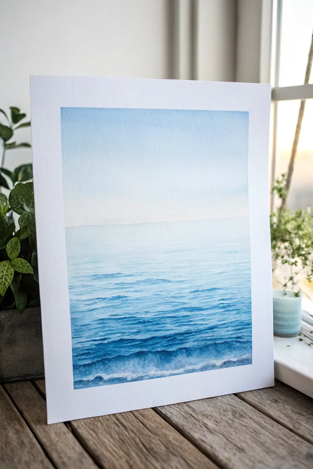
Capture the infinite calm of the ocean with this minimalist seascape painting. This project relies on mastering the wet-on-wet technique to create a seamless transition from a pale, hazy sky to the textured, rolling waves of the deep blue sea.
Step-by-Step Guide
Materials
- Cold-pressed watercolor paper (140lb/300gsm)
- Painter’s tape or masking tape
- Flat wash brush (1 inch)
- Round watercolor brushes (size 6 and size 2)
- Watercolor paints: Cerulean Blue, Prussian Blue, Indigo
- White gouache (optional)
- Two jars of water (one for rinsing, one for clean water)
- Paper towels
- Drawing board or hard surface
Step 1: Preparation and Sky Wash
-
Secure the paper:
Begin by taping down all four edges of your watercolor paper to your board. This creates the crisp white border seen in the final piece and prevents the paper from buckling when wet. -
Define the horizon:
Lightly draw a straight horizontal line across the paper, positioned slightly above the halfway mark. Keep this pencil line extremely faint, just enough for you to see. -
Pre-wet the sky:
Using your large flat brush and clean water, apply an even coat of water to the sky area above your horizon line. The paper should be glistening but not forming puddles. -
Apply the initial sky gradient:
Dilute a very small amount of Cerulean Blue with plenty of water. Starting at the very top edge, brush the color across. Rinse your brush slightly and continue painting downward, pulling the color so it fades into pure clear water before it hits the horizon line. -
Soften the transition:
While the paper is still damp, tilt your board slightly if needed to encourage the pigment to flow downward just a bit, ensuring a flawless gradient. -
Let the sky dry:
Allow the top section to dry completely. If you touch it while it’s cool or damp, you risk creating blooms or back-runs.
Uneven Wash?
If your sky gradient dries with hard edges or ‘cauliflower’ blooms, you likely added water to a drying wash. Next time, work faster while the sheen is still wet and don’t rework drying areas.
Step 2: Painting the Ocean
-
Base layer for the water:
Switch back to your flat brush. Mix a light wash of Cerulean Blue. Paint the entire water area below the horizon line with this pale, even tone. -
Establish the horizon:
While the base layer is still slightly damp, pick up a slightly stronger mix of Cerulean Blue. Carefully paint a straight line right along the horizon. -
Start the mid-ground waves:
Switch to your size 6 round brush. Mix Cerulean Blue with a touch of Prussian Blue. Begin painting horizontal strokes about an inch below the horizon, leaving gaps of the lighter base color showing through. -
Build darker values:
As you move lower down the paper, darken your paint mixture by adding more Prussian Blue. Use shorter, choppier horizontal strokes to mimic the texture of ripples. -
Intensify the foreground:
For the bottom third of the painting, mix a strong Indigo with your Prussian Blue. The pigment should be less watery here. -
Create wave structures:
Paint larger, more defined wave shapes in the foreground. I like to vary the pressure on the brush here—press down for the belly of the wave and lift up for the tapering edges. -
Layering for depth:
Once the previous layers are semi-dry, go back in with your darkest Indigo mix. Add thin, erratic lines just underneath the crests of the foreground waves to create deep shadows.
Step 3: Highlights and Finishing Touches
-
Lift out pigment:
If your foreground feels too heavy, use a clean, damp brush (blotted on a paper towel) to gently ‘erase’ or lift some pigment from the tops of the waves, creating a highlighted crest. -
Add sea foam (optional):
For crisp white foam, take a tiny amount of white gouache on your size 2 brush. Dry brush it sparingly on the very tops of the nearest waves. -
Refine the edge:
Check the very bottom edge of painting. Ensure the darkest darks anchor the bottom of the composition. -
The reveal:
Wait until the paper is bone dry—touch it with the back of your hand to check for coldness. Carefully peel away the masking tape at a 45-degree angle purely away from the art.
Level Up: Sparkles
To mimic sunlight hitting the water, carefully scratch the paper surface with an X-Acto knife or needle in tiny horizontal dashes on the dark waves. This reveals the white paper core.
Enjoy the peaceful atmosphere your new seascape brings to the room

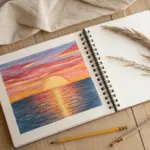
Pink Pastel Comfort Clouds
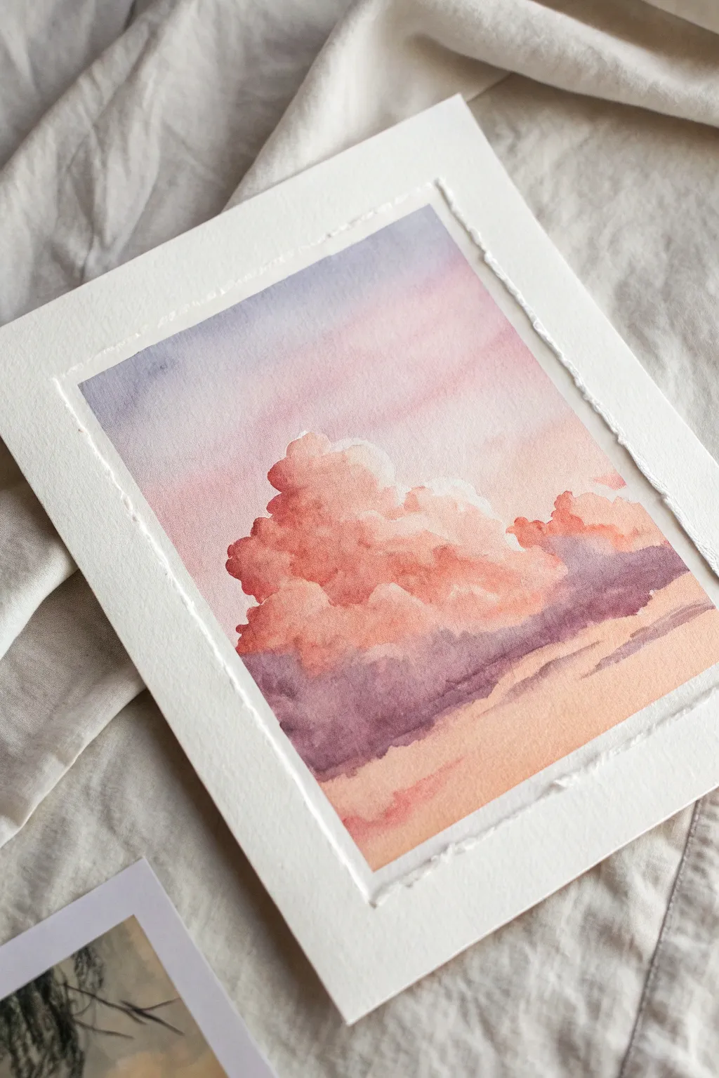
Capture the fleeting magic of a sunset with this soft, atmospheric watercolor study featuring billowing pink clouds. The gentle gradient and textured edges give this piece a nostalgic, comforting feel perfect for any mood board.
Step-by-Step
Materials
- Cold press watercolor paper (300 gsm)
- Masking tape or painter’s tape
- Watercolor paints (Alizarin Crimson, Ultramarine Blue, Yellow Ochre, Burnt Sienna)
- Round brushes (size 8 and size 12)
- Flat wash brush (1 inch)
- Clean water jar and mixing palette
- Paper towels
- Ruler (thick metal or plastic)
Step 1: Preparation and Sky Layer
-
Create the border:
Tape your watercolor paper down to a board or table. Place the tape about half an inch inside the paper’s edge to create a clean, crisp white border around your final painting. -
Pre-wet the sky:
Using your large flat brush, apply a generous layer of clean water to the top two-thirds of the paper. Use the wet-on-wet technique, ensuring the paper glistens but doesn’t have puddles. -
Mix the sky gradient:
Prepare a very dilute wash of Ultramarine Blue with a tiny touch of Alizarin Crimson to make a soft lavender. Mix a separate puddle of very pale crimson. -
Paint the upper sky:
Start at the very top with the lavender mix. Use horizontal strokes, letting the color naturally diffuse downwards into the wet paper. -
Transition the colors:
As you move down the paper, pick up the pale crimson wash. Blend it gently into the bottom of the lavender area while the paint is still wet, creating a seamless ombre effect. -
Lighten the horizon:
Towards the middle of the paper where the clouds will sit, fade the wash out to almost clear water so the background is very pale. Let this layer dry completely.
Fixing Hard Lines
If your clouds dry with hard, unwanted edges inside the fluff, re-wet the area slightly with a clean damp brush and gently scrub to reactivate and soften the paint.
Step 2: Building the Clouds
-
Mix the cloud main body color:
Create a stronger, creamy mix of Alizarin Crimson with a hint of Yellow Ochre. This salmony-pink will be the main light-hitting part of the cloud. -
Shape the cloud tops:
Using a size 8 round brush, paint the fluffy, rounded tops of the clouds in the center of the page. Keep the edges irregular and bumpy to look organic. -
Create the shadow mix:
While the pink is still active, mix a purple-grey tone using Alizarin Crimson and Ultramarine Blue, perhaps neutralizing it slightly with a touch of Burnt Sienna. -
Add volume with shadows:
Drop this purple shadow mix into the bottom/underside of the still-wet pink cloud shapes. Let the colors bleed together to create soft, fluffy transitions. -
Paint the lower cloud bank:
Extend the dark purple mixture horizontally across the lower third of the painting to form the heavy base of the cloud formation. -
Soften distinct edges:
Clean your brush, blot it slightly, and gently run the damp bristles along the bottom edge of the purple cloud bank to soften it into the background.
Step 3: Foreground and Finishing
-
Establish the horizon glow:
Mix a warm, pale orange wash using Yellow Ochre and a tiny dot of crimson. Paint the area below the dark purple clouds. -
Add distant cloud streaks:
With a smaller brush and the purple-grey mix, paint thin, horizontal streaks near the bottom right to suggest distant, flat stratus clouds. -
Deepen the contrast:
Once the main cloud mass is semi-dry, I like to glaze a slightly darker crimson into the nooks and crannies of the cloud fluff to make it look more three-dimensional. -
Dry completely:
Let the painting sit until the paper is bone dry and cool to the touch. This is crucial before removing the tape to prevent tearing. -
Remove the tape:
Peel the tape away slowly at a 45-degree angle, revealing the crisp white edges. -
Create the deckled edge:
Place a thick ruler firmly along the white border. Tear the paper upwards against the ruler’s edge to create that beautiful, raw, fibrous texture shown in the photo.
Add Some sparkle
For a magical touch, mix a tiny amount of iridescent medium into your pink paint. The clouds will shimmer subtly when they catch the light.
Frame your beautiful cloud study in a floating frame to show off those lovely torn edges


Moody Sunset Gradient Skyline
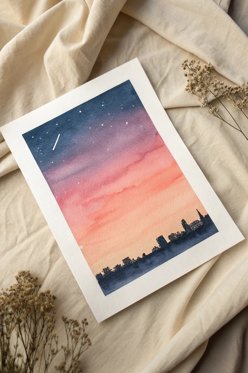
Capture the serene transition from day to night with this atmospheric watercolor painting. By blending a vibrant sunset gradient into a crisp silhouette skyline, you’ll create a moody piece perfect for framing.
Detailed Instructions
Materials
- Cold press watercolor paper (300gsm/140lb recommended)
- Masking tape or washi tape
- Watercolor paints (Indigo/Payne’s Grey, Violet, Alizarin Crimson, Cadmium Orange, Lemon Yellow)
- Flat wash brush (3/4 inch or 1 inch)
- Small round brush (size 2 or 4)
- White gouache or white gel pen
- Clean water jar
- Paper towels
- Pencil (optional)
Step 1: Setting the Sky
-
Prepare the paper:
Begin by taping down all four edges of your watercolor paper to a hard board or table. Press the tape firmly to ensure clean, crisp borders once the painting is complete. -
Mix your palette:
Prepare four distinct puddles of paint on your palette: a deep Indigo blue, a rich Violet, a warm Pink (Alizarin Crimson + tiny touch of Orange), and a soft Peach (Cadmium Orange + plenty of water). -
Start the wash:
Using your flat wash brush, load it with the deep Indigo blue. Apply a strong, bold horizontal stroke across the very top of the paper. -
Transition to purple:
Quickly rinse your brush slightly, pick up the Violet, and paint directly below the blue, slightly overlapping the wet edge to encourage the colors to bleed together naturally. -
Add warmth:
Clean the brush again and switch to your pink mixture. Apply this band below the purple, working quickly so the paper stays damp enough for seamless blending. -
Finish the gradient:
For the bottom section of the sky, use the pale Peach mixture. Blend it into the pink above and then fade it out almost to clear water as you reach the bottom third of the paper. -
Refine the blend:
If I notice any harsh lines, I like to take a clean, damp brush and gently sweep horizontally across the transition zones to smooth them out while everything is still wet. -
Dry completely:
Let the paper dry completely. This is crucial—if the paper is cool to the touch, it’s still damp. Wait until it is bone dry to prevent the next layer from blooming.
Paint Blooming?
If you see cauliflower-like blooms in your sky, you likely added water to a spot that was already drying. Once a section starts to dry, avoid touching it again.
Step 2: Building the City
-
Mix shadow color:
Create a very concentrated, dark mixture using Indigo and a touch of Violet or Black. You want a creamy consistency that is opaque, not watery. -
Outline the skyline:
Switch to your small round brush. About a quarter of the way up from the bottom, gently dab the brush to create an uneven, jagged line that mimics distant building tops. -
Create variation:
Vary the heights of your ‘buildings.’ Make some tall and rectangular for skyscrapers, others short and flat for warehouses, simply by pressing harder or using just the tip of the brush. -
Add architectural details:
For a realistic look, add tiny vertical lines on top of some buildings to suggest antennas, or pointed triangular shapes for church spires. -
Fill the silhouette:
Once the top edge of the skyline is defined, fill in the rest of the bottom area solidly with your dark mixture all the way down to the tape. -
Add window lights:
While the dark silhouette is still slightly wet (but not soaking), you can lift tiny dots of paint with a dry brush or tissue, or wait for it to dry and use a white gel pen later.
Pro Tip: Gravity Assist
Tilt your board slightly propped up at the top edge. This helps the paint flow downward naturally, making the gradient blending much smoother and easier to control.
Step 3: Final Details
-
Add stars:
Once the sky is fully dry, dip a toothbrush or stiff brush into white gouache. Running your thumb over the bristles, splatter tiny white specks onto the dark blue section at the top. -
Paint a shooting star:
Using a fine liner brush or white gel pen, draw a single, short diagonal line in the upper sky to represent a shooting star or satellite. -
Review and touch up:
Check for any uneven edges in the silhouette and smooth them out with the small brush if needed. -
Reveal the painting:
Carefully peel away the masking tape at a 45-degree angle, pulling away from the center of the artwork to prevent tearing the paper.
Now you have a stunning twilight cityscape ready to bring a calming vibe to any room


Stormy Gray Ocean Study
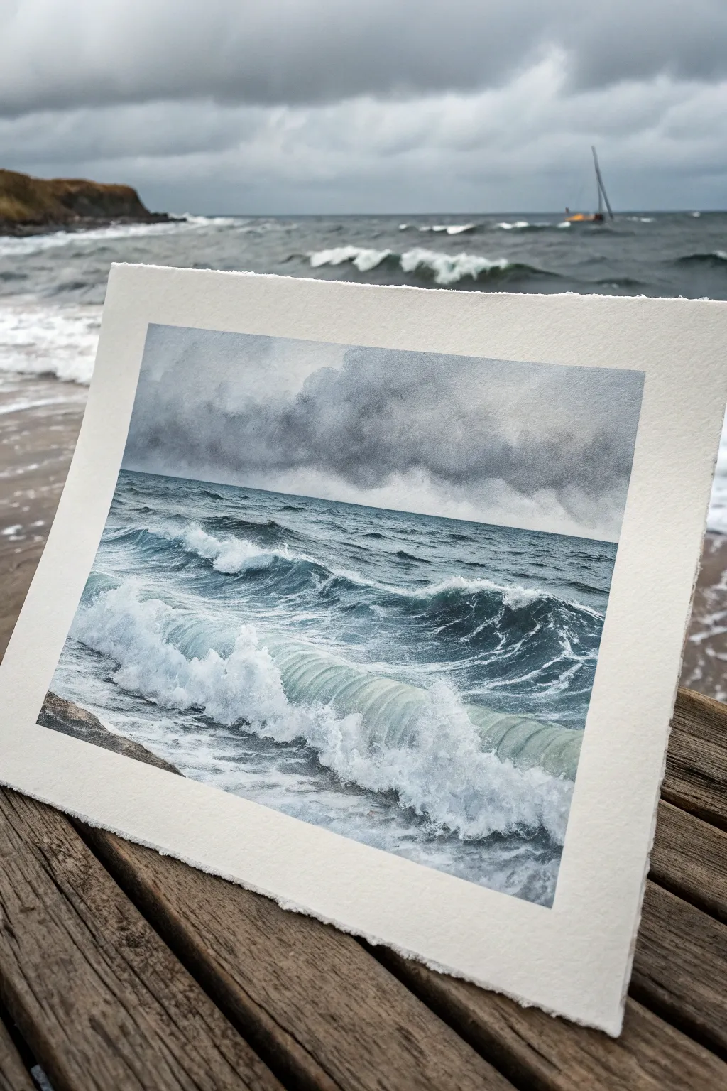
Capture the raw power of a moody ocean with this dramatic seascape study. By mastering wet-on-wet techniques and careful lifting, you will create rolling waves and heavy rain clouds that feel like they are moving right off the paper.
Step-by-Step Tutorial
Materials
- Cold Press Watercolor Paper (140lb/300gsm or heavier, taped down)
- Watercolor Paints: Payne’s Grey, Indigo, Prussian Blue, Burnt Umber, Titanium White (gouache or white watercolor)
- Large Flat Wash Brush
- Medium Round Brush (Size 8 or 10)
- Small Round or Rigger Brush (Size 2 or 4)
- Masking Fluid
- Clean Water & Paper Towels
- Palette
- Sea Sponge or Natural Sponge
Step 1: Atmosphere and Sky
-
Paper Preparation:
Begin by securing your watercolor paper to a board with artist’s tape to prevent buckling. Lightly sketch a very faint horizon line about one-third of the way up from the bottom of the page. -
Pre-wetting the Sky:
With your large flat brush, apply clean water to the entire sky area above the horizon line. You want the paper to be glistening wet but not forming puddles. -
Mixing the Storm Grey:
Mix a substantial puddle of Payne’s Grey with a tiny touch of Burnt Umber to warm it slightly. This will be the base for our heavy clouds. -
Dropping in Color:
While the paper is still wet, drop in your dark grey mix at the top of the paper, letting it bleed downwards. Keep the pigment concentration heavy at the top for drama. -
Creating Cloud Forms:
Use a damp, thirsty brush or balled-up paper towel to gently lift pigment out of the wet wash in uneven, billowy shapes. This creates the lighter, softer parts of the storm clouds. -
Softening the Horizon:
As the sky wash approaches the horizon line, dilute the paint significantly with water. You want a misty, indistinct blurred line where the sky creates ‘rain curtains’ meeting the sea.
Control the Bleed
For realistic rain curtains, tilt your board slightly while the sky is drying. Gravity will pull the pigments down, creating natural vertical streaks.
Step 2: The Deep Ocean
-
Dark Sea Base:
Once the sky is damp-dry (cool to the touch but no gloss), mix a deep ocean color using Indigo and Prussian Blue. Apply this in horizontal strokes just below the horizon. -
Building Depth:
While this sea layer is wet, drop in concentrated Payne’s Grey into the troughs of the distant waves to suggest depth and shadow. -
Preserving Whites:
As you move towards the foreground, leave random patches of the white paper untouched. These reserved areas will become the brightest parts of the churning foam later. -
Defining the Wave Form:
Switch to your medium round brush. Paint the translucent, curling body of the main foreground wave using a diluted mix of Prussian Blue. Keep the strokes curved to mimic the motion of water.
Magic Eraser Trick
Use a slice of melamine sponge (magic eraser) to lift dry paint for soft sea spray effects. It removes pigment more aggressively than a continuous brush.
Step 3: Texturing the Waves and Foam
-
Shadows in the Foam:
Mix a very watery, pale grey-blue. Carefully paint the underside of the white foam areas to give them volume, ensuring they don’t look like flat white stickers. -
Deepening Contrasts:
Once the painting is dry, re-wet specific areas of the deep water. Add your darkest Indigo mix right next to the whitest foam areas; I find this high contrast makes the white water pop intensely. -
Splatter Texture:
Load a stiff brush or toothbrush with white gouache (or white watercolor). Protect the sky area with a piece of scrap paper, then flick fine mist over the wave crests to simulate sea spray. -
Highlights and Spray:
Using the small rigger brush and opaque Titanium White or gouache, paint fine, wandering lines of foam webbing on the dark water surface. -
Softening Edges:
Take a clean, damp brush and gently soften some of the hard edges of your white gouache strokes so the foam looks integrated into the water, rather than sitting on top. -
Shoreline Detail:
If your composition includes a hint of shoreline or rocks in the corner, paint these loosely with Burnt Umber and Payne’s Grey, keeping them dark and indistinct to focus attention on the waves.
Now step back and admire the powerful, stormy atmosphere you have captured on paper.
BRUSH GUIDE
The Right Brush for Every Stroke
From clean lines to bold texture — master brush choice, stroke control, and essential techniques.
Explore the Full Guide
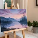
Forest Green Quiet Landscape
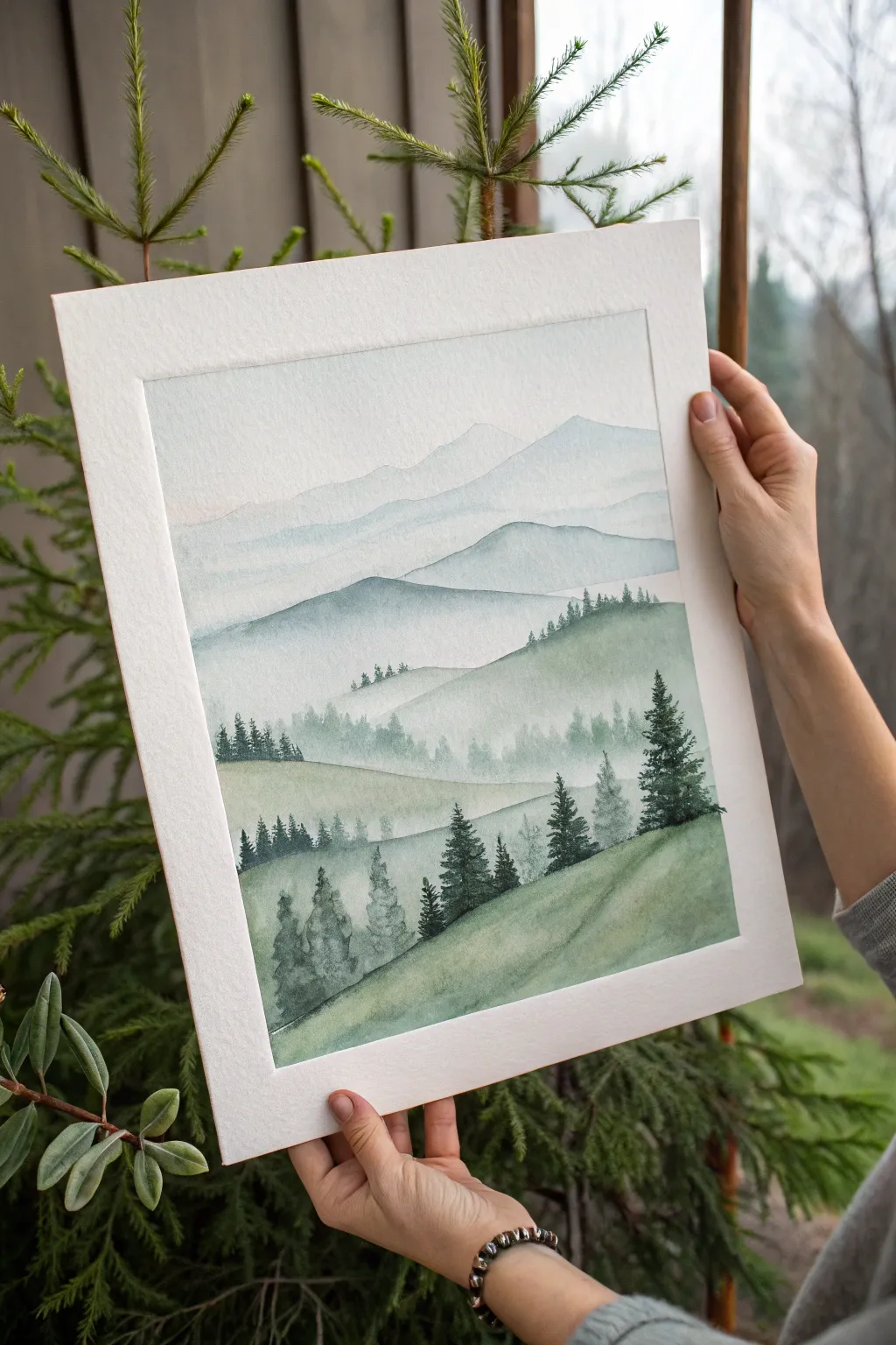
Capture the serene silence of a foggy morning with this layered watercolor landscape. By building up washes from distant peaks to foreground pines, you’ll create a soothing sense of depth and atmosphere.
Step-by-Step
Materials
- Cold press watercolor paper (300 gsm)
- Watercolor paints (Indigo, Sap Green, Payne’s Grey, Burnt Umber)
- Flat wash brush (3/4 inch)
- Round brushes (sizes 4, 6, and a fine liner)
- Masking tape
- Two jars of water
- Paper towels
- Palette for mixing
Step 1: Preparation and Sky
-
Secure the paper:
Tape your watercolor paper down to a flat board on all four sides. This prevents buckling and creates that crisp, clean white border you see in the final piece. -
Sketch the horizon lines:
Using a hard pencil (like a 2H), very lightly sketch the undulating lines of the mountain ranges. Keep the lines faint so they disappear under the paint later. -
Prepare the sky wash:
Mix a very dilute, watery wash of Payne’s Grey with a tiny touch of Indigo. It should look almost clear on your palette. -
Paint the sky:
Apply clean water to the sky area first, then drop in your pale grey mix wet-on-wet. Let the color fade out as it reaches the first mountain line to create a misty effect.
Step 2: Distant Mountains
-
Mix the furthest mountain color:
Create a mix slightly darker than your sky, using more Indigo and a hint of purple if available. The rule here is atmospheric perspective: things get lighter and cooler the further away they are. -
Paint the first range:
Paint the most distant mountain silhouette. While the bottom edge is still wet, use a clean, damp brush to soften it downward, fading it into white paper before it dries. -
Layer the second range:
Once the first layer is completely dry, mix a slightly more saturated blue-grey. Paint the next range of mountains, again softening the bottom edge with water to mimic fog settling in the valleys. -
Adding the middle ground:
Introduce a small amount of Sap Green to your blue-grey mix. Paint the middle hills, keeping the edges soft but making the color value distinctly darker than the previous layers.
Bloom Control
To get that perfect misty fade at the bottom of a mountain, use a clean, damp brush (not dripping wet) to pull the pigment down. Too much water causes ‘blooms’ or cauliflower marks.
Step 3: Foreground Hills
-
Intensify the green:
For the closer rolling hills, mix Sap Green with a touch of Burnt Umber to create an earthy, mossy tone. Paint these hills with uneven washes to suggest grassy textures. -
Create misty treelines:
While the middle-ground hill is damp (not soaking), drop in tiny vertical strokes along the ridge using a size 4 brush. This ‘wet-on-damp’ technique creates soft, indistinct trees emerging from the mist. -
Define the nearest slope:
Paint the large foreground hill in the bottom right with your strongest mix of Sap Green and Payne’s Grey. Let the wash be uneven to suggest the slope’s terrain.
Make it Winter
Change the mood entirely by swapping the greens for only blues and greys. Leave small white gaps on the tree branches and hilltops to suggest a fresh layer of snow.
Step 4: Adding the Pines
-
Practice tree shapes:
On a scrap piece of paper, practice your pine trees. Use the tip of the brush for the top, then press down and zigzag slightly as you move down to create wider branches. -
Paint distant trees:
Using a size 4 brush and a mid-tone green-grey, paint small groupings of trees on the middle hills. Keep them relatively loose and less detailed. -
Add the hero trees:
Switch to your darkest, most saturated mix of Green and Indigo. Paint the large, detailed pine trees on the right foreground hill. I find it helps to hold the brush vertically for better control over the needle details. -
Populate the left foreground:
Add the smaller cluster of trees on the lower left hill. Vary their heights so they look natural and organic, not like a picket fence. -
Add final textures:
Use a dry brush technique with dark paint to gently drag across the foreground hill, suggesting grass texture or shadows under the trees. -
The reveal:
Wait until the paper is bone dry—touch it with the back of your hand to check. Carefully peel off the masking tape at a 45-degree angle to reveal your crisp white frame.
Now you have a tranquil window into nature to hang on your wall or gift to a friend
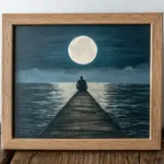
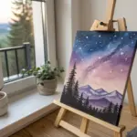
Purple Twilight Dream Scene
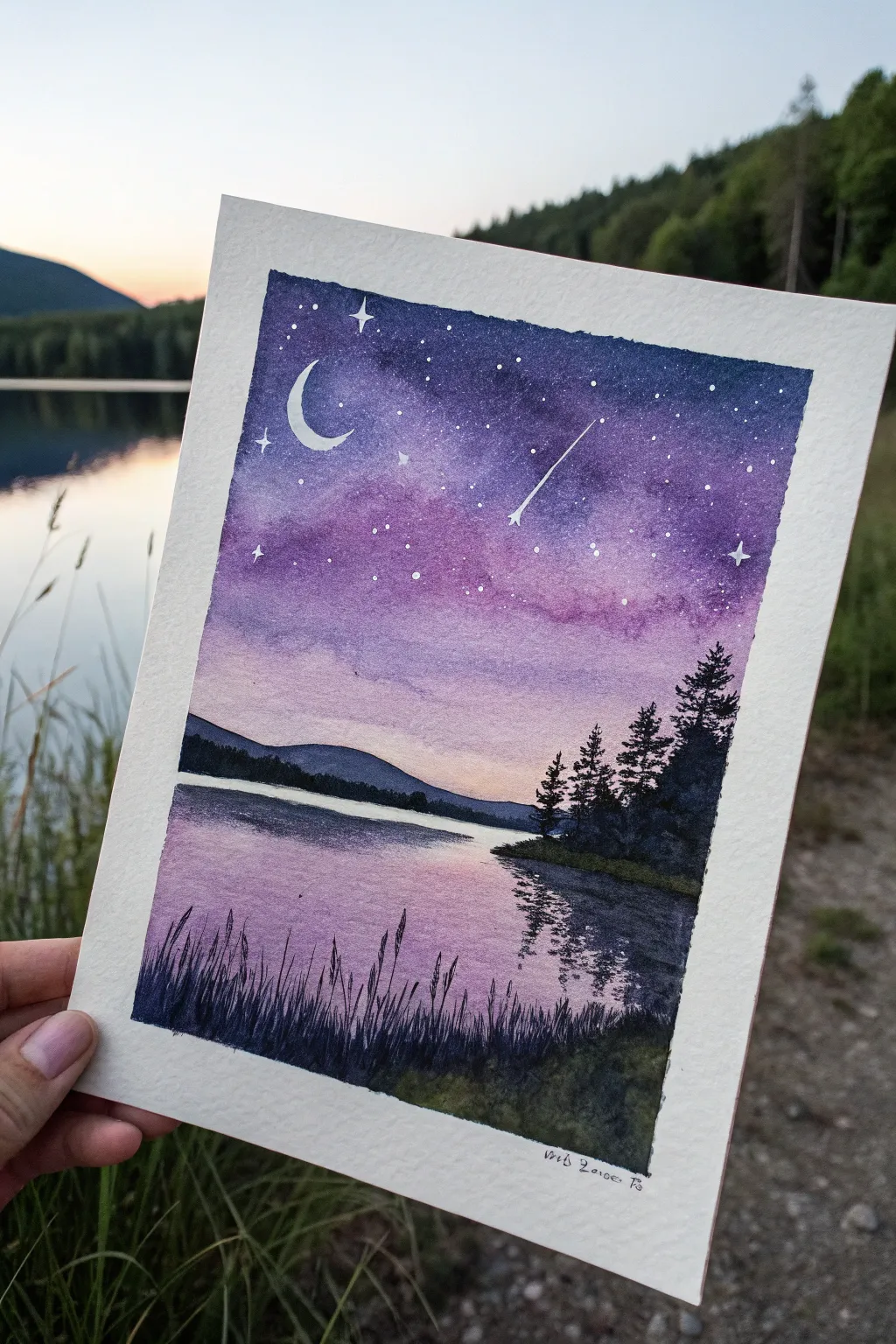
Capture the ethereal transition from day to night with this serene watercolor landscape. Featuring a gradient sky, reflective waters, and silhouetted pines, this piece perfectly embodies a peaceful evening mood.
Detailed Instructions
Materials
- Cold Press Watercolor Paper (300gsm/140lb)
- Masking tape
- Watercolors (Indanthrone Blue, Dioxazine Purple, Quinacridone Magenta, Lemon Yellow, Lamp Black)
- White gouache or white gel pen
- Round brushes (sizes 8, 4, and 0 for details)
- Clean water jar
- Paper towels
- Heat gun or hairdryer (optional)
Step 1: Painting the Sky and Horizon
-
Prepare the canvas:
Tape down all four edges of your watercolor paper to a board. This creates the crisp white border seen in the reference and prevents warping. -
Sketch the horizon:
Lightly draw a horizontal line about one-third of the way up from the bottom to mark where the lake meets the mountains. -
Wet the sky:
Using your large round brush (size 8), apply clean water to the entire sky area, stopping just above your horizon pencil line. -
Deep night sky:
While the paper is wet, drop concentrated Indanthrone Blue mixed with a touch of Lamp Black into the very top corners and edges. Let this bleed downwards naturally. -
Purple transition:
Blend Dioxazine Purple into the blue area, pulling it further down the page. Allow the colors to mix on the paper for a soft, clouded look. -
Magenta mid-tones:
Introduce Quinacridone Magenta below the purple. Keep this layer fairly watery so it stays translucent. -
Horizon glow:
Near the horizon line, wash in a very pale, diluted Lemon Yellow or warm pink, blending it gently upward into the magenta to create the fading sunset light. -
Dry completely:
Let this layer bone dry. You can use a hairdryer if you’re impatient, but air drying often yields softer gradients.
Fixing Water Blooms
If cauliflower-like blooms appear in your sky, don’t scrub! Wait for it to dry, then gently glaze a thin layer of the surrounding color over the top to smooth it out.
Step 2: Creating the Reflection and Landscape
-
Paint the lake base:
Wet the lake area below the horizon. Mirror the sky colors upside down: putting pale yellow/pink near the horizon, transitioning to purple, and finally deep blue at the very bottom edge. -
Define the mountains:
Once the sky is dry, use a medium blue-grey mix to paint the distant mountain silhouette across the horizon line. -
Paint the middle ground:
Paint a darker landmass strip on the right side using a mix of Green and Lamp Black, bringing it slightly forward into the water. -
Pine tree silhouettes:
Switch to a size 4 brush. Using highly pigmented Lamp Black (or a very dark green), paint jagged pine trees rising from the dark landmass on the right. Use the tip of the brush to tap in the textured branches. -
Water reflections:
While the trees are still slightly damp (or by re-wetting the area below them), pull dark pigment downwards into the water using horizontal zig-zag strokes to simulate ripples and reflections. -
Foreground grasses:
With a liner brush or size 0 brush, paint quick, upward flicking strokes in solid black along the entire bottom edge to create tall grasses and reeds.
Pro Tip: Crisper Trees
For realistic pine trees, use a ‘rigger’ brush or a script liner. The long bristles hold more paint and allow for looser, more organic branch shapes.
Step 3: Celestial Details
-
Add stars:
Cover the bottom half of your painting with scrap paper. Load a stiff brush with white gouache and tap the handle to spatter tiny stars across the purple and blue sections of the sky. -
Paint the crescent moon:
Using opaque white gouache or a gel pen, carefully paint a crescent moon in the upper left purple area. -
Shooting star and sparkles:
Draw a shooting star with a trailing tail and add a few larger, four-pointed ‘sparkle’ stars manually for emphasis. -
Reveal:
Wait for every drop of paint to dry completely before slowly peeling off the masking tape at a 45-degree angle.
Frame your mini-masterpiece near a window to let the natural light enhance those dreamy purple transitions

PENCIL GUIDE
Understanding Pencil Grades from H to B
From first sketch to finished drawing — learn pencil grades, line control, and shading techniques.
Explore the Full Guide
Four-Panel Mood Mini-Scenes Grid
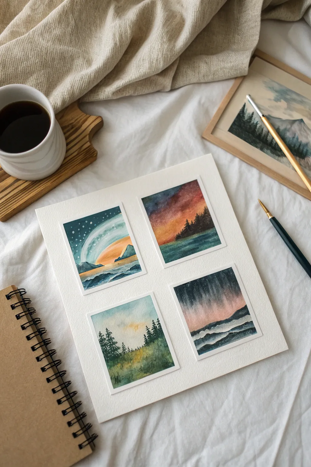
Capture four distinct atmospheres in this compact grid layout, where shifting light and color palettes tell different stories side-by-side. This project uses masking tape to create crisp, clean borders around miniature landscape vignettes, perfect for practicing wet-on-wet techniques.
How-To Guide
Materials
- Cold press watercolor paper (approx. 8×10 inches)
- Painter’s tape or drafting tape (1/4 inch width)
- Watercolor paints (pans or tubes)
- Round brushes (sizes 2, 4, and 6)
- Small flat brush (optional, for washes)
- Two jars of water
- Paper towels
- White gouache or white gel pen
Step 1: Preparation & Layout
-
Tape the grid:
Begin by taping down the edges of your paper to a board to prevent buckling. Measure and mark the center of the paper lightly with a pencil. -
Create the panels:
Use your masking tape to create a cross shape in the middle, effectively dividing the paper into four equal quadrants. Press the edges of the tape down firmly with a bone folder or your fingernail to ensure paint doesn’t seep underneath.
Step 2: Top Left: Celestial Dream
-
Wet the sky area:
In the top-left box, brush clean water over the upper two-thirds of the panel. You want the paper glistening but not swimming. -
Apply the atmosphere:
Drop in cool variations of teal, prussian blue, and a touch of indigo. While wet, lift out a curved arch shape with a clean, damp brush to suggest a planetary ring or aurora. -
Add the horizon:
Once the sky is damp-dry, paint a low mountain range using a darker blue-grey mix. Let the bottom fade into a watery foreground to suggest a reflection. -
Starry details:
Once completely dry, use white gouache to tap in tiny stars in the upper dark blue section.
Bleeding Lines?
If paint seeps under the tape, avoid using a heat tool, which can melt the adhesive. Instead, burnish the tape edges harder next time or switch to artist-grade tape.
Step 3: Top Right: Fiery Sunset
-
Paint the gradient:
Working wet-on-wet again, start with a deep violet or indigo at the very top right corner. Quickly transition into crimson, then orange, and finally a warm yellow near the horizon line. -
Create the water:
Mirror these colors slightly in the bottom third for the water, but keep the tones more muted and horizontal. -
Silhouette the trees:
Using a size 2 brush loaded with concentrated indigo or black, paint a jagged treeline sloping down from right to left. Allow the trees to overlap the colorful sky just slightly.
Theme Variations
Try painting the same scene in four different seasons (white winter, green spring, etc.) or four times of day to study how lighting changes a single landscape.
Step 4: Bottom Left: Golden Hour Meadow
-
Soft sky wash:
Apply a very pale blue wash to the top, leaving the center area unpainted or tinged with a very diluted yellow to represent the sun’s position. -
Grassy textures:
Mix sap green with a little ochre. Using vertical flicking motions with a semi-dry brush, create a grassy texture starting from the bottom up. -
Framing trees:
Paint evergreen trees on the left and right sides to frame the bright center. Keep the trees loose and somewhat transparent to maintain the airy feeling.
Step 5: Bottom Right: Stormy Night
-
Dramatic vertical wash:
This panel relies on vertical movement. Brush on streaks of payne’s grey and dark violet from the top down, letting them bleed into a soft pink horizon line. -
Layering the hills:
Paint rolling hills in layers. Start with a lighter grey hill in the distance. Let it dry. -
Foreground contrast:
Add a second, closer layer of hills in a much darker, near-black tone. Use a white gel pen or gouache to add a subtle rim light on the ridges if they look too flat.
Step 6: Finishing Touches
-
The reveal:
Wait until every panel is bone dry. This is crucial to avoid tearing. I find it safest to peel the tape away slowly at a 45-degree angle. -
Clean up edges:
If any paint bled under the tape, use a tiny amount of white gouache to touch up the borders and restore the crisp white grid.
Peeling that final piece of tape is incredibly satisfying, revealing your four miniature worlds in perfect harmony
Black Silhouette Over Mood Gradient
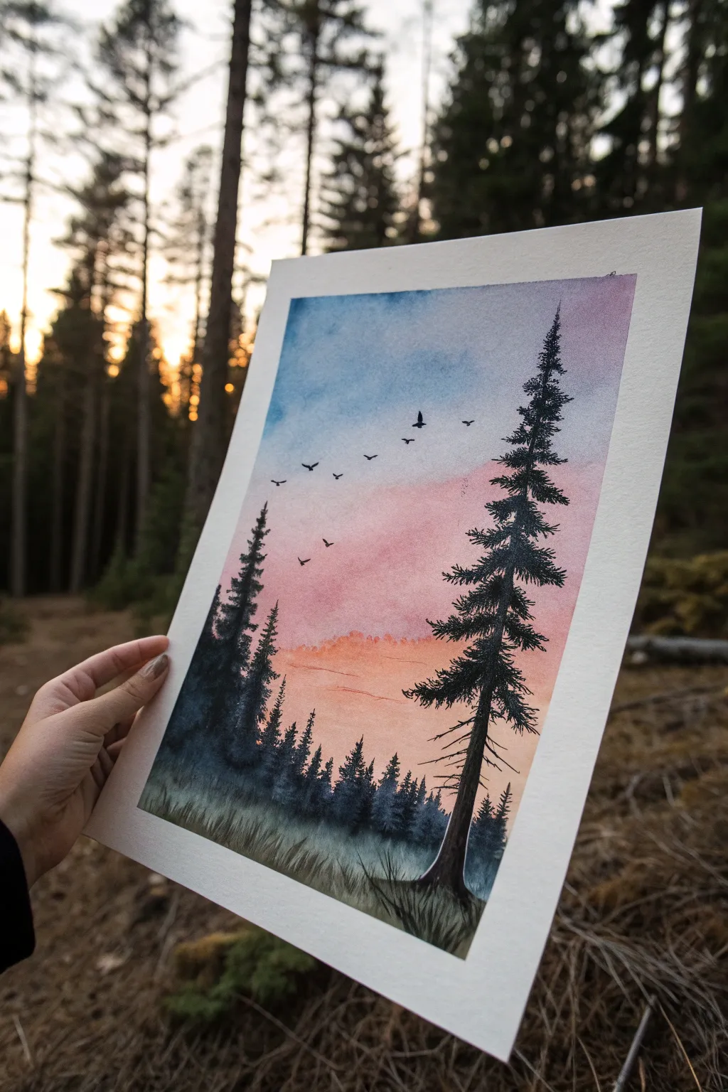
Capture the serene transition of day into night with this striking watercolor landscape. By combining a soft, blended gradient sky with crisp, detailed tree silhouettes, you’ll create a piece that feels both peacefuland dramatic.
Step-by-Step Guide
Materials
- Cold press watercolor paper (300 gsm)
- Masking tape
- Watercolor paints (Indigo, Rose Madder, Cadmium Orange, Lamp Black, Sap Green)
- Large flat wash brush
- Round brushes (sizes 6 and 0/fine liner)
- Clean water jar
- Paper towels
- Mixing palette
Step 1: Setting the Scene
-
Prepare your canvas:
Begin by taping down all four edges of your watercolor paper to a board or table using masking tape. This creates that crisp white border seen in the reference and prevents the paper from buckling when wet. -
Wet the sky area:
Using your large flat brush and clean water, apply an even coat of water to the upper three-quarters of the paper. You want a consistent sheen, but avoid creating puddles.
Fixing “Cauliflowers”
If water blossoms appear in your sky, wait until it’s dry, then gently scrub the edge with a damp stiff brush to soften it, or simply paint a bird over the spot.
Step 2: Creating the Gradient Sky
-
Start with the blue:
Load your brush with a watered-down Indigo or Phthalo Blue. Apply this to the very top section of the wet paper, letting the pigment flow downwards slightly. -
Introduce the pinks:
Clean your brush and pick up a soft Rose Madder or pink tone. Apply this horizontally across the middle section, carefully blending it upwards where it meets the blue to create a soft violet transition. -
Add the sunset glow:
Rinse your brush again and load it with a dilute Cadmium Orange. Paint the horizon line just below the pink. Let the orange mingle slightly with the pink above it, but keep the color strongest near the bottom. -
Soften the blend:
If harsh lines appear, use a slightly damp, clean brush to gently swipe back and forth across the transition zones. Let the background dry completely before moving on.
Add Moonlight
Make it a night scene by leaving a small white circle unpainted in the blue section, or use white gouache to flick stars over the dried sky.
Step 3: Painting the Foreground
-
Mix your darks:
Create a deep, nearly black mixture using Lamp Black mixed with a touch of Sap Green and Indigo. This adds richness to the silhouettes so they aren’t flat black. -
Establish the distant treeline:
Using a size 6 round brush and a slightly diluted version of your dark mix, paint the distant, uneven treeline along the bottom horizon. Use vertical dabbing motions to suggest tree tops. -
Paint the main pine figure:
Switch to your dark, concentrated black mixture. On the right side, paint a thin vertical line for the trunk of the main pine tree, reaching almost to the top of the blue sky section. -
Add pine branches:
Start from the top of the trunk and work down using quick, irregular flicks of the brush tip. Make the branches wider and denser as you move toward the base of the tree. -
Add secondary trees:
On the left side, paint a smaller, slightly less detailed pine tree using the same technique. Varying the height creates a more natural composition.
Step 4: Adding Final Details
-
Ground the scene:
Darken the very bottom of the painting with your darkest black mix to create a shadowy forest floor. While wet, lift your brush upwards in quick strokes to create the look of tall grass. -
Add the birds:
Using your finest liner brush or size 0, paint tiny ‘v’ shapes in the sky between the two main tree groups. Keep them small and varied in angle to simulate movement. -
Refine the details:
Look at the main tree trunk. Add a few dry, scratchy lines near the base to suggest bark texture, and darken any areas of the foliage that look too transparent. -
The reveal:
Once the paint is 100% bone dry to the touch, slowly peel away the masking tape at a 45-degree angle to reveal your clean edges.
Enjoy the peaceful atmosphere your new landscape brings to the room


Paint to Music Mood Translation
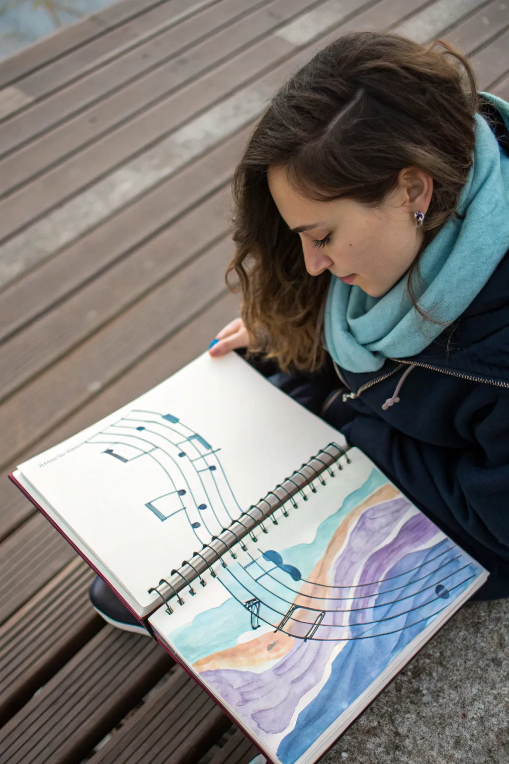
Capture the fluid movement of sound by transforming rigid musical notation into a flowing watercolor landscape. This mixed-media project seamlessly blends precise ink lines with loose, expressive washes of purple, blue, and sand to represent how music feels.
How-To Guide
Materials
- Spiral-bound mixed media or watercolor sketchbook
- Pencil (HB or 2B)
- Eraser
- Black fineliner pens (sizes 0.5 and 0.8)
- Ruler
- Watercolor paints (phthalo blue, violet, ochre, burnt sienna)
- Round watercolor brushes (size 4 and 8)
- Cup of water and paper towels
Step 1: Drafting the Composition
-
Establish the curve:
Begin by lightly sketching a large, sweeping S-curve that starts on the upper left page and flows down across the spiral binding onto the bottom right page. This will act as the spine for your musical staff. -
Mark the staff lines:
Using your pencil, draw five parallel lines following that S-curve. On the left page, keep the lines relatively straight and parallel, but as they cross the binding to the right, allow them to become wavier and less structured. -
Sketch the notes:
Lightly draw musical notes (crotchets and quavers) on the staff. Place the distinct, clean notes on the left page, and let the notes on the right page begin to distort or stretch slightly.
Bleeding Ink?
If your black fineliner smudges when you apply watercolor, it likely isn’t waterproof. Test your pen on a scrap paper first or do the watercolor washes first and ink over them once dry.
Step 2: Inking the Music
-
Line the staff:
Use a ruler and the 0.5 fineliner to ink the straight section of the staff on the left page. Stop cleanly where the curve begins to bend significantly. -
Freehand the flow:
Switch to freehand drawing for the right page. Carefully trace your penciled waves, intentionally letting the lines wobble slightly to mimic movement. -
Fill the notes:
Color in the note heads with the 0.8 pen for solid black coverage. Draw the stems, making sure they follow the orientation of the staff lines. -
Erase guidelines:
Wait at least five minutes for the ink to fully set, then gently erase all visible pencil marks to leave a clean black-and-white framework.
Add Metallic Accents
Once the paint is completely dry, use a gold or silver gel pen to trace the stems of the musical notes on the ‘water’ side to make the music shimmer like sunlight on waves.
Step 3: Watercolor Washes
-
Mix the sand tones:
Create a dilute mix of ochre and a touch of burnt sienna. Paint a wavy band beneath the bottom staff line on the right page, mimicking a sandy shoreline. -
Add first ocean layer:
Using a clean brush and phthalo blue, paint a translucent wave shape directly above the sand tone. Let the wet paint touch the sand color slightly for a soft bleed. -
Introduce violet hues:
Mix a watery violet wash. Apply this in broad, organic stripes between the staff lines on the right page, suggesting deep water or sound waves. -
Layering movement:
While the violet is still damp, drop in hints of stronger blue at the edges of the wash to create depth and shadow within the ‘water’. -
Bridge the gap:
Carry a very pale wash of blue from the right page just slightly over to the left page’s edge, creating a visual transition between the rigid sheet music and the painted landscape. -
Define note shadows:
I like to add a tiny drop of diluted blue paint beneath the note heads on the right page, making them look like they are floating on the water. -
Final drying check:
Allow the sketchbook to lie flat until completely dry to prevent the colors from running across the page.
Now you have a visual representation of a melody coming to life on paper
Have a question or want to share your own experience? I'd love to hear from you in the comments below!