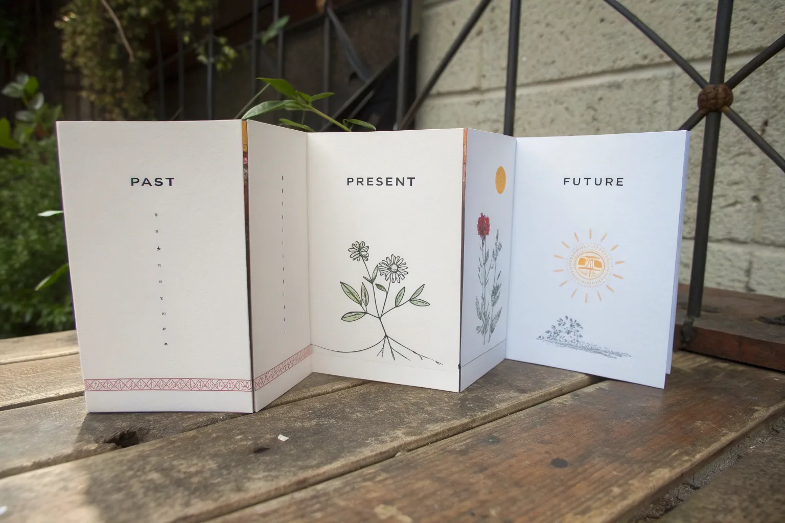
Whenever you’re stuck on what to draw, a clear past–present–future structure can instantly turn a random sketch into a story. Here are my favorite ways to split time into three stages so your drawing feels meaningful, readable, and fun to make.
Straight-Line Timeline With Milestones
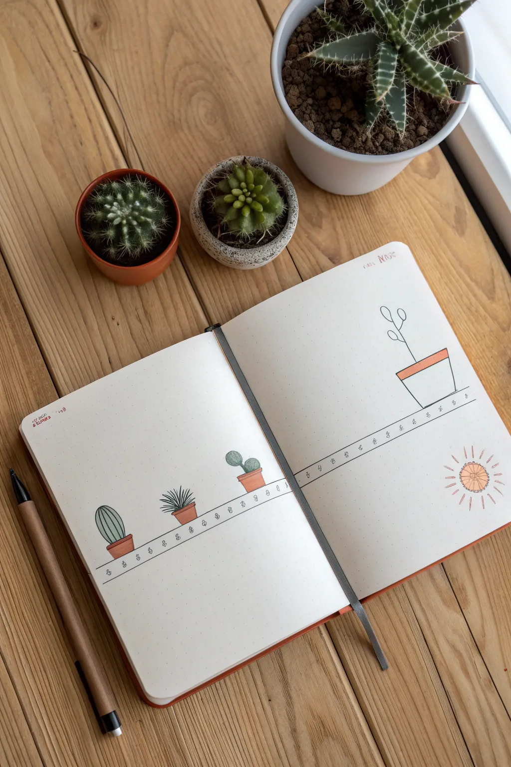
This minimalist bullet journal spread uses a clean horizontal line as a timeline base, adorned with charming illustrations of potted succulents and cacti. It’s a perfect way to visualize growth or milestones with a botanical theme.
Step-by-Step
Materials
- A5 Dot Grid Journal or Sketchbook
- Fine Liner Pen (Black, 0.3mm or 0.5mm)
- Ruler
- Pencil
- Eraser
- Colored Pencils or Markers (Terracotta, Sage Green, Dark Green, Yellow/Orange)
Step 1: Setting the Baseline
-
Mark the Horizon:
Open your journal to a fresh double-page spread. Using your ruler and pencil, lightly draw a straight horizontal line across the lower third of both pages. This will serve as the shelf or ground for your timeline. -
Refine the Line:
Go over your pencil line with a black fine liner. To give it a bit of character, you can make the line slightly imperfect or ‘sketchy’, or keep it crisp against the ruler. -
Add Decorative Details:
just below the main line, draw a secondary, thinner parallel line about 2-3mm below. In the space between these lines, add small loops or tiny ‘g’ shapes repeatedly to create a decorative trim pattern.
Step 2: Planting the Pots
-
Sketch Pot Outlines:
Lightly sketch four pot shapes with your pencil. Place three on the left page, spaced evenly, and one larger one on the right page towards the outer edge. Use simple trapezoid shapes—narrower at the bottom, wider at the top. -
Define the Rims:
Add a thin rectangular band at the top of each trapezoid to create the rim of the terracotta pots. This gives them dimension and a classic gardening look. -
Ink the Pots:
Trace over your pencil sketches with the fine liner. For the pot on the far right, focus on clean, straight lines as it is a focal point.
Use A Dot Grid
A dot grid journal makes spacing your plants evenly significantly easier. Count 4-5 dots between each pot to ensure your layout feels balanced and not cluttered.
Step 3: Growing the Greenery
-
First Cactus (Left):
For the first pot on the left, draw an oval-shaped cactus body. Add vertical stripes down its length to represent ribs. -
Spiky Succulent (Middle):
In the second pot, draw a spiky plant like an agave or aloe. Start from the center and draw pointed leaves radiating outward and upward. -
Bunny Ear Cactus (Right):
For the third pot near the center fold, draw a ‘bunny ear’ cactus (Opuntia). Draw one round pad as the base and a smaller circle attached near the top. -
Tall Sprout (Right Page):
On the far right page, inside the larger pot, draw a tall, simple plant. Create a single vertical stem with a few loop-shaped leaves branching off near the top to suggest new growth.
Growth Metaphor
Draw the plants in stages of growth from left to right—starting as a seed on the left page and ending as a full bloom on the right—to visually represent progress.
Step 4: Solar Details & Coloring
-
Draw the Sun:
In the bottom right corner of the spread, sketch a simple sun. Draw a small circle and surround it with radiating lines of varying lengths for a playful, doodle style. -
Erase Guidelines:
Wait a moment for the ink to set, then gently erase all remaining pencil marks across the spread. -
Color the Pots:
Use a terracotta or warm orange marker/pencil to fill in the pots. I usually leave a tiny sliver of white space on one side to suggest a subtle highlight. -
Color the Plants:
Fill in your cacti with sage or dark green. You can vary the shades—make the leftmost cactus a muted green and the others slightly more vibrant. -
Sun Accents:
Color the center of the sun with a soft orange or yellow to balance the warm tones of the pots. -
Final Dates or Labels:
If you wish, use a small pen or stamp to add dates or a month header (like ‘MAY’ or ‘MAR’) in the top corner, keeping the text small and unobtrusive.
Your personalized botanical timeline is now ready to track your journey


Road Signs at a Time Crossroads
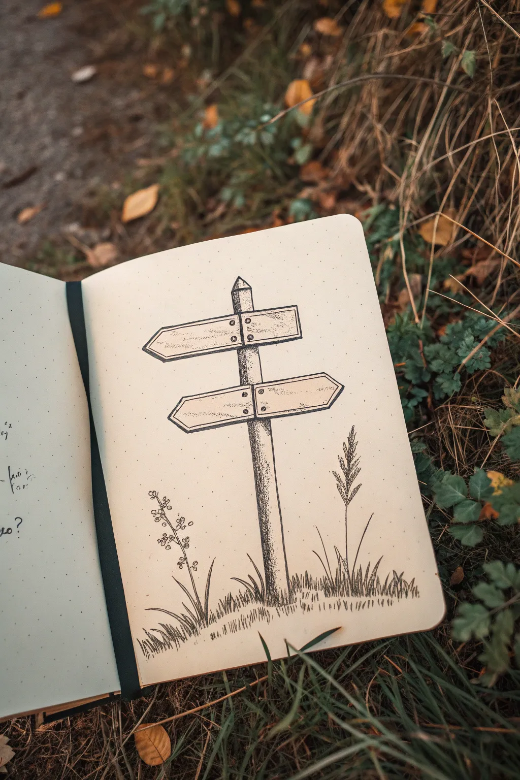
Capture the feeling of a decisive moment with this charmingly rustic signpost sketch. Using simple dot-work shading and clean linework, this illustration perfectly symbolizes the choices between past, present, and future.
Detailed Instructions
Materials
- Dot grid notebook (A5 size recommended)
- Fine liner pen (0.1mm or 0.3mm)
- Fine liner pen (0.05mm for details)
- Pencil (HB or 2B)
- Eraser
- Ruler (optional, but helpful for the post)
Step 1: Drafting the Structure
-
Set the Center Post:
Begin by lightly sketching a vertical rectangle for the main post. It should be slightly taller than the width of your page. Add a small triangle on top to form a pointed roof-like cap. -
Position the Signs:
Sketch the top sign pointing to the left. Draw a long horizontal rectangle intersecting the upper part of the post, ending in a point. Keep the perspective flat for a graphic look. -
Add the Lower Sign:
Draw the second sign below the first, but pointing to the right this time. Leave a comfortable gap between them so the text, if you add any later, won’t feel crowded. -
Detail the Wood:
Outline the rectangular shape of the signs again just inside your initial lines to create a border, making the wood look recessed or framed. -
Add Hardware:
Sketch four small circles where the signs attach to the post—two for each sign—to represent the bolts or nails holding them in place. -
Sketch the Ground:
Lightly draw a small mound at the base of the post. Keep the line irregular to suggest earth and grass rather than a smooth hill.
Pro Tip: Dot Density
Don’t rush the stippling! Keeping your pen perfectly vertical protects the nib and creates rounder, cleaner dots rather than tiny dashes.
Step 2: Inking the Outline
-
Outline the Post:
Switch to your thicker fine liner (0.1mm or 0.3mm). Trace over your pencil lines for the main post, stopping where the signs overlap so you don’t draw through them. -
Ink the Signs:
Carefully ink the outlines of the wooden signs. I usually rotate my notebook here to pull the pen towards me for straighter lines. -
Define the Hardware:
Ink the small bolt circles. Fill them in slightly or add a tiny dot in the center of each to give them depth. -
Erase Guidelines:
Once the ink is completely dry—give it a full minute—gently erase all your underlying pencil marks to reveal a clean structure.
Level Up: Personalize It
Write ‘Past’ on the left sign and ‘Future’ on the right in a tiny serif font, referencing the prompt’s theme of standing at a crossroads.
Step 3: Shading and Texture
-
Stipple the Post:
Using your finest pen (0.05mm), begin stippling (dotting) the main post. Concentrate the dots heavily on the right side to create a shadow, making the post look cylindrical. -
Fade the Shadows:
As you move toward the left side of the post, space the dots further apart. The far left edge should have almost no dots, acting as a highlight. -
Texture the Signs:
Add very light, sparse stippling to the signs themselves. Focus the dots slightly along the bottom edges and corners to give the wood some subtle weathering. -
Ground the Post:
Add a dense cluster of dots right at the base of the post where it meets the ground. This anchors the object so it doesn’t look like it’s floating.
Step 4: Foliage and Atmosphere
-
Draw Grass Blades:
Use quick, upward flicks of your 0.1mm pen to create grass growing around the base. Vary the lengths and angles; some should cross over each other for a natural look. -
Add the Right Plant:
On the right side, draw a taller, reed-like plant. Use a central stem and short, diagonal dashes branching off near the top to mimic a seed head or wheat stalk. -
Add the Left Plant:
On the left, sketch a delicate wildflower. Draw a thin, curving stem with tiny circles clustered at different heights to represent buds or berries. -
Final Touches:
Review the balance of the drawing. Add a few extra dots to the darkest shadow areas to increase the contrast if the drawing feels too flat.
Now you have a beautifully textured signpost ready to guide you to your next artistic destination


Stair Steps From Past to Future
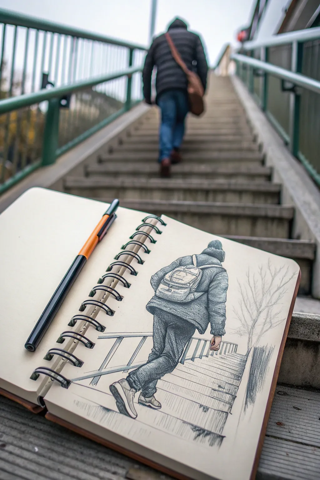
This project captures the symbolism of moving forward by drawing a figure ascending a staircase, rendered in intricate pen and ink style within a sketchbook. The artwork contrasts a detailed foreground figure against a fading background, creating a sense of depth and journey.
Step-by-Step Guide
Materials
- Wire-bound sketchbook (heavyweight paper)
- Graphite pencil (HB or 2B)
- Fine liner pens (0.1mm, 0.3mm, 0.5mm)
- Orange-barreled drawing pen or marker (for prop styling)
- Eraser
- Ruler (optional)
Step 1: Penciling the Structure
-
Establish the horizon line:
Start by lightly sketching a horizon line near the top third of your page to determine eye level. -
Draft the staircase skeleton:
Draw the basic perspective rails for the stairs. The lines should converge slightly towards a vanishing point near the top of the page. -
Mark step increments:
Lightly tick off horizontal lines for the steps. They should get closer together as they move higher up the page to simulate depth. -
Outline the figure’s posture:
Sketch a stick figure to get the gesture right. One leg should be lifted mid-step, and the torso should lean slightly forward. -
Flesh out the figure:
Add volume to the figure, defining the baggy winter coat, the beanie, and the shape of the legs. -
Add the backpack:
Sketch a backpack sitting high on the shoulders. Keep the straps loose to show weight and movement. -
Define the shoes:
Detail the sneakers, paying attention to the angle of the lifted foot to ensure it looks like it’s pushing off the step.
Clothing Texture Pro-Tip
Vary your hatch marks by material. Use cross-hatching for denim, stippling for wool hats, and long flowing lines for nylon jackets.
Step 2: Inking and Texturing
-
Outline the figure:
Using a 0.3mm fine liner, carefully go over your pencil lines for the person. Make the outer contour slightly thicker to separate them from the background. -
Texture the coat:
Switch to a 0.1mm pen to add texture to the coat. Use short, horizontal hatching lines to mimic the puffiness of the fabric. -
Detail the jeans:
Use cross-hatching to create the denim texture. Darken the folds behind the knees and near the ankles for deeper shadows. -
Render the backpack:
Ink the backpack with curved strokes to show its roundness. Add small details like zippers and pockets. -
Ink the foreground steps:
Draw the steps nearest to the viewer with crisp, solid lines. Use vertical hatching on the risers (the vertical part of the step) to create shadow. -
Fade the background steps:
As you move up the stairs, use lighter, broken lines. This atmospheric perspective helps the steps recede into the distance. -
Add the railing:
Draw the handrail on the left side with straight, clean lines. Keep the shading minimal here to avoid clutter. -
Sketch the tree:
On the right side, add a leafless tree using very light, wispy strokes. The branches should look delicate and faint.
Step 3: Final Touches
-
Deepen the shadows:
Use a 0.5mm pen to darken the deepest shadows—under the shoes, beneath the coat hem, and in the deep folds of the pants. -
Erase pencil marks:
Wait for the ink to significantly decompose and dry to avoid smudging, then gently erase all underlying graphite lines. -
Ground the figure:
Add a small cast shadow directly under the planted foot to ensure the figure doesn’t look like they are floating. -
Stage your photo:
Place your pen diagonally across the left page and position the sketchbook on a real set of stairs to recreate the meta-photo effect.
Perspective Troubleshooting
If the figure looks like they are falling backward, check the planted foot. It must be directly under the center of the head vertically.
Now you have a thoughtful sketch that perfectly illustrates the journey from where you were to where you are going


Aging Self Portrait Trio
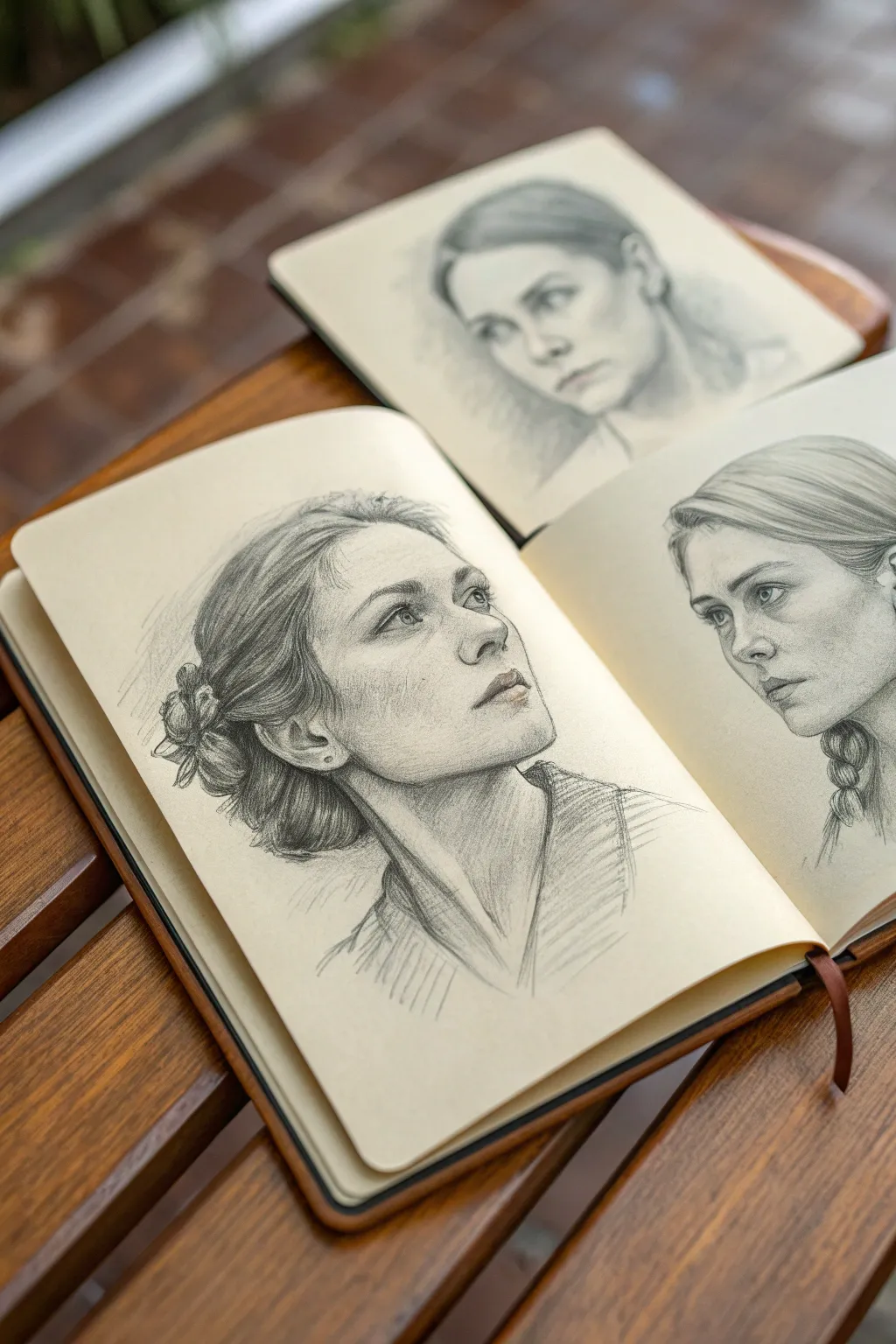
This evocative sketching exercise captures the same subject at three distinct life stages—youth, adulthood, and elder years—spread across open sketchbook pages. Using soft graphite techniques, you will create a cohesive narrative that explores the subtle physical changes of aging while maintaining a single identity.
How-To Guide
Materials
- Heavyweight sketchbook (cream or off-white paper preferred)
- Graphite pencils (HB, 2B, 4B, 6B)
- Kneadable eraser
- Precision mechanical pencil (0.5mm, HB)
- Blending stump (tortillon)
- Reference photos of one person at different ages (or imagination)
Step 1: Planning and Layout
-
Analyze the Composition:
Visualize your layout across two open pages and perhaps a second sketchbook or loose sheet placed behind. The central portrait (Present) dominates the left page, looking up. The younger self (Past) occupies the right page, and the older self (Future) sits in the background. -
Establish the Head Angles:
Using an HB pencil with very light pressure, draw oval armatures for the heads. Tilt the main oval upward to the right, and the right-page oval slightly downward to the left to create a conversational dynamic between the ages. -
Map Facial Features:
Lightly sketch the center lines and eye lines. For the ‘Present’ portrait, the eye line should curve upward around the skull form. Mark the nose and mouth placement, ensuring the proportions remain consistent across all three faces to maintain likeness.
Fixing “Muddy” Shading
If skin looks dirty instead of shadowed, you may have over-blended. Lift the graphite with a kneadable eraser and re-apply crisp hatch marks to regain texture.
Step 2: Drawing the Young Self (Right Page)
-
Outline Youthful Features:
Focus on softer, rounder forms. Keep the jawline smooth and the cheeks full. Avoid harsh lines; instead, define shapes with subtle shading later. Use a mechanical pencil for crisp eye outlines. -
Render the Eyes and Nose:
Shade the pupils deeply with a 4B pencil. Keep the skin around the eyes smooth, avoiding laugh lines. Shade under the nose gently, suggesting form without hard edges. -
Draft the Braid:
Sketch the hair pulled back into a simple braid. I find drawing the braid as a series of interlocking ‘Y’ shapes helps get the structure right before adding texture. -
Soft Shading:
Use a 2B pencil to lightly shade the cheekbones and forehead. Smudge gently with a tortillon to achieve that flawless, youthful skin texture.
Step 3: Drawing the Present Self (Left Page)
-
Define the Bone Structure:
As faces age, baby fat recedes. Sharpen the jawline and define the cheekbones more clearly than the previous sketch. The neck muscles, particularly the sternocleidomastoid, should be visible due to the upward tilt. -
Detail the Eyes:
Draw the gaze looking upward. Add slightly more definition to the eyelids and the very beginning of crows’ feet at the corners to suggest maturity. -
Render the Messy Bun:
Sketch the hair swept back into a loose bun. Use quick, curved strokes with a 4B pencil to show the volume and direction of the strands. Allow flyaways to escape the bun for realism. -
Add Depth with Cross-Hatching:
Layer graphite on the darker side of the face (the left cheek and neck). Combine hatching with smudging to create a sense of three-dimensional form that feels solid. -
Texture the Clothing:
Roughly sketch the collar and shoulders. Use loose, directional strokes to suggest a ribbed fabric texture, keeping it less detailed than the face to maintain focus on the expression.
Level Up: Color Accents
Add a single spot color using watercolor or colored pencil—perhaps the same eye color in all three, or a red lip—to visually connect the timeline.
Step 4: Drawing the Future Self (Background)
-
Adjust the Proportions:
For the older portrait, slightly soften the jawline again to show skin elasticity changes. The eyes may appear slightly smaller due to heavier lids. -
Add Age Markers:
With a sharp HB pencil, delicately indicate nasolabial folds (lines from nose to mouth) and faint forehead lines. Keep these subtle; overworking them can look like a caricature. -
Soften the Focus:
Since this portrait is ‘in the back,’ keep the contrast lower. Use an H or HB pencil for the hair, making it look thinner and lighter (grey). Do not use the deep 6B darks here; keep it ethereal.
Step 5: Final Touches
-
Harmonize the Lighting:
Ensure the light source is consistent across all three drawings (generally coming from the upper right). Deepen the shadows under the ‘Present’ chin with a 6B pencil for contrast. -
Refine Highlights:
Use the kneadable eraser to lift pigment from the bridge of the nose, the forehead, and the lip of the ‘Present’ portrait to make the sketch pop.
Close your sketchbook knowing you have captured a lifetime of character in graphite

PENCIL GUIDE
Understanding Pencil Grades from H to B
From first sketch to finished drawing — learn pencil grades, line control, and shading techniques.
Explore the Full Guide
Earth Split: Healthy, Now, Warning
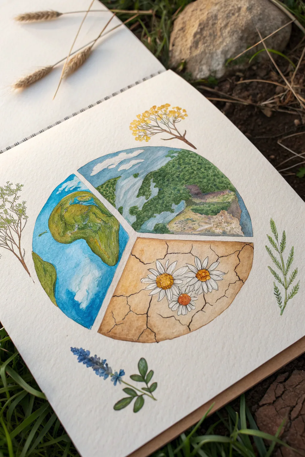
This thoughtful watercolor piece divides the Earth into three narrative segments, contrasting lush greenery with parched, cracked soil. It captures an environmental message through delicate washes and fine details, perfect for reflecting on nature’s balance.
Step-by-Step Tutorial
Materials
- Cold press watercolor paper (sketchbook format ideal)
- Pencil (HB or H)
- Compass or large circular object (for tracing)
- Waterproof fine liner pens (0.1mm and 0.3mm, darkness)
- Watercolor paints (phthalo blue, sap green, burnt sienna, yellow ochre, raw umber)
- Small round brushes (size 2 and 4)
- White gouache or white gel pen (optional for highlights)
- Eraser
Step 1: Planning the Composition
-
Draw the main circle:
Begin by drawing a large, perfect circle in the center of your page using a compass or by tracing a bowl. Keep your pencil pressure very light so the graphite won’t show through the paint later. -
Divide the segments:
Sketch a large ‘Y’ shape inside the circle to divide it into three distinct pie-slice sections. The vertical line of the ‘Y’ should start from the bottom center, splitting the circle into a left half and two right quadrants. -
Sketch the terrain outlines:
In the left section, lightly sketch a simplified continent shape resembling a stylized Africa or South America. In the top-right section, draw wavy lines to indicate a river flowing through a forest. For the bottom-right, sketch jagged, interconnecting lines to represent cracked, dry earth. -
Add floral details:
Outside the circle, lightly sketch the small botanical elements: a yellow flowering branch at the top, a lavender sprig at the bottom, and green leafy stems on the sides. Inside the dry earth section, draw three simple daisy shapes.
Step 2: Painting the Global View (Left)
-
Base wash for the ocean:
Mix a watery Phthalo Blue. Wet the paper in the ‘ocean’ area first (avoiding the land), then drop in the blue paint. Let it bloom naturally to create cloud-like textures. -
Painting the landmass:
Once the blue is dry, paint the continent using a mix of Sap Green and Yellow Ochre. While the paint is still damp, dab in darker greens to suggest topography and depth. -
Adding texture:
Use a nearly dry brush to lift out a few spots of blue paint to create softer cloud shapes, or wait until dry and scumble a tiny bit of white gouache over the blue.
Muddy colors?
If your greens leak into the blue oceans, let the first section dry completely before painting the next. Use a hairdryer on low heat to speed this up.
Step 3: Detailing the Landscapes (Right)
-
Lush forest section:
For the top-right quadrant, start with a pale blue-grey wash for the river and sky area. Once dry, stipple various shades of green to create the canopy of trees. Keep the greens darker near the bottom of this section to show density. -
River banks:
Paint the banks of the river with a sandy beige mix. Use a very small brush to create rugged coastline details where the land meets the water. -
The dry earth base:
Move to the bottom-right section. Paint a flat, pale wash of Yellow Ochre mixed with a touch of Burnt Sienna over the entire cracked earth area, carefully painting *around* the flower petals. -
Defining the cracks:
Using a fine liner pen or a very thin brush with concentrated dark brown paint, trace over your pencil lines for the cracks. Make these lines jagged and varied in thickness. -
Shading the cracks:
To make the cracks look deep, run a line of diluted brown paint along one side of each crack line. This creates a shadow and gives the dry ground dimension. -
Painting the daisies:
Paint the centers of the daisies with a vibrant yellow-orange. Leave the petals white (the color of the paper), perhaps shading the tips slightly with very pale grey to separate them.
Deepen the Meaning
Try painting the three sections in different seasons or times of day (sunrise, noon, night) to represent the passage of time alongside the environmental theme.
Step 4: Border and Accents
-
Surrounding botanicals:
Paint the external plants with a loose hand. Use delicate brushstrokes for the yellow flowers at the top and the lavender at the bottom. I usually keep these less detailed than the center circle to frame the artwork without distracting from it. -
Inking the borders:
Revisit the lines dividing the three sections. Go over them with your waterproof fine liner to create a crisp separation between the contrasting worlds.
Once the paint is fully set, erase any lingering pencil marks to let your Earth portrait shine.
Hand Map: Memories, Now, Hopes

Capture the essence of your journey with this minimalist grid layout, featuring twenty distinct hand-drawn symbols representing memories, current vibes, and future aspirations. The design combines clean lines with rustic charm on textured paper for a timeless, earthy aesthetic.
Detailed Instructions
Materials
- Heavyweight cream or oatmeal-colored textured paper (mixed media or watercolor paper)
- Fine liner pen (black-archival ink, size 0.3mm or 0.5mm)
- Pencil (HB or 2H for light sketching)
- Ruler (clear acrylic is best for visibility)
- Eraser (kneaded)
- Utility knife and metal ruler (for trimming)
- Optional: Deckle edge ruler or tearing tool
Step 1: Preparing the Canvas
-
Select your paper:
Choose a heavyweight paper with a bit of tooth or texture. An oatmeal or cream color adds warmth compared to stark white. -
Size the paper:
Cut your paper to approximately A5 size (5.8 x 8.3 inches) or slightly smaller. If you want the rustic look shown in the image, carefully tear the edges against a ruler instead of cutting them cleanly. -
Calculate the grid:
Measure the printable area of your paper. For a 4×5 grid layout like the example, decide on a square size (around 1.25 to 1.5 inches per square) and calculate the margins to keep it centered. -
Draft the grid lines:
Using your pencil and ruler, very lightly draw the outer rectangle handling the border first. Then, mark off the internal horizontal and vertical dividing lines. -
Identify your symbols:
Before drawing, plan which 20 icons represent your ‘Past, Present, and Future.’ These could be simple nature elements like mountains, celestial bodies, botanical sprigs, or cozy items like blankets and mugs.
Consistent Weight
Use the same pen thickness for both the grid lines and the icon drawings. This unifies the piece, making it look like a cohesive chart rather than just doodles in boxes.
Step 2: Inking the Framework
-
Trace vertical lines:
Take your fine liner pen and carefully trace over the vertical pencil lines. Use a ruler to ensure they are perfectly straight. -
Trace horizontal lines:
Repeat the process for the horizontal lines, creating a crisp 4×5 grid of twenty boxes. -
Erase guidelines:
Allow the ink to dry completely to avoid smudging. Then, gently erase any visible pencil marks from the grid structure.
Step 3: Drawing the Icons
-
Sketch the celestial row:
Start with the top row. Pencil in a crescent moon, a simple tent shape, a compass, and a pine branch. Keep the lines simple and geometric. -
Add atmospheric elements:
In the second row, sketch a sunburst, two fluffy clouds, a poinsettia or star flower, and a rising sun horizon line. -
Incorporate nature and comfort:
For the middle row, draw another sun variation, a single cloud, a cloud pair, and a solid pine tree silhouette. -
Detail the lower rows:
Continue downward with a circle icon, a stemmed glass or cup, a snowflake, and small stars. The bottom row can feature a potted plant, a knit texture square (representing a blanket or sweater), a starburst, and a mountain peak. -
Ink the outlines:
Go over your pencil sketches with the fine liner. Use confident strokes. For solid shapes like the pine tree or darkest mountains, fill them in meticulously with the pen. -
Add texture marks:
I like to add tiny stippling or hatching lines to items like the mountains or the knit square to give them depth without overcomplicating the simple style. -
Final clean up:
Once all ink is fully dry, do a final pass with your kneaded eraser to remove iconic graphite sketches, leaving only the crisp black ink.
Smudge Prevention
If you are right-handed, work from the top-left box to the bottom-right. If left-handed, work top-right to bottom-left. This keeps your hand from resting on wet ink.
Now you have a beautifully organized visual map of your personal timeline ready to be displayed or tucked into a journal


Have a question or want to share your own experience? I'd love to hear from you in the comments below!