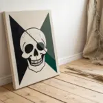
Dorm rooms can feel like blank little boxes, but a few smart paintings can turn that space into something that actually feels like you. I pulled together my favorite dorm painting ideas that are budget-friendly, easy to hang, and totally doable without committing to permanent wall changes.
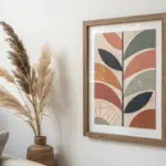
Mini Gallery Wall of Small Canvases
Transform a blank dorm wall into a cohesive desert-inspired aesthetic with this grid of mini canvases. Using soft pastel acrylics and simple silhouettes, you’ll create a repetitive yet unique collection of arid landscapes that feels curated and professional.
How-To Guide
Materials
- 15 small canvases or canvas boards (approx. 8×10 or 5×7 inches)
- 15 simple light wood floating frames (sized to your canvas)
- Acrylic paints (White, Raw Sienna, Burnt Sienna, Olive Green, Cobalt Blue, Sap Green, Yellow Ochre, Burnt Umber)
- Set of acrylic brushes (1-inch flat wash, medium round, and fine liner)
- Palette or paper plate
- Cup of water
- Paper towels
- Painter’s tape or command strips (for hanging)
- Pencil (HB or lighter)
- Measuring tape and level
Step 1: Color Palette & Backgrounds
-
Prepare your palette:
Begin by prepping your main color groups. You’ll need dusty blues for the sky, sandy beiges and ochres for the ground, and muted greens for vegetation. The secret to this look is mixing a significant amount of white into every color to keep the tones soft and pastel. -
Divide the compositions:
Mentally split your 15 canvases into three groups. Five will feature prominent sky space, five will be balanced horizons, and five will focus on ground textures or close-up flora. This variety keeps the grid interesting. -
Paint the skies:
Using your 1-inch flat brush, paint the upper portion of your canvases with a mix of Cobalt Blue and White. I like to keep the brushstrokes horizontal and smooth. For sunset vibes on a few, blend in a touch of watered-down Burnt Sienna or pink near the horizon line before the blue dries. -
Lay the ground foundations:
Mix Raw Sienna with White to create a base sand color. Paint the bottom sections of your canvases, letting the horizon lines vary in height. On some, curve the line to suggest dunes or hills; on others, keep it flat. -
Add atmospheric depth:
While your background layers are still slightly damp, introduce a very pale, misty version of your ground color right at the horizon line. Blend it gently upwards into the sky to create a hazy, distant effect typical of desert landscapes.
Step 2: Landscape & Flora Details
-
Define the mid-ground:
Once the base layers are dry, mix a slightly darker version of your sand color using Yellow Ochre and a touch of Burnt Umber. Add vague shapes of distant hills or plateaus in the background of about half the canvases. -
Paint distant mountains:
For the mountain peaks seen in the reference, mix blue with a tiny dot of brown to get a muted slate color. Paint triangular shapes sitting on the horizon. Keep the edges soft so they look far away. -
Add foreground texture:
Using an old or dry brush, stipple (dab repeatedly) some darker olive green and brown mixed with white onto the bottom foreground of several pieces. This creates the illusion of scrub brush and desert grass without needing to paint individual blades. -
Sketch the hero subjects:
Lightly sketch the main focal points with a pencil. Choose a different subject for each: a tall saguaro cactus, a solitary tree, a rocky outcrop, or a blooming agave. Keep the silhouettes simple. -
Paint the cacti:
Mix Sap Green with a little Burnt Sienna and White for a natural cactus green. Fill in your cactus sketches using a round brush. Ensure you paint the arms of the cactus slightly unevenly for a more organic look. -
Detail the trees:
For the small trees, use a liner brush with watered-down brown paint to sketch thin, spindly trunks and branches. Follow this by dabbing the foliage with a sponge or scruffy brush using a muted green mix. -
Layer rocky textures:
On the canvases featuring rock formations, use a palette knife or the edge of a flat brush to scrape on thick, unblended streaks of Burnt Sienna and Ochre. This mimics the rough striations of sandstone.
Mismatched horizons?
Don’t stress if horizon lines don’t match perfectly neighbor-to-neighbor. Slight variations actually make the grid feel more dynamic and less like a single cut-up poster.
Step 3: Final Touches & Assembly
-
Add highlights and shadows:
Determine a light source direction (usually top-left or top-right) and apply it consistently across all 15 paintings. Add a thin line of pale yellow or white to the sun-facing side of cacti and rocks, and a wash of diluted brown on the opposite side for shadow. -
Refine the edges:
Go back in with your sky color and sharpen the edges of mountains or horizons if they became too messy. Clean lines help the small format read clearly. -
Frame the work:
Allow the paintings to cure fully (at least 24 hours). Place each canvas into its light wood floating frame. Since these are customized for a clean look, ensure the canvas sits flush and uses the appropriate clips or adhesive for your specific frame type. -
Plan the grid:
Lay out all 15 framed pieces on the floor first. Arrange them in a 5×3 grid to balance the colors and subjects—make sure you don’t have two cacti or two dark mountains right next to each other. -
Install the gallery:
Using a level and measuring tape, install the top row first maximize precision. I find using a spacer block (like a piece of wood cut to size) helps keep the gap between frames perfectly consistent as you work your way down.
Add dimensional texture
Mix a little baking soda or modeling paste into your paint for the rocks and foreground sand. This gritty texture catches the light and makes the desert feel real.
Step back and admire your mini desert oasis, bringing a calm and warm atmosphere to your room
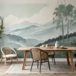
Over-the-Bed Horizon Landscape
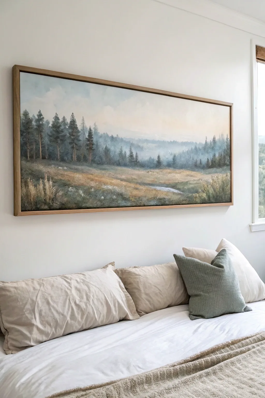
Bring the calming vastness of nature into your dorm room with this serene, panoramic landscape painting. Featuring misty pine forests and soft, rolling fields, this large-scale artwork creates a peaceful focal point perfect for hanging above your bed.
Detailed Instructions
Materials
- Large panoramic canvas (approx. 24×60 inches) or plywood panel
- Acrylic paints: Titanium White, Mars Black, Prussian Blue, Burnt Sienna, Yellow Ochre, Sap Green, Raw Umber
- Large flat brush (2-inch)
- Medium filbert brush
- Small round detail brush
- Fan brush (optional)
- Mixing palette
- Water cups and paper towels
- Easel or large flat workspace
- Wooden floating frame kit (oak or maple finish)
Step 1: Setting the Scene
-
Prepare the canvas:
Begin by ensuring your long canvas is clean and primed. If you are using a raw wood panel, apply two coats of gesso, letting each dry completely, and sand lightly between coats for a smooth painting surface. -
Map the composition:
Using a very diluted mix of Burnt Sienna and water, sketch faint horizontal lines to divide your canvas. Place your horizon line slightly above the center mark, separating the sky from the land. Sketch rough vertical lines where your main clusters of trees will stand on the left side. -
Block in the sky gradient:
Mix a large amount of Titanium White with a tiny touch of Yellow Ochre and Prussian Blue to create a pale atmosphere. Starting at the very top, paint horizontal strokes, gradually adding more white as you move down toward the horizon to create a hazy, morning glow. -
Paint the distant mountains:
While the sky is still slightly tacky, mix Titanium White with a small amount of Prussian Blue and a dot of Black to make a pale, misty blue-grey. Paint the faint silhouettes of distant mountains along the horizon line, blurring the bottom edges into the sky color to imply heavy mist.
Step 2: Building the Middle Ground
-
Establish the background treeline:
Create a cool, dark green using Sap Green mixed with Prussian Blue and a bit of White. Using a medium filbert brush, dab in a line of distant trees just below the mountains. Keep the shapes soft and fuzzy; these trees are far away and shouldn’t have sharp details. -
Add atmospheric perspective:
As you move slightly lower on the canvas, mix more White into your green blend. Paint a second, lower layer of trees or hills in front of the first. This ‘fades’ the background and adds depth, simulating morning fog rolling through the valley. -
Paint the open field base:
For the grassy field, switch to your large flat brush. Mix Yellow Ochre, Burnt Sienna, and White to create a warm, dry grass color. Paint broad, sweeping horizontal strokes across the bottom half of the canvas, leaving some darker patches of Raw Umber for shadowed dips in the terrain. -
Refine the grassy texture:
Using a dry brush technique, lightly drag some lighter cream and pale green tones over your field base coat. This creates the illusion of tall grasses catching the light without having to paint individual blades yet.
Muddy colors?
If your greens look too brown or muddy, stop mixing all three primary colors at once. Clean your brush and restart the mix, adding the complementary color (like red/brown into green) very slowly.
Step 3: Foreground and Details
-
Paint the prominent left trees:
Mix a dark, rich evergreen color using Sap Green, Prussian Blue, and Burnt Sienna. Using the side of your flat brush or a fan brush, tap in the foliage of the tall pine trees on the left side. Start narrow at the top and widen the branches as you move down. -
Add tree trunks:
With a small round brush and a mix of Raw Umber and Black, paint thin vertical lines through the center of your pine trees to suggest trunks. Keep the lines broken and intermittent so they appear to peak through the pine needles rather than sitting on top of them. -
Introduce the meadow stream:
Mix a pale, reflective blue-grey (similar to your sky color but slightly darker). Paint a narrow, winding shape in the mid-right foreground to represent a small stream or puddle reflecting the sky. Keep the edges soft so it settles naturally into the grass. -
Layer mid-ground shrubbery:
Using a stippling motion with an old brush, add clusters of bushes in the middle distance using muted greens and browns. Place these randomly across the field to break up the flat space, concentrating some near the stream. -
Highlight the foreground grass:
I particularly enjoy this step; take a small detail brush with a mix of White and Yellow Ochre and flick upward strokes in the very bottom foreground. These distinct blades of dry grass create a sharp focus point that contrasts with the blurry background. -
Add final mist effects:
If the transition between the trees and the ground looks too harsh, mix a very transparent glaze of Titanium White and water. Lightly drag this over the ‘feet’ of the distant trees to simulate fog settling on the ground.
Pro Tip: Soften edges
Keep a clean, dry blending brush handy. While paint is wet, gently sweep over edges of clouds or distant trees to blur them. This ‘sfumato’ effect is key for realistic atmospheric depth.
Step 4: Finishing Touches
-
Check values and contrast:
Step back five feet from your painting. Ensure your closest trees are the darkest/sharpest elements and the distant mountains are the lightest/softest. Add touches of dark paint to the foreground shadows if needed for depth. -
Varnish the painting:
Once the acrylic paint is fully dry (wait at least 24 hours), apply a coat of matte or satin varnish to protect the artwork and unify the sheen of the different paint colors. -
Frame the artwork:
Place your canvas into the floating frame. Secure it from the back according to the kit’s instructions. The natural wood tone of the frame complements the earthy palette of the landscape beautifully.
Hang your new masterpiece and enjoy the view of a quiet, misty morning right from your pillow
Soft Botanical Watercolor Set
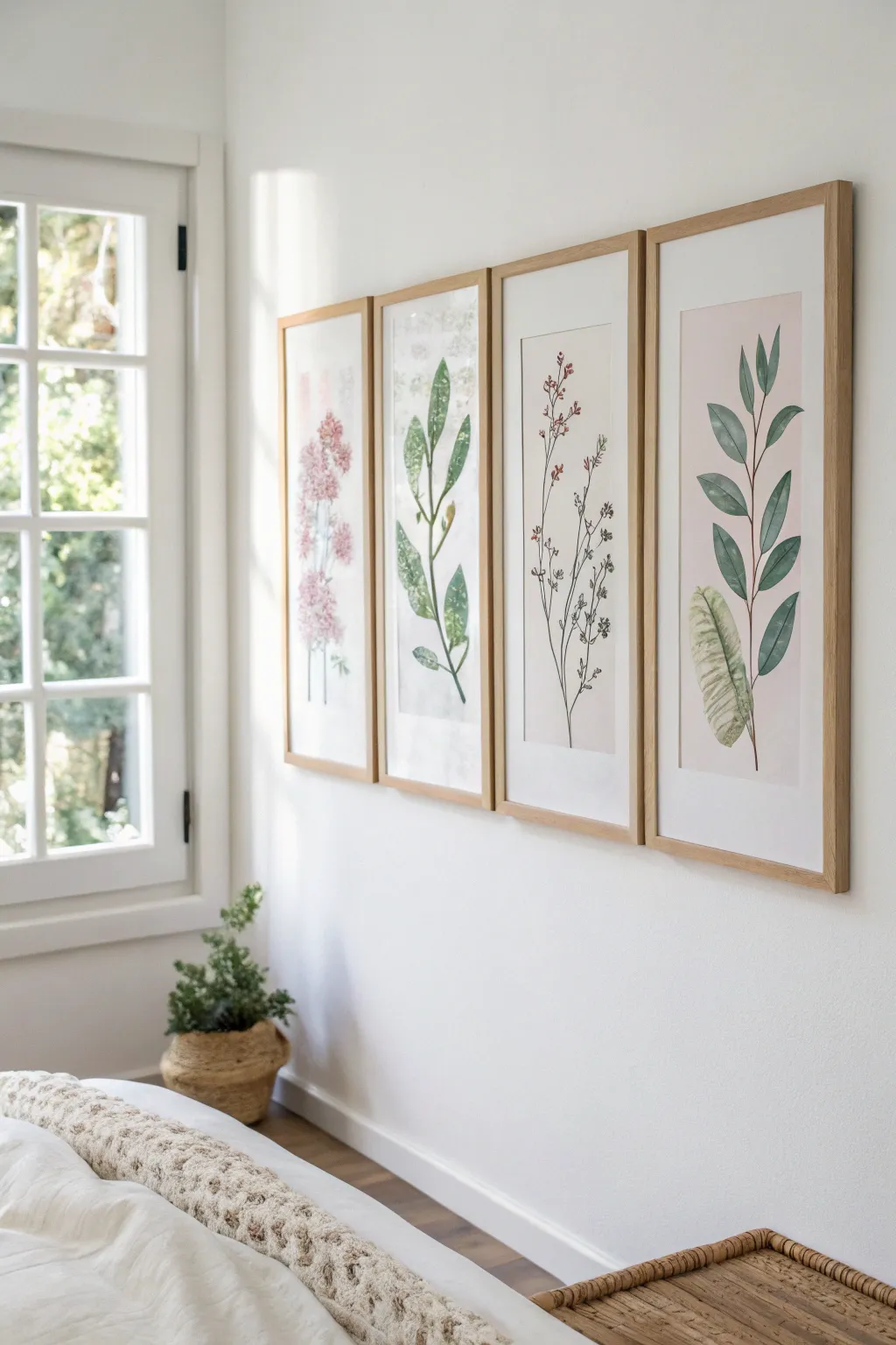
Bring a breath of fresh air into your dorm room with this set of four tall, elegant botanical paintings. Using soft watercolor techniques on elongated paper, you’ll create a cohesive gallery wall that feels both modern and organic.
Step-by-Step Tutorial
Materials
- 4 large sheets of cold press watercolor paper (cut to approx. 10×24 inches)
- Watercolor paints (Sap Green, Olive Green, Hooker’s Green, Alizarin Crimson, Rose Madder, Burnt Umber)
- Round watercolor brushes (size 4, 8, and a fine liner)
- Pencil (HB or 2H)
- Kneaded eraser
- Painter’s tape or washi tape
- Drawing board or hard surface
- Paper towels
- 2 jars of water
Step 1: Preparation & Sketching
-
Cut and tape:
Begin by cutting your watercolor paper into four equal, tall rectangles. Standard full sheets can often be cut lengthwise to achieve this elongated look. Tape the edges of each sheet securely to your board to prevent buckling. -
Plan the compositions:
Lightly sketch a single, central stem running vertically up each page. Don’t center them perfectly straight; give the main stem a gentle curve or wander for a natural feel. -
Sketch the foliage:
Draw the basic shapes of your leaves and flowers. For the leaf prints, outline alternating oval shapes. For the floral stems, sketch clusters of small circles or loose petal shapes near the top. -
Lighten the lines:
Before painting, take your kneaded eraser and gently dab (don’t rub) the paper to lift most of the graphite. You want the faintest possible ghost lines so the pencil doesn’t show through the transparent paint.
Step 2: Painting the Greenery
-
Mix your greens:
Prepare three puddles of green: a bright, yellow-based green; a deeper, cooler blue-green; and a muted olive. Mixing in a tiny touch of red can muddy the green slightly for a more realistic, earthy tone. -
Paint the first stems:
Using a size 4 round brush, paint the main stems with a confident, fluid stroke. Vary the pressure on your brush—press down for thicker sections and lift up for thinner, delicate connections. -
Base layer for leaves:
For the solid green leaves (like the third and fourth panels), fill in the leaf shapes with a light wash of water first, then drop in your lighter green pigment and let it spread. -
Adding depth:
While the leaf wash is still damp, touch the base of the leaf (where it meets the stem) with your darker green mix. This wet-on-wet technique creates a natural gradient without hard lines. -
Specifics: The broad leaf:
For the large, textured leaf at the bottom of the fourth panel, use a ‘dry brush’ technique. Load your brush with slightly thicker paint, dab off excess on a paper towel, and drag it across the paper to create a textured, veiny look.
Natural Imperfection
Don’t try to make every leaf identical. Nature is random. Intentional variations in water saturation and leaf shape make the set look organic rather than manufactured.
Step 3: Floral Details & Finishing
-
Mix the floral pinks:
Dilute your Alizarin Crimson or Rose Madder with plenty of water for a soft, blush tone. Prepare a second puddle with less water for the darker accents. -
Paint the blooms:
For the pink flower panel, use a dabbing motion with your brush tip to create clusters of petals. Keep the edges ragged and uneven to mimic real blossoms like lilacs or cherry blossoms. -
Specifics: The delicate red stem:
For the third panel with tiny red buds, switch to your fine liner brush. Paint very thin, wiry stems and add tiny dots of red/brown at the tips. -
Refining edges:
I find it helpful to look for any lost edges once the main layers are dry. Use the fine liner brush with a slightly darker version of your base color to redefine a leaf tip or stem connection if it looks too washed out. -
The remove reveal:
Ensure the paper is completely bone-dry. Slowly peel off the painter’s tape at a 45-degree angle, pulling away from the artwork to reveal a crisp, clean white border. -
Framing:
Place your finished pieces in light wood frames. If you can’t find custom tall frames, mount them on larger archival mat board to fit standard poster frames.
Bloom Troubleshooting
If you get ‘cauliflower’ blooms where paint dries unevenly, don’t panic. Wet a clean brush slightly and gently soften the hard edge, or simply leave it as a watercolor texture.
Hang your new botanical gallery with equal spacing between frames to instantly transform your wall into a calm, nature-inspired retreat
Abstract Color-Block Triptych
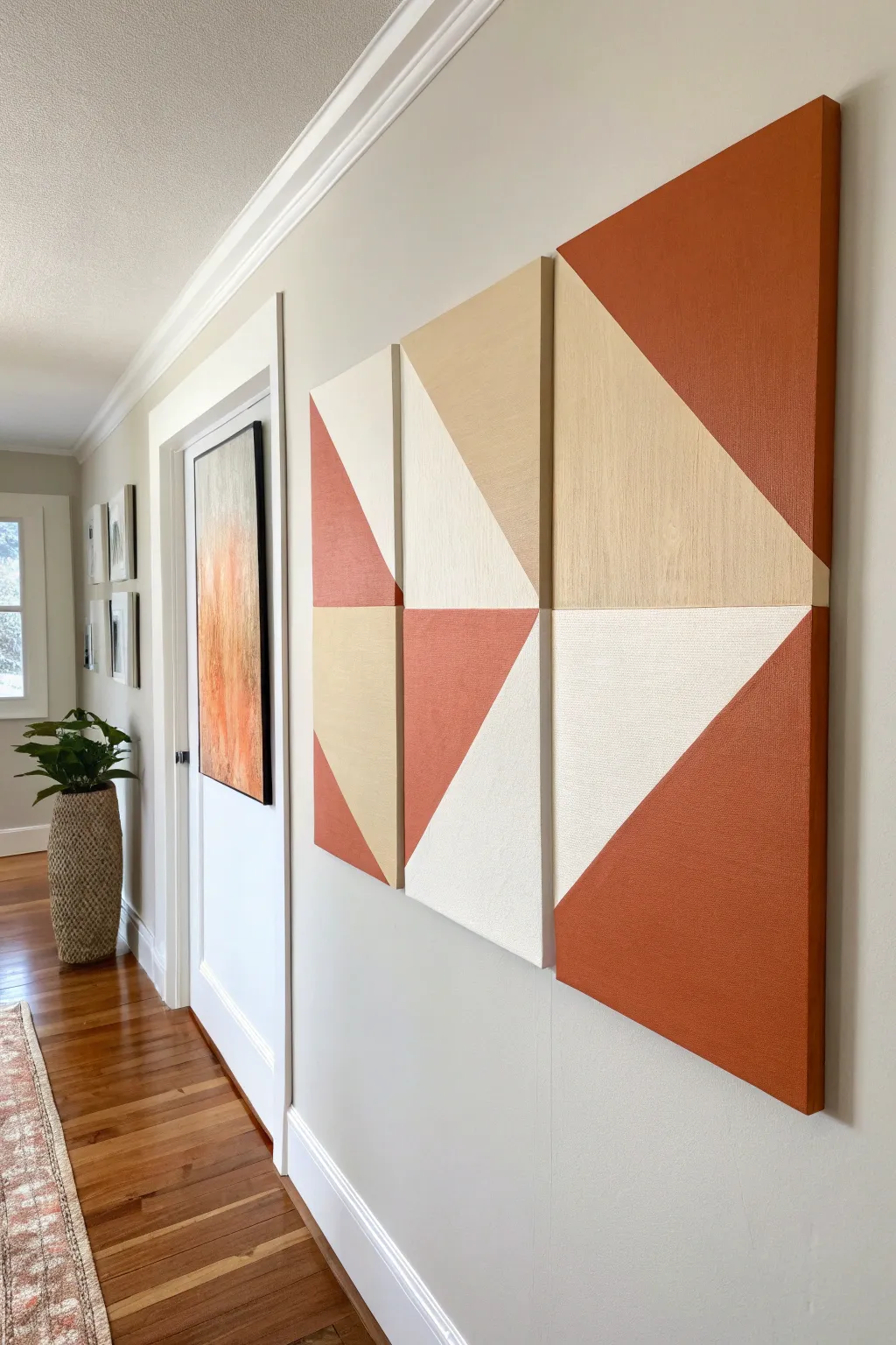
Bring a bold, modern gallery feel to your dorm room with this striking geometric canvas set. By using simple masking tape techniques and a warm, earthy color palette, you can create a high-end looking triptych that perfectly balances structure and warmth.
How-To Guide
Materials
- 3 Stretched canvases (2 smaller matching sizes, 1 large rectangular size)
- Acrylic paints (Burnt Sienna/Terracotta, Beige/Sand, Warm White)
- Painter’s tape (1-inch width)
- Credit card or brayer tool
- Flat paintbrushes (various sizes)
- Ruler or measuring tape
- Pencil
- Drop cloth or newspapers
- Bubble level (for hanging)
- Command strips (for damage-free hanging)
Step 1: Planning and Preparation
-
Grid your layout:
Begin by laying your three canvases on the floor in the desired arrangement. Place the two smaller canvases stacked vertically on the left and the large rectangular canvas on the right to visualize the overall shape. -
Mark the diagonals:
Using a long ruler and a light pencil, draw diagonal lines across each canvas. The goal is to create large triangular sections. Ensure some lines appear to continue from one canvas to the next for visual continuity. -
Label color zones:
Since this design relies on specific color placement, lightly write ‘R’ for rust, ‘T’ for tan, and ‘W’ for white in the corresponding triangle sections directly on the canvas so you don’t get confused later.
Bleeding Lines?
If paint bled under the tape, wait for it to dry fully. Then, re-tape along the original line and gently touch up the mistake with the correct color using a small detail brush.
Step 2: Taping and Sealing
-
Apply first tape lines:
Apply painter’s tape along the outside edge of your pencil lines. You can’t paint all colors at once, so choose one color group to start with (e.g., all the white sections) and tape off the boundaries for those areas. -
Seal the edges:
This is the secret to crisp lines: firmly press down the tape edges using a credit card or a brayer tool. I like to really burnish the edges to prevent any paint from creeping underneath. -
Base coat trick:
For razor-sharp lines, verify the seal by painting a very thin layer of your base canvas color (usually white) or a clear matte medium over the edge of the tape. Let this dry completely.
Pro Tip: Custom Texture
Mix a small amount of baking soda into your acrylic paint before applying. This gives the canvas a trendy, grainy ceramic texture that adds depth to the simple shapes.
Step 3: Painting the Sections
-
Paint the lightest color:
Start with your warm white sections. Apply the paint using a flat brush, stroking away from the tape edge to further minimize bleed-through. Two thin coats are better than one thick, gloppy coat. -
Add the mid-tone:
Once the white is dry to the touch, move to your beige or sand color. Apply this to the designated sections, ensuring solid, opaque coverage. -
Apply the accent color:
Finally, paint the rust/terracotta sections. This bold color might need an extra coat to ensure it looks rich and even without brushstrokes showing through. -
Remove tape carefully:
While the final coat of paint is still slightly tacky (not fully cured), slowly peel back the painter’s tape at a 45-degree angle. This prevents the paint from chipping.
Step 4: Refining and Finishing
-
Re-tape for adjacent sections:
Wait until your first painted sections are completely dry (give it at least an hour). Now, apply fresh tape over the dry painted edges to expose the remaining unpainted triangles. -
Seal and paint remaining areas:
Repeat the sealing process with the credit card, then paint the remaining color zones. Using this two-stage taping method ensures perfect corners where three colors meet. -
Touch up edges:
Inspect the sides of the canvas. Carry the design over the edges for a finished, gallery-wrapped look, or paint all sides a solid neutral color if you prefer a framed appearance. -
Let it cure:
Allow the canvases to dry overnight in a dust-free area. -
Install the artwork:
When hanging, maintain a consistent gap (about 1 to 1.5 inches) between the panels. Use a level to ensure the horizontal lines flow perfectly across the gap.
Step back and admire how these simple geometric shapes transform your wall into a sophisticated focal point
BRUSH GUIDE
The Right Brush for Every Stroke
From clean lines to bold texture — master brush choice, stroke control, and essential techniques.
Explore the Full Guide
Line Art Portraits of Your People
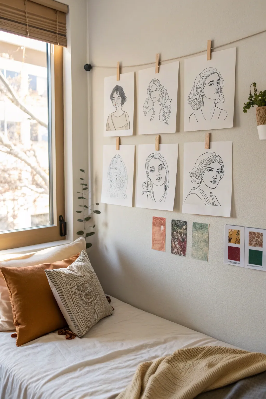
Transform your bare walls into a dedicated gallery space with these elegant, minimalist line art portraits. This project creates a cohesive series of drawings that captures the essence of your favorite people using simple, continuous contours.
Step-by-Step Guide
Materials
- High-quality mixed media or Bristol paper (9×12 inches)
- Graphite pencil (HB or 2B)
- Kneaded eraser
- Fine-point black ink pens (0.3mm and 0.5mm)
- Reference photos of friends or family
- Light tablet or bright window (for tracing)
- Masking tape or painter’s tape
- Jute twine or string
- Wooden clothespins
- Two wall hooks or Command hooks
Step 1: Preparing Your Subjects
-
Select your photos:
Choose 4-6 high-resolution headshots of your subjects. Photos with good lighting and distinct shadows work best for translating into line art. -
Pre-edit specifically for line work:
Use a photo editing app to turn your reference photos black and white. Increase the contrast significantly—this helps you see the defining lines of the jaw, nose, and eyes more clearly. -
Set up your workspace:
Clear a flat surface. If you are using a light tablet, set it up now. If you don’t have one, tape your printed reference photo onto a bright window during daylight hours.
Clean Lines Only
Focus on “implied lines” for the nose and lips. You don’t need to close every shape; leaving a small gap in the line art of the nose bridge often looks more artistic.
Step 2: Drafting the Contour
-
Align your paper:
Place your high-quality art paper over the reference photo. Secure the corners gently with painter’s tape so the pages don’t shift while you work. -
Trace the main outline:
Using your graphite pencil with a very light hand, trace the outermost silhouette of the head and shoulders. Don’t press hard; these are just guide lines. -
Map the features:
Lightly mark the placement of the eyes, nose, and mouth. Instead of drawing every eyelash, just outline the shape of the iris and the upper lash line. -
Simplify the hair:
Look for the major shapes in the hair rather than individual strands. Draw large, sweeping curves that represent clumps of hair or waves. -
Refine the sketch:
Remove the paper from the light source. Look at your drawing alongside the original photo. Use your eraser to clean up messy areas and refine the expression until it looks right.
Add a Pop of Color
Watercolor splash! Before inking, paint a single abstract shape of watercolor (like a circle or swoosh) behind where the head will go for a trendy mixed-media look.
Step 3: Inking the Portraits
-
Test your pens:
Scrap paper is essential here. Test your 0.5mm and 0.3mm pens to ensure the ink is flowing smoothly and hasn’t dried out. -
Commit to the main lines:
Start with the 0.5mm pen for the boldest lines: the jawline, the neck, and the main shape of the hair. Use confident, continuous strokes rather than short, scratchy ones. -
Add facial details:
Switch to the finer 0.3mm pen for delicate features like the eyes, nose, and mouth. This variance in line weight adds professional depth to the illustration. -
Detail the hair texture:
I like to add just a few internal lines within the hair shapes to suggest movement and texture without overworking it. Keep it minimal. -
Let the ink cure:
Allow the ink to dry completely for at least 15 minutes. Smudging wet ink with an eraser is heartbreaking, so patience is key. -
Erase pencil guides:
Gently glide your kneaded eraser over the entire drawing to lift the graphite, leaving only the crisp black ink behind.
Step 4: Assembly and Display
-
Repeat the process:
Follow the drafting and inking steps for all of your chosen portraits until you have a complete set. -
Measure your wall span:
Determine where you want the gallery to hang. Measure a length of jute twine roughly 12 inches longer than your desired span to allow for a slight drape. -
Install anchors:
Place your wall hooks or Command hooks at the desired height. Tie a small loop at each end of the twine and hook them securely. -
Hang the art:
Use wooden clothespins to clip the top center of each drawing to the twine. Space them evenly, leaving about 2-3 inches between each portrait for visual breathing room.
Step back and admire how a simple piece of string and some ink can turn your favorite faces into a modern masterpiece
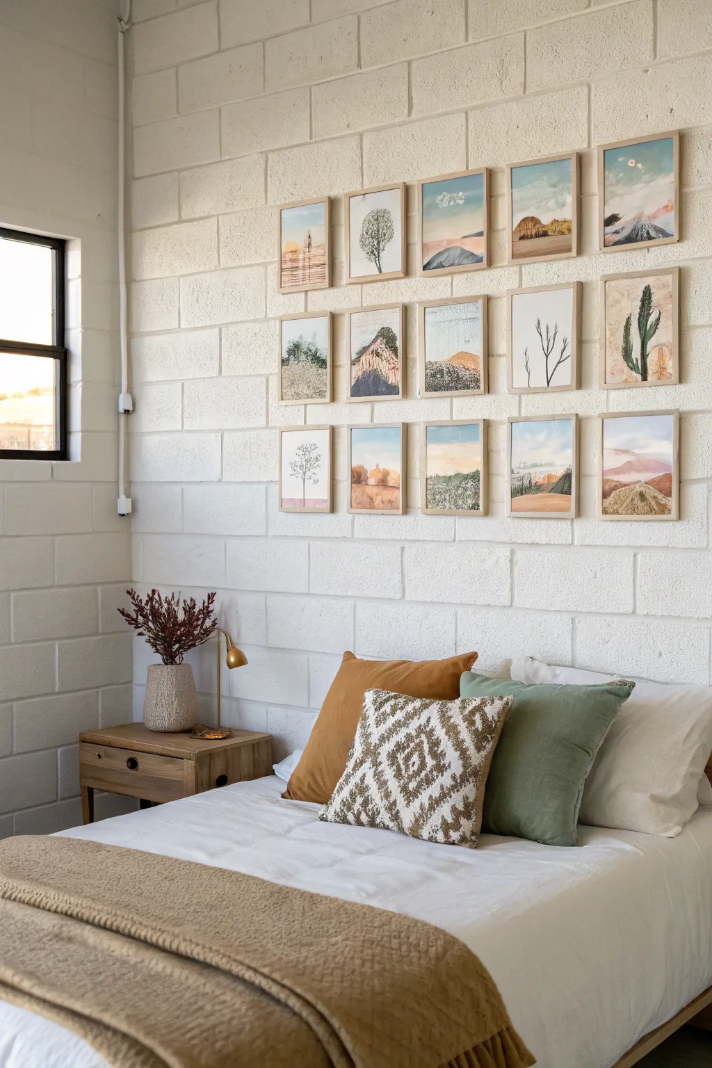
Tiny Painted Postcard Wall
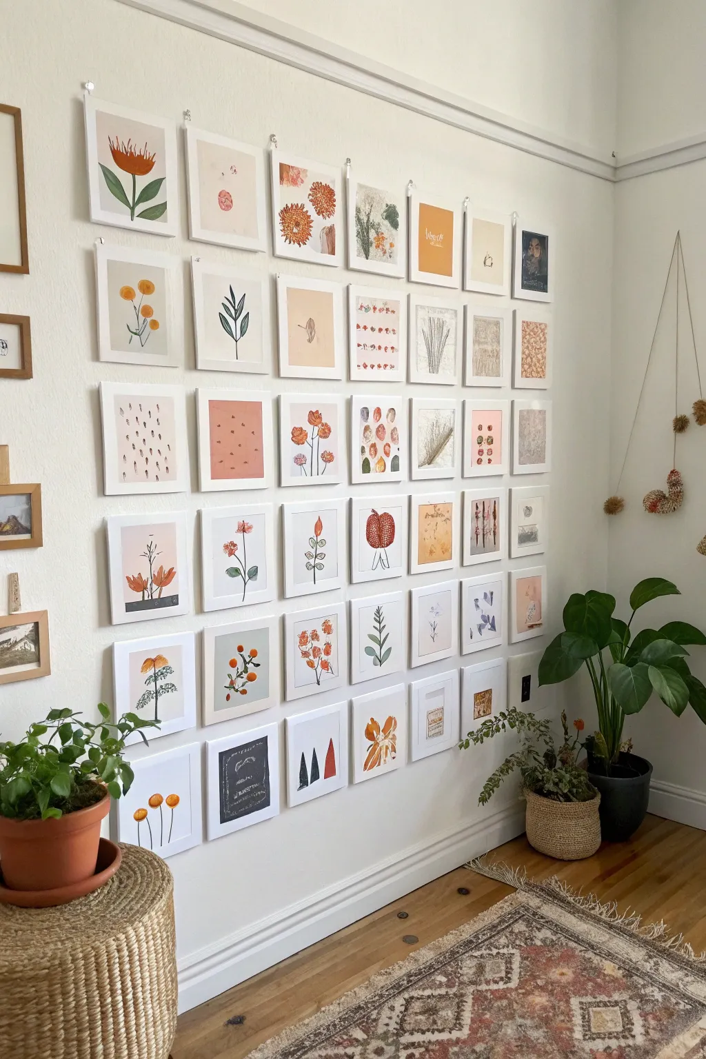
Transform a blank wall into a sprawling, botanical-inspired mosaic using miniature hand-painted postcards. This project combines simple watercolor techniques with a cohesive warm color palette to create an impressive, grid-style installation that feels both curated and organic.
Step-by-Step Tutorial
Materials
- Heavyweight watercolor paper or blank watercolor postcards (approx. 4×6 inches)
- Watercolor paint set (focus on muted oranges, ochres, greens, and dusty pinks)
- Fine liner pens (black, 0.3mm and 0.5mm)
- Round watercolor brushes (size 2, 4, and 6)
- Masking tape or painter’s tape
- Pencil and eraser
- White picture frames (simple aesthetic, enough for a grid layout)
- Command strips or picture hanging hardware
- Ruler
- Jar of water and paper towels
Step 1: Planning the Palette & Theme
-
Define your colors:
Before putting brush to paper, select a limited color palette to ensure the massive grid looks cohesive. Mix a few key shades: a burnt orange, a dusty rose, a sage green, and a mustard yellow. Keep these specific mixes handy or note the ratios. -
Sketch loose concepts:
On scrap paper, brainstorm about 30-40 simple motifs. Think botanical: single stems, abstract flower heads, leaf patterns, and simple geometric shapes like dots or dashes. You want variety but a shared visual language.
Warped Paper Woes?
If your paper buckles after painting, lightly mist the back with water and place it under a heavy book overnight to flatten it before framing.
Step 2: Painting the Postcards
-
Prep the paper:
If cutting your own paper from large sheets, measure and cut them into uniform 4×6 inch rectangles. Tape the edges down to a board if you want a clean white border, though the frames in the example cover the edges regardless. -
Create background washes:
For about a third of your cards, apply a very light, diluted wash of color (like pale pink or beige) across the entire surface or in a central block. Let these dry completely. These will serve as colored grounds for darker details later. -
Paint botanical hero images:
Select 10-12 cards to feature ‘hero’ flowers. Using a size 6 brush, paint loose, organic shapes for flower heads—think poppies, proteas, or abstract blooms. Don’t worry about petals being perfect; blobs of color work well here. -
Add stems and greenery:
Once the flower heads are dry, switch to a size 4 brush and your sage green mix. Paint slender stems and leaves connecting the blooms. I find that varying the stem curvature makes them look more natural and less stiff. -
Create pattern cards:
For the next batch of cards, focus on repeating patterns. Paint rows of small dots, dashes, or tiny leaf shapes. Use a single color for each card to keep it graphic and simple. -
Incorporate abstract elements:
Paint a few cards with just abstract shapes—circles, semi-circles, or color blocks in your palette. These act as visual ‘breathing room’ between the more detailed floral illustrations. -
Add fine details with ink:
Once all paint is bone dry, take your fine liner pen. Add delicate details to the botanicals, like stamens, leaf veins, or outlines on the abstract shapes. Keep the lines thin and sketchy rather than bold and heavy.
Step 3: Framing & Installation
-
Frame the artwork:
Place each dry painting into a clean white frame. Ensure the glass is free of fingerprints. Lay them all out on the floor first to finalize the arrangement. -
Arrange the grid:
Balance the colors and motifs. Try not to cluster all the orange flowers in one corner; distribute the ‘hero’ florals, patterns, and lighter abstract pieces evenly throughout the grid. -
Establish the bottom line:
Using a level and ruler, lightly mark the position for the bottom row of frames on your wall. Installing from the bottom up or from a center line out helps maintain straightness. -
Hang and space:
Hang the frames with uniform spacing—about 1.5 to 2 inches between each frame looks best. Use a spacer (like a block of wood cut to size) to quickly check the gap between frames as you work your way up the wall.
Add Texture
Use a dry brush technique or dab paint with a sponge on a few background layers to introduce subtle texture differences across the grid.
Step back and admire your personal art gallery that brings a warm, creative energy to the room

PENCIL GUIDE
Understanding Pencil Grades from H to B
From first sketch to finished drawing — learn pencil grades, line control, and shading techniques.
Explore the Full Guide
Cinderblock-Friendly Canvas Board Grid
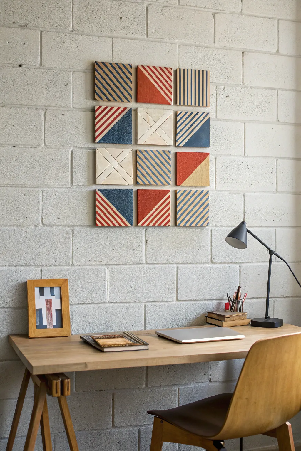
Transform a plain cinderblock wall into a modern art gallery with this striking grid of geometric panels. By combining raw texture with bold nautical stripes in red and blue, you can create a sophisticated statement piece that is perfectly lightweight for dorm living.
Step-by-Step Guide
Materials
- 12 small canvas boards or thin wood squares (4×4 or 6×6 inches)
- Painter’s tape (various widths)
- Acrylic craft paint (Navy Blue, Rust Red)
- Small flat paintbrush
- Ruler or straight edge
- Pencil
- Command strips or poster putty
Step 1: Planning and Prep
-
Map out your grid:
Before painting, arrange your 12 squares on a flat surface in a 3-wide by 4-high grid to visualize the final composition. -
Sketch the designs:
Lightly trace your desired patterns onto each board with a pencil. Aim for a mix: some solid diagonally split squares, some fully striped, and two ‘blank’ squares with simple ‘X’ relief lines. -
Define linear patterns:
For the striped squares, use a ruler to mark even intervals. Vary the direction of the stripes—vertical, horizontal, and diagonal—to keep the eye moving across the installation.
Step 2: Taping and Painting
-
Mask the first batch:
Apply painter’s tape firmly over the areas you want to keep unpainted (or wood-toned). Press the edges of the tape down tightly with your fingernail or a credit card to prevent paint bleed. -
Mix your colors:
Pour out your navy blue and rust red acrylics. If the colors feel too bright, I like to mix in a tiny drop of black or brown to darken them slightly for a more vintage, collegiate look. -
Paint the solids:
Start with the squares that have large solid triangles. Fill in the marked areas with smooth, even strokes, ensuring full coverage. -
Paint the stripes:
Moving to the striped panels, carefully paint between your tape lines. Use a smaller flat brush here to avoid pushing paint under the tape. -
Create the relief squares:
For the two light-colored squares (center of the second and third rows), use a very subtle wash of white or cream paint, or leave them raw. Define the ‘X’ pattern by scoring the surface lightly or using a very fine line of white paint.
Bleed-Proof Lines
Before applying color, paint a thin layer of the *background* color over the tape edge. This seals the gap so your colored lines stay razor-sharp.
Step 3: Finishing Touches
-
Remove the tape:
Perform the peel reveal while the paint is still slightly tacky. Pull the tape away slowly at a 45-degree angle to get the crispest lines. -
Clean up edges:
If any paint seeped through, use a tiny detailed brush and a bit of the background color (or white) to touch up the lines. -
Let it cure:
Allow all panels to dry completely for at least an hour before handling them for installation. -
Install the grid:
Attach mounting strips to the back of each square. Start by placing the top-left square, then use a level (or measure from the ceiling) to ensure your spacing is even as you build the grid row by row.
Dimension Upgrade
Instead of canvas, use thin balsa wood squares. The natural wood grain adds warmth against the cold cinderblock wall.
Step back and enjoy how this orchestrated chaos brings order and style to your room
Painted Borders That Fake a Frame
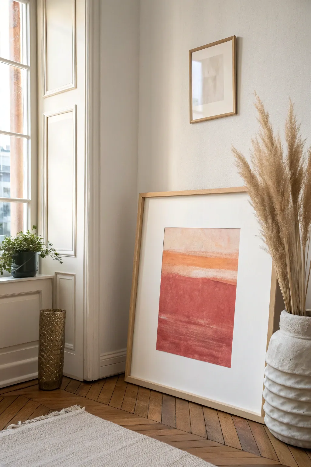
Create a sophisticated, gallery-ready look for your dorm without the heavy price tag of custom framing. This project uses the negative space of the paper itself to mimic a wide, high-end matte, centering a warm, sunset-inspired abstract gradient.
How-To Guide
Materials
- Large sheet of heavy watercolor paper (e.g., 18×24 or 22×30 inches)
- Painter’s tape or masking tape (1-inch width works well)
- Watercolor paints or fluid acrylics
- Palette regarding colors: Burnt Sienna, Yellow Ochre, Alizarin Crimson, Titanium White
- Large flat wash brush (1.5 to 2 inches)
- Medium round brush
- Jar of clean water
- Paper towels
- Ruler
- Pencil
- Large wooden poster frame (optional, for final display)
Step 1: Preparation and Masking
-
Measure the borders:
Lay your large watercolor paper on a flat, clean surface. Decide how wide you want your ‘faux matte’ to be. For this look, measure 4 to 5 inches in from every edge to create a generous white border. -
Mark the corners:
Lightly mark the corners of your inner rectangle with a pencil. Double-check your measurements to ensure the inner painting area is perfectly centered. -
Tape the boundaries:
Apply painter’s tape along the pencil marks you just made. Press the edges of the tape down firmly with your thumbnail or a spoon handle. This seal is crucial for getting that crisp, professional edge later. -
Protect the borders:
I like to add a second overlapping row of tape or adhere scrap paper over the wide borders, just in case a wayward splash of paint tries to escape the painting zone.
Step 2: Painting the Gradient
-
Prepare the wash:
Mix a very watery, pale wash of Yellow Ochre with a touch of Titanium White. This will be the base for the top section. -
Paint the sky:
Using your large flat brush, apply this pale wash to the top third of the taped-off area. Use broad, horizontal strokes. -
Create the texture:
While the paint is still wet, blot it gently with a crumpled paper towel to create a soft, clouded texture. Let this layer dry almost completely. -
Mix the horizon line:
Mix a stronger, more saturated orange using Yellow Ochre and a tiny bit of Alizarin Crimson. You want this to be bolder than the sky. -
Apply the horizon strip:
Paint a horizontal band across the middle section, slightly overlapping the bottom of your dry sky layer. Don’t worry if the line isn’t perfectly straight; a wobble adds organic charm. -
Prepare the ground color:
Mix your darkest color for the bottom section: Burnt Sienna with Alizarin Crimson to make a deep, reddish terracotta. -
Paint the base:
Fill the bottom half of the rectangle with this deep red mixture. Use long, sweeping horizontal strokes to mimic the look of land or water. -
Blend the transitions:
Clean your brush and leave it slightly damp. Gently run it along the area where the orange horizon meets the red ground to soften the edge slightly, creating a hazy transition.
Tape Sealing Trick
Paint a thin layer of clear matte medium or white paint along the tape edge first. This seals the tape so your colors won’t bleed underneath.
Step 3: Adding Depth and Detail
-
Layering richness:
Once the bottom red section is dry to the touch, go back in with a slightly more concentrated red mix. Add horizontal streaks to suggest ripples or topographical layers. -
Highlight the horizon:
Using a dash of white mixed with your pale yellow, paint a thin, broken line right above the orange horizon strip to make it pop against the sky. -
Dry completely:
Allow the painting to dry fully. If the paper feels cold to the touch, it is still wet. Wait until it is room temperature. -
The reveal:
This is the best part: slowly peel the tape away at a 45-degree angle. Pulling away from the paint helps prevent tearing the paper. -
Clean up edges:
If any paint bled under the tape, you can gently scrape it away with a craft knife or touch it up with white gouache that matches your paper.
Upgrade the Texture
Add a pinch of salt to the wet watercolor wash in the bottom red section. As it dries, the salt creates beautiful, starry speckles.
Step back and admire how that crisp white border instantly transforms your painting into a polished design element.


Desk Nook Diptych in Matching Colors
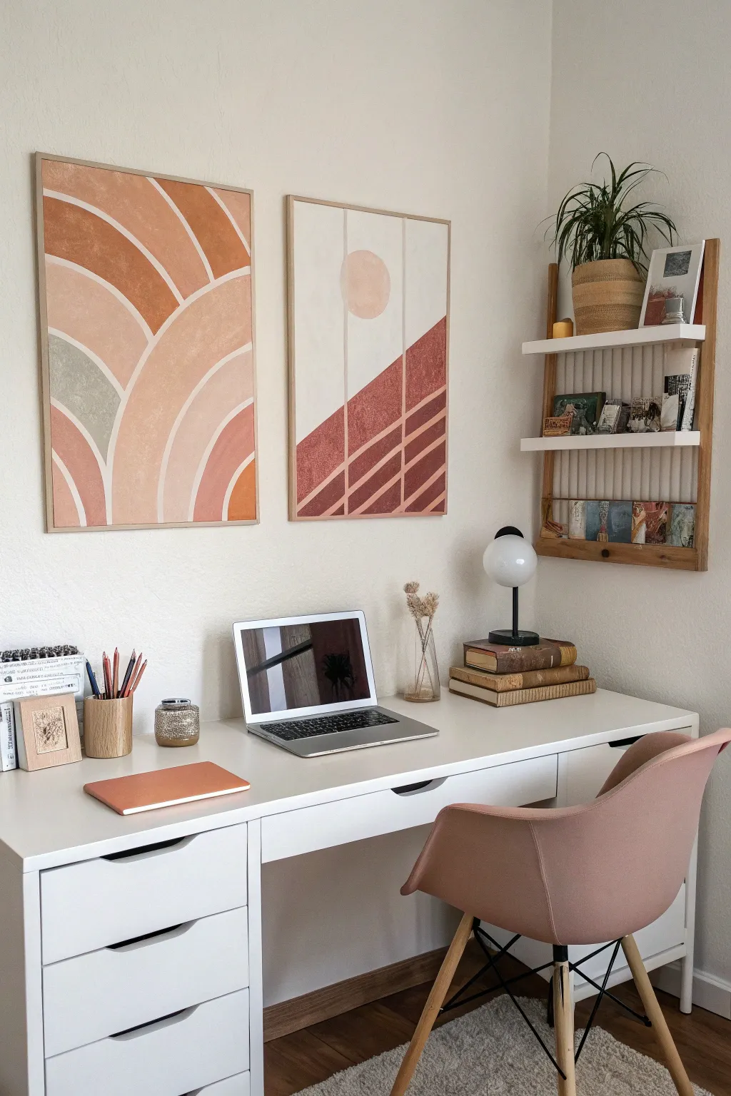
Bring warmth and modern style to your desk nook with this stunning pair of DIY geometric paintings. Featuring earthy terracotta tones, soft arches, and clean lines, this diptych creates a high-end gallery look using simple masking techniques.
Step-by-Step Guide
Materials
- Two large framed canvases (18×24 or 24×36 inches)
- Acrylic paints (terracotta, burnt sienna, peach/blush, sage green, cream/beige)
- Painter’s tape (various widths: 1/4 inch and 1 inch)
- Flat paint brushes (1-inch and small detail brush)
- Pencil
- Ruler or straight edge
- String and push pin (for drawing arches)
- Mixing palette or paper plates
- Drop cloth or newspaper
Step 1: Preparation & Layout
-
Prime the Surface:
Begin by painting both canvases with a solid base coat of cream or warm beige acrylic paint. This ensures a uniform background and will serve as the ‘white space’ lines later. Let this layer dry completely. -
Sketch the Grid:
On the second canvas (the right-hand one), use a ruler and pencil to lightly draw two vertical lines, dividing the canvas into three equal vertical sections. This creates the window-pane effect. -
Draw the Arches:
For the left canvas, you’ll need to draw concentric arches. Tie a piece of string to a pencil. Hold the string fixed at the bottom center of the canvas and swing the pencil to create perfect semi-circles. Adjust the string length to create multiple nested arches. -
Sketch the Sun & Horizon:
On the right canvas, use a circular object (like a bowl) to trace a circle near the top center for the sun. Then, use your ruler to draw a steep diagonal line rising from left to right for the hill. -
Add Decorative Lines:
Below the diagonal hill line on the right canvas, use your ruler to draw parallel diagonal lines. These will become the striped detail later.
Step 2: Tape Masking
-
Mask the Straight Lines:
Apply your 1/4 inch artist tape or thin washi tape over your pencil lines on the right canvas. Tape over the vertical grid lines and the diagonal stripes. Press the edges down firmly to prevent paint bleed. -
Mask the Curves:
For the arched canvas, you can carefully freehand the painting if you have a steady hand, or use flexible curve tape. Alternatively, paint slightly over your pencil lines and come back with the base color later to tidy up the gaps.
Clean Lines Hack
Before painting your color, paint over the tape edges with your BASE color first. This seals the tape and ensures crisp lines.
Step 3: Painting Process
-
Mix Your Palette:
Prepare your custom colors. Mix burnt sienna with white to get various shades of terracotta and peach. I like to keep the sage green slightly muted by adding a tiny dot of brown or grey. -
block in the Right Canvas:
Paint the ‘hill’ section below the diagonal line with a deep terracotta or reddish-brown. Paint the sun shape with a soft peach or blush tone. Leave the sky area as the base cream color. -
Paint the Arches:
On the left canvas, paint the alternating bands of the arches. Use the darkest terracotta for the outer bands, fading into lighter peach tones or the sage green for inner sections. A flat brush works best for these wide curves. -
Add Texture:
While the paint is still wet, you can dab it lightly with a dry sponge or stippling brush to give it that organic, stone-like texture seen in the photo. -
Apply Second Coats:
Once the first layer is dry to the touch, assess the coverage. Acrylics often need a second coat for opacity, especially lighter peach tones.
Wobbly Arches?
If freehanding curves is tough, cut the arch shapes out of contact paper or vinyl to use as a reverse stencil.
Step 4: Finishing Touches
-
Remove the Tape:
This is the satisfying part. Carefully peel back the tape while the paint is slightly tacky (not fully cured) to get the cleanest lines. Pull at a 45-degree angle away from the painted area. -
Touch Up Lines:
If any paint bled under the tape, use a small detail brush and your base cream color to tidy up the lines. You can also re-define the gaps between the arches on the left canvas using this method. -
Seal the Artwork:
Allow the canvases to dry overnight. If desired, apply a clear matte varnish spray to protect your work and unify the sheen. -
Frame and Hang:
Place your canvases into floating frames (usually light wood or oak) to match the aesthetic. Hang them side by side with about 2-3 inches of space between them.
Step back and admire how these warm, coordinated pieces transform your workspace into a cozy sanctuary
Painted Corkboard as an Art Backdrop
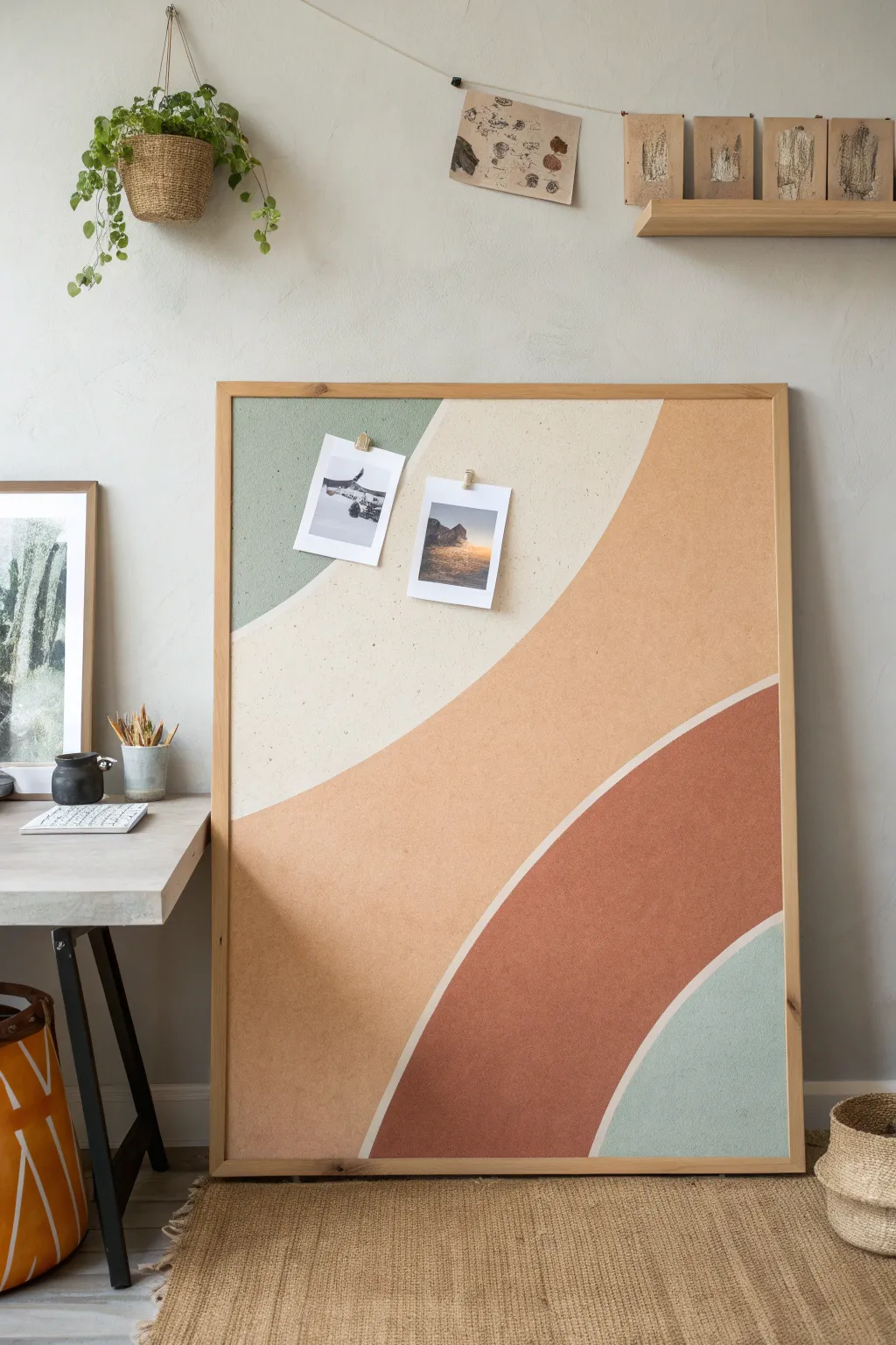
Transform a plain, functional office supply into a statement art piece by painting bold, earthy curves onto a large corkboard. This project doubles as both a functional organization station and a stunning geometric mural that adds warmth to bare dorm walls.
Detailed Instructions
Materials
- Large framed corkboard (approx. 24×36 inches or larger)
- Acrylic craft paints (sage green, cream/off-white, terracotta, rust orange, muted teal)
- Painter’s tape or drafting tape
- Pencil
- Medium flat paintbrush (1-inch width)
- Small round paintbrush for edges
- Paper plate or palette
- Cup of water and paper towels
- Drop cloth or newspaper
Step 1: Planning and Sketching
-
Clean the Surface:
Start by wiping down the corkboard with a dry cloth to remove any dust or loose cork particles. This ensures your paint adheres smoothly and prevents texture clumping. -
Visualize the Curves:
Look at the board and imagine the flow of the design. The composition features sweeping, organic curves that look like rolling hills or a simplified sunset. You want about four to five distinct color sections. -
Lightly Sketch Design:
Using a pencil, very lightly draw your curved lines directly onto the cork. Press gently so you don’t groove the cork material. Start with the top left curve, then the large swooping cream section, followed by the main terracotta body, and finally the bottom corner details. -
Tape the Frame:
Apply painter’s tape carefully around the inside edge of the wooden frame. This protects the wood finish from accidental brushstrokes while you painting the outer edges of your design.
Uneven Edges?
If your hand-painted curves look shaky, use flexible masking tape (designed for curves) to block out the shapes before painting for razor-sharp lines.
Step 2: Painting the Sections
-
Paint the Top Corner:
Start with the sage green color in the top left corner. Use your small round brush to carefully cut in along the pencil line first to establish a crisp edge. -
Fill in Green Section:
Switch to your medium flat brush to fill in the rest of the green shape. Dab the paint into the cork’s texture rather than just brushing across it for better coverage. -
Paint the Cream Curve:
Next, tackle the large creamy white section. This negative space is crucial for the design’s balance. Paint carefully along the green border you just created, keeping a steady hand. -
Apply Second Coats:
Cork is porous and absorbs paint quickly. I find that the lighter colors, like the cream, almost always need a second or even third coat to look solid and opaque. Let the first layer dry for 15-20 minutes before recoating. -
Start the Main Section:
Mix a warm terracotta or peach tone for the largest central section. Begin painting from the middle, working your way out toward the cream border and the frame edges. -
Refine the Boundaries:
Use your smallest brush to tidy up where the terracotta meets the cream. A smooth, confident stroke works best here to avoid a shaky, jagged line.
Step 3: Adding Depth and Detail
-
Paint the Rust Arch:
For the lower semi-circle shape, choose a deeper rust or burnt orange color. This darker tone grounds the composition. Paint this section carefully, leaving a thin, consistent gap of unpainted cork—or a painted white line—between this shape and the main terracotta section to create separation. -
Create the White Contour Line:
If you want the distinct white line seen in the inspiration image between the peach and rust sections, use a liner brush with your cream paint to draw a clean, dividing stripe between the two color blocks. -
Add the Bottom Accent:
Paint the final bottom right corner with a muted teal or blue-grey. This cool tone balances the warmth of the orange and peach hues. -
Check for Gaps:
Inspect the entire board for any tiny holes or spots where the cork color is showing through unintentionally. Dab a little extra paint into these crevices. -
Dry and Peel:
Allow the entire board to dry completely, preferably overnight. Once dry, carefully peel off the painter’s tape ensuring you pull away from the paint edge to keep it crisp.
Level Up
Instead of basic paint, use a texture medium or mix baking soda into your acrylics to give the shapes a raised, plaster-like effect for more visual depth.
Hang your new focal point on the wall and use simple wooden pins to display your favorite photos or notes on your custom art piece
Blended Gradient “Aura” Paintings
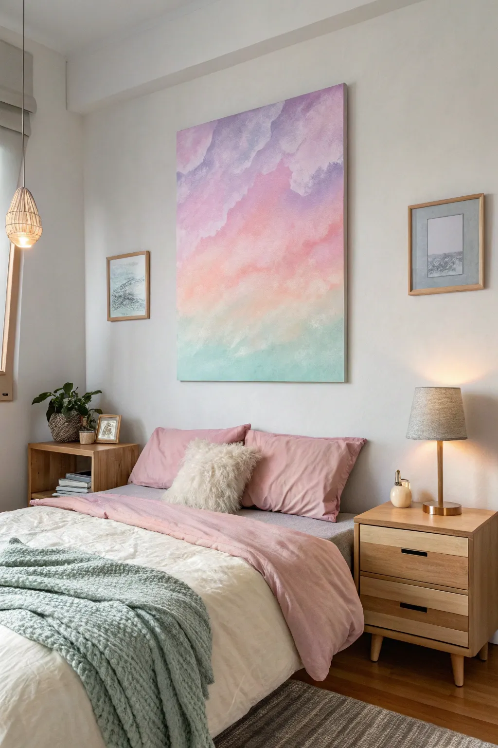
Bring the serene colors of a pastel sunset into your dorm room with this soft, vertical gradient painting. Mimicking the look of fluffy clouds or a spiritual aura, this large-scale art piece transitions from calming mint to warm peach and cool lavender using gentle blending techniques.
Detailed Instructions
Materials
- Large rectangular canvas (e.g., 24×36 or larger)
- Acrylic paints: Titanium White, Mint Green, Peach/Coral, Lavender/Light Purple
- Large flat brush (2-3 inch)
- Medium round brush
- Sea sponge or cosmetic wedge sponges
- Palette or paper plates
- Spray bottle with water
- Drop cloth or newspapers
Step 1: Setting the Background
-
Prepare the canvas:
Lay your drop cloth down and set up your canvas vertically. If your canvas isn’t pre-primed, apply a coat of gesso and let it dry completely. -
Base coat application:
Mix a large amount of Titanium White with a tiny drop of Mint Green to create a very pale, almost white, mint shade. Paint the entire canvas with this mixture using your large flat brush to ensure an even, bright surface. -
Map the color zones:
Once the base is tacky but not fully dry, lightly visualize or mark roughly three zones: the bottom third for green, the middle for pink/peach, and the top for purple.
Fixing Muddy Colors
If blending peach and green turns brown, stop immediately. Let the layer dry completely, then sponge fresh opaque color over the muddy spot to correct it.
Step 2: Applying the Gradient
-
Bottom layer: Mint:
Load your large brush with Mint Green. Start painting from the very bottom edge, using horizontal strokes that move upward. -
Fade the green:
As you move up into the bottom third, mix gradual amounts of white into your green paint. This lightens the color as it travels upward, creating a fade effect before you hit the middle section. -
Middle layer: Peach:
Clean your brush thoroughly. Start applying the Peach/Coral paint in the middle section. Initially, keep a small gap between the peach and the green to prevent muddy mixing. -
Top layer: Lavender:
Clean the brush again. Apply the Lavender paint to the top third of the canvas, brushing downward toward the peach section. -
Initial blend:
While the paints are still wet, use a slightly damp brush to gently feather the borders where the colors meet (Mint/Peach and Peach/Lavender). Don’t overwork it yet; just soften the hard lines.
Step 3: Creating the Cloud Texture
-
Prepare the sponge:
Dampen your sea sponge and squeeze out excess water. It should be moist but not dripping. -
Sponging the bottom clouds:
Dip the sponge into a mix of Mint and White. Dab softly along the transition line between the green and peach sections to create fluffy, cloud-like irregular shapes. -
Building the middle clouds:
Repeat the sponge technique with a Peach/White mixture. Sponge upward into the lavender zone and downward into the green zone, creating organic, diagonal drifts rather than straight horizontal lines. -
Top section texture:
I find it helpful to mix a slightly darker purple here for depth. Sponge this into the upper corners and top edge, then sponge lighter lavender/white billows just below them. -
Mist for fluidity:
Lightly spritz the canvas with water from a distance. Use a clean, dry brush to very gently sweep over the sponged areas in circular motions to blur the texture slightly, making it look ethereal. -
Adding highlights:
Take straight Titanium White on a smaller round brush or clean sponge corner.Highlight the ‘tops’ of your cloud shapes, particularly in the peach and lavender sections, to give them volume.
Level Up: Metallic Sheen
Mix a clear acrylic glazing medium with pearlescent mica powder or gold leaf flecks. Glaze over the lightest white cloud tops for a magical shimmer.
Step 4: Finishing Touches
-
Assess the flow:
Step back about five feet. Look for any areas that feel too heavy or blocked in. Use a dry brush to whispy out any heavy blobs of color. -
Reinforce the edges:
Paint the sides of the canvas canvas to match the adjacent front colors (green at bottom, purple at top) for a polished, frameless look. -
Final drying:
Let the painting sit undisturbed for at least 24 hours to ensure the thickest layers of acrylic are fully cured.
Hang your new masterpiece to create a calming focal point in your room
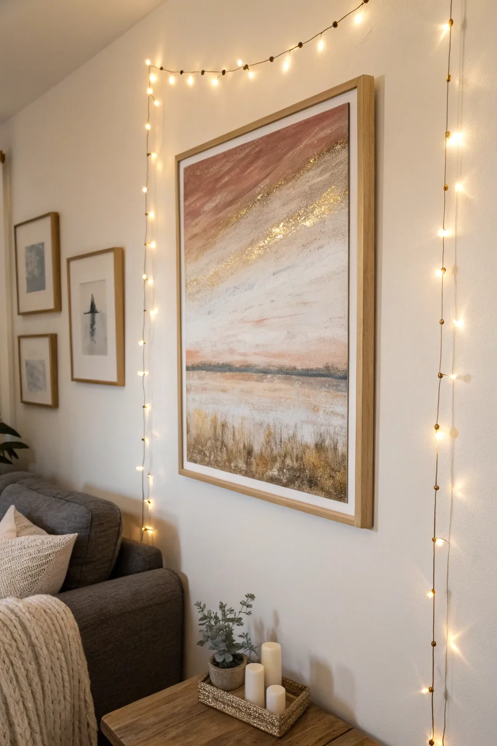
Metallic Accents for Low-Light Shine

This serene abstract landscape combines soft, blended acrylics with a striking diagonal streak of gold leaf to catch the light. It brings a sophisticated, high-end gallery look to your dorm room without the heavy price tag.
Step-by-Step
Materials
- Large stretched canvas (24×36 or larger)
- Acrylic paints (terracotta, titanium white, grey blue, raw sienna, burnt umber)
- Gold leaf sheets
- Gold leaf adhesive (size)
- Gold glitter (fine)
- Large flat brush (2-inch)
- Medium round brush
- Fan brush
- Palette knife
- Water spray bottle
- Soft gilding brush or makeup brush
Step 1: Setting the Scene
-
Prepare the Horizon:
Start by deciding where your horizon line will sit; about one-third up from the bottom works best for this composition. Draw a very faint pencil line across the canvas to guide you. -
Mix the Sky Tones:
On your palette, mix a soft blush color using terracotta and a generous amount of titanium white. Also prepare a pale grey-blue for the lower sky area. -
Paint the Upper Sky:
Using the large flat brush, apply the blush mixture to the top left corner, brushing in broad, sweeping diagonal strokes downward toward the right. -
Blend the Transition:
While the paint is still wet, introduce pure white below the blush tone. Use a clean, slightly damp brush to blend the edges where the pink meets the white to create a soft, cloud-like fade. -
Lower Sky & Water:
Paint the area just above your horizon line with white, fading into the very pale grey-blue. Carry similar colors below the horizon line to represent the water, keeping your strokes horizontal here.
Gold Won’t Stick?
If the leaf lifts off, the size (glue) was likely too wet or too dry. It needs a distinct ‘tack.’ Reapply glue to bare spots, wait 15 mins, and try again.
Step 2: Adding Texture & Detail
-
Define the Horizon:
Mix a darker grey-blue with a touch of burnt umber. Using the edge of a palette knife or a flat brush, paint a thin, broken line across the horizon to suggest distant land or heavy mist. -
Create the Foreground:
For the grassy area at the bottom, mix raw sienna, white, and a little burnt umber. Apply this with vertical, upward flickering strokes using a fan brush or an old, splayed bristle brush. -
Layering the Grass:
Add depth to the foreground by layering slightly darker brown tones near the very bottom edge and lighter, sandy tones near the water line. I find that dabbing the wet paint with a paper towel can create nice organic texture here. -
Dry Completely:
Let the entire canvas dry fully. This is crucial before moving on to the metallic elements to prevent the gold leaf from sticking to tacky paint.
Step 3: The Golden Accent
-
Map the Gold Path:
Visualize a diagonal path cutting through your sky, mirroring the angle of your initial pink strokes. It should look like a sunbeam breaking through clouds. -
Apply Adhesive:
Brush a thin, uneven layer of gold leaf adhesive along this diagonal path. Deliberately make the edges rough and scattered rather than a solid line. -
Wait for Tackiness:
Allow the adhesive to sit until it becomes tacky but not wet (usually 10-15 minutes, depending on the brand). It should feel sticky like tape. -
Lay the Gold Leaf:
Gently press sheets of gold leaf onto the tacky adhesive. Don’t worry about perfect coverage; cracks and gaps add to the vintage, weathered look. -
Burnish and Brush:
Use a soft, dry brush to gently rub the gold leaf into the canvas texture. Brush away the excess loose flakes. -
Add Glitter Highlights:
For extra sparkle, dab a tiny bit more adhesive in the center of the gold path and sprinkle fine gold glitter sparingly. This catches the fairy lights beautifully at night. -
Seal (Optional):
If you want to protect the gold leaf from tarnishing over time, apply a specific metal leaf sealer over just the golden areas.
Create Misty Vibes
Keep a spray bottle of water handy. Lightly mist the canvas while blending the sky colors to keep the acrylics workable for longer, softer gradients.
Step 4: Finishing Touches
-
Final Assessment:
Step back and look at your painting from a distance. If the gold feels too stark, you can lightly dry-brush a little white paint over parts of it to integrate it back into the clouds.
Hang your shimmering landscape near a light source to watch the gold come alive in the evening


Have a question or want to share your own experience? I'd love to hear from you in the comments below!