
If making art alone feels a little too quiet lately, an art collab can snap your creativity right back to life. Here are my favorite art collab ideas—from classic passes and swaps to delightfully weird prompts that practically guarantee surprise results.
Style Swap Character Portraits
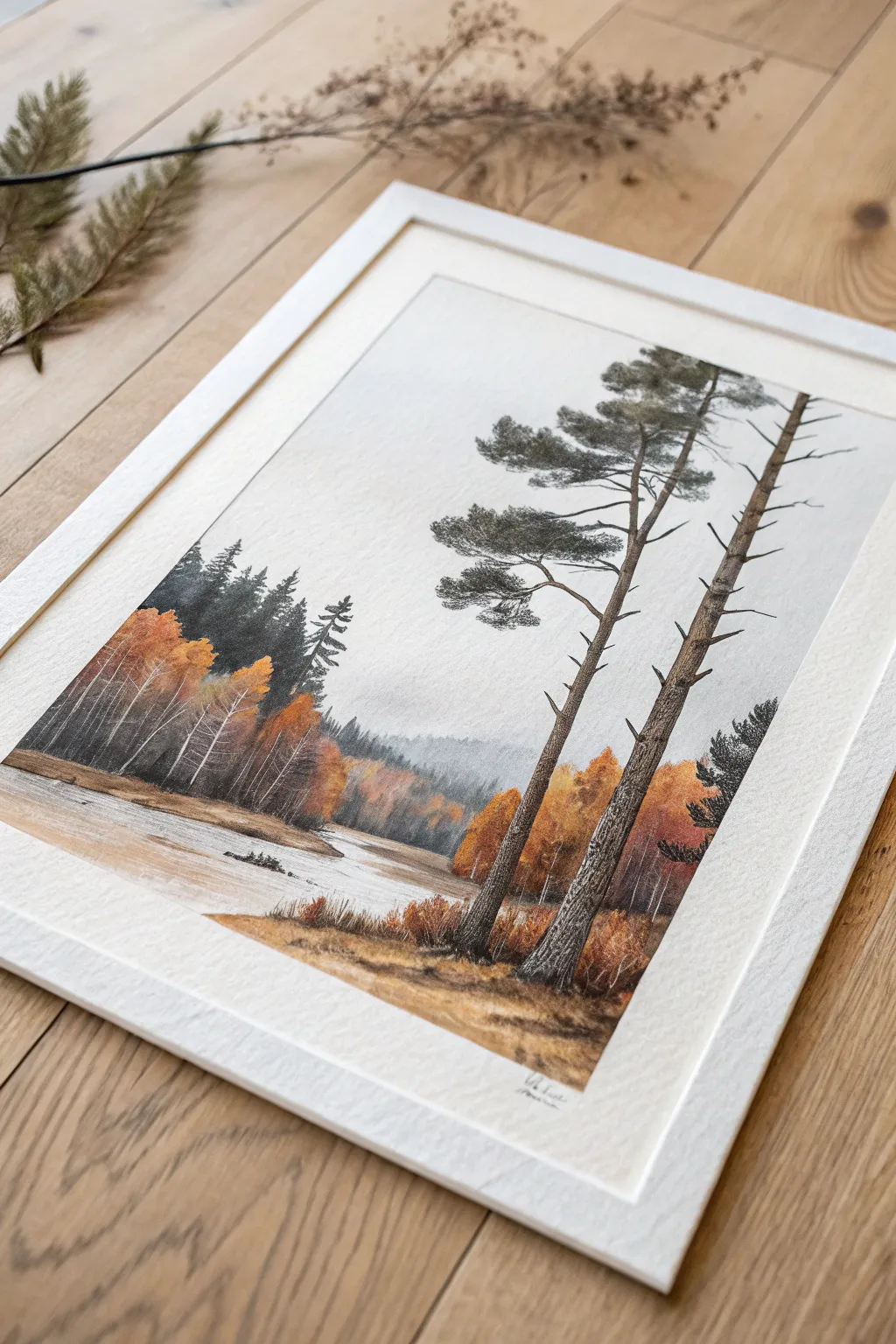
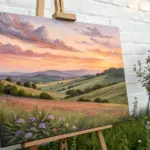
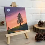
Capture the serene beauty of a foggy autumn morning with this detailed mixed media landscape. Combining soft watercolor washes for the atmosphere with precise colored pencil detailing creates rich texture in the pine bark and foliage.
Step-by-Step Guide
Materials
- Hot press watercolor paper (A3 or A4)
- Watercolor paints (Payne’s Grey, Burnt Sienna, Yellow Ochre, Sap Green, Sepia)
- Colored pencils (dark greys, browns, olives, golds)
- Watercolor brushes (large flat wash, sizes 4 & 2 round)
- Pencil (HB for sketching)
- White gouache or white gel pen
- painter’s tape
Step 1: Planning and Underpainting
-
Secure the paper:
Tape your watercolor paper down firmly to a board on all four sides. This creates that crisp white border seen in the reference and prevents buckling during the wet phases. -
Sketch the composition:
Using an HB pencil, lightly sketch the horizon line about one-third up from the bottom. Mark the path of the river curving gently from left to right. Sketch the vertical lines for the two main foreground pine trees on the right, ensuring one leans slightly for interest. -
Paint the sky:
Mix a very dilute wash of Payne’s Grey. Wet the sky area first with clean water, then drop in the grey pigment, letting it fade near the horizon to mimic fog. Keep this extremely pale. -
Create distant mountains:
While the sky is still slightly damp, paint the distant mountain silhouette using a slightly stronger mix of the grey-blue. The dampness will blur the edges, creating atmospheric perspective. -
Block in the river:
Using a flat brush, lay down a pale wash of Burnt Sienna and Grey for the river water. Keep your strokes horizontal to suggest flow. Leave some paper white in the middle for reflections.
Fixing Muddy Colors
If your autumn trees mix with the green background and turn brown, let the layer dry completely before painting the next color. Use pencils for separation.
Step 2: Building the Landscape
-
Paint the autumn foliage:
For the trees on the left bank, mix Yellow Ochre and Burnt Sienna. Dab these colors in vertical clusters, letting them bleed together slightly. Don’t paint individual leaves yet; focus on the general shapes of the tree masses. -
Darken the background forest:
Behind the orange autumn trees, paint a band of dark greenish-grey (Sap Green + Payne’s Grey). This creates depth and makes the bright foliage pop. -
Foreground bank base:
Paint the immediate foreground bank with a warm mix of Yellow Ochre and Sepia. While wet, lift out small horizontal areas with a dry brush to suggest uneven terrain. -
Main tree underpainting:
Once the background is dry, use a round brush to paint the trunks of the two large pine trees. Use a light wash of brown; we will add the texture later with pencil.
Pro Tip: Texture
Use cold press paper if you want natural texture, but hot press (smooth) allows for much finer pencil details on the bark and branches.
Step 3: Refining with Pencils
-
Add tree trunk texture:
Switch to sharp colored pencils (dark brown and charcoal grey). Draw the rough bark texture on the main pine trunks using short, jagged vertical strokes. Leave gaps of the watercolor showing through for highlights. -
Define the pine branches:
Draw the branches radiating from the upper trunks. Remember that pine branches often curve upward or sag with weight. Keep the lines jagged and organic. -
Draw pine needles:
Using a dark olive or grey-green pencil, scribble dense clusters of needles on the branches. I prefer to use a circular, scumbling motion here to create the look of thick tufts. -
Detail the birch grove:
On the left side, use a white gel pen or gouache to draw thin, vertical white trunks over the dark background. Add tiny black marks for the birch bark texture. -
Enhance the grass:
Use burnt orange and brown pencils to flick upward strokes in the foreground, creating tall grasses along the riverbank. -
Sharpen the water line:
Use a dark pencil to define the edge where the land meets the water. Add a few horizontal lines in the water itself to suggest ripples moving around rocks. -
Final atmosphere check:
Step back and assess your values. If the distant trees look too sharp, lightly glaze over them with a very watery white gouache or pale grey wash to push them back into the mist.
Now you have a tranquil, misty forest scene ready to be framed and displayed
Split-Canvas Mirror Duo

Create a stunning statement piece with these complementary large-scale canvases featuring organic, flowing shapes in a warm, earthy palette. This project relies on balancing bold colors like rust and teal with soft peach tones to create a cohesive visual rhythm across two separate panels.
Detailed Instructions
Materials
- Two large vertical stretched canvases (e.g., 24×60 inches)
- Acrylic paints: Teal/Hunter Green, Burnt Orange/Rust, Mustard Yellow, Peach/Beige, Titanium White
- Large flat brushes (2-inch and 1-inch)
- Round detail brush (size 4 or 6)
- Pencil
- Eraser
- Drop cloth or newspapers
- Palette or painter’s tray
- Water cup and paper towels
- Masking tape or painter’s tape (optional for straight edges)
- White chalk (optional for sketching)
Step 1: Planning and Sketching
-
Prepare the workspace:
Lay down your drop cloth and set up both canvases side-by-side vertically. Having them next to each other is crucial for visualizing the flow of the design across the gap. -
Prime the surface:
If your canvases aren’t pre-primed, apply a coat of gesso. Even on pre-primed canvas, a fresh coat of white acrylic paint creates a smooth, clean base for sketching. -
Draft the major curves:
Using a pencil or a piece of white chalk, lightly sketch the large, swooping curves that will define your shapes. Start with the largest forms that span the width of the canvas. -
Establish the focal points:
Sketch the prominent semi-circles and leaf-like shapes. Notice how the shapes on the left canvas seem to ‘reach’ toward the right canvas, creating a sense of connection. -
Refine the composition:
Step back and look at the sketch from a distance. The shapes don’t need to be perfectly symmetrical, but the visual weight should feel balanced between the two panels. -
Clean up sketch lines:
Use an eraser to lighten any heavy pencil lines so they won’t show through the lighter paint colors, especially the peach and beige sections.
Step 2: Painting the Layout
-
Mix the rust orange:
Create a deep rust color by mixing burnt orange with a touch of brown. Start painting the large leaf shapes on the right canvas and the corresponding section on the left. -
Apply the teal tones:
Using the large flat brush, fill in the teal/hunter green sections. I like to keep my brushstrokes moving in the direction of the shape’s curve for a smoother finish. -
Add the mustard accents:
Paint the mustard yellow shapes, such as the upper semi-circles. Ensure the edges are crisp where they meet the white background. -
Fill the beige backgrounds:
Mix a soft peach or beige tone. Carefully paint the large background sections that sit behind the bolder shapes, bringing the color right up to your pencil lines. -
Refine edges:
Once the base coats are dry, use the smaller flat brush to tidy up the outlines of your organic shapes. The separation between colors should be clean and sharp. -
Add the white line details:
On the dark teal sections, use a thin round brush or a white paint marker to draw delicate, curved white lines that mimic veins or abstract contours.
Flow & Continuity
Draw your initial sketch across both canvases simultaneously while they are pushed together. This ensures the lines flow seamlessly from one panel to the next.
Step 3: Final Touches
-
Check for opacity:
Inspect the lighter colors, specifically the yellow and peach areas. If the canvas texture is showing through too much, apply a second coat for solid, opaque coverage. -
Ensure consistency:
Compare the colors across both canvases. The rust orange on the left should perfectly match the rust orange on the right to maintain continuity. -
Clean the negative space:
Use titanium white to touch up the background areas, correcting any accidental smudges or slips from the colored paints. -
Seal the artwork:
To protect the paint and unpinify the sheen, apply a layer of matte or satin varnish over the entire surface of both canvases once fully dry.
Fixing Wobbly Lines
If your curved edges look shaky, use the flat edge of a small brush loaded with thick paint. Press and drag slowly to create a razor-sharp, smooth border.
Hang these beauties side-by-side to instantly transform your wall into a modern art gallery display


Background-Foreground Trade
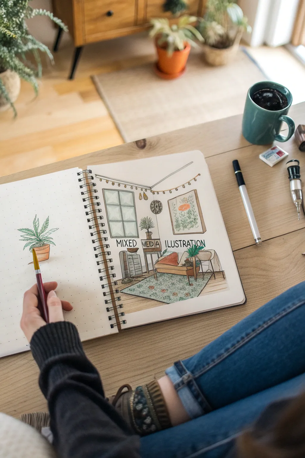
This project utilizes a sketchbook spread to create a narrative contrasting a detailed isolated subject on the left with its environmental context on the right. It combines technical perspective drawing with loose, organic watercolor techniques for a warm, inviting aesthetic.
Step-by-Step Tutorial
Materials
- Dotted grid sketchbook
- Mechanical pencil (HB)
- Kneaded eraser
- Waterproof fine liner pens (0.1mm, 0.3mm, 0.5mm)
- Watercolor set or alcohol markers
- Round paintbrush (size 4 or 6)
- Ruler
Step 1: Planning the Perspective
-
Establish the room structure:
On the right page, draw a large rectangle in the center-upper portion to represent the back wall of the room. -
Create depth:
Draw diagonal lines extending from the four corners of your rectangle outward toward the page edges to define the ceiling, floor, and side walls. -
Block in furniture:
Lightly sketch geometric boxes to represent the lounge chair, the side table, and the shelving unit, ensuring the horizontal lines merge toward a vanishing point. -
Add architectural details:
Sketch the window grid on the left wall and the large poster frame on the back wall, using your ruler to keep vertical lines perpendicular to the page bottom.
Ink Troubleshooting
If your black lines bleed when you add paint, ensure your pen is labeled ‘waterproof’ or ‘archival.’ If unsure, let the ink dry for 24 hours first.
Step 2: Sketching the Elements
-
Draft the foreground subject:
On the left page, draw a simple, centralized plant pot and sketch long, arching lines for the fern fronds. -
Mirror the subject:
Add a smaller version of the same potted plant onto the table or shelf in your room sketch on the right to visually connect the two pages. -
Detail the room decor:
Sketch the string lights draped near the ceiling, the circular wall clock, and the pattern on the area rug. -
Placement of text:
Lightly letter the words ‘MIXED MEDIA ILLUSTRATION’ (or your own title) in the negative space between the furniture to balance the composition.
Level Up: Real Texture
Glue a small rectangle of actual patterned fabric over the rug area or a tiny dried flower onto the poster frame for a true multimedia 3D effect.
Step 3: Inking the Illustration
-
Outline main structures:
Use a 0.5mm waterproof pen to go over the major lines of the walls, the window frame, and the furniture outlines. -
Refine the foliage:
Switch to a 0.3mm pen to ink the leaves on both pages, adding small jagged edges to the fronds for texture. -
Add delicate details:
Use a 0.1mm pen for fine details like the wood grain on the floor, the rug fringe, and the string light bulbs. -
Lettering:
Inking the text requires steady pressure; go slowly over your pencil guides to ensure the lettering is crisp and legible. -
Clean up:
Allow the ink to dry completely for several minutes before gently erasing all underlying pencil lines to prevent smudging.
Step 4: Adding Color
-
Base warm tones:
Paint the terracotta pots and the lounge chair with a warm orange or rust-colored wash. -
Greenery gradients:
I like to mix a sap green with a touch of brown for the plants, varying the water amount to create light and dark leaves. -
Texturing the rug:
Instead of filling the rug solidly, use small dabs of teal or green paint to mimic the woven pattern shown in the reference. -
Shadows and glazing:
Add a very diluted grey wash under the chair and table legs to ground the objects to the floor.
Enjoy seeing how your single botanical study transforms into a part of a larger story on the opposite page.
Character Dynamic Template Duos
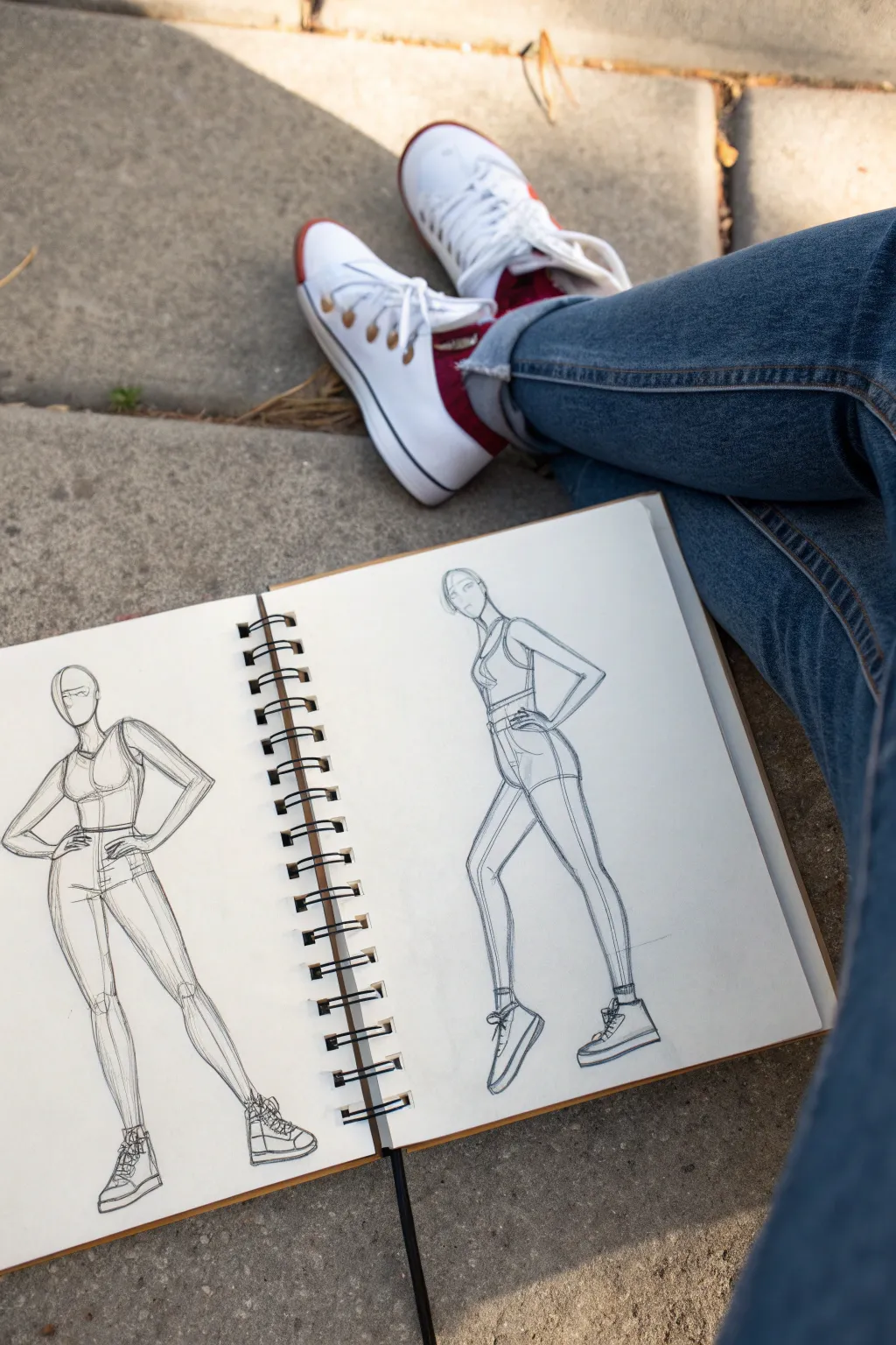
Master the art of character turnaround with this dynamic duo sketch featuring a stylized model in two complementary poses. This tutorial guides you through constructing figure forms using basic geometry before refining them into a cohesive fashion illustration style.
How-To Guide
Materials
- Spiral-bound sketchbook (A4 or similar size)
- HB or 2B graphite pencil
- Fine liner pen (0.3mm or 0.5mm, black)
- Kneaded eraser
- Ruler (optional)
Step 1: Planning and Basic Structure
-
Visualize the layout:
Begin by mentally dividing your sketchbook page in half. You will place the frontal pose on the left page and the side/profile pose on the right page to create a dynamic comparison. -
Establish the head for the left figure:
On the left page, lightly sketch an oval for the head. Add a vertical center line to guide facial symmetry and a horizontal line for the eye level. -
Construct the torso:
Below the head, draw a slightly curved line for the spine to establish gesture. Sketch a trapezoid for the ribcage and a wider shape below for the pelvis, leaving a small gap for the waist. -
Map out the limbs:
Use stick lines to determine the arm and leg positions. For this pose, position the hands on the hips to create confident triangles with the arms. Extend lines for the legs, keeping the weight on one leg for a natural stance. -
Flesh out the cylindrical forms:
Draw cylinders and ovals over your stick frame to give volume to the arms and legs. Pay attention to the joints at the elbows and knees.
Wonky Anatomy?
If a limb looks awkward, check the length. A standard fashion figure is about 8-9 heads tall. Measure the head and see if your legs match that scale.
Step 2: Drafting the Side Profile
-
Start the right figure’s head:
Move to the right page. Draw the head oval again, but this time orient it for a side view, looking towards the left. This creates a connection between the two figures. -
Build the side torso:
Draw the ribcage and pelvis from a side perspective. The spine should have a gentle ‘S’ curve. Note how the chest protrudes slightly and the back curves inward at the waist. -
Position the side limbs:
Sketch the arm closest to the viewer with a hand-on-hip gesture similar to the first figure. Extend the legs in a walking or striding motion, with one leg forward and the back heel lifted off the ground. -
Add volume to the side view:
Flesh out the limbs with cylindrical shapes. Ensure the thigh and calf muscles reflect the movement of the stride.
Step 3: Refining and Clothing
-
Define the face and hair:
Return to the left figure. Refine the jawline and add a simple hairstyle. You can keep facial features minimal, using just a line for the eyes/sunglasses, to maintain focus on the pose. -
Sketch the outfit:
Draw a fitted crop top and high-waisted shorts or pants on the left figure. Follow the contours of the body you constructed earlier. -
Replicate the outfit on the side view:
Draw the same clothing on the right figure, adjusting for the new angle. The side seam of the pants and top should be visible and follow the curve of the body. -
Detail the footwear:
Sketch high-top sneakers on both figures. I find drawing a simple wedge shape first helps get the perspective of the shoe right before adding laces and soles.
Dynamic Twist
Try drawing the same character in three views: front, side, and back. Or color-code the clothing on each page for contrast.
Step 4: Final Lines and Shading
-
Inking the outlines:
Take your fine liner or sharpen your pencil for a darker line. Trace over your constructive sketch with confident strokes. Use varying line weight—thicker on the shadowed sides—to add depth. -
Add construction details:
Leave some of the initial geometric construction lines visible or lightly re-draw them. This ‘under-drawing’ look adds an artistic, architectural feel to fashion sketches. -
Hatch shading:
Use vertical hatching lines on the legs and torso to indicate shadow and form. Keep the strokes quick and parallel. -
Clean up:
Gently erase any distracting stray marks with your kneaded eraser, but don’t over-clean; the sketchiness is part of the charm.
You’ll soon have a stylish character study ready to be the base for your next fashion line
BRUSH GUIDE
The Right Brush for Every Stroke
From clean lines to bold texture — master brush choice, stroke control, and essential techniques.
Explore the Full Guide
Sketchbook Relay by Mail
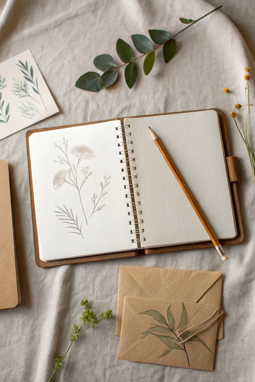
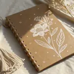
This minimalist wildflower study uses fine lines and negative space to create a serene sketchbook entry. The aesthetic relies on warm sepia tones and precise strokes to capture the fragility of nature, making it a beautiful addition to a collaborative traveling sketchbook.
Step-by-Step
Materials
- Cream-colored sketchbook (smooth paper)
- H graphite pencil (hard lead for light sketching)
- 0.3mm mechanical pencil or 0.1mm sepia fineliner
- Kneaded eraser
- Reference photo of Queen Anne’s Lace or Yarrow
Step 1: Structural Sketching
-
Establish the axis:
Open your sketchbook to the left page. Using your H pencil, lightly draw a long, slightly curved main stem line that reaches about two-thirds up the page. -
Map the branches:
Add two or three thin lines branching off the main stem at upward angles. Keep these lines very faint, as they serve as guidelines for the flower positions. -
Block in flower heads:
At the top of your main and secondary stems, sketch loose, flattened ovals or kidney shapes. These don’t need to be perfect; they just mark where the flower clusters will sit. -
Define leaf placement:
Towards the bottom left of the stem, draw a sweeping curved line extending outward. This will become your main fern-like leaf structure.
Step 2: Detailed Line Work
-
Select your tool:
Switch to your precise drawing tool. You can use a very sharp dark pencil for a softer look, but I prefer a sepia fineliner to match the vintage botanical aesthetic shown. -
Draw the lower stem:
Begin tracing over your initial stem line, starting from the bottom. Use a confident but delicate stroke. Don’t make the line perfectly straight; slight wobbles add organic realism. -
Add stem joints:
Where a branch splits from the main stem, thicken the intersection just a tiny bit to suggest the plant’s structure and weight. -
Create the florets:
Instead of outlining the flower ovals, fill the shapes with tiny clusters of small circles and ‘U’ shapes. Keep them denser in the center and looser at the edges. -
Connect the blooms:
Draw tiny, hair-thin lines connecting your individual floret clusters back to the main branch stem. -
Detail the leaf spine:
Go back to the bottom leaf guide. Draw a central vein, tapering it to a fine point as it extends away from the main plant. -
Add leaflets:
Along the leaf spine, draw slender, pointed leaflets. Use quick, flicking motions with your pen so the tips of the leaves taper off naturally. -
Balance the composition:
If the drawing feels uneven, add a small, detached sprig or a single floating leaf lower down on the page to ground the composition.
Smudge Prevention
Place a sheet of glassine or scrap paper under your drawing hand. This protects the creamy sketchbook paper from skin oils.
Step 3: Finishing Touches
-
Check line weight:
Look over the drawing. Make the base of the main stem slightly darker or thicker than the delicate tips of the flowers to create visual stability. -
Dry thoroughly:
If using ink, wait at least five full minutes to ensure the pigment has set completely into the paper fibers. -
Erase guidelines:
Gently roll your kneaded eraser over the drawing to lift the underlying H pencil marks without damaging the paper surface. -
Sign and date:
Add your initials or the date in a small, discreet font near the bottom of the stem to mark your contribution to the relay.
Level Up: Mail Art
Decorate the exterior mailing envelope with a matching leaf sprig to give the recipient a teaser of the art inside.
Your delicate botanical page is now ready to be mailed off to the next artist in the circle
Five-Minute Paint Swap Carousel
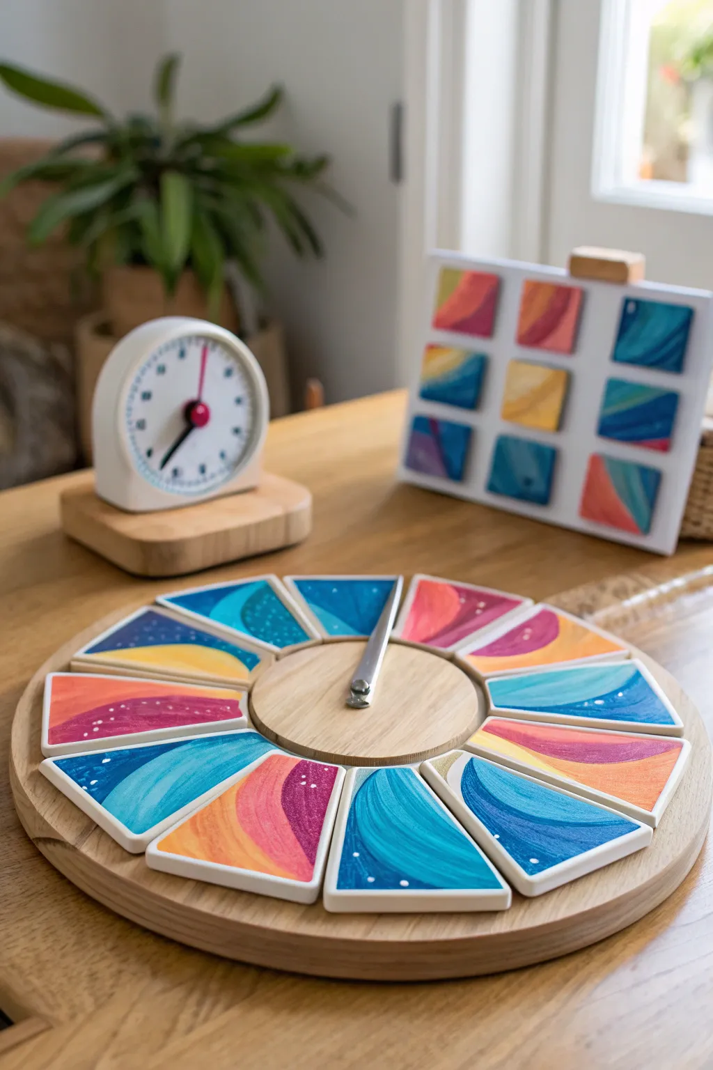
Bring collaboration to your art practice with this rotating wooden carousel designed for quick, iterative painting challenges. The finished piece features removable wooden wedges boasting vibrant acrylic swirls and patterns, creating a cohesive yet diverse kaleidoscope of color.
Step-by-Step Tutorial
Materials
- Unfinished wooden lazy susan (approx. 12-inch diameter)
- Set of pre-cut wooden pie wedges (must fit the lazy susan)
- Additional square wooden tiles (optional, for background rack)
- Fine-grit sandpaper (220 grit)
- White gesso primer
- Acrylic paints (teal, navy, coral, yellow, purple, white)
- Medium flat synthetic brush
- Small round detail brush
- Matte or satin spray varnish
- Metal spinner arrow (optional, for game aspect)
- Wooden dowel or central peg
- Strong craft glue (e.g., E6000 or wood glue)
Step 1: Preparing the Base
-
Sand the Components:
Begin by lightly sanding your wooden lazy susan and all the individual wooden wedge pieces. You want a super smooth surface so the paint glides on effortlessly. Wipe away any dust with a damp cloth or tack cloth. -
Secure the Center:
Glue a small wooden circle or disc into the exact center of the lazy susan. This creates a hub that holds the wedges in place visually and provides a spot for the spinner. Let this bond completely before moving on. -
Prime the Wedges:
Apply a thin, even coat of white gesso to the top surface of each wooden wedge. This step is crucial for making the bright acrylic colors pop later. Allow the primer to dry for at least 30 minutes. -
Install the Spinner:
If you are adding the game element, drill a small pilot hole in the center hub and screw in your metal spinner arrow. Ensure it spins freely without scraping the wood.
Sticky Spinner?
If the spinner doesn’t rotate well, add a small metal washer between the spinner mechanism and the wood to reduce friction.
Step 2: Designing the Wedges
-
Base Color Blocking:
Mix a vibrant palette of teal, coral, and ochre yellow. On three or four wedges, paint solid, sweeping curves that mimic hills or waves. Don’t worry about details yet; just get the main blocks of color down. -
Layering Contrast:
On the remaining wedges, use deeper tones like navy blue and purple. Paint similar curved shapes but vary the direction—some sweeping left, some right—to create dynamic movement when they are arranged in a circle. -
Adding Dimension:
Once the base layers are dry to the touch, mix a lighter version of your teal and coral by adding a touch of white. Paint a second interior curve inside your original shapes to create a ‘highlight’ strip. -
Creating Texture:
I find that using a slightly dry brush here adds nice texture. Drag a little bit of the contrasting color along the edges of your curves to soften the transition between bands of color. -
Detailing with Dots:
Dip the handle end of your small brush into white paint. Add clusters of tiny dots—representing stars or sea foam—scattered across the darker sections of the wedges. Keep the clusters random for an organic look.
Step 3: Finishing Touches
-
Seal the Artwork:
Arrange the painted wedges on a drop cloth in a well-ventilated area. Apply two light coats of matte spray varnish to protect the paint from handling during future games. -
Sand the Edges:
If any paint dripped over the sides, gently sand the raw wood edges of the wedges again to give them a crisp, professional clean-up. -
Assemble the Carousel:
Place all the finished wedges onto the lazy susan base, encircling the center hub. They should sit loosely enough to be picked up but snug enough to form a complete circle. -
Create the Scoreboard (Optional):
If you have extra square tiles, repeat the painting process with similar swirl patterns. These can be displayed on a small easel or board in the background to track color themes or turns.
Magnetic Magic
Embed small magnets into the bottom of each wedge and the base board so the pieces ‘snap’ satisfyingly into place but are still removable.
Now you have a beautiful, interactive art piece ready for your next creative game night

PENCIL GUIDE
Understanding Pencil Grades from H to B
From first sketch to finished drawing — learn pencil grades, line control, and shading techniques.
Explore the Full Guide
Big Coloring-Page Mural
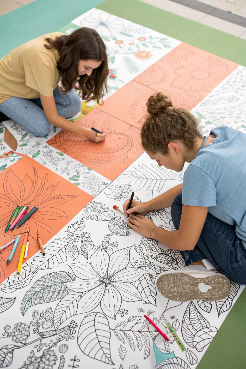
Turn art-making into a collaborative social event with this massive floor-based coloring page project. Featuring bold botanical line art across oversized paper panels, this mural creates a striking visual puzzle that friends can bring to life together.
How-To Guide
Materials
- Large format paper rolls (white)
- Colored poster board or construction paper (salmon/peach tone)
- Black brush pens or thick chisel-tip markers
- Fine-liner black pens
- Pencils and eraser
- Clear tape or masking tape
- Ruler or straight edge
- Various colored pencils or markers (for filling in later)
Step 1: Preparation & Layout
-
Select your color palette:
Decide on a two-tone background scheme. In the example, large white panels alternate with salmon-colored square panels to create a checkerboard effect. -
Cut the panels:
Cut your large format white paper and colored paper into equal-sized rectangular or square sheets. Aim for at least 24×24 inches per panel for a truly ‘giant’ feel. -
Arrange the grid:
Lay the sheets out on a large clean floor space to determine your final composition. Tape the backs of the sheets together securely so they don’t slide apart while you draw.
Fixing Ink Smudges
If you smudge wet ink, turn it into a leaf or bug! Draw a new organic shape around the mistake and fill it with a pattern to hide the error.
Step 2: Drafting the Design
-
Sketch the major forms:
Using a light pencil, sketch oversized botanical shapes spreading across multiple panels. Let a single large flower petal start on a white sheet and cross over onto a peach one to unify the design. -
Add secondary elements:
Fill the negative spaces with medium-sized leaves, stems, and seed pods. I like to vary the scale here, mixing giant blooms with smaller clusters of foliage. -
Detail the textures:
Lightly pencil in internal details like leaf veins, flower centers, and patterned textures within the shapes.
Keep It Taut
Tape the corners of the entire mural grid to the floor with painter’s tape. This prevents the paper from shifting or wrinkling while you draw.
Step 3: Inking the Lines
-
Outline main shapes:
Take a thick black marker or brush pen and trace over your primary pencil lines. Use confident, sweeping strokes for the outlines of the large flowers. -
Vary line weight:
Use a slightly thinner marker for the internal details of the leaves and petals. This hierarchy of line thickness makes the drawing easier to read. -
Add intricate patterns:
Switch to a fine-liner pen to create intricate zentangle-style patterns inside specific leaves or petals. Think stripes, circles, or cross-hatching to add visual interest. -
Clean up:
Once the ink is completely dry, use a large eraser to gently remove all visible pencil marks from the paper.
Step 4: The Coloring Event
-
Set the stage:
Leave the mural taped together on the floor or separate the panels if you need more space for individual participants. -
Gather supplies:
Scatter handfuls of colored pencils, markers, or crayons around the perimeter of the art piece. -
Collaborate and color:
Invite friends to jump in. The beauty of this project is that one person can work on shading a large leaf while another fills in the tiny patterns on the opposite side. -
Add detail color:
Use the colored pencils to shade the botanical elements. You can choose to color fully or leave parts black and white for contrast.
Enjoy the relaxed atmosphere as your giant botanical puzzle comes to life with color
Claim-a-Square Grid Collab
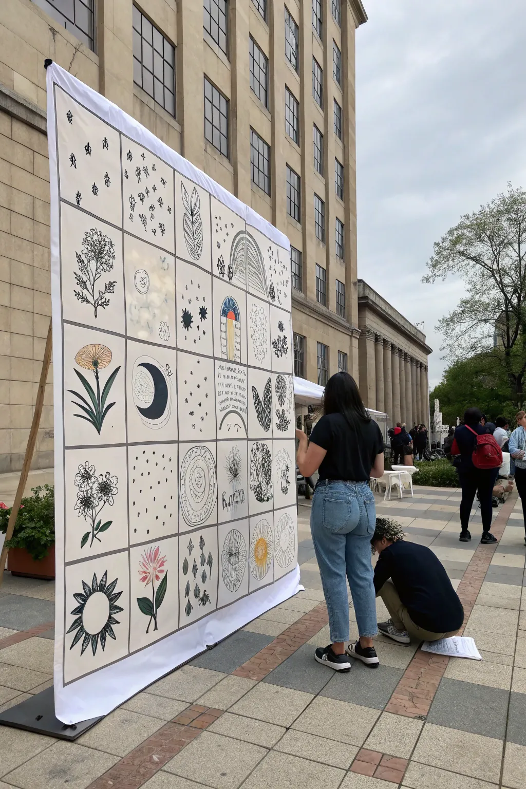
This large-scale collaborative art project brings together individual creativity into a cohesive grid masterpiece. It features stylized botanical and celestial illustrations on a giant fabric or vinyl banner, perfect for community events or classroom displays.
Step-by-Step Tutorial
Materials
- Large white vinyl or heavy canvas banner (approx. 6×8 feet)
- Black permanent markers (various tip sizes: fine, medium, broad)
- Fabric markers or acrylic paint markers (muted colors: olive green, mustard yellow, dusty pink)
- Long ruler or straight edge (yardstick)
- Pencil and large eraser
- Grommet kit (optional, for hanging)
- Portable banner stand or A-frame structure
- Reference sketches or theme sheets
Step 1: Grid Preparation
-
Measure dimensions:
Lay your large banner material flat on a clean, hard surface. Measure the total width and height to decide on your grid size. A 5×8 grid works well for a vertical format, or adjust based on your participant count. -
Calculate square size:
Divide your total width by the number of columns (e.g., 5) to find the width of each square. Do the same for the height. Aim for squares that are roughly 12-16 inches for a good impact. -
Mark the grid:
Using a pencil and a long straight edge, lightly mark the grid lines across the entire banner. Double-check your measurements as you go to ensure the boxes remain square. -
Finalize grid lines:
Once satisfied with the pencil layout, trace over the grid lines with a broad-tipped black permanent marker. Use the straight edge to keep lines crisp and bold. These thick lines will act as frames for each artwork.
Step 2: Assigning and Sketching
-
Establish a theme:
Decide on a loose theme to keep the collab cohesive. The example uses ‘Botanical & Celestial,’ featuring flowers, leaves, moons, and suns. Provide reference images to participants if needed. -
Claim a square:
Have each artist choose one grid square to work on. It helps to alternate complex designs with simpler ones so the final piece feels balanced. -
Draft lightly:
Encourage artists to sketch their design lightly in pencil directly onto the banner first. This allows for adjustments before committing with ink.
Keeping it Clean
Place a piece of scrap cardboard behind the banner area you are drawing on. This provides a hard surface and prevents ink bleeding through to the table or surface underneath.
Step 3: Inking the Designs
-
Outline main shapes:
Using a medium-tip permanent marker, participants should ink the primary outlines of their drawing. I find it safest to work from the top down if multiple people are working at once to avoid smudging. -
Add details:
Switch to a fine-tip marker for intricate details like leaf veins, stippling for shading, or small patterns. Variety in line weight makes the grid visually interesting. -
Incorporate bold fills:
Select certain areas to fill in completely with black ink, such as a crescent moon or the center of a flower. These high-contrast areas anchor the visual rhythm of the banner.
Smudge Alert
If someone accidentally smudges wet ink, turn it into a deliberate design element. Add stippling dots or small organic shapes over the smudge to camouflage it naturally.
Step 4: Adding Color Accents
-
Select a limited palette:
Choose 3-4 specific colors for the whole group to use (e.g., olive green, pale pink, ochre). Limiting the palette ensures the finished banner looks curated rather than chaotic. -
Apply color sparingly:
Use acrylic paint markers or fabric markers to color in select elements. Don’t color everything—leave plenty of white space. Color a flower petal, a sun ray, or a leaf, but keep the linework dominant. -
Layering color:
If using paint markers, let the first layer dry before adding a second coat if greater opacity is needed. This prevents the paper or fabric from pilling.
Step 5: Final Assembly
-
Erase pencil marks:
Once the ink and paint are completely dry (give it at least an hour), use a large eraser to gently remove any visible pencil guidelines. -
Install grommets:
If you plan to hang the banner, punch holes in the corners and reinforce them with metal grommets. This prevents tearing when the banner is displayed. -
Mount and display:
Attach the banner to a portable stand using zip ties or rope through the grommets. Ensure the banner is pulled taut so the grid lines look straight and professional.
Now you have a stunning, community-created mural ready to display at your next event


Giant Group Scene Base
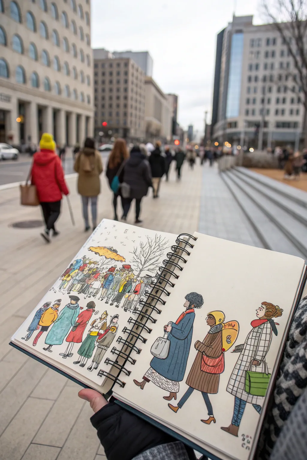
Capture the bustle of city life with this charming urban sketching project that combines loose pen work with vibrant pops of color. You’ll create a lively two-page spread that uses perspective to transition from a dense background crowd to detailed foreground characters.
Detailed Instructions
Materials
- Spiral-bound sketchbook (heavyweight mixed media paper)
- Fine liner pens (0.1mm, 0.3mm, and 0.5mm, waterproof ink)
- Watercolor set or alcohol-based markers
- Water brush or small round brush (size 4)
- HB Pencil
- Kneaded eraser
- Paper towel
Step 1: Planning the Composition
-
Establish the horizon line:
Begin by lightly sketching a horizontal line across both pages with your HB pencil, placing it slightly above the center mark. This will ground your figures. -
Draft the background crowd:
On the left page, lightly pencil in a large cluster of small, simplistic shapes near the horizon line. These don’t need details yet, just ovals for heads and rectangles for torsos to establish density. -
Position foreground figures:
On the right page, sketch three large figures walking in a line. Make these significantly taller than the background crowd to create a sense of depth and perspective.
Ink Smearing?
Ensure your pen claims to be ‘waterproof’ or ‘archival.’ If unsure, test a line on scrap paper and brush water over it before starting your main piece.
Step 2: Inking the Background
-
Outline the distant crowd:
Switch to your 0.1mm fine liner. Start inking the small background crowd on the left page. Keep your lines loose and wiggly; you aren’t aiming for realism, but rather the suggestion of movement. -
Add minimal features:
Give the closest figures in this background group tiny suggestions of faces—just dots for eyes or a line for a hat rim. Leave the figures furthest back as simple outlines. -
Incorporate environment elements:
Behind the crowd, sketch the bare branches of a tree using shaky, organic lines. Add a few vertical lines to suggest buildings or streetlights in the distance. -
Draw the transition group:
Moving toward the middle of the spread (near the spine), draw a medium-sized group of people. These should be slightly larger and more detailed than the background group, acting as a bridge to the foreground.
Step 3: Detailing the Foreground
-
Ink the main characters:
Use a 0.5mm pen for the three large figures on the right page. This thicker line weight pulls them forward visually. Start with the head outlines and work down. -
Add clothing textures:
Focus on the patterns. For the figure on the far right, draw a grid pattern for a checkered coat. Use simple parallel lines on the middle figure to suggest a ribbed sweater or texture. -
Define accessories:
Draw the bags and purses carefully. I like to add specific details here, like the distinct straps on the tote bag or the buttons on a backpack, to give the characters personality. -
Ground the figures:
Add small shadow shapes under their feet using diagonal hatching to show they are walking on pavement. -
Erase pencil guides:
Once the ink is completely dry (wait at least a few minutes to prevent smudging), gently erase all your initial pencil marks with a kneaded eraser.
Real-World Inspiration
Sit on a bench and sketch actual passersby for 15 minutes. Capture their distinct posture or a unique hat rather than trying to get a perfect likeness.
Step 4: Adding Color
-
Select a limited palette:
Choose 4-5 core colors (like teal, mustard yellow, brick red, and olive green) to keep the illustration cohesive. Test them on a scrap piece of paper first. -
Wash the foreground coats:
Apply flat washes of color to the coats of the three main figures. Let the color pool slightly for texture, but try to stay mostly within the lines. -
Color the accessories:
Paint the bags and scarves with contrasting colors. If the coat is blue, try a bright yellow bag to make it pop. -
Spot color the crowd:
Move to the background crowd on the left. Don’t color everyone! randomly fill in a jacket here or a hat there. Leaving white space helps the drawing breathe. -
Add pattern details:
Once the base washes are dry, go back with a slightly darker shade or a colored pencil to enhance patterns, like the checks on the coat or stripes on a scarf. -
Final touches:
Add tiny touches of skin tone to the faces if desired, or leave them stylized and white. Sign and date your sketch in the corner.
Now you have a lively urban scene that perfectly captures the rhythm of the street
Scan-and-Blend Hybrid Collage
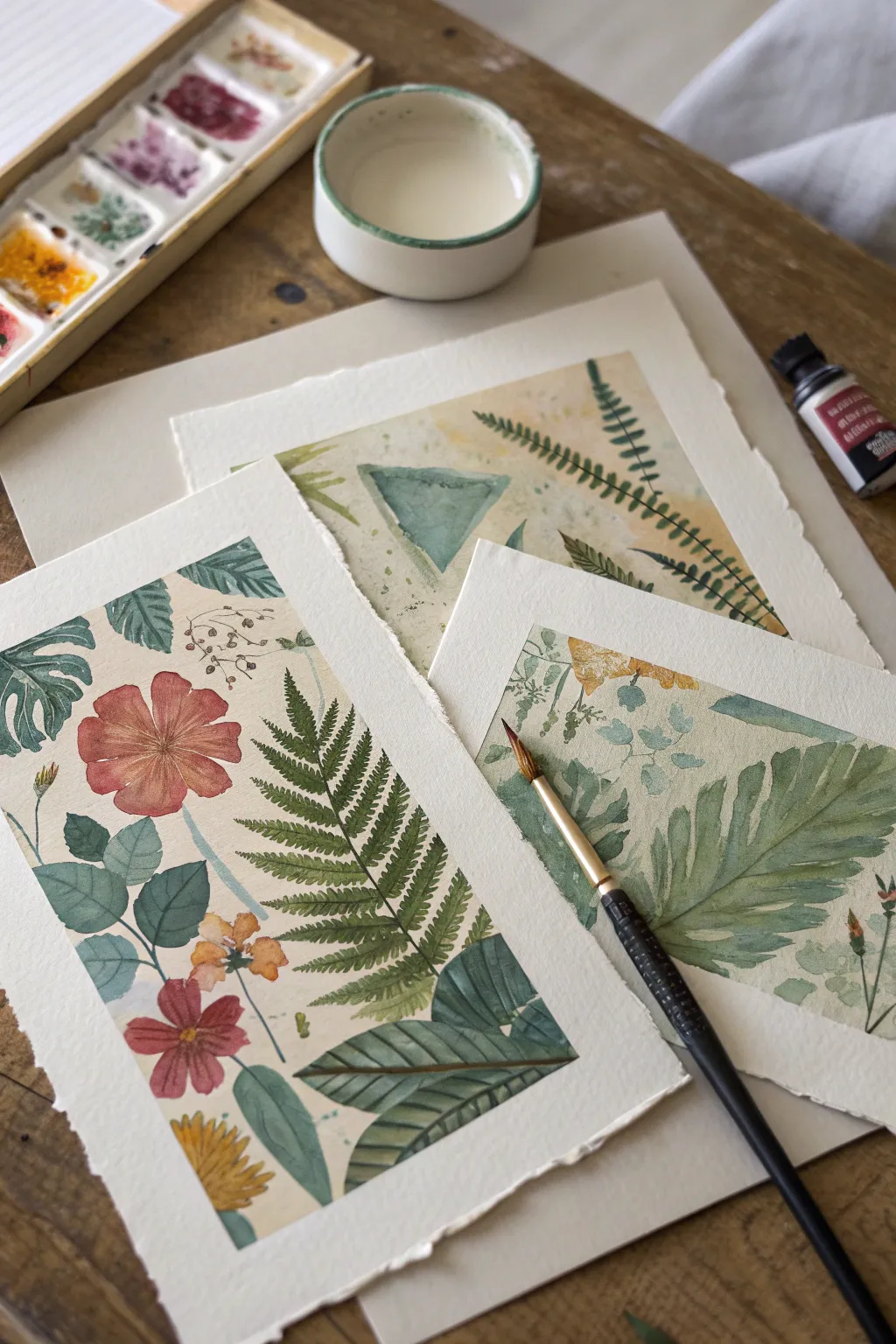
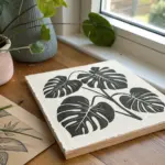
Create a serene collection of nature-inspired artworks that combines loose, fluid washes with precise botanical details. This project focuses on layering earthy greens, rusty reds, and soft yellows to build compositions lush with ferns, leaves, and wildflowers.
Step-by-Step
Materials
- Cold press watercolor paper (300 gsm or heavier)
- Watercolor paints (pans or tubes in sap green, oxide red/burnt sienna, yellow ochre, indigo)
- Small round brushes (size 2 and 4)
- Flat wash brush (size 6 or 8)
- Ceramic water dish
- Pencil for light sketching
- Paper towels
- Masking tape (optional)
Step 1: Planning and Foundation
-
Paper Preparation:
Begin by tearing your watercolor paper into three distinct rectangular sizes to create a dynamic triptych layout. Tearing against a straight edge rather than cutting gives you those beautiful, organic decked edges. -
Composition Sketching:
Lightly sketch the main elements on each sheet with a hard pencil (like an H or 2H) to keep lines faint. Plan for a mix of large focal leaves, delicate ferns, and simple geometric shapes like the triangle seen in the background sheet. -
Initial Color Palette:
Prepare your palette by mixing a watery sap green, a muted terracotta red using burnt sienna, and a pale yellow ochre. You want these initial mixes to be quite transparent for the base layers.
Step 2: Background Washes
-
Laying the Base:
On the largest sheet, use a flat brush to apply a very faint, uneven wash of yellow ochre and dilated green. Let the colors bleed slightly into each other to create an aged, parchment-like background texture. -
Geometric Accents:
If you are including geometric elements like the triangle, paint them now using a flat wash of teal or muted green. Keep the edges relatively crisp but allow the interior color to have some natural water granulation. -
First Drying Phase:
Allow these background layers to dry completely. If the paper feels cool to the touch, it is still wet; wait until it is room temperature before proceeding to detailed work.
Water Control
Keep separate water jars for warm (reds/yellows) and cool (greens/blues) colors. This prevents your vibrant greens from turning into muddy brown sludge when you rinse your brush.
Step 3: Botanical Detailing
-
Fern Structures:
Switch to your size 2 round brush. For the ferns, paint a thin central stem first, then use quick, rhythmic strokes to pull the leaflets outward, lifting the brush at the tip for a tapered point. -
Varied Greenery:
Paint large monstera or broad leaves using a mix of sap green and a touch of indigo for depth. I like to leave tiny slivers of white paper (negative space) along the veins to give the leaves definition without using black lines. -
Adding Florals:
For the rust-colored flowers, paint five broad, petal shapes radiating from a center. Keep the paint fluid so the pigment pools slightly at the edges of the petals, creating a natural outline effect as it dries. -
Background foliage:
On the sheet with the triangle, paint long fern fronds that overlap the geometric shape. This layering creates depth and connects the abstract background with the realistic foreground. -
Layering Transparency:
Once your first set of leaves is dry, paint a second layer of paler or different-colored leaves ‘behind’ them. This ‘ghosting’ technique makes the composition feel lush and dense.
Digital Hybrid
Scan your dry paintings at high resolution. Isolate elements in Photoshop to create a seamless pattern or print them onto fabric for custom tea towels or tote bags.
Step 4: Finishing Touches
-
Deepening Shadows:
Mix a darker green using sap green and a tiny bit of red or brown. Apply this selectively to the base of leaves or where stems overlap to anchor the plants visually. -
Spatter Texture:
Load a brush with watery pigment (green or ochre) and tap it against another brush handle over the paper. This creates fine speckles that mimic pollen or natural imperfections. -
Center Details:
Add center details to your flowers using a concentrated dot of yellow or dark brown. Make sure the petals are fully dry first to prevent the center from bleeding outward. -
Final Assessment:
Arrange the three pieces together. If one looks too light compared to the others, add a few more dark leaves or stems to balance the visual weight across the collection.
Step back and admire your mini botanical garden, perfect for framing or scanning for your next digital project
Prompt Chain Mini Comic
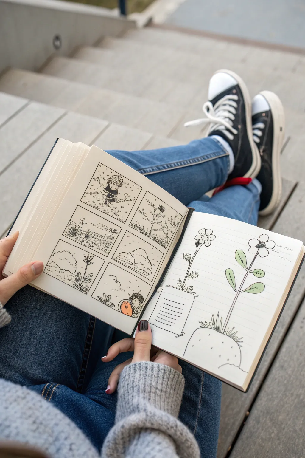
Transform a blank sketchbook spread into a collaborative storytelling game by creating a multi-panel mini-comic and a contrasting character study. This project combines structured panel work with loose, illustrative elements, perfect for passing back and forth with a friend.
Detailed Instructions
Materials
- A5 Sketchbook or heavy-weight notebook
- 0.3mm and 0.5mm black fineliner pens
- Pencil (HB or 2B)
- Eraser
- Ruler
- Colored pencils or markers (orange, green, light brown)
Step 1: Setting up the Grid
-
Measure margins:
On the left page, use your ruler to mark out a comfortable margin around the edges, roughly 1 inch from each side. -
Draw panel borders:
Divide the central space into six equal rectangles—two columns of three rows sketch the grid lightly with pencil first to ensure symmetry. -
Ink the frames:
Once you are happy with the layout, go over your panel borders with a 0.5mm fineliner for a bold, crisp edge. Let the ink dry for a moment before erasing the pencil guides.
Clean Lines Pro-Tip
When erasing pencil sketches under ink, wait at least five minutes to ensure the ink is fully cured. This prevents smearing your crisp black lines.
Step 2: Sketching the Narrative
-
Plan the sequence:
Lightly sketch a simple sequence in the panels. The example shows a journey: a character walking, a landscape, and finally discovering something. Keeping the figures small allows you to focus on the environment. -
Ink the first panel:
Using a 0.3mm pen, ink the first panel. Draw a character bundled up against the wind, using short, scratchy lines to suggest movement and blowing snow. -
Create atmosphere:
In the second panel, draw a barren landscape with a prominent, spindly tree. Use jagged lines for the branches to convey a harsh, wintry mood. -
Add background details:
For the middle row, draw a distant village or structures. Keep the lines thin and delicate to suggest distance. -
Ink the varied terrain:
In the bottom left panel, draw rocky or hilly terrain. Use stippling (dots) or small dashes to add texture to the ground without overwhelming the panel. -
Final panel focus:
In the last panel, draw your character interacting with a new object. Here, outline a large, round shape that the character is inspecting. -
Add a pop of color:
Take an orange marker or colored pencil and color only the object the character found in the last panel. This selective color highlights the narrative climax.
Step 3: The Character Study
-
Draft the layout:
On the right-hand page, lightly pencil two large flower-like structures growing out of pots or mounds. This page serves as a contrast to the tight panels on the left. -
Ink the left plant:
Draw the left plant with a thin stem and drooping petals. Place it in a cylindrical pot detailed with horizontal lines. -
Ink the right plant:
Draw the right plant taller, with two large leaves on the stem and a simple five-petal flower head. Base it in a rounded, mound-like pot with small texture marks. -
Color the leaves:
Use a light green colored pencil to gently shade the leaves of the right-hand plant. Apply the color softly, leaving some white space for a highlight effect. -
Add finishing touches:
Add handwritten notes or prompts next to the drawings on the right page if this is a collaborative piece, guiding your partner on what to add next.
Level Up: Interactive Elements
Leave the speech bubbles empty! Hand the book to a friend and challenge them to write the dialogue based solely on your visuals.
Now you have a charming story spread that invites further creative collaboration
Sound-to-Scene Interpretation Swap
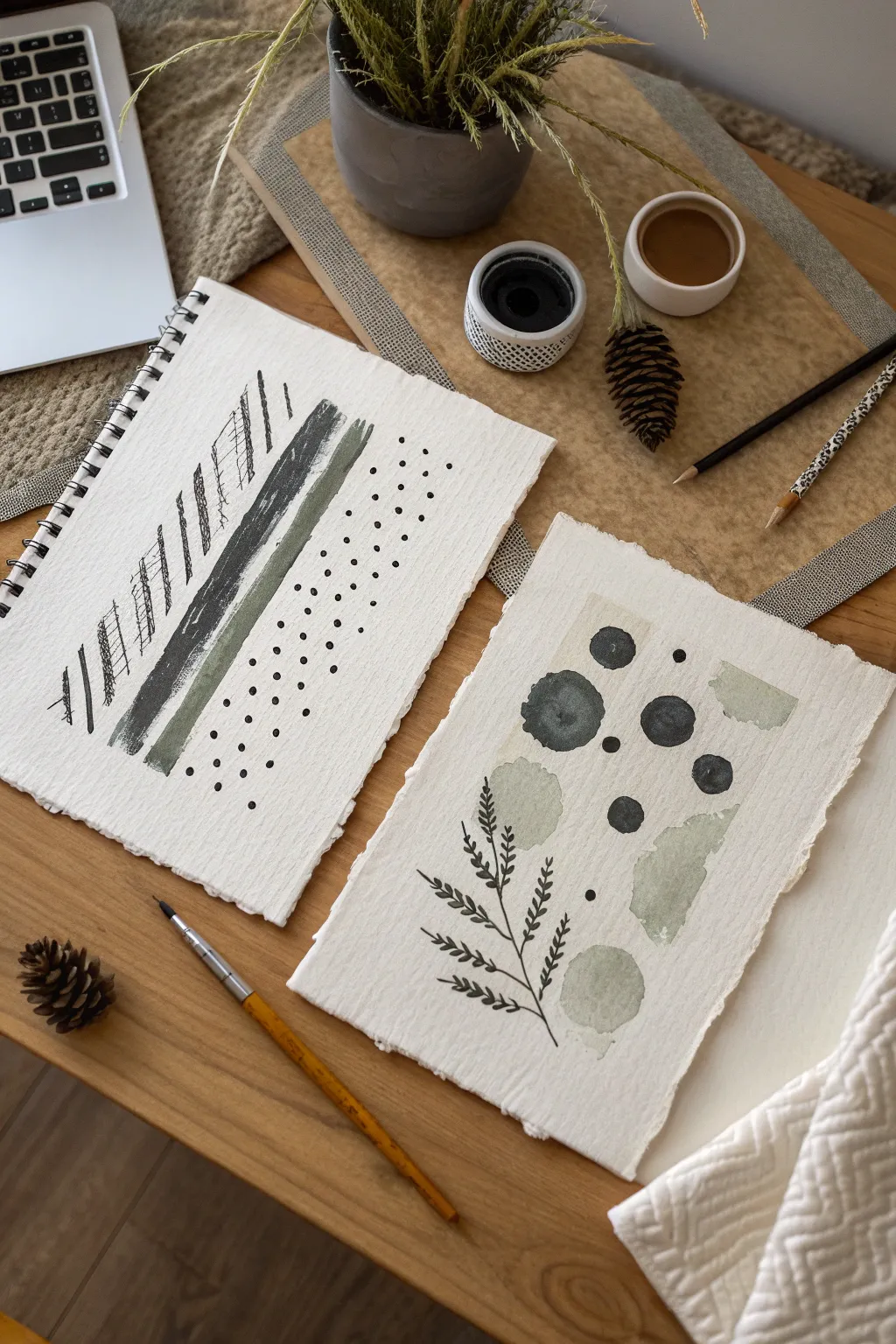
This tutorial guides you through creating two complementary mixed-media pieces that balance geometric precision with organic softness. Using a limited palette of olive greens and charcoal blacks on textured handmade paper, you’ll explore mark-making techniques ranging from structured hatching to free-flowing ink spheres.
How-To Guide
Materials
- Heavyweight handmade cotton rag paper (deckle edge)
- Black India ink or acrylic ink
- Olive green watercolor paint
- Sage or moss green watercolor paint
- Flat shader brush (size 6 or 8)
- Round watercolor brush (size 4 or 6)
- Fine liner or rigger brush
- Fine-tip black drawing pen (0.5mm)
- Graphite pencil
- Water cups and palette
Step 1: Preparation & Setup
-
Paper Selection:
Begin with distinctively textured paper. If you don’t have handmade rag paper, tear the edges of heavyweight watercolor paper against a ruler to mimic that raw, deckle-edge look. -
Palette Mixing:
Prepare your colors. You need a deep, opaque black (ink works best), a muted olive green, and a lighter, watery sage green. Test the green transparency on a scrap piece; you want a nice variation between opaque and translucent.
Dry Brush Technique
For the stripes, wipe excess paint off your brush before applying. This ‘dry brush’ method allows the paper’s tooth to grab pigment unevenly, creating beautiful texture.
Step 2: Project 1: The Linear Study (L)
-
Pencil Guidelines:
Lightly sketch a few diagonal guidelines on the first sheet of paper to determine the angle of your composition. These should run from bottom-left to top-right. -
Hatching Texture:
Starting on the left side, use your fine-tip black pen to create a band of diagonal hatching. Vary the density; some lines should be close together, others spaced apart, creating a vibrating rhythm. -
Adding the Ink Stripe:
Load a flat shader brush with black ink. Paint a bold, confident stripe parallel to your hatching. Allow the dry texture of the paper to show through slightly at the start and end of the stroke. -
The Opaque Green Band:
Clean your flat brush thoroughly. Pick up the olive green paint—keep it fairly thick and creamy. Paint a stripe next to the black one, letting them almost touch but maintaining a hairline gap. -
The Translucent Wash:
Add more water to your green mix. Paint a final, thinner stripe on the right side. I find that lifting the brush quickly at the end of the stroke gives it a nice feathered edge. -
Stippling Detail:
Dip the handle end of a paintbrush or a small dotting tool into black ink. Create a field of dots on the right side of the paper, filling the negative space with an organized but organic stipple pattern.
Make It a Diptych
Mount both pieces on a single large matte board with a deep bevel. The connection between the linear chaos and the organic flow creates a sophisticated gallery look.
Step 3: Project 2: The Botanical Abstract (R)
-
Planning the Shapes:
On the second sheet, visualize an asymmetrical arrangement. You want a mix of circular forms and soft, amorphous blobs. -
Painting Ink Orbs:
Using the round brush and black ink, paint several circles of varying sizes. Don’t worry about perfect geometric spheres; a little wobble adds character. Make the largest one quite dark and the others slightly more washed out. -
Soft Green Forms:
Switch to your lighter sage watercolor wash. Paint two or three irregular, stone-like shapes to balance the dark circles. Keep these very wet and loose to contrast with the ink. -
Botanical Sketching:
Once the background washes are bone dry, take your fine liner brush (or the black pen). Draw a delicate stem rising from the bottom left. -
Adding Leaves:
Add small, repeating leaves to the stem. Use quick, short strokes to suggest foliage rather than drawing every vein perfectly. -
Connecting the Elements:
Add a few tiny black dots scattered among the larger shapes to lead the eye through the composition, similar to the stippling in the first project. -
Final Assessment:
Step back and look at both pieces together. If the botanical piece feels too light, add one more small, solid black circle to anchor the weight. -
Drying:
Let both artwork pieces dry completely flat on a clean surface to prevent the heavy paper from buckling further.
Display these studies together to bring a quiet, contemplative mood to your creative space

Have a question or want to share your own experience? I'd love to hear from you in the comments below!