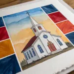
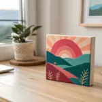
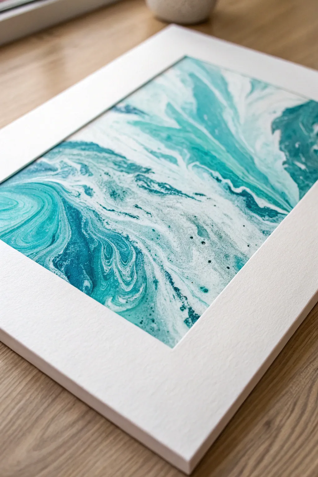
Whenever I need a color that instantly feels like a deep breath, I reach for turquoise—it’s calming, bright, and a little bit magical. Here are some of my favorite turquoise painting ideas you can try today, from classic watery scenes to bolder, more unexpected twists.
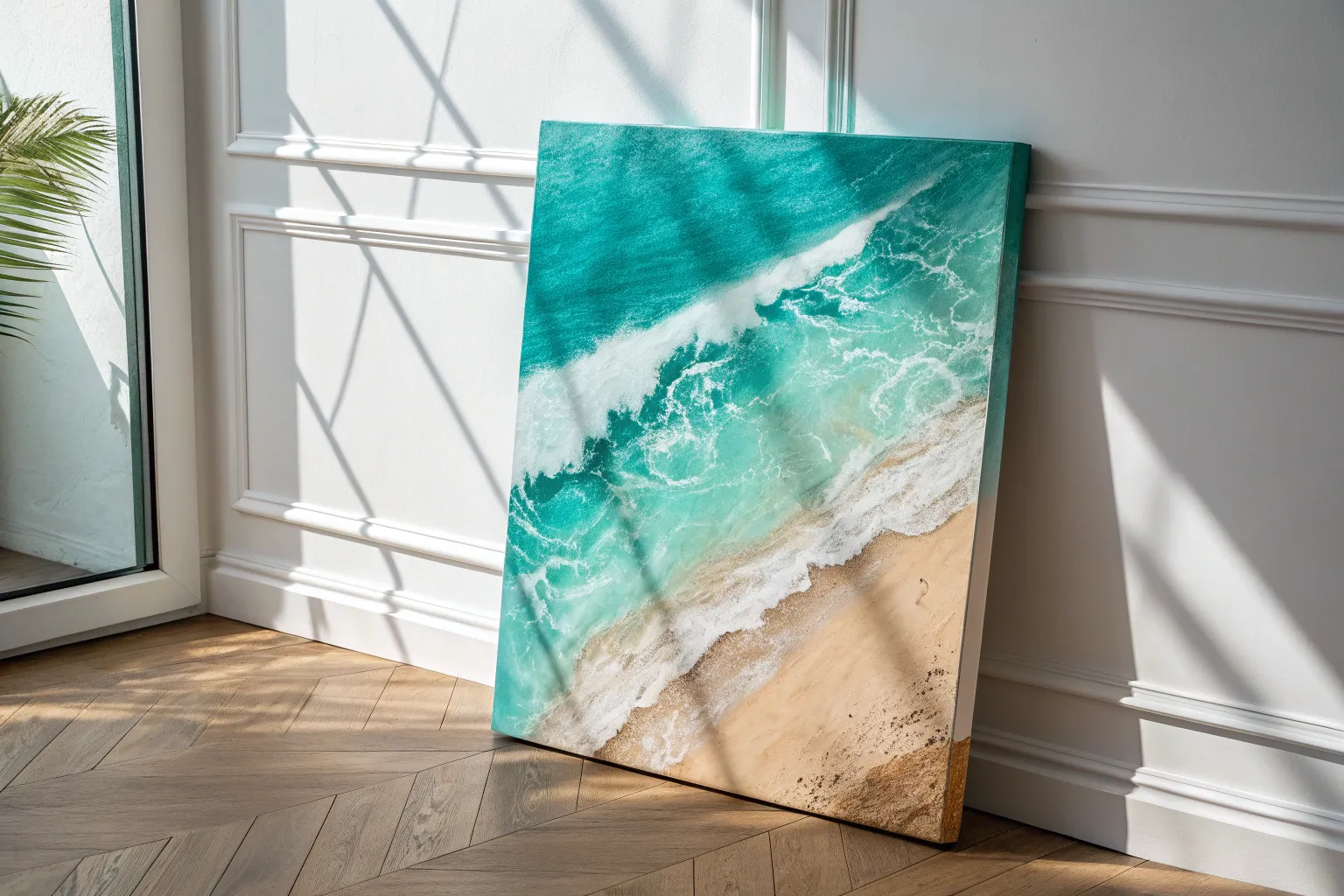
Turquoise Ocean Wave Layers
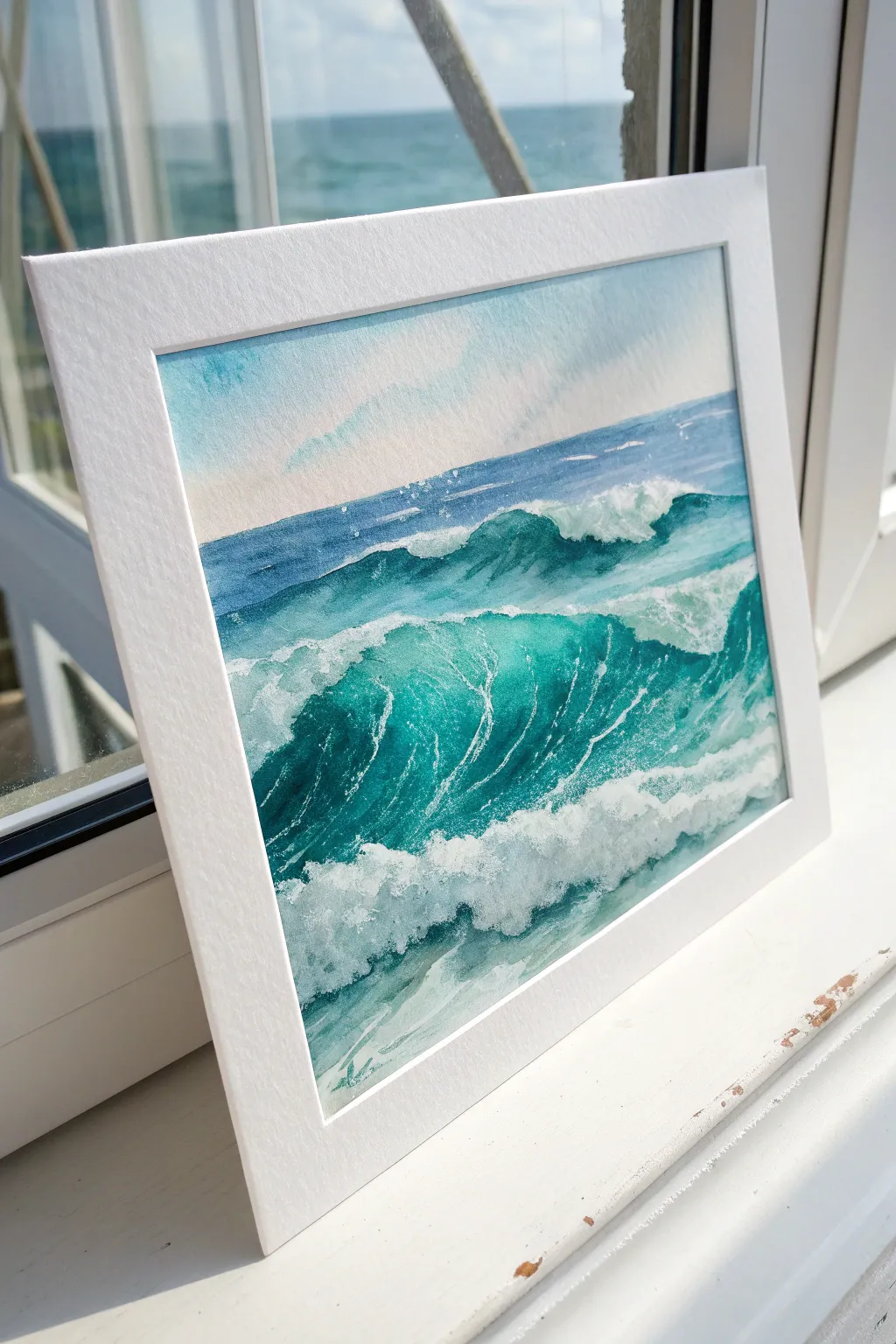
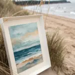
Capture the dynamic movement of the ocean with this vibrant watercolor project featuring crashing turquoise waves and sea foam. By layering translucent washes and preserving crisp whites, you’ll create a refreshing seascape that feels full of light and energy.
Step-by-Step Tutorial
Materials
- Cold press watercolor paper (300gsm)
- Painter’s tape or masking tape
- Watercolor paints: Turquoise (Phthalo Turq), Prussian Blue, Indigo, Burnt Umber
- White gouache or white bleed-proof ink
- Round brushes: Sizes 10 or 12 (large wash), 6, and 2 (details)
- Masking fluid
- Two water containers
- Paper towels or a rag
- White mat board for framing
Step 1: Planning and Preparation
-
Secure the paper:
Tape your watercolor paper down firmly to a board on all four sides. This prevents buckling when the paper gets wet and creates a clean, crisp border for framing later. -
Sketch the wave structure:
Using a hard pencil (like an H or 2H), very lightly sketch the horizon line about two-thirds up the page. Draw the outline of the main crashing wave and the secondary swells behind it. -
Protect the highlights:
Apply masking fluid with an old brush or a dedicated applicator to the areas where the foam will be brightest—specifically the crest of the main wave and the scattered spray. Let this dry completely before touching it with water.
Muddy Waters?
If your turquoise looks dull, you likely picked up orange or red on your brush. Stick to cool blues and greens only. Let layers dry fully before glazing over them.
Step 2: Painting the Sky and Horizon
-
Wet the sky area:
Use your largest brush to wet the paper above the horizon line with clean water. The paper should glisten but not have standing puddles. -
Wash in the sky:
Drop in a very dilute wash of Turquoise mixed with plenty of water. Keep the top corners slightly darker and let the color fade almost to white as it nears the horizon line. -
Define the distant sea:
While the sky is drying, mix a darker version of the sea color using Prussian Blue and a touch of Indigo. Paint a straight, horizontal strip right at the horizon line to establish the distant deep water.
Step 3: Building the Wave Layers
-
Base wash for the waves:
Mix a large amount of your main Turquoise color. Paint the body of the waves, carefully painting around the masked foam areas. Use a wet-on-dry technique here to keep some control over the shapes. -
Deepen the shadows:
While the base turquoise is still damp in places, drop in a mix of Prussian Blue and Turquoise into the trough of the wave (the area under the curling crest). This creates depth and volume. -
Texture the water surface:
Using a size 6 brush and a ‘dry brush’ technique, drag pure Turquoise lightly across the paper’s texture on the wave face. This mimics the ripples and movement of water. -
Darkest accents:
Mix Indigo with a tiny bit of Burnt Umber to create a deep, near-black teal. Paint this into the absolute deepest crevices under the crashing foam to make the white pop significantly. -
Soften distinct edges:
If any lines between the dark blue and turquoise look too harsh, rinse your brush and run damp bristles along the edge to soften the transition.
Make It Sparkle
For a magical sun-kissed look, gently scratch the paper surface with an X-Acto knife or razor blade in the highlighted areas to create ultra-bright glints.
Step 4: Foam and Finishing Details
-
Remove the mask:
Once the paper is bone dry—touch it with the back of your hand to check—gently rub away the masking fluid with your finger or a rubber cement pickup tool. -
Shadow the foam:
The revealed white paper will look too stark and flat. Mix a very watery, pale grey-blue and paint the bottom/shadow side of the foam clumps to give them 3D form. -
Add bright splatter:
Load a stiff brush or an old toothbrush with white gouache. Flick the bristles to spray fine white dots over the crashing area to simulate sea spray. -
Enhance white caps:
Use the size 2 brush and thick white gouache to paint fine, networking lines—often called sea lace—dragging down the front face of the wave. -
Final dry brushing:
I like to take a nearly dry brush with white gouache and scumble it over the top of the wave crests to create a misty, broken effect where the water is aerated. -
Mat and frame:
Carefully peel off the painter’s tape at a harsh angle. Place a crisp white bevel-cut mat over your painting to complete the professional gallery look.
Step back and admire the refreshing splash of color you have brought into your space
Turquoise Sea Turtle Underwater Scene
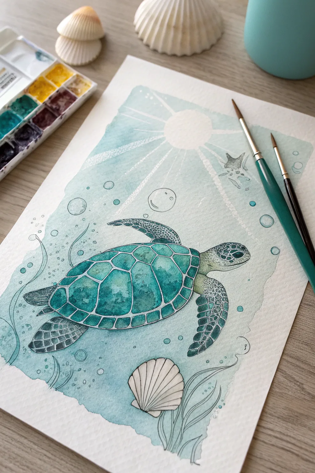
Capture the serene beauty of marine life with this tranquil watercolor painting that features a graceful sea turtle swimming through turquoise waters. This project combines loose wet-on-wet background techniques with precise pen detailing to create a lovely balance of softness and structure.
Step-by-Step
Materials
- Cold press watercolor paper (300 gsm)
- Watercolor paints (Turquoise, Phthalo Blue, Sap Green, Payne’s Grey, Yellow Ochre)
- Round watercolor brushes (Size 8 for washes, Size 2 for details)
- Waterproof white gel pen or white gouache
- Fine liner pen (Black or Dark Grey, 0.3mm)
- Masking fluid (optional)
- Pencil and eraser
- Painter’s tape
- Two jars of water
- Paper towels
Step 1: Sketching and Masking
-
Tape down the paper:
Secure your watercolor paper to a hard surface using painter’s tape on all four sides. This prevents buckling when we add water and creates that clean, crisp border seen in the final piece. -
Lightly sketch the turtle:
Using a light hand, draw the oval shape of the turtle’s shell in the center. Add the flippers, head, and tail. Keep the lines faint so they don’t show through the transparent watercolor later. -
Add scenic details:
Sketch a large scallop shell at the bottom right and a small circle for the sun near the top. Draw faint lines radiating from the sun for the rays and add circular bubbles of varying sizes floating around the turtle. -
Mask highlights (optional):
If you are using liquid masking fluid, apply it carefully over the sun rays, the bubbles, and the white lines between the shell scutes. If you don’t have masking fluid, you can simply paint around these areas or add them later with white gouache.
Avoid Muddy Waters
Wait for the background turquoise to dry completely before painting the turtle. If the layers touch while wet, the green and blue will bleed into an indistinct blob.
Step 2: Creating the Ocean Background
-
Prepare a turquoise wash:
Mix a generous amount of Turquoise with plenty of water to create a very light, transparent wash. You want this initial layer to be the color of shallow tropical water. -
Paint the background wash:
Apply the turquoise wash over the entire background area, carefully avoiding the turtle’s body and the scallop shell. Paint right over the sun rays if you used masking fluid; otherwise, leave negative space for them. -
Deepen the water color:
While the paper is still slightly damp, drop in slightly more concentrated Phthalo Blue or darker Turquoise near the bottom corners and around the turtle’s outline to create depth. -
Suggest movement:
Use a clean, damp brush to lift out a little color in wavy patterns near the sea grass area at the bottom to suggest water currents.
Step 3: Painting the Subjects
-
Paint the shell scutes:
Mix a vibrant teal using Turquoise and a touch of Sap Green. Paint the individual plates (scutes) on the turtle’s shell. Vary the intensity, making the centers slightly lighter to give them a convex, 3D appearance. -
Detail the skin:
For the flippers and head, use a mix of Sap Green and a tiny bit of Yellow Ochre for a duller, natural green. Paint the skin, letting it dry completely before proceeding. -
Add skin texture:
Once the base green is dry, use your small size 2 brush and a darker green-grey mix to dab small, irregular spots on the flippers and head to mimic scales. -
Paint the scallop shell:
Use a very diluted wash of Payne’s Grey or a watery brown to paint the bottom seashell. Keep it largely white, adding shadow only in the grooves of the shell.
Add Salty Texture
Sprinkle coarse salt onto the wet background wash before it dries. Once dry, brush the salt off to reveal star-like textures that look perfectly like fizzy ocean bubbles.
Step 4: Defining Details
-
Remove masking fluid:
Ensure the paper is bone dry. Gently rub away the masking fluid to reveal the crisp white paper underneath. -
Outline with pen:
Take your fine liner pen and carefully outline the turtle, the shell scutes, and the bottom seashell. Use broken or lighter lines for the bubbles to keep them looking airy. -
Add sun ray texture:
With a dry brush and a tiny amount of white gouache (or a white gel pen), softly stipple or scratch texture into the sun rays so they look like beams of light filtering through water. -
Draw sea grass and bubbles:
Using the fine liner or a very thin brush with dark paint, draw wavy lines at the bottom for sea grass. Outline the bubbles, adding a tiny reflection mark inside each one. -
Final highlights:
Use your white gel pen to add final bright highlights on the top of the turtle’s shell and head where the sun hits, enhancing the wet look.
Peel off the tape slowly to reveal those clean edges and admire your underwater masterpiece
Turquoise Water Lily Pond Glow
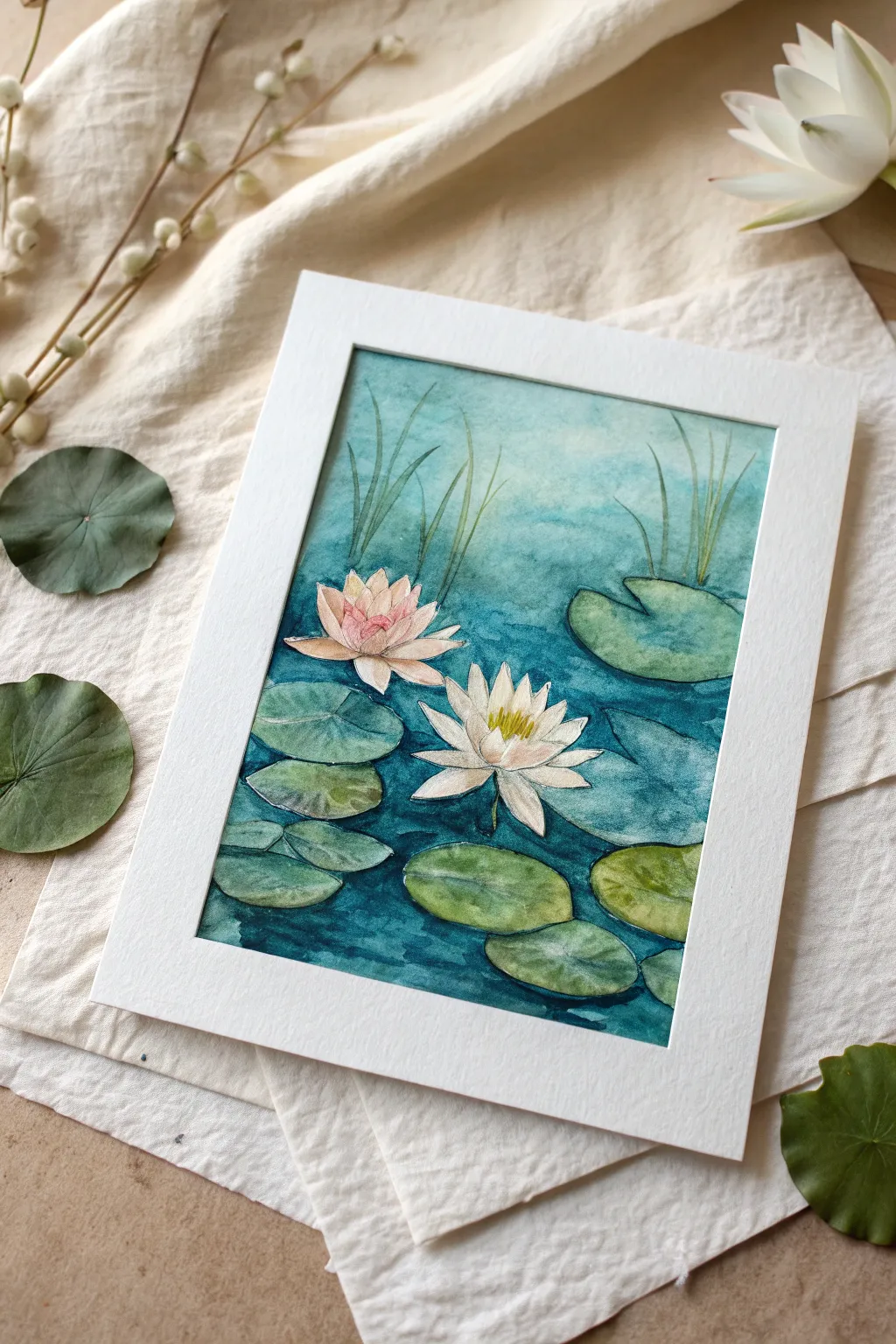
This serene watercolor painting captures the cool, calming essence of a lily pond using varying shades of turquoise and deep teal. The soft gradients of the water contrast beautifully with the delicate petals of the floating lilies.
Step-by-Step
Materials
- Cold press watercolor paper (140lb/300gsm)
- Watercolor paints (Turquoise, Phthalo Blue, Sap Green, Alizarin Crimson, Lemon Yellow, Payne’s Grey, Burnt Umber)
- Round watercolor brushes (Size 8 for washes, Size 4 for details)
- Masking fluid (optional)
- Pencil (HB) and kneaded eraser
- Two jars of water
- Paper towels
- White mat frame for display
Step 1: Planning and Sketching
-
Compose the scene:
Begin by lightly sketching the placement of your two main water lilies. Position the pinkish bloom slightly higher and to the left, and the open white bloom lower and to the center-right to create a balanced diagonal flow. -
Add pads and reeds:
Sketch the oval shapes of the lily pads surrounding the flowers. Vary their sizes and angles to create depth. Add a few vertical, slightly curved lines in the background to represent tall grasses or reeds sticking out of the water. -
Refine the outlines:
Go over your sketch to ensure the petals are clearly defined. Keep your pencil lines light so they won’t show through the transparent watercolor layers later. -
Preserve the whites:
If you are less confident painting around shapes, apply a thin layer of masking fluid to the lily petals and the highlights on the pads. Let this dry completely before touching the paper with water.
Muddy Water?
If your turquoise water looks dull, you may have mixed orange or red into it by accident. Keep two water jars: one for cleaning warm colors (reds/yellows) and one for cool colors (blues/greens).
Step 2: Painting the Water
-
First wet-on-wet wash:
Wet the entire water area with clean water, avoiding the flowers and pads. Drop in a very diluted wash of Turquoise mixed with plenty of water to establish a light, airy base layer. -
Deepen the background:
While the paper is still slightly damp, mix a stronger Turquoise with a touch of Phthalo Blue. Apply this to the upper section of the water, letting it diffuse downwards to create a soft gradient. -
Create depth around elements:
Switch to your size 4 brush. Mix a concentrated teal using Phthalo Blue and a tiny bit of Payne’s Grey. Paint carefully around the lily pads and flowers, darkening the water immediately next to them to make them pop forward. -
Add water ripples:
Using horizontal strokes with the darker teal mix, suggest gentle movement in the water. Keep the strokes looser in the open areas and tighter near the pads. -
Paint the background reeds:
Mix a watery Sap Green. Paint the reeds in the background with quick, upward strokes. Because the background is soft, these shouldn’t be too sharp or detailed.
Step 3: Painting the Flora
-
Base layer for lily pads:
Once the water is dry, paint the lily pads with a wash of Sap Green. Vary the tone by adding more yellow to some pads (for sunlight) and more blue to others (for shadow). -
Deepen pad shadows:
Mix Sap Green with a drop of blue or brown. Apply this darker green to the edges of the pads and where they overlap, creating a sense of dimension. -
Texture on the pads:
Use a nearly dry brush to stipple a little texture onto the larger pads in the foreground, suggesting veins or surface unevenness. -
Paint the pink lily:
Dilute Alizarin Crimson to a very pale pink. Glaze the petals of the upper flower, concentrating the color at the base of the petals and tips, leaving the centers almost white. -
Paint the white lily:
For the lower white lily, leave most of the paper white. Use a very pale grey-blue wash to paint only the shadows on the petals, defining their overlapping structure. -
Add the centers:
Mix a bright Lemon Yellow with a touch of decorative orange. Paint the stamens in the center of both flowers with small, short dabs of the brush.
Add Some Shimmer
Mix a tiny amount of iridescent medium into your final teal glaze on the water. It will make the pond surface glisten subtly when the light hits the artwork.
Step 4: Final Details
-
Enhance contrast:
Return to the water with your darkest teal mix. Deepen the shadows directly underneath the floating pads to ‘anchor’ them to the surface. -
Refine edges:
If you used masking fluid, remove it now. Soften any hard edges on the petals with a clean, damp brush. -
Add subtle highlights:
If needed, use a tiny amount of white gouache or a white gel pen to add highlights to the tips of the stamens or the wettest parts of the lily pads. -
Mount and frame:
Once the painting is completely dry, flatten it under a heavy book if it has buckled. Place a clean white mat over the image to crop it neatly and frame the composition.
Step back and admire the peaceful atmosphere you have created with your brush and palette

White Dandelion on a Turquoise Sky
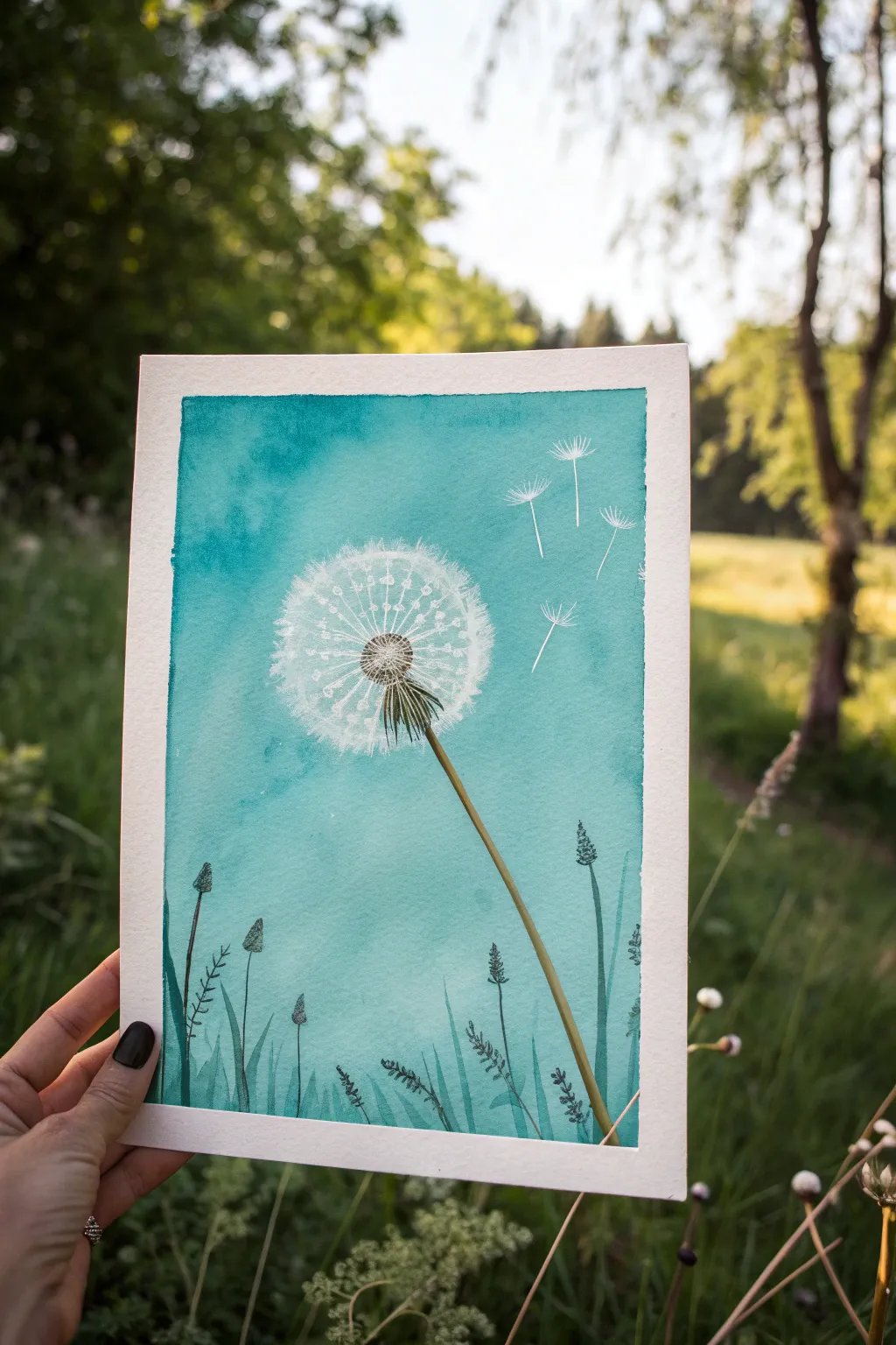
Capture the airy lightness of a dandelion seed head against a vibrant summer sky with this watercolor project. The striking contrast between the teal wash and the delicate white details creates a serene, dreamy atmosphere.
Detailed Instructions
Materials
- Cold press watercolor paper (300gsm)
- Masking fluid (drawing gum) with applicator or old brush
- Painter’s tape or washi tape
- Watercolor paints: Turquoise, Phthalo Blue, Sap Green, Burnt Umber
- White gouache or white gel pen
- Round watercolor brushes (size 8 for wash, size 2 or 0 for details)
- Pencil and eraser
- Paper towels and water cup
Step 1: Preparation and Masking
-
Tape boundaries:
Begin by taping down all four edges of your watercolor paper to a board. This creates the crisp white border seen in the reference image and prevents buckling. -
Sketch lightly:
Use a pencil to very faintly sketch the position of the dandelion head, the stem, and the floating seeds. Keep the lines minimal so they don’t show through later. -
Protect the white:
Apply masking fluid to the dandelion seeds (the fluffy white part), the floating seeds, and the thin ‘spokes’ radiating from the center. This preserves the pure paper white. -
Mask the stem:
In the gap between the seed head and the main stem, add tiny dots of masking fluid where light might catch the green parts. Let the masking fluid dry completely until it’s tacky-free.
Step 2: The Turquoise Wash
-
Mix the sky color:
Create a large puddle of turquoise paint. I like to add a tiny touch of Phthalo Blue to deepen it and give it that rich, oceanic quality. -
Wet the paper:
Using a clean, large brush, apply clear water over the entire sky area, going right over the dried masking fluid, but stopping just short of the bottom grassy area. -
Apply the wash:
While the paper is wet, load your brush with the turquoise mix and sweep it across the top, letting it flow downwards. The color can be uneven; variation adds texture. -
Create a gradient:
As you move lower past the dandelion head, dilute your paint slightly with water so the turquoise becomes a bit lighter and softer near the horizon line. -
Dry completely:
Wait for the paint to be bone dry. If the paper is cool to the touch, it is still wet. Patience here prevents smudging.
Stuck Masking Fluid?
If masking fluid rips the paper upon removal, your paper might be too soft or the fluid was left on too long. Try lifting it slower or warming it slightly with your hand.
Step 3: Removing Mask and Adding Details
-
Reveal the white:
Gently rub your finger or a rubber cement pickup tool over the masking fluid to peel it away, revealing the crisp white paper underneath. -
Paint the center:
Mix Burnt Umber with a little blue to make a dark brown. Using a fine brush, stipple dot-like texture into the very center of the dandelion head. -
Define the bracts:
Paint the small green leaf-like structures (bracts) under the seed head using a mix of Sap Green and the dark brown. Use quick, downward strokes. -
Draw the stem:
With a steady hand and a size 2 brush, paint the long stem using a yellowish-green mix. Start thick near the head and lift pressure as you go down. -
Add stem shadow:
Once the stem is dry, run a very thin line of darker green along one side of it to give it volume and roundness.
Add Sparkle
Mix a tiny amount of iridescent medium into your white gouache for the dandelion seeds. They will catch the light subtly when viewed from different angles.
Step 4: Grasses and Final Highlights
-
Base grass layer:
At the very bottom of the paper, paint translucent, diluted teal/green shapes to suggest distant leaves and grass blades. -
Detail grasses:
Using a darker blue-green mix, paint distinct silhouettes of grass blades and seed pods over the lighter wash. Vary the heights and angles for realism. -
Enhance the puff:
With very watered-down white gouache or a white gel pen, add tiny details back into the dandelion puff to soften the hard edges left by the masking fluid. -
Connect the seeds:
Draw incredibly fine faint lines connecting the floating white fluff to the center of the dandelion. These should be barely visible. -
Flying seeds:
Add the tiny stems to the floating seeds on the right side using your finest brush or pen. -
Peel the tape:
Slowly peel away the painter’s tape at a 45-degree angle to reveal your clean, professional border.
Now you have a serene piece of art that perfectly captures the feeling of a breezy summer day
BRUSH GUIDE
The Right Brush for Every Stroke
From clean lines to bold texture — master brush choice, stroke control, and essential techniques.
Explore the Full Guide
Turquoise Night Sky With Silhouettes
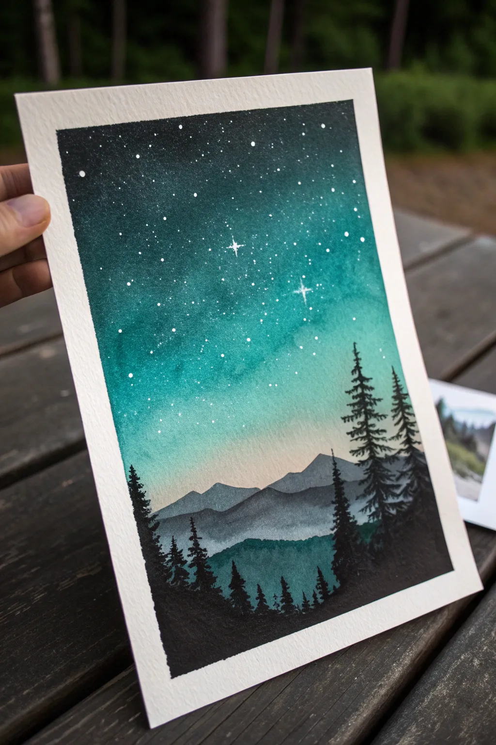
Capture the magic of a twilight wilderness with this serene watercolor landscape featuring a vibrant turquoise gradient sky. The contrast between the brilliant, starry night and the deep, shadowy pine forest silhouettes creates a captivating depth that draws the viewer in.
How-To Guide
Materials
- Cold-press watercolor paper (300 gsm)
- Painter’s tape
- Watercolor paints (Turquoise, Indigo/Payne’s Grey, Black)
- White Gouache or White Gel Pen
- Flat wash brush
- Medium round brush (size 6 or 8)
- Small liner brush (size 0 or 1)
- Clean water jar and paper towels
- Old toothbrush (optional for stars)
Step 1: Setting the Sky
-
Prepare your canvas:
Tape down all four edges of your watercolor paper to a board with painter’s tape. This ensures a crisp white border and prevents the paper from buckling when wet. -
Wet the paper:
Using your flat wash brush and clean water, apply an even coat of water to the upper two-thirds of the paper where the sky will be. You want a consistent sheen, not puddles. -
Apply the darkest blue:
Load your brush with a deep indigo or a mix of turquoise and black. Paint a horizontal strip at the very top of the sky, letting the pigment bleed downwards. -
Blend in the turquoise:
While the top strip is still wet, clean your brush slightly and pick up concentrated turquoise paint. Apply this directly below the dark band, overlapping slightly to encourage blending. -
Create the gradient:
Continue painting downwards with the turquoise, gradually adding more water to your brush to dilute the color. The sky should fade to a very pale, watery turquoise as you reach the horizon line. -
Add a hint of warmth:
Just before the paint dries, you can add a microscopic touch of peach or pale warm grey at the very bottom of the sky gradient for a subtle sunset glow, though keeping it purely pale turquoise works beautifully too. -
Let it dry completely:
This step is crucial. Wait until the paper is bone dry and flat before moving on. I usually give it at least 20 minutes touches to avoid ruining the smooth gradient.
Oops! Blooms in the sky?
If water drops create ‘cauliflower’ blooms in your drying sky, don’t panic. Wait for it to dry, then gently scrub the area with a damp stiff brush to soften the edges, or cover it with a darker tree silhouette.
Step 2: Mountains and Stars
-
Paint the distant mountains:
Mix a diluted grey-blue color. Using your medium round brush, paint a jagged mountain ridge about one-third up from the bottom. The color should be translucent to suggest atmospheric perspective. -
Add the stars:
While the mountains dry, load a toothbrush or stiff brush with white gouache diluted slightly with water. Flick the bristles to spray a fine mist of stars over the dark upper sky. -
Highlight specific stars:
Use a white gel pen or a fine brush with opaque white gouache to add a few larger, distinct stars. Add a subtle cross-shape to one or two of them to create a twinkling effect. -
Paint the mid-ground hills:
Mix a slightly darker, more opaque teal-grey. Paint a second mountain range below the first one, overlapping it slightly. This layer should be darker than the distant mountains but lighter than the foreground.
Take it further
Make it a shooting star moment by dragging a wet brush tail behind one of your white gouache dots, fading it out as it trails behind the star.
Step 3: Silhouettes and Details
-
Mix your blackest black:
For the foreground trees, you need heavily pigmented paint. Mix black watercolor with a bit of indigo, or use pure black gouache for maximum opacity. -
Establish the tree line:
Using the medium brush, block in a solid dark mass at the very bottom of the paper. Create an uneven top edge to simulate the tips of a forest canopy. -
Paint tree trunks:
Switch to your fine liner brush. Pull thin, vertical lines up from the dark forest mass to act as the trunks for your tall pine trees. Vary the heights to keep it looking natural. -
detail the pine branches:
Starting from the top of a trunk, use the very tip of your brush to dab small horizontal branches. Widen your strokes as you move down the tree, creating a conical pine shape. -
Fill in the forest:
Repeat this process for several trees, grouping them on the right and left sides to frame the composition. Ensure the black silhouette contrasts sharply against the light horizon. -
Final touches:
Once the trees are dry, slowly peel away the painter’s tape at a 45-degree angle to reveal your clean white border.
Step back and admire the peaceful depth you have created in your starry wilderness scene
Turquoise Desert Cactus Pop Art
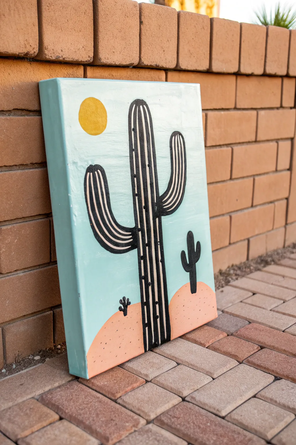
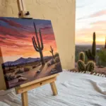
Bring the warmth of the southwest into your home with this stylized, pop-art inspired cactus painting. The soothing turquoise sky contrasts beautifully with dusty pink hills and bold black outlines, making it a perfect statement piece for modern decor.
Step-by-Step Tutorial
Materials
- Deep-edge canvas (16×20 inches or similar)
- Acrylic paints: Turquoise/Teal, White, Coral/Dusty Pink, Black, Golden Yellow
- Large flat paintbrush (1-inch width)
- Medium round paintbrush
- Small detail brush or liner brush
- Pencil and eraser
- Painter’s palette or paper plate
- Water cup and paper towels
Step 1: Setting the Scene
-
Mix the sky color:
Start by creating a custom turquoise shade. I like to mix a bright teal with a generous amount of white paint to soften it into a pastel, airy sky blue. Ensure you mix enough to cover about three-quarters of your canvas. -
Paint the background:
Using your large flat brush, paint the upper portion of the canvas with your turquoise mix. Apply long, horizontal strokes for a smooth finish. Don’t worry about the bottom edge being perfect, as the hills will cover it. -
Don’t forget the edges:
Extend the turquoise paint around the top and side edges of the canvas. This gallery-wrap technique gives the finished piece a polished, professional look without needing a frame. -
Mix the ground color:
While the sky dries, clean your brush and mix a dusty pink or coral shade. Combine orange, white, and a tiny drop of brown or red until you achieve a warm, desert-sand hue. -
Paint the rolling hills:
Paint the bottom section of the canvas with your coral mix, creating two rounded humps to represent desert dunes. Let the paint overlap slightly with the dry turquoise sky to ensure no white canvas shows through. -
Let it dry completely:
Allow the entire background to dry for at least 20-30 minutes. The base must be fully set before you sketch over it to avoid smudging or digging into the paint.
Uneven Lines?
If your hand feels shaky while painting the long black stripes, use a partially dried paint marker instead of a brush. It offers more control and consistent flow for long lines
Step 2: Sketching and Blocking
-
Sketch the main cactus:
Lightly draw the central Saguaro cactus with a pencil. Start with a tall, thick vertical trunk, then add a curved arm on the left reaching up, and a slightly higher curved arm on the right. -
Add background elements:
Sketch a simple circle in the upper left sky for the sun. Then, draw outlines for two tiny cacti on the hills—one small one on the left and a slightly larger one on the right. -
Fill the sun:
Using a medium round brush, fill in the sun circle with golden yellow paint. You may need two coats here to get a solid, opaque coverage against the turquoise background. -
Paint the silhouette cacti:
Switch to black paint and fill in the two small background cacti solid black. These are silhouettes, so they don’t need stripes or details, just clean edges. -
Base coat the main cactus:
Fill in the large central cactus shape with a very light beige or off-white color. This acts as a primer and background for the stripes you will add later.
Pro Tip: Chalk It Out
Instead of a graphite pencil, use a piece of white chalk to sketch your cactus over the painted background. It wipes away easily with a damp cloth if you make a mistake
Step 3: Adding Details and Definition
-
Outline the cactus:
Once the beige base is dry, use a liner brush and black paint to carefully outline the entire shape of the main cactus. Use a steady hand and try to keep the line thickness consistent. -
Paint the vertical ribs:
Inside the cactus outline, paint vertical black stripes that follow the curve of the plant. On the trunk, these should be straight; on the arms, curve the lines to follow the bend. -
Add texture to the ribs:
To give the cactus dimension, ensure you leave the beige under-layer showing between your black stripes. This creates the look of the cactus’s ribbed surface. -
Add the spines:
Using the very tip of your small brush or a toothpick, add tiny black dots along the beige stripes. Spacing them out irregularly makes the texture look more organic. -
Detail the sand:
Dilute a tiny bit of black paint with water or use a black paint pen. Gently flick or dot small speckles onto the coral hills to simulate sand texture and break up the solid color. -
Final touches:
Check your edges and touch up any turquoise or coral paint that might have been accidentally marked with black. Sign your name in the corner once you are happy with the composition.
Hang your desert masterpiece in a sunny spot to enjoy those vibrant colors all year round

PENCIL GUIDE
Understanding Pencil Grades from H to B
From first sketch to finished drawing — learn pencil grades, line control, and shading techniques.
Explore the Full Guide
Turquoise Mandala With Calm Symmetry
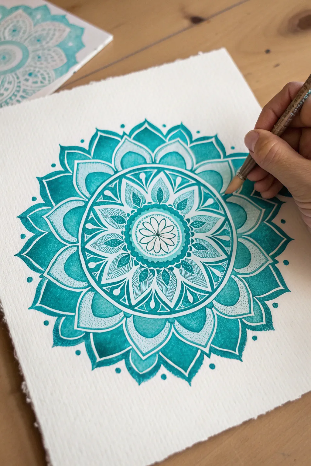
Achieve a state of creative flow with this intricate monochromatic mandala, built from radiating layers of turquoise and teal. This project balances precision with the organic bleed of watercolor, resulting in a mesmerizing piece of symmetrical art.
Detailed Instructions
Materials
- Cold press watercolor paper (300 gsm)
- Turquoise watercolor paint (tube or pan)
- Teal or Phthalo Blue watercolor paint (for shadows)
- Compass
- Protractor
- HB Pencil
- Ruler
- Kneaded eraser
- Round watercolor brushes (size 0, 2, and 4)
- White gel pen or fine opaque white paint marker
- Two jars of water
- Paper towel
Step 1: Planning the Geometry
-
Find the center point:
Begin by measuring your paper to find the exact center point. Mark it lightly with your pencil; this anchor point is crucial for keeping your symmetry aligned throughout the entire process. -
Draw concentric circles:
Using your compass, draw a series of concentric circles radiating from the center. Start small for the central flower, add a slightly larger band for the inner petals, and continue expanding outward until you have about 5-6 distinct rings to house your petal layers. -
Mark radial guidelines:
Use your protractor to divide the circle into even sections. For a standard mandala like this, dividing every 15 or 30 degrees works well. Draw light straight lines through the center to the edge, creating ‘slices’ that will guide your petal placement. -
Sketch the petal shapes:
Lightly sketch your petal outlines within the circular grids. Start with a simple 8-petal flower in the center, then stagger the subsequent layers of petals so the tip of a new petal sits between the two below it. Keep your pencil pressure very light so it’s easy to erase later.
Don’t Rush the Dry
Work on non-adjacent petals (skip one) as you go around a ring. This prevents wet paint from two petals bleeding into each other.
Step 2: Applying the Base Color
-
Mix your primary turquoise:
Prepare a generous puddle of turquoise paint on your palette. Add enough water so it flows easily but isn’t too pale. You want a medium-value saturation for the main body of the mandala. -
Paint the central flower:
Start painting from the center outward. Fill in the petals of the innermost flower, leaving a tiny hairline of white paper between shapes if possible to define the edges naturally. -
Work on the middle ring:
Move to the next ring of petals. I like to use a ‘wet-on-dry’ technique here for crisp edges. Carefully outline each petal with the tip of your size 2 brush, then fill the center. -
Add pigment variation:
While the paint is still wet in a petal, touch the tip of your brush (loaded with slightly darker teal) to the base of the petal. Let the pigment bleed upward naturally to create a gradient effect, giving the shape volume. -
Paint the large outer petals:
Switch to your size 4 brush for the largest outer petals. Ensure you have enough paint mixed to complete the entire ring without the color shifting too much. -
Create the heavy border:
Identify the circular band that separates the inner intricate work from the outer large petals. Fill this ring solidly with your darkest teal mix to create a strong visual frame that anchors the design.
Level Up: Ombré Effect
Mix two cups of teal: one watery, one saturated. Paint petals graduating from light tips to dark bases for a glowing, 3D effect.
Step 3: Detailing and Defining
-
Dry completely:
Allow the entire painting to dry completely. If the paper feels cool to the touch, it’s still damp. Wait until it is room temperature to avoid smudging the next steps. -
Clean up sketch lines:
Gently roll a kneaded eraser over the painting to lift the graphite guidelines. Because watercolor is transparent, heavy pencil marks can show through, so remove what you can without scrubbing the paint. -
Add fine line texture:
Using a very fine brush (size 0) or a turquoise fine liner, add delicate hatching lines inside the middle ring of petals. These tiny strokes should follow the curve of the petal to suggest texture. -
Deepen the contrast:
Mix a concentrated, almost creamy consistency of teal. Paint small geometric accents, triangles, or dots in the negative spaces between the main petals to make the turquoise pop. -
Highlight with white:
Use your white gel pen or opaque white marker to add stippling (dots) inside specific bands. This mimics the look of textured embossing and adds a delicate sparkle to the matte paint. -
Refine the center:
Draw the final central flower outlines clearly with a thin dark line, making the very middle of the mandala a focal point of high contrast.
Step back and enjoy the calming rhythm of your symmetrical masterpiece.
Turquoise Geometric Gradient Blocks
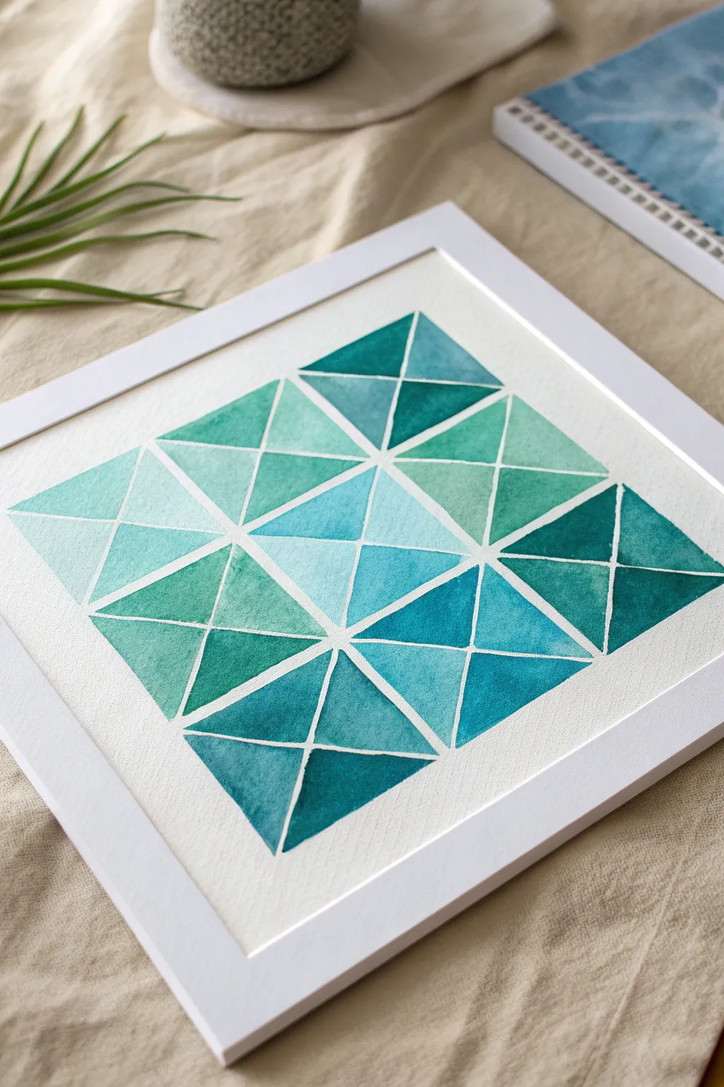
This serene watercolour project plays with light and shadow through a mesmerizing grid of turquoise shards. The crisp white lines cutting through the soft, gradient washes create a stunning stained-glass effect that feels both modern and coastal.
How-To Guide
Materials
- Cold press watercolour paper (140lb/300gsm)
- Painter’s tape or masking tape (approx. 1/4 inch width)
- Watercolour paints (Phthalo Blue, Viridian Green, Lemon Yellow)
- Flat shader brush (size 6 or 8)
- Finer round brush for touch-ups
- Ruler
- Pencil (HB or H)
- Eraser
- Two water jars
- Mixing palette
- Paper towels
- Square picture frame with mat
Step 1: Grid & Masking
-
Measure your canvas:
Begin by trimming your watercolour paper to fit your square frame. Use a ruler to determine the center point of the paper, ensuring equal margins on all sides for a balanced composition. -
Draft the main grid:
Lightly mark out a large square, then divide it into a 3×3 grid of smaller, equal squares using your pencil and ruler. Press very lightly so the graphite doesn’t show through the final paint. -
Add diagonal guides:
Inside each of the nine squares, draw an ‘X’ by connecting the opposing corners. This creates four triangular sections within every square block. -
Apply the tape grid:
This step requires patience. Apply thin masking tape or painter’s tape along all your pencil grid lines. Start with the long horizontal and vertical lines dividing the 3×3 blocks first. -
Tape the diagonals:
Cut smaller pieces of tape to mask off the diagonal ‘X’ lines inside each square. Ensure these pieces butt up tightly against the grid tape so no paint seeps into the intersections. -
Seal the edges:
Run a bone folder or the back of a spoon firmly over all the tape strips. This creates a tight seal against the textured paper, which is crucial for achieving those crisp, white geometric lines.
Step 2: Mixing & Painting
-
Create your palette:
Mix a spectrum of turquoise shades. Start with a base of Phthalo Blue and a touch of Viridian. Create three distinct puddles: a pale aqua (mostly water), a medium teal, and a deep ocean blue. -
Plan your gradients:
Look at the composition and decide where you want light and dark areas. The goal is random variation; avoid placing two identical shades right next to each other. -
Paint the first triangles:
Pick a triangle section and apply a wash of clean water first (wet-on-dry technique). While it is shiny but not soaking, drop in your pale aqua mix. -
Introduce depth:
While that first triangle is still wet, touch the tip of your brush loaded with the darker teal to one corner. Let it bleed naturally into the paler wash for a soft gradient effect. -
Work in sections:
continue painting the triangles one by one. I usually skip around the grid rather than working linearly; this allows adjacent sections to dry slightly and prevents accidental smudging. -
Vary the saturation:
For some triangles, use the deep ocean blue mixture straight onto dry paper for a bold, saturated look. This contrast between soft washes and solid blocks adds visual interest. -
Check for puddles:
If paint pools too much against the tape edge, gently lift the excess with the corner of a clean paper towel or a dry brush to prevent ‘cauliflowering’.
Edge Master
For razor-sharp lines, paint a thin layer of clear watercolour medium or white gouache over the tape edges first to seal them before adding colour.
Step 3: Revealing & Framing
-
Wait for complete dryness:
This is the hardest part! Ensure the painting is bone dry. If the paper feels cool to the touch, it still holds moisture. Give it an extra hour to be safe. -
Peel the tape:
Gently peel the tape away at a 45-degree angle, pulling away from the painted area. Go slowly to avoid ripping the paper surface. -
Clean up edges:
Once all tape is removed, you might see tiny imperfections where paint bled under. You can gently scrape these away with a precision craft knife or cover them with a tiny bit of white gouache. -
Erase guidelines:
If any pencil marks are visible in the white channels between shapes, carefully erase them with a kneaded eraser. -
Frame your work:
Place your finished piece into the frame. Using a white mat helps extend the negative space of the grid lines, making the turquoise colours pop even more.
Metallic Luxe
Swap one specific shade of turquoise for a metallic gold or copper watercolour paint. Add it to just 3-4 random triangles for a chic, modern accent.
Hang your new geometric masterpiece in a sunny spot where the natural light can play off those beautiful watery gradients


Turquoise Marble Swirls and Veins
Capture the effortless movement of ocean waves with this fluid art project that balances vibrant turquoise hues against crisp whites. The result is a mesmerizing, marbled effect that looks sophisticated enough for a gallery wall but is surprisingly achievable at home.
Step-by-Step
Materials
- High-flow or fluid acrylic paints (Turquoise, Teal, White)
- Pouring medium (Liquitex or Floetrol)
- Heavyweight mixed media paper or canvas panel (A4 size)
- White mat board (passe-partout) with backing board
- Plastic cups (small to medium size)
- Craft sticks for stirring
- Straw or hair dryer (for moving paint)
- Drop cloth or plastic sheeting
- Gloves
Step 1: Mixture Preparation
-
Protect your workspace:
Fluid art gets messy, so begin by covering your entire table with a drop cloth or plastic sheeting. Tape down the edges so it doesn’t shift while you work. -
Mix the turquoise base:
In a small cup, combine one part turquoise acrylic paint with two parts pouring medium. Stir slowly and gently to avoid creating air bubbles, which can spoil the smooth finish later. -
Create a deeper teal shade:
For the darker veins seen in the image, mix a small amount of teal paint with the medium in a separate cup. If you don’t have teal, simply add a tiny drop of black to your turquoise mixture. -
Prepare the white flow:
Mix a larger batch of white paint with pouring medium. You’ll want slightly more white than the colored paints to create those broad, negative space areas that give the piece its airy feel. -
Check consistency:
Lift your stir stick; the paint should flow off it like warm honey. If it’s too thick and clumps, add a few drops of water. If it’s too thin and watery, add a bit more paint.
Muddy Colors?
If your turquoise and white are turning gray or muddy where they touch, you likely over-stirred or tilted the canvas too aggressively. Less movement preserves distinct lines.
Step 2: Creating the Pour
-
Layer the dirty cup:
Take a clean, empty cup. Pour a layer of white at the bottom, followed by a splash of turquoise, then a drizzle of the deep teal. Repeat this layering twice, but don’t stir it. -
Apply the base coat:
Pour a small puddle of plain white mixture onto the center of your paper or canvas and spread it thinly to the edges. This ‘wet canvas’ helps the colored paint glide smoothly across the surface. -
The flip or pour:
You can either quickly flip the layered cup onto the paper (flip cup technique) or slowly pour the contents in a diagonal ribbon motion across the surface (dirty pour). For the look in the image, a diagonal dirty pour works best. -
Tilt to stretch:
Gently pick up your paper or board. Tilt it slowly to the left, then the right, letting gravity stretch the paint. This creates those long, sweeping marble veins. -
Blow out the details:
Where the lines look too thick, use a straw to blow air onto the paint. This pushes the white over the turquoise, creating delicate, lacy cells and feathery transitions. -
Refine the composition:
Look for areas that feel too heavy. I sometimes like to add a few drops of white directly onto the wet surface and blow them outward to break up large blocks of color.
Step 3: Drying and Mounting
-
Let it settle:
Place the artwork on a perfectly level surface to dry. If it’s tilted even slightly, the design will slide off the edge over the next few hours. -
Patience is key:
Allow the piece to dry for at least 24 to 48 hours. Acrylic pours dry from the outside in, so it may look dry long before the underlying layers are truly set. -
Flatten the artwork:
If you used paper and it buckled slightly during drying, place the fully dry artwork under a heavy stack of books for a day to press it flat. -
Position the mat:
Take your white mat board and hover it over the painting. Move it around to find the most interesting section of the swirls—this is called ‘cropping’ your composition. -
Secure the backing:
Once you found the perfect sweet spot, tape the artwork to the back of the mat board using acid-free tape ensures it won’t yellow over time. -
Final assembly:
Place the matted artwork against the backing board. The crisp white border will instantly elevate the organic turquoise currents.
Pro Tip: Cell Magic
Add 1-2 drops of silicone oil or dimethicone to your colored paint cups (not the white base) before pouring to create stunning circular cells within the swirls.
Hang your new ocean-inspired masterpiece in a bright room to let the natural light highlight the intricate fluid details
Turquoise and Metallic Accent Abstract
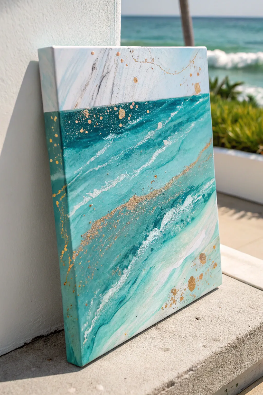
Capture the essence of crashing ocean waves with this luminous mixed-media canvas. Blending deep turquoise hues with metallic gold splatters, this piece brings the movement and sparkle of the sea right into your living space.
How-To Guide
Materials
- Stretched canvas (e.g., 16×20 inch)
- Heavy body acrylic paints: Turquoise Deep, Phthalo Green, Titanium White, Sky Blue
- Liquid gold leaf or metallic gold acrylic paint
- Pouring medium (optional, for fluid effects)
- Texture paste or modeling paste
- Palette knives (assorted sizes)
- Wide flat brush and detailed round brush
- Old toothbrush (for splattering)
- Cup of water and paper towels
- Spray bottle with water
Step 1: Building the Foundation
-
Prime the canvas:
Start by applying a thin, even coat of Titanium White across the top third of your canvas to establish the sky or foam area. This ensures your lighter colors occupy the upper portion cleanly. -
Map out the horizon:
Using a wide flat brush, paint a soft dividing line where the deep ocean water meets the lighter upper section. Do not make this line perfectly straight; a slight, organic slant mimics the natural movement of water. -
Mix your ocean hues:
On your palette, mix Turquoise Deep with a touch of Phthalo Green to create a rich, dark teal. Prepare a separate pile of lighter turquoise by mixing Sky Blue with a little Titanium White. -
Apply the base ocean layer:
Paint the bottom two-thirds of the canvas with your dark teal mixture. Use horizontal, sweeping strokes to emulate the flow of currents, but don’t worry about perfect coverage yet.
Uneven Splatter?
If your gold splatters are too big or gloopy, instantly dab them gently with a dry paper towel to lift the excess paint, leaving a subtle stain instead.
Step 2: Creating Movement and Texture
-
Add lighter currents:
While the base layer is still slightly tacky, load your brush with the lighter turquoise mix. Streak this color through the dark teal, focusing on diagonal movements that suggest rolling waves. -
Blend wet-on-wet:
Use a damp brush or a light mist from your spray bottle to blur the boundaries between the dark and light blues, creating a soft, watery gradient. -
Introduce texture:
Mix a small amount of texture paste with Titanium White. Using a palette knife, scrape this mixture diagonally across the canvas to represent frothy sea foam or breaking waves. -
Refine the white caps:
Feather the edges of your white texture paste with a dry brush to soften the look, making it appear more like foam and less like a solid block of white. -
Layering the marble effect:
In the top white section, use a fine liner brush with diluted gray or silver paint to create very faint, marble-like veins. Keep these lines jagged and random for a natural stone look. -
Enhance depth:
Go back into the deep blue areas with pure Phthalo Green on a small brush to add pockets of shadow under the white foam lines, which makes the waves pop forward.
Step 3: Metallic Accents and Finishing
-
Prepare the gold:
Shake your liquid gold leaf or metallic acrylic well. If using heavy body metallic paint, thin it slightly with water so it flows easily from a brush. -
Paint gold veins:
Using your thinnest brush, trace along some of the diagonal white foam lines with the gold. I like to break the line frequently so it looks like sunlight catching parts of the water rather than a solid stripe. -
Create gold clusters:
Dip the tip of a palette knife into the gold paint and gently press it onto the canvas borders and random spots in the blue water to create organic, chunky metallic deposits. -
Splatter technique:
Dip an old toothbrush into diluted gold paint. Hold it near the canvas surface and run your thumb across the bristles to flick tiny gold specks across the darkest parts of the painting. -
Focus on the transition:
Add a concentrated area of gold dots and small splashes right where the white top section meets the teal ocean, acting as a decorative horizon line. -
Extend to the edges:
Don’t forget to wrap your painting around the sides of the canvas. Continue the blue currents and gold splatters onto the edges for a finished, gallery-ready look. -
Final review:
Step back and look for balance. If the gold feels too heavy in one spot, you can glaze over it with a very thin wash of turquoise to push it back into the depths.
Resin Finish
Pour a layer of clear epoxy resin over the thoroughly dried painting. This adds a glass-like finish that makes the gold shimmer and the water look wet.
Allow the metallic elements to cure fully before hanging your shimmering seascape in a bright room.
Turquoise Fluid-Pour Beach Vibes
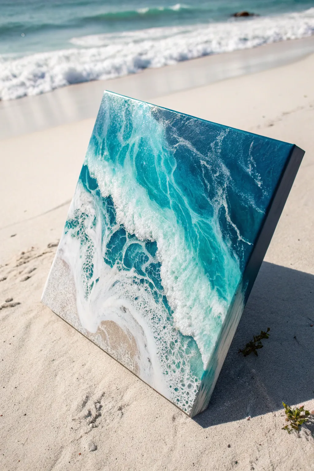
Capture the churning beauty of the sea with this glossy, depth-filled resin art piece. Using tinted epoxy and strategic airflow, you will recreate the vibrant turquoise gradients and frothy white sea foam of a breaking wave.
Step-by-Step
Materials
- Square wood panel or canvas (cradle board preferred)
- Art resin (two-part epoxy)
- Turquoise resin pigment paste or fluid acrylic
- Deep blue resin pigment (phthalocyanine blue)
- White pigment paste (specifically opaque/heavy body)
- Real sand (fine grain)
- Heat gun
- Crème brûlée torch
- Mixing cups and stir sticks
- Gloves and respirator mask
- Painter’s tape
- Level
Step 1: Preparation and Base Layer
-
Prep your surface:
Since resin is self-leveling, ensure your workspace is perfectly flat using a level. Tape the underside of your canvas or wood panel with painter’s tape to catch glossy drips, making cleanup much easier later. -
Mix the sand texture:
In a small cup, mix a small amount of resin with your real sand until it has a wet slush consistency. It shouldn’t be too runny, just enough to bind the grains. -
Apply the shoreline:
Pour the sand mixture onto the bottom left corner of your panel, spreading it diagonally to create a shoreline. Smooth it out but leave a little texture for realism. -
Mix your ocean colors:
Mix a larger batch of clear resin, then divide it into three cups. Tint one deeply with the dark blue, one with the turquoise, and leave a smaller amount clear or very lightly tinted for blending. -
Pour the deep water:
Pour the deep blue resin at the top right corner, covering about a third of the panel. This represents the deepest part of the ocean. -
Pour the turquoise water:
Pour the turquoise resin in the middle section, adjacent to the deep blue. Let it overlap slightly with the blue; resin loves to be nudged. -
Blend the gradient:
Use your gloved finger or a clean stir stick to gently marry the line where the blue meets the turquoise. You want a soft transition, not a hard stripe. -
Connect to the sand:
Pour a thin line of clear resin between the turquoise water and your sand layer to act as a buffer for the upcoming waves.
Cell Creation Secret
For massive lacing cells, stick to dedicated opaque pigment pastes rather than acrylic paint. The chemical density difference is key to the reaction.
Step 2: Creating the Waves and Cells
-
Prepare the white wave resin:
Mix a small amount of resin with your opaque white pigment paste. It needs to be very opaque to stand out against the blue background. -
Draw the first wave line:
Drizzle a thin line of white resin right at the edge where the clear/turquoise resin meets the sand. This will be your shore break. -
Draw the second wave line:
Add a second thin line of white further back in the turquoise water section to create depth and the illusion of a rolling wave coming in. -
Heat and pop bubbles:
Briefly pass a torch over the colored sections to pop air bubbles. Do not torch the white lines yet. -
Blow the waves:
Using your heat gun on a medium setting, push the white resin lines backward (away from the sand) and then gently pull them forward over the clear/blue areas. -
create the lacing:
Hold the heat gun at a 45-degree angle. The heat will thin the resin, spreading the white pigment into those distinct, foamy cells (lacing) visible in the photo. -
Refine the shape:
I like to use a toothpick or small tool to physically drag small wisps of white foam back into the blue water, mimicking the spray of a crashing wave. -
Torch distinct cells:
Quickly swipe your torch over the white lacing areas. The sudden burst of heat helps the cells expand and creates that organic, bubbly sea-foam texture. -
Check edges and cover:
Ensure the resin has flowed over the sides of the canvas for a finished look. Cover the piece with a large box to prevent dust from landing on it while it cures for 24 hours.
Blurry Lacing Fix
If your white waves look muddy or blurred, you likely overheated the resin or overworked it. Stop blowing sooner and let the resin move itself.
Once fully cured, your glassy ocean scene will bring a permanent splash of summer to your wall
Turquoise Mixed-Media Collage Wash
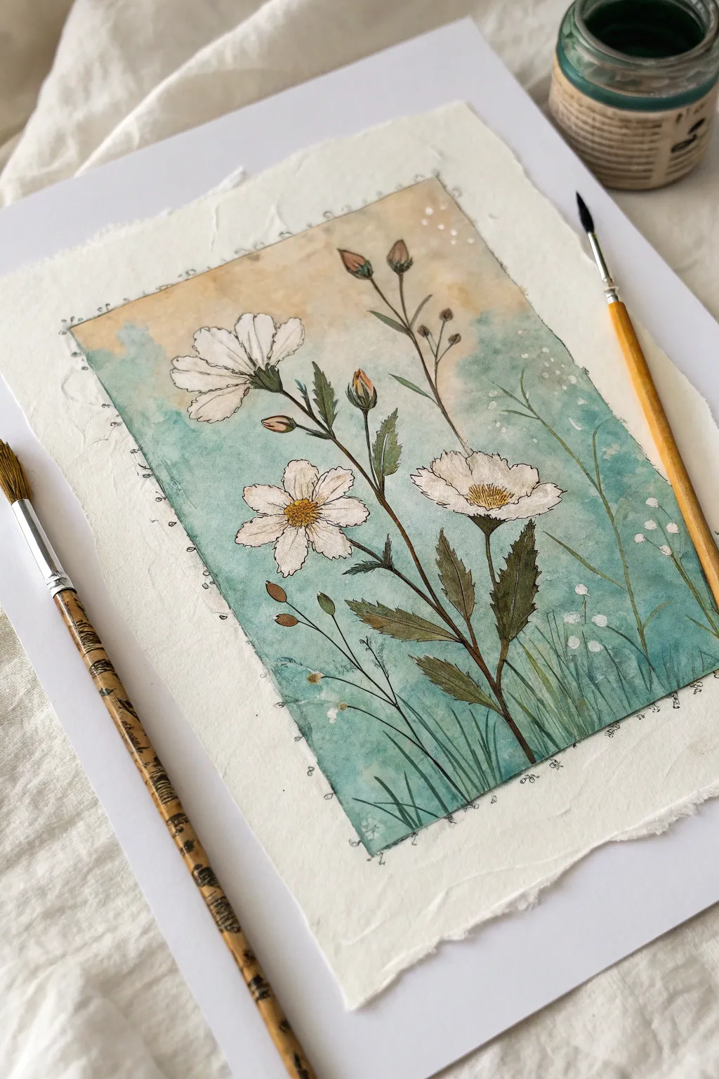
This delicate mixed-media piece combines soft turquoise washes with crisp ink linework on beautifully textured paper. The result is a botanical illustration that feels vintage yet fresh, perfect for framing or gifting.
Step-by-Step
Materials
- Heavyweight cold-press watercolor paper with deckled edges (300 gsm or higher)
- Watercolor paints: Turquoise, Burnt Sienna, Yellow Ochre, Sap Green, and Indigo
- Fine liner waterproof pigment pens (sizes 005, 01, and 03)
- White gouache or white gel pen
- Round watercolor brushes (size 4 and size 0)
- Pencil (HB or H) and kneadable eraser
- Masking tape
- Jar of clean water
- Paper towels
Step 1: Preparation and Sketching
-
Paper Selection:
Begin by selecting a piece of heavy, creating-textured paper. If your paper doesn’t have deckled edges, you can tear the edges gently against a ruler to create that rough, handmade look. -
Defining the Frame:
Lightly draw a rectangular border inside your paper, leaving about a 1.5-inch margin on all sides. This will contain your painting while letting the ragged edges of the paper shine. -
Initial Sketch:
Using a hard pencil like an H so lines stay faint, sketch the main floral composition. Place three main flower heads: one facing left near the top, a central full bloom, and one slightly lower on the right. Add long, sweeping stems connecting them. -
Adding Details:
Sketch in the smaller details, like unopened buds at the top and serrated leaves along the stems. Don’t worry about perfection; organic shapes look more natural.
Step 2: The Background Wash
-
Mixing the Turquoise:
Create a watery mix of turquoise paint. You want it transparent enough that the paper texture shows through, but pigmented enough to contrast with the white flowers. -
Applying the Gradient:
Starting from the bottom of your bordered rectangle, paint upwards with the turquoise mix. As you move higher, add more water to your brush to fade the color out. -
Adding Warmth:
While the upper edge of the turquoise is still slightly damp, introduce a very pale wash of Yellow Ochre or diluted Burnt Sienna at the very top of the rectangle, letting it blend softly downward into the blue. -
Lifting Color:
Use a clean, damp brush or a small piece of paper towel to gently lift color away from the flower petals if you accidentally painted over them. The petals should remain the white of the paper. -
Drying Time:
Let this background layer dry completely. If the paper buckles slightly, you can place a heavy book on it once it is bone dry.
Muddy colors?
Wait for the turquoise background to be 100% dry before painting the green stems. If the background is damp, the green will bleed into the blue, creating an unwanted dark smudge.
Step 3: Painting the Botanicals
-
Base Greenery:
Mix Sap Green with a touch of Indigo or Burnt Sienna to create a natural, earthy olive tone. Paint the stems and leaves, keeping the color varied—darker near the base of the leaves and lighter at the tips. -
Flower Centers:
For the centers of the open flowers, dab in a concentrated mix of Yellow Ochre and Burnt Sienna. Use a stippling motion (tiny dots) to mimic the pollen texture. -
Bud details:
Paint the closed buds with a mix of green at the base, fading into a rusty pink or brown at the tips using Burnt Sienna. -
Grass Blades:
Using your smallest round brush (size 0), flick rapid, thin strokes of green from the bottom upwards to create blurred grass blades in the foreground. Vary the opacity to create depth.
Add dimension
Sprinkle coarse salt onto the wet turquoise wash while you are painting the background. Once dry, brush it off to reveal a distinct, starry texture that mimics old stone.
Step 4: Inking and Finishing
-
Outlining Petals:
Once all paint is perfectly dry, take your 01 fine liner. loosely outline the flower petals. Use broken lines—don’t close every shape perfectly—to keep the illustrative style airy. -
Detailing Centers:
Switch to a 005 pen for the flower centers. Draw tiny circles and dense dots over the yellow paint to define the seed heads. -
Leaf Veins:
Add central veins to the leaves with the 01 pen. I prefer to add light hatching or scribbles on the darker side of the leaves to suggest shadow. -
Border Accent:
Go over your initial pencil rectangle border with the fine liner. Instead of a ruler-straight line, make it slightly wavy or broken. Add tiny loops or dots sporadically along the line for decoration. -
White Highlights:
Using white gouache or a gel pen, add tiny dots to the flower centers and a few strokes on the leaves for highlights. -
Magic Dust:
Finally, add small clusters of white dots and perhaps a few faint white circles in the turquoise background area to create a ‘bokeh’ or magical dust effect.
Once the ink is set, you have a serene piece of botanical art ready to display


Have a question or want to share your own experience? I'd love to hear from you in the comments below!