When I need an instant creative boost, I reach for pink paint—it can be soft and dreamy or loud and fearless, depending on how you use it. Here are some pink art ideas I love teaching because they make pink the main character, not just a little accent.
Pink Sunset Gradient Wash
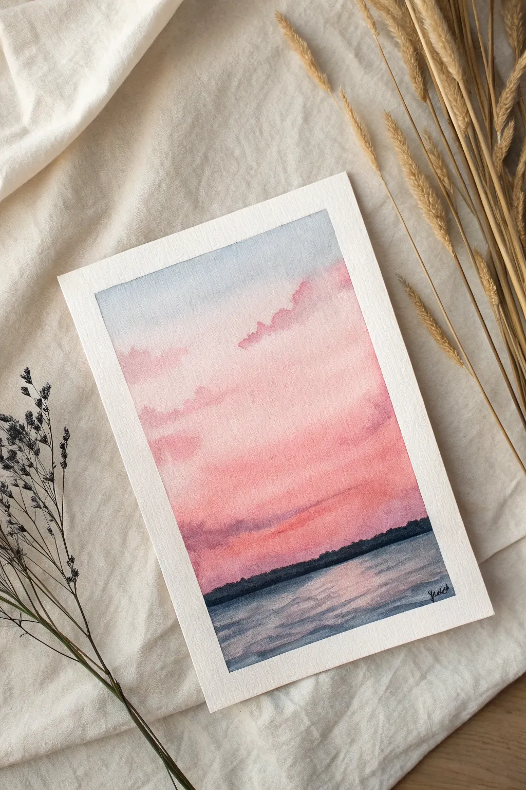
Capture the fleeting beauty of twilight with this gentle watercolor gradient wash. This tutorial guides you through creating a soft, dreamlike transition from cool blues to warm pinks, anchored by a calm body of water.
Step-by-Step
Materials
- Cold press watercolor paper (300 gsm)
- Masking tape
- Flat wash brush (1 inch)
- Round brush (size 6 or 8)
- Small round brush (size 2)
- Watercolor paints (Ultramarine Blue, Alizarin Crimson, Rose Madder, Payne’s Grey)
- Clean water jar
- Paper towels
- Mixing palette
Step 1: Preparation and Sky Base
-
Secure the paper:
Begin by taping down all four edges of your watercolor paper to a board or table. This creates that crisp white border seen in the final piece and prevents the paper from buckling heavily when wet. -
Pre-wet the sky area:
Using your large flat brush and clean water, gently wet the upper two-thirds of the paper where the sky will be. You want an even sheen, not puddles, to help the colors flow together softly. -
Apply the upper sky:
Mix a very dilute wash of Ultramarine Blue. With the flat brush, lay this color across the very top of the paper, letting it fade out as you pull it down about an inch or two. -
Introduce the pink:
While the paper is still damp, switch to a soft rose color (like Rose Madder). Start painting horizontally from the middle of the sky area, working upward slightly to meet the blue. Let the two colors touch and bleed naturally; don’t overwork the seam. -
Deepen the horizon gradient:
Mix a slightly more saturated Alizarin Crimson. Continue the wash downward towards the horizon line, making the pink deeper and warmer as you get lower. Leave the bottom third of the paper unpainted for now.
Wet-on-Wet Magic
Work slightly tilted. Gravity helps the blue and pink washes flow downward, creating a seamless gradient without harsh horizontal brush marks.
Step 2: Clouds and Atmosphere
-
Lift out soft clouds:
Before the pink wash dries completely, clean your damp brush and gently lift away pigment in irregular, organic shapes to suggest soft cloud formations in the upper pink area. -
Add darker cloud layers:
Mix a touch of purple by combining your blue and crimson. Using a round brush, paint loose, horizontal cloud streaks across the lower sky. Since the paper is likely still slightly damp, these edges will stay soft and atmospheric. -
Intensify the sunset:
Add a few streaks of concentrated pink or light red just above the horizon line to represent the last intense light of the setting sun. I find that careful layering here adds real depth. -
Let it dry:
Allow the sky section to dry completely. The paper should be flat and warm to the touch before you proceed to the distinct horizon line.
Add a Foreground
Once dry, paint thin silhouette reeds or tall grasses in the immediate foreground with black ink for added depth and framing.
Step 3: Water and Horizon
-
Paint the tree line silhouette:
Mix a dark, cool color using Payne’s Grey and a touch of Ultramarine. With your small round brush, paint a jagged, organic line across the horizon to represent distant trees. Keep the bottom edge of this line straight. -
Start the water base:
Dilute your remaining dark mixture with plenty of water to create a grey-blue wash. Paint the water area below the tree line, leaving some horizontal gaps of white paper showing through to represent reflected light. -
Reflect the sunset:
While the water wash is wet, drop in hints of the pink sky color into the water area, particularly near the center. Let the pink and grey-blue swirl slightly to create a shimmering effect. -
Add water ripples:
Once the water layer is semi-dry, use the tip of your size 6 brush with a slightly darker grey-blue mixture to paint thin, horizontal wavy lines. This adds texture and movement to the water surface. -
Final details:
Check your tree line; if it faded too much, add a second layer of dark pigment to ensure high contrast against the bright sky. Sign your work in the bottom corner with a fine liner or small brush. -
Reveal the border:
Wait until the painting is bone dry. Carefully peel away the masking tape at a 45-degree angle to reveal the clean, crisp edges that frame your gradients.
Enjoy the peaceful atmosphere your new gradient artwork brings to the room

Dreamy Pink Ocean Waves
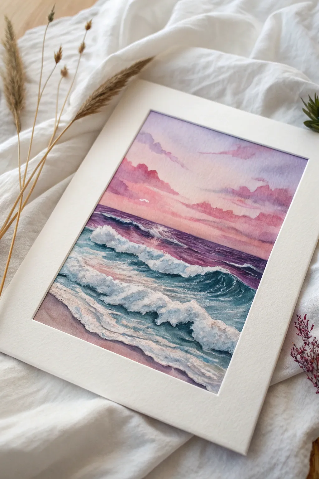
Capture the magic of a coastal sunset with this soft and dreamy painting. By combining wet-in-wet techniques for the sky with textured white gouache for the waves, you’ll create a piece that feels both ethereal and lively.
Detailed Instructions
Materials
- Cold press watercolor paper (300 gsm)
- Watercolor paints: Rose Madder, Cobalt Violet, Ultramarine Blue, Prussian Blue, Burnt Sienna
- White gouache or white acrylic ink
- Masking tape
- Large flat wash brush
- Round brushes (sizes 4 and 8)
- Fine liner brush
- Paper towels
- Mixing palette
- Two jars of water (one for clean, one for dirty)
Step 1: Preparation and The Sky
-
Tape it down:
Begin by securing your watercolor paper to a board using masking tape along all four edges. This creates that crisp, clean border you see in the photo and prevents the paper from buckling when wet. -
Wet the sky area:
Use your large flat brush to apply a generous layer of clean water to the top two-thirds of the paper. You want the paper to be glisten with sheen but not have standing puddles. -
Lay in the soft violet:
While the paper is wet, dilute Cobalt Violet into a very pale wash. Sweep this across the upper sky area, letting it diffuse naturally. -
Add warmth:
While the violet is still damp, introduce a soft Rose Madder near the horizon line. Blend it gently upward into the violet to create a smooth gradient. -
Deepen the clouds:
Mix a slightly stronger concentration of Rose Madder and a touch of Ultramarine. Dab this mixture into the wet sky to suggest soft, fluffy clouds. I find that lifting the brush vertically helps keep the edges soft. -
Horizon line:
Define the horizon line with a deeper mix of Ultramarine and Rose Madder. Ensure this line is straight, perhaps using a piece of tape or a ruler as a guide if the paper is dry enough.
Muddy Colors?
If your pink sky turns gray when meeting the blue sea, ensure the sky is fully dry before starting the water. Layering complements while wet creates mud.
Step 2: The Ocean Base
-
Deep water gradient:
Just under the horizon, paint a band of deep purple using your violet and blue mix. This represents the distant, shadowed water. -
Transition to teal:
As you move closer to the foreground, switch to Prussian Blue mixed with a tiny bit of Burnt Sienna to dull it. Paint rapid, horizontal strokes, leaving small gaps of white paper to represent sparkling light. -
Foreground sand:
For the bottommost section where the water meets the shore, wet the paper and drop in a very diluted wash of Rose Madder and Burnt Sienna to create wet sand reflecting the pink sky. -
Let it dry completely:
This is crucial. Before adding the detailed waves, the base layers must be bone dry to prevent muddying the crisp white caps.
Step 3: Waves and Highlights
-
Shadowing the waves:
Identify where your main crashing waves will be. Underneath these imagined white caps, paint dark teal shadows using Prussian Blue and a touch of black or Payne’s Grey. -
Curved strokes:
Use a round brush to paint the translucent, curving body of the wave. Keep your strokes fluid and follow the natural curl of water. -
Apply white gouache:
Squeeze out fresh white gouache. Use a dry brush technique to drag thick, opaque white paint along the tops of the waves. The texture of the paper will break up the stroke, mimicking sea foam. -
Detail the foam:
Switch to a smaller round brush. Add dabs of white gouache in the foreground to create the frothy sea foam washing up on the sand. -
Connect the layers:
Use a slightly damp brush to soften the bottom edge of the white sea foam where it touches the wet sand, making it look integrated rather than pasted on. -
Final highlights:
Add tiny dots of pure white gouache with your liner brush to represent water spray or catching light on the distant water ripples. -
Remove tape:
Once the painting is 100% dry, peel the tape away slowly at a 45-degree angle to reveal those satisfying clean edges.
Brilliant White Foam
Don’t add water to your white gouache for the wave crests. Using it thick, straight from the tube, ensures maximum opacity and texture against the dark sea.
Frame your masterpiece in a simple white mat to let those sunset colors truly shine


Pink Abstract Acrylic Pour Look
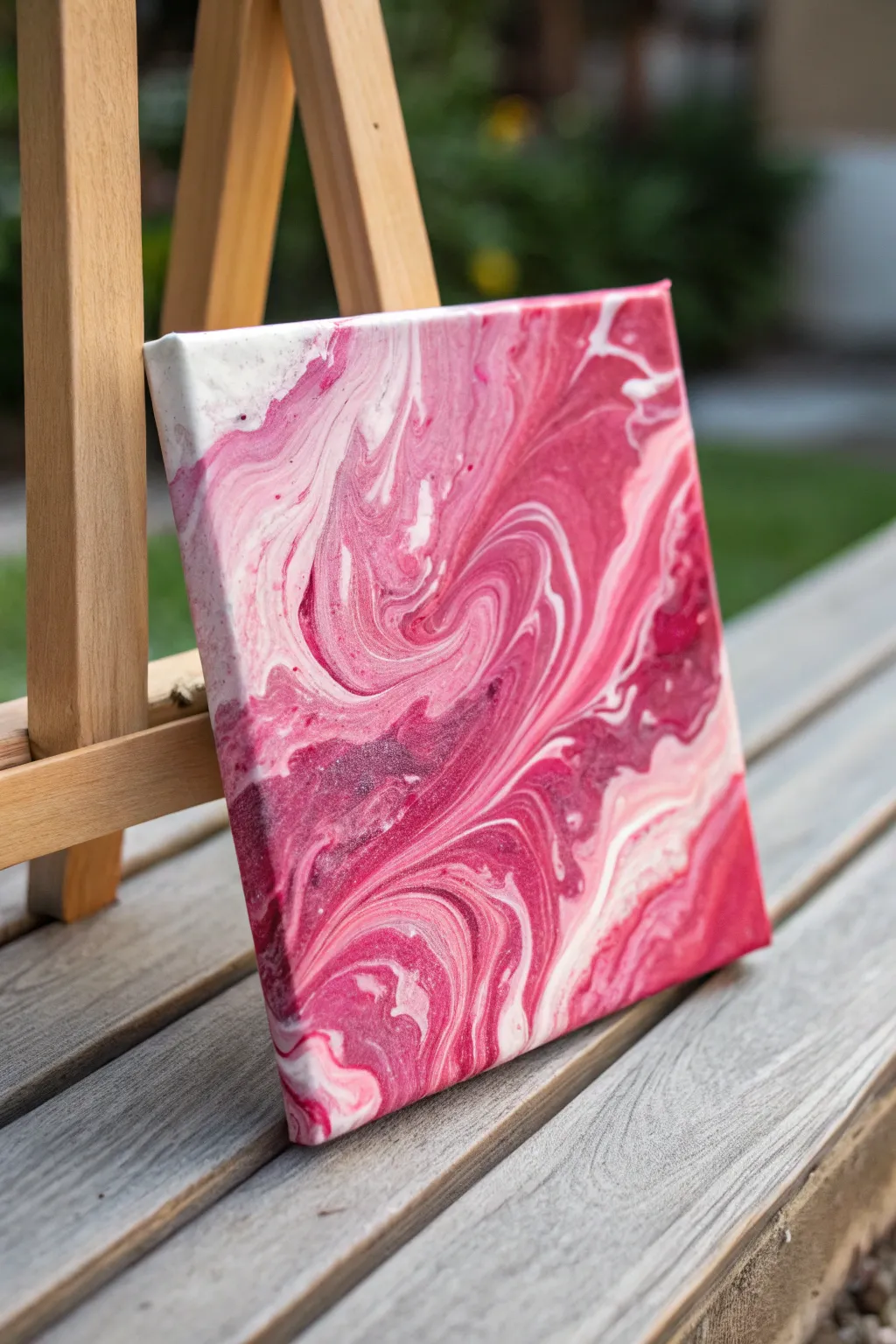
This captivating acrylic pour blends rich magenta, soft pinks, and crisp white into a marbled dreamscape reminiscent of raspberry cream. The fluid, organic lines create a sense of movement that brings a modern and romantic touch to any space.
How-To Guide
Materials
- Small square canvas (e.g., 8×8 or 10×10 inches)
- Acrylic paints (Magenta, Titanium White, light Baby Pink)
- Pouring medium (like Floetrol or Liquitex)
- Silicone oil (optional, avoiding it keeps lines smoother like the photo)
- Plastic cups for mixing
- Stir sticks
- Gloves
- Drop cloth or plastic sheet
- Push pins (to elevate canvas)
Step 1: Preparation & Mixing
-
Set up your workspace:
Cover your table thoroughly with a drop cloth or plastic sheet. Acrylic pouring is messy, and preparation is key to a stress-free session. -
Elevate the canvas:
Insert push pins into the four corners of the back of your canvas wood frame. This lifts the canvas off the table, allowing paint to drip freely over the edges. -
Mix the pouring medium:
In separate cups, mix your acrylic paints with pouring medium. A standard ratio is 1 part paint to 2 parts medium, but check your medium’s bottle for specifics. -
Adjust consistency:
Stir each cup thoroughly until the consistency resembles warm honey. If the paint is too thick, add a few drops of water at a time until it flows smoothly off the stick. -
Layer the main cup:
I like to take a clean empty cup and start layering the colors. Pour a small amount of white, followed by magenta, then baby pink. Do not stir. -
Repeat the layering:
Continue layering the colors in the same cup until it is about two-thirds full. Varying the amount of each color in the layers adds visual interest.
Step 2: The Pour Technique
-
The flip motion:
Place your canvas face down on top of the cup. firmly hold the cup against the canvas and quickly flip them over together so the cup is now upside down on the canvas. -
Let it settle:
Wait about 30 seconds for the paint to settle down to the bottom of the canvas surface before lifting the cup. -
Lift the cup:
Gently lift the cup straight up. The paint will puddle out in a marbled pool. If there’s paint left in the cup, drizzle it over any empty spots. -
Begin tilting:
Gently tilt the canvas to move the paint puddle around. Start by moving it towards the center, then slowly guide it toward one corner. -
Cover the corners:
In the photo, the flow is smooth and elongated. Achieve this by tilting slowly. Let the paint run over one edge, then bring the weight of the paint back to the center before tilting to the next corner. -
Refine the composition:
Look for patterns you like. If you see a beautiful swirl of magenta and white, try to stretch it out by tilting in that direction, but be careful not to over-stretch and muddy the colors. -
Check the edges:
Ensure all sides and corners are fully covered with paint. You can use a finger to dab paint from the drip tray onto any bare spots on the sides.
Muddy Colors?
Avoid ‘muddy’ areas by not over-tilting. If colors mix too much, stop manipulating the canvas. Keep movements slow and deliberate to preserve distinct bands.
Step 3: Finishing Touches
-
Pop air bubbles:
If you see tiny bubbles surfacing, you can gently blow on them or use a kitchen torch quickly over the surface to pop them. This ensures a smooth finish. -
Clean the underside:
Run a craft stick or your finger along the underside edge of the canvas frame to remove dripping paint. This prevents bumps from forming as it dries. -
Allow to dry:
Leave the painting to cure in a dust-free area on a level surface. It will take at least 24 to 48 hours to dry completely depending on humidity.
Add Sparkle
Mix a tiny amount of iridescent medium or fine silver glitter into the white paint cup. It creates a subtle shimmer that catches the light beautifully.
Once fully dry, you can seal your serene pink creation with a gloss varnish to make those colors truly pop
Pink and Gold Geode Texture
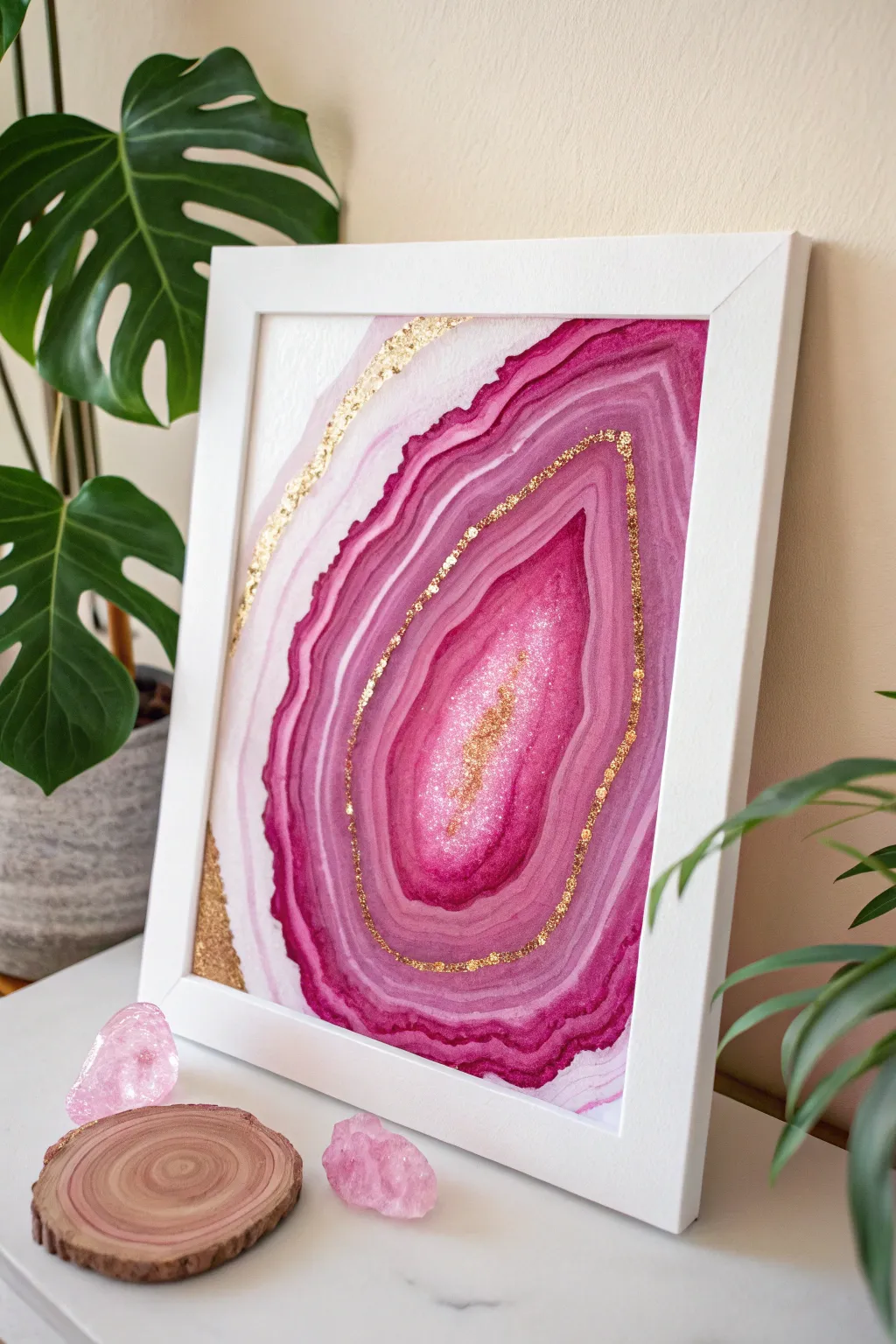
Capture the organic beauty of natural stone with this striking watercolor and gold leaf project. The deep magenta layers ripple outward in mesmerizing bands, accented by luxurious touches of shimmering gold that catch the light.
Detailed Instructions
Materials
- Cold press watercolor paper (heavyweight, at least 140lb)
- White or wooden frame
- Watercolor paints (magenta, purple, deep pink)
- Metallic gold paint or gold leaf kit
- Gold glitter (fine grain)
- Round watercolor brushes (sizes 6 and 2)
- Clean water jar
- Paper towels
- Masking tape or painter’s tape
- Pencil for light sketching
Step 1: Planning the Shapes
-
Secure the paper:
Tape your watercolor paper down to a flat board or table on all four sides. This prevents warping when the paper gets wet. -
Sketch the geode:
Lightly sketch the outline of your geode shape. Think organic and distinct—aim for an irregular teardrop or oval that occupies the majority of the paper. -
Define the center:
Draw a smaller, enclosed shape inside the first one to mark the ‘heart’ or crystalline center of the geode. This area will be the darkest and most saturated.
Muddy colors?
If layers are bleeding together too much, let each ring dry for 2-3 minutes before painting the adjacent one. Dry paper creates harder separation lines.
Step 2: Layering the Color
-
Mix your palette:
Prepare three concentrations of your magenta paint: a very watery pale pink, a medium tone, and a thick, pigment-rich deep magenta. -
Wet-on-wet foundation:
Pre-wet the central ‘heart’ shape with clean water until it glistens but isn’t pooling. This allows the paint to bloom naturally. -
Paint the center:
Drop your darkest magenta into the wet center. Let the pigment spread, but leave a few tiny white gaps for texture. While wet, sprinkle a pinch of fine glitter into the center for sparkle. -
Create the first ring:
Loading your brush with the medium-tone pink, paint a band around the dark center. Leave a very thin sliver of white paper between this ring and the center to define the layers. -
Softening edges:
Before the ring dries completely, rinse your brush and run damp bristles along the outer edge of the band to soften it, creating a gradient effect. -
Building outward:
Continue adding concentric rings, alternating between thin, sharp dark lines and wider, watery pale bands. The contrast between hard edges and soft washes mimics real stone. -
Varying the width:
Make sure your bands aren’t perfectly uniform. Let some swell and become thicker on one side of the geode shape, just like natural formation. -
Outer wash:
For the outermost layers, use your palest pink mixture. Allow it to fade out almost to white at the very edges of your initial sketch. -
Dry completely:
This is crucial—let the painting dry fully. Use a hairdryer on a low setting if you are impatient, but air drying is safest for flatness.
Salt Texture Trick
While the paint is still wet in the darkest bands, drop a few grains of coarse salt on it. Brush it off when dry for a stunning crystalline texture.
Step 3: Gilding and Framing
-
Map the gold accents:
Look at your dried layers. Choose one prominent ring about halfway out to highlight with gold, along with an accent curve near the top outer edge. -
Apply adhesive:
If using gold leaf, paint a thin line of adhesive size (glue) along your chosen paths. If using metallic paint, simply load a fine Size 2 brush. -
Lay the gold:
Press the gold leaf onto the tacky adhesive or carefully paint your metallic line. I purposefully make this line slightly jagged or broken to look more like a mineral vein. -
Add corner details:
Don’t forget the bottom left corner—add a small triangular section of gold leaf or paint here to balance the composition. -
Brush off excess:
Once dry, use a soft, dry brush to sweep away any loose gold leaf flakes. This reveals the crisp, shiny vein underneath. -
Frame it:
Remove the tape carefully, peeling away from the center to avoid tearing. Place your artwork into the white frame to complete the modern look.
Now you have a stunning, glamorous piece of abstract art that brings a pop of color to any room
BRUSH GUIDE
The Right Brush for Every Stroke
From clean lines to bold texture — master brush choice, stroke control, and essential techniques.
Explore the Full Guide
Hot Pink Geometric Minimalism
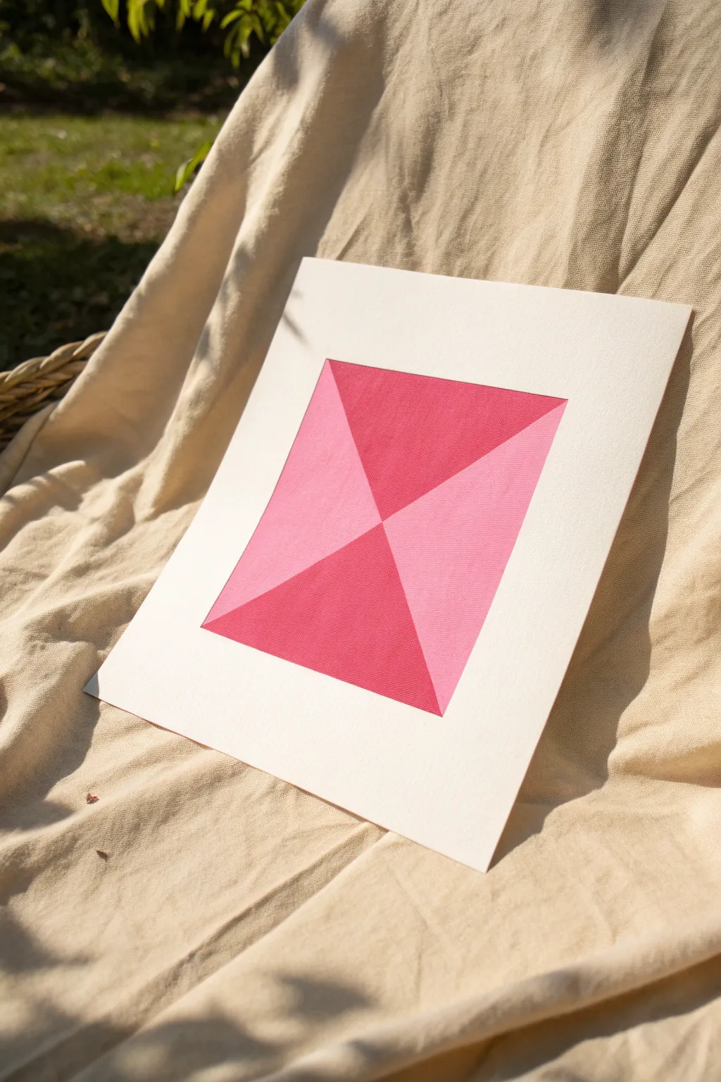
This striking geometric piece balances bold hot pink with soft blush triangles to create a dimensional hourglass effect. Its clean lines and minimalist composition make it a perfect modern accent for any gallery wall.
Step-by-Step Tutorial
Materials
- Heavyweight bristol board or watercolor paper (approx. 9×12 inches)
- High-tackle masking tape or drafting tape
- Acrylic paints: Magenta/Hot Pink and Titanium White
- Flat shader brush (synthetic, roughly 1/2 inch wide)
- Ruler or quilting square
- Pencil
- Eraser
- Basic palette or mixing surface
- Pre-cut mat board (white, with a square opening)
Step 1: Preparation & Layout
-
Trim the base:
Begin by cutting your bristol board or heavy paper to a size slightly larger than the opening of your mat board to allow for secure mounting later. -
Center constraints:
Using your ruler, lightly mark the exact center point of the paper. From this center, measure outwards to define the outer square boundary of your design. A 6×6 or 8×8 inch square works beautifully for this. -
Draw the diagonals:
Place your ruler from the top-left corner of your defined square to the bottom-right corner and draw a very faint line. Repeat for the top-right to bottom-left corners. -
Mask the border:
Apply your drafting tape precisely along the four outer edges of your square. This creates the crisp white border that separates the art from the rest of the paper.
Seal the Bleed
Before painting your color, brush a thin layer of matte medium or white paint over the tape edge. This seals gaps so your lines stay razor-sharp.
Step 2: Masking & Painting
-
Section off the light triangles:
You need to paint opposite sections first to keep edges sharp. Apply tape directly over the diagonal pencil lines, covering the top and bottom triangular areas entirely. This exposes only the left and right triangles. -
Mix the blush tone:
On your palette, take a small amount of Magenta and mix it into a larger dollop of Titanium White until you achieve a soft, bubblegum pink. -
Paint the first layer:
Using your flat brush, paint the exposed left and right triangles. Here I prefer to brush inward from the tape toward the center to prevent paint from bleeding under the edges. -
Apply a second coat:
Allow the first layer to dry to the touch—about 10 minutes. Apply a second coat of the light pink to ensure solid, opaque coverage without streaks. -
Remove tape and dry:
Carefully peel back the diagonal tape while the paint is still slightly tacky to get the cleanest line. Let these sections dry completely (at least 30 minutes) before proceeding. -
Mask the dark triangles:
Once the pink sections are bone dry, apply fresh tape directly over the painted edges you just created. This protects your work and exposes the top and bottom triangles. -
Prepare the hot pink:
Squeeze out pure Magenta paint. If you want it slightly deeper, add the tiniest touch of red or a microscopic dot of black, but pure magenta usually pops best. -
Paint the dark sections:
Fill in the top and bottom triangles with the hot pink paint. Again, brush away from the tape edges initially to seal the seal. -
Final coat:
As with the lighter sections, apply a second coat of the hot pink to ensure the color is rich and velvety.
Paint Peeling Off?
If paint lifts when removing tape, the bottom layer wasn’t dry enough or the tape is too strong. Stick tape to your clothes first to reduce tackiness.
Step 3: Finishing Touches
-
Reveal the design:
Gently peel away the diagonal tape first, followed by the outer border tape. Pull the tape at a 45-degree angle slowly to avoid tearing the paper surface. -
Clean up:
Once fully dry, inspect the white border. If any pencil marks from the corners remain visible, gently erase them with a gum eraser. -
Mount artwork:
Place your mat board over the artwork to check alignment. The points of the triangles should touch exactly at the true center. -
Secure in place:
Flip the mat and artwork over. Use acid-free artist tape to secure the paper to the back of the mat board.
Now your vibrant geometric study is ready to bring a pop of color to your space
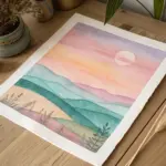
Cotton-Candy Pink Cloudscape
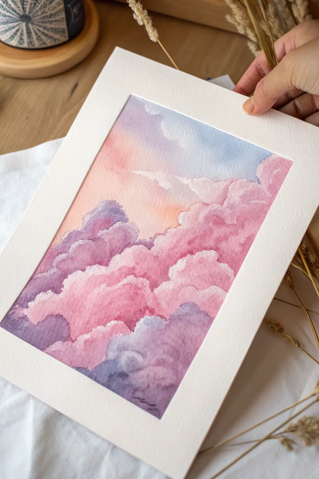
Capture the ethereal beauty of a sunset sky with this soft watercolor cloudscape. Using a palette of gentle pinks, lilacs, and muted blues, you will layer wet-on-wet washes to create fluffy, light-filled clouds that seem to float right off the paper.
Step-by-Step Tutorial
Materials
- Cold press watercolor paper (300 gsm)
- Watercolor paints: Rose Madder or Quinacridone Rose, Ultramarine Blue, Cobalt Blue, touch of Burnt Sienna or Orange
- Round watercolor brushes (size 8 or 10 for washes, size 4 for details)
- Clean water jars (two)
- Paper towels
- Painter’s tape or masking tape
- Drawing board
- White mat (optional, for framing)
Step 1: Setting the Sky
-
Prepare your surface:
Tape your watercolor paper down securely to a board on all four sides. This prevents buckling and leaves a crisp white border later. -
Sketch the cloud shapes:
Very lightly sketch the outlines of your main cloud masses using a hard pencil (like 2H or H). Keep the lines faint so they disappear under the paint later. -
Wet the sky area:
Identify the background sky area visible behind the clouds. Using your large round brush and clean water, dampen this upper section of the paper, avoiding the main cloud shapes. -
Paint the upper gradient:
While the paper is wet, drop in a watery mix of Cobalt blue mixed with a tiny bit of Ultramarine at the top right corner, letting it fade as it moves down. -
Transition to warmth:
While the blue is still damp but not soaking, mix a very pale wash of rose with a speck of orange. Apply this to the middle-left section of the sky for a soft sunset glow.
Fixing Blooms
If water back-runs create ‘cauliflower’ blooms in your clouds, don’t panic. Wait for it to dry, then soften the hard edge with a damp stiff brush or glaze over it.
Step 2: Building the Clouds
-
Mix your base pink:
Prepare a puddle of your main pink color (Rose Madder works beautifully). It should be diluted enough to be soft, but pigmented enough to show up clearly. -
Paint the first cloud layer:
Start painting the tops of the large cloud formations. Use the belly of your brush to deposit color, then clean your brush and use just damp bristles to soften the bottom edge of the stroke, fading it into white. -
Vary the pink tones:
As you move across the large central cloud mass, drop in slightly more saturated pink in some areas while the paper is still damp to create volume and depth. -
Introduce lilac shadows:
Mix Ultramarine Blue with your Rose to create a soft violet. Apply this to the underside of the upper cloud layers while the pink above is still slightly damp, allowing a soft, fuzzy blend. -
Define the hard edges:
Ensure the top edges of your clouds remain crisp against the sky. This ‘hard edge’ provides the structure, while the soft internal blends create the fluffiness.
Add Sparkle
For a magical touch, use white gouache or a white gel pen to add tiny highlights on the very top edges of the highest clouds once the painting is 100% dry.
Step 3: Deepening Values
-
Create the lower dark clouds:
For the darker purple clouds at the bottom left, mix a stronger concentration of your violet. Apply this wet-on-dry to get distinct, bubbly cloud shapes. -
Soften the transitions:
Immediately after painting a dark purple shape, use a clean, damp brush to tickle the edges where it meets a lighter cloud, softening the transition so it doesn’t look like a cutout. -
Add mid-tone pinks:
Look for the medium-dark areas in the central pink mass. Glaze a second layer of pink over the dry first layer to build up the ‘body’ of the cloud. -
Refine small details:
Switch to your size 4 brush. Add tiny, wispy cloud fragments at the top edges where the main cloud meets the blue sky to add realism. -
Deepen the deepest shadows:
Mix your darkest purple (add a touch of Burnt Sienna to the violet to dull it slightly). Paint into the crevices at the bottom of the cloud clusters. -
Final assessment:
Step back. If any edges look too harsh inside the cloud body, gently scrub them with a damp brush to lift a little pigment and soften the look. -
Dry and reveal:
Let the painting dry completely—the paper must be room temperature to the touch. Carefully peel away the tape at a 45-degree angle.
Place your finished piece in a clean white mat to enhance the delicate colors and enjoy your personal sunset view

PENCIL GUIDE
Understanding Pencil Grades from H to B
From first sketch to finished drawing — learn pencil grades, line control, and shading techniques.
Explore the Full Guide
Pink Blossom Branch Ink-and-Wash
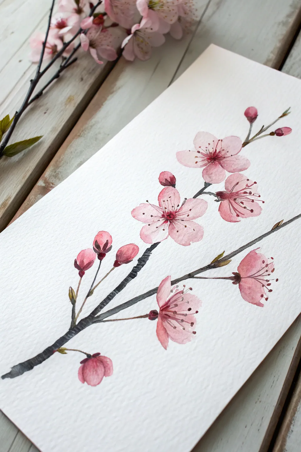
Capture the ephemeral beauty of spring with this graceful ink-and-wash style cherry blossom branch. Using soft washes of pink and decisive, dark branches, you’ll create a piece that feels both botanical and wonderfully artistic.
Step-by-Step
Materials
- Cold press watercolor paper (textured, 300gsm)
- Watercolor paints (Alizarin Crimson, Sap Green, Burnt Umber or Sepia)
- Black ink or very dark watercolor/gouache for branches
- Round watercolor brushes (Size 2, 4, and a detail liner brush)
- Pencil (HB or H)
- Palette for mixing
- Water cups and paper towels
Step 1: Sketching the Composition
-
Map the Main Branch:
Begin with a very faint pencil sketch. Draw a diagonal line starting from the bottom left corner, reaching toward the upper right. This will be your main anchor branch. -
Add Secondary Growth:
Sketch a thinner secondary branch splitting off to the right about a third of the way up. Add tiny spurs for buds along both lines. -
Position the Blooms:
Lightly draw circles or ovals where the main flowers will sit. Place 2-3 full blooms on the upper branches and a couple of half-opened flowers lower down. Don’t worry about petal details yet; just get the placement right.
Bleeding Edges?
If your branch color bleeds into the pink petals, the flowers weren’t dry enough. Wait longer, or dry with a hair dryer on a low setting before painting adjacent areas.
Step 2: Painting the Blooms
-
Mix Your Pink:
Dilute Alizarin Crimson with plenty of water to create a very pale, transparent baby pink. Prepare a second puddle with a slightly more concentrated pigment for shadows. -
First Petal Wash:
Starting with the top right flower, paint the five petals using the pale mix. Leave tiny slivers of white paper between petals to keep them distinct. -
Add Depth While Wet:
While the first wash is still damp, touch the center of the flower with your slightly darker pink mix. Let it bleed naturally outward into the petals. -
Painting the Buds:
For the closed buds at the bottom left and tips, use a more saturated pink mix. Paint simple teardrop shapes, keeping the color strongest at the base. -
Layering Petals:
Move to the central, open flower. Paint the petals with slightly irregular edges to mimic nature. I find varied edges make the flower look more organic than perfect circles. -
Side-View Flowers:
For the blossoms hanging downward, paint a bell shape or a semi-circle, indicating that the petals are cupped. -
Drying Time:
Allow the pink floral elements to dry completely. This is crucial so the dark branch color doesn’t bleed into your delicate flowers.
Add Highlights
For extra pop, use a white gel pen or white gouache to add tiny highlight dots on the anthers or the glossy parts of the reddish buds.
Step 3: The Branches and Details
-
Mixing the Branch Color:
Mix Sepia with a touch of black ink or Ivory Black watercolor to get a near-black, woody tone. It should be opaque but not thick. -
Painting the Main Stem:
Using a size 4 brush, paint the main branch in segments. Lift your brush slightly between segments to create a knobby, natural wood texture rather than a straight pipe. -
Connecting the Blooms:
Switch to a smaller size 2 brush. Carefully draw thin stems connecting your pink flowers to the main branch. These connections should be delicate. -
Adding Sepals:
At the base of the pink buds and side-view flowers, paint small green-brown sepals (the little cup holding the flower). Mix Sap Green with a bit of your brown for an earthy olive tone. -
Leaf Shoots:
Add tiny, sharp green leaf shoots emerging from the branch tips or near buds. Keep these minimal; this is early spring growth. -
Branch Texture:
Once the main grey-brown branch is dry, take a fairly dry brush with darker pigment and drag it lightly over the wood to create texture and bark lines.
Step 4: Finishing Touches
-
Painting Stamens:
Use a detail liner brush and a dark reddish-brown mix. Paint fine, wispy lines radiating from the center of the open flowers. -
Adding Anthers:
Dot the ends of those wispy stamen lines with tiny specs of dark brown or crimson to represent the pollen anthers. -
Final Contrast Check:
Step back and look at your composition. If any petals look too flat, add a very transparent glaze of pink to the underside of a petal to suggest shadow.
Frame this delicate study in a simple wood frame to complement the clean aesthetic of the branch.
Pink Fashion Sketch With Bold Shadows
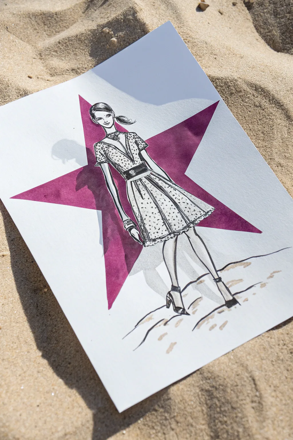
This striking mixed-media illustration combines sharp ink linework with a bold geometric shape to create a high-contrast fashion statement. The interplay between the crisp black pen strokes and the vibrant magenta star creates a dynamic backdrop that makes the figure pop off the page.
Detailed Instructions
Materials
- Heavyweight mixed media paper or bristol board
- Pencil (HB or H)
- Eraser
- Fine liner pens (0.1mm, 0.3mm, 0.5mm)
- Black brush pen or broad marker
- Magenta alcohol marker or acrylic paint marker
- Ruler
- Tracing paper (optional)
Step 1: Planning and Foundation
-
Draft the background star:
Begin by lightly drawing a large five-pointed star in the center of your paper using a pencil and ruler. Ensure the star is large enough to span most of the page width. -
Sketch the figure’s gesture:
Lightly sketch the fashion croquis (figure) directly over the star. Position her so she stands centrally, with legs slightly apart for a dynamic pose. -
Define the anatomy:
Flesh out the figure’s anatomy, focusing on the angle of the shoulders and the bend of the knees. Keep your pencil lines faint so they are easy to remove later. -
Draft the outfit:
Sketch the dress on the figure. Draw a V-neck bodice, a defined waistband, and a knee-length skirt with gentle pleats. Add details like the sleeves and the shoes. -
Check composition:
Step back and look at your pencil draft. The figure should overlap the star significantly, creating depth. Adjust the size of the star or figure if necessary to get the balance right.
Bleed-Proofing
If your marker bleeds into the white figure, use a white gel pen or opaque white gouache to tidy up the edges and reclaim the silhouette.
Step 2: Color and Contrast
-
Fill the star background:
Using your magenta alcohol marker or paint marker, carefully fill in the star shape. Do not color over the figure; leave the silhouette of the woman white. -
Refine the edges:
Go back around the edges of the star to ensure the points are sharp. Be extremely careful around the outline of the woman’s hair and dress to keep the boundary crisp. -
Add deep shadows:
With the same magenta marker, add a second layer of ink to the lower left points of the star to simulate a slight gradient or shadow effect within the shape itself. -
Let it dry completely:
Wait for the marker ink to dry fully before moving on to avoid smudging the color into the white figure area.
Cast Shadows
When adding the gray shadow on the star, keep the light source consistent. If the light comes from the right, the shadow falls on the left.
Step 3: Inking and Details
-
Outline the figure:
Switch to your 0.3mm fine liner. Carefully ink the main outline of the figure, hair, and dress. Use confident, smooth strokes. -
Add facial features:
Use the 0.1mm pen for delicate facial features like the eyes, nose, and mouth. Keep the expression simple and stylized. -
Detail the hair:
Use the black brush pen or a thicker marker to fill in the dark sections of the hair, leaving small white highlights to suggest shine. -
Pattern the dress:
With the 0.1mm pen, add the polka dot pattern to the dress. Vary the density of the dots to suggest folds in the fabric. -
Define dress folds:
Draw vertical lines on the skirt to represent pleats. Add slightly heavier lines under the arms and waist belt for dimension. -
Detail the accessories:
Ink the belt with solid black or heavy hatching. Define the wrist cuffs and shoes, adding small details like heels and straps.
Step 4: Finishing Touches
-
Create ground shadows:
Using a light gray marker or diluted ink, sketch rugged, abstract lines at the figure’s feet to suggest unstable ground or sand. -
Add cast shadows:
To make the figure pop, add a slight gray shadow on the magenta star just to the left of the figure’s arm and dress. This mimics a shadow cast by the woman onto the star behind her. -
Clean up:
Once all ink is 100% dry, gently erase any remaining visible pencil lines, particularly around the face and the points of the star. -
Final assessment:
Check for any gaps in the magenta fill or weak lines in the ink work and touch them up as needed.
Now you have a bold fashion illustration ready to be framed or added to your portfolio


Pink Portrait in a Limited Palette
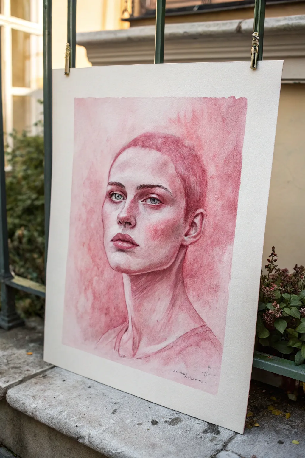
This striking portrait study explores the depth and versatility of a single hue, using varying concentrations of pink watercolor to build form and emotion. The result is a moody, atmospheric piece that focuses on light, shadow, and the subtle textures of the face without the distraction of a full color palette.
Step-by-Step Tutorial
Materials
- Cold press watercolor paper (300 gsm or heavier)
- Watercolor paint (Alizarin Crimson or Quinacridone Rose)
- Opaque white gouache or white watercolor
- Small amount of Payne’s Grey or blue watercolor (for eyes)
- Round watercolor brushes (Size 8 for washes, Size 2 or 0 for details)
- Drawing pencil (HB) and kneaded eraser
- Paper towels
- Palette for mixing
- Masking tape
- Painting board
Step 1: Preparation and Sketching
-
Prepare the surface:
Tape your watercolor paper securely to a board on all four sides. This prevents buckling when we apply heavy washes later and creates that crisp, clean border seen in the final piece. -
Establish the proportions:
Using your HB pencil, lightly map out the head shape. Focus on the central axis of the face to get the slight tilt correct. Mark the eye line, nose base, and mouth line. -
Refine the features:
Draw the contours of the face more cleanly now. Pay special attention to the shape of the buzz cut hairline, the almond shape of the eyes, and the structure of the neck muscles. -
Lighten the guide:
Roll a kneaded eraser gently over your sketch. You want the graphite lines to be faint enough that they won’t show through the transparent watercolor layers, but visible enough to guide you.
Patchy Shadows?
If your shadows dry with hard ‘cauliflower’ edges inside the face, your brush was too wet. Use a slightly drier mix for layering, or soften edges immediately with a damp brush before they dry.
Step 2: Building the Form with Washes
-
Mixing the master color:
Squeeze out a generous amount of your chosen pink (like Alizarin Crimson) onto your palette. Create three puddles: one very watery and pale (tea consistency), one medium strength (milk), and one concentrated (honey). -
First wash:
With a large round brush, apply the palest wash over the entire silhouette of the head and neck, avoiding the whites of the eyes. This establishes the base tone of the skin. -
Wet-on-wet background:
While the skin base is drying, wet the background area around the head with clean water. Drop in your medium-strength pink mix, letting it bloom and spread unevenly to create that textured, moody atmosphere. -
Mapping the shadows:
Once the first layer is dry, use the medium mix to block in the major shadow shapes: under the brow bone, the side of the nose, under the nose, the upper lip, and the deep shadow under the jawline. -
Softening edges:
Immediately after placing a shadow shape, use a clean, damp brush to soften the edges where the shadow turns into light. This creates the smooth transition of a cheekbone or rounded forehead.
Step 3: Adding Depth and Detail
-
Deepening the darkest areas:
Switch to your concentrated paint mix. Carefully apply this to the darkest recesses: the nostrils, the corners of the mouth, the crease of the eyelid, and the hollow of the ear. -
Sculpting the features:
Use a smaller brush (size 2) to build up the structure of the lips. The upper lip is usually darker than the lower lip. Leave a tiny highlight on the lower lip if possible to suggest moisture. -
Texturing the hair:
For the buzz cut, use a fairly dry brush technique. Stipple or dab small dots of medium and dark pink across the scalp area to mimic the texture of short, cropped hair. -
Defining the eyes:
Mix a tiny amount of Payne’s Grey or diluted blue to paint the irises. Keep them pale and ghostly. Add the pupil with a dark dot, and carefully outline the lash line with your darkest pink mix. -
Neck anatomy:
Paint vertical strokes on the neck to suggest the sternocleidomastoid muscles. Keep these strokes loose to maintain the painting’s expressive energy.
Make it Pop
Introduce a complementary color for contrast. A tiny wash of pale green in the background or shadows will make the pink tones vibrate and appear much more intense.
Step 4: Final Touches and Highlights
-
Enhancing the gaze:
If your white paper reserve for the eye highlights got lost, use a tiny dot of opaque white gouache to bring the sparkle back to the eyes. This instantly brings the portrait to life. -
Background integration:
Darken the background immediately adjacent to the light side of the face. This negative painting technique makes the cheekbone pop forward. -
Refining edges:
Check the silhouette. If the edge of the face looks too sharp against the background, re-wet it slightly and lift a little pigment to soften the line, integrating the figure with the space. -
Removing the tape:
Wait until the paper is completely bone-dry—I usually give it an extra hour just to be safe. Peel the masking tape away slowly at a 45-degree angle to reveal your crisp, professional border.
Now step back and admire how a single color can captured such a complex and evocative expression
Pink Typography Poster-Style Painting
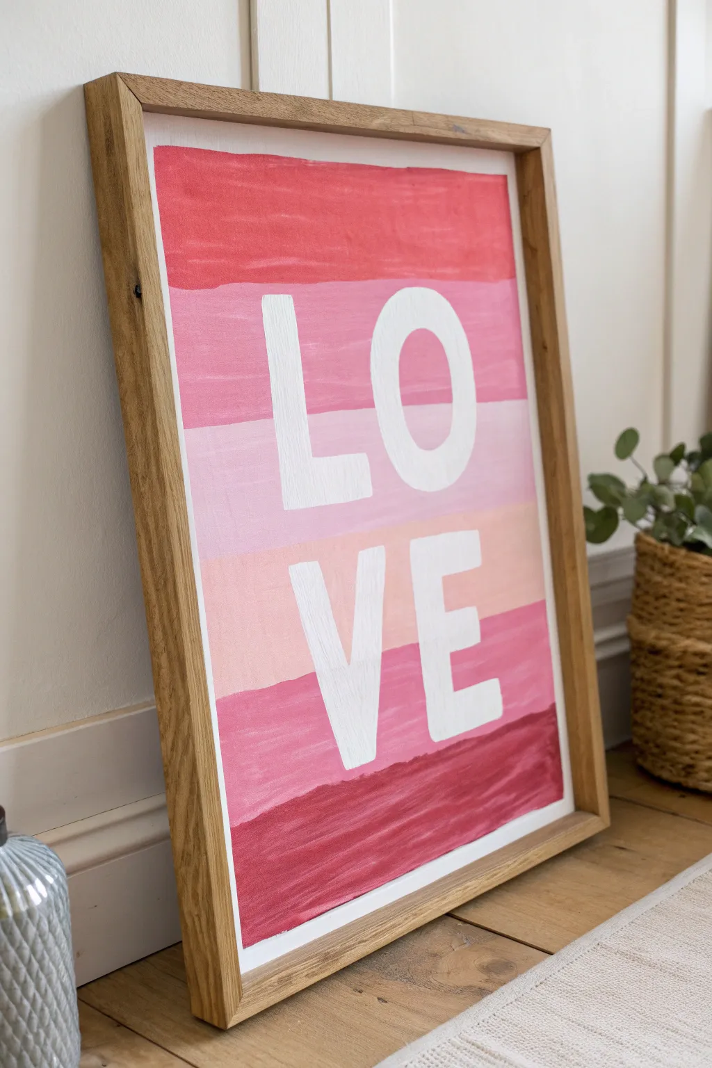
This vibrant typography poster uses simple horizontal stripes to create a bold, modern statement piece perfect for adding a pop of color to any room. With its layered shades of pink and crisp white lettering, it balances a hand-painted feel with clean graphic design.
How-To Guide
Materials
- Heavyweight watercolor paper or mixed media paper (at least 140lb)
- Acrylic paints (Red, White, and Magenta/Deep Pink)
- Flat shader brush (1-inch width)
- Smaller flat brush (for lettering)
- Ruler
- Pencil
- Painter’s tape or masking tape
- Palette or paper plate for mixing
- Wooden frame (optional)
Step 1: Preparation & Layout
-
Prepare your surface:
Begin by taping down the edges of your paper to a flat work surface. This prevents the paper from buckling when wet and ensures you get a clean white border around the edge, just like in the photo. -
Measure the stripes:
Using a ruler and pencil, lightly mark horizontal lines to divide the paper into five equal sections. These sections will become your colored stripes. -
Lightly sketch the letters:
Very faintly sketch the word ‘LOVE’ in block letters. Position ‘LO’ in the top half (overlapping the top three stripes) and ‘VE’ in the bottom half. Center them carefully, but don’t worry about perfection; the paint will cover your lines.
Uneven Lines?
If you struggle with steady hands, use painter’s tape to mark off each horizontal stripe before painting. Let each stripe dry and move the tape before starting the next color
Step 2: Painting the Background
-
Mix the top color:
Start with a medium coral-red tone. Mix a bit of red with a touch of white and perhaps a dot of yellow if your red is too cool. You want a warm, vibrant salmon-red. -
Paint the first stripe:
Using your 1-inch flat brush, fill in the top horizontal section. I like to keep my brushstrokes horizontal to maintain that smooth, poster-like texture. -
Mix the second shade:
For the second stripe down, mix a bubblegum pink. This should be lighter and cooler than the top stripe, so add more white and a tiny bit of magenta to your base mixture. -
Paint the second stripe:
Fill in the second section. It’s okay if the paint roughly touches the line of the previous section; a slightly imperfect, hand-painted edge adds character. -
Create the middle shade:
The third (middle) stripe is the lightest. Mix a very pale, soft pastel pink by adding a significant amount of white to your previous pink mixture. -
Apply the middle stripe:
Paint the middle section. If you are painting over your pencil sketch for the letters, make sure you can still faintly see the guides. If the paint is too opaque, you might need to re-sketch later. -
Mix the fourth shade:
The fourth stripe returns to a medium tone, similar to a dusty rose or warm blush. It should be darker than the middle stripe but lighter than the bottom one. -
Paint the fourth stripe:
Apply the paint to the fourth section, maintaining those horizontal brushstrokes. -
Mix the bottom color:
For the final bottom stripe, mix your deepest, richest color—a deep berry or burgundy red. This anchors the visual weight of the poster. -
Finish the background:
Paint the bottom section and let the entire background dry completely. Acrylics dry fast, but give it at least 20-30 minutes to ensure the white lettering won’t pull up the pink paint.
Go Metallic
Swap the plain white acrylic for gold leaf or metallic gold paint for the lettering. The shimmer against the matte pink ombré creates a luxurious, high-end look
Step 3: Lettering & Finishing
-
Prepare white paint:
Use pure titanium white acrylic paint. You want a heavy body paint for opacity so the pink stripes don’t show through the letters. -
Outline the letters:
With a smaller flat brush, carefully outline your ‘LO’ and ‘VE’ pencil marks. Using a flat brush helps you get crisp, square edges on the block letters. -
Fill in the letters:
Fill in the outlines with the white paint. Apply the paint thickly. You may need two coats here: let the first one dry to the touch before adding a second to get that bright, solid white. -
Clean up edges:
Once the white is dry, check your edges. If any pink lines look messy, you can carefully touch them up with leftover mixed paint, but be cautious not to smudge your white letters. -
Remove the tape:
Slowly peel away the painter’s tape at a 45-degree angle to reveal your crisp white border. -
Frame your art:
Once fully cured, place your artwork into a simple light wood frame to match the airy, modern aesthetic shown in the photo.
Hang your new typography art in a spot that needs a little warmth and love
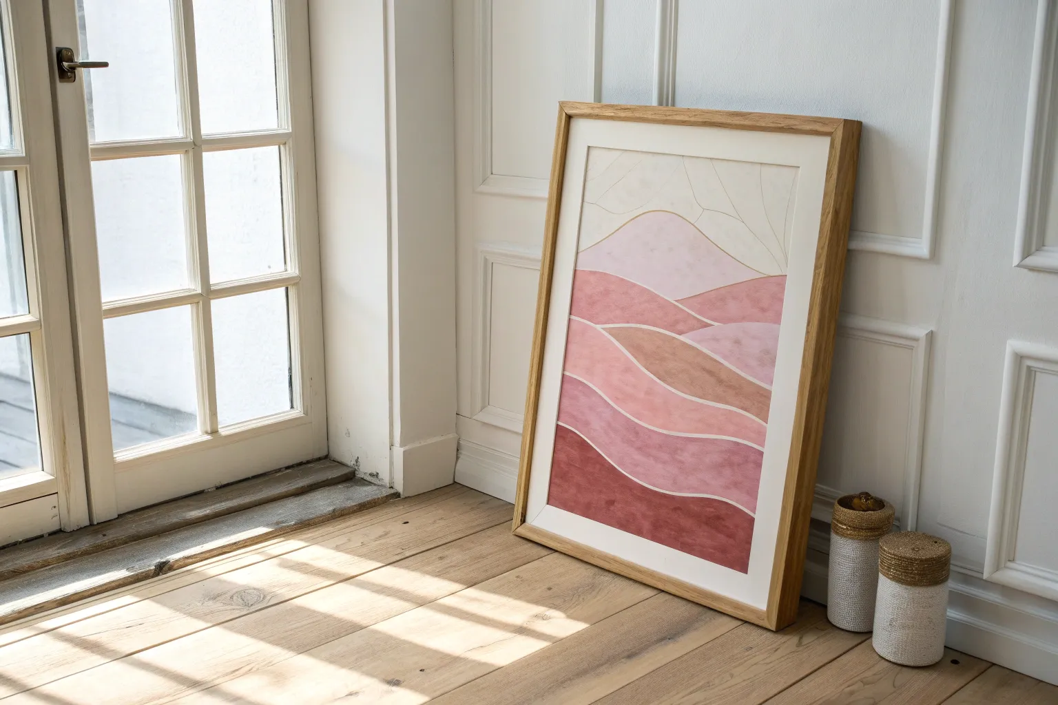
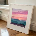
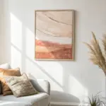
Tiny Pink Triptych for a Gallery Wall
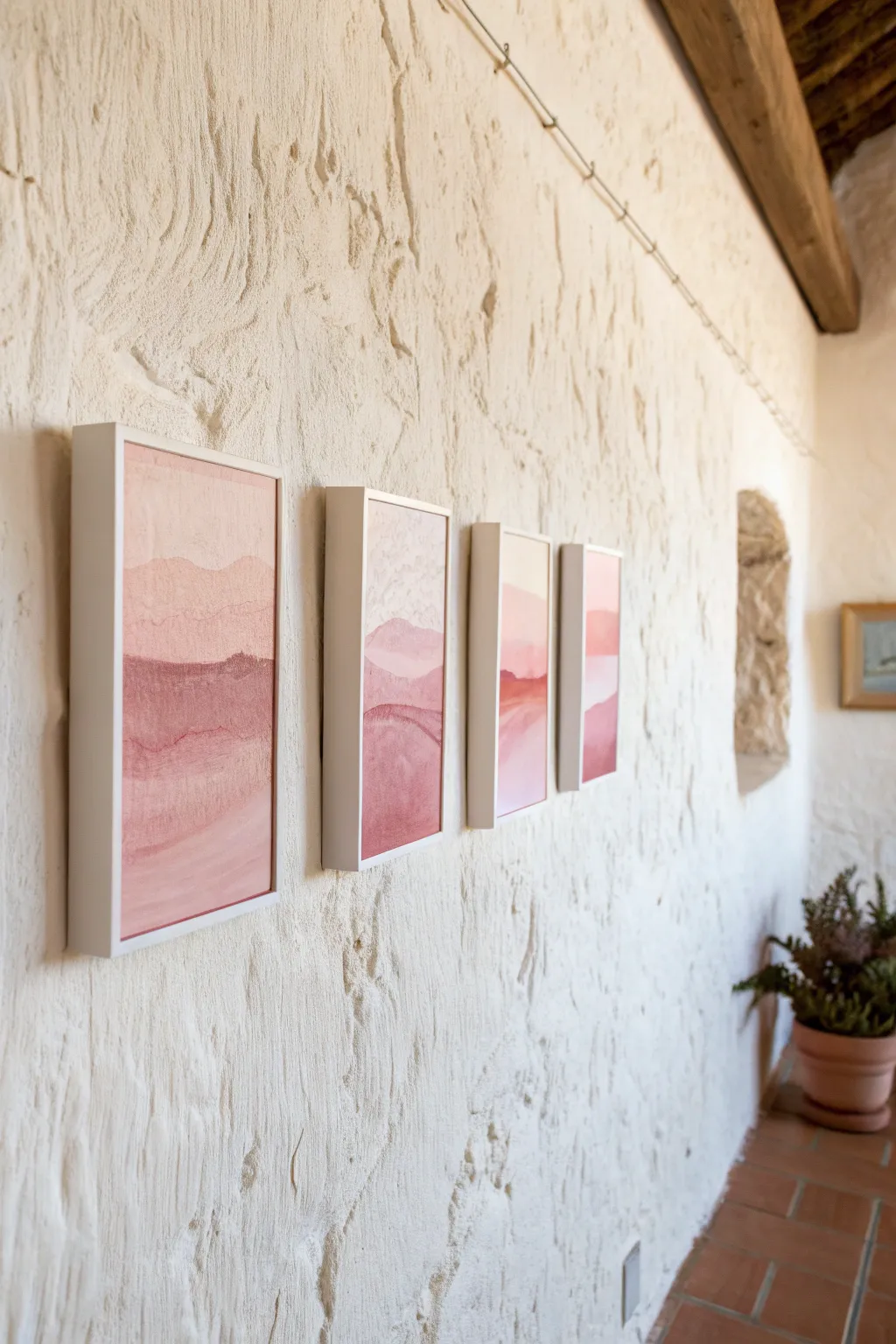
Soft, monochromatic landscapes bring a serene warmth to any room, especially when displayed as a cohesive series. This project uses layers of diluted acrylic or watercolor washes to build abstract, dreamy horizons in shades of dusty rose and terra cotta.
Detailed Instructions
Materials
- 4 small heavy-weight watercolor paper sheets (5×7 or 6×8 inches)
- 4 deep-set white gallery frames (sized to match paper)
- Watercolor paints or fluid acrylics (Crimson, Burnt Sienna, White, Yellow Ochre)
- 2 large round watercolor brushes (size 10 and 14)
- Masking tape
- Mixing palette with deep wells
- 2 jars of water
- Paper towels
- Pencil
- Ruler
Step 1: Preparation & Color Mixing
-
Prepare the paper:
Begin by taping down all four sheets of watercolor paper to a flat, hard board using masking tape. Ensure the tape covers about 1/4 inch of the paper edges to create a clean border later. -
Create the base pink:
On your palette, mix a generous amount of your primary pink shade. Combine Crimson with a touch of White and a tiny drop of Yellow Ochre to warm it up, aiming for a soft, dusty rose. -
Mix tonal variations:
Separate this base mixture into three different wells. Keep one as is, add more water and white to the second for a pale blush, and add a dot of Burnt Sienna to the third for a deeper, earthier terra cotta. -
Test your swatch:
Test your colors on a scrap piece of paper first. They should look cohesive together, like a paint chip gradient.
Wet-on-Wet Magic
For softer transitions between the hills, re-wet the bottom edge of a dry layer before painting the next color. This causes a slight bloom where they meet.
Step 2: Painting the Landscapes
-
Sketch the horizon lines:
Lightly sketch uneven, wavy horizon lines across all four papers. It helps to line the papers up side-by-side during this step so the ‘hills’ naturally flow from one frame to the next. -
Paint the sky:
Using the largest brush, dip into clean water and wet the ‘sky’ area of each paper. While wet, drop in the palest blush mix, letting it bleed softly down toward the horizon line. -
Soften the edges:
While the sky layer is still damp, lift your board slightly so the paint pools naturally at the bottom of the sky section, creating a gentle gradient effect. -
Let the first layer dry:
Allow the sky sections to dry completely. A hair dryer on a low, cool setting can speed this up if you are impatient. -
Paint the middle ground:
Load your brush with the medium dusty rose mixture. Paint the shape of the distant hills, overlapping slightly with the bottom of your sky wash. -
Create texture:
Before the middle layer dries, dab a clean, slightly damp paper towel onto random spots to lift pigment. This creates the subtle, mottled texture seen in the reference image. -
Paint the foreground:
Using the darkest terra cotta mix, fill in the bottom-most section of your landscape. I prefer to make this layer more opaque to ground the composition visually. -
Add separation lines:
Once the broad shapes are dry, use a smaller brush with a concentrated mix of the darkest pink to paint thin, wandering lines along the tops of the ridges. This defines the separate sets of hills.
Step 3: Finishing & Framing
-
Remove the tape:
Once the paper is bone dry, carefully peel away the masking tape. Pull the tape away from the paper at a 45-degree angle to prevent tearing the textured surface. -
Clean up the glass:
Disassemble your frames and clean the glass on both sides with glass cleaner and a microfiber cloth to ensure no dust is trapped. -
Mount the artwork:
Place your dried paintings into the frames. If the frames are deep-set (shadow box style), adhere the artwork to the backboard using double-sided acid-free tape. -
Secure the backings:
Reassemble the frames, securing the backings tightly. Check the front to ensure no debris has fallen inside the shadow gap. -
Plan your spacing:
Lay the frames on the floor to determine spacing. For a clean gallery look, keep the gap between frames consistent, ideally 2 to 3 inches apart. -
Hang the series:
Hang the frames on the wall using a level to keep the series perfectly straight.
Level Up: Metallic Touch
Mix a tiny amount of gold gouache or metallic watercolor into your final foreground layer for a subtle shimmer that catches the sunlight.
Step back and enjoy the calming rhythm your new pink landscape series brings to the space
Have a question or want to share your own experience? I'd love to hear from you in the comments below!