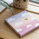
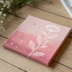
Whenever I’m craving color without a lot of fuss, I reach for oil pastels or soft pastels—they’re basically instant magic on paper. Here are my favorite pastel coloring ideas that you can start today, from classic gradients to a few playful, unexpected twists.
Blend a Classic Sunset Gradient
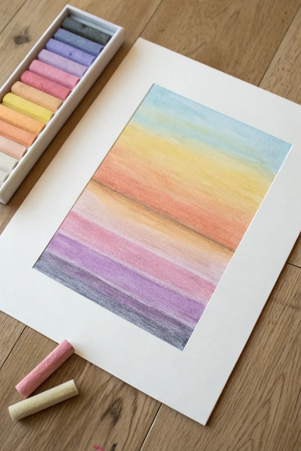
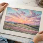
Capture the fleeting beauty of twilight with this seamless pastel gradient project. By layering horizontal bands of color from cool blue to deep violet, create a calming abstract landscape that seems to glow from within.
Step-by-Step Guide
Materials
- Soft pastel set (including light blue, yellow, orange, pink, violet, and dark grey/blue)
- Heavyweight textured art paper or pastel paper
- Pre-cut mat board frame
- Masking tape or artist’s tape
- Paper towel or blending stump (optional)
- Fixative spray
Step 1: Preparation & First Layers
-
Secure the paper:
Tape your art paper down to a flat surface. Position your pre-cut mat board over the paper to visualize the framing, lightly marking the corners with a pencil if needed to know your working boundaries. -
Start with the sky:
Begin at the very top of your paper with a light blue pastel stick. Apply the color using broad, horizontal strokes, covering the top quarter of the page lightly. -
Transition to light:
Just below the blue, introduce a pale yellow pastel. Allow the yellow to slightly overlap the bottom edge of the blue section to prepare for blending later. -
Add warmth:
Moving downward, select a soft orange tone. Apply this in a horizontal band directly beneath the yellow, keeping your strokes loose and consistent in direction.
Step 2: Building the Spectrum
-
Deepen the hues:
Below the orange, switch to a soft pink or salmon color. This band represents the fading light of the sun as it dips below the horizon. -
Introduce the twilight:
Select a medium violet or purple shade. Apply this band beneath the pink, pressing just a little harder to deposit more pigment for a richer tone. -
Ground the composition:
For the final bottom strip, use a dark grey or deep indigo. This creates the ‘earth’ or the darkest part of the twilight sky, providing a strong base for the gradient. -
Assess coverage:
Step back and look at your bands of color. Ensure there are no large gaps of white paper showing through, although some texture is desirable.
Muddy colors?
If colors look dull where they meet, you are likely over-blending. Stop rubbing, apply a fresh layer of the original pure color on top, and leave it alone.
Step 3: Blending & Refining
-
Clean your hands:
Before blending, make sure your fingers are clean and dry. I usually keep a damp cloth and a dry towel nearby for this step. -
Blend the sky:
Using your finger foundation or a paper towel, gently rub the boundary between the blue and yellow. Use a horizontal back-and-forth motion to create a soft green transition. -
Work downwards:
Move to the yellow-orange transition. Use a clean finger to smudge these colors together, softening the hard edge until the shift looks natural. -
Merge warm tones:
Blend the orange into the pink band. Because these colors are analogous, they mix easily, but be careful not to over-blend and lose the distinct orange strip. -
Address the cool transition:
Carefully blend the pink into the violet. This area can get muddy if overworked, so use a light touch to encourage a soft mauve connection. -
Final blend:
Smudge the violet into the dark grey base. This should be the darkest, heaviest blending to anchor the bottom of the piece. -
Add texture layers:
Take your orange and pink pastels again and lightly scumble (draw loosely) over the middle section to add texture back in, mimicking clouds. -
Define the horizon:
Use a darker brown or grey pastel to draw a very subtle, thin line across the middle section suggesting a distant horizon or shoreline.
Add a silhouette
Once the background is blended, use black pastel or charcoal to draw a simple silhouette of trees, birds on a wire, or a cityscape along the bottom edge.
Step 4: Finishing Touches
-
Clean placement:
Lift the paper carefully and tap off any excess pastel dust into a trash bin. Avoid blowing on it, as moisture droplets can spot the artwork. -
Preserve the work:
In a well-ventilated area, spray a light coat of fixative over the drawing to prevent smudging. -
Mount artwork:
Once the fixative is dry, align your mat board over the drawing and secure it from the back with tape for a professional finish.
Place your framed gradient in a spot that catches natural light to really make those colors sing
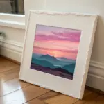
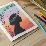
Create a Moody Night Sky With Stars
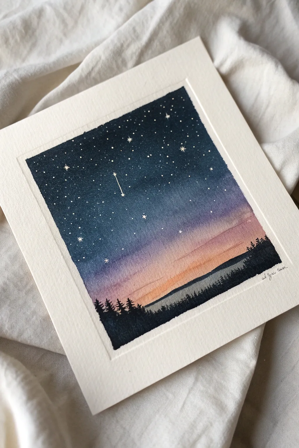
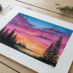
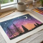
This serene painting captures the magic of twilight fading into a deep, starry night. By blending rich indigo hues into soft sunset pastels, you’ll create a breathtaking backdrop for a simple forest silhouette.
Step-by-Step Tutorial
Materials
- Cold press watercolor paper (square format)
- Masking tape
- Watercolor paints: Indigo, Prussian Blue, Purple/Violet, Rose Madder (or similar pink), Warm Orange or Yellow Ochre, Black/Payne’s Grey
- White gouache or white gel pen
- Flat wash brush (approx. 3/4 inch)
- Small round brush (size 2 or 4)
- Fine detail brush (size 0 or 00)
- Jar of clean water
- Paper towels
- Palette for mixing
Step 1: Preparing the Canvas
-
Secure the paper:
Tape down all four edges of your watercolor paper to a board or table using masking tape. This creates that crisp, clean white border and prevents buckling when the paper gets wet. -
Pre-wet the sky area:
Using your flat wash brush and clean water, gently wet the entire paper surface. You want an even sheen, not puddles, to help the colors flow together seamlessly.
Clean Edges Pro Tip
To prevent paint bleeding under the tape, burnish the edges down firmly with a fingernail or bone folder before you start painting.
Step 2: Painting the Gradient Sky
-
Start with the horizon:
Load your brush with a watered-down warm orange or yellow ochre. Paint a horizontal strip across the bottom third of the paper, letting it bleed slightly upward. -
Introduce the pink:
Without cleaning your brush thoroughly, pick up some rose madder or soft pink. Apply this directly above the orange strip, blending the two where they meet while the paper is still damp. -
Transition to purple:
Mix a medium violet shade. Apply this band above the pink, using broad horizontal strokes. Allow the pink and purple to merge naturally for a soft transition. -
Deepen the blue:
Switch to Prussian Blue or a similar deep blue. Paint the next section upwards, blending it down into the purple layer. The color should be getting more saturated as you move up. -
The midnight ceiling:
For the very top section, use your darkest Indigo, perhaps mixed with a tiny touch of black. Paint the top edge and blend downwards into the Prussian Blue. -
Smooth the gradient:
If distinct lines appear, clean your brush, dampen it slightly, and very gently run it horizontally across the transition zones to soften them. Be careful not to overwork it. -
Let it dry completely:
This is crucial. The paper must be bone-dry before moving to the next step to prevent the stars or trees from bleeding into the sky.
Step 3: Adding the Silhouette
-
Mix the forest color:
Create a thick, opaque mixture of black or concentrated Payne’s Grey. If you want a hint of depth, add a touch of deep green, but it should look nearly black. -
Paint the tree line foundation:
Using a small round brush, paint an uneven, slightly bumpy horizon line across the bottom of the orange section. Fill in everything below this line with solid black. -
Create tree peaks:
Switch to your fine detail brush. Use short, upward dabbing motions to create the jagged tops of pine trees along the horizon line. Vary the heights to make it look natural. -
Add texture:
For larger trees, paint a thin vertical line for the trunk first, then dab small horizontal branches outward, getting wider toward the bottom of the tree.
Level Up: Metallic Touch
Swap the white gouache for metallic silver or gold watercolor paint for the stars. It catches the light beautifully when viewed from an angle.
Step 4: Illuminating the Stars
-
Prepare the stars:
Squeeze out a small amount of white gouache. It needs to be the consistency of heavy cream—thick enough to be opaque, but fluid enough to leave the brush. -
Splatter method (optional):
For the tiniest distant stars, load a brush with watered-down gouache and tap it against another brush handle over the dark blue section. Cover the tree area with paper if you want to keep it pristine. -
Hand-paint bright stars:
I prefer to use a fine detail brush or a white gel pen to place individual dots. Concentrate most of them in the dark upper section, becoming sparser as you move down into the lighter colors. -
Create ‘twinkle’ stars:
Choose a few larger dots and carefully paint a tiny cross or four-pointed star shape over them to make them twinkle. -
The shooting star:
Identify a spot in the upper middle section. Paint a small star shape, then drag a very faint, thin white line downwards and slightly to the left to create a tail. -
The reveal:
Wait for the gouache and black paint to dry completely. Slowly and carefully peel off the masking tape at a 45-degree angle to reveal your clean edges.
Frame your miniature masterpiece or use it as a stunning handmade greeting card


Draw a Glowing Moon and Soft Clouds
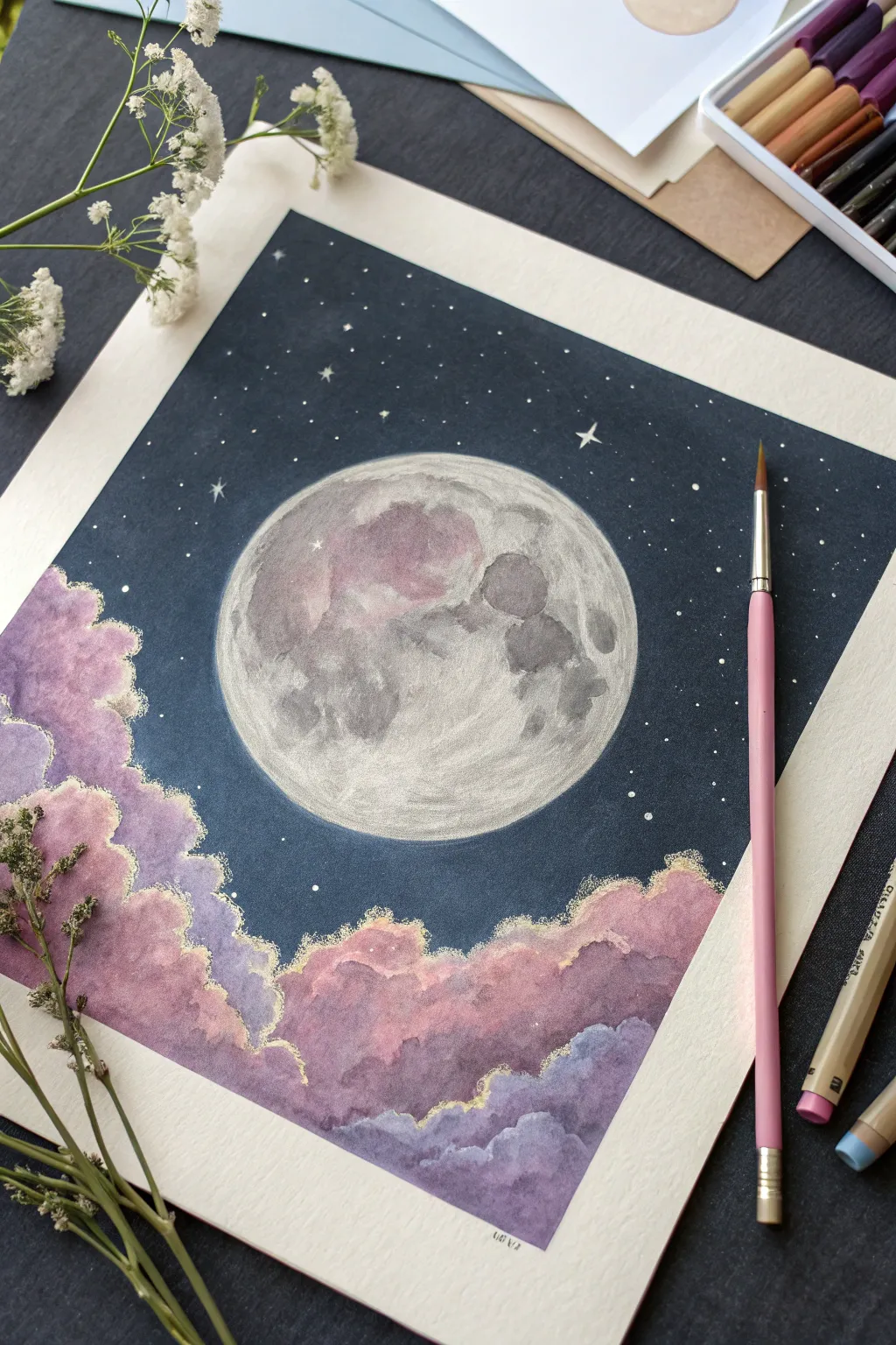
Capture the magic of a quiet night sky with this dreamy composition featuring a detailed full moon and billowing, pastel-hued clouds. Using a combination of pastels and opaque paints allows for stunning contrast between the deep navy background and the soft, glowing elements.
Detailed Instructions
Materials
- Heavyweight watercolor paper or mixed media paper (square format)
- Masking tape
- Gouache or acrylic paint (Navy Blue, Black, White)
- Soft pastels or pastel pencils (Pink, Lavender, Purple, Grey, White)
- Gold metallic paint or gold ink
- Flat wash brush
- Fine detail brush (size 0 or 1)
- Circular object for tracing (like a bowl or compass)
- Pencil
- Kneaded eraser
Step 1: Setting the Scene
-
Prepare the borders:
Begin by taping down the edges of your square paper with masking tape. This secures the sheet and creates that crisp, professional white border when you peel it off later. -
Trace the moon:
Place your circular object slightly off-center in the upper middle of the page. Lightly trace around it with a pencil to establish the moon’s position. -
Sketch the cloud outlines:
Sketch organic, billowing shapes rising from the bottom corners towards the moon. Keep the lines light and fluffy, overlapping them to create depth. -
Paint the night sky:
Mix a deep navy blue with a touch of black gouache or acrylic. Carefully paint the sky area, working around the moon circle and the cloud outlines. I like to apply two thin coats here to ensure the dark background is perfectly solid and opaque.
Fixing Smudges
If pastel dust smears onto your dark sky, don’t rub it! Use a kneaded eraser to lift the dust straight up, or paint over the mistake with your navy mix.
Step 2: Creating the Moon
-
Base coat the moon:
Fill the circular moon shape with a flat layer of light grey or off-white paint to cover the paper texture. -
Mark the craters:
Once the base is dry, use a grey pastel pencil or thinned grey paint to sketch the major lunar shapes giving the moon its character. -
Building lunar texture:
Using a darker grey pastel, gently shade the ‘seas’ or maria of the moon. Smudge these areas slightly with your finger or a blending stump to soften the edges. -
Adding highlights:
Take a white pastel pencil and stipple small dots and lines over the lighter areas of the moon to simulate crater textures and rocky ridges. -
Subtle color variation:
Lightly graze a dusty pink pastel over parts of the moon’s surface to reflect the colors of the clouds below, tying the color palette together.
Step 3: Adding the Soft Clouds
-
Base layer of clouds:
Start coloring the clouds with a soft lavender pastel. Apply the pigment heavily near the bottom and fade it out as you move upward. -
Layering pink tones:
Introduce a warm pink pastel on top of the lavender, focusing on the upper billows where imaginary moonlight would hit the clouds. -
Deepening shadows:
Use a darker purple or indigo pastel in the crevices between cloud puffs to create volume and separation between the layers. -
Blending for softness:
Use a clean finger or a soft tissue to gently blend the pastel layers together. Aim for a gradient effect where the colors melt into one another without losing the distinct cloud shapes. -
Refining the edges:
Go back with your fine brush and the dark background paint to neaten up the sky wherever pastel dust might have strayed outside the lines.
Add Depth
For more dramatic clouds, mix a tiny amount of glitter into your gold paint for the edges, or use pearlescent watercolors for the cloud highlights.
Step 4: Starlight and Gold Details
-
Gilding the clouds:
Dip your fine detail brush into metallic gold paint or ink. Carefully outline the very tops of the cloud billows to give them a glowing ‘silver lining’ effect. -
Adding main stars:
Using opaque white paint or a white gel pen, dot scattered stars across the navy sky. Make a few slightly larger than others for variety. -
Creating twinkle stars:
Select three or four larger stars and draw small cross shapes to create a twinkling effect. -
The final reveal:
Wait until every element is completely dry to avoid smudging the pastels. Slowly peel away the masking tape at a 45-degree angle to reveal your clean edges.
Step back and admire the peaceful lunar scene you’ve created on paper

Color a Cheerful Sunflower Close-Up
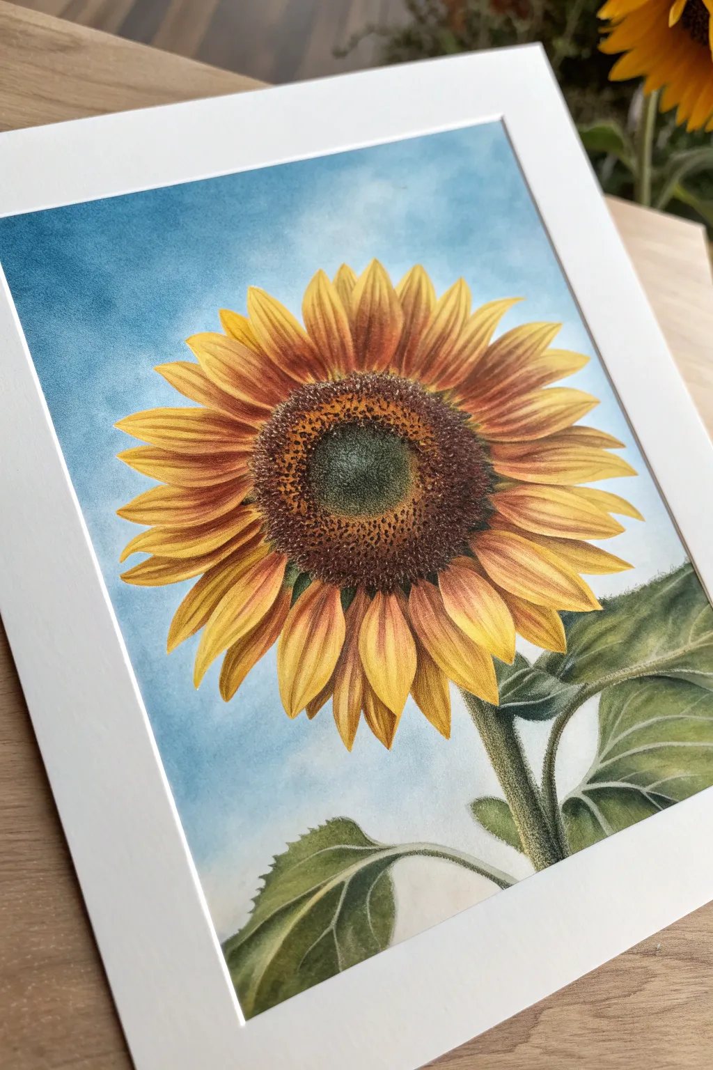
Capture the warmth of late summer with this vibrant pastel study of a sunflower head against a crisp blue sky. The project focuses on layering techniques to achieve realistic gradients in the petals and rich texture in the seed head.
Detailed Instructions
Materials
- Textured pastel paper (white or light cream)
- Soft pastels (sky blue, cerulean, white)
- Pastel pencils (lemon yellow, golden yellow, cadmium orange, burnt sienna, raw umber, dark green, sap green, black)
- Blending stump or tortillon
- Kneadable eraser
- Drafting tape
- Fixative spray
Step 1: Preparation and Sky
-
Outline the composition:
Begin by lightly sketching the large circular seed head in the center and the radiating petals. Don’t worry about perfect symmetry; natural variations make it realistic. Sketch the stem and leaves at the bottom right. -
Lay down the sky base:
Using the side of a soft pastel stick, block in the background with a medium sky blue. Apply the color gently around the petal outlines, leaving the flower itself clean. -
Blend the atmosphere:
With a clean finger or a soft cloth, smooth the blue pigment into the paper’s tooth. Add touches of darker cerulean at the top corners and whisper-light strokes of white near the flower to create a subtle atmospheric depth. -
Seal the background:
Apply a very light coat of workable fixative to the background area. This prevents the blue dust from smearing into your bright yellow petals later.
Clean Hands, Bright Colors
Keep a damp towel nearby. Yellow is easily polluted by darker colors. Wipe your hands/pencils immediately after touching the dark center before working on petals.
Step 2: Petal Layering
-
Base yellow layer:
Using a lemon yellow pastel pencil, fill in all the petals with a solid base coat. This establishes the brightness underneath the shadows. -
Define the mid-tones:
Switch to golden yellow. Start adding strokes from the center of the flower outward, fading them about halfway up each petal. This creates the primary shadow cast by the seed head. -
Deepen the shadows:
Use a cadmium orange pencil to deepen the crevices between overlapping petals and the area immediately surrounding the center disk. Keep your strokes directional, following the growth of the petal. -
Add burnt sienna details:
For the petals closest to the viewer, add fine lines of burnt sienna near the base to show texture and veins. This warmth brings the petals forward. -
Highlight tips:
I like to take a bright white or very pale yellow pencil and gently stroke the very tips of the petals to make them look sunkissed and crisp against the blue sky.
Level Up: Bee Friendly
Add a small bumblebee resting on a petal or hovering near the center. Use dark greys and bright yellows, blurring the wings for motion.
Step 3: Seed Head Texture needed
-
Establish the dark ring:
The seed head has zones. Start with the dark ring surrounding the very center. Use raw umber and touches of black to stipple—creating tiny dots—in a circular band. -
Create the center green:
Fill the very center circle with a mix of sap green and raw umber. Keep the texture tight and dense to represent immature seeds. -
Bridge the gap:
Between the dark ring and the petals, stipple lighter browns and burnt sienna. This transition area is where the seeds are most golden. -
Refine the texture:
Go back over the dark ring with a sharp point to add distinct, tiny circular shapes or darker dots, giving the impression of individual seeds packing the head.
Step 4: Stem and Leaves
-
Base green layer:
Color the stem and leaves with a medium sap green. Apply the pastel relatively smoothly for the broad leaf areas. -
Add leaf veins:
Use a white or pale green pencil to draw the jagged veins on the leaves. Don’t press too hard; you want them to look integrated, not scratched on top. -
Shadow and form:
Use a dark green or even a touch of blue-green to shade the underside of the leaves and the side of the stem away from the light source. -
Fuzzy texture:
Sunflower stems are hairy. Use a white pastel pencil to make tiny, short tic marks along the edge of the stem, catching the light and creating that distinct fuzziness.
Frame your sunflower with a clean white mat to make those cheerful yellows truly pop off the wall
BRUSH GUIDE
The Right Brush for Every Stroke
From clean lines to bold texture — master brush choice, stroke control, and essential techniques.
Explore the Full Guide
Use a Tree Silhouette Against the Sky
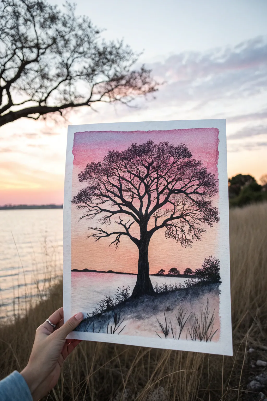
Capture the serene beauty of dusk with this striking study in contrasts. By blending a soft, pastel sunset sky as a backdrop for a stark black tree silhouette, you’ll create a piece that feels both peaceful and dramatic.
Step-by-Step Tutorial
Materials
- Cold press watercolor paper (300 gsm)
- Masking tape
- Watercolor paints (Alizarin Crimson, Cadmium Yellow, Payne’s Grey, Lamp Black)
- Round brushes (sizes 8 and 2)
- Fine liner brush or 00 round brush
- Jar of clean water
- Paper towels
- Pencil and eraser
Step 1: Setting the Scene
-
Tape and Prep:
Begin by securing your watercolor paper to a board or table using masking tape along all four edges. Press down firmly to ensure clean borders later. -
Sketch the Horizon:
Lightly sketch the horizon line about one-third of the way up from the bottom of the paper. Keep this line very faint as you don’t want graphite showing through the light sunset colors. -
Map the Tree:
Roughly mark the position of the main trunk in the center foreground. You don’t need to draw every branch yet, just the main vertical anchor point.
Uneven Gradients?
If your sky stripes aren’t blending well, tilt your board slightly while the paint is wet. Gravity helps pull the pink down into the yellow for a smoother sunset look.
Step 2: Painting the Sky
-
Wet the Paper:
Using your largest brush, apply a clean wash of water to the entire sky area above your horizon line. The paper should be glistering but not swimming in puddles. -
Apply the Pink:
Load your size 8 brush with a watery mix of Alizarin Crimson or a cool pink. Brush this horizontally across the top third of the sky, letting the color bleed downward naturally. -
Add the Gold:
Rinse your brush and pick up a soft yellow or peach tone. Apply this near the horizon line, blending it upward into the still-wet pink to create a smooth orange transition in the middle. -
Let it Dry:
Allow this layer to dry completely. If the paper feels cool to the touch, it is still wet; wait until it is room temperature.
Step 3: Creating the Reflection
-
Water Reflection:
For the water area below the horizon, use a much paler wash of the same pink and peach colors. Keep your brush strokes horizontal to mimic the flatness of the water surface. -
Bank Foundation:
While the water area is drying, mix a dark grey using Payne’s Grey. Paint the solid ground area in the bottom right foreground, creating a sloping bank where the tree will stand.
Level Up: Salt Texture
While the pink sky wash is still wet, sprinkle a tiny pinch of table salt into the upper corners. This creates starry, cloud-like textures as it dries.
Step 4: The Silhouette
-
Trunk Structure:
Using Lamp Black (or a very concentrated Payne’s Grey for a softer look), paint the main trunk of the tree. I find it helpful to start wide at the base and taper as I move upward. -
Major Branches:
Extend thick primary branches outward from the trunk. Remember that trees are organic; avoid perfect symmetry and let branches twist slightly. -
Detailing Twigs:
Switch to your fine liner or 00 brush. With very little water on the brush, pull fine, delicate twigs from the larger branches. Use a shaky hand intentionally to create natural, rugged textures. -
Canopy Density:
To suggest leaves or dense twig clusters without painting individual leaves, use the tip of a dry-ish brush to stipple small dots of black at the ends of the finest branches. -
Foreground Grasses:
Using the fine brush, flick quick, upward strokes of black along the bottom slope to create tall grasses and weeds silhouette against the water. -
Distant Trees:
With a diluted grey, paint tiny, low bumps along the distant horizon line to suggest a far-off shoreline of trees.
Step 5: Finishing Touches
-
Shadows:
Add a light wash of grey under the tree bank on the left side to shadow the water slightly, grounding the landmass. -
Review and Refine:
Step back and look for any gaps in the tree silhouette that look too empty. Add a few more tiny twigs there to balance the composition. -
The Reveal:
Once the paper is 100% dry, carefully peel away the masking tape at a 45-degree angle to reveal your crisp white borders.
Now you have a tranquil sunset scene that perfectly balances vibrant color with deep contrast
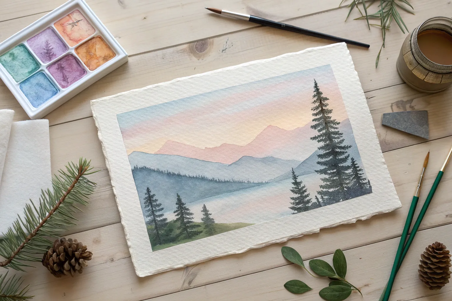
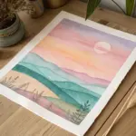
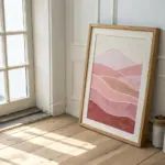
Paint Misty Mountains in Layers
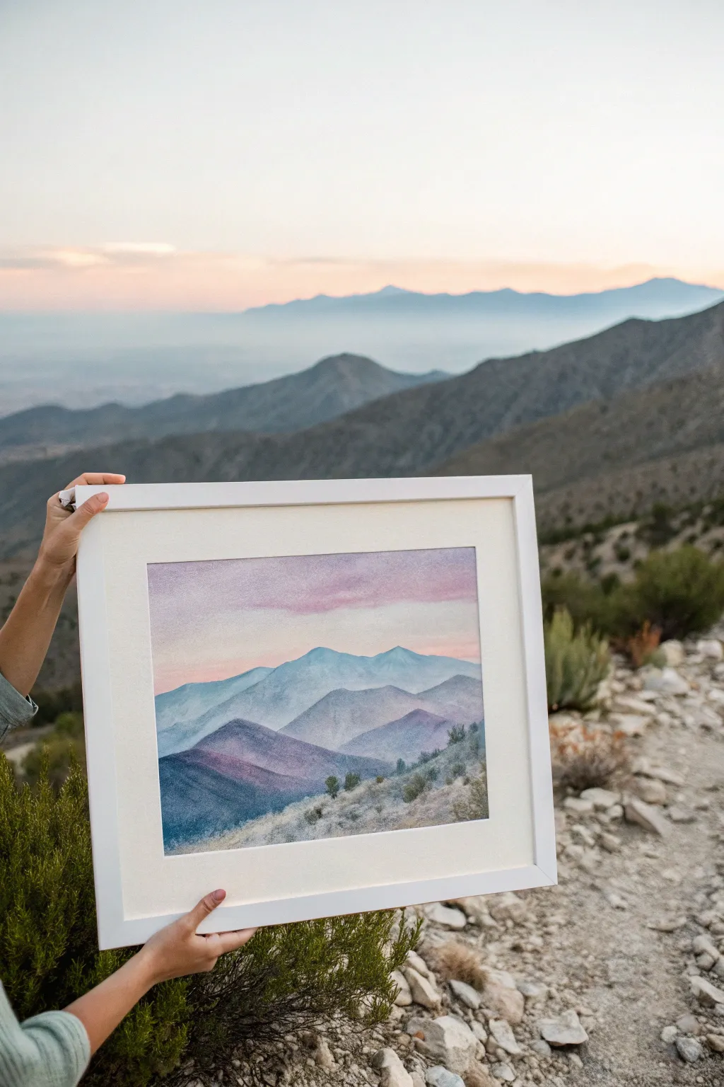
Capture the serene beauty of a twilight mountain range with this layered soft pastel tutorial. By stacking rolling hills in atmospheric perspective, you will create a sense of vast distance using a soothing palette of violets, blues, and soft pinks.
Step-by-Step
Materials
- Textured pastel paper (white or light cream, approx. 9×12 inches)
- Soft pastels (titanium white, soft pink, lavender, ultramarine blue, teal/turquoise, deep violet, olive green)
- Hard pastel pencils (dark green, dark grey/blue for details)
- Blending stump (tortillon) or soft foam applicator
- Clean soft cloth or paper towel
- Workable fixative spray
- Masking tape
- Drawing board or hard surface
- Standard white matte and frame (optional)
Step 1: Setting the Sky
-
Preparation:
Begin by taping the edges of your paper to a drawing board to create a clean white border. This mimics the professional matted look shown in the photo. -
Base Sky Layer:
Using the side of a soft pink pastel stick, gently scumble a broad horizontal band across the top third of the paper. Keep the pressure light to allow the paper’s tooth to show through. -
Adding Atmosphere:
Introduce a touch of lavender just below the pink, and a hint of white near the horizon line. I like to blend these together with a clean finger or soft cloth to create a smooth, cloud-like gradient. -
Cloud Texture:
With the tip of a magenta or deeper pink pastel, dash in a few loose, horizontal cloud streaks across the sky, keeping them soft and undefined.
Muddy Colors?
If your mountain layers look muddy, you may be over-blending. Apply the pastel and leave it alone, or use a clean finger for each color to prevent greying out your vibrant pigments.
Step 2: Building the Distant Range
-
Outline the Furthest Peaks:
Sketch a jagged, uneven line about one-third down from the top using a pale blue or teal pastel. These are your most distant mountains, so they should look faint. -
Filling the Distant Range:
Fill in the shape you just created with the pale blue. Add plenty of white pastel over the top to desaturate the color, pushing the mountains back into the distance. -
Blending for Mist:
Using a blending stump, smooth out the pigment for the distant range. Ensure the bottom edge of these mountains fades softly into the paper or the next layer; hard edges here will ruin the illusion of depth. -
The Second Range:
Draw another mountain profile slightly lower and overlapping the first. Use a slightly darker blue-grey or periwinkle shade here. The key is to gradually increase saturation as you move down the page.
Add Sparkle
For a magical touch, lightly sprinkle scraped dust from a pearlescent white pastel over the sunlit sides of the mountains, then press firmly to adhere.
Step 3: The Middle Ground
-
Introducing Purple Tones:
Create the third layer of ridges using a soft violet pastel. Focus on carving out the shape of the ridges, making these peaks slightly sharper and larger than the previous ones. -
Shadow and Light:
Apply a lighter lilac on the left slope of the peaks and a deeper violet on the right slope to suggest a light source coming from the left. -
Deepening the Valley:
As you move lower into the painting, introduce richer ultramarine and deep purples for the shadows of the overlapping hills. Blend these areas gently, but leaves some texture visible to suggest rocky terrain. -
Fixative Break:
Lightly spray the artwork with workable fixative. This prevents the sky and distant mountains from smudging while you work on the foreground.
Step 4: Detailed Foreground
-
Darkest Values:
For the closest hill in the bottom left, layer dark teal mixed with charcoal grey or deep violet. This heavy contrast anchors the composition. -
Foreground Slope:
Block in the immediate foreground slope on the bottom right using olive greens and muted browns. Keep the strokes directional, mimicking the slant of the hill. -
Adding Vegetation Texture:
Switch to your hard pastel pencils. Use short, upward flicking motions to draw grassy textures and small shrubs along the foreground ridge. -
Tree Details:
Place a few small, darker green dots or blobs along the ridgeline to represent small trees or bushes. Don’t over-detail them; simple shapes work best. -
Highlighting the Flora:
Add tiny taps of pale ochre or light sage green on top of the dark bushes to catch the imaginary light. -
Final Clean Up:
Peel away the masking tape slowly at a 45-degree angle to reveal your crisp, white border. Frame the piece behind glass to protect the delicate surface.
Step back and admire your atmospheric landscape, noting how the receding colors create a beautiful sense of vast space

PENCIL GUIDE
Understanding Pencil Grades from H to B
From first sketch to finished drawing — learn pencil grades, line control, and shading techniques.
Explore the Full Guide
Try Calm Ocean Waves With Foam
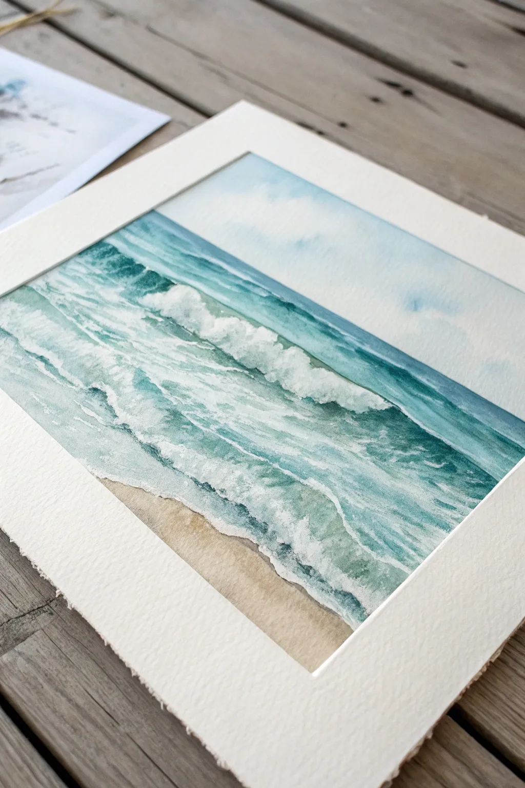
Capture the rhythmic beauty of the ocean with this soothing watercolor project that focuses on soft transitions and foamy textures. Using a limited palette of teals and sandy beiges, you’ll learn to layer translucent washes to build depth without losing the delicate light of the paper.
How-To Guide
Materials
- High-quality watercolor paper (cold press, 300gsm)
- Watercolor paints (Turquoise, Phthalo Blue, Burnt Sienna, Yellow Ochre, White Gouache)
- Masking fluid or white wax crayon (optional)
- Flat wash brush (large)
- Round brushes (sizes 4 and 8)
- Old toothbrush or stiff bristle brush
- Painter’s tape
- Paper towels
- Two jars of water
Step 1: Preparation and Sky
-
Secure Your Paper:
Tape your watercolor paper down to a board on all four sides. This creates that clean, crisp border seen in the final piece and prevents the paper from buckling when wet. -
Sketch the Horizon:
Lightly draw a straight horizontal line about one-third of the way down from the top to mark the horizon. Sketch a few faint diagonal lines to indicate the direction of the rolling waves. -
Wet the Sky Area:
Using your large flat brush, apply clean water to the area above the horizon line. You want the paper to be damp and glistening, but not swimming in puddles. -
Paint the Sky Gradient:
Mix a very diluted wash of Phthalo Blue. Apply it at the top edge of the paper and let it flow downward, fading into almost pure water as it nears the horizon line for a soft, atmospheric look. -
Lift Some Clouds:
While the sky is still damp, crumple a paper towel and gently blot a few areas to lift the pigment, creating soft, undefined white clouds.
Don’t Overwork
Watercolor naturally does beautiful things when left alone. Once you lay down a stroke for a wave, resist the urge to keep brushing it, or you’ll lose the fresh, transparent look.
Step 2: The Ocean Base Layers
-
Define the Horizon:
Once dry, mix a stronger turquoise color. Carefully paint a straight, sharp line right across the horizon. -
Establish the Deep Water:
Below the horizon line, paint a band of deep turquoise, keeping the color fairly saturated to represent the deeper ocean water furthest from the shore. -
Create the Sand:
Mix Yellow Ochre with a tiny touch of Burnt Sienna and plenty of water. Paint the bottom section of the paper, creating an uneven, organic edge where the water will meet the sand. -
Plan the Foam:
You can leave the white paper bare for the crashing foam, or for easier painting, apply masking fluid in jagged, horizontal shapes where you want the whitest breaking waves to be.
Step 3: Waves and Details
-
Paint the Rolling Waves:
Using a size 8 round brush and a mix of turquoise and blue, paint diagonal strokes representing the backs of the waves. Leave gaps of white paper between these strokes to suggest the sun hitting the water. -
Add Shadow to Foam:
Mix a very pale, watery grey-blue. Paint underneath the white foam areas to simulate the shadow cast by the crashing water, giving the wave volume. -
Deepen the Colors:
I prefer to verify my values here. Go back into the deep water sections with a more concentrated teal to increase the contrast against the white foam. -
Soften the Shoreline:
Where the water meets the sand, use a clean, damp brush to soften the hard paint edge, blending the ochre of the sand slightly into the blue of the shallows to show wet sand.
Sparkle Effect
Use a craft knife to very gently scratch the surface of the dry dark blue paint. This removes tiny bits of pigment to reveal white paper underneath, creating perfect glistening sparkles.
Step 4: Texture and Finishing
-
Enhance the White Foam:
If you used masking fluid, rub it off now. If you didn’t, dip your brush into white gouache (opaque watercolor) and paint thick, textured strokes along the crests of the waves. -
Create Sea Spray:
Load an old toothbrush or stiff brush with white gouache. Run your thumb over the bristles to flick tiny droplets onto the wave crests, mimicking ocean spray. -
Refine the Shadows:
Use a small size 4 brush to add tiny, dark teal accents just under the biggest foam splashes to make them pop forward. -
Add Dry Brush Texture:
Take a slightly dry brush with turquoise paint and drag it horizontally across the water surface. The texture of the paper will catch the paint, creating a sparkly water effect. -
Reveal the Artwork:
Wait until the painting is completely bone-dry. Slowly peel off the painter’s tape at a 45-degree angle to reveal the clean white borders.
Step back and admire your peaceful seascape, letting the calming blue hues transport you straight to the shore
Make a Colorful Galaxy Swirl
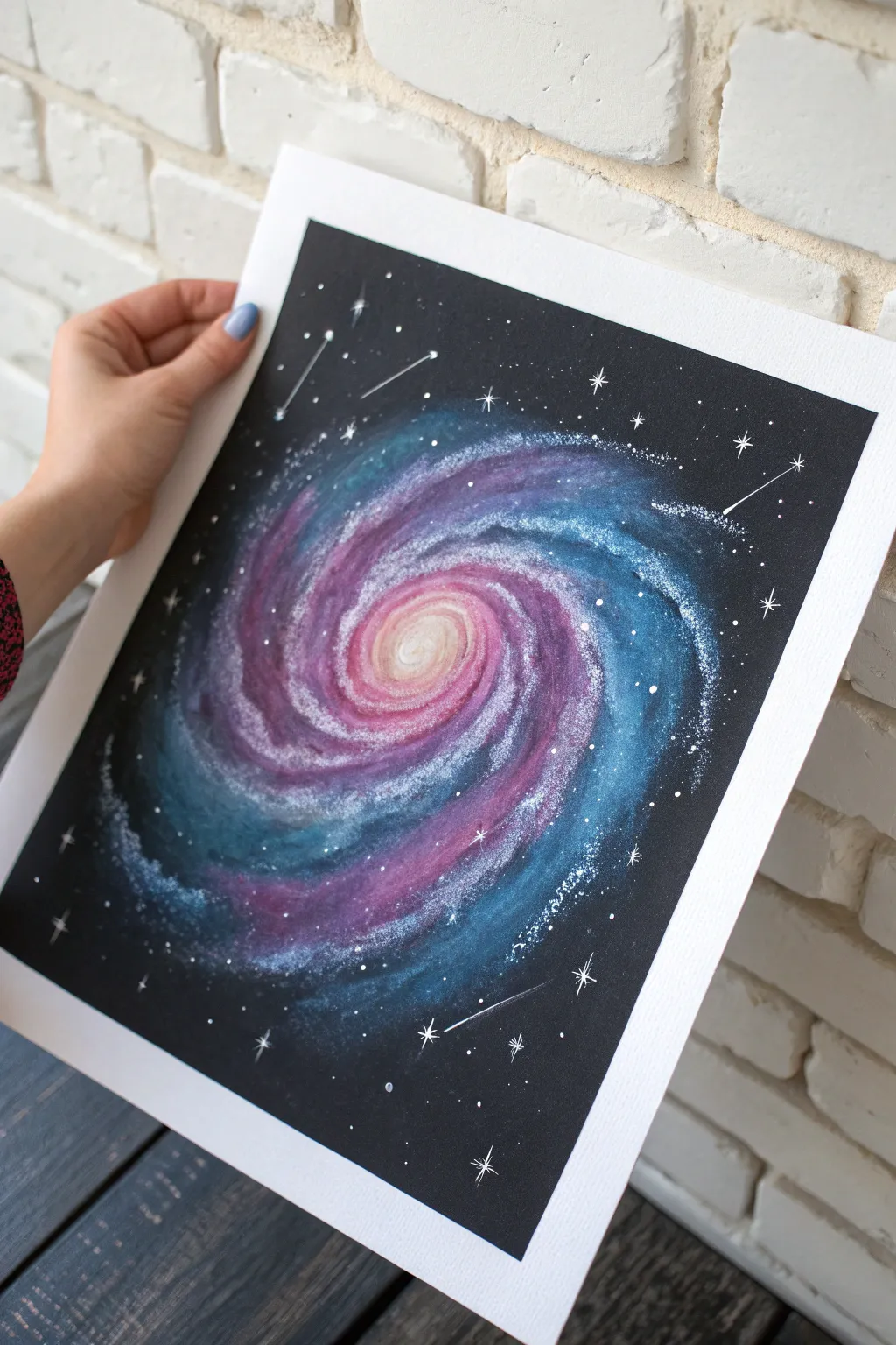
Capture the mesmerizing beauty of deep space with this vibrant galaxy swirl project. Using soft pastels on dark paper, you’ll blend luminous pinks, purples, and blues to create a glowing spiral nebula dotted with twinkling stars.
Step-by-Step Tutorial
Materials
- Black mixed media or pastel paper (heavyweight)
- Soft pastels (stick form) in white, pale yellow, pink, magenta, purple, light blue, dark blue, and teal
- Pastel pencils or white gel pen for fine details
- Blending tools (paper tortillons or your fingers)
- Workable fixative spray
- Paper towels or wet wipes for cleaning fingers
- Masking tape
Step 1: Setting the Composition
-
Prep your surface:
Tape down the edges of your black paper to a drawing board or table. This creates a clean white border when you’re finished and keeps the paper from shifting while you work. -
Mark the center:
Using a white pastel pencil or the very edge of a white pastel stick, lightly mark a small dot in the center of the page. This will be the bright, glowing core of your galaxy. -
Draft the spiral arms:
Very faintly sketch out the path of your spiral arms radiating from that center point. You don’t need perfect lines; just a loose guide to help you keep the elliptical shape balanced as you add color.
Clean Hands, Bright Colors
Keep a damp towel nearby. Wipe your fingers between blending the dark blues and the light pinks. Dirty fingers will turn your bright galaxy core muddy brown.
Step 2: Building the Core
-
Base layer for the center:
Start with a pale yellow or cream pastel stick. Apply it densely at the absolute center, pressing firmly to get good pigment coverage on the black paper. -
Add first transition color:
Circle the yellow core with a light pink pastel. Don’t worry about being neat; overlap the yellow slightly so they can mix in the next step. -
Initial blend:
Use your fingertip or a paper stump to smudge the yellow and pink together, working in a circular motion outward. The center should be the brightest part of the image. -
Intensify with magenta:
Add a ring of deeper magenta or rose pink around the light pink area, extending slightly into the beginning of the spiral arms.
Step 3: Creating the Spiral Arms
-
Lay down the purple path:
Take a medium purple pastel and broadly stroke it along the spiral guides you drew earlier. Follow the curve naturally, letting the stroke get wider as it moves away from the center. -
Introduce blue tones:
On the outer edges of the purple swirl, apply teal and light blue. This creates a dimensional look, suggesting gases cooling as they move away from the core. -
Deepen the contrast:
In the spaces *between* the spiral arms, use a navy or deep indigo blue. This negative space keeps the galaxy from looking like a solid blob and adds depth. -
Blend the gradient:
I prefer to use a clean finger for this part to really push the pigment into the paper’s tooth. Blend the purple into the blue, following the direction of the swirl. Do not blend the deep background blue into the bright arms too much, or you’ll lose definition. -
Re-establish highlights:
Pastel blending can sometimes dull the colors. Go back over the very center and the high points of the spiral arms with white and light pink to make them pop again.
Splatter Stars
Mix white acrylic paint with a tiny bit of water. Dip an old toothbrush in it and flick the bristles to spray fine white mist over the dried pastel for intense stars.
Step 4: Stars and Details
-
Add ‘stardust’ texture:
Take a white soft pastel stick and gently scrape the edge with a craft knife or fingernail over the artwork, aiming specifically at the spiral arms. This drops fine white dust onto the paper. -
Fix the dust:
Lay a piece of wax paper over the art and gently press down to adhere the dust, or lightly tap it with your finger. This creates the look of millions of distant stars within the galaxy structure. -
Draw major stars:
Using a sharpened white pastel pencil or a white gel pen, dot specific stars around the black background. Vary the pressure to create different sizes. -
Create twinkling effects:
Choose 5-7 of the larger stars and turn them into ‘glimmering’ stars. Draw a simple cross or a four-pointed star shape over the dot to give them a lens flare effect. -
Add shooting stars:
Draw faint, straight lines trailing from a few of the corner stars inward toward the galaxy to simulate shooting stars or comets. -
Clean up:
Carefully peel away the masking tape. Pull the tape away from the center of the drawing to prevent ripping the paper surface.
Enjoy the deep, cosmic atmosphere of your new galaxy artwork


Sketch a Small Bird Study in Pastels
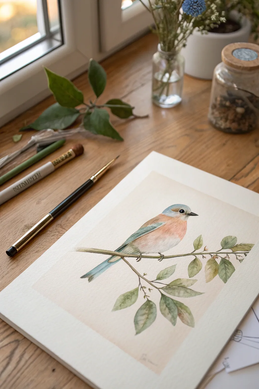
Capture the delicate beauty of a perched bluebird using a mixed-media approach that combines soft washes with precise pastel pencil details. This project balances warm peach tones against cool teals to create a serene, lifelike nature study on textured paper.
How-To Guide
Materials
- Heavyweight textured paper (cold press watercolor or pastel paper)
- Pastel pencils (Cool Grey, Teal Blue, Peach/Salmon, Burnt Umber, Olive Green)
- Soft pastel stick (Cream/Off-white)
- Watercolor paints (optional base layer)
- H graphite pencil for sketching
- Small round brush (size 2 or 4)
- Kneaded eraser
- Fixative spray
Step 1: Planning and Foundation
-
Lightly map the composition:
Begin with a very faint graphite sketch. Draw a diagonal line for the main branch, ensuring it has a slight gentle curve rather than being stick-straight. Mark the bird’s position slightly off-center for a balanced composition. -
Refine the bird’s shape:
Sketch the oval body shape, ensuring the chest is plump and round. Add the head as a smaller circle on top, and define the long, tapered tail feathers extending downwards. -
Sketch the botanical elements:
Add smaller twigs branching off the main stem. Sketch simple tear-drop shapes for leaves, clustering them in groups of two or three to look natural. -
Create a background tint:
Using a very diluted wash of watercolor or a rubbed-in layer of cream soft pastel, create a faint rectangular background area behind the bird. This separates the subject from the white paper without needing a full background.
Step 2: Color Blocking the Bird
-
Apply the warm chest tones:
Take a peach or salmon-colored pastel pencil. Lay down soft, diagonal strokes across the bird’s chest and belly, leaving the center slightly lighter to suggest roundness. -
Add the cool blue wings:
Use a teal blue pastel pencil for the head and wing area. Stroke in the direction of the feathers—short strokes on the head, longer strokes on the wing. -
Blend the transitions:
Use a stump blender or your finger to gently smudge the area where the blue of the head meets the peach of the chest, creating a soft, misty transition. -
Define the wing feathers:
Sharped your teal pencil to a fine point. Draw distinct lines over the blended wing area to suggest individual flight feathers, pressing harder to create shadow between them. -
Detail the tail:
Color the tail with a mix of teal and cool grey. Keep the edges crisp to differentiate them from the softer body feathers.
Clean Edges
Keep a piece of scrap paper under your drawing hand. This prevents your palm from smearing the soft pastel dust onto the clean white background.
Step 3: Botanical Details
-
Base layer for the branch:
Run a line of burnt umber along the branch sketch. I find it helpful to vary the pressure here—harder for knots and shadows, lighter for the top highlights. -
Color the leaves:
Fill in the leaves with a soft olive green. Don’t make them solid blocks of color; leave the edges slightly faded or sketchy for a vintage botanical look. -
Add leaf variation:
Touch in a bit of yellow ochre or brown on the tips of a few leaves to simulate drying or age. -
Draw the veins:
With a sharp green or grey pencil, draw a central vein down each leaf. Keep these lines extremely thin and delicate.
Vintage Varnish
To get that old-world field guide look, lightly brush a very weak tea stain over the entire paper before you start drawing to age it instantly.
Step 4: Final Definition
-
Intensify the eye:
Use a black or dark grey pencil to draw the eye. Leave a tiny speck of white paper bare for the catchlight, which brings the bird to life immediately. -
Refine the beak:
Draw the small, sharp beak using dark grey. Ensure the line separating the upper and lower beak is crisp. -
Add subtle feet:
Sketch the tiny claws gripping the branch using grey. Keep them sketchy and light so they don’t distract from the bird’s colorful body. -
Highlight the feathers:
Use a white pastel pencil to add a few highlights on the shoulder of the wing and the top of the head to simulate glossy feathers. -
Ground the image:
Add a tiny bit of darker shadow underneath the branch and the bird’s tail to give the subject weight.
Once you’ve sprayed a light coat of fixative, your delicate bird study is ready to be framed
Color a Cozy Pet Portrait With Soft Fur
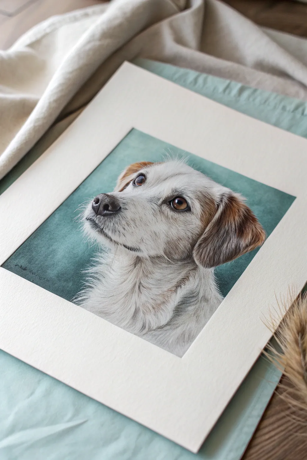
Capture the soulful expression of a beloved dog using soft pastels to create realistic fur textures and deep, lively eyes. This portrait features a gentle teal background that makes the warm browns and whites of the coat truly pop.
Step-by-Step
Materials
- Pastel paper (Canson Mi-Teintes or Pastelmat, light grey or beige)
- Soft pastel sticks (teal, white, grey, burnt sienna, dark brown, black)
- Pastel pencils (white, dark brown, black, grey, tan)
- Blending stump or tortillon
- Kneadable eraser
- Glassine paper (to rest your hand on)
- Fixative (optional)
- Standard pencil for sketching
Step 1: Sketching & Background
-
Outline the Subject:
Begin by lightly sketching the dog’s main shapes using a neutral-colored pastel pencil (like a light grey or tan). Avoid graphite pencils as they can repel pastel. Focus on placing the eyes, nose, and the overall head shape correctly. -
Map the Shadows:
Lightly shade in the darkest areas of the ears, under the chin, and around the eyes using a dark brown pastel stick. This establishes your value map before adding detail. -
Apply Background Base:
Using the broad side of a teal or sea-green soft pastel stick, cover the background area roughly. Don’t worry about getting right up to the fur edge yet. -
Refine the Background:
Use your fingers or a sponge tool to blend the teal into a smooth, seamless cloud. Fade the color slightly as it approaches the dog’s outline to keep the edges soft, which helps the subject stand out.
Muddy Fur?
If your white fur looks dirty, you might be over-blending. Apply the final white layers with heavy pressure and don’t touch them again. Let the strokes sit on top of the paper.
Step 2: Building the Underlayer
-
Base Color for White Fur:
Apply a base layer for the white fur using a mix of light grey and very pale cream pastel sticks. Avoid pure white for now; we want to save that for the brightest highlights later. -
Base Color for Brown Patches:
Block in the ear and eye patches with a burnt sienna or warm brown stick. Smudge these base layers gently with a finger to push the pigment into the paper’s tooth. -
Establish the Eyes:
Switch to sharp pastel pencils for the eyes. Outline the iris with black, fill with a warm honey brown, and add a deep black pupil. Leave a tiny spot of clean paper for the reflection highlight. -
Define the Nose:
Fill in the nose shape with dark grey and black pastel. Use a blending stump to smooth the texture, as noses are generally less textured than fur.
Step 3: Creating Texture & Detail
-
Start Fur Direction:
Using a grey pastel pencil, start drawing individual strokes over the nose bridge and cheeks. Follow the natural growth direction of the fur—short strokes near the nose, longer ones on the neck. -
Deepen Ear Shadows:
Layer dark brown and black pencil strokes inside the ear fur to create depth and volume. Let the warm brown base show through for a rich, realistic coat color. -
Add Whisker Dots:
On the muzzle, gently mark small, dark dots where the whiskers will eventually originate. Keep these subtle. -
Layering the Neck Fur:
On the chest and neck, use broader strokes with a light grey stick, then overlay with fine white pencil lines. Clump the strokes slightly to mimic the way longer fur gathers. -
Refining the Eyes:
Add a tiny touch of blue or cool grey to the white part of the eye (the sclera) for realism. Sharpen the black outline around the eye to make it piercing and clear. -
Brighten the Highlights:
Now, take your softest, brightest white pastel stick. Apply strong, confident strokes on top of the muzzle, above the brow, and on the chest to create the appearance of light hitting the fur.
Make it Shine
Make the nose look wet by adding a sharp, hard-edged highlight of pure white on the upper curve, and a subtle blue reflected light on the shadow side.
Step 4: Final Touches
-
Add Whiskers:
With a very sharp white or light grey pencil, draw quick, confident curves for the whiskers. Press harder at the base and lift off at the end for a tapered look. -
Clean Up Edges:
Check the boundary between the fur and the teal background. Use a pastel pencil to add tiny stray hairs overlapping the background, breaking up any rigid outlines. -
Final Polish:
Add the final catchlight to the eyes with pure white. This single dot brings the whole portrait to life.
Place your finished piece in a simple mat to let those soulful eyes draw the viewer in
Frame It With Crisp Taped-Off Borders
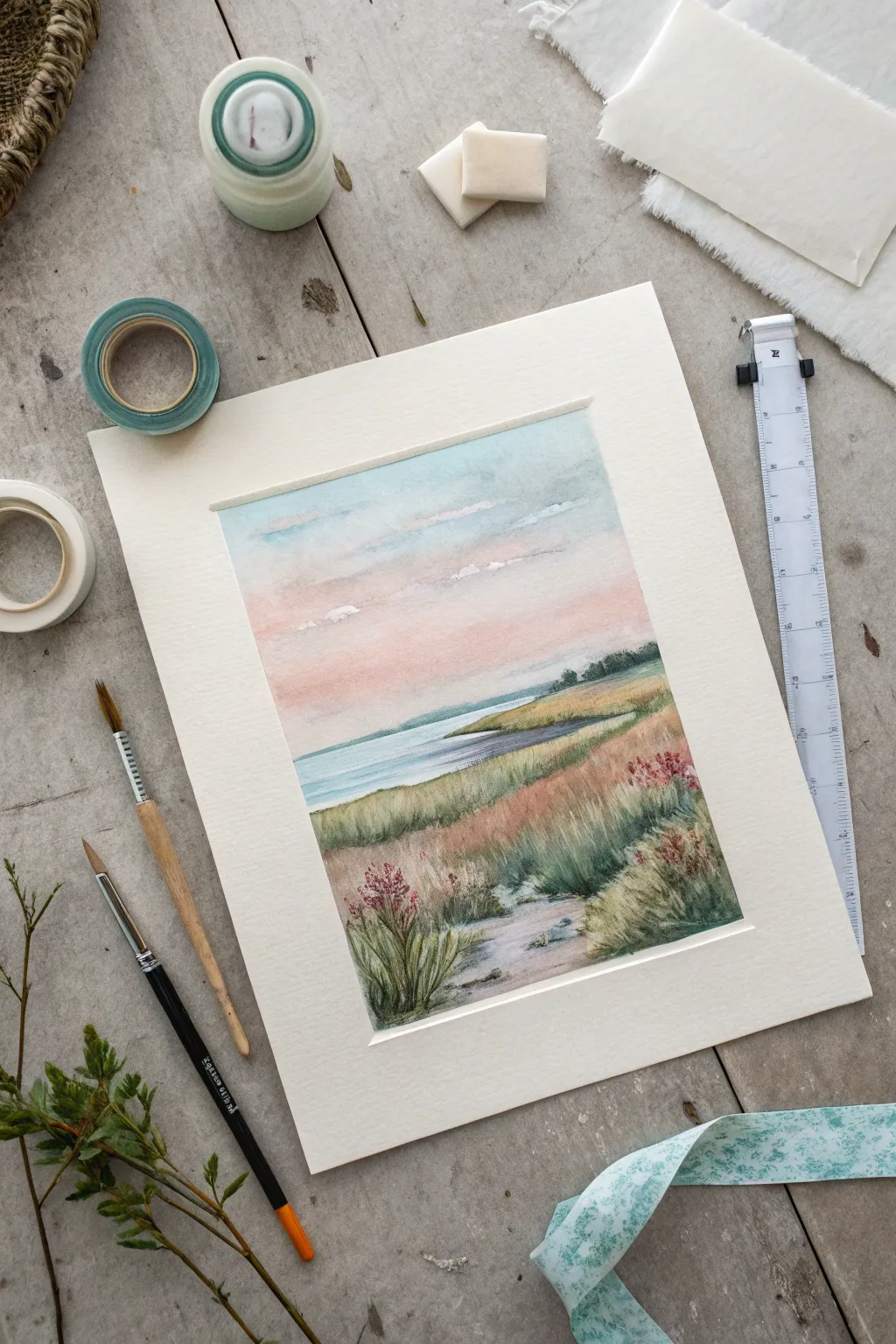
Capture the serene beauty of a coastal landscape with this soft, atmospheric watercolor painting. Using taped borders creates a crisp, professional finish that frames the delicate pink sunset and wind-swept marsh grasses perfectly.
Step-by-Step Guide
Materials
- Cold press watercolor paper (140 lb/300 gsm)
- Painter’s tape or masking tape (low tack)
- Watercolor paints (Cerulean Blue, Alizarin Crimson, Sap Green, Burnt Sienna, Yellow Ochre)
- Round watercolor brushes (size 4 and 8)
- Rigger brush (optional, for fine grass)
- Jar of clean water
- Paper towels
- Pencil (HB or 2B)
- Ruler
- Mixing palette
- Board or mat to tape paper onto
Step 1: Preparation & Drawing
-
Tape the borders:
Begin by securing your watercolor paper to a sturdy backing board. Apply masking tape evenly along all four edges to create a clean rectangular frame. Ensure the tape is pressed down firmly to prevent paint from seeping underneath. -
Sketch the horizon:
Lightly sketch the horizon line about two-thirds of the way down the paper. It doesn’t need to be perfectly straight; a slight curve adds natural character. -
Outline the landforms:
Draw the curving coastline of the marsh on the right side, guiding the eye from the foreground into the distance. Sketch rough shapes for the grassy mounds, keeping your pencil lines very faint so they disappear under the paint.
Clean Lines Secret
To prevent paint bleeding under the tape, run a bone folder or the back of a spoon firmly along the tape edge before you start painting.
Step 2: Painting the Sky & Water
-
Wet the sky area:
Using your larger round brush and clean water, wet the entire sky area down to the horizon line. The paper should be glistening but not forming puddles. -
Apply the blue sky:
Drop in a dilute wash of Cerulean Blue at the very top of the sky, letting it fade as you move downward. Leave some white gaps for soft clouds. -
Add the sunset glow:
While the paper is still damp, introduce a soft wash of Alizarin Crimson mixed with plenty of water near the horizon. Let it bleed slightly into the blue above to create a gentle, violet transition. -
Paint the distant water:
Once the sky is semi-dry, paint the water area with a flat, even wash of diluted Cerulean Blue mixed with a tiny touch of green. Keep the strokes horizontal to suggest calmness. -
Create distant land:
Paint a thin, pale strip of blue-grey along the horizon line to represent the far shore. This anchors the perspective.
Torn Paper Fix
If tape rips the paper upon removal, you likely pulled too fast. Heat the tape with a hair dryer for a few seconds first to soften the adhesive.
Step 3: Developing the Marsh
-
Base layer for grass:
Mix Sap Green with a little Yellow Ochre. Apply this base wash to the grassy areas on the right, varying the intensity to show light hitting the mounds. -
Add earthy tones:
While the green is still wet, drop in hints of Burnt Sienna or reddish-brown to represent dried grasses and patches of earth. This wet-in-wet technique creates soft, natural blends. -
Paint the foreground path:
For the sandy path or water inlet in the foreground, use a very watery mix of violet-grey or muddy brown. Leave some areas of the white paper showing to represent reflected light. -
Define the shoreline:
Use a slightly darker mix of blue-green to define the edge where the grass meets the water. This shadow adds depth and separates the land from the sea.
Step 4: Details & Final Touches
-
Texture the grass:
Switch to your smaller brush or a rigger brush. Once the base layers are dry, flick upwards with a mix of dark green and brown to create individual blades of grass in the foreground. -
Add wildflowers:
I like to take a fairly dry brush with concentrated Alizarin Crimson or reddish-purple and dab tiny dots onto the tufts of grass to suggest wild flowering plants. -
Deepen the shadows:
Mix a dark green (green plus a touch of red creates a natural dark tone) and deepen the shadows at the base of the grass clumps and under the wildflower clusters. -
Final assessment:
Step back and look at the overall balance. If the foreground needs more weight, add a few more detailed grass strokes closest to the viewer. -
The reveal:
Wait until the painting is completely bone-dry. Carefully peel away the masking tape at a 45-degree angle, pulling away from the artwork to reveal your crisp, clean borders.
Place your finished piece in a mat as shown to give it a gallery-worthy presentation
Fill the Background With Scribbled Pastel Energy
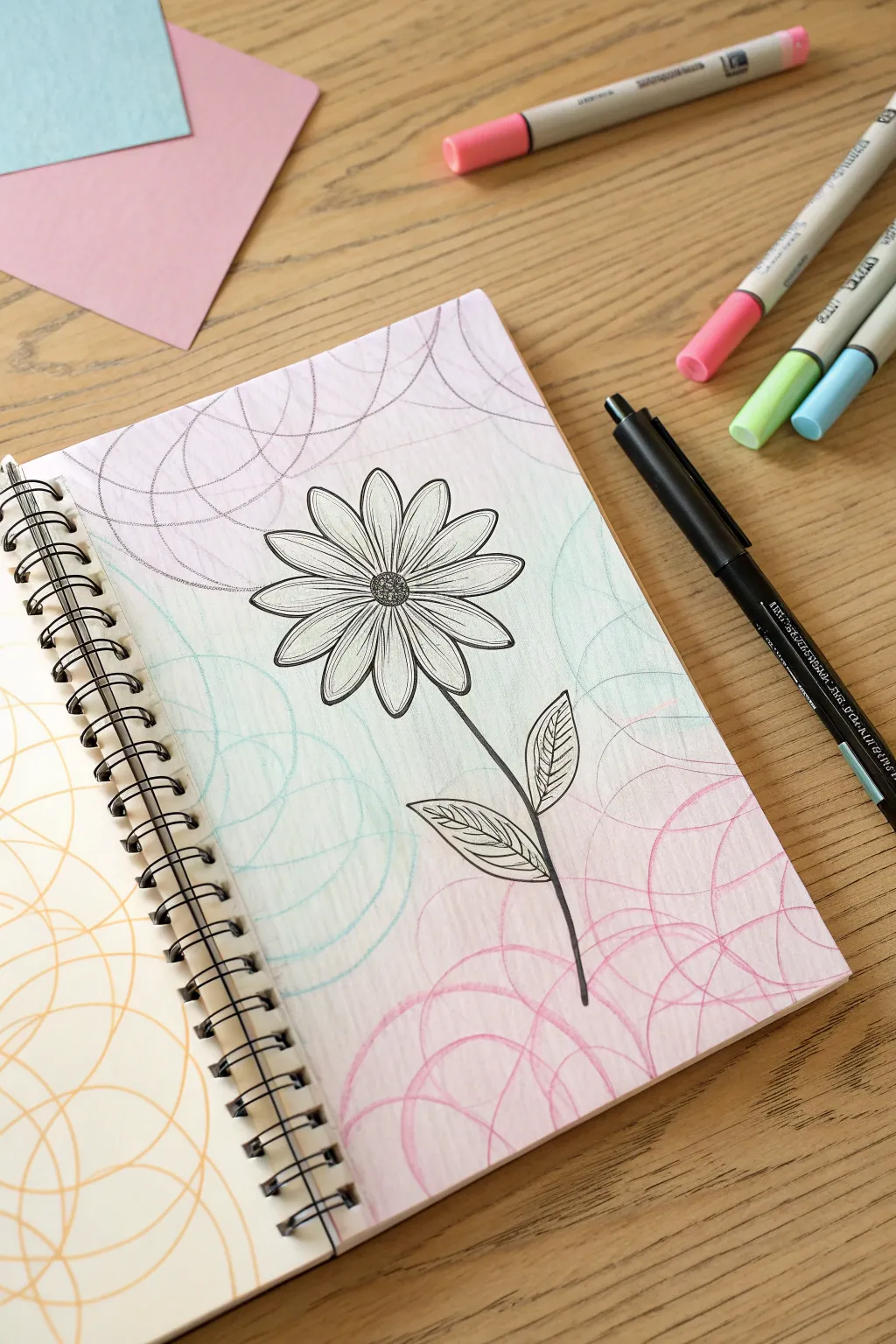
Transform a simple botanical line drawing into a vibrant masterpiece by surrounding it with energetic, scribbled loops. This technique uses soft pastel tones to create a dynamic, bubbly background that adds movement without overpowering your central flower illustration.
Step-by-Step Guide
Materials
- Spiral-bound sketchbook with thick paper (mixed media or bristol)
- Black fine liner pen (felt tip or pigment liner)
- Pastel brush markers or highlighters (pink, mint green, lavender)
- Pencil (light sketching)
- Eraser
Step 1: Planning the Layout
-
Find the center:
Begin by lightly marking the center of your page with a pencil to position the flower head correctly. -
Sketch the flower circle:
Draw a small circle for the flower’s center, about the size of a nickel, right where you made your mark. -
Draft the petal guidelines:
Lightly sketch a larger circle around the center to define how long your petals will be, ensuring the flower stays symmetrical. -
Add the stem line:
Draw a single, slightly curved line extending downwards from the bottom of the flower head to create the stem. -
Position the leaves:
Sketch two simple leaf shapes, one on each side of the stem, keeping them roughly midway down the page.
Ink Smearing?
If your black pen smears when you add pastel scribbles near it, switch to a waterproof pigment liner (like Pigma Micron) or let the black ink cure overnight before coloring.
Step 2: Inking the Illustration
-
Ink the flower center:
Using your black fine liner, draw over the center circle using tiny, tight stippling or small dots to give it a textured, pollen-filled look. -
Outline the petals:
Draw the petals one by one, starting from the center and extending to your outer guideline. Give the tips a soft point rather than a perfect curve. -
Add petal details:
Draw a single, straight line down the center of each petal to create the midrib vein. -
Ink the stem:
Go over your pencil line for the stem with a confident stroke. I sometimes like to thicken the line slightly near the base of the flower. -
Detail the leaves:
Outline the leaves and add veins. Instead of simple straight lines, use slightly curved diagonal lines for the leaf veins to suggest volume. -
Erase pencil marks:
Wait a moment for the ink to fully dry, then gently erase all your pencil guidelines so the page is clean.
Step 3: Creating the Background
-
Select your palette:
Choose three distinct pastel colors—here we are using a soft pink, a minty blue-green, and a pale lavender. -
Start the first color zone:
Take the lavender marker and begin in the top left corner. Draw loose, overlapping circular scribbles that spiral outward. -
Vary the density:
Keep the loops large and airy; you aren’t trying to color the page solid, but rather creating a web-like texture. -
Transition to mint green:
Switch to your mint green marker for the middle section of the page. Let the scribbles overlap slightly with the lavender area. -
Navigate around the flower:
Continue your loops right up to the edge of the black flower outline, being careful not to draw inside the petals. -
Add the pink base:
Use the pink marker for the bottom section of the page, creating semi-circular loops that anchor the bottom of the composition. -
Check for balance:
Look at the page as a whole. if any white spaces feel too empty, add a few more loose loops to connect the color zones.
Add Sparkle
For a magical finish, trace over a few of the pastel spiral lines using a silver or gold gel pen. The metallic sheen will catch the light beautifully against the soft colors.
Now you have a lively, colorful page that captures the joyful chaos of creativity
Do a Minimal Monochrome Pastel Study
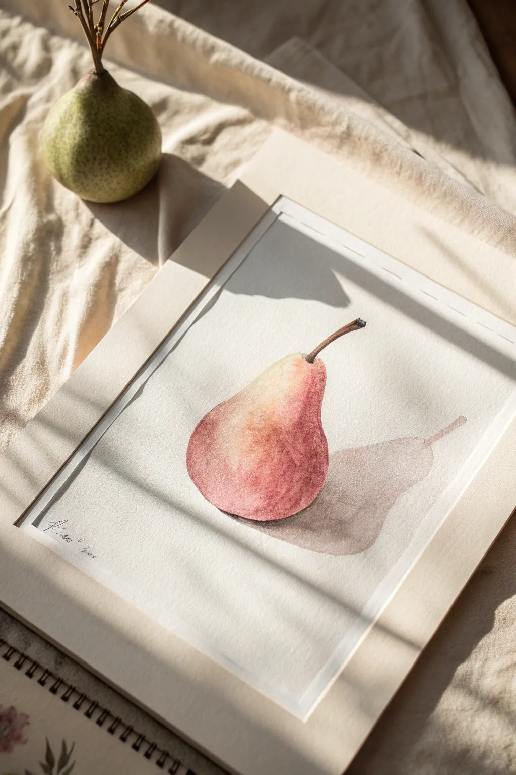
This still life project focuses on capturing the simple elegance of a pear using a limited, monochromatic palette of warm reds and earthy browns. The soft gradients and delicate cast shadow create a realism that feels both modern and timeless.
Step-by-Step Guide
Materials
- Cold press watercolor paper (300 gsm)
- Watercolor paints (Alizarin Crimson, Burnt Sienna, Yellow Ochre, Sepia)
- Round watercolor brushes (size 4 and 8)
- Pencil (HB or 2H)
- Kneadable eraser
- Paper towels
- Two jars of water
- Masking tape
Step 1: Preparation and Sketching
-
Tape your paper:
Secure your watercolor paper to a board or table using masking tape along all four edges. This prevents buckling when the paper gets wet. -
Outline the shape:
Using a light hand and your HB pencil, sketch the basic teardrop shape of the pear. Focus on the asymmetrical curve at the bottom. -
Add stem and shadow:
Draw the thin, curved stem extending from the top. Lightly outline the cast shadow shape falling to the right, mirroring the pear’s contours. -
Lighten the lines:
Gently roll a kneadable eraser over your sketch to lift excess graphite. You want faint guidelines that won’t show through the transparent paint.
Highlight Preservation
Don’t use white paint for the highlight. The brightest white in watercolor comes from the unpainted paper itself. Plan this spot before your brush touches the page.
Step 2: Painting the Pear Body
-
Prepare the base wash:
Mix a very dilute wash of Yellow Ochre with a tiny touch of Alizarin Crimson to create a pale peach tone. -
Apply the first layer:
With your size 8 brush, wet the inside of the pear shape with clean water first (wet-on-wet technique), then drop in your pale peach mix, leaving a small white highlight on the upper left curve. -
Build the blush:
While the paper is still damp, mix a stronger concentration of Alizarin Crimson. Gently dab this into the bottom and right side of the pear where the skin looks reddest. -
Blend the transition:
Clean your brush and wipe it slightly damp. Use it to soften the edges where the red meets the pale yellow, creating a smooth gradient. -
Deepen the shadows:
Mix a bit of Burnt Sienna with your red. Apply this to the bottom right edge of the fruit to give it volume and roundness. Allow this layer to dry completely.
Step 3: Details and Shadows
-
Paint the stem:
Switch to your size 4 brush. Mix Sepia and Burnt Sienna to a creamy consistency. Carefully paint the stem, making the base slightly thicker where it joins the fruit. -
Add texture:
Once the main pear body is dry, I find that dry-brushing a tiny bit of texture adds realism. Use a mostly dry brush with faint red pigment to stipple subtle spots on the skin. -
Mix the cast shadow color:
Create a neutral shadow tone by mixing Sepia with a touch of Alizarin Crimson. It should be transparent and watery. -
Paint the cast shadow:
Apply the shadow wash to the area you sketched on the table surface. The color should be darkest right underneath the pear base. -
Soften shadow edges:
Before the shadow paint dries, rinse your brush and run a damp edge along the outer perimeter of the shadow to blur it slightly into the white paper. -
Define the contact point:
Use a concentrated dark mix of Sepia to paint a very thin, dark line right where the pear touches the surface, anchoring the object. -
Final assessment:
Step back and look at your contrast. If the pear needs more vibrancy, add a transparent glaze of crimson over the red areas once everything else is bone dry.
Cauliflower Blooms?
If you see uneven water marks or ‘blooms’ drying on the pear skin, you likely added water to a drying wash. Let it dry completely, then fix it with a gentle glaze.
Remove the tape slowly at an angle to reveal your crisp, clean edges and enjoy your delicate fruit study
Have a question or want to share your own experience? I'd love to hear from you in the comments below!